Office Alex Nicholls creates multi-generational apartment with its own spa
CategoriesInterior Design

Office Alex Nicholls creates multi-generational apartment with its own spa

Architecture studio Office Alex Nicholls has fused two penthouse apartments in Melbourne into one large flexible home, converting their basement parking spots into a private spa and pool.

Adaptability was key to the home in Melbourne’s Elsternwick suburb, which needed to provide enough space for a multi-generational family as well as accommodating visiting relatives in guest rooms that double up as studies.

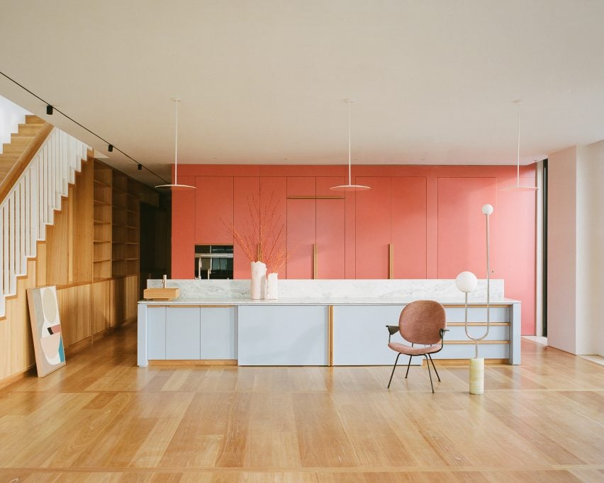
Salmon pink kitchen in Melbourne apartment by Office Alex Nicholls
Office Alex Nicholls fused two apartments to create Elsternwick Penthouse

“Spaces were designed to adapt to a multitude of uses, with flexible working and living spaces as well as areas that could expand for large groups or contract to provide intimate settings,” the studio’s founder Alex Nicholls told Dezeen.

Office Alex Nicholls was brought on board while the apartment block was still under construction and was able to make significant changes to suit his clients’ needs – improving the layout, adding skylights and up-speccing on key details like the windows.
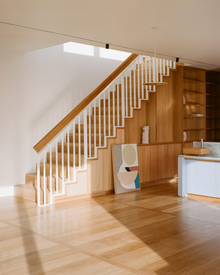
Wooden staircase inside Elsternwick Penthouse
Timber staircases lead to the roof garden

“The design intent was to create variety and different spatial experiences across a very expansive and potentially monotonous floorplan,” Nicholls said.

“I wanted to create a light yet grounded and natural-feeling space that was contrasted with some stronger formal elements such as sculptural skylights and coloured functional volumes.”
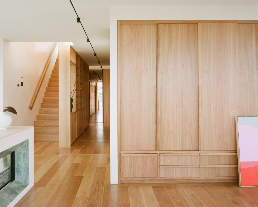
Timber storage and staircase in Melbourne apartment by Office Alex Nicholls
A “library spine” runs through the apartment to provide storage

To navigate this vast apartment, Nicholls devised a central “library spine” – a corridor running the entire length of the apartment that houses the family’s collection of books, art and artefacts while creating an opportunity out of what could have been a dark and monotonous space.

“The idea for the library spine was born from a storage requirement of the clients,” the architect said. “However, it became a key architectural intervention.”

“From a practical standpoint, it allowed everything to be easily accessible and displayed but it also helps to draw people through the apartment and celebrate the two staircases to the roof garden at either end.”
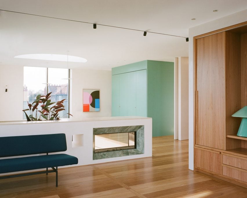
Living room of Melbourne apartemnt by Office Alex Nicholls
Oculus skylights funnel sunlight into the interior

To provide vital light to the heart of the apartment and enhance the two main living spaces, Nicholls designed a series of circular and semi-circular oculus skylights, which reference the clients’ love of Elsternwick’s art deco architecture.

“They create a sense of movement and symmetry in the composition of otherwise rectilinear volumes,” he explained.

The apartment has three kitchens, partly to meet the family’s religious requirements and partly to allow the different generations who are sharing the apartment to enjoy their own independence.

Described by Nicholls as a series of “magic boxes”, each monolithic kitchen is defined by one vivid colour. This helps to delineate spaces and provides a counterpoint to the otherwise warm and natural material palette, which includes Blackbutt timber and Gosford sandstone.
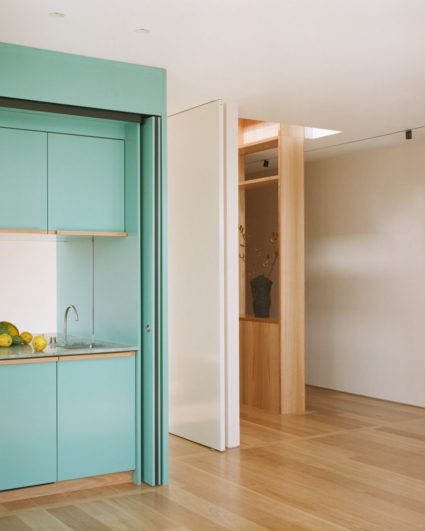
Turquoise kitchen in Elsternwick Penthouse
The apartment has three colourful kitchen units

“The kitchens were designed to be largely concealed within these coloured volumes to give each one more spatial presence while ensuring the apartment did not feel too kitchen- and appliance-heavy as a result of the clients’ complex requirements,” Nicholls said.

In the basement, Nicholls turned the penthouses’ lift-accessed parking spots into a private 100-square-metre wellness space that features a fitness pool, sauna, kitchenette, changing rooms and a flexible rehabilitation area.
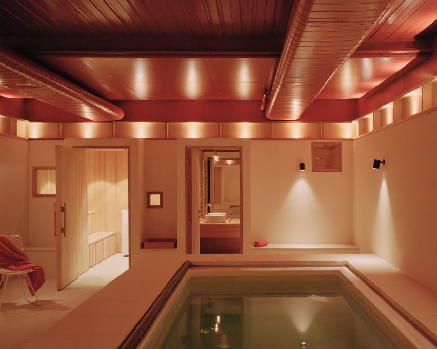
Basement spa with pool in Melbourne flat by Office Alex Nicholls
Nicholls also converted the apartments’ parking spots into a private spa

To make up for the lack of natural light in this subterranean space, Nicholls deployed atmospheric indirect lighting and a warm colour palette.

“Lighting the space via a datum of timber niches helped give the spa a restorative atmosphere, enhanced by the use of natural materials such as sandstone, timber, terracotta and lime render,” he explained.
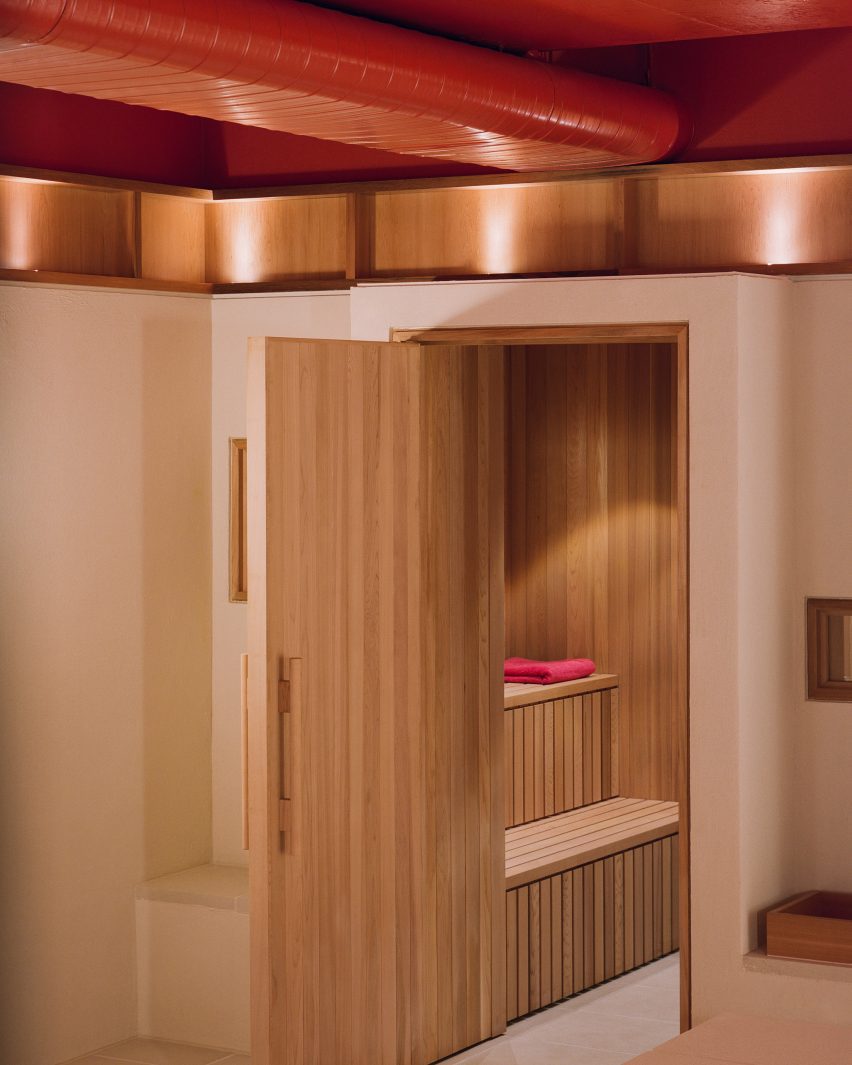
Timber sauna in Elsternwick Penthouse basement
The spa is home to a timber sauna

Elsternwick is a thriving suburb in the southeast of Melbourne, brimming with buzzy shops, restaurants and bars.

Among them is the Hunter & Co Deli, whose interiors were informed by the cold cuts on offer, and the minimal Penta cafe with its monolithic concrete counter.

The photography is by Rory Gardiner.

Reference

Studio Tate creates “textural earthiness” for Relinque wellness spa
CategoriesInterior Design

Studio Tate creates “textural earthiness” for Relinque wellness spa

Melbourne-based Studio Tate has used raw and tactile materials to create “a soothing urban oasis” for the Relinque spa in Melbourne.

Located in north east Melbourne, the 800 square-metre space includes a day-spa, spinal clinic, pilates and yoga studios.

Reception Relinque
The interiors are informed by local parks and waterways

Local practice Studio Tate was informed by nearby parklands and waterways to create “a soothing urban oasis”.

“It was important to create a textural earthiness that evokes the senses, while striking a balance between sophistication and approachability,” explained Studio Tate senior associate Emily Addison.

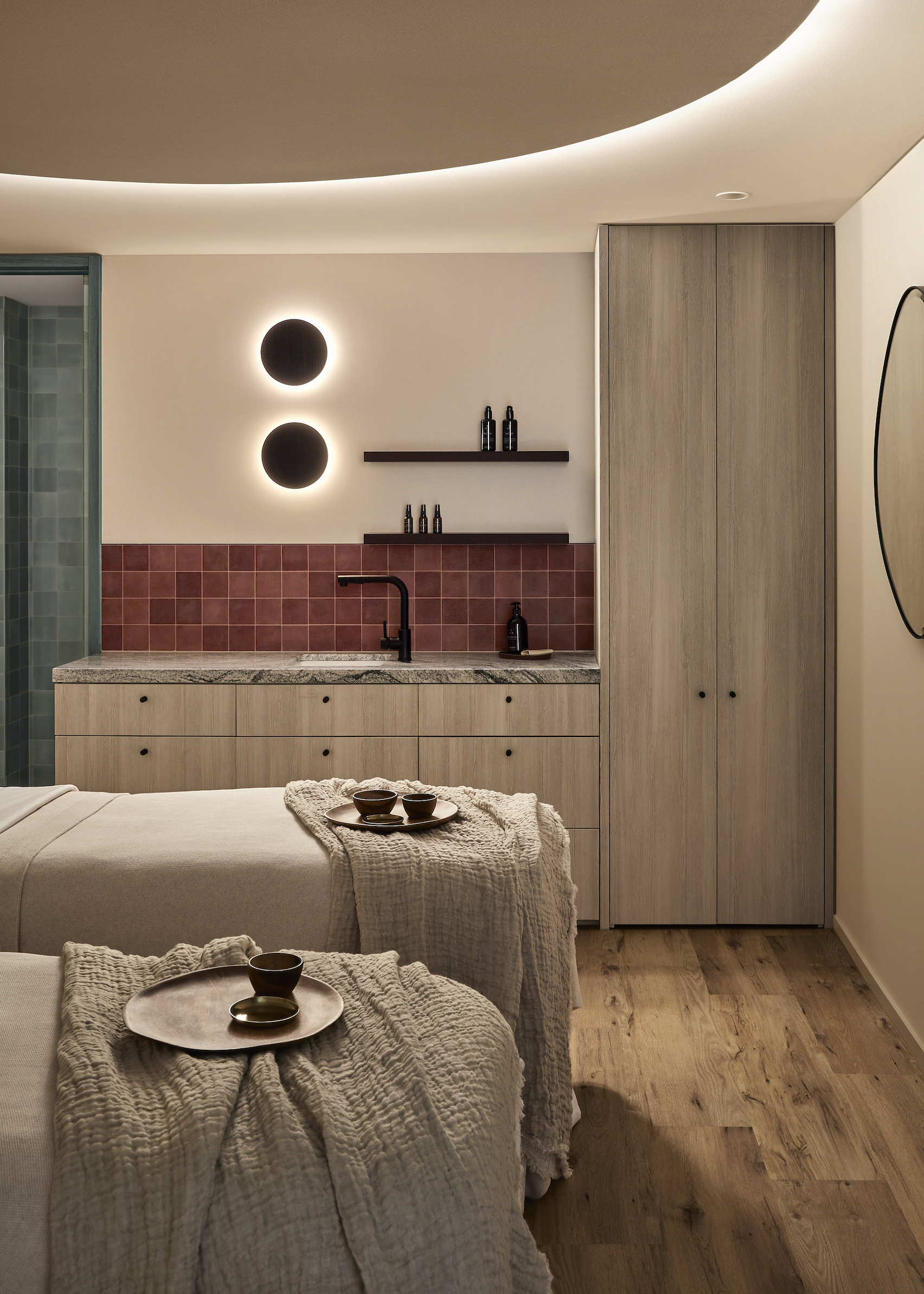
Treatment room Relinque
A deep rust tone in the treatment rooms was selected to be gender neutral

The treatments rooms were located on either side of a central reception area, with the spa and yoga studio located on one side and the spinal clinic and pilates studio on the other.

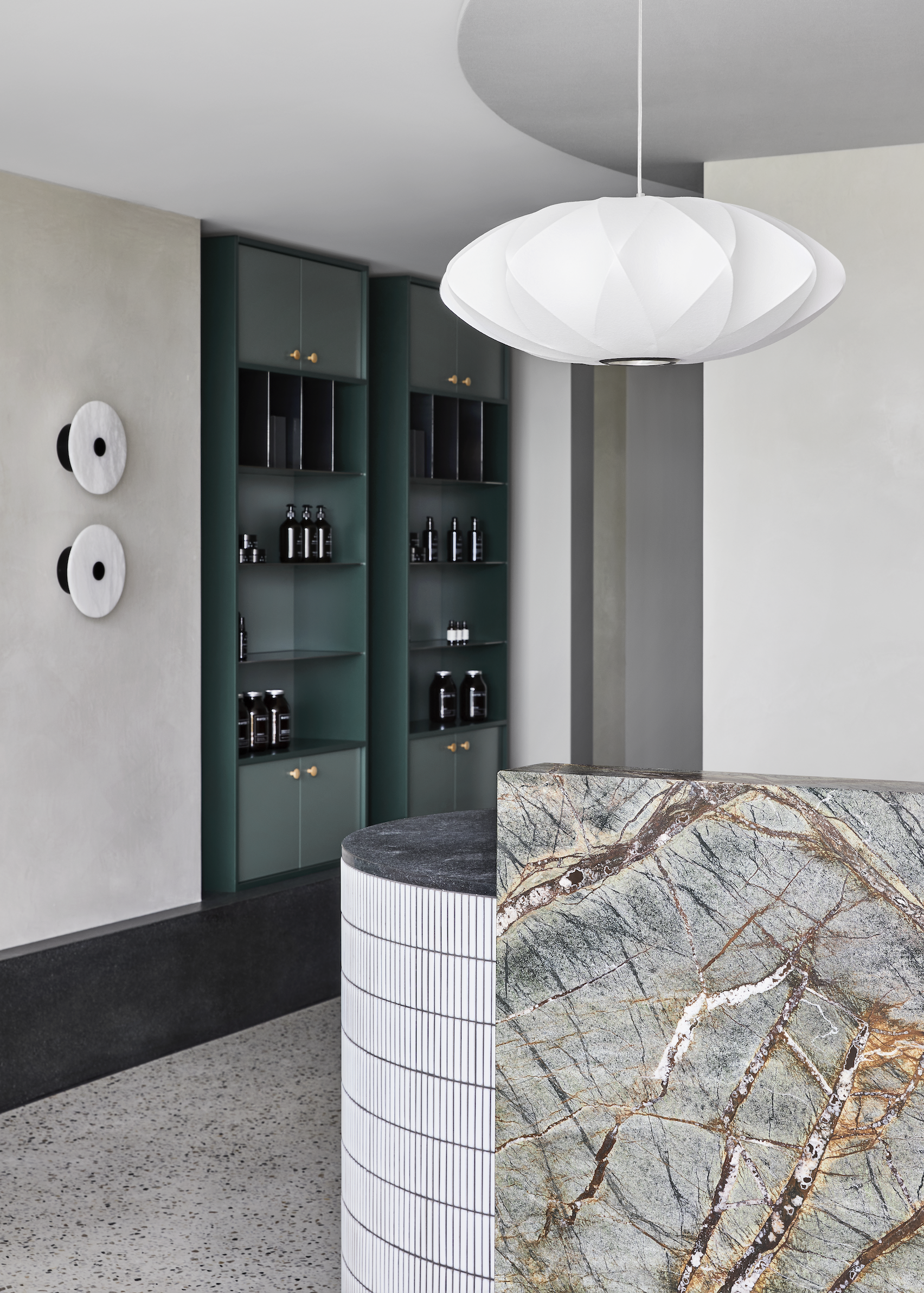
Studio Tate used green marble, honed granite and hand-glazed Japanese tiles in the reception area, where visitors are encouraged to relax and browse the retail products before stepping into treatments.

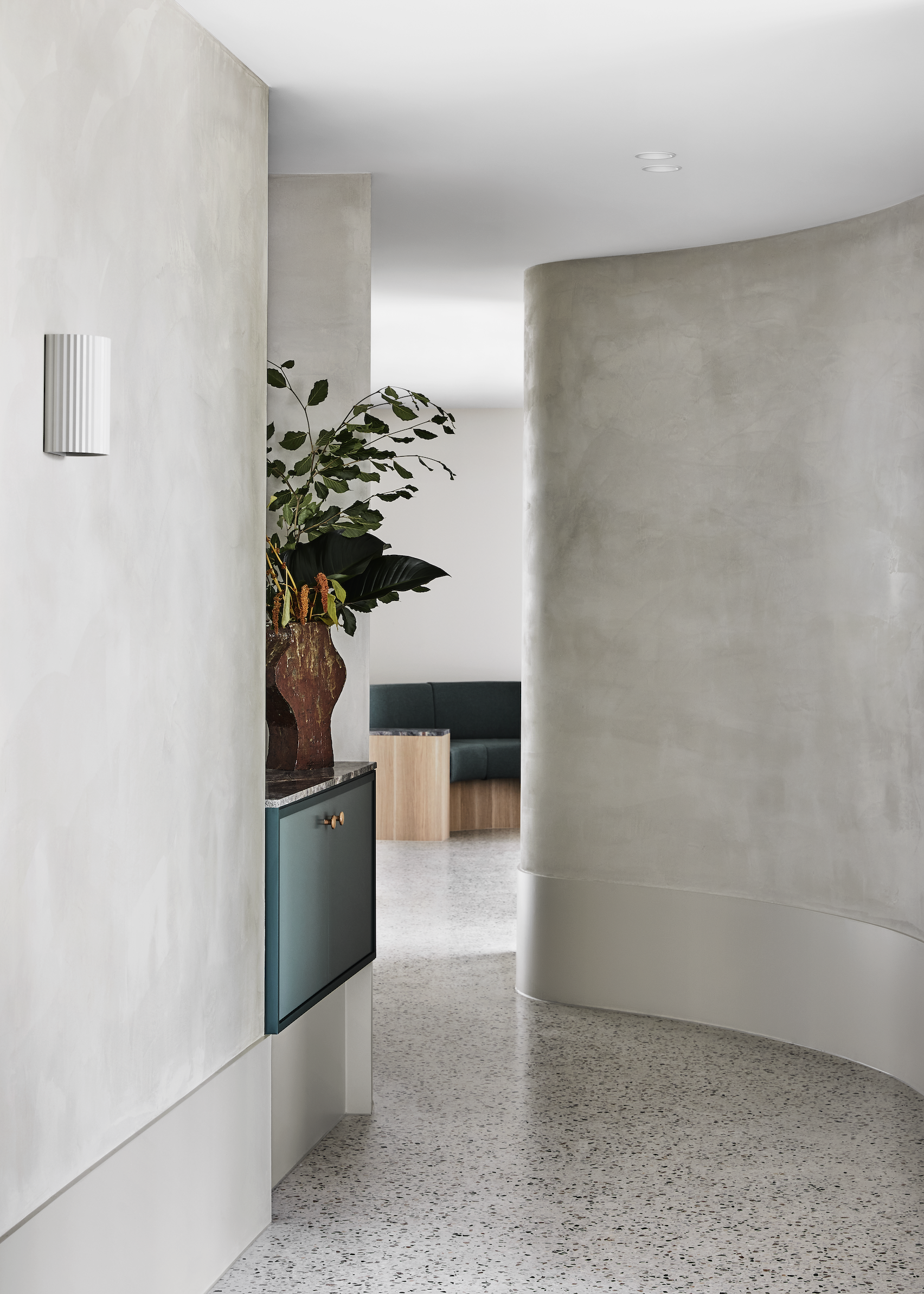
Corridor Relinque
Curved corridors encourage visitors to explore the space

The yoga studio was intentionally positioned close to the entrance facing the street, which allows plenty of natural light. A timber floor and ceiling were desigend to create a sense of warmth in the room.

Moving further into the spa area, the tones get darker to provide privacy. Spaces were arranged in a circular configuration, which “encourages a continuous experience of the venue”.

Relinque spa
The design aimed to have “textural earthines”

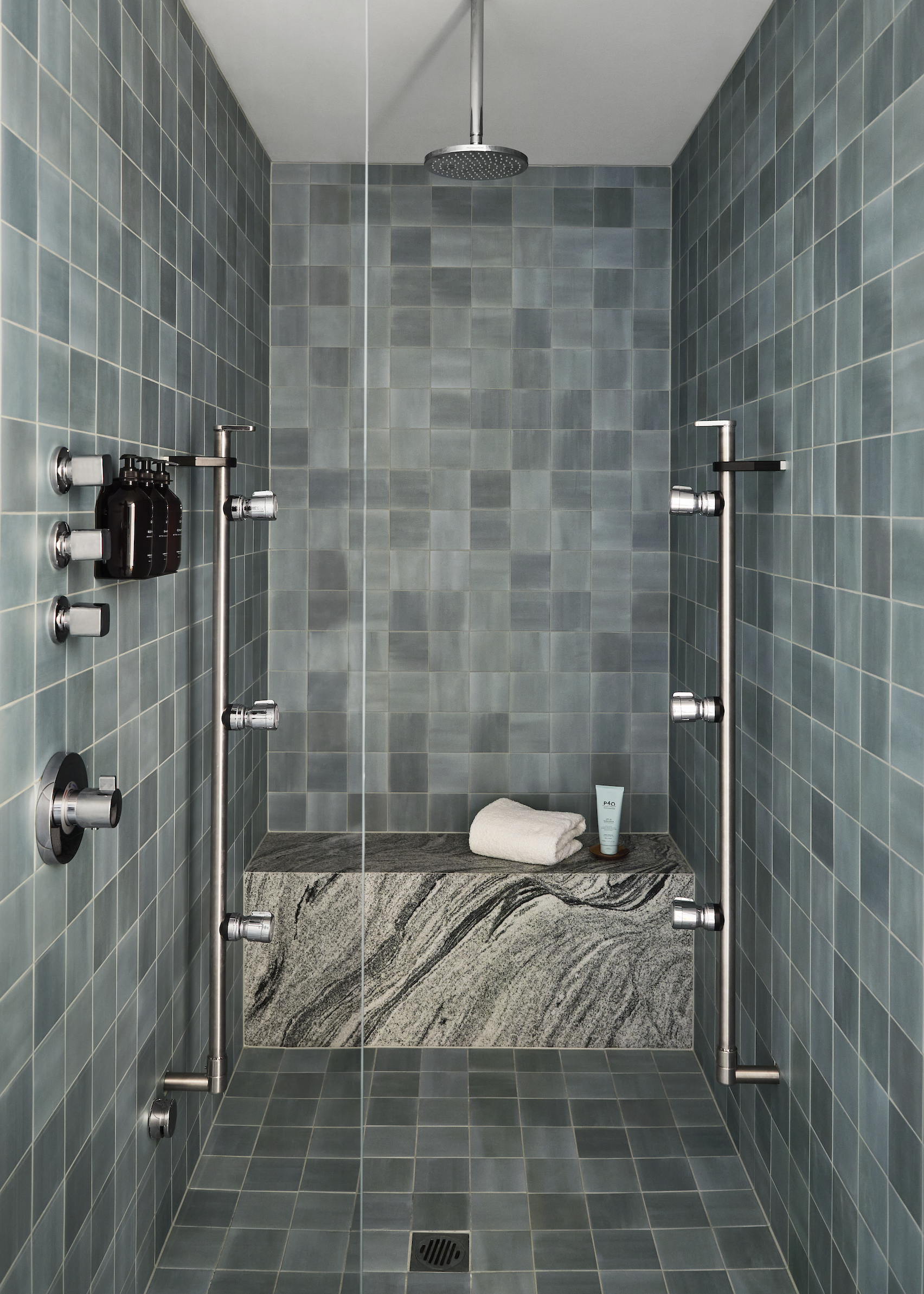
A curved corridor finished in polished plaster leads visitors to the spa area. Five individually-contained treatment rooms feature a deep rust tone, steam showers with sage green tiles and a granite shower bench.

Above the treatment bench, a backlit ceiling creates a halo around a circular acoustic fabric panel. The gently diffused light helps calm the mind throughout treatments.

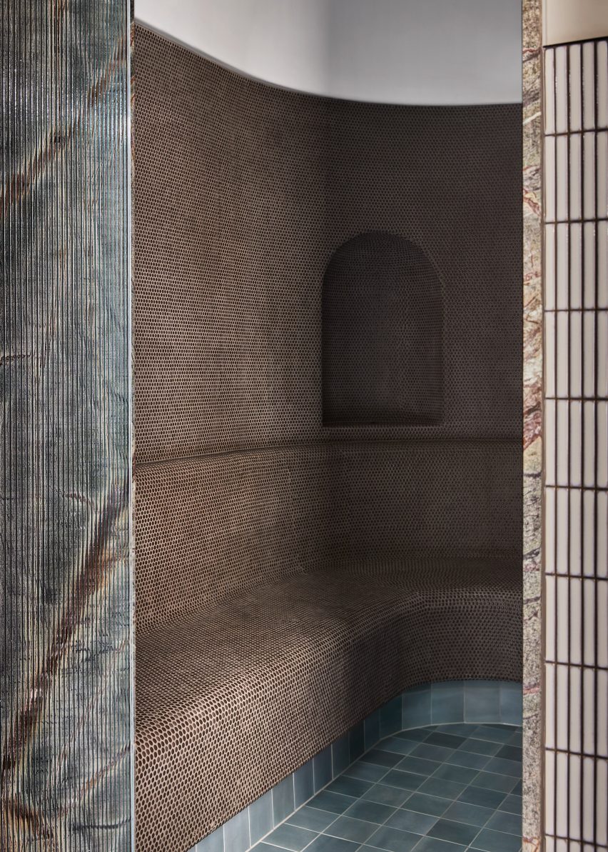
The rounded steam room is lined with mosaic tiles, facing directly onto an ice room centred around an ice well covered in Japanese ceramic tiles.

“Luxurious accents are balanced with raw and tactile materials, ensuring the space feels welcoming to all,”added Addison.

Shower Relinque
Steam showers are lined with sage green tiles and a granite shower bench

A palette of greens, greys, burgundy and earth tones were used throughout the space in response to the nature-themed design narrative, according to Addison.

Studio Tate is led by interior designer Alex Hopkins and Carley Nicholls. The studios previous work includes an open office design for Burnet Institute and a day-spa with calming interiors in Melbourne.

The Photography is by Lillie Thompson.

Reference

Beer-filled baths and straw beds feature in Brussels’ Bath & Barley spa
CategoriesInterior Design

Beer-filled baths and straw beds feature in Brussels’ Bath & Barley spa

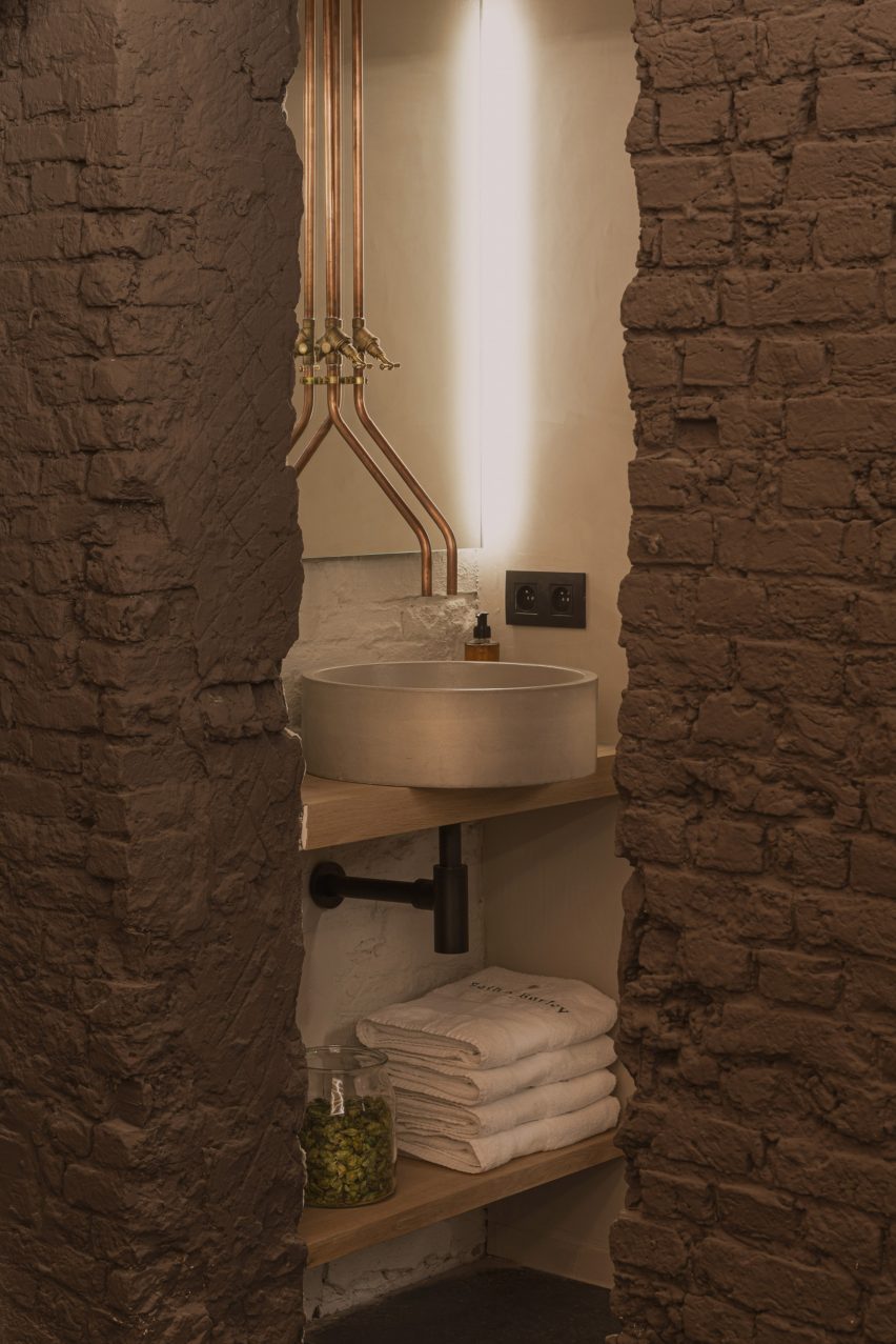
Set in a vaulted cellar in the old city centre of Brussels, Bath & Barley is an updated take on a traditional Czech beer spa from design studio WeWantMore.

Beer spas offer beer-infused spa treatments, most notably beer baths where guests soak in water mixed with hops, malt and medicinal herbs.

Straw beds in spa
WeWantMore has designed the Bath & Barley spa in Brussels

Bath & Barley is the “very first” beer spa in Belgium, according to local practice WeWantMore, offering a modern take on the traditional day spas.

“Beer spas are a tradition in the Czech Republic but not in Belgium, despite our nation’s rich beer culture,” the studio explained.

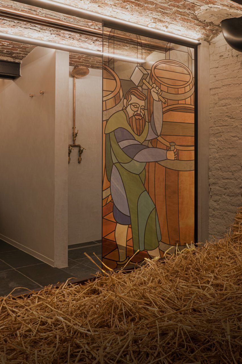
Spa stained-glass screen
Privacy screens were designed to look like stained glass

“We noticed that most Czech beer spas are more beer than spa – dark, lots of neon and an overall pub vibe,” the practice added. “This wasn’t our idea of a soothing wellness experience.”

“Instead, we decided to create a sense of relaxation and intimacy, but with a link to what distinguishes Bath & Barley: beer, bathing and Belgium’s beer.”

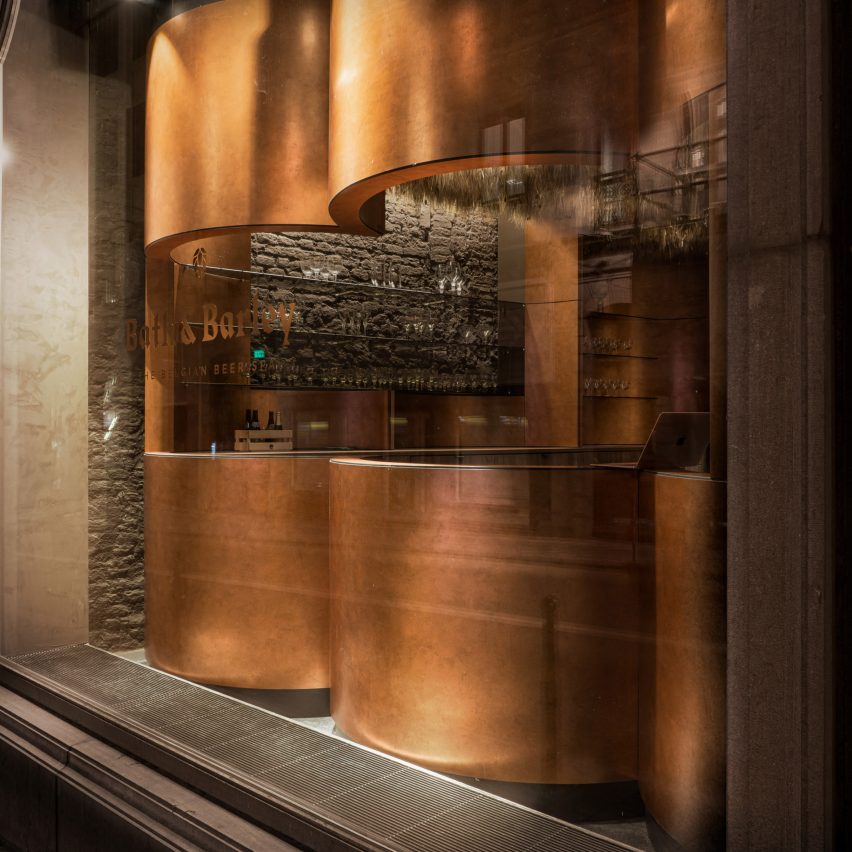
Bath & Barley spa
The spa’s reception is located on the ground floor

To realise this vision, the studio drew on a palette of raw natural materials such as lime stucco, wood and straw, alongside copper and stained glass to evoke Belgium’s medieval beer brewing culture.

The spa is split across two floors, with the oak bathtubs nestled into the vaulted basement and framed by draft beer machines, where guests can pour themselves a pint.

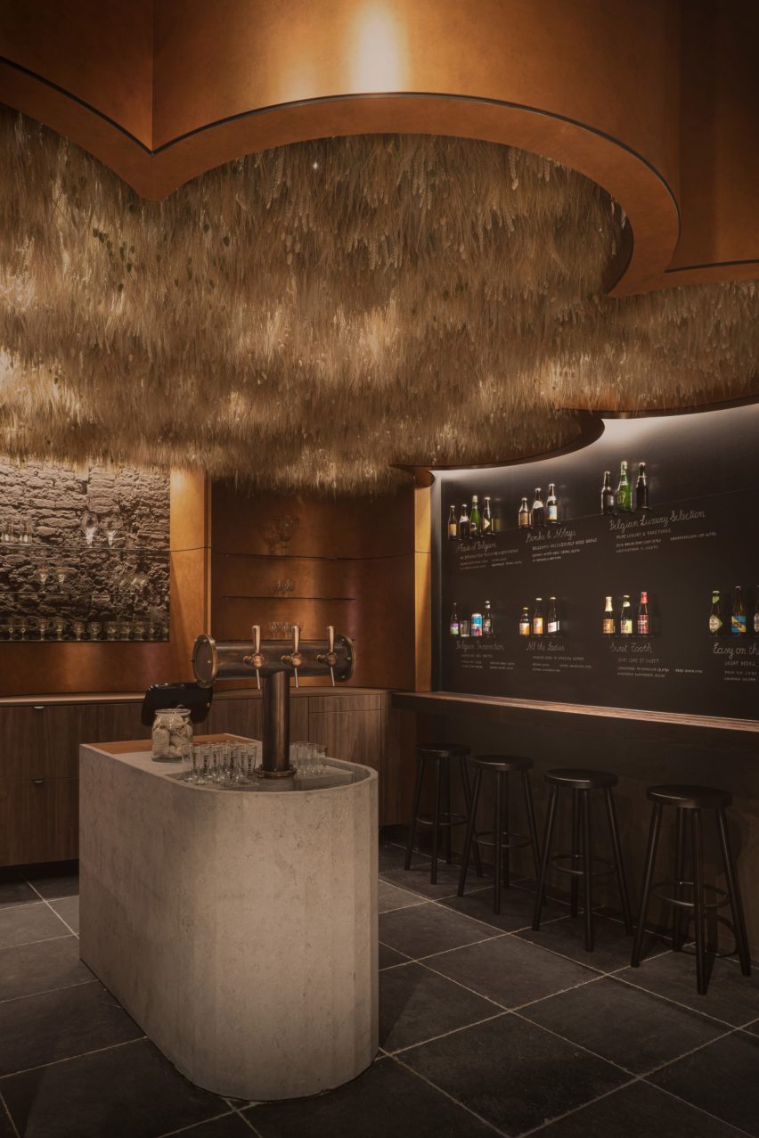
Bath & Barley spa tasting counter
A stone tasting counter defines the entrance space

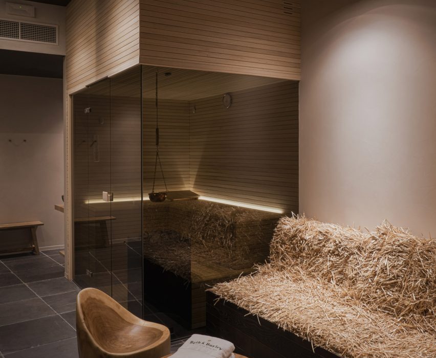
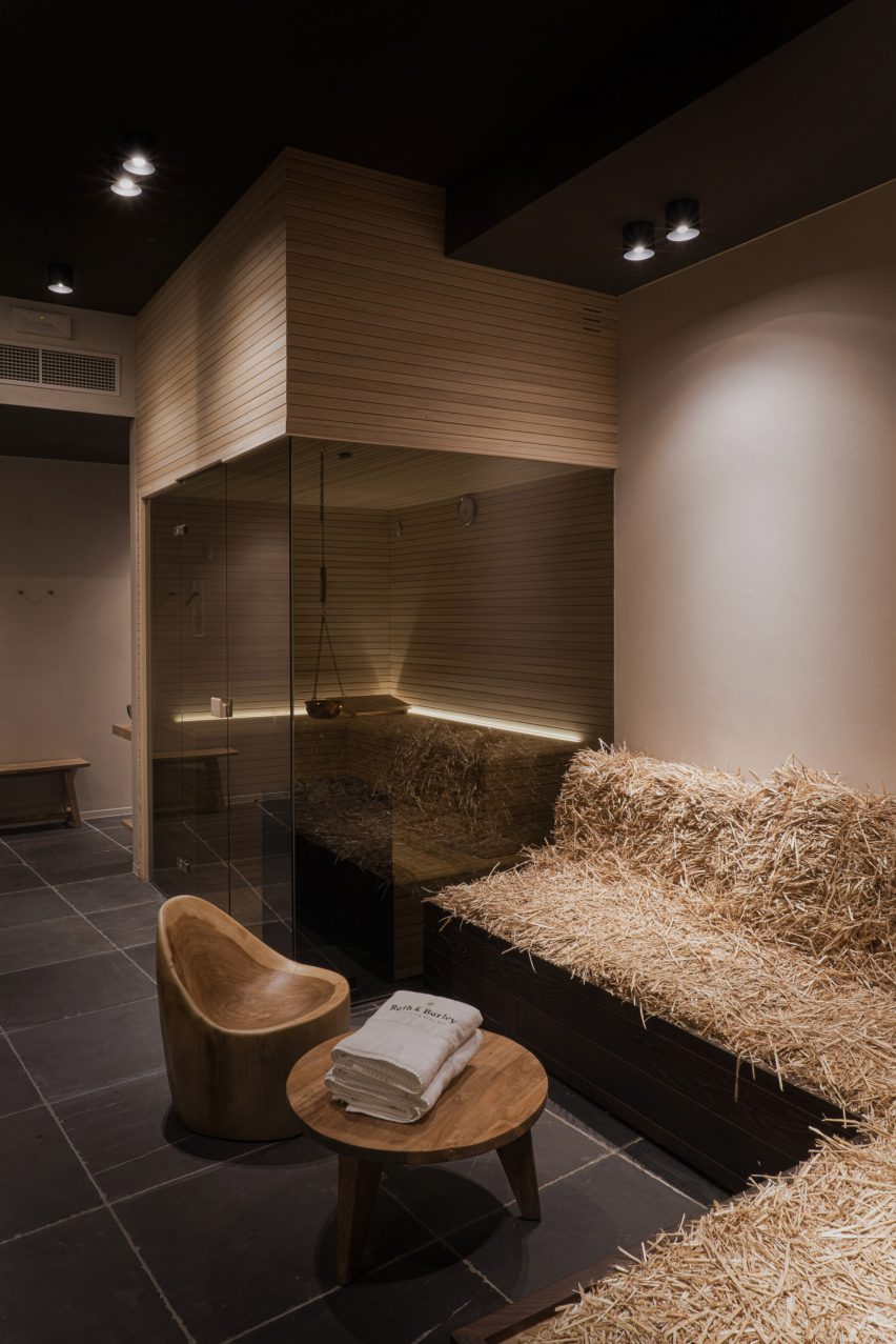
After the bathing ritual, guests can use the spa’s sauna or rest on a staw-upholstered lounge that allows them to “connect with nature”, according to WeWantMore.

“The design supports social wellbeing and creates a unique escape from the daily rush,” WeWantMore said.

The spa’s reception is located one level up on the ground floor and is wrapped in curved copper sheets to resemble the kettles used in traditional Belgian breweries.

Dried barley hangs from the ceiling above a stone tasting counter, where guests can taste a variety of beers and select the hops they want to add to their bath. 

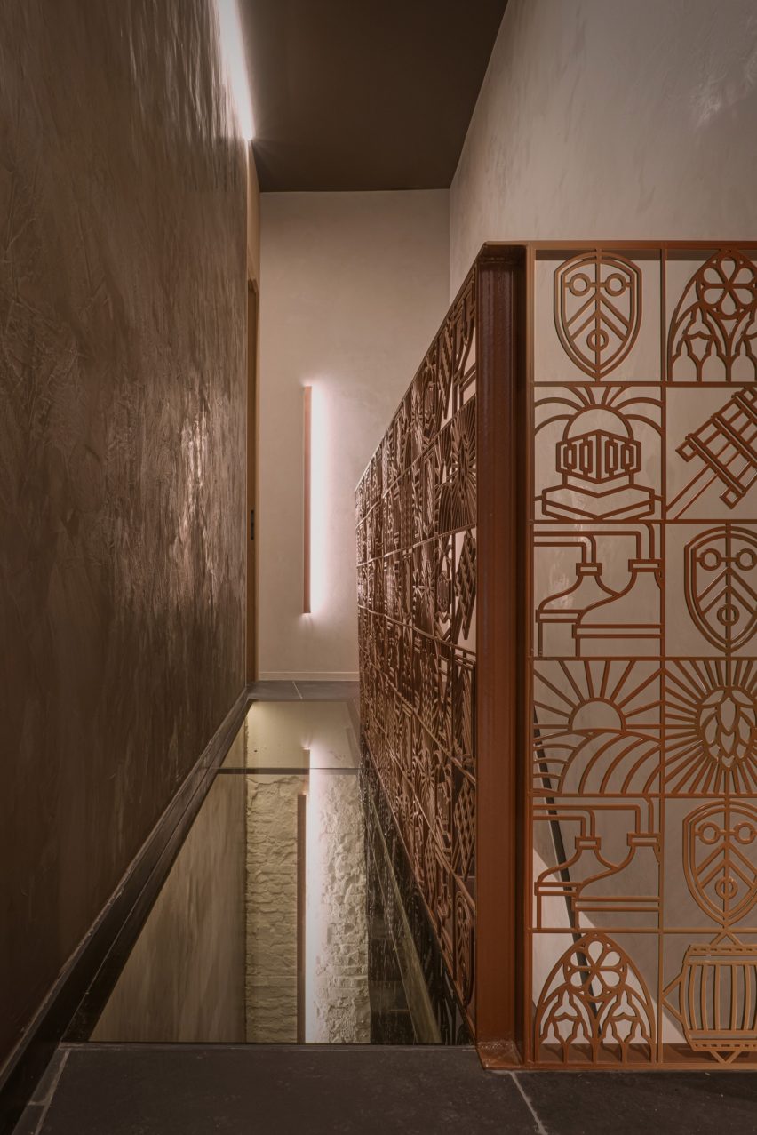
Brussels basement spa
Steel balustrades depict the different stages of brewing beer

“The natural scent of the dried barley branches dangling from the ceiling adds to the sensory experience and sets the mood,” said the studio.

Ecclesial illustrations from Bath & Barley’s visual identity are integrated throughout the interior in the form of privacy screens, which resemble stained-glass church windows, and steel balustrades that depict the different steps of the brewing process.

Spa interior by WeWantMore
Copper accents feature throughout the interior

Bath & Barley has been shortlisted in the leisure and wellness interior category of this year’s Dezeen Awards.

Other projects in the running include a hotel spa in the Maldives designed by Marcio Kogan of Studio MK27 and a Shenzhen cinema with a copper-lined lobby.

All images are courtesy of WeWantMore.

Reference

atmosphere spa forms under arched terrain in the mountainous alpine scenery
CategoriesArchitecture

atmosphere spa forms under arched terrain in the mountainous alpine scenery


1/7

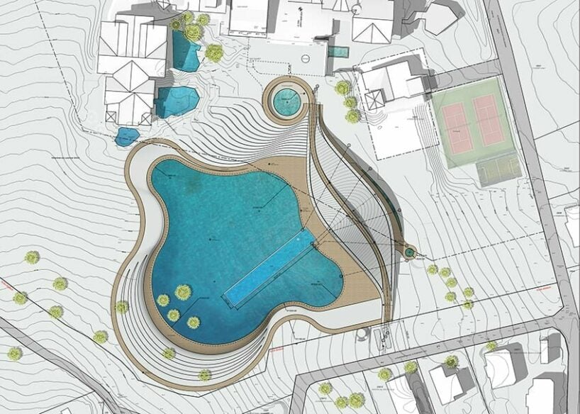
atmosphere master siteplan

atmosphere master siteplan

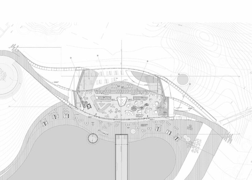
atmosphere ground floor plan

atmosphere ground floor plan

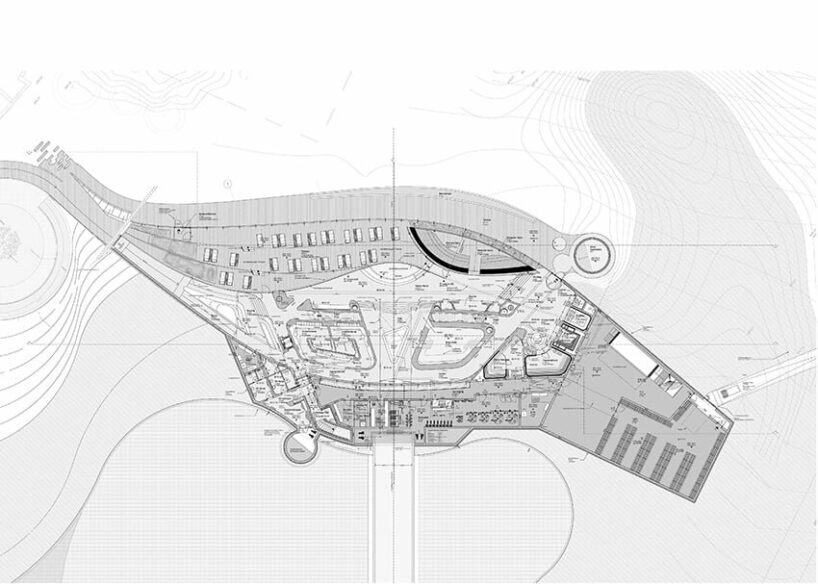
atmosphere first floor plan

atmosphere first floor plan

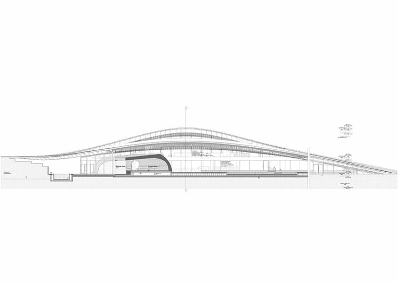
atmosphere longitudinal section A-A

atmosphere longitudinal section A-A

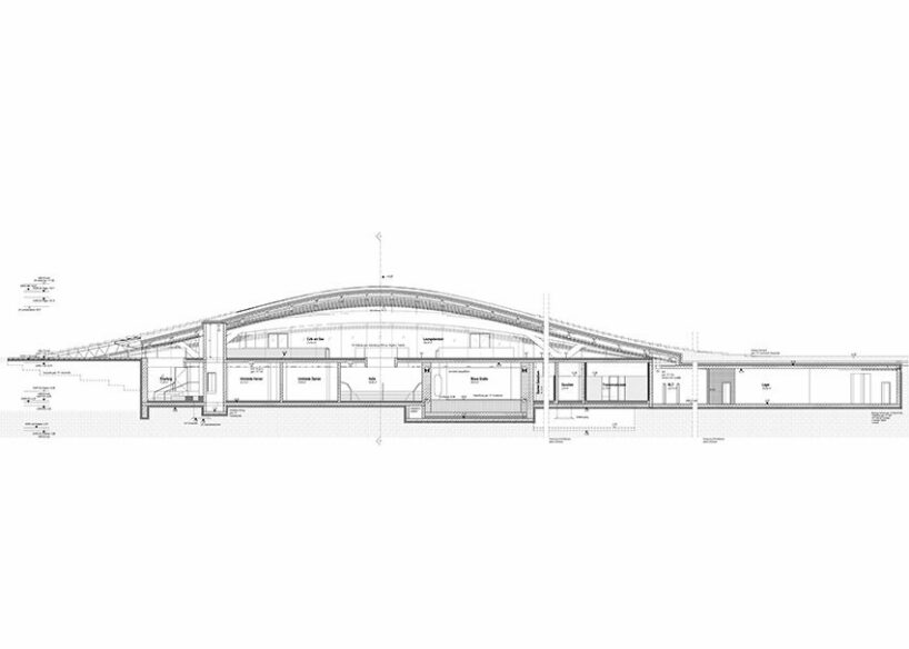
atmosphere longitudinal section B-B

atmosphere longitudinal section B-B

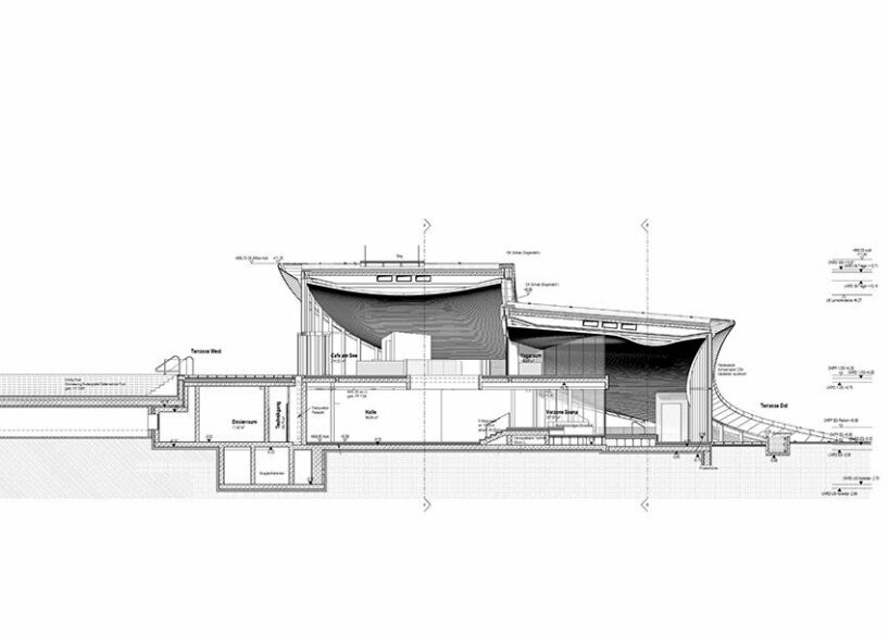
atmosphere cross-section

atmosphere cross-section

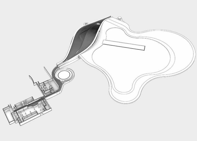
atmosphere axonometric view

atmosphere axonometric view

project info:


name: ATMOSPHERE by Krallerhof
designer: Hadi Teherani Architects GmbH | @hadi.teherani

client: Altenberger GmbH & Co.

KG principal: Hadi Teherani

partner in charge: Sebastian Appl

project leader: Patrick Hesse

head of design: Kaveh Najafian

3D development for construction: Kaveh Najafian, Patrick Hesse

architecture & design development: Patrick Hesse, Kaveh Najafian, Aysil Sahin, Neda Tahouri, Ludwig Ebert

interior design: Hadi Teherani Architects

head of interior design: Nicola Sigl

interior concept design & design development: Nicola Sigl, Paulina Pucliowska, Nayanika Bahia

competition & concept design: Kaveh Najafian, Patrick Hesse, Amir Khazan, Hamidreza Edalatnia Landscape

concept: Hinnerk Wehberg

location: Leogang, Austria


designboom has received this project from our DIY submissions feature, where we welcome our readers to submit their own work for publication. see more project submissions from our readers here.


edited by: christina vergopoulou | designboom


Reference

Atelier Right Hub replaces corners with curves in cavernous Hangzhou spa
CategoriesInterior Design

Atelier Right Hub replaces corners with curves in cavernous Hangzhou spa

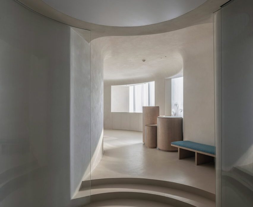
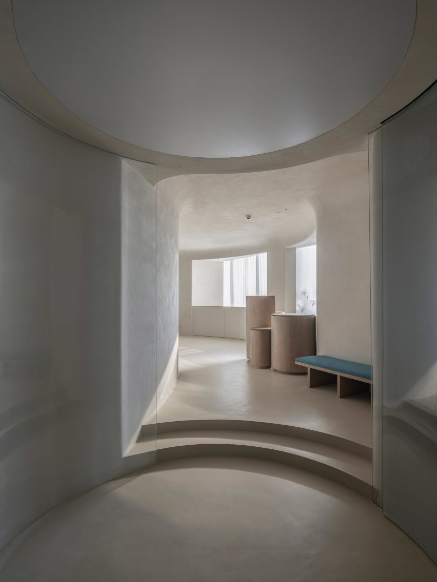
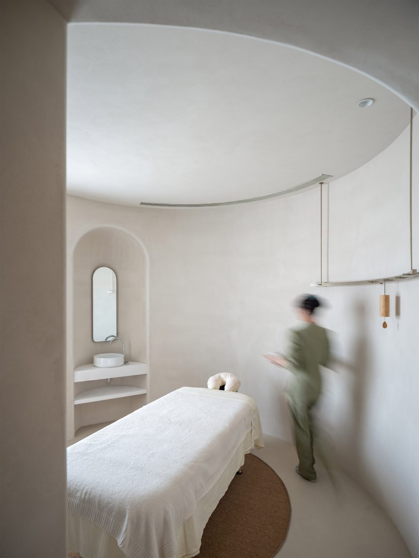
Chinese studio Atelier Right Hub created a cave-like spa in Hangzhou, China, with a network of interconnected, circular rooms and walls finished in white clay.


Located on the 13th floor of a commercial building by the Qiantang river in downtown Hangzhou, the Soul Realm Spa offers spaces for massage and meditation.

The interior of the Soul Realm Spa has a neutral palette
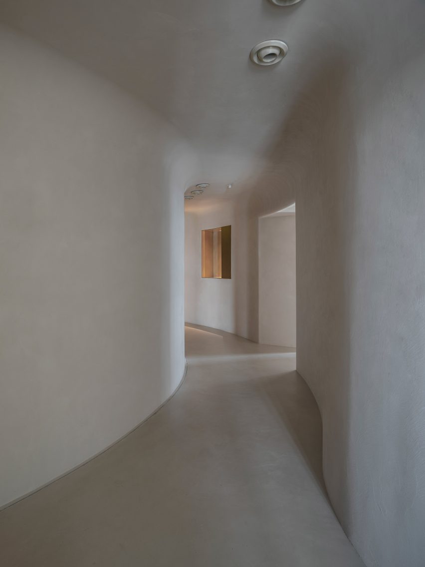
Curved walls lead visitors through the Soul Realm Spa

Local studio Atelier Right Hub was invited to create a calming interior within the building’s rectangular, 220-square-metre floorplan.

This was achieved by inserting a sequence of circular treatment rooms with curved ceilings into the centre of the plan.

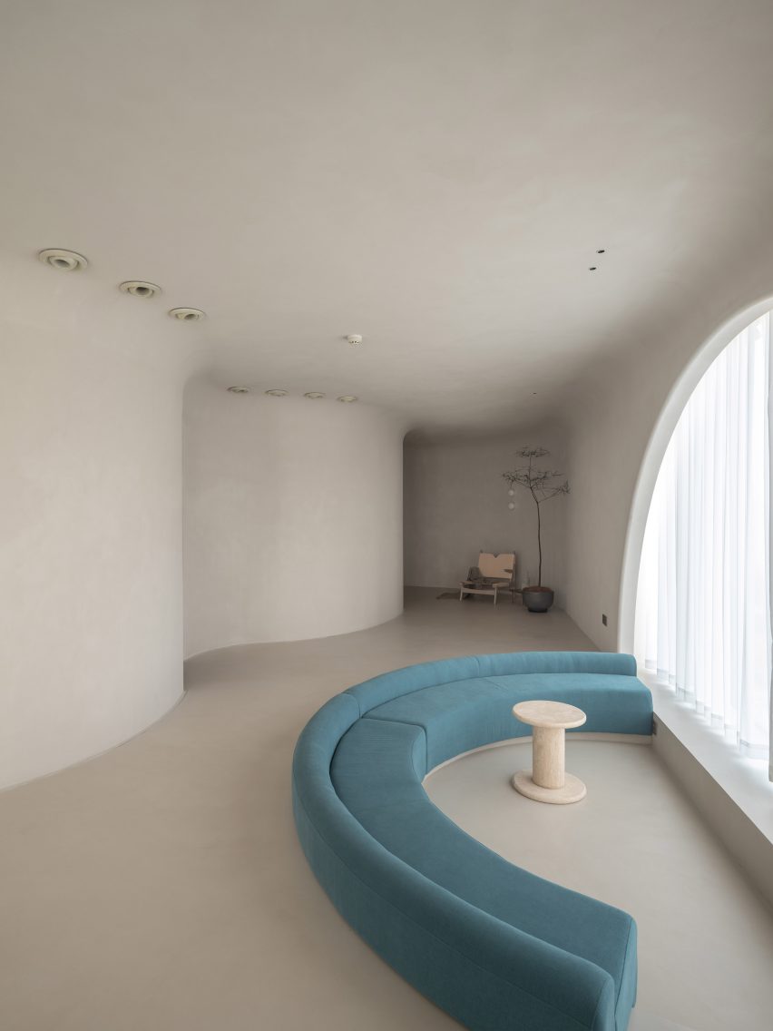
A blue sofa is located at the waiting area of Soul Realm Spa
A curved blue sofa faces a semi-circular window

“If we observe life carefully, we will find that straight lines are mostly found in man-made objects while natural objects are mostly curved,” the studio told Dezeen.

“Whether it is mountains or rivers and streams, they are curved and full of changes and they have more charm and vitality than straight lines.”

The sofa is sunken into the floor at Soul Realm Spa
The walls are finished in white clay

According to Atelier Right Hub, the circular plan was informed by the shape of traditional Tibetan singing bowls – a type of inverted bell used for meditation.

The walls, ceilings and floors are made from white clay and blend seamlessly together. They have a textured finish, which the studio likens to “walking barefoot on earth”.

“China used to be a country dominated by farming culture,” Atelier Right Hub explained. “Farmers mostly farmed barefoot in the fields and children often played barefoot as well.”

“These memories are both unfamiliar and longed for in modern cities. Only when you feel the earth barefoot will you let go of your defences – this is also a way we hope spa guests could enjoy real relaxation.”

A spa bed is located in the centre of a treatment room at Soul Realm Spa
Private treatment rooms have a circular design

Each massage room features a brass garment hanger and storage tray suspended from the ceiling, where clients can store their clothing and jewellery during treatments.

Curved clay walls also wrap the perimeter of the floor plan to create a curved corridor where the studio has positioned resting areas, a lobby and the foyer.

“The interior space is similar to caves,” said the studio. “The curved ceiling, streamlined walls and the visual axes that revolve around the twists and turns form a fuzzy space-time context that is difficult to synchronize with the outside.”

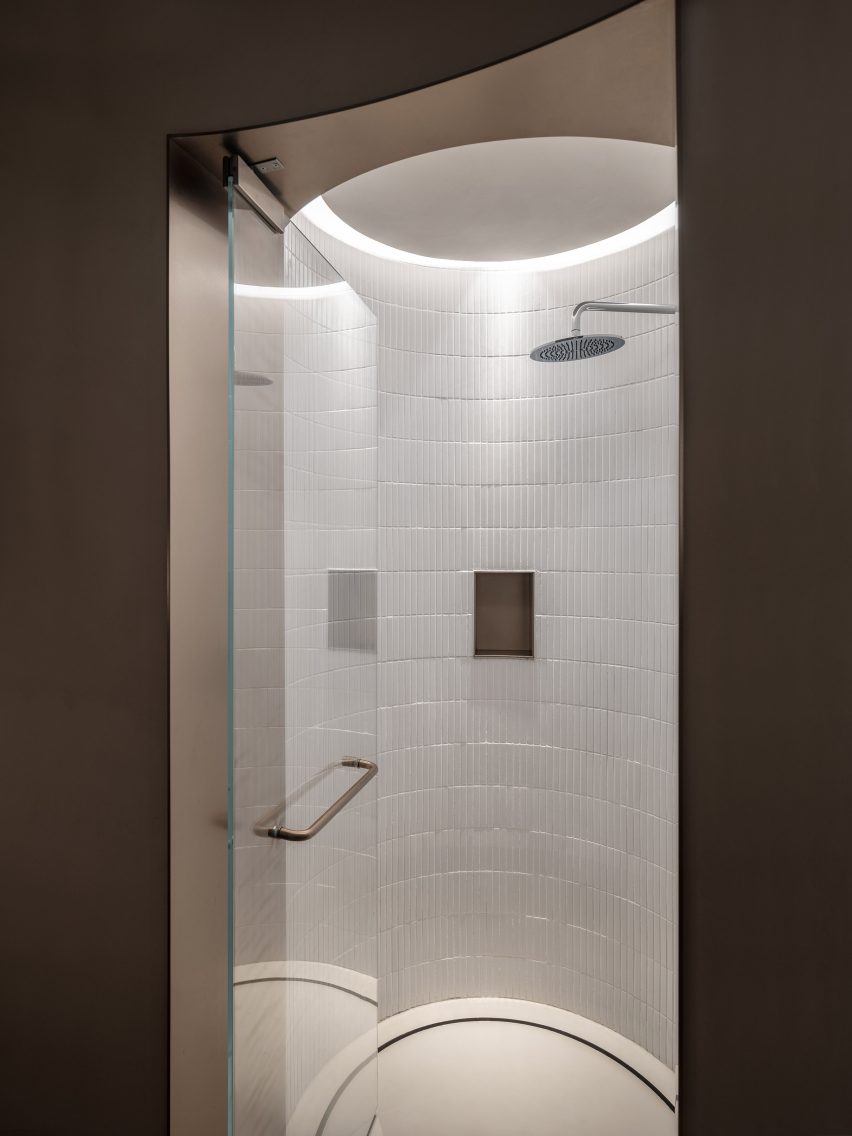
A glass door leads to a walk-in shower
Showers are fitted within a circular alcove

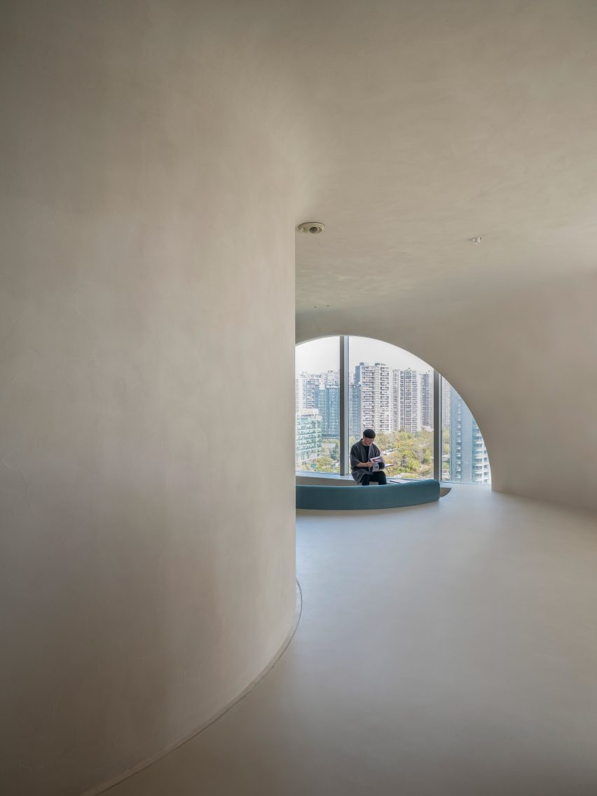
A series of large, geometric windows punctuate the corridor, including an arc-shaped window that illuminates a small resting area and reveals expansive views of the city’s downtown area.

Its form is echoed in the semi-circular sunken lounge with green banquette seating next to the window.

Walls and ceilings seamlessly blend into one
The spa was designed to have a cave-like look

Other cavernous spas around the world include the Europhia Spa by DecaArchitecture, which is carved into the base of a mountain in Greece, and a subterranean spa in Brooklyn, New York.

Photography is by Studio FF and Studio RH.


Reference