Retail Space of Zhima Health at the Universal Beijing Resort // Le Brand Strategy
CategoriesSustainable News

Retail Space of Zhima Health at the Universal Beijing Resort // Le Brand Strategy

Text description provided by the architects.

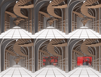
After a night-owl drink, you feel instantly refreshed, start walking in the air all the way up to the ceiling along the twists and turns of the spiral stairs and in front of your eyes is unfolding a world that sees no end…
While you chill out, you see four Chinese characters that read “Zhima Health” in front of a counter.

© Le Brand Strategy

© Le Brand Strategy

That’s when you let out a sigh of relief, realizing what happened was nothing but hallucination.

As a leader in the transformation and upgrade of time-honored brands, Zhima Health, a brand owned by the renowned TCM firm Tongrentang, draws the wisdom of the interior designer Wang Yong from Beijing Wuxiang Space Architecture Design Studio to put two stores-zero store in Daxing District and No.1 store in Shuangjing area-in place, highlighting a lifestyle trend that values both punk and health preservation among the young generation.

© Le Brand Strategy

© Le Brand Strategy

Along with the grand opening of the Universal Beijing Resort, a new retail store “Beijing Youli” under the support of Beijing State-owned Assets Supervision and Administration Commission also made its debut as the first suggested stop for the park visitors after they get off from the subway station. As a shop-in-shop, a disruptive new retail experience area for Zhima Health was designed by Wang Yong for an independent space of 30 square meters in the store.

© Le Brand Strategy

© Le Brand Strategy

1.Design Challenges of Re-upgradeTwo Tasks for the DesignerIn response to the call of “carrying on the essence while pursuing innovations” of time-honored brands proposed by Beijing State-owned Assets Supervision and Administration Commission, Beijing Youli emerged as a multi-brand store that gathers a portfolio of traditional brands that represent the humanitarian spirit of a city.

© Le Brand Strategy

© Le Brand Strategy

Its opening at Universal Beijing Resort has pooled nearly 30 local or national time-honored brands as well as other recognized ones, which, spurred by China Chic and together with other fashion brands, have formed a synergy as the new limelight at the new landmark.
With the experience of two existing stores, Zhima Health has taken consumption experience to the next level-on top of functionality and social networking, the space is expected to also offer an ever more critical emotional value for consumers, which is what Wang Yong must address as the first challenge.
The second challenge comes from the space itself-a 6.5m×4m box area of less than 30 square meters.

© Le Brand Strategy

© Le Brand Strategy

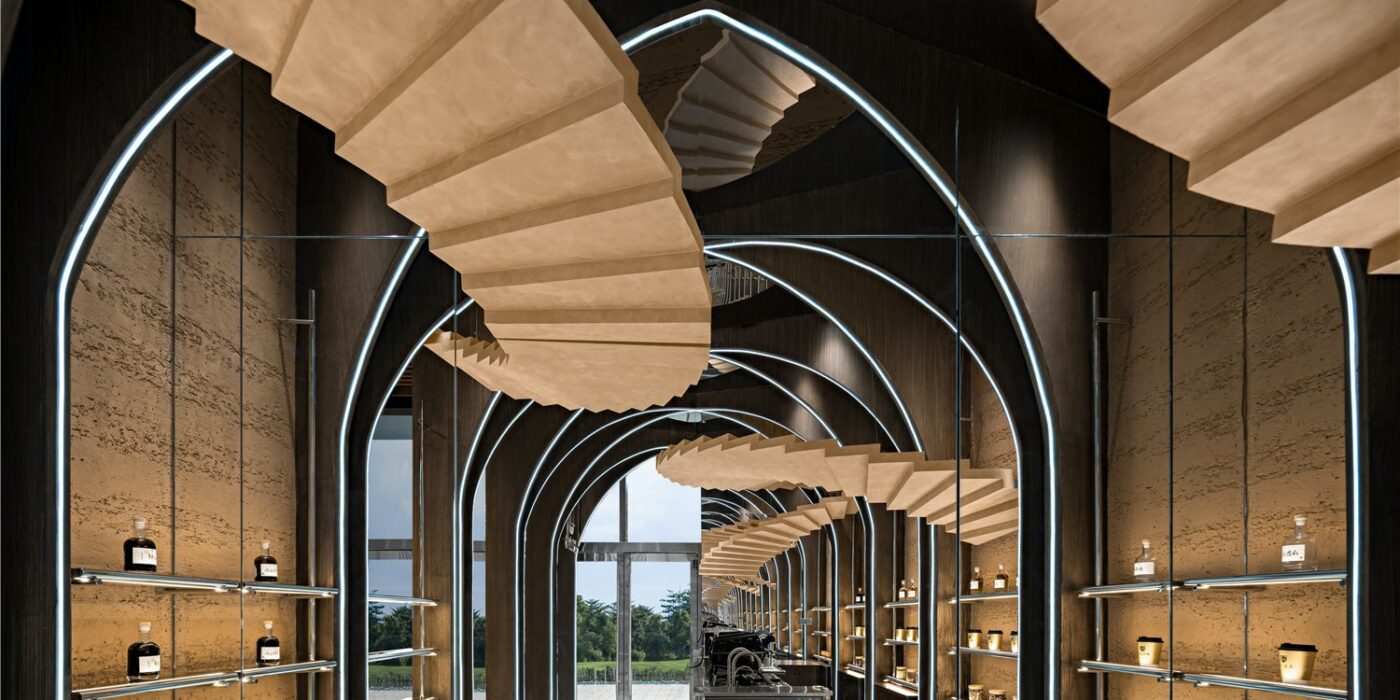
Given its relatively compact size compared to the other two stores, Wang Yong has to figure out how to minimize the “small” feeling of the confined space through the addition of a “fourth” dimension based on a 3D design concept.2.Design ConceptThe Uniqueness of the SpaceWhat Wang Yong had in mind was to target a certain customer group for Zhima Health with a brand new architectural style, which should conform with the culture of Universal Beijing Resort, cater to the diversified consumption preferences of the young generation, comply with the brand genes of Zhima Health and fit in the limited space.As a result, Wang Yong and his team decided to incorporate inspirations from Inception, multi-dimension, fashion and traditional brand genes into the design to deliver a space which is on the one hand fashionable and sci-fi and on the other light and friendly.As Zhima Health features the display and selling of light drinks in the quasi-concept store, Wang Yong, considering its finite space with a raised ceiling, worked out a light and 3D product arrangement plan and circulation design, resulting in a new retail space with a devotion to a sense of infiniteness and preservation of functionality.3.pace PresentationA 30㎡Metaverse Taking advantage of the high ceiling, Wang Yong deployed numerous towering wood arches, which were designed to intersect on the ceiling and then extend all the way down to the bottom of the rammed earth walls where product shelves were mounted.Four pairs of life-size wood spiral stairs echo each other overhead, threading through arches from a height and dominating the shop-in-shop.

© Le Brand Strategy

© Le Brand Strategy

The entire space, thanks to the arches and stair structures, resembles an unfolded accordion which is waking up the folded time and space.
On both horizontal and vertical dimensions, the use of mirrors enhances visual spaciousness. A whole glass on the ceiling and one side of the wall, together with the stretching structures that present a distortion in time and space, seems to have eliminated the boundary of the space and distorted time in a dazzling way.

© Le Brand Strategy

© Le Brand Strategy

With light projecting from underneath the ground and structured light belts on the arches, a metaverse of new retail space is throwing its arms wide open to all customers.4.New ValueBrand Genes That Combine Tradition and InnovationAs all century-old brands denote a particular trend or fashion in a certain era, the rise of China Chic is more of the rebirth of culture and value than cultural revival.

© Le Brand Strategy

© Le Brand Strategy

In particular, the irreplicable culture and spirit in the brand genes have enabled the reinvigoration of time-honored brands. From Goji Berry Coffee to Night Owl Drink, Zhima Health has achieved continued success, celebrating the everchanging time and the aspiring young generation and asserting its say as a new brand under a time-honored one in the modern era.

© Le Brand Strategy

© Le Brand Strategy

For any young person who is looking for a trendy and healthy night owl drink, Zhima Health is poised to provide a most authentic solution.
Building on Tongrentang’s brand recognition over the past few centuries, Zhima Health, through the concept zero store covering an area of nearly 20,000 square meters and the new retail social space of merely 30 square meters, is extending its antenna with innovation and courage ingrained in the brand to reach the future market.

© Le Brand Strategy

© Le Brand Strategy

To meet the demands of the new market and new consumption groups, it is brewing a new interpretation for the genes of its parent brand through space, for which Wang Yong has led the interior design–In hopes that the retail space at Universal Beijing Resort can strike a chord with the young customers, heralding a brighter future for Zhima Health albeit a small beginning through the combination of tradition and innovation.Project DetailsProject Location: Beijing, ChinaCustomer: Beijing Tongrentang Health Pharmaceutical CompanyTime of Design: September, 2021Interior Design: Beijing Wuxiang Space Architecture Design StudioWeb:www.wuux.netBuilding Type: CommercialLead Designer: Wang YongDesign Team: Wang Yong, Yu Yue, Jia Zhiyong, Zhu Chenxu, Tan Wei, Zhang Guiying, Beijing Wuxiang Space Architecture Design StudioPhotography: Zheng YanProject Planning: Le Brand Strategy AgencyCopywriting Agency: NARJEELING.

© Le Brand Strategy

© Le Brand Strategy

Retail Space of Zhima Health at the Universal Beijing Resort Gallery

Reference

Walk-Up Avenue is a public space for locals ​in Edinburgh by New Practice
CategoriesArchitecture

Walk-Up Avenue is a public space for locals ​in Edinburgh by New Practice

Architecture studio New Practice has transformed an unused site in the town centre of Craigmillar, Edinburgh, into a multi-purpose public space for the local community.

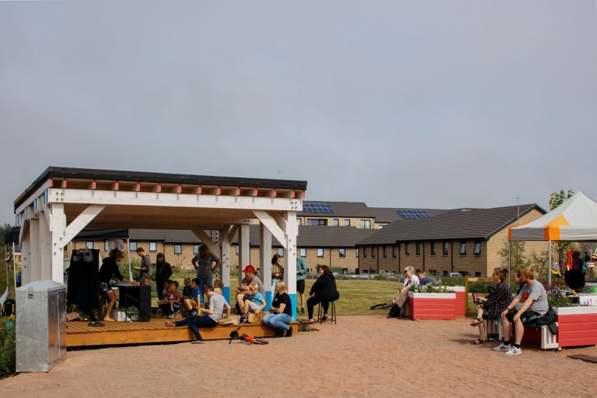
Named Walk-Up Avenue, the site comprises a flexible events space, green-roofed stage, communal garden, cafe and play areas that residents and community groups can use freely.

Walk-Up Avenue colourful timber batten
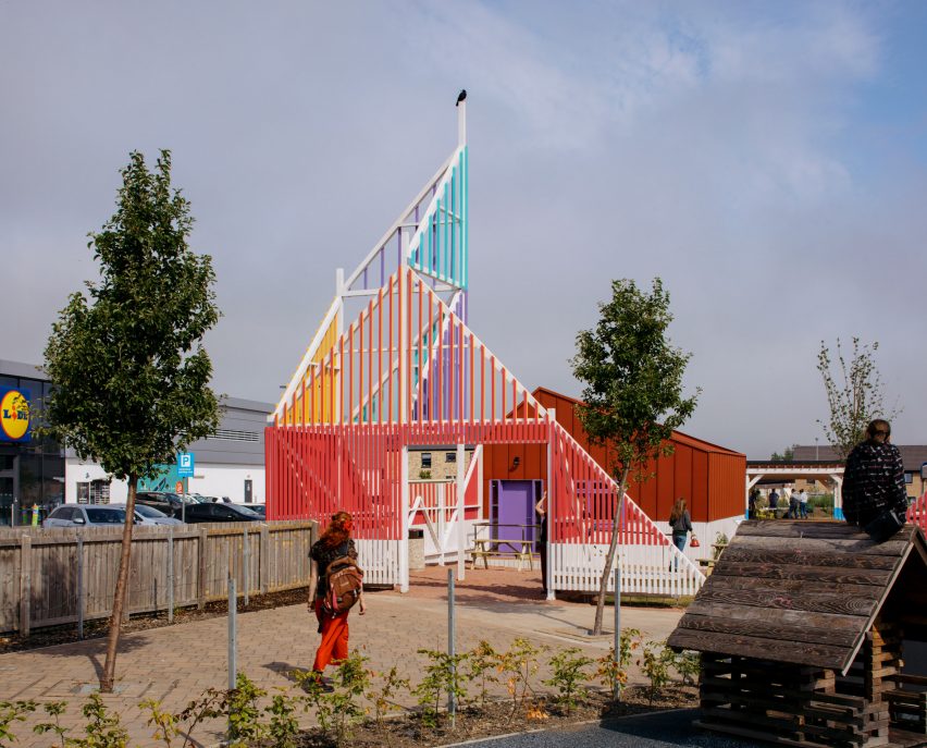
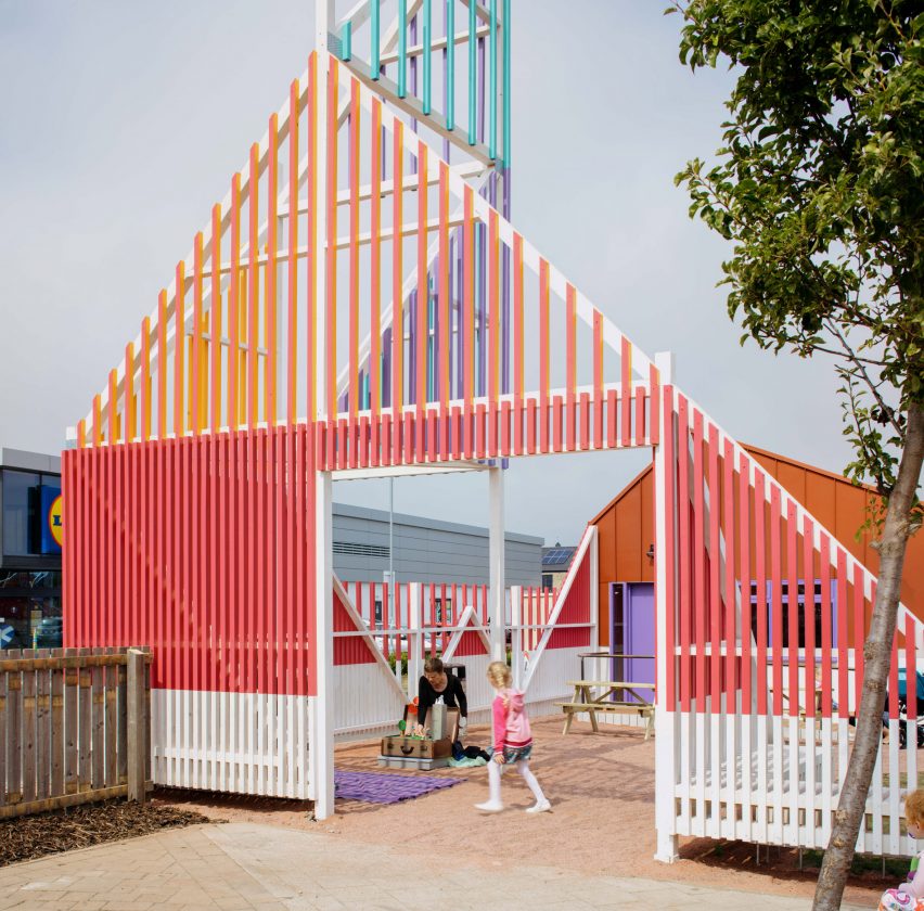
A tall timber structure marks the entrance

The space was constructed for the City of Edinburgh Council to support small businesses and become a recognisable meeting point in the area.

“Walk Up Avenue aims to create a welcoming and colourful space for the local community to come together and take ownership of for many years to come,” said New Practice.

Green-roof stage and event plaza in Craigmillar
Walk-Up Avenue includes a stage and events space for locals to use

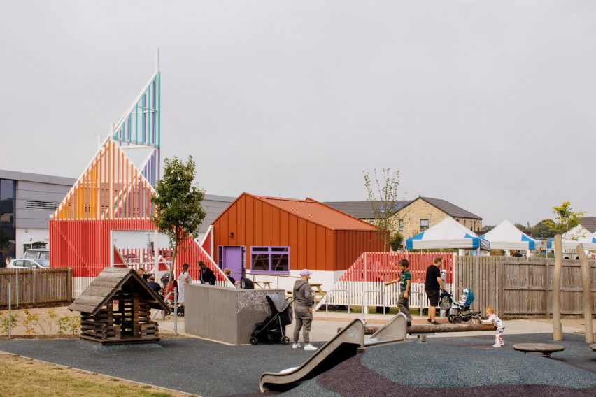
The site of Walk-Up Avenue is located next to a retail park, set back from the main road behind an existing play area.

Its entrance connects the plot to the playpark and guides visitors away from the road towards a planted area with picnic tables.

Colourful entrance structure made from timber battens
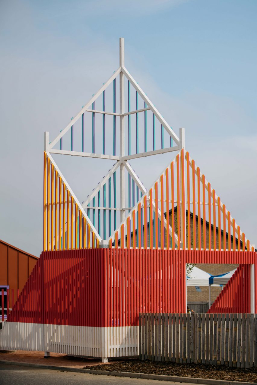
The “beacon” entrance is made from timber battens

According to New Practice associate Maeve Dolan, Craigmillar’s high street had become disjointed with stretches of inactive frontage.

To remedy this, the studio designed a brightly-coloured nine-metre-tall “beacon” made from timber battens to mark the entrance to Walk-Up Avenue.

Entrance structure and steel-clad cafe of Walk-Up Avenue by New Practice
A steel-clad commercial unit was added to help activate the high street

“We needed something big, bright and intriguing which clearly signalled a community use,” Dolan told Dezeen.

“It’s been labelled as the ‘beacon’ on our drawings since the beginning because that’s what we wanted it to act as to passersby, both those on-foot and moving at speed on the busy main road.”

Stage and events space designed by New Practice
The plaza includes seating and box planters

Also at the newly transformed site is a steel-clad structure with a flexible interior and cafe amenities, which New Practice designed for local businesses to help increase activity on the high street.

The building is leased to the Trade Unions in Communities (TUIDC), which intends to run the cafe and use the space to organise educational and employment programmes.

Further into the plot are a green-roofed stage and a plaza with box planters and seating, which neighbourhood groups are encouraged to use to organise their own events.

“Walk-Up Avenue is about creating a lively town-centre gathering place,” said Dolan.

“It is not a prescriptive space but instead provides the foundational infrastructure that invites the community to make use of it as they require, whether that be for rest, socialising, play, exercise, performance, small-scale retail or growing and gardening,” she continued.

Beacon timber entrance at Walk-Up Avenue by New Practice
The project was designed for the local Craigmillar community and visitors

With funding from the government agency NatureScot, infrastructure that helps to create wildlife habitats and prevent flooding was incorporated into the landscaping, including rain gardens, swales, sustainable drainage systems and deep gutters that double as a drinking source for animals.

“The blue-green infrastructure was funded by NatureScot with the aim to produce an educational space where people could see all of these items working together and understand their benefits,” said Dolan.

View of play area in Craigmillar
The entryway connects Walk-Up Avenue with the neighbouring playpark

While offering a public space for local businesses and community groups to flourish, the space is hoped to support the wider regeneration of the Craigmillar area.

It also contributes to Edinburgh’s 20-minute neighbourhood strategy, a scheme that aims to provide all local residents with access to amenities within a short walk or cycle from their homes.

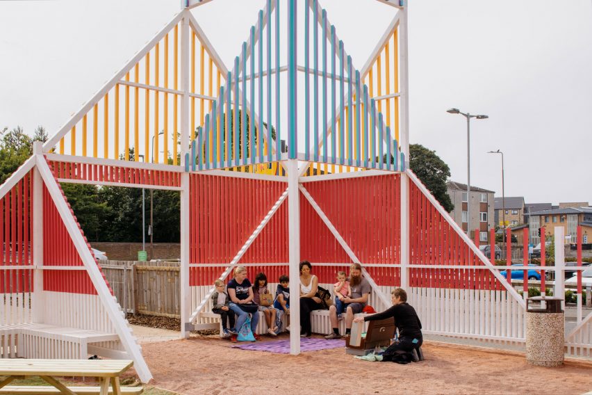
Colourful timber batten structure with seating by New Practice
Seating is added throughout the project

The opening of Walk-Up Avenue coincided with the Craigmillar and Niddrie Community Festival, which saw the plot being used for music and theatre performances and a craft market.

“During this day the most interesting thing was watching how local residents accessed the site, coming through both the formal entrance under the beacon but also filtering in via the soft boundary to back lanes and their private back gardens,” said Dolan.

Another project recently completed by New Practice is the renovation of Kinning Park Complex, a former school building in Glasgow that was saved from demolition.

The photography is by Will Scott.


Project credits:

Architect: New Practice
Landscape architect: Liz Thomas
Construction contractor: Bridgewater building solutions
Quantity surveyor: Currie & Brown
Structural engineer: Will Rudd
Building services engineer: Max Fordham

Reference

The New Venture X Office by Studio+ Is a Masterclass in What Makes a Co-Working Space Great
CategoriesArchitecture

The New Venture X Office by Studio+ Is a Masterclass in What Makes a Co-Working Space Great

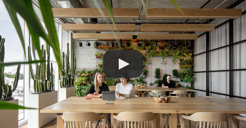
When Studio+ began designing the new office space for Venture X, the firm asked itself the question: “What makes a co-working space great?”

Studio+ figured that inspiring creativity in a workplace takes more than luxurious finishes and the right furniture but requires above all an understanding of the psychology behind great work. The firm took notes from the Venture X team — who have designed and built over 50 facilities around the world — and translated their lessons into a design that is both fresh and homey.

Read more about the project here:

Read More About the Project

Popular Choice, 10th Annual A+Awards, Coworking Space

Reference

FADAA uses bio-concrete screens to shade D/O Aqaba retail space
CategoriesInterior Design

FADAA uses bio-concrete screens to shade D/O Aqaba retail space

Crushed shells were used to form the bio-brick partitions at this store for a decor brand in Aqaba, Jordan, by architecture studio FADAA.

Designed by the Jordanian studio for Decoration One, the D/O Aqaba retail space is a flexible showcase for the local brand’s craft-focused homeware and ornaments.

Objects on display in the D/O Aqaba store
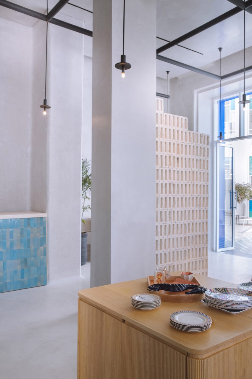
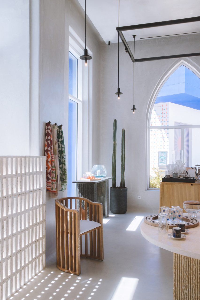
Bricks made from crushed shells act as sun shades and spatial dividers in the D/O Aqaba store

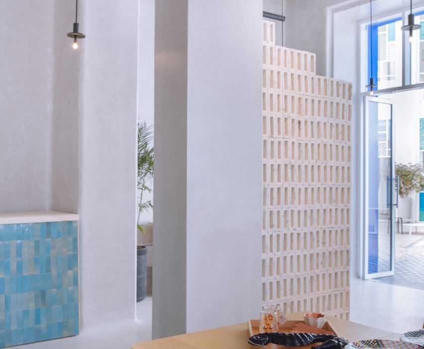
To protect the interior from the harsh south sun, the studio implemented partitions of stacked hollow rectangular bricks based on the traditional mashrabiya screens found in Islamic architecture.

These bricks are made from the shells of oysters, mussels and clams left over as waste from the coastal city’s seafood restaurants.

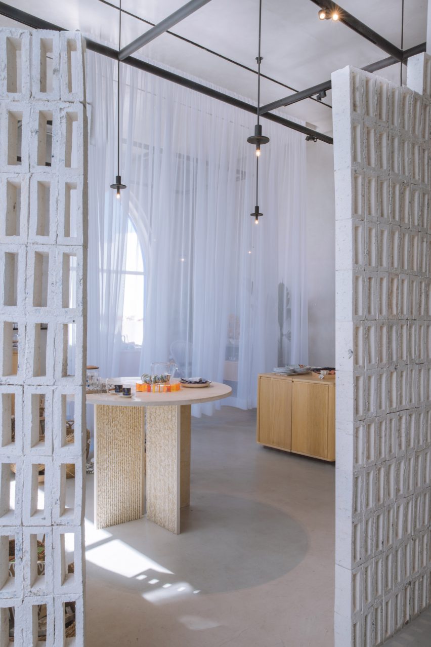
Bio-brick screens used as spatial dividers
The bio-bricks are stacked into gridded screens

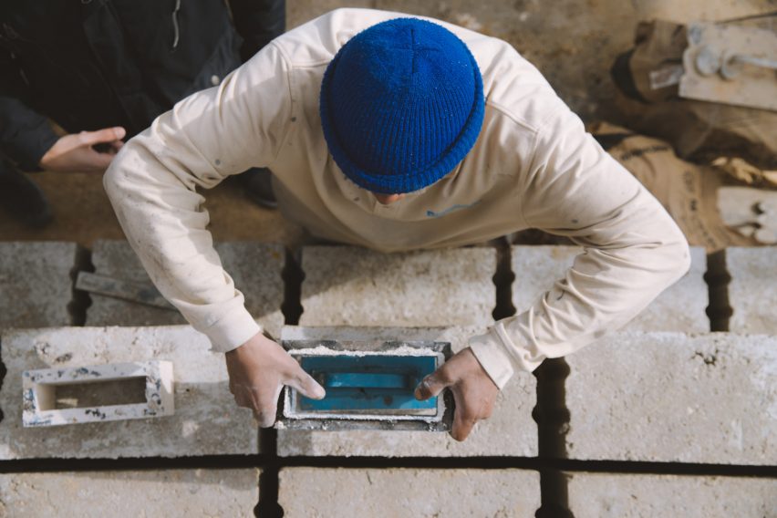
The shells were crushed and used as aggregate for a bio-based concrete that sequesters the carbon from the molluscs’ protective calcium carbonate coverings.

This material is pressed into a mould to form the brick shapes, dried to harden, and finally assembled into the gridded screens.

Store interior with furniture and displays

As well as shading the shop, the partitions help to divide the boutique and guide customers around the interior.

“Working alongside Decoration One’s craftspeople, a materiality-driven approach created the concept of a flexible retail store that embraces craft and low-carbon materials,” said the FADAA team, led by architects Bisher Tabbaa, Sarah Hejazin and Qussai Yousef.

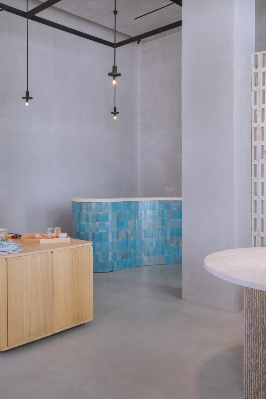
Sales counter clad in blue tiles
Colour is introduced through blue zellige ceramic tiles cladding the sales counter

Lime-plastered walls and native plant species also feature in the store to create a “healthy indoor environment”.

To accommodate Decoration One’s ever-changing collections, modular oak tables and sheer curtains can be moved and rearranged to organise the space as desired.

More tables, made from hand-chiselled local basalt and limestone, contrast the wood furniture and offer alternative ways to display the products.

A splash of colour is introduced by the zellige ceramic tiles that clad the curved sales counter.

Crushed shells form an aggregate for a bio concrete that is moulded into bricks
The bio-bricks are formed in moulds and feature hollow centres

“Embracing the craft nature of the project as well as economically supporting local industries, materials such as zellige and mother of pearl inlaying were used throughout the design,” FADAA said.

D/O Aqaba is shortlisted in the Sustainable Interior category for this year’s Dezeen Awards, along with projects including a restaurant in London and an office in Tokyo.

The bricks offer a sustainable alternative
The crushed shells form aggregate for the bricks and are visible across the surfaces

Bio-bricks are growing in popularity as a sustainable building material and a variety of compositions have been trialled over the past few years.

Bricks made from mushroom mycelium, sugar cane, charcoal and even human urine have all been put forward as environmentally friendly options.

The photography is by Bisher Tabbaa.

Reference

Urban flyover converted into playful community gathering space
CategoriesSustainable News

Urban flyover converted into playful community gathering space

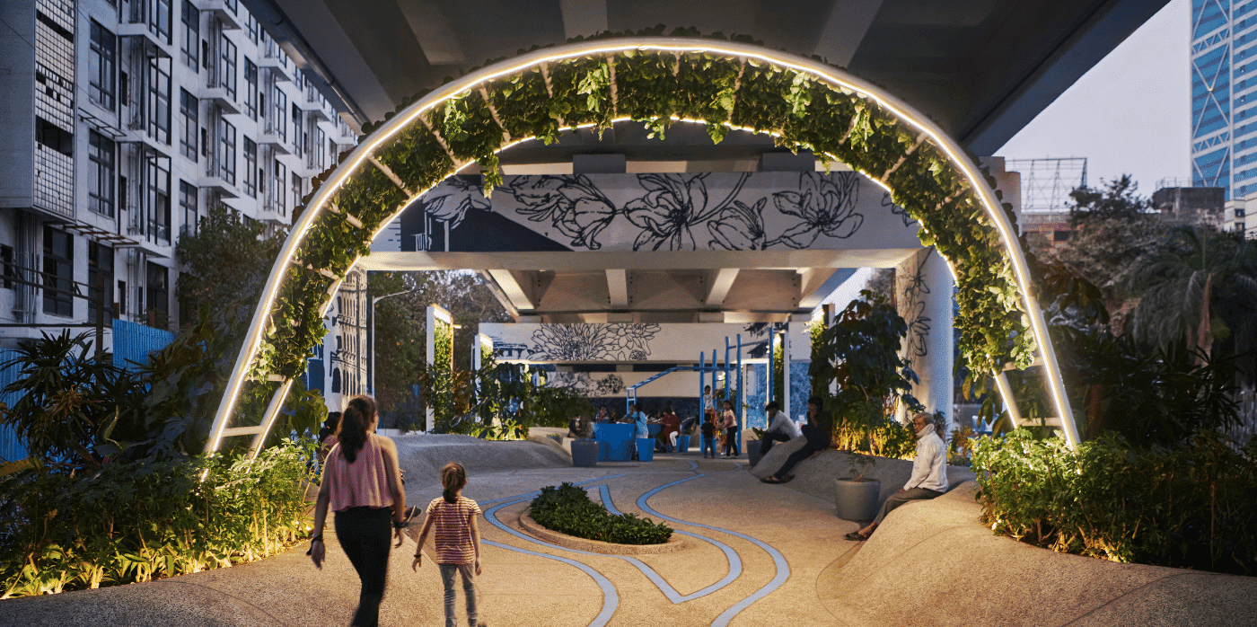
Spotted: Unlit, unused, dirty, and often unsafe locations are almost always easy to find in a city. Imagine, instead, how much beauty could be brought into the world if those underutilised spaces were multi-use community hubs. Mumbai architects StudioPOD, along with Dutch designers MVRDV, turned that idea into reality with the One Green Mile development directly below the Senapati Bapat Marg flyover in Mumbai.

The two studios were tasked with transforming 1,800 metres of the 11-kilometre-long space into a communal hub for recreation, meeting, reading, and performing. Now well lit, painted a bright white, and entwined with greenery, 3D shapes, and public art, the One Green Mile project provides a blueprint for making exceptional use of deserted urban areas.

Screens and archways of plants throughout the space help lower surrounding temperatures, reduce noise from traffic, and improve air quality for local residents. With bike paths, outdoor gyms, and places to gather and sit, the reinvigorated concrete barriers and roof have become a beautiful addition to the city, rather than an eyesore, bringing accessible fun into everyday urban living.

Developers are increasingly incorporating multi-use spaces into their plans, with Springwise spotting projects that range from entire neighbourhood updates to a garden footbridge that provides renewable energy and growing space for local restaurants.  

Written by: Keely Khoury

Email: office@mvrdv.com

Website: mvrdv.com

Reference

6 Simple Ways To Soundproof a Space
CategoriesArchitecture

6 Simple Ways To Soundproof a Space

The A+Product Awards is open for entries, with a Main Entry Deadline of June 24th. Get started on your submission today! 

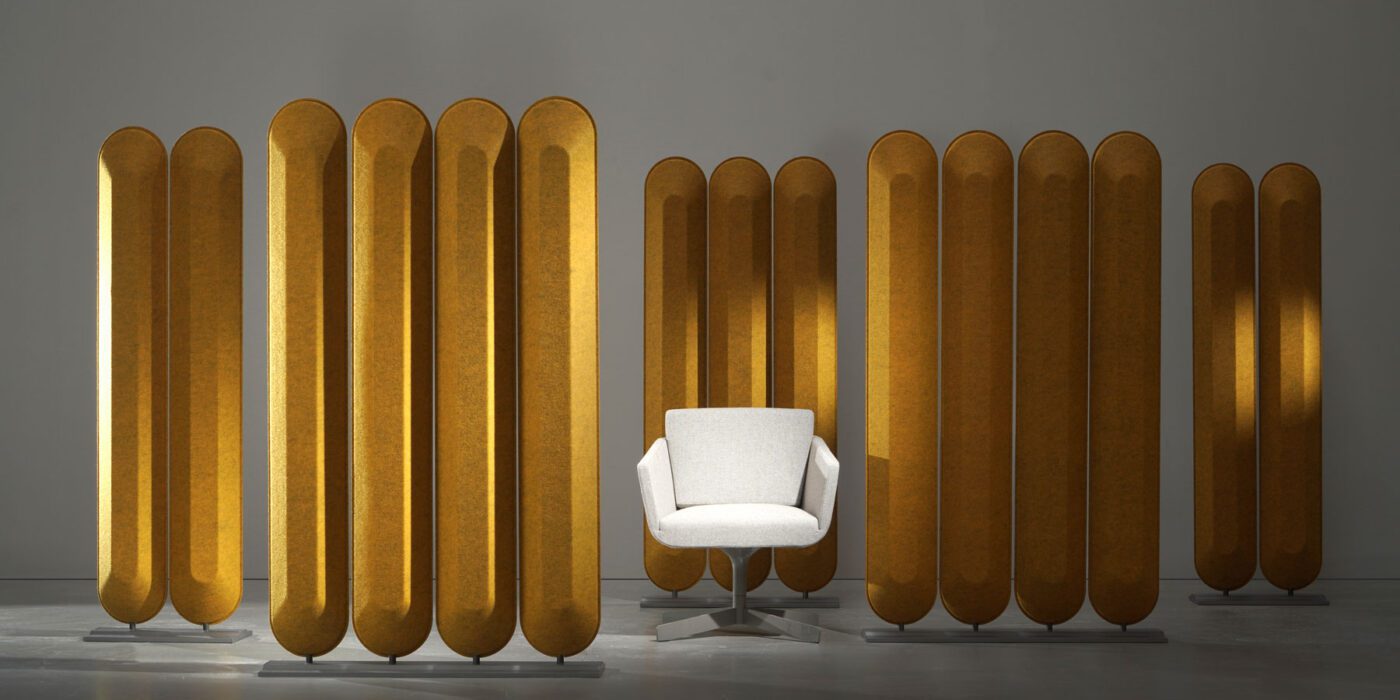
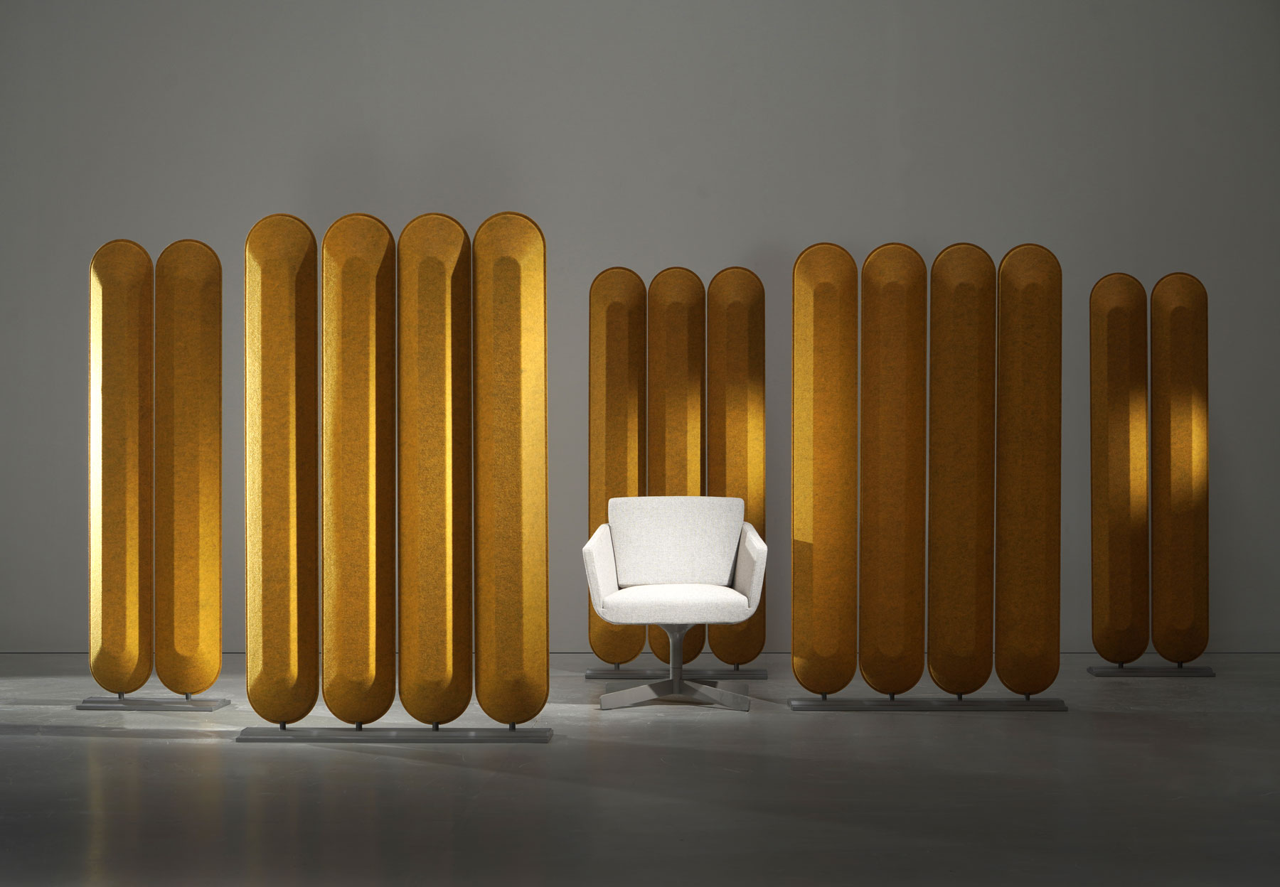
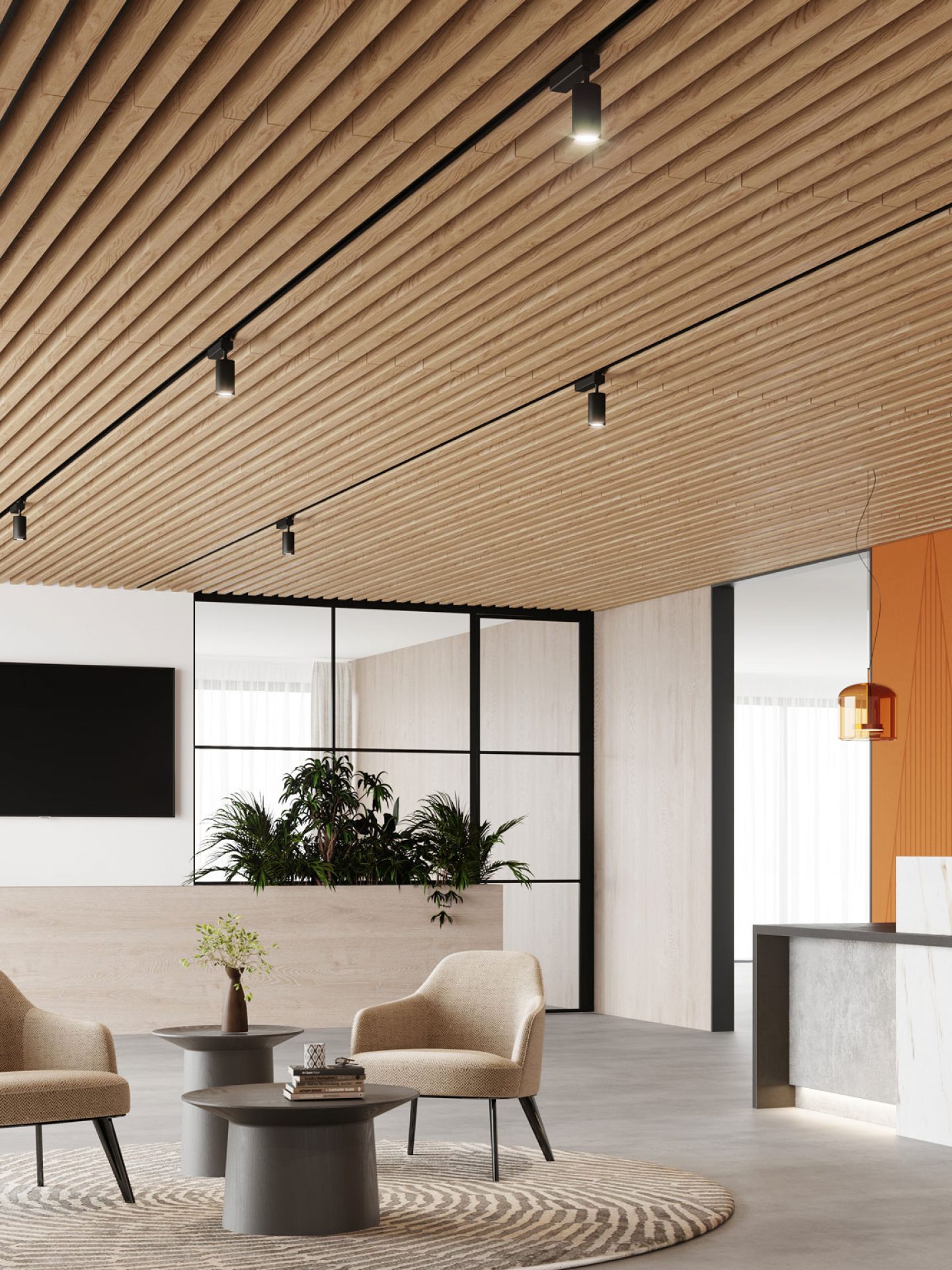
In today’s competitive real estate market, large square footage is hard to come by and highly-priced. Today, smaller square footage is the norm and when living in close quarters, dwellers often pay more attention to soundproofing their tight space. The soundproofing process is rather sophisticated and there are countless products on the market to choose from. From Feltouch’s Make Up Divider panels that soften acoustics, Acoufelt’s SoftenUp Ceiling System that is aesthetically pronounced and softens interior acoustics to TURF Design’s Scanlines acoustic wall panels that double as decoration and noise-control, soundproofing options are abundant. What is more, all pay close attention to the four soundproofing elements: decoupling (vibration), absorption (air), mass (weight) and damping.

However, seeking professional help and investing in high-end products is a large investment and oftentimes off-the-table for those renting or on a budget. Thankfully, there are many inexpensive DIY solutions to help muffle sound, decrease vibration and ultimately, create a more enjoyable living environment. Listed below are six measures that will help keep out noise, keep in sound and improve a room’s overall acoustics.

Make Up Divider acoustic panels by Feltouch

SoftenUp Ceiling System by Acoufelt

1. Rearrange the Furniture and Add Mass to Walls

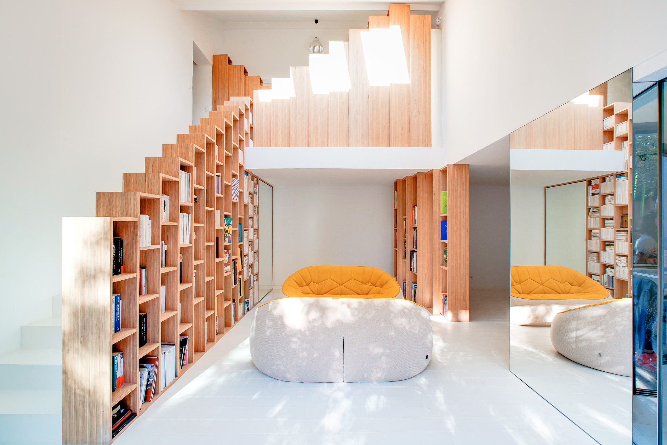
Rearranging furniture is a simple and inexpensive tool to improve the room’s sound quality. Placing heavy furniture, such as bookcases and large shelves, against walls can help block out unwanted sound. When a substantial mass is placed against a wall, it resists vibrations coming from surrounding rooms and thus reduces sound. This technique won’t completely eliminate sound but will certainly reduce bothersome noise.

Bookshelf House by Andrea Mosca Creative Studio, Paris, France, 2016

2. Choose Soft Furnishings

Sound is transmitted through vibrations and the more vibrations, the louder the noise. Hard objects vibrate more than soft objects, so when furnishing a noisy space, opting for pieces with soft materials can help limit sound vibration and reverberation. For example, tablecloths, cushions and upholstered pieces can help reduce vibration in a room, hence decreasing noise. The reduction of noise isn’t enormous, but neither is the effort it takes to add a few soft furnishings. Therefore, this technique is great for busy people who want to use what they have around the house and keep with their budget.

The Hedonist by Nuno Pimenta, Mannheim, Germany, 2014

3. Curtains and Blinds

Curtains are also a great way to block sound before it gets the chance to vibrate off hard surfaces. Whether it be a curtain or blind, covering apertures can help reduce the echo and reverb in a room. Equally, there are many soundproofing curtains on the market that work to trap internal sound rather than block out exterior noise. Therefore, soundproofing curtains are great if the goal is to create privacy.

4. Rugs, Carpets and Soundproofing Mats

Similarly to adding wall mass, it’s important to address the floor. Rugs and carpets are an easy solution to eliminating the sound of footsteps and pronounced movement. Using thick rugs or even layering carpets can be very effective in muffling noise. Moreover, adding a rug underlay can increase thickness and help absorb echoes. Soundproofing mats are also something to consider depending on the function of the room.

HOME^DOME by idoia otegui_i!arquitectura, Madrid, Spain, 2019

5. Decorate Your Space with Wall Art

Another simple and aesthetically pleasing way to tackle noise is to decorate the space! Think canvas paintings and tapestries. This is a cost-effective and effortless way to muffle sound while simultaneously decorating a room. This technique won’t block out sound but can help reduce the echo in a room.

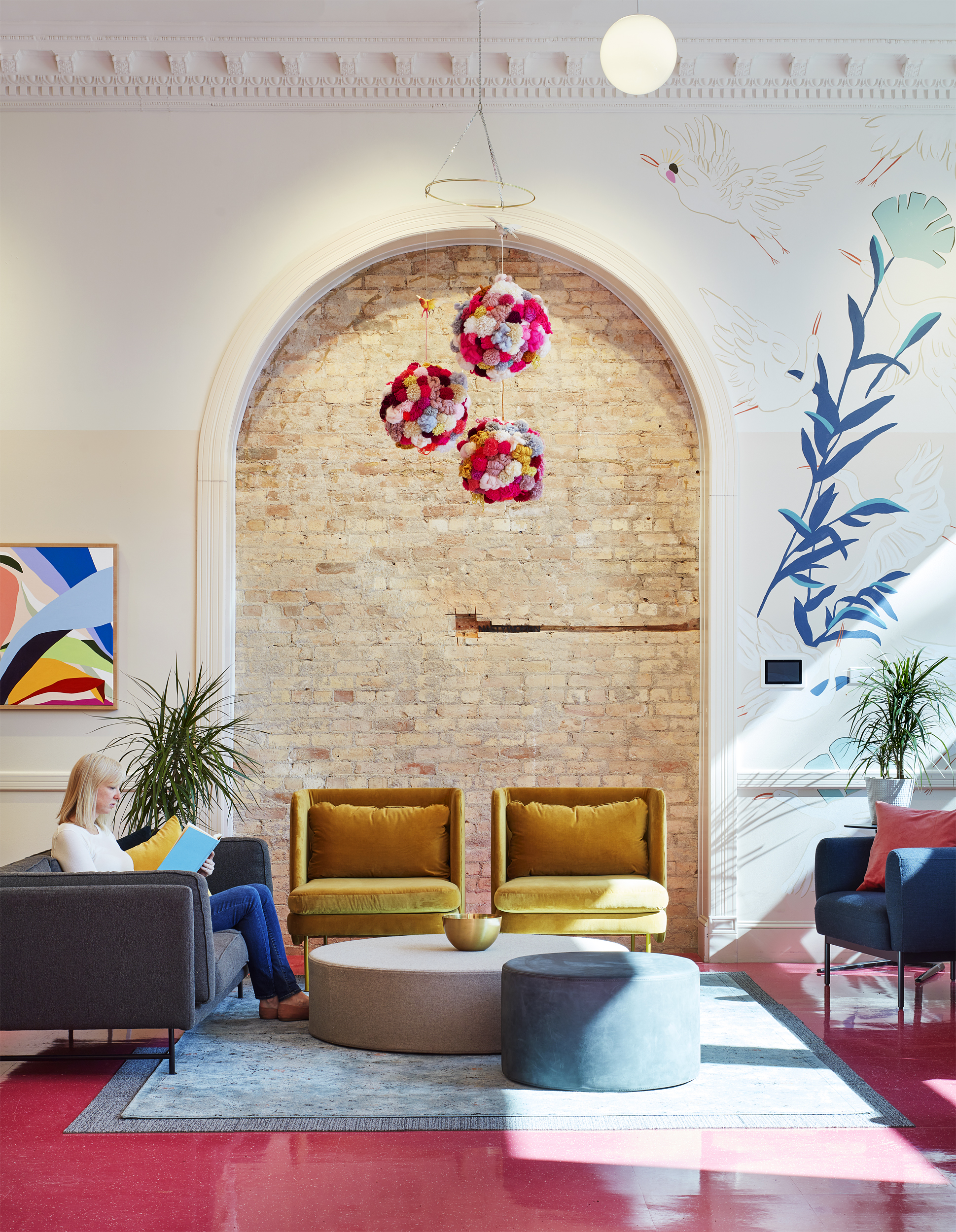
The Coven by Studio BV, Saint Paul, MN, United States, 2020

6. Tape Your Windows and Sweep Your Doors

One of the most challenging spots to soundproof is windows. If there’s a gap between the window and window frame (often caused by a worn-out seal), noise will travel regardless if the window is shut. One way to easily tackle this issue is to use weatherstripping tape. All it takes is replacing the old weatherstripping tape with the new one. This will help insulate openings and keep out exterior sound. Additionally, adding a door sweep to the bottom of a door will seal the opening and help keep out sound.

These six soundproofing solutions are ideal for those renting, residing in non-permanent housing situations or on a tight budget. They are easy to install, inexpensive and will aid in blocking out the undesired noise of a loud neighbor or roommate. All it takes is a little time, patience and creativity to soundproof a space!

The A+Product Awards is open for entries, with a Main Entry Deadline of June 24th. Get started on your submission today! 

Reference

An experiential space to relax and recharge
CategoriesSustainable News

An experiential space to relax and recharge

Spotted: Workers’ daily stress levels reached a record high in 2020 according to a global survey by Gallup, with 43 per cent of respondents in over 100 countries claiming to have experienced stress. With such striking figures, it’s little wonder that the World Health Organization has called stress the ‘health epidemic of the 21st century’. Against this context, designers are beginning to think about how the built environment can reduce stress levels – particularly in the workplace.

Designed by Finnish designer Pekka Kumpula, Silmu is an experiential space for focus and relaxation. The single-person pods are designed to be installed in places that lack privacy – such as workplaces and public spaces. Combining a natural design language with state-of-the-art technology, the idea is that Silmu can act as the perfect setting, either for a ‘micro-break’ during the most hectic periods of the day, or for highly concentrated work that requires maximum focus.

The pods integrate music composed by film and TV composer Mars Lasar – which is played through built-in, noise-cancelling speakers. To further deepen the experience, ‘feel-the-sound’ technology lets users feel the music all over their body. A fan and air filtration system keeps the pods fresh, and LED lights can be adjusted for colour and brightness. Users can tweak the environment within the space using an interior control panel or through a mobile app. The seat within the pod is ergonomically designed for maximum comfort.

“The design language of Silmu comes from the nature of the Nordic, from the first shoots of spring,” explains Kumpula. “Like when nature wakes up, Silmu also helps you to re-create yourself, relax and refresh,” he adds.

Other stress-busting innovations spotted by Springwise
include smart
devices that re-create forest bathing, a
vibroacoustic bed that could aid physical and mental health, and lighting
panels that boost mood when working from home.   

Written By: Matthew Hempstead

Email: silmu@silmux.fi

Website: silmux.fi

Reference

Loft conversions by architects that maximise usable space
CategoriesInterior Design

Loft conversions by architects that maximise usable space

Our latest lookbook shines a light on residential loft conversions from Dezeen’s archive, including rooftop extensions on existing dwellings and apartments built in underused attics.

Opening up the volume beneath the roof is a popular way of squeezing more space out of a dwelling or building. The new spaces often feature unusual geometries, which a skilled architect can exploit to create dramatic and characterful new rooms.

This is the latest roundup in our Dezeen Lookbooks series providing visual inspiration for the home. Previous articles in the series feature plant-filled interiors, colourful kitchens and stylish home-working spaces.


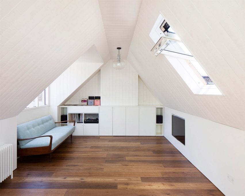
A guest bedroom in a London attic

West Heath Drive, UK, Alexander Martin

London architect Alexander Martin converted the disused loft of an Arts and Crafts-style house in Hampstead to create this pared-back and light-filled guest room and study.

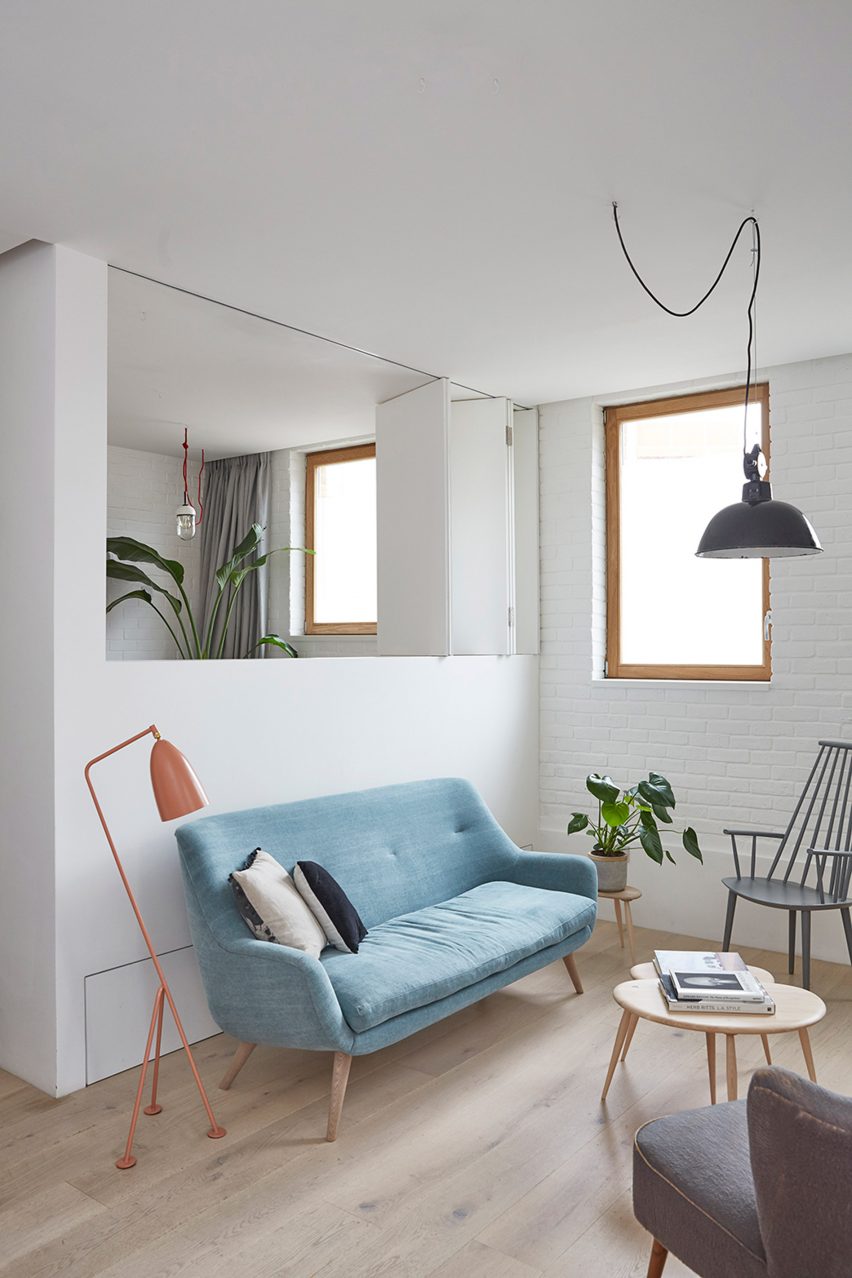
It has a T-shaped plan and was therefore divided into three rooms – one of which is hidden behind a moving wall that is disguised as an integrated bookcase. The guest room is finished with white walls, a dark wooden floor and a vintage Greaves and Thomas teak sofabed.

Find out more about West Heath Drive ›


A bed deck in a loft apartment by Dodi Moss

House for a Sea Dog, Italy, by Dodi Moss

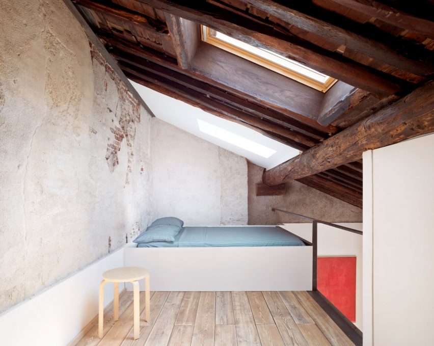
While renovating the loft of a 17th-century apartment block in Genoa, architecture and engineering studio Dodi Moss inserted a mezzanine floor that serves as a bed deck to maximise usable floor space under the eaves.

It has a rustic finish, characterised by an exposed wooden roof structure, unvarnished wooden floors and a rough plaster wall, and is furnished with a simple IKEA stool for use as a bedside table.

Find out more about House for a Sea Dog ›


A home office in a London loft

Dormore, UK, by Con Form Architects

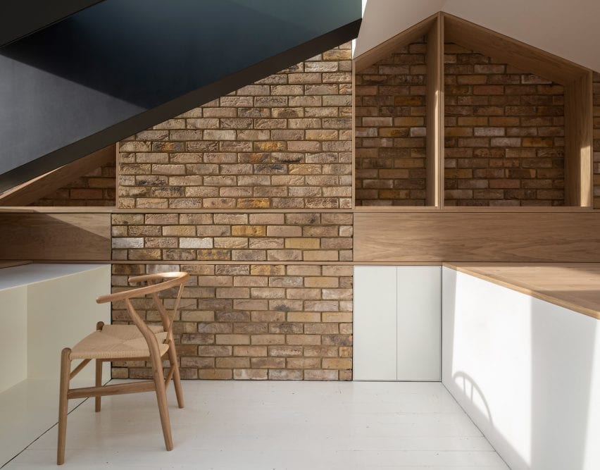
Dormore is a bright home office nestled within the small attic of a house in London, which was converted for a client who needed a space to work from home. A large slice was cut out of the original roof and filled with glazing and a large dormer window to bring light inside.

It is accessed by a compact folded steel staircase and finished with oak joinery and a whitewashed floor, alongside exposed brick walls and a Hans Wegner Wishbone Chair.

Find out more about Dormore ›


A loft apartment in Prague

Rounded Loft, Czech Republic, by A1 Architects

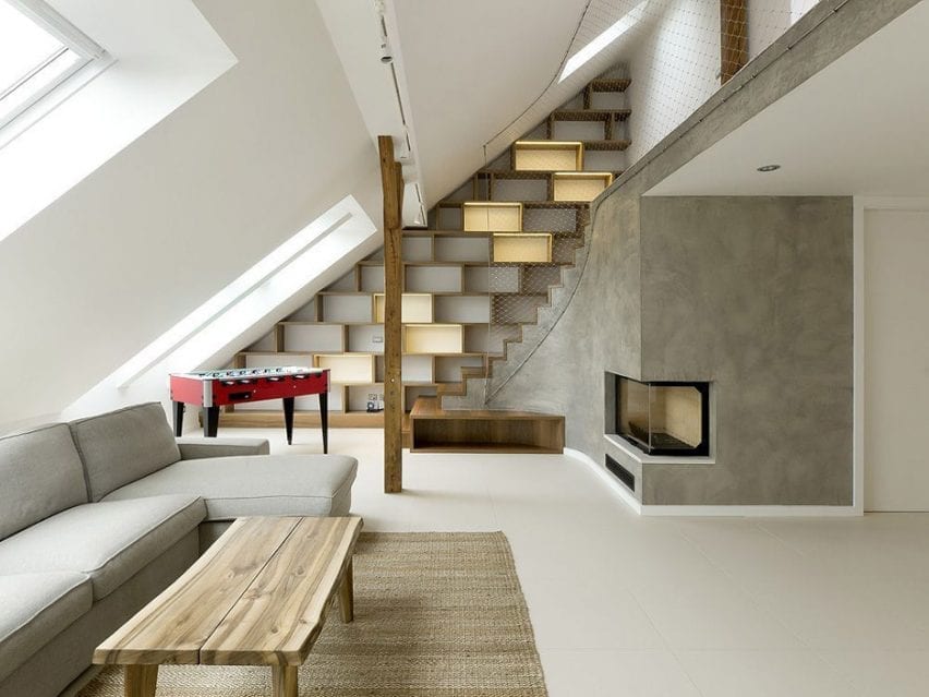
Czech studio A1 Architects built a two-storey apartment within the attic of an apartment block in Prague. Its living room, which occupies the lower level, is lit by windows slotted within the attic’s sloping roof and finished with tactile wooden furnishings and grey plaster walls.

The lower level also contains bedrooms and is linked to a guest suite on the small upper floor by a staircase lined with wooden bookshelves and a steel net that takes the place of a bannister.

Find out more about Rounded Loft ›


A plywood-lined bedroom in the loft of a London home

Maynard Road, UK, by Widger Architecture

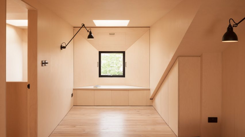
A pair of minimalist bedrooms lined with plywood occupy the old attic of this first-floor flat in Hackney, which was converted by London studio Widger Architecture.

As the attic had a sloped roof with limited head height, the architect introduced a flat roof dormer that spans the entire width of the property. While maximising headroom, it also allowed the studio to introduce more windows to invite more light inside.

Find out more about Maynard Road ›


A white-walled loft apartment

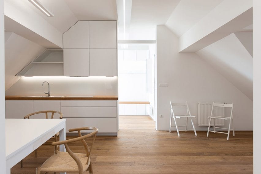
Alpine Apartment, Slovenia, by Architektura d.o.o.

This loft space was converted into a two-bedroom apartment by Slovenian studio Architektura d.o.o. for the client to use as a family holiday home in the lakeside town of Bled.

At the centre is a kitchen, flanked by two bedrooms, a living room and an entrance hall. As the kitchen has no exposure to natural light the living room entrance has no door, in order to help illuminate the space.

The home is complete with white custom-built furniture that aligns with the irregularly shaped attic ceiling, while pale wooden floorboards nod to the home’s Alpine setting. These finishes are complemented by wooden Wishbone Chairs by Hans Wegner and white folding chairs from IKEA.

Find out more about Alpine Apartment ›


A plywood-lined reading room

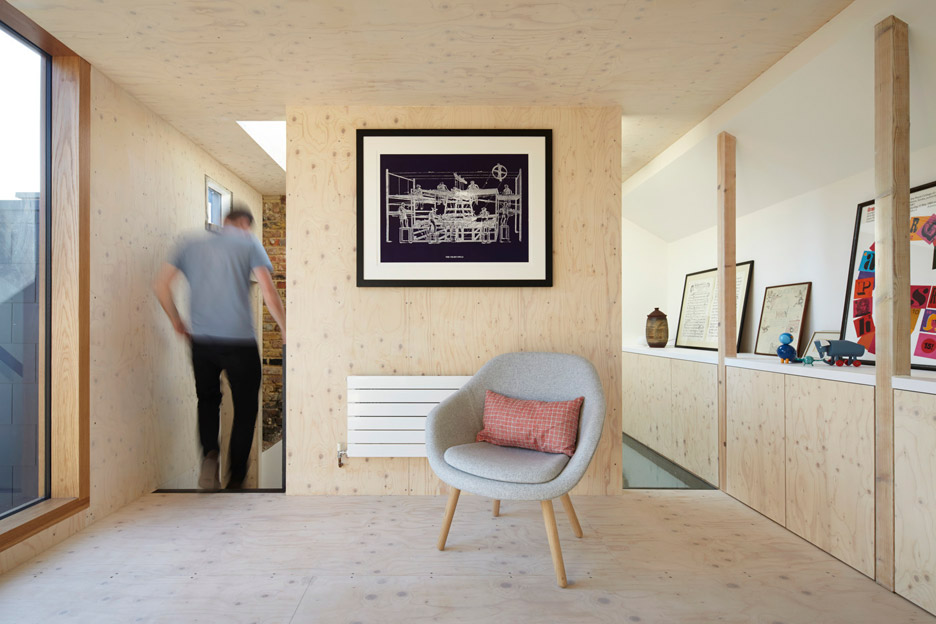
Gallery House, UK, by Studio Octopi

London architect Studio Octopi renovated and extended the dead space below the pitched roof of this terraced Victorian house in Battersea to create a separate reading room and study.

The two rooms are unified by a perforated black steel staircase and their matching spruce plywood walls and floors. Pared-back furnishings are dotted throughout, including a pair of About A Lounge Chairs by Hay in the reading room.

Find out more about Gallery House ›


A bed in a converted attic in Belgium

Attic conversion in Antwerp, Belgium, by Van Staeyen Interieur Architecten

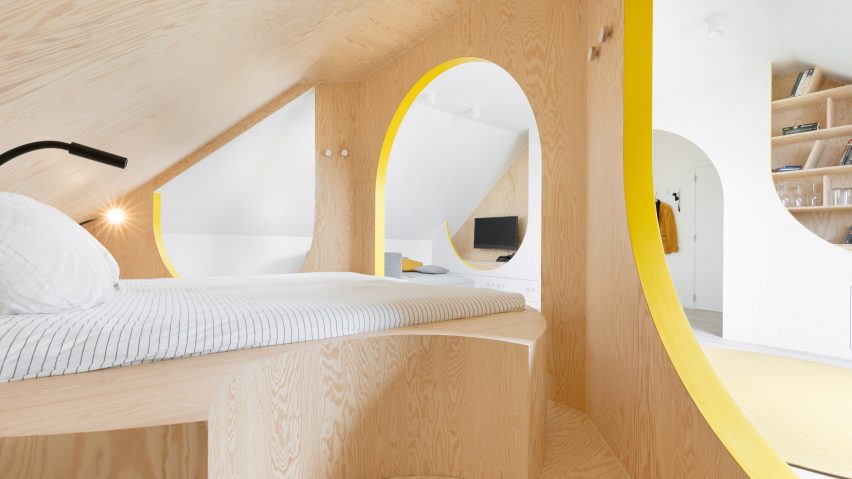
A dark attic that was used for storage was converted into this bright multi-functional room at a house in Antwerp. It contains a bed, seating area and bathroom defined by spruce-clad partitions with arched portals, curved seating and yellow detailing.

It was designed by Van Staeyen Interieur Architecten for the clients to use as a guest room and a social space for their daughters to spend time with their friends as they get older.

Find out more about Attic conversion in Antwerp ›


A reading room in a dormer extension

Project Escape (to the Roof), UK, by A Small Studio

Architecture practice A Small Studio created a reading room, bedroom, dressing room and bathroom for a family within the loft of their Victorian home in south-east London.

Between the bathroom and reading room, there is also a new free-standing solid oak stair that helps bring light into the lower levels of the home. Three large dormer windows on one side of the loft frame views of the back garden.

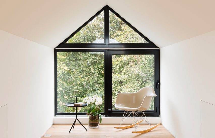
The conversion’s focal point is its reading room, which is complete with a Plastic Armchair RAR by Charles and Ray Eames and a black DLM side table by Hay.

Find out more about Project Escape (to the Roof) ›


A white-walled attic conversion in France

Attic conversion, France, by F+F Architects

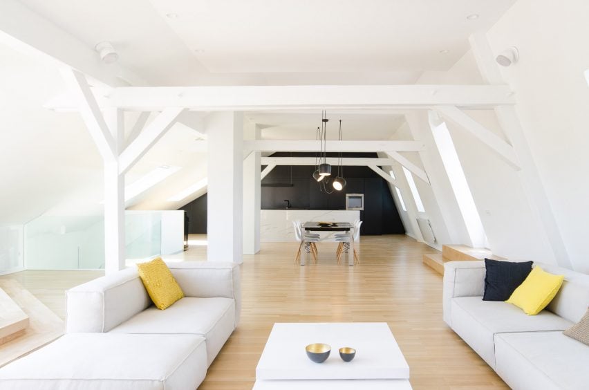
This spacious light-filled apartment was built by Parisian studio f+f architects by converting the attic of an art nouveau building in Strasbourg. Over two levels, it comprises bedrooms, bathrooms and an office, alongside an open-plan living space with a kitchen, dining area and terrace.

The attic’s original pine flooring was preserved and treated with lye, an alkali used to lighten wood, while existing trusses have been painted white and left exposed throughout.

Find out more about this attic conversion ›


This is the latest in our series of lookbooks providing curated visual inspiration from Dezeen’s image archive. For more inspiration see previous lookbooks showcasing colourful interiors, calm living rooms and colourful kitchens.

Reference

Ten L-shaped kitchens with extensive countertop space
CategoriesInterior Design

Ten L-shaped kitchens with extensive countertop space

The latest lookbook in our series exploring kitchen layouts highlights 10 examples from Dezeen’s archive that have two connected countertops that form an L-shaped layout.

L-shaped kitchens are organised in the shape of the letter L usually with a long row of cabinetry adjoined to a slightly smaller projecting section. However, in some instances, the countertops can be equal in length.
Appliances, sinks and cookers are usually placed on opposite sides of the kitchen with ample storage and workspace around and between. In larger spaces, islands can be incorporated into the design between the L-shaped counters to provide additional space.

The L-shape is of the most common kitchen layouts along with U-shaped kitchens, one-wall kitchens, island kitchens, galley kitchens and peninsula kitchens.

This is the latest roundup in our Dezeen Lookbooks series providing visual inspiration for the home. Previous kitchen-related posts feature breakfast bars, compact kitchens and kitchens with skylights.


l-shaped by baumhauer

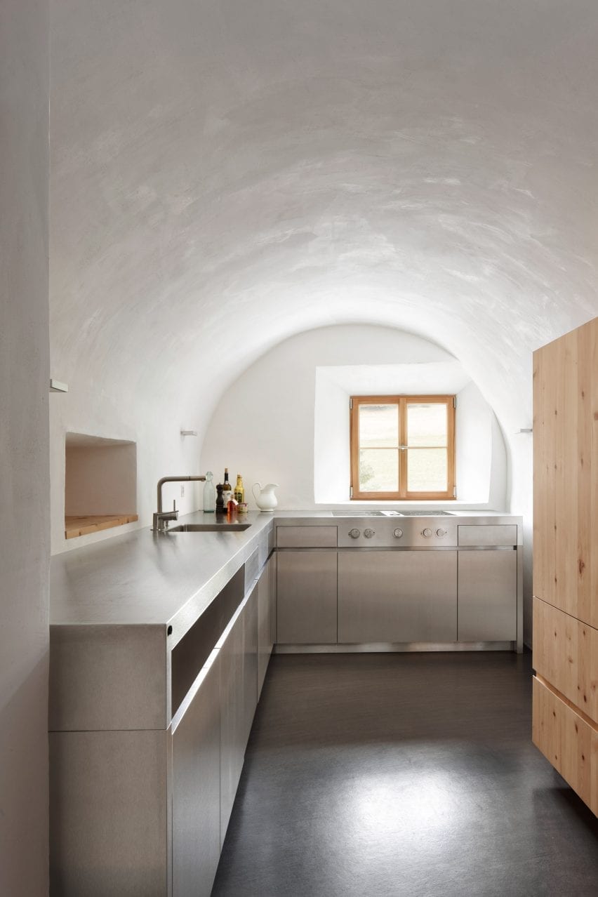
Farmhouse, Switzerland by Baumhauer

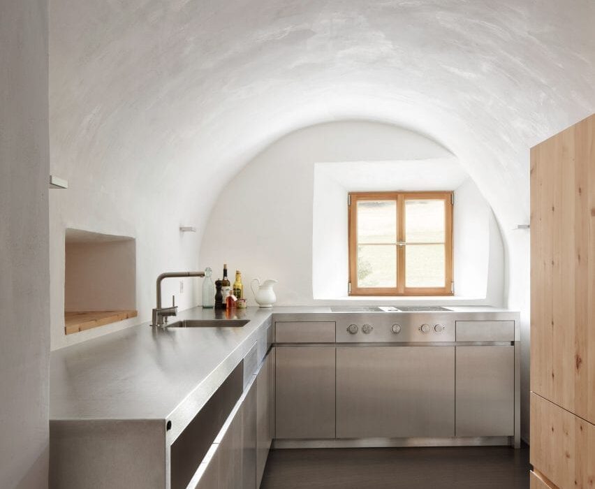
Fitted in a vaulted space within a traditional farmhouse, this L-shaped kitchen uses clean lines to contrast with the historic nature of the building.

The kitchen consists of two stainless steel counters with stainless cabinetry with drawers, cupboards and appliances fitted below.

One arm of the L contains a cooker positioned directly in front of a framed window to give the residents views across a Swiss valley while they are cooking. The other counter has a sink embedded opposite a serving hatch that punctures the thick stone wall between the dining and kitchen space.

Find out more about Farmhouse ›


plywood kitchen by Sanden+Hodnekvam Arkitekter

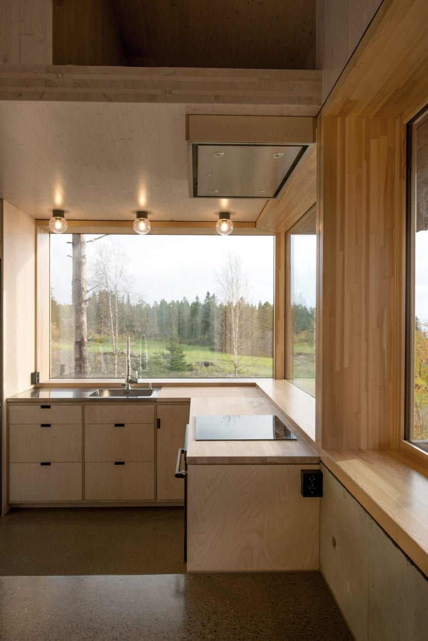
Cabin at Rones, Norway by Sanden+Hodnekvam Arkitekter

Fitted against a wrap-around corner window, this birch plywood kitchen designed by Sanden+Hodnekvam Arkitekter includes an L-shaped row of base cabinetry.

A steel sink that incorporates a large drainer was placed at the centre of the row of units, while an electric cooker was placed on the other.

The cabinetry and drawers below have a minimalist look with units aligned flush with the kitchen’s wooden countertops and featuring cut out handles.

Find out more about Cabin at Rones ›


L-shaped kitchen by hayhurst and co

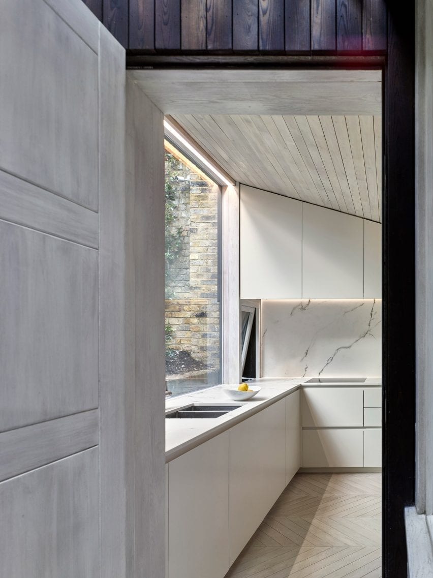
London flat, UK by Hayhurst and Co

This kitchen at the rear of a London flat was built beneath a part-sloping wood-lined ceiling that follows the topography of the garden.

A row of white floor units topped with a marble countertop with an embedded sink was placed below a large full-width window that looks out to the sloping garden. The counter extends along the kitchen’s wall to form an L that contains an electric hob.

Find out more about London flat ›


l-shaped kitchen by vaughn mcquarrie

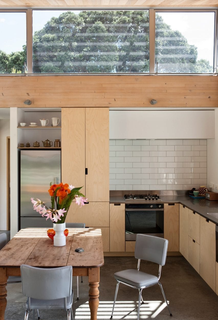
Oneroa House, New Zealand by Vaughn McQuarrie

This timber New Zealand home overlooking the Hauraki Gulf uses materials chosen for their texture and robustness.

The open-plan kitchen-diner sits beneath a mono-pitched roof with north-facing clerestory windows.

Plywood kitchen units line two of the walls with the sink positioned next to a large window with views across a bay.

Find out more about Oneroa House ›


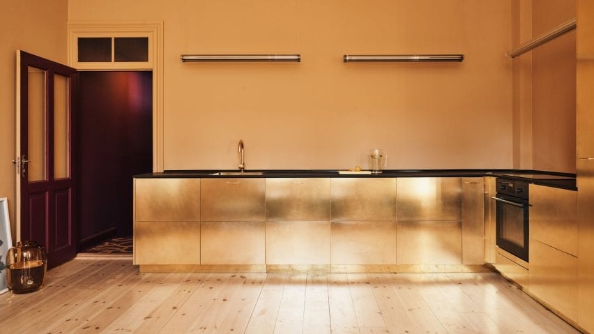
Ikea customised kitchen by Reform

Stine Goya headquarters, Copenhagen by Reform

This communal kitchen at fashion brand Stine Goya’s headquarters runs along two walls of a room that has butter-yellow walls and light timber floors.

Danish brand Reform updated IKEA cabinets with brass doors and handles to create a metallic look. The counters are topped with a contrasting black laminate countertop that matches the black appliances.

Find out more about Stine Goya headquarters ›


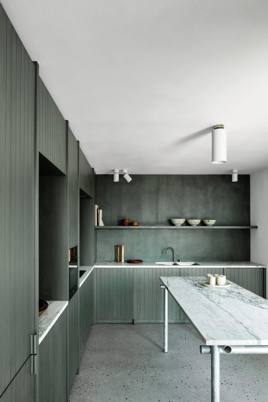
green stained kitchen by Carmine Van Der Linden and Thomas Geldof

Belgian apartment, Belgium by Carmine Van Der Linden and Thomas Geldof

Carmine Van Der Linden and Thomas Geldof stained the birch cabinetry in this L-shaped kitchen a seaweed green to connect the space with its coastal surroundings.

Alga Marina marble was used for the kitchens countertops to add a neutral contrast to the deep green.

Find out more about Belgian apartment ›


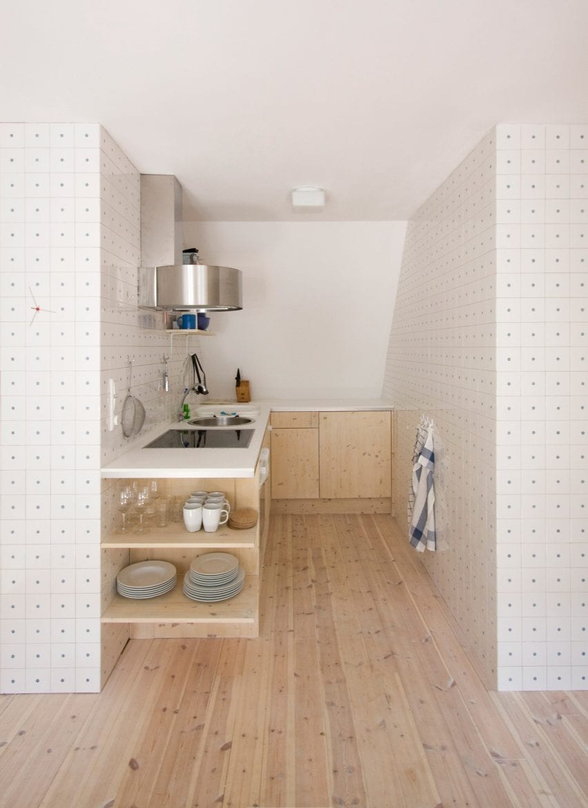
l-shaped kitchen by karin matz and francesco di gregorio

Föhr apartment, Germany by Francesco Di Gregorio and Karin Matz

Francesco Di Gregorio and Karin Matzhay converted the hayloft of a thatched roof farmhouse on the island of Föhr in Germany into this apartment.

Its L-shaped kitchen is tucked away against the sloping roof, between a bathroom and bedroom. The architect duo lined the walls with thousands of ceramic tiles, each drilled with a singular hole to reveal a blue dot to form a sea of polka dots.

Wooden base cabinetry blends with the apartments wood flooring and houses the kitchen’s appliances and storage. Because of its small footprint, a circular sink, electric stove and oven were organised beside each other within the longer countertop against the tiled wall.

Find out more about Föhr apartment ›


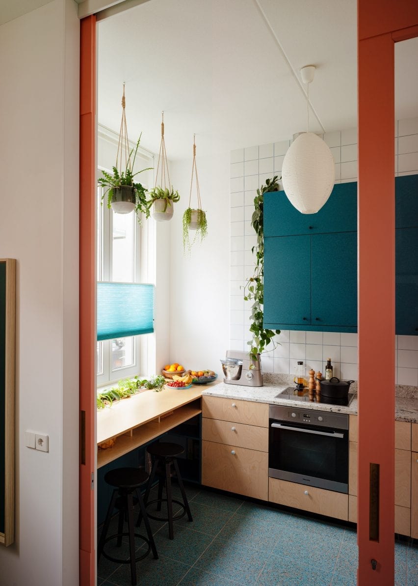
L-shaped kitchen by Lagado Architects

Workhome-Playhome, The Netherlands by Lagado Architects

Ashwood cabinetry, burnt-orange niches, blue terrazzo floors and teal hued cupboards fill this L-shaped kitchen in Rotterdam.

A wall of squared white tiles frames teal coloured overhead cabinetry that is suspended over a sink, stovetop and granite worktops.

Teal cabinetry complements the kitchen’s blue terrazzo floors, which marks the area from the light wood floors in the living space. A breakfast bar in front of a window becomes an extension of the work area and can be used as additional prep space.

Find out more about Workhome-Playhome ›


L-shaped kitchen by ras arquitectura

Corsega Apartment, Spain by RAS Arquitectura

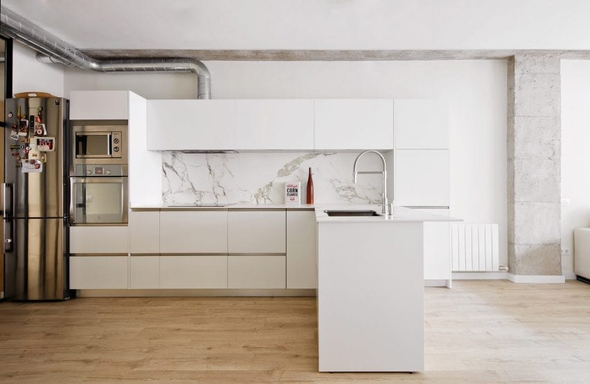
This simple kitchen combines bright white cabinetry, steel appliances, grey-veined marble and exposed pipework.

Overhead cabinetry surrounds a veined marble splashback and extends across the countertop, which extends into the room and doubles as a breakfast bar.

A steel oven and microwave were fitted within the cabinetry at the end of the kitchen, tying together with the metallic handle and exposed extractor fan piping.

Find out more about Corsega Apartment ›


L-shaped kichen by Denizen Works

Extension One, UK by Denizen Works

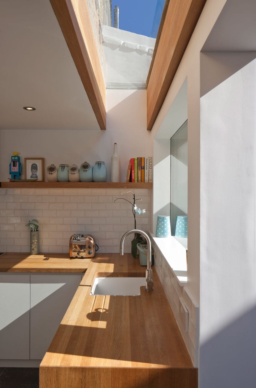
An oak countertop wraps around white cabinetry in this residential extension by Denizen Works. A white-tiled splashback wraps around the L-shaped countertops below a chunky oak shelf and rectangular window that overlooks the garden.

The studio added a large L-shaped skylight supported by large oak beams above the counter containing the sink.

Find out more about Extension One ›


This is the latest in our series of lookbooks providing curated visual inspiration from Dezeen’s image archive. For more inspiration see previous lookbooks showcasing colourful interiors, calm living rooms and colourful kitchens.

Reference

Ten interiors by architects that use internal glazing to create space and light
CategoriesInterior Design

Ten interiors by architects that use internal glazing to create space and light

For our latest lookbook, interiors expert Michelle Ogundehin has selected ten examples of interiors with glazed internal windows, doors and partitions that create clever zoning and add privacy while still letting the light through.


“In the ongoing search for work-from-home space, walls are making a return as open-plan layouts are found wanting,” writes architect, author and TV presenter Ogundehin, who has curated this selection of images from Dezeen’s archive.

“But walls block out natural light as well as potentially making spaces feel poky and claustrophobic,” adds Ogundehin, who joins Dezeen’s lookbooks team as occasional guest editor.

“Instead, consider an internal window or semi-glazed partitioning. The latter could be fixed or moveable, in the form of concertina partitions or pocket doors, so they can be slid or folded away at the end of the working day.”

“Either way, this selection of projects proves that zoning the contemporary home for work, rest and play doesn’t necessarily mean creating solid walls.”

This is the latest roundup in our Dezeen Lookbooks series providing visual inspiration for the home. Previous articles in the series feature interiors with printed wallpaper, spa-like bathrooms, inviting courtyards, outdoor spaces with fireplaces and fire pits, and pastel-hued interiors.

Read on for Ogundehin’s selection of great examples of internal glazing:


99 square-metre apartment by Lera Brumina

Minsk apartment, Belarus, by Lera Brumina

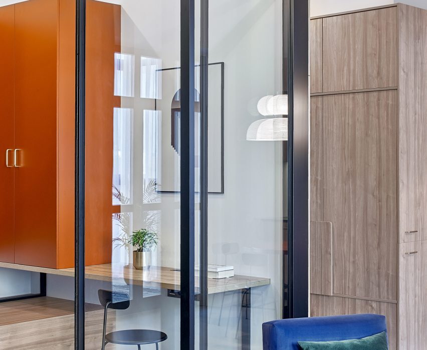
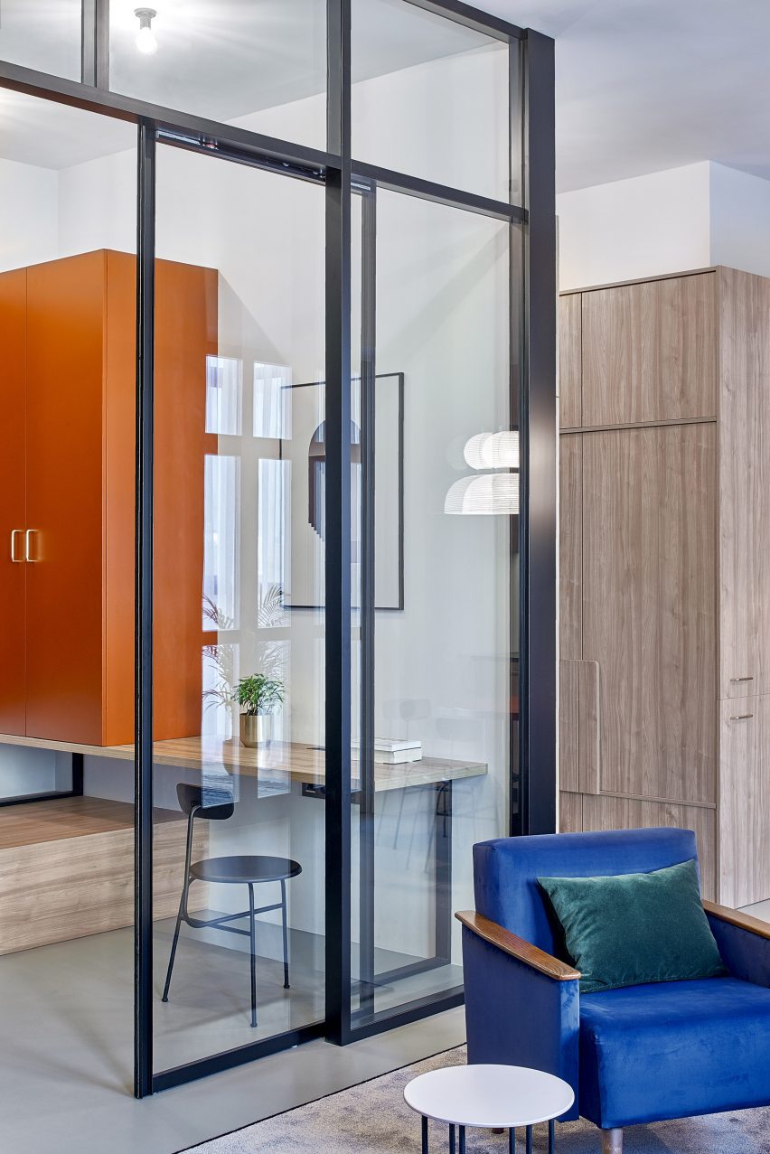
Interior designer Lera Brumina chose to use internal glazing as a clever solution to a problem with the light in this Minsk apartment, where one side is extremely bright and the rear half is much darker.

Instead of walls, she used sliding glass doors to separate the rooms, letting the light from the windows on one side of the apartment flow through the whole space. Colourful furniture and details also make the rooms brighter.

Find out more about Minsk apartment ›


Internal glass window in Beaconsfield Residence

Beaconsfield Residence, Canada, by StudioAC

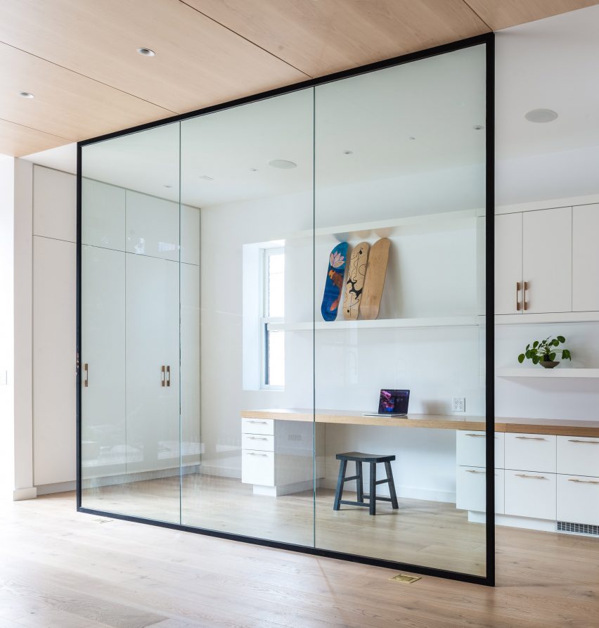
The renovation of this Victorian-era house in Toronto entailed overhauling and opening up the interior, including creating a glassed-in office at the rear of the house.

Located next to the kitchen, the office is shielded from it by a simple glass wall in a black frame, which is both decorative and creates a second room without making the kitchen feel smaller.

Find out more about Beaconsfield Residence ›


Teorema Milanese apartment, designed by Marcante Testa

Teorema Milanese, Italy, by Marcante-Testa

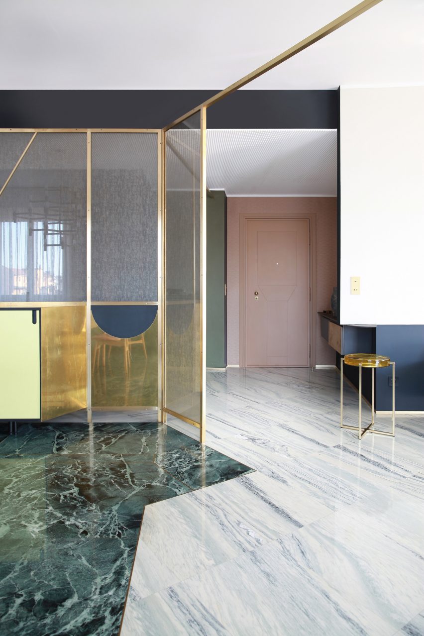
A rich mix of materials and colours, including green and grey marble, feature in this luxurious-looking Milanese apartment by Marcante-Testa.

A partition wall was knocked out to create an open-plan living and dining room, with the different rooms demarcated by a golden metal frame that holds decorative glazed windows. This also separates the dining area from the hallway.

A lens table by McCollin Bryan with a glass tabletop picks up both the glass and the gold colour of the frame.

Find out more about Teorema Milanese ›


Makepeace Mansions Apartment by Surman Weston

Makepeace Mansions, UK, by Surman Weston

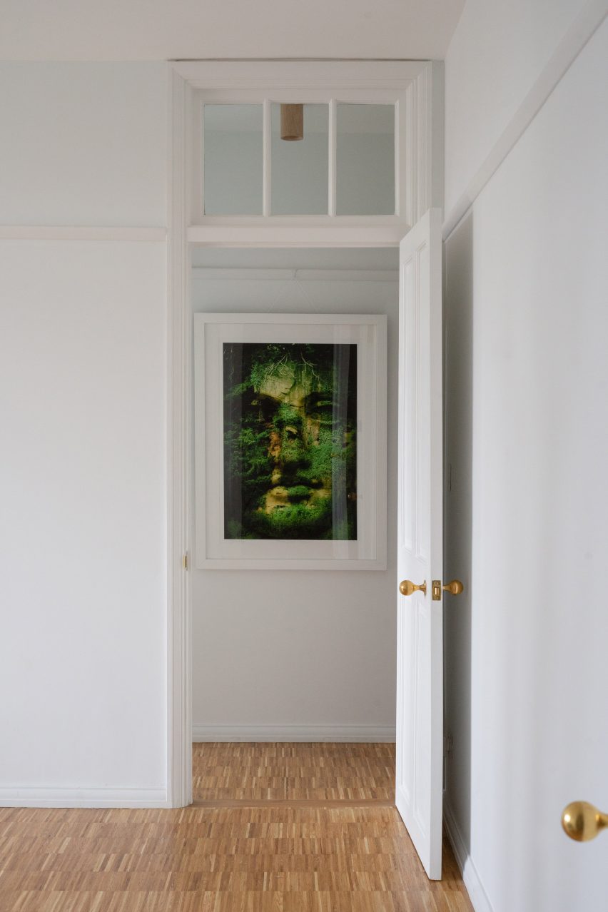
In rooms with high ceilings, such as this London apartment that was given a refresh by Surman Weston, using glazed internal windows above doors is a clever way to let more light into the room.

A number of the rooms in the 1920s residential block feature these windows, which are both decorative and practical.

Find out more about Makepeace Mansions ›


Glazed interior window in Chinese hotel

Lostvilla Qinyong Primary School Hotel, China, by Atelier XÜK

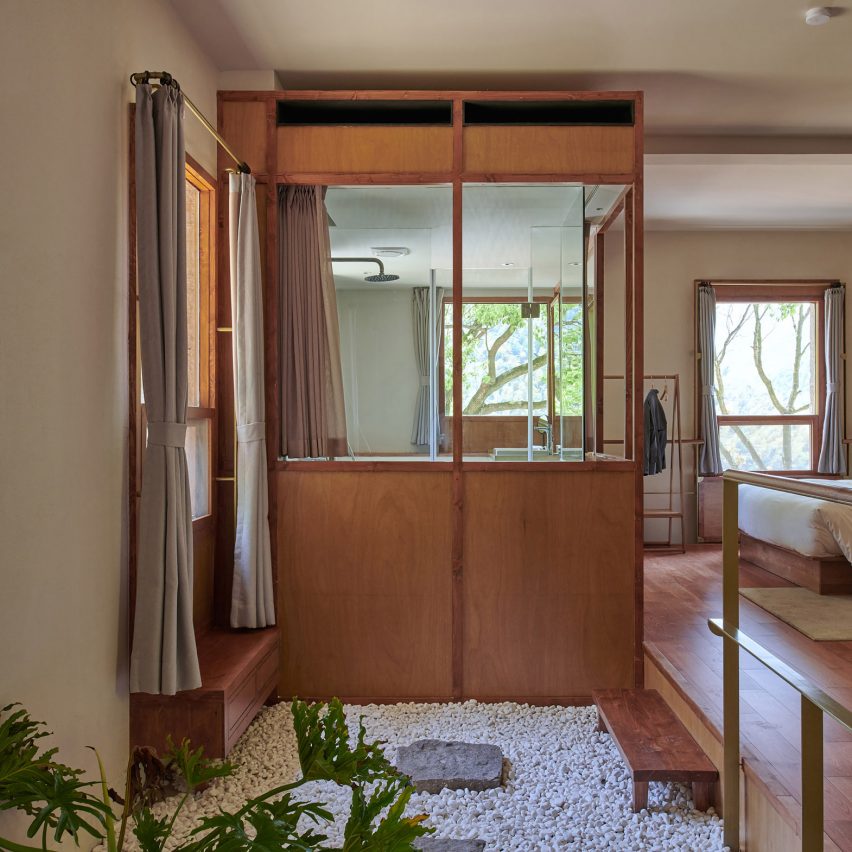
Atelier XÜK has turned a former primary school in China into a boutique hotel, with guest bedrooms that feature wooden floors and beds.

Wood-clad bathroom cubes hold showers and other facilities, which sit within wooden frames that have been glazed in some places to protect from the water. This creates a light-filled bathroom that still has a sense of privacy.

Find out more about Primary School Hotel ›


Riverside apartment by Format Architecture Office

Riverside Apartment, US, by Format Architecture Office

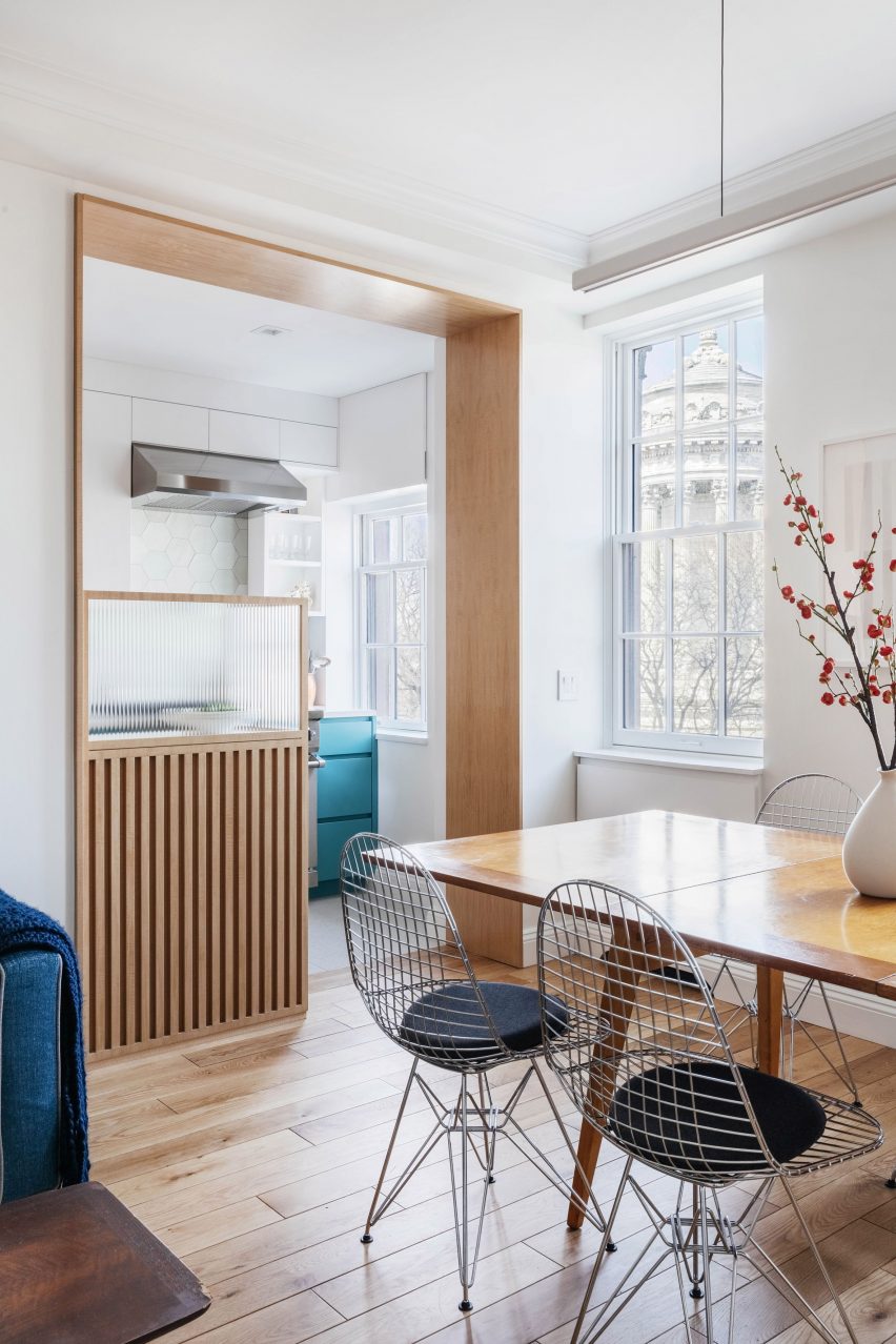
A small glazing solution shields the kitchen from the dining space in this New York apartment, adding a restaurant-like feel to the kitchen design.

Ribbed glass has been inserted into a wooden frame, hiding the prep-work space in the kitchen from the more relaxed living space and adding a nicely textured detail to the pared-down aesthetic of the flat.

Find out more about Riverside Apartment ›


Lawyers office by Arjaan De Feyter

Lawyer’s office, Belgium, by Arjaan de Feyter

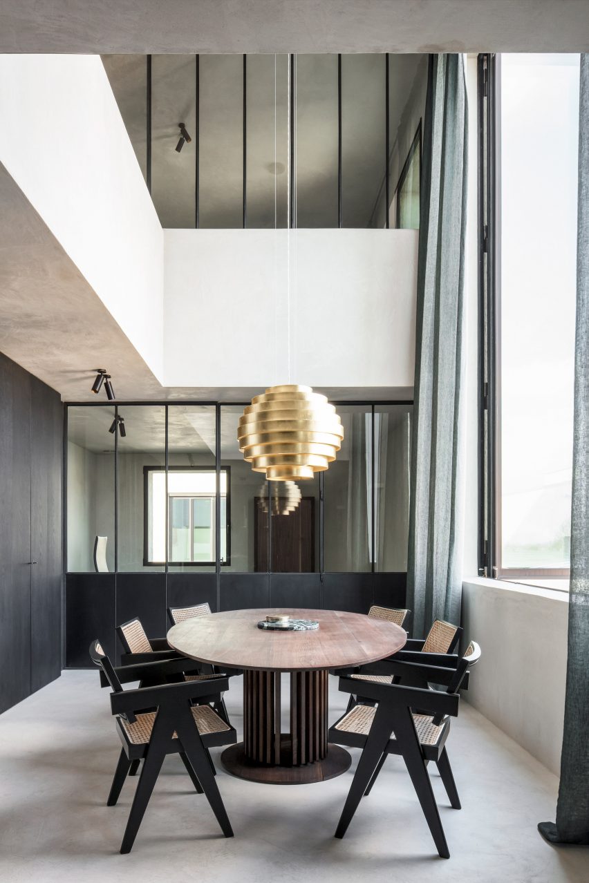
Professional spaces can also benefit from internal glazing, such as in this lawyer’s office in Belgium. Large glazed internal walls and windows help break up the rooms while making sure the moody colour palette doesn’t feel too dark.

Partition walls of glass and blackened steel create closed-off meeting rooms and contrast against the whitewashed walls.

Find out more about Lawyer’s office ›


Wood-clad bedroom with interior window

LIFE micro-apartments, South Korea, by Ian Lee

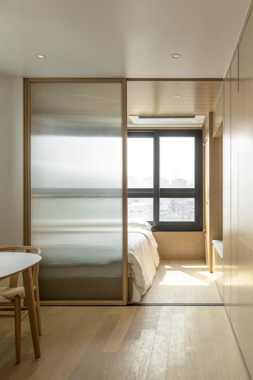
This co-living building in Seoul has micro-apartments that tenants can customise however they want, with interiors that were designed to feel simple and timeless.

Sliding glass partitions have been used to divide the rooms in some of the apartments, with frosted glass to add more privacy between bedrooms and social spaces.

Find out more about LIFE micro-apartments ›


Bedroom of Botaniczna Apartment by Agnieszka Owsiany Studio

Botaniczana Apartment, Poland, by Agnieszka Owsiany Studio 

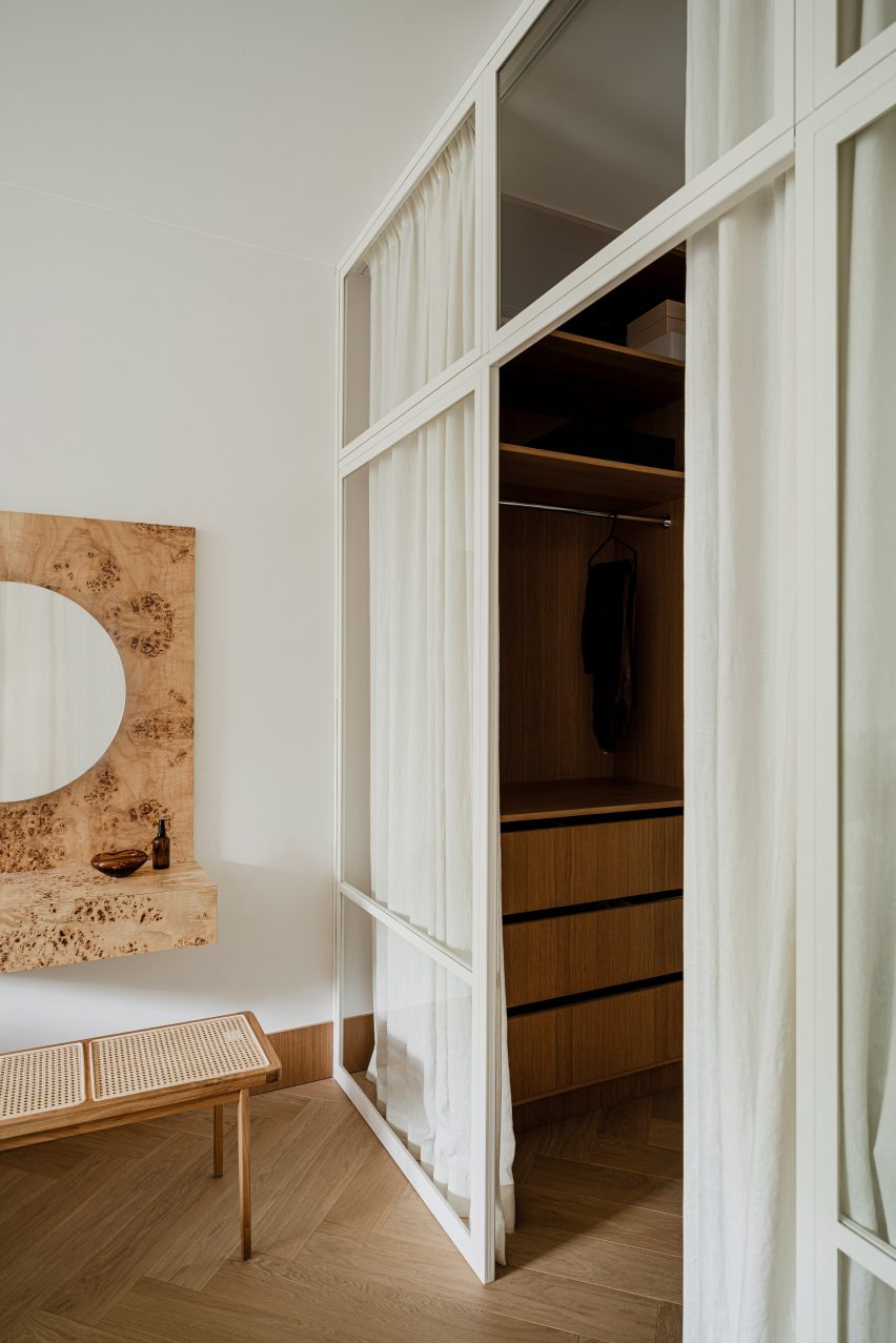
Designer Agnieszka Owsiany aimed to create a tranquil apartment for a couple with high-pressure jobs, and used a simple material palette and natural colours to do so.

A floor-to-ceiling glass wall between the apartment’s hallway and the bedroom has a white frame that matches the plain white walls and has been hung with white curtains, a clever way to create a more intimate space when desired.

Find out more about Botaniczana Apartment ›


Hackney Mews by Hutch Design

Mews house, UK, by Hutch Design

Even without glazing, internal windows help open up adjacent rooms and create a sense of space. Hutch Design’s renovation of this London mews house includes a side extension with a concertina partition in the upper section of the dividing wall.

This can be open or closed as needed, creating a room that can be adapted depending on its usage.

Find out more about Mews house ›


This is the latest in our series of lookbooks providing curated visual inspiration from Dezeen’s image archive. For more inspiration see previous lookbooks showcasing printed wallpapers, contemporary bathrooms, calm living rooms and colourful kitchens.

Reference