Shrinking Spaces, Expanding Horizons: Navigating Tiny Living in an Off-Grid Houseboat
CategoriesArchitecture

Shrinking Spaces, Expanding Horizons: Navigating Tiny Living in an Off-Grid Houseboat

The judging process for Architizer’s 12th Annual A+Awards is now away. Subscribe to our Awards Newsletter to receive updates about Public Voting, and stay tuned for winners announcements later this spring.   

“Water is central to these kinds of desirable ecologies that can reshape cities,” says Ham Dong, co-founder and partner of Crossboundaries. The firm contributes to creating “vital built environments” via architecture, and project blueprints are often defined by location.

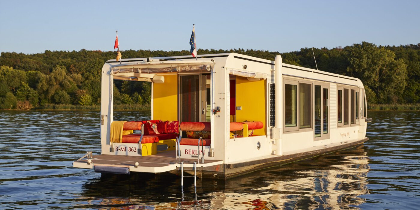
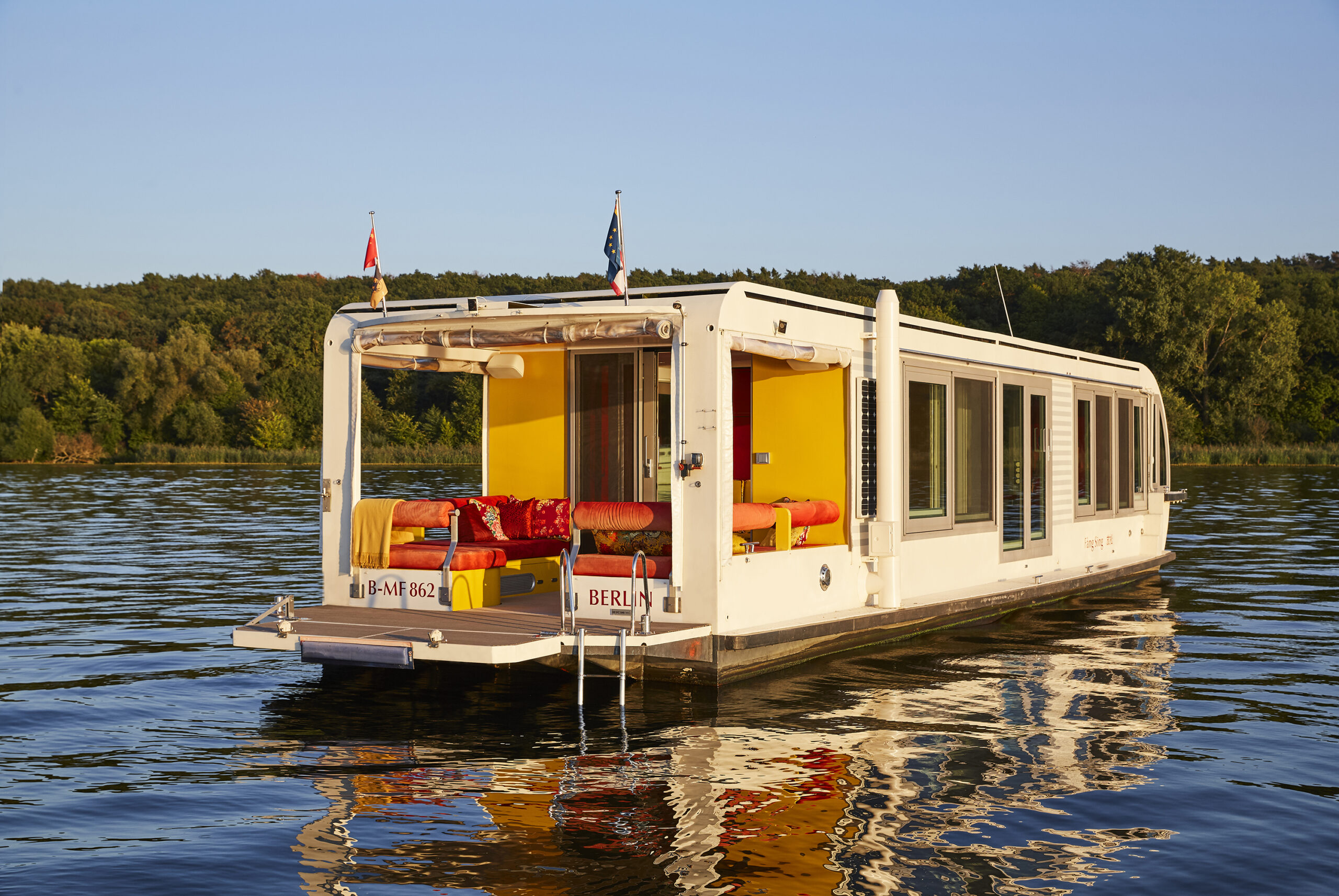
In some ways, you could say the opposite is true of the firm’s latest undertaking, Solar + Design = Tiny Home on the Water. The clue is very much in the name — a modified houseboat offering the freedom of canal, lake and river life with high-end, modern specifications. Less obvious: the vessel runs entirely on solar power, making it a groundbreaking example of alternative fuel for transport, off-grid heating and cooking. 
Solar + Design = Tiny Home on the Water by Crossboundaries, Germany

Putting things into perspective, around 1% of the UK population has no grid connection and uses bottled gas for power. In the US, around 12 million use propane as a primary energy source. Off-grid fuels are recognized as a substantial challenge to green transition. Solar Houseboat SYC 1415 is a unique example of renewable solutions applied to a situation that presents particular challenges in this area.

Currently floating in Germany, from March to November, the boat is entirely self-reliant. An entire roof of panels and an additional one on either side powers everything needed. That includes traveling up to 50 kilometers per day, at 7 KM/H, around the same speed as a standard canal barge.
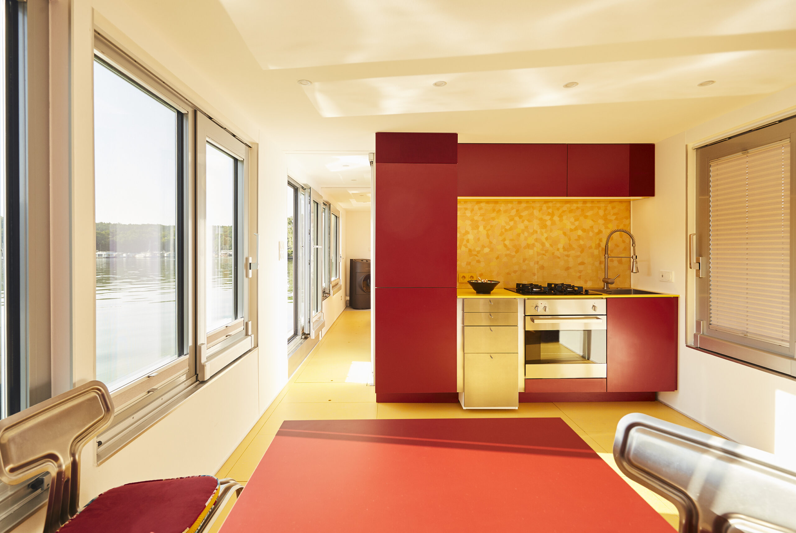
Solar + Design = Tiny Home on the Water by Crossboundaries, Germany

On the inside, climate considerations are more hidden. A biological sewage treatment unit can be converted to drinking water, and a purification system is capable of turning river and lake water into potable. 

With just 15 meters in length and 4 meters in width to realize a bold vision combining transport, architecture and interior design, a series of interlinked but distinct areas guide you through the lower deck from a charming rear ‘terrace.’ These are almost as adaptable as the boat itself. Living areas become personal gyms, with equipment hidden beneath floor tiles that perfectly complement a simple, primary color scheme and functional finish. Beds recede before vanishing, opening more space.
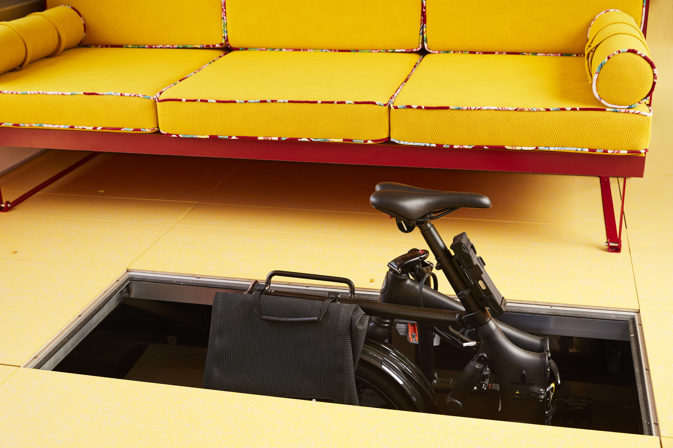
Solar + Design = Tiny Home on the Water by Crossboundaries, Germany

Extensive research was conducted into material quality, taking into account local and regional landscapes, and seasonal weather on a continent known for real variation in temperatures. Lessons in design have clearly been learned from the development of tiny homes in recent decades, with every inch maximized through innovative solutions.

The result recalls memories of a trip to the iconic Rietveld Schroder House, in Utrecht, Netherlands. The 1920s home is an interiors landmark, carefully conceived in a way that introduced incredible flexibility to each area inside its modest sized building. De Stijl style governed aesthetics, a school defined by bold ‘pure’ colors and right angles.
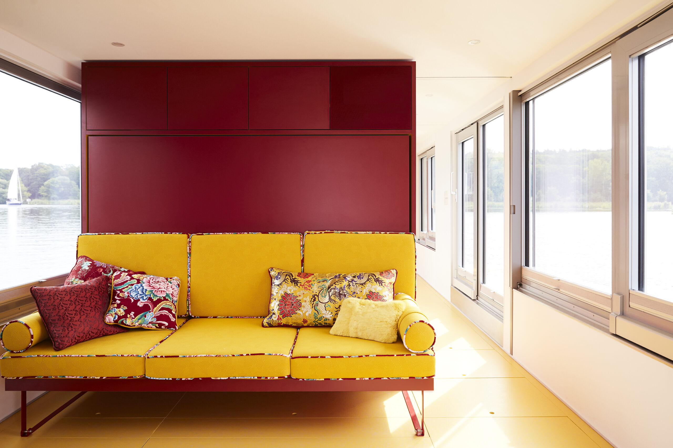
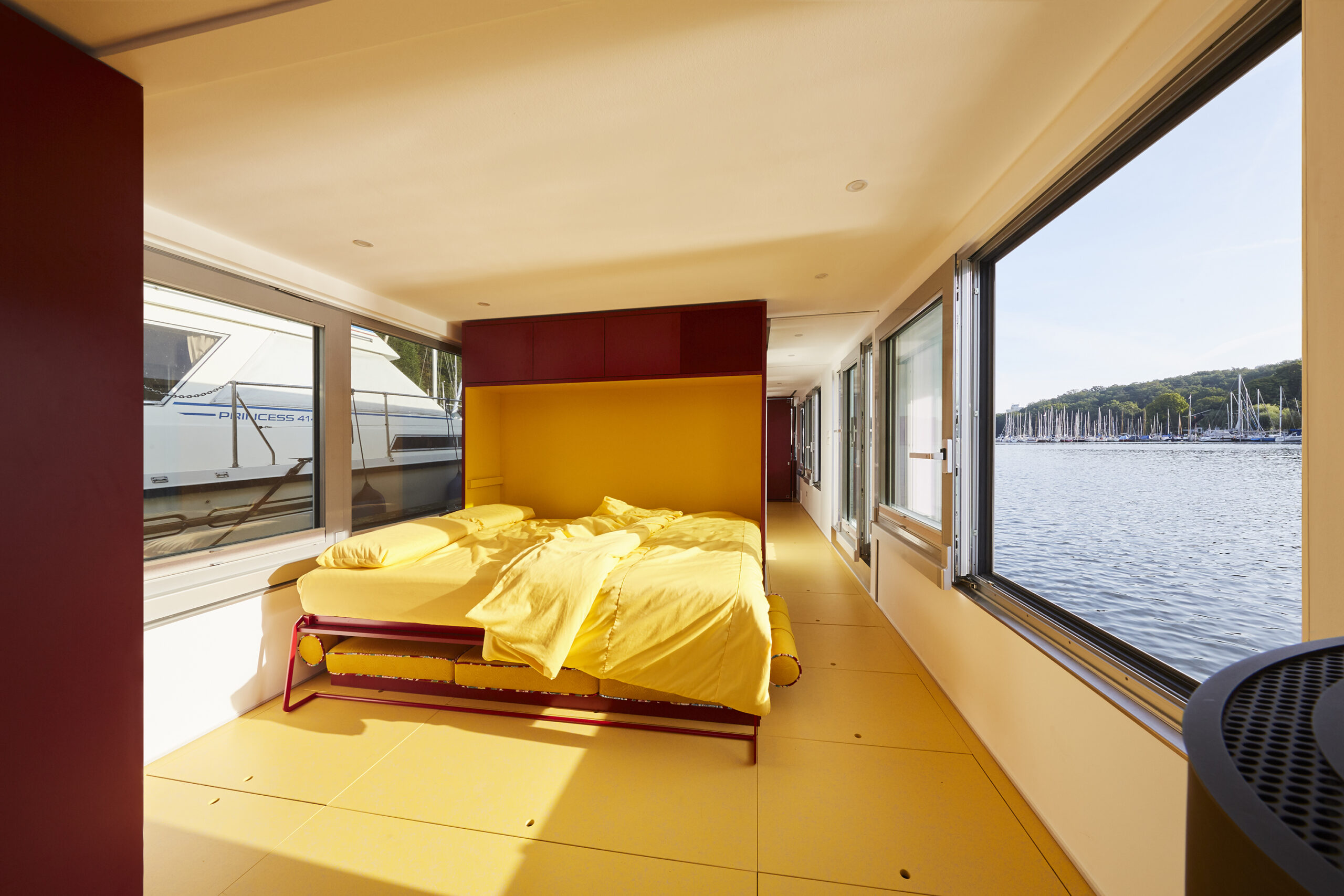
Solar + Design = Tiny Home on the Water by Crossboundaries, Germany

Back onboard, another sleeping area appears from within the helmstead — the core technical controls of the craft itself — as if to emphasize the point that this is a deftly engineered home. In doing so, we’re given a truly spectacular view to wake up to. And this could be anywhere, because the project is made for absolute mobility and designed for relocation. Simply cast off and leave when you need a change of scenery.

We can’t remember another live-in vehicle which is so closely aligned in design with more permanent, fixed dwellings. And this hybrid speaks to our emerging needs. Like the ability to move without sacrificing the notion of ‘home’, immerse ourselves in new places but not lose identity. Others are more urgent, for example developing new forms of resilience to a changing world. Or returning to others we had, in the West at least, almost abandoned.
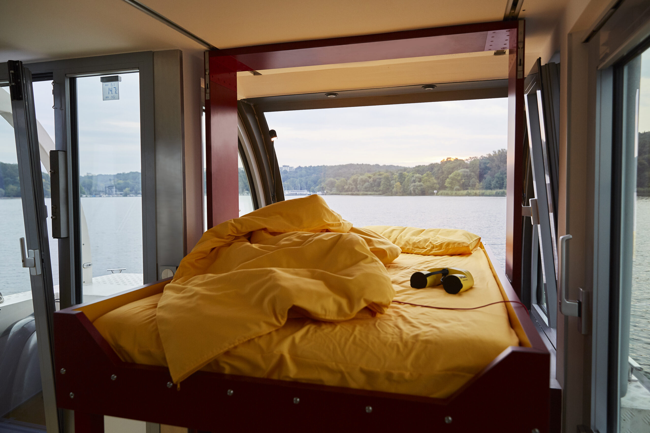
Solar + Design = Tiny Home on the Water by Crossboundaries, Germany

For the boat’s owner, Marianne, travel was the key driver in all this. Having spent her life living in cities, most recently moving from Beijing to Berlin, her dream of navigating Europe by water makes sense. There’s always something beautifully peaceful about being on a boat, whether that’s the lone barge on a quiet canal or sole ship on the ocean. 

In Europe, lack of access to green space is an increasing concern among urban populations, with a recent poll suggesting 1/3 of residents in Britain’s biggest metropolitan areas planned to leave in the future to get closer to the countryside. And yet, if the pandemic taught us the value of nature, it also made a point about the importance of connections and communities. The joy of Solar Houseboat SYC 1415 is the fact we don’t need to commit to either. We can be remote, or find ourselves on the busier channels coursing through our great cities. As such, it speaks to our current age in clear terms — a time when adaptability is becoming currency.  

The judging process for Architizer’s 12th Annual A+Awards is now away. Subscribe to our Awards Newsletter to receive updates about Public Voting, and stay tuned for winners announcements later this spring.   

Reference

Seven playful living spaces where swings provide dynamic seating
CategoriesInterior Design

Seven playful living spaces where swings provide dynamic seating

This lookbook compiles seven living spaces where swings show they have a place beyond children’s playgrounds by providing a gleeful alternative to static seating.
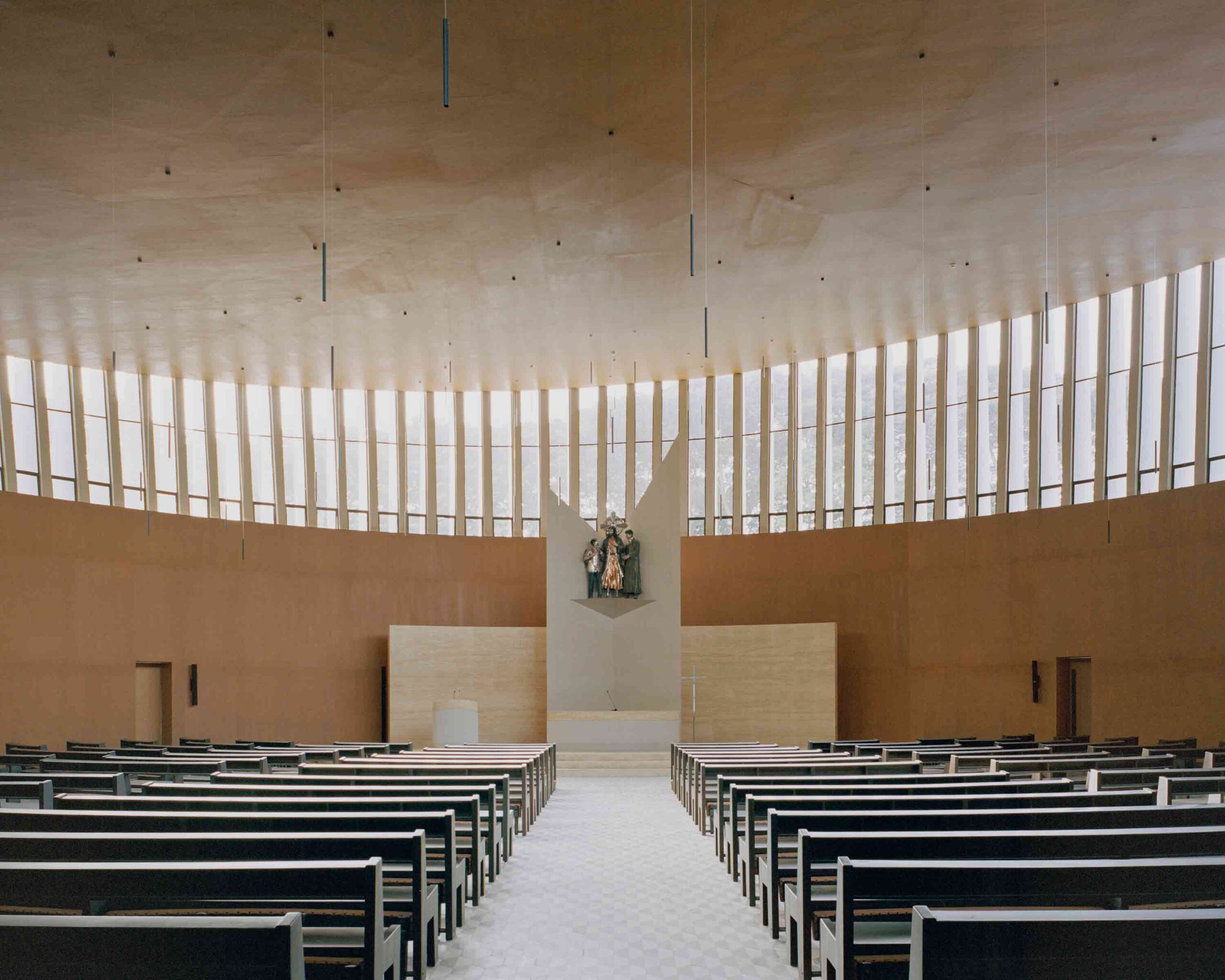
Swings typically consist of a seat made from a flat piece of metal, plastic, wood or canvas, but can also be made from found materials such as tyres and sometimes feature a wraparound design for added safety.

This seat is then suspended by sturdy lengths of rope or chain from a frame, ceiling or tree.

Swings have been used for hundreds of years by cultures across the world for both leisure and ritual-related purposes, and are enjoyed by people of all ages, from children in play areas to older people who might have swinging benches in their gardens.

From basic playground swings transplanted into grown-up interiors to intricately crafted bench swing seats that look out over lush courtyards, read on to view a selection of interiors on Dezeen that feature suspended seating.

This is the latest in our lookbooks series, which provides visual inspiration from Dezeen’s archive. For more inspiration, see previous lookbooks featuring interiors animated by indoor slides, living spaces featuring metal furniture and spaces with oversized windows.


Covered walkway with swing seat looking out onto an open-air courtyard with treesCovered walkway with swing seat looking out onto an open-air courtyard with trees
Photo by Ishita Sitwala

Gujarat house, India, by Design ni Dukaan

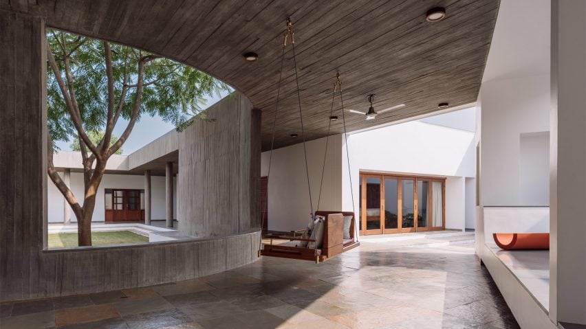
A wooden swing seat covered in pillows is suspended from the concrete ceiling of this house in the Indian state of Gujarat.

The swing is situated in one of the house’s covered walkways and was positioned to allow the sitter to enjoy views of its open-air courtyard.

Find out more about Gujarat house ›


Kenwood Lee House by Cousins & Cousins (RIBA house of the year longslist)Kenwood Lee House by Cousins & Cousins (RIBA house of the year longslist)
Photo by Jack Hobhouse

Kenwood Lee House, UK, by Cousins & Cousins

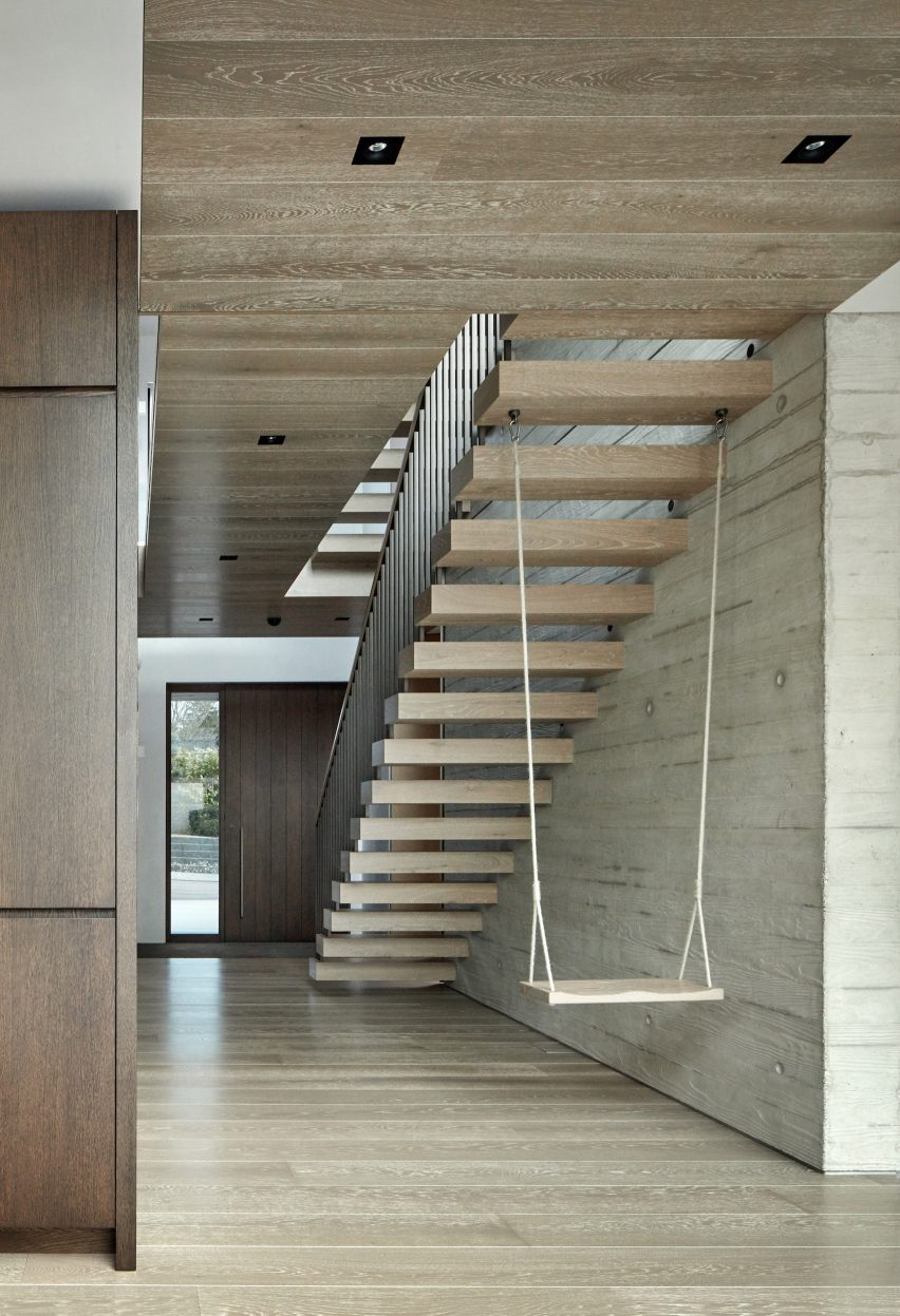
A cantilevered floating stair anchors a swing inside the hallway of this house in north London by local studio Cousins & Cousins.

The wooden seat is suspended by softly frayed rope, creating a subtly rustic composition that compliments both the poured-concrete finish of the walls and the wood used on the ceiling, cabinets and front door.

Find out more about Kenwood Lee House ›


Covered living space beside courtyard with swing seatCovered living space beside courtyard with swing seat
Photo by Yash R Jain

Karai, India, by Rain Studio

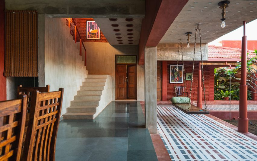
Local office Rain Studio hung a polished wooden swing seat overlooking a verdant courtyard in this house near the city of Chennai in southern India.

The seat is suspended from all four corners by ornately cast metal hooks and links, some of which feature animals such as elephants.

Find out more about Karai ›


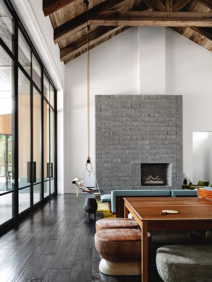
Living room with concrete fireplace and a swingLiving room with concrete fireplace and a swing
Photo by Chase Daniel

Austin House, USA, by Melanie Raines

Rustic Californian barns provided reference points for this house in Austin, Texas, which features a lofty double-height living space complete with multiple seating options.

A metal-framed lounge chair flanked by integrated side tables is suspended from the ceiling’s wooden rafters by two long lengths of rope, adding to the interior’s whimsical atmosphere.

Find out more about Austin house ›


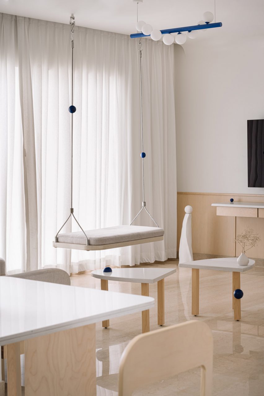
Living room interior of Out of the Blue apartment in IndiaLiving room interior of Out of the Blue apartment in India
Photo by The Fishy Project

Thane apartment, India, by The Act of Quad

Rigid metal uprights, each threaded with a cobalt-blue sphere, tie this swing seat in with the rest of the apartment’s blue-themed interior scheme, created by design studio Act of Quad.

The seat is softened by a slim cushioned pad and has been attached to the ceiling with metal hardware.

Find out more about Thane apartment ›


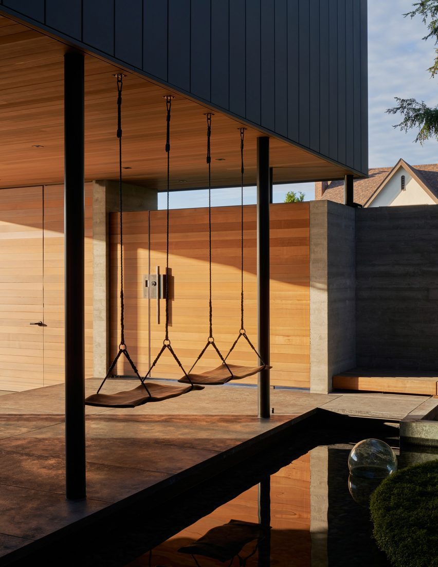
The Perch by Chadbourne + Doss ArchitectsThe Perch by Chadbourne + Doss Architects
Photo by Kevin Scott

The Perch, USA, by Chadbourne + Doss

A pair of swings are strung up on the boundary between a covered entryway and a courtyard pond in this house in Seattle.

The seats themselves were made from sheets of walnut timber and intended to provide the sitter with the experience of floating above the water.

Find out more about The Perch ›


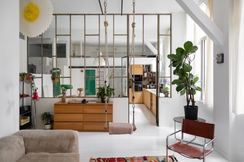
Living room in a high-ceilinged apartment with a swing hanging in itLiving room in a high-ceilinged apartment with a swing hanging in it
Photo by BCDF studio

Parisian loft, France, by Isabelle Heilmann

Hooks, carabiners and thick, knotted ropes affix this swing to the tall ceilings of this Parisian apartment’s living room.

The suspended seat slots in comfortably with the rest of the eclectically-chosen furniture, including a mid-century cantilevered chair and a slouchy, ribbed sofa.

Find out more about Parisian loft ›

This is the latest in our lookbooks series, which provides visual inspiration from Dezeen’s archive. For more inspiration, see previous lookbooks featuring interiors animated by indoor slides, living spaces featuring metal furniture and spaces with oversized windows.

Reference

Ten inspiring living spaces punctuated by structural columns
CategoriesInterior Design

Ten inspiring living spaces punctuated by structural columns

From monolithic concrete pillars to ornately decorated columns, this lookbook collates ten living room interiors that embrace existing structural columns.

It is not always cost-effective or practical for designers and architects to remove preexisting columns from interiors, especially if they are load-bearing and thus vital to the structural integrity of the building.

In the past, the structural components of buildings were often concealed within walls; however, this changed with the increase in popularity of open-plan spaces over the course of the 20th century.

Columns are sometimes placed at irregular intervals, especially in older buildings, and consequently the interior design scheme must be adapted to fit around them.

Pillars can provide a strong focal point that can be enhanced by both the choice of interior finishes and the placement of furniture around them.

Depending on their materiality and style, they can also serve as an immovable reminder of the building’s design style and the historical period in which it was built.

This is the latest in our lookbooks series, which provides visual inspiration from Dezeen’s archive. For more inspiration see previous lookbooks featuring interiors animated by textural burl wood, multicoloured interior design schemes and contemporary interiors that make a feature of historic ruins.


Grey chairs in living room with white column in cornerGrey chairs in living room with white column in corner
Photo by Pier Carthew

Kerr, Australia, by SSdH

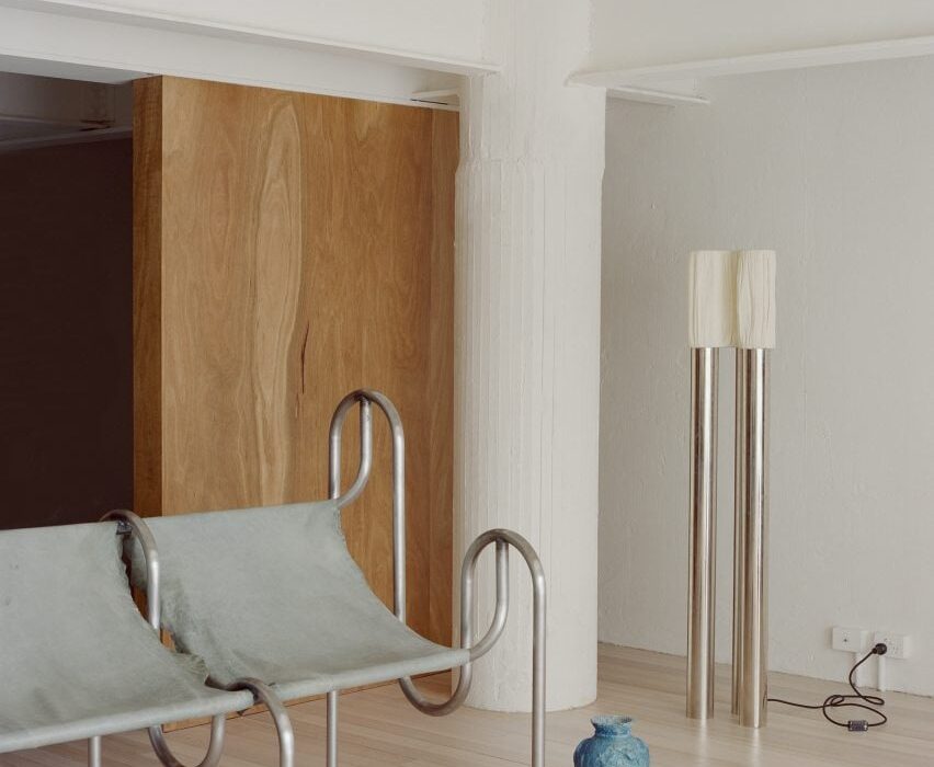
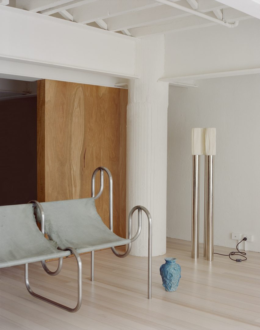
The industrial past of this mezzanine apartment in Melbourne is apparent thanks to the I-beams that crisscross the space and the pair of thick plastered columns in two corners of its living room.

The functional aesthetic of the pillars is complimented by the presence of streamlined metal furnishings and offset by floor-to-ceiling wooden panelling.

Find out more about Kerr ›


Kitchen with chrome counter in JJ16 apartment by Lucas y Hernández-GilKitchen with chrome counter in JJ16 apartment by Lucas y Hernández-Gil
Photo by Jose Hevia

JJ16, Spain, by Lucas y Hernández-Gil

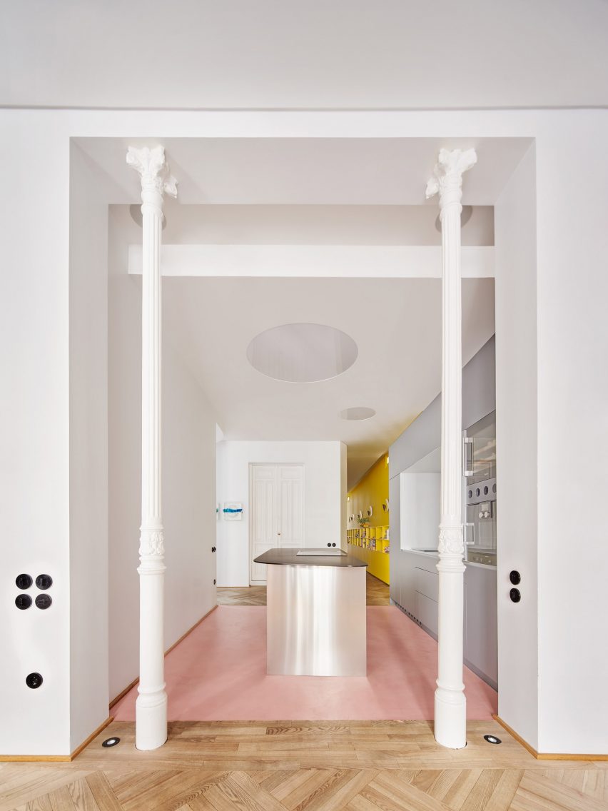
Situated in the Salamanca district of Madrid, local studio Lucas y Hernández-Gil created a playful interior for a high-ceilinged 19th-century apartment that combines pops of colour with original features.

A pair of elegant columns made from cast iron frame the entrance to the walk-through kitchen, contrasting the contemporary units with their fluted shafts and ornamented capitals.

Find out more about JJ16 ›


Living room with concrete column in itLiving room with concrete column in it
Photo by Fran Parente

Curitiba apartment, Brazil, by Leandro Garcia and Amanda Dalla-Bona

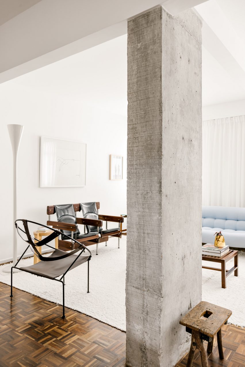
Eclectic furniture and glossy herringbone flooring contrast the weathered concrete pillar that sits on the boundary between the living and dining spaces of this apartment in the Brazilian city of Curitiba.

It has a rectangular footprint and a characterfully rough surface, which are both echoed in a gnarled wooden stool sitting at its base.

Find out more about Curitiba apartment›


Living room with mirrored wall and detailed columnsLiving room with mirrored wall and detailed columns
Photo by Sarah Elliott

Tribeca Loft, USA, by Andrea Leung

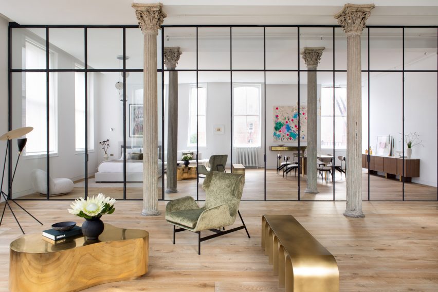
Public and private zones have been delineated by a partially mirrored wall tucked behind a sequence of three original, intricately formed columns in this loft apartment in New York’s Tribeca area.

The Corinthian-style iron pillars are characterised by gracefully fluted shafts topped by opulent capitals that feature acanthus leaves. The style was popular in ancient Greek and Roman architecture.

Find out more about Tribeca Loft ›


Living room with smooth white column in cornerLiving room with smooth white column in corner
Photo by Felix Speller and Child Studio

Mews house, UK, by Child Studio

A quartet of smooth, statuesque pillars blend in seamlessly against a backdrop of art deco and mid-century modern furnishings in the living area of this mews house in London’s Mayfair area.

The thick, pale pillars bring a dramatic air to the space, which was designed for lounging as well as hosting, entertaining and dining.

Find out more about the mews house ›


Living space with curved sofa and tiled columnsLiving space with curved sofa and tiled columns
Photo by Seth Caplan

Dumbo Loft, USA, by Crystal Sinclair Designs

Walls made from floor-to-ceiling glass panels and an opulent crystal chandelier create a sense of luxury in this Brooklyn apartment.

The living room is grounded by a double-height structural pillar, which has a bottom half clad in pale pink vertical, subway-style tiles.

Find out more about Dumbo Loft ›


Living space with kitchen in corner and stone pillar in centreLiving space with kitchen in corner and stone pillar in centre
Photo by José Hevia

Can Santacilia, Spain, by OHLAB

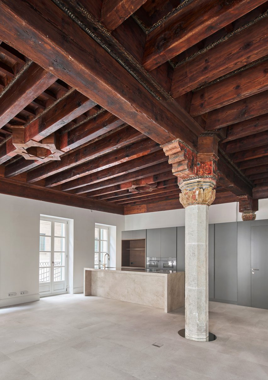
A pillar with a faceted stone shaft and an ornately carved and painted wooden capital is the focal point of this living area inside an apartment in Palma de Mallorca by local studio OHLAB.

The stately pillar and dramatic coffered ceiling are contrasted by the sleek modern kitchen, but united by the use of stone in both the column and kitchen island.

Find out more about Can Santacilia ›


Living area in a wooden houseLiving area in a wooden house
Photo by Nao Takahashi

Casa Nano, Japan, by Bosco Sodi

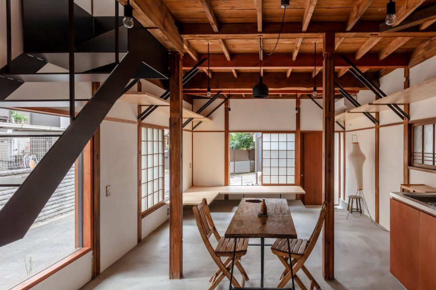
This modest home in Tokyo features slender struts made from wood that form part of the building’s exposed structure.

Wooden seating, tables, cabinets and shelving create a harmonious interior scheme, which is dominated by both the skeletal wooden frame of the building and an open-tread staircase.

Find out more about Casa Nano ›


Vasto gallery by Mesura apartment interiorVasto gallery by Mesura apartment interior
Photo by Salva López

Casa Vasto, Spain, by Mesura

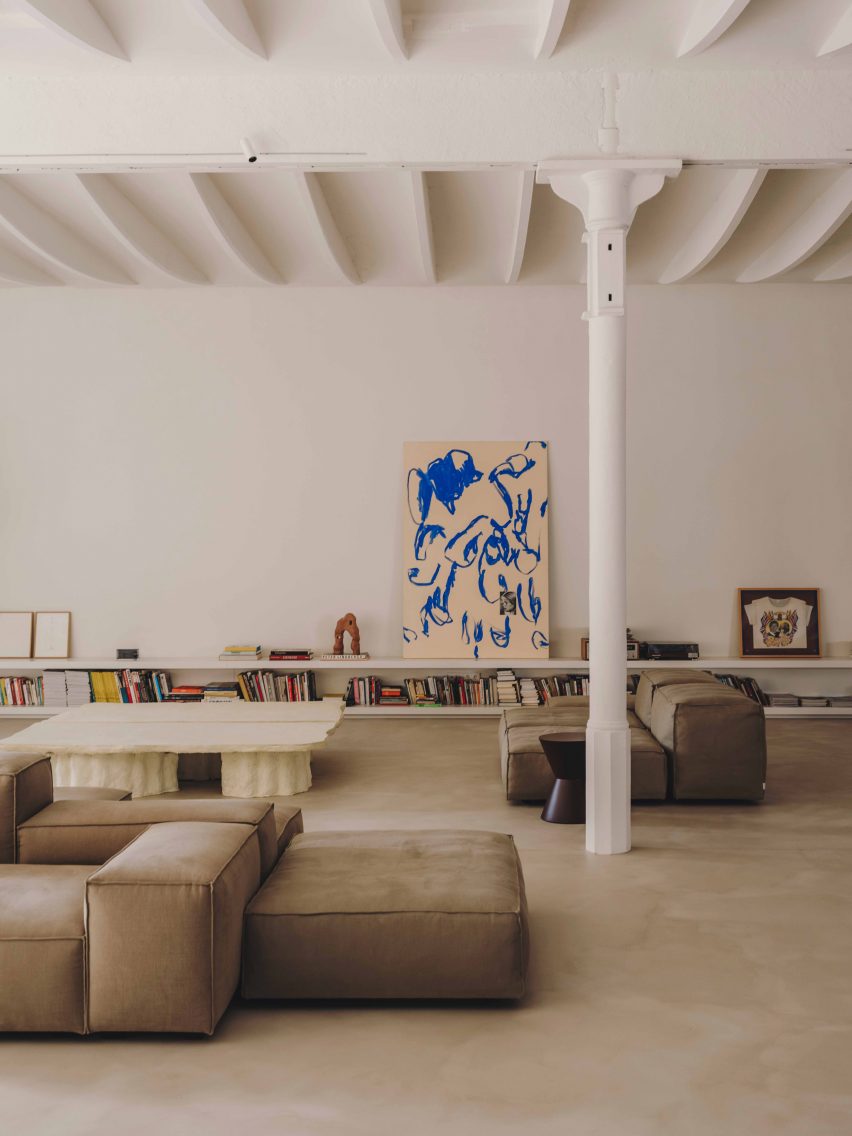
This apartment in Barcelona (above and main image) is studded with white-rendered columns dating from the 18th century, which anchor the unique vaulted ceiling to the expansive floor.

Low-slung furnishings provide a horizontal emphasis in the interior while the columns create a rhythm of upright pillars, which nod to the building’s industrial heritage.

Find out more about Casa Vasto ›


Brutalist Chelsea townhouse by PricegoreBrutalist Chelsea townhouse by Pricegore
Photo by Johan Dehlin

Brutalist Chelsea townhouse, UK, by Pricegore

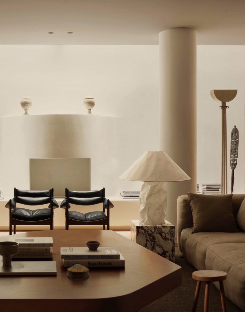
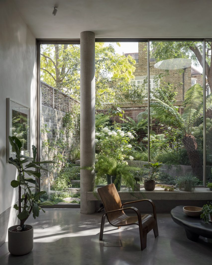
London-based architecture studio Pricegore refurbished the interior of this brutalist townhouse to celebrate its concrete materiality.

In the lofty, double-height living space, a cylindrical pillar stretches from floor to ceiling in front of the backdrop provided by the house’s verdant garden.

Find out more about Brutalist Chelsea townhouse ›

This is the latest in our lookbooks series, which provides visual inspiration from Dezeen’s archive. For more inspiration see previous lookbooks featuring interiors with textural burl wood, colourful interior design schemes and contemporary interiors that make a feature of existing historic ruins.

Reference

Framery predicts focus spaces to be key office design trend of 2024
CategoriesInterior Design

Framery predicts focus spaces to be key office design trend of 2024

Promotion: the need for well-considered focus spaces will come to the fore in workplace design in 2024, driven by the uptake of artificial intelligence, according to office pod brand Framery.

Framery says that the increase in AI in the workplace will result in it taking more responsibility for mundane, repetitive tasks, resulting in the need for additional focus spaces in open-plan offices to help support employees’ deep and focused tasks.

“If it happens how it’s expected and AI takes more responsibility for repetitive tasks, the office design should reflect this development and support deep, focused work,” said Tomi Nokelainen, head of Framery Labs, the company’s research and innovation unit.

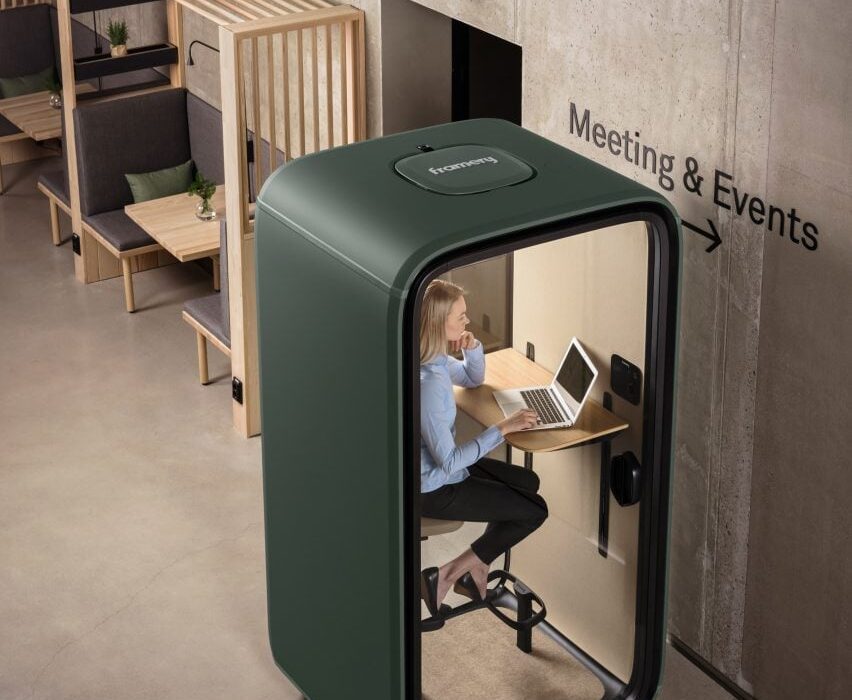
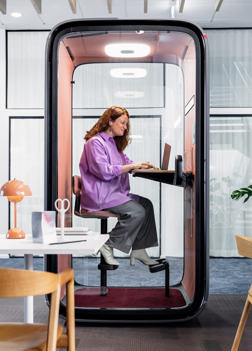
Photo of a woman sitting within a forest green-coloured single-person office pod working at a laptop. The pod sits within a modern office space surrounded by open workstations
Framery predicts focus areas will be the key office design trend of 2024

According to Framery, while post-pandemic hybrid office design placed an emphasis on the creation of collaborative spaces and “flashy common areas embodying organisational culture”, the next phase of this evolution will centre on creating areas that minimise distraction and allow for focused work.

“It’s noteworthy that employees value focused working spaces beyond collaborative spaces,” said Nokelainen. “With work complexity on the rise, there is a heightened demand for both acoustic and visual privacy.”

The company points to the findings of research company Leesman, which has reported that workers are still choosing to stay at home for solitary work. Leeman’s research suggested that some working activities were “better supported at home” including individual-focused work and planned meetings.

However, Framery says that when employees have the option to work from home, that may not be sufficient to fulfil their productivity needs.

“It can’t be assumed that all employees have the luxury of a dedicated home office room, or are willing to invest in expensive desks or ergonomic chairs,” said Nokelainen.

Photo of a woman working at a laptop within a closed office pod that has two transparent and two solid walls. The pod is located within a breakout space with more casual, open table seating
Office workers value focus areas more than collaborative spaces, Framery research finds

Framery, a Finnish brand, was one of the first to enter the office pods space in 2010, creating soundproof booths that drown out external distractions so that employees can undertake focused work or conduct video conferencing calls.

According to Framery Labs’ research, focus spaces are the number one desired perk for employees that would draw them into working in the office rather than at home and they address distractions to focused work, for example, noise.

Only 33 per cent of employees report finding noise levels satisfactory in their workplace and dissatisfaction with noise has the strongest correlation to an employee saying that the design of their workplace does not support their personal productivity.

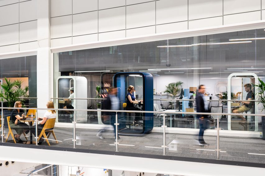
Photo or rendering of a modern, busy office incorporating several single-person work pods where people are working on their laptops in peace
The pods are soundproof so external noise is not a distraction

This can be especially consequential for neurodiverse people, who constitute around 15 to 20 per cent of the global population and who can have a greater sensitivity to sensory stimuli, according to the brand.

With workplaces becoming more inclusive, the next step will be to design them to function as “a catalyst not a barrier to productivity”, said Nokelainen, with a recognition that different people have different needs.

“There are no one-size-fits-all focus spaces – they can be everything from silent open areas, library-like spaces, private offices or pods,” said Nokelainen. “Each role and industry has their own special needs that must be taken into account.”

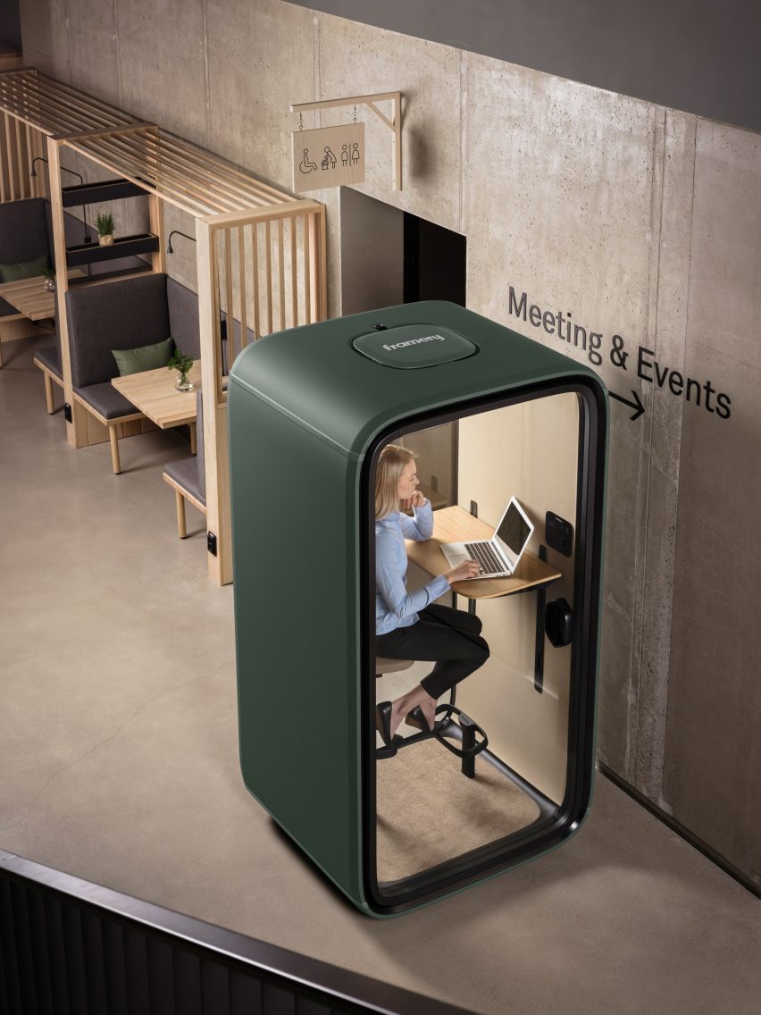
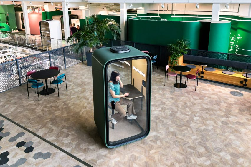
Photo or rendering of a forest green Framery One office pod within a contemporary office, placed within an otherwise open breakout space with cafe-style tables and chairs
The Framery One pod is Framery’s bestselling product

These considerations can be addressed with products like the Framery One, Framery’s bestselling office pod. A single-person workstation for focused work that is also optimised for virtual meetings, it includes soft lighting and adjustable ventilation to help create a personalised environment.

In a closed pod like this, neurodiverse people can apply “sensory integration techniques”, said Nokelainen which means incorporating the sensory tools or approaches that promote calm and focus for them.

There are also multi-person pods like the Framery Q Flow, one of the newest models. It is designed to help enable workers to achieve the “flow” state of mind, where work feels effortless and time switches off, and includes a height-adjustable electric table so that users can shift positions without interrupting their thought process.

The office pods come with Framery Connect, an integrated workplace management tool that supplies detailed data and analysis around how often and when they’re being used.

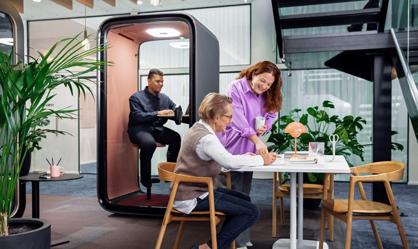
Photo of a man using the Framery One pod in an office while two women collaborate on a table outside
The pods include the Framery Connect workplace management system

Framery says it prides itself on the quality of its soundproof office pods, as well as having been among the first to bring the product category to the market. The company launched 13 years ago after its founder – Samu Hällfors – devised a solution to address the distraction caused by his boss’s loud phone calls.

“Our founder and CEO Samu Hällfors invented the office pod category in 2010,” said Framery. “Now we have over 200 competitors globally. To ensure we stay the market leader we are relentlessly innovating to engineer the most advanced pod in the world.”

Framery also has a sustainable and responsible ethos and has made a commitment to converting to a circular business model.

To find out more about Framery and its products, visit the brand’s website.

Partnership content

This article was written by Dezeen for Framery as part of a partnership. Find out more about Dezeen partnership content here.

Reference

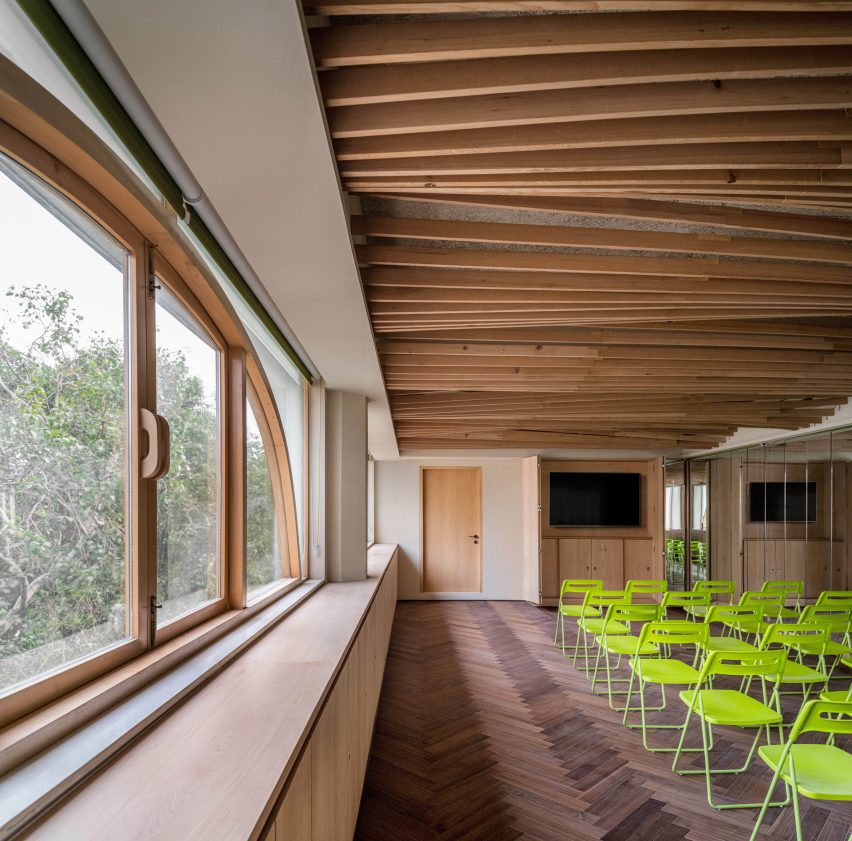
Studio Hinge creates library spaces beneath tree-like wooden columns
CategoriesInterior Design

Studio Hinge creates library spaces beneath tree-like wooden columns

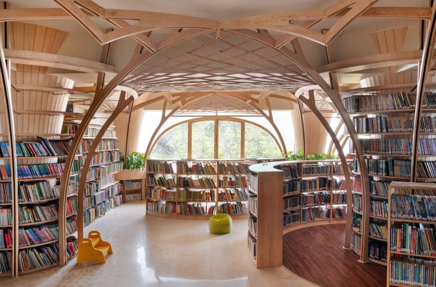
Indian practice Studio Hinge has completed Forest of Knowledge, a library in Mumbai that sits beneath a tree-like canopy of latticed wood.

The library was designed for the Cricket Club of India, a member’s club dating back to the 1930s that is housed in an art deco building in southern Mumbai.

Forest pf Knowledge library
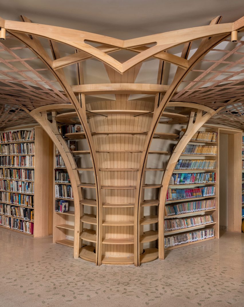
Columns were created to resemble tree trunks

Adapting the third floor of this building, Studio Hinge looked to recreate the feeling of “sitting under a tree with a book” by reimagining the structure’s concrete columns as tree trunks.

Alongside, a former Zumba studio has been updated to be used as a flexible space for book clubs, film screenings and workshops.

Library interior in India
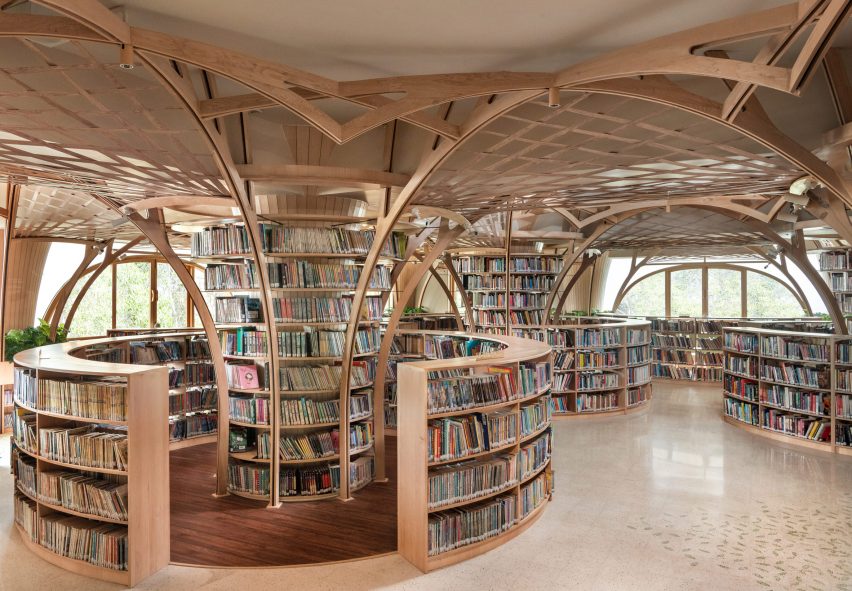
Circular bookshelves sit underneath the “canopy”

“India experienced one of the harshest and most sudden covid lockdowns in the world, and a lot of the design of the library was developed during this time, during which it was clear that people were yearning to meet and share ideas in person again,” explained the studio.

“On a conceptual level, the design draws from nature, in particular the notion of sitting under a tree with a book, and also borrows from the beautiful canopy formed by the ficus and gulmohar trees to be found in the adjacent street,” it continued.

Wooden shelving in Forest of Knowledge
The shelves are connected by plank-covered steel frames

A steel frame covered with small wooden planks lines each of the concrete columns.

This integrates shelving and extends upwards to create arched forms across the ceiling that are then connected in areas with a wooden lattice.

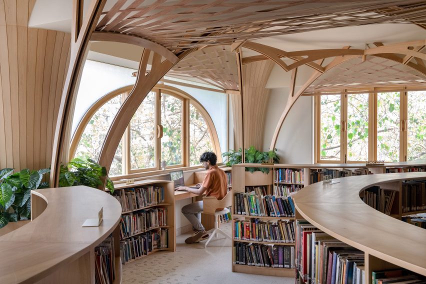
Curving bookshelves have been organised in a circle at the base of each column, with seating areas at the edges of the floor plate creating a variety of different conditions and atmospheres for visitors.

On the library’s floor, custom terrazzo tiles feature a pattern of green “leaves” with a circle of wooden flooring used at the base of each column.

Visitor at library in Mumbai
The floor was decorated with a leaf pattern

“Care has been taken to ensure no bookshelf in the open space is taller than 1.2m,” explained Studio Hinge.

“This allows maximum natural light to permeate deep into the plan and for most adults to have an unobstructed view whilst standing, while creating sheltered semi-private nooks to sit and read in,” it added.

“It also provides a very different perception of the library for children, from whose vantage the space between the circular bookshelves is playful, almost labyrinthine in nature.”

Multipurpose room in Forest of Knowledge library
A ceiling of timber planks adds interest to the multipurpose room

In the multipurpose room, the ceiling has been finished with an undulating pattern of timber planks and the walls lined with cabinets to maximise storage.

Forest of Knowledge was recently longlisted in the workplace interior (small) category of Dezeen Awards 2023.

Elsewhere in Mumbai, The Act of Quad recently converted a former library into its own interior design studio, with a see-through facade of perforated, white metal sheets and Malik Architecture transformed an ice factory into an events space.

The photography is by Suryan + Dang.


Project credits:

Design team: Interior Architecture – Studio Hinge, Pravir Sethi, Chintan Zalavadiya
Lighting design: Studio Trace, Tripti Sahni
MEP: ARKK Consultants

Reference

Transcending Typology: 6 Ways Architects Are Transforming New Spiritual Spaces
CategoriesArchitecture

Transcending Typology: 6 Ways Architects Are Transforming New Spiritual Spaces

The latest edition of “Architizer: The World’s Best Architecture” — a stunning, hardbound book celebrating the most inspiring contemporary architecture from around the globe — is now available. Order your copy today.  

Religion is steeped in symbolism, and places of worship are, by extension, physical manifestations of these belief systems. Architecture is a powerful vehicle for spirituality. It allows the ethereal, the conceptual, to be made tangible and concrete. Spatial design can give form to the cornerstones of faith, orchestrating vast volumes of veneration and shaping intimate nooks for introspection.

Yet, we’ve moved far beyond traditional, time-honored typologies of religious space. Architects continue to experiment with light, scale and form to create subversive and surprising sacred structures. From awe-inspiring parametric projects to a meditative woodland retreat, discover the ways these wonderous places of worship, recognized at the 11th A+Awards, are forging new pathways to architectural enlightenment.


1. Calling on Curvilinear Forms

Sanctuario De La Salle by CAZA, Biñan, Philippines

Jury Winner, 11th Annual A+Awards, Religious Buildings & Memorials

Sanctuario De La Salle by CAZA

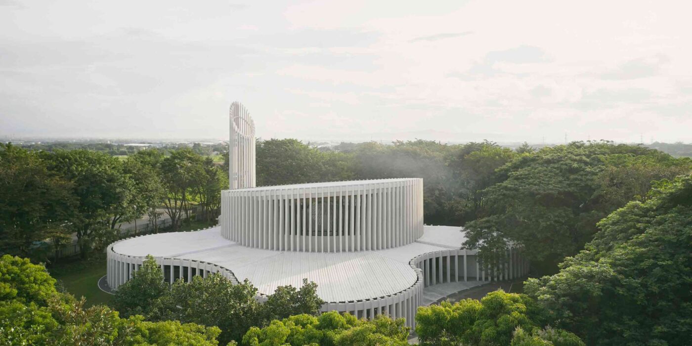
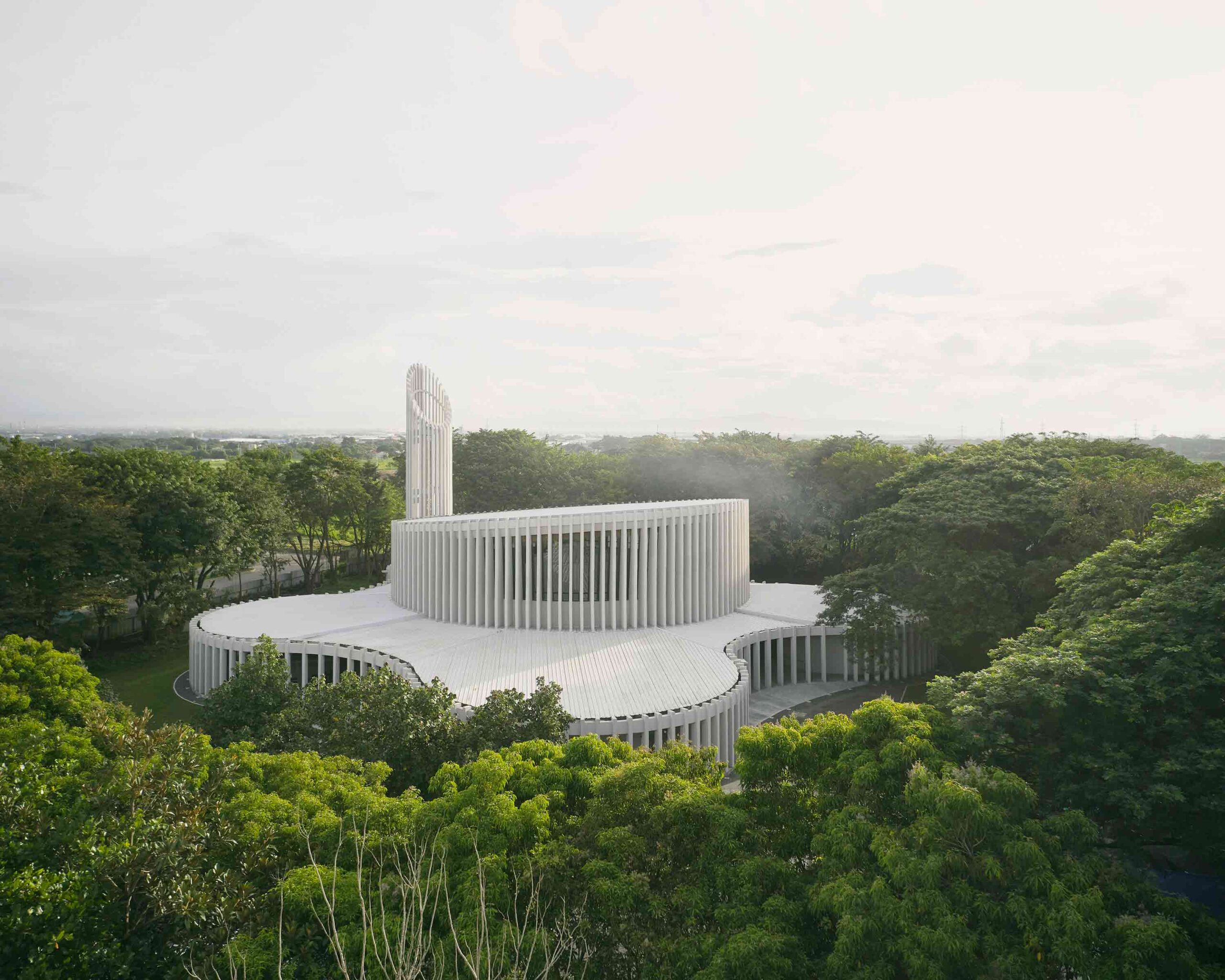
Sanctuario De La Salle by CAZAIn a dramatic departure from the historic cruciform plan, this remarkable church in the Philippines is defined by its striking, amorphous form. Shrouded by woodland, the mysterious edifice is veiled by a rhythmic curtain of white slats, eschewing precise angles for flowing, curvilinear lines. The building embraces organic shapes, while its permeable façade establishes a dialogue between the inner world of worship and the external landscape.
At the heart of the church is the drum-shaped congregation hall, framed by a sweeping clerestory window. Above, the tilted ceiling evokes the orbital arc of the planets, reinforcing the connection between the congregation and the wider universe. A series of spherical rooms flank the hall, situated within a larger circulatory area, the small pockets forming a communal space greater than the sum of its parts.


2. Experimenting With Glazing

Church of the Holy Family by ARQBR Arquitectura e Urbanismo, Brasília, Brazil

Popular Choice Winner, 11th Annual A+Awards, Religious Buildings & Memorials

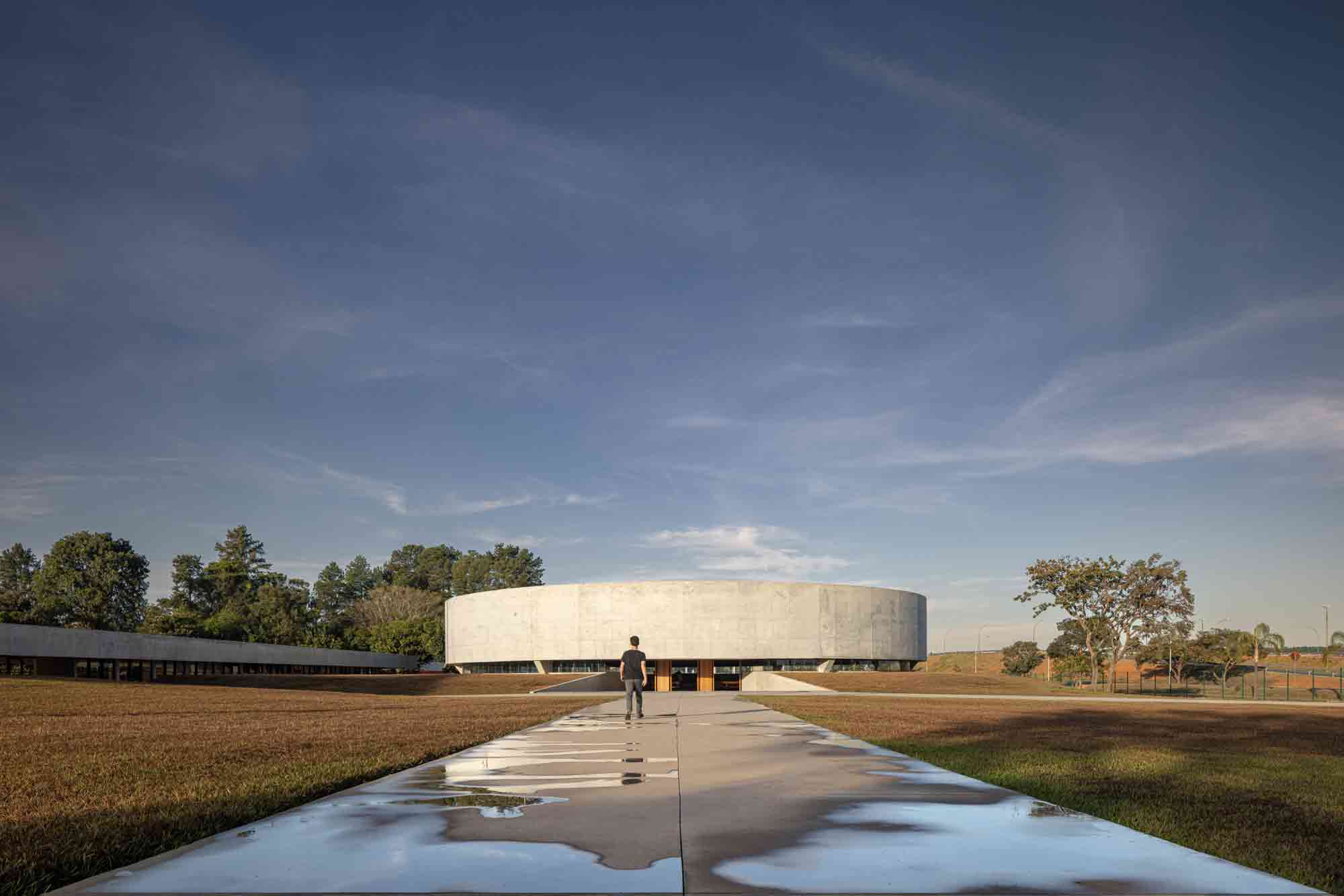
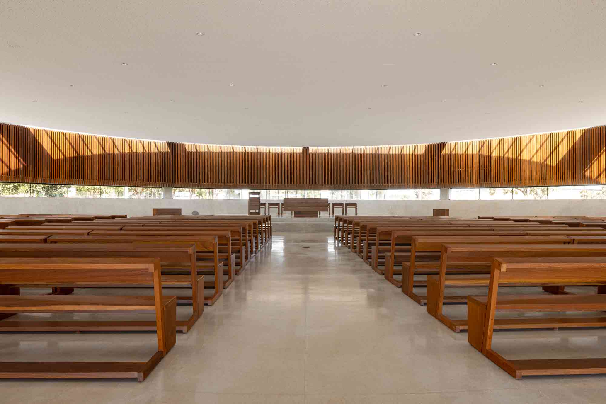
Church of the Holy Family by ARQBR Arquitectura e Urbanismo Church of the Holy Family by ARQBR Arquitectura e UrbanismoA casualty of urbanization, the trees that once surrounded this site in Brasília were all but removed to make way for an adjacent expressway. The acreage’s new Catholic church seeks to reawaken the bucolic soul of the land and illuminate the relationship between the spiritual and environmental realms.
The circular nave, peaceful in its monolithic presence, is partially embedded underground, beneath the natural height of the plot. Inside, parallel ribbons of glazing encase the perimeter. Inset into the roof, a ring of skylights illuminates the ripple of wood panels below. A sweeping glass band rises behind the lectern, balancing on the horizon, drawing the external terrain in. This remarkable project recenters and internalizes the landscape, infusing it with religious significance.


3. Memorializing the Past

Saint Sarkis Church by David Hotson_Architect, Carrollton, Texas

Finalist, 11th Annual A+Awards, Religious Buildings & Memorials

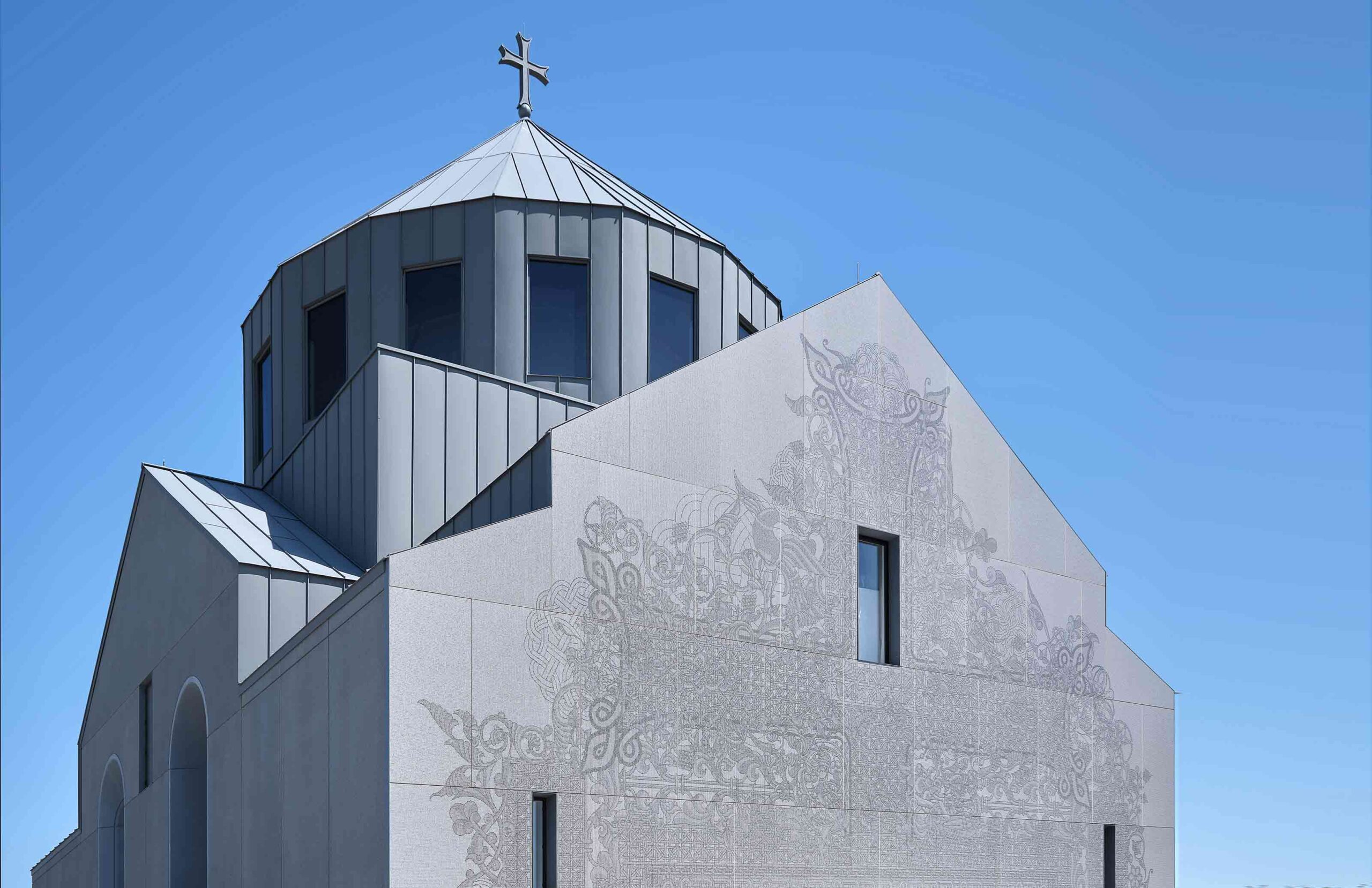
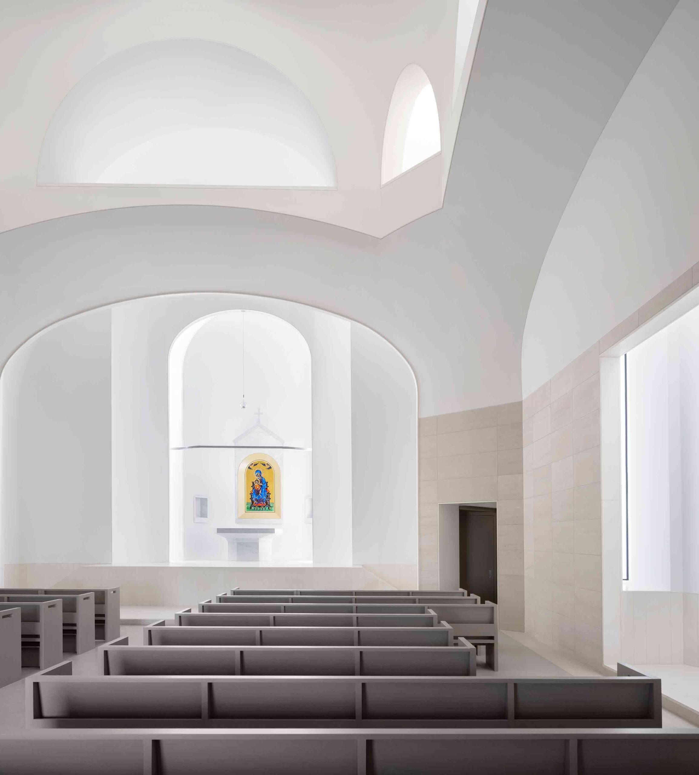
Saint Sarkis Church by David Hotson_Architect Saint Sarkis Church by David Hotson_ArchitectWhile this astonishing church stands in East Texas, it draws on an ecclesiastical tradition some 8,000 miles away. A homage to the historic Armenian church of Saint Hripsime, it features the same domed form, built some 1,400 years on from its counterpart. The structure’s sculptural interior, carved from glass-fiber reinforced concrete, follows the lead of its ancient inspiration. Lighting fixtures, air-conditioning ducts and other modern interventions have been skilfully concealed, creating an ethereal finish that transcends time.
The very fabric of this grand edifice was conceived as a moving memorial too. The west façade is clad in digitally printed porcelain rainscreen, depicting the traditional Armenian cross and motifs drawn from the country’s vernacular art. Yet, upon closer examination, a secondary layer of meaning unfurls — the design dissolves into 1.5 million infinitesimal pixels, representative of the victims of the Armenian genocide.


4. Honoring the Organic World

Meristem Chapel by MOTIV Architects, Surrey, Canada

Finalist, 11th Annual A+Awards, Pavilions

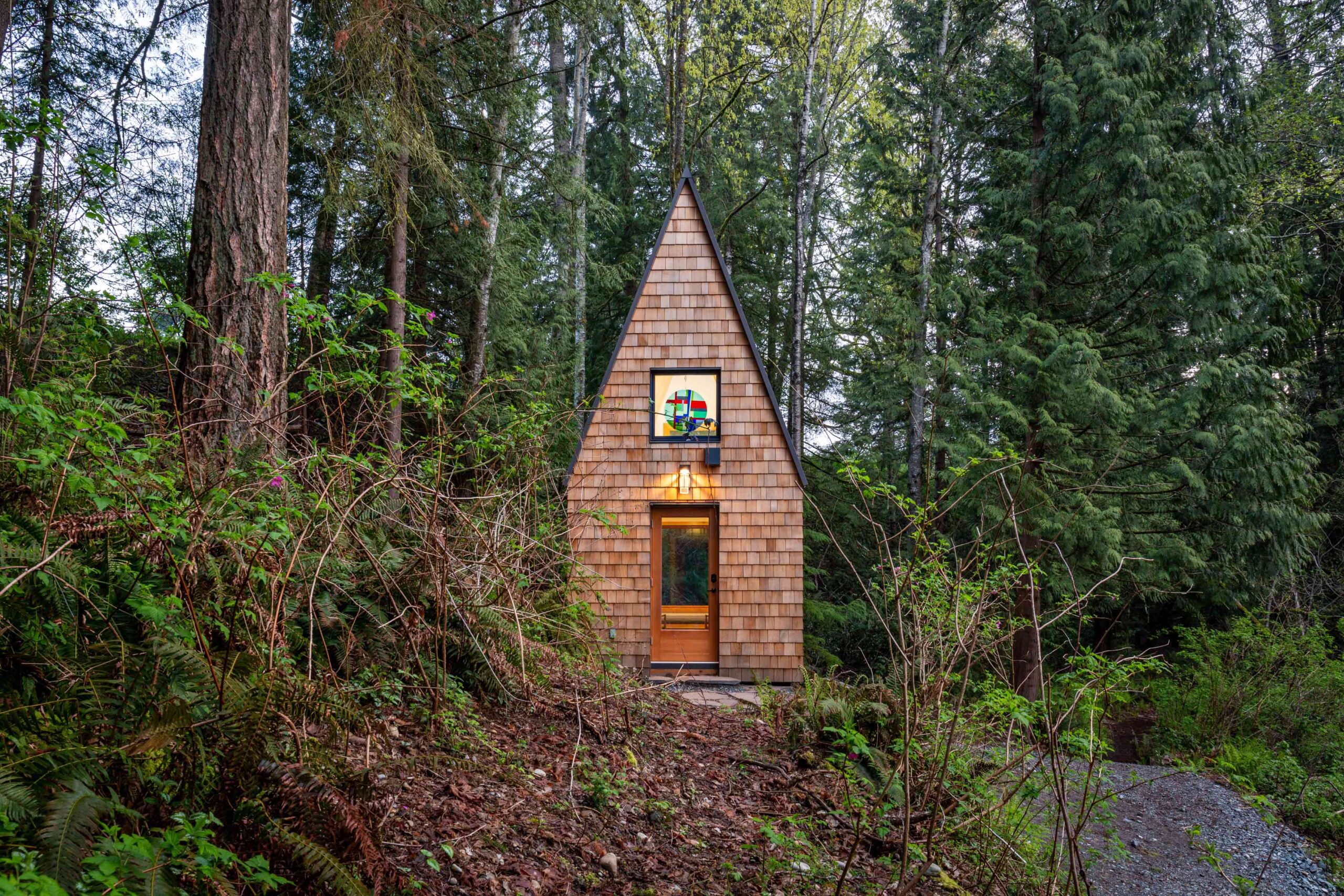
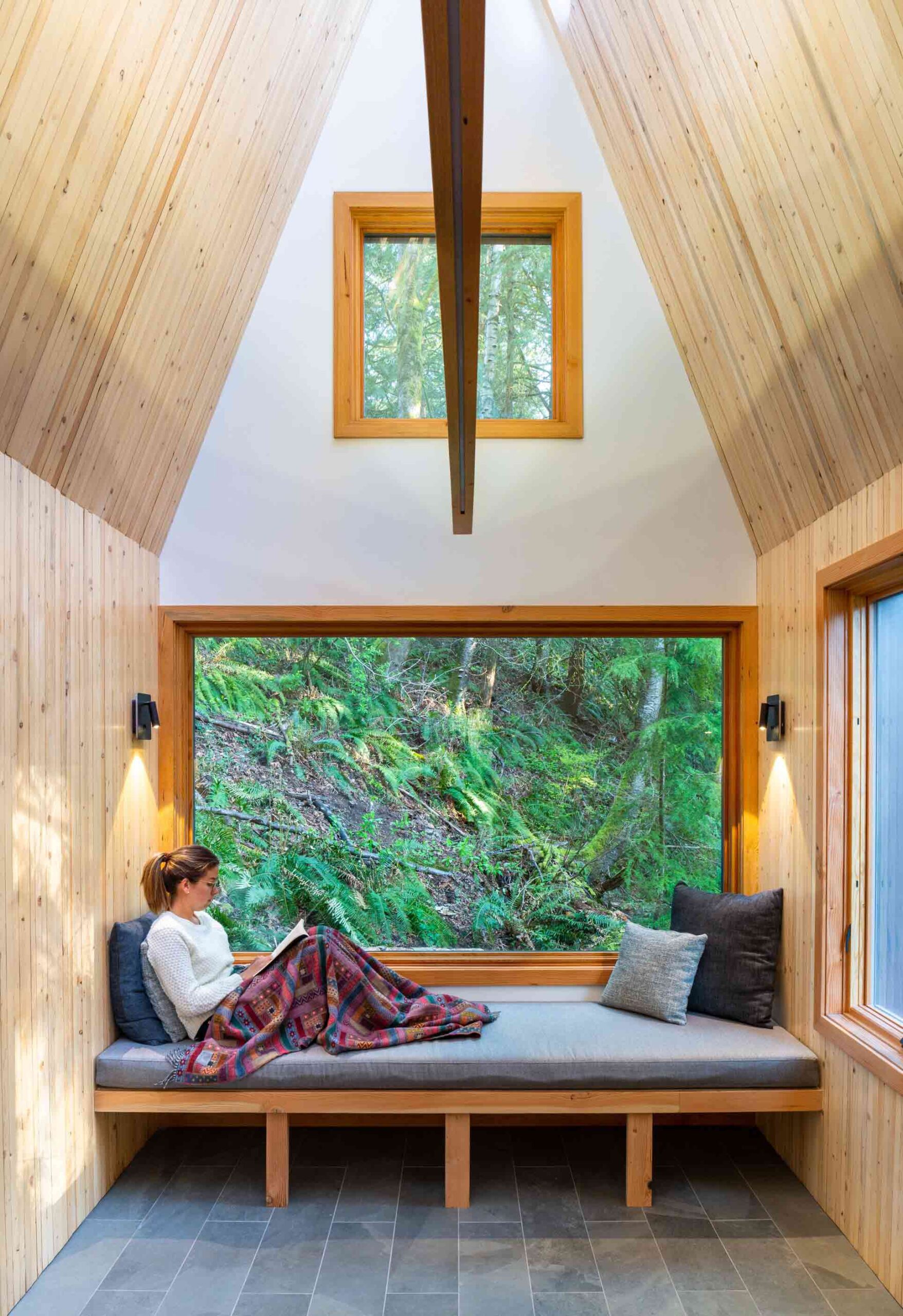
Meristem Chapel by MOTIV Architects Meristem Chapel by MOTIV ArchitectsThis enchanting chapel in British Columbia was conceived as a peaceful place of reflection and reconnection with the organic landscape, at a distance from the frenetic hubbub of modern life. Its name, Meristem, references a plant tissue found in the roots and shoots of foliage, which instigates the growth of new cells. In the same way, this unassuming space seeks to instill spiritual growth in those who find refuge within its walls.
Nestled in woodland, the structure’s steeply pitched form mirrors the silhouette of the surrounding conifers. The materials used in its construction are deeply rooted in the chapel’s locale — plywood and nail-laminated timber panels were salvaged from deconstructed buildings less than 200 meters from the site. Exposed wood envelops the interior, forming a calming space for contemplation. Twelve skylights are embedded in the ridge of the roof, casting mesmerizing sunbeams across the woodwork.


5. Playing with Perforated Skins

Kol Emeth Center by Field Architecture, Palo Alto, California

Finalist, 11th Annual A+Awards, Religious Buildings & Memorials
Finalist, 11th Annual A+Awards, Sustainable Cultural/Institutional Building

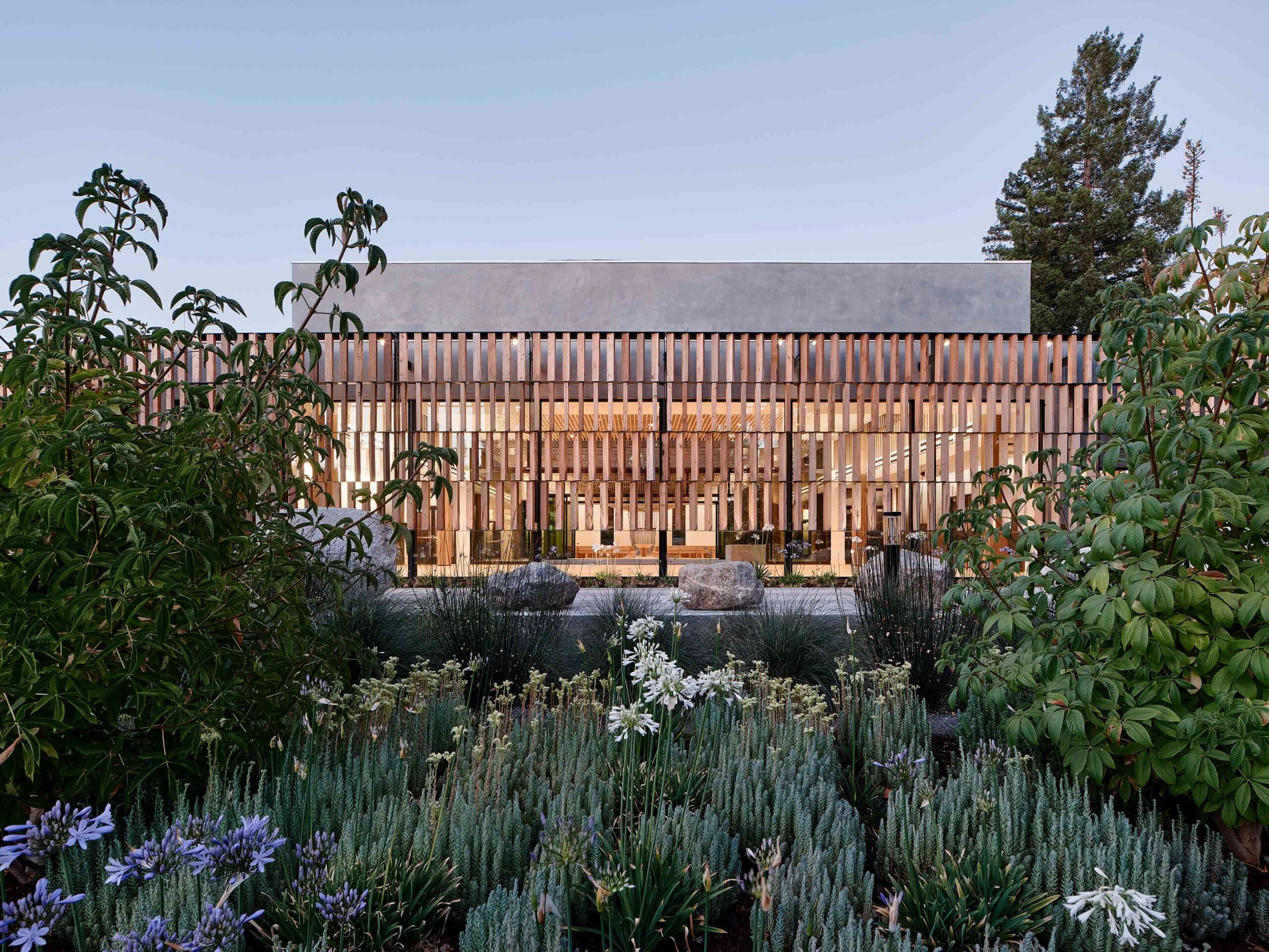
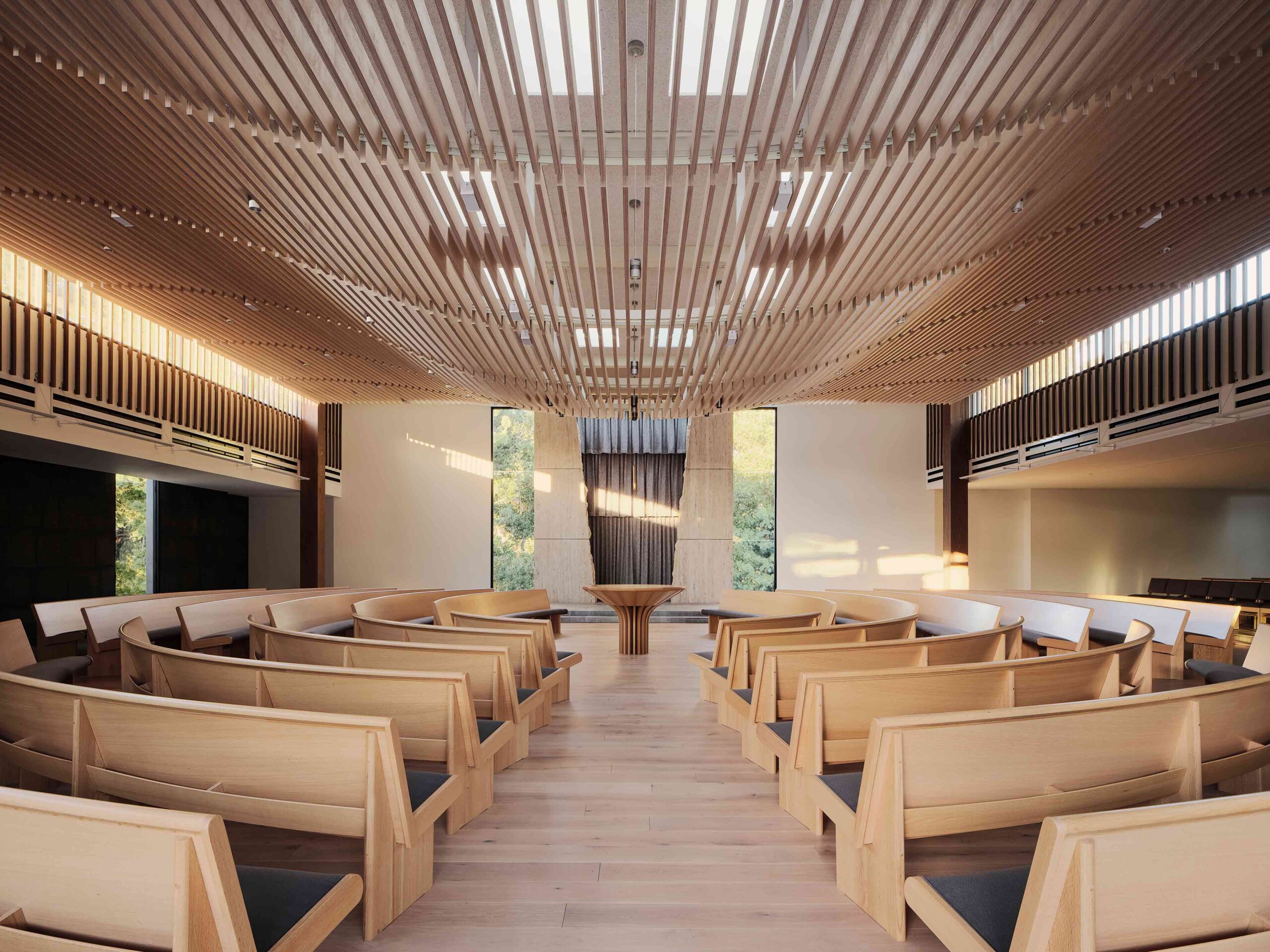
Kol Emeth Center by Field Architecture Kol Emeth Center by Field ArchitectureEnvisaged as a progressive beacon, this extraordinary synagogue in California combines centuries-old tradition with modern values, articulated through cutting-edge construction methods. The project negotiated a number of restrictions, including an awkward, triangular plot, a single-story height limit and a tight budget. The result is a versatile place of worship that utilizes humble materials and honors the structure’s environmental context.
The building’s sleek, glazed frame is encircled by a striking perforated skin. A stunning example of parametric design, four tiers of rotating timber slats have been carefully calibrated to maximize the site’s light levels. In the prayer hall, a slatted dropped ceiling falls in organic undulations, allowing light from the glazing above to filter through. Thanks to the synagogue’s porous shroud, its spiritual spaces are punctuated with glimpses of the verdant woodlands and wildflowers.


6. Merging Unexpected Typologies

Madaline Terrace by Dake Wells Architecture, Springfield, Missouri

Special Mention, 11th Annual A+Awards, Religious Buildings & Memorials

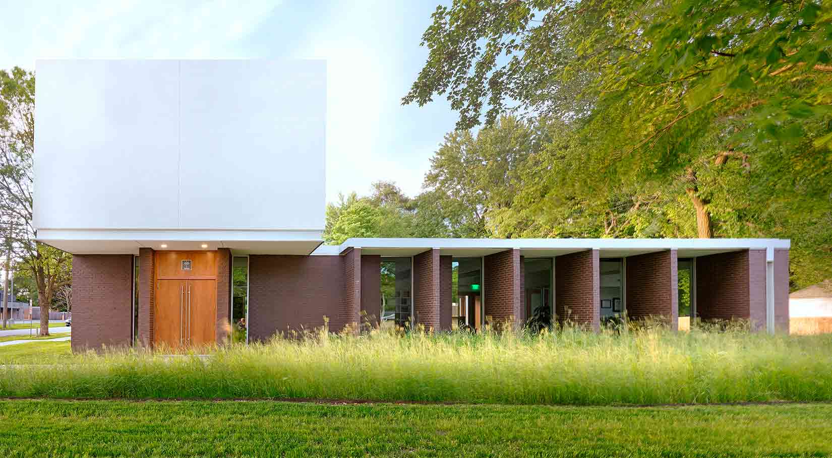
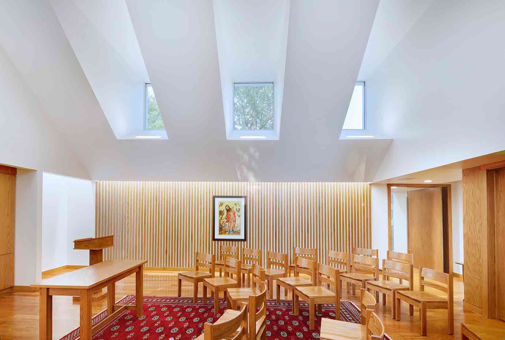
Madaline Terrace by Dake Wells Architecture Madaline Terrace by Dake Wells ArchitectureThis innovative project sits at a juncture between contrasting worlds. Bridging Springfield’s energetic commercial district and a quiet neighborhood, the building fuses two surprising typologies: a private law practice and a chapel. Visually compelling, the modernist-inspired structure masterfully balances the needs of its client, a minister and attorney with a proclivity for Le Corbusier and Louis Kahn.
The building reads as a tale of two functions, belied by a unifying architectural thread. A low pavilion houses the law office, accentuated by protruding fins that offer shade from the Missouri sun. Meanwhile, the chapel is expressed as a white cubic volume floating above the brickwork. Inside, the mass has been carved into a majestic, vaulted space. The sequestered glazing in the roof becomes a series of picture frames, capturing snapshots of the tree canopy while obscuring the hustle and bustle of the thoroughfare below.

The latest edition of “Architizer: The World’s Best Architecture” — a stunning, hardbound book celebrating the most inspiring contemporary architecture from around the globe — is now available. Order your copy today.  

Reference

Productora converts Mexico City textile factory into artist spaces
CategoriesArchitecture

Productora converts Mexico City textile factory into artist spaces

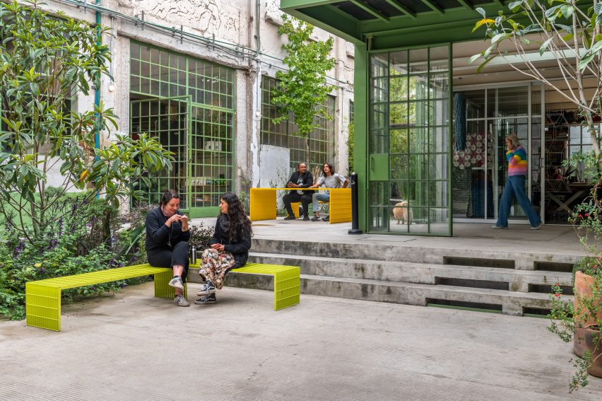
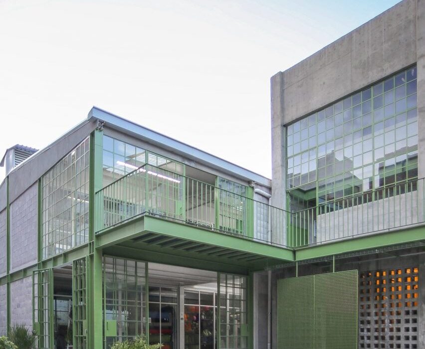
Mexican architecture studio Productora has restored a concrete industrial complex in Mexico City into a series of studios including its own office.

Productora has been gradually renovating the building, which was originally a textile factory built in the 1920s, since it moved its offices to the structure following an earthquake in 2017.

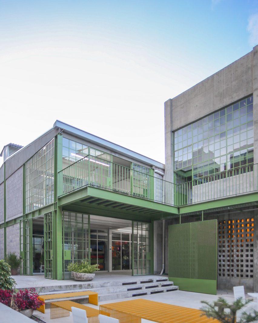
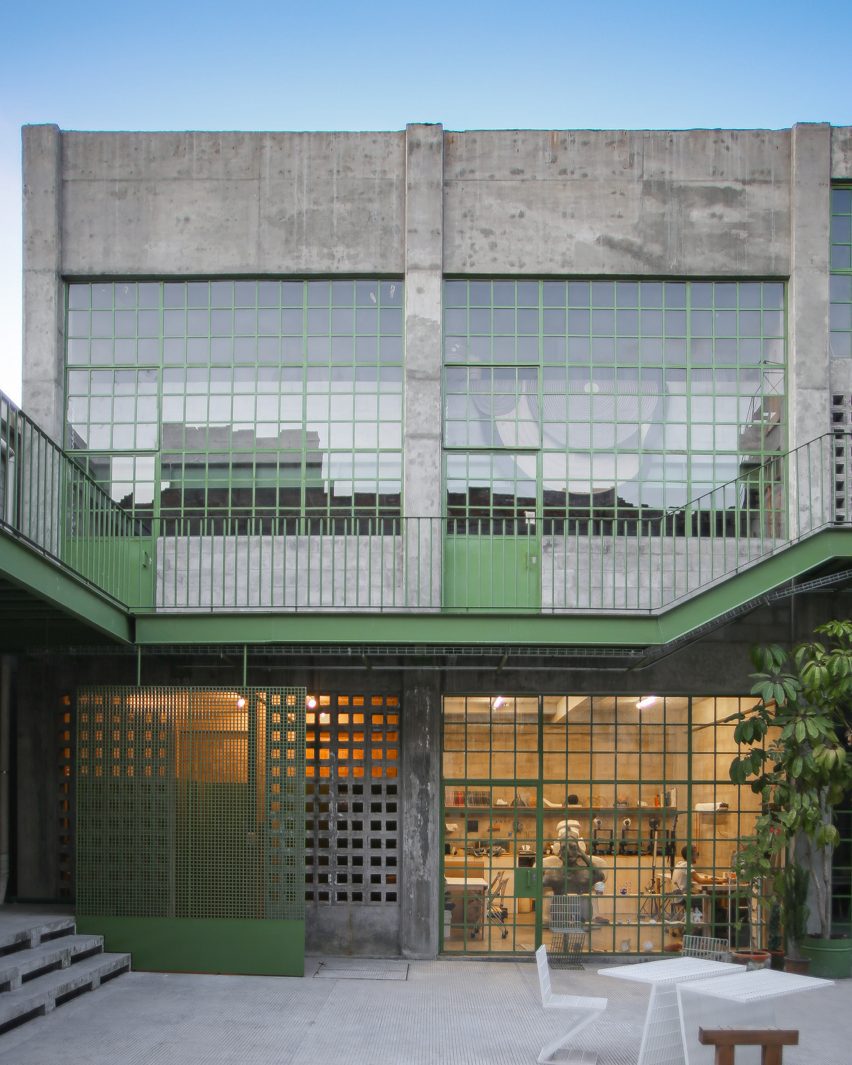
Green trimmed concrete reuse project
Productora has renovated an industrial site in Mexico City where it has an office

The studio originally took up residence in an empty “nave” in the factory in Mexico City’s Doctores neighbourhood along a furniture company.

Since then, the studio has been “slowly rebuilding the complex while inhabiting it” and more than twenty other companies have moved into the complex, which is now called Laguna,

Concrete and green trim in Mexico City
New buildings were added to the cleared courtyards in the middle of the complex

For the renovation, the studio focused on the interior of the complex while leaving the street-facing, painted-concrete exterior, generally untouched so that one might not know the complex is there at all.

The complex is now orientated around two courtyards that were cleared of existing structures to create new circulation and gathering areas.

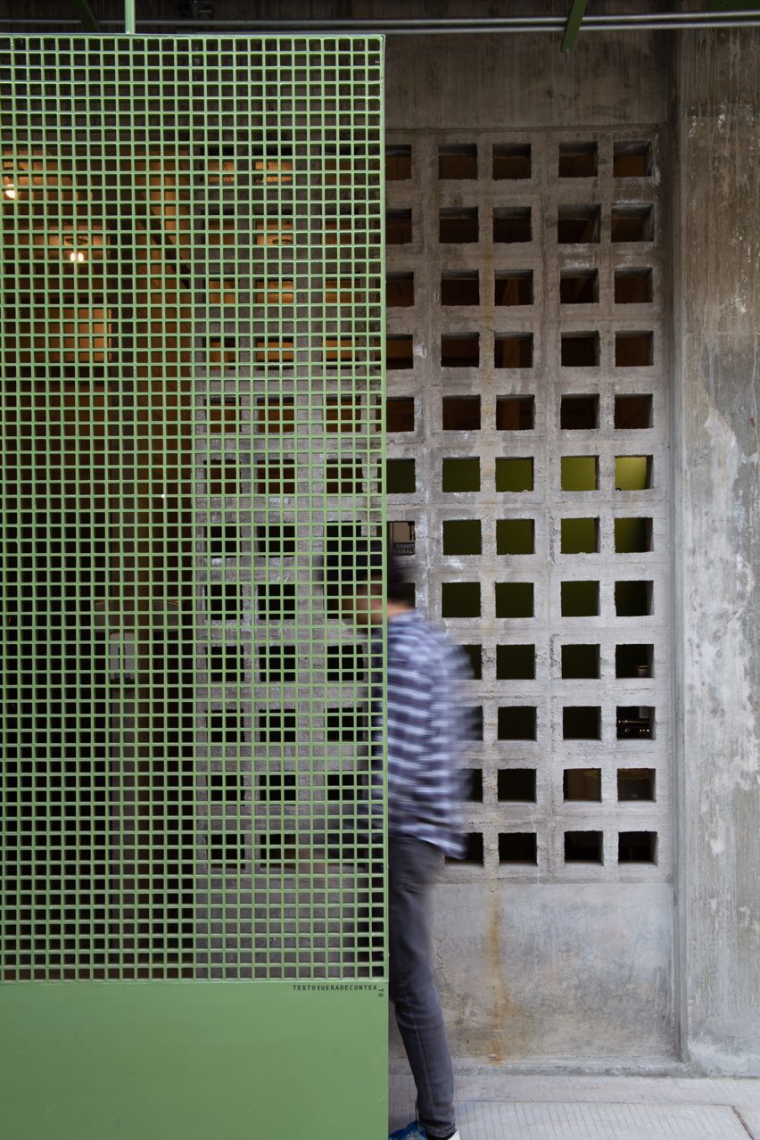
Green metal screen with concrete breeze blocks
The site was once a textile factory

Within these courtyard spaces, a mix of newly built concrete workshops and the renovation of existing brick-and-mortar and concrete buildings will continue to take place over the next several years. The studio said it hopes that the project will be one of “constant adaptation and transformation”.

Now, the most significant aspects of the renovation have been the cleared courtyards and added buildings, as well as expressive walkways and a new freight elevator that towers above the site.

Green detailing was chosen because it was prominent in the trim of the windows and roof on the facade of the original structure, and these green details continue along the causeways and in the gridded window frames.

People on benches in Mexico City art space
Gathering spaces have been included in the courtyards. Photo by Camila Cossio

Social spaces have been installed in the courtyards so that members of the various companies can gather.

In the future, Productora plans to build wooden workshops on top of the preexisting structure to create flexible and modular extensions to the current program.

Jozz Gómez, a coordinator for Laguna, said that the presence of the complex has also positively changed the environment around the complex.

“It started to bring more employment, but also changed the neighbourhood,” she told Dezeen.

“It was known to be a very dangerous neighbourhood, but after the project started, you can see foreigners, students, and young people walking around the streets.”

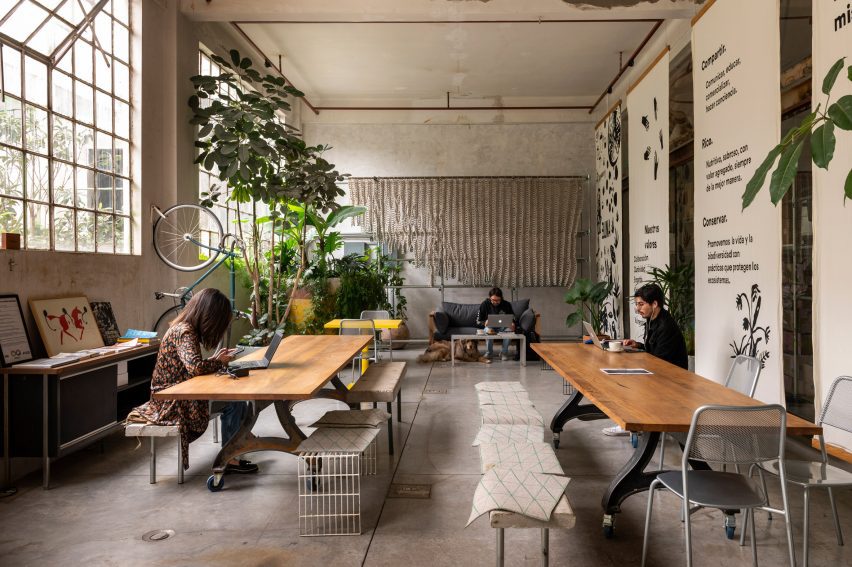
Office spaces in industrial spaces
It holds office space for creative studios. Photo by Camila Cossio.

Productora was founded in 2006 and has additional offices in Brooklyn. Recent projects include a hotel in San Miguel de Allende clad in red and green tile as well as a bright-blue cohousing project in Denver, Colorado, USA.

The photography is by Pablo Manjarrez. Top photo by Camila Cossio. 

Reference

Luchetti Krelle brings laid-back luxury to social spaces of Manly Pacific
CategoriesInterior Design

Luchetti Krelle brings laid-back luxury to social spaces of Manly Pacific

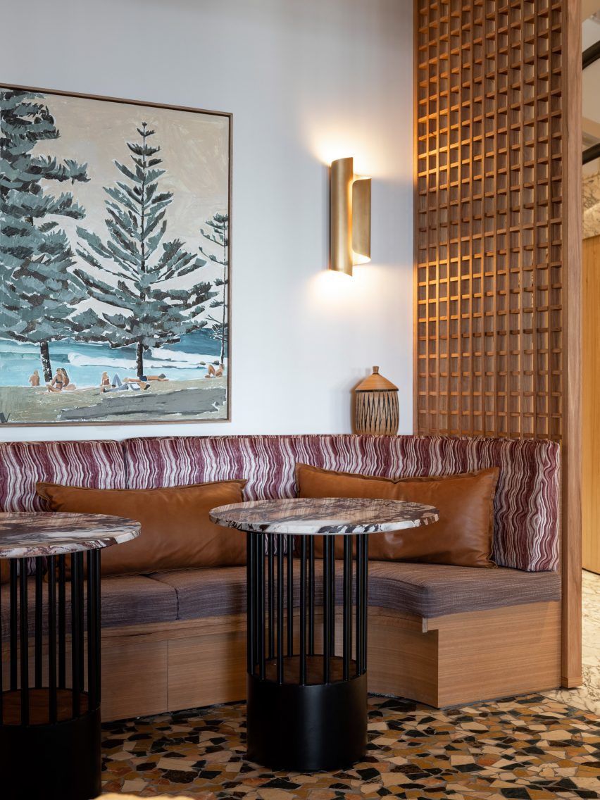
Spicy shades of turmeric, cinnamon and ginger feature alongside mosaic tiles and hand-painted murals in the public spaces of this hotel in Sydney, following a makeover from local studio Luchetti Krelle.

The renovation encompassed Manly Pacific‘s lobby as well as its 55 North bar and a few neighbouring lounge areas, all located on the hotel’s ground floor, which opens directly onto Manly Beach.

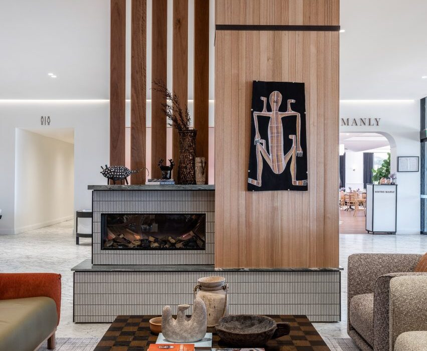
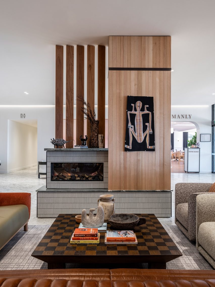
Lobby of Manly Pacific hotel
Luchetti Krelle has overhauled the lobby of Sydney’s Manly Pacific hotel

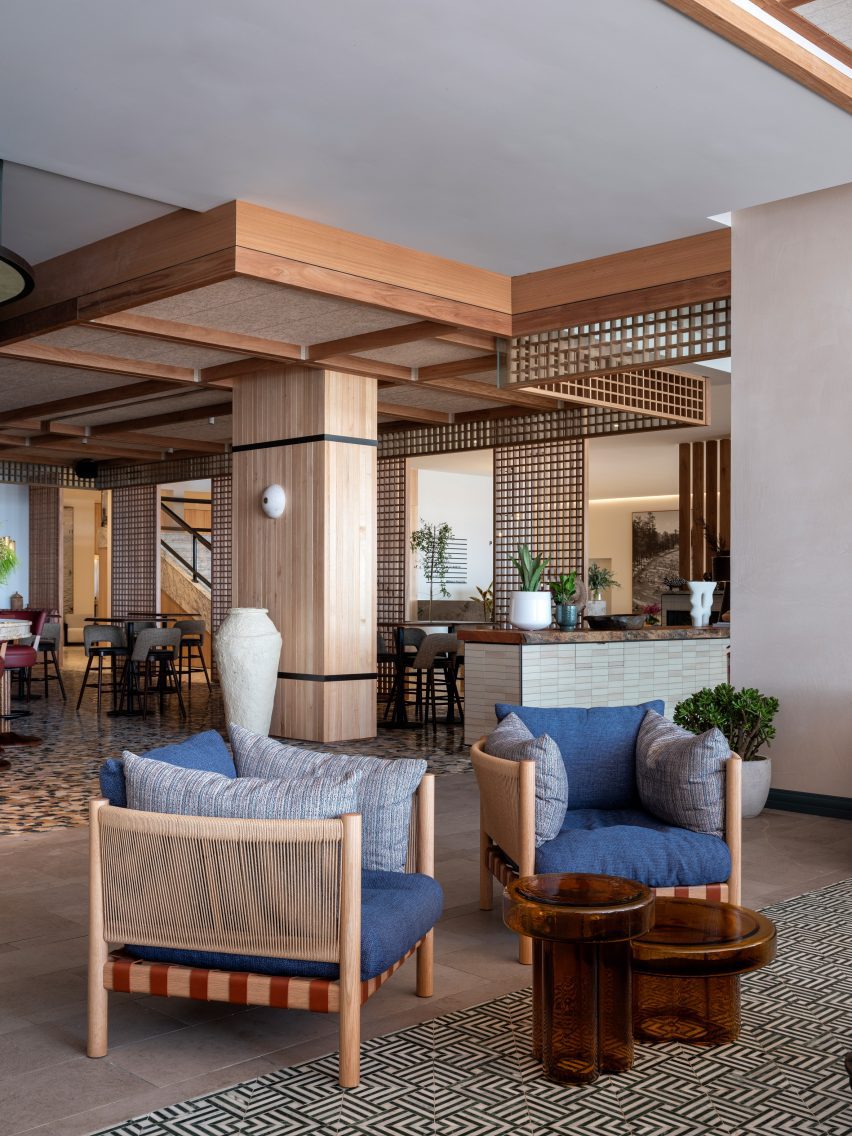
In the reception area, Luchetti Krelle created an intimate lounge setting to bring a sense of warmth and welcome into the otherwise vast white space while creating a link to the more richly decorated drinking spaces beyond.

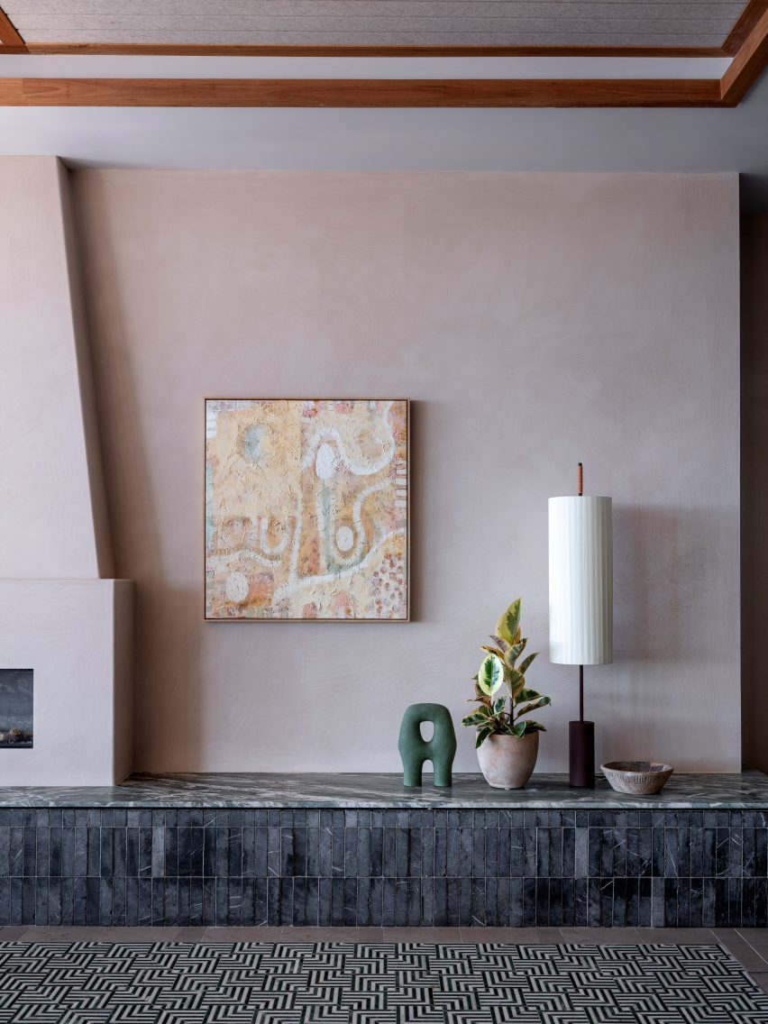
Tactile sofas and clubby armchairs are clustered around a chequerboard table looking onto a fireplace that mixes tile and timber in a mid-century-influenced design.

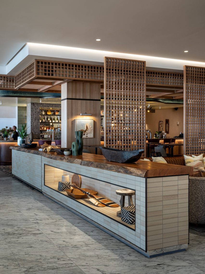
Latticed screens create a loose separation between Manly Pacific’s reception and the adjoining bar area, which introduces a richer palette of colours and materials to forge a sense of laid-back luxury.

55 North bar by Luchetti Krelle
The studio also renovated the adjoining bar

“A loose luxury defines our approach to the reappointment of the bar and neighbouring lounge areas,” Luchetti Krelle said.

“Layered textures, spiced tonal triggers and punchy patterns were selected to energise the drinking spaces with a graceful attitude that prioritised home comfort.”

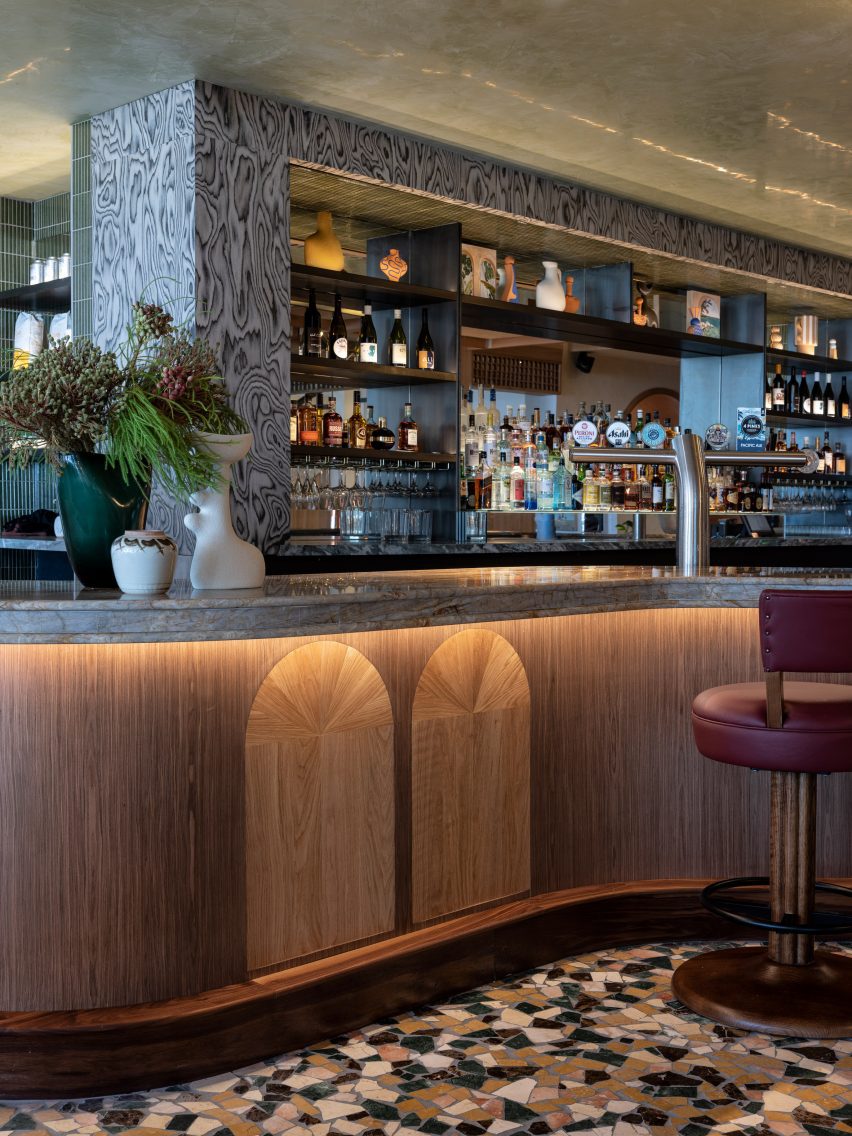
55 North is centred on an impressive island bar that curves outwards into the room to create a sense of welcome.

Counter of Manly Pacific hotel bar
Crazy paving in autumnal hues defines the bar area

The bar’s outlines are mirrored by the lines of the bulkhead ceiling above, creating a shape reminiscent of a clamshell that draws the eye across the room and brings a cosy intimacy to the bar area.

“Hospitality design is about making people feel welcome, relaxed and confident so less noticeable elements drove our process,” the studio said.

“We lowered the bar’s original height so smaller guests didn’t feel intimidated by its stature, adding custom leather swivel stools with curved returns to encourage lengthier sittings.”

55 North bar by Luchetti Krelle
Lattice screens help to loosely divide the space

The client had originally requested a new bar closer to the lobby. But Luchetti Krelle chose instead to improve the existing design to conserve waste and save valuable build time.

“As with all hospitality projects, there is an added pressure to complete the build and installation within deadline, given commercial pressures to open for business,” the studio said.

“So we saved time finding creative solutions to transform existing elements, avoiding demolition and the waste of materials.”

Seating area inside Manly Pacific hotel
A series of lounge spaces lead off the bar

Opening off the main bar area is a series of lounges.

Through the careful use of curves, arches and latticed screens, Luchetti Krelle designed these spaces to flow from one to another with a clear sense of continuity, while each area maintains its own distinct character and sense of purpose.

“We created adjoining rooms to encourage hotel guests to treat the space like an extension of their home during the day,” the studio said.

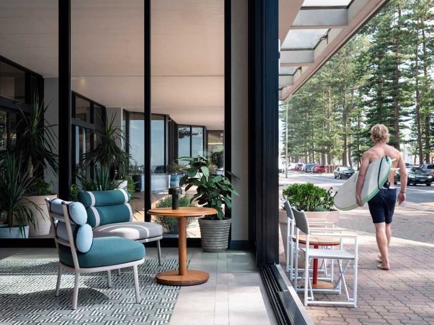
On the beach side, a sunroom takes its cues from the vista with striped and patterned upholstery in a palette of cooling blues that tether the space to the seascape beyond.

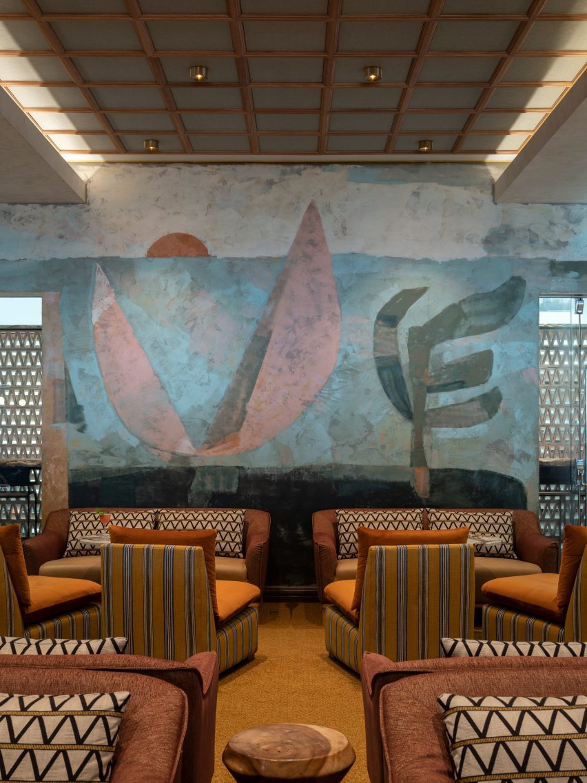
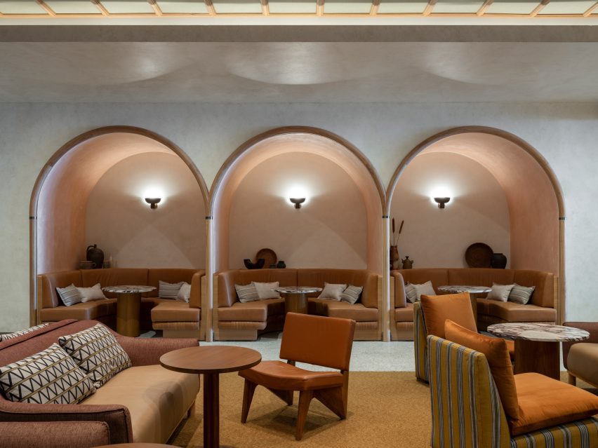
To the rear of the bar, a former gaming room has become an expansive cocktail lounge, where arches frame three intimate booths and the eye is led across the room by an underwater scene, painted onto Venetian plaster by local mural studio Steady Hand Studio.

Fireplace inside lounge of Manly Pacific hotel
Cool blue tones connect the sunroom to Manly Pacific’s beachside setting

Tiles are the protagonist material of this project, defining each area.

“Intricate autumnal crazy paving lures eyes through latticed screens that lightly separate the lobby and bar,” said Luchetti Krelle.

“Waves of fanned pearl-hued marble mosaics accentuate the rear lounge’s sophistication. Within the front sun lounge, tessellated Indian green and Carrara marble mosaic arrangements mimic the effect of a rug.”

Street-facing hotel lounge designed by Luchetti Krelle
The sunroom opens straight onto Manly Beach

Timber, too, plays a large part in the design, used across walls, ceilings, arches and booths – particularly in the bar.

“It was important to use varied timber species, including Blackbutt and walnut, to add textural depth and warm shades,” the studio said.

A variety of plaster finishes introduce another level of texture while helping to convey a sense of history and permanence, according to Luchetti Krelle.

Mural inside cocktail lounge of Manly Pacific hotel
A hand-painted mural dominates the cocktail lounge in the rear

These include the teal plaster applied to the bulkhead surround of the main bar, which features a glossy underside to bring a sense of lightness to the structure.

And in the ocean-side lounge, the pale sand shade of the fireplace wall cools the space during summer, reflecting the sunlight.

Booths in cocktail lounge of hotel designed by Luchetti Krelle
Seating booths are enveloped in cosy arches

The Manly Pacific is among a number of hospitality projects that Luchetti Krelle has completed in Sydney over the last two years.

Among them is a bar set inside a former butcher shop as well as the restaurant RAFI, characterised by vivid abstract paintings and patterned floors.

The photography is by Tom Ferguson.

Reference

Eight bedrooms with understated yet productive desk spaces
CategoriesInterior Design

Eight bedrooms with understated yet productive desk spaces

For our latest lookbook, we’ve rounded up eight bedrooms with desks that provide much-needed workspace while maintaining a peaceful environment.

Not every house has the space for a designated office room, so adding a desk to the bedroom is a popular choice for those requiring a place to work or study at home.

The examples in this lookbook show how a workspace for productivity can be added to a bedroom without detracting from the calm and serenity needed for sleep.

It includes understated fold-out desks, desks built into wall storage, a cosy reading nook and a study area that can be closed off with sliding screens.

This is the latest in our lookbooks series, which provides visual inspiration from Dezeen’s archive. For more inspiration see previous lookbooks featuring interiors informed by Mediterranean living, interiors that adopt wabi-sabi principles and interiors covered in Barbiecore pink.


Dark wood desk next to built-in wardrobes in Fisherman's Cottage
Photo by Gavin Green

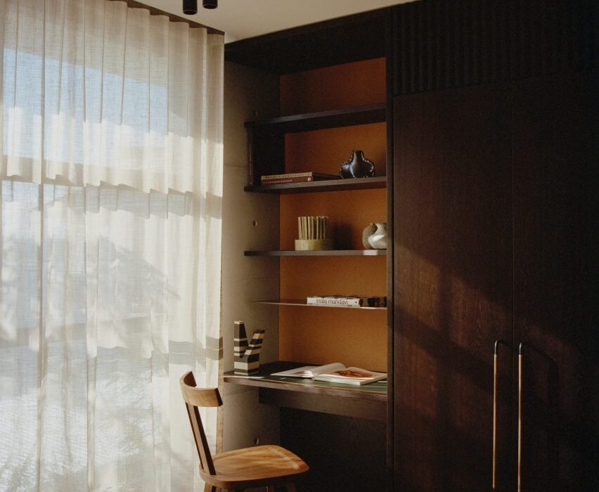
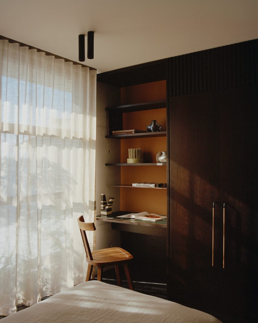
Fisherman’s Cottage, Australia, by Studio Prineas

Architecture studio Studio Prineas designed a concrete tower extension containing four bedrooms for a fisherman’s cottage in Sydney, separating the private rooms from the rest of the house.

The studio added dark timber built-in wardrobes, shelving and a small desk along a wall in one of the bedrooms, adjacent to a large window that overlooks the nearby bay and lets natural light onto the study space.

Find out more about Fisherman’s Cottage ›


Bedroom with a desk in the red concrete house by Sanden+Hodnekvam
Photo by Sanden+Hodnekvam Arkitekter

House in Red Concrete, Norway, by Sanden+Hodnekvam Arkitekter

The pine-panelled interior of this bedroom contrasts with the home’s red-pigmented concrete exterior, designed by Oslo architecture studio Sanden+Hodnekvam Arkitekter.

Pine plywood furniture that decorates the space was built on site, including the wall-mounted desk at the end of the bed.

Find out more about House in Red Concrete ›


Office nook with a custom-built wood desk and colourful chair
Photo by Ballman Khapalova

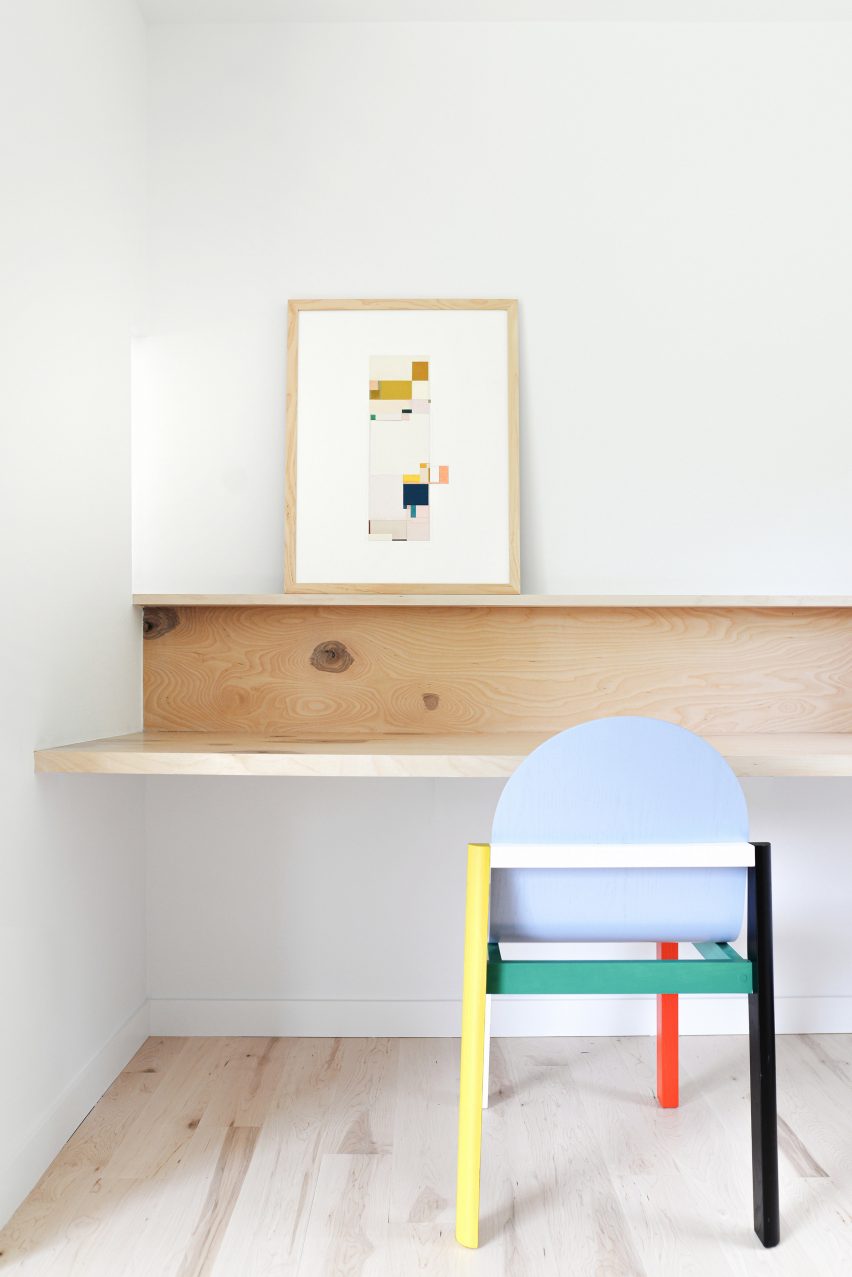
Pine Lane House, USA, by Ballman Khapalova

Two bedrooms were combined into one main bedroom suite with a study space, as part of the renovation of this 1980s ranch house in Saugerties, New York, by architecture studio Ballman Khapalova.

The studio designed custom wood furniture for the home, including a minimalist fold-out desk that stretches the length of the bedroom’s designated office nook.

Find out more about Pine Lane House ›


Interior of Laxus by Apollo Architects & Associates
Photo by Masao Nishikawa

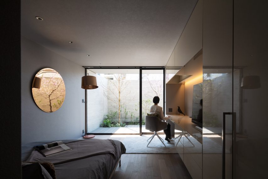
Laxus, Japan, by Apollo Architects & Associates

A desk space sits in line with glossy wall storage in the bedroom of this Tokyo home, which is lit by strip lighting recessed in the overhead cupboards.

Designed by Japanese studio Apollo Architects & Associates, the bedroom overlooks a courtyard with trees and shrubs, adding a serene and calming quality to the space.

Find out more about Laxus ›


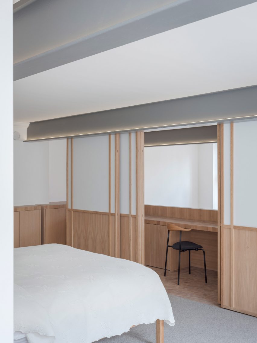
Wooden desk behind sliding doors in a bedroom at Apartment Block by Coffey Architects
Photo by Timothy Soar

Apartment Block, UK, by Coffey Architects

Local studio Coffey Architects overhauled the interior of this two-storey London flat and decorated it with surfaces made from wooden blocks, including a mezzanine study area with a long desk and storage.

Behind the study area is a main bedroom. Here, Coffey Architects separated the two zones by changing the flooring from wooden blocks to a grey carpet and adding Japanese-style timber screens inlaid with translucent panels.

Find out more about Apartment Block ›


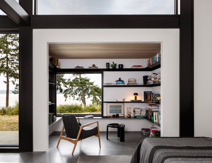
Reading nook with white walls and black shelving
Photo by Rafael Soldi

Whidbey Dogtrot, USA, by SHED

American firm SHED added a reading nook with views of the surrounding landscape to the bedroom suite in Whidbey Dogtrot, a cedar-clad home in the Pacific Northwest.

Slim black shelving covers the three walls in the nook and provides a worktop space for reading and studying.

Find out more about Whidbey Dogtrot ›


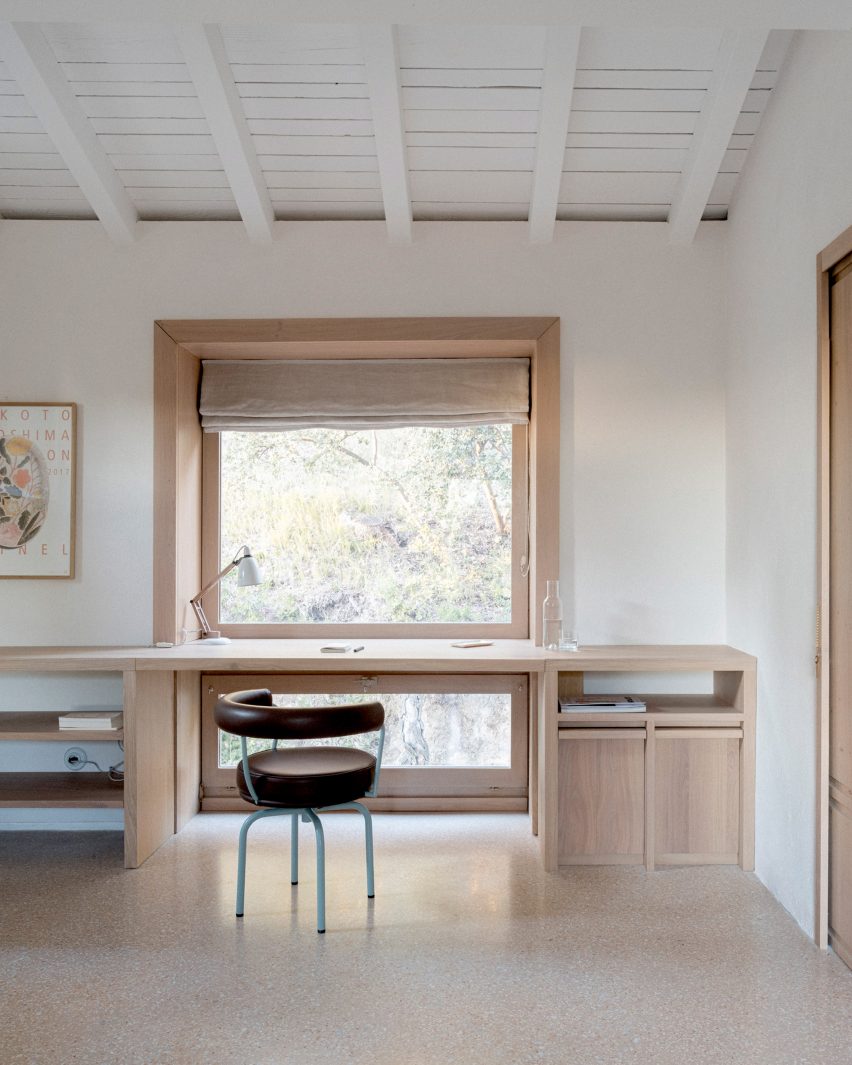
Wooden desk by a timber-framed window in MA House by Timothee Mercier from Studio XM
Photo by Simone Bossi

MA House, France, by Timothee Mercier

An oak desk paired with an aubergine-coloured Cassina chair sits behind a large picture window in the bedroom of this farm building in southeast France.

Architect Timothee Mercier converted the rural building into a home for his parents, creating a purposefully pared-back interior “clear of fuss and clutter” and adding splashes of colour in the choices of furniture.

Find out more about MA House ›


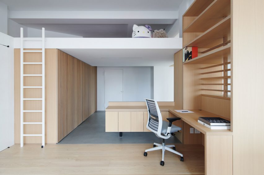
Wooden desk below a mezzanine bed
Image by Kevin Kunstadt

Financial District apartment, USA, by Light and Air

Brooklyn studio Light and Air removed partition walls in this 1,200-square-foot New York City apartment to create an open space with increased storage.

Custom-built furniture creates separation between the rooms, including an L-shaped desk with open shelves that helps divide the bedroom area from the living room.

Find out more about the Financial District apartment ›

This is the latest in our lookbooks series, which provides visual inspiration from Dezeen’s archive. For more inspiration see previous lookbooks featuring interiors informed by Mediterranean living, interiors that adopt wabi-sabi principles and interiors covered in Barbiecore pink.

Reference

Red Dunes Playtopia features “cave-like” play spaces and undulating hills
CategoriesArchitecture

Red Dunes Playtopia features “cave-like” play spaces and undulating hills

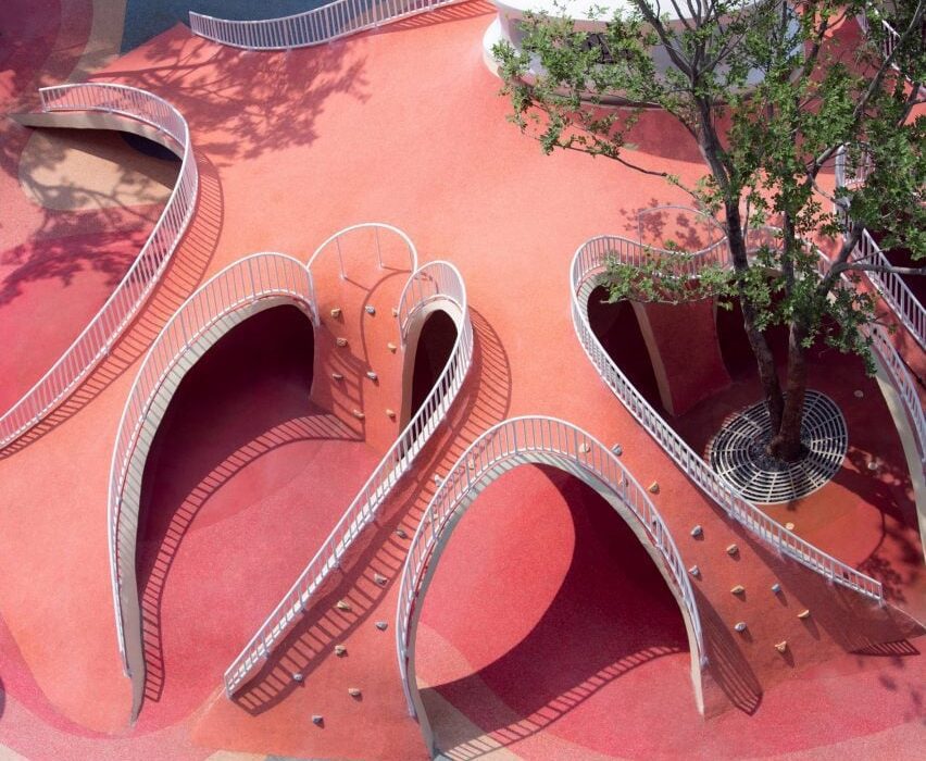
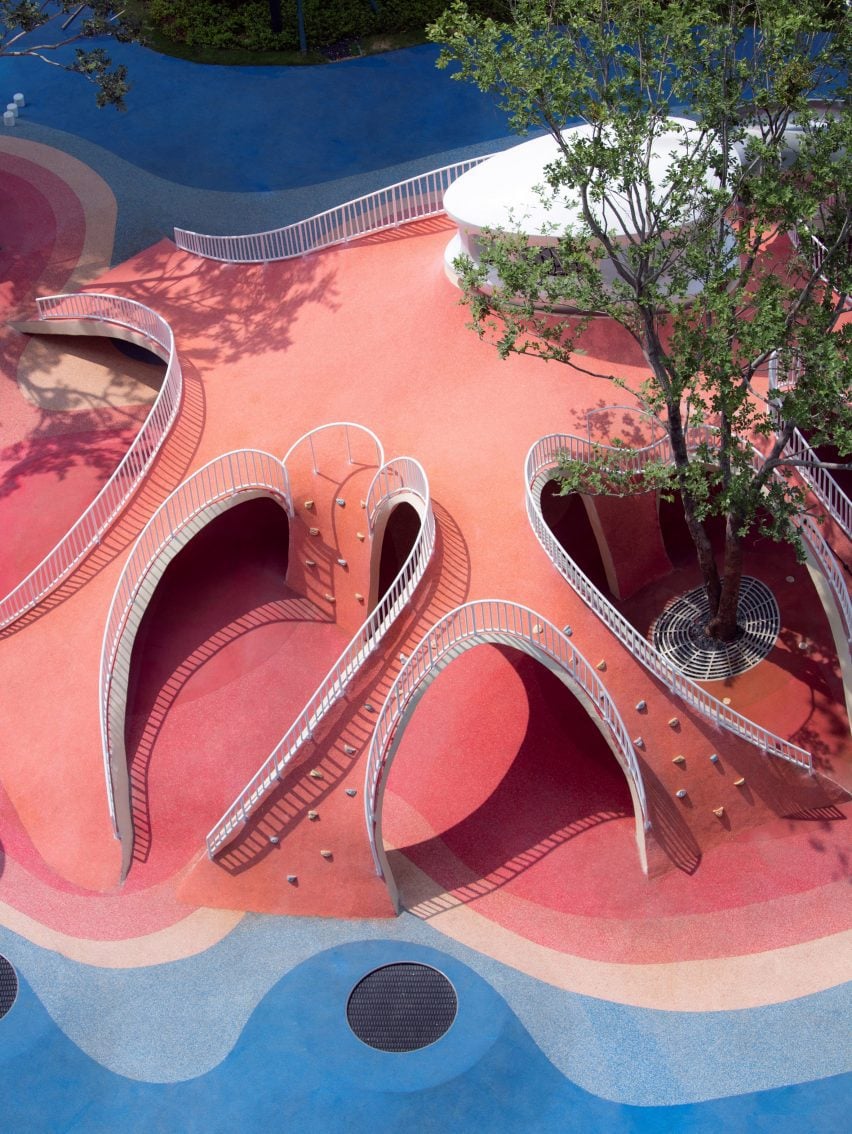
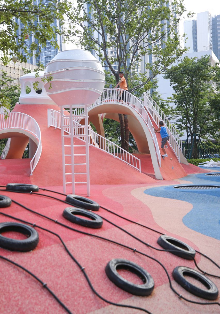
Sloping red dunes and cavernous spaces feature in this playground, which local studio XISUI Design has created in a residential area in Guangzhou, China.

Built above an underground parking unit, the play area takes cues from natural forms including mountains and caves and comprises a playful arrangement of hills and arches designed for climbing and discovery.

“The design revolves around utilising the undulating red dunes to provide an attractive terrain for children to come and engage in activities such as running, jumping, and playing,” studio design director Hu Yihao told Dezeen.

Image of Red Dunes Playtopia
Red Dunes Playtopia was designed by XISUI Design

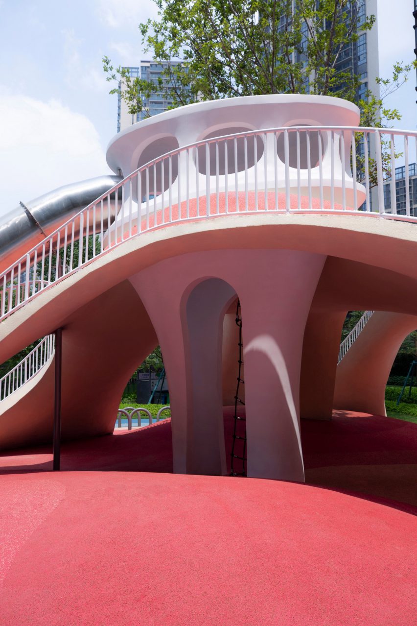
The studio used a load-bearing concrete shell for the structure of the playground, arranging the openings so that the loads are transferred to the supporting columns of the building below.

“Through concealed structural supports beneath the main weight-bearing concrete shell, the upper weight is precisely transferred to the supporting columns of the underground garage,” said Hu.

“This reduces the amount of earthwork volume used, reducing the weight of the load, and ensuring safety and stability.”

Photo of Red Dunes Playtopia by XISUI Design
The playground consists of hill-like structures

A variety of areas were hidden beneath the concrete shell, where the undulating topography of the land underneath helps to form organic landscapes designed to evoke the atmosphere of a cave.

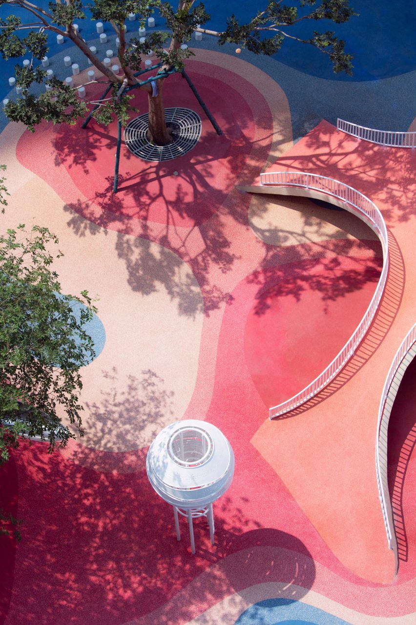
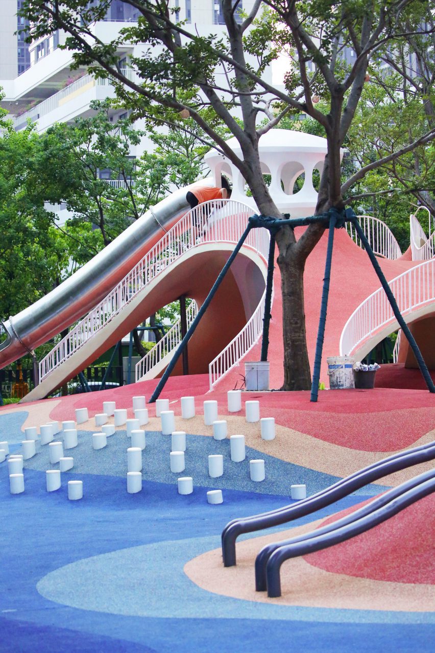
Accessed through curved openings between sloping bridges, the covered play space is punctuated by a central white column, where a ladder leads to a white playhouse that sits above the concrete shell and connects to a metal slide.

Photo of the Red Dunes Playtopia by XISUI Design
It has a concrete shell

“The use of undulating concrete shell structures creates cave-like spaces that blend harmoniously with the terrain, offering both climbing opportunities and fantastic sheltered areas,” said Hu.

“This design approach ensures seamless integration with the natural topography while minimising structural elements and maximising space utilisation.”

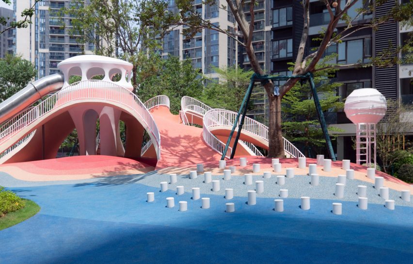
The landscape was coloured with a range of red and blue tones arranged in a blocky pattern of curving shapes that follows the topography of the playground.

“Our client expressed an interest in incorporating a celestial theme into the children’s play area, specifically referencing the concept of Mars,” said Hu.

“To balance the overall colour scheme and avoid excessive dominance of red tones, we also incorporated complementary blue hues to enhance contrast and visual interest.”

Photo of the playground
Climbing walls, slides and walkways cover the hills

Up the sides of the shell, ropes and climbing walls provide access to the top of the hill, with white railings placed along the edges of the arches to provide additional safety.

Play equipment, including tunnels, stepping stones, slides, and tactile climbing frames, has been arranged across the rest of the site into zones suited towards different age groups, ranging from toddlers to teenagers.

“We aimed to provide a balanced range of activities that cater to different stages of child development, including exercises that enhance upper and lower body strength, balance, social interaction, and parent-child bonding,” added Hu.

Photo of the playground
The playground has an undulating topography

Flattening out towards the edges of the site to simplify access, the topography was designed around these zones, with a smaller hill to one side of the site catering to toddlers and the larger shell on the other end providing more challenging terrain for older children.

While trees are dotted around the play area, the main green spaces were placed around the edges of the site where the ground dips to absorb draining rainfall.

Photo of Red Dunes Playtopia by XISUI Design
Trees surround the playground

“Meticulous calculations and simulations have ensured a comprehensive natural drainage system, effectively managing rainwater flow despite the undulating terrain,” said the studio.

“This innovative approach eliminates the need for surface drainage outlets, allowing rainwater to naturally disperse into green spaces and designated peak drainage outlets.”

Other playgrounds recently featured on Dezeen include a tree-inspired office playground in Tel Aviv and a series of giant rocks on wheels designed to encourage adventurous play.

The photography is by Hu Yihao.

Reference