Destudio inverts day and night zones at redesigned Valencia apartment
CategoriesInterior Design

Destudio inverts day and night zones at redesigned Valencia apartment

Architecture office Destudio has remodelled an apartment in Valencia for a couple of empty nesters, swapping the positions of the living and sleeping areas so they perform better for the owners’ lifestyles.

The clients, who recently worked with Destudio to design their pharmacy in the Spanish city, invited the studio to oversee the renovation of the 150-square-metre apartment that had been their home for two decades.

The couple’s grown-up children no longer live with them and Destudio saw this change in circumstances as an opportunity to create an entirely new and more appropriate layout.

Interior of Casa Inversa by DestudioInterior of Casa Inversa by Destudio
Destudio swapped the positions of living and sleeping areas in Casa Inversa

“We worked with the owners to convince them to make a ‘tabula rasa’ of how they lived in this house for the last 20 years and find a better distribution for their actual needs,” Destudio creative director Gabi Ladaria told Dezeen.

“It was tough for the family to recognise that every wall had to be demolished,” he added, “but when they saw the first plans and 3Ds they realised there were better ways to live in their house, being more honest with their needs in the coming years.”

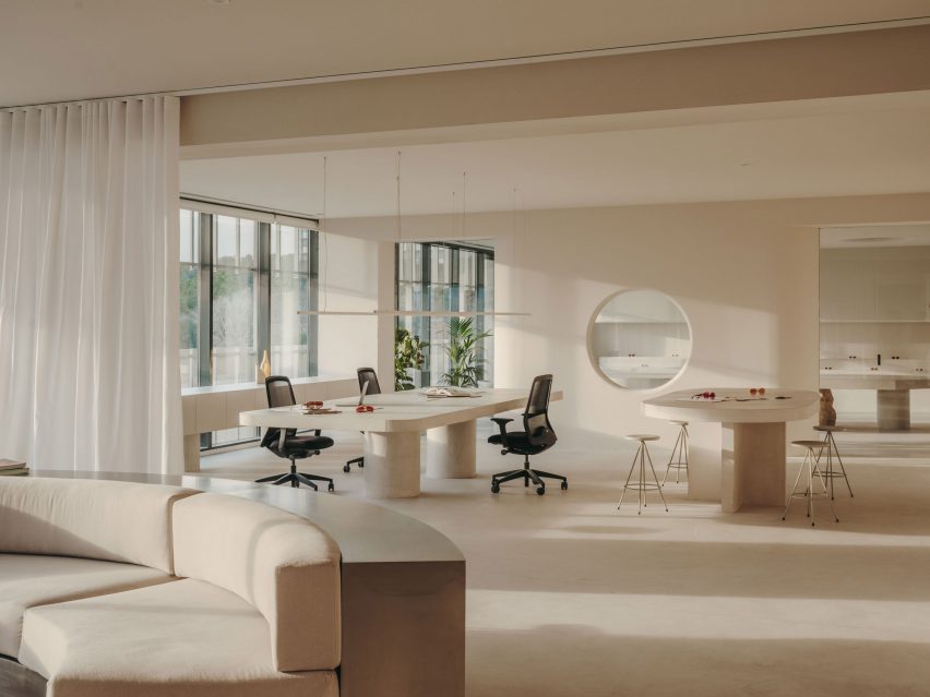
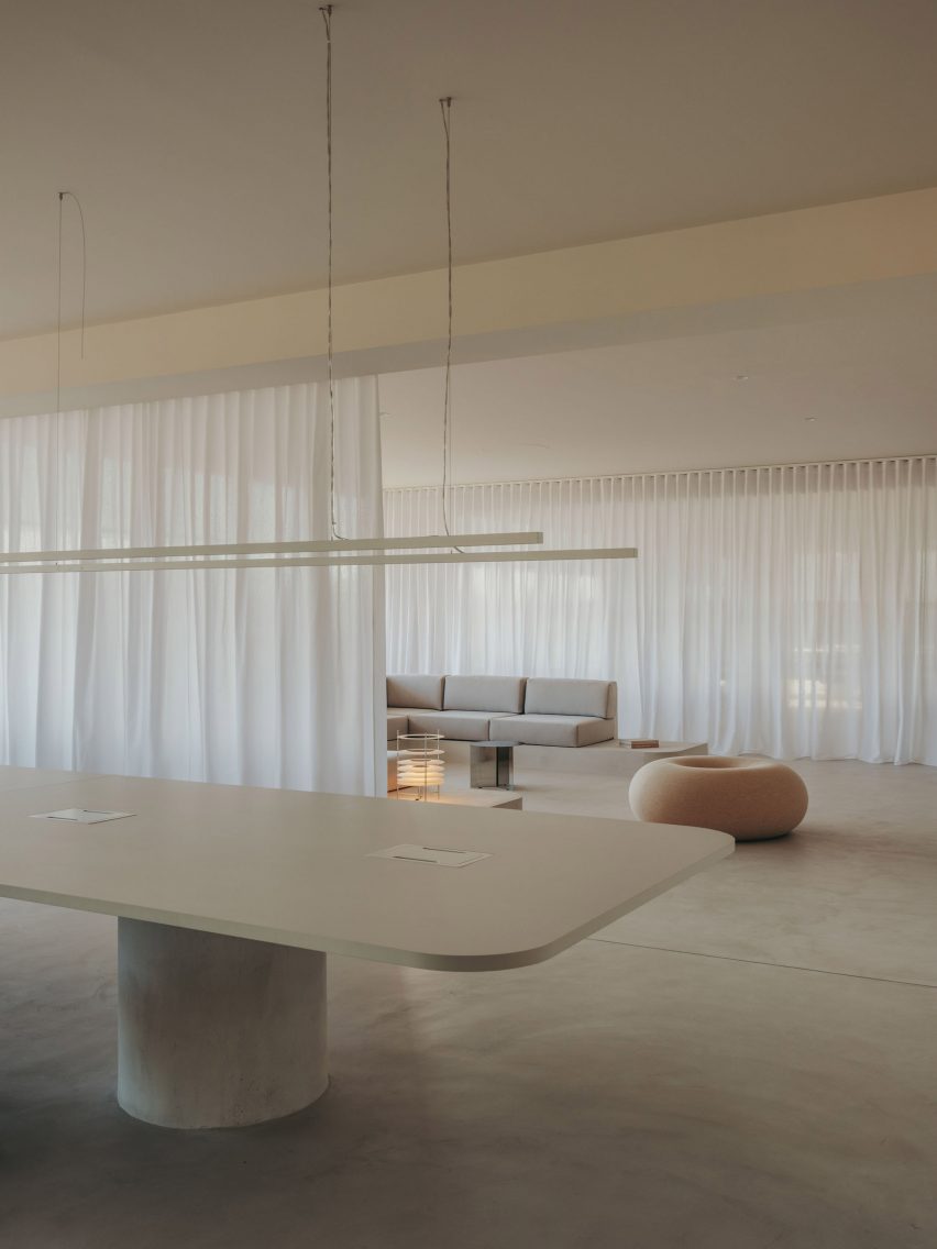
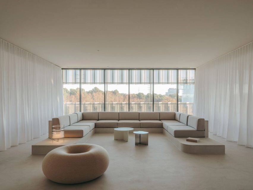
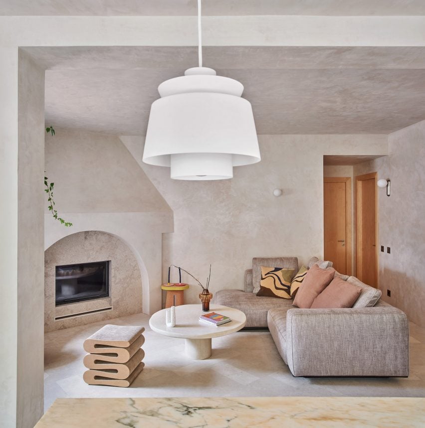
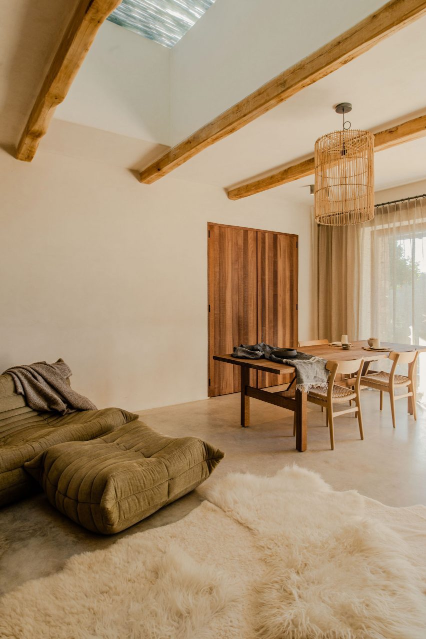
An initial survey of how the existing spaces were used informed the decision to switch the position of the private and communal areas so the main living space receives the best of the available sunlight. This act gave the project its name, Casa Inversa.

Dining room in Casa Inversa by DestudioDining room in Casa Inversa by Destudio
The dining area was positioned in the corner of the living room

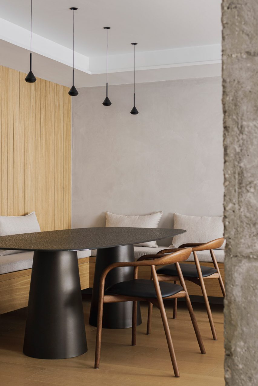
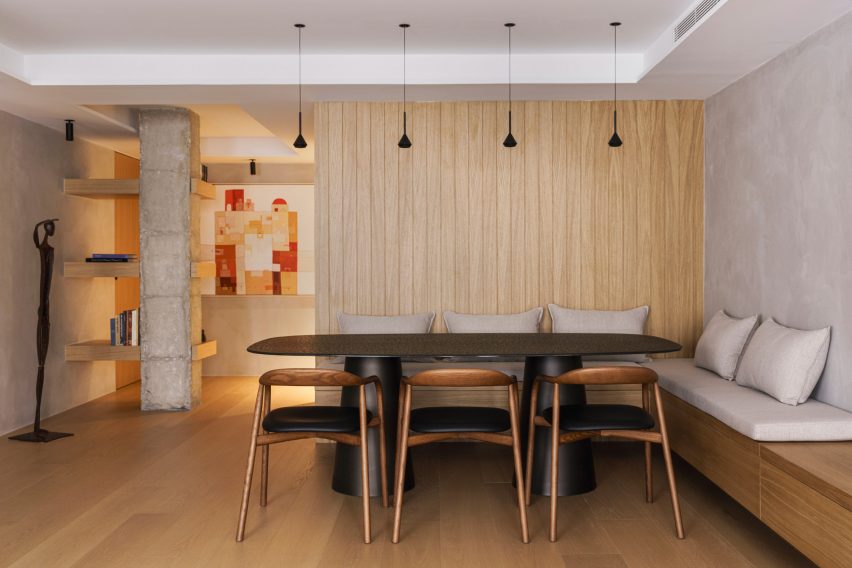
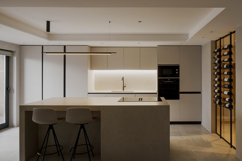
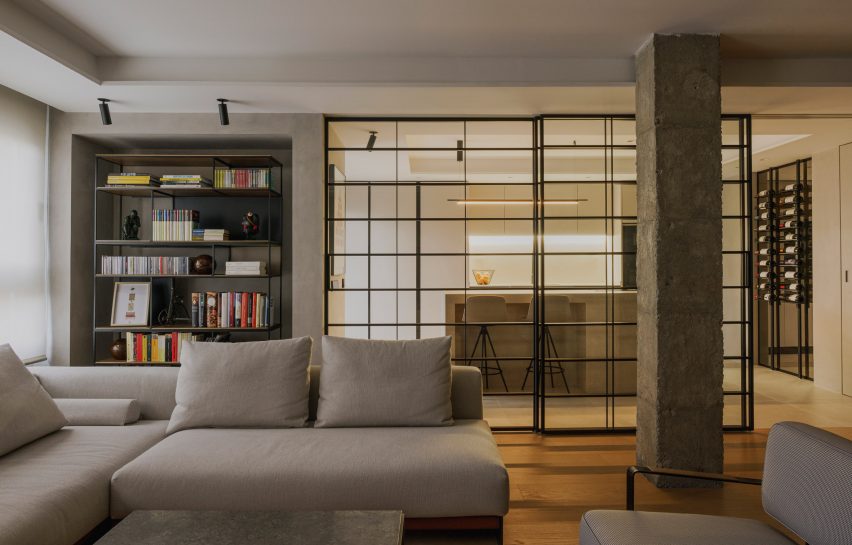
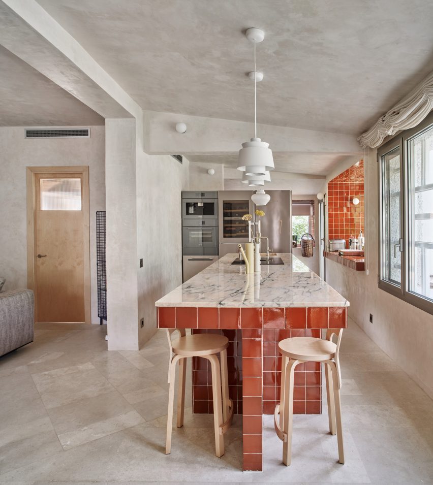
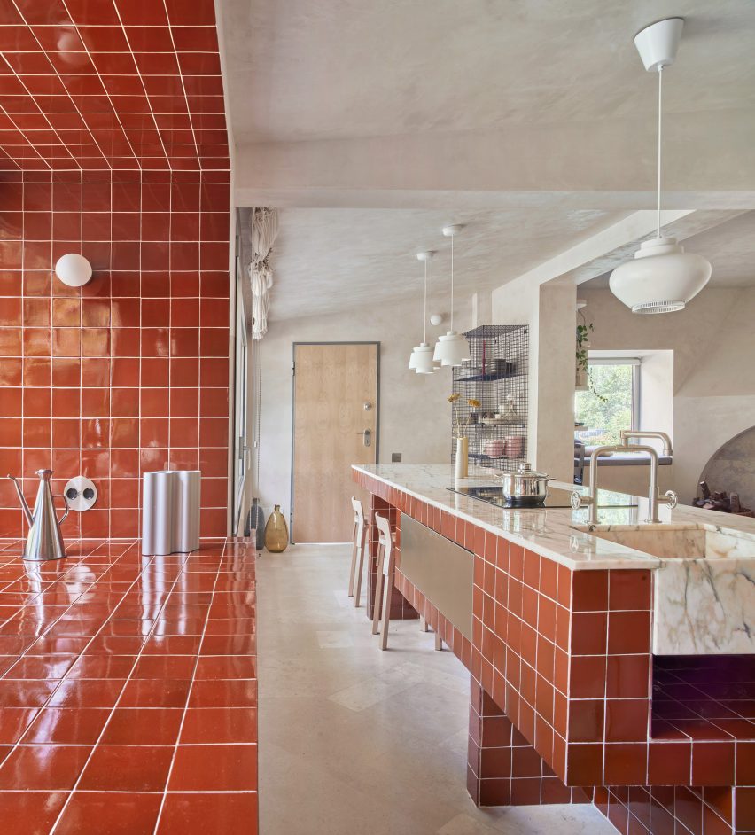
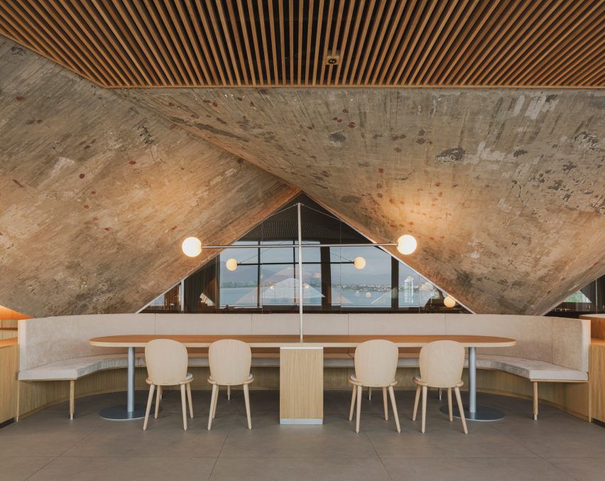
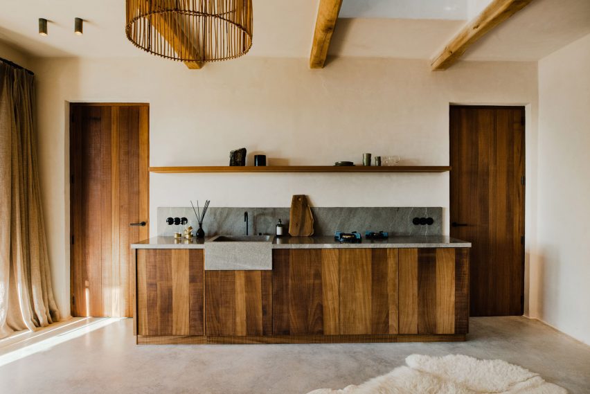
Conversations with the clients revealed that they wanted the kitchen to be the heart of the house as this is where they spend a lot of time preparing and eating meals throughout the day.

This informed the decision to reduce the size of the dedicated dining area by incorporating it into a corner of the living room.

Grey kitchen in a Valencia homeGrey kitchen in a Valencia home
The kitchen was designed as the heart of the home

A cantilevered bench minimises the floor area used so the adjacent lounge feels more generous.

“We use this strategy in our restaurant projects to maximise the number of diners,” Ladaria pointed out, “but here it is used to maximise the space in the other part of the corner bench where the living room is located.”

The studio added that the table is likely to be used infrequently, mostly when friends or family come to visit, so it was designed like a restaurant booth to make the dining experience feel like eating out.

The kitchen opens onto a terrace with outdoor seating, while on the opposite wall a wine display backed with semi-opaque glass provides a visual connection with the adjoining utility space. Sliding glass doors can be closed to separate the kitchen and the adjacent sitting room if required.

Living room in Casa Inversa with a glass partition wallLiving room in Casa Inversa with a glass partition wall
Sliding glass doors separate the living area and kitchen

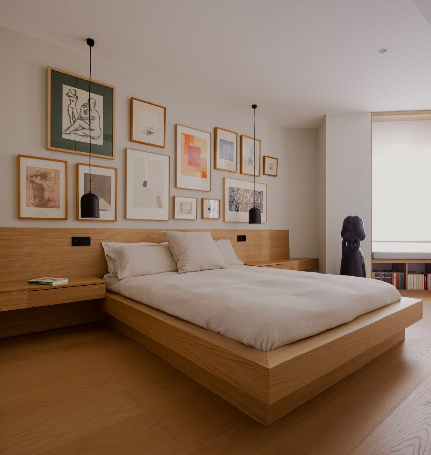
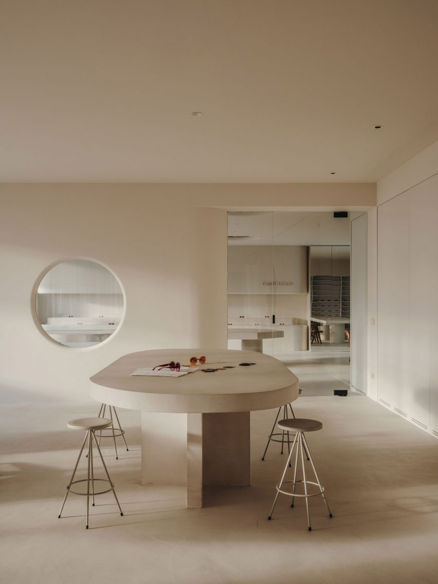
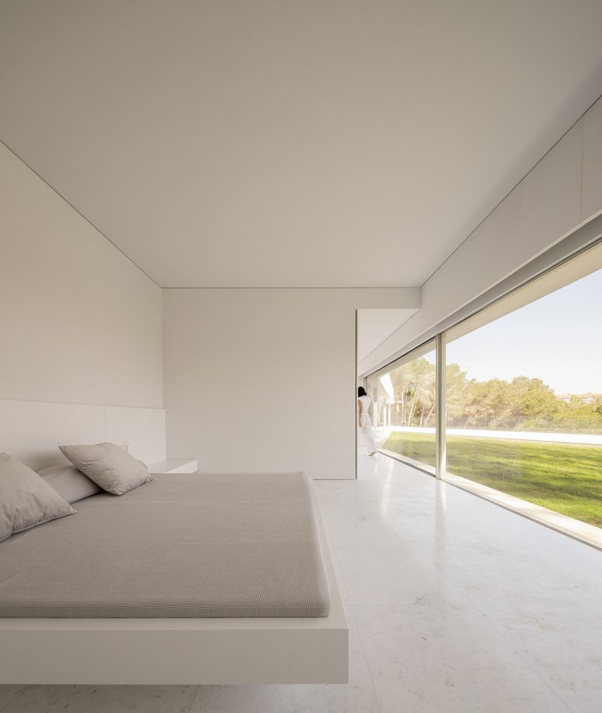
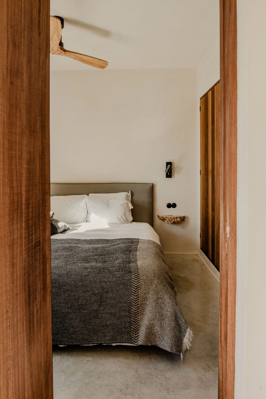
The apartment’s three bedrooms were relocated to the opposite end of the floor plan, where they overlook the building’s internal courtyards.

The principal bedroom and one of the guest rooms are accommodated in an angular corner that previously housed the living room. The main bedroom’s dressing area features cupboards that extend along one wall, making the most of the space.

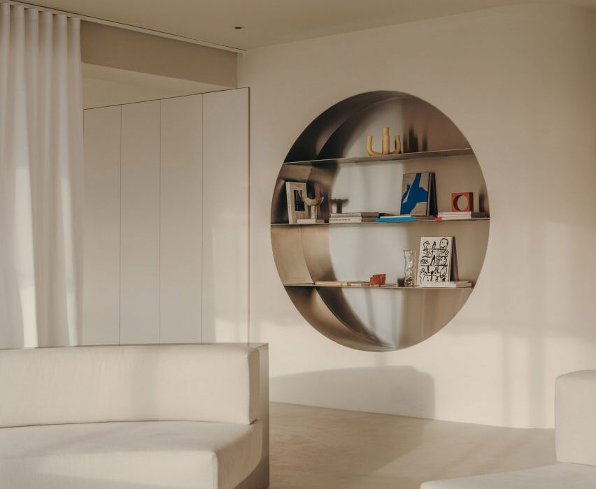
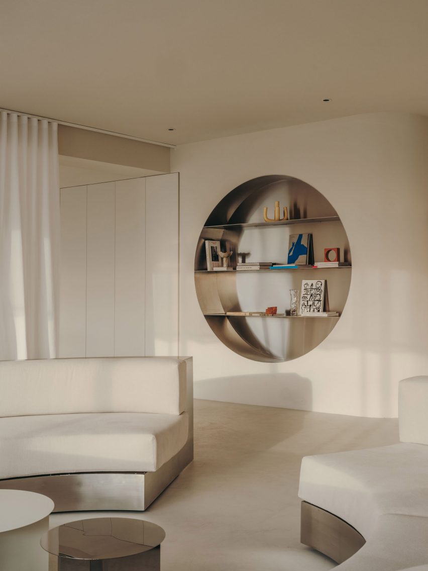
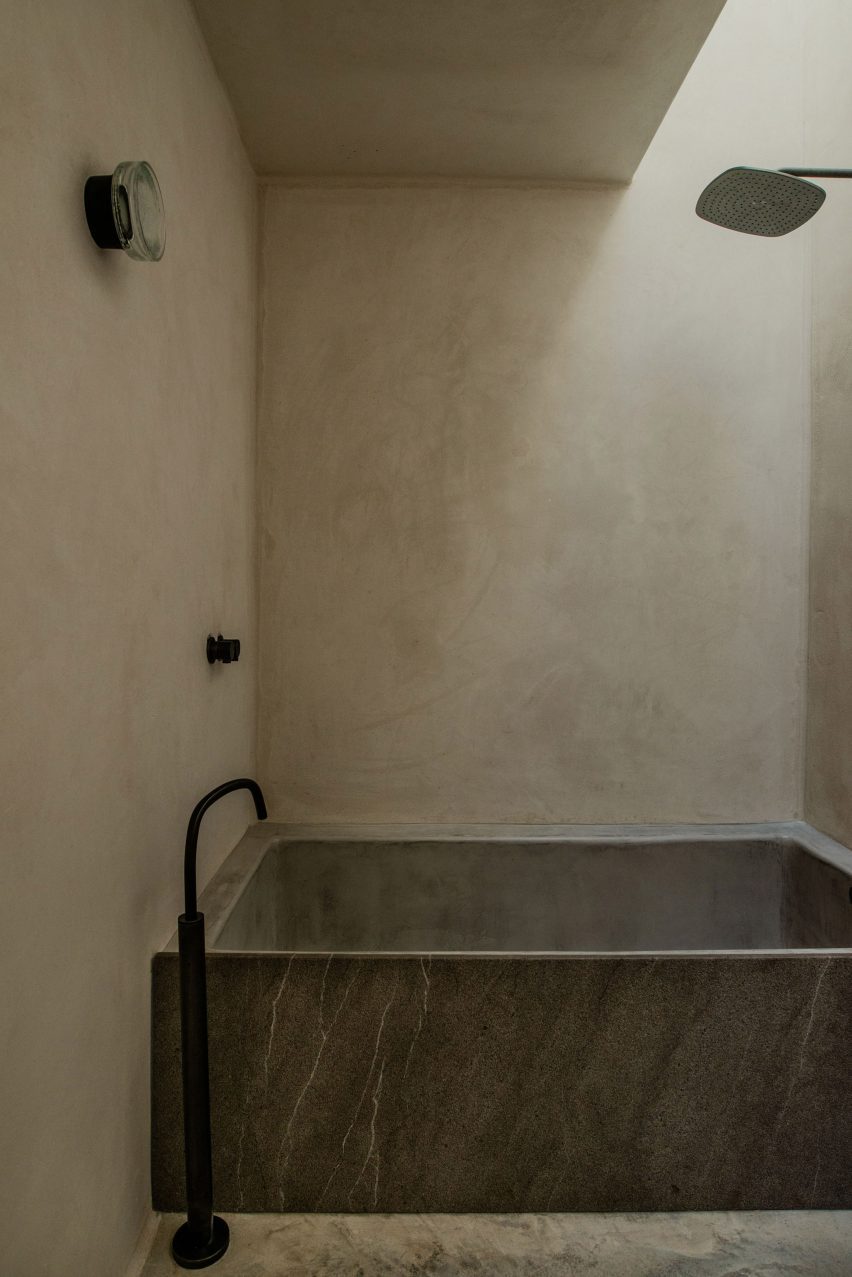
A material palette consisting of clay-rendered walls, oak joinery and porcelain tiles acts as a warm backdrop for the clients’ art collection.

Bedroom in Casa Inversa Valencia apartmentBedroom in Casa Inversa Valencia apartment
Clay render covers the walls

Where possible, Destudio specified furniture from local brands, including the sofa, armchairs and the living room’s library shelving.

Destudio was founded in 2014 by architects Gabi Ladaria and Nacho Díaz, who studied together at Valencia’s Polytechnic University.

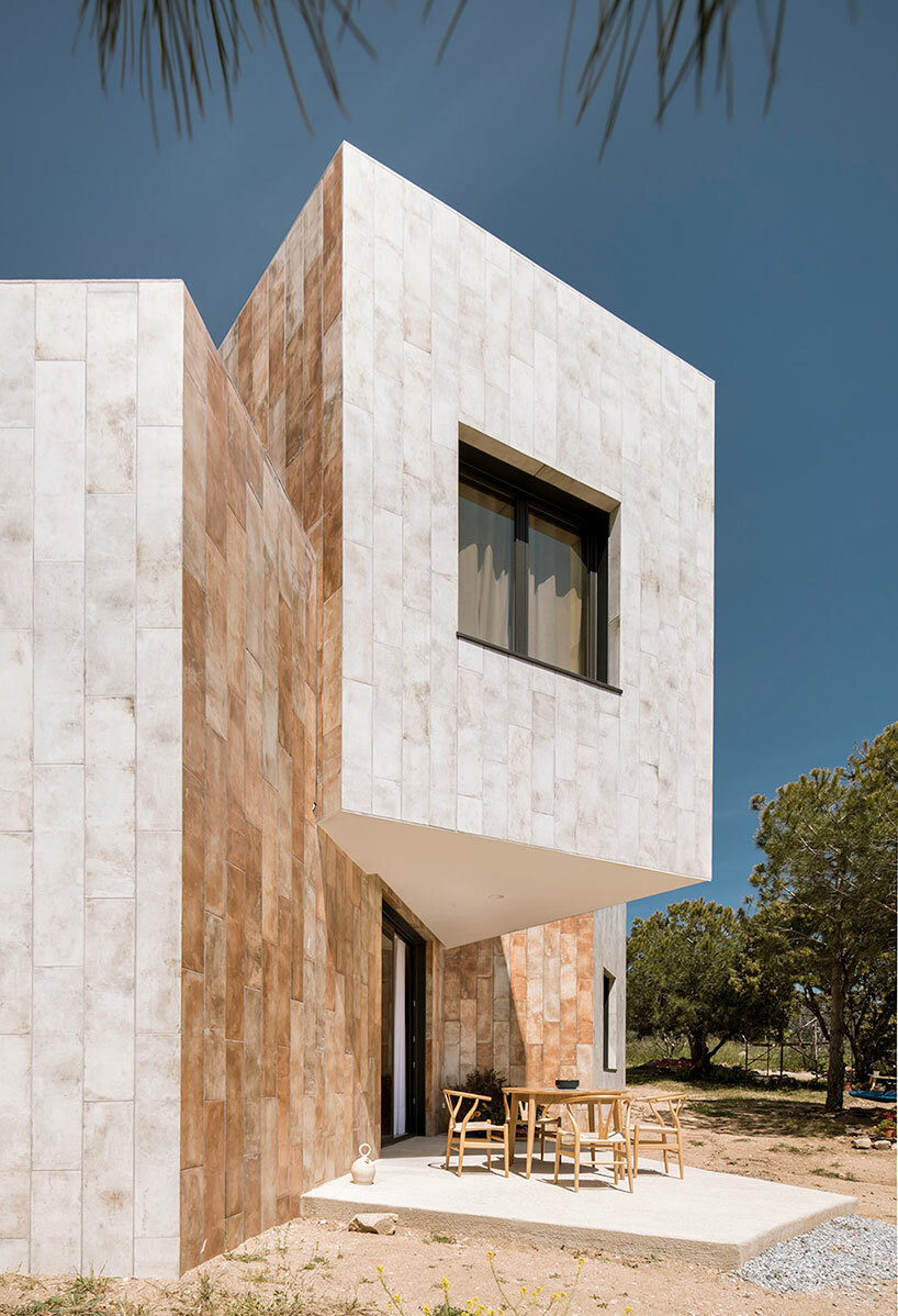
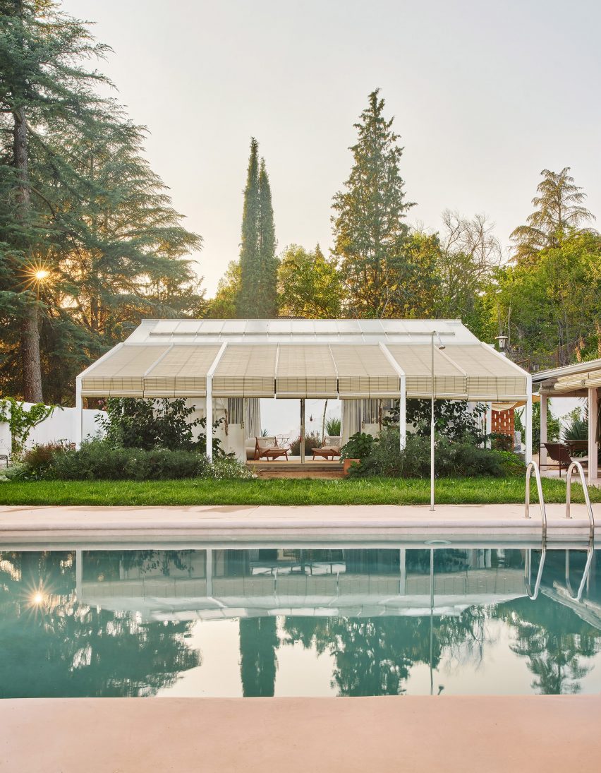
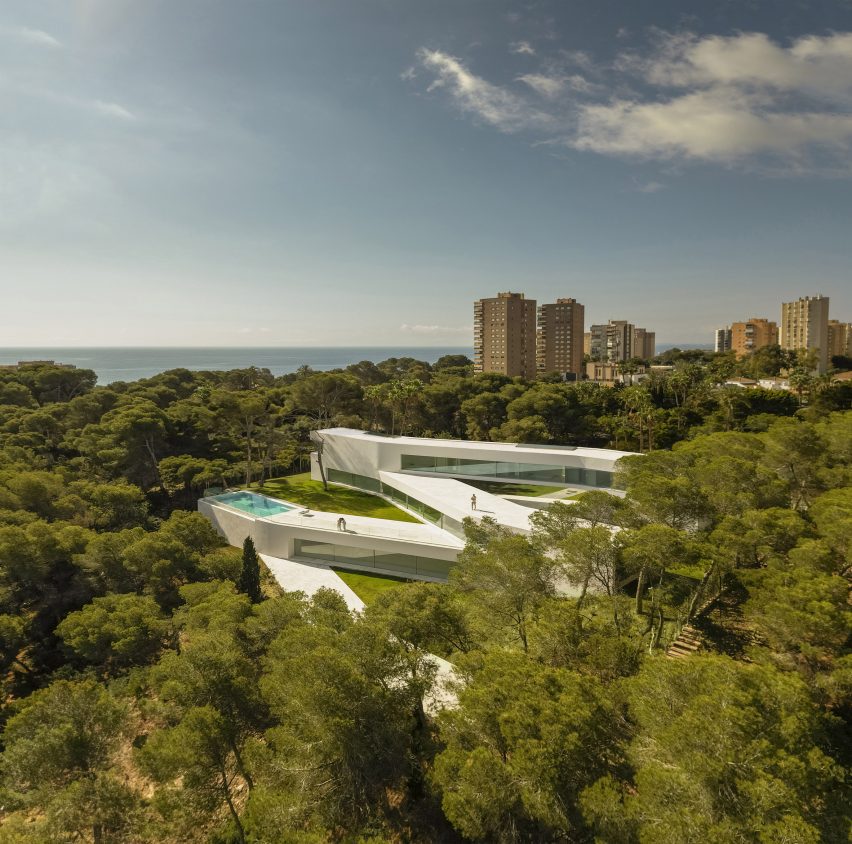
Other recent residential projects in Valencia include the renovation of a former fisherman’s house using geometric blue-and-white tiling and a copper-toned home in an olive grove.

The photography is courtesy of Destudio.

Reference

Isern Serra completes “serene” office for eyewear brand Gigi Studios
CategoriesInterior Design

Isern Serra completes “serene” office for eyewear brand Gigi Studios

Sculptural custom-made furniture adds artistic flourishes to this otherwise minimal showroom and head office, designed by Spanish interiors studio Isern Serra for eyewear brand Gigi Studios.

Isern Serra was tasked with creating a holistic scheme for the 900-square-metre headquarters, occupying one floor of a building in the town of Sant Cugat del Vallès just north of Barcelona.

Wall niche with stainless steel shelving in Gigi Studios office Wall niche with stainless steel shelving in Gigi Studios office
Isern Serra has filled the Gigi Studios headquarters with custom furniture

The brief called for a design that creates a sense of spaciousness and comfort while reflecting founder Patricia Remo’s vision of Gigi Studios as a brand.

“It is also serene, warm and elegant and conceptually close to the idea of a studio and away from the concept of a traditional office, without losing the practicality and functionality,” Isern Serra explained.

Workspaces in office in Spain by Isern SerraWorkspaces in office in Spain by Isern Serra
Rows of desks were replaced with more intimate work areas

The building’s rectangular floor plan features a central service core housing the lifts and toilets, with the workspaces, meeting rooms, kitchen and showroom occupying the surrounding O-shaped open space.

Serra and his team positioned the kitchen and showroom at one end of the plan and placed the meeting rooms and client areas at the other, leaving the longer sides open to optimise circulation.

Table with stools in Gigi Studios office Table with stools in Gigi Studios office
Concrete bases for the work tables were cast in situ

Various bespoke furniture pieces, conceived by Isern Serra as “small works of art”, bring a distinct personality to the different formal and informal spaces.

These interventions were designed to embody Gigi Studios’ design ethos while standing out against the warm and minimal backdrop.

“The project aims to experiment with the limits of the workspace and seek a new concept that goes hand in hand with the idea of domus and museum,” Isern Serra explained.

Table and lounge area inside office in Spain by Isern SerraTable and lounge area inside office in Spain by Isern Serra
Curtains can be used to cordon off the lounge area

A large circular sofa framed in stainless steel provides a bold statement in one of the reception areas.

The sculptural piece fulfils a dual function as a seating area and a space for working, with tables and book storage integrated into the backrest around the perimeter.

Similarly, the building’s central core is wrapped in a layer of built-in storage units including circular stainless-steel niches that incorporate shelves for displaying books and materials.

Rather than a typical office layout with rows of workstations, the large open spaces are separated into more intimate zones with a more domestic scale.

Lounge area inside Gigi Studios office Lounge area inside Gigi Studios office
A Boa Pouf by Sabine Marcelis provides informal seating

Next to the lobby is a design area featuring tables made from concrete that was cast in situ. Task seating surrounds the work table and a taller table is accompanied by stools, while lenses for the different glasses are stored in a custom-made unit.

The second workspace features a large C-shaped sofa with a concrete base that was also cast in situ. Custom-made tables and one of Sabine Marcelis’s Boa Poufs complete this lounge-style space, which can be visually separated from the rest of the office using curtains on either side.

Look at eyewear showroom through circular windowLook at eyewear showroom through circular window
The showroom is visible from the office through a circular window

A circular window with rounded edges provides a glimpse of the showroom, which is dominated by two sculptural tables with concrete tops supported by rough chunks of travertine stone.

A built-in tiered display is used to highlight different Gigi Studios’ eyewear. The rest of the collection is housed in a backlit cabinet, while a mirror-fronted unit conceals a large screen used for presentations.

The kitchen is located next to the showroom so that the two spaces can easily be used together for events. Here, a homely, Mediterranean feel is created via a five-metre-long sharing table, custom-made alongside the accompanying stools.

Showroom inside Gigi Studios headquartersShowroom inside Gigi Studios headquarters
Display tables in the showroom are held up by rough chunks of travertine

The sizeable kitchen island is finished in micro-cement and features a curved base that enhances its sculptural presence.

A curved corridor incorporating a sofa niche on one wall provides access to offices and a meeting room positioned to have the best views of the surrounding countryside.

Internal columns are used to support one end of concrete tables built in each of the workspaces, furnished with classic designs including Marcel Breuer’s Wassily and Cesca chairs.

Office inside eyewear brand headquarters in Spain by Isern SerraOffice inside eyewear brand headquarters in Spain by Isern Serra
Large sharing tables allow for communal eating in the kitchen

Interior designer Isern Serra founded his self-titled studio in Barcelona in 2008 and works across architecture, interiors and industrial design.

Previous projects including a rose-coloured shop for Barcelona’s Moco Museum that was based on a computer-generated image and a minimalist office for digital artist Andrés Reisinger, which was named small workplace interior of the year at the 2023 Dezeen Awards.

The photography is by Salva López with art direction by Aasheen Mittal.

Reference

Lucas y Hernández Gil adds multi-use greenhouse to Casamontesa
CategoriesInterior Design

Lucas y Hernández Gil adds multi-use greenhouse to Casamontesa

A renovated 1970s bungalow with “kitsch character” and a greenhouse that doubles as a living room feature in Casamontesa – a weekend home designed by Spanish studio Lucas y Hernández Gil.

The project began when a couple asked the studio to overhaul a single-storey house that was once part of a hotel complex on the outskirts of Madrid.

Kresta Garden House doubles as home officeKresta Garden House doubles as home office
The renovated bungalow and a multifunctional greenhouse (above) make up Casamontesa

The brief later expanded to include a multifunctional greenhouse that can be used as a workspace, a guest bedroom, a gym or simply as a garden room.

Lucas y Hernández Gil, led by architects Cristina Domínguez Lucas and Fernando Hernández-Gil Ruano, developed a distinct character for each building.

Casamontesa renovation of 1970s bungalowCasamontesa renovation of 1970s bungalow
The main house is a bungalow built in the 1970s

Casamontesa’s renovated bungalow has a warm, playful style that draws on the 1970s aesthetic while the garden pavilion has a more utilitarian feel.

“The owners, a young urban couple who love design and live and work in the centre of Madrid, were looking for a functional and compact getaway within a fantastic garden,” Lucas told Dezeen.

“They wanted a very comfortable and flexible home that would be useful for both working and getting together with friends.”

Casamontesa house kitchen islandCasamontesa house kitchen island
The interior centres around a new kitchen island

The bungalow renovation involved simplifying the interior layout to create a combined kitchen, dining room and living room, with a bedroom and bathroom off to one side.

“The house, in addition to being small, was very compartmentalised,” explained Lucas.

Casamontesa house kitchen islandCasamontesa house kitchen island
The materials palette includes pink marble and handmade tiles

To unify the newly open-plan living space, the designers installed an island that serves as a worktop, dining table and social gathering place.

This island features a countertop made from Portuguese pink marble while its sides are covered in the same handmade burgundy tiles that line an adjacent window recess.

Casamontesa house with arched fireplaceCasamontesa house with arched fireplace
An arched fireplace provides a focal point in the living room

“The rest of the surfaces – Campaspero stone floors and waxed tinted plaster walls – establish a dialogue by contrast with the colourful and shiny surface of the tiles,” added Lucas.

Key details in the living room include an arched fireplace and a tadelakt plaster coffee table, while the bedroom features semi-circular marble nightstands.

For Casamontesa’s garden room, the design team customised a prefabricated greenhouse.

A pergola extends the building volume outwards in a bid to blur the boundary between inside and out, and is topped with wooden blinds to provide shade.

Kresta Garden House greenhouse with pergolaKresta Garden House greenhouse with pergola
A pergola extends the width of the greenhouse

A wooden box on wheels provides an additional bedroom, described as a “small Shigeru Ban-style mobile room”.

Other additions include thermal curtains and an automatic shading and ventilation system, which allow for versatile use of the space throughout the year.

Kresta Garden House creates extra living room with mobile sleep spaceKresta Garden House creates extra living room with mobile sleep space
A “Shigeru Ban-style mobile room” provides an additional sleeping space

“By complementing the programme of the original bungalow, a more complete and flexible program is achieved, overcoming the limitations of a weekend house,” added Lucas.

Other recent projects by Lucas y Hernández Gil include a bar featuring extreme colour blocking and an apartment with a hidden closet.

The photography is by José Hevia.

Reference

​​Fran Silvestre Arquitectos references pathways for Sabater House in Spain
CategoriesArchitecture

​​Fran Silvestre Arquitectos references pathways for Sabater House in Spain

Spanish studio Fran Silvestre Arquitectos has created a minimalist white house in Alicante, which winds through the landscape to enhance its relationship with the outdoors.

Named Sabater House, the Spanish dwelling unfolds through a series of intersecting, elongated forms that ascend upwards over its 780-square-metre site.

Its slim volumes adapt to the site’s natural topography, navigating existing large trees and framing a series of terraces and courtyards.

Aerial view of Sabater House by Fran Silvestre ArquitectosAerial view of Sabater House by Fran Silvestre Arquitectos
Fran Silvestre Arquitectos has created a minimalist white house in Alicante

According to Fran Silvestre Arquitectos, the sprawling design takes cues from local pathways that are carved into the terrain and lead to a hermitage.

“We were struck by how these winding paths adapt to the terrain, generating a very interesting architecture,” Fran Silvestre Arquitectos told Dezeen.

“This was the starting point to develop a home on a plot with similar characteristics in terms of width and slope of the land.”

Facade of Sabater House by Fran Silvestre ArquitectosFacade of Sabater House by Fran Silvestre Arquitectos
Sabater House winds through the landscape

Sabater House is designed for a client who wanted a home to accommodate his large family while ensuring “enough independence to guarantee the privacy of all family members”.

To accomplish this, each floor of the home features a distinct programme.

Aerial view of white home in AlicanteAerial view of white home in Alicante
Each floor of the home features a distinct programme

The highest level, described as the “nighttime area” of the home, features five bedrooms and bathrooms oriented to look out to the sea above the tree line.

Meanwhile, the middle floors contain an open-plan kitchen, dining and living area with floor-to-ceiling windows framing views out to the garden and outdoor swimming pool.

Exterior of white house in Spain by Fran Silvestre ArquitectosExterior of white house in Spain by Fran Silvestre Arquitectos
The house winds around existing trees

The living spaces are stretched across the long and narrow floor plan in a bid to avoid compacting them and open them up to the outdoors.

“The project is drawn with a very clear geometry of straight elements that are joined by a soft radius of curvature,” said the studio. “Each piece has a relationship with the environment.”

Accommodated on the lower level are the pool basin, a wine cellar, storage facilities and additional sleeping quarters.

With each floor stacked at an angle to create a zigzagging floor plan, a series of courtyards, terraces and bridges are created, further opening the relationship with the outdoors.

All-white interior of Spanish houseAll-white interior of Spanish house
The middle floor features open-plan living spaces

“Something unexpected about the house for us is the character of the interstitial spaces between the blocks and how they envelop you,” explained Fran Silvestre Arquitectos.

“The first acts as an access garden that directs you towards the entrance door, and the second as one of the main terraces. They are versatile spaces that allow you to make the most of the different orientations.”

Bedroom of Sabater House in AlicanteBedroom of Sabater House in Alicante
The top level contains the bedrooms

Fran Silvestre Arquitectos was founded in 2005 by architect Fran Silvestre. The studio is known for its minimalist style, which is applied throughout Sabater House.

Its previous projects that feature its signature pared-back style include an overhanging Hollywood Home and a residence with a T-shaped roof in Valencia.

The photography is by Fernando Guerra.

Reference

eme 157’s domehome emerges from foliage-covered brick house in spain
CategoriesArchitecture

eme 157’s domehome emerges from foliage-covered brick house in spain

EME 157 Studio’s DOMEHOME expands existing house in Aravaca


DOMEHOME project by EME 157 involves the expansion of a single-family home in Aravaca, Madrid, adding a new floor to accommodate an independent apartment for the family’s son. The renovation primarily focuses on transforming the previously unused terrace on the top floor into a habitable space. The design process begins with the consideration of the external appearance, emphasizing how to crown the existing brick house covered in vegetation. To maintain a balanced height without excessive increase, the design adopts a domed shape, allowing for increased internal height, spatial dignity, and reduced perception of height from the exterior.


The choice of cork for the new floor contributes to its distinctiveness, both in terms of materiality and insulation properties, contrasting with the solidity of the brick in the rest of the house. Zinc is employed for the vault, aligning with the overall design strategy. 

eme 157's domehome emerges from foliage-covered brick house in spain
all images by © Luis Asin


large circular skylight illuminates the house’s interior


The interior layout, driven by the desire to prioritize panoramic views, comprises 50 sqm on the ground floor housing the entrance, a bedroom, and a bathroom. The upper floor, spanning 130 sqm, is divided into private and public areas. The private zone features a bedroom and bathroom, while the public space integrates an open kitchen, dining room, and living room with expansive north-facing windows. A large circular skylight, originally illuminating the stairwell, floods the room with natural light.


Material simplicity characterizes the interior, with mortar floors, polished stainless steel for countertops and showers, and plywood and linoleum board for furniture. The design team at EME 157 experiments with the contrast between cold and warm materials. Exposed original concrete beams and pillars create a contrast with the new slender circular metal pillars painted in sky blue, seamlessly blending with the breathtaking views outside.

eme 157's domehome emerges from foliage-covered brick house in spain
EME 157 transforms a home in Aravaca, Madrid, adding a new floor for an independent apartment

eme 157's domehome emerges from foliage-covered brick house in spain
the architects crown the brick house with a distinctive domed shape covered in vegetation

eme 157's domehome emerges from foliage-covered brick house in spain
the renovation converts the previously unused top-floor terrace into a functional living space

eme 157's domehome emerges from foliage-covered brick house in spain
the domed design maintains a balanced height, offering increased internal space

Reference

Zooco Estudio unveils Cantabrian Maritime Museum restaurant
CategoriesInterior Design

Zooco Estudio unveils Cantabrian Maritime Museum restaurant

Madrid-based Zooco Estudio has created a striking restaurant within the Cantabrian Maritime Museum in Santander, Spain, that celebrates the building’s brutalist architecture.

The restaurant is set within a dramatic vault of concrete paraboloids that were unearthed during the renovation, while a slatted timber ceiling pays homage to the area’s shipbuilding legacy.

Interior of brutalist Cantabrian Maritime Museum restaurant in Spain by Zooco EstudioInterior of brutalist Cantabrian Maritime Museum restaurant in Spain by Zooco Estudio
Zooco Estudio added a restaurant to the second floor of the Cantabrian Maritime Museum

Overlooking the tranquil waters of Santander Bay, the restaurant is located on the second floor of the landmark Cantabrian Maritime Museum, which was designed in the mid-1970s by architects Vicente Roig Forner and Ángel Hernández Morales.

The paraboloids were an original fixture of the structure and supported the roof of what was once the museum’s patio.

Interior of brutalist Cantabrian Maritime Museum restaurant in Spain by Zooco EstudioInterior of brutalist Cantabrian Maritime Museum restaurant in Spain by Zooco Estudio
Oak details were designed to contrast the restaurant’s concrete arches

The studio focused on restoring the historic fabric of the space and reviving the paraboloids, which had been concealed for around 20 years, as “a vestige of the past”.

“In 2003, the building was renovated and as part of this intervention, the paraboloids were covered with a new roof and the space between them and the perimeter of the building was closed with glass, generating a covered space where there was previously a terrace,” Zooco Estudio co-founder Javier Guzmán told Dezeen.

“We wanted the concrete paraboloids to be the absolute protagonists of the space and by removing the paint and the coating, the paraboloids are visible again and regain their full prominence.”

Interior of brutalist restaurant in Spain by Zooco EstudioInterior of brutalist restaurant in Spain by Zooco Estudio
The renovation exposed the raw concrete surface of the paraboloids

The previous renovation also altered the dimensions of the space and reconfigured the volume as a square.

To promote symmetry, four additional concrete triangles were added to balance out the original paraboloids in the brutalist restaurant.

Timber ceiling panels and concrete paraboloids inside a brutalist restaurantTimber ceiling panels and concrete paraboloids inside a brutalist restaurant
Slatted wooden ceiling panels bridge the gaps between the arches

Overhead, a false ceiling of slatted timber panels frames the concrete arches.

The studio designed theses triangular boards to reference the arrangement of timber across the hull of a boat, a nod to the museum and the area’s nautical past.

The panels also serve the purpose of concealing the restaurant’s mechanical systems.

“The wooden slats bring warmth and friendliness to the space while allowing us to solve all the technical needs for air conditioning, heating and lighting, leaving them hidden,” Guzmán said.

“In this way, we ensure that all these elements do not interfere with the dialogue of concrete and wood, which are presented as continuous and clean elements.”

Dining tables overlooking views of the Santander bayDining tables overlooking views of the Santander bay
Walls of floor-to-ceiling glazing offer views across the bay

The interior layout was largely dictated by the low arches of the elliptic paraboloids that dominate the brutalist restaurant.

“The geometry of the existing structure conditions the space, because its height in its lower part is impractical, so a large bench is arranged around the entire contour that allows us to take advantage of that space and organise the distribution of the rest of the floor plan,” added Guzmán.

Concrete paraboloid and dining tables inside brutalist restaurant in Spain by Zooco EstudioConcrete paraboloid and dining tables inside brutalist restaurant in Spain by Zooco Estudio
Grey porcelain floors mirror the concrete paraboloids

Like the ceiling panels, the interior finishes and furnishings allude to the maritime history that the building commemorates.

“The use of wood and steel for all the furniture is reminiscent of the materials used in shipbuilding – the furniture has slight curvatures that are reminiscent of the aerodynamic shapes of boats,” explained Guzmán.

“Likewise, the lamps are inspired by the masts for ship sails.”

Dining tables at Cantabrian Maritime Museum restaurantDining tables at Cantabrian Maritime Museum restaurant
Zooco Estudio also designed the restaurant’s curved timber furniture

Another key change was the replacement of the perimeter glass wall.

The inclined glazing was swapped for vertical glass, a decision that reclaimed external space for the patio, which stretches the length of the restaurant and overlooks the harbour below.

“When we are inside, the feeling is the same as when we are inside a boat, there is only water around, and that is why we used clean glass from floor to ceiling, generating a perimeter terrace as happens on boats,” said Guzmán.

Terrace at Cantabrian Maritime MuseumTerrace at Cantabrian Maritime Museum
The terrace features green curvilinear outdoor furniture

Other projects by Zooco Estudio include a renovated house in Madrid and a co-working space with a kids’ play area in California.

The photography is by David Zarzoso.


Project credits:

Architect: Zooco Estudio
Construction:
Rotedama Constructora SL
Lighting: Zooco Estudio
Furniture: Zooco Estudio

Reference

Ibiza Interiors turns dry-stone stables into flexible guesthouse
CategoriesInterior Design

Ibiza Interiors turns dry-stone stables into flexible guesthouse

A 200-year-old stable building in the mountains of Ibiza has been converted into a vacation home by local studio Ibiza Interiors.

The Atelier is one of four dwellings that make up Campo – a group of rentable guesthouses set in a finca, or farmstead, in the island’s Morna Valley.

View through large opening into a neutral-toned interiorView through large opening into a neutral-toned interior
Campo Atelier is located in a renovated dry-stone stable building

Ibiza Interiors founder Jurjen Van Hulzen has renovated these buildings one by one to enhance their original features and create a series of tranquil getaway spots.

“Nestled between carob and orange trees, the Atelier […] appears at the end of the path as a haven of peace,” said the Dutch architect, who founded the studio in 2014.

Room with wooden ceiling beams, polished concrete floor and a dining tableRoom with wooden ceiling beams, polished concrete floor and a dining table
The main space is designed for flexible use

The single-storey dry-stone structure is typical of the local vernacular but now features a large retractable glass wall across its front.

A polished concrete patio continues inside, where exposed timber ceiling beams and wooden doors complement the neutral colour palette.

“Textures and styles are not afraid to cohabit and the emphasis is on the interplay between old and contemporary, elegant and rustic,” said Van Hulzen.

A small kitchenette with wood-panelled cupboards and doors either sideA small kitchenette with wood-panelled cupboards and doors either side
A small kitchenette with wood-panelled cupboards matches the doors on either side

The main space contains a small kitchenette on one side and a dining table that doubles as a workspace on the other.

A seating area comprising low, comfy sofas is positioned towards the back.

A minimally furnished bedroom with built-in storageA minimally furnished bedroom with built-in storage
The minimally furnished bedroom includes built-in storage

The interior is designed to be as flexible as possible, with all of the furniture except the kitchen counters moveable to provide space for exercise or meditation.

Equally, the linen curtains can be drawn and the sofas reoriented for watching movies on a projected screen.

The bedroom is minimally furnished but guests can store their belongings within built-in closets while another glass door opens to the exterior.

In the bathroom, lit from above by a skylight, a large tub made of dark stone is accented with matte black hardware.

A grey stone bathtub illuminated by a skylightA grey stone bathtub illuminated by a skylight
In the bathroom, a grey stone tub is illuminated by a skylight

The landscaping around the Atelier was designed by Ibiza Exteriors, a new offshoot of Ibiza Interiors created by Van Hulzen and Alicia Uldall.

The pair chose local flora attuned to the island’s climate that requires minimal maintenance such as stipa grasses, aloe, rosemary and mastic trees.

A 200-year-old building sat into the hillsideA 200-year-old building sat into the hillside
The 200-year-old building sits on a hillside, with its flat roof accessible via stairs

Deep steps lead up to the flat roof that serves as a picnic or sunbathing spot overlooking the valley. The dining table and chairs can also be brought outside for al fresco dining among the vegetation.

“Like the Atelier, the garden preserves the wild essence of this land and its genuine beauty,” Van Hulzen said.

Wooden dining table outdoorsWooden dining table outdoors
The dining table can be brought outdoors for al fresco meals

Better known for its party scene, Ibiza is becoming ever more popular as a wellness and relaxation destination – particularly away from its coast.

Many of the island’s historic fincas have been converted into secluded accommodations including the remote Aguamadera resort and the members-only retreat La Granja.

The photography is by Ariadna Puigdomenech.

Reference

External Reference creates 3D-printed organic displays for La Manso store
CategoriesInterior Design

External Reference creates 3D-printed organic displays for La Manso store

3D-printed shelving structures informed by Catalan-modernist buildings were used for shelving in this store designed by External Reference for a Spanish jewellery brand.

Experimental jewellery designer Adriana Manso asked Carmelo Zappulla’s studio External Reference to develop a suitably unusual interior concept for her first physical store in the city.

Exterior of La Manso store in BarcelonaExterior of La Manso store in Barcelona
The store is in the Eixample district

The project involved designing a window display and shelving for the 25-square-metre store, which is located in Barcelona’s Eixample district just a few metres from the house where Manso was born.

Manso is known for her playful pieces made from recycled plastic, which she wanted to display in a space that evokes the luxury feel of an haute-couture boutique.

Interior of La MansoInterior of La Manso
It features a 3D-printed interior informed by architecture

External Reference sought to combine the contemporary plasticity of La Manso’s jewellery with motifs influenced by Barcelona’s early 20th-century architecture, including the building in which the store is situated.

“Our design concept revolved around bringing the exterior facade inside, creating a melted and fluid background that would serve as an artistic canvas for showcasing the jewellery,” Zappulla told Dezeen.

“By blending the expressive elements of Catalan modernism with the organic forms inspired by La Manso design, our goal was to craft a visually captivating environment that elevates the overall shopping experience.”

Floral details in Barcelona storeFloral details in Barcelona store
External Reference created wavy shapes for the space

The designers selected fragments from the decorative facade and abstracted them using a process involving hand drawing and computational design techniques.

In particular, floral details from the elaborate canopy at the store’s entrance were reinterpreted as large rosettes incorporating futuristic glitches and bas-reliefs.

The organic shapes form shelving units that range in height from 90 centimetres to 1.7 metres. Jewellery and accessories are displayed on the shelves, as well as on a small table at the centre of the space.

The furniture is made from biodegradable cellulose and was produced with technical support from specialist 3D-printing workshop La Máquina.

Zappulla and his team refined the digital models to optimise them for printing. This involved splitting them into manageable parts that could be processed by the machine’s robotic arm.

Barcelona jewellery storeBarcelona jewellery store
The aim was to provide a neutral backdrop

All of the printed elements are finished in a muted off-white shade that matches the rest of the interior and provides a neutral backdrop for displaying the jewellery.

Large, mirrored surfaces help to make the interior feel more expansive, while spotlights provide targeted illumination for highlighting the collection.

In addition to the main furniture, the designers also developed a window display and 3D-printed signage that extend the store’s conceptual design out into the street.

Shelving at La MansoShelving at La Manso
The La Manso interior has a muted colour palette

Large-scale 3D-printing technology offers designers possibilities to create unique elements for branded interiors, which makes it increasingly popular for retail spaces.

Spanish design studio Nagami has created a store for sustainable clothing brand Ecoalf featuring transparent 3D-printed displays that recall melting glaciers, while Dutch architecture practice Studio RAP used the technology to produce a wave-like tiled facade for an Amsterdam boutique.

The photography is courtesy of External Reference.

Reference

‘the house of a thousand faces’ by OOIIO architecture frames mountainous views in spain
CategoriesArchitecture

‘the house of a thousand faces’ by OOIIO architecture frames mountainous views in spain

the house of a thousand faces


OOIIO Architecture plays with bold geometries for ‘LLO House,’ a single-family dwelling in Valdemorillo, Spain. The final composition presents itself as a series of angular volumes that interconnect and point in different directions, framing scenic views of the mountainous landscape around Madrid. The presence of several trees and rocks on the property was a great challenge that led the team to intervene gently in the existing vegetation with a design that slides through it. Taking shape as a large spatial pinwheel — as mentioned by the architects — the project aims to open up to the horizon but also itself becomes a sculpture with expressive forms of materials and shapes. From the perspective of a passerby, the house emerges with vague boundaries and invites one to discover them gradually by walking around it.


‘Wandering around the building, a passer-by discovers that the house is never the same, it has a thousand faces.’ shares the Madrid-based studio. ‘It is a house that looks to several different points, and also, when you look at it, it will always appear different, depending on the time of day, the season, and the position. You will always see a different house. A nuance, a shadow that throws with a specific inclination, but never the same as before.’'the house of a thousand faces' by OOIIO architecture frames scenic views of mountainous spainall images by Javier de Paz


Form & material variety in domestic residential architecture


The functions are distributed throughout the various masses, each of them generously opening in different directions. The building’s core is a double-height space that embraces the staircase and acts as a connector between the two levels. The imposing geometries of the project are softened with a skin of clay-type ceramic pieces in reddish and grayish tones and smoothly integrate the building into its natural setting. At the same time, its muted color palette creates a pleasing contrast with the pops of green as a backdrop. The interior, which is also designed by OOIIO Architecture (more here), showcases a similar character following earthy tones expressed throughout the spaces.  A series of fired clay mosaics combined with wood in natural and mint green tones are strategically positioned in the central staircase, the living room, or the kitchen furnishing, thus achieving aesthetic continuity between in and out.  'the house of a thousand faces' by OOIIO architecture frames scenic views of mountainous spain the functions are distributed among the various masses'the house of a thousand faces' by OOIIO architecture frames scenic views of mountainous spain

the house appears different depending on the angles of view

Reference