Mu Spring Resort // IDMatrix
CategoriesSustainable News

Mu Spring Resort // IDMatrix


Text description provided by the architects.

Project name: Mu Spring ResortOwner: Chengdu Blue Town Urban and Rural Construction Development Co., Ltd.Address: Blue Town Group · Mu Spring Resort, Boer Village, Xingyi Town, Xinjin District, Chengdu city, Sichuan ProvinceInterior Finish: IDMatrix (http://www.matrixdesign.cn/)Furnishing: MIXPhotography: Shi Xiang Wan HeFurniture and decoration: M-CASA/MATRIX originalFloral design: M·FLORALMaterial R&D: decorative material studio / Fautaetic PleaeantFloor area: 1825 square metersMain materials: textured latex paint, rammed earth, granite, rustic brick, walnut wood veneer, hand-painted wallpaper, paper rattan, bamboo, oak wood flooringCompletion time: 2021See the mountains and water, and remember homesickness.

© IDMatrix

© IDMatrix

© IDMatrix

© IDMatrix

The hometown returns to people in a familiar but refreshingly warm way.The project is located in the core area of Agricultural Expo Park, Xinjin County, Chengdu City, far away from the downtown and thus providing a tranquil lifestyle. In this idyllic environment with beautiful natural scenery, it appears to have all the elements that an ideal life should have.

Based on the “geography”, “blood” and “emotion” of the place where the project is located, the project made the architecture, landscape and custom as a whole to connect the ecological landscape of country life with the modern concept of urban life, showing the infinite potential and possibilities of future country life.

© IDMatrix

© IDMatrix

© IDMatrix

© IDMatrix

It is committed to building an artistic resort of modern Oriental style with rich cultural memory.The bamboo and wood structure utensils used in ancient times to serve food have several layers. Whether it was a gold-plated box with carved flowers or a bamboo box, they all were made of natural materials, plain but durable.

© IDMatrix

© IDMatrix

© IDMatrix

© IDMatrix

The wall lamps in wooden structure in the reception hall is an excellent modern interpretation of “food box”, a traditional wooden food box from ancient times, and this design demonstrates one’s proper search in the dim lights. The vaulted housing structure also represents cultural inheritance and continuation.The long table with the trace of time avoids any carving and decoration.

© IDMatrix

© IDMatrix

© IDMatrix

© IDMatrix

Under the double presentation by touch and vision, it holds the art installation displaying dead wood sprouting next spring. The intrinsic beauty is fully displayed.The vault structure of “Paddy Fields” restaurant is derived from the green tiled slope roof of Linpan in western Sichuan, making the space spacious. Under the plain base, the direct contact between furniture and people gives rise to tradition.

© IDMatrix

© IDMatrix

© IDMatrix

© IDMatrix

MATRIX Original showcased the modern evolution of different Sichuan’s Chinese style furniture, adding traditional undertones to the design feast.

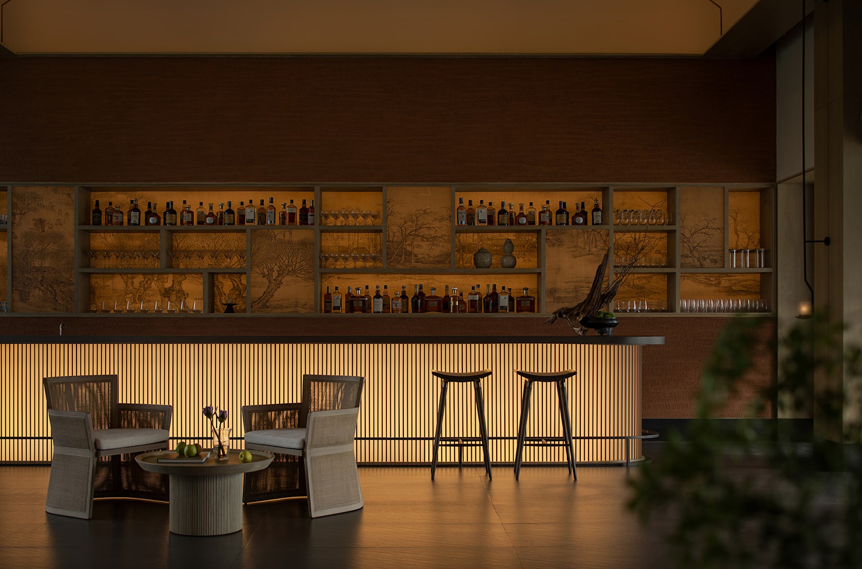
As the center of the courtyard, “Tea time in paddy fields” pub has two entrances, one front and the other back, completely creating an open space. In warm light, one can enjoy tranquil Zen atmosphere at the end of the bar.While relying on nature, the space also can offer lush bamboo and splendid orchestra with interior running water, which are of great interest.Light and shadow from the garden wander in the interior space.

© IDMatrix

© IDMatrix

© IDMatrix

© IDMatrix

Chinese garden borrowing techniques are perfectly used to let one experience the vast world and feel the vitality from inside to outside via the growth of grass and trees.The rough but clean wall presents the purest scene to express the true spiritual appeal.Open a window and let in the sunlight so as to fill the room with warmth and coziness.

© IDMatrix

© IDMatrix

© IDMatrix

© IDMatrix

Take a stroll at the end of the story, and hometown rests in the peace of mind. .

© IDMatrix
© IDMatrix

© IDMatrix

© IDMatrix

Mu Spring Resort by IDMatrix Gallery

Reference

Ten inspiring outdoor dining spaces for spring
CategoriesInterior Design

Ten inspiring outdoor dining spaces for spring

As spring approaches in the northern hemisphere, it’s time to start preparing for sunnier days and warmer evenings. For this lookbook, we’ve rounded up ten inviting spaces featuring outdoor furniture for relaxed al-fresco dining and socialising.


Getting together in public spaces may still be restricted in much of the world over the coming months due to the coronavirus pandemic.

Domestic gardens, courtyards and patios could well be the best place for sharing quality time with friends and family this spring and summer. Read on for 10 inspiring ideas from the Dezeen archives.

This is the latest roundup in our Dezeen Lookbook series providing visual inspiration for the home. Previous articles in the series showcased living rooms with statement shelving, green kitchen interiors, peaceful bedrooms and designer bathrooms.


Mexican home with outdoor lounge area

Guadalajara House, Mexico, by Alejandro Sticotti

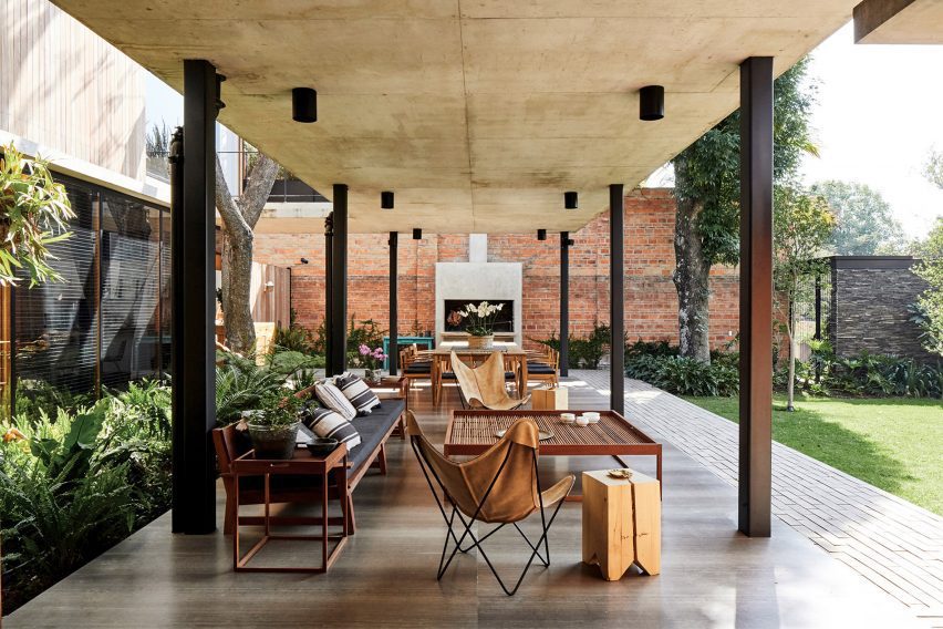
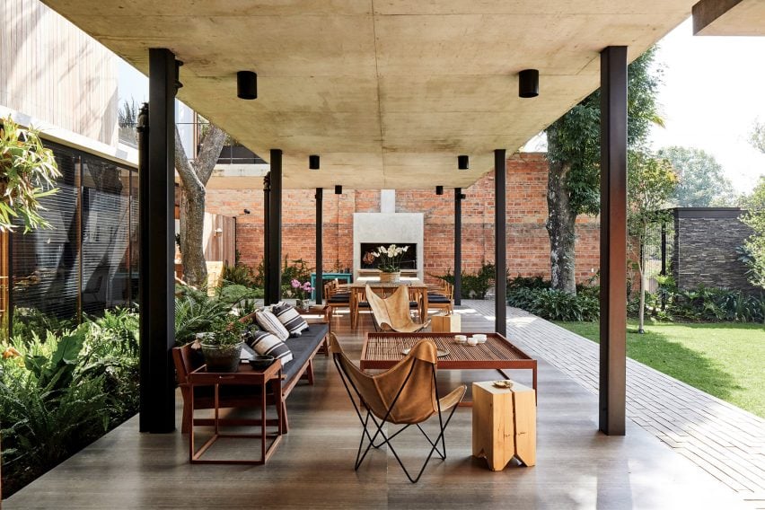
This house in Guadalajara, Mexico makes the most of the benign climate with an L-shaped, open-sided gallery that extends from the home to provide a cool space for dining and relaxing.

The gallery, which is paved in polished stone, features two zones. The dining area features a twelve-seater wooden table set next to an outdoor fireplace while the lounge area consists of a cushion-strewn, timber-framed sofa, leather Butterfly Chairs and a large, square coffee table.

Find out more about Guadalajara House ›


Dining tables at House of Flowers winery by Walker Warner Architects

House of Flowers, US, by Walker Warner

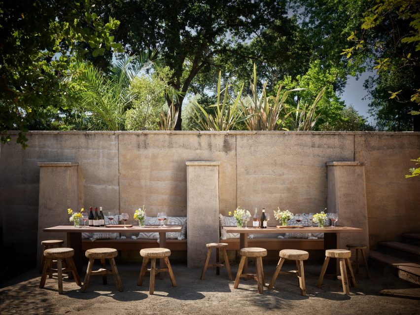
This plein-air dining zone is at a California winery but its rustic style could equally work in a domestic garden or courtyard. Here, visitors can enjoy a glass of wine in the sun while sitting against a warm adobe wall.

Built-in wooden benches are matched with sturdy tables and rough-hewn wooden stools. Tables are decorated with simple bouquets from the garden.

Find out more about House of Flowers ›


Courtyard dining spot in Old Jaffa House 4 by Pitsou Kedem

Jaffa apartment, Israel, by Pitsou Kedem

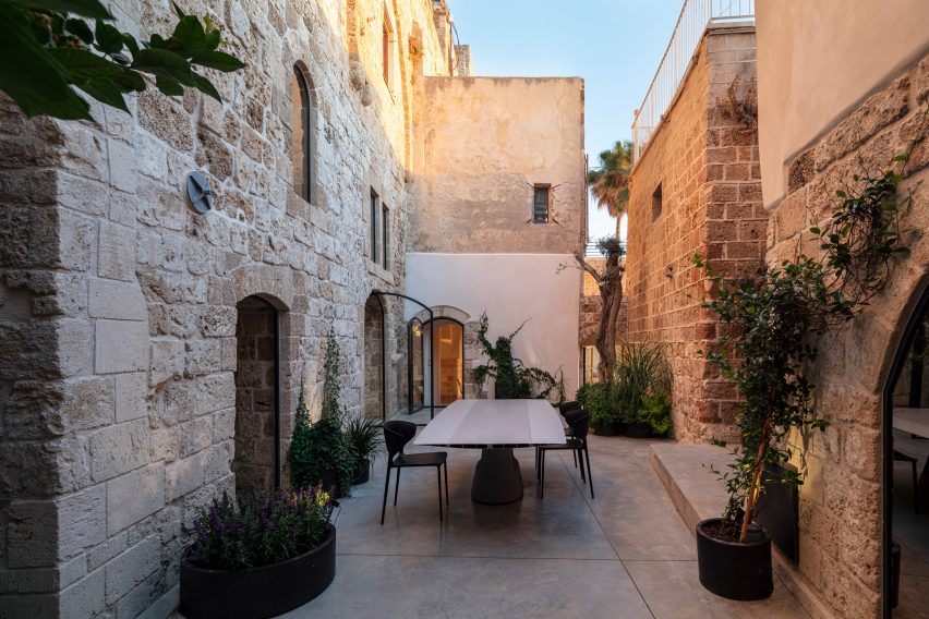
This sea-facing Jaffa apartment in a historic building has a narrow courtyard that is used for outdoor dining during the summer months. A glossy dining table is easy to wipe down and is complemented by practical plastic chairs.

The ancient stone walls and concrete floor are softened by shrubs and climbers set in oval planters.

Find out more about Jaffa apartment ›


White-painted garden pavilion with dining area

Garden pavilion, UK, by 2LG Studio

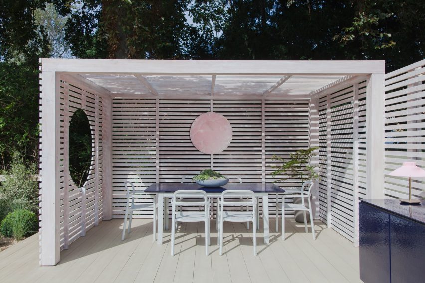
British interior designers Jordan Cluroe and Russell Whitehead of 2LG Studio built themselves a white-stained pavilion in their back garden that is used as a dining space and for socialising when the weather allows.

The raised pavilion is clad in slatted timber and serves as a covered dining area. Wide timber decking adds a touch of the seaside boardwalk to the ensemble.

Find out more about Garden pavilion ›


Outdoor dining space on granite terrace

Casa 4.1.4, Mexico, by AS/D

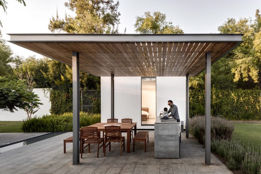
This multigenerational weekend retreat in Mexico features four separate dwellings arranged around a courtyard that is paved in granite and bisected by a shallow rivulet.

Extending from one of the lodges is a steel pergola with a canopy of slatted timber. This creates a shady spot for family dinners that is furnished with a teak table, dining chairs and benches. An outdoor kitchen allows prep and cooking to be done outside.

Find out more about Casa 4.1.4. ›


Dining table outdoors in Greek holiday home

Mykonos holiday home, Greece, by K-studio

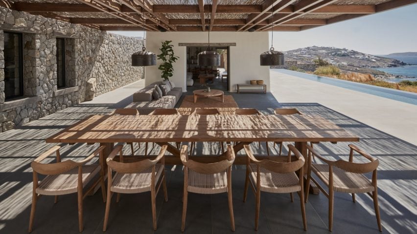
A walnut pergola covered in traditional reeds provides shade for the outdoor living space at this holiday home in Mykonos. Consisting of a lounge area and a ten-seater dining table, the generous stone terrace looks across an infinity pool towards the ocean.

“To create a house that would allow guests to enjoy being outside throughout the day we needed to filter the overwhelming intensity of the climate by providing shade and protection from the elements,” said architect K-studio.

Find out more about Mykonos holiday home ›


Outdoor dining area in Italy

Country House, Italy, by Studio Koster

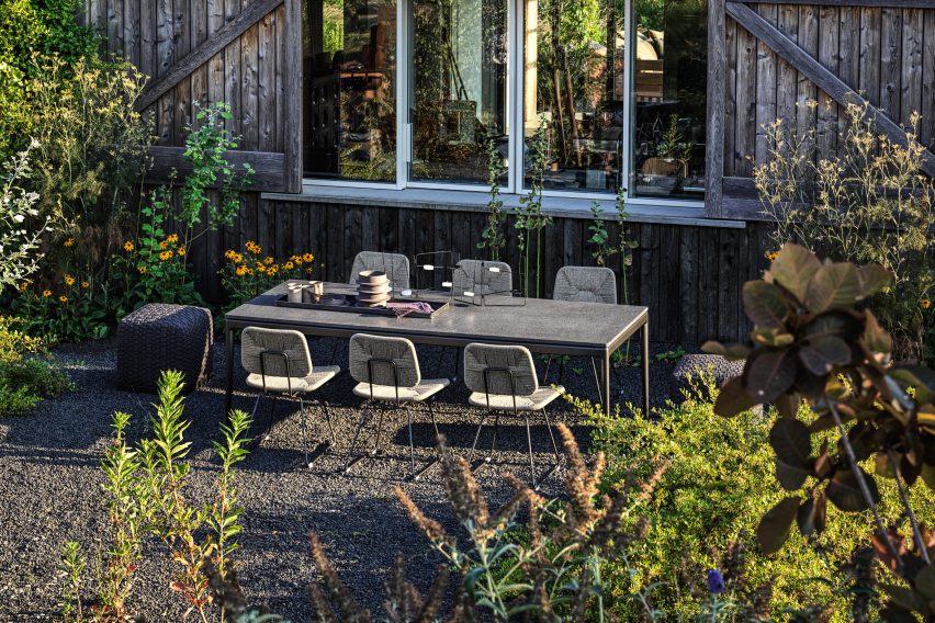
Studio Koster’s Italian Country House near Piacenza has an idyllic outdoor dining space set amid a cottage-style garden. The setting, close to a timber wall, provides shelter from breezes while lava gravel provides a rustic, low-maintenance touch.

Steel-framed chairs with rattan seats plus poufs with woven covers – both by Italian brand Flexform, which furnished the house for a photoshoot – give the space an eclectic feel.

Find out more about Country House ›


Wooden table and chairs on tiled floor surrounded by flower pots

Villa Fifty-Fifty, The Netherlands, by Studioninedots

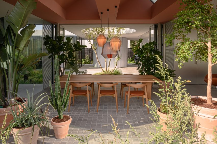
This dining space in Villa Fifty-Fifty in Eindhoven is both indoors and outdoors. Folding glass doors peel back to turn the room into a loggia that is open to a courtyard on one side and a densely planted border on the other.

Quarry tiles and statement plants in terra-cotta pots add a taste of sunnier climes while the only furniture is a chunky dining table and a set of Elbow Chairs designed by Hans J Wegner for Carl Hansen & Son.

Find out more about Villa Fifty-Fifty ›


Raised dining area on concrete terrace

House B, Austria, by Smartvoll

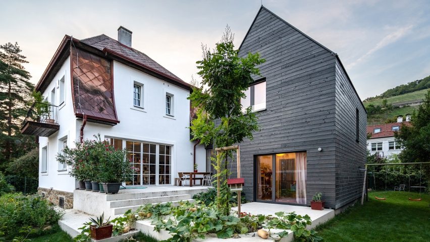
An outdoor dining area sits on a split-level concrete terrace outside this house in Austria, which was an extension and renovation of an existing building. The dining table, made of dark wood to contrast with the pale cement, is set close to the house to protect it from the elements.

Large potted oleanders protect the dining space from view on the upper level of the patio while squash vines planted in a circular void spill over the lower level.

Find out more about House B ›


Sunny dining spot in Puglia house with white walls

The White Tower, Italy, by Dos Architects

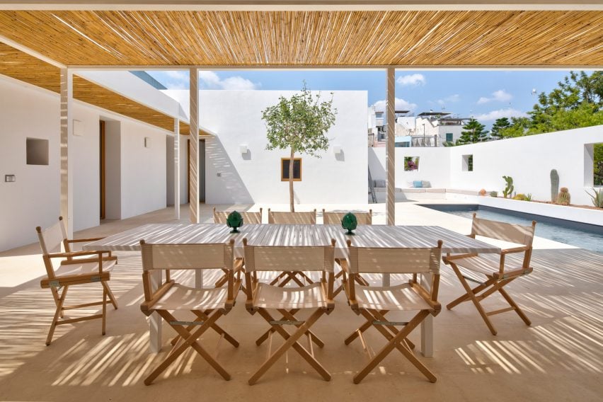
This bright white house in Puglia has an outdoor dining space with a simple, elegant design. Directors’ chairs with beige canvas seats give it an outdoorsy, camping-like feel and match the pale-wood table. A pergola made of slender steel columns is shaded with canes.

Two decorative table objects in green break up the beige colour scheme and add a simple but elegant touch.

Find out more about The White Tower ›


This is the latest in our series of lookbooks providing curated visual inspiration from Dezeen’s image archive. For more inspiration see previous lookbooks showcasing green kitchen interiors, peaceful bedrooms, calm living rooms and colourful kitchens.

Reference

Ten interiors with pastel colours that freshen up the home for spring
CategoriesInterior Design

Ten interiors with pastel colours that freshen up the home for spring

For this lookbook, we’ve rounded up ten home interiors decorated in pastel tints that show how ice-cream colours can give spaces a fresh, calming look.


The selection from our archive, which includes bathrooms to bedrooms and kitchens, shows how pastels – made by adding white to pure colours to make them more luminous and less saturated – can create a spring-like feeling.

Never really out of fashion, pastels have strong psychological associations with new life with their pale, cheery tints representing a midway stage between the darkness of winter and the full-blown colour of summer.

This is the latest roundup in our Dezeen Lookbooks series providing visual inspiration for the home. Previous articles in the series feature rooftop gardens, bright kitchens, interiors with statement plants, terrazzo kitchens, and stylish home offices.


Hidden Hiues by Note Design Studio

Hidden Tints, Sweden, by Note Design Studio

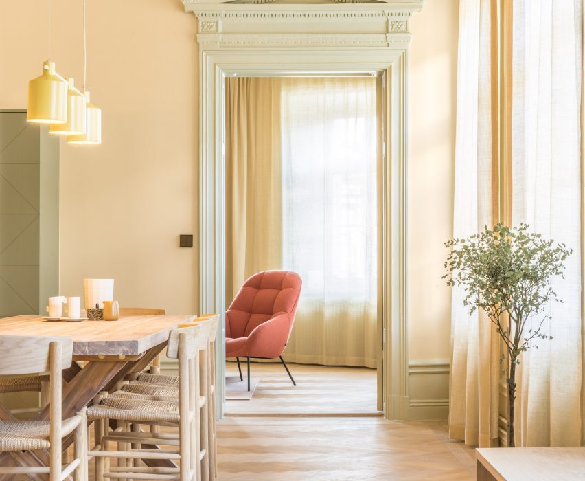
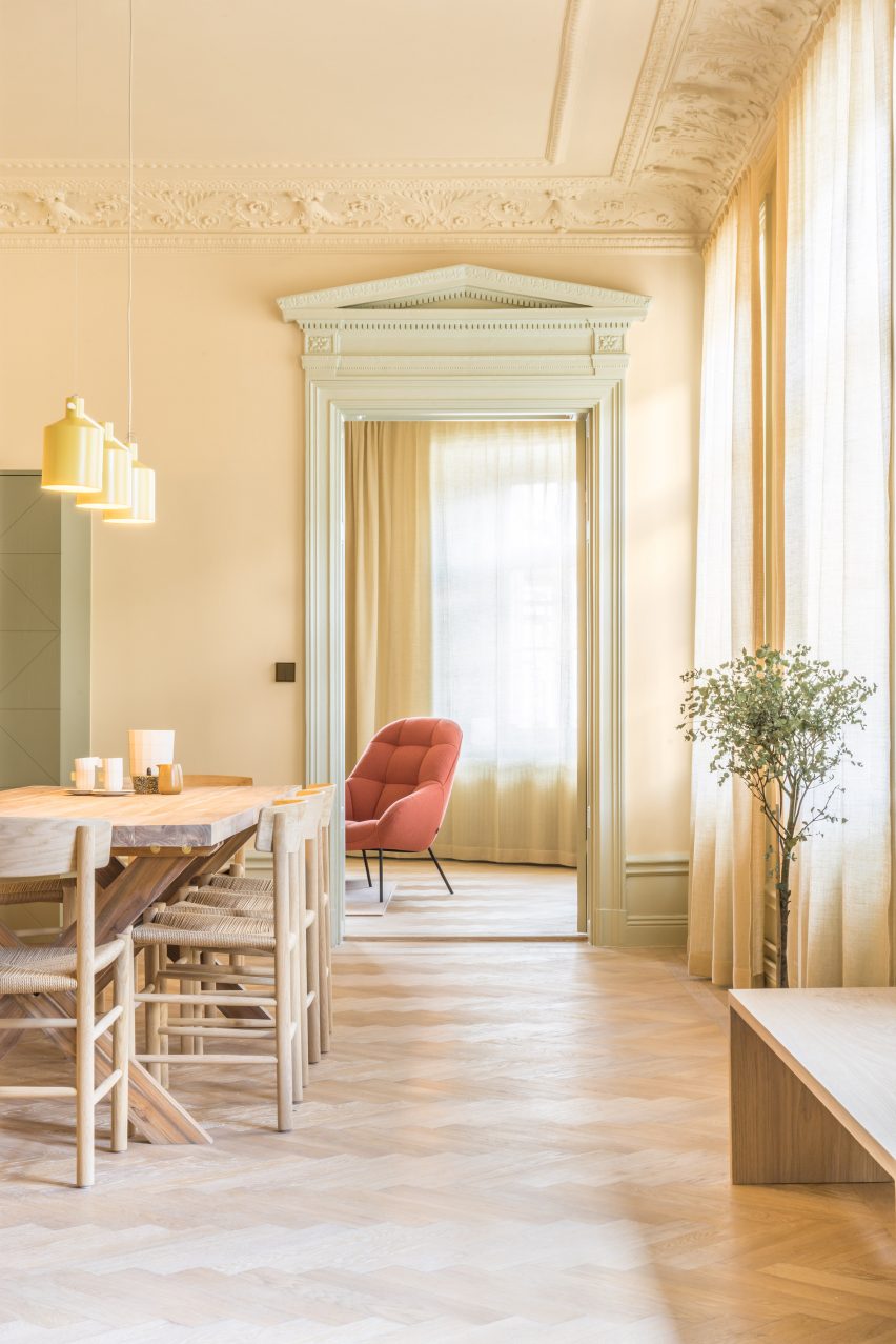
A warm, yellow tint covers the walls of this Stockholm apartment designed by Note Design Studio, which is filled with different pastel colours. A pale, spring-like green complements the yellow and is picked up in the plants dotted around the space.

Wooden furniture matches the gleaming wooden floors, while a pale orange Mango lounge chair by Note Design Studio for Wendelbo adds a touch of colour. The light above the table is SILO Trio by Note Design Studio for Zero.

Find out more about Hidden Tints ›


Longhouse in Victoria, Australia designed by Partners Hill

Longhouse, Australia, by Partners Hill

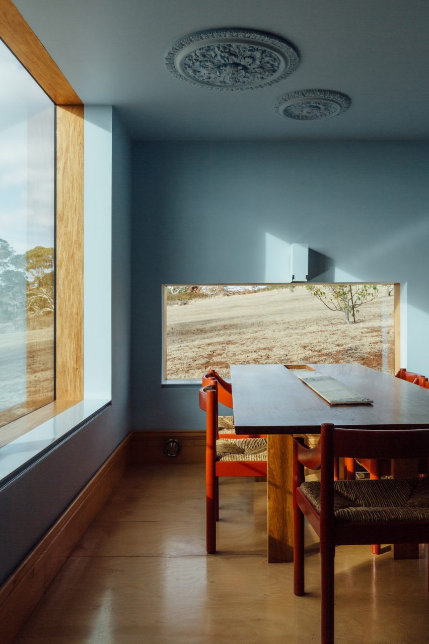
The dining room of this shed-style home in Australia has been decorated in a pale blue colour that contrasts with its wooden floor and wooden door frame, as well as the rolling plains of bushland outside the windows.

Tomato-red dining chairs give the room a contemporary, vibrant feel and stand out against the soothing blue walls.

Find out more about Longhouse ›


Suburban Canny by Tribe Studio

Suburban Canny, Australia, by Tribe Studio

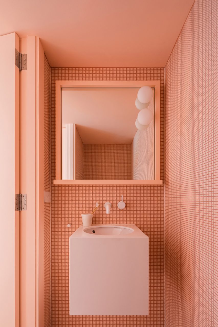
Each bathroom in this Sydney home is tiled in a different colour – pink, teal and blue. The almost apricot-pink shade of the tiles is matched with a pale pink, wall-hung basin as well as the door and door frame.

The geometric shapes of the small tiles create a graphic pattern on the wall that adds interest to the monochrome interior.

Find out more about Suburban Canny ›


Foyer in Cleveland by Beauty Shoppe

Co-working space, US, by Beauty Shoppe

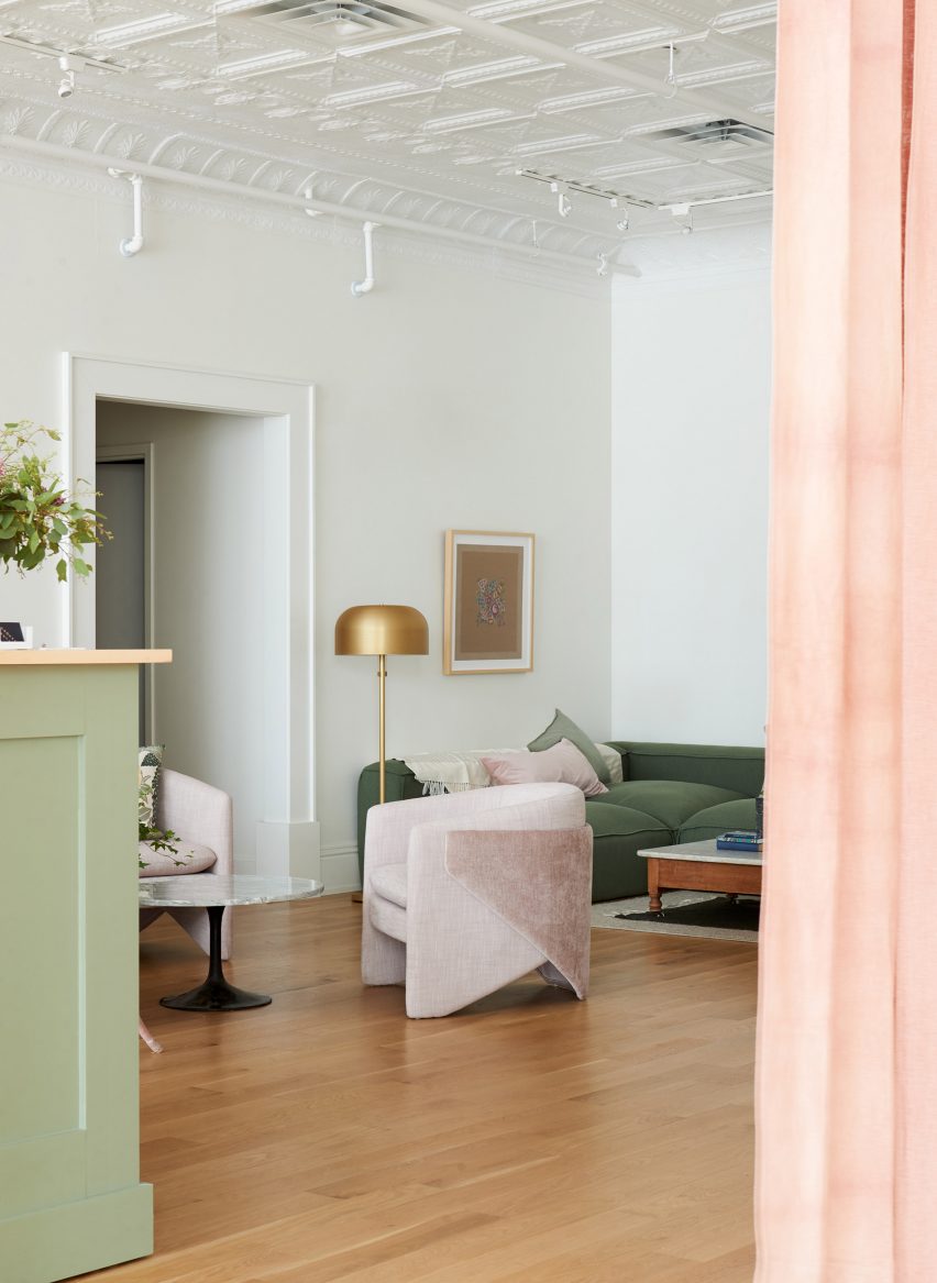
While the walls have been kept a discrete grey colour, pastel colours were used for other parts of the interior in this Cleveland co-working space. A Tulip side table by Eero Saarinen for Knoll sits between two of West Elm’s Thea chairs in a very pale pink shade.

Green and pink is used throughout the space, on a reception desk in pistachio green and the apricot-coloured curtains, as well as a comfy green sofa accessorised with a pink pillow.

Find out more about the co-working space ›


High House by Dan Gayfer Design

Melbourne extension, Australia, by Dan Gayfer Design

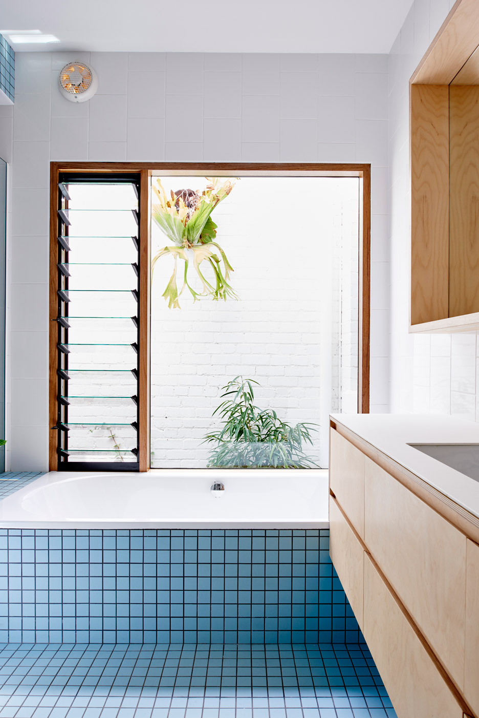
A banana-leaf ficus (ficus maclellandii) peaks in from the courtyard at this tile-clad blue bathroom in Melbourne. The tiles match the exterior of the house, which is also clad in pale blue tiles.

White-tiled walls and wooden drawers complete the clean, simple interior of the bathroom.

Find out more about the Melbourne extension ›


Green pastel bedroom

Skyhouse, US, by David Hotson and Ghislaine Viñas

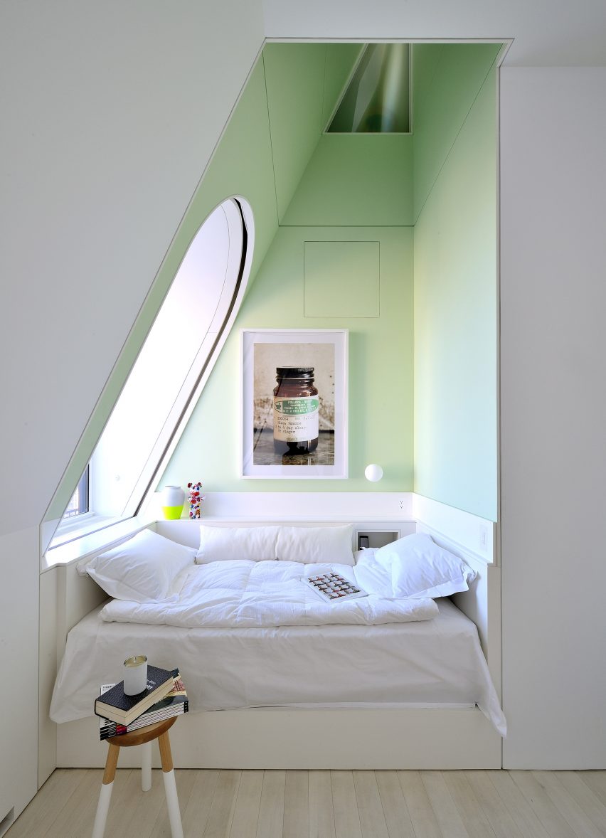
This comfy sleeping nook in a Manhattan penthouse has been livened up with a very pale, almost pear-green colour that creates a peaceful feeling.

Light streaming in from a large window in the slanted wall adds to the fresh, crisp feel of the space which has been decorated with a small, practical stool as well as selected art pieces.

Find out more about Skyhouse ›


Paris apartment by Les Ateliers Tristan & Sagitta

Paris apartment, France, by Les Ateliers Tristan & Sagitta

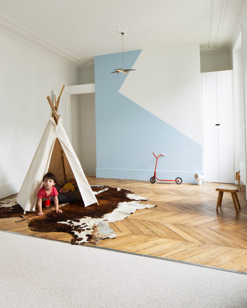
Colour was used generously throughout this Paris flat and used in a clever way to divide the children’s room for two brothers.

One side of the space has pale blue paintwork and beige carpet, while the other has white walls and wooden floorboards laid in a zigzagging pattern. The same pale blue was also used on the side with white walls to create a decorative geometric design on the wall.

Find out more about Paris apartment ›


A Brockley Side London house extension and renovation by CAN

A Brockley Side, UK, by CAN

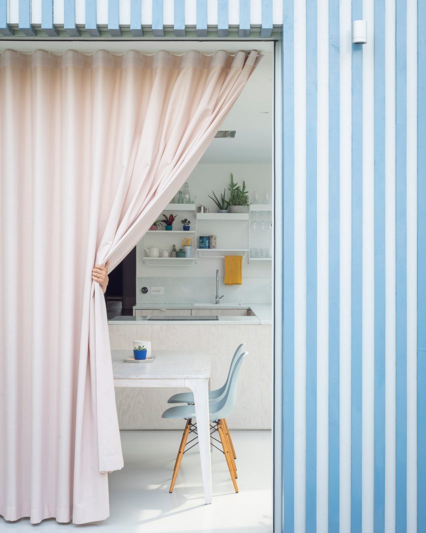
Architecture studio CAN added a blue and white striped extension to a Victorian terrace in London and used a pastel pink curtain to give added privacy to the kitchen and dining space inside.

Pale turquoise Eames DSW chairs are set around a white dining table, with the colour picked up by the speckled sink splashback and the blue accessories on the shelves above it.

Find out more about A Brockley Side ›


Architecture studio Nimtim renovate a Victorian terrace in London into a space saving apartment

London flat, UK, by Nimtim

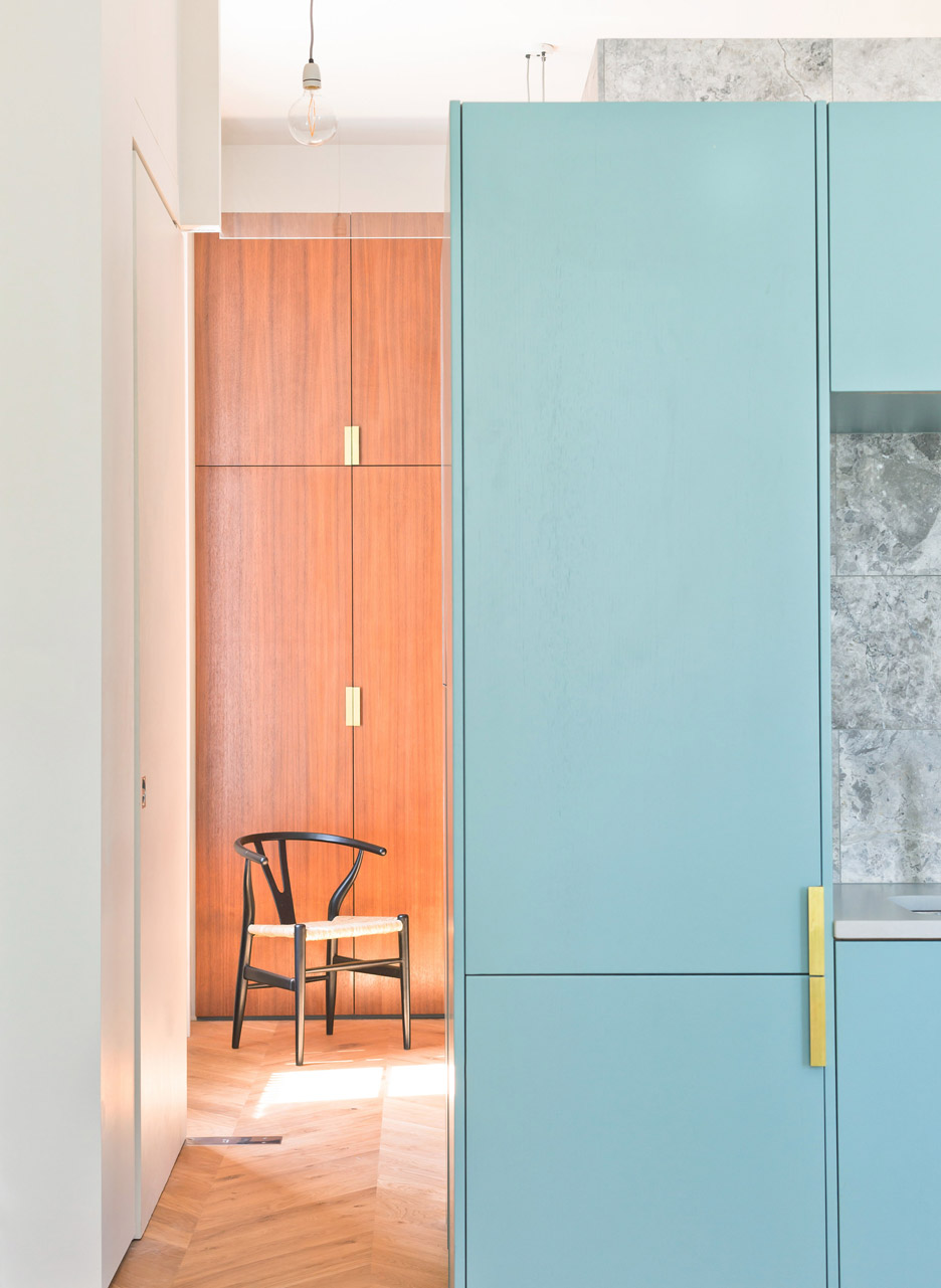
Hans J Wegner’s sculptural Wishbone chair for Carl Hansen & Søn functions almost as a piece of art in this bedroom in a London flat, which has wooden fitted wardrobes and a fold-down bed.

The kitchen and dining space next to it has colourful turquoise cabinetry and a grey marble wall, which adds a luxurious touch to the space.

Find out more about London flat ›


Leman Locke hotel

Leman Locke, UK, by Grzywinski + Pons

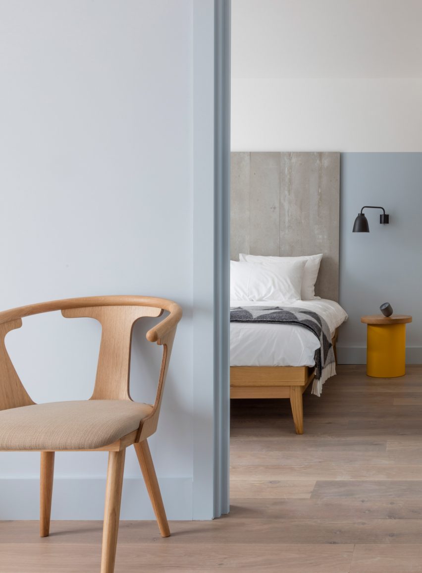
Pale blue was used in this bedroom of the Leman Locke hotel in London, which was designed to bridge the gap between a home and a hotel stay.

Sami Kallio’s In Between chair for &Tradition matches the elegant wooden bed, and the natural wood – which is also used on the bedside table – gives the sleek space a more organic feel.

Find out more about Leman Locke ›


This is the latest in our series of lookbooks providing curated visual inspiration from Dezeen’s image archive. For more inspiration see previous lookbooks showcasing peaceful bedrooms, calm living rooms and colourful kitchens

Reference