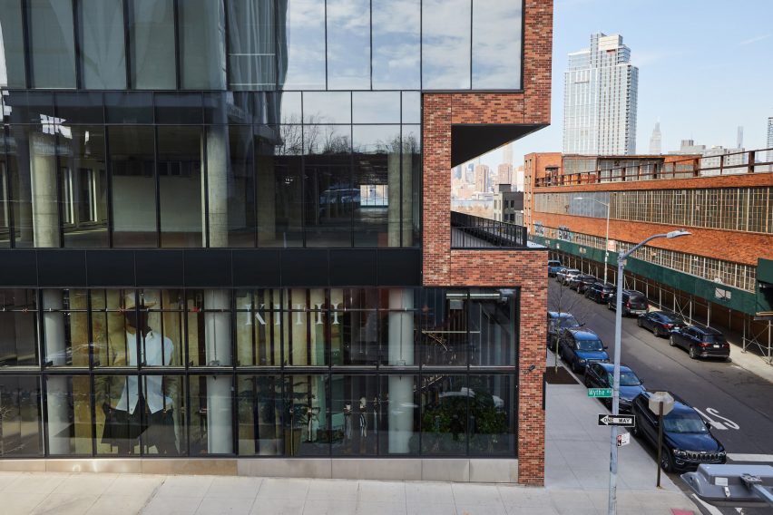
MRDK uses arches and mosaics for Ciele Athletics store in Montreal
CategoriesInterior Design

MRDK uses arches and mosaics for Ciele Athletics store in Montreal

Rounded walls and archways create a flow through this Montreal boutique, designed by local studio MRDK for Canadian sportswear brand Ciele Athletics.

The first boutique for Ciele, which sells technical headwear and apparel for running, opened in April 2023 on Notre-Dame Street in Montreal – the brand’s hometown.
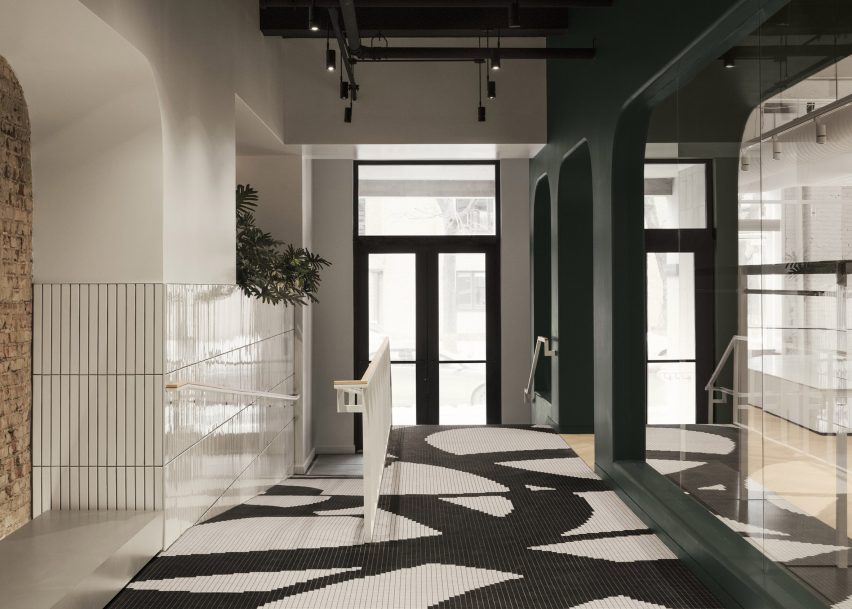
Entryway with black and white mosaic flooring
Black and white mosaic tiles form a pattern based on Ciele’s apparel at the entrance to the store

The 3,000-square-foot (279-square-metre) flagship store was designed by MRDK to be as much a boutique as a community space for runners to meet and socialise.

Along the narrow entryway, flooring comprises black and white mosaic tiles that form a graphic pattern based on select items of the brand’s apparel.
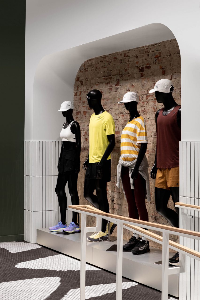
Four mannequins within a wall niche
Visitors are lead past a quartet of mannequins to a community lounge area

Ascending four steps or a ramp leads visitors past a large white-tiled planter, then a display of mannequins lined up in front of a brick wall.

A lounge area at the end is designated for gathering and conversation, offering “anyone with an interest in movement and connection a chance to experience running and the many facets of its dynamic community through regular meet-ups and events”, said MRDK.
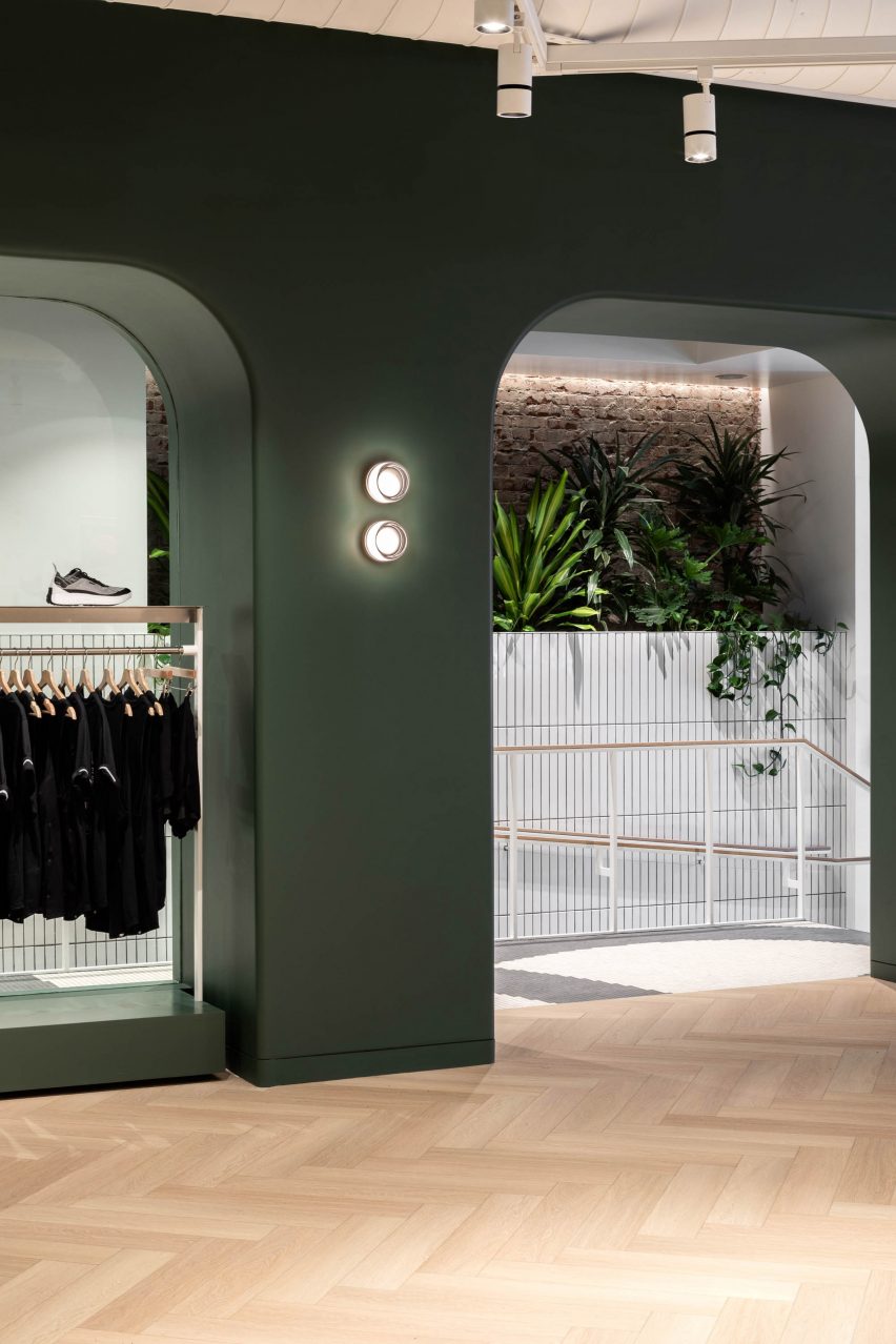
A dark green dividing wall with arched openings
Access to the main retail space is via an archway that punctures a dark green partition

Access to the main retail space is through an archway with rounded corners that punctures a deep, dark green partition.

“An arched wall gracefully separates the more public community area from the rest of the store, creating a sense of intrigue and inviting exploration,” MRDK said.

White service counter in front of a dark green wall
The green hue continues behind the fluted white service counter

Other similar openings in this spatial divider are used to display clothing on single or double-stacked rails.

The same forest green shade continues on the wall behind the service counter, which is fronted by a white fluted panel and includes a small glass vitrine set into its top.
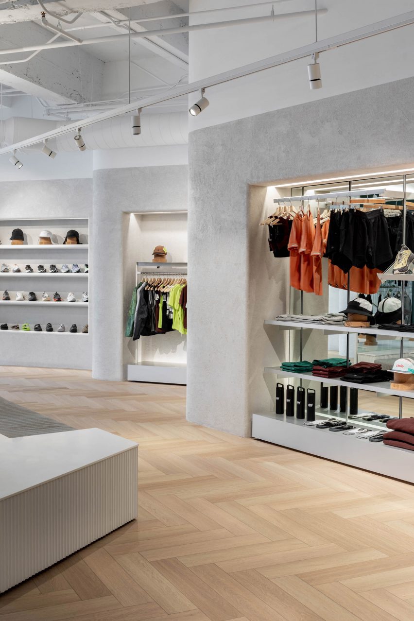
Sportswear displayed in a series of angled niches
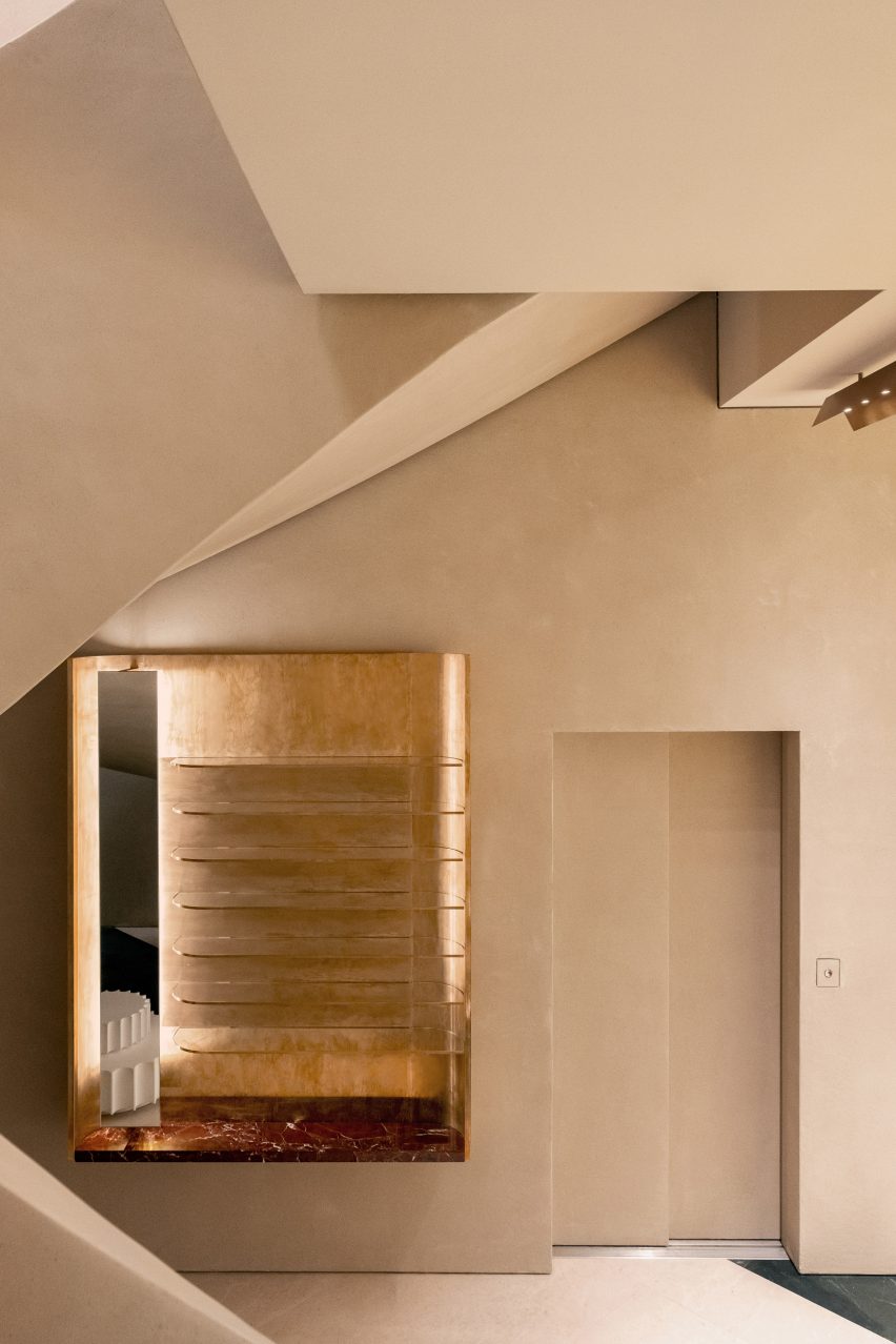
Lime plaster covers the angled walls, which feature bull-nose edges that soften their appearance

Herringbone white oak parquet floors are laid wall to wall, running beneath a low central island that is designed to be broken apart and moved around the store depending on merchandising needs.

A textured lime plaster finish was applied to the walls, wrapping around the bull-nosed corners that soften the angles created by the offset displays.

“The play of light and shadows on these textured surfaces creates a sense of dynamism, accentuating the uniqueness of the space,” said MRDK.

In one corner, a 12-foot-tall (3.7-metre) shelving system presents Ciele’s range of hats on cork mannequin heads.
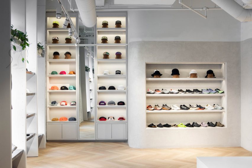
Hats displayed on floor-to-ceiling shelves
A tall shelving system displays Ciele’s hat collection

Fitting rooms at the back of the store are kept minimal, with green velvet curtain draped behind the arched openings to the cubicles.

“The thoughtful combination of materials, textures, and colours creates an atmosphere that seamlessly blends modernity with a touch of timeless elegance,” said MRDK.
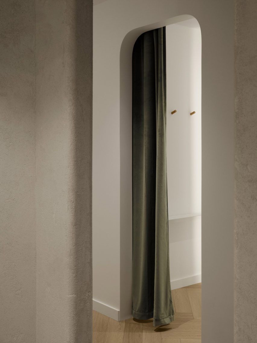
Minimalist fitting room with green velvet curtain
The fitting rooms are kept minimalist and feature green velvet curtains

Formerly known as Ménard Dworkind, the studio was founded by Guillaume Ménard and David Dworkind, and has completed a variety of retail spaces in Montreal and beyond.

Most recently, these have included a store for plastic-free beauty brand Attitude.

The photography is by David Dworkind and Alex Lesage.


Project credits:

Team: David Dworkind, Benjamin Lavoie Laroche
Contractor: Groupe Manovra
Ceramic floor tile: Daltile
Lighting: Sistemalux
Lime plaster: Venosa
Wood profiles: Brenlo

Reference

EBBA designs sculptural pop-up for Rotaro at London store Liberty
CategoriesInterior Design

EBBA designs sculptural pop-up for Rotaro at London store Liberty

London-based studio EBBA Architects has channelled the environmental ethos of fashion rental platform Rotaro for its pop-up boutique at department store Liberty.

The project aimed to show that beautiful and interesting spaces can be created for temporary use, while still considering the environmental impacts of materials and construction.

“We are very aware of our environmental impact and we believe design should speak to this, while also trying to make a unique experience for the visitor,” EBBA founder Benjamin Allan told Dezeen.

Pop-up shop at Liberty by EBBA
EBBA designed a pop-up shop for fashion rental platform Rotaro

Rotaro is all about fashion rental, as a response to waste in the industry,” he added. “Circularity is key to their ethos and we wanted to connect to this, both in the use of material and form.”

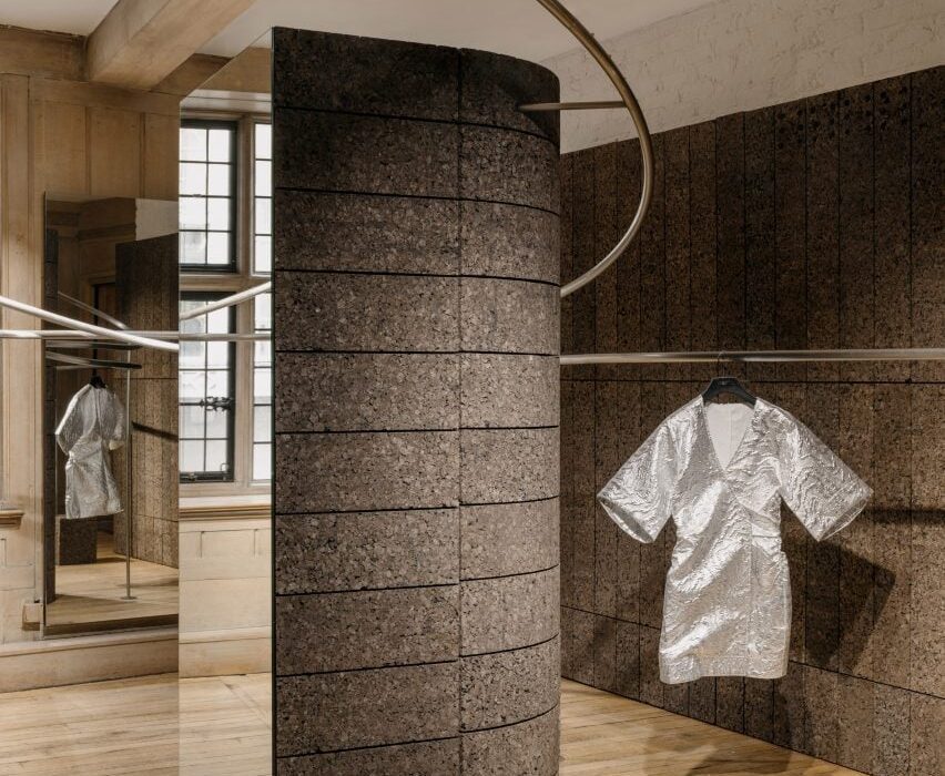
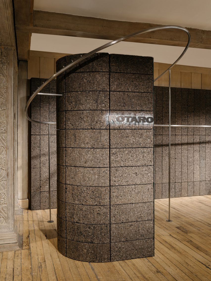
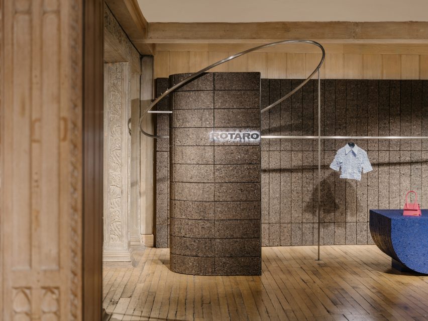
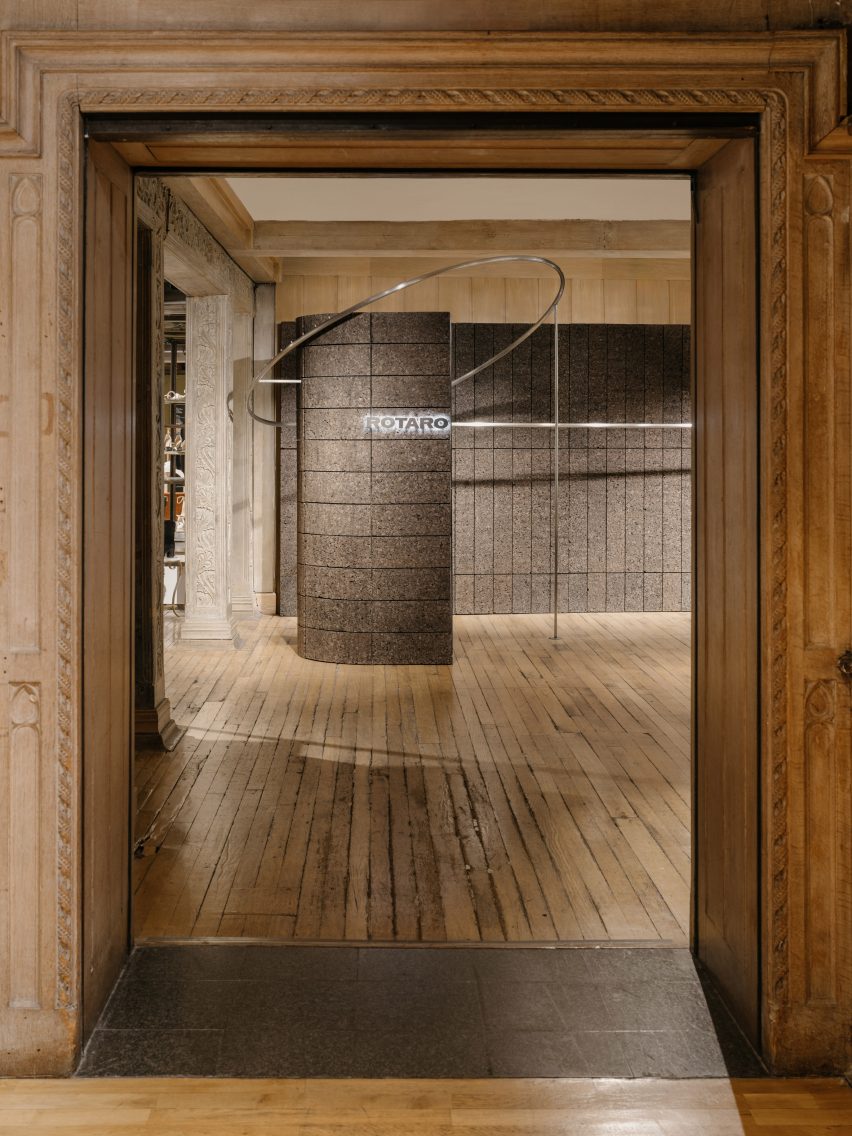
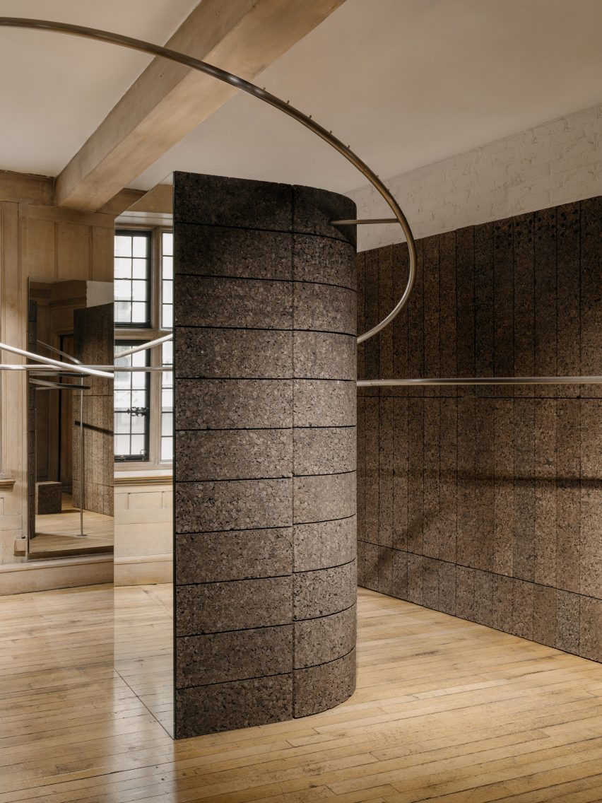
Bringing definition to Rotaro’s space within the wider store, EBBA has demarcated the area with a pair of substantial columns, each with an elongated, semi-circular cross-section.

“The position and shape of the columns create the sense of walking into an entirely new space within the historic context of Liberty,” said Allan.

Cork column emblazoned with the Rotaro logo
The studio demarcated the area with a pair of substantial columns

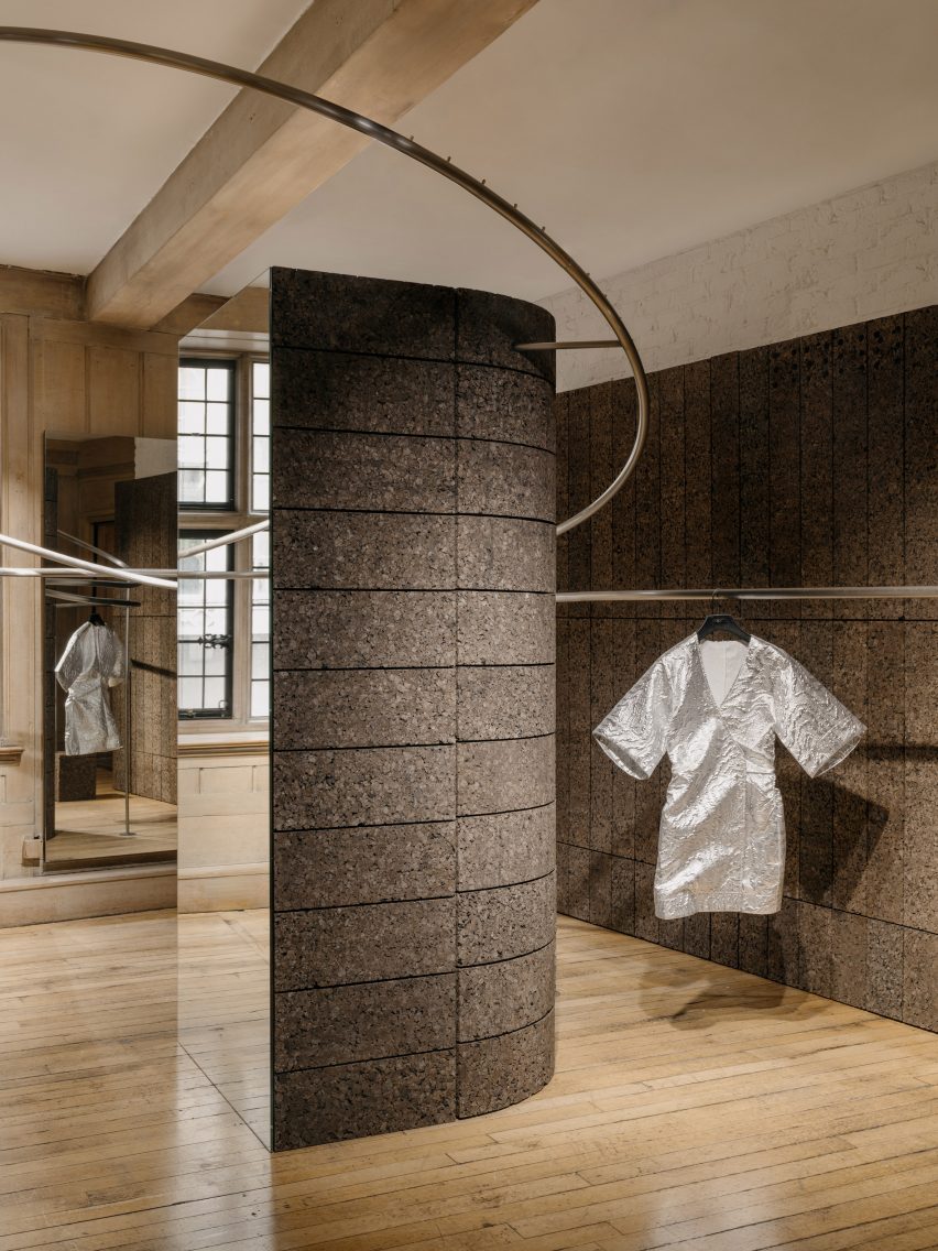
Entwining the two columns, a pair of metal rails have the dual function of creating a display area and introducing a sculptural element that further defines the space, with soaring, free-form curves.

“The two rails rotate and wrap around each of the columns, while also simultaneously responding to the opposite rail, a bit like a choreographed piece,” Allan said.

Cork column at Rotaro pop-up in Liberty
Cork is the project’s primary material

Continuing the theme of duality, just two key materials have been used in the space – cork and metal.

EBBA was influenced by the work of artists Donald Judd and Carl Andre and their elevation of humble materials through detailing and construction.

Metal rails by EBBA for the Rotaro pop-up
A pair of metal rails have a dual function

“We always look to push the potential of a project, to make the most impact through the simplest of means and also address the need to be economical,” Allan said.

“Essentially the design revolves around only two materials which, working together, give a sense of regularity in the layouts of the blocks, combined with the sculptural forms of the rails.”

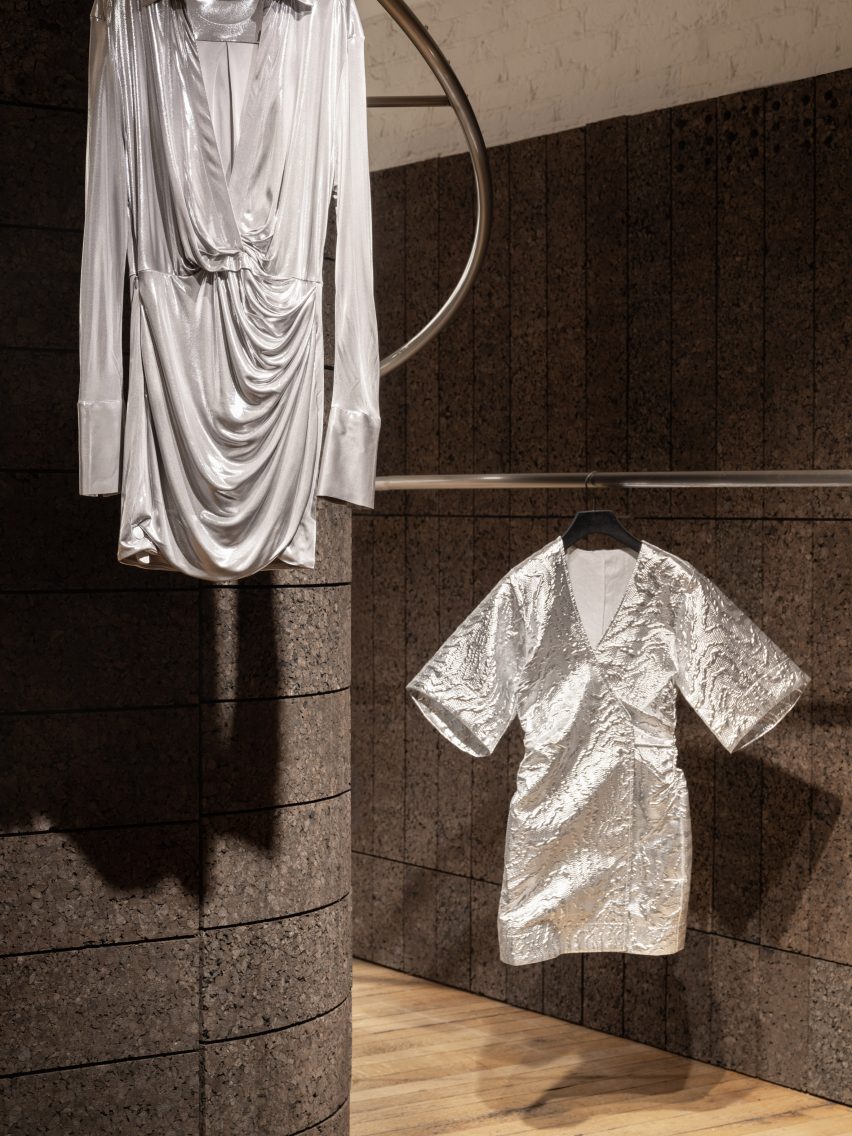
Garments hanging from metal rails
Curated garments hang from the rails

Cork was used as the primary material, cladding the two columns and creating the backdrops that zone Rotaro’s area.

EBBA aimed to use a material that had an environmental quality, while using the standardisation of the blocks to set parameters for the design.

“We chose blocks of a specific dimension that could then be adapted to create both the walls and the columns themselves,” Allan said.

“The cork is a natural material that has an inherent warmth and depth, while also being incredibly versatile and easily recycled,” he added.

Textured ultramarine plinth
Texture characterises the pop-up shop

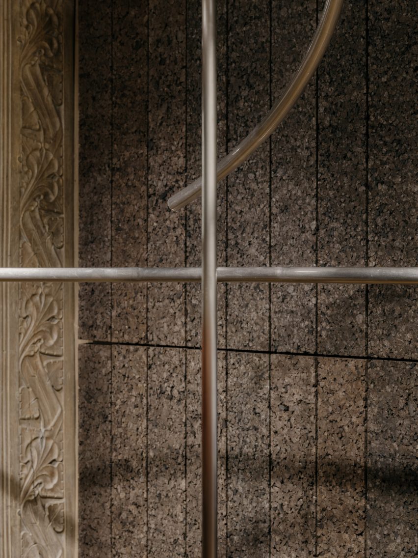
Brushed stainless steel was used for the metalwork, with each rail comprised of a single piece of metal that was bent and sculpted to wrap around the columns.

This rail’s curving form relates to the idea of circularity in Rotaro’s business model, while also bringing an adaptability to the space by allowing the garments to be shown in a variety of ways.

Stainless steel railing for Rotaro by EBBA
Brushed stainless steel was used for the metalwork

“The primary purpose is to display the continuously updated collection while also adding a sculptural aspect that helps to create a sense of space,” said Allan.

Within the ornately-detailed Liberty store, the project offers a bold, contemporary response to the interior, while finding common ground with the wider building.

Curving metal rail
The rail’s curving form relates to the idea of circularity

“The tones and textures in the warmth of the cork, tie in with the timber and natural colours of Liberty’s interior spaces,” Allan said. “Detailing and decoration in the original columns relate to nature and vegetation, which also tie into the use of cork and its qualities.”

Because the Liberty building has Grade II listed status, no fixings were allowed into the building fabric.

“The benefit of the lightweight cork material meant we could also adapt the Rotaro space with minimal impact on the wider building,” he added.

Lightweight cork column at Rotaro by EBBa
Cork was chosen for being lightweight

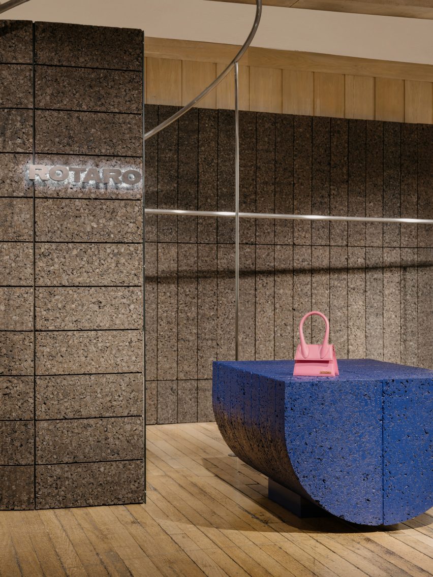
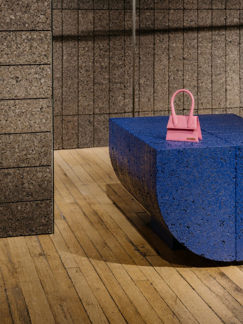
To create a plinth that provides a flat surface for displaying objects, EBBA used the same semi-circular form of the columns, but flipped onto its side.

This element has been given an ultramarine blue coating to add a sense of playfulness and catch the attention of visitors, using one of Rotaro’s key colours to connect with the brand’s identity.

Semi-circular plinth with ultramarine coating
A semi-circular plinth features an ultramarine blue coating

While the space has been designed as a pop-up, EBBA worked – through the quality of the materials and the construction of the walls and blocks – to give it a sense of permanence.

“All of our projects aim to achieve a quality of permanence through the use of natural materials and the detailing of the construction,” Allan said.

“We believe that this level of quality helps to create a design that feels purposeful, even for temporary uses.”

Other recent projects by EBBA Architects include a shop for Cubitts in an old pie-and-mash restaurant and a house extension with brutalist-style materials.

The photography is by James Retief

Reference

Isern Serra turns renderings into reality to form pink Moco Concept Store
CategoriesInterior Design

Isern Serra turns renderings into reality to form pink Moco Concept Store

Design studio Isern Serra has transformed a computer-generated image by digital artist Six N Five into a rose-coloured retail space for the Moco Museum in Barcelona.

Situated in Barcelona’s El Born neighbourhood, the Moco Museum exclusively exhibits the work of modern artists such as Damien Hirst, Kaws, Yayoi Kusama and Jeff Koons.

The institution’s eponymous concept store has a similarly contemporary offering, selling a mix of design, fashion and lifestyle goods.

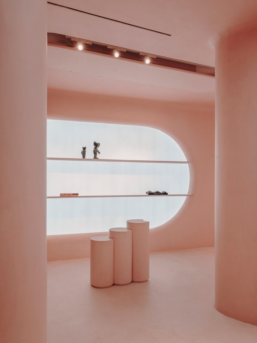
Pink interior of Moco shop in Barcelona, designed by Isern Serra and Six N. Five
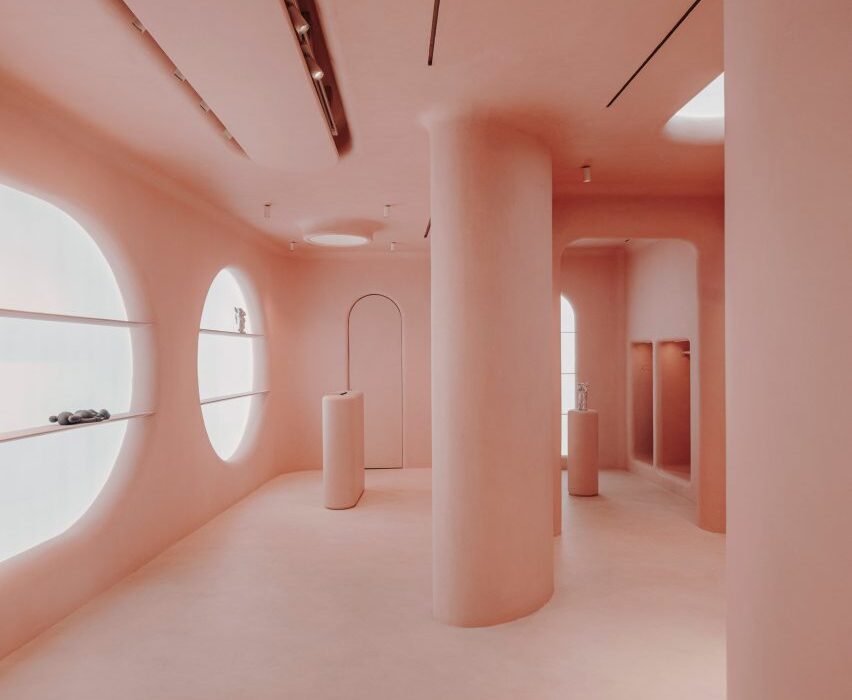
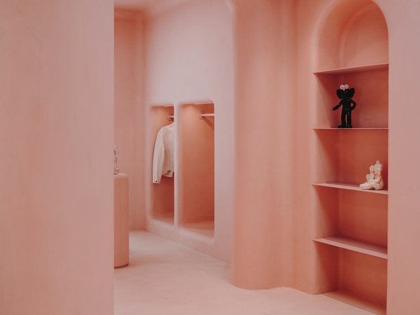
The store’s interior is completely covered in pink micro-cement

Its surreal pink interior started out as a computer-generated image by Six N Five, a digital artist known for envisioning other-worldly dreamscapes in pastel hues.

Barcelona-based design studio Isern Serra then brought the image to life, using pink micro-cement to achieve the same uniform, ultra-smooth surfaces seen in the drawing.

Pink interior of Moco shop in Barcelona, designed by Isern Serra and Six N. Five
Products are displayed inside huge circular display niches

“The Moco Concept Store represented an interesting challenge, as I had to combine the purpose of the store with actual architecture remaining true to our original dreamy world I had built in CGI,” explained Six N Five, whose real name is Ezequiel Pini.

“But these concepts were able to go one level further, both in decisions and execution, thanks to Isern Serra who brought its extraordinary talent and experience.”

Pink interior of Moco shop in Barcelona, designed by Isern Serra and Six N. Five
Arched and square niches have also been punctured into the walls

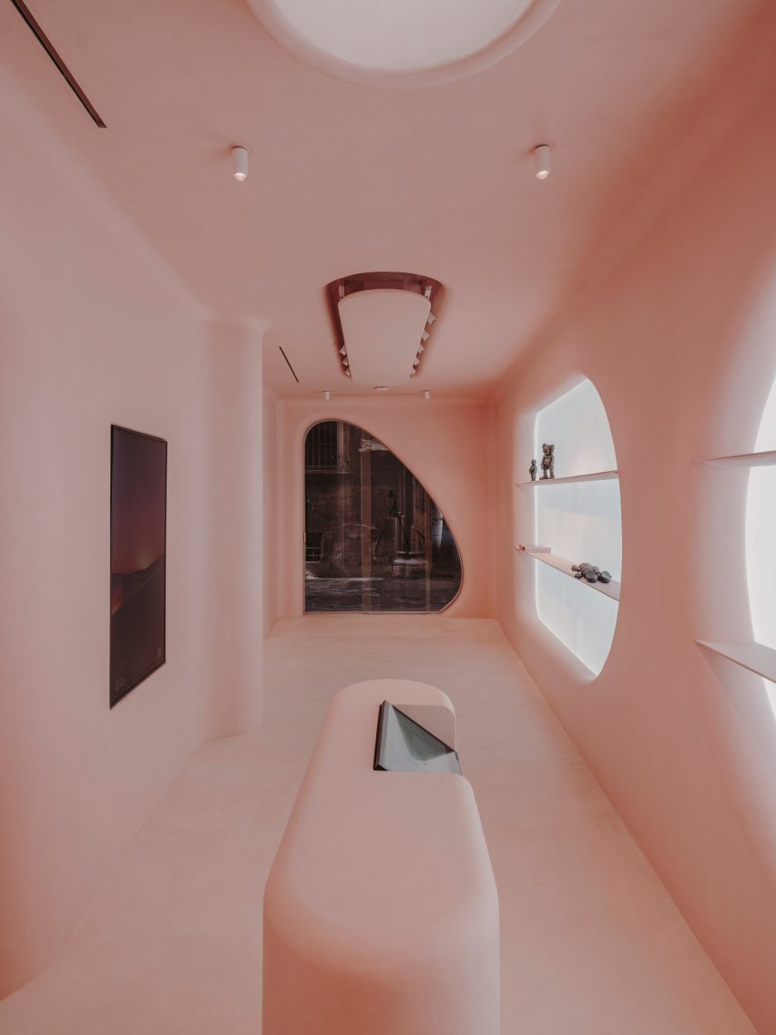
The store’s rosy interior can be seen through two large openings in its facade – one of them is rectangular, while the other is slightly curved and contains the entrance door.

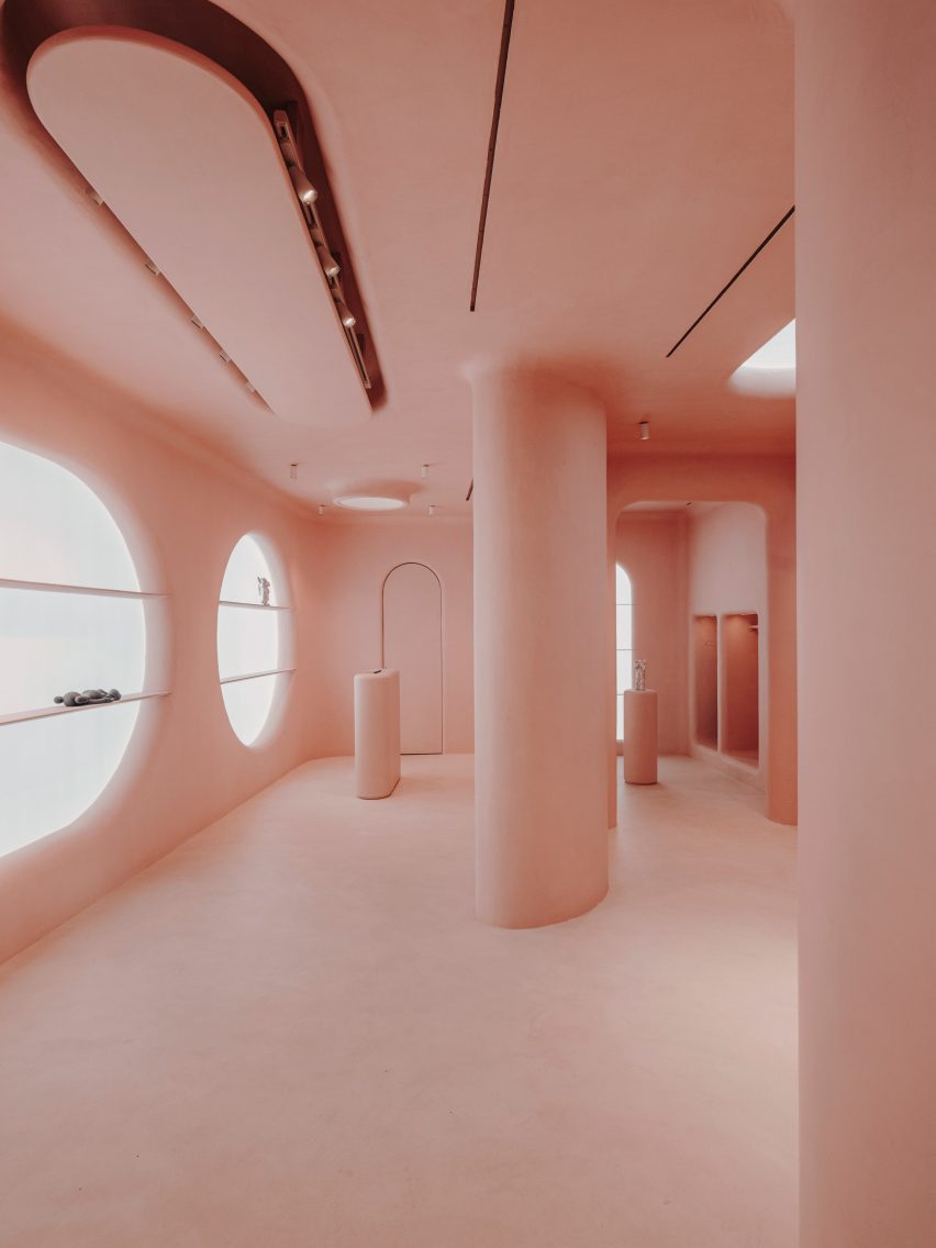
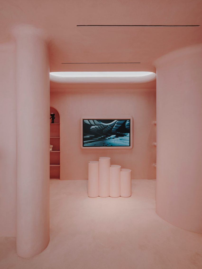
A series of chunky columns run through the middle of the space. Surrounding walls have been punctured with arched, square and circular display niches, some of which are dramatically backlit.

Rows of shelves and a frame for a tv screen have also been made to project from the wall.

Pink interior of Moco shop in Barcelona, designed by Isern Serra and Six N. Five
A faux skylight sits directly above pink display plinths

The store’s largely open floor plan is only interrupted by a few pink cylindrical plinths used to showcase products, and a bespoke pink cashier desk with an integrated computer system.

Custom spotlights have been installed on the ceiling, along with a faux skylight.

Pink interior of Moco shop in Barcelona, designed by Isern Serra and Six N. Five
The store’s custom furnishings, like the cashier desk, are also rendered in pink

An increasing number of creatives are making their virtual designs a reality.

Last year, digital artist Andres Reisinger collaborated with furniture brand Moooi to produce a physical version of his Instagram-famous Hortensia chair, which was initially a rendering.

The piece is covered with 20,000 pink fabric petals, emulating the almost fluffy appearance of a hydrangea flower.

In Sweden, designer Christoffer Jansson passed off a virtual apartment as an Instagram home renovation project.

The photography is by Salva Lopez.


Project credits:

Authors: Six N Five and Isern Serra
Builder: Tegola Rosso SL

Reference

Apple reveals Battersea Power Station shop as latest “evolution of the store”
CategoriesInterior Design

Apple reveals Battersea Power Station shop as latest “evolution of the store”

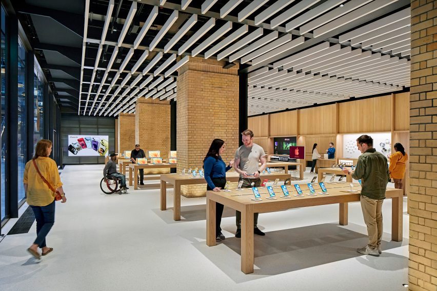
Technology company Apple has unveiled its latest Foster + Partners-designed store in the recently revamped Battersea Power Station in London, which features updated fixtures and furniture.

Set to open later today, Apple Battersea is the brand’s 40th UK store and represents an evolution in its retail design thinking with more of an emphasis placed on accessibility and sustainability.

“We developed this material palette and this fixture set that is really trying to align with like Apple’s goals,” said Bill Bergeron Mirsky, a global retail design lead at Apple.

“This material palette is new for us, it’s an evolution of the Apple Store,” he told Dezeen.

Apple Battersea by Foster + Partners
Apple Battersea opens today

Designed by UK studio Foster + Partners, the store is set on the ground floor of the shopping centre within the 1930s Turbine Hall A at the former power station, where the studio also designed the technology brand’s offices.

The shop is arranged around four original brick piers and has steel roof supports exposed on the ceiling. On top of this base, Foster + Partners overlaid a revamped fixture set that Mirsky said “will become familiar over time”.

Apple Battersea is the second store – after the recently reopened Tysons Corner store in the USA, which replaced Apple’s first ever store – to feature the redesigned fixtures.

Apple Battersea by Foster + Partners
It features an updated fixture set

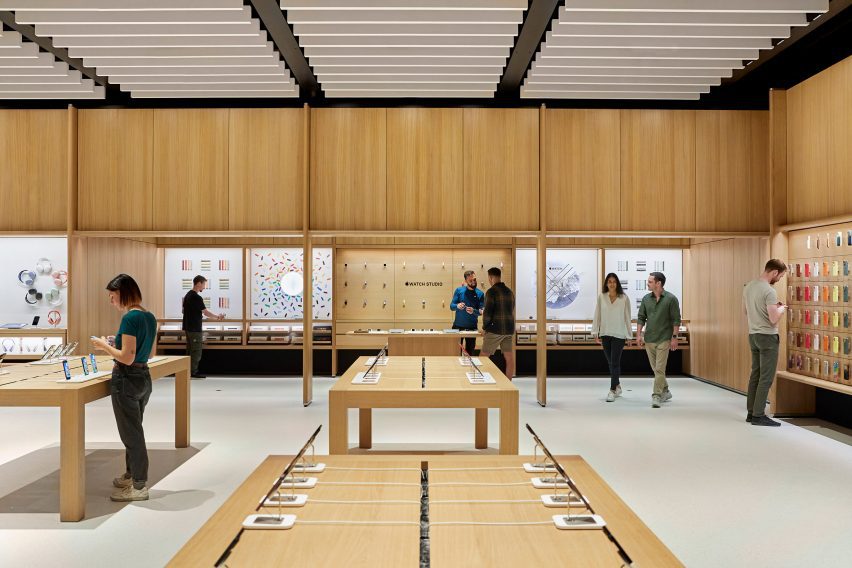
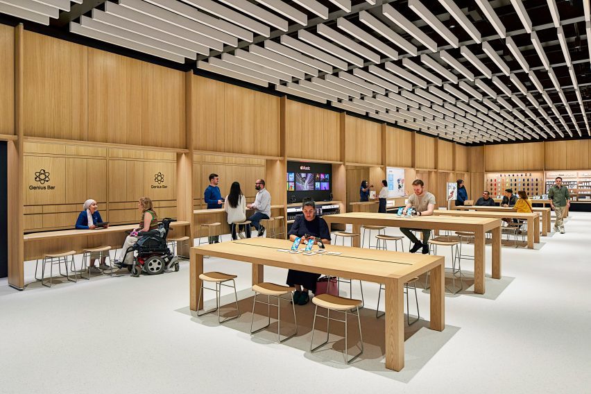
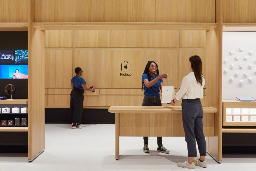
Around the edge of the store is an oak framework of shelving that was developed with Foster + Partners.  The timber structure also defines a space dedicated to watches, a pick-up area and a redesigned Genius Bar.

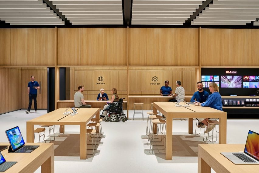
The Genius Bar has a counter for stand-up service along with a lowered area where people can be served sitting down. Along with its standard Parsons tables, which are made from sustainably harvested European oak, the store also has several lowered tables.

Updated Genius Bar
The redesigned Genius Bar has a lower counter

“We’ve thought about mobility issues across the whole fixture set,” explained Mirsky. “We have our traditional Parsons table with our standard height, but you notice that the tables in the back are varied and our new genius bar as well.”

“We have a standing height because the team really prefers to stand and it lets them work with more people and then they can stand at the tables, but customers who want to sit or need to sit can actually use these slightly modified tables,” he continued.

As part of the focus on mobility, Apple also increased the amount of circulation around the edge of the store.

Tables in London Apple store
There is more space around the edge of the store

Along with the timber framework, Apple aimed to replace other more carbon-intensive elements in the store with biomaterials.

The floor, which was first used in the Brompton Road store, was made from aggregates bound together with a bio-polymer, while the acoustic baffles in the ceiling were made from biogenic material.

The acoustic baffles and bright floor form part of a focus on improving visual and acoustic clarity in the store, with a dark band placed around the base of the walls to provide visual differentiation with the flooring.

“Something I want to point out that is really part and parcel of the material palette, but also goes to our universal design, is the contrast in the store,” said Mirsky.

“We wanted to make sure we have this really enhanced kind of navigation,” he continued. “So the floor is brightened – it helps us with our low energy – but it also makes it so that you can clearly see the table and the walls are defined.”

Pick up space in Apple Store
The store has a dedicated pick-up corner

The fixture set, flooring and ceiling baffles were also used at the Tysons Corner store and Mirsky believes the base can create a feeling of familiarity for Apple’s customers.

“Each store is really dealt with as a unique circumstance Battersea has this incredible, incredible existing architectural fabric to work in,” he said.

“We use the same fixture set at Tysons Corner in a mall setting in America which doesn’t have this sort of grand grandiose architecture, but the same fixture set can generate an environment that’s very familiar and welcoming no matter where you are.”

The store is the latest to open in London, following the Brompton Road store that opened last year, which was designed to be a “calm oasis”. Other recently completed Apple Stores include the band’s first shop in India and a store in Los Angeles’ historic Tower Theatre.

Reference

6a Architects brings Soho sex shop windows to JW Anderson Milan store
CategoriesInterior Design

6a Architects brings Soho sex shop windows to JW Anderson Milan store

British fashion brand JW Anderson has opened a flagship store in Milan that was designed by British studio 6a Architects and draws on the local atmosphere as well as Soho sex shops.

The 53 square-metre-store is located on the Via Sant’Andrea luxury shopping street in Milan’s Quadrilatero shopping district. It is set across a single floor and comprises two rooms.

Photo of JW Anderson store in Milan
JW Anderson’s first Milan store was designed by 6a Architects

While the boutique primarily draws reference from its “bourgeoise” Milanese surroundings, the retail space also pulls from designer Jonathan Anderson’s first JW Anderson store in Soho and from the 2017 exhibition Disobedient Bodies, which was curated by him.

It was designed by 6a Architects, who Anderson began working with in 2017 after selecting the studio to design the set for Disobedient Bodies at The Hepworth Wakefield.

Interior photo of the JW Anderson store
It draws on a Milanese atmosphere

“I thought [6a Architects] really grasped how to take my visual language and turn it into something which was able to be educational,” Anderson told Dezeen.

“They’re very good at hybrid, old or new. They’re very good at this combination, they’re great architects.”

“The store actually is a combination of Disobedient Bodies and a store. It’s a little bit more elevated,” he said. “The front of the building feels Soho, and as you go in, it feels more kind of domestic Milanese.”

Interior photo of the JW Anderson store in Milan
It carries over elements from the Soho store

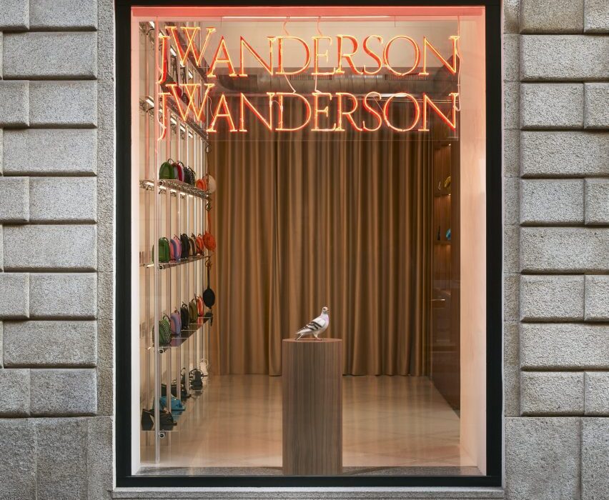
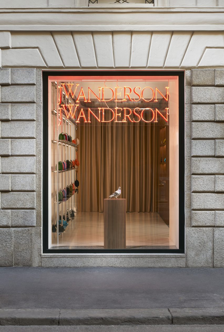
In a nod to the store frontages of the sex shops found in London’s Soho area, the windows of the Milanese store were decorated with neon lighting and rainbow-slatted curtains.

Anderson and 6a Architects used the design as a juxtaposition against the more typical Milanese interior.

“For me, there is something very sexual about neon lighting,” said Anderson. “I think we associate it with grand gestures and I felt like a window is kind of like a television set. There’s something with neon that it does, it kind of tricks you.”

Photo of the JW Anderson store
Traditional Italian furnishings and finishes fill the interior

“There are little alleyways and they have all these amazing sex stores on and these curtains,” Anderson continued.

“I liked the idea that we have this in Milan and then suddenly you enter into a kind of Milanese setting, something which is very bourgeoise.”

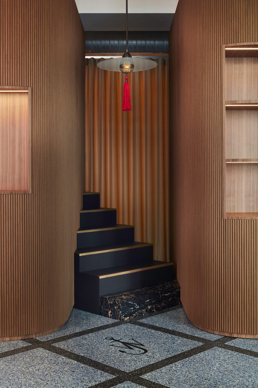
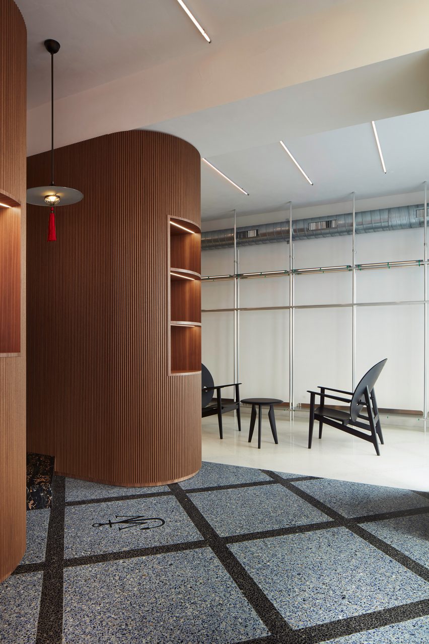
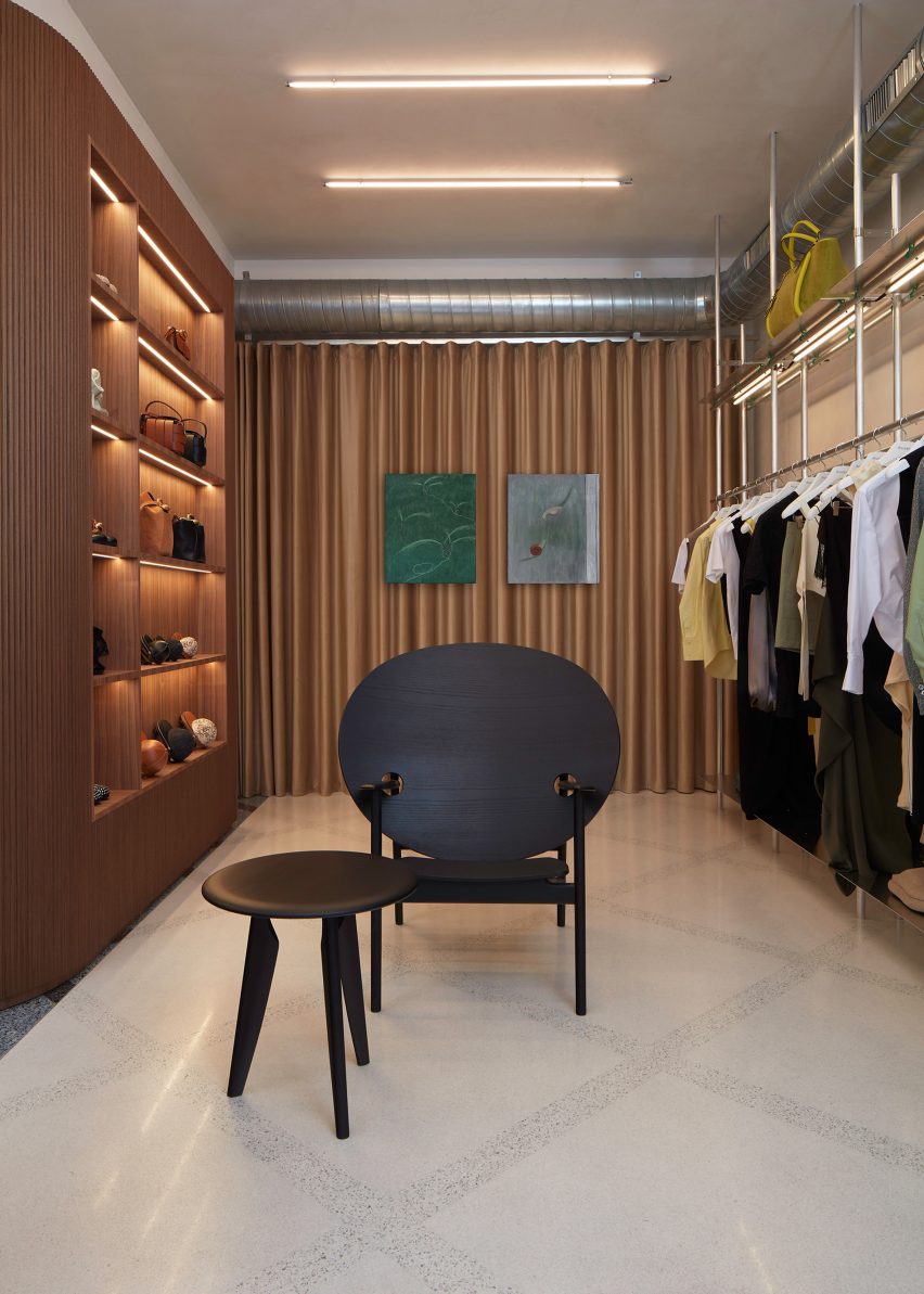
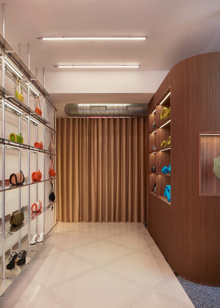
Inside, gridded handmade terrazzo covers the floor and visually divides areas of the interior through bespoke contrasting tones of grey and sand.

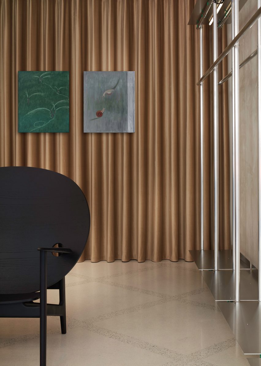
Brassy, metallic curtains ripple along the rear walls of the store, in a similar way to 6a Architects’ use of curtains in the exhibition design for Disobedient Bodies.

Photo of artworks at the store
Jonathan Anderson selected furniture and artwork for the interior

Aluminium scaffolding, which was also carried over from Anderson’s Soho store, was translated into display shelving and brought an “angst” to the interior that contrasts against traditional Italian furnishings, such as fluted walnut panelling that envelops two curved walls.

“There is something slightly more underground in terms of the construction of a JW Anderson store, whereas, I think Loewe [for which Anderson is creative director] is about a heightened perfection,” said Anderson. “With JW Anderson, there’s always a bit of slight angst to it.”

“It’s softer inside, and then you have this harshness with the windows where there’s neons and sex curtains and it’s kind of like a theatre. It has moveable parts and in a weird way the store becomes a giant window.”

Photo of the store
It has furniture by Mac Collins

Furniture and artworks personally selected by Anderson fill the interior.

Designer Mac Collins’ black Iklwa chair was paired with matching side tables, while a Cardinal Hat pendant light by Lutyens Furniture is suspended from the ceiling of the main space.

Oil paintings by Chinese artist Hongyan appear to float on the ripples of the brass-coloured curtains, and images by photographer Wolfgang Tillmans sit on the walls of the store’s fitting room.

Photo of the fitting room
An image by Wolfgang Tillmans is placed in the fitting room

“I don’t believe that stores should be completely cookie-cutter,” said Anderson. “I feel like the key is to make sure that each store has a different universe because there’s no point in having something which is just a duplication, duplication, duplication.”

Jonathan Anderson founded his eponymous label JW Anderson in 2008 and was appointed creative director of Spanish luxury house Loewe in 2014, which recently announced the winner of its sixth annual craft prize.

During London Fashion Week, JW Anderson presented a “parallel world of people trapped in their computers” for its Spring Summer 2023 collection.

The photography is by DePasquale+Maffini, courtesy of JW Anderson.

Reference

Ringo Studio completes colourful store for Our Place in Los Angeles
CategoriesInterior Design

Ringo Studio completes colourful store for Our Place in Los Angeles

Brooklyn-based Ringo Studio designed a store for kitchenware brand Our Place that features colourful tile displays and expressive drapery that hangs from the ceiling.

The Our Place Melrose store is the brand’s second location in Los Angeles, following the inaugural shop in Venice, and is situated in West Hollywood’s busy shopping district.

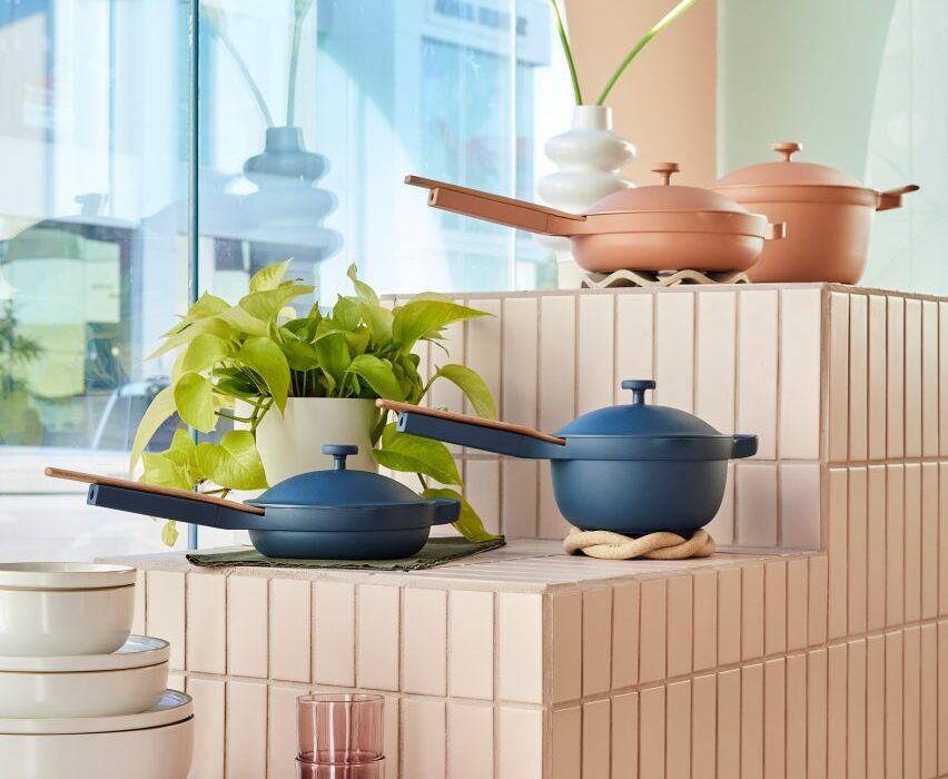
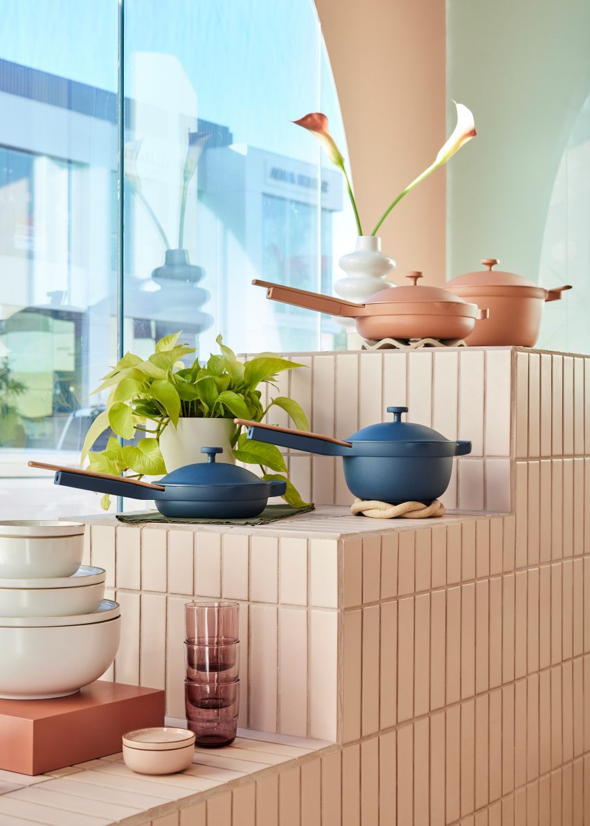
Our Place pots and pans displayed on a tiered stand covered in cream tiles
The Our Place store is designed to showcase the brand’s colourful cookware

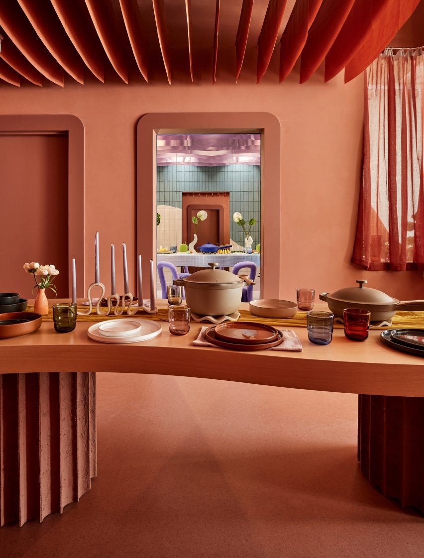
The interiors by Ringo Studio are based on the identifiable colour palette of Our Place cookware sets, which are known for in a variety of pastel, neutral and jewel-toned hues.

“It retains the warmth and intricacy of Our Place’s first store in Venice, concepted by Mythology, while also taking Our Place’s design ethos into new and unique expressions,” said the team.

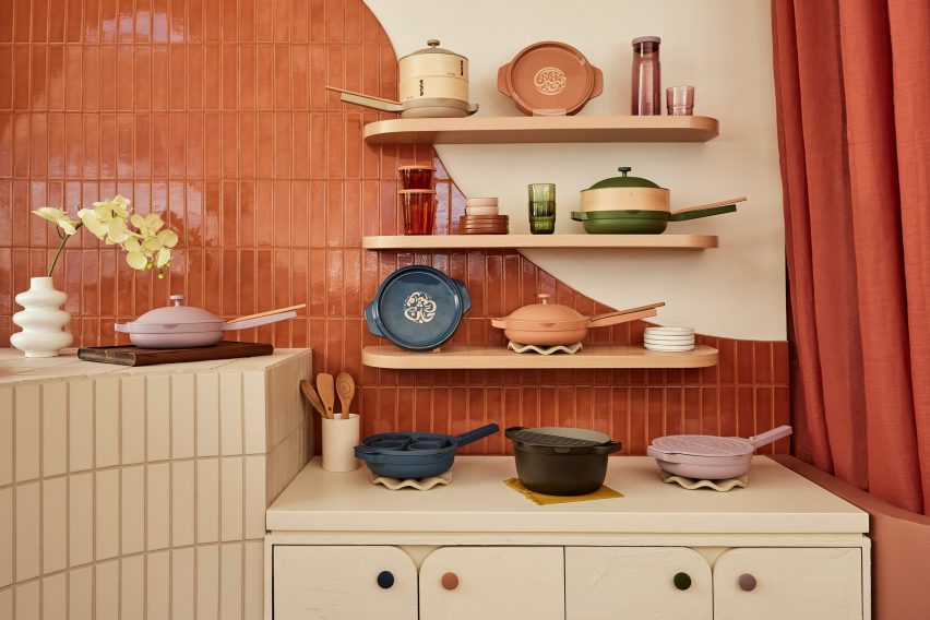
Cookware displayed on three shelves and cabinets below, against a tiled wall
Many of the surfaces are covered in long rectangular tiles laid in a straight stack pattern

Elements derived from classical architecture were included, from fluted columns that support a wavy-topped table to arches that curve over shelving units and form punctured openings for showcasing small items.

Storage cabinets have rounded corners, as do the doors that front them, and many of the built-in elements also feature filleted edges.

An entirely terracotta-coloured space with a dining table laid with Our Place products
At the back is a space coloured entirely terracotta, which features a table displaying the brand’s products

Long rectangular tiles laid in straight stack patterns cover several of the walls and display stands.

Each tiled block or surface is a different colour, with large panels including terracotta, lilac and cream, and smaller sections in pale blue and green.

An area towards the back is decorated entirely in terracotta, which covers the floor and walls, as well as matching strips of fabric hung in rows from the ceiling.

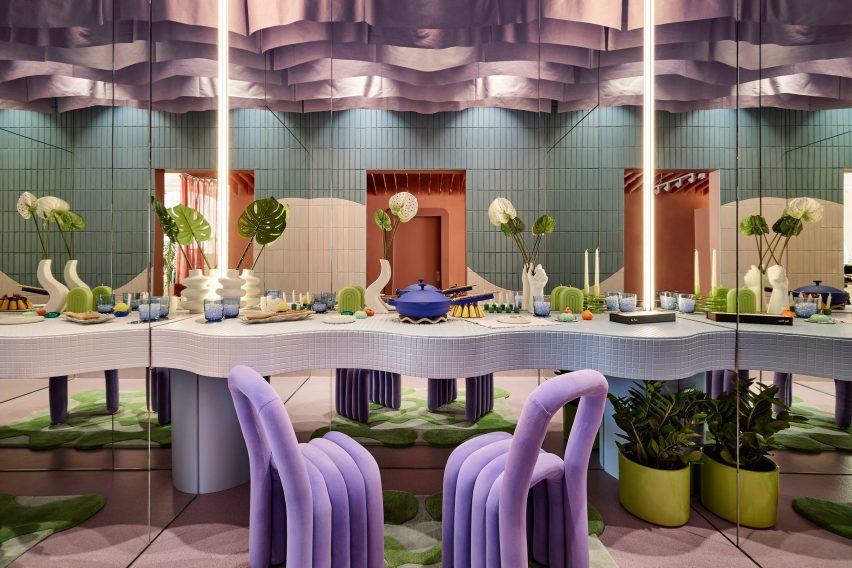
There’s also a side room where Our Place products are laid out on a dining table with mirrors on three sides, creating infinite reflections intended to “welcome everyone to have a seat at the table”.

A small room with a dining table and two purple chairs, with mirrors on three sides
A side room features mirrors on three sides to create infinite reflections of a dining table setup

Covered in mosaic tiles and with an undulating front, the table is accompanied by a pair of purple velvet chairs, and from the ceiling hangs purple drapery.

“Infused with the cozy feeling of home, the streamlined suite of products are artfully displayed throughout the store, making them feel like chic, sculptural objects,” said the Our Place team.

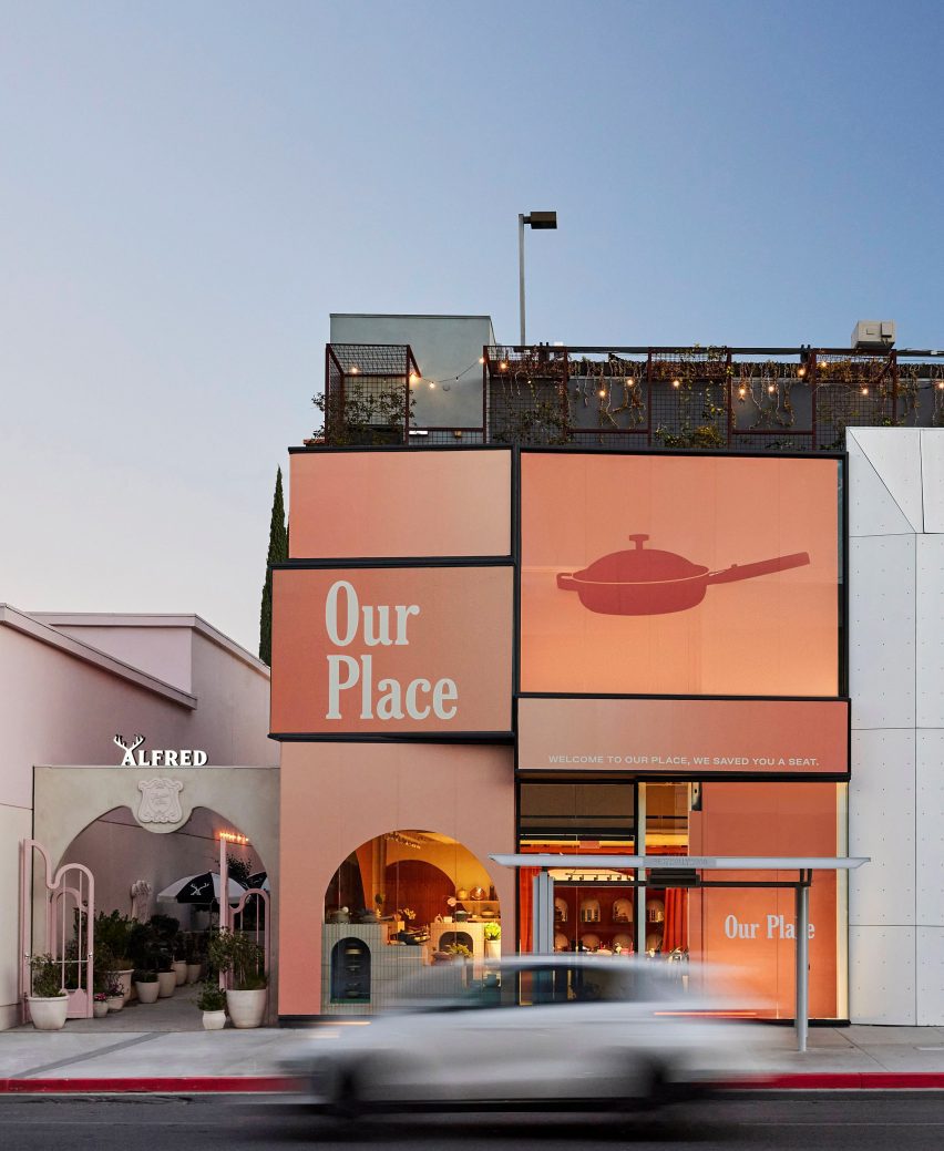
The exterior of the Our Place store on Melrose Avenue
Our Place Melrose is located in West Hollywood’s busy shopping district and is the brand’s second location in LA

Ringo Studio was founded by architectural designer Madelynn Ringo, who has created retail experiences for companies such as Glossier, Studs and Funny Face Bakery.

Last year, the studio completed a store for fitness brand Bala in New York City, which includes scaled-up versions of its products.

The photography is by Jenna Peffley.

Reference

Glossier Boston store features pastel green mouldings
CategoriesInterior Design

Glossier Boston store features pastel green mouldings

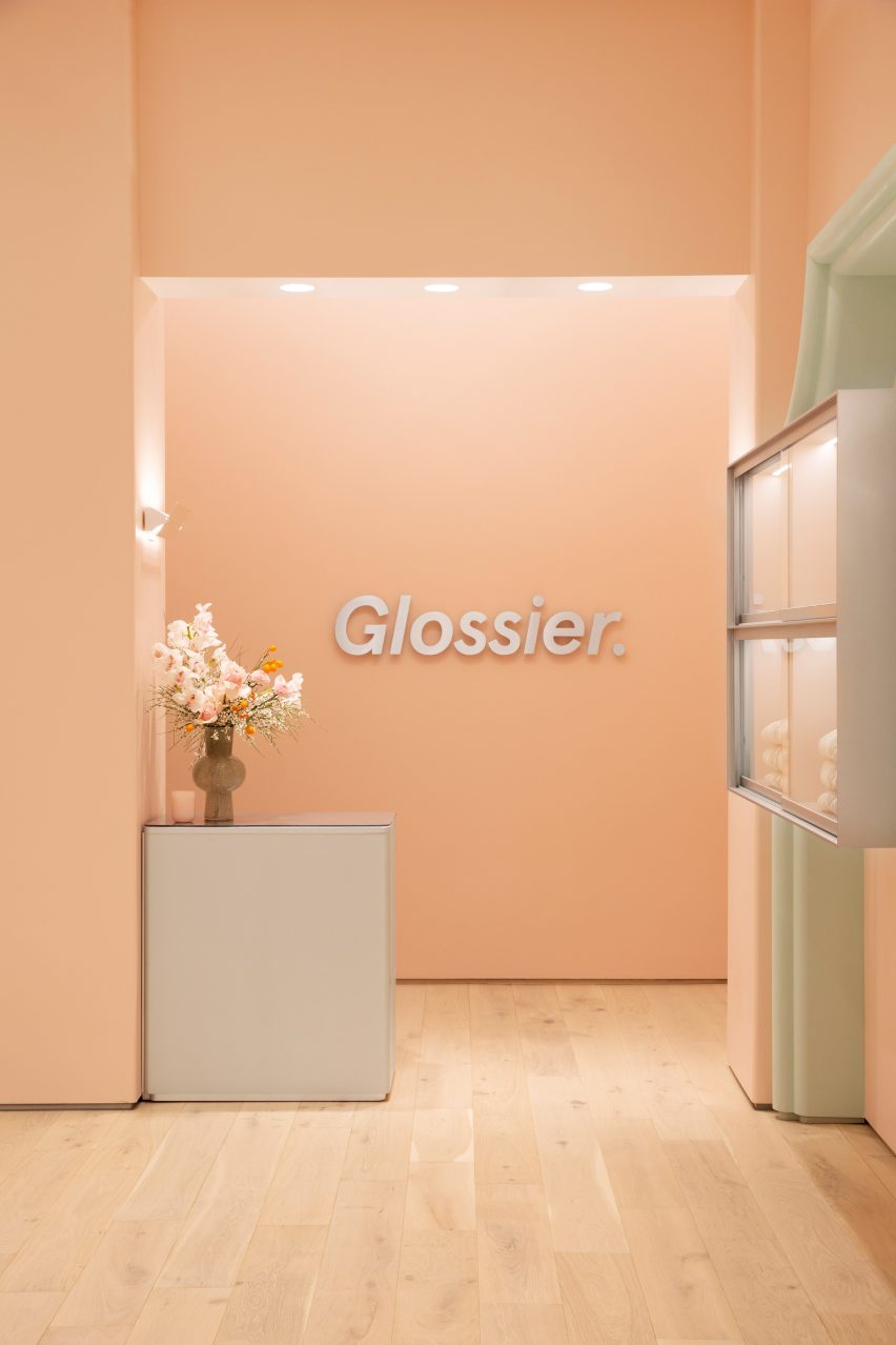
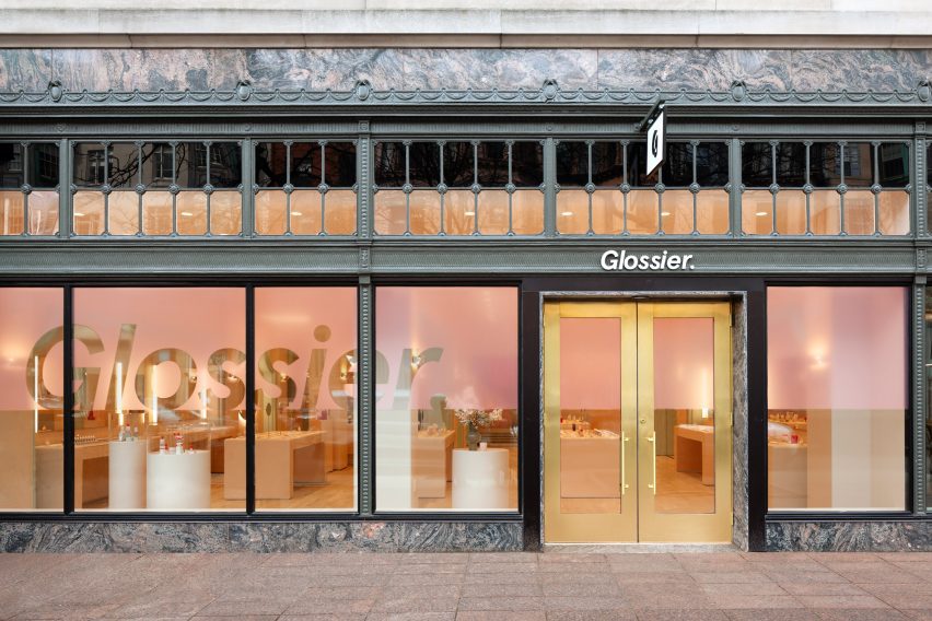
Decorative architectural mouldings are recreated in pastel green to frame openings at the Boston store for the cosmetics brand Glossier.

Designed by the company’s in-house team, the permanent Glossier Boston location on the city’s bustling Newbury Street follows a pop-up at the Seaport in 2019.

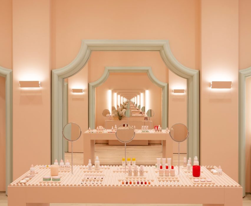
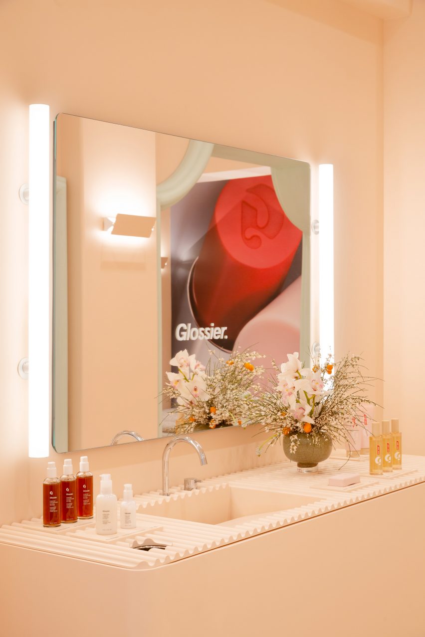
Infinite mirror reflections in pale pink Glossier store
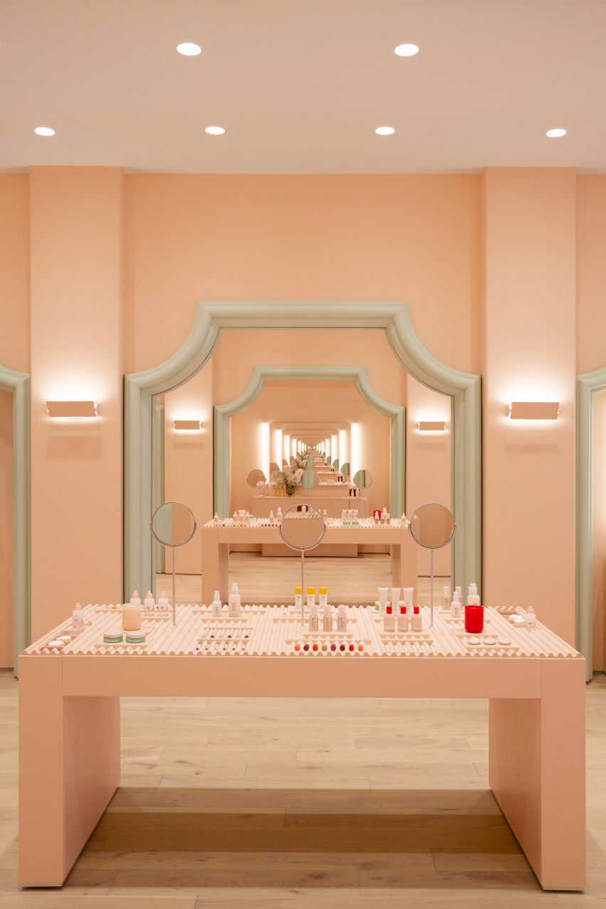
Mirrors positioned to face one another create infinite reflections at the Glossier Boston store

For the space, the designers took influences from historic local architecture and Boston’s status as a college student hub, with Harvard University and MIT located just over the Charles River in Cambridge.

“With our 10th Glossier location, we wanted to bring something special to the city that honors its metropolitan and scholastic personality,” said the team. “Our influences for Glossier Boston’s design include collegiate fashion and the decorative characteristics of Boston’s local architecture.”

Glossier logo affixed to pale pink wall
The brand’s signature pink hue covers the walls

They also cited the “blush pink stucco, verdant green stone and verdant plant life” of the nearby Isabella Stewart Gardner Museum, which is modelled on a Venetian palazzo, as a source of inspiration for the store interior.

Glossier’s signature Millennial pink shade covers the walls, while cased openings are framed with stylised versions of architectural mouldings found on neighbouring buildings.

Product display in front of large mirror
Products are displayed on wavy trays

Mirrors are positioned to face one another in order to create infinite reflections of customers testing makeup and skincare products.

The merchandise is displayed on the wavy trays, cylindrical displays and rectangular tables found in many of Glossier’s stores.

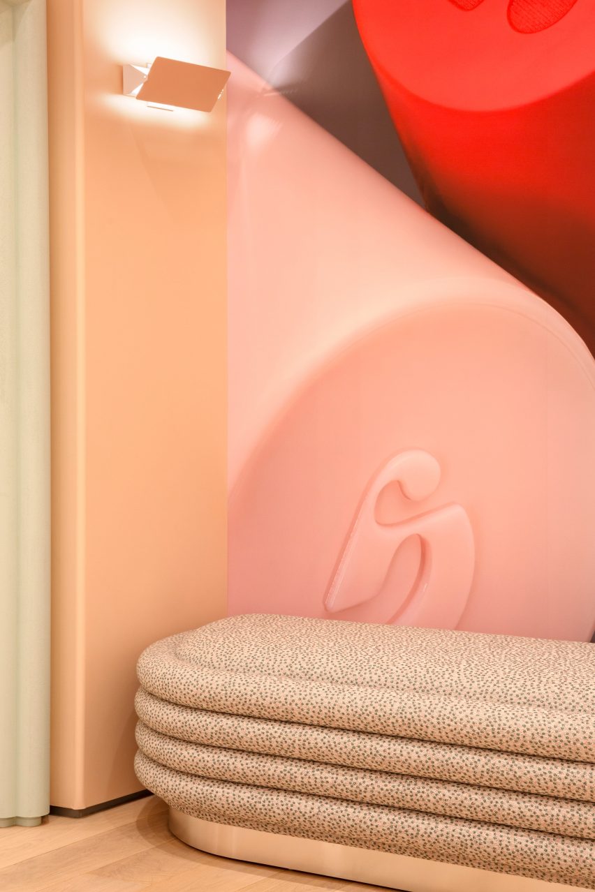
Soft seating
The store is Glossier’s 10th permanent retail location

Pale wood floors contribute to the soft colour palette, while bright lighting is designed to be flattering.

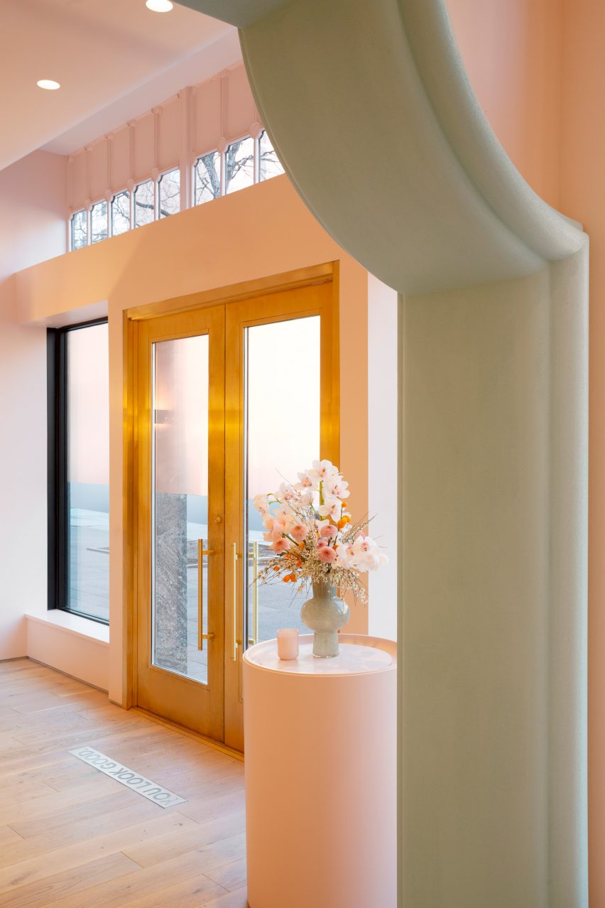
On the exterior, the tall windows and brass doors are surrounded by marble panels and bronze detailing.

These details contrast the pale hues inside.

“There is also a large step-back from the curbside, filled with lush trees that invite visitors to connect and hang out,” the team said.

Brass doors
Stylised versions of historic architectural mouldings frame cased openings

When Glossier launched in 2014, it became known for its pop-up stores that opened across the US.

The temporary spot that the company installed in Seattle, which was filled with plant-covered mounds, was named small retail interior of the year at the 2020 Dezeen Awards.

Glossier Boston store exterior
The store’s marble and bronze exterior contrasts the interior colour scheme

The brand has since opened permanent locations in cities including Seattle, Los Angeles and London.

All of these share a similar aesthetic and colour scheme, with subtle differences that nod to the specific location and context.

The photography is by Brian W Ferry.

Reference

Glass blocks divide Eye Eye optical store by Best Practice Architecture
CategoriesInterior Design

Glass blocks divide Eye Eye optical store by Best Practice Architecture

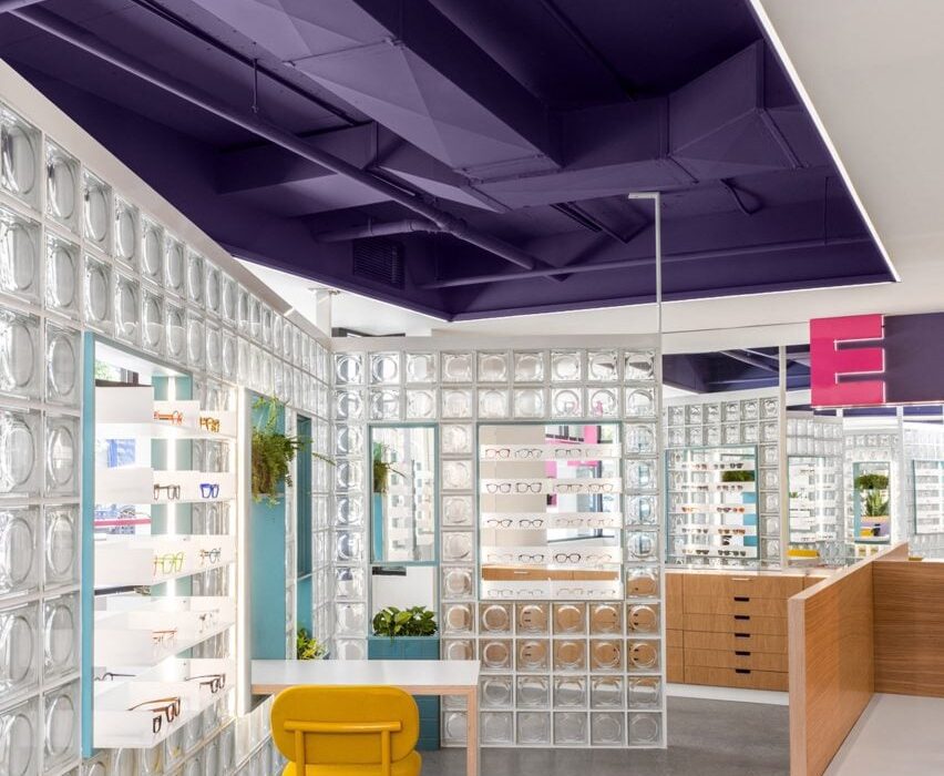
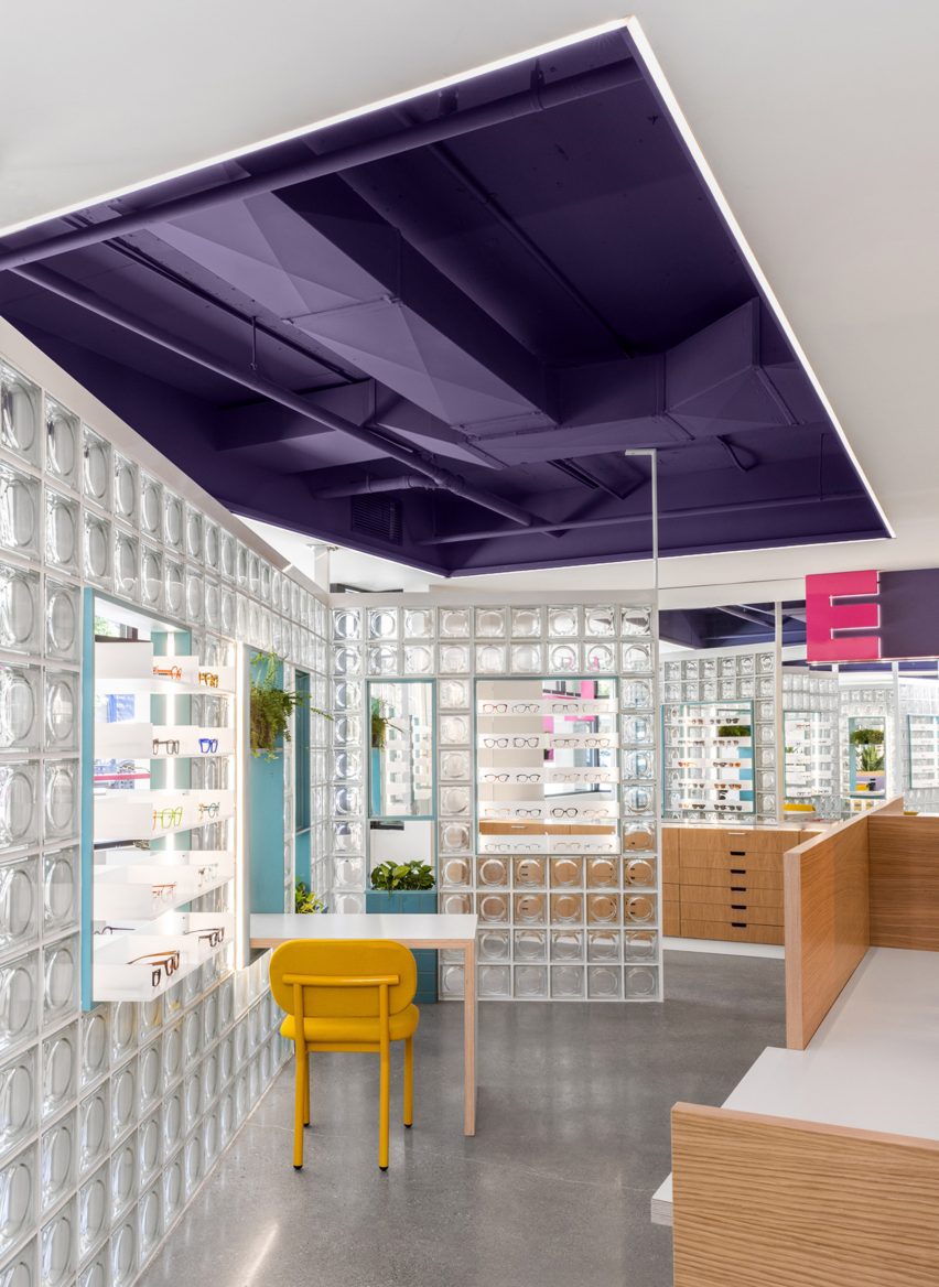
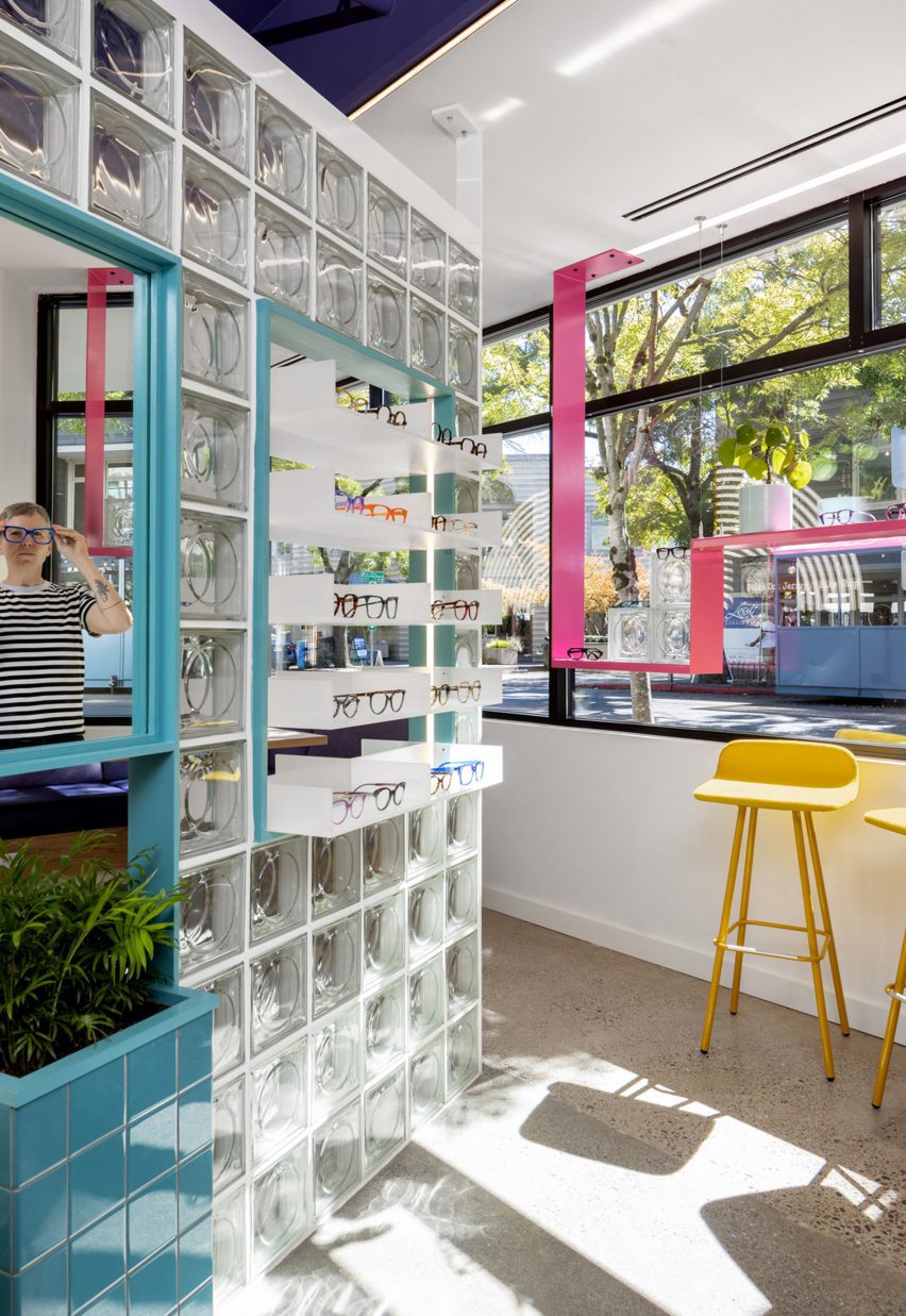
Local studio Best Practice Architecture has used punchy colours, glass bricks and dichroic glass inside an optometry store in Seattle’s Leschi neighbourhood.

For Eye Eye‘s second location, founder Will Pentecost got back in touch with Best Practice Architecture, which had completed the brand’s first brick-and-mortar store back in 2015.

Eye Eye retail space with cutout ceiling to add extra height
Cutouts in the low ceiling add extra height to the Eye Eye retail space

Unlike the inaugural space, the new store does not benefit from tall ceilings and a strong street presence.

So the architects had to get creative to turn the “drab” commercial building into a fun and inviting environment.

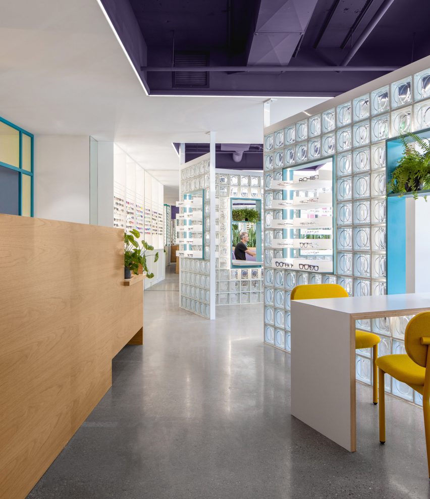
Glass block partitions divide the store
Glass block partitions are angled to create a more dynamic space

“The client gave Best Practice free range to transform the interior with only three requests: include glass blocks, use lit signage, and incorporate design language from the original location without being too repetitive,” said the studio.

The retail area is situated at the front of the space, facing the street through large windows, while the examination rooms and staff facilities can be found at the back.

Glasses displayed on shelves with the glass block partitions
Niches in the partitions contain mirrors and product displays

The specified glass blocks are used to divide the store, forming angled walls with openings that feature mirrors, product displays and furniture that spans both sides.

“Carefully placed to create an interesting circulation flow and contrast with the orthogonal layout, the clever design provides both form and function, welcoming filtered daylight deep into the space while accommodating basic retail needs,” said Best Practice.

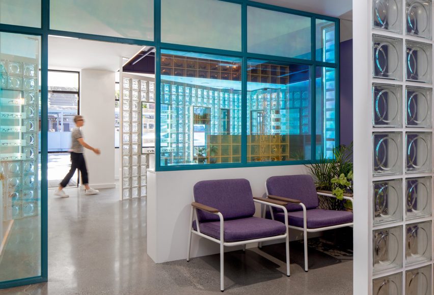
Purple banquette beneath illuminated graphic of concentric arcs
A purple banquette is tucked in a corner for casual consultations

Cutouts in the low ceiling add extra height and expose ductwork that is painted purple – a hue that’s repeated in the upholstery of a banquette tucked in the corner for consultations.

More purple covers the walls in the examination reception area, which is separated from the store by a screen of dichroic glass that changes colour depending on the angle from which it’s viewed.

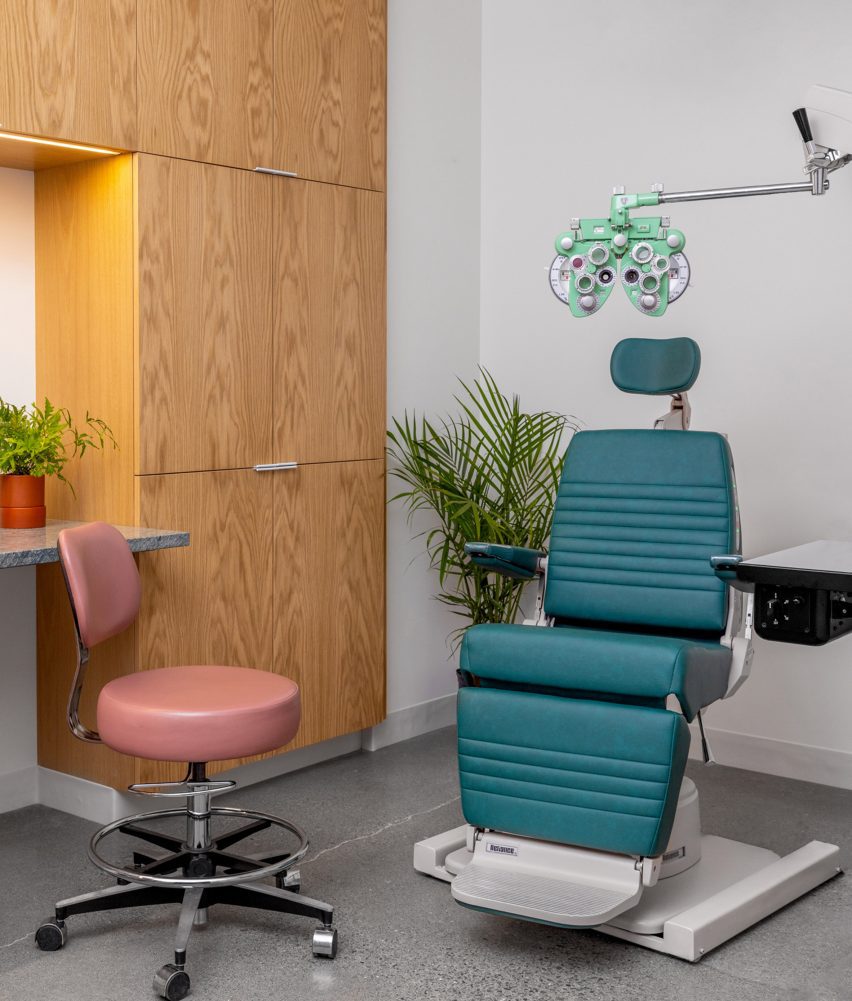
The glass blocks appear again as a partition between the clinic reception and the exam rooms behind, which are outfitted with custom medical equipment and wood cabinetry.

Signage that echoes the original Eye Eye branding is also installed in the retail space, including a concentric circle that echoes vintage eye tests and two large “E” letterforms.

Dichroic glass partition
A dichroic glass screen separates the retail space from the examination area

“With this new space, Best Practice brings Eye Eye’s vision to life once again through an exploration of materiality, the patient experience, and a fresh take on a commercial space,” said the studio. “It’s an eye care clinic reimagined.”

Founded in 2011 by Ian Butcher, Best Practice Architecture has completed a variety of projects in and around its home city of Seattle.

Exam room at Eye Eye
Exam rooms are outfitted with custom medical equipment and wood cabinetry

These range from updating a historic bungalow and transforming a storage shed into backyard studio, to designing a men’s footwear store.

The photography is by Rafael Soldi.


Project credits:

Architect: Best Practice Architecture
Design team: partner in charge: Kailin Gregga; partner/principal architect: Ian Butcher; lead designer/project architect: Sarah Smith
Contractor: Metis Construction
Graphics and branding: Drew Hamlet
Custom signage: Western Neon
Custom casework: Creoworks

Reference

Moschino store in Millan designed to reference the “history of ancient Italy”
CategoriesInterior Design

Moschino store in Millan designed to reference the “history of ancient Italy”

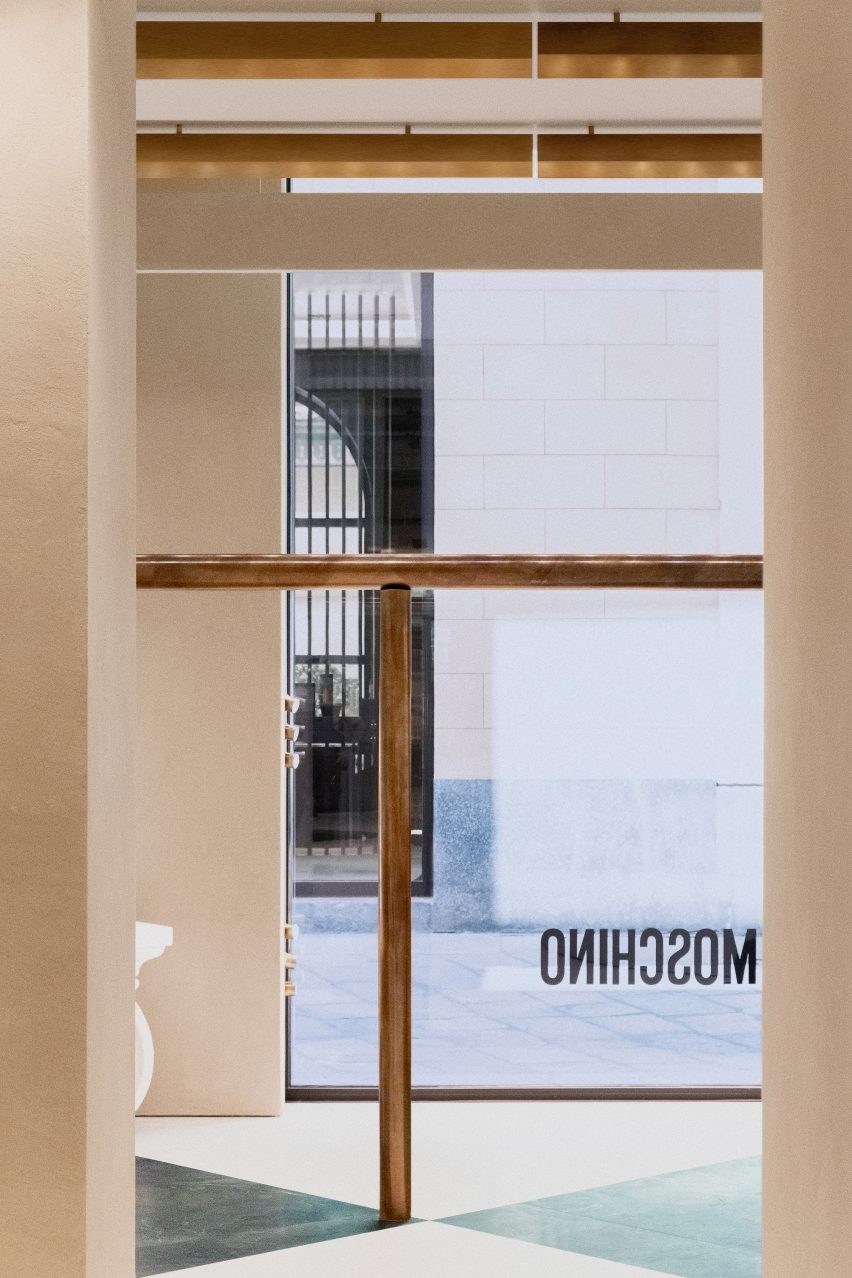
Italian studio Andrea Tognon Architecture has collaborated with former Moschino creative director Jeremy Scott to renovate the brand’s flagship store in Milan.

Located on Via della Spiga, one of Milan’s famed shopping streets, the store sits within the 18th-century Palazzo Perusati, which was recently transformed by real estate company Hines into a luxury retail development.

The store was designed by Andrea Tognon Architecture in collaboration with Scott who aimed to recreate and allude to the history of ancient Italy through a minimalist yet ornamental interior scheme.

Interior image of the Moschino flagship
The Moschino Milan store was designed by Andrea Tognon and Jeremy Scott

“I was inspired by the rich history of ancient Italy and the beauty and decadent opulence of its design,” said Scott.

“Sometimes we start to design from memories, sometimes from form, materials and colours,” added Andrea Tognon Architecture founder Andrea Tognon.

“For this project, I started only from words.”

Photo of the interior of the Moschino Milan store
It is located within a recently renovated retail hub

The Milan flagship spans two floors and covers 380 square metres.

Its ground floor is dedicated to the brand’s women’s ready-to-wear collections and accessories, while its first floor is dedicated to its men’s and kid’s collections.

Photo of the Moschino store
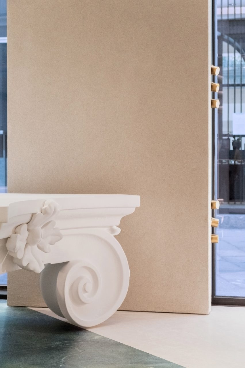
Oversized columns and capitals fill the store

Throughout the interior, Andrea Tognon Architecture used rich materials that speak to Moschino’s baroque flair, which was also highlighted through decorative and oversized architectural elements.

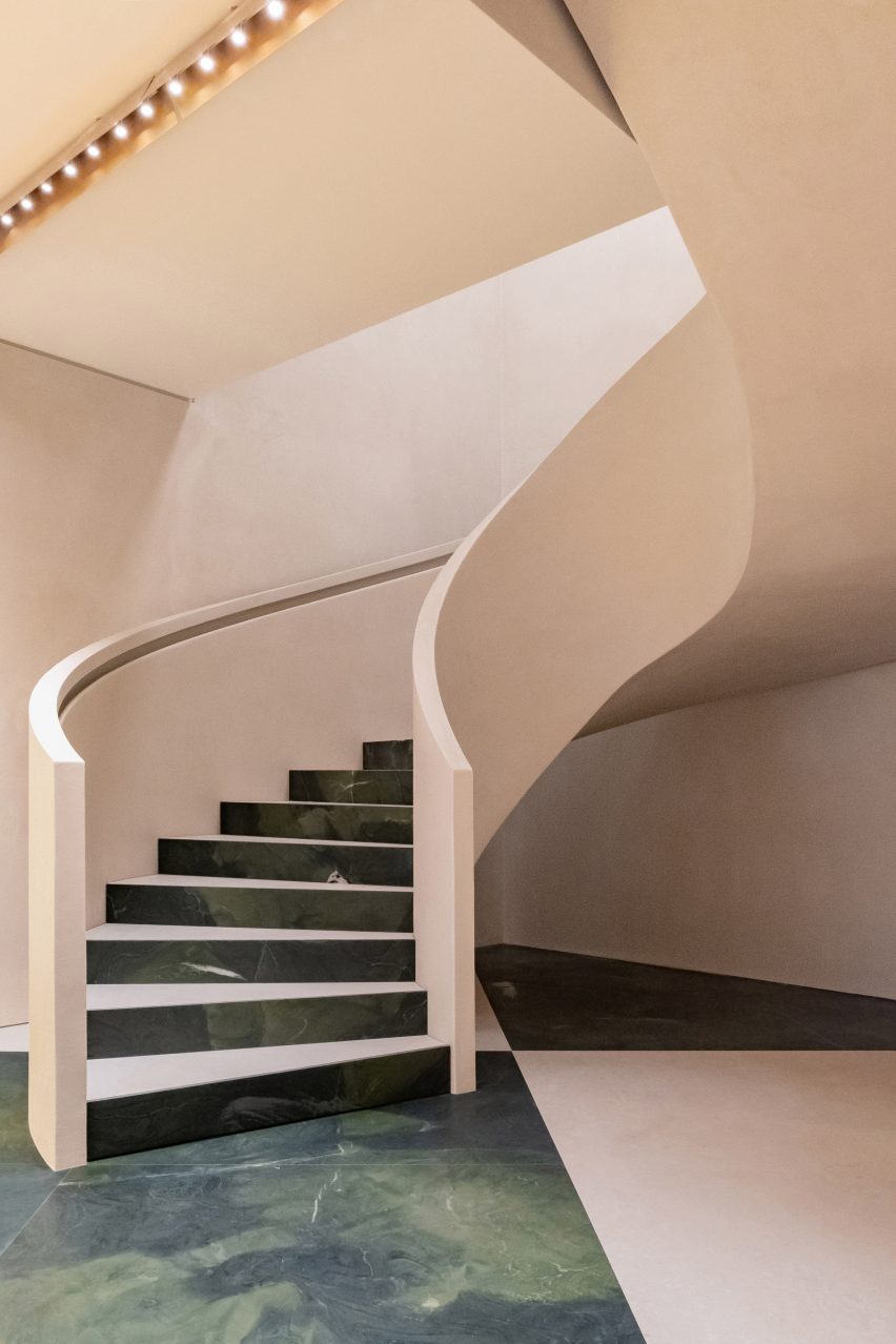
A checkered floor constructed from Botticino marble and green stone, sourced from Brazil, covers the ground floor retail area while the above floors were clad in yellow Siena marble.

A vast stone spiral staircase connects the two floors of retail space and forms a continuation of the oversized checkered floor – with the tread and rise of each step similarly clad in green stone and marble.

Patinated brass lighting stretches rhythmically in horizontal rows across the ceiling of the store. Curving tubular display rails line the boundaries of the interior and were constructed in the same brass finish.

Pale pink spiral staircase
Marble and stone cover the floors

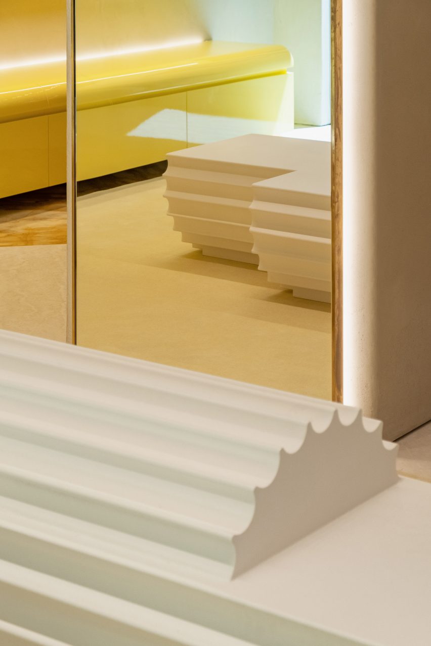
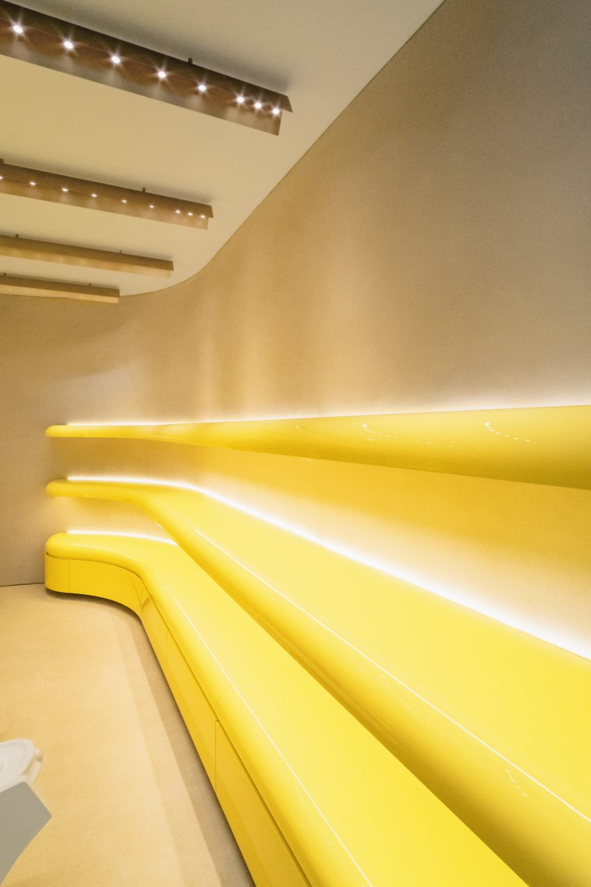
Pops of colour were introduced to the interior through bright yellow lacquered wood shelving that flank the walls of the store and follow its curving profile.

Oversized columns and capitals were placed throughout the interior and function as furniture and display areas for the brand’s products and accessories.

Interior photo of the Milan store
It was designed to reference the ancient history of Italy

Also scattered throughout the store are additional custom furniture pieces that were created by Scott in homage to Moschino’s founder Franco Moschino.

These tables combine two tables which were spliced in the middle, joined together and decorated with marble tops and gold leaf ornamentation.

Photo of shelving at the store
Pops of colours were incorporated throughout the store

Last week news broke that Jeremy Scott was leaving Moschino after a decade-long tenure at the Milanese fashion house. In 2020, Scott replaced models at his Spring Summer 2021 show with puppets that wore the brand’s womenswear collection.

Elsewhere in Milan, London design studios Brinkworth and The Wilson Brothers created a caravan-shaped artist studio for Marni’s flagship store in the Italian city.

The photography is by Adriano Mura.

Reference

Kith creates “industrial ambiance” for its Williamsburg store
CategoriesInterior Design

Kith creates “industrial ambiance” for its Williamsburg store

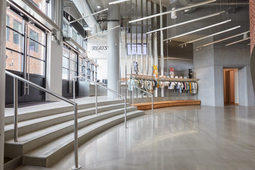
American clothing brand Kith has created a flagship store in Williamsburg, Brooklyn, that uses brick, wood and steel to reference the industrial history of the neighbourhood.

Designed by Kith‘s founder Ronnie Fieg and the brand’s in-house team of architects, the Williamsburg location is located in the Gensler-designed 25 Kent Plaza office building, where Kith also has its corporate offices.

Kith Williamsburg
Kith designed a store for its apparel in Williamsburg

The design takes elements that carry through some of the other Kith stores, such as marble finishes and metal fins, and adds details that situate it in the context of Williamsburg.

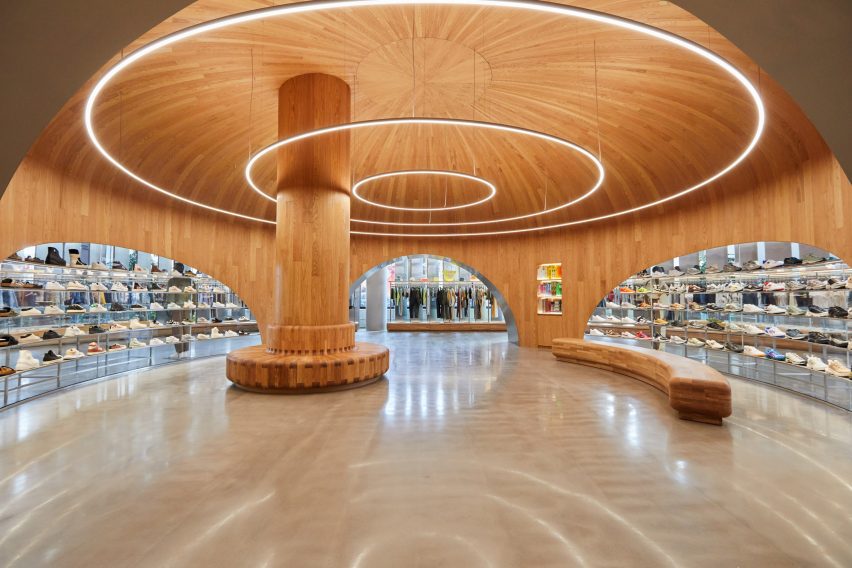
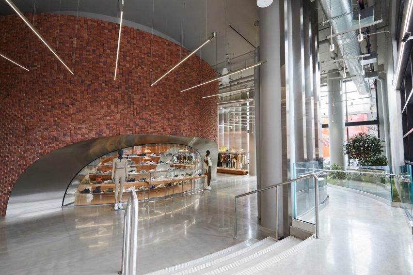
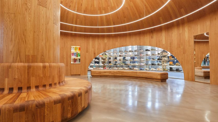
These include a massive circular structure at the heart of the store that is covered with red brick on the outside and lined with white oak inside. The piece was custom-made at a nearby, undisclosed wood workshop.

Kith Williamsburg
It features a central structure made of brick and wood

This central element has a domed wooden ceiling with a wooden column and circular light fixtures that radiate out towards the edges concentrically.

A number of sloping arched voids in the structure have metal-lined undersides and provide an entryway on two sides and display cases for the brand’s collection of sneakers on another.

“We constructed the central dome completely from scratch and created the exterior from the same exact bricks used on the outside of the main building so it feels very cohesive as you enter,” said Fieg.

“Every inch of that dome is custom which meant our precision down to the last minute detail was crucial.”

“Outfitting the interior with rounded wood panels, shaping the footwear shelves to sit flush within the windows, every detail was poured over.”

Kith polished concrete floor
It steps down from an outdoor plaza

Outside the circular area, the lights radiate perpendicularly, like sun rays, towards the walls.

The perimeter of the store is lined with metal fins that block the sun from the glass-lined eastern exposure while also creating a massive logo when viewed from outside.

Also lining the perimeter of the store are custom wooden clothing racks.

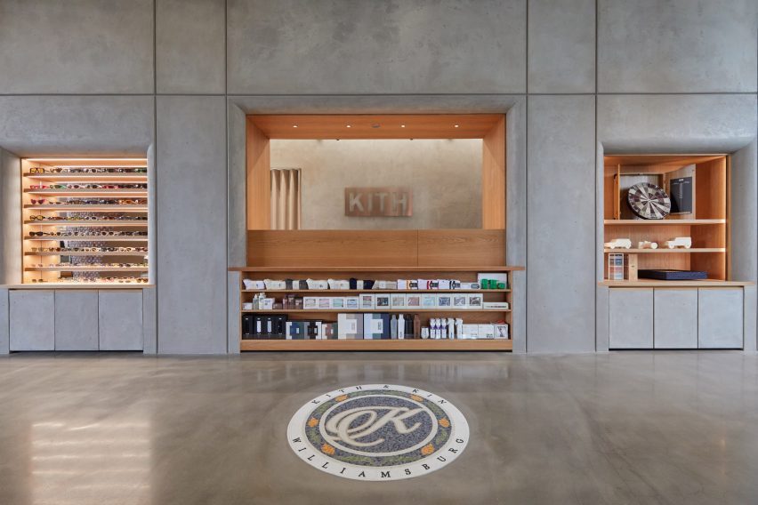
Mosiac in polished concrete flooring
A custom mosaic was placed in the floor

Polished concrete flooring runs through the space, which steps down from the public plaza at the centre of 25 Kent.

The designers oriented the entrance towards the plaza and placed garden boxes in the corners of the store to better connect it with the public space outside.

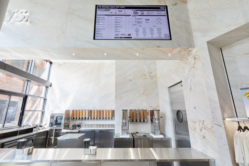
Marble snack bar
Marble clads the snack bar

“The industrial ambiance is balanced with lush oak trees outside, and an abundance of greenery spread throughout the store,” the brand said.

The Kith Treats Area at the entrance – where a combination of ice cream and cereal are served – was lined with Rosa Aurora marble and has a to-go window that opens up to the plaza.

Wooden dome inside Kith store
The wooden elements were custom made nearby

A wall of stainless steel panels separates the treats area from the retail space, while the walls opposite the street-facing glass are matte concrete with wooden insets for further display and service areas.

On the floor, Kith installed a brand logo made of mosaic tiles.

It is the third store in New York City for the brand, which was founded in 2011, and creates apparel for men, women and children.

To celebrate the opening, the brand launched a sneaker with footwear companies Clarks and Adidas.

Gensler Williamsburg Kent
It is in a Gensler-designed building in Williamsburg

This is the twelfth store opened by Fieg, who moved to Williamsburg himself with his family in 2017, and the Kith headquarters there in 2021.

“The restaurants, the shops, the people, and the atmosphere make it a very special area in New York and were all factors in us moving our brand HQ there in 2021,” he said.

“It’s my home, our team’s home, and it only made sense for us to make it a home for our community.”

Many of Kith’s prior locations, in Miami and Los Angeles, for instance, were designed by designer Daniel Arsham and his studio Snarkitecture.

In both the Paris and original downtown Brooklyn locations, Kith installed chandeliers made up completely of Nike Air Max sneakers.

Reference