Khaite flagship store designed as a “tribute to the cultural legacy of SoHo”
CategoriesInterior Design

Khaite flagship store designed as a “tribute to the cultural legacy of SoHo”

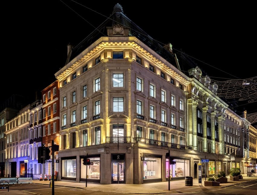
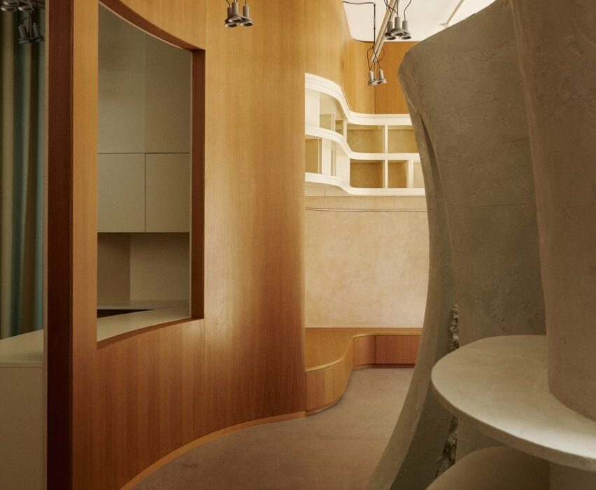
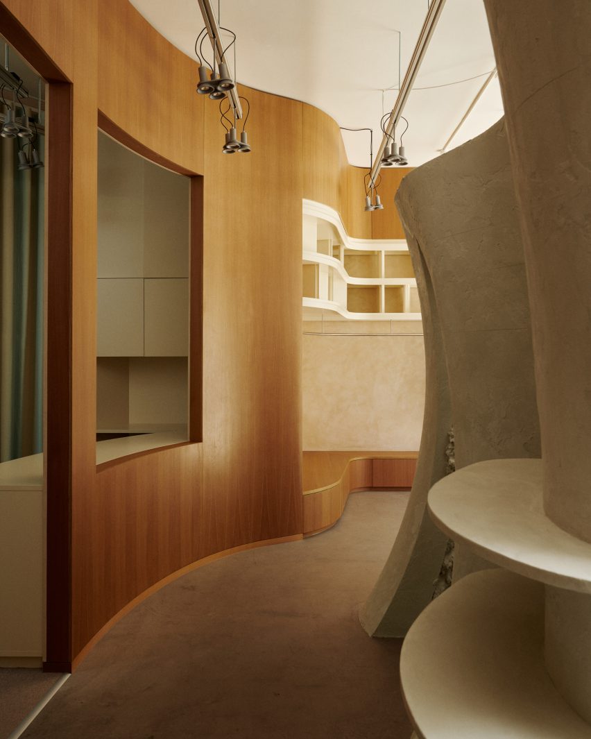
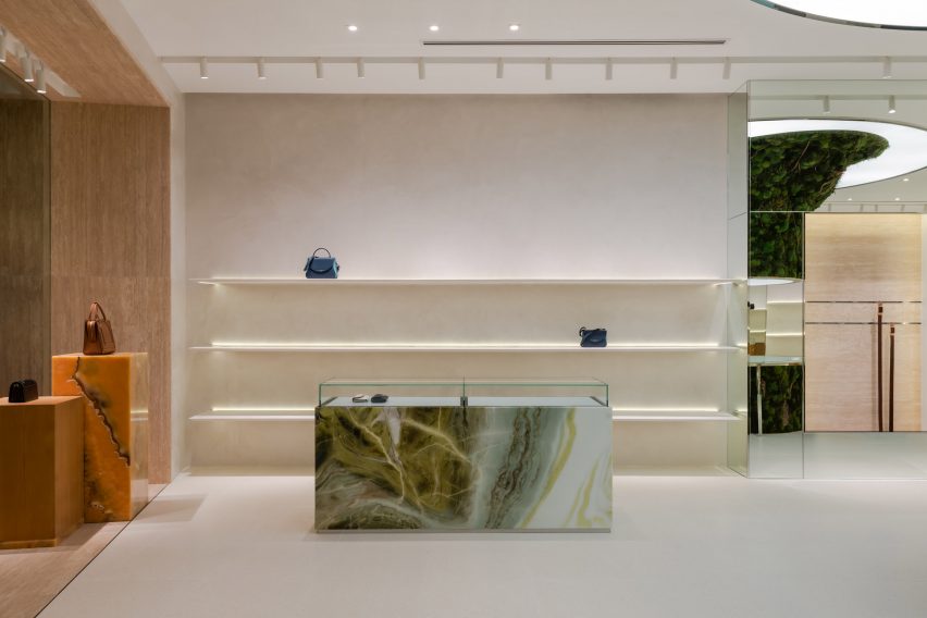
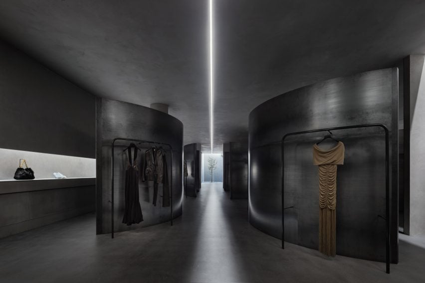
American fashion brand Khaite has opened its flagship store in SoHo, New York City – a cement-trowelled and steel-lined interior with an evergreen tree planted into its shop floor.

The store was designed by Khaite‘s founder and creative director, Catherine Holstein and her husband New York-based architect, Griffin Frazen.

Interior image of the Khaite store
The Khaite flagship store is located in SoHo, New York City

It occupies a Corinthian column-fronted building in SoHo, capped with Italianate cast-iron modillion cornices, designed by German architect Henry Fernbach in 1871.

Holstein and Frazen wanted to encapsulate the cultural legacy of the SoHo location with the area’s connection to the founding of the brand.
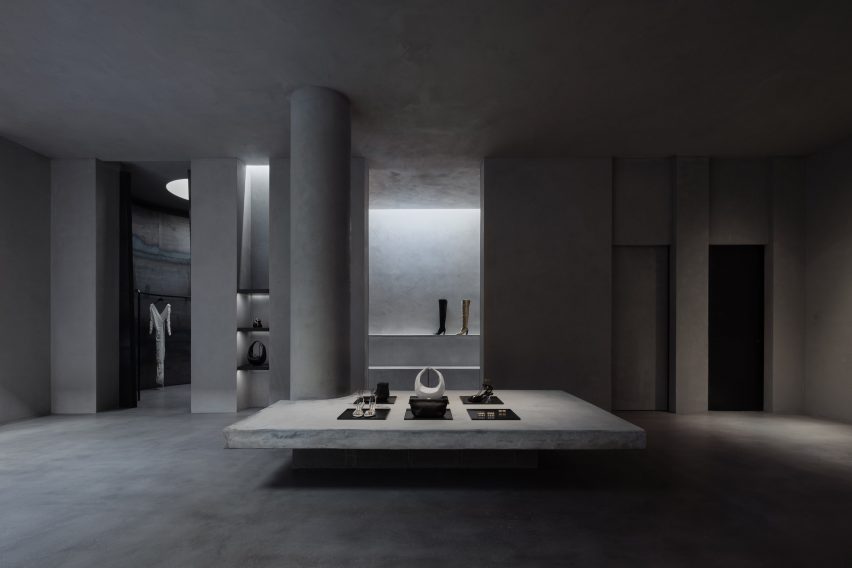
Interior of the Khaite store
It was designed by Khaite’s founder and her husband

“Every element of KHAITE is shaped by New York, and we set out to make this space a tribute to the cultural legacy of SoHo,” said Holstein.

“When I moved to New York twenty years ago, this block of Mercer was my entry point to the city, and SoHo is where KHAITE was born. Our first design studio was just down the street.”
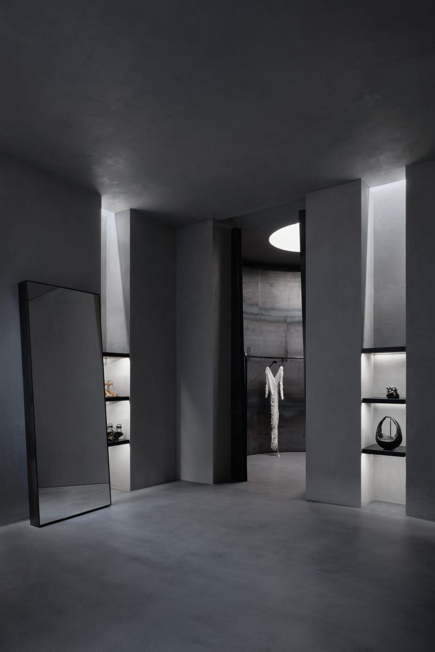
Interior image of the Khaite store in SoHo
The couple looked to encapsulate the legacy of its location

The entire 371 square metre ground floor of the store was dedicated to retail space while the building’s basement was reserved for back-of-house workings as well as a private meeting area.

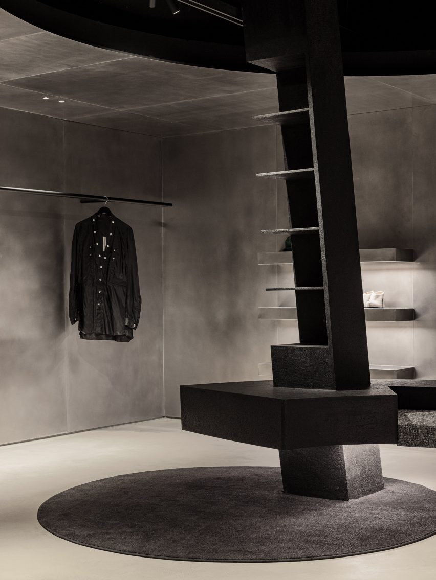
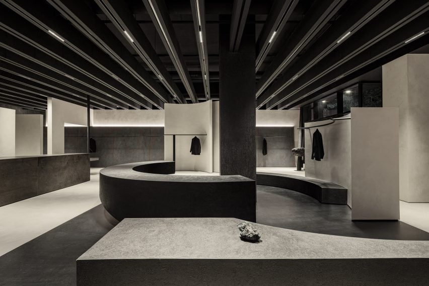
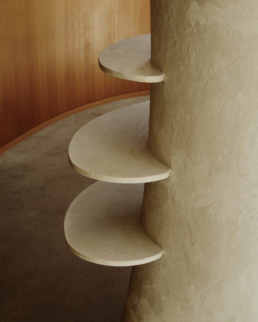
Holstein and Frazen’s approach saw the store clad in city-characterising materials such as steel, glass, poured concrete, troweled cement and plaster, which bring an industrial and monolithic look to the space.
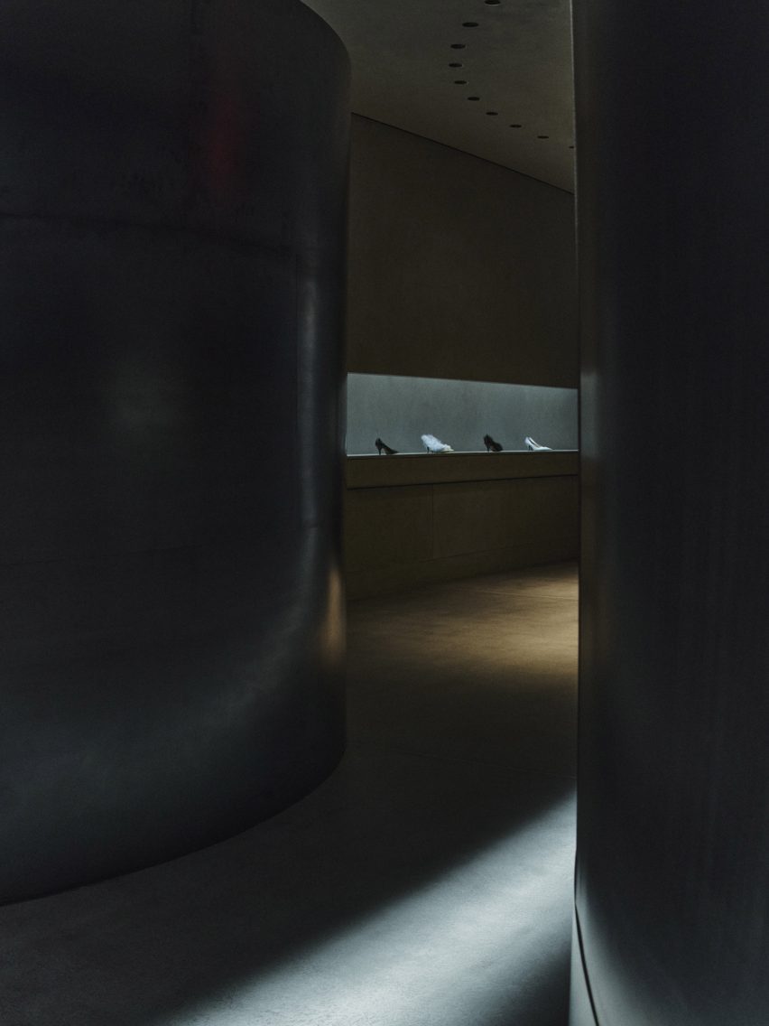
Photo of the Khaite store
Cement, concrete and steel were used throughout the store

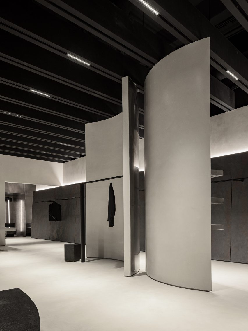
Four curving steel partition walls meander through the length of the retail space and are used to conceal and frame Khaite’s ready-to-wear collections that are displayed on curved display rails.

The four steel walls are visually separated by a channel of light from one of two skylights at the rear of the store that was exposed during its renovation.

A focal feature of the store is an evergreen Bucida Buceras tree, which was named the Shady Lady and planted into the floor beneath the rear skylight.

As light enters and flows into the space from the skylights the rough and textural quality of the cement-trowelled walls is revealed.
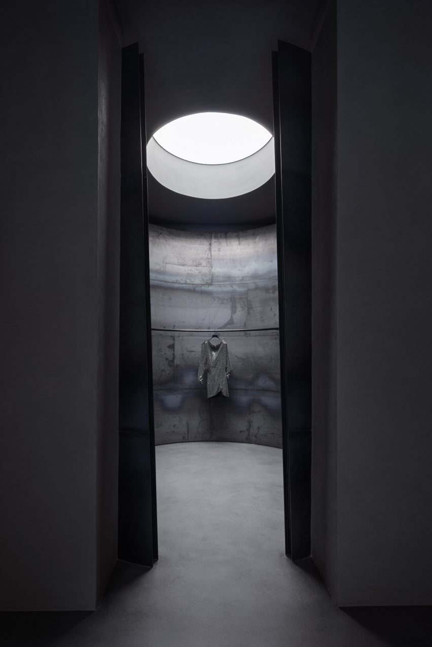
Photo of the interior of the Khaite store
Skylights were uncovered during its renovation

“The design was conceived in terms of material – choosing the right materials and working with them in the right way to satisfy the programmatic requirements,” said Frazen.

“We leaned into elemental qualities like natural light, preserving the scale and openness while creating intimate spaces.”
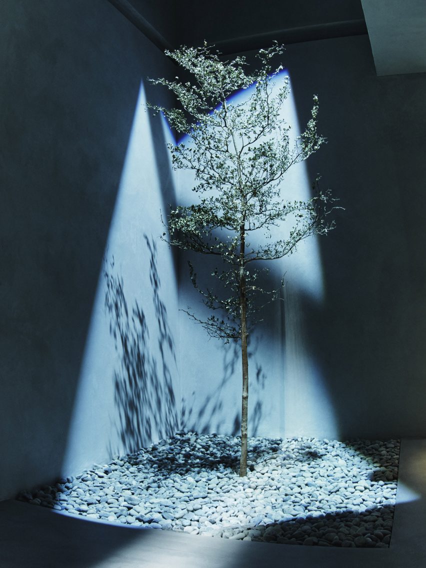
Photo of a tree in the store
A tree was planted into the floor of the store

“We embrace the change of materials like steel and concrete just as you would leather and cashmere, honoring them by allowing them to wear in gracefully,” said Frazen.

“Each piece has unique textures, and rather than polishing away or painting over them, we preserved imperfection.”
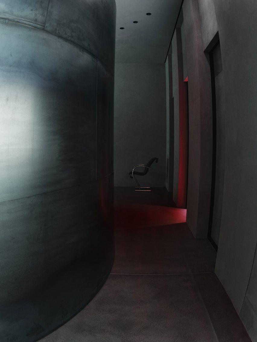
Photo of the concrete store
It has an industrial look

Three fitting rooms were designed to contrast the brutalist details of the store and were blanketed in a deep red, fitted with plush red carpeting and warm lighting.

Minimal furniture was placed throughout, such as a Sing Sing chair by Japanese designer Shiro Kuramata that sits beside a twisted, low-lying shelf used to display the brand’s accessories.
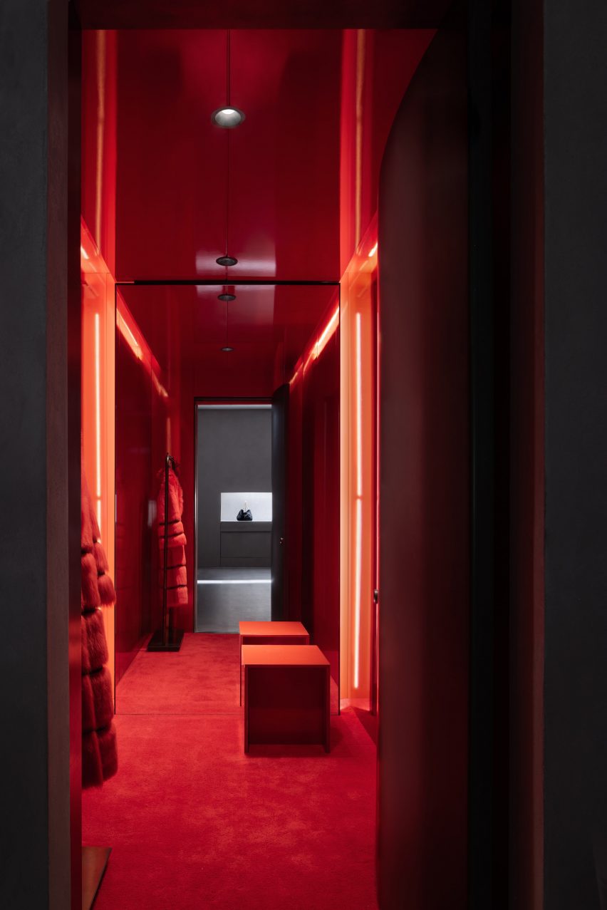
Interior image of a red fitting room
The basement contains back-of-house operations

Before opening to the public, the store was used as the setting for Khaite’s Autumn Winter 2023 show which was presented in February.

Nearby in SoHo, design agency Aruliden completed a store interior for fashion brand Jonathan Simkhai that incorporated cut-out shapes from Simkhai’s clothing into partitions and furniture.

Design firm Crosby Studios teamed up with AR technology company Zero10 to create a pop-up store also in SoHo that allows people to try on virtual clothes.

Reference

Using solid blocks to store heat
CategoriesSustainable News

Using solid blocks to store heat

Spotted: Energy cannot efficiently be stored for very long – and it is expensive to store it far from where it is produced. This is why, as the world transitions to sources of energy that are generated intermittently (such as solar and wind), the need for better energy storage solutions has risen to the forefront. Australian startup MGA Thermal has developed what it hopes will be a revolutionary new method for efficient storage of renewably generated energy.

MGA’s technology uses a new type of thermal storage material, called Miscibility Gap Alloys (MGA). These are capable of safely storing a huge amount of energy as heat. The company manufactures MGA blocks that contain particles of tiny metal alloys, dispersed in a matrix material. As the blocks are heated (using renewable sources), energy is absorbed and the particles melt. At the same time, the matrix material remains solid and holds the molten particles in place. When the blocks cool, the energy is released.

The company has recently received funding from Shell to build a pilot project that will demonstrate steam generation from the blocks. The pilot plant, which will only be around 12 metres by 3 metres in size, has a planned storage capacity of five megawatt-hours. The project will gather data to validate the efficacy of using the blocks as mid-to-long-term thermal storage in a practical system.

Energy innovators have their sights firmly set on developing much more efficient storage systems. Springwise has recently spotted several of these systems, including an iron-air battery and a salt battery small enough to use in electric vehicles.
Written By: Lisa Magloff

Reference

Demountable electric-blue grid engulfs On-Off store interior in Milan
CategoriesInterior Design

Demountable electric-blue grid engulfs On-Off store interior in Milan

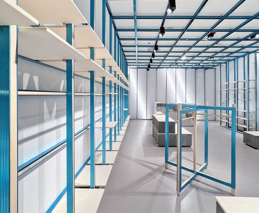
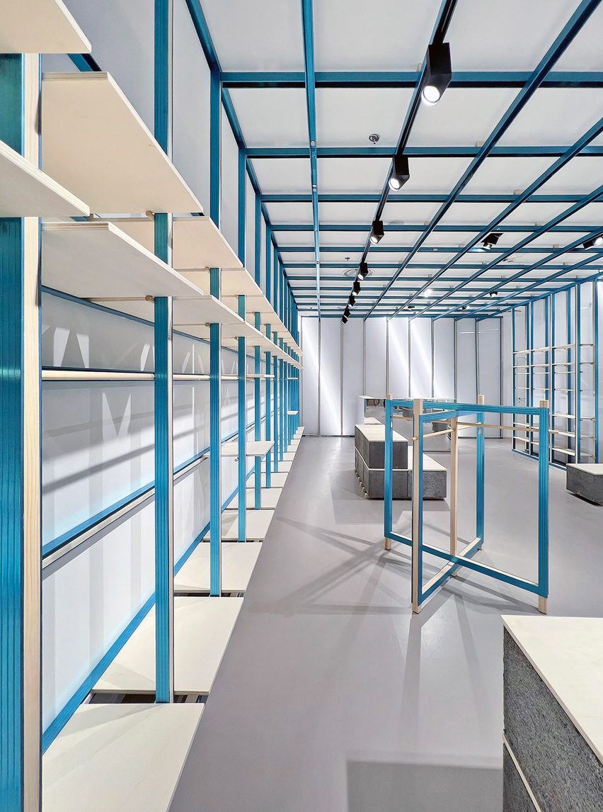
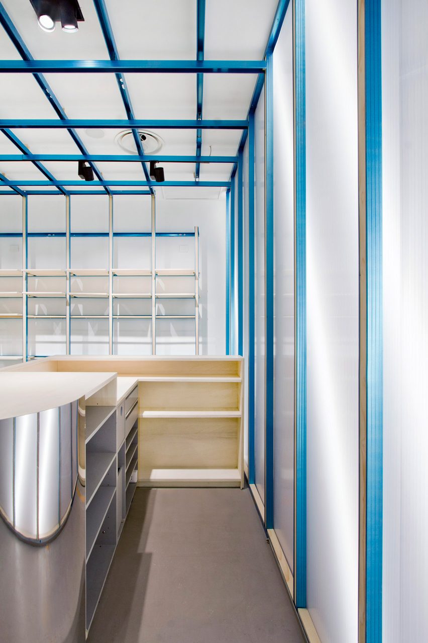
Italian architect Francesca Perani has teamed up with design studio Bloomscape to create a reversible fit-out for this clothing store in Milan, which is dominated by a flexible gridded shelving system.

Perani and Bloomscape installed the grid with its moveable shelves as a way to let the On-Off store effortlessly change its display arrangements.
Shelving system in Milan store by Francesca Perani and Bloomscape
A gridded blue framework covers the entire interior of Milan’s On-Off store

It was also a matter of making the store reversible, meaning that the fit-out could be easily dismantled should the retailer move on to a different site, saving waste and leaving behind a clean slate for the next occupier.
“Too often, the world of retail is still insensitive to sustainability; its lifecycle, however, is too short to continue being ignored,” explained Bloomscape co-founder Rosario Distaso.

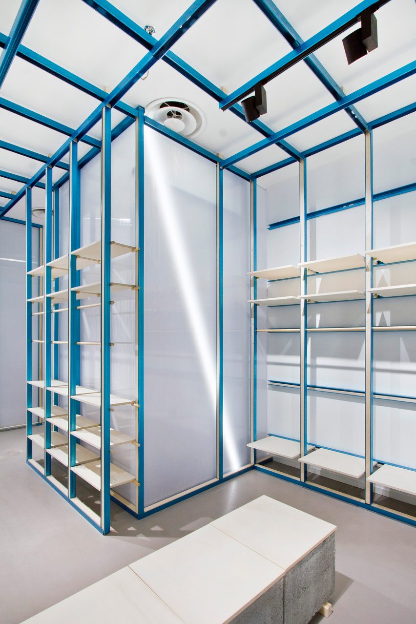
Polycarbonate walls in ON-OFF store in Milan
Concrete chimney blocks form display plinths and benches

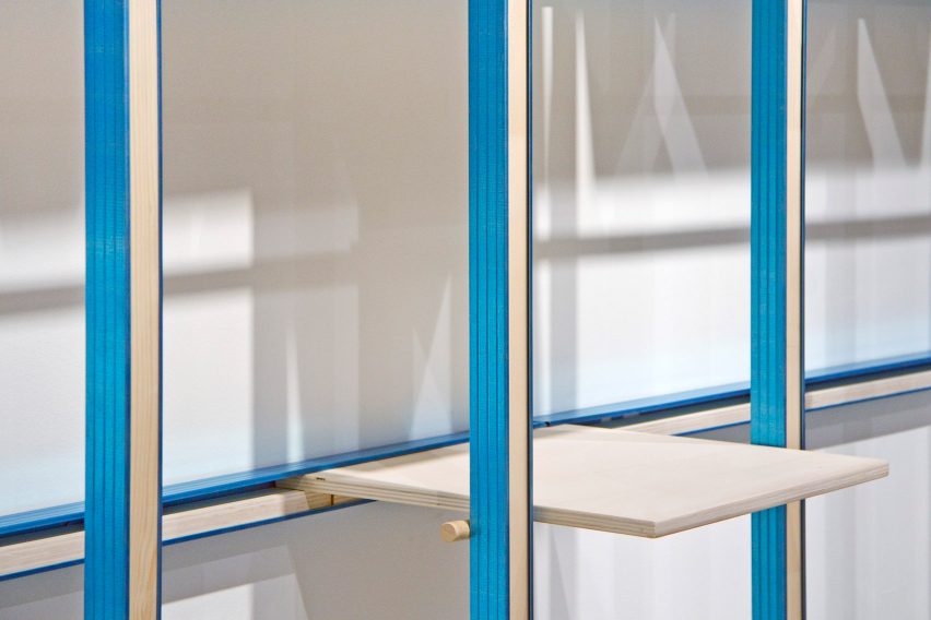
The gridded framework comprises beams of poplar wood surrounded by metal frames that were anodised to produce a vivid electric-blue colour.

The system runs along the walls and across the store’s ceiling, allowing On-Off to hang wayfinding signage.

Wood and metal shelving in Milan store by Francesca Perani and Bloomscape
Shelves can be moved around in the framework to create different displays

All of the shelves can be pulled out or slotted in at different points of the framework.

A fixed wooden clothes rail runs between two of the columns, allowing the hung garments to appear almost as part of the store’s architecture.

As the team was working with a limited budget, just a handful of materials were applied throughout the rest of On-Off.

The same metal-clad poplar wood was used to create freestanding clothing rails that appear at the edges of the store. Sheets of poplar also form the top of the store’s display plinths and bench seats, which have chimney cement blocks for a base.

Mirrored cash register in ON-OFF store in Milan
Mirrored panels clad the store’s cash register desk

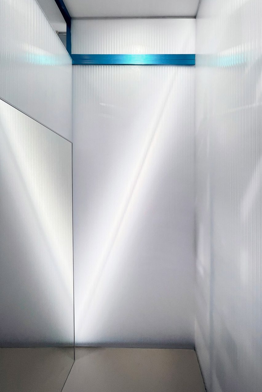
At the rear of the floor plan is a mirror-clad cash register, set against a wall lined with translucent polycarbonate sheets.

More panels of polycarbonate were used to enclose On-Off’s changing rooms, with a shiny silver curtain suspended in front of each cubicle for privacy.

Polycarbonate changing rooms in Milan shop by Francesca Perani and Bloomscape
Polycarbonate walls and silver curtains feature in the changing rooms

Other striking retail spaces in Milan include the Marni flagship with its very own artists’ studio and IoNoi – a hybrid store and gallery dedicated to the work of Italian designer Fabio Novembre.

The photography is courtesy of Francesca Perani.

Reference

WGNB creates minimal monochrome SVRN store in Chicago
CategoriesInterior Design

WGNB creates minimal monochrome SVRN store in Chicago

A variety of monolithic furniture pieces direct the flow of movement around this fashion boutique in Chicago, designed by South Korean studio WGNB.

The space for lifestyle brand SVRN is intended to highlight the products for sale as artworks and ideas, rather than simply as garments.

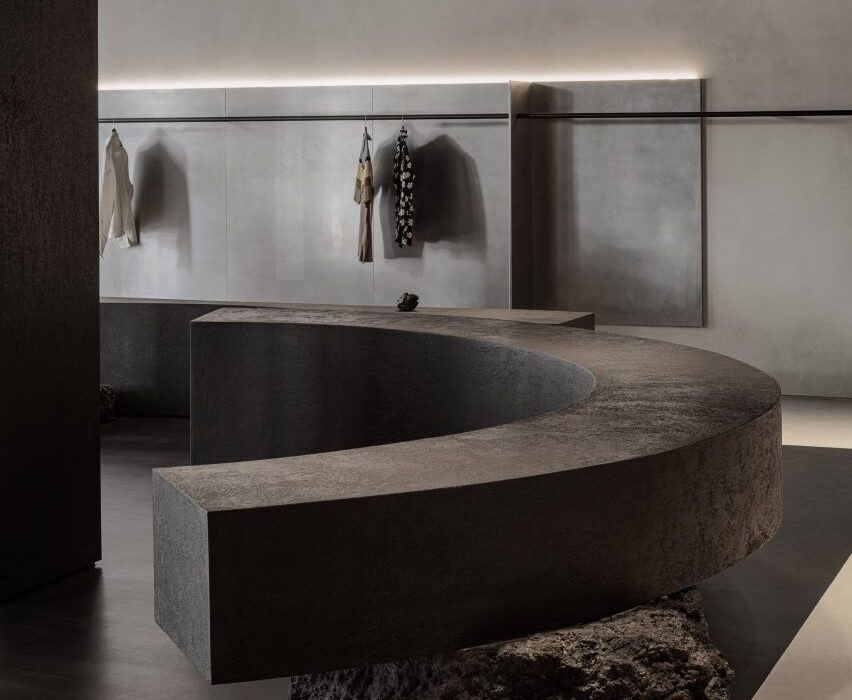
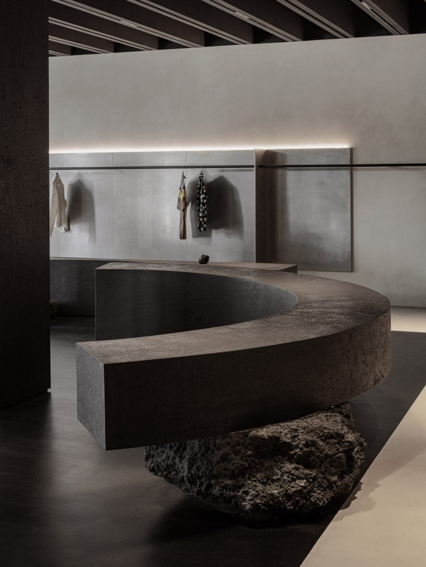
Curved bench balanced on rocks
Benches balanced on irregularly shaped rocks also act as product displays in the store

“Spatial design of the SVRN store began with our interpretation of the SVRN’s brand identity and narrative through the eastern perspective,” said WGNB.

“While the western perspective looks at the object itself, the eastern perspective rather focuses on the surrounding relationship of the object.”

Thin black rails for displaying clothing
Thin black railings are used for hanging garments

The 4,200-square-foot (390-square-metre) store on North Aberdeen Street, in the Fulton Market area, is split into two sections: the main sales floor and a back room, which are connected by a narrow corridor.

A muted, monochrome selection of materials creates a serene atmosphere in both of the spaces, while the architectural elements dictate purposeful paths that connect them.

Wide shot of the store with service counter on the left
Various architectural and furniture elements form pathways for shoppers to meander

Black railings transverse the walls, puncturing curved and flat vertical partitions made from materials including concrete, steel and black-stained thermowood.

Curved benches that act as both accessory displays and seating are balanced on large irregularly shaped stones.

Hole in the stainless steel ceiling
The walls and ceiling in the back room are lined with stainless steel

Together, all of these elements suggest multiple meandering routes for customers to trace through the store.

In the back room, the curvature of the benches corresponds with a circular opening in the brushed stainless steel ceiling, while a round patch of carpet sits offset on the floor.

Footwear display area
A section dedicated to footwear features multiple shelving units

Hot-rolled steel continues across three walls, creating a sci-fi feel in certain areas of the room.

Micro-cement plaster paints are used to contrast the metal, adding a rougher texture against the smooth surfaces.

Ladder of shelves sat on a circle of carpet
A monochrome colour scheme is applied throughout

“Overall, usage of the materials are manifestations of the SVRN’s brand identity and narratives,” said WGNB.

The fourth wall in the rear space is reserved for displaying shoes, which sit on shelves of unequal heights that are silhouetted against backlighting.

“The spatial layout of the store considers the current that customer’s circulation creates in the space with the objects and openness,” said the studio.

“And, the visual tension is created by the constantly changing eyesight of the customers while navigating the store.”

Store interior at night
A variety of smooth and textured surfaces create subtle contrasts across the boutique

Minimalist fashion boutiques can be found worldwide, with many brands opting for a simple and pared-back interior to allow the products to shine.

Recently completed examples include Snøhetta’s Holzweiler store in Copenhagen and a Jonathan Simkhai store in New York’s SoHo by Aruliden.

Wavy partitions define pathways
The store was designed by WGNB, the Dezeen Awards Emerging Interiors Studio in 2021

WGNB, which won the Dezeen Award for Emerging Interior Designer of the Year 2021, has also created monochromatic interiors for fashion brand Juun.J’s flagship store and a golf supply shop – both in Seoul.

The photography is by Yongjoon Choi.


Project credits:

Construction/general contractor: Helios Construction Services


Reference

On models London trainer store on “shoppable science museum”
CategoriesInterior Design

On models London trainer store on “shoppable science museum”

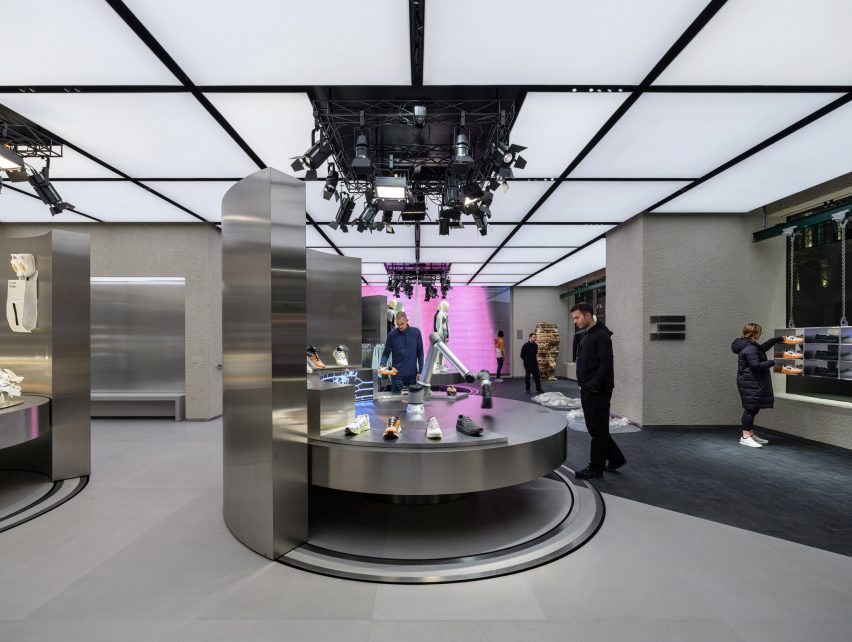
Swiss brand On has opened its first UK shop on London’s Regent Street, complete with steel fixtures and a robotic arm.

For its debut outpost in the United Kingdom, On aimed to showcase the science and technology behind its running shoes and clothing.

Sportswear shop on London's Regents Street
On has opened a trainer store on London’s Regent Street

“Our concept was a shoppable science museum in the sense that one of the main things we want to share is that what we do is science-based,” said On’s head of brand environments Nicholas Martin.

It is performance-run culture that is infused into everything we do.”

The store’s ground floor is defined by three circular steel tables, used to display the brand’s latest products.

Stainless steel table in On's trainer store
The store contains three circular steel tables

Each of the tables, which can be raised and lowered, is surrounded by a curved steel wall that can be rotated to create a variety of layouts within the store.

The table at the store’s entrance also holds a robotic arm that mimics the action of running to showcase On’s running shoes.

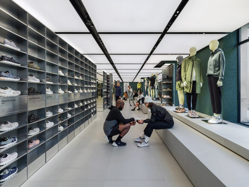
Stainless steel shoe cabinets are located on the upper floor
The upper floor houses steel shoe cabinets

“The first thing you actually see is our robotic arm,” Martin told Dezeen. “We want people to touch and explore. So you kind of get to see the movement.”

“And then we also try to add different layers of storytelling,” he continued. “So you can compare the different shoes.”

Steel trainer cabinet known as the magic wall
On describes the cabinets as a “magic wall”

The first floor is defined by a pair of steel cabinets, described by On as a “magic wall” that runs the length of the store.

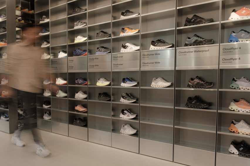
It contains all of On’s products in all available sizes so that customers can instantly try on trainers.

“Our goal was to revolutionise the way shoe try-ons happen,” said Martin. “At our stores, we let the product speak for itself. Our technology is something you feel once you put a product on.”

Contrasting the steel fixtures, the store’s walls were finished in natural clay sourced from Cornwall, which was applied by hand.

On the ground floor and in the basement-level event space, the walls are painted in a muted shade of grey while on the upper floors, they are finished in green.

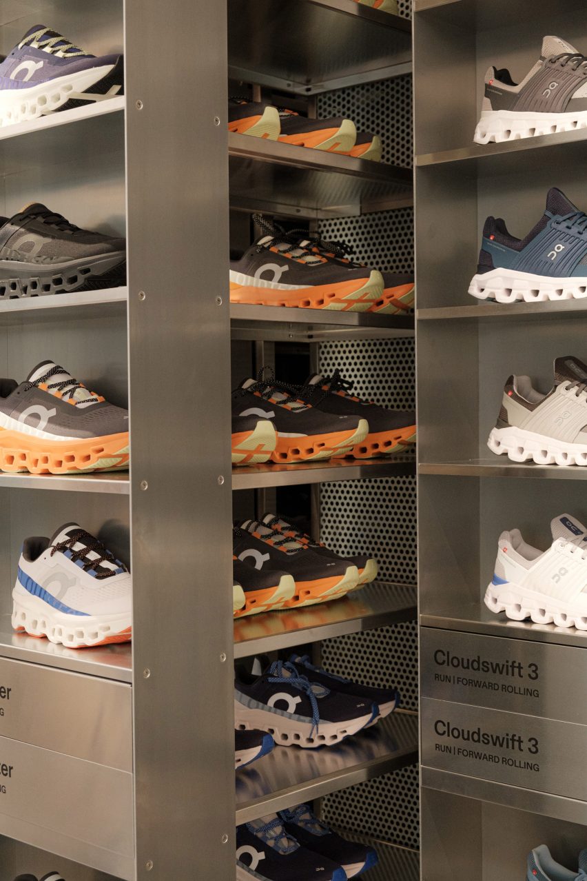
On shoes in metal cabinets
The cabinets contain all sizes of On’s shoes

“Swiss engineering means for us loving technology and the natural world,” said Martin. “Technology makes the store look sleek, nature helps us to give the store a more imperfect and warmer look.”

“The store green is a nod to the legendary British racing green – a colour culturally saturated in movement, speed and engineering,” he continued.

On's store on Regents Street
The store is On’s first in the UK

Founded in 2010, On is known for its lightweight running shoes and is reportedly the fastest-growing running brand worldwide. Its stores form part of On’s wider efforts to build its brand internationally.

“They offer a space for our fans, community and new customers to explore and get to know the brand,” said Martin. “We see the store as a media channel that connects our fans with the brand.”

On previously created a reflective mountain cabin in the Swiss Alps to mark the launch of its first hiking shoe.

All photography courtesy of On.

Reference

Snøhetta combines clay and oak for minimalist interior of Holzweiler store
CategoriesInterior Design

Snøhetta combines clay and oak for minimalist interior of Holzweiler store

Architecture practice Snøhetta stuck to natural materials for the fit-out of the Holzweiler boutique in Copenhagen, incorporating subtle references to the fashion brand’s Norwegian heritage.

Snøhetta is a long-term collaborator of Holzweiler‘s, having designed the company’s flagship store and showroom in Oslo, as well as a number of its pop-up shops, runway sets and its digital identity.

Copenhagen store features minimalist interiors by Snøhetta
Snøhetta has designed Holzweiler’s Copenhagen outpost

For Holzweiler’s first international outpost in Copenhagen, Snøhetta followed the concept of “tracing” – devising an interior scheme that shows traces of the brand’s Norwegian roots alongside the minimalist aesthetic found in its previous retail spaces.

“Reminiscent of a memory or feeling that remains, the idea of ‘traces’ evokes an emotional sense of the brand’s beloved heritage as it travels to a new city,” the practice said.

Holzweiler's Copenhagen store features minimalist interiors by Snøhetta
A clay sculpture by Ingeborg Riseng sits at the heart of the store

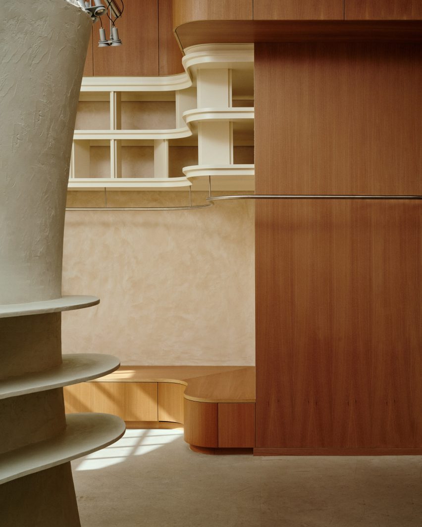
At the centre of the 100-square-metre store is a tall, hollow sculpture by Norwegian artist Ingeborg Riseng, which shoppers can step into. Its undulating outer walls are fitted with display shelves and coated in a smooth layer of clay, while the inside has a rough, craggy surface.

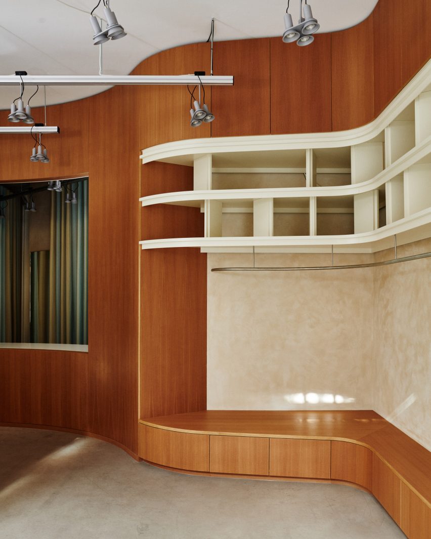
An oakwood display plinth winds its way around the periphery of the store, eventually connecting to a curved timber partition at the rear of the floor plan.

Copenhagen store features minimalist interiors by Snøhetta
Around the edge of the store is an oak display plinth

Behind the wall lies a changing area with cubicles and curtains created by Danish textile design studio Tronhjem Rømer.

The fabric is digitally printed with subtle yellow and pale blue stripes, designed to evoke the shifting shades of the Norwegian sky.

To contrast the store’s largely natural material palette, Snøhetta added some industrial-style finishing touches like metal clothing rails and custom strip lighting, developed by Swedish brand Ateljé Lyktan.

Both the floors and ceilings were preserved from the store’s previous fit-out.

Holzweiler's Copenhagen store features minimalist interiors by Snøhetta
Garments hang from steel rails

Other recent projects by Snøhetta include Bolder Star Lodges, a quartet of wooden cabins that overlook a fjord in Norway.

Meanwhile in Denmark, the practice employed boat construction techniques to create a timber community centre in Esbjerg.

The photography is by Magnus Nordstrand, courtesy of Snøhetta and Holzweiler.

Reference

Gonzalez Haase AAS includes rammed-earth “islands” at clothing store
CategoriesInterior Design

Gonzalez Haase AAS includes rammed-earth “islands” at clothing store

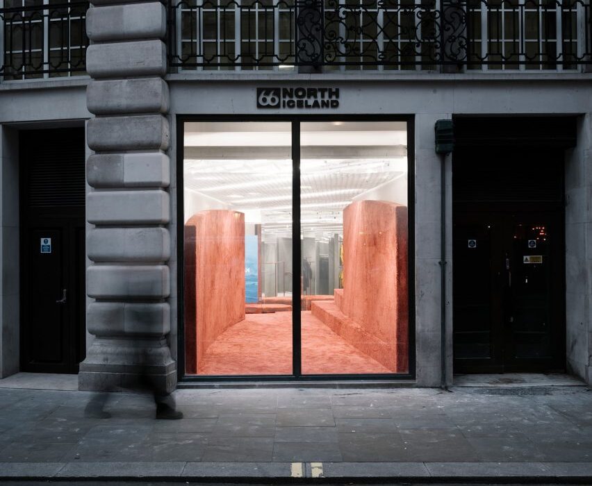
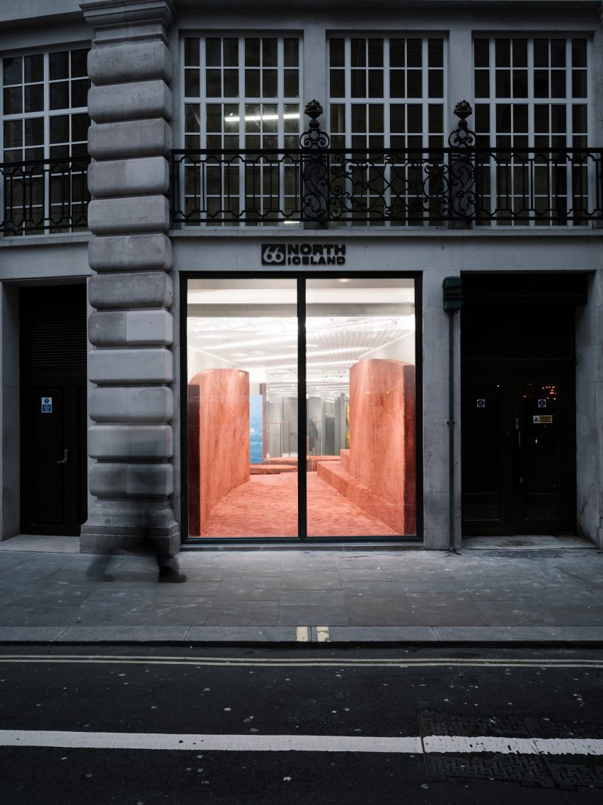
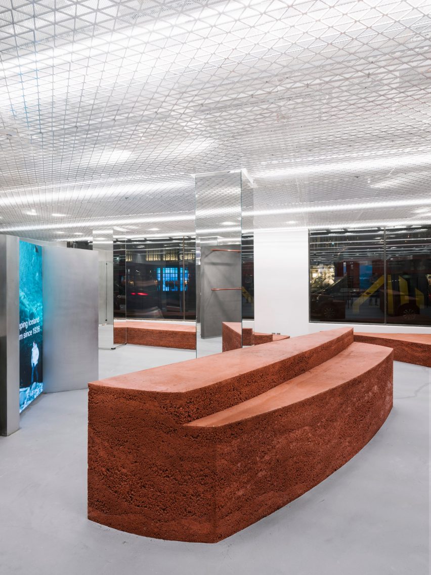
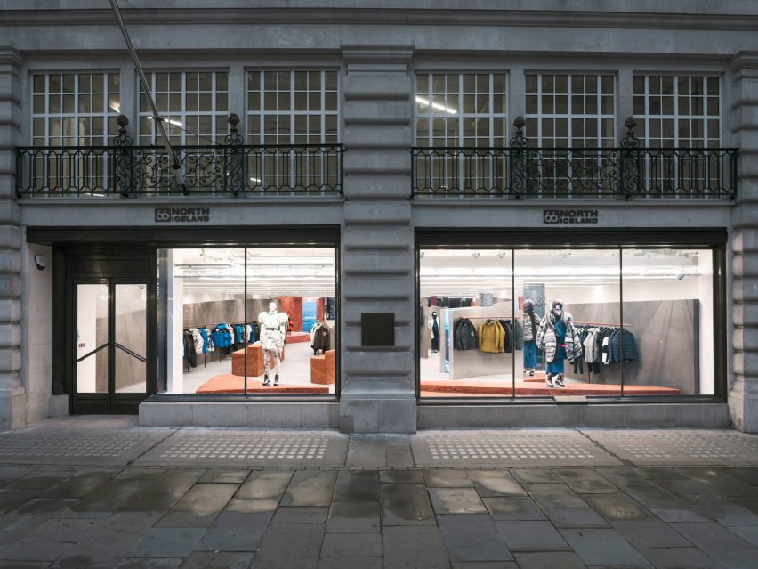
Architecture studio Gonzalez Haase AAS has completed a store on London’s Regent Street for Icelandic clothing brand 66º North, featuring curved walls and freestanding plinths made from rammed earth.

The Berlin-based studio headed by Pierre Jorge Gonzalez and Judith Haase set out to create a holistic concept for the store that represents Iceland in an original way, rather than relying on stereotypes.

Shop front with stone facade and large window looking into a store with rammed-earth islands
The shop interior was informed by Iceland’s volcanic landscapes

Gonzalez Haase AAS let the natural elements and the country’s geology inform key design features such as curved grey walls that evoke the shifting weather and rammed-earth islands that represent the earth.

“The weather in Iceland is a very real and prominent feature in the land and we classified this as static (the island) and forever changing (the weather),” the studio explained. “The static island of Iceland stands still in comparison to the constantly evolving and adapting weather, but this influences the perception of the island.”

Shop interior with grey floor and rammed-earth displays
Rammed-earth islands add colour and texture to the shop’s interior

Upon entering the space, visitors encounter a series of curved walls rendered in natural pigmented clay sourced from Cornwall in the south of England.

The designers said the use of different grey tones represents the changing weather: “the immaterial, movement, changing, blurry and informal”.

Shop interior with grey floor, silver island and rammed-earth steps and partition wall
Grey walls represent Iceland’s shifting weather

The curved walls vary in height and frame different views within the store. At the entrance, one of the walls stretches back 18 metres, drawing the viewer’s gaze into the space and offering a tactile introduction to the experiential interior.

“These curved walls create different perspectives and atmospheres,” the design team added. “They sit in front of the existing white walls to create a dramatic foreground of rolling soft curves.”

A series of monumental rammed-earth islands are inserted throughout the floor plan, adding colour and texture that evokes the earth and magma of Iceland’s volcanic landscape.

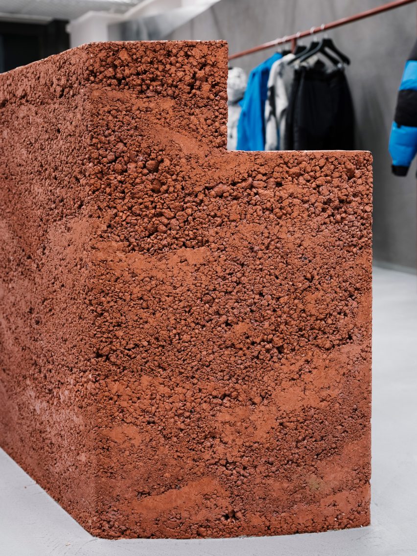
The islands were created by artist Lennart Frank, who cast and sculpted them from an aggregate mix of different lava rocks to create a layered effect.

Close up of the rammed-earth display islands at the 66 Degrees North clothing store
The islands were made from an aggregate mix containing different lava rocks

A combination of pigmented aggregate and sand gives the islands their reddish-brown hue, while the rugged texture brings a tactile element to the space that complements the brand’s clothing.

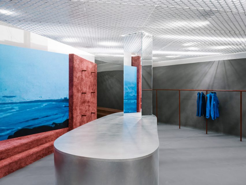
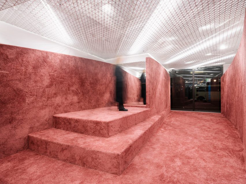
The earthy tones are echoed in the metal clothes rails, as well as in the colour of a carpet applied to the surfaces within a more intimate space at the rear of the store.

Shop interior with rammed-earth floor, steps and partition wall
Earth-toned carpet was used in parts of the shop

A custom-made mesh ceiling was designed to evoke a misty white sky, while also concealing lights and technical equipment.

Mirrors and screens displaying films of the Icelandic landscape help to define the flow of movement through the space and add a playful dimension to the shopping experience.

Shop front with stone facade and large window looking into a store with rammed-earth islands
The shop is located on Regent Street in London

Gonzalez and Haase founded their Berlin-based studio in 1999. The firm works on commercial, residential and cultural projects, developing spatial concepts and experiences that foreground the interplay between light and architecture.

Previous interiors designed by Gonzalez Haase AAS include a minimal office for a Berlin communications firm and a sparse, white-walled concept store in Lisbon that occupies a disused warehouse.

The photography is by Thomas Meyer, Ostkreuz Photography.


Reference

FOG Architecture transforms Beijing courtyard house into fragrance store
CategoriesInterior Design

FOG Architecture transforms Beijing courtyard house into fragrance store

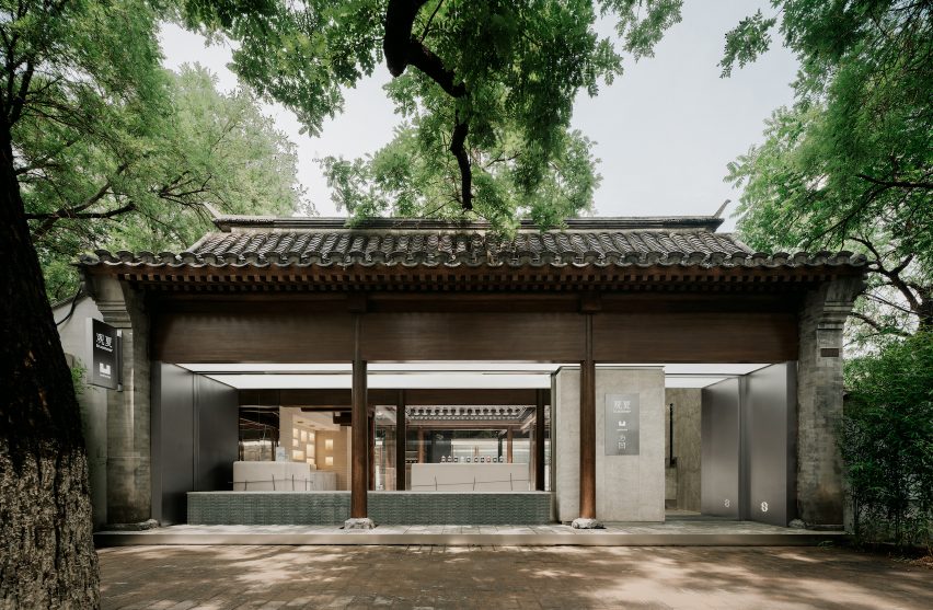
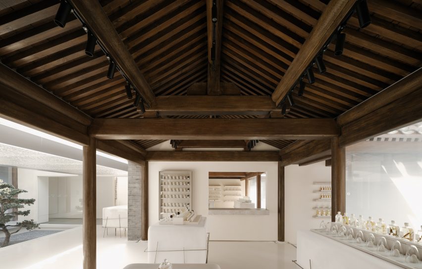
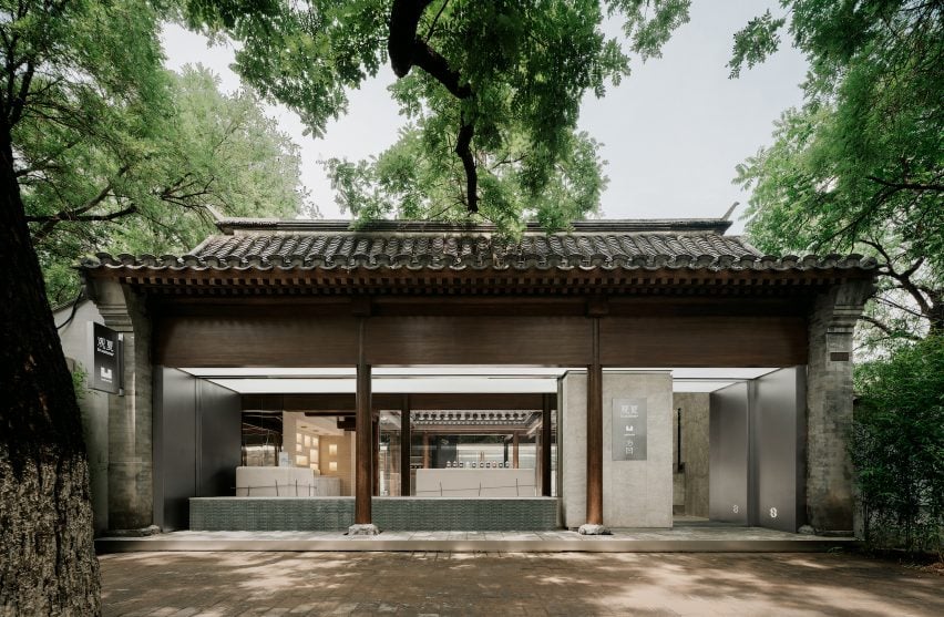
Chinese studio FOG Architecture has turned a courtyard house in Beijing into a flagship store for fragrance brand ToSummer with exposed wooden roof trusses and columns.

Located within a 500-square-meter Siheyuan complex, the store occupies  a 280-year-old courtyard house that are common in the region.

ToSummer Beijing storefront
The store is located at a restored courtyard house in Beijing

FOG Architecture renovated the building to reveal its original architecture, which features triangle-shaped timber roof trusses and series of wooden columns.

Layers of decorations added on the structure over the years as well as some of the interior walls were removed to expose the core wooden structure of the building as well as to create an open view of the space.

Wooden roof trusses of ToSummer Beijing
The studio exposed the wooden roof trusses and columns of the original building

“We ‘skimmed’ the building to expose its ‘skeleton’,” said the studio. The resultant ‘column field’ became the visual centre of gravity of the space as well as what defines its outline.”

“One of the challenges of the project had to do with the building’s old and new functions – more specifically, how to transform this venerable courtyard which has stood for nearly 300 years as a private residence into a commercial space that is neighbourly, communal, and all-inclusive,” it continued.

ToSummer Beijing
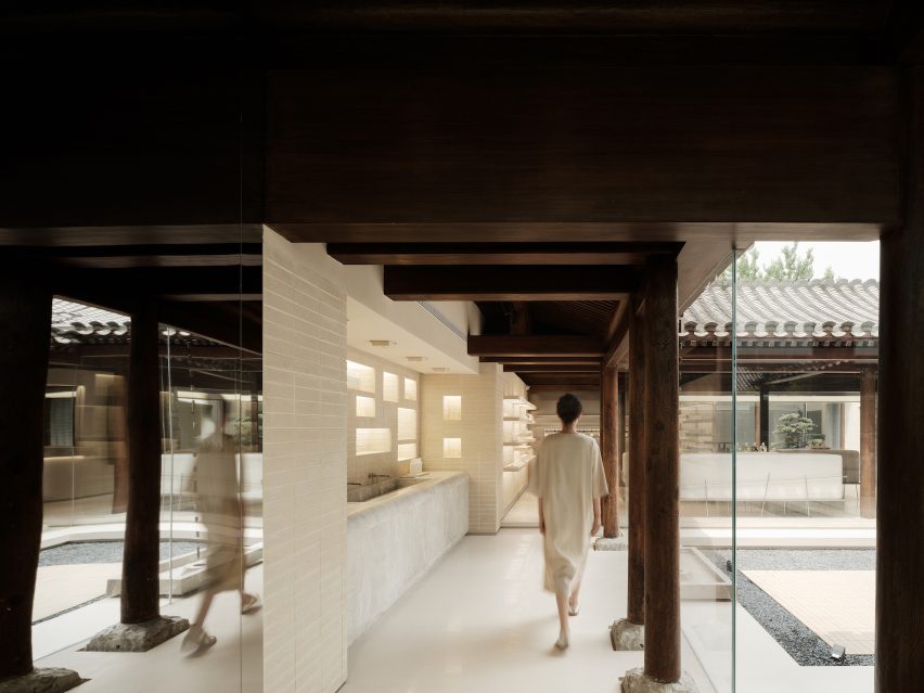
Product display areas are arranged around the courtyards

Glass windows were installed at the storefront, inviting visitors on the street to observe the complex layout of the old courtyard house, while glass walls were used to divide the space.

Product display areas were arranged around three courtyards of various sizes at the ground level of the complex, each connected by a bridging hallway, which the studio described as “symbol of graduating from the past to the present”.

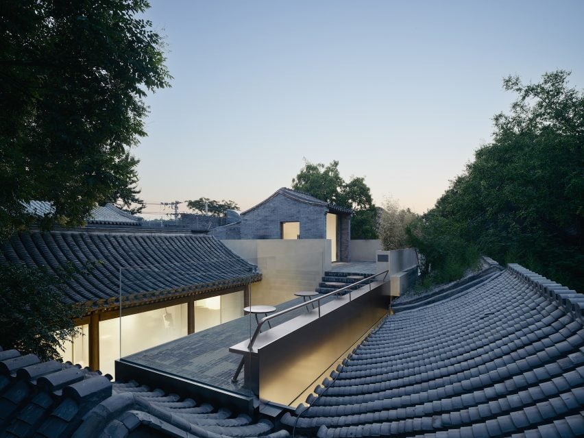
On the first floor,  FOG Architecture remodelled the roof space to create a lounge area overlooking the building’s roofs.

These roofs were restored with the same grey brick tiles from the original building layered in the same density.

Rooftop view of ToSummer Beijing
Grey brick tiles from the original building are restored

A rain chain was hung from the roof connecting to a hundred-year-old well of the site. The well-preserved brickwork of the well echoes the delicate crafts of the roof tiles.

FOG Architecture was founded by Zheng Yu and Zhan Di and has offices in London, Shanghai and Chongqing.

Previously the studio has completed flagship stores for ToSummer in Beijing and Shanghai. Other recent retail project from the studio include Super Seed’s Hangzhou store featuring kinetic display.

The photography is by InSpace Architectural Photography.


Project credits:

Design team: Zou Dejing, Wu Leilei, Wang Shengqi, Tang Mo, Lei Ronghua, Jiang Lu, Huang Yingzi, Zhuang Shaokai, Sun Yuan, Zhang Xinyue, Chen Yixuan, Zheng Yining, Tao Xinwei, Cao Xiaomao, Hou Shaokai, Xiong Aijie, Khoon Choi (client representative), Zhan Di, Zheng Yu
Project management: Shen Qianshi (client representative)
Lighting Design: Zhang Xu, Liben Design
Structural engineering Consultant: Tao Xinwei, Wang Haibo
Construction drawing: BS Design
Contractor: Youlong Jinsheng

Reference

Halleroed combines the futuristic and the primitive for Chengdu Acne store
CategoriesInterior Design

Halleroed combines the futuristic and the primitive for Chengdu Acne store

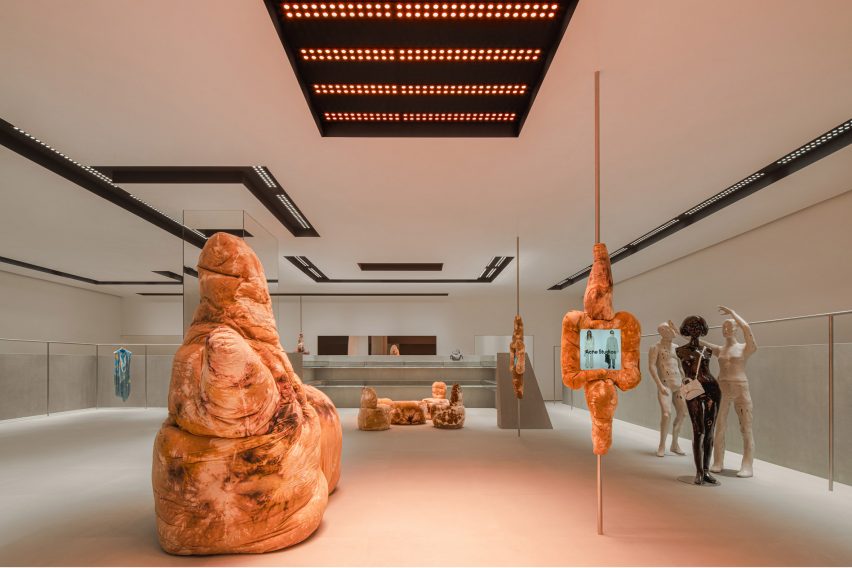
Fashion brand Acne Studios has opened its latest store in China, which was designed by Stockholm studio Halleroed and is located in the submerged SKP department store designed by Sybarite in Chengdu, China.

The 338-square-metre store has a discrete sandstone exterior marked by a red LED sign displaying the brand’s logo.

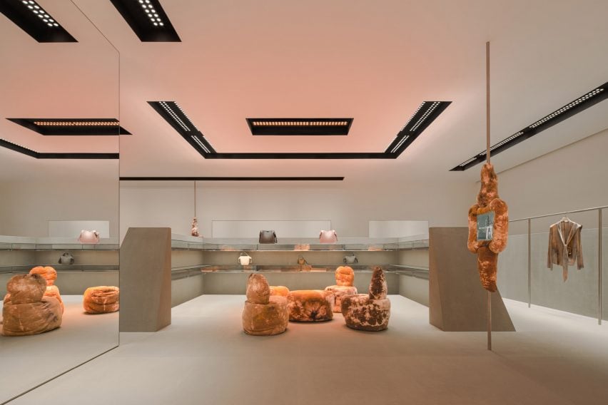
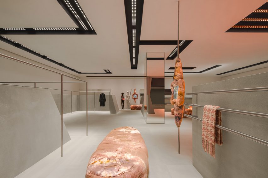
Inside, grey sandstone walls contrast against sculptural tie-dye furniture in earthy tan hues by British designer Max Lamb.

Acne Studios store designed by Halleroed
The store is located inside Chengdu’s SKP department store

“Our inspiration was aesthetically playing with design from the 1980s and 90s, and how that period looked at the future,” Halleroed founder Christian Halleroed told Dezeen.

“The inclined stone clad walls, the futuristic lighting together with the Daniel Silver mannequins – we thought of a futuristic space/computer age feel, but in a contemporary way of putting it together,” he added.

“We clashed this with the Max Lamb sculpture-like furniture that has a more primitive, earthy feeling.”

Bic fabric sculpture by Max Lamb in Acne Studios store
It features tactile, soft seating by Max Lamb

As well as the furniture, Lamb designed four fabric-clad touchscreens that are mounted on slim poles throughout the store and provide an overview of the brand’s current collection and stock availability.

Expressive mannequins by artist Daniel Silver and a light installation by designer Benoit Lalloz help to add a futuristic feel to the space.

Interior of Acne Studios store in SKP Chengdu
Lighting was designed to feel “like a spaceship”

Halleored, which has designed a number of Acne Studios‘ stores, normally works with Lalloz on the lighting but said the Chengdu store lights have a different feel to those in other stores.

“These were done a bit differently than previous since they are recessed in the ceiling, but still has the typical look of Benoit Lalloz,” Halleroed said.

“We wanted the lighting to feel like a spaceship,” he added.

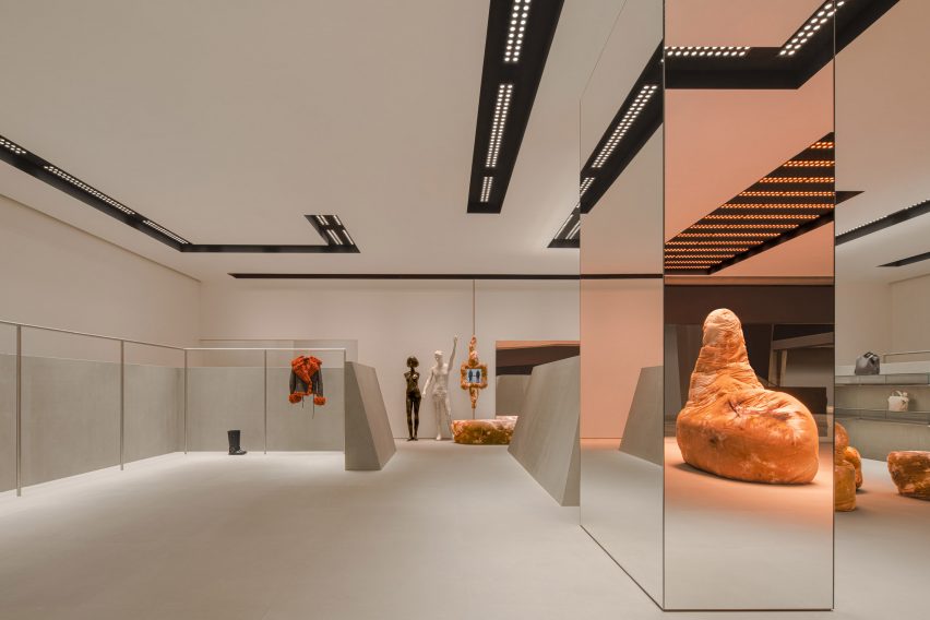
A large mirrored column in the middle of the store reflects its pared-down interior, which features a colour palette informed by the grey hues used for early computer designs.

Large mirror inside Acne store designed by Halleroed
A large mirrored column sits in the centre of the sandstone room

“We used a very restrained palette with the grey, monochrome sandstone on the floor and angled walls, high gloss white walls and ceiling, the black coves in the ceiling, and for the fixtures brushed stainless steel,” Halleroed said.

“The Max Lamb and Daniel Silver pieces contrast this, with their brown batik fabric and the white with patina and silver mannequins.”

Previous Acne Studios store designs featured on Dezeen include a “monolithic” store in Paris and a pink-ceiling flagship store in Milan’s Brera district.

The photography is courtesy of Acne Studios.

Reference

Biophilic design informs moss-covered installation at luxury bag store
CategoriesInterior Design

Biophilic design informs moss-covered installation at luxury bag store

Creative studio Spacemen looked to biophilic design principles to construct a tree-like installation covered in moss, which forms the centrepiece of a flagship outlet for luxury leather brand Braun Büffel in Malaysia.

Described by Shanghai-based Spacemen as a store that straddles an art gallery and a laboratory, the studio wanted to create an interior that would attract a younger audience and serve as “an abstract oasis” in Putrajaya’s IOI Mall.

Interior of bag store in Malaysia with marble cabinetry
Spacemen designed the store interior for bag brand Braun Büffel

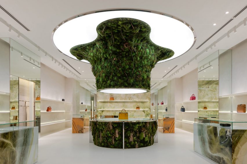
Central to this design is an oversized, organic-shaped sculpture clad in preserved flat moss, ball moss and lichen that is suspended from an illuminated disc in the middle of the shop.

A rounded table clad in the same plants was positioned directly below to complete the installation. It also doubles as a plinth for Braun Büffel leather bags, which are displayed sparsely across the store like museum artefacts.

Organic-shaped moss-covered installation that recalls a sprouting tree
It is characterised by a central moss-covered sculpture

The sculpture takes cues from biophilic design – a concept that encourages a closer connection between humans and nature when creating interior spaces.

“The form was designed to seem as though it is sprouting from the ground towards the ceiling – towards the sun – hence why we integrated the membrane lighting ceiling above it, just like how it would grow out of a beaker in a mad scientist’s lab towards natural light,” explained Spacemen founder Edward Tan.

“We envisioned an otherworldly concept akin to something out of a Hollywood sci-fi movie,” he told Dezeen.

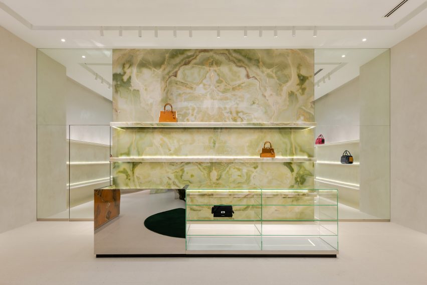
Green onyx feature wall with handbags displayed on its shelving
A green onyx feature wall was placed at the back of the store

Tan said that Spacemen adopted a “maximal minimalism” approach when creating the store interiors, in an attempt to challenge the neutral shapes and colours often associated with luxury.

Throughout the shop, lime plaster walls and bright white terrazzo floors are interrupted by various ornate display units and shelves magnified by floor-to-ceiling mirrors.

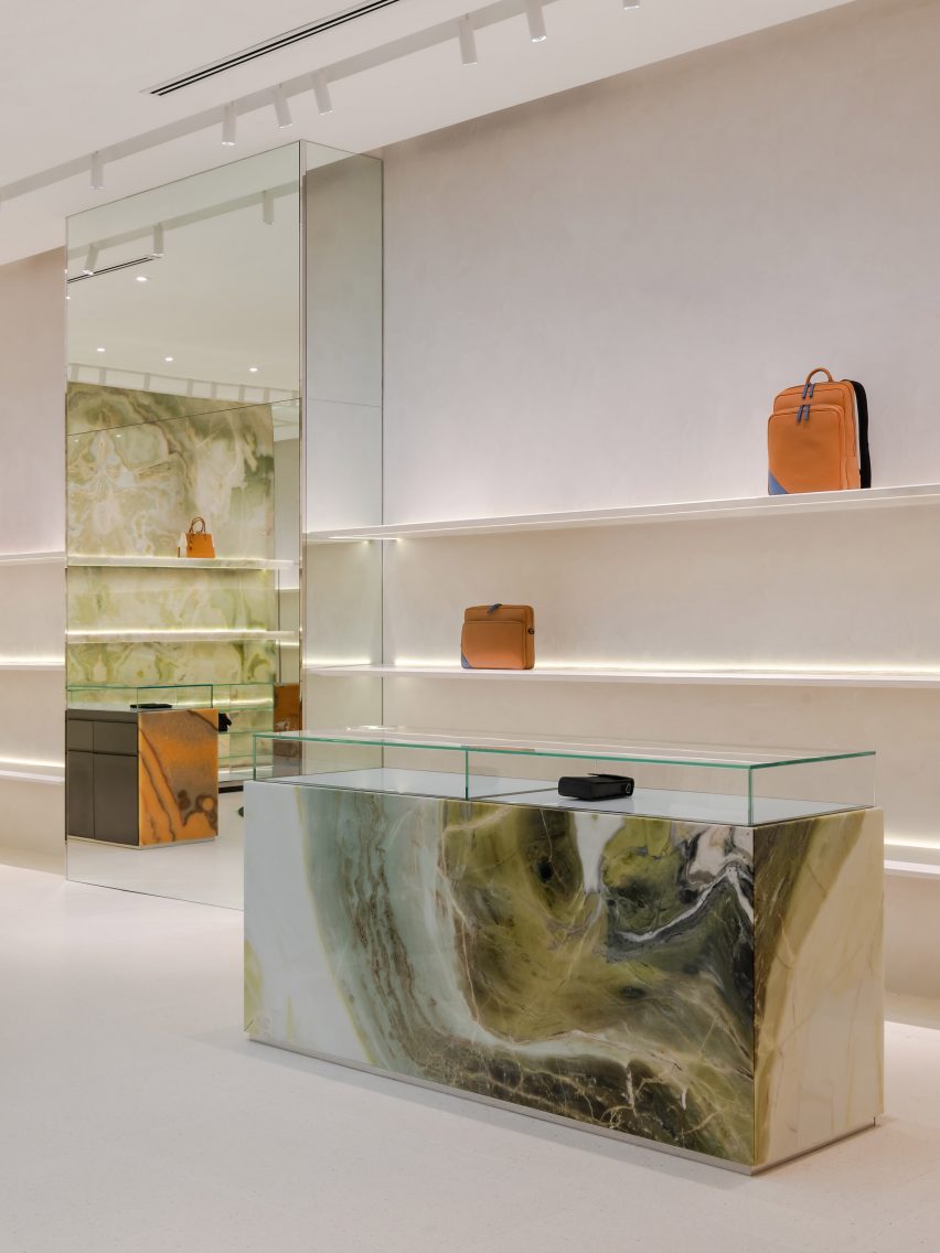
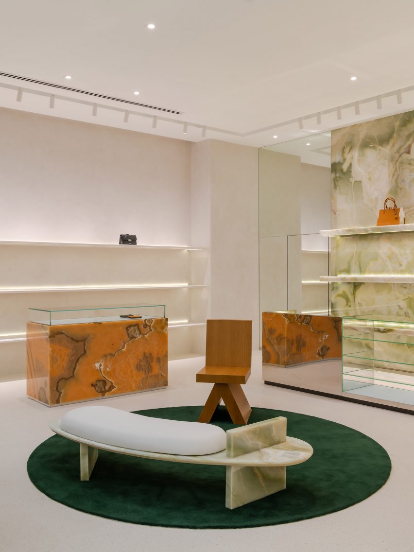
This cabinetry is made from decadent slabs of swirly orange onyx and jade marble, some of which are topped with glass vitrines that reveal small leather goods.

Spacemen placed a green onyx feature wall at the back of the store, which sits behind furniture including a bespoke curved bench created from the same material as well as a custom oak armchair.

Waiting area in store by Spacemen with bespoke furniture
Bespoke seating creates a waiting area for customers

Explaining the decision to incorporate biophilic design into the Braun Büffel outlet, Tan said, “I think with the pandemic, people have taken to appreciating nature a lot more than before.”

“This is especially true for people living in big cities where they live in apartments and are confined to office cubicles all the time, and do not have access to nature and greenery as much as they should.”

“Therefore it has become a new form of luxury to be able to afford lush greenery and gardens indoors,” he concluded.

Green and orange marble and onyx cabinetry within store interior by Spacemen
Green and orange hues add colourful accents to the space

Other retailers featuring similar designs include a store in Seattle for beauty brand Glossier with a mossy mushroom-covered mound and a Celine boutique in Paris that is characterised by large expanses of brass and marble.

The photography is by David Yeow Photography.


Project credits:

Interior design: Spacemen
Moss artist: Ohsum Mossum

Reference