Keiji Ashizawa creates Blue Bottle Coffee shop in Kobe department store
CategoriesInterior Design

Keiji Ashizawa creates Blue Bottle Coffee shop in Kobe department store

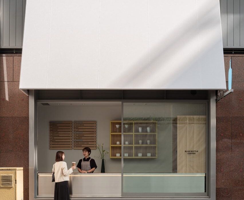
Japanese studio Keiji Ashizawa Design has created the interior of the Blue Bottle Coffee shop in Kobe’s Hankyu department store, taking advantage of its display windows to connect the cafe with the street outside.

The 173-square-metre cafe, which shares the department store’s ground floor with a number of apparel brands, has five large display windows.

To open the coffee shop up towards the street, designer Keiji Ashizawa turned one of the windows into a take-out counter.
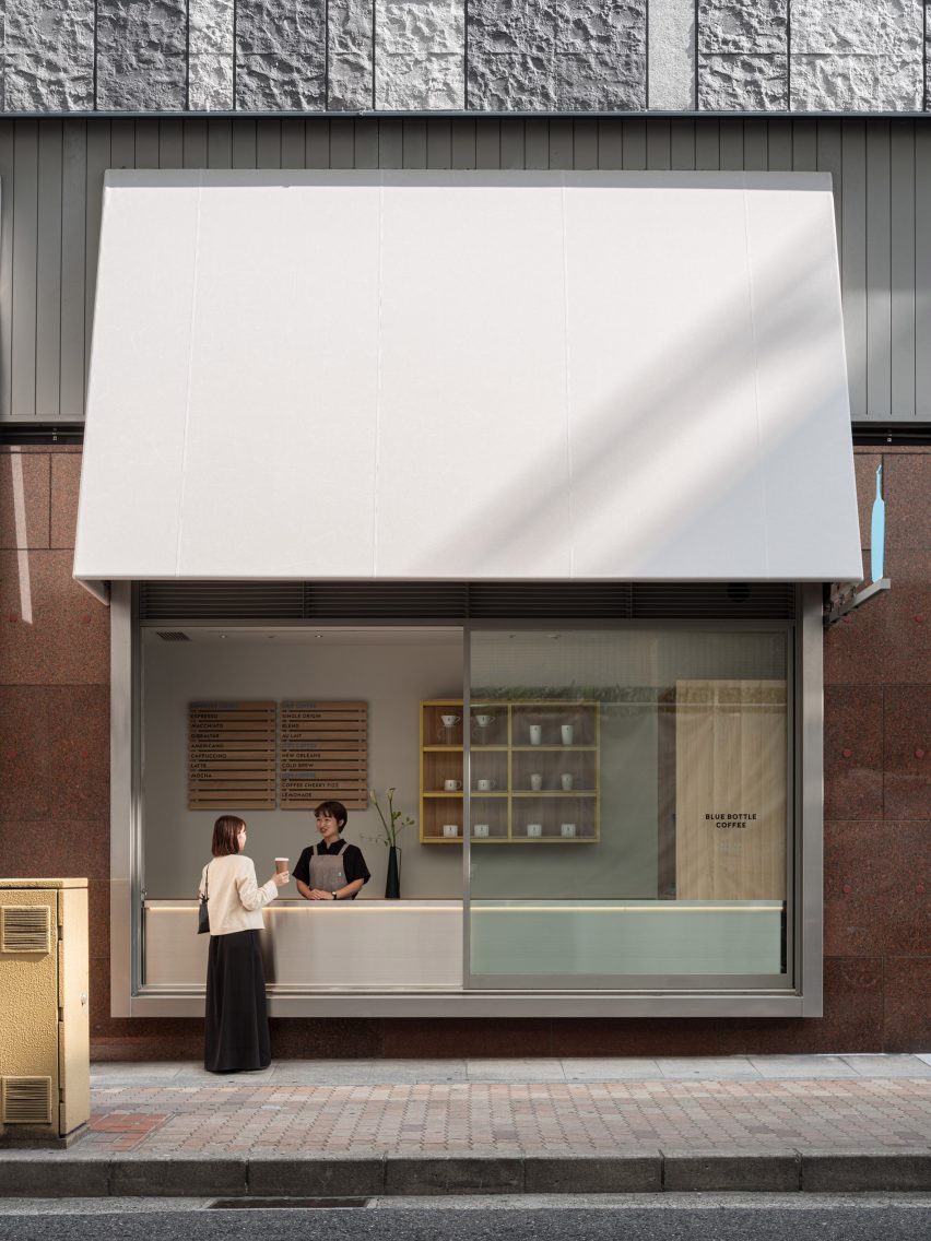
Window counter of Blue Bottle Coffee shop in Kobe
One display window was turned into a take-out counter

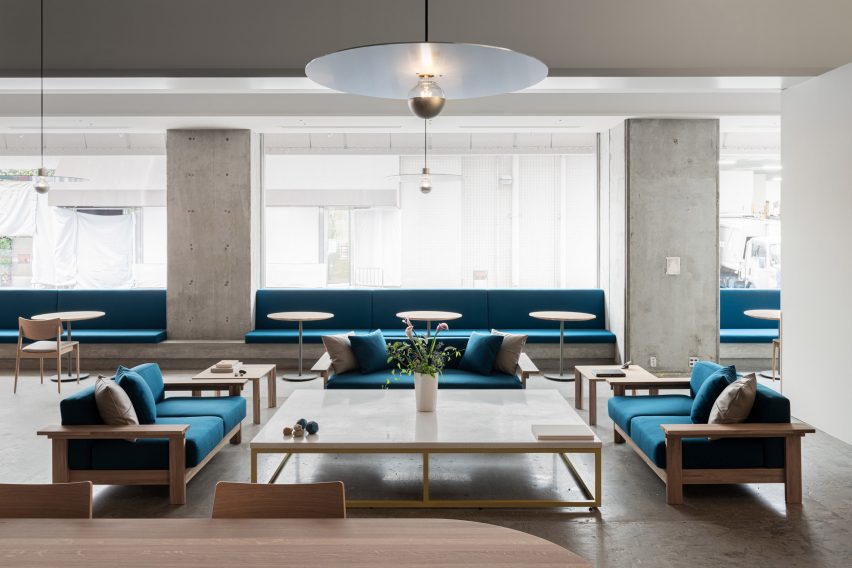
The remaining window niches were filled with blue built-in seating, creating a splash of colour among the wooden furniture.

Inside the cafe, square-shaped and rectangular furniture nods to the graphic look of the facade and is contrasted by round tables and large circular ceiling lights.

“The furniture is mainly made of domestic wood in collaboration with the Japanese furniture manufacturer Karimoku, who specializes in working with oak wood,” Ashizawa told Dezeen.
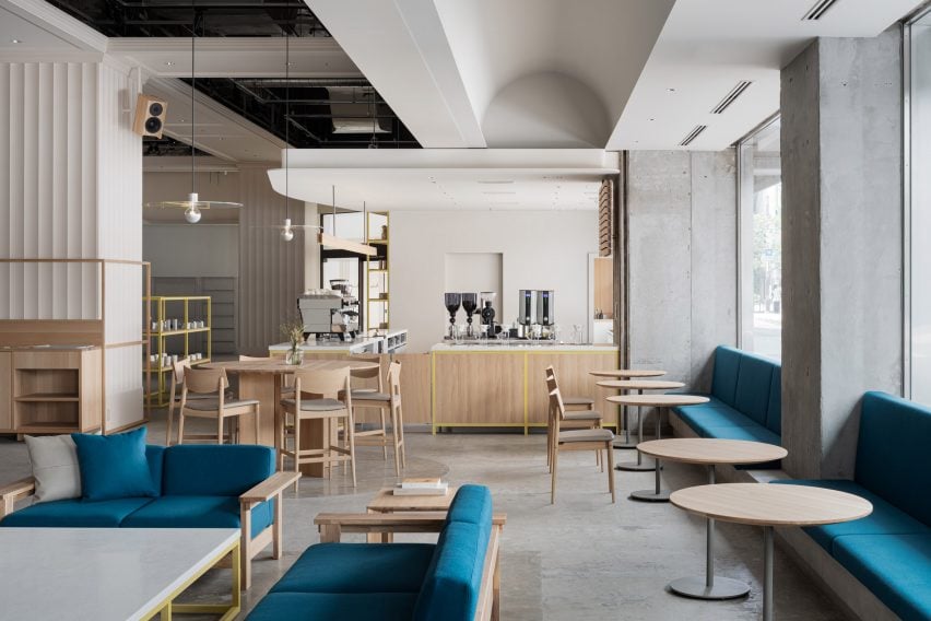
Interior of Hankyu Blue Bottle Coffee shop
Wooden furniture and terrazzo tabletops were used for the interior

The studio also mixed in terrazzo amongst the wooden furniture to give the cafe a welcoming feel.

“By placing a large terrazzo tabletop with fine textures created by mixing grounded glass into the material, it adds to the soft and welcoming atmosphere that identifies Blue Bottle Coffee and their hospitality,” Ashizawa said.

“It is also used for the low coffee table surrounded by the sofas, creating a sense of harmony and elegance throughout the space of the cafe,” he added.

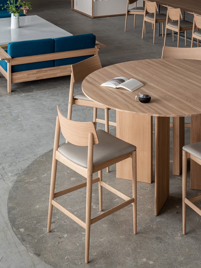
While the studio was unable to change the material of the existing rough concrete floor, the department store allowed it to create a discrete demarcation by polishing the floor underneath the central tables.
Terrazzo table inside Blue Bottle Coffee shop
Circular pendant lights were made from raw aluminium

Large disc-shaped pendant lights add a sense of drama to the coffee shop’s pared-back design.

“With the idea of creating a high ceiling within the space, the pendant lights were made from raw aluminum to complement the industrial structures,” Ashizawa said.

“Six pendant lights are placed in the central space at equal distances in three zones, creating a sense of rhythm and spatial balance.”
Polished concrete floor in Blue Bottle Coffee shop
The concrete floor was polished in part of the cafe

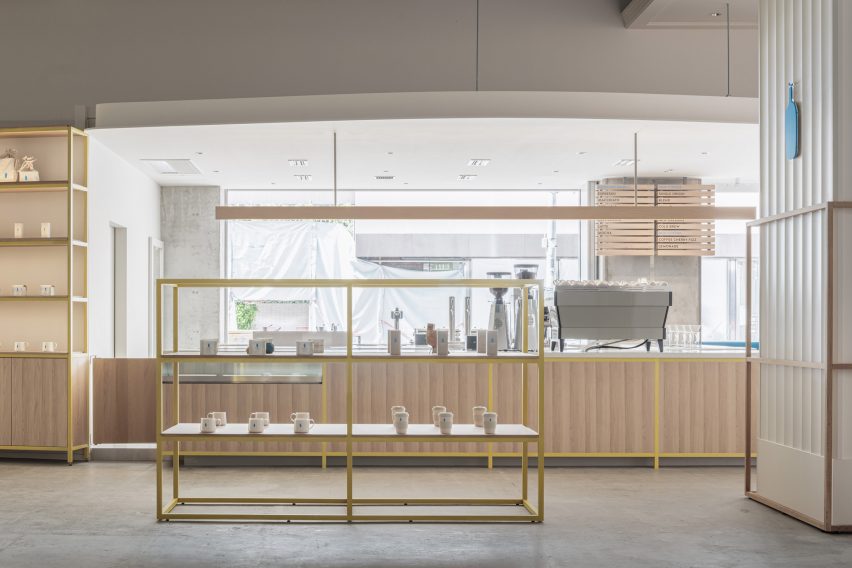
The wooden furniture inside the Blue Bottle Coffe Hankyu cafe has mainly been kept in its natural colour, but Ashizawa added bright colour to some of the wood.

“In the space with concrete structures, the yellow color was added to balance the combination of wood and concrete, and the blue color was placed as a contrast,” he said.

“We also designed the space to fit in with the apparel brands that share the ground floor.”
Colourful shelving in Kobe cafe
Shelves were painted a bright yellow

Ashizawa has previously created a number of cafes for the Blue Bottle Coffee company, including a Shanghai store decorated with traditional Chinese roof tiles and a Tokyo outpost with a volcanic-ash counter.

The photography is by Tomooki Kengaku.


Project credits:

Architect: Keiji Ashizawa Design
Project architect: Keiji Ashizawa, Tomohiko Fujishita, Masaru Kiotya
Construction: Tank
Design supervision: Miyachi Office/Kunihiko Miyachi
Lighting design: Aurora/Yoshiki Ichikawa
Furniture: Karimoku Case Study/Ichinomaki Laboratory by Karimoku
Metal works: Super Robot

Reference

Perron-Roettinger clads Kim Kardashian SKKN pop-up store in cement
CategoriesInterior Design

Perron-Roettinger clads Kim Kardashian SKKN pop-up store in cement

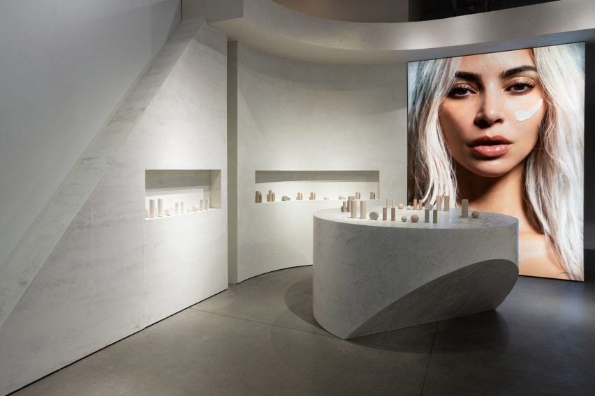
Design studio Perron-Roettinger has created a pop-up shop for Kim Kardashian’s skincare and homeware brand SKKN in Los Angeles that showcases its products in a physical space for the first time.

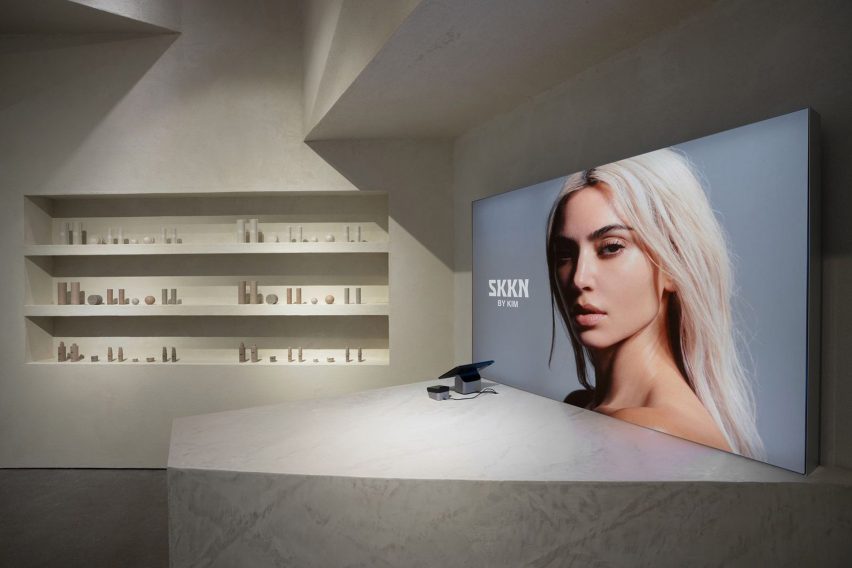
The minimalist pop-up store, which is located inside Los Angeles shopping mall Westfield Century City, was designed using a limited material palette in a nod to the brand’s pared-back design.

A concrete store interior for Skkn
Perron-Roettinger has created a pop-up shop for Skkn

“The SKKN [store] is about raw materials – bold, big blocks of stacked raw material – which is inspired from an inactive quarry that I visited once,” Perron-Roettinger cofounder Willo Perron told Dezeen.

“All different plaster and cement finishes echo the emphasis on the raw natural materials.”

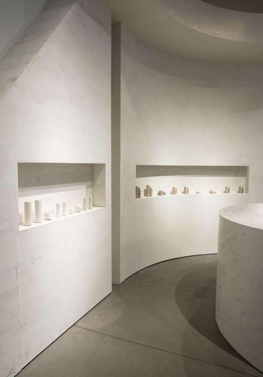
Neutral coloured concrete walls inside a shop
The walls and counters are made from concrete and plaster

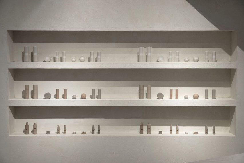
In the 1,330-square-foot (123 square-metre) space, homeware and skincare products are presented within curved wall alcoves or on top of sculptural counters made from grey concrete and plaster. The room is framed by two large portrait photos of reality television star Kardashian.
“Just in time for the holiday season, the pop-up will offer customers a luxurious in-person shopping experience with the entire SKKN By Kim collection – from skincare to home decor,” said the brand.

Skincare products on cream coloured shelves
Skincare items are displayed in alcoves

The use of raw materials references Perron’s partner Brian Roettinger’s packaging for SKKN products, as well as Kardashian’s recently launched concrete homeware collection called Home Accessories Collection.

All the materials come in varying shades of Kardashian’s signature beige and grey colour palette, which she has used in her home and her shapewear collections.

According to Perron, the brand’s packaging and the store interior are united in their reliance on simple shapes and raw materials.

“The throughline idea is materials untouched, most primary and elemental state,” he explained. “Simple geometry is important to add a recognizable component to both the space and the packaging.”

Perron–Roettinger was also responsible for SKKN’s creative direction, brand identity and art direction.

A portrait photo of Kim Kardashian in a store
The store mirrors the brand’s minimalist packaging

The SKKN pop-up shop is open until the end of the year in Westfield Century City, Los Angeles.

The longtime collaboration between designer Willo Perron and Kim Kardashian has seen Perron design other pop-up stores for the American reality star’s brands.

For Kardashian’s shapewear company Skims, Perron created a beige coloured pop-up shop in Paris with chunky display units and partitions.

Los-Angeles based Perron-Roettinger has also completed other pop-up shops for brands including Stüssy.

The photography is by Gray Hamner.


Reference

Nina + Co brings biomaterials into MONC eyewear store in London
CategoriesInterior Design

Nina + Co brings biomaterials into MONC eyewear store in London

Cornstarch-foam shelves meet mycelium display plinths in this London store that Nina + Co has designed for bioplastic eyewear brand MONC.

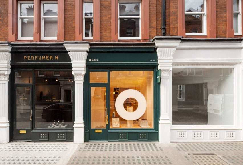
Nestled among a parade of high-end shops in Marylebone, MONC sells glasses made from bio-acetate – an acetate produced completely without fossil fuels – which are packaged using recycled leather cases and compostable cornstarch foam.

Exterior of MONC eyewear store in Marylebone, London
The first MONC eyewear location sits along a row of shops in Marylebone

When local studio Nina + Co was brought in to design MONC’s debut store, the team was keen to incorporate biomaterials throughout the interior, while also taking the brand’s short-term lease of the retail unit into account.

“Circularity was key,” said the studio. “Almost everything we brought into that building was entirely bio-based or recycled.”

“The furniture is expertly built to last but can be disassembled for re-use, recycling or return to the earth as nourishment.”

Interior of MONC eyewear store in Marylebone, London
The store features a ceiling installation made from cornstarch foam

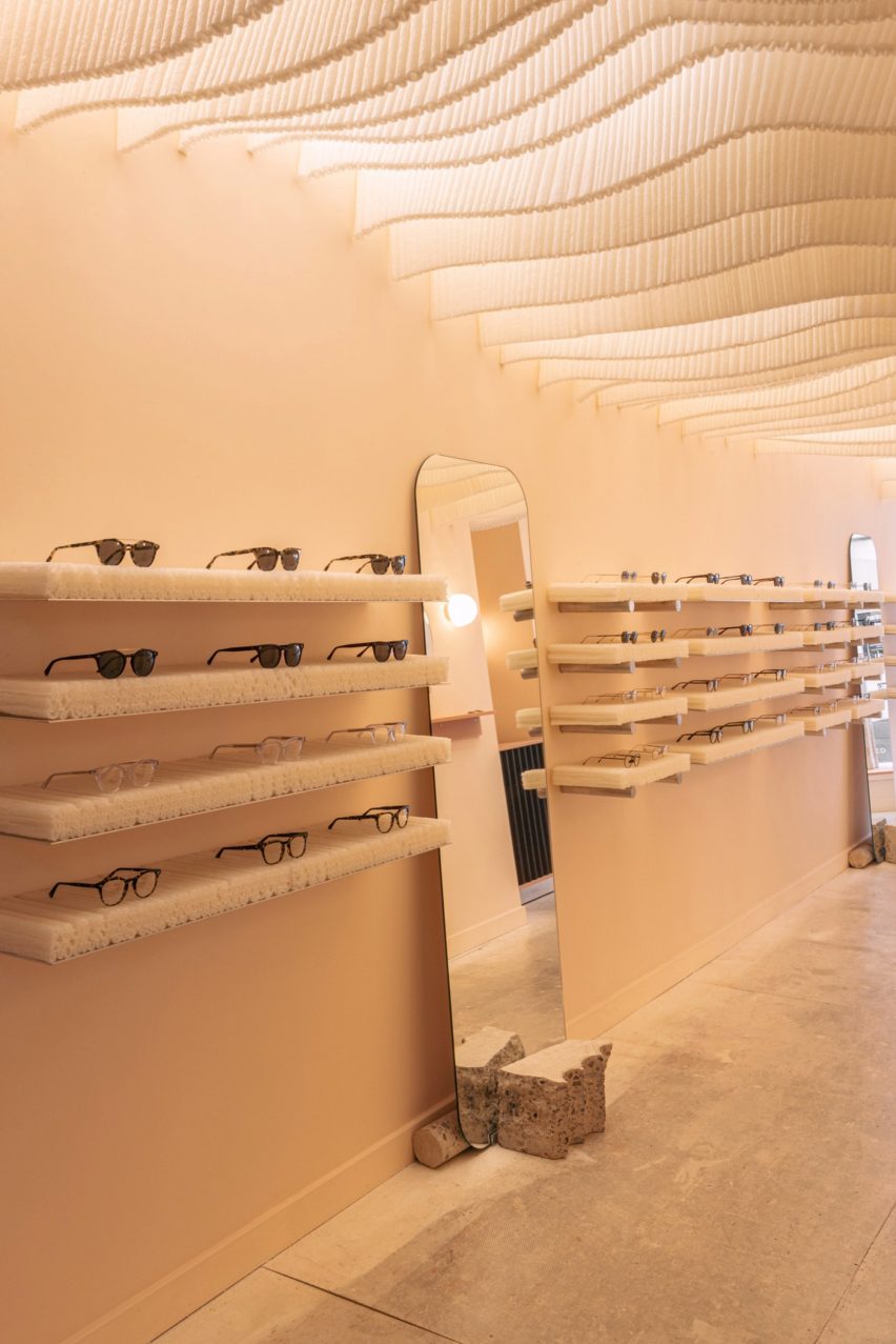
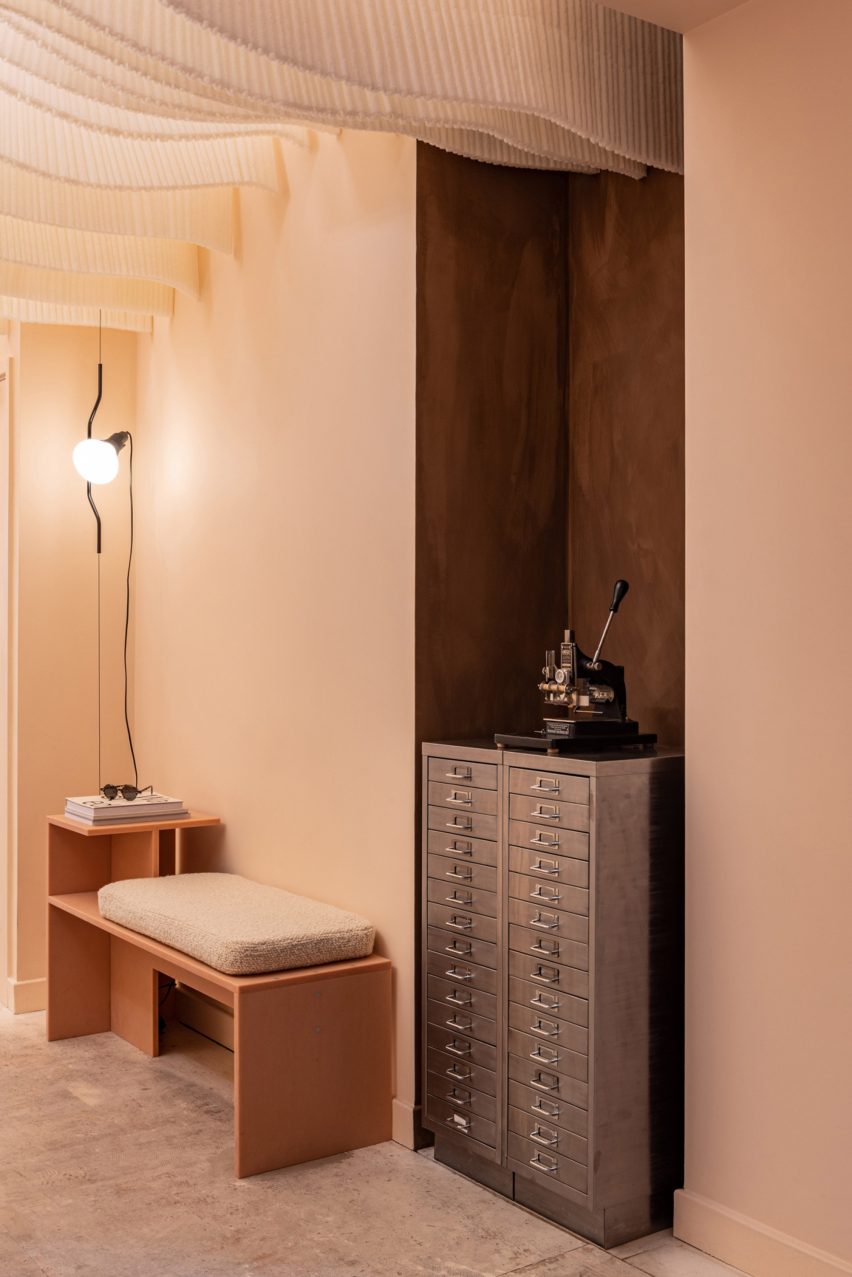
Upon entering the store, visitors find themselves under an undulating ceiling installation crafted from corrugated panels of cornstarch foam.

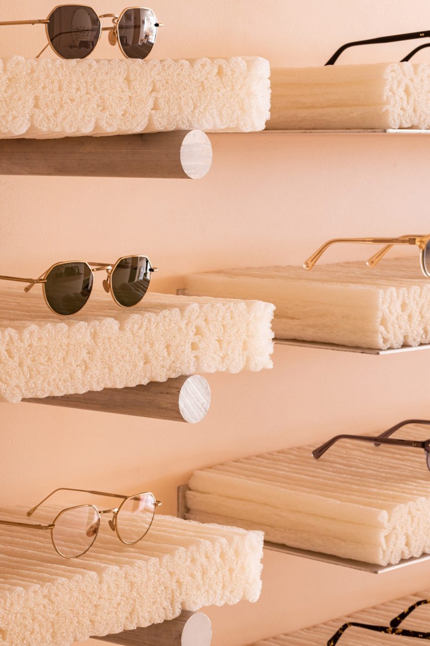
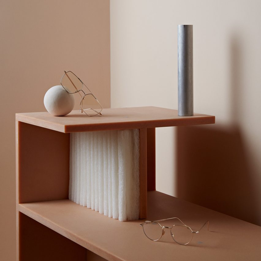
Thicker blocks of the material were used to create rows of squishy-looking shelves, which can be used for packaging or simply dissolved in water when they eventually start to show signs of wear and tear.

MONC eyewear store in Marylebone, London has shelves made from cornstarch foam
The foam was also used to form small shelves

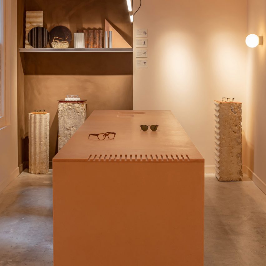
Display plinths made out of mycelium – the vegetative part of a fungus – were dotted across the store to showcase different eyewear models.

In between the shelves, a couple of long mirrors are balanced on hunks of concrete that were salvaged from roadworks nearby.

Interior of MONC eyewear store in Marylebone, London
A recycled PET island sits at the centre of the store beside mycelium display plinths

The craggy concrete was chosen as a subtle nod to the rugged Dolomite mountains, which can be seen from the Italian town where all MONC eyewear is produced.

Nina + Co worked closely alongside Welsh manufacturers Smile Plastics and London joiner EJ Ryder to design the store’s recycled PET island and bench seat, which are an apricot-orange hue.

As both furniture pieces were joined with mechanical bolts rather than glues, they can easily be taken apart, flat packed and transported to a different MONC store for reuse.

Walls throughout the interior were finished with VOC-free clay paint while the unit’s existing floor was covered with a water-based sealant.

Interior of MONC eyewear store in Marylebone, London
The plastic was also used to form a bench seat

“Previous tenants had ripped up their floor to leave a plywood subfloor, with markings of the adhesive still evident and some paint bucket outlines,” the studio explained.

“After a test patch, we were convinced that a simple water-based sealant would give it a beautiful depth and sheen with the industrial feel of concrete [while being] kinder to the planet and the budget.”

Interior of MONC eyewear store in Marylebone, London
Walls were washed with a calming clay paint

MONC is one of five projects shortlisted in the small retail interior category of this year’s Dezeen Awards.

It’s going head-to-head with the Durat showroom by Linda Bergroth, which is decked out in an unusual mix of colours, and Aesop’s Yorkville store by Odami with its oxblood-red balusters.

The photography is by Handover.

Reference

AIA Estúdio designs cave-like interior for clothing store in Rio de Janeiro
CategoriesInterior Design

AIA Estúdio designs cave-like interior for clothing store in Rio de Janeiro

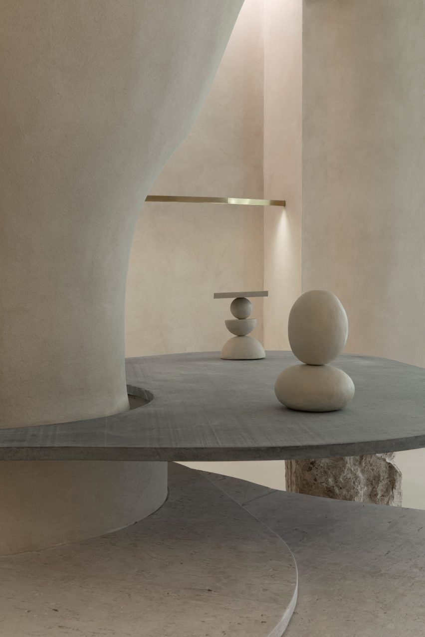
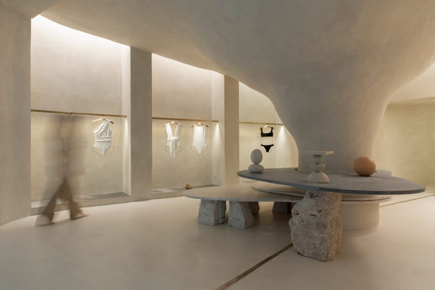
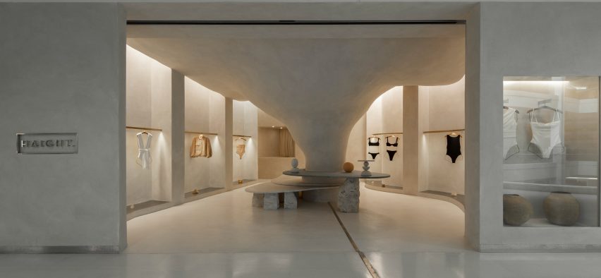
Organic shapes and stone-like surfaces characterise the interior of the Haight clothing store in Rio de Janeiro, which was designed by interior and landscaping design practice AIA Estúdio.

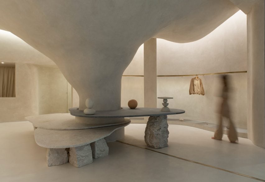
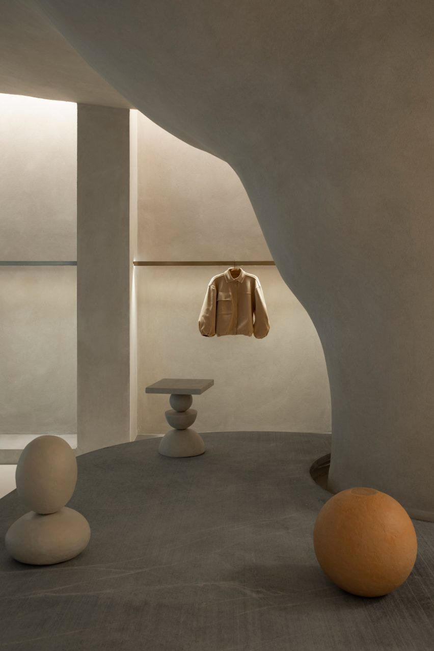
A large pillar with a rough, textured surface dominates the 110-square-metre shop interior, expanding as it ascends before merging into the ceiling to create a cave-like space.

Haight clothing store by AIA Estúdio
A pillar transforms into a cave-like structure

“Its height starts small and in the back part it ends higher in a nonlinear form, just like a cave,” AIA Estúdio founder Alice Tepedino told Dezeen.

“The infinite and diverse processes of erosion that form cliffs, caves, stalactites, sands, stones and the movements of water with its tracks and shapes led to our creative process being part of the concept developed for the store’s spatiality.”

Haight clothing store by AIA Estúdio
Stone slabs around the pillar are used to display objects

Rather than being a cumbersome obstacle, the pillar helps organise the shop’s circulation and movement of shoppers, according to the studio.

“It is from the occupation around the pillar that the space fluidity is achieved. This disposition is enhanced by curved lines that define the path inside the store,” said Tepedino.

Haight clothing store by AIA Estúdio
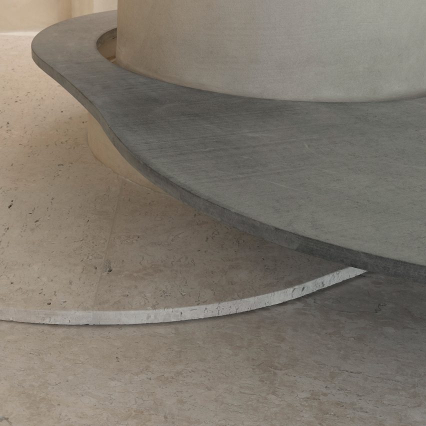
Curved stone plates balance on rocks

Slabs of soapstone and Bahia beige marble encircle the pillar at different heights and are propped up by Bahia beige marble rocks that create a display surface and a place for shoppers to sit.

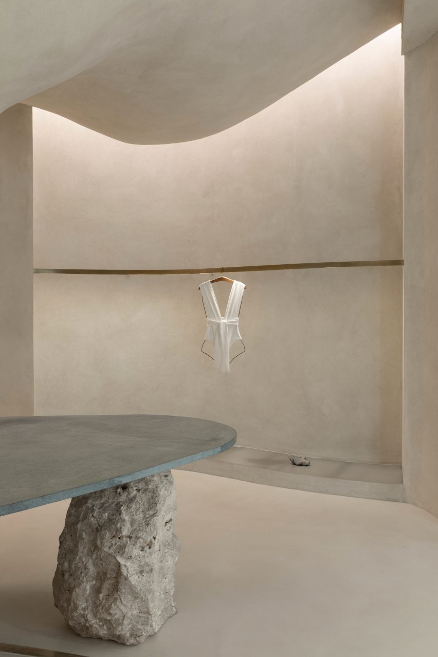
On the perimeter walls, niches with stainless steel bases display Haight’s clothing on brushed-brass rails.

The metallic surfaces and straight edges of the niches contrast with the organic shapes and materials in the centre of the shop, which is located in the Shopping Leblon retail centre.

Tepedino used indirect lighting in the niches to illuminate the space, mimicking cracks in cave walls where sunlight can seep through.

Interior of the Haight clothing store
Clothing is displayed on brushed-brass rails

“The exhibition interspace was thought of as a cut in the walls, an operation emphasised by the transition of materiality,” said Tepedino.

“Inside, there are exhibition racks in brushed brass, which, with their more solar aspect, contribute to subtly warming up the store’s ambience, together with the soapstone and its greyer tone.”

Haight clothing store by AIA Estúdio
The bottoms of wall niches are lined with steel

Tepedino’s design is the first of Haight‘s stores to be located inside a shopping centre, which prompted the designer to approach the project in a different way.

The entrance to the shop is a large opening that provides open access from the shopping centre to the nature-inspired shop interior.

Exterior of the Haight clothing store
It is the first Haight store to be located in a mall

“The design adopted a contrasting strategy between the store and mall, which, despite the rigid and controlled environment, offers opportunities such as the possibility of not having a door,” said Tepedino.

The brand’s conceptual basis is related to natural landscapes but when you are inside the mall, you find a language that is the opposite of Haight’s conceptual basis, with artificial elements and cold materiality.”

Stone surfaces at the Haight clothing store
Natural materials and surfaces were used throughout the shop interior

“Once you’re inside the store you get disconnected from the artificial atmosphere of the rest of the building,” Tepedino continued.

The project has been shortlisted in the small retail interiors category of Dezeen Awards 2022, alongside a surfaces showroom in Helsinki with colourful terrazzo-like walls and an oxblood red shop interior with walls decorated with Victorian-style balusters.

The photography is by Maira Acayaba.

Reference

AMO cocoons Jacquemus store in pillows to create “bedroom-like” interior
CategoriesInterior Design

AMO cocoons Jacquemus store in pillows to create “bedroom-like” interior

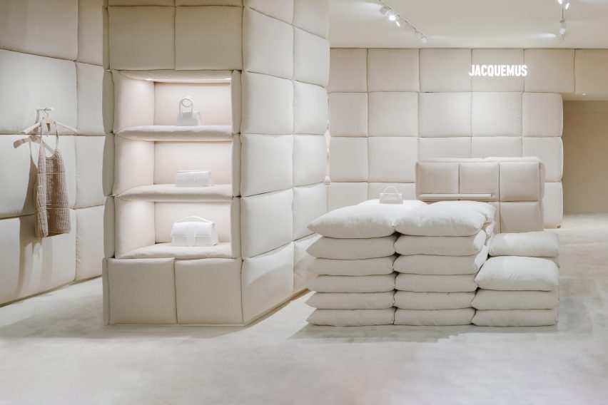
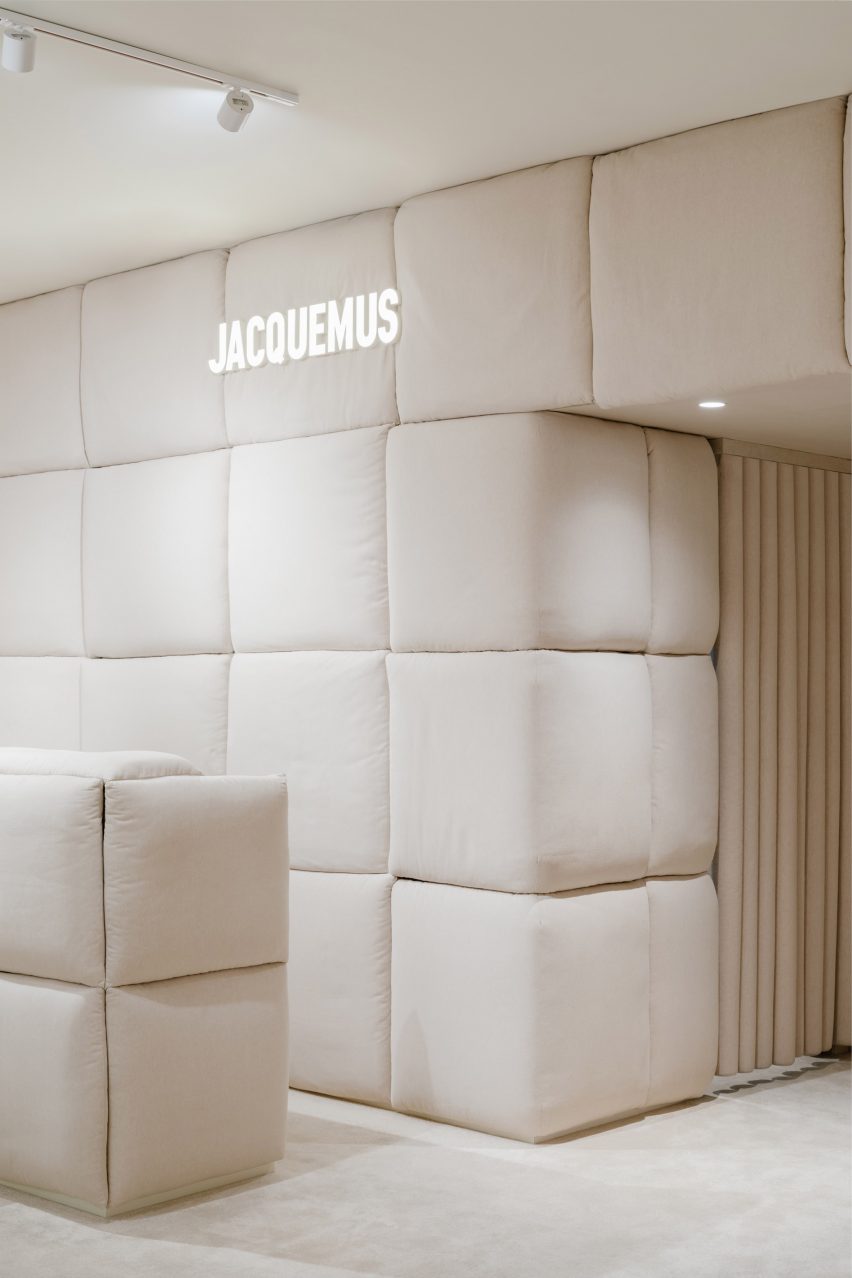
Dutch studio AMO has used pillows to form the display stands and line the walls in this tactile womenswear boutique by fashion brand Jacquemus in Paris, France.

The 60-square-metre shop, set in the department store Galeries Lafayette Haussmann, was designed to feel like a bedroom according to AMO, which is the research and design arm of architecture firm OMA.

A store interior filled with cream pillows
AMO has lined a Jacquemus store with large cream-coloured pillows

“The location of the shop within the Galleries Lafayette – without windows or daylight – led to the idea of creating a bedroom-like environment: a room entirely made of pillows,” said OMA partner Ellen van Loon.

“It is a cocooning and relaxed atmosphere, inviting customers to lounge and browse for as long as they want,” she told Dezeen.

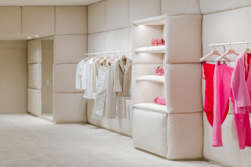
Pink and white clothes displayed in a Jacquemus store
The store is designed to feel like a bedroom

The linen pillows were designed to reference the textiles of Provence, where Jacquemus founder Simon Porte Jacquemus grew up.

“We explored a material palette that aims to capture the atmosphere of Provence,” said OMA architect Giulio Margheri.

“The fabric of the pillows is a reference to the linens of the South of France,” he told Dezeen.

Cream pillows and a Jacquemus sign
Linen pillows reference the textiles of Provence

AMO also added a stack of pillows to serve as a seating area for shoppers, as well as a spot to showcase Jacquemus’ signature tiny bags.

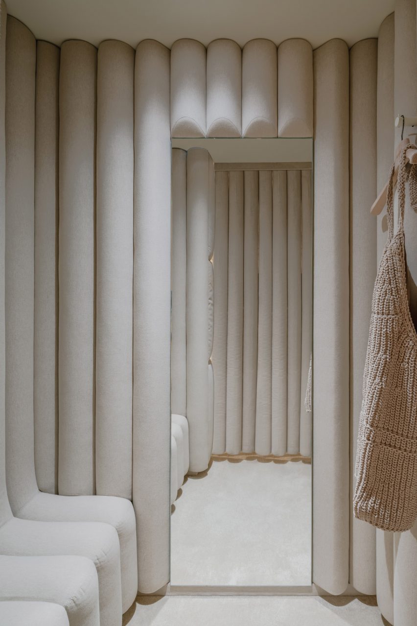
The studio completed the store’s easy-going atmosphere with the help of a stripped-back scheme, including cream-coloured carpet, soft lighting and clothing rails in a milky beige hue.

AMO previously designed another store for Jacquemus inside the London department store Selfridges. Much like the brand’s Paris outpost, the shop was wrapped entirely in a single material – clay.

“The design of the Jacquemus boutiques in London and Paris began with the idea of testing the limits of working with a single material,” Van Loon explained.

“Instead of working on the design first and deciding on the materials afterwards, we let the materials dictate their presence in the space.”

A cream coloured changing room
Changing rooms are coloured in the same creamy hue

The Jacquemus store is one of many retail interiors AMO has designed in Paris.

Among them is a pop-up shop by Tiffany & Co that showcases an array of jewellery pieces and a flagship store for clothing brand Off-White that features abstract interpretations of Parisian courtyards and flea markets.

Project credits
Partner: Ellen van Loon
Architect: Giulio Margheri
Team: Valerio Di Festa, Camille Filbien and Mattia Locci

The photography is by Benoit Florençon, courtesy of AMO.

Reference

Universal Design Studio models Biotherm’s Monaco concept store on a lab
CategoriesInterior Design

Universal Design Studio models Biotherm’s Monaco concept store on a lab

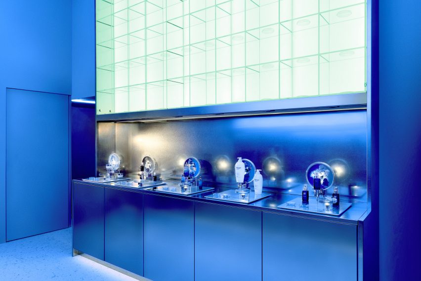
The visual language of scientific laboratories informed the look of this blue-lit concept store in Monaco, which London firm Universal Design Studio has devised for skincare brand Biotherm.

Set inside Monaco’s historic Oceanographic Institute, Blue Beauty Lab is where buyers and other industry insiders can come to expand their knowledge of the science underpinning Biotherm‘s skincare line.

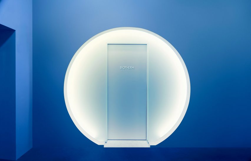
Biotherm concept store in Monaco has blue interiors with science lab-inspired details
Visitors enter the Blue Beauty Lab via a circular doorway

Although the 30-square-metre concept store showcases a selection of the brand’s products, none of them are for sale. Instead, visitors can fully immerse themselves in the experience of being in the “lab”.

“Brands are increasingly looking to physical presence for means above and beyond selling products,” explained Satoshi Isono, creative director at Universal Design Studio.

“They’re harnessing spaces to storytell their core brand messaging in unique ways and ultimately connect with customers in a more impactful way.”

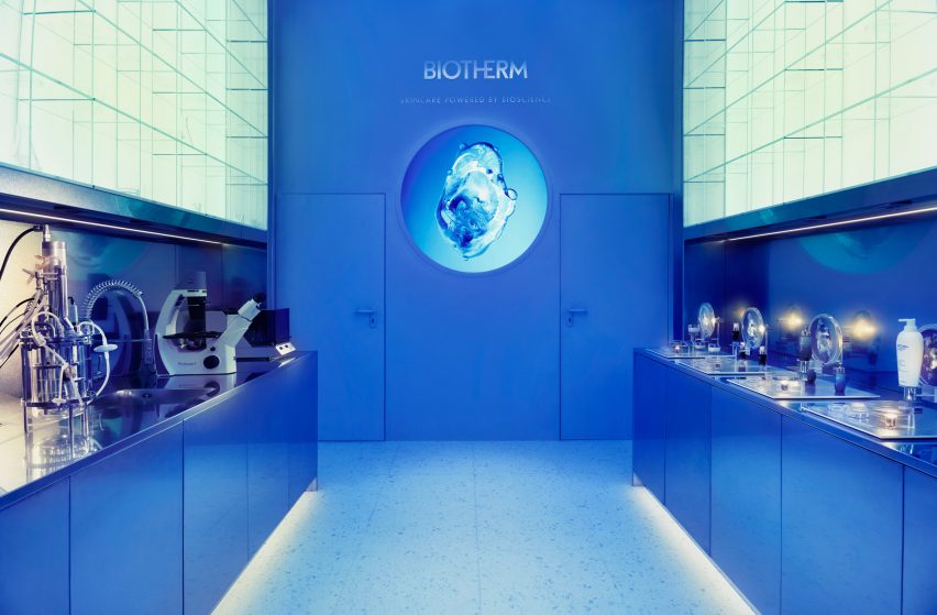
Biotherm concept store in Monaco has blue interiors with science lab-inspired details
The first section of the store is set up like a science lab

As the outer walls of Blue Beauty Lab back onto water tanks harbouring various aquatic creatures, Universal Design Studio had to keep architectural interventions to a minimum. As a result, the store’s floor plan is fairly simple.

To enter, visitors walk through a circular doorway and a short mirrored tunnel. The interior is washed in sea-blue light and split into two parts.

Biotherm concept store in Monaco has blue interiors with science lab-inspired details
Steel worktops and petri dishes add to the lab-like feel of the space

The first is an area reminiscent of a research lab that gives an insight into the production process of Life Plankton – an extract containing 35 different nutrients that Biotherm incorporates throughout some of its moisturisers, serums and skin peels.

Stainless steel counters and glass shelving units run down the sides of the space, dotted with science paraphernalia like microscopes, petri dishes, test tubes and measuring flasks.

A small workshop forms the second part of the store, centred by a round table. Directly above is a large ring light emitting a bright white glow that enhances the lab-like feel of the space.

Interactive visuals produced by multimedia design studios Superbien and AC3 Studio are projected on the surrounding walls.

Biotherm concept store in Monaco has blue interiors with science lab-inspired details
Measuring flasks and test tubes are also displayed on the shelves

The clinical aesthetic of laboratories has also inspired a number of other interiors.

Among them is a bike shop in Copenhagen by local designer Johannes Torpe and a cafe in Tokyo with a white-lacquered steel ceiling grid.

Reference

Ten homes with walk-in wardrobes that store clothes in interesting ways
CategoriesInterior Design

Ten homes with walk-in wardrobes that store clothes in interesting ways

In this lookbook, we pick out 10 home interiors that feature walk-in closets designed to provide bedroom storage that is both practical and appealing.

Walk-in wardrobes create a bespoke storage solution that is hard to achieve with standard furniture.

Often they are considered a luxurious feature used to declutter the bedroom in large houses, but as the 10 examples below demonstrate, they can also be a sleek solution for utilising dead space in smaller homes.

This is the latest in our lookbooks series, which provides visual inspiration from Dezeen’s archive. For more inspiration see previous lookbooks showcasing well-organised bedrooms, interiors with built-in furniture and homes that make a feature of their corridors.


Marine house extension designed by David Barr Architects
Photo is by Jack Lovel

Marine, Australia, by David Barr Architects

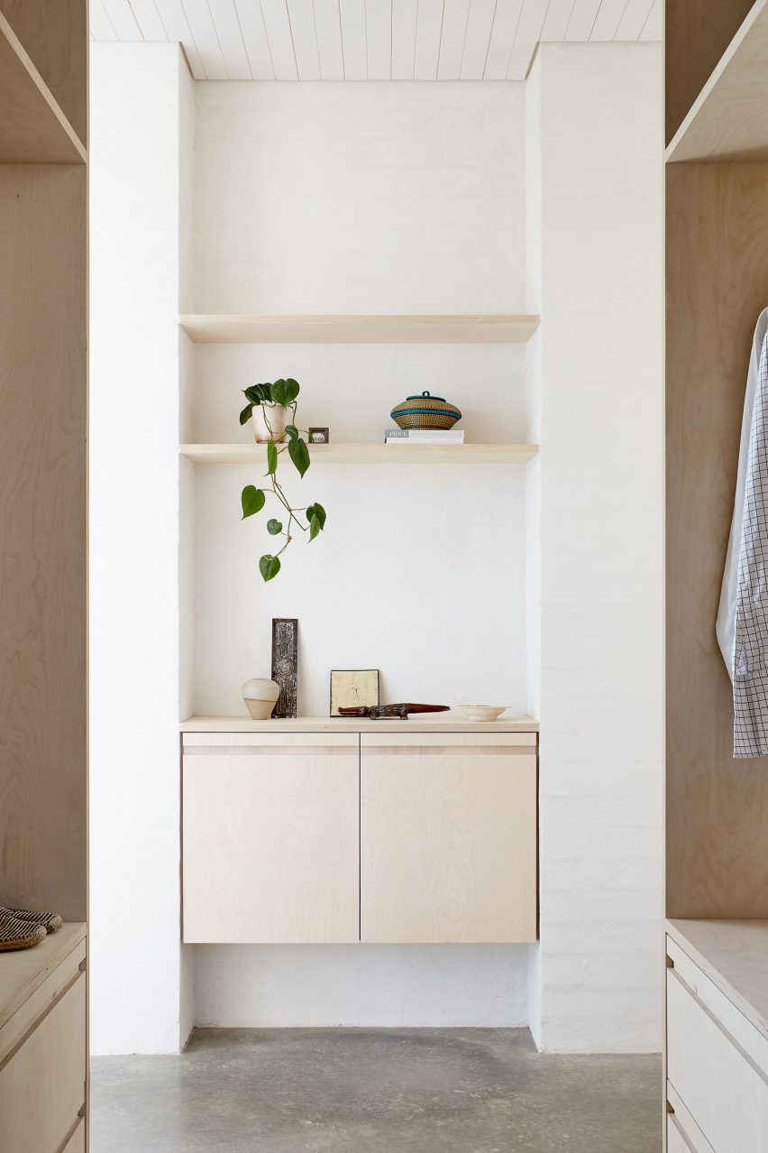
This walk-through wardrobe sits in a corridor between a bathroom and the master bedroom of a cottage near Perth.

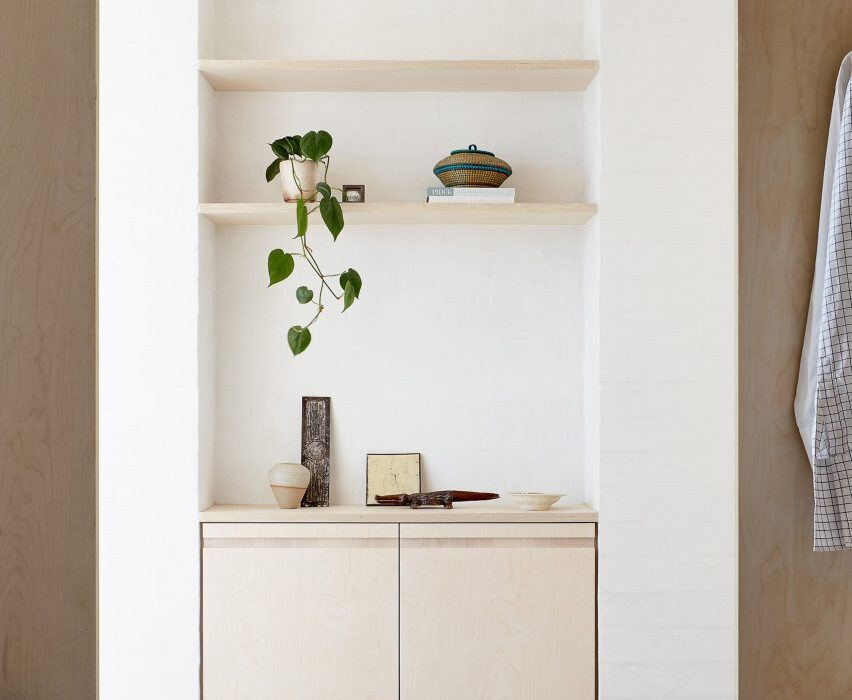
Birch-plywood storage units and concrete flooring define the wardrobe, a continuation of the materials used throughout the light and airy extension designed by David Barr architects.

Find out more about Marine ›


Walk-in wardrobe
Photo is by Roehner + Ryan

O-asis, USA, by The Ranch Mine

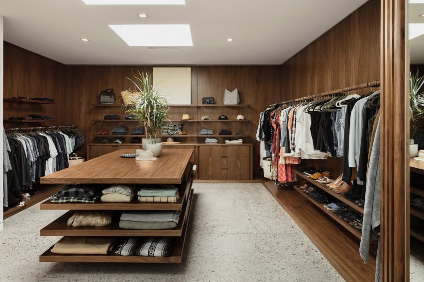
Warm-toned wood shelving and cabinetry was combined with terrazzo flooring in this enormous walk-in closet that sets out clothes like a boutique fashion store.

It flows right off from the bathroom of a large house in Arizona designed for a musician by architecture studio The Ranch Mine.

Find out more about O-asis ›


Bedroom of Botaniczna Apartment by Agnieszka Owsiany Studio
Photo is by Pion Studio

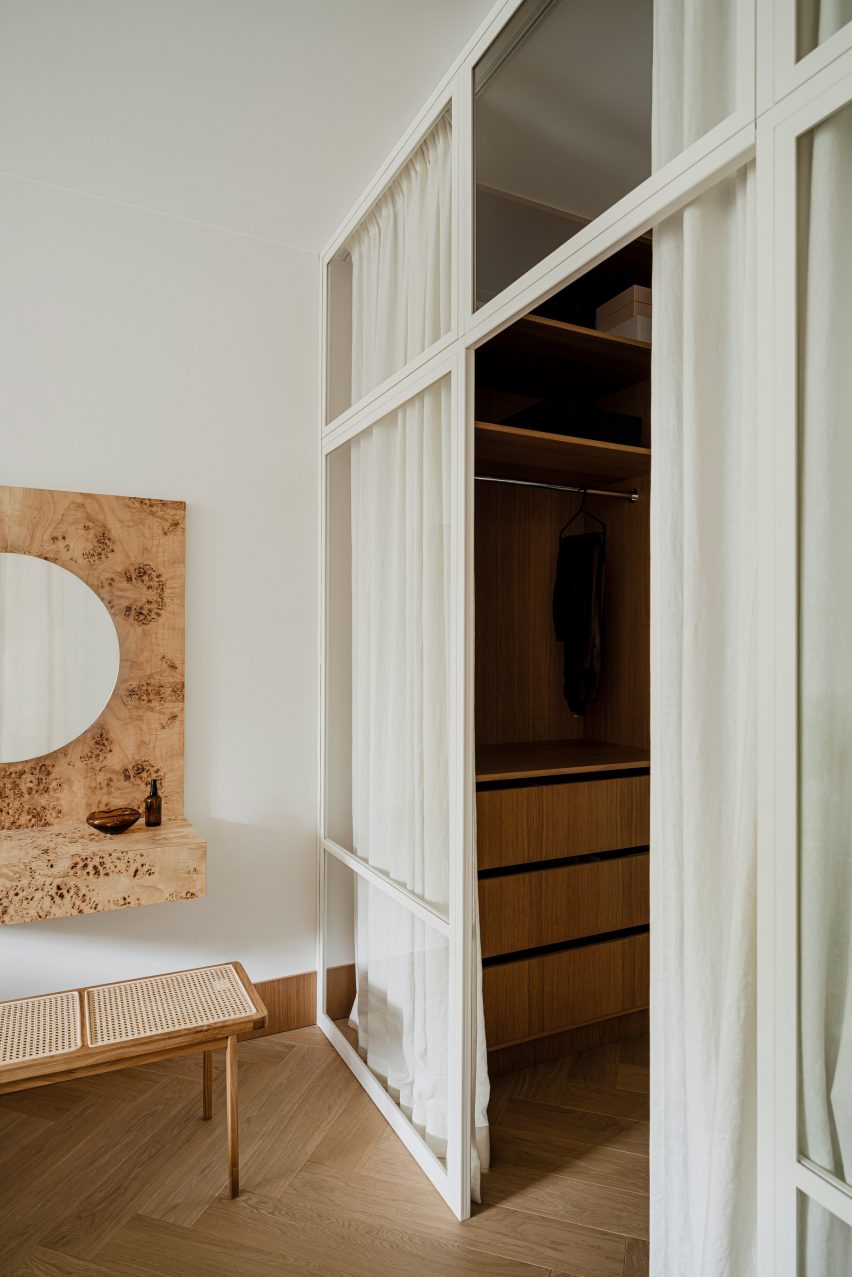
Botaniczna Apartment, Poland, by Agnieszka Owsiany Studio

A linen-curtain screen tidily obscures the walk-in wardrobe in this Poznań apartment designed by Agnieszka Owsiany Studio.

The elegant and delicate aesthetic of the curtains contributes to the calming atmosphere the studio sought to create, as well as helping to offset the adjacent burl-wood vanity desk that acts as the bedroom’s feature element.

Find out more about Botaniczna Apartment ›


Apartment by Studio Noju
Photo is by Studio Noju

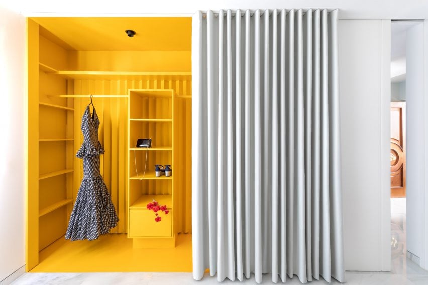
Casa Triana, Spain, by Studio Noju

Studio Noju used a floor-to-ceiling curtain to create a walk-in wardrobe in the main bedroom of this renovated apartment in Seville.

The studio used a bright yellow paint for the wardrobe that contrasts with the monochrome curtain and surrounding walls, adding to the sense of theatre and surprise when the drape is drawn back.

Find out more about Casa Triana ›


Apartment in Estrela by Aurora Arquitectos
Photo by Do Mal o Menos

Apartment in Estrela, Portugal, by Aurora Arquitectos

A small, triangular room in this old Lisbon apartment was converted into a walk-in closet as part of a revamp by Aurora Arquitectos.

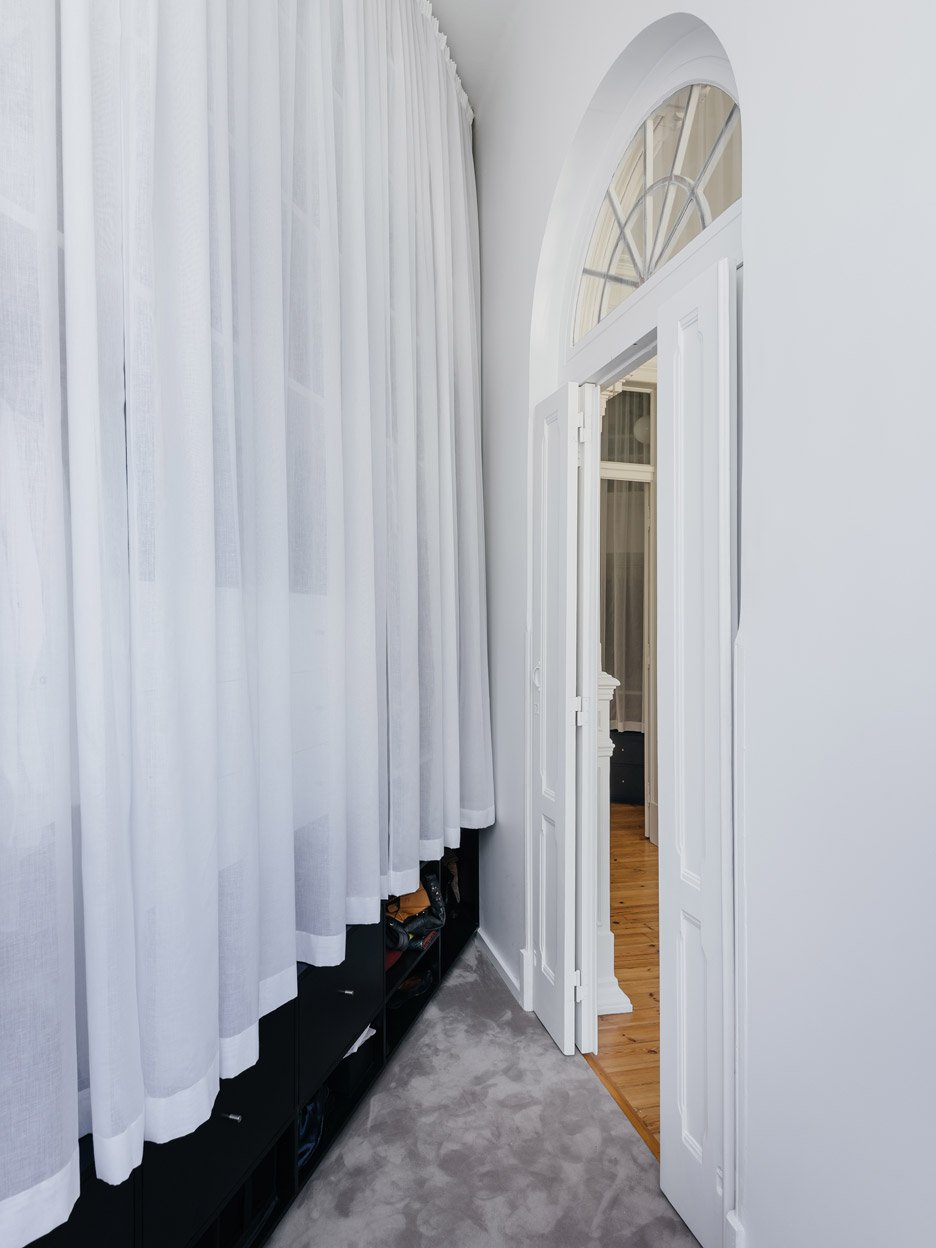
White curtains cover a storage unit that runs along the longest wall of the wardrobe, which is provided with natural light by glazing above an arched doorway.

Find out more about Apartment in Estrela ›


House H in Taiwan designed by KC Design Studio
Photo is by Hey! Cheese

House H, Taiwan, by KC Design Studio

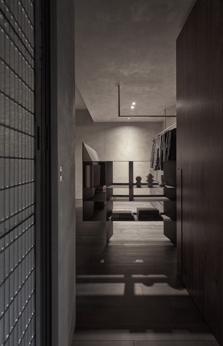
This basement apartment in Taipei was given a moody colour palette and raw textures in an overhaul by KC Design Studio.

That theme was continued in the walk-in wardrobe off the master bedroom, which acts as a dressing area between an en-suite bathroom and a private lounge.

Find out more about House H ›


Hubert by Septembre Architecture
Photo is by David Foessel

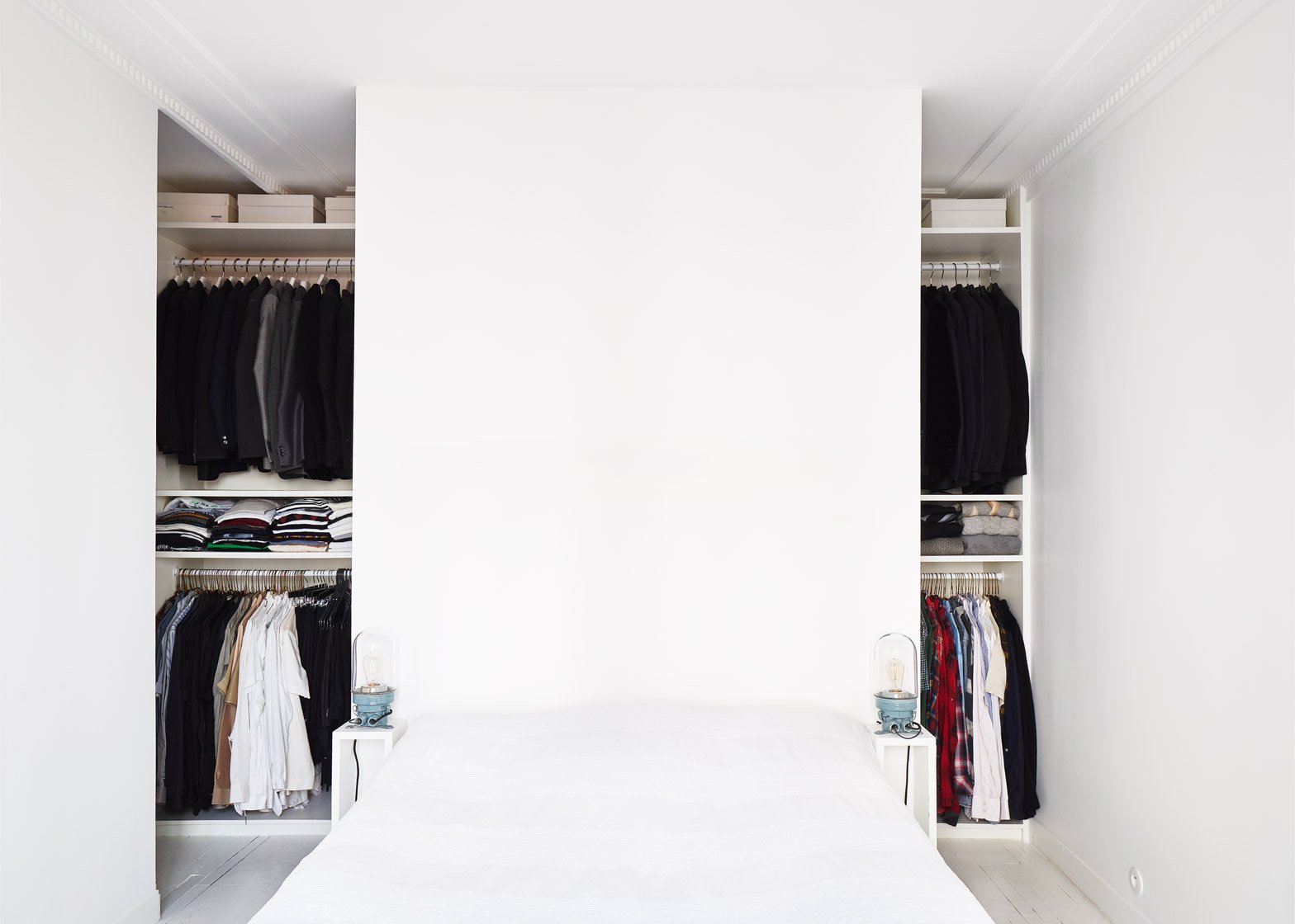
Hubert, France, by Septembre

Embedded within a modestly sized Paris apartment renovated by architecture studio Septembre, this walk-in closet is an example of clever utilisation of space.

A wall behind the bed forms a partial division, allowing for generous clothing storage while retaining the room’s overall proportions.

Find out more about Hubert ›


The Magic Box Apartment Raúl Sánchez Architects
Photo is by José Hevia

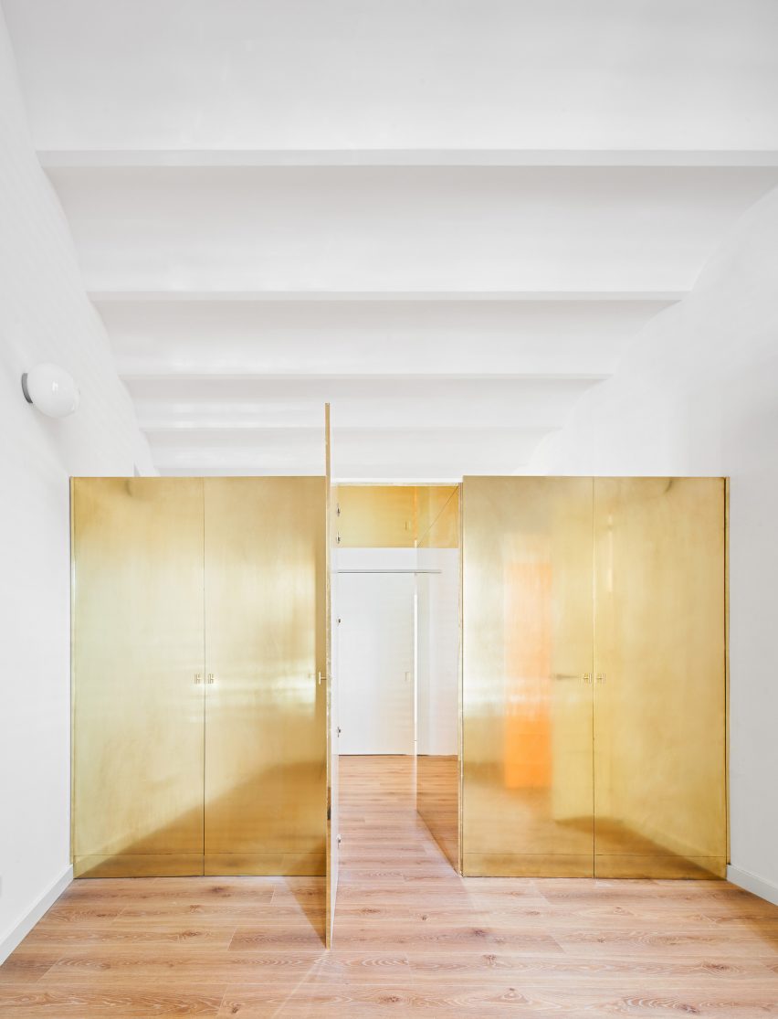
The Magic Box Apartment, Spain, by Raúl Sánchez Architects

This apartment near Barcelona, designed by Raúl Sánchez Architects, takes the concept of a walk-in wardrobe to a new level.

Aptly called The Magic Box Apartment, it features a shiny brass wardrobe that divides two bedrooms instead of a traditional partition wall, which can be passed through like a secret passageway.

Find out more about The Magic Box Apartment ›


RL House Renovation by Diego López Fuster Arquitectura
Photo is by Pablo Pacheco

RL House Renovation, Spain, by Diego López Fuster Arquitectura

Diego López Fuster Arquitectura opted to give the bedroom of this Alicante a generous walk-in wardrobe that acts as a full dressing area.

Rather than being hidden or tucked away, its wide proportions help to make the relatively long and narrow bedroom feel more spacious.

Find out more about RL House Renovation ›


Casp21 by Bonba Studio
Photo is by José Hevia

Casp21, Spain, by Bonba Studio

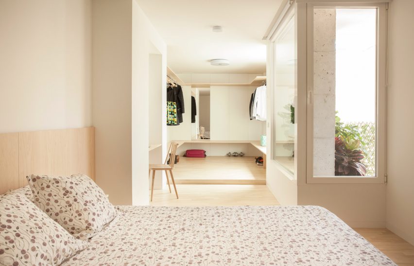
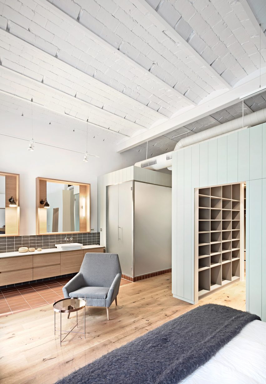
Green-panelled wood boxing encloses a sizeable walk-in wardrobe in the corner of this bedroom in a converted office building in Barcelona.

Through this intervention, Bonba Studio maximised the feeling of brightness and spaciousness in the room, as well as ensuring that the full impact of the traditional vaulted ceiling was maintained.

Find out more about Casp21 ›

This is the latest in our series of lookbooks providing curated visual inspiration from Dezeen’s image archive. For more inspiration see previous lookbooks showcasing well-organised bedrooms, interiors with built-in furniture and homes that make a feature of their corridors.

Reference

Balenciaga opens smoked-glass couture store beneath historic atelier in Paris
CategoriesInterior Design

Balenciaga opens smoked-glass couture store beneath historic atelier in Paris

Fashion house Balenciaga has opened a couture store with smoked-glass-panelled walls in the same building as its original couture salon in Paris.

The store is located beneath Balenciaga‘s historic atelier at 10 Avenue George V, which was recently renovated to exactly replicate the interior of the original couture salon that was first opened in 1937.

Interior image of Balenciaga's Couture Store in Paris
The interior of the store was clad in tinted glass

“The newly renovated space at 10 Avenue George V is dedicated to preserving Balenciaga’s heritage in its original couture location, first opened in 1937, as well as creating a couture for today,” said the brand.

The design of the store beneath the couture salon was created by long-time Balenciaga collaborator Sub, a Berlin-based architecture studio that was founded by Niklas Bildstein Zaar and Andrea Faraguna.

Interior image of a smoked-glass changing room at Balenciaga's Couture Store
The store is located in the same building as Balenciaga’s original couture salon

The boutique’s exterior is marked by oversized serif Balenciaga signage, a nod to Balenciaga’s 20th-century branding that also forms a distinction from the narrow, sans serif typeface that currently identifies the brand.

Beneath the signage, four arched openings frame swooping curtains that are given a golden hue by the brown-tinted glazing.

Interior image of a grey-hued fitting room at the Balenciaga Couture Store
Grey curtains zone spaces throughout the store

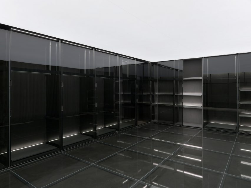
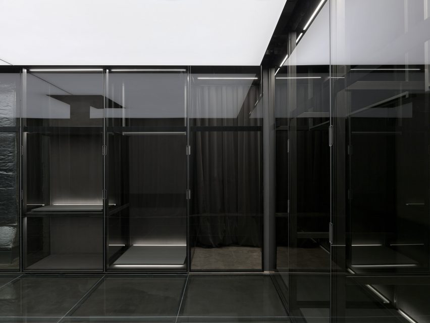
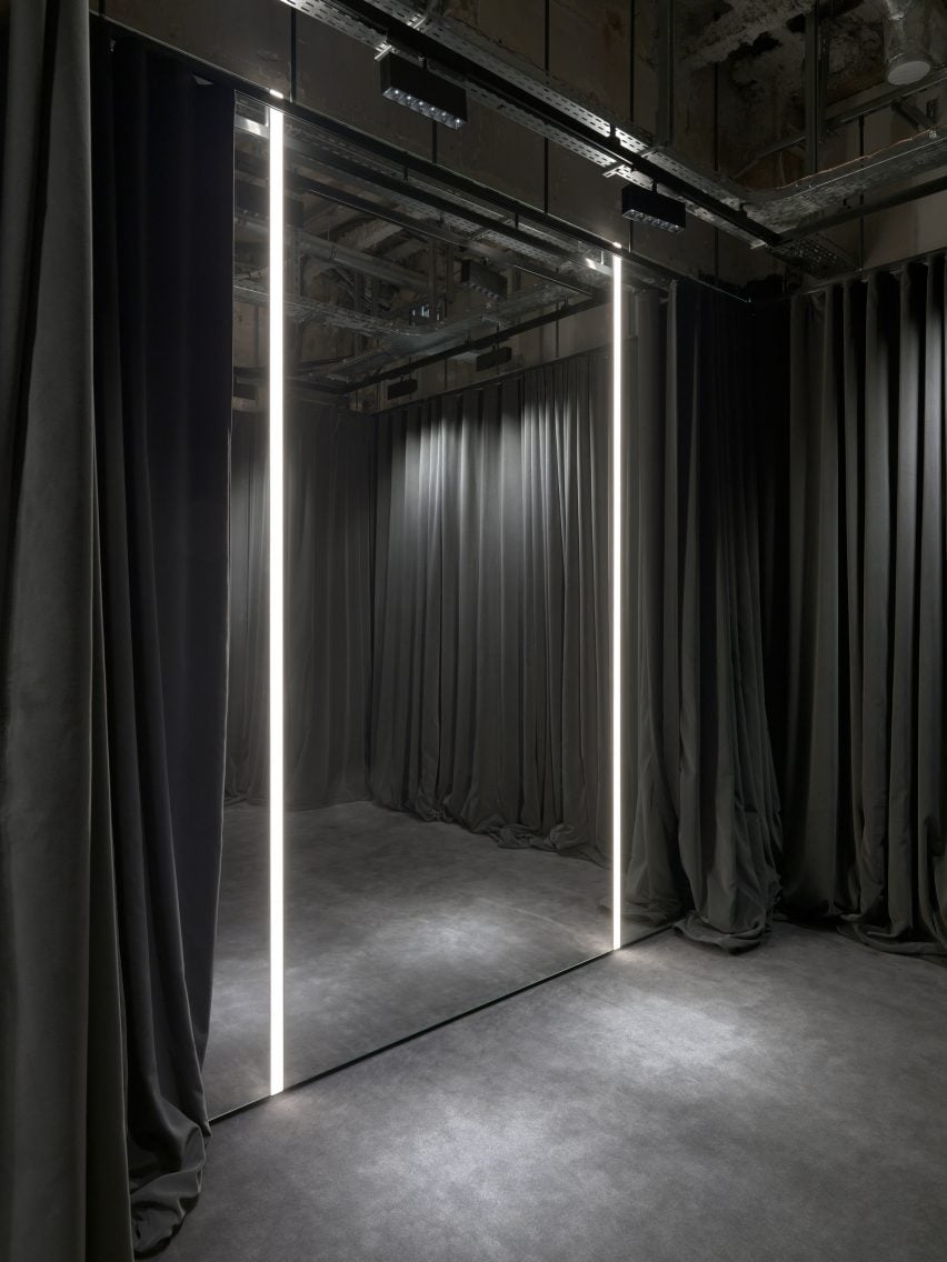
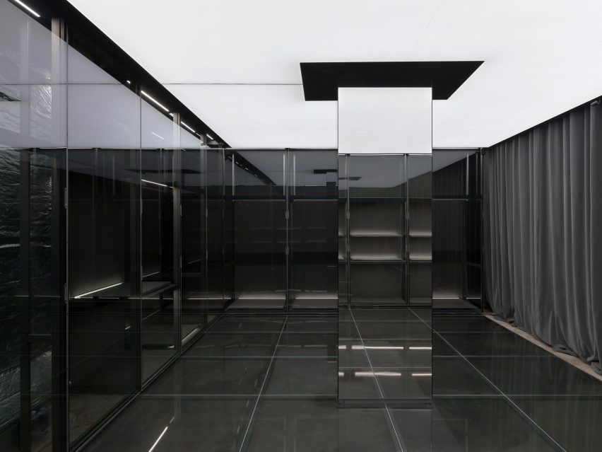
The interior of the couture store echoes Balenciaga’s raw architecture concept, which was applied internationally across the interior of its stores, but this edition has been clad in panels of tinted glass instead of concrete.

Between the unfinished but glass-clad walls, ash-hued curtains conceal carpeted areas while wrinkled-leather ottomans were placed throughout the two-storey store.

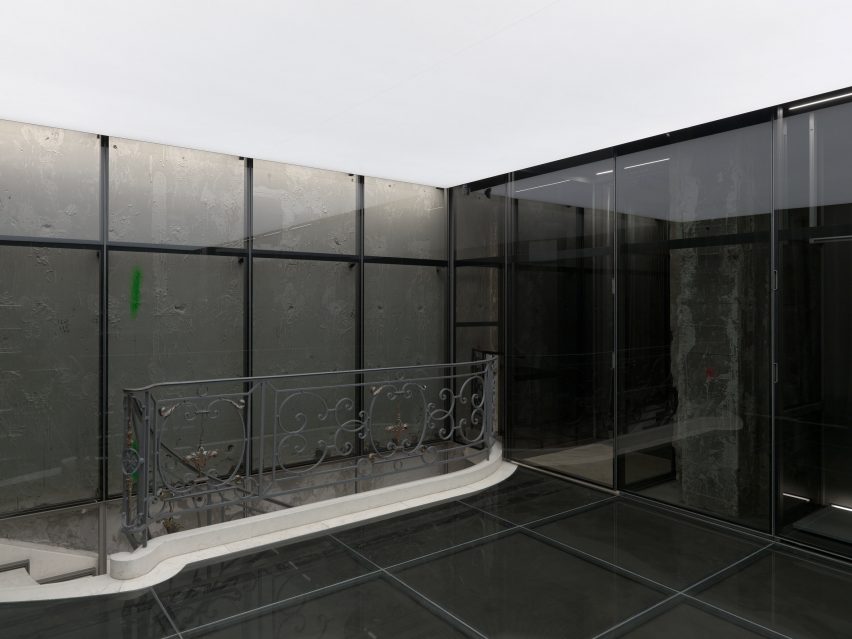
Wrought iron balustrades and a curving marble staircase, with glass panelling slotted around it, hint at the building’s history and the former decor and interior scheme of the atelier above.

“The concept of the couture store is a gateway to couture, which remains a very closed universe, especially for new generations,” said Balenciaga CEO Cédric Charbit.

Interior image of the first floor of the Balenciaga Couture Store
Remnants of the store’s history were incorporated into the design

“In this new store, products, made-to-measure services and retail excellence are a reinvention of the Balenciaga client experience,” said Charbit.

“It is exciting to be able to present this level of craft, creativity and made-in-France savoir-faire in our historical address.”

Image of the interior with mirrors surrounding the store's columns and supports
Balenciaga’s couture atelier is located above the store

Metal shelving was decorated with couture items, ranging from artisanal to technological, from the brand’s most recent Autumn Winter 2022 couture show.

Items on display include its speaker bag, which was created in collaboration with Danish audio brand, Bang & Olufsen.

Earlier in 2022, Balenciaga wrapped its Mount Street store in London in a bright pink faux fur to celebrate its Le Cagole bag.

Photography is courtesy of Balenciaga.

Reference

Wooden wind turbines store carbon
CategoriesSustainable News

Wooden wind turbines store carbon

Spotted: Today, most wind turbine towers are made of tubular steel. But a partnership is promoting a surprising alternative: wood. Laminated veneer lumber (known as ‘LVL’) is a material made up of stacked layers of thin wood. Pound for pound it is stronger than steel, and Finnish LVL producer Stora Enso is teaming up with Modvion – a company that uses the engineered wood product to make next-generation turbine towers.

Modvion’s towers are built in lightweight modules. This approach has two key benefits from an engineering and construction perspective. First, the modular design makes it possible to build taller towers that can reach stronger winds, leading to more cost-efficient energy production. And second, the modules can be easily transported on public roads – without the need for permits or road reconstructions.

But perhaps the most compelling reason for making the switch from steel to LVL is the sustainability benefits of using a wood-based material. Wood is a renewable resource, and using it reduces the carbon dioxide emissions associated with the turbine tower by 90 per cent. Moreover, using wood as a construction material locks away the carbon dioxide absorbed by the tree during its lifetime for the long term.

“The commitment of Stora Enso to replace fossil-based materials with renewables is a perfect match for Modvion,” explains Otto Lundman, CEO of Modvion. “To solve the climate crisis, we need more renewable energy as well as increased use of sustainable, wooden constructions,” he adds.

Springwise has spotted several recent innovations that use wood as a construction material. These include a skyscraper made from cross-laminated timber, a wall system made from waste wood, and engineered wooden walls strong enough to replace all above-ground steel and concrete.

Words: Matthew Hempstead

Email: info@modvion.com

Website: modvion.com

Reference

Daytrip channels Margate beach in revamped Turner Contemporary store
CategoriesInterior Design

Daytrip channels Margate beach in revamped Turner Contemporary store

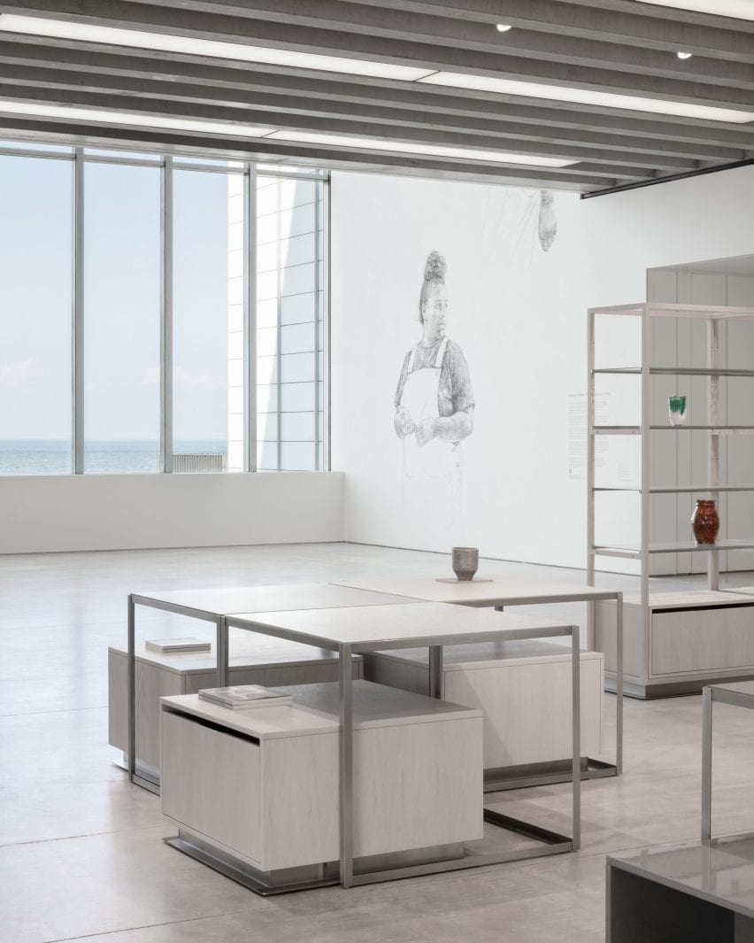
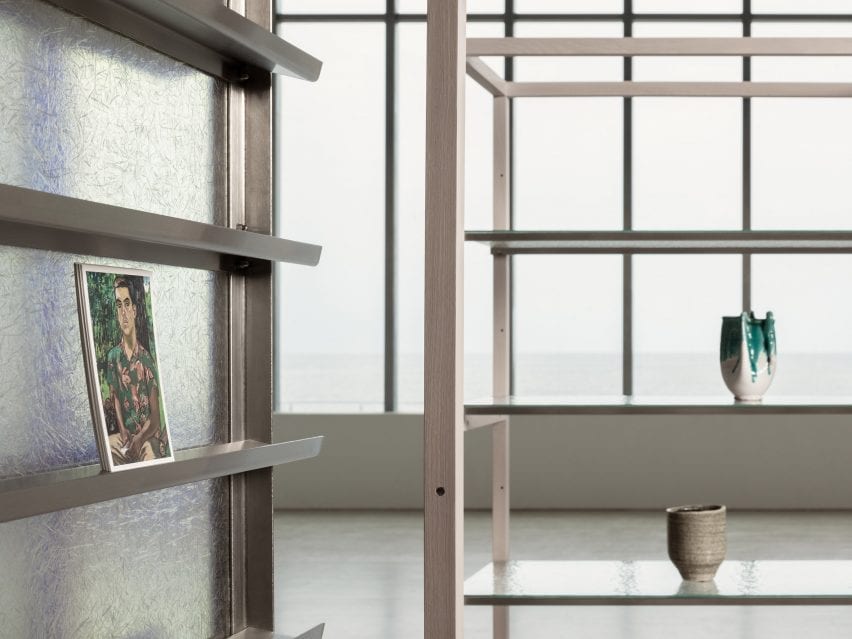
Design studio Daytrip looked to Margate’s dramatic beach landscape when designing this shop for the Turner Contemporary gallery, which sits perched on the town’s seafront.


The David Chipperfield-designed gallery, distinguished by its opaque glass shell and expansive ocean views, recently reopened after a renovation project that included the shop along with a new cafe and common areas.

Store with panoramic view of ocean and vases on display shelves in interior designed by Daytrip
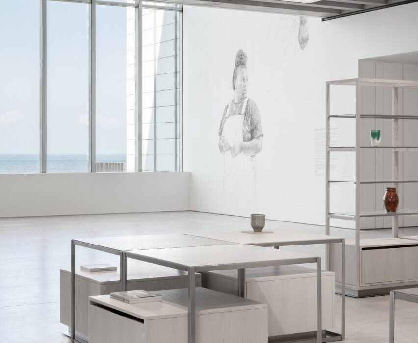
The revamped Turner Contemporary store looks out over Margate beach (top and above)

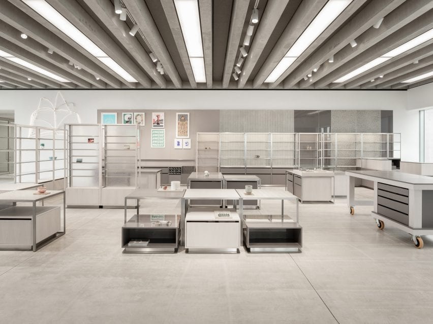
Located in the lobby, the shop’s existing retail shell was designed to be highly flexible and to reflect the building’s gallery spaces, with poured screed flooring, linear glazing and a prominent ribbed concrete ceiling.

Daytrip designed a new fit-out for the store that reflects both the building’s architecture and the lifelong admiration that the gallery’s namesake, landscape painter JMW Turner, held for Margate and its surrounding landscape in southern England.

Interior of Turner Contemporary
Pigment-dyed timber panels were inspired by Margate beach

“As we began putting materials together for the scheme, we wanted to capture the light and patterning of the beach,” Daytrip studio co-founder Iwan Halstead told Dezeen.

“Margate beach and its seafront changes dramatically from season to season. As the tide pushes out, the beaches transform into radical landscapes of striation and patterning,” he added.

“On a sunny day, the rippled beaches are captured with shadows and glistening pools of water. We also noticed the effect of the salt spray and rainwater on the metal architectural elements – a dappled weathering effect that adds natural patina and cloudy lustre to the exterior.”

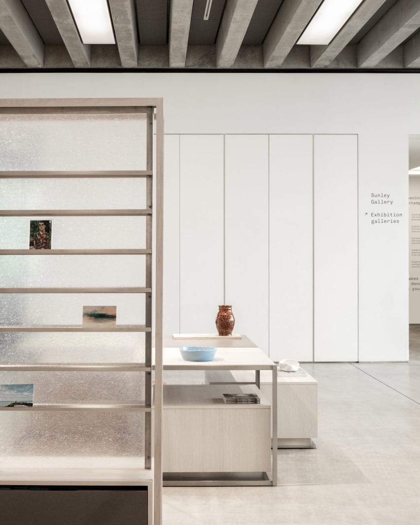
Magazine display and low tables with vases in Turner Contemporary Store
Display stands are backed with clear, textured fibreglass

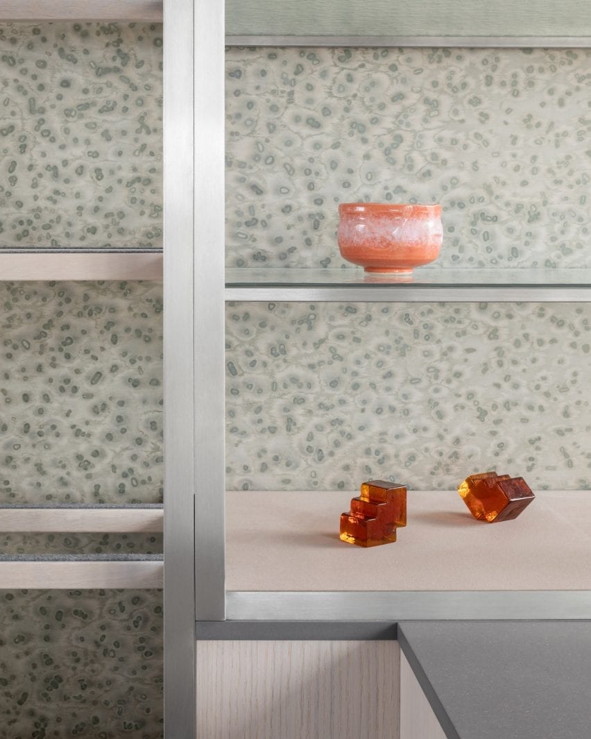
This natural texture is referenced in the mottled grey veneer panels that line a portion of the walls.

Their unique, painterly pattern was created using a method developed by Berlin studio Llot llov, which involves covering pigment-dyed timber with salt crystals that absorb a portion of the colour.

“It felt naturally appropriate and subtle enough to line the display wall of the gallery and a number of the tables’ surfaces,” said Halstead.

“We paired this with textured cathedral glass shelving, chosen for its fluid, water-like appearance that allows light to transfer dappled shadowing on the veneered surfaces and the existing Chipperfield concrete floor.”

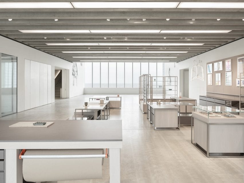
Overview of shop interior by Daytrip with simple grey display tables
All of the elements in the store can be moved to make space for events

A vertical shelving system, which showcases artworks, prints and posters, is backed with a translucent layer of fibreglass.

“Its inherent gossamer nature when illuminated by the sunlight creates beautiful patterning and highlights its fibrous textures – cloudy and ethereal – like many of JMW Turner’s artworks,” Halstead explained.

The store’s furniture was constructed from “humble” materials such as grey Valchromat – a wood fibreboard that is treated with several coats of lacquer to create a high, reflective sheen. This is paired with matt, white-oiled oak, which the studio chose for its sandy hue.

Fibreglass-backed shelf displaying artwork in Turner Contemporary Store
Rippled glass shelves reflect the light streaming in through the panoramic windows

Daytrip’s renovation also includes the creation of a merchandising system based on the approach of a magazine editorial.

The display tables and plinths can be organised into formations that create narratives with and around the products, linking back to Margate’s wider creative community and its makers.

Shop interior by Daytrip with low display tables and a row of shelves
The building’s ribbed concrete ceiling is left exposed

The display system also includes a workbench that is used for group discussions and workshops and invites visitors to congregate. All of the fixtures can be moved to accommodate large-scale events and talks.

Previously, Daytrip has created an eclectic office for a media company in London’s Clerkenwell and renovated a five-storey townhouse in Clapton.

Photography is by Ståle Eriksen.


Reference