Halleroed inserts sculptural travertine plinths in Axel Arigato’s Paris store
CategoriesInterior Design

Halleroed inserts sculptural travertine plinths in Axel Arigato’s Paris store

Design studio Halleroed has used travertine podiums to display sneakers like sculptures in the Paris store of streetwear label Axel Arigato.


Located in the Marais district on Rue Vieille du Temple, the boutique stocks the brand’s full range of footwear, clothing and accessories, in addition to a curated selection of design objects.
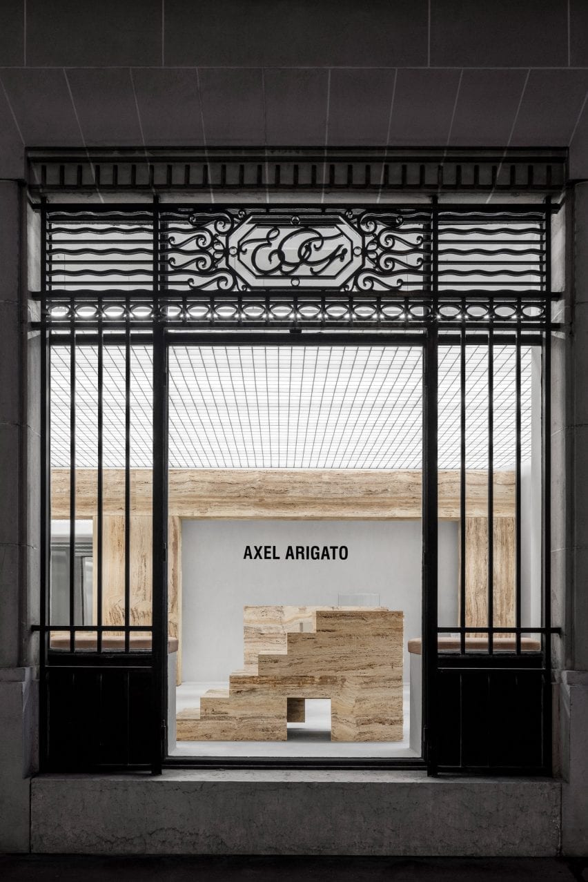
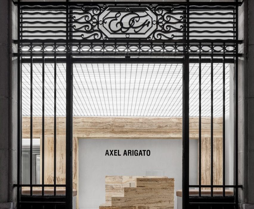
Entrance to Axel Arigato Paris store with travertine displays
Axel Arigato’s Paris store is dotted with travertine display plinths

The store occupies two rooms divided by a freestanding wall of light-yellow travertine, which references the columns and beams found in classical architecture.

Walls and floors are finished in raw concrete while overhead, a punctured grid ceiling conceals the store’s lighting system.

A series of sculptural display plinths made from honed, bush-hammered or raw travertine stone help to create a “grandiose” entrance, designed to emulate the feeling of stepping into an art gallery.
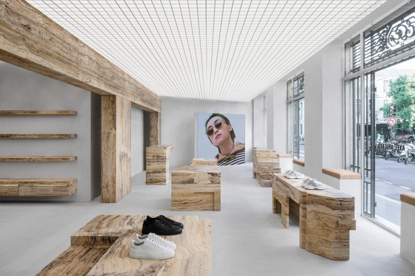
Retail interior by Halleroed with shoes displayed on travertine blocks
A freestanding travertine wall divides the space into two

“The normal model for a sneaker brand is to cover every centimetre of the back walls in products from floor to ceiling,” Axel Arigato‘s co-founder and creative director Max Svärdh told Dezeen.

“We do the opposite by displaying our product on podiums in the centre of the room instead, like a piece of sculpture.”
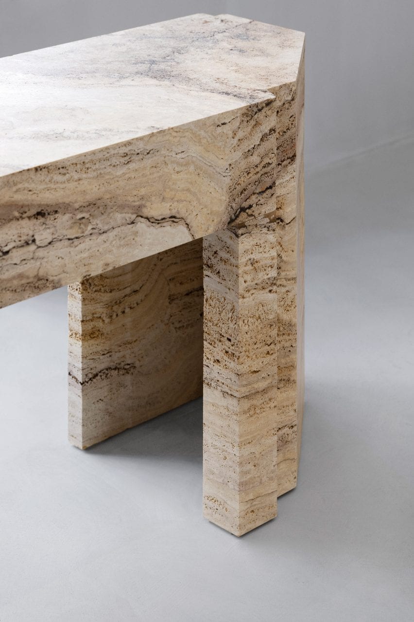
Close-up of travertine stone table in Axel Arigato Paris store
The stone was hammered, honed or left raw

Travertine was also used to form a series of shelves in the rear of the store and custom chairs in the dressing room.

According to Svärdh, the stone has been a key element in all of Axel Arigato’s retail locations so far.
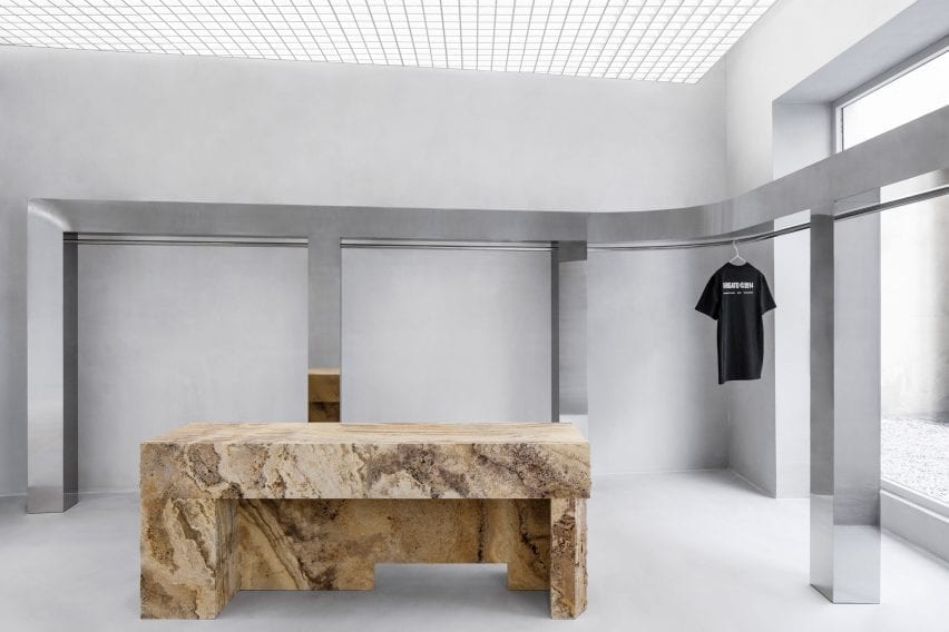
Mirroed steel clothes rail in retail interior by Halleroed
A mirrored steel clothes rail wraps the back of the store

“Our brand colour is a pale yellow so we were naturally drawn to the light yellow travertine,” he explained.

“We worked with different finishes to bring out its characteristics and more specifically highlight its impurities, which in itself makes it more beautiful.”

To contrast with the travertine, Halleroed wrapped an upholstered bench seat around one of the columns and introduced a chunky, stainless steel clothes rail.

This lines the store’s back wall and extends out into a courtyard filled with white gravel.

Travertine wall, mirrored clothes rail and upholstered bench in Axel Arigato Paris store
An upholstered bench is wrapped around a central column

Axel Arigato was launched in 2014 as an online store for luxury streetwear. It opened its first brick-and-mortar space in London’s Soho in 2016 and has since expanded into four standalone spaces.

“We always look to the neighbourhood and the specific building that we are in [when designing a store],” Svärdh said.

“Paris is the home of luxury and the use of rich travertine stone really embodies that. All standalone stores have a gallery-esque feeling to them with mutual design codes but offer completely unique experiences.”
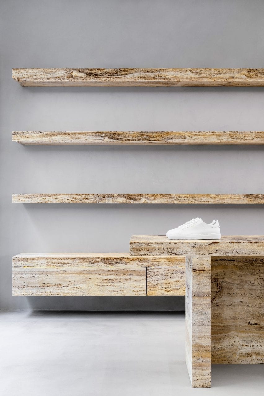
White sneaker on travertine shelves in retail interior by Halleroed
The displays are designed to exhibit trainers as if they were sculptures

A large freestanding LED screen is used for displaying creative content in the Paris store.

The brand has previously worked with Halleroed – founded in 1998 by Christian and Ruxandra Halleroed – on its London, Stockholm and Copenhagen flagship stores, which all feature monochromatic colour palettes and concrete surfaces.

Photograhy is by Benoit Florençon.

Reference

Vision Studio conceals “jewel-like” store behind perforated metal facade
CategoriesInterior Design

Vision Studio conceals “jewel-like” store behind perforated metal facade

Cool-toned industrial materials such as aluminium and concrete are paired with marble surfaces and translucent pastel shelving in this eyewear store in Melbourne, Australia.


Designed by local firm Studio Edwards, the first flagship store by optometrist Vision Studio is housed in a shopping centre in the city’s Glen Waverley suburb.

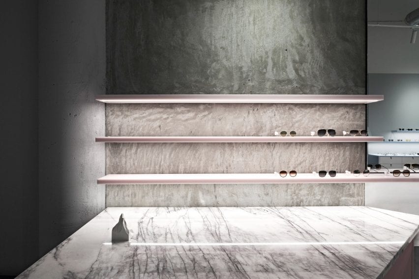
Transluscent pastel pink sunglasses displays with marble counter in retail interior by Studio Edwards
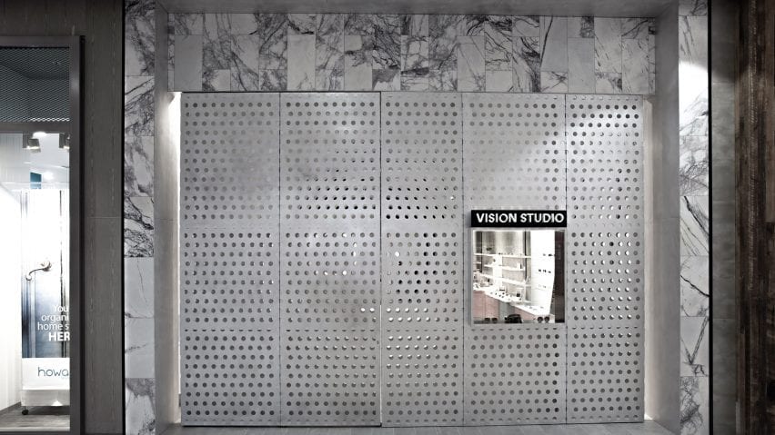
Vision Studio’s perforated aluminium facade (top image) hinges open to reveal a jewel-like interior (above)

Half of the store’s 3.6-metre-high perforated aluminium facade hinges open to reveal what the studio describes as a “jewel-like” interior, framed by marble tiles that contrast with the raw concrete of the existing shell.

Inside, Studio Edwards set out to create a space reminiscent of a gallery, including enough display space for 200 spectacles and storage for an additional 800 pairs alongside three consultation rooms with waiting areas and a staff and store area.

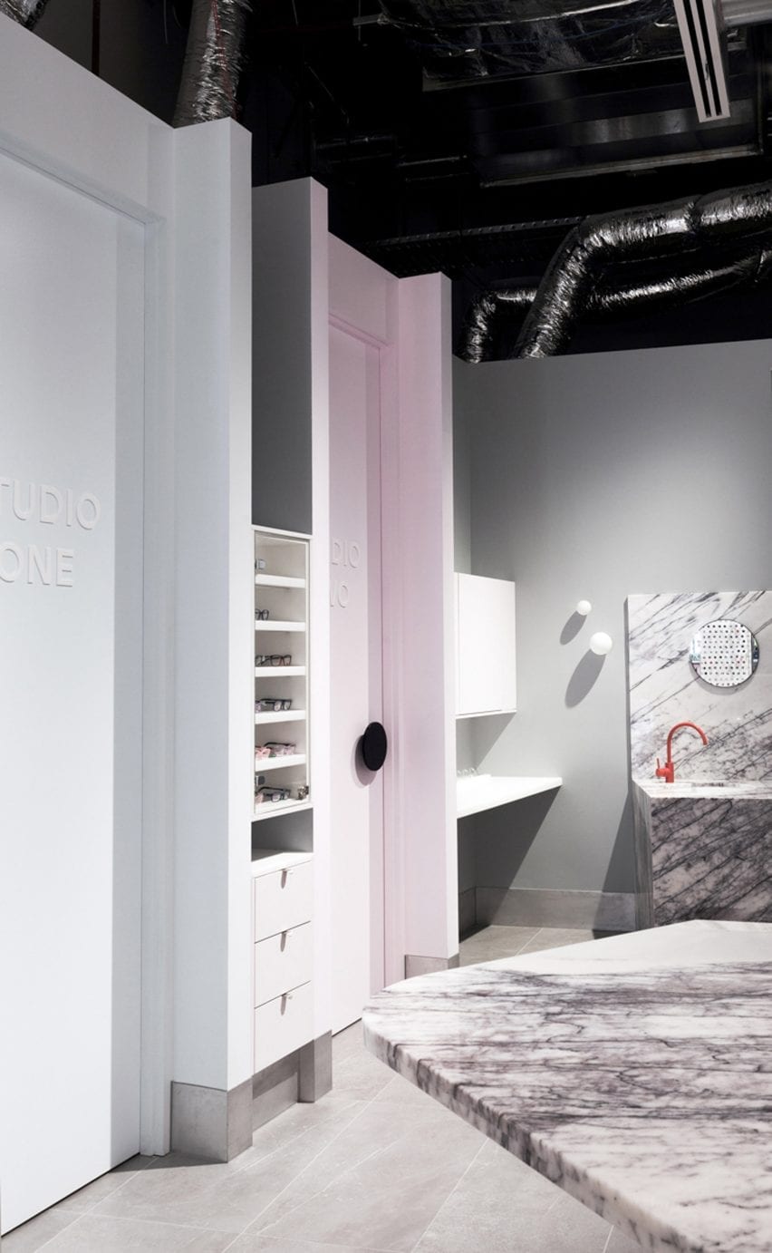
Marble accents and bright orange tap in Vision Studio interior
A bright orange tap and pastel pink doorframe act as pops of colour in the otherwise monochrome interior

To accommodate these functions, the floor plan is split into two zones with the store and display area at the front, and the optician and consulting spaces at the rear.

“The space is zoned via an angular plan configuration with the areas requiring most privacy to the rear and semi-private consulting spaces tapering to the front,” Studio Edwards founder Ben Edwards told Dezeen.

“One challenge was to work with the existing air conditioning ceiling ductwork – we chose to expose them and include them within the overall aesthetic.”

Pastel-coloured accents are applied to the shelving and cabinets that run along the walls on either side of the Vision Studio store.

The material palette, which the studio described as “a balance between raw and refined”, blends industrial materials such as aluminium and concrete with marble surfaces and translucent shelving that seems to hang in midair.

Perforated aluminium facade of retail interior by Studio Edwards
The shop is located in a Glen Waverley shopping centre

Other studios that have combined industrial materials and soft, powdery colours include Spanish studio Lucas y Hernández-Gil, which contrasted pastel furnishings against concrete walls in this restaurant in Seville.

Photography is by Tony Gorsevski.

Reference

FOG Architecture creates “modern cave” for ToSummer’s Beijing store
CategoriesInterior Design

FOG Architecture creates “modern cave” for ToSummer’s Beijing store

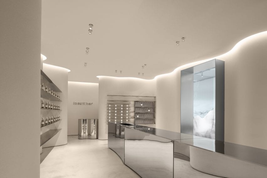
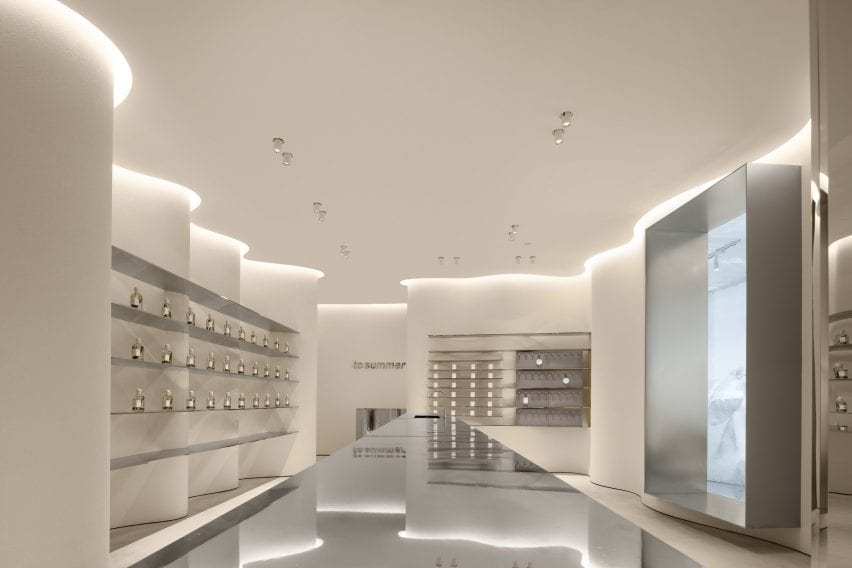
Chinese studio FOG Architecture has added curved walls, mirrored surfaces and faux stone to the interiors of aromatherapy brand ToSummer’s flagship store in Beijing.


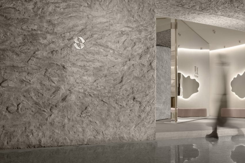
Located in Beijing’s Taikoo Li Sanlitun shopping village, FOG Architecture designed the 170-square-metre ToSummer store to recall the atmosphere of a cave.

ToSummer Living Room has faux stone walls
Top: a mirrored screen was placed at the entrance to the store. Above: the exterior of the store is covered in a textured faux stone

“The brand’s concrete requirement for this space design was a modern cave,” said FOG Architecture.

“We chose not to directly create the natural appearance of caves but, instead, presents the characteristic elements of material textures to inspire the sensory experience.”

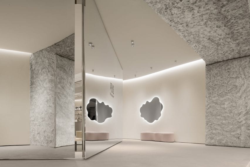
Mirrored surfaces were used throughout ToSummer Living Room
The mirrored screen reflects passers-by and the interior of the store

The entrance to the store is marked by a large faux-stone wall and a mirrored screen, which leads visitors into the store.

The studio explained that the large mirrored screen was designed to draw passers-by into the store while referencing screens typically used in homes and domestic spaces.

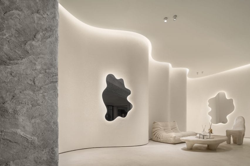
A togo sofa is placed beside undulating walls at ToSummer Living Room
Curving walls were used along the perimeter of the store

“The curiosity of what is behind attracts the beholders to walk inside,” FOG Architecture co-founder Zheng Yu told Dezeen. “The surface of the screen is usually decorated with an illustration of natural scenery.”

“It is a metaphor of the space hidden behind. And this is the reason we placed a scaled up, mirror polished screen as the central spatial element. It illustrates beauty in a restrained manner.”

Mirrored furniture was used in the retail space at ToSummer Living Room
The store was divided into multiple zones

Natural-toned, undulating walls envelop the interior of the store and are illuminated by strip lighting set within the ceiling.

The interior was divided and zoned into a collection of small sections each with its own functions, housing retail space, exhibition space and installation areas.

A cream Togo by Michel Ducaroy for Ligne Roset, an off-white Playdough chair and coffee table by Karstudio as well as amorphous mirrors were placed throughout the store suggesting the idea of domestic space.

“The aim of the furniture is to convey a sense of the domestic,” said Yu. “That’s why we named this space a ‘Living Room’. A space that gives people a place to breathe in a busy and fast-moving shopping mall.”

The walls of the ToSummer Living Room were finished with white
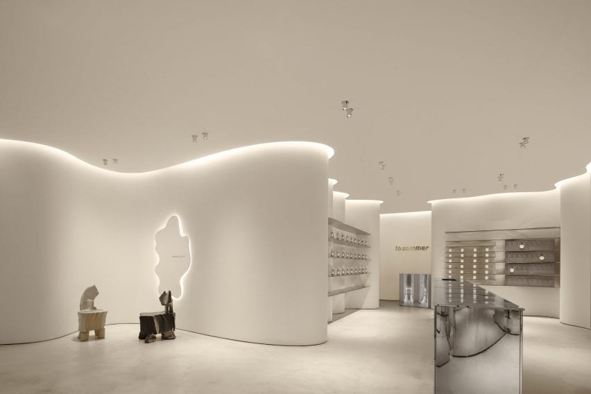
A long metal island contrats with the softness of the store

Custom “timber rotten” chairs designed by British designer Max Lamb were also placed across the store and in niches formed by its curved walls.

“In a way, Max Lamb was also our main inspiration during the project,” Yu explained.

“The [chairs] lacquering was smooth, shiny and colourful while the foam is tortured, torn, scarred – combined the materiality itself gives me an illusion of heaviness similar to a piece of timber rotten through time, but it is lightweight and smooth and newly made.”

Light reflects of the metal surfaces
Shelves were built within the curving walls

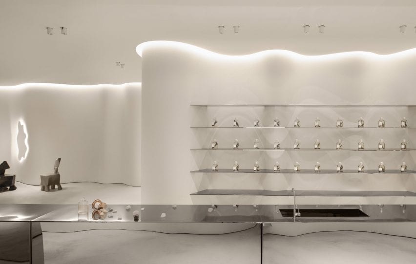
An exhibition and retail space at the rear of the store has a series of shelves organised around a long reflective metal island that contrasts to the curving walls it is surrounded by.

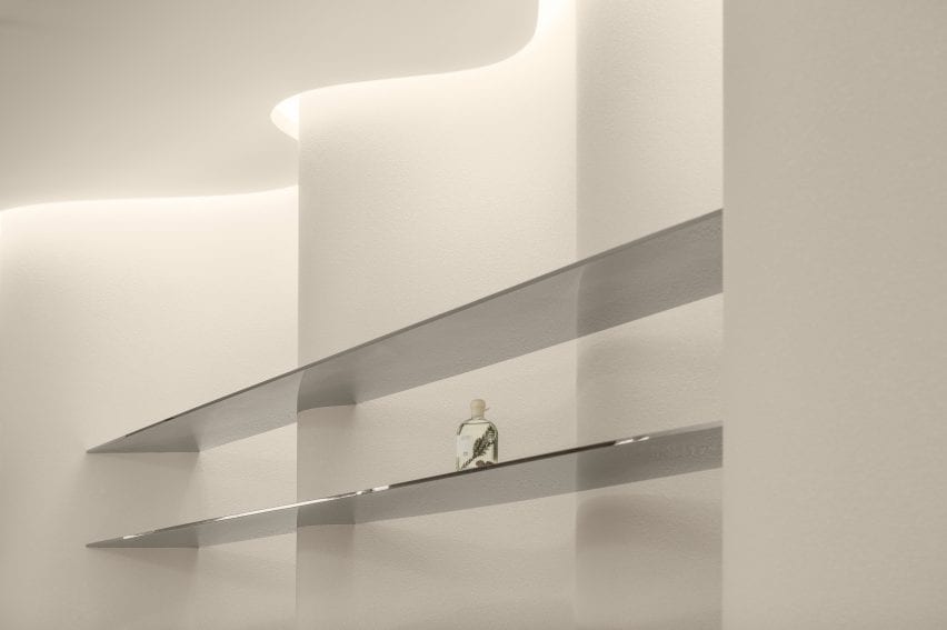
Rectangular metal shelves were suspended along the undulating walls, drawing attention to the irregularity of the space while displaying products like artworks.

Shelves house the stores product at ToSummer Living Room
Two chairs designed by Max Lamb occupy the space

A metal cashier’s table was tucked behind a curving volume and mimics the shape of its walls, forming a rounded counter space that becomes an extension of the walls.

“[The store] transforms the original cave concept into spatial language, integrating it into this realistic space full of modern oriental feeling to present a delicate balance between commercial and art, domestic and public realm, natural and artificial,” said the studio.

Fragrance is pictured on a metal shelf
The display areas were designed to showcase product like artwork

FOG Architecture is a studio with offices in London, Shanghai and Chongqing founded by Yu and Zhan Di.

Other Beijing projects with curved walls include this avocado-green space age informed hair salon and this kindergarten with a rooftop playground by MAD Architects.

Photography is by Inspace.


Project credits:

Design principle: Zheng Yu, Zhan Di
Design team: Hou Shaokai, Zhou Chuyang, Xiong Aijie, Vince Choi and Fu Shidi
Lighting design: School of Architecture, Tsinghua University and One Lighting Associates Beijing
Furniture and installation design: DEFRONT and F.O.G.
Construction drawing: SU PIN
Construction team: Youlong Jinsheng Decoration Ltd.

Reference

Google store designed by by Reddymade opens in New York
CategoriesInterior Design

Google store designed by by Reddymade opens in New York

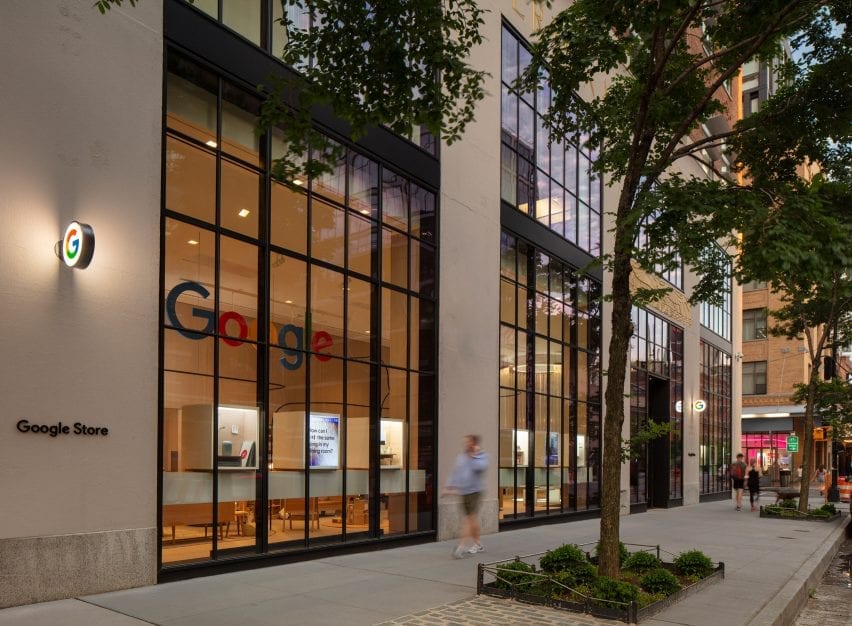
Google has opened its first physical retail space in New York’s Chelsea, designed by architecture studio Reddymade to include cork furniture and recycled materials.


Welcoming its first visitors on 17 June 2021, Google Store occupies a ground-floor space in the former Port Authority Building – a vast art deco structure that is home to the tech company’s NYC headquarters.

Google Store windows
The large windows of the first Google Store look out onto Ninth Avenue in Chelsea

Located on the corner of 15th Street and Ninth Avenue, the store’s glazed facade looks onto the entrance of the popular Chelsea Market situated opposite.

Architect Suchi Reddy of Reddymade worked with Ivy Ross, VP of design, UX and research for Google Hardware, to create a retail experience based on their collaboration during Milan’s Salone del Mobile in 2019.

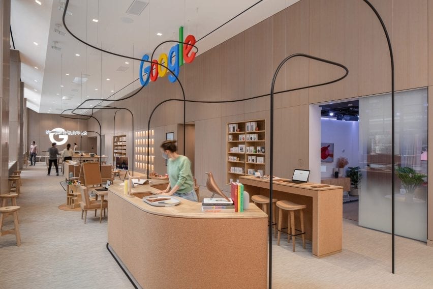
Google Store interior
Google Store’s interior features warm materials and lighting

Elements of the exhibition, A Space For Being, including the core principles of neuroaesthetics – a branch of science that examines how visual aesthetics can impact our bodies and minds – informed the design of the store.

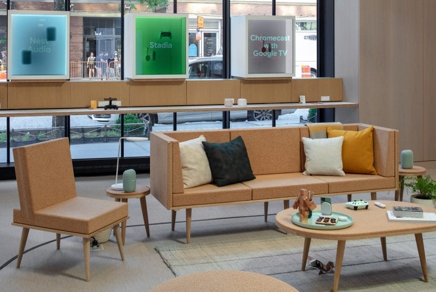
Warm and tactile materials like wood panelling, and cork furniture by Daniel Michalik, were chosen to create an inviting mood in the main area. “Reddymade’s design puts the visitor at ease, welcoming those seeking help alongside those pursuing their curiosity,” said a statement on behalf of the studio.

Seating in Google Store
Cork furniture by Daniel Michalik is dotted around the space

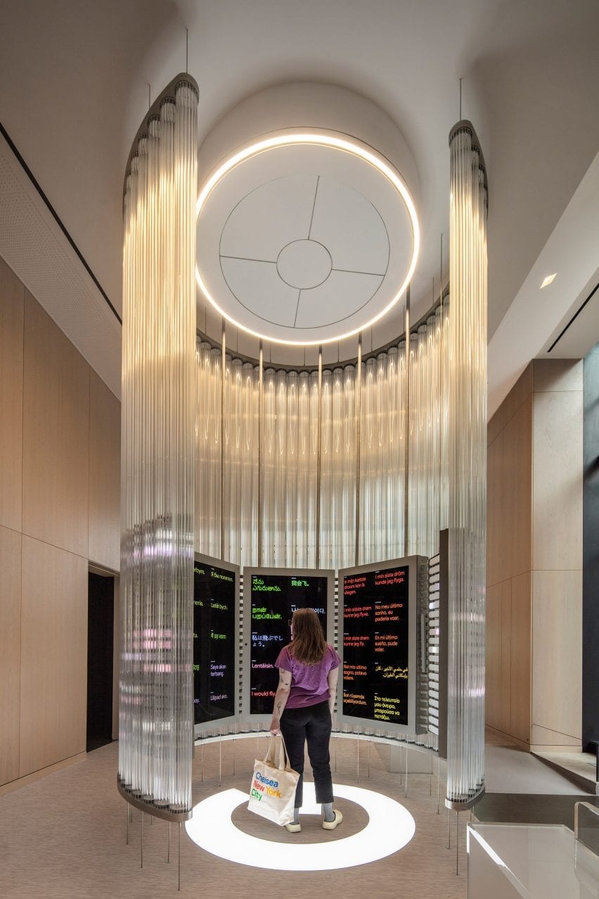
At the entrance, tubes of extruded glass are suspended between the floor and ceiling to form the Imagination Space, where visitors are invited to interact with Google products and technologies via a series of screens.

The intention is to “re-awaken visitors to the childlike wonder found in the technology and digital innovation on display”, the statement said.

Around the store, a thin black metal line traces a fluid path, drawing the eye between the various product displays.

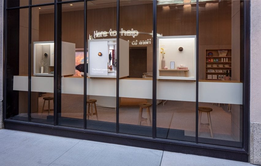
A central circular counter that acts as a support desk has a neon halo, spelling out “Here to help” multiple times in a ring.

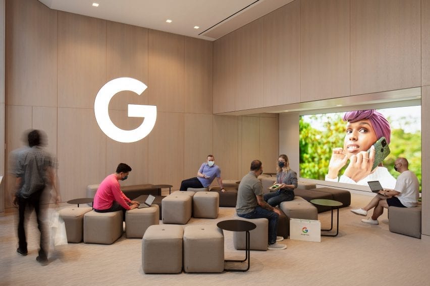
Casual seating at Google Store
Casual seating is provided for customers seeking product support

Casual seating in the form of benches, poufs and stools can be used by shoppers and those seeking product advice or assistance.

In the windows, illuminated “discovery boxes” showcase Google products and allow passersby to interact with them using augmented reality technology.

Imagination Space
The Imagination Space creates an enclosed area for shoppers to experience Google products and technologies

Many of the materials across the Google Store were selected for their sustainable credentials, enabling the project to achieve LEED Platinum certification.
Among these are flooring made from 100 per cent recycled factory waste by Swedish company Bolon, and acoustic panels with a felt-like finish made from 100 per cent PET plastic, and containing at least 60 per cent post-consumer content, by US manufacturer Kirei.

Window boxes from the exterior
Discovery Boxes in the Google Store windows allow passersby to interact using augmented reality technology

Ross spoke to Dezeen in 2019 about how companies like Google “have an obligation” to be more sustainable.

She is also responsible for the creation of the Google Design Lab at the company’s Silicon Valley headquarters, as well as the expansion of its hardware line, which she has overseen since 2016.

Photography is by Paul Warchol, courtesy of Google.


Project credits:

Architect: Reddymade
Contractor: Michilli
MEP engineer: Rosini Engineering
Structural engineer: Stratford Engineering
Accessibility and LEED consultant: Steven Winters Associates
Lighting designer: Reveal Design Group
Acoustic consultant: Lally Acoustical Consulting
Expeditor: Ganci & Logozzo
Millwork/fabricator: Bednark Studio
Millwork: Viridis
Glass fabricator (Magic Space): AMG Glass Technik
Cork furniture: Daniel Michalik
Furniture dealer: EvensonBest
Upholstery: The Work Room
Neon: Let There Be Neon

Reference

Snøhetta references libraries for Oslo pop-up store A Better Place to Think
CategoriesInterior Design

Snøhetta references libraries for Oslo pop-up store A Better Place to Think

Architecture firm Snøhetta has created a library-informed respite from the digital world with A Better Place to Think, an Oslo pop-up shop for tablet brand reMarkable.


Located just off the city’s main shopping street, the temporary store was made to showcase the brand’s tablet, which has a paper-like surface.

reMarkable pop-up store interior by Snohetta
The reMarkable pop-up store is informed by libraries

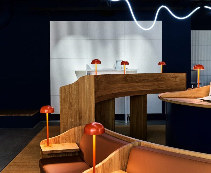
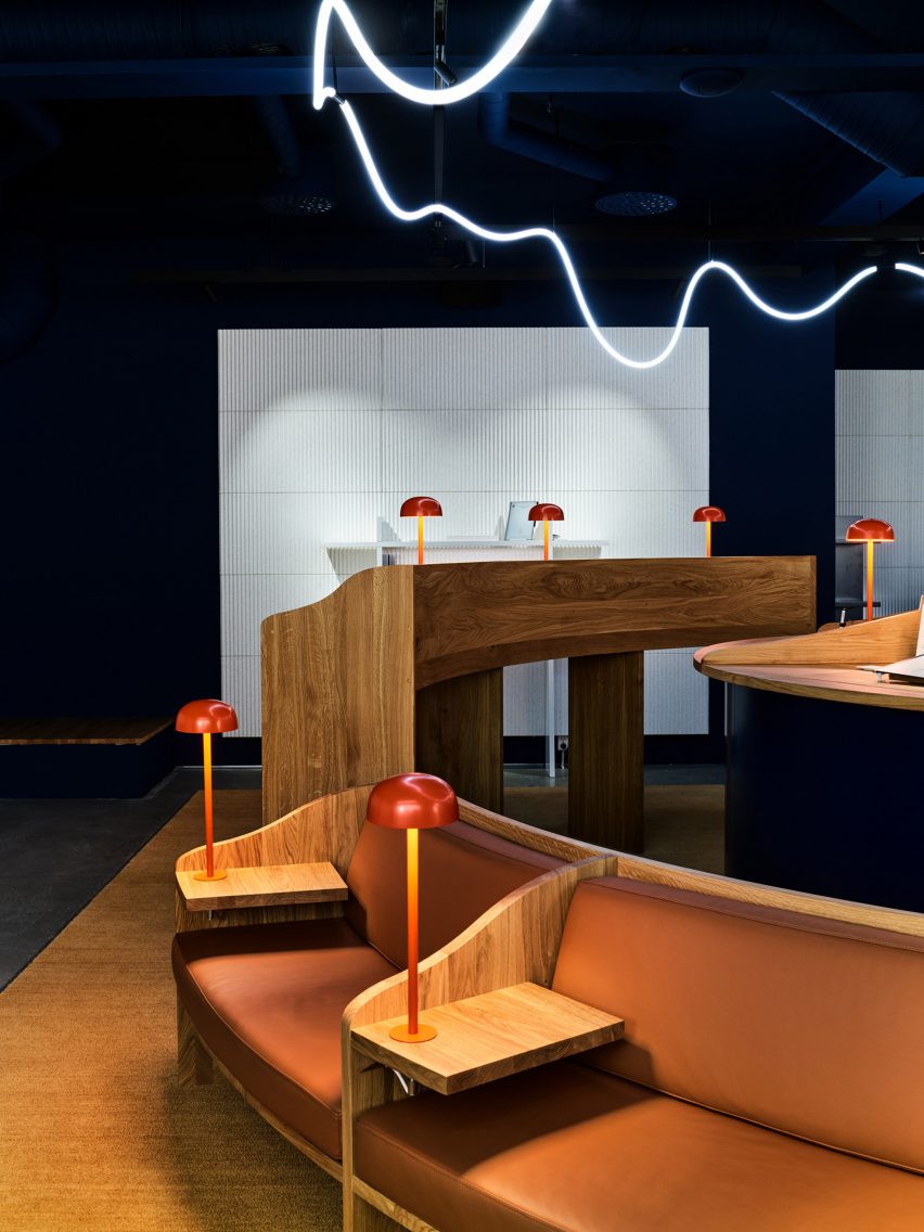
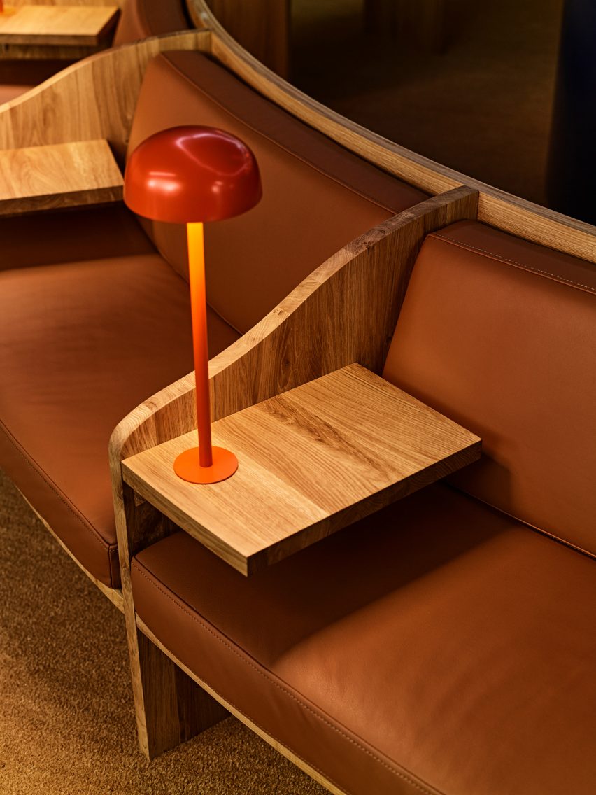
Snøhetta looked to libraries for the design, which features divided timber desks, leather banquets and small domed reading lamps.

The Norwegian studio wanted to encourage contemplation and concentration through the spatial qualities of the pop-up.

Library-like reading nook
It features bespoke oak furniture in a quiet environment

“In today’s fast-paced and digitalised society, finding places for focused thinking can be a challenge,” Snøhetta founder Kjetil Trædal Thorsen told Dezeen.
“For the reMarkable pop-up store, we wanted to echo the serene environments of libraries – the clean and open spaces, somber aesthetics, tidy structures, and focused reading zones.”

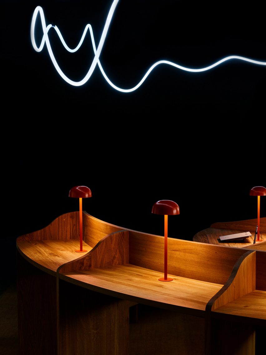
Standing desks separated by dividers
The central light installation is inspired by a handwritten line

A Better Place to Think features two concentric rings of desks and seating, with the inner ring made up entirely of standing desks and the outer ring featuring blocks of seated desks, benches and sofas.
A handmade light installation overhead was inspired by the energy and movement of a line of handwriting.

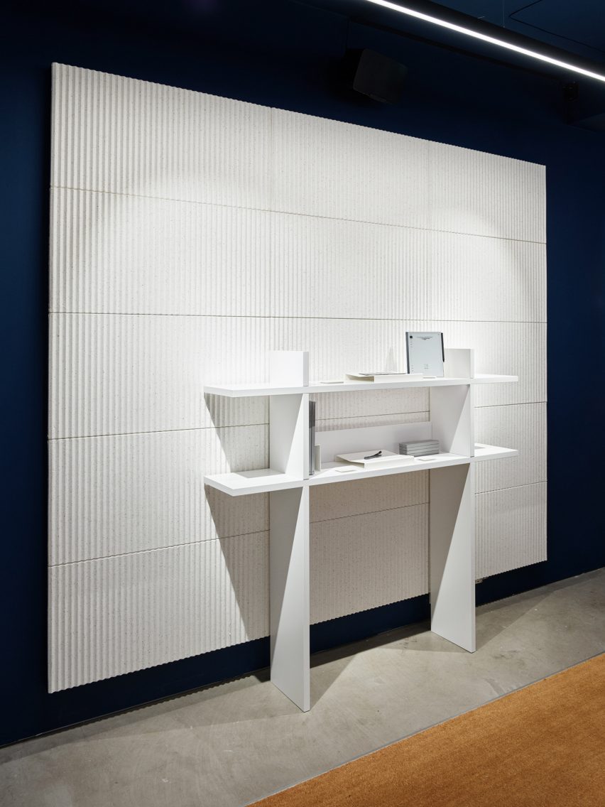
The walls and ceiling are painted in a “calm and sober” dark blue, with white acoustic panels and shelving covering most of the wall space.

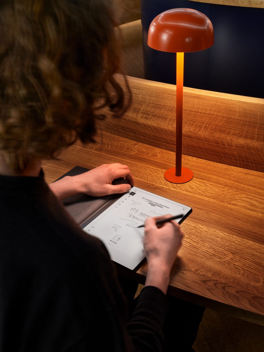
The matt finishes across the walls, panels and on the bespoke oak furniture are meant to echo the material qualities of paper.

Person writing on reMarkable paper tablet at oak desk
The store features matt finishes inspired by the feel of paper

The design of the pop-up aims to emphasise the enduring value of bricks-and-mortar shopping.

“Although consumers are becoming increasingly digital in their shopping habits, especially during the pandemic, we see the value of letting our customers experience that ‘wow’ moment of writing on one of our paper tablets for the very first time,” said reMarkable founder and CEO Magnus Wanberg.

White acoustic panel with shelving
White pulp acoustic panels line the walls

Founded in 1989, Snøhetta has offices around the world.

Its recently completed buildings include the shimmering Le Monde Group Headquarters in Paris and the El Paso Children’s Museum, which has a barrel-vaulted roof resembling a cloud.

Photography is by Calle Huth.

Reference

Studiopepe nods to Milan’s stations in La Rinascente department store
CategoriesInterior Design

Studiopepe nods to Milan’s stations in La Rinascente department store

Design and architecture agency Studiopepe references Milan’s offices and metro stations in its revamp of the fourth floor of the city’s renowned luxury department store La Rinascente.


The fourth floor, which is home to the store’s womenswear department, has been reimagined by the Milanese studio using bold graphic elements and pop colours.

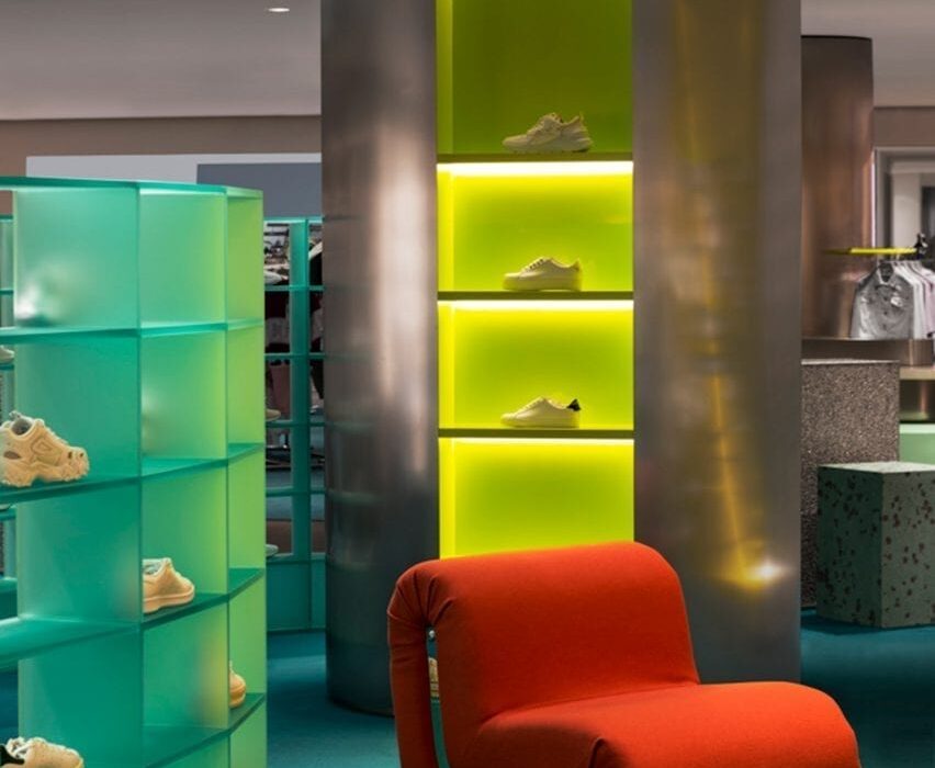
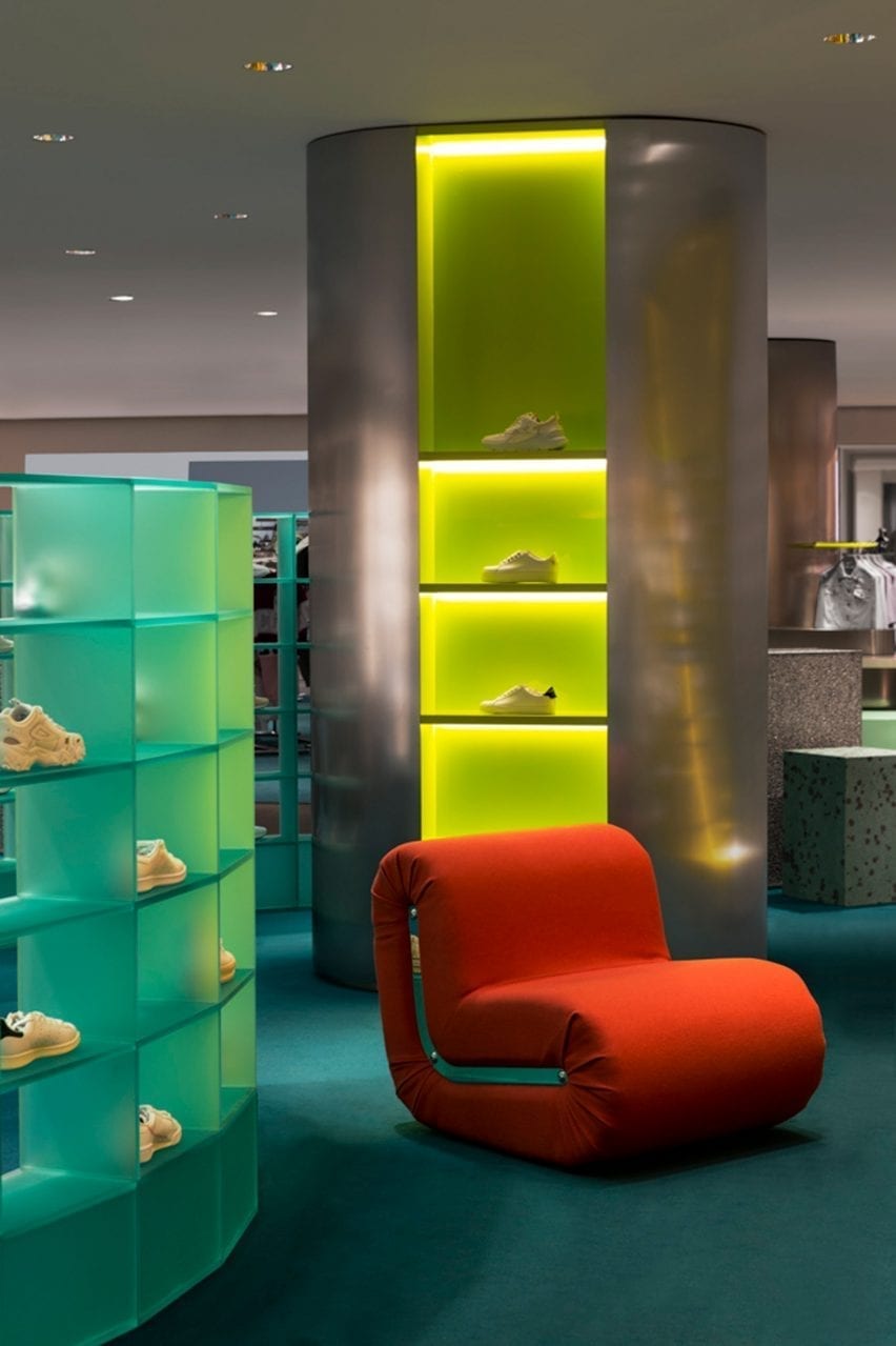
Illuminated display columns with red armchair in Rinascente womenswear department
The interior is dotted with colourful accents including changing rooms encircled in orange curtains (top image) and Rodolfo Bonetto’s Boomerang armchair (above)

Studiopepe, founded in Milan in 2006 by Arianna Lelli Mami and Chiara Di Pint, conceived the space as a series of zones subtly organised by functions and visual references.

1980s Milanese workplaces as well as the city’s rationalist M1 metro stations – the latter designed in 1964 by Italian architects Franco Albini and Franca Helg – were among the studio’s inspirations.

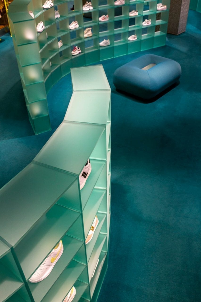
Curved plexiglass shelving displaying trainers on blue carpet in retail interior by Studiopepe
A system of curved plexiglass shelving meanders through the womenswear department

“The use of graphic elements and pop tones echoing Milan street style convey a new genderless approach to retail design,” explained the studio.

“Colour is conceived as an architectural tool – an intense emerald green, silver and black create an unusual palette animated by hints of coral and bright yellow tones.”

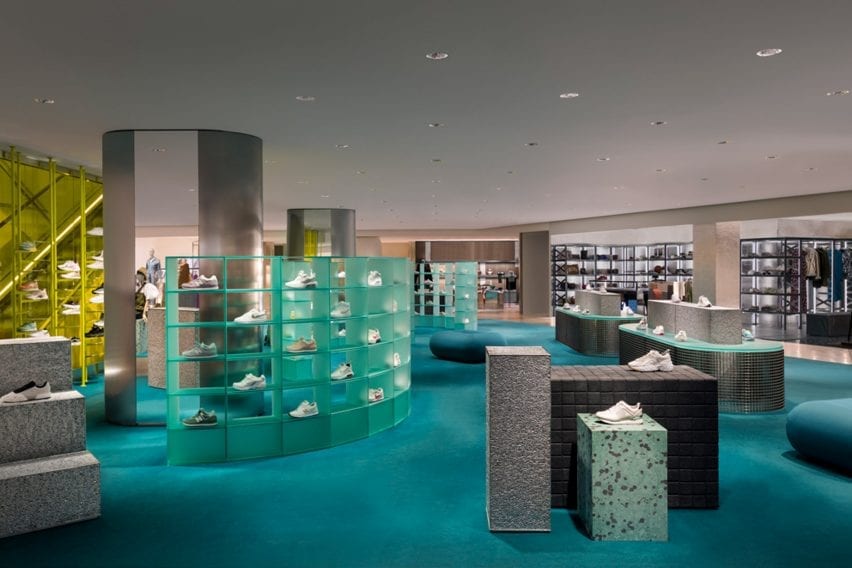
Overview of La Rinascente womenswear department with blue carpet and grey displays
The department is accessed via a bright yellow staircase

The steel tubes – which are used to clad display columns and create table legs – are a direct reference to the city’s underground stations.

Materials such as satin steel, plexiglass and terrazzo are paired with experimental materials with contrasting textures such as Silipol – a material which was originally selected by Albini and Helg to cover the Metro stations’ walls; Alusion, the stabilised aluminium foam that is used to clad the city’s Fondazione Prada; and Milleform, a bio-based cotton acoustic tile.

To create a domestic feel, the space is furnished with a mix of bespoke rounded furniture and display cabinets, as well as classic design pieces like the Boomerang armchair by Rodolfo Bonetto.

Curved satin plexiglass shelving systems that display the store’s trainer offering also serve as space dividers.

The department’s distinctive circular changing rooms are enclosed in orange curtains made from structured leather – a feature that Studiopepe said nods to the textile folding doors often used by Italian architect Gio Ponti.

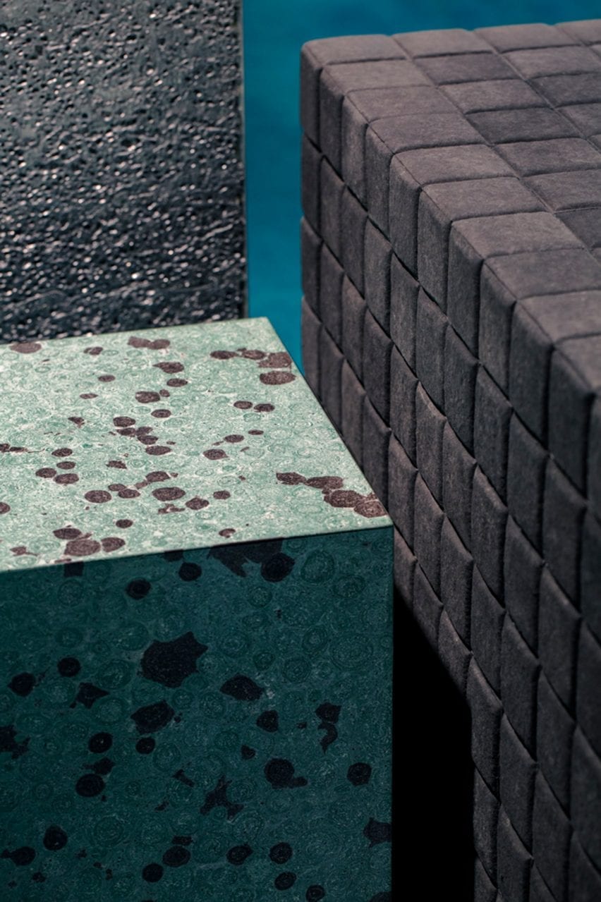
Turquoise stone table and upholstered pouf in retail interior by Studiopepe
Studiopepe used contrasting textures throughout the interior

A previous incarnation of La Rinascente’s fourth-floor womenswear department was designed by Japanese studio Nendo. Designed in 2013, the studio drew upon architectural elements observed while exploring Milan to create a calming, neutral space.

The studio said that it was “inspired by the unexpected encounters with shop windows, courtyard gardens and public squares that come from wandering Milan’s back streets.

Reference

Foster + Partners turns palazzo in Rome into Apple Store
CategoriesInterior Design

Foster + Partners turns palazzo in Rome into Apple Store

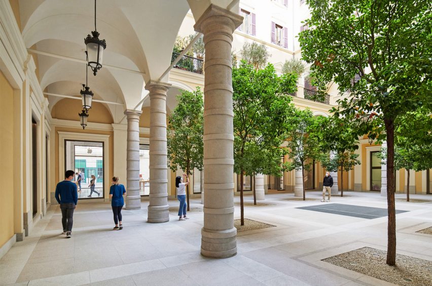
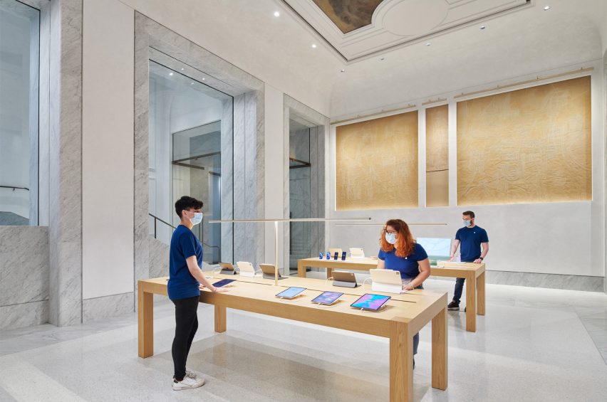
Fosters + Partners has restored and converted the Palazzo Marignoli in Rome into an Apple Store, uncovering historic features and opening up a central courtyard.


Apple Via del Corso is the largest Apple Store in Europe and occupies the historic Palazzo Marignoli, near the Piazza Colonna, in the centre of Rome.

The courtyard of the Apple Via del Corso contains local trees
Top: the store is located in the Palazzo Marignoli. Above: a courtyard is at the centre of the building

The Apple Via del Corso building sits on a site that held a church and a convent in the 16th century.

The current Palazzo Marignoli building was constructed between 1873 and 1878 and served as a home for Marquis Filippo Marignoli. It also housed the Caffè Aragno, a famous gathering spot for artists.

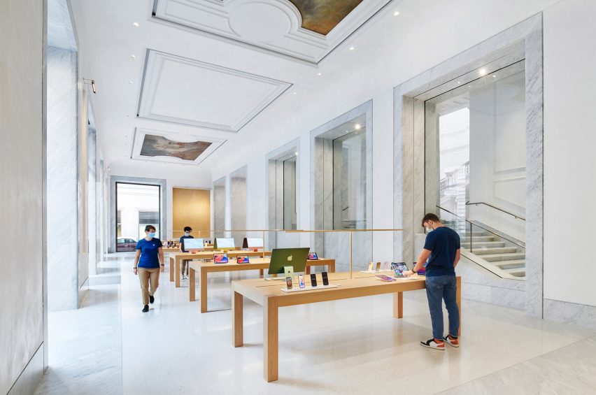
Marble covers the interior of Apple Via del Corso
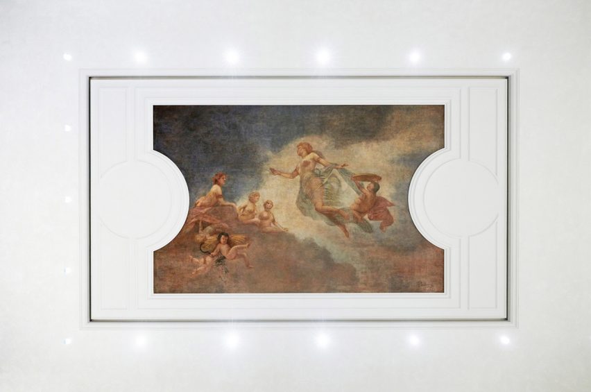
Original paintings were restored and placed in the ceiling

Foster + Partners wanted to celebrate its history by highlighting its grandeur and restoring its historic features.

“The idea was to celebrate different aspects and various areas of the history of the building,” said Foster + Partners partner Luis Matania.

“You have this juxtaposition of all these various areas in the building’s history, through to now, the 21st century.”

Lighting surrounds an original painting
Ettore Ballerini’s Dusk was placed between ceiling panelling

L-shaped in its plan, the building is organised around a large courtyard that the studio opened up to be used by the public and to greet visitors upon entry into the building.

Camphor trees placed across the courtyard informed by the 16th-century convent that previously existed on the site.

Grey marble frames doorways and windows at Apple Via del Corso
Wooden tables were placed within retail spaces

“The courtyard is no longer private, it becomes a democratic space that the community is invited to come through into and enjoy,” said Foster + Partners partner Stefan Behling.

“We reintroduced trees as a reference to the old convent and it allows the community to come and enjoy this beautiful space.”

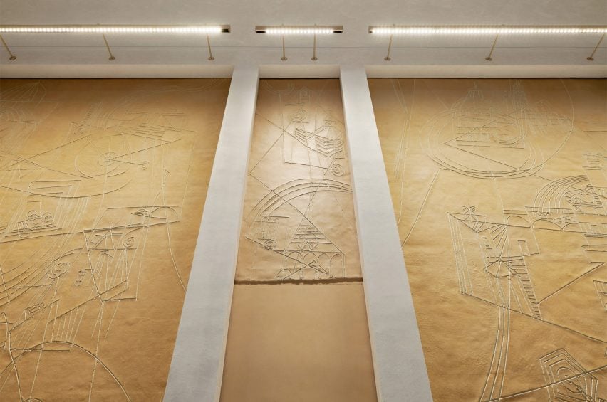
Artworks were placed within the walls of Apple Via del Corso
Artworks by Afro Basaldella that were found in the building were restored

Artworks by Italian artist Afro Basaldella from the building’s art cafe days abstractly depict imagery and scenes of Italy were carefully restored and set into the walls.

Large early-1900s ceiling paintings by Fabio Cipolla and Ettore Ballerini have also restored and incorporated above the marble interiors between ceiling panelling.

“It has been a complicated building and we have discovered things along the way,” said Matania.

“It has been an evolving design process, that has amended and adapted as we found new things, new painting and new aspects of the architecture”

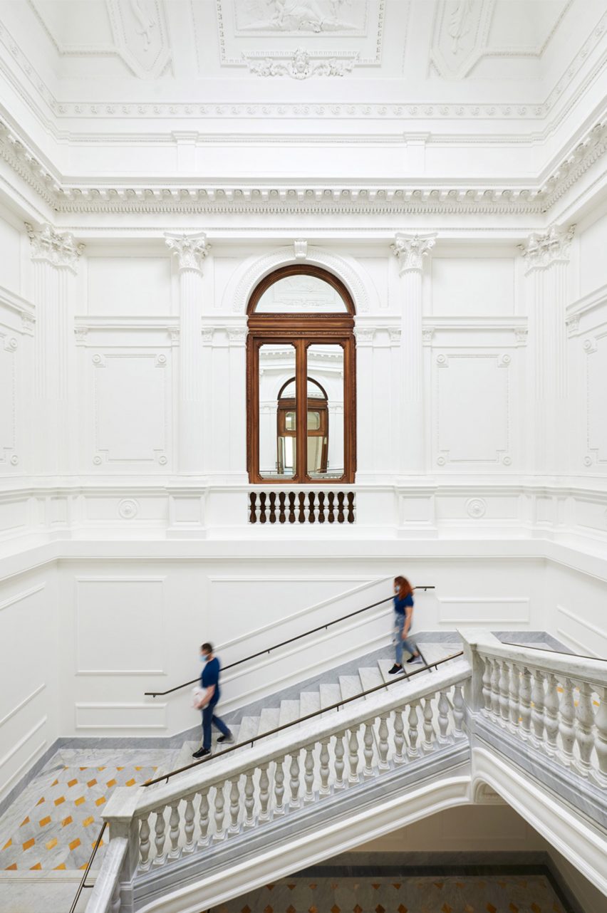
Decorative mouldings cover the walls and ceilings of Apple Via del Corso
The grand staircase was fitted with local marble

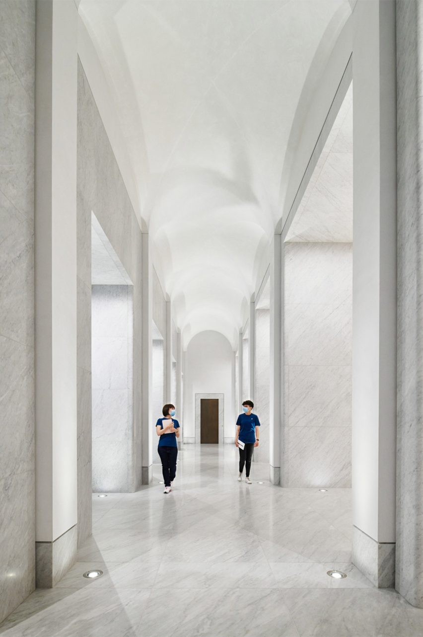
White marble was used throughout the interior of Apple Via del Corso, covering the floors of each room and framing large windows that provide glimpses into adjoining rooms.

To the west of the courtyard, a grand staircase with vast mouldings and a former oculus on its ceiling was restored, structurally reinforced and fitted with locally sourced Carrara marble.

The firm recreated daylight within the grand stairwell by adding LED lighting to the oculus that changes with the time of day.

The corridor has a curved ceiling
A long corridor links spaces in the store

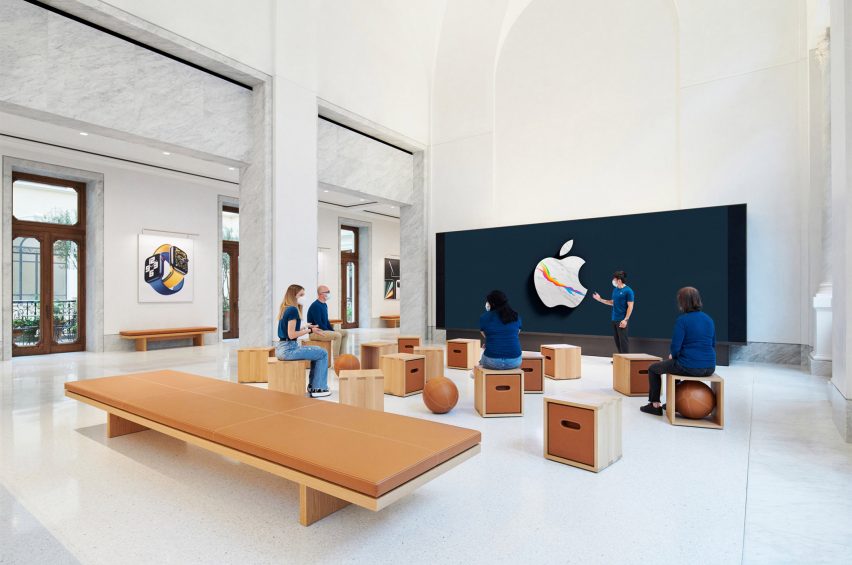
On the first floor, a long corridor connects a forum space with a Genius Bar and three retail areas.

The forum-style space will be used for community events, occupying what used to be the Palazzo’s ballroom a central point of the first floor.

Box stools were placed around the room at Apple Via del Corso
Apple Via del Corso’s forum-style space was furnished with pale wood and leather

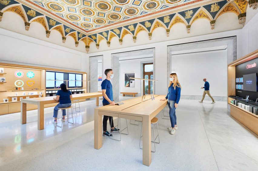
In the Genius Bar, conservators restored a hand-painted geometrically patterned ceiling with decorative crown mouldings.

Wooden furniture and joinery were used throughout to bring warmth to the interior spaces.

Cabinetry was constructed with a pale wood
An original hand-painted patterned ceiling covers the Genius Bar of Apple Via del Corso

Dark wood-framed doors and windows along the corridors and edge of the rooms open out onto Juliette balconies and a terrace that overlooks the courtyard below.

Camphor trees, olive trees and jasmine vines were placed across the terrace to reflect typical plant-filled Roman roof terraces.

Apple Via del Corso is one of many historic buildings the technology company has opened stores in, including the Foster + Partner designed Champs-Élysées store in Paris and the converted Washington DC library.

Reference

Formoral is a skincare store that resembles a “desert planet”
CategoriesInterior Design

Formoral is a skincare store that resembles a “desert planet”

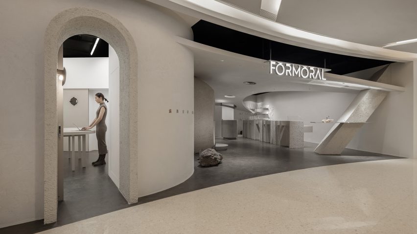
A spherical gateway and otherworldly light reflected through glass prisms feature in this skincare store in Hangzhou, China, which local interiors studio Lialawlab has designed around the theme of retro-futurism.


Created for independent skincare brand Formoral, the concept store is laid out across a 120-square-metre retail unit in the city’s GDA Plaza shopping mall.

Formoral store by Lialawlab
The store is themed around the concept of retro-futurism

The store is made up of a “series of spatial scenes” based on the theme of retro-futurism – meaning the future as envisioned in the past.

“The space was decorated using no colour; only different textures in similar colours were used to highlight the space level,” Lialawlab‘s chief designer Liya Xing told Dezeen.

“It was envisioned as a contrasting yet unified whole, which breaks the homogeneity of physical retail spaces in modern cities and explores the deep relationship between nature and the artificial.”

Colourful lights on grey display units in skincare store
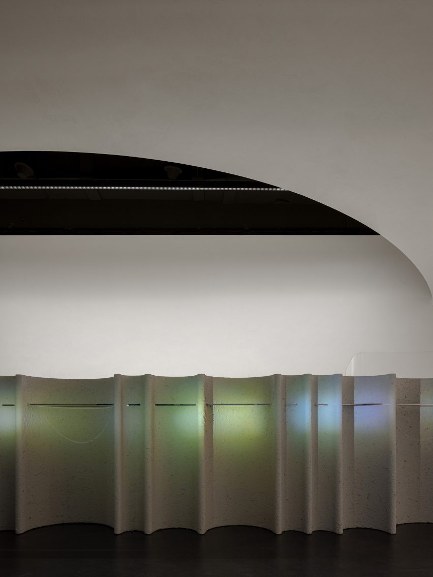
Light reflected through glass prisms creates patches of rainbow-coloured light

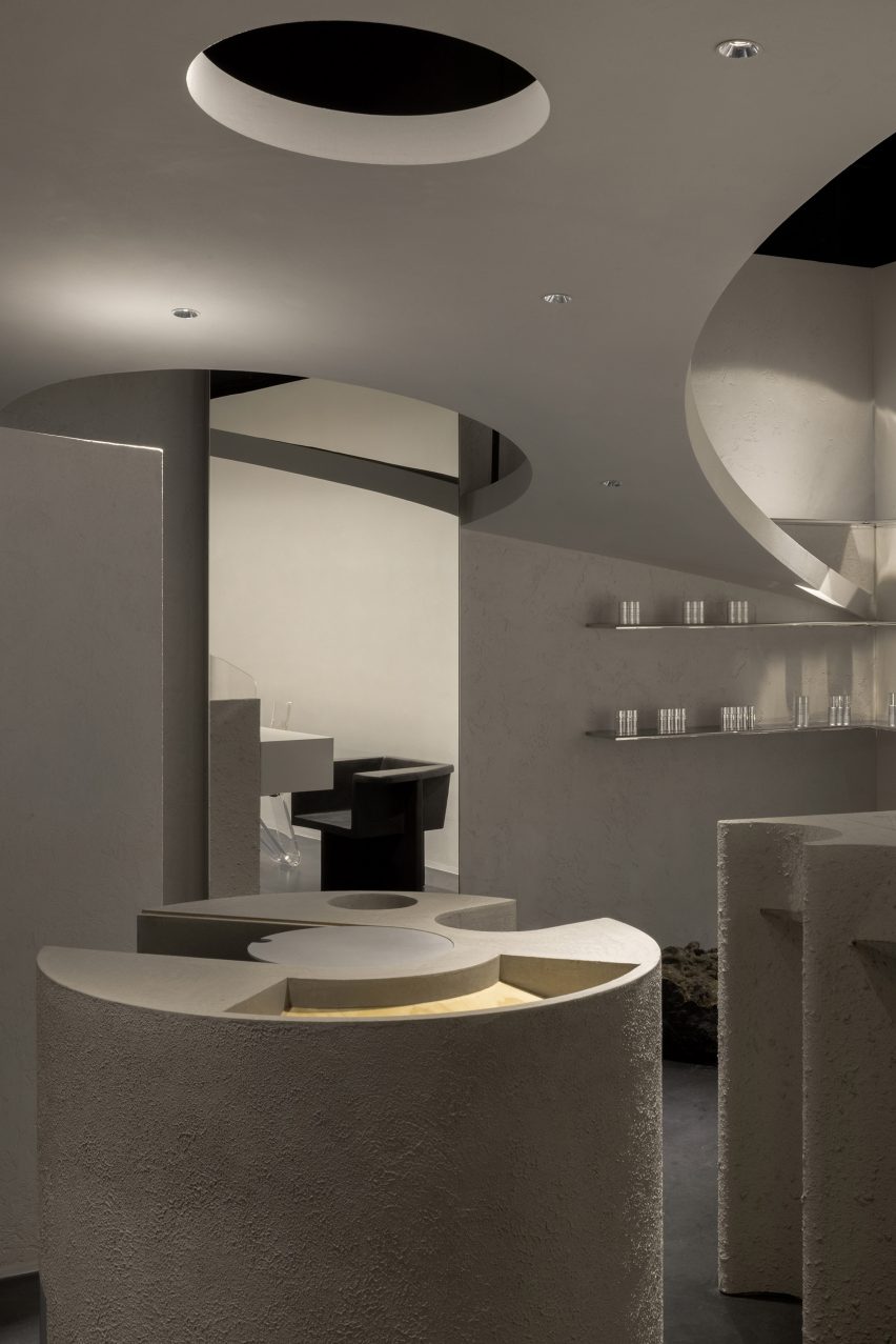
The studio created the Formoral store as a desaturated space with large structures, columns and counters finished in highly textured, grey paint.

“The austere finishes echo the brand’s affinity with nature while highlighting the image of a primitive desert planet,” explained Lialawlab, which was founded by Liya Xing alongside Haifeng Luo.

Lialawlab painted the space grey
Textured grey paint defines the space

The studio organised the layout to accommodate the store’s various functional areas and make a clear distinction between its public and private spaces.

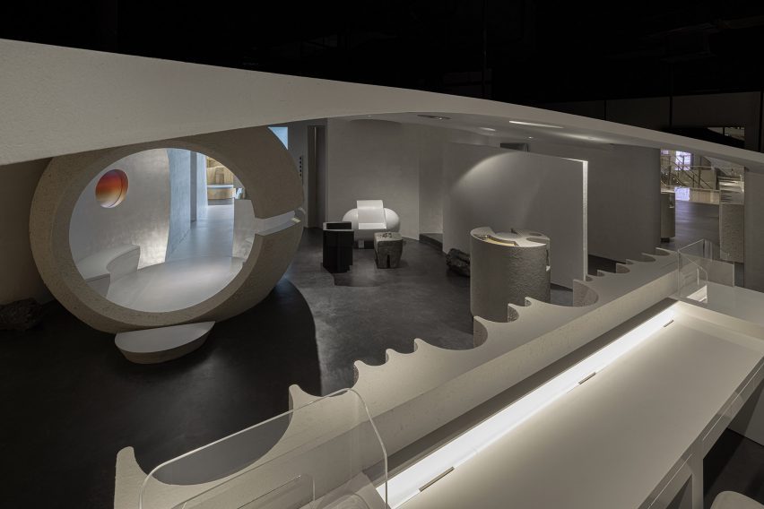
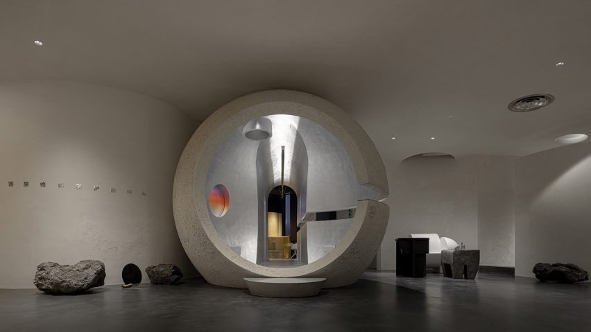
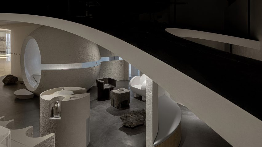
In the foyer, a sculptural service desk welcomes customers in from the shopping mall while opposite, a large spherical structure that Lialawlab refers to as a “rising planet” serves as a gateway into the private spaces of the store.

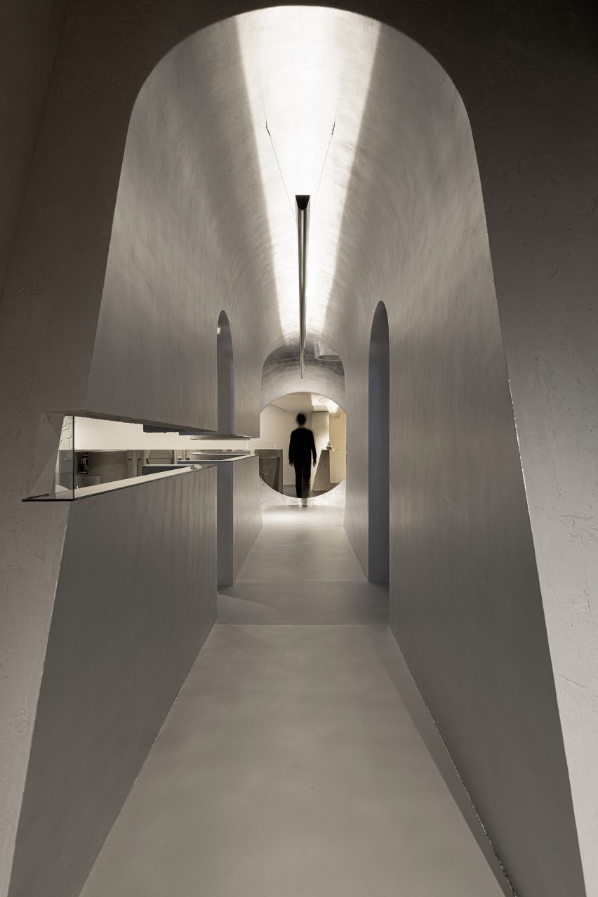
The inside of the structure is lined with bench seating and connects to a tunnel clad with matte silver foil and aluminium plates.

Spherical structure in Formoral store in Hangzhou
A spherical volume forms an entrance to the store’s more private spaces

“To trigger people’s desire to explore the space, we carved out a 200-millimetre-wide gap at the height of 1.25 meters of the massive sphere and the tunnel,” said the studio.

“The gap is complemented with mirrored material, allowing customers to stay, wonder, stare and rest.”

Two cabin doors along the tunnel lead to Formoral’s eight functional zones including product displays, spaces for skin testing, events and demonstration as well as an office and break room for employees.

Tunnel in Lilawlab-designed store
A tunnel leads customers through the store

To contrast with the grey interior, the designers reflected and refracted light through prisms and gradient-index neon glass that throw patches of rainbow-coloured light onto the walls.

The studio also included coloured lamps and lanterns and a round window in the spherical structure, which is covered with a colour gradient film.

Although the store’s ceilings are 4.6 metres high, only 2.8 metres of this space is actually useable due to the mechanical, electrical and plumbing services installed on the ceiling structure.

The designers skillfully overcame this problem by creating a sloped dropped ceiling, which is 2.75 metres tall at its highest point and skims the top of the spherical structure in the foyer.

At its lowest point of 1.25 metres, it meets the wall to create a smooth, seamless transition.

Formoral is a skincare store in China
The store’s sloped ceiling gives it an otherworldly feel

To avoid costly repositioning of the services, Lialawlab created an arc-shaped opening with a six-metre radius above the reception desk.

“The ceiling effectively extends the reception to the public realm, achieving a balance between functionality and form,” the studio explained.

Lialawlab was informed by the idea of a
Lialawlab designed the space to feel like another planet

Elsewhere, Irish studio Kingston Lafferty Design recently created “otherworldly” interiors within a skin clinic in Dublin, using a palette of plaster, marble, terrazzo and stainless steel.

Photography is by Feng Shao.

Reference

Child Studio channels Soho’s peep show booths for Cubitts eyewear store
CategoriesInterior Design

Child Studio channels Soho’s peep show booths for Cubitts eyewear store

Featuring linoleum floors, Formica-clad walls and a deep red basement, Soho’s peep show booths served as inspiration for the atmospheric interior of this London eyewear store by Child Studio for spectacle-maker Cubitts.


Perched on the corner of Marshall Street in London’s Soho neighbourhood, the store occupies one of the early 19th-century buildings that form the area’s narrow streets.

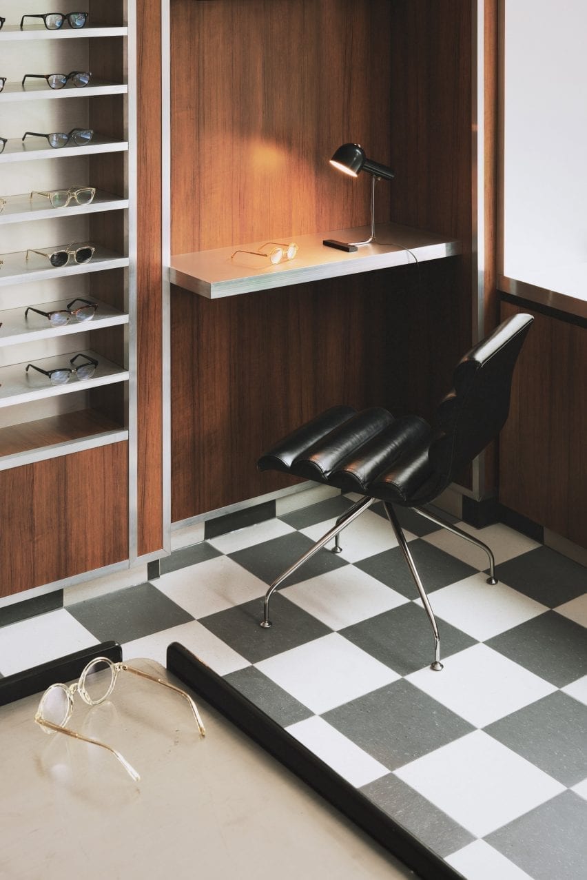
Checked linoleum floor and wood-panelled walls in Cubitts eyewear store
Black and white checkered linoleum flooring features throughout the store

The store is spread out over a small ground floor and basement space lined by a narrow staircase.

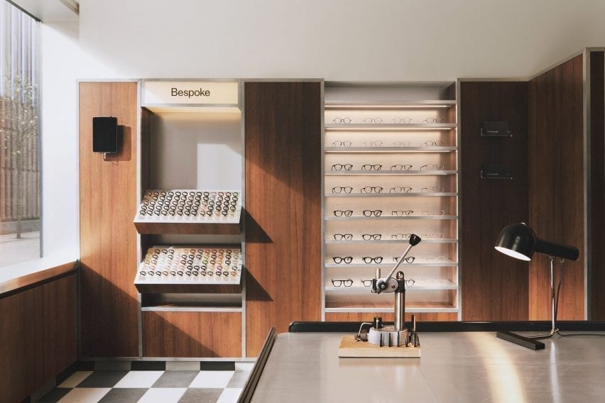
In terms of practical requirements, the store needed to incorporate a display of the 100 different coloured acetate chips that customers can choose from to create bespoke frames.

London-based Child Studio designed a space for Cubitts that aims to reflect the history of the local area and create a customer journey that would encourage people to explore the basement space.

Wood-panelled walls and acrylic display stands in eyewear store by Child Studio
A wall-mounted display case holds 100 different coloured acetate chips

Cubitts wants each of its shops to have a unique design reflecting the history of the local neighbourhood,” Child Studio co-founder Alexy Kos told Dezeen.

“The brand has a strong connection to London, where its glasses are made, and to Modernism as the guiding principle to its design aesthetic.”

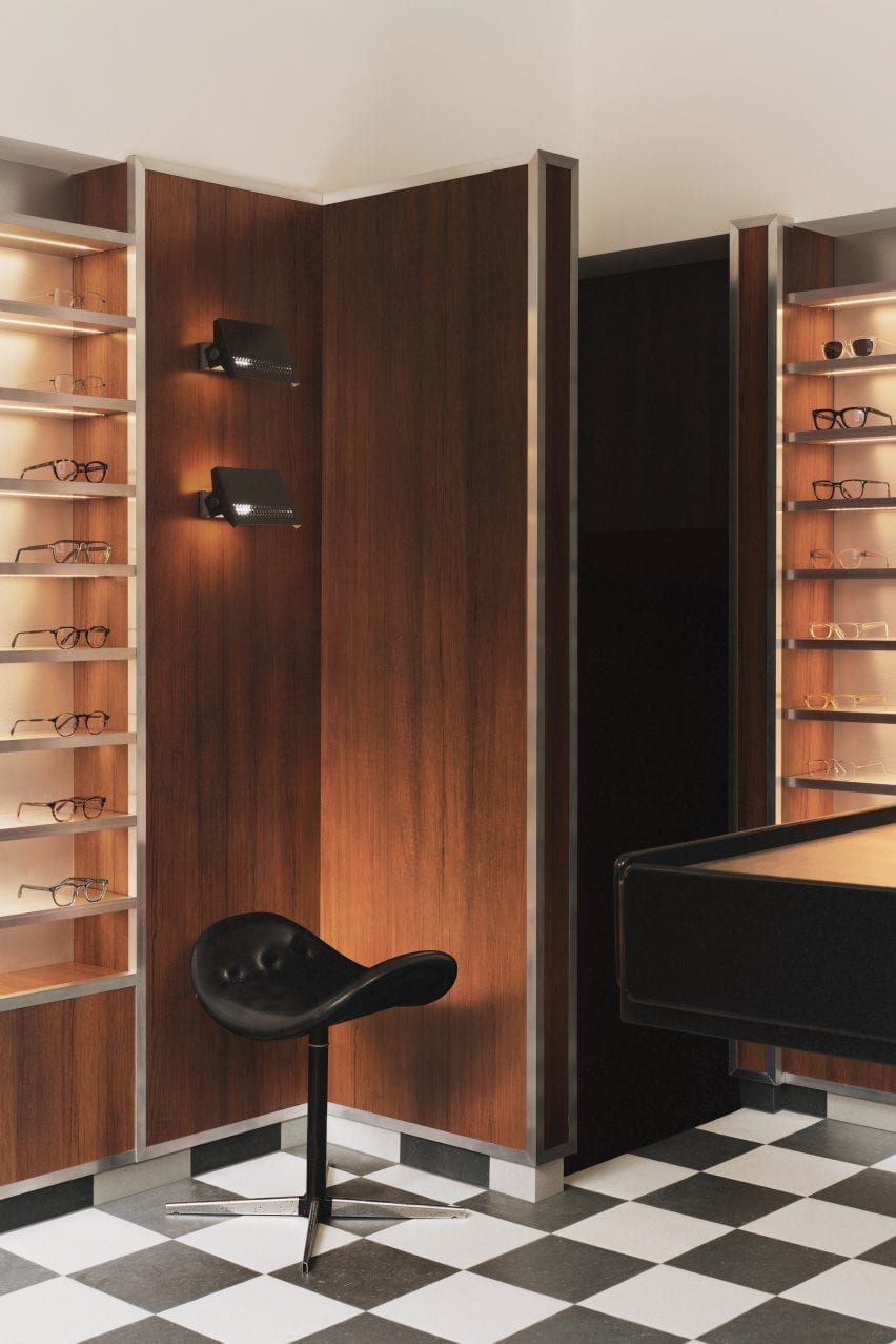
Checkered floor, black stool and wood-panelled walls in Cubitts London shop

To design the interior, the studio drew upon Soho’s colourful history as a destination for massage parlours, adult cinemas and sex shops in the postwar era.

“Gambling, drinking, religious and political dissent, clubbing and prostitution were all, at varying times, peculiar Soho specialities,” said the studio.

“We have focussed our research on Soho’s heyday in the postwar era, looking at the interiors of the neighbourhood’s iconic venues, such as the Formica-clad Bar Italia and the legendary jazz venue 100 Club, with its all-red interiors.”

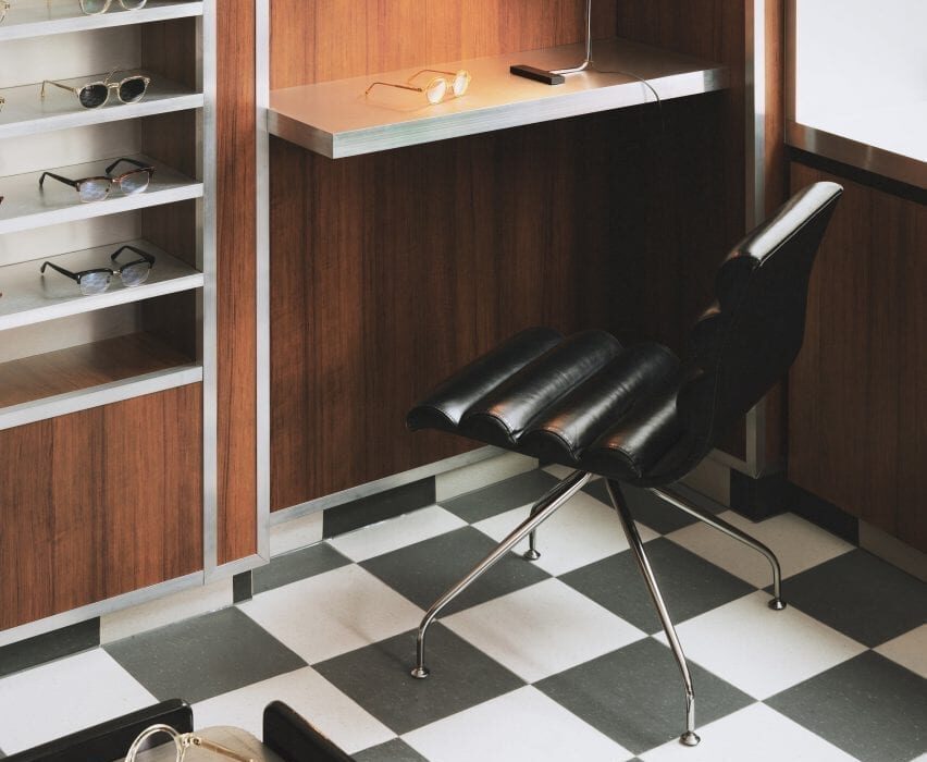
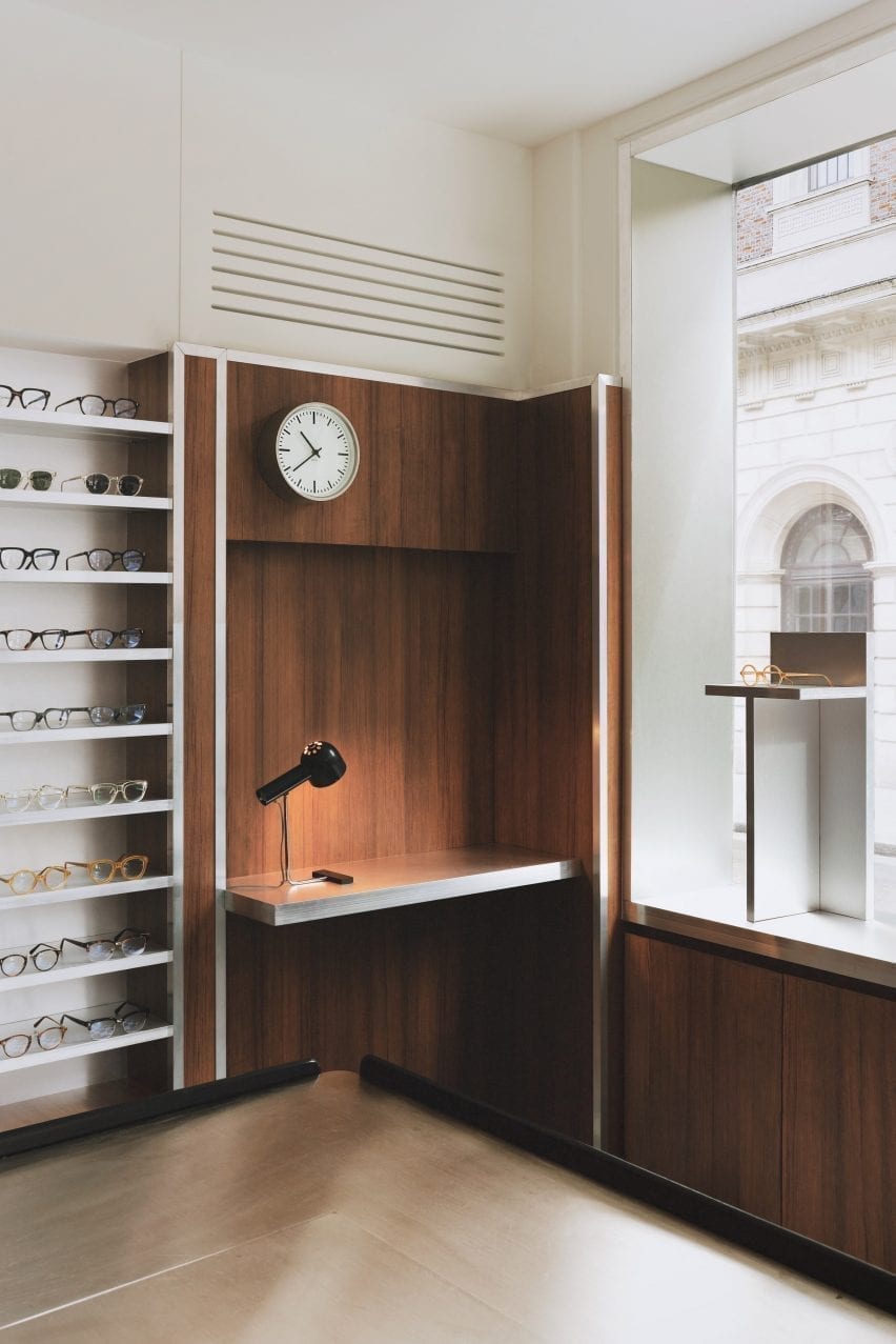
Desk nook with clock and glasses display in eyewear store by Child Studio
Formica laminate partitions with aluminium trims divide up the space

Referencing the peep show booths of Soho, the store incorporates low partitions clad in a wood-effect Formica laminate and trimmed with aluminium to form a maze-like environment.

Display areas with illuminated acrylic shelving that showcase the spectacles and the colourful acetate chips are recessed into the walls. Lightbox signage integrated into the metal-trim cladding and black and white checkered linoleum flooring add to the store’s nostalgic ambience.

An antique Caori cocktail table designed by Vico Magistretti in 1961 serves as a focal point on the ground floor.

Featuring a brushed aluminium tabletop and several concealed compartments for records and magazines, the piece was specially sourced by Child Studio and adapted to include a raised podium so that it is better serves the retail environment.

Leather chair with red glasses display in Cubitts store
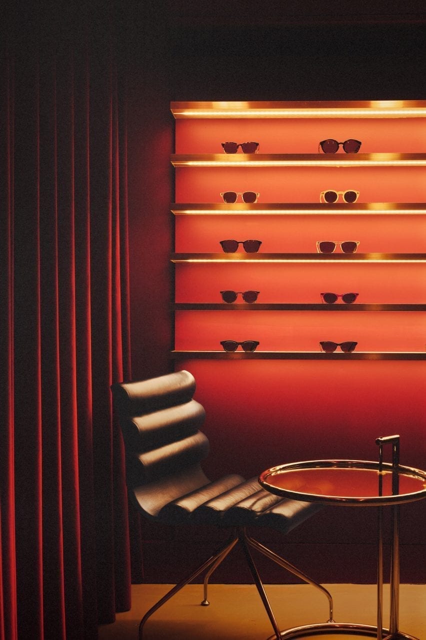
The basement is saturated with a deep red colour

“Every project tells a unique story and we always look for rare and unusual furniture pieces to add depth and authenticity to the narrative,” said the design team.

“The desk lamp is another mid-century find, created by the Czech designer Josef Hurka for the manufacturer Napako in the 1960s.”

Acryclic glasses display with red velvet curtain in eyewear store by Child Studio
Limited-edition sunglasses are displayed on shelves clad in aluminium-effect Formica

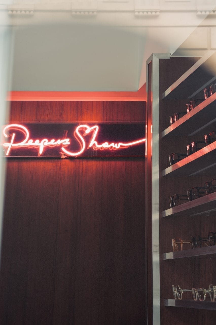
A narrow staircase leads to the basement, which is saturated in a deep red colour. Customers are guided to an eye examination room concealed behind a velvet curtain by neon signs.

Cubitt’s moody basement lounge area is lit by the Conelight floor lamp by the British designer Ronald Homes and furnished with chrome and leather chairs designed by Giovanna Modonutti.

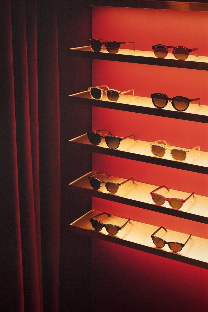
A collection of limited-edition sunglasses is displayed on illuminated shelves clad in aluminium-effect Formica that create a theatrical effect in the dark red surrounds.

Neon peep show sign in Cubitts Soho store
A neon peep show sign hangs at the entrance to the eye examination room

Previously, the studio run by Kos and Che Huang has channelled the look of a 1950s cafe inside a vegan pizza restaurant in west London and transformed a former London post office into a sushi restaurant with a 1960s interior.

“We like to use the word ‘cinematic’ to describe the spaces designed by Child Studio,” Kos told Dezeen. “With every project, we aim to capture a particular mood and atmosphere, rather than trying to recreate an interior from a specific era.”

Photography is by Felix Speller and Child Studio.

Reference