Ten Foster + Partners-designed Apple Stores
With Apple opening its latest Foster + Partners-designed store in the newly renovated Battersea Power Station, our latest roundup spotlights 10 Apple Stores designed by the British architecture studio.
Apple has been working with Foster + Partners since 2014, when the technology company and architecture studio initiated its almost decade-long relationship to complete a retail location in Istanbul, Turkey.
Apple describes its first stores as looking “like nothing else”, but is now more focused on renovating and restoring buildings such as its Los Angeles store, Champs-Élysées store and Rome flagship.
“I think that the evolution of retail for Apple is really interesting – starting with very bold statement with stores that look like nothing else,” said Bill Bergeron Mirsky, a global retail design lead at Apple, at the opening of the brand’s Battersea Power Station store.
“And then over time, you move to the Apple Store being very ubiquitous. And now it’s come around to being a responsibility approach,” he continued. “As we see the rise of Apple in the world and the importance people place on the brand and the values that it represents.”
With Apple now having stores in 526 locations across the world Dezeen has selected 10 striking recent stores from its archive:

Battersea Power Station, UK, 2023
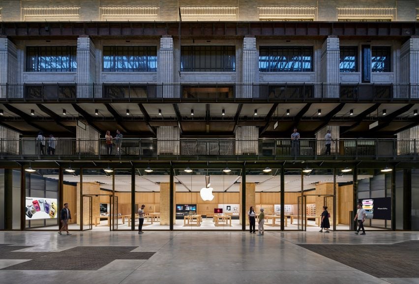
Apple’s most recently opened store is located within the newly renovated Battersea Power Station in London, which marks the technology company’s 40th UK store.
The store is set on the ground floor of the shopping centre within the power station’s 1930s Turbine Hall A. The interior was organised around four original brick columns and beneath steel roof supports that were left exposed.
Find out more about Battersea Powerstation Apple store ›
Mumbai, India, 2023
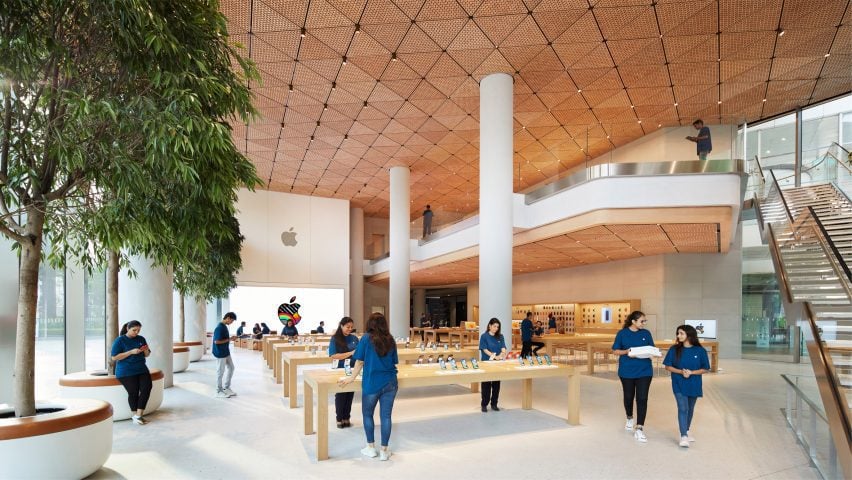
India’s first flagship Apple Store contains a wooden canopy made from 450,000 hand-crafted oak elements that form 1,000 triangular ceiling tiles.
The walls of the store were made from stone sourced from Rajasthan and have a fine grain that is meant to convey the texture of Georgette fabric. It was enclosed by two eight-metre-high glass walls that allow light to flood the double-height interior.
Find out more about Mumbai Apple store ›
Brompton Road, UK, 2022
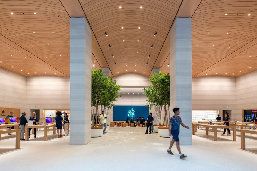
An arched timber ceiling with seven-metre tall interiors defines the Brompton Road Apple store in west London. The arched timber ceiling mirrors the profile and shape of the window bays located at the facade of the building.
The studio removed a mezzanine level from the shop interiors and incorporated six Castagna stone columns, four Ficus trees and a terrazzo floor made from castor oil resin, aggregate and recycled glass.
Find out more about Brompton Road Apple store ›
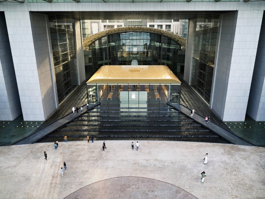
Abu Dhabi, UAE, 2022
Apple’s Abu Dhabi store on Al Maryah Island was built on top of a raised podium and surrounded by a stepped waterfall around all of its four sides.
The podium the building is set on is pyramid shaped and constructed from black granite stone. The store is accessed via two bridges that extend over the water feature from a waterfront promenade.
Find out more about Abu Dhabi Apple store ›
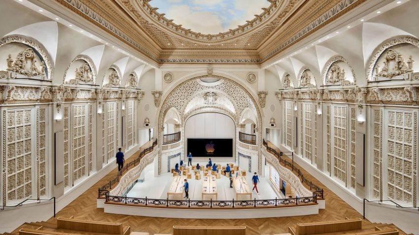
Los Angeles, US, 2021
In Downtown Los Angeles, Foster + Partners worked with Apple to renovate a historic 1920s, baroque revival-style movie theatre that was designed by American architect S Charles Lee in 1927.
The sensitive renovation of the formerly abandoned theatre saw the studio restore its corner clock tower, terracotta facade, exterior canopy, and grand entry hall that is complete with bronze handrails and marble columns.
Find out more about Los Angeles Apple store ›
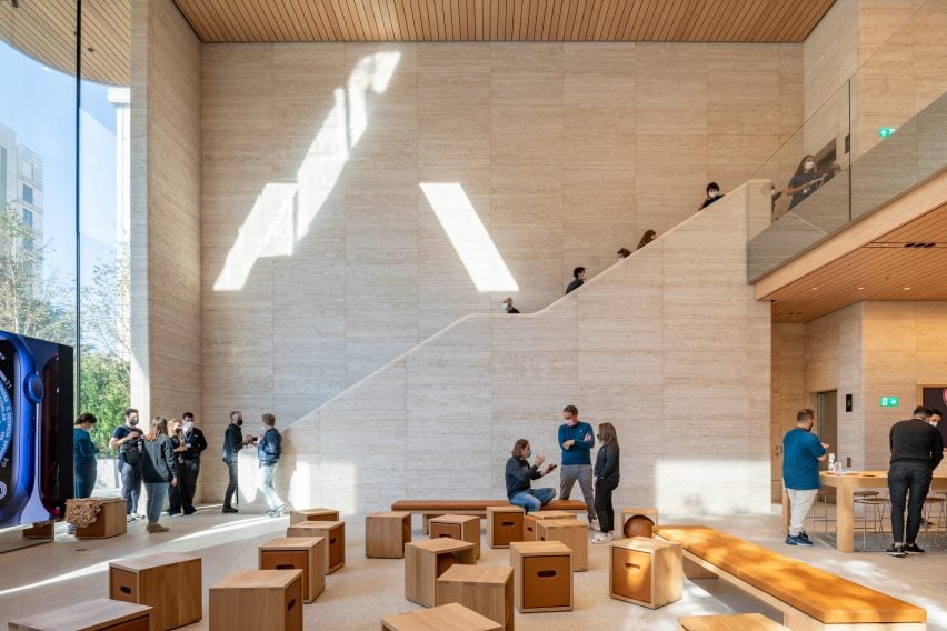
Istanbul, Turkey, 2021
Two large travertine walls flank the interior of Istanbul’s Bagdat Caddesi Apple store. Benefitting from a column-free interior encompasses two levels with a sunken double-height space at its rear.
The building is set back from the street and appears to be a single-storey structure as a result of its sunken lower level. The structure was topped with a large overhanging roof.
Find out more about Istanbul Apple store ›
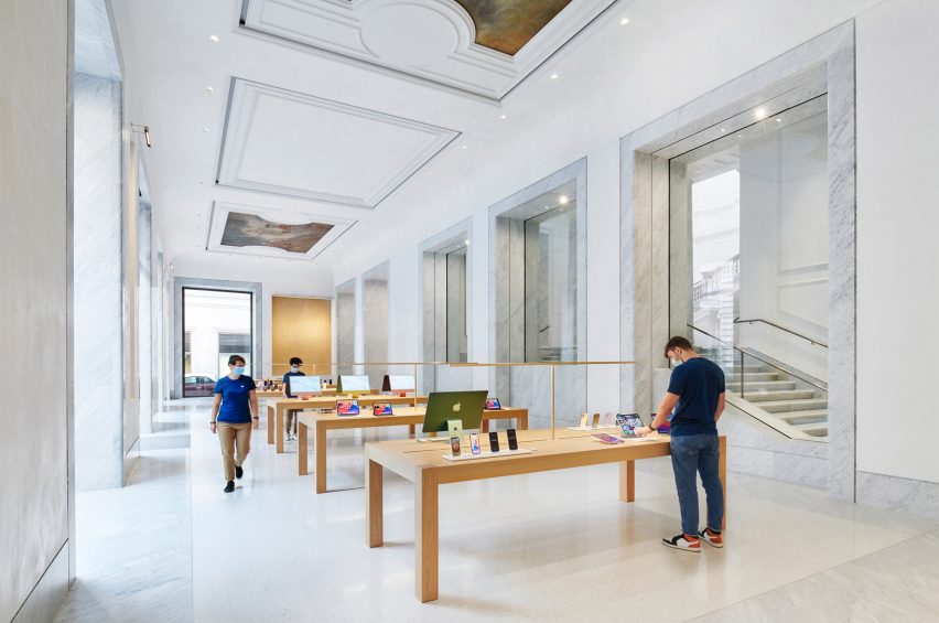
Via Del Corso, Italy, 2021
Another restoration project saw Foster + Partners convert and restore a historic palazzo in Rome, which is located in the centre of the Italian city.
Palazzo Marignoli was constructed between 1873 and 1878 and served as a home for Italian politician Marquis Filippo Marignoli. Foster + Partners wanted to celebrate the building’s history by restoring and highlighting its grandeur and historic features. Hand-painted patterned ceilings and frescos were restored throughout.
Find out more about Rome Apple store ›
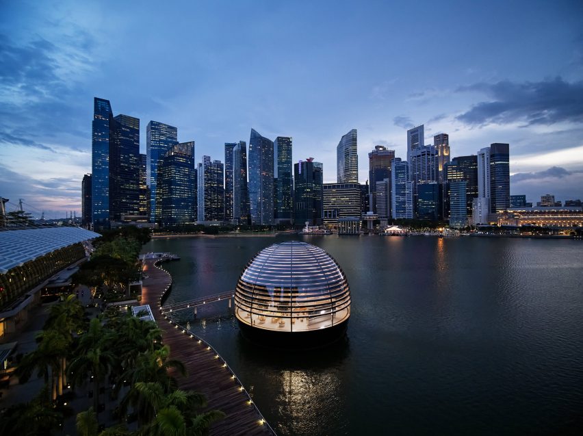
Singapore Apple, Singapore, 2020
Noted as Apple’s “most ambitious retail project”, its Marina Bay Sands store in Singapore is a spherical glass structure that is completely surrounded by water and accessed via a 45-metre-long underwater tunnel.
The store’s interior is an open-plan space that measures 30 metres wide beneath a self-supporting glass and steel dome, which is made from 114 pieces of glass with 10 steel vertical mullions that provide structural support.
Find out more about Singapore Apple store ›
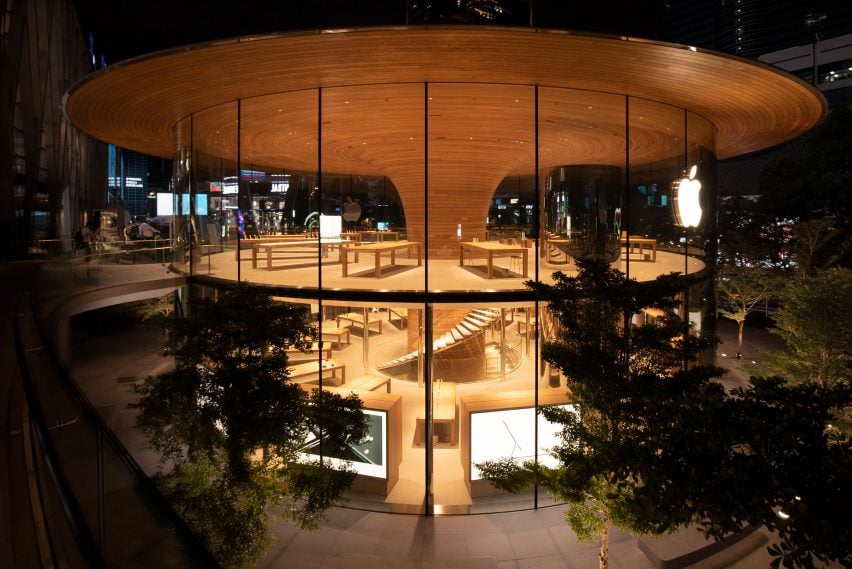
Bangkok Apple, Thailand, 2020
Named Apple Central World, this Bangkok store is organised around a timber-clad column and a large overhanging roof that was designed to resemble the canopy of a tree.
The store has a 24.4-metre diameter with a timber column that is clad in 1,461 slats of European white oak at its centre. The column fans out at ceiling level and adjoins the roof and extends past the glass perimeter of the store, forming a three-metre cantilever over the glazing.
Find out more about Bangkok Apple store ›
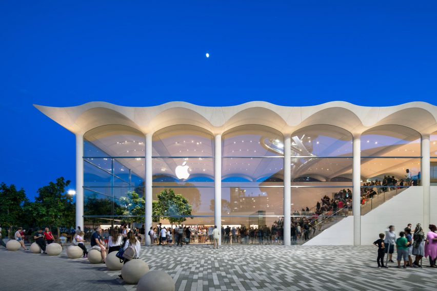
Miami, US, 2019
An undulating white concrete roof, which draws on Miami’s art deco buildings, tops the Apple Aventura store that is located in Aventura Mall in the north of Miami.
The structure is a boxy, two-storey building with glass walls and indoor trees. The roof of the store is made up of seven, precast six-metre-wide white concrete arches to form a barrel-vaulted ceiling.
Find out more about Miami Apple store ›

