Chora L Works
CategoriesArchitecture

Thinking Outside of the Modernist Box: Revisiting Deconstructivist Architecture

The A+Product Awards is open for entries, with a Main Entry Deadline of June 24th. Get started on your submission today! 

Deconstructivism is one of the most divisive architectural styles. The style and the corresponding movement emerged in the 1970s and became known in the 1980s with projects around the world by Peter Eisenman, Frank Gehry, Zaha Hadid, Rem Koolhaas and Bernard Tschumi etc. Several architects associated with the discipline-shattering movement are still highly active or have their influences long-lasting today, although their practices have undoubtedly evolved.

Yet, when it comes to describing deconstructivism, the term remains somewhat elusive. Buildings under this umbrella follow no specific forms and methodology, yet they can be seen as a reaction against the central tenets of modernism and classical architecture. The resulting buildings often seem extraterrestrial that so different from their ordinary surroundings.

Chora L Works

Eisenman Architects, La Villette, Paris, France, 1987. © Eisenman Architects.

Jacques Derrida and Peter Eisenman

The movement was rooted in the influential theories — that originated in the field of literature — by the philosopherJacques Derrida, of whom Eisenman was a close friend. Eisenman then translated Derrida’s ideas into architecture, for example, from chora (driven from Plato’s theory by Derrida) to absence and presence.

The philosopher and the architect were invited by Bernard Tschumi to design a garden in Parc de la Villette. With the design, they deeply investigated how to represent the unrepresentable. Beyond this, they not only contemplated how to represent the void, but also how to make emptiness meaningful — a delayed reaction to the horrors of World War Two, made possible by the machine-age technology that modernists had embraced in a utopian light. Although this project was never fully materialized, the investigation was rich enough to grow into the publication Chora L Works.

La Villette aerial

Perspective drawing of Parc de la Villette © Bernard Tschumi Architects.

La Villette photo

A look of Parc de la Villette from across the river, photo by Peter Mauss/Esto, courtesy of Bernard Tschumi Architects.

Bernard Tschumi

Parc de la Villette by Bernard Tschumi is believed the first built Deconstructivist project. The massive park consists of a group of buildings, walkways, bridges, gardens and more planned across a surprisingly large site in the City of Light.

The project encompasses buildings neatly placed in a matrix and a walkway system from a plan view. The walkways are in straight lines, arcs and curves that spread in a seemingly random manner and force no particular circulations. The red enameled steel buildings have no clear meaning either in themselves or from one to the next.

Casa da Musica_exterior_night

Exterior of Casa da Musica by OMA, Porto, Portugal

Rem Koolhaas

With hard-edged facets of different shapes, Koolhaas’s architecture is like cubism in three dimensions. The form can be rather simple, such as Casa da Musica. The skin made of white concrete folds into an irregular geometry that resembles an ore as well as a ship – but nothing that can be recognized exactly. The placement of glazing is unpredictable and even by seeing what’s behind the windows, the spatial arrangement of the concert hall remains unclear.

Day and night view of Seattle Central Library by OMA, Seattle, Washington.

There are complicated forms like that of Seattle Library as well. The form reminds people nothing of a library building. It is hard to tell from its appearance the function of the building at all. During the night, when the glass skin is lit from the inside, the spaces are revealed, surprising yet reasonable that are not betraying the overall form.

Walt Disney Concert Hall_exterior

Exterior of Walt Disney Concert Hall by Gehry Partners, L.A., California.

Frank Gehry

Gehry’s style is unforgettable and probably the easiest to associate with “radical.” Famous for drawing laconic sketches on napkins and other such items, his costly public structures, covered in distorted metal panels, instantly became landmarks once built.

The metal skin can be solid, hiding everything inside, like that of Walt Disney Concert Hall. Similar to Koolhaas’s buildings, you can read nothing specific from the form since the form does not follow functions. The plan behind the crazy skin is extraordinary, too. Walls can run perpendicular to each other while turning freeform a few steps away.

lou ruvo center for brain health

Lou Ruvo Center for Brain Health_interior

Exterior and interior of Lou Ruvo Center for Brain Health by Gehry Partners, Las Vegas, Nevada

Or, the appearance can be like Lou Ruvo Center for Brain Health, where regular façades with rectangular windows in lines are distorted into extreme forms. It is like Dali’s drawing, building up a surreal atmosphere by deforming ordinary objects of everyday life. Some of the distorted facades are “real”, sheltering spaces underneath. Some are rather “fake”, being simply massive shapes that fly above the head. The building is disassociating “facades” with the function of sheltering and enclosing.

London Aquatics Centre_exterior_night

London Aquatics Centre_interior

Exterior and interior of London Aquatics Centre by Zaha Hadid Architects, London, England

Zaha Hadid

Featured by smooth surfaces and skew shapes rounded at the corners, Zaha Hadid’s buildings possess a futuristic feeling. They are non-referential to the architectural style of any region and any generation, resulting in the buildings appearing often alien to their surroundings. The fluid forms sometimes recall natural existence, though that likeness stays only for a second.

For example, London Aquatics Centre, which was originally built for the London 2012 Olympic Games, has a shell-like roof. The massive roof is grounded at three points, all at the ends of the structure, creating a column-less interior. The three feet are hidden by other structures. The roof is therefore uninterrupted and looks like something soft that falls on top of the building.

Salerno Maritime Terminal_exterior

Salerno Maritime Terminal_interior

Exterior and interior of Salerno Maritime Terminal by Zaha Hadid Architects,Salerno, Italy

Salerno Maritime Terminal is more “solid” than the Aquatics Centre. It is shaped like a manta on the upper half, while a steady lower part makes it resemble a spaceship in sci-fis. The mosaic on the roof appears like the reflection on the inner side of an oyster.

None of the above architects has style alike. Rather, their style seems personal and non-referential. The forms are free from stereotypes of functional spaces following certain looks. More radically, even the traditional logic of spatial arrangement is challenged, e.g. in Parc de la Villette. They break the box of modernism, bringing contemporary architecture to a larger stage of experimentation.

The A+Product Awards is open for entries, with a Main Entry Deadline of June 24th. Get started on your submission today! 

Reference

David Hammons's "Day's End" is a Masterpiece
CategoriesArchitecture

David Hammons’s “Day’s End” is a Masterpiece

 Send us a photo. Tell us a story. Win $2,500! Architizer’s 3rd Annual One Photo Challenge is underway with an Early Entry Deadline on May 27, 2022! Start your entry for architecture’s biggest photography competition here. 

Not everyone is happy with Day’s End, David Hammons’s massive but easy-to-miss sculpture on New York’s West Side waterfront, which stands squarely across the street from the Whitney Museum of American Art. In a diplomatic yet skeptical piece in ArtReview, critic Evan Moffitt writes that the sculpture raises “uncomfortable questions” about the legacy of New York’s piers, which were once a clandestine meeting point for the city’s queer community, and are now home to jogging paths and wine bars for the one percent. 

The implication is that this sculpture, an 18 million dollar Whitney commission, is just the latest example of “gentrifier art.” This fact is particularly irksome to Moffitt because Day’s End is being sold as a memorial to an earlier, grittier incarnation of the city. The Whitney’s official press materials prominently mention the LGBTQ history of the long-since demolished Pier 52, which Hammons’s sculpture resurrects in ghostly outline. For Moffitt, there is a stark contradiction between the marginalized social history that the Whitney is claiming to venerate, and the role the museum has played in transforming the Meatpacking District into a gilded playground.

The sculpture at sunset. Photo by Elvert Barnes.

 “The new Day’s End… is a product of immense physical and bureaucratic resources, a framework that is perfect and unchanging,” Moffitt writes, referring to the tremendous amount of legwork that went into ensuring that the sculpture’s slender beams could withstand the changing tides of the mighty Hudson. “This is less reflective of a flaw in Hammons’s design than of how impossible it is to incise a landscape so thoroughly policed and privatized.” 

This line of argument is taken further by Kathleen Langjhar in The Architect’s Newspaper, who writes that Hammons’s work “selectively engages” with history, and that much of the praise that greeted the sculpture’s 2021 opening, including from The New York Times, is rooted in “a general attitude that sees culture as an unmitigated good, a solvent for cleansing the wrongs of the past.” On this reading, Day’s End is not just another example of gentrification art, but a cunning attempt to disguise the violent process of displacement that gave rise to the sanitized Meatpacking District we know today. 

Like the sculpture itself, these critiques raise more questions than they answer. For one, what is Day’s End actually about? What is it claiming to memorialize, exactly, and on whose behalf? If the Whitney is discussing this work in a self-serving way – and of course they are – does this necessarily define what the work is in itself? 

There seems to be more going on here than meets the eye. For one thing, why did Hammons, who has spent almost six decades refusing to cooperate with major art institutions like the Whitney, suddenly make an exception in order to create this work? Given everything we know about Hammons, who has spent his career using the tactics of conceptual art to advocate for the Black community, it seems unlikely that he did it to advance the interests of art museums and property developers. And given the mercurial brilliance of his body of work, it is also hard to see him as a dupe. 

According to David Hammons and Whitney director Adam Weinberg, the initial inspiration for Day’s End was not gentrification, queer history, or any of the other topics that have dominated discussion of the work, but rather the previous artwork that once stood on the site: Gordon Matta-Clark’s  architectural intervention, which was also titled Day’s End. In 1975, the self-described “anarchitect” cut a large opening on the river-facing facade of the Pier 52 shed, transforming the abandoned pier into a kind of observatory or makeshift cathedral. (Matta-Clark was reportedly inspired by the shed’s resemblance to early Christian basilicas). At “day’s end,” golden light would pour into the gritty space, a glimpse of heaven in the midst of a postindustrial hell. It stood for just three years before the shed was demolished in 1978, the same year that Matta-Clark passed away from pancreatic cancer at age 35. 

The fact that Hammons had Matta-Clark in mind when he conceived the piece, and not the pier’s history as a nexus of queer culture, has troubled a number of commentators. It turns out that Matta-Clark resented the presence of the LGBTQ community on Pier 52. Although Matta-Clark had no more right to the space than they did – his installation was created without permits, under cover of night – he padlocked the entrances to the shed while he was working on his piece. He described the frequent visitors to the space as “menacing characters,” part of a “sadomasochistic fringe,” and complained that their presence detracted from the power of his work. While Matta-Clark was interested in reclaiming the dark, abandoned corners of New York for art, he had little time for the people who had already found a use for these spaces. Moffitt complains that Hammons’s piece, by memorializing Matta-Clark, “contributes to the hagiography of a homophobe.” 

Ironically, while Matta-Clark may not have liked the LGBTQ subculture that thrived alongside the original Day’s End, his work lives on in public memory in large part due to the work of photographer Alvin Baltrop, a gay, African-American artist who lovingly documented sunbathers on the piers in the 70s. The very community Matta-Clark resented is, it seems, responsible for the long afterlife his installation has enjoyed. 

This is the kind of irony that Hammons appreciates more than his critics do. Moffitt bristles at the fact that the plaque adjoining Day’s End mentions Matta-Clark and not Baltrop or the history of cruising at the piers, claiming that these omissions amounts to violent erasure. But as Jacques Derrida would note, every attempt to commemorate or conserve is simultaneously an act of erasure. If this is violence, it is a kind of violence that is inscribed in the essence of signification itself. It would be impossible to encompass the entire history of the piers in the space of a plaque.

Of the work, Hammons has said “a great tailor makes the fewest cuts.” Photo by Elvert Barnes

By leaving the form of the sculpture radically open, Hammons’s work speaks to the impossibility of his critics’ demand – that is, the impossibility of an objective monument. Every monument is a “cut” in the historical record, privileging some elements over others. The best one can do is create a space for discussion. And Hammons’s Day’s End, in echoing the architectural form of Pier 52, literally does this – that is, it creates space. That is all it does, really. Its form is an outline. As Hammons noted when discussing the piece, “a great tailor makes the fewest cuts.” Without speaking to it directly, Hammons’s Day’s End provoked a discussion about the queer history of the piers. That history – and other histories, yet unmentioned – is simply part of the work, regardless of the intentions of its patrons and creators. The work exceeds the Whitney, and exceeds Hammons.  

Throughout his career, David Hammons has explored the mystic power of objects and materials. He once said that he spends “85 percent” of his time on the streets, observing his environment and gathering inspiration. His most enduring works are made from discarded materials, from garbage. He has created art from liquor bottles, hair, felled telephone poles, garbage bags, and even snow.

While Hammons’s work is deeply political, it is never didactic.  Take his famous 1986 installation, Higher Goals. Working out in the open, on the streets of Brooklyn, Hammons decorated felled telephone poles with bottle caps. He then fixed basketball hoops to the top of the poles and placed them upright again. The hoops stood 20 to 30 feet in the air, far higher than any player could comfortably reach. “It takes five to play on a team, but there are thousands who want to play,” Hammons explained “Not everyone will make it, but even if they don’t, at least they tried.”

With brutal clarity, this piece illustrated the way fame is dangled in front of Black youth, a means of keeping marginalized communities complacent with false hope. And yet, there was more to it than that. The intricately decorated hoops also spoke to the resilience of the Black community, how the youth still dare to dream even in desperate circumstances. Looking up at the sculptures, one wonders what could happen if that energy could be channeled somewhere else. 

Another example of a work by Hammons that defies easy interpretation is his Bliz-aard Ball Sale in 1983. This performance piece was deceptively simple. Hammons literally sold snowballs on the side of the road. Perfect snowballs, made with expert care and available in different sizes. At one level, this whimsical performance was a commentary on capitalism’s ability to turn anything into a commodity. It was a joke. But in another sense, there was something beautiful about the snowballs, their delicacy and ephemerality. By selling them, he was offering customers a taste of their childhood, a tactic not unknown to marketers. There is an art in marketing, the work suggests. Perhaps it is a dark art, but it is an art all the same. 

“[ H ] David Hammons – Blizaard Ball Sale (1983)” by Cea. is licensed under CC BY 2.0.

Day’s End is another Hammons work that is mischievous in its undecidability. It certainly is an homage to Gordon Matta-Clark, an artist who Hammons never crossed paths with, but who shared Hammons’s interest in art’s power to transform forgotten spaces and materials. But it pointedly does not resemble Matta-Clark’s installation. There is no half-moon in the new Day’s End, no play of light and shadow. The sculpture simply points to its original context, and in doing so has provoked a lively debate over the legacy of a small part of the waterfront that, previously, no one thought about very much. 

If Hammons’s Day’s End is a monument at all, it is a very non-traditional one. In bolder moments, one could even call it an “anti-monument.” The work advances no specific narrative, presenting only a frame for contested histories. 

Cover photo by Elvert Barnes 

 Send us a photo. Tell us a story. Win $2,500! Architizer’s 3rd Annual One Photo Challenge is underway with an Early Entry Deadline on May 27, 2022! Start your entry for architecture’s biggest photography competition here. 

Reference

"22 Gordon Street" Reimagines the Bartlett School as a Monstrous Manifestation of Architectural Experimentation
CategoriesArchitecture

“22 Gordon Street” Reimagines the Bartlett School as a Monstrous Manifestation of Architectural Experimentation

Send us a photo. Tell us a story. Win $2,500! Architizer’s 3rd Annual One Photo Challenge is underway with an Early Entry Deadline on May 27, 2022! Start your entry for architecture’s biggest photography competition here. 

The 2022 One Rendering Challenge winners have been announced, concluding an incredible competition that celebrates one of the most integral processes in design: rendering. The top Student Prize went to Christian Coackley for “22 Gordon Street” — a mysterious and detailed reimagining of UCL’s famous Bartlett School of Architecture building (where the artist is currently enrolled). The building, previously known as Wates House, famously underwent massive and ambitious refurbishment over the last decade when millions of pounds were invested to open up the façade of the building and reveal new creative spaces within. The rendering, however, is not only concerned with the evolution of the building itself; it uses the architecture school building as a metonym to imagine an alternative model for architectural education and the profession as a whole.

“In light of enduring issues we are facing globally, such as a climate and ecological emergency, schools of architecture must nurture a culture of collaboration in architectural education to meaningfully address them. Therefore the drawing speculates on the third iteration of The Bartlett School of Architecture. In contrast to the building’s previous 2 iterations, Wates House (1975) and The Bartlett (2016), this next installment of the school will be constructed over the course of 1000 years by the students and tutors themselves,” Christian stated. Using Photoshop and ZBrush, the winning rendering meditates on the impermanence of design and the inherently evolutionary nature of building, as structures must adapt with evolving human needs.

22 Gordon Street: In its first iteration as Wates House (1975), and later as The Bartlett (2016). 

“The future generations of the building’s inhabitants will recover a lost material culture of hand-crafted ceramics,” imagines Christian. “This interchangeable orchestra of students and tutors will weave themselves together through the poetic symphony of a shared material culture, ushering in a new era in architectural education: The Age of Belonging.”

Architizer’s Editor-in-Chief Paul Keskeys discusses the creative process behind the winning rendering, which included a community engagement process in addition to the more technical considerations. Christian also shares images of his other work.

Paul Keskeys: Congratulations on your success! What does winning the 2022 One Rendering Challenge mean to you?

Christian Coackley: I feel extremely lucky and grateful for the outcome of the competition as it is a product of the endless support from my family, friends, and tutors who are at the core of why I do what I do. It is truly awesome to be recognized in such a competitive field, however, I also appreciate that ideal outcomes and perfect results are not a true reflection of what this discipline is about.

What were the primary challenges of conceiving your work, from forming the idea to the actual physical process of rendering?

The idea was formed around my interest in experimenting with a socially engaged method of research to inform architectural design. Through the act of creating a ‘Dining Room’ outside of 22 Gordon Street, I was able to host conversations with students, tutors, and passers-by that allowed me to learn more about others’ experiences at the school, and their thoughts on the culture of architectural education. The guests of this occasion were encouraged to add to one of five clay sculptures that had been worked on by a previous guest. The result of the 3-day event was 5 co-created sculptures and a better understanding of what The Bartlett meant to its users.

The physical process of creating the render derived from the approach of taking more time to do one thing, rather than doing many things that take less time. This approach to drawing is one that I have struggled with as it requires placing a level of patience and belief in the design process that I hadn’t done previously.

Did you use your usual techniques and software for creating this rendering? If you tried something different, how did that go?

Since I wanted the architecture to reflect the very human conversations that took place at ‘The Occasion’, I turned towards the ZBursh software that is used for making character models in games. Within the software I was able to develop a language that allowed for me to abstract the human form into architectural prototypes that could be deployed within the render. One can notice that the render is split between two distinctly different architectural languages. On the right is a skeletal structure that is taken from images of physical clay sculptures created by the guests and I, and on the left is the organic skin that was created using ZBrush. These two contrasting languages eventually begin to weave themselves together over the course of the project. This is shown in one of the projects final interior renders, which depicts the head of school giving Britain’s immortal Queen Elizabeth a tour of the new Bartlett.

Detail of the One Rendering competition winner. 

What connection does this image have to you and your personal feelings about architecture?

The image reminds me that architectural education, practices and The Bartlett itself, are all made up of human beings. They represent the potential for skilled and passionate individuals to come together as a collective and create something that could not be achieved in isolation. However, it unfortunately feels that we are still a long way off from establishing a culture of collaboration rather than competition in architectural education.

When first joining The Bartlett, I felt that the only thing that could separate yourself from the rest was by working harder and longer than others. This mindset was not wrong, but it was not disciplined, and I was one of many students unwittingly participating in one of the profession’s systemic issues; long hours culture. This issue stems from the competitive culture that is established through the act of valuing product over process, an aspect that was critiqued by David Nicol in his text ‘Changing Architectural Education’. He proposes that this is ‘most clearly reflected in the conduct and focus of assessment’, where students are often not rewarded directly for their efforts in analyzing the needs of a client or community. Rather this process is seen as an additional aspect that may be included alongside the main conceptual design proposal. Furthermore, the students’ projects are boiled down to a collection of portfolio pages that become a ’tangible product’ for employers to consume.

Do you have any other work that compares to this in terms of lighting, atmosphere and composition?

Instead of responding words, Christian lets his other images speak for themselves: 

What one tip would you give students and architects looking to win next year’s One Rendering Challenge?

I would suggest trying a technique or approach to design that you want to develop further or have never tried before. I feel it is best to never be 100% comfortable in what you’re doing otherwise it can prevent you from discovering things you never previously envisioned. But most importantly… Keep Drawing!

Send us a photo. Tell us a story. Win $2,500! Architizer’s 3rd Annual One Photo Challenge is underway with an Early Entry Deadline on May 27, 2022! Start your entry for architecture’s biggest photography competition here. 

Reference

Avian Architecture: To Coexist, Architects Must Embrace Multi-Species Design
CategoriesArchitecture

Avian Architecture: To Coexist, Architects Must Embrace Multi-Species Design

Judging is now underway for the 10th Annual A+Awards Program! Want to earn global recognition for your projects? Sign up to be notified when the 11th Annual A+Awards program launches.  

In urban environments, one could argue that birds are typically viewed through two diametrically opposed lenses. On the one hand, they are idealized objects of desire, occupying central symbolic roles in language, literature, art and religion. The idea is ancient, visceral and undeniable; manifested through religious rituals and rites of passage across the world. At the same time, birds are viewed as a nuisance and, in many cases, are seen as “pests” that need to be managed within our cities. While urban city-dwellers might appreciate the presence of birds in their neighborhood park or nesting in a backyard tree, the notion of actively sharing buildings and structures with these animals is currently not widely accepted. 

Simultaneously, the climate crisis and the pandemic outbreak have collectively forced us to rethink how we interact with other forms of life within our urban environments, on both a micro and macro scale. As we have continued to rapidly urbanize areas all across the globe, animals that originally called these environments home have been displaced, forced to find other means of refuge, or have learned to coexist with humans in primarily antagonistic ways. In response to the status quo, how might architecture play a role in defining and mediating the varying shades of “middle ground” in between spectacle and maintenance that typically define animals like birds in the built environment? What can forms of inter-species architecture teach us about how to live more sustainably with all species?

Mosaic of Scene with Egyptian Columbarium for Breeding Pigeons, First Century B.C. Rome © WikiCommons

For centuries, birds such as pigeons played a significant role in the economies and culture of ancient civilizations like Persia, the historic region of southwestern Asia that is now modern day Iran. Pigeons have been part of the Middle East since the dawn of agriculture, as the world’s oldest domesticated bird, with research suggesting that they lived in captivity stretching back over 10,000 years ago. As agrarian practices began to evolve in ancient Persia, farmers realized that pigeon droppings made excellent fertilizer and subsequently began to build towers to breed and house these birds. Rich in phosphorus, potassium and nitrogen, pigeon droppings provided much-needed fertilizer for melons, cucumbers, wheat and other nitrogen-demanding crops — all cornerstones of Persian cuisine

Once the value of these birds became clear, pigeon towers proliferated as the region’s agricultural output began to improve and humans worked to construct symbiotic and mutually beneficial relationships with these feathered creatures. Typically built from molded mud, lime, earth, or salt — depending on the material resources of the region — these towers could house up to as many as 15,000 birds at a time, subsequently generating 15 tons of annual fertilizer for a local region. 

Dovecotes (Pigeon Towers) are plentiful in the agricultural vicinities of Isfahan. © WikiCommons

Isfahan is famous for its rich tradition of pigeon towers. Most of the structures still in existence today date back to the 17th century. The architecture of these towers adapts the vernacular architecture of Iran to suit avian needs; majestic vaulted towers with an internal honeycomb structure rise up to six stories high and 50 to 75 feet in diameter. The birds can access their nests through small, narrow passages that protect them from predators such as snakes or larger birds. Once a year, farmers access these small sockets to extract their droppings, simultaneously providing safe refuge for these animals while benefiting the agricultural production of the local community.

The resilience of this bird-based architecture, which has been constructed by cultures across history and geographies demonstrates that urban infrastructure can utilize ecological materials, mostly salt and earth, to help sustain populations of up to 20,000 people at a time. While many of the pigeon towers that used to dot the landscapes of countries like Iran unfortunately lie in disrepair today, they stand as monuments to the enduring importance of low-tech cooperative architectural solutions to contemporary crises. 

Interior, Isfahan Pigeon Tower. ©WikiCommons

Today, due to the widespread use of chemical fertilizers, active pigeon towers are few and far between, as these unique buildings convey memories of a past long forgotten. Our architectural relationship with these animals primarily endures through various DIY forms, as birdhouses for aviary enthusiasts or rooftop pigeon coops. Recognizing the intelligence of pigeons, bird enthusiasts in cities like New York have taken to housing these animals in order to train them to become champion flyers and racers, periodically releasing their flocks in spectacular displays of choreographed flight. Pigeons also have an incredible biological sense called magneto-reception, allowing them to navigate vast terrains and find their way home or deliver messages from as far as 2,300 miles away, a skill that has periodically been exploited by humans throughout history. 

While few forms of architecture today truly embrace the potential of these animals, the desire to experiment with this architectural typology in an effort to provide safe refuge for avians was not lost on all contemporary architects, as birds have become an undeniable part of life in almost any urban environment. In Barcelona’s Parc Güell, Antoni Gaudí intentionally designed architectural elements that would allow for birds and pigeons to nest. He constructed long terraced walls and turrets that incorporated nests for pigeons and a variety of other avians to reside in, encouraging their interaction with the architecture as opposed to trying to prevent it. 

A walkway below and roadway above mirrors the organic shapes of trees and provides nests for park birds, Parc Güell (1914). ©WikiCommons

Oscar Niemeyer’s O Pombal Pigeon House (1960) in Brasília may be the most recognized pigeon tower in recent times. With mirrored oblong openings on either side, this giant concrete tower stands in the center of the Praça dos Três Poderes, at the heart of Brazil’s capital. Its interior is constructed with thin rows of horizontal concrete shelves that allow for hundreds of pigeons to perch and roost in. While the tower is purely sculptural and doesn’t engage in the beneficial agricultural practices that pigeons can help to implement, architectural symbols like this one are important in terms of shifting the collective sentiment that birds are a nuisance to be tolerated within urban environments. 

O Pombal, Oscar Niemeyer (1960). @WikiCommons

O Pombal, Oscar Niemeyer (1960). @WikiCommons

For the vast majority of urban spaces, current architectural practices make life extremely difficult and often deadly for birds all across countries like the United States. The astronomical increase in buildings that utilize fully glazed facades has resulted in the estimated deaths of at least a billion birds across the country each year. Shiny glass exteriors, interior plants near windows, and landscaping near buildings can all be deadly to birds as they are unable to distinguish reflections in the glass from open sky. Following habitat loss, this is the second largest man made threat that birds face each year. In response, urban areas like New York City have introduced Local Laws to update building codes to make new glass structures safer for birds, resulting in frit patterns and other designs that can be commonly be found on exterior glazing today. While these measures are an important step forward, architects should think bigger and not only opt for bird-friendly designs in their projects but work to help the avian community thrive.

As we continue to build at unprecedented rates in both urban and rural areas, we must take a harder look at whether we design with other species in mind. To be sure, solutions that may have worked throughout history in places like Isfahan — a rural community without the technical capabilities for large scale agriculture — may not be as replicable in large metropolitan areas like New York City. That being said, how can historic works of co-species architecture as a whole contribute to the re-examination of our relationship with nature, which is so sorely needed? Birds like pigeons have proven countless times throughout history that they are beneficial to our biosphere and can help us be more productive stewards of the planet, if only we would listen.

Judging is now underway for the 10th Annual A+Awards Program! Want to earn global recognition for your projects? Sign up to be notified when the 11th Annual A+Awards program launches.  

Reference

100 Renderings That Tell Stories About Architecture and Our World in 2022
CategoriesArchitecture

100 Renderings That Tell Stories About Architecture and Our World in 2022

The largest exhibition of architectural renderings in 2022 is officially here! We are thrilled to reveal the 100 Finalists for the 3rd Annual One Rendering Challenge, each one telling a unique story about architecture’s role in the shaping of modern society. Below, you’ll find every amazing image that made the Top 100, forming an extraordinary showcase of architectural visualization and narrative-driven design.

Our stellar line up of expert jurors are now reviewing each of these images in minute detail, and their decisions will revealed with the publication of the Official Winners’ Announcement towards the end of April. The renderings will be judged according to the competition criteria. For the One Rendering Challenge, jurors’ rankings are converted into scores, which then give us our two Top Winners and 10 Commended Entries.

You can explore those 100 renderings below (published across 4 posts and in no particular order), accompanied by their stories. Tell us which is your favorite on Instagram and Twitter with the hashtag #OneRenderingChallenge! Below, “Part 1” presents the first 25 architectural visualizations — you can jump to part 2, 3 and 4 using these buttons:

Part 2     Part 3     Part 4


“Kaiserwagen” by Zana Bamarni

“Depicted in this image is my hometown Wuppertal. The world famous Schwebebahn, which was build over one hundred years ago as a result of advancements in steel production and metal fabrication, still remains to awe visitors when it meanders through narrow streets above the river Wupper. Shown here is a speculative redesign of the city in the spirit of the early Schwebebahn designs and its historic “Kaiserwagen”.

A lot of motivs were drawn from historic Schwebebahn Stations and the Art-Nouveau movement. A combination that is very fitting in a historical context. Both were made possible due to the progress in metal fabrication and could have been natural evolutions of each other. This image celebrates the joyful mingling of architecture and craftsmanship and carries this spirit into the scenery itself. People mingling.”

Software used: V-Ray, Rhino


“REMEMBRANCE” by Zoe Russian Moreno

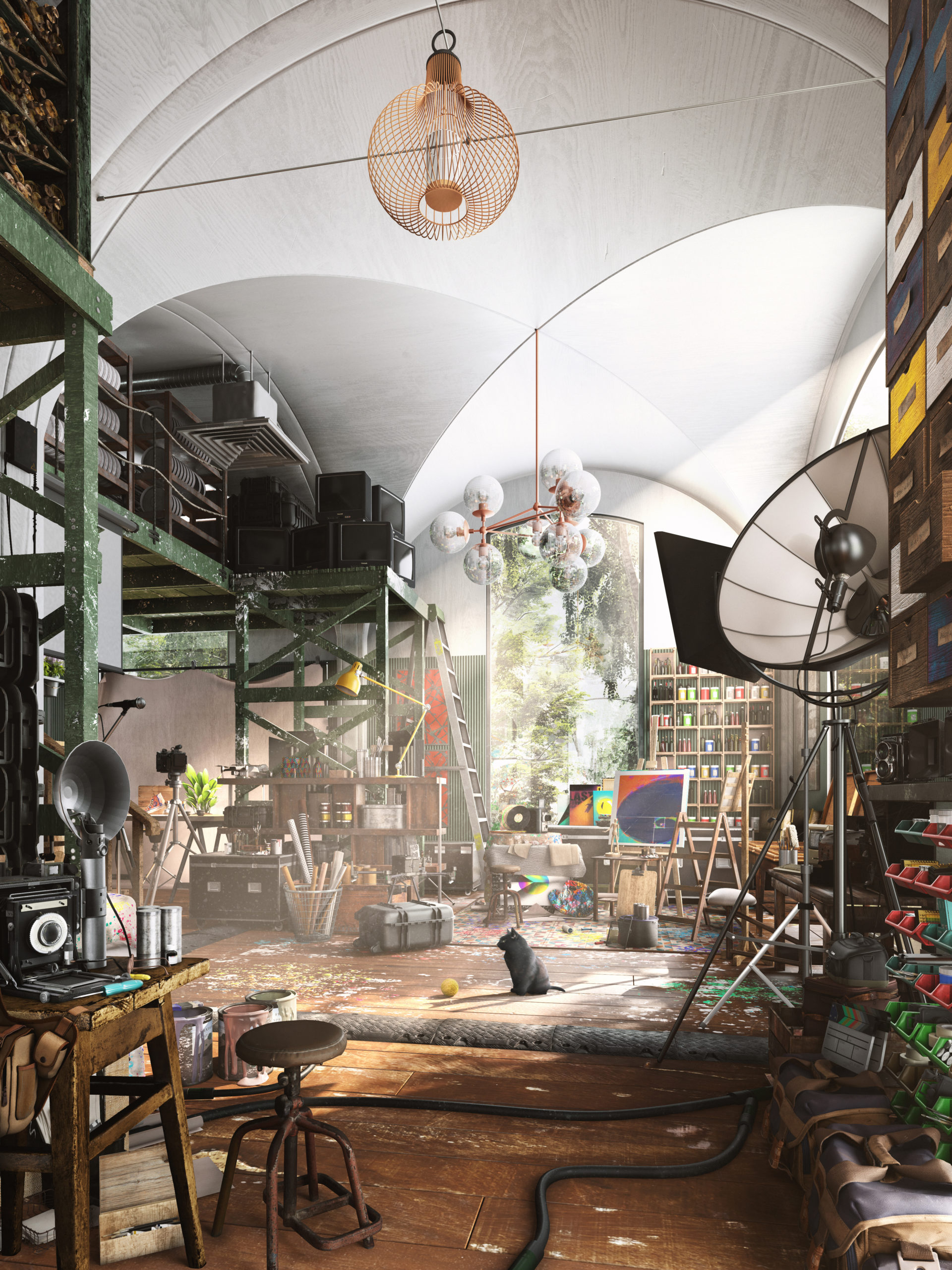
“Memories and dreams sometimes go hand in hand. The combination of reality and fantasy is an intrinsic force that supplies the creative portfolio of an artistic mind with endless possibilities. Nevertheless, even with all the infinite pieces put together sometimes one can’t help but look into triggers of certain spaces that take you back into specific moments of life. This particular studio is a combination of said moments in time; clutter in respective areas, materiality, scale, objects and the conglomeration of mechanical pieces grounds the imagery, which brings a sense of character that many people resonate with. It’s a sense of remembering a space that does not exist. A remembrance.”

Software used: V-Ray, 3ds Max, Photoshop


“The Lantern” by Evan Mott

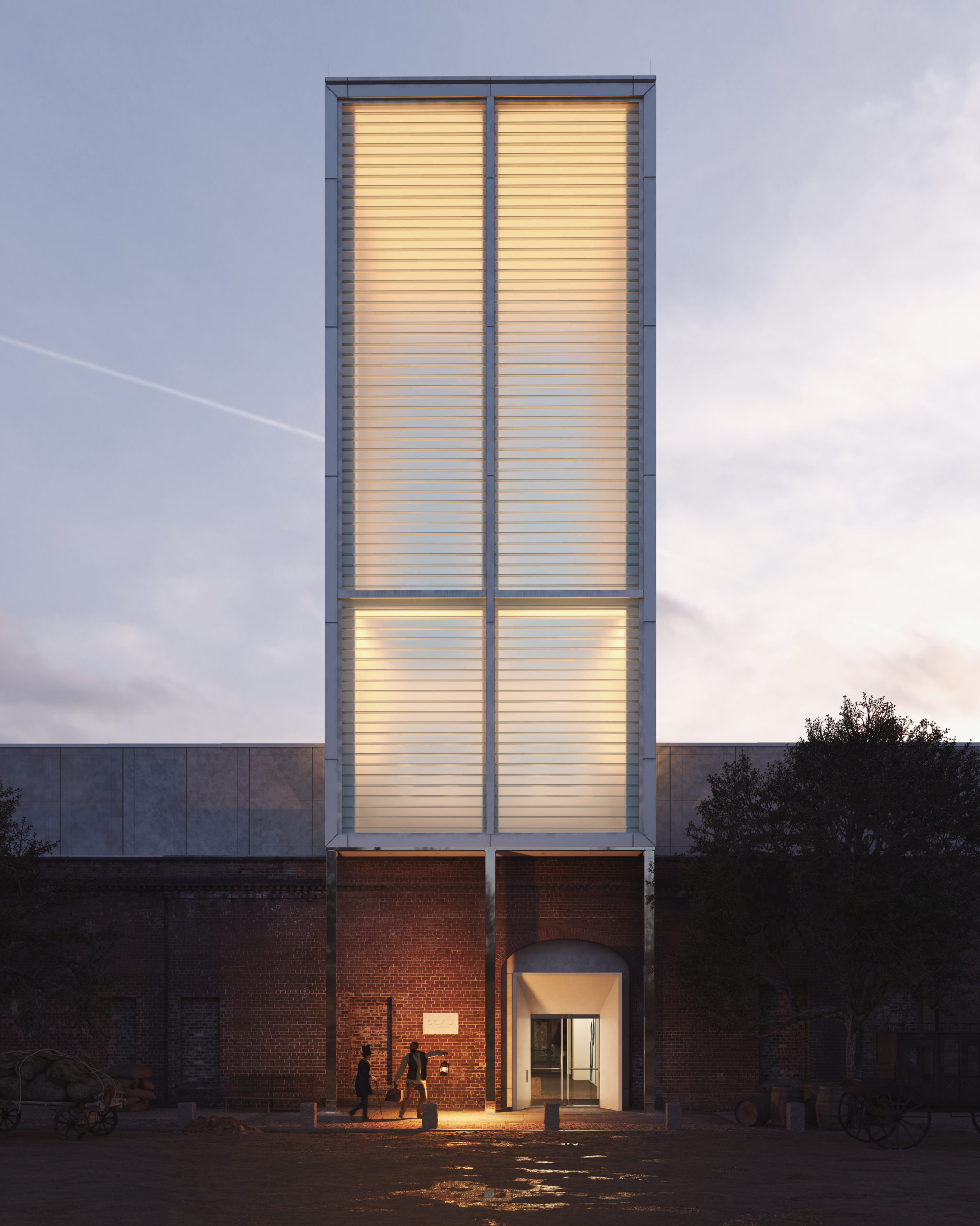
“On December 21, 1848, a white plantation owner, traveling with his enslaved servant, passed through the Central of Georgia Railroad terminal in Savannah, seeking medical care in Boston.

Or so it seemed.

In actuality, the pair were Ellen and William Craft. Enslaved since birth, the married couple devised an artful plan of escape in which fair-skinned Ellen disguised herself as William’s white owner. Four terrifying days and 1,000 miles later, they successfully carried their lantern to freedom. They would devote their lives to exposing the dark brutalities of slavery, lighting the way to liberty for others.

Today the same railroad terminal, reimagined as the SCAD Museum of Art, carries its own lantern. The glow of the 85-foot glass tower reminds us that Craft-like creativity and courage are essential in building and protecting the delicacy of equity and freedom.

Thank you, SCAD, for telling this story.”

Software used: V-Ray, 3ds Max, Photoshop, Other


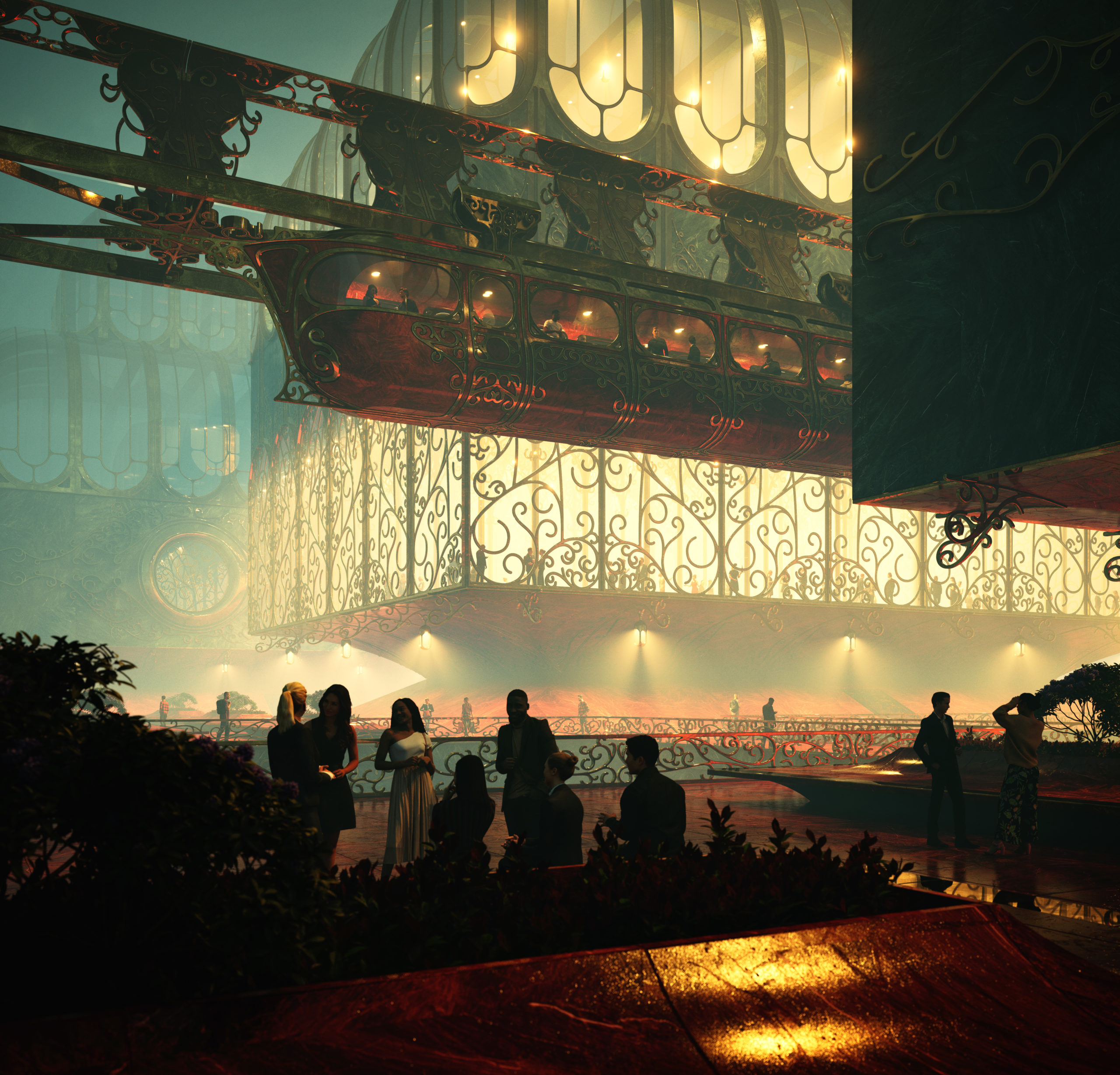
“Up In The Air” by Vittorio Bonapace

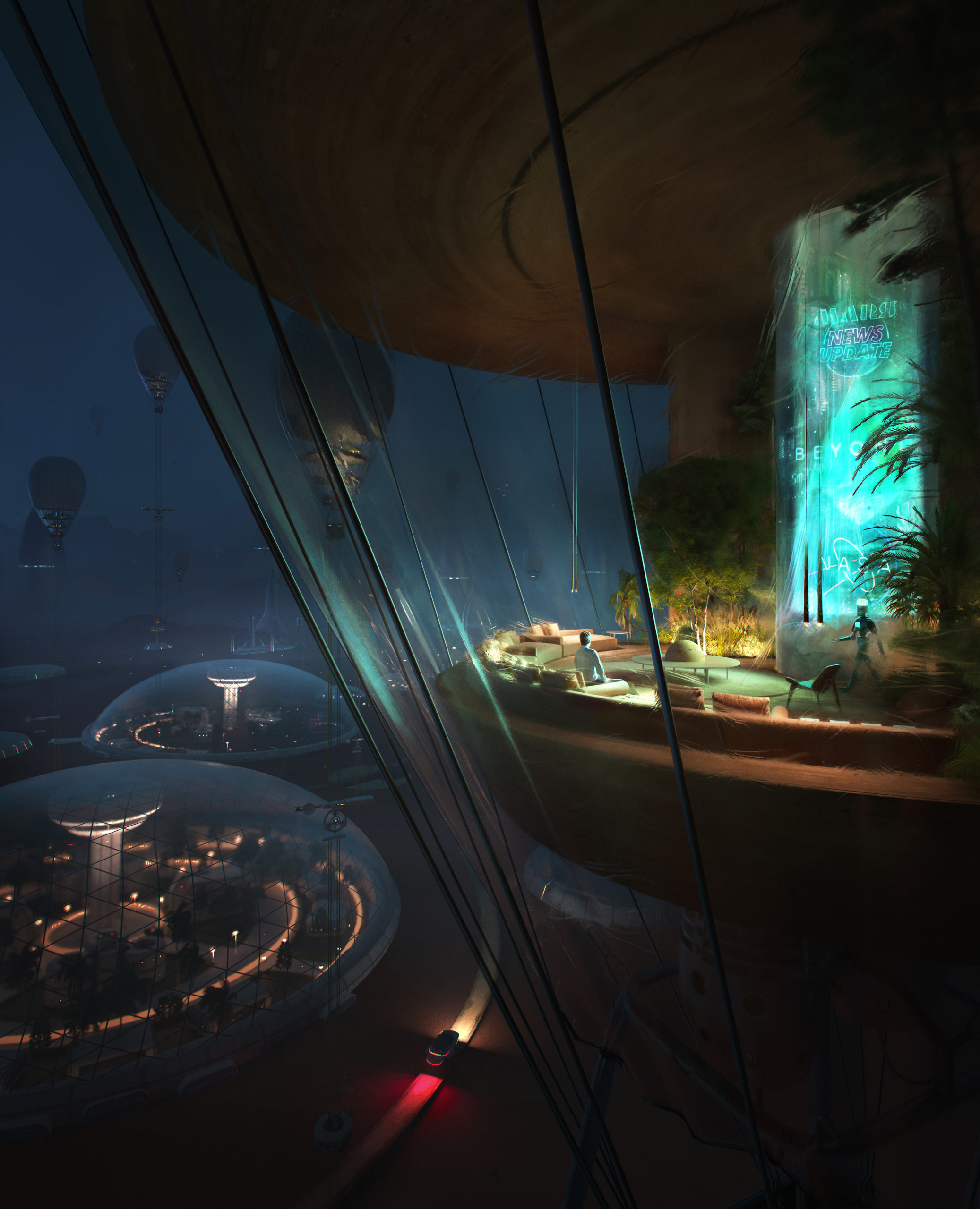
“The First Settlement on Mars.

The author imagined the first Colony – not so far in the future – inhabiting the sky into high-altitude balloons, leaving Mars’s surface for laboratories, roads, research and science experiments. “Up In The Air ” is part of a set of three illustrations. It’s not about the first epic human’s landing on the planet; the whole concept is about the confidence of living there, enjoying home.”

Software used: 3ds Max, Corona Renderer, Photoshop, Other


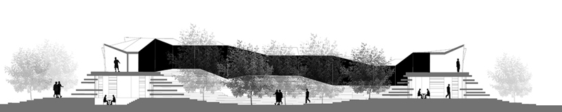
“Halo Funeral Center” by Pablo Emilio Vázquez Ramos

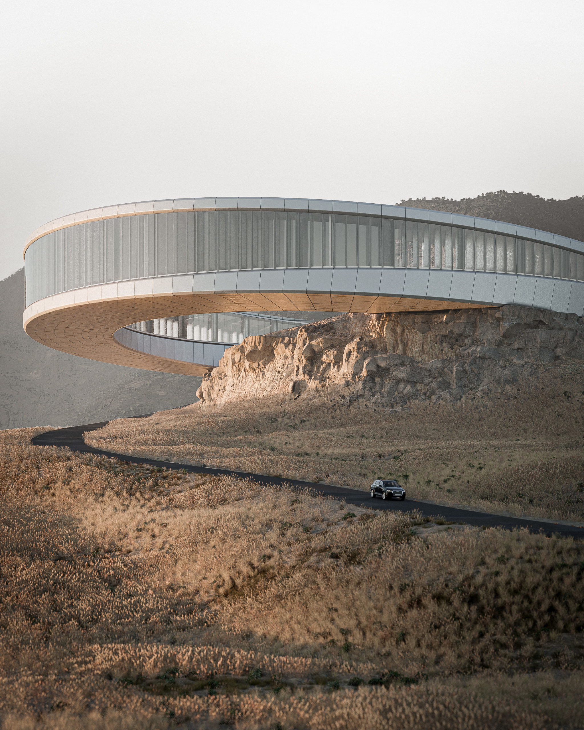
“Located near a highway between two major cities in the north of Mexico, Monterrey and Saltillo, the site generates from the hillside of the mountain chain. A ring with an inner radius of 47m, a section of 18m and an outer radius of 65m. Embedded in the ground giving the appearance of rising or detaching from it. The intention of the project is to guide the farewell process of a loved one through the natural and architectural environment. HALO Funeral Center stands out for its morphology and relationship with the context that generates a farewell process for both the bereaved and the deceased. In this way achieving a liberation and a healthy duel.”

Software used: Blender


“About Storeys and Stories” by Guilherme Marcondes

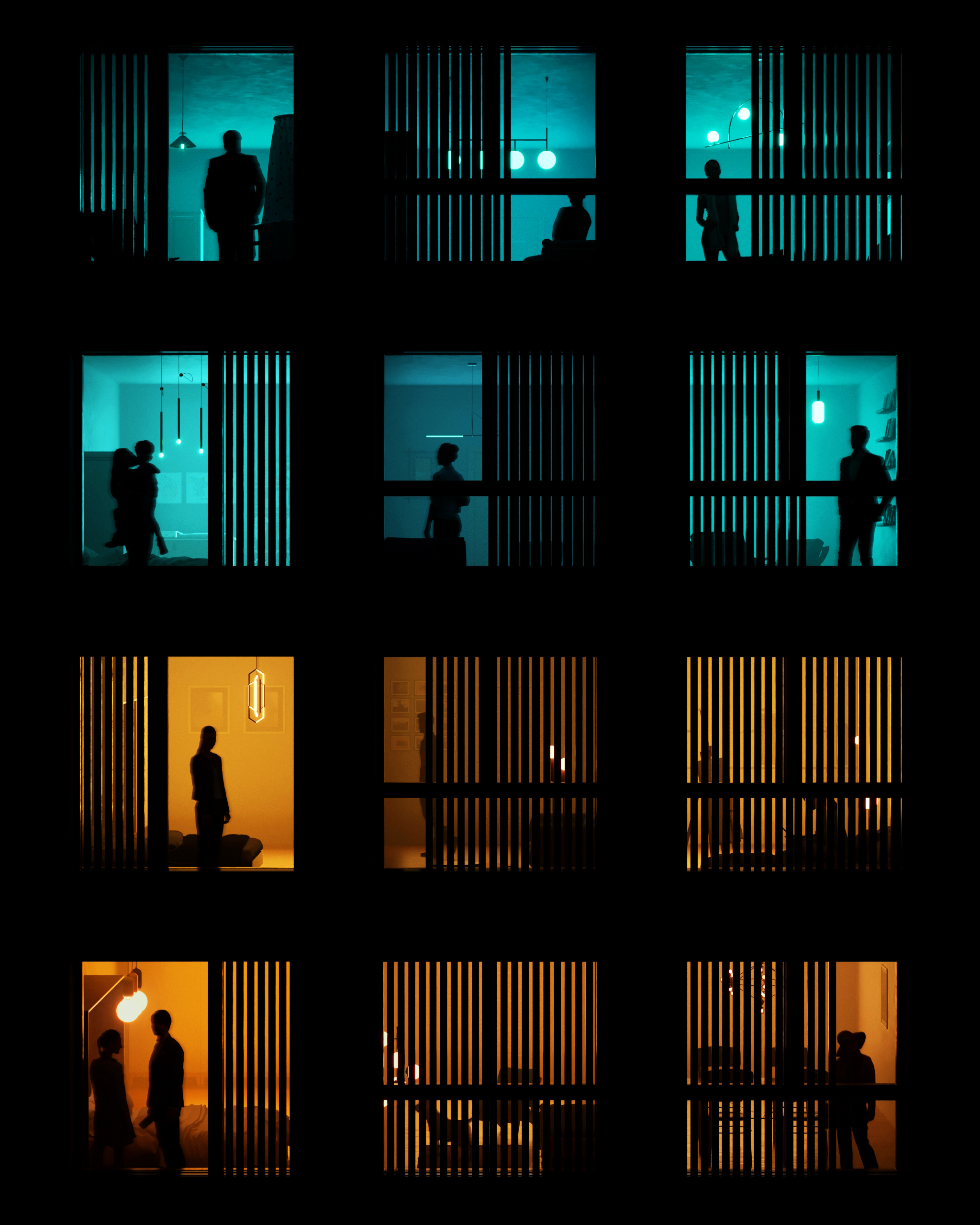
“People is what gives architecture life. With all their different lights and colors, they make the spaces alive. When designing a façade, a lot of effort is put into the relation with the exterior environment. With this rendering I wanted to focus on the role that the interior spaces play in a façade. Each of these windows have a story to tell, a feeling to show, a thought going on.

Home can have a lot of meanings: it’s where we come after work, rest, see our loved ones. It’s where we process the thing that happened outside, where we plan the things we want to do outside. Most importantly, it’s where we can show our true colors: sometimes bright, strong and warm. Sometimes soft, cold and blue. Through the day and the night the façade is where we see not just the city, but also the people’s light.”

Software used: 3ds Max, Corona Renderer, Photoshop


“Layers of the Underworld” by Keyhan Khaki

“A boundless generative study for a spatial understanding of an infinite archive dedicated to letters and stamps in the context of Campo Marzio. Inspired by “The Library of Babel” by Jorge Luis Borgestry, the drawing tries to incorporate the idea of sauntering and browsing through ramps. It explores the layers beneath the Campo Marzio in relation to the accumulation of historical letters and records. This is a result of moving upward and downward into the layers of Campo Marzio imagined by Giovanni Battista Piranesi (1720- 1778).”

Software used: Rhino, Lumion, Photoshop


“Foot of The Hill” by qiantailong Shi

“Overlooking the sky, the water,the mountains and the small houses, they form a long picture that is deeply touching. The combination of a long time and strong strength reveals a solemn scene and makes people linger and forget to return. I suddenly had a strong desire and shouted at the mountain opposite. Bursts of pleasant echoes reverberated in my young heart, and my heart suddenly gushed a kind of magnanimity I had never had before. I felt that I had melted into the mountain.”

Software used: 3ds Max, SketchUp, Corona Renderer


“Gravity” by jingwei li

“The illustration explores a future in which architectural forms grasp to reach beyond Earth’s gravity. Density and population lead some to choose a nomadic life-style, free to roam the open plains below…”

Software used: V-Ray, 3ds Max, Photoshop


“Museum of Memories” by Hristo Rizov and Arthur Panov

“What are memories if not frozen fragments of time?
Locked there in the museum.
Screaming for attention.
Wrestling to keep you restless.
Some full of sorrow and unrealized dreams.
Some… of uncried tears.”

Software used: V-Ray, 3ds Max, Photoshop


“Fainted Hope” by Dennis Grimm and Renato Aguilar

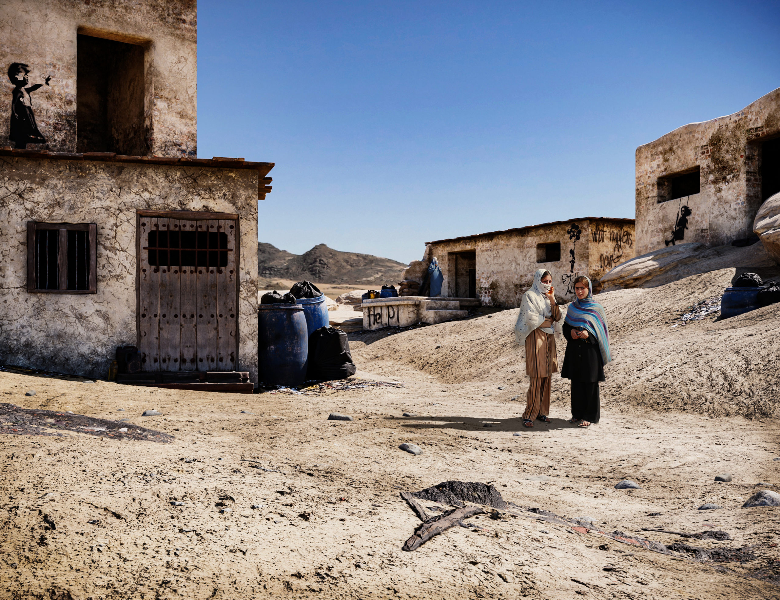
“Faced with the cruel reality everybody witnessed on TV in 2021, we were moved and felt responsible to act.

The image was to grab the viewers’ attention, evoke a feeling of affectedness, and make them reflect on the situation. The ambiance was inspired by several images we found of Afghan habitations. We aimed for realism, so we tried our best to capture the arid and vast landscapes we saw in these references and model authentic regional architecture. Finally, the young women are the focal point of the entire scene, they are quite literally in the middle of everything.

The environment, the architecture, and especially the characters – everything had to look and feel as real and convincing as possible. The women’s postures and facial expressions are crucial in conveying this feeling of uncertainty and helplessness, so we put a lot of effort into their appearance.”

Software used: 3ds Max, Corona Renderer, Photoshop


“Sunset Love” by Mark Eszlari

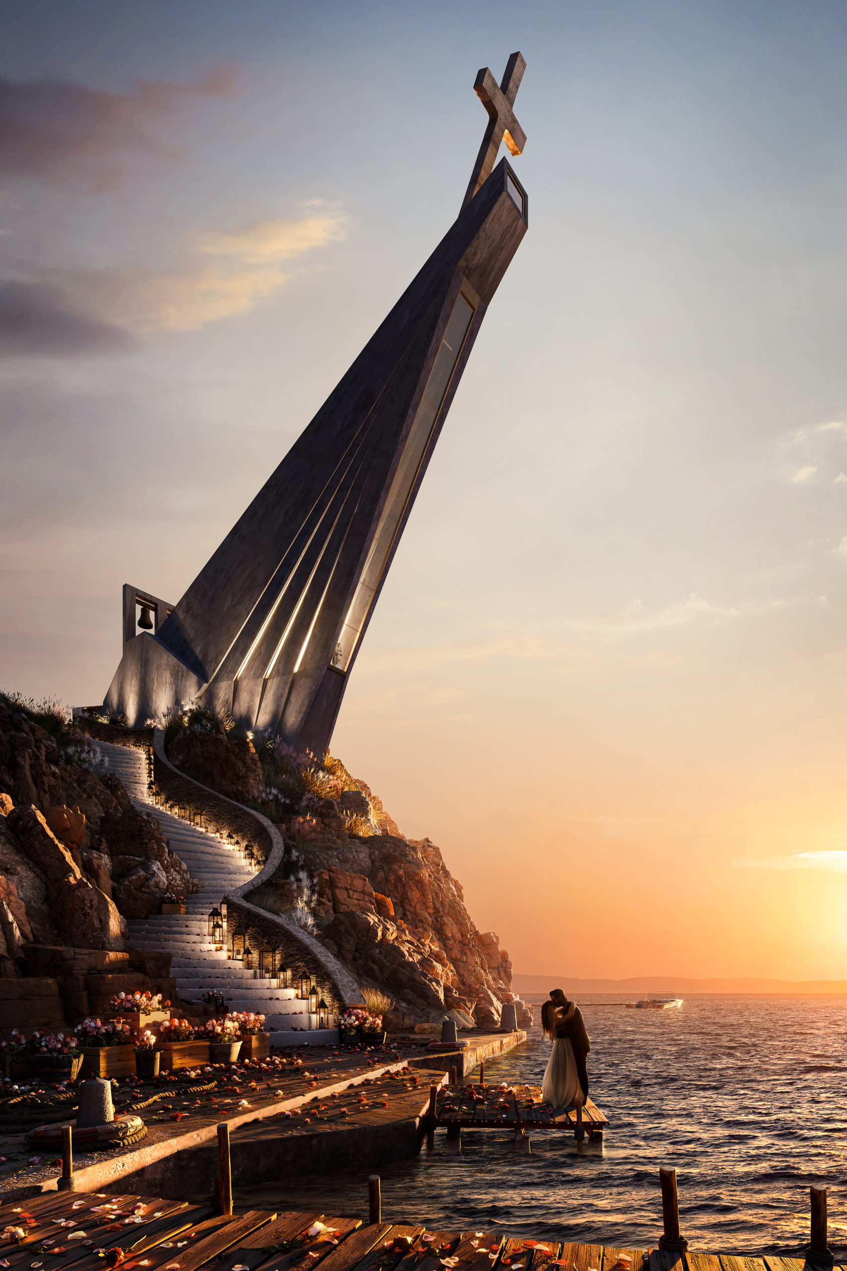
“Churches are sacred spaces where people unite spiritually with a higher power. We enter churches when faced by pure and meaningful emotions like true love. Churches are therefore unique types of architecture where humans can express their deepest feelings through prayers influencing their psychology, philosophy and lifestyle. Love at first sight usually culminates in a church during the wedding ceremony.

The illustrated couple expresses their love for one another, sharing a kiss at sunset, before climbing the stairs to enter this sacred space while the priest looks after them with his prayers, binding the souls together to be one. The design of the church is inspired by praying hands pointing towards heaven, the location by Greek islands. The elements such as the red roses, symbol of love, the sunset and staircase to the church contribute to the romantic emotions adding warmth to the image, a metaphor for hearts in love.”

Software used: 3ds Max, Corona Renderer, Photoshop


“Shanty Stack” by Arnaud Imobersteg

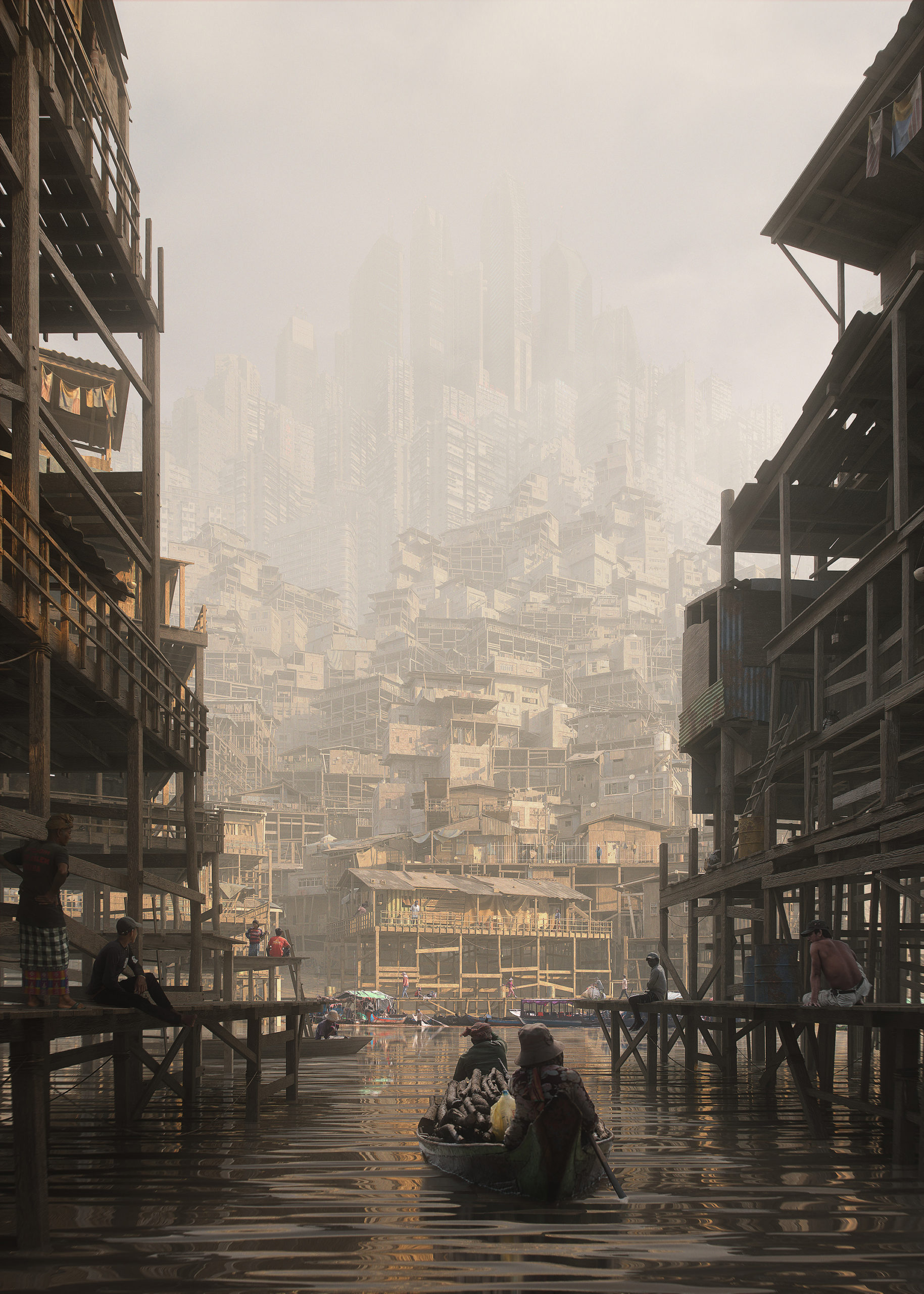
“The sun is warming the air as the market is closing now. My shirt is already sticking to my skin. They advised to avoid going out, but I feel good, I’m only coughing. Uncle Alisha is saying he got sick because it’s not air anymore, he says that before we used to see the sky and it was blue. But I don’t know; maybe he’s just getting old, he’s already 37. The Stack is constantly growing as new people are moving in. Are they coming from Above?”

Software used: Blender


“Cheese Factory” by Artem LT and Mykola Mondich

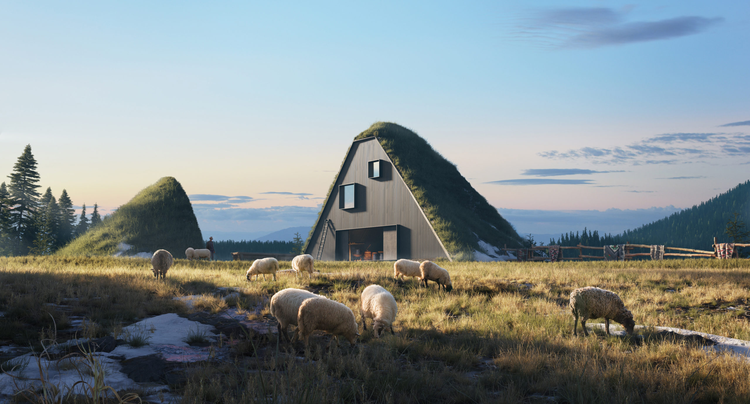
“Cheese factory. A place that is sure to please guests, especially fans of healthy eating preservation of national traditions, local cuisine. The landscapes there are also quite beautiful – the peaks of the Carpathians are clearly visible. Shepherds work here from spring to autumn. During this time, many sheep can be seen on the slopes. Various cheeses, Budz, Bryndza, Vurda are prepared on the fire. You can see with your own eyes a difficult but pleasant process, the preparation of Hutsul cheeses.

Architecture is organically integrated into the environment. Polonyna is a forestless area of the upper belt of the Ukrainian Carpathians, which is used as pasture and hayfield. Hutsul cheese becomes first Ukrainian product with protected geographical indication. Hutsul Bryndza is made of mountain sheep milk in accordance with traditions dating back to the 15th century on the summer high mountain pastures of the Carpathians.”

Software used: 3ds Max, Corona Renderer, Photoshop


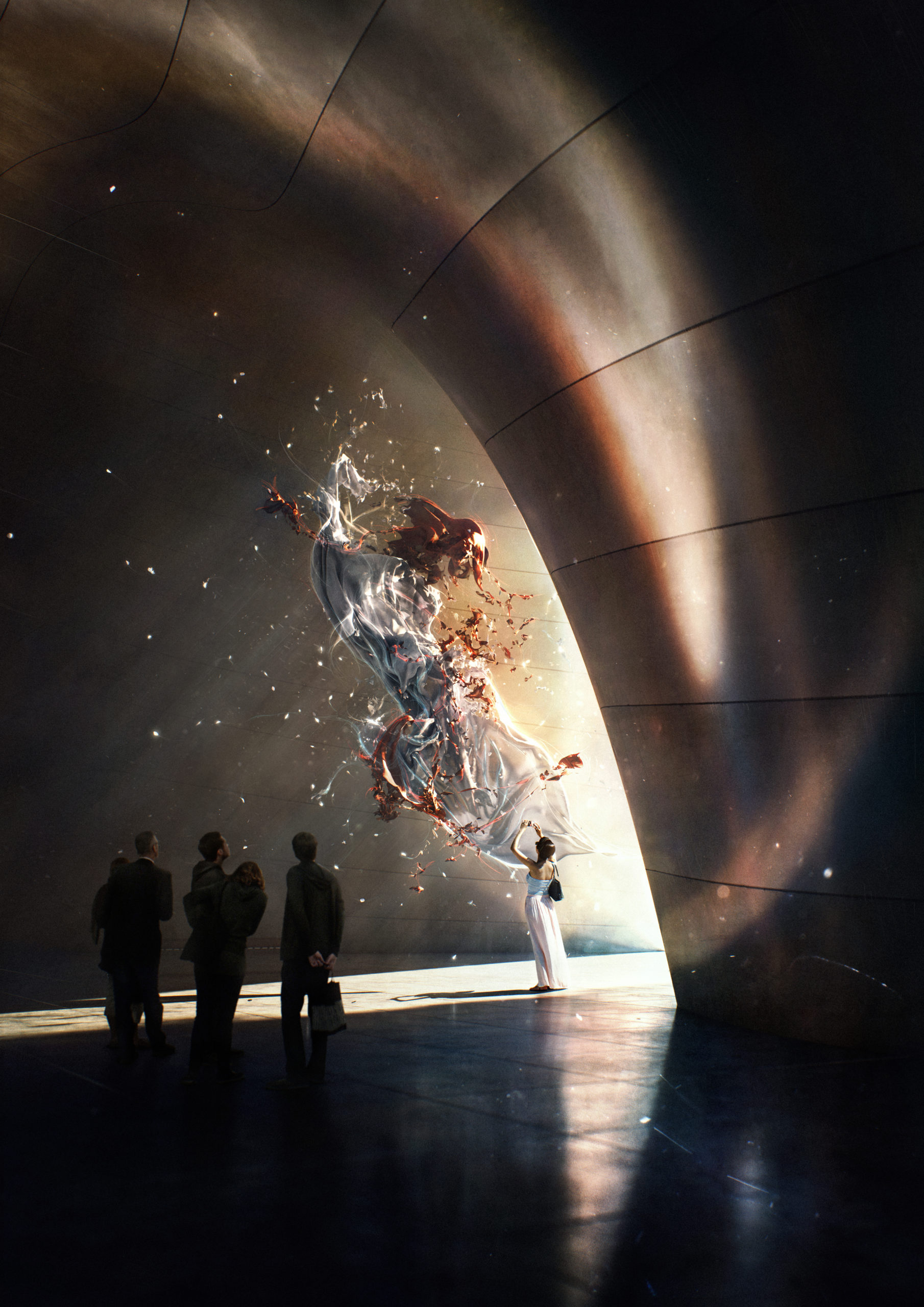
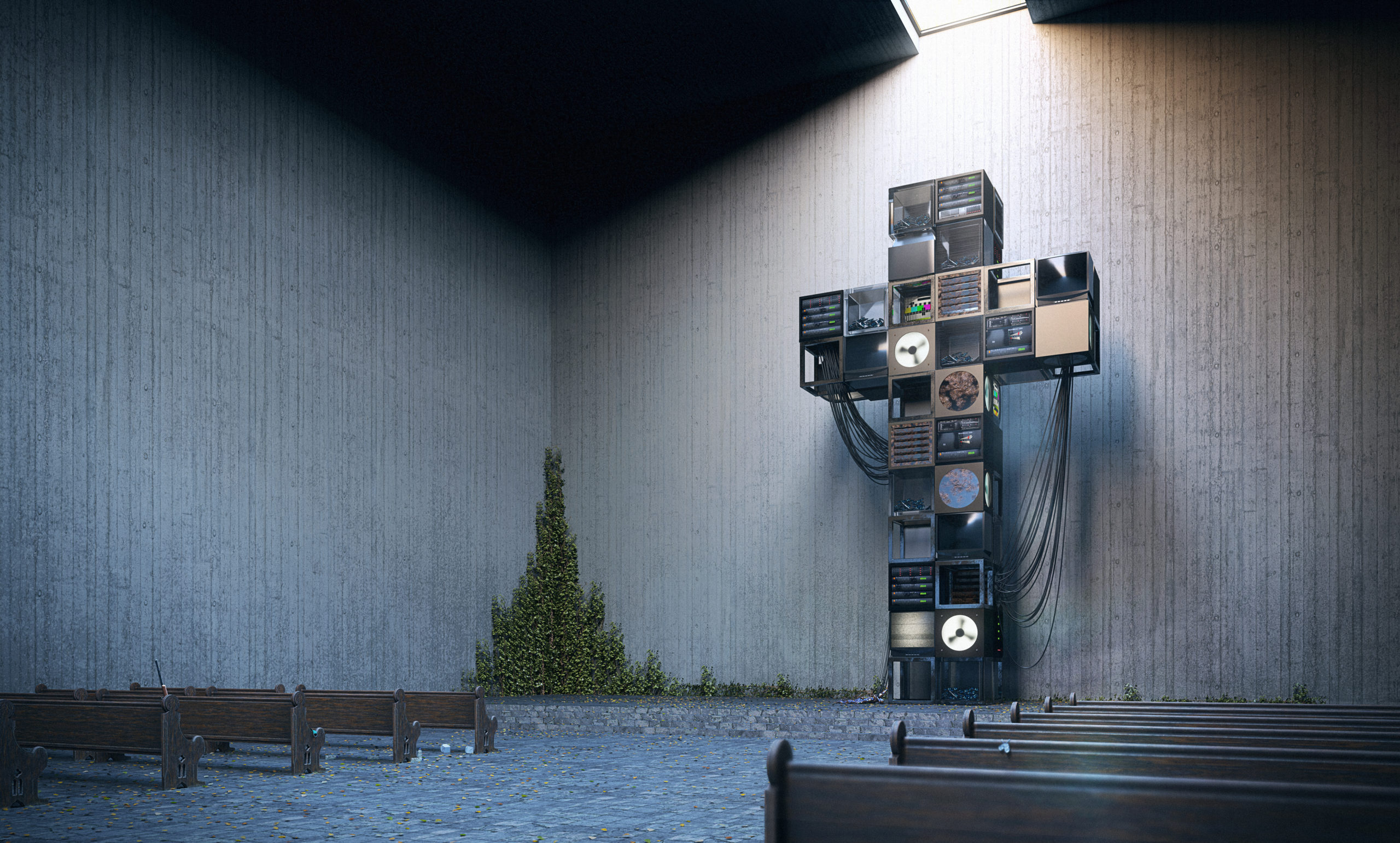
“SHINE” by Alexis Bossé

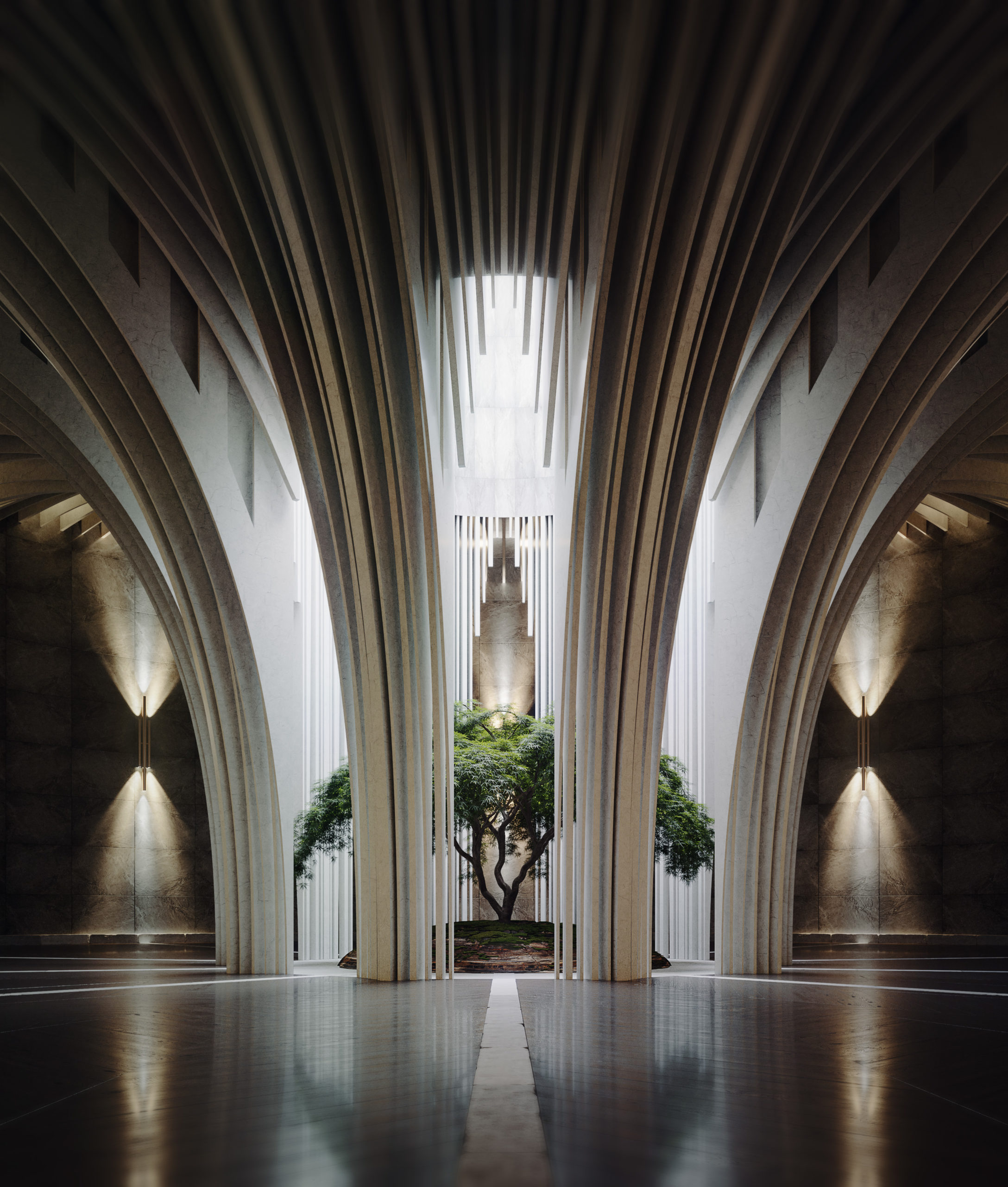
“I dreamed of a circle room with countless thin arkd who fall in the center. At first, I tried to make a subtile natural light like a overcast sky. I worked shaders of walls and arks with dressed stone for remind stuctures like abbayes and churchs. After that I really wanted to make a old dark wood floor with a lot of wear but in the same time I want to make it elegant with strong reflections. I choose a dark Floor because this helped me contrast the image, the room is globally dark except for the center of the image. I placed a tree with a soft shape to stay close to the arks shape. After that I added few artificial lights with warm color to have more reflections on the floor. I tried to make a place which is perceived like sacred and silent.”

Software used: V-Ray, 3ds Max, Photoshop


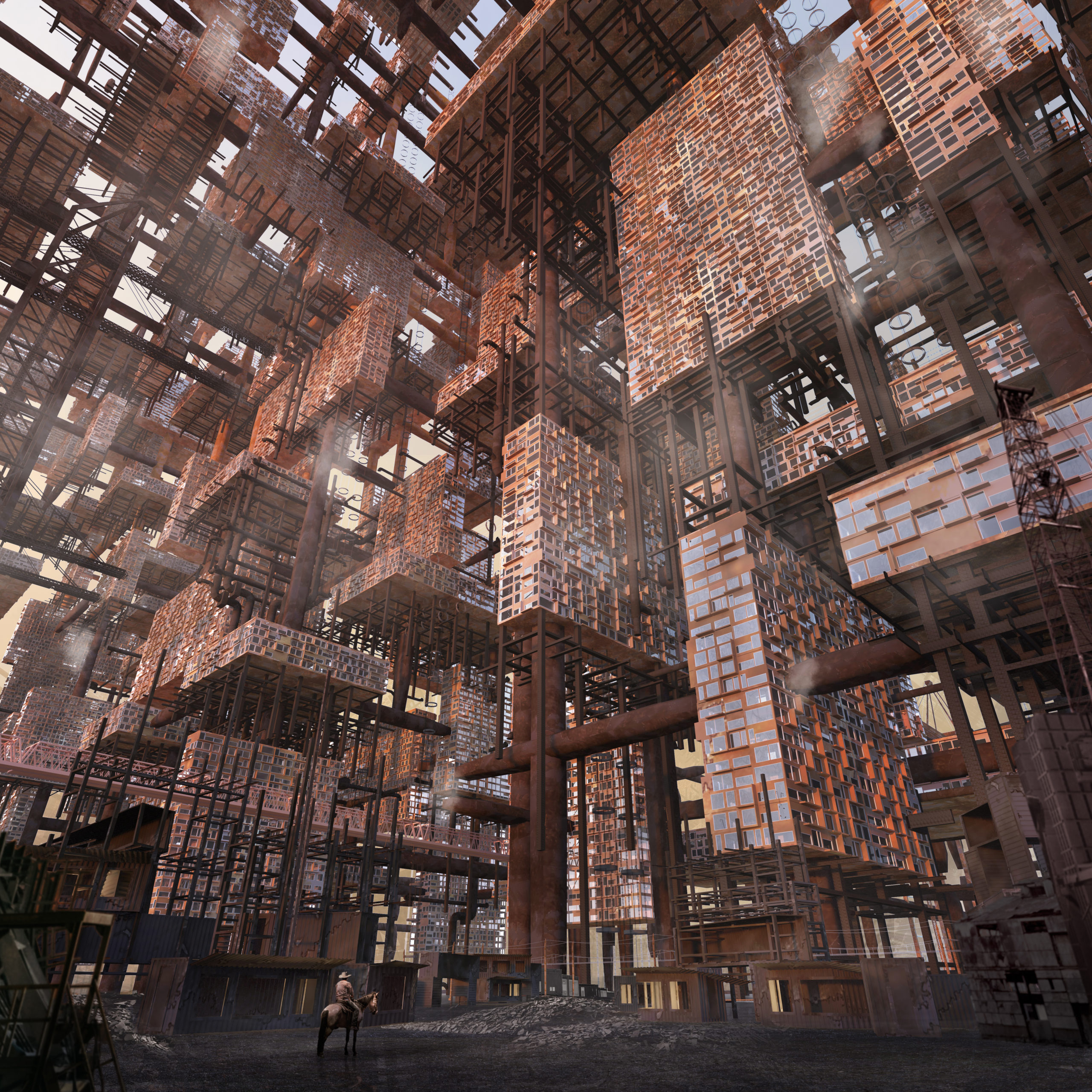
“Victory St” by Dániel Ócsai

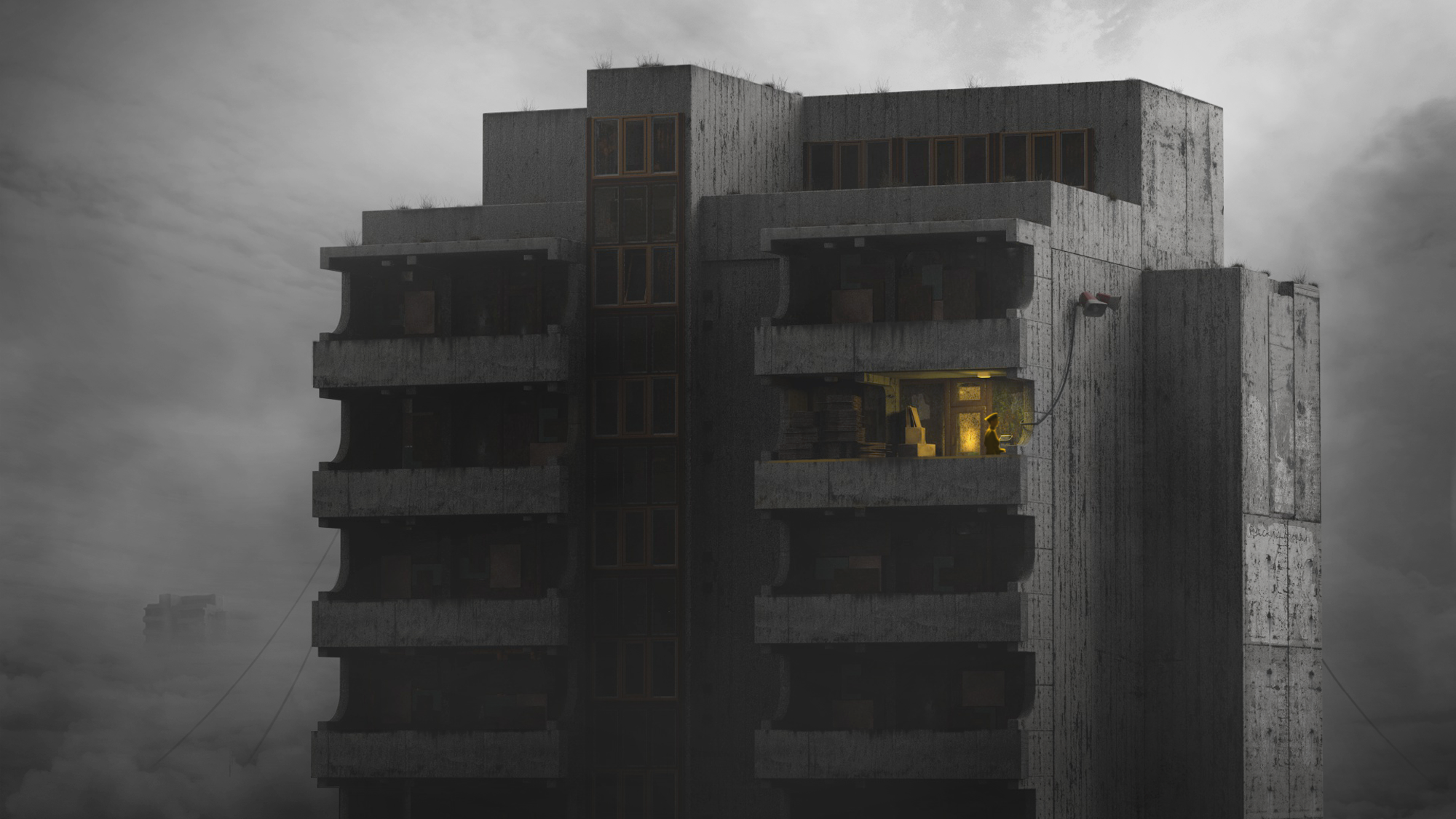
“My story depicts a dystopia that is mostly driven by the cold and insensitive brutalism of Orwell’s 1984 novel and the post-soviet era in Middle-Eastern Europe. These types of buildings are called “panel houses” in Hungary, which means houses made of reinforced concrete blocks. Most of these were built right after World War II, when suddenly many people had to be accommodated.

I love the negative charm of these monsters that makes them look like they will stand forever and beyond. On my image the inhabitants have either left the building or taken them away – who could tell. The man in the cap can be a propagandist or some kind of servant who is a faceless, impersonal part of the omnipresent, yet intangible system. Life is unknown down there, but presumably everyone is doing an automated, meaningless job. I think less information says more here.”

Software used: Cinema 4D, Photoshop, Other


“The Remnant” by Sai Lam Ma

“Day 1947

This is it, the tales are true. I’ve found the remnant of human civilization from all those years ago.

It was said people used to turn to technology for all their problems, almost worshiping it as if it was the solution to everything. But only if they would look closer, they would have noticed all the pollution, inequality, conflict and harm they were causing. Instead of going to the roots of these problems, they slowly trapped themselves in this concrete tomb scrambling for some miraculous device to save them all. Maybe only then, when it all come crashing down would they realize how they should have treasured it all. Maybe only then, would they start to let nature heal.

They could have left us with so much more than a monument of regrets…”

Software used: V-Ray, Rhino, Photoshop


“THE SECRET LIFE OF A DAM” by Dominic Maslik

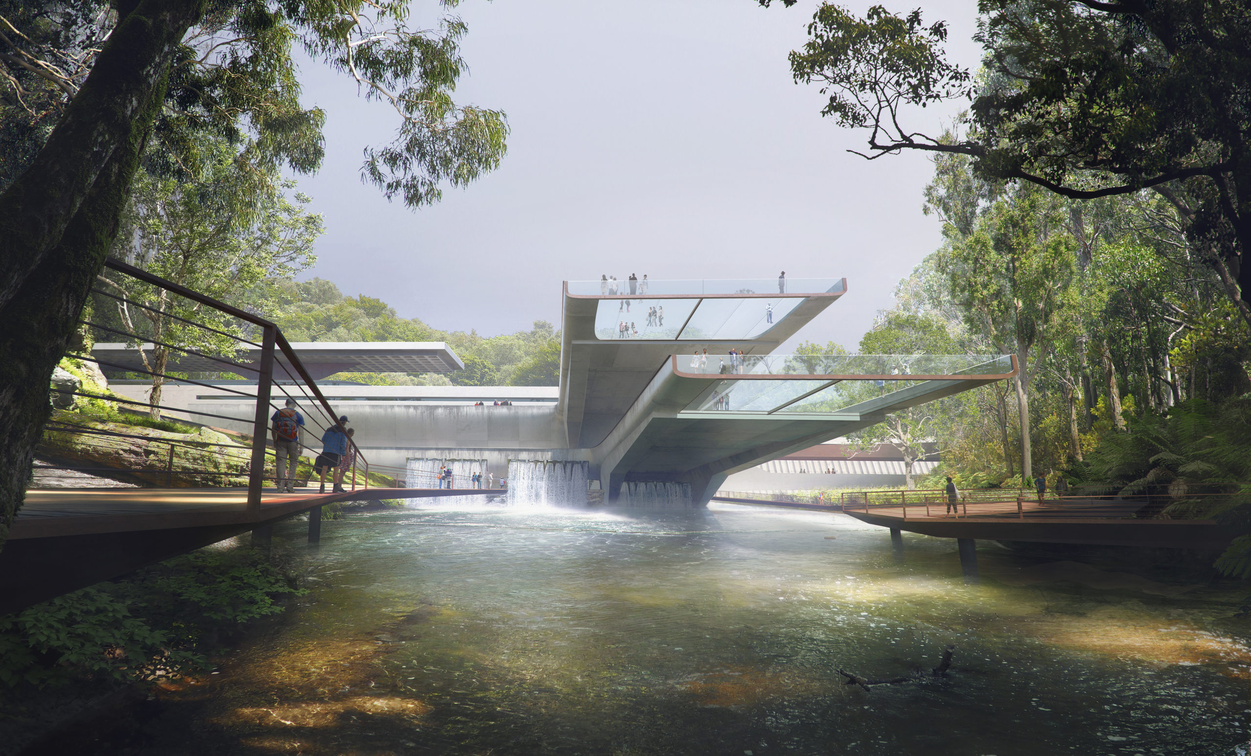
“This is the story of an old industrial building with a new form of life. One idea was popping in my mind to take the most industrial function and to make it not only a practical source of energy, but also architecturally and publicly friendly. Looking over different dams around the world I realized that’s the perfect ground for the imagination. Brutalist aesthetics, and the almost military look of the dams, made me overthink their use.

What if it can be used by the public, attract tourists? When I realized It can be redesigned also as a garden, lookout, integrated into nature as a beautiful architectural element there was no hesitation where it potentially could be. I took as a location lush Australian forest with its amber rivers coming from the mountains. My inspiration for the scene and color-grading were coming from Austrian landscape painters such as John Wilson, John McCartin, Frederick McCubbin.”

Software used: V-Ray, 3ds Max, Photoshop


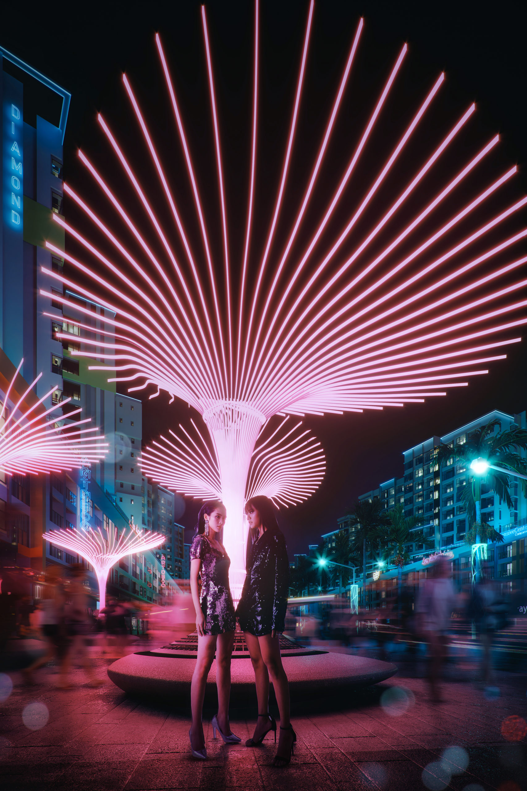
“Tokyo Rift” by Felix Manibhandu

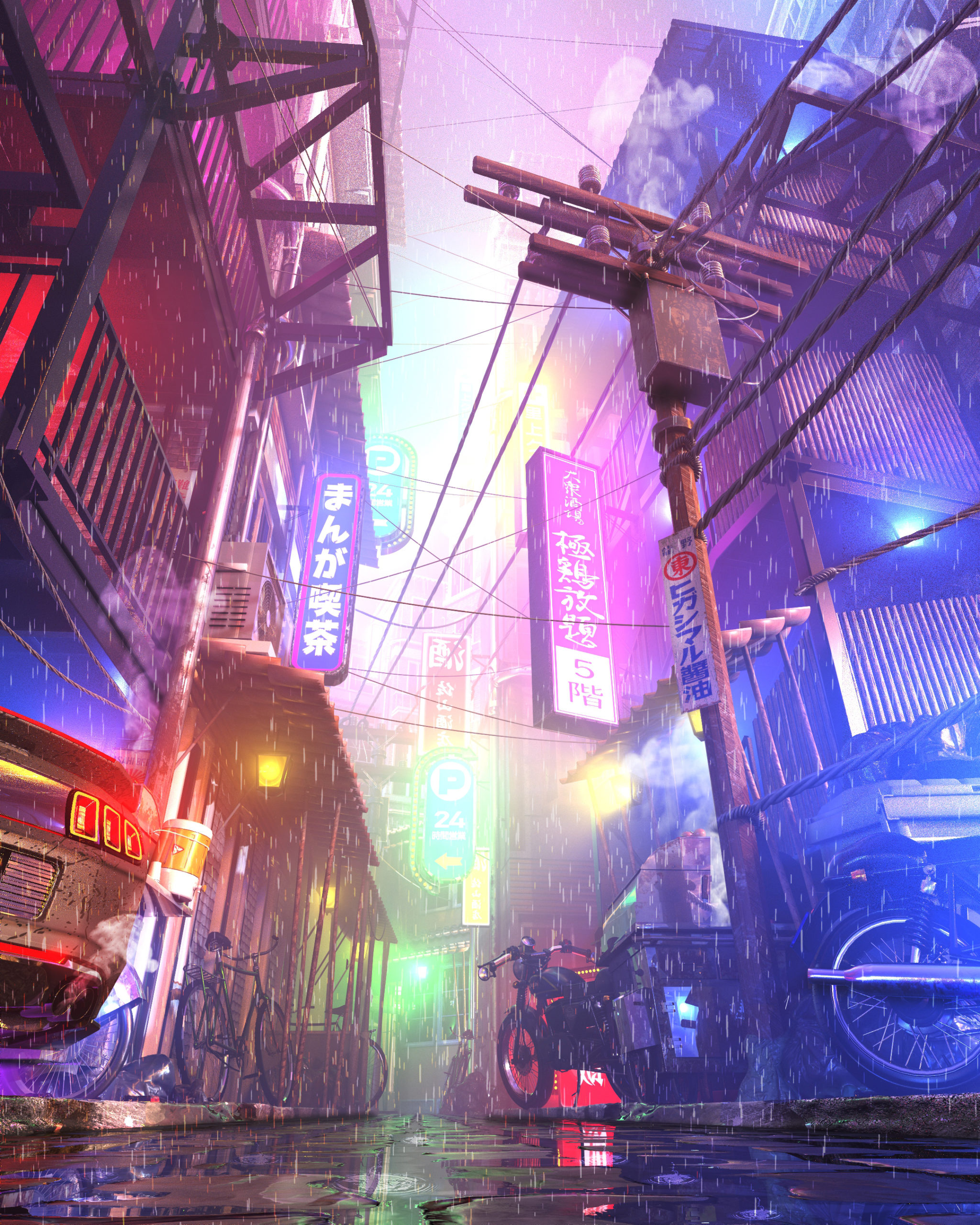
“Growing up in urban South-East Asia, I’ve found there’s nothing in comparison to the chaotically beautiful sensory overload.

The typical high-rise modular architecture above provides enclosure to the sprawling hustle and bustle of micro communities below, night time transforms high density spaces to a fluorescent techno-visual feast.

This work in progress it to develop in to an environment camera pan shot. The first frame is a reimagining of what could be the sights, sounds and smells of a city I’ve never visited, referencing heavily on past experiences and emotions.”

Software used: Photoshop, Other


“The Meditation Temple” by Fatimah Ishmael

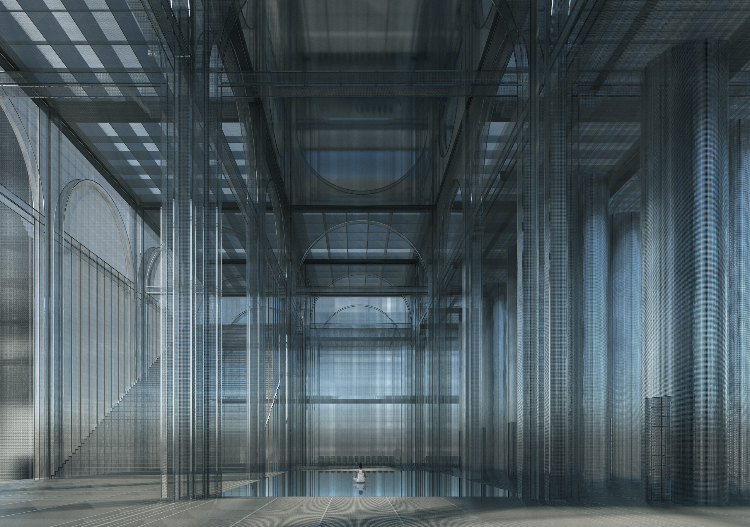
“The project is an anti-surveillance monastery in the mountains of China named the ‘Blind Spot’. Located more specifically in Fengdu ghost city, Chongqing, the Blind Spot is a retreat/sanctuary where you can escape the pressures of a heavily surveilled society. It is temporary living off the grid and houses sleeping chambers, meditation rooms, learning centres, and is influenced by the design of Buddhist monasteries.

The Meditation Room is constructed by metal mesh (influenced by a Faraday cage) and is a retreat within a retreat. It conveys a peaceful yet eerie feeling; though the cage-like construction stops the electromagnetic fields (WiFi, etc), the exposed and semi-transparent walls and floors still give the feeling of being watched.”

Software used: V-Ray, Other


“Celadon City (Saigon, Vietnam)” by Nhi Hoang (Producer), Lucien Bolliger (Executive Producer), Trinh Thai (Art Director & Visualizer) Quynh Luong (Model), Ng Lee (Model), Thanh Ho (Model photographer), Gamuda Land (Developer), Soyon (Creative agency), and createdby.ma (Architecture Visualization Agency)

“Saigon has evolved from the ’70s-nowhere else in Vietnam can one experience the quickly changing cultural and economic shift that takes place before our eyes. The 10+ million inhabitants seem to be constantly moving…Locals and foreigners, looks, sounds, smells, tastes all mix, and create something so eclectic and excitingly new that is impossible to capture in words. The city’s constantly buzzing. Moving. People yearn to break the shackles of the past, the shackles of society’s expectations. Poverty, traditional values, and collectivism are quickly shifting to consumerism and individualism.

Our CGI aims to captures the hustle, bustle and buzz one can feel in Saigon. The two models embody the modern people of Saigon, whereas the rest of the city moves around them at lighting speed. We used a neo-noir, cyberpunk-inspired mood to imply how this place isn’t stuck in the past, but very much representing the future.”

Software used: 3ds Max, Corona Renderer, Photoshop


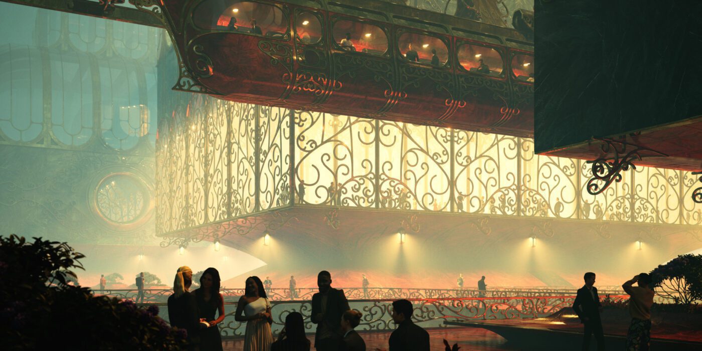
“Group Therapy” by Gourav Neogi

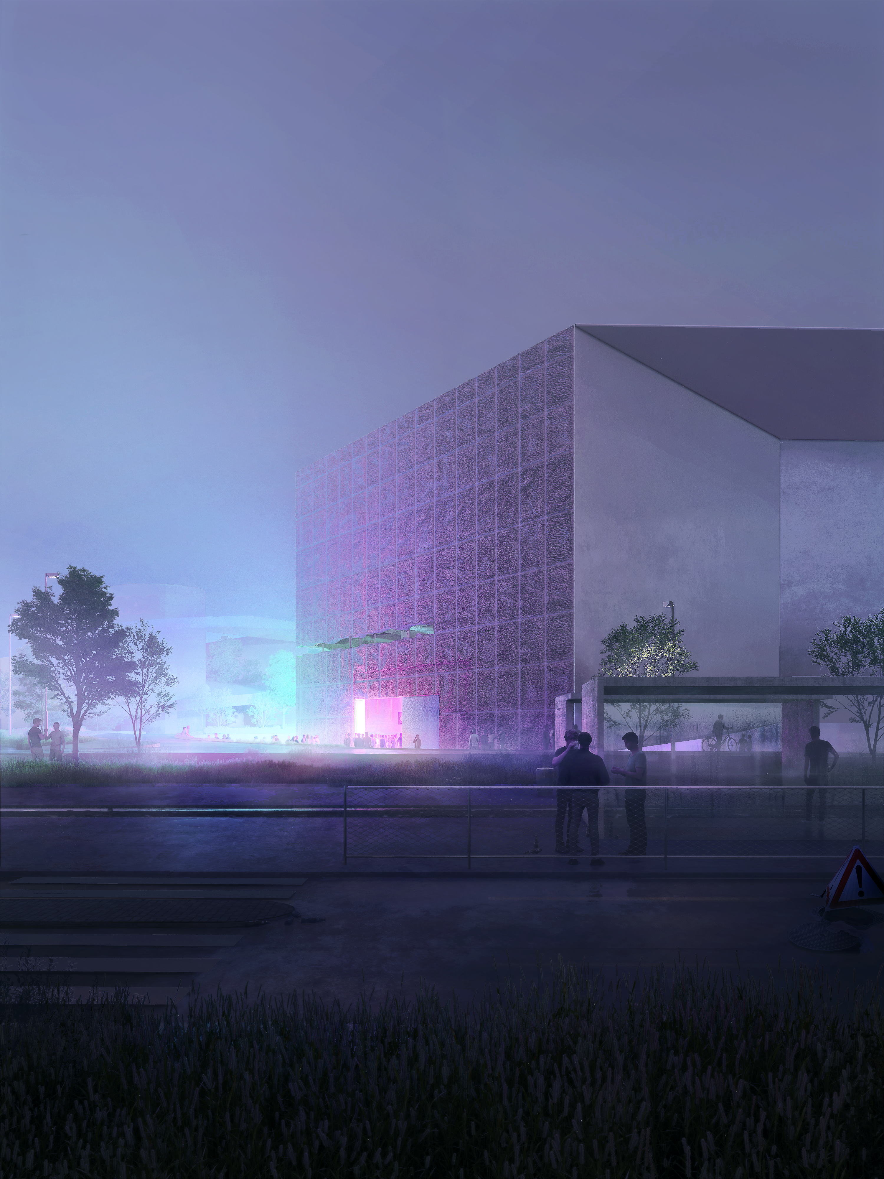
“We heard the thump of music. A door swung open, LED lights bleeding into the night. The space was packed but it felt familiar, like being reunited for the first time with people you didn’t really know. Some whose first names you know but whose numbers are not in your phone. You have no idea what they do for a living, or where they are from, or how old they are. You see them on the dance floor, where you have been hanging out for years.

This images captures a moment from the future as the pandemic restrictions are lifted. This ordinary corner of the Schaulager museum designed by the Swiss firm Herzog & De Meuron, becomes the destination for an underground techno party in Basel.”

Software used: V-Ray, 3ds Max, Rhino, Photoshop


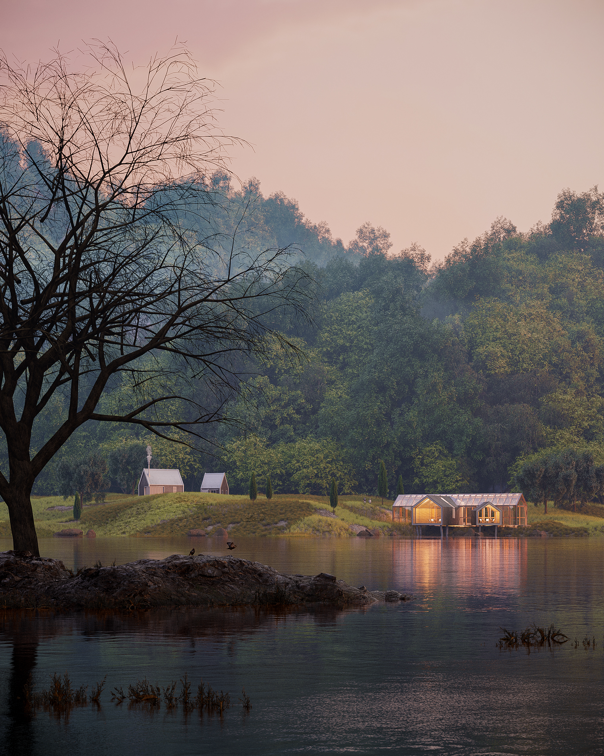
“Cabins in the Woods” by Behzad Keramatih and Hizir Kaya

“City life can be vibrant, diverse, and dynamic. But it can also be crowded, polluted, and noisy; It is overstimulating which can make people feel stressed and overwhelmed. So the question is what’s the antidote to modern life stress? That is why we in the DD Studio decided to design a cabin in the woods in our style with minimum interference with nature as a building and maximum view. In this image, we are trying to show the communication between nature and humans and how the cabin sits in context.”

Software used: 3ds Max, Corona Renderer, Photoshop


“Reclaim the Air – AirKeepers” by Minsung Kim

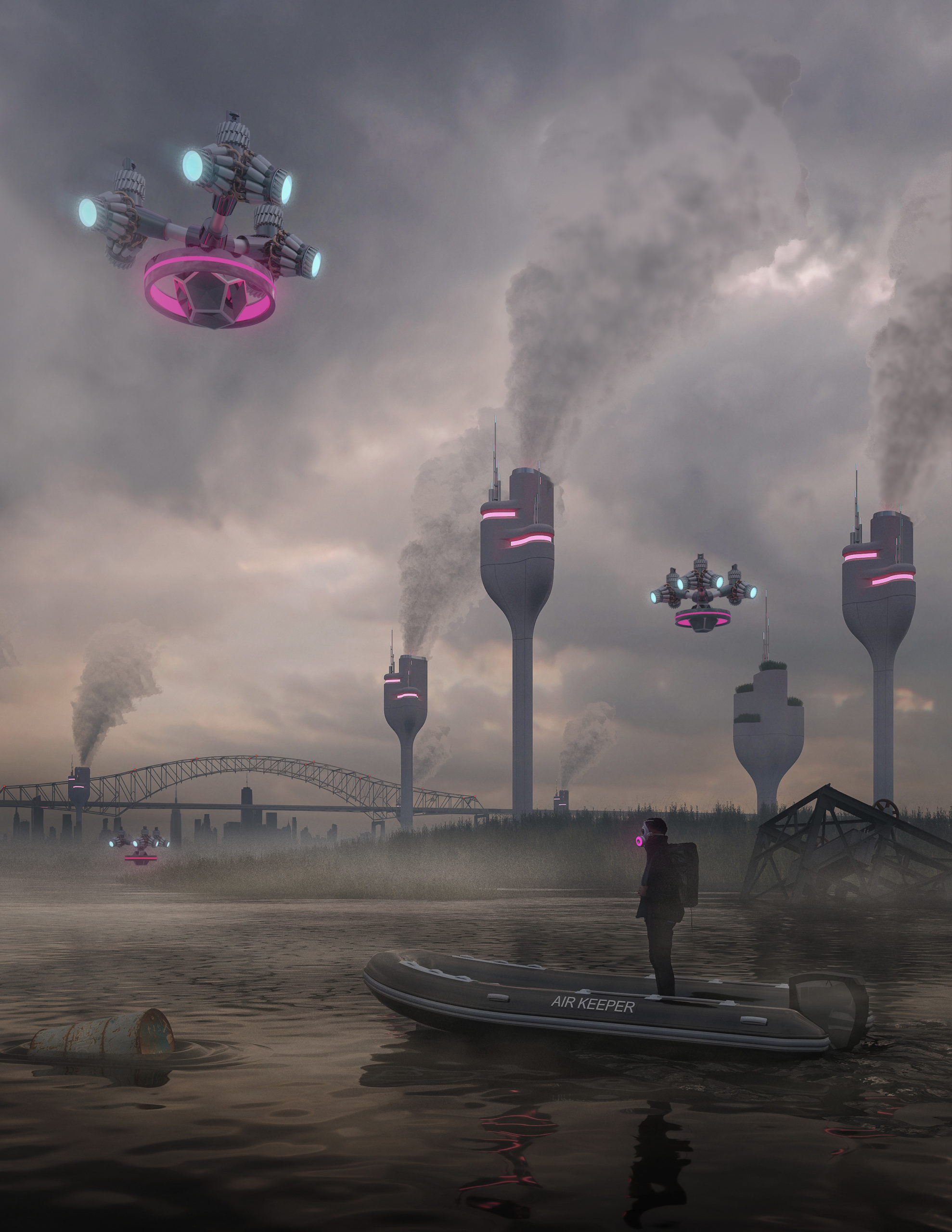
“Along the Passaic River from Port Newark through Jersey Turnpike, air pollution caused by toxic factories and transportation leads to increased health concerns and affects families’ health and vulnerable communities in Newark and the entire New York Metropolitan area.

The rendering shows AirKeepers’ interventions to combat air pollution along the Passaic River. The Mist Towers emit mist to capture toxic chemicals and particulate matter and drop them down to the ground. Then, Hyper-accumulating plants absorb the fallen pollutants and keep them away from the river. Additionally, Drones monitor the air quality and alert polluted air by emitting lights, helping people avoid being exposed to the pollutants.

While the scale of pollution is far greater than the Newark area alone, AirKeepers view these design interventions as a framework that can be used in the future to guide design efforts for combating pollution around the region and creating a healthier environment.”

Software used: V-Ray, Rhino, Photoshop


“The Construction of the Mihama Nuclear Shrine” by Sabina Blasiotti

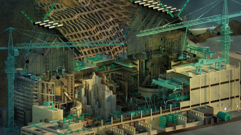
“In 2012, Japanese architect Katsuhiro Miyamoto made the extraordinary proposition to erect giant Shrine-style roofs over the ruined reactors of the Fukushima Daiichi Nuclear Power Plant after the 2011 nuclear disaster. The conceptual idea of using the roofs to signify the presence of a powerful force on site extends to a workable proposition, based on the Japanese culture where shrines are rebuilt every 20 years to ensure that traditional building techniques are passed on generations. Likewise, the upkeep of the reactors’ decommissioning will extend in centuries, therefore the construction of these roofs is chosen as a form of preservation, to transmit the knowledge of Nuclear Waste management to future generations.

This drawing retells the story of Miyamoto, the construction of the Nuclear Shrine further influences the regeneration of the surrounding abandoned coastal landscape, repurposed as a sanctuary integrating ceremonial and commercial activities such as fishing and rice farming.”

Software used: V-Ray, Rhino, Photoshop

Next 25 Renderings →

Reference

Why Every Architect Should Read Walter Benjamin
CategoriesArchitecture

Why Every Architect Should Read Walter Benjamin

Judging is now underway for the 10th Annual A+Awards Program! Want to earn global recognition for your projects? Sign up to be notified when the 11th Annual A+Awards program launches. 

The word “modernity” was coined by the French poet Charles Baudelaire, who used it to describe the “fleeting, ephemeral experience of life in an urban metropolis.” In his 1867 essay “The Painter of Modernity,” Baudelaire exhorts artists to reject classicism and embrace the flickering, tragicomic life of the streets. He argues that the modern artist must become a flaneur, or connoisseur of urban life, if they hope to produce work that is vital and alive. 

Watercolor and ink sketch by Constantin Guys (1802 – 1892). Baudelaire named Guys the ultimate “painter of modernity” due to the interest he took in city crowds.

For Baudelaire, the quicksilver newness of modernity was made possible by architecture, by the way his fellow Parisians moved through built spaces. And the most interesting built spaces in Baudelaire’s Paris were the arcades. Constructed in the first half of the 19th century, the Paris arcades were covered walkways that housed various shops, newsstands and cafes. With vaulted ceilings made from glass and iron, the arcades offered an elegant respite from the grime and noise of the city street. In guidebooks to Paris from the time period, the arcades were always listed as a major attraction. 

The philosopher and critic Walter Benjamin believed the arcades were the most important architectural form of the century. In his unfinished masterpiece, The Arcades Project, written between 1927 and 1940, Benjamin attempts to reconstruct Baudelaire’s Paris using an experimental method, assembling thousands of textual fragments into a kind of collage. His goal was not simply to write a historical narrative, but to bear witness to the birth of modernity. The result is a fascinating meditation on the dialectical relationship between architecture and history — a subject that is just as relevant today as it was in Benjamin’s time. 

1831 engraving of the rotunda at Galerie Colbert. Along with the nearby Galerie Vivienne, Galerie Colbert was one of Paris’s largest and most famous arcades.

The most unique aspect of The Arcades Project is its structure. The book opens with a series of impressionistic but otherwise conventional essays, establishing the historical period with overviews of subjects such as the origin of the arcades, the history of the Paris Commune, and Baron Haussmann’s dramatic redesign of Paris between 1850 and 1870, in which many of the arcades were destroyed to make way for the wide boulevards and uniform city blocks that define the city as we know it today. After these sections, however, things take a more radical turn. 

The majority of the text is comprised of pieces that Benjamin calls “convolutes,” which are textual fragments that he collected through his vast reading on the period. Quotations from newspapers, letters and academic texts are placed alongside the author’s own reflections. The fragments are ordered by an alphabetical system, with the letters corresponding to different topics. For example, section A concerns the arcades; B is about fashion; and C, Ancient Paris and the Catacombs. Some of the sections combine topics in an idiosyncratic way, such as D, which covers both boredom and Nietzsche’s concept of “Eternal Return.” A number of fragments are cross-referenced, corresponding to more than one letter, which allows readers to see how these different ideas relate to each other, like points in a web or constellation. 

When Walter Benjamin wasn’t strolling through the arcades, he spent most of the 1930s in Paris’s public libraries and archives.

All told, The Arcades Project isn’t written so much as constructed, like a building. The ordering system of the convolutes resembles the directory of a massive shopping mall. Readers of this book do not follow a narrative or argument, but move through a kind of endless exhibition. They enter into the period, discovering it for themselves. 

The book begins with a note that the majority of the Paris arcades were built in the “decade and a half after 1822.” Readers learn that the arcades were made possible by the “boom in the textile trade” and “the advent of building in iron.” This was long before Baron Haussmann’s transformation of Paris. The arcades really belong to an earlier era, before the Second Empire, before even Baudelaire.

As Benjamin explains, Paris in the 1820s was a filthy, crowded, “subterranean” city, prone to outbreaks of cholera and revolution. And yet the arcades, which were open to the public, were glittering modern spaces, temples of the new religion of consumerism. At their entrance were boot scrapers, simple iron tools built into crevices in the wall that visitors would use to scrape the city muck off the soles of their shoes, a type of ritual cleansing.

Galerie Colbert in 1900

It was in the arcades that the flaneur, Baudelaire’s archetypal city wanderer, could contemplate the crowd as an aesthetic spectacle. Urban life, in its messiness and variety, now had an elegant stage on which it could be observed. 

The iron and glass ceilings of the arcades suggested that these spaces were harbingers of a utopian future. As Benjamin points out, the only other place city dwellers were likely to encounter this type of construction was in exhibition halls such as the Crystal Palace, in which new technologies were often debuted. New technologies were introduced in the arcades as well. Benjamin notes that “they are the scene of the first gas lighting.” 

Passage Verdeau today. This was one of Benjamin’s favorite arcades to visit as it was home to dozens of bookstores and antique shops. Built in 1847, it was one of the last arcades to be constructed.

In a fascinating paragraph, Benjamin argues that the appearance of “the new” always draws the imagination back to “elements of prehistory, that is of a classless society.” A dream about the future is always also a wish to recover what one has lost. Benjamin believes it is no coincidence that socialist thinking — especially of the utopian variety — exploded in France at the same time that the arcades appeared. Charles Fourier’s famous phalanstery, his scheme for a self-contained, egalitarian living and working community, was essentially “a city of arcades,” Benjamin argues. It was the arcades that showed Fourier that variegated human activities could be organized under a single roof. 

1826 floor plan of Galeries Colbert and Vivienne

When Benjamin mailed his early drafts of The Arcades Project to colleagues, many found it baffling. Why give all this attention to 19th century shopping malls? How was this relevant at a time when fascism was on the move all across Europe? Walter Benjamin was a German Jew and a committed Marxist. When he wrote The Arcades Project, he was living in France as a political exile. And yet, he believed that the best use of his time and talent was to investigate the conditions that gave rise to modernity, especially the emergence of the commodity form. Here, he felt, he would uncover the deep roots of fascism, and perhaps better understand how it could be resisted.

Writing under the shadow of Nazism, Benjamin understood modernity differently than Baudelaire had. He had mixed feelings about it, or to use his terminology, he approached it “dialectically.” While modernity offered new possibilities for freedom, in the end it had created the conditions for fascism. Without modern technology, the Nazi regime would never have been able to exercise the level of destructive control that they did. Even the spectacle of the crowd, which Baudelaire had celebrated as a symbol of diversity, was menacingly transfigured into an image of uniform state power in the Nazi propaganda films of Leni Riefenstahl. The crowd, like so much else, had been engineered for totalitarian ends. 

When Walter Benjamin sat down to write his book, the spectacle of the urban crowd had been transformed into something menacing and authoritarian.

Something had obviously gone very wrong with modernity. What was it? This is the question Benjamin asks in The Arcades Project. Importantly, he doesn’t seek to answer it, at least not in any direct way. What he does instead is try to bring Baudelaire’s Paris to life with his collage method. His hope is that these juxtapositions of facts, quotations, and speculative commentaries will cause a “dialectical image” of the period to “flash up” in the reader’s mind, allowing them to see things that cannot be described in a straightforward way: the diverted hopes and buried possibilities of the period. 

The Arcades, as a site of commerce, played an important role in the history of the commodity form. This uncanny photo of a Parisian storefront was taken by the street photographer Eugene Atget in the early 20th century.

Benjamin saw the modern world as a kind of dream, or “phantasmagoria,” in which the true relations between people are obscured by capitalist ideology and commodity fetishism. The arcades, then, were the earliest dream factories, a spectacle of consumption in which the actual history of the objects on display, and the labor that went into producing them, was deliberately concealed.

Visitors to the arcades were encouraged to think of themselves as consumers, maybe even flaneurs, but never as exploited workers. While the form of life Baudelaire celebrated produced flashes of revolutionary possibility, in the end it had lulled the masses into a false consciousness, preventing them from taking hold of their own destiny. 

The goal of The Arcades Project was to snap readers out of the capitalist dream so they could resist the fascist nightmare. Like Freud, Benjamin believed that one needed to descend into the murky depths of the past in order to recover the insights they needed to move forward. If  there is one sentiment that runs through the project, it is hope — hope of a desperate sort. 

Galerie Vivienne in 1905

In 1940, Walter Benjamin died at the age of 48 in Portbou, Spain while in police custody. He was fleeing Nazi-occupied France when he and his companions were arrested by Spanish authorities, who told them that they would be deported back to France the following day. Believing he would be sent to a concentration camp, Benjamin took a deliberate overdose of morphine in his prison cell. However, the next day his companions were all released and allowed to continue on their journey to America. If Benjamin had held on just one more day, he could have traveled with them. 

The tragic story of Benjamin’s death is often told with the suggestion that it carries a poignant lesson. However, I never understood what that lesson was supposed to be. So in lieu of commentary, I am simply going to leave it here, as Benjamin would have, as a stray piece of the historical puzzle. 

Walter Benjamin’s work remains an important resource, not only for philosophers and cultural critics, but for architects. Architects today would do well to think about cities the way Benjamin did, as living collages that place the present in conversation with the past. If architects studied Benjamin, they would learn to see their projects not as stand alone entities, but as points of light within a vast, ever-shifting constellation. 

Judging is now underway for the 10th Annual A+Awards Program! Want to earn global recognition for your projects? Sign up to be notified when the 11th Annual A+Awards program launches. 

Reference

Round Up: Contextualizing the Rising Trend in Ring-Shaped Housing
CategoriesSustainable News

Round Up: Contextualizing the Rising Trend in Ring-Shaped Housing

Have your say in which architects will take home Architizer’s prestigious A+Awards: Public Voting opens this spring. Interested in next year’s program? Subscribe to our newsletter for updates.  

Recently, The Almanac by Sweco Architects Denmark made headlines for its conceptual community-centric approach to housing. Evoking themes associated with its namesake, the proposal features ring-shaped housing blocks with a large courtyard at its core. The lower floor of the building features cafes and other recreational spaces, tying it with the communal exterior spaces. The core also acts as the cultural center for each structure. The upper floor has a continuous balcony that connects to individual homes, all placed adjacent to each other along the ring form.

The Almanac by Sweco Architects Denmark

Like chawls found in Western India, the connected balcony on the exterior encourages neighbors to interaction. Additionally, the corridor on the inner side also forces people to walk by each other’s homes. Simply walking past the windows of other neighbors increases the chances of impromptu conversations and sharing of meals. Unlike apartments in big cities, it is almost impossible to not know who your neighbors are in this typology. Given the curved form, residents have the opportunity to interact with neighbors across the rings as well as those in the central garden.

The circular form has long been popular in architecture. Vernacular dwellings across the world were rounded, perhaps as an imitation of shapes and geometries found in the natural environment. But this form had several advantages as well. In comparison to a square or rectangular perimeter, a circular exterior has a lesser surface area, helping thermal conditions in cold climates. This shape also allowed for more connection points between the roof and the walls, making them stronger. These homes are also more resistant to strong winds, snow and earthquakes.

Image by ming yang via Pixabay

Over time the form of such buildings has evolved. Using a donut shape for multi-unit housing dates back to the 12th Century. The Tulou is a ring-shaped home made by the Hakka community in the Fujian province of China is one of the most well-known examples. There were some rectangular ones but the ring shape remained more popular. Given its robust walls and limited entrances, its structure was both built to protect its inhabitants and foster community living.

The building had small windows on the outside but was opened up inside. Each Tulou could have two to four floors. Made from thick load-bearing earthen walls, each building could easily house about 800 people along with other community spaces such as halls, wells and storerooms. Each Tulou was created for one Hakka clan and their extended family to live together. The uniform sizes of each home unit inside underscored the overarching design theme: unity.

Image by limo23 via Pixabay

In addition to protection and interaction, these structures were also very sustainable (primarily due to its durability). Today, these rammed earth structures are still standing. It should be noted that they have a minimal carbon footprint; in additional to sustainable material sourcing, the material structure itself also helps to regulate the temperature within. Furthermore, the unique donut shape allows ample light to enter the homes as well as in the common spaces, reducing the need for man-made light sources. There is also good circulation of the air through the entrances and the courtyard.

Apart from vernacular housing, the circular form with multiple units also found different uses through the 18th century. One such example is the Narrenturm in Vienna. The structure, built in 1784, was designed to accommodate psychiatric patients. This shape was thought to be helpful when trying to look at the occupants of the whole building from the center.

This idea was also the foundation for the conceptual Panopticon prisons, imagined by Jeremy Bentham. The building was to house prisoners in cells across the external ring and have a central watchtower for guards to observe prisoners from, much like an internal panorama. Fortunately, the use of the form has now reverted back to private homes, apartment complexes, museums and even commercial buildings.

62M by 5468796 Architecture, Winnipeg, Canada

Today, we’re seeing a renewed interest in this unique building footprint, and the idea of building a round housing structure is now popping up in cities across the world. Take, for example, 62M, a housing dormitory in Winnipeg, which resembles a flying saucer. The disk-shaped structure stands on tall columns to provide better views from the 40 studios within and help with climatic conditions.

The entrance of the building as well as the circulation elements are located at the center. Additionally, the continuous corridor was devised to reduce the alienation caused by connectors with dead ends and present opportunities for the residents to meet their neighbors. The circular form also reduces the external surface area, thereby making heating spaces more efficient in cold winters.

Tietgen Dormitory by Lundgaard & Tranberg Architects, København, Denmark

Similar themes are seen in the Tietgen Dormitory in Denmark. The structure comprises 360 residential units along the perimeter as well as some community spaces along the internal surface. Unlike previous structures in the article, homes in this dorm are staggered to create a sense of individuality. Several apartments are grouped together with a common community space that protrudes to help it stand out. While there is no common corridor inside, the circular form allows for increased visual connectivity.

The ring a ring a roses by GVultaggio

Lastly, a competition entry proposes a housing structure that increases interaction with the landscape as well as other residents. The different homes in the ring are placed at different heights and enclose the central space, creating a secured courtyard. The spaces on the lower level are classified as day-time functions whereas the upper level is for night-time or private functions.

All of these new structures draw on historic precedents but also bring new 21st century insights into the fold. While ringed housing complexes may never be a dominant residential floorplan in our cities, the host of design benefits suggest that this upward trend will bring more user-friendly, community-building housing stock to urban areas in the coming years.

Have your say in which architects will take home Architizer’s prestigious A+Awards: Public Voting opens this spring. Interested in next year’s program? Subscribe to our newsletter for updates.  

Reference

Will Architects Prioritize Passenger Experience in the Post-Pandemic World?
CategoriesArchitecture

Will Architects Prioritize Passenger Experience in the Post-Pandemic World?

Have your say in which architects will take home Architizer’s prestigious A+Awards: Public Voting opens this spring. Interested in next year’s program? Subscribe to our newsletter for updates.  

Traveling is an exhilarating endeavor. Whether it be by bus, train or air, successful travel requires stamina, organization and the ability to adapt. When traveling by plane, the initial leg of the journey often causes stress. From document checks to security lines, the entire airport process can feel arduous; however, when you touch down at your destination, the exhausting journey begins to feel worthwhile.

With the added complexities of the pandemic, flying feels more like a burden than it does a favorable experience. The excitement to board a plane is replaced by a fierce worry that something will go wrong. Today, passengers are greeted with long lines, rigorous document controls and a heightened stressful atmosphere. It is hard to predict when the return to normalcy will be — or if that will ever happen — but what is certain is that stress goes hand-in-hand with travel. Will the pandemic change the ways in which architects design transport interiors? Can architecture act as a mediator between stress and calm? Can it facilitate relaxed movement while not compromising practical requirements?

The check-in and administrative side of air travel are likely not to change, and airport security checks will likely remain long and unfavorable; however, once headed to the gate, the energy in the airport can shift. The second leg of the journey can be more relaxing, and architects can have a hand in that.

San Francisco International Airport, Boarding Area E by Gensler, San Francisco, CA, United States. Popular Winner, 2015 A+Awards, Transportation – Airports. © Joe Fletcher Photography

One way to help alleviate travel-related anxiety is through access to outlets. As society turns to digital solutions, passengers are required to arrive at the airport with their documents ready to go and as a result, many rely on their personal electronics to store travel documents. From boarding passes, immunization proof, to test results, electronic devices have become essential for air travel – especially during the COVID-19 pandemic. Most airports were built before the digital era and as a result, are only equipped with a mere number of accessible outlets. Airports travel will likely continue within this digital realm and aviation architects are beginning to catch on and ensure their designs are fitting of the times.

San Francisco International Airport, Boarding Area E by Gensler, San Francisco, CA, United States. Popular Winner, 2015 A+Awards, Transportation – Airports. © Joe Fletcher Photography

While aviation architecture continues to evolve, some designs were ahead of their time. Take San Francisco International Airport, Boarding Area E renovation for example. Back in 2014 design team, Gensler was commissioned to transform the airport’s Boarding Area E into a travel oasis — and they did just that. The design features passenger spaces that are not typically found in most airports. From private dressing rooms to yoga centers, this airport terminal truly encourages its passengers to unwind and take a moment for themselves.

O’Hare Global Terminal by Skidmore, Owings & Merrill (SOM), Concept.

Meanwhile, the recently conceptualized Chicago O’Hare Global Terminal design revives the city’s spirit while prioritizing the passenger’s experience. In a collaborative effort by SOM, Ross Barney Architects and Arup, the team designed a terminal that incorporates atypical airport spaces: the outdoors. The gate’s dining, shopping and entertainment options reflect Chicago’s dynamic art and culinary scene. Meanwhile, passengers can unwind inside or outdoors. An open-to-the-sky concourse garden offers guests a chance to connect with the outdoors before boarding their plane. Surrounded by trees and hammocks, this atypical use of the outdoors facilitates relaxation by offering passengers a chance to breathe after making it past the stressful check-in and security lines.

Guadalajara International Airport, Terminal 2 Concept by CallisonRTKL. Finalist, 2021 A+Awards, Transportation – Unbuilt Transportation

The Guadalajara International Airport Terminal 2 design concept equally promotes passenger experience. Conceptualized by CallisonRTKL, this design enhances the local Mexican culture and cuisine. Interior gardens, comfortable waiting lounges, pet care centers and family facilities – this airport was conceptualized to cover any and all possible passenger requests. The arts are also celebrated in this design. Virtual art galleries and live performance spaces house local dancers and offer passengers a chance to unwind through visuals displays.

Most airports were built before the digital era and prior to the COVID-19 pandemic. Upgrading and renovating old terminals and airport spaces is a massive undertaking and costs a pretty penny. But the pandemic has offered a moment to pause, and as large-scale projects start up once again, we see a shift in aviation architecture practices and a newfound prioritization towards enhancing the passenger experience. Ultimately, such shifts in design practices will help mitigate travel-related stresses and encourage passengers to relax whilst waiting to board.

Have your say in which architects will take home Architizer’s prestigious A+Awards: Public Voting opens this spring. Interested in next year’s program? Subscribe to our newsletter for updates.  

Reference

Climate tile_close up
CategoriesArchitecture

Extending Manhattan Is Not Going to Save New York From Flooding

Browse the Architizer Jobs Board and apply for architecture and design positions at some of the world’s best firms. Click here to sign up for our Jobs Newsletter.

Global warming has increased volatile weather and is causing sea levels to rise at alarming rates. Combined, these two problems are making coastal regions increasingly vulnerable. Covered in asphalt, concrete and other hard surfaces, cities are already at a disadvantage due to their low porosity. Surface runoff relies heavily on the sewerage system; a very limited amount of water can get away through evaporation.

Unlike more natural or rural areas, where sand and soil can let surface runoff go underground, in cities, water can usually only go down in places where a manhole connected to the city’s sewage system is available. Under such circumstances, water is more likely to accumulate, overwhelming the sewerage system and causing flooding as it takes longer to get back to the underground water system or nearby tributaries. Manhattan is particularly vulnerable.

After Hurricane Sandy hit New York City in 2012, the city was left mourning the deaths of 43 people and assessing damage totalling $19 billion. More recently in 2021, Hurricane Ida devastated NYC. Hurricane, surge and flooding are the problems that the city has to deal with urgently. In January, Professor Jason Barr from Rutgers University proposed a divisive solution aimed to combat future flooding: extending Manhattan. The extension scheme is also to tackle the housing issue of the crowded island.

As proposed by Prof. Barr, the extension scheme by the south of the island is about 1,760 acres large. It runs approximately from Holland Tunnel to somewhere around Manhattan Bridge and extend beyond the Statue of Liberty towards the south. The extension seeks to provide about 180,000 housing units for 247,000 people in total. Constructed wetlands will stand between land and water to protect the city behind it from flooding.

Indeed, constructed wetlands have been proved to be environmentally beneficial and mitigate floods. Soil and plants hold the water when it comes and allow it to penetrate the ground while holding them. Compared to an unobstructed urban hard surface where water can run over immediately, constructed wetlands reduce the intensity of peak flow when flooding.

Furthermore, as they are connected to the sewerage, constructed wetlands function as biofilters for treating rainwater/storm runoff and urban grey water. The plants remove nutrients, heavy metals and other pollutants from the water. The filter bed, which normally consists of sand and gravels, also help remove solid contaminants. If well-planned, constructed wetlands can as well be a pleasant part of the urban landscape, adding to the biological diversity in cities.

Climate tile_close up

The Climate Tiles installed by Heimdalsgade 22-24, Nørrebro, Copenhagen ©Tredje Natur.

Climate tile_drawing

Drawings of the Climate Tiles ©Tredje Natur.

Here comes the question: how large do the constructed marshlands and wetlands need to be on the extension to save Manhattan from damages and losses in future? According to a study after Hurricane Sandy which looked at coastal wetlands’ efficiency in flood/damage reducing, the wetlands covering only 2% of New York State’s land area have saved about $140 million or 0.4% of the state’s total losses.

Looking at the rough plan created by Prof. Barr, it is clear that more careful considerations are needed when planning enough artificial wetlands for protecting the entire Manhattan. Besides, the shown plan is making the East River even narrower, which could reduce its capacity.

There are other urban design strategies to cope with water. The Climate Tile project by Tredje Natur is reintroducing the hydrologic cycle to the city of Copenhagen. The visible part of the project is pavement tiles with small wholes on them that allow water to infiltrate into the ground and down to the sewerage. It is mimicking the natural process where surface runoff joins the groundwater through infiltrating the soil.

An invisible component of the project lies beneath the tiles, where the main part of the artificial water system functions. The rainwater collected from rooftops and the street level gathers through pipes. Connected to the soil under urban green areas, the water collected is then supplied to plants. The excess goes into the city’s drainage system after part of the water and nutrients are consumed by plants. This scheme can let water into the ground faster rather than completely relying on storm drains. By feeding water to plants first, it also controls the amount of water going into the main sewerage.

Cheonggyecheon_day

The restored Cheonggyecheon River, photo by Isageum on Flickr, accessed from Wikimedia Commons.

Cheonggeycheon_night

The restored Cheonggyecheon River, photo provided by Cheonggyecheon official website.

While the Climate Tile requires careful corporations with the existing drainage system, the Cheonggyecheon River restoration project in Seoul, South Korea, took the “radical” route in giving the river back to the hydrologic system. The Cheonggyecheon River flowed underground for about 50 years before once again seeing the light of day in 2005. The river was nearly dry when the road and highway that run above it have been removed. Continuing for over three miles, the river banks became a linear urban green space as well as flood plains to hold the river’s overflow during heavy rains.

Flood plains for overflowing are not any kind of modern invention but the most natural way to deal with seasonal flooding. As we harden the land to build more towers, we are also sacrificing the capacity of water bodies around cities. Meanwhile, the sea level keeps rising, pushing our water system even closer to its limit. Cities then become vulnerable when regular or unexpected heavy precipitation comes, leaving tragedies behind. Keeping a respectful distance between the built environment and nature is our way out from the climatic crisis, rather than continuing invading.

Browse the Architizer Jobs Board and apply for architecture and design positions at some of the world’s best firms. Click here to sign up for our Jobs Newsletter.

Reference