Burberry’s draws on minimalism at New Bond Street store
CategoriesInterior Design

Burberry’s draws on minimalism at New Bond Street store

British luxury brand Burberry has renovated its New Bond Street store, which has been decorated with a minimalist scheme that is populated with striking contemporary furniture.

Set on a prominent spot on the corner of New Bond Street and Conduit Street in central London, the 22,000-square-metre store is split across three levels.

Exterior photo of Burberry's New Bond Street store
Burberry’s flagship store is located on New Bond Street

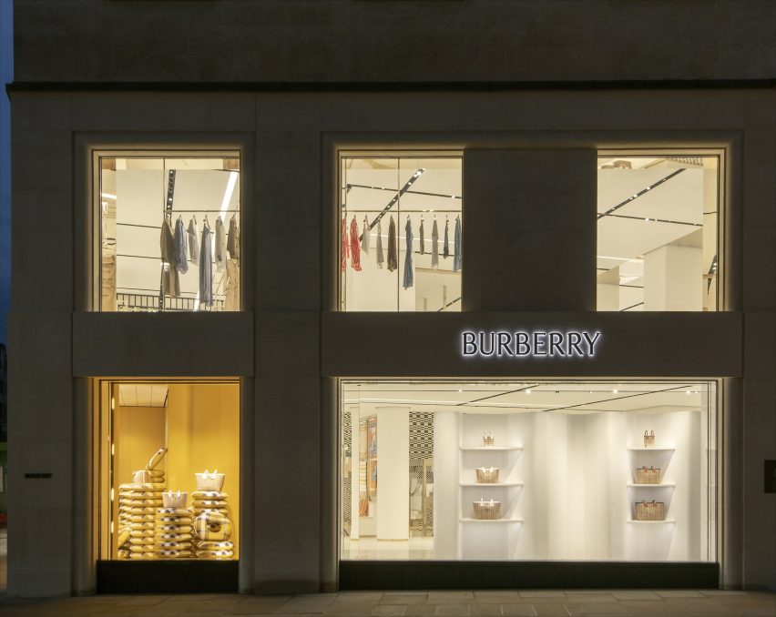
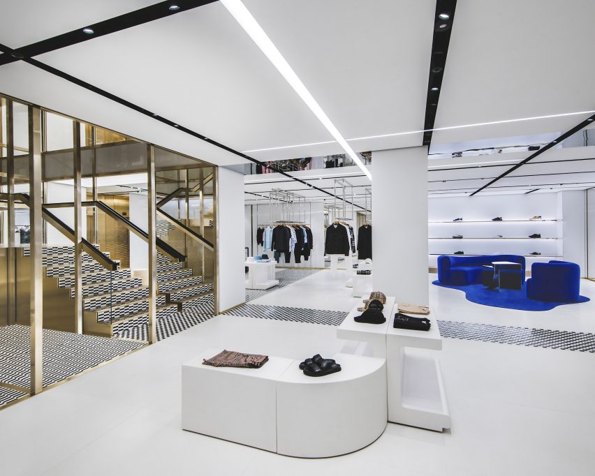
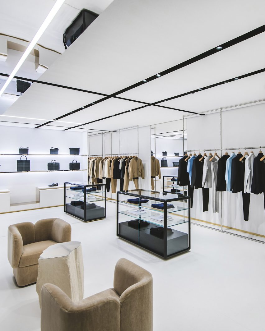
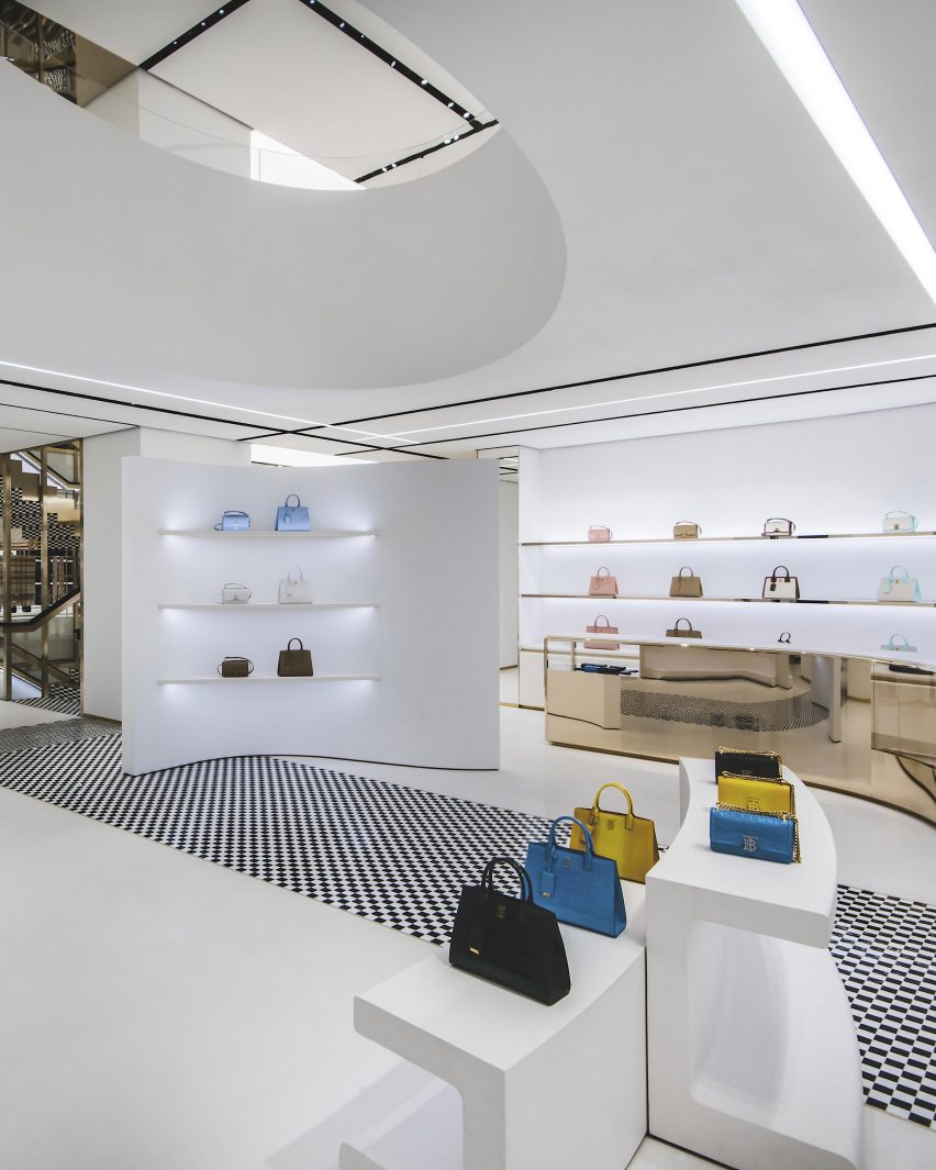
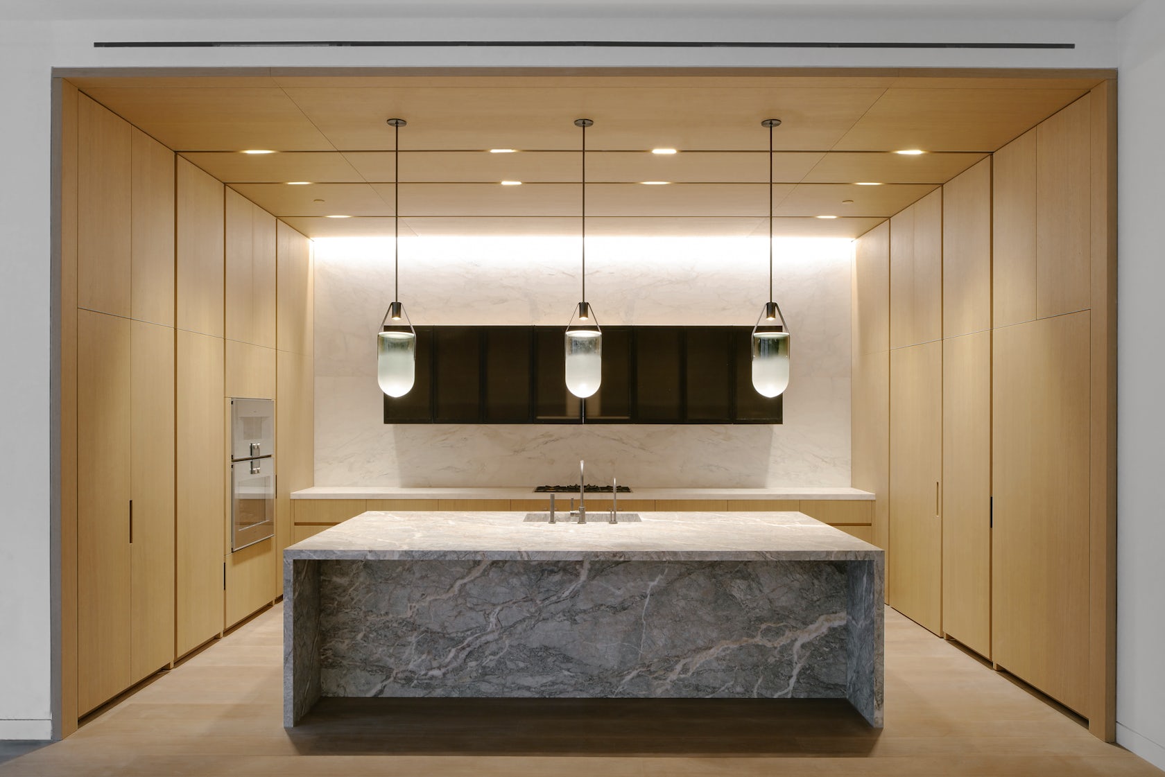
The flagship store has a minimal open-plan interior that is characterised by stark white floor, walls and ceilings which are offset by pops of gold, blue and tones of brown.

The fixtures of the store such as its pillars, staircase, wall displays and mirrors bring a rigid and strict geometry to the space that is complemented by a panelled ceiling which was designed to mimic the brand’s iconic check.

Interior photo of Burberry's New Bond Street Store
It has a minimalist interior

“The minimalist interior is punctuated with an eclectic mix of contemporary furniture, creating a stripped-back setting designed to spotlight key Burberry pieces,” said Burberry.

“Overhead lighting has been crafted to replicate the iconic Burberry Check – a pattern introduced in the 1920s, referencing the brand’s rich heritage.”

Interior photo of Burberry's New Bond Street Store
Burberry’s check was incorporated across the ceiling

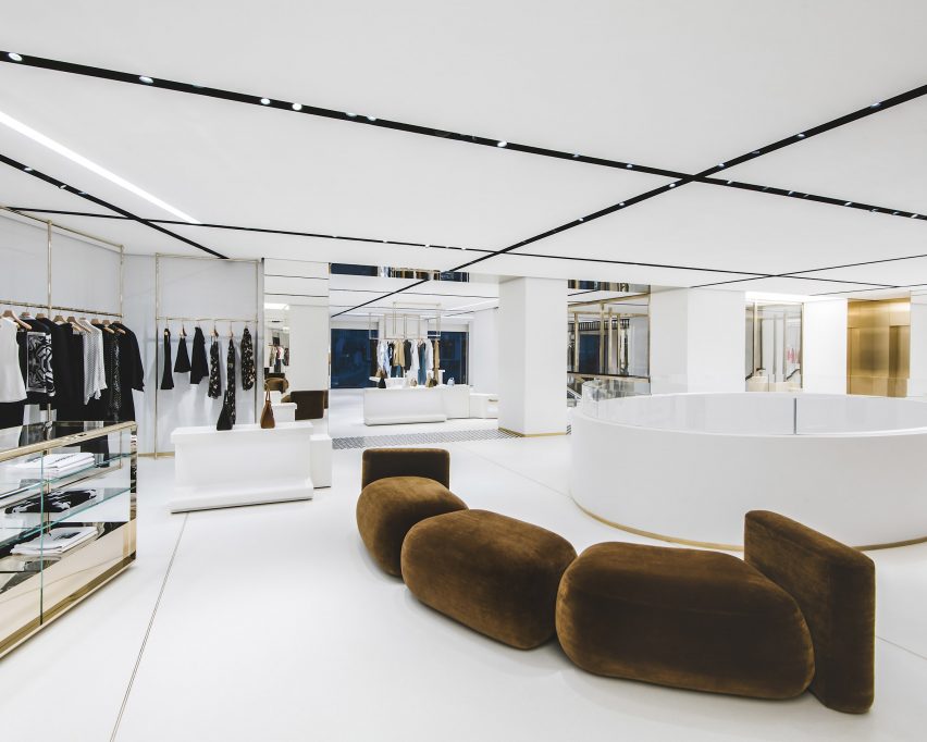
Ceiling panels were organised in a gridded formation with spotlights set between each. Lighting strips were added to the panels at various intervals throughout the store and reference the multiple lines of the signature check.

Throughout the store, slivers of checkered tiles punctuate the stark white floors. A classic black-and-white checkered tile covers multiple areas of the interior, zoning numerous different spaces including ready-to-wear and accessory sections.

Other combinations of tiling include a dark brown and black rectangular tiles that are similarly organised in a checkerboard formation.

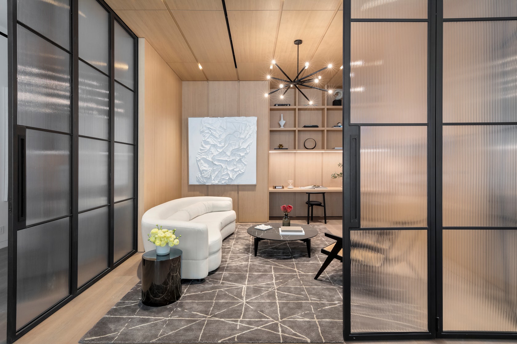
In contrast to the rigid lines of the store’s more permanent fixtures, furniture brings a softer and more playful look.

Curving sofas and armchairs were upholstered in bold shades of beige, brown and vibrant blue and placed on top of matching area rugs and carpets.

Photo of a seating area at the store
Areas of the store were decorated with pops of colour

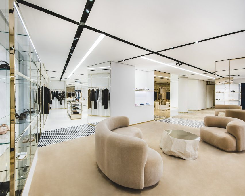
Display tables in blocky shapes are carried throughout each of the store’s floors and sit alongside glass, metal and mirrored vitrines.

Clothing rails draw on an industrial look, with the floor-to-ceiling structures reminiscent of scaffolding systems, however, set apart by their polished and reflective finish.

Photo of a shopping area
Polished metals were paired with glass

“We are excited to open the doors of our newly refurbished flagship store on New Bond Street in one of London and the world’s premier luxury shopping destinations,” said Burberry’s chief executive officer Jonathan Akeroyd.

“The store showcases our beautifully crafted products in a luxury setting that connects our customers with our brand and unique heritage.”

Photo of the store interior
Blocky display units were placed throughout

In 2022, British designer Daniel Lee was announced as Burberry’s creative director following a shock exit from Bottega Veneta. Soon after his appointment, Lee revealed the “first creative expression” under his direction in the form of an archive-inspired charging knight logo and serif logo font.

Earlier this year, British artist Tom Atton Moore was commissioned to create a series of hand-tufted textile installations for Burberry’s Paris showroom and Rue Saint Honoré store.

The photography is courtesy of Burberry.

Reference

Raúl Sanchez divides Girona Street apartment with 21-metre wooden wall
CategoriesInterior Design

Raúl Sanchez divides Girona Street apartment with 21-metre wooden wall

A lengthy walnut-panelled wall runs through the bright white living spaces inside this Barcelona apartment, renovated by local studio Raúl Sanchez Architects.

The Girona Street apartment is set within a 19th-century building in Barcelona’s affluent Dreta de l’Eixample neighbourhood and belongs to a design-savvy couple with two young children.

Living room interior of apartment in Barcelona, designed by Raúl Sanchez Architects
A 21-metre-long walnut-panelled wall runs the length of the Girona Street apartment

Prior to the renovation, the apartment contained a warren of small, dark living spaces bookended by an indoor patio and a sitting room that overlooks the street.

Raúl Sanchez Architects connected these two rooms with a 21-metre-long wall that stretches from one end of the floor plan to the other. While the majority of surfaces in the apartment were rendered in white micro-cement, the wall is crafted from walnut wood.

Living room interior of Girona Street apartment in Barcelona, designed by Raúl Sanchez Architects
Spaces throughout are rendered in white micro-cement

“I thought of a material, which could contrast the whiteness with elegance and warmth while also adding texture and ruggedness,” founder Raúl Sanchez told Dezeen.

“We made several samples and trials until we got the right wood and the right porosity of walnut.”

Dining room interior of apartment in Barcelona, designed by Raúl Sanchez Architects
A blue-painted dining room lies next to the lounge

A series of rooms run parallel to the wall, beginning with a dining area.

Here, a section of the rear wall was painted dark blue and fitted with a built-in bench seat, while the floor was inlaid with a square patch of patterned hydraulic tiles.

Further along the hallway, a sitting area was created just in front of a pair of stained glass windows. This is followed by two bedrooms that are partially painted blue to match the dining area.

One of them is fronted by a huge pivoting door that, like the apartment, is split into two sides. One half is clad with stainless steel and the other in brass.

Green kitchen interior of Girona Street apartment in Barcelona, designed by Raúl Sanchez Architects
A sea-green kitchen is hidden behind doors in the walnut-wood wall

More rooms lie concealed behind the long walnut wall, each accessed via a discrete flush door. This includes a U-shaped kitchen, which was almost entirely painted a sea-green hue.

There’s also a storage area, the family bathroom and the principal bedroom, where a floor-to-ceiling cream curtain helps conceal en-suite facilities.

Apartment designed by Raúl Sanchez Architects features walnut wood wall
Other rooms in the Girona Street apartment are concealed behind flush doors

The apartment’s indoor patio was freshened up, as was the street-facing sitting area. It now features a mint-green sideboard and bookshelf, as well as a decorative wall panel that mimics the brass-and-steel pivot door.

More hydraulic tiles were also incorporated into the floor, this time in mismatch prints.

Living room interior of Girona Street apartment in Barcelona, designed by Raúl Sanchez Architects
Hydraulic floor tiles and mint-green furnishings feature in the living room

Raúl Sanchez Architects is behind a number of striking homes in Barcelona, aside from the Girona Street apartment.

This includes BSP20 House with its towering spiral staircase and the Tamarit Apartment, which is decked out with clashing materials.

The photography is by José Hevia.


Project credits:

Architecture: Raúl Sanchez Architects
Team: Valentina Barberio, Paolo Burattini, Flavia Thalisa Gütermann, Dimitris Louizos, Albert Montilla
Structure: Diagonal Arquitectura
Enginering: Marés Ingenieros
Textile design: Catalina Montaña

Reference

Solar-powered street carts for food vendors
CategoriesSustainable News

Solar-powered street carts for food vendors

Spotted: Street vendors are a big part of Kenyan culture and a significant source of livelihood for many Kenyans, particularly in the capital, Nairobi. But, for some 100,000 street food vendors in the city, it can be both economically challenging and environmentally damaging to keep food at the right temperature. Many vendors rely on charcoal, which releases high levels of carbon dioxide, carbon monoxide, and pollutants.

Instead, Nairobi-based startup Zuhura Solutions has introduced the Halisi Trolley, a solar-powered vending car that allows food to be kept warm for longer using an alternative, clean energy source.  

The stored solar energy is converted into heat that freely warms the food to ensure it’s kept at the necessary temperature for safe eating. Surplus energy that is generated powers LED lights, so vendors can sell them for hours into the night. There are also charging ports that can be used to power customers’ mobile phones at an extra cost – allowing vendors to easily earn additional income. 

Zuhura sells adverting space on the carts to fund its production and subsidised the final cost for vendors. The startup only uses durable, high-quality materials to create the carts, which are available in customised or modular versions, or can be sold in bulk.  

The startup offers vendors a flexible pay-as-you-go plan of $80 (around €73) a month with a 10 per cent initial down payment. Zuhura also connects vendors with technicians who can quickly service their trolleys in the event of a malfunction. 

Food insecurity is a growing concern, particularly for areas without the infrastructure to store produce safely. Springwise has spotted many innovations working to ease this pressure, including a solar-powered refrigerator to cut food spoilage for fishermen and farmers, and another sustainable refrigeration unit that can generate continuous refrigeration for up to four days.

Written By: Anam Alam

Reference

One Wall Street completes conversion from offices to apartments
CategoriesInterior Design

One Wall Street completes conversion from offices to apartments

Work to convert an art deco skyscraper from offices to residential use has completed, becoming the largest building in New York City to undergo this type of adaptive reuse.

A total of 566 homes now occupy One Wall Street, designed by Ralph Walker and completed in 1931, in Lower Manhattan’s Financial District.

Living room by FrenchCalifornia
The completion of One Wall Street’s conversion was marked by the reveal of a new model apartment

Developer Harry Macklowe of Macklowe Properties is behind the transformation, which encompasses one million square feet (92,900 square metres) of residential and 250,000 square feet (23,200 square metres) of commercial amenities.

“In the heart of the iconic financial district, One Wall Street, one of New York City’s most significant buildings, both in history and sheer size, has set the standard for residential conversions, marking yet another historic success,” said Macklowe.

Office with Lower Manhattan view
The apartment was designed by Guillaume Coutheillas of FrenchCalifornia

“The goal was to incarnate empty spaces into thoughtfully redesigned residences that will stand the test of time and continue to answer future demands of modern living.”

The building’s opening was marked by the reveal of a new model residence, designed by Guillaume Coutheillas of FrenchCalifornia.

Bedroom within FrenchCalifornia's model residence
Residence 3404 features three bedroom and multi-aspect views

Residence 3404, one of the building’s largest, includes three bedrooms and multi-aspect views of New York harbour.

Coutheillas envisioned the interiors as if Macklowe himself were to live there, blending European influences using warm neutral colours.

Sky Pool
Amenities in the tower include a “sky pool” with a glass ceiling

Many of the furniture and decor items were sourced from Mexico City studio Atra and are debuting in the space.

Other model residences completed last year were designed by Elizabeth Graziolo of Yellow House Architects and French architect and designer Cyril Vergniol.

A 6,500-square-foot (600-square-metre) co-working space available exclusively to residents and their guests was outfitted in partnership with architect Deborah Berke.

More amenity spaces cover the 38th and 39th floors, including a 75-foot (23-metre), glass-enclosed Sky Pool with a wraparound terrace, and a private restaurant, bar and dining room for residents.

One Wall Street entrance
One Wall Street was designed by Ralph Walker and completed in 1931

The Financial District, known locally as FiDi, is named for being home to the New York Stock Exchange and many global banking headquarters.

However, the area has gradually seen a rise in residential developments over the past decade.

One Wall Street art deco skyscraper
The skyscraper is the largest office building to be converted for residential use in New York City’s history

Many of Manhattan’s office buildings are still struggling with low occupancy rates following the Covid-19 pandemic, so this type of office-to-residential conversion may become more common in the near future.

The photography is by Colin Miller.


Reference

SoHo’s 49 Greene Street Embraces the Modern Concept of Loft Living
CategoriesArchitecture

SoHo’s 49 Greene Street Embraces the Modern Concept of Loft Living


49 Greene Street – a 6-story building in NYC’s historic SoHo district, is an extant example of the mixed iron-and-masonry construction of the post-Civil War era. The client’s brief was to restore the building’s masonry façade and cast-iron storefront, and to convert the interiors into four high-end residential units. To do this, we drew inspiration from the makers and artist ls that once occupied this previously manufacturing building to create units that embrace modern concept of ‘loft living’, in which open, non-programmed flexible spaces meet highly crafted, millworked moments, adding warmth throughout with the use of woods, marbles, and ironwork.

Architizer chatted with Jordan Rogove, Co-Founder and Principal of DXA studio, to learn more about this project.

Architizer: What inspired the initial concept for your design?

Jordan Rogove: We wanted to speak to the various movements that helped form SoHo’s unique character and charm. Much like the artists who were attracted to the neighborhood’s empty lofts in the 1960’s, we too were drawn to the building’s high ceilings, abundant light, and expansive floor plates. For this reason, we are committed to leaving the spaces as open, fluid, and customizable as possible.

However, we were acutely aware that we were designing a home, so introducing a residential scale was important to make the otherwise large space comfortable and inviting. To achieve this, we lowered the ceiling in select rooms and introduced a high level of craft and tactility – our way of communicating with the by-gone manufacturing era of SoHo.

Throughout these rooms, we created a material theme of oak wood paneling, blackened steel, fluted glazing and various marbles. These materials are not only visually exquisite, but very in their tactile qualities, which we believe to be crucial adding warmth and comfort to a home.

© DXA studio

© DXA studio

© DXA studio

© DXA studio

© DXA studio

© DXA studio

This project won in the 10th Annual A+Awards! What do you believe are the standout components that made your project win?

The kitchen and den–the hearth of the home–are the showpieces of each unit, as they are not only beautiful and practical, but speak to each other in their materiality and detailing.

In the kitchen, the appliances, storage, and secondary scullery kitchen are all seamlessly hidden behind white oak paneling with beautifully crafted integrated pulls. This paneling wraps onto the ceiling to cleverly integrate recessed lighting and HVAC diffusers. The island is crafted out of a single slab of Fior di Pesco marble, known for its ability to add calm and serenity to a space, while the upper cabinetry is clad in blackened steel and fluted glass.

This millwork detailing continues into the den, where white oak paneling and a built-in desktop can be closed off from the main living spaces by large blackened steel and fluted glass doors. Alternatively, these doors can perfectly tuck away into the oak millwork to allow flexible space programming.

Many of these materials can be found throughout the unit, creating an overarching theme. For instance, the blackened steel of the den’s custom doors is mirrored in the steel frames of the bathroom vanities, the plumbing fixtures, and even the column cladding.

© DXA studio

© DXA studio

© DXA studio

© DXA studio

What was the greatest design challenge you faced during the project, and how did you navigate it? 

Renovating a manufacturing building from the 1800’s was an exciting challenge, both in terms of design and coordination. On the design side, we believe that as architects, it is our duty to celebrate the area’s rich history in an authentic yet contemporary manner. This is why we wanted to keep the open nature of these spaces as much as possible. It is also why we used wood and iron in a way that is reminiscent of previous eras, while using contemporary detailing to bring these materials to the present day.

On the coordination side, working with existing buildings in NYC is always a challenge. As precisely as we survey all historic projects, we often encounter surprises during construction that require us to tweak our design on the fly–and 49 Greene was no exception. Furthermore, we had to design an entirely new roof structure, as the existing roof was significantly sloped, which meant giving the 200-year old structure upgrades to account for modern building technologies.

© DXA studio

© DXA studio

© DXA studio

© DXA studio

What is your favorite detail in the project and why? 

Although it is one of the smallest rooms in each unit, we think the powder room really packs a punch. The vanity and sink are entirely made out of Fior di Bosco marble, which marries well with the ebony black wood veneer panels to create a dark yet calming atmosphere.

© DXA studio

© DXA studio

© DXA studio

© DXA studio

In what ways did you collaborate with others, and were there any team members or skills that were essential in bringing this Award winning project to life?

The nature of this project required us to closely collaborate with millworkers, iron workers, and various craftspeople to get the detailing down. We worked with Canova on all of the millwork, Manhattan Steel Door Co. on the large den doors, and with Sage Construction on the stonework and other general detailing. We had many pencil sessions and back-and-forth shop drawing reviews to better understand how to achieve the level of craftsmanship that we envisioned–and we really refined our knowledge of interior detailing along the way.

© DXA studio

© DXA studio

© DXA studio

© DXA studio

For more on 49 Greene Street, SoHo, please visit the in-depth project page on Architizer.

49 Greene Street, SoHo Gallery

Reference

DDG and IMG outfit penthouse at Manhattan’s 180 East 88th Street tower
CategoriesInterior Design

DDG and IMG outfit penthouse at Manhattan’s 180 East 88th Street tower

Arched openings frame views of New York City from this duplex penthouse apartment in a Carnegie Hill residential tower, designed and developed by American real estate company DDG.

The penthouse sits atop the newly constructed 180 East 88th Street, an art deco-influenced building that tallest residence north of 72nd Street on Manhattan’s Upper East Side.

Bedroom with arched window
The arched opening that crowns 180 East 88th Street frame views from the interior

Spilt over two storeys, its 5,508 square feet (512 square metres) of interiors were designed by the tower’s architects and developers DDG and staged by New York firm IMG.

The residence also enjoys an additional 3,500 square feet (325 square metres) of exterior spaces across multiple levels — including a private rooftop terrace overlooking Central Park.

Sculptural staircase
A sculptural staircase connects the two storeys and the roof terrace of the penthouse

Huge arches in the grey-brick facades that wrap the building’s crown are visible from the inside, thanks to large expanses of glazing that enclose the apartment on both floors.

There are views across the city in all directions, the most dramatic of which is of the Midtown skyline to the south.

Kitchen
The kitchen features a golden cooker hood that echoes the building’s pinnacle

There are two living spaces, a large dining area and a separate eat-in kitchen, five bedrooms and a den, and four full and two half bathrooms.

The two internal levels and the roof terrace are connected by a curvaceous staircase that rises through centre of the penthouse.

Spaces are neutrally decorated, with sculptural light fixtures and expressive artworks adding visual interest.

In the kitchen, a golden cooker hood echoes the colour and shape of an architectural feature on the building’s pinnacle.

Huge arched opening with view of Manhattan
Expansive terraces enjoy unobstructed views across Manhattan

Completed earlier this year, 180 East 88th Street includes 46 half- and full-floor residences, along with amenities such as a partial indoor basketball court and soccer pitch, a game room, a residents’ lounge, a private fitness and yoga studio, and a children’s playroom with a slide.

The building’s exterior design was influenced by “the boom in high-rise masonry construction in New York in the early 20th century”, and is one of many recent skyscrapers in the city that have ditched glass in favour of more solid-looking materials.

Bathroom
Full-height glass walls allow the vistas to be enjoyed from the majority of rooms

“Paying homage to the lost art of traditional craftsmanship, the intricate exterior features a striking hand-laid brick facade made of 600,000 handmade bricks by Denmark’s master brickworks Petersen Tegl,” said a statement from DDG.

Manhattan has no shortage of luxury penthouses, with some of the most notable including a residence at the top of Rafael Viñoly’s 432 Park Avenue and the premium unit at Zaha Hadid’s 520 West 28th Street development.

The photography is by Sean Hemmerle.

Reference

“22 Gordon Street” Reimagines the Bartlett School as a Monstrous Manifestation of Architectural Experimentation
CategoriesArchitecture

“22 Gordon Street” Reimagines the Bartlett School as a Monstrous Manifestation of Architectural Experimentation

Send us a photo. Tell us a story. Win $2,500! Architizer’s 3rd Annual One Photo Challenge is underway with an Early Entry Deadline on May 27, 2022! Start your entry for architecture’s biggest photography competition here. 

The 2022 One Rendering Challenge winners have been announced, concluding an incredible competition that celebrates one of the most integral processes in design: rendering. The top Student Prize went to Christian Coackley for “22 Gordon Street” — a mysterious and detailed reimagining of UCL’s famous Bartlett School of Architecture building (where the artist is currently enrolled). The building, previously known as Wates House, famously underwent massive and ambitious refurbishment over the last decade when millions of pounds were invested to open up the façade of the building and reveal new creative spaces within. The rendering, however, is not only concerned with the evolution of the building itself; it uses the architecture school building as a metonym to imagine an alternative model for architectural education and the profession as a whole.

“In light of enduring issues we are facing globally, such as a climate and ecological emergency, schools of architecture must nurture a culture of collaboration in architectural education to meaningfully address them. Therefore the drawing speculates on the third iteration of The Bartlett School of Architecture. In contrast to the building’s previous 2 iterations, Wates House (1975) and The Bartlett (2016), this next installment of the school will be constructed over the course of 1000 years by the students and tutors themselves,” Christian stated. Using Photoshop and ZBrush, the winning rendering meditates on the impermanence of design and the inherently evolutionary nature of building, as structures must adapt with evolving human needs.

22 Gordon Street: In its first iteration as Wates House (1975), and later as The Bartlett (2016). 

“The future generations of the building’s inhabitants will recover a lost material culture of hand-crafted ceramics,” imagines Christian. “This interchangeable orchestra of students and tutors will weave themselves together through the poetic symphony of a shared material culture, ushering in a new era in architectural education: The Age of Belonging.”

Architizer’s Editor-in-Chief Paul Keskeys discusses the creative process behind the winning rendering, which included a community engagement process in addition to the more technical considerations. Christian also shares images of his other work.

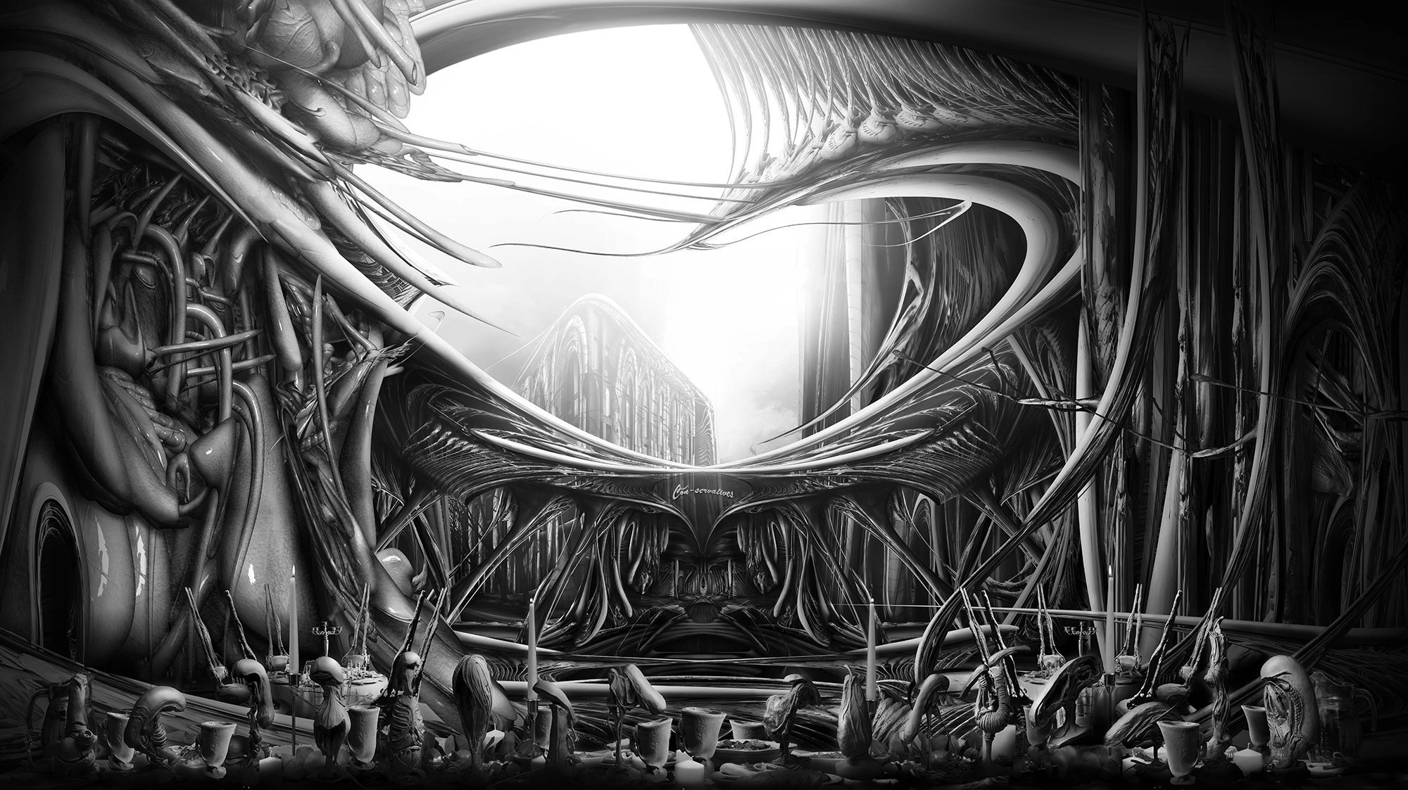
Paul Keskeys: Congratulations on your success! What does winning the 2022 One Rendering Challenge mean to you?

Christian Coackley: I feel extremely lucky and grateful for the outcome of the competition as it is a product of the endless support from my family, friends, and tutors who are at the core of why I do what I do. It is truly awesome to be recognized in such a competitive field, however, I also appreciate that ideal outcomes and perfect results are not a true reflection of what this discipline is about.

What were the primary challenges of conceiving your work, from forming the idea to the actual physical process of rendering?

The idea was formed around my interest in experimenting with a socially engaged method of research to inform architectural design. Through the act of creating a ‘Dining Room’ outside of 22 Gordon Street, I was able to host conversations with students, tutors, and passers-by that allowed me to learn more about others’ experiences at the school, and their thoughts on the culture of architectural education. The guests of this occasion were encouraged to add to one of five clay sculptures that had been worked on by a previous guest. The result of the 3-day event was 5 co-created sculptures and a better understanding of what The Bartlett meant to its users.

The physical process of creating the render derived from the approach of taking more time to do one thing, rather than doing many things that take less time. This approach to drawing is one that I have struggled with as it requires placing a level of patience and belief in the design process that I hadn’t done previously.

Did you use your usual techniques and software for creating this rendering? If you tried something different, how did that go?

Since I wanted the architecture to reflect the very human conversations that took place at ‘The Occasion’, I turned towards the ZBursh software that is used for making character models in games. Within the software I was able to develop a language that allowed for me to abstract the human form into architectural prototypes that could be deployed within the render. One can notice that the render is split between two distinctly different architectural languages. On the right is a skeletal structure that is taken from images of physical clay sculptures created by the guests and I, and on the left is the organic skin that was created using ZBrush. These two contrasting languages eventually begin to weave themselves together over the course of the project. This is shown in one of the projects final interior renders, which depicts the head of school giving Britain’s immortal Queen Elizabeth a tour of the new Bartlett.

Detail of the One Rendering competition winner. 

What connection does this image have to you and your personal feelings about architecture?

The image reminds me that architectural education, practices and The Bartlett itself, are all made up of human beings. They represent the potential for skilled and passionate individuals to come together as a collective and create something that could not be achieved in isolation. However, it unfortunately feels that we are still a long way off from establishing a culture of collaboration rather than competition in architectural education.

When first joining The Bartlett, I felt that the only thing that could separate yourself from the rest was by working harder and longer than others. This mindset was not wrong, but it was not disciplined, and I was one of many students unwittingly participating in one of the profession’s systemic issues; long hours culture. This issue stems from the competitive culture that is established through the act of valuing product over process, an aspect that was critiqued by David Nicol in his text ‘Changing Architectural Education’. He proposes that this is ‘most clearly reflected in the conduct and focus of assessment’, where students are often not rewarded directly for their efforts in analyzing the needs of a client or community. Rather this process is seen as an additional aspect that may be included alongside the main conceptual design proposal. Furthermore, the students’ projects are boiled down to a collection of portfolio pages that become a ’tangible product’ for employers to consume.

Do you have any other work that compares to this in terms of lighting, atmosphere and composition?

Instead of responding words, Christian lets his other images speak for themselves: 

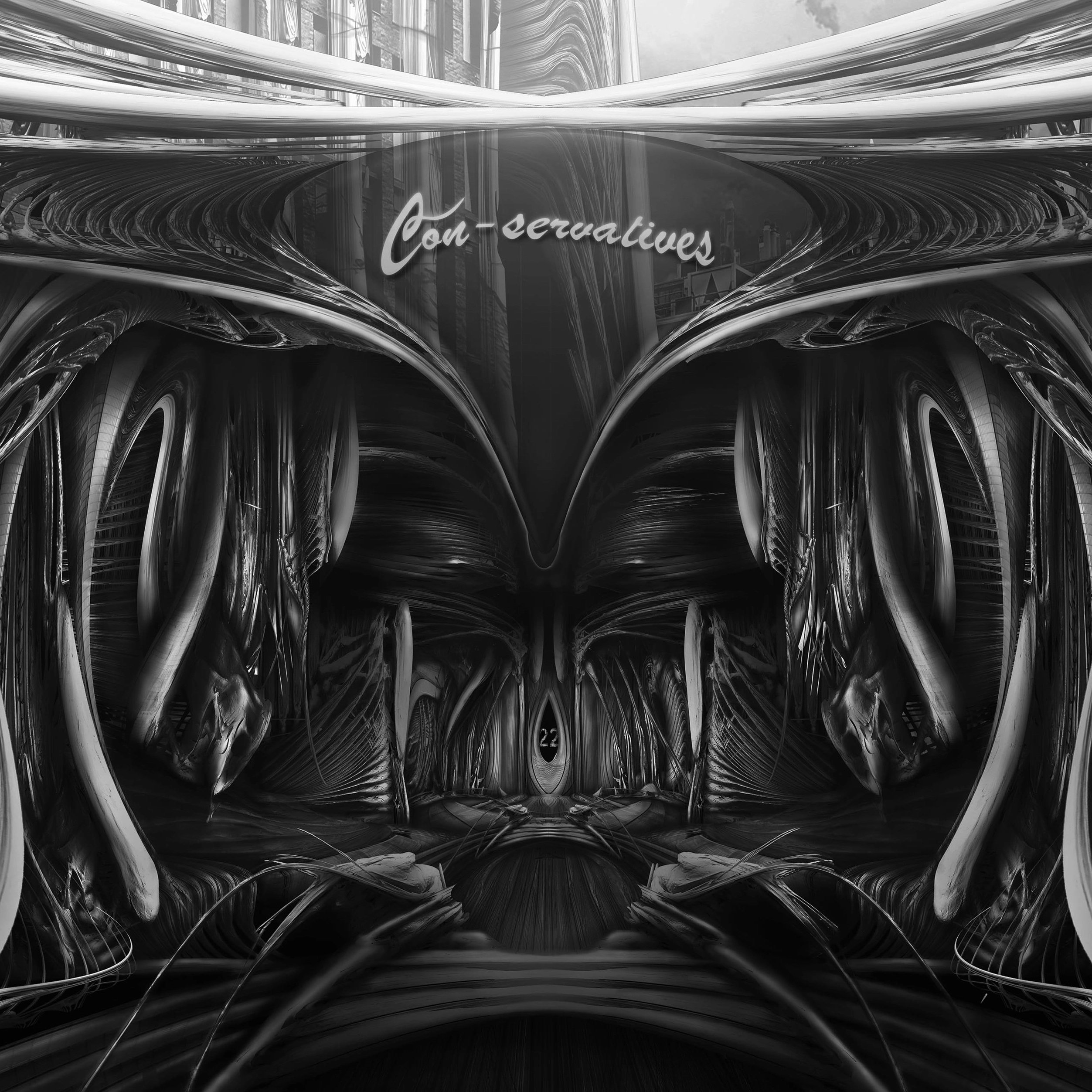
What one tip would you give students and architects looking to win next year’s One Rendering Challenge?

I would suggest trying a technique or approach to design that you want to develop further or have never tried before. I feel it is best to never be 100% comfortable in what you’re doing otherwise it can prevent you from discovering things you never previously envisioned. But most importantly… Keep Drawing!

Send us a photo. Tell us a story. Win $2,500! Architizer’s 3rd Annual One Photo Challenge is underway with an Early Entry Deadline on May 27, 2022! Start your entry for architecture’s biggest photography competition here. 

Reference