Ten inspiring living spaces punctuated by structural columns
CategoriesInterior Design

Ten inspiring living spaces punctuated by structural columns

From monolithic concrete pillars to ornately decorated columns, this lookbook collates ten living room interiors that embrace existing structural columns.

It is not always cost-effective or practical for designers and architects to remove preexisting columns from interiors, especially if they are load-bearing and thus vital to the structural integrity of the building.

In the past, the structural components of buildings were often concealed within walls; however, this changed with the increase in popularity of open-plan spaces over the course of the 20th century.

Columns are sometimes placed at irregular intervals, especially in older buildings, and consequently the interior design scheme must be adapted to fit around them.

Pillars can provide a strong focal point that can be enhanced by both the choice of interior finishes and the placement of furniture around them.

Depending on their materiality and style, they can also serve as an immovable reminder of the building’s design style and the historical period in which it was built.

This is the latest in our lookbooks series, which provides visual inspiration from Dezeen’s archive. For more inspiration see previous lookbooks featuring interiors animated by textural burl wood, multicoloured interior design schemes and contemporary interiors that make a feature of historic ruins.

Grey chairs in living room with white column in cornerGrey chairs in living room with white column in corner
Photo by Pier Carthew

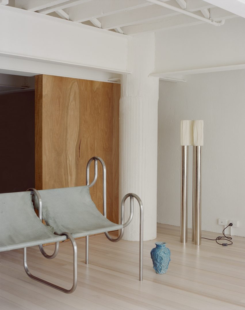
Kerr, Australia, by SSdH

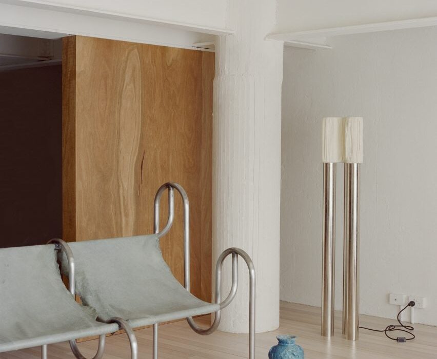
The industrial past of this mezzanine apartment in Melbourne is apparent thanks to the I-beams that crisscross the space and the pair of thick plastered columns in two corners of its living room.

The functional aesthetic of the pillars is complimented by the presence of streamlined metal furnishings and offset by floor-to-ceiling wooden panelling.

Find out more about Kerr ›

Kitchen with chrome counter in JJ16 apartment by Lucas y Hernández-GilKitchen with chrome counter in JJ16 apartment by Lucas y Hernández-Gil
Photo by Jose Hevia

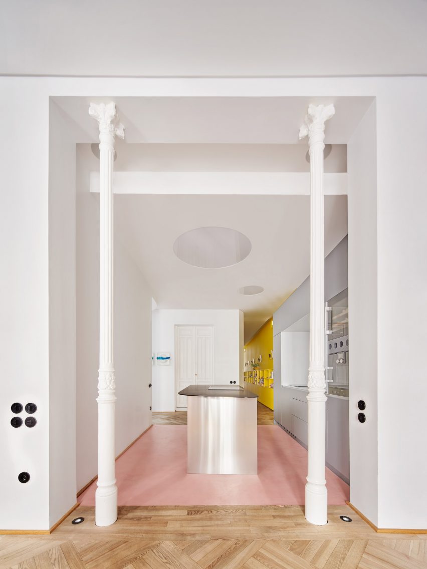
JJ16, Spain, by Lucas y Hernández-Gil

Situated in the Salamanca district of Madrid, local studio Lucas y Hernández-Gil created a playful interior for a high-ceilinged 19th-century apartment that combines pops of colour with original features.

A pair of elegant columns made from cast iron frame the entrance to the walk-through kitchen, contrasting the contemporary units with their fluted shafts and ornamented capitals.

Find out more about JJ16 ›

Living room with concrete column in itLiving room with concrete column in it
Photo by Fran Parente

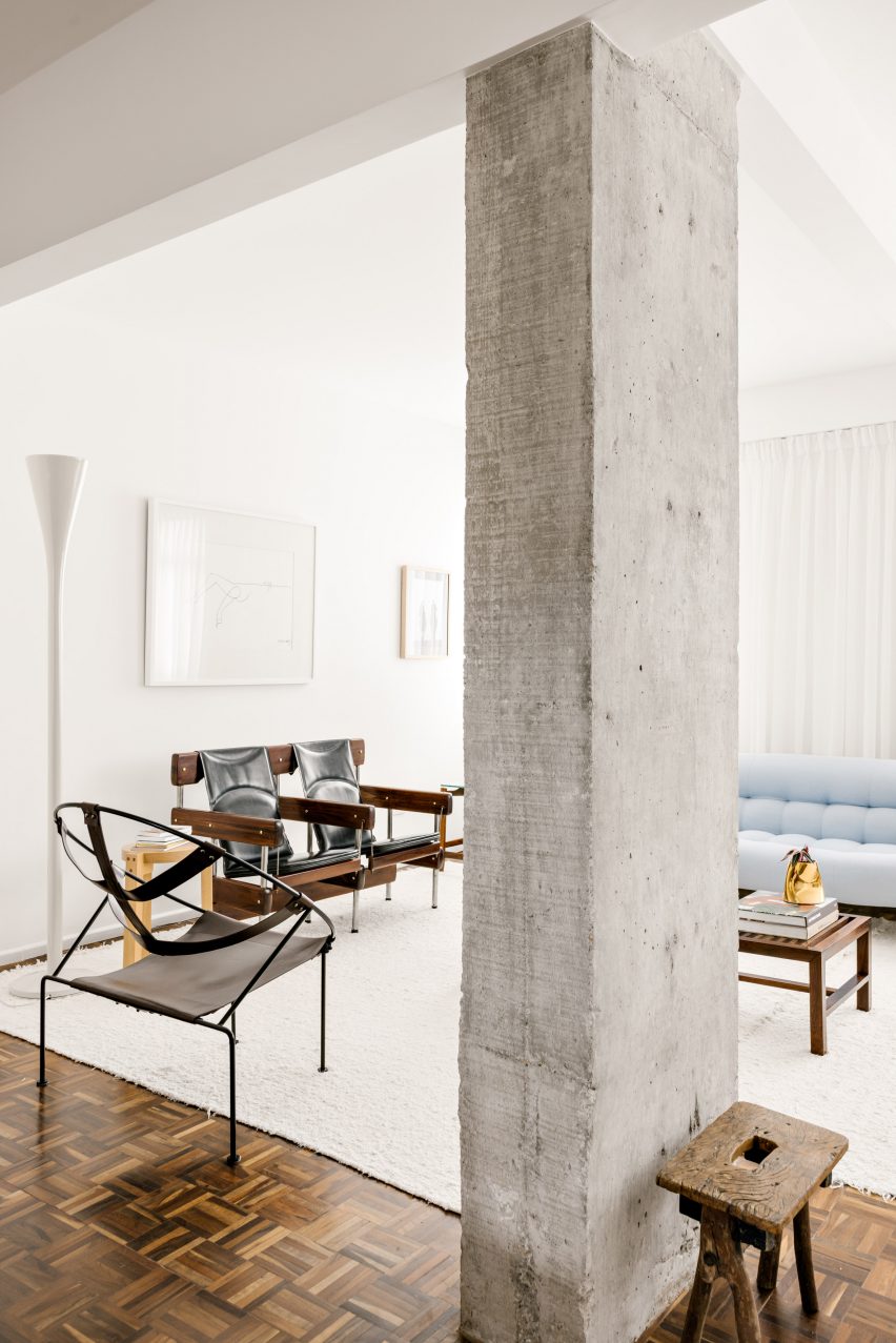
Curitiba apartment, Brazil, by Leandro Garcia and Amanda Dalla-Bona

Eclectic furniture and glossy herringbone flooring contrast the weathered concrete pillar that sits on the boundary between the living and dining spaces of this apartment in the Brazilian city of Curitiba.

It has a rectangular footprint and a characterfully rough surface, which are both echoed in a gnarled wooden stool sitting at its base.

Find out more about Curitiba apartment›
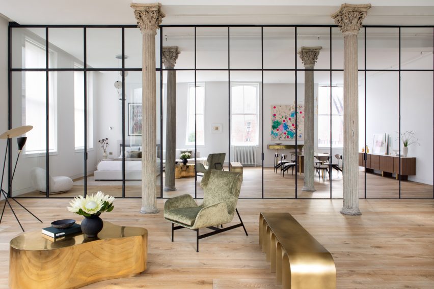

Living room with mirrored wall and detailed columnsLiving room with mirrored wall and detailed columns
Photo by Sarah Elliott

Tribeca Loft, USA, by Andrea Leung

Public and private zones have been delineated by a partially mirrored wall tucked behind a sequence of three original, intricately formed columns in this loft apartment in New York’s Tribeca area.

The Corinthian-style iron pillars are characterised by gracefully fluted shafts topped by opulent capitals that feature acanthus leaves. The style was popular in ancient Greek and Roman architecture.

Find out more about Tribeca Loft ›
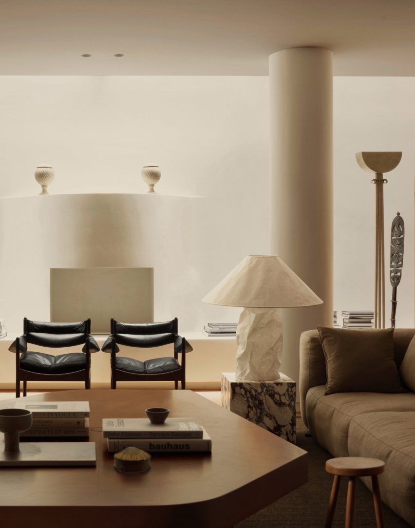

Living room with smooth white column in cornerLiving room with smooth white column in corner
Photo by Felix Speller and Child Studio

Mews house, UK, by Child Studio

A quartet of smooth, statuesque pillars blend in seamlessly against a backdrop of art deco and mid-century modern furnishings in the living area of this mews house in London’s Mayfair area.

The thick, pale pillars bring a dramatic air to the space, which was designed for lounging as well as hosting, entertaining and dining.

Find out more about the mews house ›


Living space with curved sofa and tiled columnsLiving space with curved sofa and tiled columns
Photo by Seth Caplan

Dumbo Loft, USA, by Crystal Sinclair Designs

Walls made from floor-to-ceiling glass panels and an opulent crystal chandelier create a sense of luxury in this Brooklyn apartment.

The living room is grounded by a double-height structural pillar, which has a bottom half clad in pale pink vertical, subway-style tiles.

Find out more about Dumbo Loft ›
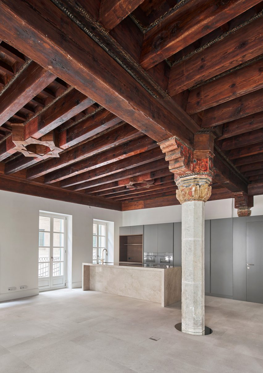

Living space with kitchen in corner and stone pillar in centreLiving space with kitchen in corner and stone pillar in centre
Photo by José Hevia

Can Santacilia, Spain, by OHLAB

A pillar with a faceted stone shaft and an ornately carved and painted wooden capital is the focal point of this living area inside an apartment in Palma de Mallorca by local studio OHLAB.

The stately pillar and dramatic coffered ceiling are contrasted by the sleek modern kitchen, but united by the use of stone in both the column and kitchen island.

Find out more about Can Santacilia ›
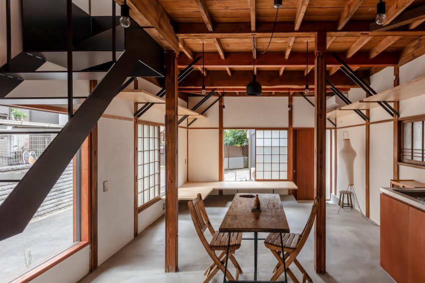

Living area in a wooden houseLiving area in a wooden house
Photo by Nao Takahashi

Casa Nano, Japan, by Bosco Sodi

This modest home in Tokyo features slender struts made from wood that form part of the building’s exposed structure.

Wooden seating, tables, cabinets and shelving create a harmonious interior scheme, which is dominated by both the skeletal wooden frame of the building and an open-tread staircase.

Find out more about Casa Nano ›
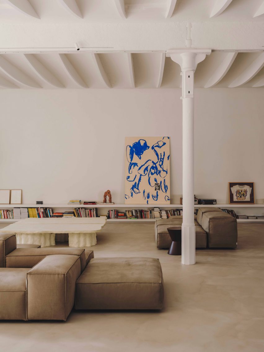

Vasto gallery by Mesura apartment interiorVasto gallery by Mesura apartment interior
Photo by Salva López

Casa Vasto, Spain, by Mesura

This apartment in Barcelona (above and main image) is studded with white-rendered columns dating from the 18th century, which anchor the unique vaulted ceiling to the expansive floor.

Low-slung furnishings provide a horizontal emphasis in the interior while the columns create a rhythm of upright pillars, which nod to the building’s industrial heritage.

Find out more about Casa Vasto ›
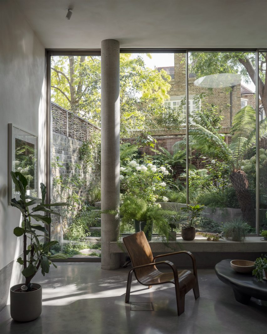

Brutalist Chelsea townhouse by PricegoreBrutalist Chelsea townhouse by Pricegore
Photo by Johan Dehlin

Brutalist Chelsea townhouse, UK, by Pricegore

London-based architecture studio Pricegore refurbished the interior of this brutalist townhouse to celebrate its concrete materiality.

In the lofty, double-height living space, a cylindrical pillar stretches from floor to ceiling in front of the backdrop provided by the house’s verdant garden.

Find out more about Brutalist Chelsea townhouse ›

This is the latest in our lookbooks series, which provides visual inspiration from Dezeen’s archive. For more inspiration see previous lookbooks featuring interiors with textural burl wood, colourful interior design schemes and contemporary interiors that make a feature of existing historic ruins.

Reference

6 Expressive Projects Flaunting Their Structural Frames
CategoriesArchitecture

6 Expressive Projects Flaunting Their Structural Frames

Architizer is thrilled to announce that the 11th Annual A+Awards is open for entries! With an Early Entry Deadline of November 4th, 2022, the clock is ticking — get started on your submission today.

With the plethora of materials available today, architectural frames have become increasingly complex, moving further and further away from the simple cast iron and concrete examples of the past. A confluence of factors influences the design of a frame, which in turn shapes the building’s height, shape and interior spaces. As architects push the limits of creative possibility, the skeletons of some of the world’s most beautiful buildings have evolved into evermore intricate and visually exciting structures. Using modern building techniques and innovative materials, building frames have become webs of beams, posts, knuckles and joints that, in the past, may have been hidden behind stone and drywall.

There’s a widely known expression that suggests a magician never shares his secrets; however, when it comes to architects and the craft of structural design, this seems to be less and less the case. Gazing through the gallery of the 10th Annual A+Awards-winners, we noticed an increased number of buildings expressively flaunting their structures for all to see. Could a renewed appreciation for the masterful art of structural design be why we are seeing more projects with exposed frames? Or are there other reasons — including transparency about sustainable material choices or even representing the program within — motivating architectural firms to reveal their buildings’ skeletons?


Caisse d’Epargne Bourgogne-Franche-Comté Headquarter

By GRAAM , Dijon, France

Jury Winner, 10th Annual A+Awards, Mid Rise (5-15 Floors)

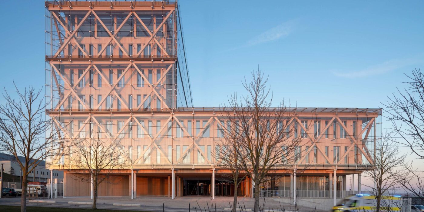
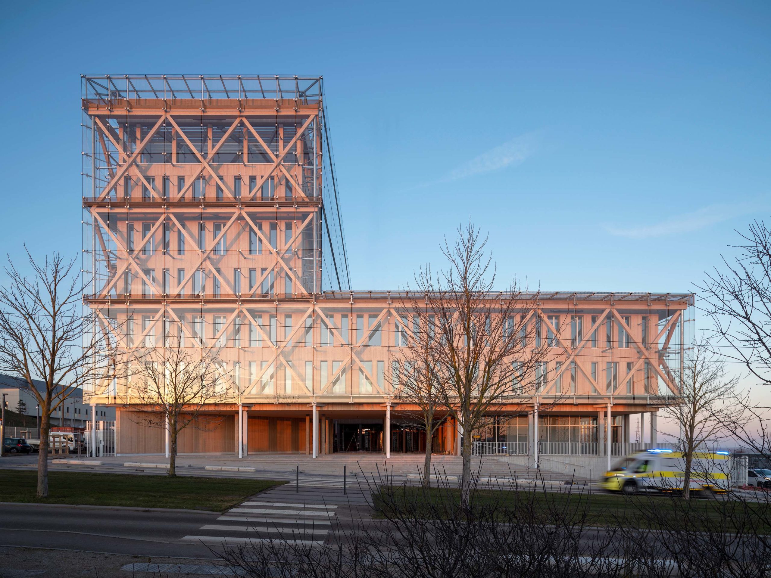
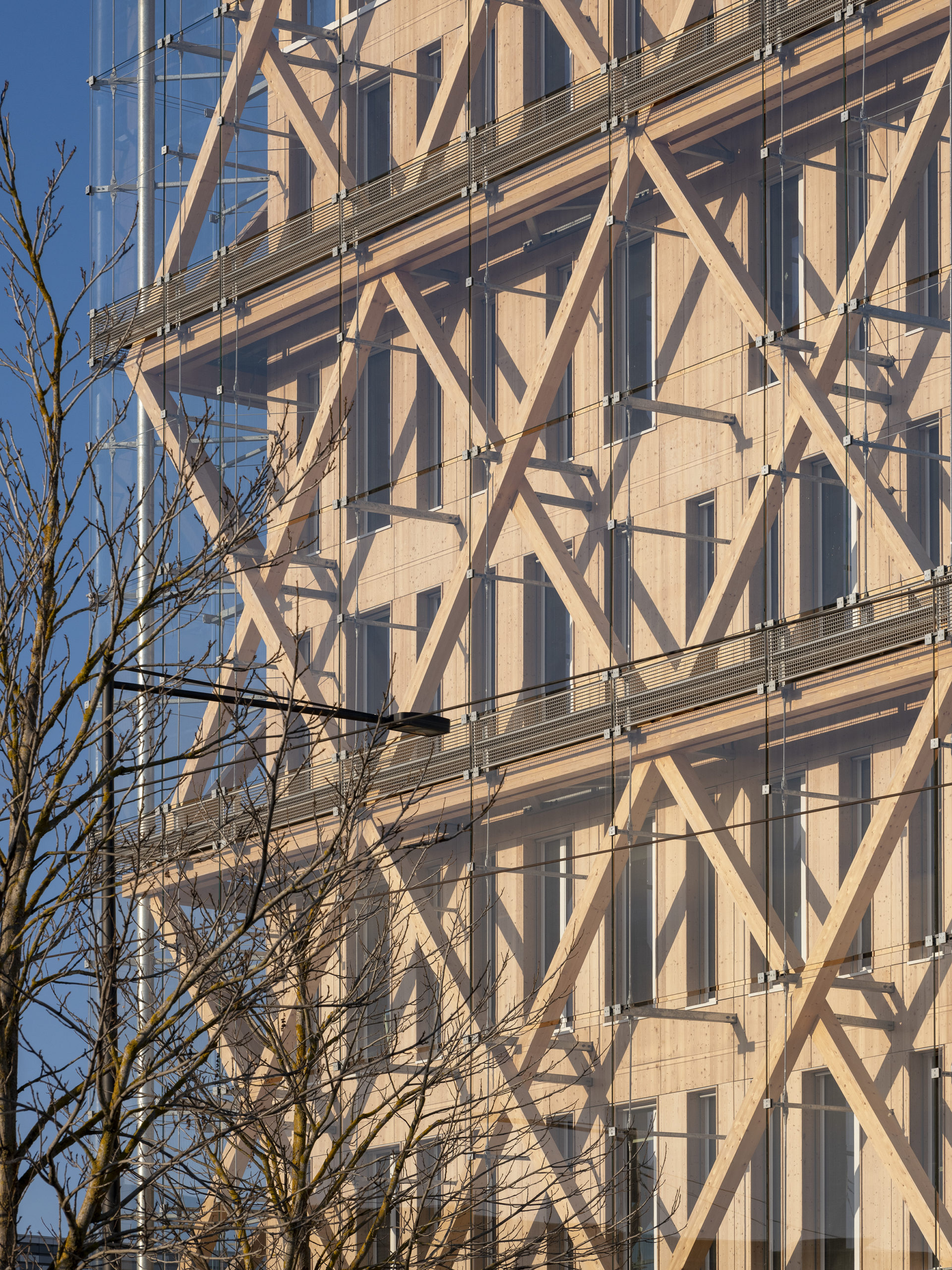
Banking group Caisse d’Epargne has a new head office designed by GRAAM. An intelligent seven-story modular building, the headquarters is designed with a prefabricated concrete floor and exo-wooden structure covered with a glazed double skin. The goal was to design a building that reached Passivhaus standards while providing a flexible work environment. Local materials were expertly implemented to create the stunning structure whose timber frame and glazed façade assist in heating and cooling, while the cleverly placed timber columns are ideal for partitioning work areas.


Casa Malandra

By TAC, Puerto Escondido, Mexico

Popular Winner, 10th Annual A+Awards, Private House (XS <1000 sq ft)

Photographs by Onnis Luque

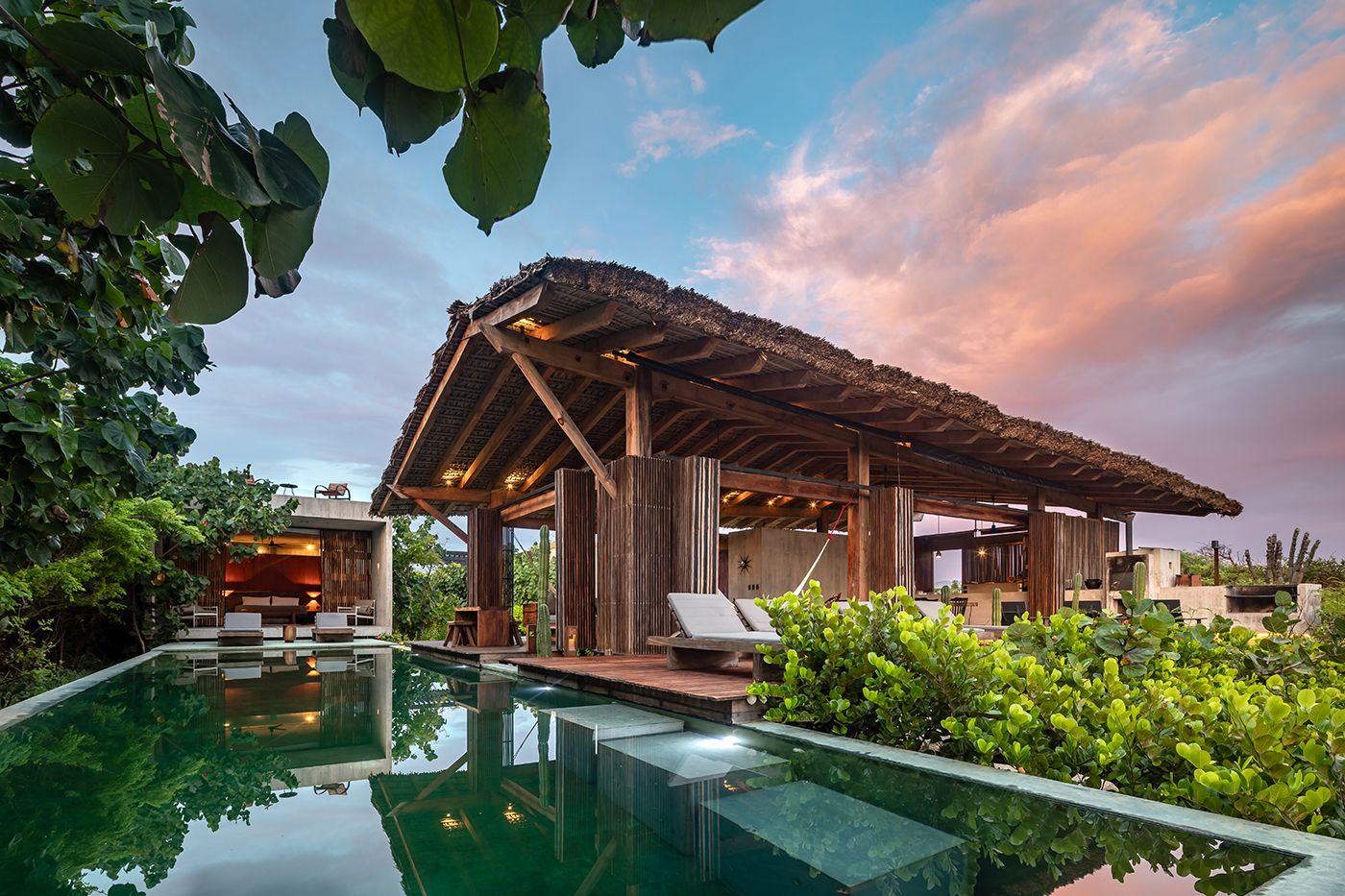
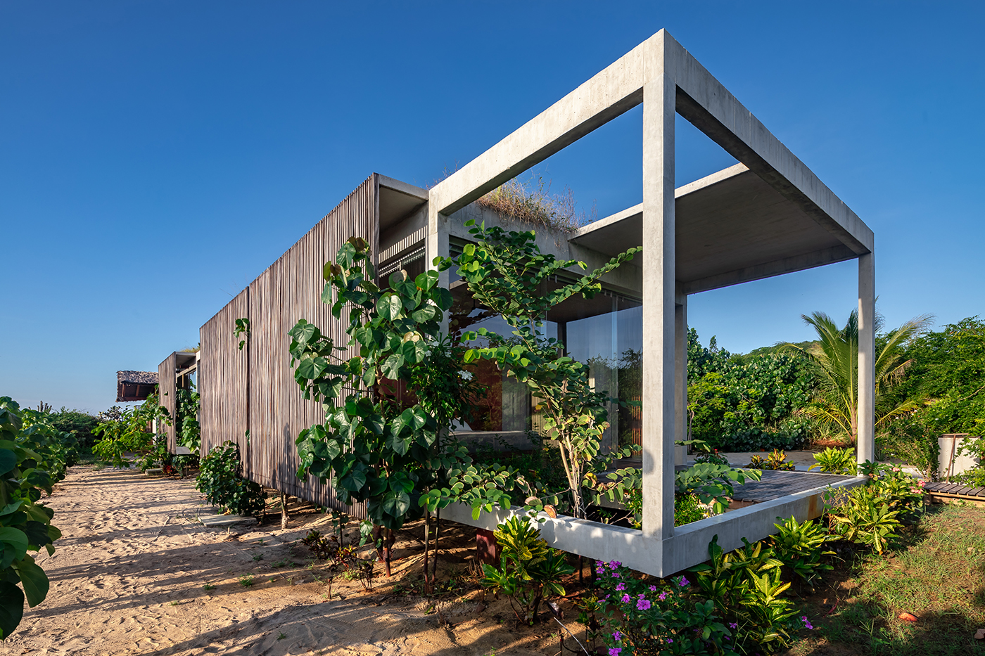
Casa Malandra was conceived by the Mexican firm Taller Alberto Calleja amid the lush fields of Puerto Escondido in Mexico. The design creates many juxtapositions. While the concrete frame that forms the private domain of the dwelling emerges as a contemporary cuboid structure, it contrasts to the open wooden build that borders (next to the private pool), which draws inspiration from the Mexican Palapa — a traditional shelter roofed by palm leaves or branches whose timber frame is in keeping with the uncultivated surroundings. The exposed structure in both instances aim to increase the volume of space throughout while simultaneously connecting the various vernacular voids and implementing visual appeal.


IKEA – the good neighbour

By querkraft architekten zt gmbh, Vienna, Austria

Jury Winner, 10th Annual A+Awards, Retail

Photographs by Christina Häusler – Querkraft Architekten

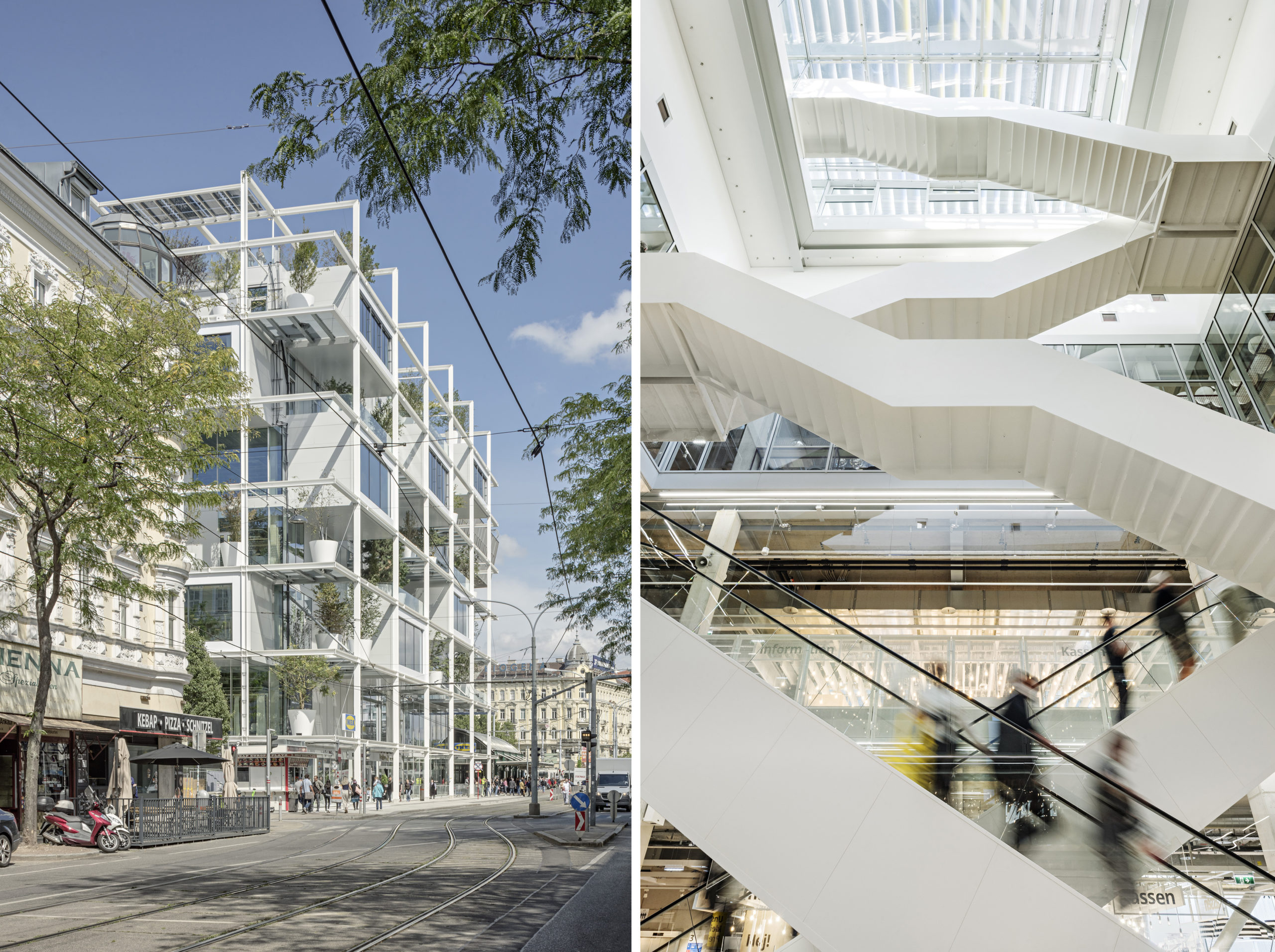
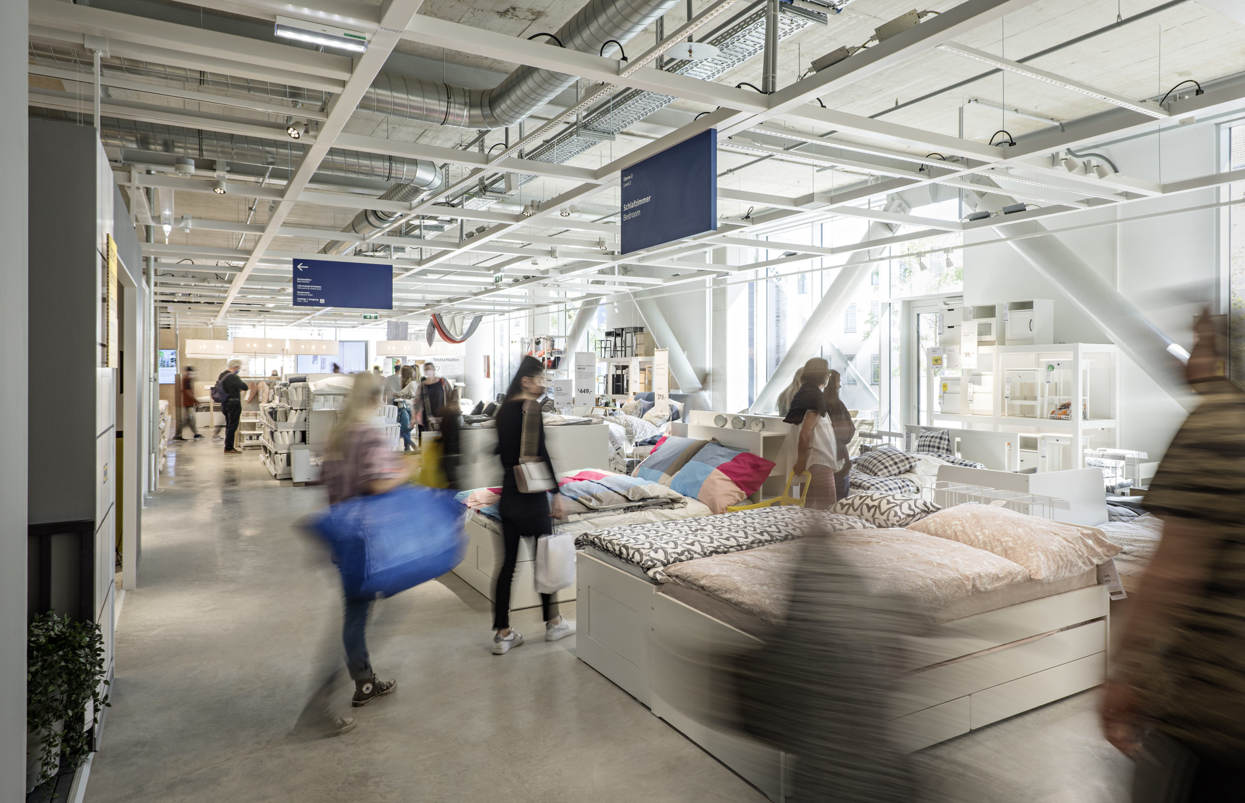
In Austria’s capital, Vienna, Querkraft Architekten constructed the first IKEA store unsuitable for cars and parking. Designed to be “a good neighbor,” the community conscious building is the essence of its origin. The exposed framework of the no-frills building showcases how the structure is assembled, much like the renowned furniture pieces within. By exposing the infrastructure, the perceptible height of the spaces is increased dramatically, and the continuous void in the interior of the building allows visual contact between the different floors.

Additionally, the prefabricated reinforced concrete columns are set on a grid of around ten by ten meters, which guarantees considerable flexibility in the design and use of the spaces within. To ensure the efficient conditioning of the building, all of the services are based on a simple principle: short distances and direct access, which is helped by the lack of internal cladding. Like the beloved Kallax for apartments worldwide, Querkraft Architekten’s The Good Neighbor could well be a city center staple of the future.


Ghost Hangar

By John Grable Architects, TX, United States

Popular Winner, 10th Annual A+Awards, Showroom

Photographs by John Grable Architects

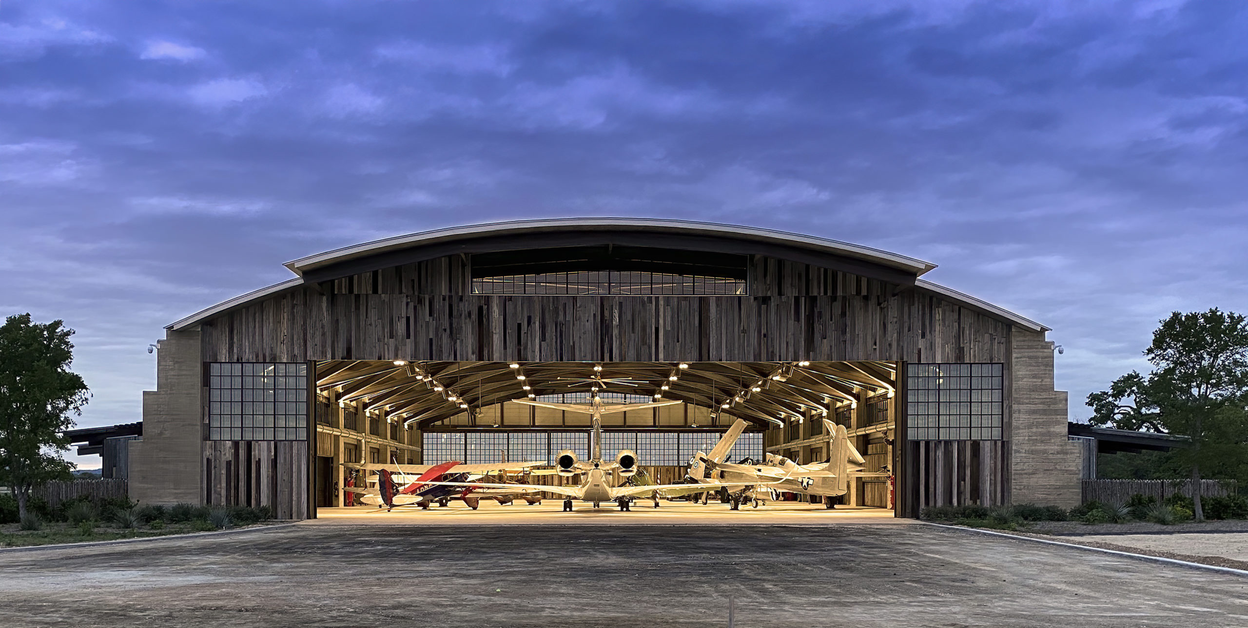
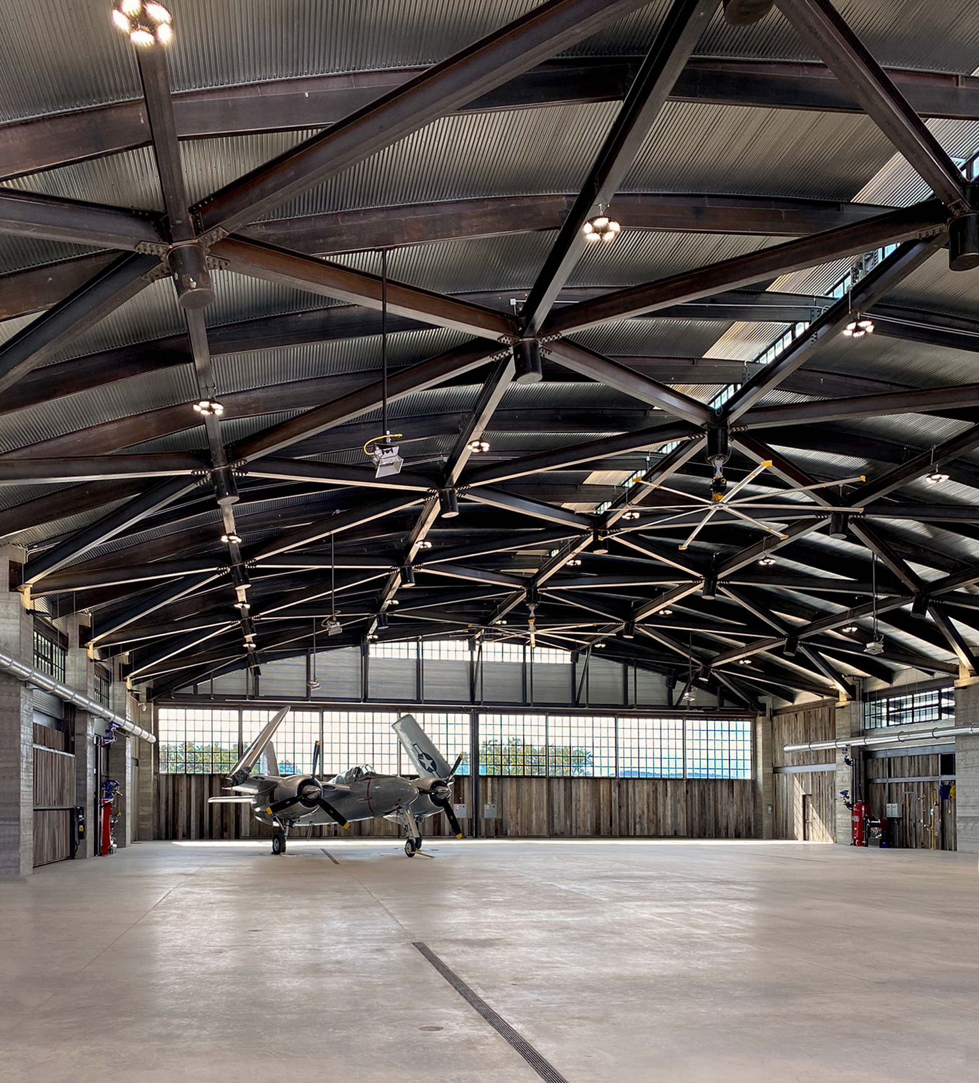
Ghost Hangar was designed exclusively to house a living collection of Vintage WWII-era aircraft. The 32,000-square-foot structure sits on a remote site in Texas Hill Country, Texas. With their traditionally inspired design proposal, John Grable Architects aspired to ensure a minimal visual impact on the surrounding landscape. Drawing inspiration from the historical shape and form of the Quonset hut developed during WWII, a rigid frame was selected using a triangulated wide-flange barrel-vault structural system connected through a series of knuckles. This composition enables the building to achieve longer spans suited to aircraft housing. The unconventional steel roof structure and board-formed concrete buttresses provide unquestioned durability. At the same time, reclaimed barn wood siding was specified pre-weathered to tolerate the surrounding climate while blending harmoniously with the territory.

The passive light shelves, deep roof overhangs and cupola openings work in conjunction with the Thermasteel envelope to render the hangar volume a shaded refuge throughout the warm summers. The building is not only aesthetically era-appropriate but it also achieves sustainable properties through the use of age-old principles.


Cycling and Pedestrian Bridge in Bohinj Slovenia

By Atelje Ostan Pavlin, Municipality of Bohinj, Radovljica, Slovenia

Jury Winner, 10th Annual A+Awards, Transportation Infrastructure  

Photographs by Mirian Kambič

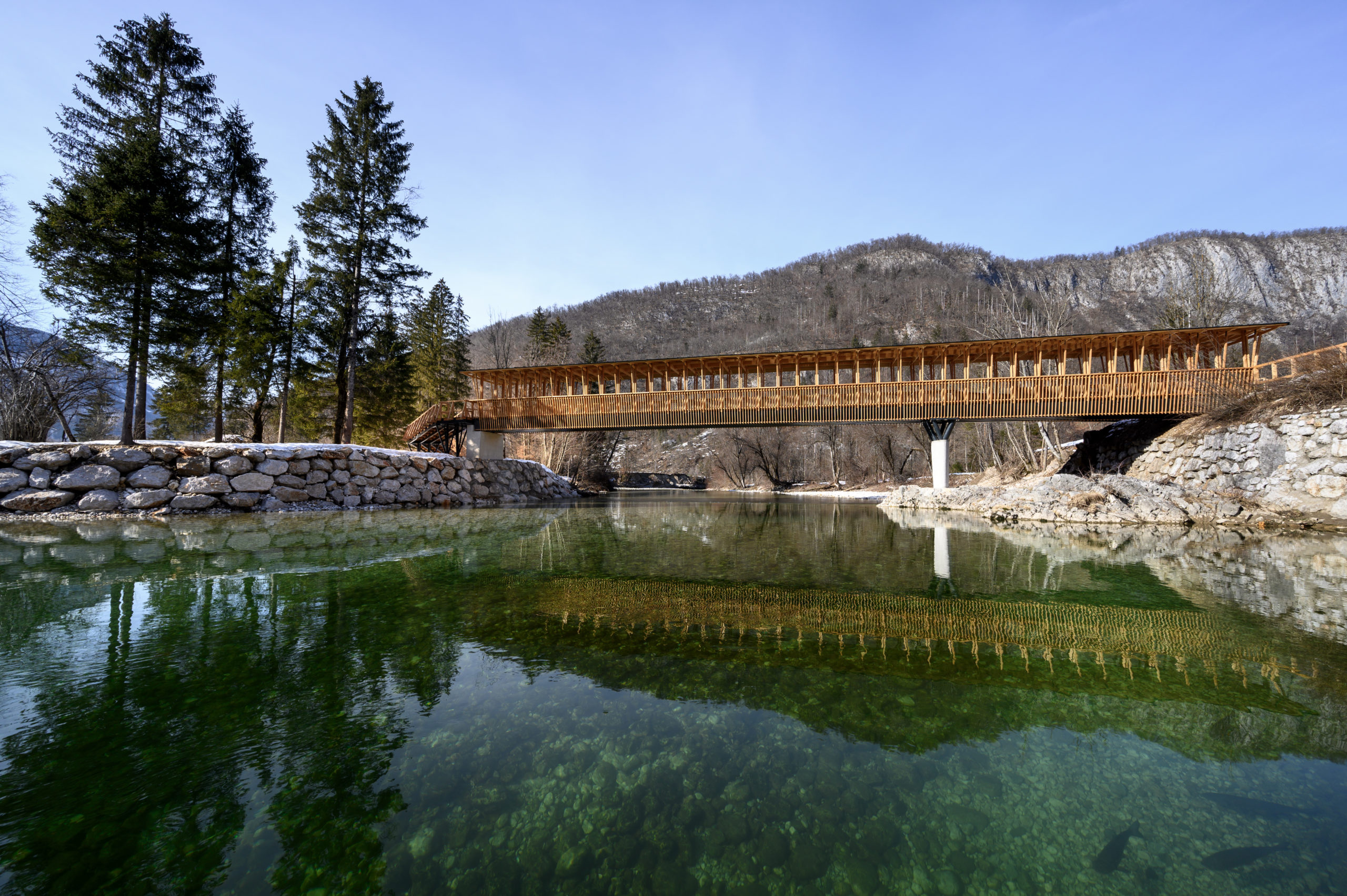
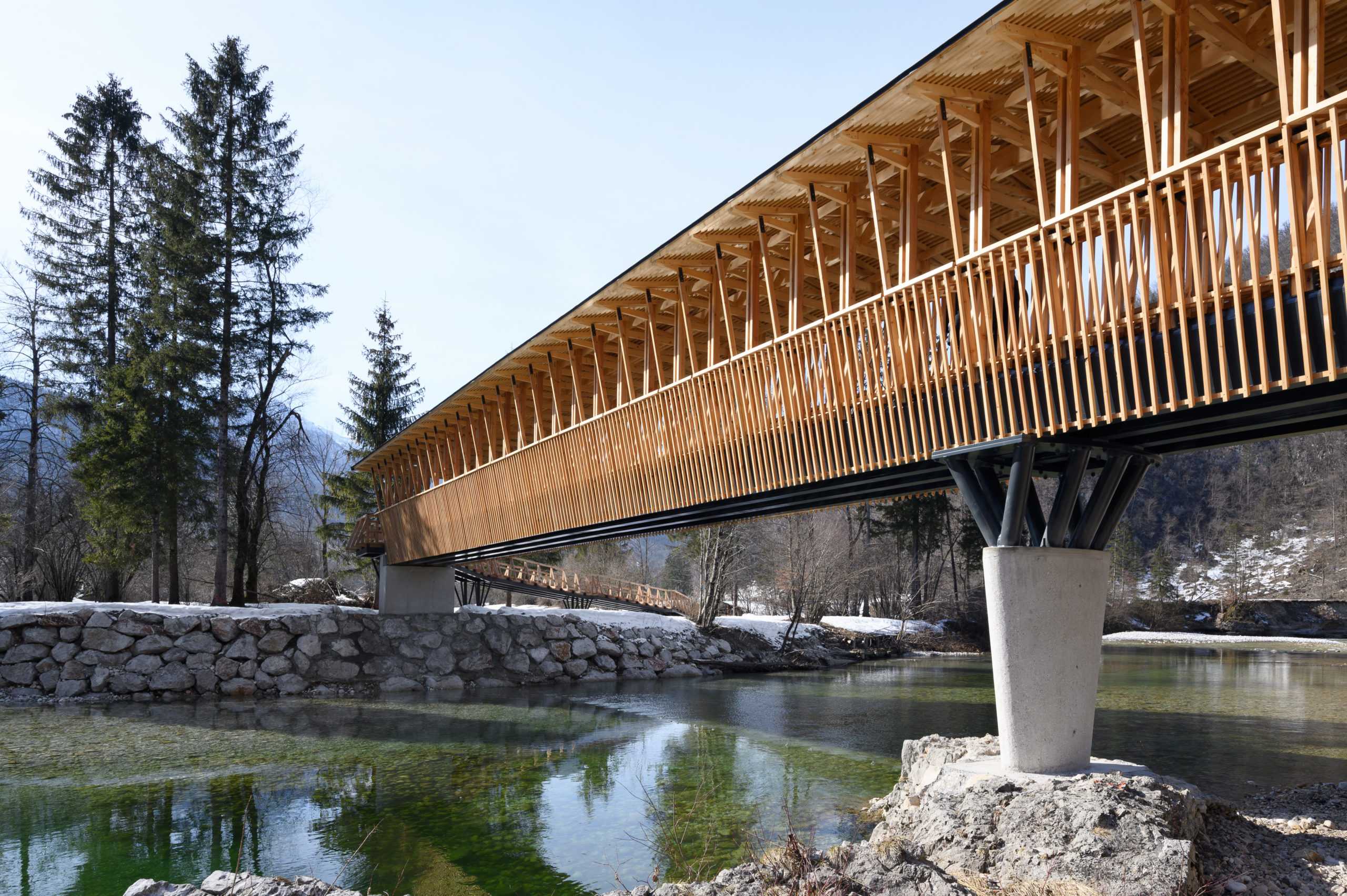
The intricate footbridge on the Bohinj Cycle Route connects the upper and lower banks of the Sava Bohinjka River. The central volume of the bridge is supported at three points, and the load-bearing structure consists of four steel beams running the length of the bridge. The intermediate ellipsoid concrete pillar rests on the river bed and carries steel “branches” to support the beams. The architects aimed to evoke the sense of a “rural wooden temple” with their bridge reflecting the form of a traditional hayrack. The main construction, pillar rhythms, wooden details, ties, eaves and roof are all built from local larch wood to ensure harmonious integration with the natural landscape.


Nantong Urban Agricultural Park Exhibition Center

By Z-ONE Tech, Nantong, China

Jury Winner, 10th Annual A+Awards, Gallery & Exhibition Spaces

Photographs by LINBIAN

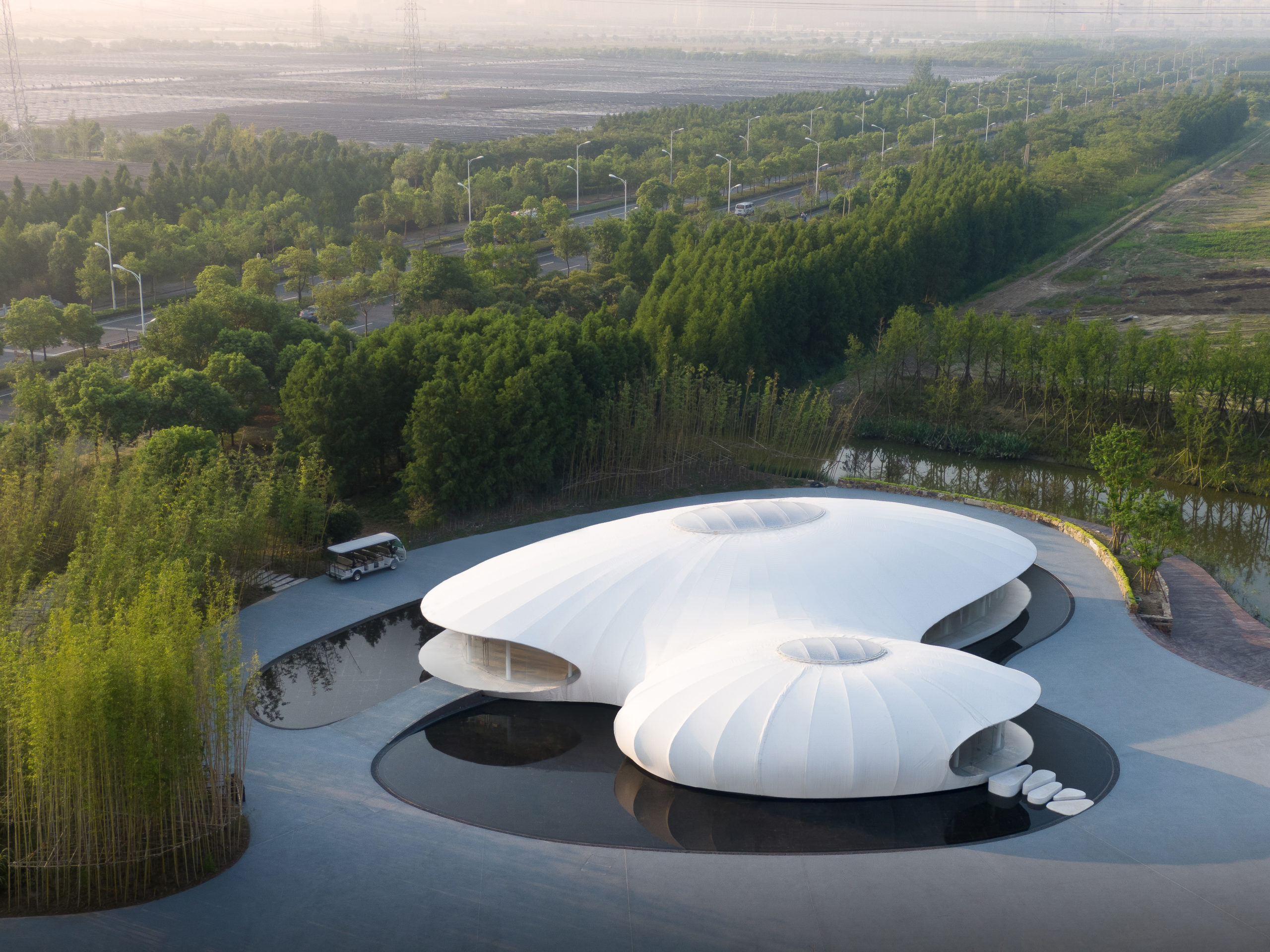
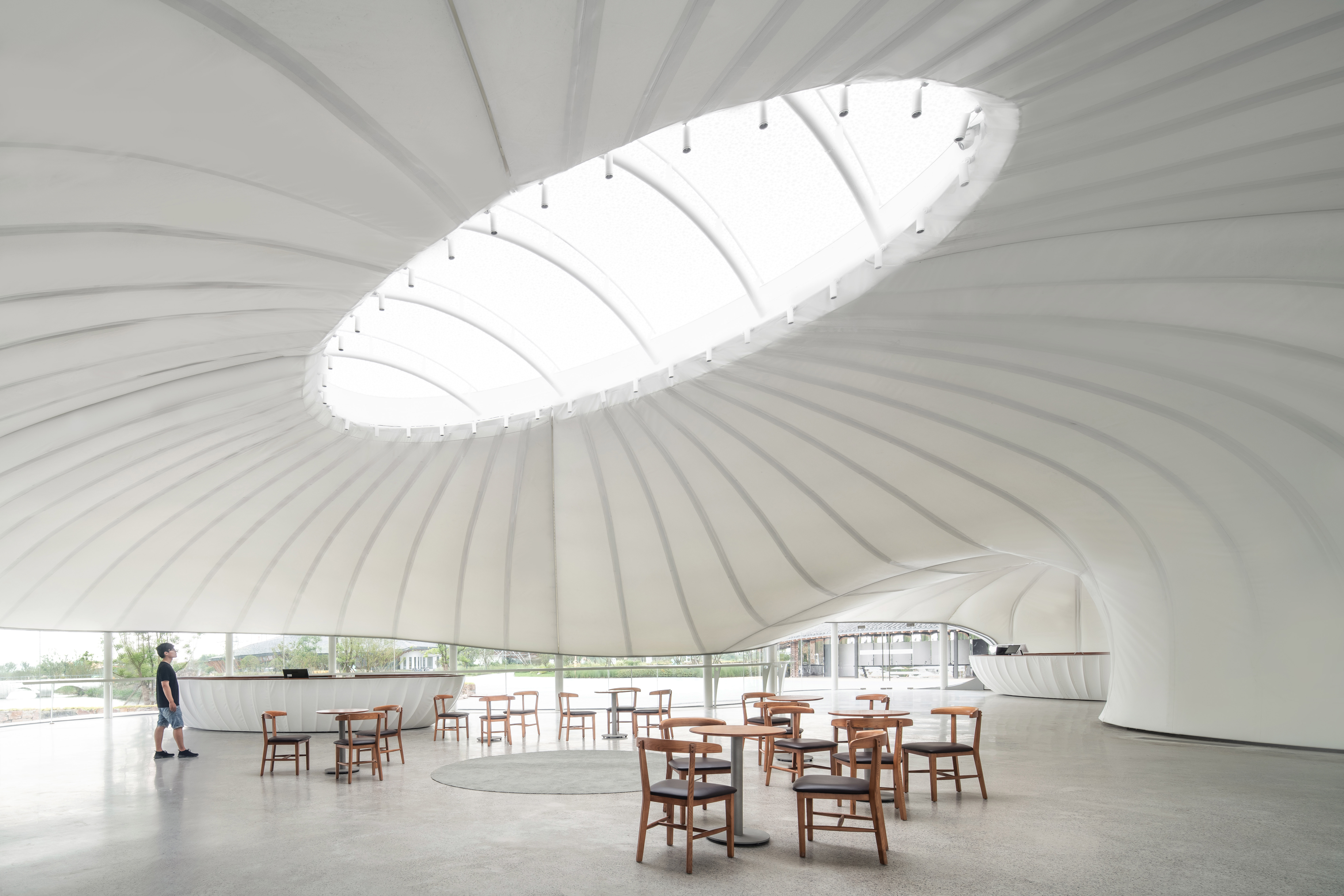
Experimental architectural practice Z-ONE Tech has designed several distinct buildings for Nontong Urban Agricultural Park. The Rural Living Room Exhibition Centre is a contemporary building in form and construction. The white tent-like structure has a membrane segmented by the structural lines that shape its two ovoid figures with their sky-lights while vertical columns hold the perimeter glazing that captures the raw vistas beyond.

Architizer is thrilled to announce that the 11th Annual A+Awards is open for entries! With an Early Entry Deadline of November 4th, 2022, the clock is ticking — get started on your submission today.

Reference

Structural Membranes: Exploring ETFE and PTFE Synthetic Polymers in Architecture
CategoriesArchitecture

Structural Membranes: Exploring ETFE and PTFE Synthetic Polymers in Architecture

Browse the Architizer Jobs Board and apply for architecture and design positions at some of the world’s best firms. Click here to sign up for our Jobs Newsletter.

Modern chemistry made mass-producing polymers possible and continues to facilitate the use of synthetic polymers in architecture. Membranes are one of the most visible forms of polymers in design and construction. Waterproofed membranes add a layer to the building’s envelope that both prevents damp walls and helps control the humidity inside. This approach to structure and envelope, which has gradually become popular since the late 20th century, is an especially good choice for public projects with large span roofs. For example, the Millennium Dome by RSHP, which has been badly damaged by the extraordinarily destructive storm Eunice, is a dome structure with a skin of PTFE coated glass fabric that has an astonishing diameter of 1, 200 feet (365 m) and a height of 165 feet (50 m).

A roof formed by a single layer of membrane is significantly thinner than structures built from traditional materials such as timber and bricks, while it is possible to be as strong as steel, depending on the material. The resulting structure, therefore, preserves lightness both structurally and visually. Meanwhile, they are strong enough to stand against the weather and good at self-cleaning. This article looks at two predominant synthetic polymers — both plastics that are categorized as textiles. PTFE, polytetrafluoroethylene, is constructed from carbon and fluorine atoms. Meanwhile, ETFE, ethylene tetrafluoroethylene, is built from carbon, fluorine and hydrogen. While the former is more fire-resistant, the latter performs better under tensile pressure.

Sogokagu Design Lab_exterior

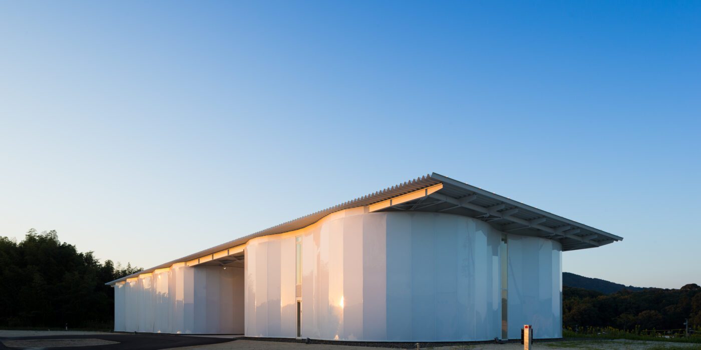
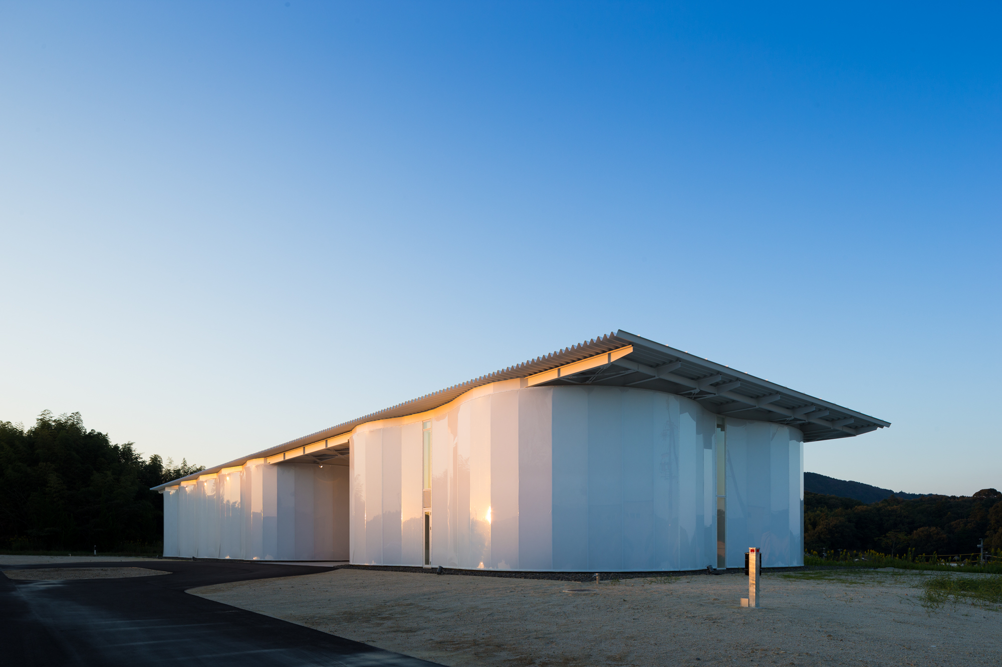
Polymers are also applied as hard materials, the Sogokagu Design Lab by Kengo Kuma and Associates has a ETFE façade.

So far, membranes sound ideal for large-span structures. However, the performance of the material heavily depends on its structural integrity. If just one part of the piece breaks, normally, if the type of membrane used is fabric-based like PTFE, the replacement of a whole piece will be required. Therefore, the maintenance and repair of membrane structures can be quite costly, which should be considered when choosing the material.

There is also a wide range of sheet materials that can be considered as membranes. Some are woven fabrics coated with polymers, some come directly as foils/films. ETFE is one of the most popular materials for membrane structures as it becomes a film that is highly flexible to fit onto the skeleton of different shapes. It is also transparent enough to let lights travel through, either allowing daylight into the space to utilize natural light or creating a luminous, performative visual of the building at night by lighting it from the inside. Moreover, the material is highly recyclable — although not biodegradable. Still, already-used ETFE can be reprocessed into new ETFE materials.

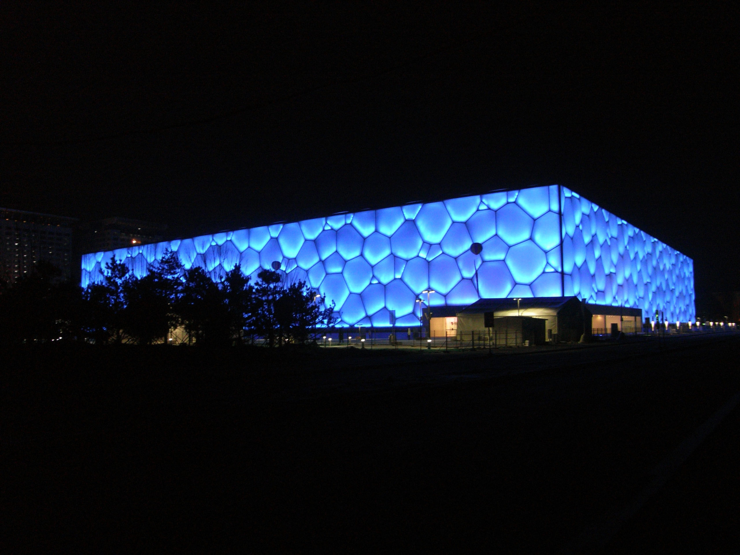
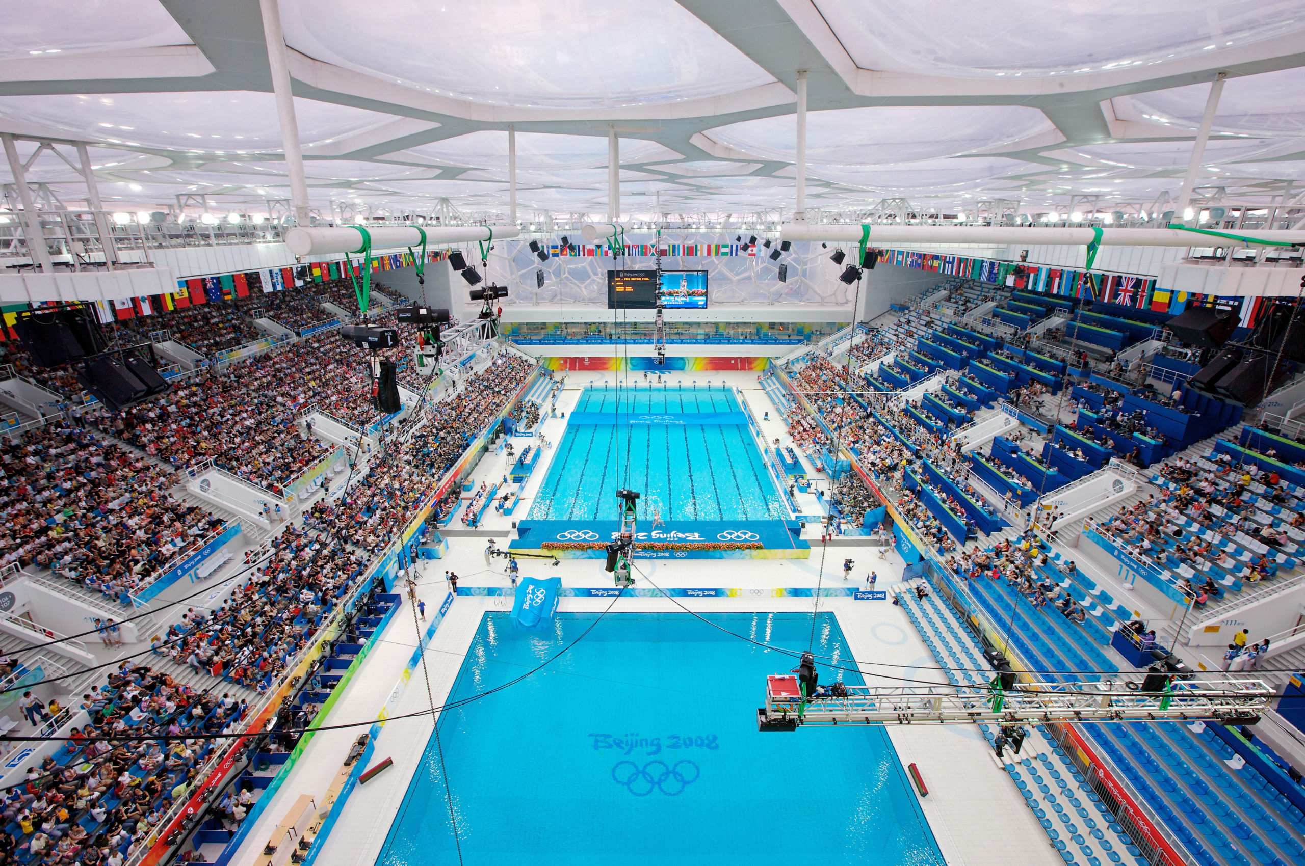
water cube_night_exteriorwater cube_day_interiorDesigned by PTW Architects, the National Swimming Centre in Beijing, also called Water Cube, has an iconic “bubbling” façade made of ETFE. To achieve this appearance, ETFE films are first welded together, then installed onto the steel frames and lastly filled with inert gases using the piped embedded in the steel frames to form cushions. The swimming pool is lit by natural light during the daytime and very little artificial lighting is needed, thanks to the transparency of ETFE.
Solar energy is let through the envelope as well and heats the space, the water and the concrete floor structure. During the night, the concrete floor of high thermal mass gives out heat that is stored during the daytime, saving energy on air-conditioning. As each cushion is independent of the others, a broken cushion can be quickly repaired by welding a supplementing patch of ETFE onto it or be simply replaced with a new cushion to secure the integrity of the envelope.

Functioning similarly to double- and triple-glazing, the gas-filled cushions are good insulators for noise and heat as well. The insulating function of ETFE cushions has been already proved in the Eden project (2001), where ETFE cushions help control climates in enormous greenhouses.

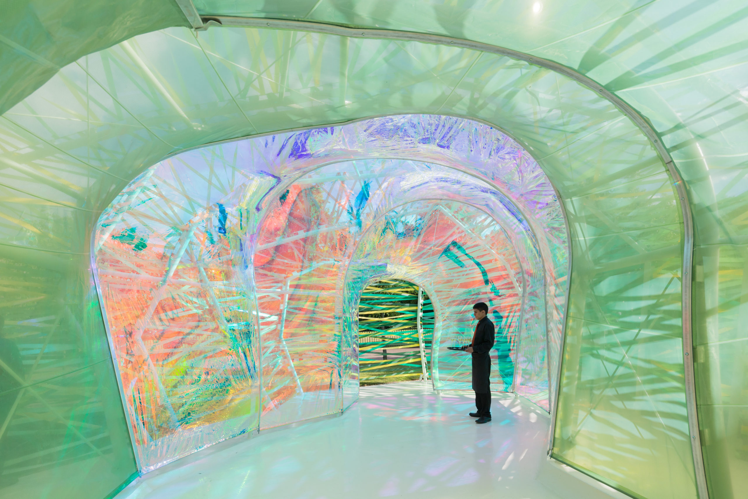
selgascano serpentine_day_interiorWhile Water Cube employs ETFE cushions for their environmental performance, the Serpentine Pavilion 2015 designed by SelgasCano plays with the material’s transparency. Using colored and color-diffusing ETFE films, joined by colored ribbons, the design team created a surreally colorful spatial experience. ETFE films and ribbons of different shades are attached to the steel skeleton, forming a double skin system where shades overlay building new shades and forms penetrate forming dreamy shadows. The lightness of the material allowed all skin sections to be installed by hand.
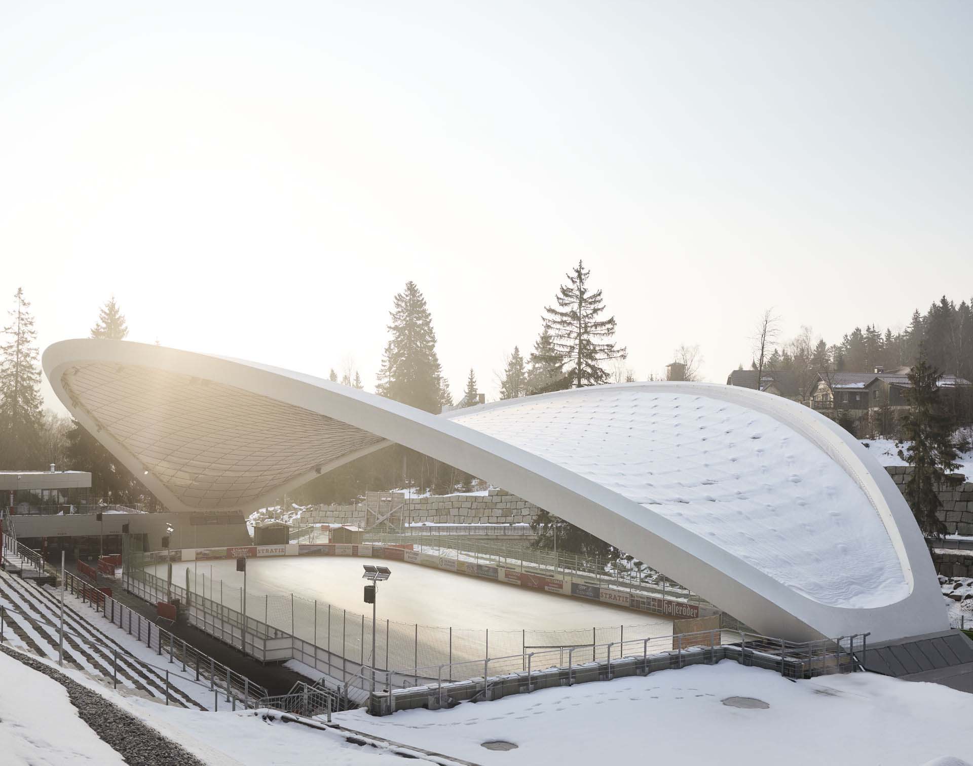
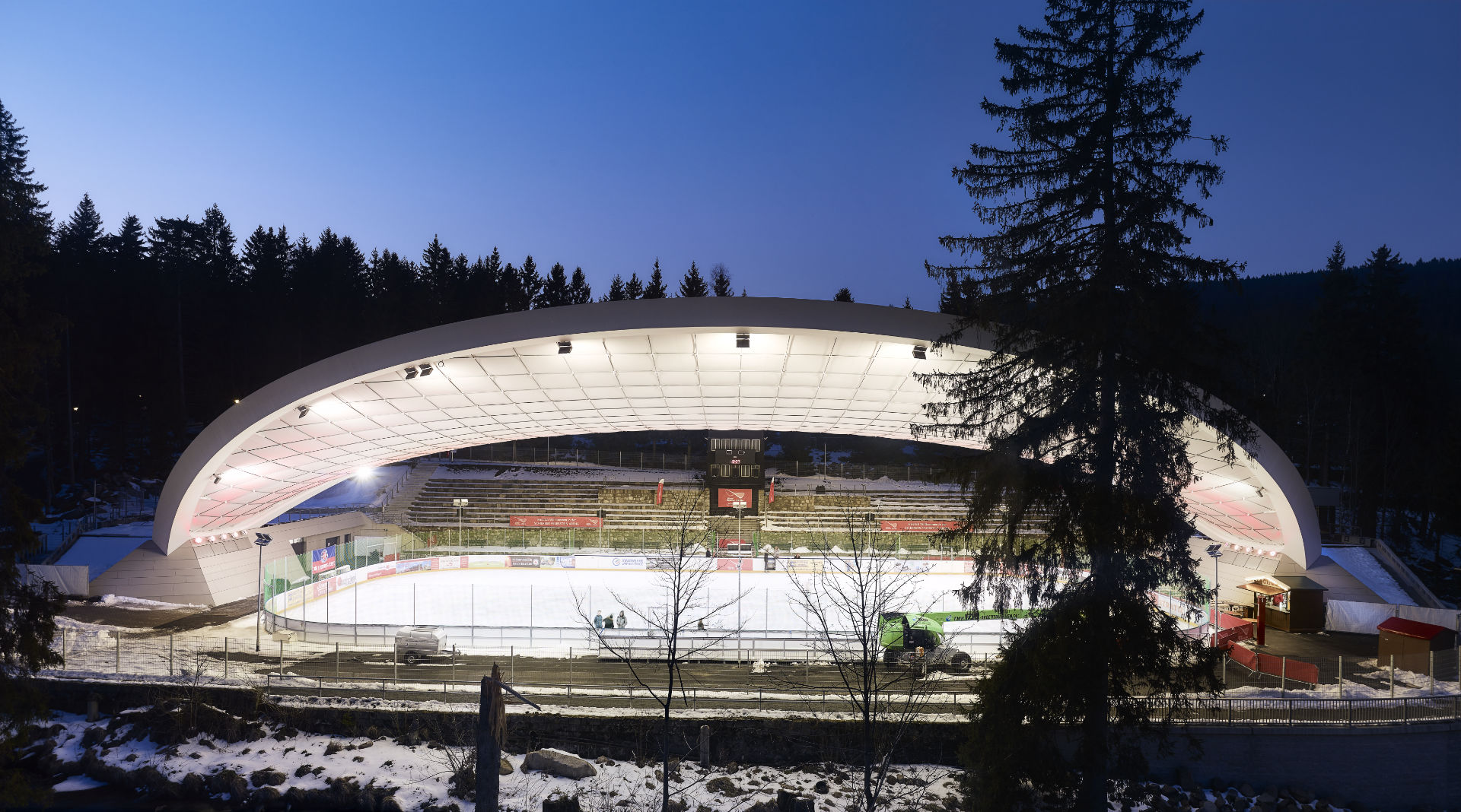
PTFE membranes, on the other hand, are normally manufactured by coating PTFE onto glass fabrics, which makes them highly resistant to cracks under stretching and more scratch-resistant than ETFE. The strength of the material allows the formation of dramatic free form structures. While PTFE membrane facilitates natural lighting as ETFE does, it can further filter UV light thus preventing possible damages to furniture caused by long-term UV light exposure. Similar to ETFE, it is also anti-corrosion and easy to clean.

Feuerstein-Arena Schierke_dayFeuerstein-Arena Schierk_nighteThe Ice Stadium Schierker Feuerstein-Arena designed by GRAFT stands out in the competition to renovate the stadium for its unique roof. The roof of over 29,000 square feet (2, 700 sq. m) spans across the ice rink, meeting the ground at its two ends. The lightweight yet strong PTFE membrane rests on a net of steel ropes which is then fixed to the outer steel frame. The structure bears wind, rain and snow and sheltered the stadium from direct sunlight by diffusing it. During the night, the reflectivity of the material spreads lights across the whole roof, multiplying the artificial lighting.

Browse the Architizer Jobs Board and apply for architecture and design positions at some of the world’s best firms. Click here to sign up for our Jobs Newsletter.

Reference