Studio Asaï hides lodge among landscape of South African game reserve
CategoriesInterior Design

Studio Asaï hides lodge among landscape of South African game reserve

Rammed earth walls and an organic colour scheme help this South African family lodge designed by architecture practice Studio Asaï to blend into its natural surroundings.

Tembo Tembo sits close to the Sabie River on the western edge of Kruger National Park – a sprawling game reserve that’s home to a wide array of flora and fauna, including what’s known as the “big five”: lions, leopards, rhinos, elephants and buffalo.

Tembo Tembo lodge by Studio Asai features rammed-earth walls
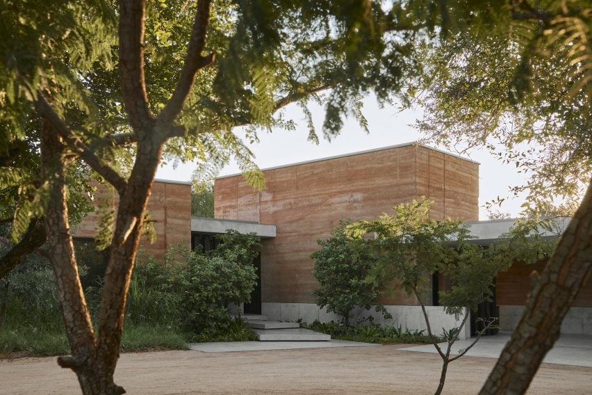
Tembo Tembo’s rammed earth walls blend into the landscape of the game reserve

This setting was a large point of inspiration for Paris-based Studio Asaï, which decided to construct the home from rammed earth, emulating the materiality of towering termite nests that can be seen across the reserve.

“More locally, [rammed earth] is only used for singular walls in the house, thought of as a decorative object,” explained the studio. “For Tembo Tembo, we decided to use it as the main material for the entire house.”
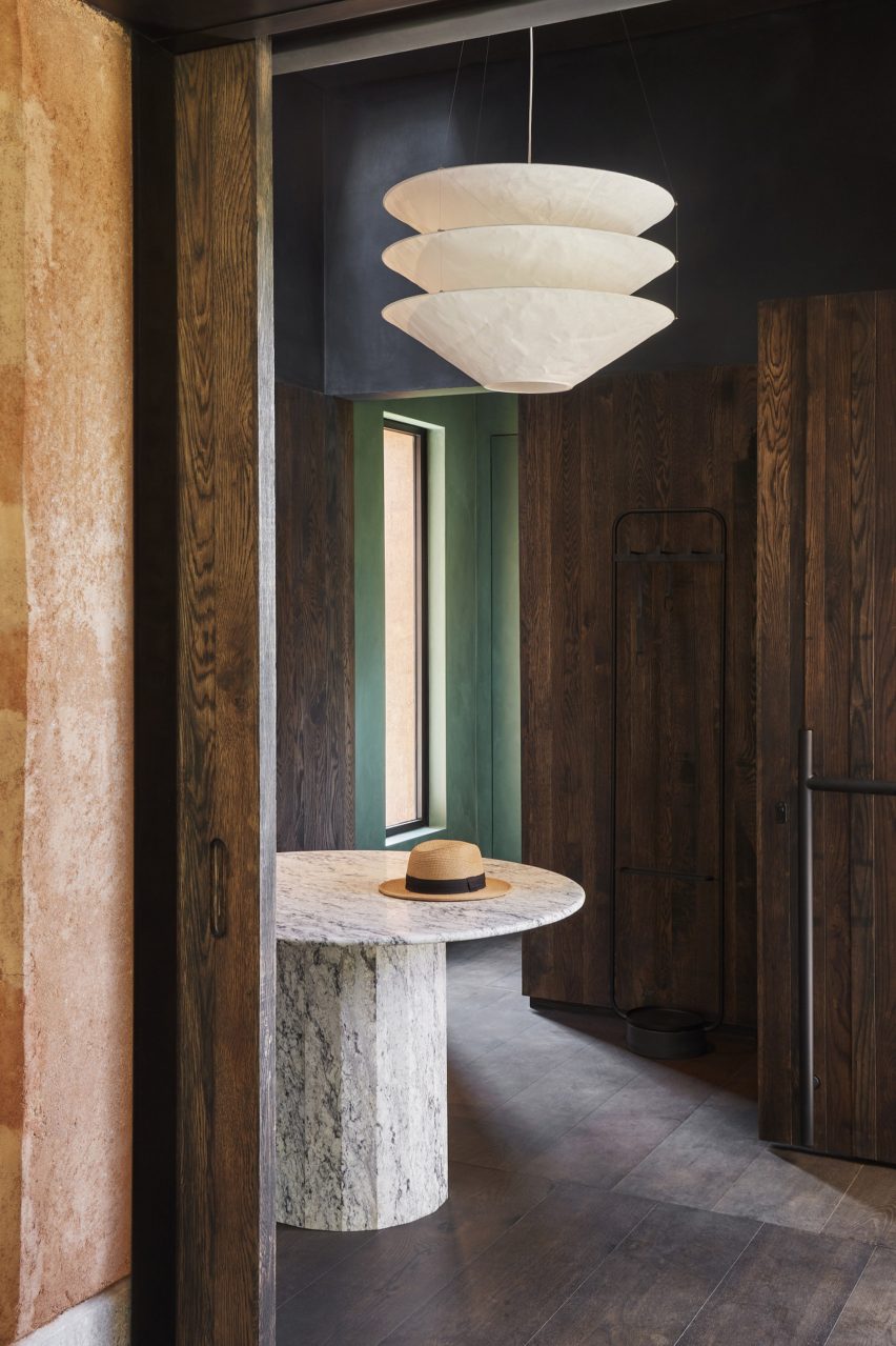
Entryway interior of Tembo Tembo lodge by Studio Asai
Dark wood lines the home’s moody entranceway

To ensure the stability of the home, Studio Asaï worked alongside local architect Nicholas Plewman to develop a structural skeleton that could support the roof and walls.

Locally sourced rammed earth was then applied to the structure, mixed with a sealant to make the material less porous and crumbly.
Tembo Tembo lodge by Studio Asai features rammed-earth walls
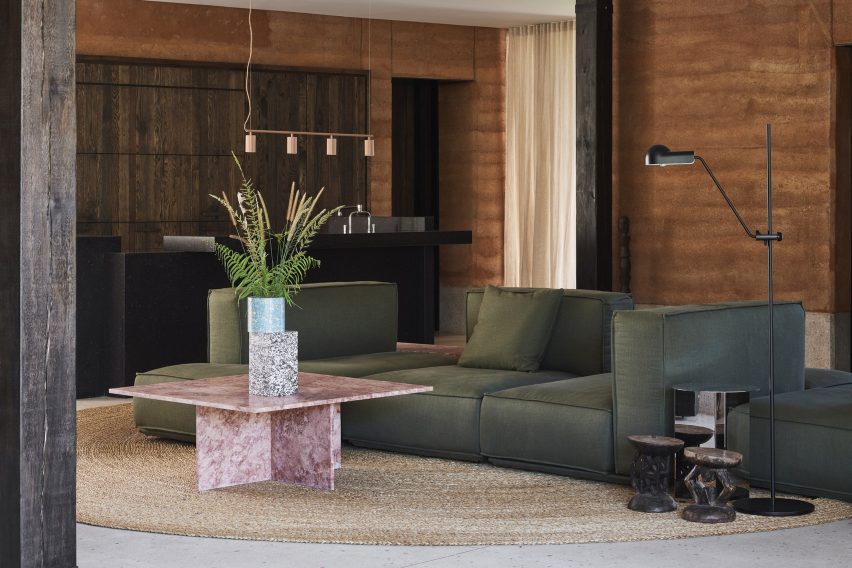
A green sofa in the living area is meant to emulate the colour of the foliage outdoors

The house was also built atop an 80-centimetre-high concrete platform to keep away lizards and other critters while minimising flooding from the heavy downpours that frequently occur in the region from September onwards.

The property’s flat steel roof is meant to give the home a lower, more discrete profile.
Dining area of Tembo Tembo lodge by Studio Asai
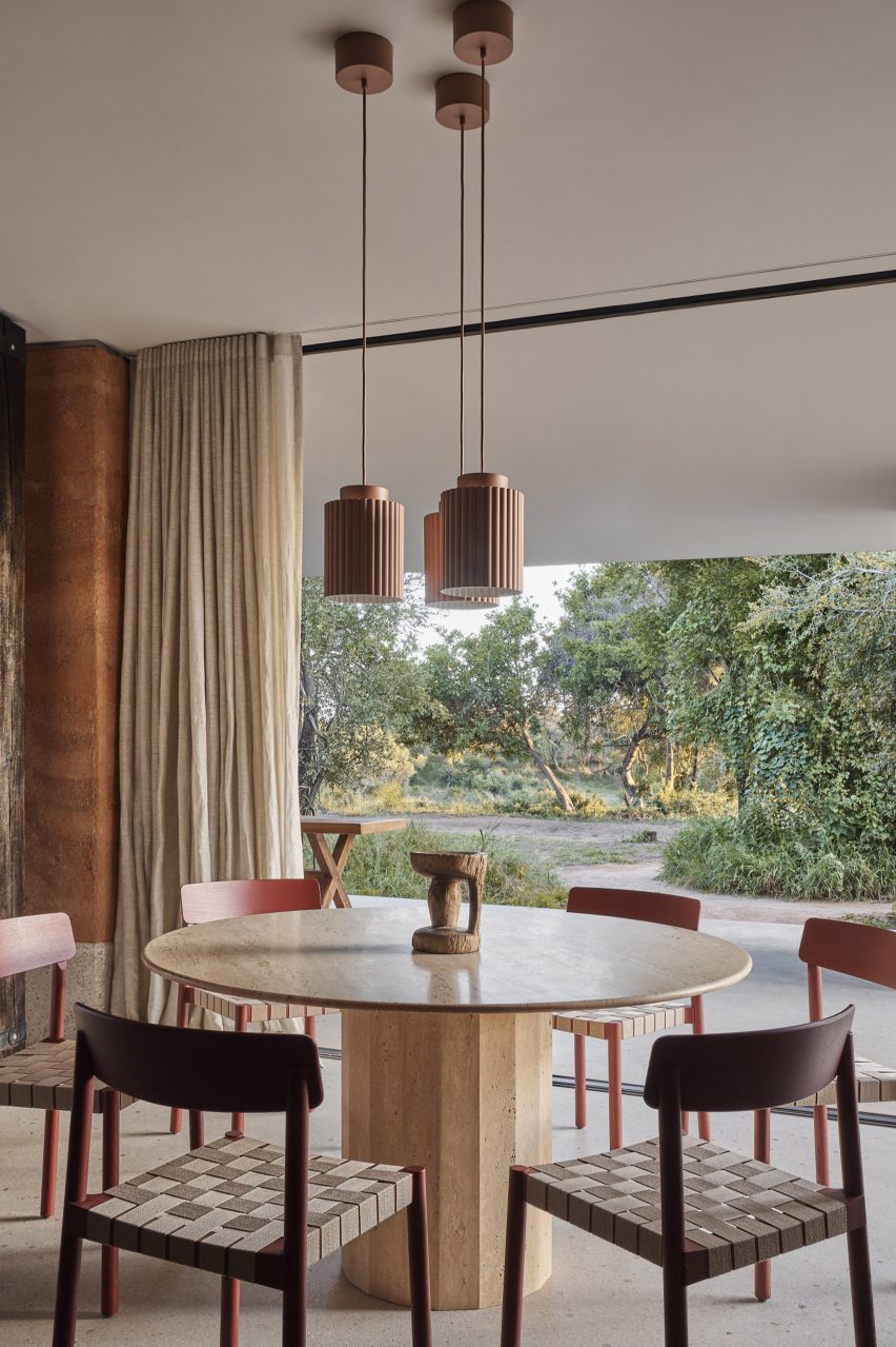
The dining area opens onto a shaded terrace

Inhabitants access the home through a moody entryway lined with dark wood panels. A papery, three-tier pendant light hangs from the centre of the space directly above a white marble table.

The home’s rammed earth walls were left exposed in the adjacent living area, which is anchored by a modular green sofa that nods to the foliage of the South African bush.
Library of Tembo Tembo lodge by Studio Asai
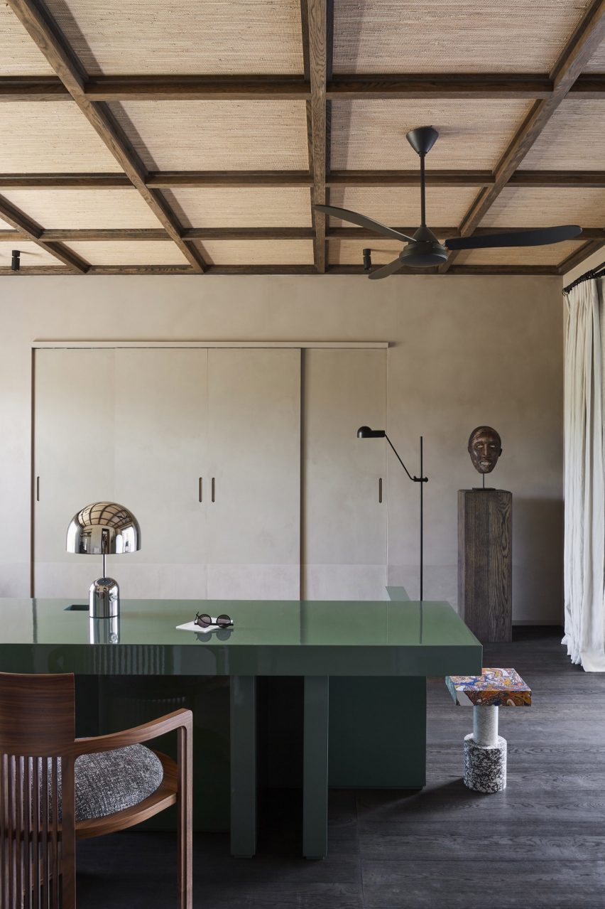
Cream plaster walls and a coffered ceiling can be seen in the home’s library

To the side of this space is a contemporary kitchen complete with dark wood cabinetry and a blocky breakfast island crafted from black Zimbabwean granite.

In the corner of the room is a travertine marble dining table surrounded by chairs with woven seats. This is positioned directly next to an expansive glazed panel that, when slid back, lets inhabitants step onto a shaded terrace.
Bedroom interior of Tembo Tembo lodge by Studio Asai
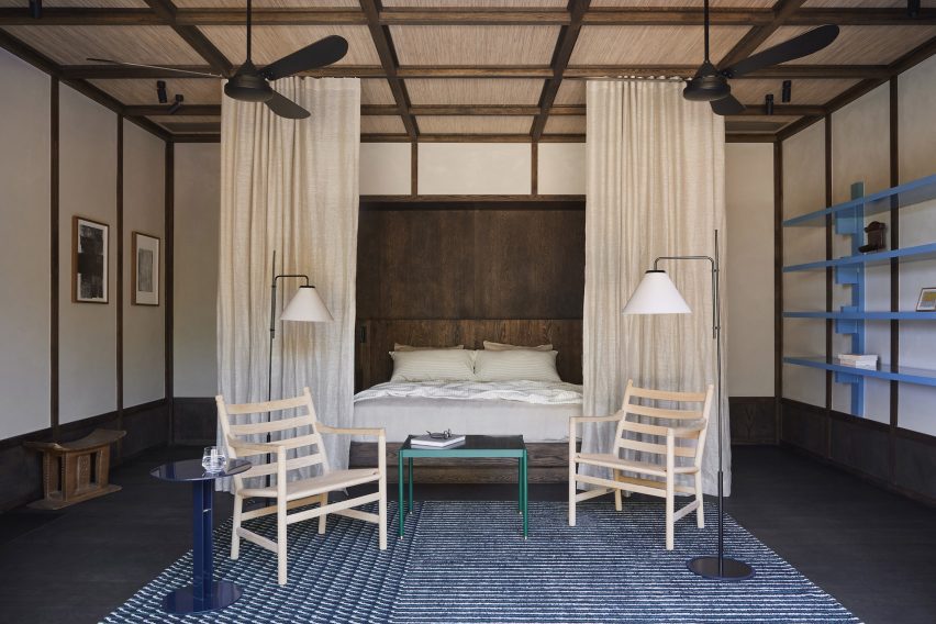
Curtains help give the principal bedroom a tented safari-camp feel

Creamy plaster walls appear in the home’s library, complementing the rustic beige fabric that was set into the room’s coffered ceiling.

Studio Asaï revived the “bush” green of the sofa but this time in the form of a glossy work desk.
Tembo Tembo lodge by Studio Asai features rammed-earth walls
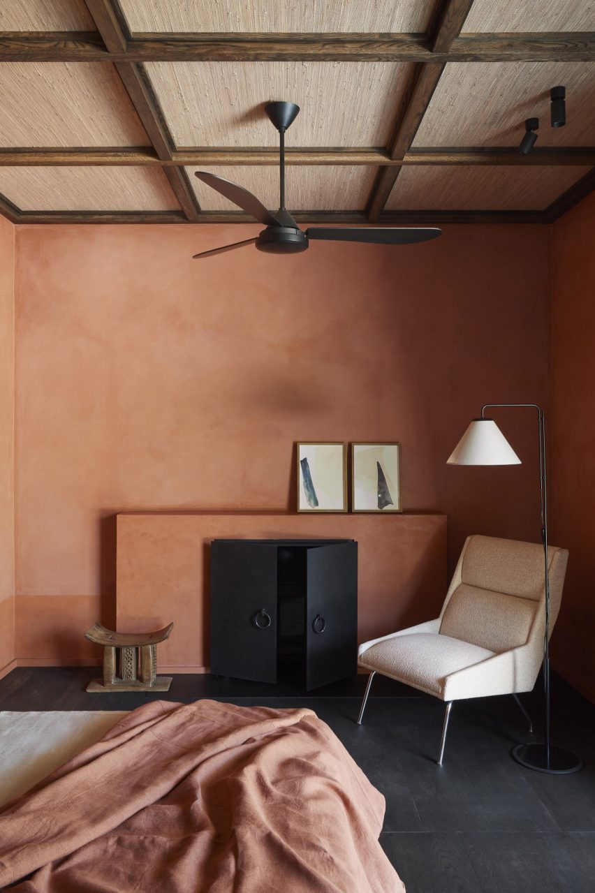
The house’s rammed earth walls are revealed again in the guest bedroom

Designed to feel akin to a “modern safari camp”, the principal bedroom features a large bed that can be enclosed with gauzy curtains on all sides.

There’s a cosier feel in the guest bedroom where Studio Asaï has once again left the rammed earth walls bare and installed a black metal fireplace for use in the cooler months.

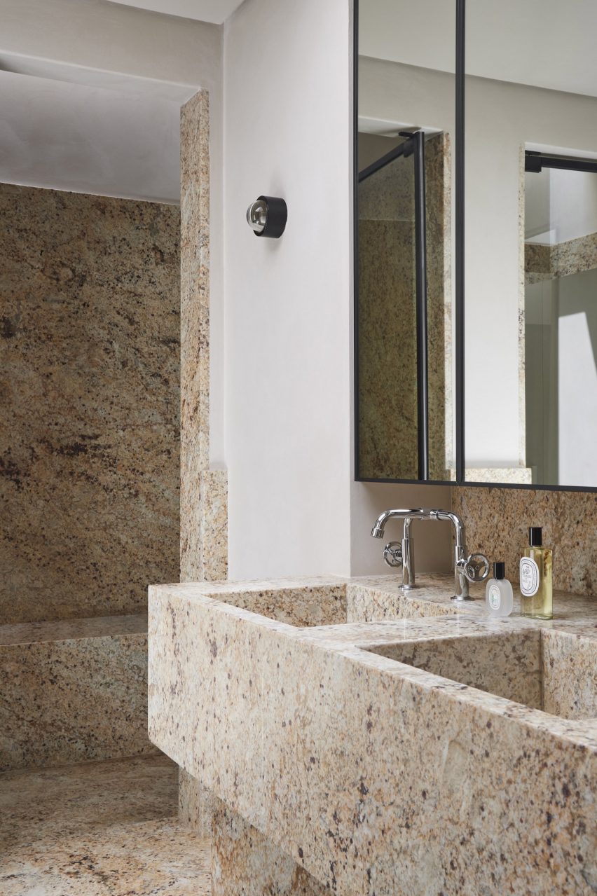
There’s also a striking bathroom that’s almost entirely lined in a flecked Namibian stone.
Bathroom interior of Tembo Tembo lodge by Studio Asai
Namibian stone covers surfaces in the bathroom

Tembo Tembo has made the shortlist of the home interior category at this year’s Dezeen Awards.

It will compete against other projects such as Prior Barraclough’s Union Street House, which is entirely lined in Australian hardwood, and Keiji Ashizawa Design’s Hiroo Residence, which is decked out in muted tones to amplify the space’s sense of light.

The photography is by Adrien Dirand.


Project credits:

Interior design and architecture: Studio Asaï
Architecture: Nick Plewman Architects
Landscape design: Green Inc

Reference

MR Studio designs Hong Kong gym to “transport visitors to another world”
CategoriesInterior Design

MR Studio designs Hong Kong gym to “transport visitors to another world”

In Hong Kong’s fast-paced Central District, local practice MR Studio has modelled this fitness studio on a futuristic Martian dwelling to offer members an escape from their busy lives.
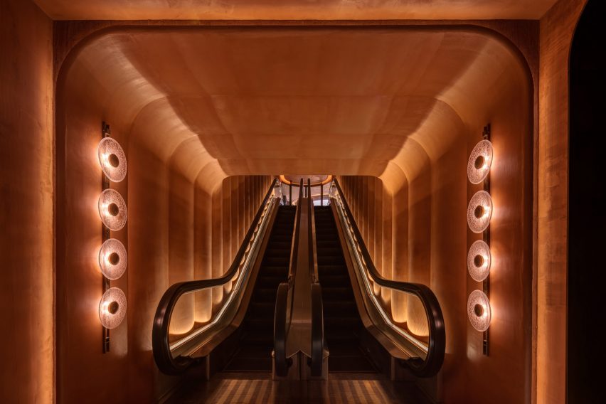
Gym Town‘s entryway and reception are finished entirely in an an earthy shade of orange, chosen to reflect the colours of Mars, while moody black workout areas were designed to allow visitors to focus on their individual health goals.

Entrance escalator of Gym Town in Hong Kong by MR Studio
Gym Town is entered via a dramatic escalator

“We wanted to create a unique and immersive experience for gym-goers,” MR Studio founder Myron Kwan told Dezeen. “The concept of Mars was chosen to represent escapism and a sense of adventure.”

“Inspired by Elon Musk’s vision of colonising Mars, we wanted to create a space that felt futuristic and cutting-edge.”

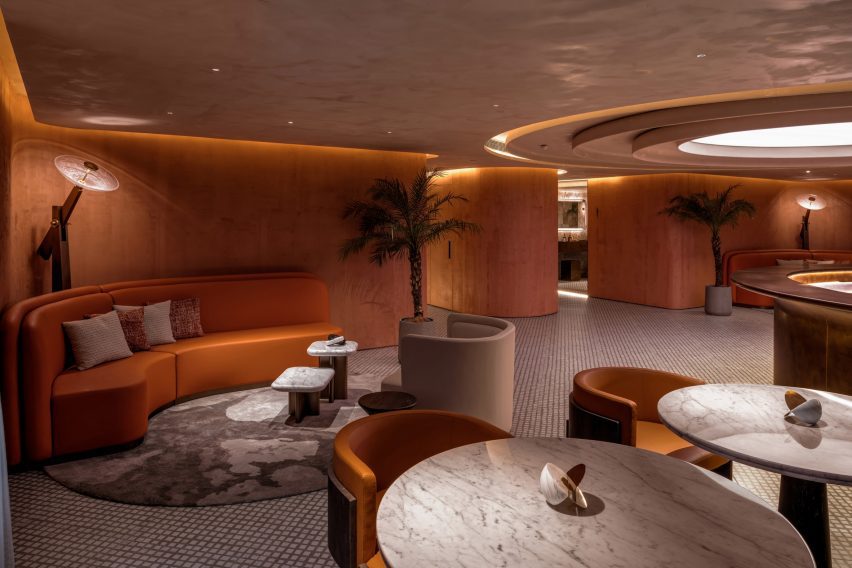
Lobby and reception of Gym Town
The gym’s reception doubles as a lounge

The studio created a bespoke sculptural lighting piece that can be seen from the street to create a sense of intrigue about the gym.

From the entrance, members are taken up to the lobby by an escalator. In a bid to make this ascent feel like an event, MR Studio turned the space into a tunnel-like “portal” that provides a sense of voyage.

Seating area in Hong Kong gym by MR Studio
Bespoke lights were modelled on satellite dishes

Around the escalator, the walls undulate to create a series of vertical ridges, designed to add depth and visual interest while suggesting walls that have buckled under the heat of the red planet.

“By using the tunnel-like form, we wanted to create a visually striking feature that would set the tone for the entire space,” Kwan said.

“The tunnel creates a sense of anticipation and excitement as guests enter,” he added. “The design itself aims to transport visitors to another world.

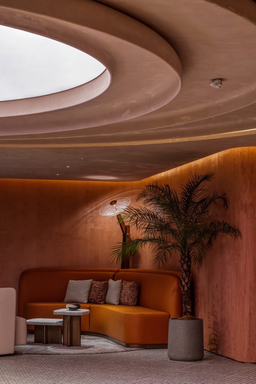
Skylight in Gym Town lobby
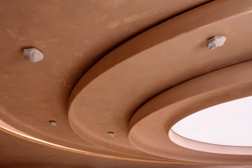
Decorative rocks are fixed to the ceiling

The escalator delivers members into a large reception area, arranged as a lounge with various seating areas.

One of the challenges of the project was the absence of natural light, which MR Studio addressed with a feature ceiling light.

Composed of concentric circles with an illuminated core, it suggests both a natural skylight and the crater-studded terrain of Mars.

Curves and circles feature heavily throughout Gym Town, from wavy walls and rounded furniture to lights inspired by the form of a satellite dish.

“Custom-made table lamps adorned with sleek metal finishes and cracked glass details capture the silhouette of high-gain antennas used in space exploration,” the studio explained.

The room is centred on a semi-circular brass-wrapped reception desk, which doubles as a bar during events or after-hours gatherings.

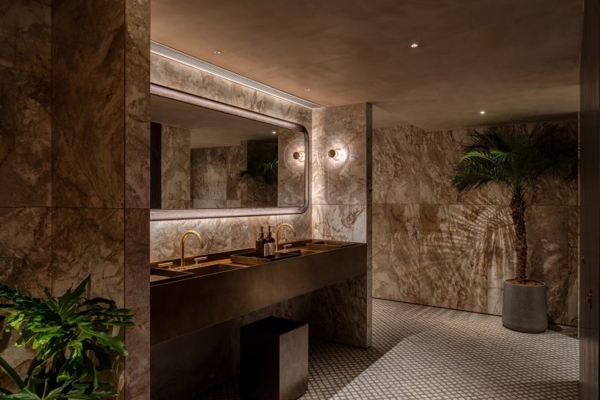
Bathroom inside Hong Kong gym by MR Studio
Rooms get progressively darker

The walls here feature the same dusty red-orange finish as the entrance tunnel, while decorative rocks are fixed to the ceiling.

“Envisioned as a modern Martian house, the space is painted in a textured monochromatic palette of tangerine, referencing the iconic red planet’s signature colour and rough terrain,” said Kwan.

“It adds vibrancy and warmth to the space, creating a visually intriguing element that complements the overall design theme.”

Workout area inside Hong Kong gym by MR Studio
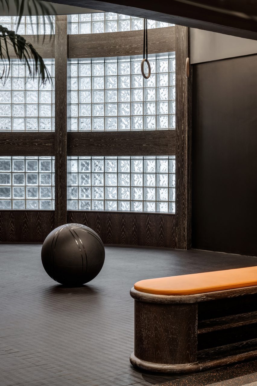
The workout areas are finished in muted black and grey tones

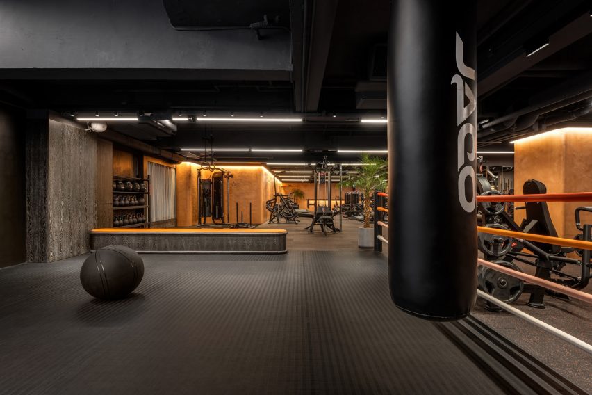
Progressing into the changing rooms, workout areas and studios, the colour palette shiftsto more sober greys and blacks.

“To encourage members to fully devote to their fitness routines, the workout area is grounded in an organic and unpretentious style,” the studio said.

Overview of workout areas inside Gym Town
Orange accents delineate different areas

Gym Town has been shortlisted in the health and wellbeing interior category at this year’s Dezeen Awards.

Also in the running is the dusty-pink welfare centre of a boys’ school in Melbourne and a pediatric clinic in Seattle with “no blank walls”.

The photography is by Steven Ko.


Reference

Productora and Esrawe Studio outfit Mexico hotel with planes of green tile
CategoriesInterior Design

Productora and Esrawe Studio outfit Mexico hotel with planes of green tile

Local architecture studios Productora and Esrawe Studio have outfitted a Mexico hotel with planes of green tile suspended from the lobby ceiling.

Located on a hilly site in San Miguel de Allende, Mexico, the Albor Hotel is part of Hilton’s Tapestry Collection.

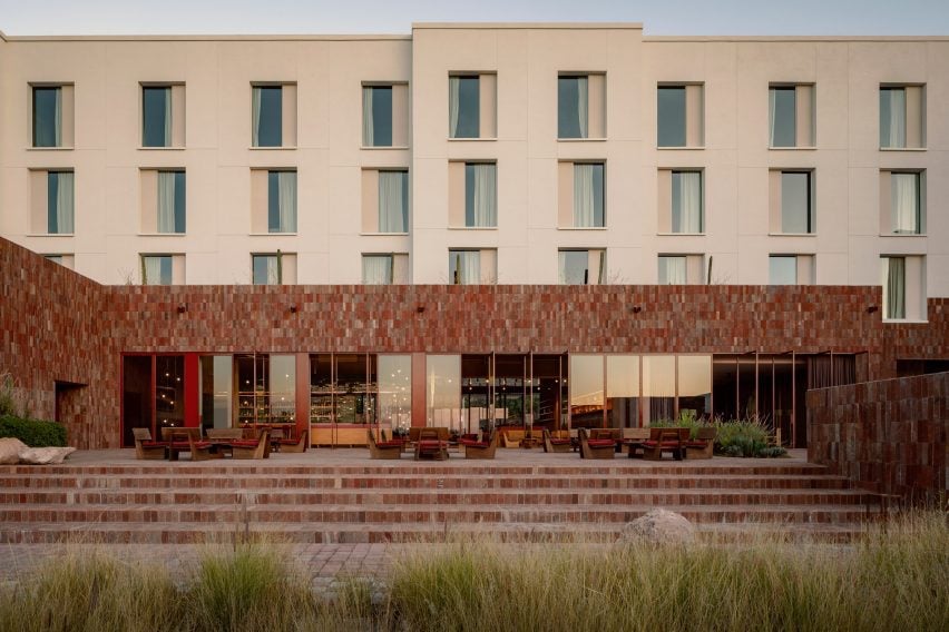
A hotel with a long stone facade
Productora and Esrawe Studio have wrapped a hotel in Mexico with local red stone

Completed in 2022, the 6,038 square metre project contains a lobby, restaurant, bar, gym, multipurpose room, and a pool area with a grill.

Productora and Esrawe Studio pulled from the mountainous surroundings for the design.

Green tiles with a leaf-like pattern of pink and white
The stone is carried into the building’s lobby and lower levels

“The hotel emerges naturally from the terrain, framing a beautiful view of the valley,” said the team.

“The hotel’s stone base is inspired by the mountain’s interior, featuring a textured and colourful appearance.”

A hotel lobby with wooden chairs and a canopy tiled in green
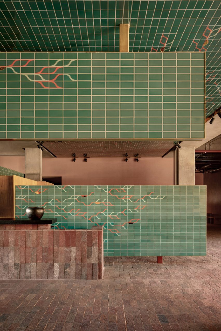
Planes of green tile are suspended from the ceiling

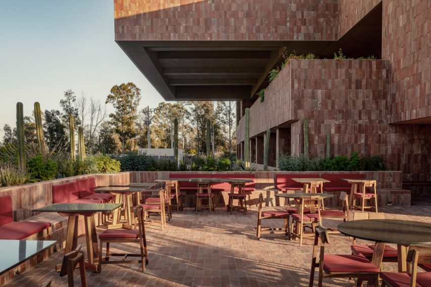
A natural red, textured stone was wrapped around the building’s first two levels, which steps up the hill on the site.

The top three levels contain the hotel’s private rooms and have an exterior clad in a simple white material, which contrasts the base.

A stone outdoor patio with brick facade
The tile features a graphic pattern by artist Omar Barquet

The lower levels, which contain the lobby, restaurant, bar and garden, run perpendicular to the site’s cobble-stone street, while the upper-floor volume runs parallel.

Guests enter into the hotel’s spacious lobby, where the same red stone was carried onto the floors, walls and bar elements.

Red door frames open to the outdoors
The hotel contains a multi-leveled terrace and restaurant

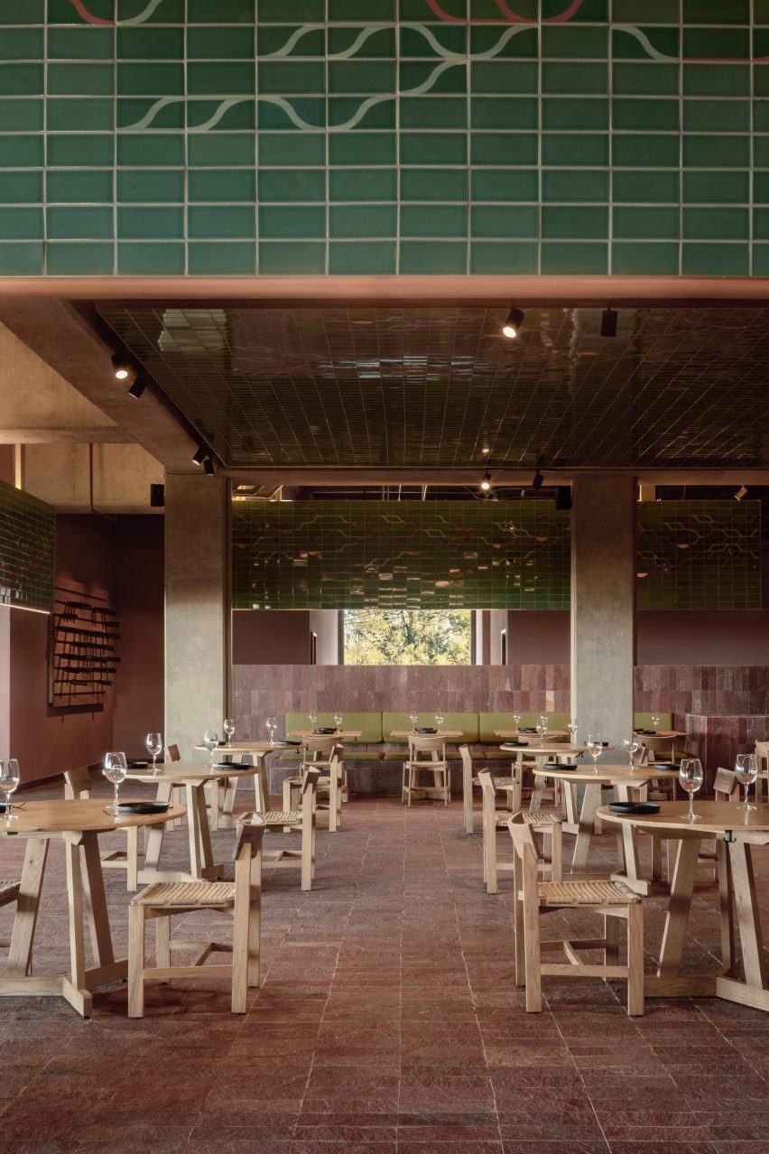
The lobby’s double-height space is divided by planes of sea-foam green ceramic tile, which feature a leaf-like pattern by Mexican artist Omar Barquet.

Crafted by tile manufacturer Latitude, they cover dividing walls, ceiling planes and panels that are suspended from the ceiling.

The space is outfitted with wide, blocky wooden tables and chairs by Roberto González. Wood was also used for a large bookshelf that spans the length of the interior lobby.

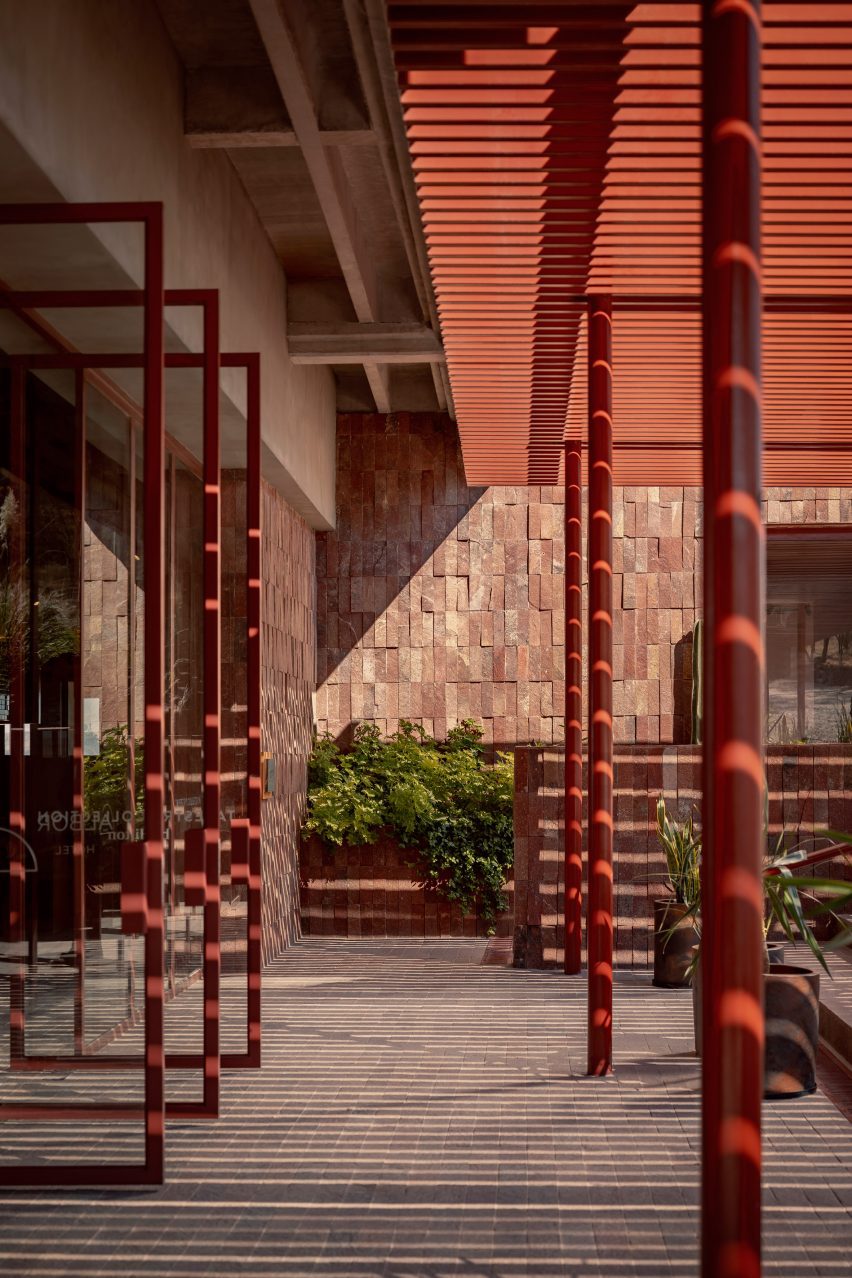
A mixture of gray, green and red cushions were used to cover the seating, with the same red tone used to frame a series of sliding glass doors that lead onto the hotel’s sprawling patio.

A bedroom outfitted with beige textiles and walls with accents of earthen tones
A natural red tone was carried throughout the hotel’s lower and upper levels

Rectangular volumes cantilever over the back patio, reflecting the same rectangular panels used to divide the lobby.

The patio sprawls across several levels, with large square planting beds installed with cacti and other local plants by PLANTA Botanical Design.

The hotel’s private rooms were kept minimalist, with the same wooden furniture echoed in seating areas, cabinetry and a bed frame.

“The rooms feature a natural colour palette and materials such as mineral clay, local crafts, wooden furniture and natural fabrics, providing a cosy and inviting atmosphere for guests,” said the team. 

An earthen red tone was also carried into the private bathrooms.

Productora recently completed a bright blue co-housing complex in Denver, Colorado, while Esrawe Studio renovated an apartment in Mexico City with an oak “skin”.

The photography is by César Béjar.


Reference

2LG Studio includes emerging designers in You Can Sit With Us exhibition
CategoriesInterior Design

2LG Studio includes emerging designers in You Can Sit With Us exhibition

Russell Whitehead and Jordan Cluroe of 2LG Studio have curated You Can Sit With Us, a London Design Festival show that offered “a seat at the table” to a diverse mix of emerging designers.

The 2LG Studio founders invited 13 designers from a mix of nationalities, races, genders and backgrounds to be a part of the exhibition, which was on show at London Design Fair.

Designers for You Can Sit With Us by 2LG Studio
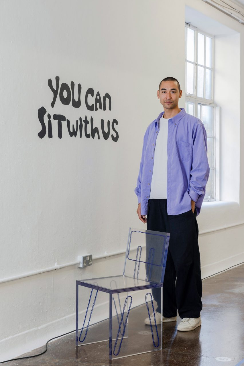
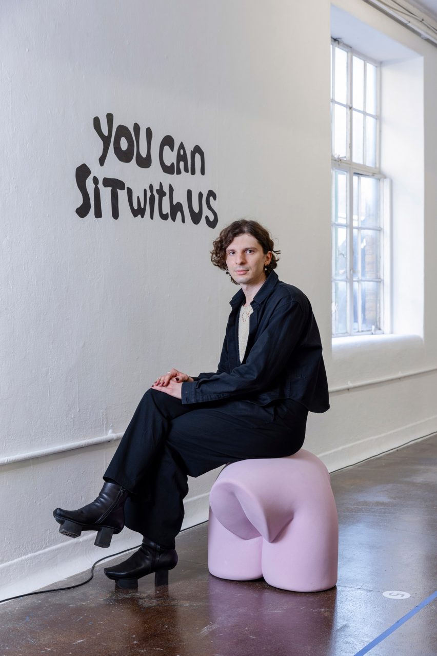
Cluroe (top left), Whitehead (top right) and Adam Fairweather of Smile Plastics pictured with 9 of the 13 chair designers

The exhibition took the form of a dining room, featuring a long table surrounded by chairs that were each designed by a different participant.

Whitehead and Cluroe came up with the concept based on their own experiences of trying to break into the design industry and being made to feel like outsiders.

Chair by Anna Maria Øfstedal Eng in You Can Sit With Us by 2LG Studio
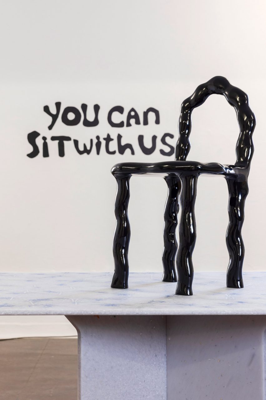
The chair by Anna Maria Øfstedal Eng features a black lacquer finish

“When we launched our practice nearly 10 years ago, there was an inner circle that felt very out of reach to us,” Whitehead told Dezeen.

“We were so bruised by the industry and felt blocked by certain doors that were firmly closed to us,” he continued.

“Instead of chasing acceptance where it wasn’t forthcoming, we decided to accept the love that was coming our way and put our energy there.”

Chair by Sam Klemick for You Can Sit With Us by 2LG Studio
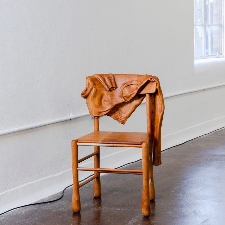
Sam Klemick’s chair incorporates a sweater into its carved wood form

The aim of You Can Sit With Us, he said, was to give a platform to a new generation of designers who may be having similar experiences.

The exhibition’s name is a reference to the 2004 movie Mean Girls.

“We wanted this to be a safe space that actively welcomed new perspectives,” Whitehead explained.

Chair by Helen Kirkum for You Can Sit With Us by 2LG Studio
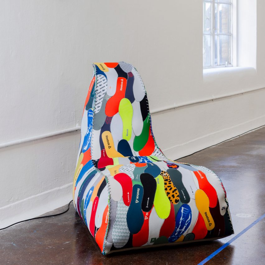
Helen Kirkum produced a lounge seat with upholstery made from trainer insoles

Among the most eye-catching designs in the show is a lounge seat with upholstery made from trainer insoles by Helen Kirkum, a footwear designer who typically crafts her designs from recycled sneakers.

Norwegian designer Anna Maria Øfstedal Eng has contributed a CNC-cut version of a hand-crafted ash chair she first made during the pandemic in a new black lacquer finish.

Chair by Benjamin Motoc
Benjamin Motoc’s piece playfully combines a sketch with a basic 3D form

A backrest with a sweater slung over it is part of the carved wood form of a design by California-based Sam Klemick, who had a career in fashion before she moved into furniture.

Rotterdam-based Benjamin Motoc created a piece that playfully combines a sketch with a basic 3D design, while Paris-based sculptor Bence Magyarlaki has produced a characteristically squidgy form.

Chair by Bence Magyarlaki
Bence Magyarlaki produced a characteristically squidgy form

Other chairs were designed by Amechi Mandi, Divine Southgate Smith, Wilkinson & Rivera, Net Warner, Hot Wire Extensions, Byard Works, Pulp Sculptuur and Blake C Joshua.

The participants were selected across design, art and fashion because Whitehead and Cluroe “didn’t want to enforce boundaries in that way”.

Chair by Byard Works
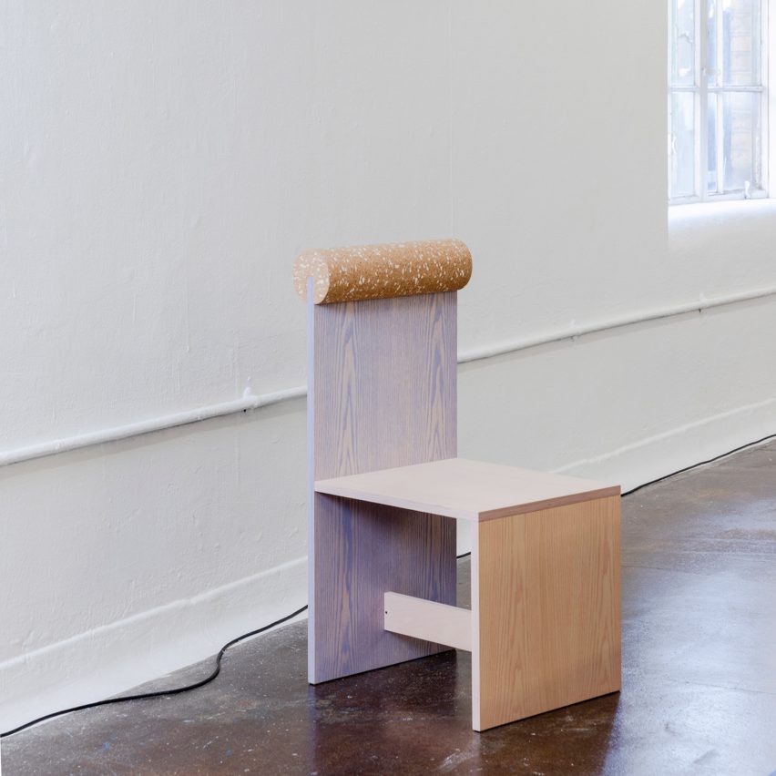
Rob Parker of Byard Works contributed a chair made from plywood and cork

Their chairs were arranged around a table produced by Smile Plastics using recycled plastic bottles and old tinsel, which created a glittering effect.

The exhibition was an important project for 2LG, and for Whitehead in particular, who battled mental health struggles following the pandemic.

The designer said the project allowed him to explore how “heart and emotion” can be a part of design.

“A lot of healing has taken place in the lead-up to this show,” he said.

Textiles by Granite + Smoke with 2LG Studio
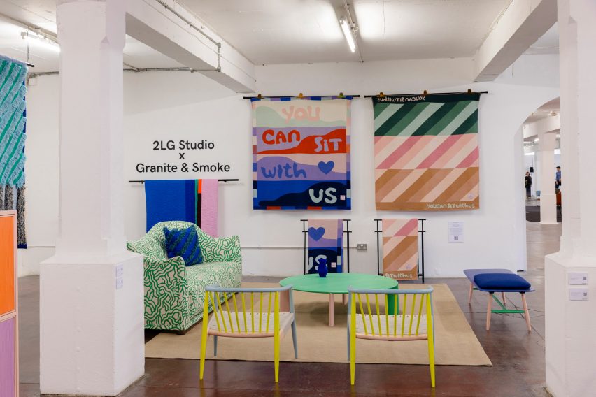
Granite + Smoke produced blankets featuring the title, You Can Sit With Us

The project included a collaboration with textile brand Granite + Smoke, who produced colourful blankets emblazoned with the exhibition’s title message.

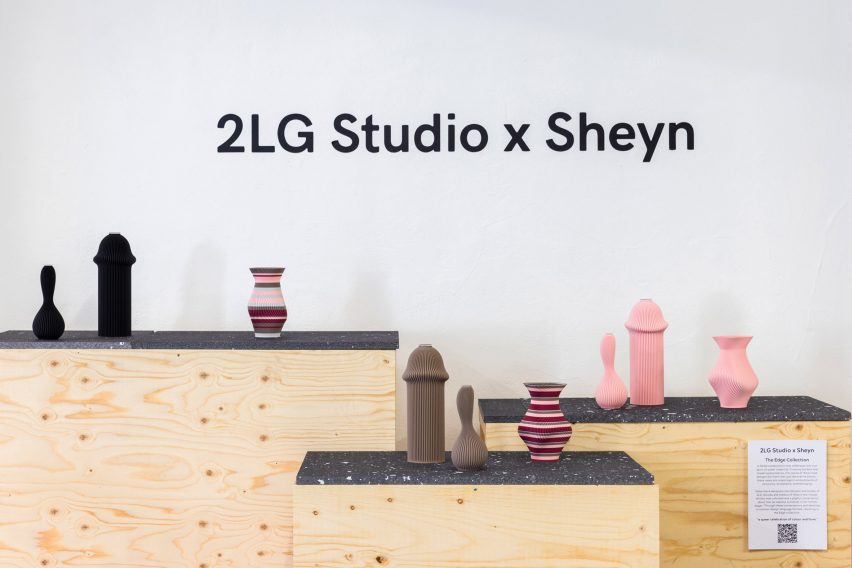
Whitehead and Cluroe also worked with homeware brand Sheyn on a series of suggestive 3D-printed vases.

Vases by 2LG Studio with Sheyn

“The collection we designed together is a celebration of our queerness, something we have not embraced fully in our product design output, but it felt more important than ever to put that out there right now,” added Whitehead.

You Can Sit With Us was on show at London Design Fair from 21 to 24 September as part of London Design Festival. See Dezeen Events Guide for more architecture and design events around the world.


Reference

Mestiz celebrates artisan collaborations in colourful Mexico studio
CategoriesInterior Design

Mestiz celebrates artisan collaborations in colourful Mexico studio

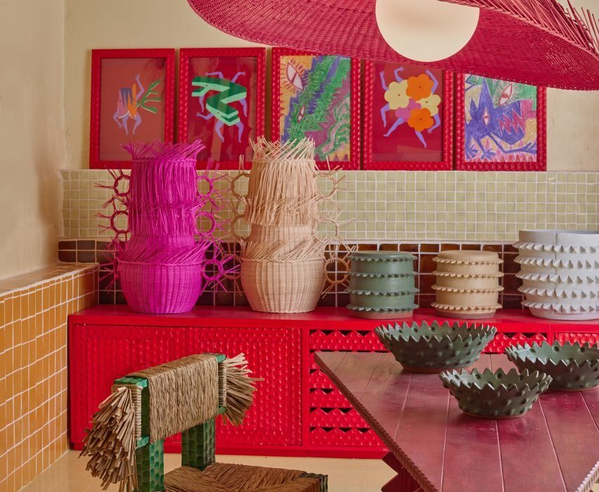
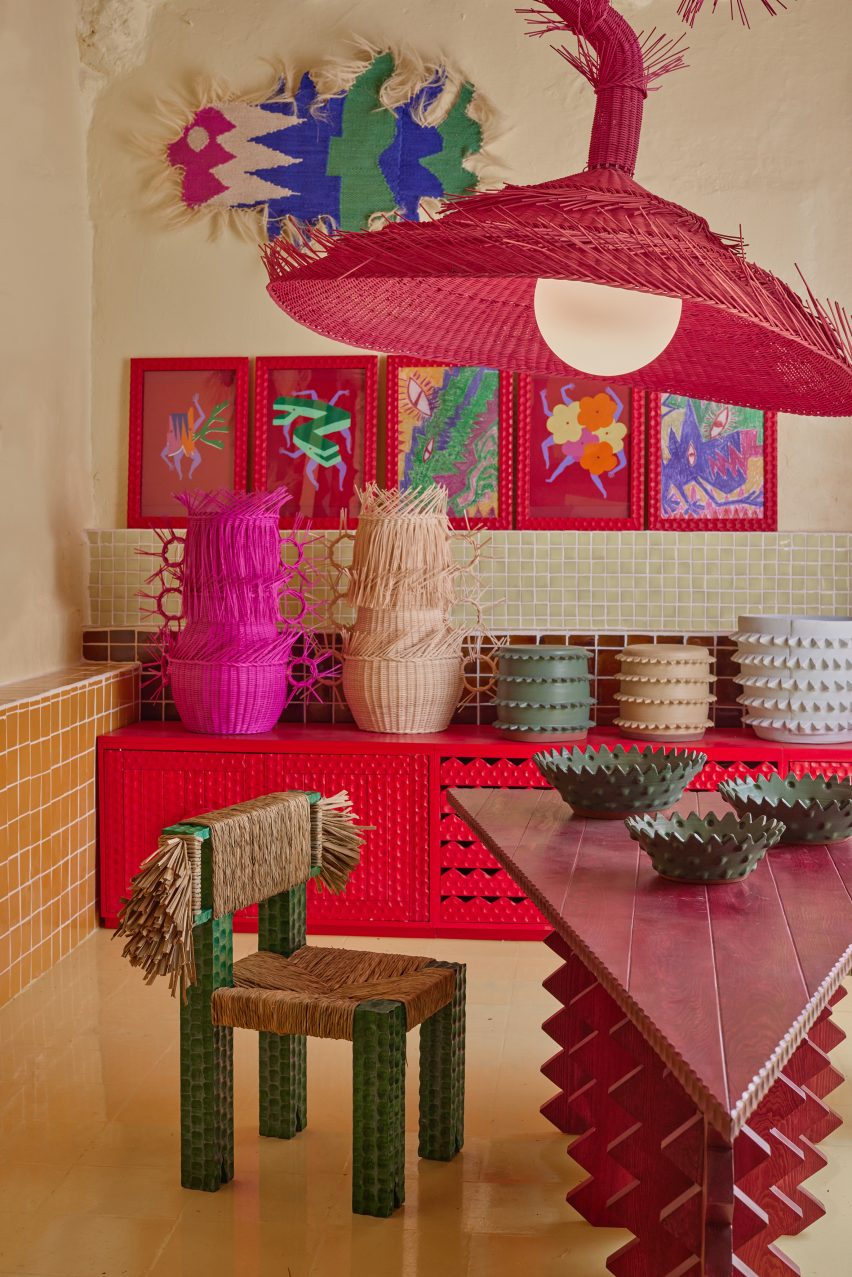
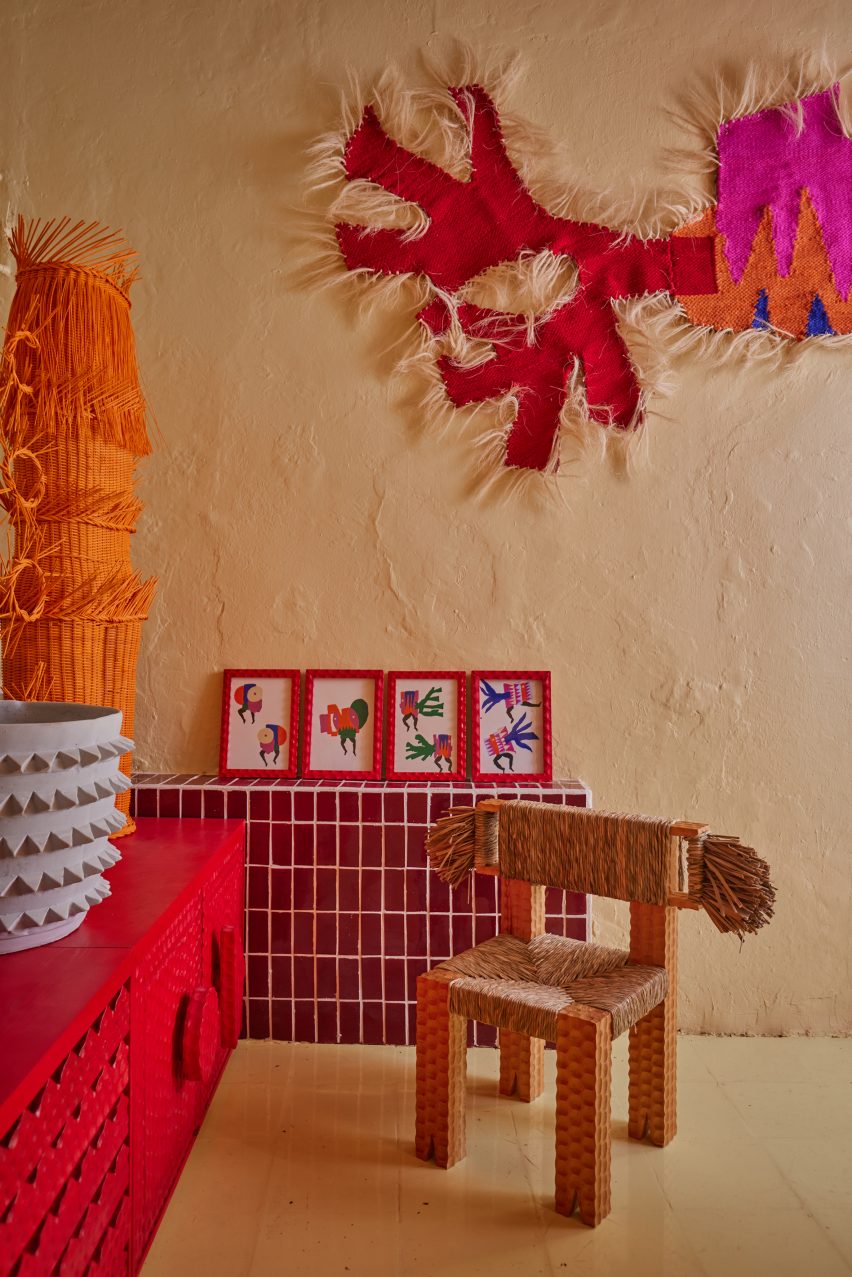
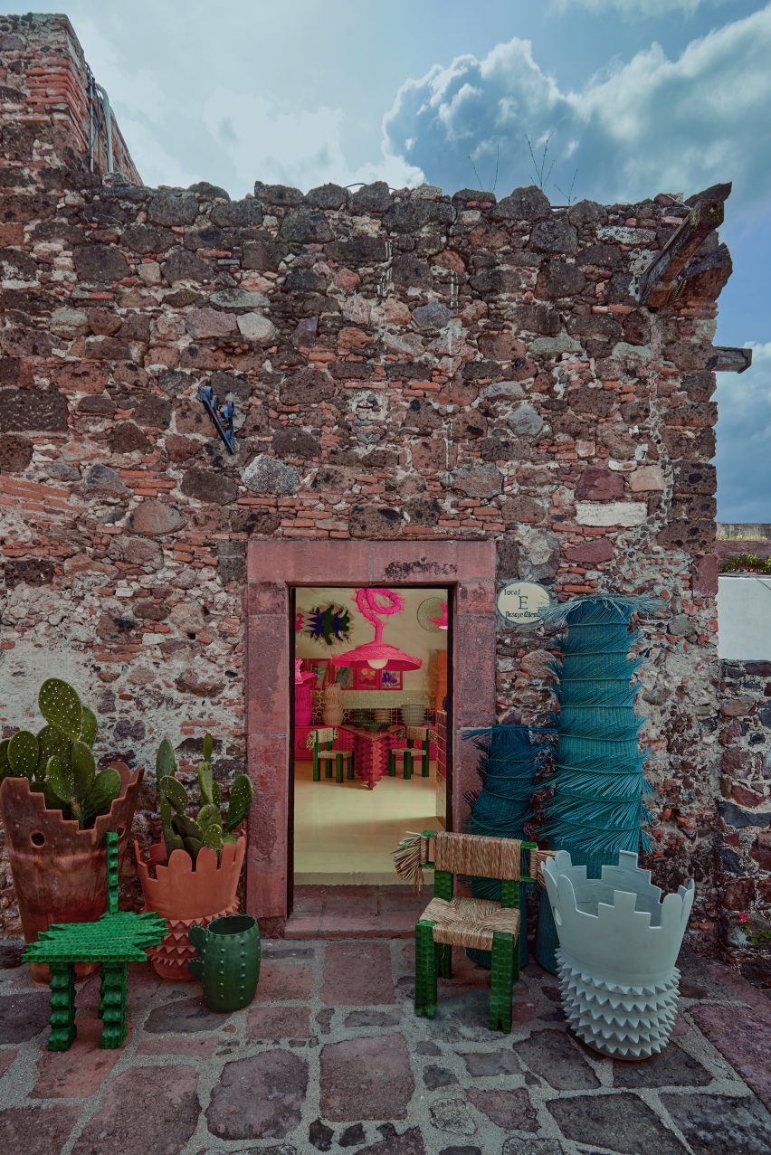
Mexican design studio Mestiz has opened a showroom and workshop within a historic building in San Miguel de Allende, where its brightly hued collaborations with local craftspeople take pride of place.

The studio space is located on Pasaje Allende in the heart of the central Mexican city, renowned for its colonial-era architecture and arts scene.

Showroom filled with colourful furniture and homeware
Mestiz opened its new studio as a space to present its colourful furniture and homeware

Mestiz founder Daniel Valero collaborates with a variety of skilled local artisans to create furniture and homeware using ancestral crafts.

“In our studio, partnerships aren’t short-lived; they’re built to last,” he said. “We’ve nurtured long-term relationships with artisans, where learning and creating are an ongoing process.”

Plaster walls with red, orange and brown designs in front
Rough plaster walls of the remodelled space provide a neutral backdrop for the brightly hued designs

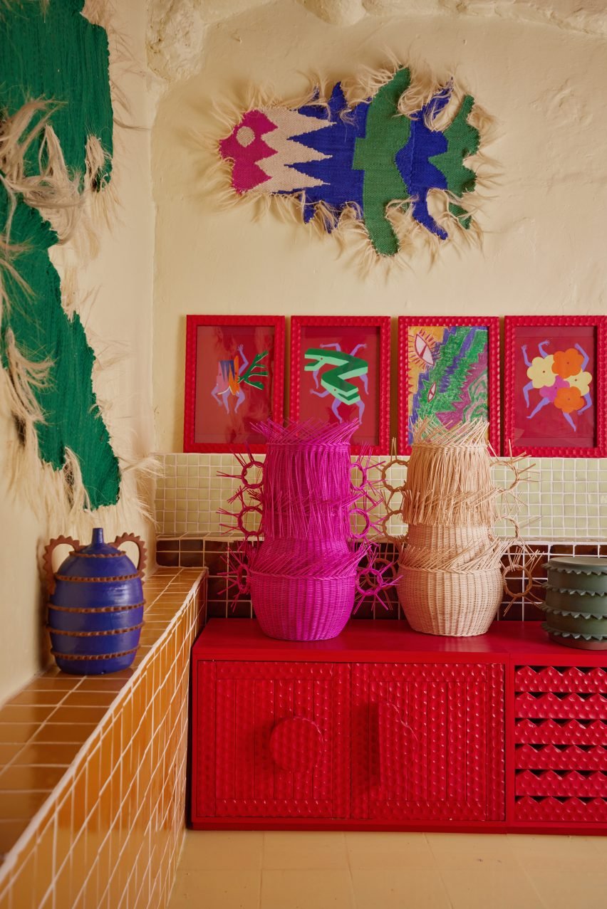
Pieces from Mestiz’s collection fill the interior of the studio, which occupies a remodelled stone building designed as a “wild habitat” brimming with personality.

“It was once a kitchen,” Valero explained, “and now it’s a space that respects the idea of Mexican cuisine, infusing it into our creative sanctuary.”

Items displayed on tiled ledges
Ledges covered in glossy tiles provide places to display smaller items the in the showroom

The studio comprises three principal spaces. In the showroom, the original wooden beams and the brick ceiling are exposed, and rough buttery plaster covers the walls.

Ledges and podiums clad in glossy tiles provide places for small items like spiky vessels and framed pictures to be displayed.

Workshop with red bench and shelf
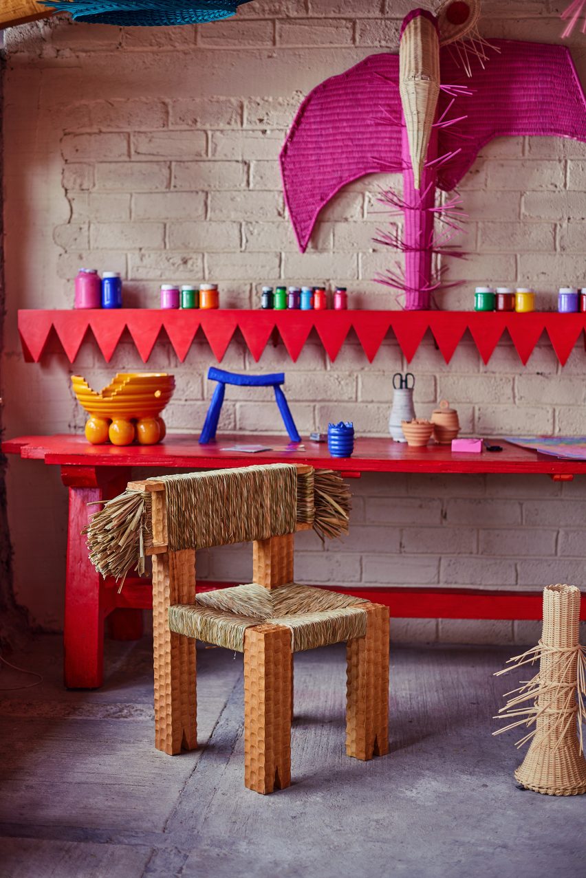
In the workshop, red benches are used for assembling the designs

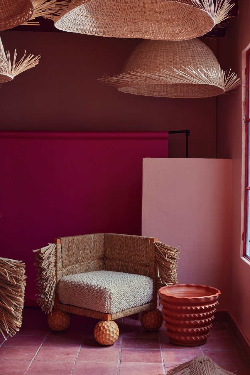
Larger furniture pieces like a triangular table and chairs with tufty backrests are arranged across the floor.

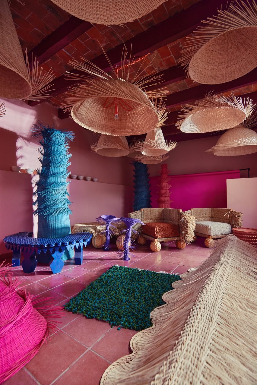
Meanwhile, textile artworks decorate the walls and huge, fibrous pink light fixtures hang overhead.

“Our creations aren’t just pieces; they’re stories,” said Valero.

“We believe in crafting designs that engage in profound dialogues with the context and history of each community we work with.”

Pink room filled with wicker lighting and furniture
A pink-toned storage room is also filled with products, which are all made from natural materials

The workshop is situated in a lean-to at the side of the building, where the rough stone walls are visible on two sides and other surfaces are left untreated.

Red-painted benches for assembling items and storing natural materials – palm, wood, wool, wicker and ceramic – are surrounded by partially completed designs.

Wicker lights suspended above chairs with tufted sides
Mestiz partners with artisans across Mexico to preserve and celebrate craft traditions

A pink-hued storage room is also packed with products, from wicker lights suspended from the ceiling to tall totems in blue, pink and purple stood in the corners.

“Our practice is a living testament to the merging of traditions,” Valero said. “Our pieces are the embodiment of cultural syncretism, where diverse influences converge to create something entirely new.”

Stone building exterior with view into showroom
The studio is located in a historic stone building in San Miguel de Allende

The rich creative spirit of San Miguel de Allende is also presented at the city’s Casa Hoyos hotel, where colourful tiles and local craft fill a former Spanish colonial manor.

Other Mexican designers continuing local traditions through their work include Fernando Laposse, who uses corn waste to create a marquetry material, and Christian Vivanco, who launched a rattan furniture collection with Balsa.

The photography is by Pepe Molina.


Reference

Studio Becky Carter creates “distinctly New York” interiors for Cecchi’s
CategoriesInterior Design

Studio Becky Carter creates “distinctly New York” interiors for Cecchi’s

Brooklyn-based Studio Becky Carter has pulled varied references, from Bauhaus luncheonettes to comedic characters, for the interiors of a bistro in Manhattan’s West Village.

Art deco dining rooms, 1960s Milanese architecture and “a distinctly New York feel” are all evoked at Cecchi’s, the first establishment from veteran restaurant maitre d’ Michael Cecchi-Azzolina.

Dining area with pistachio banquettes and wall mural
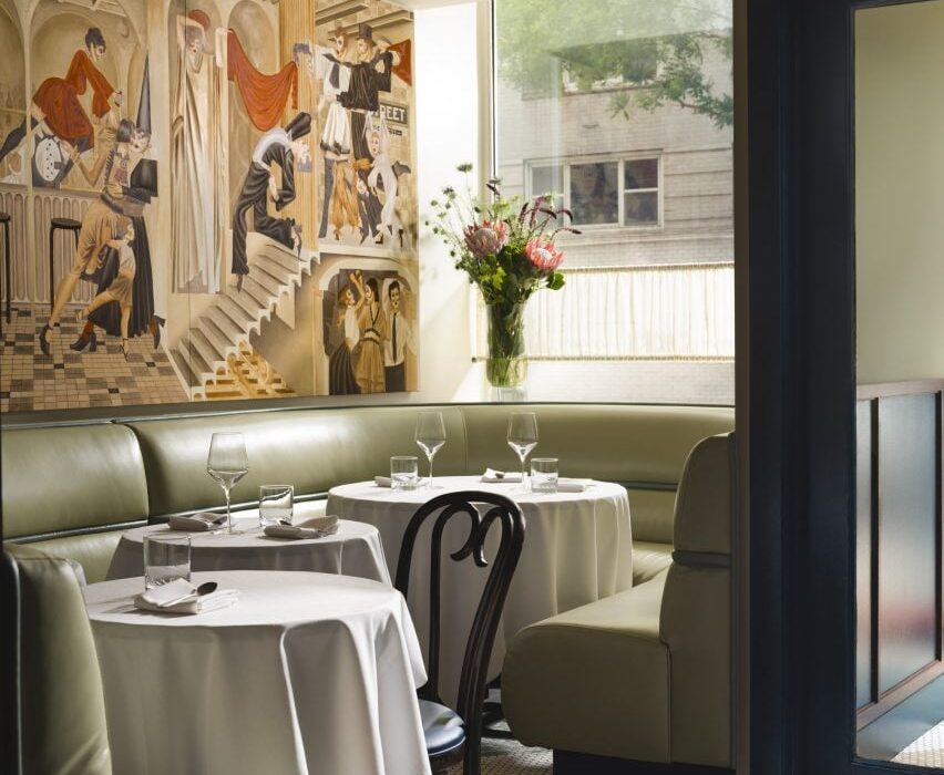
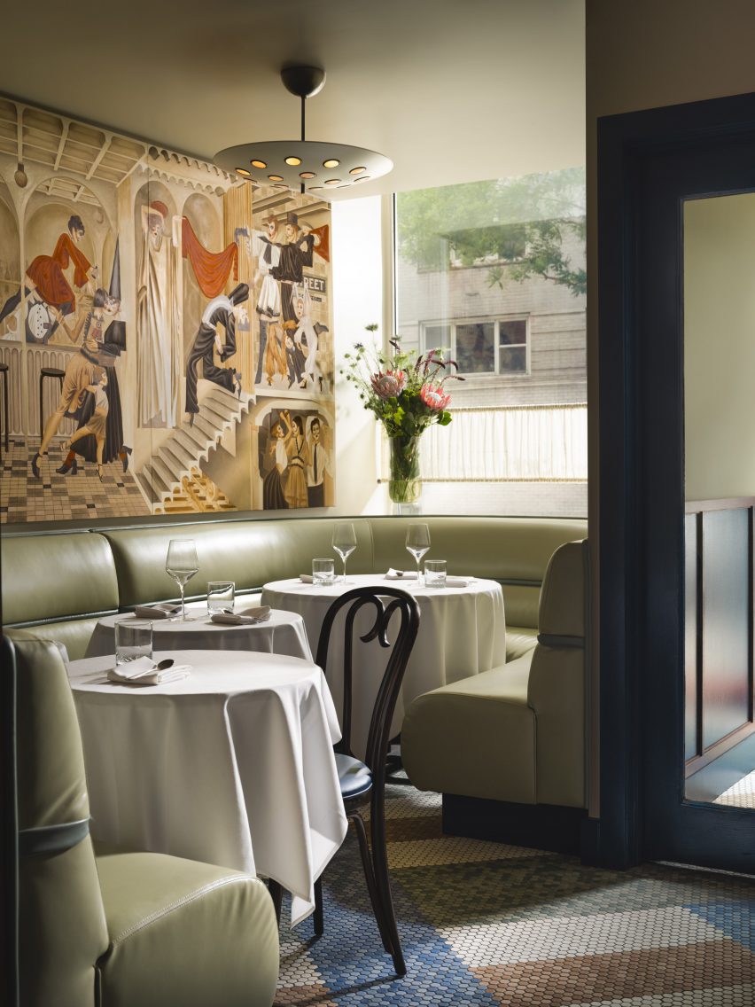
At the entrance to Cecchi’s, pistachio leather banquettes sit below a mural by Jean-Pierre Villafañe

Studio Becky Carter was given creative control to produce an environment that felt distinctively New York, but also presented a departure from the typical bistros.

“My style is retro-futurist, so I take strong cues from historic design narratives and process them through the lens of an imagined future society,” Carter told Dezeen. “When people enter Cecchi’s, I want them to feel like they’ve stepped into old-school, underground, NYC exclusivity, only this time everyone is invited.”

Marble lectern used as a host stand
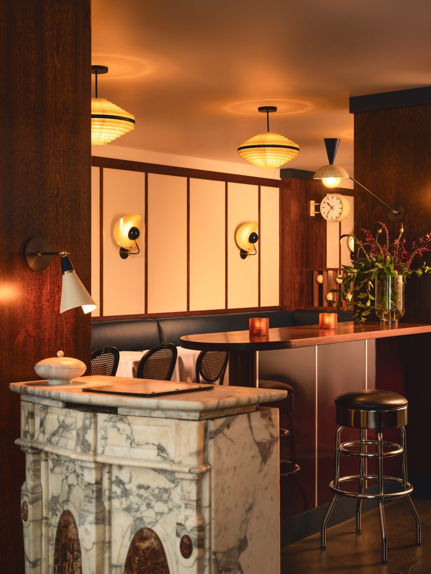
Elements retained from the space’s previous iteration as Café Loup include a marble lectern used as a host stand

A starting point for the design was the whimsical murals of artist Jean-Pierre Villafañe, who was brought on early in the process to create scapes for the restaurant’s walls.

His “transportational” depictions of lively party scenes helped to inform the colour palette for the rest of the space, a mix of reds, blues and tonal browns.

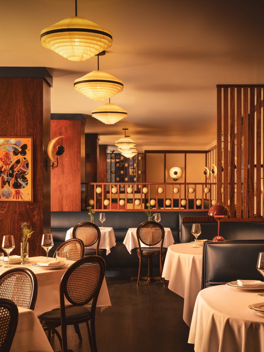
Dining area with navy banquettes, caned bistro chairs and 1970s lighting
Villafañe’s murals informed the colour palette for the restaurant’s interiors

Some of the dancing figures appear as historic European comedic characters, so Carter also looked to these for influences.

The spheres placed within dividing screens, for example, are reminiscent of those found on a Pierrot costume, a figure in French pantomime theatre, while mosaic floor tiling at the entrance is adapted from Harlequin patterns.

View down the dining room with multiple space dividers
Large columns and louvred dividers break up the space into different yet visually connected areas

“The beautifully finished spheres are just so tactile,” said Carter.”I can’t not touch them every time I’m in the restaurant.”

The long, narrow space posed several challenges, such as the lack of natural light towards the rear and large structural columns that interrupted the flow.

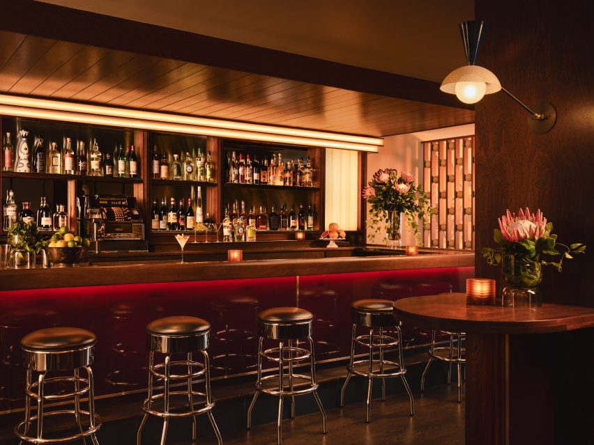
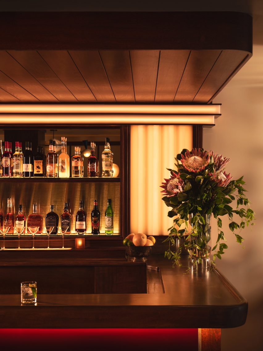
Bar with mahogany top and burgundy lacquered front
The mahogany bar top was also retained, while high-gloss burgundy lacquer was added to the front

Carter’s approach involved dividing up the restaurant into multiple areas, demarcated by the wood-wrapped columns, louvred dividers and built-in seating – all at different heights to allow visual connections across them.

At the entrance, pistachio green leather banquettes occupy the bright window niches, then the mood shifts to darker and cosier as guests venture further inside.

Bar corner with wood panelling and custom lighting
Soft lighting around the bar adds to the mood in the space

Several elements from the space’s previous iteration as Café Loup were retained or refinished as part of the new design, including the mahogany bartop and the restored caned bistro chairs.

The marble lectern that serves as the host stand and a chrome cash register were also saved, while 1970s Czech lighting was introduced overhead.

White tablecloths lend to the classic, old-school atmosphere, while contemporary details like custom wall sconces and the burgundy lacquered bar front add a more casual twist.

“Michael envisioned the servers being able to pull up a chair and have a conversation about the menu in a convivial manner, and the style was to reflect this,” Carter said.

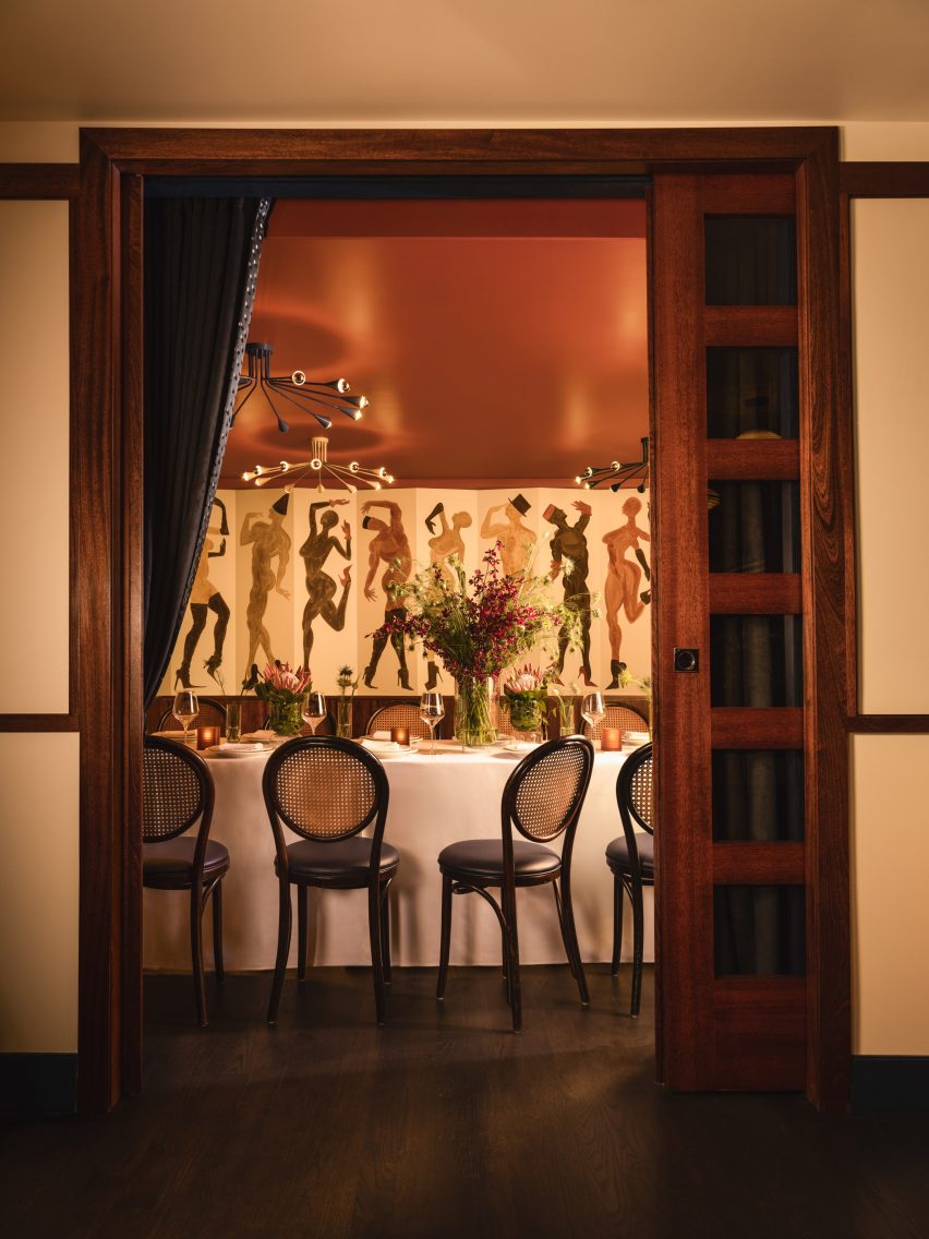
Doorway looking into a private dining room
A private dining room for parties is located at the back of the restaurant

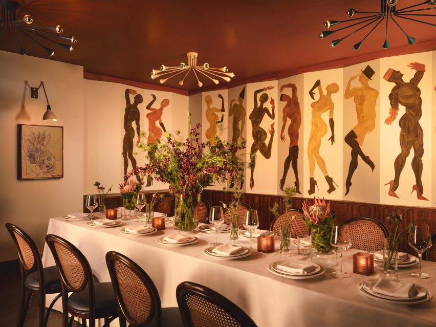
A private room for parties at the back features another Villafañe mural, as well as a rust-coloured ceiling and sci-fi lighting.

Overall, Cecchi’s offers a fine-dining experience that still feels approachable, warm and not too serious.

Long dining table laid for a party in front of a wall mural
The private room features another Villafañe mural, as well as a rust-coloured ceiling and sci-fi lighting

Carter founded her eponymous studio in 2016 and has completed a mix of residential and hospitality spaces on both coasts.

Other recently completed restaurants in the US that feature retro-futurist interiors include 19 Town, a Chinese eatery in Los Angeles by Jialun Xiong, while new openings in the West Village include the worker-owned Donna designed by Michael Groth.

The photography is by Joseph Kramm.

Reference

Studio Andrew Trotter refreshes 17th-century Casa Soleto in Puglia
CategoriesInterior Design

Studio Andrew Trotter refreshes 17th-century Casa Soleto in Puglia

Casa Soleto, a 17th-century house in Puglia, Italy, has been carefully renovated using lime plaster, terrazzo and furniture salvaged from a monastery.

The four-bedroom house, parts of which are over 400 years old, was given a refresh by its owners – architecture firm Studio Andrew Trotter and its studio manager Marcelo Martínez.

Exterior of Casa Soleto
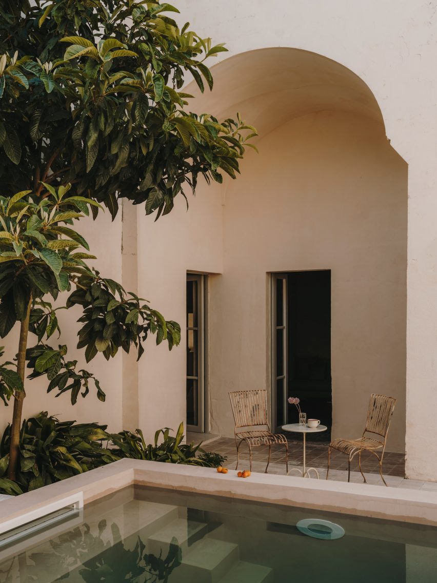
Casa Soleto is located in southern Italy

While no structural changes were made, the designers redid some of the building’s roofs, which were falling apart, added two bathrooms and powder rooms, and swapped the living and dining spaces around.

“The street front had all the baroque details of a small palazzo and inside it was like time stood still,” Studio Andrew Trotter founder Andrew Trotter said of the house.

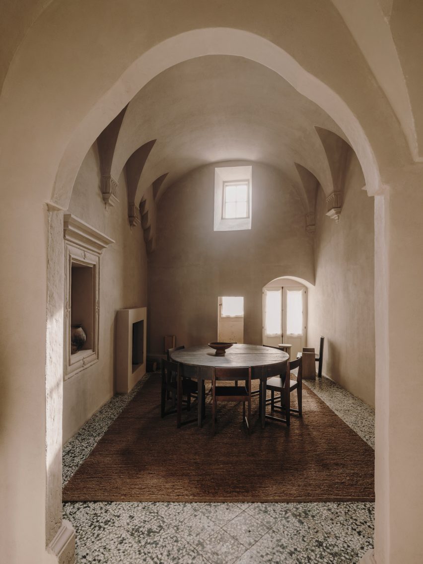
Dining room in Casa Soleto
Parts of the house are over 400 years old

None of its walls were straight and the layout was designed for the needs of past occupants, with a chapel located behind the kitchen so that the family did not need to leave the house to pray.

This place of worship was transformed into a media room and a powder room with an outdoor shower, creating a space that can be used as an extra guestroom if needed.

Old chapel in Puglia house
A former chapel was turned into a media room that can also serve as an extra guest room

Trotter and Martínez aimed for the renovation of Casa Soleto to resemble the original building as much as possible and the team preserved much of its original flooring.

“We tried to use natural materials as much as possible,” Martínez told Dezeen.

“We used lime plasters to give a natural and raw feeling to the walls, terrazzo floors – battuto alla veneziana – in the areas where new floors had to be made, wooden windows and doors seeking to imitate the original ones, cast iron hardware and linen sofas.”

Bedroom in Italian home by Studio Andrew Trotter and Marcelo Martínez
The 17th-century house was decorated with modern and antique furniture

The designers also chose a discrete colour palette for the lime plaster used on the walls of the house, which on the ground floor culminate in five-metre-high ceilings.

“We chose subtle earthy and greeny colours,” Martínez said. “Colours played a central role, as some make spaces feel light, others moody.”

Studio Andrew Trotter kept the house’s original kitchen and commissioned local woodworkers from the city of Lecce to recreate the home’s original wooden doors.

To add to the natural feel of the interior, the team used jute rugs to cover the stone floors and sourced linen upholstery and curtains from local artisans.

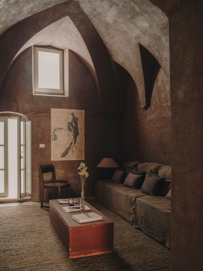
Living room in Casa Soleto
Lime plaster was used to give the walls a natural feel

Furniture and accessories by Danish brand Frama were juxtaposed with antique furniture pieces including an 18th-century dining table that was salvaged from an Abruzzo monastery.

The studio also sourced a late 18th- early 19th-century wardrobe from Lombardy for one of the bedrooms in Casa Soleto, which can only be accessed by going through the front patio and up an outside staircase.

Kitchen in Casa Soleto
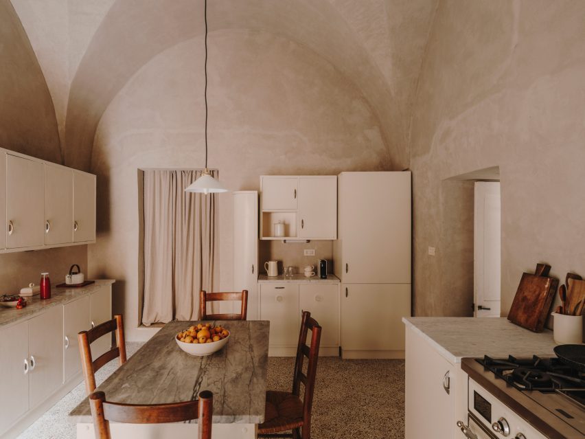
The original kitchen was kept and refurbished

Studio Andrew Trotter, which has worked on a number of projects in Puglia, plans to use Casa Soleto as a rental property.

“We purchased and restored it mainly to rent it out, and also to invite creative minds that we appreciate, make gatherings and exhibitions,” Martínez said.

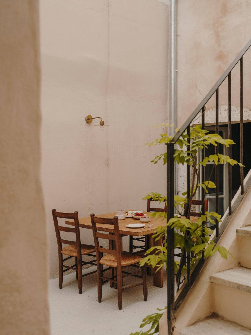
Exterior of Casa Soleto
An exterior staircase leads up to the bedrooms

Previous projects the studio has completed in the area include a 19th-century school that was turned into a family home and an earth-toned villa made from local sandstone.

The photography is by Salva López.


Project credits:

Interior design: Andrew Trotter and Marcelo Martínez
Plaster application: Tullio Cardinale and team
Woodwork: Alba Falegnameria

Reference

Studio Varey Architects celebrates natural light in Notting Hill house
CategoriesInterior Design

Studio Varey Architects celebrates natural light in Notting Hill house

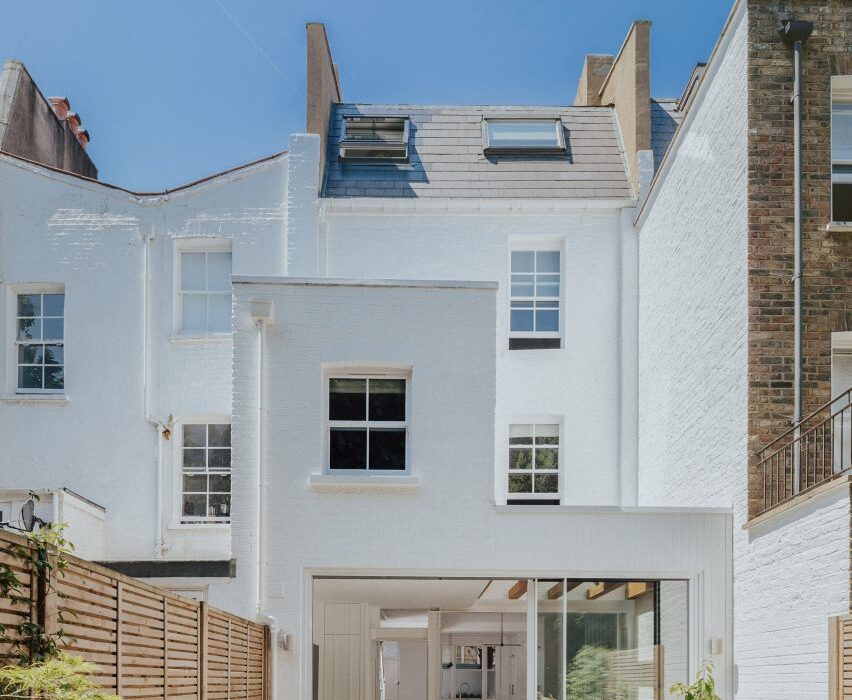
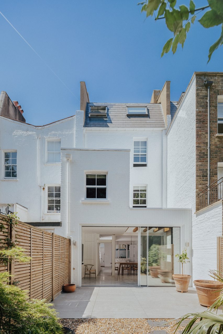
London firm Studio Varey Architects has simplified this Victorian terraced house to create a light-filled home in Notting Hill, with timber-framed skylights designed to catch the sun.

Set in the Westbourne Conservation Area, Huron House has belonged to its current owners for the last 25 years.

Exterior of house in London by Studio Varey Architects
Huron House is a renovated Victorian terrace in west London

The overhaul of the 19th-century building started as a simple ground-floor renovation to replace the kitchen and improve the connection between the house and its garden.

However, exploratory works showed the four-storey property to be in bad structural condition, which demanded major improvement works but also gave the owners an opportunity to reimagine their period home.

Dining area of Huron House
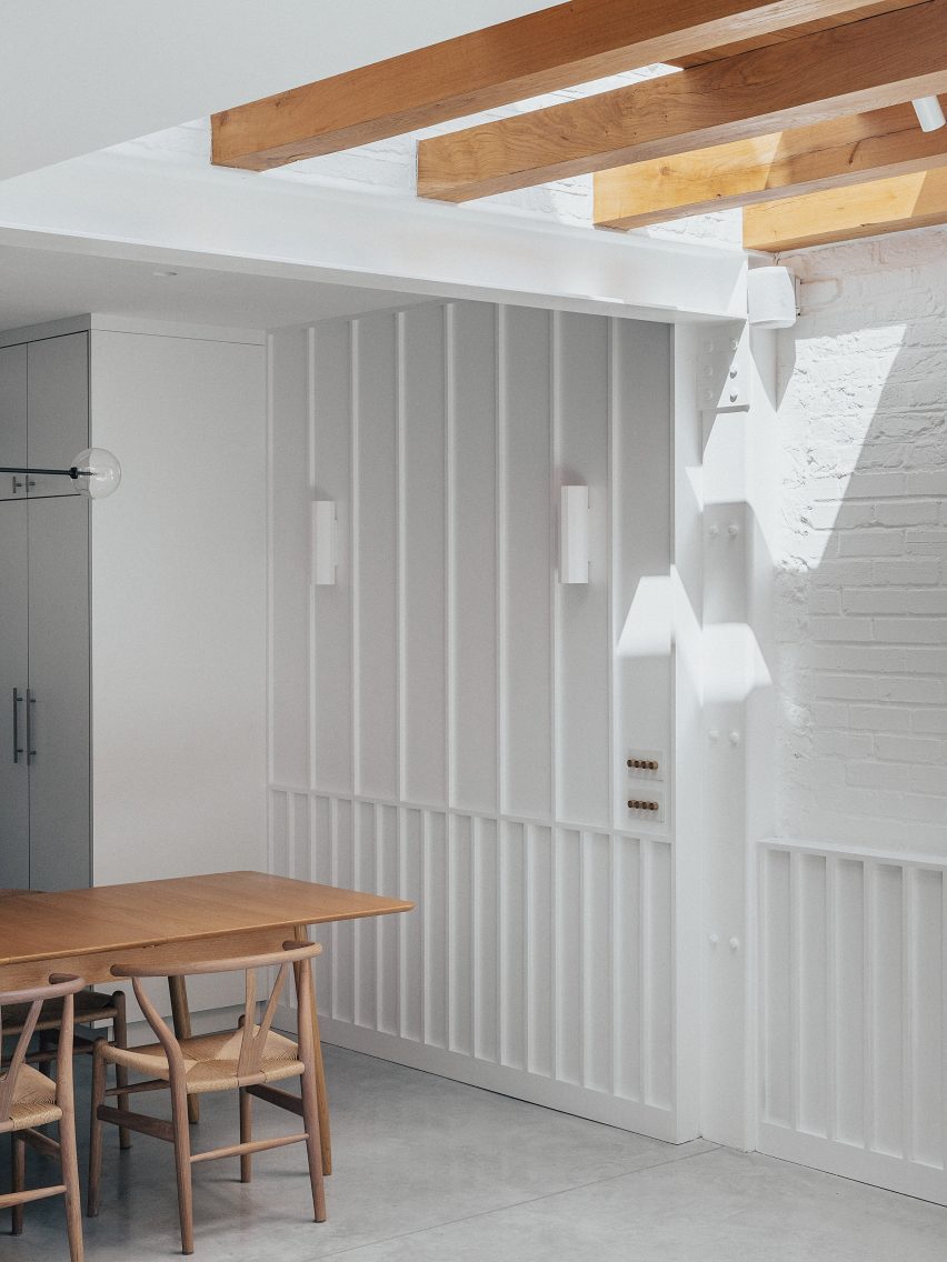
Decorative oak beams frame the skylight in the extension

The new brief to Studio Varey Architects included a full house renovation and interior design, with special emphasis on the bathrooms as well as custom joinery and the rebuilding of the 1990s rear extension to create a new open-plan kitchen and dining room.

“Our goal was to create an open-plan living space and bring lots of natural light into the ground floor, helping it to feel more inviting and better suited to entertaining friends and family,” the studio told Dezeen.

Stairwell of house in London by Studio Varey Architects
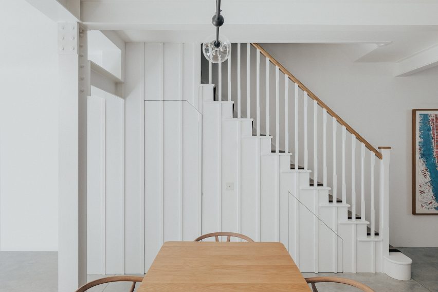
A simple white staircase leads upstairs

The property sits on a rough east-west axis, giving it the potential to achieve great light levels throughout the day, with the sun moving from the back of the house in the morning to the front in the afternoon.

“We wanted to ensure this natural light was captured through the architecture and design of the spaces,” the studio said.

On the ground floor, Studio Varey Architects removed a structural post that supported the building but divided the back wall.

Bathroom with light well in Huron House
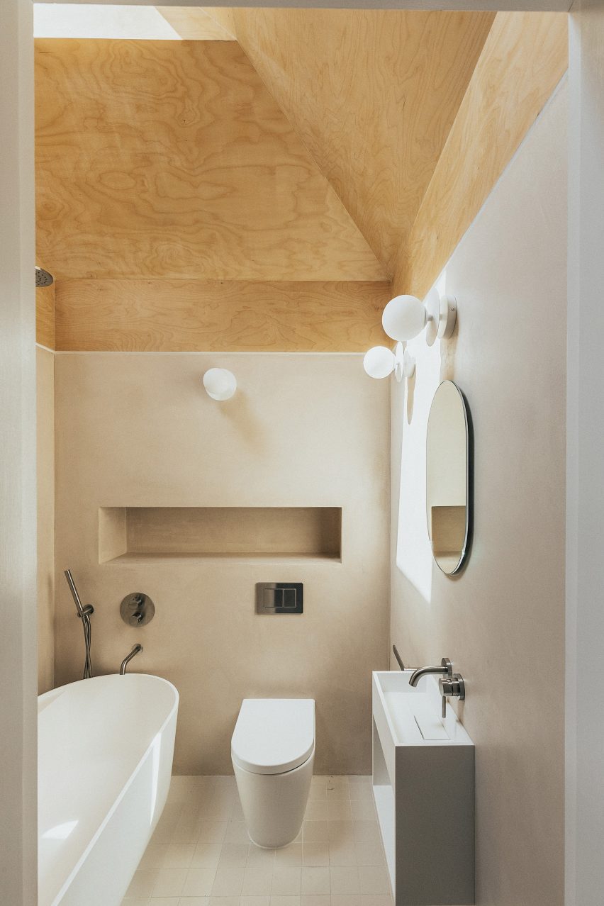
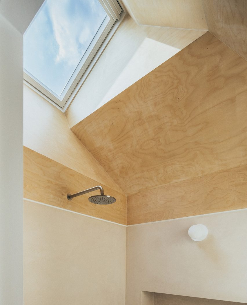
A skylight illuminates the top-floor bathroom

This has been replaced with a steel frame, which allowed the studio to introduce slimline aluminium sliding doors that now run along the whole back of the property.

An existing skylight in the flat roof here was enlarged and framed with oak beams, pulling more light into the centre of the hybrid kitchen-dining space.

“Natural light cascades into the back of the house, while the introduction of oak beams created a feature that plays with the light as it travels through the property,” the studio said.

The whole staircase was replaced and positioned further away from the home’s large rear windows, creating a lightwell funnels sun into the lower floors.

On the top floor, an existing bathroom was fully renovated. Situated in the middle of the top floor it featured no windows save for a small skylight, meaning that light levels were totally inadequate.

Here, Studio Varey Architects cut back the ceiling to create a multifaceted surface clad in birch plywood – its colour knocked back with a wash of soft white – to bounce light around the space.

Timber-clad light well in Huron House
The ceiling was cut back to allow more light into the interior

“We created a splayed ceiling that increased the height of the space, allowing for the playful integration of materials to emphasise the new angles,” the studio said.

“Naturally finished birch ply, leading from the skylight down into Tadelakt walls, beautifully captures sunlight creating a special warmth in the space.”

Living room of house in London by Studio Varey Architects
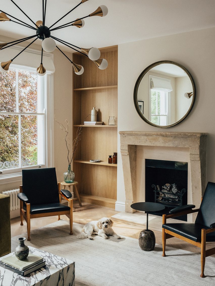
Oak forms bookcases in the sitting rom

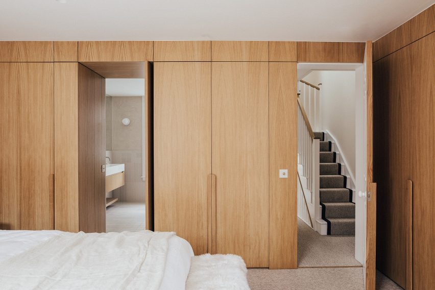
White oak can be found throughout the house in the form of built-in joinery from bookcases and wardrobes, as well as in the feature beams of the extension.

“We wanted to simplify the material palette and keep it light, both in appearance and number of elements we used,” the studio said.

“This was done to emphasise the quality of the materials themselves, highlight the craftsmanship of the work and establish a visual link between the interior spaces throughout the home.”

Bedroom of house in London by Studio Varey Architects
Oak joinery features in the primary bedroom

Polished concrete, used for the floor at ground level, is underlaid with underfloor heating and provides a durable surface that is easy to clean for the owners after walking their dog.

Other recently renovated houses in London include Sunderland Road House by 2LG, which features pastel-painted corniced ceilings, and Graphic House by Office S&M, which is defined by graphic shapes and bold hues.

The photography is by Taran Wilkhu.

Reference

DAB Studio lines kitchen of Dutch home with oak and Afromosia wood
CategoriesInterior Design

DAB Studio lines kitchen of Dutch home with oak and Afromosia wood

Dutch interior design practice DAB Studio has transformed the kitchen of a family home in Zwaag, the Netherlands, by covering the floors and ceiling in one type of wood and the walls and cabinets in another.

DAB Studio aimed to create a “calm yet soulful” interior with an earthy colour palette made up of tan and neutral shades.

Kitchen interior by DAB Studio with wood-lined walls, floors and cabinets
Quarter-sawn Afromosia wood lines the walls and kitchen units

The floors and ceiling were covered in hand-scraped oak with a smoked and black-oiled finish, laid in a pattern of side-by-side plank pairs.

Afromosia wood, a tropical hardwood native to west Africa, was applied to the walls and cabinets. The wood was quarter sawn to create a decorative grain pattern and add a sense of playfulness to the interior.

Wood-lined dining room with a built-in seating nook
Oak planks were laid in side-by-side pairs on the floors and ceiling

DAB Studio co-founders, Lotte and Dennis Bruns, designed the interior to be a space that would balance “feminine and masculine elements” and reflect both of the owners’ design tastes.

According to the duo, the repeating wood choices for the different surfaces give the space a sense of completeness.

Wood-lined kitchen with a black door and marble worktops
Marble worktops extend down the sides of the kitchen units

“Per the client’s request, we wanted to merge the feminine and masculine vision of their new home, balancing each other out in one curated space,” the co-founders told Dezeen.

“This allowed us to create unique areas in line with our client’s habits and interests while imbuing the space with a sense of spaciousness and lightness.”

“In order to merge all elements of the design, it felt important to prioritise the theme of consistency,” the duo added.

“For that particular reason, the wood of the floor is repeated on the ceiling, and the wood used for cabinetry is continued into the walls of the room.”

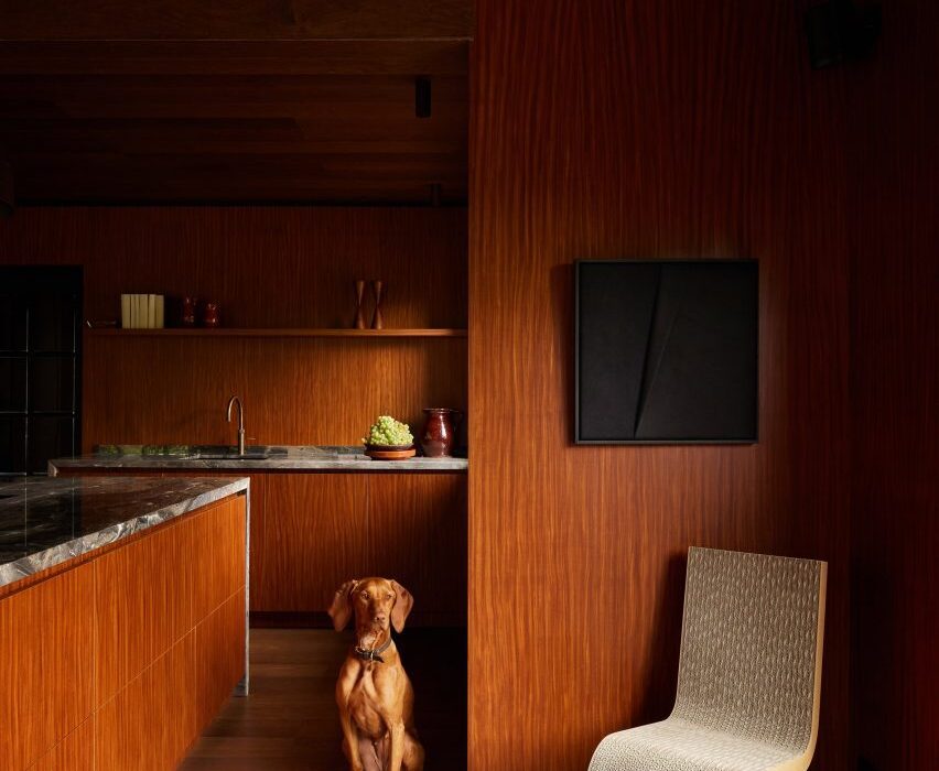
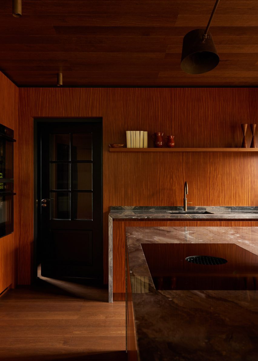
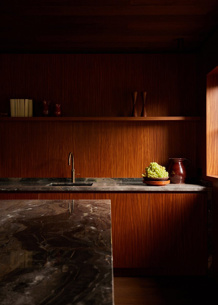
The centrepiece of the kitchen is the island, which features Afromosia wood cabinet doors and a waterfall countertop made from Arebescato Orobico marble.

Wood cabinets along one kitchen wall were also topped with a marble worktop, which extends down one side to frame the unit.

Wood-clad seating nook with upholstered seating and a marble table by DAB Studio
The studio balanced “masculine and feminine” elements in the interior

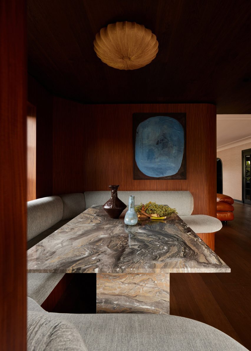
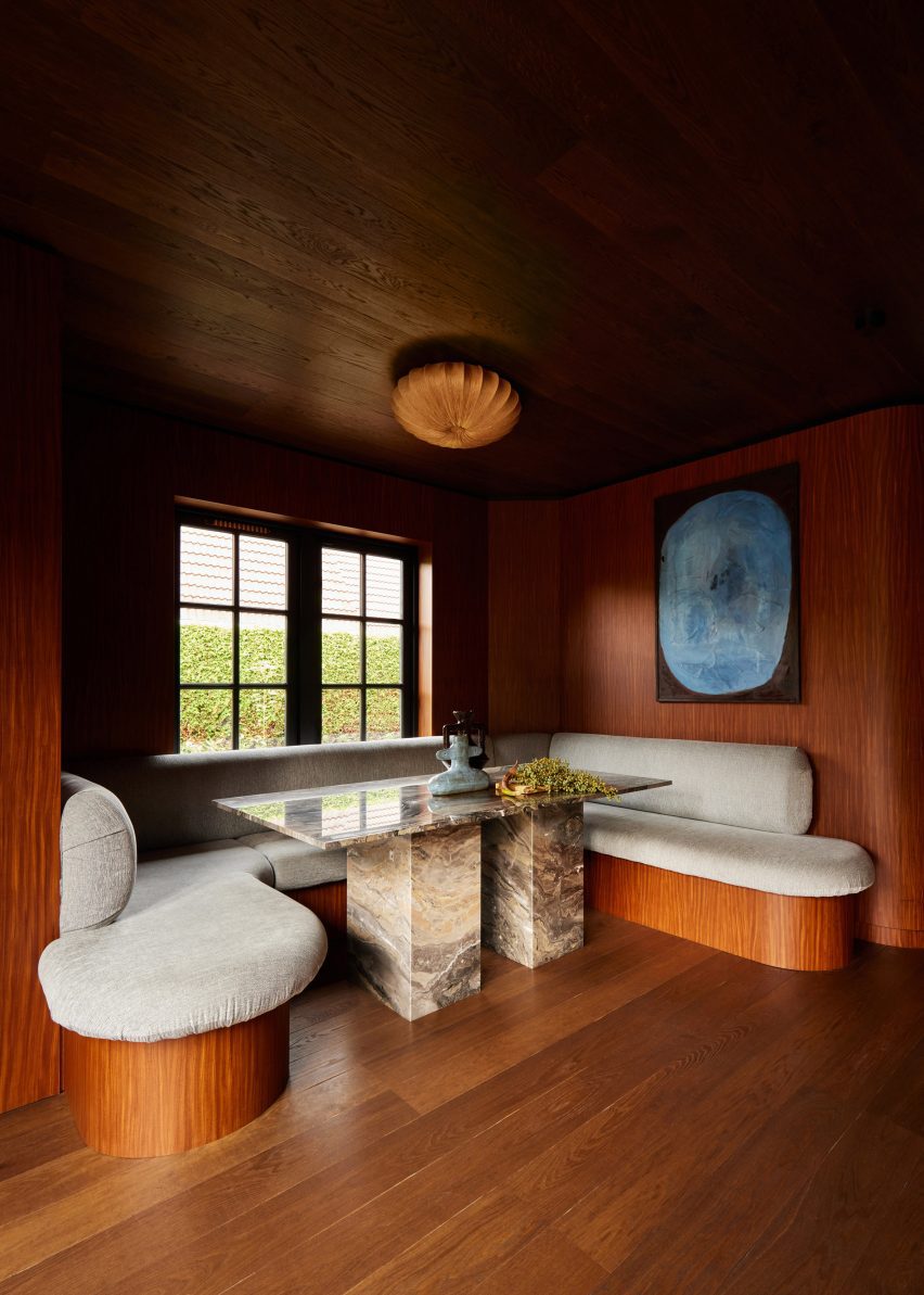
DAB Studio added a dining nook below a window, designed to be a space flooded with natural light where the family can gather.

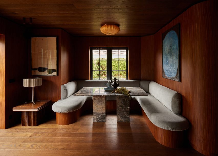
Seating with rounded corners wraps the three walls of the nook. The seating base was covered in the same wood as the interior walls, while the seat and backrest are covered in plush upholstery.

Wood-lined kitchen by DAB Studio with marble worktops
The quarter-sawn Afromosia wood creates a decorative grain

At the centre of the nook, a rectangular table with two blocky legs made from Arebescato Orobico marble contrasts the rounded seating.

“The dining nook is where the family can spend time together, welcome new conversations, and create core memories,” said Lotte and Dennis Bruns.

“The asymmetrical built-in banquette seating feels inviting with its round edges, and adds a dynamic feel to the space.”

Banquette seating in a dining room nook with wood flooring, ceiling and walls by DAB Studio
The dining nook sits below a window

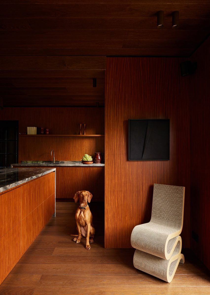
Decorative items and free-standing furniture were introduced to the interior to add more rounded elements, including a Wiggle Chair by Frank Gehry.

Elsewhere in the Netherlands, Francois Verhoeven Architects has created a bungalow clad in vertical timber slats and Julia van Beuningen added a plywood staircase to a barn conversion.

The photography is by Daniëlle Siobhán.

Reference

Mcmullan Studio designs garden room as “restorative haven”
CategoriesArchitecture

Mcmullan Studio designs garden room as “restorative haven”

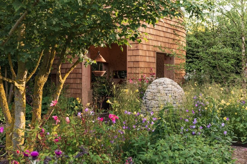
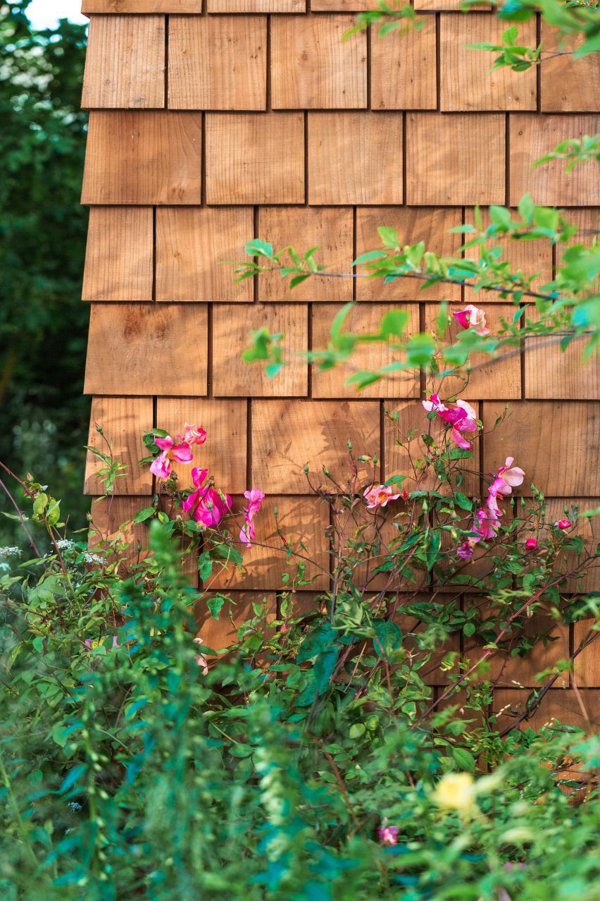
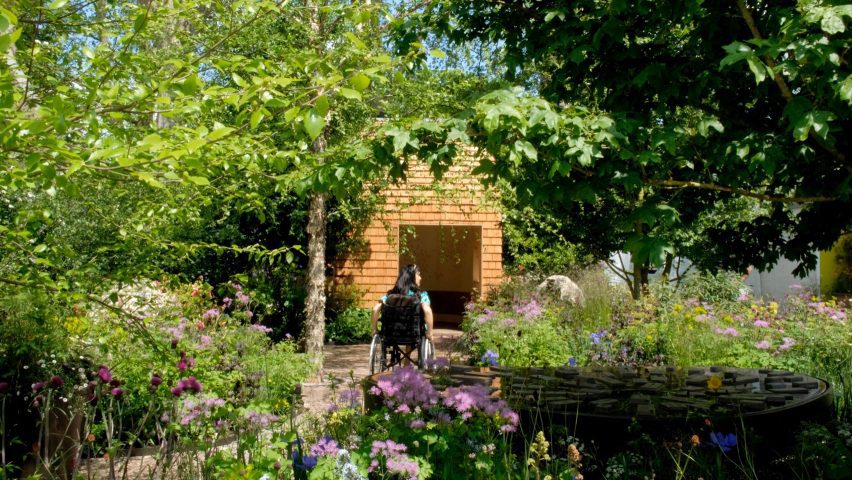
Wooden shingles clad this pod-like garden room by London practice Mcmullan Studio, which has been created for spinal-injury charity Horatio’s Garden.

The small space was conceived by Mcmullan Studio as a “beautiful, immersive, restorative haven” for patients with spinal injuries at a hospital in Sheffield.

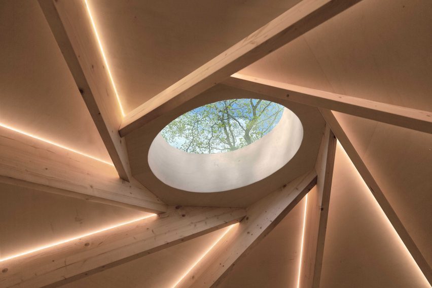
It has large openings and a central circular skylight to create a close connection to the outdoors, informed by the Japanese concept of forest bathing.

Garden room for Horatio's Garden by Mcmullan Studio
Mcmullan Studio has created a garden room for Horatio’s Garden

“Our design addresses the issue of monotony and lack of stimulation experienced by patients who are confined to staring at hospital ward ceilings, particularly those who cannot move or lift their heads due to spinal injuries,” director Andrew Mcmullan told Dezeen.

“We all know how good being in nature can make us feel,” he added. “We have known it for centuries. The sounds of the forest, the scent of the trees, the sunlight playing through the leaves, the fresh, clean air — these things give us a sense of comfort.”

The wooden pavilion was originally created for Horatio’s Garden‘s exhibit at the 2023 RHS Chelsea Flower Show in London, for which Mcmullan Studio worked with landscape designers Harris Bugg Studio.

Wooden shingles
It is clad in wooden shingles

The pavilion is now being transported to the Princess Spinal Injuries Centre in Sheffield as a permanent space for the charity, due to open in 2024.

The garden room’s skylight sits at the centre of a reciprocal roof – a twisting circle of interlocking beams that requires no central support, allowing the interior to be as open and unobstructed as possible.

“Apart from the technical aspects, the reciprocal frame also has intrinsic beauty. The nest-like character of this structure creates a visually intriguing and comforting atmosphere,” described Mcmullan.

“The structure frames a glazed rooflight that invites daylight into the space while providing ever-changing views of the overhanging tree canopies,” he added.

Reciprocal roof inside Horatio's Garden pod
It has a reciprocal roof

Wooden finishes have been used inside and out, with space for seating and a bed beneath the central skylight and a pattern of circular ceramics mounted on the walls.

Ease of transportation was central to the structure’s design, allowing it to be easily lifted as a single unit for its transportation from London to Sheffield.

Exterior of Garden room for Horatio's Garden by Mcmullan Studio at the 2023 RHS Chelsea Flower Show
It was on show at the 2023 RHS Chelsea Flower Show. Photo by Jim Stephenson

Once in place, it will be accompanied by two additional garden rooms and a larger communal garden building, all of which will also be designed by Mcmullan Studio.

Other garden rooms featured on Dezeen include an artichoke-shaped workspace by Studio Ben Allen and a writer’s shed by WT Architecture.

The photography is by Lucy Shergold unless stated otherwise.

Reference