Ivy Studio converts historic bank into offices for Montreal ad agency
CategoriesInterior Design

Ivy Studio converts historic bank into offices for Montreal ad agency

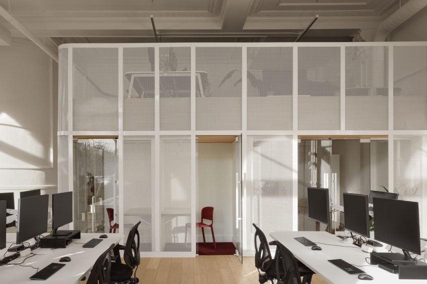
The offices that Montreal’s Ivy Studio has designed for digital advertising agency Cardigan include a mesh-wrapped mezzanine and a “futuristic” basement within a former bank building.

For Cardigan‘s expanding team, Ivy Studio has renovated a stone building that was built as a bank in 1907, in the Rosemont area of Montreal.
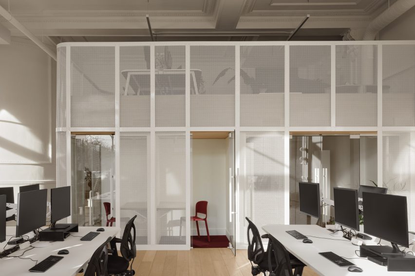
Steel mesh mezzanine within historic bank building
Ivy Studio inserted a steel mesh mezzanine inside the historic bank building to provide additional space

The structure has had many uses, including most recently a religious establishment, and boasts plenty of historic architectural details.

While the upper floor is a residential condo, Cardigan occupies 1,250 square feet (116 square metres) across the ground and basement levels – spaces with very different ceiling heights and light conditions.
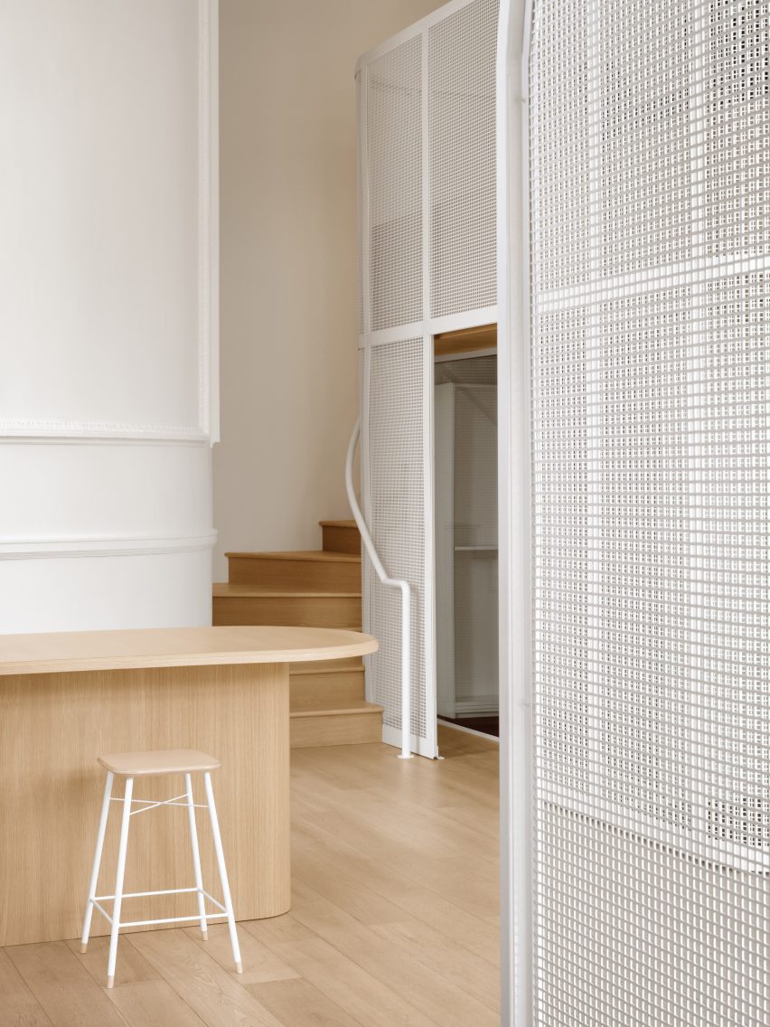
Steel mesh partitions beside an oak staircase and counter
The mesh was painted white to accentuate the bright and airy feel in the office space

“One of the main challenges of working with the building was the contrasting ceiling heights between each floor,” said Ivy Studio. “This made the spacial blocking very important at the start of the project.”

To benefit from the 16.5 foot (5 metres) clearance and abundance of natural light, all the workstations are positioned on the ground level.
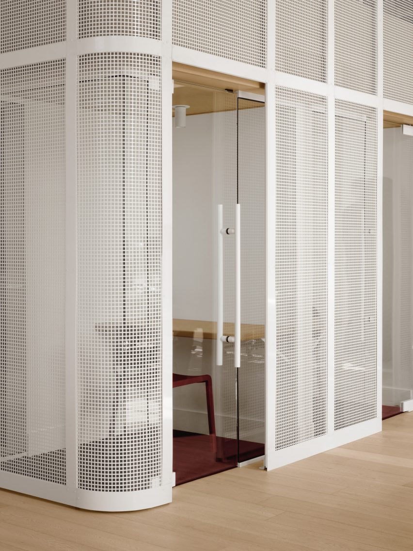
Glass-walled phone booth behind steel mesh
Under the mezzanine sit multiple phone booths and meeting rooms

However, the floor plate was not sufficient to accommodate all 25 employees as well as meeting rooms, so the studio took advantage of the ceiling height and added a mezzanine.

This addition was placed in a corner to avoid blocking the arched windows, and was painted entirely white to accentuate the bright and airy atmosphere of the space.
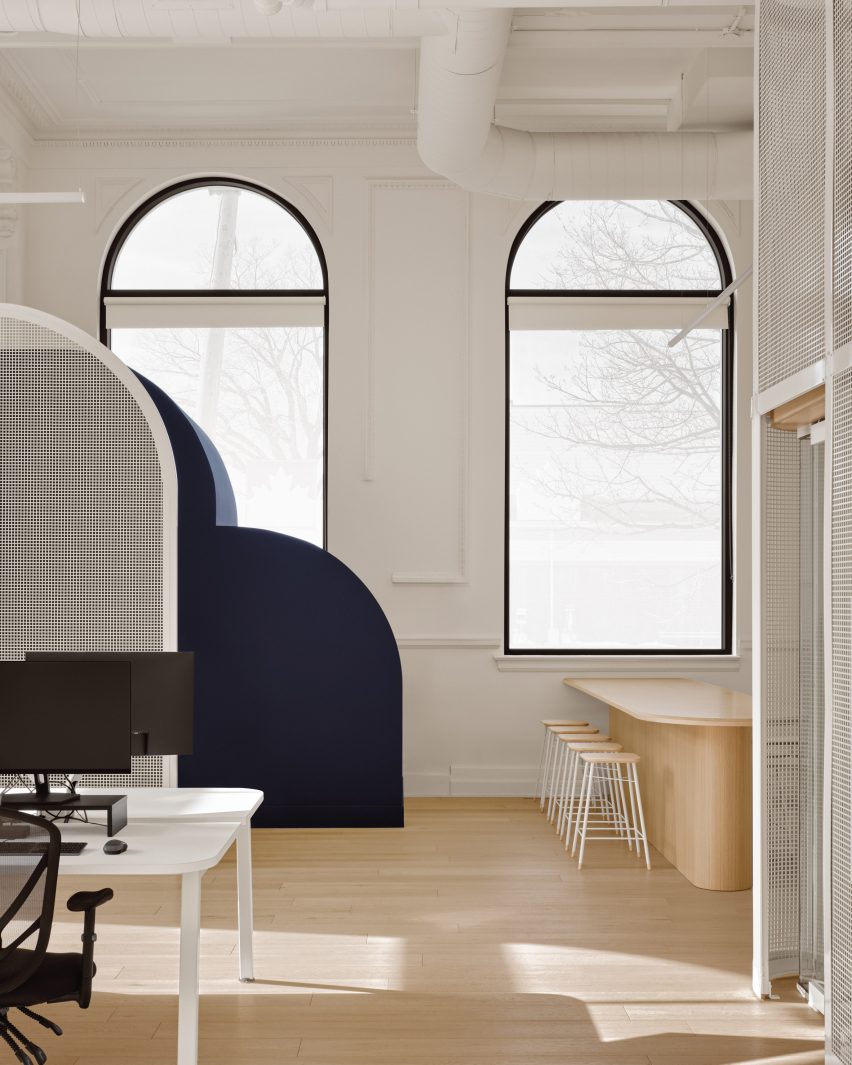
Large arched windows in office space
During the renovation, the building’s large arched windows were fully uncovered to let in more light

The structure is made from perforated steel mesh, allowing light to enter the phone booths and meeting rooms tucked underneath, and a gap was left between the mesh and the glass partitions behind to make space for planters.

Additional workstations are located on top of the mezzanine, which is curved at its corner. “The newly-built mezzanine structure interprets the curves of the existing space without competing with them,” Ivy Studio said.

To let even more light in, the boarded window arches were reopened to their original form, while the parquet flooring was replaced with natural oak to retain the warmth.

Meanwhile, in the basement, low ceiling heights and a lack of windows called for an entirely contrasting strategy.

“It is a different universe of its own,” said Ivy Studio, which took a “futuristic, in your face” approach to the sub-grade space.
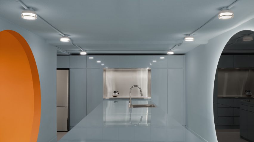
Baby blue kitchen with orange portal on one side and mirror on the other
In the windowless basement, a contrasting “futuristic” aesthetic was chosen

This level accommodates the bathrooms, kitchen, lounge and storage, and features a mix of plastered ceilings, ceramic walls and epoxy floors.

In the kitchen, all of the surfaces are coloured baby blue, while the adjacent bathroom block is completely grey.
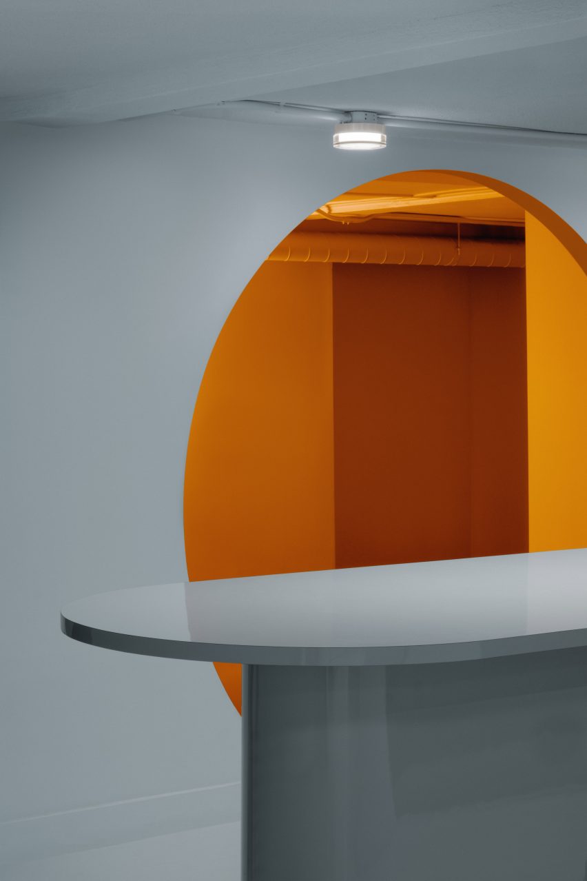
Blue kitchen with orange room beyond
The spaces are colour-blocked to heighten their visual impact

Across the kitchen island, a circular mirror faces an opening that’s exactly the same shape and leads into a room painted in orange.

“The spaces are all monochromatic, to increase the visual impact of their intense colors but also help camouflage the imperfections of the existing building,” said Ivy Studio.
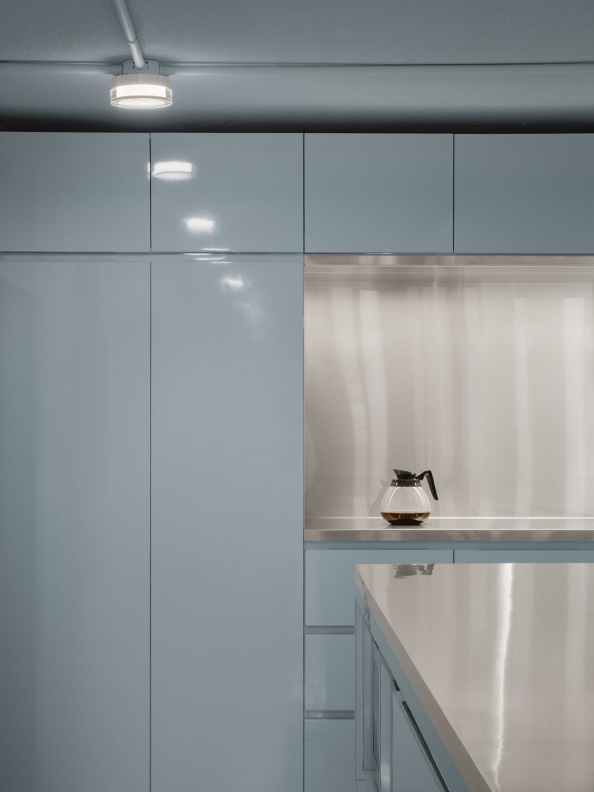
Baby blue kitchen with stainless steel island and backsplash
Baby blue and stainless steel cover the kitchen

The office’s levels are linked by two staircases: an older one made from wood and a newer minimal design that emerges from under an arched portico.

Both are painted navy blue and are intended to reflect Cardigan’s contradicting “hard-working yet playful values”.
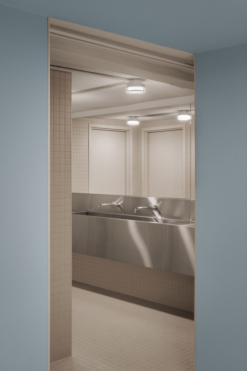
Bathroom with grey tiles viewed from blue room
The adjacent bathroom is executed entirely in grey

Ivy Studio’s portfolio of projects in its home city spans from workspaces and restaurants, to a spinning studio and a dry cleaners.

Recently completed interiors by the firm include a creative hub populated with pink and purple elements, and a renovated eatery that was damaged in a fire.

The photography is by Alex Lesage.


Project credits:

Design and architecture: Ivy Studio
Construction: Group Manovra

Reference

2LG Studio brings colour and personality into London family home
CategoriesInterior Design

2LG Studio brings colour and personality into London family home

Ornately corniced ceilings were preserved and painted pastel inside this detached Edwardian house in southeast London, which local firm 2LG Studio has renovated for a returning client.

Set in the leafy residential area of Forest Hill, the house on Sunderland Road belongs to a couple who needed space for their three young children to grow and play.

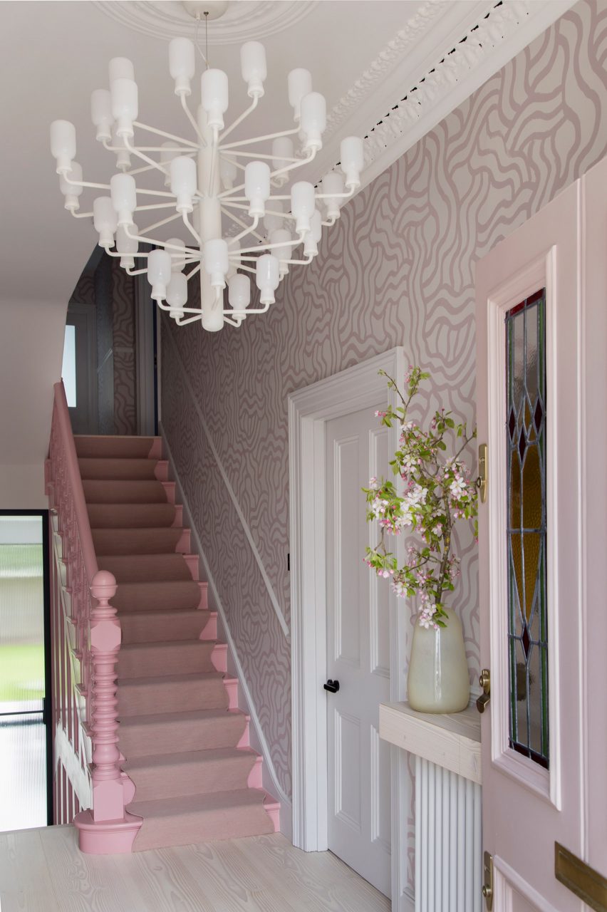
Hallway of Sunderland Road house
2LG has completed Sunderland Road house in Forest Hill

“Having designed this couple’s previous home, we had a strong sense of their tastes and wanted to evolve that for them in this house,” 2LG Studio founders Jordan Cluroe and Russell Whitehead told Dezeen.

“We wanted to bring out their characters by emboldening their love of colour and finding ways to build pattern and joy into the materiality of the home,” the duo added.

“The intent here was to respect the period elements of the building, whilst reflecting the modern style of the family who live there.”

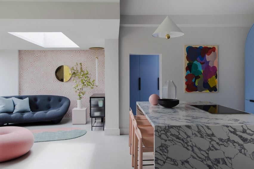
Open-plan living room and kitchen in London house by 2LG
Hand-printed wallpaper by Custhom Studio features in the lounge and hallway

Throughout the house, playful elements are in balance with a more serious aesthetic.

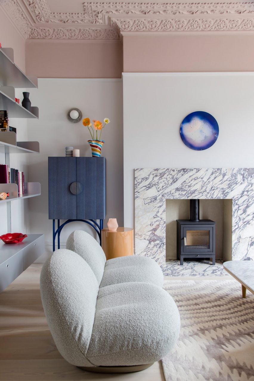
Instead of treating the home’s elaborate ceiling mouldings separately – as tradition dictates – 2LG Studio applied a colour-block philosophy and painted them in the same pastel tones used across the upper walls and ceilings.

The studio drew on a range of references for the interior, from 1980s colours to Italian design elements such as marble and Murano glass lighting, all the way to the Scandinavian influences seen in the natural materials and minimalist approach to furnishing.

Kitchen and dining room of Sunderland Road house
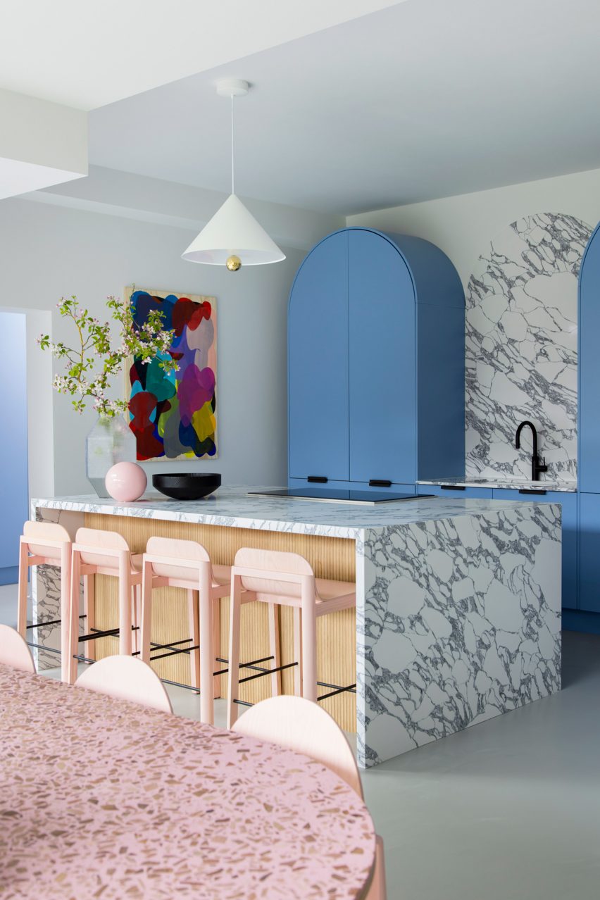
The kitchen is defined by sky-blue cabinetry and marble countertops

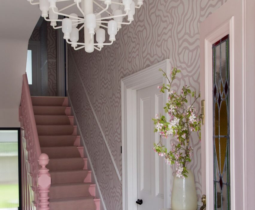
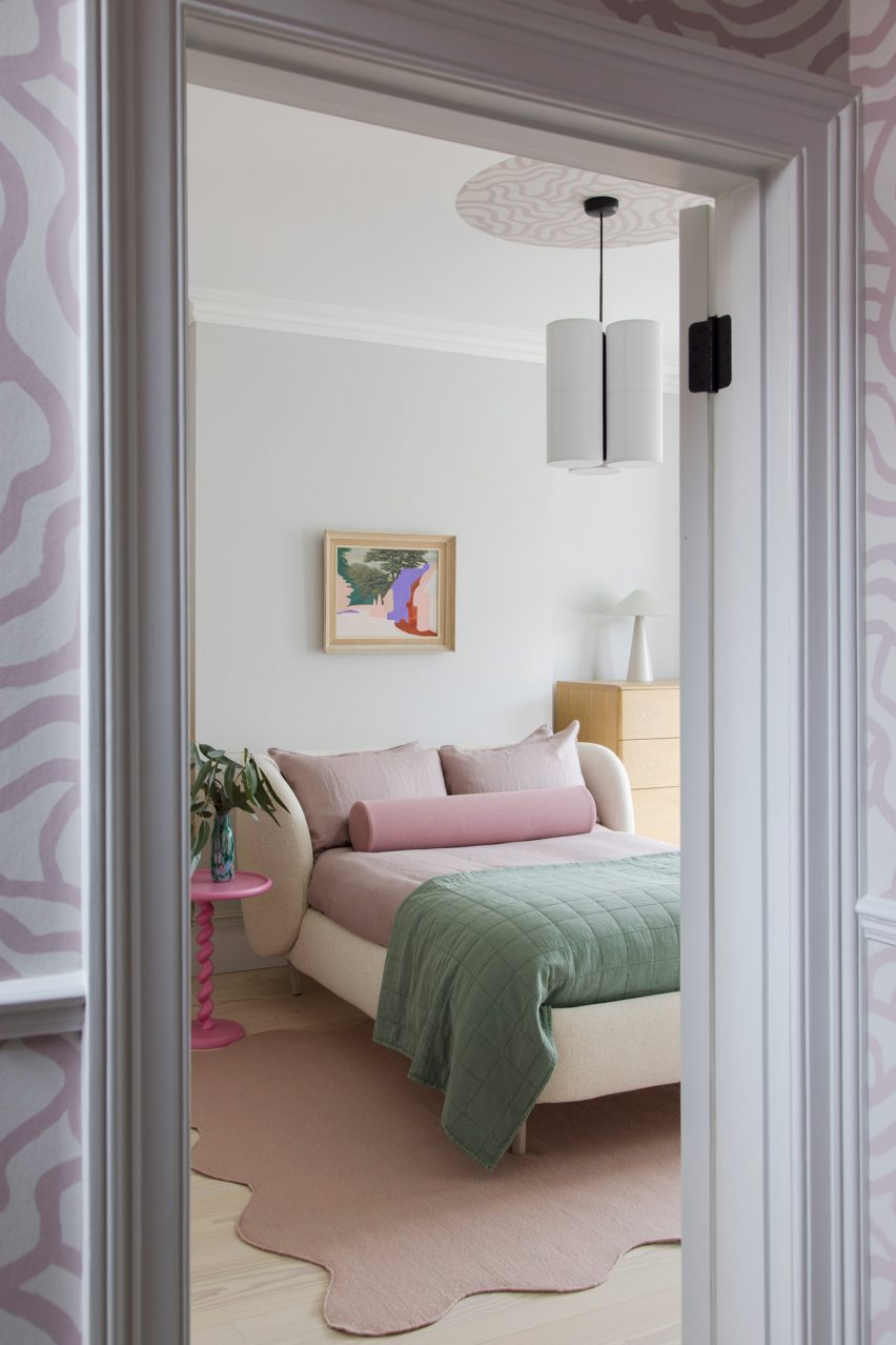
Creating impact in the entrance hall is a hand-printed wallpaper, designed by 2LG Studio with long-term collaborator Custhom Studio and used here in a bespoke calamine-pink colourway that’s repeated in the connecting spaces throughout the house, as well as in the rear living area.

“It creates a welcoming, human feel as soon as you enter,” the design team said.

This ballet-slipper colour is paired with a brighter candy pink, bringing calm and warmth to the overall scheme.

Lounge of Sunderland Road house
2LG painted ceilings, mouldings and upper walls in pastel colours

Pink-heavy palettes have become a signature for 2LG, also reflected in the natural pink undertones of the extra-wide Douglas fir floorboards that feature throughout the house alongside a grey poured-resin floor in the kitchen.

“The floorboards set the tone with a nod to Scandi minimalism, adding a natural soul throughout that unites the bolder elements,” said 2LG Studio.

In the kitchen, sky-blue cabinetry is used alongside marble countertops and splashbacks, with arched forms uniting the two finishes while pink elements such as bar stools pop against this calm backdrop.

“The colours are a key part of the atmosphere and identity of this house,” said 2LG. “The blues gets deeper and bolder as you move upstairs into the study and the family bathroom.”

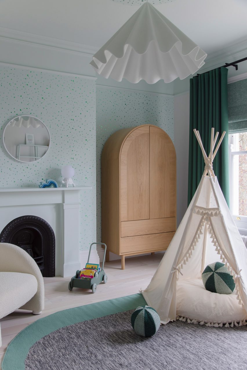
“Primary red details give structure to the colour palette in the living room. Pastel green in the baby’s room is serene and fresh, warmed up with a mix of wood tones and creams.”

Bedroom of house in London by 2LG
Pink details feature throughout the home’s interiors

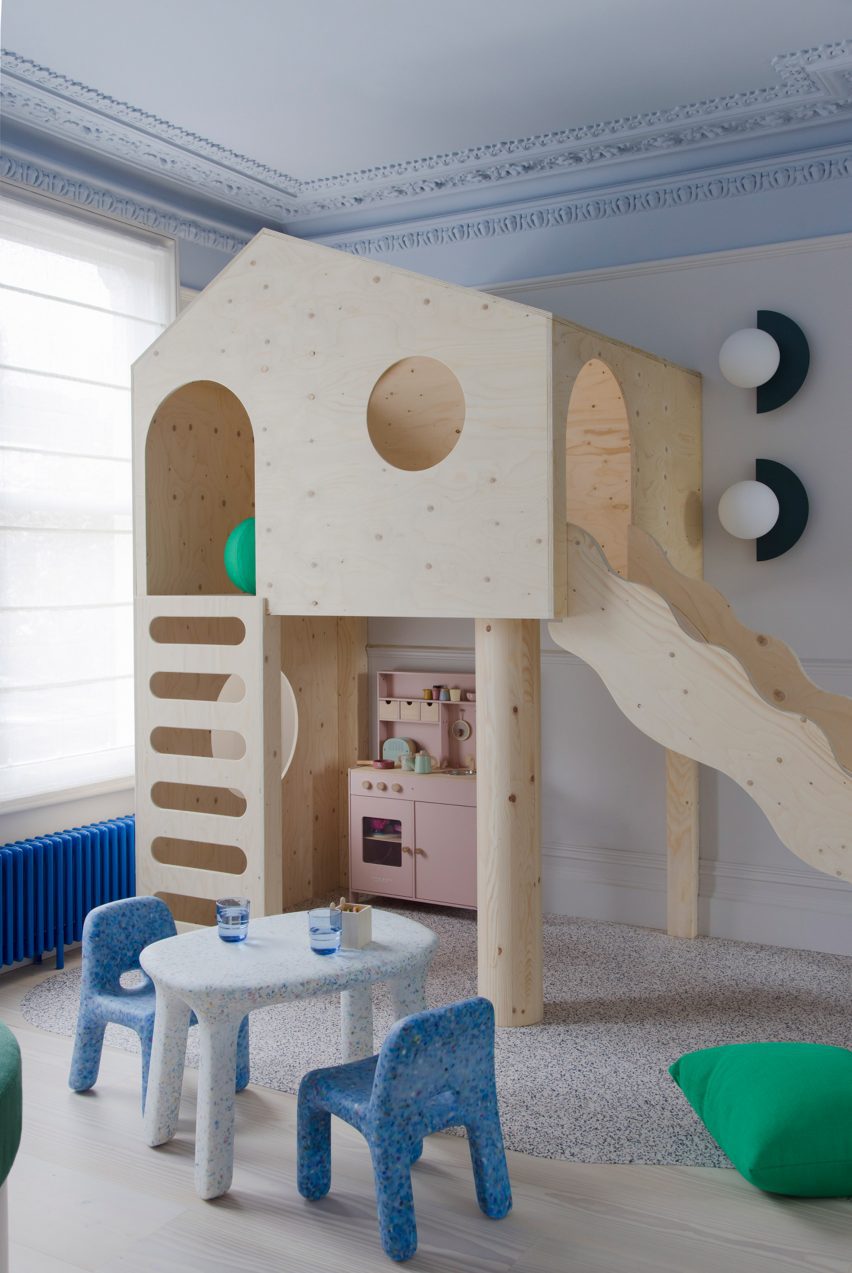
The project features bespoke joinery including a playhouse on stilts in one of the kids’ rooms alongside existing 2LG pieces such as the Luca bedhead in the loft bedroom and the Tilda sofa, both designed for London furniture company Love Your Home and upholstered here in Kvadrat x Raf Simons fabric.

“The fitted elements of the furniture give a sense of coherent design and function to the spaces whilst the classic design pieces bring a curated gallery feel, not unlike a contemporary luxury fashion store,” said 2LG Studio.

Children's bedroom of house in London by 2LG
2LG designed custom joinery including a stilted playhouse

Various recycled materials provide textural interest throughout the house, among them the recycled plastic wall lights in the living room by Spark and Bell.

2LG Studio also added a pink Foresso top made using waste wood chips and resin to the dining table, while the bespoke bathroom cabinet was made using leftover Douglas fir floorboards with recycled plastic details by UK company Smile Plastics.

Children's bedroom in Sunderland Road house
Pastel green was used to finish the baby’s room

Since Cluroe and Whitehead founded their design practice in 2014 under the name 2 Lovely Gays, the studio has completed a number of residential projects in the British capital.

Among them is the couple’s own home and office – to which they recently added a garden pavilion with a “touch of Beetlejuice” – and an equally colour-led renovation of a period property in the Heaver Estate conservation area.

The photography is by Megan Taylor.

Reference

Note Design Studio enriches Cloudy Outlines aparmtent with curvy stucco
CategoriesInterior Design

Note Design Studio enriches Cloudy Outlines aparmtent with curvy stucco

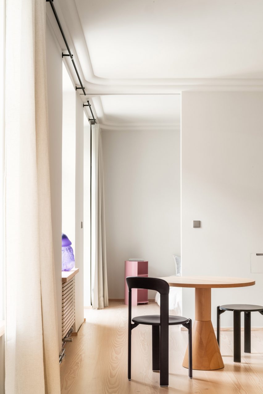
Note Design Studio has updated this formerly characterless apartment in Stockholm to feature bespoke Douglas fir joinery and curvy stucco ceilings designed to suggest cloud formations.

Although the Cloudy Outlines apartment sits within a building dating back to 1842, Note Design Studio says the interior had been stripped of any historic charm and “traces of craftsmanship” during previous renovations.

Kitchen interior of Cloudy Outlines apartment by Note Design Studio
Douglas fir joinery appears throughout the Cloudy Outlines apartment

It also had a poor layout, with a living area that could only be accessed via a dark, lengthy corridor snaking around the back of the apartment while the remaining rooms were awkwardly shaped and difficult to furnish.

The studio decided to redesign the home from scratch, knocking down all of its internal walls to form a more cohesive floor plan.

Interior of Cloudy Outlines apartment by Note Design Studio
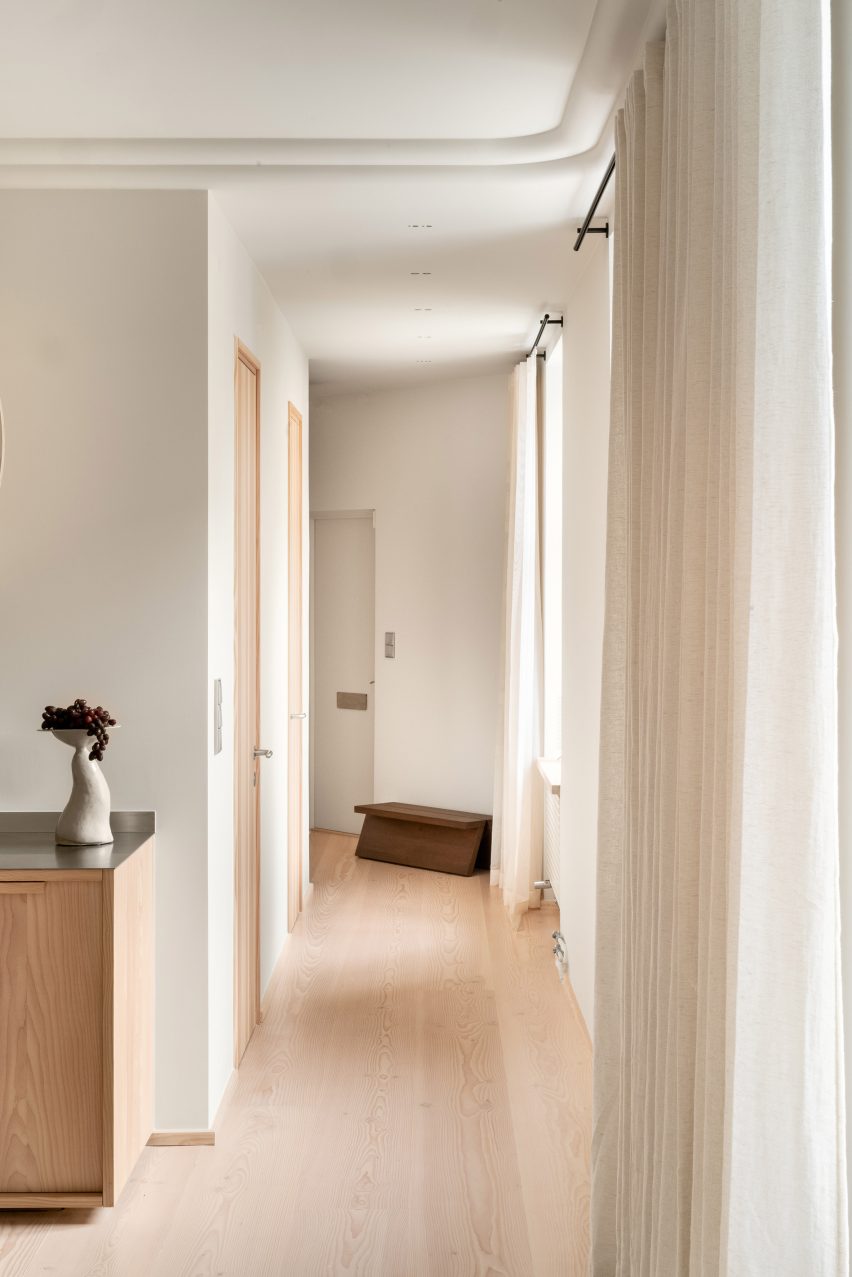
The apartment’s corridor was repositioned to allow for more natural light

The corridor was repositioned to run parallel to the building’s window-lined facade and, as a result, is now flooded with natural light.

Rooms were classically finished with white-painted walls and Douglas fir flooring.

Dining room interior of Cloudy Outlines apartment by Note Design Studio
Curved stucco gives the ceilings a soft, cloud-like quality

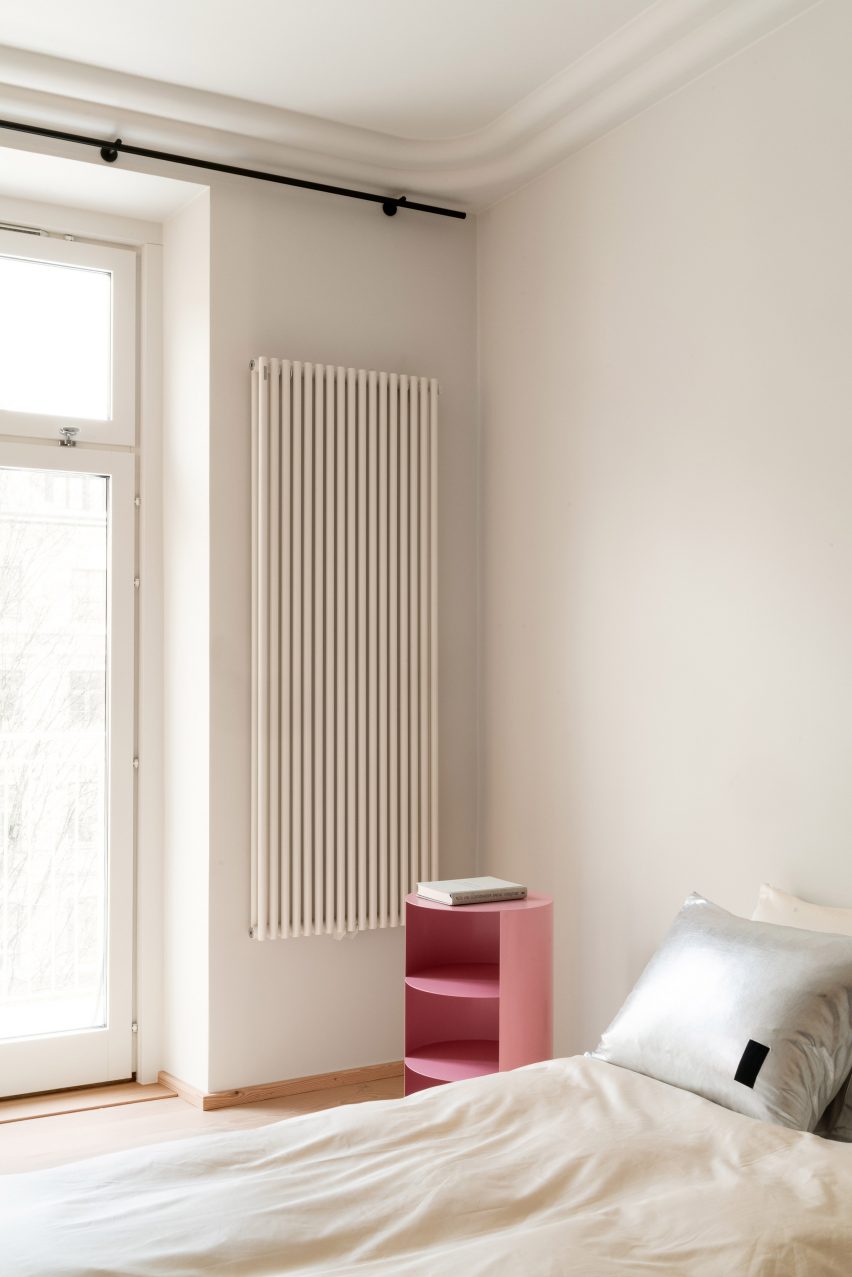
Billowy stucco moulding was added throughout to give a soft “cloudy” quality to the ceilings and provide a contrast with the “rationality and material robustness” of the apartment, the studio explained.

“With the previous interior and finishes removed, a new holistic design was developed with a limited amount of design principles, all with a timeless ambition,” Note Design Studio said.

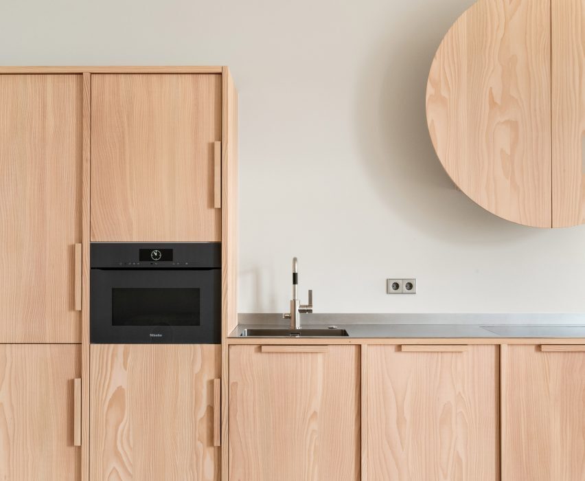
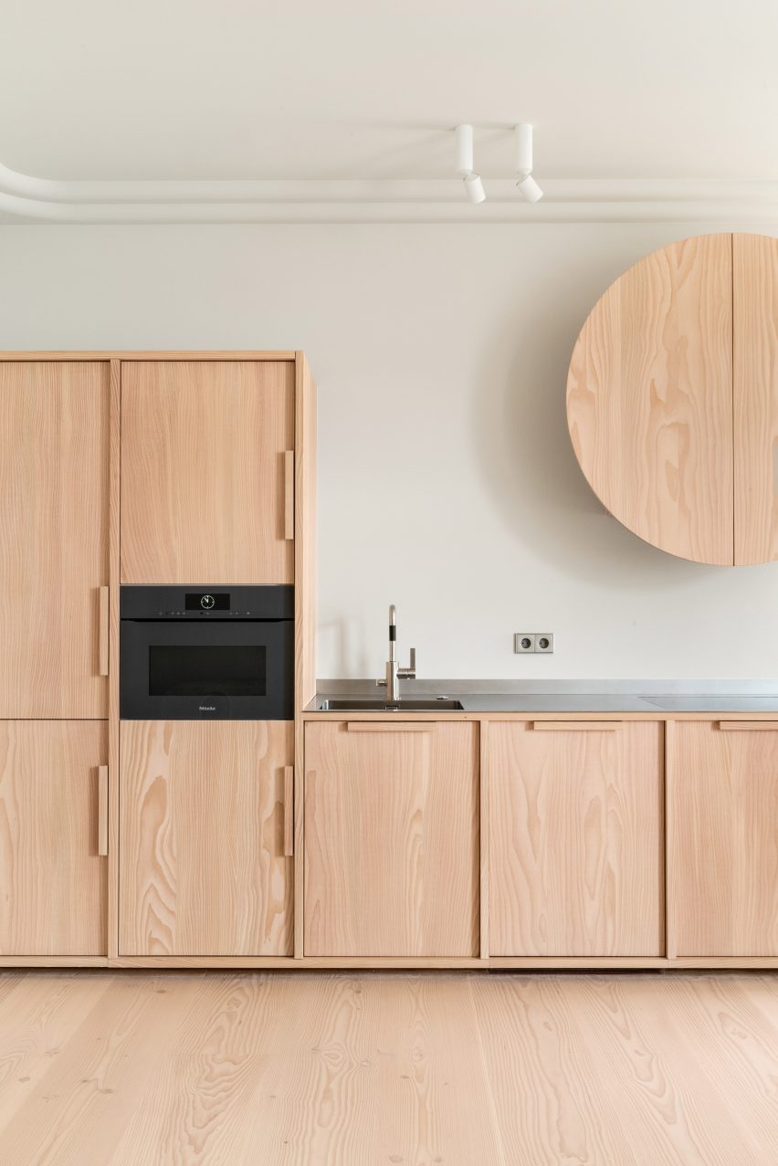
In the kitchen, Douglas fir was used again to create simple cupboards and a striking circular cover for the extractor fan.

The countertop, on the other hand, is overlaid with a sleek metallic finish.

Hallway of Stockholm apartment by Note Design Studio with wooden door
Furnishings in pastel hues disrupt the otherwise neutral colour scheme

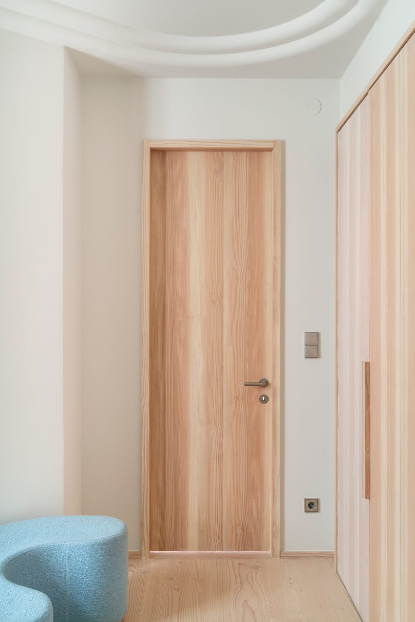
All of the apartment’s doors, as well as its window sills, are also made from Douglas fir.

The material palette only deviates slightly in the bathroom, which features grey-tile surfaces and flecked terrazzo-like flooring.

Bedroom interior of Cloudy Outlines apartment by Note Design Studio
The stucco effect can also be seen in the bedroom

The Cloudy Outlines apartment is one of several residential renovations that Note Design Studio has completed in the Swedish capital, where the firm is based.

Among them is Habitat 100 – an apartment littered with references to the Swedish Grace movement – and the Mantelpiece Loft, which is distinguished by its colour-block bedrooms.

The photography is courtesy of the studio.

Reference

Fred Rigby Studio creates dried flower meadow inside Lestrange store
CategoriesInterior Design

Fred Rigby Studio creates dried flower meadow inside Lestrange store

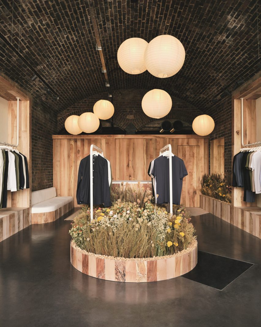
Forest sounds and furnishings made from storm-stricken trees bring elements of nature into this menswear boutique in London’s King’s Cross, designed by local practice Fred Rigby Studio.

The store is the fourth outpost from men’s fashion brand Lestrange and was conceived based on blueprints by biophilic design expert Oliver Heath, combining greenery with reclaimed and natural materials to forge a greater connection to the outdoors.

White clothes rails inside Lestrange store in Coal's Drop Yard
Fred Rigby Studio has designed the latest Lestrange boutique in London

According to Fred Rigby Studio, this approach was chosen to reflect the brand’s philosophy of using renewable and recycled fibres to produce clothing with longevity.

“We wanted to create a sense of calm within the space, which didn’t feel like a generic shop but an interior which told a story behind the clothing and the brand’s ethos,” explained the studio’s eponymous founder.

Overview of wood-lined London shop interior by Fred Rigby Studio and Oliver Heath
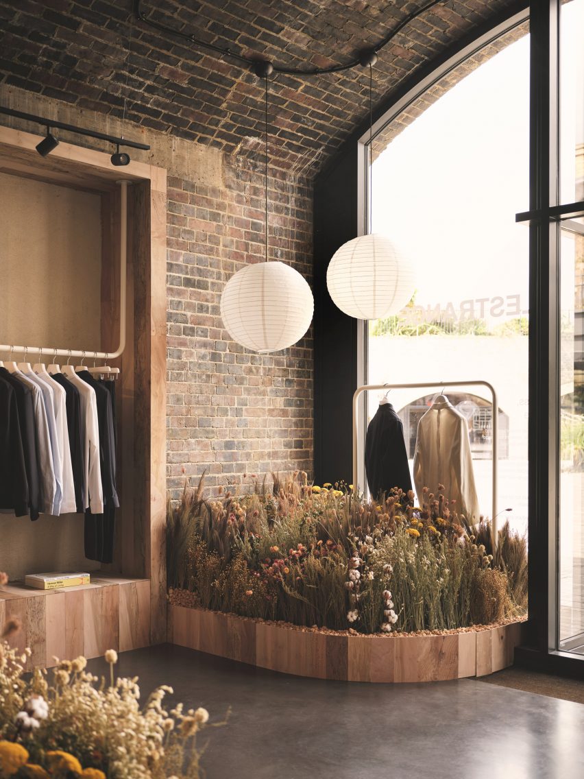
Rice paper lanterns are suspended at varying heights throughout the space

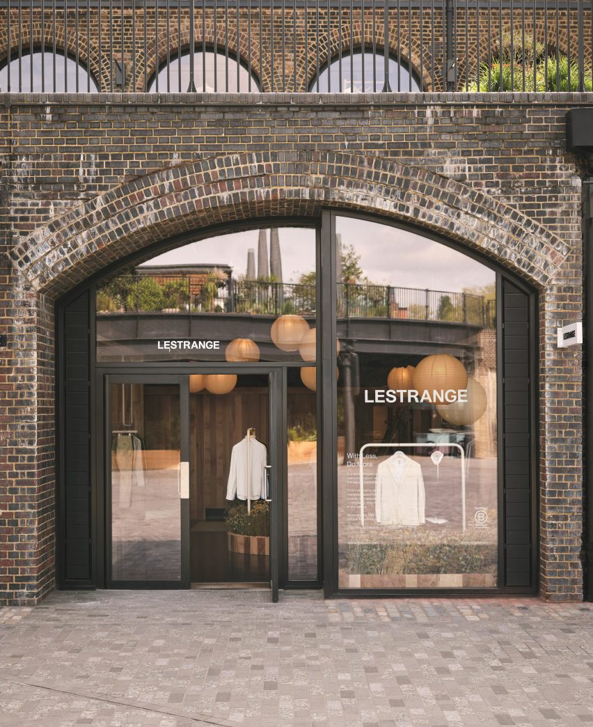
The Lestrange store is set inside the Thomas Heatherwick-designed Coal Drops Yard shopping centre, formed of two converted warehouses that were originally built in the Victorian era to store the vast quantities of coal needed by the capital.
Rigby wanted to incorporate this imposing brick structure into his final design.

Shelves inside Lestrange store in Coal's Drop Yard
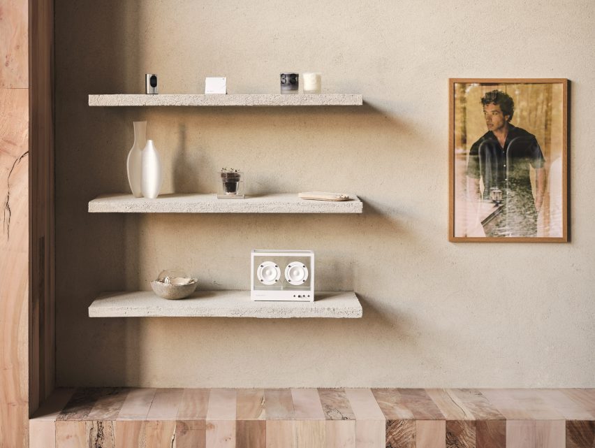
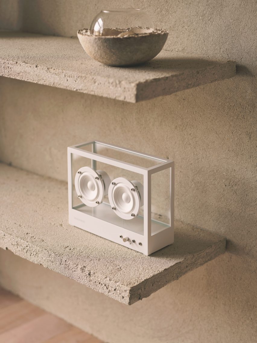
Tactile plaster was used to cover the walls

“We didn’t want to hide this history by covering it up, which would have also entailed using construction materials,” he told Dezeen.

“So we celebrated it, breaking the space up using timber walls and cladding, then adding the rice paper lights to give the space a more intimate feel.”
Speaker on a plaster-covered shelf
The same finish was also applied to a trio of display shelves

Using the existing site as his canvas, Rigby focused on sourcing a tight edit of natural and reclaimed materials.

“There are lots of new materials on the market, but finding those that are produced in quantity and applicable to commercial use can be a challenge,” he said.

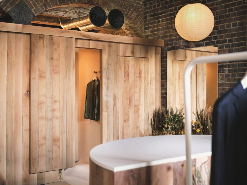
London plane timber – harvested from “storm-stricken and diseased trees” within a few miles of King’s Cross – was used to form the partitions that define the store’s display and changing areas, as well as some bespoke furniture pieces.

British manufacturer Clayworks blended unfired clays with minerals and natural pigments to create the tactile wall finishes, while the terrazzo-style countertops were made by Welsh company Smile Plastics using a mix of recycled plastics from discarded mobile phone casings and chopping boards.

Lestrange store in Coal's Drop Yard by Fred Rigby Studio and Oliver Heath
The changing rooms are clad in panels of London plane timber

As the ultimate counterpoint to the mass and severity of the brick, Rigby conceived the idea of an indoor meadow that meanders through the Lestrange store.

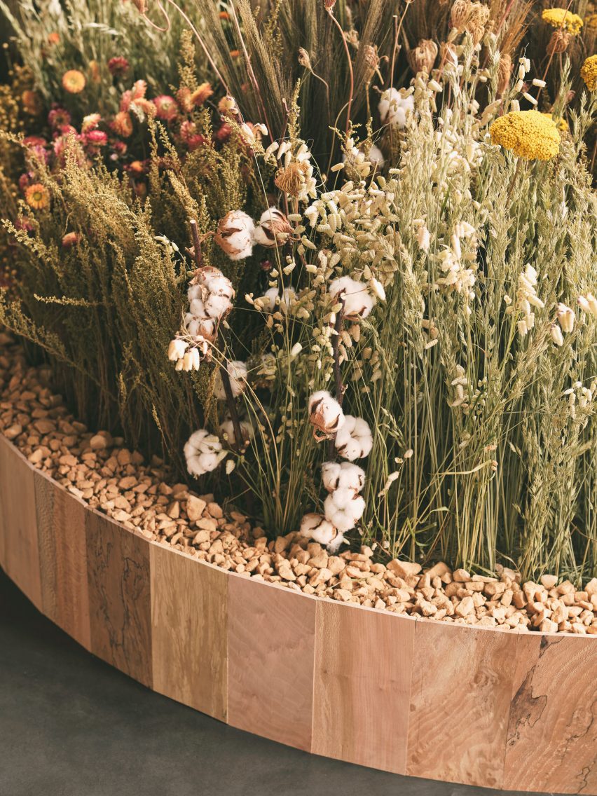
The arrangement of natural dried flowers and grasses was realised by award-winning garden designer Lottie Delamain, integrating a carefully chosen mix of species to reflect the fibres commonly used in apparel manufacture such as cotton and flax.

“We wanted to bring nature inside, using plants linked to the clothes while creating a touch point to the materiality,” said Rigby.

Dried flowers and grasses in a bed of stones inside Lestrange store in Coal's Drop Yard
Garden designer Lottie Delamain created a dried flower meadow for the store

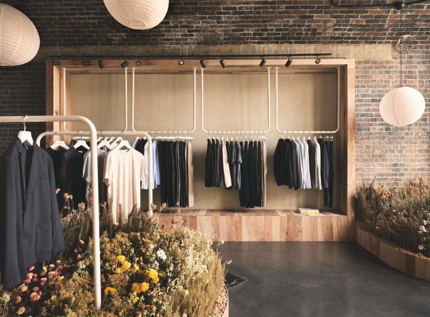
Clothes are displayed on simple white metal rails and the capacious open-topped dressing rooms feature speakers playing forest sounds, complemented by discreet wall lights that cast a subtle glow.

There are also subtle nods to Japanese design in the form of the rice paper lampshades that float at varying heights throughout the store.

Mini dried flower meadow inside London shop by Fred Rigby Studio and Oliver Heath
The flowers are set in wood-framed stone beds

“We started with a mixture of initial references, one of which was a teahouse designed by Charlotte Perriand,” said Rigby.

“We wanted to create a material-focused space with nods to natural materials such as the rice paper lights, which we felt would add to the space and create a sense of calm and stillness.”

Lestrange store in Coal's Drop Yard by Fred Rigby Studio and Oliver Heath
The Lestrange shop is set inside the Coal Drops Yard shopping centre

Previous projects from Rigby, who founded his studio in 2008, include bespoke furnishings for a renovated 1920s office building in London as well as the interiors of Bath’s Francis Gallery, which is set inside a Georgian townhouse.

The photography is by Felix Speller.

Reference

Studio Other Spaces museum courtyard in “canopy of glass and mirrors”
CategoriesArchitecture

Studio Other Spaces museum courtyard in “canopy of glass and mirrors”

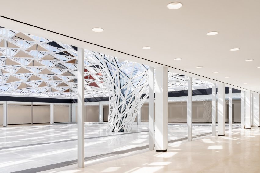
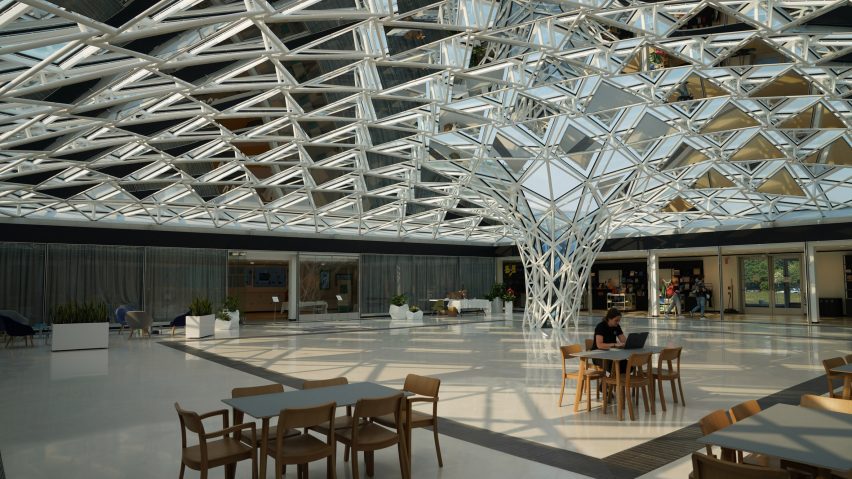
Artist Olafur Eliasson and architect Sebastian Behmann’s firm Studio Other Spaces has created a sculptural work called Common Sky to enclose an open-air courtyard at the Buffalo AKG Art Museum.

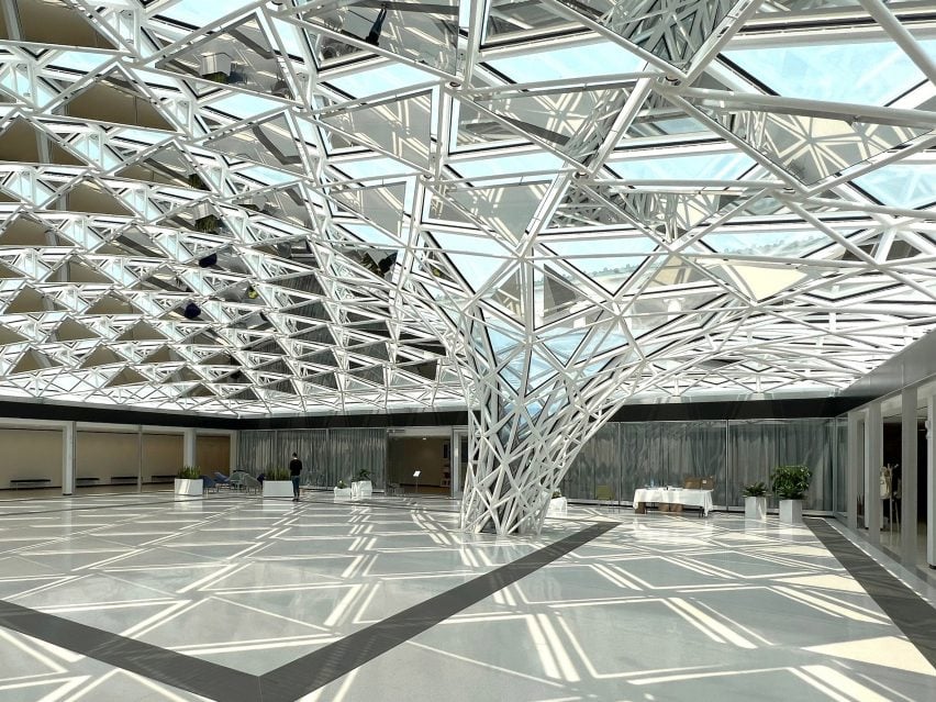
Created as part of a renovation of the museum led by architecture studio OMA’s New York office, Common Sky is a massive glass and mirror canopy created from hundreds of overlapping mirror and glass panels.

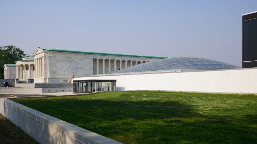
The installation encloses an open-air courtyard in the 1962 modernist Seymour H Knox Building designed by American architect Gordon Bunshaft, which was largely unused.

Glass canopy at buffalo museum
Studio Other Spaces created a canopy to enclose a courtyard in a mid-century Buffalo museum

“Common Sky is a dynamic, sculptural statement that combines a geometric language and a playful, poetic approach,” said Studio Other Spaces (SOS) co-founder Olafur Eliasson.

“As an artwork, it sensitizes you to the world outside, to the surrounding environment of Buffalo.”

“It draws your attention to things that are difficult to measure, and to things that depend on emotion and on your active involvement.”

View of the canopy from under the canopy
The canopy is made of alternating glass and steels layered on top of each other with a steel frame

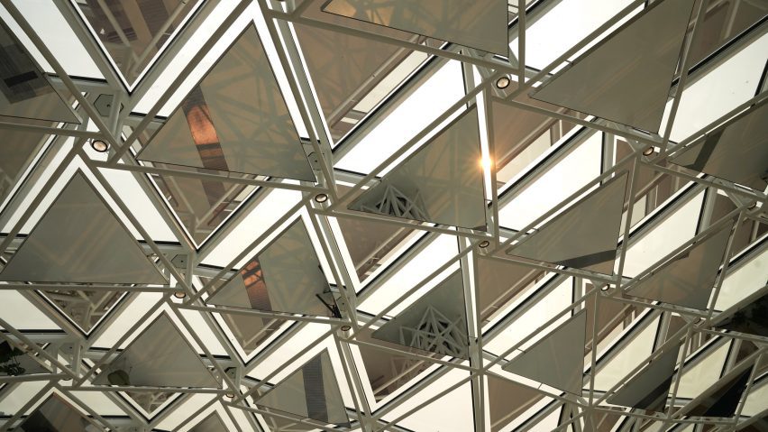
The canopy is made from alternating mirror and glass panels, with two layers supported by white-painted steel, giving the structure depth.

At the centre of the courtyard, the panels coalesce into a funnel that meets the ground at the place where a hawthorn tree once stood in order to reference the history of the space. This tree-like form also supports the structure so as to eliminate the need for an additional support system, keeping the canopy open.

The choice to use mirrors instead of having an all-glass canopy came from a desire to create an insulating effect for the canopy.

Close up view of panels
The glass panels reflect sunlight, minimising heat gain

The mirrors reflect sunlight away from the canopy, which minimises heat gain within the canopy and reduces the need for air conditioning.

Light coming through the alternating panels creates a play of glare and shadow on the stone floor of the space, which is lined by a covered veranda on two sides.

SOS said that the choice in material and form was chosen to keep the connection with the environment that existed with the courtyard through “non-classical architectural” while respecting the style of the Bunshaft design.

Museum exterior view
The new courtyard is accessible to the public

“The structure forms a unique design that takes into account all of the surrounding elements from the Buffalo AKG Art Museum, including the park, and neighboring buildings,” said SOS co-founder Sebastian Behmann.

“We created a site-specific artwork that amplifies the existing situation and combines it with the idea of a modern courtyard.”

The use of glass also mirrors the new museum building designed by OMA for the site, which is enveloped in a glass facade.

As part of the revamp of the museum, OMA also created a new entrance to the Seymour H Knox Building, so the public can access the courtyard from the adjacent Frederick Law Olmsted-designed Delaware Park.

The studio worked with engineer Herwig Bretis from ArtEngineering and Petersberg-based steel constructor Hahner Technik on the project.

Low-light view of the canopy
the canopy funnels down to the ground at the spot where a hawthorn tree once stood

Studio Other Spaces was founded in 2014 in Berlin by Behmann and Eliasson.

Its other works include an “anti-monument” consisting of several diverse buildings in Ethiopia and a colourful, conical glass pavilion for a winery in California.

The photography is by Marco Cappelletti and Studio Other Spaces.

Reference

Studio Wok designs bakery Pan as contemporary take on Japanese culture
CategoriesInterior Design

Studio Wok designs bakery Pan as contemporary take on Japanese culture

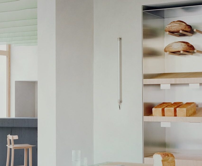
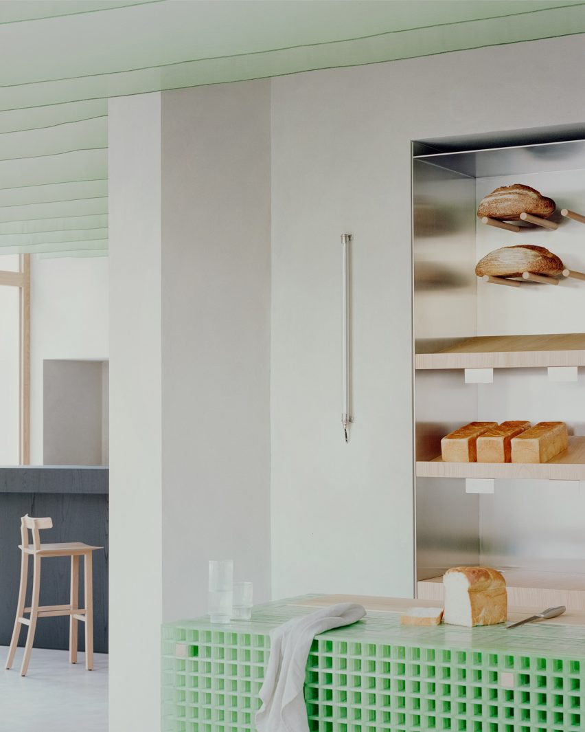
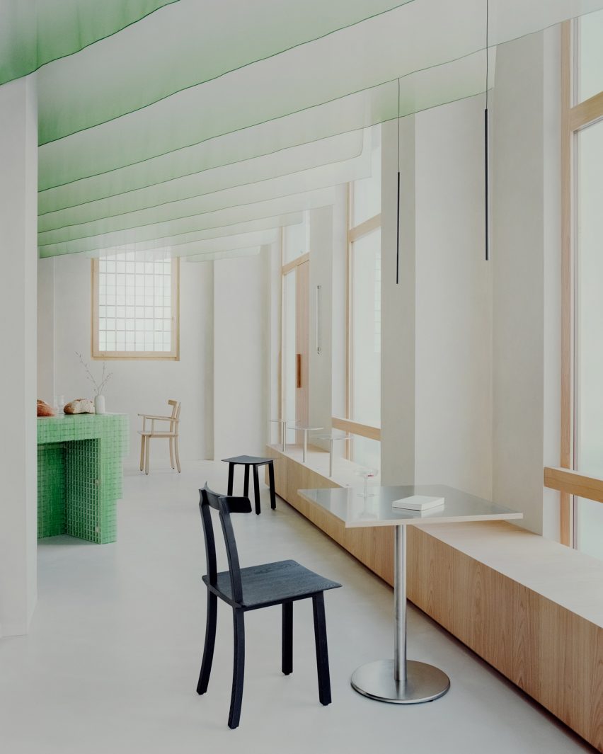
Architecture practice Studio Wok has created a matcha-green counter and Japanese-style fabric panels for bakery and wine bar Pan in Milan’s Acquabella district.

The studio created the eatery, which is led by Japanese chefs Yoji Tokuyoshi and Alice Yamada, to have an interior that would represent a meeting between Japan and Milan.

“There are references to Japanese culture, non-literal and far from stereotypes,” Studio Wok said. “The intention was for a deeper understanding, working on the concept of quality, both in materials and in details.”

Bread counter at Pan cafe
A fibreglass counter sits at the centre of the bakery

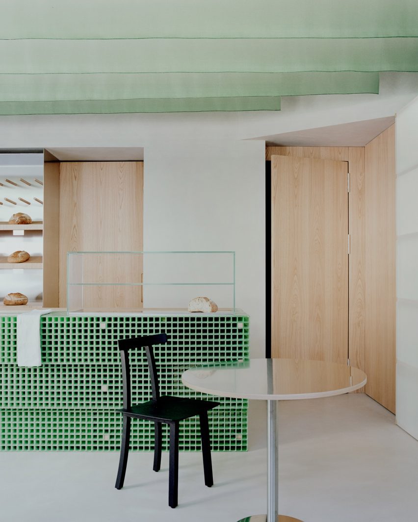
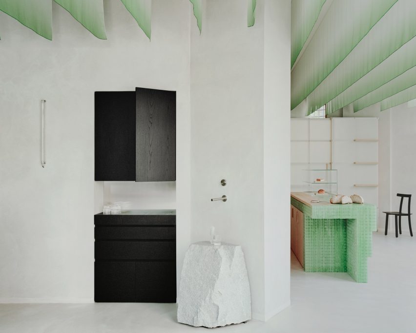
A central bread counter is the “protagonist piece” in Pan’s interior design.

The counter was constructed from panels of fibreglass grid and its eye-catching colour was informed by the vivid green of matcha, an ingredient widely used in Pan’s food, the studio said.

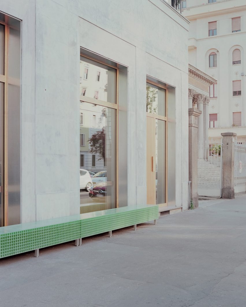
Fibreglass was also used to create an external bench, linking the bakery with the wider neighbourhood.

Fibreglass bench outside Milan bakery
Fibreglass was also used for an external bench

“We did a lot of research looking for a ‘poor’ material that could be ennobled by being used in an innovative way,” Studio Wok told Dezeen.

“Fiberglass grating is a material used in industry but little used in interiors and it seemed perfect to us.”

Ceiling fins in Pan cafe
Fabric hangs from the ceiling

The green of the fibreglass is echoed in vertical fins of hanging fabric that define the ceiling, creating a dialogue between hard and soft elements within the space.

These suspended sheets of fabric are a contemporary update of the traditional Japanese design element of ‘noren’, meaning curtains or hanging divider panels.

Ceiling inside Pan bakery
Wooden seats have views of the street

“The ceiling sheets have the main function of creating a three-dimensional covering to make the environment more welcoming and also to work from an acoustic point of view,” the studio said.

“They create a suspended three-dimensional world, both continuous and ephemeral. Furthermore, they dialogue with natural light during the day and with artificial light in the evening.”

Bathroom sink by Studio Wok
The bathroom has a decorative stone sink

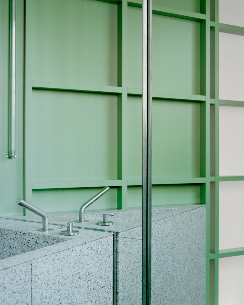
In the bathroom, the green theme continues with a wall and sliding door featuring translucent panels of pressed cellulose, which have been fixed onto a wooden grid frame.

“We were looking for a translucent material to allow natural light to pass through the anteroom. It also reminded us of the rice paper walls, typical of Japan,” Studio Wok said.

The effect of these materials is to create “a green monochromatic box from which the monolithic element of the sink emerges,” Studio Wok said.

The sink was made of a grey-tinted natural stone called Moltrasio.

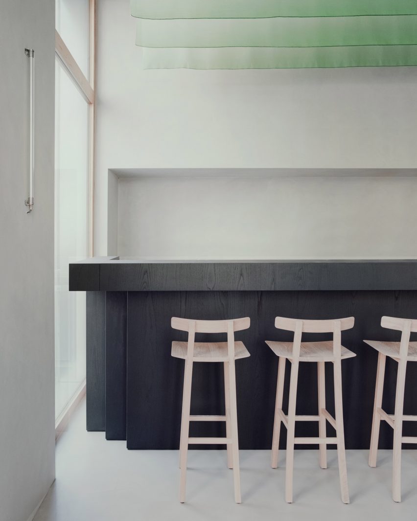
In the main space, light grey walls and floors in hand-trowelled cementitious resin amplify the sense of light, while chestnut was used in both its pale natural form and stained black across integrated and freestanding furniture.

Interior of Pan, Milan
Black-stained chestnut was used for the bar area

The bar area has a more serious, less playful atmosphere, informed by the black-stained chestnut wood of the counter and cabinetry.

Here, a rough-hewn natural stone boulder serves as a water counter, introducing a freeform, sculptural element to the space.

Bar at Pan in Milan
Studio Wok designed the bakery and wine bar with references to Japan

To anchor the space in the local neighbourhood, Studio Wok designed large windows with pale chestnut frames that open the bakery up towards the street.

Seating in the window areas “project the interiors of the venue outwards, creating a hybrid threshold space between the domestic and the urban,” the studio said.

“Our vision for the material palette at Pan was to seek a balance between elements with a contemporary and industrial flavour, with others that are more natural and timeless,” said Studio Wok.

“It’s a celebration of Japan and its dualism between innovation and wabi-sabi spirit.”

Studio Wok has previously designed a cavernous pizza restaurant and transformed a barn into a country home.

The photography is by Simone Bossi.

Reference

Natural Material Studio designs floor-to-ceiling biotextiles
CategoriesSustainable News

Natural Material Studio designs floor-to-ceiling biotextiles

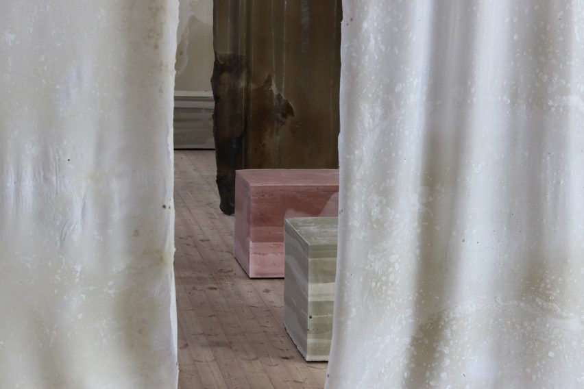
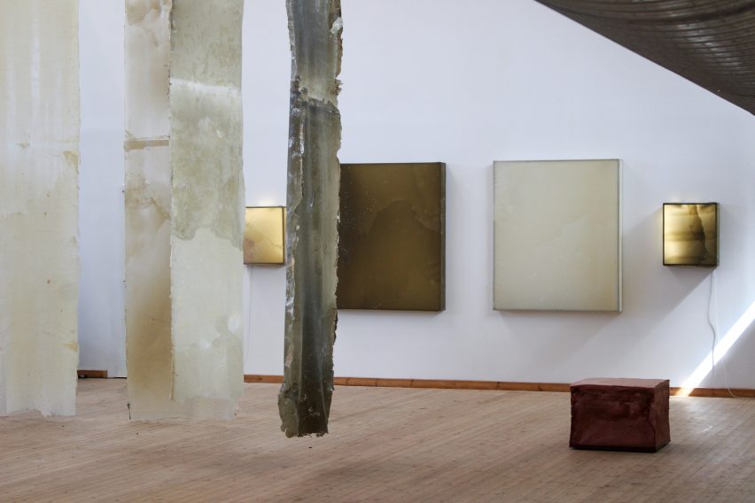
Danish design practice Natural Material Studio has unveiled its Human Nature exhibition, which featured compostable biofoam seating and biomaterial textiles, at 3 Days of Design.

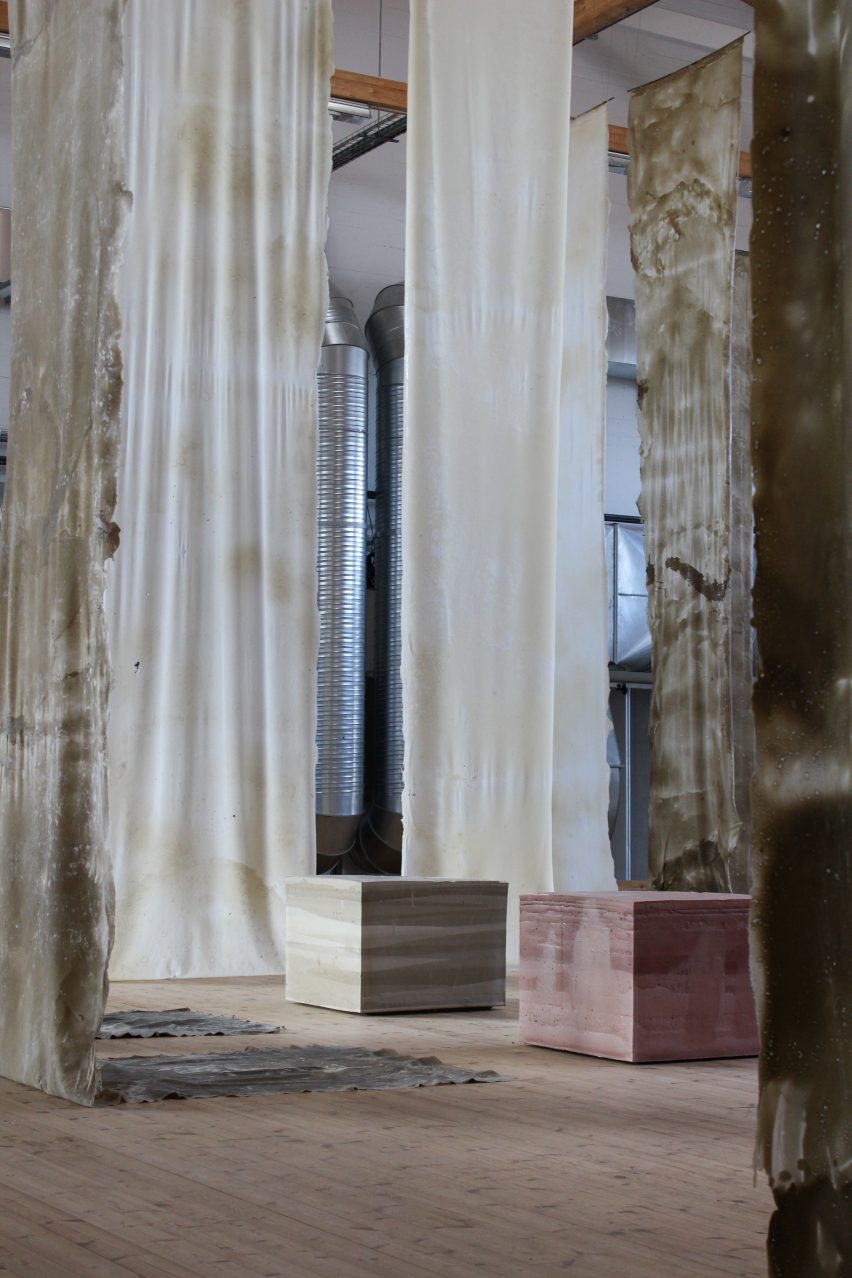
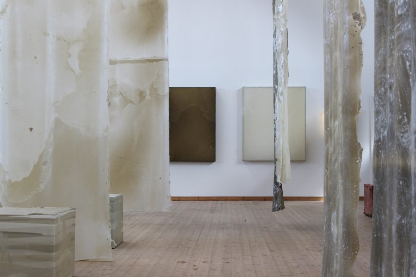
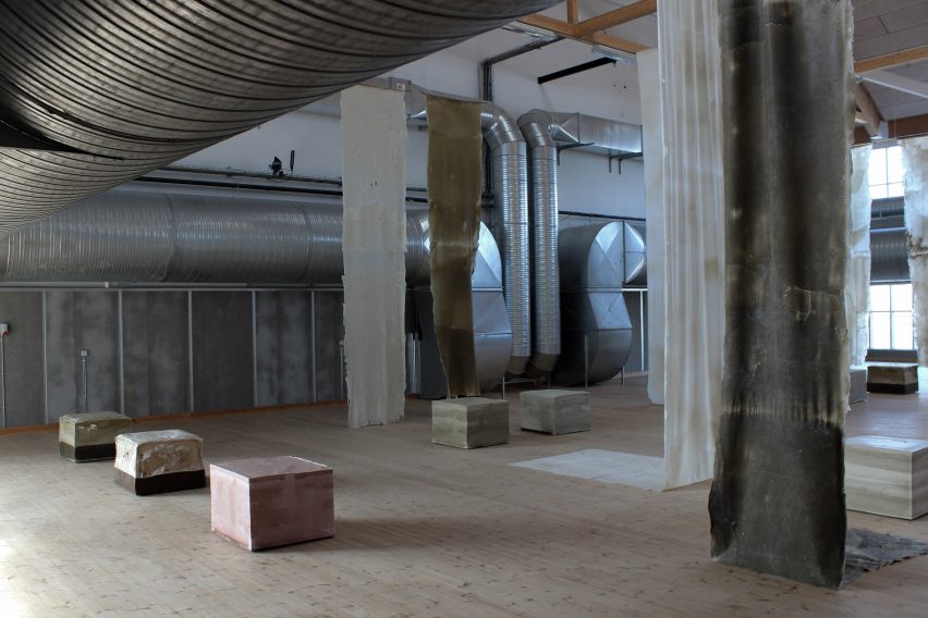
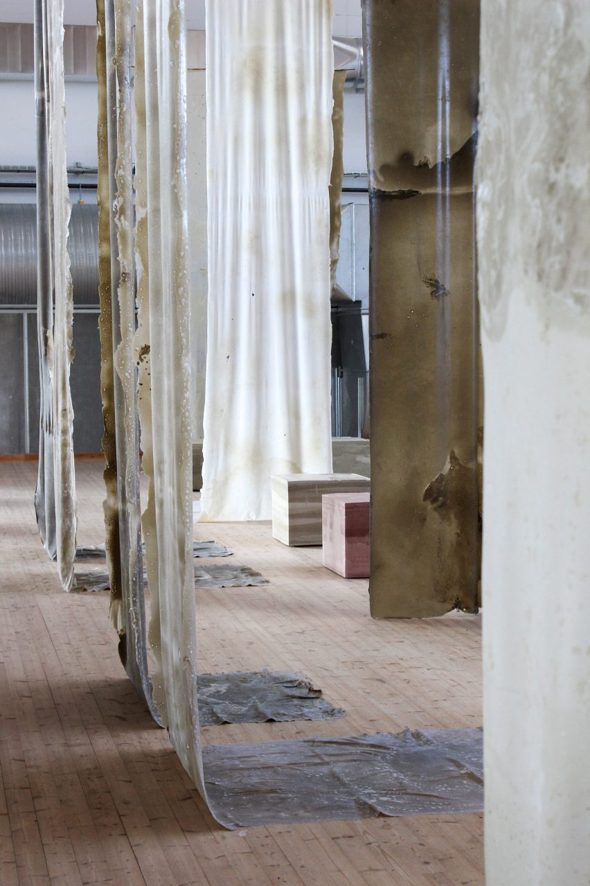
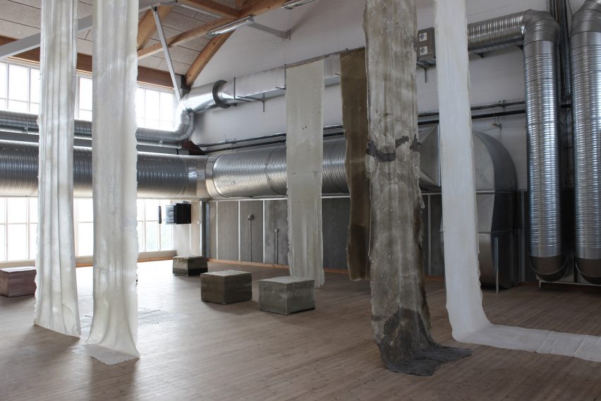
The studio designed the Human Nature installation to take full advantage of the large vaulted space at art gallery Copenhagen Contemporary, hanging handcrafted biotextiles that were up to seven metres long from its ceilings.

“We created a lot of materials for this exhibition, I think around 150 square metres,” Natural Material Studio founder Bonnie Hvillum told Dezeen.

“But what’s been really exciting has been the length and height that we have managed to work with – the textiles are over seven metres long.”

Biomaterials at Human Nature exhibition
Human Nature features metres-long biotextile installations

“It’s something that we are curious about, expanding the scale,” she added. “Spatially, it creates a completely different experience when the textiles come up in the scale and surround us, almost like trees.”

Natural Material Studio uses its own material processes to create its biomaterials. Among the ingredients used for the materials in Human Nature were natural softeners mixed with biopolymers, chalk and clay.

The textiles that were dyed with chalk had a fittingly chalky white hue, while those dyed with clay become greenish.

Chalk-dyed biomaterials by Natural Material Studio
White textiles were dyed with chalk

As part of the exhibition, which was on show during annual design festival 3 Days of Design, Natural Material Studio wanted to showcase how humans and nature interact in the creation of the materials.

To that end, the biotextile pieces were cast in wooden frames to be handled as they were drying, but were otherwise were left to develop naturally.

Human Nature also featured sculptural seating designs that were made by casting Natural Material Studio’s self-developed biofoam in a three-dimensional frame, within which it was allowed to shape itself.

The resulting square seats come in a variety of colours, including pinkish ones made by using red clay.

Red-clay biofoam seating at Human Nature
Compostable biofoam forms sculptural seating

The material can be composted at the end of its life and will biodegrade in about a month, according to Hvillum.

“The material is biodegradable – you can give it to your chickens,” Hvillum said. “My chickens eat it, I can’t leave it outside!”

The exhibition also includes lighting works, which were constructed by attaching the biotextiles to a metal frame above an LED light, and which mark the first time Natural Material Studio has created lighting designs.

“For a long time we were trying to bring the materials onto the wall,” Hvillum explained.

“This is basically the material suspended over material frames and then we use a LED light to try to work with them like this.”

Lighting designs by Natural Material Studio
Natural Material Studio designed lights for the first time

Describing the installation as a “spatial art piece”, Natural Material Studio said the idea was also to allow visitors to touch and interact with the biomaterials, which represent years of research and prototyping.

The handcrafted nature of the biomaterial process comes through in the finished design, with the seats and textiles having kept their rough surfaces and textural qualities.

Natural Material Studio at 3 Days of Design
The natural materials were showcased in an industrial setting

The company is currently working with the Danish National Museum, which conducts research into the longevity of materials such as plastic, to look at how the biomaterials will age.

“They have taken in my materials and we’re going to be having a look at how they age over time,” Hvillum said.

“They can speed the process up so that one month is equivalent to 30 years, so we can very easily see what happens with these materials.”

Interiors at Human Nature exhibition at 3 Days of Design
The installation was on show at Copenhagen Contemporary

Hvillum is also interested in how the biomaterials can be “kept alive”.

“With this research project we try to understand how they change over time and what we can do to prolong life, for example, moisturising them,” she said.

“It’s keeping them alive, basically, which is mind-blowing – actually thinking that we need to water them, just like I water my plants because it’s organic material. You give them a little spritz to moisturise them.”

Biotextiles hanging from ceiling
Bioxtextiles surround visitors “like trees”

Hvillum hopes that the Human Nature exhibition will showcase more of the process of working with different materials, as well as what the materials can do.

“I feel like we sometimes as designers want to force the materials into certain things, and I wanted to really be honest about the process and about what the materials actually do,” she said.

“I think it works quite well as an installation to come in and really start living with these materials, experiencing them and slowly start building these relations.”

Other projects on show at 3 Days of Design include a farmers market inside the Frama store in an old apothecary and an exhibition of emerging designers inside a woodworking factory.

Human Nature was on show from 7 to 9 June 2023 as part of 3 Days of Design. See Dezeen Events Guide for information about the event, plus a list of other architecture and design events taking place around the world.

Reference

Camille Walala takes colourful style to the max in self-designed studio
CategoriesInterior Design

Camille Walala takes colourful style to the max in self-designed studio

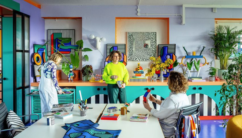
London designer Camille Walala has worked with carpentry workshop Our Department to fit out her own studio with a no-holds-barred version of her colourful design style.

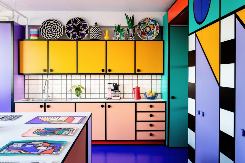
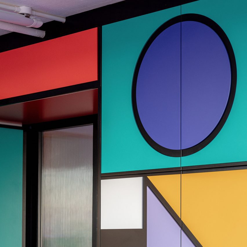
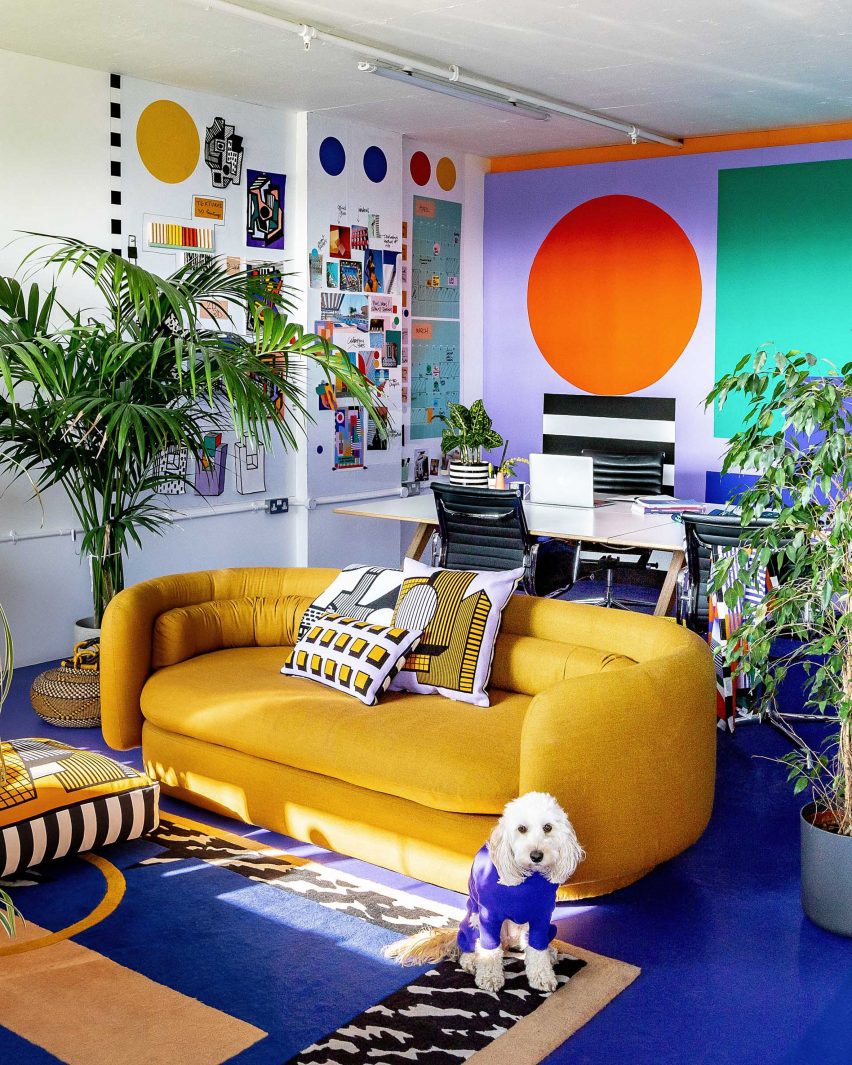
Electric blue floors, graphically patterned cabinetry and a kitchenette with cartoon-like proportions feature in the space, which is located in the Regent Studios building off Broadway Market in East London.

Photo of a brightly coloured kitchenette in Camille Walala's London studio
Camille Walala designed her studio to include a kitchen with exaggerated proportions

The seventh-floor space attracted Walala and her studio manager Julia Jomaa with its sweeping views.

Knowing they would be in no hurry to vacate, the duo took their time with the design, working side by side in the studio for over a year while adjusting the position of their space-dividing furniture until they arrived at a layout with the perfect functionality for them.

Photo of Camille Walala and her studio team in their London office in Regent Studios
The studio chose to embrace colour in the design

Once they decided to embark on the interior design, it was not a given that they would embrace Walala’s signature bold colour palette, as they worried about it potentially clashing with future work.

“We were like, how colourful should we go?” Walala told Dezeen. “Should we keep it quite simple or should we actually go for it?”

But ultimately, she says the desire to feel inspired by their workspace and “inhabit the aesthetic fully” won out.

Photo of the workspace in Camille Walala's London studio
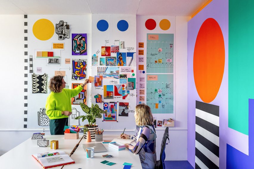
The studio is divided into two rooms including one for “clean” computer-based work

The studio is divided into two rooms – one for “clean” computer-based work and the other for “messy” activities such as painting and model making.

Walala and Jomaa created a 3D model of the interior in SketchUp before bringing in their favourite carpenters” Our Department – a studio specialising in design and fabrication for the creative industries – to realise the design.

The duo of Simon Sawyer and Gustave Andre built all of the elements in the space with a focus on achieving clean lines and pure block colours along with maximum functionality.

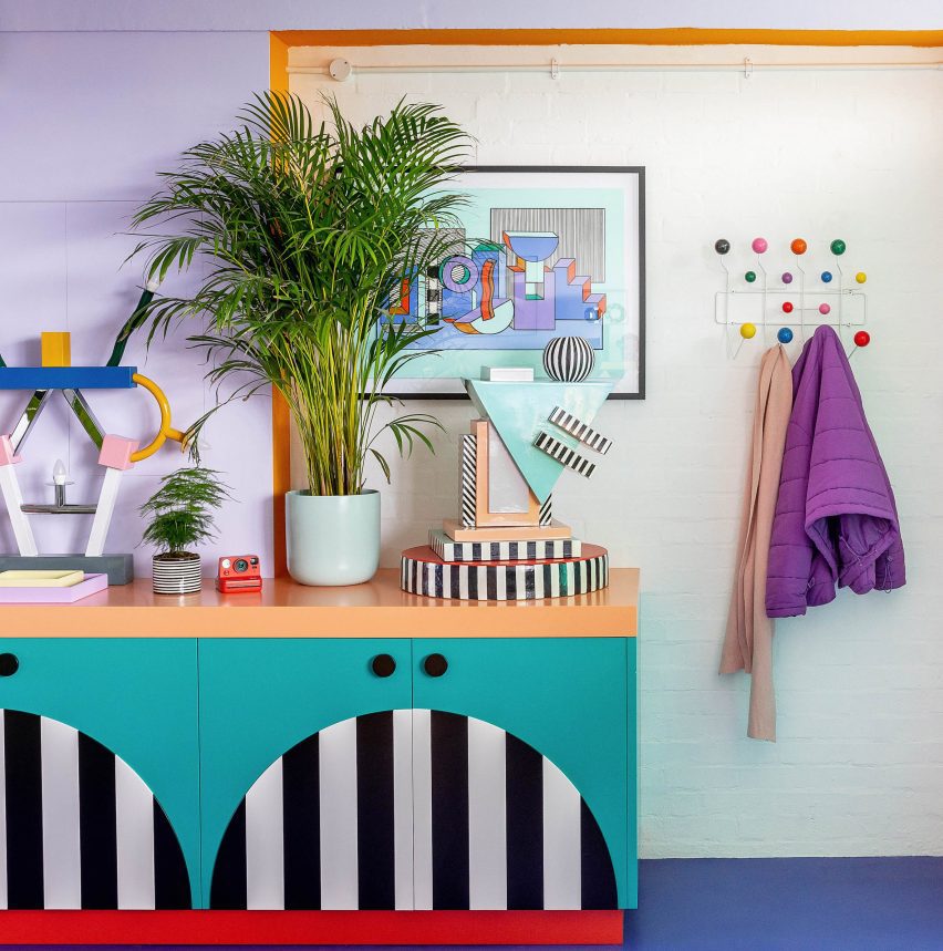
Close-up photo of colourful cabinetry at Camille Walala's studio showing relief pattern of cut-out shapes glued onto black MDF doors
Our Department achieved clean lines by sticking coloured shapes onto MDF doors

For the cabinetry, they used doors made of melamine-faced medium-density fibreboard (MDF) and applied a decorative technique they had used on previous Walala projects.

This involved CNC-cutting shapes out of thin MDF, before spraypainting and precisely glueing them onto the doors to create a graphic pattern while avoiding the fuzzy lines that can sometimes come from painting directly onto surfaces.

In the kitchen, the group worked together to exaggerate proportions as much as possible, with Walala saying she dreamed of achieving a “Bart Simpson kitchen” through elements such as chunky handles and bold grout.

“We designed the Lego House a few years ago, this really colourful house,” she explained. “Especially the kitchen in that space was really quite bold and almost like a cartoon, and we thought we should do something similar in our studio.”

By contrast, a more subtle feature is the double sliding door between the studio’s two rooms, which consists of a transparent fluted screen set within a black frame.

While it may be less attention-grabbing, Jomaa says the mesmeric effect of the fluted panels sliding against each other is like a “little animation of colour”.

Photo of a colourful office space with a yellow sofa in front of a big worktable
The workspace also includes natural details like custom tulipwood desk legs

There are also a few natural wood elements throughout the interior such as tulipwood desk legs to balance the liberal use of colour.

As with all residents of Regent Studios, Walala will need to return the rented space to its original condition when her studio eventually leaves, so there are no permanent fixtures and everything is designed to be dismantled.

Even the central “wall”, which contains floor-to-ceiling storage on one side, is freestanding. But the team used kitchen-unit feet to wedge it against the ceiling for stability.

Photo of details in a colourful office space with bold cabinetry, bright blue floors and plants and colourful ornaments on display
Everything is designed to be dismantled when the studio one day moves out

Walala and Jamaa have been working together for eight years and started off sharing a desk in a basement studio. Their recent projects have included murals, installations and a proposal for a car-free Oxford Street.

Walala is often seen as being part of the New London Fabulous wave of maximalist designers, alongside Yinka Ilori, Morag Myerscough and Adam Nathaniel Furman.

The photography is by Taran Wilkhu.

Reference

Ringo Studio positions sex toys in athletic-themed room for Contact Sports
CategoriesInterior Design

Ringo Studio positions sex toys in athletic-themed room for Contact Sports

Brooklyn-based Ringo Studio has reimagined the experience of shopping for sex toys, creating a store in New York modelled on a collegiate locker room.

The Contact Sports shop on Mercer Street in Soho is designed to feel very different to the typical spaces in which products for sex are purchased.

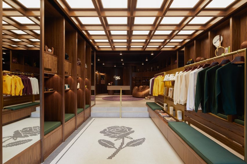
Store interior with walnut shelving and mosaic floor
The store interior features walnut panelling and mosaic flooring

“In a survey conducted before launch, the majority of people reported feeling uncomfortable walking into a sex store,” said the studio. “Uninviting exteriors felt intimidating, the aisles were hard to navigate, and the shelves stocked hundreds of products that were hard to decipher.”

Working with Ringo Studio founder Madelynn Ringo – who has designed retail spaces for Glossier, Bala and Our Place – the brand devised a shopping experience based around sport, and used cues from this world to inform the interiors.

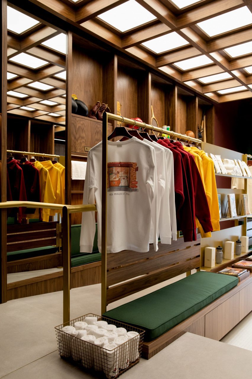
Merchandise displayed on brass rails and shelving
Merchandise is displayed on brass rails and shelving

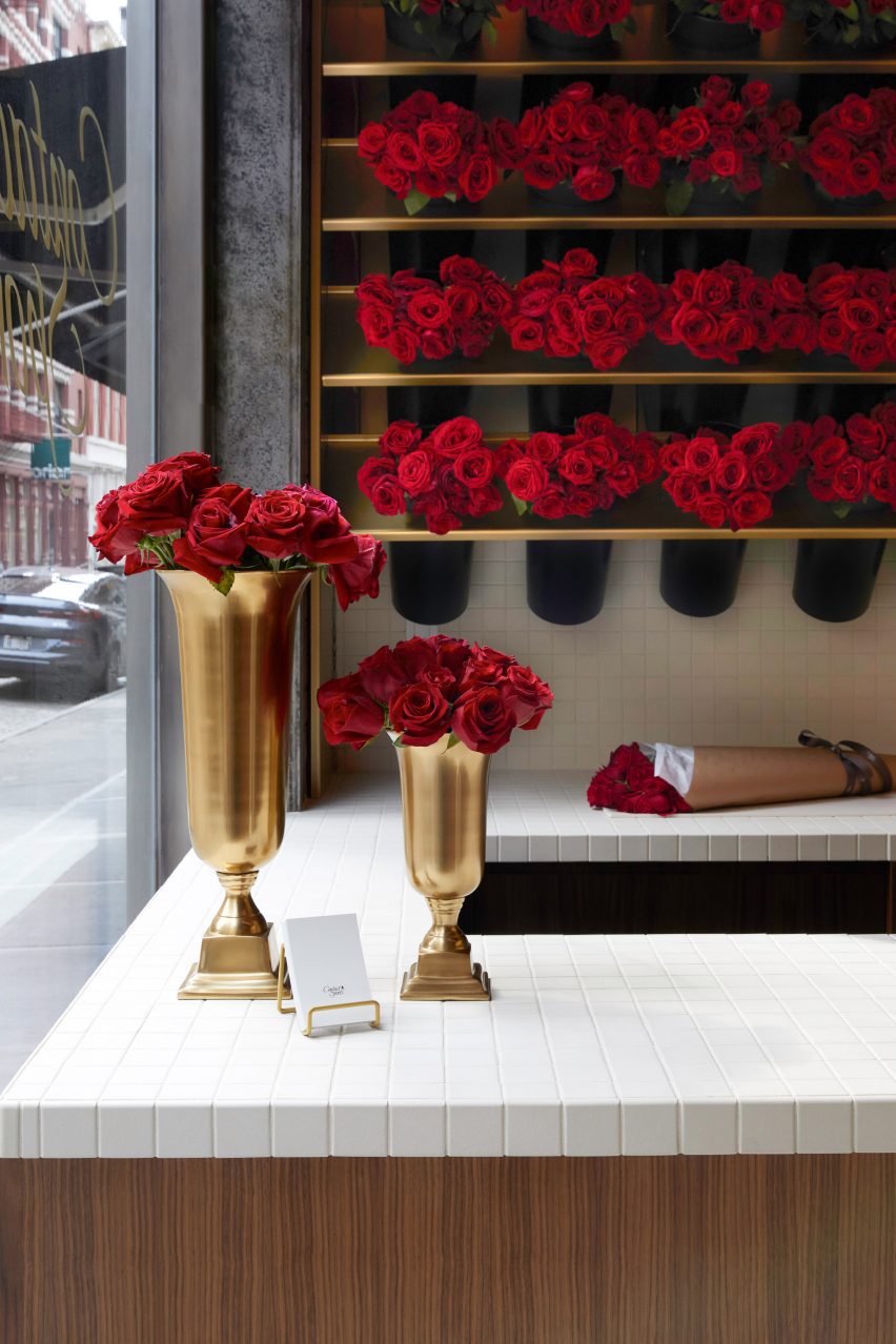
The retail space includes an area at the front that sells long-stem roses in singles or bundles, including a 15-foot (4.5 metre) wall on which the fresh-cut red flowers are stored.

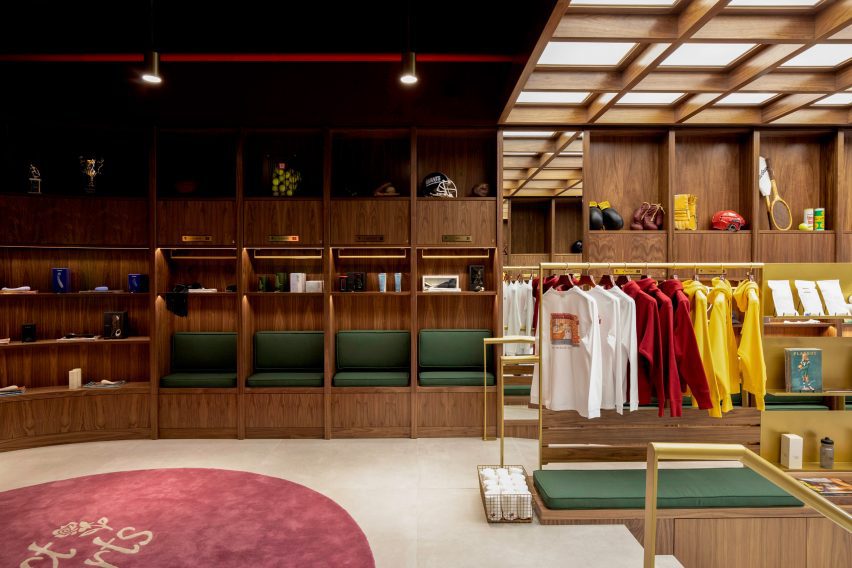
Beyond, dark walnut panelling, brass rails and shelves, and green cushions give the store a collegiate atmosphere, while mosaic floor tiles and baskets of towels evoke a locker room.

Walnut panelling forms cubby holes for displaying products
Walnut panelling forms locker-like cubby holes for displaying products

Vintage sporting ephemera like tennis rackets, boxing gloves and American football helmets are displayed on higher shelves.

Below, the selection of “entry-level gear and sensual gifts” from brands such as Kiki de Montparnasse, Lelo, Dame, Maude, Future Method and more are merchandised in locker-style cubbyholes.

“Contact Sports flips the traditional model on its head and takes a more curated approach, stocking only 70 products at launch,” the studio said.

“Their team spent more than a year vetting a category that includes tens of thousands to offer only the best of the best, with unexpected touches that enhance the full experience around the sport.”

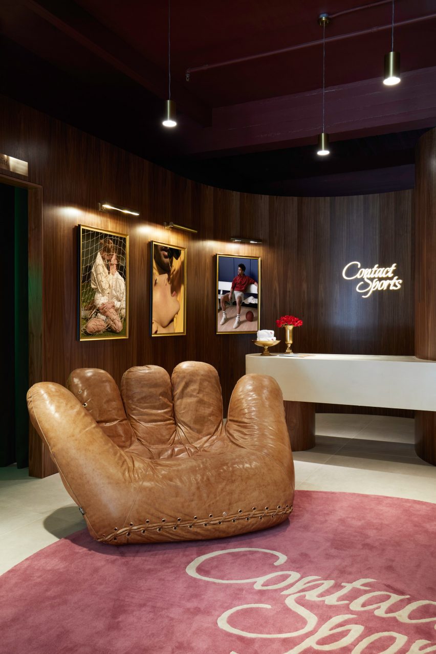
Jonathan de Pas baseball glove chair in front of counter
The store features a Joe Chair shaped like a baseball glove

The space is illuminated from above by a light box behind a wooden lattice, while softer lighting is installed in the cubbies.

An iconic chair shaped like a giant baseball mitt by designers Jonathan de Pas, Donato D’urbino and Paolo Lomazzi sits next to the white counter, above which the brand’s cursive logo glows in neon.

Long-stem red roses displayed in trophy-like vases
Long-stem red roses are sold at the front of the store

The sex toy industry has grown significantly in recent years, as taboos have broken and social acceptance has widened. See some of the most unusual sex toys featured on Dezeen.

However, “the retail experience itself had yet to evolve,” said the Contacts Sports team, which hopes the store will change how shopping for sex gear should look and feel.

The photography is by Anna Morgowicz.

Reference

Studio RC embeds equestrian complex into Mexican landscape
CategoriesArchitecture

Studio RC embeds equestrian complex into Mexican landscape

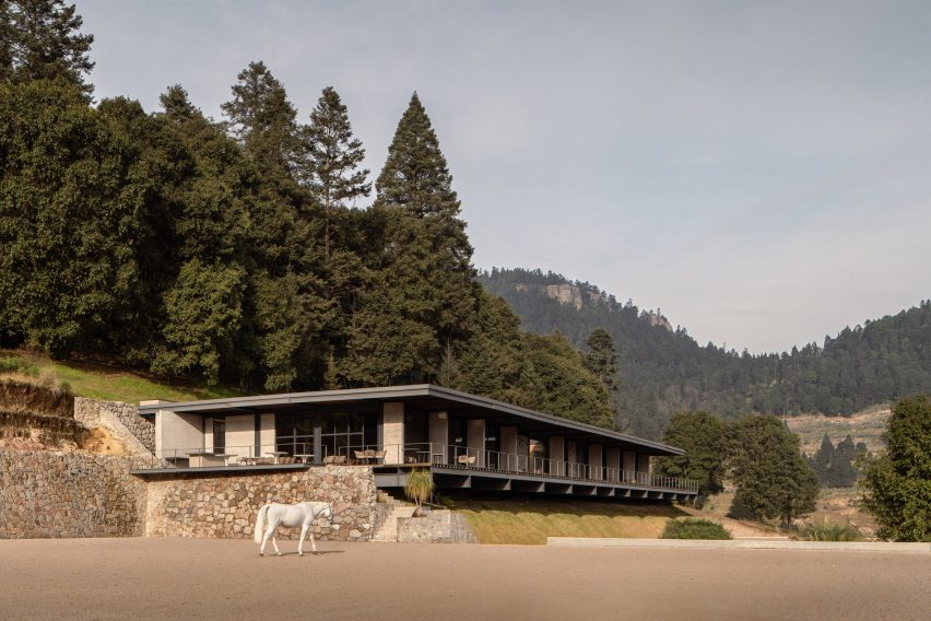
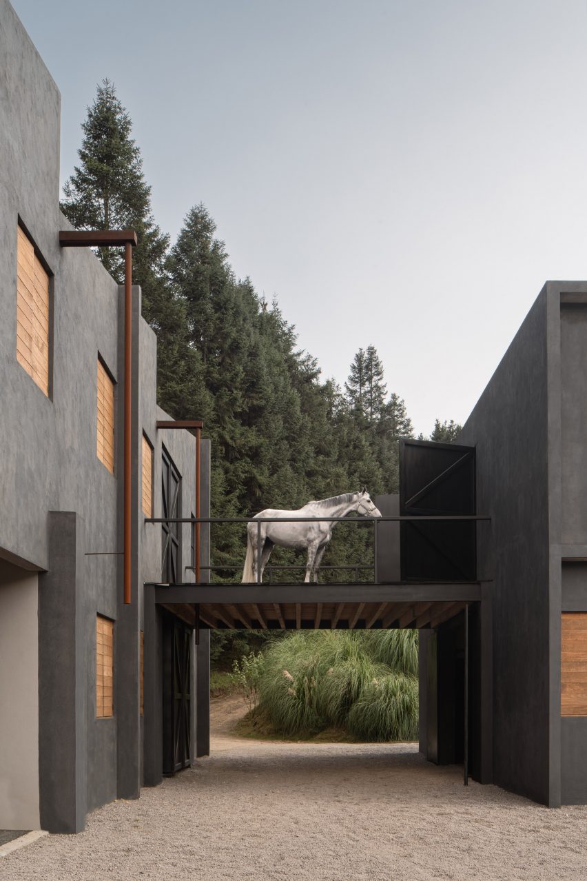
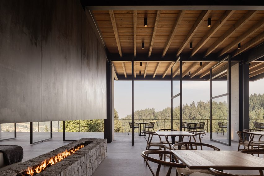
Stables linked by steel bridges and a clubhouse with a cantilevered terrace feature at the Hípico Piedra Grande equestrian complex in rural Mexico, designed by Studio RC.

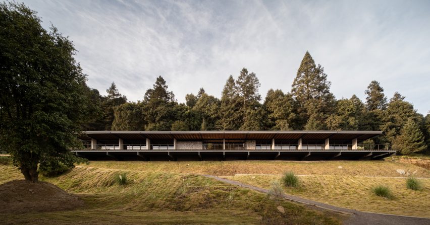
Located in Huixquilucan in the State of Mexico, the complex includes a rectilinear clubhouse and a block of stables surrounded by gravel roads and green areas and meandering riding trails.

Hípico Piedra Grande equestrian complex is located in rural Mexico

Mexican architecture office Studio RC  arranged the building around a central patio and positioned it on the hillside to complement the natural surroundings.

The low-slung clubhouse was constructed from a skeleton of columns and steel beams, which are also exposed on the interior.

Rectilinear clubhouse with a cantilevered terrace by Studio RC
The clubhouse’s terrace cantilevers off the hillside

The building’s facade is defined by rugged stone walls and a timber roof – materials sourced from the area.

“The project seeks to alter the site as little as possible, looking for a contemporary language that in turn was appropriate for the context,” said the studio.

Steel bridge with a horse standing on it
Steel bridges connect the stables

A gap was created between the clubhouse’s stone retaining walls and its interior spaces in order to create cross ventilation, while the building’s terrace gently cantilevers off the hillside.

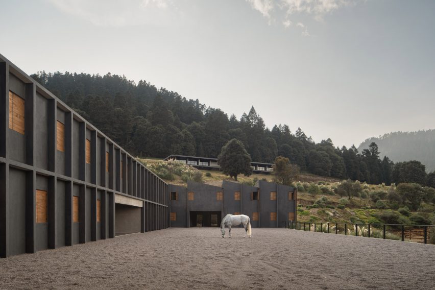
Spread across three modules on two levels, the stables are positioned below the clubhouse and are connected by steel bridges, which create another open central patio used for walking horses.

Sawtooth roof on a grey stable
One module is topped by a sawtooth roof

Dark grey concrete was used for the angular facade, while each module is characterised by sets of wooden shutters.

The stables’ uniform geometry is interrupted only by a sawtooth roof that tops one of the modules and takes advantage of natural light during the day and also captures rainwater for reuse.

Inside, Studio RC chose a recycled material for the stables’ flooring, which was designed to control the acoustics as well as provide suitable traction for walking horses.

The clubhouse interiors feature a similar simplicity. Board-formed concrete walls match pared-back neutral furniture while floor-to-ceiling glazing provides expansive views of the surrounding greenery.

Minimalist interior design within clubhouse at equestrian complex
The clubhouse features minimalist interiors

Elsewhere in Mexico, 1540 Arquitectura created stables from a series of triangular structures while Matias Zegers Architects inserted a skylight along the ridge of a stable near Santiago in Chile.

The photography is by Cesar Belio

Reference