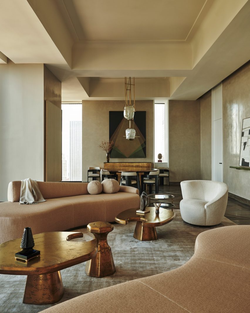
Child Studio designs Mayfair pied-à-terre with mid-century modern details
CategoriesInterior Design

Child Studio designs Mayfair pied-à-terre with mid-century modern details

Local practice Child Studio has designed a house in a mews courtyard in London that mixes mid-century modern furniture with custom-made pieces in a nod to fashion designer Yves Saint Laurent’s home.

Child Studio designed the home, which was created for a hotelier and restauranteur, as a space for dining, entertaining and hosting parties.
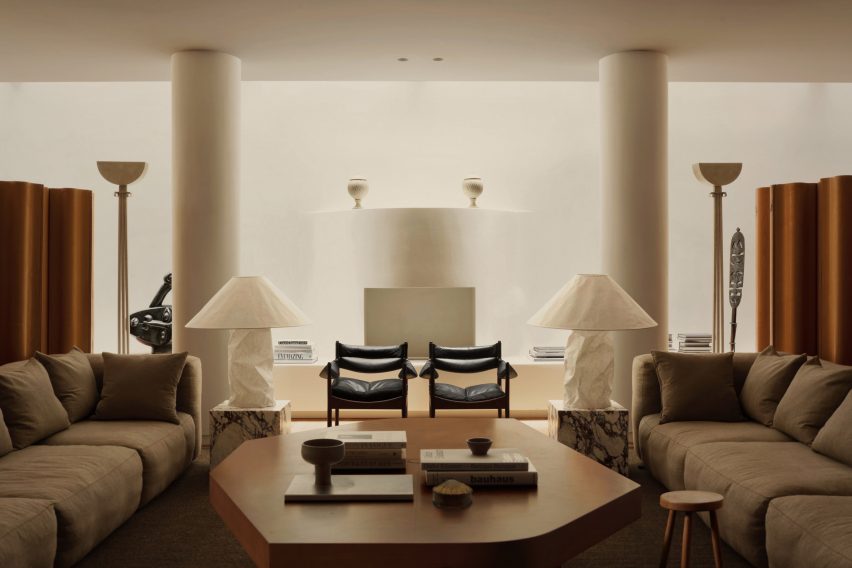
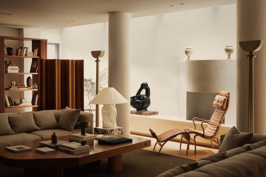
Lounge in Mayfair home by Child Studio
A white curved fireplace sits at the centre of the lounge

It centres around a spacious lounge that was informed by the grand salon in fashion designer Saint Laurent’s Paris home.

Informed by the way Saint Laurent’s residence displayed his collection of artworks, the Mayfair home is a cornucopia of furniture pieces by iconic mid-century modern designers.
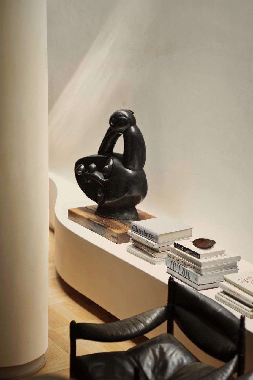
Sculpture in London home by Child Studio
Sculptures and vintage furniture decorates the space

“We worked closely with the client to create a space that reflected his personality and interests, encompassing art, design, literature and travel,” Child Studio founders Che Huang and Alexy Kos told Dezeen.

“This approach made us think of Saint Laurent’s salon – an eclectic interior where design objects and art pieces from different eras and parts of the world are assembled together, forming a highly personal environment.”
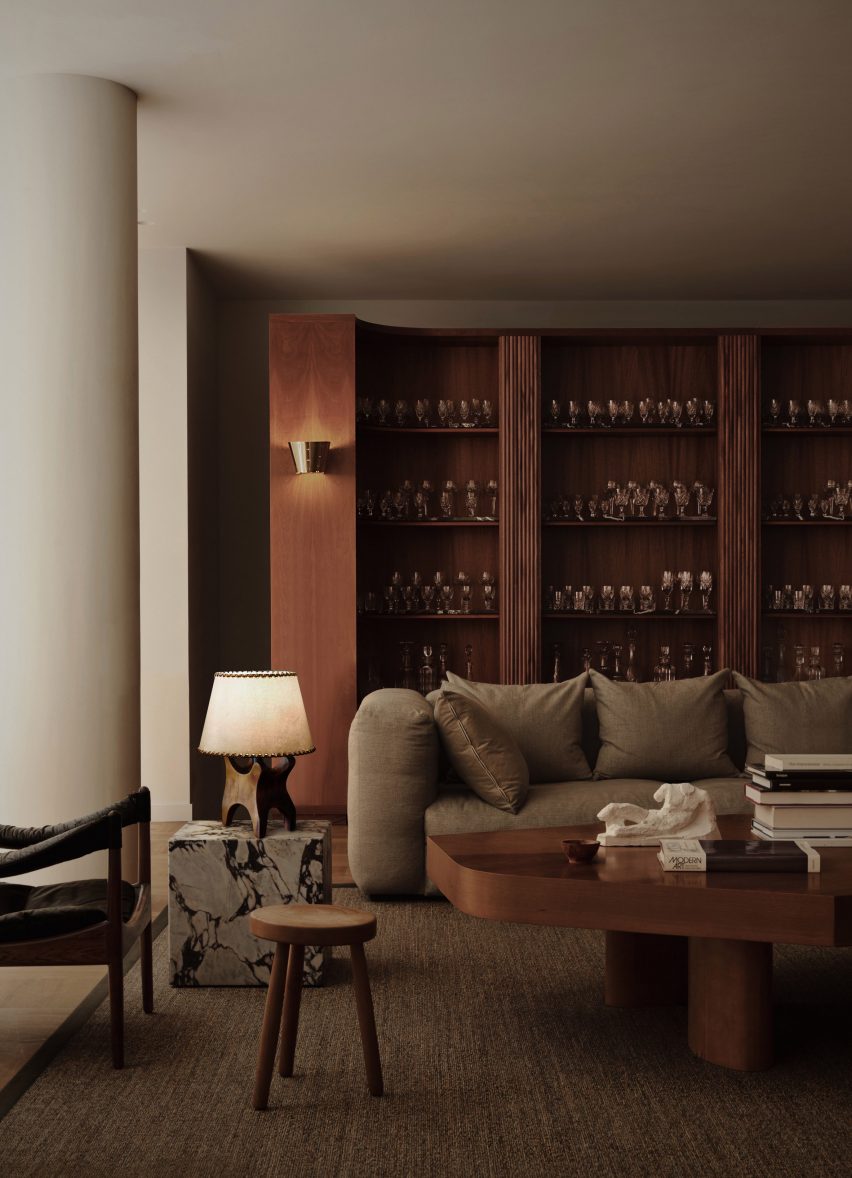
Wooden walls in Mayfair residence
Wooden shelving divides the room

A large open space in the residence, with narrow full-length skylights on each side, was given a vintage feel through the addition of wooden library walls.

These divide it into a lounge area as well as spaces for dining and studying.

“We were interested in finding an authentic design language for this project, balancing the art deco references with the 1960s and 70s modernism,” the studio added.
Mid-century modern interior by Child Studio
Child Studio designed a wooden table for the room

Among the furniture and lighting used for the residence are Japanese paper lamps by industrial designer Ingo Maurer and the “Pernilla” lounge chair by Swedish designer Bruno Mathsson, which have been juxtaposed with furniture designed by the designers themselves.

“We paired vintage Scandinavian furniture by Bruno Mathsson and Kristian Vedel with playful lights by Ingo Maurer and Alfred Cochrane,” Huang and Kos said.

“The cabinetry and tables were designed by Child Studio to unify the interior and accommodate all functional requirements.”
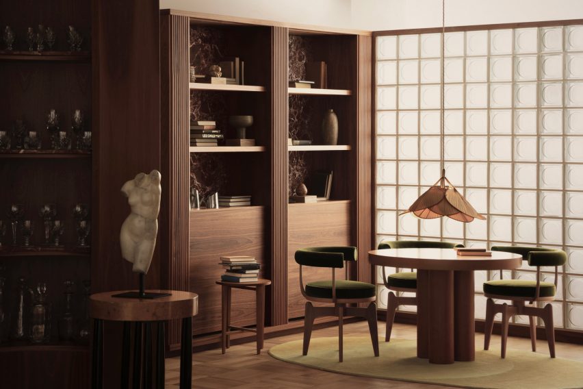
Dining space in Mayfair home
The dining area has a glass-brick wall

The lounge also contains a fully functional, half-moon-shaped fireplace created by the studio, with a decorative shape that matches two ornate urns and a pair of art-deco-style floor lamps.

“We designed the adulating fireplace to bring a sense of scale and permanence to the space,” the designers said.

“The plaster finish seamlessly blends in with the surroundings,” they added.

“The fireplace is placed below the skylight, and the soft shifts of sunlight throughout the day contribute to the tranquil atmosphere.”
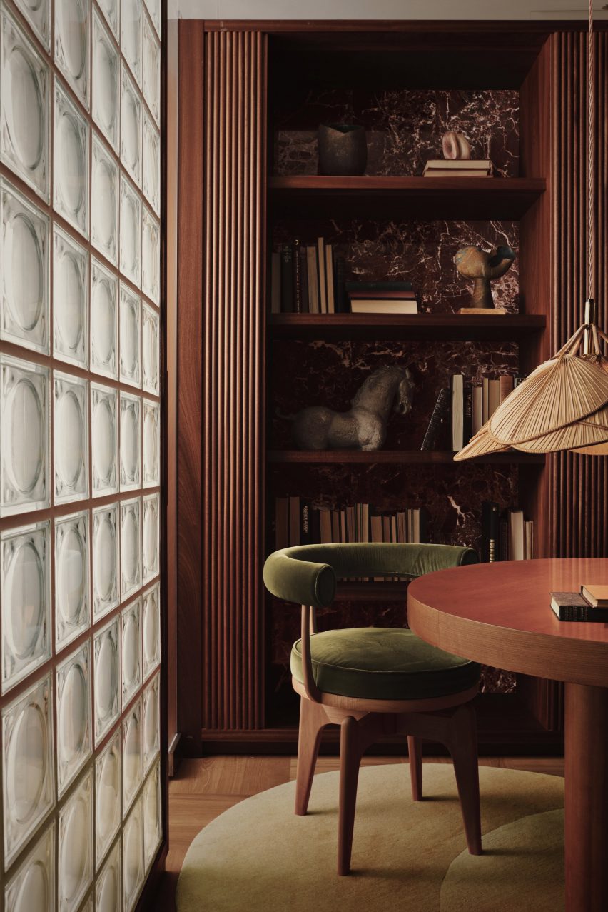
Charlotte Perriand chairs in Mayfair dining room
Armchairs by Charlotte Perriand sit around the dining table

In the dining area, dark-wood shelving holding glassware, books and vases surrounds a circular wooden table with dining chairs by French architect Charlotte Perriand.

“The material palette of this room draws inspiration from the modernist Villa Muller by Adolf Loos,” the designers said.

“The combination of dark mahogany wood, patterned marble and green upholstery feels so chic, yet warm and unpretentious.”
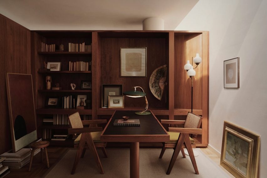
Wood-panneled study by Child Studio
The study also features natural materials

A kitchenette next to the dining area was separated from the space by a glass-brick partition designed to filter the daylight.

Behind the library shelves, Child Studio created a wood-panneled study for the homeowner. The studio aimed to use natural materials throughout the project.

“We enjoy working with natural materials, such as solid wood, stone and plaster,” Huang and Kos said.

“Child Studio often designs custom furniture pieces for projects, and we find that these simple and timeless materials are incredibly versatile and ideal for creating bespoke hand-crafted objects.”
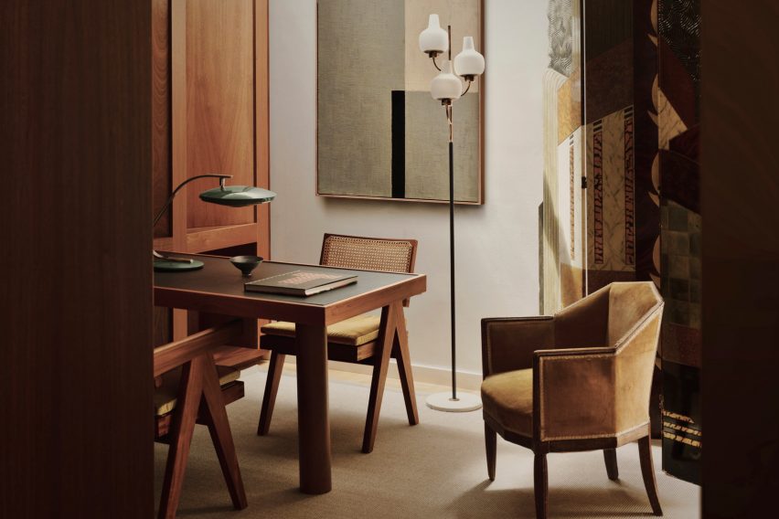
Close up of study space by Child Studio in Mayfair
The reisdence is located in a historic mews in Mayfair

Child Studio used an “understated” colour palette for the residence to create a warm, relaxing environment that it hopes will continue to evolve.

“Our goal was to design an interior that will continue evolving over time as the owners add new art pieces and bring heirlooms from their travels,” the studio said.

Also in Mayfair, architecture studio Laplace renovated The Audley pub and filled it with art and MWAI designed an apartment as if it were a hotel suite.

The photography is by Felix Speller and Child Studio.

Reference

studio MEMM fronts tree house in brazil with playful solar shading
CategoriesArchitecture

studio MEMM fronts tree house in brazil with playful solar shading

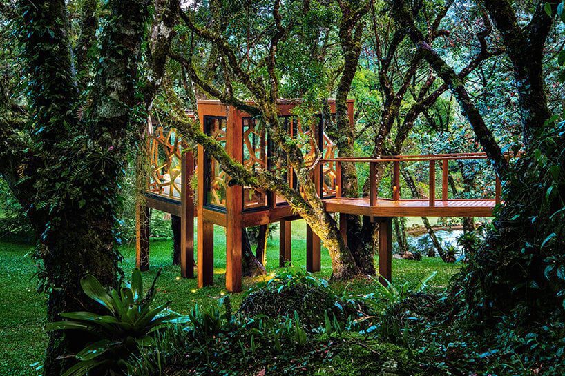
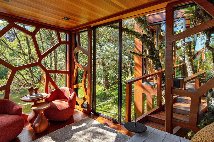
‘tree house’ by studio MEMM, a multigenerational hub


On a sloping land in Monte Verde, Brazil, Studio MEMM has completed a tree house as a multigenerational wooden hub connected by a walkway. Covering 18 sqm, the project ‘emerged as a playful idea. In a moment of family expansion, with new grandchildren and nephews, the client understood that the ludic universe of the tree house could add to the experience of staying in Monte Verde, Minas Gerais,’ explains the practice.


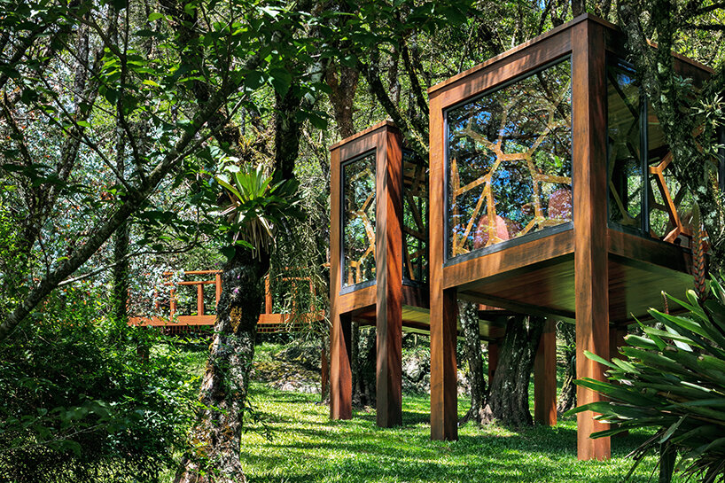
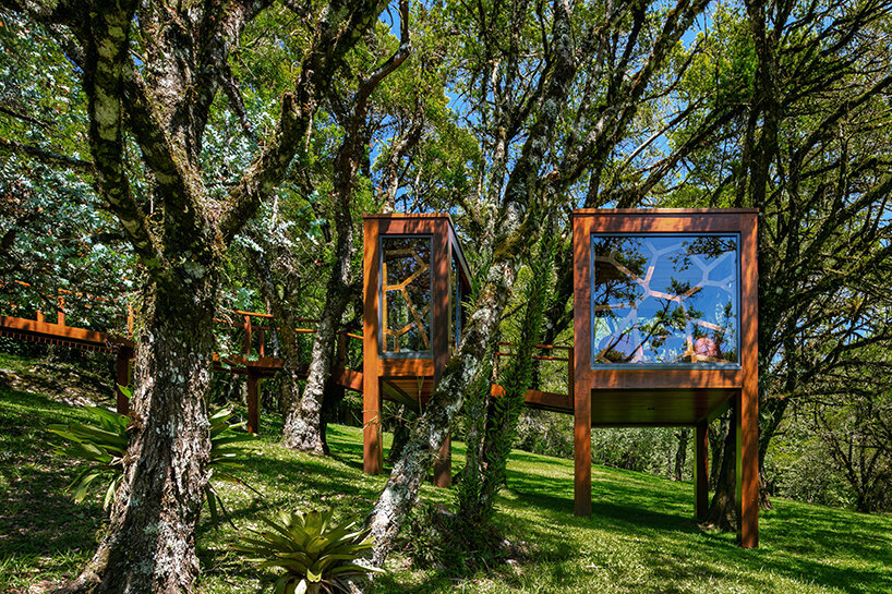
The design is located close to the main residence and features two volumes positioned among tree branches, emphasizing the sense of playfulness. The first and smaller module spanning 6 sqm serves as a reception area. In comparison, the second 12 sqm volume functions as the primary activity hub, initially displaced to accommodate a torsion of trunks that change position as they gain height. Two walkways support these structures: the first and smaller pathway connects both modules while the second, larger one gently regulates the terrain slope and links the tree house to the main property promenade.

studio MEMM fronts two-volume tree house in brazil with solar shading inspired by leaves
all images © Nelson Kon


‘Before conceiving the project, it was necessary to choose the tree and understand its context. The client already had in mind options in an area near the lake on the site. Around it, programs such as a pool annex, a deck, a natural pool, and the new house would fence the surroundings of the body of water. The garden, densely populated by numerous tree species, brings privacy and ambiance to each program around the wetland area. In addition, a gentle, continuous slope extends across the land so that the lake’s surroundings are arranged in gentle plateaus,‘ shares the Studio MEMM team

studio MEMM fronts two-volume tree house in brazil with solar shading inspired by leaves


using glass, brise-soleils, and light for a deeper immersion 


All façades of the ‘Treee House’ are clad in glass panels, encouraging a strong visual connection to the outdoors. Bordering the panels are aluminum frames that attach the glass to the façades; thanks to their dark graphite finish, these frames stand out from the wooden structure and emphasize the limit between solid and void. They also contribute to the water drainage on rainy days, preventing puddles from accumulating in the lower parts of the frame and eventually deteriorating the wood. 

studio MEMM fronts two-volume tree house in brazil with solar shading inspired by leaves
a two-volume structure connected by a walkway


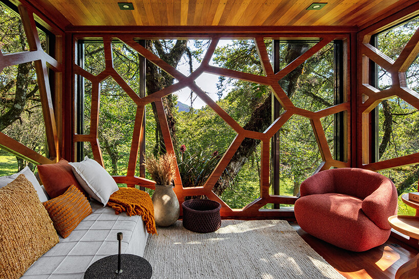
Inspired by the geometries of the surrounding sycamore leaf structures, Studio MEMM fronted the two-volume shed with a CNC-milled brise-soleil, industrially built with glued laminated timber.  Installed from the inside, this architectural element ‘embraces the guest and creates an impression of a dome that contains this entire universe in the interiors, instigating immersion and disconnection from the external world, transporting the user to a shelter that allows them to experience a feeling of unrecognizable enchantment,’ continues the team. 

studio MEMM fronts two-volume tree house in brazil with solar shading inspired by leaves
the brise-soleils evoke the geometry of sycamore leaves


Lastly, the lighting design by Futura Iluminação highlights both the unique aesthetic and sculptural branches engulfing the ‘Tree House’ without undermining the charm of night-time darkness. ‘The light spots placed on the ground level reveal the trunks and tree tops. The softly lit branches and leaves filter the dark sky above. Inside, light fixtures on the floor illuminate the brise soleil from bottom to top, bringing light, instead of shadow, to the lower part of the geometries. The solution emphasizes the view of the inside from the outside of the house and contributes to the discovery effect of the element in the heights,’ says Studio MEMM. 

studio MEMM fronts two-volume tree house in brazil with solar shading inspired by leaves


Reference

Rotating panels define spaces in artist’s studio by Ab Rogers Design
CategoriesInterior Design

Rotating panels define spaces in artist’s studio by Ab Rogers Design

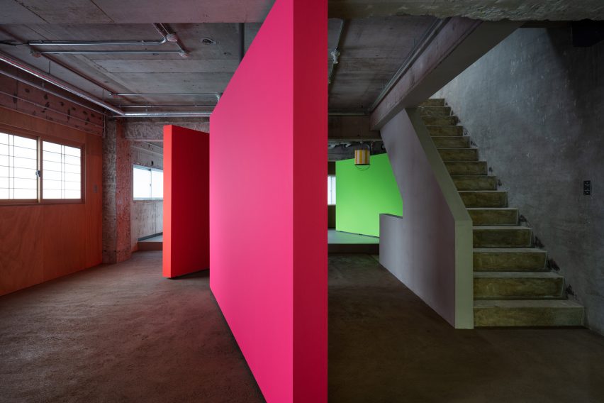
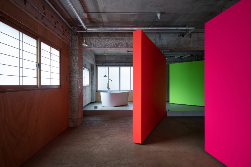
Ab Rogers Design has completed an artist’s studio and residence in Kanazawa, Japan, featuring a series of fluorescent partition walls that can be rotated to transform how the space is used.

Called Fishmarket, the multipurpose creative and living space was designed for Japanese artist Hiraki Sawa, who lives in London but regularly visits his home city of Kanazawa.

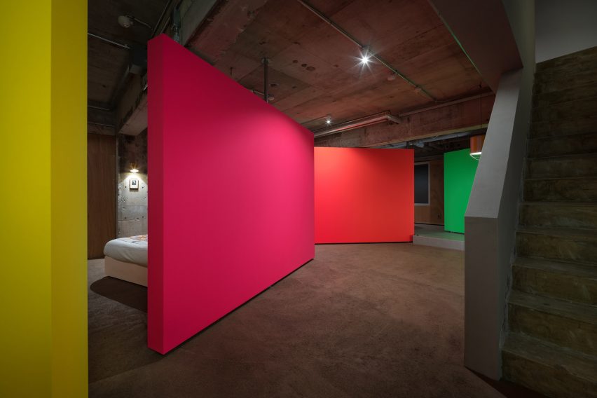
Pink, orange and green rotating partition walls in a concrete apartment by AB Rogers
Ab Rogers Design introduced rotating walls that define spaces

Sawa met Ab Rogers in 2019 when the pair were both working on projects for the Wonderfruit music festival in Thailand.

At the time, they were both living in east London and over the course of several conversations decided to work together on what Rogers calls the “co-being space” in Kanazawa.

Fluorescent rotating partition walls revealing a freestanding bathtub in a concrete apartment by Ab Rogers Design
The interior was stripped back to its shell

Named after the duo’s shared love of fish, the former commercial space was converted into a place for Sawa to stay while in Kanazawa, as well as a place to host workshops around design, culture and food.

Rogers’ studio stripped the interior back to its industrial shell before adding foil-backed insulation to some of the walls and introducing interventions including the rotating plywood walls.

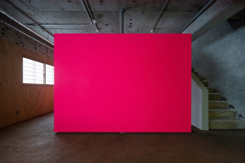
Pink fluorescent partition wall in an industrial apartment with concrete staircase to the side
The fluorescent partition walls are made from plywood

“We didn’t want to make it cosy or glossy, we wanted to work with the bones of what was there,” Rogers told Dezeen.

“We tried to let the light in as much as possible while keeping it raw and creating these interventions, these objects in space.”

Yellow, pink, orange and green rotating partition walls zoning a bedroom in a concrete apartment by Ab Rogers Design
The walls were painted in different colours to add character

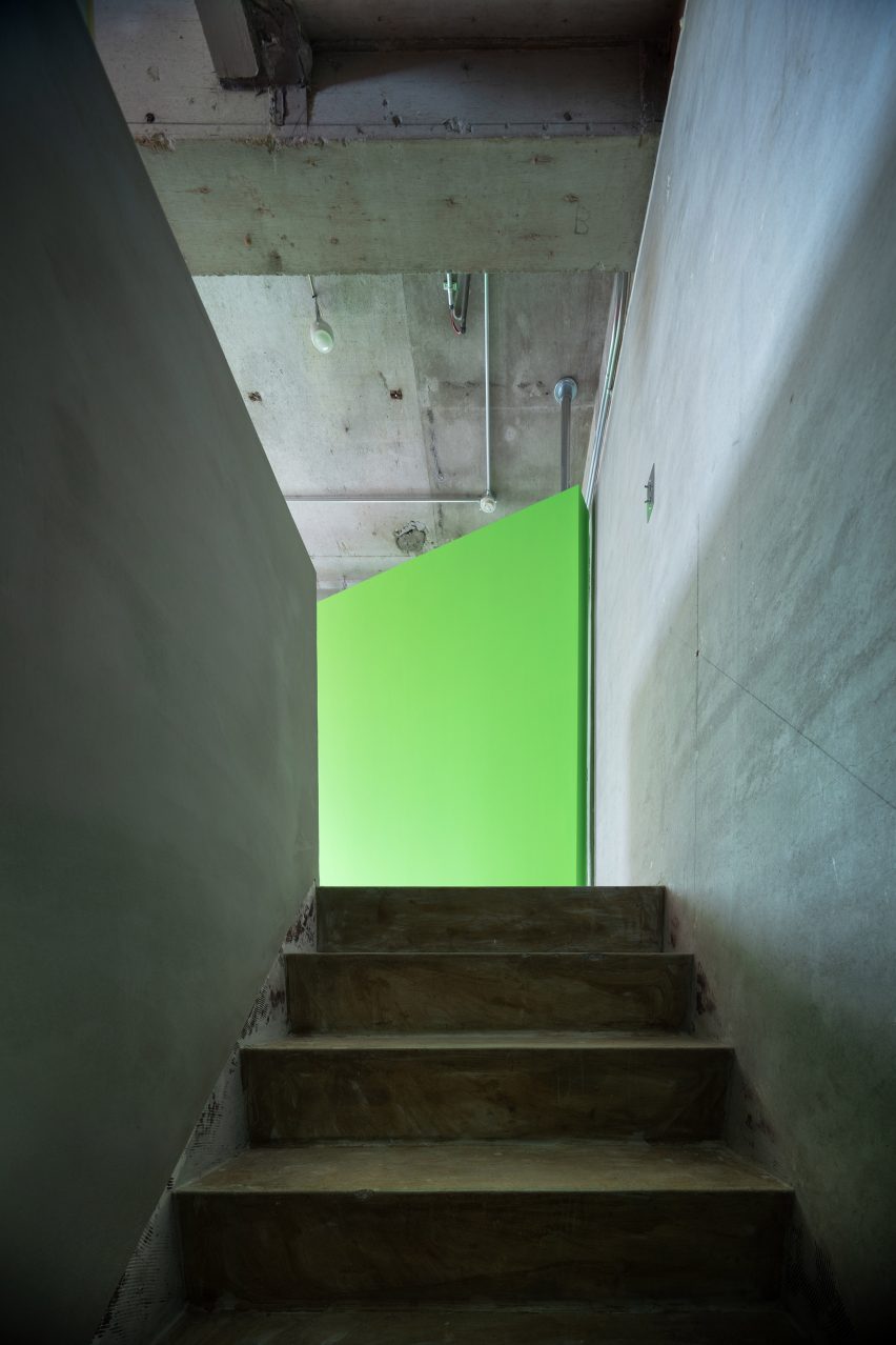
The insertion of the four movable partitions on the building’s second floor allows this open space to be transformed into three smaller multipurpose zones.

Pivoting doors conceal the bathroom and enable the bedroom to become a workshop for making art, a place for viewing it or a social space for gatherings.

Each panel is painted in a different fluorescent highlighter hue to bring a sense of vibrancy and character to the otherwise pared-back space.

“I love fluorescent colours because they’re really alive and dynamic,” Rogers explained. “When daylight hits them they become electrified and they transform into something else.”

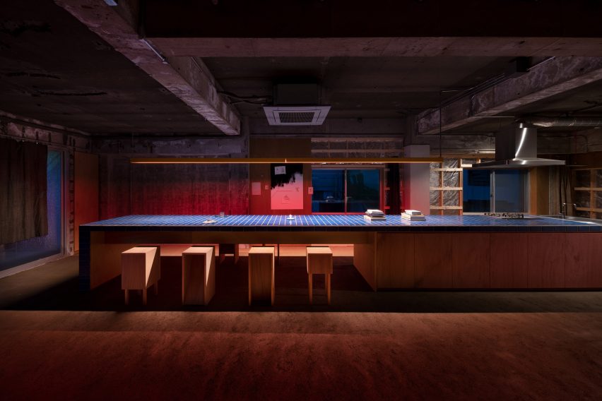
Long kitchen island bench topped with blue tiles in a dimly lit industrial apartment
The kitchen is located on the upper floor

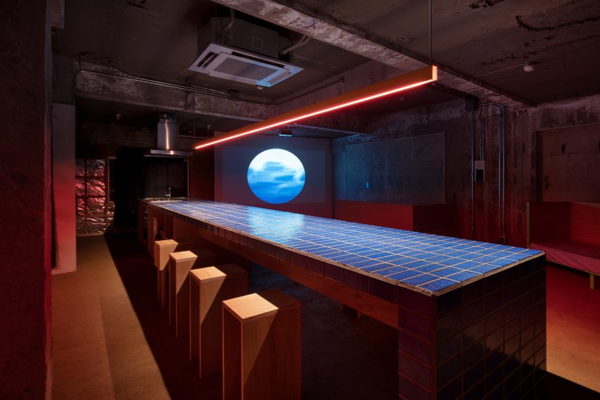
A concrete staircase ascends to another open space where a monolithic nine-metre-long workbench functions as a kitchen, a worktop and a table for cooking, eating and sharing.

“The kitchen can be used as a kitchen but it’s also adaptable depending on what actions are being performed in the space,” Rogers explained.

“If you put a plate on it, it becomes a restaurant,” he added. “If you put a computer on it then it’s an office and if you put a sewing machine on it then it becomes a workshop for designing or making textiles.”

Long kitchen table topped with blue tiles with red strip lighting overhead in an unfinished industrial apartment
A long tiled bench provides space for food preparation and dining

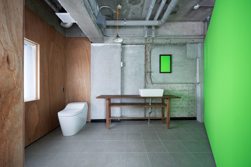
All of the materials used in the project were sourced locally and chosen for their affordability. Building regulations also dictated some of the design decisions, such as the need to line certain walls with plywood panels.

Rogers never visited Kanazawa, so Sawa was responsible for solving problems on-site and finding materials to turn his ideas into reality.

Toilet and sink on a wooden bench in an industrial bathroom with fluorescent green wall by Ab Rogers Design
Some walls were lined with plywood panels

The project evolved over time with lots of back and forth between the client and designer. According to Rogers, this organic process produced an outcome that embodies both of their visions.

“I love these small projects where you have a strong affiliation with the client,” said the designer. “This symbiotic way of designing through a conversation is really fluent and means you’re always building ambition.”

Fluorescent green rotating wall at the top of a concrete staircase
The studio was previously a commercial space

Rogers works across fields such as health, culture, retail, hospitality and housing.

Previous projects by the multidisciplinary design studio include a cancer treatment hospital clad in glazed red terracotta and a space-efficient apartment with a floor area of just 19 square metres.

The photography is by Takumi Ota.

Reference

Pema Studio designs Forte House as “a dense and closed fortress”
CategoriesArchitecture

Pema Studio designs Forte House as “a dense and closed fortress”

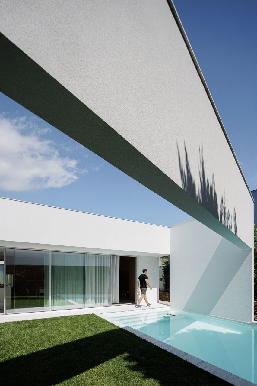
Architecture practice Pema Studio drew on the idea of a protected fortress when creating the Forte House, a blocky, white-rendered home that replaces a neglected existing structure in Santo Tirso, Portugal.

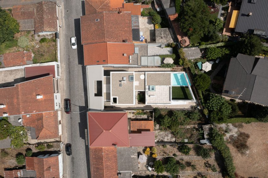
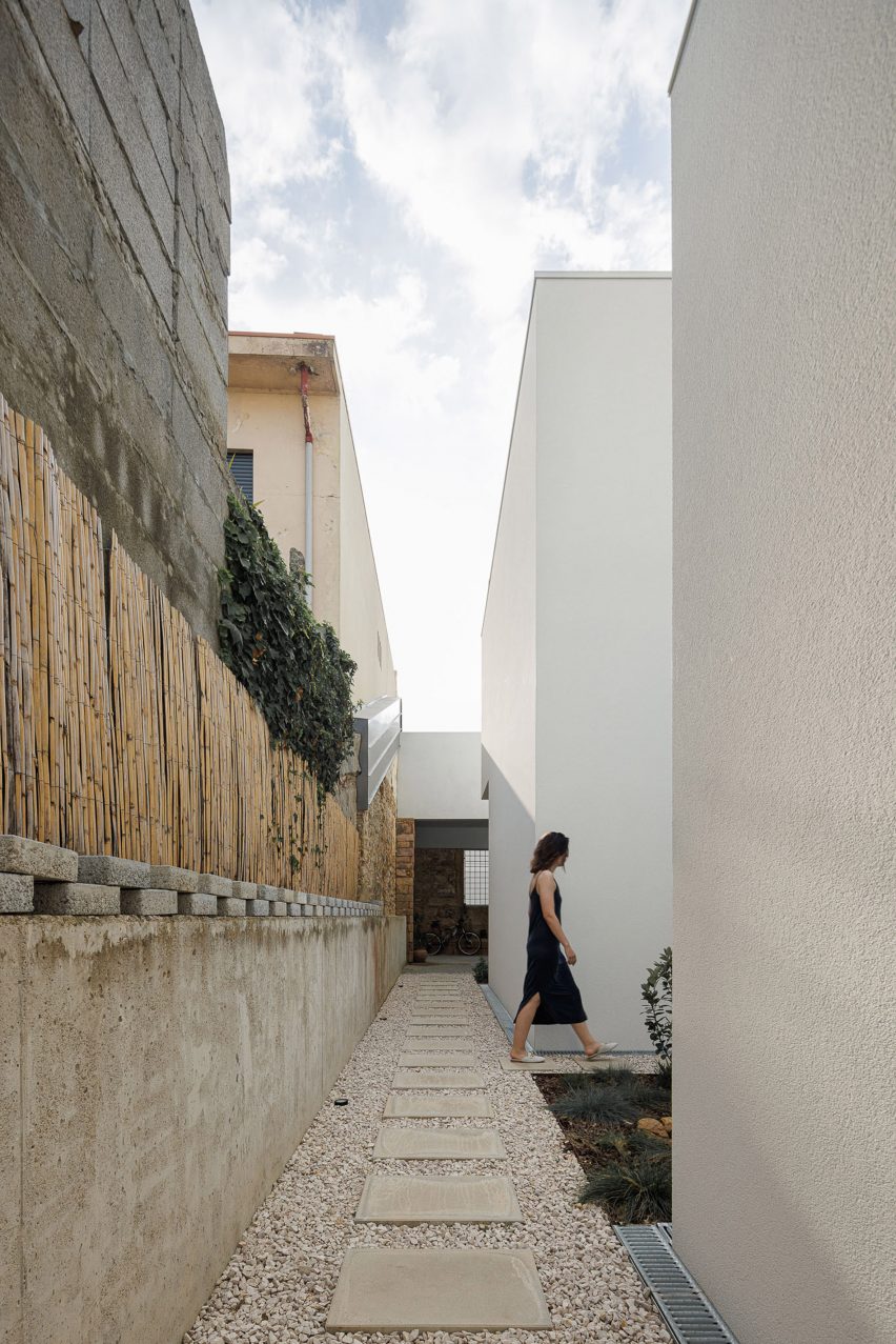
The dwelling is set back from a retained facade and sits within existing stone perimeter walls on the site, creating an exterior space around its edges with private, skylit patios.

Aerial view of Forte House in Santo Tirso
Pema Studio drew on the idea of a protected fortress when creating the Forte House

“The house is designed in a complex balance between the creation of a dense and closed fortress and the reinterpretation of the typical patio house, looking for a protected oasis in its intimate relationship with the sky,” said Pema Studio.
“The intervention starts from a massive block that impertinently detaches from the limits and mimics the land plot outline.”

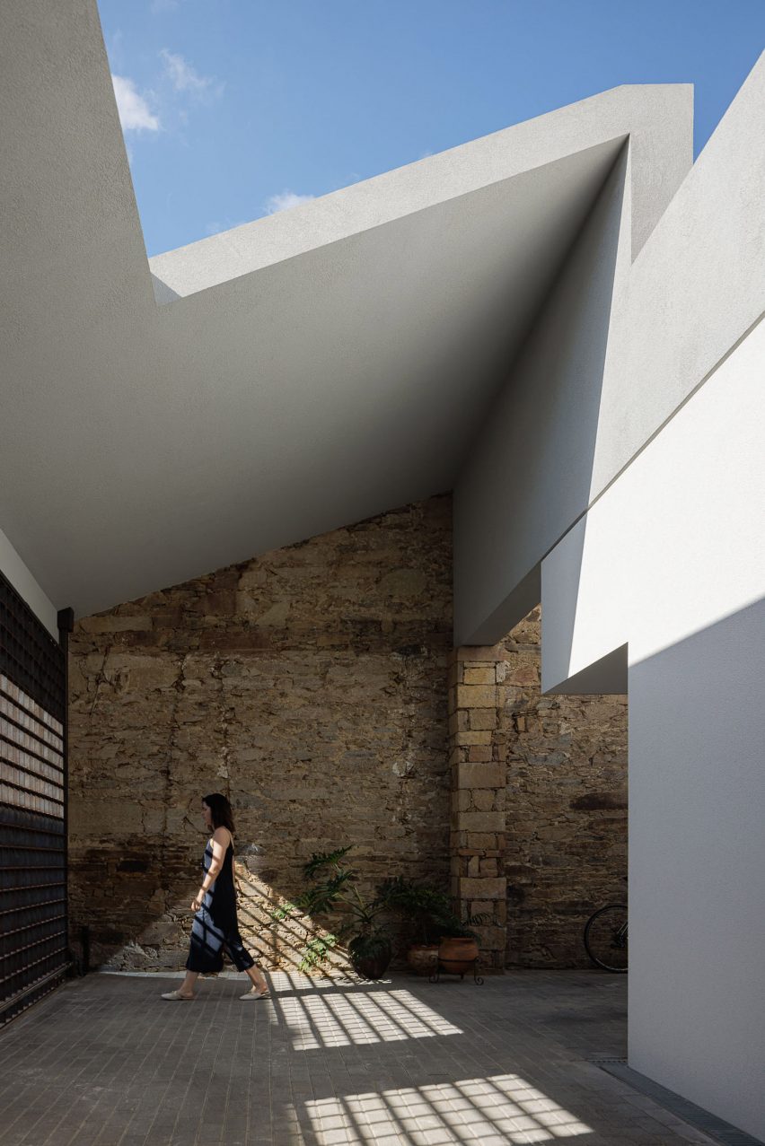
Sheltered outdoor space at Portuguese house
The white-rendered home is set back behind an existing facade

The retained facade and a metal gate of the former building now lead into an entrance courtyard, sheltered by a sloping roof punctured by a large opening.

Set back from the street, an entrance is tucked into the northern side of the home’s white exterior, leading into the more secluded study and bedroom at the front.

Courtyard outside Portuguese home
It sits within an existing stone wall

“The old facade, an element of the pre-existing [fabric], is one of the few remaining elements,” said the studio.
“With the necessary functional changes, it was restored and rehabilitated as an element of cohesion and framing with the adjacent urban fabric, reducing the intervention’s impact on the street,” it continued.

From the entrance, a corridor leads through to a more open living, kitchen and dining area at the rear of the home. This space is connected to a garden and swimming pool that can be independently accessed using the narrow pathways along each side of the site.

Two small planted courtyards have been cut out of the home’s southern edge, providing access to natural light and ventilation.

Swimming pool at Forte House by Pema Studio
There is a swimming pool

Stairs on both the interior and exterior lead up to Forte House’s first floor, where two additional bedrooms connect to rooftop seating areas and a balcony overlooking the street at the front of the site.

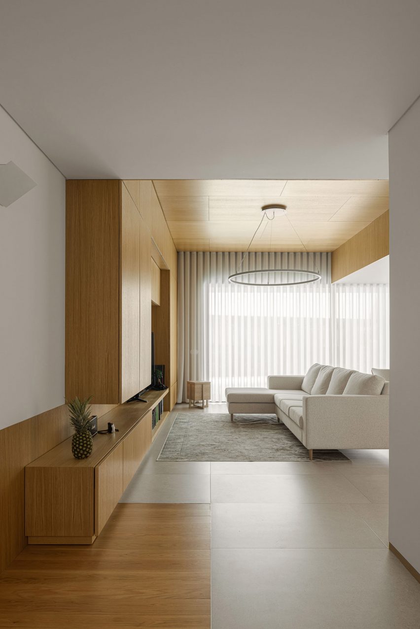
Inside, walls of white plaster in the circulation areas echo the design language of the exterior, while wooden panelling has been introduced in the bedrooms and living spaces, and used to create large areas of built-in storage.

White-walled living room with wooden cabinets
The living space echoes the white exterior of the house

Based in Santo Tirso, Pema Studio was founded by Tiago Pedrosa Martins in 2019.

Other homes recently completed in Portugal include a cork-clad dwelling near Lisbon by Inês Brandão Arquitectura and a minimalist white home on a narrow site in Ponta Delgado by Box Arquitectos.

The photography is by Ivo Tavares.


Project credits:

Architect: Pema Studio
Collaborator: Daniel Carvalho/Livre Atelier and Dário Cunha
Main architect: Tiago Pedrosa Martins
Construction: Construções Alves e Freitas, Lda.
Engineer: M2 – Gabinete de Estudos

Reference

Dark Matter garden studio by Hyperspace features pivoting door
CategoriesArchitecture

Dark Matter garden studio by Hyperspace features pivoting door

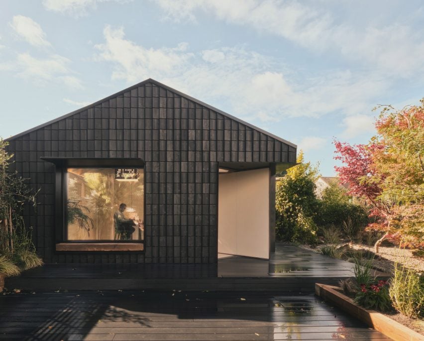
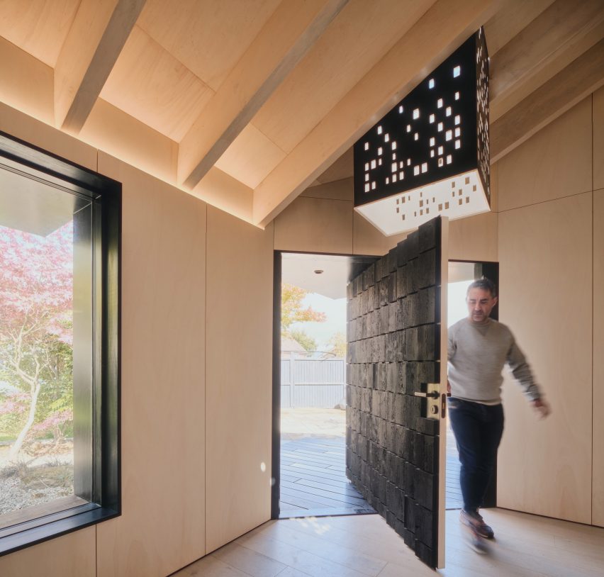
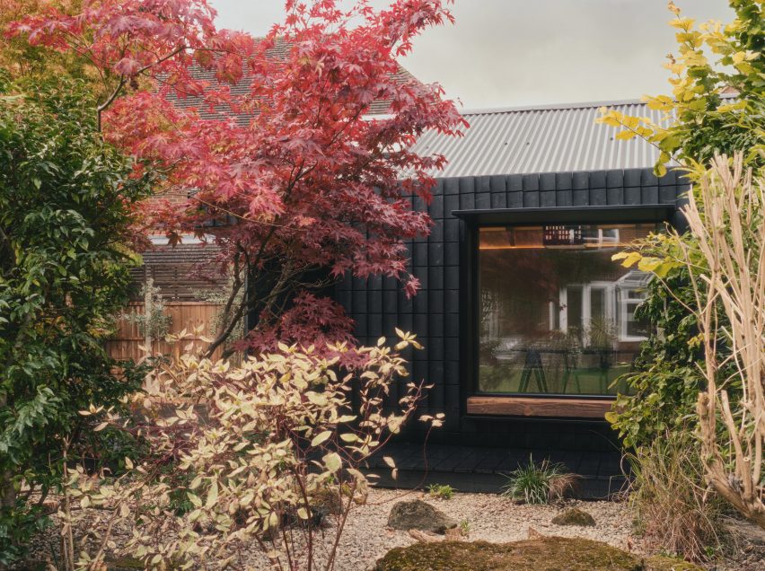
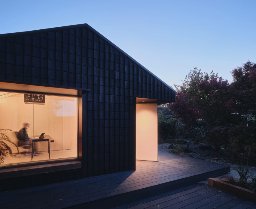
London-based architecture studio Hyperspace has created a garden studio in Hertfordshire, England, featuring a pivoting door and a charred-timber facade that doubles as an insect hotel.

Hyperspace converted a suburban garage to create the work-from-home studio called Dark Matter.

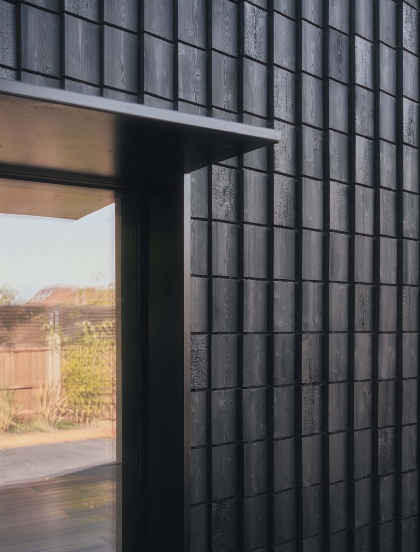
The building’s name refers to its facade, formed of 850 pieces of charred wood. The process, called Shou Sugi Ban, prolongs the life of the wood by making it more resistant to moisture.

Charred timber facade of Dark Matter garden studio by Hyper
The garden studio was created by converting a former garage

Gaps were left in between these wooden shingles to provide natural habitats for insects, with the aim of promoting biodiversity in the garden.

They act “as a giant bug hotel for insects to hibernate in”, according to Hyperspace founder Olli Andrew.

Andrew designed the studio to provide the client, design recruitment consultant Wayne Euston-Moore, with a spacious and tranquil workspace.

Entrance to Dark Matter garden studio by Hyper
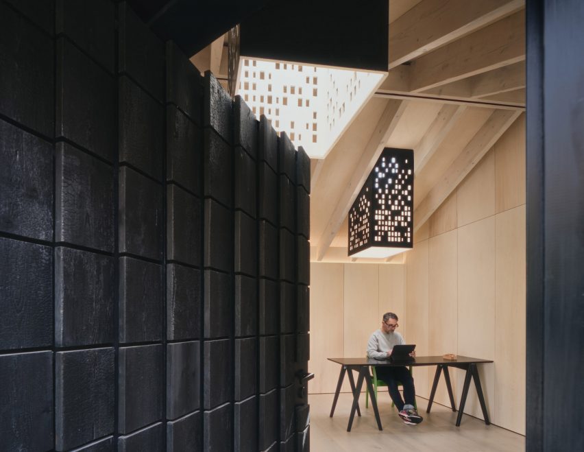
An extra-wide pivoting door forms the entrance

The ambition from the outset was to go beyond the simple, glass-fronted box that forms most garden studios.

The pivoting door follows this approach. Located on an angular cutaway at the building’s corner, this double-width element create a sense of drama from arrival.

Pivoting door
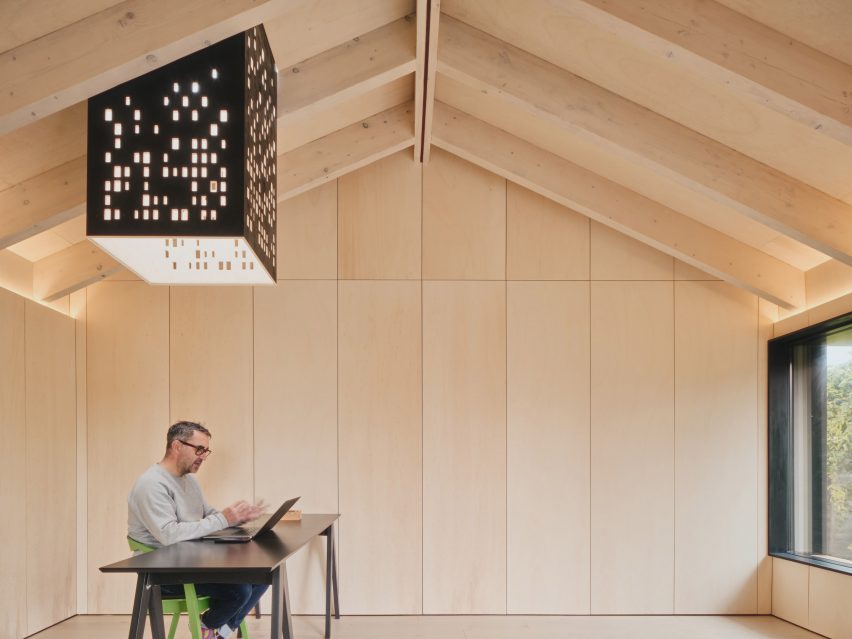
Two perforated “light chimneys” help to animate the interior

The building also features two “light chimneys” dotted with perforations.

Extending down from skylights in the roof, they create dynamic light reflections intended to mimic dappled sunlight through a tree canopy.

“Outdoor garden studios don’t need to be generic boxes,” said Andrew.

“This project’s beauty is in the craft, space and light. And with its connection to nature, it’s an inspired place to work.”

Light chimney and desk in Dark Matter garden studio by Hyper
Plywood panels line the interior walls

The design reuses almost all of the materials from the original garage structure, including the timber beams from the dismantled hip roof. Anything leftover was diverted to another Hyperspace project, to keep waste to a minimum.

A corrugated metal roof was supported on white oiled timber rafters, while the interior walls are now lined with poplar plywood panels.

Charred timber shingles
Charred timber shingles clad the exterior walls

To improve the building’s energy performance, Andrew chose triple-glazed windows and skylights while he added insulation formed of wood fibre, wool and recyclable foil-based blankets.

“To reduce embodied carbon, the majority of materials were procured from within a 10-mile radius,” said Andrew.

“Steel and concrete use was kept to a minimum, with only one steel flitch plate and less than one square metre of concrete.”

Dark Matter garden studio by Hyper
Windows have deep sills, so can double as informal seats

The studio is minimally furnished, helping to enhance the sense of space. A simple table in the corner offers a view out through windows facing both north and east.

These windows both feature deep sills and minimal overhanging canopies, giving the studio’s occupant an alternative to place to sit and work.

Night view of Dark Matter garden studio by Hyper
The facade provides nesting space for insects

“It provides an amazing headspace which is inspiring yet calm,” Euston-Moore said. “It feels like you’re in a perfectly insulated space yet connected to the outside with ample natural light.”

Other recent garden studio designs include Michael Dillon’s low-cost architecture studio in Kent and a writer’s hut in Dublin designed by Clancy Moore Architects.

The photography and film are by Simon Kennedy.

Reference

Vo Trong Nghia Architects designs Urban Farming Office for own studio
CategoriesArchitecture

Vo Trong Nghia Architects designs Urban Farming Office for own studio

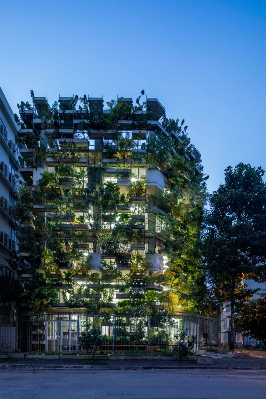
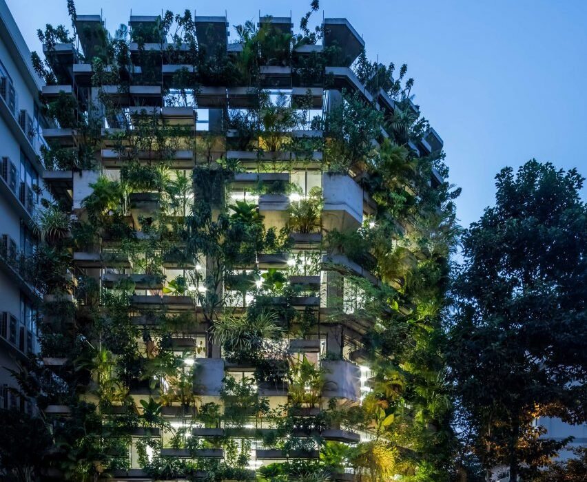
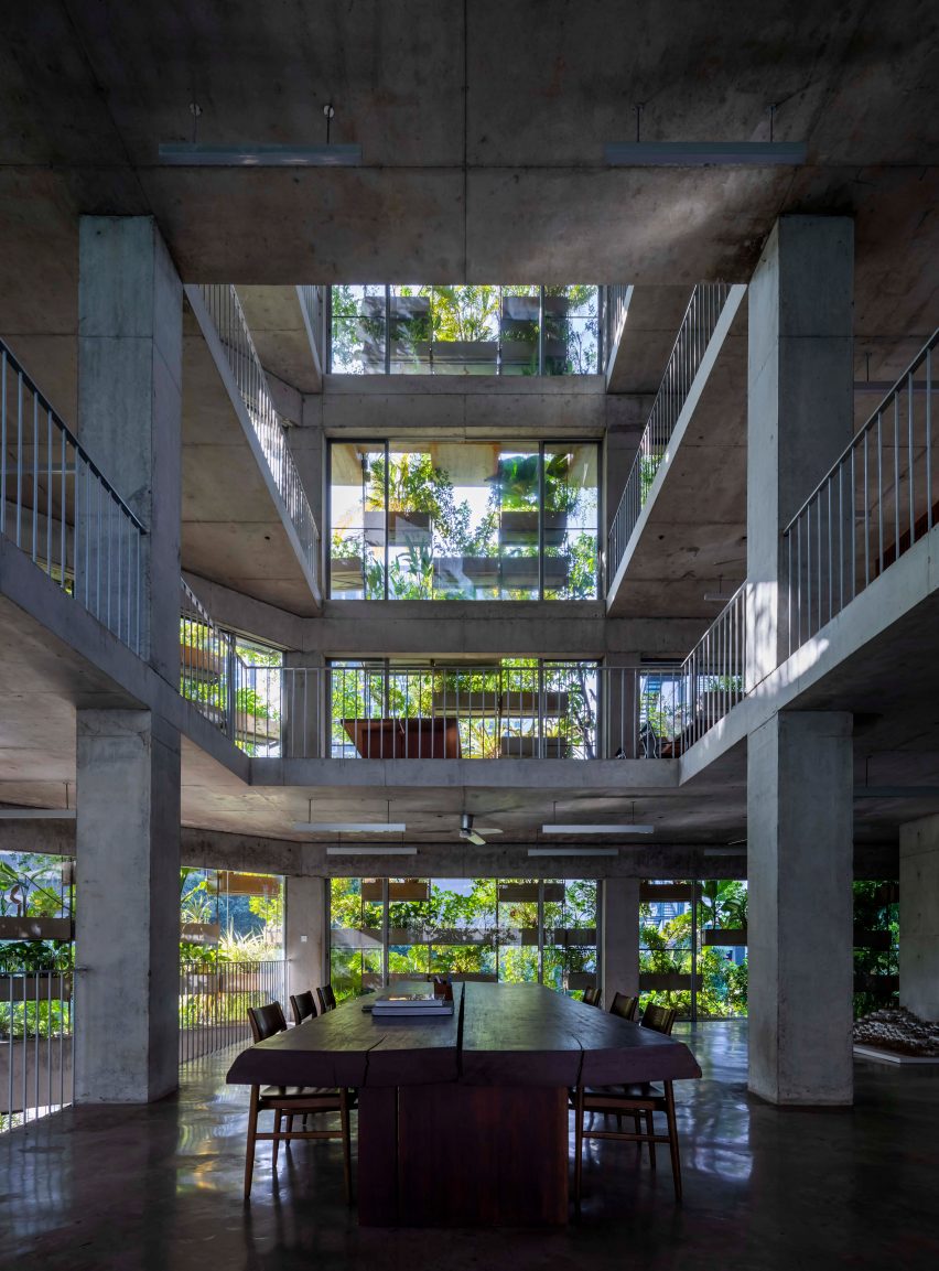
Vietnamese studio Vo Trong Nghia Architects has completed Urban Farming Office, its own head office in Ho Chi Minh City, creating a concrete-framed building covered in a “vertical farm” of vegetables, fruits and herbs.

Located on a corner site in the city’s Thu Duc district, the Urban Farming Office was designed to be emblematic of the plant-filled, low-energy architecture for which Vo Trong Nghia Architects is known.

Alongside the office, the practice has also constructed a version of its low-cost housing prototype, S House, designed to withstand typhoons and earthquakes and first unveiled in 2012.

exterior image of Urban Farming Office
Urban Farming Office was designed by Vo Trong Nghia Architects

“Under rapid urbanisation, cities in Vietnam have diverged far from their origins as sprawling tropical forests,” explained the practice. “The lack of green causes various social problems such as air pollution, floods and the heat island effect.”

“In this context, new generations in urban areas are losing their connection with nature, [and] increasing droughts, floods and salinisation jeopardise food supplies,” it continued.

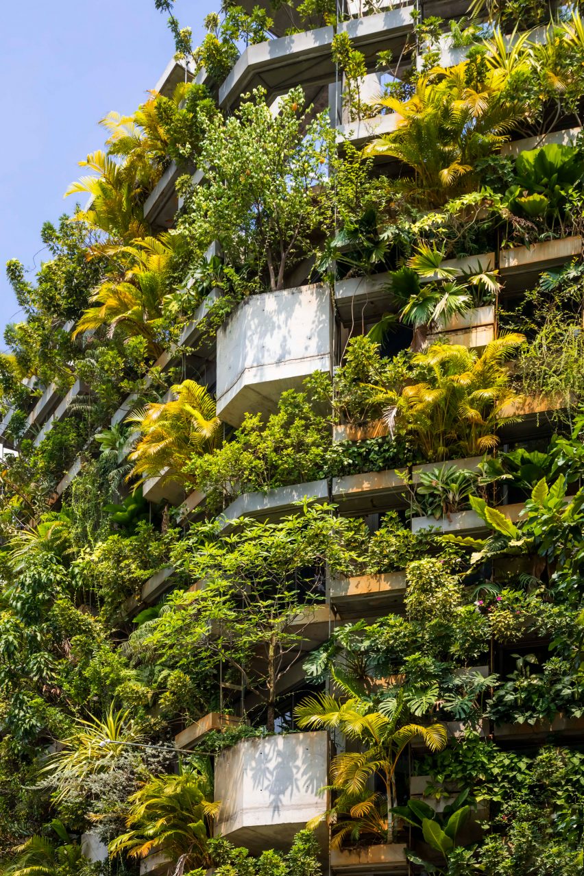
The core of the office building is constructed using an exposed concrete frame, while the planters themselves are supported by a shelving-like external structure of thin steel, allowing them to be flexibly rearranged as plants grow or swapped out entirely.

Image of the facade at Urban Farming Office
The building is covered in a vertical farm

Completely covering the building’s glazed southern side, the wall of plants acts to filter sunlight and air, preventing overheating and creating a shaded microclimate for the office interiors.

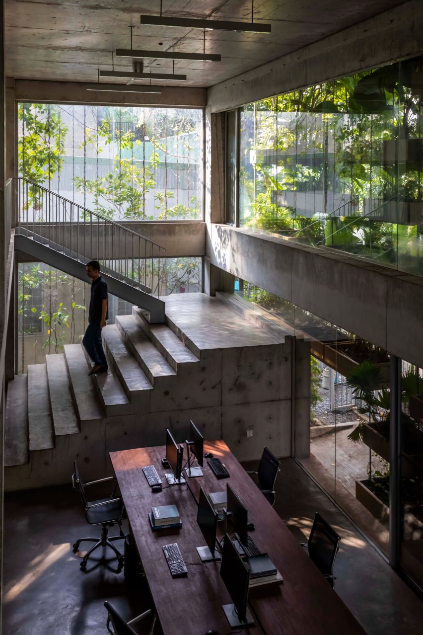
Inside, workspaces are organised around a central atrium, and full-height sliding glass doors provide access onto balcony areas for moving or harvesting from the planters, with a rooftop garden providing further space for growing plants.

“Together with the roof garden and ground, the system provides up to 190 per cent of green ratio to the site area, which is equivalent to 1.1 tons of harvest,” explained the practice.

“[The vegetation] is irrigated with stored rainwater, while evaporation cools the air,” it continued.

Interior image of Urban Farming Office
The building is the architecture studio’s own office

The concrete structure has been left completely exposed internally, complemented by dark wood furniture and minimalist light fittings to provide a contrast to the bright green of the planted facade.

To allow the office areas to be as open as possible, the lift and stair core has been pushed to the northern corner of the building, where brick walls with small openings for ventilation have been left bare to allow for the possibility of future rear extensions.

Interior image of the concrete office
It has an exposed concrete interior

Architect Vo Trong Nghia founded his eponymous practice in 2006, and it has since become known for its explorations of low-energy architecture, often incorporating plants and bamboo into its designs.

Other projects recently completed by the studio include a bamboo welcome centre for a resort on the island of Phu Quoc, and a home in Bat Trang wrapped by a perforated brick wall and a series of elevated garden spaces.

The photography is by Hiroyuki Oki.

Reference

Studio KO places female chefs “at the epicentre” of Sahbi Sahbi restaurant
CategoriesInterior Design

Studio KO places female chefs “at the epicentre” of Sahbi Sahbi restaurant

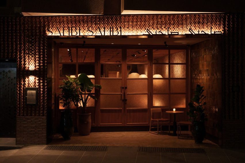
French architecture practice Studio KO has designed the restaurant interiors of Sahbi Sahbi using textures, tones and materials that celebrate Moroccan cuisine and female culinary practices.

Sahbi Sahbi, which translates to soulmates in Darija – a form of Arabic spoken in Morocco, is located in the Guéliz neighbourhood of Marrakech.

The exterior of Sahbi Sahbi restaurant
Top: An open kitchen is at the heart of Sahbi Sahbi. Above: the restaurant is in Marrakech

“Sahbi Sahbi is a reinvented tribute to Moroccan craftsmanship,” Studio KO told Dezeen.

“It is a symbiosis of modernity and tradition, of Japan wood tradition and details and Moroccan motifs and materials.”

Wooden tables inside Sahbi Sahbi
Studio KO wanted the restaurant to celebrate the female chefs who work there

The eatery serves a menu of traditional Morrocan dishes made using recipes created by Dadas – female cooks in Morocco who orally handed down their trade through generations.

Sahbi Sahibi’s focus on Dada cuisine influenced Studio KO to create an interior that places the female chefs at the centre of the space.

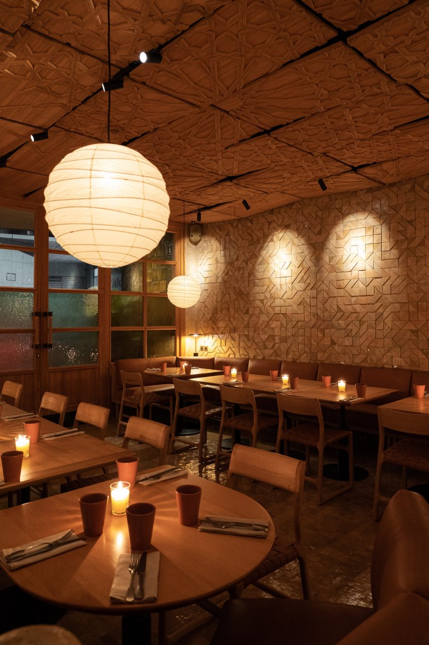
Sahbi Sahbi restaurant interiors by Studio KO
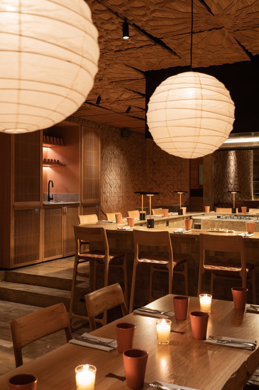
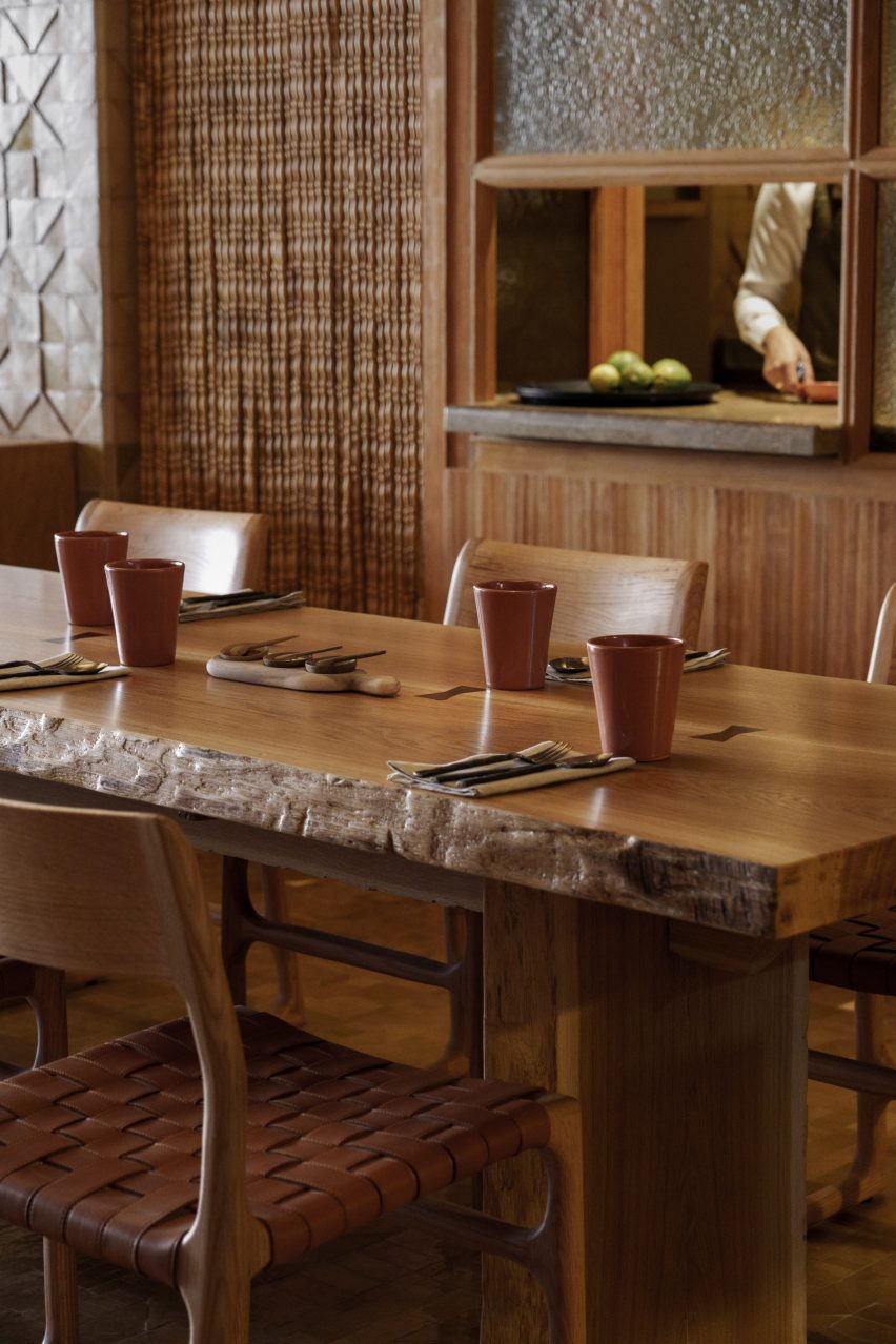
Warm wood was used for the ceiling, walls and table and chairs

“In Morocco, the kitchen is normally a secretive place, the hidden domain of the Dadas, women who hand down recipes from one generation to the next,” Studio KO said.

“It is with precisely this intention, to share and transmit knowledge – an intention evident even in the layout of the restaurant – that guests are welcomed at Sahbi Sahbi,” added the brand.

The interiors of a Moroccan restaurant
Rust-coloured paint and tableware is dotted throughout

In the centre of the restaurant, the kitchen was intentionally left open so that diners can watch the chefs at work and get an insight into the culinary process.

Horseshoe-shaped tables and seating wrap around an open stove integrated into a kitchen island counter where chefs prepare meals.

“In conceiving this warm, convivial space, the designers inverted the archetype of Moroccan cuisine – its secretiveness – and instead placed the cooking at the epicentre of the restaurant’s activity,” said Studio KO.

Earthy colours and natural materials were used to complement the relaxed and friendly aesthetic of the restaurant.

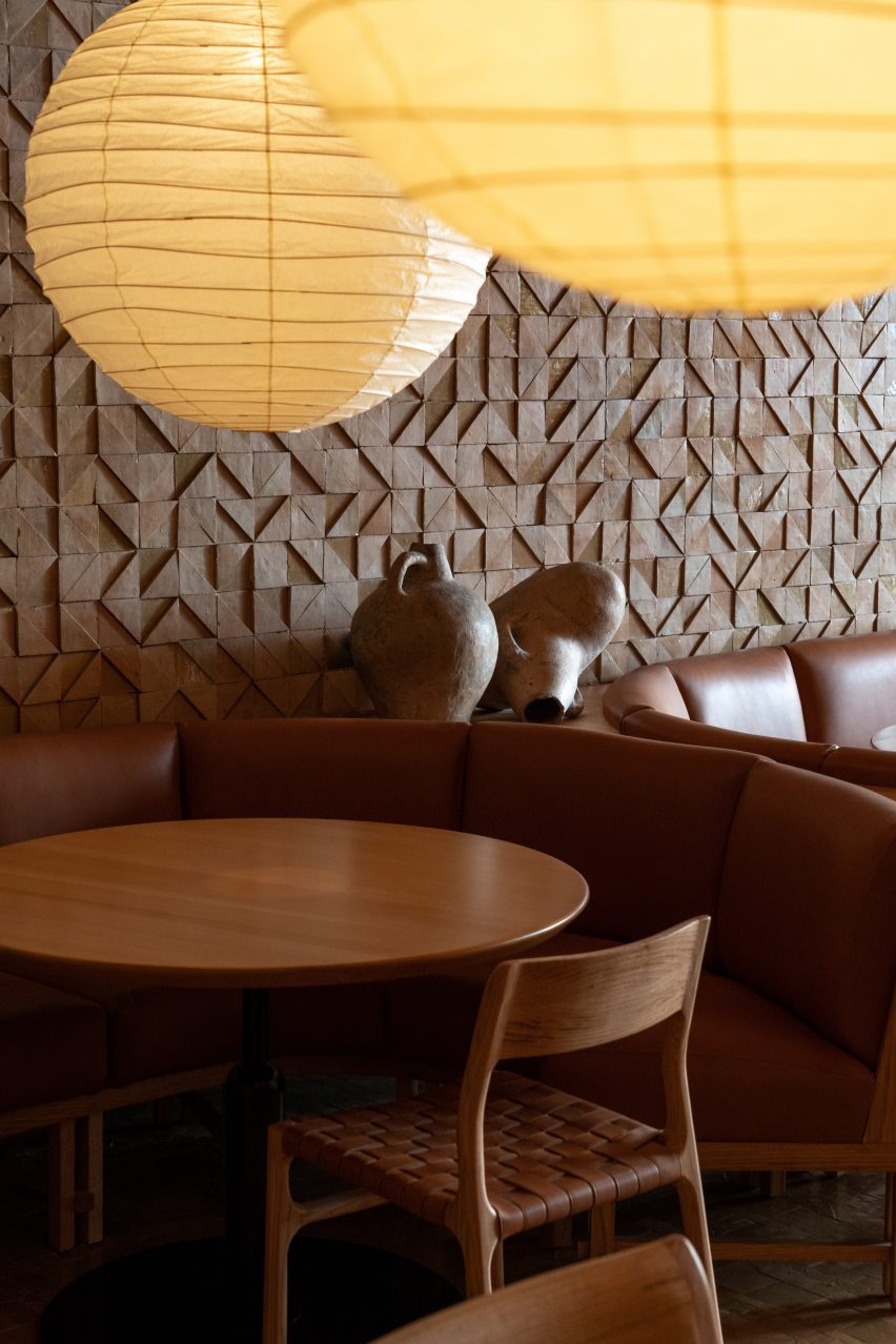
Wood was used to add warmth throughout. It covers the walls and ceiling and also forms the woven chairs and dining tables. These are illuminated with spherical pendant lights while brown leather upholsters the booth seating around the edge of the space.

A fireplace inside Sahbi Sahbi
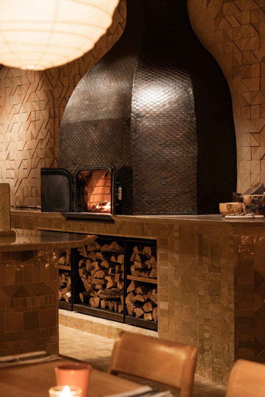
A traditional oven is located at the side of the space

In one corner, there is a large traditional oven where chefs can burn logs to bake bread or roast meat.

Finer details include rust-coloured ceramic urns, clay pots and pans and orange-brown paint in an alcove above a sink.

“The beauty is subtle: details, textures, the play of light and surfaces, natural tones and motifs that tell a story of traditional materials and knowledge, freely reinterpreted,” Studio KO explained.

The interiors of Sahbi Sahbi
the interiors were designed as a tribute to Moroccan craftsmanship

Studio KO has previously worked on projects in Marrakech. In 2017 the studio revealed the Musée Yves Saint Laurent, a 4,000-square-metre museum building showcasing the work of the late fashion designer Yves Saint Laurent.

Other notable buildings in the Moroccan capital city include Fobe House, a white house designed by Paris-based architecture studio Guilhem Eustache.

The photography is by Pascal Montary.

Reference

LAMA studio turns warehouse into vibrant workspace in barcelona
CategoriesArchitecture

LAMA studio turns warehouse into vibrant workspace in barcelona

a look inside ‘CODEA PROJECT’ BY LAMA STUDIO


Spanish practice LAMA studio has converted a commercial property and warehouse into a vibrant, multipurpose workspace for Codea Studio, a creative agency based in Barcelona. Covering 355 sqm, the space occupies one highly elongated floor and features a 6-meter-wide front façade that originally kept very little natural light from entering the building. The front area is a commercial space with a height of 4.5 meters, varying widths, with flat slabs and metal beams. At the back is a charming open-plan warehouse with a 5.5-meter-high gable roof constructed using wooden trusses, the most characteristic element of the entire space.


To meet the agency’s requirements, the architects focused on two interventions. The first was creating a central core to house service areas (storage, technical rooms, meeting rooms, and lavatories), allowing LAMA studio to retain the entrance and rear warehouse as large open spaces. The central core also functions as a transition area between both spaces. The second intervention focused on building a continuous, linear element that runs the full length of the dividing wall from the entrance to the back of the warehouse; this elements takes on different functionalities according to the needs of each area, with various materials and idioms.


Specifically, the plan sees the property distributed into four distinct zones. First, the open-plan space adjacent to the street acts as the point of entry to the premises. Next, we come to the central service area which runs down a long hallway. Then, at the back, we come to the unique warehouse area. This will become the main space where the day-to-day running of the agency happens. Finally, in order to open a new back façade and bring light into the building, the old courtyard at the back of the property was restored and three large openings were made to connect it to the interior,’ writes LAMA studio. 
reconversion of a warehouse into a multi purpose office space in barcelona 9
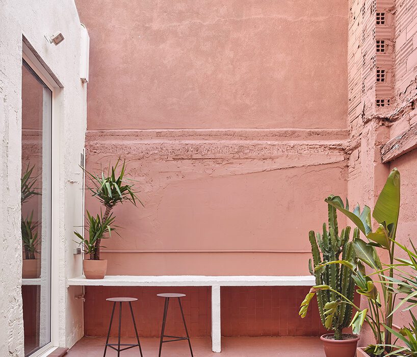
terracotta-painted courtyard | all images © José Hevia


mediterranean vernacular meets mexican influences


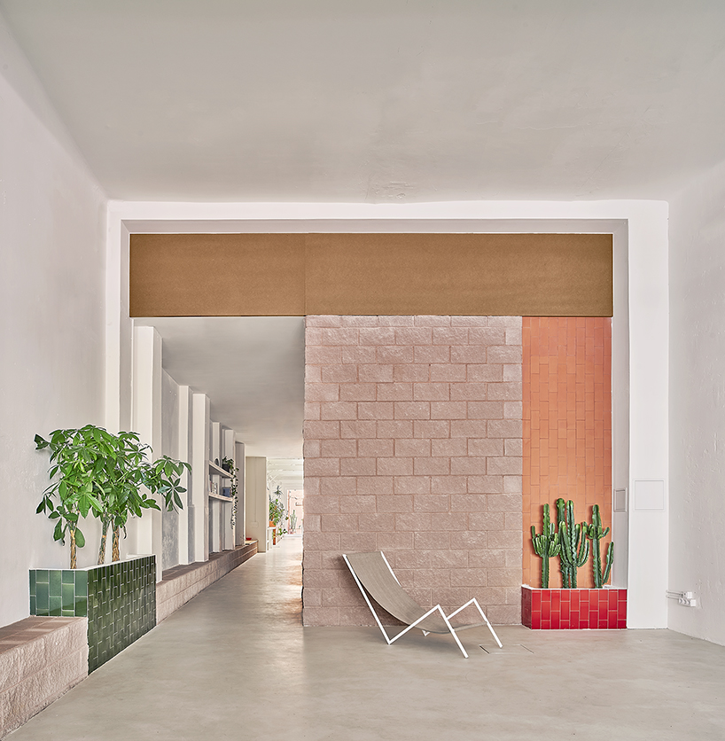
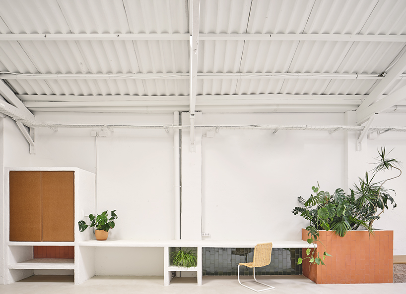
In terms of materials and finishes, the goal was to preserve the original presentation of the different spaces, merely cleaning and painting them in white to create a neutral backdrop against which the renovation stands out. While the office backdrop was kept simple, Codea Studio opted for raw materials and contrasting textures and colors, resulting in a design that reflects a Mediterranean vernacular style coupled with textures and hues of Mexican influence. ‘Rough-finished concrete block with pink tones was chosen to create the main core area and the continuous linear element. This brings personality and robustness to the project while acting as a self-supporting element for constructing the entire perimeter and dividing walls of the core area,’ note the architects.


The different extensions appearing in the linear element were built on-site and given a rather rough plaster finish, painted in white, highlighting their handcrafted character. Furthermore, LAMA studio adorned the lavatories, planters, work areas, and other spaces needing special attention with complementary cladding materials like traditional Catalan rasilla bricks and red and green glazed ceramic from La Bisbal. Finally, raw MDF board was incorporated into the renovated warehouse as a more contemporary material with a strong visual accent. ‘It offers smooth surfaces to work with, bringing practicality, as well as elegance, to the project,’ continues the practice.

reconversion of a warehouse into a multi purpose office space in barcelona 1
the service core is built using concrete blocks and tiles, and is detailed using MDF


a multipurpose and light-filled workspace 


The entry area is a foyer and multipurpose room characterized by its spare nature, as it has to be adaptable for many uses. At the back, the start of the service core emerges, built using concrete blocks, tiling, and MDF. On the left, a bench appears as a continuous element that runs through the courtyard and changes functions according to each area. The central core, delimited by the high concrete block walls that establish a strong, solid volumetry, hosts two large passageways that function as a sort of antechamber.


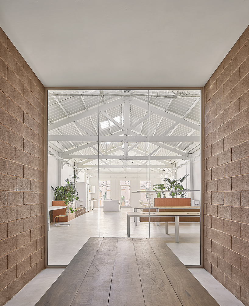
The first passage leads to the lavatories, and the second to the storage areas and meeting rooms. In these semi-open foyers, the doors are paneled from floor to ceiling in raw MDF to create maximum contrast with the roughness and color of the blocks. The meeting rooms open onto the main hall through large glass doors, extending the reach of natural light while fostering a visual relationship between the spaces. In the main hall, the varying uses required for the workspace are expressed in the continuous element as it runs along the entire side wall with cupboards, work surfaces, a planter, a bench, and finally, to the kitchen and the patio worktop. Here, too, cement blocks, elements of masonry, and other materials alternate according to the function of each section.


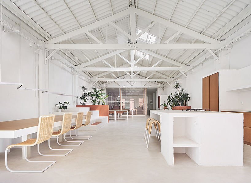
The kitchen, located at the back of the former warehouse, consists of different modules, either open or closed, with MDF. The extended cooking area, clad in ceramic tile, extends towards the outdoor courtyard. In the center is a large island with a porcelain worktop holding a work and storage area on one side and a bar with stools on the other. Only minimal treatment was given to the outdoor courtyard. It was cleaned and painted in the same way as the rest of the original architectural elements of the project. Still, the team coated the surfaces using a terracotta-colored paint, contrasting with the interior’s white backdrop.

reconversion of a warehouse into a multi purpose office space in barcelona 3
meeting rooms open onto the main hall through large glass doors that extend the reach of natural light


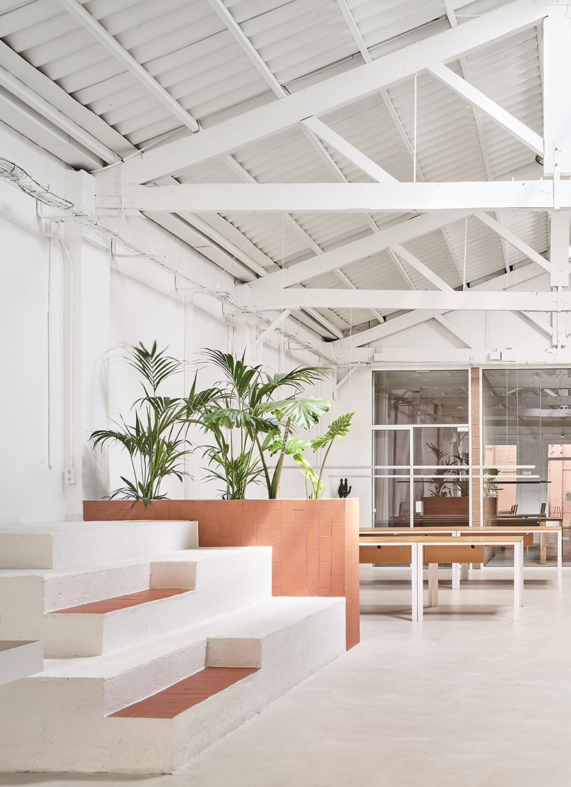
Opposite the kitchen is the dining area, where an imposing metal table by Cristian Herrera Dalmau with an MDF top is rooted to the floor. Dalmau also designed a suspended metal zig-zag lamp hung atop the table, boasting a unique iridescent bichromate finish, as well as the Grillo chairs and Poni stools from Branu. In the central area of the hall, tiered levels and a tall planter clad in rasilla bricks separate the work zone from the kitchen and dining areas. In addition to the plants acting as a lattice between the spaces, this element functions as a relaxation area and a platform for presentations and other agency activities.


Last but not least, the work area sits in front of large windows fronting the meeting rooms, with two lines of white lacquered metal tables topped with MDF. The suspended lamps, with the same zinc finish as the one in the dining room, were also devised by Cristian Herrera Dalmau.

reconversion of a warehouse into a multi purpose office space in barcelona 4
general view of the main hall

reconversion of a warehouse into a multi purpose office space in barcelona 11
tiered levels and a planter clad in rasilla bricks separate the work zone from the kitchen + dining areas

reconversion of a warehouse into a multi purpose office space in barcelona 7
a continuous linear element runs from the entrance to the back, adopting different functionalities

Reference

Studio Tate creates “textural earthiness” for Relinque wellness spa
CategoriesInterior Design

Studio Tate creates “textural earthiness” for Relinque wellness spa

Melbourne-based Studio Tate has used raw and tactile materials to create “a soothing urban oasis” for the Relinque spa in Melbourne.

Located in north east Melbourne, the 800 square-metre space includes a day-spa, spinal clinic, pilates and yoga studios.

Reception Relinque
The interiors are informed by local parks and waterways

Local practice Studio Tate was informed by nearby parklands and waterways to create “a soothing urban oasis”.

“It was important to create a textural earthiness that evokes the senses, while striking a balance between sophistication and approachability,” explained Studio Tate senior associate Emily Addison.

Treatment room Relinque
A deep rust tone in the treatment rooms was selected to be gender neutral

The treatments rooms were located on either side of a central reception area, with the spa and yoga studio located on one side and the spinal clinic and pilates studio on the other.

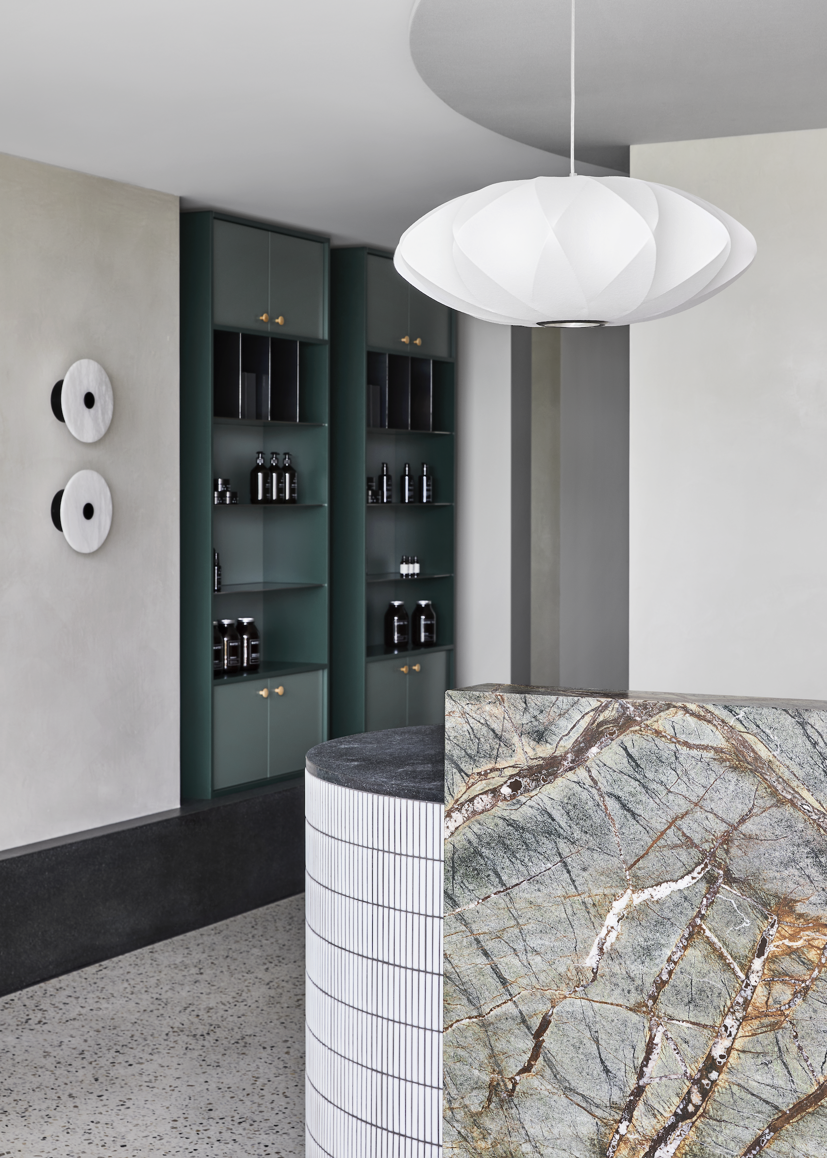
Studio Tate used green marble, honed granite and hand-glazed Japanese tiles in the reception area, where visitors are encouraged to relax and browse the retail products before stepping into treatments.

Corridor Relinque
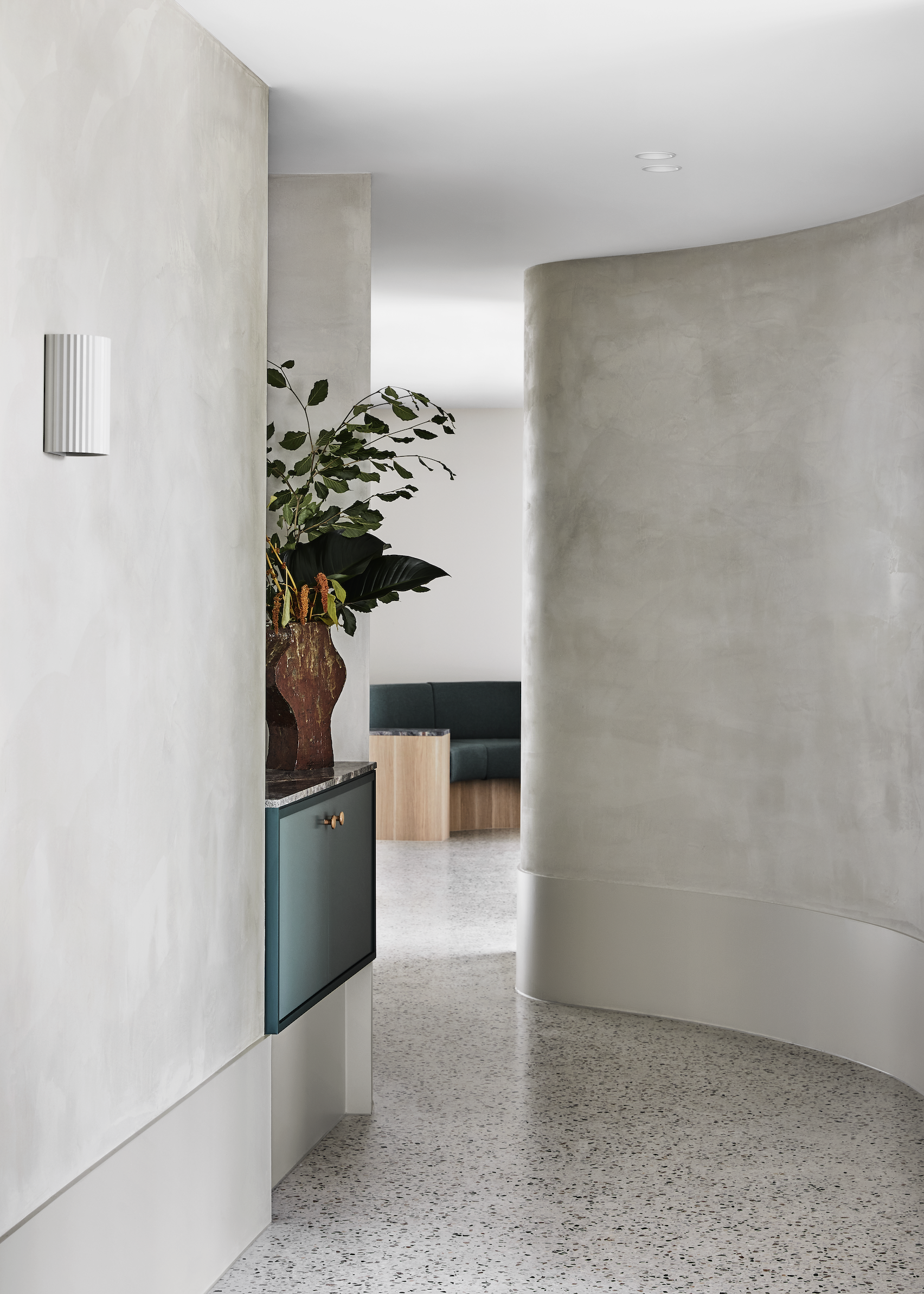
Curved corridors encourage visitors to explore the space

The yoga studio was intentionally positioned close to the entrance facing the street, which allows plenty of natural light. A timber floor and ceiling were desigend to create a sense of warmth in the room.

Moving further into the spa area, the tones get darker to provide privacy. Spaces were arranged in a circular configuration, which “encourages a continuous experience of the venue”.

Relinque spa
The design aimed to have “textural earthines”

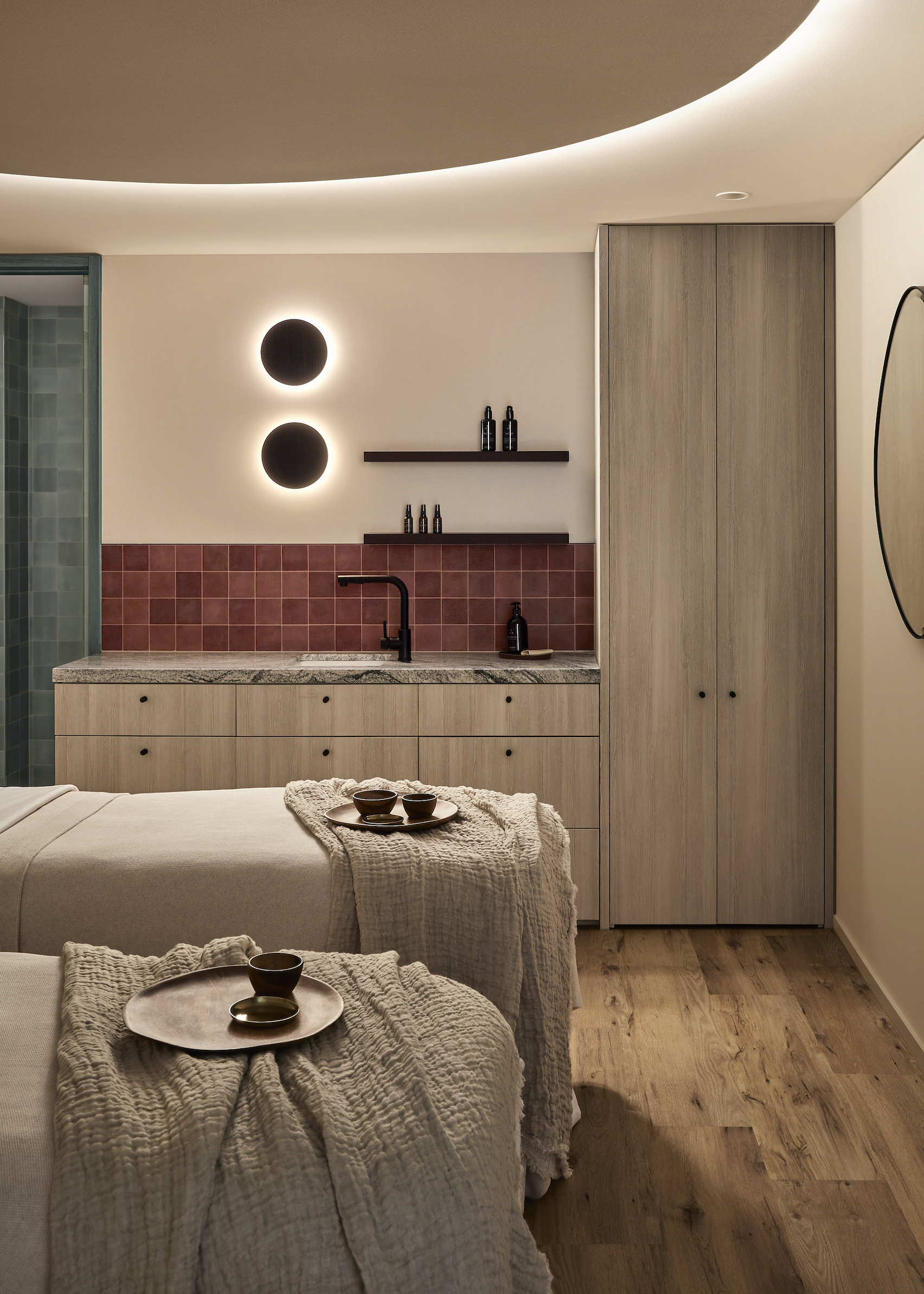
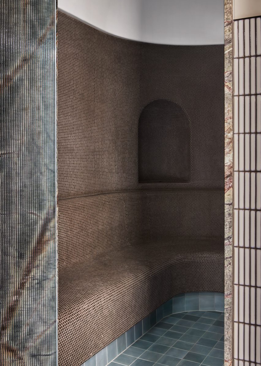
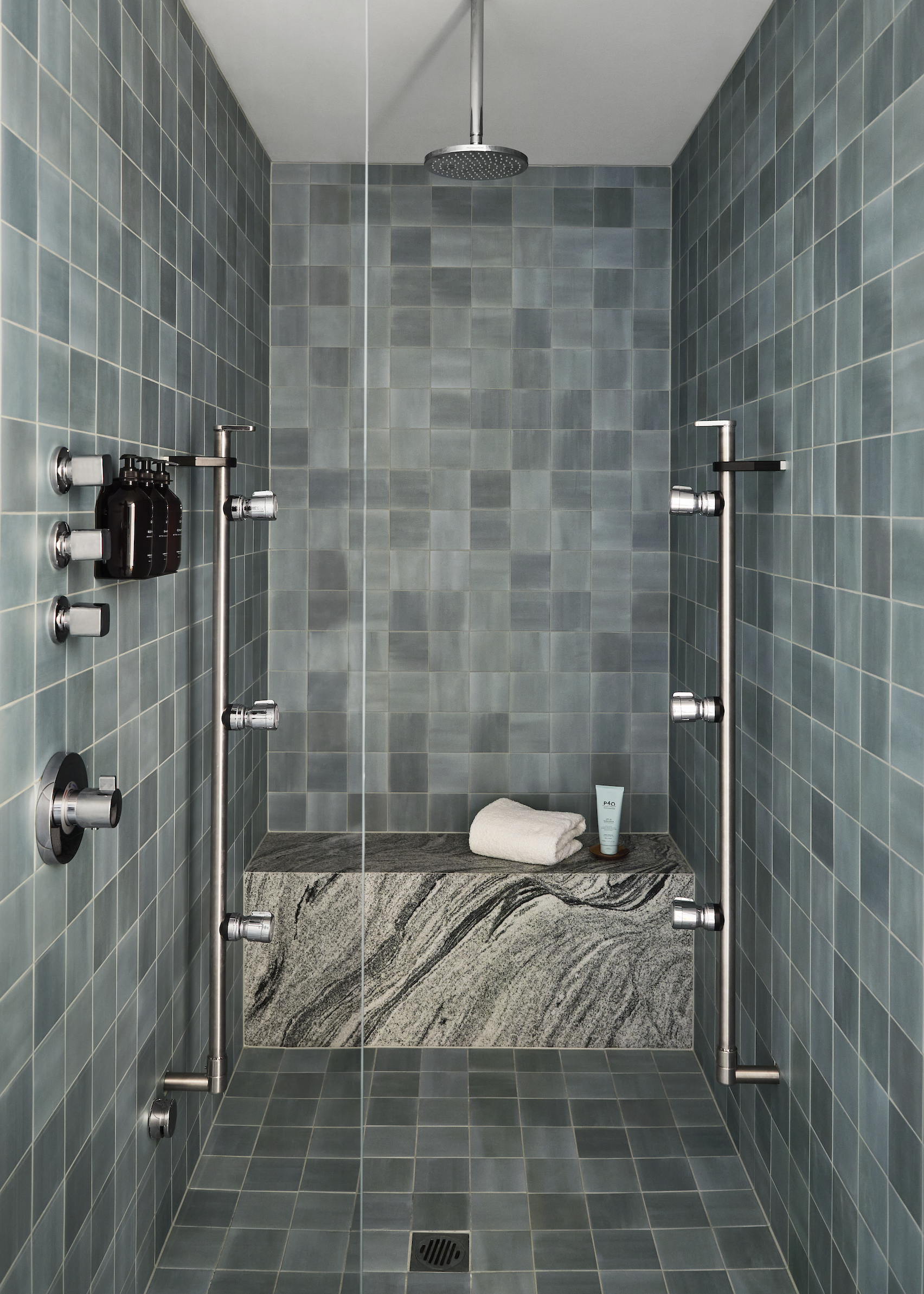
A curved corridor finished in polished plaster leads visitors to the spa area. Five individually-contained treatment rooms feature a deep rust tone, steam showers with sage green tiles and a granite shower bench.

Above the treatment bench, a backlit ceiling creates a halo around a circular acoustic fabric panel. The gently diffused light helps calm the mind throughout treatments.

The rounded steam room is lined with mosaic tiles, facing directly onto an ice room centred around an ice well covered in Japanese ceramic tiles.

“Luxurious accents are balanced with raw and tactile materials, ensuring the space feels welcoming to all,”added Addison.

Shower Relinque
Steam showers are lined with sage green tiles and a granite shower bench

A palette of greens, greys, burgundy and earth tones were used throughout the space in response to the nature-themed design narrative, according to Addison.

Studio Tate is led by interior designer Alex Hopkins and Carley Nicholls. The studios previous work includes an open office design for Burnet Institute and a day-spa with calming interiors in Melbourne.

The Photography is by Lillie Thompson.

Reference

Studio Sofield completes interiors on world’s skinniest supertall skyscraper
CategoriesInterior Design

Studio Sofield completes interiors on world’s skinniest supertall skyscraper

Studio Sofield has completed the interiors of 111 West 57th Street, also known as Steinway Tower – a supertall skyscraper designed by SHoP Architects in New York City.

The interiors mark the full completion of the 1,428-foot-tall (435-metre) skyscraper, which is the second tallest in the Western Hemisphere, and the skinniest in the world with a height-to-width ratio of 24:1.

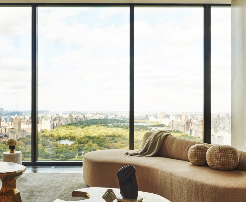
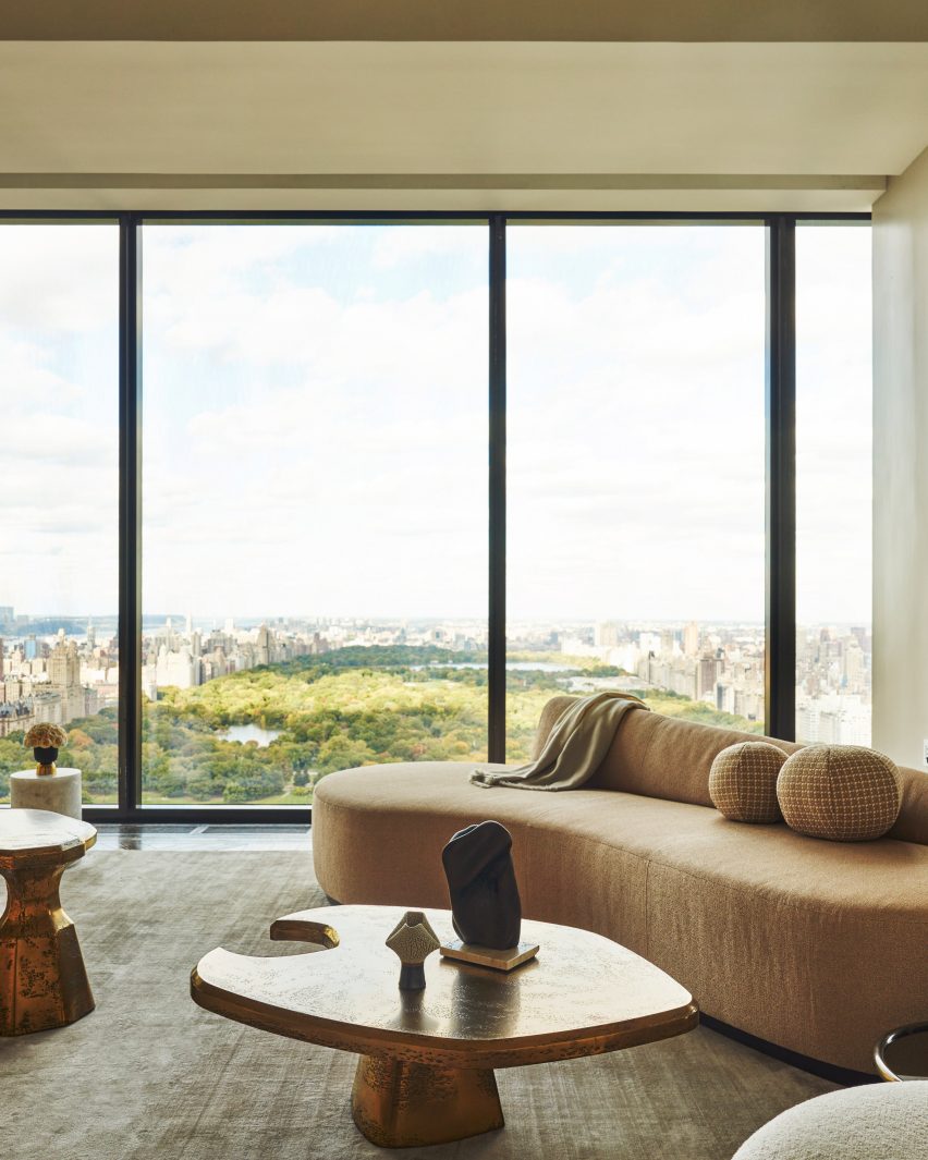
Steinway tower interiors with modern furniture and view of central park
Studio Sofield completed interiors for Steinway Tower in Manhattan

Sited on a street bordering Central Park in Midtown that has come to be known as Billionaire’s Row, the skyscraper has views looking north and south.

New York-based Studio Sofield designed the interiors for the skyscraper as well as the adjacent Steinway Hall, which is connected to the tower.

The 91-storey skyscraper has 46 residences, with an additional 14 held in Steinway Hall, as well as a variety of amenities, and was developed by JDS Development Group and Property Markets Group.

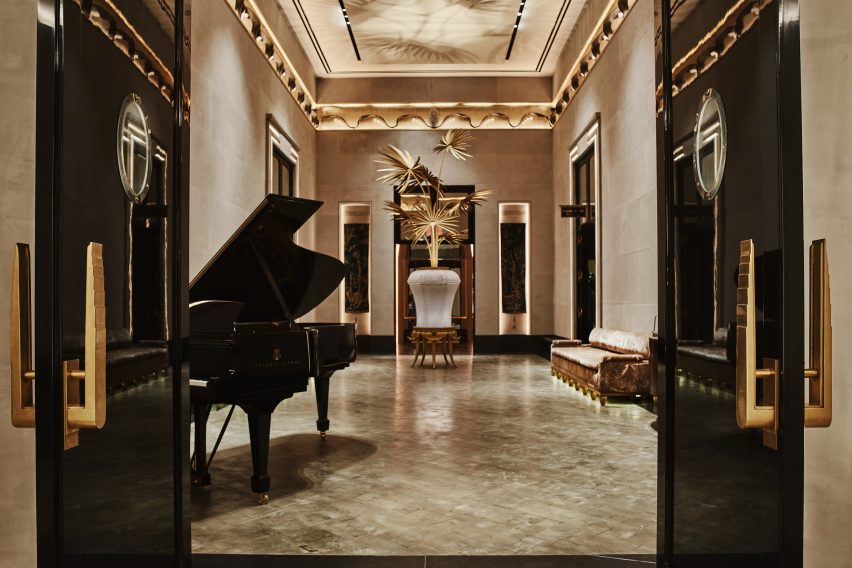
Steinway Tower lobby inteirors with pianos
The design included interiors for the lobby spaces that connect the tower and Steinway Hall

“With 111 West 57th Street, I set out to create interior architecture that was unmistakably and quintessentially New York,” said Studio Sofield founder William Sofield.

“While celebrating the vibrancy of today, I am a historian by nature and sought to honor and evoke the splendor of our city’s gilded age.”

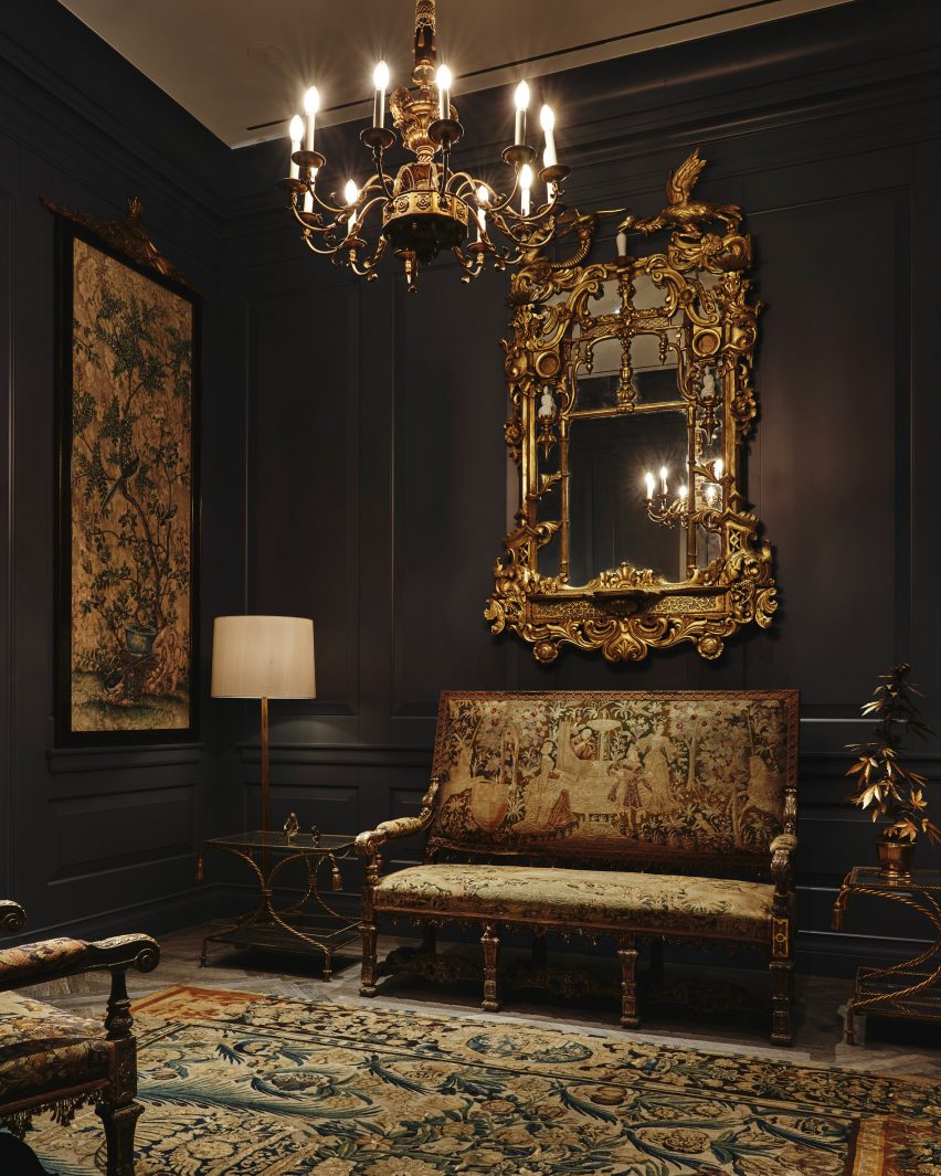
Steinway Tower lobby interiors gilded frames
Studio Sofield wanted the public interiors to reflect the “gilded age” of New York City

Interiors designed by Sofield includes the “block-long lobby sequence” that connects the two aspects of the tower. Here, the studio restored the original flooring of the Steinway Hall and used limestone, marble, blackened steel and velvet accents.

Murals in bas-reliefs of gold and silver leaves depict architectural landmarks of New York, and elephants were depicted elephants roaming through the city as a”tribute to the history of pianos”.

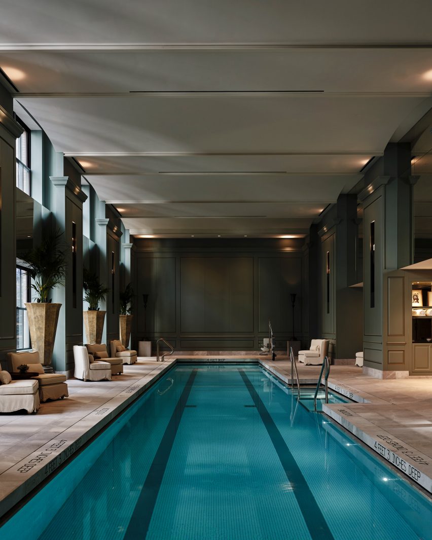
Steinway Hall swimming poool
The swimming pool room has full-height windows

Another room in the lobby sequence was outfitted with bronze mirror cladding that leads to a “domed salon” lined with banquet seating.

On 58th street, a residence entrance featuring a granite porte-cochere with grillwork doors inspired by “the bronze filigree on the building’s exterior”.

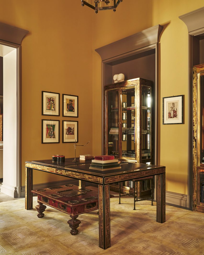
Steinway hall room
Steinway Hall was renovated using themes from the original building

The bar area and the swimming pool are also in the hall structure. According to the studio, the bar was based on the “legendary King Cole Bar with its chic bar” with an ornamental balcony and skylights that further the material references to the original building.

Elevator vestibules for the tower were completed using custom-made doors by artist Nancy Lorenz. The swimming pool is 82 feet long (25 metres) and is housed in a double-height room with floor-to-ceiling windows.

In the skyscraper, the residences each occupy at least a single floor. Each home has a central room where the views to the north and south are prioritised, and these rooms lead to a “signature great hall, which often spans the full width of the tower,” according to the studio.
Grey oak and macauba stone were used for the flooring and nine-foot-tall doors separate the room.
Steinway Skyscraper interiors
The skyscraper’s residences have wooden and stone floor

Hardware for the doors as well as other features like the freestanding bathtubs and the fixtures were sourced from long-standing US manufacturers such as PE Guerin, which, according to the studio, is the “country’s oldest architectural hardware firm”.

Other supertall skyscrapers – defined as one between 984 and 1,969 feet (300 and 600 metres) – designed by SHoP Architects include the Brooklyn Tower in Downtown Brooklyn, which is nearing its way to completion, having topped out earlier this year.

Billionare’s Row – the name for the luxury skyscrapers on 57th Street near Central Park in Manhattan, continues to see new developments, with New York studio ODA announcing the construction of a “fractal” skyscraper on the street.

The interior photography is by Adrian Gaut with exterior photography by David Sundberg.

Reference