Studio MK27 creates Patina Maldives resort on Fari Islands
CategoriesInterior Design

Studio MK27 creates Patina Maldives resort on Fari Islands

Brazil-based Studio MK27 has used wood, rattan and stone textures to create the buildings for a holiday resort on the Fari Islands archipelago in the Maldives.

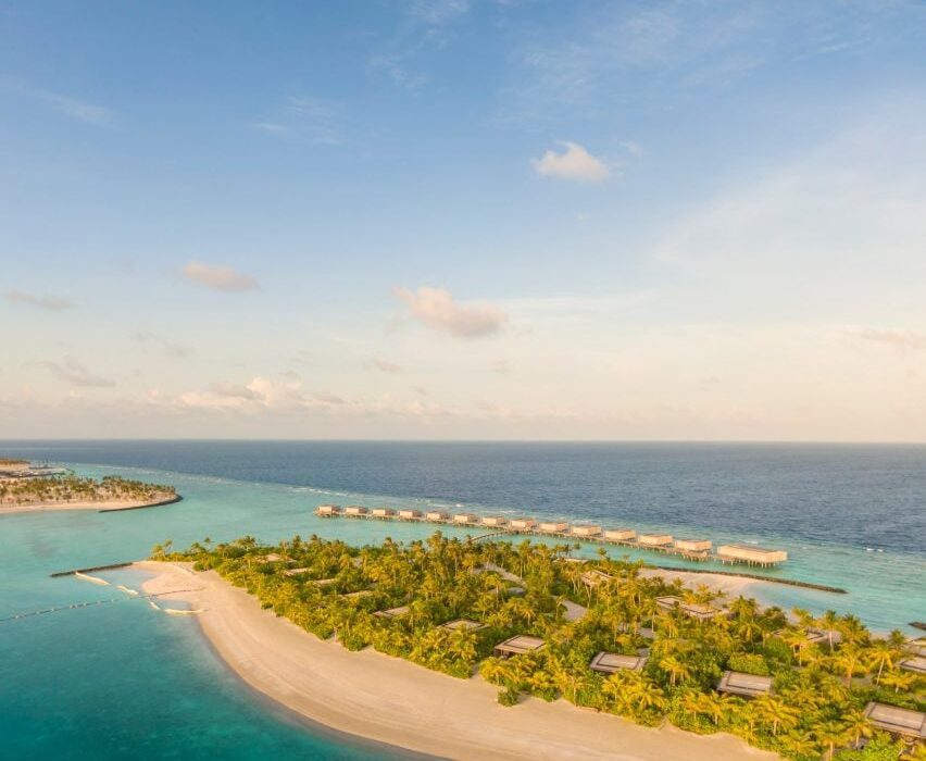
Patina Maldives occupies one of the four islands that makes up the artificial archipelago, which was built over approximately 10 kilometres of reef on the northern edge of North Male Atoll.
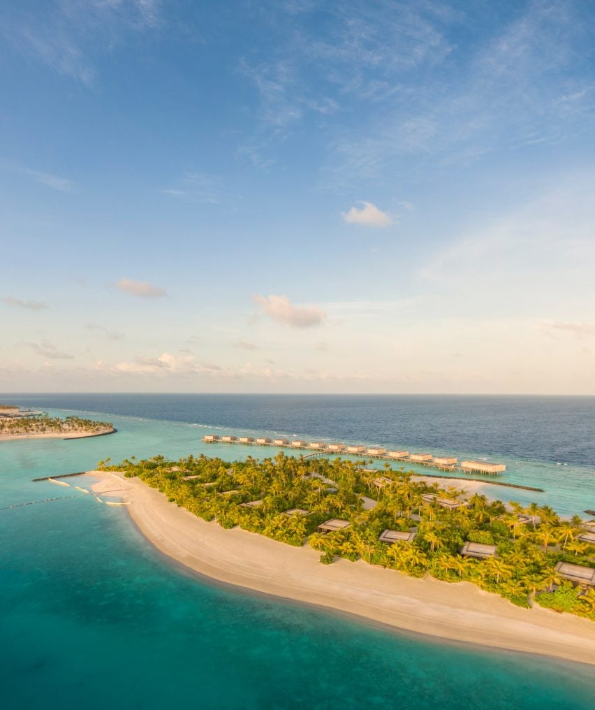
Aerial view of Patina Maldives
Patina Maldives is located within the new Fari Islands archipelago

Studio MK27 has designed architecture and interiors for buildings across the island, including an arrival pavilion, a spa, a kid’s club, and a cluster of bars and restaurants.

Accommodation is provided by a mix of beach suites, private in-land villas and water villas that project out to sea.
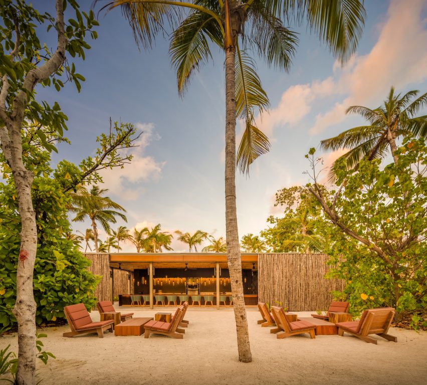
Patina Maldives by Studio MK27
Studio MK27 designed architecture and interiors for the resort’s various buildings

Never rising above the tree canopy, the buildings are dotted around the island in an arrangement designed to create areas of vibrant social activity and spaces of complete seclusion.

“Patina is unique in the Maldives: an opportunity to be together in isolation,” said Studio MK27 founder Marcio Kogan. “[It is] one of the most remote places on Earth and still a place designed for people to meet one another.”
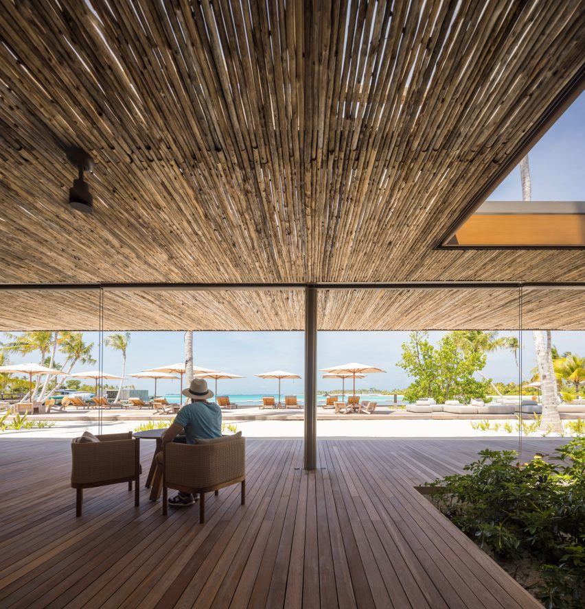
Deck at Patina Maldives by Studio MK27
Natural materials are combined with earthy colours

“Patina Maldives embraces our natural conflicts: desire for peace and party, for nature and design, technology and rusticity, self-indulgence and deep reflections,” he added.

The materials palette throughout consists of earthy colours, matt finishes and natural textures that are intended to chime with the natural landscape.
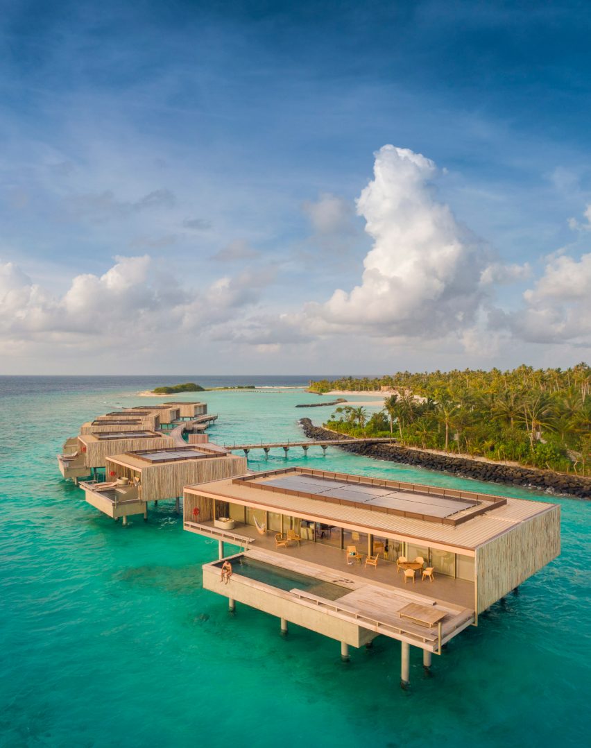
Beach villa at Patina Maldives by Studio MK27
Water villas come with their own swimming pools

Many of Studio MK27’s own designs can be found in the furnishings, including woven lighting pendants, neatly crafted shelving units, and cabana and deck chairs co-designed with Norm Architects.

The villas feature high-tech sliding window systems that allow the interiors to be opened up on three sides at the touch of a button, as well as custom-made blackout blinds.

“We escalate the textures and emotions from zero to 100, from soft shadows to overwhelming light,” said Studio MK27.

“It’s a rhythm with contrast, pauses and transparencies. From slow dolce far niente to exuberant real vitality, it is a place for people to bond with nature and each other, for people to experience the essential with glamour.”
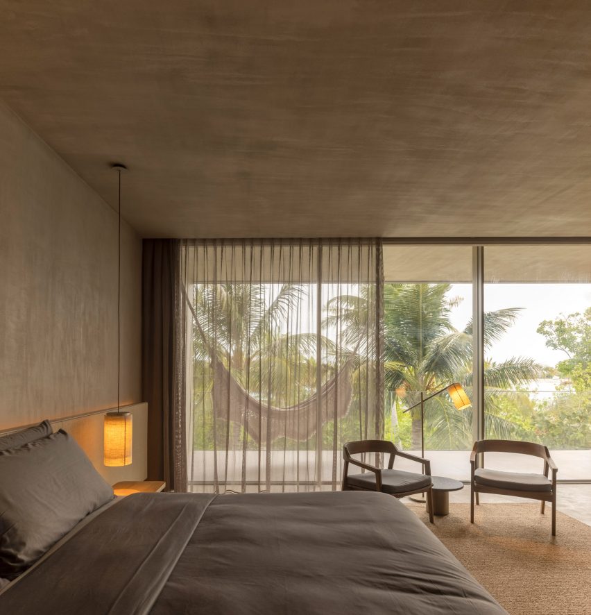
Villa at Patina Maldives by Studio MK27
There are also suites and villas inland and on the beach

Many of the buildings are characterised by clever details.

The spa centres around a shallow pool, with a skylight above offering a play of light and shadow, while the kid’s club is defined by colourful window apertures.
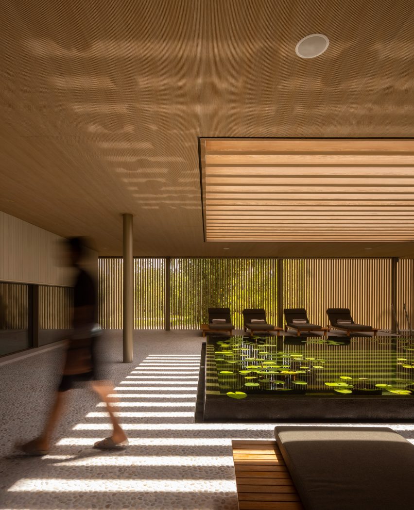
Spa at Patina Maldives by Studio MK27
The spa centres around a calming pool

The bar and restaurant area, known as the village, has its own sense of style.

Arabesque, a restaurant serving Middle Eastern cuisine, combines patterned terracotta blockwork with copper lights, while the Brasa grill is designed as a Latin American smokehouse.
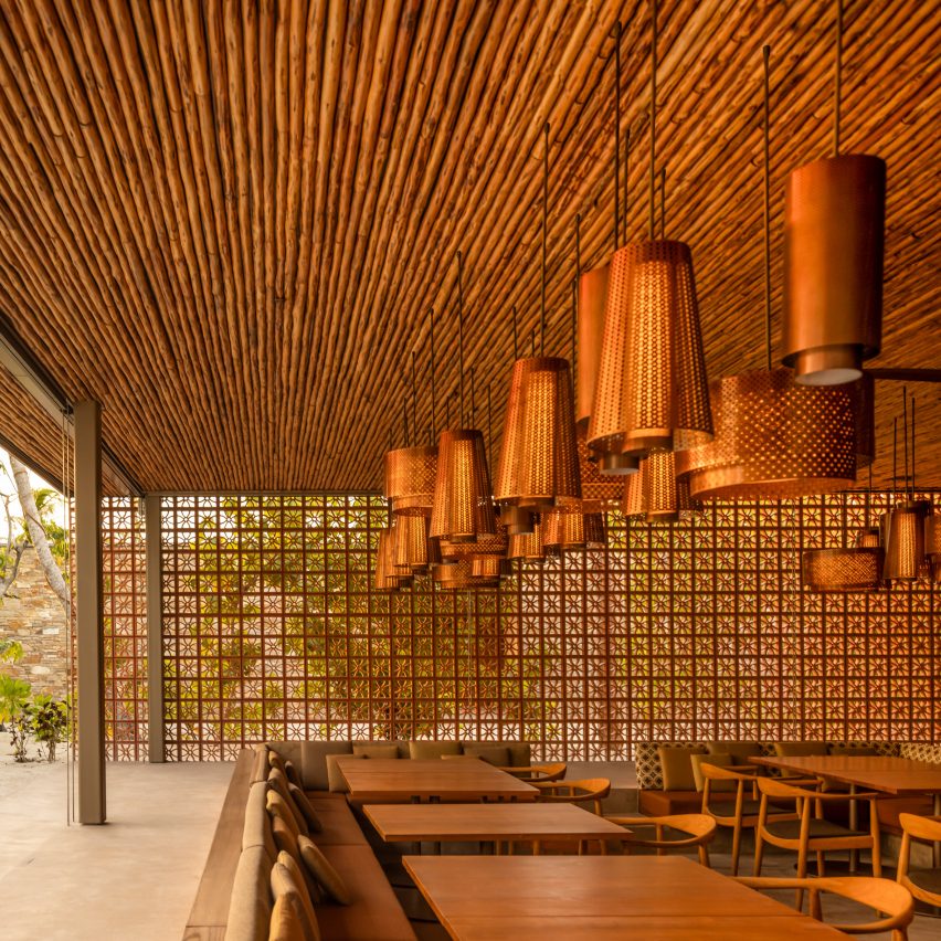
Restaurant at Patina Maldives by Studio MK27
The Village is a cluster of bars and restaurants

Studio MK27 has worked on many projects in idyllic locations, such as the beachside Vista House, or Jungle House, which is located in a rainforest.

The studio spent five years developing designs for Patina Maldives, which officially opened in May 2021.
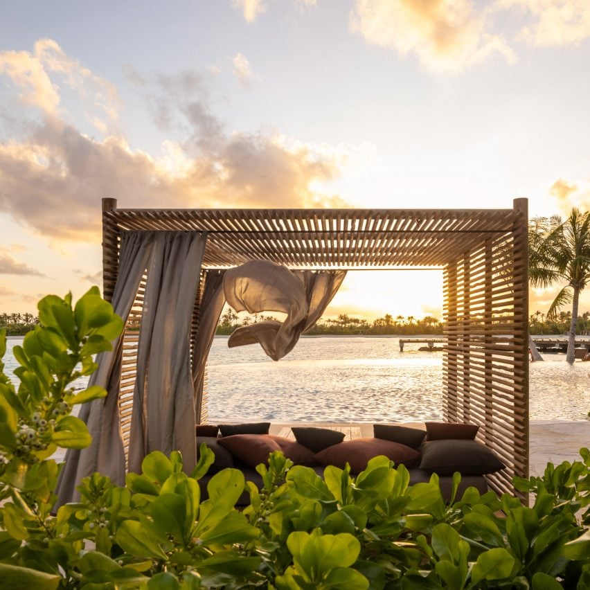
Cabana at Patina Maldives by Studio MK27
Studio MK27 custom designed much of the furniture

The hotel was longlisted for Dezeen Awards 2022 in the hospitality building category, while the spa is shortlisted in the leisure and wellness interior category.

It is one of three resorts located on islands within the Fari Islands archipelago, along with the Ritz-Carlton Maldives and the Capella-Maldives.

The photography is by Fernando Guerra.


Project credits

Architecture: Studio MK27
Lead architects: Marcio Kogan, Renata Furnaletto
Interior designers: Diana Radomysler, Pedro Ribeiro
Project team: André Sumida, Carlos Costa, Carolina Klocker, Diego Solano, Eduardo Glycerio, Elisa Friedmann, Gabriela Chow, Gustavo Ramos, Giovanni Meirelles, Julia Pinheiro, Lair Reis, Laura Guedes, Luciana Antunes, Renato Rerigo, Regiane Leão, Renata Scheliga, Ricardo Ariza, Marcio Tanaka, Mariana Ruzante, Mariana Simas, Samanta Cafardo, Suzana Glogowski, Tamara Lichtenstein, Thauan Miquelin
Developer: Pontiac Land Group
Landscape designer: Vladimir Djurovic Landscape Architects
Lighting design: The Flaming Beacon
Construction: Alhl Pvt
Project manager: Mace Group

Reference

The New Venture X Office by Studio+ Is a Masterclass in What Makes a Co-Working Space Great
CategoriesArchitecture

The New Venture X Office by Studio+ Is a Masterclass in What Makes a Co-Working Space Great

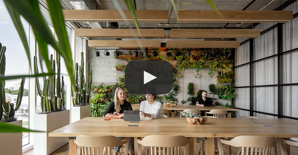
When Studio+ began designing the new office space for Venture X, the firm asked itself the question: “What makes a co-working space great?”

Studio+ figured that inspiring creativity in a workplace takes more than luxurious finishes and the right furniture but requires above all an understanding of the psychology behind great work. The firm took notes from the Venture X team — who have designed and built over 50 facilities around the world — and translated their lessons into a design that is both fresh and homey.

Read more about the project here:

Read More About the Project

Popular Choice, 10th Annual A+Awards, Coworking Space

Reference

Ukrainian studio Bogdanova Bureau’s Kyiv office damaged in missile attack
CategoriesInterior Design

Ukrainian studio Bogdanova Bureau’s Kyiv office damaged in missile attack

Kyiv architecture studio Bogdanova Bureau has vowed to make its office “even more beautiful than before” after it was damaged in a Russian missile attack.

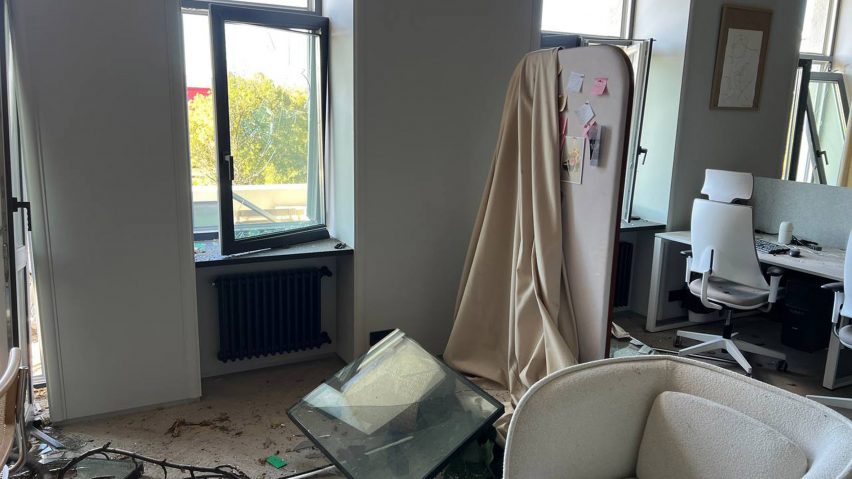
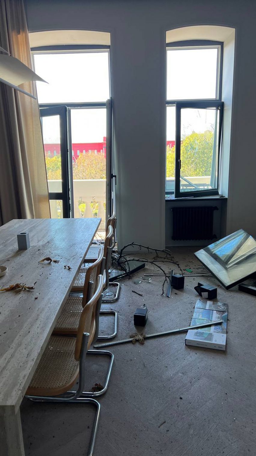
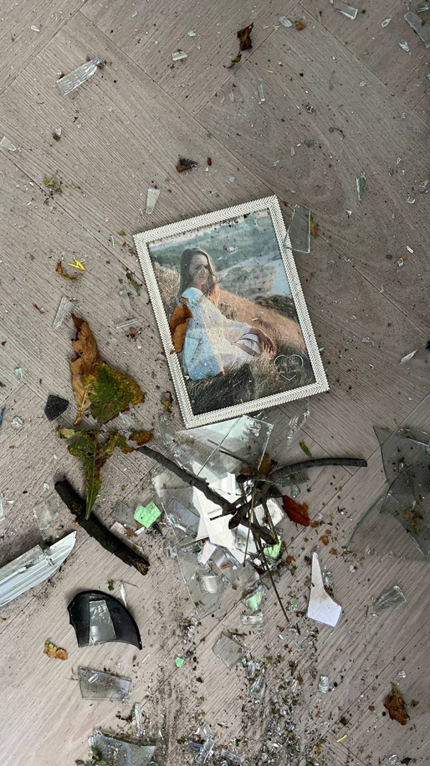
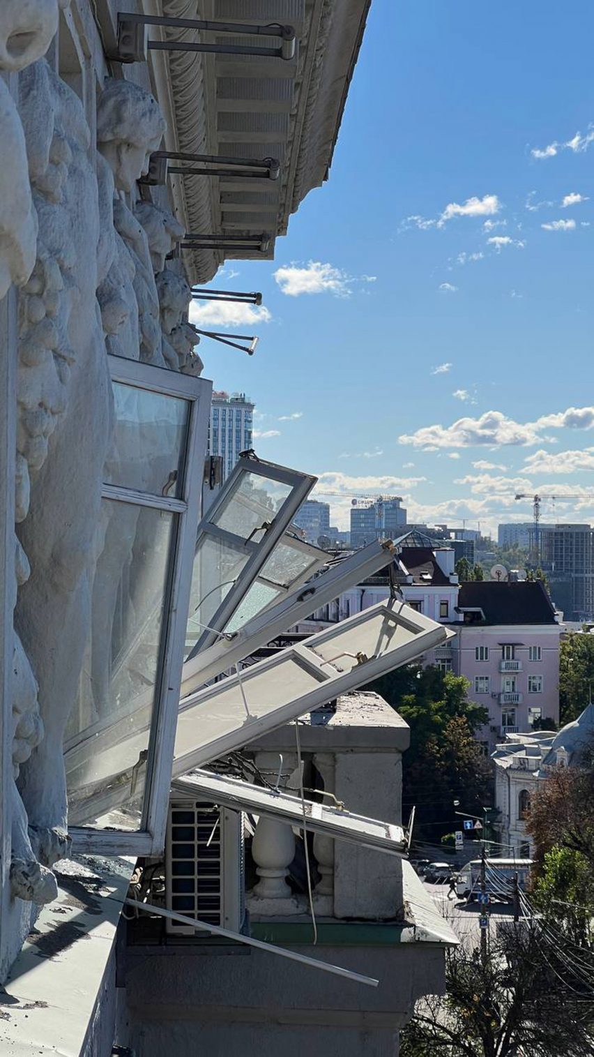
Staff at Bogdanova Bureau arrived at the office on Monday to find the windows blasted into the room and debris and broken glass scattered across the floor.

Bogdanova Bureau office damaged by missile blast
Windows were smashed into the room by the blast

Russian forces had fired a barrage of missiles into the Ukrainian capital and other cities early that morning, killing 19 people and injuring many more.

None of Bogdanova Bureau’s employees were harmed, though some of their possessions were destroyed, the studio told Dezeen. By Tuesday, the team had cleaned up the office and returned to work in the studio.
Ukraine war damage
The team cleaned up the office and returned to work the following day
“In some time we will repair all that is broken and make our place even more beautiful than before,” said studio spokesperson Nadia Sheikina. “As designers, we know how to do it.”

“As well, we are going to rebuild all the destroyed cities and villages, all the schools, homes and ambulatories that were ruined in Ukraine,” she continued. “We already had started working on it.”

Debris on floor
Broken glass and debris was scattered through the office

“We were scared on February 24 when the war started, now we are not,” she added. “We know that the mean enemy wants to invade our land and appropriate our culture, but it will never happen.”

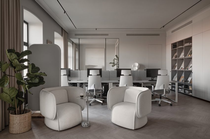
Bogdanova Bureau only recently refurbished its office, completing the project five months before the Russian invasion began.

Bogdanova Bureau's Kyiv office interiors
The office, pictured before the blast, was refurbished five months before the war began. Photo by Yevhenii Avramenko

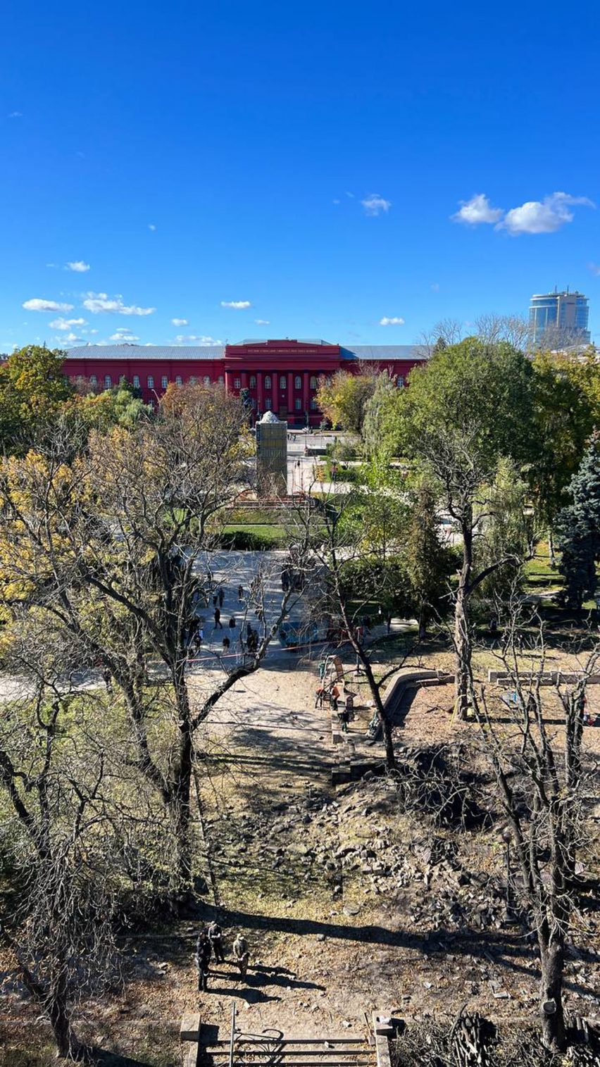
The office is in the heart of Kyiv next to Shevchenko Park, and is surrounded by a university, libraries, museums, and a cultural centre, as well as apartments and office buildings.

A missile struck the middle of the park close to a children’s playground, with the blast wave destroying windows across the building housing the studio’s office.

Missile strike site in Kyiv park
The missile struck a park outside the office building next to a playground

The bombardment of central Kyiv was part of a series of attacks launched in retaliation after a key bridge linking Russia to the annexed region of Crimea was heavily damaged by an explosion.

In April, Bogdanova Bureau spoke to Dezeen for a piece about how Ukrainian design and architecture studios were dealing with the war.

At the time, its founder Olga Bogdanova urged international clients to trust Ukrainian studios to deliver despite the turmoil of the conflict.

“We thank the international society and especially the international design community for all their support and all their attention,” Sheikina said this week.

War damage in Kyiv
Windows of the building were left damaged

“But after eight months of the war, we feel that some of you got used to the war. Please do not be! It is understandable, no one can be stressed for such a long time and everyone deserves to experience their own life and focus on some normal things around them,” she continued.

“We ask you not to get used to war and pay your precise attention to Ukrainian designers, architects, and artists. Please raise your voice and stand with Ukraine. It can make things different!”

The photography is by Yulia Bevzenko unless otherwise stated.

Reference

Universal Design Studio models Biotherm’s Monaco concept store on a lab
CategoriesInterior Design

Universal Design Studio models Biotherm’s Monaco concept store on a lab

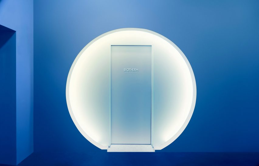
The visual language of scientific laboratories informed the look of this blue-lit concept store in Monaco, which London firm Universal Design Studio has devised for skincare brand Biotherm.

Set inside Monaco’s historic Oceanographic Institute, Blue Beauty Lab is where buyers and other industry insiders can come to expand their knowledge of the science underpinning Biotherm‘s skincare line.

Biotherm concept store in Monaco has blue interiors with science lab-inspired details
Visitors enter the Blue Beauty Lab via a circular doorway

Although the 30-square-metre concept store showcases a selection of the brand’s products, none of them are for sale. Instead, visitors can fully immerse themselves in the experience of being in the “lab”.

“Brands are increasingly looking to physical presence for means above and beyond selling products,” explained Satoshi Isono, creative director at Universal Design Studio.

“They’re harnessing spaces to storytell their core brand messaging in unique ways and ultimately connect with customers in a more impactful way.”

Biotherm concept store in Monaco has blue interiors with science lab-inspired details
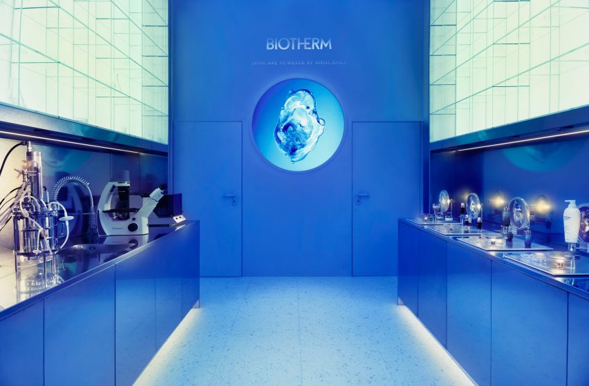
The first section of the store is set up like a science lab

As the outer walls of Blue Beauty Lab back onto water tanks harbouring various aquatic creatures, Universal Design Studio had to keep architectural interventions to a minimum. As a result, the store’s floor plan is fairly simple.

To enter, visitors walk through a circular doorway and a short mirrored tunnel. The interior is washed in sea-blue light and split into two parts.

Biotherm concept store in Monaco has blue interiors with science lab-inspired details
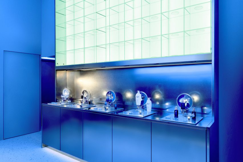
Steel worktops and petri dishes add to the lab-like feel of the space

The first is an area reminiscent of a research lab that gives an insight into the production process of Life Plankton – an extract containing 35 different nutrients that Biotherm incorporates throughout some of its moisturisers, serums and skin peels.

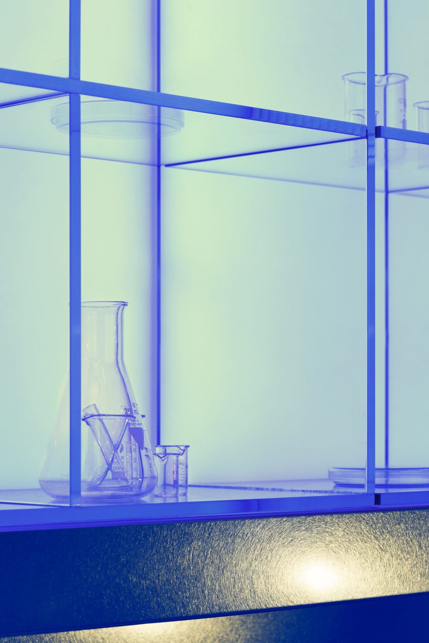
Stainless steel counters and glass shelving units run down the sides of the space, dotted with science paraphernalia like microscopes, petri dishes, test tubes and measuring flasks.

A small workshop forms the second part of the store, centred by a round table. Directly above is a large ring light emitting a bright white glow that enhances the lab-like feel of the space.

Interactive visuals produced by multimedia design studios Superbien and AC3 Studio are projected on the surrounding walls.

Biotherm concept store in Monaco has blue interiors with science lab-inspired details
Measuring flasks and test tubes are also displayed on the shelves

The clinical aesthetic of laboratories has also inspired a number of other interiors.

Among them is a bike shop in Copenhagen by local designer Johannes Torpe and a cafe in Tokyo with a white-lacquered steel ceiling grid.

Reference

Ivy Studio renovates fire-damaged Piatti restaurant in Montreal
CategoriesInterior Design

Ivy Studio renovates fire-damaged Piatti restaurant in Montreal

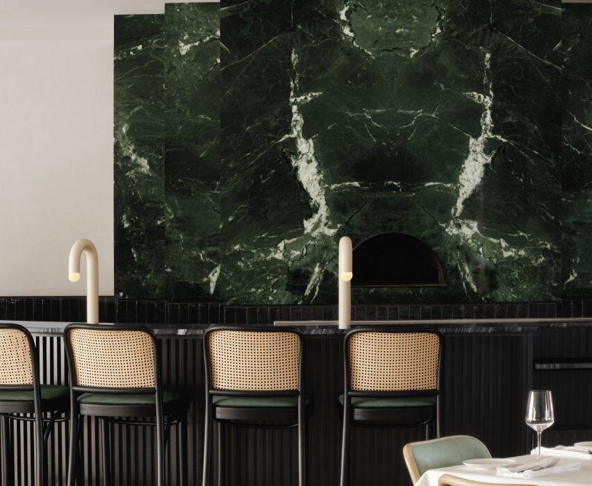
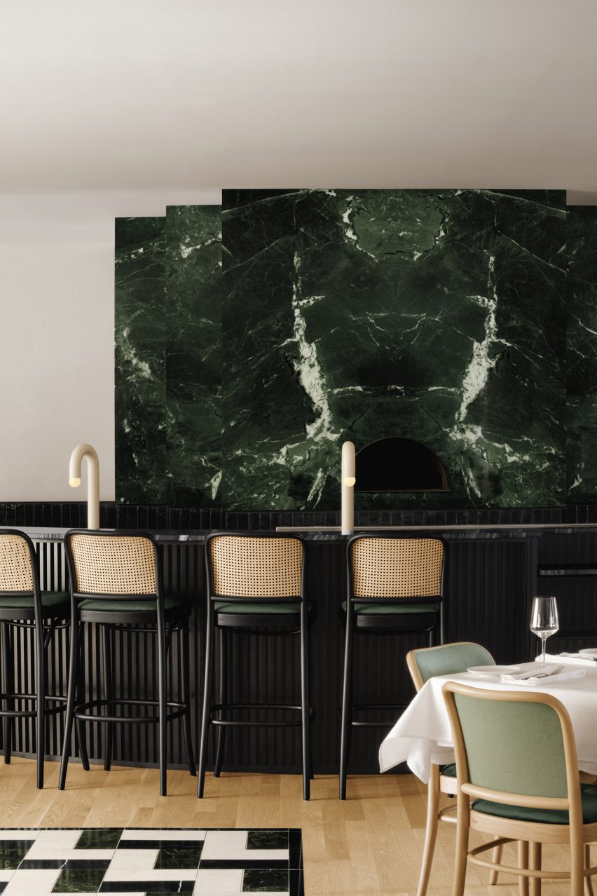
Dark green marble, glossy black tiles and sculptural lighting contrast the rough stone walls of this Montreal restaurant that has been resurrected by local Ivy Studio.

Located in Rosemère, on Montreal’s north bank, Piatti opened 15 years ago in an old stone building that was previously extended to accommodate a larger commercial space.

Green marble pizza oven
A pizza oven wrapped in green marble forms a focal point at Piatti

After a fire ripped through the Italian restaurant over a year ago, damaging the roof and the interior, the owners chose to renovate and update the space.

“From this tragedy rose the opportunity to give the space a much-needed facelift,” said the Ivy Studio team, who took on the project.

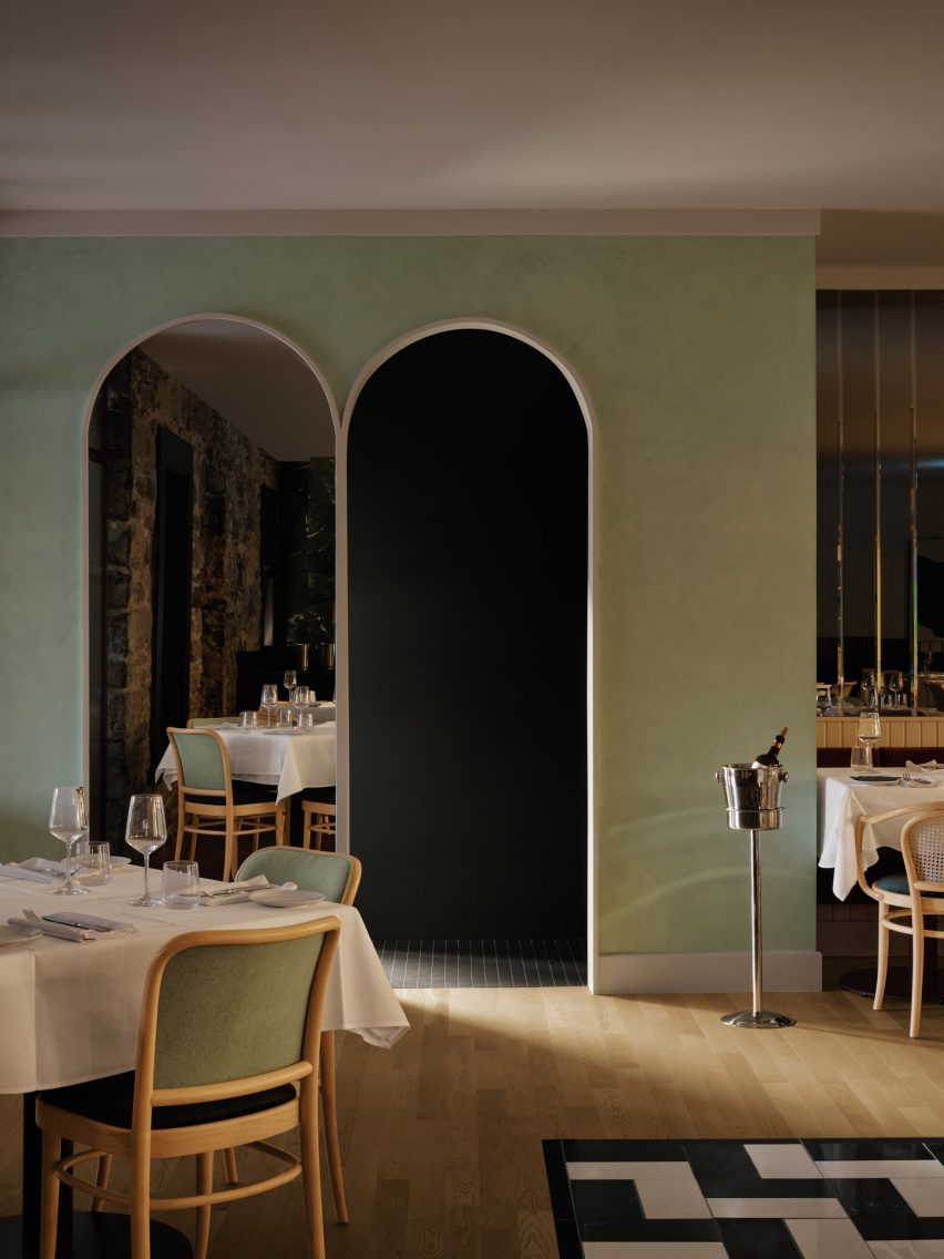
Two arches in pistachio-coloured wall
Entrance to the kitchen is through an arch set into a pistachio-coloured wall

“While the overall aesthetic is very contemporary, the decor was inspired by traditional Italian design and includes textures, materials and colours that project clients directly to the Mediterranean,” the studio added.

The two-storey building is entered on the lower level, where the preparation kitchen, a private event room and the washrooms are situated.

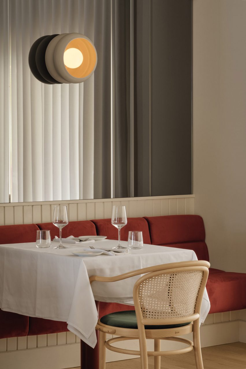
Sienna banquette below a mirrored wall
A sienna-toned banquette is installed beneath a mirrored wall

Upstairs are the dining areas, each with a distinct atmosphere. When entering past courses of glossy black tiles, customers are met by a “monumental” pizza oven wrapped in green Saint-Denis marble.

A black stained-wood and marble structure in front acts as a dining and service area, across from a hand-plastered pistachio wall with an arch that leads to the closed kitchen.

Bar area within old stone building
The bar area is located in the old stone building

Above a sienna-toned velvet banquette, a mirrored wall helps to make the dining space feel larger – reflecting its cream walls and sheer curtains.

Bistro chairs with green seats and caned backs are placed around tables.

Custom lighting and stools at the bar
Lighting and stools were custom designed for the bar

A circular wood-topped table sits on zig-zag black and white tiles below a central bespoke chandelier.

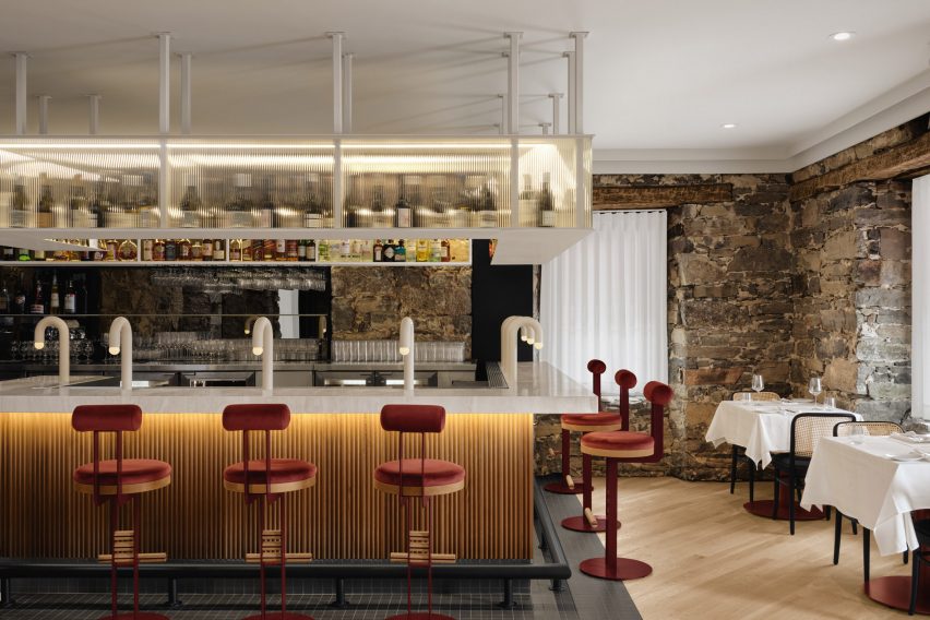
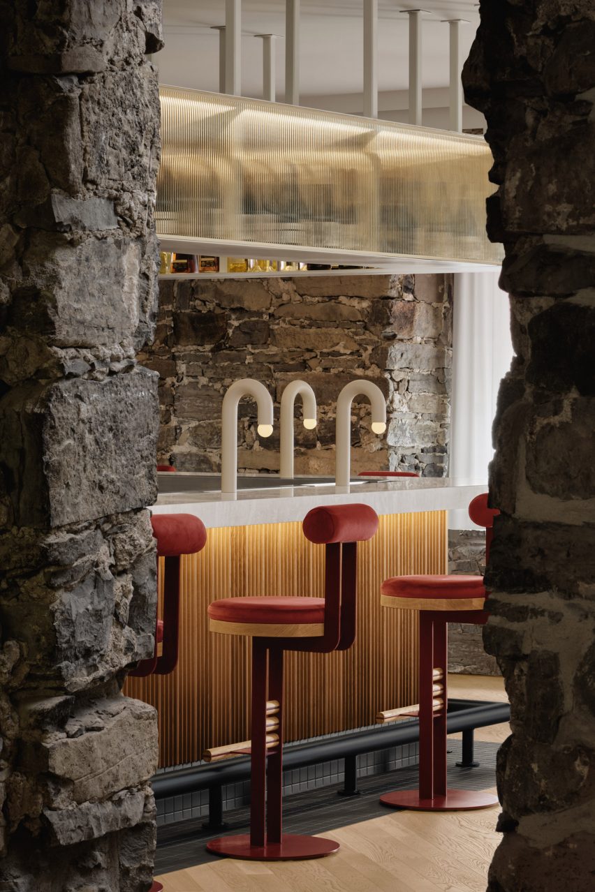
The bar occupies the old stone aspect of the building. Here, a U-shaped counter is clad with vertical oak boards and topped with a four-inch-thick travertine slab.

Custom stools made from velvet, steel and wood are lined up against the bar, colour-matching the banquette upholstery in the dining room.

Minimal, custom cream-painted lamps are spaced along the length of the counter, while a steel structure suspended above holds bottles behind fritted glass panels.

Dining table in the corner
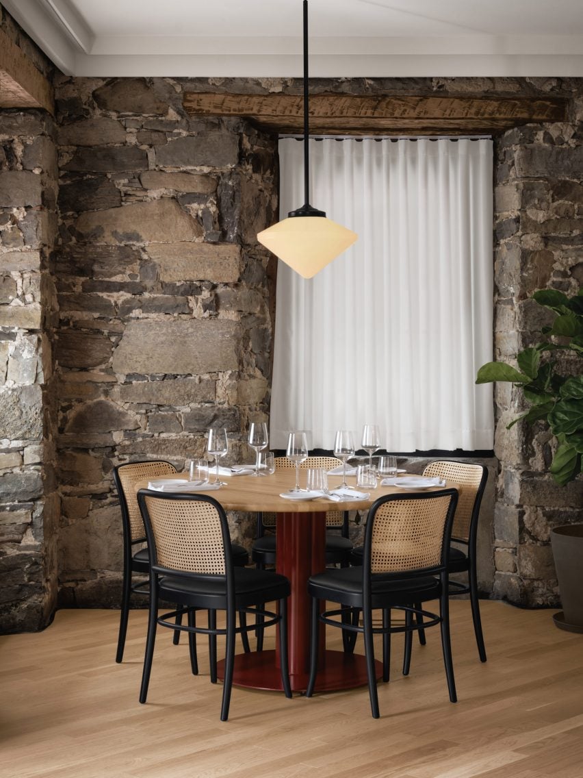
A pendant light hangs above a table in the corner of the bar area

“The entire room has recessed lighting going around the ceiling to properly highlight the original stone walls in the evening,” said Ivy Studio.

Montreal is home to a wealth of Italian restaurants with notable interiors, several of which have opened over the last few years.

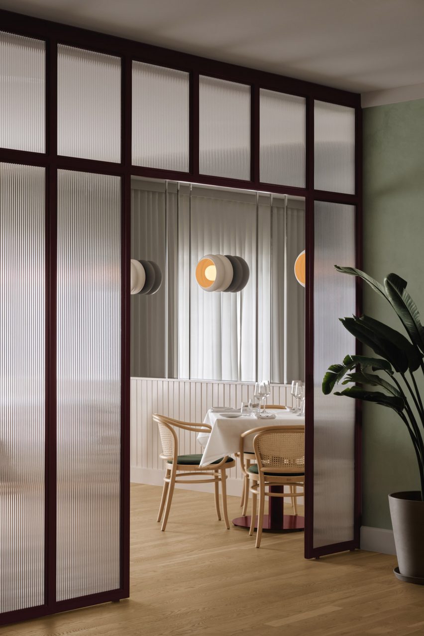
Fritted glass dividing wall
Ivy Studio based the contemporary decor on traditional Italian design

They include pizza spot Vesta and Tiramisu at the city’s Hilton hotel – both designed by Ménard Dworkind.

Among Ivy Studio’s other hospitality projects in the Quebec capital is Jack Rose, an eatery in a former auto body shop.

The photography is by Alex Lesage.


Project credits:

Team: Gabrielle Rousseau, David Kirouac, Guillaume B Riel, Philip Staszewski
Construction: Groupe Firco

Reference

Studio Terpeluk renovates Albert Lanier-designed Noe Valley home
CategoriesInterior Design

Studio Terpeluk renovates Albert Lanier-designed Noe Valley home

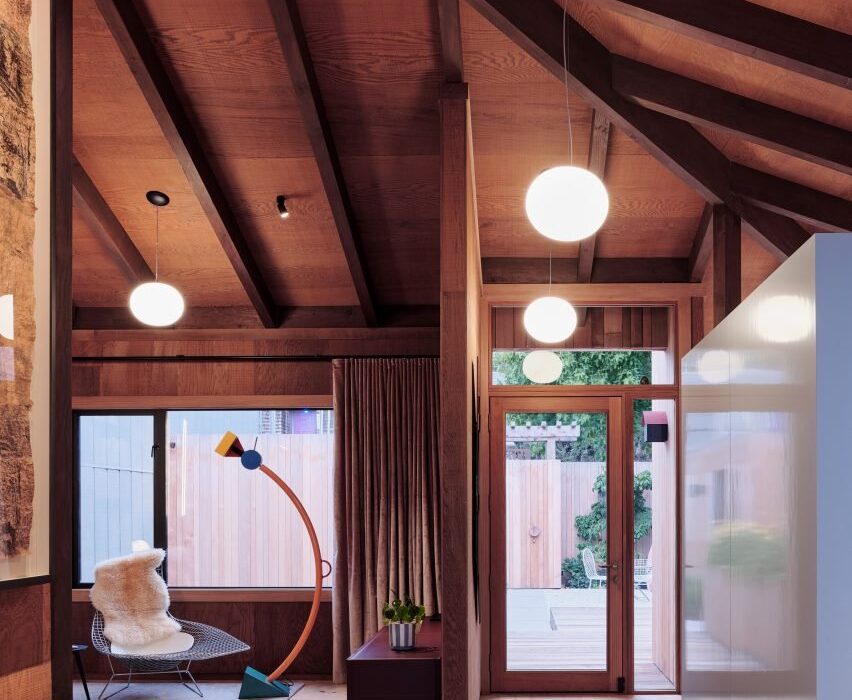
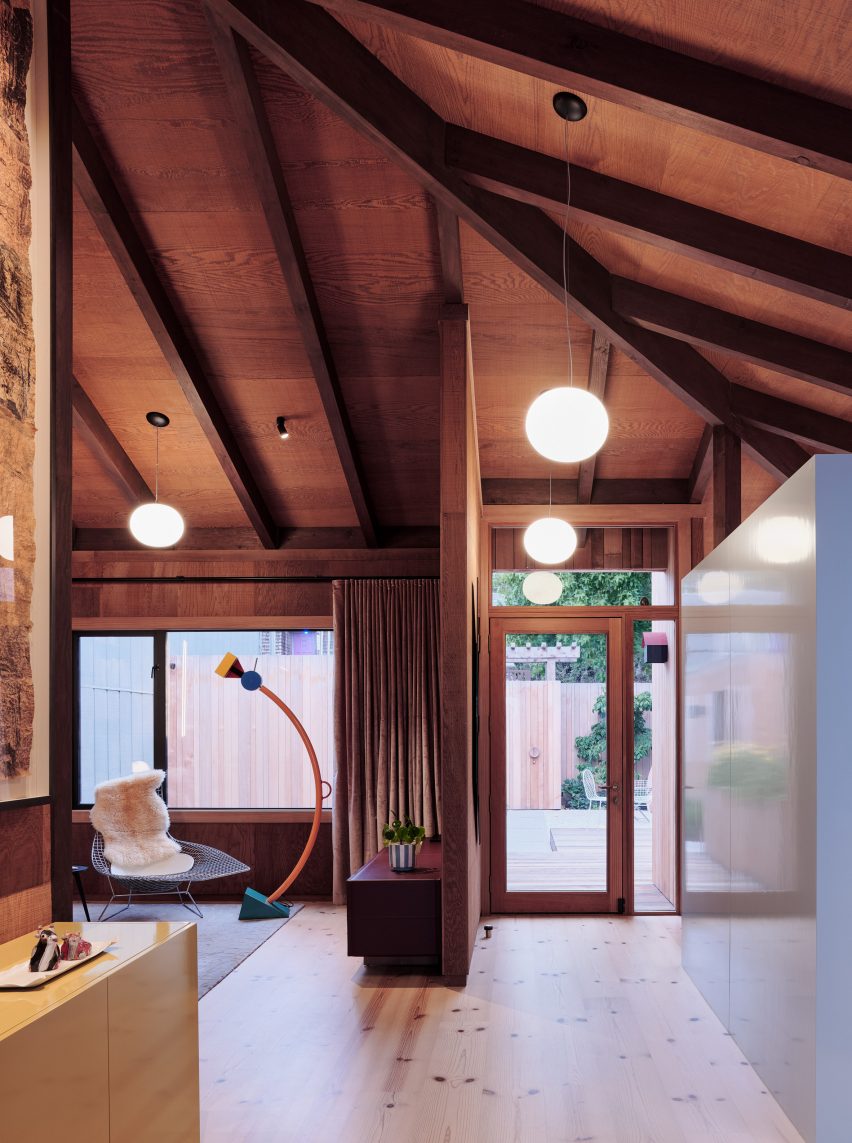
San Francisco-based Studio Terpeluk has renovated and expanded Redwood House in Noe Valley with redwood interiors and terraces.

The three-storey Redwood House was originally designed by American architect Albert Lanier – husband to sculptor Ruth Asawa – in a hilly  San Francisco neighbourhood characterised by Victorian and Edwardian houses.

Noe Valley home with exposed timber beams in ceiling and sculptural lamp
Studio Terpeluk renovated an interior in Noe Valley

Studio Terpeluk was selected to expand the 1976 house from 2,260 square feet (210 square metres) to 3,218 square feet (299 square metres) with a new guest room suite, home office, wet bar and media room.

The renovation “surgically modified the house in an architecturally non-aggressive manner,” the studio said.

Colourful panelling and cedar ceiling in Noe Valley home
Western red cedar was used for the walls and ceiling

Wrapped with irregular western red cedar planks, the narrow house cascades down the hillside with exterior courtyards that mitigate the grade change.

One enters the house through an intimate courtyard off the street into an open-plan upper level with a sloping ceiling and dark-knotted Douglas fir flooring made from local reclaimed pier pilings.

Many of the walls and ceilings were updated with vintage rough-sawn redwood veneered plywood maintained from the original build.

“Redwood surfaces and structural elements complete the warm interior landscape: from the sloping roof beams to partition walls and built-in shelves,” the studio said.

Cedar shelf library with abstract painting
The renovation expanded the home

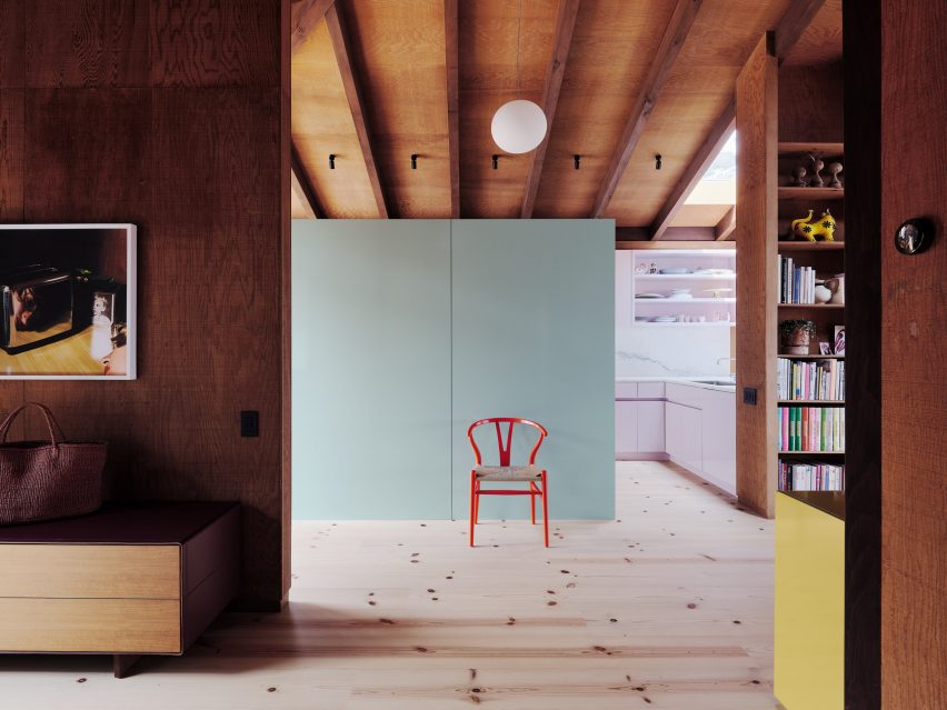
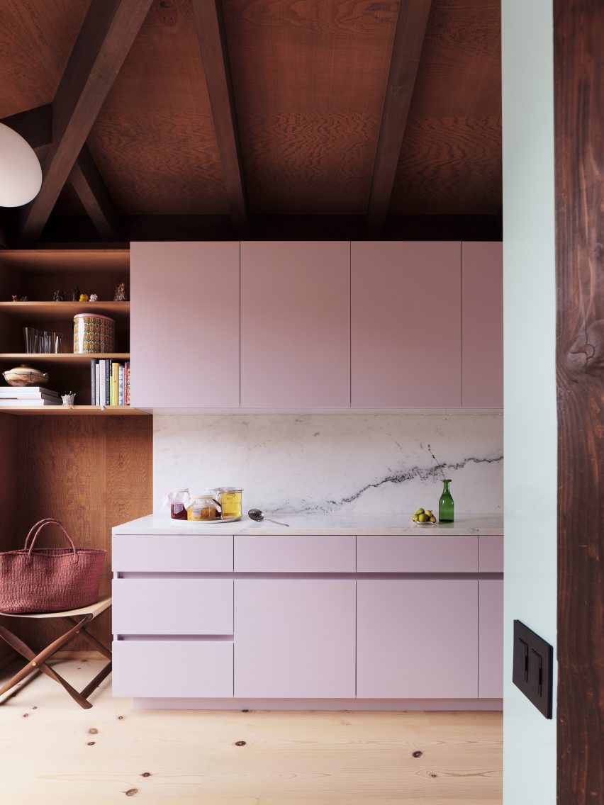
To the left of the entrance is the kitchen with custom-gloss cabinets and a Carrara marble backsplash. It opens to a dining room that features a Saarinen table and Hans Wegner wishbone chairs.

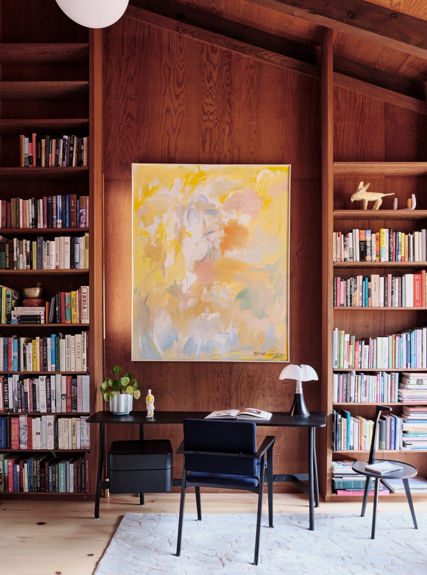
To the right is the library where sunlight from the large window brightens the dark panelling and sculptural furniture.

Pink cabinets with marble backsplash
Bright panelling contrasts the rich wood tones

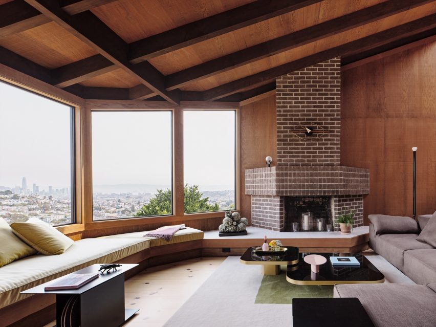
The living room is oriented around a pink sculpture by American artist Wanxin Zhang.

Padded seating wraps the corner under a large window looking out to the San Francisco skyline.

Brick fireplace with views of San Francisco and wrap-around seating
The living room has wrap-around seating and views of San Francisco

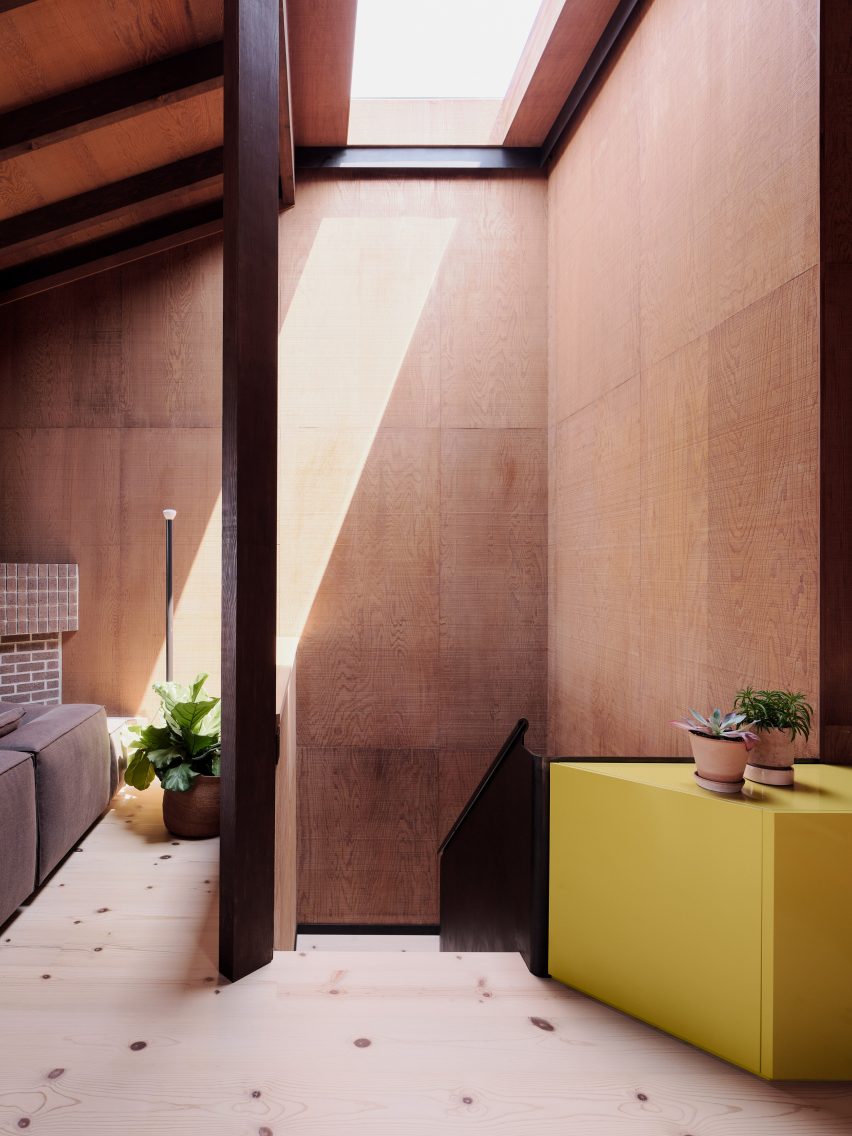
The house is centred around a staircase illuminated by a skylight.

“The sculptural blackened steel stair with vintage rough-sawn redwood plywood walls anchors the house, weaving together the three floors and their diverse spatial character,” the studio continued.

Wooden staircase with skylight and yellow storage unit
The home is oriented around a central staircase

The middle level features guest suites with direct access to the entry courtyard.

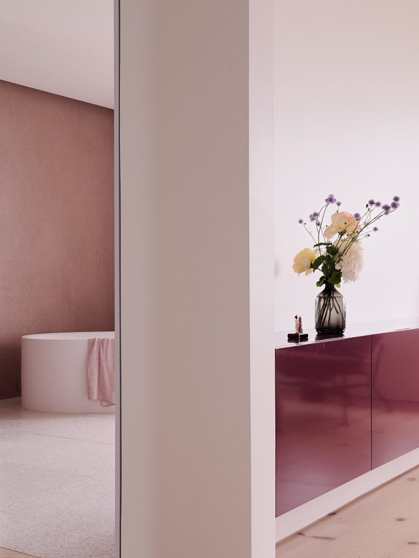
The primary suite is softened by light pink terrazzo tile and a micro mosaic of Indian red recycled plastic tiles.

Pink tile bathroom in mid-century renvoation
The home’s colour complements the art collection of the owners

“Color was a recurring theme in the exquisite and eclectic art collection of the owners,” studio founder Brett Terpeluk said.

“This went perfectly hand in hand with my interest in mid-century Italian design and its bold use of color.”

Wood-panelled terrace in Noe Valley home
A series of terraces connect the home with the sloping site

“We collaborated with our friend and designer Beatrice Santiccioli to enrich the project with a dedicated and bespoke color language,” he continued.

At the lowest level, a media room, home office and kitchenette open to an abundantly landscaped garden.

The outdoor areas were designed by Terpeluk’s wife and longtime consultant, Italian landscape designer Monica Viarengo.

The terraces shift from curated gardens to wild vegetation as one moves through the property, while the plantings reference California coastal landscapes with yellow roses, espaliered fruit trees and a variety of thymes.

Bedroom connecting to courtyard in Noe Valley home
A guest suite connects to the central courtyard

Studio Terpeluk was founded in 2008 by Brett Terpeluk, after he finished a tenure working with Italian architect Renzo Piano.

Other Noe Valley renovations include the Gable House by Edmonds + Lee, a renovated Victorian townhouse by Fougeron Architecture and an industrial home for a tech entrepreneur by Levy Art and Architecture and Síol Studios.

Photography is by Joe Fletcher.


Project credits

Project team: Brett Terpeluk, Huy Nguyen
Landscape design: Monica Viarengo
Color consultant: Beatrice Santiccioli
Contractor: Saturn Construction
Structural engineering: Strandberg Engineering
Furniture: Santiccioli Arredamenti
Orama sliding window systems: Cooritalia
Windows: Bonelli
Wood reclaimed wood flooring: Arborica
Metal fabrication: Upper Story Design
Drapery/upholstery: Malatesta & Co
Art: Catharine Clark Gallery

Reference

Studio MOM creates mycelium cycle helmet MyHelmet
CategoriesSustainable News

Studio MOM creates mycelium cycle helmet MyHelmet

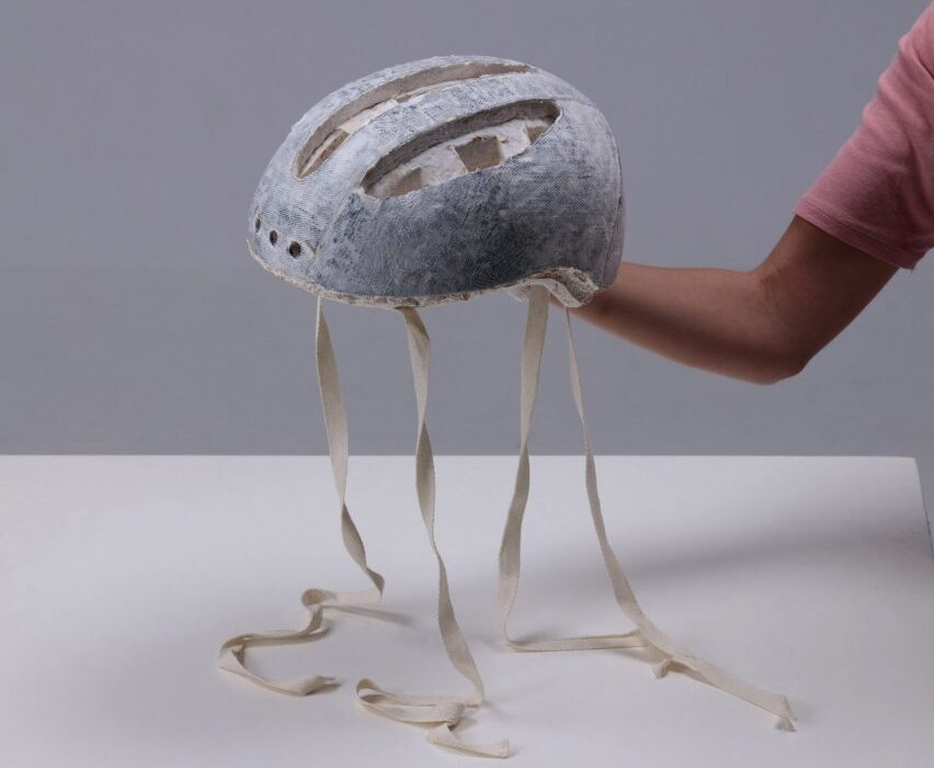
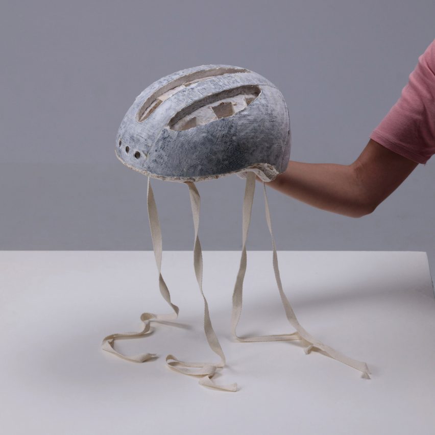
Dutch design office Studio MOM has developed a bicycle helmet from biomaterials that, unlike polystyrene helmets, can be produced without fossils fuels and composted after use.

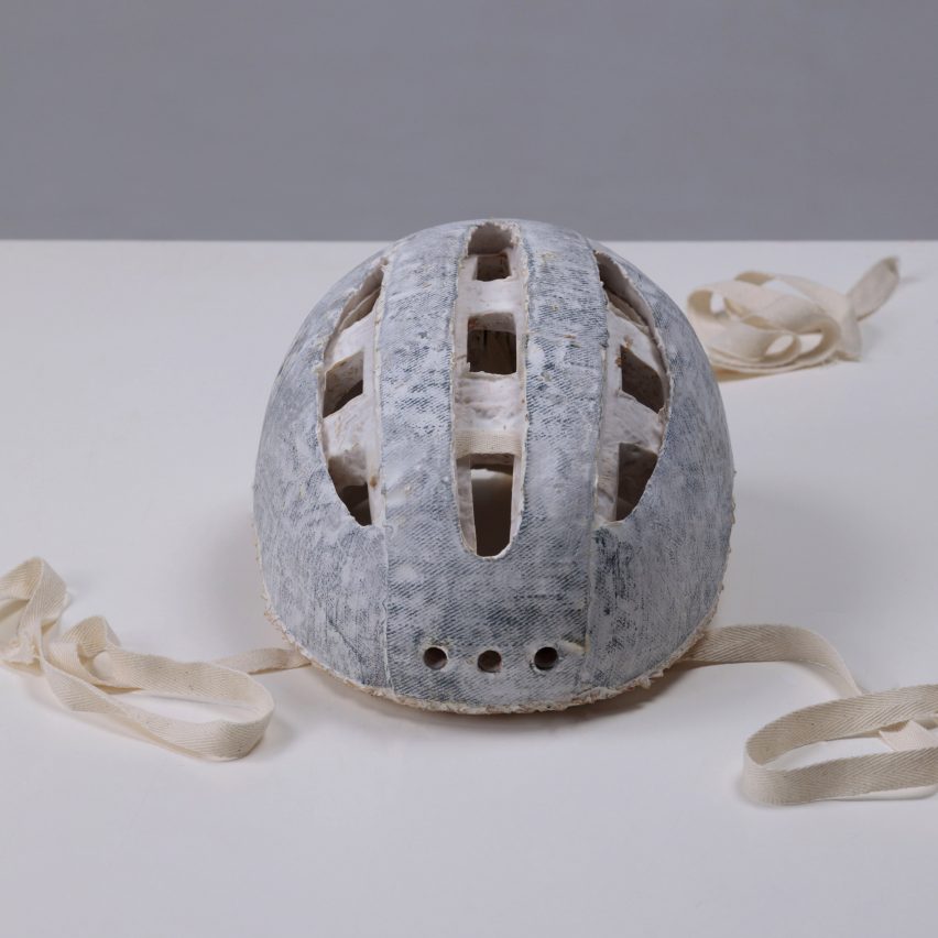
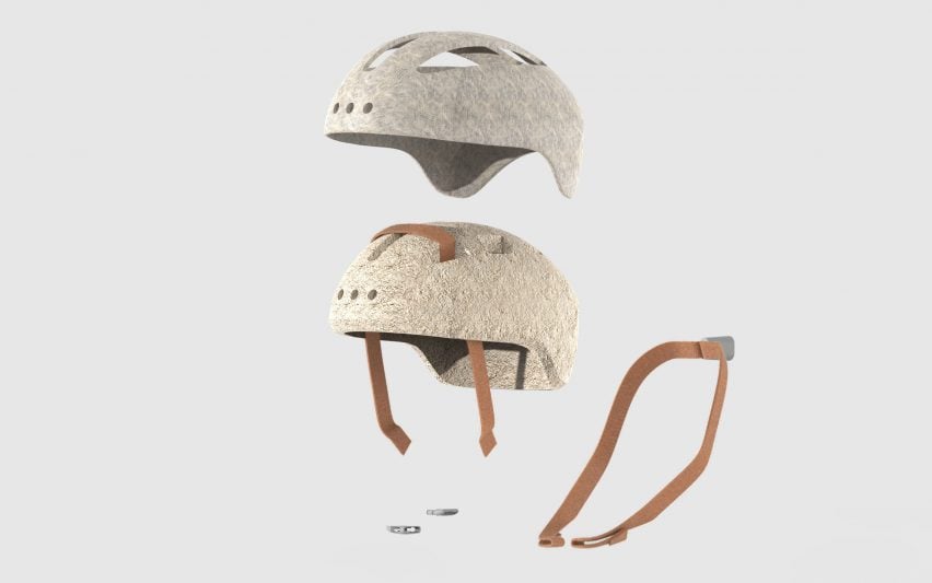
A specially developed form of mycelium – the fleshy root-like structure of a fungus – forms the main shell of MyHelmet, while the outer skin and strap are produced from a hemp textile.

MyHelmet mycelium helmet by Studio MOM
MyHelmet is made from mycelium and hemp

The result is a helmet that, according to Studio MOM, can be manufactured more sustainably and produces less waste after use.

“MyHelmet fits in with principles of the circular economy,” said the studio. “There are minimal CO2 emissions, it does not require any fossil raw materials and the end result is 100 per cent biodegradable.”

MyHelmet mycelium helmet by Studio MOM
The use of biomaterials makes the helmet compostable

Experts recommend replacing a helmet every three to five years, as the strength is likely to be reduced by the wear-and-tear of regular use.

However, most bicycle helmets are made from expanded polystyrene, or EPS, a form of plastic that is difficult to dispose of. It is non-biodegradable and harder to recycle after it has been glued to the other components of a helmet.

MyHelmet mycelium helmet by Studio MOM
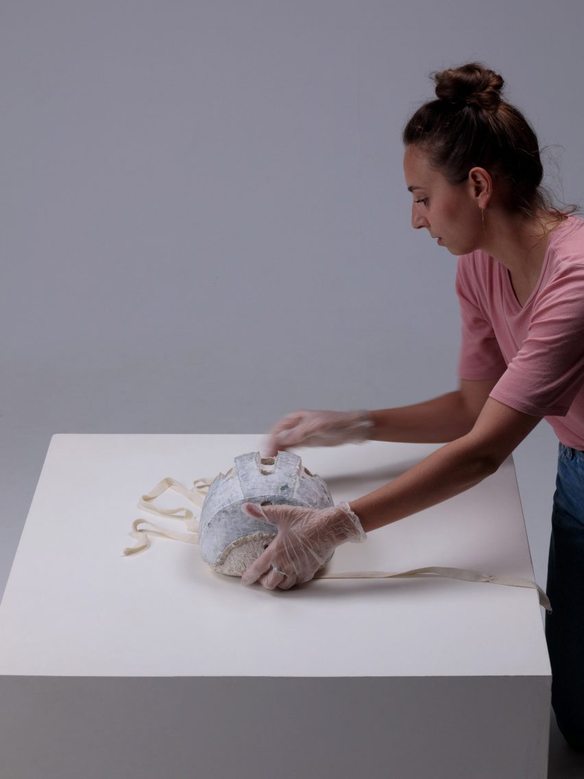
Alessandra Sisti developed MyHelmet as a student graduation project

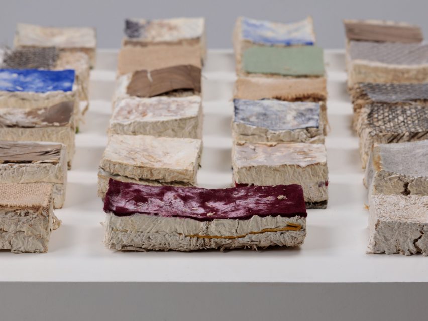
The MyHelmet design replaces the EPS with a mycelium that is cultivated on a diet of hemp flakes.

By briefly heating up this mycelium during the growing process, its structural makeup becomes similar to that of EPS; it becomes rigid, lightweight and has low thermal conductivity.

The natural layer structure of the mycelium also creates space for airflow, helping to keep the wearer’s head cool.

The process was developed by junior designer Alessandra Sisti as her graduation project from the Design and Engineering masters programme at Politecnico di Milano.

Sisti was able to further develop the design after joining Studio MOM, testing a wide range of material compositions to find the most effective solution.

Material sample for MyHelmet
Studio MOM has tested a wide range of material compositions

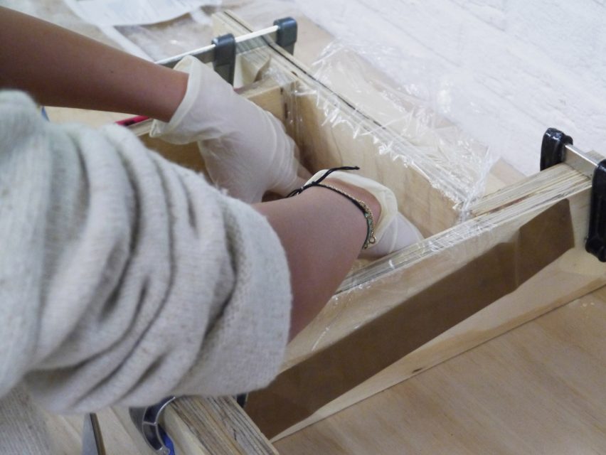
The various elements of the helmet are combined during the process. This allows the mycelium to bond with the hemp textile that forms the strap and outer skin, providing extra support and removing the need for glue.

Studio MOM has carried out a series of initial tests to ensure the product’s safety for use.

An FEM analysis of the product prototype allowed the designers to assess the shape, strength, rigidity and fatigue of the material. A simulation of the NTA standards test – the test which decides if a helmet complies with the requirements in the Dutch technical agreement – was also carried out, with “promising” results.

Production of Material sample for MyHelmet
Components are combined in the growing process, so no glue is needed

The project builds on Studio MOM’s experience with sustainable mobility products.

The Arnhem-based office has designed a series of bicycles, including an electric cargo bike powered by a hydrogen battery, the LAVO Bike.

Studio MOM founder Mars Holwerda is now hoping to find partners to help the studio develop the design from a prototype to a commercial product.

Renders of MyHelmet by Alessandra Sisti
Mycelium forms the bulk, while the outer skin and strap are a hemp textile

“By developing a new process, we have taken a considerable step towards using mycelium bio-manufacturing on an industrial scale,” he said.

“The bicycle industry now has something at its disposal to stop the endless stream of harmful, systematic plastic and EPS waste. But we are not there yet. Who is in?”

Mycelium is increasingly being utilised across the architecture, design and fashion industries.

Other uses include as leather in a Stella McCartney fashion collection, as the walls of a Dutch Design Week pavilion and as the material for a Sebastian Cox lighting collection.

Reference

Chzon studio designs airport departure hall to reference Parisian life
CategoriesInterior Design

Chzon studio designs airport departure hall to reference Parisian life

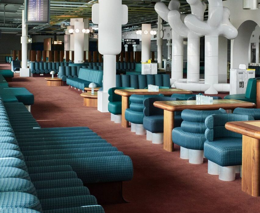
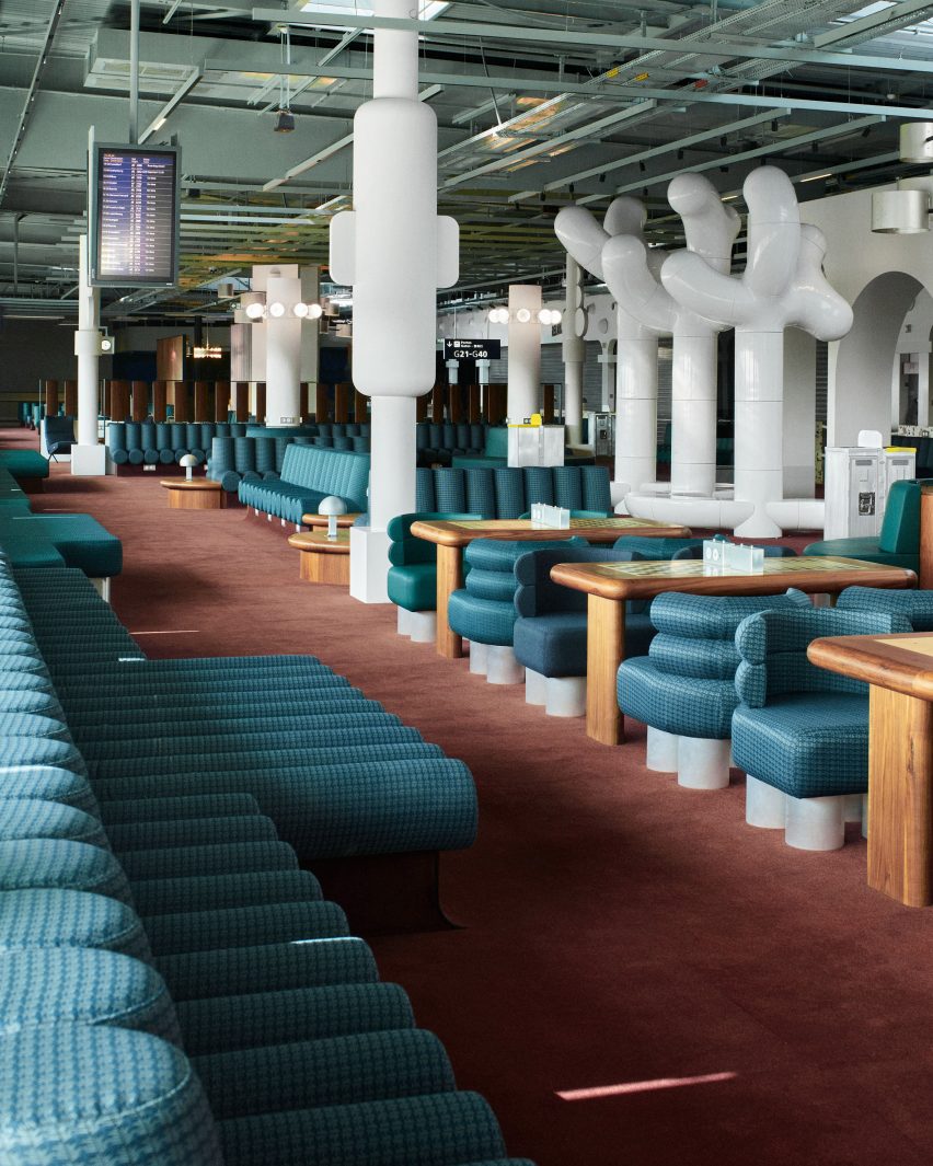
French design agency Chzon studio has added archways and fountains that reference iconic Parisian monuments to a departure lounge at the Charles de Gaulle Airport in Paris.

Chzon studio redesigned the boarding gate area in Terminal 2G with the aim of creating a dynamic representation of Paris’ design and history in a typically utilitarian area of the airport.

Photograph showing airport departure lounge with green seating and wooden chess tables
The vast space is punctuated by white columns and sculptural installations

The 1,300-square-meter space is populated by rounded seating in dark blue and green upholstery, which takes aesthetic cues from the 1960s and 1970s, arranged in benches, booths and pairs.

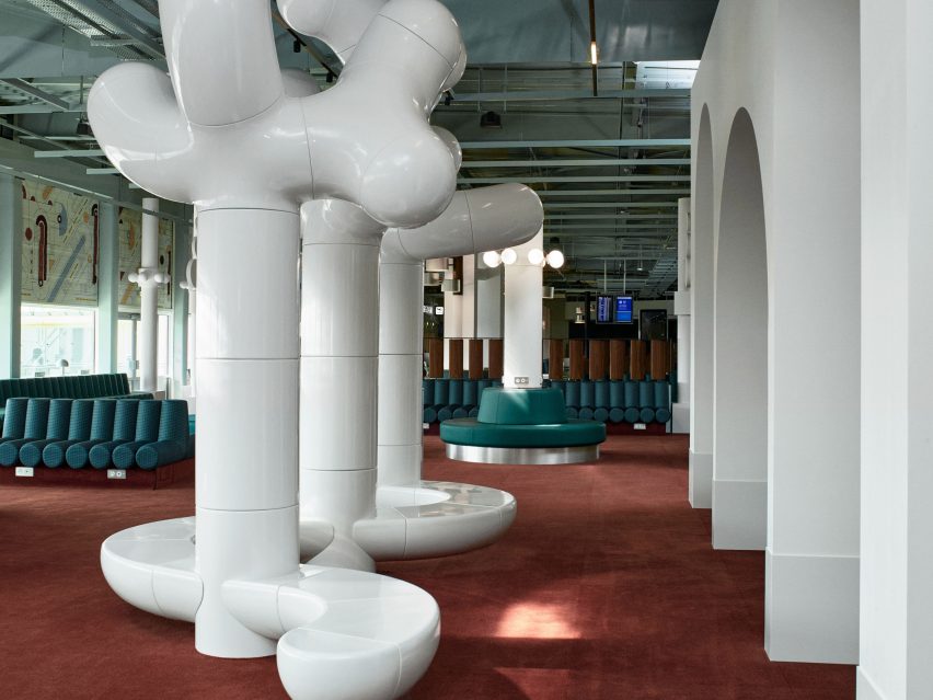
To zone the space and instill privacy, the studio added partitions and expressive white sculptures by artist studio Les Simonnets, which double as alternative bench seating.

Photograph showing airport departure lounge with green bench seats and large tree-like rounded white sculptures
References to Paris are made at varying scales throughout the space

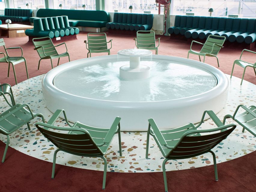
The studio made reference to iconic Parisian monuments by installing archways that nod to the Arc de Triomphe, as well as a fountain that is reminiscent of the water feature in the Jardin du Luxembourg and surrounded by green metal chairs similar to those found in Paris’ parks.

Rows of wooden tables have been inlaid with chess boards in another reference to the parks of Paris. Passengers can use these as workspaces, to eat at, or to play games on while waiting for flights.

Photograph showing airport departure lounge with green chairs, white fountain and terrazzo flooring
The miniature fountain is a focal point within the terminal

As well as designing some of the lighting for the interior in-house, the studio also sourced and installed antique lighting and other decorative objects from the city’s St Ouen flea market, including giant wall lights and aluminium sunshades.

To keep the space relevant to its function, Chzon also made references to aeroplane design by employing metallic details, patterned finishes and reclining plane-style seats designed by Italian architect and furniture designer Osvaldo Borsani.

“[The design] dramatises the boarding lounge while keeping the passenger informed,” Dorothée Meilichzon, founder of Chzon studio, said of the interior design.

“The departure lounge becomes a smooth transition between the Paris that we are leaving and the plane that is going to take off.”

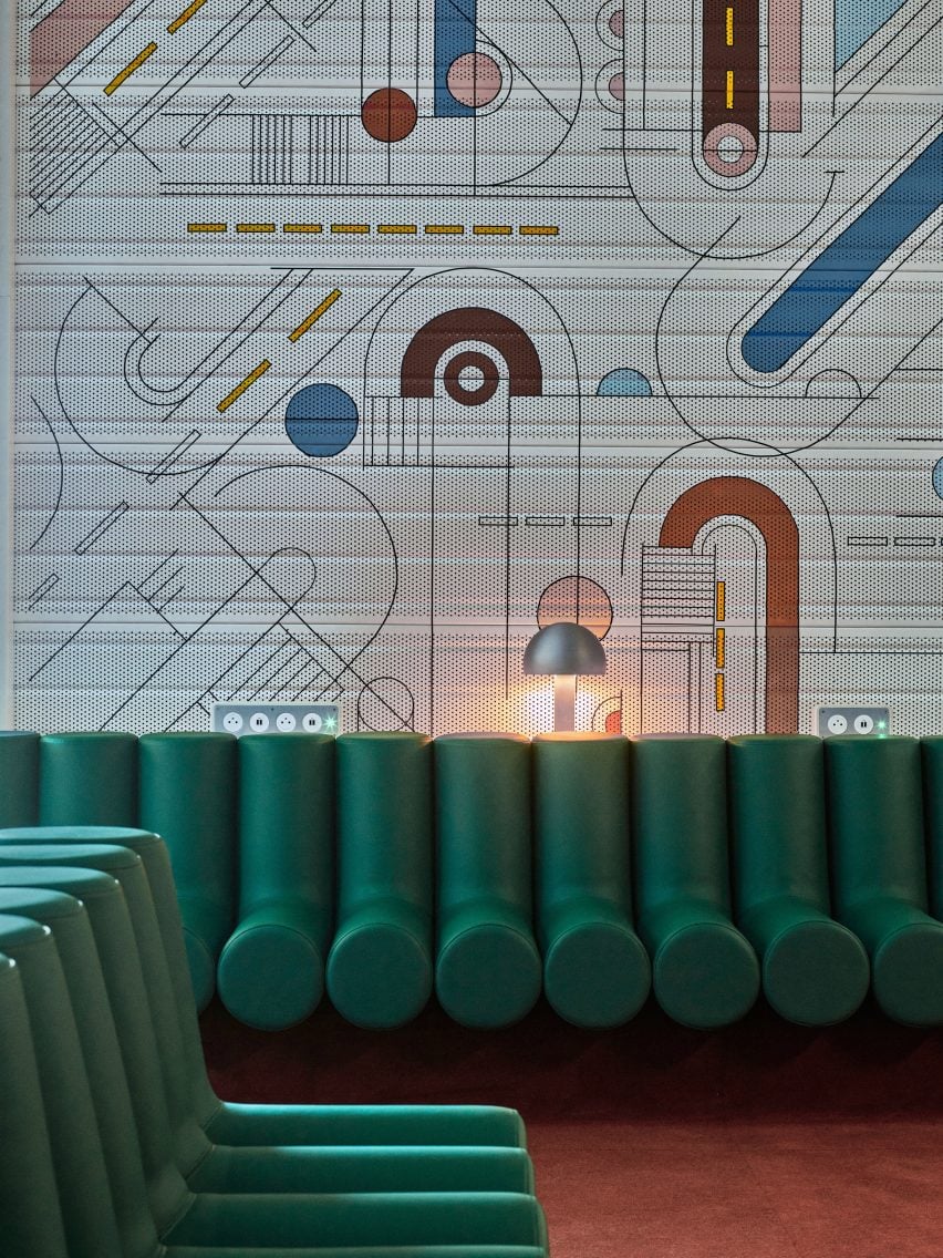
Photograph showing airport departure lounge with abstract mural above windows and green seating
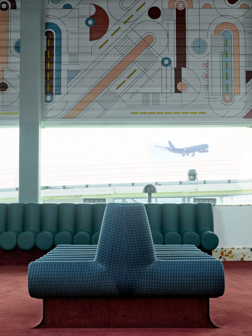
The mural is applied to perforated sheets and wraps around the walls above the windows

The space also features a mural inspired by the work of French painter Sonia Delaunay that sits above the windows, which overlook the runways and allow views of planes taking off and landing.

This fresco also references symbols used in airport signage and carries similar rounded motifs to the ones present in the retro-style seating and lighting.

Photograph showing airport departure lounge with green bench seats and abstract mural behind
Rounded elements in furniture, lighting and decor reference the design of the 1960s and 1970s

Charles de Gaulle Airport, also known as Roissy Airport, is the French capital’s principle airport.

Other airport-related projects published on Dezeen include the cosy remodelling of an airport in Colorado, USA by Gensler and an airport that contains the world’s tallest indoor waterfall by Safdie architects.

Images are courtesy of Chzon studio

Reference

Form Us With Love designs perforated steel furniture for Stockholm studio
CategoriesInterior Design

Form Us With Love designs perforated steel furniture for Stockholm studio

As part of Stockholm Design Week, Swedish design firm Form Us With Love has opened the doors to its new studio space featuring modular furniture informed by pegboard walls.

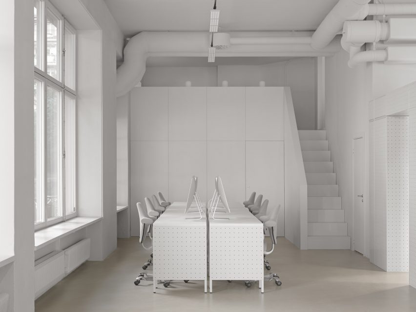
Perforated steel units are dotted throughout Form Us With Love‘s (FUWL) Stockholm studio, which is housed in a former travel agency.

White desks and chairs in white-walled room by Form Us With Love
Form Us With Love’s Stockholm studio has furniture made from perforated steel

“We’ve been dealing with this space for a good year and a half, and thinking about it for a good ten years,” FUWL co-founder John Löfgren told Dezeen.

“It’s definitely a place that is a catalyst for what we’re doing – and we’re doing quite a lot of different things, so we need a really flexible space and we need a mobile space,” he added. “We tried to be smart about how you store things and logistics in general, really being economical with each square metre.”

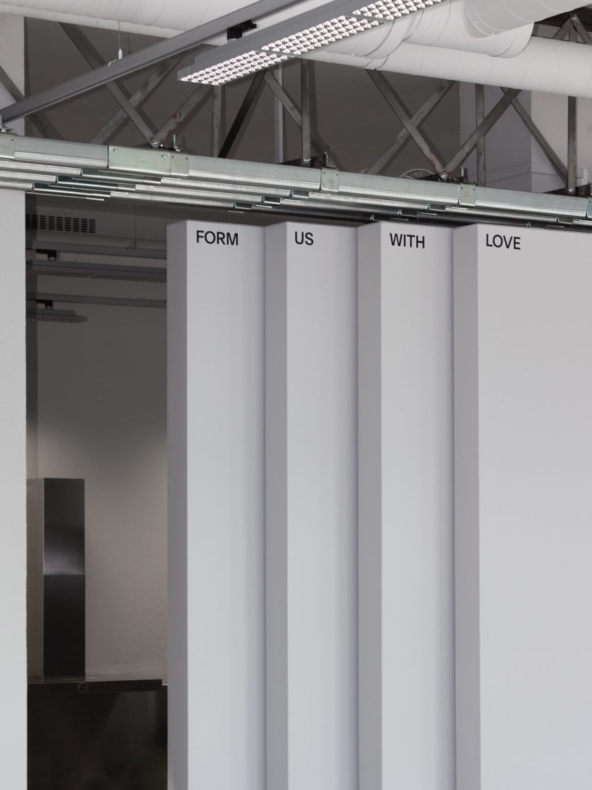
Floor-to-ceiling hangar doors in design studio by Form Us With Love
Large hangar doors can be used to divide the interior

The 200-square metre studio space, which was created in collaboration with architecture studio Förstberg Ling and branding studio Figur, was designed to suit the needs of the FUWL team.

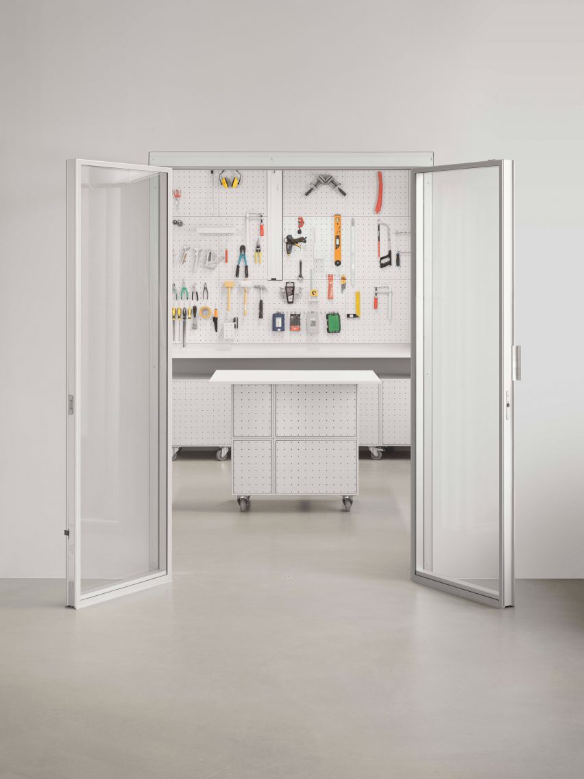
Large floor-to-ceiling hangar doors hide an office area, workshop and kitchen while allowing the front of the studio to be sectioned off from the remainder of the space.

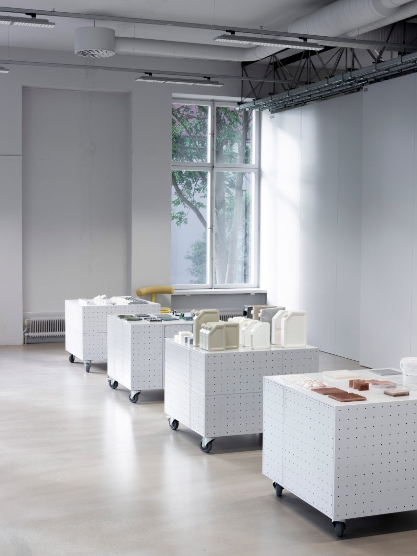
Wheeled cabinets on a wooden floor
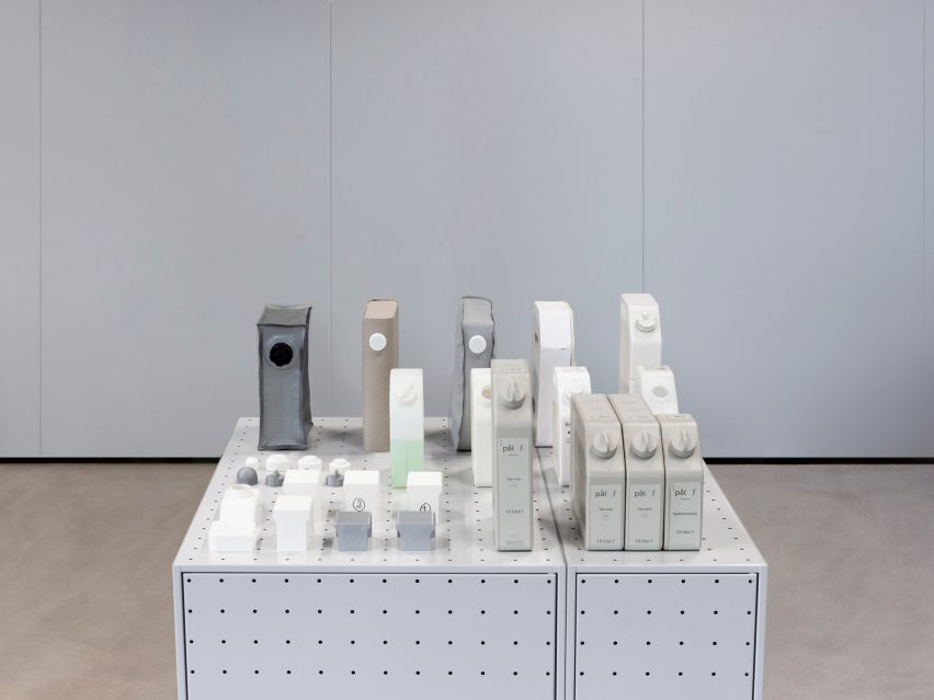
The studio is showcasing material experiments on wheeled cabinets

This allows the area to be used as an exhibition space, where FUWL is displaying some of its ongoing projects during Stockholm Design Week.

Among these is a project that explores how toxic glass – a waste material from the glass industry – can be treated to separate the toxins from the glass.

Five low, wheeled cabinets made from perforated steel were used to display the projects.

Plastic containers showcased on steel cabinet
FUWL has created multiple different storage units

These are just some of the storage units and room dividers that FUWL has made for the studio, drawing on materials found in its own workshop.

“We have these boxes that were derived from the workshop, like ones you would have in the garage,” Löfgren said.

“We started wondering what would happen if we move these things out in the open,” he added. “It started off as dividers and walls, but add some wheels and all of a sudden we are in the open space.”

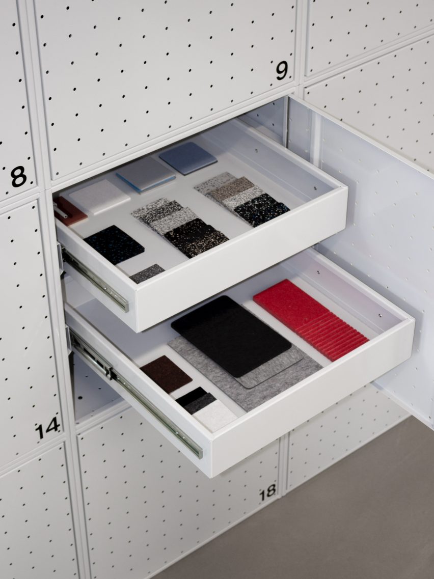
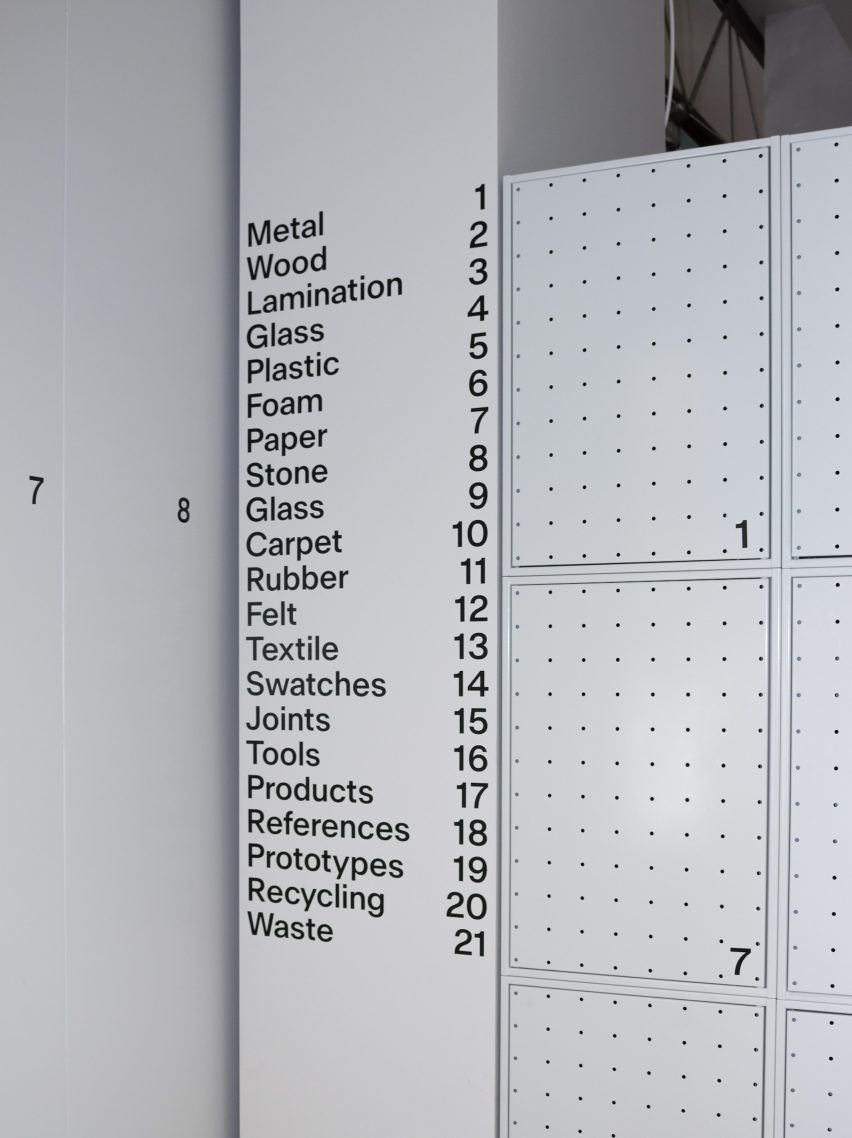
The studio is currently using the modular units as a material library, a tool wall and storage for personal and studio use, as well as experimenting with new functionalities.

Produced by Tunnplåt – a company that normally supplies lockers to schools, gyms and other public-sector interiors – the containers have a pattern of symmetrical holes.

White drawers in a metal cupboard that contain material samples by Form Us With Love
A material library is housed in their drawers

This was designed to make the reference to pegboard walls immediately recognisable.

“We definitely experimented with patterns,” Löfgren said. “We still wanted people to have a smile on their face like: I can see where it derives from.”

White wall with door that opens up to workshop by Form Us With Love
The pegboard-style furniture was informed by tool walls

Realising that the perforated steel units could be used to create a flexible interior was just a coincidence, Löfgren said.

“I think it’s definitely a tool that incorporates how we want to work in the interior,” he said. “And I think that’s just been a coincidence.”

“We were always looking for something that would help us have this kind of full flexibility, and still be able to do something both fun and functional,” he added.

Grey perforated steel storage cabinets
The studio was designed to be both practical and flexible

In the future, the studio said it might also create the units in other colours. For its own office, soft grey tones were chosen to aid concentration.

“We worked with tones of grey as a backdrop throughout the space to put focus on the creative processes taking place within,” architecture studio Förstberg Ling said.

Form Us With Love has previously launched products such as Forgo, a soap designed to minimise carbon emissions and an IKEA chair made from recycled wood.

The photography is by Jonas Lindström Studio.

Form Us With Love’s studio is open to the public between 5 September and 9 September 2022 as part of  Stockholm Design Week. See Dezeen Events Guide for an up-to-date list of architecture and design events taking place around the world.

Reference

The Peak – Boutique Hotel // studio symbiosis
CategoriesSustainable News

The Peak – Boutique Hotel // studio symbiosis

Text description provided by the architects.

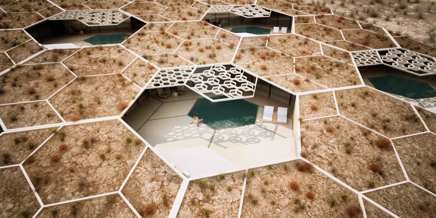
The Peak Resort and Spa, is located in the untouched serene landscape of Udaipur, Rajasthan, the desert kingdom of India. Designed as a destination to unwind and rejuvenate the property hosts, 8 pool villas, event space, Restaurant, Spa, Gym, star gazing platform and an outdoor pool.Cocoon villas nested in natureThe design concept amalgamates the untouched beauty of nature that engulfs the site, along with regional architecture of Rajasthan.

© studio symbiosis

© studio symbiosis

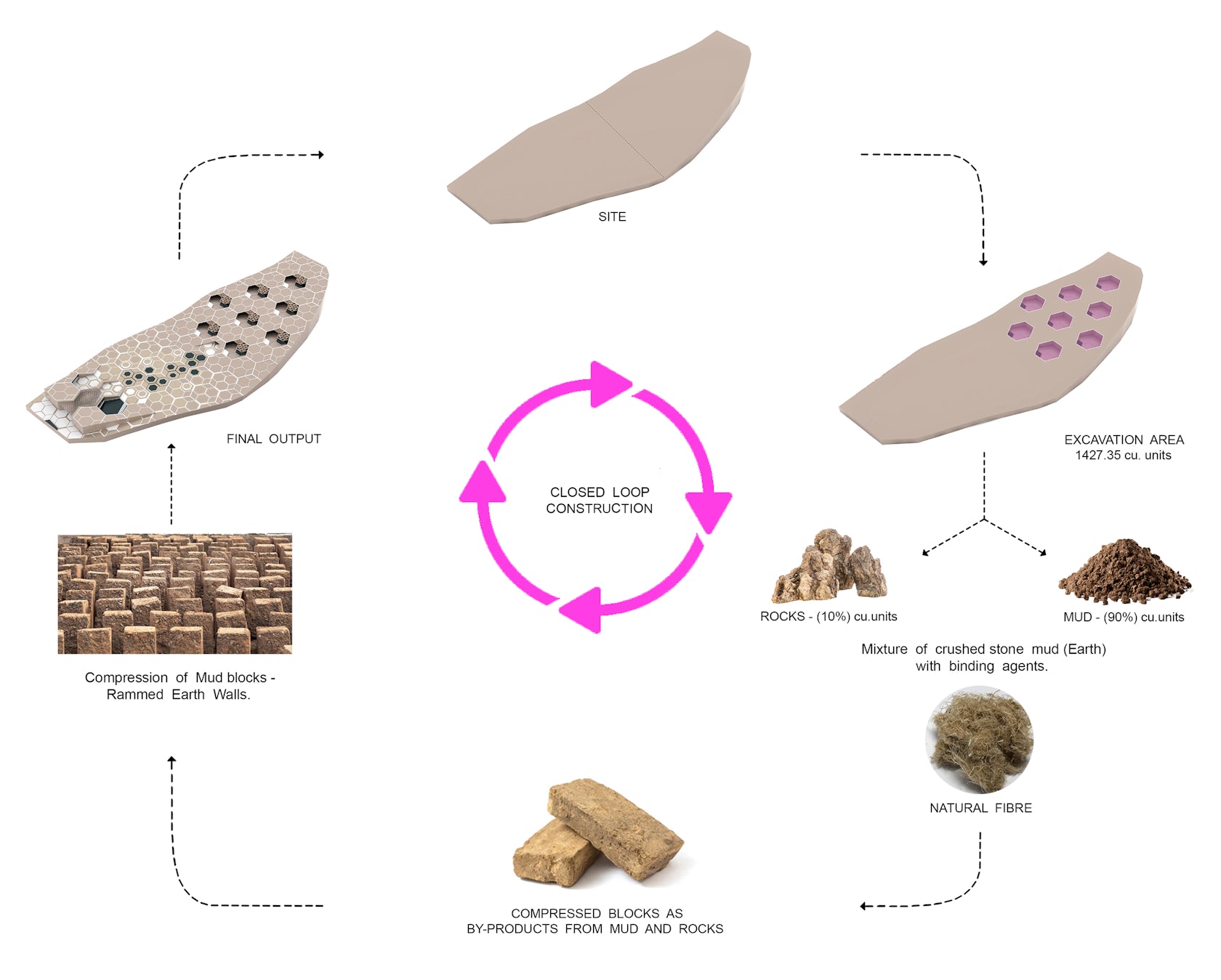
The idea of built and landscape is seen as an amalgamation in the design. The original contours of the site have been used as an interface to create architecture. Each villa is nested as a cocoon space in the landscape. These cocoon villas have been designed by excavating earth, to create minimum disruption to the natural beauty of the site.

© studio symbiosis

© studio symbiosis

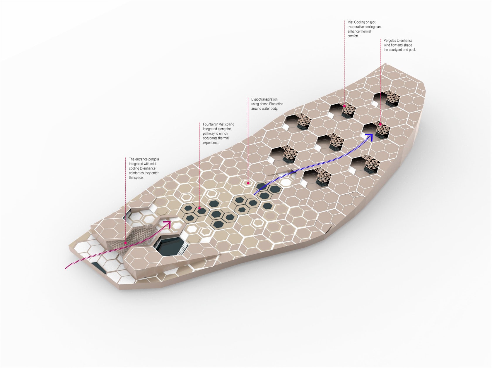
Local patterns were studied from the architecture of Rajasthan, and a “Hexagonal” pattern that is a common denominator in nature as well as the regional architecture has been used as a unifying element for the design. This hexagonal base pattern has been grafted on the site to create a system driven approach to design the landscape, entrance buildings, scooping of the villas, water bodies, etc.

© studio symbiosis

© studio symbiosis

to create a sense of harmony and symbiosis in the design.Design EvolutionHalf of the site terrain is almost flat and then it slopes drastically from the south towards the north. The dominant views from the site are mountains towards the south. This natural terrain of the site has been used as a design driver.

© studio symbiosis

© studio symbiosis

The flat part of the site that is adjacent to the approach road has been used for Drop-off, Reception, All day dining, and Spa and then further on an open event space. The design idea was to create a form nested in nature. The sloping part of the site has been used as an opportunity to excavate earth and nest villas within the topography.

© studio symbiosis

© studio symbiosis

This helps us in capturing the beautiful views of the south facing mountains. The natural topography of the site creates a height difference between the various villas, thereby giving them all complete privacy.Window to LandscapeArchitecture of Rajasthan boasts of intricate carving and Jharokha’s (Semi covered balconies with perorated windows all around).

© studio symbiosis

© studio symbiosis

The concept of a Jharokha has been translated in the design as the villas are scooped out from the terrain to create these “Jharokha’s” with outdoor pool, star gazing deck and sit-out space. Each villa is conceptually a window (Jharokha) to experience nature. Resource ConservationVillas have been nested in landscape, by excavating the earth of the site.

© studio symbiosis

© studio symbiosis

This excavation of 1427 cubic units gave us 142.7 cubic units of rocks and 90% is mud. As a part of the design process, we are using the excavated earth and rocks, by mixing natural fibres in them to strengthen and create compressed mud blocks. The retaining walls around the villas are being constructed from these mud blocks, where the raw material is coming from the site itself.

© studio symbiosis

© studio symbiosis

It’s an idea of a closed loop civil construction, where we take from mother earth and put it back on the site in a new form, in this case we take mud and rocks and graft back rammed earth walls. Rest of the materials are being locally sourced within 5 kms of the project site.

© studio symbiosis

© studio symbiosis

Given that Rajasthan is the stone hub of India, locally available stone has been used for the outdoor landscape as well as indoor finishes.Villas & earth breamingThe villas are designed for “leisure travellers” as well as for “work from destination”. The design brief looks at creating a home away from home with villas cocooned in nature.

© studio symbiosis

© studio symbiosis

Each villa is 140 sqm indoor and 130 sqm outdoor area. The villas are equipped with the outlook of a long stay traveller, with a master bedroom, living, dining, pantry, outdoor pool, star gazing platform and an outdoor deck.
Using regional patterns, a stone carved pergola has been designed for shading the outdoor decks of the villas.

© studio symbiosis

© studio symbiosis

This helps in shading from the direct sunlight and creates playful patterns of light and shadow on the deck. The villas are nested within earth, to create a heat sink and keep the villas naturally cooled in the scorching dessert heat during daytime, and keeps the villas warm during the night in the winters.

© studio symbiosis

© studio symbiosis

Since each villa is surrounded by earth, the heat gain and heat dissipation happens at a controlled rate. The outdoor terraces and the depth of the villa has been designed to ensure ample light inside the villa, without exposing the surface area of the built to the sun directly. Outdoor space and Shallow water bodiesThe wind direction on the site is from South which is the entrance of the site and travels along the depth of the site up towards north.

© studio symbiosis

© studio symbiosis

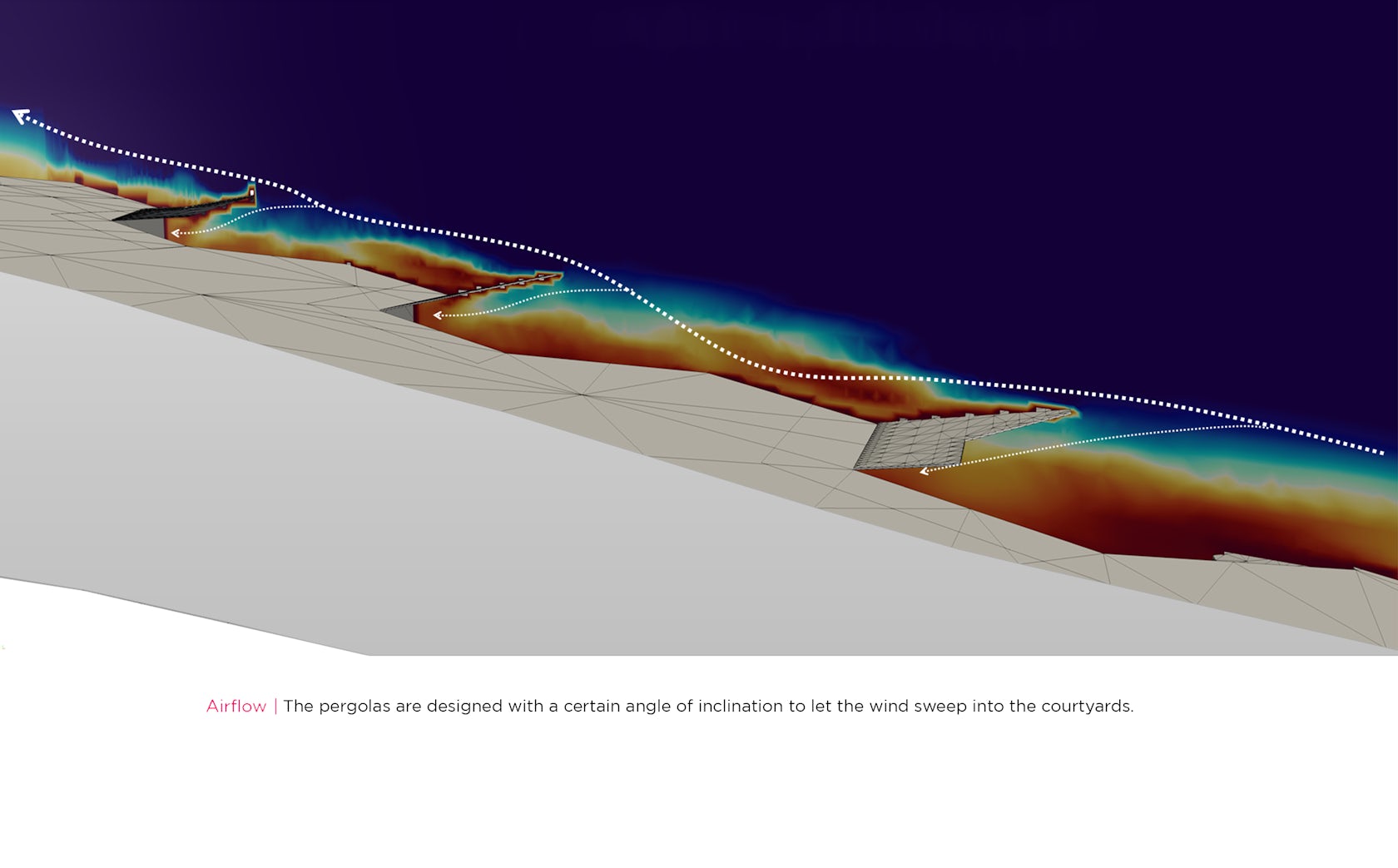
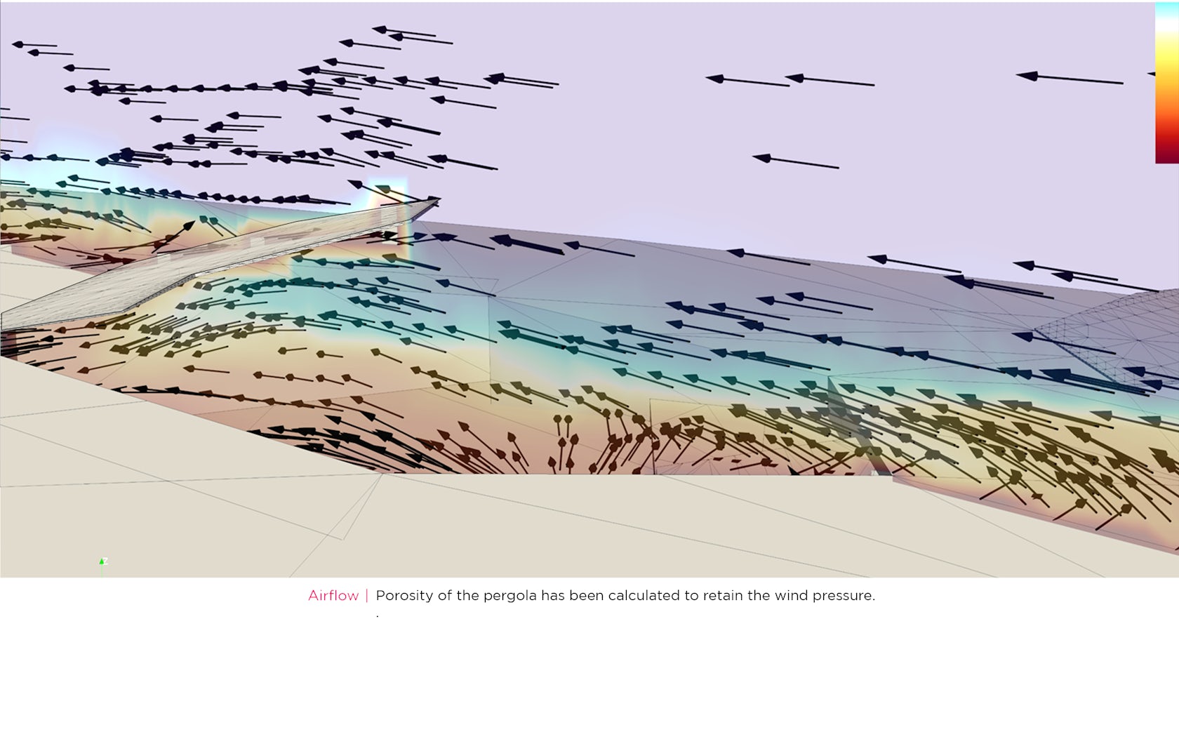
This wind movement has been channelized by creating two building flanking either side of the entrance that create a wind tunnel effect and compress and accelerates the wind. Further shallow water bodies have been designed along the path of the wind which cools it down. Given the villas are scooped out of an inclined surface, the wind coming in contact with the water bodies is cooled down and travels seamlessly along the sloped site and creates a cool breeze reaching the villas which is further pushed in the villas with the help of a pergola.
Using cfd, the inclination of the pergolas has been optimized, to direct the wind inside the villas.

© studio symbiosis

© studio symbiosis

Porosity of the pergola has been calculated to retain the wind pressure. The central plaza has been designed as a multifunctional space. This can have regional folk dance, puppet shows (regional to Rajasthan), breakout space for high tea, archery, pool deck, as well as event space.Sustainability Sustainable design solutions have been integrated in the design in various stages of design and construction.

The temperature in this region of Rajasthan can go up to 45-47 degrees. Design strategies have been introduced to reduce the cooling loads in the building and create a sustainable resort.
Natural topography of the site has been used to nest the villas by using earth berming to cool the villas and the outdoor spaces are shaded with pergolas to reduce direct heat from the sun.

The wind blowing on the site from the south has been accelerated by creating a wind tunnel by flanking buildings on either side of the entrance. This accelerated wind passes over shallow water bodies designed in the central plaza, thereby cooling the wind. The cooled wind moves up the inclination of the site and is pushed in the villas using pergolas, optimized by cfd.

Excavated earth from the site is transformed into mud blocks being used as retaining walls of the villas, with rest of the construction materials sourced from within 5 kms of the site.This project is driven by design moves to create a model of sustainable design in scorching heat of Rajasthan..

Reference