Studio Four opens up “dark and compartmentalised” Melbourne residence
CategoriesInterior Design

Studio Four opens up “dark and compartmentalised” Melbourne residence

A series of portal openings improve connections between rooms and bring extra light into this 1970s residence in Melbourne renovated by Australian practice Studio Four.


Studio Four aimed to renovate the home, which was designed by Australian architect Wayne Gillespie in 1972, to improve the internal plan and bring it up to date for contemporary living.
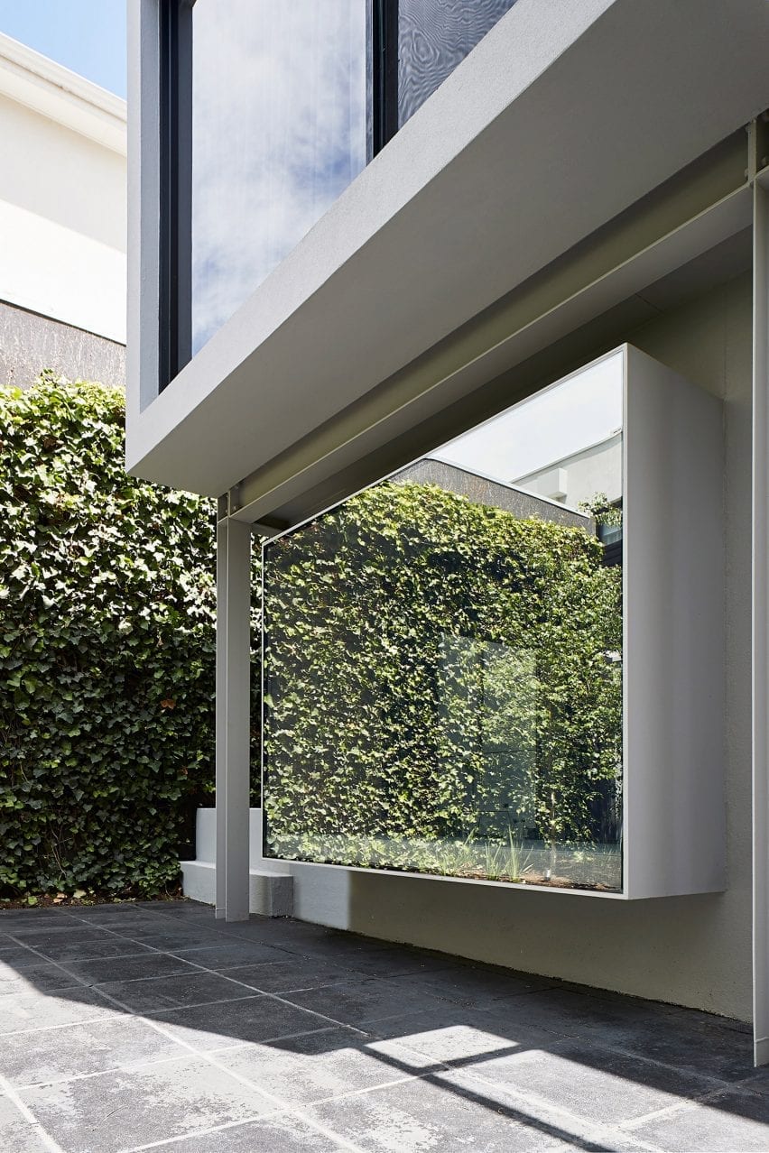
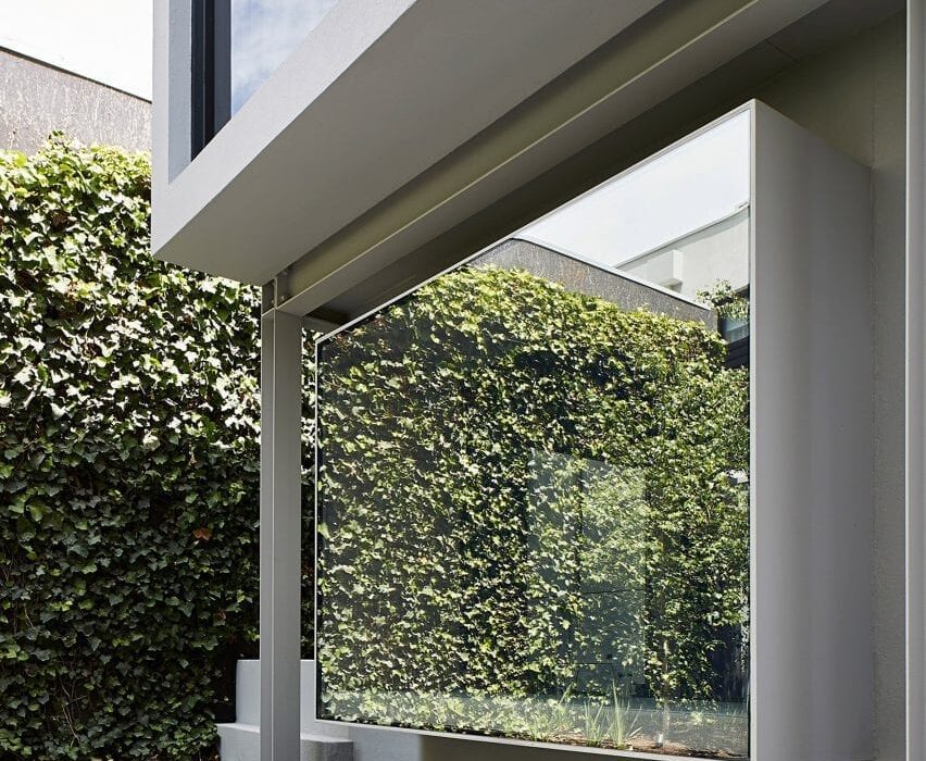
Exterior of Cunningham Street residence with protruding glazed volume
A series of portal openings provide views of the garden beyond (top and above)

“While the existing house was of solid build, the interiors felt lightweight by comparison and did not flow or function as desired,” said Studio Four.

“Some spaces, in particular the existing kitchen, were dark and compartmentalised and did not fully harness the possible connections with the garden.”
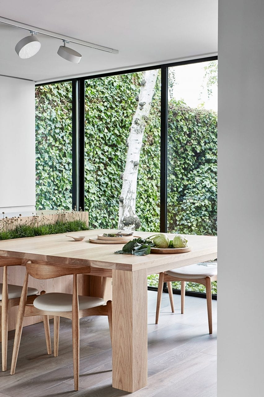
Kitchen interior Studio Four with wooden chairs and table and view of garden
Solid wood furnishings create a sense of warmth in the otherwise monochrome kitchen

Located in the city’s South Yarra neighbourhood, the Cunningham Street Residence was designed by Gillespie as his first independent project and his first home.

The architect, who died in 2001, was known for his use of pure, clean lines, and combining classical design features with modern technology.
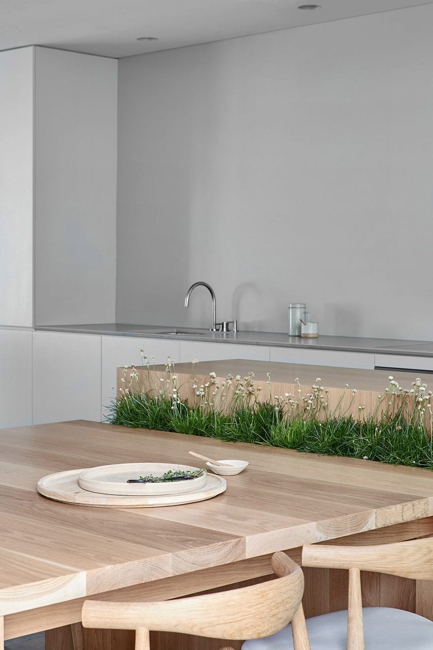
Wooden kitchen table setup with integrated planter in Cunningham Street residence
A planter is integrated between the dining table and kitchen island

“The client’s brief was to provide a holistic solution,” explained Studio Four.

“Their brief was to strengthen Gillespie’s original vision, as opposed to creating an alternate vision that would directly contrast it.”
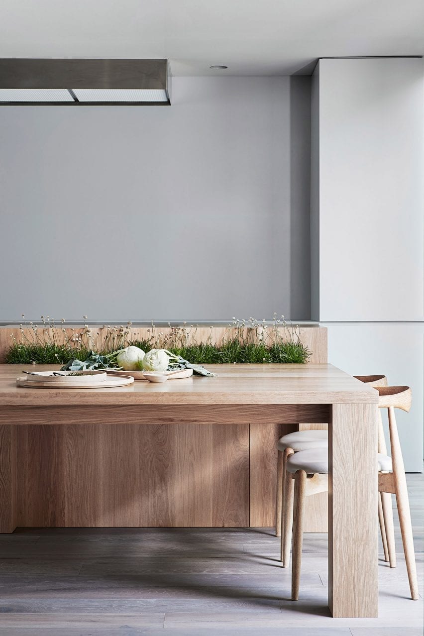
Cunningham Street residence by Studio Four
The kitchen was relocated

Studio Four replanned the rooms to enable the occupants to spend time both together and separately.

For example, the existing kitchen was relocated to the centre and rear of the home so it could be used as a central space for the family to gather in.

To make the spaces appear larger and more connected with each other and the outside space, the architects inserted a series of portal openings between the spaces.

It decorated the spaces with a palette of light and neutral colours.
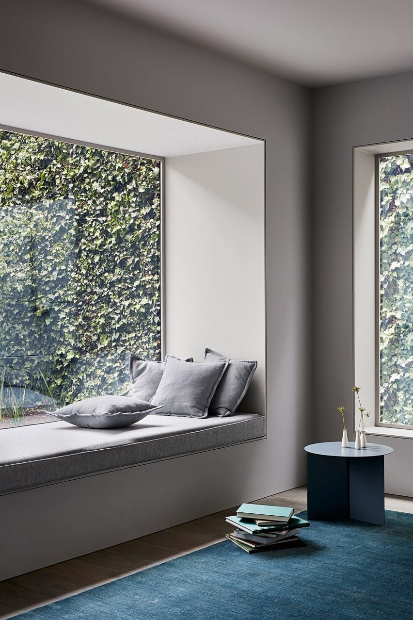
Reading nook with blue carpet and view of garden in interior by Studio Four
One of the portals features an integrated reading nook

“The design response reflects the integrity of the existing built fabric. The focus is on the experience rather than the form, and all emphasis is placed on the quality of the experience rather than a visual statement,” concluded the studio.

“The result is a house where the architectural form and its interiors act as one, and the transition between built form and landscape is blurred.”
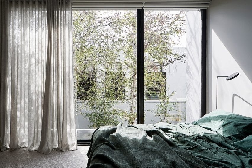
Bedroom with floor to ceiling windows and green bedding in Cunningham Street residence
The bedroom features panoramic views of the trees outside

Studio Four, which is led by directors Annabelle Berryman and Sarah Henry, has a track record of creating homes that blur indoor and outdoor space.

Previous residential projects include an all-white family home with a garden at its centre, and a grey-brick home with a central olive tree-dotted courtyard.

Photography is by Shannon McGrath.

Reference

Vision Studio conceals “jewel-like” store behind perforated metal facade
CategoriesInterior Design

Vision Studio conceals “jewel-like” store behind perforated metal facade

Cool-toned industrial materials such as aluminium and concrete are paired with marble surfaces and translucent pastel shelving in this eyewear store in Melbourne, Australia.


Designed by local firm Studio Edwards, the first flagship store by optometrist Vision Studio is housed in a shopping centre in the city’s Glen Waverley suburb.

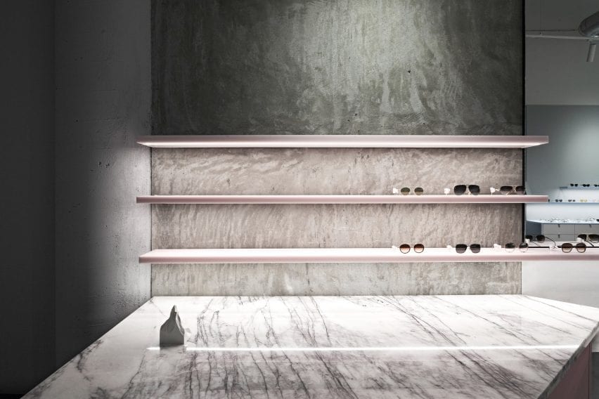
Transluscent pastel pink sunglasses displays with marble counter in retail interior by Studio Edwards
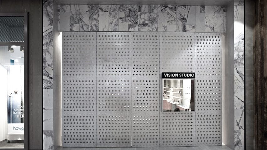
Vision Studio’s perforated aluminium facade (top image) hinges open to reveal a jewel-like interior (above)

Half of the store’s 3.6-metre-high perforated aluminium facade hinges open to reveal what the studio describes as a “jewel-like” interior, framed by marble tiles that contrast with the raw concrete of the existing shell.

Inside, Studio Edwards set out to create a space reminiscent of a gallery, including enough display space for 200 spectacles and storage for an additional 800 pairs alongside three consultation rooms with waiting areas and a staff and store area.

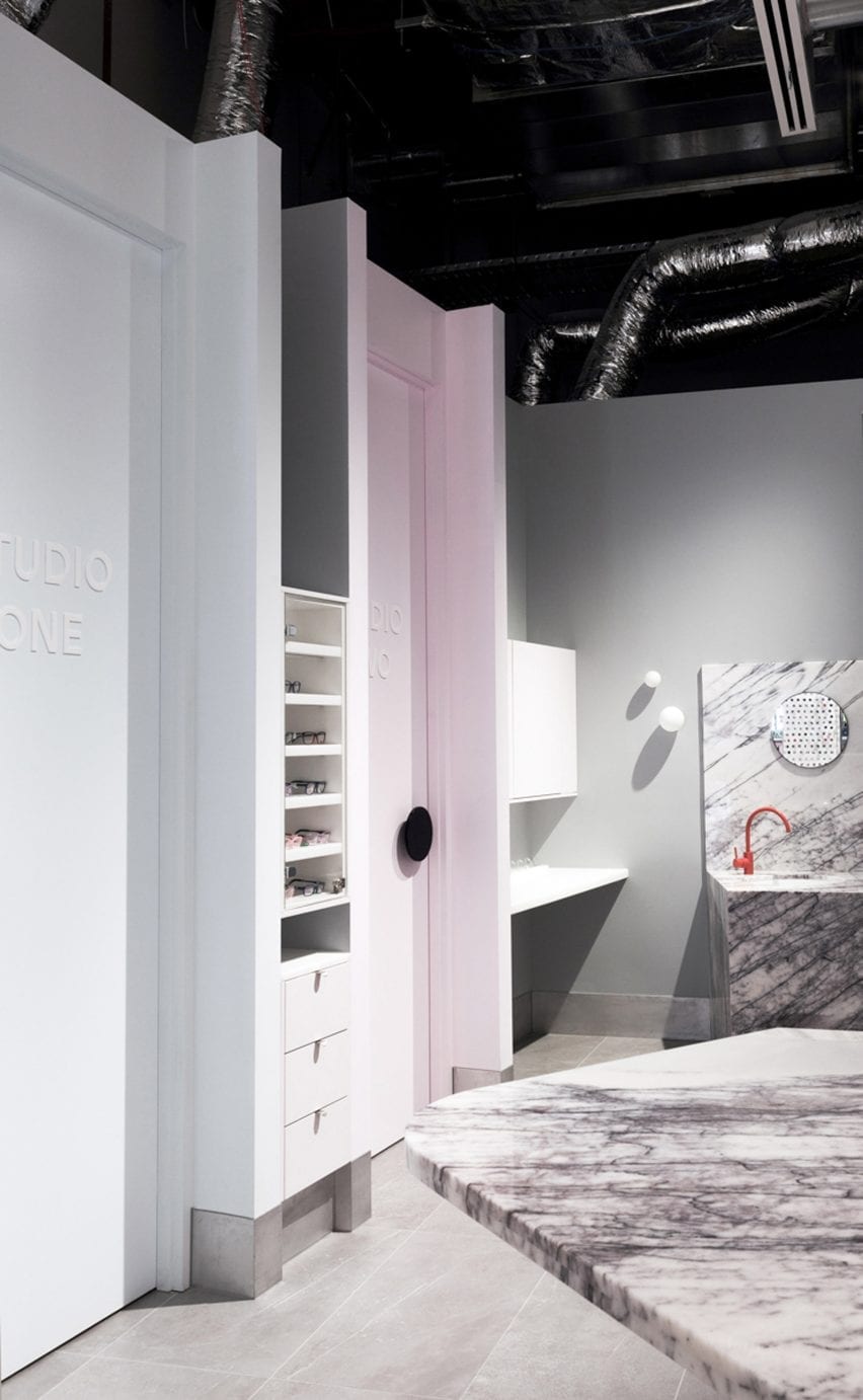
Marble accents and bright orange tap in Vision Studio interior
A bright orange tap and pastel pink doorframe act as pops of colour in the otherwise monochrome interior

To accommodate these functions, the floor plan is split into two zones with the store and display area at the front, and the optician and consulting spaces at the rear.

“The space is zoned via an angular plan configuration with the areas requiring most privacy to the rear and semi-private consulting spaces tapering to the front,” Studio Edwards founder Ben Edwards told Dezeen.

“One challenge was to work with the existing air conditioning ceiling ductwork – we chose to expose them and include them within the overall aesthetic.”

Pastel-coloured accents are applied to the shelving and cabinets that run along the walls on either side of the Vision Studio store.

The material palette, which the studio described as “a balance between raw and refined”, blends industrial materials such as aluminium and concrete with marble surfaces and translucent shelving that seems to hang in midair.

Perforated aluminium facade of retail interior by Studio Edwards
The shop is located in a Glen Waverley shopping centre

Other studios that have combined industrial materials and soft, powdery colours include Spanish studio Lucas y Hernández-Gil, which contrasted pastel furnishings against concrete walls in this restaurant in Seville.

Photography is by Tony Gorsevski.

Reference

Leckie Studio designs penthouse inside BIG’s Vancouver skyscraper
CategoriesInterior Design

Leckie Studio designs penthouse inside BIG’s Vancouver skyscraper

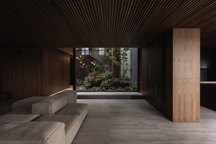
A rainforest-style atrium with a cedar tree lies within a two-storey unit designed by Leckie Studio, located inside the new Vancouver House tower.


The penthouse is found within the sculptural, 59-storey tower that rises up from a triangular site in downtown Vancouver, near Granville Bridge. The building was designed by architecture firm BIG and was completed last year.

Leckie Studio designed the project
A rainforest-style atrium sits at the heart of the penthouse

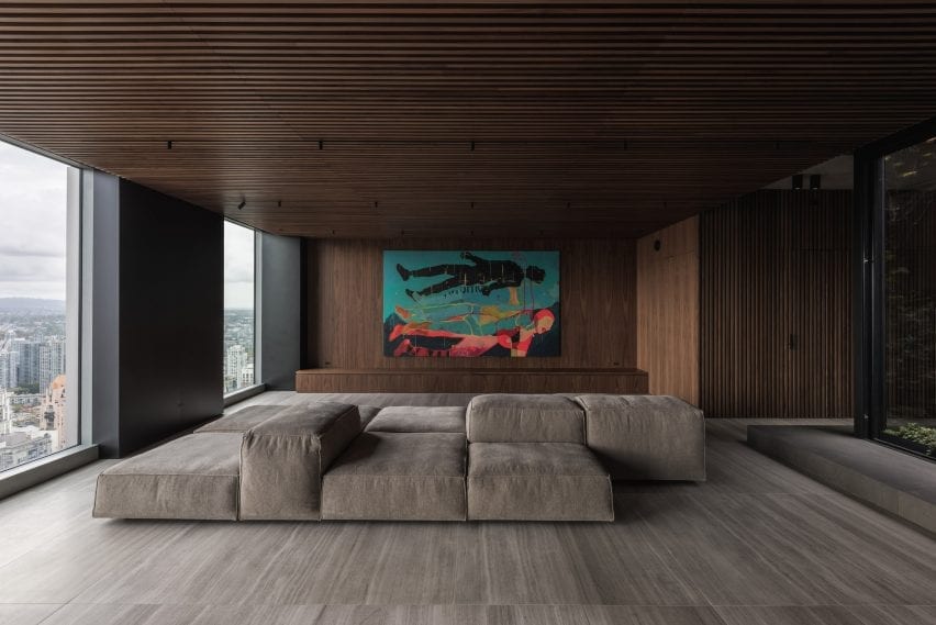
The two-level apartment is on the northwest side of the skyscraper, where it is afforded views of English Bay and the North Shore Mountains.

The unit’s owner desired an inviting atmosphere and spaces to accommodate natural artefacts and artwork from her travels. She turned to local firm Leckie Studio to oversee the design.

The penthouse is located in Vancouver House tower
The apartment has views far-reaching views of Vancouver and beyond

The team set out to create a layered environment that looked both inward and outward, and was infused with organic elements.

“Through an iterative design process, the studio and client arrived at a highly bespoke, biophilic design that is attuned to the passage of time,” the team said.

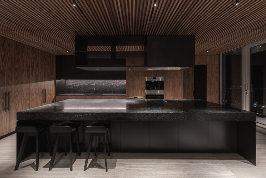
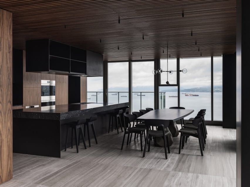
Leckie Studio inserted a kitchen into the lower level
A kitchen on the lower level features a giant island

The unit is divided into public and private areas. On the bottom level, one finds a living room, dining area, kitchen and an office. A half-turn stair leads to the upper level, which holds two bedrooms.

There also is a 167-square-metre roof deck that is accessed via a private elevator.

“The experience of the penthouse is quite varied, depending on the time of day and which space is being occupied,” said architect Michael Leckie.

The unit’s focal point is a tall, glazed atrium filled with lush vegetation.

The atrium has vegetation
The atrium runs alongside the stairwell leading to bedrooms

Acting as the “spine” for the penthouse, the atrium runs alongside the stairwell and extends from the unit’s bottom level all the way to its roof terrace. At the top, it is open to the sky.

“Conceived as a microcosm of the Pacific Northwest rainforest, its centrepiece is a full-size, red cedar tree that lends a contemplative and grounding element to the onlooking interiors,” the team said.

Leckie Studio used American black walnut for the woodwork
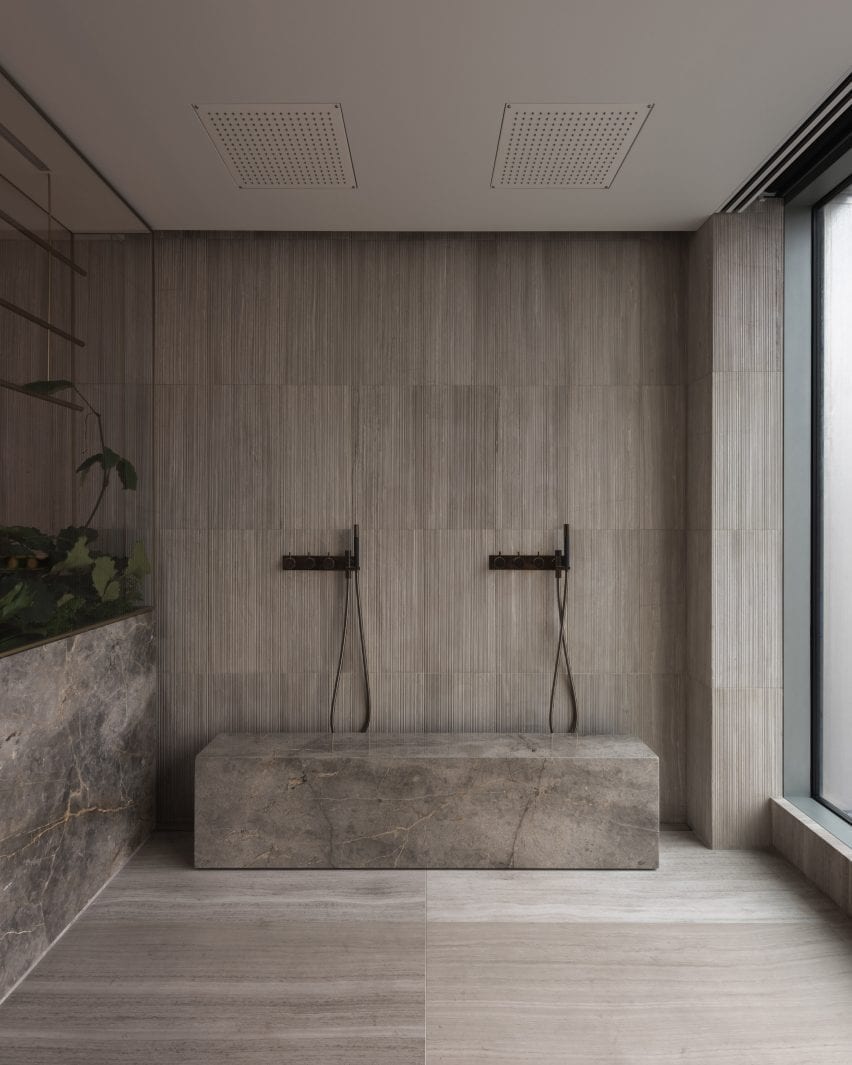
Finishes and fixtures are kept minimal in the bathroom

“The ecosystem surrounding this tree will be sustained long term by a ‘nurse’ log, which replenishes the space with nutrients from decay.”

Beyond the atrium, earthy elements are found throughout the dwelling and form a rich backdrop for the client’s belongings.

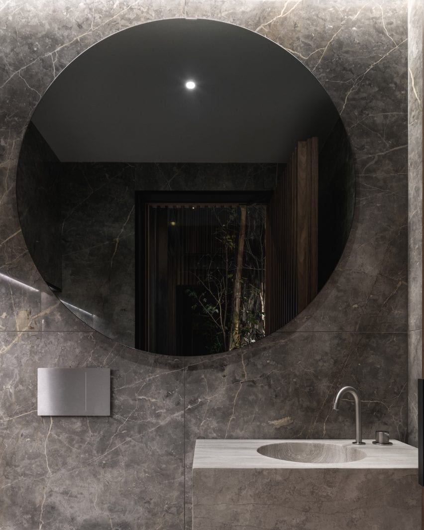
Travertine was used for custom-milled bathroom sinks
Marble lines the walls of the powder room

American black walnut makes up the woodwork in the living room, kitchen and bathing areas. The high-quality wood was also used for the stair treads.

Travertine was used for flooring and custom-milled bathroom sinks. Smokey grey marble lines the walls in a powder room.

Leckie Studio used black accents in the project
Blackened-steel accents can be found throughout the apartment

Blackened-steel accents run throughout the unit and act as a counterpoint to the natural materials.

The penthouse’s sparse furnishings include an oak-topped dining table with a cast-bronze base, and a low-lying, multidirectional sofa that support various postures and orientations.

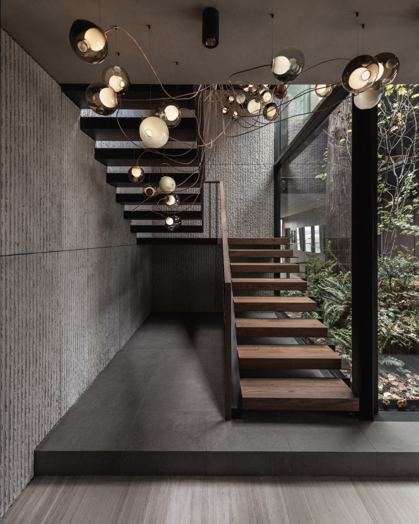
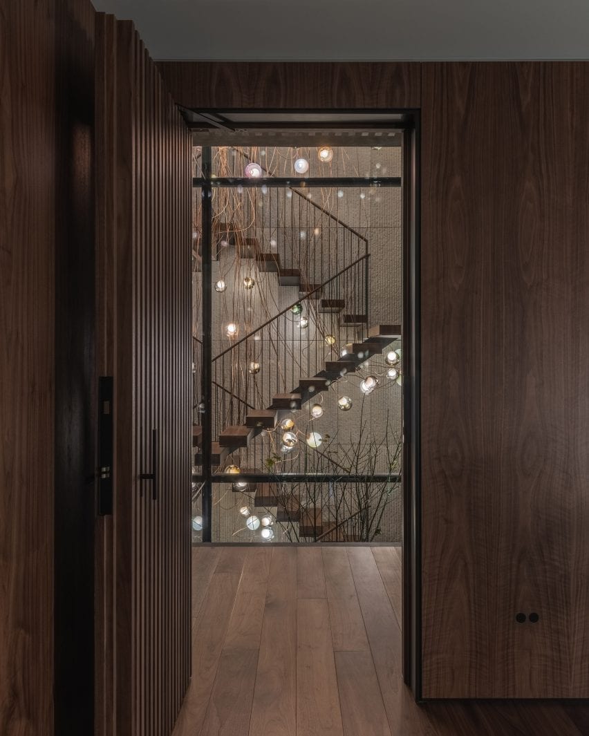
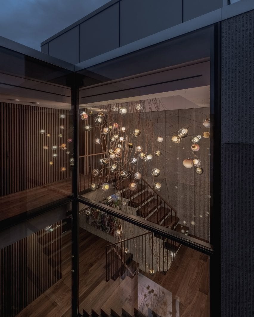
A lighting installation floats in the stairwell
A lighting installation from Bocci illuminates the stairwell

Floating in the stairwell is a lighting installation from Bocci that evokes a cluster of sparkling fireflies. The piece is made of copper and 122 glass luminaires.

The rooftop terrace is meant to serve as an extension of the living space. It is fitted with a stainless-steel jacuzzi, an outdoor shower, a kitchenette and plenty of seating.

Leckie Studio was founded in 2015
The lighting installation is made from copper and glass

Founded by Michael Leckie in 2015, Leckie Studio has designed a number of residential projects, including mirrored cabins that blend into the forest. The firm also designed Slack’s Vancouver office, located within a repurposed industrial building.

Photography is by Conrad Brown.

Reference

Child Studio transforms 60s London post office into Maido sushi restaurant
CategoriesInterior Design

Child Studio transforms 60s London post office into Maido sushi restaurant

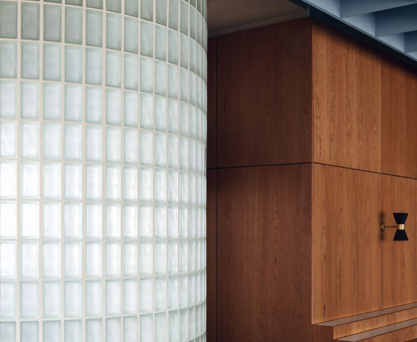
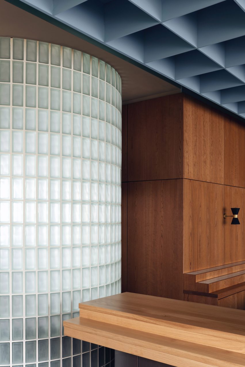
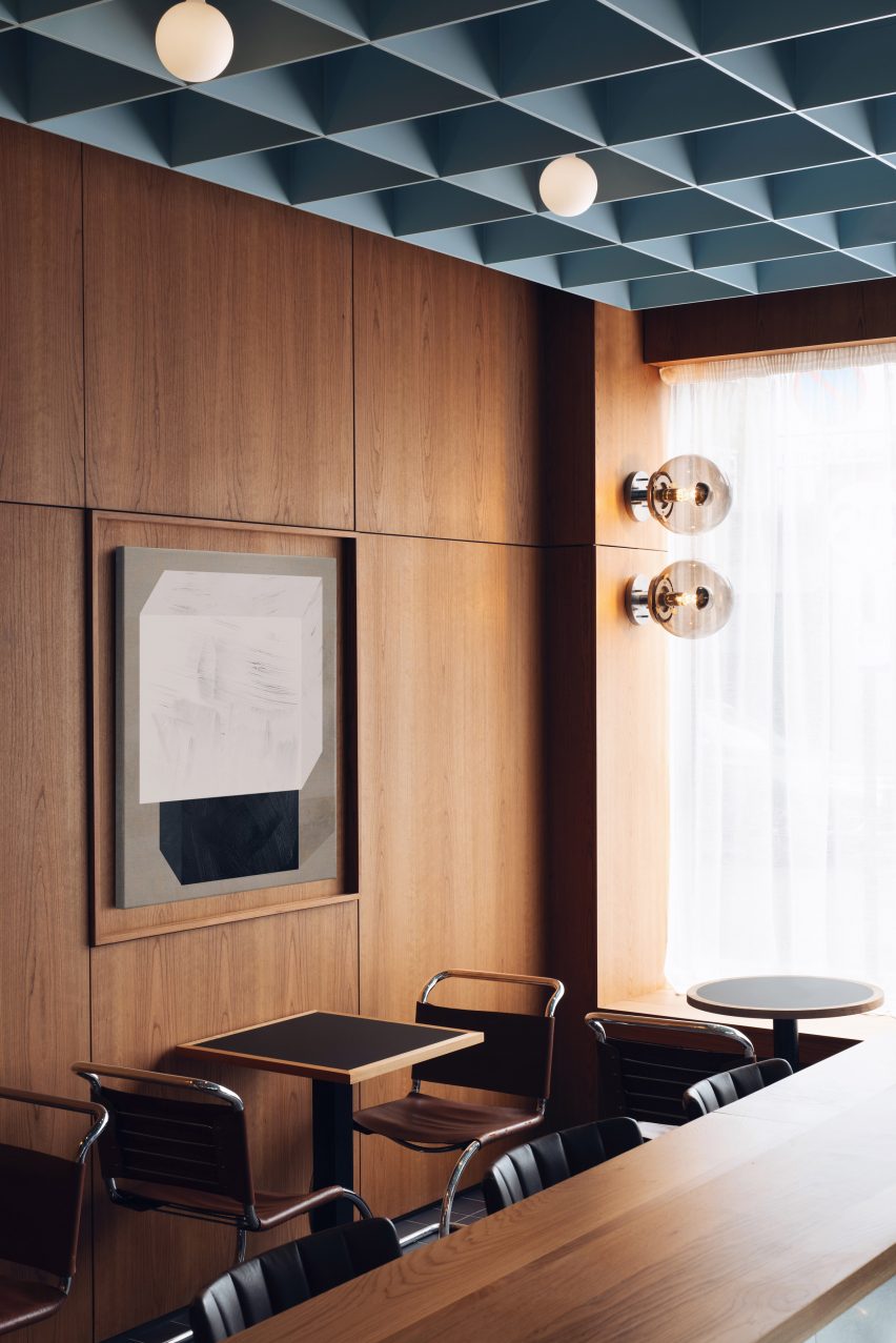
Child Studio has used a glass block wall, dark cherry wood panelling and a soft blue coffered ceiling to channel 1960s London in this sushi restaurant.


Located in a former post office, Maido is an eatery in London’s Saint John’s Wood neighbourhood with interiors designed to honour the heritage of the late modernist building.

Glass blcok wall and wooden cupboard in Maido restaurant
A curved glass brick wall divides the space

“We were fascinated by the unique story of this building and aimed to capture the nostalgic atmosphere of 1960s London, paying tribute to the modernist public spaces of the era,” said Child Studio founders Alexy Kos and Che Huang.

“The design evolved around the bold geometry of this period and the juxtaposition of simple materials: wood, glass, clay and steel.”

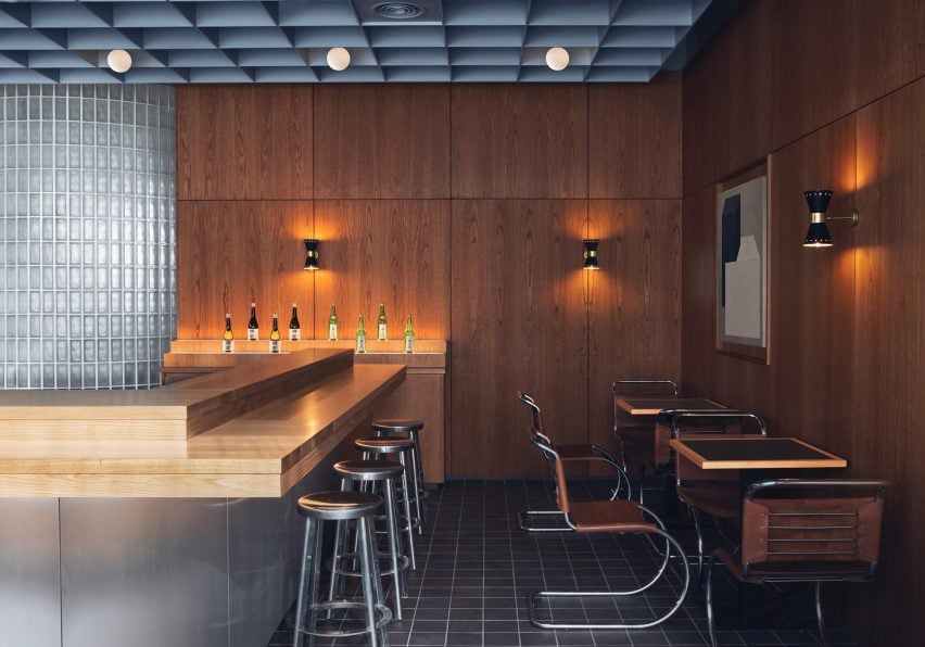
Steel panelled bar and MR10 tubular steel chairs by Mies van der Rohe chairs in restaurant interior by Child Studio
Maido is anchored by a steel-panelled bar

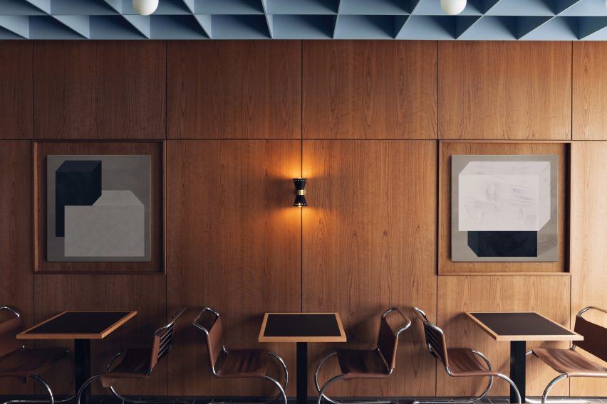
The walls across the entire space are clad in cherry wood while shallow alcoves are decorated with a rotating selection of artworks.

A suspended coffered ceiling hangs overhead, its grid pattern echoed in the black quarry tiles on the floor and the semicircular glass brick wall that divides the space.

The curved partition wall also forms a generous, leather-upholstered seating booth at the back of the space.

Wood-panelled walls with art in Maido restaurant
Shallow alcoves are decorated with a rotating selection of art

The focal point of Maido’s interior is a central island bar clad in reflective curved steel panels.

Here, the sushi master prepares and serves authentic Japanese dishes while customers perch on polished aluminium bar stools by Japanese industrial designer Naoto Fukasawa.

“It was important for us to create a range of different seating scenarios and balance the convivial atmosphere with more intimate nooks and crannies,” Che explained.

To complete the space, the studio sourced a selection of classic midcentury furniture pieces. These include antique MR10 tubular steel chairs by Mies van der Rohe and moulded plywood armchairs by Norman Cherner.

Pipistrello table lamps, designed by Gae Aulenti in 1965, sit on the island bar and on a large communal dining table while antique wall sconces produced by Italian manufacturer Stilnovo create a cosy ambience.

Wood-paneleld walls with MR10 tubular steel chairs by Mies van der Rohe in restaurant by Child Studio
Mies van der Rohe’s MR10 chair was used throughout the interior

Founded in 2017 by Che Huang and Alexy Kos, Child Studio has previously completed a 1950s-style interior for a vegan pizzeria in west London, which was shortlisted in the 2019 Dezeen Awards.

All photographs are by Felix Speller and Child Studio.

Reference

Horma Studio creates terracotta-toned salad bar in Valencia
CategoriesInterior Design

Horma Studio creates terracotta-toned salad bar in Valencia

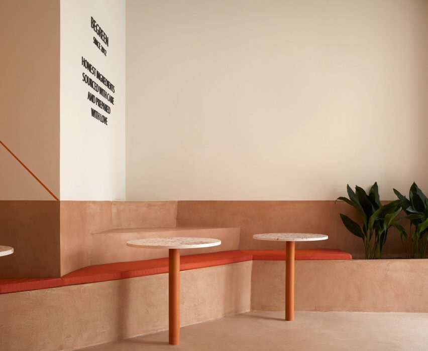
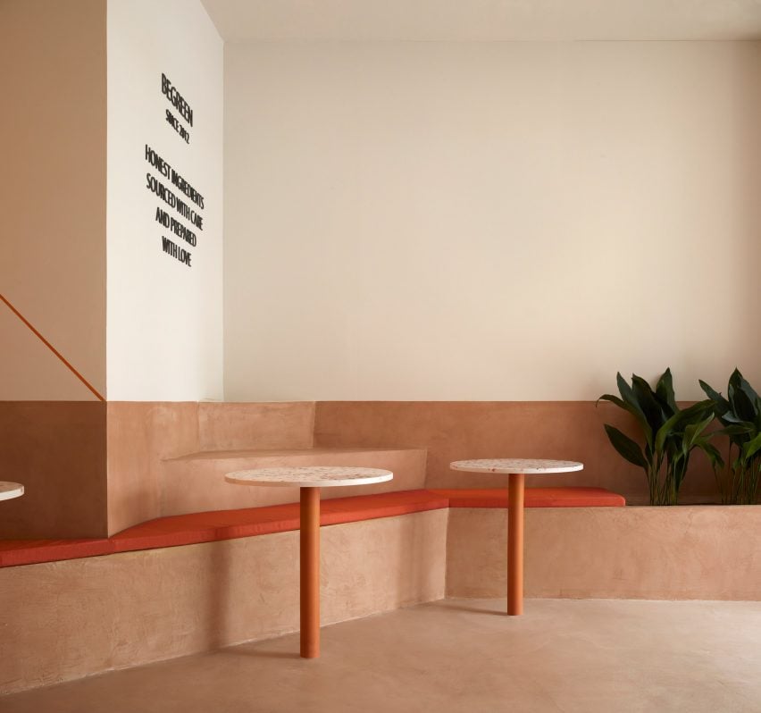
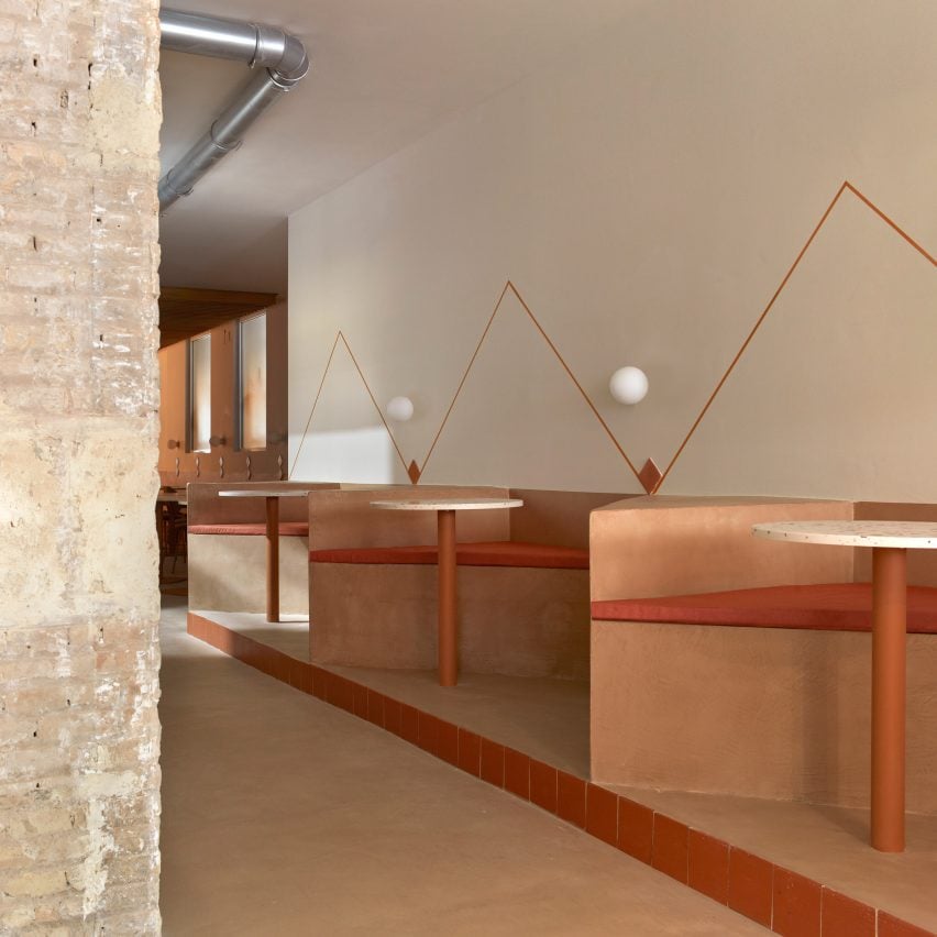
A zigzagging plinth that accommodates seating, steps and planters weaves its way through this terracotta-coloured salad bar in Valencia by local design practice Horma Studio.


Located in a protected heritage building in the city’s L’Eixample district, the 140-square-metre space belongs to the BeGreen Salad Company.

For its interior, the brand wanted a non-prescriptive layout that could be used in a multitude of different ways.

Seating made of terracotta-coloured micro-cement in BeGreen Salad Company Valencia
A zigzagging plinth integrates planters and seating

“They asked us to design a comfortable and singular space,” Horma Studio told Dezeen.

“It needed to be representative of BeGreen as a place that should be honest, natural and sustainable but at the same time should rethink the concept of a typical cafe and restaurant with chairs and tables. They were looking for something flexible that could be used without any rules.”

Angular seating booths and wall mural in cafe by Horma Studio
The plinth runs along one wall of the 30-metre-long space

Finished in micro cement, terracotta and timber, the interior is laid out over an awkward long and narrow floor plan.

To maximise the eatery’s small footprint, the design team inserted a simple seating “plinth” that zigzags along one wall of the 30-metre-long space.

“We realised that the angular furniture allows us to get in more seats and contributes to creating a pleasant space, making this combination the best for our design,” the studio explained.

Finished in micro-cement, the plinth is set at different levels of up to 90 centimetres in height. It divides the plan into different seating areas including booths, benches and steps for casual seating, alongside areas for planting.

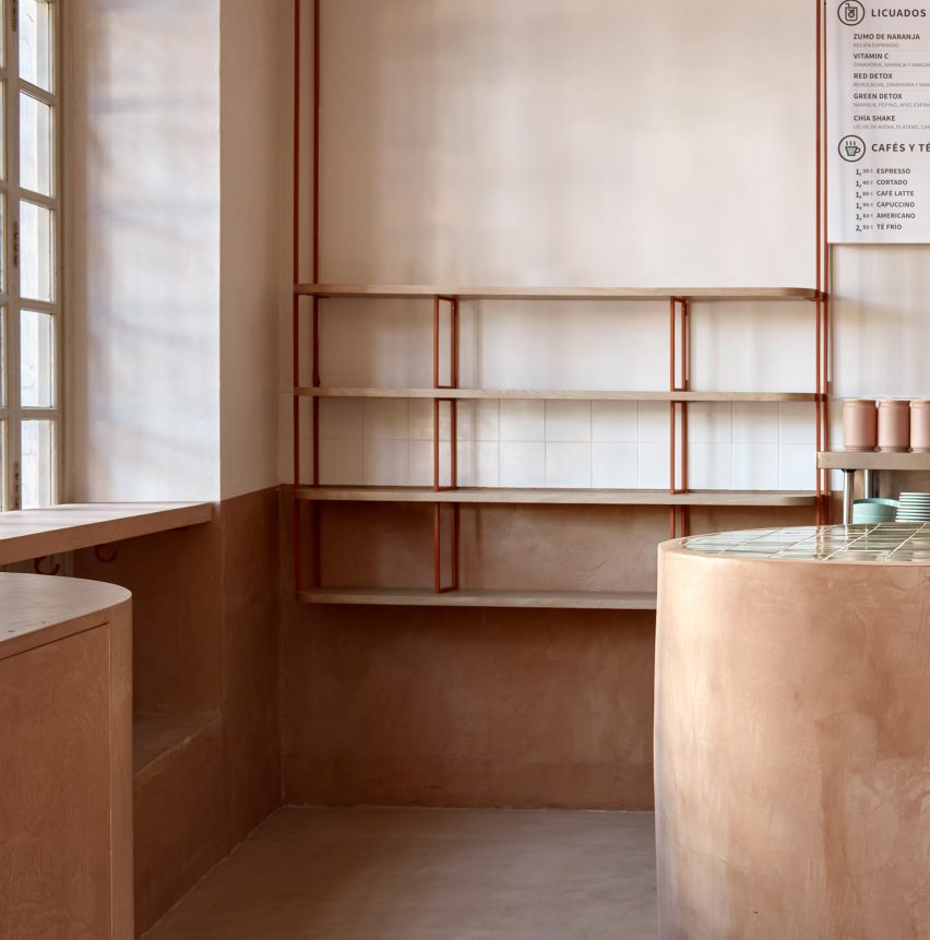
The plinth is decorated with locally-produced terracotta elements such as wall tiles and integrated cylindrical table legs. Matching upholstered seat cushions were used to pad out the bench and seating.

“The project aims to be as sustainable and honest as possible, so we simplified our decisions and used as few materials as possible,” said Horma Studio.

Micro-cement service counter and hanging shelves in BeGreen Salad Company Valencia
The serving counter is finished in micro-cement

Other terracotta-hued eateries include this Mexican restaurant in Downtown Los Angeles, where Wick Architecture & Design chose materials “that could be found on a construction site”, and a cafe in Melbourne in which Australian practice Ritz & Ghougassian used the worn red brick facade as a reference point.

Photography is by Mariela Apollonio.

Reference

Ivy Studio adds pops of colour to Spacial co-working office in Montreal
CategoriesInterior Design

Ivy Studio adds pops of colour to Spacial co-working office in Montreal

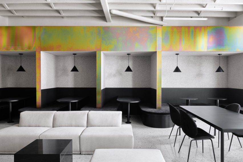
Mint green and burgundy are among the hues incorporated into a Montreal co-working space that Canadian firm Ivy Studio designed to “stand out from its competitors.”


The office is located on the second floor of a 743-square-metre building in Verdun, one of city’s trendiest neighbourhoods. The space formerly housed a Jiu Jitsu gym and a beauty salon.

Ivy Studio designed the project
Spacial co-working office includes mint and burgundy hues

This is the first location for the new co-working brand Spacial. Local practice Ivy Studio was charged with designing a flexible work environment for up to 120 people.

“Being the first of its brand, this space had to stand out from its competitors by offering a unique vision for co-working,” the team said.

Local firm Ivy Studio added dashes of colour to the space
The project was designed by Ivy Studio

The team divided the rectangular space into two distinct zones.

The front portion encompasses public areas that are largely used for informal working, socialising and relaxing. In the rear, the team created a more private area with about two dozen rentable offices in varying sizes.

Throughout the space, contemporary finishes and decor are paired with original building elements, such as exposed ceiling joists and brick surfaces.

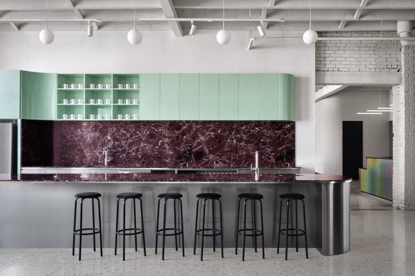
In many areas, the team coated the walls with an off-white plaster and covered the floors with light-grey terrazzo. Much of the furniture is black, although dashes of colour are sprinkled throughout.

Rainbow-coloured elements feature in the office
Dashes of colour are set against monochrome walls

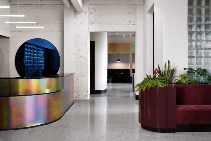
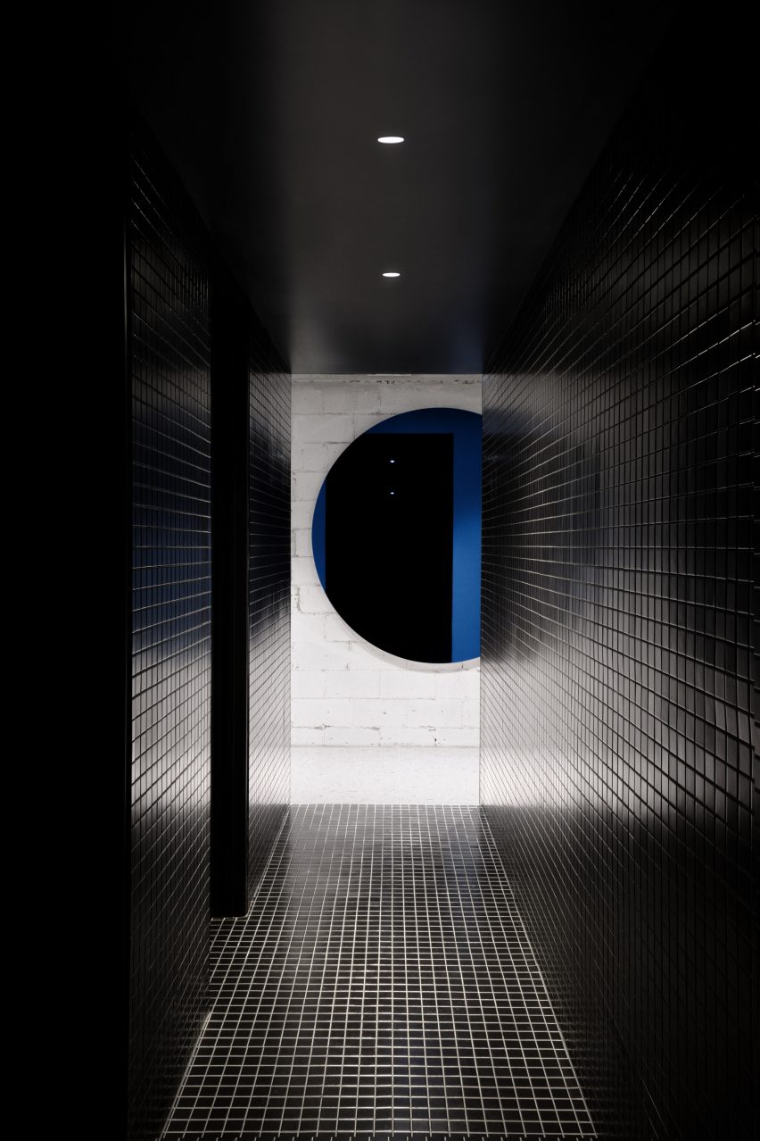
Upon entering, one encounters a rounded reception desk made of zinc with a rainbow-coloured finish. Hanging on a wall is a blue, circular mirror – one of several rounded elements in the venue.
To one side of the foyer is a lounge and a trio of conference rooms, each with a wall-mounted screen.

Ivy Studio created a mixture of light and dark areas
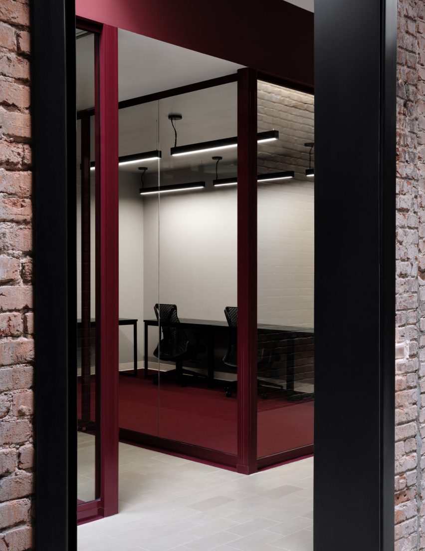
Brick walls feature in the office

“In the conference rooms, televisions are camouflaged in front of matching, circular black mirrors, each backlit to put forward the white-washed brick wall,” the team said.

To the other side of the foyer is a second public area. This one encompasses a kitchen and dining space, including private booths that are well-suited for small groups.

Bathrooms have black tiles and pops of colour
Bathrooms have black ceramic tiles

The kitchen features curved cabinetry with a glossy mint-green finish, and a backsplash and island covered with Rosso Levanto marble. The base of the island is made of stainless steel, which mimics the chrome planters found throughout the office.

Situated near the kitchen are the bathrooms, which have black ceramic tiles and matching plumbing fixtures.

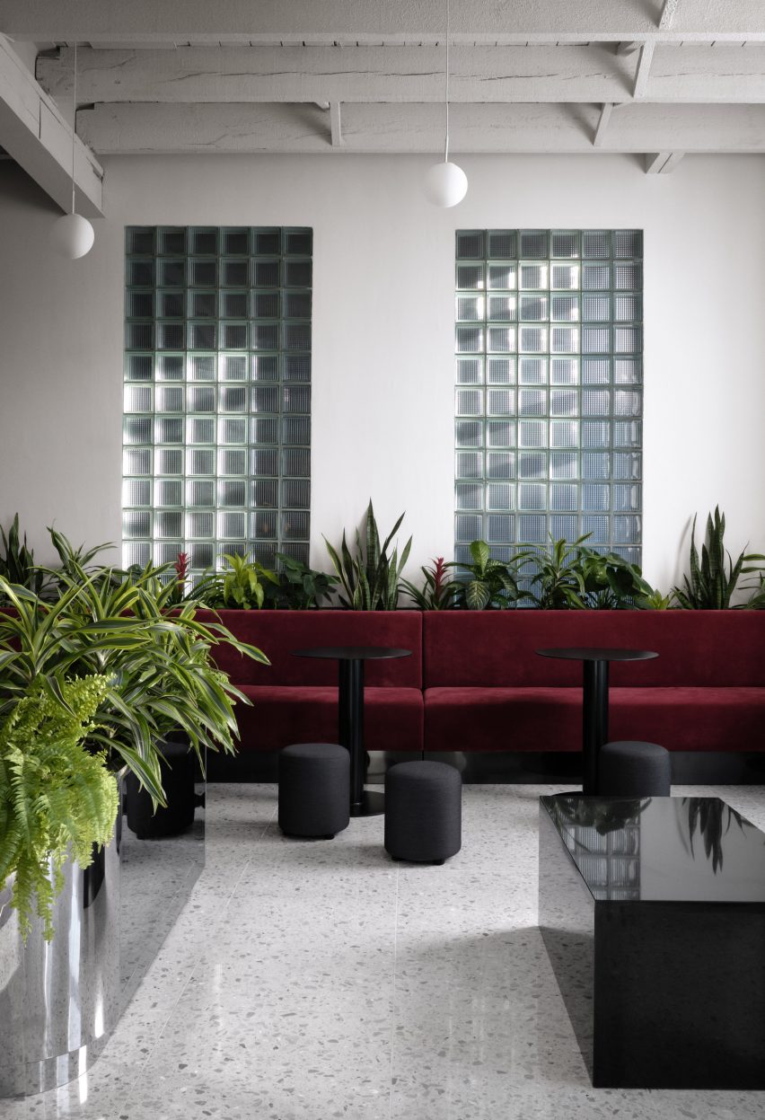
Ivy Studio put a glass-brick wall in the reception
The reception area has a blocky glass brick wall

Behind the reception desk is a glazed-block wall that separates the public zone from the private offices, while still enabling light to pass through.

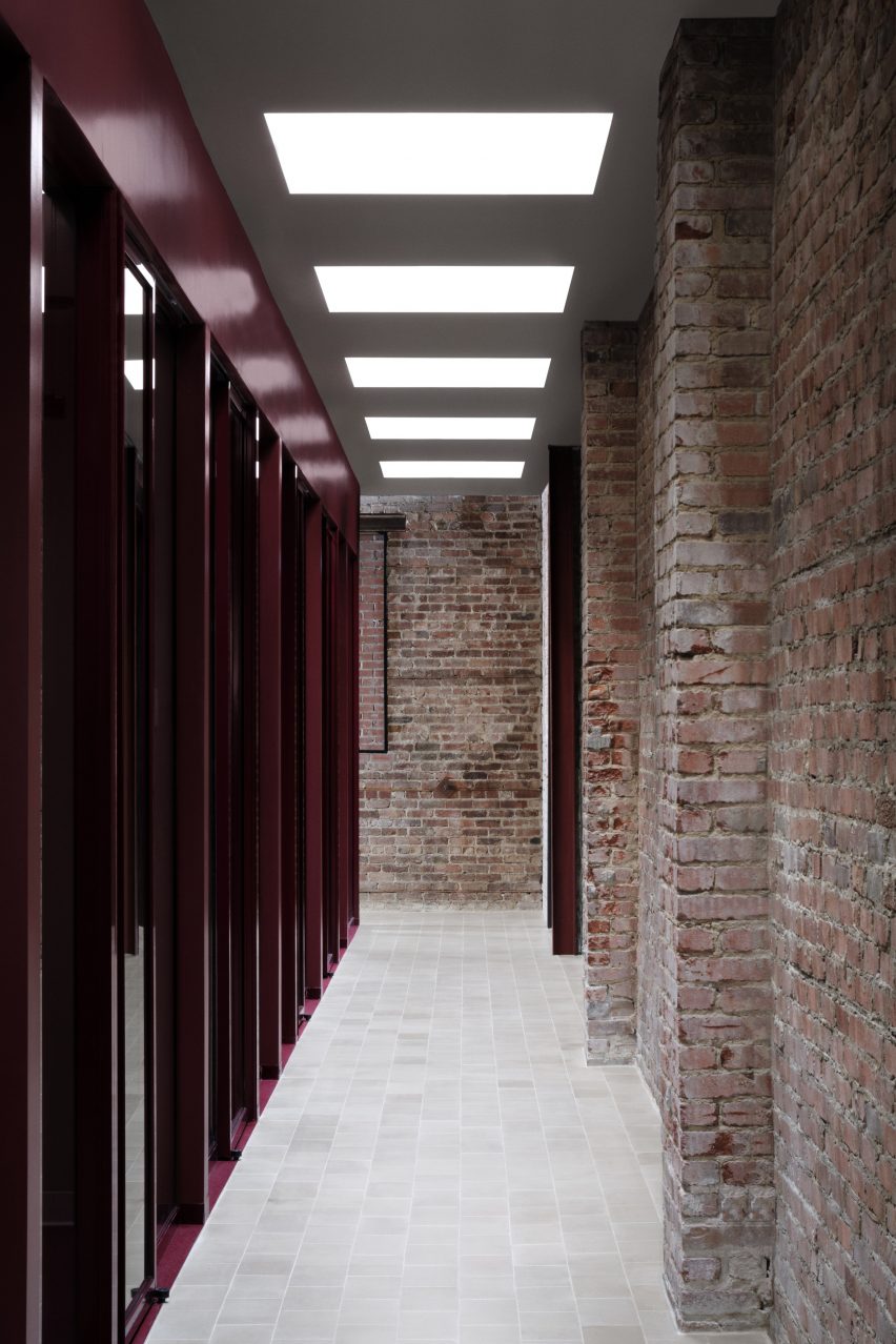
The offices are arrayed along corridors with tile flooring and brick walls. Both fixed and sliding glass panels enclose the work spaces. A dark burgundy hue was chosen for the carpeting and mullions.

Skylights throw light onto the office's corridors
Skylights bring extra light into the office’s interior

To ensure the private area felt bright and welcoming, the team installed 20 skylights above the corridors.

“With the exposed brick walls, sandstone floor tiles and abundance of natural light pouring into the hallways, the general feeling resembles that of working in an exterior courtyard,” the team said.

Other co-working spaces in Canada include an office designed by Henri Cleinge within Montreal’s old Royal Bank, and a women-only space in Toronto that was designed by MMNT Studio to feel peaceful yet playful.

Photography is by Alex Lesage.


Project credits:

Architecture and design: Ivy Studio Inc
Construction: Gestion Gauthier Construction
Furniture: Ivy Studio Inc.

Reference

Limdim House Studio uses curved walls and arched niches in Vietnam apartment
CategoriesInterior Design

Limdim House Studio uses curved walls and arched niches in Vietnam apartment

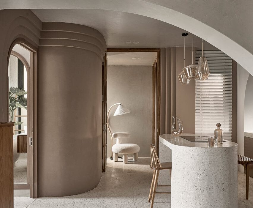
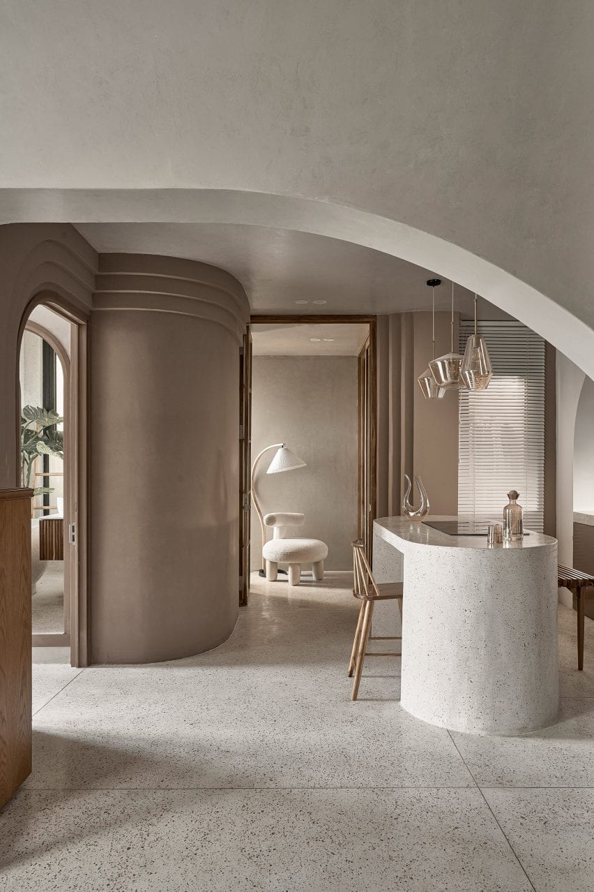
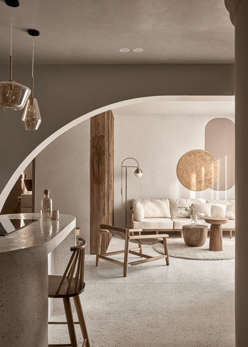
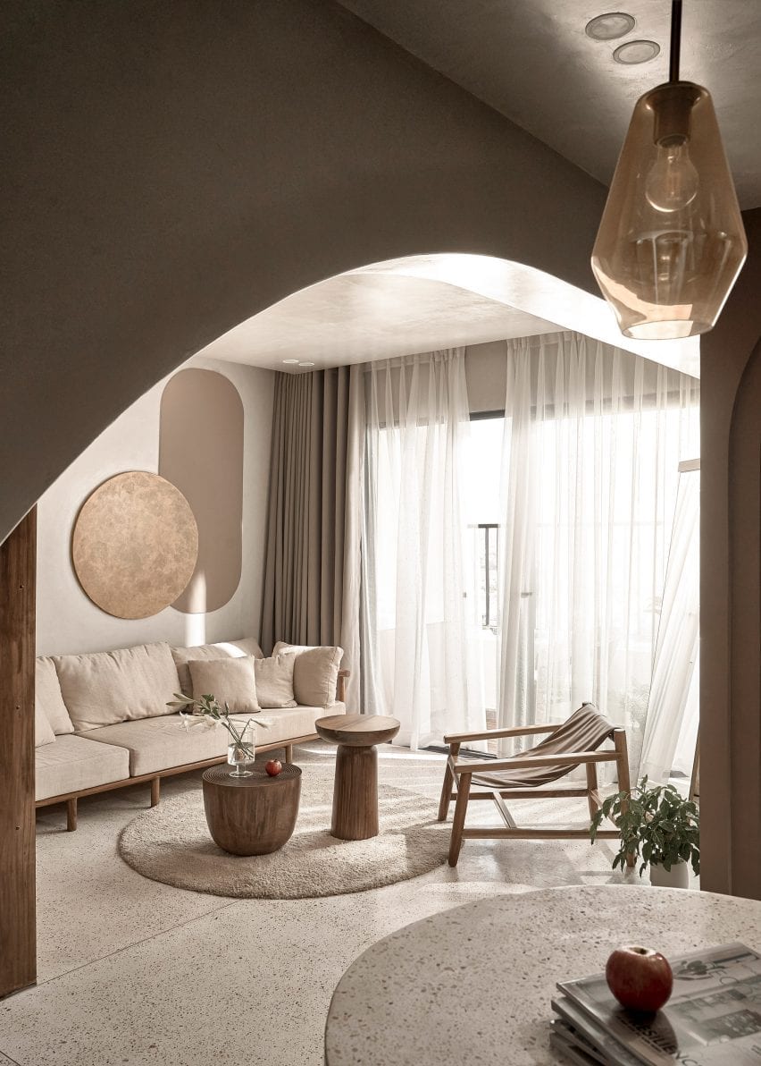
Architecture firm Limdim House Studio has renovated the Brown Box apartment in Vietnam adding curving walls, tiered cornices and terrazzo surfaces that aim to create a “calm” and “gentle” space. 


Limdim House Studio reorganised the previously “commercial” two-bedroom apartment by removing walls to convert it into a spacious one-bedroom home named Brown Box.

Brown Box has a neutral colour palette
Top: a curving arched wall divides the open plan living space. Above: terrazzo was used throughout the apartment

“The idea comes from the byname of the owner of the house, Ms Brown,” studio founder Tran Ngo Chi Mai told Dezeen. “Since she also loves the colour brown, our idea was to create a living space as gentle and calm as this colour itself.”

“[We] processed the space with the aim of creating a new colour, a new breath to get rid of the boredom in commercial apartments.”

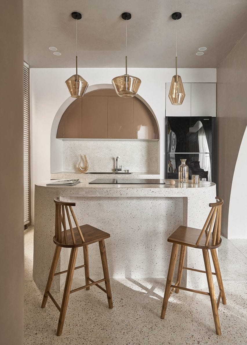
A kitchen island doubles as a breakfast bar at Brown Box
The island is blanketed in terrazzo

As part of the opening up of the home, the studio removed existing walls and added curving partition walls in their place.

The curved walls were surrounded by stepped cornices as a modern take on crown mouldings that remove the harshness of corners in the open-plan kitchen diner.

Wood and stone was used throughout the apartment
The studio added new partition walls

The studio used a natural colour palette throughout, employing light browns, beige and wood tones to create a peaceful yet sophisticated look.

“We choose tones around brown and beige,” explained Chi Mai. “when designing with this colour tone, we want the apartment to be peaceful, plain and still full of sophistication.”

Sheer curtains surround a balcony at the apartment
Circular furnishings and motifs reference the design of the apartment

A rounded island at the centre of the kitchen diner was clad in pale terrazzo to provide additional counter space in the one-wall kitchen.

An arched niche frames a sink, terrazzo countertops and a row of taupe brown overhead cabinetry which was arranged in a semicircle to fit within the alcove.

Terrazzo slabs extend across the floors of the apartment and to the living space which is zoned by floor-to-ceiling Melaleuca wood cabinetry and wooden furnishings.

The ceiling above the living area has a curved design and merges into an arched wall that visually separates the living area from the kitchen diner.

Terrazzo was used in the bedroom of the apartment
The bedroom has a light and airy look

“We use terrazzo all the way from the kitchen island, like a stream going down the floor and spreading everywhere,” said Chi Mai.

“Choosing this type of material helps the colour in the house to become light and soothing.”

“Physically, Terrazzo has good hardness, just enough gloss, and more heat dissipation than wooden floors, so it creates a cool feeling, especially in tropical areas.”

Textural paint covers the walls of Brown Box apartment
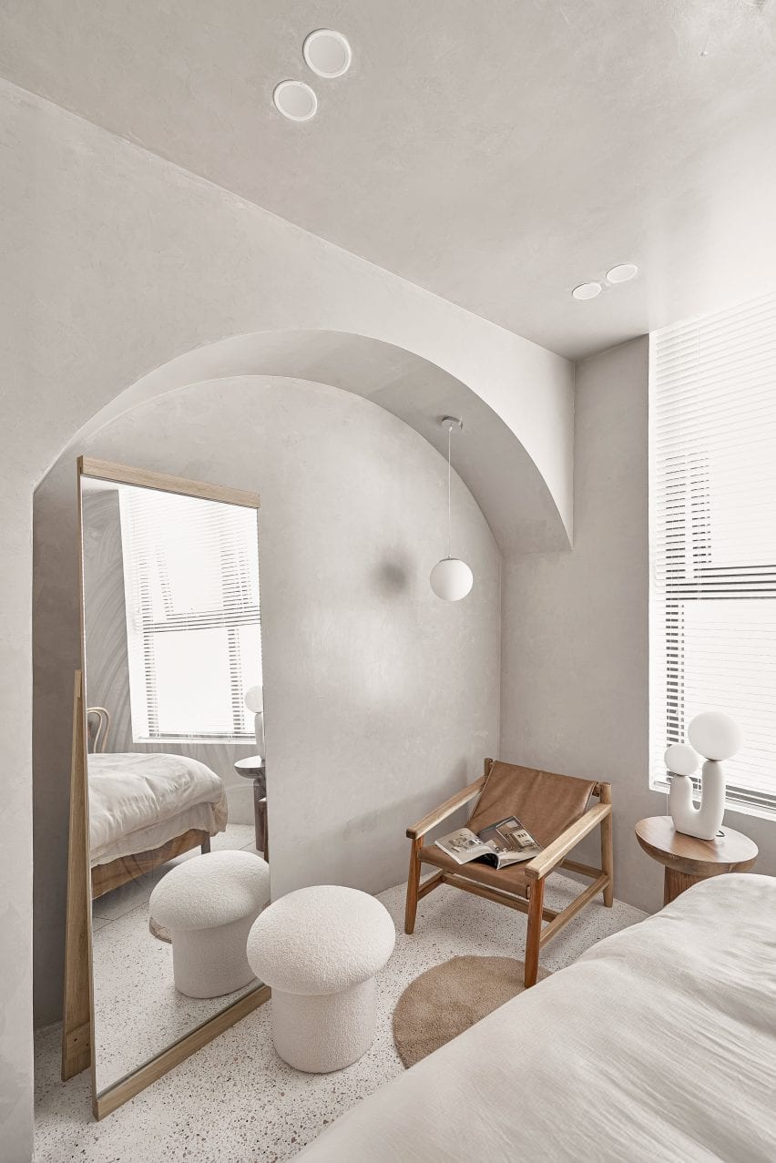
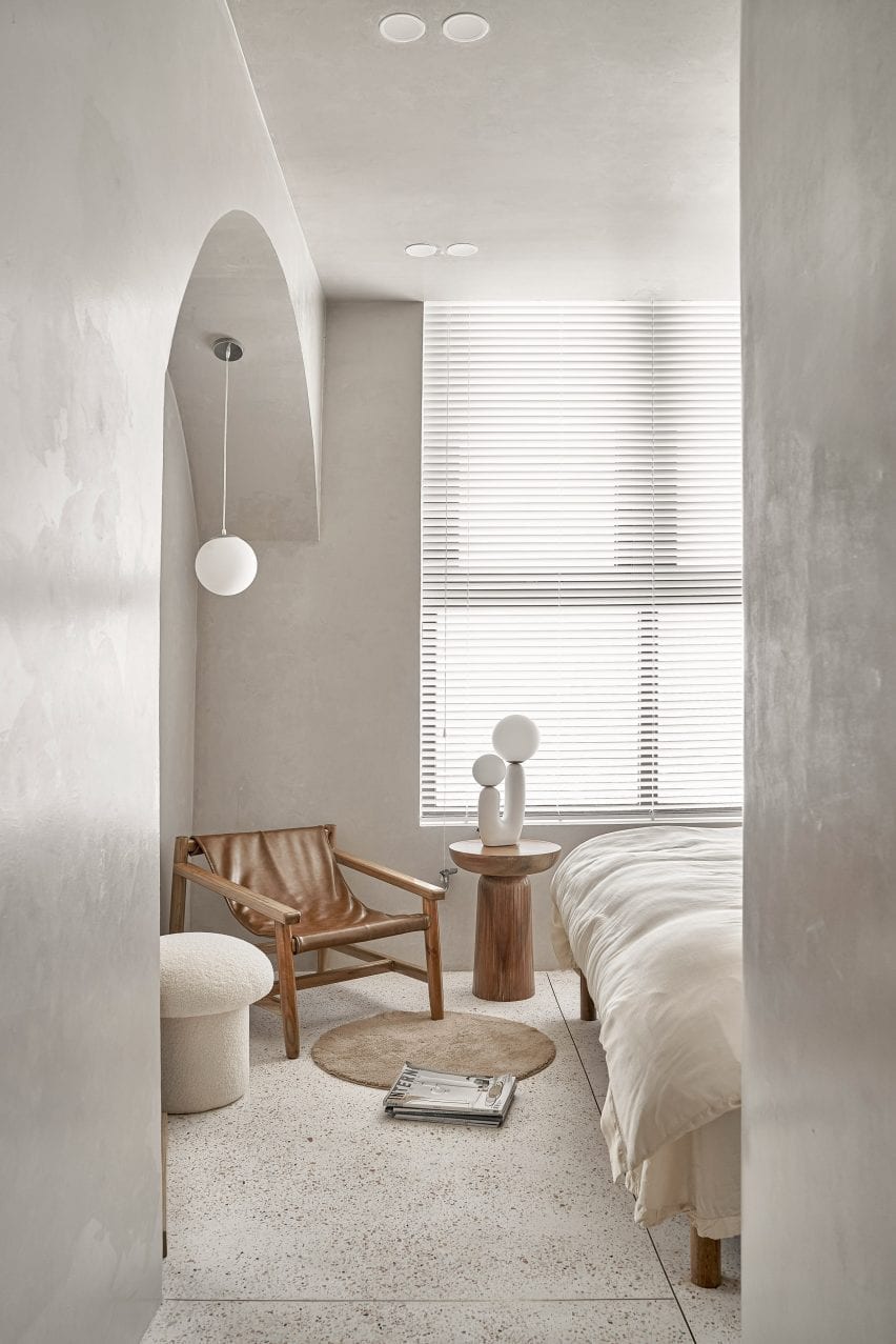
An arched niche houses a mirror and a reading chair

An arched doorway leads from the open-plan living area to the bedroom space. Its walls were covered in a grey plaster-like finish providing a textural quality.

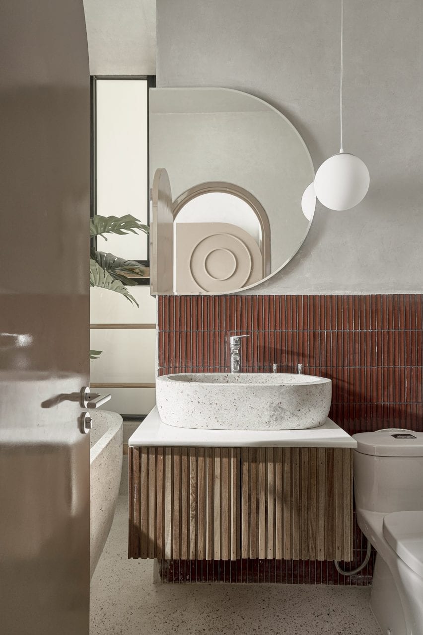
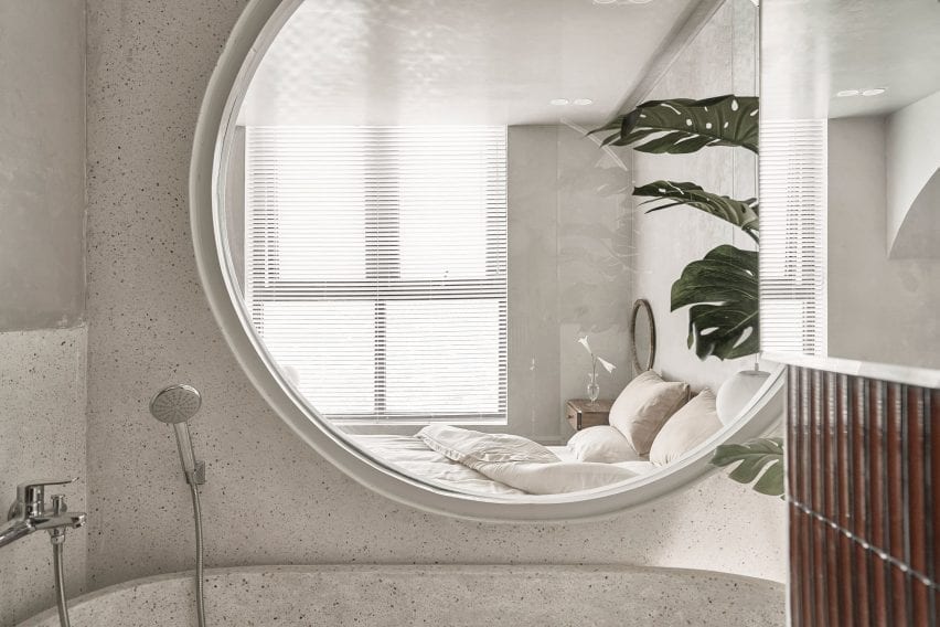
An en-suite next to the bedroom was fitted with a free-standing terrazzo bathtub below a large circular window that looks into the bedroom.

The apartment has an en-suite
Redbrick tiling was used in the en-suite

“The important thing when designing a space, in our opinion, is to create a new, sophisticated and especially to bring comfortable feeling to the owner,” said Chi Mai.

“If the owners come back after a hard days work, they don’t enjoy the life in this space, this space will forever be just a place to provide basic needs like eating, sleeping and that will be our failure in this project.”

A terrazzo bathtub was placed in the en-suite
A large circular window connects the bedroom and en-suite

Limdim House Studio is an architecture, design and interior design practice based in Vietnam.

Other Vietnamese projects include this apartment by Whale Design Lab which references the work of Louis Kahn, along with this holiday home that has a thatched roof.

Photography is by Do Sy.

Reference

Child Studio channels Soho’s peep show booths for Cubitts eyewear store
CategoriesInterior Design

Child Studio channels Soho’s peep show booths for Cubitts eyewear store

Featuring linoleum floors, Formica-clad walls and a deep red basement, Soho’s peep show booths served as inspiration for the atmospheric interior of this London eyewear store by Child Studio for spectacle-maker Cubitts.


Perched on the corner of Marshall Street in London’s Soho neighbourhood, the store occupies one of the early 19th-century buildings that form the area’s narrow streets.

Checked linoleum floor and wood-panelled walls in Cubitts eyewear store
Black and white checkered linoleum flooring features throughout the store

The store is spread out over a small ground floor and basement space lined by a narrow staircase.

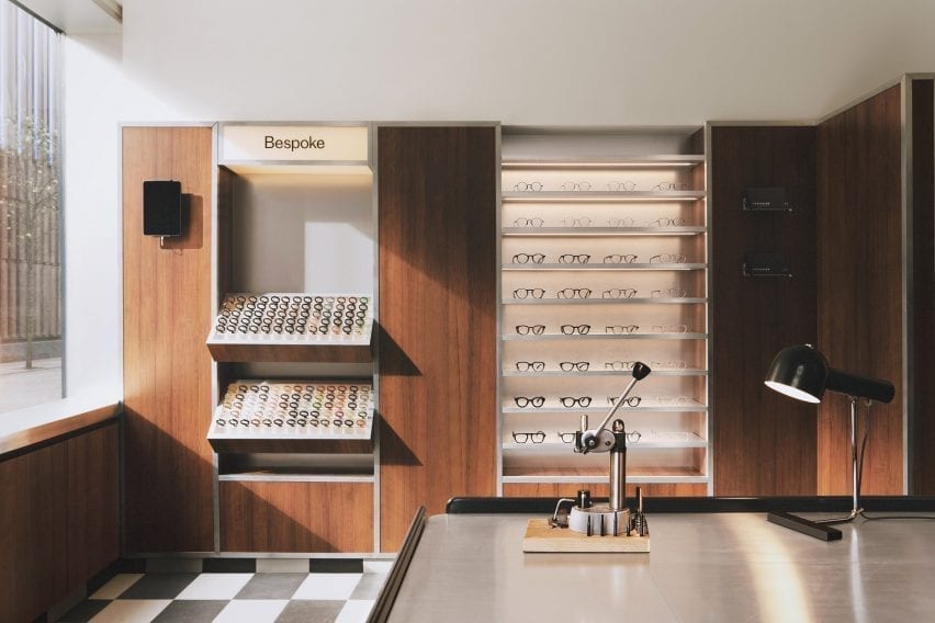
In terms of practical requirements, the store needed to incorporate a display of the 100 different coloured acetate chips that customers can choose from to create bespoke frames.

London-based Child Studio designed a space for Cubitts that aims to reflect the history of the local area and create a customer journey that would encourage people to explore the basement space.

Wood-panelled walls and acrylic display stands in eyewear store by Child Studio
A wall-mounted display case holds 100 different coloured acetate chips

Cubitts wants each of its shops to have a unique design reflecting the history of the local neighbourhood,” Child Studio co-founder Alexy Kos told Dezeen.

“The brand has a strong connection to London, where its glasses are made, and to Modernism as the guiding principle to its design aesthetic.”

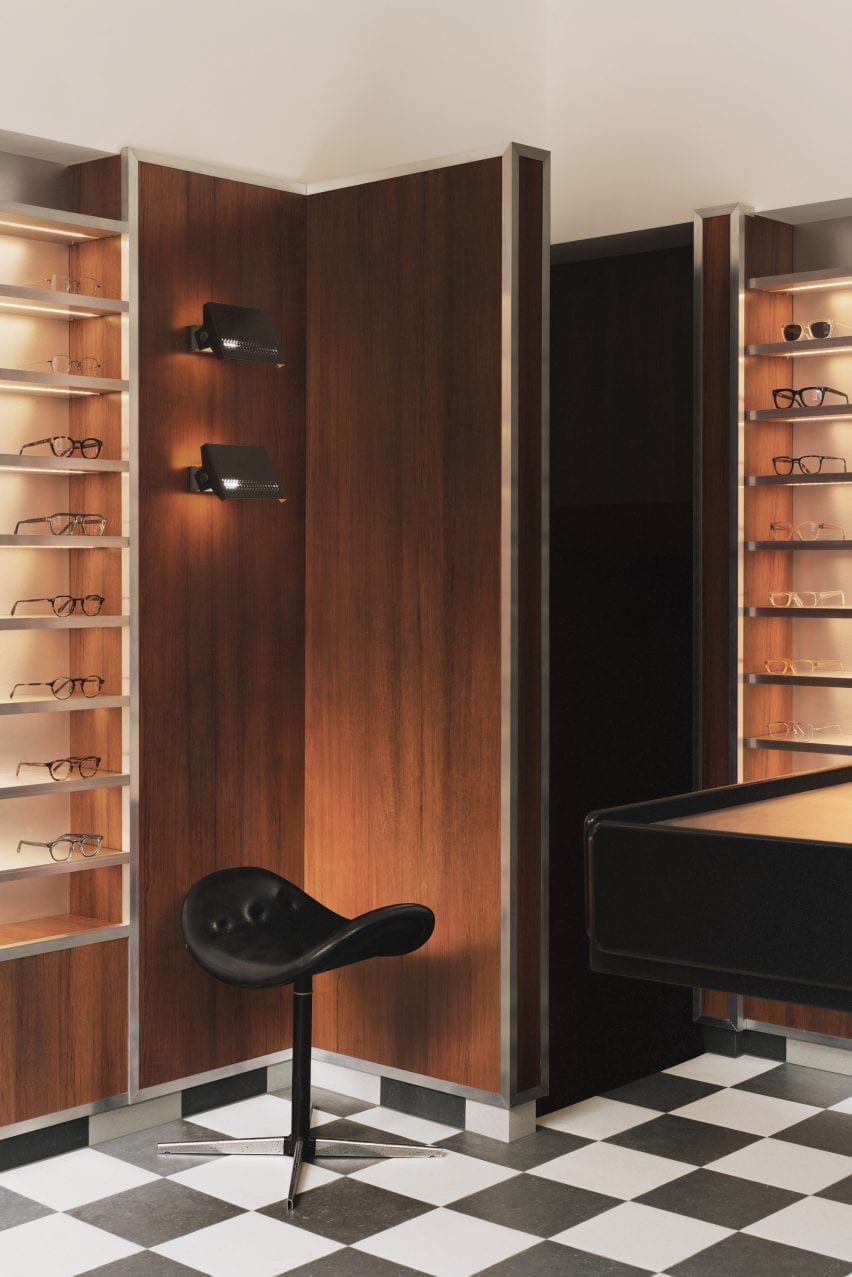
Checkered floor, black stool and wood-panelled walls in Cubitts London shop

To design the interior, the studio drew upon Soho’s colourful history as a destination for massage parlours, adult cinemas and sex shops in the postwar era.

“Gambling, drinking, religious and political dissent, clubbing and prostitution were all, at varying times, peculiar Soho specialities,” said the studio.

“We have focussed our research on Soho’s heyday in the postwar era, looking at the interiors of the neighbourhood’s iconic venues, such as the Formica-clad Bar Italia and the legendary jazz venue 100 Club, with its all-red interiors.”

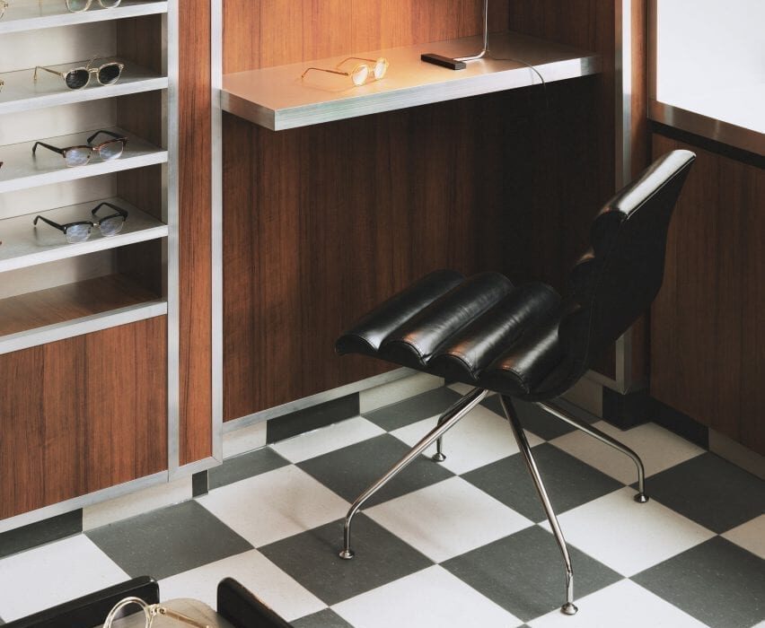
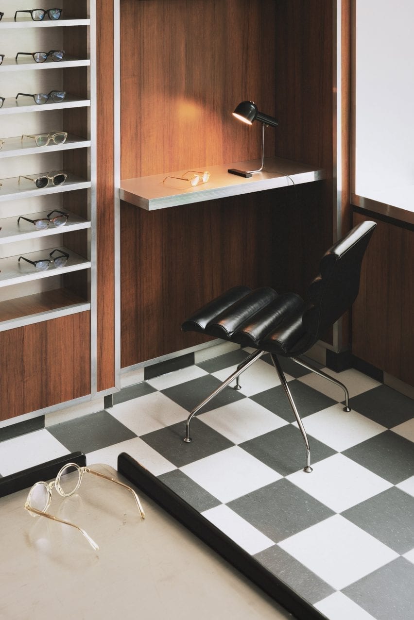
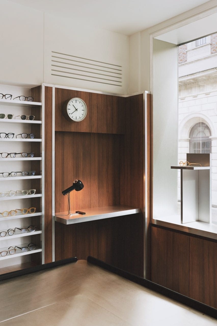
Desk nook with clock and glasses display in eyewear store by Child Studio
Formica laminate partitions with aluminium trims divide up the space

Referencing the peep show booths of Soho, the store incorporates low partitions clad in a wood-effect Formica laminate and trimmed with aluminium to form a maze-like environment.

Display areas with illuminated acrylic shelving that showcase the spectacles and the colourful acetate chips are recessed into the walls. Lightbox signage integrated into the metal-trim cladding and black and white checkered linoleum flooring add to the store’s nostalgic ambience.

An antique Caori cocktail table designed by Vico Magistretti in 1961 serves as a focal point on the ground floor.

Featuring a brushed aluminium tabletop and several concealed compartments for records and magazines, the piece was specially sourced by Child Studio and adapted to include a raised podium so that it is better serves the retail environment.

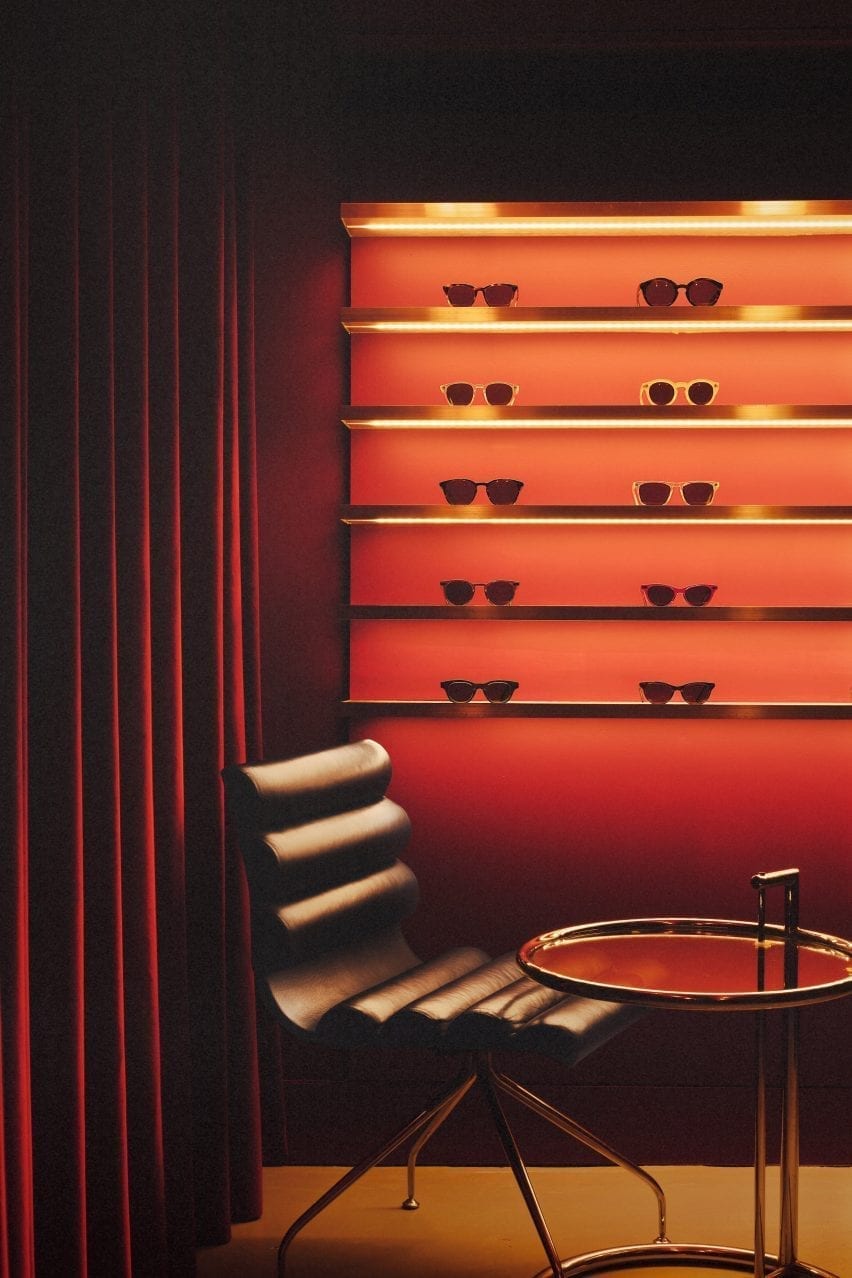
Leather chair with red glasses display in Cubitts store
The basement is saturated with a deep red colour

“Every project tells a unique story and we always look for rare and unusual furniture pieces to add depth and authenticity to the narrative,” said the design team.

“The desk lamp is another mid-century find, created by the Czech designer Josef Hurka for the manufacturer Napako in the 1960s.”

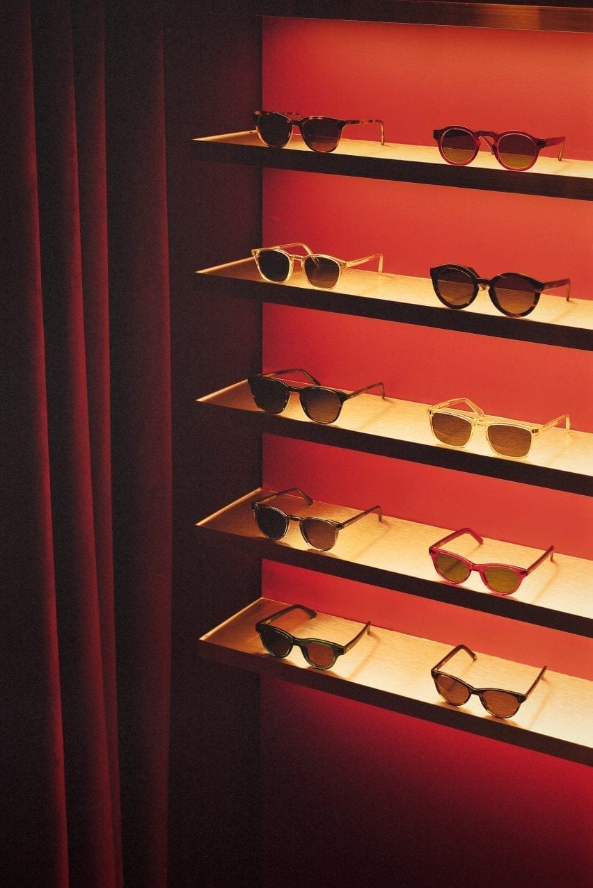
Acryclic glasses display with red velvet curtain in eyewear store by Child Studio
Limited-edition sunglasses are displayed on shelves clad in aluminium-effect Formica

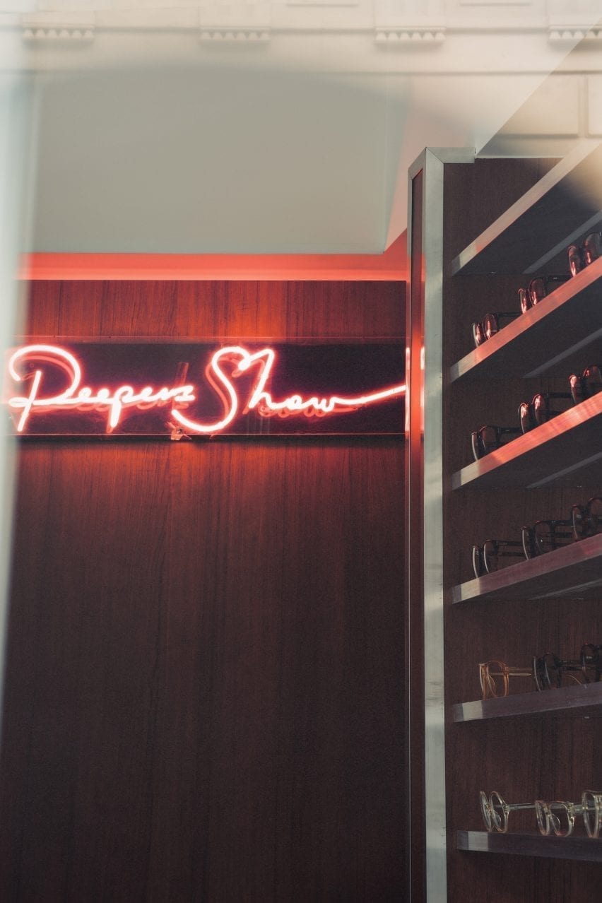
A narrow staircase leads to the basement, which is saturated in a deep red colour. Customers are guided to an eye examination room concealed behind a velvet curtain by neon signs.

Cubitt’s moody basement lounge area is lit by the Conelight floor lamp by the British designer Ronald Homes and furnished with chrome and leather chairs designed by Giovanna Modonutti.

A collection of limited-edition sunglasses is displayed on illuminated shelves clad in aluminium-effect Formica that create a theatrical effect in the dark red surrounds.

Neon peep show sign in Cubitts Soho store
A neon peep show sign hangs at the entrance to the eye examination room

Previously, the studio run by Kos and Che Huang has channelled the look of a 1950s cafe inside a vegan pizza restaurant in west London and transformed a former London post office into a sushi restaurant with a 1960s interior.

“We like to use the word ‘cinematic’ to describe the spaces designed by Child Studio,” Kos told Dezeen. “With every project, we aim to capture a particular mood and atmosphere, rather than trying to recreate an interior from a specific era.”

Photography is by Felix Speller and Child Studio.

Reference