Camille Walala takes colourful style to the max in self-designed studio
CategoriesInterior Design

Camille Walala takes colourful style to the max in self-designed studio

London designer Camille Walala has worked with carpentry workshop Our Department to fit out her own studio with a no-holds-barred version of her colourful design style.

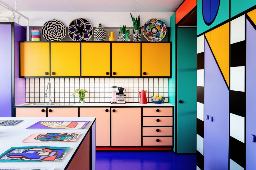
Electric blue floors, graphically patterned cabinetry and a kitchenette with cartoon-like proportions feature in the space, which is located in the Regent Studios building off Broadway Market in East London.

Photo of a brightly coloured kitchenette in Camille Walala's London studio
Camille Walala designed her studio to include a kitchen with exaggerated proportions

The seventh-floor space attracted Walala and her studio manager Julia Jomaa with its sweeping views.

Knowing they would be in no hurry to vacate, the duo took their time with the design, working side by side in the studio for over a year while adjusting the position of their space-dividing furniture until they arrived at a layout with the perfect functionality for them.

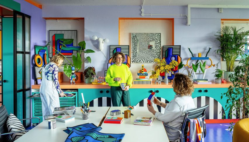
Photo of Camille Walala and her studio team in their London office in Regent Studios
The studio chose to embrace colour in the design

Once they decided to embark on the interior design, it was not a given that they would embrace Walala’s signature bold colour palette, as they worried about it potentially clashing with future work.

“We were like, how colourful should we go?” Walala told Dezeen. “Should we keep it quite simple or should we actually go for it?”

But ultimately, she says the desire to feel inspired by their workspace and “inhabit the aesthetic fully” won out.

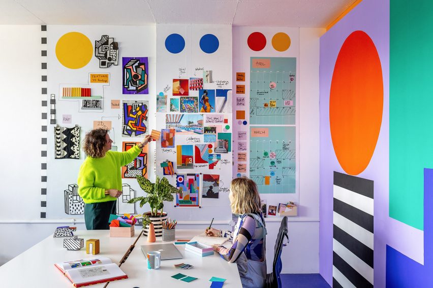
Photo of the workspace in Camille Walala's London studio
The studio is divided into two rooms including one for “clean” computer-based work

The studio is divided into two rooms – one for “clean” computer-based work and the other for “messy” activities such as painting and model making.

Walala and Jomaa created a 3D model of the interior in SketchUp before bringing in their favourite carpenters” Our Department – a studio specialising in design and fabrication for the creative industries – to realise the design.

The duo of Simon Sawyer and Gustave Andre built all of the elements in the space with a focus on achieving clean lines and pure block colours along with maximum functionality.

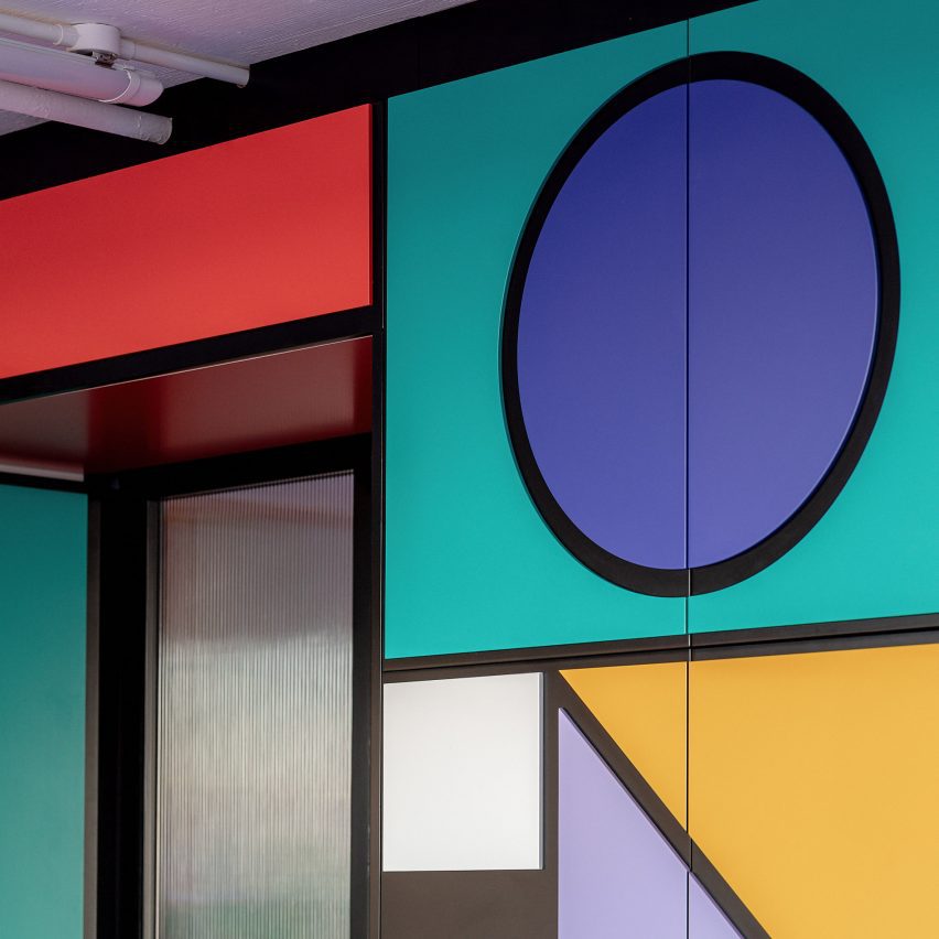
Close-up photo of colourful cabinetry at Camille Walala's studio showing relief pattern of cut-out shapes glued onto black MDF doors
Our Department achieved clean lines by sticking coloured shapes onto MDF doors

For the cabinetry, they used doors made of melamine-faced medium-density fibreboard (MDF) and applied a decorative technique they had used on previous Walala projects.

This involved CNC-cutting shapes out of thin MDF, before spraypainting and precisely glueing them onto the doors to create a graphic pattern while avoiding the fuzzy lines that can sometimes come from painting directly onto surfaces.

In the kitchen, the group worked together to exaggerate proportions as much as possible, with Walala saying she dreamed of achieving a “Bart Simpson kitchen” through elements such as chunky handles and bold grout.

“We designed the Lego House a few years ago, this really colourful house,” she explained. “Especially the kitchen in that space was really quite bold and almost like a cartoon, and we thought we should do something similar in our studio.”

By contrast, a more subtle feature is the double sliding door between the studio’s two rooms, which consists of a transparent fluted screen set within a black frame.

While it may be less attention-grabbing, Jomaa says the mesmeric effect of the fluted panels sliding against each other is like a “little animation of colour”.

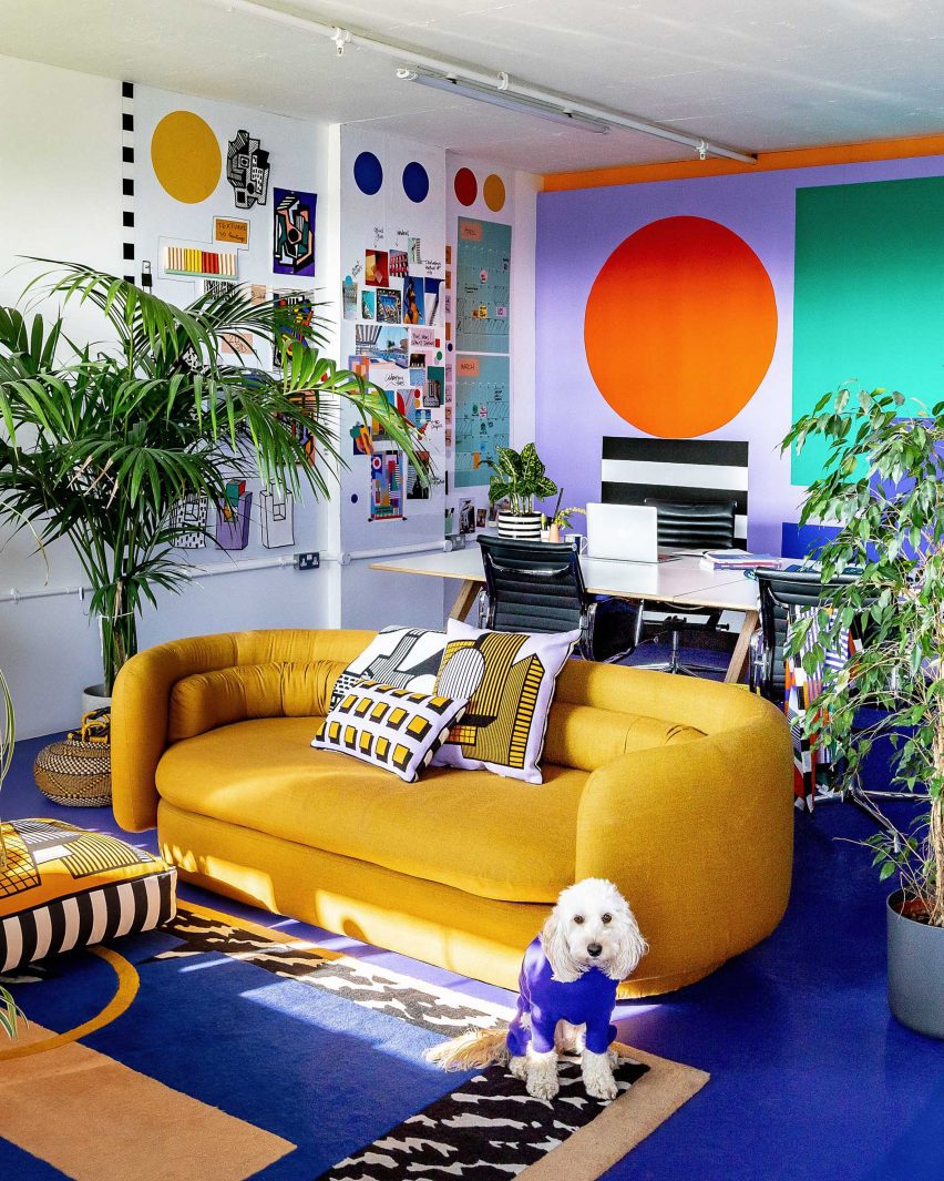
Photo of a colourful office space with a yellow sofa in front of a big worktable
The workspace also includes natural details like custom tulipwood desk legs

There are also a few natural wood elements throughout the interior such as tulipwood desk legs to balance the liberal use of colour.

As with all residents of Regent Studios, Walala will need to return the rented space to its original condition when her studio eventually leaves, so there are no permanent fixtures and everything is designed to be dismantled.

Even the central “wall”, which contains floor-to-ceiling storage on one side, is freestanding. But the team used kitchen-unit feet to wedge it against the ceiling for stability.

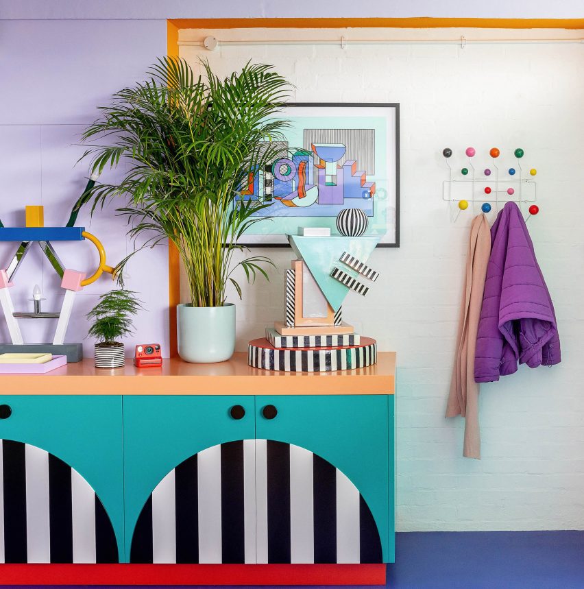
Photo of details in a colourful office space with bold cabinetry, bright blue floors and plants and colourful ornaments on display
Everything is designed to be dismantled when the studio one day moves out

Walala and Jamaa have been working together for eight years and started off sharing a desk in a basement studio. Their recent projects have included murals, installations and a proposal for a car-free Oxford Street.

Walala is often seen as being part of the New London Fabulous wave of maximalist designers, alongside Yinka Ilori, Morag Myerscough and Adam Nathaniel Furman.

The photography is by Taran Wilkhu.

Reference

Six interior designers style rooms at L’Appartamento in Milan
CategoriesInterior Design

Six interior designers style rooms at L’Appartamento in Milan

Six interior design studios, including Kingston Lafferty Design and T.ZED Architects, have overhauled a room at the 1930s L’Appartamento for commerce platform Artemest at Milan design week.

The designers each used furniture, lighting and art from the brands, designers and artists represented on the Artemest platform to showcase their own style in a room at the apartment in Milan’s 5Vie district for the L’Appartamento exhibition.

“We wanted to bring this stunning apartment back to life and show how different interior design studios, each with its own style and design approach, can work with Artemest to create inspiring and surprising interiors that celebrate authentic Italian beauty,” said Artemest founder Ippolita Rostagno.

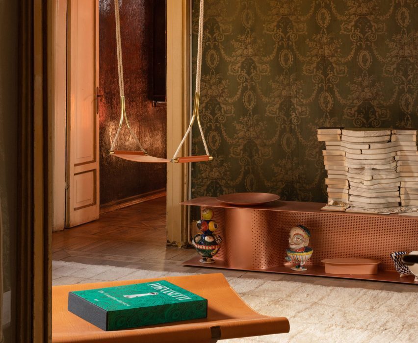
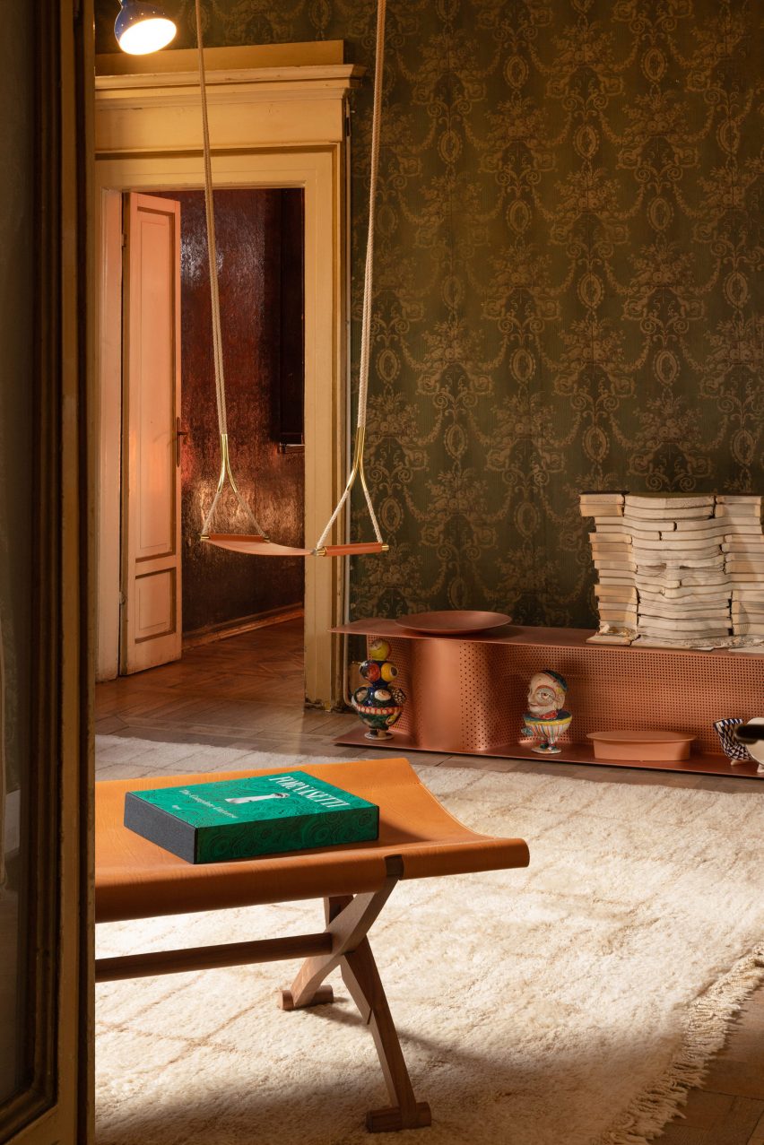
Entryway at Artemest’s L'Appartamento in Milan by Dubai-based studio T.ZED Architects
T.ZED Architects designed the entrance space at Artemest’s L’Appartamento

In the entryway, Dubai-based studio T.ZED Architects aimed “to set the tone for what is yet to come” by preserving the character of the room and adding selected pieces.

The studio choose a mix of furniture in off-white, cream and brown, including copper and leather finishes that plays off the green tones of the richly patterned, period wallpaper.

Mirrors – including a Sybilla mirror with console by Ettore Sottsass for Glas Italia, and an Itaca floor mirror by Atlasproject – were placed to illuminate and enlarge the space, while amplifying the period details.

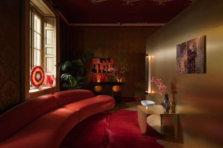
Living room at Artemest's L'Appartamento in Milan by Kingston Lafferty Design
Kingston Lafferty Design placed a golden block in the living room

In the adjoining room, Dublin-based studio Kingston Lafferty Design aimed to “challenge visitors’ sense of what a living room should be” by placing a sculptural monolithic block seems to glow with a soft golden sheen in the centre of the space.

The block splits the room into two distinct spaces and contains a mirrored space described by the studio as “a gallery of lights”.

Golden block in living room
The golden block divides the space into two

On one side of the block is an informal living room that evokes a sense of playfulness through the use of oversized furniture in bright colours, including the Osaka Blue Sofa by Pierre Paulin for La Cividina.

The other side has a rich palette of jewel-tones to creates a more decadent atmosphere.

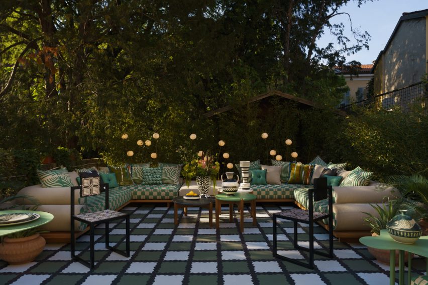
Terrace at Milanese villa
Moniomi aimed to create a room on the terrace

Leading from the living room a large terrace was reworked by Miami-based studio Moniomi, which aimed to create an outside room that felt like an interior space.

The studio used a combination of large-scale upholstered pieces, gridline patterns and graphic blacks and whites, softened by lush greens to reference the outdoor location.

The design language here features saturated colours and layered patterns – including the Nuovola 01 dining table by Mario Cucinella for Officine Tamborrino, which represent the studio’s Hispanic roots.

Dining space in Milanese apartment
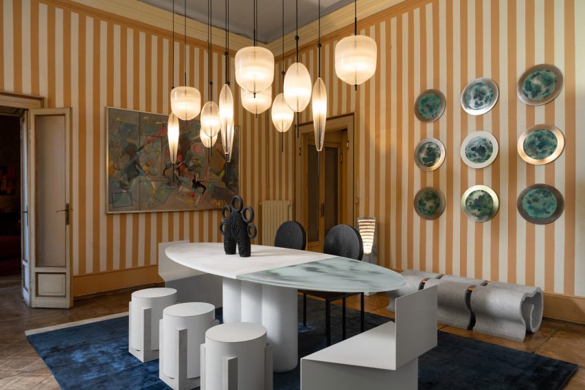
Nina Magon designed the apartment’s dining space

Another US-based designer, Nina Magon, created the L’Appartamento dining room, playing with monochromatic hues to enhance the authenticity of the original finishes here.

Sculptural furniture, such as the Trompe-l’oeil Trois dining table by DelMondo Studio, topped with a cluster of Flow[t] pendant lamps by Nao Tamura for WonderGlass was added to the space.

Bedroom designed by Styled Habitat
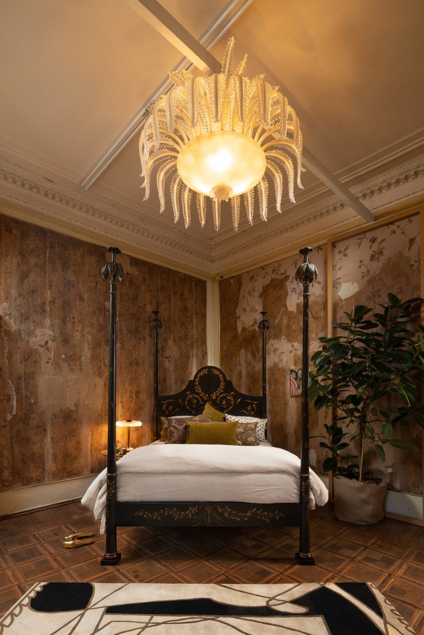
The bedroom was designed by Styled Habitat

In the bedroom, Dubai-based studio, Styled Habitat, delved into the history of the 1930s to translate the romance of that era into the modern day and evoke a sense of timeless glamour.

To capture the experimental and avant-garde trends of European modernism, Styled Habitat juxtaposed new and old, with a Czech Chair by Hermann Czech for Gebrüder Thonet Vienna, alongside pieces like the Calle Pinzi Murano Glass Chandelier by Luci Italia.

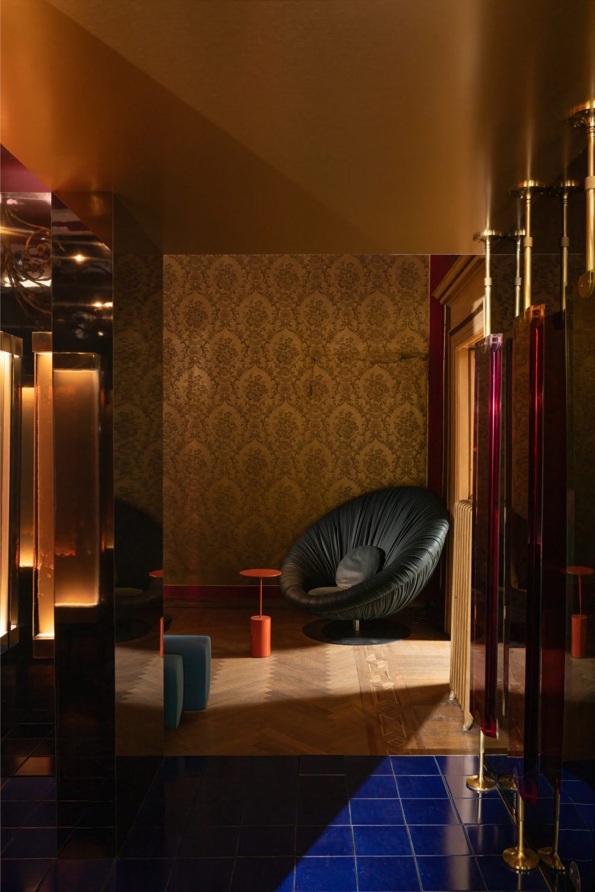
Finally, for L’Appartamento’s hallway and the studio, Paris-based interior designer Anne-Sophie Pailleret was informed by her first reaction to seeing the apartment.

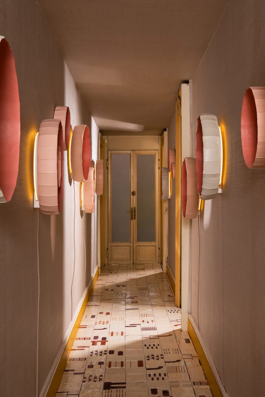
The long, narrow hall, has been covered with the textural Tra 1100 Wallpaper hand-crafted by La Scala Milano Wallcovering, contrasting with geometric Alfabeto Tiles by Margherita Rui for Ninefifty, on the floor.

Corridor by Anne-Sophie Pailleret
Anne-Sophie Pailleret styled the corridor

The walls are further decorated with Ninfea wall lamps by Giovanni Botticelli in collaboration with Paola Paronetto, functioning as a gallery-style grouping of lights.

For the studio room, Pailleret created a mix of warm colours and graphic patterns, with comfortable and curvaceous furniture.

The photography is courtesy of Artemest.

L’Appartamento takes place from 17 to 23 April 2023 at Via Cesare Correnti 14, 20123 Milan, Italy. See our Milan design week 2023 guide on Dezeen Events Guide for information about the many other exhibitions, installations and talks taking place throughout the week.

Reference

Out of This World: 7 Lunar Style Habitats Architects Are Mooning Over
CategoriesArchitecture

Out of This World: 7 Lunar Style Habitats Architects Are Mooning Over

Browse the Architizer Jobs Board and apply for architecture and design positions at some of the world’s best firms. Click here to sign up for our Jobs Newsletter.

Oscar Wilde famously wrote, “We are all in the gutter, but some of us are looking at the stars.” Since the beginning of time, human beings have been fascinated by outer space — the stars, the sun, the moon and everything else in between. For tens of thousands of years, scientists, philosophers, innovators and billions of others have collectively and continuously craned their necks with curiosity and ambition to understand the existence beyond ours that surrounds us.

Space has always invoked an enormous sense of fascination for us mere planet dwellers, and despite the renewed ambition after nearly 50 years to return to our moon’s surface, many architects have channeled their lunar fascinations a little closer to home. The following eight architectural beauties might not hold up under the unrelenting and harsh conditions of space habitation, but they would certainly look the part.


Self-Assembly Geodesic Domes

By FDome, Poland

Popular Choice Winner, 9th Annual A+Awards, Architecture +Small Living

Self-Assembly Geodesic Domes by FDome, Poland Photographs by Steven D’Avignon

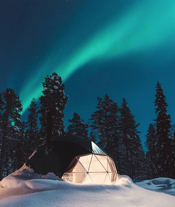
Domes have far and away been the structural representation of choice when film directors depict our eventual habitation of other planets, and Poland-based FDomes self-assembly Geodesic Glamping domes show us how cozy such a home could be. Versatile and portable, the tented structures blend perfectly into the surrounding landscape and boast spacious interiors. Fully-fitted bathrooms, kitchenettes and a functional loft bed, with an option to connect one or more domes, mean that while these domes might not be suitable for space habitation, they’d be an excellent addition to the back garden.


Residential House in Kaunas

By Architectural bureau G.Natkevicius and partners, Kaunas, Lithuania
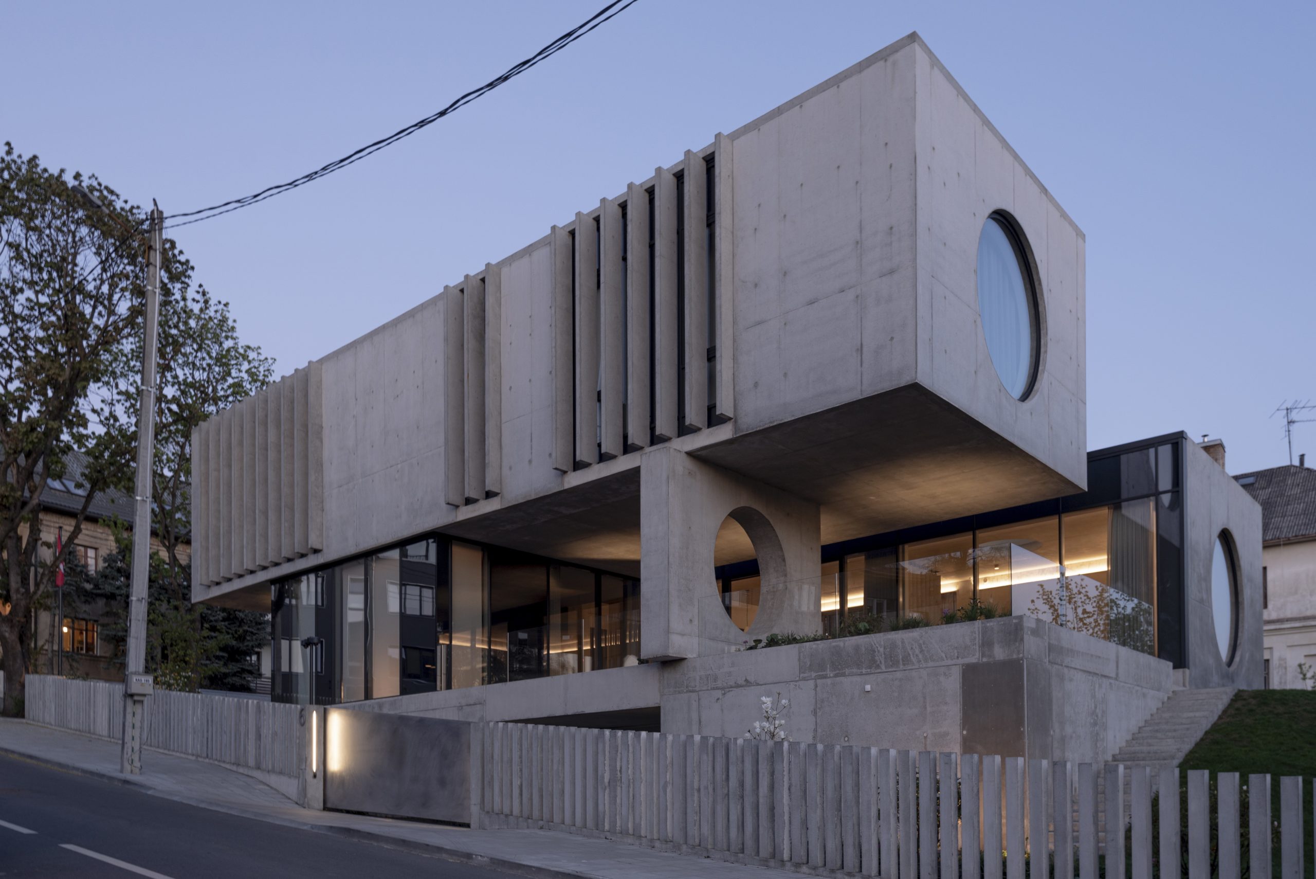
Unless I’ve missed something vitally important, I think we can all agree that wherever the planet that humankind eventually relocates to, trees and timber could be challenging to come by. It’s therefore easy to imagine that stone and concrete-like conglomerates will more likely be available and, therefore, favored in such an environment. 

With a distinct familiarity with Kisho Kurokawa’s Metabolist Icon this two-story family home in Kaunas is a modernist dream, circular windows included. The reinforced concrete structure is robust and industrial in design yet retains a pure form, while its unfussy facade and muted pallet inside and out give a sense that the monolithic building would be right at home on the surface of Luna. 


Casa de los Milagros (House of Miracles)

By Naser Nader Ibrahim, Coatepec, Mexico 
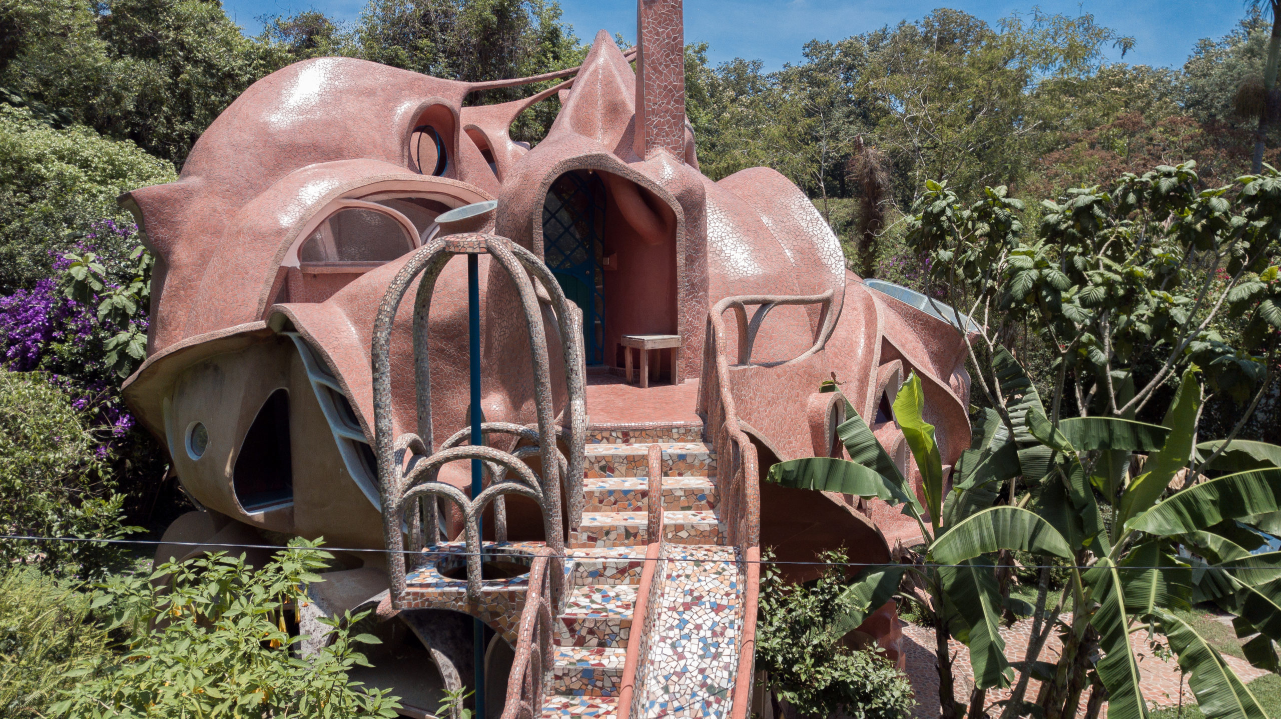
Casa de los Milagros (House of Miracles) By Danilo Veras Godoy, Coatepec, Mexico Photographys by Naser Nader Ibrahim

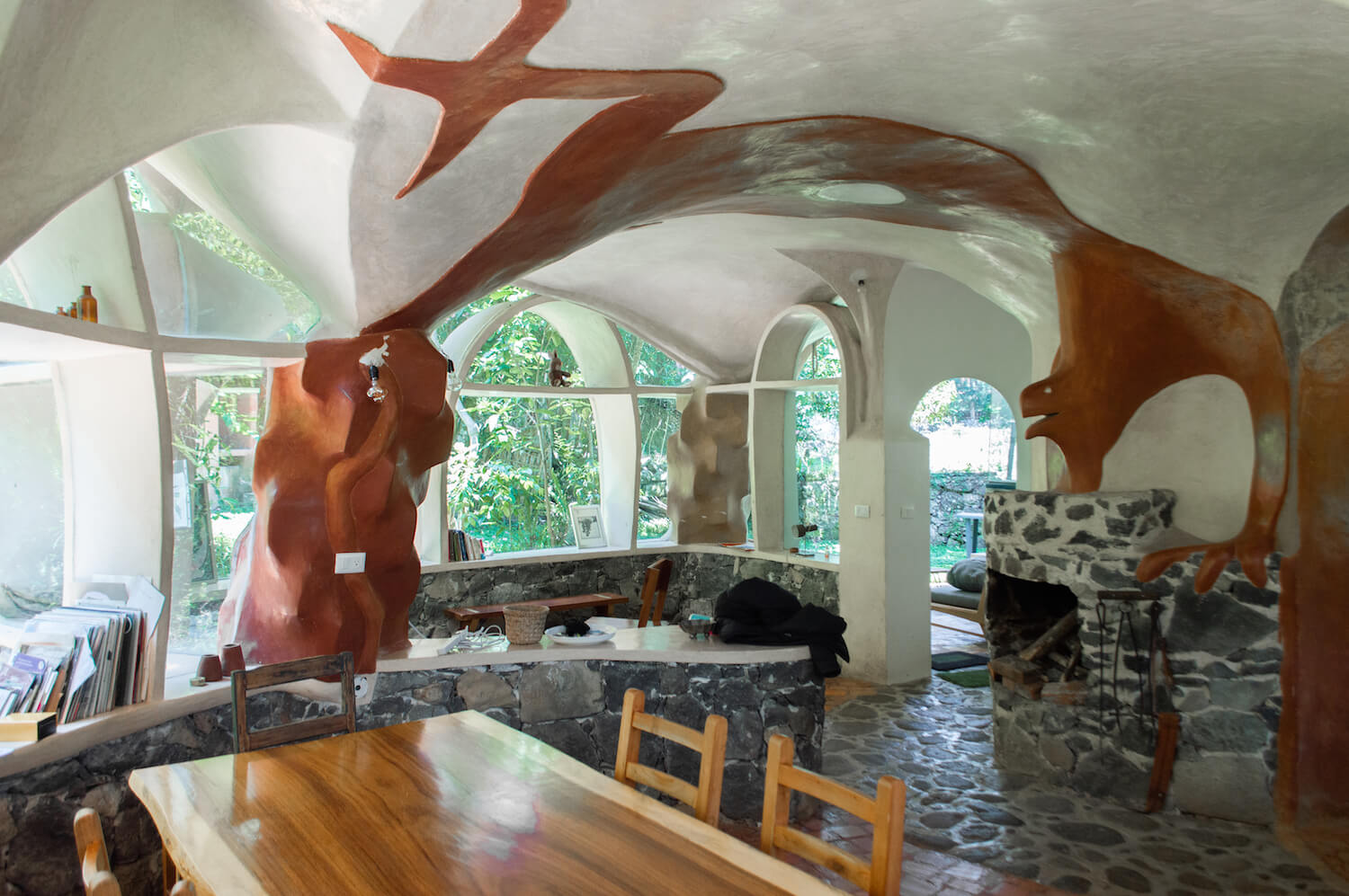
Casa de los Milagros (House of Miracles) has, according to the owner of the unique dwelling, been referred to as a mushroom, an octopus, a bat cave, a flower, a snail shell, and even a meringue. The bizarre shape gives the building an organic yet otherworldly appearance.

Built in stages and without a traditional blueprint, the low-cost family home is the product of long conversations between owner and architect alongside a build-as-you-go strategy. “What are your wildest dreams?” was the starting point, and answers involved slides, fire station poles, a salamander-like creature creeping toward the fireplace on the ceiling, wombs with a view, meaning elevated nest-like sleeping quarters with windows for stargazing at night and sun-greeting in the morning and on a more traditional note — a light-filled kitchen.


Niki-H

By Seisho Takashi Architect’s Studio, Hokkaido, Japan

If we were to take timber to Earth’s Moon or even Mars, we’re probably going to have to be pretty frugal with its use. Niki-H by Seisho Takashi is an excellent example of exemplary woodworking on a microarchitecture level that shows how the potentially luxury commodity could be adopted for structure building economically.

The petite yet robust structure was designed for wine-making settlers in the notoriously wintery Hokkaido. The recessed building sits below the 23 inch (60 centimeter) freezing depth of the ground. At the same time, the 60-degree pitch of the roof helps the minimal home withstand any heavy snowfall. An open-plan interior bookended by two huge windows allows the cozy space to be filled with light and, most importantly, warmth when the sun shines.


Desert House

By AyEh, Qeshm Island, Iran
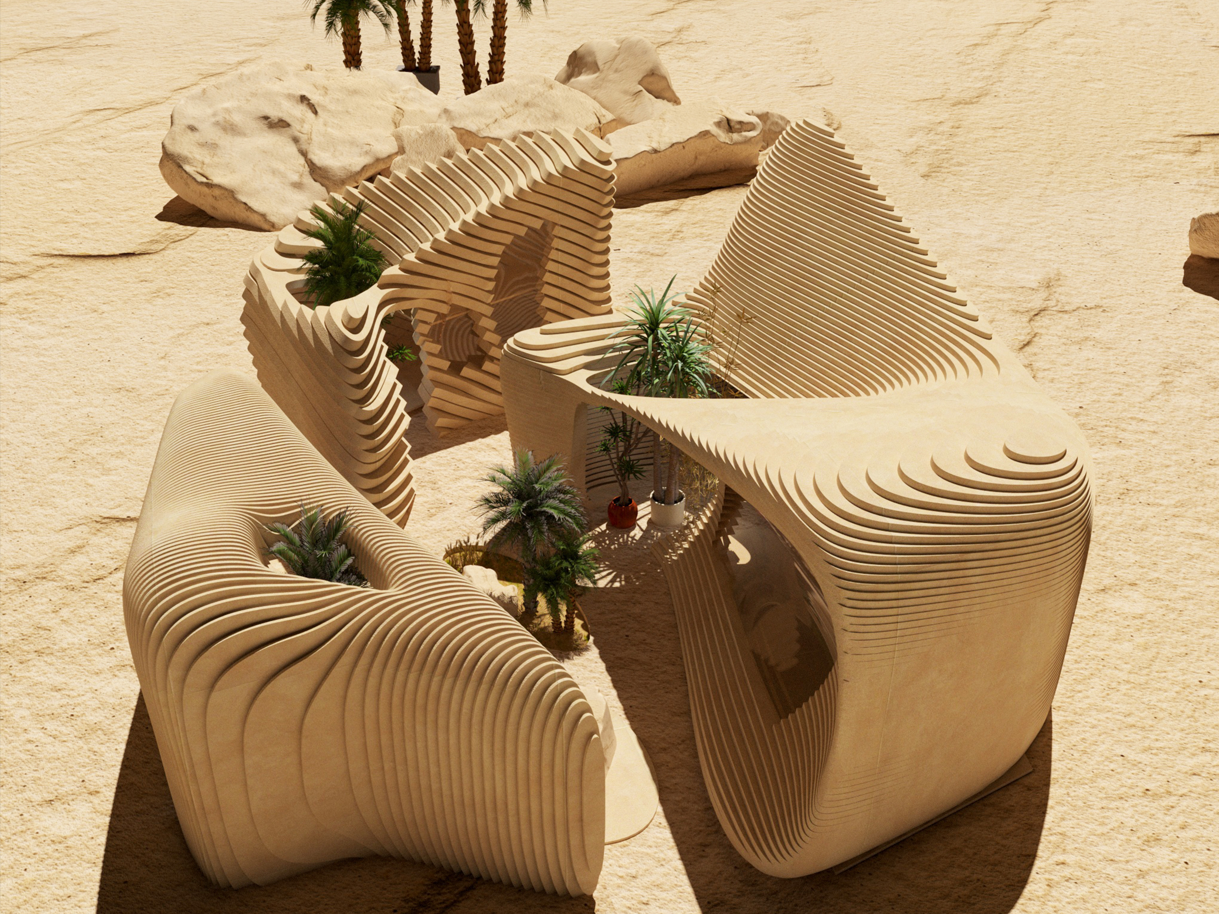
Desert House by AyEh, Qeshm Island, Iran Images by AyEh

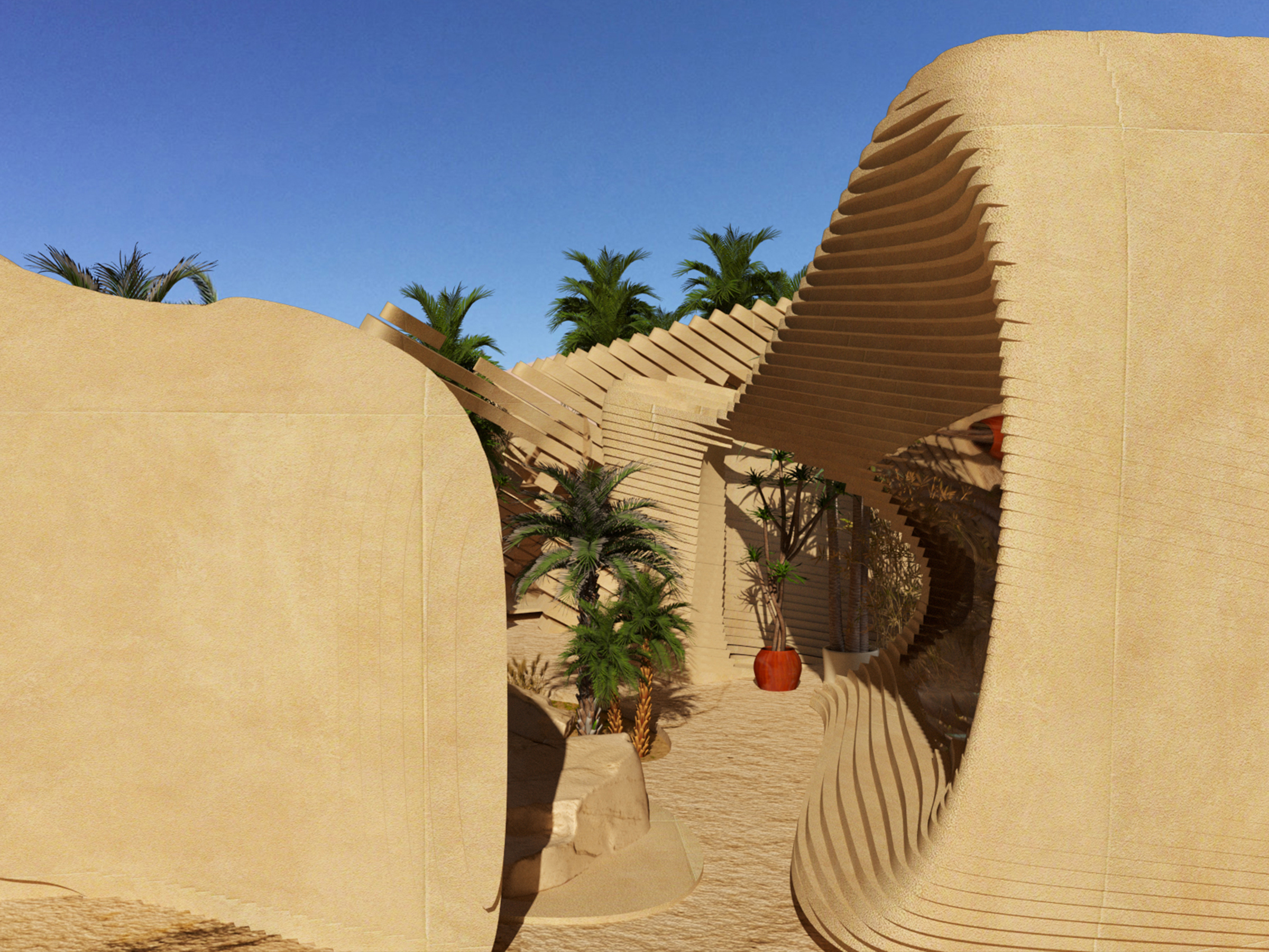
So let’s say we’ve sorted out the whole “doesn’t have an atmosphere problem” on Mars, or maybe we’ve found our very own Arrakis (minus the giant killer worms)— the unusually formed Desert House by AyEh looks to be the perfect home for such a warm, dry climate.

Located on Qeshm Island, the series of buildings concentrate on providing thermally comfortable indoor and outdoor environments adopting many traditional thermal strategies to work harmoniously with the landscape and location, not against it. Each of the three buildings contains individual features of the dwelling but is arranged according to wind circulation, sun direction and cross ventilation. These clever decisions create areas indoor and out which can be enjoyed at all times while continuing to support the abundant plant life proposed for the property.


Sedona Moongate

By SWABACK pllc, Sedona, AZ, United States

Sedona Moongate by SWABACK pllc, Sedona, AZ, United States Photographs by Dino Tonn
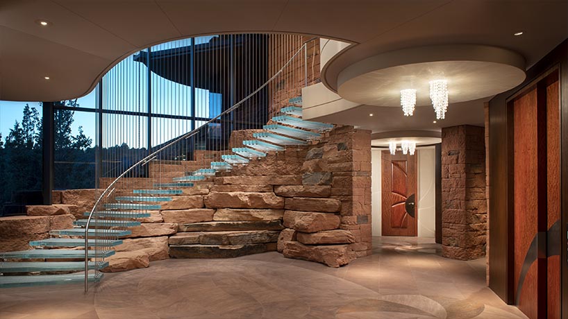
Unfortunately, just because we made it out to the stars, it’s doubtful that we would abandon capitalism altogether, and the aptly named Sedona Moongate gives us a glimpse of what a Mars mansion for the exceptionally wealthy space dweller might look like.

Actually located firmly on Earth in Arizona, Moongate residence seemingly rises out of the red rocks. The house—two half circle wings joined by a rectangular glass box entryway and gallery—includes sweeping and graceful roof overhangs, canted just so to shade windows and balconies during the summer while allowing winter sun to saturate the interior. At the entryway, the massive stacked sandstone base—invisibly mortared—gives the effect that the structure was built into an escarpment. Extensive oversized, cascading stonework and cabinetry enrich the interior, but the foyer’s glass staircase, suspended by steel rods, is the home’s pièce de résistance.


The Almanac

By Sweco Architects, Denmark
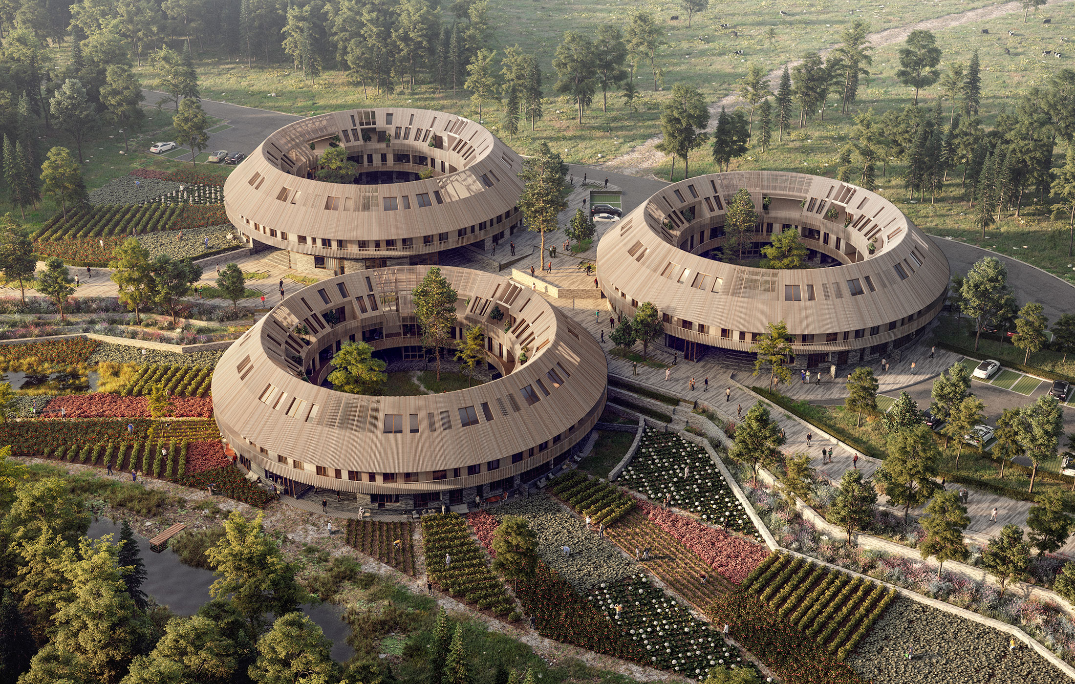
Lastly, what would space colonization be without community and a healthy sense of togetherness? My guess: Pretty short-lived and unsuccessful. That’s why the Almanac concept by Danish Architects Sweco might be the answer to our interplanetary future dreams.

By adopting community as the focal point for the housing of the future, the architects drew inspiration from the traditional location-based calendar – an almanac. In the project, housing communities are arranged in housing clusters around a common courtyard. The housing clusters are then bound together by larger surrounding urban landscape spaces, where communities of varying sizes utilize the surrounding landscape and connect themselves with the surrounding housing clusters.

Speaking on the unusual design architects and innovation manager at Sweco Architects, Karl-Martin Buch Frederiksen said, “Communities are often at their best if they are tangible and manageable. If they become too large, we easily lose the sense of togetherness and responsibility that is the prerequisite for us to share a universe. In addition, it is our experience that the community thrives best when it is not something that is expected of others, but instead stands as an enticing daily alternative. It is the awareness that has been our starting point in the work on the project.”

Browse the Architizer Jobs Board and apply for architecture and design positions at some of the world’s best firms. Click here to sign up for our Jobs Newsletter.
Reference