Smart and Stylish: 6 Innovative Home Products Deftly Designed for Modern Life
CategoriesArchitecture

Smart and Stylish: 6 Innovative Home Products Deftly Designed for Modern Life

Architizer’s A+Product Awards is open for submissions, with the Extended Entry Deadline fast approaching on Friday, February 23rd. Get your products in front of the AEC industry’s most renowned designers by submitting today.

The time we spend at home has been on a steep incline over the past few years. Much of this time is accounted for by the considerable rise in people working from home. However, it’s not all work. Spending time on other activities at home has also seen a dramatic surge. For many people, their home has become their sanctuary, opting for intimate dinner parties over visiting lavish restaurants and cozy movie nights on the sofa above dancing in crowded nightclubs. Our homes are our offices, our gyms, our libraries, our playgrounds, and, in some cases, even our supermarkets. It is thanks to this shift in societal behavior that we are changing our view of what our homes are and what we need them to do for us, and with that, how we choose to furnish them is changing, too.

Homeowners are investing more in their homes, aiming to make their places of refuge as functional, comfortable, and efficient as they can — adopting new technologies to create spaces that are adaptable and places that can cater to an evolving lifestyle.

As of 2024, there are over 400 million smart homes worldwide, expected to reach 478.2 million by 2025. In the United States alone, over 60.4 million households are using smart home devices as of 2023, and this figure has grown to approximately 69.91 million households actively using smart home devices in 2024. Ease of use and functionality have become key factors in how we use our homes. The following products were designed to be as practical as they are stylish — as A+Product Awards winners, they also all received accolades from Architizer’s stellar jury of industry experts, comprising 200+ renowned architects and designers that truly understand what it takes to create great buildings and spaces:

Enter the A+Product Awards


Workstation Sinks

By Delta Faucet

Jury Winner, 2022 A+Product Awards, Kitchen & Bath, Fixtures & Fittings – Kitchen
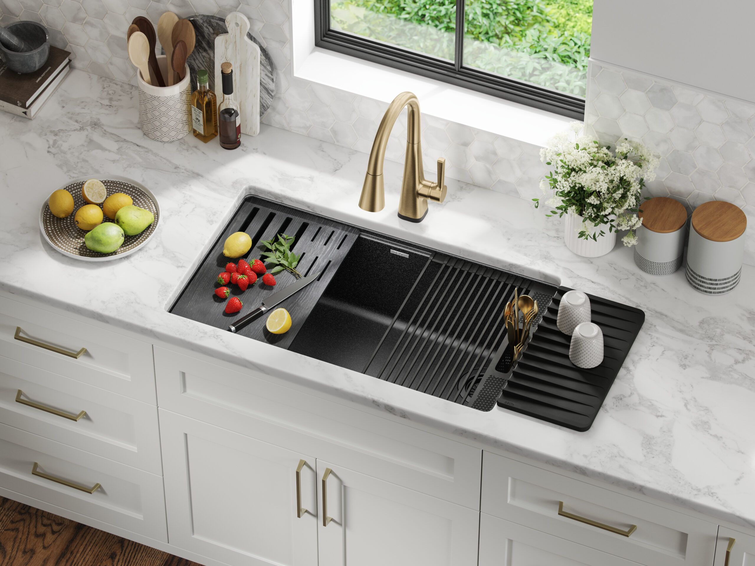
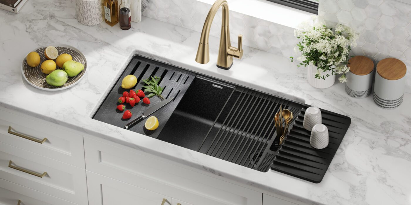
Workstation Sinks By Delta Faucet Jury Winner, 2022 A+Product Awards, Kitchen & Bath, Fixtures & Fittings - KitchenIf you’ve been on social media any time in the last year, you’re bound to have seen a workstation sink. The multifunctional units are the envy of every avid home chef, and this version by Delta Faucet is terrific. Designed to meet the evolving needs of modern kitchens, the workstation sinks are a blend of Delta Faucet water-delivery expertise and functional design. Each Workstation sink is sleek in design and offers a multifunctional workspace through its built-in WorkFlow™ ledge. The adaptable sink space is equipped with integrated accessories like cutting boards, dish racks, utensil holders and even a ledge to hold your phone or tablet. Constructed from durable TRU16 gauge stainless steel and featuring noise-reducing soundproofing, these sinks are designed for both durability and quiet operation.


Statement Showering Collection

By Kohler Co.

Jury Winner, 2022 A+Product Awards, Kitchen & Bath, Fixtures & Fittings – Bath 
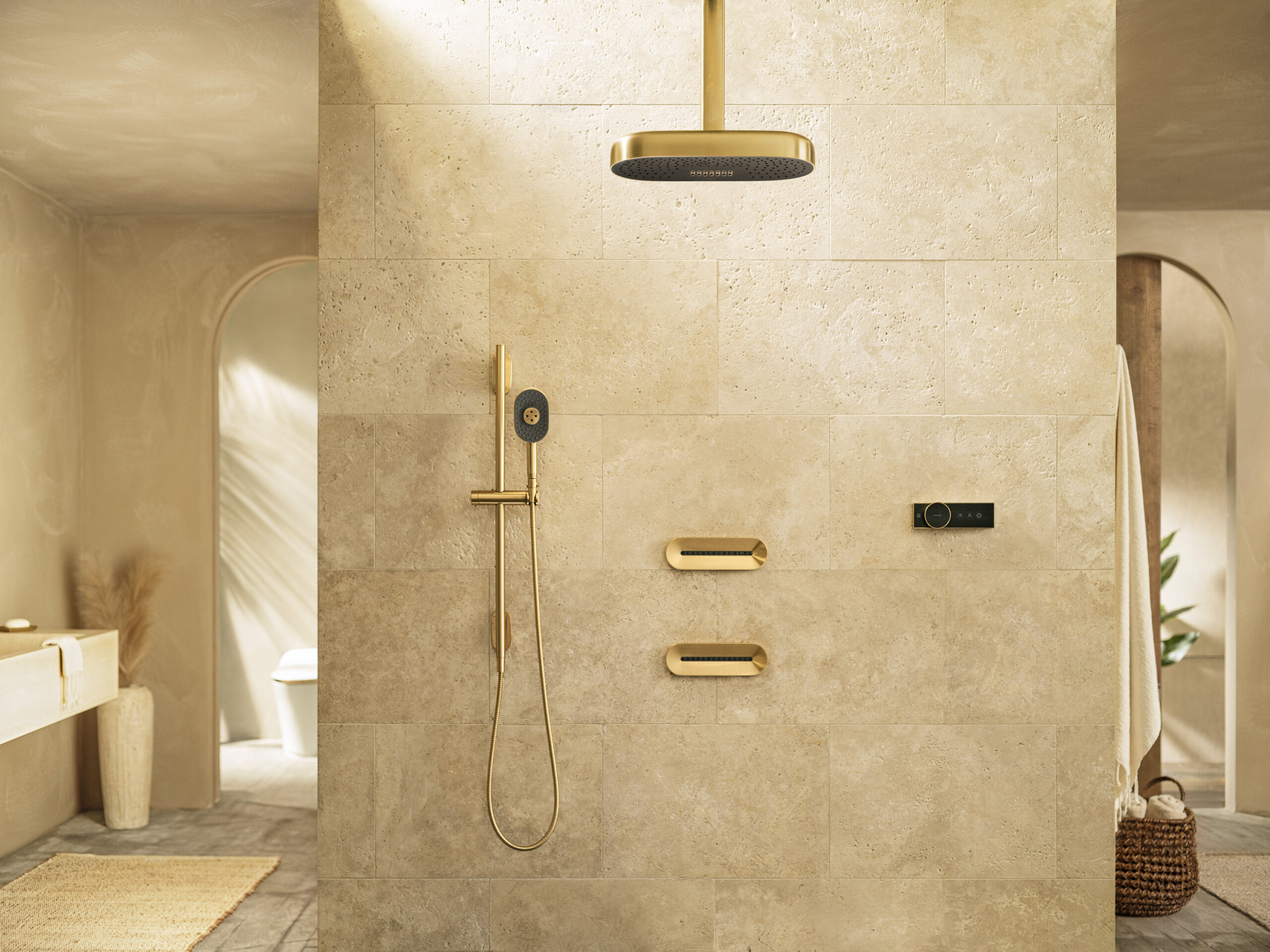
Statement Showering Collection By Kohler Co. Jury Winner, 2022 A+Product Awards, Kitchen & Bath, Fixtures & Fittings - Bath Often, the goal of technology is to increase functionality and make things easier, but sometimes, it’s about pure luxury, and that was Kohler’s goal when creating the Statement Shower Collection—exquisite design paired with innovative performance to create the ultimate well-being experience.

The Kohler Statement™ showering collection transforms the shower experience, offering a unique blend of form, function, and flair. Drawing inspiration from furnishings and lighting, the collection’s designs integrate seamlessly into any space, encouraging personal expression through a variety of shapes, sizes, finishes and innovative spray experiences. This global line is designed for universal appeal, ensuring easy installation and specification across different regions. Kohler’s approach reimagines modern minimalism, blurring the boundaries between rooms and promoting a cohesive and warm aesthetic. The Statement collection marries powerful functionality with design sophistication to create an immersive environment.


36 Induction Cooktop with Integrated Ventilation

By Fisher & Paykel

Jury Winner, 2022 A+Product Awards, Kitchen & Bath, Appliances 
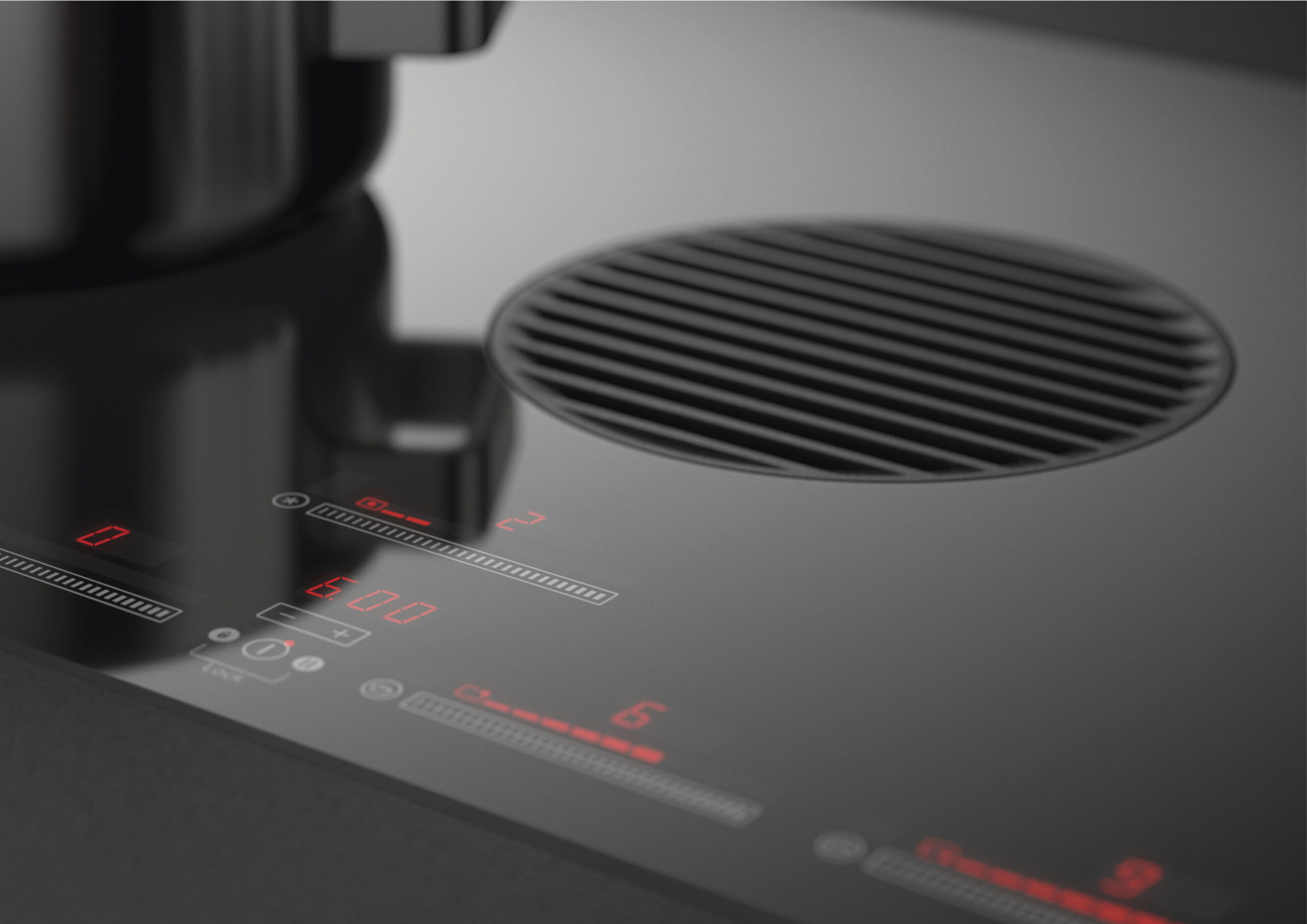
36 Induction Cooktop with Integrated Ventilation By Fisher & Paykel Jury Winner, 2022 A+Product Awards, Kitchen & Bath, Appliances The average kitchen extractor or cooker hood has never been the most attractive of appliances. While they have a valid purpose in most homes, bulky, shiny and painfully noisy are but a few choice descriptives for the standard extraction system, and because of these unfortunate characteristics, these silver suckers have been rapidly falling out of favor with designers and homeowners alike. But what do you do when you have poor ventilation and a fondness for aromatic foods? The answer— downdraft extractors. A relatively new innovation in kitchen design, downdraft extractors offer a sleek and discreet alternative to traditional overhead cooker hoods. They’re designed to be flush with the kitchen countertop and extract air directly from the hob when in use, making them especially suitable for kitchen islands or where a clear line of sight is preferred.

Fisher & Paykel have taken this innovation to the next level and integrated a downdraft extractor into their 36 Induction Cooktop. A true two-in-one appliance, the induction cooktop, with accurate temperature control, combines the precision of induction cooking with powerful extraction, meaning no more ugly overhead extractor.


30-Inch Column Refrigerator

By Dacor

Popular Choice Winner, 2022 A+Product Awards, Building Systems, Smart Design & Technology 
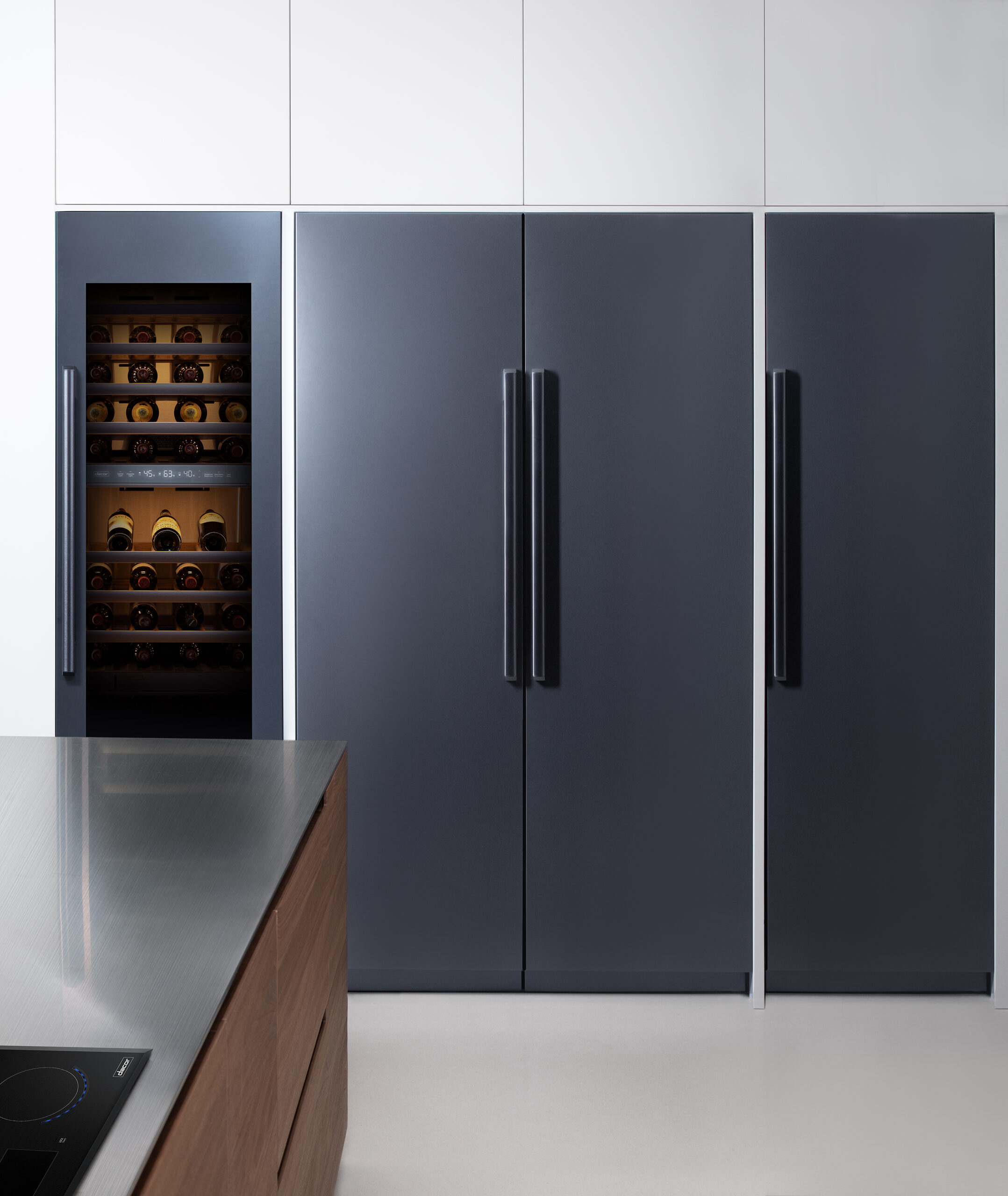
30-Inch Column Refrigerator By Dacor Popular Choice Winner, 2022 A+Product Awards, Building Systems, Smart Design & Technology A fridge is a fridge, right? Wrong! The 30-inch Column Refrigerator by Dacor is the epitome of refrigerator technology. Placing technology at the forefront, the innovative fridge boasts intuitive features such as the iQ Remove View, which allows users to control temperature and lighting remotely and even view the contents of their refrigerator to simplify grocery shopping and a hidden touch-control display panel regulates temperature, helping to preserve food freshness and extending the lifespan of your groceries.

The refrigerator doesn’t just stop at technological prowess, though; its sleek design comes in three high-end finishes and can be fully integrated to sit flush with other kitchen cabinets, while the water dispenser is ingeniously fitted inside the unit to maintain the uninterrupted exterior finish.


Wilderness Front Facing 31H

By Ortal

Popular Choice and Jury Winner, 2022 A+Product Awards, Building Systems > Building Equipment & Systems 
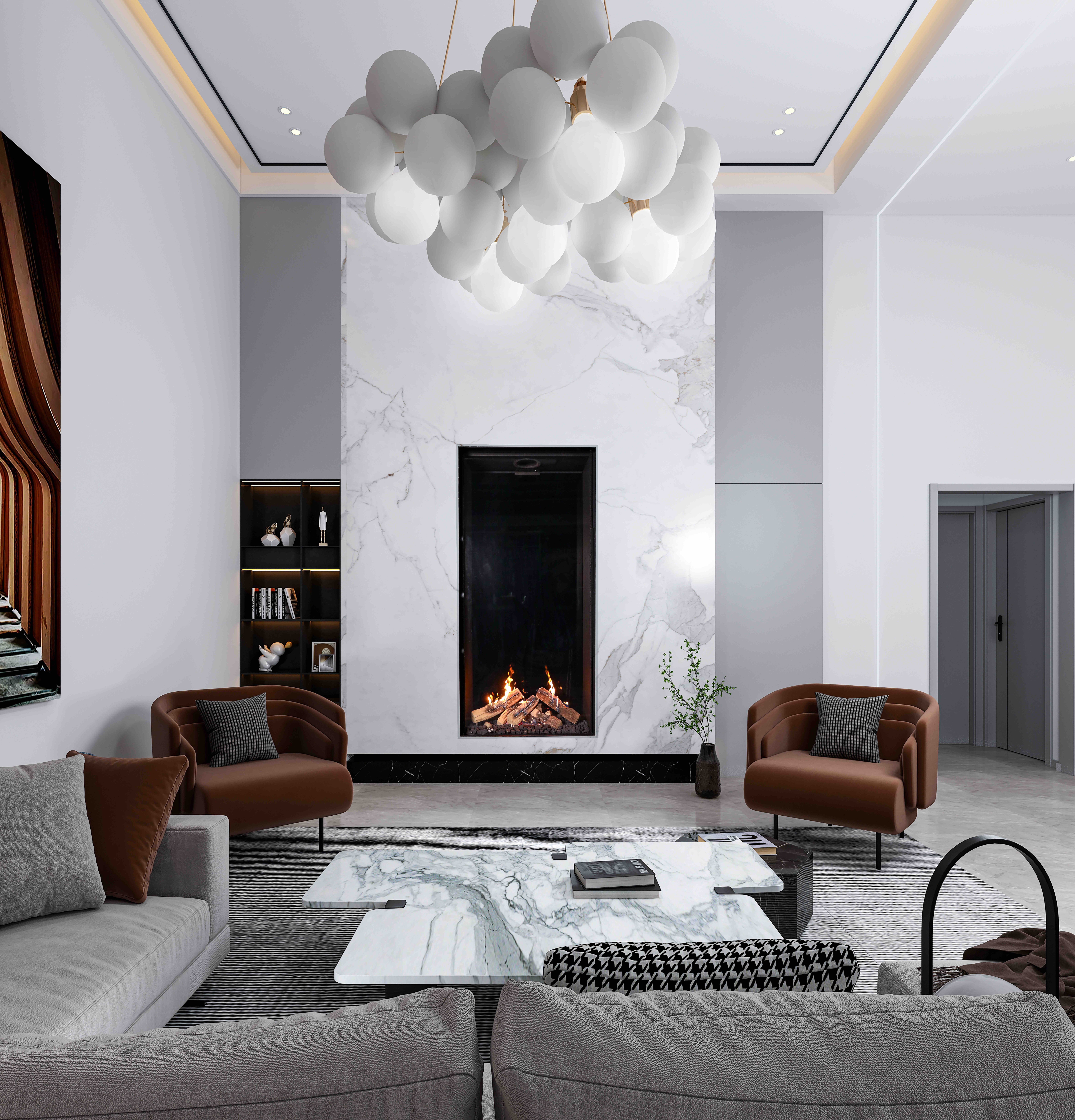
Wilderness Front Facing 31H By Ortal Popular Choice and Jury Winner, 2022 A+Product Awards, Building Systems > Building Equipment & Systems There’s nothing quite like sitting in front of the fire on a cold winter’s evening, but the thought of cleaning it out and lighting it, alongside environmental concerns, can quickly take the romance out of the idea of having a fireplace in your home.

The Wilderness Front Facing 31H by Ortal removes those problems altogether. Drawing inspiration from the natural world to redefine the fireside experience, the beautiful feature fire uses advanced ceramic log technology with a soothing, nature-inspired aesthetic. The collection aims to provide a tranquil and memorable ambiance while the Wilderness Burner technology, available in variations like Wilderness Burner Dark Brown and Wilderness Burner Chopped Wood, pays homage to the timeless tradition of humans gathering around the hearth to tell tales and watch the world go by.

Ortal’s Front Collection takes the whole concept a step further by achieving the seamless integration of high-end contemporary frameless fireplaces into a building architecture with passive cool wall technology and powerful vent systems, and over 100 models with various media options to create unique and extraordinary focal points in any space.

Architizer’s A+Product Awards is open for submissions, with the Extended Entry Deadline fast approaching on Friday, February 23rd. Get your products in front of the AEC industry’s most renowned designers by submitting today.

Reference

Eight homes where mid-century modern furniture adds a stylish touch
CategoriesInterior Design

Eight homes where mid-century modern furniture adds a stylish touch

Pieces by designers Charles and Ray Eames and Isamu Noguchi are on show in this lookbook, which features homes with eye-catching mid-century modern furniture.

Mid-century furniture, which often has simple lines and a sculptural feel, adds a modernist touch to these homes, which range from period properties to newly built and renovated houses.

Among the interiors showcased in this lookbook are iconic architect Le Corbusier’s own home and a residence in London’s upmarket Mayfair area that has been filled with mid-century modern and art deco details.

This is the latest in our lookbooks series, which provides visual inspiration from Dezeen’s archive. For more inspiration see previous lookbooks featuring perforated brick-walls, budget home interiors and immersive saunas in peaceful settings.


Mid-century modern home Mid-century modern home
Photo by Mariell Lind Hansen

Zero House, UK, by Ben Garrett and Rae Morris

Owners Ben Garrett and Rae Morris updated Zero House, which was informed by Californian Case Study Houses, themselves in a way that would honour its mid-century roots.

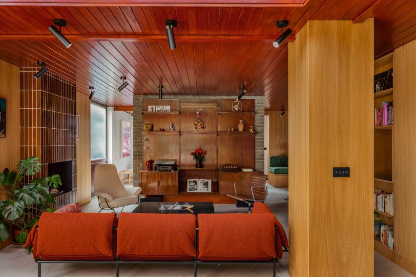
The living room features a striking floor-to-ceiling fireplace clad in tiles, as well as a number of furniture pieces in warm colours. Among them is a classic Eames office chair in a dark-brown leather colour that matches the wooden panelling that decorates the room.

Find out more about Zero House ›


Hudson Woods house by Magdalena KeckHudson Woods house by Magdalena Keck
Photo by Jeff Cate

Hudson Woods home, US, by Magdalena Keck

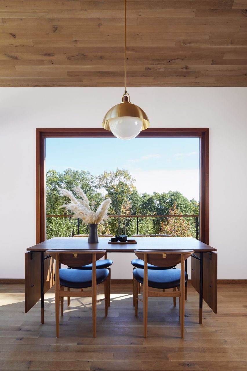
Located in upstate New York, this holiday home has an interior that fuses Danish and Japanese design. A dinner table and chairs by designer Finn Juhl are among the Danish pieces used in the house, where they look both functional and elegant.

A simple lamp with a gold-coloured shade above the table adds a decorative touch and matches the brass fastenings at the backs of the chairs.

Find out more about the Hudson Woods home ›


Interior of Madrid apartmentInterior of Madrid apartment
Photo by Polina Parcevskya and Julie Smorodkina

Radikal Klassisk, Spain, by Puntofilipino 

The interior of this Spanish apartment in a former bank building has a moody, interesting colour palette and features richly textured materials including terrazzo, clay-rendered walls and marble tiles.

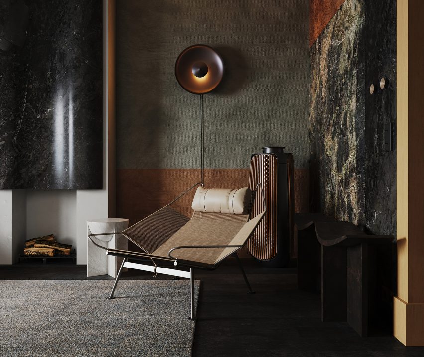
In contrast, the furniture is streamlined and unfussy, including a sculptural lounge chair by Danish designer Hans J Wegner in the living room.

Find out more about the Radikal Klassisk ›


City Beach residence in Perth by Design TheoryCity Beach residence in Perth by Design Theory
Photo by Jack Lovel

City Beach House, Australia, by Design Theory

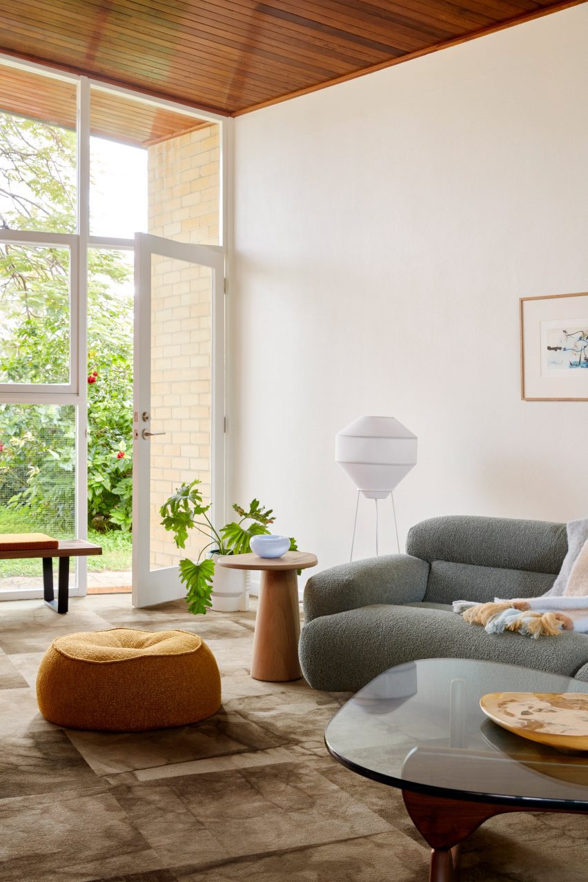
American artist and designer Noguchi’s iconic coffee table, made from a heavy glass tabletop that rests on two undulating wooden legs, has pride of place in the living room of City Beach House.

The interior, created by Australian studio Design Theory, responds to the design and natural material palette of the house itself, which is from the 1960s.

Find out more about City Beach House ›


White home in Sweden by Asa Hjort ArchitectsWhite home in Sweden by Asa Hjort Architects
Photo by Jim Stephenson

Hallen, Sweden, by Åsa Hjort Architects

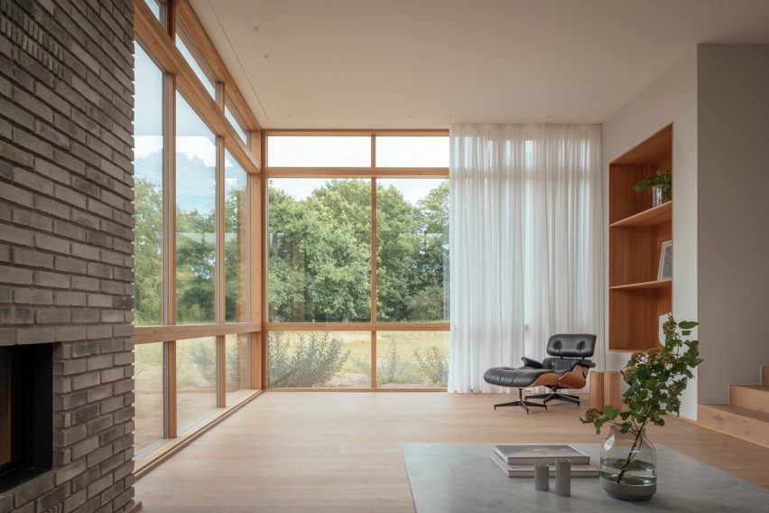
This newly built home in the southern Swedish region of Österlen has a blocky geometric design and large windows that provide views out across the Baltic Sea.

An Eames lounge chair adds a comfortable resting space in one of the rooms, where its dark hues contrast against sheer white curtains and pale wood flooring.

Find out more about Hallen ›


Moore HouseMoore House
Photo is by Joe Fletcher

Moore House, US, by Woods + Dangaran

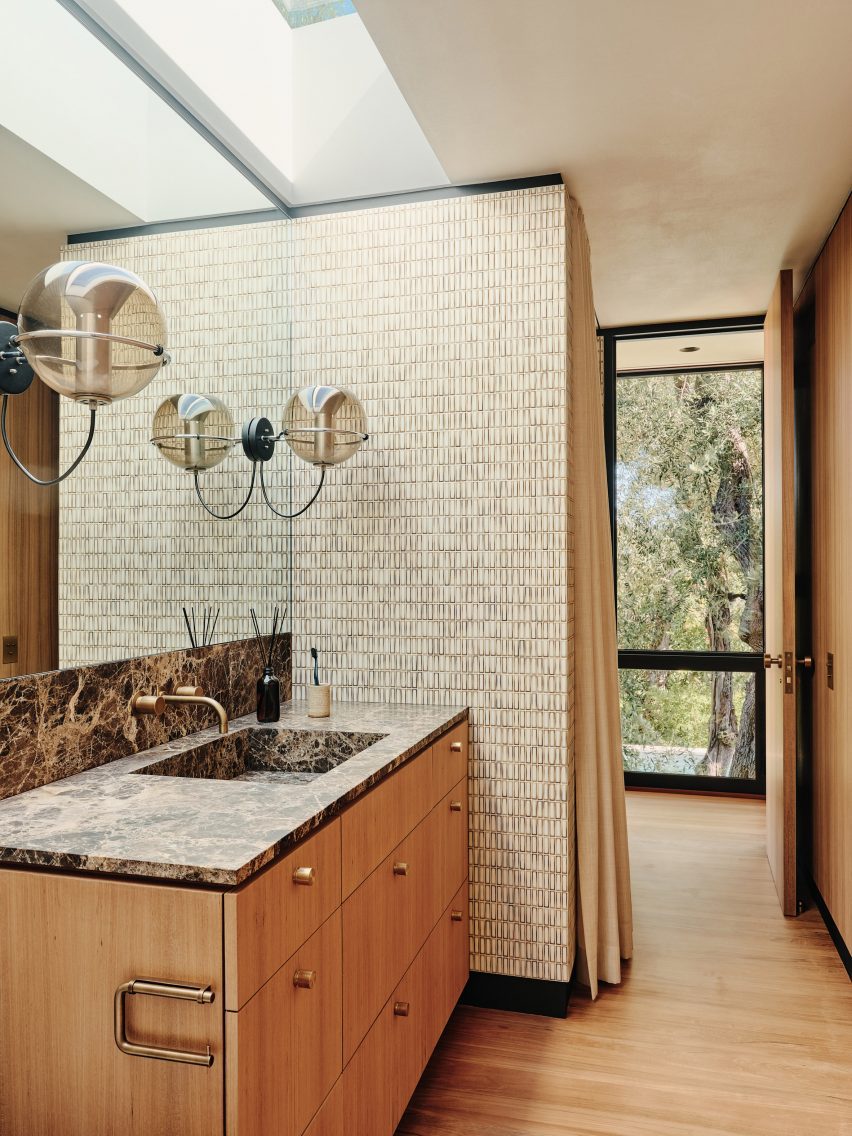
A pair of vintage globe-shaped pendants by Dutch designer Frank Ligtelijn light up the bathroom in this 1960s California home designed by architect Craig Ellwood.

The bathroom also features a dark Emperador marble countertop and a wall clad in Japanese porcelain tiles.

Find out more about Moore House ›


Mid-century modern interior by Child StudioMid-century modern interior by Child Studio
Photo by Felix Speller and Child Studio

Mayfair residence, UK, by Child Studio

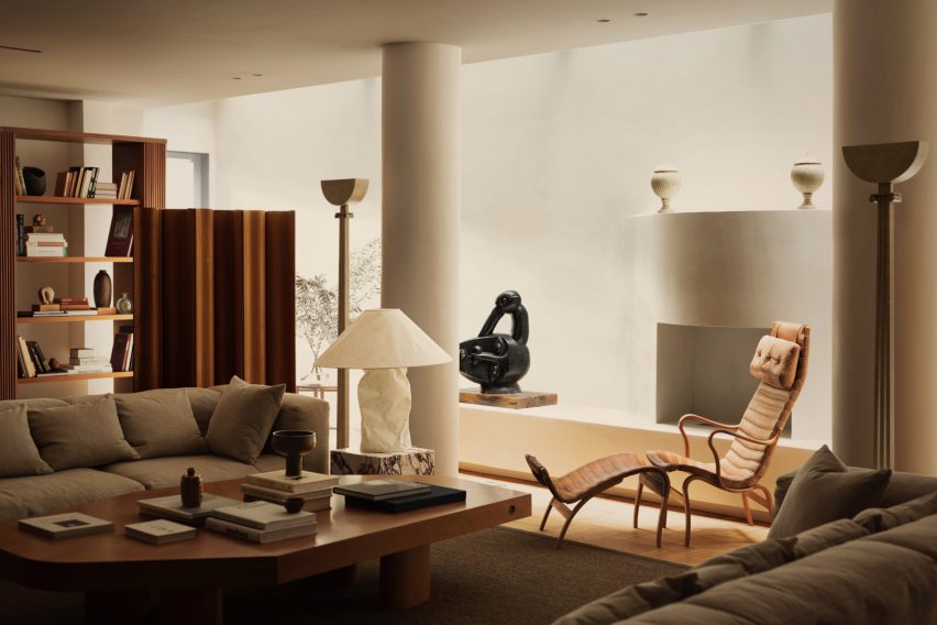
The “Pernilla” lounge chair by Swedish designer Bruno Mathsson is among the many mid-century modern furniture pieces on show in this London apartment.

Local practice Child Studio told Dezeen that the spacious lounge that houses the chair was informed by the grand salon in fashion designer Yves Saint Laurent’s Paris home.

Find out more about the Mayfair residence ›


Le Corbusier's studio apartmentLe Corbusier's studio apartment

Studio apartment, France, by Le Corbusier

Le Corbusier’s apartment in his Immeuble Molitor apartment building in Paris, where he lived for more than three decades, reopened to the public in 2018.

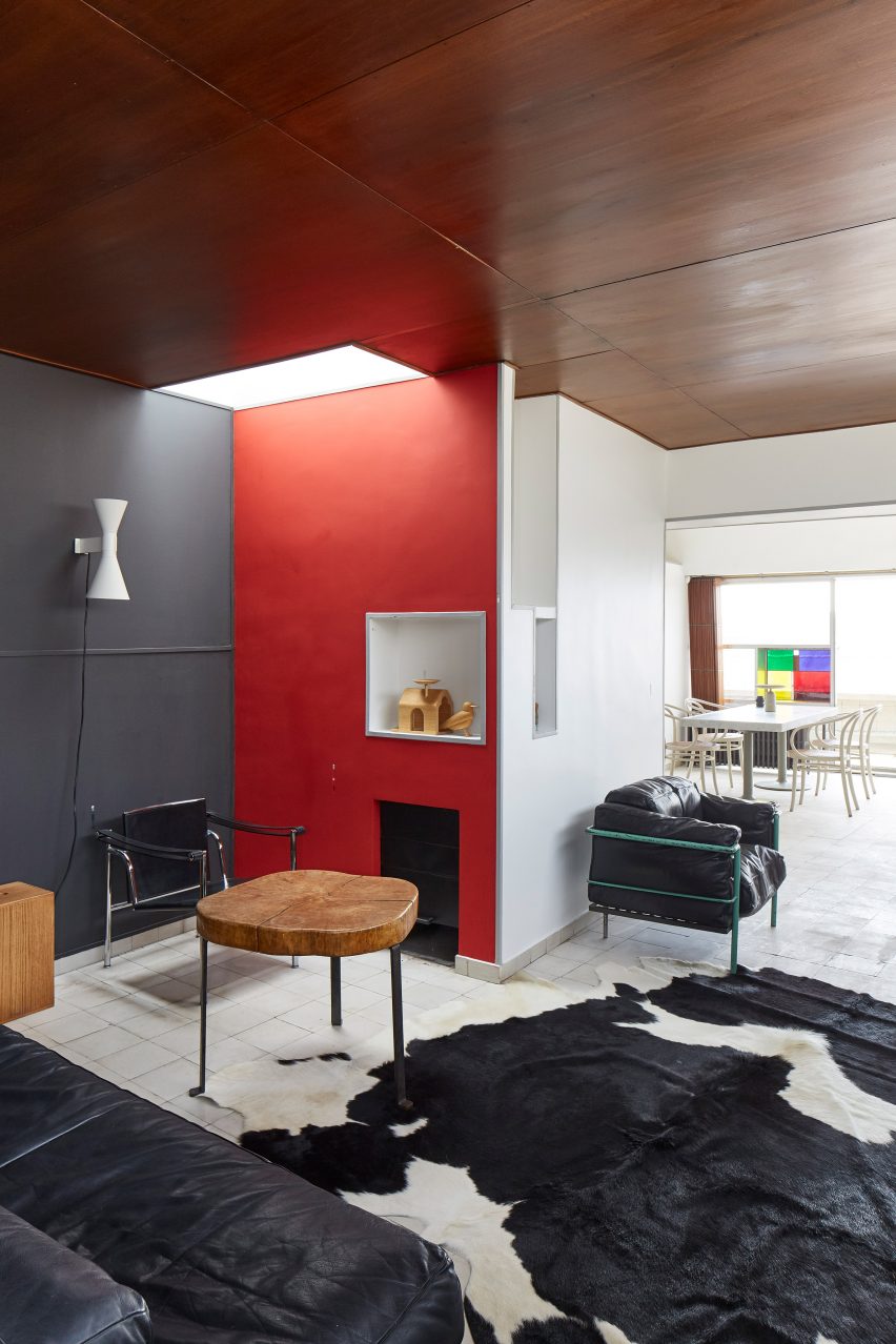
Visitors to the modernist flat can admire mid-century modern furniture pieces including a black leather edition of the designer’s signature LC2 lounge chair, which sits next to a cowhide rug at the entrance of the apartment.

Find out more about Le Corbusier’s apartment ›

This is the latest in our lookbooks series, which provides visual inspiration from Dezeen’s archive. For more inspiration see previous lookbooks featuring perforated brick-walls, budget home interiors and immersive saunas in peaceful settings.

Reference

Eight homes with stylish and practical built-in window seats
CategoriesInterior Design

Eight homes with stylish and practical built-in window seats

For our latest lookbook, we’ve collected eight window seats in homes across the world including clever custom-made solutions in wood and concrete.

By installing a window seat, interior designers don’t just add extra seating to a room, they also create a peaceful space that can be used for contemplation and relaxation.

Whether it functions as a small nook for reading, a sofa for socialising or even as a daybed, these projects showcase how the built-in furniture piece has been used in homes from Denmark to China.

This is the latest in our lookbooks series, which provides visual inspiration from Dezeen’s archive. For more inspiration see previous lookbooks featuring interiors created on a budget, immersive saunas and light-filled kitchens.


Window seat, Nicolai Paris by NOA
Photo by Antoine Huot

Nicolai Paris, France, by NOA

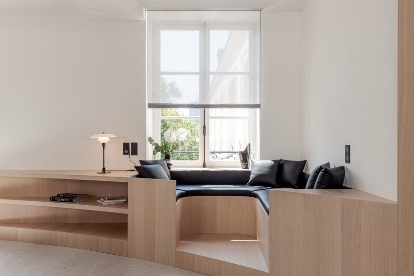
This Network of Architecture-designed Marais apartment inside a converted hotel has been outfitted with a selection of custom-made oak furniture. In the living room, a stylish built-in window seat was designed to function as both seating and storage space.

Its curved shape was enhanced by the addition of black-leather cushions and pillows, which contrast the unadorned white walls and the bleached oak parquet with its decorative chevron pattern.

Find out more about Nicolai Paris ›


Villa Weinberg
Photo by Mikkel Mortensen

Villa Wienberg, Denmark, by Wienberg Architects and Friis & Moltke

Together with studio Friis & Moltke, Danish architects Mette and Martin Wienberg gave this 1940s cottage an overhaul to turn it into a home for their own family.

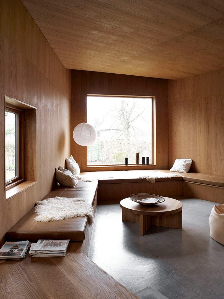
The house has wooden panelling throughout and in the living space, the material was also used to form a low-slung window seat that functions as a bench around the room. Cosy pillows and a sheepskin add comfort.

Find out more about Ell House ›


Maison Jericho
Photo by Manon Vandenhoeck

Maison Jericho, France, by Olivia Fauvelle Architecture

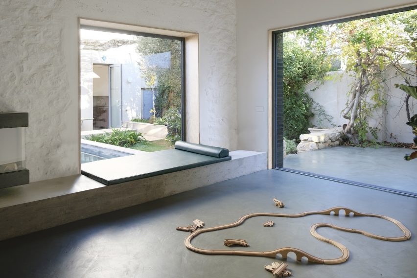
This outbuilding in Marseille was refurbished and extended by French studio Olivia Fauvelle Architecture. In the living room, a concrete window seat was added to help create a connection between the indoors and outdoors.

It overlooks a tiled terrace with a pool and is topped with a leather daybed to create a restful space. A wood-burning stove hangs above the window seat, adding warmth to the room.

Find out more about Maison Jericho ›


First floor window seat in Puppeteers House by REDO Architects
Photo by Do Mal o Menos

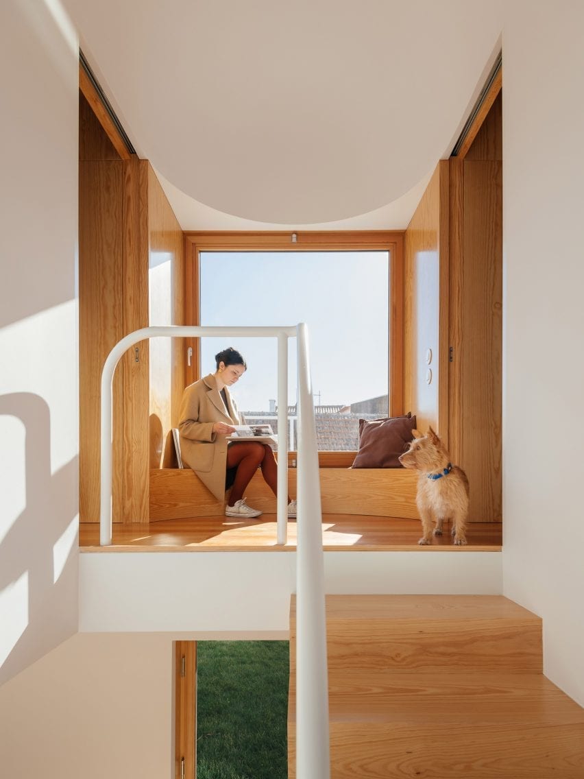
Puppeteers House, Portugal, by REDO Architects

REDO Architects was inspired by stage sets when designing Puppeteers House in Sintra, Portugal, which features wooden joinery constructions intended to evoke theatrical scenography.

This includes a curved wooden bench that functions as a window seat on the first-floor landing, where it is matched by wooden panelling.

“We used a precise quarter of a circle as a tool – like a compass – in different radii, orientations, combinations and materialities,” REDO Architects founder Diogo Figueiredo told Dezeen.

Find out more about Puppeteers House ›


Wooden window seat
Photo (above and main image) by Maxime Brouillet

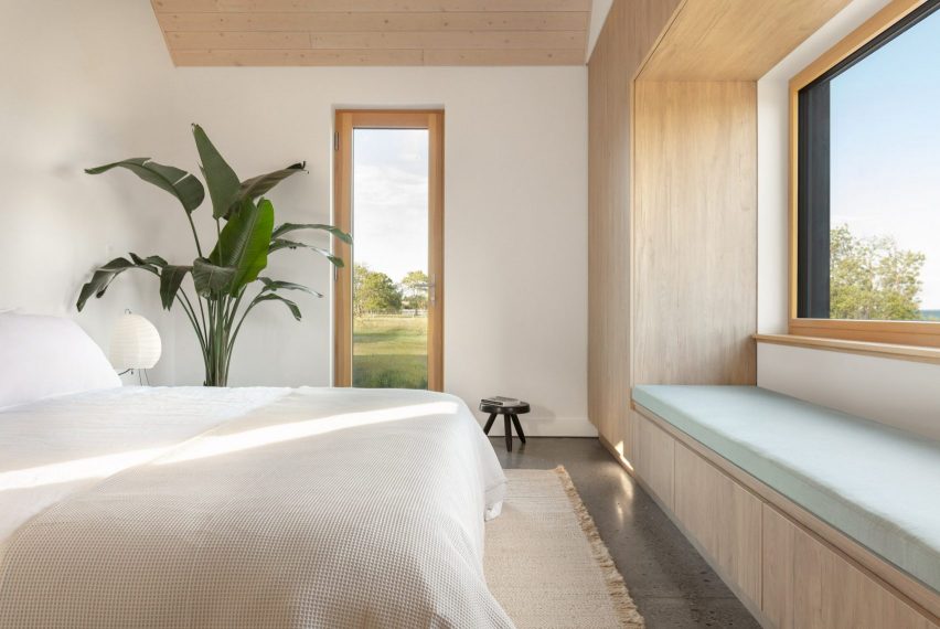
Ell House, Canada, by Ravi Handa Architect and AAmp Studio

The built-in window seat in the Ell House holiday home in Wellington provides its owners with a picturesque view of Lake Ontario.

The exterior of the house was clad in cedar that was charred using the Japanese yakisugi method while the interior features contrasting light oak millwork.

The same wood was also used to form a window seat in the bedroom, which features clean lines and has a cushion for additional comfort.

Find out more about Ell House ›


Window seat inside Low Energy House designed by Architecture for London
Photo by Lorenzo Zandri and Christian Brailey

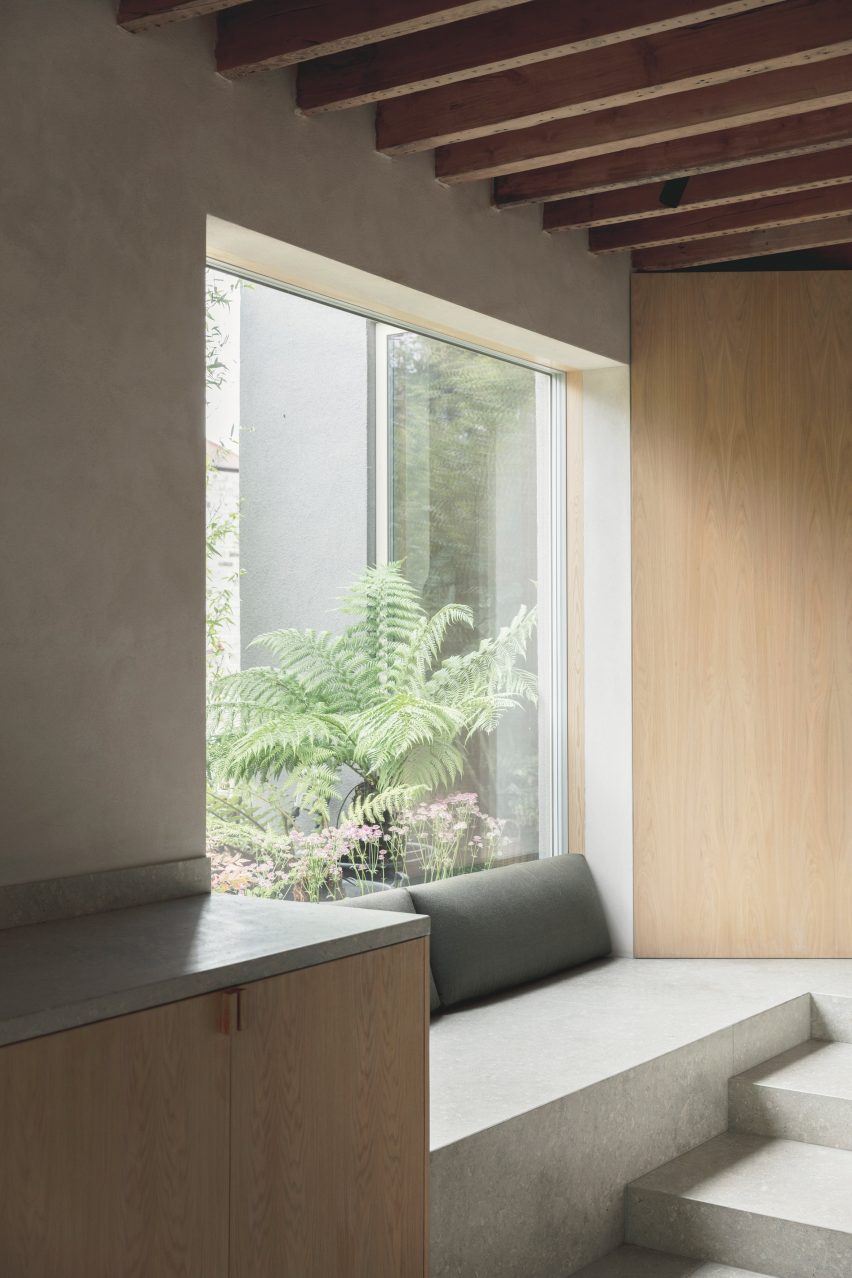
Muswell Hill home, UK, by Architecture for London

British studio Architecture for London designed this home in north London for its founder Ben Ridley. Located in an Edwardian house that hadn’t been renovated for almost 40 years, it was designed to be energy-saving and constructed using natural materials.

A cosy window seat made from grey limestone can be found in the kitchen, where it connects to a storage cabinet made from pale oak.

Find out more about Muswell Hill home ›


U-shape Room by Atelier Tao+C
Photo by Tian Fang Fang

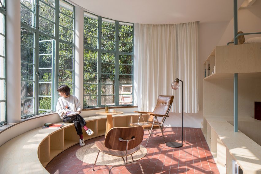
U-Shape Room, China, by Atelier Tao + C

U-shaped window seats are more unusual than rectangular ones. But in this Chinese home, the architects had little choice as the building is dominated by a huge, rounded bay window.

Studio Atelier Tao+C added a curved plywood seat that also has storage spaces. It matches a two-storey plywood volume that houses all the functional rooms of the apartment.

Find out more about U-Shape Room ›


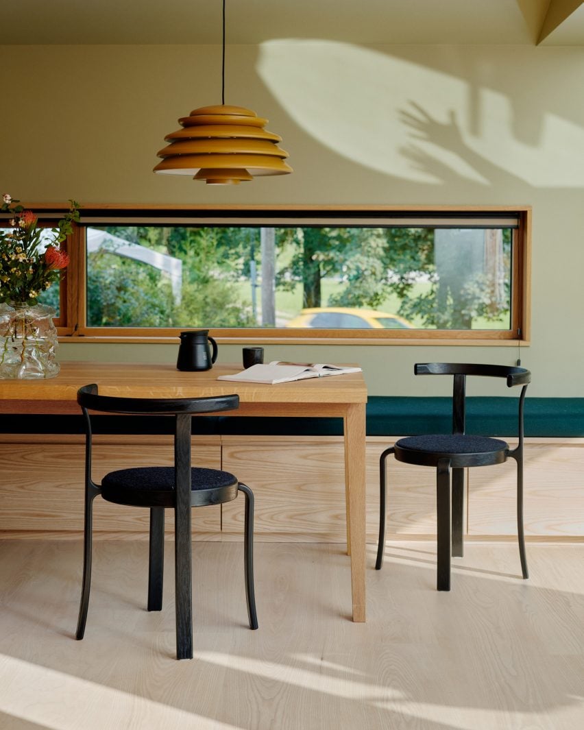
Dining table with green wall and yellow pendant
Photo by Magnus Berger Nordstrand

The Yellow House in the Apple Garden, Norway, by Familien Kvistad

This renovated 1950s house in Oslo was given a colourful interior by locally based duo Familien Kvistad and also features “an abundance of wood”.

While window seats are usually placed under large windows, here the designers chose to add one underneath the smaller, rectangular kitchen window. The long bench is made from ash and has practical storage space hidden underneath a dark green cushion seat.

Find out more about The Yellow House ›

This is the latest in our lookbooks series, which provides visual inspiration from Dezeen’s archive. For more inspiration see previous lookbooks featuring interiors created on a budget, immersive saunas and light-filled kitchens.

Reference

The Future of Architecture: Stylish Home Furnishings With Lighter Ecological Footprints
CategoriesArchitecture

The Future of Architecture: Stylish Home Furnishings With Lighter Ecological Footprints

 The A+Product Awards is open for entries, with a Main Entry Deadline of June 24th. Get started on your submission today! 

Environmental ethics has been increasingly the concern of the built environment industry. When constructing buildings and styling interiors, more and more attention is paid to sustainably sourcing and recycling materials. Eco-friendly design does not limit products to just a few looks, nor does it compromise their functionality. These four beautiful A+Awards winning products will add tasteful texture to your designs while lessening the environmental impact of your project.

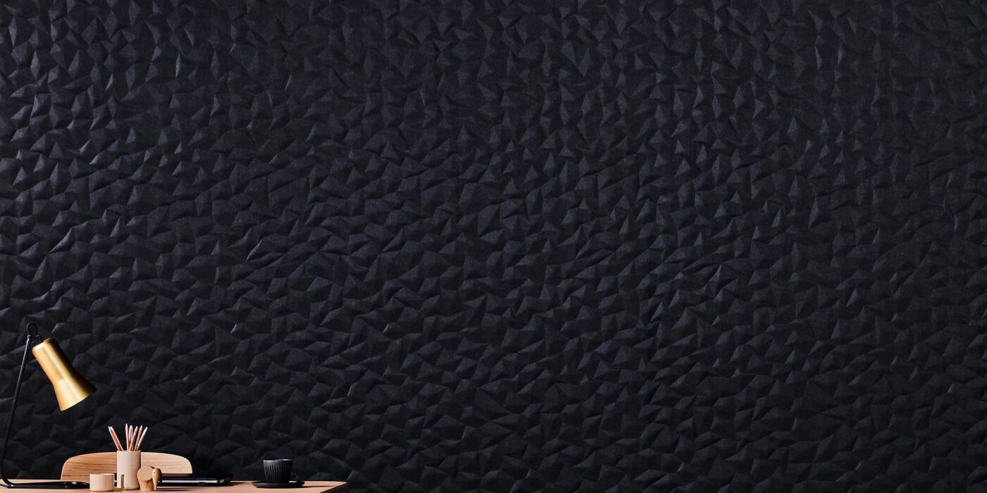
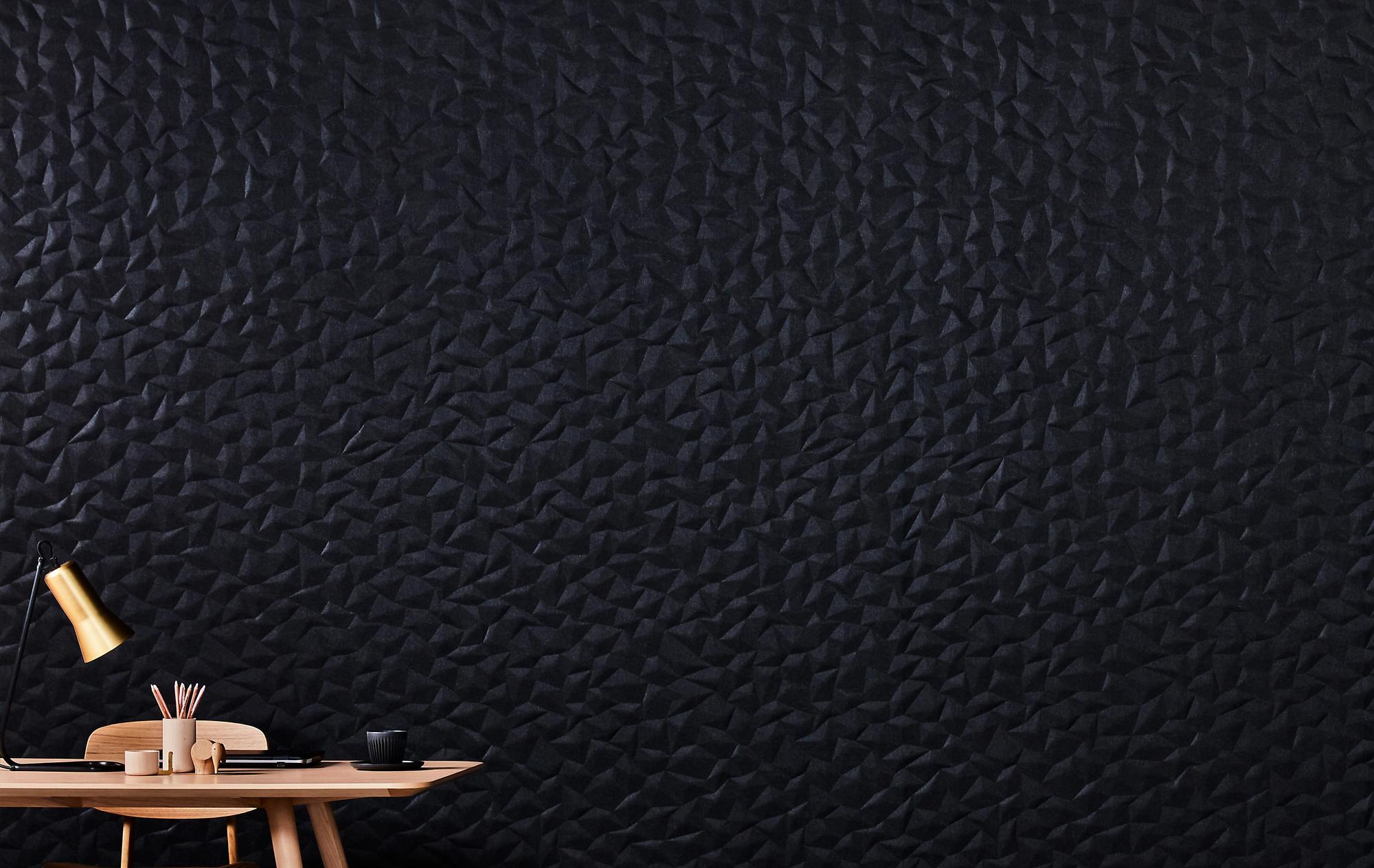
The Embossed Acoustic Panel Series from Woven Image, distributed in the USA by Kirei
Winner, 2021 A+Product Awards, Acoustics

Acoustic panels are useful not only for workplaces and auditoriums but in domestic scenarios as well. Whether in a home office or a family theater, acoustic panels make sounds and voices sharper by reducing undesirable reflections on hard surfaces. They also insulate your room from external noises.

The Embossed Acoustic Panel Series by Woven Image offers high-quality acoustics together with a range of choices for styling. There are three types of patterns to choose from: the linear, simplistic ZEN, the rhythmic GEM, and the origami-inspired ION, each comes in 12 colors.

The panels are made from over 60% recycled PET and fiber while manufactured in a carbon-neutral production facility that utilized solar energy. The product has a low VOC emission rate of 0.023mg/m²/hr and a good Noise Reduction Coefficient of 0.75. It is also easy to trim that a utility knife can cut it through. The subtle light and shadow created by the 3D patterns make the panels an addition to interior styling.

Silestone® Sunlit Days by Cosentino Group
Winner, 2021 A+Product Awards, Hard Surfacing, Tiles and Stone

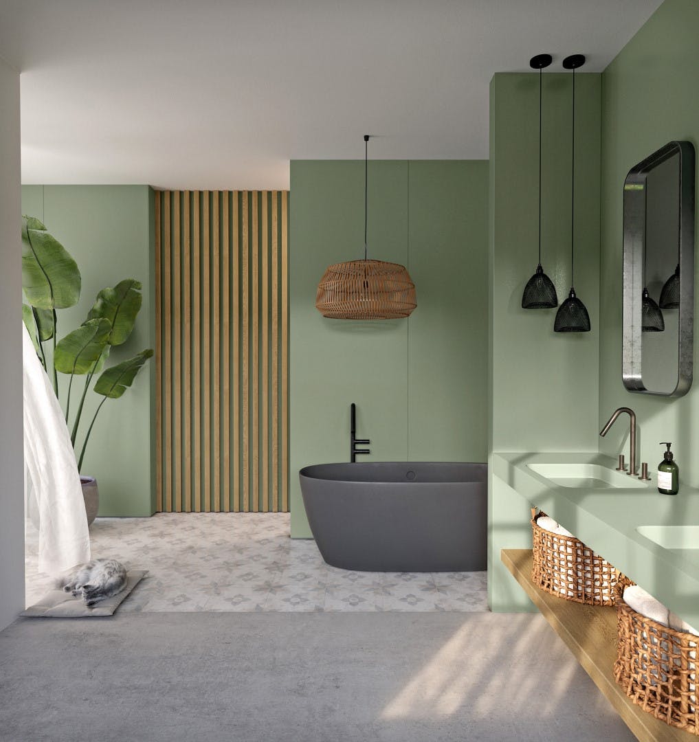
Quartz surfaces are popular in home designs for their stone-like appearance, high versatility, durability and accessibility, especially when compared to natural stones like granite and marble. They are cast from a mixture including small pieces of quartz, resins, pigments, etc. Bonded by resins, the finished surface comes sealed and flat, making them easy to clean. The mixture is made in a way that allows it to be colored as needed, ensuring that owners will not have to make compromises on home styling. AT present, Quartz surfaces from the Silestone® Sunlit Days series are available in white, light grey and red, blue, and green in low saturation. The soothing colors and clean shapes give interiors a modern looking.

Quartz surfaces have the appearance of stones but are more eco-friendly than natural stones. The Sunlit Days series provide carbon-neutral quartz surfaces that incorporate extra strategies to cut the material’s carbon footprint. The production uses 99% reused water, 100% renewable electric energy and a minimum of 20% recycled raw materials in its composition. Furthermore, the brand has committed to offsetting GHG emissions through the Voluntary Carbon Market. Being environmentally aware does not limit our choice of furnishing and surface texturing to synthetic materials that comprise recycled resources. Instead, natural materials can also be consumed sustainably.

Brace by Davis Furniture
Winner, 2021 A+Product Awards, Contract Furniture

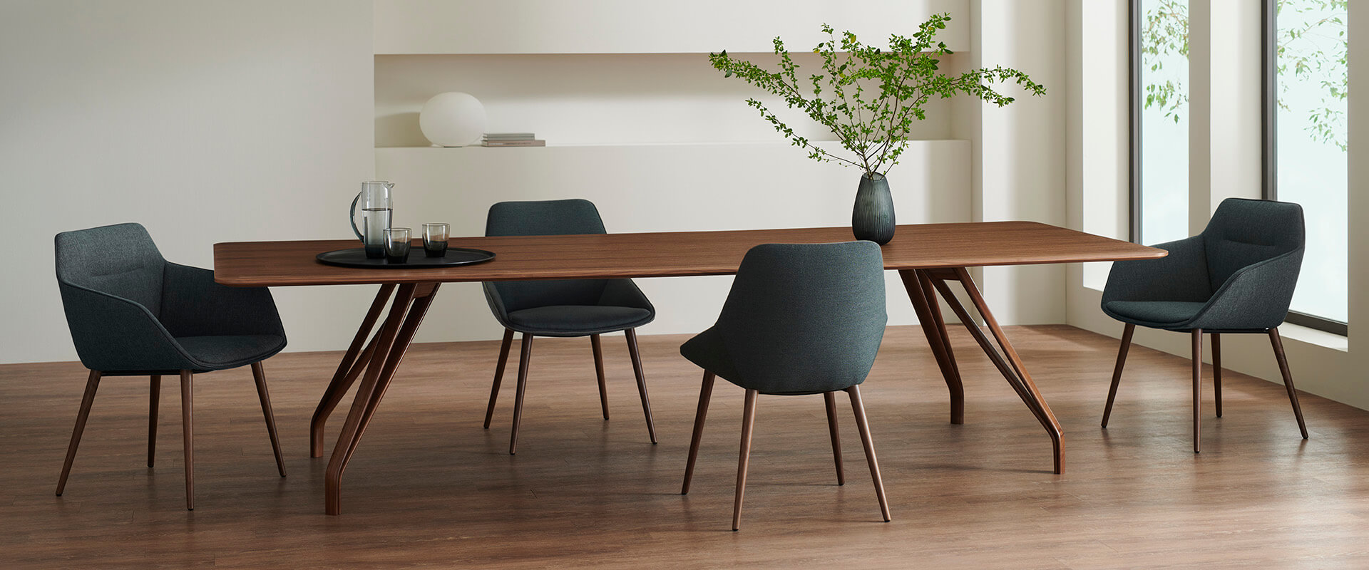
Brace from Davis Furniture is one of this kind. Each Brace table is made from a tree at the end of its lifecycle, leaving plenty of time for the material to store carbon during its growth. Furthermore, the brand has committed to planting two saplings for each tree they harvest. In this way, the sourcing is sustainable and the European forest is never overly exploited by the product’s production.

The solid wood table comes in various sizes and shapes to accommodate a range of events. For example, a long, rectangular table can be perfect as a home office desk while a small, round one can serve an intimate meal for two people, etc. The sleek table top is supported by the iconic legs. Each leg splits into two as it goes up, creating a slim triangular space within itself. More than 50 types of selectable coatings on each Brace table allow the table different colors and textures that best suit the home design. The design celebrates the uniqueness of the natural material with the technological precision of modern design.

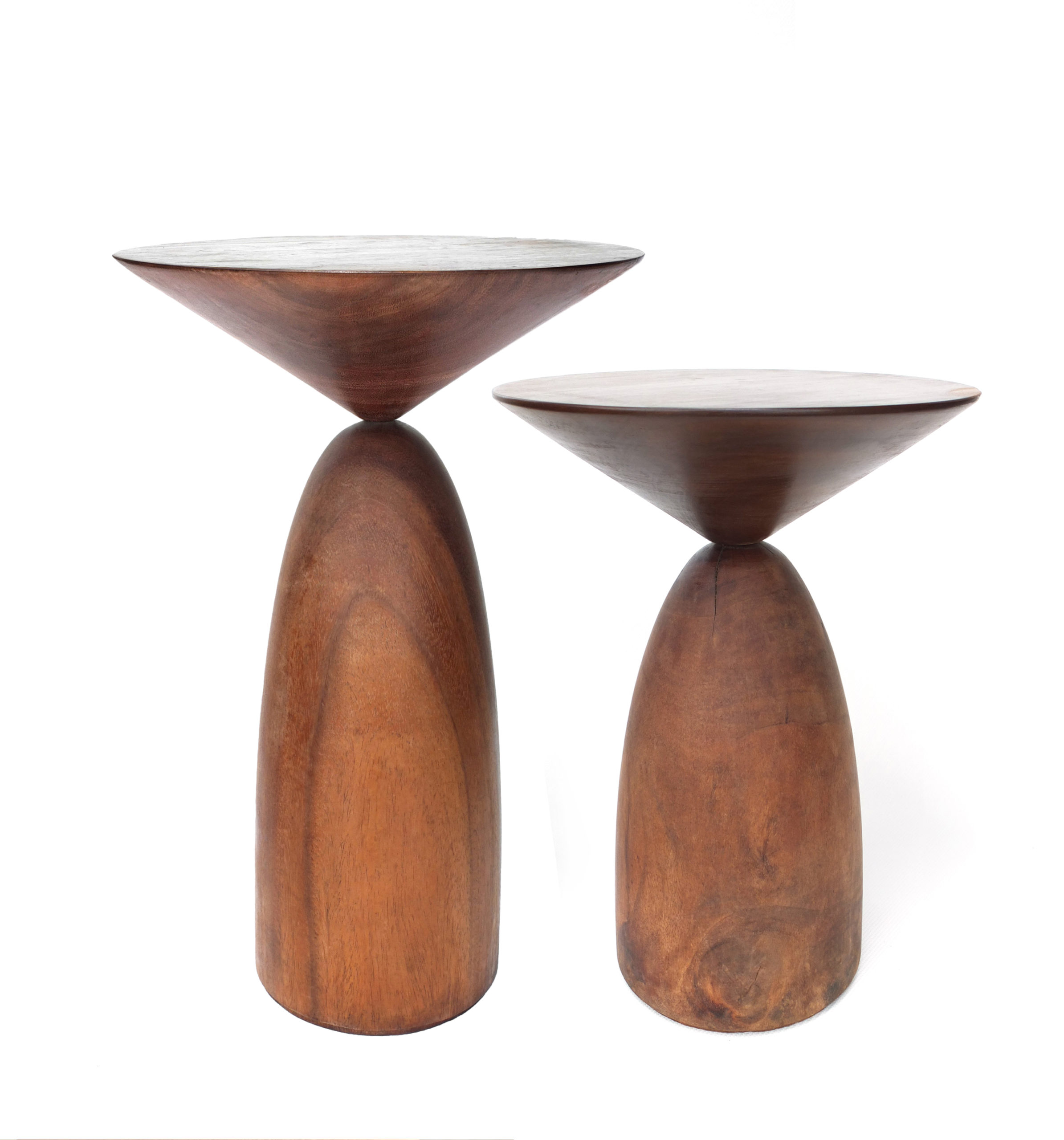
Koroi Side Table by MAJA
Winner, 2021 A+Product Awards, Residential Furniture

The Koroi Side Table also embraces the characteristics of natural materials. Each Koroi Side Table is handcrafted from solid wood by artisans in Bangladesh with a resource-efficient approach. Burls, deep cracks and other features of the tree remain visible from the smoothened surfaces. Comprising two geometric forms, the design of Koroi sets a subtle balance between fragile and sturdy. Althought the connection between the two parts looks delicate — precarious, perhaps — the piece’s solidity is guaranteed by the thick wood. The two parts are cut at opposing grains, giving them contrasting textures and different reflectiveness.

 The A+Product Awards is open for entries, with a Main Entry Deadline of June 24th. Get started on your submission today! 

Reference

Eleven stylish home-working spaces that complement the decor
CategoriesInterior Design

Eleven stylish home-working spaces that complement the decor

Home offices don’t have to look like work offices. For this lookbook, we’ve rounded up eleven remote workspaces that don’t compromise on style.


Our selection, all of which come from the Dezeen archives, includes compact setups from homes and hotels as well as more generous, dedicated home offices.

This is the latest roundup in our Dezeen Lookbooks series providing visual inspiration for the home. Previous articles in the series feature children’s bedrooms, inspiring outdoor living spaces, calming green kitchens, and living rooms with beautiful statement shelving.


Roksanda Ilincic penthouse apartment in London's King's Cross

London penthouse, UK, by Roksanda Ilincic

Fashion designer Roksanda Ilincic designed the interiors for this apartment in London’s King’s Cross filled with saturated colours and geometric shapes.

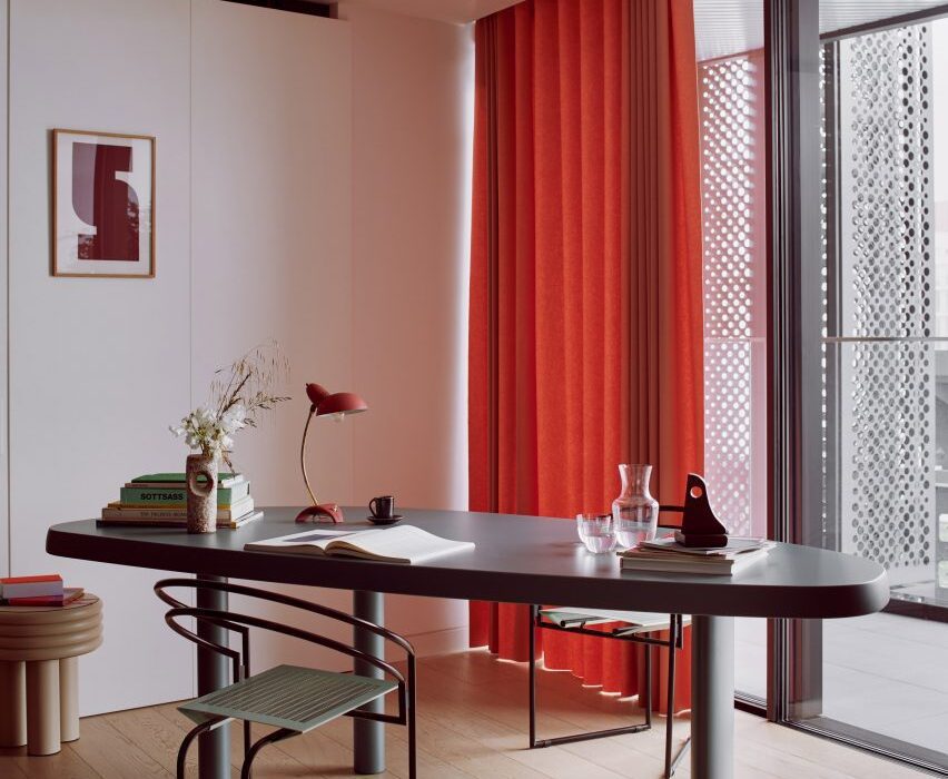
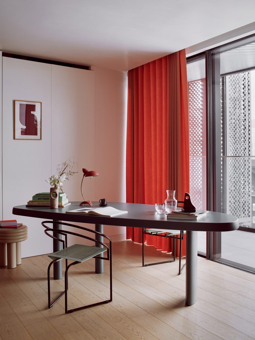
A quiet work corner has a grey oval table, black steel-framed tubular chairs and a wooden stool that functions as a small side table. A warm red curtain and table lamp and sculptural, abstract accessories add a friendly feel to the room.

Find out more about London penthouse ›


Strandhotel Zoomer in the Netherlands designed by The Other Season and HK Living

Strandhotel Zoomers, the Netherlands, by The Other Season

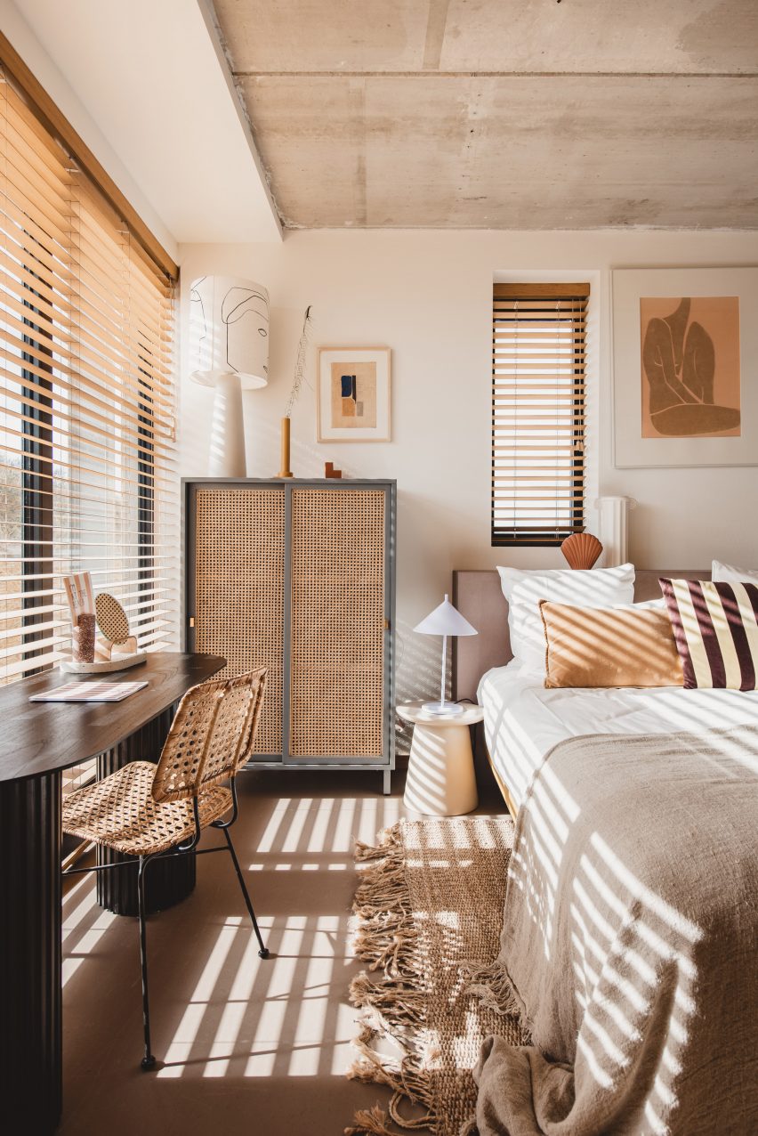
This bedroom in the Strandhotel Zoomers was designed in a natural, sandy colour palette that evokes the beach dunes beyond its walls.

A  shallow wooden desk sits in front of a window with views of the ocean and is complemented by a thin, steel-frame chair with a decorative wicker seat, creating a small but practical workspace.

Find out more about Strandhotel Zoomers ›


Home office with concrete walls

Casa Ventura, Mexico, by Tatiana Bilbao

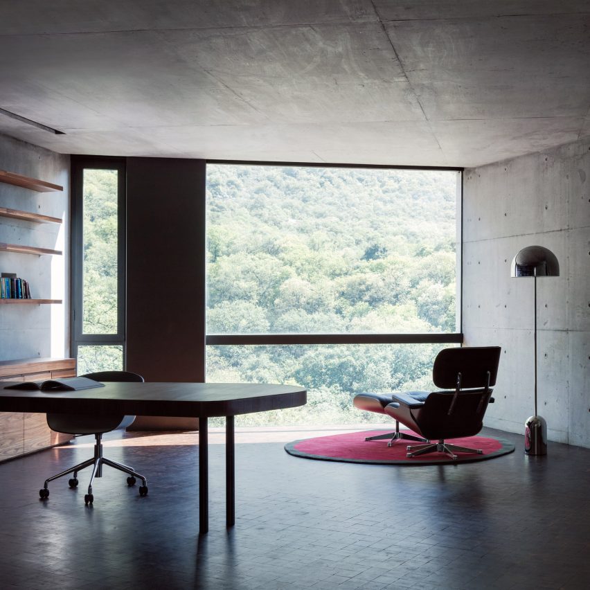
A concrete house on a forested hillside in Mexico is the setting for this panoramic home office, which has an elegant, solid wooden desk and shelving and cabinets in lighter wood.

An Eames lounge chair by the floor-to-ceiling window and a domed metal floor lamp function as a peaceful reading corner in the minimalist office.

Find out more about Casa Ventura ›


Gold desk in turquoise room

Television Centre apartment, UK, by Waldo Works

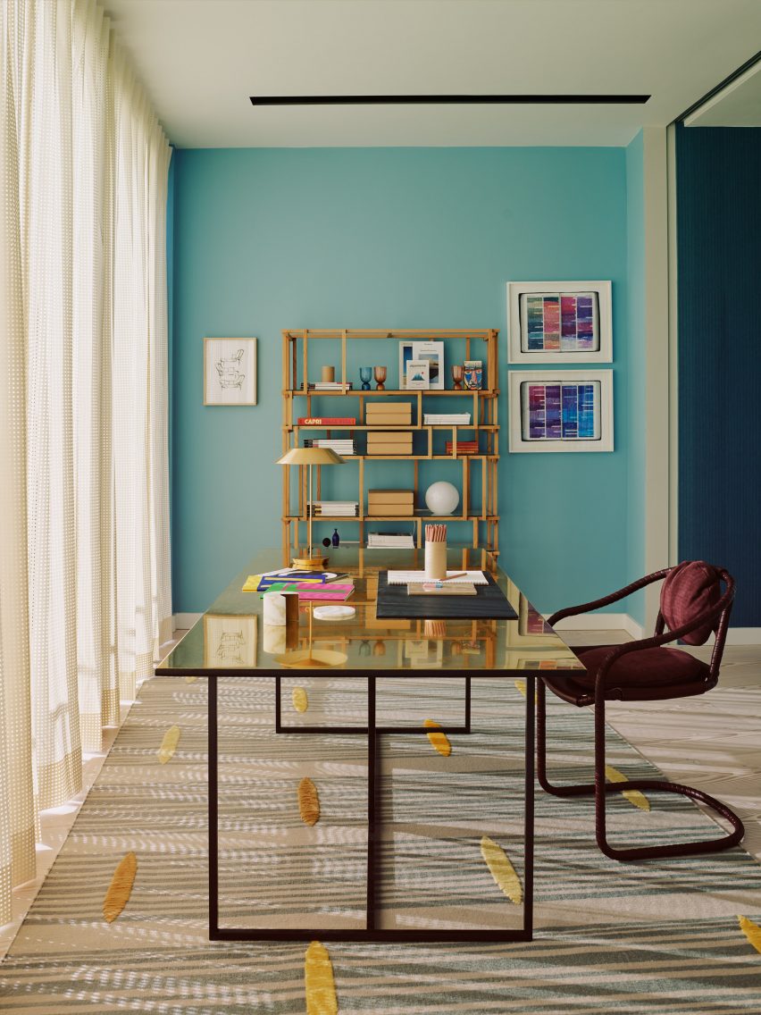
Waldo Works’ colourful interior design for this penthouse apartment inside London’s Television Centre includes a luxurious office space with a metal desk on graphic steel legs. Its gold colour creates a warm contrast against an eye-catching turquoise wall that has been hung with colourful prints.

A natural-wood bookshelf with asymmetrical shelving is filled with magazines, boxes, and decorative vases while a printed rug with yellow applique detailing makes the room feel inviting.

Find out more about Television Centre apartment ›


Workspace by mirror in Autor Rooms

Autor Rooms, Poland, by Mamastudio

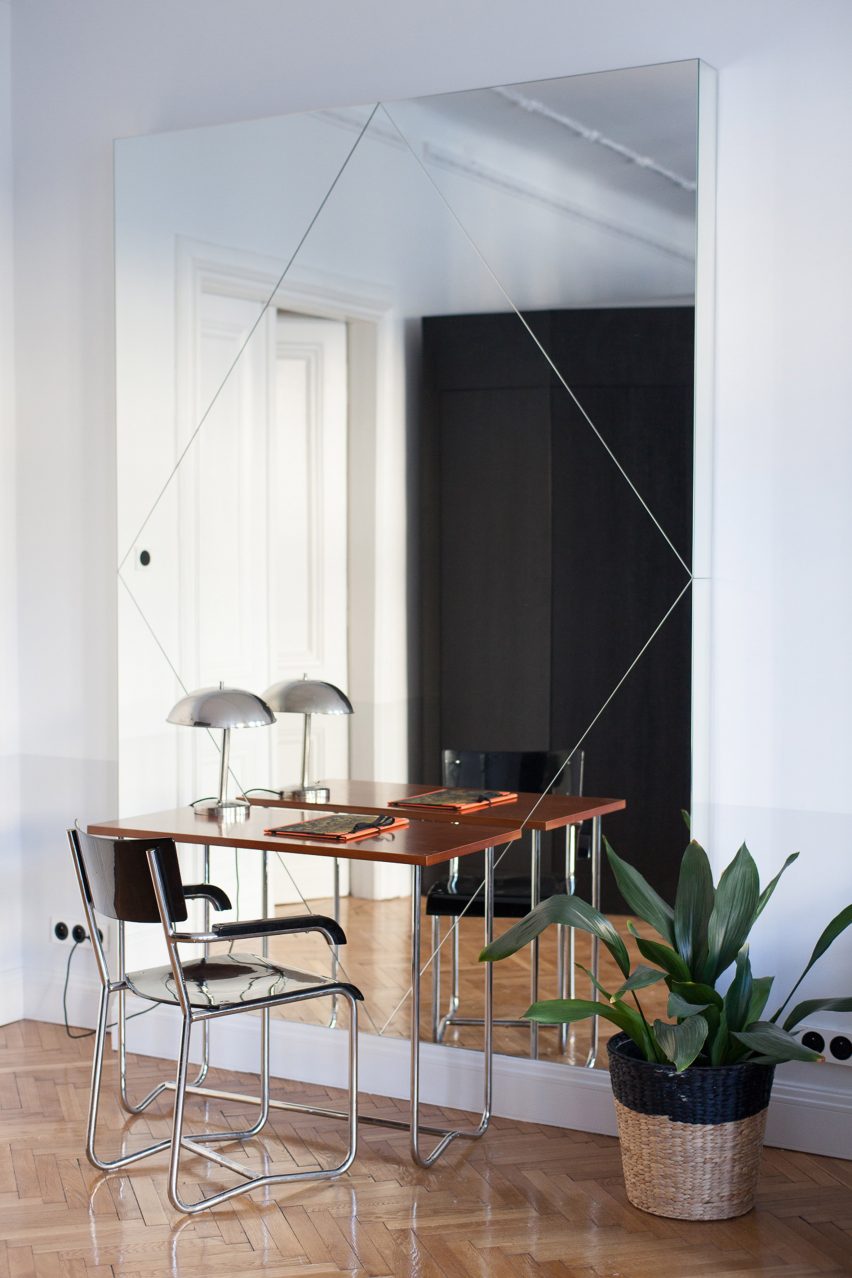
Pieces by local designers feature in the Autor Rooms hotel in Warsaw, including this small, clever wood-and-steel desk.

The streamlined, minimal design of both the desk and the chair is perfect for a discrete workspace, while the large mirror they face makes the room feel bigger. A metal lamp and plant in a woven basket are the only two accessories in this office corner.

Find out more about Autor Rooms ›


Interiors of 2LG Studio's Design House

2LG Studio home and workspace, UK, by 2LG Studio

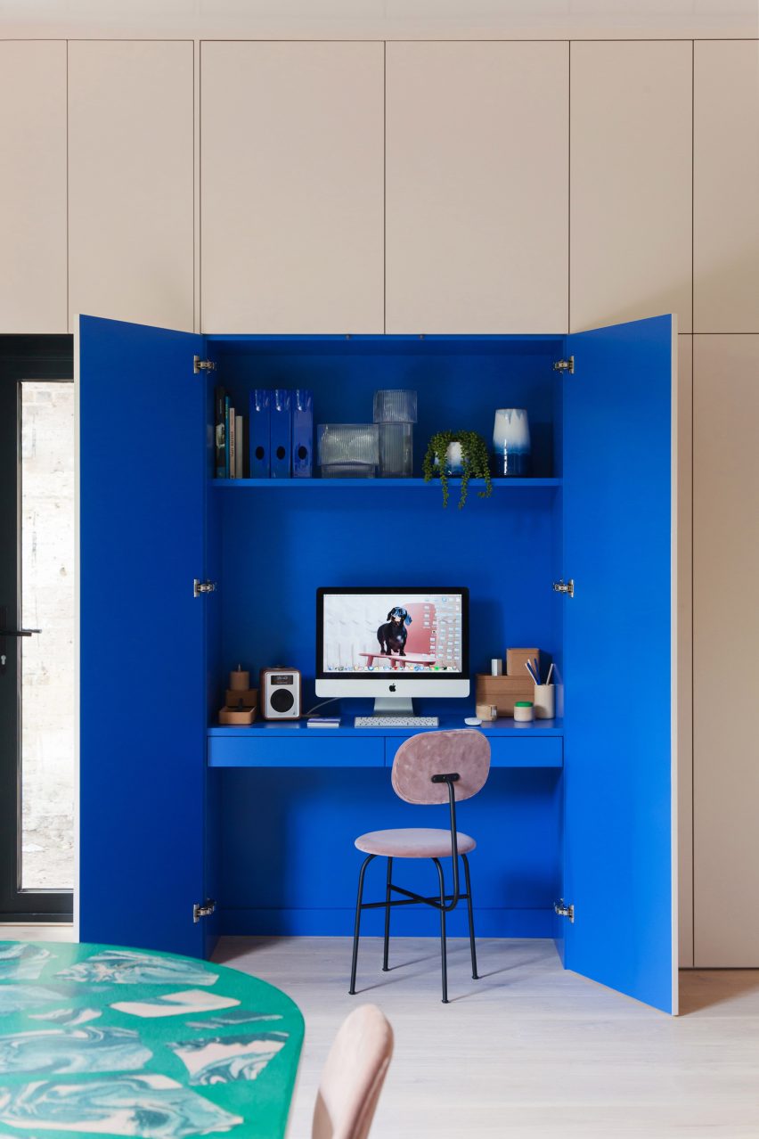
This clever, compact solution by 2LG Studio sees full-height white cupboards conceal a built-in computer desk. The cupboards’ bright, Klein-blue interior helps demarcate the space as a separate work area.

A shallow desk shelf is just big enough to hold a computer screen and keyboard, with drawers below providing storage. Practical filing folders share a shelf above the desk with glass vases and ceramics.

Find out more about 2LG’s workspace ›


Still Room in Antwerp is a silent refuge

Still Room, Belgium, by Studio Corkinho

The monastic interiors of this 19th-century Antwerp building include a wooden writing desk facing an arched window, creating a suitable space for contemplative creativity.

The desk has a matching wooden chair and a patinated leather chair sits next to it. Underneath the table, a selection of books on silent meditation and sacred architecture provide apt reading material.

Find out more about Still Room ›


Study of the Knightsbridge Mews House by Echlin

Knightsbridge mews house, UK, by Echlin

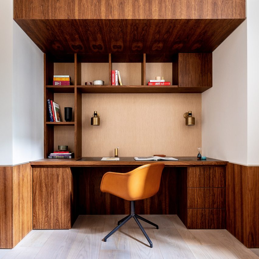
Echlin’s design for this London mews house includes a built-in study made using bespoke joinery.

Dark wood was used for both the desk and its discrete drawers, and continues above the desk where it forms roomy shelving and a wooden overhang that frames the compact home office. Brass detailing adds a luxurious touch and contrasts nicely against the wood.

Find out more about Knightsbridge mews house ›


Pinterest roundups skylights

Stockholm house, Sweden, by Förstberg Ling

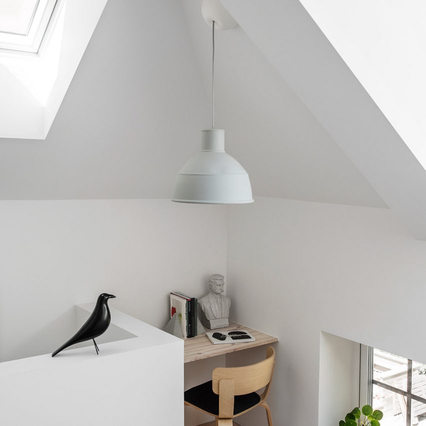
Sometimes the simple solutions are the best, like in this small work nook in a house in a former blacksmith’s workshop in Sweden. A corner space has been given an added floating desk to take full advantage of the space.

A matching wooden chair creates a practical space for working or studying, which has been decorated with a stone bust and matching bookends.

Find out more about Stockholm house ›


The Audo by Menu and Norm Architects

The Audo, Denmark, by Menu and Norm Architects

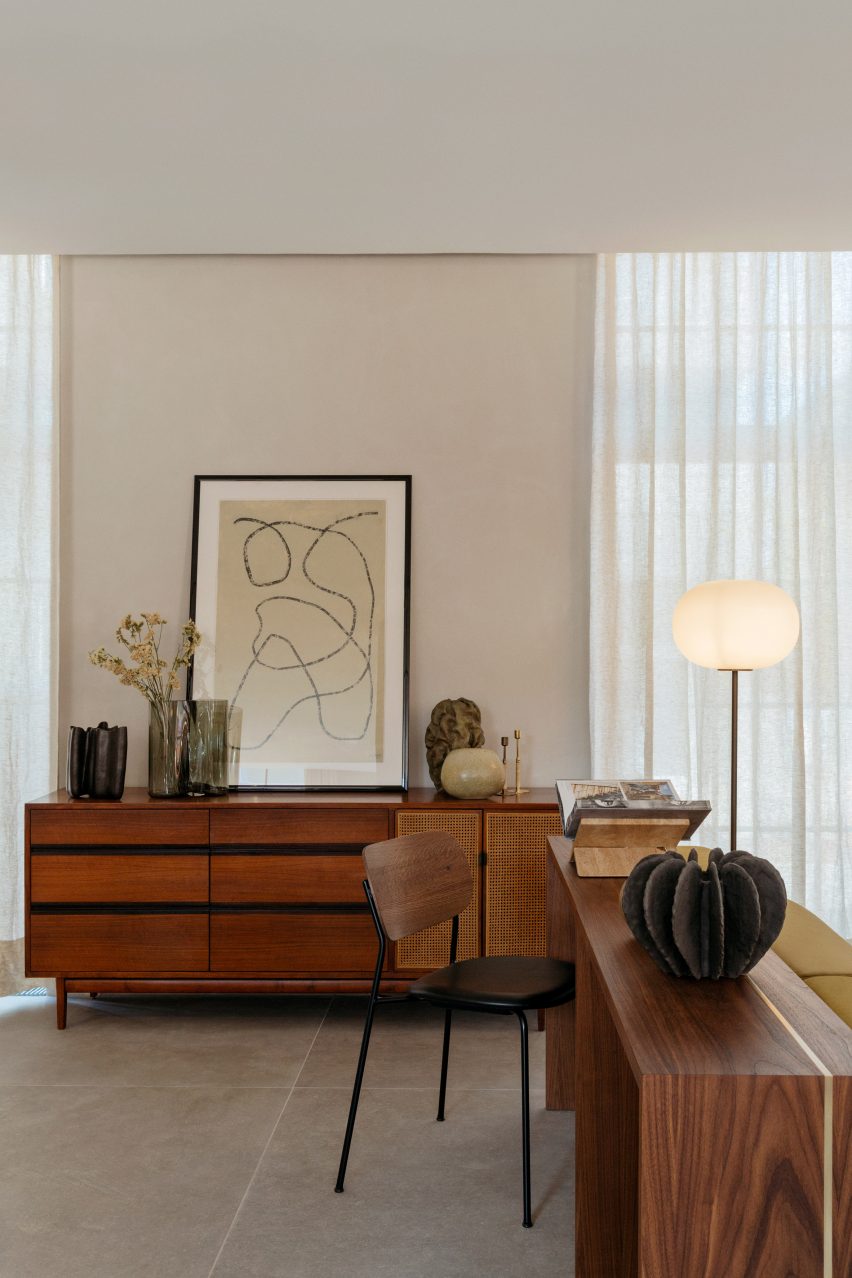
Norm Architects and Menu’s design for The Audo hotel in Copenhagen filled the concrete interior with wood, straw, stone and other natural materials.

This work area uses the material palette to create an elegant, calming feeling. A wooden desk can function either as a writing desk or as a display space for the numerous decorative items that are strewn around the area. Storage is hidden in a matching cabinet with rattan doors.

Find out more about The Audo ›


Agate Pass Cabin by Olson Kundig Architects

Agate Pass Cabin, US, by Olson Kundig

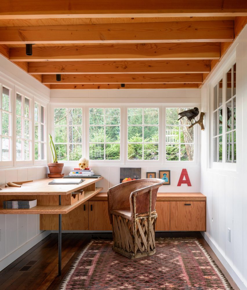
When Olson Kundig Architects principal Alan Maskin renovated a 1938 beach cabin to turn it into a house for himself, he added a study space on a former porch.

Here, the laidback bohemian feel of the house continues. A desk and cabinets made from Glulam wood match the wooden ceiling beams, while a rough-hewn chair adds a rustic note to the bright room.

Find out more about Agate Pass Cabin ›


This is the latest in our series of lookbooks providing curated visual inspiration from Dezeen’s image archive. For more inspiration see previous lookbooks showcasing children’s bedrooms, outdoor living spaces, calm living rooms and colourful kitchens.

Reference