What’s Yellow, Blue and Red All Over? Showcasing Sweden’s Stunning Scarlet Architecture
Architects: Want to have your project featured? Showcase your work through Architizer and sign up for our inspirational newsletter.
The color red has been a part of residential architecture in Sweden since the 16th century when Falu red paint was first created from the residue found in copper mines in the country’s Falun region. Locals realized that this reddish sludge, when treated correctly, formed a paint that was very affordable, durable, weather-resistant and also helped mimic the appearance of brick houses that were owned by wealthier families.
Now, that particular shade of red is iconic and is knowingly used to help houses stand out in the verdant landscape. Today, the tradition continues evolving. Shades of Falu red now coats a variety of Swedish structures ranging from small homes and barns to large-scale university and apartment buildings. Here are a few buildings that illustrate the timelessness and exuberance of the color.
Images by Johan Fowelin
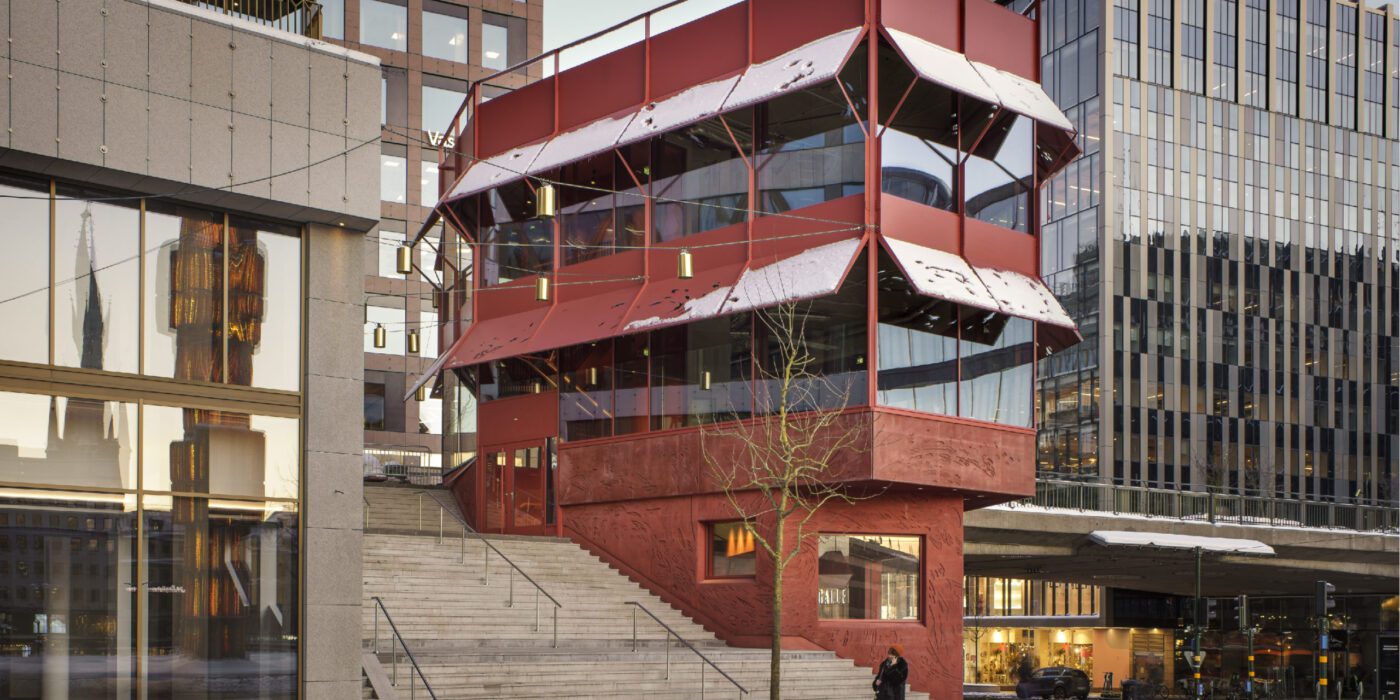
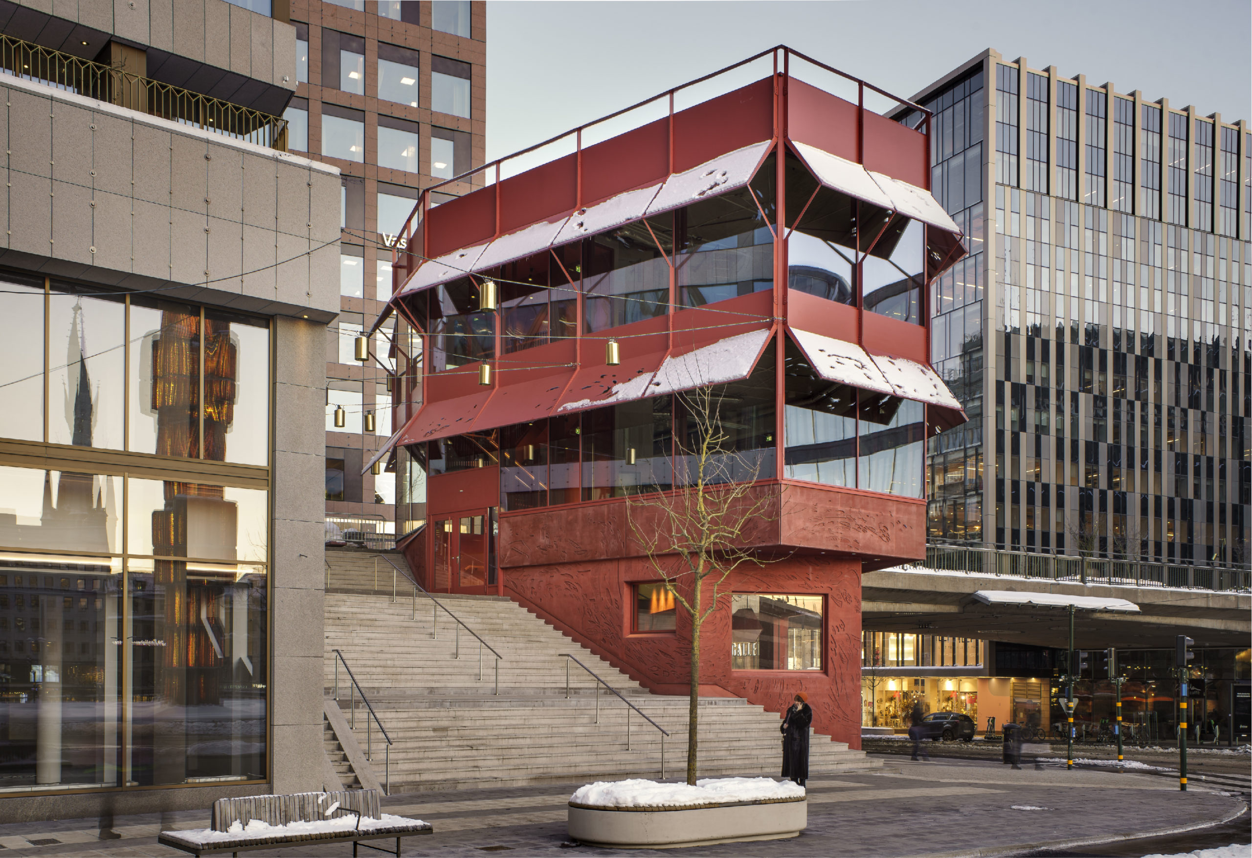
The Pavilion by Marge Arkitekter, Stockholm, Sweden
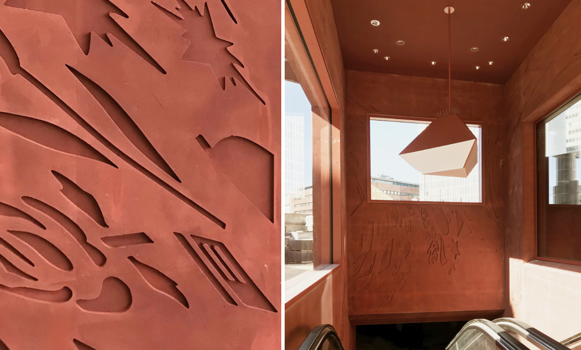
Unlike traditional pavilions, this Stockholm structure is stacked like a building. It is conceived to become the focal point of the redesign of the city block around it. The different levels help accommodate the slope of the site and provide access to visitors from both sides. The rouge tone helps it stand out among the beige and brown hues of the buildings around and also acts as a beacon for the citizens. The patterned exterior, created in collaboration with artist Gunilla Klingberg, is made of red-dyed concrete. The language is kept consistent by painting the awnings and window frames as well.
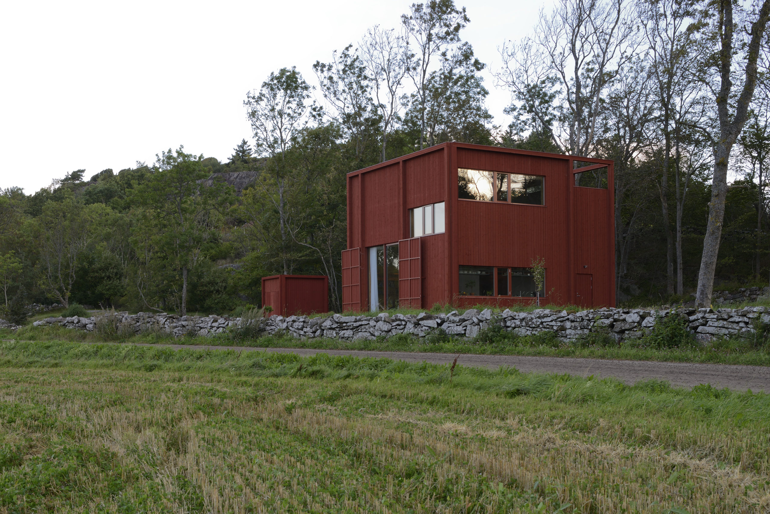
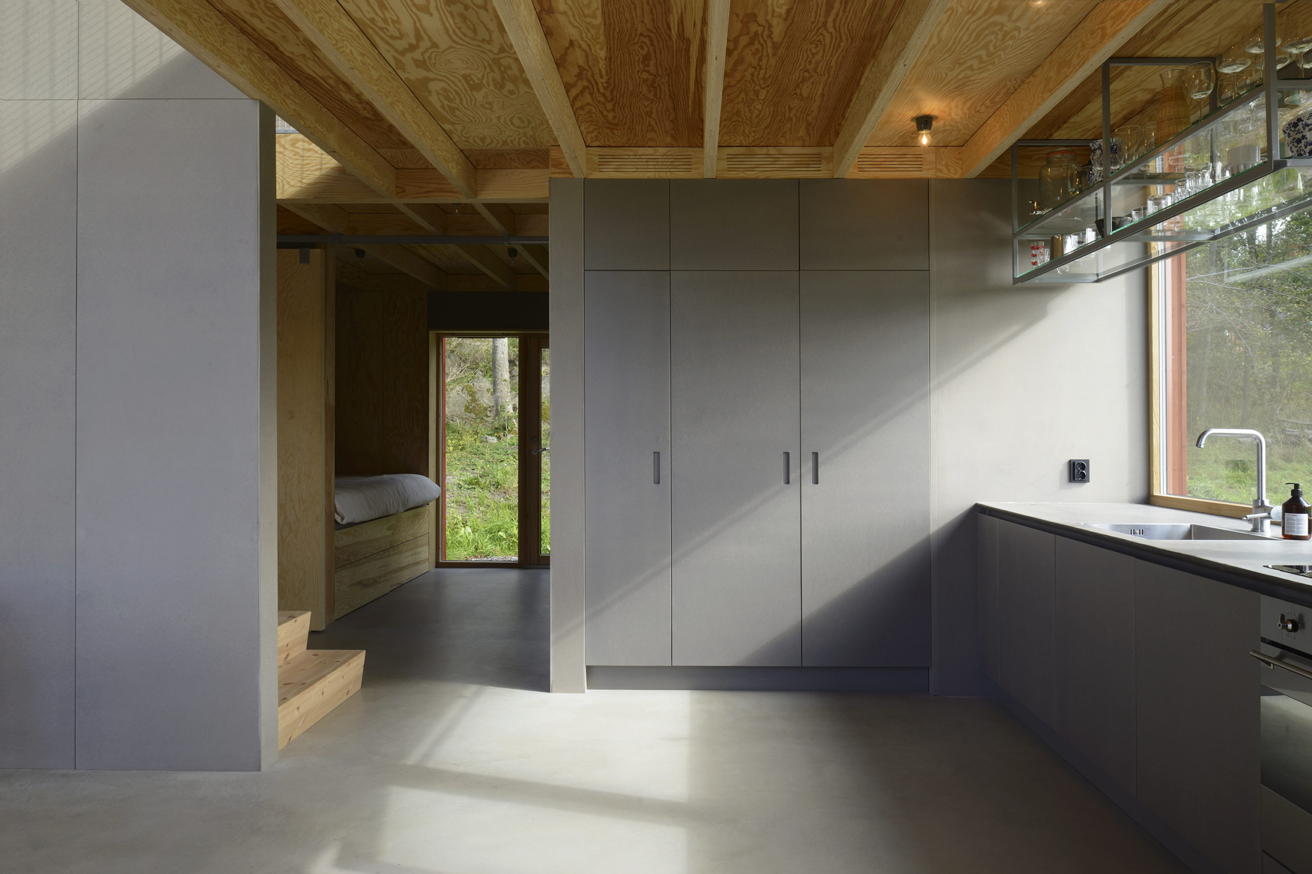 Späckhuggaren / House for a drummer by Bornstein Lyckefors Arkitekter, Kärna, Sweden
Coated in the traditional Falu red color, this house was designed for a single father of two. At one point, the site housed an old farm stall and a warehouse that was destroyed in a fire. The form of that warehouse is what inspired the design of this house. While the home appears heavy and solid from the outside, the interiors are open and airy. The spaces inside vary in height and there are mesh-covered gaps between levels to allow light to penetrate diagonally across floors.
Images by Ulf Celander
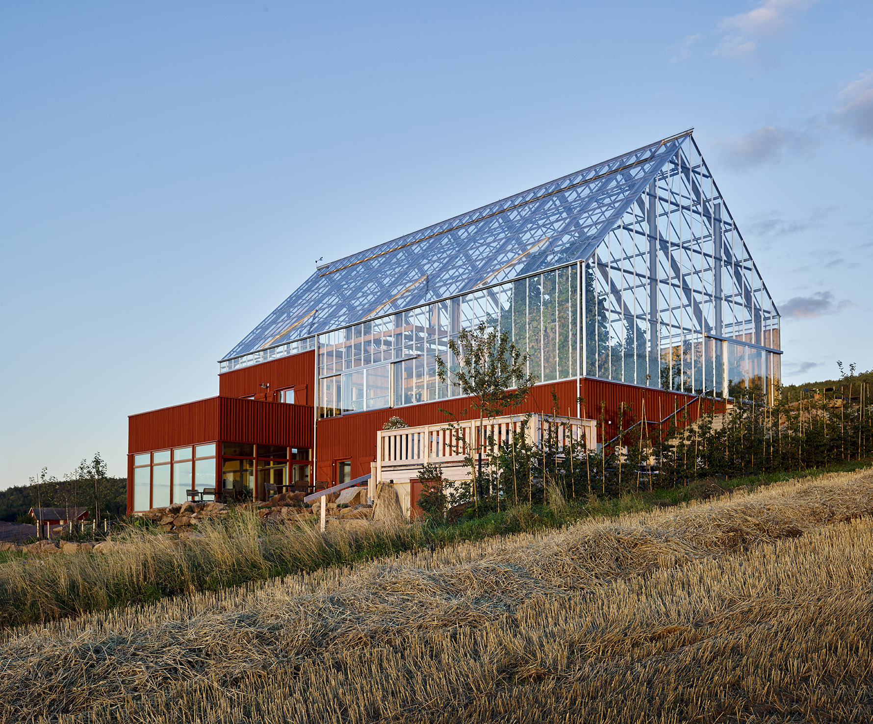
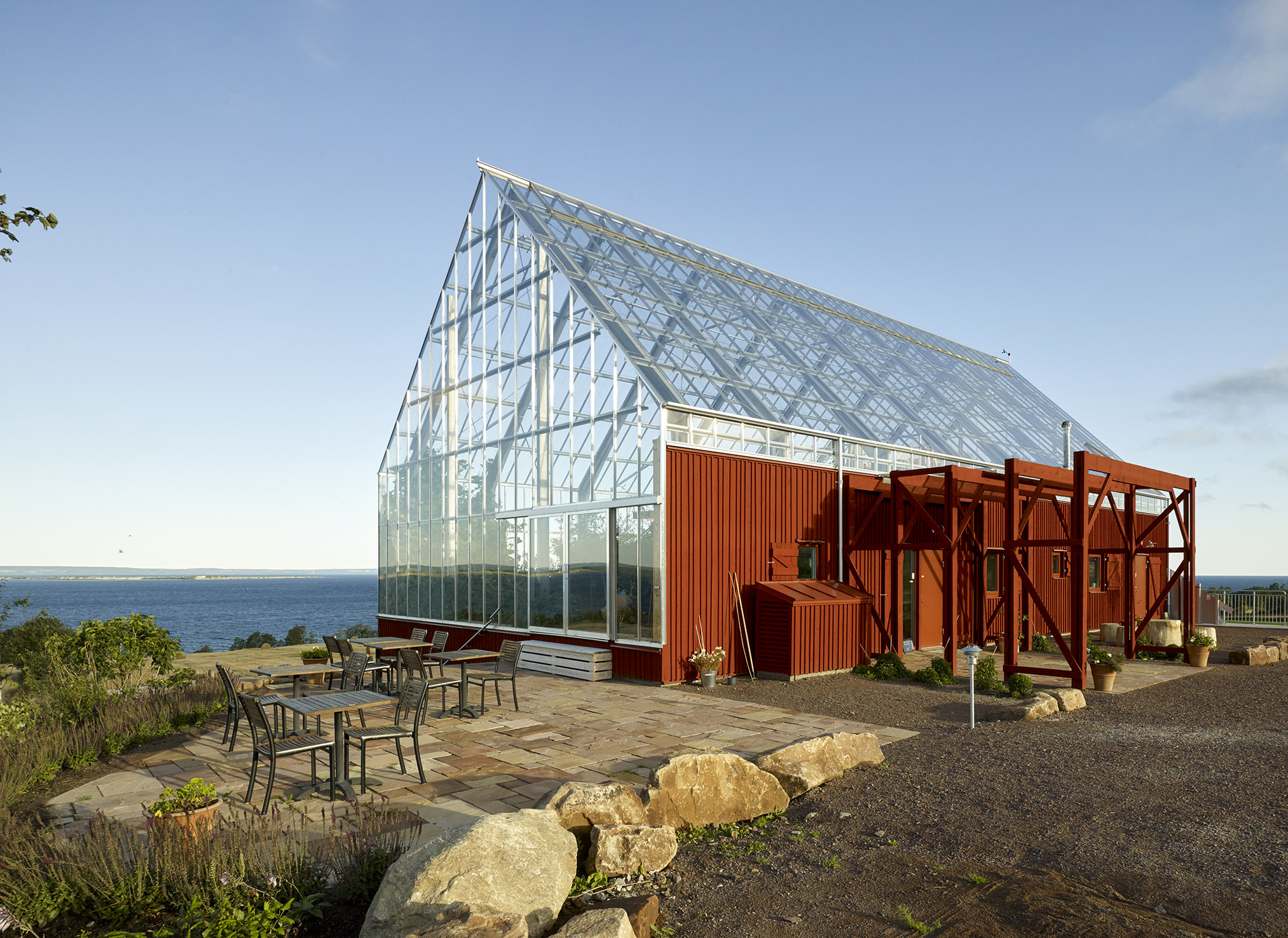
Uppgrenna Naturehouse by Tailor made arkitekter, Uppgränna, Sweden
This café and event space is a remodel of a red barn that was extant on the site. The red base, reminiscent of the previous structure, is given a modern facelift with the addition of a large greenhouse on top. The addition of panels to the base and doors not only helps maintain the barn aesthetic but also helps reduce heat radiation. On top, the greenhouse is equipped with a sewage and waste recycling system that also aids the growth of plants within. This eliminates the need to be connected to the municipal sewage system.
Images by Åke Eson Lindman
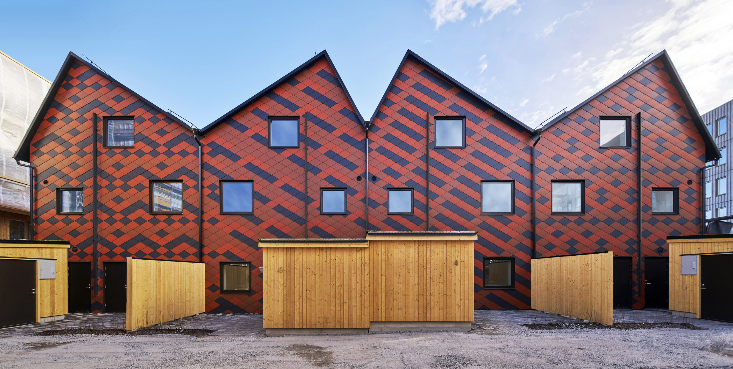
Passive Townhouses in Vallastaden by Kjellgren Kaminsky Architecture AB, Linköping, Sweden
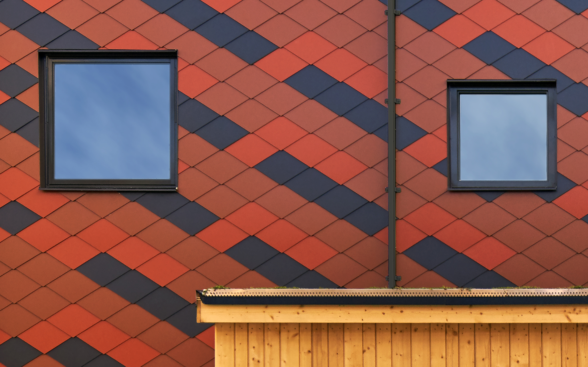
The townhouse is broken up into four different apartments, with each one showcasing a slightly different personality. The continuous volume is broken up into four parts using separate roofs and façade patterns. These patterns are created using a mix of black, bright red and brick-toned tiles. The individuality of the apartments is also reflected in the kitchens and bathrooms inside. Additionally, this building features a courtyard, garden and storage space.
 Tower on the Ting by Wingårdh Arkitektkontor AB, Örnsköldsvik, Sweden
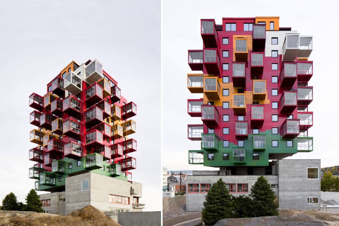
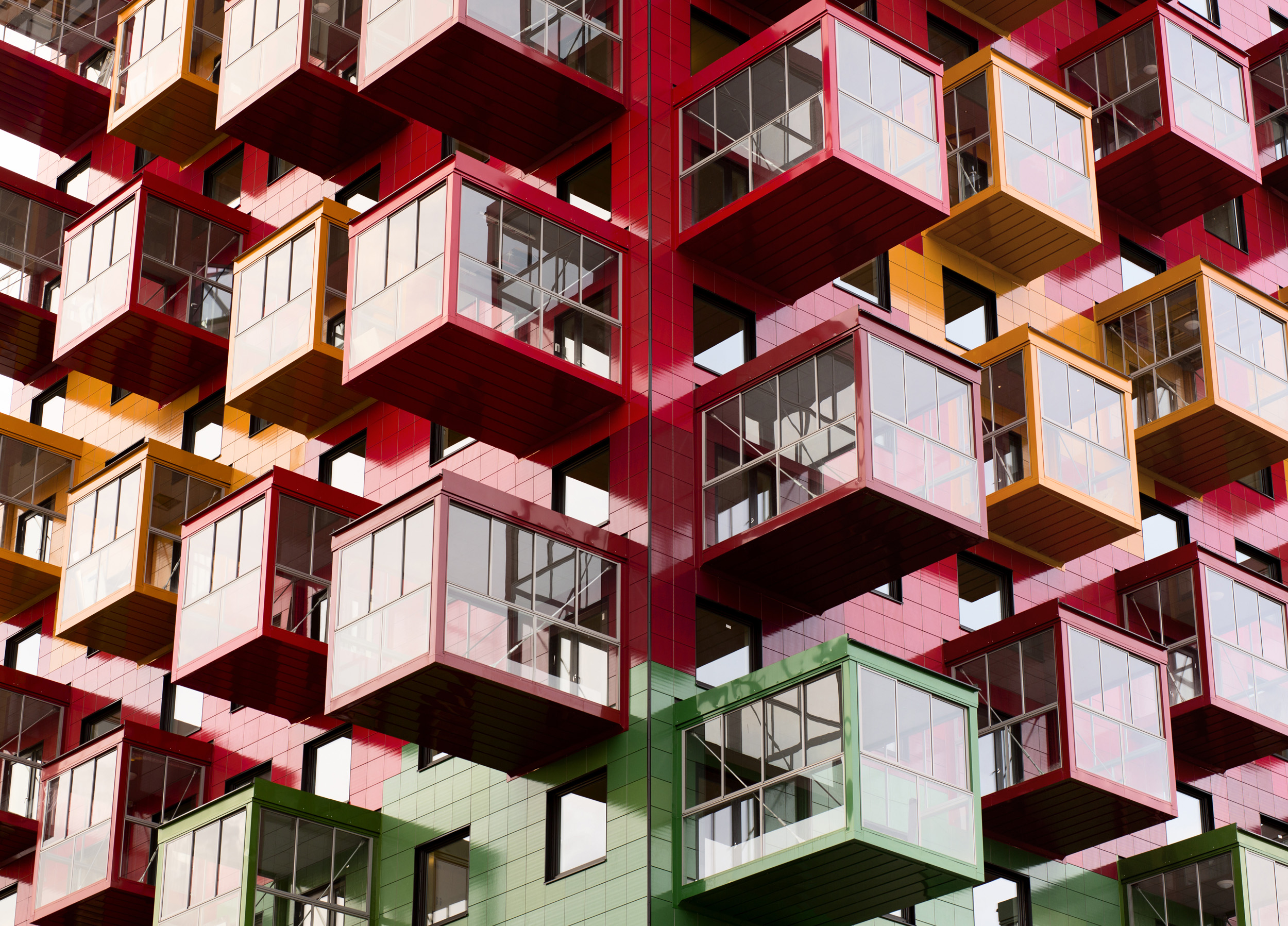
Niklas Nyberg, a local builder, bought a courthouse that was built in 1967 after discovering it was rarely used and hoped to construct an apartment building on top of it. Taking inspiration from one of his favorite artists, Bengt Lindström, the architect set out to design a multidimensional apartment block. The square plan of the building is broken up into nine parts like a hashtag. Each level of the structure is made up of five apartments placed around a central block. The exterior is covered in glazed ceramic tiles in colors found in Lindström’s artwork.
Images by Tord-Rikard Soderstrom and Åke Eson Lindman
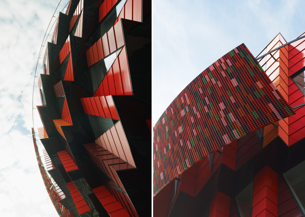
Kuggen by Wingårdh Arkitektkontor AB, Gothenburg, Sweden
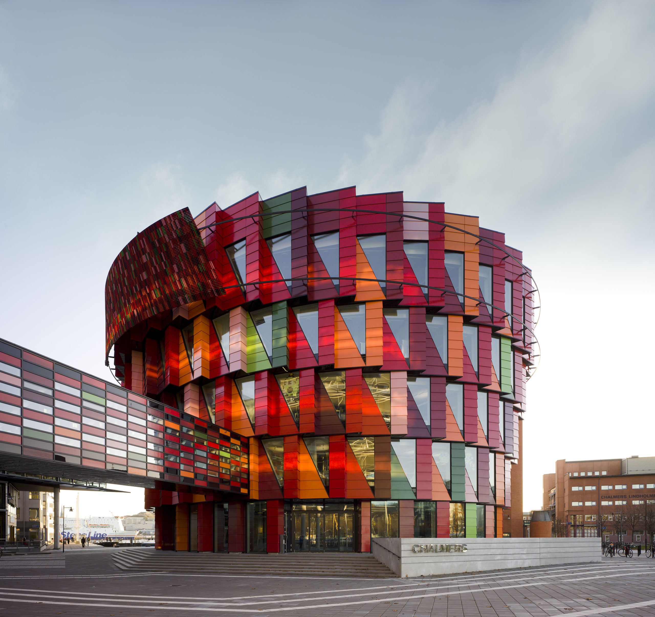
The colorful glazed terracotta panels on this university building almost make it appear as if it is in motion. The red tones are a nod to the wharves and the harbors in the region and the other tones help add dimension and contrast. The structure is shaped like a tapered cylinder to shade the lower floors and increase floor space. The upper levels of the southern portion of the building project a bit further than the others to provide more shade throughout the day. Similarly, the triangular windows emerged from lighting considerations; they are designed to draw in sunlight from the ceiling and ensure that it reaches the building’s core. Meanwhile, motion-activated lights and ventilation systems help to conserve energy.
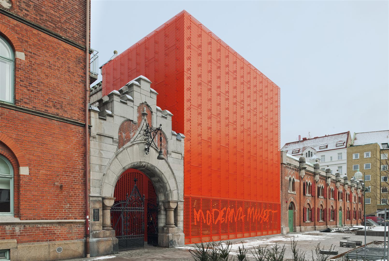
 Moderna Museet Malmö by Tham & Videgård Arkitekter, Malmö, Sweden
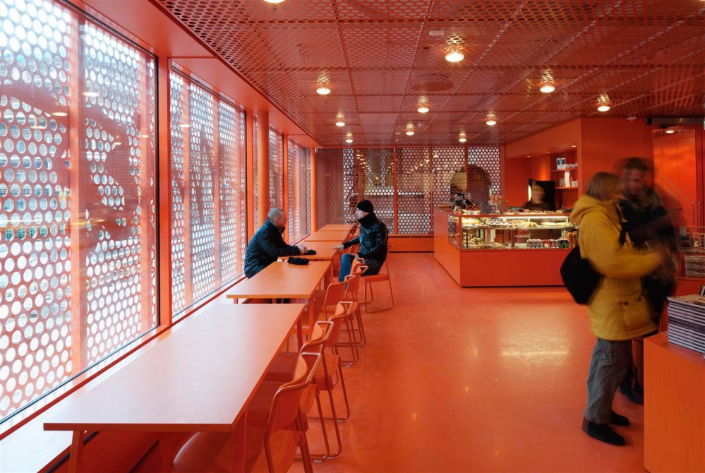
The new branch of the Swedish Museum of Modern Art stands is a remodel of an old electricity station. The remodel is marked with the addition of a bright vermillion cubical extension with a perforated façade placed right next to a traditional entrance. The larger perforations on the lower level help the museum’s sign stand out as well. The floor is glazed to filter the sunlight coming in and the same vibrant hue is painted across every surface as well as the furniture inside the café. The other exhibition spaces are painted white or other neutral tones, intentionally creating a contrast.
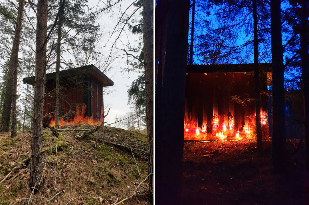
 Fire House by Ulf Mejergren Architects (UMA), Stockholm, Sweden
After the previous outhouse burned down, the architect decided to rewrite the story of its demise in the replacement design. The client’s requirement for a red shed was taken up a notch by adding recycled beads, arranged to mimic a burning blaze, on the walls. This was paired with lights to bring this composition to life. In addition to being a point of conversation, the faux fire also helps keep the deer and rabbits away. The effect produced was so realistic that the owners had to inform their neighbors that it was art and not actual fire when they called the fire brigade.
Architects: Want to have your project featured? Showcase your work through Architizer and sign up for our inspirational newsletter.

