Philippe Block on Sustainable Construction: “Building Technique Is More Important Than Materials”
The latest edition of “Architizer: The World’s Best Architecture” — a stunning, hardbound book celebrating the most inspiring contemporary architecture from around the globe — is now available. Order your copy today.
There is a quality one finds in people who really believe in what they do. It is not excitement in the voice or a twinkle in the eye. No, it is simply the fact that they are eager to explain what they do as clearly as they can. With this type, there is no space for any sort of conversational filler. Time is of the essence, and at the end of the discussion, they want to make sure, above all, that you “got” it, that you grasped their message.
The type I am thinking of is the opposite of the dissimulating salesperson who speaks with an agenda in mind. Ironically, of course, a person who believes in what they do is far more convincing than any salesperson.
In any case, this was my experience speaking with Philippe Block, a structural design researcher at ETH Zurich who is best known for his commitment to “strength through geometry,” or the idea that the mass of buildings — and with it their embodied carbon footprints — could be greatly reduced if architects were more thoughtful about load distribution. Instead of beams and flat floor plates, Block envisions a future of vaults and curves. With the right shapes, he argues, we could create high-rise buildings with far less concrete and, in many cases, almost no steel reinforcements whatsoever. And like the Gothic cathedrals he loves, these structures would stand for centuries, persisting through hurricanes, earthquakes and floods.

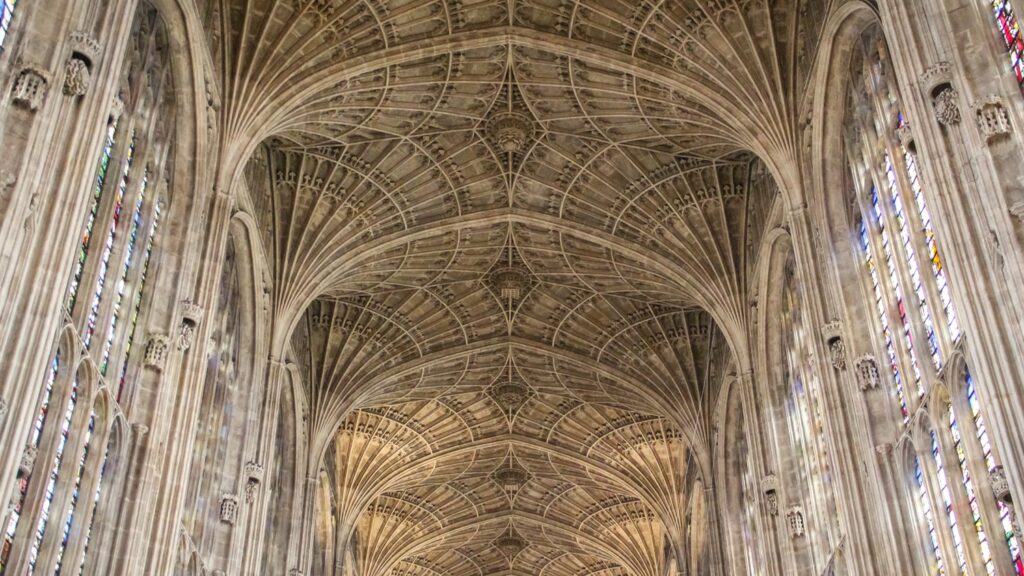
The fan-vaulted stone ceiling of King’s College chapel at the University of Cambridge, UK: fully unreinforced, standing over five centuries, and proportionally as thin as an eggshell. Photo by J. Kurt Schmidt. Used with permission from Block Research Group.
Reducing the amount of concrete used in construction would have a major impact on climate change. It is estimated that 8% of global carbon emissions are caused by the manufacture of cement, the binding agent in concrete.
Block, it must be noted, is no longer simply a researcher. He recently launched a company called VAULTED AG which produces customizable modular floor plates made from unreinforced concrete. The plates, of course, use the most sustainable concrete available on the market. But the most important aspect of them is not what they are made from, it is their shape. Due to the use of vaulting, these floor plates use 60% less concrete and 80% less steel than the standard floor plates used in the industry.
Yet they are just as strong, and can easily be used in the construction of high-density, high-rise buildings, meeting a practical need in a world with a population projected to grow by over 2 billion in the next thirty years. Geometry, Block explained, is not just about beautiful shells, opera houses and stadiums. It isn’t just for show.
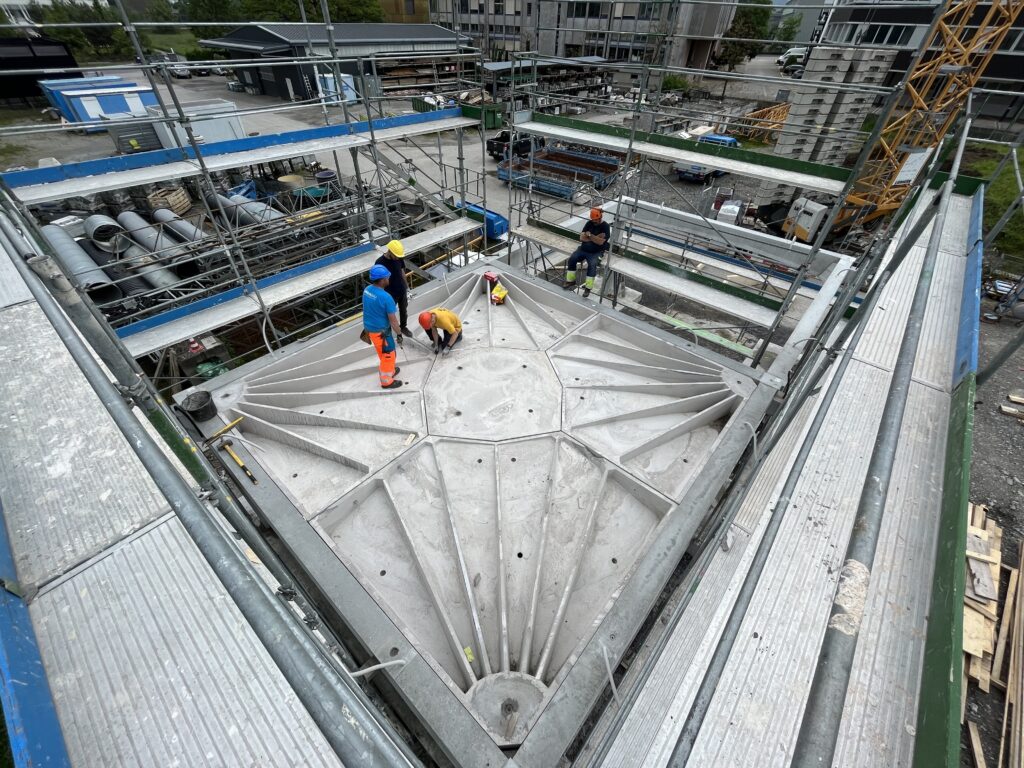
VAULTED AG commercialises a low-carbon, fully circular prefab vaulted floor, called the Rippmann Floor System (RFS), that reduces the global warming potential (GWP) compared to a flat slab in reinforced concrete by at least two-thirds. Here, workers install a Rippmann floor plate in a 10 story project in Zug, Switzerland. Photo by Gabriele Mattei, used with permission by VAULTED AG.
When I spoke to Block over Zoom, he was eager to get down to the nuts and bolts of the discussion, which ended up lasting over an hour. The questions I had prepared ended up being irrelevant, as his slideshow presentation covered all that I wanted to ask and more. It never occurred to Block that I might be interested in talking about his background or personal life. From the jump, our conversation was all about proving his thesis that geometry, or building technique, is more important than materials when it comes to sustainable construction. This, he explained, is the concept behind VAULTED AG’s revolutionary floor plates. And if this principle were widely applied, it could change the future of construction forever.
“When speaking of sustainability, so many people, in a very un-nuanced and simplistic way, talk about materials only, right?” he said, about a minute into the conversation. “Wood is good, concrete is bad. That is an absolute absurdity. It is not just about material, it’s also about how much you need, which is where structural design and optimization comes in, and then, increasingly important, the extending of resources or entire components past the first life of a building — to keep things in the loop in a circular construction economy.”
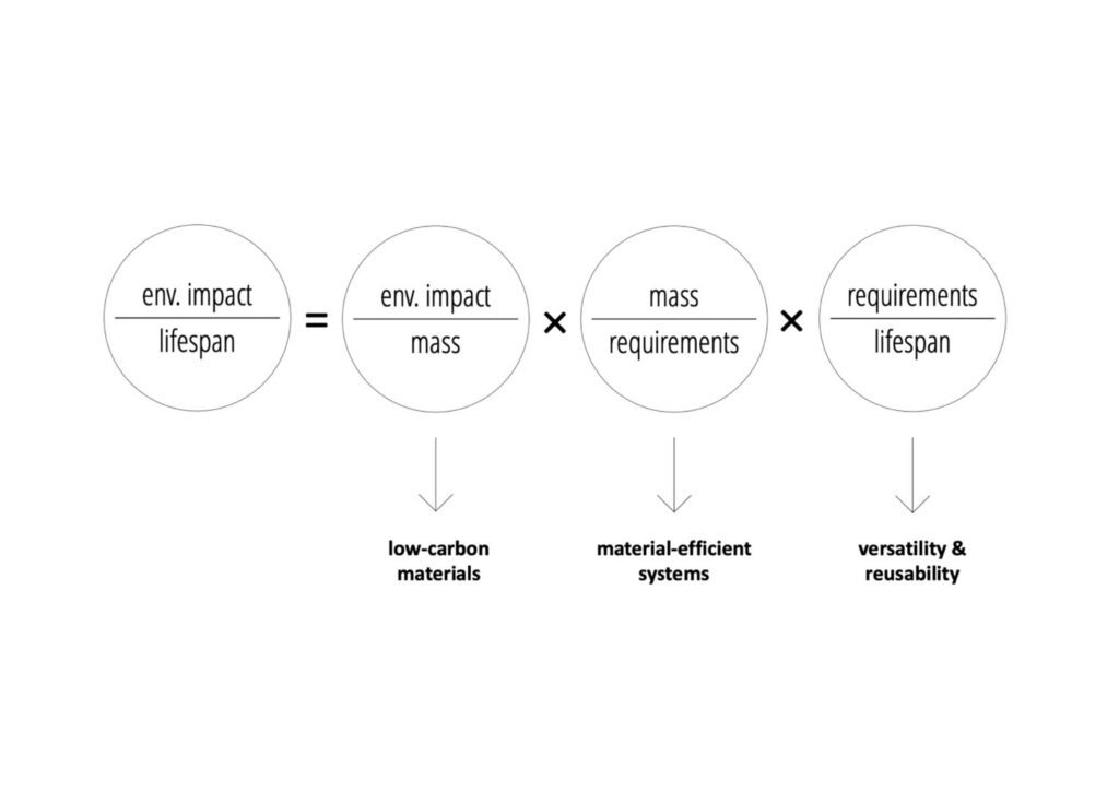
The three main levers that contribute to the environmental impact of a building or construction, focusing on embodied emissions and resources. Graphic prepared by Catherine De Wolf & Corentin Fivet. Used with permission from Block Research Group.
Here Block pulled up a graphic showing how he calculates the environmental impact over the lifespan of a building. He emphasized that his goal was not only to lower the mass of buildings, reducing the amount of carbon, but also to use forms of concrete that are recyclable, and that can be reused once a building has been demolished. Concrete used correctly, he explained, is just as sustainable as wood, especially if one takes into account the lifespan of the building and the ability for unreinforced concrete to be reused and repurposed.
At this point, Block moved to a slide of the famous fan vaulting over the nave of King’s College Chapel at the University of Cambridge, England. This structure, he explained, has stood for over 500 years. More impressive than this, the stone vaults of this structure are simply “masonry systems… just pieces of stone held together in compression. They stand because they have a good geometry while being proportionally as thin as an eggshell.”
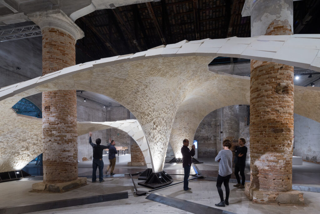
The Armadillo Vault, shown at the 2016 Venice Architecture Biennale: 399 pieces of cut stone, held together through geometry, without mortar, glue or reinforcement, using the same principles as Gothic Cathedrals and demonstrating the beauty of strength through geometry. Photo by Iwan Baan. Used with permission from Block Research Group.
Block then opened his next slide, an installation he and his team created for the 2016 Venice Architecture Biennale. “What you are looking at are 399 pieces of cut stone that are held together because of their geometry, no glue, no mortar, no reinforcement, fully dry assembled,” he explained. “So the same principles as to why the cathedrals are standing make this possible.” What struck me about this installation was just how thin the shell was. With the right geometry, a lot can be done with a small amount of materials.
Concrete, he explained, essentially behaves like stone once it is cast, so masonry principles apply to concrete construction. However, most modern buildings require massive amounts of steel-reinforced concrete because the structure is not assembled according to intelligent masonry principles. The key is to “align the structure to where the compressive forces naturally want to be,” unlike a “typical beam,” which does not offload the weight in any kind of strategic way, but simply braces the structure.
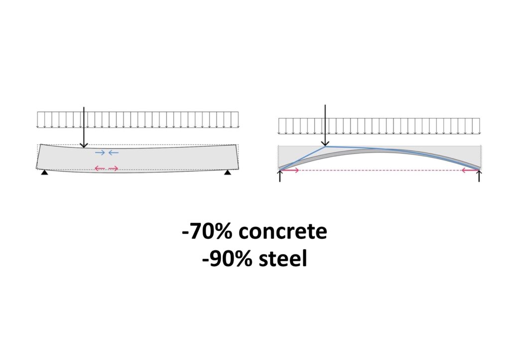
Concrete is an artificial stone, and like stone, it does not want to be a straight beam, it wants to be a masonry arch. A rib-stiffened, arched floor with tension ties uses up to 70% less concrete and 90% less steel compared to a flat slab in reinforced concrete for the same structural requirements. Graphic prepared by Block Research Group, ETH Zurich. Used with permission.
These are the principles that underlie Block’s vaulted floors, called the Rippmann Floor System or simply RFS. Aesthetically, I told Block, I really appreciated how these floors looked once installed, especially from underneath, where they can be installed to appear as beautiful vaulted ceilings. In the future, I proposed, perhaps flat roofs and ceilings will be associated with the 20th century, while geometrically informed construction will be considered a more contemporary building practice.
Block agreed, adding that there is something about these spaces that, like Gothic cathedrals, “feel good” to the visitor. One can tell that the materials are “happy,” that they are in an arrangement that “makes sense.” However, he added, he did not want to really push this point too hard. One could hang a simple flat suspended ceiling, concealing the expressive elements under thin shells. Architects who want to work with flat ceilings are still free to do so with this new system. Plates are fully customizable and easy to dry assemble on site. They are just as easy to work with as traditional floor systems; they just use drastically less material, and have a much smaller carbon footprint.
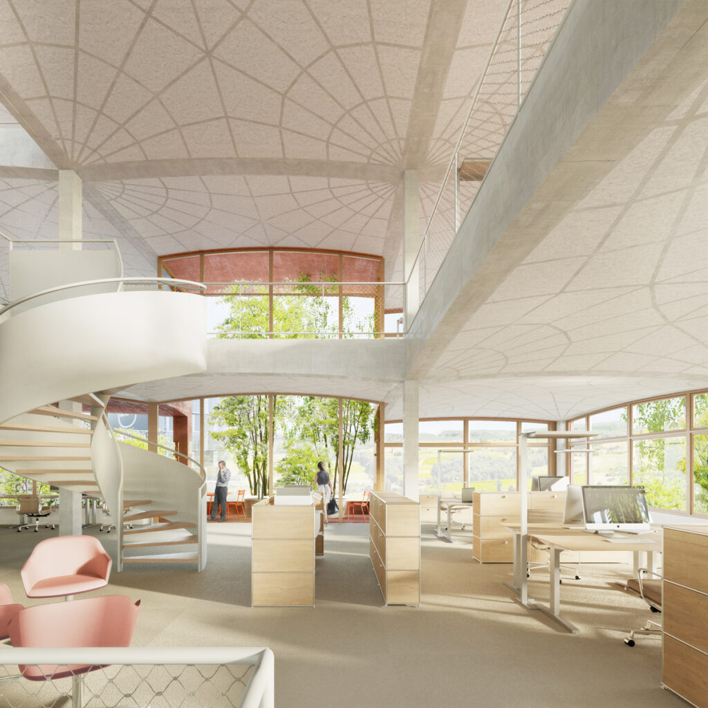
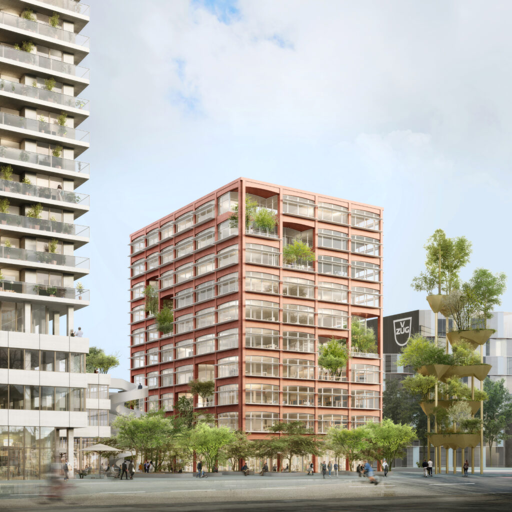
The CreaTower project in Zug, Switzerland, designed by Gigon+Guyer Architects, introduces the Rippman Floor System in a 10-story office tower. In the interior view, note the beautiful ribbed detailing on the ceiling, which makes structural elements of the flooring system visible. PONNIE images. Used with permission from Gigon+Guyer
The Rippmann Floor system is already being employed in commerical projects. In Zug, Switzerland, Gigon+Guyer is using the system for their CreaTower project, which includes a 10 story, 40 meter office tower.
I left my conversation with Block with a renewed sense of optimism about the future of architecture. Beautiful, powerful buildings need not be accompanied by a guilty conscience. With the right kind of ingenuity, we can have dense urban construction without catastrophic waste. Sustainability does not mean thinking smaller — just thinking differently. And maybe lighter…
Cover image: An early, sand-3D-printed prototype of the discrete masonry floor, which was further developed into the Rippmann Floor System. Used with permission from Block Research Group.
The latest edition of “Architizer: The World’s Best Architecture” — a stunning, hardbound book celebrating the most inspiring contemporary architecture from around the globe — is now available. Order your copy today.

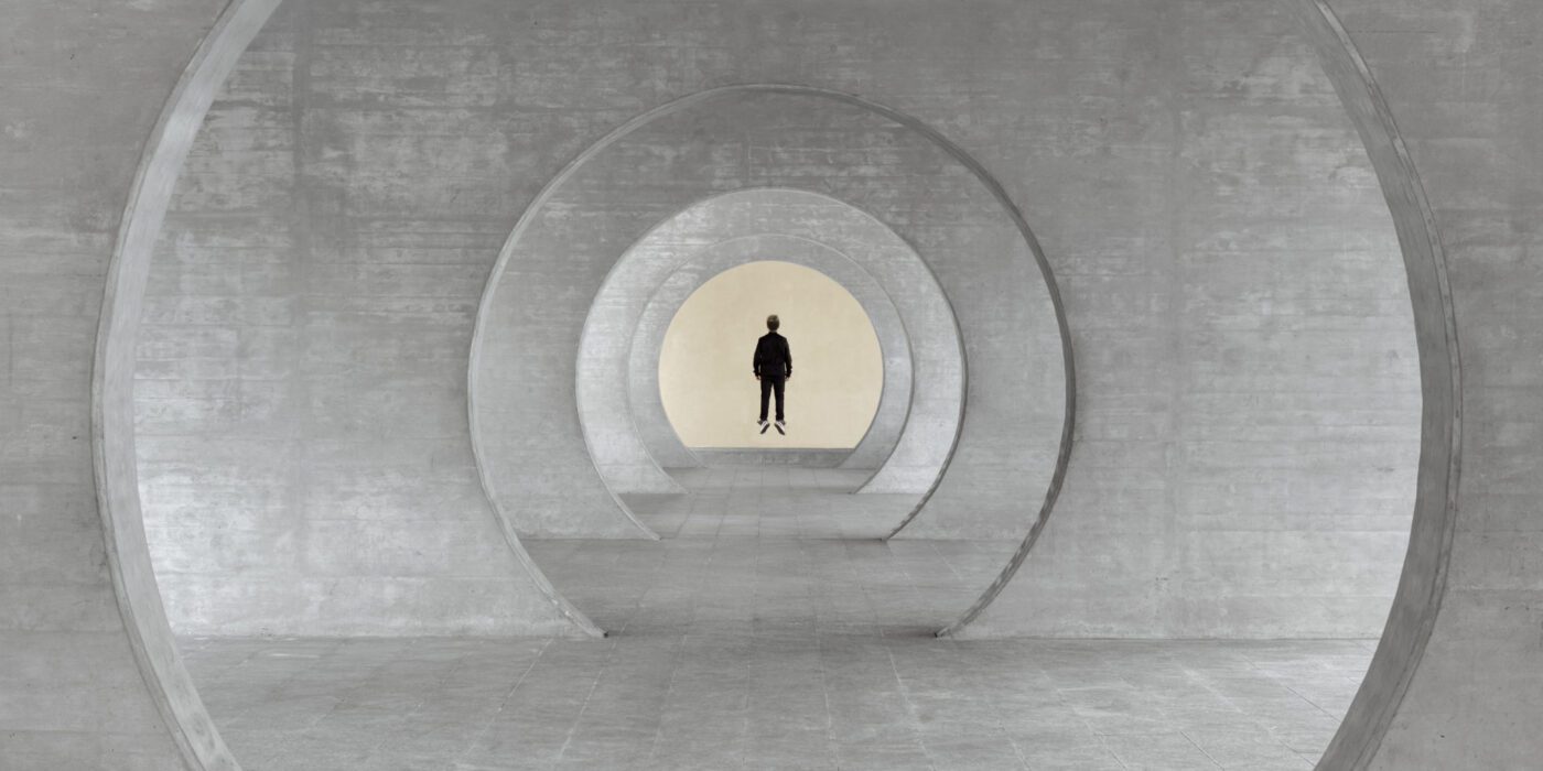
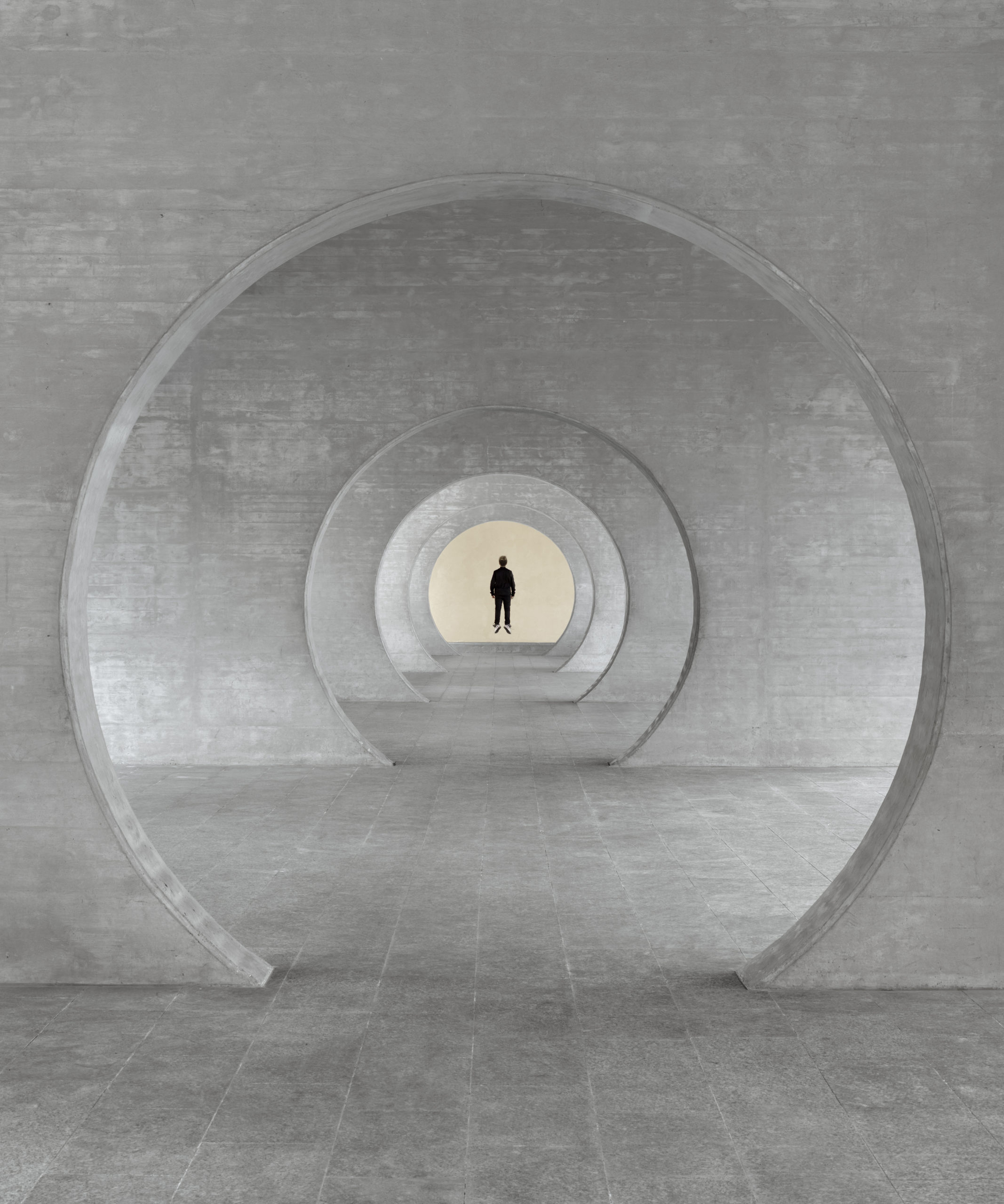 Taken in Novazzano Residential Complex in Switzerland, this work imagines the site as the residence of a superhero. The view looks through a series of circular openings and lands on the end of the space. There, a figure is floating as only a superhero can. The figure occupies the center of the composition and is backed by a warm, bright background.
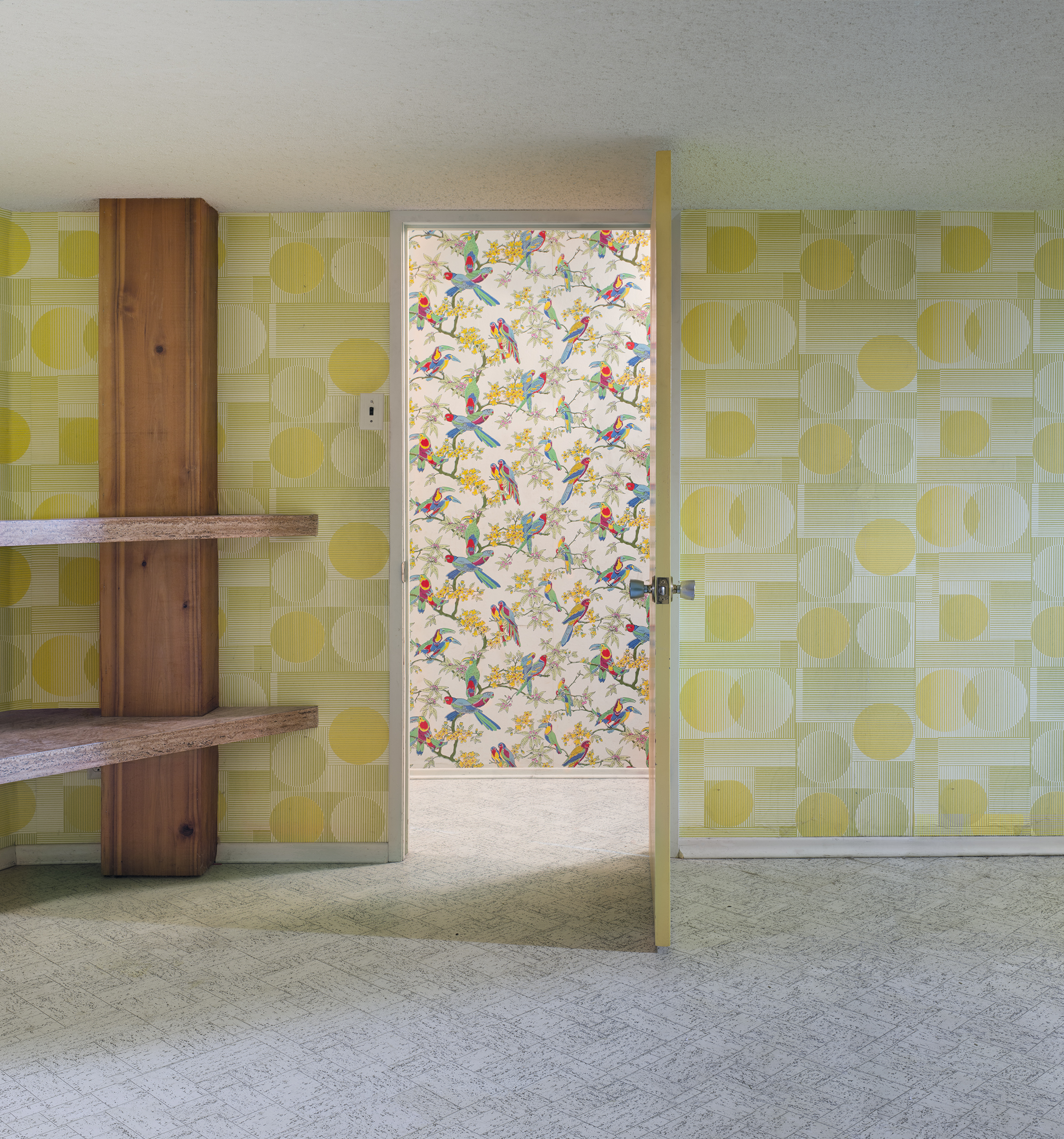 Framed by the doorway in this image is a wall covered in wallpapers depicting birds and plants. In the foreground is a darker room with abstract geometric shapes on its walls. The rather modernist patterns in the foreground contrast the nostalgic patterns behind them in terms of brightness, color schemes and the complexity of shapes.
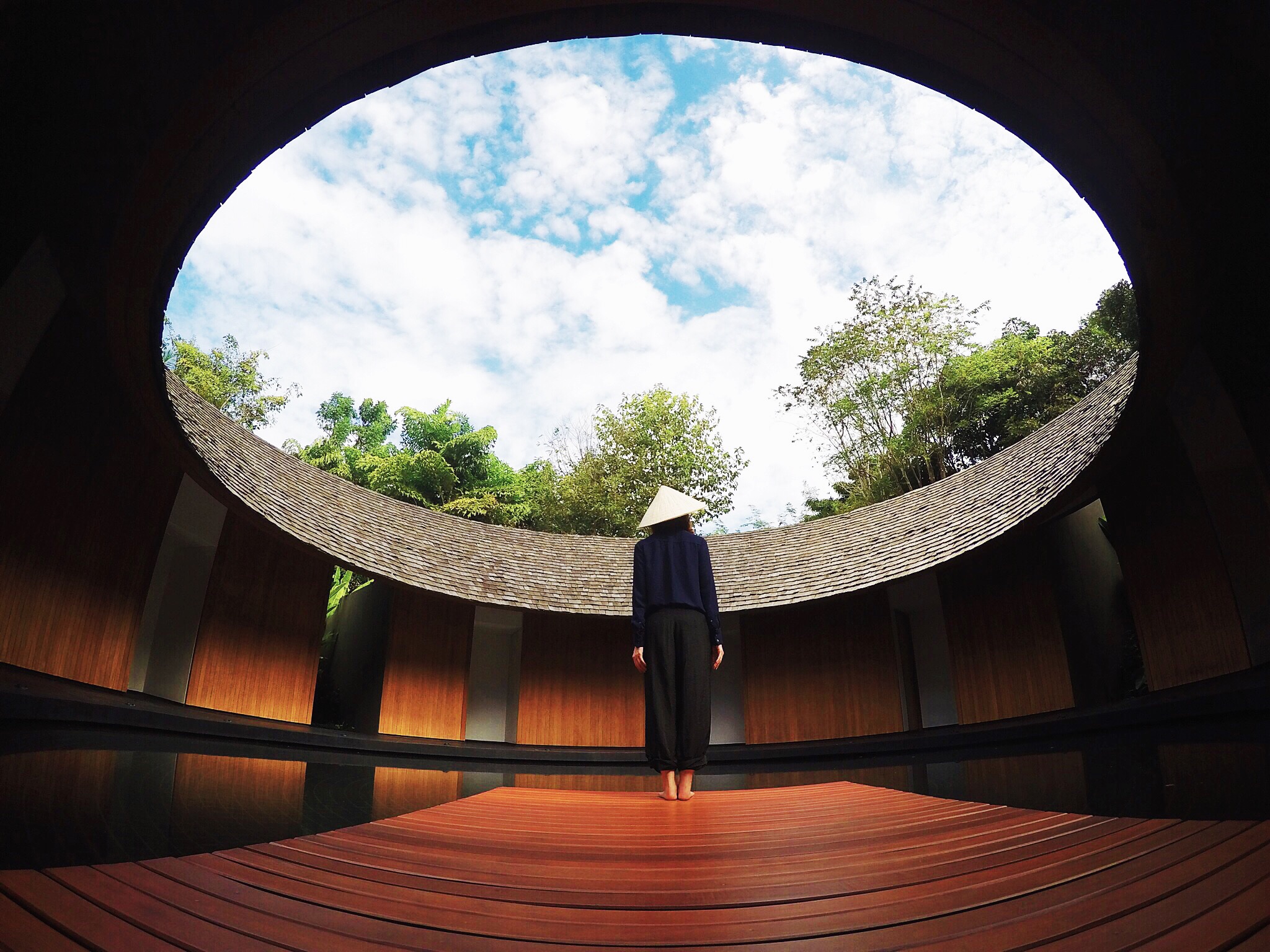 In this photo, the first thing that grabs the viewer’s attention might be the sky framed by the building’s roof. Inside and outside the frames are respectively the bright natural environment and the built environment in the roof’s shadow.
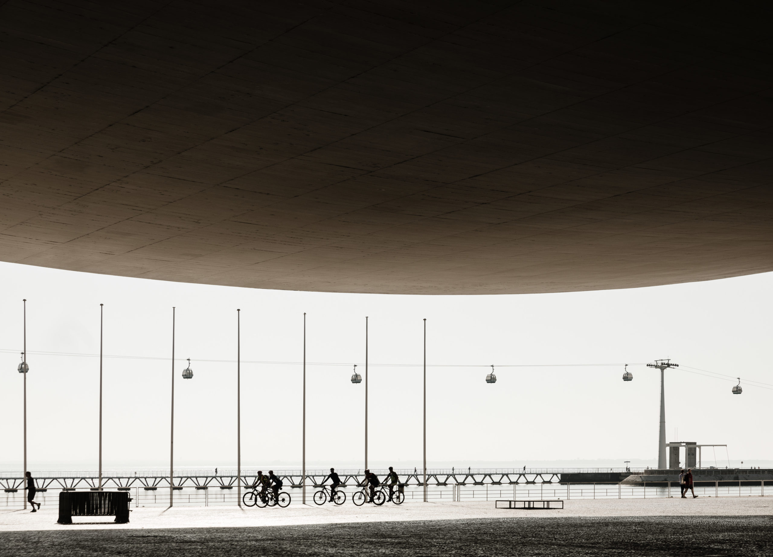 Nearly half of the image is occupied by the canopy of Álvaro Siza’s Expo’98 Portuguese National Pavilion, which reframes the image. All contents, the street, the pedestrians, the cyclists, etc, are concentrated in the lower half of the composition. The brightness of the late morning sunlight becomes a white canvas, while the shaded inner side of the canopy seems so dark that forces your view down.
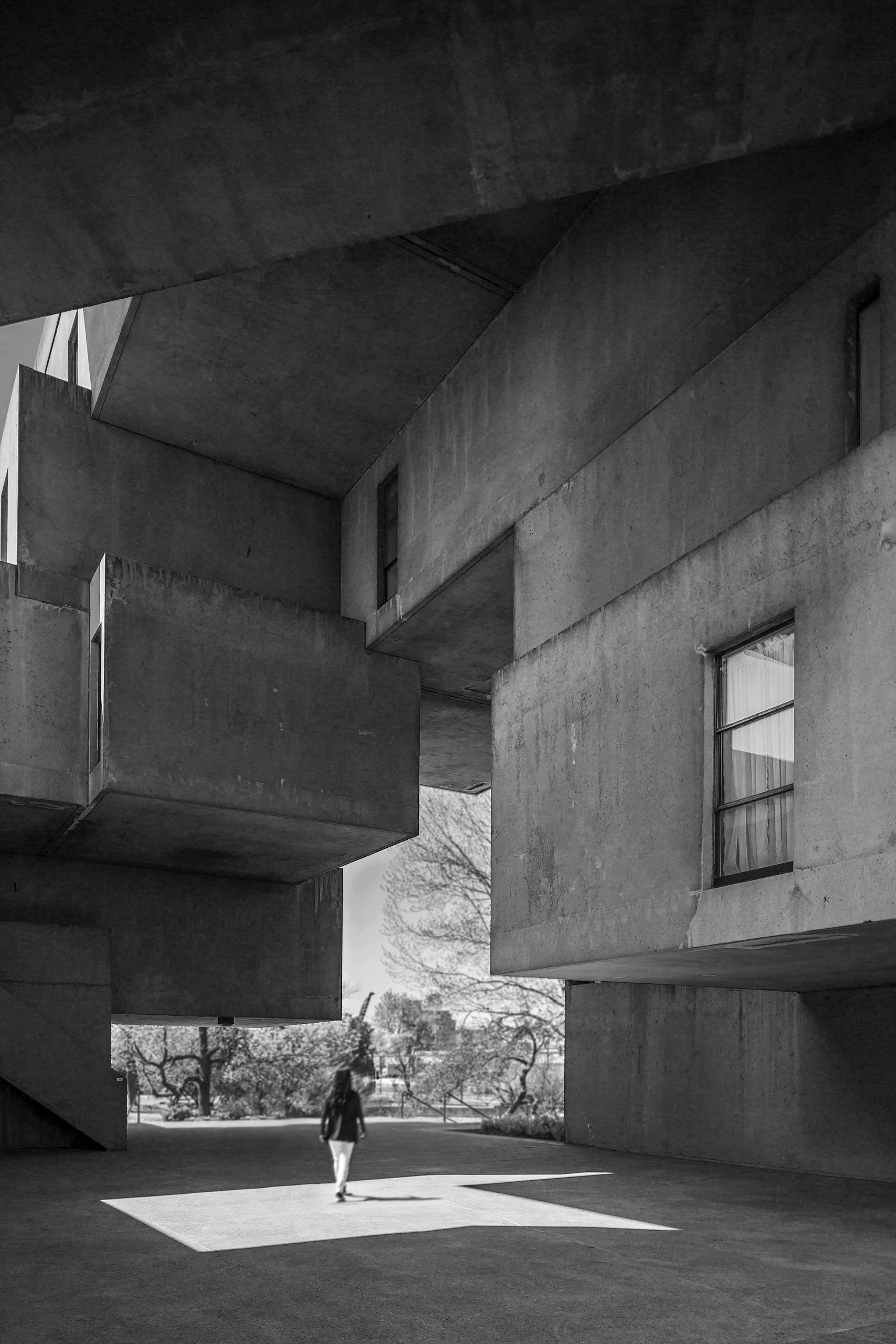 The author creates an irregular second frame with the building Habitat 67 by Moshe Safdie. Heavy concrete volumes are layered one over another, while each rectangular volume is different in length and thickness. Together, they frame the green space in the background with straight lines and clear angles, highlighting the contrast between natural and built, organic and industrial.
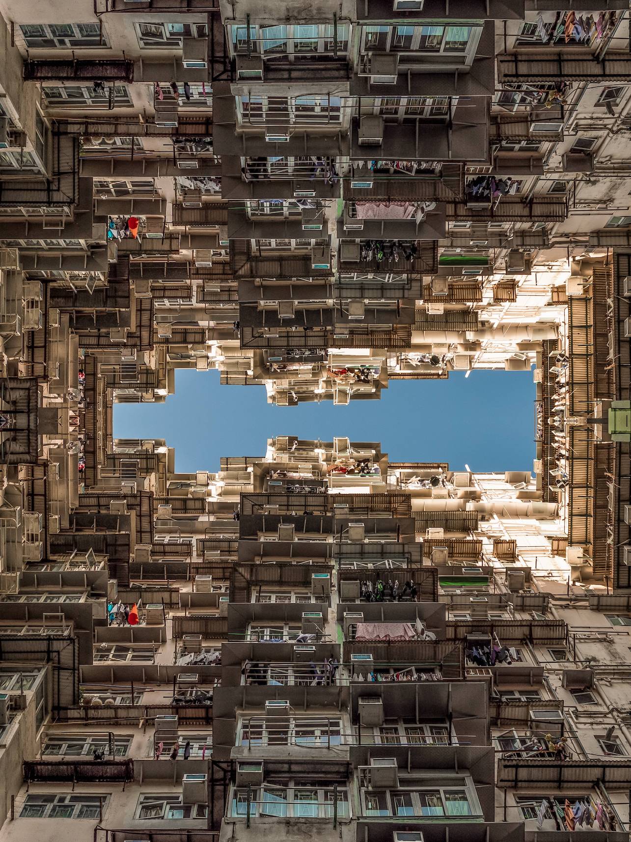 The image depicted here might be striking to those who never lived in areas of dense population. However, it is the type of view that the author grew up with. The building here is one of the government-subsidized residences for low incomes. In this photo, the sky is clear like a plain color block while buildings are rich in forms and textures. The windows are rhythmic as your view goes upwards from the bottom of the photo. The rhythm comes to a sudden end as it reaches the top of the building, where the sky frees you from the intense building surface. The photo is mirrored to form the symmetrical frame in the middle. This creates a feeling of being surrounded by buildings and multiplies the intensity of the textures.