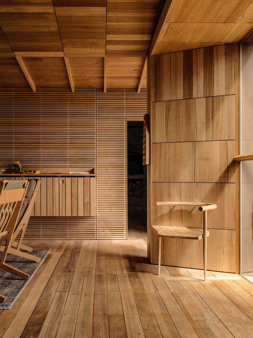
Ten mass-timber buildings that changed the way we think about wood
CategoriesSustainable News

Ten mass-timber buildings that changed the way we think about wood

As our Timber Revolution series comes to an end, we round up the 10 significant buildings that have pushed the use of mass-timber.

Starting with a small housing scheme built in rural Austria in the late 1990s and ending with an 87-metre tower completed in the USA last year, the buildings profiled in the series chart the rise of engineered wood over the past 25 years.

Here are 10 mass-timber buildings that helped to change the way we think about wood:
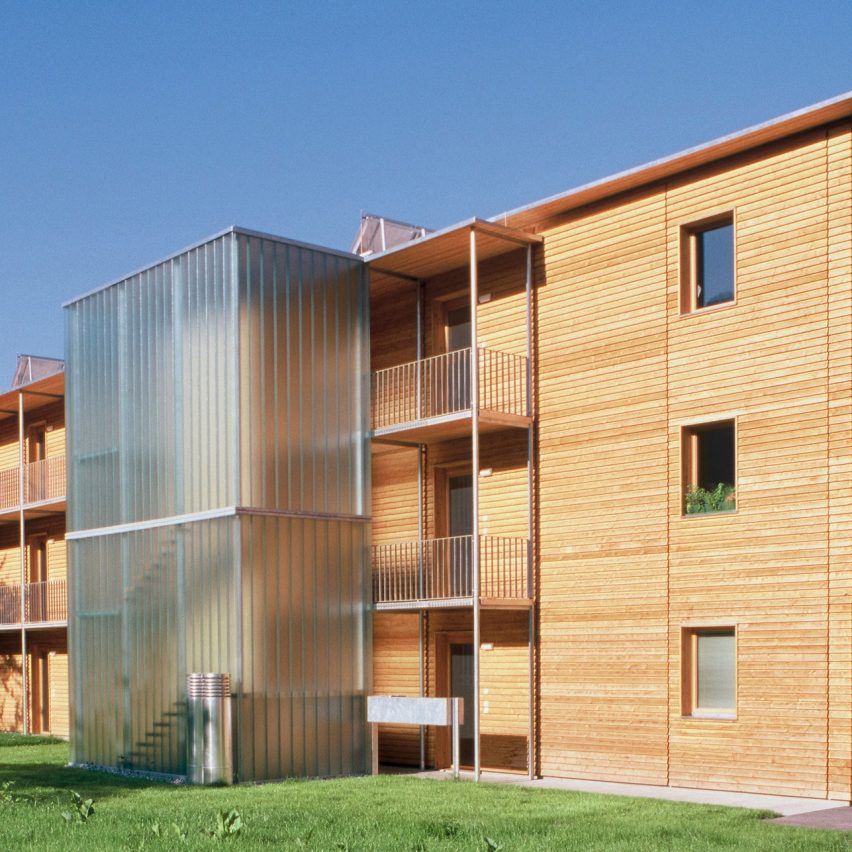

The Ölzbündt building in Austria by HK Architekten
Photo by Ignacio Martinez

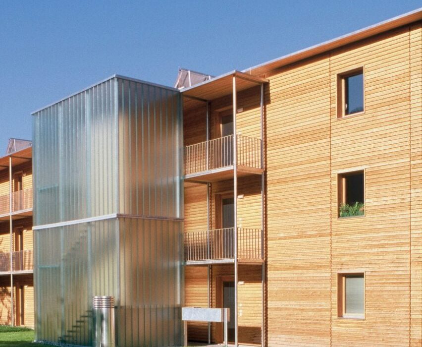
Ölzbündt, Austria, by HK Architekten (1997)

Our first case study profiled this early example of mass-timber multi-storey housing outside Dornbirn by Herman Kauffman’s studio, HK Architekten.

The three-floor block, which holds 13 homes and references traditional local houses in its design, was a prototype for a construction system that would enable multi-storey residential buildings to be made out of wood.

Find out more about Ölzbündt ›
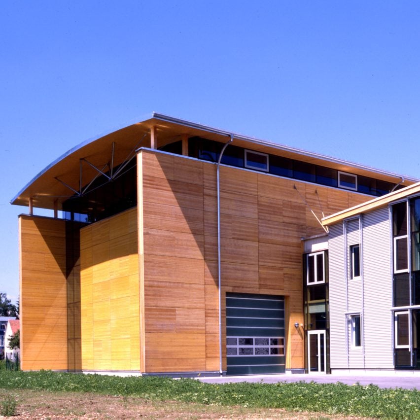

BTZ building at TU Graz
Photo by Paul Ott (also top)

BTZ at TU Graz, Austria, by Nussmüller Architekten (2001)

Much of the early research into mass timber took place in Austria, and the Bau Technik Zentrum (BTZ) at Graz University of Technology was the very epicentre of that work.

Designed by Nussmüller Architekten, the BTZ was an important mass-timber testing centre but also a significant piece of wooden architecture in itself, as one of the first examples of panel-system mass-timber construction and the first timber building with a curved roof.

Find out more about BTZ at TU Graz ›
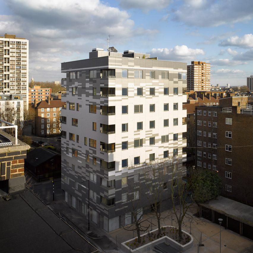

Exterior of Murray Grove by Waugh Thistleton
Photo by Will Pryce

Murray Grove, UK, by Waugh Thistleton Architects (2009)

Murray Grove, also known as Stadthaus, attracted international attention upon its completion for demonstrating that timber could be used for tall buildings.

The nine-storey residential tower in east London, designed by local studio Waugh Thistleton, has a superstructure made almost entirely from pre-fabricated cross-laminated timber (CLT).

Find out more about Murray Grove ›
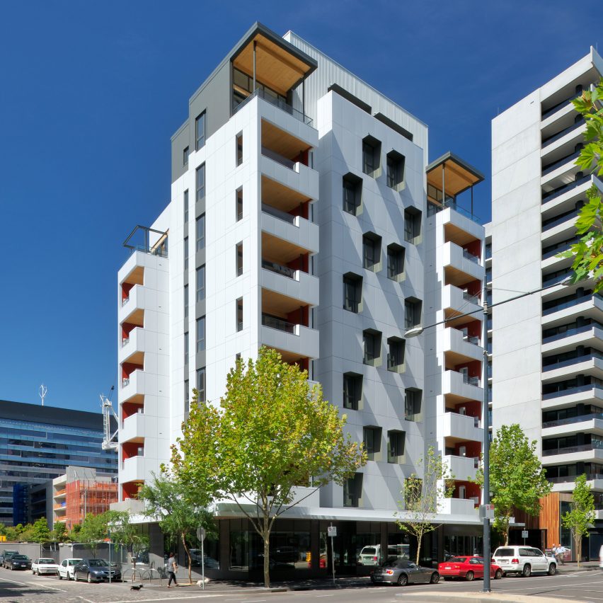

Photo of Forté
Photo courtesy of Lendlease

Forté, Australia, by Lendlease (2012)

More than 750 CLT panels were shipped all the way from Austria to Australia to construct the first mass-timber high rise down under, designed and built by developer Lendlease.

Even despite the extensive freightage, university researchers said that the 10-storey building’s environmental impact was still smaller than if it had been constructed using concrete.

Find out more about Forté ›

Tamedia Office Building by Shigeru Ban
Photo by Didier Boy de la Tour

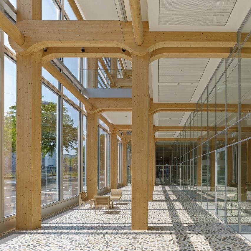
Tamedia Office Building, Switzerland, by Shigeru Ban (2013)

Japanese architect Shigeru Ban worked with Swiss engineer Hermann Blumer to devise a novel structural system for this extension to an office building in Zurich.

The pre-fabricated glued-laminated timber skeleton is held together entirely without screws or nails, instead consisting of large columns and cross-beams intersected by ovular spacer beams that lock the whole structure together.

Find out more about the Tamedia Office Building ›

T3 by Michael Green Architecture
Photo by Ema Peter Photography

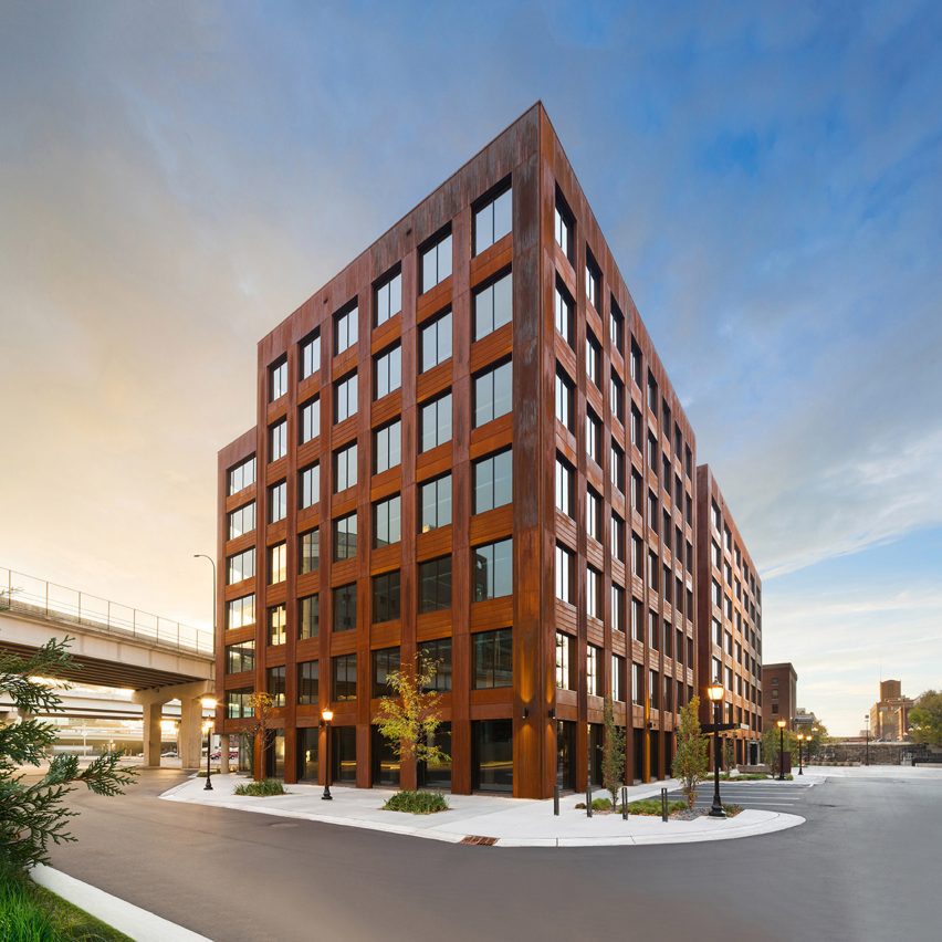
T3, USA, by Michael Green Architecture (2016)

T3 in Minneapolis, designed by Canadian office Michael Green Architecture, became the first tall wooden structure in the USA upon its completion.

Constructed using wood from trees killed by mountain pine beetles, it was intended to demonstrate to the US real-estate industry that large mass-timber projects were viable – and it worked, with 1,677 mass-timber buildings now either finished or in progress across the country.

Find out more about T3 ›

Dalston Works building by Waugh Thistleton Architects
Photo courtesy of Waugh Thistleton Architects

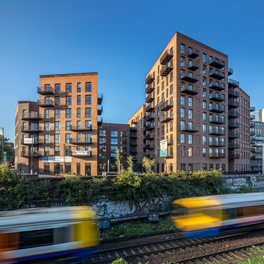
Dalston Works, UK, by Waugh Thistleton Architects (2017)

Using 3,852 cubic metres of CLT, the Dalston Works apartment complex in east London used more mass timber by volume than any other building.

Also designed by Waugh Thistleton, its external, party and core walls, as well as flooring and stairs, were made entirely from pieces of CLT – but at the request of the developer it was clad in traditional bricks to reference nearby Edwardian and Victorian buildings.

Find out more about Dalston Works ›
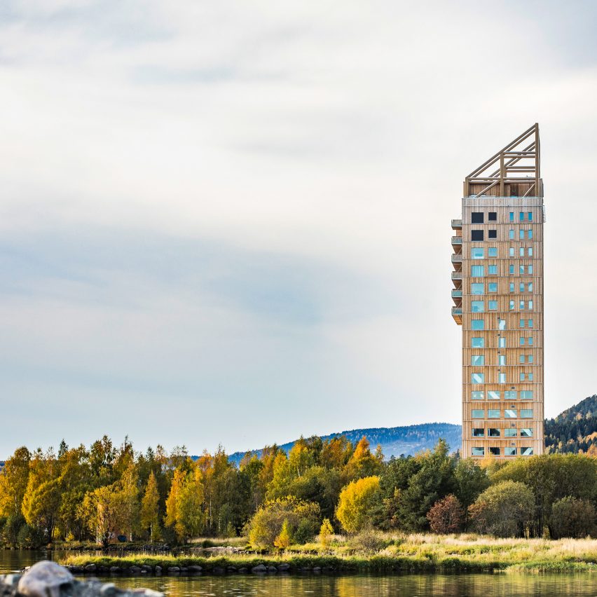

The exterior of Mjøstårnet
Photo by Ricardo Foto

Mjøstårnet, Norway, by Voll Arkitekter (2019)

Mjøstårnet is an 85.4-metre-high tower on the edge of Norway’s biggest lake constructed using wood from local spruce and pine forests.

Architecture studio Voll Arkitekter designed the project, which was the world’s tallest timber building when completed, to show that building large, complex structures out of wood is possible.

Find out more about Mjøstårnet ›
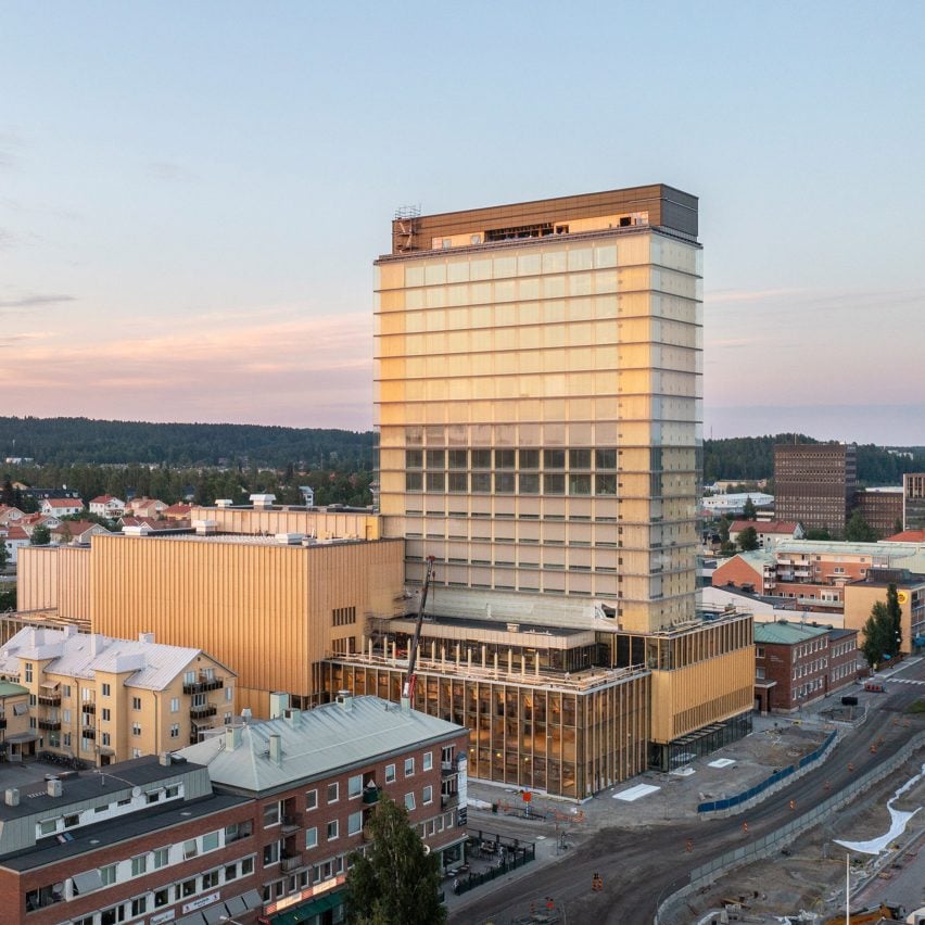

Exterior of Sara Kulturhus Centre
Photo by Patrick Degerman

Sara Kulturhus Centre, Sweden, by White Arkitekter (2021)

White Arkitekter’s Sara Kulturhus Centre is a 20-storey mass-timber building just below the Arctic Circle in the Swedish city of Skellefteå.

The vast quantities of wood used in its structure are estimated to store 9,000 tonnes of carbon dioxide – double the amount thought to have been emitted during construction, meaning the studio claims the building will be carbon negative over its lifetime.

Find out more about the Sara Kulturhus Centre ›


World's tallest timber tower Ascent
Photo courtesy of Korb + Associates Architects

Ascent, USA, by Korb + Associates Architects (2022)

The final case study featured in the Timber Revolution series is Ascent in Milwaukee, Wisconsin, currently the world’s tallest mass-timber building at 86.6 metres – though likely not for much longer.

Rather than its height, Korb + Associates Architects believes the residential project’s true significance is the collaborative model devised for working with city officials to achieve regulatory sign-off.

Find out more about Ascent ›


Timber Revolution logo
Illustration by Yo Hosoyamada

Timber Revolution

This article is part of Dezeen’s Timber Revolution series, which explores the potential of mass timber and asks whether going back to wood as our primary construction material can lead the world to a more sustainable future.

Reference

Ten interiors featuring natural materials and timeless accents
CategoriesInterior Design

Ten interiors featuring natural materials and timeless accents

For this special lookbook sponsored by Danish design company D Line, we’ve selected ten interiors that showcase architectural details by the brand including door handles, taps and drawer pulls.

Door furniture and other pieces of practical hardware provide the finishing touches to interior schemes, and can create physical touchpoints that play a significant role in how people interact with the spaces they inhabit.

D Line has been designing and manufacturing architectural hardware and sanitary ware since 1971. Collaborators include Danish architects Knud Holscher and Arne Jacobsen and British designer Tom Dixon.

Here are 10 projects where D Line’s products have been used to add timeless accents to interiors with natural materials, including homes, hotels, restaurants and even a medical facility.


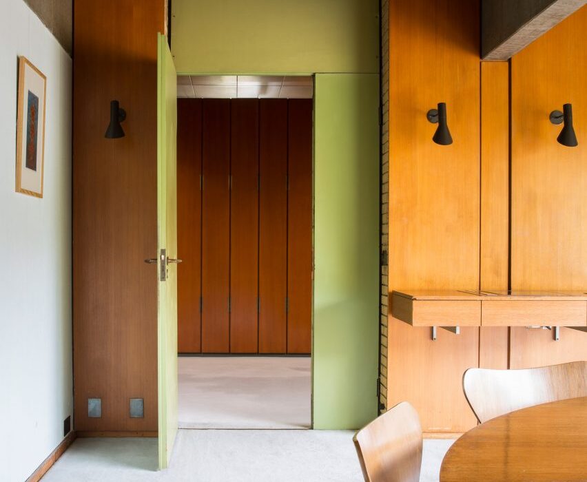
Photograph showing room with wood panelling and green wall
Photo is by Jonas Bjerre Poulsen

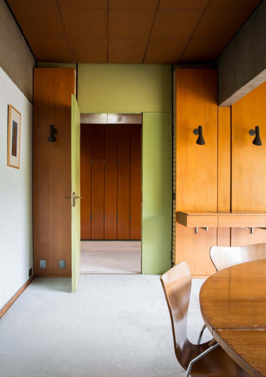
St Catherine’s College, Oxford, by Arne Jacobsen and Knud Holscher

Jacobsen designed the modernist concrete exterior as well as the interior and furnishings of St Catherine’s College at the University of Oxford, which opened in 1962.

Details as small as the handles on the interior doors – named AJ lever handles in reference to the designer’s initials – echo the curved, smooth form of the college’s larger design elements.


Äng restaurant by Norm Architects
Photo is by Jonas Bjerre Poulsen

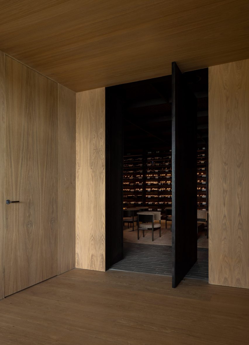
Äng restaurant, Sweden, by Norm Architects

Danish studio Norm Architects has designed Äng, a restaurant in Sweden with both an above-ground structure resembling a greenhouse and a subterranean wine cellar.

D line’s distinct L lever handle in a gunmetal finish was used on doors throughout both spaces, where it matches other metal lighting fixtures as well as the building’s structural components.

Find out more about Äng restaurant ›


Photograph showing room with white door and light blue walls
Photo is courtesy of Norm Architects

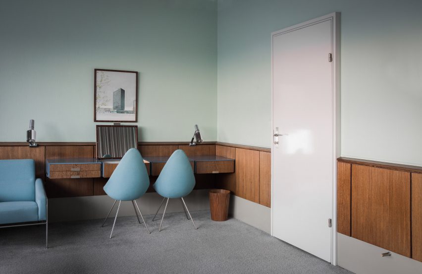
SAS Royal Hotel, Copenhagen, by Arne Jacobsen

Another project by Jacobsen, who designed all the elements found in the SAS Royal Hotel in Copenhagen – which opened in 1960 – in line with his all-encompassing approach to architecture and interior design.

Subsequent remodelling means that only Room 606 remains in its original form. Here, steel AJ lever handles were chosen to tie in with the cool duck-egg blue walls and other silver hardware, such as the frame of the blue seats and sofa.

Find out more about SAS Royal Hotel ›


Photograph of neutral toned living area with large cone shaped lamp shade
Photo is by Jonas Bjerre Poulsen

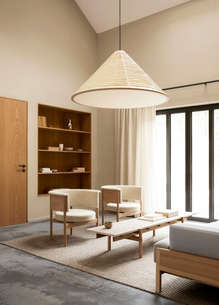
Archipelago House, Sweden, by Norm Architects

This holiday home by Norm Architects is situated in a coastal area of Sweden and combines Scandinavian design with Japanese aesthetics.

The L lever handle in charcoal from D line’s Holscher range provides a steady rhythm of graphic contrast in the interior, which primarily uses light wood furnishings and bright neutral finishes.

Find out more about Archipelago House ›


View through coastal dwelling onto sea
Photo is courtesy of Rubow Architects

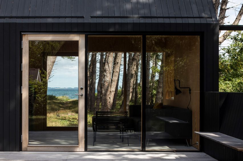
Private Summer Residence, Denmark, by Rubow Architects

Designed by Danish studio Rubow Architects, this holiday home in Denmark aims to blend in with its surroundings by using neutral tones and floor-to-ceiling windows that allow natural light and views of nature into the house.

The L lever handle provides an unobstructive finish to the house’s doors and helps give the house its indoor-outdoor feel.


Neutral interior with mismatched furniture
Photo is by Enok Holsegård

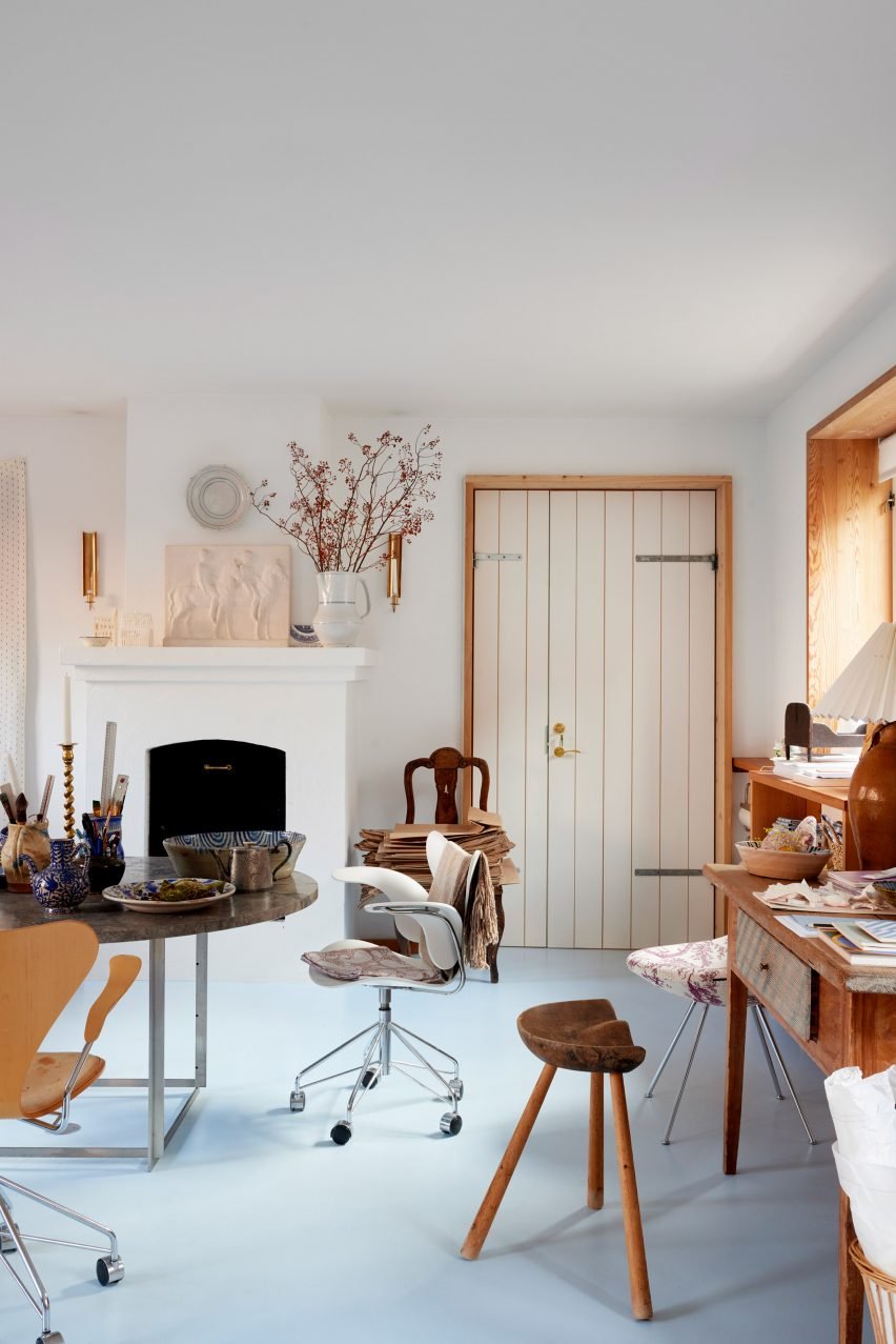
Barbara’s atelier, Copenhagen, by Barbara Bendix Becker

Textile designer Barbara Bendix Becker’s Copenhagen-based antiques and collectibles atelier is full of Nordic ceramics, lighting and furniture by celebrated Scandinavian designers.

The brass Arne Jacobsen lever handle features alongside these other design classics and has been seamlessly integrated with other warm-toned metal finishes, as well as the atelier’s honey-coloured wooden elements.


Photograph of bathroom with bath below long window
Photo is courtesy of MTJ Studio

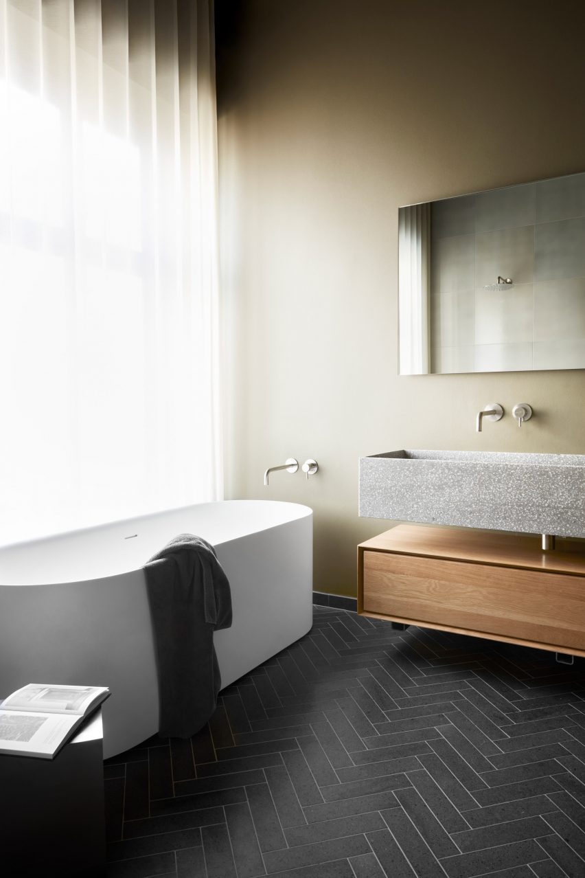
Stockholmsgade bathroom, Copenhagen, by Emil Thorup

This bathroom scheme created by interior designer Emil Thorup is characterised by its rhythmic herringbone tile floor, muted sage-coloured walls and round-cornered, freestanding bathtub.

D-line’s Qtoo bathroom hardware collection in a subtle brushed-steel finish was used for part of the bath, sink and shower setup, and creates a nice metallic contrast to the pale green walls and natural materials used in the room.


Dentology+ by Norm Architects
Photo is by Jonas Bjerre Poulsen

Dentology+ clinic, Antwerp, by Norm Architects

Norm Architects went against the grain with the design of this dental surgery, which avoids overtly clinical interiors in favour of soft neutral finishes that encourage calmness in patients.

Charcoal-toned L lever handles punctuate the otherwise light and airy interior, alongside unexpected homely details like low-slung sofas and translucent draped curtains.

Find out more about Dentology+ clinic ›


Kitchen island with red handles in front of tall curtains
Photo is courtesy of &Shufl

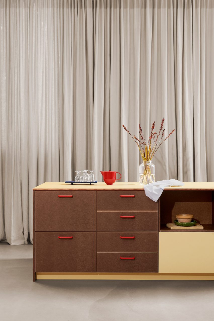
&Shufl x D Line collaboration

Danish design company &Shufl provides carpentry and hardware elements that are compatible with IKEA kitchens, bathrooms and wardrobes to give existing schemes a facelift.

D Line’s bar handles, which have featured in its catalogue for over 50 years, are used for the &Shufl designs, where they come in a curated palette of different colours and finishes.


Neutral room with light wood clad door
Photo is by Luke Arthur Wells

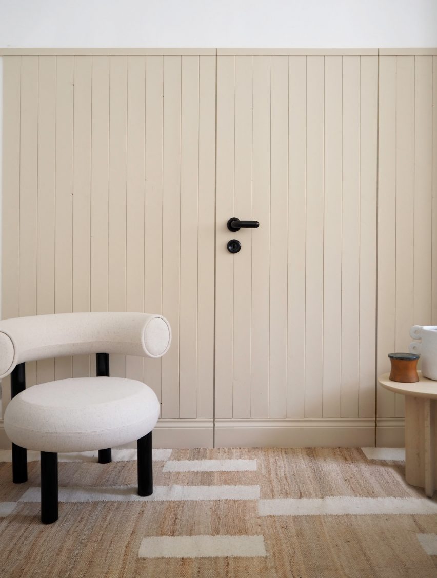
Luke Arthur Wells x Fat collection by Tom Dixon

British interior designer Luke Arthur Wells devised an interior scheme that encourages peacefulness by using rounded furniture, handmade ceramics and soft floor coverings.

D Line’s FAT lever handle – part of a wider collection by Dixon – is shorter, thicker and more rounded than traditional door furniture and further softens the already gentle interior.


This is the latest in our series of lookbooks providing curated visual inspiration from Dezeen’s image archive. For more inspiration see previous lookbooks showcasing sociable split-level living spaces, subtly installed lifts, cosy cabins and opulent hotels.

This lookbook was produced by Dezeen for D line as part of a partnership. Find out more about Dezeen partnership content here.

Reference

Ten Tokyo apartments with minimalist interior designs
CategoriesInterior Design

Ten Tokyo apartments with minimalist interior designs

Cleverly concealed kitchens and subtle wooden accents feature in our latest lookbook, which collects Tokyo apartments characterised by minimalist and serene interiors.

These apartments in Japan’s capital are united by their muted colours and an abundance of wood – elements often associated with traditional Japanese interior design.

As one of the world’s most densely populated cities, Tokyo homes often feature smaller floor plans or less natural light than those located in more spacious cities.

Architects and designers have created plenty of understated solutions to these restrictions, such as inserting space-saving storage into open-plan living areas.

From a flat informed by traditional Kyoto townhouses to an Airbnb dressed in subtle geometric furniture, here are 10 Tokyo apartments with minimalist interior designs.

This is the latest in our lookbooks series, which provides visual inspiration from Dezeen’s archive. For more inspiration see previous lookbooks featuring concrete bathrooms, cosy cabins and homes with elevators.


Norm Architects and Keiji Ashizawa's minimalist interior design
Image is courtesy of Norm Architects and Keiji Ashizawa Design

Kinuta Terrace by Norm Architects and Keiji Ashizawa Design

Two apartments within Tokyo’s 1980s-designed Kinuta Terrace apartment block were renovated by Norm Architects and Keiji Ashizawa Design to include more natural light.

The studios reconfigured the floor plans to form fewer but larger living spaces, which are characterised by smooth concrete, timber fixtures and sheer sandy-hued curtains.

“Nature feels integrated into the apartment from most rooms so that, when looking out into the courtyard, you can’t quite tell you’re in a city as immense as Tokyo,” said Norm Architects designer Frederik Werner.

Find out more about these Kinuta Terrace apartments ›


Minorpoet applies traditional Japanese design to a renovated apartment in Tokyo
Photo is by Satoshi Shigeta

Apartment in Kitasando by Minorpoet

This 1960s apartment contains a sleek kitchen counter and storage space concealed behind folding doors informed by traditional Japanese screens known as Byōbu.

Design studio Minorpoet took cues from traditional Kyoto townhouses for the project, which features a hidden kitchen that cannot be seen from the living room.

Minimalist furniture and finishes match the pared-back theme, including iconic Finnish architect Alvar Aalto’s stackable wooden 60 stool.

Find out more about Apartment in Kitasando ›


Shibuya Apartment 201,202 by OgawaArchitects
Photo is by Kaku Ohtaki

Airbnb apartments by Hiroyuki Ogawa Architects

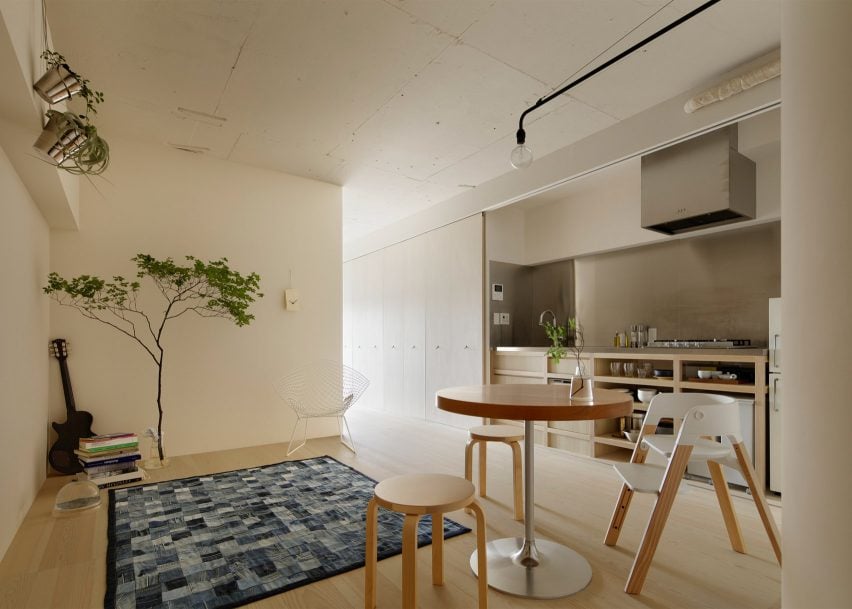
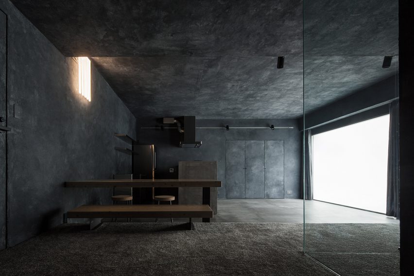
Local studio Hiroyuki Ogawa Architects renovated two Airbnb apartments in Tokyo’s Shibuya ward with completely contrasting designs. One has floors and walls clad in light wood (main image), while the other pairs a plush grey carpet with dark plasterwork.

Neon lighting in the latter apartment was chosen to remind guests of the bustling city while cork stools, metallic kitchen cabinetry and charcoal-toned accents create a moody atmosphere.

Find out more about these Airbnb apartments ›


The Life concept apartment by I IN
Photo is by Tomooki Kengaku

The Life concept apartment by I IN

The Life concept apartment is an understated residence set within a 1980s building by Tokyo design firm I IN. According to the studio, the project was created to encourage people to rethink renovated apartments in Japan, rather than favour newbuilds.

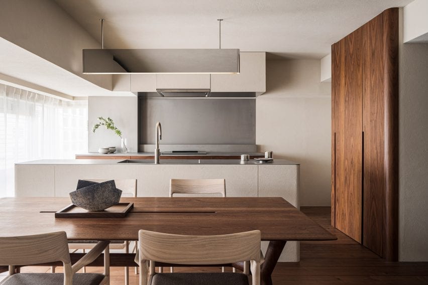
An open-plan living space contains a kitchen, living room and bedroom characterised by reeded glass partitions, stucco walls and luxurious red walnut joinery.

Find out more about The Life concept apartment ›


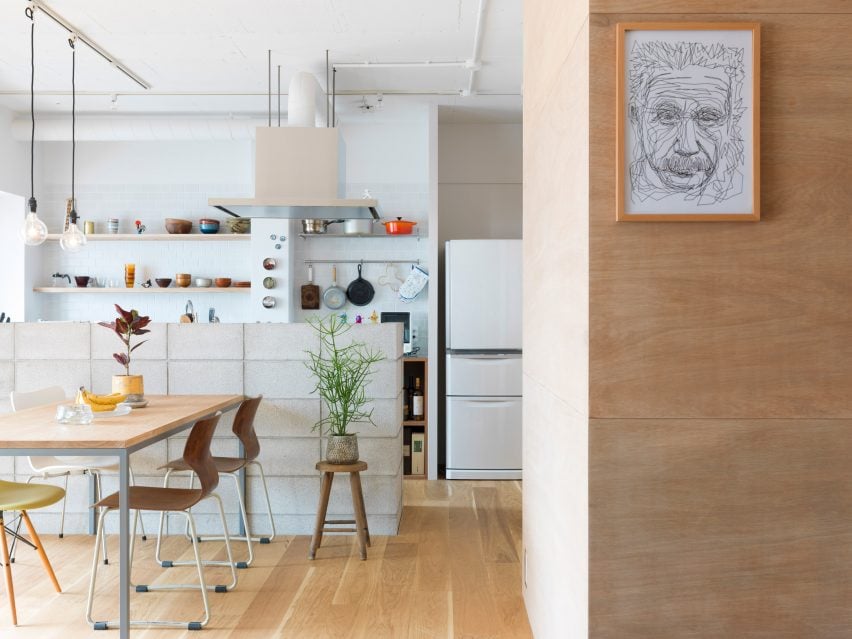
Apartment by FrontOfficeTokyo
Photo is by Toshiyuki Yano

Akasaka apartment by FrontOfficeTokyo

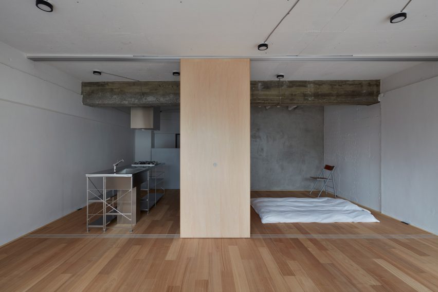
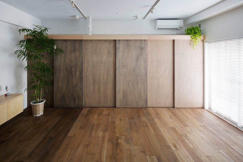
Almost all of the walls within this 50-square-metre flat were replaced with multi-functional box units and sliding partitions to make the space feel bigger and brighter.

Local studio FrontOfficeTokyo stripped the apartment down to a single room, which features designated zones to lounge, cook, eat and sleep.

Raw and simple materials emphasise the utilitarian interior design, including exposed ceilings, pale timber floors and a corner bathroom contained in a concrete box.

Find out more about this apartment ›


Tokyo apartment by Snark Architectures
Image is courtesy of Snark Architectures

House in Chofu by Snark Architectures

Snark Architectures renovated an apartment in Chofu – a city to the west of downtown Tokyo. Located at the base of Mount Takao, the dwelling intends to mirror traditional cabins.

With an open-plan layout that references mountain huts, House in Chofu is characterised by lauan plywood cabinetry and floor-to-ceiling glazing that offers views of the surrounding scenery.

“The house is the base camp connecting mountains and cities,” Snark Architectures director Yu Yamada told Dezeen.

Find out more about House in Chofu ›


Tokyo apartment by G Studio Architects
Image is courtesy of G Studio

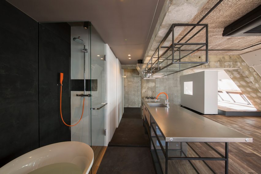
Tokyo Loft by G Studio Architects

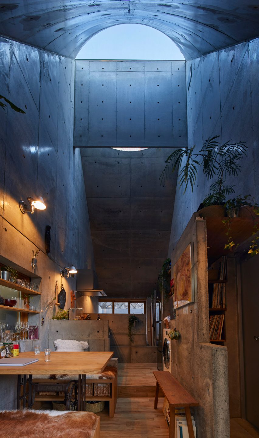
Located on one of the top floors of a 1980s housing block, Tokyo Loft is short-term accommodation that intends to balance home comforts with industrial finishes.

G Studio worked with architects Teruya Kido and Suma-Saga-Fudosan to complete the interior look, which includes original sloping concrete walls that were illustrated with splashes of white paint in a nod to traditional Japanese washi paper.

Rows of skylights were added to the walls to flood the apartment with natural light, while bright orange electrical wires and plumbing features were left exposed. A freestanding bathtub adds a playful touch to the main living space.

Find out more about Tokyo Loft ›


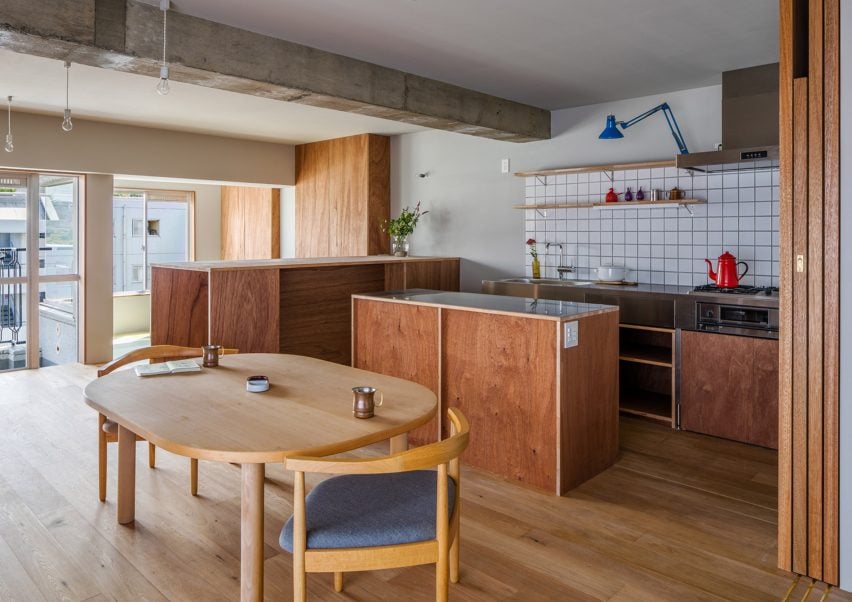
J House by Domino Architects
Photo is by Domino Architects

J House by Domino Architects

Wooden panelling creates “corners, blind spots and niches” in J House – a pared-back apartment renovated to maximise restricted floor space for a growing family.

Japanese studio Domino Architects used low-cost exposed plywood for its simplicity, while rough concrete in the kitchen adds to the dwelling’s minimalist interior design.

Find out more about J House ›


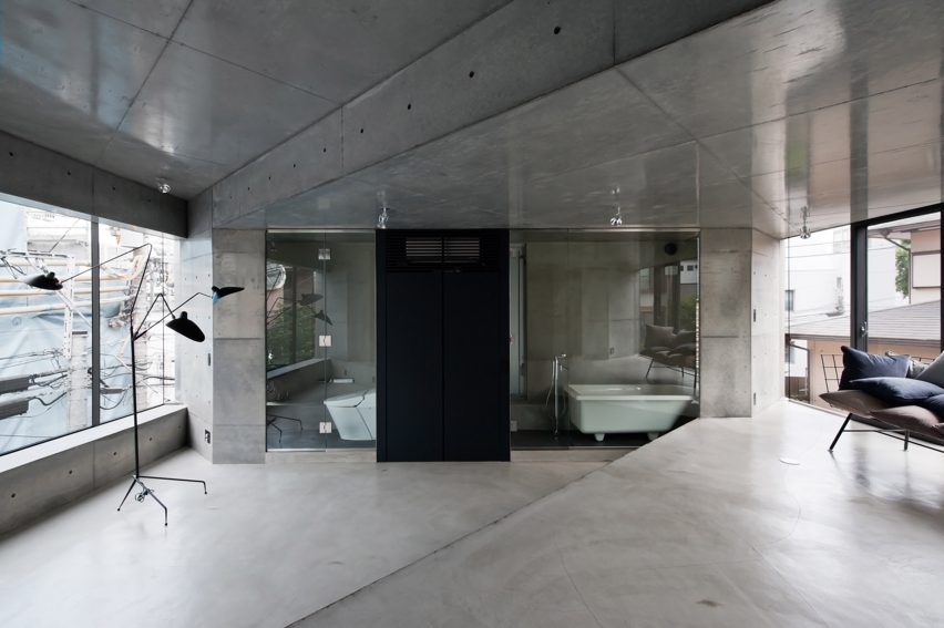
Motoazabu Apartment sYms
Photo is by Shigeo Ogawa

Motoazabu Apartment sYms by Kiyonobu Nakagame Architect & Associates 

Diagonally stepped floors and ceilings create a dynamic layout of triangular zones within a pair of apartments in Tokyo’s Motoazabu neighbourhood.

Smooth, understated concrete defines the central interior spaces, which are surrounded by kitchen worktops and glazed bathrooms.

“What we aimed to do with this structure was to create something that would blend with its surroundings and maintain absolute simplicity,” explained architect Kiyonubu Nakagame.

Find out more about Motoazabu Apartment sYms ›


Opera apartment
Image is courtesy of Taka Shinomoto and Voar Design Haus

Opera Apartment by Taka Shinomoto and Voar Design Haus

A material and colour palette influenced by the different shades of an Opera cake – a famed French dessert – informed the “layered” coffee-hued interiors in this apartment.

The hallway features sliding geometric cupboard doors stained in various shades of brown while a mixture of glossy, matte and textured coatings cover the white walls.

Find out more about Opera Apartment ›

This is the latest in our lookbooks series, which provides visual inspiration from Dezeen’s archive. For more inspiration see previous lookbooks featuring concrete bathrooms, cosy cabins and homes with cleverly designed lifts.

Reference

Ten Spanish apartment renovations characterised by eclectic tiles
CategoriesInterior Design

Ten Spanish apartment renovations characterised by eclectic tiles

For our latest lookbook, we have collected 10 apartments in Spain that have been brought to life using decorative tiles, from preserved 20th-century features to speckled contemporary terrazzo grout.

Known for its abundance of colourful tiles, Spain has many period apartments with original details including ornate archways and eclectic tiling.

The following architecture and interior design studios have made the most of these traditions when renovating homes, which often involved refreshing the homes’ interiors while maintaining their history, or adding contemporary elements that nod to the past.

This is the latest in our lookbooks series, which provides visual inspiration from Dezeen’s archive. For more inspiration see previous lookbooks featuring statement carpets, pop-up shops and homes with sliding doors.


Yurikago House by Mas-aqui
Photo is by José Hevia

Yurikago House, Barcelona, by Mas-aqui

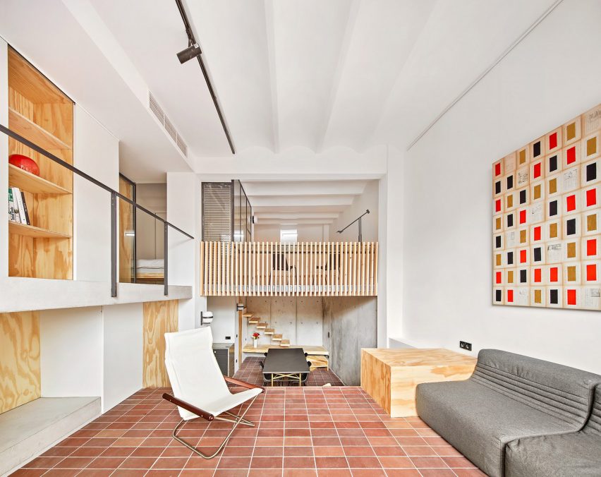
Architecture studio Mas-aqui opened up an apartment in Barcelona by creating multiple levels lined with slabs of exposed concrete, slatted wood and reddish ceramic tiles.

The dwelling was named  Yurikago House after the Japanese word for a cradle, which references the shape of the timber structure that supports part of a new mezzanine that was created in the renovation.

Find out more about Yurikago House ›


Conde Duque apartment by Sierra + De La Higuera
Photo is by German Sáiz

Madrid apartment by Sierra + De La Higuera

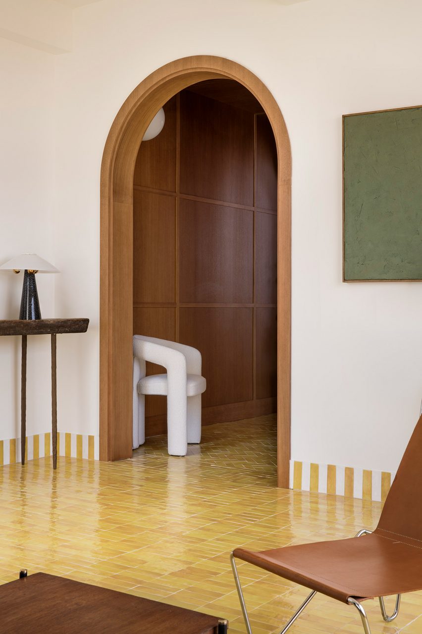
Set within a 1940s building, interior spaces in this Madrid apartment were delineated with vibrantly hued Moroccan zellige tiles, from bold yellow accents in the living room to an emerald green kitchen.

The tiles are defined by imperfect hand-moulded surfaces and feature throughout the home in the form of decorative skirting as well as flooring and cabinetry.

Find out more about this Madrid apartment ›


Casa Cas 8 by DG Arquitecto
Photo is by Mariela Apollonio

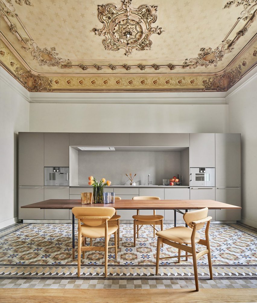
Valencia apartment by DG Arquitecto

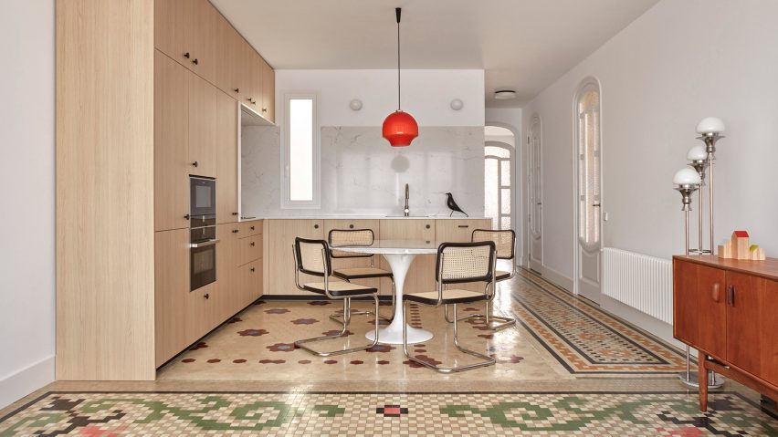
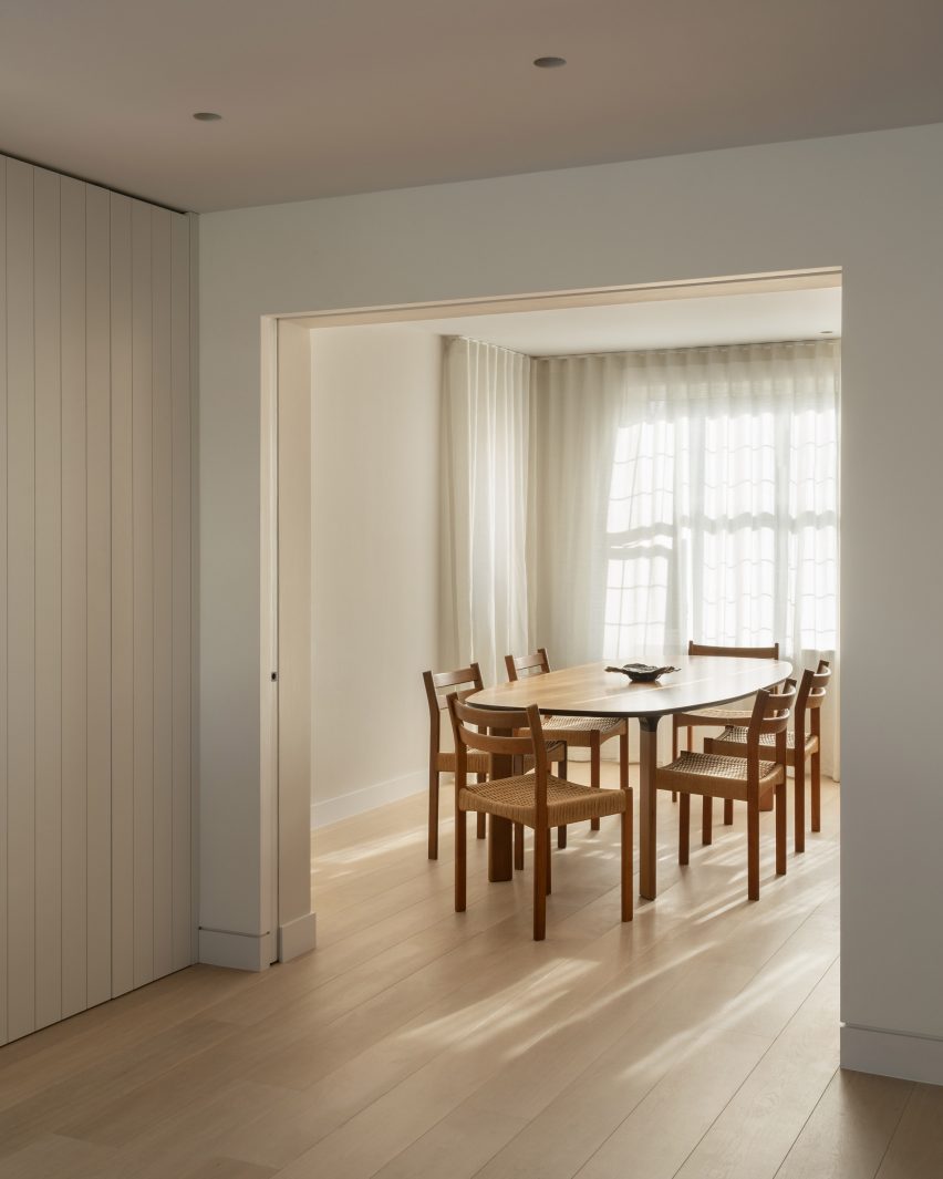
During the minimalist renovation of a 1920s apartment in Valencia, local studio DG Arquitecto preserved the original mosaic elements – flooring that the firm called “typical” of the city.

The studio paired mid-century rattan dining chairs and delicate timber elements with the colourful tiles while original mouldings and decorative arched doorways were also maintained.

Find out more about this Valencia apartment ›


Tiled bathroom in curved bathroom within apartment in the Torres Blancas building
Photo is by José Hevia

1040 Unit, Madrid, by Studio Noju

Working within Madrid’s iconic brutalist Torres Blancas tower, emerging practice Studio Noju created an apartment that balances contemporary details with the building’s brutalist history.

Each of the dwelling’s three bathrooms were individually colour-coded with small geometric mosaics that nod to the green ceramic tiles that clad the apartment’s terraces.

“The [mosaic] material allowed us to solve all the elements of the bathroom such as shower areas, vanities, walls and floors, referencing a similar material strategy used in the original design,” studio co-founder Antonio Mora told Dezeen.

Find out more about 1040 Unit ›


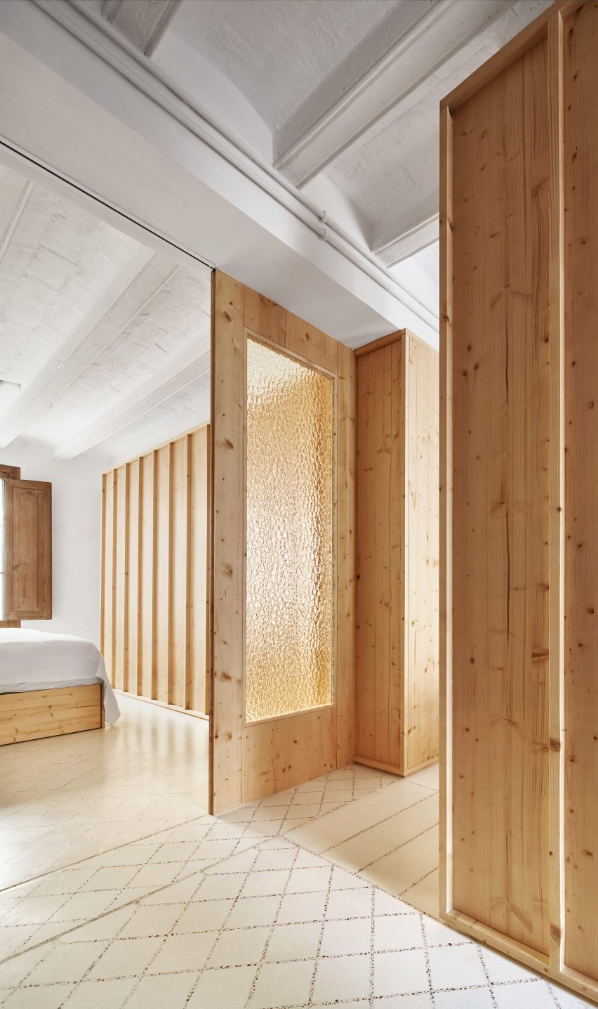
Tiled floors and bookcases within Barcelona apartment by Narch
Image is courtesy of Narch

Barcelona apartment by Narch

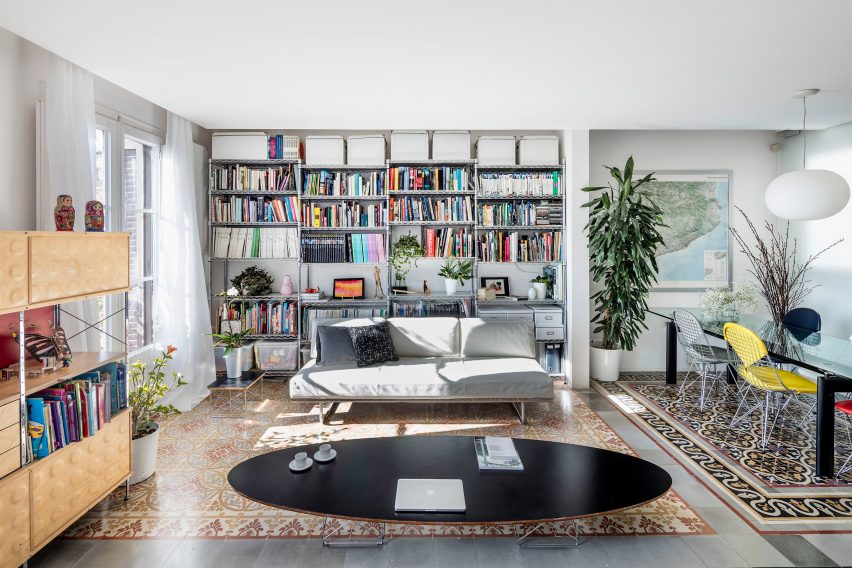
Eclectically arranged decorative floors dating back to the early 20th century take centre stage in this Barcelona apartment that was renovated by Narch architecture office.

Known as encaustic tiling, which is common in the city, each tile is created by pouring pigmented ceramics into moulds and pressing them to create a pattern.

Elsewhere in the apartment, doors made from laminated glass screen off its bedrooms. This material was chosen for its neutrality in order to emphasise the space’s ornate flooring.

Find out more about this Barcelona apartment ›


Casa Olivar in Madrid by Matteo Ferrari and Carlota Gallo
Photo is by Asier Rua

Casa Olivar, Madrid, by Matteo Ferrari and Carlota Gallo

Casa Olivar is a two-storey apartment by designers Matteo Ferrari and Carlota Gallo, which is characterised by handmade terracotta floor tiles that complement the home’s muted colour palette.

Created as a “sensorial refuge”, the dwelling includes two large windows in the living room that flood the space with natural light. Earthy-toned, simple materials feature throughout, including textured plaster finishes.

Find out more about Casa Olivar ›


Tiled kitchen within Barcelona apartment by Parramon + Tahull
Photo is by Judith Casas Sayós

Barcelona apartment by Parramon + Tahull

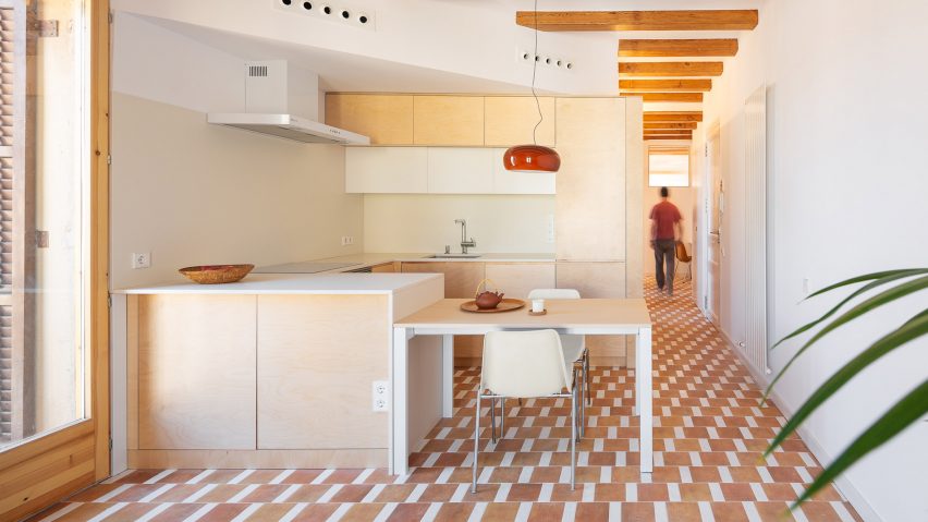
Barcelona studio Parramon + Tahull added bespoke birch plywood joinery and continuous tiled flooring to an apartment in the city’s Gracia neighbourhood, in order to blend with the building’s original features.

Created by Spanish manufacturer Wow, the terracotta tiles feature a mismatched geometric design that covers the entire apartment, including the kitchen and the bathroom.

Find out more about this Barcelona apartment ›


Terrazzo grout made from crushed tiles
Photo is by José Hevia

Laia and Biel’s House, Barcelona, by TEd’A

Architecture office TEd’A used crushed tiles to create playful terrazzo grout in a renovated apartment that belongs to the owners of the Mallorcan tile brand Huguet.

The grout was made from the original terracotta tiles that lined the home before its revamp, which were crushed into tiny pieces to form a reddish-hued aggregate that was mixed with existing white tile grout.

“Our idea was to keep the best parts of the old flat we bought,” Biel told Dezeen, citing sustainability and honouring the apartment’s original design.

Find out more about Laia and Biel’s House ›


End the Roc by Nook Architects
Photo is by Yago Partal

End of the Roc, Barcelona, by Nook Architects

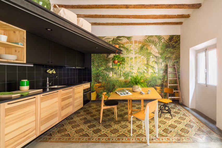
Nook Architects redesigned another apartment in Barcelona while maintaining its distinctive historical details, including a striking mural-style wall that is over 40 years old, timber beams and intricately patterned floor tiles.

“Our approach to End of the Roc revolved around the restoration and consolidation of the building’s original character,” said the architecture studio.

Find out more about End of the Roc ›


Casa Burés by Vilablanch
Photo is by Jordi Folch

Casa Burés, Barcelona, by Vilablanch and TDB Arquitectura

Interior design studio Vilablanch collaborated with TBD Arquitectura to refurbish all 26 apartments within Case Burés – a 20th-century building constructed by the late architect Francesc Berenguer i Mestres.

The team selected “silent” contemporary furnishings to complement Case Burés’ original decorative features, such as stainless steel geometric cabinetry that was chosen so as not to “compete with” or “imitate” the colourful tiled flooring.

Find out more about Casa Burés ›

This is the latest in our lookbooks series, which provides visual inspiration from Dezeen’s archive. For more inspiration see previous lookbooks featuring statement carpets, pop-up shops and homes with sliding doors. 

Reference

Ten homes with pocket doors that disappear into the walls
CategoriesInterior Design

Ten homes with pocket doors that disappear into the walls

Our latest lookbook explores homes where pocket doors slide into gaps within the walls, as a way of saving space or giving a more open feel to an interior.

A pocket door is a specific type of sliding door designed to slot into a wall cavity. This means that when the door is open, it is completely hidden from view.

For homes where an open-plan layout is desirable but not practical, pocket doors offer a viable alternative. When open they are almost invisible, allowing adjacent rooms to feel more connected.

Pocket doors can also be used for rooms where there isn’t enough space for a door to open outwards, or for locations where it makes sense for the door to integrate into surrounding joinery.

Read on to see 10 different examples, in homes that include a courtyard house in Arizona and a renovated 1920s apartment in New York.

This is the latest piece in our lookbook series, which provides visual inspiration from Dezeen’s archive. Other recent editions showcase cabins with cosy interiors and homes that make the most of narrow spaces.


Pocket door in St John Street apartment

St John Street, UK, by Emil Eve Architects

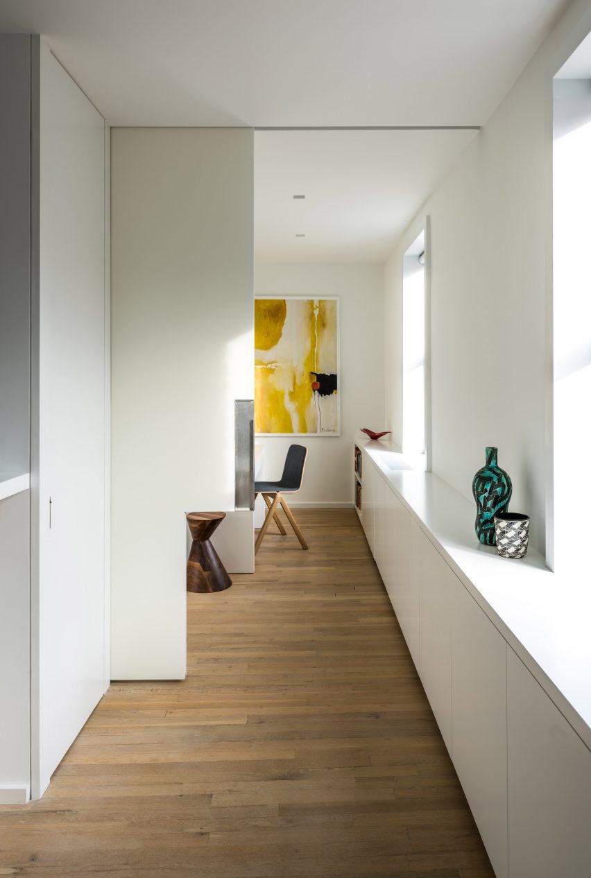
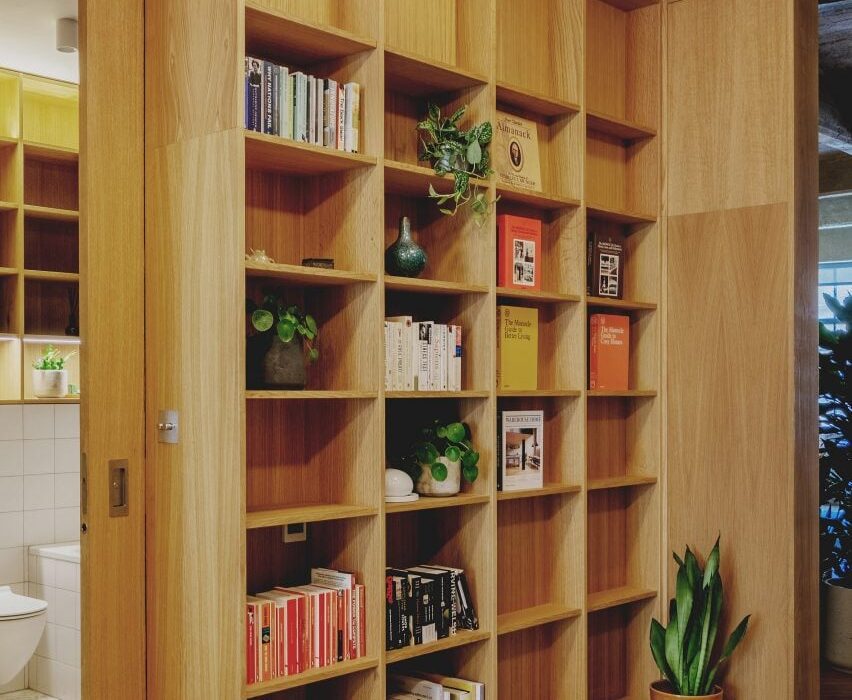
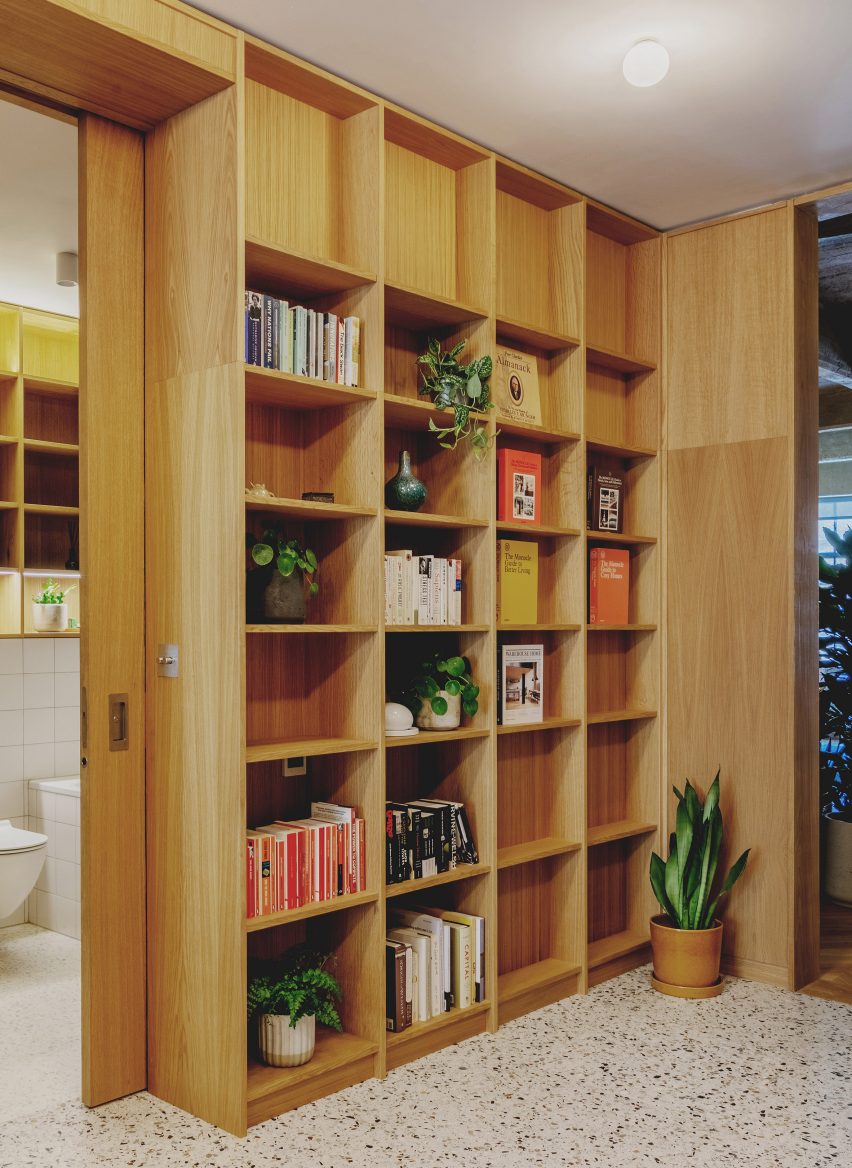
Pocket doors slot in behind bookcases in the entrance lobby of this converted loft apartment in London.

Emil Eve Architects designed various oak joinery elements to divide up the interior of the former industrial space. Pocket doors are made from the same wood, so they feel integrated.

Behind the doors are two bedroom spaces and a bathroom.

Find out more about St John Street ›


Pocket door in Riverside Apartment

Riverside Apartment, USA, by Format Architecture Office

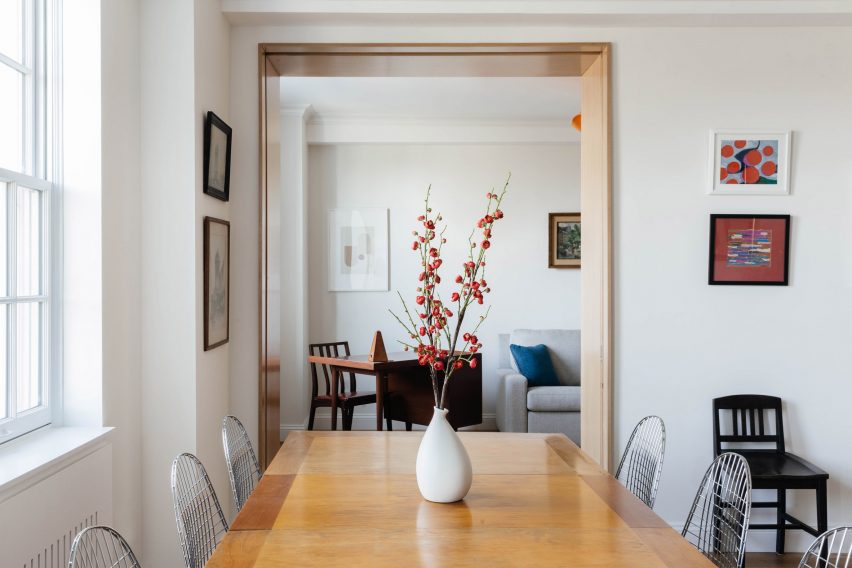
In this 1920s apartment in New York’s Upper West Side, recently renovated by Format Architecture Office, a pocket door separates the main lounge and dining room from an adjacent study.

This means that, when the study is not required as a quiet workspace, it can become an extension of the day-to-day living space.

The door sits within a deep frame made from Anigre wood – an African hardwood commonly used for furniture and cabinetry – which matches the design of the kitchen entrance opposite.

Find out more about Riverside Apartment ›


Pocket door in Moss home and studio

Logan Certified, USA, by Moss

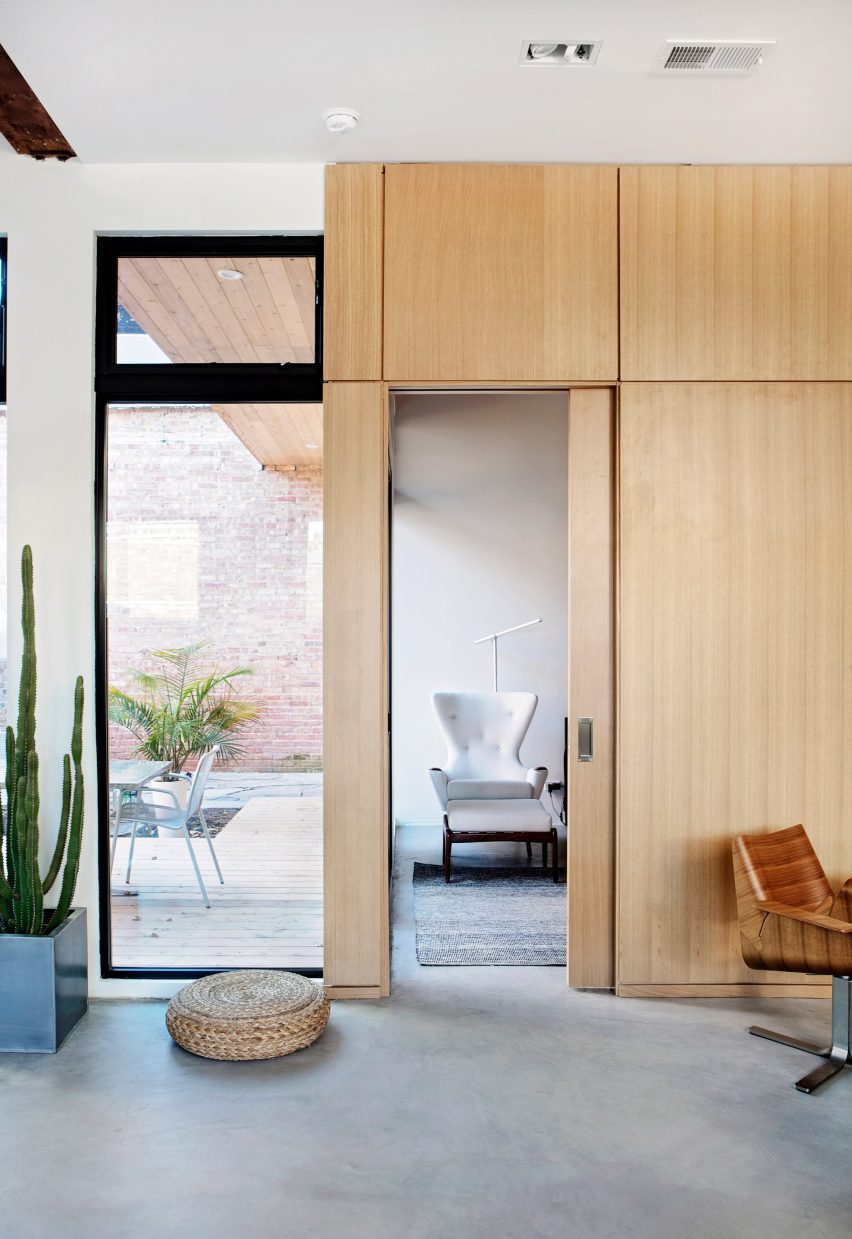
This converted bodega in Chicago serves as the home and workplace of Matt Nardella, founder of architecture and design firm Moss, and his wife and colleague Laura Cripe.

The couple’s bedroom is located behind an oak-panelled wall. By installing a pocket door made from the same material, they have made the entrance feel more discrete.

Find out more about Logan Certified ›


Pocket door in Apartment in Föhr by Karin Matz and Francesco Di Gregorio

Apartment in Föhr, Germany, by Karin Matz and Francesco Di Gregorio

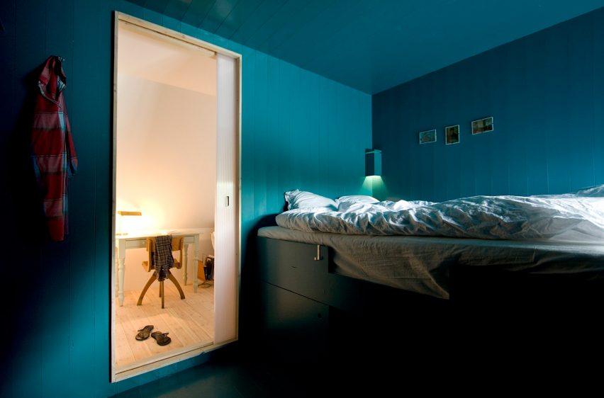
Pocket doors lead through to cabin-style bedrooms in this converted attic apartment on the island of Föhr, designed by architects Francesco Di Gregorio and Karin Matz.

The doors are made from transluscent polycarbonate, giving them a soft glow that contrasts with the vivid blue-green colour of the walls.

Find out more about Apartment in Föhr ›


Pocket door in house by Tailored Design Lab

A Gabled Roof in Kawagoe, Japan, by Tailored Design Lab

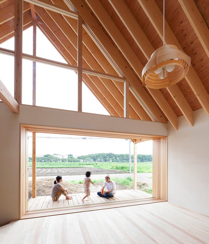
A popular use of pocket doors is to make a patio deck feel like a continuation of the indoor living space, as Tailored Design Lab did at this family house in Saitama Prefecture.
The project features a three-panel pocket door system, allowing a four-metre-wide window to slot into a cavity that is significantly smaller.

Find out more about A Gabled Roof in Kawagoe ›


Pocket door in The Ranch Mine

O-asis, USA, by The Ranch Mine

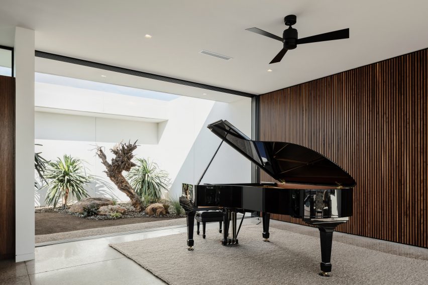
This home for a musician in Arizona features a series of four glazed pocket doors that allow a combined living room, kitchen and piano room to be completely opened up to the elements.

Two of the doors connect the room with a secluded courtyard filled with desert plants, while the other two lead out to a sheltered terrace overlooking a swimming pool at the rear.

All four doors are full-height, making them feel more like moving walls.

Find out more about O-asis ›


Pocket door in Bank Street Apartment

Bank Street Apartment, USA, by MKCA

An unusually shaped pocket door was required for this renovation of an apartment in New York’s West Village, by Michael K Chen Architecture (MKCA).

The works included adding a continuous storage unit along one wall, extending from the lounge and kitchen into a small  home-office slotted in the corner.

The pocket door slots around this unit, thanks to a rectangular cutaway in one corner, meaning one of the owners could work from home without being disturbed by their partner.

Find out more about Bank Street Apartment ›


Writer’s Studio, USA, by Eric J Smith

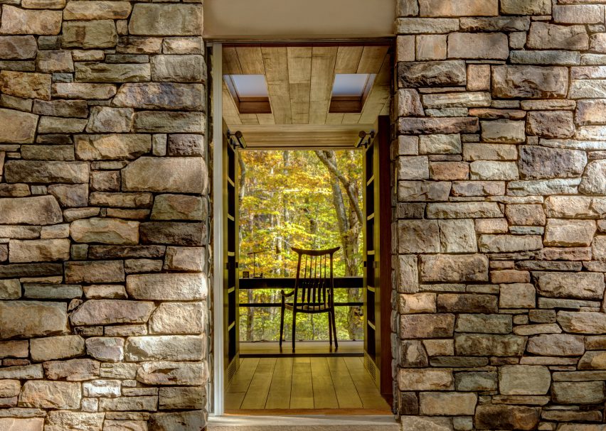
Using a pocket door as a main entrance is less common but not impossible, as proved by this writing studio at the Connecticut home of poet John Barr.

The glass pocket door is set behind a stone facade, protected by a sliding panel made of distressed oak. It aligns with the owner’s desk, allowing the breeze to easily flow through.

Find out more about Writer’s Studio ›


Pocket door in Hipped House

Hipped House, UK, by Oliver Leech Architects

The dining room of this family home in Surrey is previously separate from the kitchen and living space.

In order to create more spacious, open living spaces, Oliver Leech Architects replaced the old door with a much larger opening. A pair of pocket doors mean it the room can still be closed up if required.

Find out more about Hipped House ›


Pocket door in apartment by Mas-aqui

Yurikago House, Spain, by Mas-aqui

Pocket doors are a favourable solution for en-suite bathrooms, where a standard door might get in the way of a basin, toilet or shower.

In this house in Barcelona, the pocket door extends all the way up to the ceiling to enhance the sense of spaciousness when it is open.

Find out more about Yurikago House ›

Reference

Ten residential interiors that make the most of narrow spaces
CategoriesInterior Design

Ten residential interiors that make the most of narrow spaces

Including tight living areas, kitchens wedged into corridors and interiors in skinny Japanese houses, this lookbook features 10 homes that make clever use of narrow spaces.

Projects on constricted urban sites or working within historical buildings often must contend with long-and-narrow interior layouts.

Here are 10 examples of interiors where narrow spaces have been utilised to their full potential thanks to intelligent design.

This is the latest in our lookbooks series, which provides visual inspiration from Dezeen’s archive. For more inspiration see previous lookbooks featuring mezzanine bedrooms, creative built-in furniture and homes that make a highlight of their corridors.


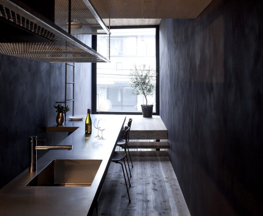
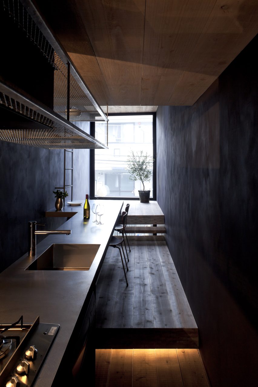
1.8 Metre House in Japan
Photo by Sobajima, Toshihiro

1.8m Width House, Japan, by YUUA Architects & Associates

As its name suggests, the rooms in this house in central Tokyo are just 1.8 metres wide, so Japanese studio YUUA Architects & Associates had to plan the interior with meticulous care.

They used split-level floors to create natural partitions between different spaces, with a kitchen and dining area lined up along a single wall, while a dark colour scheme is intended to provide “a sense of depth”.

Find out more about 1.8m Width House ›


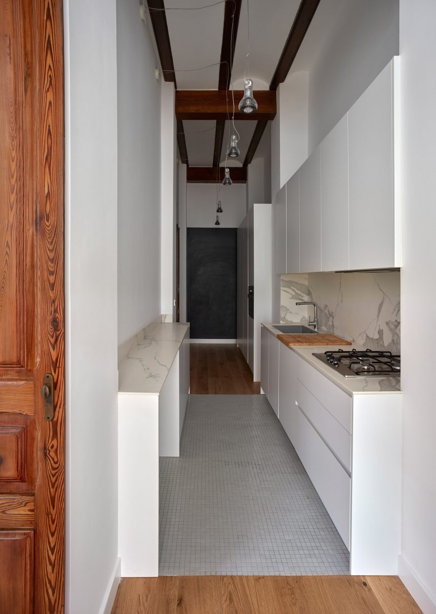
House in Valencia by DG Arquitecto Valencia
Photo by by Mariela Apollonio

Horta Nord townhouse, Spain, by DG Arquitecto Valencia

DG Arquitecto Valencia sneaked a kitchen into a passageway in this Valencian townhouse as part of a renovation project for a young family.

White floor tiles and downlighting hanging from the high ceiling help the space maintain a sense of generous scale despite the narrow proportions.

Find out more about this Horta Nord townhouse ›


196 Orchard model residence in Manhattan by Alex P. White
Photo by Colin Miller

196 Orchard apartment, USA, by Alex P White

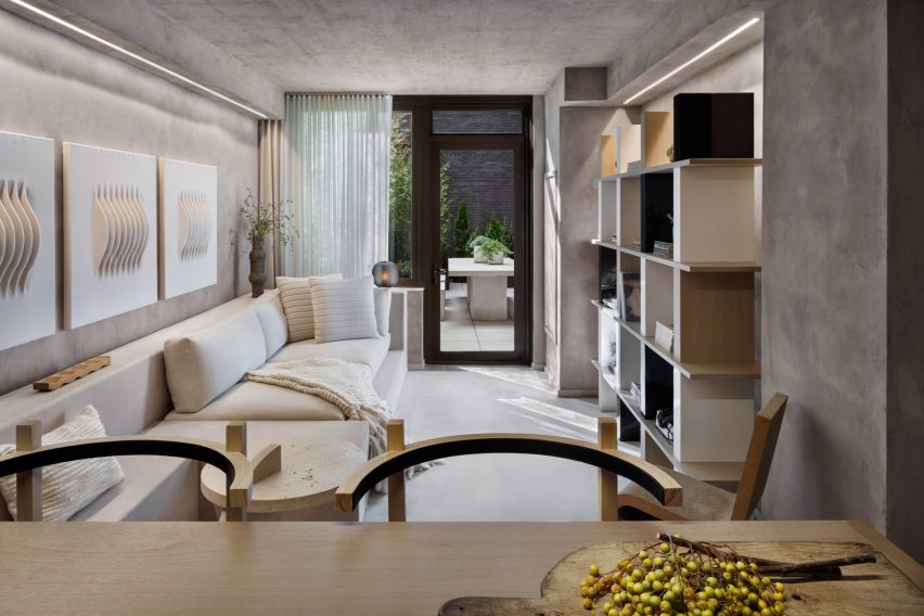
American designer Alex P White created a model unit for a high-end condominium building in Manhattan’s Lower East Side characterised by exposed calming concrete ceilings, grey plaster walls and neutral-toned decor.

In the narrow living room, a mix of shapes and textures combine with built-in furniture to provide added visual depth, from a series of ivory wall hangings by Los Angeles artist Mary Little to a large walnut shelving unit designed by White and a cardboard chair by Frank Gehry.

Find out more about this 196 Orchard apartment ›


Maisonette in Notting Hill by Francesco Pierazzi Architects
Photography is by Lorenzo Zandri

Notting Hill maisonette, UK, by Francesco Pierazzi Architects

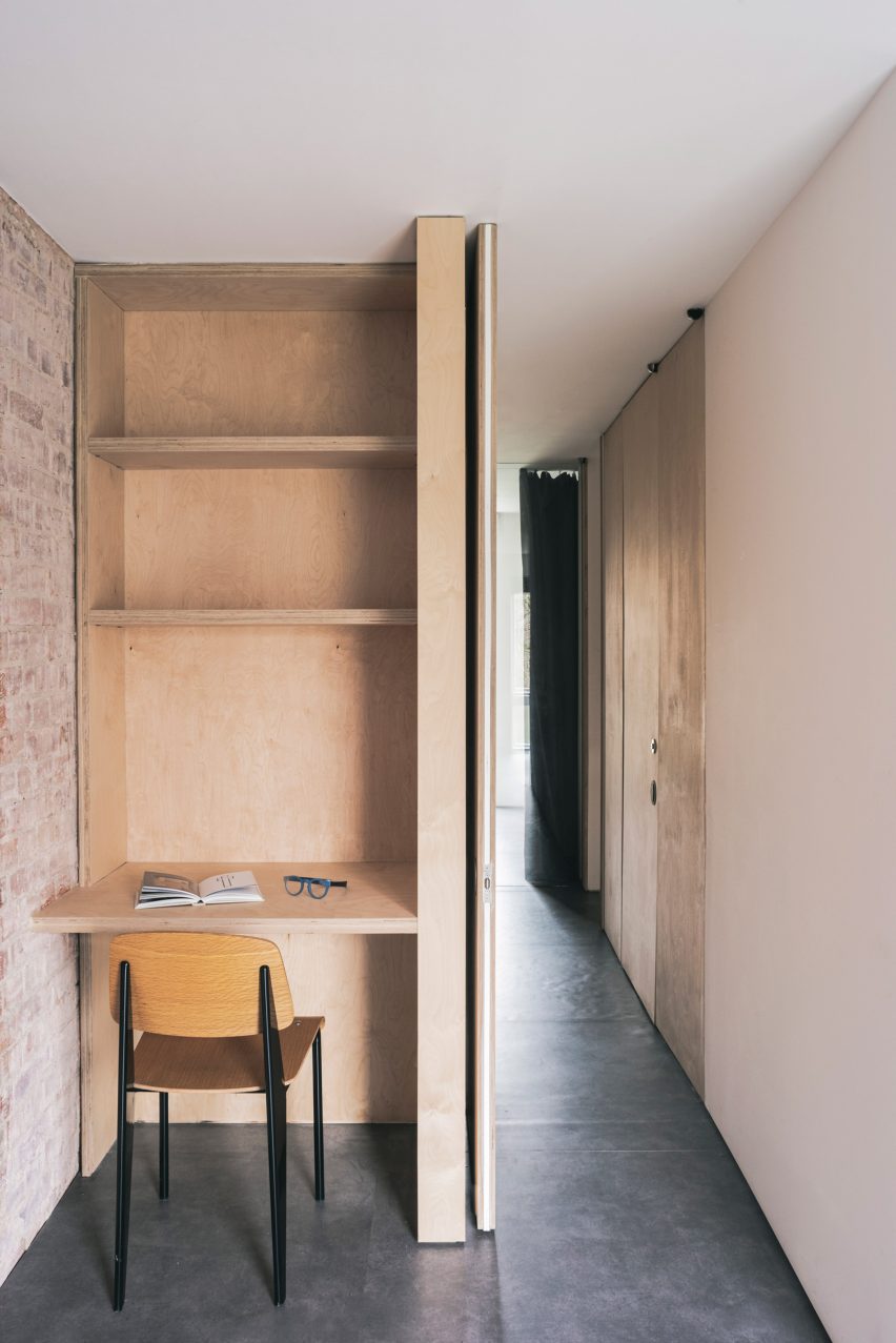
A petite plywood study space was nestled into a hallway in this London maisonette overhauled by Francesco Pierazzi Architects.

To emphasise the home’s sense of height, the studio placed floor-to-ceiling doorways in all of its narrower rooms and left the brick shell exposed, offset by dark flooring.

Find out more about this Notting Hill maisonette ›


Nuwa guesthouse by Z_Lab
Photo by Texture on Texture

Seochon micro guesthouse, South Korea, by Z_Lab

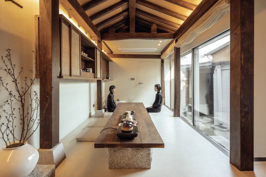
Z_Lab’s serene interiors for this tiny guesthouse tucked down an alleyway in northern Seoul occupy a former traditional Korean home, otherwise known as a hanok.

In the main space, long and rectilinear, different functions are lined up from a cosy reading area on a timber bench to a lengthy walnut table for enjoying tea that sits directly beside a sunken water bath.

Find out more about this Seochan micro guesthouse ›


West Chelsea Apartment by BoND
Photo by Eric Petschek

West Chelsea Apartment, USA, by BoND

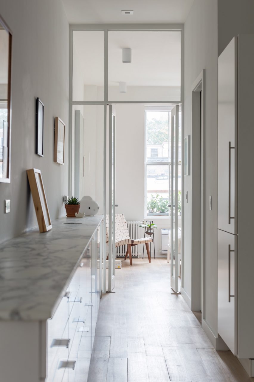
This long and narrow apartment in New York’s Chelsea neighbourhood was overhauled by architecture studio BoND, which replaced partition walls with glass doors to allow more light to reach the middle section while also “celebrating the apartment’s elongated proportions and maximising the illusion of depth”.

All utilities, including kitchen and bathroom fixtures, were moved to one wall to leave the other free for displaying art, while the direction of the floorboards and linear lighting fixtures help to emphasise the length of the interior.

Find out more about West Chelsea Apartment ›


Studio 6b bedroom
Photo by Itay Benit

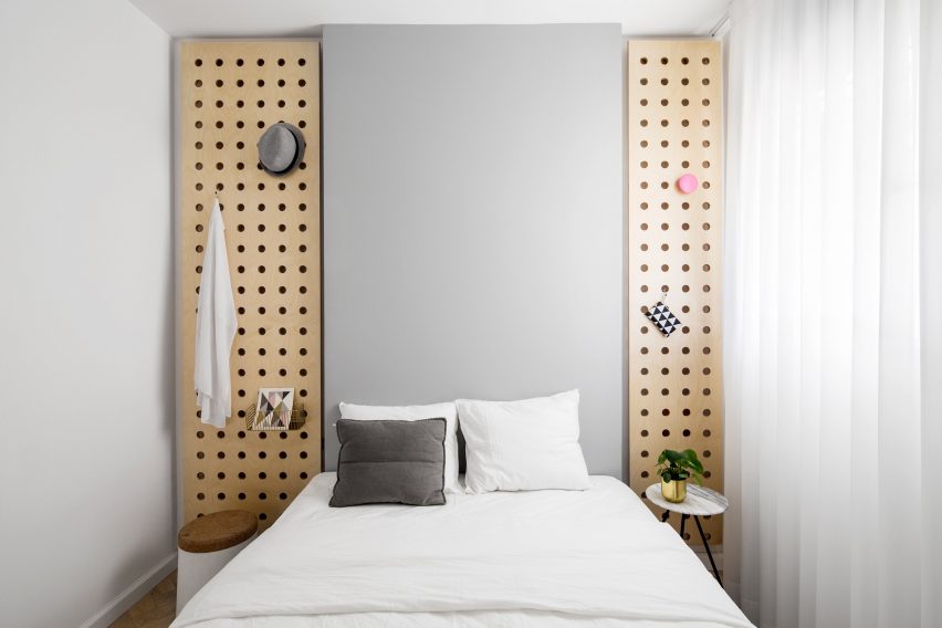
Bauhaus Tel Aviv apartment, Israel, by Amir Navon and Maayan Zusman

A “safe room” was turned into a snug spare bedroom as part of a refurbishment of this Tel Aviv apartment by architect Amir Navon and interior designer Maayan Zusman, who worked alongside graduates Dana Sagive and Naama Tison Vilotsky.

To compensate for a lack of width a light-toned oak herringbone floor was paired with pale colours, while two wooden plates with holes pierced in them to support brass hooks are a space-saving storage solution.

Find out more about this Bauhaus Tel Aviv apartment ›


Love2 House by Takeshi Hosaka in Tokyo Japan
Photo by by Koji Fujii Nacasa and Partners

Love2 House, Japan, by Takeshi Hosaka

This Tokyo micro home designed by architect Takeshi Hosaka for himself and his wife gathers household amenities into a linear floorplan spanning just 19 square metres.

Borrowing principles from the architecture of villas in ancient Roman villas, Hosaka divided up spaces for sleeping, bathing, eating and study using seven partitions that extend out from the concrete walls.

Find out more about Love2 House ›


Birch and Clay Refugio by Rise Design Studio
Photo by Ståle Eriksen

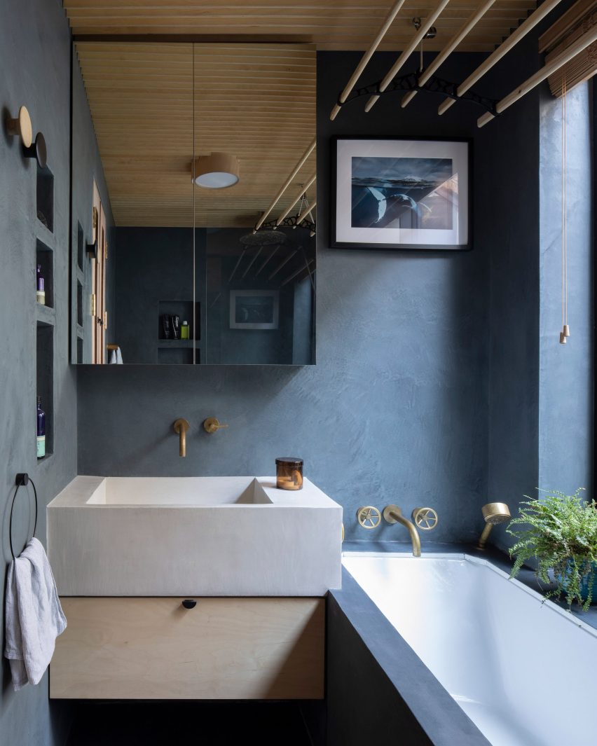
Birch and Clay Refugio, UK, by Rise Design Studio

By cutting shelving into one wall, retaining a generous window sill and subtly overlapping the chunky sink and bathtub, Rise Design Studio was able to make the most of limited lateral space in this bathroom.

The room’s proportions were chosen to match an adjacent lightwell in the remodelled London flat, while the dark blue tadelakt walls and floor contrast with a birch plywood ceiling to convey an impression of solidity.

Find out more about Birch and Clay Refugio ›


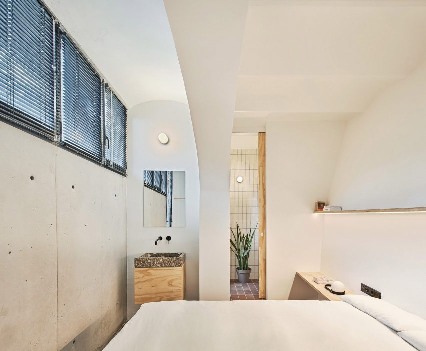
Interiors of La Odette apartment by Crü

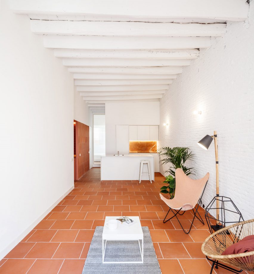
La Odette, Spain, by CRÜ

Architecture studio CRÜ was tasked with transforming this Barcelona apartment from a cramped three-bedroom home into a spacious two-bed while optimising the use of space.

In the kitchen-living area, it removed the partition walls to create an open-plan space, with large terracotta floor tiles and white-painted brick walls.

Find out more about La Odette ›

This is the latest in our lookbooks series, which provides visual inspiration from Dezeen’s archive. For more inspiration see previous lookbooks featuring mezzanine bedrooms, creative built-in furniture and homes that make a highlight of their corridors.

Reference

Ten cosy cabins with living spaces that frame views of nature
CategoriesInterior Design

Ten cosy cabins with living spaces that frame views of nature

From Norway to New Zealand, this lookbook explores rural cabins with cosy living areas that are animated by natural materials and views out over wild landscapes.

Cabins are a popular building typology with architects all around the world. Typically built from wood, the little shelters are ideally suited as peaceful retreats in remote locations.

Their small size and the use of organic materials such as wood helps these structures to blend in with natural surroundings, while also creating warm and calming living spaces for inhabitants.

As demonstrated by this roundup, little else is needed to make a cabin cosy, and keeping their interiors pared-back retains focus on the main event – the views out to nature.
This is the latest in our lookbooks series, which provides visual inspiration from Dezeen’s archive. For more inspiration see previous lookbooks featuring interiors with statement carpets, earthy bedrooms with natural colours and hotel interiors enriched by jewel tones.


Living space of Enough House by Brian MacKay-Lyons
Photo is by James Brittain

Enough House, Canada, by Brian MacKay-Lyons

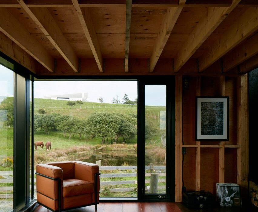
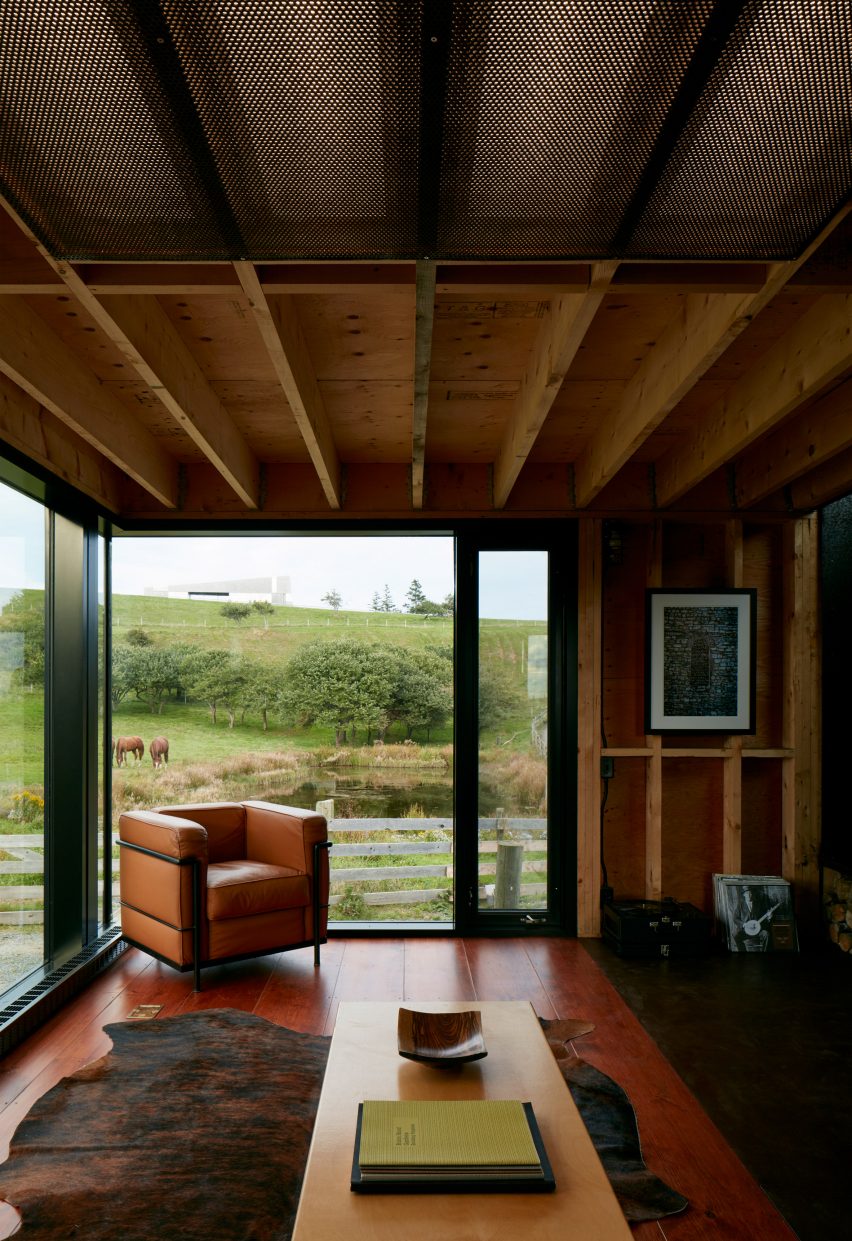
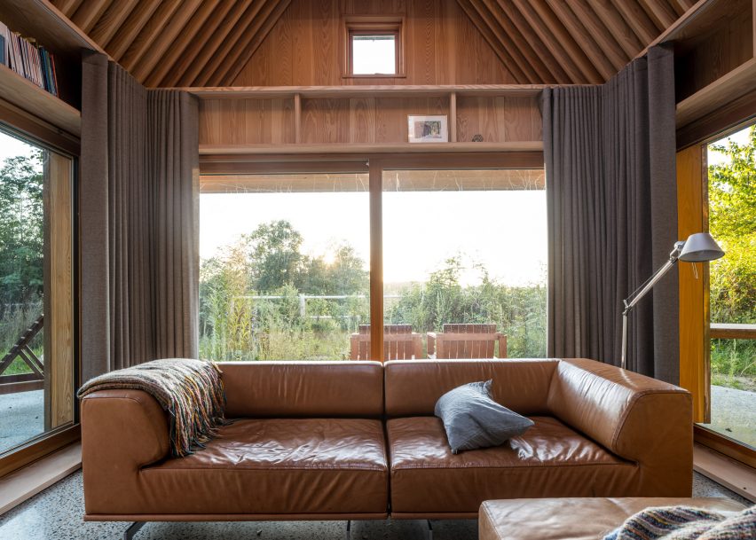
Dark-stained floorboards complement the light and exposed timber beams and columns of this cabin on a farmstead in Nova Scotia.

Its living room has large windows for looking out over the rustic landscape but retains a sheltered feel with low ceilings, a soft rug and comfy leather furniture such as the 2 Fauteuil Grand Confort armchair by Le Corbusier.

Find out more about Enough House ›


L-shaped sofa and armchair inside cabin living space
Photo is by Tom Bird

Looking Glass Lodge, UK, by Michael Kendrick Architects

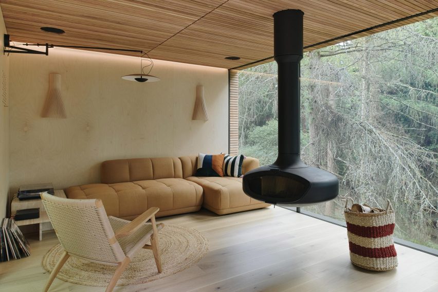
A black fireplace is suspended from the ceiling of this sitting area, located in the Looking Glass Lodge in East Sussex.

The room has a pared-back design filled with woven furnishings and wooden surfaces, helping to ensure the focus stays on the floor-to-ceiling glazing.

According to its designer Michael Kendrick Architects, the studio’s aim was to give the cabin “a sense of transparency and belonging within its setting”.

Find out more about Looking Glass Lodge ›


Sitting and dining area of The Hat House in Sweden
Photo is by Jim Stephenson

The Hat House, Sweden, by Tina Bergman

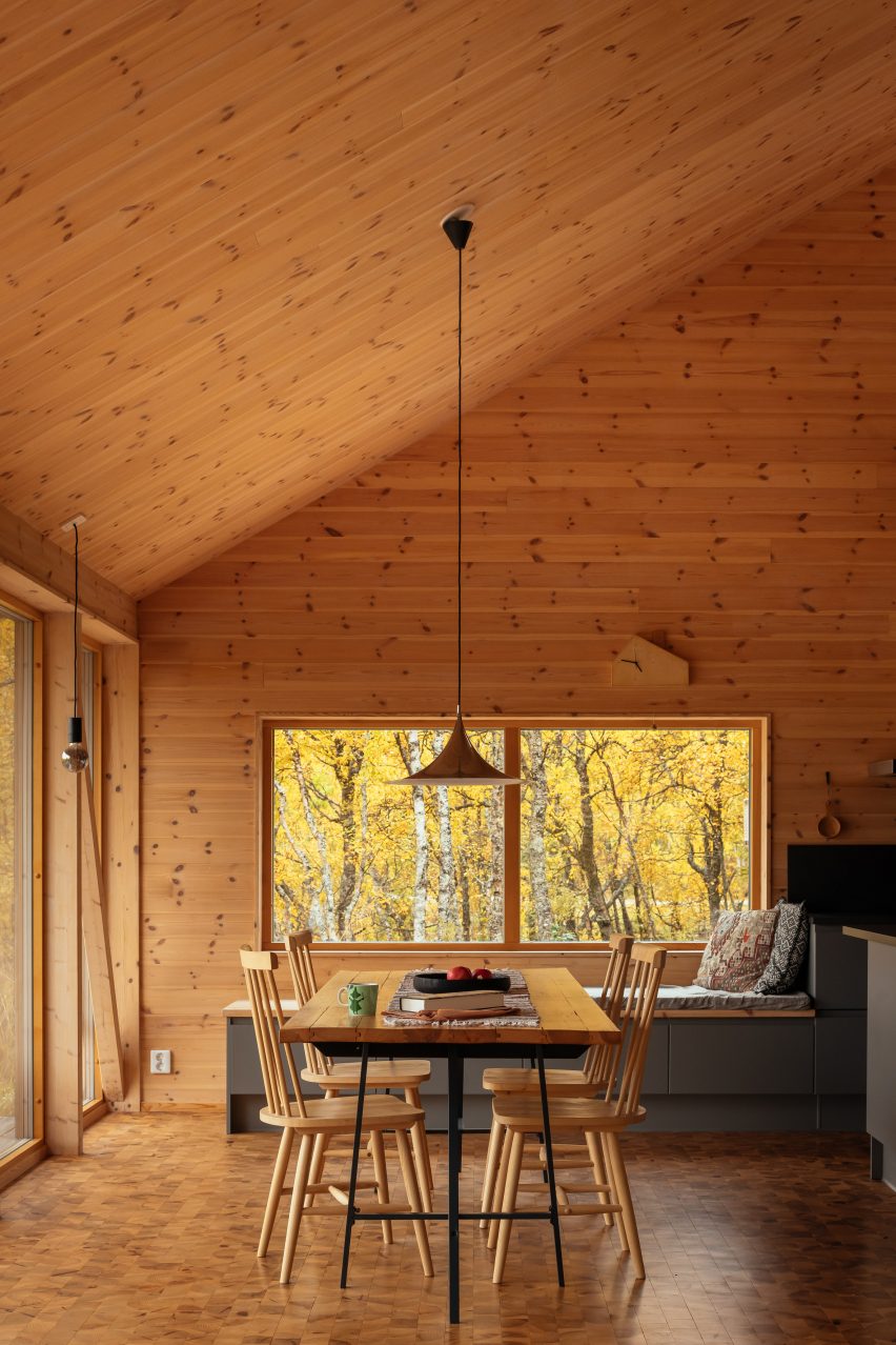
Despite its tall ceilings, The Hat House’s living-dining space has been made to feel snug with its warm material palette dominated by different woods.

These include spruce panels on the walls and end-grain spruce blocks for the floor. A cushioned window seat allows the owner to immerse themself in the view.

Find out more about The Hat House ›


Living room of Bruny Island Cabin by Maguire + Devin
Photo is by Rob Maver

Bruny Island Cabin, Australia, by Maguire + Devin

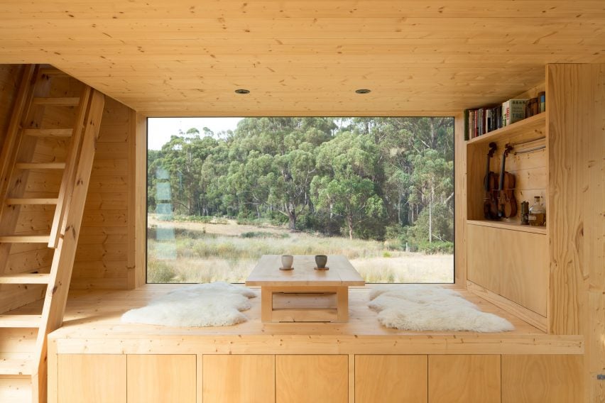
Baltic pine lines almost every surface of this off-grid cabin in Tasmania, designed by Maguire + Devin with references to traditional Japanese houses.

Nearly every piece of furniture forms a part of the building’s frame, creating a minimalist and uncluttered interior. This includes a raised seating area, positioned beside a pane of glass and finished with a low-lying table and rugs for sitting.

Find out more about Bruny Island Cabin ›


Living space of Biv Punakaiki cabin
Photo is by Stephen Goodenough

Biv Punakaiki, New Zealand, by Fabric Architecture

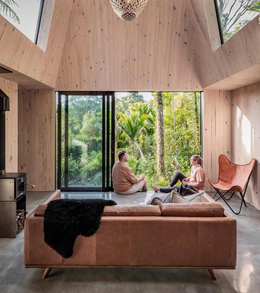
Hidden within the rainforest in the coastal village of Punakaiki, this holiday cabin has large spans of glazing that aim to immerse occupants in the landscape.

Furnishings are few and far between to prevent distracting from the view, but a homely feel is created through the warm and exposed timber structure and mid-20th-century furnishings including a leather butterfly chair.

Find out more about Biv Punakaiki ›


Mobile forest cabin at Het bos roept campsite by The Way We Build
Photo is by Jordi Huisman

Forest Cabin, Netherlands, by The Way We Build

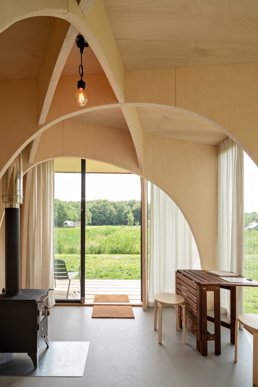
Arches made of poplar give a chapel-like character to this tiny mobile cabin, located on a campsite in the Robbenoordbos forest in the Netherlands.

Its compact living area is deliberately simple, furnished with just a writing desk and a wood burner for warmth and offering visitors a meditative space to “rejuvenate close to nature”.

Find out more about Forest Cabin ›


Living room of Iragüen Viñuela Arquitectos ski cabin
Photo is by Marcos Zegers

House by the Cautín River, Chile, by Iragüen Viñuela Arquitecto

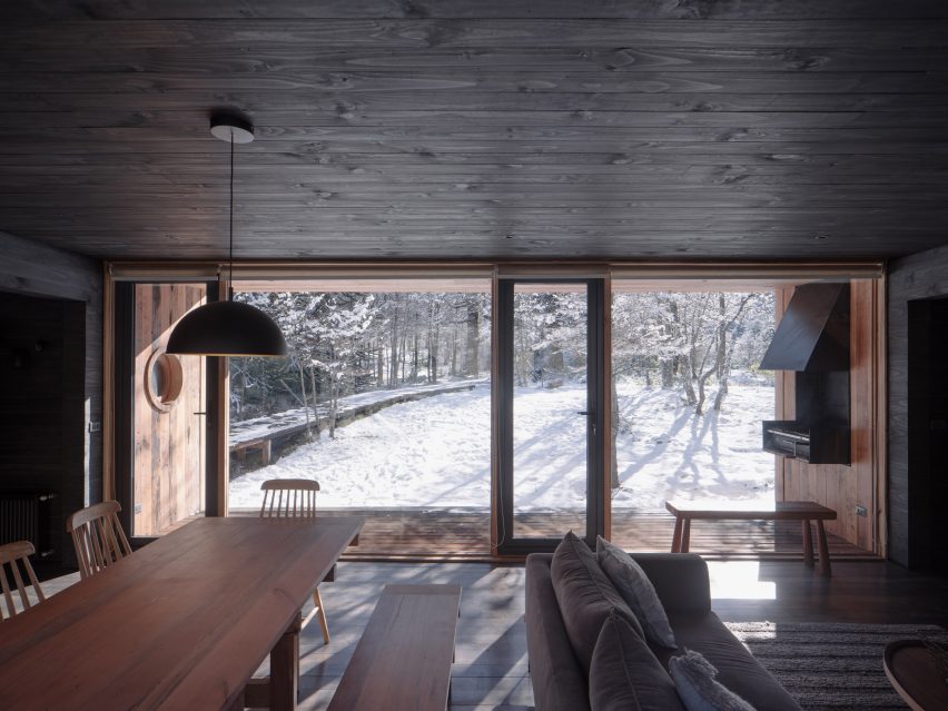
Iragüen Viñuela Arquitectos opted for dark-stained wood for the interior lining of this ski cabin in Chile, creating a moody yet cosy living area where the outside views take centre stage.

“The interior of the house, completely covered in black wood, allows a great contrast with the white winter and green summer landscape, and offers an atmosphere of introspection and calm according to the vocation of shelter,” said the studio.

Find out more about House by the Cautín River ›


Living space in Cabin Nordmarka by Rever & Drage Architects
Photo is by Tom Auger

Cabin Nordmarka, Norway, Rever & Drage

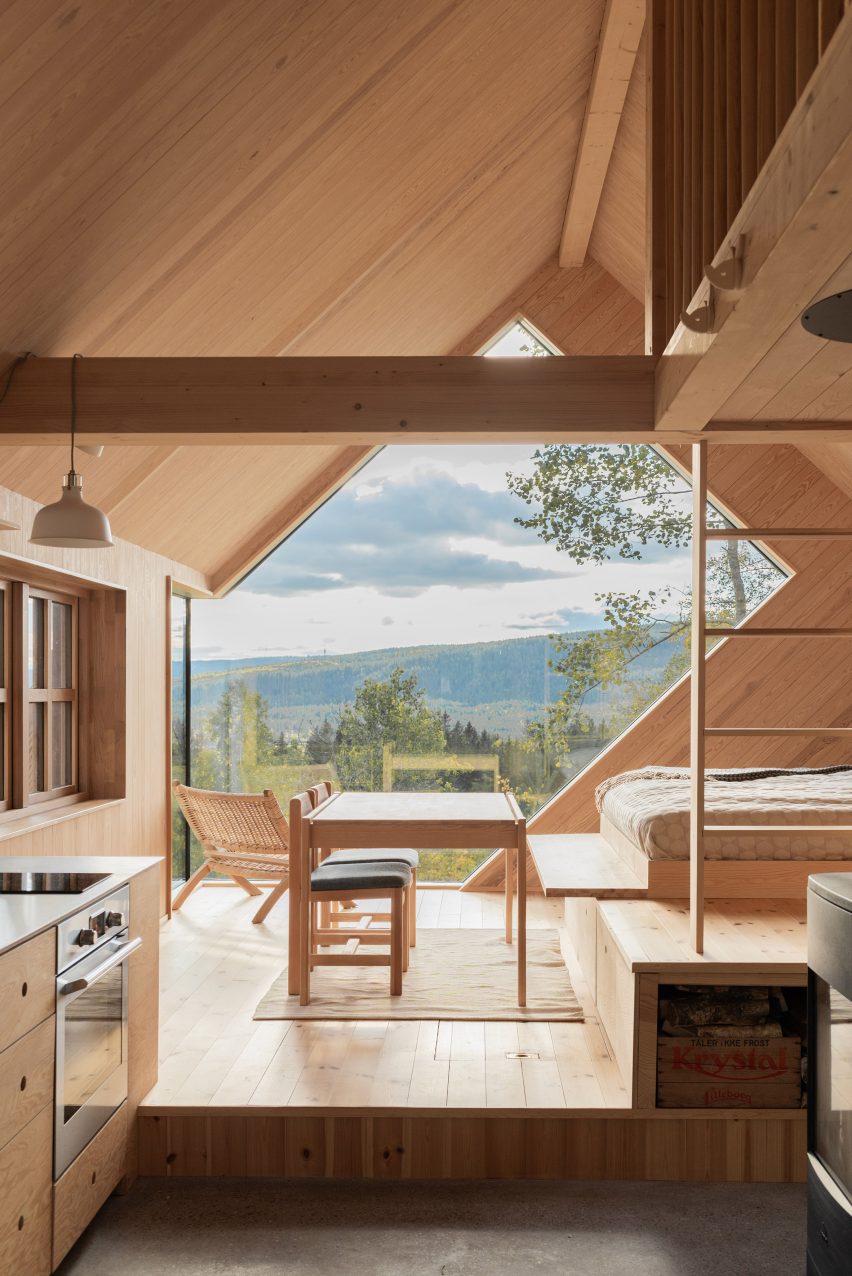
An angular corner window animates the unadorned living room of Cabin Nordmarka that Rever & Drage recently completed in Norway.

The green and blue tones of the forested surroundings form a colourful backdrop to the elevated space, which is characterised by light timber planks and matching furniture.
Find out more about Cabin Nordmarka ›


Interior of The Author's House in Denmark by Sleth
Photo is by Rasmus Hjortshøj, Coast

The Author’s House, Denmark, by Sleth

Landscape studio Sleth designed this writer’s cabin to blend in with its natural setting on the outskirts of Aarhus.

Douglas fir planks line the living room, creating a cosy retreat for the owner while echoing the surrounding trees. Bookshelves at the base of its gabled profile help reduce the height of the room, making it feel even more snug.

Find out more about The Author’s House ›


Treetop cabin at Bergaliv Landscape Hotel, Sweden, by Hanna Michelson

Bergaliv Landscape Hotel, Sweden, by Hanna Michelson

This compact wooden cabin nestled in the treetops of a Swedish mountain is one of four designed for the Bergaliv Landscape Hotel.

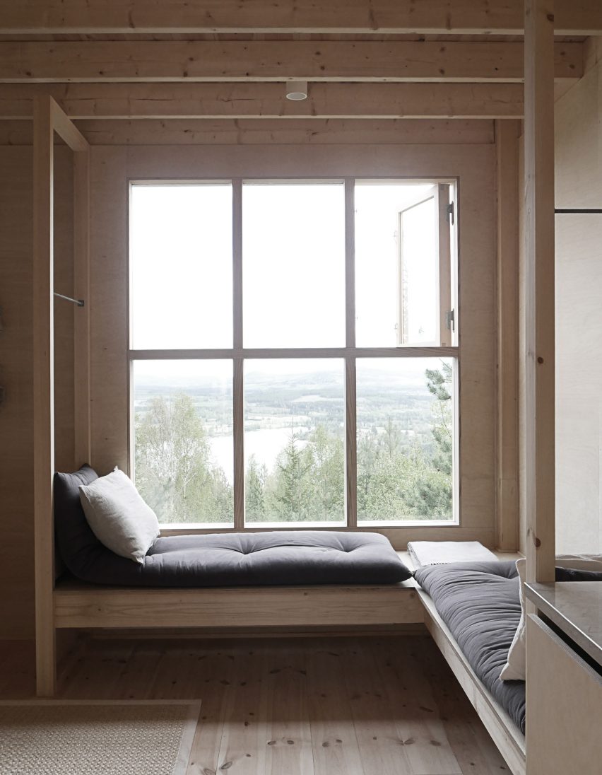
Like many other cabins on the list, the interior is simply finished. This draws attention to a wooden L-shaped bench and window seat, designed for visitors to get lost in the views out over the landscape.
Find out more about Bergaliv Landscape Hotel ›

This is the latest in our lookbooks series, which provides visual inspiration from Dezeen’s archive. For more inspiration see previous lookbooks featuring interiors with statement carpets, earthy bedrooms with natural colours and hotel interiors enriched by jewel tones.
Reference

Ten interiors that make use of statement carpets
CategoriesInterior Design

Ten interiors that make use of statement carpets

A bright red carpet covering the interior of an abandoned Mexico City mansion, a sisal carpet stretched over furnishings and a carpeted bathroom are among the floor coverings in our latest lookbook of 10 interiors with bold carpets.

Not only can carpets bring more texture and statement colour to an interior setting, but they can also help to insulate homes, especially if used in combination with a layer of underlay.

These interiors showcase how carpets in unusual shades and carpets displayed in unexpected ways can bring a unique look to homes and offices.

This is the latest in our lookbooks series, which provides visual inspiration from Dezeen’s archive. For more inspiration see previous lookbooks featuring hotel interiors with decadent jewel tones, kitchens with marble surfaces and residential interiors informed by biophilic design.


Barcelona apartment by PMAA
Photo is by José Hevia

Arches Apartment, Spain, by PMAA

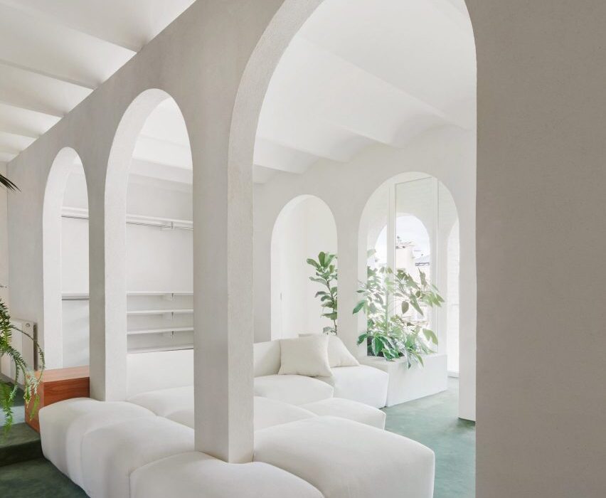
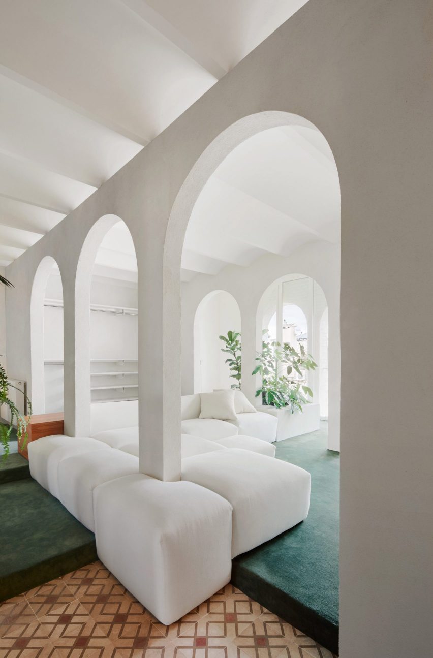
Spanish architecture studio PMAA overhauled the interior of this top-floor apartment in Barcelona’s Raval neighbourhood. The apartment is characterised by white-painted partitions with arched openings that run through and divide the interior of the home.

The living area, which is raised on a slight platform, was blanketed in a cool, sea green-toned carpet juxtaposed against the stark white walls. A large modular sofa wraps around the columns of the arched partitions.

Find out more about Arches Apartment ›


Nagatachō Apartment by Adam Nathaniel Furman
Photo is by Jan Vranovsky

Nagatachō Apartment, Japan, by Adam Nathaniel Furman

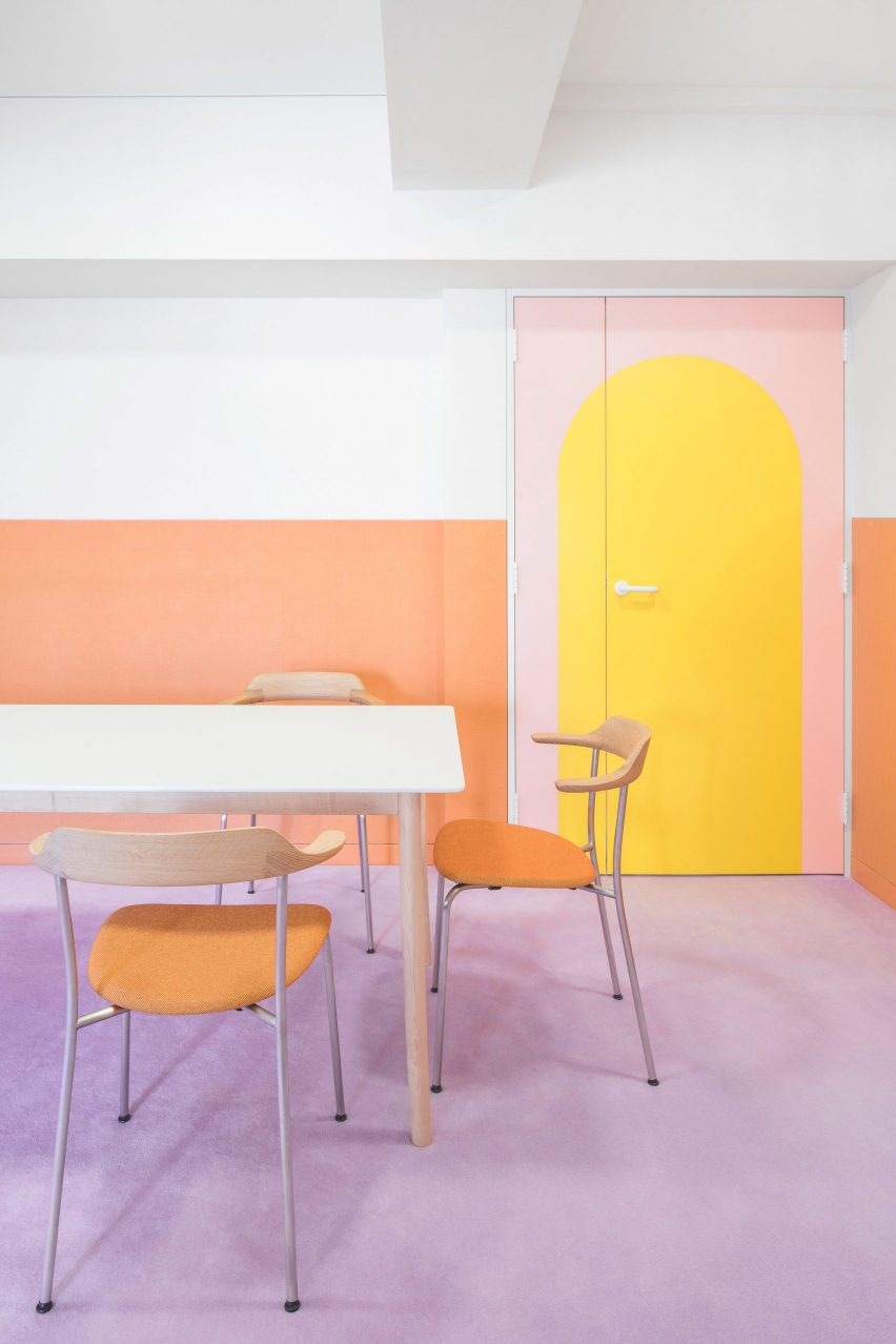
London designer Adam Nathaniel Furman renovated the interior of this formerly “claustrophobic” Tokyo apartment, adding a bold, pastel and sugar-sweet colour palette.

A low-pile, lilac carpet extends through the interior of the home and serves as a base for a rainbow of pastel hues that cover the walls, joinery and furniture throughout.

Find out more about Nagatachō Apartment ›


New York office by Halleroed
Photo is by Erik Undehn

New York Office, US, by Halleroed

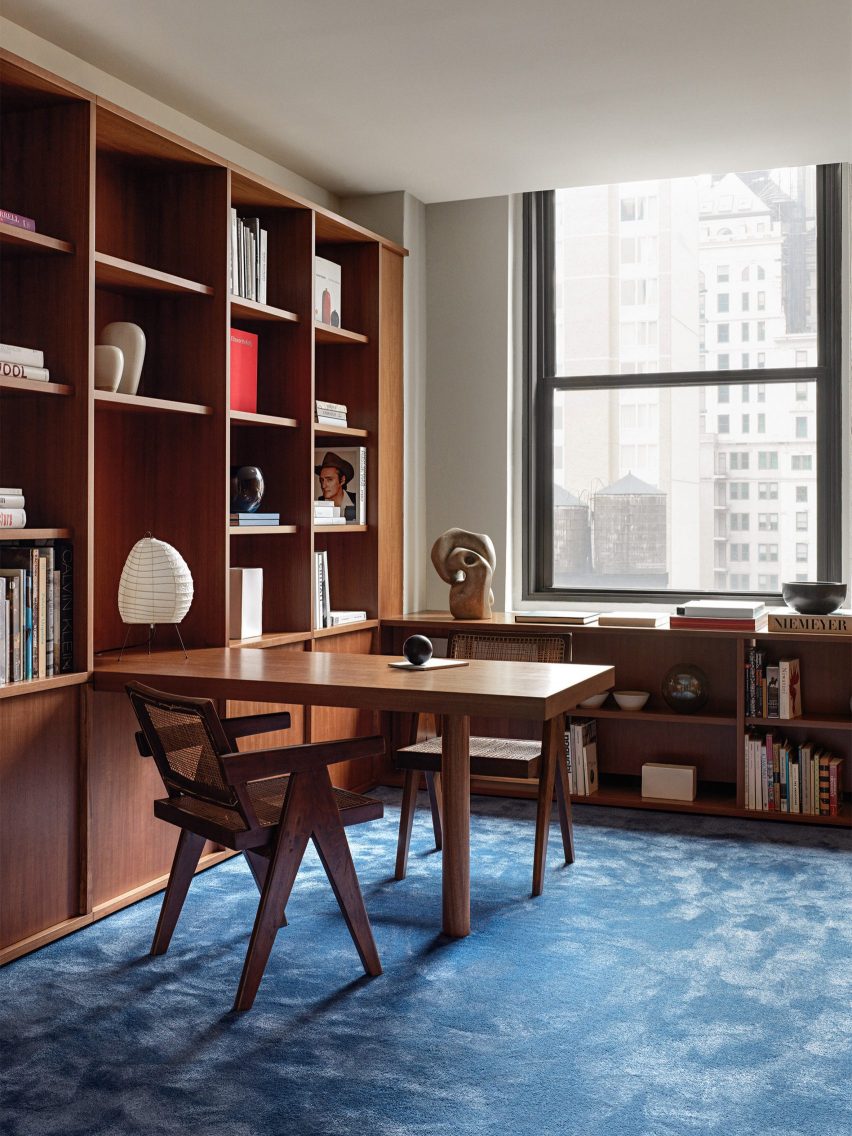
In New York City, Stockholm studio Halleroed made a bold feature out of plush blue carpets and wood panelling throughout the interior of an office building that covers almost 17 stories.

The interior scheme was informed by movies created by American filmmaker David Lynch. Most of the walls and surfaces of the interior were clad in veneer panels made from Makore wood, which is native to central and western Africa.

Find out more about New York Office ›


Antwerp A by Atelier Dialect
Photo is by Piet-Albert Goethals

Apartment A, Belgium, by Atelier Dialect

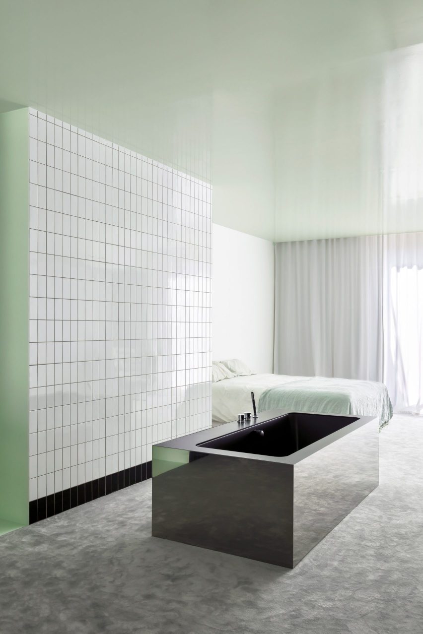
A rectangular stainless-steel bathtub sat on top of a heavy grey carpet form part of this Antwerp apartment, which underwent a contemporary renovation by Belgian design studio Atelier Dialect.

The primary bedroom has an open-plan design that adjoins an en-suite bathroom. Both spaces are linked by a grey carpet that covers the floor, and minty-green lacquer that stretches across the walls and ceiling of the open-plan spaces.

A reflective tub sits in the middle of the room in front of a wall of subway tiles.

Find out more about Apartment A ›


Mexico City manasion by Masa
Photo is by Genevieve Lutkin

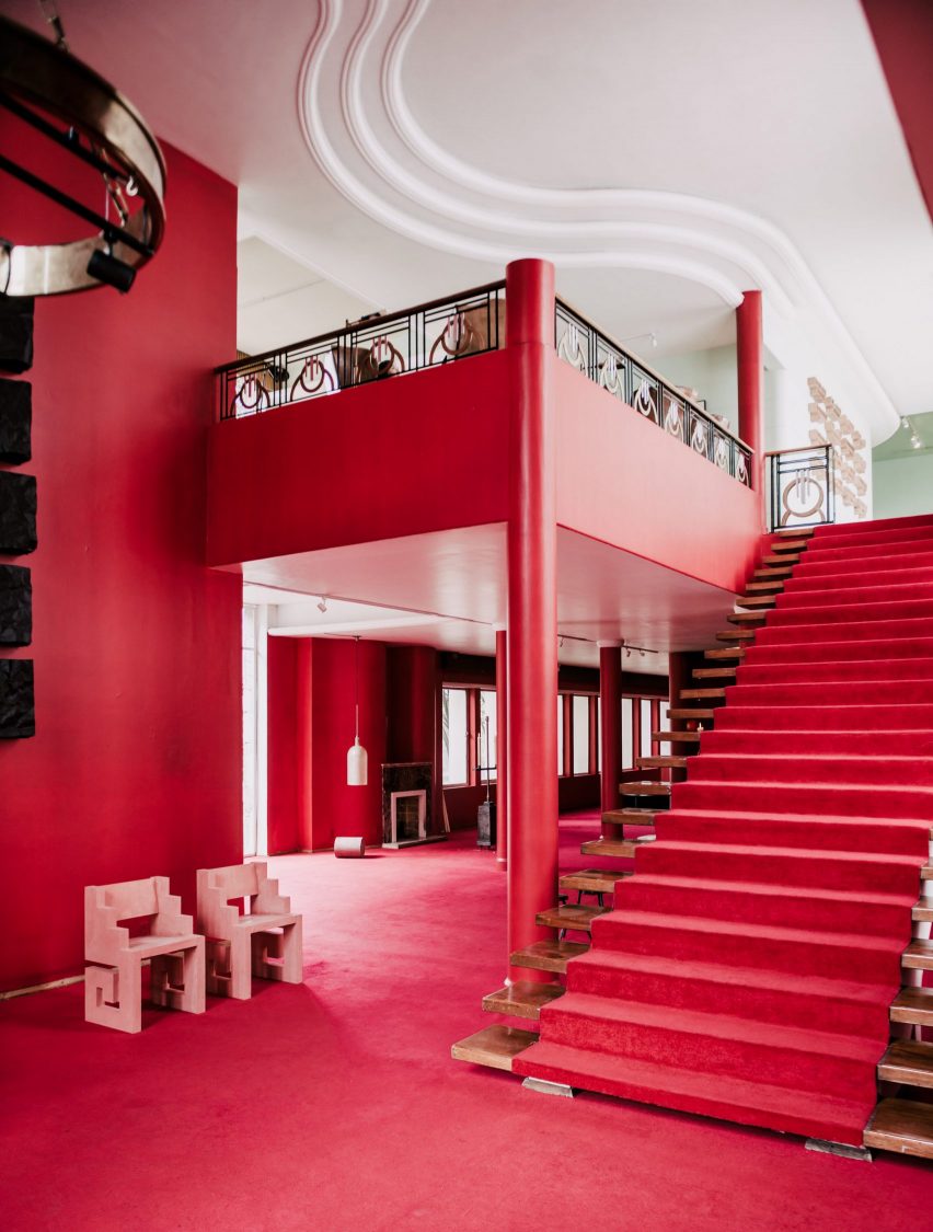
Mexico City mansion, Mexico, by Masa gallery

This 1970s mansion in Mexico City was used as a setting for the inaugural exhibit from Masa gallery. The venue was decorated with bright red walls and also features expanses of red and golden-hued carpets.

The mansion, which had been vacant since the 1970s, was kept as the gallery found it and decorated with works by a number of Mexico City-based designers and architects.

Find out more about Mexico City mansion ›


Barcelona apartment by Arquitectura-G
Photo is by José Hevia

Barcelona apartment, Spain, by Arquitectura-G

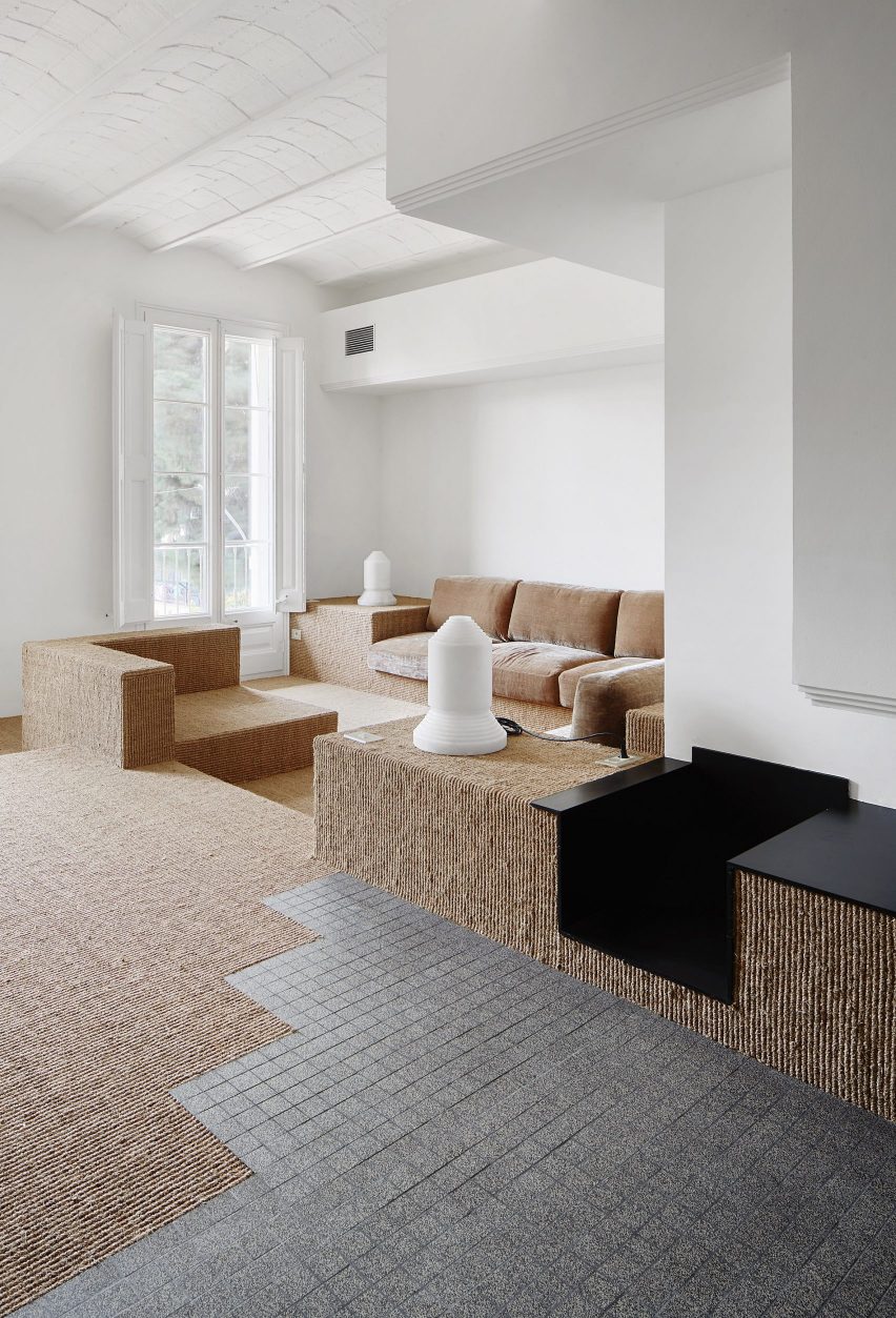
Located in the Ensanche district of Barcelona, this 149-square-metre apartment was renovated by Spanish studio Aqruitectura-G, which was assigned with opening up the interior and drawing in natural light.

The studio adapted the floor levels of the home to zone different areas across each floor. In the living area, a warm-hued sisal carpet extends across the stepped levels of the space, while also covering and wrapping around built-in seating, tables and other surfaces.

Find out more about Barcelona apartment ›


New York apartment by Harry Nuriev and Tyler Billinger
Photo is by Dylan Chandler

New York apartment, US, by Harry Nuriev and Tyler Billinger

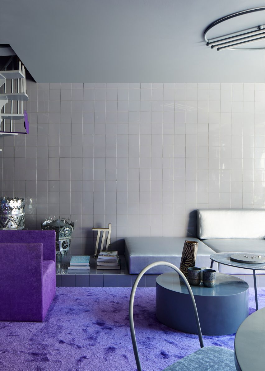
Crosby Studios founder Harry Nuriev and his partner and CEO Tyler Billinger renovated their NoLita apartment in Manhattan, New York City, in shades of violet. A heavy-pile purple carpet was fitted in the living area amid grey tile-clad surrounding walls and floors.

“We wanted a space that was not only elegant, but also liveable – we wanted to create a cosy sanctuary, which is why we used a warm grey as the base colour, and a vibrant purple as the supporting to give it that Crosby signature boldness,” said Billinger.

Find out more about the New York apartment ›


London townhouse by Studio Hagen Hall
Photo is by Mariell Lind Hansen

London townhouse, UK, by Studio Hagen Hall

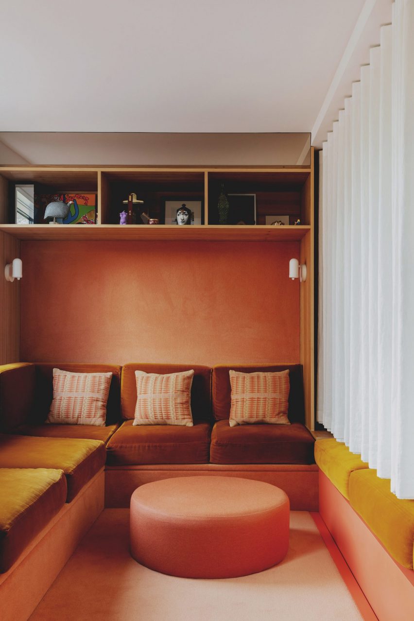
Architecture office Studio Hagen Hall transformed this townhouse in north London, decorating its interior with a scheme that nods to 1970s Californian modernism.

The lounge includes a custom sofa upholstered in a mustardy, orange-hued velvet. Beneath the sofa and across the walls, a peach carpet covers the surfaces as well as a circular ottoman at the foot of the sofa.

Find out more about London townhouse ›


Casa Lana by Ettore Sottsass
Photo is by Gianluca Di Ioia

Casa Lana, Milan, by Ettore Sottsass

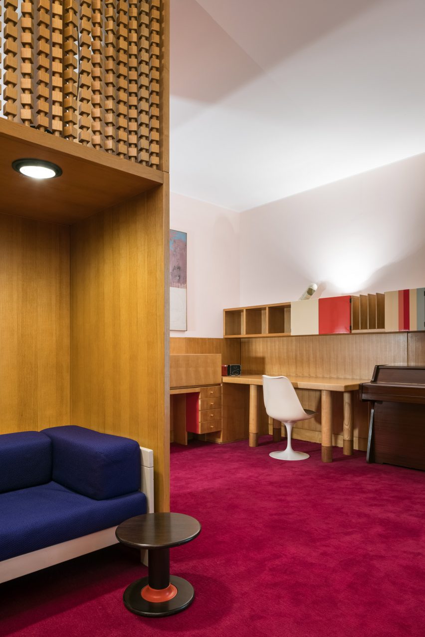
In 2022, the Triennale di Milano museum reconstructed the interior of a Milanese apartment that was designed by Memphis Group founder Ettore Sottsass.

A magenta-coloured carpet runs through the interior of the replica apartment, while wood-clad and boldly upholstered soft furnishings in contrasting blue hues were also placed in the room.

Find out more about Casa Lana ›


Winona House by Reigo and Bauer
Photo is by Lisa Petrole

Winona House, Canada, by Reigo and Bauer

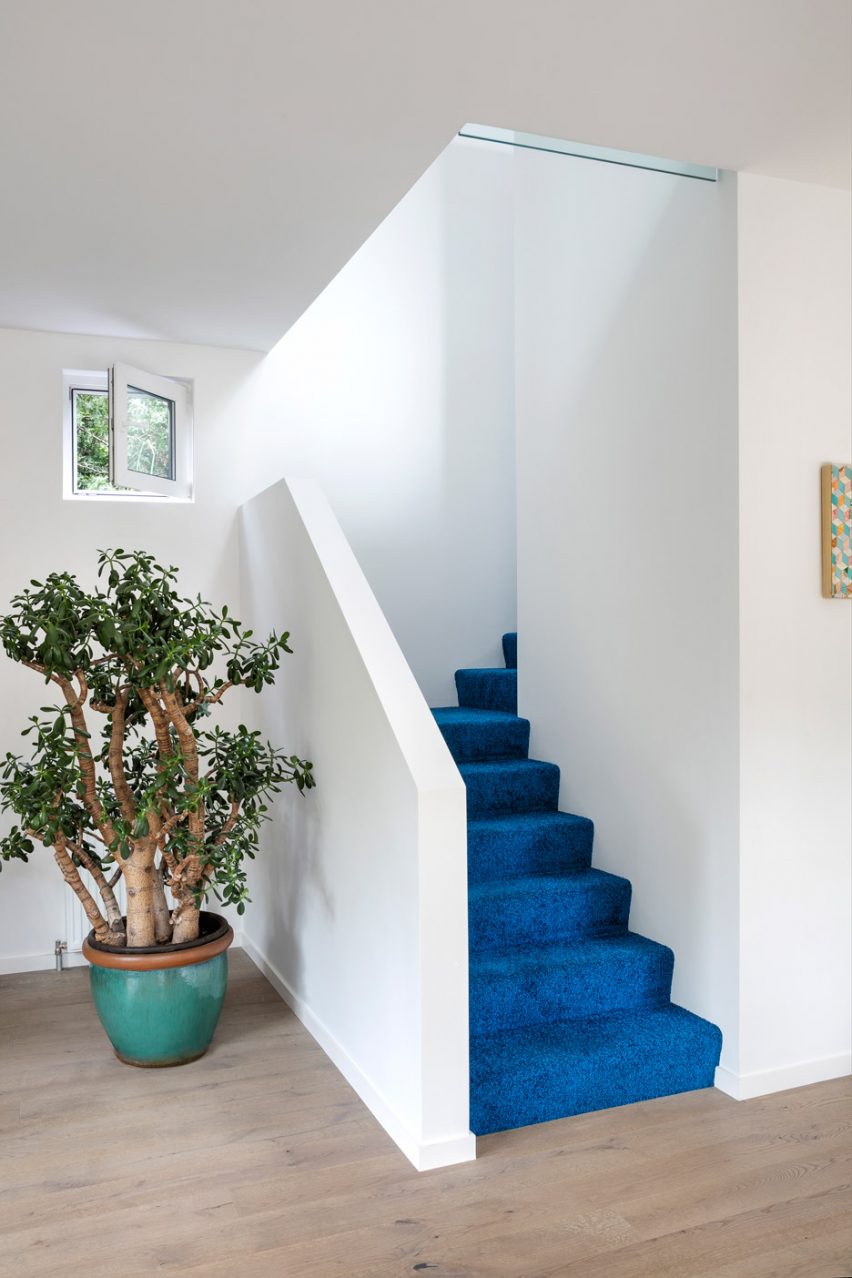
At Winona House, a family home in Toronto that was designed by local architecture studio Reigo and Bauer, residents and visitors are met by a bright blue carpet in the entrance hall that covers the stairs to the home’s upper levels.

Pops of colour were added throughout the home, including on the exterior, which features a hot pink-painted entrance that is surrounded by black shingles.

Find out more about Winona House ›

This is the latest in our lookbooks series, which provides visual inspiration from Dezeen’s archive. For more inspiration see previous lookbooks featuring pop-up shop interiors, kitchens with marble surfaces and interiors with stone furnishings.

Reference

Ten earthy bedrooms that use natural colours and textures
CategoriesInterior Design

Ten earthy bedrooms that use natural colours and textures

In our latest lookbook, we highlight 10 bedroom interiors that introduce earthy colour palettes and natural materials to evoke a sense of calm and tranquility.

Warm tones of earthen brown and light neutrals were used alongside colourful pops of terracotta and leafy greens on soft furnishings, headboards and decorations to create a peaceful atmosphere in these bedrooms.

Stone surfaces, timber panelling, linen fabric, accents of clay and limewash finishes add subtle textures to the interior spaces.

This is the latest in our lookbooks series, which provides visual inspiration from Dezeen’s archive. For more inspiration see previous lookbooks featuring jewel-toned hotel interiors, kitchens with marble surfaces and biophilic homes.


Brown bedroom in house in Mexico City by Chloe Mason Gray
Photo by Fabian Martinez

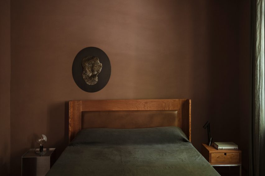
Colonia Condesa House, Mexico, by Chloé Mason Gray

For the renovation of this mid-20th century house in Mexico City, local interiors studio Chloé Mason Gray embraced the lack of natural light coming into the space by introducing dark, earthy colours and textures.

The walls of the primary bedroom were coated in brown plaster, and the space was finished with a brown leather headboard and linen furnishings in deep shades of forest green.

Find out more about Colonia Condesa House ›


Interior of Casa Maiora by Studio Andrew Trotter in Puglia
Photo by Salva López

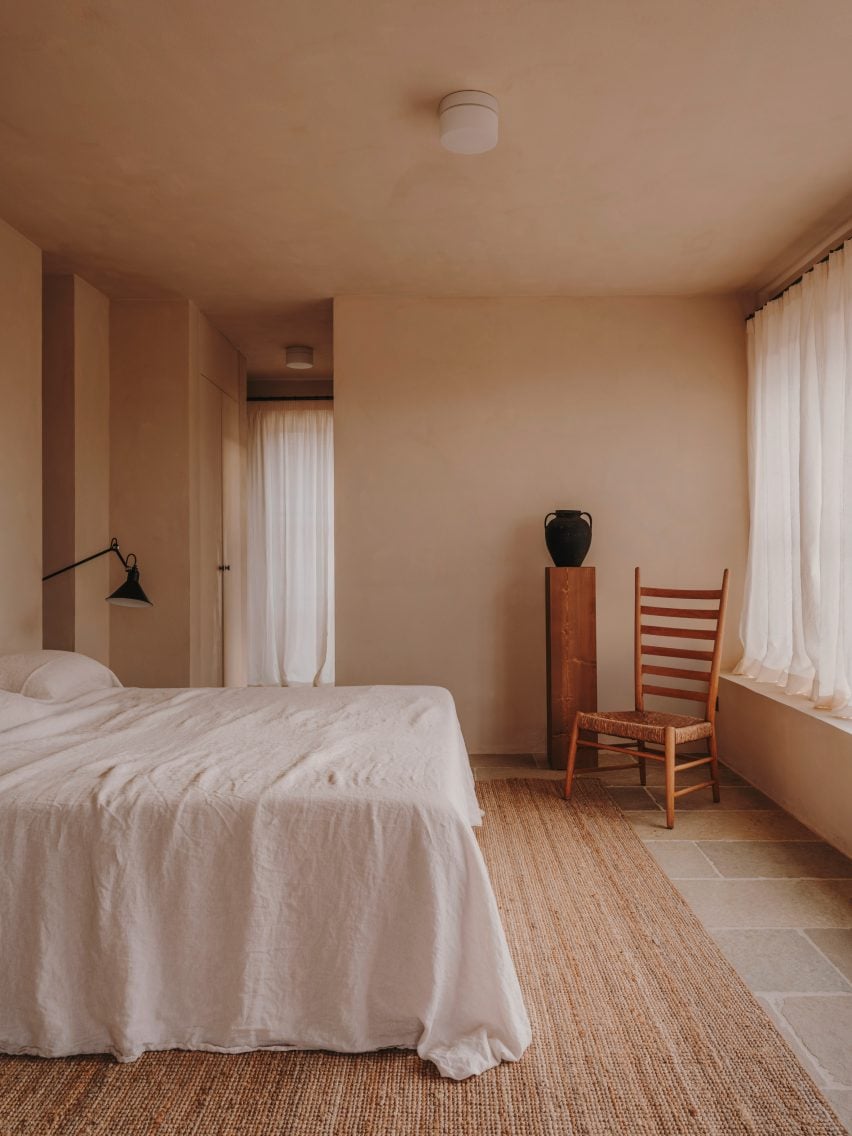
Casa Maiora, Italy, by Studio Andrew Trotter

Designed to mimic the surrounding landscape, Italian architecture practice Studio Andrew Trotter created this villa in Puglia with sandstone and limestone walls coated in a pink lime wash.

Stone floors complement the warm-toned walls while in the bedrooms, locally-sourced wooden antique furniture and large woven rugs add hints of deeper earthen shades.

Find out more about Casa Maiora ›


Bedroom interior of Dumbo Loft by Crystal Sinclair Designs
Photo by Seth Caplan

Dumbo Loft, USA, by Crystal Sinclair Designs

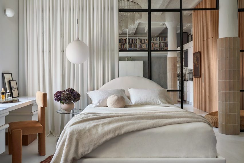
New York interiors studio Crystal Sinclair Designs punctuated the pale white backdrop of this bedroom in a Brooklyn loft apartment with caramel shades of brown and natural textures.

A yellow-brown velvet chair, rustic tiles that wrap around the lower half of structural columns, and a wooden batten wall help to make the space cosier and more inviting.

Find out more about Dumbo Loft ›


De Beauvoir Townhouse by HÛT
Photo by Emanuelis Stasaitis

De Beauvoir Townhouse, UK, by HÛT

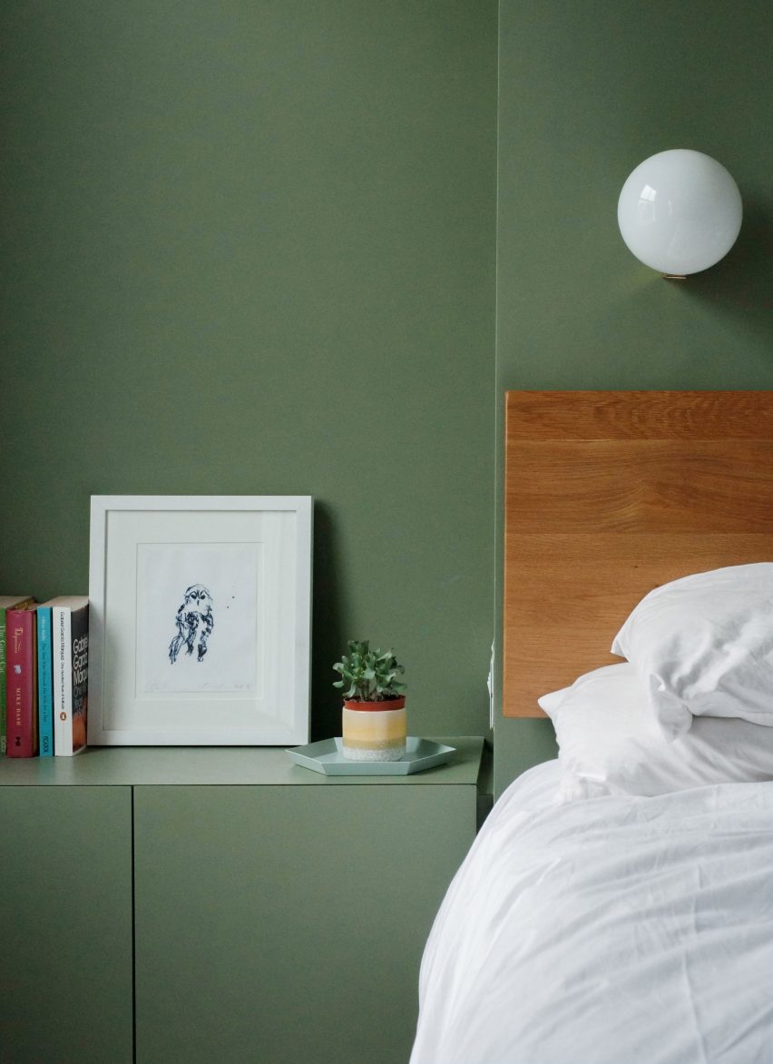
As part of the overhaul of a home in London, British architecture studio HÛT finished the surfaces and joinery in the main bedroom in sage green, nodding to the use of green shades in the kitchen and living room downstairs.

According to the studio, the muted green colour was chosen for its timelessness and longevity, as well as for its visual appeal when paired with exposed timber.

Find out more about De Beauvoir Townhouse ›


Interior of Hygge Studio by Melina Romano
Photo by MCA Estúdio

Hygge Studio, Brazil, by Melina Romano

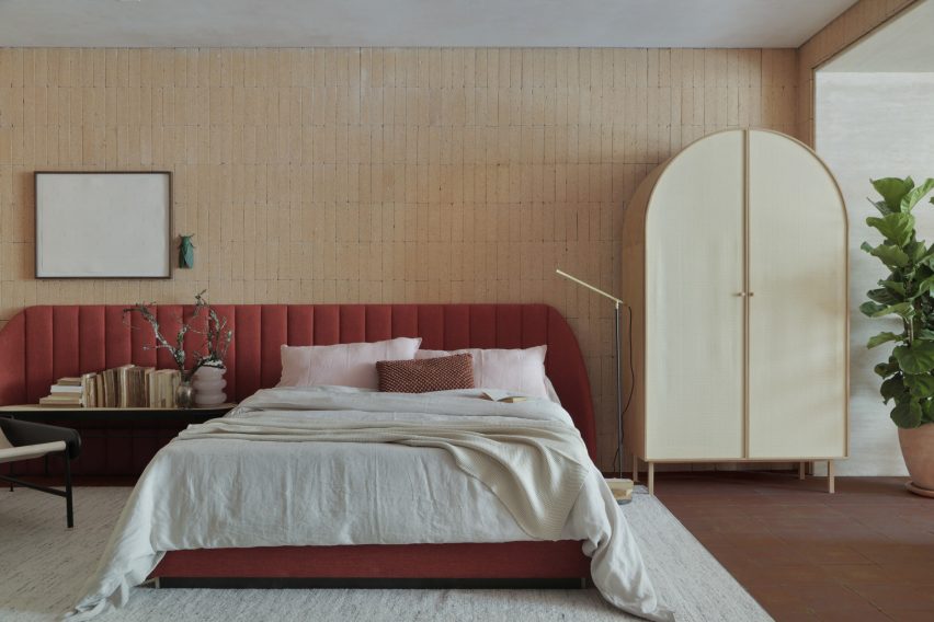
Brazilian designer Melina Romano used a myriad of earthy colours, textures and decorations to achieve a modern interior with “rustic charm” in this São Paulo apartment.

Terracotta flooring and creamy brick walls were complemented with comfy furniture and soft furnishing in earthy tones, including the rust-coloured bed frame and elongated headboard in the bedroom.

Romano also added a tropical leafy plant, branches speckled with lichen and insect-shaped wall art to the space.

Find out more about Hygge Studio ›


Custom bed in Twentieth house by Woods and Dangaran
Photo by Joe Fletcher

Twentieth, USA, by Woods + Dangaran

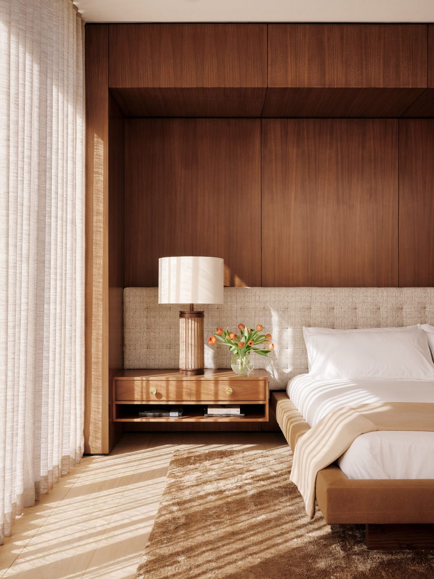
Wood panelling, vintage furnishings and earthy-brown colours characterise the interior spaces of the Twentieth house in Santa Monica by Los Angeles studio Woods +Dangaran, which was built around an olive tree.

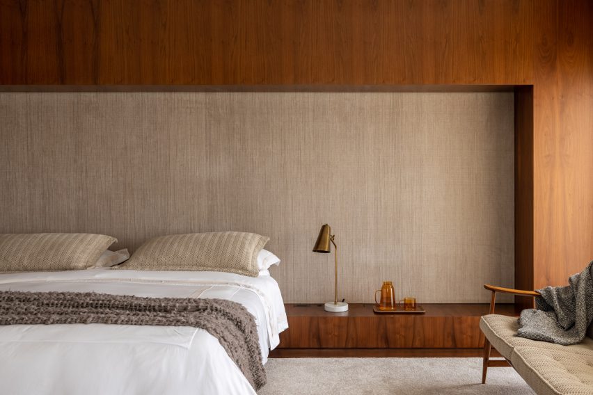
The primary bedroom was designed to feel flush and luxurious, with a Mehraban silk shag rug, brass fixtures and a custom bed recessed into a wooden surround.

Find out more about Twentieth ›


Bedroom in Flat#6 by Studio MK27
Photo by Fran Parente

Flat #6, Brazil, by Studio MK27

Also featuring a custom-made wooden bed surround is this bedroom designed by local architecture and design practice Studio MK27.

The practice added tactile rugs, blankets and fabric wall panels in various shades of brown and light neutrals to contrast with the basalt stone flooring in the São Paulo apartment.

“Natural light warms up every piece and every corner, letting the woods, the velvets and the stones speak louder,” said Studio MK27.

Find out more about Flat #6 ›


Escondido Oaxa Hotel by Decada Muebles
Photo by Undine Pröhl

Escondido Oaxaca Hotel, Mexico, by Decada Muebles

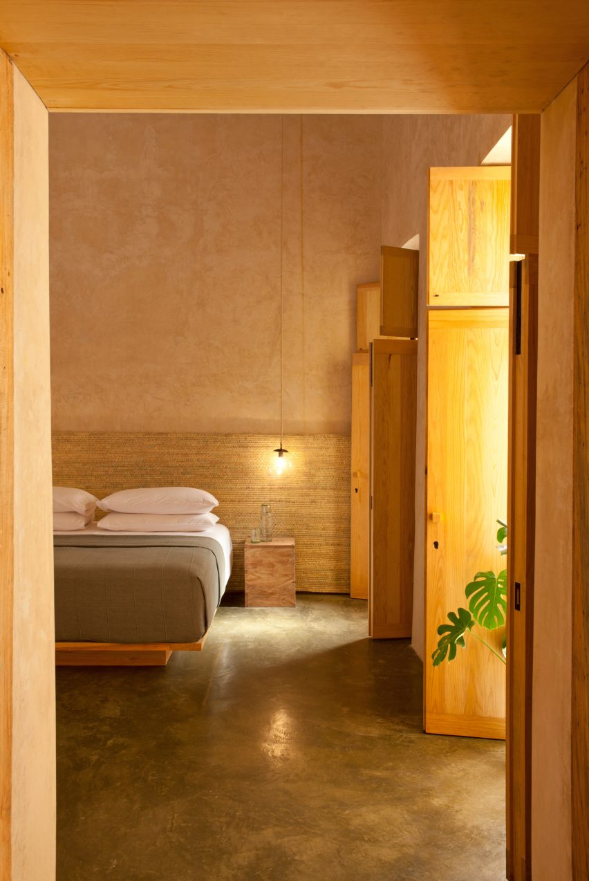
Interiors studio Decada Muebles finished the bedrooms of this boutique hotel in Oaxaca City with woven palm leaf headboards and sabino wood furniture pieces made by local artisans, including side tables, bed frames and shutters.

Alongside the wood accents, stucco walls help to add warmth and texture to the space and create a relaxing place for vacationers to stay.

Find out more about Escondido Oaxaca Hotel ›


The Palace Gate by Tala Fustok
Photo by Michael Sinclair

The Palace Gate Apartment, UK, by Tala Fustok Studio

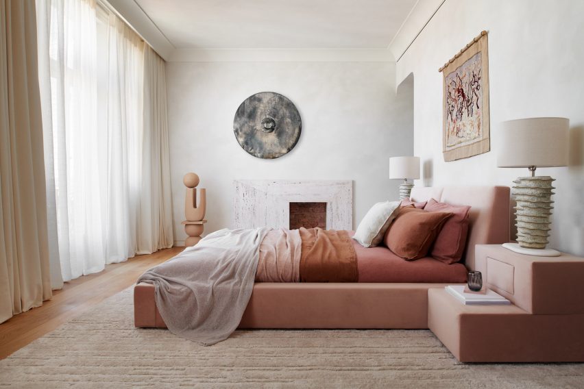
Local interior design practice Tala Fustok Studio transformed this west London apartment into a “calm sanctuary” with a mixture of stone textures, earthy fabrics and a soft-warm colour palette.

The centrepiece of the bedroom is a 1960s-style velvet bed in a dusty pink hue. Decorative items surrounding it include a wall tapestry, a modern stone fireplace and an organically-shaped ceramic statue.

Find out more about The Palace Gate Apartment ›


Lom Haijai by Studionomad
Photo by Supee Juntranggur

Lom Haijai, Thailand, by Studionomad

Lom Haijai is an apartment block in Bangkok designed by architecture practice Studionomad, which features trees growing through the facade’s louvres.

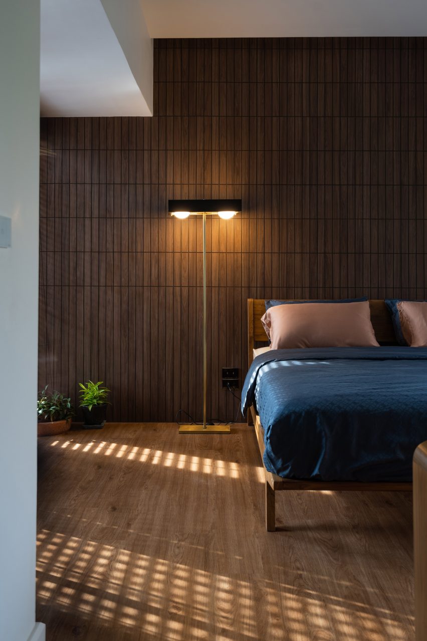
Each bedroom in the apartment block has a Juliet balcony that looks over an internal courtyard. Wooden flooring and wall panelling add to the nature-inspired theme of the design.

Find out more about Lom Haijai ›

This is the latest in our lookbooks series, which provides visual inspiration from Dezeen’s archive. For more inspiration see previous lookbooks featuring jewel-toned hotel interiors, kitchens with marble surfaces and biophilic homes.

Reference

Ten cottage interiors that offer a place for peaceful reflection
CategoriesInterior Design

Ten cottage interiors that offer a place for peaceful reflection

A renovated dwelling in rural China and a converted stable in Ibiza feature in our latest lookbook, which collects 10 cottage interiors that promise rest and relaxation.

Cottages are small dwellings that are traditionally characterised by a sense of comfort and cosiness. However, interior designers are increasingly pushing the boundaries of how to dress the insides of these homes, as seen in these innovative examples.

As the weather cools down in the northern hemisphere, here are 10 calming interior spaces in cottages by architects and interior designers from across the globe.

This is the latest in our lookbooks series, which provides visual inspiration from Dezeen’s archive. For more inspiration see previous lookbooks featuring neutral living rooms, homes in converted warehouses and Bauhaus-informed interiors.


Studio Cottage by Sun Min and Christian Taeubert
Photo is by courtesy of Sun Min and Christian Taeubert

Hai Zhen cottage, China, by Sun Min and Christian Taeubert

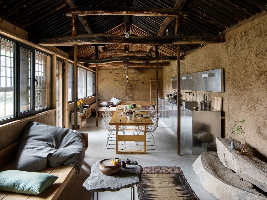
Located in Hai Zhen, a village just outside of Beijing, this previously neglected cottage was renovated by fashion designer Sun Min and architect Christian Taeubert.

A large, open-plan lounge area displays a mixture of rustic features such as the original roof and timber beams, which are presented alongside more contemporary elements including stainless steel and spindly, wireframe lighting.

Find out more about this Hai Zhen cottage ›


Barwon Heads House
Photo is by Timothy Kaye

Barwon Heads House, Australia, by Adam Kane Architects

Barwon Heads House is a renovated cottage by Melbourne-based studio Adam Kane Architects with a barn-style extension defined by an open-plan living area.

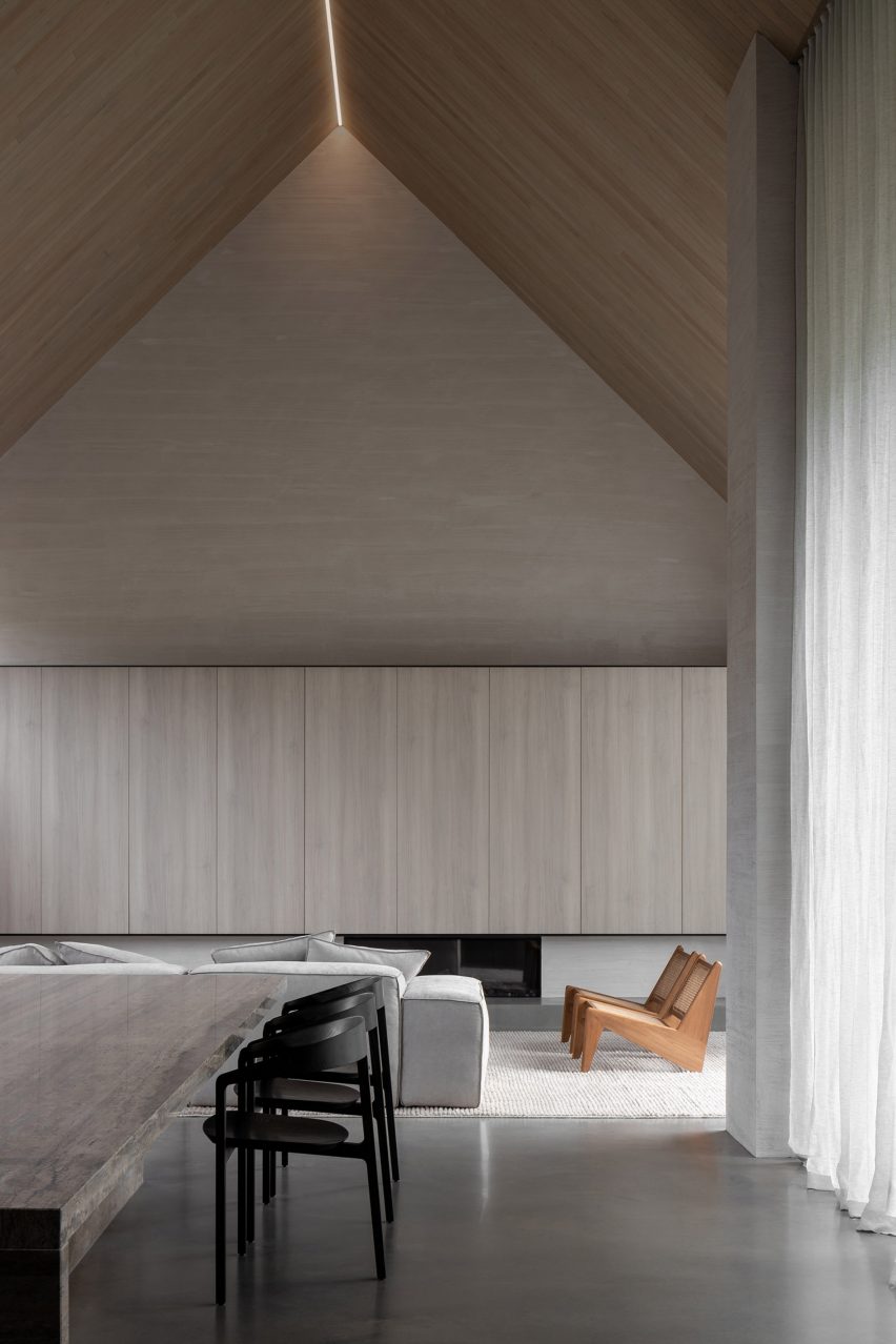
Shortlisted for the 2022 house interior of the year Dezeen Award, the cottage interior features a monochrome interior palette and statement geometric furniture, such as a pair of Kangaroo Lounge Chairs by designer Pierre Jeanneret.

Find out more about Barwon Heads House ›


House in Hampshire
Photo is by Jim Stephenson

English cottage, UK, by Invisible Studio

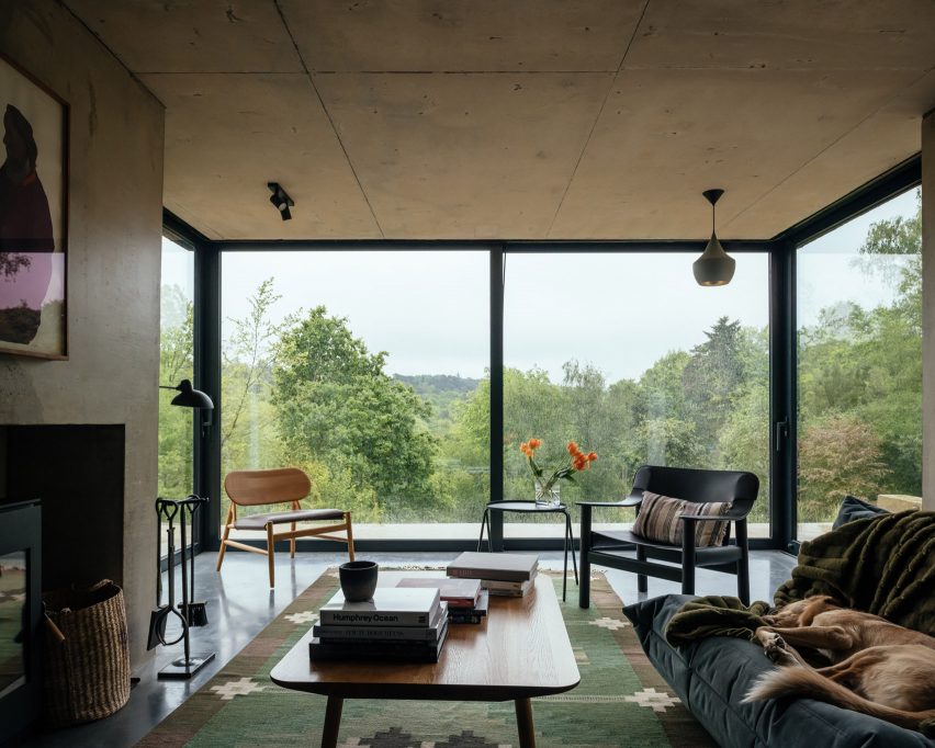
Architecture practice Invisible Studio added a double-pitched extension to this cottage that is located on the borders of Hampshire and Surrey in England.

Exposed concrete accents contrast with rectilinear sliding glass doors in the living space, which cantilevers over the sliding patio doors below with the support of a concrete chimney.

“All the materials are fair-faced so had to be perfectly made,” explained studio founder Piers Taylor. “Nothing is covered up and everything exposed.”

Find out more about this English cottage ›


Ibiza Campo by Standard Studio & Ibiza Interiors
Photo is by Youri Claesens

Casa Campo, Ibiza, by Standard Studio

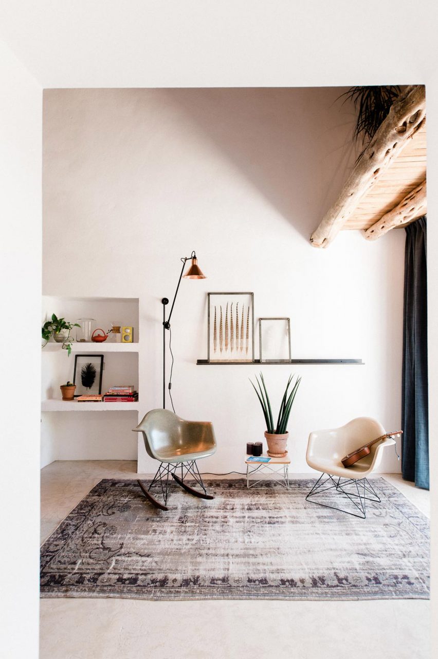
Casa Campo is a cottage in Ibiza that Standard Studio converted from a 200-year-old stable to an off-grid showroom and home for the owners of an interior design shop.

Original beams crafted from Ibiza’s native Sabina pine trees are paired with contemporary low-slung furniture in the double-height living space that is illuminated by bright white walls.

Find out more about Casa Campo ›


Artist retreat
Photo is by Jim Stephenson

Made of Sand, UK, by Studio Weave

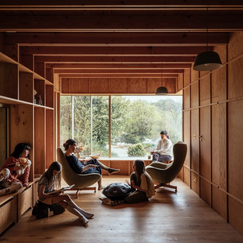
Architecture office Studio Weave designed a wooden extension to a stone cottage in Devon’s Blackdown Hills in the English countryside, which was created as a creative workspace for its owners and visiting artists.

Called Made of Sand, the extension’s interior is defined by built-in timber window seats and wall storage that is framed by large glass windows.

“The contrast between materials, old and new, in and out, are foregrounded to create a distinct sense of rest and relaxation in the new spaces,” said studio director Je Ahn.

Find out more about Made of Sand ›


Naturehumaine La Breche
Photo is by Ronan Mézière

La Brèche, Canada, by Naturehumaine

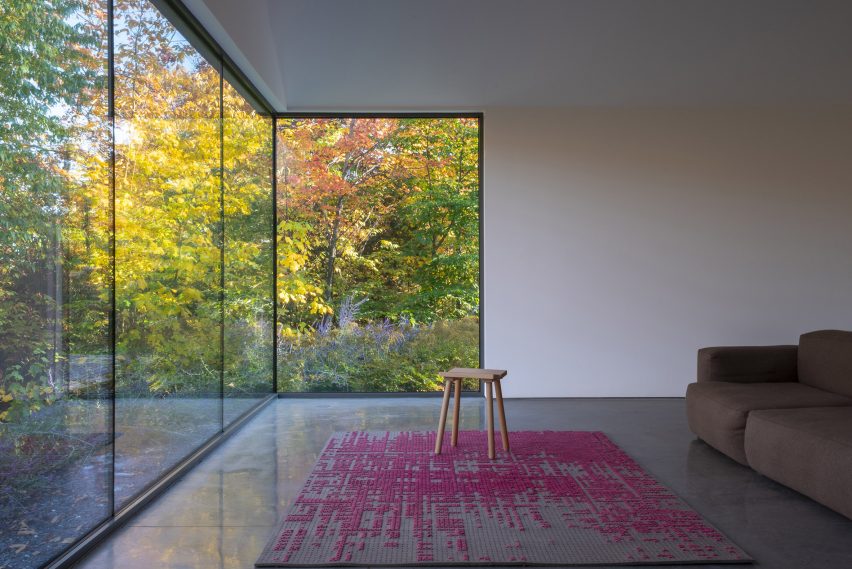
Two volumes connected by a walkway make up La Brèche, a ski cottage in Quebec by Montreal studio Naturehumaine that features facades informed by the area’s vernacular architecture.
Floor-to-ceiling corner windows illuminate the living space, which is characterised by a polished concrete floor and minimal accents of colour and texture.
Find out more about La Brèche ›


Muskoka cottage
Photo is by Joel Esposito

Muskoka Cottage, Canada, by Studio Paolo Ferrari

Named after its location in Canada’s Muskoka region, this cottage interior features exposed finishes informed by the surrounding natural forests and the area’s geological details.

These include sandy-hued, Douglas fir exposed ceilings and large slabs of granite that make up various statement islands throughout the home, as well as a large fireplace in the living space.

“The granite is coarse-grained and hard,” noted Studio Paolo Ferrari. “It references the minerality of the site and imbues the interiors with a sense of ruggedness.”

Find out more about Muskoka Cottage ›


Marlboro Music Cottages by HGA
Photo is by Paul Crosby Photography

The Marlboro Music Cottages, USA, by HGA Architects and Engineers

The Marlboro Music Cottages are a series of cabin-style dwellings by HGA Architects and Engineers (HGA) for musicians staying in New England over the summer during the Marlboro Music School and Festival, an annual event.

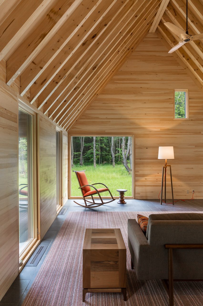
HGA took cues from the single-storey boxy dwellings with gabled roofs that populate Cape Cod for the cottages’ architecture. Cedar plank cladding and pitched roofs were used to embrace the homes’ natural setting.
Inside, the cottage interior features exposed timber ceilings, pine-sheathed walls and slate flooring, adding to this pared-back approach.

Find out more about The Marlboro Music Cottages ›


Birdseye Lathouse
Photo is by Michael Moran

Hamptons cottage, USA, by Birdseye Design

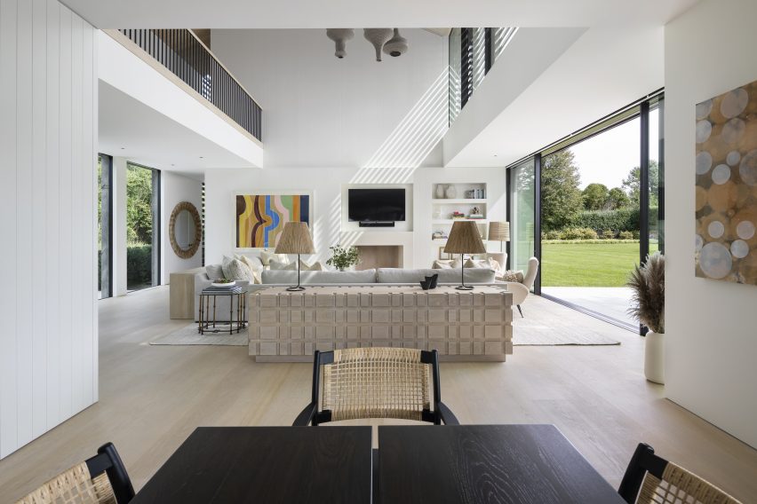
A double-height living space offers views of the surrounding Hamptons at this cottage by architecture studio Birdseye Design, which is wrapped in thin wooden slats that nod to local traditional buildings.

Eclectic geometric furniture makes up dining and living areas that anchor the west side of the property and open out onto an outdoor dining space.

“Operable glass walls open to a large stone terrace off the living room and the kitchen opens to a wood-slatted, pergola-covered porch,” said Birdseye.
Find out more about this Hamptons cottage ›


Captain Kelly's Cottage by John Wardle Architects
Photo is by Trevor Mein

Captain Kelly’s Cottage, Tasmania, John Wardle Architects

Australian studio John Wardle Architects has repaired this weatherboard cottage in Tasmania, which originally belonged to its architect, harbourmaster Captain Kelly, in the 1840s.

Furniture created from materials left over at the end of the project’s renovation feature in its updated design, while a focus on wooden interiors maintains a sense of the dwelling’s history.

“Over 175 years there had been many unsympathetic alterations to the small cottage,” said the studio. “Part of our work involved the removal of these non-original works, to respectfully return the cottage to its original form.”

Find out more about Captain Kelly’s Cottage ›

This is the latest in our lookbooks series, which provides visual inspiration from Dezeen’s archive. For more inspiration see previous lookbooks featuring neutral living rooms, homes in converted warehouses and Bauhaus-informed interiors.

Reference