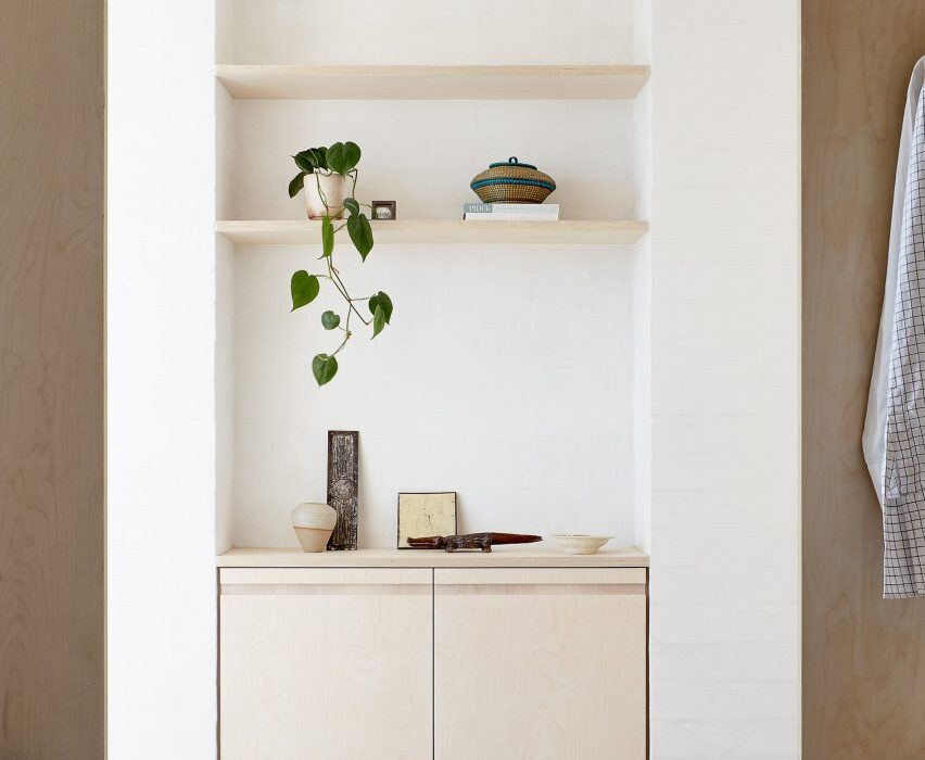
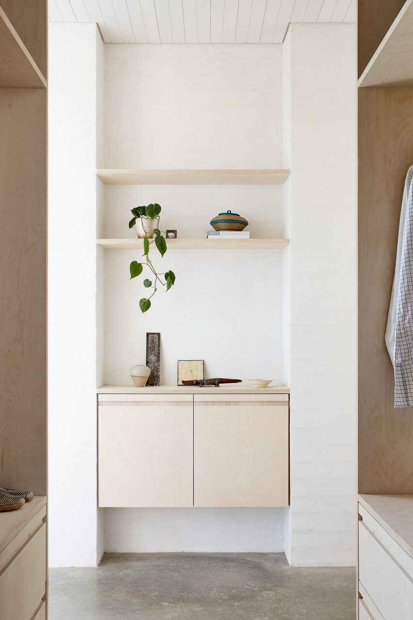
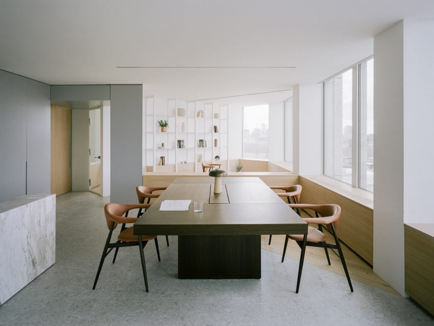
Ten homes that feature decorative ceilings and ornate plasterwork
CategoriesInterior Design

Ten homes that feature decorative ceilings and ornate plasterwork

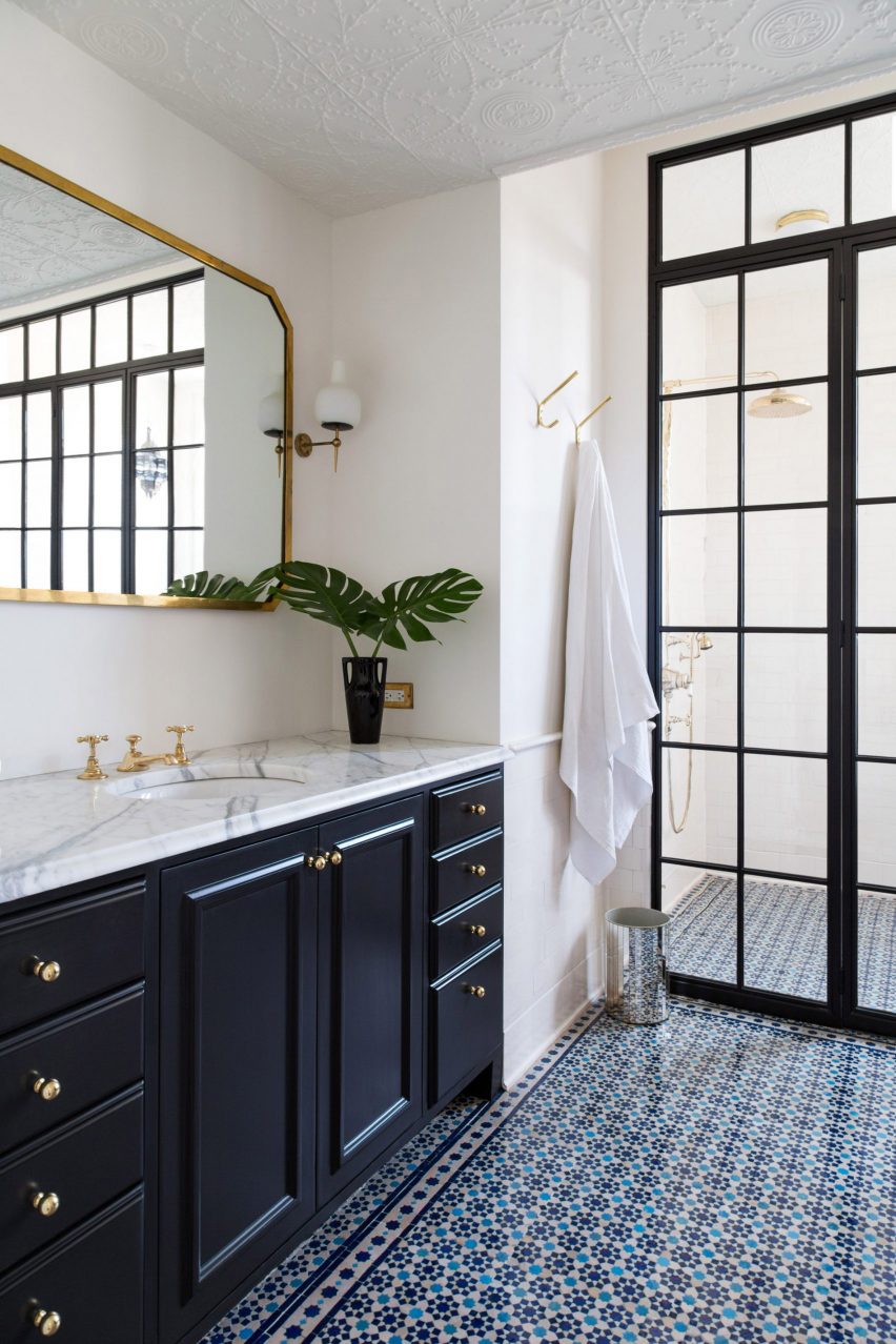
A home in Williamsburg with a bathroom that saw its original tin-panelled ceiling restored and intricate 19th-century plasterwork set within a modern apartment feature in this lookbook, which showcases decorative and ornate ceilings.

Mouldings are decorative architectural elements that are used as focal elements in interior spaces, contouring the corners of ceilings and light fixtures in the form of ceiling roses, cornices, architraves and coving.

These elements typically have a highly decorative and ornate finish incorporating seamless patterns, created through reliefs and recesses across their surfaces.

Mouldings and ornate plasterworks are typically associated with the Georgian, Victorian and Edwardian eras and were drawn from classicism and ancient Greek and Egyptian architecture.

The architectural elements were often constructed from plaster and timber, however the 20th century saw people look to alternative materials to obtain more durable and cost-effective finishes.

This is the latest in our lookbook series, which provides visual inspiration from Dezeen’s archive. For more inspiration see previous lookbooks featuring deliberately unfinished interiors, maximalist interiors and homes with walk-in wardrobes.

Stockholm Apartment by Note Design Studio

Stockholm Apartment, Sweden, by Note Design Studio

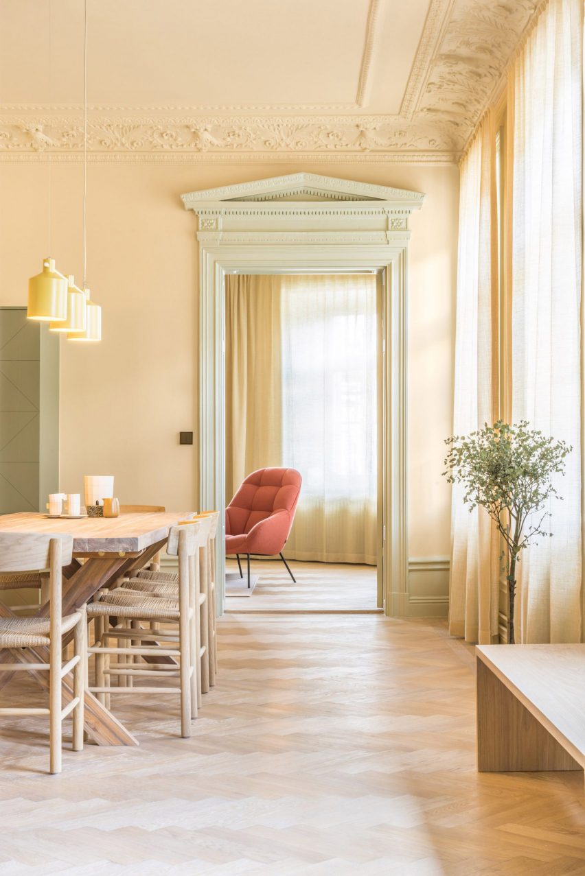
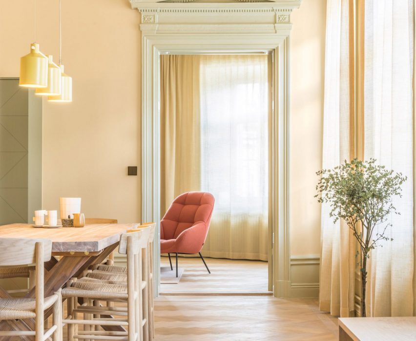
Swedish design firm Note Design Studio transformed this Stockholm office into a home adding shades of yellow, green and pink across its walls and mouldings and window frames.

Rooms of the home were painted entirely in single colours adding pastel hues to its 19th-century features.

Find out more about Stockholm Apartment ›

Historic Schoolhouse by White Arrow
Photo is by White Arrow

Historic Schoolhouse, US, by White Arrow

Brooklyn-based interior design studio White Arrow’s founders, Keren and Thomas Richter transformed this landmarked building in Williamsburg into a bright and airy home while restoring some of its original features.

In one of the home’s bathrooms, the interior design duo tracked down its original decorative tin ceiling tiles and reinstated them across the vanity area. Tin ceiling tiles are an American innovation and were created as a low-cost and more durable alternative to ornate plasterwork.

Find out more about Historic Schoolhouse ›

Bakers House by Färg & Blanche

Bakers House, Sweden, by Färg & Blanche

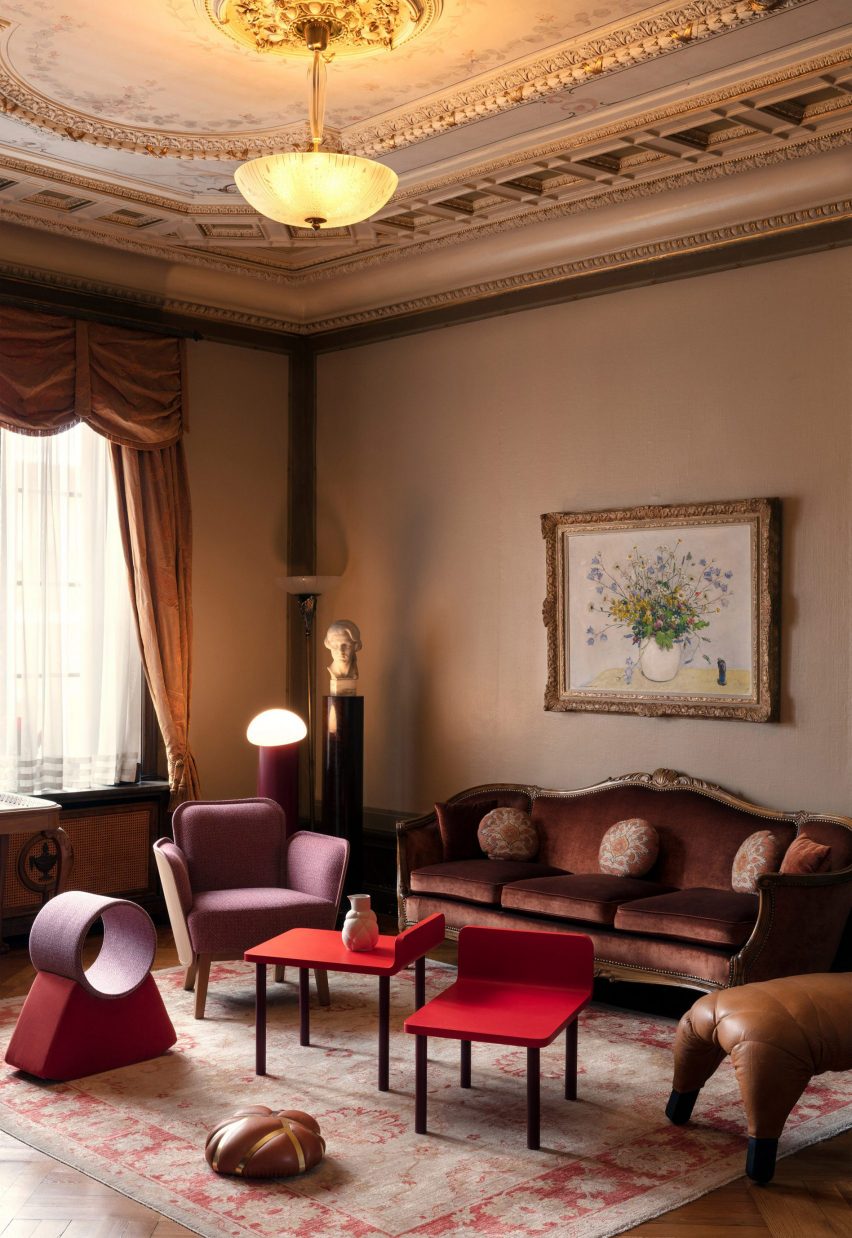
This residence, which has belonged to the family of Färg & Blanche co-founder Emma Marga Blanche for four generations, features a traditional and extravagantly ornate interior. The home formerly contained a traditional Swedish crispbread bakery at the rear of the building and is now mainly used to host events.

Intricately detailed furniture, such as carved-wood trimmed sofas and gilded photo frames complement the home’s decorative ceiling mouldings and ornamentation. In each room, the ceiling details are painted bold colours and incorporate frescoes-like paintings.

Find out more about Bakers House ›


Young family house by ŠA Atelier
Photography is by Norbert Tukaj

Young family house, Lithuania, by ŠA Atelier

Lithuanian architecture studio ŠA Atelier renovated the interior of this formerly dilapidated 19th-century apartment in Vilnius, Lithuania. Set within a townhouse built in 1862, the apartment has a minimal finish with some of its remaining original features restored as focal points throughout.

Expanses of plasterwork mouldings and ceiling roses stretch across the ceilings in the home while parquet wood flooring boasts a neutral, light tone.

Find out more about Young family house ›

Passeig de Grácia apartment by Jeanne Schultz
Photo is by Adrià Goula

Passeig de Grácia, Spain, by Jeanne Schultz Design Studio

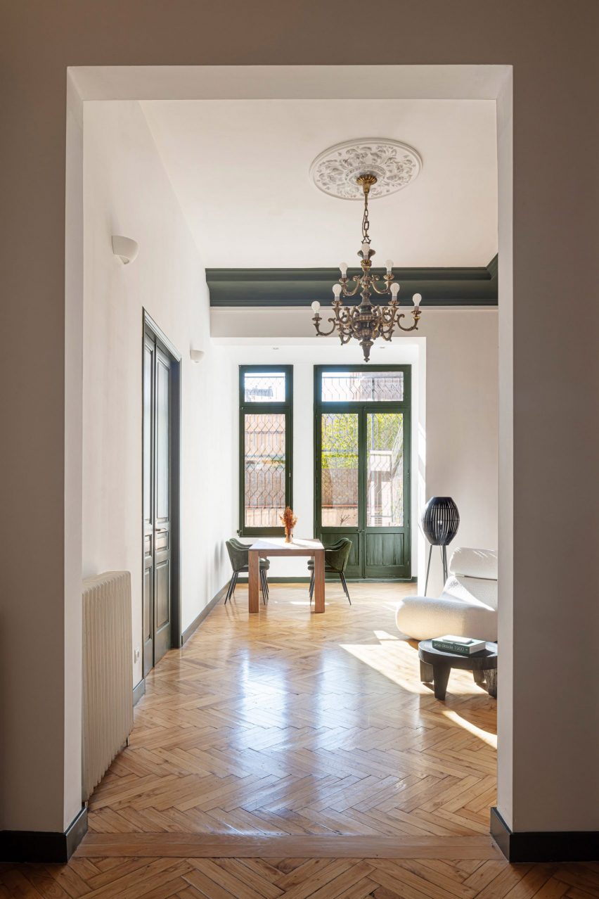
Ornamental details and finishes were added to the renovation of this apartment on Barcelona’s Passeig de Grácia.

US design firm Jeanne Schultz Design Studio incorporated and re-energised the home’s period and original features. In the main living space, it painted the ceiling’s stepped coving, that runs through the interior of the home, a shade of green which was also applied to the doors, window frames and skirting of the room.

Find out more about Passeig de Grácia ›

Napoleon apartment Freaks freearchitects
Photo is by David Foessel

Napoléon apartment, France, Freaks

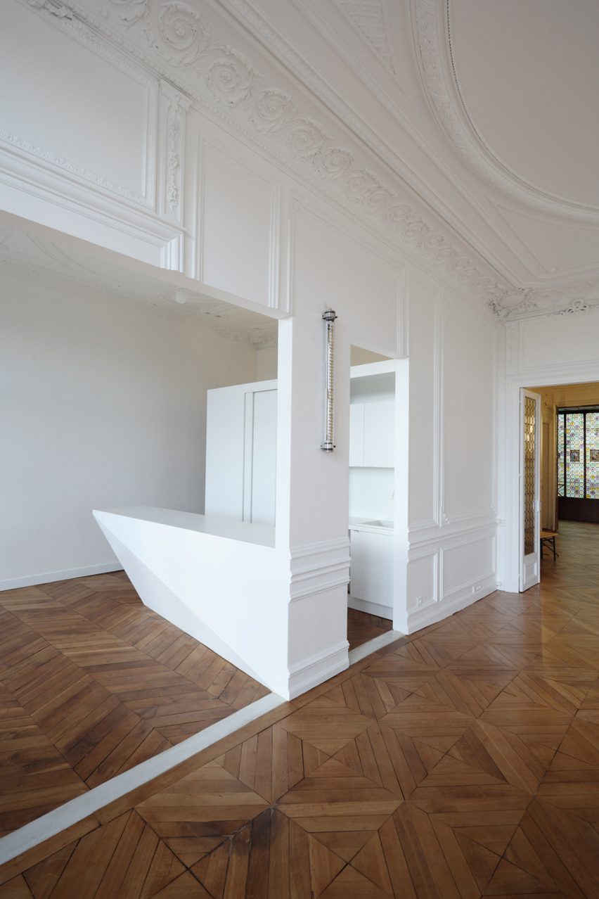
French studio Freaks renovated this apartment in Paris. It retained period mouldings and architectural features throughout but added modern touches including fluorescent lighting and freestanding angular volumes.

“One of the main interventions consisted of opening the new kitchen towards the dining room, while taking charge to use a contemporary architectural language,” said the studio.

Wood Ribbon apartment by Toledano + Architects
Photography is by Salem Mostefaoui

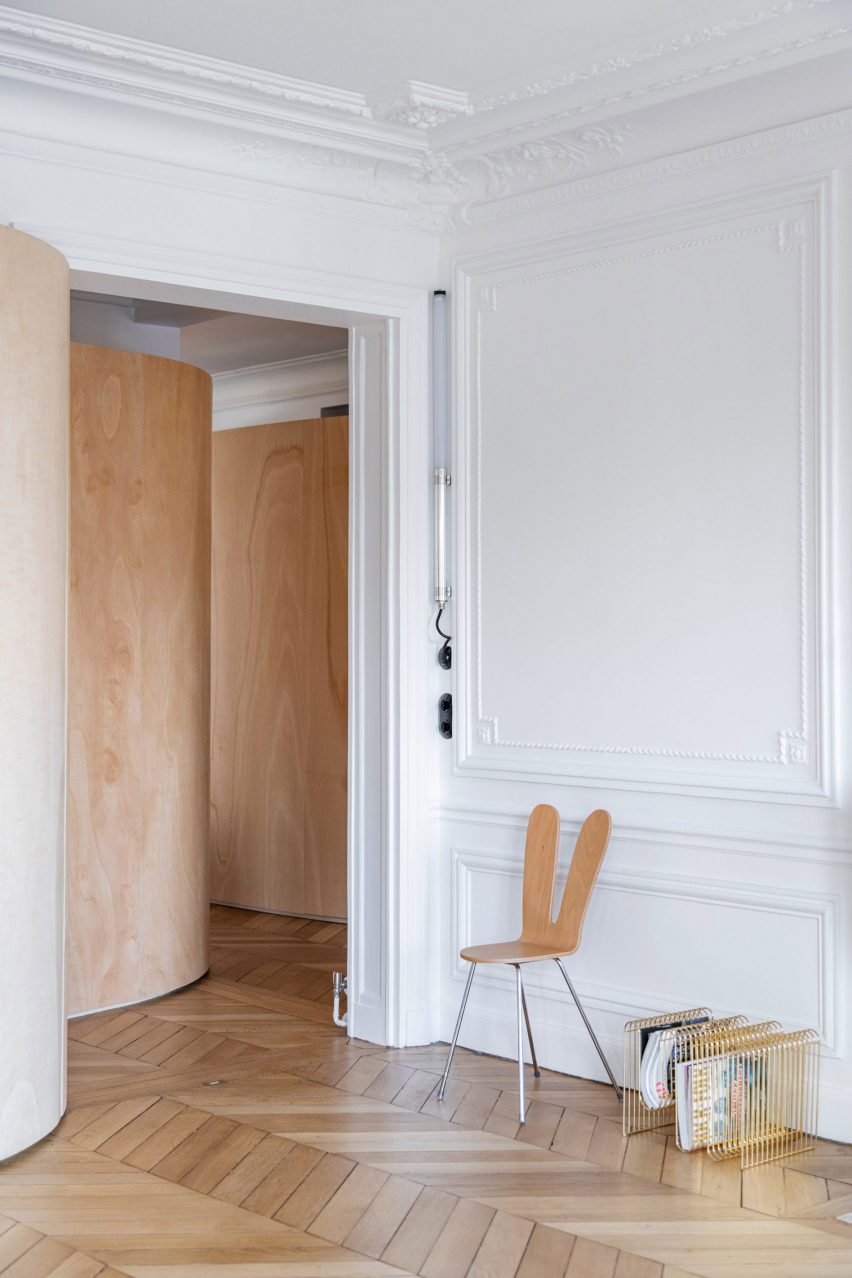
Wood Ribbon apartment, France, by Toledano + Architects

Set above a ribbon-like plywood wall and contrasting against the apartment’s contemporary decor, ornate plasterwork, which has largely remained untouched since the 19th century, subtly defines and zones this apartment.

Where French architecture studio Toledano + Architects wanted the home to feel more contemporary, it installed a false, polycarbonate ceiling over its original decorative ceilings.

Find out more about Wood Ribbon apartment ›

Montreal Home by Vives St-Laurent
Photo is by Alex Lesage

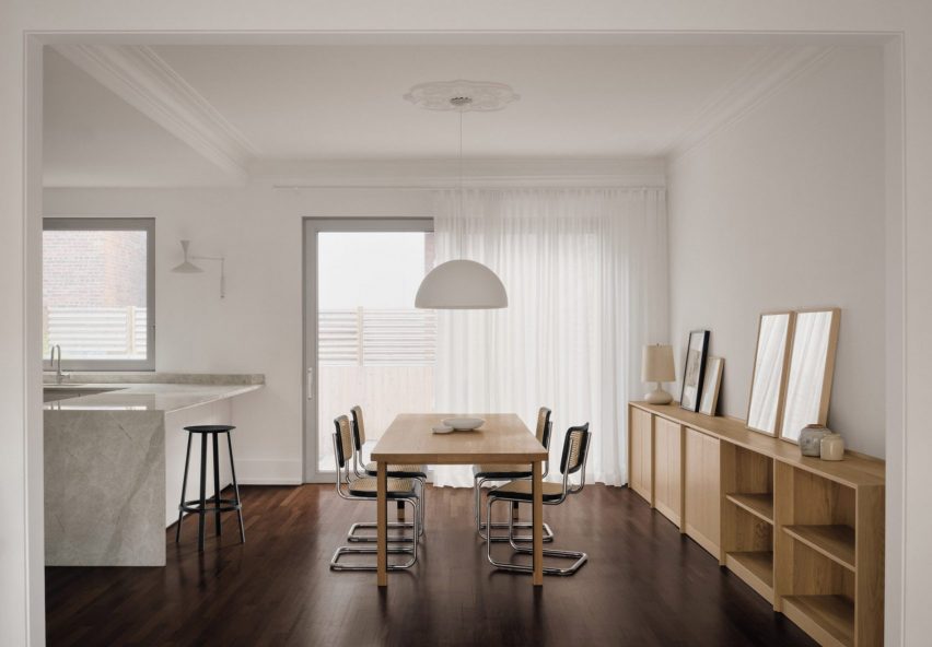
Montreal Home, Canada, by Vives St-Laurent

Canadian interior design studio Vives St-Laurent renovated and remodelled a family home in Montreal to better highlight its existing architectural elements. The studio looked to incorporate as much of the home’s original 20th-century characteristics including its plaster mouldings.

In the home’s open-plan kitchen and diner, coving informally zones the dining room from the kitchen while a ceiling rose anchors a pendant light above a light wood dining table and four Marcel Breuer Cesca chairs.

Find out more about Montreal Home ›

Carrer Avinyo 34 by David Kohn Architects

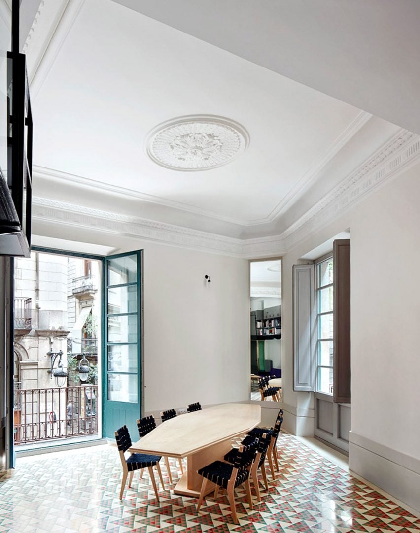
Carrer Avinyo 34, Spain, by David Kohn Architects

British architecture studio David Kohn Architects renovated this Barcelona apartment to better reveal and highlight its large windows, high ceilings and ornate mouldings.

Above the dining space, cornices bound the edges of the room while coffered ceilings stretch across the living areas. Ceiling roses throughout the home became focal points across the ceilings without light fixtures fitted to them.

Find out more about Carrer Avinyo 34 ›

Casa Cas 8 by DG Arquitecto
Photo is by Mariela Apollonio

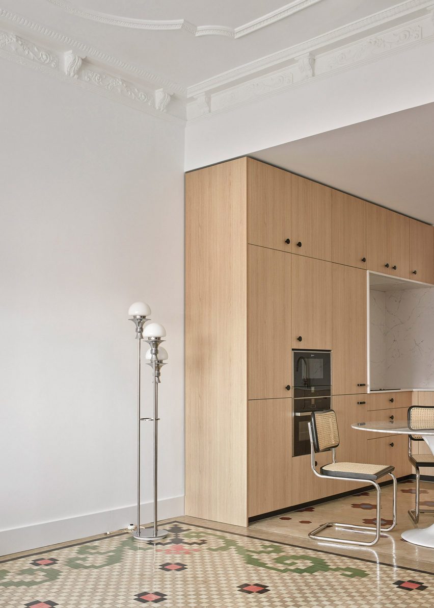
Casa Cas 8, Spain, by DG Arquitecto

Panel moulding and corbels protrude from the ceilings at Casa Cas 8 in Valencia, Spain, which was created by Valencia-based architecture studio DG Arquitecto. The 1920s penthouse aims to celebrate its original features including its mosaic floors, mouldings and arched doorways.

“Small changes in the distribution, very limited by the initial idea of ​​completely maintaining the original floor of the house and the ceilings with mouldings, helped us to transform the existing spaces,” said DG Arquitecto.

Find out more about Casa Cas 8 ›

Find out more about Napoléon apartment ›

This is the latest in our lookbooks series, which provides visual inspiration from Dezeen’s archive. For more inspiration see previous lookbooks featuring deliberately unfinished interiors, maximalist interiors and homes with walk-in wardrobes.

Reference

Ten principles for designing cool homes for hot weather
CategoriesSustainable News

Ten principles for designing cool homes for hot weather

Following a record-breaking heatwave in the UK and western Europe, with climate change meaning that sweltering temperatures are likely to become more common, Smith Mordak outlines 10 ways to design buildings that remain cool in hot weather.

Want to design cool architecture? Of course you do! Follow these principles and you too can be a cool designer of cool spaces that don’t heat up our climate – not cool.


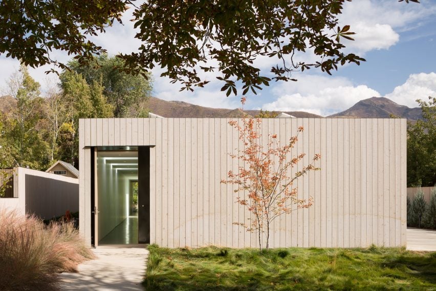
Host House in Salt Lake City
Photo by Lara Swimmer

Ground-source heat pumps and low-lying buildings

Low-lying buildings stay cooler than tall skinny ones because the ground maintains a pretty even temperature. Ground-source heat pumps essentially supercharge this process by facilitating depositing heat in the ground in summer and drawing heat from the ground in winter.

Host House in Salt Lake City (pictured), was designed by architects Kipp Edick and Joe Sadoski to be a net-zero building. It is mostly one-storey and uses a ground-source heat pump as one of its measures for controlling temperatures during the extremes of the Utah summers and winters.

Find out more about Host House ›


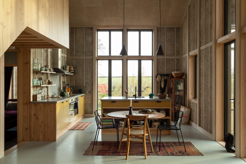
Flat House on Margent Farm, Cambridgeshire by Practice Architecture
Photo by Oskar Proctor

Exposed thermal mass

Internally exposed thermal mass is a mini version of this same concept. Thermally massive materials store heat or coolness, reducing the temperature difference between day and night.

Concrete has been soaring high on the thermal mass scale for far too long. The argument goes that while you’ll emit a load of carbon dioxide making the cement, the energy you’ll save by not having to heat and cool the building as much will make up for it. This is as annoying as those ads for excessively packaged nutrient-free foodstuffs that claim you’ll ‘save’ money buying them because they’re not quite as overpriced as they were yesterday, when you’d be better off not buying them at all. Concrete does not have a monopoly on thermal mass.

Hempcrete – a mix of hemp shiv (the woody stem of the plant) and a lime binder – is a highly insulating material that also provides that much sought-after thermal mass without the huge upfront carbon cost. It’s also vapour permeable and absorbs and releases moisture depending on its environment, so it controls humidity. Other low-carbon thermally massive materials include stone, rammed earth, and unfired bricks.

Flat House in Cambridgeshire (pictured), is a zero-carbon house designed by Practice Architecture that makes extensive use of hempcrete inside and out, especially on the exposed interior walls.

Find out more about Flat House ›


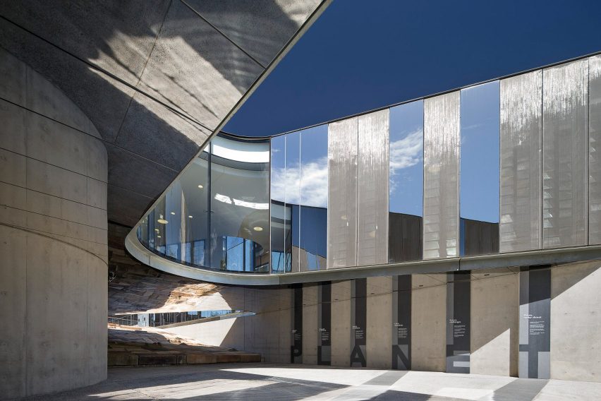
Australian Plant Bank
Photo courtesy of BVN Donovan Hill

Air cooling

If you create a labyrinth of thermal mass in your basement then not only do you get to say “want to see my labyrinth?” when people come to visit, you also have a no-need-to-plug-in coolness store always at hand. If you slowly pass outside air across the cool walls and of your cool underground maze before bringing it into inhabited spaces, then you’ve supercooled your passive ventilation without any chillers.

The Australian Plant Bank in New South Wales (pictured) uses an underground thermal labyrinth to capture and retain the heat of the day or the cool of the night, preventing sharp temperature fluctuations and warming or cooling the building by up to 7.5 degrees centigrade. It was designed by BVN Donovan Hill.

Find out more about the Australian Plant Bank ›


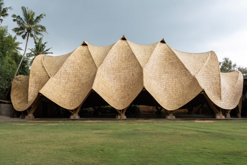
The Arc by Ibuku
Photo by Tommaso Riva

Heat extraction

As well as bringing in the cold we need to get rid of the heat. Even if you unplug everything, people still generate heat that needs removing, especially if there are a lot of people in your building.

Of course, unless your building is in a climate that never gets cold, even at night, this heat extraction needs to be controlled. Heat rises, so tall spaces that allow the heat to collect out of the way, openable windows at a high level that let the hot air out, and chimneys with wind cowls that use the passing wind to draw the air up through the building are all good tactics.

The image shows The Arc gymnasium in Bali designed by Ibuku, which uses vents at the apex of its roof to allow warm air to escape. Find out more about The Arc ›


Maggie's Leeds by Heatherwick Studio
Photo by Hufton + Crow

Keeping heat out

To reduce the amount of work the building needs to do to extract the heat or bring in the cold, well-designed buildings keep the heat out. If you don’t have a thermal labyrinth in your basement (yet!) then having a heat exchanger on your air intake/extract means you’re not losing heat in winter or gaining it in summer.

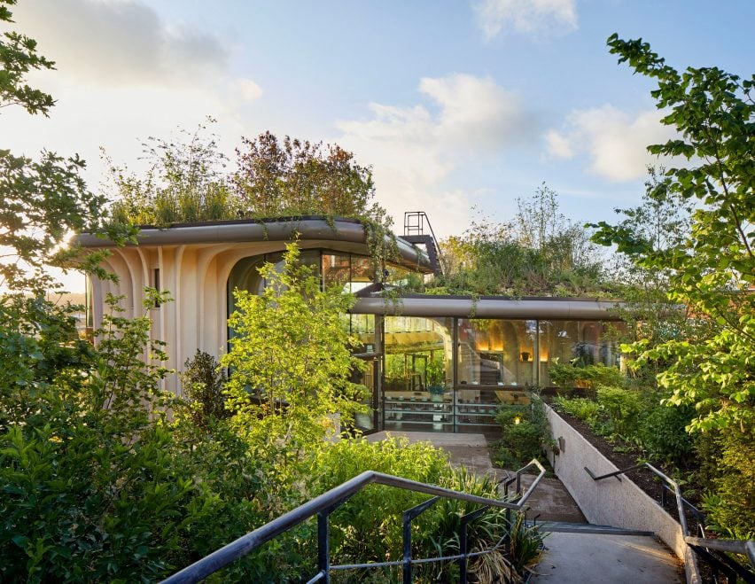
A huge way to prevent the temperature indoors from being a slave to the temperature outdoors is insulation: lovely thick insulation made from biobased, non-polluting materials. Couple this with double or triple glazing and a fat green roof (both insulating and brilliant for biodiversity) and you’re laughing.

The image shows the Maggie’s Centre for cancer patients in Leeds, designed by Heatherwick Studio and built with natural materials. Its roof is covered in plant species native to the woodlands of Yorkshire. Find about more about this Maggie’s Centre ›


Children Village in Brazilian rainforest by Aleph Zero and Rosenbaum wins RIBA International Prize
Photo by Leonardo Finotti

External shading

We’re getting better at insulation, but what we’re still mostly rubbish at as a profession is external shading. This keeps the heat off the building in the first place.

Shading needs to consider orientation. Vertical shading is best for east-and west-facing facades where the sun is lower. Overhangs and horizontal shading are best for the highest sun (from the south in the northern hemisphere and north in the southern hemisphere).

Deciduous trees are also handy, given how they shed their little shading units (aka leaves) in the winter when you appreciate the sun’s warmth. Other dynamic shading options are shutters and awnings that you can move or open and close. The shading is best outside because then the heat never gets indoors, but at a push, internal shading that’s pale – so that it reflects the heat back out – is better than nothing.

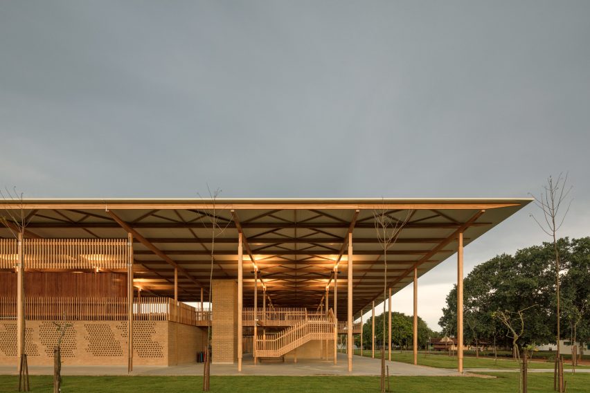
Aleph Zero and Rosenbaum designed the Children Village school boarding facility in northern Brazil (pictured) with a large canopy roof framed by cross-laminated timber to shade the building.

Find out more about Children Village ›


Karen Blixens Plads Square in Copenhagen
Photo by Rasmus Hjortshøj

Green urban environments

Designing a cool building is not just about the building, but also about designing a cool environment for your building to be in. The urban heat island effect can increase temperatures in urban areas by more than 10 degrees Celsius compared to their rural neighbours. We desperately need to tackle this if we’re to ease the health impacts of heatwaves and reduce the energy demand of buildings.

This means fewer heat-emitting things in urban spaces, ie fewer cars and fewer air conditioning units pumping out hot exhaust into the streets. It also means not leaving heat batteries lying about in the sun: towns and cities tend to be stock-full of thermal mass in the form of masonry, paving, and tarmac that soak up the heat from the sun and hang on to it tightly. We need less tarmac and more green, and when we retrofit our buildings with external insulation it would be great if this was reducing the amount of masonry cooking in the sunshine.

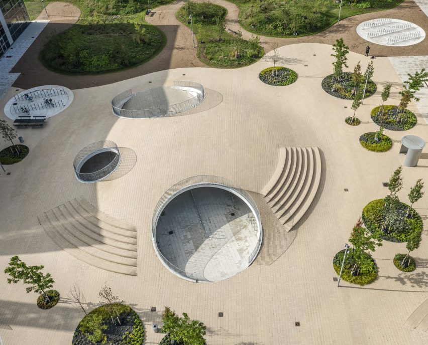
The Karen Blixens Plads public plaza in Copenhagen (pictured), which was designed by COBE, covers sheltered parking for bicycles and features neutral-coloured tiles frequently interspersed with planting and trees.

Find out more about Karen Blixens Plads ›


Shady tree-lined street
Photo by Wayne W

Shaded public realm

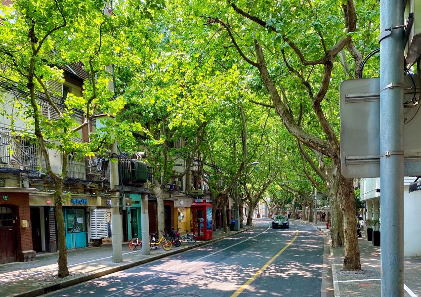
Trees are magic. Not only do they provide shade, habitats for a gazillion species, share information and nutrients with each other and other plants through mycelium networks and improve soil health, but they also cool the air around them via evapotranspiration.

This is where the trees use the heat energy in the air to evaporate the water in their leaves. We don’t need to leave this all up to the trees, however: moving water (from waterfalls to misters) has the same effect, as when the water evaporates it leaves the air around it cooler. We can also rip off the trees’ shading technologies: keep the sun off external spaces to prevent those hard, thermally massive materials from cooking us like pizza stones.
The image shows a street in Shanghai.


White roof
Photo by Víctor de la Fuente

Pale roofs

A final dig at tarmac and its buddy, the bitumen roof, is that they are dark and so they absorb heat. If these surfaces were paler, they could help reflect heat back out of town.

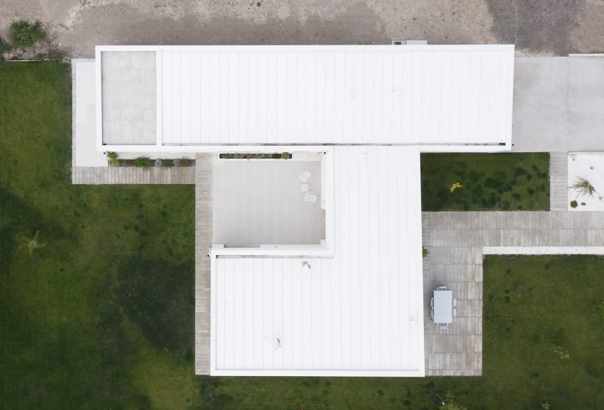
Casa Banlusa (pictured) is a white-roofed villa in Valladolid designed by architecture studio Sara Acebes Anta.

Find out more about Casa Banlusa ›


Paris apartment block by Mars Architectes
Photo by Charly Broyez

Low-energy living and reduced embodied carbon

As well as ‘fabric first’ and alleviating the urban heat island effect, let’s remember that facilitating behaviours that allow us to adapt to a changing climate is also part of this story. For example, how do the acoustics inside your home allow you to work odd hours, or how can you design spaces not for fixed activities, but the flexibility to allow inhabitants to move around a house as the sun moves across the sky?

Reducing the amount of heat being generated inside a building is a concept that bridges behaviour change and building design. Pretty much everything we plug in is pumping out heat (even a fan, depressingly) so we need more efficient appliances but also to just switch stuff off. If there’s an alternative way to do something without energy, consider it!

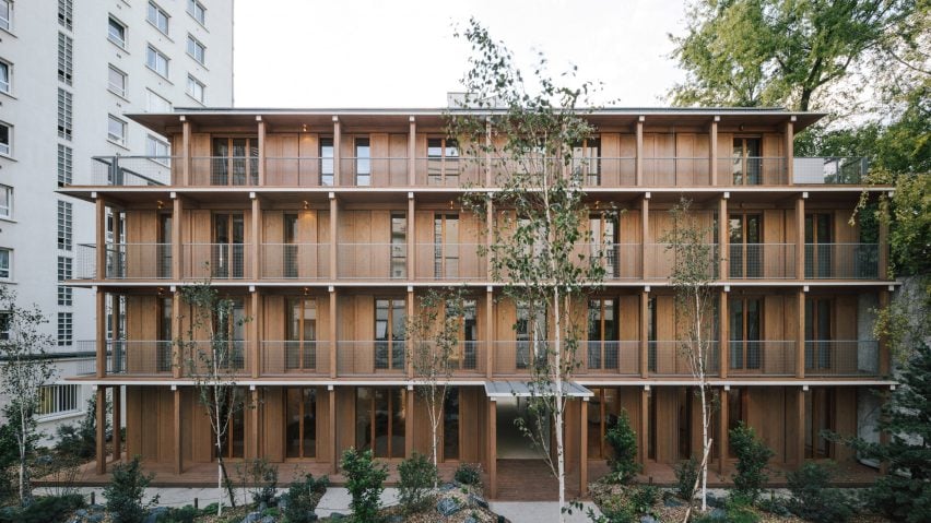
Mars Architectes designed the apartment block in Paris (pictured) entirely from wooden modules that are also clad in timber.

This brings us almost to the end of our survey of principles for being a cool designer. There’s just one final thing, arguably the most important.

Definitely do all that stuff above, but if you want to be a really cool designer, you need to not only massively reduce the energy needed to make your projects comfortable and healthy, you also need massively reduce the embodied carbon of your projects. In other words, you need to throw off the duvet that is all those greenhouse gases in the atmosphere.

To our human eyes, carbon dioxide and methane are as transparent as oxygen, but if we could see infrared light, we would see the atmosphere getting more and more opaque. Those greenhouse gases are causing global heating by blocking infrared light from busting out into space, like when your duvet hides the fact that your phone is still glowing when your family thinks you’re asleep. Not cool. Not cool. Not cool.

 Find out more about this apartment building ›

Smith Mordak is a multi-award-winning architect, engineer, writer and curator and the director of sustainability and physics at British engineering firm Buro Happold.

Dezeen is on WeChat!

Click here to read the Chinese version of this article on Dezeen’s official WeChat account, where we publish daily architecture and design news and projects in Simplified Chinese.

Reference

Ten buildings that incorporate solar panels in unusual ways
CategoriesSustainable News

Ten buildings that incorporate solar panels in unusual ways

A moving wall that evokes a sailing ship and a roof canopy modelled on a banana tree feature in this roundup, which collects 10 buildings that challenge conventional ways of fitting solar panels to help kick off our Solar Revolution series.

Solar panels, also known as photovoltaics or solar electricity cells, are becoming an increasingly common sight in our built environment.

Traditionally installed in the form of rooftop arrays, they capture energy from the sun and convert it into renewable electricity. The stronger the sunshine, the more electricity the panels generate.

While it is not uncommon for solar cells to be installed as an afterthought, this roundup demonstrates how architects are getting creative with the technology, making it a key feature in their designs without compromising on aesthetics.

Read on for 10 buildings completed and upcoming that incorporate solar panels in creative ways:


Aerial image of Google's Bay View Campus
Photo is by Iwan Baan

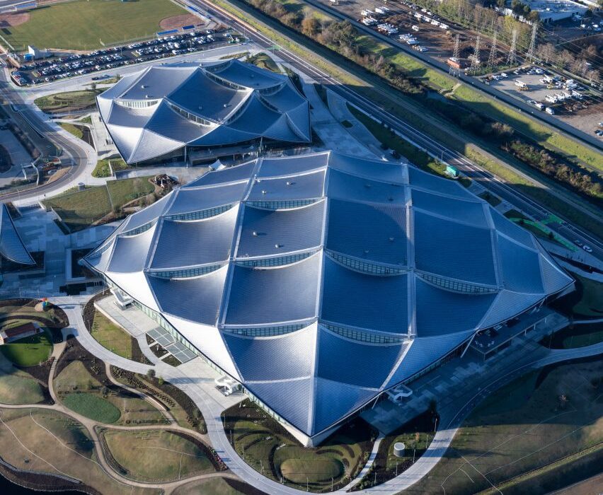
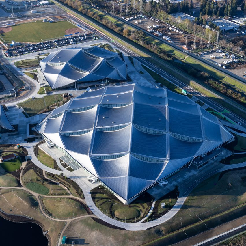
Bay View, USA, by BIG and Heatherwick Studio

A “dragonscale solar skin” forms the roof of Google’s Bay View campus, which BIG and Heatherwick Studio recently completed in Silicon Valley.

The undulating structure is built from 50,000 solar panels that generate almost seven megawatts of energy, amounting to 40 per cent of the building’s total energy needs.

Find out more about Bay View ›


Solar panels by Marjane van Aubel on the Dutch Biotope pavilion at Expo 2020 Dubai
Photo courtesy of Marjan van Aubel

The Dutch Biotope, UAE, by V8 Architects with Marjan van Aubel

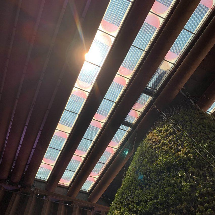
A colourful skylight formed of translucent photovoltaics crowned The Dutch Biotope pavilion at Dubai Expo 2020, casting pink and blue light below like a stained glass window.

Created by V8 Architects the structure incorporates skylights designed by Marjan Van Aubel to show how solar technology could be used as “a form of art” while providing renewable energy.

Find out more about The Dutch Biotope ›


Render of LAD headquarters in China
Render is courtesy of MVRDV

LAD headquarters, China, by MVRDV

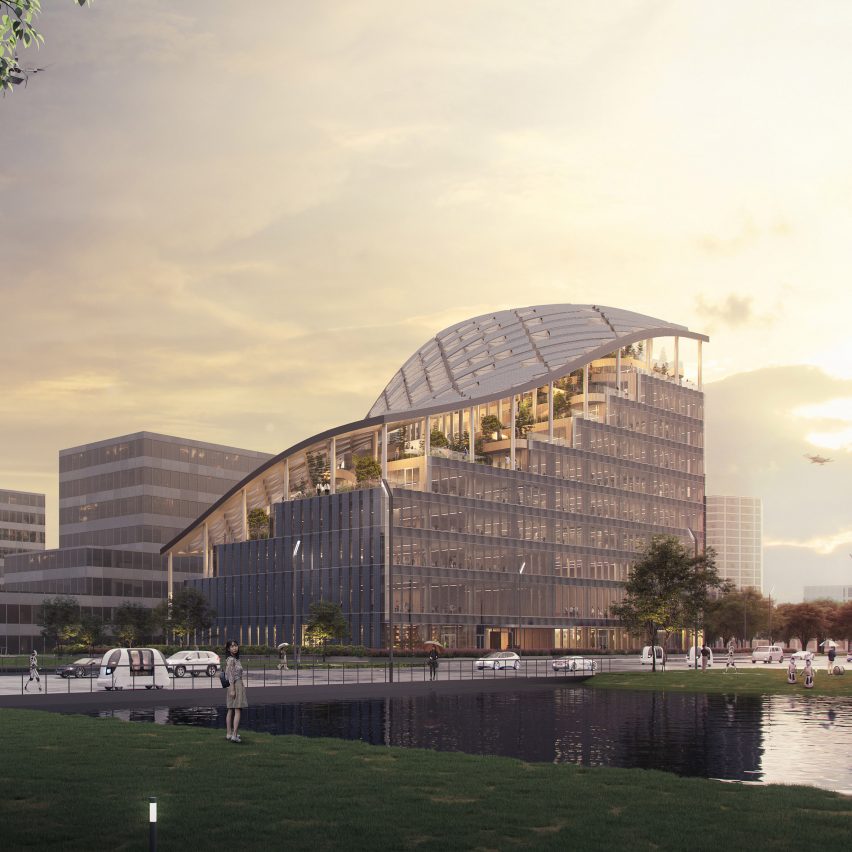
MVRDV has reimagined a traditional solar canopy in its design of this office building, which it is currently developing for agriculture company LAD in Shanghai.

Its swooping roof structure will be left open on one side but covered in solar cells on the other in a bid to provide renewable energy for the building and minimise its operational carbon footprint.

Find out more about LAD headquarters ›


Side profile of Powerhouse Telemark by Snøhetta
Photo is by Ivar Kvaal

Powerhouse Telemark, Norway, by Snøhetta

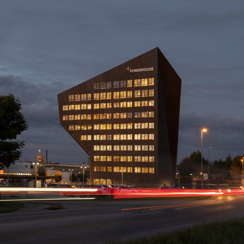
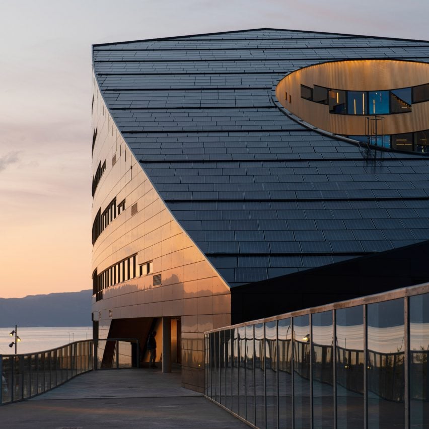
Snøhetta used photovoltaics to cover the angular roof and south-facing facade of the carbon-negative Powerhouse Telemark office in Porsgrunn.

While contributing to the structure’s “clearly identifiable expression”, the studio said the system generates approximately 256,000 kilowatts of renewable energy each year, compensating for the carbon that the building will consume over a 60-year lifespan.

Find out more about Powerhouse Telemark ›


Mount Sinai Kyabirwa Surgical Facility
Photo is by Bob Ditty

Mount Sinai Kyabirwa Surgical Facility in Uganda by Kliment Halsband Architects

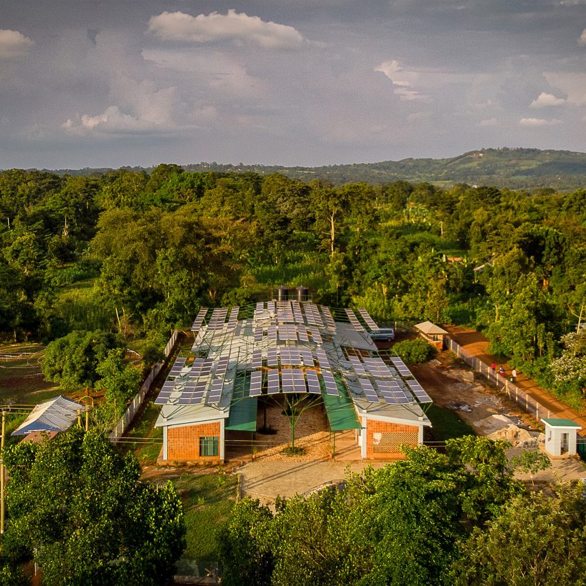
Slender tree-like columns support the wavy solar canopy that sweeps over this health facility in Uganda, designed by Kliment Halsband Architects.

While providing energy for the building, the canopy also shelters its outdoor spaces in a nod to banana plants growing in the area. “We thought of solar panels as leaves of banana plants gathering sun and providing shade,” the studio explained.

Find out more about Mount Sinai Kyabirwa Surgical Facility in Uganda ›


Front facade of 550 Spencer offices by Kennon
Render is courtesy of Kennon

550 Spencer, Australia, by Kennon

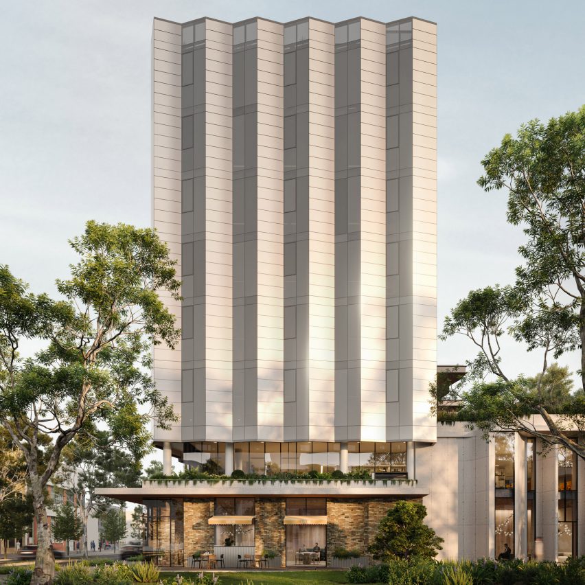
More than 1,000 solar electric panels that resemble glass will form the facade for this office tower, which Australian studio Kennon recently proposed for Melbourne.

The technology, named Skala, is produced by German company Avancis and has never been used in Australia before. It is designed to replace traditional rooftop arrays and will free up space for a garden on top of the building instead.

Find out more about 550 Spencer ›


Wall of solar panels at La Seine Musicale by Shigeru Ban
Photo is by Didier Boy de la Tour

La Seine Musical, France, by Shigeru Ban

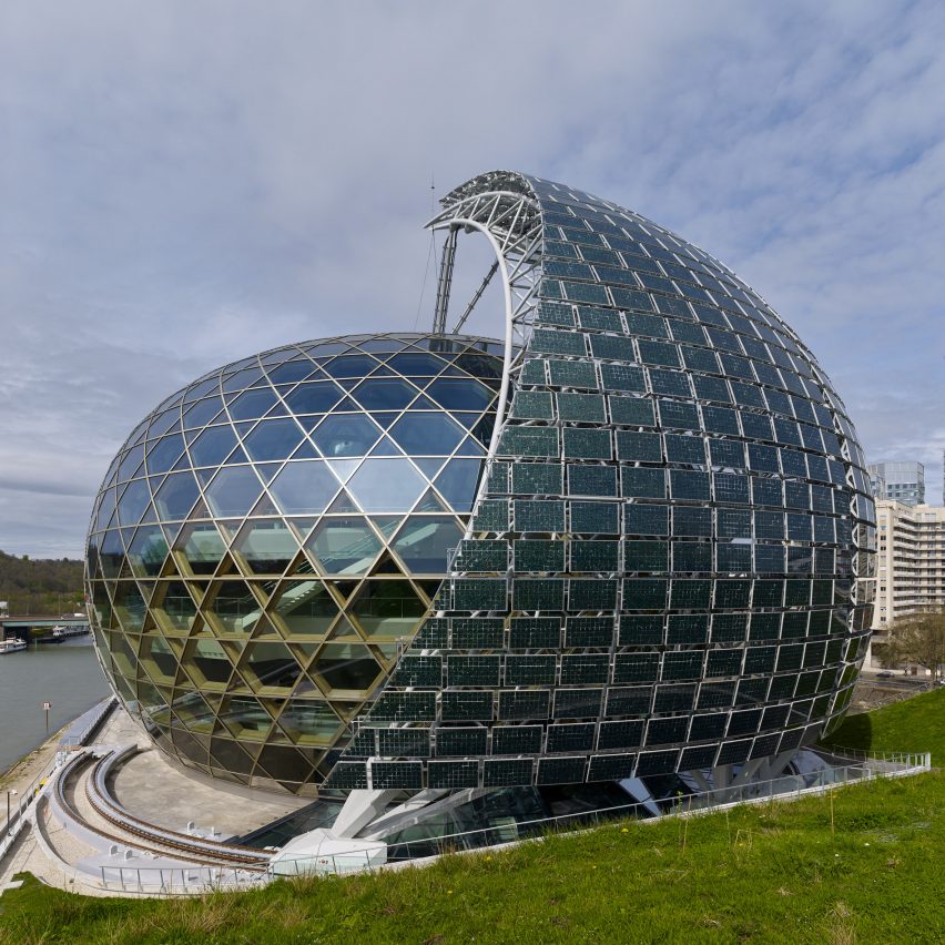
A wall of photovoltaic panels follows the path of the sun at La Seine Musical, a glazed music complex near Paris designed by Shigeru Ban.

Mounted on rails, the sail-like wall is designed to resemble a ship circulating the ovoid structure. This movement also ensures the lobby behind is shaded from direct sunlight over the course of the day.

Find out more about La Seine Musical ›


Stacked exterior of Copenhagen International School by C F Møller Architects
Photo is by Adam Mørk

Copenhagen International School for Nordhavn, Denmark, by CF Møller

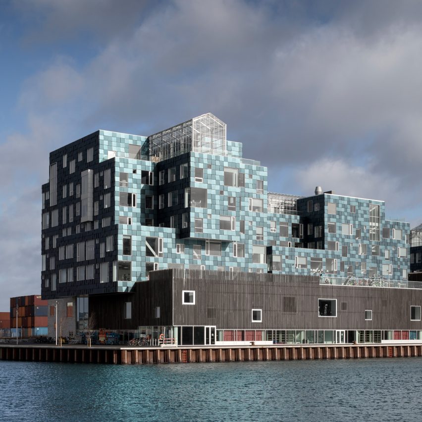
Architecture studio CF Møller disguised 12,000 solar panels as blue cladding at the Copenhagen International School for Nordhavn to mirror its waterfront site.

The panels are arranged in a way that creates a sequin-like effect across the exterior and generates over 50 per cent of the electricity needed to power the building annually.

Find out more about Copenhagen International School for Nordhavn ›


Render of the exterior of Sun Rock office
Render is courtesy of MVRDV

Sun Rock, Taiwan, by MVRDV

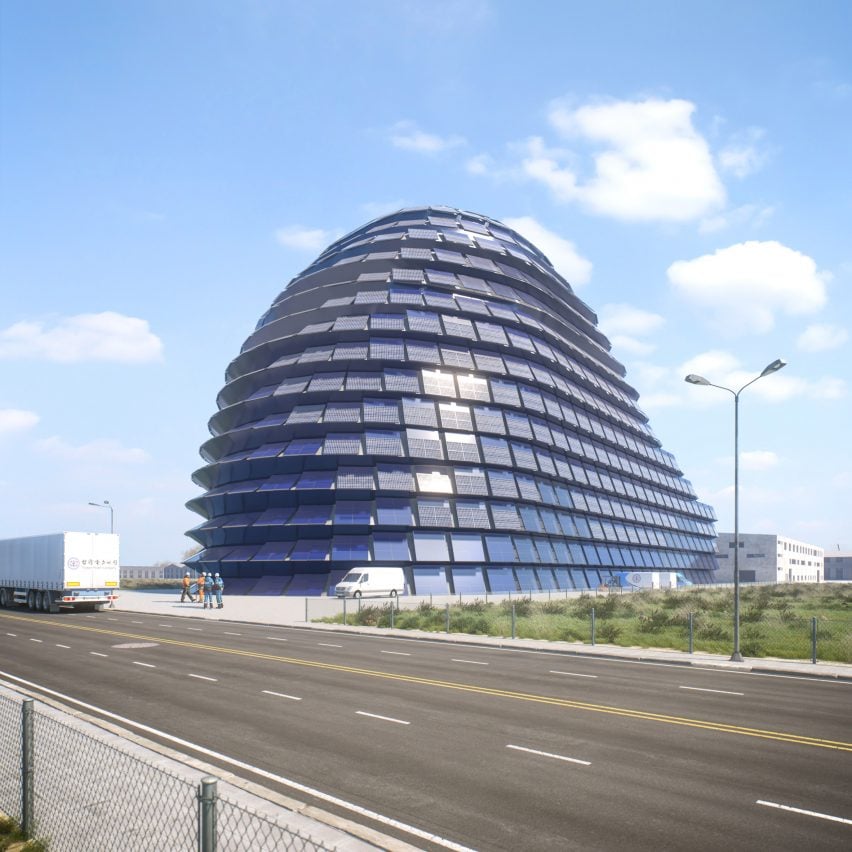
A rounded form sheathed in photovoltaics will define Sun Rock, an office and operations facility that MVRDV is developing for power company Taipower in Taiwan.

The studio designed its bulbous form to maximise the amount of sunlight its facade can harness throughout the day and, in turn, create enough energy to make the building self-sufficient.

Find out more about Sun Rock ›


Solar panels on Powerhouse Brattørkaia office building in Tronheim by Snøhetta
Photo is by Ivar Kvaal

Powerhouse Brattørkaia, Norway, by Snøhetta

Three thousand square metres of solar cells envelop this office, another Powerhouse by Snøhetta that produces twice the amount of energy it uses.

Its steep and angular exterior is the result of the limited daylight hours in the city, as it helps maximise sun exposure and allows the panels to harvest as much solar energy as possible before dark.

Find out more about Powerhouse Brattørkaia ›


Solar Revolution logo
Illustration is by Berke Yazicioglu

Solar Revolution

This article is part of Dezeen’s Solar Revolution series, which explores the varied and exciting possible uses of solar energy and how humans can fully harness the incredible power of the sun.

Reference

Ten maximalist interiors that are saturated with colour and pattern
CategoriesInterior Design

Ten maximalist interiors that are saturated with colour and pattern

Clashing colours, statement furnishings and mismatched patterns feature in this lookbook, which rounds up ten flamboyant interiors that embody the maximalist aesthetic.

Maximalism is a style of art and design that rejects the rules of minimalism. Instead, exuberance is celebrated and anarchic use of pattern, colour and texture are encouraged.

According to Claire Bingham, author of the book More is More, the style can be attributed to the Memphis Group – the 1980s design and architecture collective known for their bold postmodern creations.

However, as demonstrated by this roundup, maximalism continues to make its mark today, as designers apply the aesthetic to the interiors of our homes as well as to public spaces.

This is the latest in our lookbooks series, which provides visual inspiration from Dezeen’s archive. For more inspiration see previous lookbooks showcasing brutalist interiors, walk-in wardrobes and colourful living rooms.


Maximalist interior of Hotel Les Deux Gares
Photo is by Benoit Linero

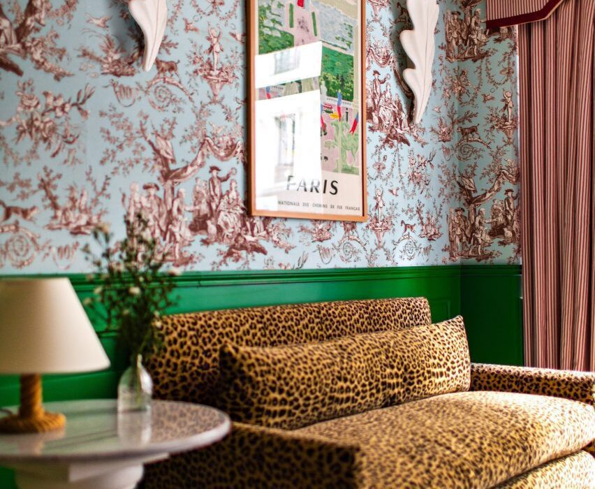
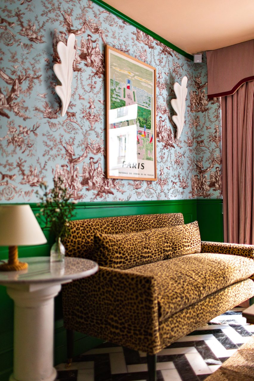
Hotel Les Deux Gares, France, by Luke Edward Hall

Contemporary pea-green walls stand in stark contrast to chintzy wallpaper and soft velvet sofas in the rooms of the Hotel Les Deux Gares in Paris.

According to its designer Luke Edward Hall, the aesthetic is intended to be “anti-modern” – harking back to a Paris of the past.

Find out more about Hotel Les Deux Gares ›


Kitchen and dining room of Casa TEC 205 in Mexico
Photo is by Adrián Llaguno

Casa TEC 205, Mexico, by Moneo Brock

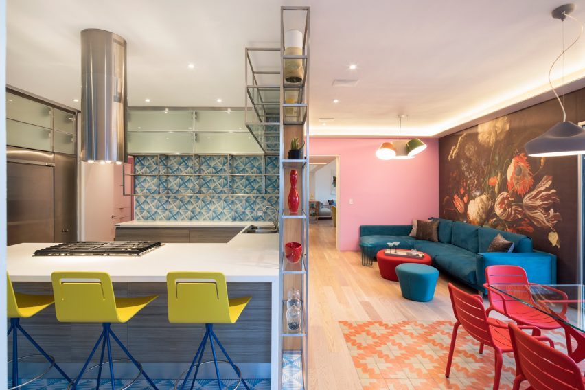
The bright-coloured works of Mexican architect Luis Barragán informed the look of this maximalist-style home in Monterrey, designed by architecture studio Moneo Brock.

Inside, striking wallpaper prints are juxtaposed with geometric tiling and colour-blocked walls, such as in the kitchen and dining room where a large floral mural takes centre stage.

Find out more about Casa TEC 205 ›


Maximalist interior of Rookies optician in Munich
Photo is by Günther Egger

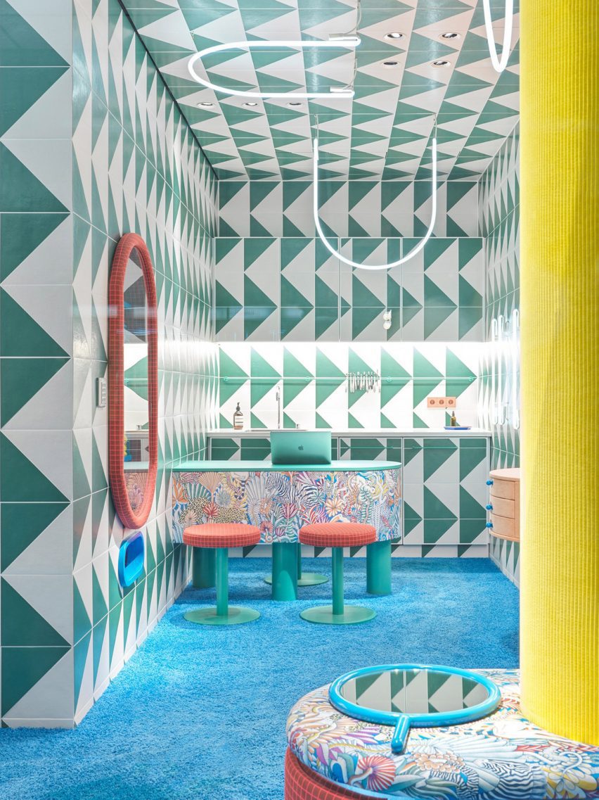
Rookies, Germany, by Stephanie Thatenhorst

Designer Stephanie Thatenhorst challenged the conventional look of healthcare facilities when designing this kid-friendly optician in Munich.

Intended as a “noisy, wild and unique paradise for children”, it marries a bright blue carpet with geometric wall tiles, U-shaped neon lights and display areas covered in apricot-coloured fabric.

Find out more about Rookies ›


Interiors of VIP centre at Schiphol airport by Marcel Wanders

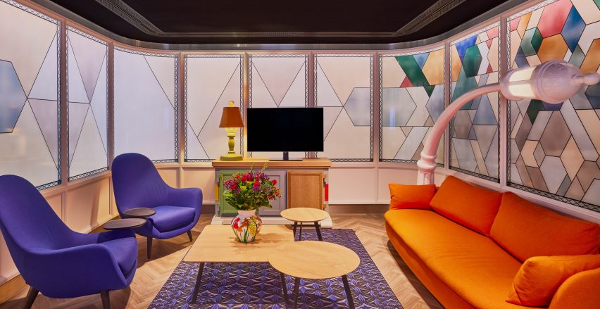
Schiphol airport lounge, Netherlands, by Marcel Wanders

The flamboyant rooms of the Schiphol airport lounge were all given a distinct look when renovated by Marcel Wanders, a creative best known for his uninhibited maximalist style.

Among them is an animated seating area that references canal houses in Amsterdam. Its finishes include wall panels resembling giant stained-glass windows and a cartoonish lamp that mimics a street light.

Find out more about Schiphol airport lounge ›


Goldie's Sunken Bar at Austin Proper Hotel and Residences by Kelly Wearstler
Photo is by The Ingalls

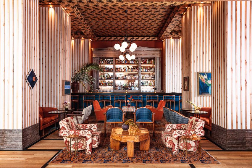
Austin Proper Hotel and Residences, USA, by Kelly Wearstler

Interior designer Kelly Wearstler teamed local art and textiles with one-off vintage details when creating the eclectic interior for Austin Proper Hotel and Residences.

This includes the hotel’s drinking establishment, which occupies a room with high ceilings covered in decorative wallpaper. Below, a cobalt blue-painted bar sits against low stuffed armchairs, chunky wooden tables and stone plinths.

Find out more about Austin Proper Hotel and Residences ›


Hallway of members' club Annabel's by Martin Brudnizki Design Studio

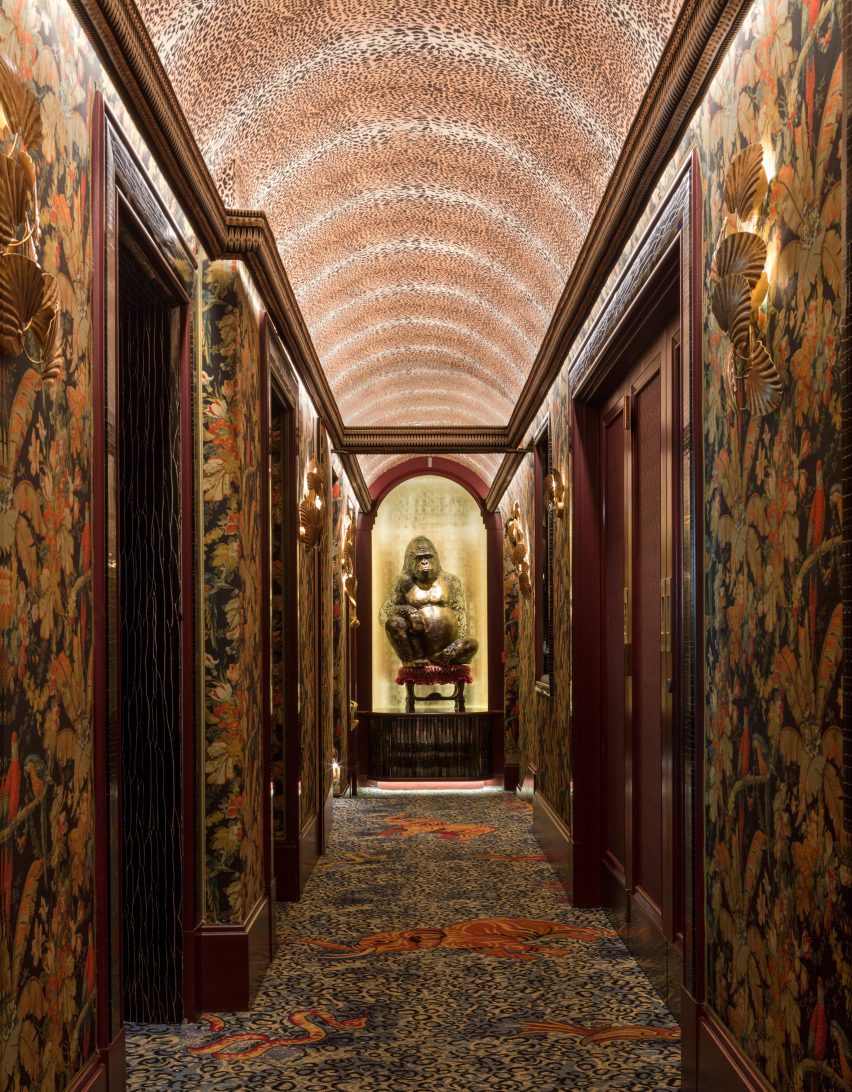
Annabel’s, UK, by Martin Brudnizki Design Studio

This dim hallway features in London members’ club Annabel’s, which was recently overhauled by Martin Brudnizki Design Studio to make visitors feel as though they have been “transported somewhere else”.

Similarly to the rest of the building, the corridor features clashing animal prints across all its surfaces and is overlooked by a sculpture of a gorilla on a seat – just one of the fanciful features hidden inside.

Find out more about Annabel’s ›


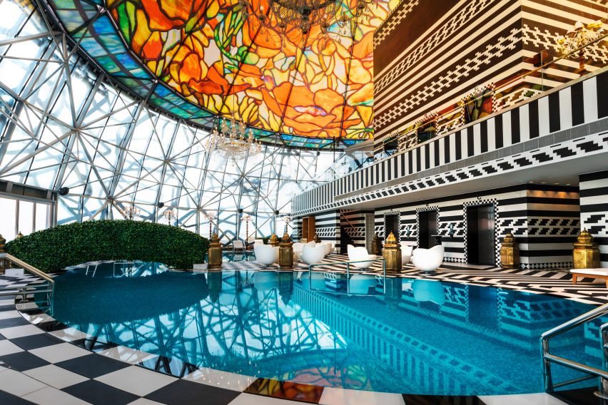
Pool area at the Mondrian hotel in Qatar

Mondrian hotel, Qatar, by Marcel Wanders

Marcel Wanders also applied his signature maximalist style to the interior of the Mondrian hotel in Doha, which is filled with mismatched patterns and oversized furnishings.

Among its standout spaces is the swimming pool on the 27th floor. Crowned by a floral-patterned stained-glass dome, it features bulbous white seating, a tactile grass-like bridge and monochrome tiling.

Find out more about Mondrian hotel ›


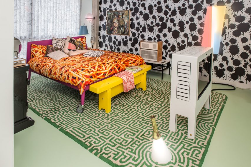
Maximalist bedroom inside the Studio Job office

Studio Job office, Belgium, by Studio Job

Studio Jobs’ founder Job Smeet describes his maximal self-designed home and office in Antwerp as being “like a visual assault”.

Encased by an exposed concrete shell, it comprises a central gallery space, kitchens, bathrooms and bedrooms – one of which clashes paint-splattered walls with shark-patterned wallpaper, a maze-like rug and spaghetti-print bed sheets.

Find out more about Studio Job office ›


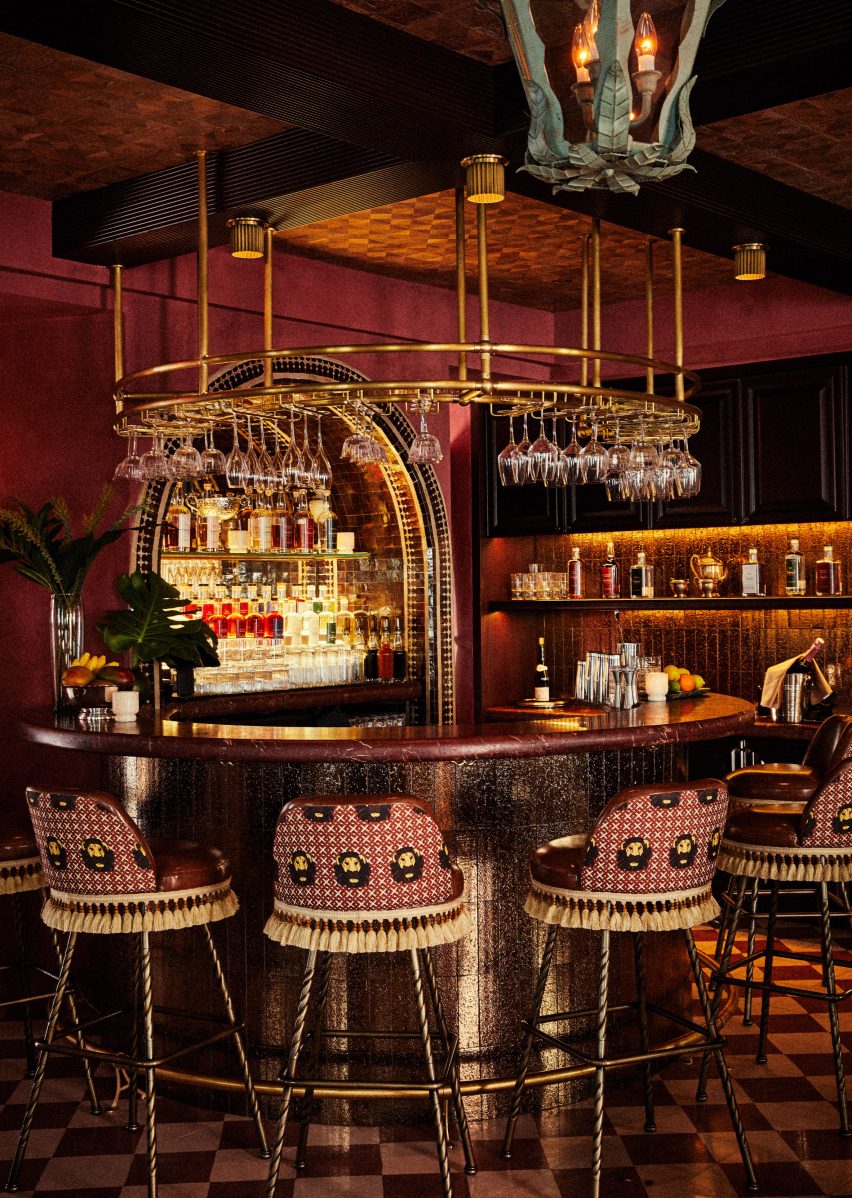
A round bar at Esme Hotel with stools around it
Photo is by Christian Harder

Esme Hotel, USA, by Jessica Schuster Design

In an overhaul of the boutique Esme Hotel in Miami, New York studio Jessica Schuster Design opted for saturated tones and sculptural furnishings to “create an artful collage of bohemian grandeur”.

Among its decadent spaces is a mahogany cocktail bar that is encircled by fringed stools and sculptural pendant lighting, set against a checkered floor and a wooden ceiling.

Find out more about Esme Hotel ›


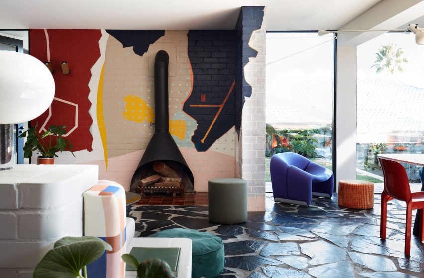
Living room of Polychrome House by Amber Road
Photo is by Prue Ruscoe with styling by Alicia Sciberras

Polychrome House, Australia, by Amber Road and Lymesmith

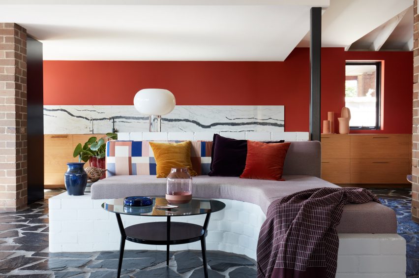
Pops of bright primary colours feature in every room of this 1960s house in Sydney, which was recently renovated by studio Amber Road and colour consultant Lymesmith.

When extending the ground floor, the team introduced an open-plan living space with graphic paved floors modelled on aerial photographs of the surrounding terrain, which contrasts with white-painted brick walls that are partly covered by an abstract mural.

Find out more about Polychrome House ›

This is the latest in our lookbooks series, which provides visual inspiration from Dezeen’s archive. For more inspiration see previous lookbooks showcasing brutalist interiors, walk-in wardrobes and colourful living rooms.

Reference

Ten colourful living rooms that make a statement with bold hues
CategoriesInterior Design

Ten colourful living rooms that make a statement with bold hues

Flamingo pink walls in a Greek seaside apartment and a living space in Italy defined by primary colours feature in our latest lookbook, which collects colourful living rooms that are designed to stand out.

From the pastel colour palette used in a Tokyo dwelling to the clash of reds and greens seen in an Athens apartment, these 10 living rooms from across the world are defined by their colourful interiors.

While using strong colours in a living room can seem like an intimidating prospect, these examples show how even just a few splashes of colour can create a warmer atmosphere and work as a contrast against traditional white walls.

This is the latest in our lookbooks series, which provides visual inspiration from Dezeen’s archive. For more inspiration see previous lookbooks showcasing brutalist interiors, terrazzo eateries and residential atriums.


Interiors of Polychrome House, designed by Amber Road
Photo is by Prue Ruscoe

Polychrome House, Australia, by Amber Road and Lymesmith

Pops of colour feature in every room of Polychrome House, a 1960s property in Sydney that was renovated by architecture studio Amber Road and colour consultants Lymesmith.

“Bright primary colours, which were layered throughout the interior, became the heartbeat of the joyful experience we were all committed to creating,” Amber Road co-director Yasmine Ghoniem told Dezeen.

Find out more about Polychrome House ›


Waterfront Nikis Apartment by Stamatios Giannikis
Photo is by Kim Powell

Waterfront Nikis Apartment, Greece, by Stamatios Giannikis

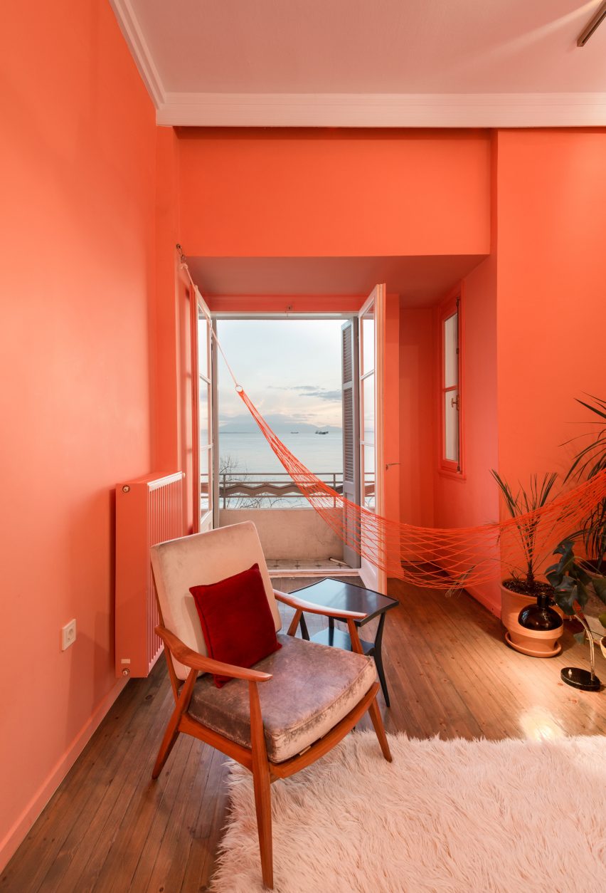
Flamingo pink walls and accents take centre stage in the living room of Waterfront Nikis Apartment, a Greek seaside dwelling set within a 1937 listed art deco building.

Architect Stamatios Giannikis paired a neon-pink hammock with a soft fluffy rug and rosy plant pots in the living room that overlooks the sea.

Find out more about Waterfront Nikis Apartment ›


Nagatachō Apartment by Adam Nathaniel Furman
Photo is by Jan Vranovsky

Nagatachō Apartment, Japan, by Adam Nathaniel Furman

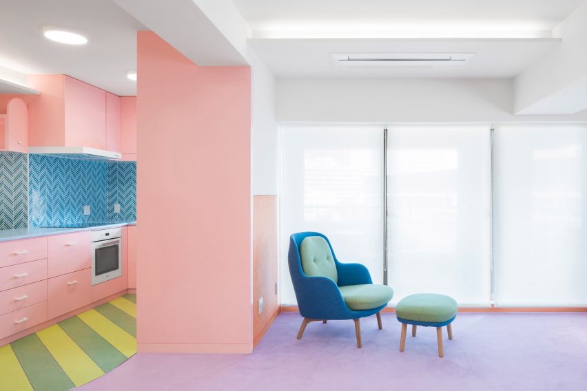
Designer Adam Nathaniel Furman used a sugar-sweet colour palette to liven up a Tokyo apartment he renovated for a retired expat couple.

Located opposite the open-plan kitchen, the combined living space and dining area features a plush lilac carpet that was chosen to contrast a bold green and blue chair and footrest, which Furman said “has the feel of sponge cake and looks like icing”.

Find out more about Nagatachō Apartment ›


Levine by Hendricks Churchill
Photo is by Tim Lenz

Connecticut house, USA, by Hendricks Churchill

American firm Hendricks Churchill sought to combine the aesthetic of a traditional farmhouse with more contemporary details at this Connecticut house.

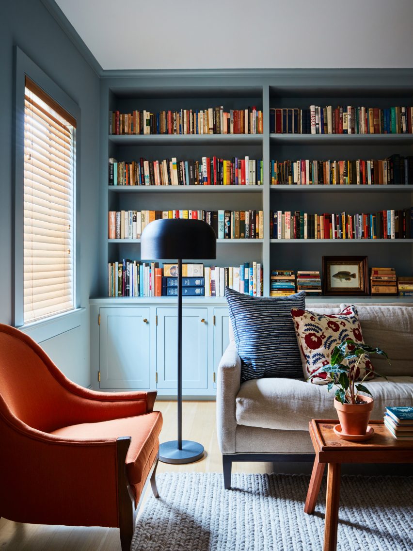
Dusty blue cabinetry meets reddy orange furniture in the home’s living room while a textured blue rug was placed on neutral wooden floorboards.

Find out more about this Connecticut house ›


Trevi House apartment in Rome designed by Studio Venturoni
Photo is by Michele Bonechi

Trevi House, Italy, by Studio Venturoni

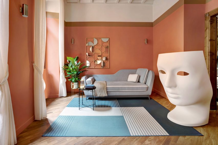
Thick bands of terracotta and sand-coloured paint wrap around the walls of Trevi House, a one-bedroom apartment in Rome that is defined by warm, earthy hues.

The living room includes a contrasting rectilinear blue and cream rug, which is positioned underneath a statement oversized sculpture, reminiscent of traditional marble statues.

Find out more about Trevi House ›


Julliana Camargo
Photo is by Maira Acayaba

The Karine Vilas Boas Apartment, Brazil, by Studio Julliana Camargo

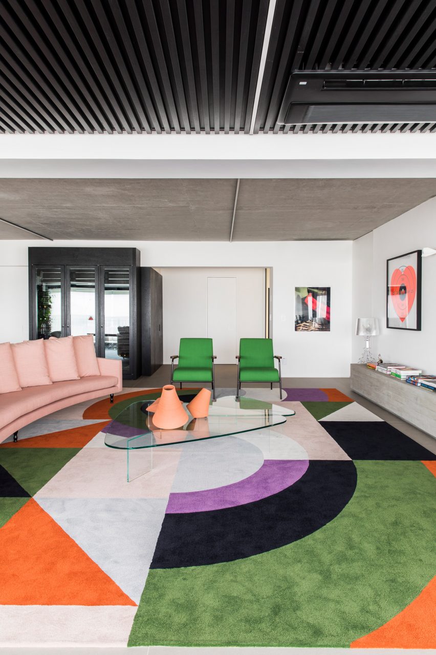
A large rug with a bright geometric pattern by Portuguese brand Punto e Filo features in the living space of this large apartment in downtown São Paulo.

Studio Julliana Camargo placed a crescent-shaped pink sofa and vivid green armchairs around the rug, emphasising its bold, technicolour appearance.

Find out more about the Karine Vilas Boas Apartment ›


Trikoupi apartment by Point Supreme
Photo is by Yannis Drakoulidis

Trikoui apartment, Greece, by Point Supreme Architects

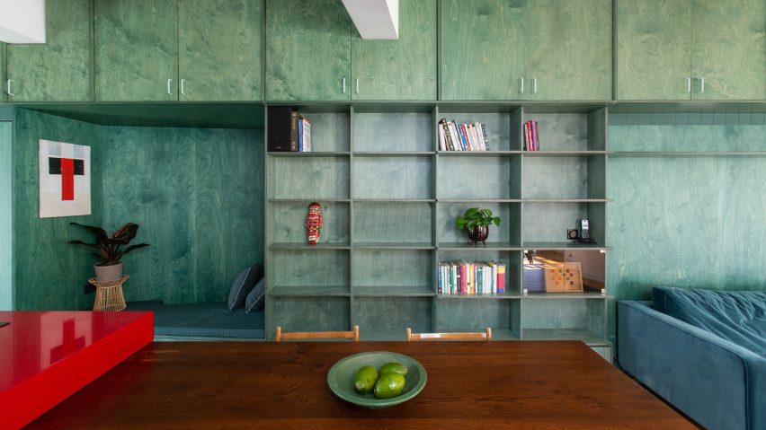
Local firm Point Supreme Architects designed this vibrant Athens apartment to include a single open-plan space combining the living, dining and kitchen areas.

To make up for the absence of partition walls, the apartment includes colourful built-in custom furniture to help delineate spaces, including a stained-green plywood storage wall and a table with a bright red top.

Find out more about this Trikoui apartment ›


House for Booklovers and Cats by BFDO Architects
Photo is by Francis Dzikowski

House for Booklovers and Cats, USA, by BFDO Architects

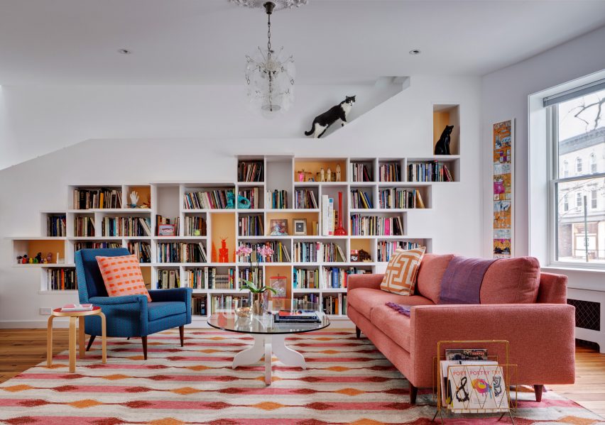
American studio BFDO Architects added splashes of pink, orange and blue to the living room of House for Booklovers and Cats, a Brooklyn home designed to include various nooks for a pair of shy cats to retreat to.

A higgledypiggledy bookshelf featuring brightly painted alcoves was built into one of the room’s walls, which was designed to house the owners’ extensive reading collection.

Find out more about House for Booklovers and Cats ›


Retroscena apartment renovation by La Macchina Studio
Photo is by Paolo Fusco

Retroscena, Italy, by La Macchina Studio

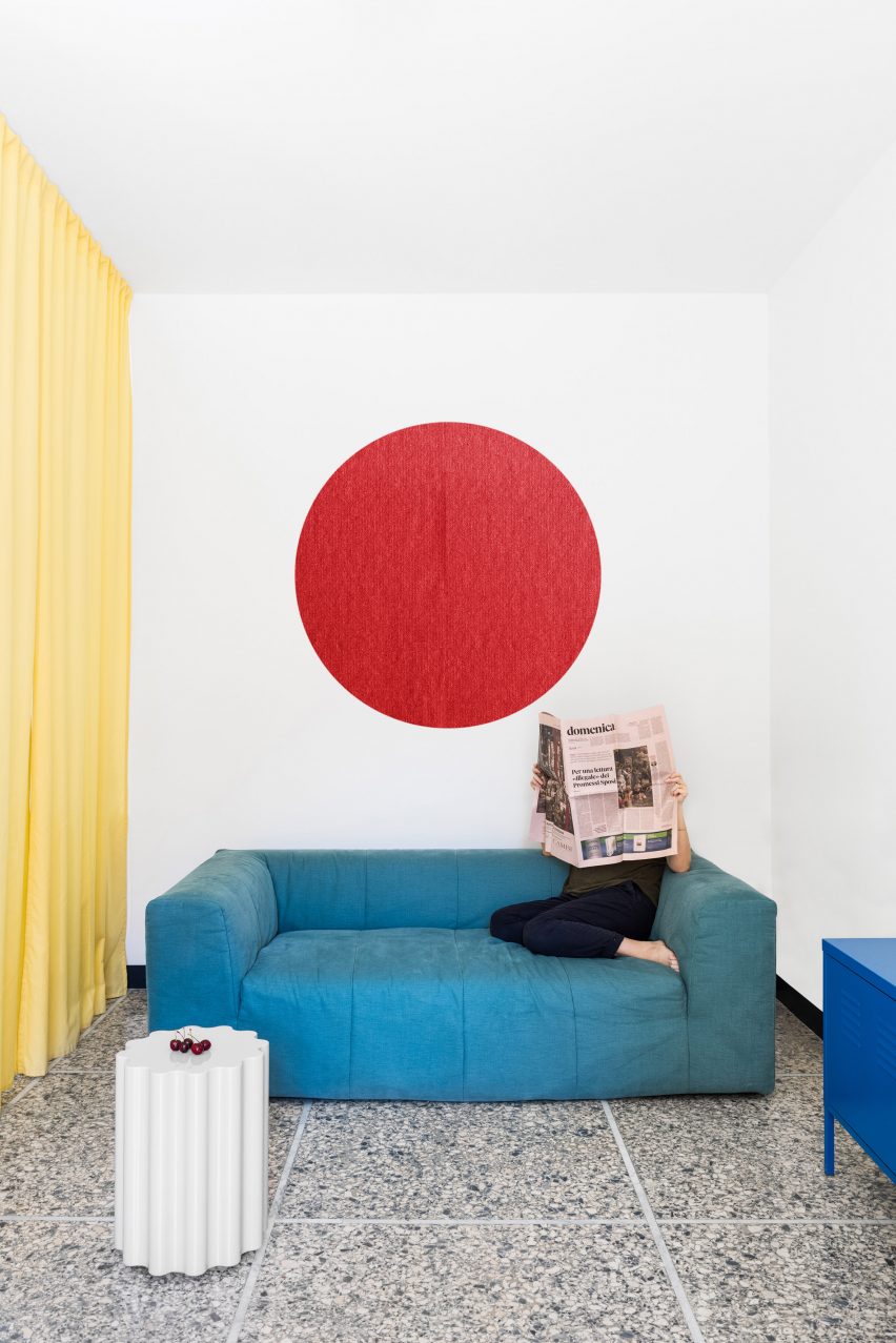
Retroscena is a distinctive 1950s apartment renovation in Rome, completed by Italian architecture office La Macchina Studio to reveal the home’s original terrazzo floors.

Primary colours were celebrated in the interior design, where the living room can be screened off by a yellow curtain and is decorated with a circular red wall hanging and a squidgy blue sofa.

Find out more about Retroscena ›


Husos Arquitectos Madrid apartment
Photo is by José Hevia

Madrid apartment, Spain, by Husos Arquitectos

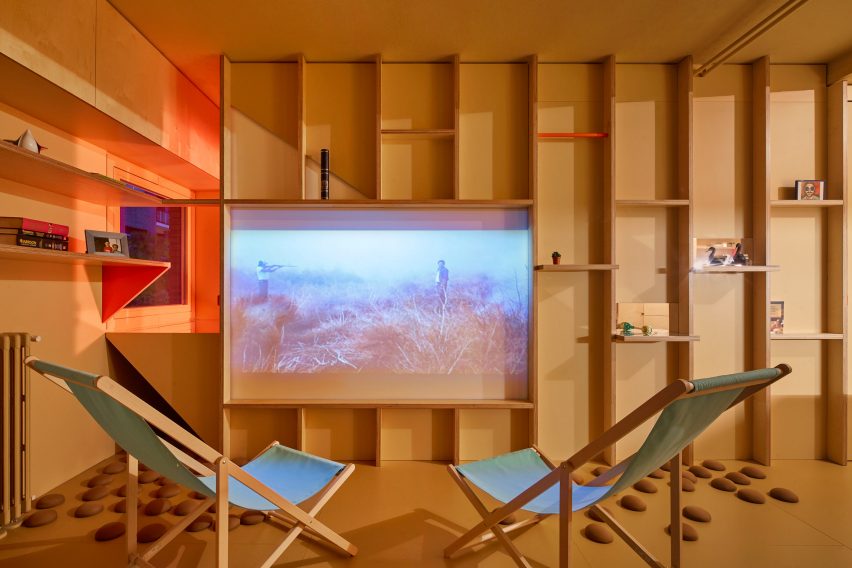
Playful lime green deck chairs and bold yellow and orange accents feature in the large living room of this Madrid apartment by Spanish studio Husos Arquitectos.

While its plywood-board cabinetry and pinewood floors mean that natural hues dominate in the room, the studio painted some of the shelves in vibrant colours to brighten up the wood.

Find out more about this Madrid apartment ›

This is the latest in our series of lookbooks providing curated visual inspiration from Dezeen’s image archive. For more inspiration see previous lookbooks showcasing green bedrooms, gardens with swimming pools and homes with glass extensions.

Reference

Ten homes with walk-in wardrobes that store clothes in interesting ways
CategoriesInterior Design

Ten homes with walk-in wardrobes that store clothes in interesting ways

In this lookbook, we pick out 10 home interiors that feature walk-in closets designed to provide bedroom storage that is both practical and appealing.

Walk-in wardrobes create a bespoke storage solution that is hard to achieve with standard furniture.

Often they are considered a luxurious feature used to declutter the bedroom in large houses, but as the 10 examples below demonstrate, they can also be a sleek solution for utilising dead space in smaller homes.

This is the latest in our lookbooks series, which provides visual inspiration from Dezeen’s archive. For more inspiration see previous lookbooks showcasing well-organised bedrooms, interiors with built-in furniture and homes that make a feature of their corridors.


Marine house extension designed by David Barr Architects
Photo is by Jack Lovel

Marine, Australia, by David Barr Architects

This walk-through wardrobe sits in a corridor between a bathroom and the master bedroom of a cottage near Perth.

Birch-plywood storage units and concrete flooring define the wardrobe, a continuation of the materials used throughout the light and airy extension designed by David Barr architects.

Find out more about Marine ›


Walk-in wardrobe
Photo is by Roehner + Ryan

O-asis, USA, by The Ranch Mine

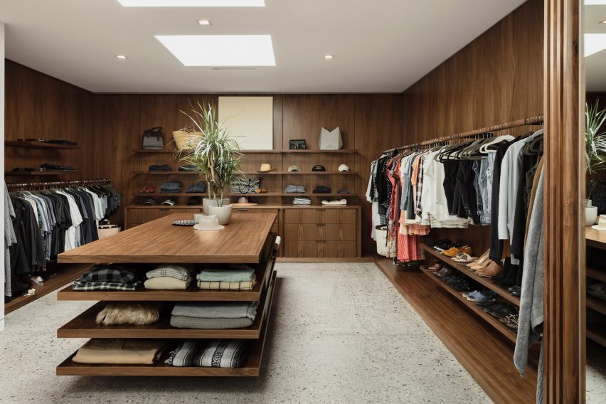
Warm-toned wood shelving and cabinetry was combined with terrazzo flooring in this enormous walk-in closet that sets out clothes like a boutique fashion store.

It flows right off from the bathroom of a large house in Arizona designed for a musician by architecture studio The Ranch Mine.

Find out more about O-asis ›


Bedroom of Botaniczna Apartment by Agnieszka Owsiany Studio
Photo is by Pion Studio

Botaniczna Apartment, Poland, by Agnieszka Owsiany Studio

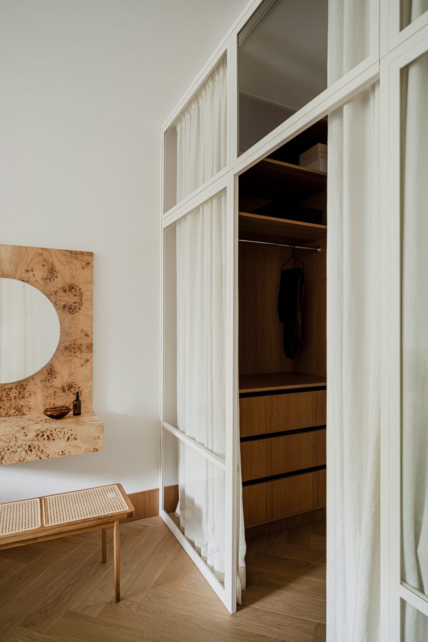
A linen-curtain screen tidily obscures the walk-in wardrobe in this Poznań apartment designed by Agnieszka Owsiany Studio.

The elegant and delicate aesthetic of the curtains contributes to the calming atmosphere the studio sought to create, as well as helping to offset the adjacent burl-wood vanity desk that acts as the bedroom’s feature element.

Find out more about Botaniczna Apartment ›


Apartment by Studio Noju
Photo is by Studio Noju

Casa Triana, Spain, by Studio Noju

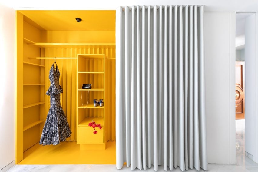
Studio Noju used a floor-to-ceiling curtain to create a walk-in wardrobe in the main bedroom of this renovated apartment in Seville.

The studio used a bright yellow paint for the wardrobe that contrasts with the monochrome curtain and surrounding walls, adding to the sense of theatre and surprise when the drape is drawn back.

Find out more about Casa Triana ›


Apartment in Estrela by Aurora Arquitectos
Photo by Do Mal o Menos

Apartment in Estrela, Portugal, by Aurora Arquitectos

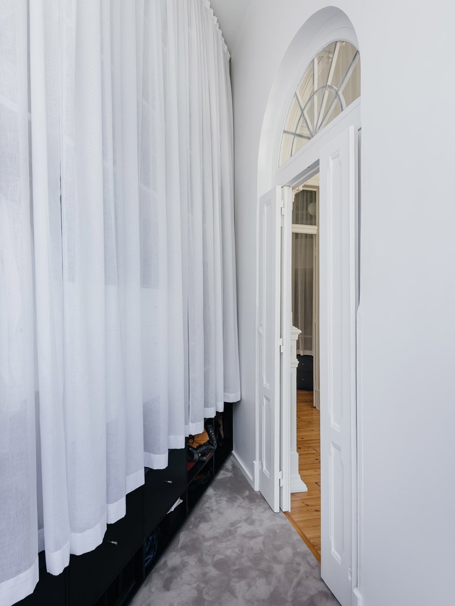
A small, triangular room in this old Lisbon apartment was converted into a walk-in closet as part of a revamp by Aurora Arquitectos.

White curtains cover a storage unit that runs along the longest wall of the wardrobe, which is provided with natural light by glazing above an arched doorway.

Find out more about Apartment in Estrela ›


House H in Taiwan designed by KC Design Studio
Photo is by Hey! Cheese

House H, Taiwan, by KC Design Studio

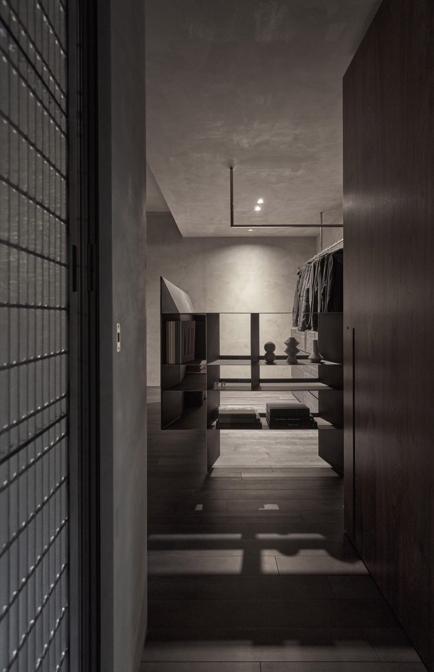
This basement apartment in Taipei was given a moody colour palette and raw textures in an overhaul by KC Design Studio.

That theme was continued in the walk-in wardrobe off the master bedroom, which acts as a dressing area between an en-suite bathroom and a private lounge.

Find out more about House H ›


Hubert by Septembre Architecture
Photo is by David Foessel

Hubert, France, by Septembre

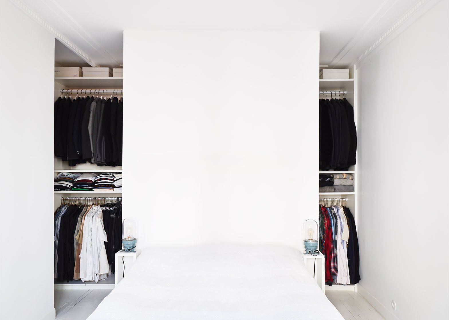
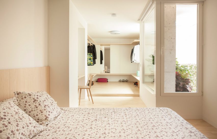
Embedded within a modestly sized Paris apartment renovated by architecture studio Septembre, this walk-in closet is an example of clever utilisation of space.

A wall behind the bed forms a partial division, allowing for generous clothing storage while retaining the room’s overall proportions.

Find out more about Hubert ›


The Magic Box Apartment Raúl Sánchez Architects
Photo is by José Hevia

The Magic Box Apartment, Spain, by Raúl Sánchez Architects

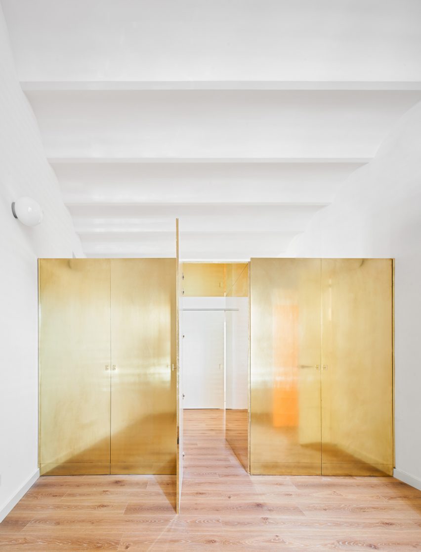
This apartment near Barcelona, designed by Raúl Sánchez Architects, takes the concept of a walk-in wardrobe to a new level.

Aptly called The Magic Box Apartment, it features a shiny brass wardrobe that divides two bedrooms instead of a traditional partition wall, which can be passed through like a secret passageway.

Find out more about The Magic Box Apartment ›


RL House Renovation by Diego López Fuster Arquitectura
Photo is by Pablo Pacheco

RL House Renovation, Spain, by Diego López Fuster Arquitectura

Diego López Fuster Arquitectura opted to give the bedroom of this Alicante a generous walk-in wardrobe that acts as a full dressing area.

Rather than being hidden or tucked away, its wide proportions help to make the relatively long and narrow bedroom feel more spacious.

Find out more about RL House Renovation ›


Casp21 by Bonba Studio
Photo is by José Hevia

Casp21, Spain, by Bonba Studio

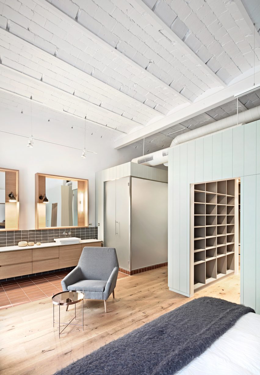
Green-panelled wood boxing encloses a sizeable walk-in wardrobe in the corner of this bedroom in a converted office building in Barcelona.

Through this intervention, Bonba Studio maximised the feeling of brightness and spaciousness in the room, as well as ensuring that the full impact of the traditional vaulted ceiling was maintained.

Find out more about Casp21 ›

This is the latest in our series of lookbooks providing curated visual inspiration from Dezeen’s image archive. For more inspiration see previous lookbooks showcasing well-organised bedrooms, interiors with built-in furniture and homes that make a feature of their corridors.

Reference

Ten furniture designs made from sustainable materials
CategoriesSustainable News

Ten furniture designs made from sustainable materials

Dezeen Showroom: a stool made from wood sourced through sustainable forestry and a 3D-printed chair made from recycled fishing nets are among the latest furniture designs on Dezeen Showroom that use sustainable materials.

Designers and brands are continually improving the sustainability of their designs in an attempt to lessen the negative impact on the environment, from the production and manufacturing stages to the longevity and lifecycle of the final product.

Included in this selection are products designed to follow circular economy principles, where parts can be replaced, repaired and recycled to increase the lifespan of the materials.

Also featured are furniture pieces made from recycled materials, including PET plastic bottles, cardboard and coffee waste.

From tables made from washed up sea plants to chairs with castor oil-based bioplastic seats, here’s a selection of the latest furniture designs made from sustainable materials on Dezeen Showroom.


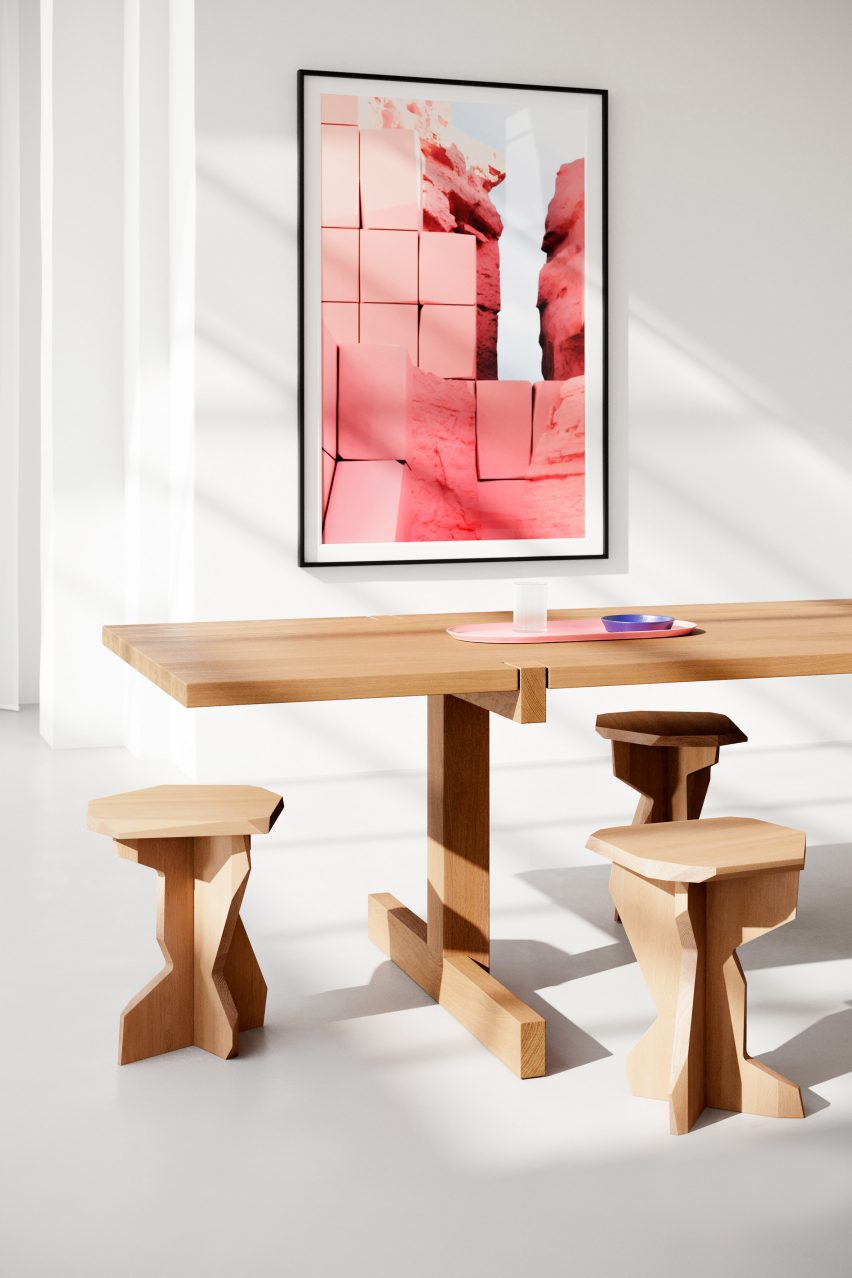
Three wooden Fels stolls by OUT around a wooden table

Fels stool by OUT

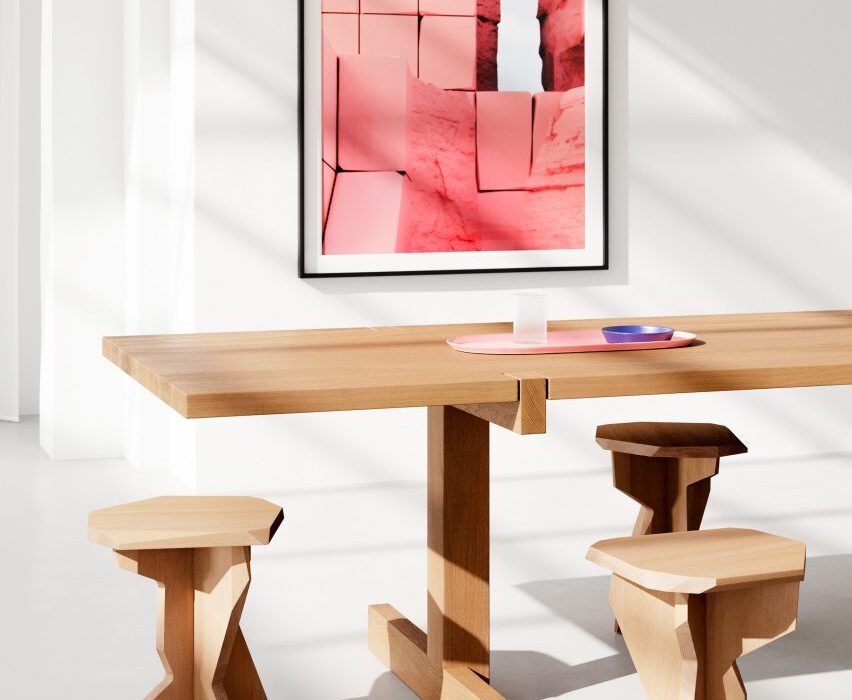
Fels is a sculptural stool created by Berlin-based brand OUT, which is made from wood obtained through sustainable forestry.

The materials are forested in Germany and Austria at a rate that maintains the environment’s biodiversity and productivity, then handcrafted into Fels stools in Germany.

Available in a natural wood finish or in a range of bright colours, Fels has a jagged profile designed to give the appearance of carved stone.

Find out more about Fels ›


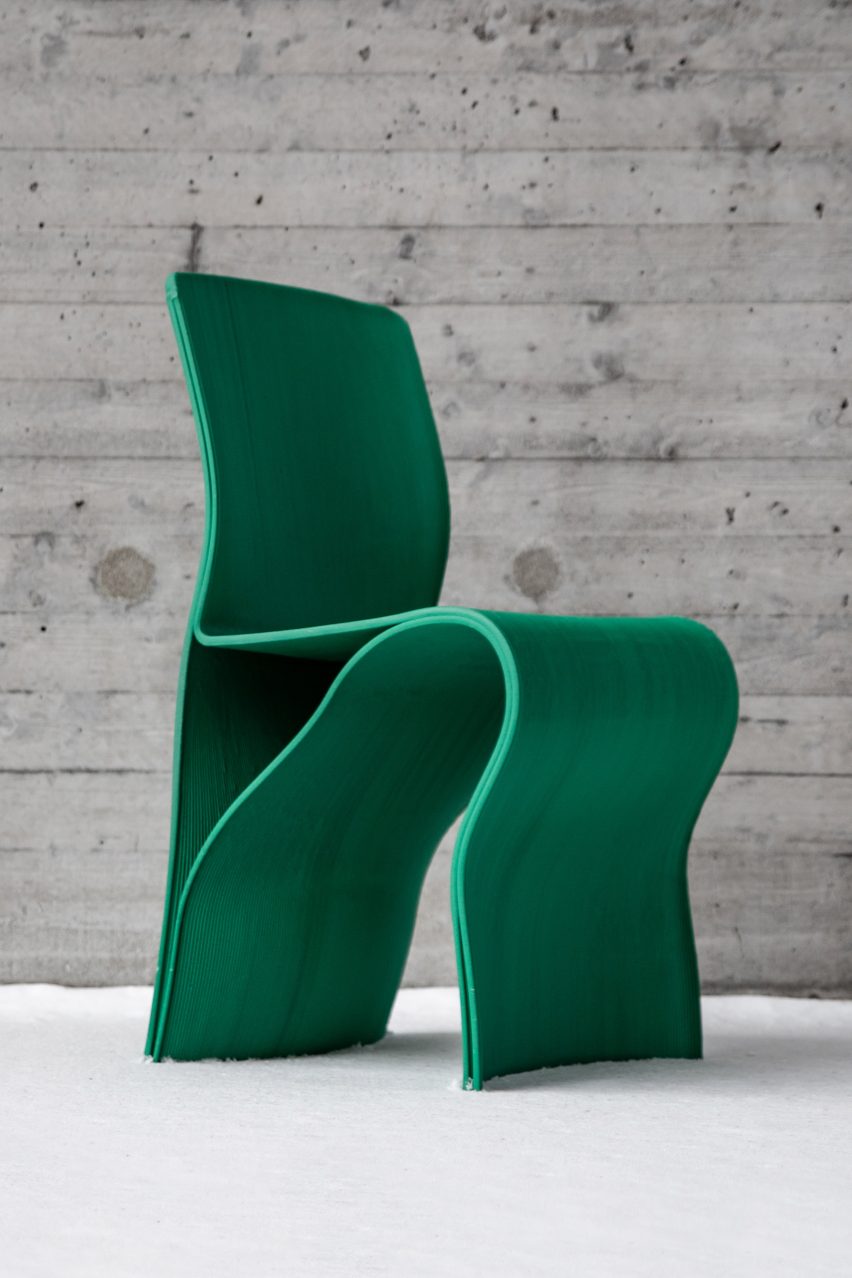
Kelp Collection chair by Interesting Times Gang

Kelp Collection chair by Interesting Times Gang

The Kelp Collection chair by Swedish studio Interesting Times Gang is made from recycled fishing nets, which gives it a bright green colour.

The fishing nets are combined with recycled FSC-certified wood fibres to create the furniture’s bio-composite material, which is 3D printed to create the chair’s curving form.

Interesting Times Gang designed the chair to bring awareness to the eradication of kelp forests due to unsustainable fishing practices and rising sea temperatures.

Find out more about Kelp Collection ›


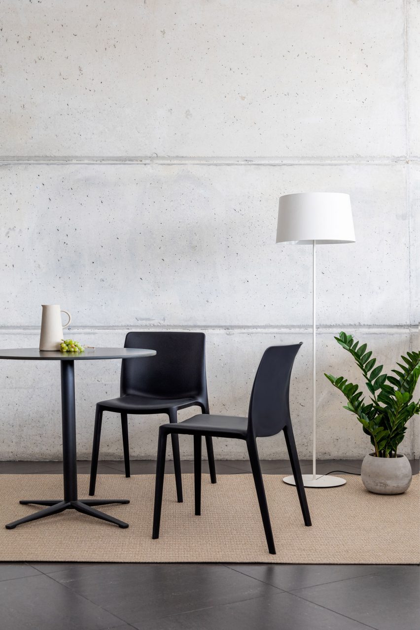
Two black Fluit chairs by Actiu next to a table, plant and lamp

Fluit chair by Archirivolto Design for Actiu

Created by Italian studio Archirivolto Design in collaboration with furniture brand Actiu, Fluit is a lightweight chair designed for both indoor and outdoor settings.

Around 80 per cent of the chair’s material is polypropylene plastic recycled from the agricultural food sector, while the remaining 20 per cent is recycled fibreglass which increases its strength.

Find out more about Fluit ›


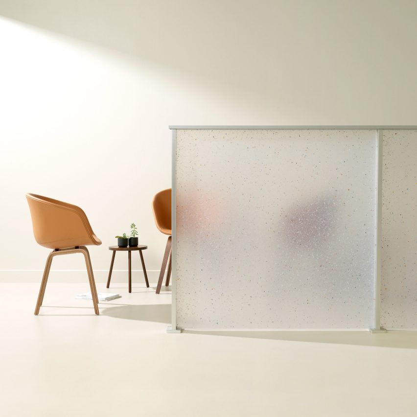
Flek Pure by 3form used as a partition wall with chairs behind

Flek Pure by 3form is a completely recycled architectural material

Flek Pure is a recycled material created by architectural material manufacturer 3form to resemble terrazzo.

The material is made from 100 per cent recycled materials sourced from 3form’s in-house factory waste. The terrazzo look comes from pelletised trimmings of the brand’s resin products.

Available in a range of translucent colours, Flek Pure can be used to produce privacy partitions, room dividers, accent pieces and exterior walls.

Find out more about Flek Pure ›


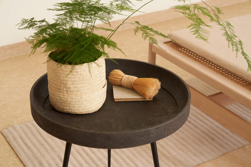
Brown Bowl table by Mater with a plant on top

Bowl table by Ayush Kasliwal for Mater

Danish furniture brand Mater has released Bowl, a table made from the brand’s Mater Circular Material which combines fibrous industrial waste with recycled plastic.

Mater developed the composite material with the aim of progressing their existing furniture collection from being sustainable to circular.

Bowl is available in two versions – one made from coffee shell waste and the other from sawdust. Plastic waste from bathroom fittings brand Grohe is recycled and acts as a binder.

Find out more about Bowl ›


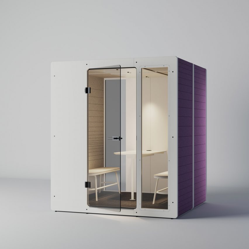
White and purple Chatpod 700 by Impact Acoustics with seating inside

Chatpod 700 by Jeffrey Ibañez for Impact Acoustic

Made from recycled materials, Impact Acoustic created the Chatpod 700 booth to provide a quiet meeting space for up to four people.

The booth’s structure is made from recycled cardboard and pressed sawdust. Recycled PET bottles are used to create the acoustic cladding and the felt-like interior finish.

Find out more about Chatpod 700 ›


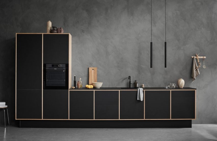
Birch and black LoopKitchen by Stykka in a concrete room

LoopKitchen by Stykka

LoopKitchen by Danish startup Stykka is a kitchen with a circular design intended to increase its lifecycle.

The kitchen is made from replaceable birch plywood parts with optional Forbo linoleum fronts available in over 20 colours.

Users can replace parts of the kitchen as they get worn, broken or if they would like a new colour. Stykka then reuses or recycles the used parts.

Find out more about LoopKitchen ›


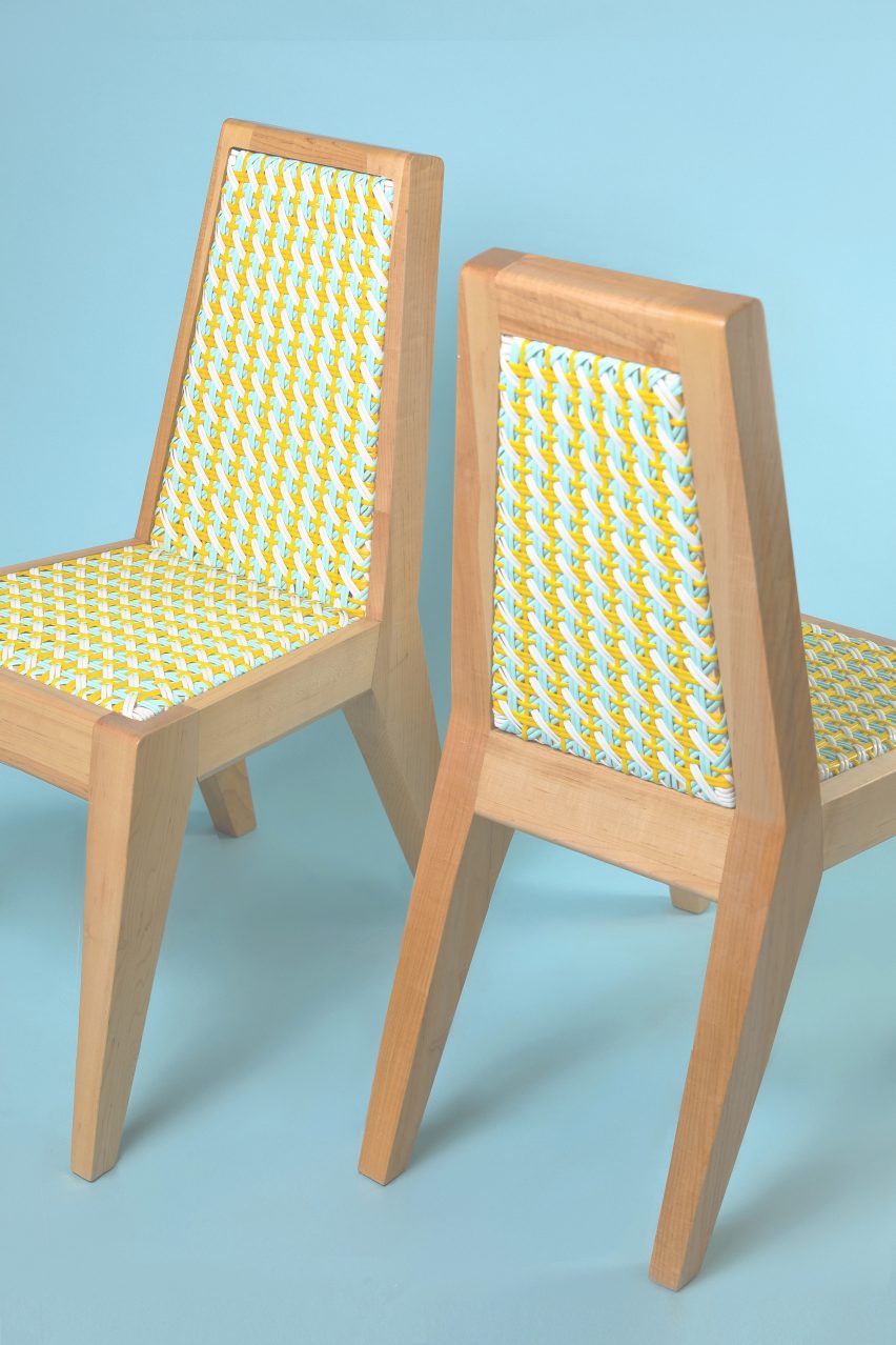
Two Dina chairs by Beit Collective with yellow and blue woven seats and backrests

Dina chair by Adam Nathaniel Furman for Beit Collective

Adam Nathanial Furman has designed the Dina chair for Beit Collective, a colourful interpretation of traditional Lebanese “Khayzaran” chairs.

Instead of the traditional use of cane, Dina’s woven seat and backrest are made from durable castor oil-based bioplastic.

Find out more about Dina ›


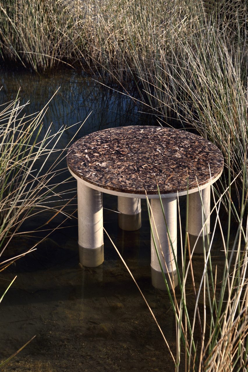
Round Oceanides table by Alex Mint in a grassy wetland

Oceanides table collection by Alexia Mintsouli for Alex Mint

Oceanides is a collection of tables made from marble and the sea plant Posidonia Oceanica, designed by Alexia Mintsouli for UK studio Alex Mint.

By upcycling Posidonia Oceanica leaves that are washed up on the shore into tabletops, Alex Mint aimed to create a more eco-friendly furniture piece.

Find out more about Oceanides ›


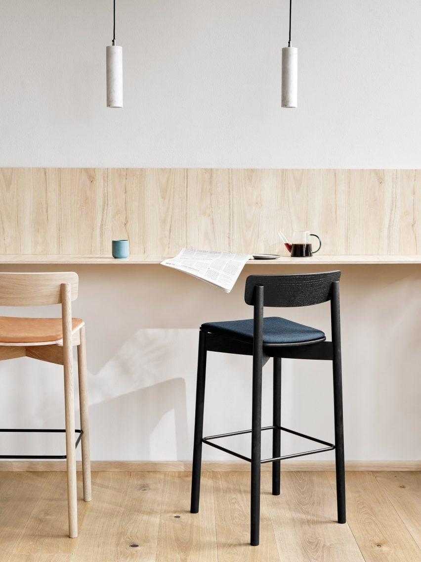
Black and natural wood Cross Bar chairs by Takt at a high table

Cross Bar chair by Pearson Lloyd for Takt

Design studio Pearson Lloyd created the Cross Bar chair for Takt with replaceable elements that can be repaired or recycled, extending the chair’s lifecycle.

The chair is available in three finishes of oak and can be optionally upholstered in a choice of eco-labelled textiles.

Find out more about Cross Bar ›

Dezeen Showroom

Dezeen Showroom offers an affordable space for brands to launch new products and showcase their designers and projects to Dezeen’s huge global audience. For more details email [email protected].

Dezeen Showroom is an example of partnership content on Dezeen. Find out more about partnership content here.

Dezeen is on WeChat!

Click here to read the Chinese version of this article on Dezeen’s official WeChat account, where we publish daily architecture and design news and projects in Simplified Chinese.

Reference

Ten beautiful brutalist interiors with a surprisingly welcoming feel
CategoriesInterior Design

Ten beautiful brutalist interiors with a surprisingly welcoming feel

For our latest lookbook, we’ve collected 10 brutalist interiors from the UK to Brazil and Indonesia that show how textiles, plants and colours can be used to soften monolithic concrete spaces and create a cosy atmosphere.

Brutalism as an architectural style often makes use of concrete to create large, sculptural buildings. These interiors in brutalist buildings feature plenty of concrete and hard angles but still manage to feel both warm and welcoming.

Colourful tiling, wooden details and tactile textiles as well as an abundance of green plants were used to create inviting living rooms, bathrooms and even workspaces in these brutalist buildings, which include the Barbican in London and Riverside Tower in Antwerp.

This is the latest in our lookbooks series, which provides visual inspiration from Dezeen’s archive. For more inspiration see previous lookbooks featuring granite kitchens, terrazzo eateries and atriums that brighten up residential spaces.


A Brutalist Tropical Home in Bali by Patisandhika and Daniel Mitchell
Photo is by Tommaso Riva

A Brutalist Tropical Home, Indonesia, by Patisandhika and Dan Mitchell

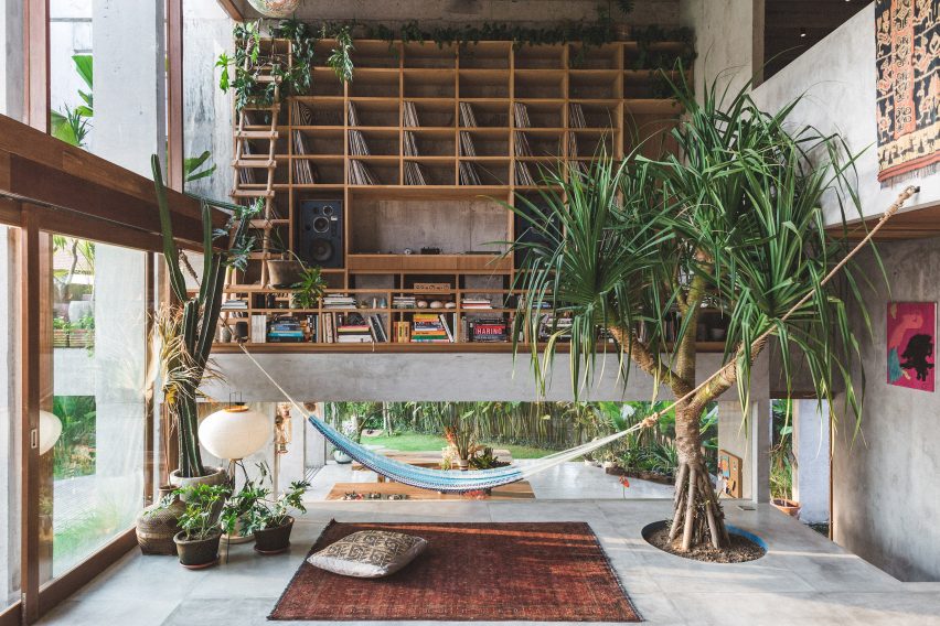
Designer Dan Mitchell worked with architecture studio Patisandhika to create this brutalist home in Bali, which features a double-height living room filled with books, records and green plants.

The house has a split-level design that was modelled on modernist architect Ray Kappe’s Kappe Residence. Inside, colourful objects, textiles and furniture draw on the work of Clifford Still, Ellsworth Kelly and the Bauhaus movement to make the house feel homely.

Find out more about A Brutalist Tropical Home ›


Large living room with concrete ceiling
Photo is by Niveditaa Gupta

House of Concrete Experiments, India, by Samira Rathod

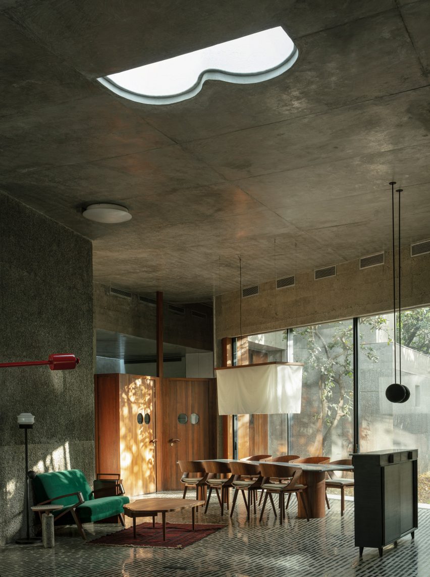
As the name suggests, House of Concrete Experiments features sculptural concrete walls. Warm wood detailing offsets the grey hues, while the concrete floor has been inlaid with black stones to create an interesting pattern.

Large windows and geometric skylights help make the room feel bright and inviting.

Find out more about House of Concrete Experiments ›


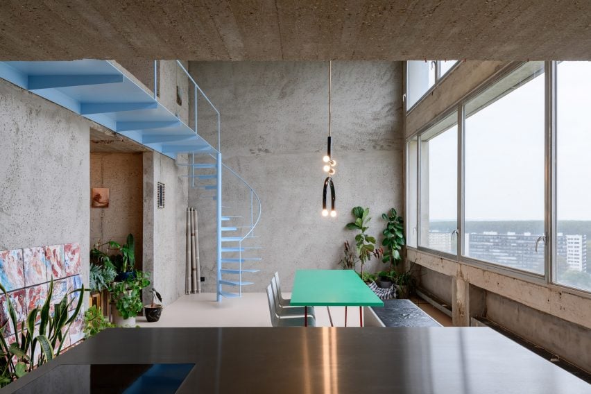
Turquoise table in room with concrete walls
Photo is by Olmo Peeters

Riverside Tower Apartment, Belgium, by Studio Okami Architecten

Studio Okami Architecten stripped the walls of this flat in Antwerp’s Riverside Tower to let its original structure take centre stage.

Colourful details such as a turquoise table and baby-blue spiral staircase and a playful, sculptural lamp make the home feel contemporary, while plenty of green plants give more life to the otherwise grey interior.

Find out more about Riverside Tower Apartment ›


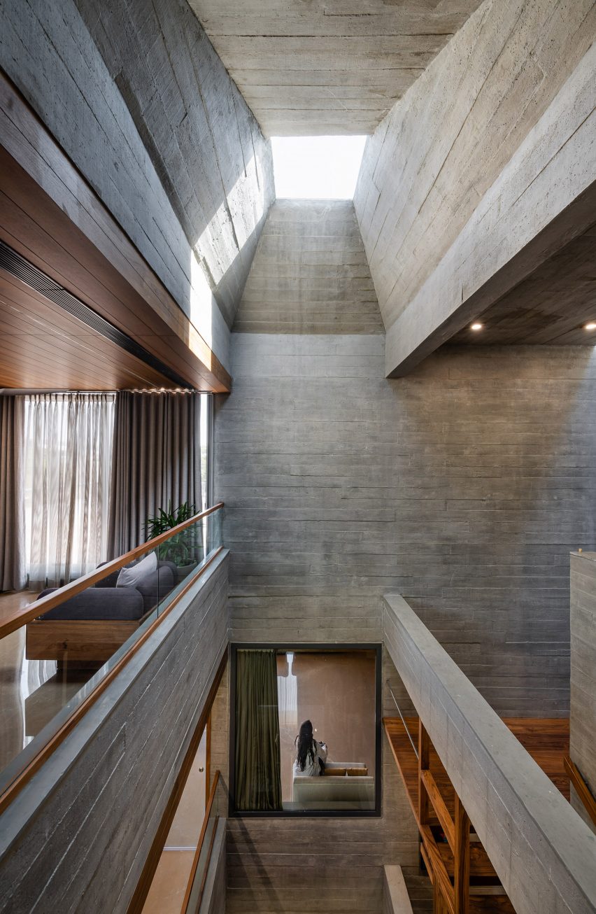
Light-filled atrium in brutalist home
Photo is by Photographix

Beton Brut, India, by The Grid Architects

Designed as a “neo-brutalist” house, Beton Brut in India has a number of dramatic features, including a skylit atrium that extends through the home.

The Grid Architects described the home as “typified by bare concrete, geometric shapes, a monochrome palette and a monolithic appearance”. Wooden flooring and furniture and plenty of textiles soften the house’s brutalist interior and potentially stern appearance.

Find out more about Beton Brut ›


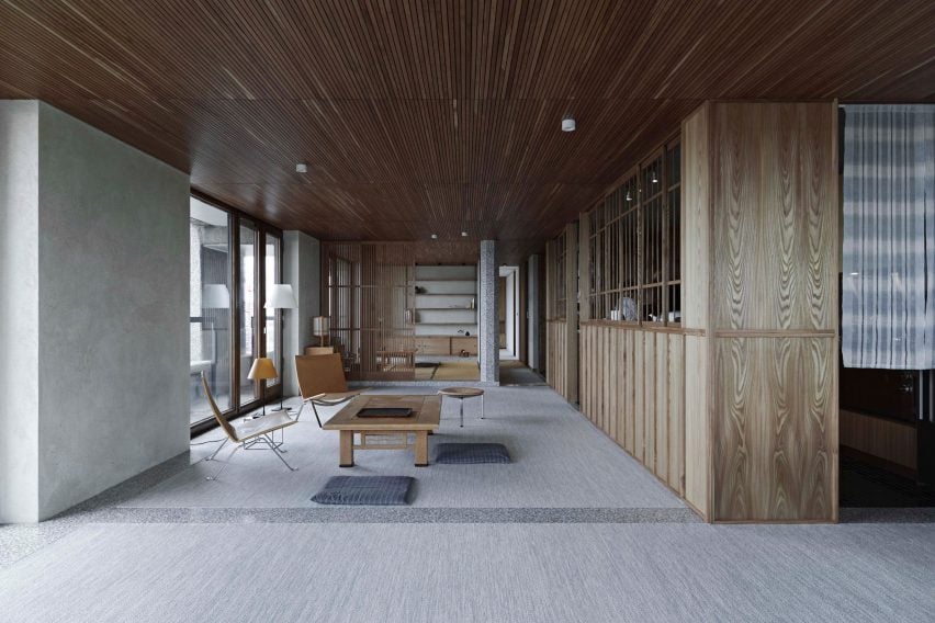
Shakespeare Tower apartment by Takero Shimazaki Architects
Photo is by Anton Gorlenko

Barbican flat, UK, by Takero Shimakazi Architects

This flat in the Shakespeare Tower of London’s brutalist Barbican estate was overhauled by Takero Shimakazi Architects in a nod to the client’s strong ties to Japan.

Details such as gridded timber panels and timber joinery were added throughout the flat, which also features Japan-informed details including an area lined with tatami mats.

Find out more about the Barbican flat ›


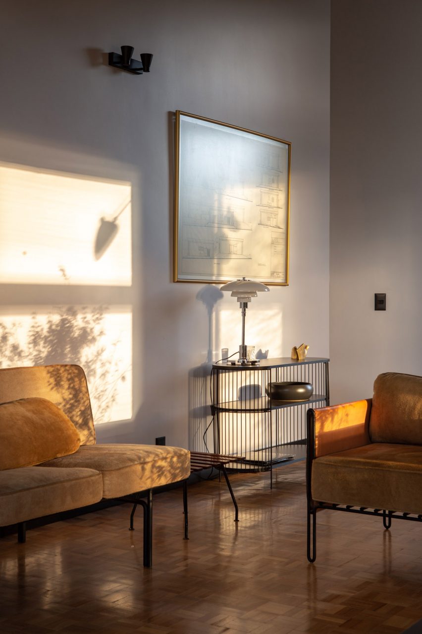
Debaixo do Bloco Arquitetura
Photo is by Joana França

Concrete home, Brazil, by Debaixo do Bloco Arquitetura

Debaixo do Bloco’s design for this sculptural house in Brazil is divided into three sections to provide a clear distinction between the various programmes.

Inside, the interior has a mid-century modern feel, with gleaming wood parquet flooring and a glass PH table lamp by Danish designer Louis Poulsen decorating a side table.

Find out more about the concrete home ›


An office table and chairs inside the office
Photo is by Lorenzo Zandri

Smithson Tower office, UK, by ConForm

The brutalist Smithson Tower in Mayfair is the location for this “homely” office designed by ConForm Architects. The studio split the space into eight zones defined by the strong structural grid of the existing building, and added low-level joinery.

The result is a design that softens the stark office spaces and makes the rooms feel more intimate.

Find out more about the Smithson Tower office ›


The Standard hotel in London by Shawn Hausman Design
Photo is courtesy of The Standard

The Standard London, UK, by Shawn Hausman

Designer Shawn Hausman created the colour-drenched interior of hotel The Standard in London, which is located in a brutalist building, to contrast “the greyness of London”.

“I would say with this property we were a bit more colourful than usual, and I think part of that is acting in contrast to the brutalist building that the hotel’s in,” explained Hausman.

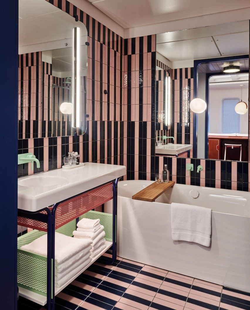
In the bathrooms, stripy pink-and-black tiled walls and pops of pale mint green give the room a fun, playful feel.

Find out more about The Standard London ›


The Preston Hollow by Specht Architects
Photo is by Casey Dunn

Preston Hollow, US, by Specht Architects

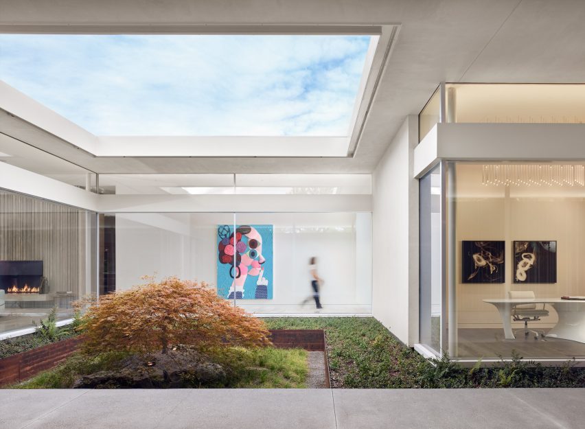
The long corrugated concrete volumes of Preston Hollow in Dallas were designed to reference brutalist Texan architecture from the 1950s and 60s, but the house was built to wrap around courtyards, creating a lively, open impression.

Inside the low-slung buildings, mid-century modern-style furniture nods to the home’s architectural references but the interior is brought up-to-date with the addition of modern art.

Find out more about Preston Hollow ›


Barbican apartment designed by John Pawson
Photo is by Gilbert McCarragher

Barbican apartment, UK, by John Pawson

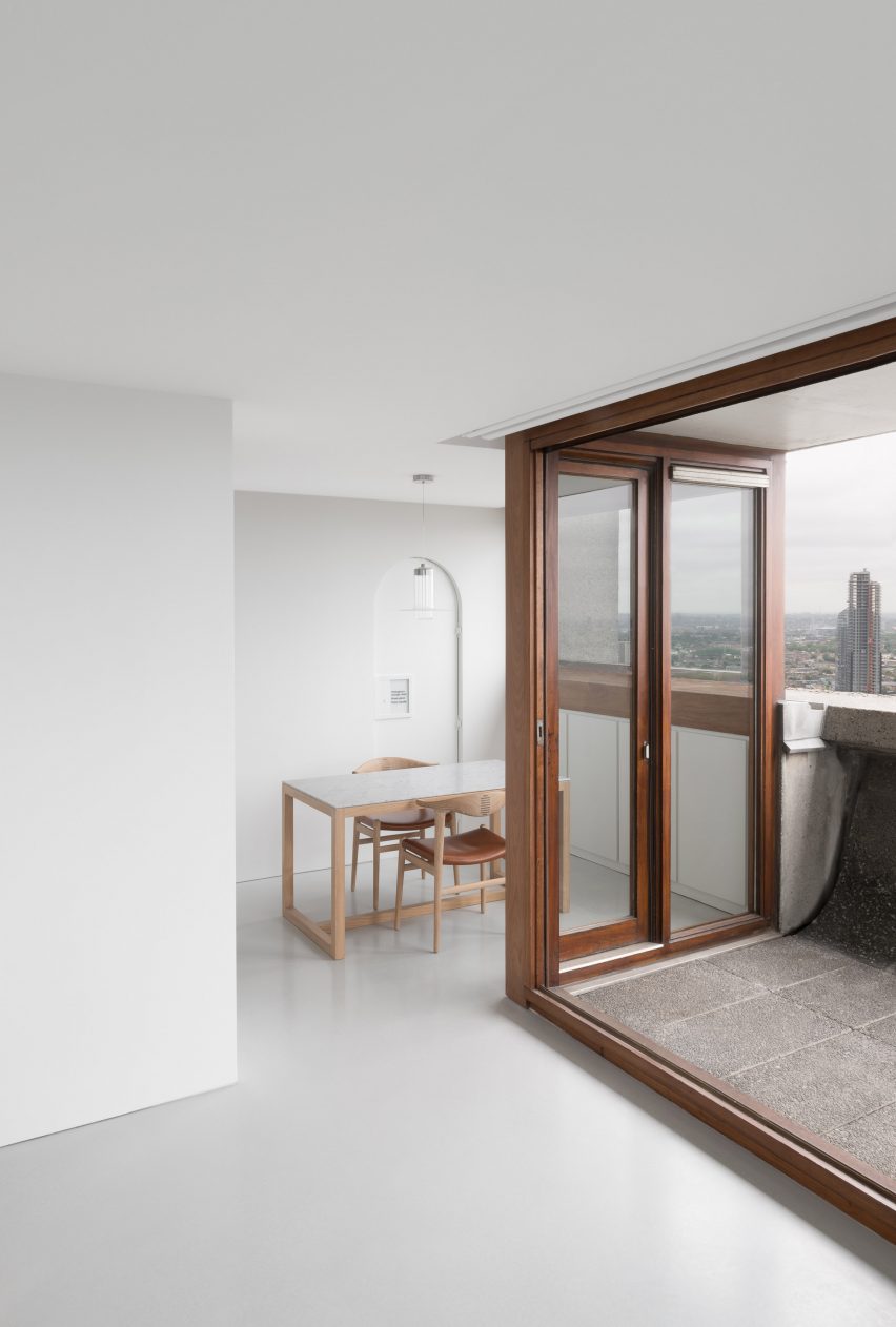
British architect John Pawson created this flat in London’s Barbican building using his signature minimalist aesthetic.

The flat, which overlooks central London and has a small concrete balcony, has been kept almost empty with just a smattering of furnishings and pale wooden surfaces. Three artworks, a Buddha sculpture and a grandfather clock are the only decorative elements in the space.

Find out more about the Barbican apartment ›

This is the latest in our lookbooks series, which provides visual inspiration from Dezeen’s archive. For more inspiration see previous lookbooks featuring granite kitchens, terrazzo eateries and atriums that brighten up residential spaces.

Reference

Ten food innovations to reduce the carbon impact of our diets
CategoriesSustainable News

Ten food innovations to reduce the carbon impact of our diets

Following the recent news about an avocado alternative called Ecovado, here is a roundup of 10 innovations that aim to reduce the carbon impact of the food industry and our diets.

The global food system, including the actions that take food from farm to plate such as transportation and production, is estimated to contribute 30 per cent of total greenhouse gas emissions, with over half of those a result of livestock agriculture.

In the past few years, designers have come up with numerous ideas for reducing food-related emissions as part of the global effort to slow climate change.

These innovations include developing alternatives to meat and other energy and resource-intensive foods, as well as creating more sustainable food production processes.

Read on for 10 designs that seek to decarbonise the food industry:


Ecovado by Arina Shokouhi

Ecovado by Arina Shokouhi

Central Saint Martins graduate Arina Shokouhi invented an avocado alternative named Ecovado, designed to break people away from purchasing the resource-intensive imported food.

“Avocados are one of the most unsustainable crops to export because of their delicate, easy-to-bruise nature, and the plantation-style monoculture farms required to meet the global demand for avocados are driving the deforestation of some of the most diverse landscapes in the world,” said Shokouhi.

The alternative contains a green, creamy, avocado-like foodstuff that is made from a combination of ingredients local to its country. It is packaged in a replica avocado skin formed from wax.

Find out more about Ecovado ›


Air Meat by Air Protein

Air Meat by Air Protein

Californian startup Air Protein has created a meat alternative titled Air Meat, made from microbes that turn recycled carbon dioxide into protein. The product aims to replicate the flavour and texture of real meat products.

With beef generating 70 kilograms of greenhouse gas emissions for every kilogram produced, Air Meat was developed in an attempt to tackle the negative climate impact of the agricultural industry.

Find out more about Air Meat ›


Solein by Solar Foods

Solein by Solar Foods

Solein is a protein-rich food made from electricity, air and water laced with bacteria. It was created by food-tech startup Solar Foods in collaboration with the VTT Technical Research Centre of Finland and the Lappeenranta University of Technology.

The food does not require land or large quantities of water to produce, both of which contribute significantly to the agricultural industry’s emissions, with the company claiming it has potential to “remove the climate impact of food systems on the planet”.

“Solein does not reduce the concentration of carbon dioxide in the atmosphere directly, but the indirect effect is that we need about one-tenth of the land compared to photosynthesis,” Solar Foods CEO Pasi Vainikka explained in an interview last year with Dezeen.

Find out more about Solein ›


Spira by Rob Russel

Spira by Rob Russell

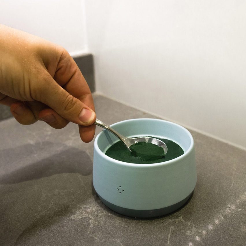
Rob Russell, a 2019 product design graduate of the University of Leeds, designed this countertop Spira device that can harvest microalgae daily. The device can produce two tablespoons of fresh, nutrient-dense spirulina each day.

This small amount constitutes a recommended daily serving, which the designer suggests adding to sauces, smoothies or salads.

“Home-cultivated spirulina combats the four contributors of food-related greenhouse-gas emissions – production, transport, cooking and waste disposal,” said Russell.

Find out more about Spira ›


Lab-grown meat by Eat Just

Lab-grown meat by Eat Just

In 2020, the Singapore Food Agency deemed Eat Just’s lab-grown, cultured chicken safe for human consumption. The US startup’s product is known as a clean meat, meaning it does not consist of dead animals but instead uses cells harvested from live animals that are grown and cultured into meat.

East Just explained that the cultured chicken has an “extremely low and significantly cleaner” microbiological content when compared to real chicken, which can contain bacteria from the gut, skin and feet of the poultry.

Find out more about Eat Just’s lab-grown meat ›


Dissolvable ramen packaging by Holly Grounds

Dissolvable ramen packaging by Holly Grounds

Product design student Holly Grounds developed an edible, flavourless biofilm that is seasoned with herbs and flavourings to replace the multiple plastic sachets which typically accompany packets of instant noodles.

The dissolvable ramen packaging is made from a handful of ingredients including potato starch, glycerin and water. The biofilm seals the noodles and prevents the food from becoming stale but dissolves in less than a minute when put into contact with water.

Find out more about Grounds’ dissolvable ramen packaging ›


Strøm by Charlotte Böhning and Mary Lempre

Strøm by Charlotte Böhning and Mary Lempre

Charlotte Böhning and Mary Lempres of studio Doppelgänger designed a collection of carbon water filters that are developed without fossil fuels and from their own kitchen waste.

The four-item range includes a substitute for Brita filter cartridges, purifying sticks and a self-cleaning pitcher and carafe. Traditional water filters are comprised of activated carbon within plastic cartridges typically derived from non-renewable energy sources.

“While carbon filtration immobilises harmful contaminants, the plastic cartridge’s only function is to hold the activated carbon,” Lempres told Dezeen. “Meanwhile, sourcing, manufacturing and injection-moulding the polypropylene are the largest contributors to the filter’s impact.”

Find out more about Strøm ›


Zero by PriestmanGoode

Zero by PriestmanGoode

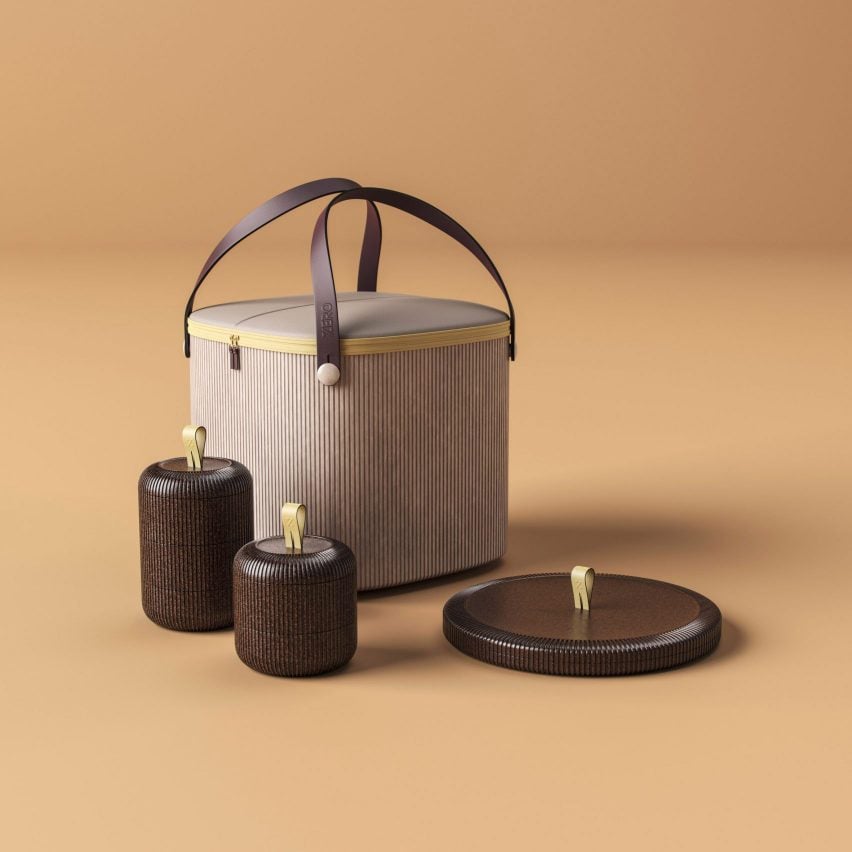
Multi-disciplinary design practice PriestmanGoode developed a concept for an incentive-based food delivery system that could encourage consumers to use and return bioplastic containers to takeaway restaurants.

The concept was created to discourage the use of single-use plastic for fast food boxes and bags. If put into widespread production, the containers and bag would be constructed from sustainable materials such as cocoa bean shells, mycelium and pineapple husks.

The boxes would have a bento-style stacking system, removing the need for individual lids as boxes would be placed on top of the other.

Find out more about Zero ›


An Egg Without a Chicken by Annie Larkins

An Egg Without a Chicken by Annie Larkins

Around 36 million eggs are eaten per day in the UK alone, produced by highly intensive farming processes.

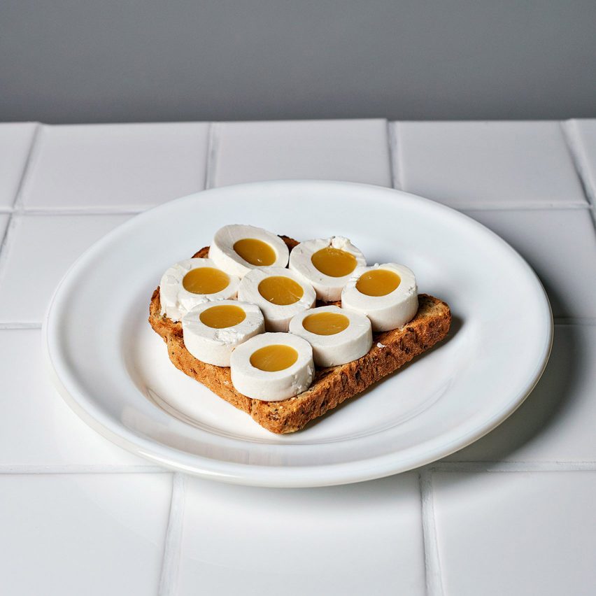
Central Saint Martins graduate Annie Larkins developed an unusually shaped alternative to chicken eggs made from pea protein, salt and algae-derived acid.

The designer altered the shape of the egg alternative, creating elongated and cubic forms, but looked to replicate the food’s white, yolk and shell, all of which were created from plant-based ingredients.

“Human desire to consume meat and animal products runs deep in cultures globally, and having an alternative that allows for an easy switch to plant-based products seems like a good thing to me,” said Larkins.

Find out more about An Egg Without a Chicken ›


3D-printed food products by Elzelinde van Doleweerd

3D-printed food products by Elzelinde van Doleweerd

Elzelinde van Doleweerd collaborated with a China-based technology company to develop food products 3D-printed from leftover food. The innovation was a result of Van Doleweerd’s final project during her industrial design degree at the Eindhoven University of Technology.

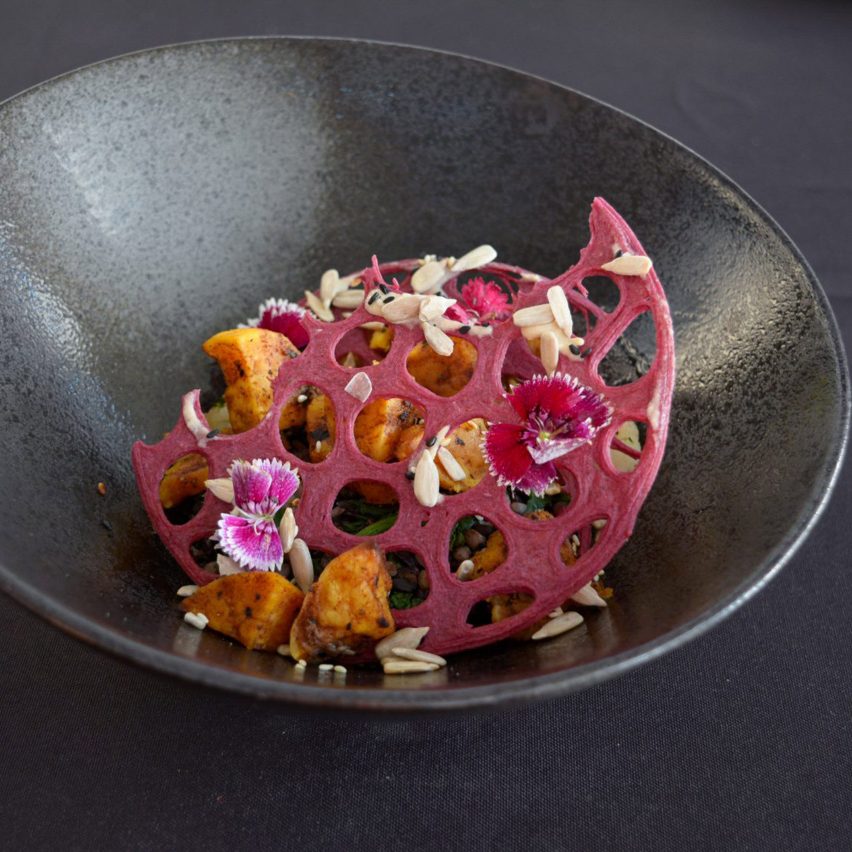
The designer began exploring 3D-printed food after learning that one-third of food produced worldwide is wasted. She used mashed, ground and sieved fruit peels, bread and rice to create the mixture, which is then printed to create 2D geometric patterns and 3D shapes.

Find out more about Van Doleweerd’s 3D-printed food products ›

Reference

Ten design projects that show the varied uses of solar power
CategoriesSustainable News

Ten design projects that show the varied uses of solar power

Clothing, cars, watches and headphones powered by solar energy feature in this roundup of 10 products that are harnessing the power of the sun as part of our Solar Revolution series.

Solar power captured by means of photovoltaic panels or solar electricity cells is becoming a more widespread way to power all manner of electronic devices.

Often incorporated into buildings, as photovoltaic panels become smaller, lighter and more efficient they are being increasingly used by designers as a renewable source of energy.

Below are 10 design projects that showcase the variety of ways solar power can be used:


Image of the RPT-02 SOL headphones
Photo courtesy of Adidas

RPT-02 SOL by Adidas and Zound Industries

Sportswear brand Adidas and speaker brand Zound Industries created wireless headphones that can be charged using both sunshine and artificial light.

Named RPT-02 SOL, the wireless headphones feature a headband that is constructed from a solar cell fabric named Powerfoyle that can convert sunlight and artificial light into electricity.

Find out more about RPT-02 SOL ›


The Solar Blanket, by Mireille Steinhage

The Solar Blanket by Mireille Steinhage

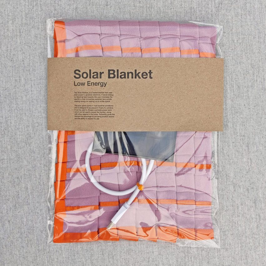
Central Saint Martins Material Futures graduate Mireille Steinhage made this solar-powered blanket from conductive yarn. The product was developed as part of a project that explored ways in which to make renewable energy products more accessible and affordable.

The blanket comes with a solar panel that attaches to a power bank and supplies energy to the blanket. Conductive yarn is used to generate heat across the blanket which is constructed using a polyester composition.

Find out more about The Solar Blanket ›


Ra by Marja van Aubel
Photography is by Pim Top

Ra by Marja van Aubel

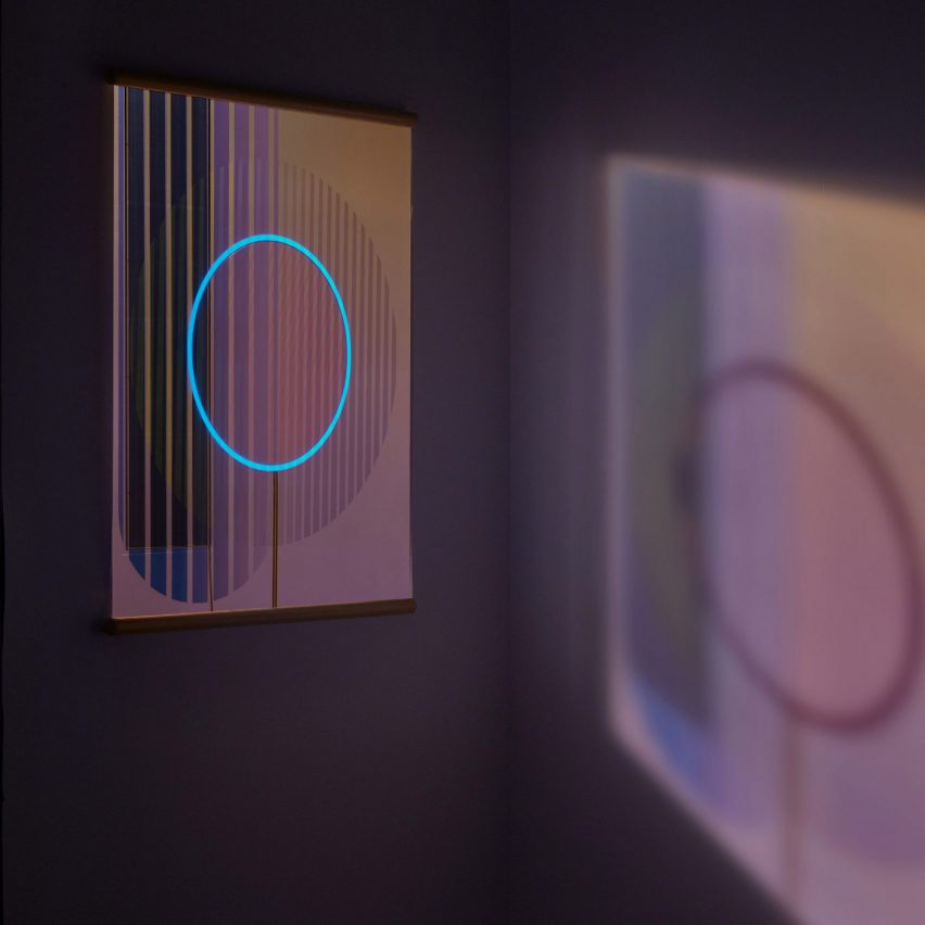
Dutch designer Marjan van Aubel arranged photovoltaic cells into geometric patterns to create a glowing, tapestry-like panel that was designed to be hung in a window.

Titled Ra, the artwork is one millimetre thick and comes to life at night. Once dark, a ring of electroluminescent paper embedded in the piece will begin to glow as a result of energy captured by the photovoltaic cells throughout the day.

Find out more about Ra ›


Sun-Powered Textiles by Aalto University
Photography is by Anne Kinnunen

Sun-Powered Textiles by Aalto University

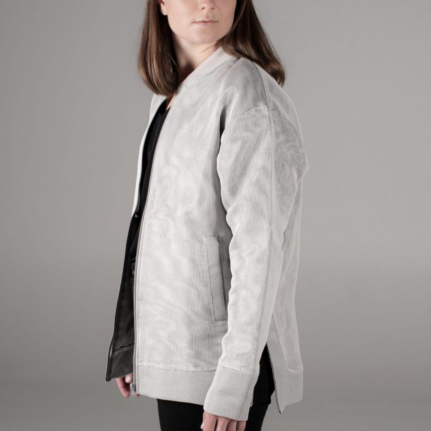
Design and physics researchers at Aalto University in Finland have developed clothing with concealed solar panels that provide users with a means to charge and power handheld electric devices without portable power banks.

A solar cell system was concealed beneath a textile layer within the jacket, which was amended so that enough light could pass through the fabric to power the wearable power bank. The development team hopes that the innovation could be applied to work and sportswear.

Find out more about Sun-Powered Textiles ›


Solartab C, by Solartab

Solartab C by Solartab

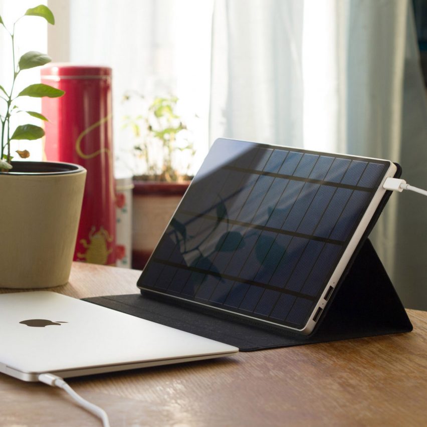
Solartab C is a portable charger that uses a photovoltaic panel to power phones, laptops and other handheld devices. Launched in 2017, the device was said to be the first of its kind to feature a USB-C connection and can quickly charge electronic devices.

The device was designed as a greener alternative to traditional chargers and has waterproof qualities as well as including a built-in cover that doubles as a stand.

Find out more about Solartab C ›


Solar-powered windbreaker, by Pauline van Dongen
Photography is by Roos van de Kieft

Solar-powered windbreaker by Pauline van Dongen

Dutch fashion designer Pauline van Dongen created a technical windbreaker with integrated solar panels that is able to charge handheld electronic devices.

Three flexible solar panels were incorporated across the face of the jacket in order to allow its users to still wear backpacks without obstructing the panels’ energy collection. The jacket is fitted with a power bank that stores energy collected throughout the day and also has water-resistant properties.

Find out more about Pauline van Dongen ›


Stella Lux, by Eindhoven University of Technology students

Stella Lux by Eindhoven University of Technology students

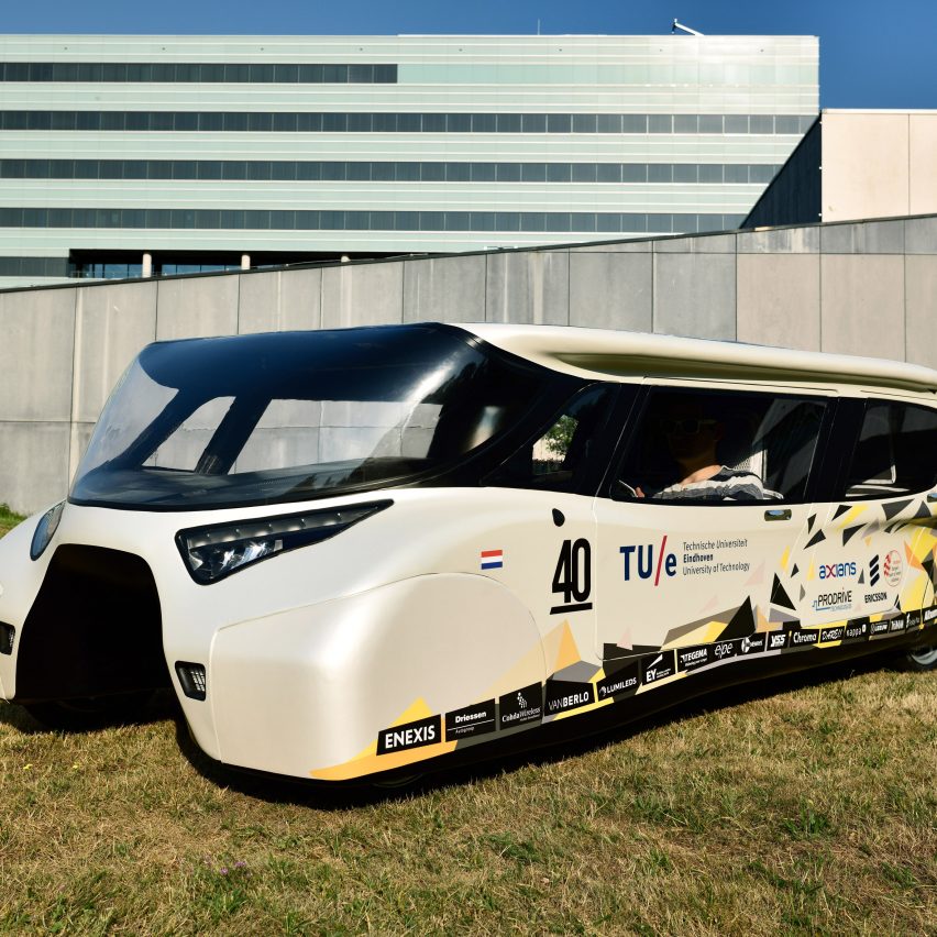
Stella Lux is a wedge-shaped car with solar panels fitted across its sloping roof and rear. As a result of its solar panel roof, the car can run for 1,000 kilometres (621 miles) on a single charge while carrying four people.

The family car was designed and built by Eindhoven University of Technology students and generates more energy than it uses, which can then be returned to the power grid.

Find out more about Stella Lux ›


Solution-01 watch collection, by Matte Works

Solution-01 watch collection by Matte Works

Watch brand Matte Works created a solar-powered watch that aims to integrate solar energy into its users’ everyday lives.

Named Solution-01, the watch comprises a solar cell beneath its dial that converts light into electrical energy. Energy is stored within the watch’s rechargeable battery, which reduces the need for disposable batteries.

Find out more about Solution-01 watch collection ›


Lightyear 0, by Lightyear

Lightyear 0 by Lightyear

Dutch startup Lightyear developed the “world’s first production-ready” solar-powered car. Lightyear 0 is a five-passenger car that is fitted with five square metres of curved solar panels across its roof, bonnet and tailgate.

The solar panel integration will convert solar energy into electric power that can add up to 70 kilometres (44 miles) per day onto the car’s 388-mile range from traditional electric charging.

Find out more about Lightyear 0 ›


SunUp, by Bradley Brister

SunUp by Bradley Brister

Rigid and flexible solar panels were combined to create SunUp, which is a product for outdoor use that can be placed over a backpack and other surfaces such as the top of a canoe.

SunUp was created by designer Bradley Brister and is comprised of a collection of polycrystalline solar panels that are adjoined to each other by flexible joints. The product has a 4,000 milliamp Hour (mAh) battery that can charge and power electronics within 12 hours.

Find out more about SunUp ›


Solar Revolution
Illustration is by Berke Yazicioglu

Solar Revolution

This article is part of Dezeen’s Solar Revolution series, which explores the varied and exciting possible uses of solar energy and how humans can fully harness the incredible power of the sun.

Reference