Ten kitchens with islands that make food preparation easier and more enjoyable
CategoriesInterior Design

Ten kitchens with islands that make food preparation easier and more enjoyable

For this lookbook, we’ve chosen ten kitchen interiors featuring kitchen islands that are both practical and sociable.


Kitchen islands are freestanding counter-height units that are usually rectangular in shape and offer additional storage and preparation space.

They work particularly well in open-plan spaces, providing a clear line of sight between the kitchen and dining areas and offering a place where people can gather.

Here are ten architecture and interior projects that feature kitchen islands including one utilising a repurposed carpenter’s bench and another informed by the work of artist Donald Judd.

This is the latest roundup in our Dezeen Lookbooks series providing visual inspiration for the home. Previous kitchen-related posts feature green kitchens, terrazzo kitchens and kitchens with skylights.


Casa Aguantao, Chile, by Guillermo Acuña Arquitectos Asociados

Casa Aguantao, Chile, by Guillermo Acuña Arquitectos Asociados

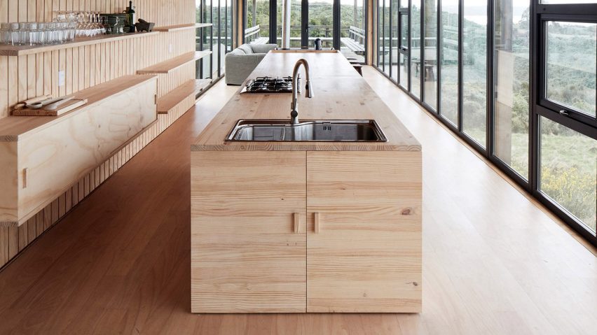
Santiago studio Guillermo Acuña Arquitectos Asociados used pale pine for this linear kitchen, with the multi-functional island drawing the eye down the length of the narrow, glazed dwelling towards the living area and terrace beyond.

The kitchen island features a large stainless steel sink and a hob at one end, with the other end serving as a dining table. The far end of the island incorporates a wood-burning stove that faces the lounge.

Find out more about Casa Aguantao ›

White Rabbit House, UK, by Gundry & Ducker

White Rabbit House, UK, by Gundry & Ducker

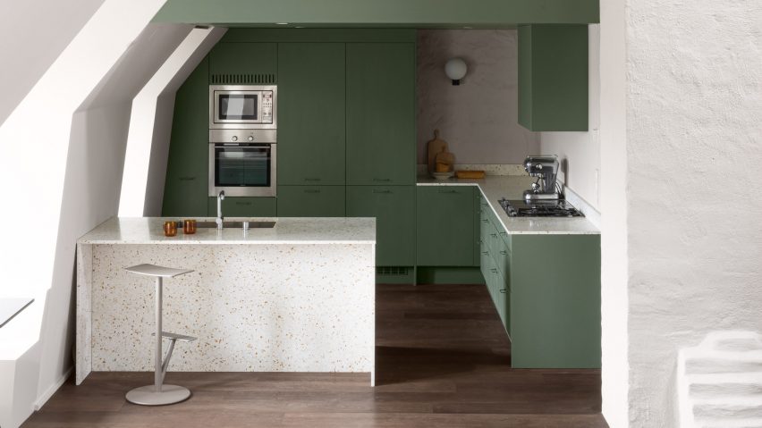
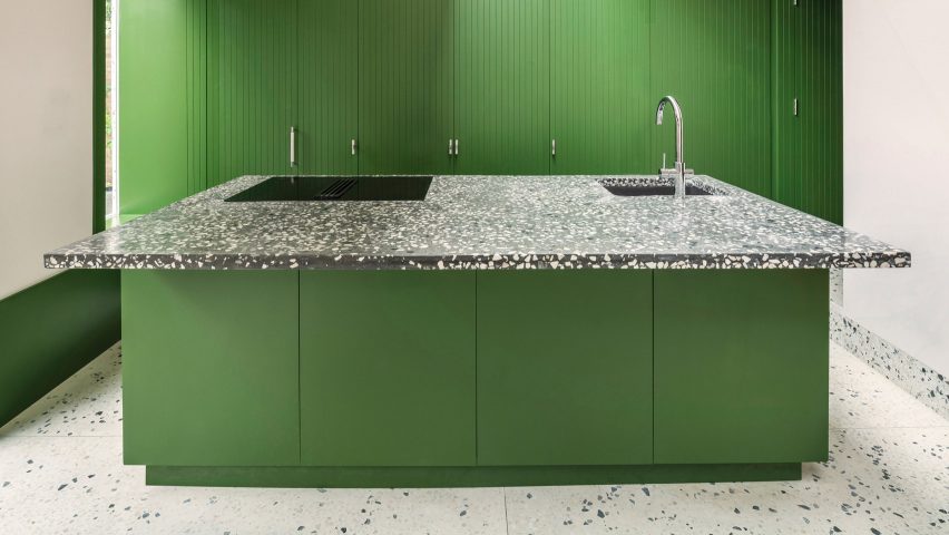
For the revamp of a 1970s house in London, British architecture studio Gundry & Ducker added this kitchen island painted a striking shade of absinthe green.

The countertop, which features a large cantilever on one side to create a breakfast bar, is made of dark terrazzo set with white stone chips. With full-height storage behind it, the island faces a generous-sized room with two glazed double doors that open onto the garden.

Find out more about White Rabbit House ›

Rylett House, UK, by Studio 30 Architects

Rylett House, UK, by Studio 30 Architects

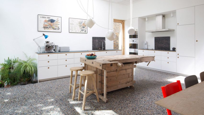
Studio 30 Architects repurposed an old carpenter’s workbench into a quirky island for this Victorian home renovation project.

The vintage wooden bench contrasts with the contemporary white kitchen units that line two walls. It serves as a sculptural bar that links the food-preparing area to the dining area on the other side of the spacious garden-facing room.

Suspended white Aim lights by the Bouroullecs hang above the island.

Find out more about Rylett House ›

Glyn House, UK, by Yellow Cloud Studio

Glyn House, UK, by Yellow Cloud Studio

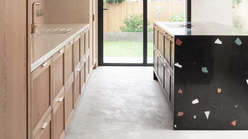
Striking black terrazzo surface with large, colourful aggregate clads all but one side of this minimalist kitchen island designed by Yellow Cloud Studio for a home extension project.

A double layer of oak drawers with bronze pull-tab handles sits below the kitchen-facing side of the counter, which has a flush hob. The other side of the island overhangs to create a narrow breakfast bar, beyond which is a dining table with bench seating set against an exposed brick wall.

Find out more about Glyn House ›
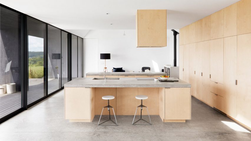

Hass House, USA, by Feuerstein Quagliara

Hass House, USA, by Feuerstein Quagliara

Architecture firm Feuerstein Quagliara designed not one but two parallel islands for the open-plan kitchen, dining area and living room in this house in rural New York state.

Set at ninety degrees to the full-height storage along one wall, the islands’ bases are made of the same plywood as the cupboards and are topped by slabs of polished concrete.

One island is inset with a deep sink and an induction hob and features a breakfast-bar niche for two adjustable-height Camp Stools by Chicago designer Greta de Parry.

Find out more about Hass House ›
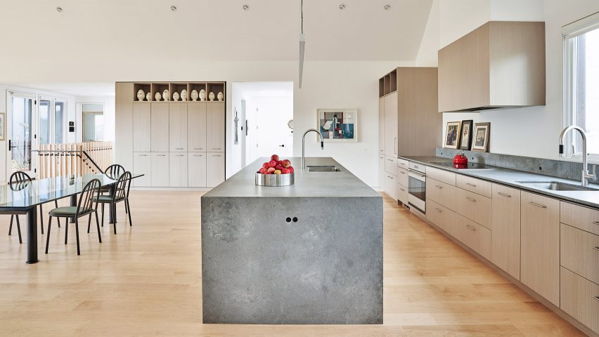

Lake Geneva Residence, USA, by Collective Office

Chicago architecture practice Collective Office created a sharp, monolithic island to divide the kitchen and dining area of this contemporary take on a farmhouse in Wisconsin.

The island is made of a solid-surface material by Caesarstone that resembles rugged concrete and has pale wood-fronted cupboards underneath.

The colour palette complements the silvery shingles of Alaskan yellow cedar that clad the home’s exterior. An extra sink is set into the countertop and there are handy electric outlets at one end.

Find out more about Lake Geneva Residence ›
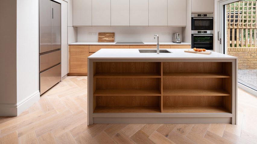

Step House, UK, by Grey Griffiths Architects

Step House, UK, by Grey Griffiths Architects

A grey, altar-like island sits in the middle of the open-plan kitchen-diner of this London extension project by Grey Griffiths Architects.

Deep timber shelves provide storage and display space along the side that faces the dining table, with a sink with an angled mixer tap set in the middle of the kitchen side.

Find out more about Step House ›
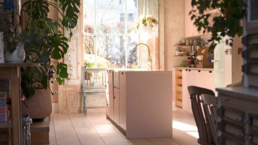

Ritson Road, UK, by Gresford Architects

Ritson Road, UK, by Gresford Architects

Pink is the theme of this kitchen extension built by Gresford Architects from rosy-hued coloured concrete in London’s Hackney neighbourhood. The vintage-style room has units along opposite walls, with a traditional Aga cooker on one side. The dining table is in an adjoining but separate space.

The narrow kitchen island, which sits in the centre of the room, has pink cupboards with slot handles. The apricot-coloured marble counter is cut away to make space for a traditional ceramic butler sink.

Find out more about Ritson Road ›
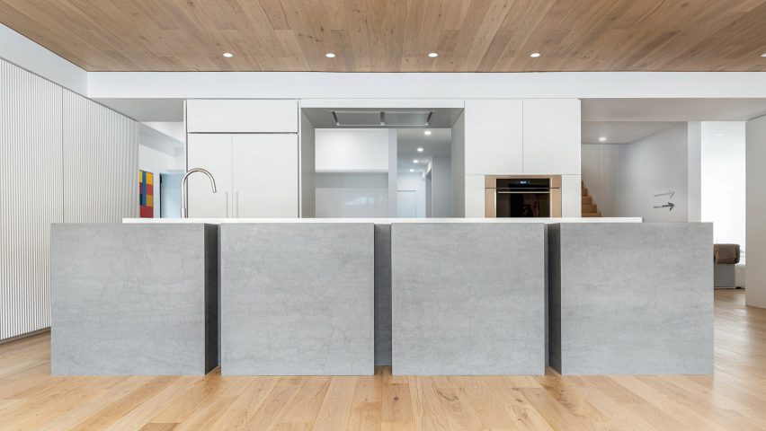

Shallmar Residence, Canada, by StudioAC 

Shallmar Residence, Canada, by StudioAC 

Canadian architectural practice StudioAC referenced the work of artist Donald Judd with this sculptural kitchen island for an art-filled house in Toronto.

The island is formed of four grey cubes made by kitchen materials brand Neolith and is topped by an offset white slab, which is interrupted only by a small recessed sink.

Find out more about Shallmar Residence ›
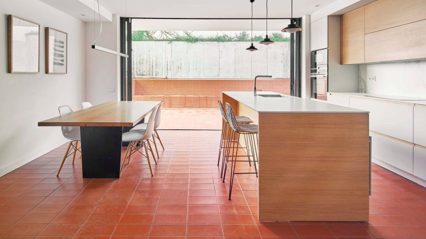

Barcelona Extension, Spain, by Bonba Studio

A simple wood-clad kitchen island provides extra surface space and a breakfast bar with bar stools in this kitchen extension by Bonba Studio.

A plain white countertop contrasts with the deep red terracotta tiles that lead out to the patio, creating a functional and spacious-feeling open-plan kitchen diner. It is illuminated by three pendant lights.

Find out more about Barcelona Extension ›


This is the latest in our series of lookbooks providing curated visual inspiration from Dezeen’s image archive. For more inspiration see previous lookbooks showcasing peaceful bedrooms, calm living rooms and colourful kitchens.

Reference

Ten kitchens with breakfast bars designed by architects
CategoriesInterior Design

Ten kitchens with breakfast bars designed by architects

Kitchens with breakfast bars feature in today’s lookbook, which showcases ten interiors from Dezeen’s archive.


Breakfast bars are multi-functional, bar-height counters where people can perch on bar stools to socialise or dine.

An informal alternative to the dining table, they can also be used for working from home, helping to make the kitchen a multi-purpose space that can be in use all day long.

Breakfast bars often make efficient use of space, combining with kitchen islands or peninsulas to provide storage and prep space.

This Dezeen Lookbook is the latest to feature design ideas for kitchens. Others explore kitchens with islands, light-filled kitchens, terrazzo kitchens and green kitchens.

Here are 10 examples of breakfast bars selected from Dezeen’s archive.


Dining space at Le Littoral by Architecture 49

Le Littoral, Canada, by Architecture49

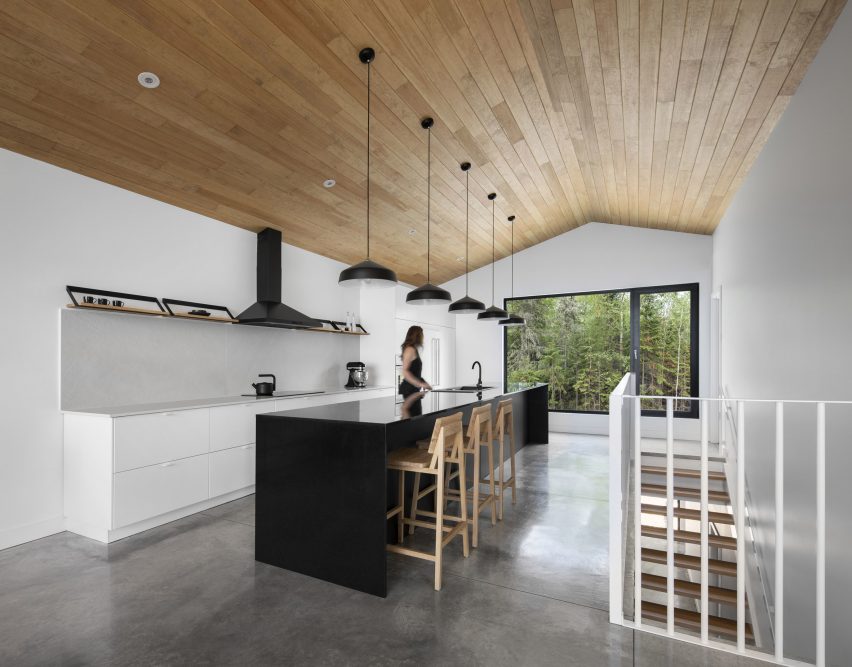
The upstairs living space at this holiday rental in Québec by Architecture49 features a long, narrow galley kitchen with an island that doubles as a breakfast bar.

Backing onto a staircase, this offers guests emerging from the ground-floor bedrooms a convenient point to stop for coffee before heading to the living and dining area beyond.

The long, black island features a niche that allows stools to be partially tucked away to increase circulation space.

Find out more about Le Littoral ›


Angular kitchen table

Holiday home, Chile, by 2DM Arquitectos

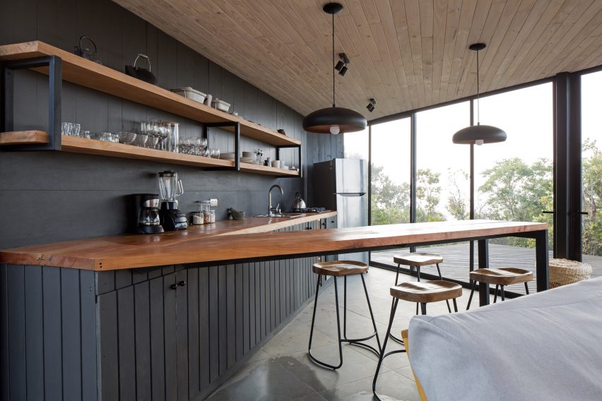
The open-plan kitchen of this angular home in Chile by 2DM Arquitectos features a V-shaped worktop, with the narrow peninsula serving as a breakfast bar.

The worktop is made of chunky, oiled hardwood while the bar stools have matching tractor-style hardwood seats.

Find out more about the holiday home ›


Apartment in Born, Spain, by Colombo and Serboli Architecture

Colombo and Serboli Architecture installed a playful open-plan kitchen with a round-ended peninsula as part of its conversion of an old apartment in Barcelona’s El Born district.

The terrazzo worktop overshoots the narrow rendered plinth, creating a breakfasting area furnished with two Revolver bar stools designed by Leon Ransmeier for Hay.

Find out more about Apartment in Born ›


Kitchen of La Nave apartment in Madrid by Nomos

La Nave, Spain, by Nomos

The terrazzo-topped peninsula in this open-plan kitchen in Madrid rests on a complex frame constructed from pine struts. This holds an open storage shelf – a typical feature in traditional Spanish kitchens, which often feature open shelving concealed by curtains instead of drawers and cupboards.

Two wooden artists’ stools with adjustable-height seats provide seating at the bar. The raw, open-plan apartment is in a former workshop in Madrid and was designed by Spanish architect Nomos.

Find out more about La Nave ›


Mantelpiece loft, Sweden, by Note Design Studio

Note Design Studio created this loft apartment in Stockholm, inserting a mezzanine into the double-height space beneath a soaring mansard roof.

The compact kitchen is tucked beneath a bedroom and features a breakfast bar set into a terrazzo peninsula that also features a sink, allowing a single breakfaster to wash up their crockery without leaving the Sequoia bar stools designed by Torbjørn Anderssen & Espen Voll for Magis.

Find out more about Note Design Studio ›


Penthouse M by CJH Studio

Penthouse M, Australia, by CJH Studio

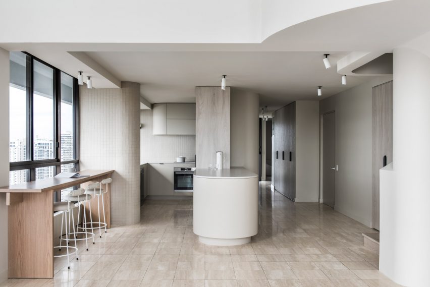
CJH Studio’s redesign of the interior of this penthouse in Gold Coast, Australia features a breakfast bar that is placed against a window to make the most of the view.

The narrow, freestanding bar is made of wood, adding a touch of warmth to the neutral tones of the kitchen, which features beige wall tiles and travertine flooring.

Find out more about Penthouse M ›


Island Rest holiday home in Isle of Wight designed by Ström Architects

Island Rest, UK, by Ström Architects 

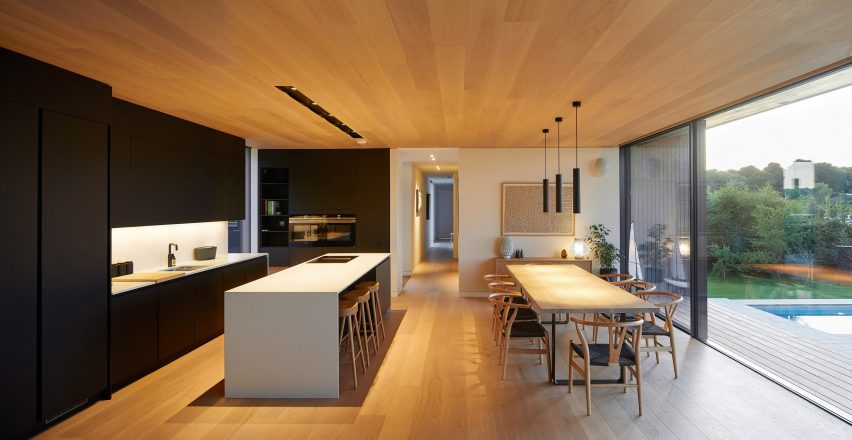
Island Rest, a low-slung holiday home on England’s Isle of Wight by Ström Architects, features a kitchen island deep enough for a row of bar stools to tuck underneath.

Made of white solid-surface material, the breakfast bar contrasts with the black kitchen and offers a more informal option than the huge wooden dining table behind, which is set with eight classic Wishbone chairs designed by Hans J Wegner for Carl Hansen & Søn.

Find out more about Island Rest ›


Interior of DU18 by Turner Works

Holiday home, England, by Turner Works

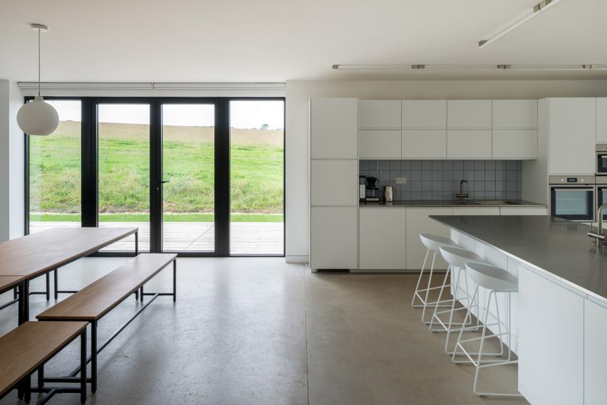
Architect Turner Works converted a barn in Devon, England into a holiday home featuring an open-plan kitchen and diner overlooking a wildflower meadow.

The unusual kitchen layout features storage, prep space and appliances arranged along a wall plus a substantial island set at 90 degrees, forming a T-shape.

A shallow breakfast bar has been carved into one end of the island, which has a stainless steel counter above white storage units. The adjoining dining area features a double-length table with refectory-style seating.

Find out more about the holiday home ›


Rue de la Gauchetière by Future Simple Studio

Family apartment, Canada, by Future Simple Studio

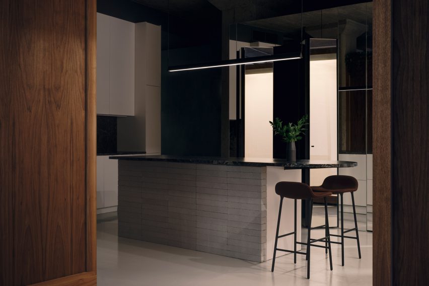
This apartment renovation in Montreal by Future Simple Studio has an asymmetrical kitchen consisting of units arranged against an angled wall plus a tongue-shaped island, which doubles as a breakfast bar.

The island is topped with polished granite and clad in white-painted cement blocks. The worktop cantilevers at one end, creating enough space for two Form bar stools designed by Simon Legald for Normann Copenhagen.

Find out more about the family apartment ›


Orange Barcelona apartment

Klinker apartment, Spain, by Colombo and Seboli Architecture

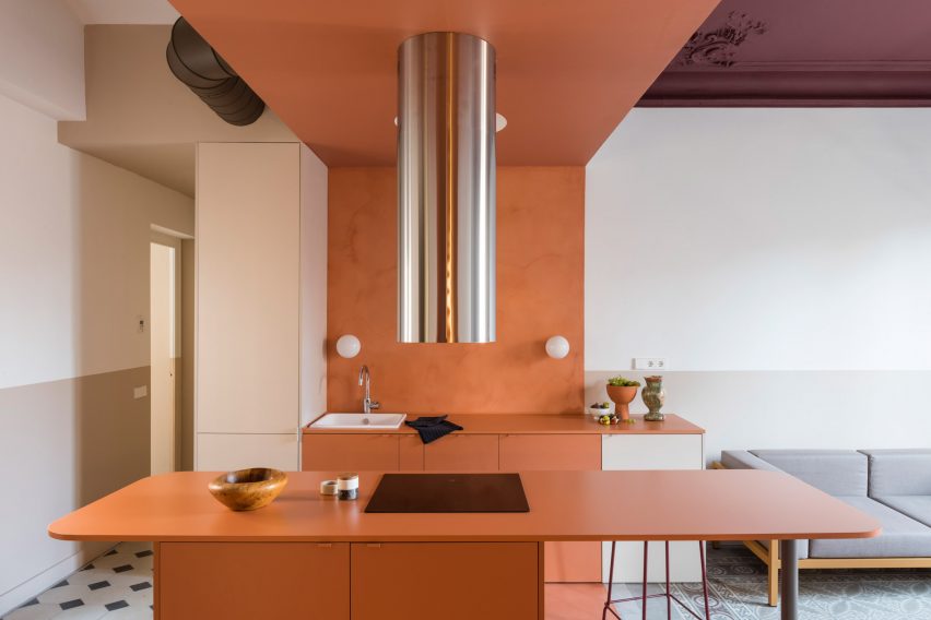
Colombo and Serboli Architecture updated this Barcelona apartment to include a compact open-plan kitchen made of russet-painted MDF.

One half of the short, broad island hosts a hob, which is ventilated by a dramatic stainless-steel extractor, with storage set below the counter.

The other, free-floating half of the island serves as a breakfast bar with room for two. It is supported by a steel column in one corner and features plenty of legroom beneath.

The apartment is too small for a dining table so the breakfast bar acts as the main eating space.

Find out more about Klinker Apartment ›


This is the latest in our series of lookbooks providing curated visual inspiration from Dezeen’s image archive. For more inspiration see previous lookbooks showcasing peaceful bedrooms, calm living rooms and colourful kitchens.
Reference

Ten interiors by Corcoran School of the Arts and Design masters students
CategoriesInterior Design

Ten interiors by Corcoran School of the Arts and Design masters students

In this school show, masters students at the Corcoran School of the Arts and Design present interiors projects including a comforting dental office and a retail experience that encourages people to repurpose old clothes.


The projects are from students on the Interior Architecture MFA course at the Corcoran School of the Arts and Design at The George Washington University in Washington, DC, USA.


School: Corcoran School of the Arts & Design at The George Washington University
Course: Interior Architecture MFA
Email: ciarc@gwu.edu

School statement:

“The Interior Architecture Master of Fine Arts (MFA) at the George Washington University’s Corcoran School of the Arts & Design in Washington, DC, is the only Council for Interior Design Accreditation-accredited programme in the United States’ capital.

“It is designed for students who pursued a bachelor’s degree in a field other than interior design, interior architecture or architecture and are looking to follow a studio-based curriculum that will teach various aspects of interior design, theories and technicalities. We believe in fostering a community that encourages creativity and pushes the boundaries of design with an emphasis on conceptual thinking and the design process.”


George Washington University

ADHD Childcare and Community Centre by Edewede Akpesiri-Odia

“Children with attention deficit hyperactivity disorder, ADHD, often have difficulties with hyperactivity and self-control. This project aims to create order and organized activities for children with ADHD while also offering fun and wellness benefits.

“The existing building is located in a dense residential area of Arlington, Virginia. Within the building shell, a grid enables order and structure. Each programme block will have activities shifting the grid, creating movement and fluidity while maintaining its volume. Activities will encourage and strengthen neural networks in the brain and enable kids with ADHD to practise self-control.”

Student: Edewede Akpesiri-Odia
Advisor: Christina Filipescu
Course:
Studio 5 – graduate
Email: 
ede.odia@gmail.com


George Washington University

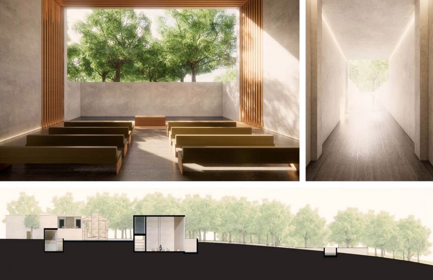
Remembrance Crematorium by Yi-Chen Chang

“Distinctive cultural responses to death inform how we process loss. Mourning rituals reflect the nature of the relationship with the deceased. As the solid stick fades to smoke, we connect to the sacred. We are reminded of the fragility of life and the importance of seizing the day.

“In this project, ruins of the McKinney homestead in Austin become a focal point for a crematorium complex. The symbolic omnipresence of death encourages us to cherish life and live deeply. References to death, burial, permanence/impermanence and the eternal are captured throughout the sequence of spaces providing quietude for reflection.”

Student: Yi-Chen Chang
Advisor: Christina Filipescu
Course:
Studio 5 – graduate
Email: changyichen@gwu.edu


George Washington University

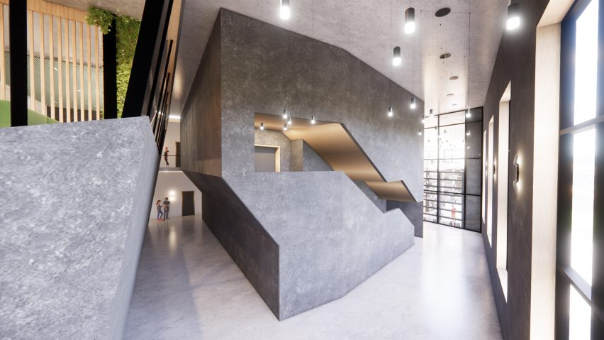
U.commons: A physical place for virtual learning by Aileen Kim

“With higher education leaning deeper into digital technologies, academic satellite sites can serve commuting and online students by providing practical resources and social support, leading to student success and equity.

“The interplay of physical and virtual realities is explored through the overlap, where the context of one reality may be expressed more dominantly over the other. At times, the overlap is a threshold, encouraging users to become aware of moving in and out of spaces designed for digi-centric or physi-centric programming. These portals guide inhabitants through areas for individual focused work to spaces for collaboration and social connection.”

Student: Aileen Kim
Advisor: Christina Filipescu
Course:
Studio 5 – graduate


George Washington

Suzuki School of Music, NYC by Taylor Oosting

“Classical music education for K-12 students comes with proven developmental benefits, but unfortunately, arts education is often among the first programmes cut from a public school’s budget. This project envisions an after-school Suzuki Education Center for strings. It aims to bring accessible music education to urban communities and lower entry barriers to classical music education and enjoyment.

“Located in one of the most diverse communities in the nation, a New York City borough, this project serves as a blueprint for future accessible music institutions. Conceptually, the project is based on the practice of Kintsugi, a Japanese method of repairing broken pottery by mending the broken areas or reattaching cracked pieces with gold lacquer, embracing the damage as an opportunity to find beauty in the imperfections.”

Student: Taylor Oosting
Advisor:
Christina Filipescu
Course:
Studio 5 – graduate
Email:
tayloroost@gwu.edu


George Washington University

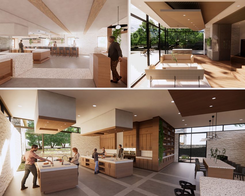
Peirce Mill: A Celebration of Food and Community by Brynn Jacoby Orban

“The Peirce Mill is a food-focused wellness centre featuring a garden-to-table restaurant, cooking classes, and a health and wellness coaching clinic. These facilities strive to celebrate food as a resource that nourishes the body and brings the community together.

“Inspired by the transformative process of grain’s movement through a mill, the site plan and architecture of the mill will highlight spaces of learning. With the use of the existing grids of the historic mill and barn, situated askew from each other in their idyllic forested, creekside setting, a shifted grid will be employed to highlight these transformative spaces of growth.”

Student: Brynn Jacoby Orban
Advisor:
Christina Filipescu
Course:
Studio 5 – graduate
Email:
jacobybrynn@gmail.com


George Washington University

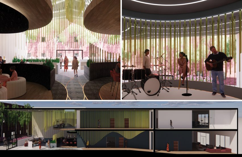
The Steady Beat Recording Studio by Hannah Shafer

“In music production and recording, women are often hindered by pay gaps, with limited mentorship and promotions opportunities while also confined to certain genres. The Steady Beat is a recording studio and artist social club in Washington DC designed with these limitations in mind – a space supportive of female excellence and collaboration.

“Inspired by sound waves, the space features undulating brass rods – a nod to musical instruments of the same material. As users cross the threshold where the historic building was once split into two, the waves become increasingly dynamic and the spaces more collaborative and creative.”

Student: Hannah Shafer
Advisor:
Christina Filipescu
Course:
Studio 5 – graduate
Email:
hannahcshafer@outlook.com


George Washington

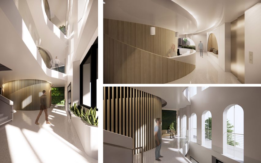
Dental Office by Vanessa Spencer

“It is estimated that 61 per cent of people have dentophobia, or fear of dentists, worldwide. This fear usually generates from past negative experiences or oral health concerns. To promote wellbeing, this project mimics nature’s process of protecting.

“A dental office is designed to bring comfort and a feeling of protection to the user by creating forms that are wrapped barriers of protection. These protected areas wrap around the spaces where the user might feel the most vulnerable. Biophilic tools are used throughout the design to connect the user with nature during their visit.”

Student: Vanessa Spencer
Advisor:
Christina Filipescu
Course:
Studio 5 – graduate
Email:
nessa31.vf3@gmail.com


George Washington University

Upcycling Retail Experience Store by Mengjiao Wang

“The fashion industry is the second-largest polluter in the world. Textile production requires significant natural resources, and the decomposition process produces greenhouse gas and leaches toxic chemicals into groundwater and soil.

“This project aims to increase people’s attention to this urgent environmental problem and to encourage people to participate in the process of upcycling clothing. Here, the old garments can be reinvented and start their new life. Drawing ideas from using ‘entropy increase’ to express the flow of time, the store will show the clothing’s journey and provide opportunities for customers to visit and join in.”

Student: Mengjiao Wang
Advisor:
Christina Filipescu
Course:
Studio 5 – graduate
Email:
mengjiaowang@gwu.edu


George Washington University

Education Co-op by Aidan Young

“In the current education system, undue emphasis is placed on academic content and standardized testing, leaving teachers with a substantial burden that consumes their mental bandwidth.

“To address the issue and to work toward a solution, this education centre will focus on one main reason students report dropping out of high school: a lack of positive peer and mentor relationships. The Education Co-op will provide students educational support in a space that cultivates and celebrates warmth and connection.”

Student: Aidan Young
Advisor:
Christina Filipescu
Course:
Studio 5 – graduate
Email:
young.aidan2015@gmail.com


Partnership content

This school show is a partnership between Dezeen and the Corcoran School of the Arts and Design. Find out more about Dezeen partnership content here.

Reference

Ten space-saving peninsula kitchens designed by architects
CategoriesInterior Design

Ten space-saving peninsula kitchens designed by architects

This lookbook highlights ten examples of peninsula kitchens, which have the functionality of kitchen islands but are a more space-saving solution.


Named after the geological feature, a kitchen peninsula is a spur that juts out from the wall or work surfaces, creating a three-sided surface. Peninsulas are often additionally used as breakfast bars for casual dining.

Peninsulas offer a space-saving solution for kitchens that don’t have enough floor space for a free-standing kitchen island. They are also useful in kitchens with irregular layouts since they can be asymmetrical or placed at jaunty angles.

They can also be used to create a useful staging post between the food preparation area and the dining area.

This is the latest roundup in our Dezeen Lookbooks series providing visual inspiration for the home. Previous kitchen-related roundups include kitchens with islands, galley kitchens and kitchens with breakfast bars.


Caldrap in Barcelona, Spain, by Nook Architects

Caldrap in Barcelona, Spain, by Nook Architects

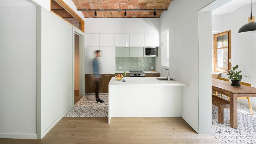
Nook Architects remodelled this 67-square-metre apartment in Barcelona to accommodate a family of three. A marble peninsula counter abuts the half-wall that divides the kitchen and the dining area.

A sink is sunk into the countertop at one end, and the marble surface overhangs to create a breakfast bar. Patterned tiles demarcate the kitchen area, which sits below a ceiling of traditional Catalonian brick vaults.

Find out more about Caldrap ›


Golden Lane flat renovation in London, UK, by Archmongers

Golden Lane flat renovation in London, UK, by Archmongers

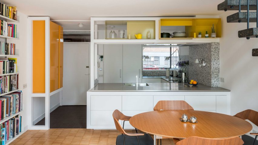
Archmongers reinstated modernist design elements for this 1950s flat renovation in London’s Golden Lane estate. Chunky white-painted wooden frames separate the kitchen and dining areas, adding high shelving above the peninsula kitchen.

The white kitchen cabinets are topped with steel while grey terrazzo picks out the counter end and splashback.

Find out more about Golden Lane flat renovation ›


Reception House in Higashiyama in Nagoya, Japan, by Yuki Mitani and Atsumi Nonaka

Reception House in Higashiyama in Nagoya, Japan, by Yuki Mitani and Atsumi Nonaka

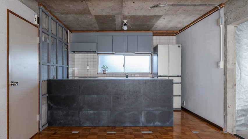
Architects Yuki Mitani and Atsumi Nonaka redesigned their kitchen to create a more social space when they remodelled their own home. A peninsula kitchen counter creates extra counter space, while allowing the hosts to chat with their guests as they prepare meals.

The rental flat came with no finishes, just raw concrete walls, so the architects played up to this and clad the counter with panels of industrial-looking zinc.

Find out more about Reception House in Higashiyama ›


Botaniczna Apartment in Poznań, Poland, by Agnieszka Owsiany Studio

Botaniczna Apartment in Poznań, Poland, by Agnieszka Owsiany Studio

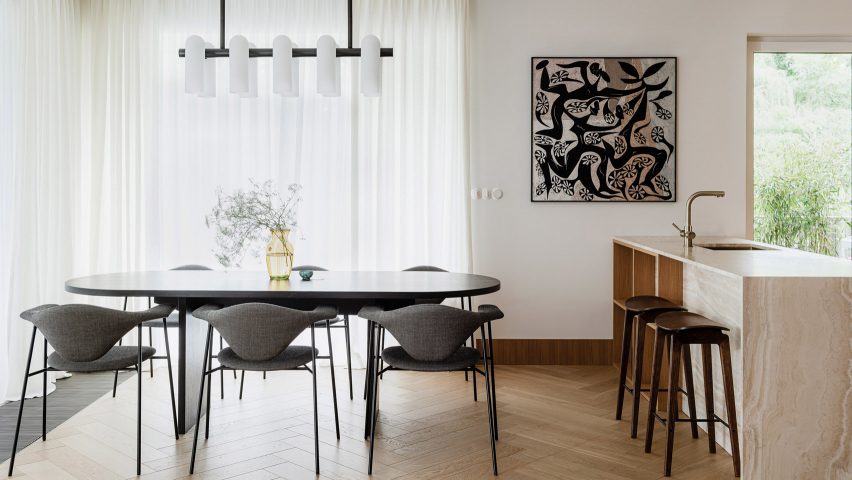
A bronze tap complements the creamy marble of this peninsula counter for an open-plan kitchen diner in a Polish apartment. Agnieszka Owsiany Studio designed the space to be as calming as possible for a couple with high-pressure jobs in medicine.

Wooden shelves are built into one side of the counter, which overhangs slightly so it can double as an informal breakfast bar with saddle-style bar stools ›.

Find out more about Botaniczna Apartment ›


Apartment in Born in Barcelona, Spain, by Colombo and Serboli Architecture

Apartment in Born in Barcelona, Spain, by Colombo and Serboli Architecture

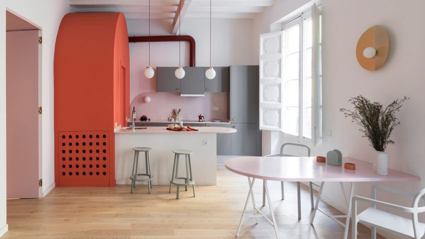
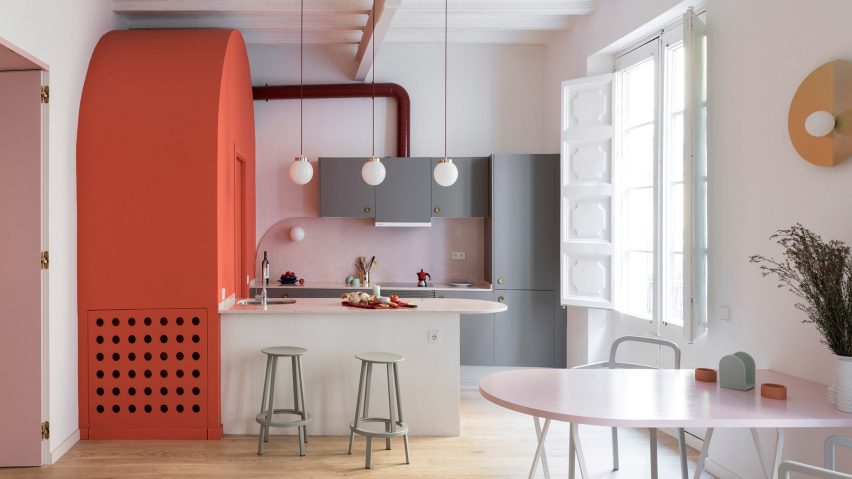
A curved countertop projects to form a breakfast bar in this colourful flat renovation by Colombo and Serboli Architecture for a woman working in the fashion industry.

The countertop abuts a bright coral arched volume that hides a guest bathroom. A polished metal tap curves over the sink on the kitchen side and two grey Revolver Stools from Hay can be drawn up to turn the surface into a breakfast bar.

Find out more about Apartment in Born ›


St Lawrence in Toronto, Canada, by Odami

St Lawrence in Toronto, Canada, by Odami

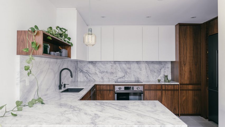
Canadian studio Odami opened up the previously enclosed kitchen of a dated 1980s apartment in Toronto. The peninsula kitchen adds more worksurfaces while creating a line of sight with the dining area.

Matching grey marble countertops and splashback contrast with the dark wood cabinetry and a matt black sink and tap.

Find out more about St Lawrence ›


Tsubo House in London, UK, by Fraher & Findlay

Tsubo House in London, UK, by Fraher & Findlay

Architecture practice Fraher & Findlay introduced a Japanese aesthetic during the renovation and extension of this Victorian-era house in London.

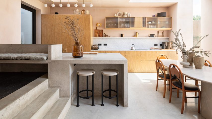
The kitchen features pink plaster walls and a peninsula-style polished concrete counter that also serves as a breakfast bar and continues up a short flight of steps to form a bench seat.

Find out more about Tsubo House ›


Cabinette in Valencia, Spain, by Masquespacio

Cabinette in Valencia, Spain, by Masquespacio

A row of retro-futuristic stools with tiered fringing from Spanish studio Masquespacio’s Déjà-Vu collection line up below the bar of this peninsula kitchen in a co-working space in Valencia.

The studio designed the space in homage to French director Jacques Tati’s 1960s film Playtime. The kitchen area features baby-blue tiling and strips of neon underlighting.

Find out more about Cabinette ›


308 S apartment in Brasilia, Brazil, by Bloco Arquitetos

308 S apartment in Brasilia, Brazil, by Bloco Arquitetos

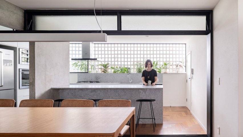
Bloco Arquitetos reconfigured this 1960s apartment in Brasilia, adding translucent sliding doorways that can be pulled across to separate the kitchen and the dining area.

The peninsula kitchen with its marble counter abuts a concrete divider wall and allows the kitchen and dining room to become one large entertaining space when the doors are open.

Find out more about 308 S ›


La Nave in Madrid, Spain, by Nomos

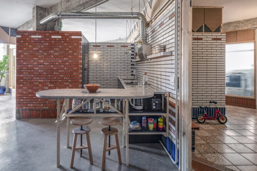
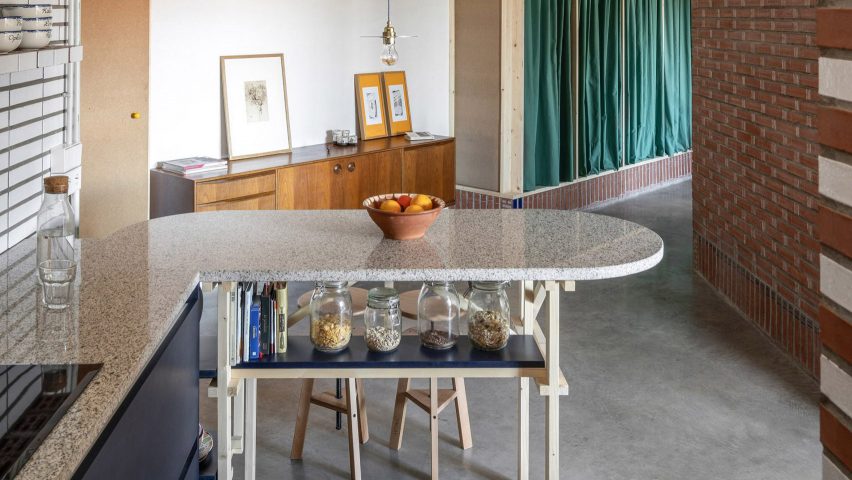
Spanish architecture studio Nomos converted an old workshop into a home for two of its partners. The original pipes and brickwork are still visible in the kitchen, which has a rounded peninsula counter supported by a wooden frame.

Nomos built the custom timber elements out of pine, including the frame and the bar stools. A blue-painted shelf under the counter doubles as a handy spot to store breakfast cereals and cookbooks.

Find out more about La Nave ›


This is the latest in our series of lookbooks providing curated visual inspiration from Dezeen’s image archive. For more inspiration see previous lookbooks showcasing peaceful bedrooms, wallpapered interiors and colourful kitchens.

Reference

Ten beautiful and practical combined kitchen and dining rooms
CategoriesInterior Design

Ten beautiful and practical combined kitchen and dining rooms

For our latest lookbook, we’ve found ten projects in the Dezeen archive where kitchens and dining rooms have been combined into one practical and sociable space.


Most homes around the world traditionally had separate areas for preparing and eating food but over the last few decades, the popularity of combined kitchen dining rooms has soared.

These are more informal spaces capable of hosting a variety of activities including entertaining, home-working as well as cooking and eating.

Kitchen dining rooms can also save space in smaller homes.

The ten examples below show some of the best examples from Dezeen’s archive and feature a variety of kitchen layouts including kitchens with islands, peninsula kitchens and kitchens with breakfast bars.

This is the latest roundup in our Dezeen Lookbooks series providing visual inspiration for the home. Previous kitchen-related roundups include compact kitchens and terrazzo kitchens.


Lover's House in Spain

Lover’s House, Spain, by Isla Architects

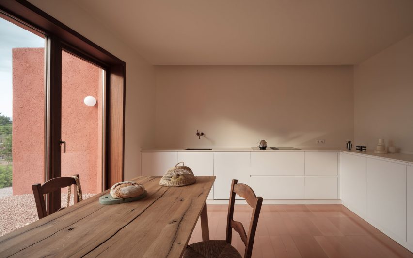
Local studio Isla Architects adapted and improved this holiday home on the Spanish island of Mallorca, using a minimalist material and colour palette to “reveal the simple geometry of the building”.

In the kitchen and dining space, matte white cabinets and countertops complement the off-white walls.

A tiled floor picks up the warm terracotta hue of the house’s exterior while utilities such as the sink and hob have clean, unadorned designs that contrast against the rustic wooden dining table and chairs.

Find out more about Lover’s House ›


The Cedars by Michael Yarinsky Studio

The Cedars, US, by Michael Yarinsky

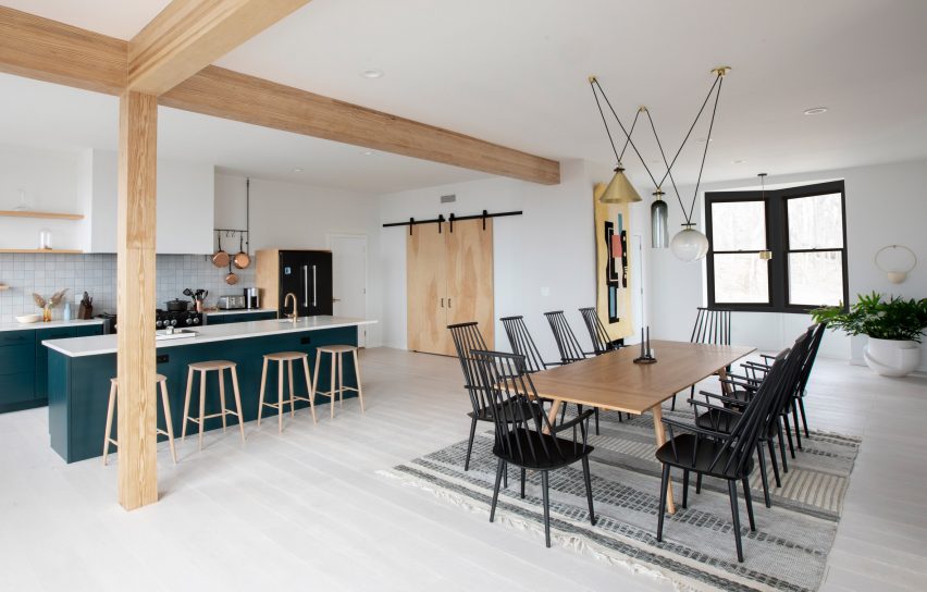
The Cedars on Long Island, New York, has a light, open kitchen and dining area with a kitchen corner that features a tiled back wall to demarcate it from the rest of the room.

As well as the larger dining table, the kitchen nook has a breakfast bar for more informal eating that has been painted in a dark petroleum blue to match the cabinetry.

Danish furniture brand Hay’s black J1110 chairs add an eyecatching graphic touch to the room, while a playful light by Ladies & Gentlemen Studio hangs above the table.

Find out more about The Cedars ›


Bright kitchen in Perth house

Marine, Australia, by David Barr Architects

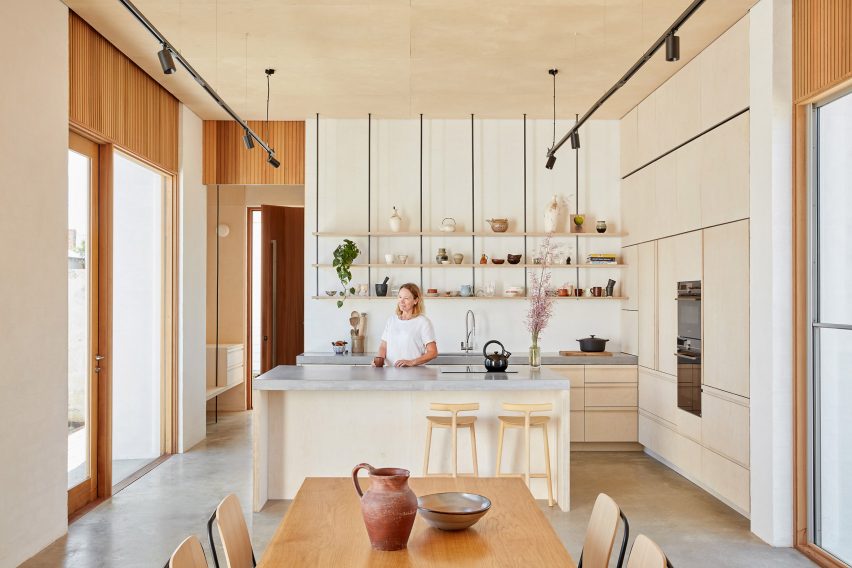
Wood runs through this kitchen and dining space in an extension to a home in Perth, Australia, designed by David Barr Architects.

Wooden cabinets and a wood kitchen island covered with grey stone countertops sit next to a wood-clad wall that hides the oven and various storage spaces.

Above the sink and work areas, open shelves hold a collection of decorative ceramics, while a matching ceramic jug and bowl sit on the wooden dining table. One side of the kitchen island functions as a breakfast bar, complete with ash chairs by Mattiazzi.

Find out more about Marine ›


Kitchen in House for a Sea Dog in Genoa by Dodi Moss

House for a Sea Dog, Italy, by Dodi Moss

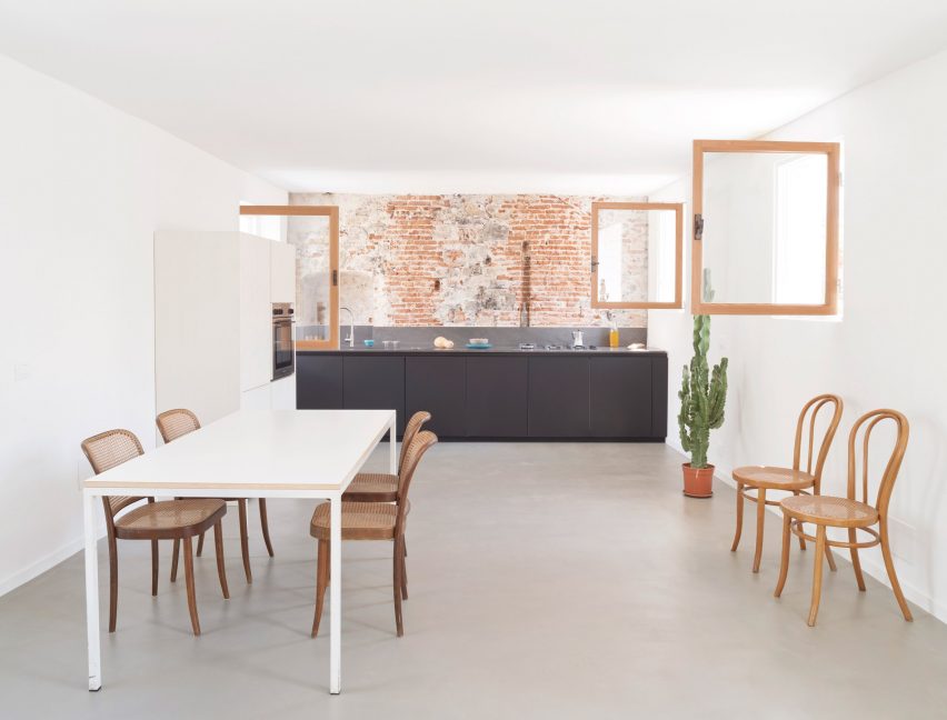
This loft apartment inside a 300-year-old building in Genoa, Italy, was designed to feel as open and spacious as possible. In the kitchen and dining room, a one-wall kitchen in a soothing dark-grey hue sits against a red brick wall.

This leaves space for a dining table and a selection of bentwood chairs with rattan seats. The oven and fridge are hidden away in white cupboards that blend into the wall.

Find out more about House for a Sea Dog ›


Three Chimney House by T W Ryan Architecture

Three Chimney House, US, by T W Ryan Architecture

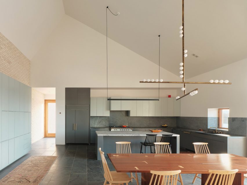
A large kitchen island with a marble countertop sits in the middle of this kitchen and dining room in Three Chimney House in rural Virginia.

With a design that was informed by both modernism and Southern colonial style, the room has been given a striking material palette. A stone floor matches the stone splashback that runs along the kitchen workspaces, while a tiled wall sits below the angled white ceiling.

Mid-century modern Stick Back chairs by Thomas Harlev underline the sparse geometric design while Lindsey Adelman’s 15 Bulb Drop System chandelier, which hangs above the table, gives the room a sacral feel.

Find out more about Three Chimney House ›


Open plan kitchen dining space

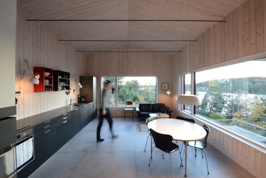
Cabin Son, Norway, by Jon Danielsen Aarhus

The rectangular kitchen in this spruce-clad holiday home in Norway has a small dining area and a sofa for lounging.

The multiuse space features a long single-wall kitchen that holds an oven and sink as well as multiple cabinets.

Colourful shelving above the countertops adds additional storage space and a vibrant touch against the pale-wood walls. A wooden table and black chairs by Danish designer Arne Jacobsen give the kitchen an elegant, modern feel.

Find out more about Cabin Son ›


Casa Meco kitchen and dining area

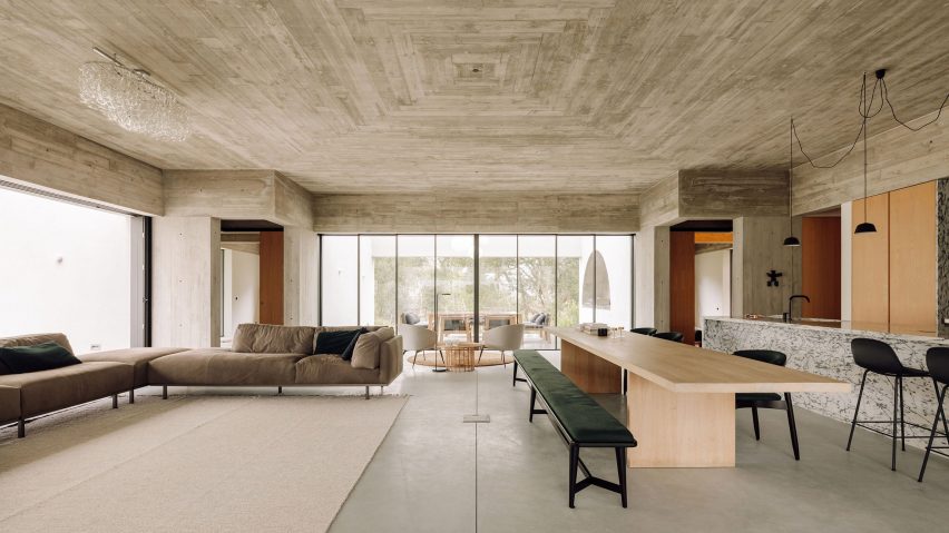
Casa Meco, Portugal, by Atelier Rua

A built-in kitchen clad in a decorative veiny marble, complete with a matching breakfast island, sits in one corner of Casa Meco’s enormous main room.

Wooden cupboards on either side of the kitchen hide the kitchen facilities. A long table made from pale wood with contrasting black chairs and a black bench can be used for large dinners, while a breakfast bar adds more seating options.

Find out more about Casa Meco ›


House-within-a-House by Alma-nac

House-within-a-House, UK, by Alma-nac

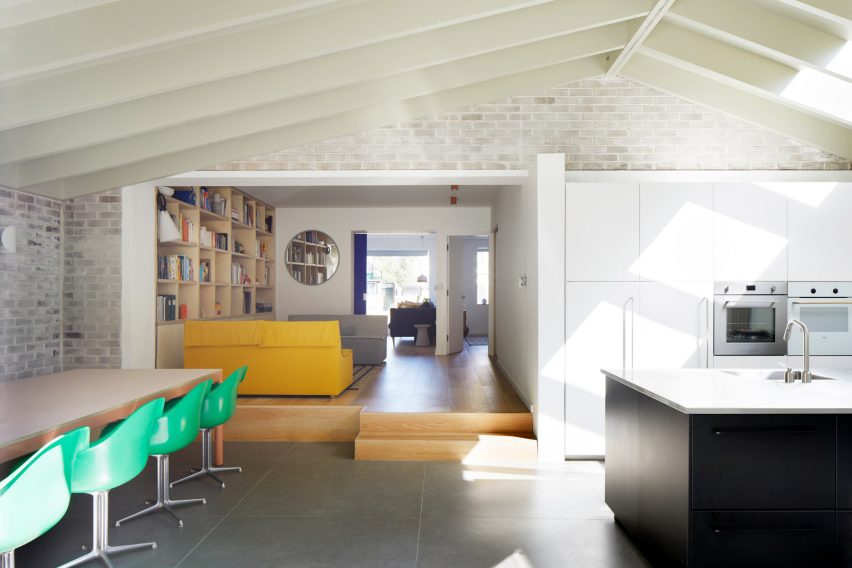
Alma-nac’s joyful design for House-within-a-House in south London includes an extension that holds the kitchen and dining area. Here, simple white cabinetry and a jet-black kitchen island sit on one side and offer plenty of space for food preparation and cooking.

Opposite, a dining table is completed with vintage-style apple-green plastic chairs. Their bright colour picks up the yellow hue of a sofa in the raised lounge area next to the dining space.

Find out more about House-within-a-House ›


Mài Apartment in Vietnam designed by Whale Design Lab

Mài Apartment, Vietnam, by Whale Design Lab

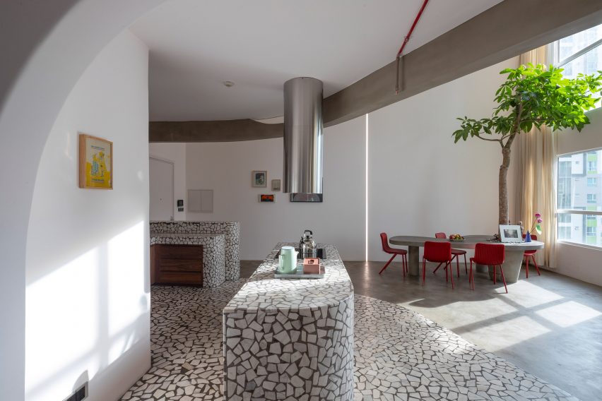
Graphic terrazzo surfaces decorate the kitchen area in this Vietnamese apartment by Whale Design Lab, which has a design informed by American architect Louis Kahn.

The splashback, countertop, breakfast island and floor were all crafted from the material. The organic, curved shapes of the kitchen island and workspaces are mirrored in the grey dining table that sits underneath a small indoor tree.

Bright red Dragonfly chairs by Einrichten Design add a splash of colour to the room.

Find out more about Mài Apartment ›


Interior of kitchen in London house

Quarter Glass House, UK, by Proctor & Shaw

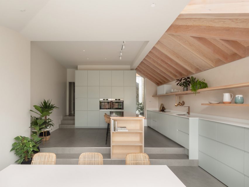
Proctor & Shaw’s design Quarter Glass House is an extension to a London house that holds the kitchen and dining space and was designed to have as much height and light as possible.

The studio lowered the floor to create more space, and combined exposed timber with duck-egg cabinetry and shiny copper surfaces to fulfill a request for warm and textural materials. A kitchen island with a breakfast bar has practical shelving on one side, and long floating wall shelves add storage space.

A simple white table with rattan chairs can seat six people and overlooks the garden outside the extension.

Find out more about Quarter Glass House ›


This is the latest in our series of lookbooks providing curated visual inspiration from Dezeen’s image archive. For more inspiration see previous lookbooks showcasing peaceful bedrooms, wallpapered interiors and colourful kitchens.
Reference