Gharib Studio outfits Austin jewellery store with pink walls and arches
CategoriesInterior Design

Gharib Studio outfits Austin jewellery store with pink walls and arches

Los Angeles design studio Gharib Studio has contrasted concrete floors and exposed ceilings with soft-pink walls and clean lines for a jewellery store in Austin.

Created for the friendship jewellery brand Little Words Project (LWP), Gharib Studio used elements of the merchandise to inform the store’s pink material palette and incorporated arches throughout the space to contrast the industrial elements of the building, which were left exposed.
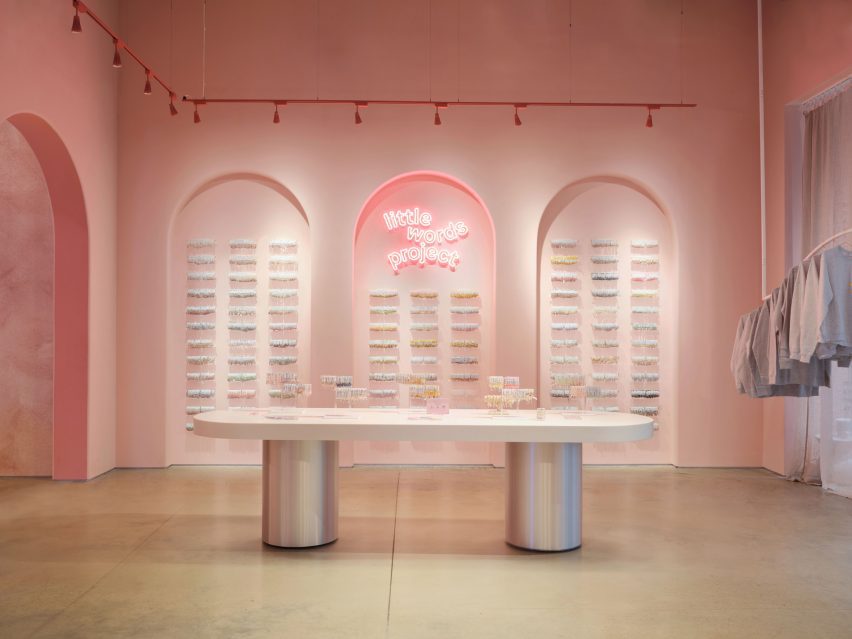
Table with silver baseTable with silver base
Gharib Studio has outfitted a jewellery store in Austin with dusty pink

According to Gharib Studio founder Nora Gharib, the team followed the common phrase “everything is bigger in Texas” when designing the concept store.

“I wanted to amplify the brand in a grand way by taking the LWP brand aesthetic and localizing it to Texas by pushing the standard design elements, such as the brand’s bracelet arches and beading table experience, then accentuating it,” said Gharib.
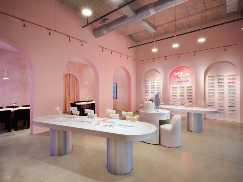
A retail store with silver with long white tablesA retail store with silver with long white tables
Arches and soft tones contrast with the space’s industrial elements

Visitors enter the store into a large, primary space, where built-in display cases were integrated into the walls.

On one side, the display resembles small bookcases and on the other, the bracelets are displayed throughout a series of arches.
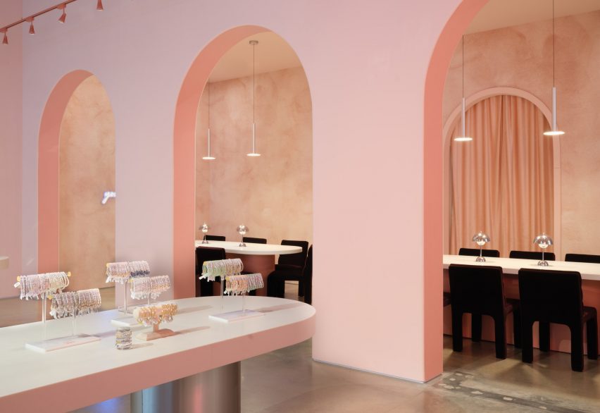
Archways with tables and chairsArchways with tables and chairs
Long tables lead to the seating area at the back of the space

At the centre of the primary space are two long tables with metallic-coated bases, also used for display. A circular display table in the middle was created to resemble a vanity, with merchandise incorporated throughout.

Gharib inserted three arches along the back of the space, in part to accentuate the height of the space, and to draw visitors to the space beyond them, which serves as a beading area.
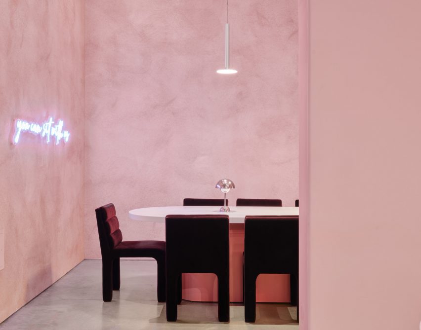
Velvet chairs underneath aluminum light fixtureVelvet chairs underneath aluminum light fixture
Metallic details were informed by the charms found on the bracelets

This space was outfitted with CB2 Castell Chairs in burgundy, with similar tables as the main space, except with pink bases instead of silver.

A neon sign that reads, “You can sit with us” hangs above the tables.

Textured dusty-pink wallpaper by Belarte Studio was used to line the space, while the remaining interior was covered in a rose pink hue.

Metallic accents throughout the store, including aluminium light pendants, a metal trimmed mirror and the display table’s metallic bases, were informed by the metal charms found in LWP bracelets.
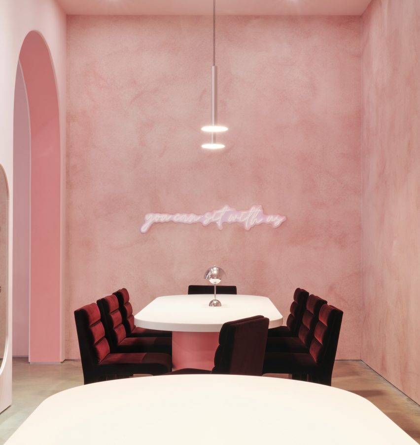
Space with velvet chairs and textured wallpaperSpace with velvet chairs and textured wallpaper
It is the brand’s first store in Austin

The space’s utility elements were left exposed on the ceiling, with red track lighting running the perimeter of the space.

Other retail projects recently completed in Austin include a mid-century post office turned grocery by Side Angle Side.

Gharib Studio is a Los Angeles-based studio founded by Nora Gharib in 2023, focused on retail and brand design.

The photography is by Casey Woods Photography 


Project credits:

Architectural designer: Gharib Studio

General contractor: Paco Santander Construction

Reference

Side Angle Side transforms Austin post office into restaurant
CategoriesInterior Design

Side Angle Side transforms Austin post office into restaurant

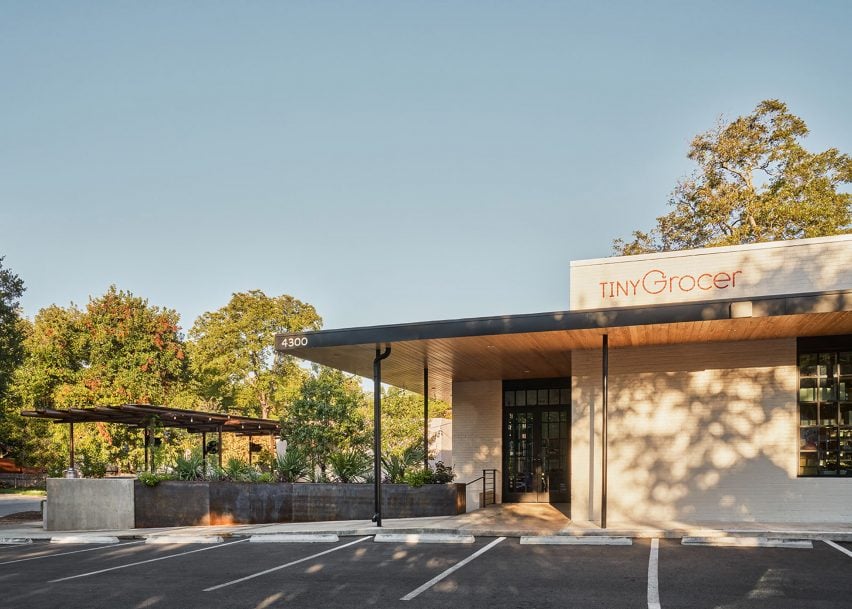
Texas architecture studio Side Angle Side has adapted a 1960s post office into a food market and restaurant in Austin.

Opened in October 2023 in the Hyde Park area, Tiny Grocer serves as a speciality market, bar and cafe while Bureau de Poste is a modern French bistro led by celebrity chef Jo Chan.

The exterior of a small, modern grocery storeThe exterior of a small, modern grocery store
Side Angle Side has transformed a 1960s post office into a food market and restaurant

Austin-based commercial and residential architecture firm Side Angle Side renovated the 3,500-square foot (325-square metre) 1967 US Post Office building and added a 1,500-square foot (140-square metre) outdoor dining patio.

“The Hyde Park U.S. Post Office was an important neighborhood hub in the 1960s – so we were especially careful to keep the integrity and spirit of the mid-century-utilitarian design,” Arthur Furman, founding partner of Side Angle Side, told Dezeen.

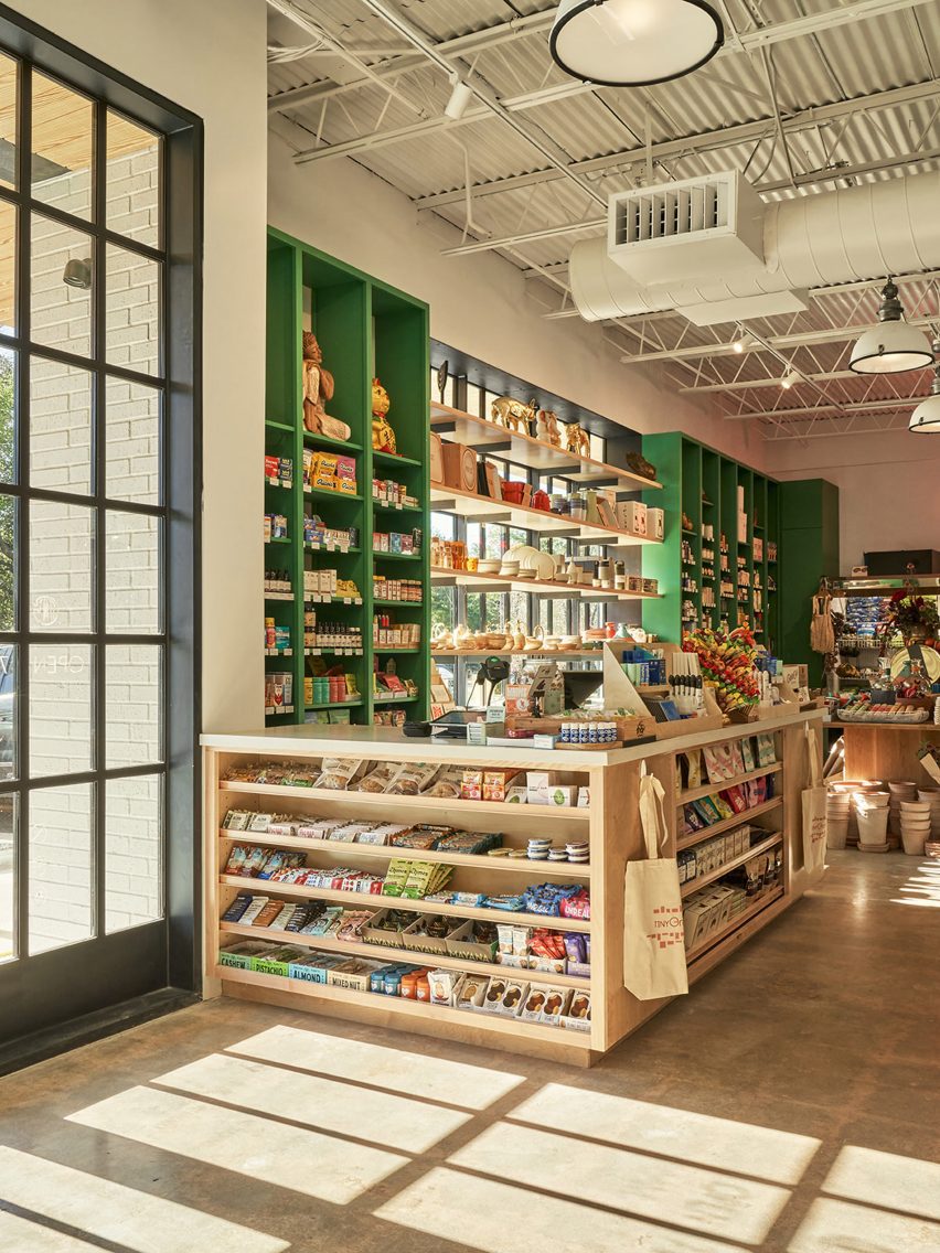
A grocery market with green shelvingA grocery market with green shelving
The team sought to preserve the building’s history as a community hub

“As the anchor tenant in the space, Tiny Grocer continues to be the centre of the community, a place to gather, shop, eat and drink.”

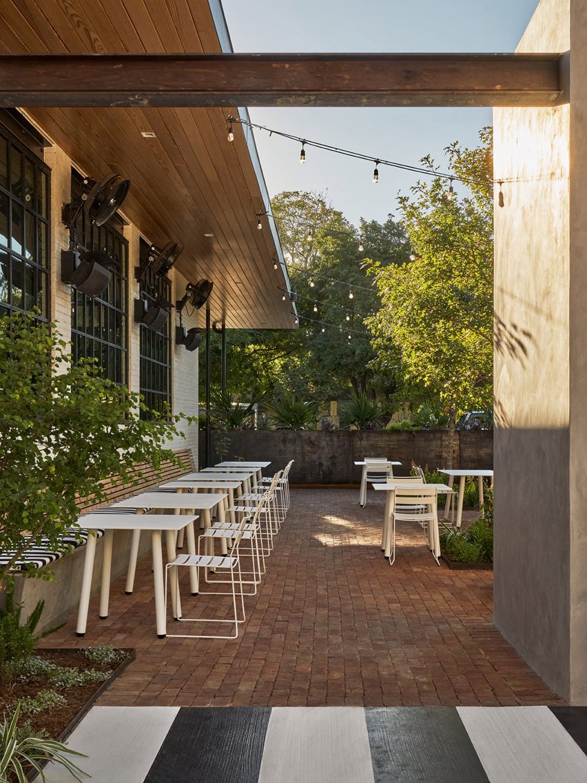
The shell of the white brick building was left intact, but the street-facing facade was previously used as a loading dock so the team transformed the back-of-house edge into a welcoming patio for the neighbourhood by removing the asphalt and adding two large live oak trees and a steel trellis and planters.

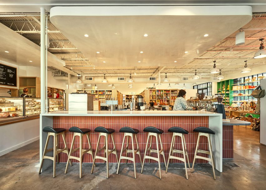
A bar in a grocery and marketA bar in a grocery and market
The exterior of the building was kept intact

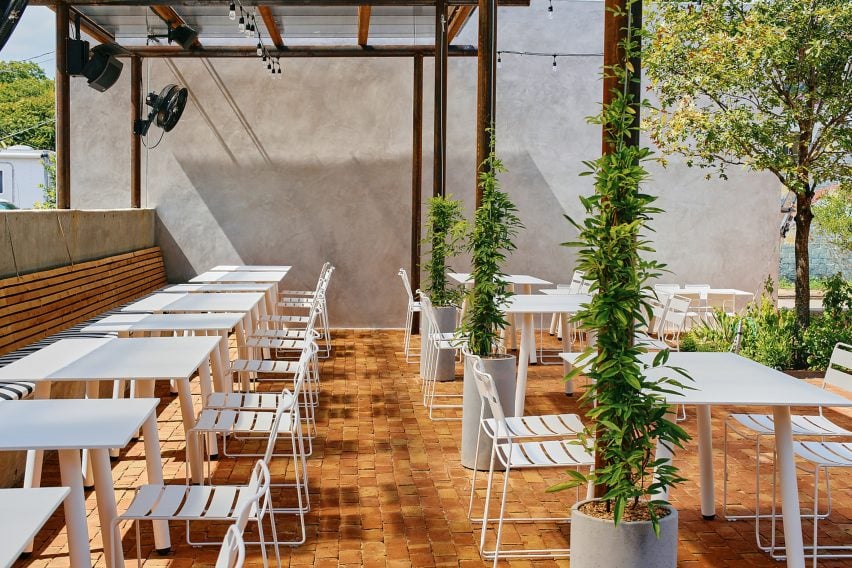
A cast-in-place concrete banquette holds the edge of the patio that is paved with antique red brick.

The steel planter forms a boundary between the parking area and the dining space, while the other edge is held by a light grey-coloured stucco restroom building. White metal furniture from Isimar and Portofino was used to furnish the patio.

“The patio and wine garden is the real heart of the project,” the team said, mentioning that it wasn’t within the original scope of the project but added later when its larger value was realized. “This is where all the care and thought of the interior spills to the outside, creating a lively environment.”

Wooden tables in front of a black framed windowWooden tables in front of a black framed window
The renovated building has exposed concrete floors from the original building

On the interior, Side Angle Side complemented the original ceiling and open web joists with metal decking and industrial warehouse pendants by AQ Lighting. The polished concrete floors expose the weathered imperfections and show the history of the building.

Upon entering, shoppers take in the colourful selection of curated products displayed on white oak mercantile shelving. Green millwork hugs one wall and the space widens to an open interior plan.

A patio with white metal seating and plantsA patio with white metal seating and plants
A patio and wine garden is at the heart of the project

A central deli and coffee bar floats in the middle of the room and creates a transition from the market to the bistro. The bar is wrapped in Seneca terracotta tile and topped with grey and white quartz countertops. Wooden Soule barstools are tucked under the waterfall counter.

The back-of-house spaces hold a kitchen office, storage, and bar equipment.

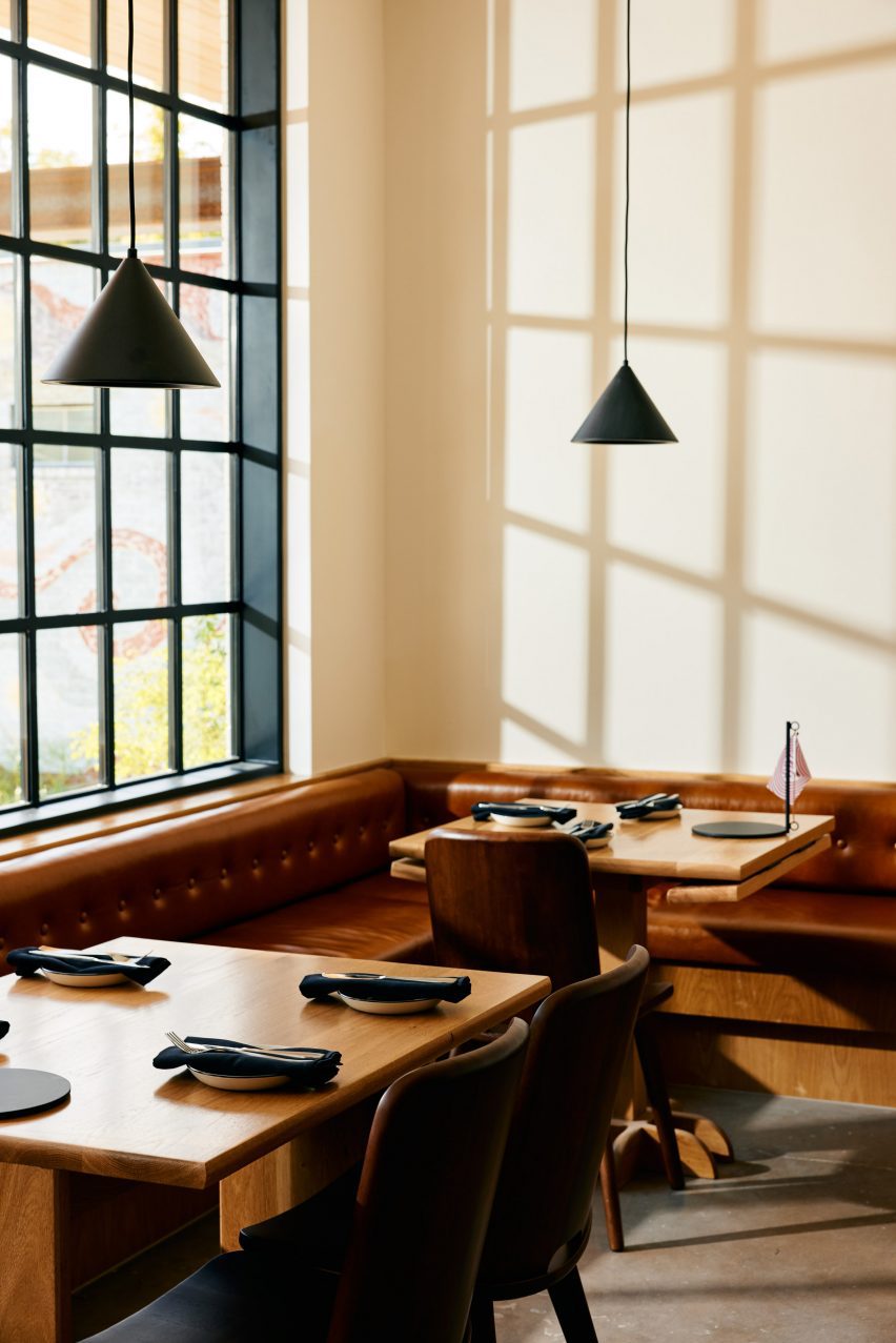
“Working closely with the owner, design finishes hint at the building’s midcentury past,” the team said, referencing the custom, built-in leather banquette by Undercover Austin Upholstery that lines the bistro’s back wall.

Above the banquette and Second Chance Custom wooden dining tables hang black cone light pendants by All Modern.

A patio with white metal seatingA patio with white metal seating
The patio features brick flooring and white metal furniture

“The single biggest sustainable feature of this project is one that is often overlooked,” the team said, noting the adaptation of the structure. “The ‘loose fit, long life’ style of these old buildings leads to more reuse and far less waste.”

Recent adaptive reuse projects in Austin include a 1900s house converted to a luxury office by Michael Hsu and commercial units converted to an architecture studio by Baldridge Architects.

The photography is by Likeness Studio and Mackenzie Smith Kelly.


Project credits:

Structural engineer: Creative Engineering
MEP engineer: ATS Engineers
Builder: Archive Properties
Commercial interior design: Side Angle Side
Architects: Side Angle Side
Building shell: Thought Barn Studio
Landscape design: Side Angle Side & Wild Heart Dirt
Owner: Steph Steele


Reference

Michael Hsu Office of Architecture utilises soft shapes for Austin high-rise
CategoriesInterior Design

Michael Hsu Office of Architecture utilises soft shapes for Austin high-rise

Texas studio Michael Hsu Office of Architecture has designed the common areas for a 50-storey residential high-rise building in Austin, as shown in this exclusive video captured by Dezeen.

Called 44 East, the building is located east of downtown Austin in the Rainey Street Historic district. The firm designed the interiors of the building’s common areas, which take cues from its natural surroundings, particularly the neighbouring Colorado River.

Michael Hsu Office of Architecture has designed the interiors of 44 East

The practice enhanced the space using colour and texture, layering vintage and custom furnishings to create a relaxed and inviting ambience.

Curved surfaces and light colours are incorporated throughout the space, with poured concrete terrazzo floors incorporated to pay homage to the gravel of the nearby riverside trail.

Michael Hsu interior design of 44 EastMichael Hsu interior design of 44 East
Curved surfaces and light colours are incorporated into the lobby area of 44 East

The interior is characterised by the use of soft shapes and natural materials throughout the various spaces, including on the eleventh floor, where pastel hues complement subtle architectural details.

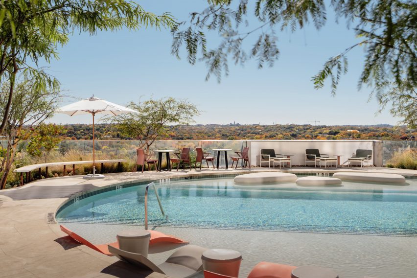
The outdoor swimming pool features a series of pebble-shaped islands, with a partially-covered patio inviting guests to relax outside and enjoy the views of the river.

Swimming pool area of 44 East Swimming pool area of 44 East
The eleventh floor features a circular outdoor swimming pool

On the thirty-seventh floor, a large moon-like pendant light is suspended above a plush circular sofa.

The higher vantage point offers scenic views of downtown Austin, and features jewel tones and darker materials intended to complement the Texas skyline at dusk.

37th floor of 44 East37th floor of 44 East
The thirty-seventh floor features darker tones to complement views of the Texas skyline

44 East was developed by Intracorp, while the tower and unit interiors were designed by Page and landscapes designed by DWG.

The interior design of the common spaces is one of the latest projects by Michael Hsu Office of Architecture, which is based in Austin and Houston.

The company recently completed its self-designed Austin studio, which is adorned in wood-and-fabric lined walls and industrial details, to accommodate its growing team.

The photography is by Chase Daniel.

Partnership content

This video was produced by Dezeen for Michael Hsu Office of Architecture as part of a partnership. Find out more about Dezeen partnership content here.


Reference