Eight interiors where burl wood provides natural texture
This week’s lookbook rounds up eight interiors with furnishings and surfaces finished in burl-wood veneer, allowing its swirly, psychedelic graining to serve a decorative function.
Burl wood is a rare and expensive wood, often only available in thin sheets of veneer. That’s because it is derived from the knobbly outgrowths of tree trunks and branches – also known as burls.
Like the botanical equivalent of a callous, these outgrowths form in response to different stress factors and grow unpredictably, creating complex unexpected grain patterns behind their gnarled bark.
Burl wood has been experiencing a renaissance over the last few years, with interior designers including Kelly Wearstler using it to evoke the bohemian flair of its 1970s heyday.
Mixed and matched with other patterns, the material is now used to communicate a kind of organic understated luxury, much like natural stone.
From a Michelin-starred restaurant to a home that was designed to resemble a boutique hotel, read on for eight examples of how burl wood can provide textural richness to a modern interior.
This is the latest in our lookbook series, which provides visual inspiration from Dezeen’s archive. For more inspiration see previous lookbooks featuring rooms with net floors, interiors with furry walls and homes with mid-century modern furniture.
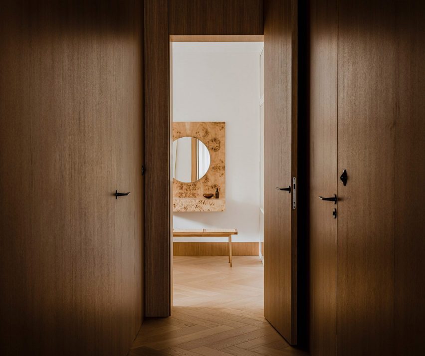
Botaniczna Apartment, Poland, by Agnieszka Owsiany Studio
This tranquil apartment in Poznań was designed by local firm Agnieszka Owsiany Studio to give the owners a reprise from their high-pressure medical jobs.
The interior combines a calming mix of pale marble and various kinds of wood, including oak cabinetry, chevron parquet flooring and a console and vanity, both finished in speckled burl.
“My clients asked for a high quality, almost hotel-like space, as they were in need of everyday comfort,” founder Agnieszka Owsiany told Dezeen.
Find out more about Botaniczna Apartment ›
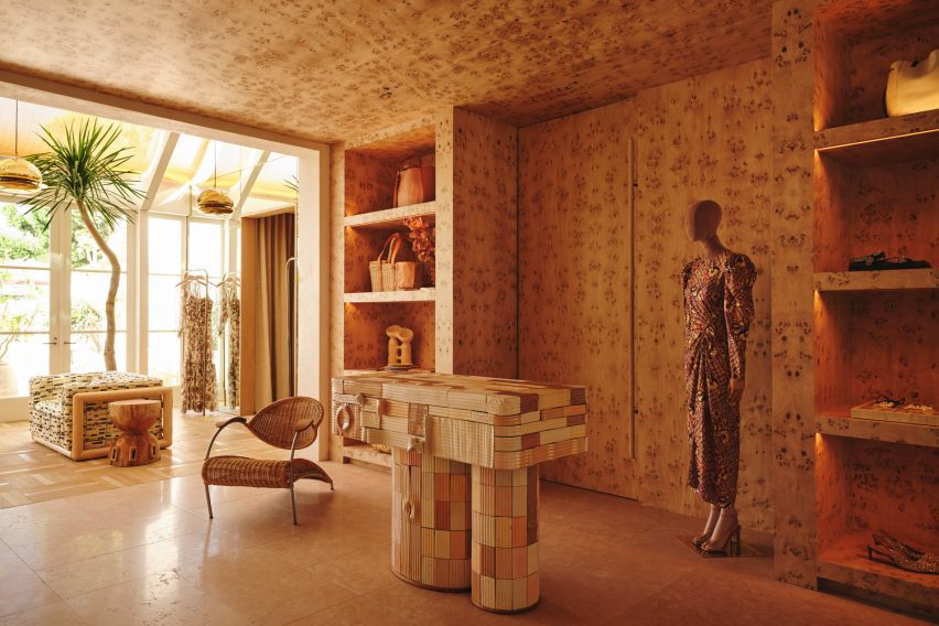
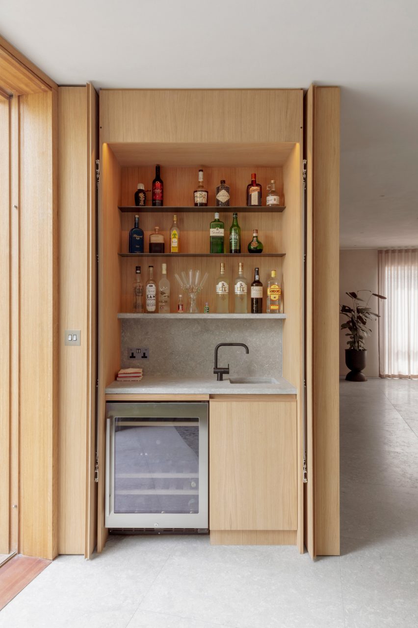
Ulla Johnson flagship, USA, by Kelly Wearstler
Burlwood brings “a touch of 1970s California nostalgia” to the Ulla Johnson flagship store in Los Angeles, courtesy of local designer Kelly Wearstler.
The unusual veneer was used liberally to cover walls, ceilings and shelves, as well as forming a statement display cabinet where the material’s natural wavy surface texture provides an added element of tactility (top image).
Find out more about the Ulla Johnson flagship ›
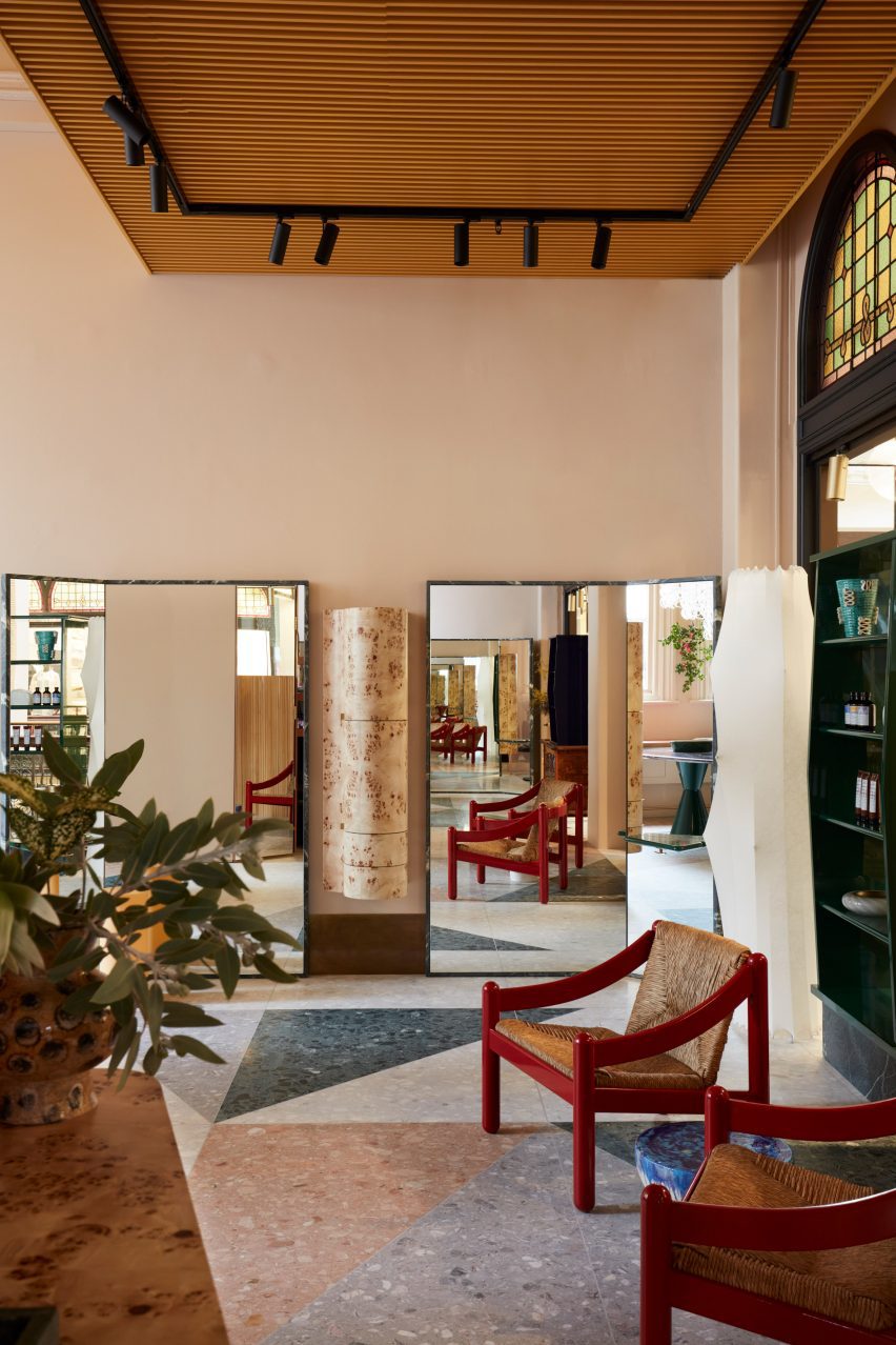
Koda hair salon, Australia, by Arent & Pyke
This hair salon in Sydney’s Queen Victoria Building was designed by Australian studio Arent & Pyke to be “best appreciated from seated height”.
Drawing attention away from the building’s extra-tall ceilings, freestanding quartzite-rimmed mirrors are placed at angles in front of the styling chairs, framing a vintage hanging cabinet made from pale burl.
Find out more about the Koda hair salon ›
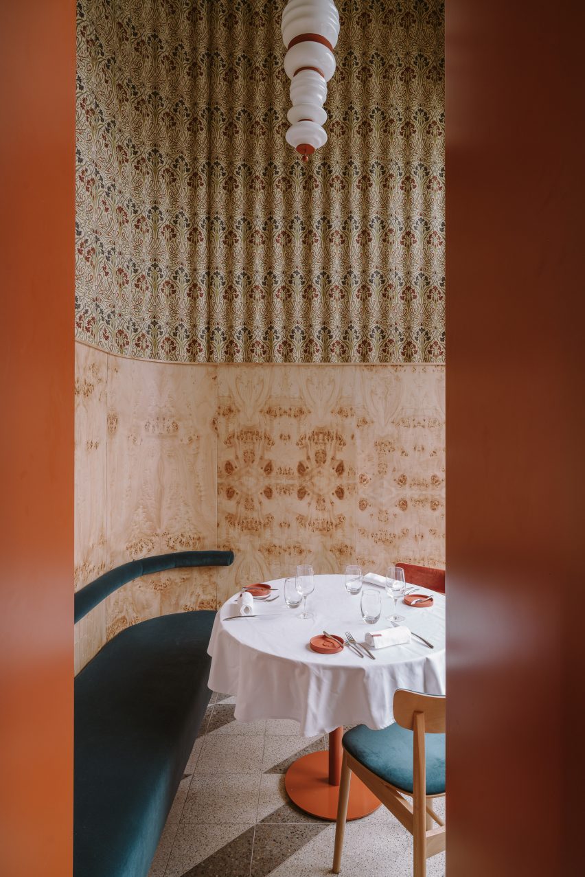
Opasly Tom restaurant, Poland, by Buck Studio
Buck Studio employed a limited palette of colours and materials to create visual continuity throughout Warsaw restaurant Opasly Tom, which occupies a split-level building that was broken up into a series of rooms of different sizes.
Coral-orange chair cushions mirror the hardware of the totem-like pendant lights, and several burl-clad cabinets are dotted throughout the eatery. These match the kaleidoscopically patterned panelling in the hallway and the private dining rooms.
“This contemporary, minimalistic design approach produces the impression of coherence while creating a powerful aesthetic impact,” explained the Polish studio, which is headed up by Dominika Buck and Pawel Buck.
Find out more about the Opasly Tom restaurant ›
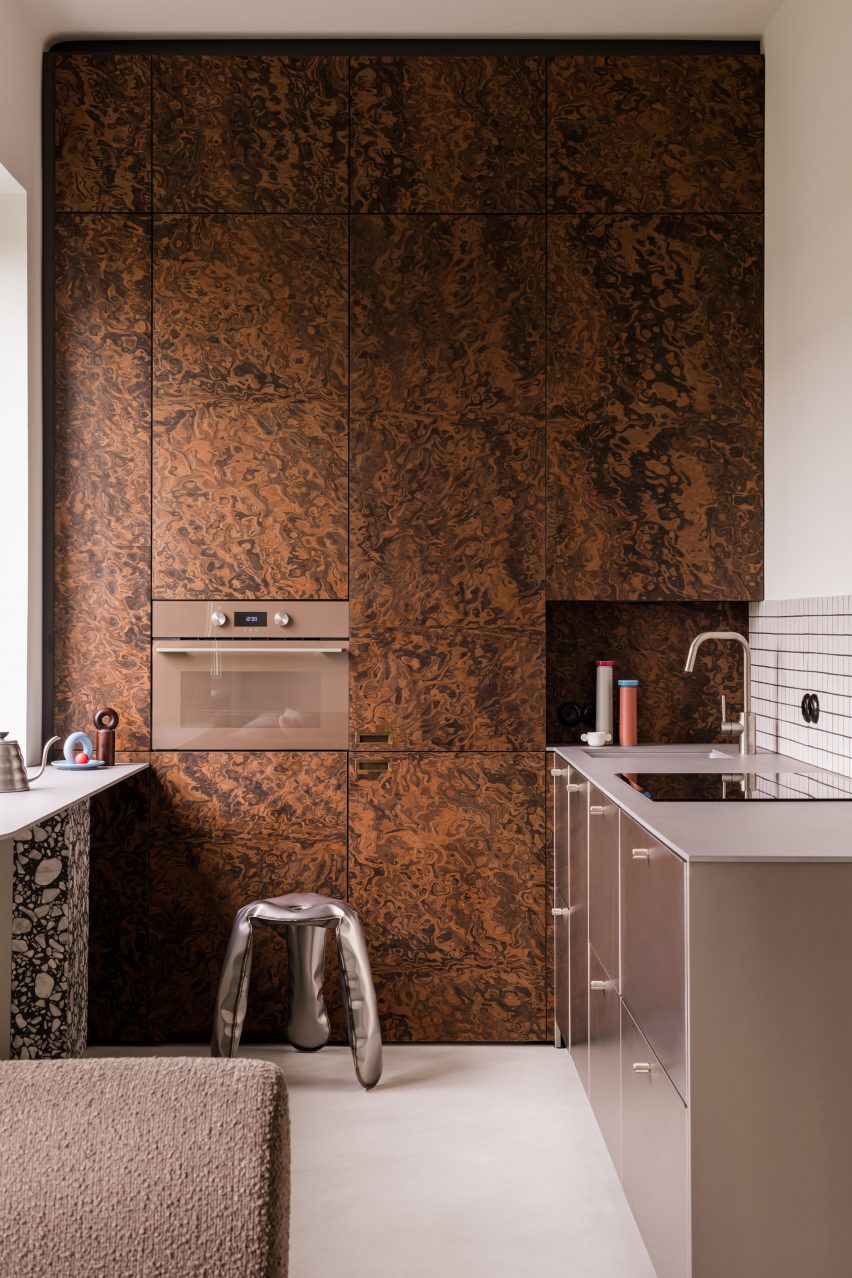
Warsaw apartment, Poland, by Mistovia
Elsewhere in Warsaw, Polish studio Mistovia designed an apartment for an art director and her pet dachshund to resemble an “elaborate puzzle” of contrasting patterns.
Walnut-burl cabinets dominate the kitchen, with their trippy swirling pattern offset against monochrome tiles, brushed-metal drawers and a terrazzo-legged breakfast bar.
Find out more about the Warsaw apartment ›
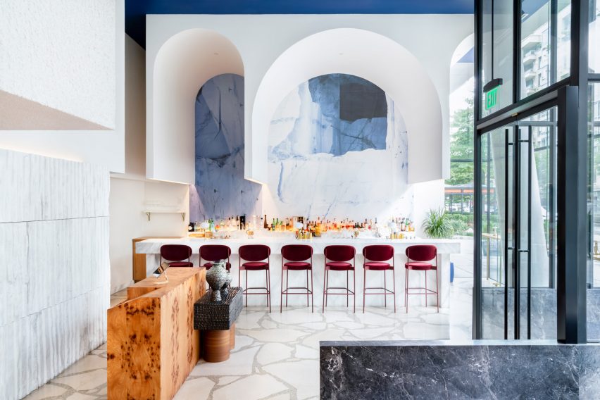
Imperfecto, USA, by OOAK Architects
Upon entering Michelin-starred restaurant Imperfecto in Washington DC, diners are greeted by a custom-made maître-d stand clad in panels of burl-wood veneer, creating a mirrored tortoiseshell pattern across its surface.
The interior, designed by Greek-Swedish studio OOAK Architects, sees neutral tones paired with splashes of blue and white that nod to the restaurant’s Mediterranean menu.
“OOAK Architects has used varied, high-quality finishes and authentic materials including Greek and Italian marbles, as well as brass and wood from different parts of the world, creating contrasting textures across the space,” the team said.
Find out more about Imperfecto ›
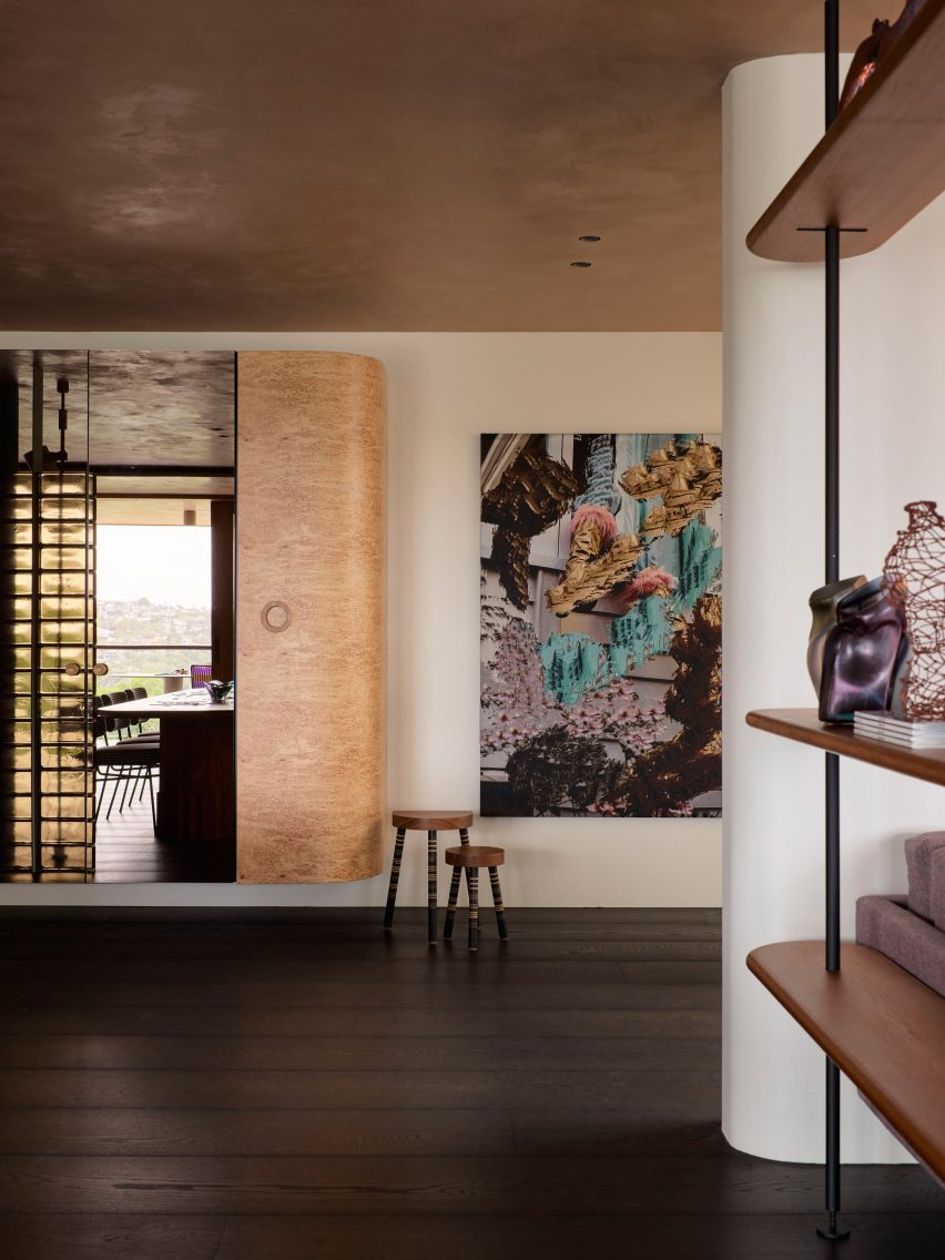
Black Diamond house, Australia, by YSG
Australian interiors studio YSG introduced a sumptuous mix of materials to this house in Sydney’s Mosman suburb to evoke the feeling of staying in a luxury hotel.
This approach is evidenced by a number of custom furniture pieces dotted throughout the home, including a Tiberio marble vanity in the downstairs powder room and a poplar-burl cabinet with a bronzed mirror that looms over the nearby living room.
Find out more about Black Diamond house ›
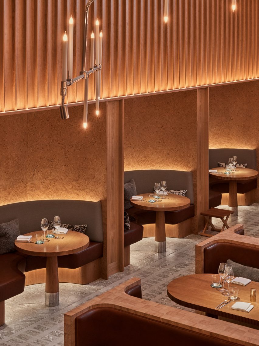
Studio Frantzén, UK, by Joyn Studio
Restaurant Studio Frantzén in London’s Harrods department store serves a fusion of Nordic and Asian food that is also reflected in its Japandi interiors – taking cues from both Scandinavian and Japanese design.
Interiors practice Joyn Studio leaned heavily on both cultures’ penchant for wood, combining seating banquettes made from blocks of end-grain pine wood with gridded timber ceilings and seating booths framed by burl-wood wall panelling.
Find out more about Studio Frantzén ›
This is the latest in our lookbook series, which provides visual inspiration from Dezeen’s archive. For more inspiration see previous lookbooks featuring rooms with net floors, interiors with furry walls and homes with mid-century modern furniture.

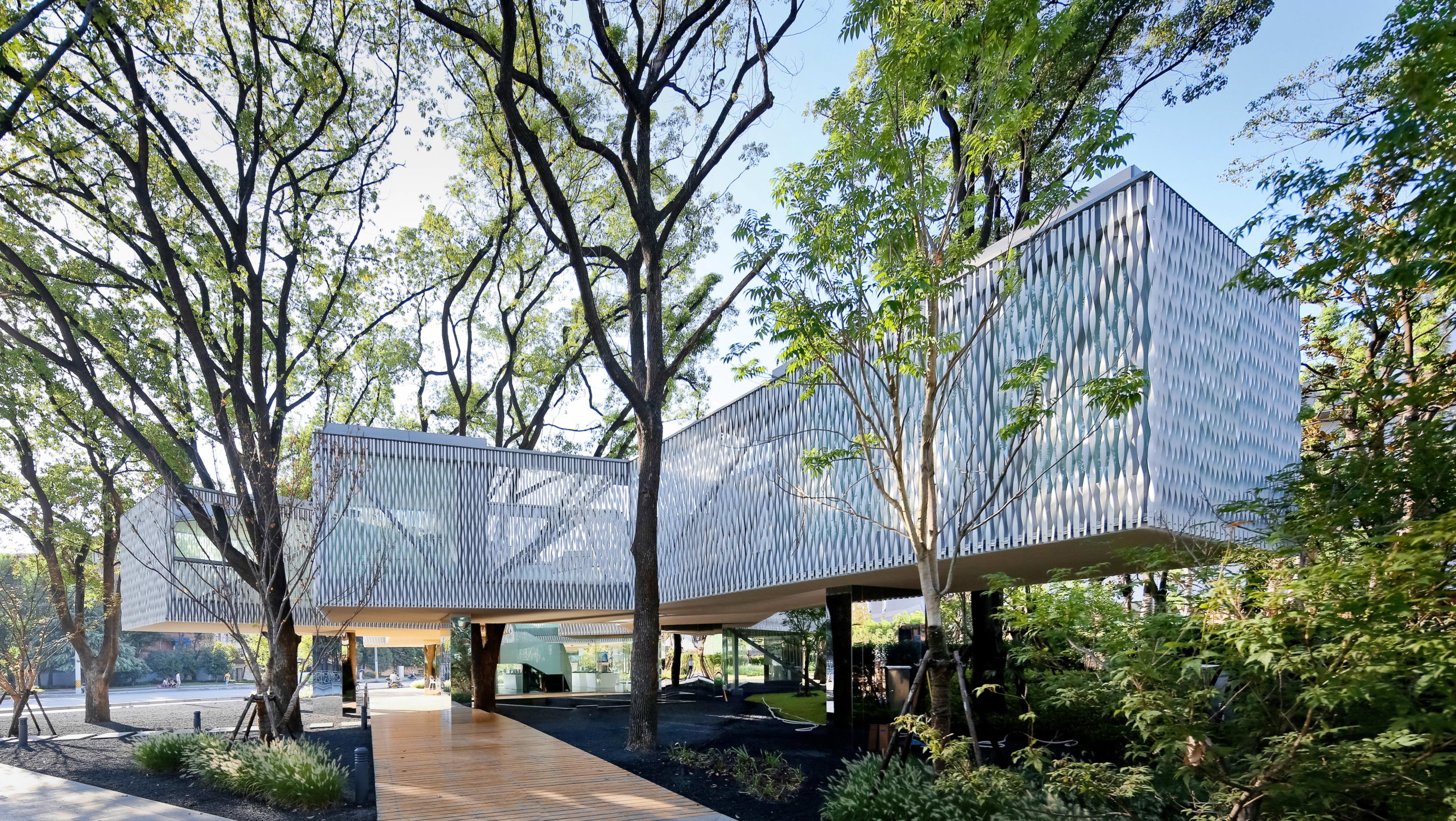
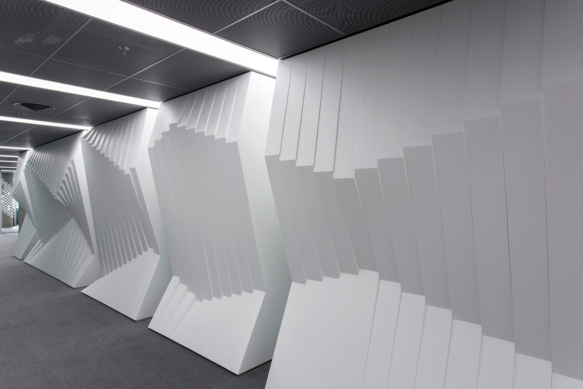
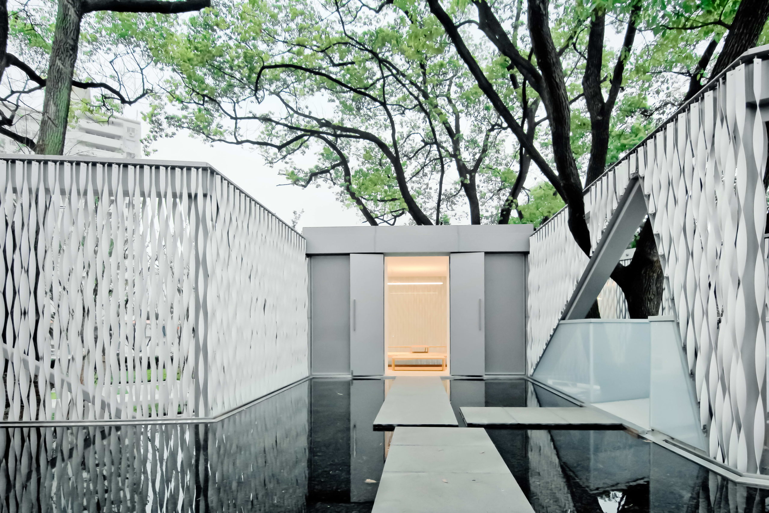 Huaxin Business Center by Scenic Architecture, Shanghai, China
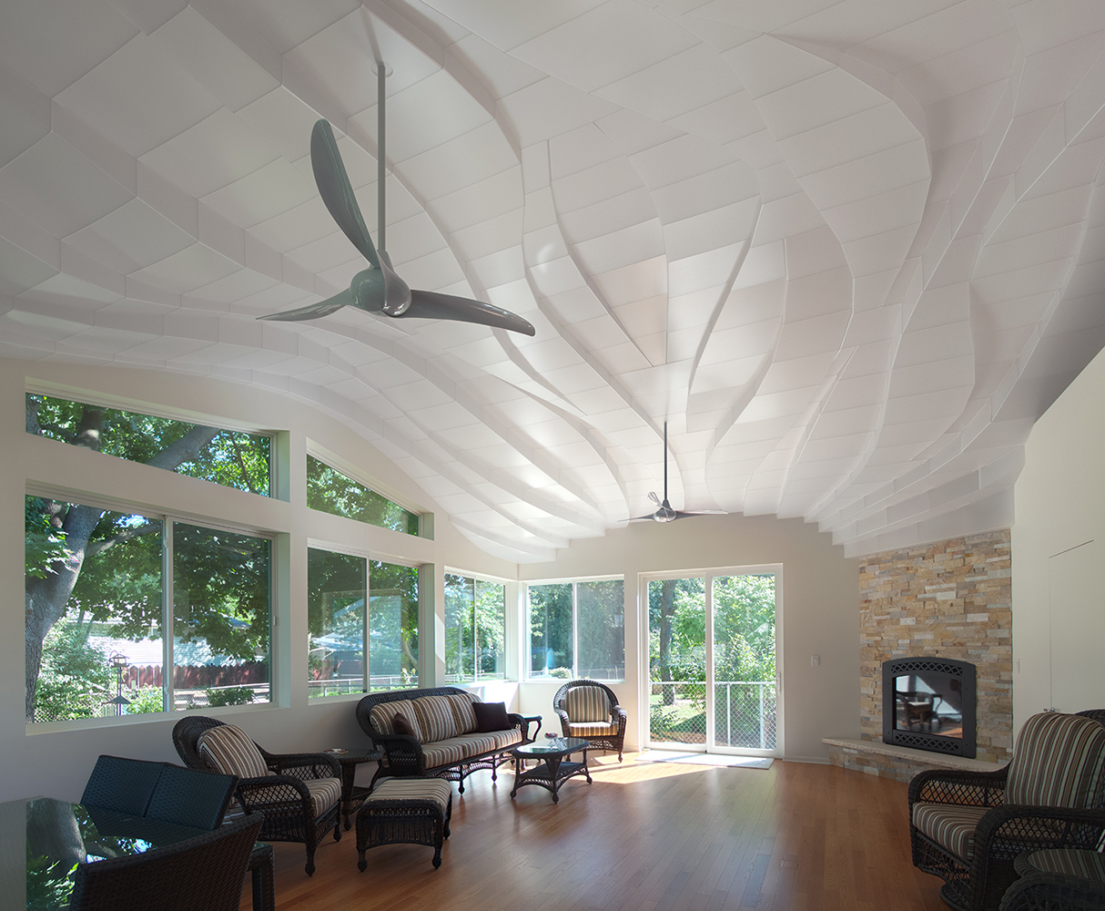
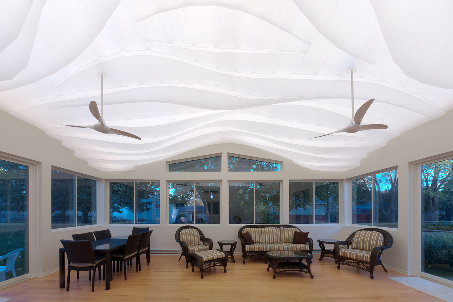 “Light Arrival” Yorkshire Ceiling by Flynn Architecture & Design, Crystal Lake, Illinois
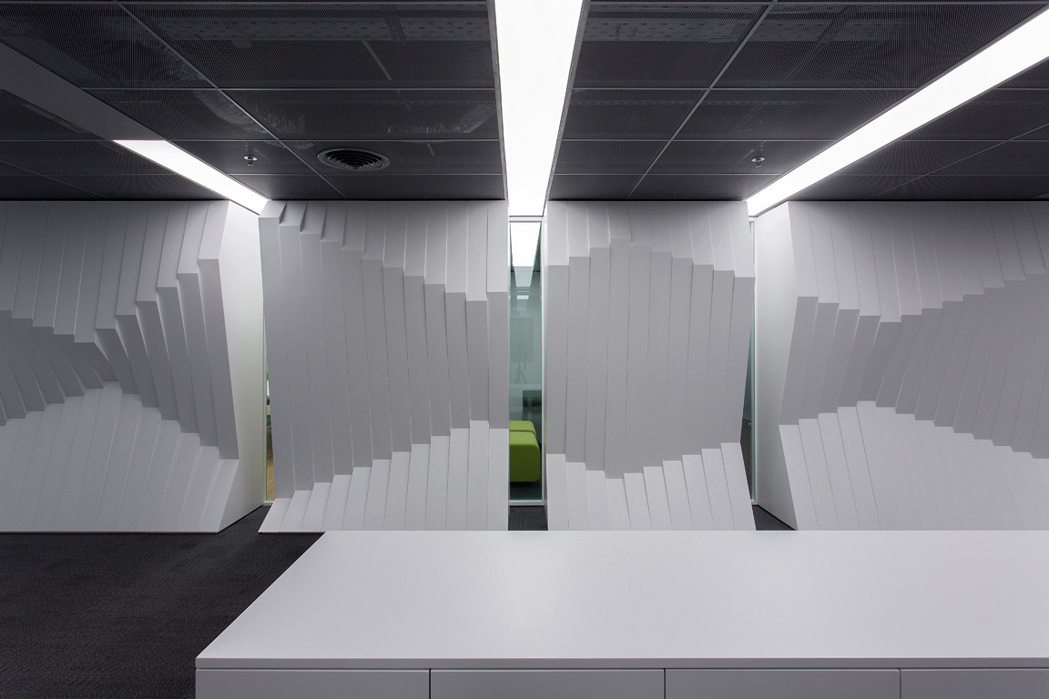
 Norwegian embassy in Athens by gfra, Athens, Greece