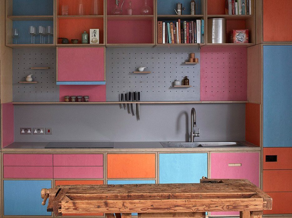
Eight tidy kitchens with slick storage solutions
As people’s interest in ultra-organised homes shows no signs of abating, we’ve collected eight clutter-free kitchens with smart storage solutions in our latest lookbook.
Spearheaded by Japanese organisational guru Marie Kondo, well-organised interiors have become a global trend. In no room is this more evident than in the kitchen, where pantries are stocked up with decanted jam jars, spice racks are labelled and shelving units are customised to house specific utensils.
The following projects, which range from compact apartments to home extensions, use hooks, nooks, racks, shelves, cubby holes and display units to create tidy kitchens where not a grain is out of place.
This is the latest in our lookbooks series, which provides visual inspiration from Dezeen’s archive. For more inspiration see previous lookbooks featuring Spanish apartment renovations, cosy cabins and interiors with statement carpets.
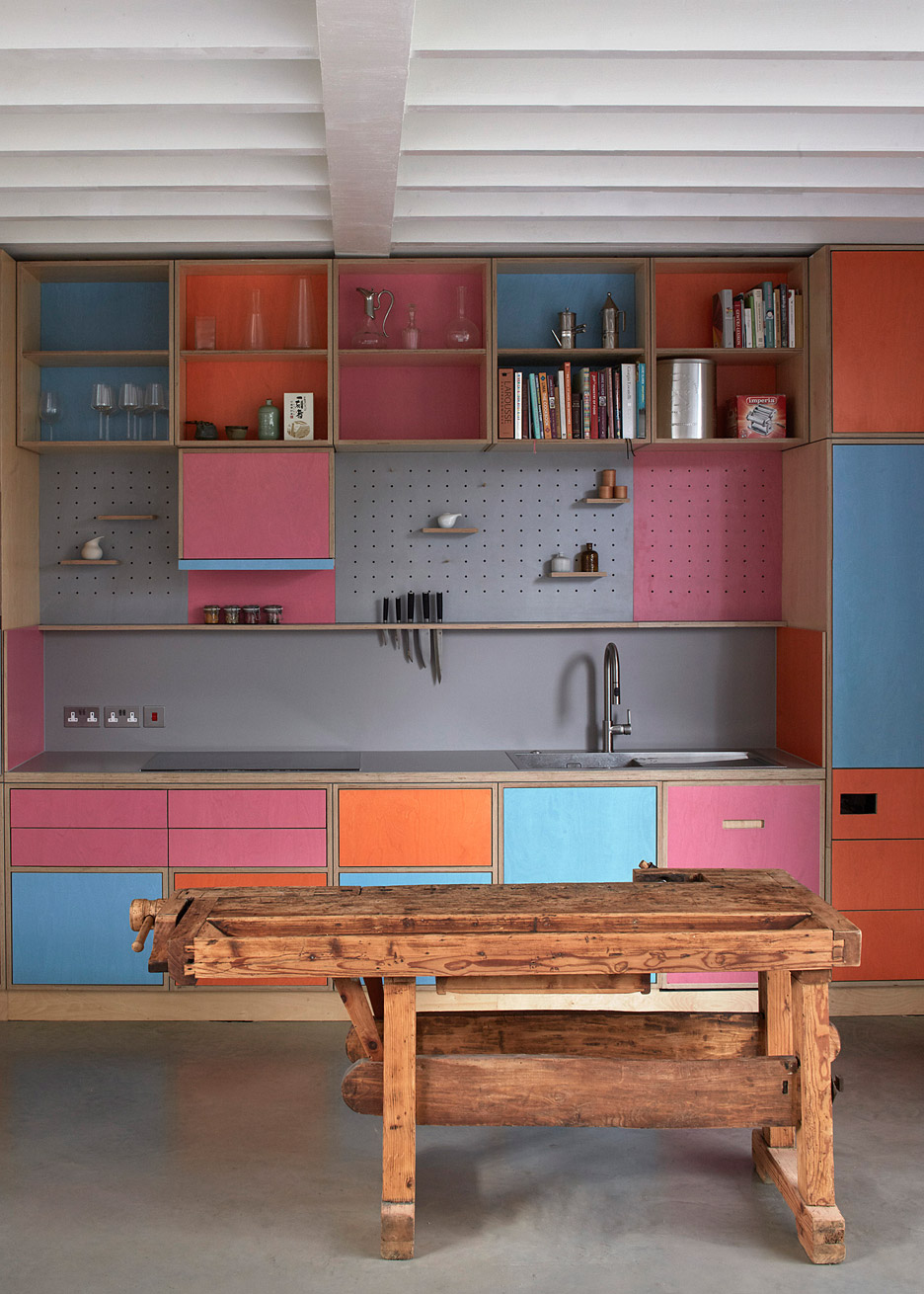
Map House, UK, by SAM Architects
Paolo Vimercati and Melanie Schubert of SAM Architects demolished a garage hidden behind several listed buildings in south London in order to create this mews house for themselves.
Designed to accommodate their “modern lifestyles”, the home’s interior is clad in vertical planks of charred larch and has plenty of open-plan spaces.
The kitchen has pink, blue and orange plywood units that are filled with cooking books and glassware, while a pegboard display area is used to hang crockery.
Find out more about Map House ›
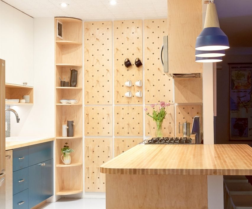
Fifth Avenue Kitchen, US, by Handwerk Art and Design
Space-saving storage solutions can be found in Fifth Avenue Kitchen, a compact New York apartment created by interior design studio Handwerk Art and Design for a client who works in the film industry.
Aiming to make the most of the 160-square-foot (15 square-metre) space, Handwerk retrofitted the kitchen with features including a pegboard wall for hanging mugs, aprons and other items.
“Starting with a study of their cooking habits and spatial needs, we designed a set of custom cabinets for the whole kitchen that placed everything specifically and precisely,” said the studio.
Find out more about Fifth Avenue Kitchen ›
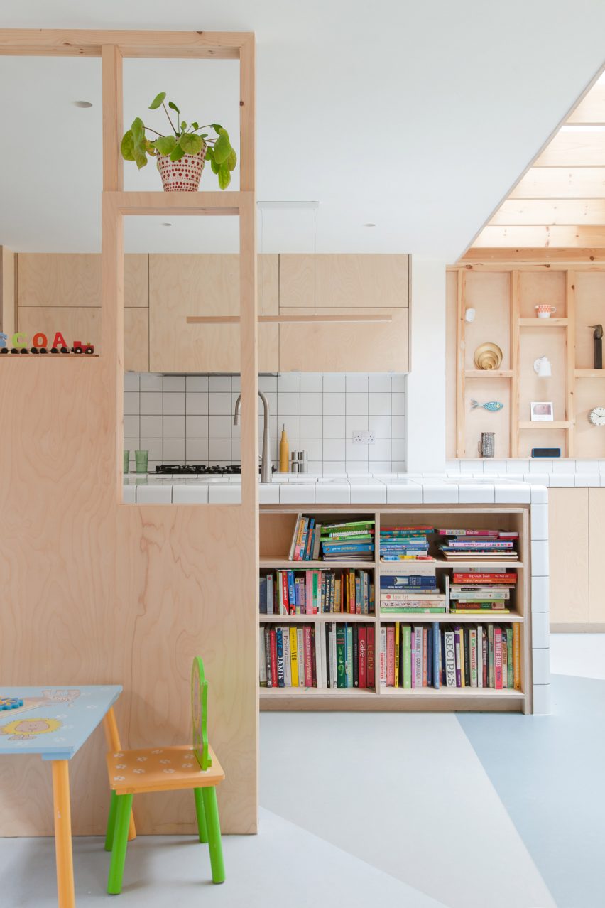
Fruit Box, UK, by Nimtim Architects
Plywood and planed softwood structures with square tiles characterise this playful galley kitchen designed by Nimtim Architects for a home extension project in Forest Hill, London.
A kitchen island features a tiled waterfall countertop above a sink and shelving. The kitchen walls were designed to be filled in to increase privacy, or easily removed to maximise open space depending on the family’s future needs.
Find out more about Fruit Box ›
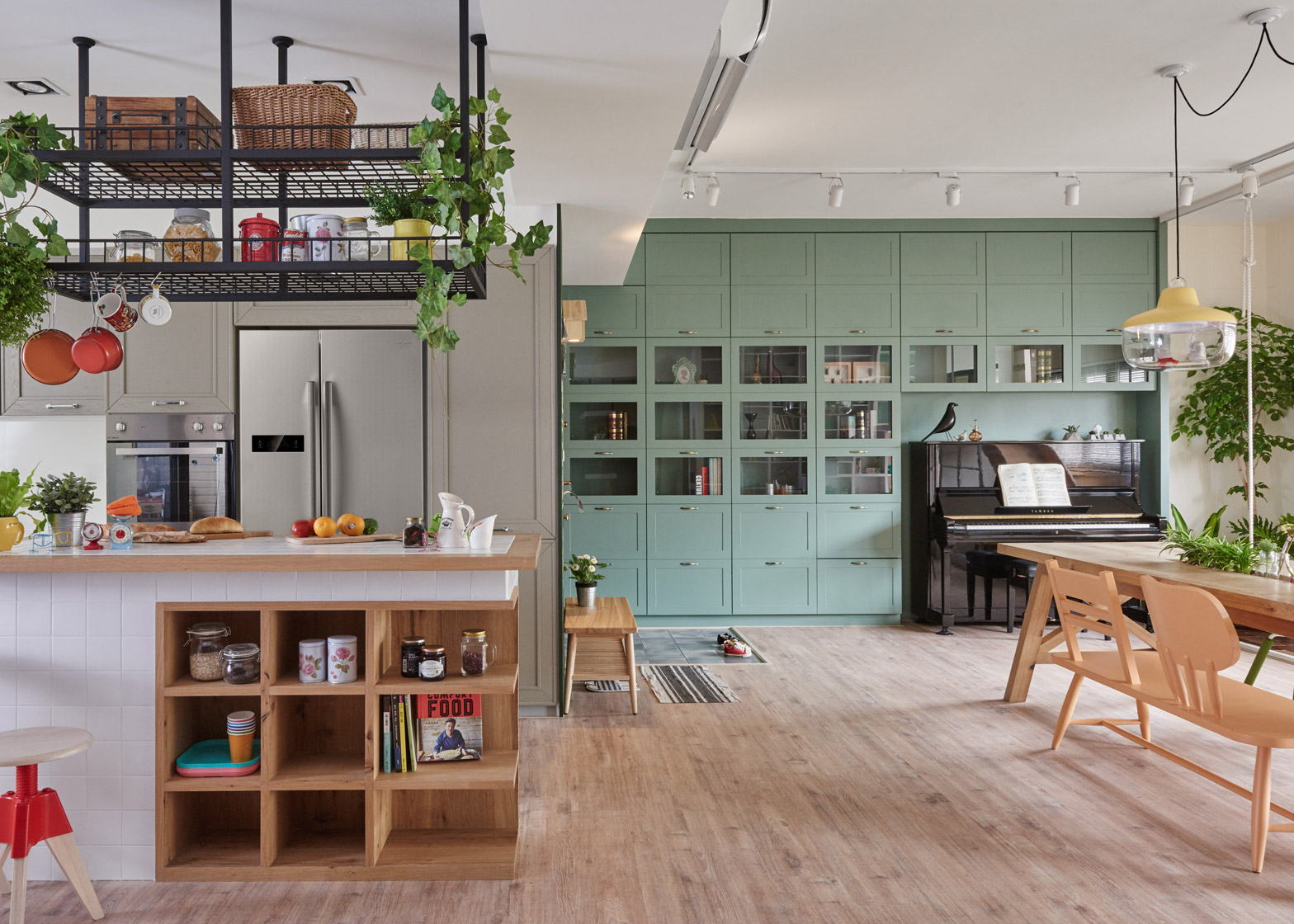
The Family Playground, Taiwan, by HAO Design
This family home in Taiwan was reorganised by studio HAO Design so that its occupants could spend more time with each other. In the kitchen, the parents are able to watch their children play games or listen to them play the piano while they are making dinner.
High ceilings in the kitchen meant there was room for a large black steel storage rack to be hung above a white-tiled island. The cage-like storage system serves as a “visual focus” and can also be used to hold plants or kitchenware.
Find out more about The Family Playground ›

Air-BnP, Hungary, by Position Collective
This former studio flat in Budapest was reorganised by Hungarian studio Position Collective to create an Airbnb property suitable for two guests. Rather than rearranging the layout – and mindful of the small budget – the studio installed a plywood furniture and storage system that caters to temporary occupants’ needs.
In the kitchen, it features a modular pegboard storage wall with adjustable shelves to showcase different pieces of local Hungarian art books, home accessories and cooking equipment.
Find out more about Air-BnP ›
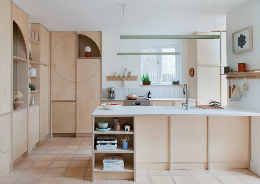
Curve Appeal, UK, by Nimtim Architects
London studio Nimtim Architects transformed a 1920s semi-detached house in Southwark using multifunctional plywood partitions with arched openings and alcoves for storing belongings.
A limited, neutral-toned material palette was employed in the kitchen, comprised of handmade terracotta floor tiles, laminated countertops and sustainably sourced plywood.
Find out more about Curve Appeal ›
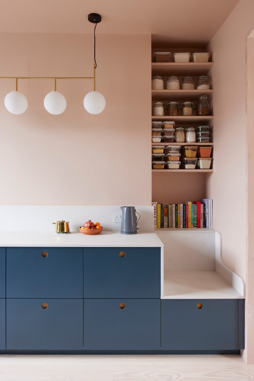
Maison Pour Dodo, UK, by Studio Merlin
For the revamp of a flat in Stoke Newington, British interior firm Studio Merlin added an abundance of storage to form serene, clutter-free living spaces.
An opening in the living room connects the kitchen, where there’s a wall of deep-set IKEA cabinets with smokey blue door fronts and a seating nook. Above this, a series of pantry-style shelves means the owner can easily access jars of cooking ingredients.
Find out more about Maison Pour Dodo ›
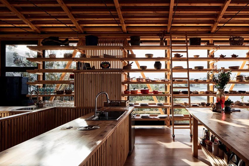
Punta Chilen, Chile, by Guillermo Acuña Arquitectos Asociados
Named after the peninsula of land that the residential complex sits on, this red home extension was constructed by Santiago-based architecture studio Guillermo Acuña Arquitectos Asociados using pine stilts.
An open-plan room in the heart of the home is a communal space designed for cooking and eating. Large pine shelves filled with ornaments and tableware line the walls.
Find out more about Punta Chilen ›
This is the latest in our lookbooks series, which provides visual inspiration from Dezeen’s archive. For more inspiration see previous lookbooks featuring homes with sliding doors, earthy bedrooms with natural colours and kitchens with marble surfaces.

