Blue doorway in alleyway
CategoriesArchitecture

Bright colours fill converted brick structure in San Miguel de Allende

Blue doorway in alleyway

Architecture studios Oficina de Diseño Colaborativo and Atelier TBD have created a cultural space that preserves the “self-built essence” of San Miguel de Allende.

Created in collaboration with interior studio Maye Colab, Santa Tere Espacio is a cultural space and office that will primarily serve to foster reading in the surrounding neighbourhoods.

Blue doorway in alleywayBlue doorway in alleyway
OCD, Atelier TBD and Maye Colab have created a brightly coloured cultural space in Mexico

Santa Tere Espacio emerged from the idea of creating architecture through renovation, reuse, repair, and repurposing,” said the team. 

Based on the self-built essence of the neighbourhood, Office of Collaborative Design, TBD Atelier, and Maye Colab joined forces with a shared vision to propose a project that engages with the site’s legacy.”

A blue door open to red-tiled kitchenA blue door open to red-tiled kitchen
Located in San Miguel de Allende, the team sought to preserve the “self-built” nature of the city

According to the team, self-construction is a “common building practice in Latin America”, a technique they sought to preserve by repurposing both the existing architecture and materials from the site, which was a former six-room, single-story dwelling.

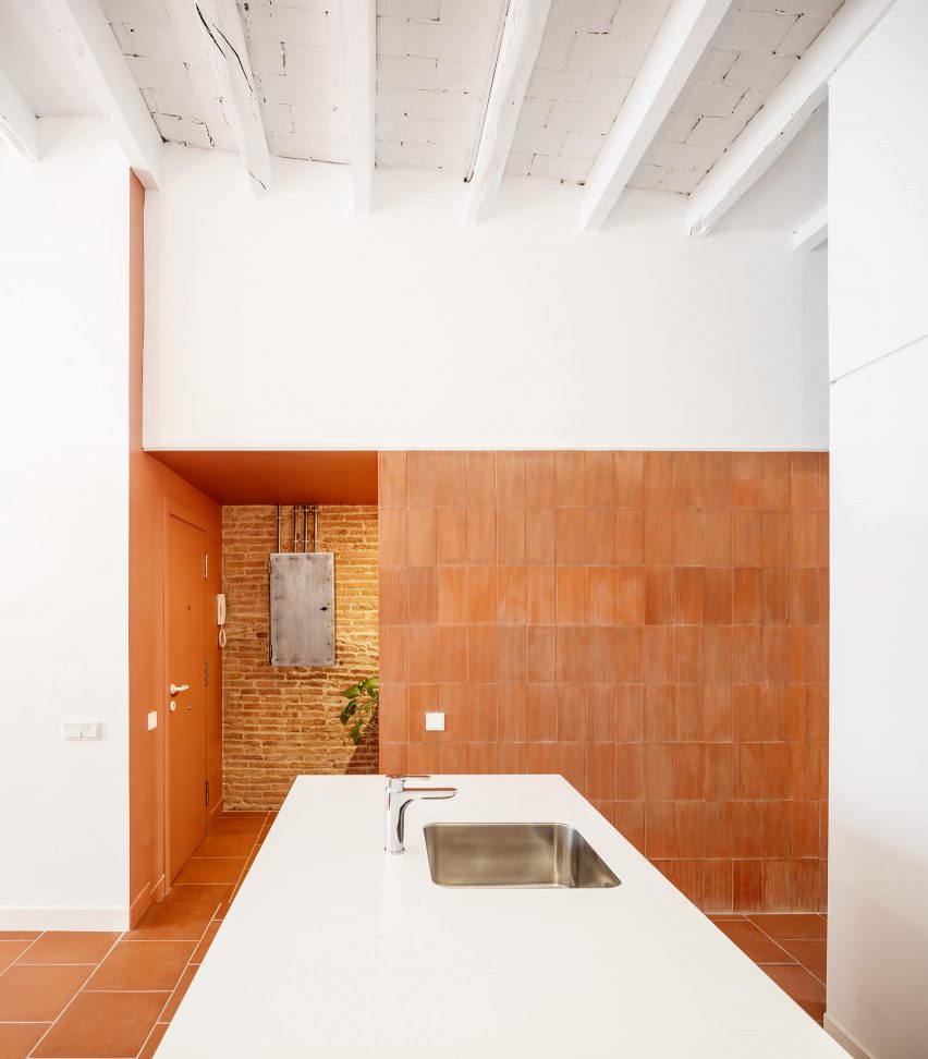
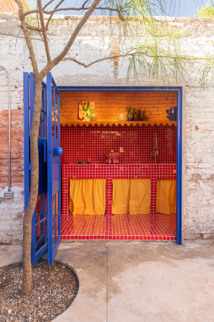
For Santa Tere Espacio, the team distributed several meeting rooms, a kitchenette, a bathroom and a central courtyard along the structure’s lateral plan with a second, detached bathroom tucked into a corner of the site. 

yellow chairs in front of a blue dooryellow chairs in front of a blue door
The site was a former single-story residence

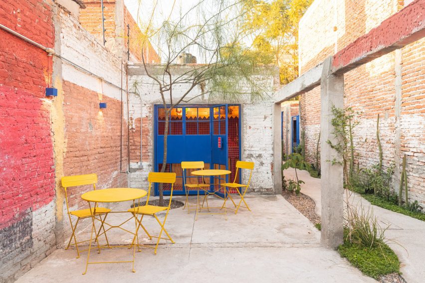
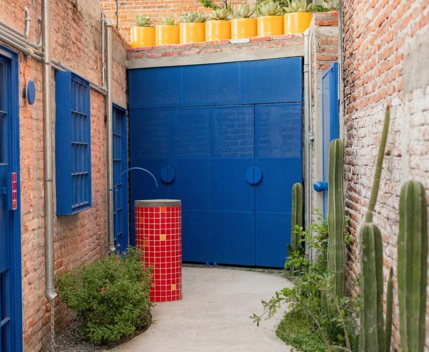
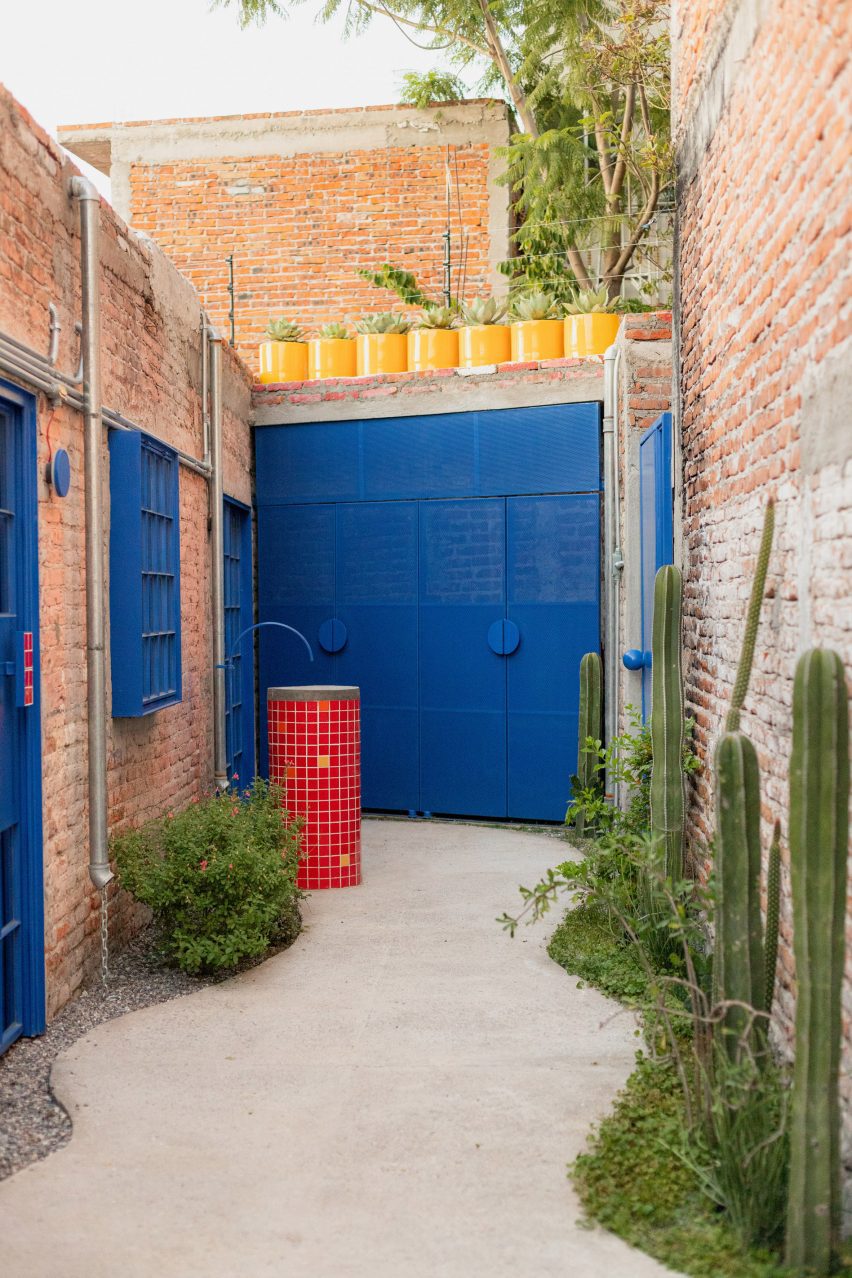
A long alleyway, marked with a curving concrete path, runs along the length of the exterior and provides access to each space.

The intervention primarily involved demolitions to bring in light and allow ventilation of the spaces, and the incorporation of new elements such as doors, windows, and tile finishes that contrast with the pre-existing structure,” said the team.
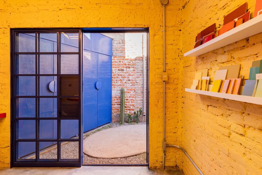
Yellow walls facing a blue colored doorYellow walls facing a blue colored door
The team preserved much of the existing architecture and repurposed material found on-site

Openings were created in the form of doors, windows, and domes, and some walls were demolished to make way for the central courtyard.”

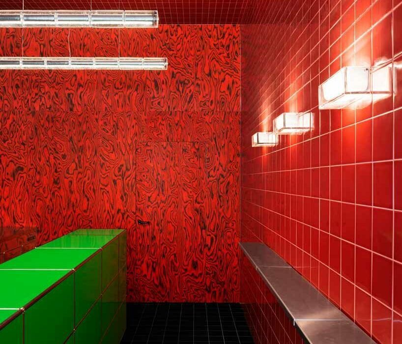
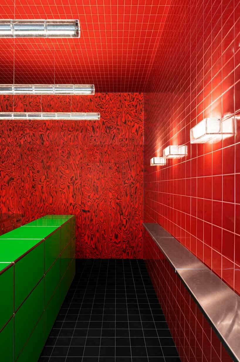
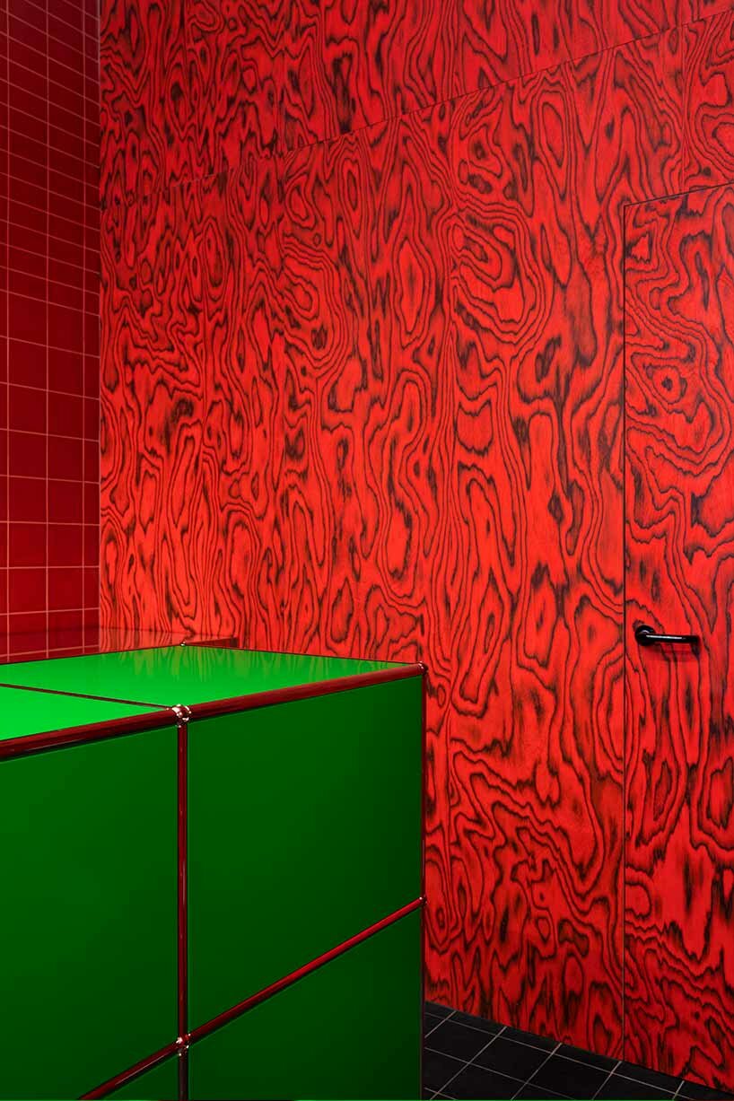
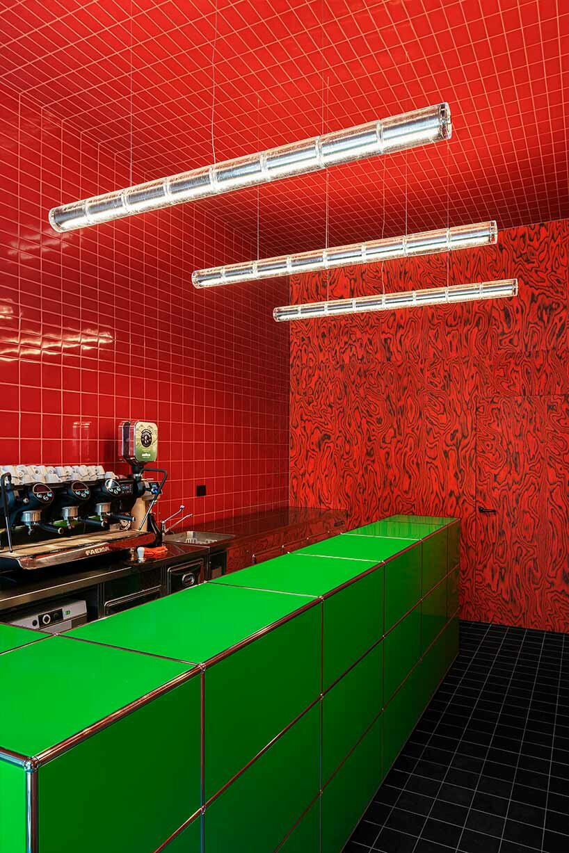
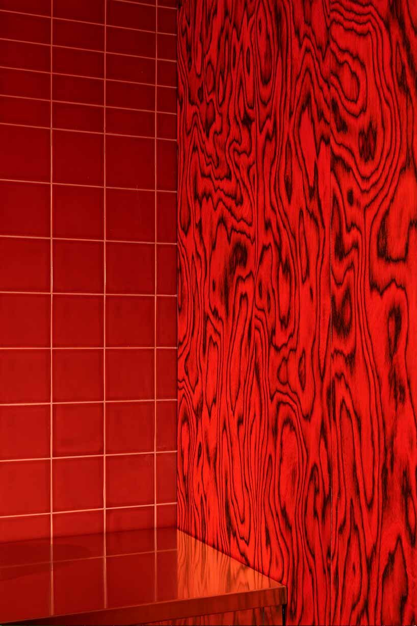
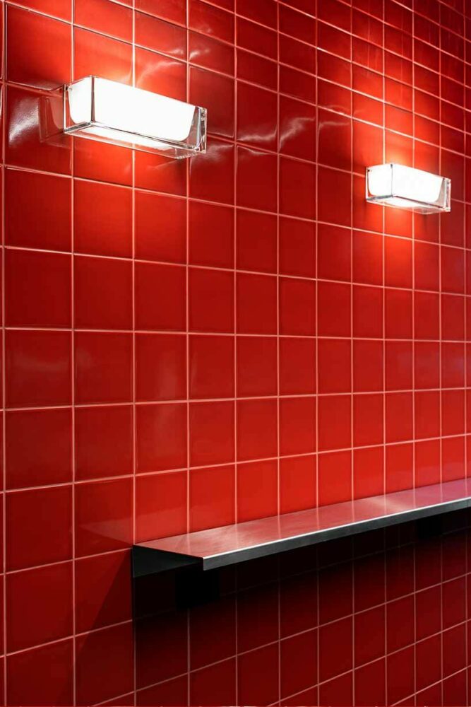
Colab worked with a palette of red, yellow and pink on the interior, based on hues found during construction.

primary colored officeprimary colored office
The interior palette was informed by colours found during the construction

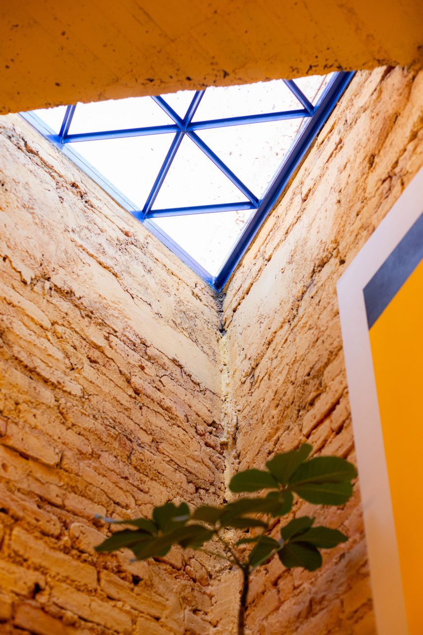
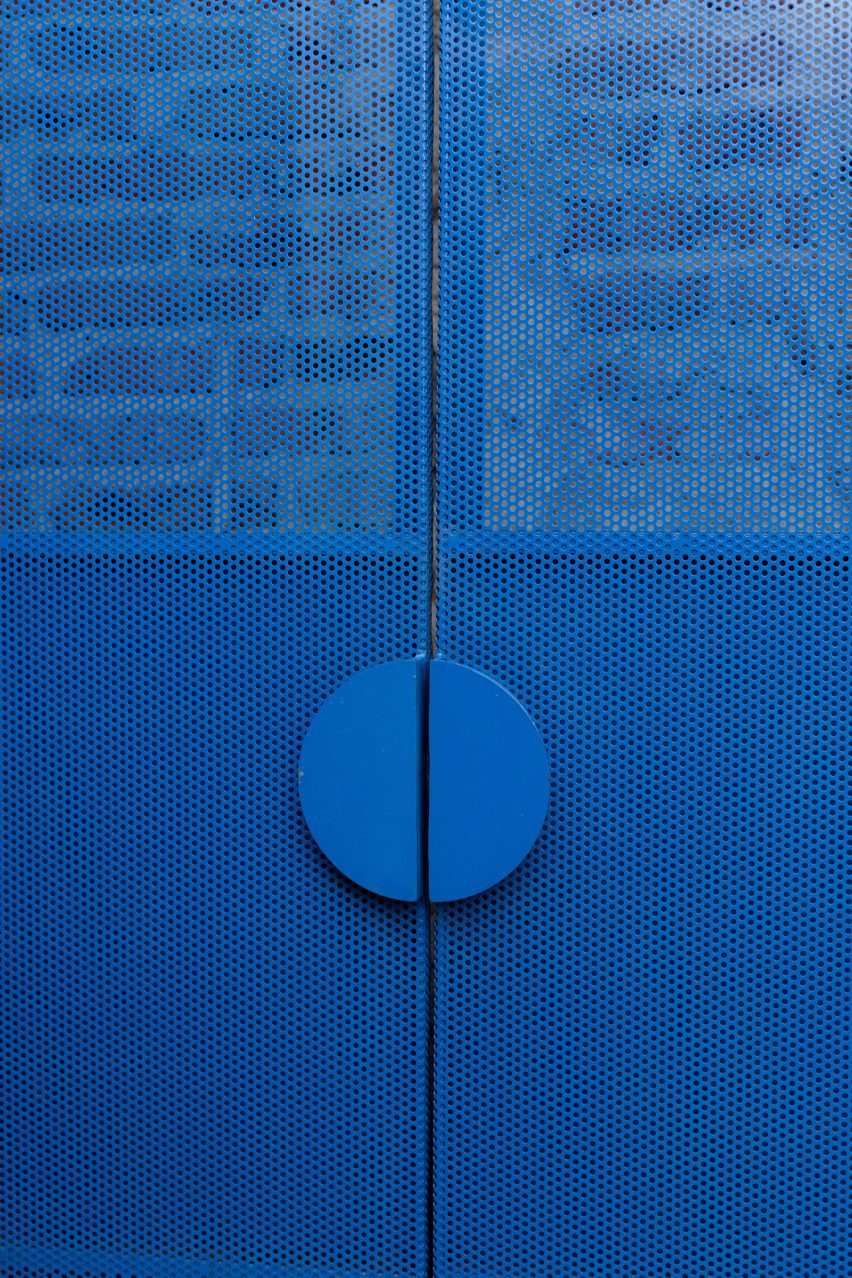
“The idea of capturing the site’s essence is also reflected in the project’s colour palette, designed based on the colours found in the construction, with a contrasting colour being the blue of the ironwork.”

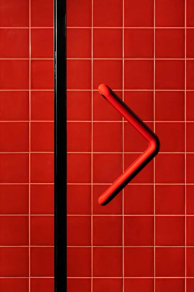
Bright blue windows and doors were distributed across the space and finished with geometric handles.

A red table and office chairA red table and office chair
Red was primarily used for furnishings

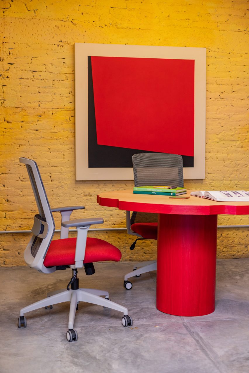
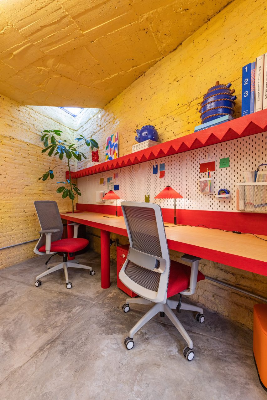
Interior furnishings were finished primarily in red, with the kitchenette covered in bright red tile and desks throughout the space trimmed in the same shade.

In a desk at the front of the building, the stalk of a plant grows through an opening carved in its surface, while a silver of a triangular skylight sits above.

Triangular skylightTriangular skylight
It features a central courtyard

The project’s landscape design incorporates both native plants and others commonly found around the neighbourhood’s rooftops, patios and facades.

A spindly palo verde plant was planted in the courtyard to provide shade, a species considered sacred to the Aztecs and associated with the feathered serpent god, according to the team. 

Santa Tere Espacio will act as a co-working and cultural space and will host OCD, Maye Colab and the bookstore Una Boutique de Libros.

Programming will focus on “reading, feminism, design and diversity”. 

Blue metal doorBlue metal door
Blue ironwork was used for windows and doors

Founded by Nadyeli Quiroz Radaelli, OCD and Maye Colab are design studios based in Mexico, while Atelier TBD, founded by Victor Wu, is an architecture office based between Brooklyn, Taipei and San Miguel.

Elsewhere in San Miguel de Allende, design studio Mestiz opened a studio to showcase its collaborations with local craftspeople.

The photography is by Leandro Bulzzano.


Project credits:

Architecture: Oficina de Diseño Colaborativo OCD, Atelier TBD
Interior design: Oficina de Diseño Colaborativo OCD, Atelier TBD, Maye Colab
Furniture and colorimetry: Maye Colab
Landscape architecture: Oficina de Diseño Colaborativo OCD, Atelier TBD
Principals: Maye Ruiz, Nadyeli Quiroz, Victor Wu
Design team: Alejandra Skinfield, Paola Bravo, Sara Lopez Farias
Structural consultant: Formula+, Yoyo Wu
Sources:
Steelwork: Crónica Estudio


Reference

Photo of seven colours of CornWall tile in flatlay, ranging from a warm beige to a a muted reddish brown and a dark greenish grey. The tiles are arranged beside a bare corn cob, a full corn cob and a small bowl of shredded biomass
CategoriesSustainable News

CornWall gives discarded corn cobs new life as interior tiles

Photo of seven colours of CornWall tile in flatlay, ranging from a warm beige to a a muted reddish brown and a dark greenish grey. The tiles are arranged beside a bare corn cob, a full corn cob and a small bowl of shredded biomass

Materials companies Circular Matters and StoneCycling have used corn cobs – one of the world’s most plentiful agricultural waste materials – to make interior cladding that is biodegradable and almost entirely bio-based.

Available in the form of tiles and sheets, CornWall is intended as a more sustainable alternative to ceramic interior wall tiles or plastic laminate.

The material is derived from more than 99 per cent renewable, biological sources, is created at low temperatures using mainly solar power and emits less carbon dioxide in its production than was captured by the corn as it grew, the manufacturers claim.

Photo of seven colours of CornWall tile in flatlay, ranging from a warm beige to a a muted reddish brown and a dark greenish grey. The tiles are arranged beside a bare corn cob, a full corn cob and a small bowl of shredded biomassPhoto of seven colours of CornWall tile in flatlay, ranging from a warm beige to a a muted reddish brown and a dark greenish grey. The tiles are arranged beside a bare corn cob, a full corn cob and a small bowl of shredded biomass
CornWall is an interior cladding material that is 99 per cent bio-based

To give the products a long lifespan, Circular Matters and StoneCycling have produced the tiles with a mechanical fixing system, so they can be demounted and reused or given back to the company for cleaning and recycling.

The technology behind CornWall was invented by Circular Matters – a start-up spun out of a lab at Belgium’s KU Leuven University, where founder Pieter Dondeyne and his team found a way to process plants to enhance their natural biopolymers and create durable materials.

The team then partnered with Dutch company StoneCycling to channel their technology into a product.

Photo of a person, close-up on their hands, holding a small pile of bare corn cobs, their kernels removedPhoto of a person, close-up on their hands, holding a small pile of bare corn cobs, their kernels removed
Corn cobs make up most of the composition of the tiles

StoneCycling co-founder Ward Massa told Dezeen that the focus on corn came because it is one of the most grown crops on the planet and its waste is abundant.

“What happens when you grow corn for human consumption is when it’s ready to harvest, you take off the corn and the corn cob is a leftover material because it doesn’t hold any nutritious value,” he said.

“Usually, that means that these corn cobs remain on the field and rot away, or they are burned as biomass to generate energy,” he continued. “In both cases, you release the carbon that was stored in those fibres – it rots away and it gets released, or you burn it and it gets released.”

With CornWall, the carbon is locked away until the tiles reach the end of their life and are left to decompose.

The production process begins with the discarded cobs being collected, dried and shredded into biomass.

This material is then mixed with other agricultural waste, binders and pigments and pressed into a plate material at a relatively low heat of 120 to 150 degrees. As a final step, the tiles are given a thin coating for water resistance.

All of the ingredients are derived from biomass apart from the pigment, which accounts for the 0.5 per cent of the product that is not bio-based – a very low percentage in a field where even products containing small amounts of materials of organic origin are sometimes labelled as bio-based.

Photo of a person at a distance standing in a huge warehouse of bare corn cobs piled high into hillsPhoto of a person at a distance standing in a huge warehouse of bare corn cobs piled high into hills
The agricultural waste material was chosen because of its abundance

According to Massa, the companies were able to keep the product pure by focusing on interior wall applications only.

“If you want to create a product that can also be used on the exterior or as a flooring or in the shower, then you have to start adding chemicals to bind it, to make it more water resistant and stuff like that,” he said.

“We chose to start with this application because it’s relatively easy and the binder and the product is nothing else than the natural polymers that are already part of this biomass. Because of adding heat and pressure, these polymers are activated and bind together.”

Photo of four objects in flatlay — a full corn cob on the left, followed by a bare corn cob, then a small tray of shredded biomass, then a CornWall tilePhoto of four objects in flatlay — a full corn cob on the left, followed by a bare corn cob, then a small tray of shredded biomass, then a CornWall tile
The corn cobs are dried and shredded before being pressed into tiles

CornWall is also biodegradable according to official standards, with Massa saying it could be buried in a field and disintegrate in a couple of months.

The only thing that would remain is the water-resistant coating, which is not biodegradable but makes up less than 0,001 per cent of the total product meaning it does not affect its biodegradability overall, according to Massa.

“Unfortunately there are no 100 per cent biodegradable coatings on the market yet,” he said. “We’re working with our suppliers on this but it’ll take more time.”

Instead, the intent is to keep the product in use for as long as possible.

The companies wants to target retail and hospitality chains that frequently open and close locations – Starbucks is an example Massa gives – and work with them to make sure the tiles stay in a closed loop of material reuse.

He also believes CornWall offers good options for these kinds of businesses in the design stage, as it can be ordered in custom colours and embossed patterns to complement their branding.

Photo of seven colours of CornWall tile in flatlay, ranging from a warm beige to a a muted reddish brown and a dark greenish grey. The tiles are arranged beside a bare corn cob, a full corn cob and a small bowl of shredded biomassPhoto of seven colours of CornWall tile in flatlay, ranging from a warm beige to a a muted reddish brown and a dark greenish grey. The tiles are arranged beside a bare corn cob, a full corn cob and a small bowl of shredded biomass
The tiles are available in a base range of six colours

“As far as we are concerned, this will become the new retail material,” said Massa. “Especially in those places in retail where they now use materials that are either glued or take a lot more energy to make or create a lot of waste when the shops are being renovated or demolished.”

“Production can also be done regionally because you don’t need a very complicated factory for it.”

CornWall is currently available in a base range of six colours and two sizes, developed in collaboration with Dutch design practice Studio Nina van Bart. Massa says additional textures will soon be added to the line.

CornWall is the fourth product from StoneCycling. The first was the WasteBasedBrick, which is made from 60 per cent waste and was used by Dutch architects Nina Aalbers and Ferry in ‘t Veld of Architectuur Maken to build their own house in Rotterdam.

Reference

Entrance of Casa Cabanyal
CategoriesInterior Design

Viruta Lab blankets compact house in Valencia with chequerboard tiles

Entrance of Casa Cabanyal

Spanish interiors studio Viruta Lab has renovated a compact house in El Cabanyal, Valencia’s traditional fishing neighbourhood, using geometric blue-and-white tiling for an understated nautical aesthetic.

Built in 1946, the humble two-storey building once belonged to the grandparents of the current owner but had been boarded up for many years.

Entrance of Casa Cabanyal
Viruta Lab has renovated a former fisherman’s house in Valencia

Viruta Lab was brought on board to transform the small 85-square-metre home into a modern holiday residence while respecting its great sentimental value to the family.

“Emotion was a very important starting point,” the studio told Dezeen.

Kitchen of Valencia house by Viruta Lab
The interior is dominated by chequerboard tiles

“The house is a family legacy and the image they have of it is very deep, so it was necessary for any intervention to be as respectful as possible and with a language that they understood and took as their own,” Viruta Lab continued.

“We understood that the architecture already had a value, that we only had to beautify it, preserve it.”

Dining area of Casa Cabanyal
Green upholstery provides a contrast with the blue-and-white colour scheme

Viruta Lab uncovered the building’s original brick walls from under layers of peeling paint and carefully repaired the pre-existing mouldings “to give height and nostalgic value to the interior design”.

Liberal chequerboard tiling provides a contrast to these traditional design details, featured throughout all the rooms from the kitchen to the sleeping quarters.

Mouldings inside house in Valencia by Viruta Lab
Viruta Lab restored the home’s original mouldings

In a suitably nautical palette of navy and off-white, the tiles reference the great variety of tiled facades found in the El Cabanyal neighbourhood.

“The dominant colours on the facades of the Cabanyal are white, blue and green, which are associated with a lifestyle linked to the resources offered by the sea,” the studio said.

“It was clear that we had to respect the local traditions, the architecture and the essence of the house and give it a maritime aesthetic, reinterpreting the Mediterranean style to adapt it to the tradition of the neighbourhood using its own materials.”

Green shows up throughout the interior in the form of simple upholstered furniture – including a sofa, pouffe, benches and stools – all custom-designed by Viruta Lab for this compact space.

Bathroom inside Casa Cabanyal
European oak was used to form joinery details

The interior woodwork in European oak was stained to resemble Canaletto walnut, matching the tones of the two remaining original interior doors that were painstakingly restored and repurposed as sliding doors.

“We wanted the woodwork to provide a quality counterpoint to the cold tones of the blues and greens, with an imprint and weight,” the studio said.

Bedroom inside house in Valencia by Viruta Lab
The remaining interior doors were restored and repurposed as sliding doors

Another key local material – esparto grass fibre – is less noticeable than the tiles but pops up throughout the house to add textural interest.

Traditionally used to make ropes, baskets, mats and espadrille sandals, the flexible natural material was repurposed to form headboards and backrests, and even clad the suspended ceilings in the bathrooms.

Bedroom inside Casa Cabanyal
Esparto grass was used to from headboards and backrests

“This material has been used because of its roots in the traditions and life in the Mediterranean area, especially in the Valencian community,” the studio said.

“For Viruta Lab, the legacy comes from its use by men of the countryside and the sea, by the original residents of the Cabanyal, those men who used to wear espadrilles.”

Courtyard inside house in Valencia by Viruta Lab
The house has a shaded outdoor dining area on the roof

As well as a clay-tiled roof terrace with a shaded outdoor dining area, the house also features a sensitively restored inner courtyard, complete with a stone water trough where the owner’s grandfather once dried his fishing nets at the end of a day’s work.

Other projects that celebrate Valencia’s historic architecture include a 1920s penthouse that was renovated to celebrate its original mosaic floors and an octogenarian home in El Cabanyal that was updated using traditional construction techniques and local materials.

The photography is by David Zarzoso.

Reference

glossy red tiles contrast with lime green counter within spazio maiocchi's new bar in milan
CategoriesArchitecture

glossy red tiles dynamically contrast with lime green counter within spazio maiocchi’s new bar

glossy red tiles contrast with lime green counter within spazio maiocchi's new bar in milan

Spazio Maiocchi’s bar extension in milan 


Spazio Maiocchi, a contemporary art space and cultural hub in the heart of Milan, has recently unveiled its new extension, a vibrant and modern bar. Its striking design, conceptualized by Capsule magazine and architect Paul Cournet, features a bold use of color and clear forms, creating a dynamic contrast between the intense shades of red and green. The eye-catching aesthetic is the result of collaborations with renowned designers, including Konstantin Grcic, and Ettore Sottsass among others. This new extension adds to the already rich cultural scene offered by Spazio Maiocchi, providing a stylish and welcoming environment where visitors can enjoy the Milanese energy.

glossy red tiles contrast with lime green counter within spazio maiocchi's new bar in milan
all images by Capsule


One year after the launch of Capsule magazine (see more here), Capsule Plaza was created as a hybrid between a fair and a collective exhibition. This initiative brought together designers and companies from various creative fields, injecting fresh energy into Milan Design Week. The inaugural edition of Capsule Plaza coincided with milan design week 2023, celebrating the city’s lively design scene. On this occasion, Capsule Plaza unveiled the new extension of Spazio Maiocchi — a striking former garage across the street, renovated by architect Paolo Caracini and Laboratorio Permanente, reaching a footprint of over 1600 sqm and reasserting its presence as a new cultural hub.

glossy red tiles contrast with lime green counter within spazio maiocchi's new bar in milan

wooden wall tiles by Ettore Sottsass incorporate natural warmth and texture into the space


a Symphony of Materials


The new bar is a natural extension of Spazio Maiocchi’s mission to bring together artists, creatives, and the community to foster cultural exchange. The space boasts a stunning design, featuring a striking combination of materials, such as Mutina DIN tiles in glossy red and matte black, created by Konstantin Grcic, and wooden wall tiles by the renowned designer Ettore Sottsass. The resulting aesthetic is bold and contemporary, while also incorporating natural warmth and texture into the space.


Adding to the design’s glossy are the horizontal suspended lamps by Ronan & Erwan Bouroullec and a USM bar counter in lime green. This diverse material choice imparts a sophisticated and timeless aesthetic to the overall composition, with the patterns and forms lending an illusion of space extension. Other details from aluminum shelves and wall sconces to a pedestal sink in rust-colored reinforced concrete contribute their own unique flair to the imposing design.

glossy red tiles contrast with lime green counter within spazio maiocchi's new bar in milan
the lime green USM bar counter creates a dynamic contrast against the red background.

glossy red tiles contrast with lime green counter within spazio maiocchi's new bar in milan
horizontal suspended lamps by Ronan & Erwan Bouroullec generate intricate reflections on the glossy walls

glossy red tiles contrast with lime green counter within spazio maiocchi's new bar in milan
a unique combination of materials, textures, and colors

glossy red tiles contrast with lime green counter within spazio maiocchi's new bar in milan glossy red tiles contrast with lime green counter within spazio maiocchi's new bar in milan


1/2

glossy red tiles contrast with lime green counter within spazio maiocchi’s new bar in milan


glossy red tiles contrast with lime green counter within spazio maiocchi’s new bar in milan


project info:


name: Spazio Maiocchi‘s new Bar | @spaziomaiocchi

designed by: Capsule and architect Paul Cournet

location: Milan

christina petridou I designboom

may 01, 2023


Reference

Budge Over Dover house in Sydney designed by YSG
CategoriesInterior Design

Eight earthy kitchens where terracotta tiles add warmth and tactility

Budge Over Dover house in Sydney designed by YSG

For this lookbook, we’ve collated eight kitchens from Dezeen’s archive that use terracotta tiling to bring a sense of warmth into the functional space.

Terracotta – meaning baked earth in Italian – technically refers to any object made from fired clay. But most commonly, the term is used to describe pottery made from a porous type of earthenware clay that is high in iron oxides, giving it a rusty reddish brown colour.

Unlike ceramic stoneware or porcelain, terracotta is fired at lower temperatures so it does not vitrify – meaning the clay retains a coarse, organic texture and isn’t waterproof unless it is glazed.

Used as a backsplash or flooring, this can bring some much-needed colour and texture into the kitchen while helping to create a connection to the outdoors.

This is the latest in our lookbooks series, which provides visual inspiration from Dezeen’s archive. For more inspiration see previous lookbooks featuring accent walls, bookshelves and sunken baths.


Budge Over Dover house in Sydney designed by YSG
Photo by Prue Ruscoe

Budge Over Dover, Australia, by YSG

Australian studio YSG used narrow terracotta tiles to “draw the outside in” to this house in Sydney, spilling from the floor of the garden patio onto the adjacent kitchen and dining area, which can be opened up to the exterior using sliding glass doors.

The rough clay is paired with shiny aubergine-coloured plaster and travertine in the sunken living room beyond, creating a contrast between raw and polished surfaces.

Find out more about Budge Over Dover ›


Dining area in Farley Farmhouse by Emil Eve Architects
Photo by Mariell Lind Hansen

Farley Farmhouse, UK, by Emil Eve Architects

When Emil Eve Architects added a gabled kitchen to a farmhouse in Wiltshire, the British studio set out to mirror the material palette of the existing home by adding arrowhead terracotta tiles to the extension’s exterior.

Inside, matching rectangular tiles were laid in a herringbone pattern on the floor while a row of clay pendant lights hang from the wooden roof beams.

Find out more about Farley Farmhouse ›


Hygge Studio by Melina Romano
Photo by Denilson Machado

Hygge Studio, Brazil, by Melina Romano

Terracotta flooring and tan brick walls lend a “rustic charm” to this São Paulo apartment, designed by Brazilian designer Melina Romano.

The tiles spill out across the entire home including the bedroom and lounge, which is framed by a screen made of decorative perforated cobogó blocks.

Find out more about Hygge Studio ›


Photo by José Hevia

Las 3 Marías, Spain, by Bajet Giramé and Nicolas Burckhardt

All-over terracotta flooring was one of the ways that Spanish studio Bajet Giramé found to connect the kitchen of this 1960s holiday home to its generous backyard, alongside the addition of generous arched openings and perforated steel doors.

“We ended up working on the whole plot, treating both house and garden as a playful matrix of varied interconnected rooms,” the studio told Dezeen.

Find out more about Las 3 Marías ›


Interiors of La Odette apartment by Crü
Photo by Adrià Goula

La Odette, Spain, CRÜ

To create a bright, open floor plan inside this apartment in a Barcelona housing block that dates back to 1877, Spanish studio CRÜ tore down most of the internal petition walls

Instead, the kitchen is now delineated by a statement wall clad in terracotta tiles – left over from the flooring and turned back-to-front to reveal their ribbed underside.

Find out more about La Odette ›


Kitchen of West Bend House in Melbourne, designed by Brave New Eco

West Bend House, Australia, by Brave New Eco

Three kinds of tiling provide textural interest inside the kitchen of this “forever home” in Melbourne, with sections of rustic terracotta contrasted against a backsplash of teal-glazed ceramics.

Corrugated tiles were also folded around the pendant light above the island that illuminates the work area, courtesy of Australian lighting brand Southdrawn.

Find out more about West Bend House ›


Como Taperia by Ste Marie
Photo by Conrad Brown

Como Taperia, Canada, by Ste Marie

Both the seating area and the open kitchen of this Spanish tapas bar in Vancouver were lined with terracotta, in a nod to the brick chimneys of Barcelona’s industrial Poble Sec power station.

Other Catalan references can be found in the restaurant’s cobalt blue accents – informed by the paintings of Joan Miró – and various abstract details that nod to the work of architect Antoni Gaudí.

Find out more about Como Taperia ›


Conde Duque apartment by Sierra + De La Higuera
Photo by German Sáiz

Conde Duque apartment, Spain, by Sierra + De La Higuera

Different spaces in this open-plan apartment in Madrid were defined by traditional Moroccan zellige tiles, with glossy yellow and green glazes and organic handcrafted surfaces.

To balance out these flashier surfaces, terracotta was used to ground the kitchen and dining area, paired with plain white walls and custom timber joinery.

Find out more about Conde Duque apartment ›

This is the latest in our lookbooks series, which provides visual inspiration from Dezeen’s archive. For more inspiration see previous lookbooks featuring accent walls, bookshelves and sunken baths.

Reference

Yurikago House by Mas-aqui
CategoriesInterior Design

Ten Spanish apartment renovations characterised by eclectic tiles

Yurikago House by Mas-aqui

For our latest lookbook, we have collected 10 apartments in Spain that have been brought to life using decorative tiles, from preserved 20th-century features to speckled contemporary terrazzo grout.

Known for its abundance of colourful tiles, Spain has many period apartments with original details including ornate archways and eclectic tiling.

The following architecture and interior design studios have made the most of these traditions when renovating homes, which often involved refreshing the homes’ interiors while maintaining their history, or adding contemporary elements that nod to the past.

This is the latest in our lookbooks series, which provides visual inspiration from Dezeen’s archive. For more inspiration see previous lookbooks featuring statement carpets, pop-up shops and homes with sliding doors.


Yurikago House by Mas-aqui
Photo is by José Hevia

Yurikago House, Barcelona, by Mas-aqui

Architecture studio Mas-aqui opened up an apartment in Barcelona by creating multiple levels lined with slabs of exposed concrete, slatted wood and reddish ceramic tiles.

The dwelling was named  Yurikago House after the Japanese word for a cradle, which references the shape of the timber structure that supports part of a new mezzanine that was created in the renovation.

Find out more about Yurikago House ›


Conde Duque apartment by Sierra + De La Higuera
Photo is by German Sáiz

Madrid apartment by Sierra + De La Higuera

Set within a 1940s building, interior spaces in this Madrid apartment were delineated with vibrantly hued Moroccan zellige tiles, from bold yellow accents in the living room to an emerald green kitchen.

The tiles are defined by imperfect hand-moulded surfaces and feature throughout the home in the form of decorative skirting as well as flooring and cabinetry.

Find out more about this Madrid apartment ›


Casa Cas 8 by DG Arquitecto
Photo is by Mariela Apollonio

Valencia apartment by DG Arquitecto

During the minimalist renovation of a 1920s apartment in Valencia, local studio DG Arquitecto preserved the original mosaic elements – flooring that the firm called “typical” of the city.

The studio paired mid-century rattan dining chairs and delicate timber elements with the colourful tiles while original mouldings and decorative arched doorways were also maintained.

Find out more about this Valencia apartment ›


Tiled bathroom in curved bathroom within apartment in the Torres Blancas building
Photo is by José Hevia

1040 Unit, Madrid, by Studio Noju

Working within Madrid’s iconic brutalist Torres Blancas tower, emerging practice Studio Noju created an apartment that balances contemporary details with the building’s brutalist history.

Each of the dwelling’s three bathrooms were individually colour-coded with small geometric mosaics that nod to the green ceramic tiles that clad the apartment’s terraces.

“The [mosaic] material allowed us to solve all the elements of the bathroom such as shower areas, vanities, walls and floors, referencing a similar material strategy used in the original design,” studio co-founder Antonio Mora told Dezeen.

Find out more about 1040 Unit ›


Tiled floors and bookcases within Barcelona apartment by Narch
Image is courtesy of Narch

Barcelona apartment by Narch

Eclectically arranged decorative floors dating back to the early 20th century take centre stage in this Barcelona apartment that was renovated by Narch architecture office.

Known as encaustic tiling, which is common in the city, each tile is created by pouring pigmented ceramics into moulds and pressing them to create a pattern.

Elsewhere in the apartment, doors made from laminated glass screen off its bedrooms. This material was chosen for its neutrality in order to emphasise the space’s ornate flooring.

Find out more about this Barcelona apartment ›


Casa Olivar in Madrid by Matteo Ferrari and Carlota Gallo
Photo is by Asier Rua

Casa Olivar, Madrid, by Matteo Ferrari and Carlota Gallo

Casa Olivar is a two-storey apartment by designers Matteo Ferrari and Carlota Gallo, which is characterised by handmade terracotta floor tiles that complement the home’s muted colour palette.

Created as a “sensorial refuge”, the dwelling includes two large windows in the living room that flood the space with natural light. Earthy-toned, simple materials feature throughout, including textured plaster finishes.

Find out more about Casa Olivar ›


Tiled kitchen within Barcelona apartment by Parramon + Tahull
Photo is by Judith Casas Sayós

Barcelona apartment by Parramon + Tahull

Barcelona studio Parramon + Tahull added bespoke birch plywood joinery and continuous tiled flooring to an apartment in the city’s Gracia neighbourhood, in order to blend with the building’s original features.

Created by Spanish manufacturer Wow, the terracotta tiles feature a mismatched geometric design that covers the entire apartment, including the kitchen and the bathroom.

Find out more about this Barcelona apartment ›


Terrazzo grout made from crushed tiles
Photo is by José Hevia

Laia and Biel’s House, Barcelona, by TEd’A

Architecture office TEd’A used crushed tiles to create playful terrazzo grout in a renovated apartment that belongs to the owners of the Mallorcan tile brand Huguet.

The grout was made from the original terracotta tiles that lined the home before its revamp, which were crushed into tiny pieces to form a reddish-hued aggregate that was mixed with existing white tile grout.

“Our idea was to keep the best parts of the old flat we bought,” Biel told Dezeen, citing sustainability and honouring the apartment’s original design.

Find out more about Laia and Biel’s House ›


End the Roc by Nook Architects
Photo is by Yago Partal

End of the Roc, Barcelona, by Nook Architects

Nook Architects redesigned another apartment in Barcelona while maintaining its distinctive historical details, including a striking mural-style wall that is over 40 years old, timber beams and intricately patterned floor tiles.

“Our approach to End of the Roc revolved around the restoration and consolidation of the building’s original character,” said the architecture studio.

Find out more about End of the Roc ›


Casa Burés by Vilablanch
Photo is by Jordi Folch

Casa Burés, Barcelona, by Vilablanch and TDB Arquitectura

Interior design studio Vilablanch collaborated with TBD Arquitectura to refurbish all 26 apartments within Case Burés – a 20th-century building constructed by the late architect Francesc Berenguer i Mestres.

The team selected “silent” contemporary furnishings to complement Case Burés’ original decorative features, such as stainless steel geometric cabinetry that was chosen so as not to “compete with” or “imitate” the colourful tiled flooring.

Find out more about Casa Burés ›

This is the latest in our lookbooks series, which provides visual inspiration from Dezeen’s archive. For more inspiration see previous lookbooks featuring statement carpets, pop-up shops and homes with sliding doors. 

Reference

Ten living spaces that don't relegate tiles to the bathroom
CategoriesInterior Design

Ten living spaces that don’t relegate tiles to the bathroom

Ten living spaces that don't relegate tiles to the bathroom

Our latest lookbook rounds up 10 living spaces that take tiling from practical to decorative, applying it to everything from bars and fireplaces to entire statement walls.

Tiles in the modern home are often consigned to the bathroom or kitchen, where their durable finish can protect walls from water damage.

But a growing cohort of designers are using the surfacing much like they would rugs or wallpapers, as a means of bringing colours and patterns into living spaces.

Whether made from ceramic, stone or concrete, this can help to imbue an otherwise cosy interior with a much-needed sense of depth and dimension.

This is the latest in our lookbooks series, which provides visual inspiration from Dezeen’s archive. For more inspiration see previous lookbooks featuring maximalist interiors, kitchens with polished granite surfaces and brutalist interiors with a surprisingly welcoming feel.


Bar area of Dream Weaver penthouse designed by YSG
Photo is by Prue Ruscoe

Dream Weaver penthouse, Australia, by YSG

Spanish tapas bars informed the design of this penthouse in Sydney, which belongs to a couple of empty nesters.

In the open-plan living space, this reference was translated into an entire wall of glossy off-white tiles, providing the backdrop for a custom bar trolley made from white ash and blue granite.

Find out more about Dream Weaver penthouse ›


Conde Duque apartment by Sierra + De La Higuera
Photo is by German Sáiz

Conde Duque apartment, Spain, by Sierra + De La Higuera

Vibrantly glazed tiles help to define the different zones in this apartment in Madrid, with green used in the kitchen, red and blue in the bathrooms and yellow in the living areas.

The traditional Moroccan zellige tiles are characterised by their tonal and textural variations, with imperfect surfaces that are moulded by hand.

Find out more about Conde Duque ›


Puro Hotel Stare Miasto Kraków by Studio Paradowski
Photo is by Pion Studio

Puro Hotel Kraków, Poland, by Paradowski Studio

Polish practice Paradowski Studio mixed and matched different kinds of tiling throughout this lounge, covering everything from the floor to the columns to an entire wall, designed by artist Tomasz Opaliński based on the modernist mosaics of the 1970s.

To soften up these hard, glossy surfaces and add a sense of warmth, the studio added plenty of textiles plus a stained oak bas-relief, which a couple of doors.

Find out more about Puro Hotel Kraków ›


Green-tiled bar
Photo is by Joana França

São Paulo apartment, Brazil, by Casulo

A bar clad in glossy green tiles forms the centrepiece of this living room, contrasted against the matt black slate on the floor.

Brazilian studio Casulo repeated this same material palette in the bathroom and kitchen of the São Paulo apartment, which the owners bought at a closed-door auction without seeing its interior.

Find out more about São Paulo apartment ›


Yurikago House by Mas-aqui
Photo is by José Hevia

Yurikago House, Spain, by Mas-aqui

Hydraulic tiling helps to create a sense of continuity across the various different floors and half-levels of this apartment, designed by architecture studio Mas-aqui.

The natural tonal variations of the reddish-brown ceramics help to create a sense of depth and texture despite using only one material.

Find out more about Yurikago House ›


Interiors of Hotel Les Deux Gares in Paris
Photo is by Benoit Linero

Hotel Les Deux Gares, France, by Luke Edward Hall

Chevron marble floors, striped pink-satin armchairs and chintzy duck-egg blue wallpaper create a riotous clash of patterns and colours in this lounge by British designer Luke Edward Hall.

“I really wanted this space to feel above all joyful and welcoming and alive, classic but a little bonkers at the same time,” he explained.

Find out more about Hotel Les Deux Gares ›


House in Girona, Barcelona by Arquitectura-G
Photo is by José Hevia

Reforma de una Vivienda en Ensanche, Spain, by Arquitectura-G

Barcelona practice Arquitectura-G removed a series of dividing walls from this apartment to let more light into the plan and relied on changing levels and flooring to denote different areas.

Here, the transition from the hallway to the lounge is signified by a zig-zagging junction between the gridded grey tiling and the neutral-toned carpet, which is made from coarse sisal plant fibres.

Find out more about Reforma de una Vivienda en Ensanche ›


Fireplace in Passeig de Grácia apartment by Jeanne Schultz
Photo is by Adrià Goula

Passeig de Grácia 97, Spain, by Jeanne Schultz

A pink stone fireplace with chequered tiling served as the starting point for the renovation of this old Barcelona apartment, with doors, window frames and ceiling mouldings throughout the home painted in a matching shade of green.

Designer Jeanne Schultz also introduced minimal yet characterful modern furnishings to keep the focus on the building’s period features, which also include traditional Catalan vault ceilings and wooden parquet flooring.

Find out more about Passeig de Grácia 97 ›


Point Supreme Athens apartment
Photo is by Yiannis Hadjiaslanis

Ilioupoli apartment, Greece, by Point Supreme

Originally popular in the 1970s, when they were used to cover verandas and porticos in holiday homes throughout Greece, these glazed terracotta tiles were salvaged from storage so they could be used to cover the floor of a one-bedroom home in Athens.

Formerly a semi-basement storage space, the apartment is located at the bottom of a typical Athenian polykatoikia – a concrete residential block with tiered balconies.

Find out more about Ilioupoli apartment ›


Casa AB by Victor Alavedra
Photo is by Eugeni Pons

Casa AB, Spain, by Built Architecture

When Built Architecture renovated this 19th-century Barcelona apartment, the Spanish practice retained the traditional mosaic flooring laid throughout most of its rooms, including the hallway, bedroom, living and dining room.

The spaces between the tiling were filled with oak floorboards to match the custom oak cabinetry the studio installed to run longways through the apartment like a spine, dividing up the private and communal areas.

Find out more about Casa AB ›

This is the latest in our lookbooks series, which provides visual inspiration from Dezeen’s archive. For more inspiration see previous lookbooks featuring maximalist interiors, kitchens with polished granite surfaces and surprisingly welcoming brutalist interiors.

Reference

Wood-panelled hallway with white armchair in flat by Sierra + De La Higuera
CategoriesInterior Design

Vibrant glazed tiles divvy up Madrid apartment by Sierra + De La Higuera

Wood-panelled hallway with white armchair in flat by Sierra + De La Higuera

Spanish architecture studio Sierra + De La Higuera has used traditional Moroccan zellige tiles to define the different spaces in this open-plan apartment in Madrid.

Housed in a 1940s building in the city’s bohemian Conde Duque neighbourhood, the apartment belongs to a well-travelled couple that wanted to stamp its Mexican and Galician heritage onto the interior.

Wood-panelled hallway with white armchair in flat by Sierra + De La Higuera
Colourful tiling features throughout the Conde Duque apartment

“Our clients wanted to bring part of their origins to Madrid,” Sierra + De La Higuera told Dezeen. “This project is the outcome of a quest to find colour in Madrid, a characteristic marked by the owners’ journeys and origins.”

The studio was commissioned to carry out a complete refurbishment of the apartment, which included totally changing its layout.

Built-in green sofa in Conde Duque apartment
The apartment is housed in a 1940s building in Madrid

The original plan consisted of a series of rooms laid out along a long windowless hallway. Sierra + De La Higuera removed as many walls as possible to create an open-plan kitchen, dining and living space.

“Historically in Madrid, houses had a lot of rooms and partitions,” the studio told Dezeen.

“But nowadays, we like to live on a more open-plan basis. The main aim of the new layout was to open spaces, eliminate corridors and hallways, and to gain as much natural light as possible.”

Curved, wood-panelled doorway in Conde Duque apartment
A wood-panelled entrance hall separates the living and dining spaces

Two bedrooms – one with a walk-in wardrobe and both with adjoining bathrooms – are located at the north end of the apartment while a bright sitting room wrapped by south-facing terraces sits at the opposite end.

Throughout the apartment, natural timber, terracotta tiles and white walls were used as foils to the zellige tiling, which is distinguished by its imperfect hand-moulded surfaces.

View from wood-panelled room into green-tiled kitchen of Sierra + De La Higuera apartment
Emerald green zellige tiles distinguish the kitchen

The wood-panelled entrance hall with its arched doorways was conceived as a buffer between two different zones. On the one side is the Mexico-influenced kitchen and dining area finished with emerald green tiles.

And on the other side are the living room and the terraces with their bold yellow colour scheme, which were informed by the couple’s travels to Singapore.

“We focused on vivid colours: bright yellows, greens, blues and reds, paired with materials like tiles, ceramics and fine wood,” explained Sierra + De La Higuera.

In the sitting room and the two bathrooms – finished in red and blue respectively – the tiles were used to create decorative striped skirting that frames the different zones.

In some areas, the colours of the tiles are applied to other furnishings to create a cohesive feel, with the green upholstery in the living room echoing the glazed green tiles in the kitchen.

Terrace with yellow-and-white tiles in Conde Duque apartment
Yellow was applied liberally throughout the terraces and in the living room

A large bookshelf that runs around the kitchen, dining and living room area was custom designed for the space by Sierra + De La Higuera.

“This element is very important to the clients, as it holds all the objects they have collected on each of their journeys in addition to all their books,” the studio explained.

Bathroom with red-and-white striped tiles by Sierra + De La Higuera
Tiles were also used to create decorative striped skirting in the bathrooms

In the bedroom, the architects designed custom cabinetry and specified a cloud-grey carpet to create a calm and cosy ambience, which is intended to evoke Galicia.

Other projects that use tiles to delineate rooms include a Barcelona bed and breakfast by Nook Architects that features vibrant blue tiles and cobalt-blue paintwork.

The photography is by German Sáiz.

Reference

Bold bathrooms: Unit 622 in Habitat 67 by Rainville Sangaré
CategoriesInterior Design

Eight bold bathrooms that make use of more than just white tiles

Bold bathrooms: Unit 622 in Habitat 67 by Rainville Sangaré

Bathrooms can easily be dismissed as the dullest room of the house, but there’s plenty of opportunity to play around with material and colour. Interiors reporter Natasha Levy has selected eight striking bathing spaces to learn from.


Bold bathrooms: Unit 622 in Habitat 67 by Rainville Sangaré

Unit 662 by Rainville Sangaré

A statement shower screen adds interest to the otherwise greyscale interior of this bathroom, which sits inside a brutalist Montreal apartment.

Made from diochroic glass, the screen casts the cubicle behind in shifting shades of green, coral-orange and aqua-blue. The vanity stand has also been completed in navy blue.

Find out more about Unit 662


Bold bathrooms: San Francisco Residence by Jamie Bush

San Francisco Residence, USA, by Jamie Bush

Blue, gold and white wallpaper printed with aqueous bubbles and streaks covers the bathroom of this San Francisco home, which belongs to a tech entrepreneur.

The rest of the home has been completed in a similarly bold aesthetic to avoid seeming “too done and perfect” – its secondary bathroom boasts ombre walls which fade from pink to blue.

Find out more about San Francisco Residence


Bold bathrooms: And Y cafe by Eduard Eremchuk

And Y, Russia, by Eduard Eremchuk

In a nod to the aesthetic of subway stations, architect Eduard Eremchuk used different tiles to deck out this Russian cafe: floor tiles in the main eating area are white, and those in the kitchen are pale blue.

A surprise is offered in the tiled bathroom, where every surface – including the sink – features a crazy black-and-white cow print. Simple white tap faucets finish the space.

Find out more about And Y


Bold bathrooms: The Siren Hotel by ASH NYC

The Siren Hotel, USA, by ASH NYC

Bathrooms are just as striking as the guest suites inside The Siren Hotel, which ASH NYC designed to “call people back” to the city of Detroit.

Flecked, cherry-red terrazzo covers the walls, clashing against the diamond-pattern monochrome floors and veiny marble shower stools.

Find out more about The Siren Hotel


Bold bathrooms: Saku by Rane Interiors

Saku, Canada, by Rane Interiors

Vintage wallpaper originally produced in Italy during the 1970s covers the surfaces of this bathroom, which sits inside Vancouver restaurant Saku.

The room’s yellow hue is meant to emulate the “light, inviting and soothing” ambience of traditional Japanese eateries.

Find out more about Saku


Bold bathrooms: Annabel's by Martin Brudnizki

Annabel’s, UK, by Martin Brudnizki

The bathrooms that designer Martin Bruznizki created for Annabel’s – an affluent members-only club in London – offer a perfect lesson in opulence.

Walls are upholstered in chintzy wallpaper, while the ceiling is lined with thousands of hand-made silk flowers. Pink onyx washbasins and gold-framed vanity mirrors add an extra dose of decadence.

Find out more about Annabel’s


Bold bathrooms: Canari House by Naturehumaine

Canari House, Canada, by Naturehumaine

To “energise” this compact bathroom, Naturehumaine completed all of its surfaces in a hard-to-miss hue of neon-orange. Graphical interest is added by the micro-hexagonal tiles that cover the floor and splashback.

The vivid space is in perfect keeping with the rest of the Montreal home, which also features a canary-yellow staircase.

Find out more about Canari House


Bold bathrooms: House P by MDDM Studio

House P, China, by MDDM Studio

Sunny yellow walls run throughout the living spaces of this Beijing home, which MDDM Studio wanted to reflect the liveliness of its occupants – a young family.

This bright aesthetic extends into the bathrooms, which feature terrazzo surfaces inlaid with large chunks of peach, yellow and dark-green aggregate. An extra splash of colour is provided by translucent blue screens that separate the bathtub from the sink.

Find out more about House P

Reference