Built To Last: 6 Times ABC Stone Provided Rare Rocks for Timeless Architecture
CategoriesArchitecture

Built To Last: 6 Times ABC Stone Provided Rare Rocks for Timeless Architecture

Architizer’s A+Product Awards has officially launched! Get your products in front of the AEC industry’s most renowned designers by submitting today.

Stone architecture stands the test of time. Built around the world, these structures have been constructed for thousands of years. With diverse applications and uses, stone is chosen for its durability, performance and aesthetic qualities. Providing different varieties like limestone and granite to travertine and marble, ABC Stone is a company with rare and hard-to-find stones from quarries worldwide. By diversifying their material portfolio and service offerings, they’ve quickly become a one-stop resource for the architecture and design community.

Chosen to meet contextual and functional requirements, stone buildings give way to a vast array of different formal expressions. Whether cut or carved away, stone is used in architecture for everything from flooring to walls. The following projects showcase some of ABC Stone‘s collaborations with designers. From locations in New York City and Hicksville, ABC helps architects and teams find the right products for their specific projects. From residential to public and cultural work, the following designs showcase the versatility and potential of stone architecture.


Tata Innovation Center at Cornell Tech

By WEISS/MANFREDI Architecture/Landscape/Urbanism, New York, NY, United States
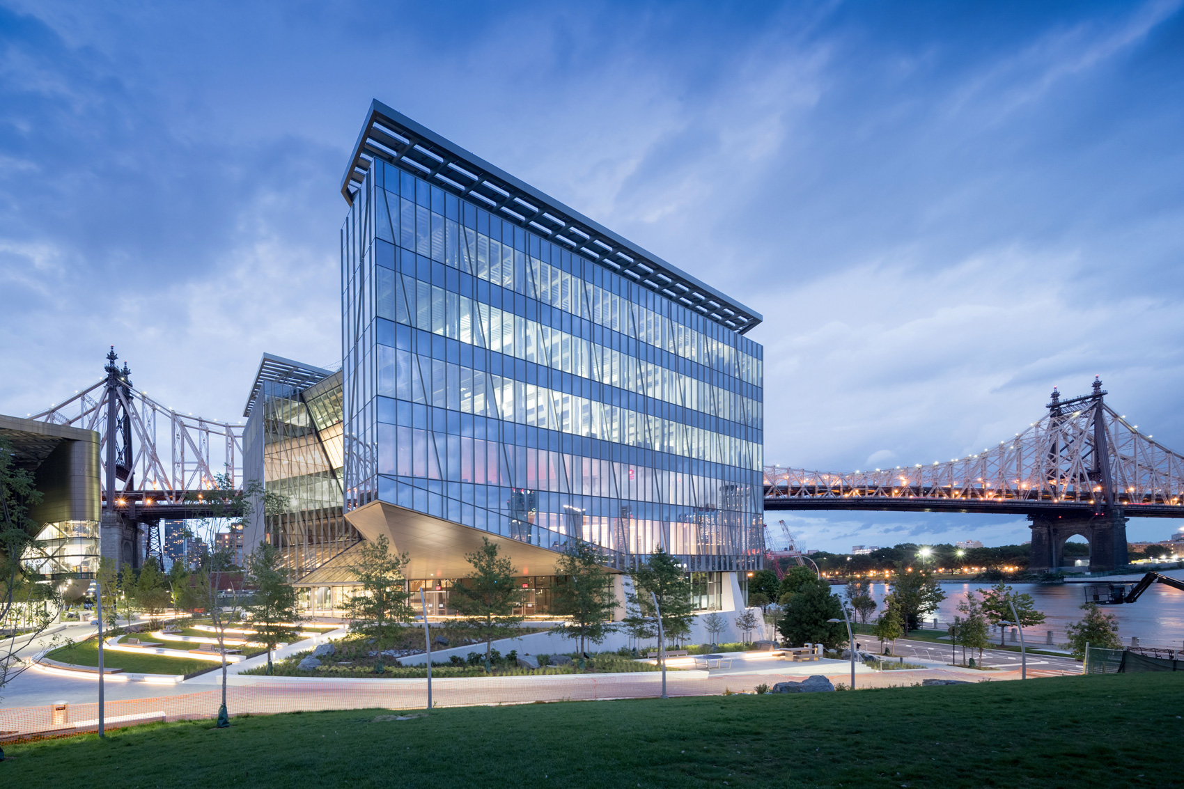
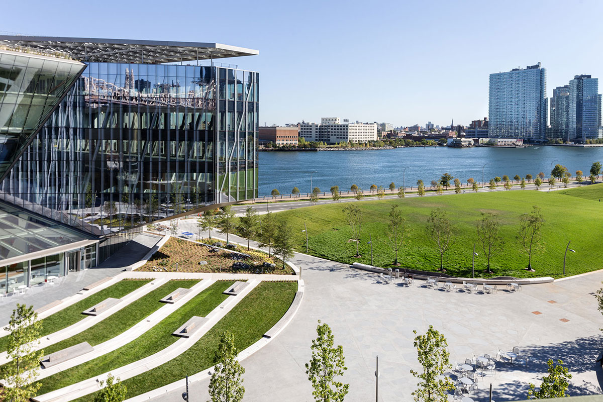
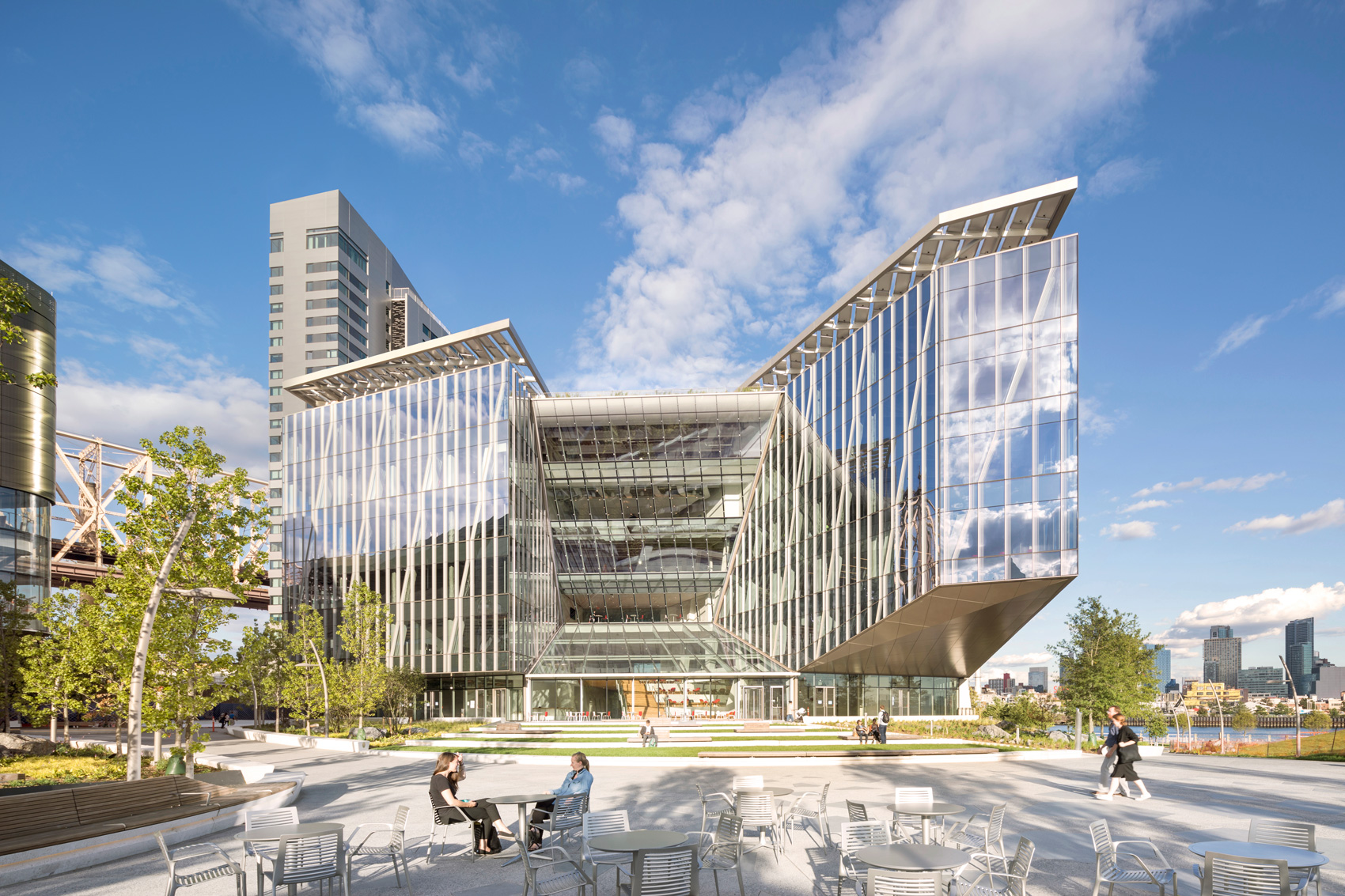
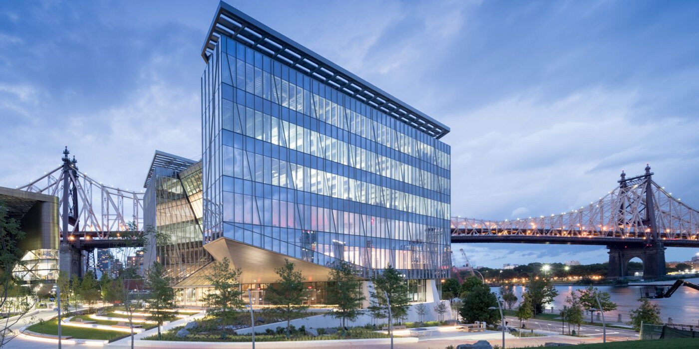
Outside the Tata Innovation Center and the surrounding grounds on Roosevelt Island, ABC provided a series of granite stone pavers. The project itself was developed by Forest City New York to supports Cornell Tech’s efforts to fuse entrepreneurial and academic ambitions on its new Roosevelt Island campus in New York City. One-third of the 235,000-square-foot building hosts Cornell Tech studios, labs, classrooms, and event spaces, while the upper levels are dedicated to a mix of technology-focused companies and start-ups.

All of the occupants share central, light-filled circulation spaces with panoramic skyline views and lounges that encourage social interaction and collaboration. The building’s cantilevered southwest and northeast wings shelter outdoor social spaces that animate the ground floor retail spaces and entry terrace. Anticipating environmental challenges such as rising sea levels and increased flood risk, the Tata Innovation Center is designed for maximum resilience with an entry floor that rises seven feet above the 100-year flood plain.


The Barnes Foundation

By Tod Williams Billie Tsien Architects | Partners, Philadelphia, PA, United States
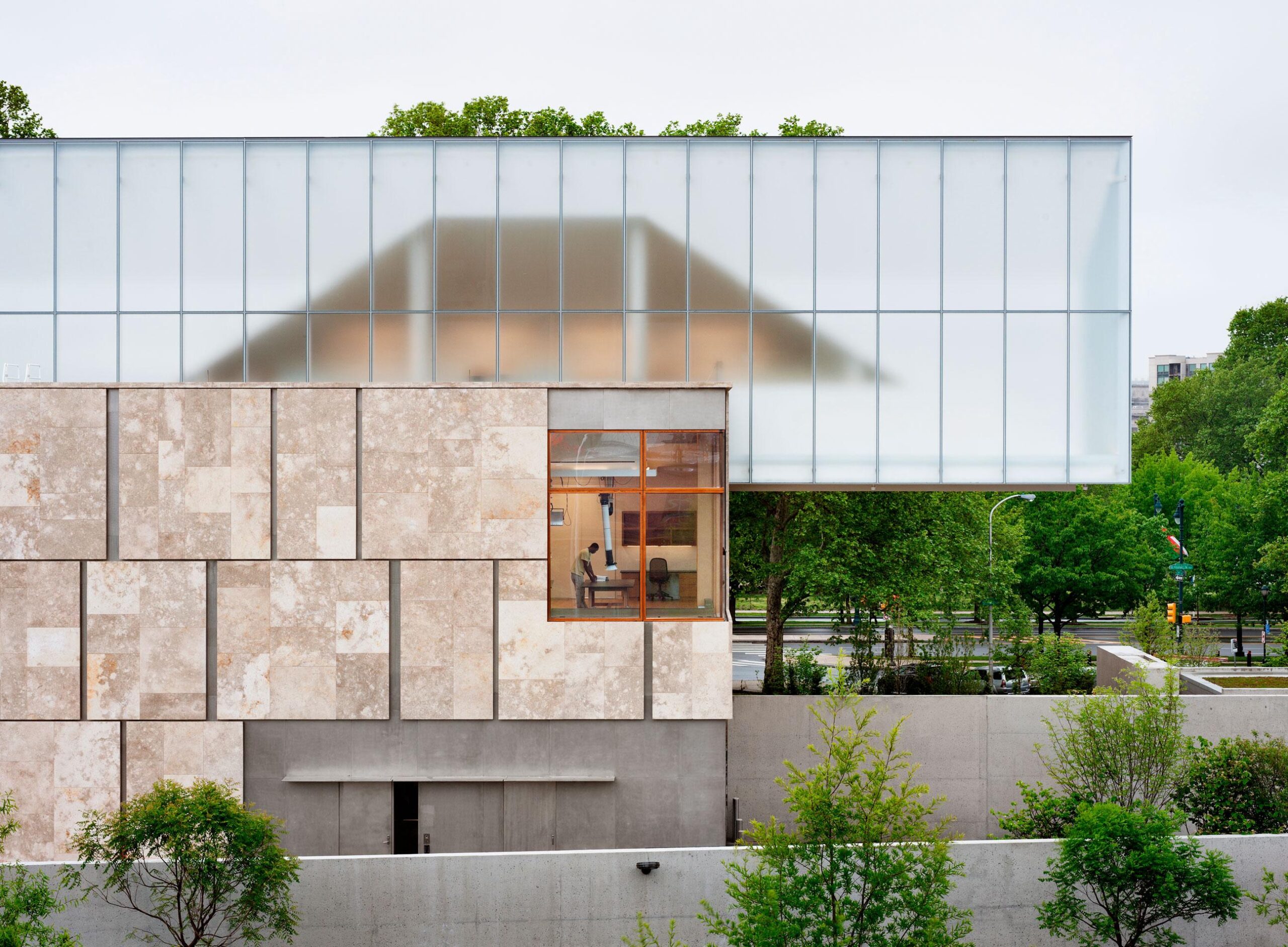
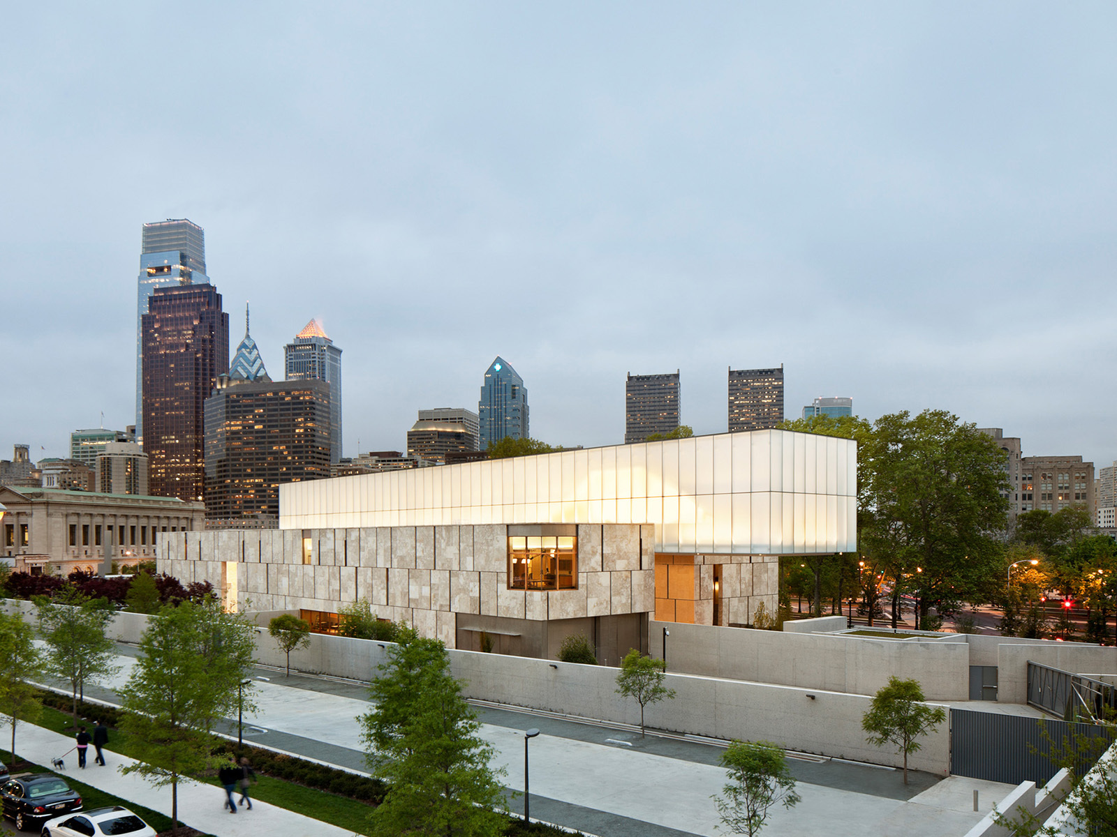
The Barnes Foundation collection was relocated to a 93,000 square foot, LEED Platinum building on the Benjamin Franklin Parkway in downtown Philadelphia. Conceived as “a gallery in a garden and a garden in a gallery,” the new building honors the past Merion facility and provides visitors with a personal experience. Clad in fossilized limestone and crowned by a luminous light box, the two-story building, with an additional level below grade, is set in a public garden.

The tripartite building plan consists of the gallery housing the collection, the L-shaped support building, and a court between the two. The L-shaped building provides facilities for the foundation’s core programs in art education, as well as for conservation, temporary exhibitions, and visitor amenities. The façade of the massive building is dressed in Ramon Grey limestone — quarried in the Negev desert and supplied by ABC Stone. In total, 4,000 stone panels were employed to construct the facility.


Field House

By Stelle Lomont Rouhani Architects, Sagaponack, New York

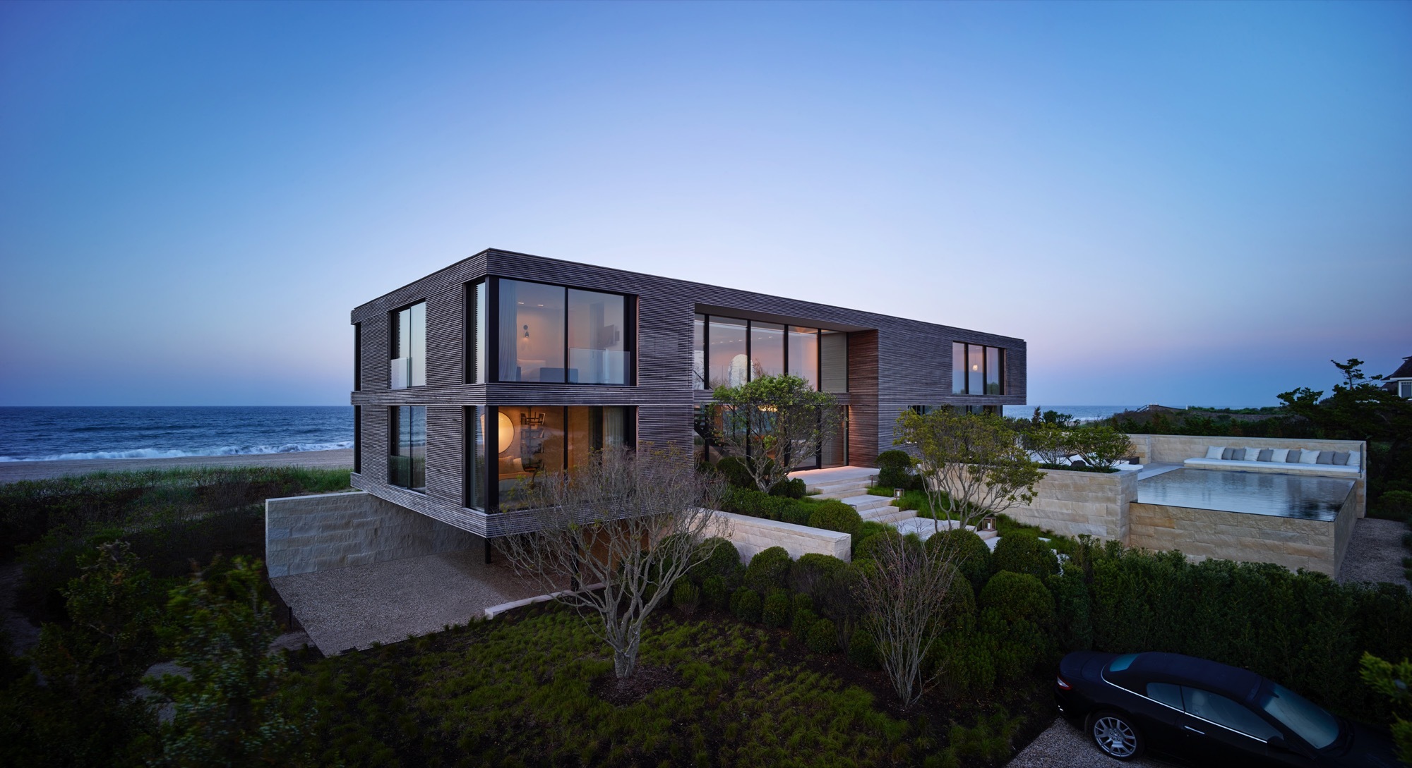
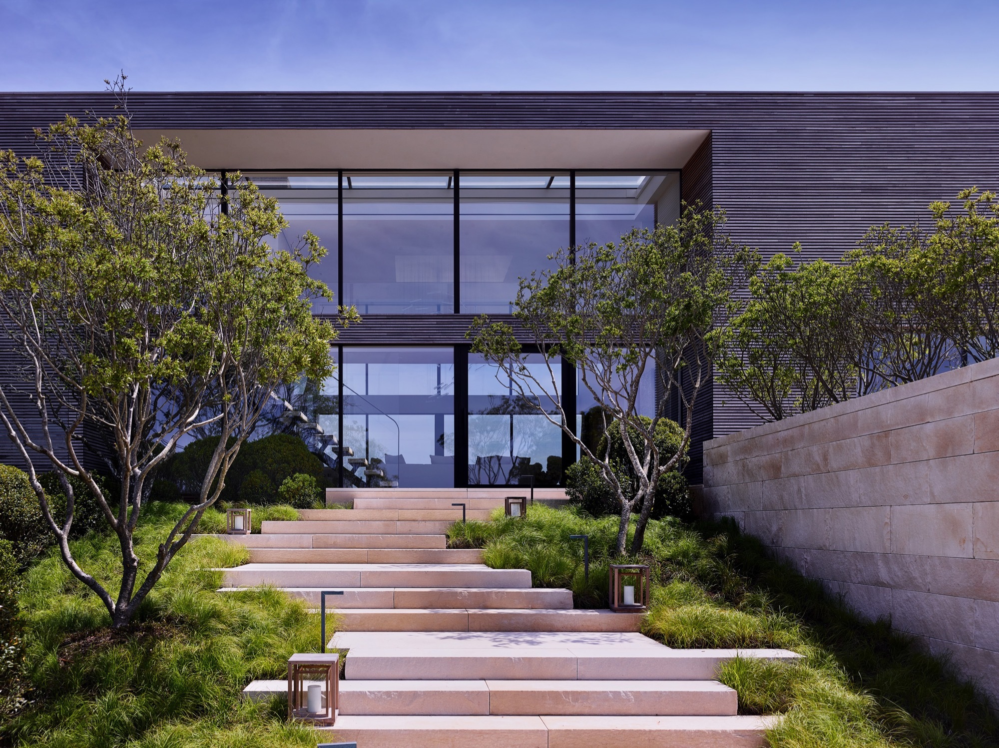
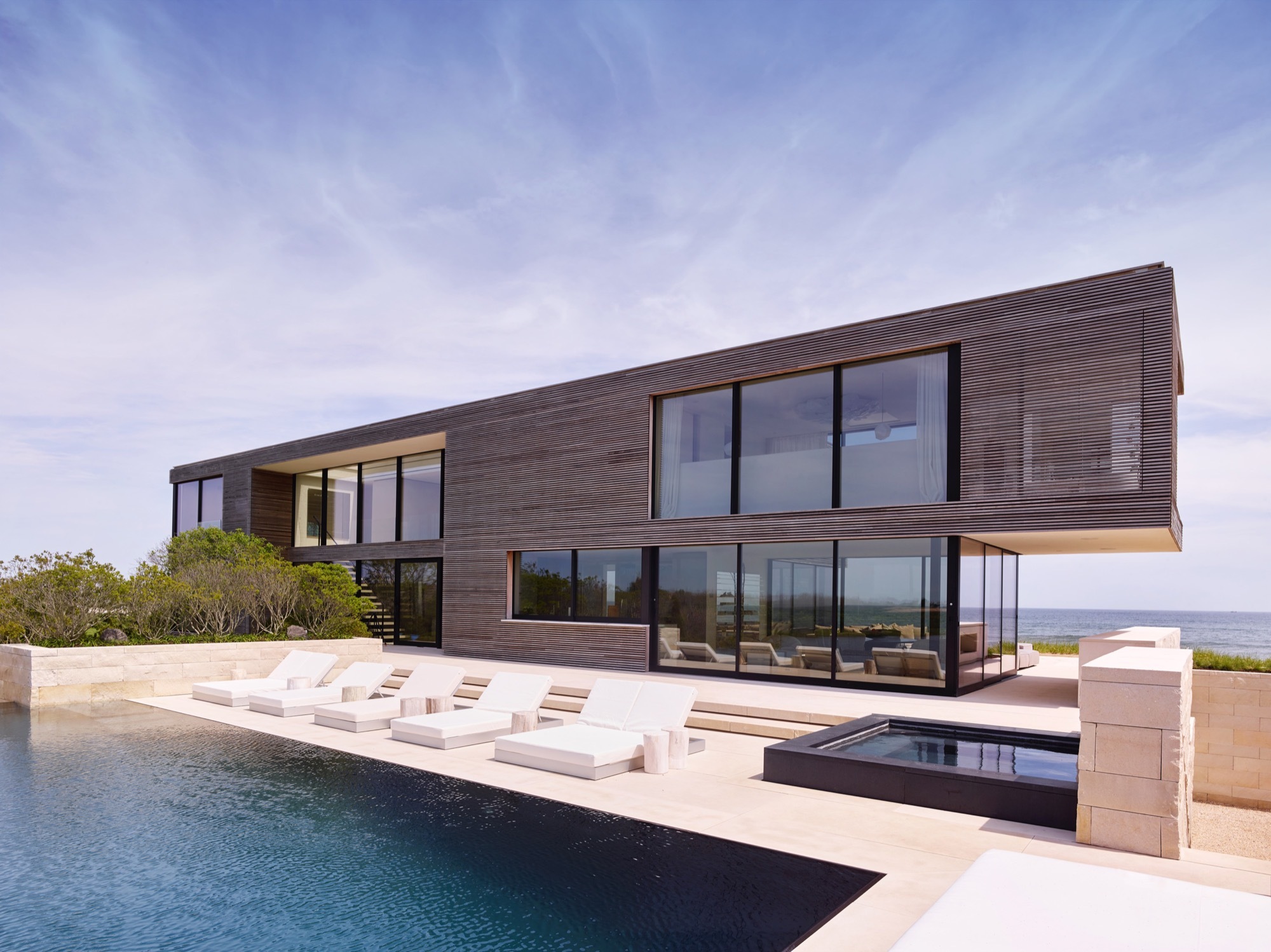
Field House was built between ocean and pond. With the landscape seemingly running through it, the house was designed around flooding and wind. It was constructed on piles with a steel frame and high density limestone. The house is approached through a terraced set of stairs, and the interior palette matches the exterior, with the limestone extending throughout the main level and reappearing as solid blocks in bathrooms.

The intention throughout is to reinforce rather than detract from the natural beauty of the surroundings. Valders Limestone from Wisconsin used inside and out. The stone is used landscape elements such as the pool and spa and the surrounding terraces. It continues through the inside main level of the house reinforcing the indoor outdoor relationship.


Pierhouse and 1 Hotel Brooklyn Bridge

By Marvel, and INC Architecture & Design, Brooklyn, NY, United States

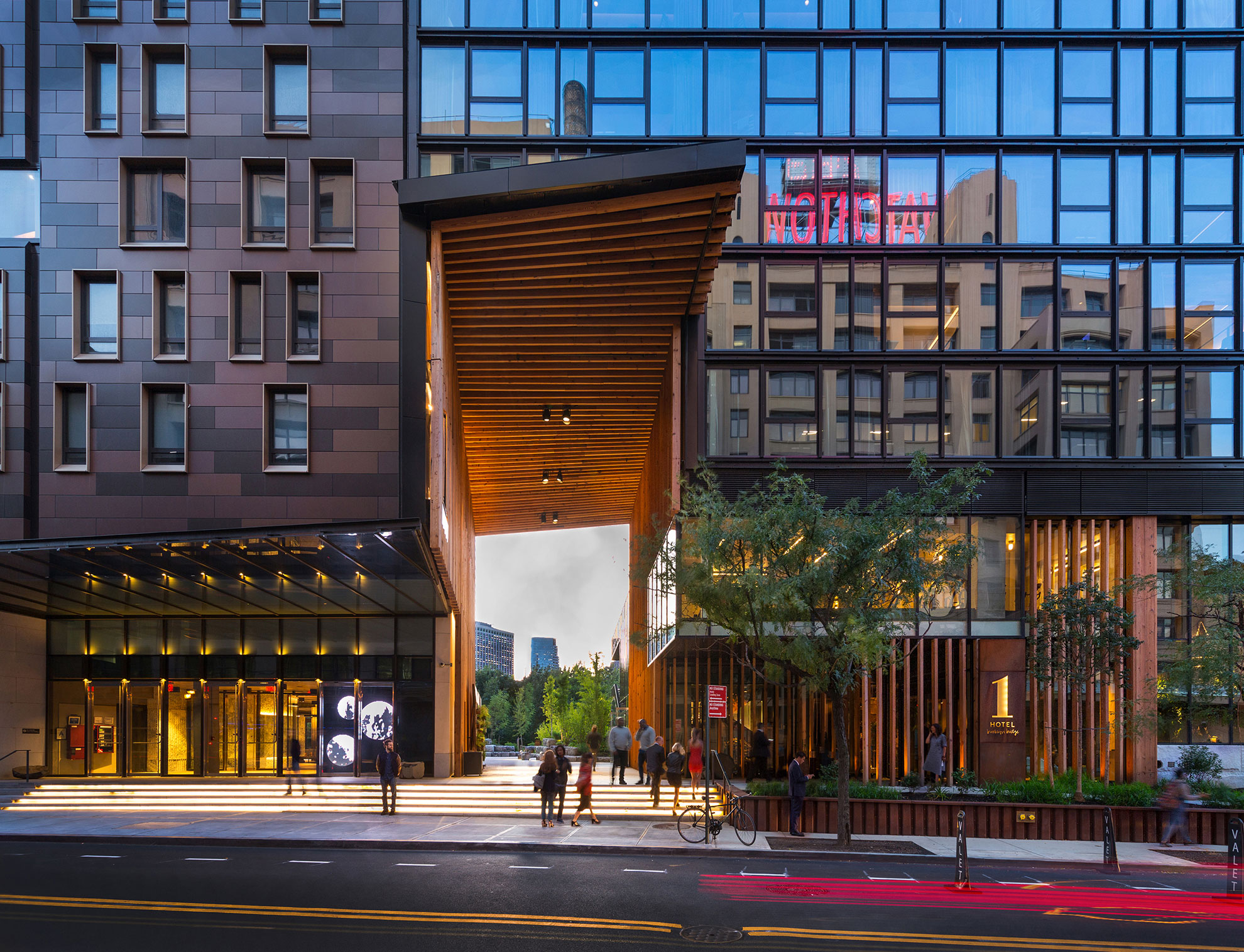
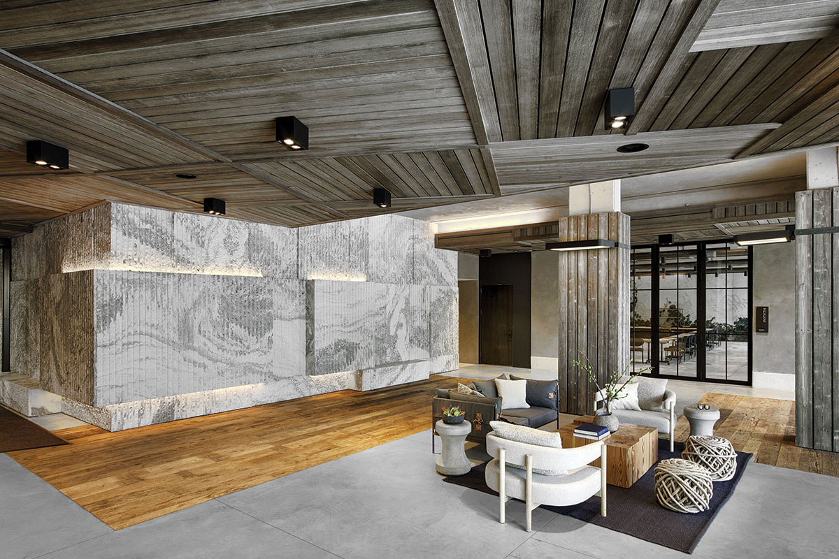
1 Hotel overlooks the East River in Brooklyn’s DUMBO neighborhood and features more than 10,000 square feet ABC’s Montclair Danby Vein Cut, Mountain White Danby, and Crystal Grey Danby. The Pierhouse and 1 Hotel Brooklyn Bridge building echoes the park’s simplified use of stone and steel. It steps down to meet the green lawns with planted roofs. Using stone from a Vermont quarry helped the project achieve the designation of LEED Gold certification.

The Pierhouse and 1 Hotel Brooklyn Bridge development includes a 194-room hotel and 106-unit condo residence in Brooklyn Heights. The design allows for unparalleled views of the New York harbor and the park. The building was made to serve as an improved link between Furman Street and the park open space.


Perry World House

By Tod Williams Billie Tsien Architects | Partners, Philadelphia, PA, United States
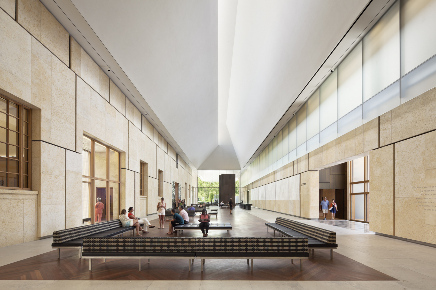
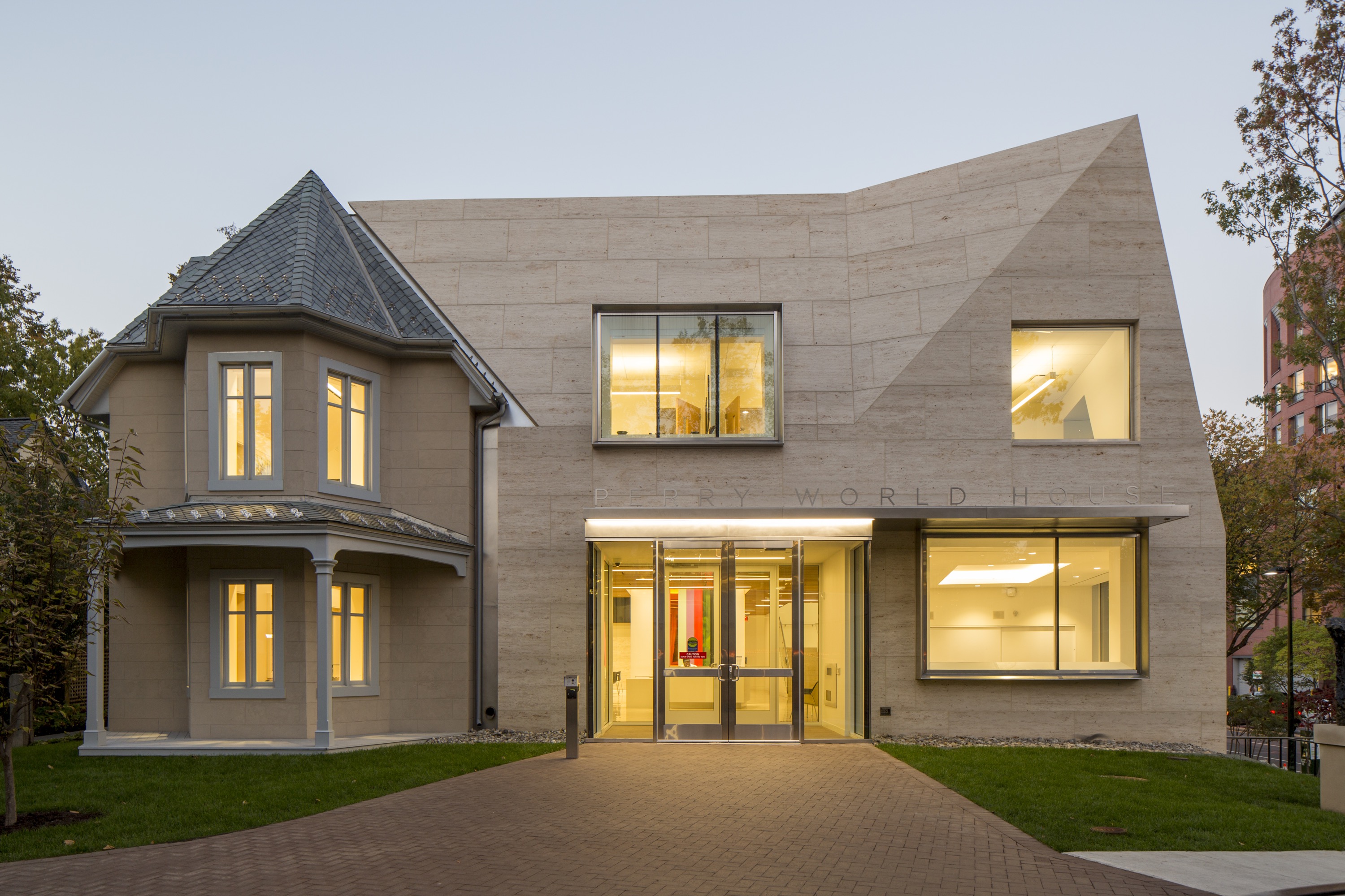
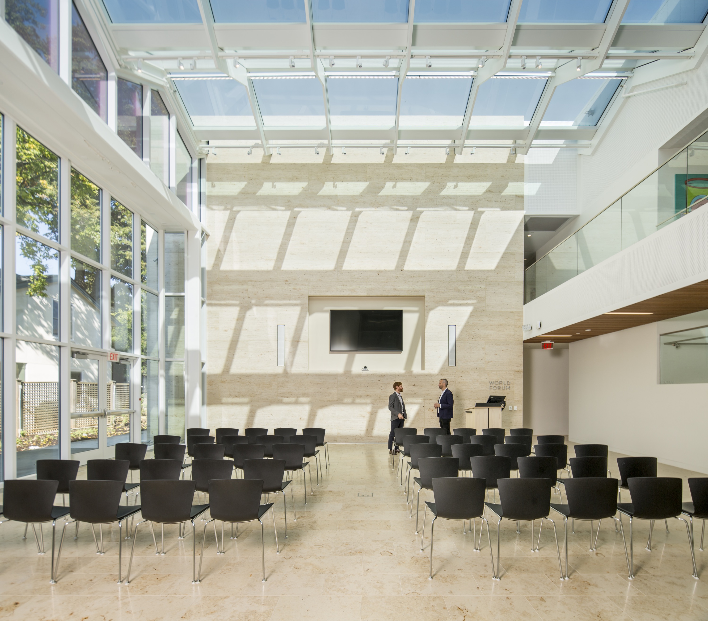
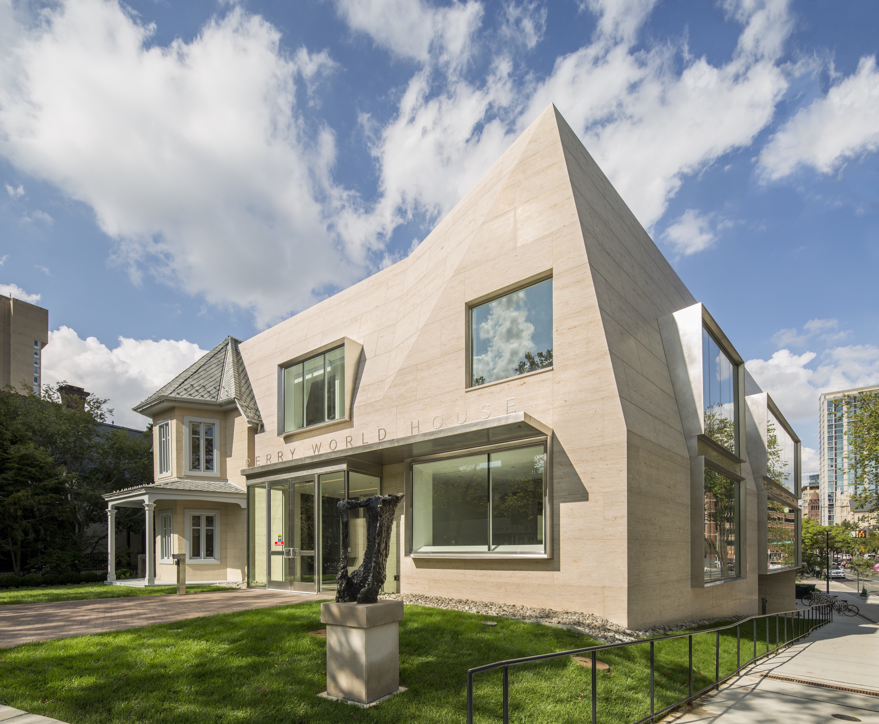
For the Perry World House, the University of Pennsylvania needed a space for its new institute that would aggregate all its international activities. This became a renovated cottage that was originally built in 1851. Designed by 1100 Architect, the team preserved the house while transforming the site into a 21st century flagship for this newly formed institute. ABC Worldwide Stone was responsible for sourcing, selecting, quality checks, logistics and fabrication approvals on all the project’s 1,850 cubic feet of Renaissance Beige limestone.

The new limestone-clad building sits at the heart of Penn’s campus, mediating two very different conditions: a pedestrian/domestic scale to its south and west, and a busy urban scale and traffic corridor to its north and east. The building’s facets allow it to modulate its scale in a seamless way, deferring to the original house, on one hand, but providing a strong edge to the busy street, on the other.


Clinton Hill Brownstone

By Michael K Chen Architecture, Clinton Hill, New York
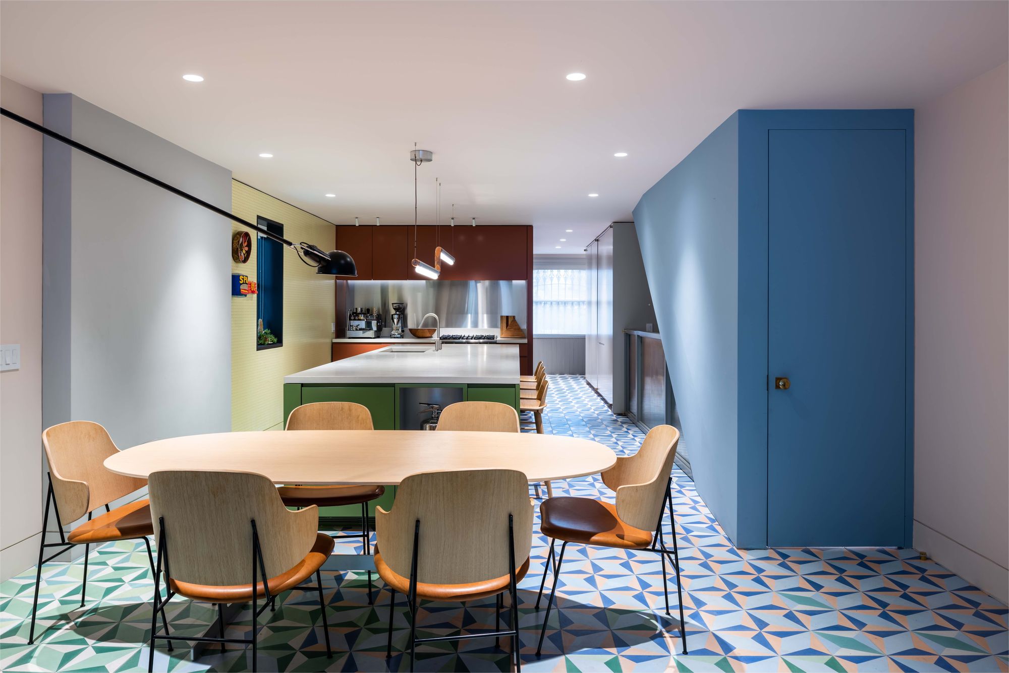
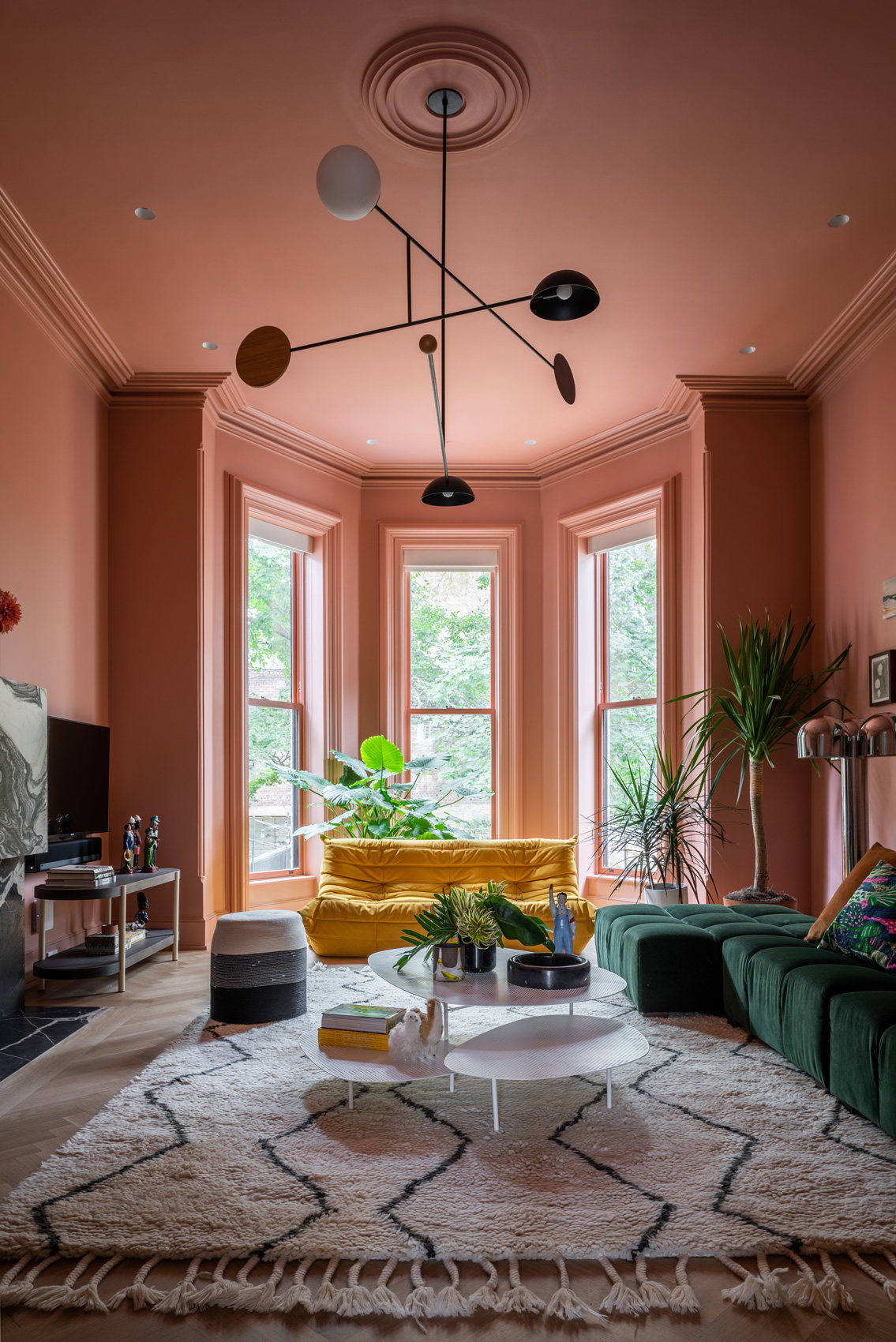
MKCA’s gut renovation and exterior restoration of a landmark Brooklyn brownstone balances history with a playful intervention. Located in the historic Clinton Hill neighborhood, the original structure was abandoned to decay for twenty years. The design of the house balances stabilizing the building and recapturing its original details with efforts to create a new home in an adventurous, innovative manner, producing an appealing aesthetic between the historic elements and the new additions.

For the project, color is an important component of the design, and it is treated in a three-dimensional, spatial manner. ABC Stone was used throughout the project interiors. Across the redesign, a rigorously uniform yet distinct palette washes over each room, retaining the boldness and vibrancy of the original hues, while rendering the spaces more modern, cohesive and calm.

Architizer’s A+Product Awards has officially launched! Get your products in front of the AEC industry’s most renowned designers by submitting today.

Reference

Ludwig Godefroy prioritises garden for “timeless” family home in Mexico
CategoriesArchitecture

Ludwig Godefroy prioritises garden for “timeless” family home in Mexico

Mexico-based architect Ludwig Godefroy has completed the renovation of a”simple” house and studio in Mexico for himself and his family that is integrated with an adjacent garden.

Godefroy and his partner renovated a former residence, focusing on the home’s orientation towards the site’s pre-existing greenspace.

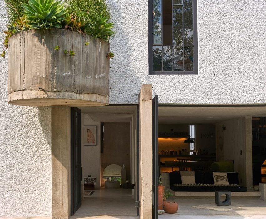
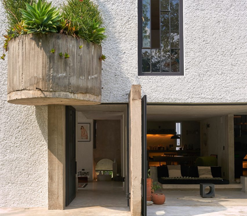
A large semi-circle planter attached to the exterior of a house
Ludwig Godefroy has completed a house and studio for himself and his family in Mexico

“Casa SanJe is a very simple project,” said Godefroy. “The main idea behind the project was to reconnect the house with its garden, opening large windows everywhere on the ground floor. In and out are always connected in this house.”

Almost half of the square site is dedicated to the garden, while the other half contains the architect’s residence.

The entrance to a house with a gate door
It is organized around the site’s substantial garden

“Casa SanJe was an ordinary Mexican house from the ’80s, without any style, a simple house with tiles on the floor and texturized plaster finishing on the walls,” said Godefroy.

The architect replaced the former materials with concrete, wood and tezontle – a red volcanic stone – to “calm down the atmosphere of the house”.

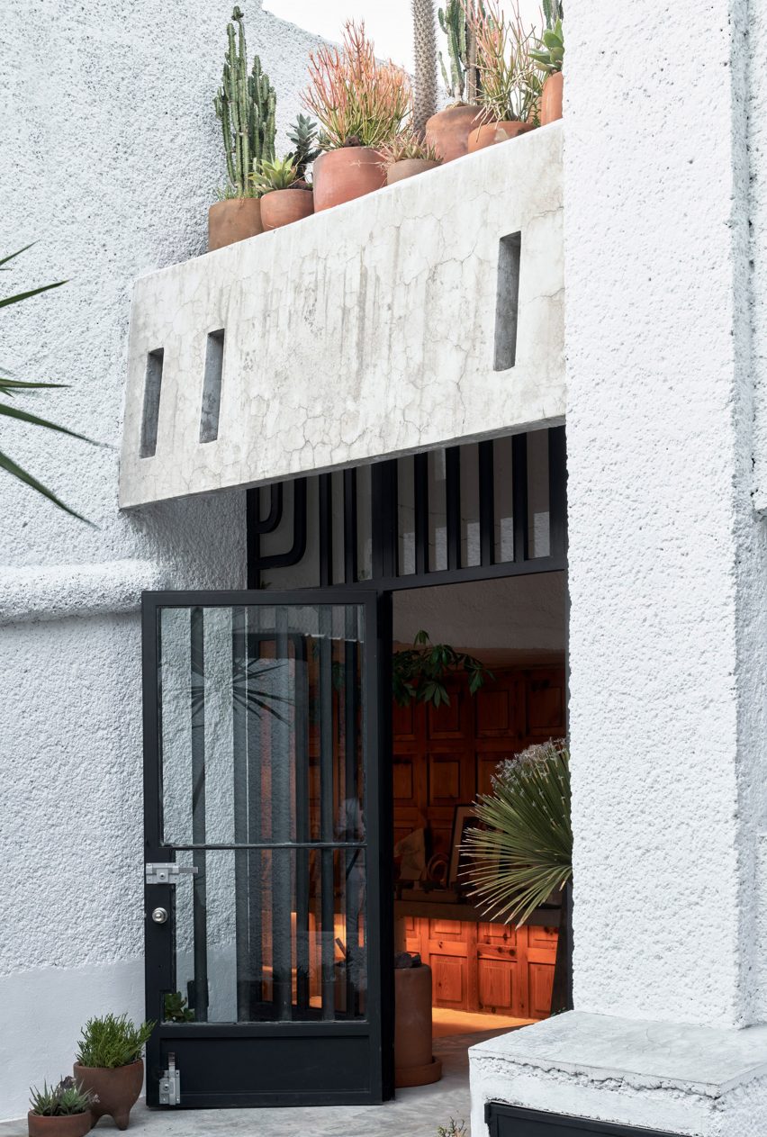
A large wrought iron door
Godefroy renovated a house originally built in the 80s

The ground level of the home contains two entrances protected by iron doors.

A car park sits adjacent to the building’s first entrance, which is accessed through a patio populated with stone, planting beds and a concrete and brick sculpture.

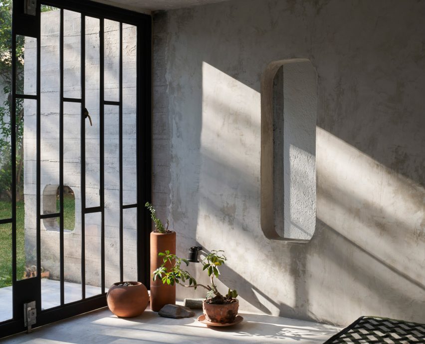
A rectangular cut out in a wall
The ground floor contains large windows and doors that open directly into the garden

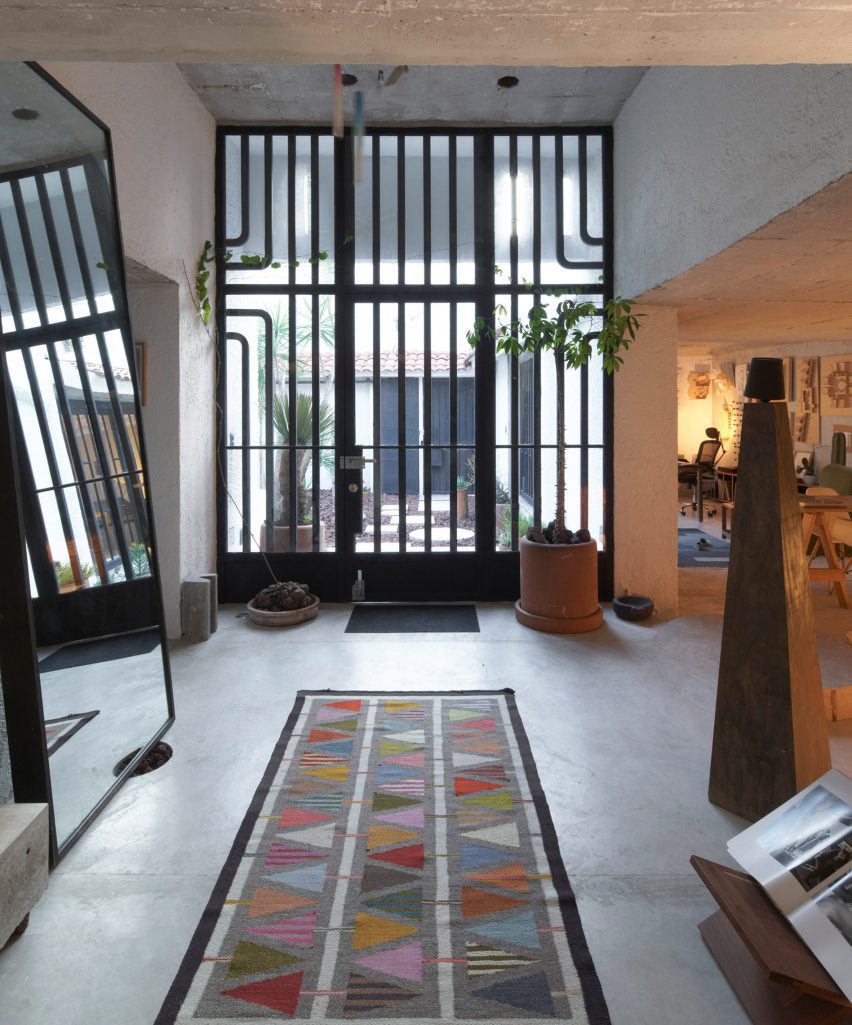
A second entrance is located further into the garden and leads to a vestibule space at the centre of the ground-level plan.

The interior program circulates around the vestibule, with the kitchen, dining area and living room located opposite the architect’s studio and library.

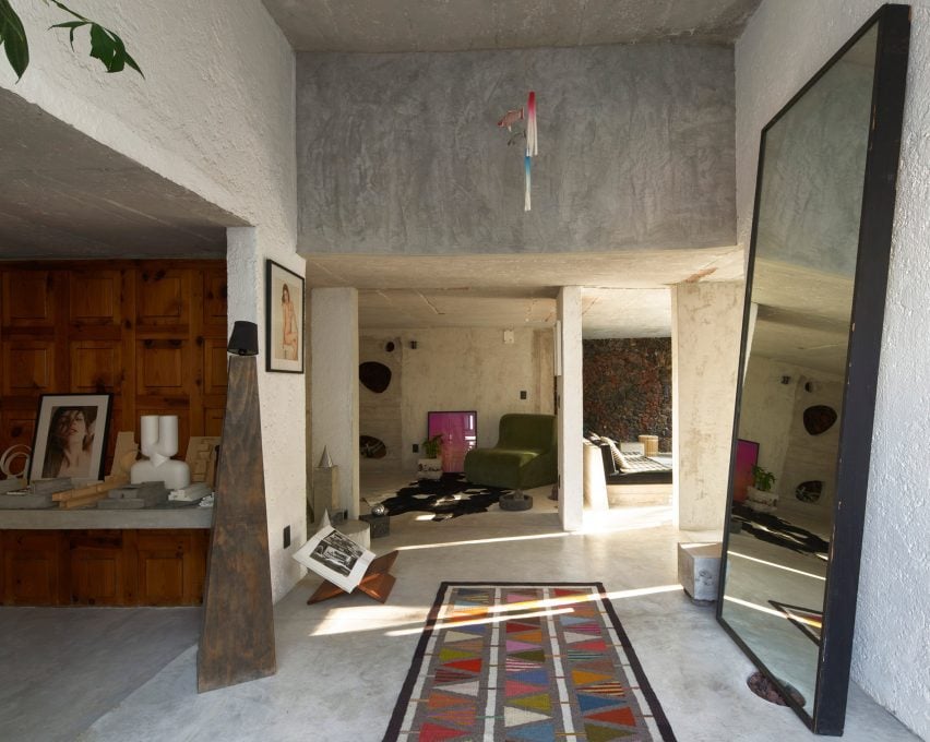
The entrance to a home with a mirror and sculptural elements
It is made of concrete with wood and stone elements

The kitchen and studio spaces were pushed along the back wall of the house, with slim windows placed periodically among cabinets and shelves.

On the side opposite, Godefroy installed large doors and windows that open the living room directly into the garden.

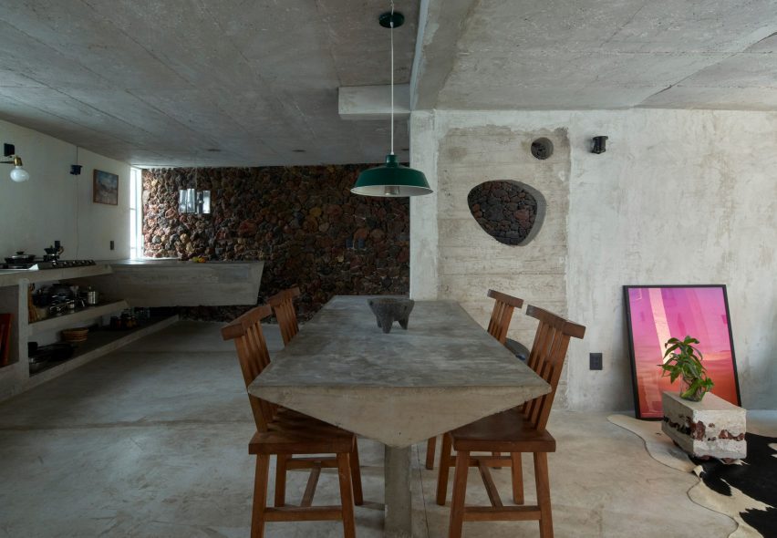
A dining table made of concrete
Furniture like a dining table and shelving was also made of concrete

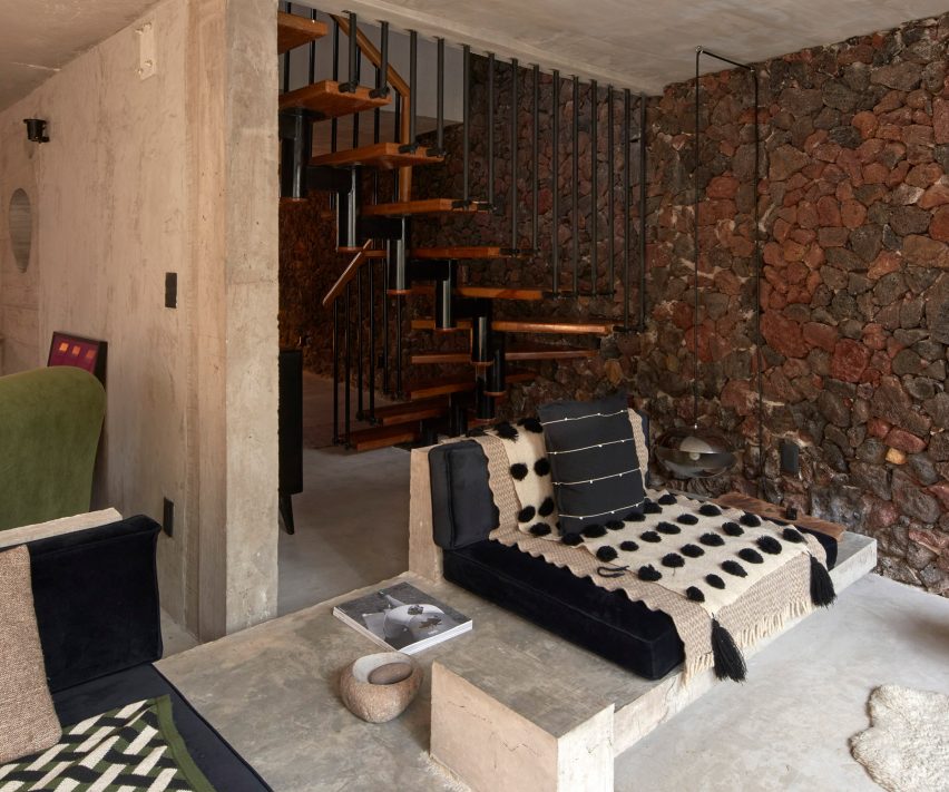
Much of the interior furniture was made of caste concrete, like the living room sofa, the dining table, side tables, kitchen shelving and an island. And some are built directly into the floor.

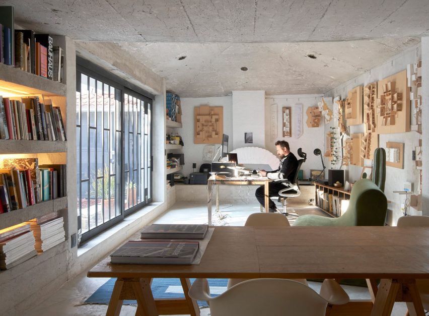
Godefroy’s studio also contains concrete shelving and a concrete desk that runs along the wall.

A living room with a wall of exposed stone and a concrete couch
A wall clad in volcanic stone rungs along the back of the house

In the same space, a wall was clad in warm wood panels, while a vaulted ceiling sits above the architect’s desk. A chimney sits adjacent.

Like some of Godefroy’s previous projects, geometric openings were cut into interior walls.

An exposed wall made of red volcanic stone runs along the back wall of the house.

Located between the kitchen and living room, a wooden staircase leads to the second floor, which contains bedrooms and a primary bath.

Casa SanJe by Ludwig Godefroy
The architect’s studio opens onto the entrance patio

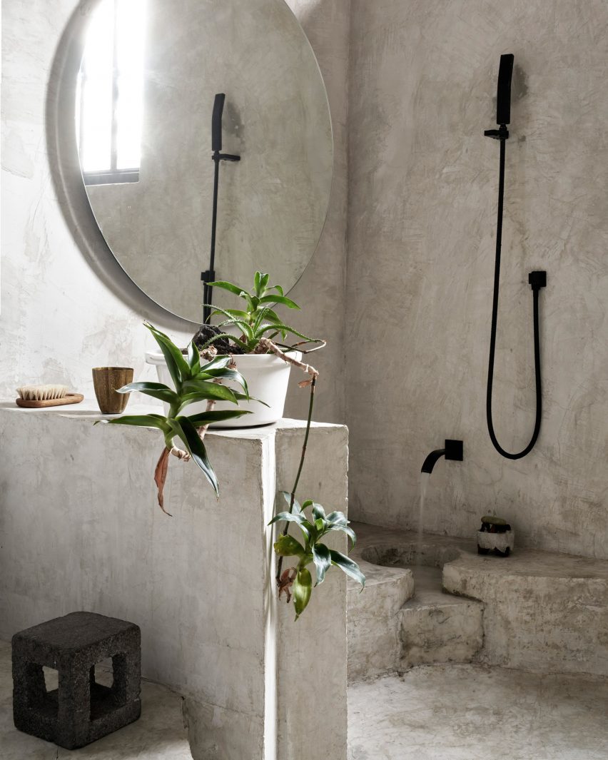
The primary bath contains a sunken, circular cutout in the floor, with multiple shower heads for bathing.

In one corner, a spigot drops water onto a stepped feature.

A bathroom with a circular cut out in the floor
An upstairs bathroom features a circular, sunken floor

Concrete was used for the ceiling, walls and floor.

Native plants were placed throughout the house, with a large semi-circle planter made of concrete placed above the house’s entrance.

“We wanted the space to become timeless, out of any trend or decoration, just made out of simple material, able to get old instead of getting damaged under the action of time,” said the architect.

Godefroy recently completed a number of projects in and around Mexico City, including a brutalist cube-shaped home and a hotel that recalls the design of an Oaxacan temple.

The photography is by Edmund Sumner.

Reference

Ten interiors featuring natural materials and timeless accents
CategoriesInterior Design

Ten interiors featuring natural materials and timeless accents

For this special lookbook sponsored by Danish design company D Line, we’ve selected ten interiors that showcase architectural details by the brand including door handles, taps and drawer pulls.

Door furniture and other pieces of practical hardware provide the finishing touches to interior schemes, and can create physical touchpoints that play a significant role in how people interact with the spaces they inhabit.

D Line has been designing and manufacturing architectural hardware and sanitary ware since 1971. Collaborators include Danish architects Knud Holscher and Arne Jacobsen and British designer Tom Dixon.

Here are 10 projects where D Line’s products have been used to add timeless accents to interiors with natural materials, including homes, hotels, restaurants and even a medical facility.


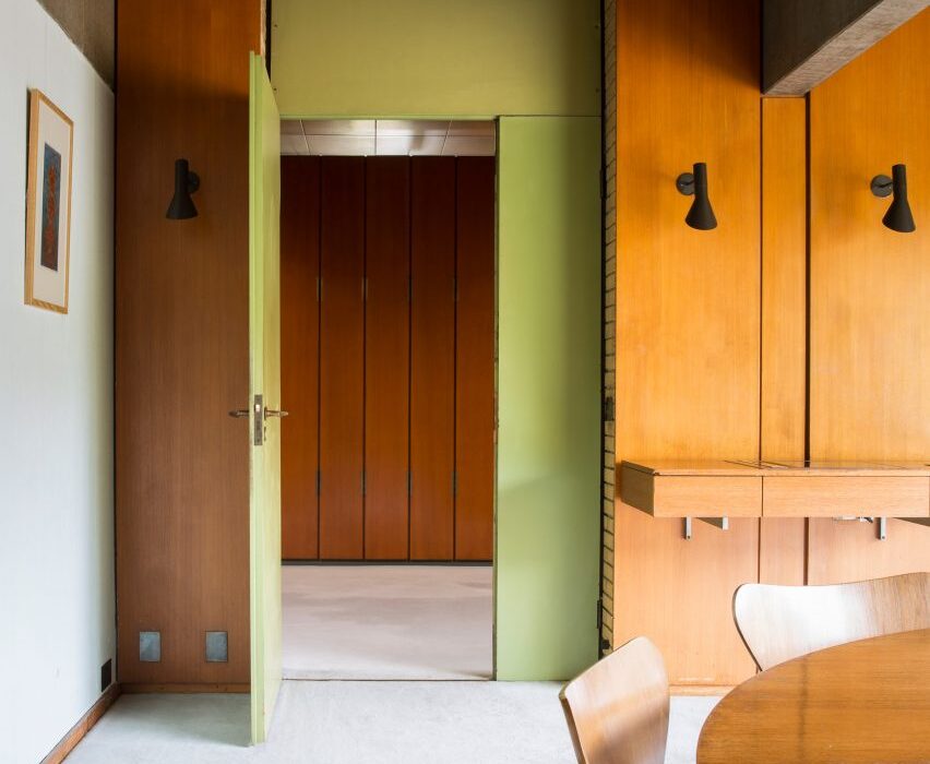
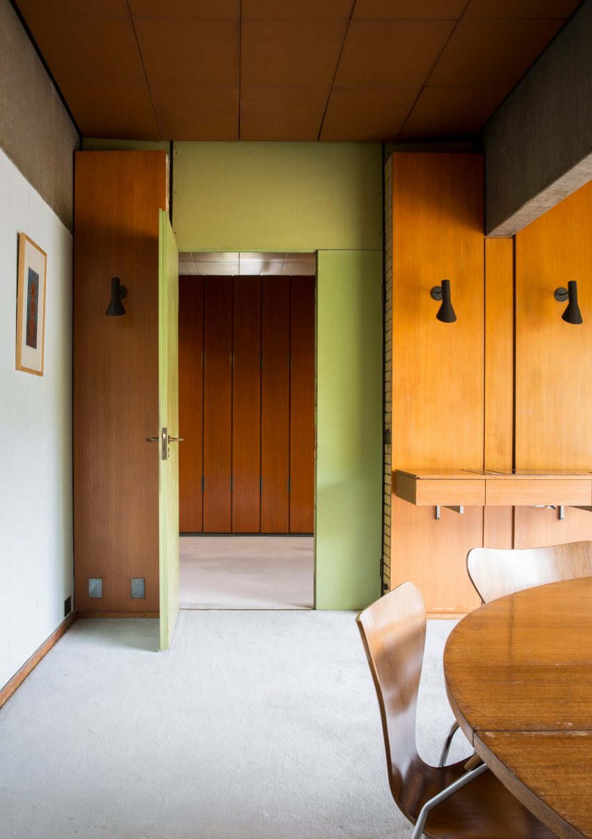
Photograph showing room with wood panelling and green wall
Photo is by Jonas Bjerre Poulsen

St Catherine’s College, Oxford, by Arne Jacobsen and Knud Holscher

Jacobsen designed the modernist concrete exterior as well as the interior and furnishings of St Catherine’s College at the University of Oxford, which opened in 1962.

Details as small as the handles on the interior doors – named AJ lever handles in reference to the designer’s initials – echo the curved, smooth form of the college’s larger design elements.


Äng restaurant by Norm Architects
Photo is by Jonas Bjerre Poulsen

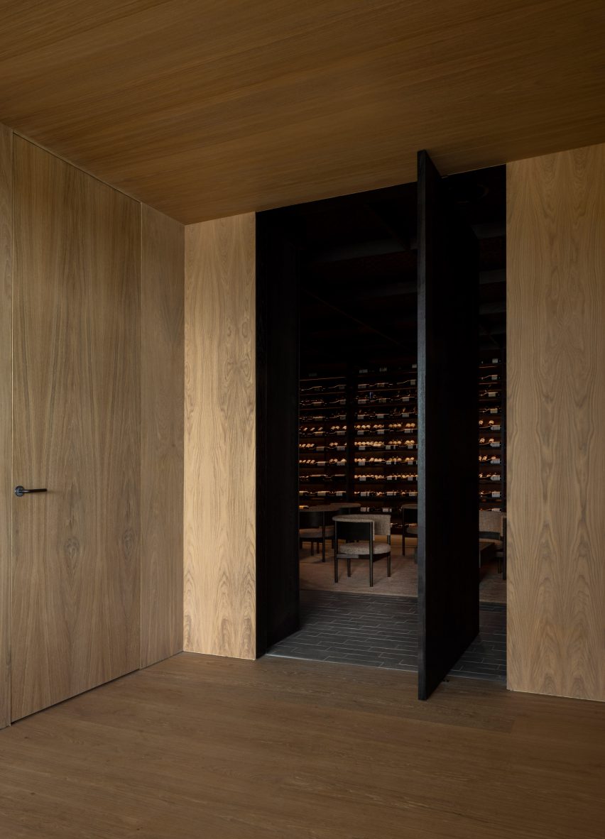
Äng restaurant, Sweden, by Norm Architects

Danish studio Norm Architects has designed Äng, a restaurant in Sweden with both an above-ground structure resembling a greenhouse and a subterranean wine cellar.

D line’s distinct L lever handle in a gunmetal finish was used on doors throughout both spaces, where it matches other metal lighting fixtures as well as the building’s structural components.

Find out more about Äng restaurant ›


Photograph showing room with white door and light blue walls
Photo is courtesy of Norm Architects

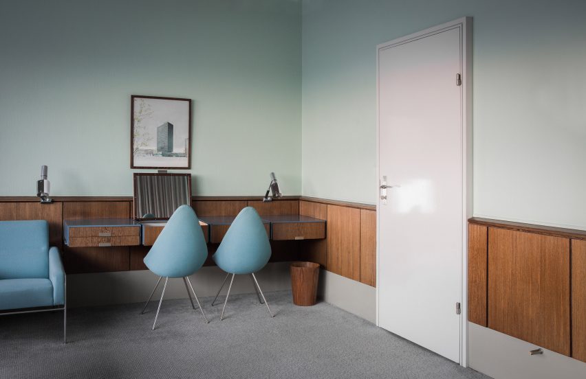
SAS Royal Hotel, Copenhagen, by Arne Jacobsen

Another project by Jacobsen, who designed all the elements found in the SAS Royal Hotel in Copenhagen – which opened in 1960 – in line with his all-encompassing approach to architecture and interior design.

Subsequent remodelling means that only Room 606 remains in its original form. Here, steel AJ lever handles were chosen to tie in with the cool duck-egg blue walls and other silver hardware, such as the frame of the blue seats and sofa.

Find out more about SAS Royal Hotel ›


Photograph of neutral toned living area with large cone shaped lamp shade
Photo is by Jonas Bjerre Poulsen

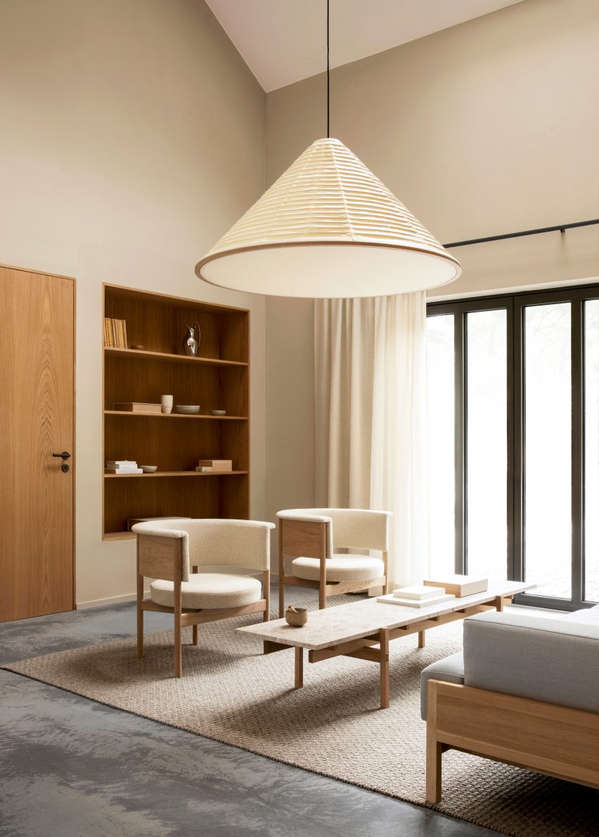
Archipelago House, Sweden, by Norm Architects

This holiday home by Norm Architects is situated in a coastal area of Sweden and combines Scandinavian design with Japanese aesthetics.

The L lever handle in charcoal from D line’s Holscher range provides a steady rhythm of graphic contrast in the interior, which primarily uses light wood furnishings and bright neutral finishes.

Find out more about Archipelago House ›


View through coastal dwelling onto sea
Photo is courtesy of Rubow Architects

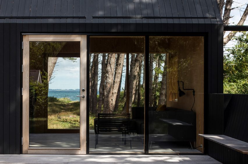
Private Summer Residence, Denmark, by Rubow Architects

Designed by Danish studio Rubow Architects, this holiday home in Denmark aims to blend in with its surroundings by using neutral tones and floor-to-ceiling windows that allow natural light and views of nature into the house.

The L lever handle provides an unobstructive finish to the house’s doors and helps give the house its indoor-outdoor feel.


Neutral interior with mismatched furniture
Photo is by Enok Holsegård

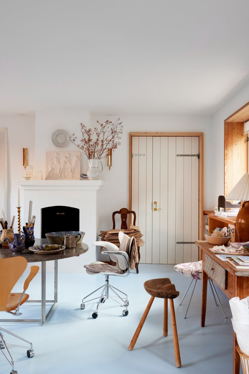
Barbara’s atelier, Copenhagen, by Barbara Bendix Becker

Textile designer Barbara Bendix Becker’s Copenhagen-based antiques and collectibles atelier is full of Nordic ceramics, lighting and furniture by celebrated Scandinavian designers.

The brass Arne Jacobsen lever handle features alongside these other design classics and has been seamlessly integrated with other warm-toned metal finishes, as well as the atelier’s honey-coloured wooden elements.


Photograph of bathroom with bath below long window
Photo is courtesy of MTJ Studio

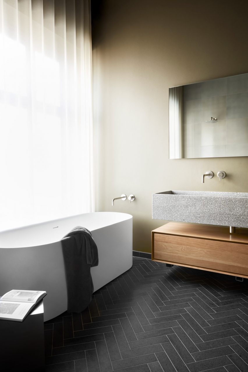
Stockholmsgade bathroom, Copenhagen, by Emil Thorup

This bathroom scheme created by interior designer Emil Thorup is characterised by its rhythmic herringbone tile floor, muted sage-coloured walls and round-cornered, freestanding bathtub.

D-line’s Qtoo bathroom hardware collection in a subtle brushed-steel finish was used for part of the bath, sink and shower setup, and creates a nice metallic contrast to the pale green walls and natural materials used in the room.


Dentology+ by Norm Architects
Photo is by Jonas Bjerre Poulsen

Dentology+ clinic, Antwerp, by Norm Architects

Norm Architects went against the grain with the design of this dental surgery, which avoids overtly clinical interiors in favour of soft neutral finishes that encourage calmness in patients.

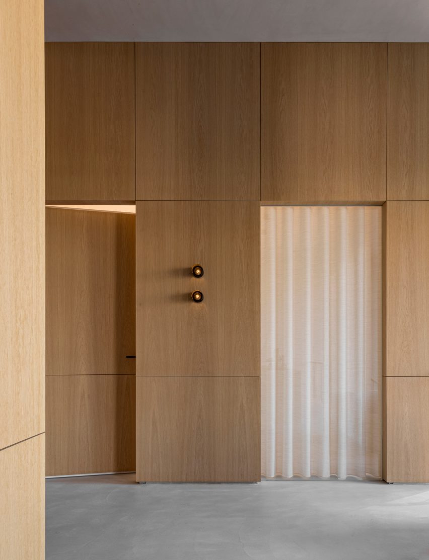
Charcoal-toned L lever handles punctuate the otherwise light and airy interior, alongside unexpected homely details like low-slung sofas and translucent draped curtains.

Find out more about Dentology+ clinic ›


Kitchen island with red handles in front of tall curtains
Photo is courtesy of &Shufl

&Shufl x D Line collaboration

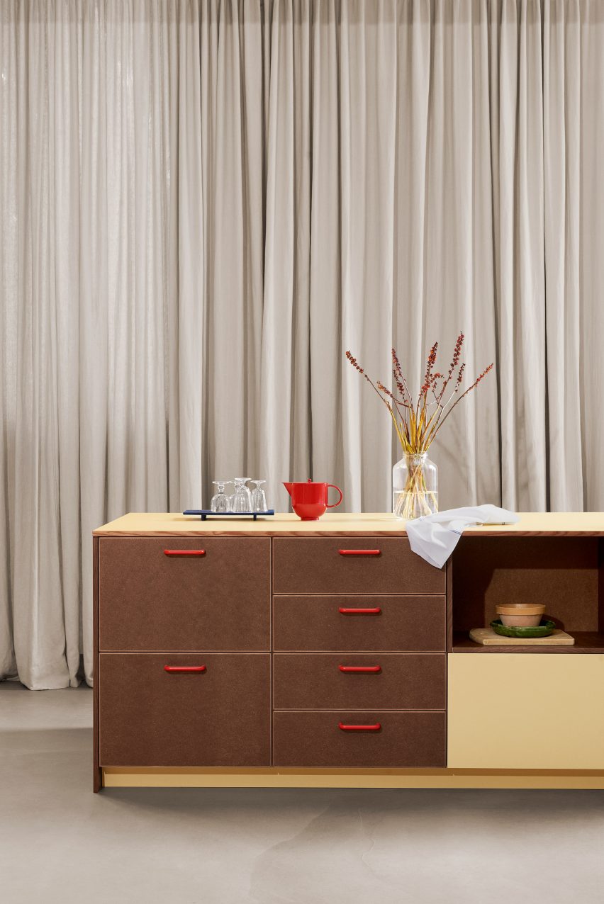
Danish design company &Shufl provides carpentry and hardware elements that are compatible with IKEA kitchens, bathrooms and wardrobes to give existing schemes a facelift.

D Line’s bar handles, which have featured in its catalogue for over 50 years, are used for the &Shufl designs, where they come in a curated palette of different colours and finishes.


Neutral room with light wood clad door
Photo is by Luke Arthur Wells

Luke Arthur Wells x Fat collection by Tom Dixon

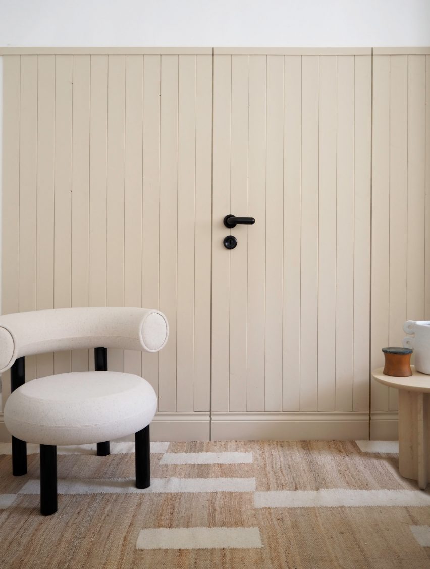
British interior designer Luke Arthur Wells devised an interior scheme that encourages peacefulness by using rounded furniture, handmade ceramics and soft floor coverings.

D Line’s FAT lever handle – part of a wider collection by Dixon – is shorter, thicker and more rounded than traditional door furniture and further softens the already gentle interior.


This is the latest in our series of lookbooks providing curated visual inspiration from Dezeen’s image archive. For more inspiration see previous lookbooks showcasing sociable split-level living spaces, subtly installed lifts, cosy cabins and opulent hotels.

This lookbook was produced by Dezeen for D line as part of a partnership. Find out more about Dezeen partnership content here.

Reference

7 Ways to Recreate the Timeless Charm of Regency Interiors
CategoriesArchitecture

7 Ways to Recreate the Timeless Charm of Regency Interiors

Architects: Want to have your project featured? Showcase your work through Architizer and sign up for our inspirational newsletter.    

Period dramas are all in rage, both in written fiction and cinematic productions. Fans of Emma and Downtown Abbey are now indulging in the Netflix adaption of Julia Quinn’s popular Bridgerton novels. In addition to causing sleepless nights of binge-watching, the series has also prompted several Pinterest searches for Regency-era aesthetics and décor.

This dramatic aesthetic developed in the 19th Century, under George IV’s rule as Prince Regent. The style of design is synonymous with grandeur and flamboyance. It was influenced by Greek, Egyptian, Gothic and Chinese architecture, celebrating art in all forms. Muted hues, decorated wall panels, ornamental moldings, plus seating, noteworthy chandeliers, fluted columns, brass inlays, rich woods and large mirrors are just a few components that combine to make up this style.

Adapting the Regency style for today’s homes is not straightforward; it can be approached by adding individual elements that reflect the era or by recreating an entire setup that exudes regal European charm. Some of the extravagant elements mentioned above can be statement pieces in minimal interiors — like an imposing chandelier in an otherwise plain hallway. On the flip side, if used subtly, they can all come together to create a cozy and inviting home that displays hints of history while being rooted in today. Channeling this style also presents a great opportunity to upcycle vintage furniture and old decor pieces, or to try some DIY experiments on plain IKEA furniture. Below are a few examples of how these elements have been used in spaces across the world.

Children’s Room Design by Ami Austin Interior Design, Memphis, Tennessee | Image by Chip Pankey

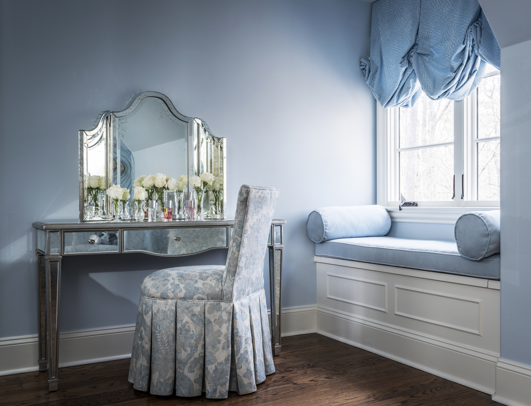
Powdery blues, soft pinks, pistachio greens and luxurious cream hues were a staple in this era. This pastel palette can be layered in any space by using patterned wallpapers, painted furniture and matching upholstery. The combination of patterns prevents the space from becoming monotonous and creates interest in an otherwise muted palette.

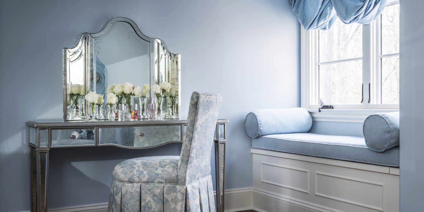
This technique is clearly exhibited in the children’s room design by Ami Austin Interior Design. The same tone of powder blue is used in the wall, curtains, window seating and a desk chair. The white baseboards and mirrored vanity make it more current and add some brightness.

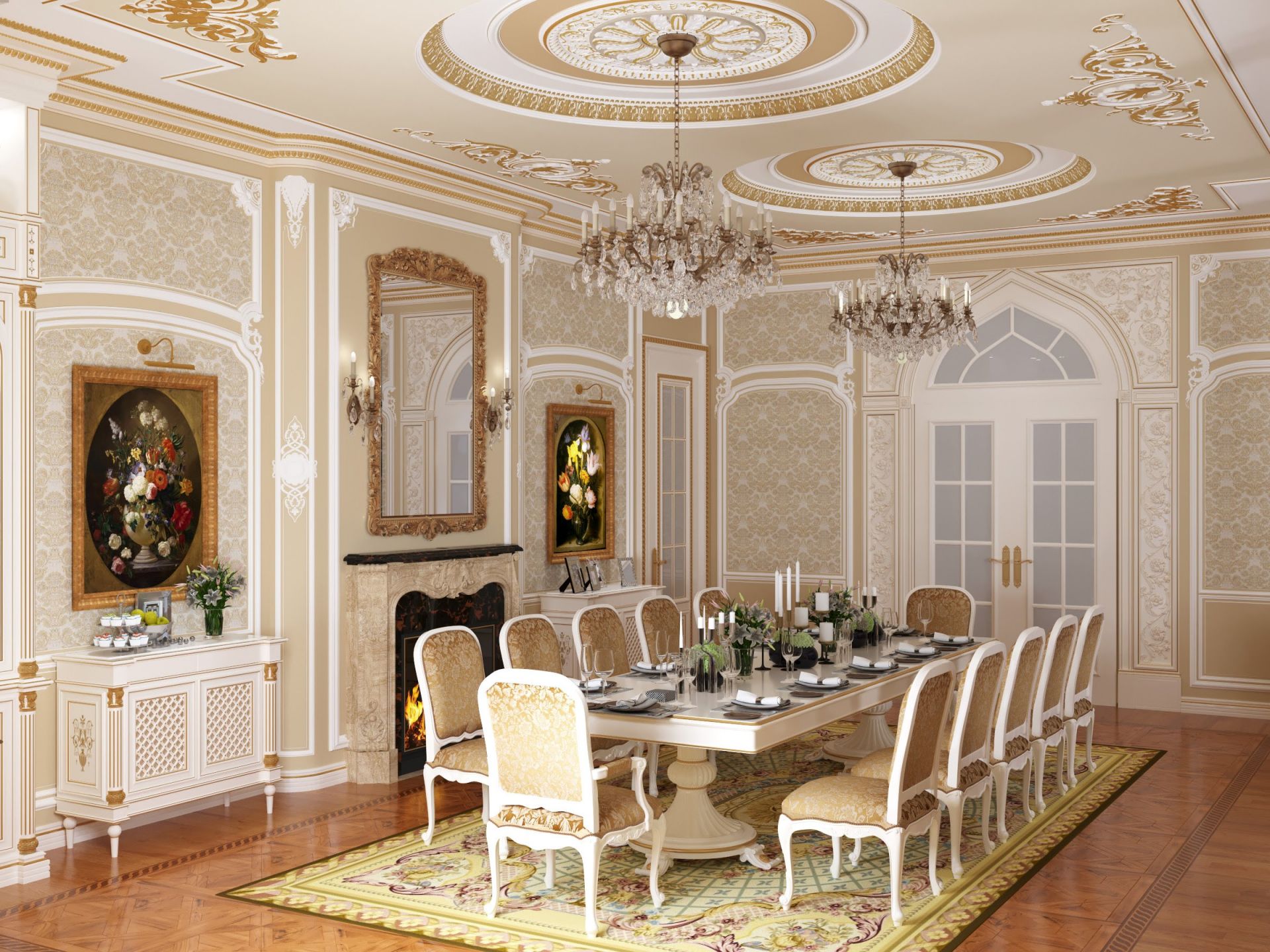
Beautiful living room in palace style by Mirt

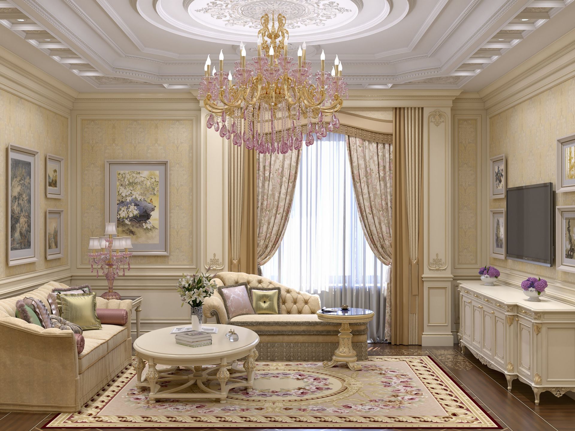
This palatial setting might be hard to replicate in contemporary interiors as is but there are some elements that could be introduced in modern homes to give them a historic touch. Decorating the walls with patterned wallpapers and then strengthening that design language with ornate mirrors and gold-framed paintings can be one way to spruce up dining or living areas. This can also be taken a step further by breaking up the walls with molded panels to divide functions in a large space without using walls.

Ladbroke Grove Townhouse by BWArchitects, London, United Kingdom

Gold and pearlescent tones have long been indicators of wealth and luxury. And since the Regency style was all about celebrating opulence, furniture and fixtures with such finishes were not uncommon. Adding golden or cream edges to highlight the lines of tables or desks, or even using gold in lights or bathrooms fittings is an easy way to incorporate this trend. This soft aqua cabinet with beige panel outlines in a townhouse designed by BWArchitects is a great example of vintage-style furniture in a modern setting.

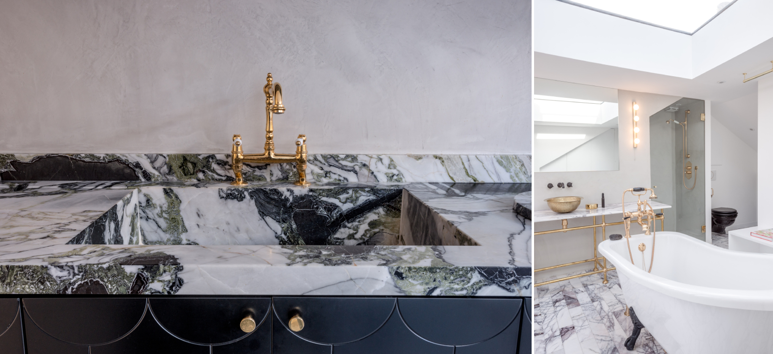
Pattern House by ALEKSA studio, London, United Kingdom

Gilded fixtures can also be paired with white marble tabletops in salons or countertops in bathrooms. Due to its versatility, marble can also be used on floors or be carved to create intricate sculptures and more. In Pattern House, ALESKA studio has paired marble slabs with metallic gold or brass sinks and taps to elevate the simple layout. Golden doorknobs and light fixtures further help build the aesthetic.

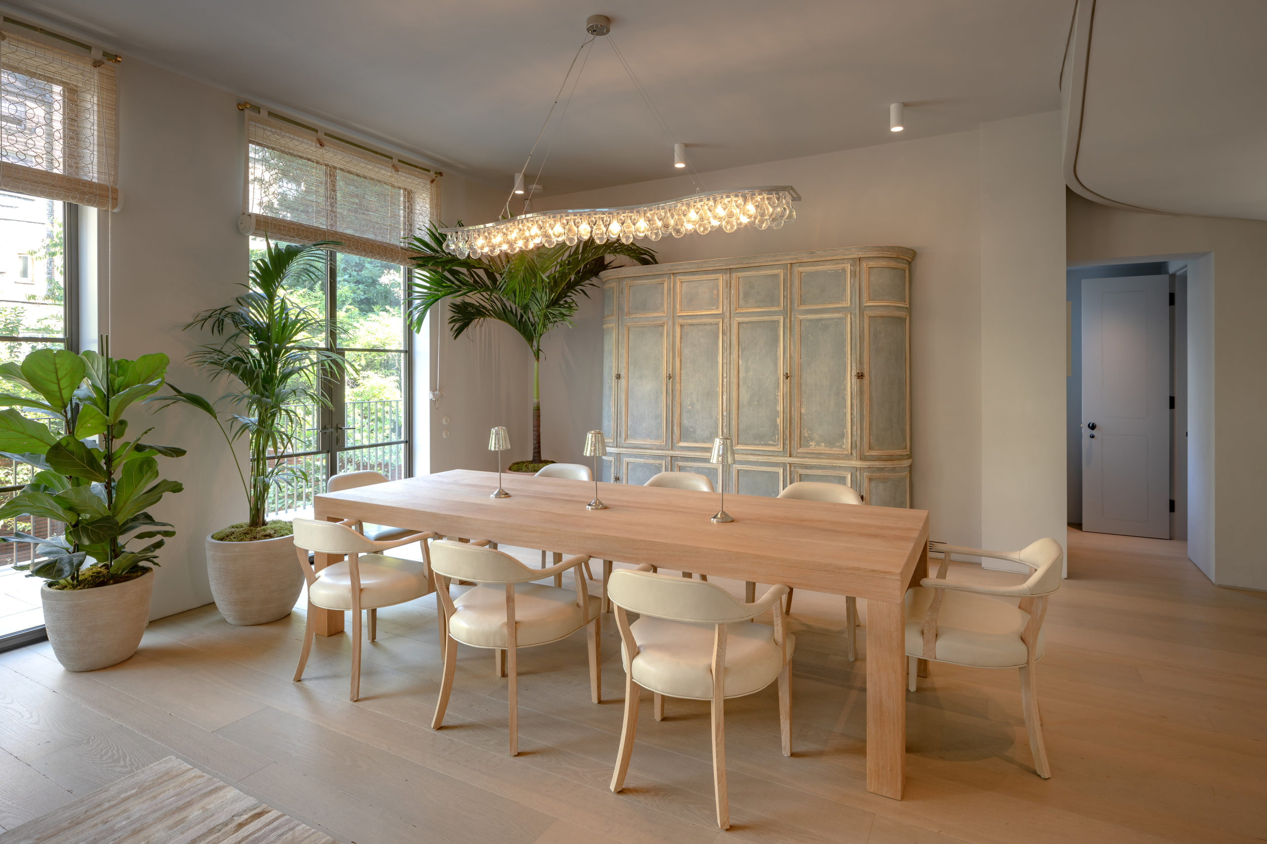
Living room design in light tones by Mirt

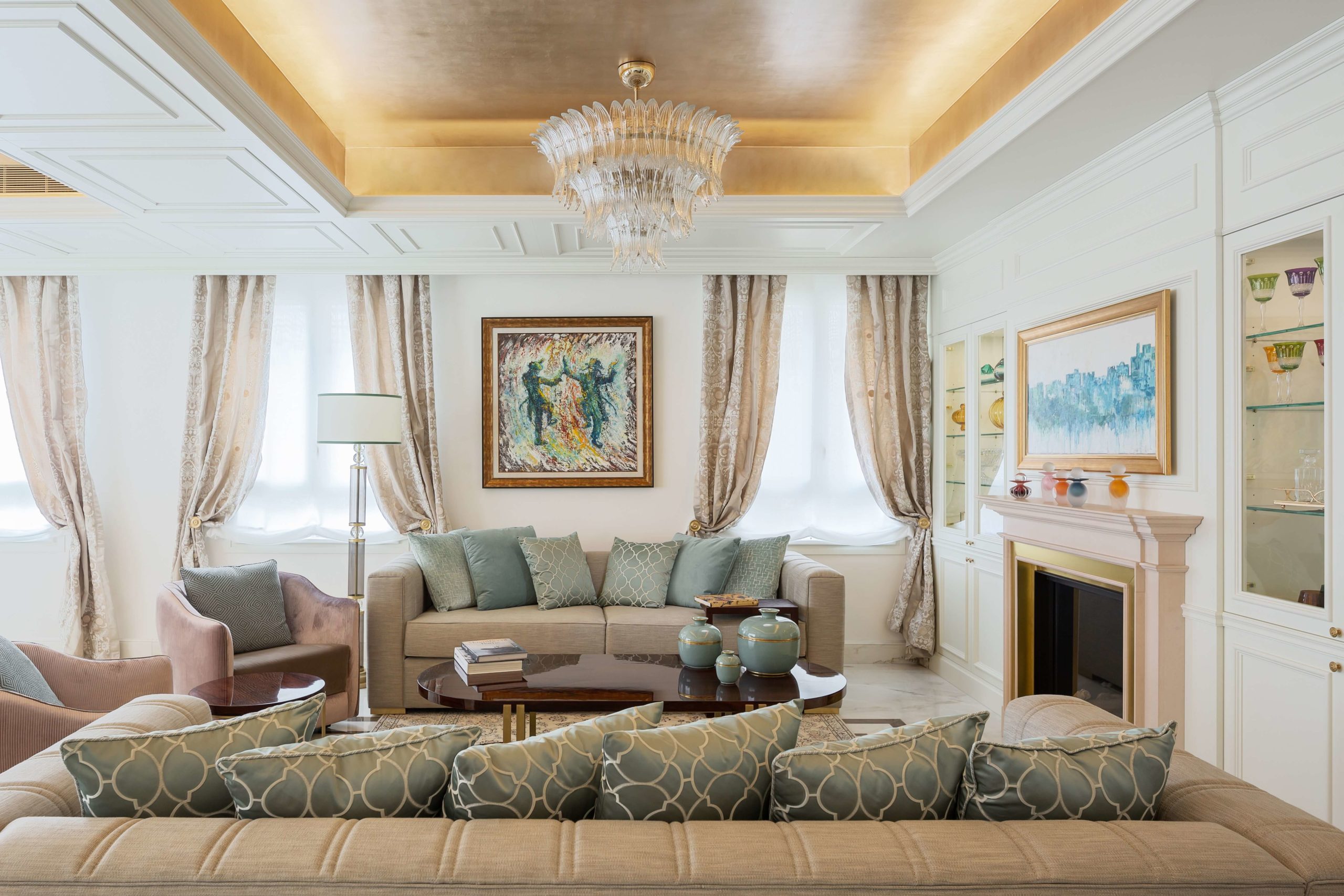
Another characteristic design element from this era was a sitting room with plush sofas and ornate chaises. As evidenced in this living room design, multiple seating options, all with curved lines and decorative embellishments, add an air of comfort and luxury to any living space. These can be upholstered in velvet or delicately patterned fabrics. When paired with equally embellished furniture, they can effortlessly transport users back to the 1800s.

Jerusalem Penthouse by Annette Frommer-Interior Design, Jerusalem, Israel

We often underestimate how dramatically curtains change the look of a space. Pleated drapes with thick fabrics or sophisticated prints that go all the way from the ceiling to the floor can give the appearance of bigger windows and higher ceilings. They can also be accompanied by decorative ties or layered with sheer curtains to make the setup more luxurious. As showcased above, curtains can be a good way to add depth, color and texture to living spaces.

Chateau in height by Estudio Jorge Felli, Buenos Aires, Argentina

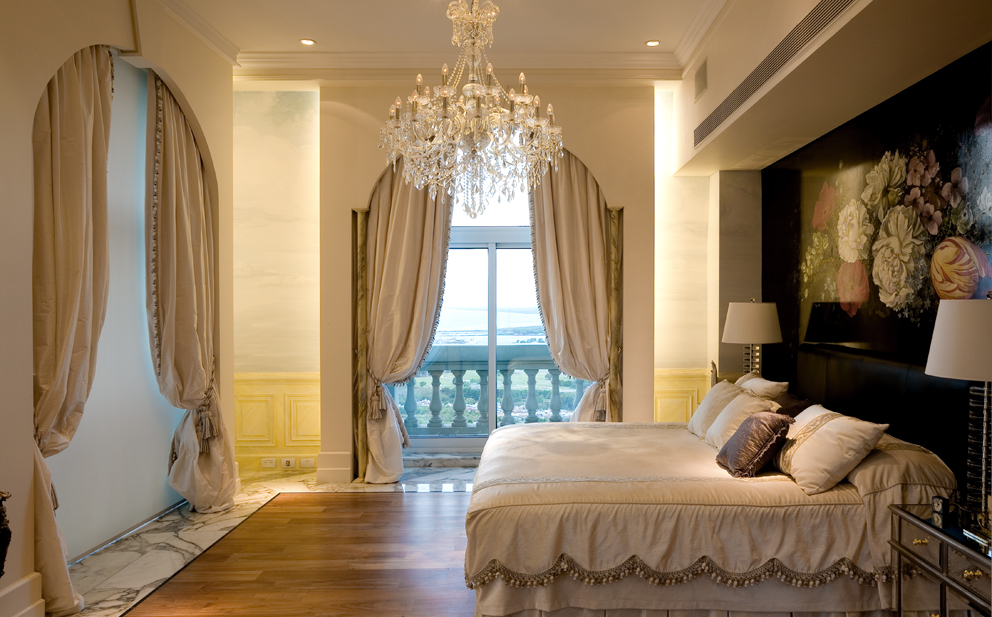
No Regency setup would be complete without a grand chandelier. Large suspended illuminators with dazzling crystals and romantic swirls celebrate the artistic expression of the period. These can also work with minimal spaces with sleek lines or more themes setups. In a bedroom in the Chateau in Height, the large chandelier is accompanied by matching drapes and beddings, marble and wooden floors and a dark floral wallpaper to create a balanced room.

Architects: Want to have your project featured? Showcase your work through Architizer and sign up for our inspirational newsletter.    

Reference