Ten Tokyo apartments with minimalist interior designs
CategoriesInterior Design

Ten Tokyo apartments with minimalist interior designs

Cleverly concealed kitchens and subtle wooden accents feature in our latest lookbook, which collects Tokyo apartments characterised by minimalist and serene interiors.

These apartments in Japan’s capital are united by their muted colours and an abundance of wood – elements often associated with traditional Japanese interior design.

As one of the world’s most densely populated cities, Tokyo homes often feature smaller floor plans or less natural light than those located in more spacious cities.

Architects and designers have created plenty of understated solutions to these restrictions, such as inserting space-saving storage into open-plan living areas.

From a flat informed by traditional Kyoto townhouses to an Airbnb dressed in subtle geometric furniture, here are 10 Tokyo apartments with minimalist interior designs.

This is the latest in our lookbooks series, which provides visual inspiration from Dezeen’s archive. For more inspiration see previous lookbooks featuring concrete bathrooms, cosy cabins and homes with elevators.

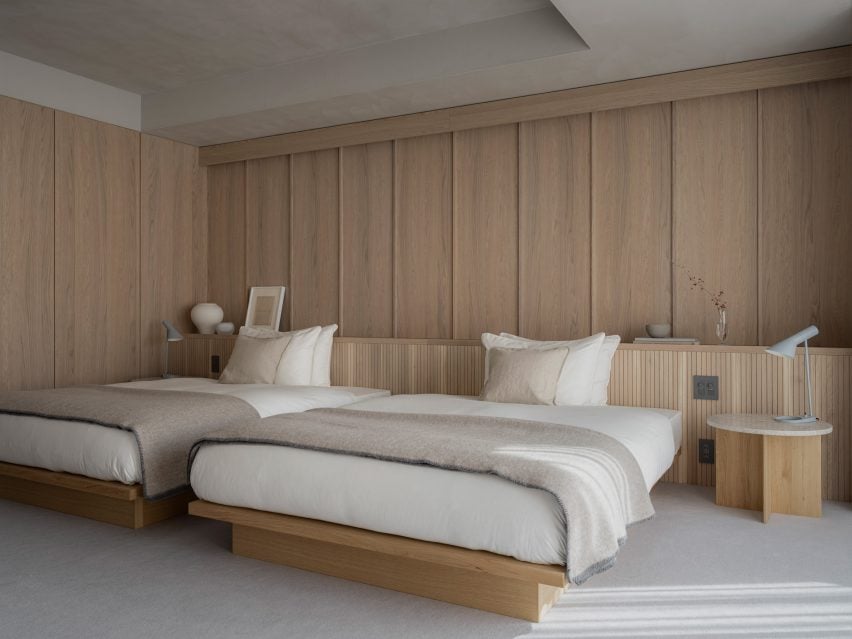
Norm Architects and Keiji Ashizawa's minimalist interior design
Image is courtesy of Norm Architects and Keiji Ashizawa Design

Kinuta Terrace by Norm Architects and Keiji Ashizawa Design

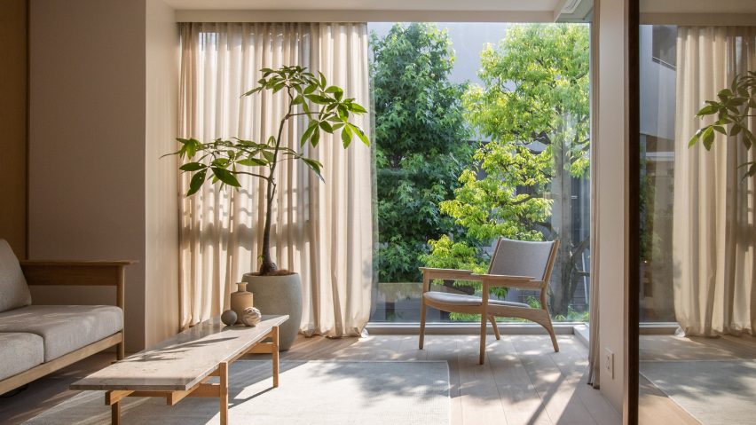
Two apartments within Tokyo’s 1980s-designed Kinuta Terrace apartment block were renovated by Norm Architects and Keiji Ashizawa Design to include more natural light.

The studios reconfigured the floor plans to form fewer but larger living spaces, which are characterised by smooth concrete, timber fixtures and sheer sandy-hued curtains.

“Nature feels integrated into the apartment from most rooms so that, when looking out into the courtyard, you can’t quite tell you’re in a city as immense as Tokyo,” said Norm Architects designer Frederik Werner.

Find out more about these Kinuta Terrace apartments ›

Minorpoet applies traditional Japanese design to a renovated apartment in Tokyo
Photo is by Satoshi Shigeta

Apartment in Kitasando by Minorpoet

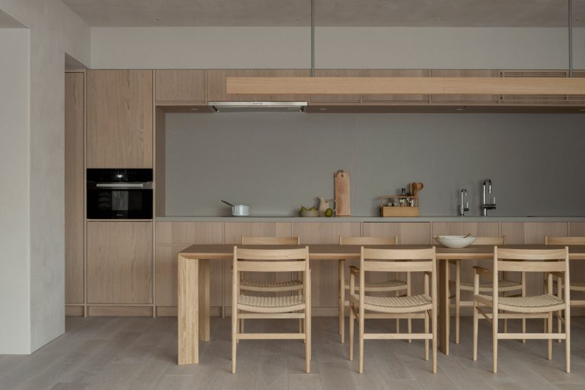
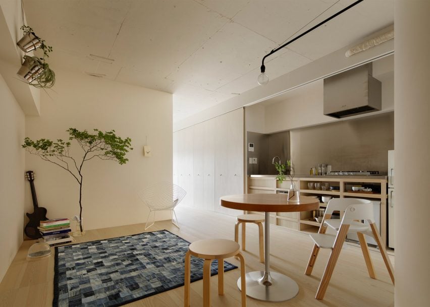
This 1960s apartment contains a sleek kitchen counter and storage space concealed behind folding doors informed by traditional Japanese screens known as Byōbu.

Design studio Minorpoet took cues from traditional Kyoto townhouses for the project, which features a hidden kitchen that cannot be seen from the living room.

Minimalist furniture and finishes match the pared-back theme, including iconic Finnish architect Alvar Aalto’s stackable wooden 60 stool.

Find out more about Apartment in Kitasando ›
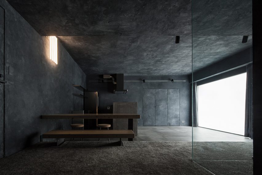

Shibuya Apartment 201,202 by OgawaArchitects
Photo is by Kaku Ohtaki

Airbnb apartments by Hiroyuki Ogawa Architects

Local studio Hiroyuki Ogawa Architects renovated two Airbnb apartments in Tokyo’s Shibuya ward with completely contrasting designs. One has floors and walls clad in light wood (main image), while the other pairs a plush grey carpet with dark plasterwork.

Neon lighting in the latter apartment was chosen to remind guests of the bustling city while cork stools, metallic kitchen cabinetry and charcoal-toned accents create a moody atmosphere.

Find out more about these Airbnb apartments ›
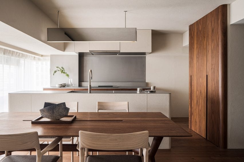

The Life concept apartment by I IN
Photo is by Tomooki Kengaku

The Life concept apartment by I IN

The Life concept apartment is an understated residence set within a 1980s building by Tokyo design firm I IN. According to the studio, the project was created to encourage people to rethink renovated apartments in Japan, rather than favour newbuilds.

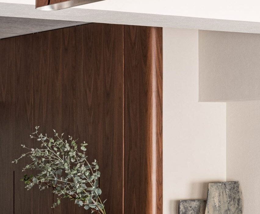
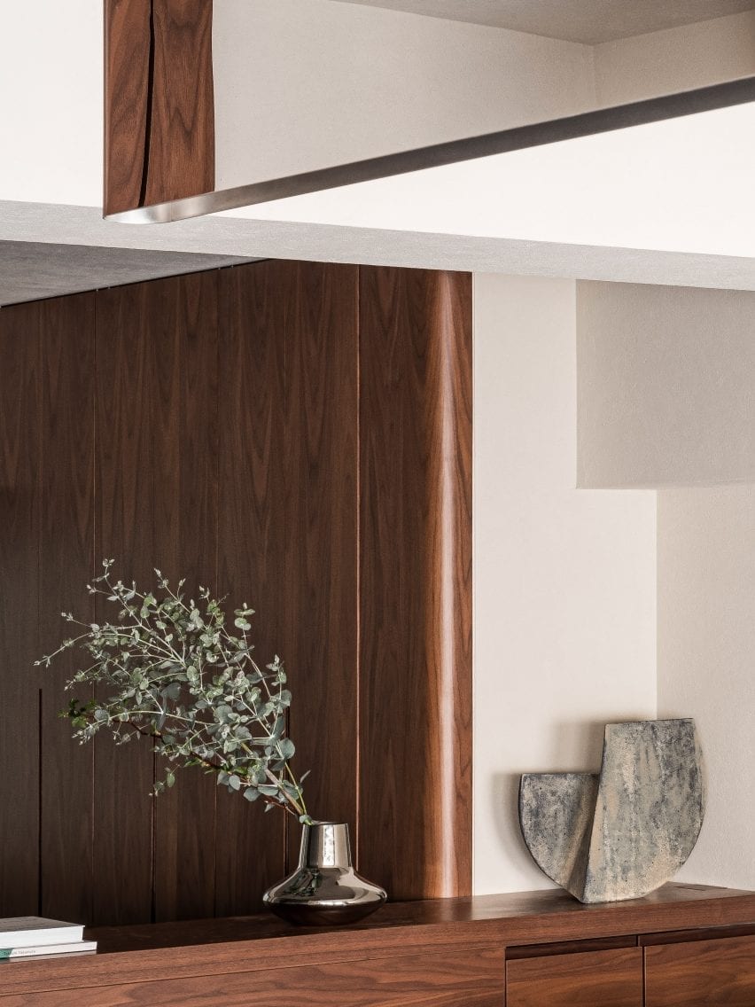
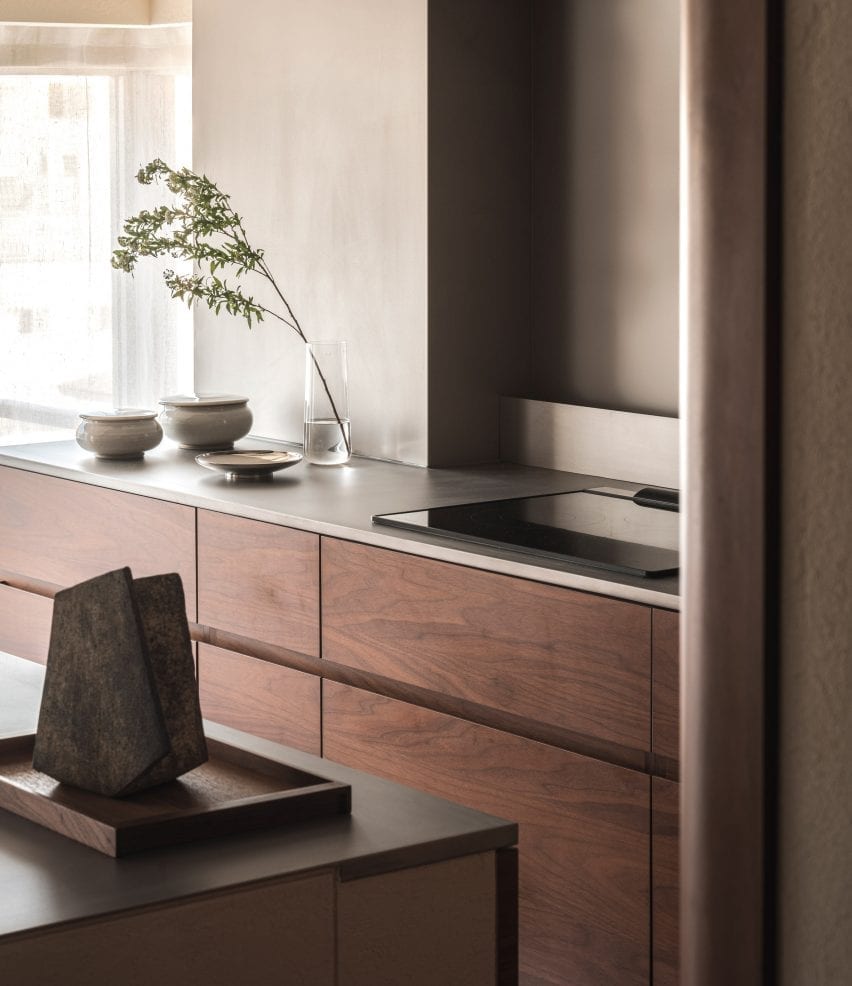
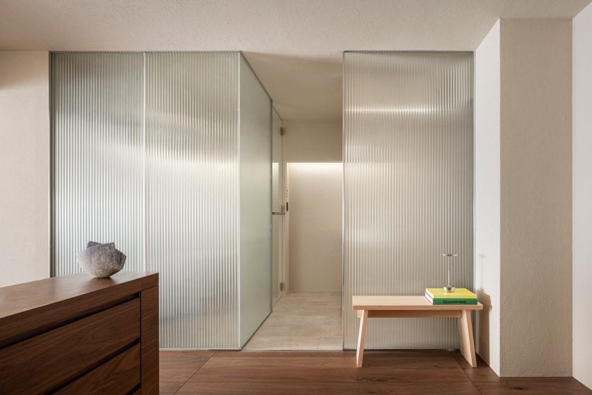
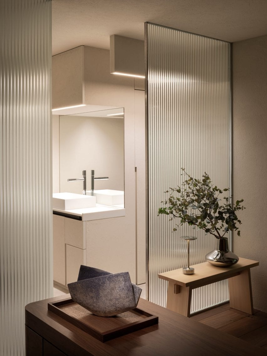
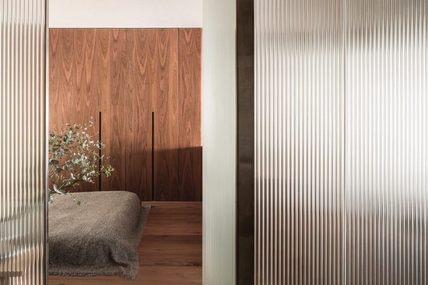
An open-plan living space contains a kitchen, living room and bedroom characterised by reeded glass partitions, stucco walls and luxurious red walnut joinery.

Find out more about The Life concept apartment ›
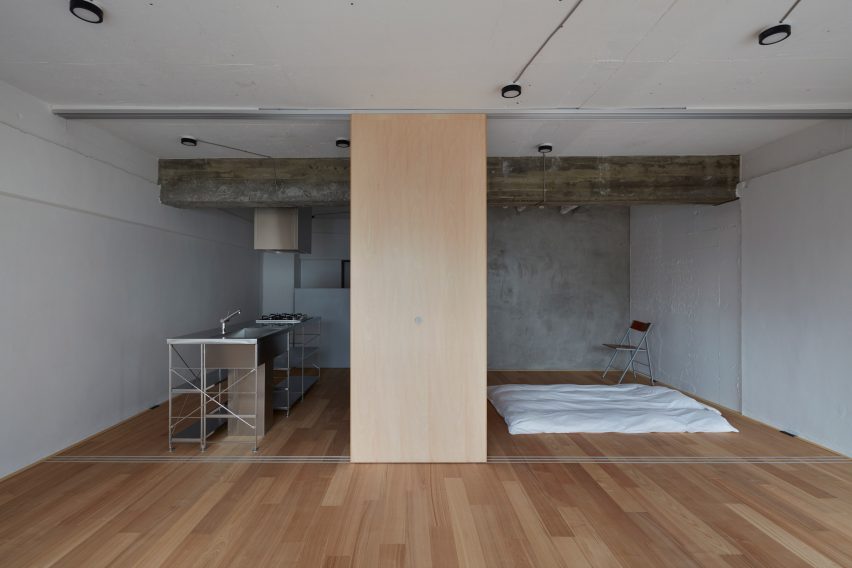

Apartment by FrontOfficeTokyo
Photo is by Toshiyuki Yano

Akasaka apartment by FrontOfficeTokyo

Almost all of the walls within this 50-square-metre flat were replaced with multi-functional box units and sliding partitions to make the space feel bigger and brighter.

Local studio FrontOfficeTokyo stripped the apartment down to a single room, which features designated zones to lounge, cook, eat and sleep.

Raw and simple materials emphasise the utilitarian interior design, including exposed ceilings, pale timber floors and a corner bathroom contained in a concrete box.

Find out more about this apartment ›
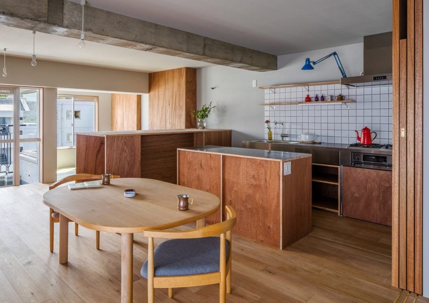

Tokyo apartment by Snark Architectures
Image is courtesy of Snark Architectures

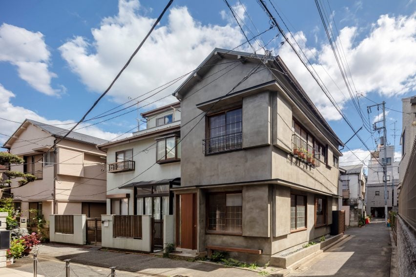
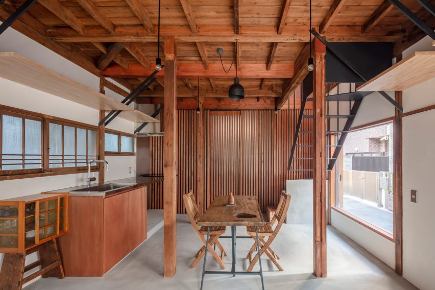
House in Chofu by Snark Architectures

Snark Architectures renovated an apartment in Chofu – a city to the west of downtown Tokyo. Located at the base of Mount Takao, the dwelling intends to mirror traditional cabins.

With an open-plan layout that references mountain huts, House in Chofu is characterised by lauan plywood cabinetry and floor-to-ceiling glazing that offers views of the surrounding scenery.

“The house is the base camp connecting mountains and cities,” Snark Architectures director Yu Yamada told Dezeen.

Find out more about House in Chofu ›

Tokyo apartment by G Studio Architects
Image is courtesy of G Studio

Tokyo Loft by G Studio Architects

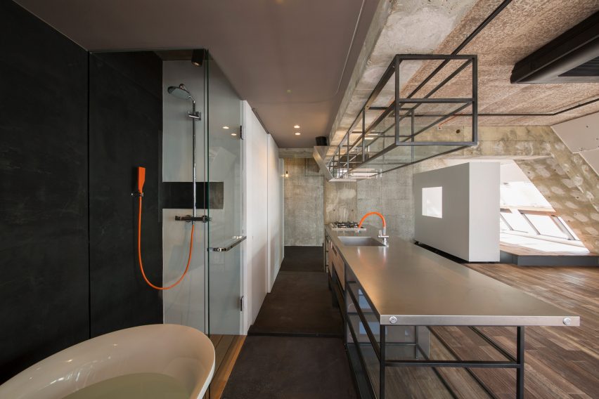
Located on one of the top floors of a 1980s housing block, Tokyo Loft is short-term accommodation that intends to balance home comforts with industrial finishes.

G Studio worked with architects Teruya Kido and Suma-Saga-Fudosan to complete the interior look, which includes original sloping concrete walls that were illustrated with splashes of white paint in a nod to traditional Japanese washi paper.

Rows of skylights were added to the walls to flood the apartment with natural light, while bright orange electrical wires and plumbing features were left exposed. A freestanding bathtub adds a playful touch to the main living space.

Find out more about Tokyo Loft ›

J House by Domino Architects
Photo is by Domino Architects

J House by Domino Architects

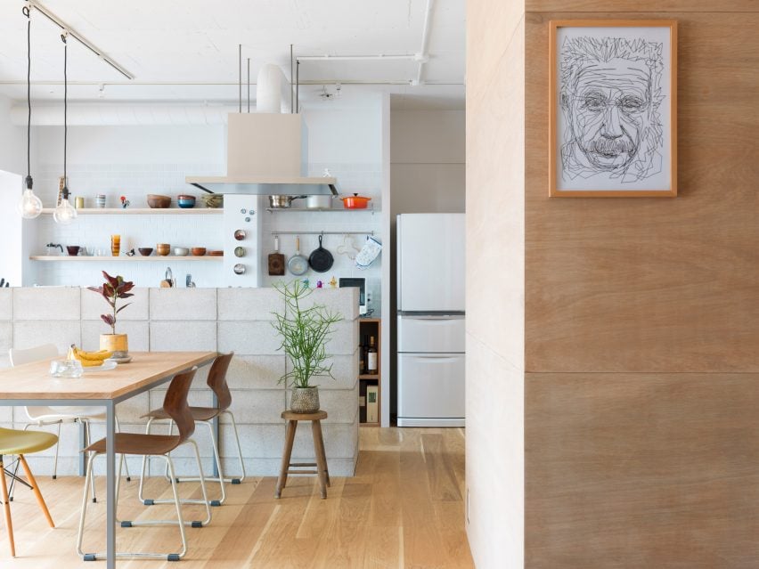
Wooden panelling creates “corners, blind spots and niches” in J House – a pared-back apartment renovated to maximise restricted floor space for a growing family.

Japanese studio Domino Architects used low-cost exposed plywood for its simplicity, while rough concrete in the kitchen adds to the dwelling’s minimalist interior design.

Find out more about J House ›

Motoazabu Apartment sYms
Photo is by Shigeo Ogawa

Motoazabu Apartment sYms by Kiyonobu Nakagame Architect & Associates 

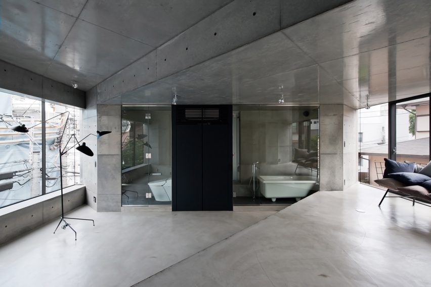
Diagonally stepped floors and ceilings create a dynamic layout of triangular zones within a pair of apartments in Tokyo’s Motoazabu neighbourhood.

Smooth, understated concrete defines the central interior spaces, which are surrounded by kitchen worktops and glazed bathrooms.

“What we aimed to do with this structure was to create something that would blend with its surroundings and maintain absolute simplicity,” explained architect Kiyonubu Nakagame.

Find out more about Motoazabu Apartment sYms ›

Opera apartment
Image is courtesy of Taka Shinomoto and Voar Design Haus

Opera Apartment by Taka Shinomoto and Voar Design Haus

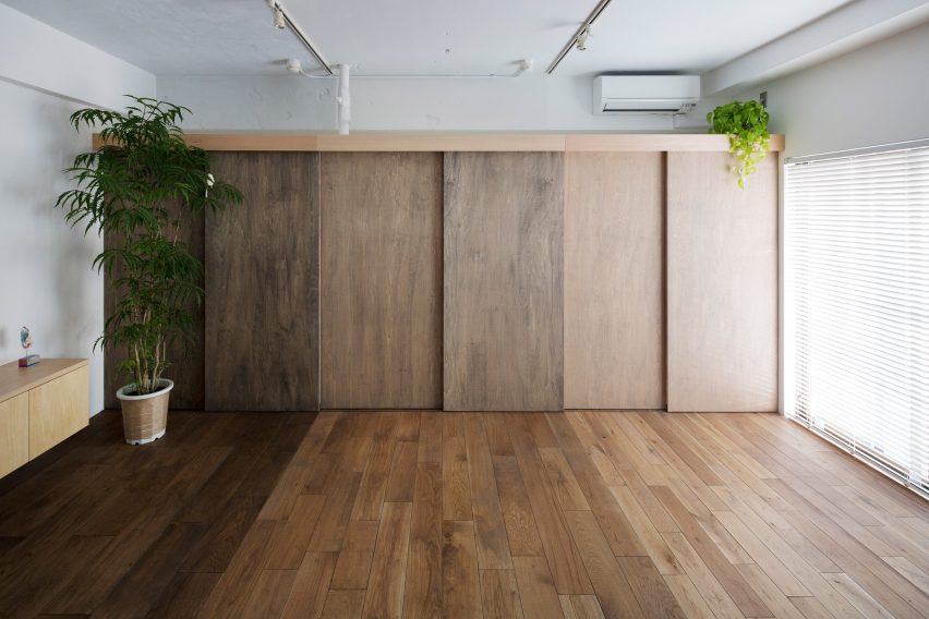
A material and colour palette influenced by the different shades of an Opera cake – a famed French dessert – informed the “layered” coffee-hued interiors in this apartment.

The hallway features sliding geometric cupboard doors stained in various shades of brown while a mixture of glossy, matte and textured coatings cover the white walls.

Find out more about Opera Apartment ›

This is the latest in our lookbooks series, which provides visual inspiration from Dezeen’s archive. For more inspiration see previous lookbooks featuring concrete bathrooms, cosy cabins and homes with cleverly designed lifts.

Reference

Wooden furniture and artworks decorate Hiroo Residence in Tokyo
CategoriesInterior Design

Wooden furniture and artworks decorate Hiroo Residence in Tokyo

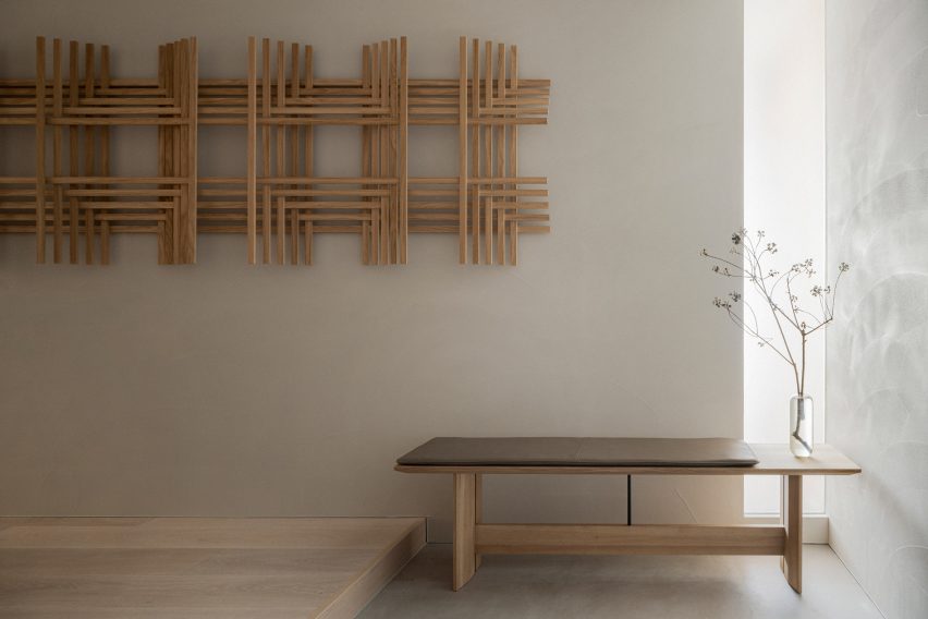
Designer Keiji Ashizawa used muted tones to make the most of the sunlight in this apartment in central Tokyo, which features wooden art pieces and furniture that was specially designed for the space.

For the Hiroo Residence, named after its location in the city’s Hiroo neighbourhood, Ashizawa wanted to underline the quality of the light in the flat.

Hallway of Hiroo Residence
A cut-out wall lets light into the hallway, which has an artwork by Sara Martinsen

In the open-plan kitchen and living room, light streams in from a balcony, and the designer took advantage of this light source by creating a cut-out wall so that the light carries through to the hallway next to it.

“I think you can see we have a very nice sunlight here,” he told Dezeen during a walkthrough of the apartment. “So I didn’t want to use white, as it would be too bright – instead I used muted, subtle tones.”

Living room corner in Hiroo Residence
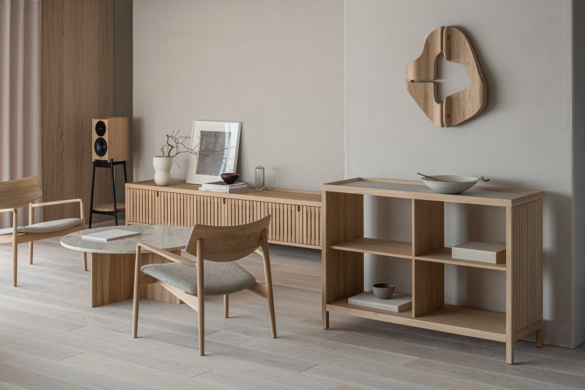
A wooden artwork by Atelier Plateau and a slatted sideboard decorate the living room

He also wanted Hiroo Residence to feel like a peaceful place to come home to in a busy city, using natural materials to create a calm ambience.

“Outside it’s super noisy but inside it’s very quiet, so I chose muted tones that also fuse with the materials; the wood and the stone,” Ashizawa said.

The tranquil 200-square-metre apartment, which overlooks the Arisugawanomiya Memorial Park, has three bedrooms and two bathrooms, as well as a kitchen and dining area, a small workspace and plenty of storage spaces.

Wooden furniture in Tokyo apartment by Keiji Ashizawa
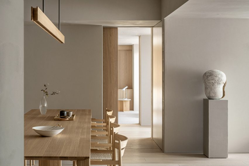
Shaker-informed chairs and a wooden light were used for the kitchen

Before designing the interior, Ashizawa changed the layout of the flat to make it more open, taking out an existing hallway to create a bigger dining space.

“Our goal was to design a space that can only be created by meticulously crafting from the smallest detail to the furniture, resulting in a quiet, comforting, and inspiring atmosphere with little noise, surrounded by natural materials crafted with tactility,” Ashizawa said of the design.

Sofa and coffee table in Hiroo Residence
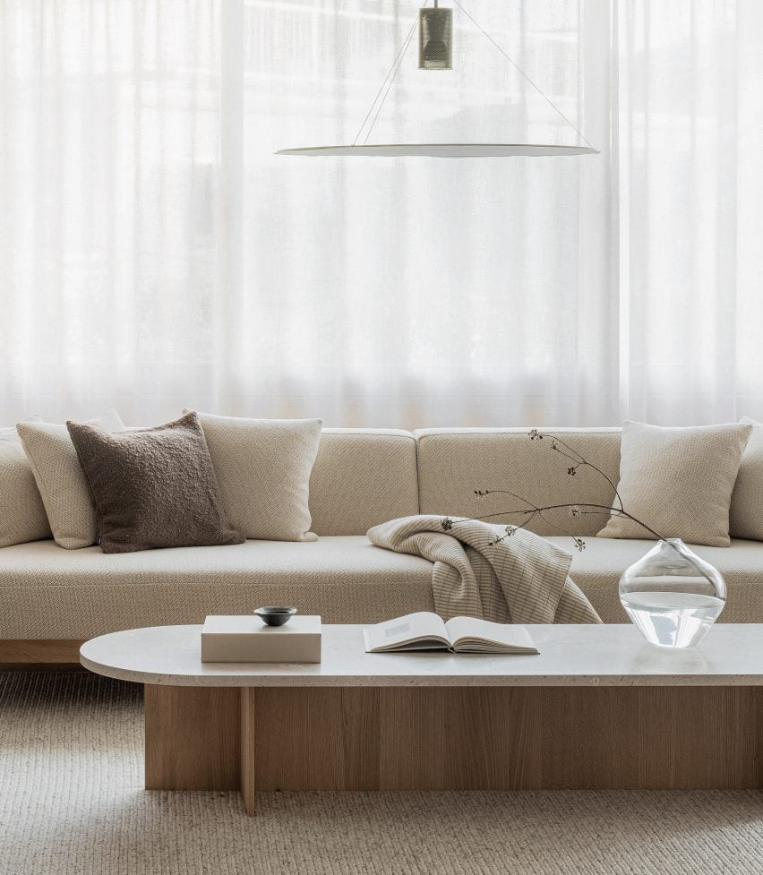
Keiji Ashizawa used a neutral colour palette for the home

He worked with the Japanese wooden furniture company Karimoku on the project, which is the eighth in its Karimoku Case Study series that sees it collaborate with architects on bespoke furniture and interior projects.
As a result, wood was used throughout Hiroo Residence, with white-stained oak covering many of the floors.
Ashizawa also worked with Karimoku to create wooden window frames and sliding doors, which were placed throughout the flat to add privacy without taking up too much space.

The furniture matches the wooden interior details and includes two pieces created especially for the project – a sideboard with decorative wooden slats and a dining chair with a woven seat that was inspired by both Shaker designs and classic Scandinavian chairs.

Bedroom of Tokyo apartment by Keiji Ashizawa
Wooden panels cover the bedroom walls

In the bedroom of Hiroo Residence, wooden wall panels add a tactile and more natural feel, which is echoed in the built-in shelves and drawers in the en-suite walk-in closet.

Cabinets were also used to hide different functions in the kitchen, where a large wooden unit takes up an entire wall.

Kitchen by Karimoku for Tokyo flat
An entire wall is taken up by a wooden kitchen unit

Even smaller details in the flat, such as the long kitchen lamp, were made from the material.

Artworks in wood by Danish art studio Atelier Plateau and the artist Sara Martinsen, which were created especially for the space,  decorate the walls.

Karimoku has worked with Ashizawa on a number of projects, including its second showroom which just opened in Kyoto, Japan, and the Azabu Residence Case Study, where the designer referenced mid-century American design.

The photography is by Tomooki Kengaku.

Reference

Bosco Sodi unveils remodelled Tokyo residence as Casa Wabi extension
CategoriesInterior Design

Bosco Sodi unveils remodelled Tokyo residence as Casa Wabi extension

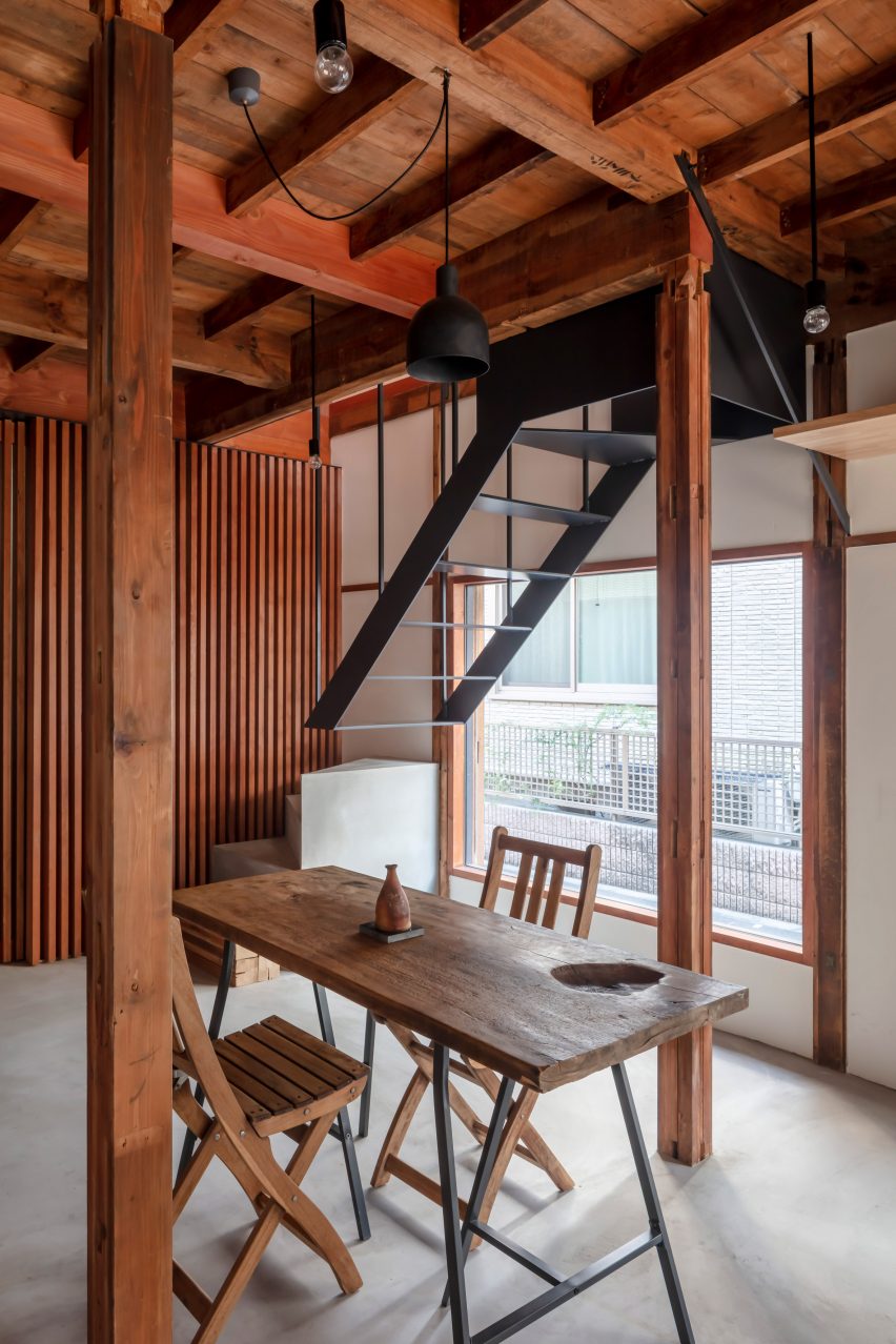
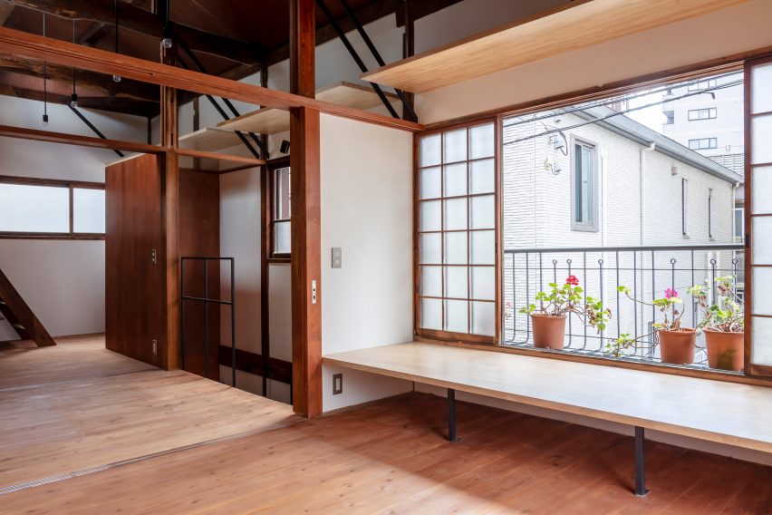
Studio Wasabi Architecture and Satoshi Kawakami Architects have created a home and artist residency in Tokyo for Mexican artist Bosco Sodi, founder of the arts foundation Casa Wabi in Mexico.

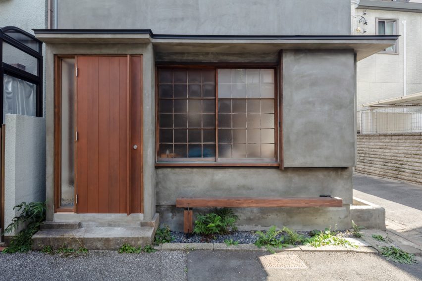
Occupying a corner plot in the Sendagi district of Tokyo, Casa Nano 2.0 is a renovation of a postwar house constructed in the late 1950s.

Casa Nano exterior Tokyo
Casa Wabi founder Bosco Sodi has unveiled a home and artist residency in Tokyo

“The house has a very simple facade system to protect the windows, a system called amado, where you can slide some metal windows and close them when there is a typhoon,” said Studio Wasabi co-founder Rafael Balboa.

The 68-square-metre home has a simple facade with a gabled roof and ridges that jut out to create small awnings.

Japanese home interior with cedar beams
The home renovated a post-world war two home in Tokyo

“For the exterior, we only applied one material – which is called Excell Joint – so it looks similar to the original house in order to make it more natural and coherent with the neighbourhood,” said Balboa.

Studio Wasabi worked with Satoshi Kawakami Architects to completely revamp the interiors for use as an extension of the Casa Wabi artist residency in Puerto Escondido, Mexico or as a home for founder Bosco Sodi and his wife interior designer Lucia Corredor.

Cedar beams and floating staircases tokyo home
The home’s original cedar beams were maintained in the redesign

After sponsoring 13 Mexican artists in the original Casa Nano at another location, Sodi needed more space and decided to move the residency into a larger space – Casa Nano 2.0.

The architecture studios worked with Sodi and Corredor to open up the space, creating an open-concept kitchen, adding furniture and moving the original staircase.

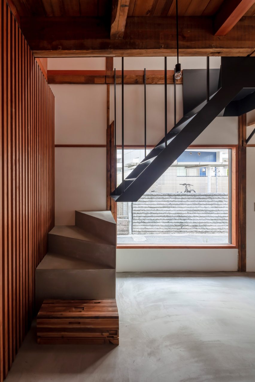
Floating steel staircase
In order to open up floorplan, the architecture studio included a floating staircase

The first floor of the two-storey, cedar-framed structure is concrete, and the second storey’s floor is made of cedar.

The designers and construction company Washin Architects kept all of the old cedar beams and columns, as well as the windows from the original house to preserve the essence of the original building.

Japanese windows with shelves and bench
The original windows were maintained

“For us, it was also very important to be able to have blackout windows so we kept the original pocket metal windows of the facade of the old house to be able to close the windows completely,” explained Corredor.

The team had to move the original staircase to open up the ground floor, so a floating steel staircase was placed against the wall at the middle of the structure, suspended from the existing beams.

Japanese home with natural wood beams
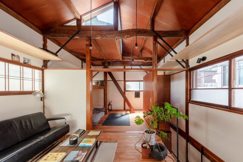
There are three living spaces on the second floor

“This house, besides being part of the art residence of Casa Wabi, was designed to fit our family needs,” said Corredor.

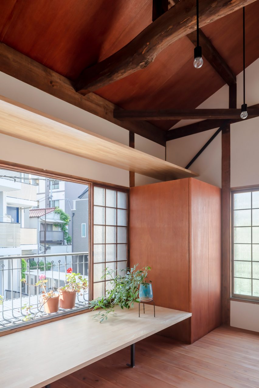
Storage space was another important factor in the design process, so the architecture studios created a shelf unit that hangs from the existing beams that stretch around the entire house.

Japanese home with shelving and open window
A shelving system surrounds the home

On the second floor, three separate spaces were included to accommodate a family of five. The primary bedroom has a simple layout and connects to a small terrace.

A central living area has a bench with a small reading nook and the seating area was furnished with a vintage French sofa from the 1950s and an old wood table from a local flea market.

Japanese sliding doors
The spaces are divded by sliding panel doors

The bunk bedroom at the end of the second floor was built for the kids or as another area spot an artist in residence and has access via a ladder to a small outdoor terrace.

The three spaces are divided by Japanese paper sliding doors with overlaying glass thick enough to maintain privacy and let the light flow into the space.

Read: Five Casa Wabi pavilions include Álvaro Siza ceramics studio and Kengo Kuma chicken coop

The doors and built-in furniture as well as the ceiling of the second floor were made using Lauan wood.

Corredor used furniture from the previous residence and items that were locally sourced to furnish the home.

“We brought all the furniture we already had in the former Casa Nano,” she said.

“Like our old wood table that we found in the flea market in UENO and our beloved Noguchi lamp to give warmth and light to the space.”

Front door on Japanese home
The home’s exterior blends into the style of the neighbourhood

Casa Nano 2.0 will continue with its residency program, inviting four Mexican artists every year, each for a period of one month.

“Japan has been life-changing for the artists that have been already,” Sodi said.

“As it was for me when I was invited to an art residence in Tokyo almost 20 years ago.”

Casa Wabi’s headquarters in Puerto Escondido was designed by Japanese architect Tadao Ando and features yearly pavilions by international architects including a red brick chimney by Mexico City-based architect Alberto Kalach and a ceramics workshop by Portuguese architect Álvaro Siza.

The photography is by Nao Takahashi. 

Reference

Tokyo warehouse revamped into Koffee Mameya Kakeru cafe
CategoriesInterior Design

Tokyo warehouse revamped into Koffee Mameya Kakeru cafe

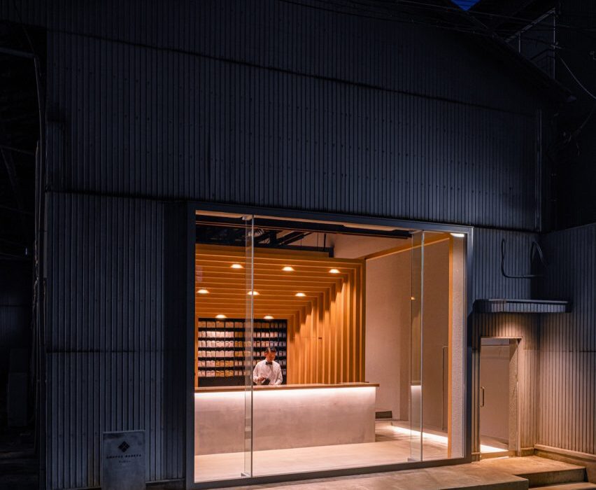
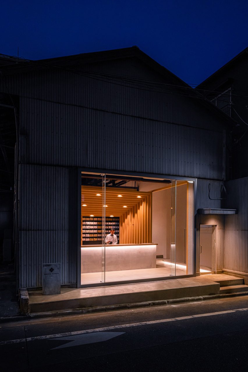
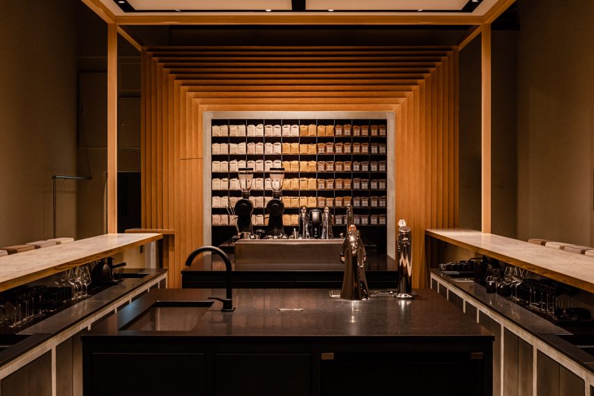
Tokyo-based Fourteen Stones Design has designed the Koffee Mameya Kakeru cafe for barista Eiichi Kunitomo in a former water transportation hub in Kiyosumi Shirakawa.

Set in the Kiyosumi Shirakawa area of Tokyo, the coffee shop occupies a warehouse which Fourteen Stones Design renovated and extended “to preserve the appearance of the old warehouse as much as possible”.

Koffee Mameya Kakeru cafe by Fourteen Stones Design
Koffee Mameya Kakeru is in an old warehouse

The studio removed the shutters from the front of the warehouse, adding a glass facade. The rest of the building, including the interiors, remains as it was – with minimal repairs made to the walls.

It aimed “to make everyday coffee an extraordinary experience” with a full “course of coffee” served by baristas and the renovation has been designed to facilitate this.

A coffee counter in black granite with a timber frame
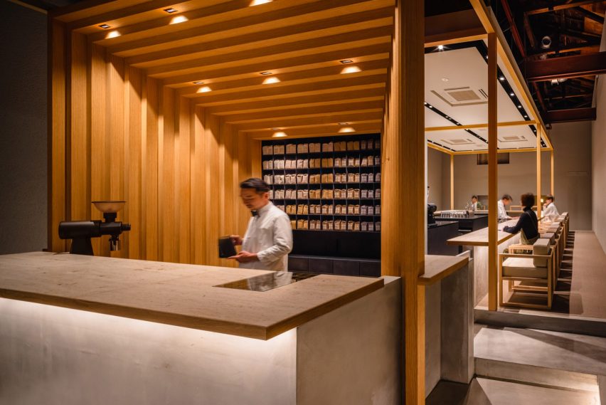
The white oak structure frames the coffee bar

A staggered rectangular frame of white oak at the entrance of the cafe, which echoes the coffee package design, dominates the interior space and provides a central visual motif for the scheme.

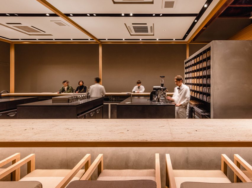
This frame divides the entrance space from the main cafe where a U-shaped bar surrounding the barista workstations was placed.

The barista’s workbenches, which were made from black granite, were deliberately placed at the centre of the space to create “a stage set-up, which enables baristas to fully demonstrate their skills”.

Besides the new seating area, restrooms, a kitchen, a laboratory and office space have all been renovated.

Baristas work at black granite counters

The service and bar countertops were made from “Jura Yellow” limestone. Featuring fossils from the Jura period, it was chosen for its texture and also for allusions to the passage of time – not only echoed in the coffee growing, roasting and brewing processes but also the journey of the brand from its inception 10 years ago.

Fourteen Stones Design’s Yosuke Hayashi designed the custom furniture for the cafe in the same white oak as the frame structure. It was manufactured by Japanese company E&Y for the project.

Barista working at coffee bar with staggered timber frame
The space aims to create a “gastronomic experience” for coffee drinkers

The cafe’s owner Kunitomo believes baristas “act as a bridge between the customer and the roastery” and should be given “a social status comparable to that of a sommelier”.

Baristas at Koffee Mameya Kakeru will serve single cups of coffee through to full courses of coffee, “elevated by the newly designed space to the realm of gastronomy”, according to the practice.

Fourteen Stones Design has been shortlisted in the restaurant and bar interior category of this year’s Dezeen Awards. Other projects in the running include a rattan restaurant in Bangkok by Enter Projects Asia Co. and YODEZEEN’s Japanese restaurant in Kyiv’s city centre.

The photography is by Ooki Jingu.

Reference

I IN revamps Tokyo apartment to change Japanese view of renovations
CategoriesInterior Design

I IN revamps Tokyo apartment to change Japanese view of renovations

Reeded glass partitions, stucco walls and red walnut joinery feature in this renovation of a compact apartment in Tokyo by local studio I IN.


Created for Smarg, the renovation arm of Japanese real estate firm Goodlife, The Life concept apartment was designed to reframe the way that Japanese homeowners perceive renovated apartments.

Built-in walnut wood wardrobe with decorative vase in The Life concept apartment
Red walnut joinery features throughout the apartment (top and above)

“There is a common image of renovated apartments in Japan, which is not always positive,” said I IN.

“The majority of people prefer new buildings and spaces because of their appearance and reinforced structures as we have earthquakes.”

Kitchen with walnut wood shelves in Tokyo flat interior by I IN
The kitchen cupboards are rendered in the same wood

To combat this preconception, I IN was commissioned to turn a 56-square-metre one-bed in a 1980s residential building into an understated luxury residence.

Set within Tokyo’s eastern Suitengūmae neighbourhood, the flat features an open-plan layout with the kitchen, living room and bedroom all located in one connected space.

Reeded glass partitions and wood cupboard in The Life concept apartment
Reeded glass partitions separate the bathroom from the living area

The kitchen sits at one end of the flat while the bedroom sits at the other, with the bed hidden from view behind a built-in walnut sideboard that the architects said serves as a “soft separation”. To separate these two domains, the living area was placed at the centre of the space.

I IN incorporated a palette of neutral colours and subtle textures throughout to create a light, restful and calming ambience.

Bathroom entrance with glass walls and decorative vases in The Life concept apartment
The screens allow light to filter into the windowless bathroom

Reeded glass partition walls allow light to penetrate into the windowless toilet and bathroom while red walnut joinery, polished chrome lighting fixtures and off-white stucco walls were chosen to evoke a sense of luxury.

“We wanted to show the wooden architectural essence from old Japan through the texture of the wood and the three-dimensional layers of light, which you see in sci-fi movies,” I IN told Dezeen.

“The soft ambience from the slit light and textured glass was also important.”

In the future, the studio says the plan is to roll the design out to other buildings in central Tokyo.

I IN, which was founded by interior designers Yohei Terui and Hiromu Yuyama in 2018, was previously shortlisted for small retail interior of the year at the 2020 Dezeen Awards.

Bedroom with built-in wooden wardrobe and reeded glass partitions in interior by I IN
The bedroom is hidden from view thanks to another glass partition

Other renovated Tokyo flats featured on Dezeen include an overhauled 1960s apartment by design studio Minorpoet, which has its kitchen hidden behind folding wooden doors, and a refurbished flat by architect Masatoshi Hira where a family of four shares one bedroom, living space and wardrobe.

Photography is by Tomooki Kengaku.

Reference

Keiji Ashizawa Design designs Blue Bottle Coffee outpost in Tokyo
CategoriesInterior Design

Keiji Ashizawa Design designs Blue Bottle Coffee outpost in Tokyo

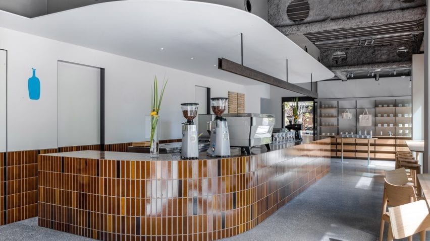
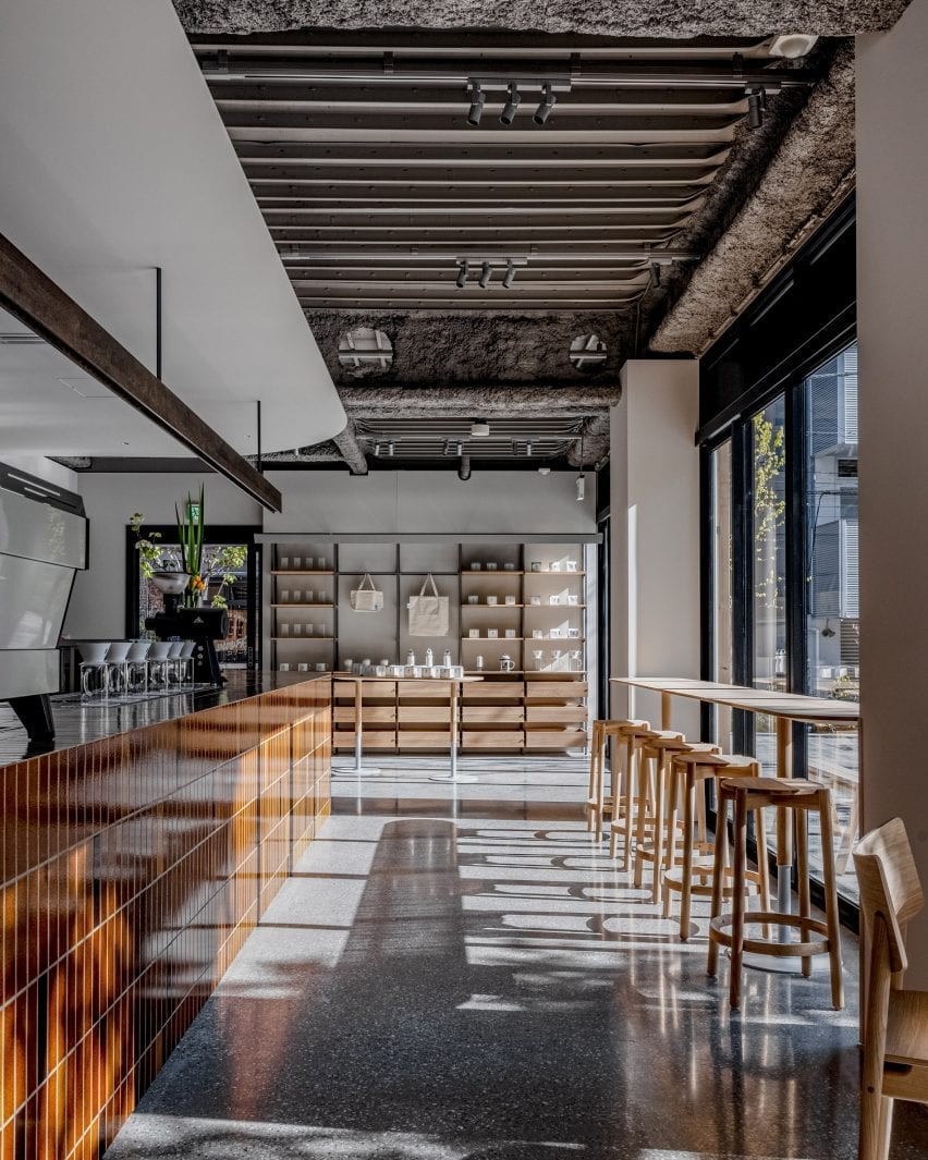
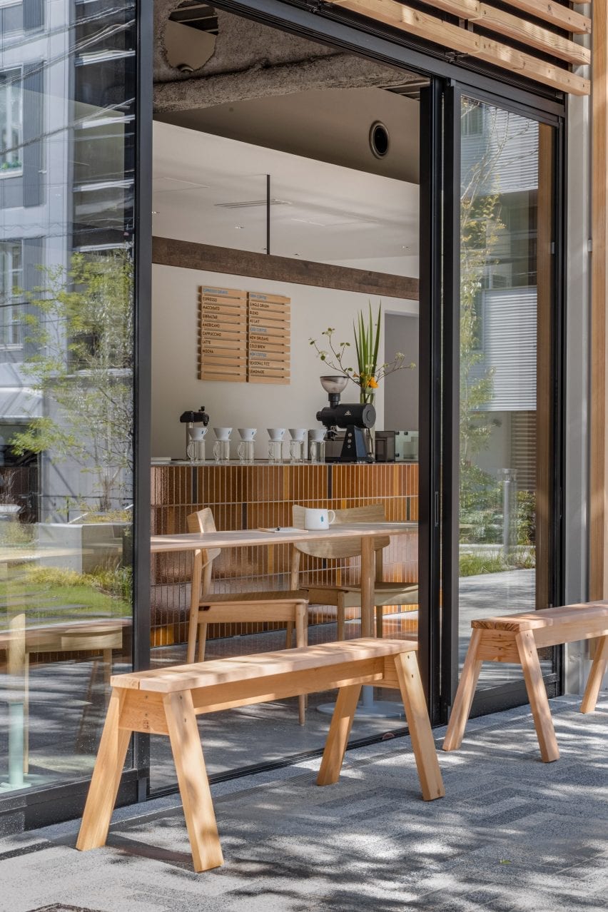
Brick-like tiles with a volcanic ash glaze created by Formafantasma and textured concrete walls feature in this coffee shop in Shibuya, Tokyo, by Japanese studio Keiji Ashizawa Design.


Located a short walk from Tokyo’s busy downtown area, this Blue Bottle Coffee outpost was conceived as an urban retreat sandwiched between two parks.

It serves coffee during the day and appetisers and natural wine in the evenings.

Curving counter with brown tiles in Blue Bottle Coffee Shibuya
Brown tiles with a volcanic ash glaze feature throughout the interior of Blue Bottle Coffee Shibuya

Keiji Ashizawa Design, which also designed the coffee brand’s Yokohama outpost, wanted to create a warm and welcoming interior that brought the park surroundings into the glass-walled and concrete-floored space.

“It was a challenge to come up with a playful interior plan in this square two-storey building,” Ashizawa told Dezeen.

“The other challenge was to make links between the first and second floors, and the exterior and interior.”

Brown-tiled bar and wooden counter seating in coffee shop by Keiji Ashizawa Design
Counter seating runs along the wall of windows

To bring the outside in, the studio installed a large, curved tile counter that wraps around the cafe’s kitchen area and welcomes customers as they enter.

The brown tiles – developed as a collaboration between London material manufacturer Dzek, and the Amsterdam-based design studio Formafantasma – are finished with a special volcanic ash glaze.

Brow-tiled walls and wooden counter seating in Blue Bottle Coffee Shibuya
A single artisan laid all 7,000 tiles in the interior

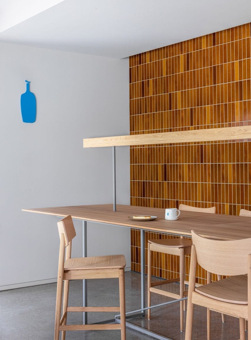
A single skilled artisan laid more than 7,000 of the tiles in the cafe. As well as the counter, they cover a low coffee table and a wall in the upstairs lounge area. Ashizawa said the tiles were specifically chosen to connect the interior and exterior spaces.

“We wanted a park-like item as a key material which stands out in the interior but also makes a strong connection between first and second floor, and the exterior and interior at the same time,” explained Ashizawa.

Sunken seating area with orange pillows in coffee shop by Keiji Ashizawa Design
A sunken seating area is fringed in bench seating

“I thought that this tile, which has a brick-like colour, is an item reminiscent of parks in Japan,” he continued.

“Also, there is the fact that the soil from volcanic ash is a familiar material in this Kanto region, and I remember that the soil floor of the original Kitaya Park was also Kanto loam.”

In addition to the warm-coloured tiles, pink and orange textiles by Kvadrat, and wooden furniture by Karimoku, Ishinomaki Lab and Ariake add warmth to the largely glass and concrete interior.

On Blue Bottle Coffee’s ground floor, tables are set at differing heights. The high counter with stools allows customers to watch the barista preparing their coffee, while the lower table provides a good view of the park.

Sheer grey curtain over sunken seating area in Blue Bottle Coffee Shibuya
The seating area is obscured by a translucent grey curtain

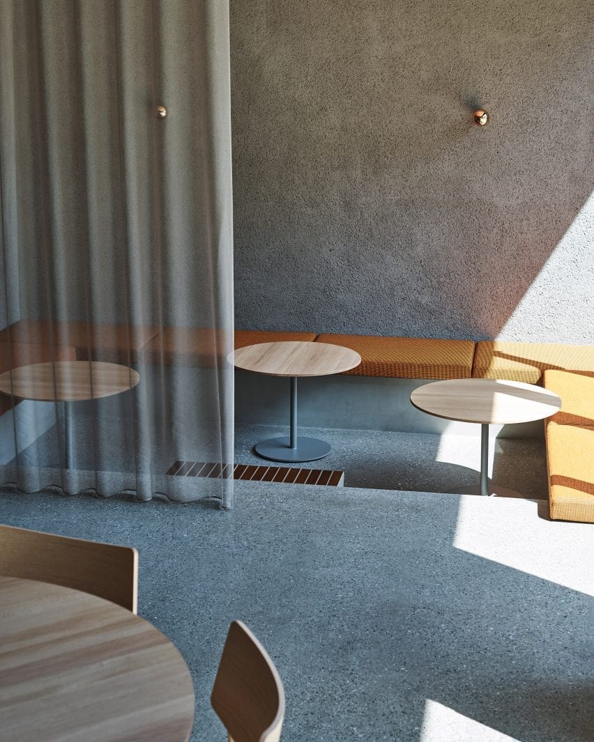
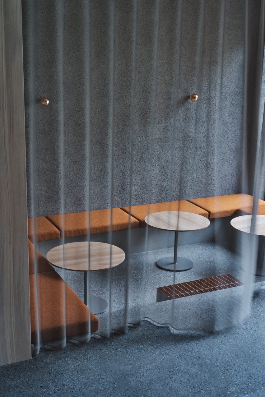
More seating types are installed upstairs, including a lowered floor area with banquette seating upholstered in an autumnal orange textile. This space can be sectioned off from the main area by a grey, sheer curtain.

An oval dining table sits in the centre of the space providing a casual and communal dining option. A high counter table with a library-like light allows for quiet groups and singles to sit at the rear of the space.

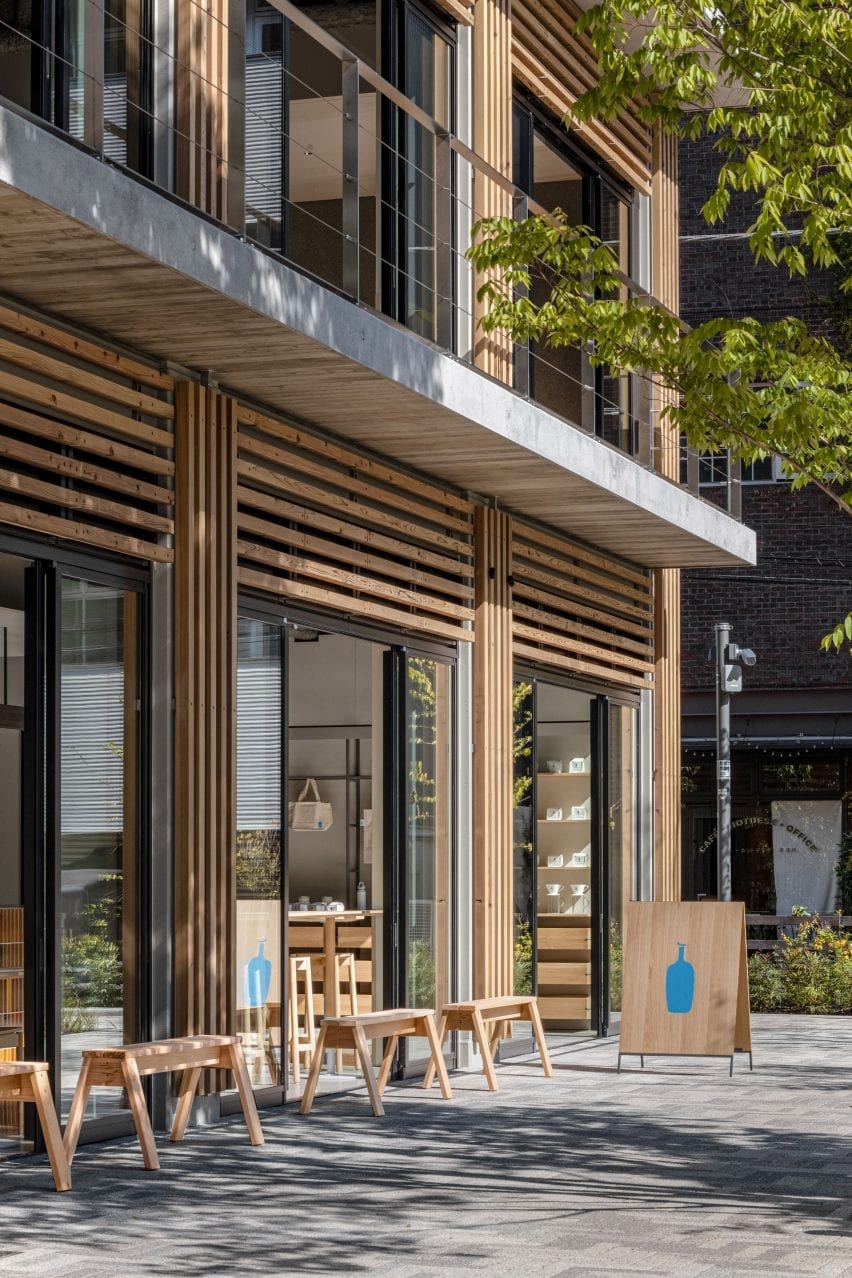
Wooden benches outside coffee shop by Keiji Ashizawa Design
Wooden benches offer seating outside of the cafe

At the far end, a low, tiled coffee table is surrounded by comfortable lounge chairs and sofas upholstered in muted pink fabric.

A textured, brushed mortar finish has been applied to the cafe’s ceiling on the ground floor, and across a wall upstairs to help improve the acoustics in the space.

Timber-clad facade of Blue Bottle Coffee Shibuya
The furniture is in keeping with the buildings timber-clad facade

“When we plan cafes or restaurants, it is essential to think about acoustics,” said Ashizawa. “It is important that you can speak easily and that you can hear the music comfortably.”

“When we first saw the condition of the interior – the floor was made of concrete with glass walls. We definitely thought that we should leave the ceiling some kind of texture to promote sound absorption. At the same time, I thought that creating a feeling of touch in the space would have the effect of relaxing customers in the stressful city of Shibuya, like the greenery of a park.”

“We hope that visitors will enjoy the warm atmosphere as if they had been invited to visit the welcoming house of a close friend,” he concluded.

Photography is by Ben Richard and Masaaki Inoue.

Reference