Space tourism informs design of Ichi Station sushi restaurant in Milan
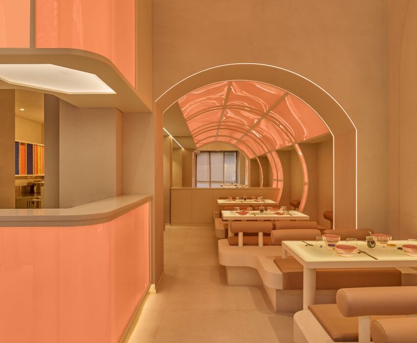
Valencian design studio Masquespacio has completed a dine-in restaurant for takeaway sushi chain Ichi Station in Milan, with interiors designed to resemble a futuristic spaceship.
Set in a historic building in the Brera district, the chain’s latest outpost builds on the same travel and transport concept established across its other outlets – including eight in Milan and another in Turin.
But Masquespacio wanted to take this idea to the next level for the new restaurant by drawing on the visual language of sci-fi and space tourism.
“We proposed approaching the travel concept as a trip to the future,” said Masquespacio co-founder Christophe Penasse.
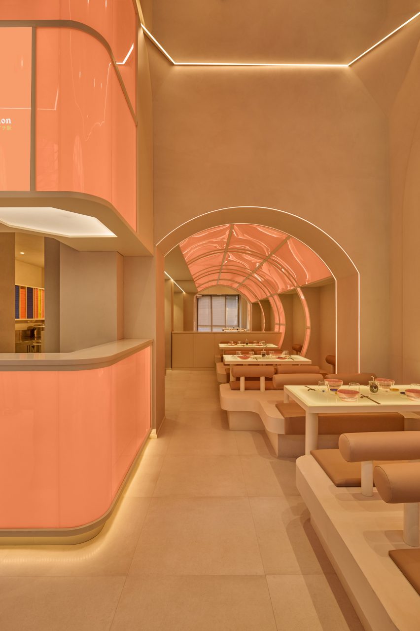
“When you enter Ichi, it’s like entering a capsule-like spaceship travelling through light, where you will disconnect from reality in order to get in touch with the food.”
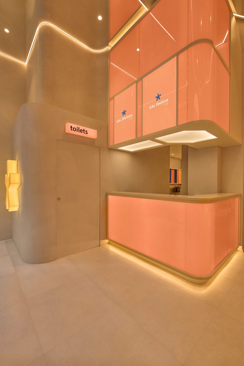
Masquespacio completely redeveloped the layout of the 80-square-metre site – previously another restaurant – creating a central dining area along with a tunnel where diners can observe some of the sushi-making process.
A pick-up bar close to the entrance was added to separate the circulation routes of take-away customers and diners.
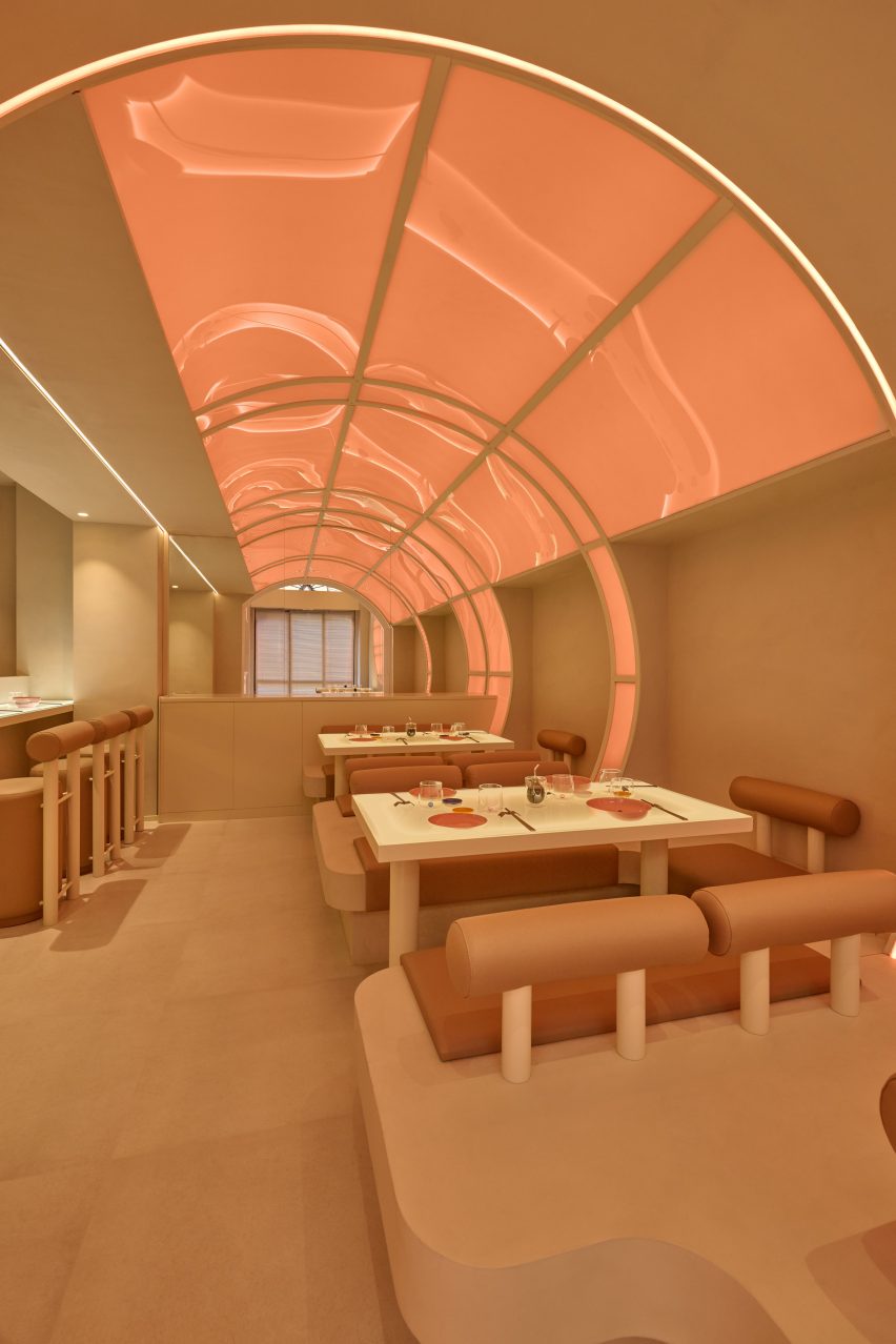
The tunnel motif was developed as a way to express the idea of travel and make a reference to Japan without falling into cliches.
“Some elements were incorporated to remind the customer of Japan, like the huge lighting circles, although we tried to avoid making typical references to Japan such as using wooden structures,” Penasse explained.
The tunnel motif also informed the circular and cylindrical details that pop up throughout the space across seat backs, bar stools and decorative elements such as the circular feature light in the main dining area.
“The shapes and forms give the project the futuristic look that it needed,” the designer said.
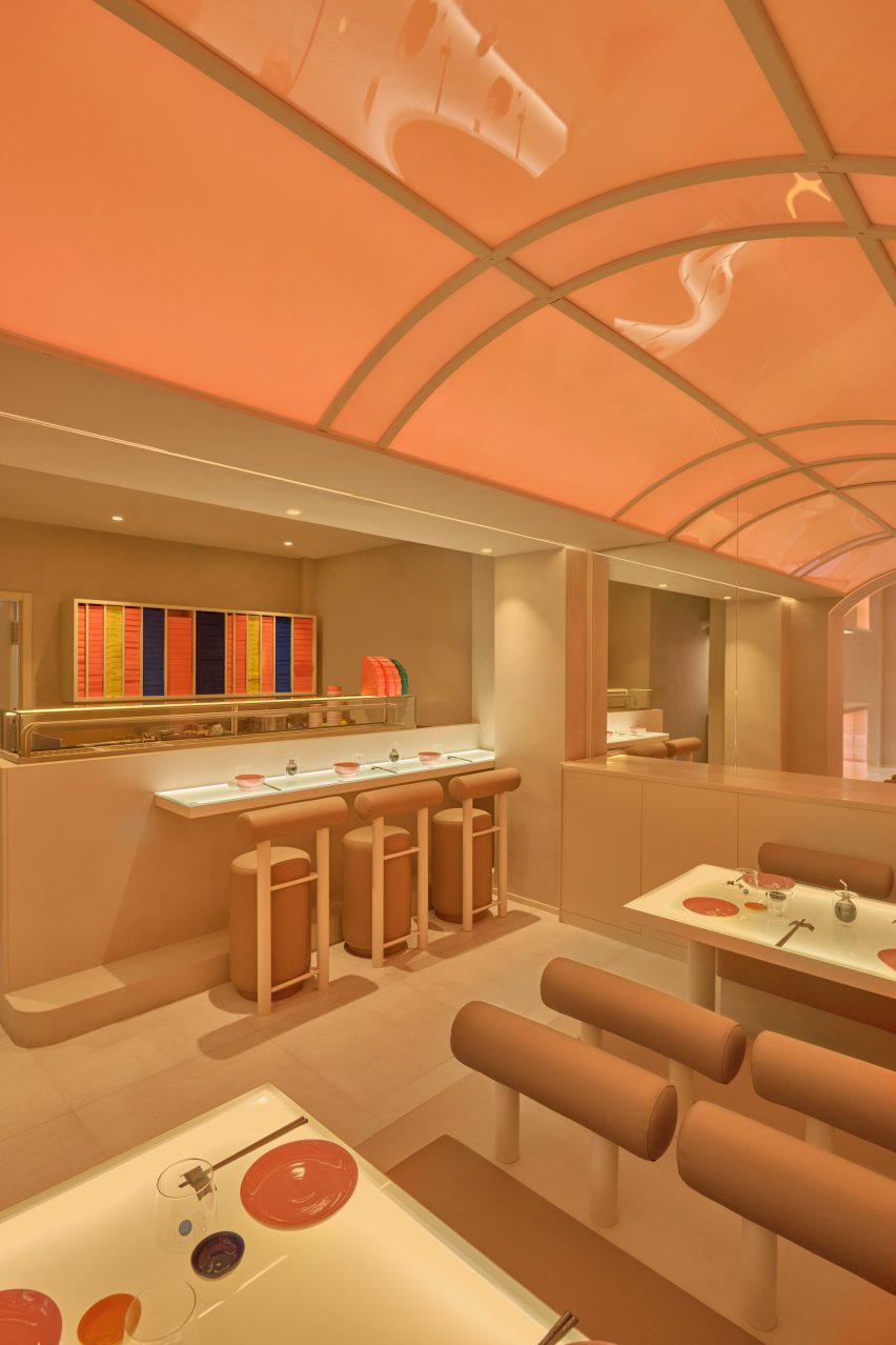
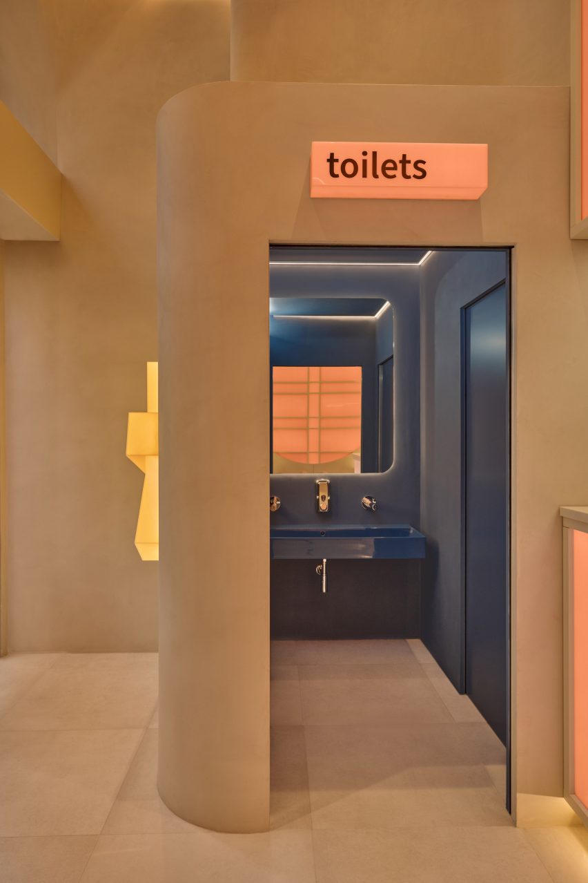
Masquespacio opted for a simple and restrained material palette that includes glass and micro-cement, which was used along with fully integrated tables and seating to create a seamless look reminiscent of a spaceship.
The restaurant’s custom-made furniture brings in another reference to transport design tropes. “You can recognise it as a reinterpretation of the seating in a station and especially on a train,” Penasse explained.
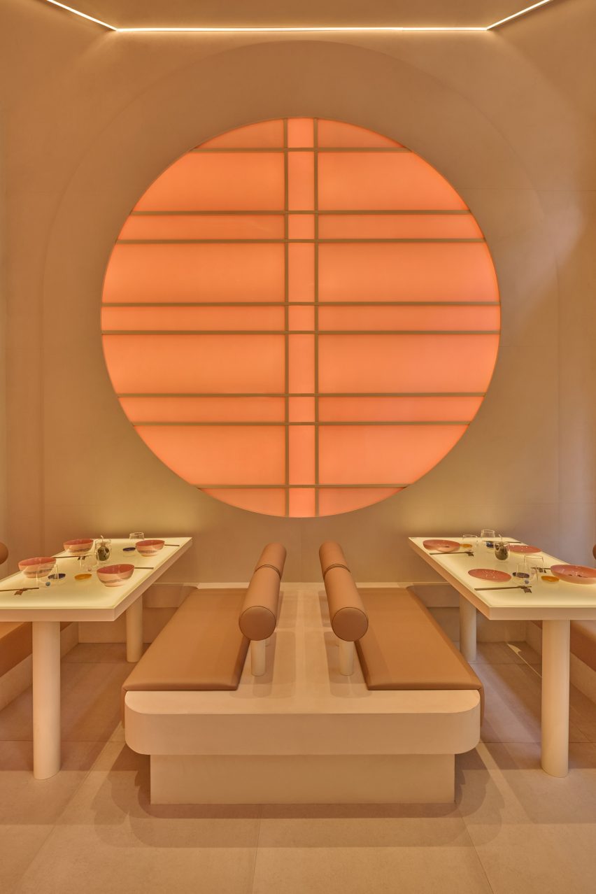
The interior is finished in neutral shades of beige and off-white but is cast in different vivid colours thanks to the LED lighting system that is integrated into the walls, ceilings and even the table tops.
The lights alternate between shades of blue, green, purple and peach at variable speeds and, according to Penasse, create a veritable “explosion of colour”.
Although based in Spain, Masquespacio has completed a number of projects in Italy in recent years.
Among them are two colour-block restaurants for fast-food chain Bun – a blue-and-green interior in Turin and a green-and-purple version in Milan.
The photography is by Luis Beltran.

