Wallmakers uses discarded toys to construct Toy Storey home in Kerala
CategoriesArchitecture

Wallmakers uses discarded toys to construct Toy Storey home in Kerala

Architecture studio Wallmakers has repurposed approximately 6,200 discarded toys to construct the walls of Toy Storey, a circular home in Kerala, India.

The aptly named residence by Wallmakers uses toys discarded in the area, which are unsuitable for recycling, as structural components and decoration within the external walls.

Exterior view of home by WallmakersExterior view of home by Wallmakers
A cantilevered verandah wraps around the circular home

“The main concept of Toy Storey revolves around the idea of using discarded toys and effectively conveying a message through this,” studio founder Vinu Daniel told Dezeen.

“By repurposing around 6,200 discarded toys, the residence in Kerala becomes a living monument to nostalgia and childhood, while addressing environmental concerns,” he added.
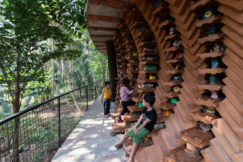
View of exterior wall of Toy Storey homeView of exterior wall of Toy Storey home
Approximately 6,200 discarded toys are used in the home’s walls

Toy Storey is wrapped by perforated, curved walls composed of compressed stabilised earth blocks, Mangalore tiles and toys, designed to draw in light and enable cross ventilation through the home. A ferrocement roof sits on top.

Four evenly-spaced entrances puncture the facade, which is wrapped by a cantilevered verandah offering outdoor space overlooking the surrounding greenery.
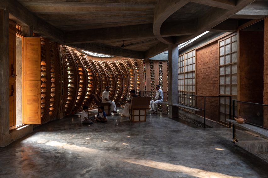
Living space within Kerala home Living space within Kerala home
Perforated walls draw light and ventilation through the interior

Inside, the home’s first floor is divided into public and private segments. The public half is defined by a large living room while the private half contains an open-plan kitchen and dining area flanked by bedrooms.

“One of the things that the client mentioned was they often host their neighbours and members of the community, which means there are often many people in the house,” Daniel said.

“Hence we decided to make the area the people frequented separate from that of the client’s family’s personal spaces,” he continued.

Japanese-style shoji screens are used as partitions throughout the interior to enable light into each space and connectivity between the private and public areas.
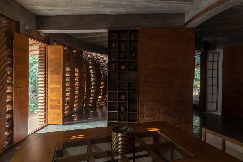
Kitchen interior within Toy Storey home in IndiaKitchen interior within Toy Storey home in India
An open-plan kitchen and dining area are flanked by bedrooms

The site’s topography enabled the addition of a secluded basement level containing a library and bedroom, accessed from the upper floor by a central staircase.

An internal courtyard topped with a glass ceiling slices through the building providing additional daylight for the interior.
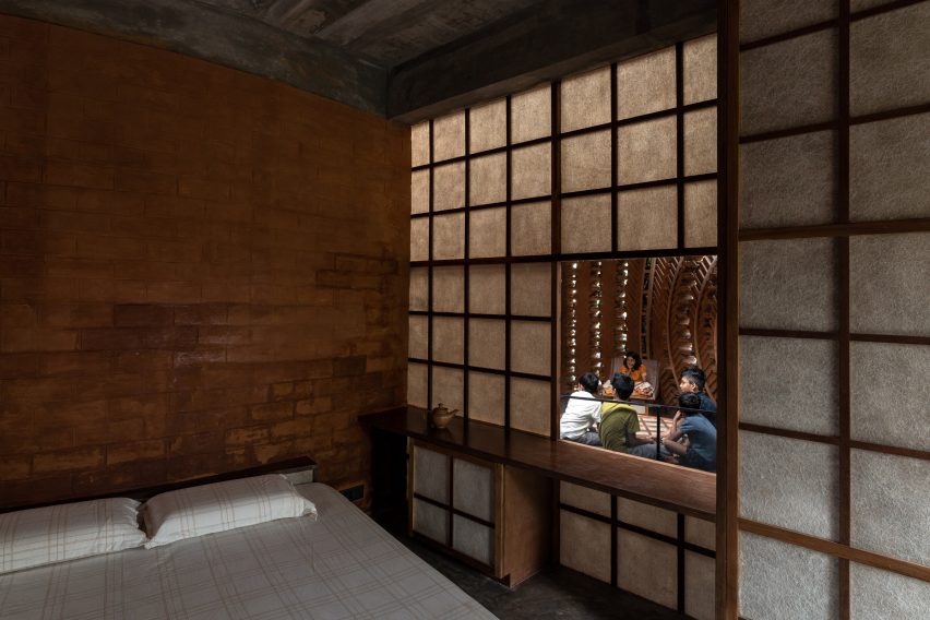
Bedroom interior within Toy Storey in IndiaBedroom interior within Toy Storey in India
Japanese-style shoji screens are used as internal partitions

Wallmakers is an architecture studio established by Daniel in 2007. Elsewhere in India, Wallmakers has also recently completed an arts centre with rooftop seating and a house that resembles “snake curling up under a rock”.

Last year, Daniel faced criticism on social media for his studio’s use of unpaid internships, which he claims have an important educational benefit.

The photography is by Syam Sreesylam and Althaf Rasheed.

Reference

A subscribe and recycle model for kids’ bicycles and toys 
CategoriesSustainable News

A subscribe and recycle model for kids’ bicycles and toys 

Spotted: Cycling is widely recognised as one of the most sustainable modes of transportation available and a great form of exercise for various age groups, but researchers point out that at the end-of-life stage, bicycles have “a significant (and uncalculated) carbon footprint.” And as fast as children grow, so does the volume of waste they produce as they outgrow everything from shoes and clothes to bicycles and toys. 

Determined to reduce their waste, a group of friends with children ranging from four to fifteen started a circular, direct-to-consumer subscription company called Gro Club. Offering bicycles and other children’s products such as car seats, strollers, and bunk beds, the company provides equipment maintenance, home delivery and recycling. Subscriptions are available for either 12 or 18 months, and the cost is approximately 70 per cent less than buying elsewhere. Customers can opt to extend their subscription for a nominal fee, upgrade to a larger-sized product, or buy the item outright.  

Based in Bengaluru, the Gro Club says that its average cost is Rs 6,000 (around €68) per year or Rs 500 (around €5.70) per month. Bicycles are custom-made in-house, and the company reuses each bicycle frame at least five times for maximum carbon emissions savings. Every bicycle that’s returned to the company is taken apart and then reconstructed with a fresh paint job, meaning that every bike looks new when it’s delivered. 

Gro Club also offers bicycles for adults at a slightly higher subscription price of around Rs 549 (around €6.20) per month. All subscriptions include a lifetime warranty on parts and home service maintenance support.

Having completed a pre-seed round of funding and with more than 5,000 subscribers in Bengaluru, the company is planning to use its next round of funding to expand both the number of products available on subscription and its servable locations. Subscriptions will shortly be available in Mumbai, Hyderabad, and Pune.  

The subscription model is being applied to many products and services, with Springwise’s archive including options for reusable nappies and office furniture.

Written By: Keely Khoury

Reference

Ringo Studio positions sex toys in athletic-themed room for Contact Sports
CategoriesInterior Design

Ringo Studio positions sex toys in athletic-themed room for Contact Sports

Brooklyn-based Ringo Studio has reimagined the experience of shopping for sex toys, creating a store in New York modelled on a collegiate locker room.

The Contact Sports shop on Mercer Street in Soho is designed to feel very different to the typical spaces in which products for sex are purchased.

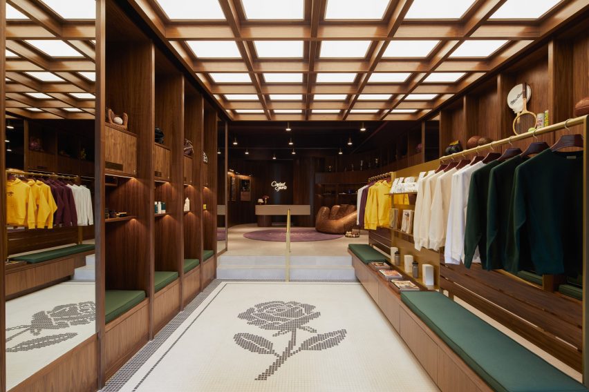
Store interior with walnut shelving and mosaic floor
The store interior features walnut panelling and mosaic flooring

“In a survey conducted before launch, the majority of people reported feeling uncomfortable walking into a sex store,” said the studio. “Uninviting exteriors felt intimidating, the aisles were hard to navigate, and the shelves stocked hundreds of products that were hard to decipher.”

Working with Ringo Studio founder Madelynn Ringo – who has designed retail spaces for Glossier, Bala and Our Place – the brand devised a shopping experience based around sport, and used cues from this world to inform the interiors.

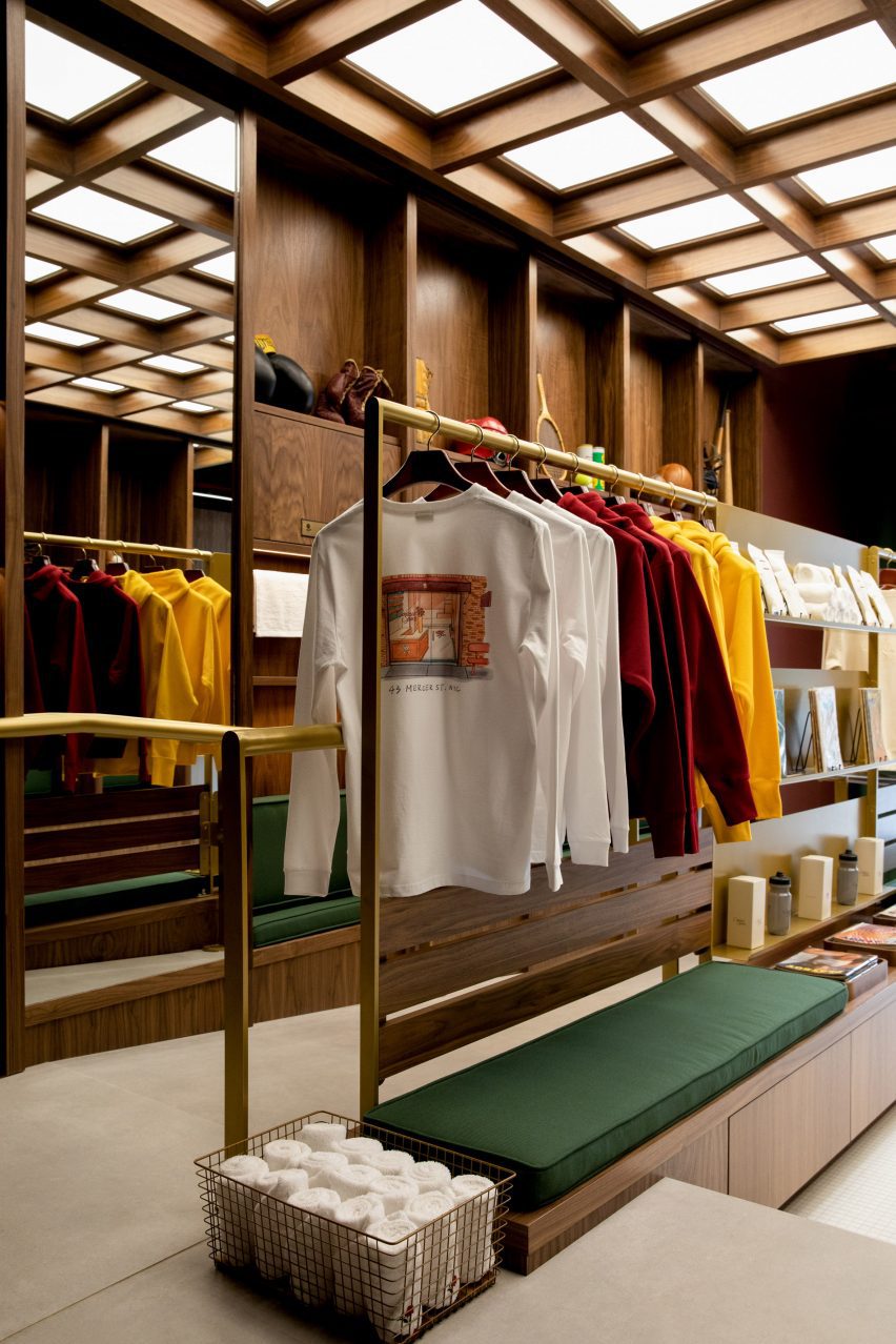
Merchandise displayed on brass rails and shelving
Merchandise is displayed on brass rails and shelving

The retail space includes an area at the front that sells long-stem roses in singles or bundles, including a 15-foot (4.5 metre) wall on which the fresh-cut red flowers are stored.

Beyond, dark walnut panelling, brass rails and shelves, and green cushions give the store a collegiate atmosphere, while mosaic floor tiles and baskets of towels evoke a locker room.

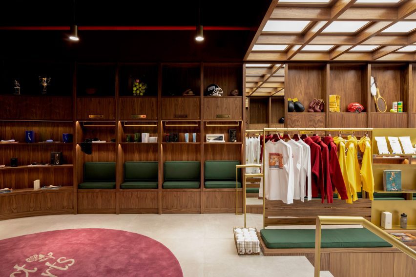
Walnut panelling forms cubby holes for displaying products
Walnut panelling forms locker-like cubby holes for displaying products

Vintage sporting ephemera like tennis rackets, boxing gloves and American football helmets are displayed on higher shelves.

Below, the selection of “entry-level gear and sensual gifts” from brands such as Kiki de Montparnasse, Lelo, Dame, Maude, Future Method and more are merchandised in locker-style cubbyholes.

“Contact Sports flips the traditional model on its head and takes a more curated approach, stocking only 70 products at launch,” the studio said.

“Their team spent more than a year vetting a category that includes tens of thousands to offer only the best of the best, with unexpected touches that enhance the full experience around the sport.”

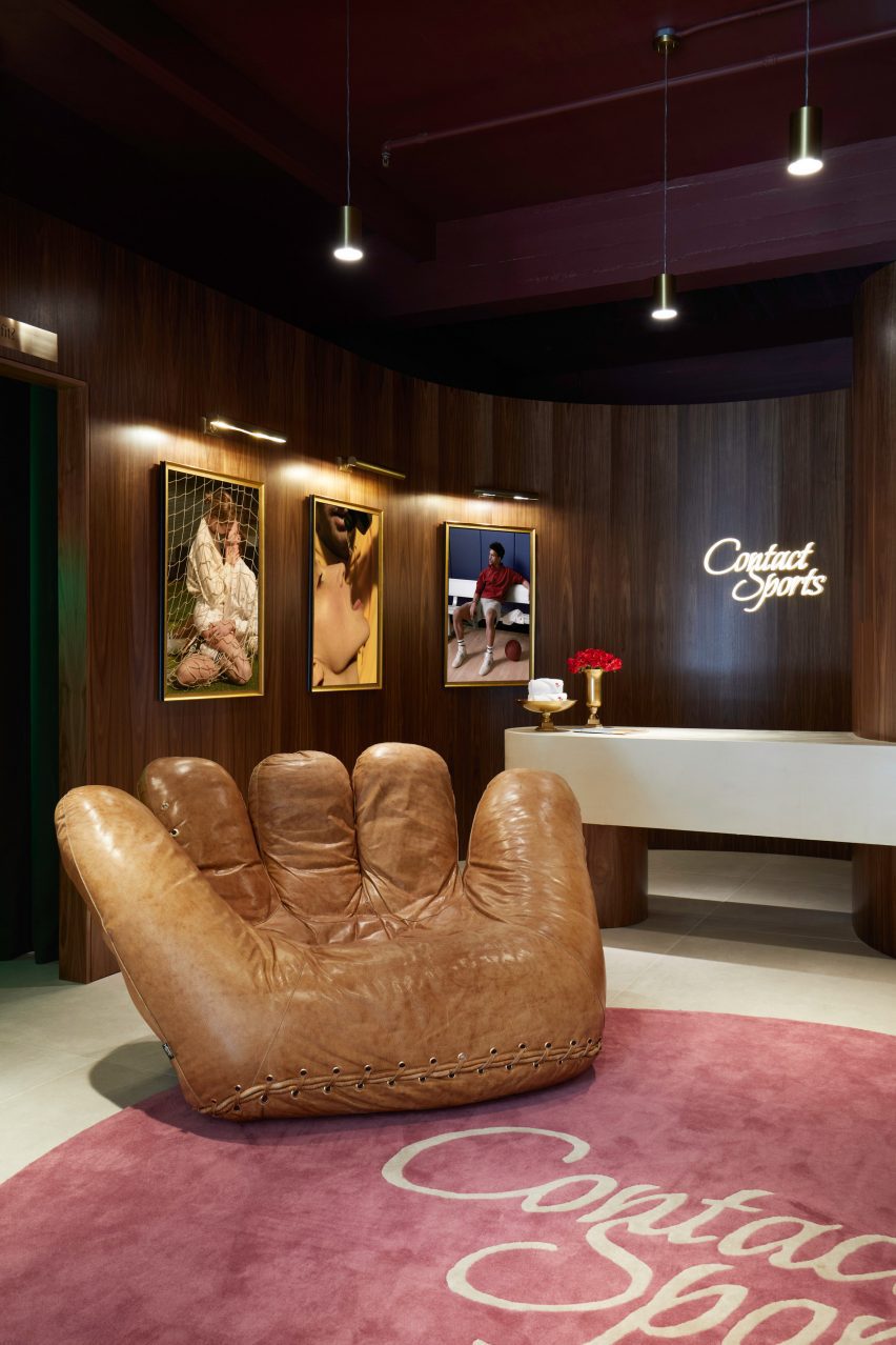
Jonathan de Pas baseball glove chair in front of counter
The store features a Joe Chair shaped like a baseball glove

The space is illuminated from above by a light box behind a wooden lattice, while softer lighting is installed in the cubbies.

An iconic chair shaped like a giant baseball mitt by designers Jonathan de Pas, Donato D’urbino and Paolo Lomazzi sits next to the white counter, above which the brand’s cursive logo glows in neon.

Long-stem red roses displayed in trophy-like vases
Long-stem red roses are sold at the front of the store

The sex toy industry has grown significantly in recent years, as taboos have broken and social acceptance has widened. See some of the most unusual sex toys featured on Dezeen.

However, “the retail experience itself had yet to evolve,” said the Contacts Sports team, which hopes the store will change how shopping for sex gear should look and feel.

The photography is by Anna Morgowicz.

Reference