Mork-Ulnes creates house in San Francisco that “breaks from tradition”
Mork-Ulnes Architects has completed the Silver Lining House, a crisp, gabled home clad in black-stained cedar that was designed for an architectural photographer and interior designer.
Located on a sloped site in San Francisco’s Bernal Heights neighbourhood, the house sits among Victorian and Edwardian homes that line the area’s hilly streets.
The project was designed for architectural photographer Bruce Damonte and interior designer Alison Damonte, who have long been friends with architect Casper Mork-Ulnes, founder of Mork-Ulnes Architects.
The couple, who are avid collectors, desired a home that showcased their treasured belongings and supported their creative work.
“We knew from the outset that this project would be an interesting collaboration, balancing our reductive tendencies with the more exuberant and maximalist impulses of our client/friends, whose style we had always admired and wanted to celebrate,” said Casper Mork-Ulnes.
The architect and his team at Mork-Ulnes Architects – which has offices in San Francisco and Oslo – conceived a home for the Damontes that “conceptually functions as a container for their furniture and art collections and a laboratory for their work”.
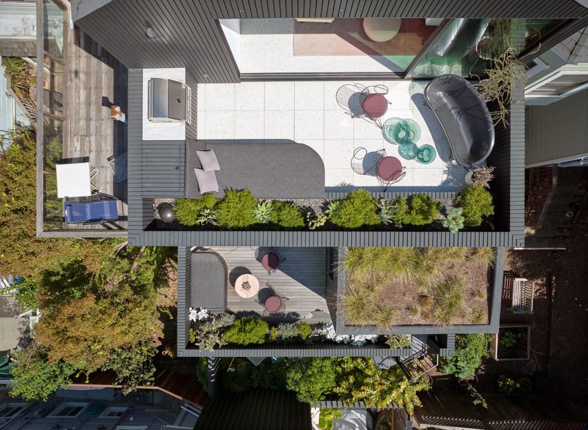
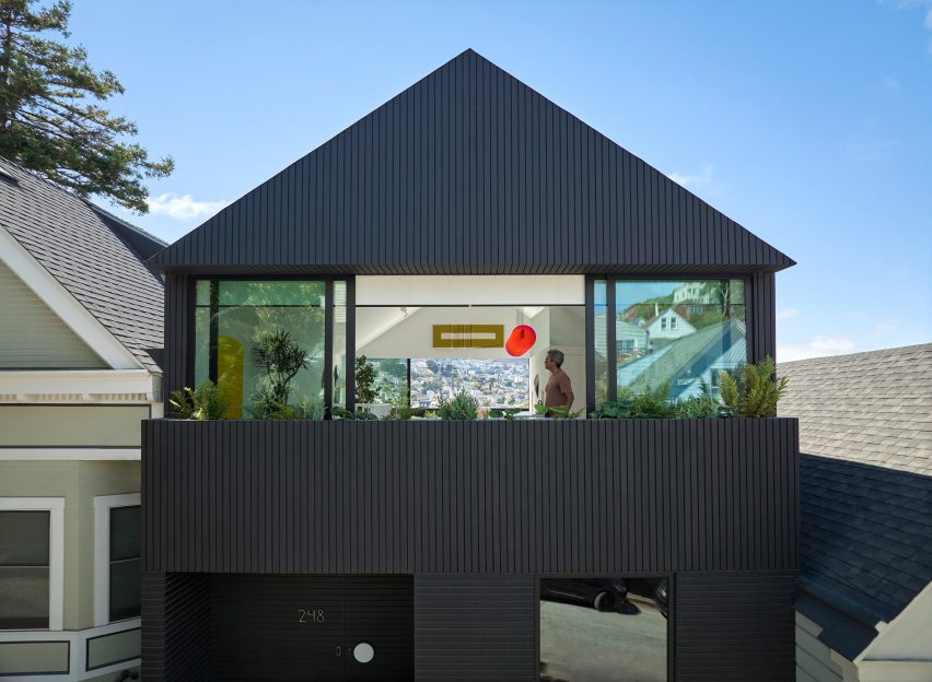
Rectangular in plan, the home rises three levels and features a crisp, gabled form. Facades are clad in strips of black-stained cedar and are punctured with openings of varying sizes.
The architects took cues from the surrounding context when deciding on key design elements such as scale, massing and cladding – but they also strayed from the norm.
“While replicating the roof forms, entry portal/stoop and massing of the Victorian homes, the new house also breaks from tradition with a black-painted facade and ribbon windows that visually connect the interior of the house to the neighbourhood,” the team said.
“Tradition is reinterpreted here with a decidedly contemporary perspective, where formal research and construction techniques are integral to creating an original and innovative outcome that engages its surroundings while also prompting further inquiry,” the team added.
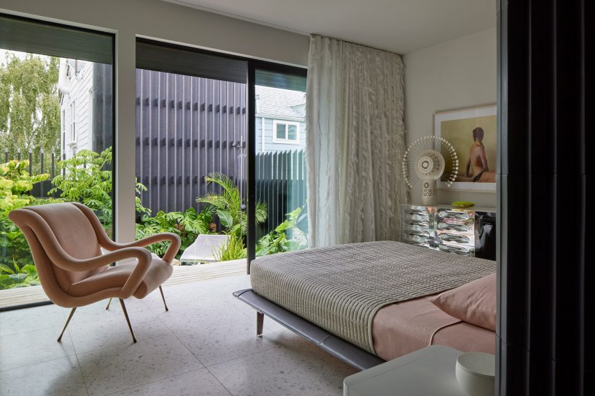
Totalling 2,818 square feet (261 square metres), the home has a “flipped floor plan”, in which private quarters are found on lower levels and communal spaces are placed up high.
The ground level holds a garage, primary bedroom suite, laundry room and sunken garden. The main entrance is found on the first floor, where the team placed a guest suite, a home office, two bathrooms and intimate spaces for relaxing and entertaining.
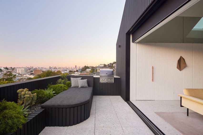
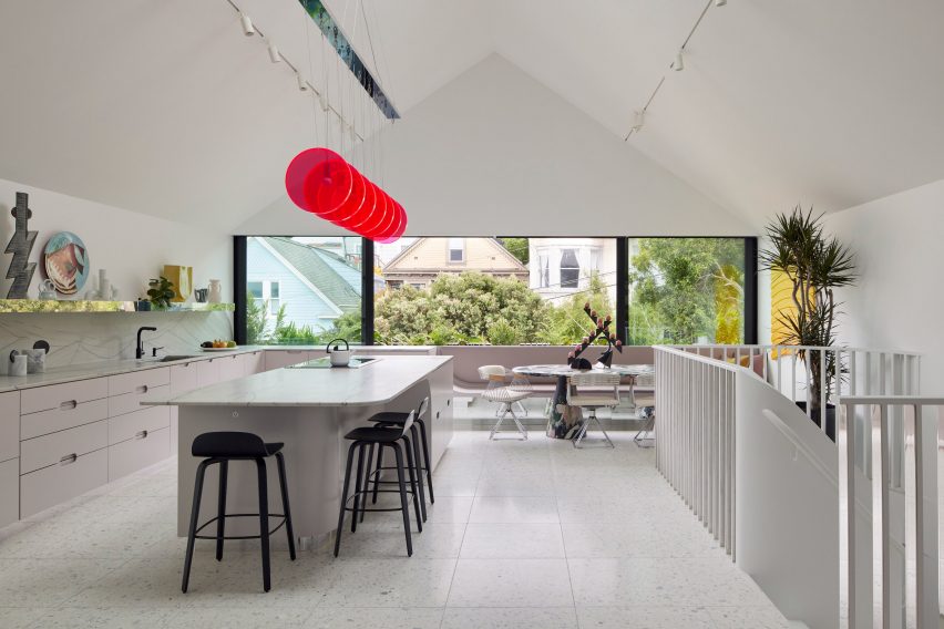
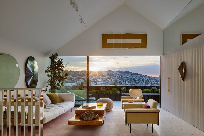
The top level – envisioned as a penthouse-type space – encompasses a kitchen, dining area, living room and powder room. A terrace offers sweeping views of the city.
Floors are linked by a curved staircase topped with a skylight. Half-polished chrome slats bounce reflections around the stairwell, an effect meant to “mimic the experience of walking through a disco ball”.
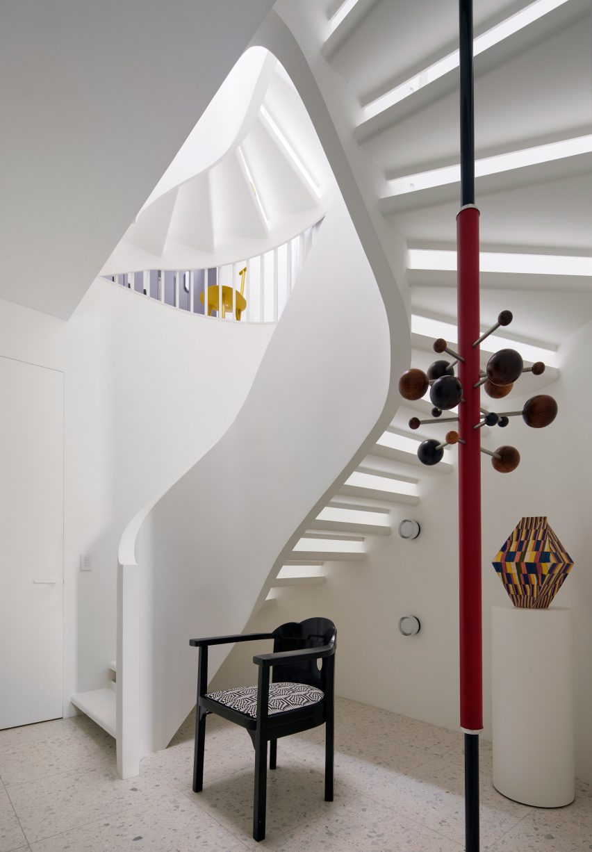
Mirrored surfaces are found in other parts of the house, lending a feeling of playfulness while also producing spacial and light-generating effects, the team said.
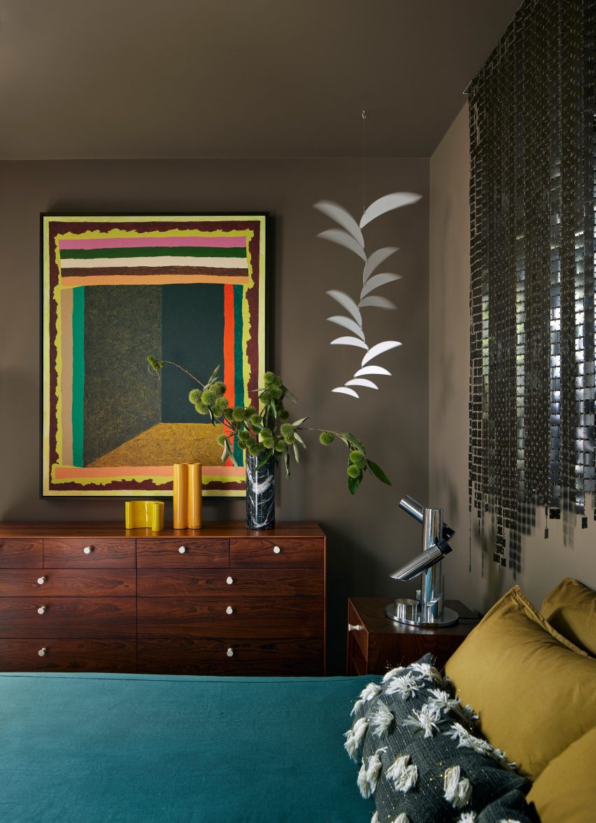
Overall, the home’s interior design – overseen by Alison Damonte – offers a mix of colours, textures and patterns that “reflect the owners’ collective creative spirit”, the team said.
Sustainability was in mind throughout the project, leading to the inclusion of elements such as high-performance windows, exterior solar shading and energy-efficient appliances.
Rooftop solar panels generate electricity that can be stored in a Powerwall battery system, and unused electricity is sent back to the power grid.
The home’s completion marks the end of a journey spanning more than a decade.
In 2010, the Damontes purchased a modest residence in Bernal Heights dating to the early 1900s.
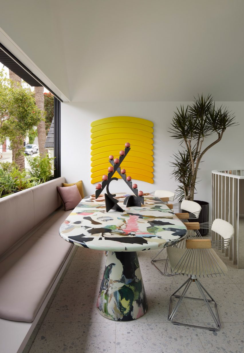
Several years later, they enlisted Mork-Ulnes to renovate the house, and just when plans were being finalized in 2017, the house caught fire and was partly destroyed.
The team salvaged what they could and reworked the design.
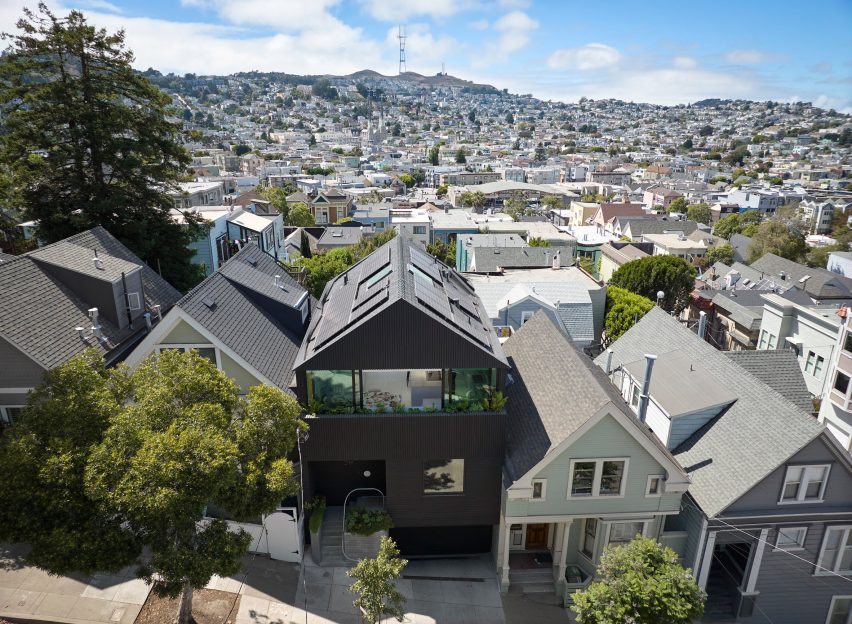
“While the incident forced a reevaluation of scope and scale of the redesign, the couple’s goal remained the same – to create a home that acted as a capsule of art and inspiration,” the team said.
Other projects by Mork-Ulnes include an eight-sided house in Oregon that was built using cross-laminated timber and a California residence clad in Corten steel to protect the building from wildfire.
The photography is by Bruce Damonte.
Project credits:
Architect: Mork-Ulnes Architects
Project design team: Casper Mork-Ulnes, Lexie Mork-Ulnes, Phi Van Phan, Gregoriy Ladigin
Interior designer: Alison Damonte
Construction manager: Raffi Nazarian
Landscape architect: Terremoto
Structural engineer: Santos & Urritia
Lighting design: PritchardPeck
General contractor: Rico’s General Construction, Inc
Cabinetmaker: Hopebuilt


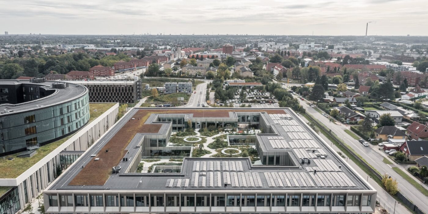
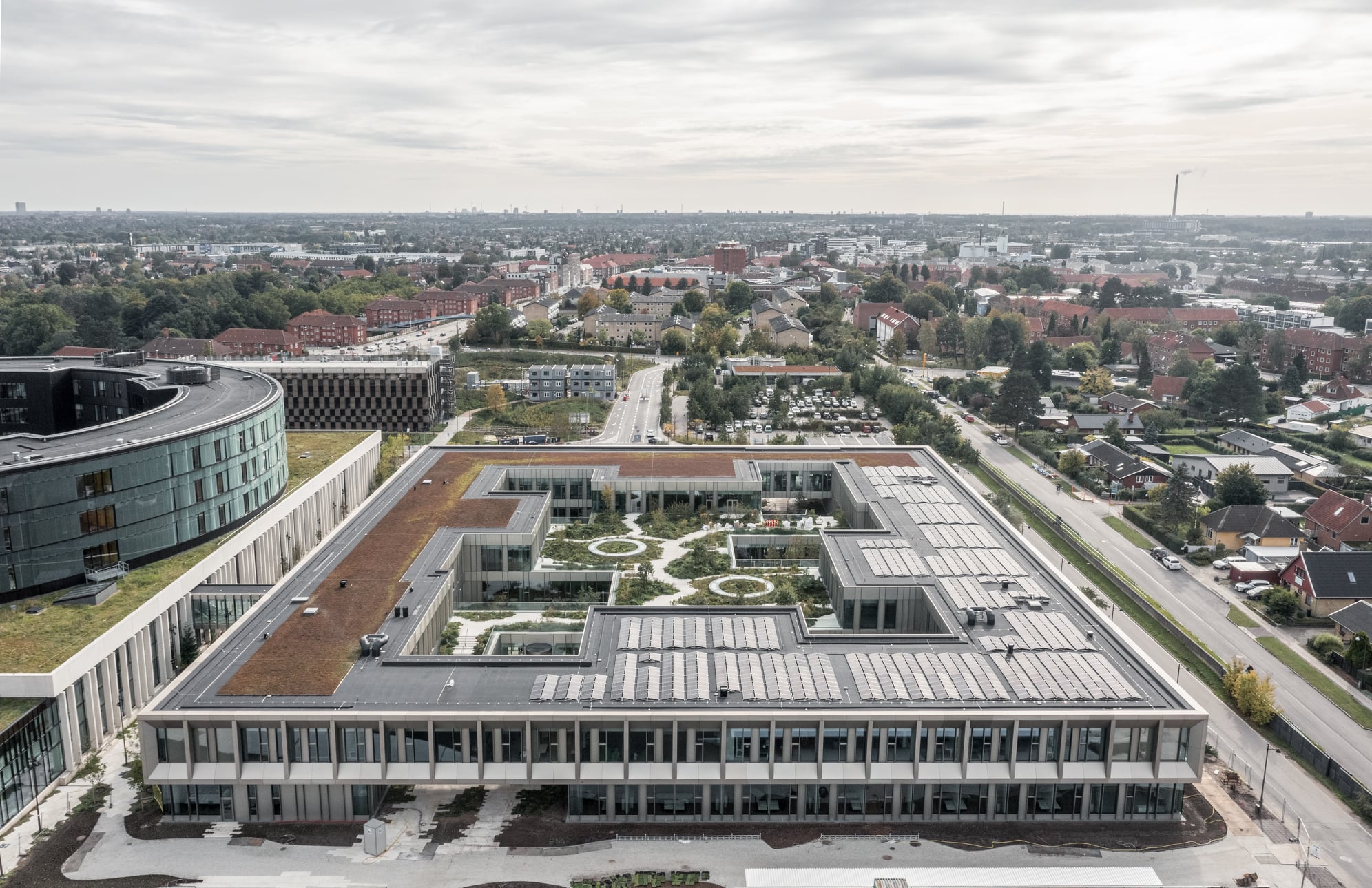
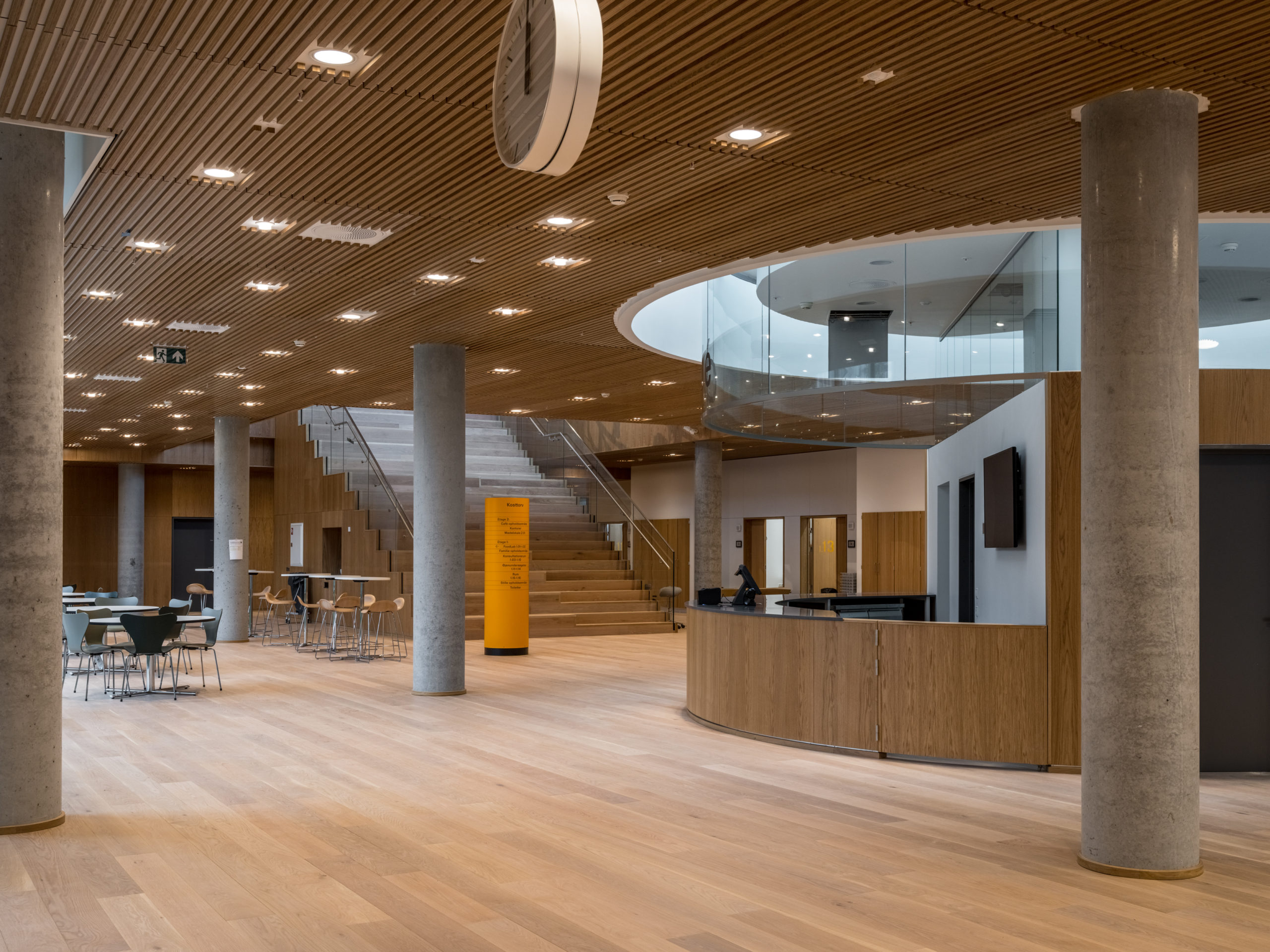 Steno Diabetes Center Copenhagen is a hospital for preventing and treating diabetes. The hospital occupies a rectangular site with two entrances open on two opposite sides. There are four inner gardens on the first floor and two of them greet the visitors immediately upon their entry. Common areas such as circulation spaces and reception sit in the middle of the floor plan, while most individual rooms are lined on the outer ring.
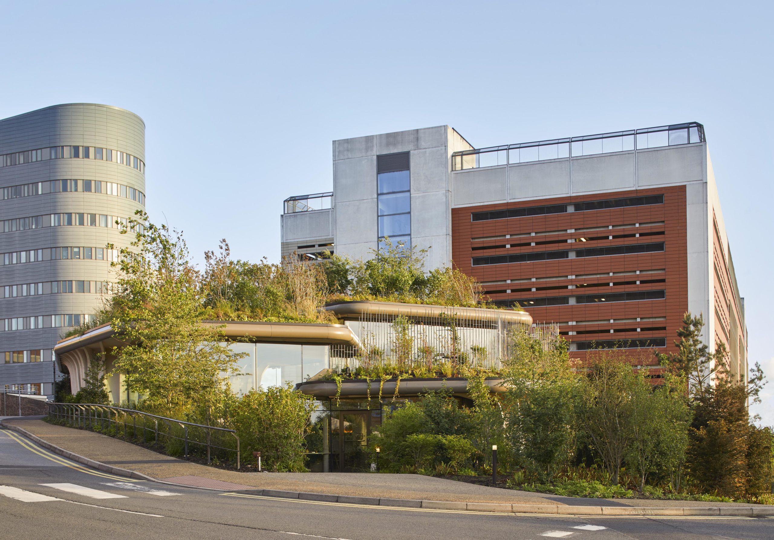
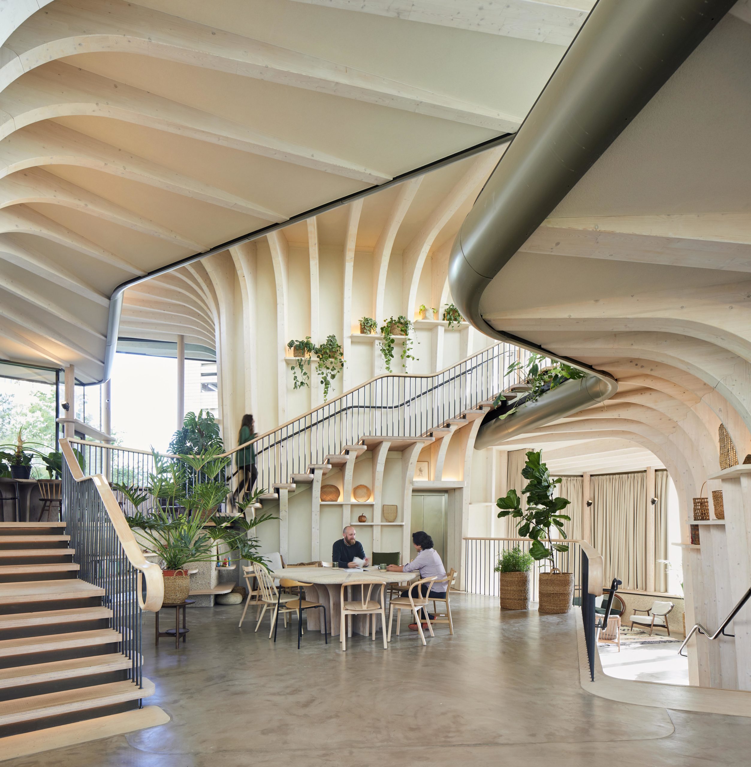 Maggie’s centers provide free cancer support and information to patients and their friends and families. The centers are located across the UK, each in a unique style while all of them embrace nature as a way of healing. Maggie’s Leeds stands on the last patch of greenery at St James’s University Hospital. The sloping site is bounded by roads and a multi-story car park. Instead of flattening the landscape, the spaces descend along the landscape, creating views that vary from open to secluded.
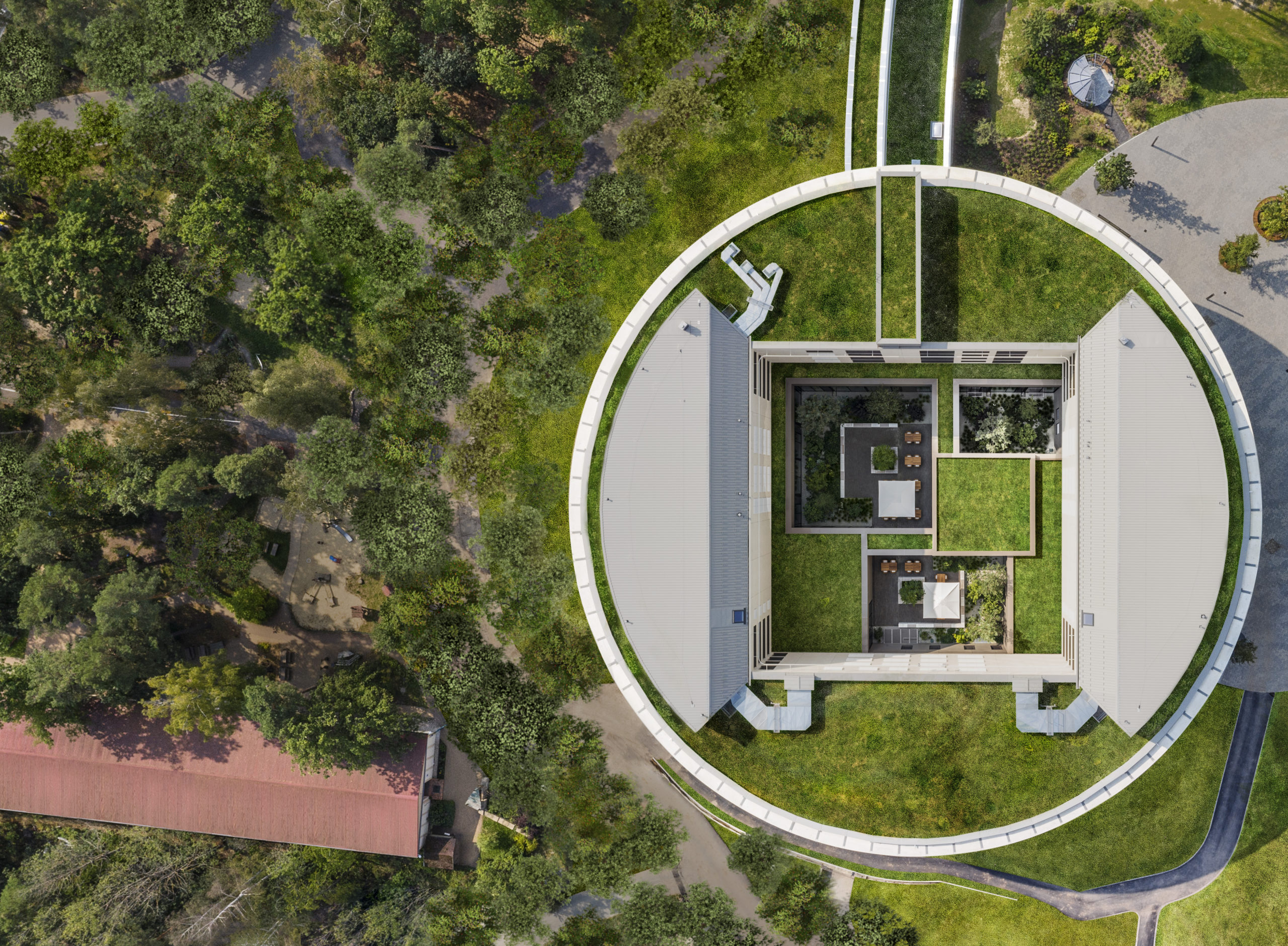
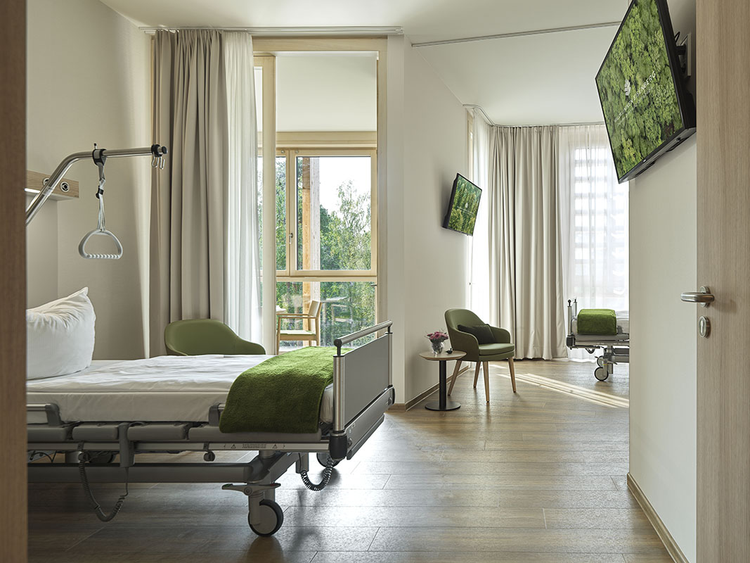 This new hospital wing of the orthopedic center Waldkliniken Eisenberg enjoys an immersive view of the Thuringian Forest. The six-story building has 128 patient rooms, all located on the outer ring of the circular floor plans. Floor-to-ceiling windows invite unblocked views of the natural landscape into the rooms while providing natural light and fresh air to the rooms.
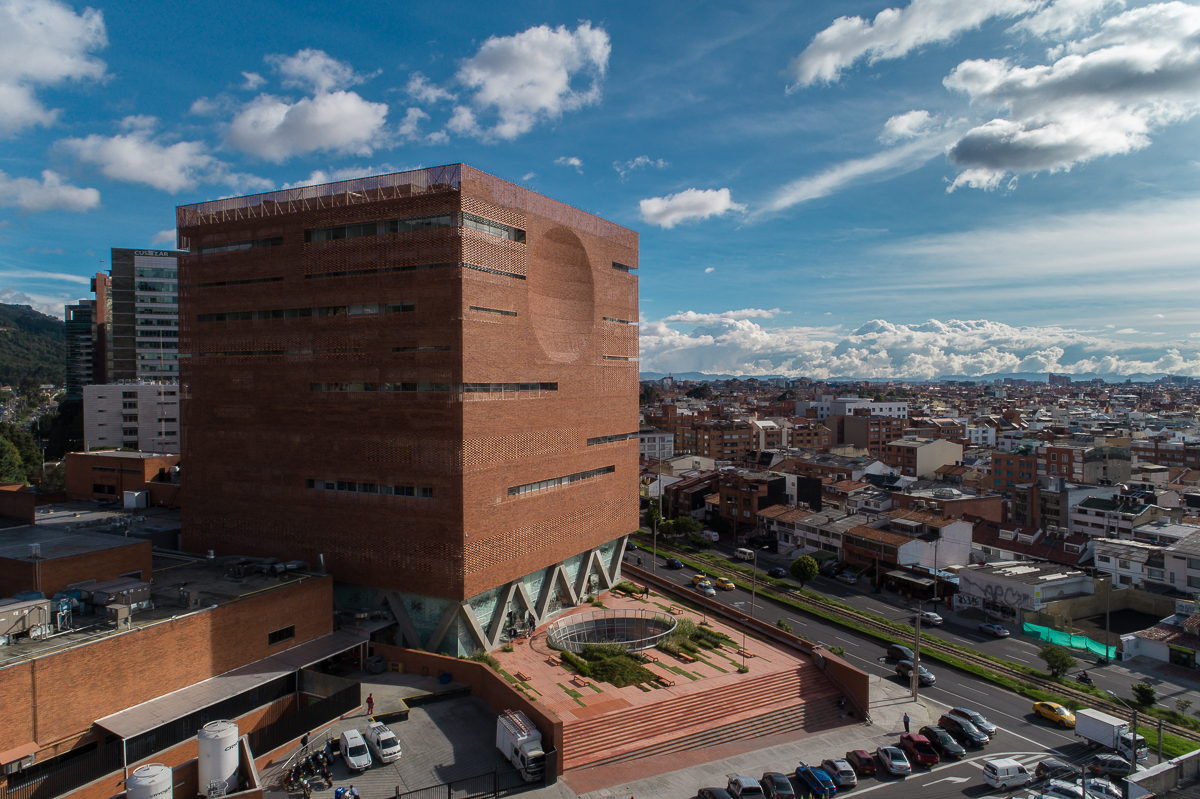
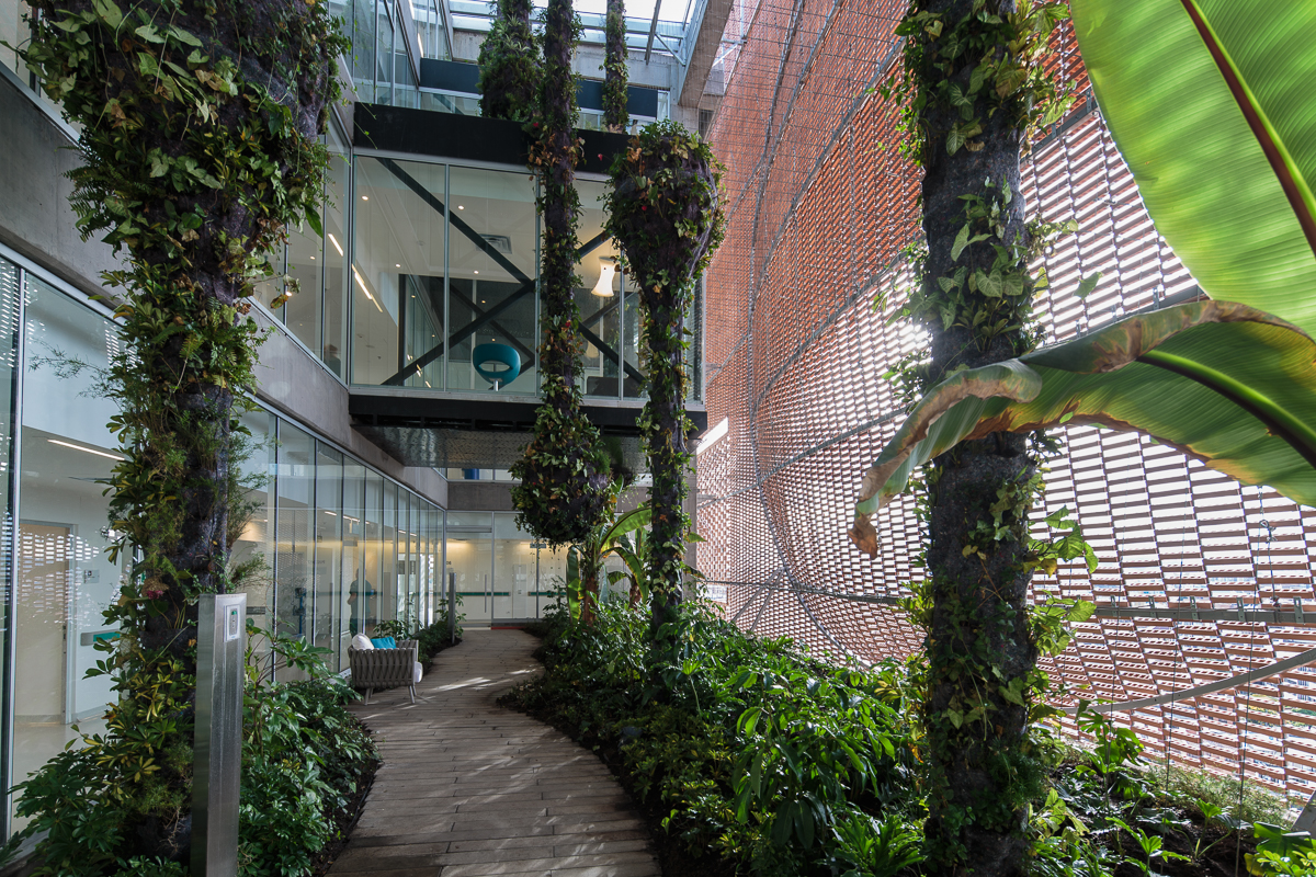 The expansion of Santa Fe de Bogotá Foundation is sited in the compact urban context of the city of Bogotá. It comprises an eleven-story block and a single-story base. The roof of the base becomes a plaza opening to the roads, with staircases inviting people onto it. Red bricks cover the expansion as a response to the existing buildings around. Strips of pavement on the plaza are replaced by plants. Different types of plants vary in height, breaking the flatness and solidity of the brick plaza.
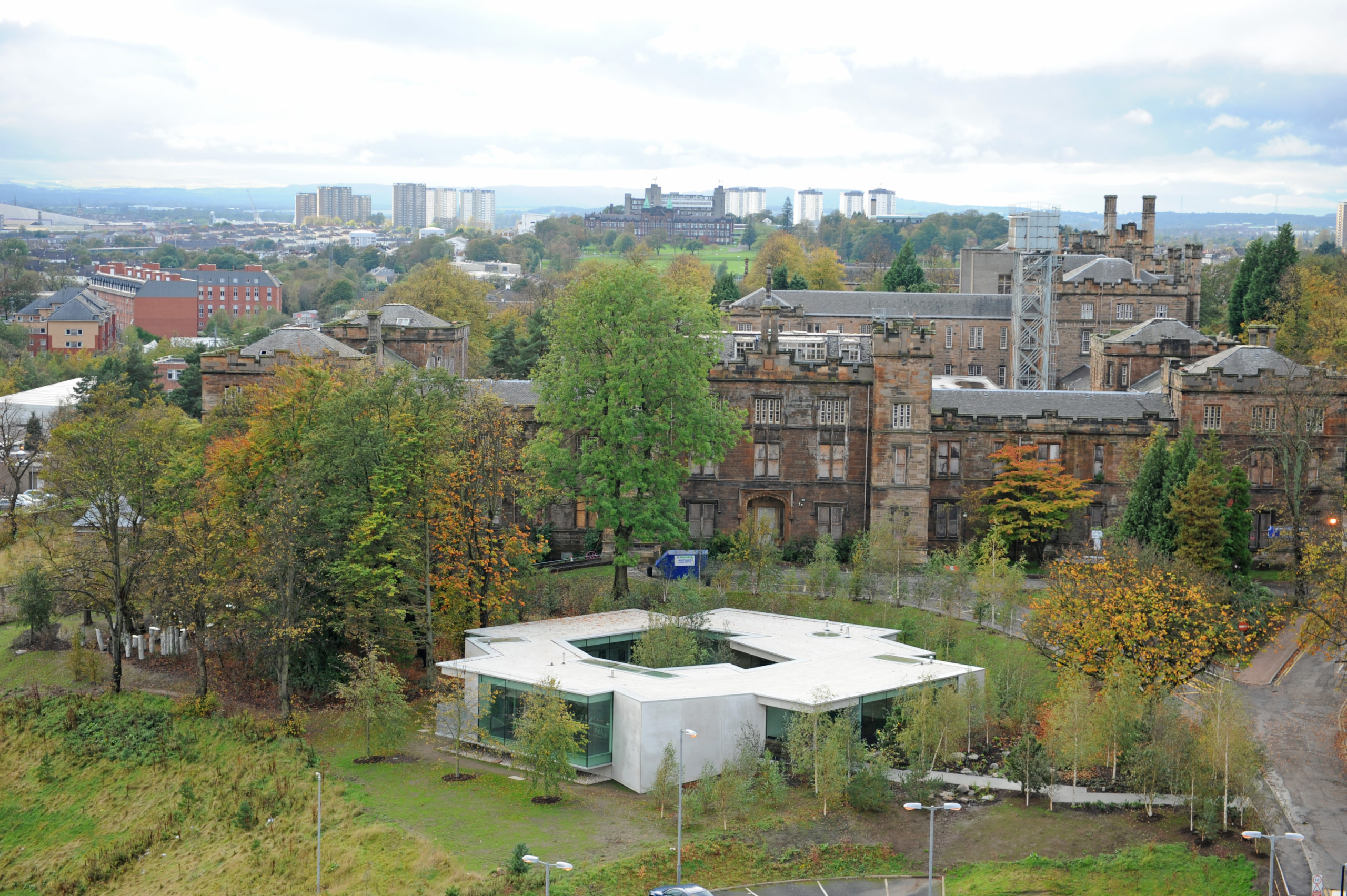
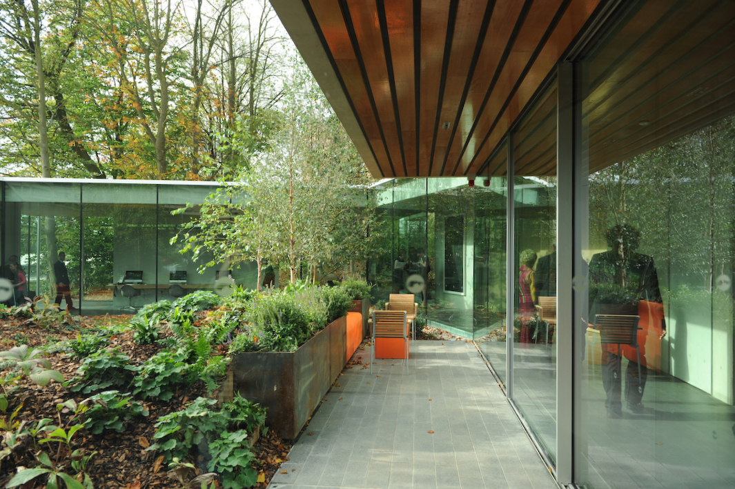 Maggie’s Gartnavel sits humbly on the land of the Gartnavel hospital in Glasgow, close to the Beatson West of Scotland Cancer Centre. The single-level volume comprises a series of interlocking rooms, with an inner garden in the middle of the ring of rooms. With a flat roof and floor levels that respond to the natural topography, the rooms vary in height. Common areas including the dining room, kitchen, library and a large activity room are on the side with taller ceilings and the counseling rooms are more intimate.
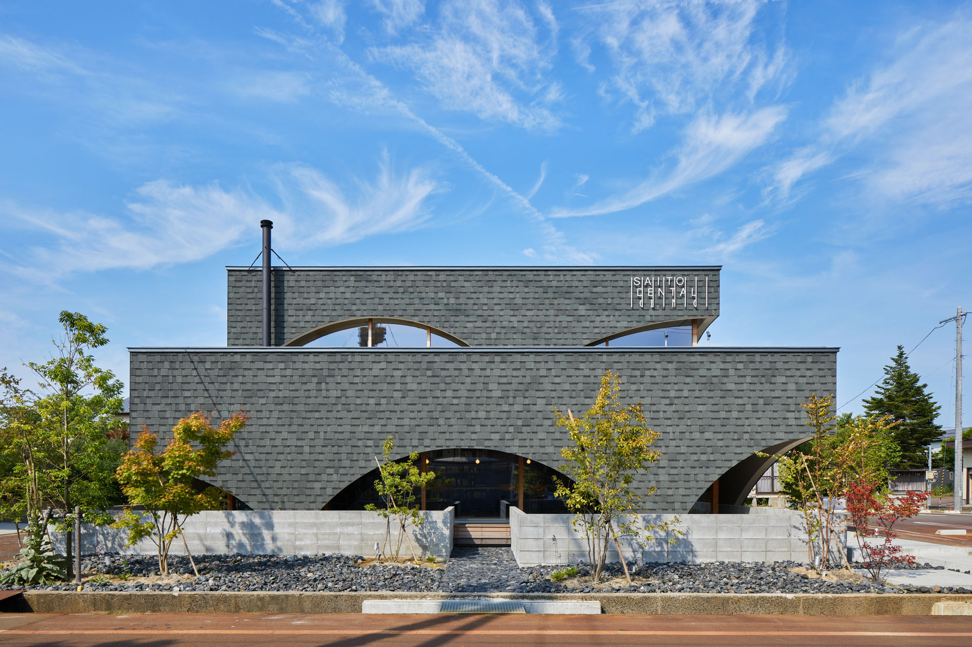
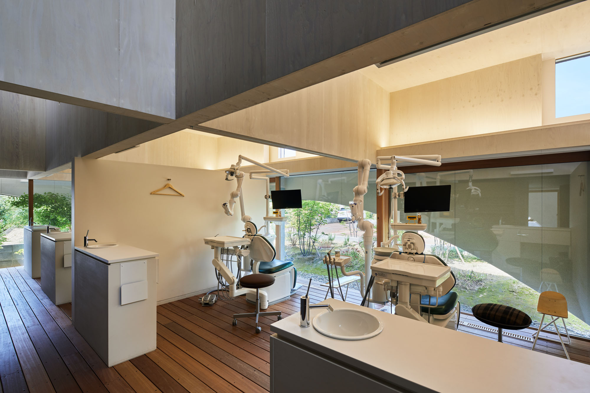 Neighboring a nursery, elementary school and junior high school, this dental clinic is designed as an enjoyable place for both children and parents. This two-story timber building accommodates not only a clinic but also a bookstore and daycare center. By combining programs, the design team wishes to encourage people to come not just for their appointment.