B.L.U.E. Architecture Studio designs compact café in Beijing
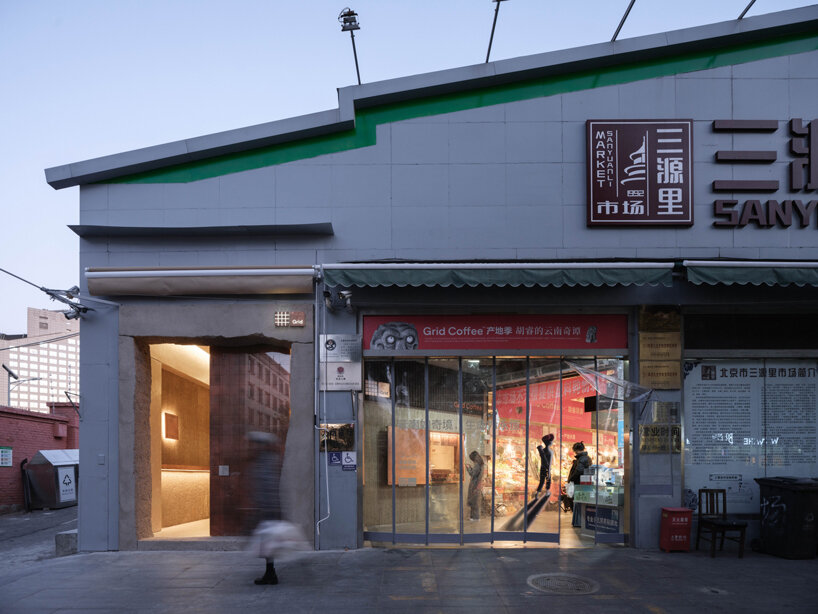
Located within the lively SanYuanLi Food Market in Beijing, this café designed by B.L.U.E. Architecture Studio offers a modern twist amidst the traditional marketplace. Occupying a small 25 sqm space, it stands out at the northern entrance, blending modernity with the market’s historic charm. Inspired by the market’s vibrancy, the café’s design aims to harmonize past and present, revitalizing the community and connecting with the urban environment. ‘Our focus is on establishing both the ‘uniqueness’ and ‘everyday sensibility’ of the community space, seamlessly integrating the distinctive spatial ambiance into daily life,’ describes the team.
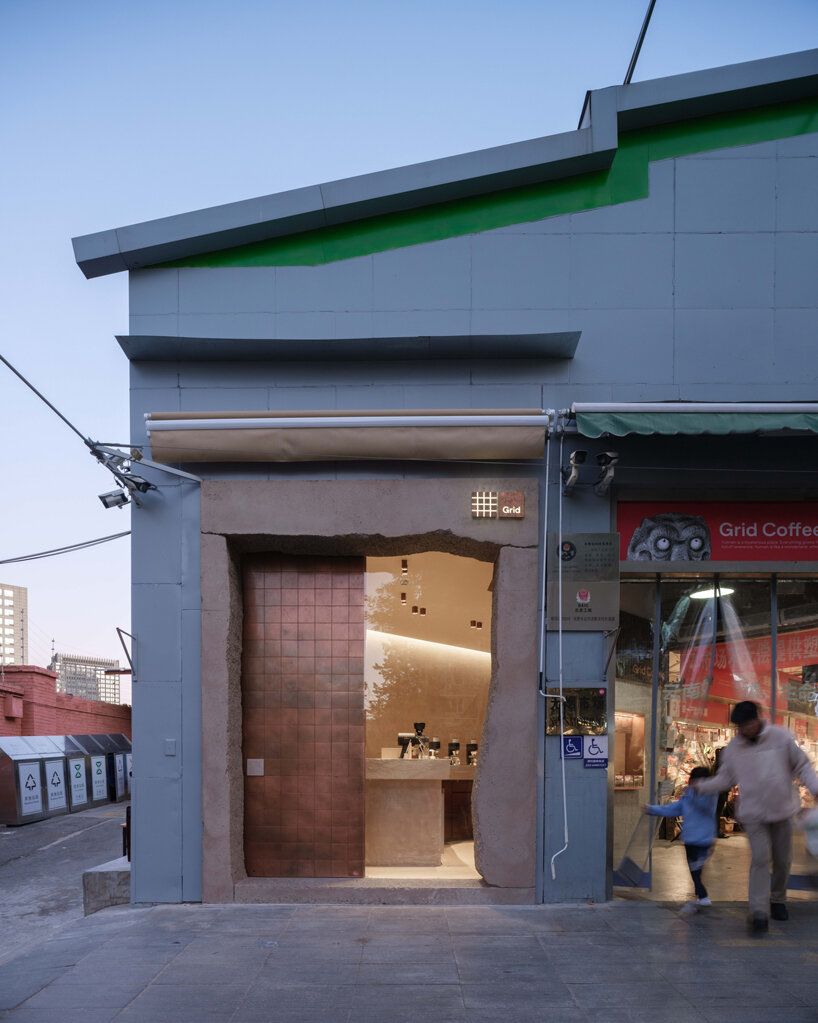
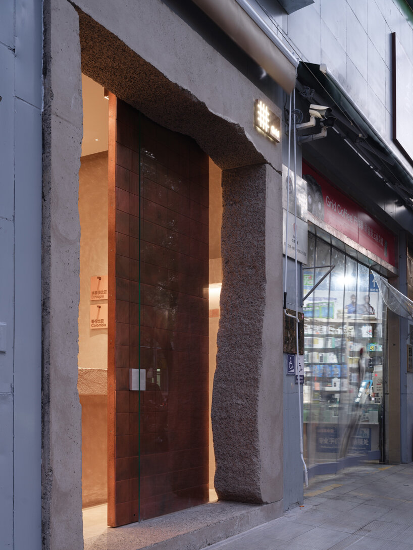
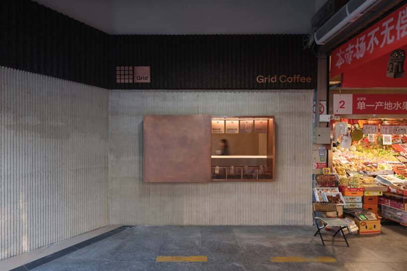
B.L.U.E. Architecture Studio‘s design captures attention with its juxtaposition of concrete framing and a copper door. Despite its small footprint, this project aims to spark conversations about street life, community renewal, and urban connectivity, exploring innovative ways to enhance public spaces. The facade design maintains coherence with the market’s aesthetic, featuring a clever window mechanism. ‘When open, it showcases interaction and integrates communication between urban life and community scenes. When closed, the hand-hammered copper plate forms a contrast with the bustling market, resembling a piece of art,’shares the team.
The unique shape of the concrete framing mirrors the market’s vibe, while the copper door adds visual interest without overwhelming the space. ‘With this design, our objective is to initiate a discourse on street, community revitalization, and urban connections, aiming to explore innovative approaches to communal public life’. Inside, the design fosters the ritual of enjoying coffee on the go, with the sculptural bar efficiently dividing the space. The windows blur the lines between the café and the market, encouraging interaction. Material choices, from oxidized copper to hand-cast ribbed facades and elm wood surfaces, further integrate the café with its surroundings.
the handcrafted copper door, in contrast with the rough and weighty concrete
windows on the inner façade foster interaction among various stalls and blur the boundaries between the café and the market
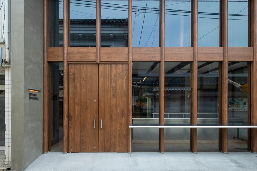
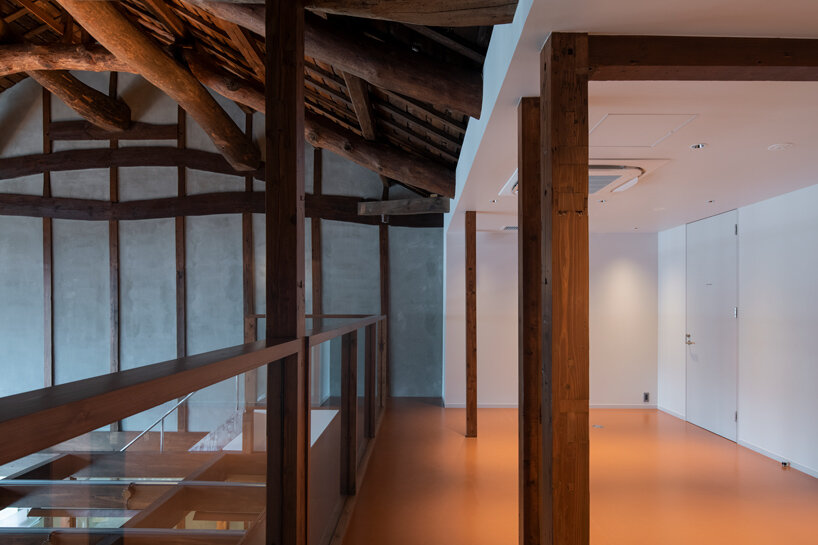
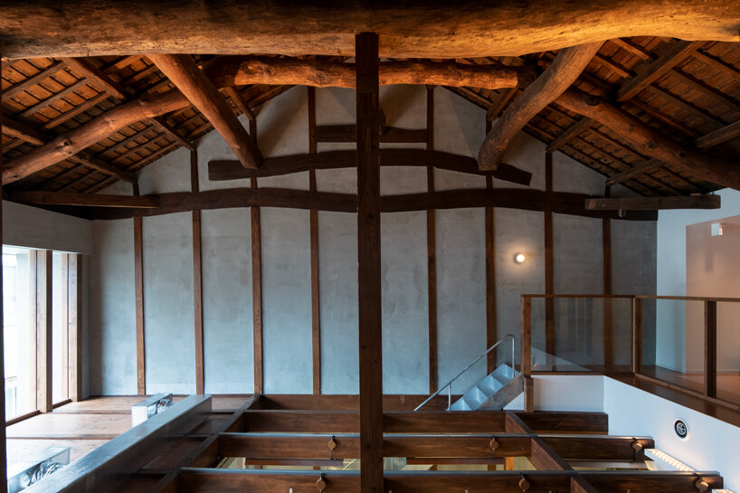
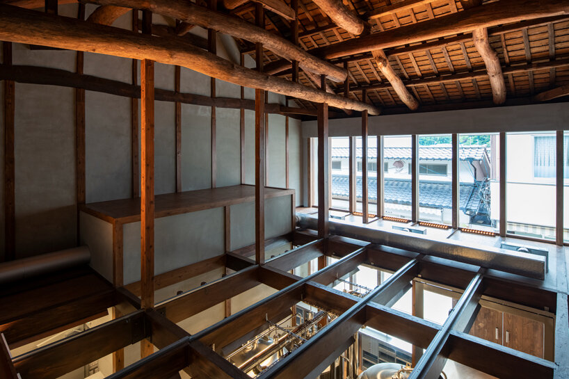
In Saga, Japan, a renovation project by CASE-REAL has transformed an 80-year-old traditional Japanese house into a craft beer brewery, named Whale Brewing. Yobuko, historically known for whaling during the Edo period and later famed for squid fishing, faces modern challenges like a declining population due to youth migration and numerous vacant houses. Given this context, the project was conceived with the aim of acting as a magnet for young people and rejuvenating the town. The chosen location for the brewery was an old traditional house along Yobuko Asaichi-dori, a street bustling with local seafood and goods stalls each morning. This aging house had been abandoned, suffering from leaks, facade deterioration, and structural issues. However, after the interior was dismantled, it revealed a sturdy structure, around nine meters tall, with hidden potential.
the goal of this project was to breathe new life into the town, all images by CASE-REAL
a New Landmark in Yobuko
After extensive discussions with clients, the architects at CASE-REAL chose to incorporate the existing strengths of the house into the new brewery design. The building’s layout features a storefront area with a ceiling on the facade side, while the brewing space utilizes the generous height of the second floor through an open atrium. A continuous glass facade spans both levels, offering a view of the street that showcases the robust beams and the brewery ambiance, despite the ceiling variation in the store area. To accommodate ground conditions, the floor plan includes a sloped design that connects the elevated rear of the building. Stainless steel was selectively utilized for elements like the counter and handles, maintaining a cohesive material theme in line with the brewing tanks. Certain façade pillars, essential for support, were crafted from solid Japanese cypress, accentuating the space’s height and adding a distinctive touch. The incorporation of rounded shapes in the pillars and counter edges was intentional, aiming to introduce a sense of softness and effectively merge structural elements with the overall design.‘By combining the new functions of the brewery with the original characteristics of the building, we hope that this will become a new landmark in Yobuko, firmly rooted in the local community,’ shared the architects.
the brewing space utilizes the generous height of the second floor through an open atrium
the new structure blends the brewery’s functionalities with the house’s original features
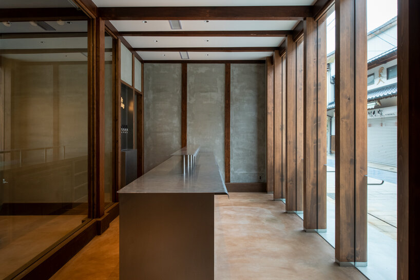
Skincare brand Aesop has collaborated with designer Samuso Hyojadong to create a store in Seochon, Seoul, that features an open facade and an oversized stone plinth.
Positioned in one of the oldest neighbourhoods of Seoul’s Jongno-gu district, the Seochon outlet was created to “fit harmoniously within its local context”, according to Aesop’s design team.
Aesop designed the Seochon store with Samuso Hyojadong
When designing the store, Aesop and Hyojadong took cues from the architecture of jeongjas – traditional Korean pavilions with no walls, which serve as spaces for resting and taking in the surrounding views.
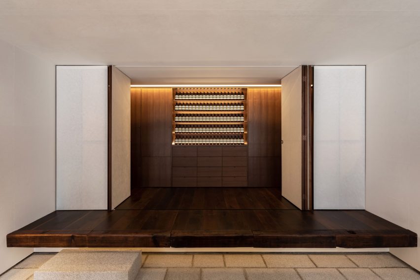
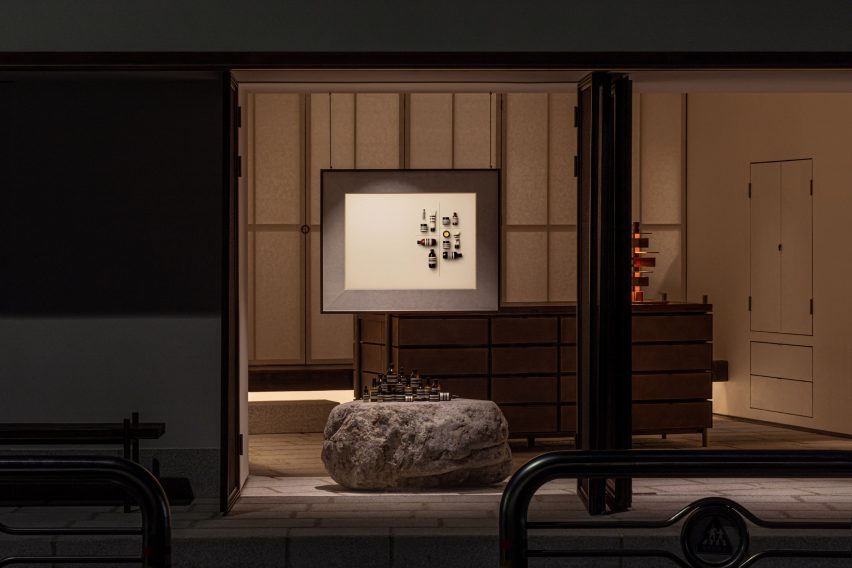
The street-facing facade was created with mesh metal screens that can open out entirely to create a storefront with no walls. Once closed, the woven metal backing creates translucent windows through which passersby observe the softly lit silhouettes of uniform rows of bottles.
Reclaimed timber features on the interior
“Samuso extended the floorplate outwards to create a threshold that conveys a generous sense of hospitality,” the Aesop design team told Dezeen.
“One [jeongja] in particular that inspired us was the Soswaewon in the Damyang region, which was built in the sixteenth century and is surrounded by a verdant garden.”
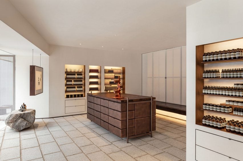
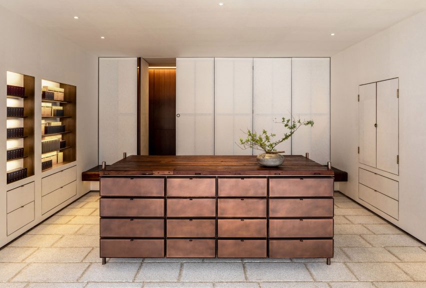
An oversized stone plinth displays Aesop products
For the store’s material palette, the designers referenced the timber and stone that are typically used to build traditional Korean houses known as hanoks.
A large, rough-edged stone plinth displaying clusters of products was positioned at the entrance while various wooden accents were created with timber reclaimed from salvage yards and an abandoned house.
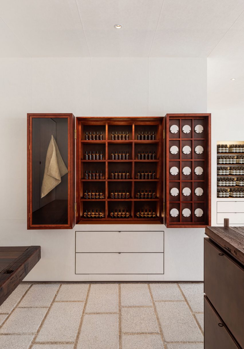
Copper was used to create geometric cabinets
The store was also built on a raised stone platform, which nods to the traditional architecture.
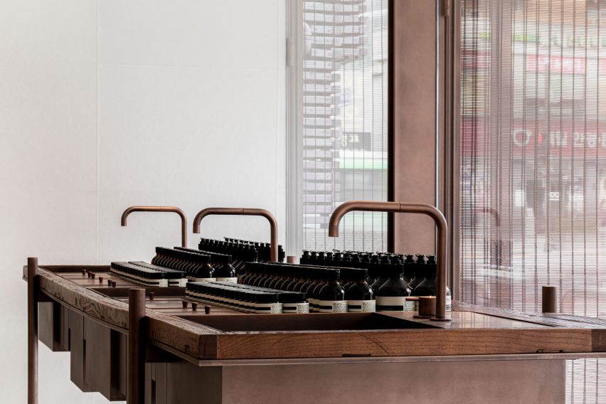
Hanji paper created from mulberry tree bark sourced from South Korea’s Gyeongnam province features on the store’s walls, which frame central geometric cabinetry and sleek taps made of locally produced aged copper.
The designers were restrained in their use of sanding, sealants and coatings when treating the materials, opting to embrace their “natural imperfections”.
“Sensitivity to texture in this store is superlative,” reflected the design team. “Samuso wanted each material to express itself directly, without too much human intervention,” it continued, referencing the roughness of the stone and the reclaimed timber’s undulating texture.
The metal was also used to design sleek taps
Rosewood was used to create the store’s signature fragrance armoire, which is hidden from view until opened out and was conceived as a traditional Korean jewellery box, according to the design team.
“Throughout the store, we were compelled by a desire to dissolve the boundaries between inside and outside, between the naturally occurring and the human-made,” concluded the designers.
The store’s signature fragrance armoire was informed by Korean jewellery boxes
Known for stores that pay homage to their varied locations, Aesop has an outlet in Cambridge defined by handwoven bulrush shelves that nod to the nearby River Cam and a Sydney store furnished with domestic items to evoke 1960s Australian homes.
Akio Isshiki infuses three distinct functions into wooden house
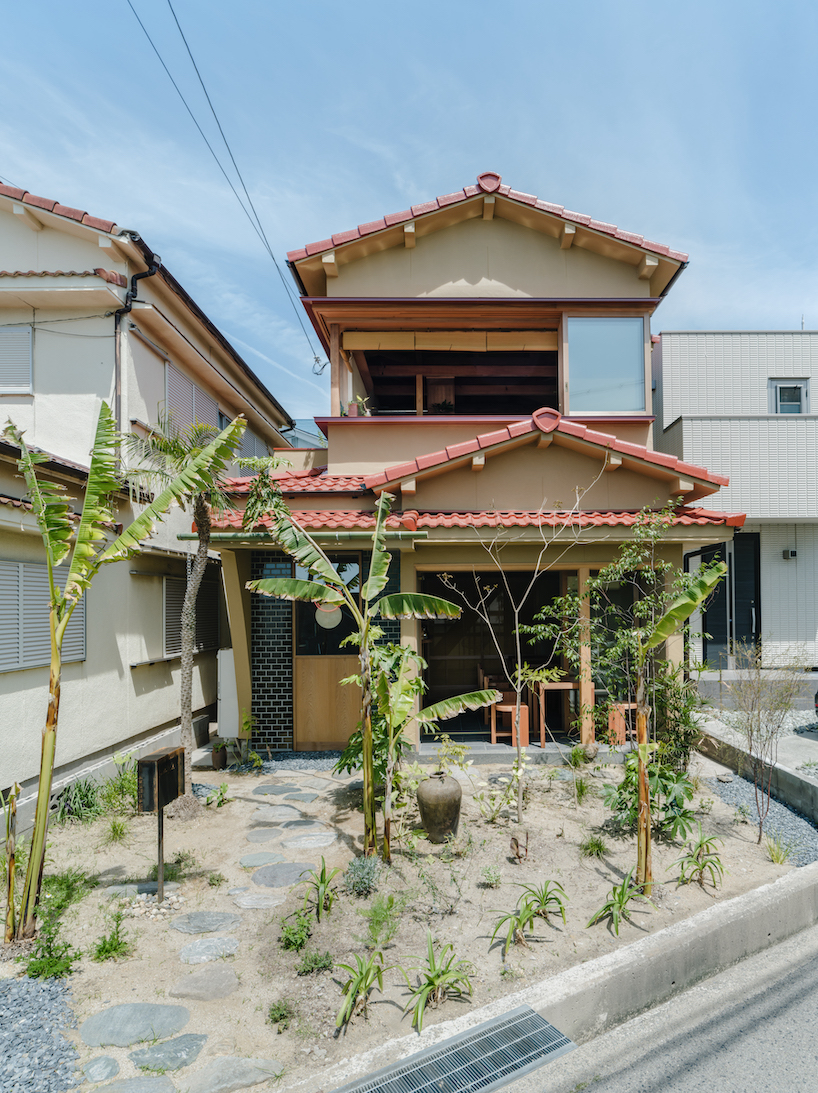
Akio Isshiki Architects renovates a wooden house near the beach in Akashi City, Hyogo Prefecture into the designer’s own residence and workplace, as well as a curry restaurant. Within this modest 73 sqm space, the coexistence of three distinct functions creates a unique environment in which notions of time and space, cultural elements, work, and living settings coexist. The design draws from traditional Japanese architecture and employs local materials and techniques while integrating global inspirations.
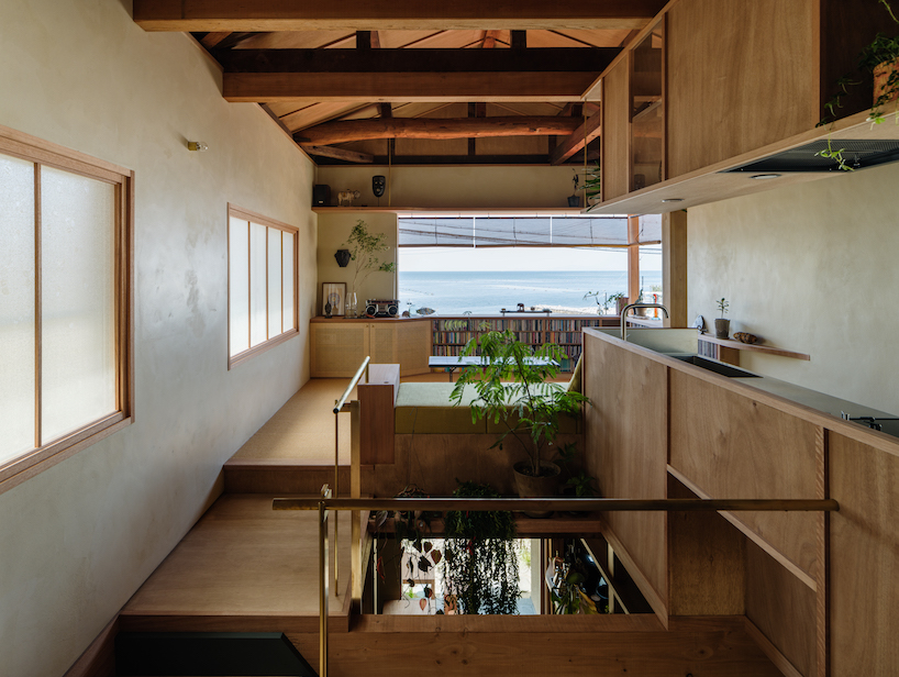
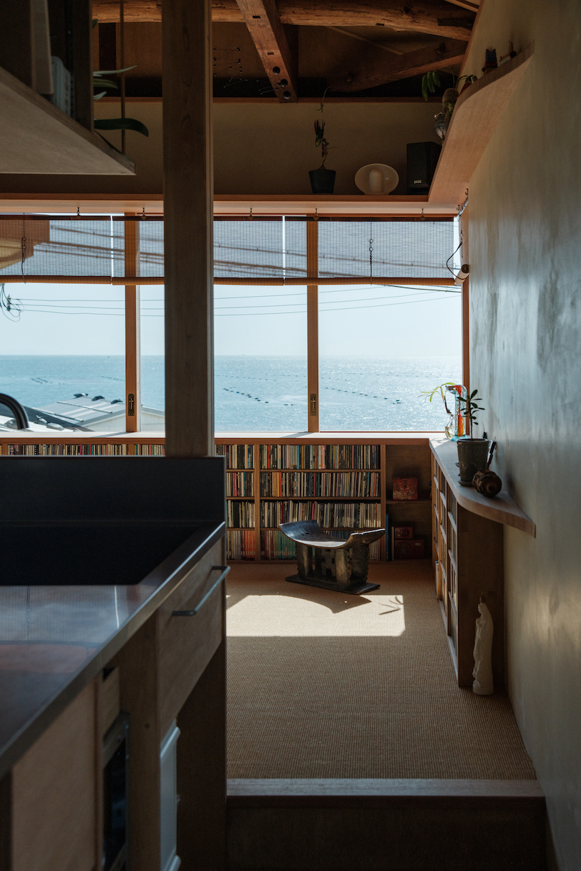
A noteworthy feature that pays homage to the region’s history of tile production is the flooring, where tiles coat the dirt ground surface. Handcrafted by Awaji’s skilled artisans, these tiles subtly echo the textures and shapes reminiscent of lava stone streets from Central and South American towns. The integration of partitions that resemble mosquito nets and Sudare blinds set against Shoji screens stand as a nod to ancient Japanese architecture. By intertwining spaces both horizontally and vertically, a gentle separation is achieved through the inclusion of native drooping plants. On the second floor, a wall facing the sea displays a scraped texture tinted with red iron oxide, skillfully completed by a local Awaji plasterer. This attempt incorporates vibrant hues of global architecture within a Japanese context. A large window cuts through the volume providing views of the sky and the sea.
the architecture Integrates Original and Contemporary Elements
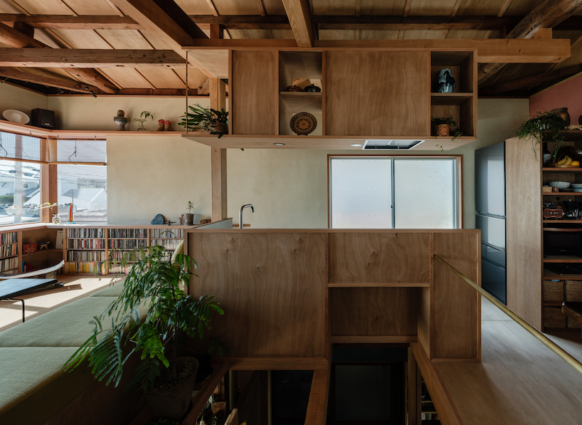
The harmony of various dimensions introduces a sense of depth into the space. Rather than accentuating contrasts between old and new, Akio Isshiki Architects‘ approach acknowledges historical materials and designs as important parts of the ensemble. The intent is to craft an environment that harmonically fuses both the original elements and newly incorporated features, creating a timeless and contemporary look. Existing structural elements such as pillars and beams blend with new architectural features, while new Shoji screens are layered to allow glimpses through the existing figured glass. A cypress pillar stands atop natural stones giving off a feeling of timelessness. Materials with various time axes are mixed and coexist.
L-shaped windows allow views of the seascape
the kitchen appears overhanging above the atrium
the kitchen area seamlessly flows into the living room
existing Fusuma doors are reused within the interior of the wooden house
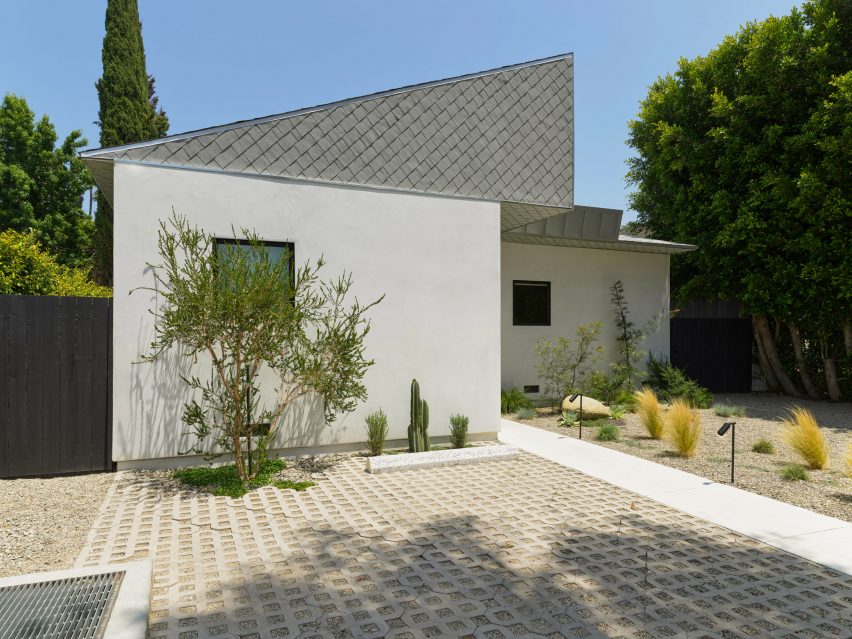
Stucco and asphalt are found on the exterior of a 1920s bungalow that has been fully revamped by local firm The LADG, which sought to challenge “traditional notions of how a house should be organised and how it should look”.
The project – officially called House in Los Angeles 5 – involved updates and extensions to a bungalow dating to 1929 in LA’s Larchmont Village neighbourhood.
Local studio The LADG extended a bungalow in Los Angeles
The LADG, or The Los Angeles Design Group, designed the project for their publicist and her family. The studio was tasked with rethinking the layout and aesthetics of a traditional single-family home.
The existing bungalow was 1,426 square feet (132 square metres) and contained two bedrooms and two bathrooms. The architecture studio began by dividing up the home’s simple, square plan.
Stucco and asphalt cover the exterior
“Upending traditional notions of how a house should be organised and how it should look, [we] began this project by cutting the plan with two concrete footpaths from the outside-in, splitting the property into four unique quadrants,” the studio said.
The perpendicular cuts run the entirety of the property, from front to back (north to south) and side to side (west to east). Entry and exit doors were positioned along the main axes.
Two footpaths divide the home into quadrants
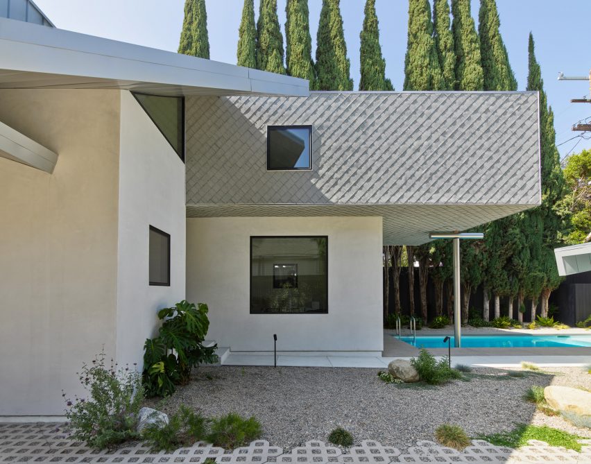
In addition to the cuts, the team added built space at the front and back of the house, increasing the home’s floor area to 1,980 square feet (184 square metres). In the rear, upper portions that project outward are supported by T-shaped steel columns.
The front half of the house consists of two quadrants, which together hold three bedrooms and two bathrooms.
The house has a multi-faceted roof
The remaining two quadrants make up the back part of the home. Combined, they encompass a kitchen, dining area, living room, powder room and service areas.
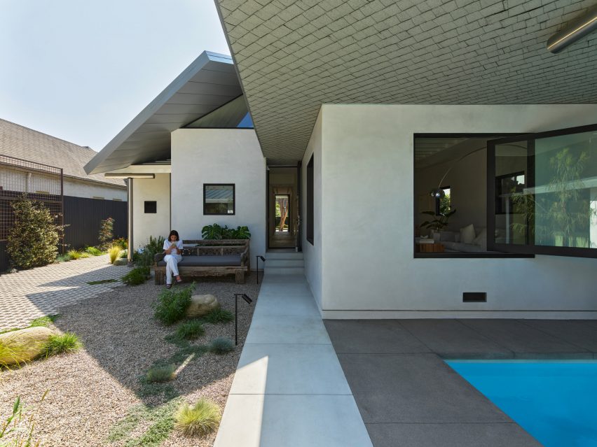
The quadrants are joined at the centre by a double-height volume that “serves as an interior courtyard and gathering place for the family”, the team said.
“The aim is to evacuate the centre of the house and put a cultural proposition in its place – a new way to think about how and where to come together as a family,” said LADG co-principal Benjamin Freyinger.
The central volume also helps cool the home’s interior, as it facilitates cross ventilation and directs hot air toward upper operable windows.
The bungalow was originally built in 1929
“We are taking out the hearth and replacing it with air, as an abstract idea and quite literally as a means to achieve a passively cooled interior climate,” said Freyinger.
The home has a multi-faceted roof that is meant to “open up the strict rationalism of the delineated plan underneath,” the team said.
The centre of the home has a double-height space
Several areas are wedge-shaped and extend beyond the walls to provide shade. The central part of the house is topped with a boxy enclosure.
“The remaining central area is covered by a double-height, upside-down box, partially unfolded into a series of projecting eaves that lap the mono-pitch wedges and bandage the whole assembly together,” the team said.
“The unfolded, lapping planes of the box are projected in elevation to standard residential pitches, giving the house a contextual affinity with the mid-century spec houses on the rest of the street.”
The home is located in LA’s Larchmont Village neighbourhood
On the exterior, one finds smooth white stucco, asphalt, sheet metal and standing-seam metal.
Inside, the team incorporated a mix of textured stucco, plaster, drywall, plywood and white-washed oriented strand board (OSB).
The LADG also updated an existing accessory dwelling unit
“The materials palette consists of a variety of common everyday materials that are quintessentially LA and legible to anyone who has shopped the aisles at Home Depot,” the team said.
In the back of the property, the team updated an existing accessory dwelling unit (ADU), which holds a bedroom and bathroom. The rear of the house also features a yard and a slender swimming pool.
Other projects by The LADG include the expansion of a mid-century home into a live-work complex for a painter and a photographer – a project called House in Los Angeles 1. The studio is also behind a California bar that evokes an Irish pub with its green tartan wall coverings, brass accents and leather banquettes.
The photography is by Marten Elder.
Project credits:
Architect: The Los Angeles Design Group Project team: Remi McClain (project lead), Kenji Hattori-Forth, Jonathan Rieke, Son Vu Engineer: Nous Engineering (project lead, Omar L Garza) General contractor: Engine Construction Project manager: Brain McCabe Landscape design: Big Red Sun Interior styling: Jason Baird
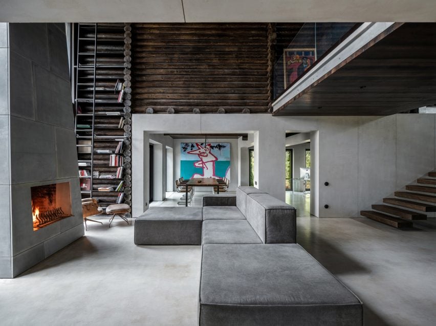
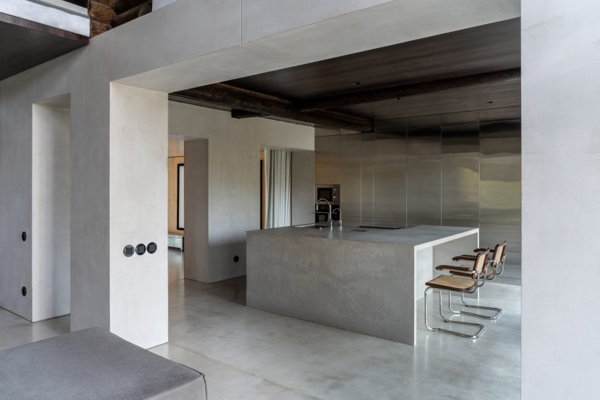
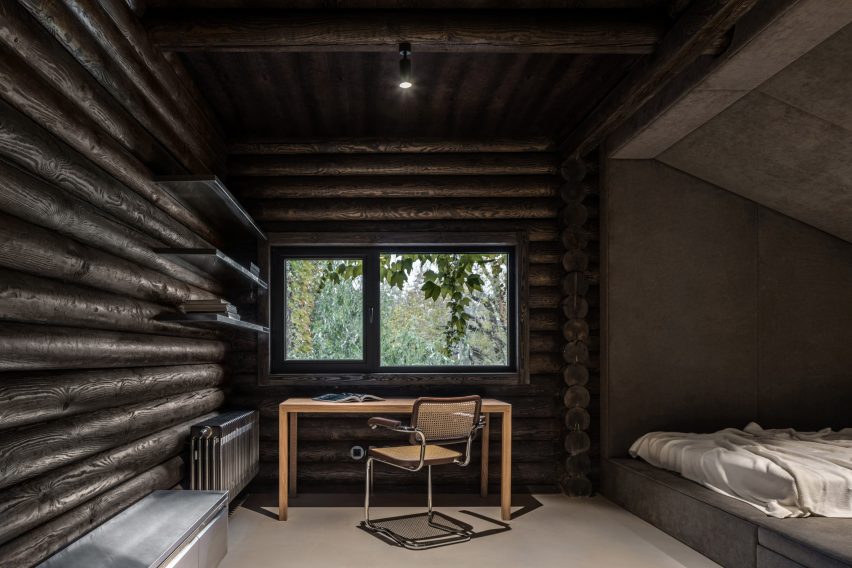
Architecture studio Balbek Bureau has revamped a house in Ukraine using stainless steel and concrete to create a modern interpretation of a log cabin.
The three-bedroom cabin was built from horizontally stacked logs, which the designers kept on display throughout the interior.
Horizontally-laid logs clad both the exterior and interior
The Kyiv-based studio aimed to deviate from conventional cabin interiors, instead creating an industrial, utilitarian scheme informed by the style of American fashion designer Rick Owens.
“The pre-existing interior was in a classic log cabin style,” Balbek Bureau told Dezeen. “The logs were a lighter shade, closer to the natural wood colour – the furniture was mostly made of wood as well with traditional country-style shapes dominating the interior.”
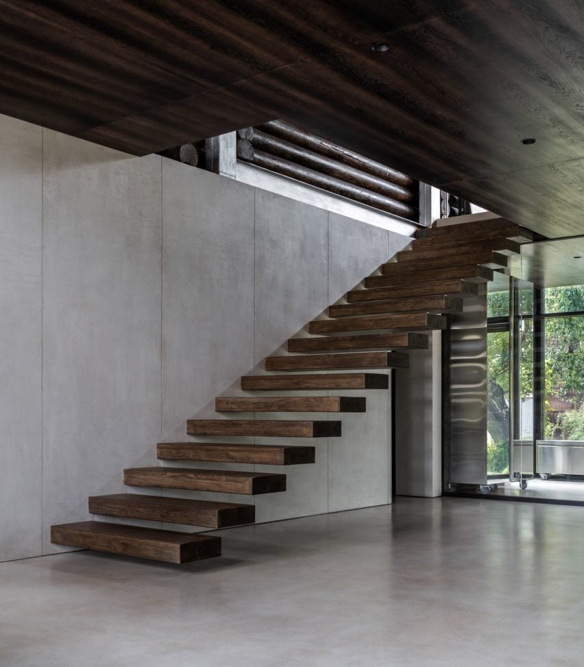
The stairs have cantilevered steps that appear to float
In order to lend itself to a more industrial finish, the studio trimmed the interior of surplus logs and timber.
“Our goal was to achieve a clean geometry of the space with as little extra lines as possible,” said the studio.
“That is why we removed part of the log beams that were not load-bearing – we did the same with non-bearing walls to create an open space on the first floor.”
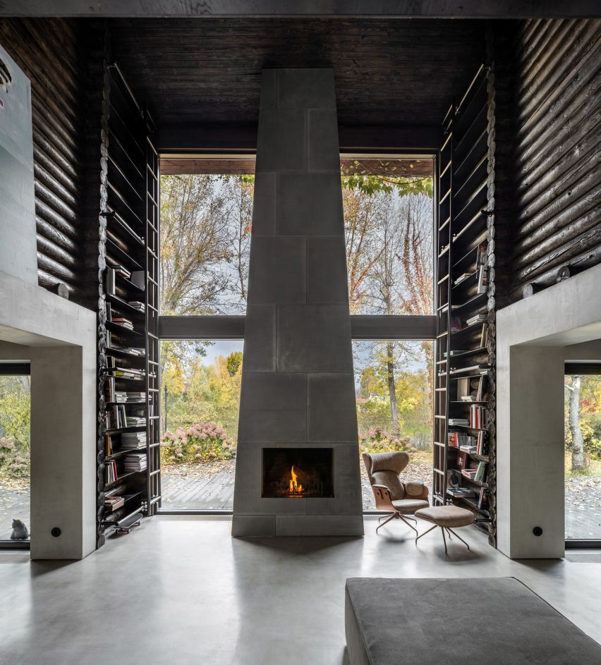
A towering fireplace dominates the living space
Microcement flooring and project-bespoke furniture pieces such as stainless steel consoles were added to the spaces to contrast the traditional log walls.
Vintage lounge and dining chairs from the owner’s own collection were added to character to the spaces, which were hung with paintings belonging to the client.
Log beams juxtapose industrial finishes in the kitchen
The glass-fronted entryway contains a staircase comprising timber planks cantilevered out from wall. Beyond, the kitchen, dining room, home office and living room are contained within one fluid space.
The cabin’s construction is most apparent in the double-height living space, where logs form tall bookcases accessed by a sliding metal ladder. These flank a tapered fireplace made from concrete blocks, at the foot of which sits a large sofa.
The use of concrete continues in the kitchen, which is dominated by a monolithic kitchen island flanked by floor-to-ceiling stainless steel cabinets.
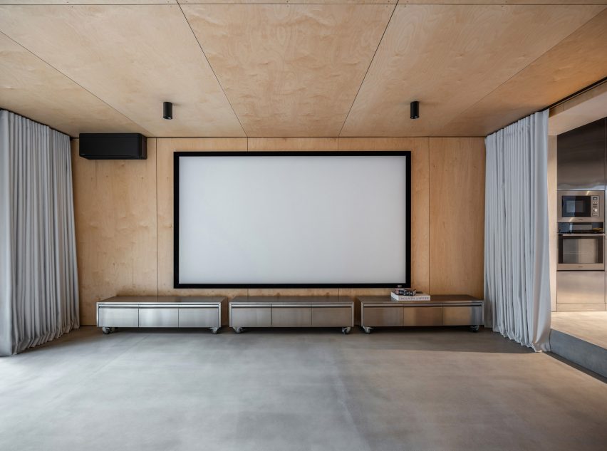
Plywood panelling replaces logs in the curtain lined theatre room leading off of the kitchen.
Metal consoles on casters sit below the screen
Modern, black-framed windows were installed throughout the building, with vertical windows added in the home office and dining room to bring more sunlight into the space.
Original ceiling beams were left exposed to highlight the cabin’s original construction.
A clear desk contrasts the wooden dining room furniture
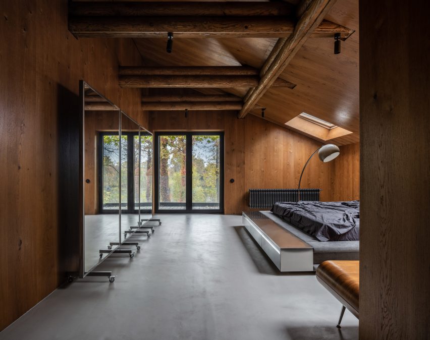
Recalling the sofas downstairs, the master bedroom features a sprawling custom-made bed that sits low to the floor. Its upholstered sides were bolstered by stainless steel consoles similar to those in the theatre room.
Retro lamps were added as a playful touches including a bulbous standing lamp that arches over the bed.
The main bedroom utilises warmer-toned wood
A moveable mirror-panelled screen on castors sits against one wall, and a wooden mid-century console references the warm-toned timber-clad walls.
Throughout the house black radiators, ceiling lights, window frames and power outlets punctuate the rooms.
Upholstered sleeping nooks create a cosy atmosphere
The two bedrooms on the other side of the cabin retain the dark-toned log walls of the living room, adjoined by steel shelves and contrasted by soft, padded sleeping nooks.
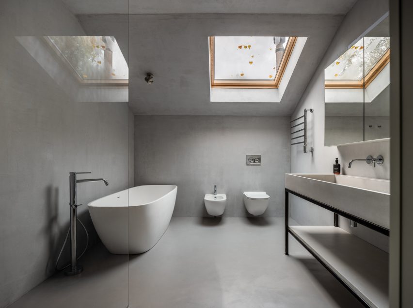
Both of the bathrooms are a stark contrast from the rest of the interiors, with almost no wooden finishes at all and housing white fixtures.
Concrete covers the bathroom walls, floors and ceilings
“[Relogged] allowed us to work on rethinking the rather established and traditional form of a log cabin,” concluded the studio.
Other cabins featured on Dezeen include A-frame cabins in a remote Canadian forest by Atelier l’Abri and a cabin clad in ash wood on a rocky outcrop in Norway by Line Solgaard Arkitekter.
The photography is by Andrey Bezuglov and Maryan Beresh.
Australis: a family home that opens to the australian bush
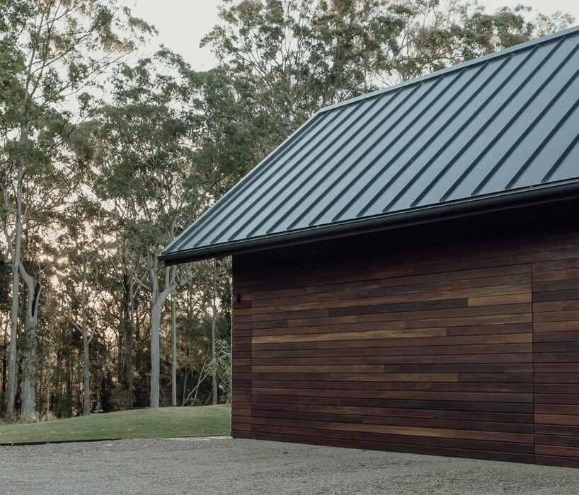
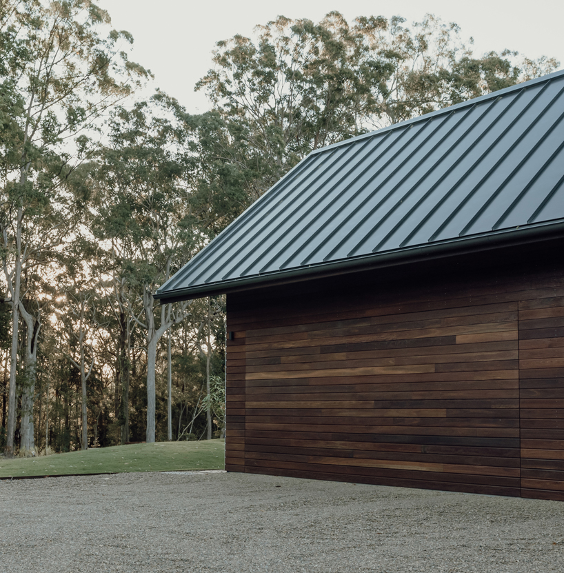
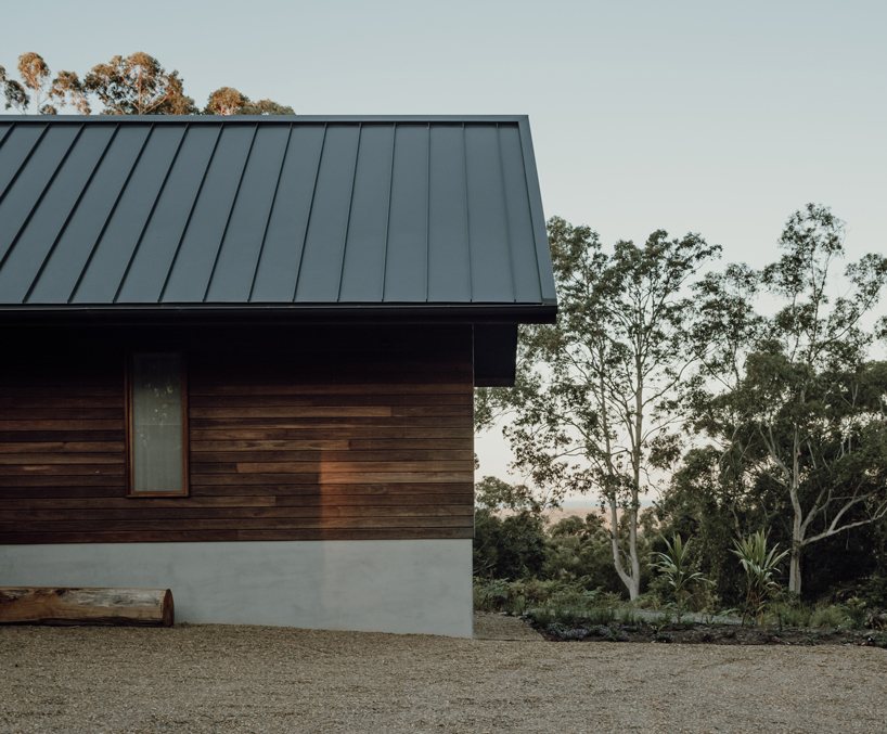
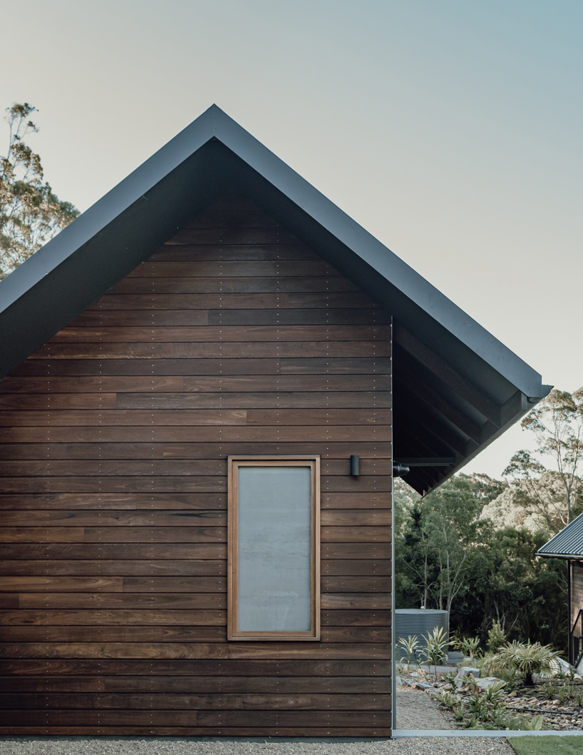
Australis House by Queensland-based sealand architects is designed to foster users’ family and friends connections and blend with the surrounding landscape of the Australian bush. The project allows for flexibility in the design to accommodate the changing requirements of the family’s living conditions. The concept follows a traditional character and draws from early Noosa building structures that present elegant roof forms and timber construction. Externally the facade applies materials such as local hardwood, stone, and metal roof sheeting that are relatively low maintenance and bushfire resistant.
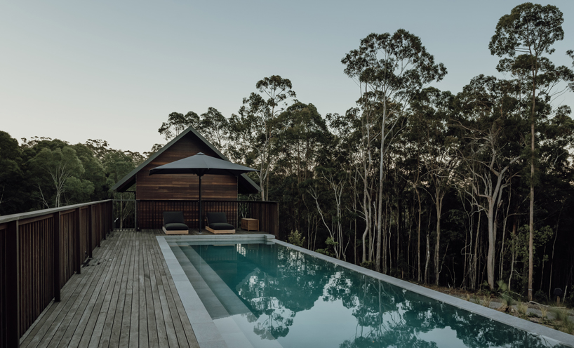
The layout forms large central areas in the house for gathering, cooking, dining, and relaxing. The more intimate zones nestle at either end of the house. The architecture provides a strong connection to the surrounding landscape and responds to the local climate and lifestyle. Large sliding glass doors and windows set up in every room open onto the gardens and landscape beyond. The apertures allow natural light and ventilation throughout the interior.
all images by David Chatfield and Emma Bourne
Australian hardwood, stone, concrete adorn the interior
Internally, the project primarily applies local hardwood, stone, concrete, and plaster. The design team‘s selection of robust materials provides a warm feel throughout and ease in maintenance and cleaning. The design references the farmhouse typology that characterizes the Noosa hinterland, traditionally made up of rural properties. Modeling on the typical layout of a central main house, that was surrounded by a series of smaller buildings, the architecture breaks up the structure into a series of smaller pavilions that follow the natural topography, and connect to the landscape. As the house is surrounded by Australian native forests, the bushfire risk is one of the principal challenges of the design. To reduce the risk, the flammable eucalyptus trees are removed from around the house and replaced with native rainforest plants that have higher water content and will create a natural bushfire buffer around the construction.
the design draws from early Noosa timber building structures
traditional Queensland gable roofs and bushfire-resistant Australian hardwood cladding
the large pool looking interacts with the natural surroundings
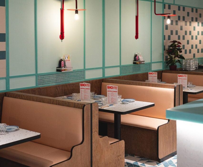
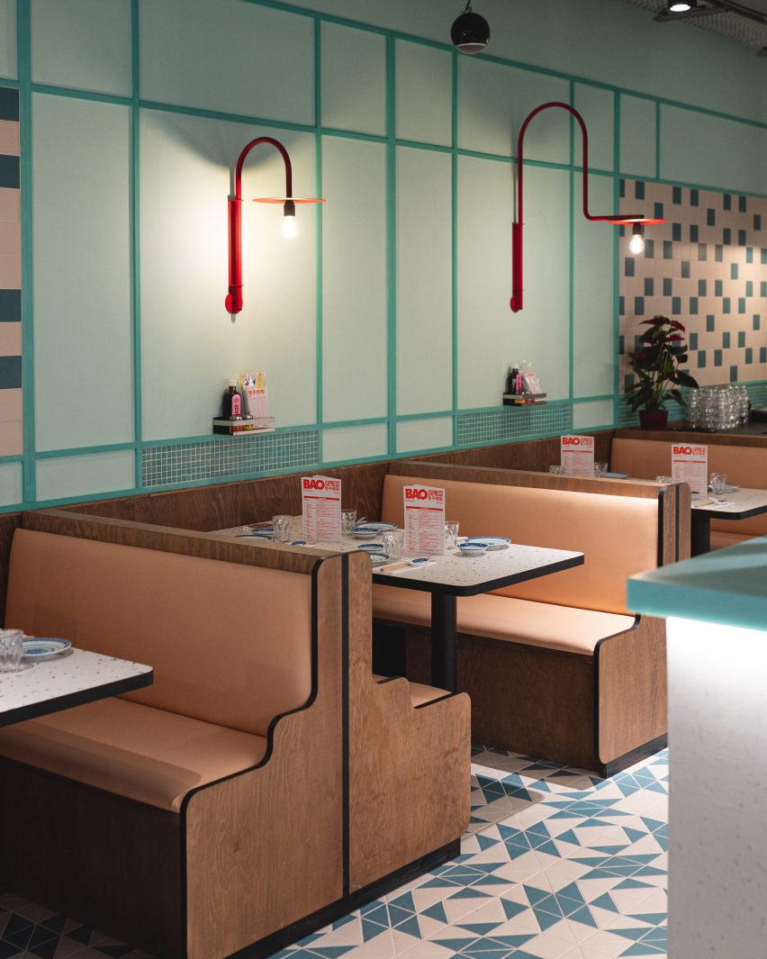
Design studio Atelieramo has completed a retro interior for a Chinese restaurant in Paris, featuring celadon-green walls and curvaceous wooden booths modelled on those found in Hong Kong diners from the 1970s.
Architect Tala Gharagozlou and designer Virginie de Graveron oversaw the interior concept for Bao Express, a restaurant near Bastille in the 11th arrondissement that serves dim sum and bao buns.
Bao Express is a Chinese restaurant in Paris. Top photo by Géraldine Martens
Housed in a former button factory, the 500-square-metre space is divided into three areas: a bakery, a diner and a basement bar.
Atelieramo set out to create a series of distinct yet connected spaces that evoke the architecture and pop culture of 1970s Hong Kong – in particular its greasy spoon cafes, locally known as cha chaan tengs.
Diners can sit in the eatery’s cosy wood-lined booths
“We reinterpreted snippets of that vibrant Hong Kong urban atmosphere with its coloured pavings, pastel colours, neon lights and dense mix of patterns and motifs,” said the studio.
“The aim was not to create a decor but rather, with a playful nod to these references, create a new atmosphere distinct to Bao’s new space.”
A larger skylit dining area is located in the rear. Photo by Géraldine Martens
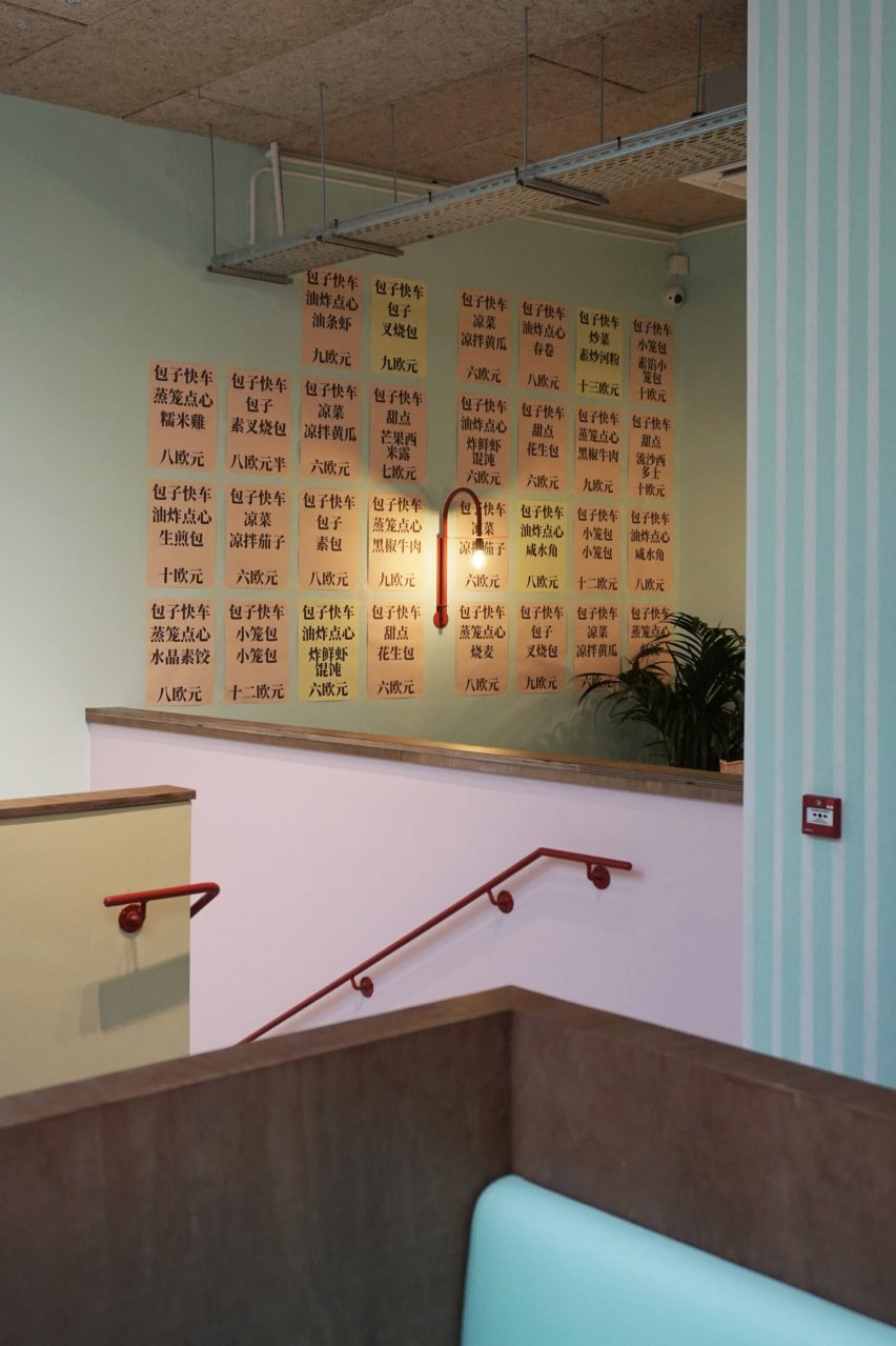
The adaptation of the existing abandoned building involved significant alterations to the floor plates and structure, along with the addition of a new staircase and circulation.
From the street, customers enter a small bakery and cafe serving sweet and savoury snacks to eat in or take away. What appears as a simple neighbourhood cafe conceals the presence of the larger dining areas, which are set back in the building’s plan.
A new staircase leads down to the basement bar. Photo by Bérénice Bonnot
The kitchens are visible from the street and guests walk past colourful crates of raw produce before passing through a metal curtain to reach the main Bao Express diner.
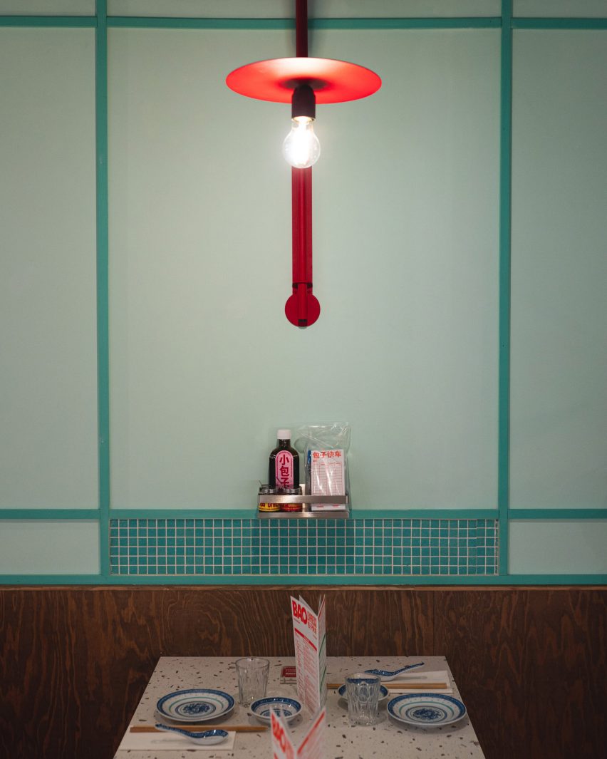
The long dining space features cosy booths with sinuous wooden frames. The pastel-green walls are contrasted with bespoke bright-red sconces and simple mosaic panels that echo the materials of the central bar.
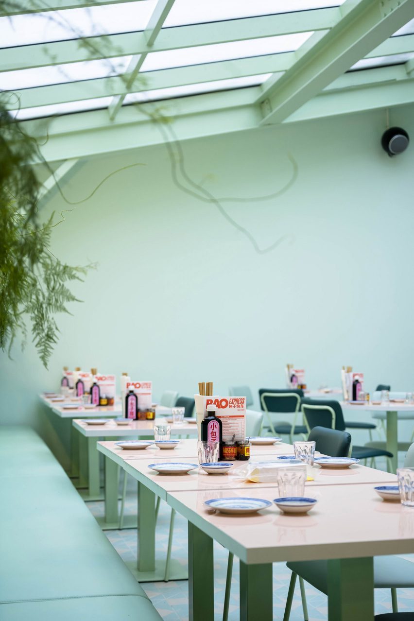
Towards the rear of the building is a larger dining area topped with an expansive skylight. This bright and airy space is filled with plants that create the feeling of dining in a winter garden.
Exposed masonry walls painted in celadon-green form the basis for a playful colour palette featuring contrasting peach and pink elements as seen in the glossy tabletops.
A hammered-metal artwork by SupaKitch decorates the ceiling in the bar
The studio’s eclectic use of colour and pattern extends to the geometric tiled floors and punchy black-and-white stripes that are painted on the walls of the staircase leading down to the basement bar Underpool.
This bar area features a hammered-metal ceiling installation by French artist SupaKitch, with a rippled surface that reflects the blue-green interior and creates the impression of looking up at an upside-down swimming pool.
The artwork creates the impression of looking up at a swimming pool
Bao Express is part of a family of eateries in Paris owned by restaurateurs Céline Chung and Billy Pham. Atelieramo was responsible for designing several of the duo’s restaurants, each of which has a unique character inspired by different aspects of Chinese culture.
Another eatery informed by traditional cha chaan tengs is The Astor restaurant in Hong Kong’s Eaton hotel, designed by New York studio AvroKO, which mixes elements of the city’s diners and street food stalls with nods to the arthouse films of Wong Kar-Wai.
The photography is by Carole Cheung unless otherwise stated.
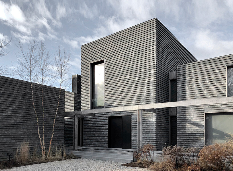
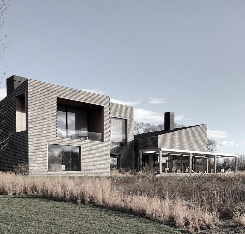
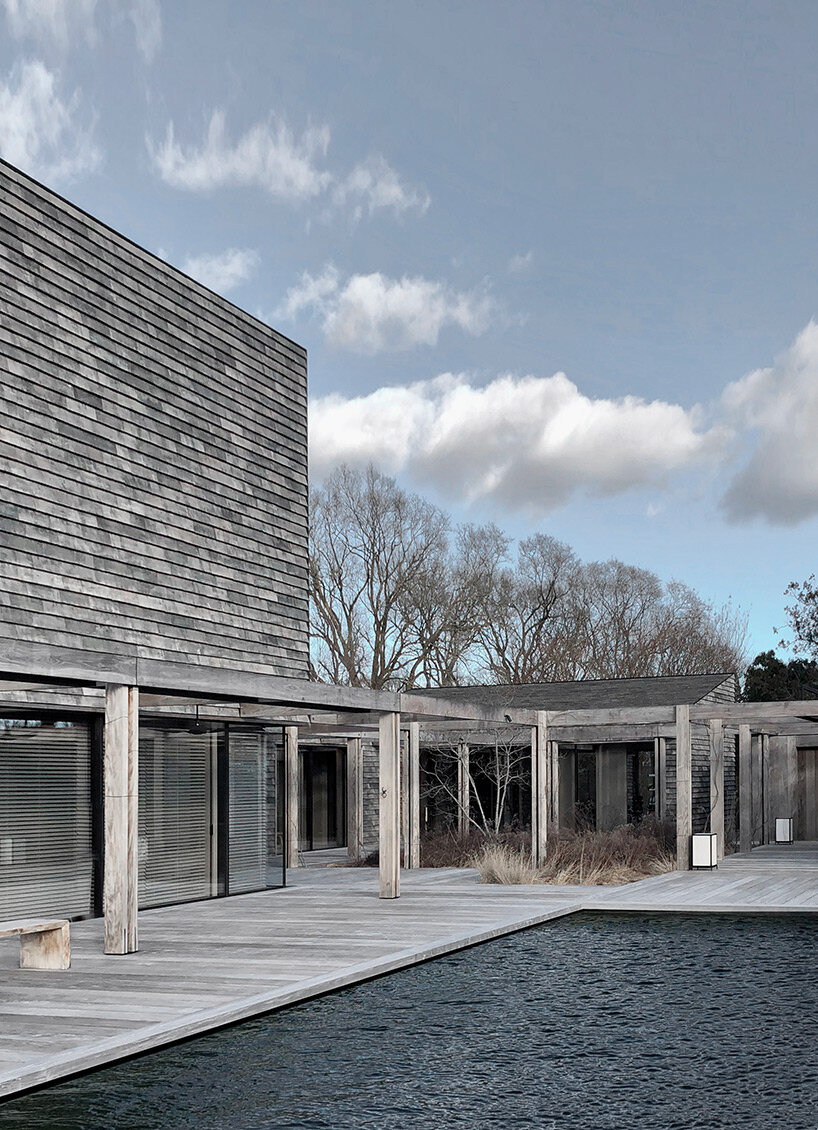
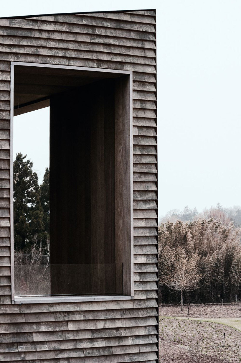
Belgian architectural firm Vincent Van Duysen has built a private residence on the lush coastline of Southampton in New York. Surrounded by wetlands and large oak trees, the architecture reflects the archetypal composition of a traditional farmhouse in the form of a cluster of volumes. Seeking a timeless material palette that emphasizes the careful composition of angled and vertical surfaces and highlights their shadows cast under the unique light, the architects chose traditional local materials such as typical wooden barn siding, cedar shingles, and bespoke fired clay tiles to cover the entire façade and roofs.
the residence is clad in bespoke fired clay tiles | all images by Joseph D’Arco
reinterpreting traditional typologies against a unique backdrop
The site is enveloped by protected wetlands with a specific color and vegetation palette. Large oak trees dominate the access road to the property, creating a tranquil and natural environment. At the same time, the region is characterized by a very special light throughout the year, creating strong shadows and contrasts.
Against this unique natural background, the architecture by Vincent Van Duysen (find more here) is defined as a group of structures that house different functions of the program and consist of a main house and outbuildings. The design approach reflects the archetypal composition of a traditional farmhouse and residential structures that form an integral part of the cultural heritage of the region.
the materiality of the project emphasizes the careful composition of angled and vertical surfaces
exterior and interior merge into one overall experience
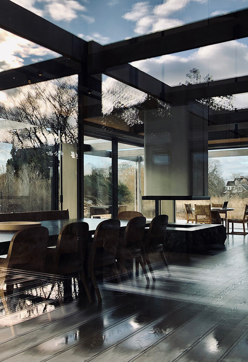
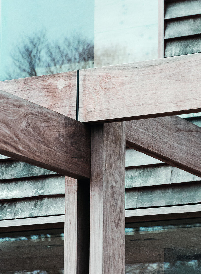
From the lush driveway, occupants pass through one of the buildings to a central courtyard. The interaction of the different volumes around the central courtyard is unified by a wooden pergola and an extended wooden terrace on a higher level, which connects and encloses all the outdoor and public areas around the house. These terraces were conceived as a pure extension of all interior spaces. In the summer, the exterior and interior spaces merge into one overall experience, ensuring interactivity between the different parts of the program.
The public areas dominate the first floor in a careful sequence of spaces and atmospheres, always emphasizing an important axis or an interesting viewpoint of the landscape. Secondary functions are located in the outbuildings, while the higher floors house the more private and exclusive areas with the master bedroom and master suite, as well as the children’s rooms. All of these rooms feature higher ceilings that capture and frame nature through generous pocket windows set into the walls.
the interaction of the different volumes around the central courtyard is unified by a wooden pergola
An important aspect of this project is the tectonic expression of the architectural volumes. It was crucial to create a timeless but contemporary material palette, but also to find a material that would highlight the careful composition of the volumes and the hierarchy between oblique and vertical planes, while emphasizing the tactility of the surfaces and the way they cast shadows under the unique light.
With an eye to the traditional materials of the region, such as the typical wooden barn siding or the cedar shingles, fired clay tiles were carefully selected for the entire façade and roofs to reflect the local architectural heritage in a contemporary way. This highly textured and tactile material, combined with naturally aged ipe wood and dark metal, completes a very powerful yet sober material palette that blends in with its surroundings.
view of the interior of the HBH residence
detail of the façade
detail of the wooden pergola
project info:
name: HBH Residence architects: Vincent Van Duysen in collaboration with:STELLECO interior design: Atelier Christian Liaigre landscape design: Piet Oudolf area: Southampton, NY, US
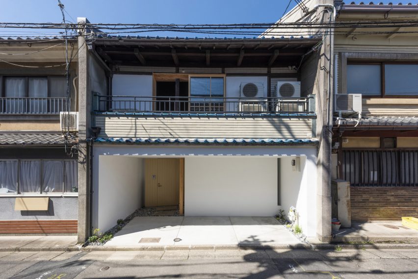
Japanese design studios Td-Atelier and Endo Shorijo Design have renovated a century-old machiya townhouse in Kyoto with minimal interiors that intend to honour the home’s existing architecture.
Called House in Marutamachi, the Japanese house was built over 120 years ago and is arranged across two floors on a long and narrow site.
House in Marutamachi is a traditional machiya house in Kyoto
Tucked between two other residential properties, the house is an example of the wooden machiya townhouses that were once common in Japan’s historical capital Kyoto but are now at risk of going extinct.
“Traditional Kyoto townhouses are being destroyed at a pace of 800 houses a year,” Td-Atelier explained.
“Old buildings don’t match modern life. However, we want to stop the decline of Kyoto townhouses by fusing tradition, design and new life.”
The kitchen is encased in a white volume
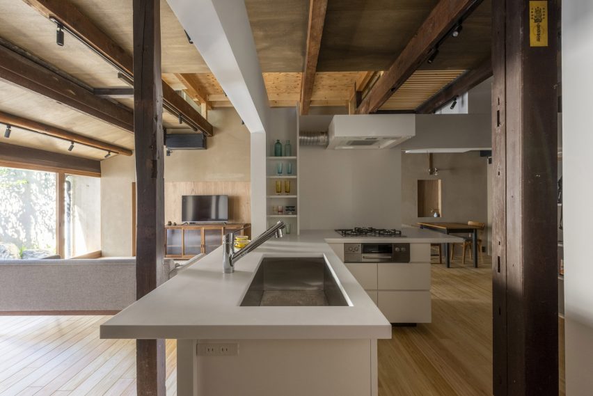
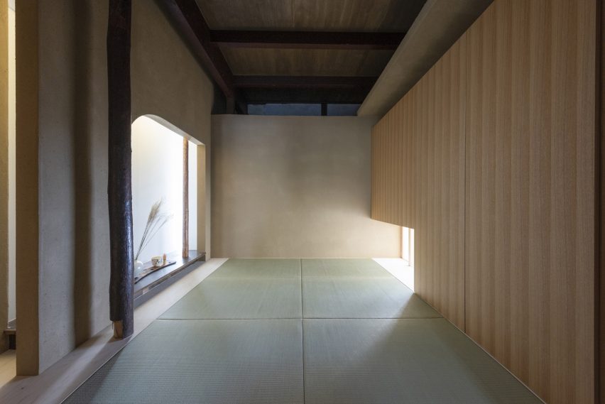
Td-Atelier and Endo Shorijo Design dressed House in Marutamachi’s interior with new components including sleek tiles and geometric furniture alongside materials reused from the original house, as seen in the traditional team room.
The studios retained the building’s wooden columns and beams but added white volumes to house rooms including the kitchen and study to avoid disturbing the existing architecture with harsh structural materials.
The tea room was constructed using materials reused from the original building
These variously sized cubes were designed to mimic the contrasting heights of buildings in a cityscape.
“The gaps and omissions created between the volume group and the existing columns, beams, walls and floors create continuity in the space,” Td-Atelier said.
Throughout the house, Td-Atelier and Endo Shorijo Design adopted a minimal material and colour palette including a combination of light and dark woods alongside smooth concrete.
A thin, sculptural light is suspended above the timber breakfast bar on the second floor, where occupants can sit on clusters of subtle-coloured stools.
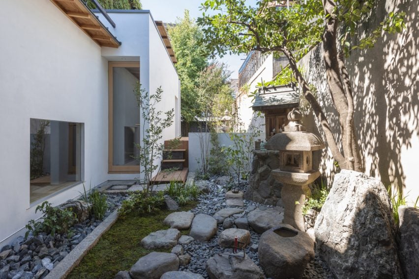
Original features were maintained in the garden
Outside, a plant-filled garden features elements from the building’s original architecture such as sandy-hued lanterns and a chōzubachi – a traditional stone water bowl historically used for washing hands before a tea ceremony.
House in Marutamachi was shortlisted for house interior of the year at the 2022 Dezeen Awards.
Dezeen recently announced the winners of this year’s interiors categories, who are now competing to win the overall interiors project of the year award.