AHMM to transform office into co-living space next to Barbican estate
CategoriesInterior Design

AHMM to transform office into co-living space next to Barbican estate

Developer HUB and investor Bridges Fund Management have revealed plans to convert a 1950s office building in London into Cornerstone, a co-living residential scheme designed by Allford Hall Monaghan Morris.

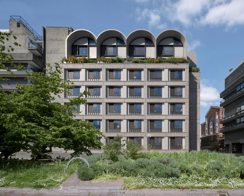
Located on the edge of the Barbican estate, the Cornerstone project will draw from the iconic Barbican architecture to transform 45 Beech Street into 174 co-living residences along with street-level commercial spaces and amenities.

“Building on the success of our previous London projects with HUB, we are joining forces again to transform an underloved office building in the heart of the city,” Allford Hall Monaghan Morris (AHMM) director Hazel Joseph said.

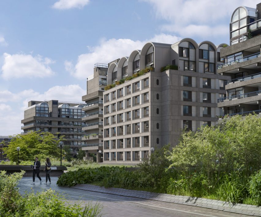
Elevation view of Cornerstone by AHMM in LondonElevation view of Cornerstone by AHMM in London
AHMM has revealed plans for a co-living retrofit next to London’s Barbican estate

AHMM’s proposal aims to re-use as much of the building’s existing structure and facade as possible, taking a “retrofit-first approach” to minimise the need for new building works.

The studio will also primarily work within the geometric parameters defined by the original envelope, while updating the rectilinear language to create uniform apertures for each co-living apartment.

Referencing the Barbican estate, a series of arched, double-height extrusions will be introduced across the crown of the building to house additional co-living apartments.

Barbican context and facade of Cornerstone by AHMM in LondonBarbican context and facade of Cornerstone by AHMM in London
The design will adapt the existing building’s form and insert a series of arched spaces at the top

“The architectural approach has been carefully considered, responding sensitively to the much-loved Barbican context, completing the northern frontage of the estate,” Joseph said.

The arches will be partially set back from the building’s facade and lined with an asymmetric patchwork of glazed and tile panels underneath the curved overhangs.

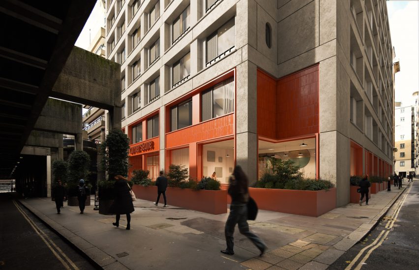
At street level, warm red panel accents will contrast against the building’s neutral concrete finishes to highlight commercial and collective functions.

The scheme will integrate a public cafe, a co-working space and community-focused amenities at its lower levels to improve the public realm for those who live and work in the area.

“The existing structure of 45 Beech Street will be re-used and extended, creating a new residential community with shared amenities and breathing new life into the local streetscape,” Joseph explained.

street level activation of Cornerstone by AHMM in Londonstreet level activation of Cornerstone by AHMM in London
At street level, new commercial and public amenities will seek to activate the ground plane

According to HUB and Bridges Fund Management, AHMM’s proposal was developed in collaboration with the community – including Barbican residents – who were consulted through a series of workshops and events.

A website was also established to solicit viewpoints about the redevelopment, reiterating the design vision to establish a “vibrant community” that will adapt the original building and holistically contribute to the neighbourhood.

AHMM was established in 1989 by Simon Allford, Jonathan Hall, Paul Monaghan and Peter Morris in London. The studio has previously converted a 1930s block into New Scotland Yard’s headquarters in London and completed a mixed-use building in Southwark with interlocking flats.

Also adjacent to the Barbican estate, Diller Scofidio & Renfro’s proposal for a pyramidal music centre was recently scrapped when the City of London Corporation revealed its plans for a “major renewal” of the Barbican.

The images are courtesy of HUB and Bridges Fund Management.

Reference

Could microbe-derived dyes transform the fashion industry?
CategoriesSustainable News

Could microbe-derived dyes transform the fashion industry?

Spotted: With the dyeing industry relying on petrochemicals to affix colour to textiles and requiring around 200 tonnes of fresh water for every tonne of coloured fabric, the challenge of reducing even part of the fashion industry’s environmental footprint is huge.  

Now, however, one company, UK-based Colorifix, has created a transformative technology for the textile industry’s dyeing needs. Using fermentation and microbes, the startup creates bioengineered dyes. At the start of the process, Colorifix identifies a colour produced by an animal, plant, or microbe, before isolating the section of the organism’s DNA where the colour is coded. Microbes can then be made to recreate this DNA sequence in the lab without needing to use toxic chemicals.  

The company ships a small amount of this microbe-produced colour to a manufacturing client, which then ‘brews’ as much dye as needed for each batch of fabric in a process similar to beermaking. All-natural feedstocks – such as sugar, plant by-products, and yeast – fuel the fermentation process, feeding the fast-growing microbes to create a batch of dye in one to two days.  

Colorifix dye is usable in industrial machinery, with no special mechanisms or tools needed. To bind the colour to a fabric, Colorifix, again, replicates a natural process for maximum sustainability. The startup uses engineered microbes to bind the dye to the fabric by concentrating salts and metals that occur naturally in water, making it possible to dye textiles at much lower – almost ambient – temperatures. The binding process is swift and strong, requiring far fewer rinses to attain a colour-fast finish. 

The entire process hugely reduces water consumption and carbon emissions, while eliminating the release of chemicals into the world’s waterways. Colorifix was an Eartshot Prize 2023 finalist in the ‘Build a waste-free world’ competition category, and the company is working towards a goal of dyeing 15 per cent of the world’s clothes by 2030.  

Developments in the process to detoxify the dyeing process are improving rapidly, with examples in Springwise’s database including a new low-temperature, bio-based process and a recycling programme that creates jobs and reduces water waste by turning temple flowers into natural dyes.

Written By: Keely Khoury and Matthew Hempstead

Reference

Spill The Tea: How Architects Can Transform Workplace Culture and Call Out Toxic Office Environments
CategoriesArchitecture

Spill The Tea: How Architects Can Transform Workplace Culture and Call Out Toxic Office Environments

Wandile Mthiyane is an Obama Leader, TedxFellow, architectural designer, social entrepreneur and the founder and CEO of Ubuntu Design Group (UDG) and The Anti-Racist Hotdog. He is proud to introduce The Tea, a peer-to-peer inclusion rating platform.

For far too long, companies have chosen to remedy discrimination after the fact rather than proactively cultivating prevention tactics to ensure employees don’t endure negative and potentially traumatic experiences. This reactive default means that the people who plan our homes, neighborhoods and cities don’t have a plan preventing them from facing harmful and dangerous workplace situations. It’s too easy to simply blame architecture culture; architects shouldn’t have to depend on Plan B–lawsuits, support groups or even have therapists on speed dial. What if you had all the information you needed on a company’s culture before applying?

Recently, I asked some friends what they wished they had known before entering the workforce, and their responses shed light on the challenges they faced. Each told me a harrowing story about intersectional discrimination in the workplace: significant pay gaps, inadequate maternity leave and administrative reluctance to address these issues and others. Comparing their stories exposes how similar problems can be found anywhere in the world, with women and people of color trying to combat workplace discrimination while simply trying to do the jobs they were hired for.

One experience was shared by a Black female friend who worked as an architectural designer in South Africa. After her first year, the company hired her white male classmate from university, assigning her the task of mentoring him for six months and teaching him about the firm’s design philosophy. One day over lunch, he unexpectedly expressed his dissatisfaction with his salary and, in the process, revealed the significant pay gap between them. Surprised by this revelation, my friend confronted her boss, and the conversation that followed is almost unbelievable.
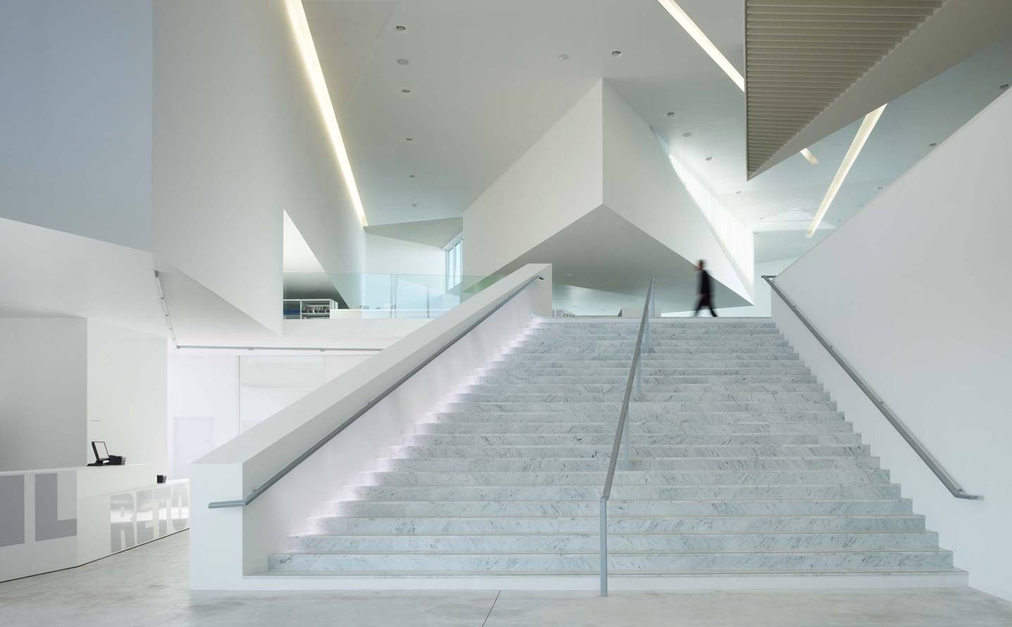
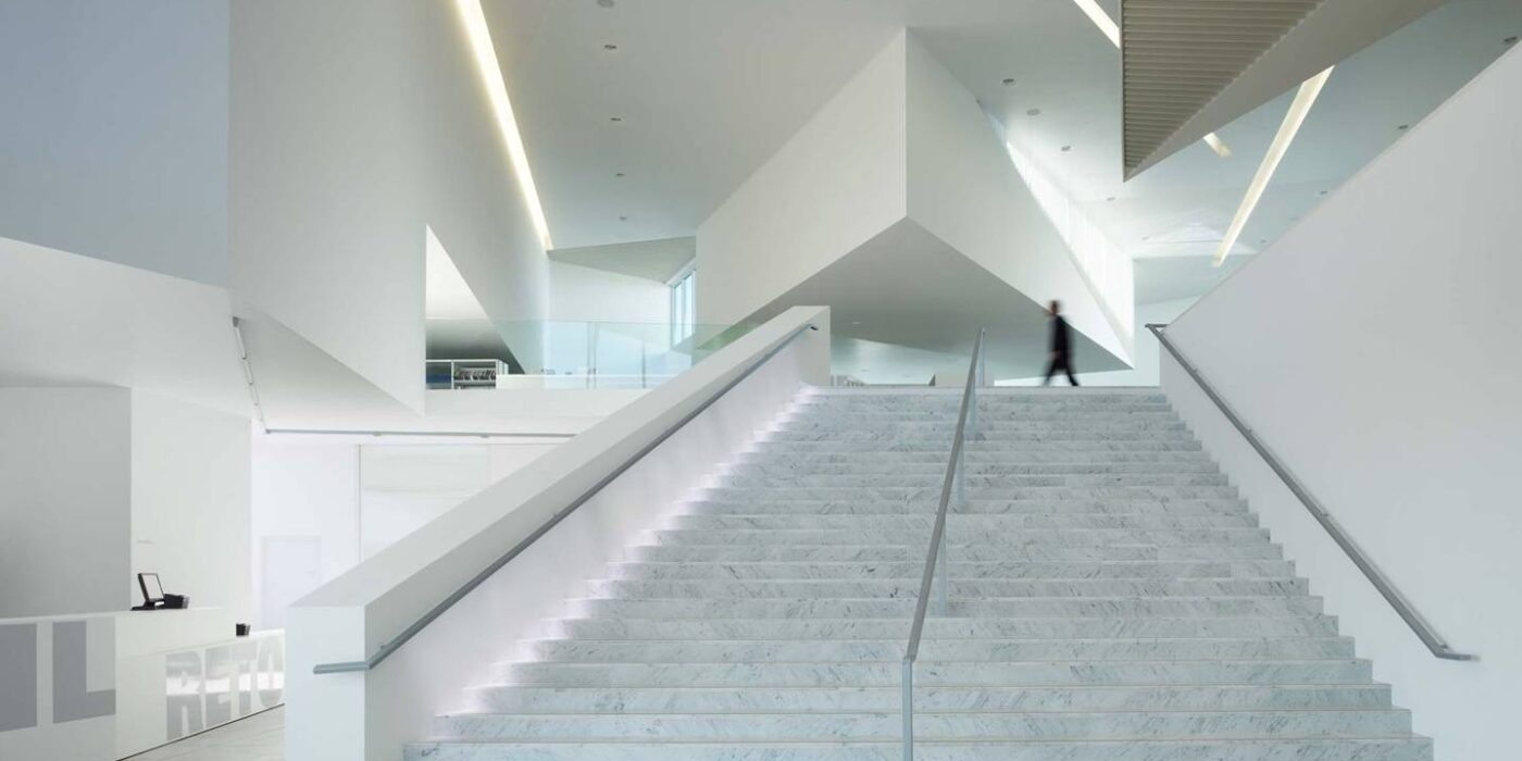
Library in Anzin by Dominique Coulon & Associés, Anzin, France

The boss initially justified the disparity by explaining that her classmate had financial responsibilities, such as paying rent to his mother. She pointed out that she paid rent to an actual landlord. The boss mentioned that his colleague — again, who she was mentoring — had a car, so they need to uphold his living standard, to which she responded she’d also have a car if she were compensated fairly. Only when she threatened to quit did she gain a raise to match her classmate’s salary.

These problems persist in North America, too. My Asian friend from Canada shared a comparable account of discovering that she was being paid significantly less than her colleagues. When she confronted her boss about the inequity, her boss quickly deflected the issue to the HR department, adopting a stance of concern and promising action. A week later, the boss informed her that the matter had been resolved and presented her with a list of goals she needed to achieve within a specific timeframe to earn a raise. Frustrated, she questioned the idea of needing to prove herself for a job she was already overqualified for just to receive equal pay. In the face of her threat to resign, the matter was resolved within a week.

Meanwhile, one of my white female friends in Germany revealed an age-based layer to gender discrimination. As she approached her mid-20s, she encountered difficulties securing a job. Once gainfully employed, she faced even greater hurdles in obtaining promotions. Companies perceived her as a potential liability because she could get pregnant, thus hindering her progress at work. Almost ironically, policies favoring maternity leave have led male bosses to view women as liabilities.

Clearly this problem is pervasive worldwide and is linked to problematic workplace cultures. While relevant in most workplaces, architecture is an industry well known for its toxic work culture. Architects have to deal with unnecessary competition between colleagues, work long hours, and pay off a mountain of school debt in the meantime. In 2023, Architecture Journal reported that over 40% of architects work at least 10 hours of overtime per week, largely unpaid, according to an AJ study completed by 400 architects. This work-pace leads to high burn-out rates, with almost 97% of architects reporting burn-out.

Take into consideration women and People of Color have to fight their own struggles against workplace discrimination while doing their own work in these already-toxic spaces. According to the National Council of Architectural Registration Boards (NCARB), out of the 121,603 licensed architects in the U.S. as of 2022, only 2% (2,492) are Black. Among them, only 566 are Black women, despite Black people making up 12.6% of the country’s population, with 52% of the Black population being Black women. These statistics clearly highlight the significant underrepresentation of people of color, particularly Black individuals and women, exposing them to vulnerability in white male-dominated studio spaces. Moreover, disparities in power structures within firms further exacerbate the situation, as women face additional challenges and are less likely to complete licensure, impeding their progression to principal roles. As one of my American friends noted, employees should have the ability to go to work and focus solely on their tasks without the added burden of being the unofficial and unpaid advocates for DEI within their companies.

Clearly, DEI programming is not enough to change our workplaces. Over the past two years, my team and I have partnered with leading social psychologists from Harvard, Columbia, Deloitte, and The Resolution Project, and closely studied company culture while consulting with architecture firms, both large and small. Throughout our research, we engaged with young professionals to understand what they wish they had known before entering the workforce, particularly what would have helped them make better decisions about the places where they would spend the majority of their adult lives.

Building upon this work, we developed The Tea: a demographic-specific, peer-to-peer inclusion rating platform that connects women and people of color to workplaces where they are truly valued. The Tea uses key workplace indicators that matter the most to individuals of similar demographics, based on research that shows why women and people of color leave or stay in workplaces. The platform uses ratings based on key workplace indicators such as salaries and benefits, path to growth, internal advocacy, external advocacy, authentic self, and valued expression. Users can also filter based on race, gender, sexual orientation and age to find how people that look like you have experienced a particular workplace.

The Tea is also built for firm leaders and HR directors, helping them know exactly what they need to improve in their own workplaces and the steps they have to take. Instead of providing negative anecdotes without clear solutions, The Tea’s data-driven key indicators show more precisely where companies need to improve. Companies can even upload their own efforts to address each indicator, so applicants can see how a company is dealing with certain problems. Above all, we value everyone’s identity and security, online and in the workplace: just log in with your LinkedIn, and your reporting remains anonymous.

In the end, The Tea benefits everyone involved. It provides employees with a safe space to identify companies that truly value their labor, eliminating the need for them to be BIM managers and the office’s designated MLK just because they’re a person of color. Simultaneously, employers gain valuable insights on how to create the most culturally diverse and inclusive firms in the world. We are transforming DEI from a mere aspiration into a tangible reality. Let’s join forces and spill the tea together, ensuring we never have to face these challenges again!

Architects: Want to have your project featured? Showcase your work through Architizer and sign up for our inspirational newsletters.
Reference

Gensler and Civilian transform Detroit post office into technology centre
CategoriesArchitecture

Gensler and Civilian transform Detroit post office into technology centre

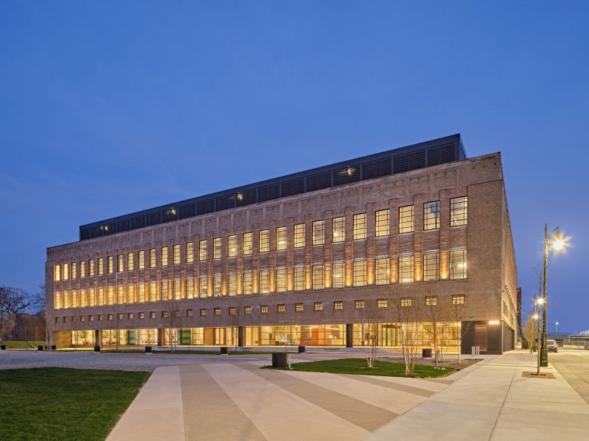
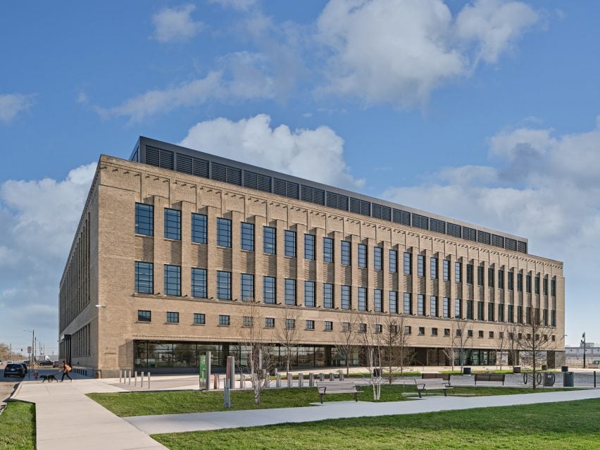
American architecture studio Gensler and interior design studio Civilian have restored the historic Book Depository building in Detroit and transformed it into the headquarters for technology company Newlab.

Gensler and Civilian transformed the art deco building to be usable by tech companies, adding purpose-built prototyping labs, open-plan co-working spaces and outdoor green spaces.

Exterior of the Book Depository building transformed by Gensler for the Newlab Detroit headquarters
Gensler and Civilian transformed a 1930s post office into a workspace and technology centre

The 270,000-square-foot (25,083 square metres) building will be used as a centre for startups, entrepreneurs, engineers and scientists working in mobility technology.

The Book Depository building was originally built in 1936, designed by American architect Albert Kahn as a post office and mail-sorting facility. It was later used as a place to store books by Detroit Public Schools, from which it draws its name.

Exterior of the Book Depository building transformed by Gensler for the Newlab Detroit headquarters
The building will be used as Newlabs Detroit headquarters

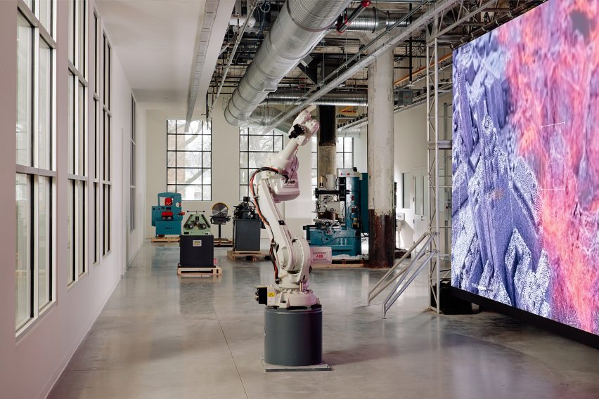
The building now includes an exhibition space, an event space, a robotics and prototyping facility, and two open studio spaces with desks, lounge areas, classrooms and meeting rooms.

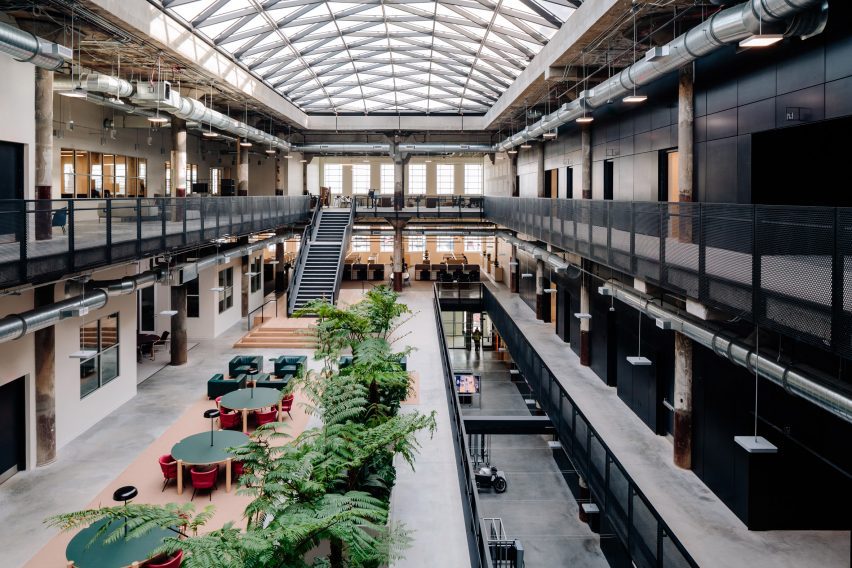
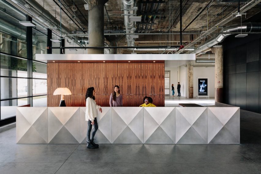
The interior has an industrial appearance with concrete floors and exposed services.

Lounge chairs, circular tables and planting fill the central atrium space, which provides a collaborative workspace lit by the skylight above.

Interior atrium space with large skylight and open-plan co-working space
An atrium space lets natural light into co-working spaces

“The building has been repositioned to meet the demands of the city’s top innovators, including ample access to daylight, open internal connectivity and destinations for exchange, and an engaging ground floor as a connective intersection within the overall development, serving as a boulevard for the community, industry partners, and the neighbourhood,” said Gensler.

“Embracing the rich history of the building, juxtaposing design elements with the industrial strength and structure associated with Albert Kahns work, Gensler reimagined the building with a focus on connection and collaboration,” added Newlab.

Newlab has an existing headquarters in Brooklyn, New York, and hopes that transforming the Book Depository building into the company’s Detroit headquarters will attract jobs to the area.

“Building on its success in Brooklyn, Newlab is scaling its model of applied innovation to create the conditions for a sustainable high-tech startup ecosystem to take hold in the region,” said the company.

Technology labs at the Newlab Detroit headquarters by Gensler
The building includes and robotics and prototyping facility

“Projected to attract thousands of new jobs to Michigan Central, the campus will offer high-design innovation and collaborative workspace, dozens of acres of green and open space for the community,” Newlab continued.

Architecture studio Ghafari assisted Gensler and Civilian with the interior design of the project and landscape design studio MYK created the landscaping scheme.

Interior of the Newlab Detroit headquarters
The interior has an industrial appearance

The building is situated on the Michigan Central campus, a district dedicated to mobility innovation that also includes Ford’s restoration and transformation of the Michigan Central Station.

Other large-scale projects set to be built in Detroit include a slanted glazed building designed by Kohn Pedersen Fox for the Detroit Center for Innovation campus and OMAs design to transform a derelict bakery into a mixed-use art and education facility.

The exterior photography is by Jason Keen. The interior photography is by Brian Ferry.

Reference

Bringing the Outside In: Using Biophilic Design Principles to Transform Commercial Interiors
CategoriesArchitecture

Bringing the Outside In: Using Biophilic Design Principles to Transform Commercial Interiors

Modernism was all about clean lines, raw surfaces, and celebrating the uncompromising rationality of the machine. The vision of LeCorbusier was revolutionary in its time, and caught on in ways he would likely not have expected. Today, most of the public spaces we move through, from offices and schools to hospitals and transport hubs, owe something to the modern movement and its penchant for no-frills design.

Not everyone is happy with this state of affairs. Today, there is a renewed interest in the textures, patterns, and curves, the very features of classical architecture that modernists once avoided. Design-thinkers have learned that natural forms, from the vein patterns in leaves to the curves of the human body, are based on fractals rather than grids. As human beings, we find fractals pleasing to the eye and emotionally restorative. Right angles, in contrast, are harsh and even exhausting. This is why so many people describe modern spaces as feeling grim, sterile, or anxiety provoking.
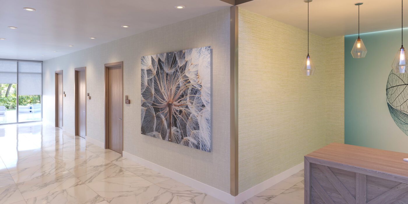
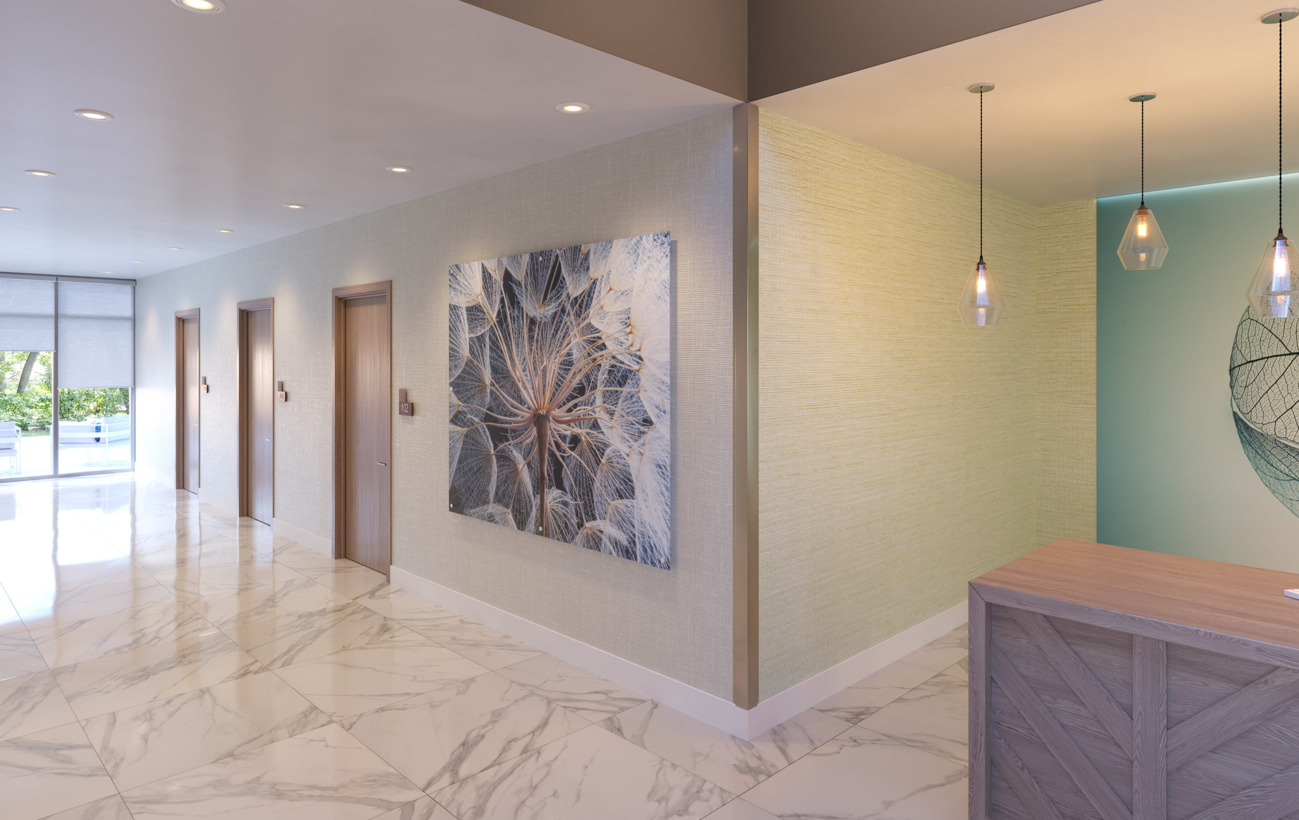
Wall art by Inpro

For architects that are looking to warm a space with natural forms, bringing in some of that fractal energy people literally crave, the experts at Inpro are providing new, high-tech solutions. They create high-end, digital artwork optimized for spaces such as offices, schools, hospitals and more, bringing vitality to spaces that would otherwise be merely functional 

Through their critical design research into art and biophilia, and from the inspiration that guides it, Inpro is looking to make art “work” for the occupants in any commercial building. How art, working through digital imagery or printed on an architectural product, can bring a brand, an idea or even a feeling to life.

Nick Cotter, Creative Director at Inpro, says: “The right image can have a calming effect, especially in healthcare environments where patients might be experiencing anxiety, fear or pain. Images of nature offer serenity in an otherwise sterile space, while bright and colorful artwork can stimulate interest and put smiles on faces.” Studies have shown that looking at images of nature is healing, much like spending time in nature. Art, then, is a crucial component of any healthcare space. 

As the company explains in their Imaging Products brochure, “North Americans spend nearly 90% of their time indoors. . . Whether it be promoting healing in healthcare, productivity in office environments, stimulating creativity in education, triggering brand recognition in hospitality or reinforcing positive transactions in retail and restaurant, the use of imagery, pattern and color can have an influence. . . these influences are seen even in our sleep, diet and mood.”

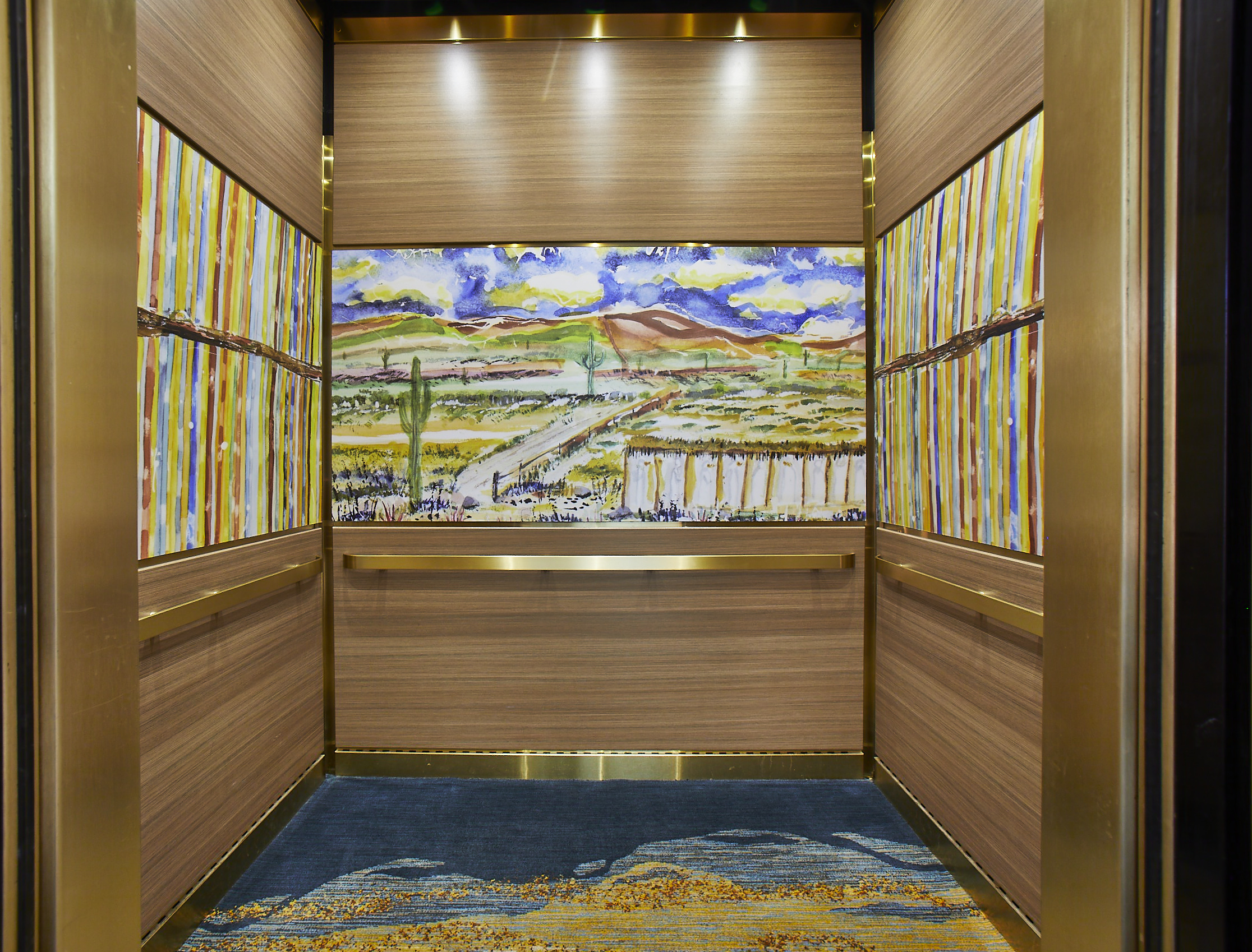
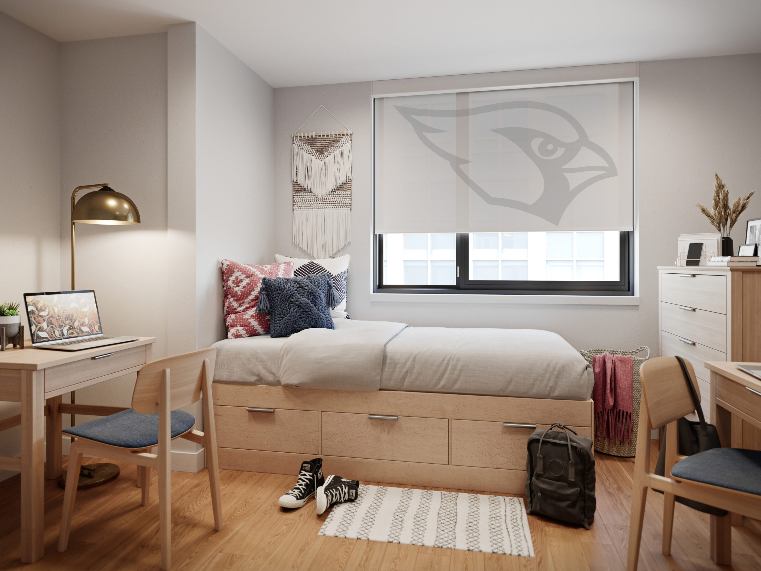
Inpro offers six product types for people looking to bring art and photo prints into their office, including Aspex® Printed Wall Protection, a printed, protective wallcovering that can be applied directly to the wall at virtually any size, and printed wall art, which hangs on the wall just like a painting. The brand also produces printed signage, which allows art to be integrated in creative ways throughout the space, durable wall panels that can be used in high traffic spaces like elevator interiors, and printed window shades, which can turn any office into a room with a view. Made from fiberglass, polyester, vinyl, and acrylic, these high-tech Solar Shades help to block glare and unwanted heat while still allowing a degree of natural light.

Elevator interior with prestige gold trim and Aspex panels showcasing local artwork.

Each of these products is durable and super high resolution. Furthermore, they are fully customizable. Inpro works with clients to select imagery suited to their brand. If no stock images fit the bill, the brand can help facilitate collaborations between clients and local artists to curate unique artwork for their space. In 2023, Inpro is also launching curated art galleries that can be printed on products based on moods, including categories like “comfort”, “focus”, “restore”, “inspire” and “energize”.

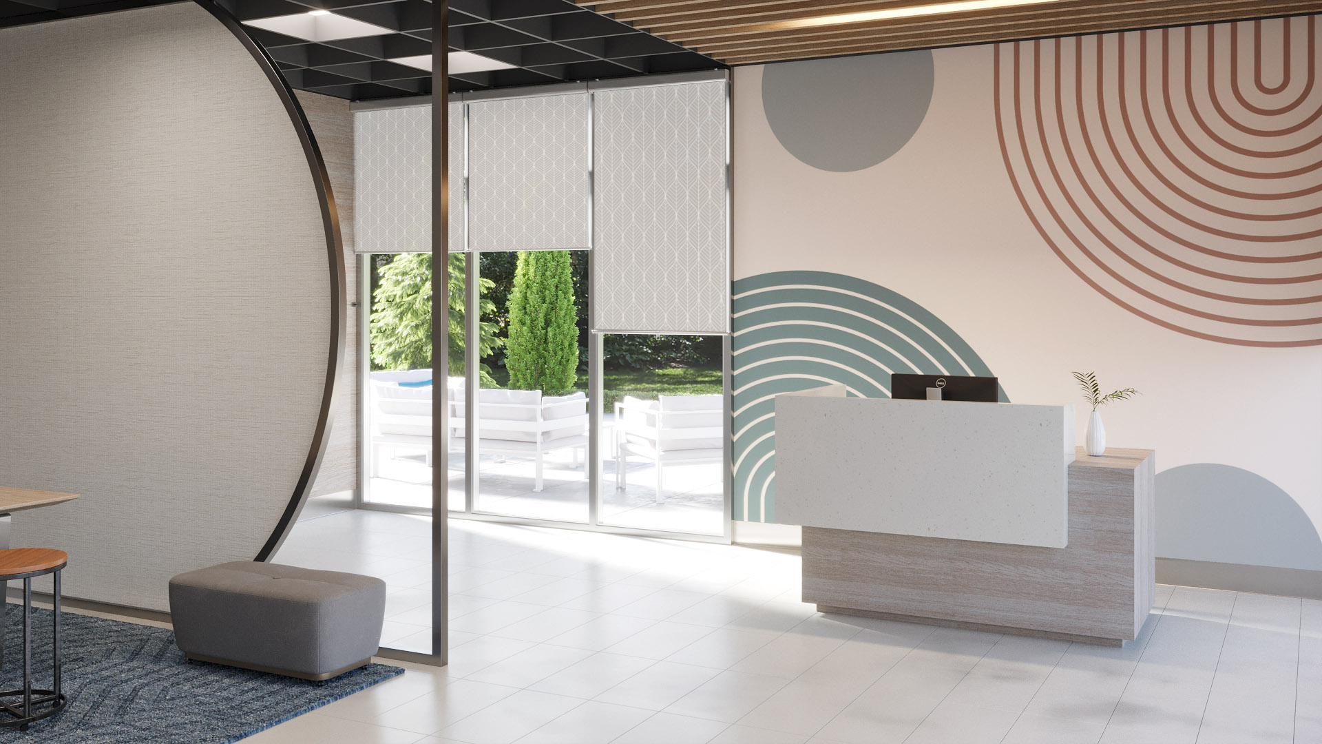
 The key is to think about your design needs, choose a theme, and stick to it. Like a real natural landscape, the whole is greater than the sum of its parts, and artworks function better when they are placed in harmonious relation to one another. Through the careful selection of Inpro products, shades can be integrated with wall coverings, art, and signage, creating a fully integrated space.

Personalized dorm room window shades by Inpro

“Adding imagery throughout your spaces brings continuity throughout your building and how people experience it,” Dan Roller, Product Manager at Inpro, explains. “For example, use an overall nature theme and create variations on each floor to help people remember different locations and change up the scenery.” This type of cohesiveness will strengthen your brand, whatever industry you are in, and elevate the experience of clients or other visitors to your professional space.

If biophilia isn’t your thing, Inpro can also create graphics that have a more streamlined, minimalist look. The key thing to remember is that with new digital imaging and printing techniques, the possibilities are endless when it comes to wall coverings. One is not limited to solid colors or patterned wallpaper. Any image you can think of can find a place on your walls, your signs or your window treatments.

Coordinated window shades and wall art by Inpro

Art is no longer something that hangs on the wall – an ornament for spectators to gaze at – but something that is ultimately functional, helping spaces work better for everyone. This sounds like something even LeCorbusier would approve of.

To learn more about Inpro’s extensive range of architectural products, check out their website and their brand profile on Architizer, or download their visual inspiration guide here.

Reference

Td-Atelier and Endo Shorijo transform traditional machiya house in Kyoto
CategoriesInterior Design

Td-Atelier and Endo Shorijo transform traditional machiya house in Kyoto

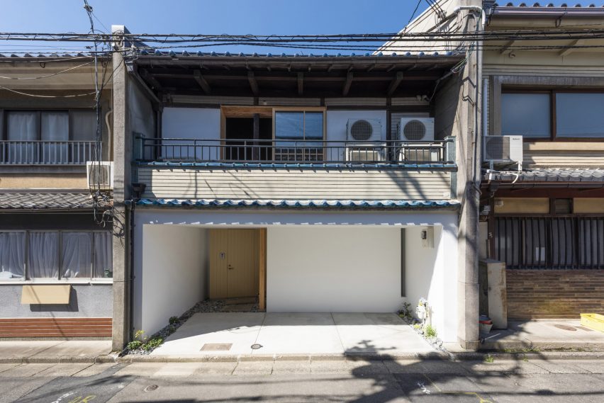
Japanese design studios Td-Atelier and Endo Shorijo Design have renovated a century-old machiya townhouse in Kyoto with minimal interiors that intend to honour the home’s existing architecture.

Called House in Marutamachi, the Japanese house was built over 120 years ago and is arranged across two floors on a long and narrow site.

Machiya house
House in Marutamachi is a traditional machiya house in Kyoto

Tucked between two other residential properties, the house is an example of the wooden machiya townhouses that were once common in Japan’s historical capital Kyoto but are now at risk of going extinct.

“Traditional Kyoto townhouses are being destroyed at a pace of 800 houses a year,” Td-Atelier explained.

“Old buildings don’t match modern life. However, we want to stop the decline of Kyoto townhouses by fusing tradition, design and new life.”

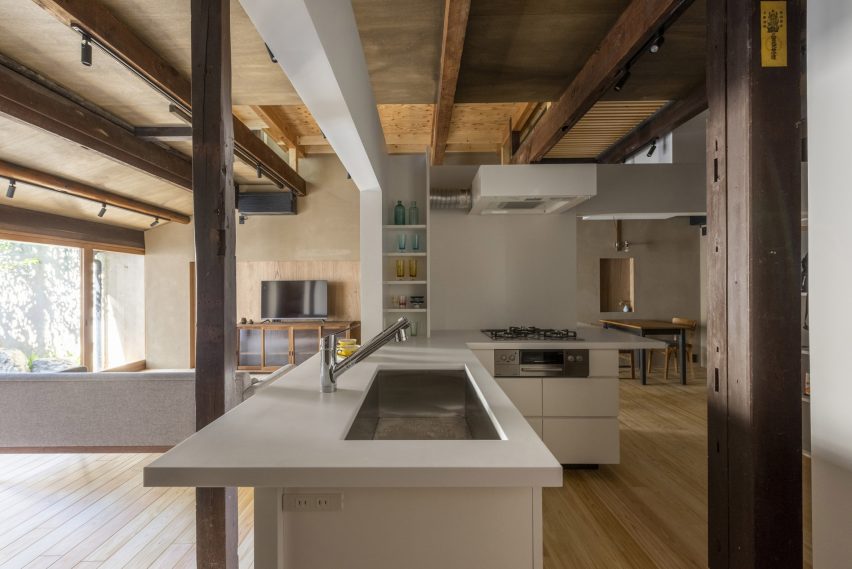
Td-Atelier kitchen interior
The kitchen is encased in a white volume

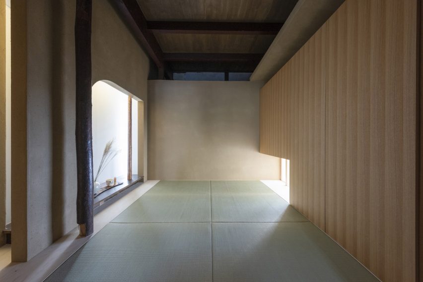
Td-Atelier and Endo Shorijo Design dressed House in Marutamachi’s interior with new components including sleek tiles and geometric furniture alongside materials reused from the original house, as seen in the traditional team room.

The studios retained the building’s wooden columns and beams but added white volumes to house rooms including the kitchen and study to avoid disturbing the existing architecture with harsh structural materials.

Bathroom in Kyoto house
The tea room was constructed using materials reused from the original building

These variously sized cubes were designed to mimic the contrasting heights of buildings in a cityscape.

“The gaps and omissions created between the volume group and the existing columns, beams, walls and floors create continuity in the space,” Td-Atelier said.

Throughout the house, Td-Atelier and Endo Shorijo Design adopted a minimal material and colour palette including a combination of light and dark woods alongside smooth concrete.

A thin, sculptural light is suspended above the timber breakfast bar on the second floor, where occupants can sit on clusters of subtle-coloured stools.

Td-Atelier garden
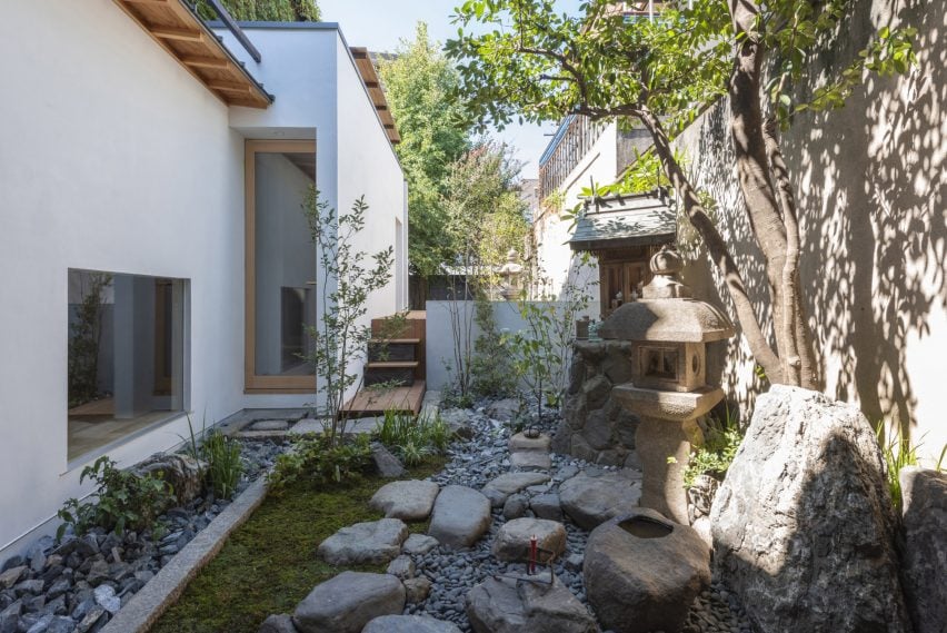
Original features were maintained in the garden

Outside, a plant-filled garden features elements from the building’s original architecture such as sandy-hued lanterns and a chōzubachi – a traditional stone water bowl historically used for washing hands before a tea ceremony.

House in Marutamachi was shortlisted for house interior of the year at the 2022 Dezeen Awards.

Dezeen recently announced the winners of this year’s interiors categories, who are now competing to win the overall interiors project of the year award.

The photography is by Matsumura Kohei.

Reference

5 Powerful Ways Lighting Can Transform Simple Architectural Spaces
CategoriesArchitecture

5 Powerful Ways Lighting Can Transform Simple Architectural Spaces

The A+Product Awards is open for entries, with a Main Entry Deadline of June 24th. Get started on your submission today! 

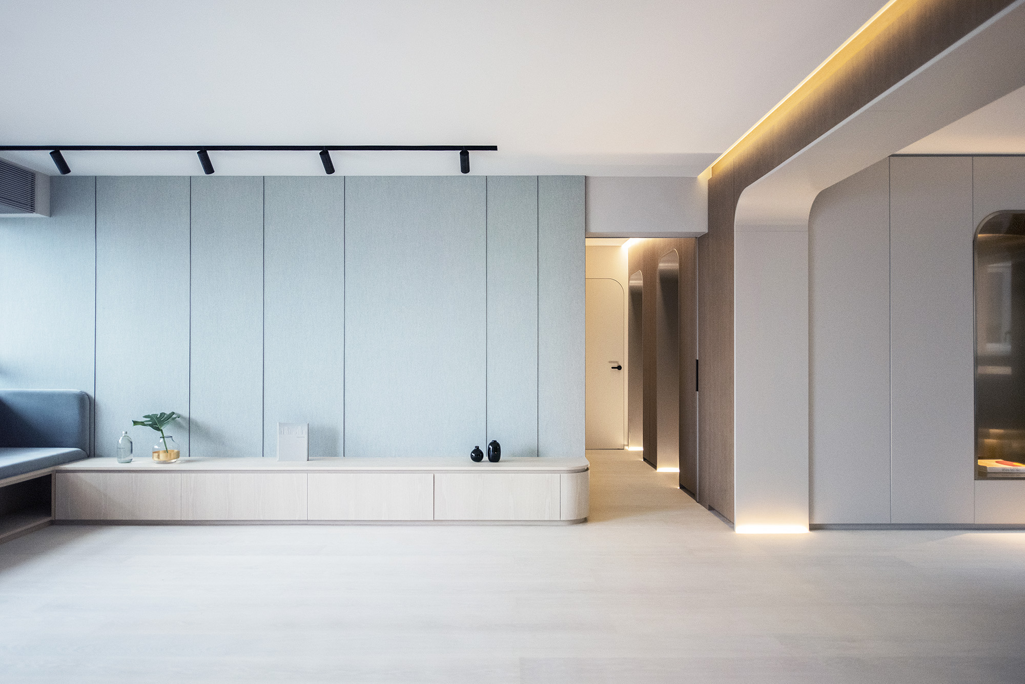
Good lighting can make or break a well-designed interior project. In addition to optimizing the availability of natural light in a space, selecting the right light fixtures can augment the furniture inside and cement a tone for the entire space. Bright white lights can make writing or chopping easier whereas warm yellow lights can make dinners an elevated experience. Similarly, colored lights can liven up parties and candle-lit wall sconces can be perfect for cozy nights.

Layering a variety of lights can add depth to any space and make it more comfortable. This technique also helps utilize different parts of a space in different ways. The scale and size of light fittings can also help fill up spaces or make them look more spacious.


Natural Light

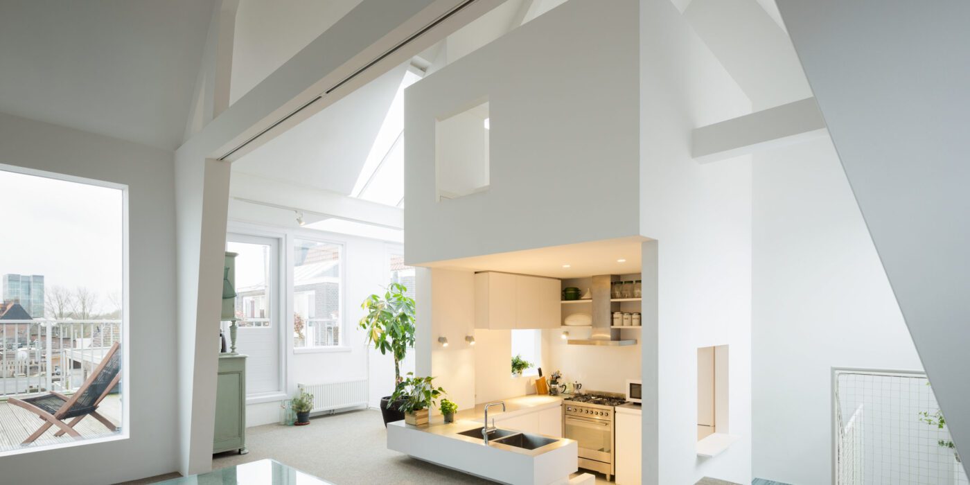
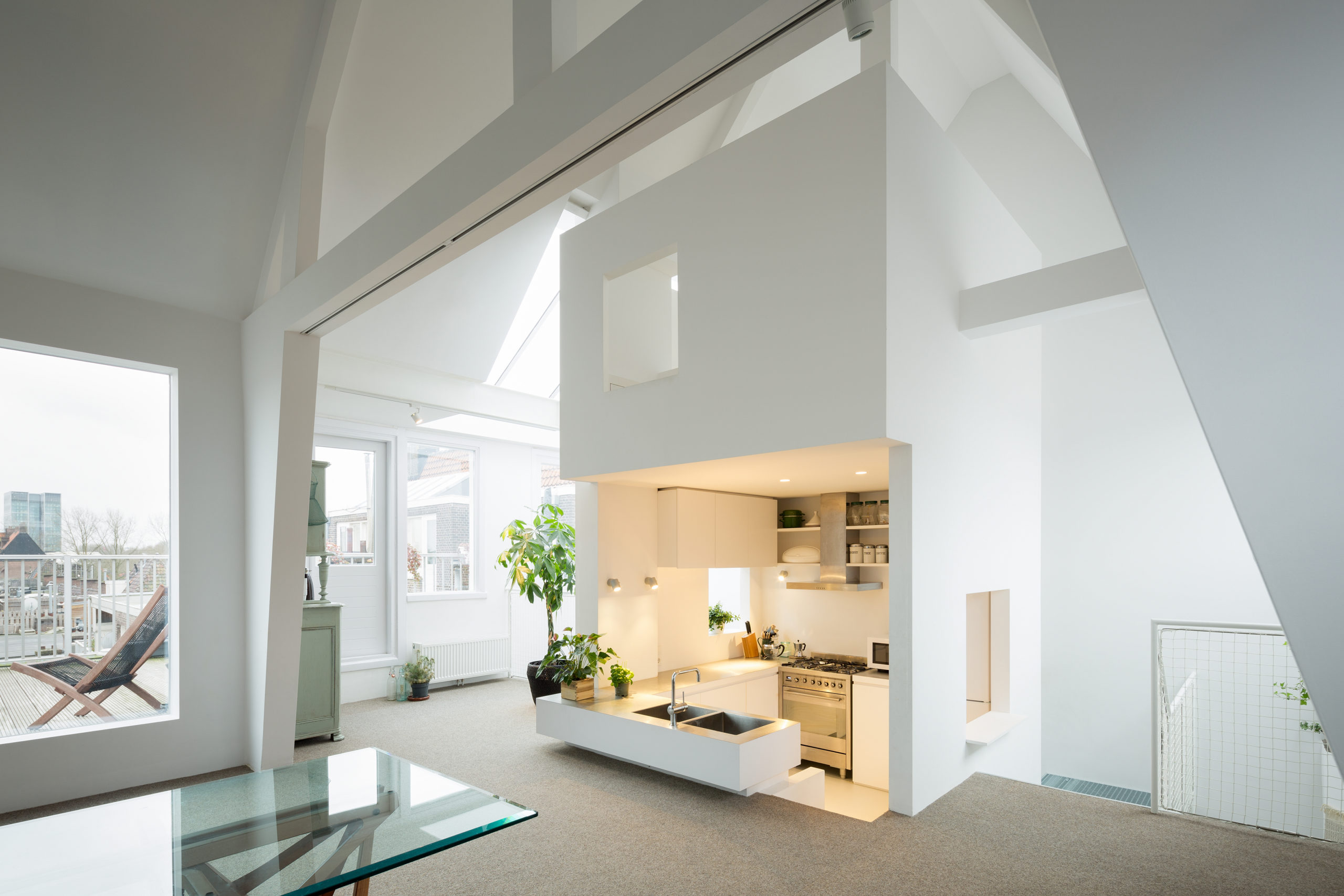
Apartment in Amsterdam by MAMM DESIGN, Amsterdam, The Netherlands | Image by Takumi Ota Photography

For years, designers have been trying to maximize the amount of natural light within a space. Having an abundance of sunlight pouring into a space can help make it feel bright, airy and comfortable (this is especially due to its soothing tone and physical warmth). Another check in favor of designing for natural light: it cuts down on power use.

Exposure to the sun’s rays also helps regulate the body’s sleep cycles as well as overall health. In addition to windows, skylights have become increasingly popular to draw in light in interior spaces. Some interior designers also use cleverly arranged reflective surfaces throughout the space to help the light bounce off of surfaces and make the space feel brighter. Translucent partitions or latticed screens in homes can also help draw light to interior spaces that might otherwise be blocked by solid walls.


Ambient Light

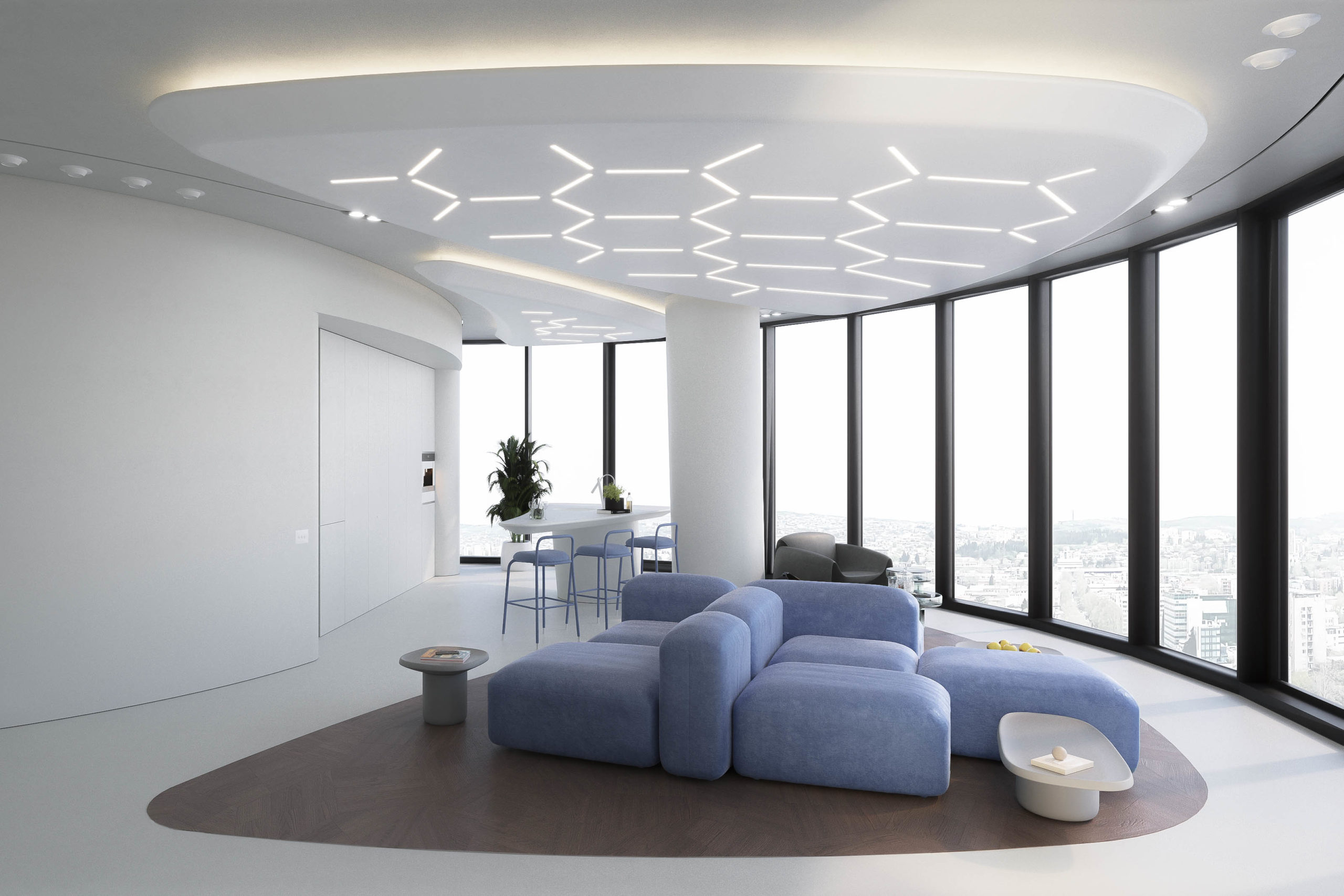
Lenvix by STIPFOLD

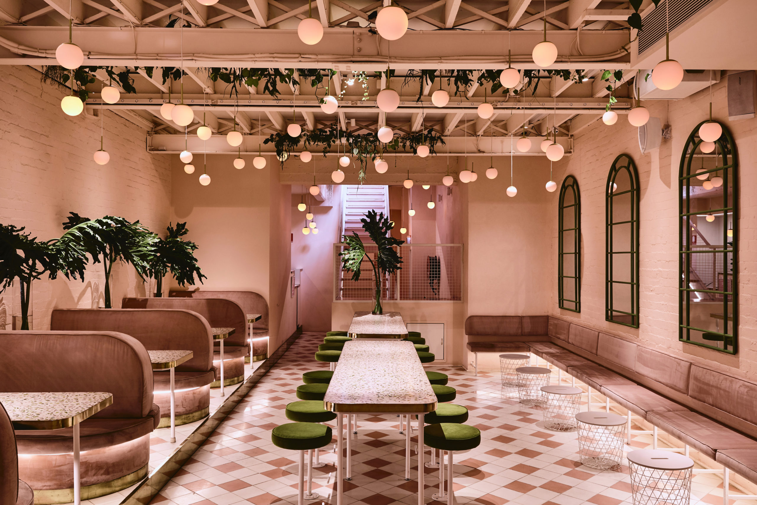
Peaches Rooftop Cocktail Bar by Pierce Widera, Melbourne, Australia

This is perhaps the most important selection of lights for a space. Ambient light refers to the fixtures that are used to brighten the entire space, more often than not in a uniform manner. The tone used for ambient light can also determine the overall mood of the space. Offices tend to use white light to help carry out tasks efficiently under the brightness. On the other hand, warmer lighting schemes are gaining popularity in restaurants and homes for the warm and cozy atmosphere they can create.

Ambient lighting can be designed in a variety of ways. It can range from ceiling lights, track lights, wall lights and chandeliers to recessed circular and strip lights. Using dimmable fittings for ambient light can also help adjust brightness levels for different activities. Now, there are a variety of options and illumination systems that are not only functional but also quirky and trendy.

In Lenvix, STIPFOLD composed a hexagonal pattern on the ceiling using slimmer light fixtures. This not only brightens the space but also adds an additional pattern to the space and helps demarcate the seating area. Alternatively, the Peaches Rooftop Cocktail Bar features a canopy of pink-toned spherical pendant lights hanging from the ceiling to mimic peaches.


Task Lighting

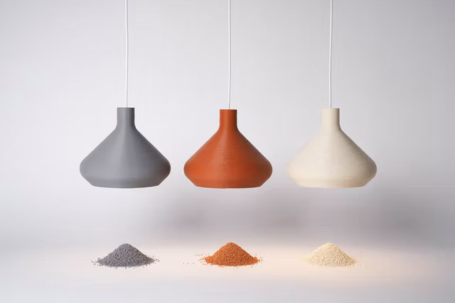
Coil Collection Naturals by LightArt

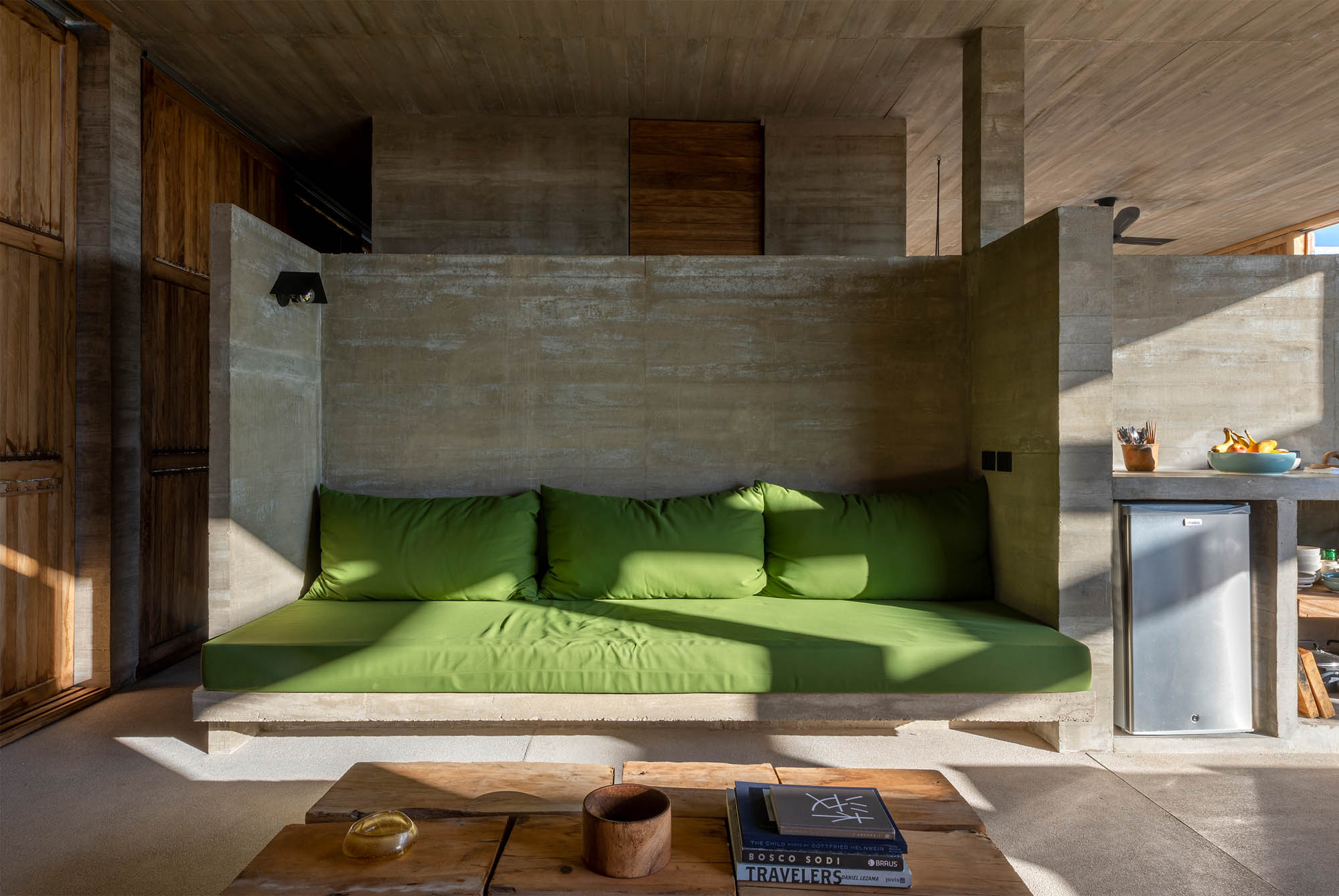
Casa Cosmos by S-AR, Oaxaca, Mexico

This could be considered a secondary source of lighting. Task lighting is referred to lighting fixtures with a very specific function. Desk lamps, bedside lights, wardrobe lights, strip lights under kitchen cabinets and even staircase guiders can come under this category. Task lighting can help carve out secluded nooks and can also help easy navigation during the night. It is ideal to isolate the switches for task lights from the overall ambient light connection so that they can be used only when needed.

Decorative additions like the A+Award-winning Coil Collection Naturals can make a great bedside companion for late-night reading and can also be used as an additional light source near desks or in hallways. In Casa Cosmos, S-AR used a focused light fixture to brighten the concrete-backed seating area. Unlike the above example, these lights can also help separate the multiple functions within a space without the use of partitions.


Accent Lights

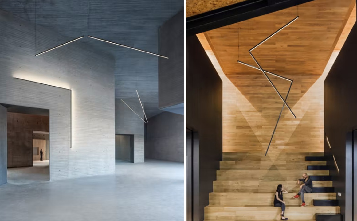
Sticks by Vibia

Hong Kong Garden / Theatre House by Bean Buro, Hong Kong Island, Hong Kong

The aim of accent lights is to draw attention to a specific object or an element, even when the general lights are on. These can be direct or indirect sources of light that highlight artwork, wall textures, level differences, recesses, false ceilings or other architectural elements in a space. This also adds more dimension and drama to the space. Types of accent lights range from small spotlights to wall-grazing linear lights.

The A+Award Winning Sticks is a modular design that can be used in a variety of ways to either focus on specific objects or illuminate specific areas in spaces. In the image above, the light is used to mimic the space of the doorway to accent not only the passage but also the wall texture. It also becomes an additional spotlight for the sides of a small stepped seating area. Accent lights also help highlight doors and partitions in Hong Kong Garden / Theatre House.


Decorative and Mood Lighting

Lo-Fi by SYNECDOCHE, Ann Arbor, Michigan

Media Plaza by Liong Lie Architects | Image by Christiaan de Bruijne

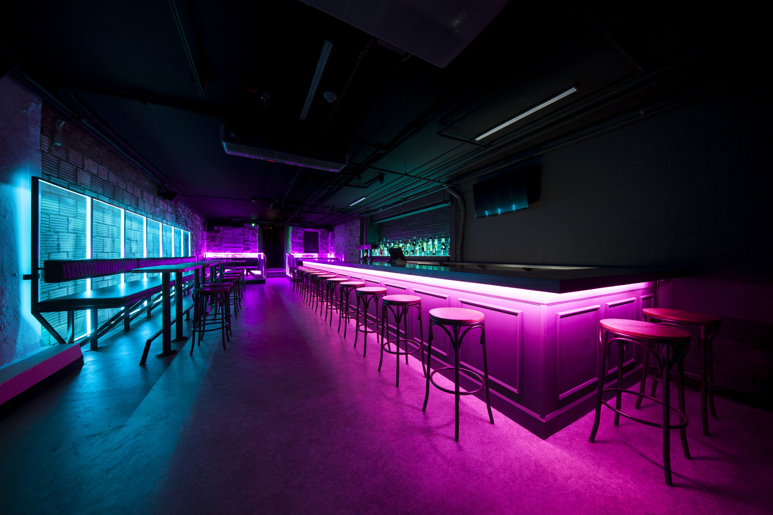
This category is often more to set a mood as opposed to being functional; it includes candle-based décor, string lights, lanterns, wall sconces and colored lights. These different techniques of illumination act as secondary light sources as they are not bright enough to help carry out everyday tasks without straining your eyes. There are extremely popular in restaurants and nightclubs as they help create an air of mystery and build tension without compromising the functionality of the furniture.

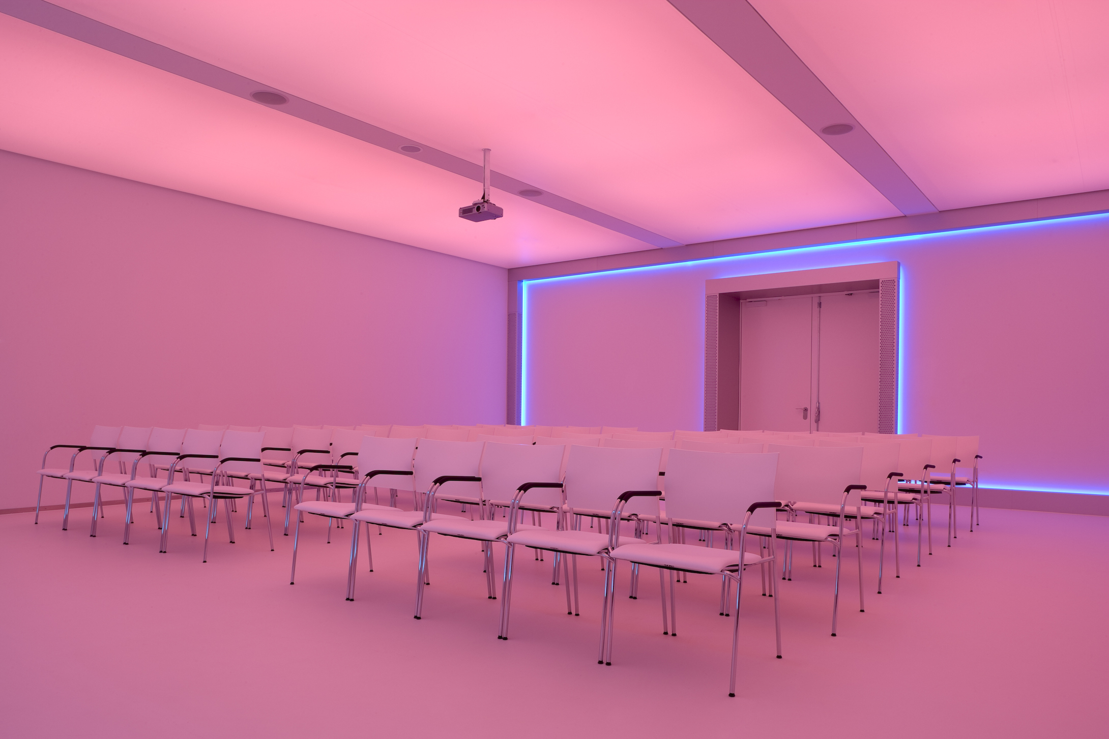
Neon blue and pink lights make up the interior of Lo-Fi in Michigan. The vibrancy of the lights energizes the otherwise dim space and also provides a great backdrop for photos, creating additional interest. In Media Plaza, a strip of blue wraps around the back wall of a projection room that is covered in foils that can change color when needed.

The A+Product Awards is open for entries, with a Main Entry Deadline of June 24th. Get started on your submission today! 

Reference

Cosentino’s Latest Material Innovation Could Transform Sustainable Design
CategoriesArchitecture

Cosentino’s Latest Material Innovation Could Transform Sustainable Design

A leading manufacturer of surfaces, Cosentino’s products are invariably beautiful, resilient, and suited to a wide range of purposes. Whether you are looking for a kitchen countertop or a unique flooring or cladding system, you will find a reliable solution in one of Cosentino’s lines of synthetic or natural surfaces.

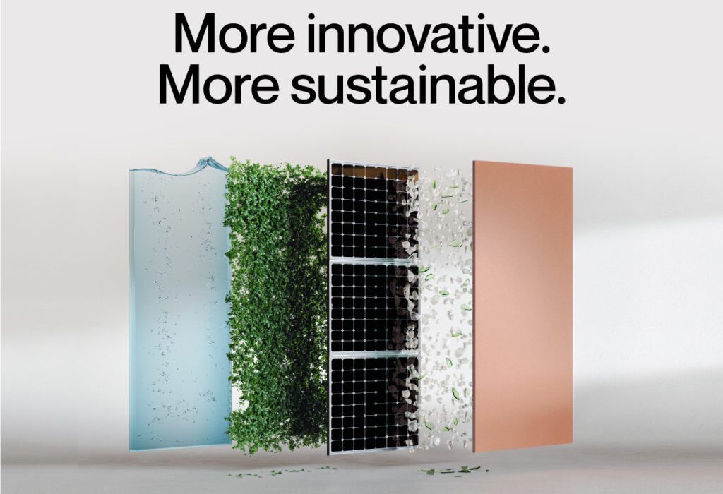
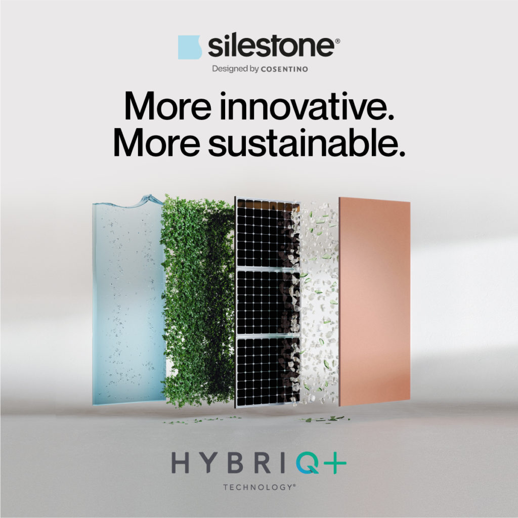
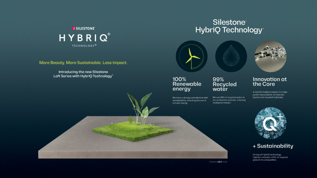
Among architects and builders, Cosentino surfaces are known to be innovative and high-quality, but one should also add visionary and socially conscious to the list of descriptors. Their newly developed HybriQ+ Technology, used for their versatile Silestone surfaces, blends premium minerals, quartz, and recycled materials with a sustainable manufacturing process that uses 99% recycled water, 100% renewable electric energy and a minimum of 20% recycled materials in its composition. Cosentino uses the term “Circular Economy” to describe their sustainable approach to resources.

All said and done, this process produces ZERO water waste. That’s right, zero with a Z. In 2022, this is welcome news indeed. The past few years have seen new attention given to the issue of water conservation as global water shortages have become a mounting problem.
The World Wildlife Federation summarizes the situation bluntly, writing that “Many of the water systems that keep ecosystems thriving and feed a growing human population have become stressed. Rivers, lakes and aquifers are drying up or becoming too polluted to use. More than half the world’s wetlands have disappeared.” They add that global climate change has put even more stress on the world’s water supply, and that “By 2025, two-thirds of the world’s population may face water shortages. And ecosystems around the world will suffer even more.”

The need for sustainable manufacturing practices is, to put it simply, an imperative. Cosentino illustrates this point quite vividly in their new campaign to promote HybriQ+. Early on in the clip, a sobering montage plays showing plastic bottles washed onto beaches, clear cut forests, and other examples of the destructive impact humanity has had on the globe. The message is poignant: alternatives must be found, and fast, if our species will be able to secure a high quality of life in the coming decades.

The rest of the video provides insight into the HybriQ+ manufacturing process, cross-cutting images of the raw materials Cosentino recycles with scenes of the laboratories in which the company’s research and development team discover new ways to conserve resources in their manufacturing process. This video is a testament to the power of technology and human ingenuity to overcome even dire obstacles.

The video closes with a simple slogan flashing on the scene: “Welcome to our revolution.” And it’s true – such an approach to manufacturing is revolutionary, especially in an era when it is easy to save money by pushing costs onto the planet. As the company notes, “We take care of the present to secure the future.”

Cosentino believes that consumers need not compromise quality in the name of sustainability. In fact, those Silestone surfaces that have been produced with HybriQ+ technology are among the most beautiful the company has ever produced. The company explains that “the new mineral composition enables never before-seen effects in color depth, texture and tone.” Indeed, Cosentino has long proven that synthetic materials can be just as elegant and intricate as natural materials.

Moreover, Silestone is engineered to withstand the harsh daily use that kitchen countertops are subject to, including stains, acid and everyday nicks and scratches. Silestone also comes with a 25 year warranty. This alone is cause for celebration for the eco-conscious among us. Materials that are built to last will not find their way to a landfill anytime soon.

We recommend spending time on the Cosentino website to explore the myriad patterns and colors that are available. The website also includes great photos of their surfaces in action in real spaces for inspiration. There really is something for any design aesthetic, to warm Mediterranean hues to the industrial gray that has proven so popular in modern homes. Silestone also comes in three textures: polished, suede (or matte), and volcano. The latter is really cool, featuring a rustic, rough texture that would add warmth to a kitchen.

As Cosentino points out in their promotional material for HybriQ+, “the kitchen has become the heart and soul of our homes. It is where we cook, work, study, and share memories. It is only natural that the next world-changing idea will come from the kitchen.” So next time you need a sustainable surface for a kitchen redesign, Cosentino Silestone with HybriQ+ should be top of mind.

To learn more about Cosentino’s HybriQ+ Technology and request a quote, click here.

Reference