Design trend predictions for 2024 include rush for sustainable accreditation
CategoriesSustainable News

Design trend predictions for 2024 include rush for sustainable accreditation

After an unsteady 2023, Dezeen’s editorial director Max Fraser considers what 2024 might hold for design.

His predictions for what we will see when it comes to design next year range from the rise of material intelligence to the rush for sustainable accreditation.

Collective material intelligence

The pace of development in material innovation continues, in particular those made from supposedly sustainable resources as well as those salvaged from waste streams, such as fabrics made from bacterial fermentation and handcrafted biotextiles.

The appetite to use such creations in projects will increase in 2024 as designers strive to create products with greater material sensitivity. This goes hand-in-hand with a drive to lower the impact of our consumption on planetary systems as we continue to sharpen our focus on the climate crisis.

Trees in Formafantasma exhibitionTrees in Formafantasma exhibition
Above: Formafantasma’s Cambio exhibition focuses on wood. Photo is by Paavo Lehtonen Photography. Top image: brick textiles by Natural Material Studio

Increasingly informed clients and customers, together with (hopefully) heightened regulations, will demand ever-more transparency around the origin of the materials, seeking justification for their implementation, as well as assurances around traceability and a low full-life impact.

An increasing number of designers will respond by shortening supply chains, opting for regionally-appropriate materials, harvested or mined closer to the place of production.

This will likely become more of a prevalent expectation in 2024, buoyed by an already enterprising surge in new biomaterials and fabrication technologies. The challenge is scaling this from narrow experimental work into more mainstream channels.

Greater appreciation of aesthetic imperfection

Product uniformity works well for items such as TVs, phones and washing machines. But when it comes to the use of natural materials in mass-production systems, the mindset of uniformity and perfection also prevails. This means that the inconsistent nuances in colour, texture or grain that are inherent in the likes of wood, wool, leather or stone become a hurdle to overcome.

There is a growing concern that stripping out the quirks of a tree, the striations of a rock or the blemishes on an animal hide just creates unnecessary waste. This was highlighted by Formafantasma’s Cambio research project when the design studio investigated the global impact of the extraction, production and distribution of wood.

Working with Finnish furniture brand Artek, one of the outcomes of the study was for the manufacturer to reassess its strict timber selection criteria. Previously only using regularly grained local birchwood without any natural marks, the brand has loosened its criteria to embrace imperfections. In 2023, characteristics such as insect borelines, knots and even bark first appeared on the iconic Stool 60 by Alvar Aalto as part of an evolving Artek collection.

This approach from a reputable brand sends a signal to the rest of the furniture industry that an ‘imperfect’ aesthetic sensibility needs to be embraced if we’re to reduce processing and production waste. This is something that I suspect will become more evident in 2024, helped by the economic case that customers will want to buy into the unique characteristics of these items.

Raw and mono-material products

Designers will further endeavour to reduce the complex interplay between different kinds of materials used in production. The motivation is to create products where the component parts can be dissembled and separated more easily for repair or recyclability.

Such intentions will need to be communicated to users and the inevitable aesthetic change celebrated.
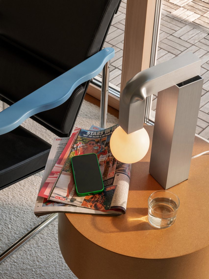
Knuckle lightKnuckle light
David Taylor’s Knuckle Light is made from aluminium

As circularity becomes expected, a ‘circular aesthetic’ will also emerge whereby products will be lauded for their efficient and singular use of materials, exposed fixings and true-to-material ‘raw’ finishes.

This was recently exemplified by the aluminium Knuckle light by David Taylor for Hem, an embodiment of raw, folded, uncoated aluminium and the winner of the lighting design of the year in the Dezeen Awards 2023.

Fifty shades of sustainable

For several years now, overuse of the word ‘sustainable’ across all areas of society has reached the point where its very meaning has become opaque. Take a trip to any trade fair or design week and you’ll leave with sustainability fatigue, so much is the word oversaid, overheard and overprinted.

Many smart brands recognise this and are eager to communicate the great lengths they go to to reduce their planetary burden, ensure reputable supply chains, create healthy work environments for all and deliver economic returns that benefit their communities as well as their shareholders. To that end, the B Corp rush is on.

B Corp Certification is one of the most rigorous and reputable certification schemes for any aspiring business, thoroughly assessing all of the aforementioned criteria and more. As one manufacturer joked to me, “It’s a tough process. Everything is opened, assessed and scored. It’s like letting a stranger look through your underwear.”

Manufacturers like Modus in the UK, Fredericia and Astep in Denmark and Andreu World in Spain all crossed the line in 2023 and I predict many more will pass the test in 2024: credibility from accreditation.

Trade fairs – a make-or-break year

It’s been another bumpy year for trade fairs, which have struggled to rebound to pre-pandemic glory. The considerable cost and enormous effort of exhibiting has brands questioning how often they can commit. The returns that fairs are expected to deliver for these exhibitors – namely via marketing, footfall and ultimately orders – is an increasing pressure when attendees have also become more discerning about which shows they choose to visit.
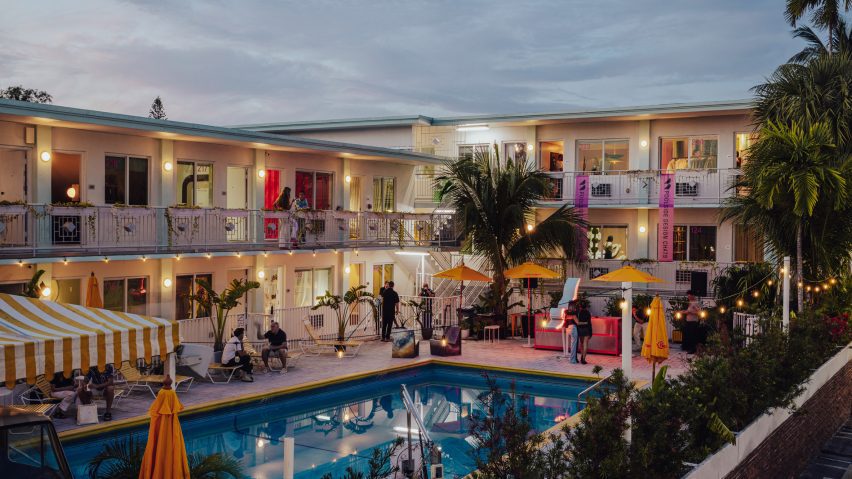
Alcova Miami hotelAlcova Miami hotel
Milan’s Alcova showed in Miami this year. Photo by Piergiorgio Sorgetti

The excessive waste generated by stand construction continues to be a challenge to overcome. I’ve become so distracted by the endless use of virgin materials to construct brand-ego-sized displays that I barely notice the product anymore. I call for greater brand humility and am hoping the previously-mentioned circular aesthetic will find its place on stand design as fairs continue to evolve.

It remains a struggle to make rather grim exhibition centres pleasurable, while reducing the environmental burden. Smaller, more nimble shows like Alcova and Material Matters will likely gather pace, able to better attain the sweet spot between quality content and distinct experience. Those that succeed will need to marry timely inspiration with responsible aspiration.

AI – will it deliver on the hype?

While hype, speculation and doom-mongering around the impact of generative artificial intelligence continues across multiple industries and at government-level, I expect the dust will settle somewhat in 2024.

For all of the wonders that AI promises, including analyzing data to inform design decisions, automating repetitive tasks, and simulating and testing designs, maybe there will be more skepticism as to whether or not it will live up to the fanfare we’ve witnessed this year.
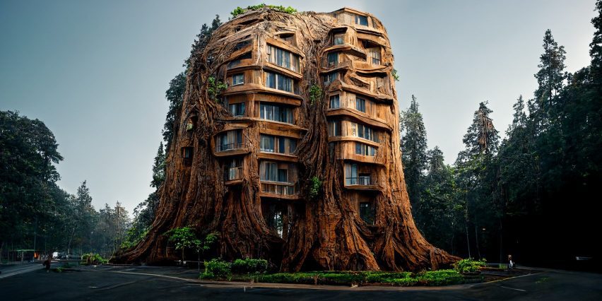
Manah Bhata AI designManah Bhata AI design
AI-designed projects created controversy. Image by Manah Bhata

One of the leading voices in AI, Gary Marcus, believes there are “many serious, unsolved problems” with the technology that could limit its usefulness. However, Airbnb co-founder Brian Chesky reckons designers should embrace AI otherwise the world “will be designed without them” as he stated in an interview with Dezeen in November. He added, “But, I am also wary of fetishization of technology” and, sharing this sentiment, I would caution the hype.

In off-the-record chats, I encounter plenty of individuals who are nonchalant about AI, so I would question the assumption that we must all want and need to use it. Within design, I wonder if we’ll see a revolution from artificial intelligence in 2024 – or perhaps its offerings will just become casually subsumed into the designer’s toolbox.

Polarising approaches to production will broaden

When it comes to fully scrutinising every action and proceeding with self-initiated care and integrity, many brands will find their mojo in 2024, particularly more nimble family-owned businesses with a clear eye on their legacy.

But I fear most won’t, as the pressures of increasing costs, stubborn inflation, volatile supply chains, debt repayments, shareholder expectations and hesitant citizen consumption trigger an urgent scramble to carve out new market segments. All of these touchpoints are and will continue to be directly or indirectly exacerbated by the desperate human conflicts and environmental disasters that we’ve witnessed globally in 2023.

Changing business models to circumnavigate these disruptions requires long-term vision and stability, two things seemingly in short supply right now. Those willing to evolve their enterprises deserve to succeed, however, I suspect many businesses will choose not to rock the boat.

Add to this the ongoing lacklustre governmental approaches to the climate crisis and it’s hard to envisage a world that can muster much excitement at the release of another new yet non-essential product. The time for the design industry to broaden its collaboration with other industries is now. The opportunities to work on game-changing solutions to some of our existential challenges are ripe for the picking.

Reference

Framery predicts focus spaces to be key office design trend of 2024
CategoriesInterior Design

Framery predicts focus spaces to be key office design trend of 2024

Promotion: the need for well-considered focus spaces will come to the fore in workplace design in 2024, driven by the uptake of artificial intelligence, according to office pod brand Framery.

Framery says that the increase in AI in the workplace will result in it taking more responsibility for mundane, repetitive tasks, resulting in the need for additional focus spaces in open-plan offices to help support employees’ deep and focused tasks.

“If it happens how it’s expected and AI takes more responsibility for repetitive tasks, the office design should reflect this development and support deep, focused work,” said Tomi Nokelainen, head of Framery Labs, the company’s research and innovation unit.

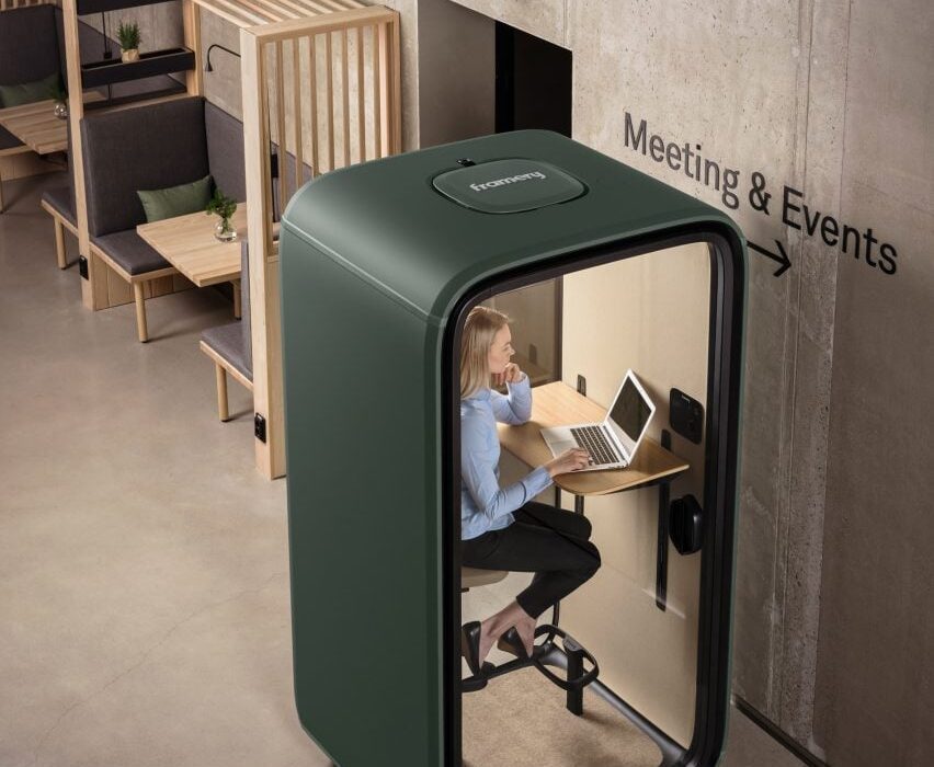
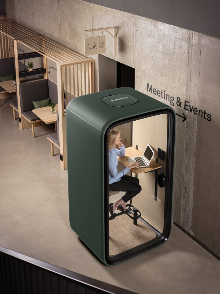
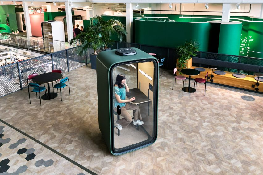
Photo of a woman sitting within a forest green-coloured single-person office pod working at a laptop. The pod sits within a modern office space surrounded by open workstations
Framery predicts focus areas will be the key office design trend of 2024

According to Framery, while post-pandemic hybrid office design placed an emphasis on the creation of collaborative spaces and “flashy common areas embodying organisational culture”, the next phase of this evolution will centre on creating areas that minimise distraction and allow for focused work.

“It’s noteworthy that employees value focused working spaces beyond collaborative spaces,” said Nokelainen. “With work complexity on the rise, there is a heightened demand for both acoustic and visual privacy.”

The company points to the findings of research company Leesman, which has reported that workers are still choosing to stay at home for solitary work. Leeman’s research suggested that some working activities were “better supported at home” including individual-focused work and planned meetings.

However, Framery says that when employees have the option to work from home, that may not be sufficient to fulfil their productivity needs.

“It can’t be assumed that all employees have the luxury of a dedicated home office room, or are willing to invest in expensive desks or ergonomic chairs,” said Nokelainen.

Photo of a woman working at a laptop within a closed office pod that has two transparent and two solid walls. The pod is located within a breakout space with more casual, open table seating
Office workers value focus areas more than collaborative spaces, Framery research finds

Framery, a Finnish brand, was one of the first to enter the office pods space in 2010, creating soundproof booths that drown out external distractions so that employees can undertake focused work or conduct video conferencing calls.

According to Framery Labs’ research, focus spaces are the number one desired perk for employees that would draw them into working in the office rather than at home and they address distractions to focused work, for example, noise.

Only 33 per cent of employees report finding noise levels satisfactory in their workplace and dissatisfaction with noise has the strongest correlation to an employee saying that the design of their workplace does not support their personal productivity.

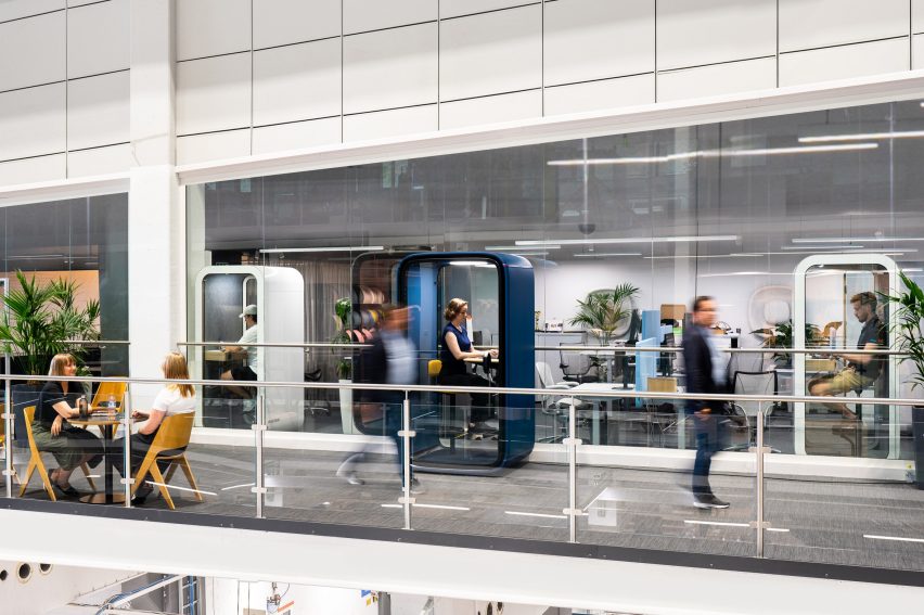
Photo or rendering of a modern, busy office incorporating several single-person work pods where people are working on their laptops in peace
The pods are soundproof so external noise is not a distraction

This can be especially consequential for neurodiverse people, who constitute around 15 to 20 per cent of the global population and who can have a greater sensitivity to sensory stimuli, according to the brand.

With workplaces becoming more inclusive, the next step will be to design them to function as “a catalyst not a barrier to productivity”, said Nokelainen, with a recognition that different people have different needs.

“There are no one-size-fits-all focus spaces – they can be everything from silent open areas, library-like spaces, private offices or pods,” said Nokelainen. “Each role and industry has their own special needs that must be taken into account.”

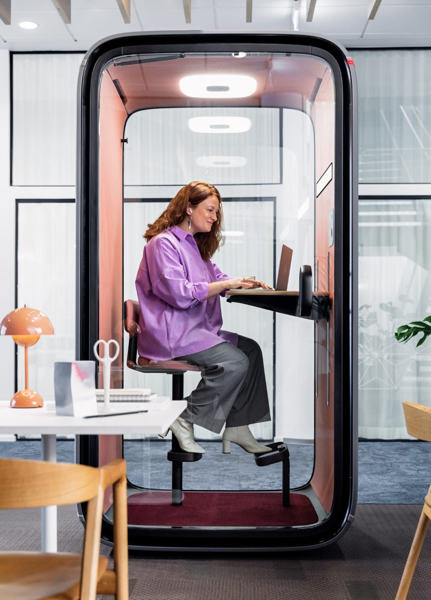
Photo or rendering of a forest green Framery One office pod within a contemporary office, placed within an otherwise open breakout space with cafe-style tables and chairs
The Framery One pod is Framery’s bestselling product

These considerations can be addressed with products like the Framery One, Framery’s bestselling office pod. A single-person workstation for focused work that is also optimised for virtual meetings, it includes soft lighting and adjustable ventilation to help create a personalised environment.

In a closed pod like this, neurodiverse people can apply “sensory integration techniques”, said Nokelainen which means incorporating the sensory tools or approaches that promote calm and focus for them.

There are also multi-person pods like the Framery Q Flow, one of the newest models. It is designed to help enable workers to achieve the “flow” state of mind, where work feels effortless and time switches off, and includes a height-adjustable electric table so that users can shift positions without interrupting their thought process.

The office pods come with Framery Connect, an integrated workplace management tool that supplies detailed data and analysis around how often and when they’re being used.

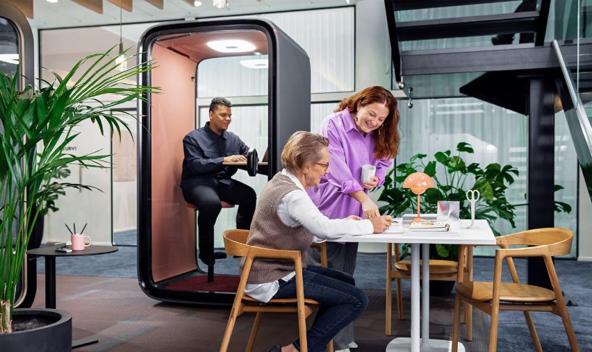
Photo of a man using the Framery One pod in an office while two women collaborate on a table outside
The pods include the Framery Connect workplace management system

Framery says it prides itself on the quality of its soundproof office pods, as well as having been among the first to bring the product category to the market. The company launched 13 years ago after its founder – Samu Hällfors – devised a solution to address the distraction caused by his boss’s loud phone calls.

“Our founder and CEO Samu Hällfors invented the office pod category in 2010,” said Framery. “Now we have over 200 competitors globally. To ensure we stay the market leader we are relentlessly innovating to engineer the most advanced pod in the world.”

Framery also has a sustainable and responsible ethos and has made a commitment to converting to a circular business model.

To find out more about Framery and its products, visit the brand’s website.

Partnership content

This article was written by Dezeen for Framery as part of a partnership. Find out more about Dezeen partnership content here.

Reference

Round Up: Contextualizing the Rising Trend in Ring-Shaped Housing
CategoriesSustainable News

Round Up: Contextualizing the Rising Trend in Ring-Shaped Housing

Have your say in which architects will take home Architizer’s prestigious A+Awards: Public Voting opens this spring. Interested in next year’s program? Subscribe to our newsletter for updates.  

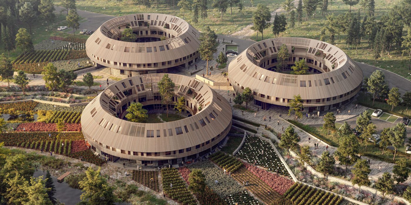
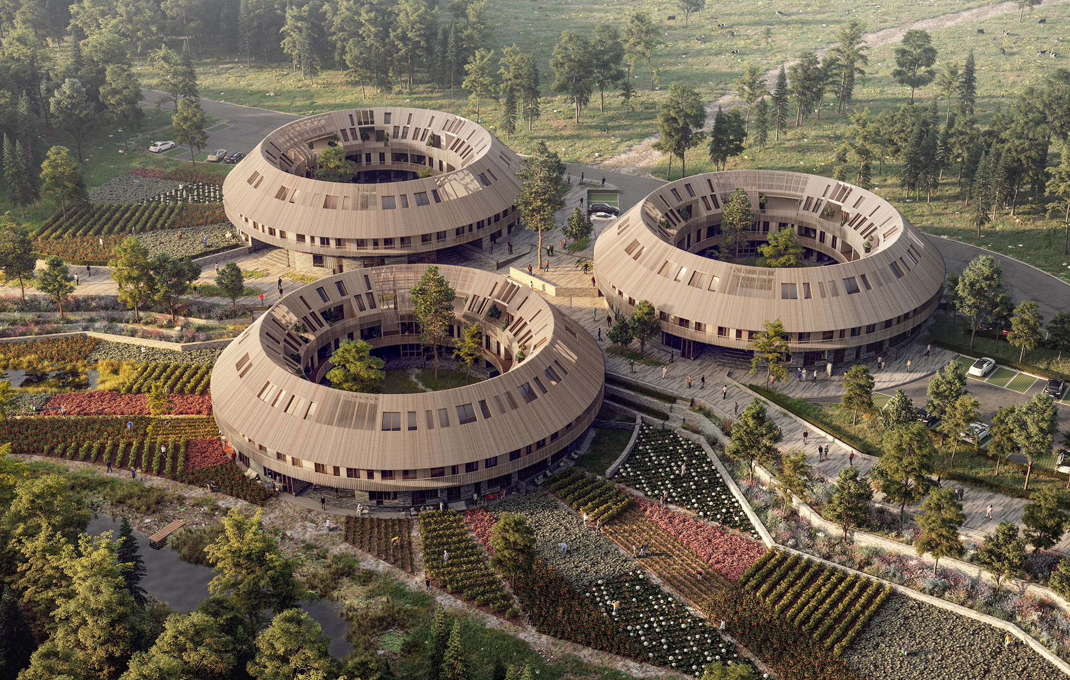
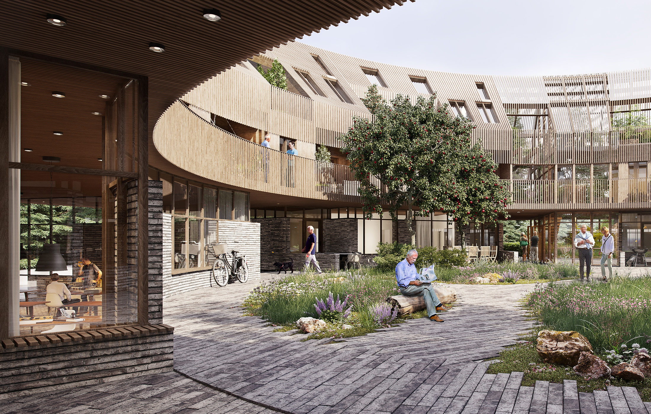
Recently, The Almanac by Sweco Architects Denmark made headlines for its conceptual community-centric approach to housing. Evoking themes associated with its namesake, the proposal features ring-shaped housing blocks with a large courtyard at its core. The lower floor of the building features cafes and other recreational spaces, tying it with the communal exterior spaces. The core also acts as the cultural center for each structure. The upper floor has a continuous balcony that connects to individual homes, all placed adjacent to each other along the ring form.

The Almanac by Sweco Architects Denmark

Like chawls found in Western India, the connected balcony on the exterior encourages neighbors to interaction. Additionally, the corridor on the inner side also forces people to walk by each other’s homes. Simply walking past the windows of other neighbors increases the chances of impromptu conversations and sharing of meals. Unlike apartments in big cities, it is almost impossible to not know who your neighbors are in this typology. Given the curved form, residents have the opportunity to interact with neighbors across the rings as well as those in the central garden.

The circular form has long been popular in architecture. Vernacular dwellings across the world were rounded, perhaps as an imitation of shapes and geometries found in the natural environment. But this form had several advantages as well. In comparison to a square or rectangular perimeter, a circular exterior has a lesser surface area, helping thermal conditions in cold climates. This shape also allowed for more connection points between the roof and the walls, making them stronger. These homes are also more resistant to strong winds, snow and earthquakes.

Image by ming yang via Pixabay

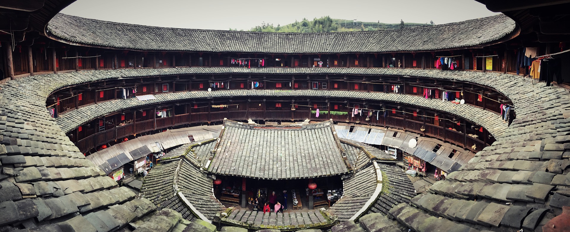
Over time the form of such buildings has evolved. Using a donut shape for multi-unit housing dates back to the 12th Century. The Tulou is a ring-shaped home made by the Hakka community in the Fujian province of China is one of the most well-known examples. There were some rectangular ones but the ring shape remained more popular. Given its robust walls and limited entrances, its structure was both built to protect its inhabitants and foster community living.

The building had small windows on the outside but was opened up inside. Each Tulou could have two to four floors. Made from thick load-bearing earthen walls, each building could easily house about 800 people along with other community spaces such as halls, wells and storerooms. Each Tulou was created for one Hakka clan and their extended family to live together. The uniform sizes of each home unit inside underscored the overarching design theme: unity.

Image by limo23 via Pixabay

In addition to protection and interaction, these structures were also very sustainable (primarily due to its durability). Today, these rammed earth structures are still standing. It should be noted that they have a minimal carbon footprint; in additional to sustainable material sourcing, the material structure itself also helps to regulate the temperature within. Furthermore, the unique donut shape allows ample light to enter the homes as well as in the common spaces, reducing the need for man-made light sources. There is also good circulation of the air through the entrances and the courtyard.

Apart from vernacular housing, the circular form with multiple units also found different uses through the 18th century. One such example is the Narrenturm in Vienna. The structure, built in 1784, was designed to accommodate psychiatric patients. This shape was thought to be helpful when trying to look at the occupants of the whole building from the center.

This idea was also the foundation for the conceptual Panopticon prisons, imagined by Jeremy Bentham. The building was to house prisoners in cells across the external ring and have a central watchtower for guards to observe prisoners from, much like an internal panorama. Fortunately, the use of the form has now reverted back to private homes, apartment complexes, museums and even commercial buildings.

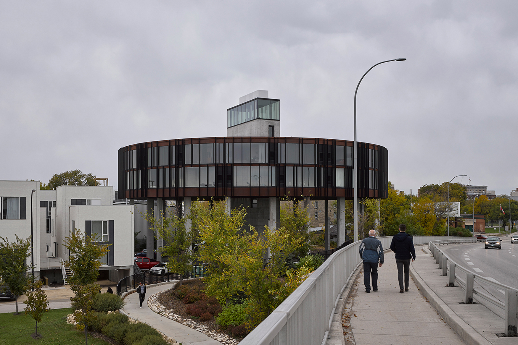
62M by 5468796 Architecture, Winnipeg, Canada

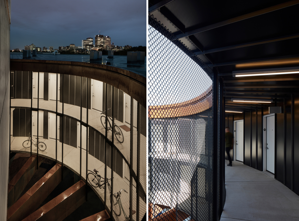
Today, we’re seeing a renewed interest in this unique building footprint, and the idea of building a round housing structure is now popping up in cities across the world. Take, for example, 62M, a housing dormitory in Winnipeg, which resembles a flying saucer. The disk-shaped structure stands on tall columns to provide better views from the 40 studios within and help with climatic conditions.

The entrance of the building as well as the circulation elements are located at the center. Additionally, the continuous corridor was devised to reduce the alienation caused by connectors with dead ends and present opportunities for the residents to meet their neighbors. The circular form also reduces the external surface area, thereby making heating spaces more efficient in cold winters.

Tietgen Dormitory by Lundgaard & Tranberg Architects, København, Denmark

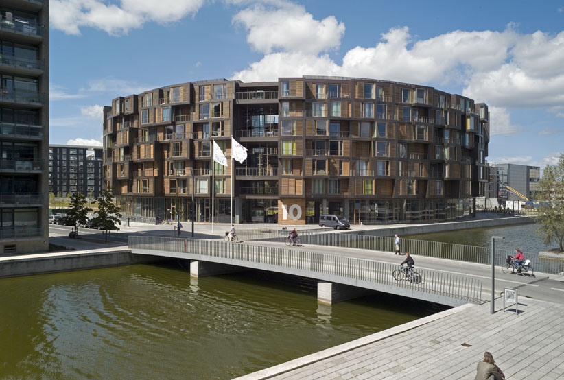
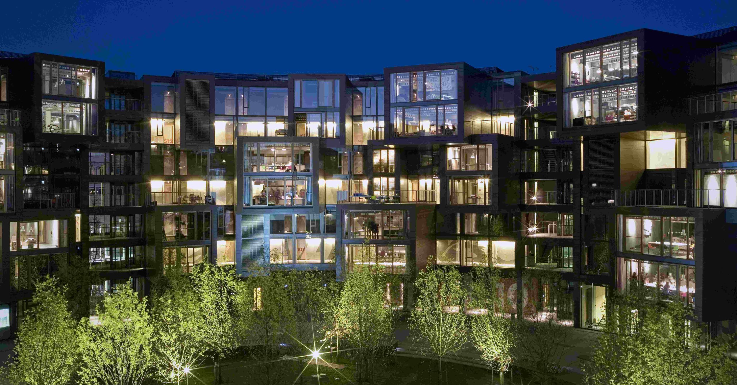
Similar themes are seen in the Tietgen Dormitory in Denmark. The structure comprises 360 residential units along the perimeter as well as some community spaces along the internal surface. Unlike previous structures in the article, homes in this dorm are staggered to create a sense of individuality. Several apartments are grouped together with a common community space that protrudes to help it stand out. While there is no common corridor inside, the circular form allows for increased visual connectivity.

The ring a ring a roses by GVultaggio

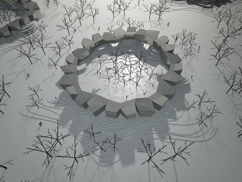
Lastly, a competition entry proposes a housing structure that increases interaction with the landscape as well as other residents. The different homes in the ring are placed at different heights and enclose the central space, creating a secured courtyard. The spaces on the lower level are classified as day-time functions whereas the upper level is for night-time or private functions.

All of these new structures draw on historic precedents but also bring new 21st century insights into the fold. While ringed housing complexes may never be a dominant residential floorplan in our cities, the host of design benefits suggest that this upward trend will bring more user-friendly, community-building housing stock to urban areas in the coming years.

Have your say in which architects will take home Architizer’s prestigious A+Awards: Public Voting opens this spring. Interested in next year’s program? Subscribe to our newsletter for updates.  

Reference