True trends always answer a need
CategoriesInterior Design

True trends always answer a need

As TikTok and other platforms become increasingly flooded with home-styling ideas, Michelle Ogundehin shares advice on how to navigate changing trends in the era of ubiquitous social media.


Newspaper journalists are often keen for a quote on “the latest trends”. What do I think of polka dots? What about red paint: hot right now, non? It depends. Or recently, what could I say about the TikTok trend “bookshelf wealth”? Hmmm, interesting.

Obviously, just because images of a lot of spotty things have been cobbled together by someone on Instagram, or an influencer declares in breathless tones that poppy has surpassed magnolia in the paint stakes, does not make it universally true. But this is not to flagellate the notion of “trends” per se – the stylistic movements that visualise our cultural climate can be genuinely intriguing.

Here-today-over-tomorrow fads can be noxious

True trends always answer a need. Emerging from an alchemy of desire, available resources, and cultural resonance, they have the power to make visible unspoken truths. However, the here-today-over-tomorrow fads can be noxious. The thing is, true trends don’t occur in a vacuum; you can always trace their roots. In short, no roots = no relevance = fad. And I’ll come back to the bookshelves.

Alternatively, it’s called marketing. Because someone, somewhere will make money from you feeling compelled to throw out your perfectly good cushion, frock, phone, or sofa to replace it with a newer, more “on-trend”, faster, smaller, prettier, or any other adjective you care to insert here, model.

Social media platform-time is bought to advance the cause and propel the message. Whether it has staying power though, is entirely another matter. This is where the aforementioned relevance and roots come in.

Arguably there are moments when it seems as if one creative camp has agreed on a singular approach. The spring special April issues of the fashion magazines collectively trill that “it’s all about pastels!” But is it? Or did the picture desks just pull together all the sugary-coloured images from across the collections of 20 different designers and call it a moment?

After all, it’s habitual for colours to lighten in the spring and darken as we approach winter. More of note would be if everyone went grey for April. But that probably wouldn’t make for an uplifting (ie sales-savvy) coverline.

It’s the same in interiors. When I was editor-in-chief of ELLE Decoration, occasionally I’d receive a letter from a disgruntled reader bemoaning the season’s hot new look. Why had it changed from last month’s look, which they loved?

As consumers and designers, we must self-interrogate

My reply was always the same: my job is to show you what’s out there, your job is to decide what you like, and then stick to it. Or change if you want to. But the key is that it’s your choice. What I always wanted to add was: and don’t devolve the responsibility for your taste!

It’s also true that there used to be a bit of a journalistic mantra that went along the lines of: one’s an oddity, two’s a coincidence, but three’s a trend! So, if three of a similar thing plopped into the inbox, then it was worth looking into.

However, the follow-up question is always: why? Why is this happening? Is there anything behind it? Just because something is new doesn’t make it news. And, crucially, is it adding anything to the cultural conversation?

I think this latter point is ever more relevant today. It can no longer be justified to create for the sake of it (that is arguably the purpose of art). Instead, as consumers and designers, we must self-interrogate.

Has this product genuinely improved the models that precede it by using less resources, demanding less energy, eradicating plastic, and thus being less likely to end up as waste? If not, then why make it?

That aside, sometimes a “trend” reflects more of a mood than a whole “moment”. Take the unexpected red “trend”. We could post-rationalise this as being rooted simply in a feeling of dark times drawing us to colour. It makes us happier.

Engaging your own inner critic becomes ever more vital

On the other hand, red is a deeply emotive hue, one of the most visible of the spectrum, thus a colour that intrinsically demands our attention. This is why it’s used for both stop and sale signs. We’re literally hardwired to see it. So, is this a verifiable trend, or merely the power of colour theory? Maybe it doesn’t matter?

However, when considering social-media trends, we generally only see more of what we think we already like. This is fine when we’re talking pops of colour, a lot less so regarding deep fakes deliberately designed to thwart opinions.

Bottom line, engaging your own inner critic becomes ever more vital. The platforms will always deliver a constant stream of fodder, but to paraphrase the inimitable Coco Chanel: content is what’s out there – but it’s up to you to choose what to believe.

Now back to those bookshelves. The images themselves are irrelevant. If someone was to go out and buy books by the metre to “get the look” then they’ve missed the point entirely; let’s not reduce the notion of home to a mere backdrop – it should be your personalised space from which to thrive.

Thus, to me, “bookshelf wealth” is the visual expression of the authenticity that we’re currently craving in a world that appears to have gone right royally tits up. Homes with shelves bursting with well-read tomes, curiosities and the talismans of life, however quirky, are an antidote to the virtual.

It dwells firmly in the tactile and tangible world of the analogue as so beautifully depicted recently in Wim Wenders’ latest film, Perfect Days, wherein the main protagonist lives contentedly in his chosen world of flip phones, cassette tapes and simple routine.

Stop the press! A trend that reflects the rejection of the maelstrom of modern life

It’s about honouring yourself, your journey, your interests, and proudly displaying it all. It stands on the shoulders of the movements we’ve seen already towards fermenting, knitting, and baking sourdough. It’s about truth-telling and slowing-down; renovating not relocating; ditching the work/spend cycle and stepping off the consumer conveyor belt.

It’s not so much a look as a potent signifier of a shifting of priorities. It’s back-to-basics and living on a human-needs-first scale, as an antidote to the prevalent norm of life being voraciously consumed at technological pace to maximise productivity for someone else.

Stop the press! A trend that reflects the rejection of the maelstrom of modern life, indicating long-term thinking and emotional evolution to be the way forward. That may not make for a super snappy soundbite, but it certainly bodes better for our future than crimson walls, or polka dots.

Michelle Ogundehin is a thought leader on interiors, trends, style and wellbeing. Originally trained as an architect and the former editor-in-chief of ELLE Decoration UK, she is the head judge on the BBC’s Interior Design Masters, and the author of Happy Inside: How to Harness the Power of Home for Health and Happiness, a guide to living well. She is also a regular contributor to publications including Vogue Living, FT How to Spend It magazine and Dezeen.

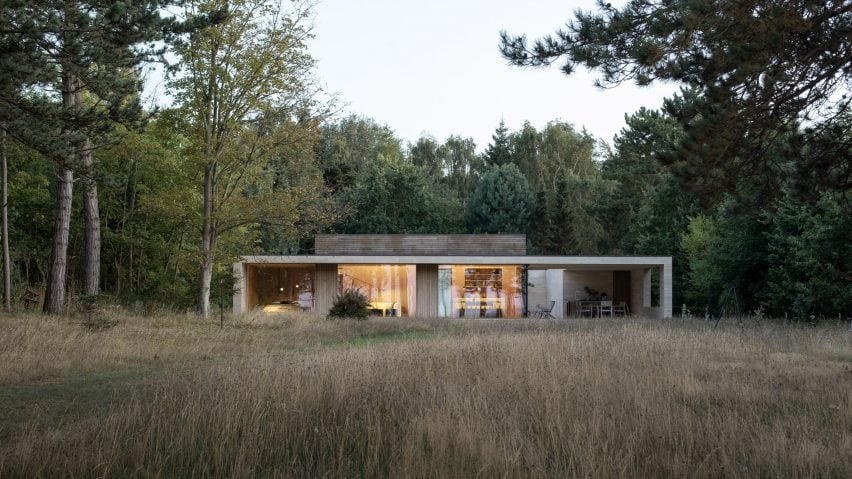
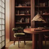
The photo, showing House M by Studio Vaaro, is by Scott Norsworthy.

Dezeen In Depth
If you enjoy reading Dezeen’s interviews, opinions and features, subscribe to Dezeen In Depth. Sent on the last Friday of each month, this newsletter provides a single place to read about the design and architecture stories behind the headlines.

Reference

This week we looked forward to the architecture and design trends of 2024
CategoriesInterior Design

This week we looked forward to the architecture and design trends of 2024

This week on Dezeen, we looked forward to the buildings set to be completed in 2024 and the architecture, design and interiors trends that will impact the upcoming year.

We rounded up 12 key buildings that will be completing over the next year – these include projects by Kéré Architecture, Sou Fujimoto, Zaha Hadid Architects and Foster + Partners.

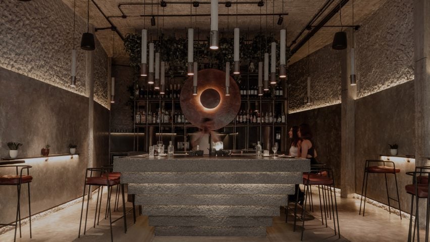
Interior by Mexican studio RA!Interior by Mexican studio RA!
We looked at the trends of 2024

We also looked at the architecture, design and interiors trends of 2024. Interior design will have a focus on individualism and see a backlash to the rise in AI design, while we will see less experimentation and more “safe spaces” this year in architecture.

Dezeen’s editorial director Max Fraser predicted that in design, we will see the rise of material intelligence and a rush for sustainable accreditation.

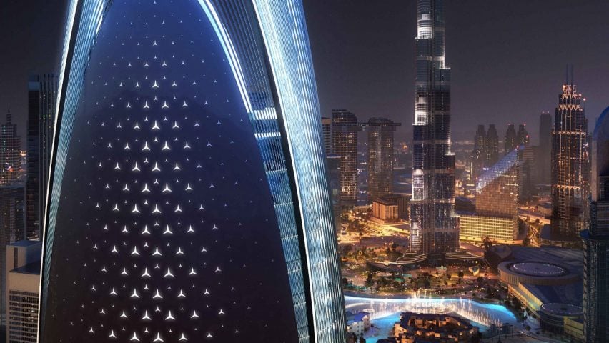
Mercedes-Benz skyscraperMercedes-Benz skyscraper
Mercedes-Benz is designing a skyscraper in Dubai

In architecture news, car brand Mercedes-Benz and developer Binghatti have revealed plans for a supertall skyscraper in central Dubai.

The car company’s first branded residential tower will reportedly be 341 meters high and located close to the Burj Khalifa.

“Our aim with our first branded real estate residential tower is to create new, desirable grounds that inherit our brand’s DNA and give our customers a place to arrive, unwind and come home to,” said Britta Seeger, a member of the management board for Mercedes-Benz Group AG.

The latest Neom region was revealedThe latest Neom region was revealed
The latest Neom region was revealed

In Saudi Arabia, the latest region of the Neom mega-development was revealed.

Named Norlana, the development designed by architecture studio 10 Design will be a town wrapped around a marina on the Gulf of Aqaba.

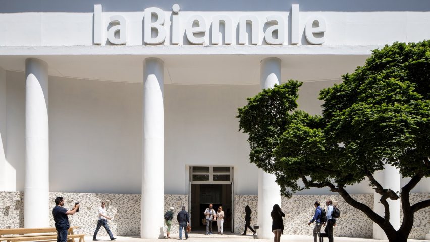
Venice Architecture Biennale 2022Venice Architecture Biennale 2022
Catherine Slessor wrote an opinion on Carlo Ratti’s Venice appointment

Following Carlo Ratti’s appointment as the curator of the next Venice Architecture Biennale, critic Catherine Slessor wrote an opinion piece that raises questions about how the event will be impacted by Italy’s far-right government.

“Viewed as a supposedly safe pair of Italian hands, Ratti’s appointment marks a screeching U-turn from [previous curator] Lesley Lokko, whose tenure was structured around narratives of decarbonisation and decolonisation,” she wrote.

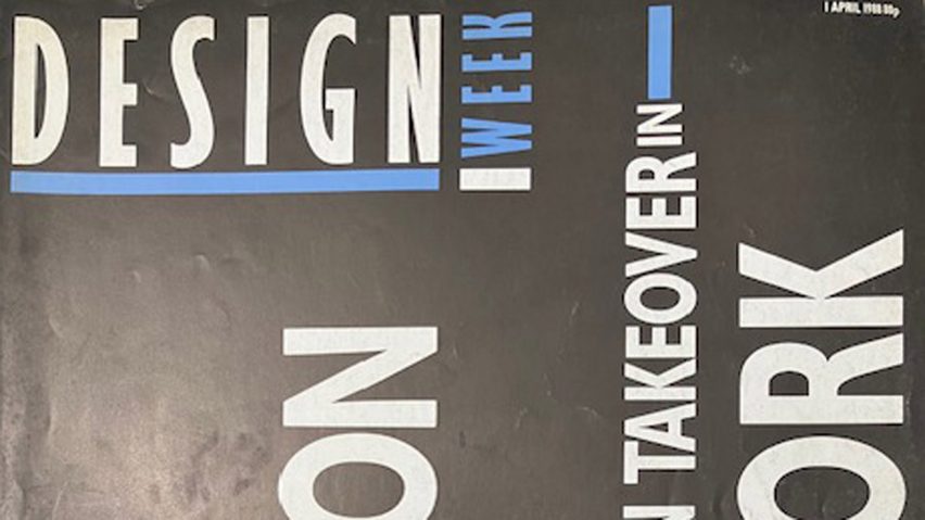
Design Week magazine coverDesign Week magazine cover
Design Week announced it was closing

In the UK, online design magazine Design Week announced that it had ceased publication and that its website will be taken offline later this month.

“Design Week is ceasing publication with immediate effect,” said a statement.

“Design Week’s parent company, Centaur, has made the decision to close the publication as its strategy shifts towards its ‘core audience of marketers, and focuses on training, information, and intelligence’.”

Danish holiday homeDanish holiday home
A Danish summerhouse was one of this week’s most-read projects

Popular projects this week included a monolithic summerhouse on the Danish coast, a pitched-roof house in Massachusetts and a store arranged around a conversation pit.

This week on Dezeen

This week on Dezeen is our regular roundup of the week’s top news stories. Subscribe to our newsletters to be sure you don’t miss anything.

Reference

The future of food: three key trends
CategoriesSustainable News

The future of food: three key trends

While some recent figures show a decline in meat consumption – notably in the UK and US – the reasons behind people’s choices are often more to do with the cost of meat than ethical judgements around animal welfare or the impact on climate. However, population growth, food security, and the climate are key concerns for governments globally, and are fuelling continued development of protein alternatives. In Singapore, it has been a key government policy to foster innovation and investment in this area to bolster domestic food security and reduce reliance on imports.

We compared notes with Jack Ellis, a Senior Associate specialising in agriculture and food at Cleantech Group, to identify the key drivers accelerating the development of meat alternatives.

1. Technology

Artificial Intelligence (AI), gene editing, 3D printing… New technologies are opening up exciting possibilities for growth in the alternative protein space, and innovative startups are pioneering their use.

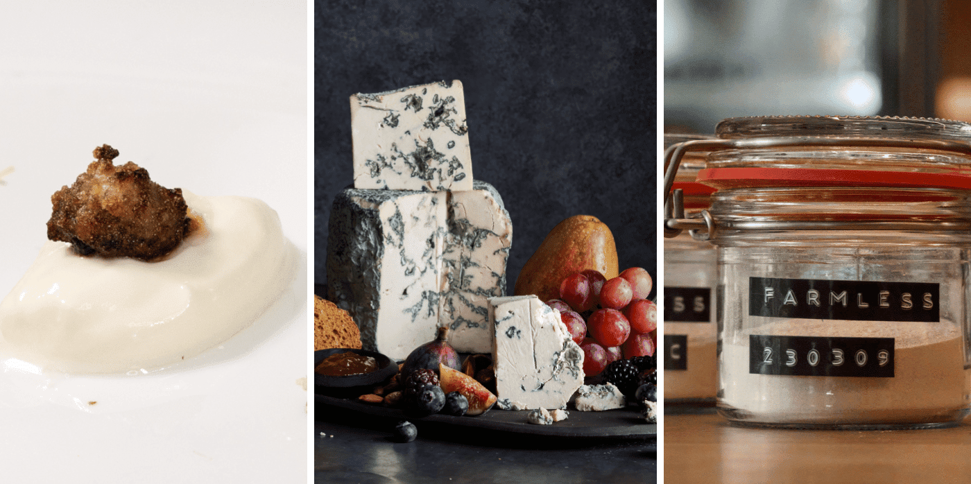
“It feels like there is momentum building around AI, and startups are putting it to different uses,” says Jack. US startup Climax Foods utilises AI to design non-dairy cheese that mimics the texture and taste of several varieties, including brie, blue, and feta. NotCo, a Chilean startup that we first spotted in 2016 – which has since become a unicorn company – uses AI to analyse the smell, texture, and taste of dairy and meat at the molecular level, and then replicate it.

Gene editing can raise protein yields from raw ingredients by ‘tweaking’ the DNA of an organism to make it behave differently. It is generally different to creating a genetically modified organism (GMO), which typically refers to taking genetic material from one species and putting it into another one – a process that has been banned in the EU since 2001. In 2018, gene editing fell under the same law, but in July this year, the EU announced that this was under review.  “Startups in Europe have been vocal in pushing for more regulatory clarity on this,” says Jack. “And if that clarity does come to be and progress, then there will be an uptick, at least in innovative activity and partnering.”

2. Cell cultivation

To date, cell-cultivated meat has two key obstacles: it’s expensive to produce (and so would be prohibitively expensive for consumers) and it needs regulatory clearance as a biological product. The latter first happened in 2020, when Singapore became the first country to grant approval, with the US following suit this year.  Despite these blockers, startups are innovating to reduce the costs involved in cell cultivation. For example, Czech-based firm Mewery uses a technique based on microalgae to decrease the cost of cultivation by up to 70 per cent. Its range of meat-free pork should be available in 2025, pending regulatory clearance.

3. Fermentation

Food production accounts for a quarter of global greenhouse emissions, with cows and other farm animals contributing around 14 per cent. Agriculture is water intensive and uses half of all habitable land on Earth. A growing trend in making food production more resource-efficient is the use of fermentation to produce alternative proteins. Amsterdam-based agritech firm Farmless only requires one five-hundredth of the amount of land needed for animal protein production. Farmless’ process creates food packed with amino-acid complete proteins, fibre, essential vitamins, carbohydrates, and unsaturated fats. It does this by turning existing supply chains of liquid feedstock into the basis for its fermentation system. The company uses a naturally occurring single-cell organism that ferments at a rapid rate, and then, through careful selection of different microbes for different results, produces proteins and foods that can be customised to include almost any combination of macronutrients. 

According to Springwise Commissioning Editor Matthew Hempstead, “With alternative proteins, there are several avenues of innovation and multiple uncertainties. But more and more businesses like Farmless are developing industrial manufacturing capabilities and are set to play an increasingly central role in transforming the agriculture industry in time to meet 2050 climate goals.”

Written By: Angela Everitt

Our November edition of Future Now shares our full list of the top ten innovations pushing the boundaries of food production, leveraging AI for greater efficiency while harnessing other technologies to create alternatives to meat. It is free for members of our Innovation Database. For more information click here.

Reference

Material Trends: “Eunomia” Depicts a Bold Future of Design in Balance With Nature
CategoriesArchitecture

Material Trends: “Eunomia” Depicts a Bold Future of Design in Balance With Nature

A new series of reports on macro design trends reveals fascinating insights into the direction in which architects and designers are traveling — and harmony lies at the heart of the first publication. In collaboration with The Prospectivists and Broadside Studios, material research and resource platform Material ConneXion has released its first major trend report, entitled Eunomia, which can be interpreted as “Fair Measure or the Good Norm.” Originally coined for a period of societal reform in Ancient Greece, Eunomia aimed to impose harmonic rules to counterbalance the consequences of human excess.

Learn More and Access the Full Report

This macro trend has clearly been catalyzed by the global pandemic. “As a reaction to months of lockdown, the fascination for the great outdoors, wellbeing and extreme sports have become deeply rooted in urbanized populations that increasingly aspire to experience a very specific and direct relationship to Nature,” states the report.

This phenomenon is linked with a rise in subcultures that recognize and embrace society’s interdependence with the natural world, developing new systems and products that are deeply informed by biological systems. Eunomia presents a diverse range of case studies to illustrate how this trend can be seen in action, from tree-bark-inspired wearables and moss-covered furnishings to bacteria-grown paint and 3D-printed waste wood tiles — complete with in-built planters.

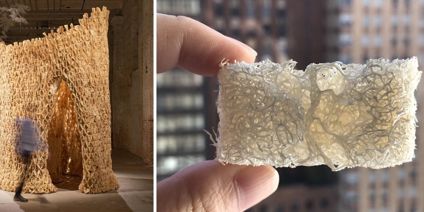
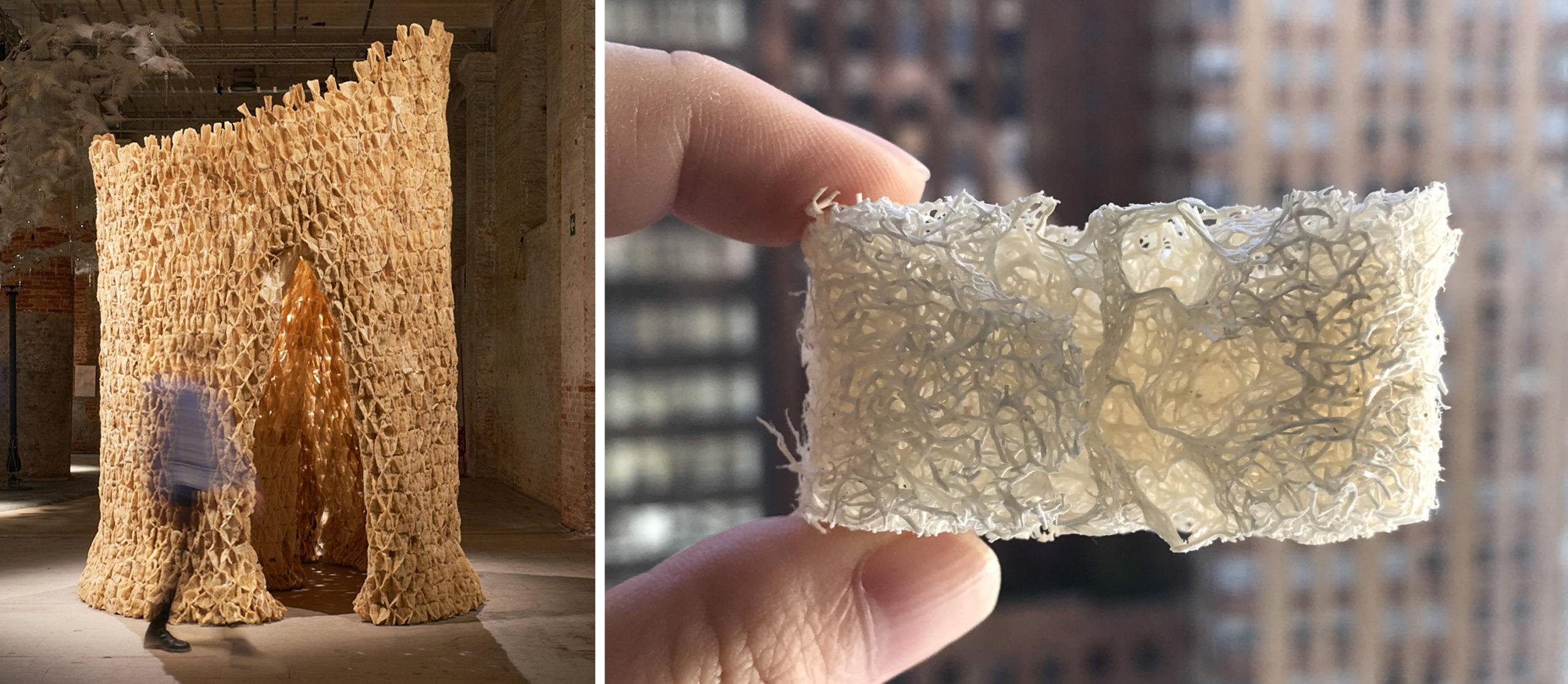
Eunomia’s themes evoke images of numerous projects from last season’s A+Awards, including The Living’s “Alive” installation, which won a Finalist accolade in the Experimental Design category. “Alive” is an experiment in multi-species architecture: a room made of porous, organic material with both macro-spaces for humans and micro-spaces for microbes, with interfaces for exchanges among different species. Photos courtesy of The Living

For architects, the report is a veritable goldmine of inspiration. Biophilic design, resilient architecture, eco-conscious materials and sustainable construction processes are all touted within the ‘Innovation Concepts’ section, with stunning case studies of these concepts being put into practice. Standout examples include Casa Merida, a house designed by Ludwig Godefroy to “withstand the local climate, using locally sourced materials and traditional Mayan features: tall air paths and punctual green areas freshen the circulating air, providing a natural cooling sensation.” 

Meanwhile, Tanya Rey’s Verdant Project presents 3D-printed ceramic columns that are designed to allow moss to grow across every surface, forming a new type of architectural ‘coating’ that blends manmade materials with nature. Additionally, Brigitte Kock and Irene Roca Moracia’s “bio concrete” material is made from invasive species such as Japanese knotweed and American crayfish, providing an “example of how polluting building materials can be transformed into new ‘economic and ecological’ value enhancing natural aesthetics, while helping to restore local biodiversity.”

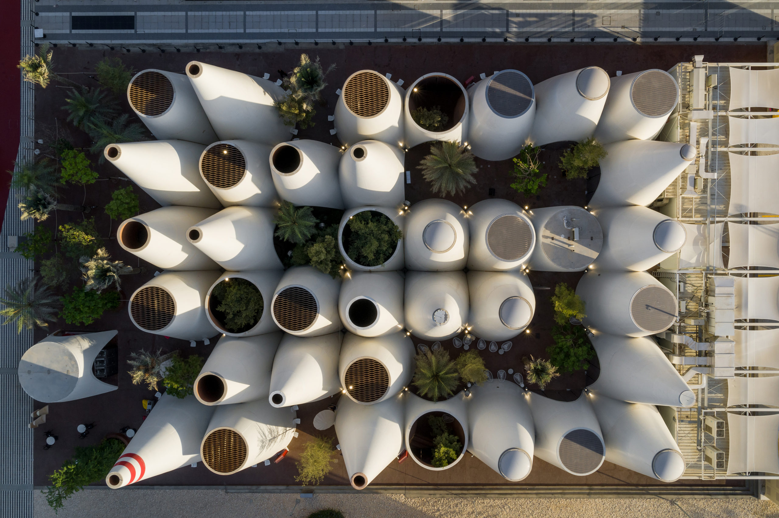
The report brings to mind projects such as Querkraft Architekten’s A+Award-winning Austrian Pavilion for the 2020 Dubai Expo. Combining local building traditions and intelligent Austrian climate engineering, a series of 38 clay plaster cones enables conventional air conditioning technology to be largely avoided, saving three quarters of the energy needed for a comparable building. Photo by Dany Eid/Expo 2020 Dubai

The report wraps up with ‘Design Ideations’, a series of vibrant, complex mood boards tied together along both aesthetic and thematic lines. These diverse yet cohesive palettes should provide architects and designers with fertile ground for continued exploration of the concepts found throughout the report. The biggest takeaway? The power of Nature is only building, and creatives must surely work with it — rather than against it — in order to thrive in the upcoming decade.

To see the full trend report and receive new material insights each month, become a member of Material ConneXion. Learn more >

Top image: Austrian Pavilion for the 2020 Dubai Expo by Querkraft Architekten

Reference

Dezeen Lookbooks present interior design inspiration and trends
CategoriesInterior Design

Dezeen Lookbooks present interior design inspiration and trends

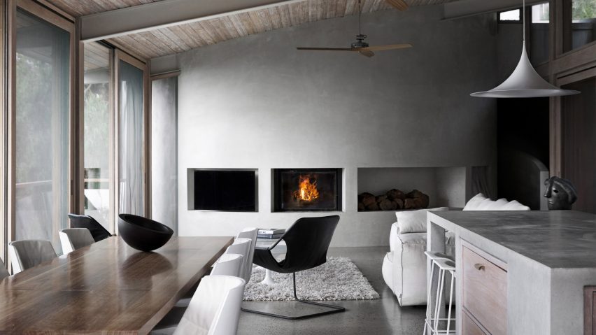
Living room with concrete wall

Dezeen has launched Dezeen Lookbooks, a new section featuring roundups of home interiors and decor trends to help designers and design lovers plan their projects.


Published each Saturday, the visually driven Dezeen Lookbooks present roundups of images of contemporary interiors selected from our vast archive of over 750,000 images.

Each roundup is curated by the Dezeen editorial team and addresses a different room and theme.

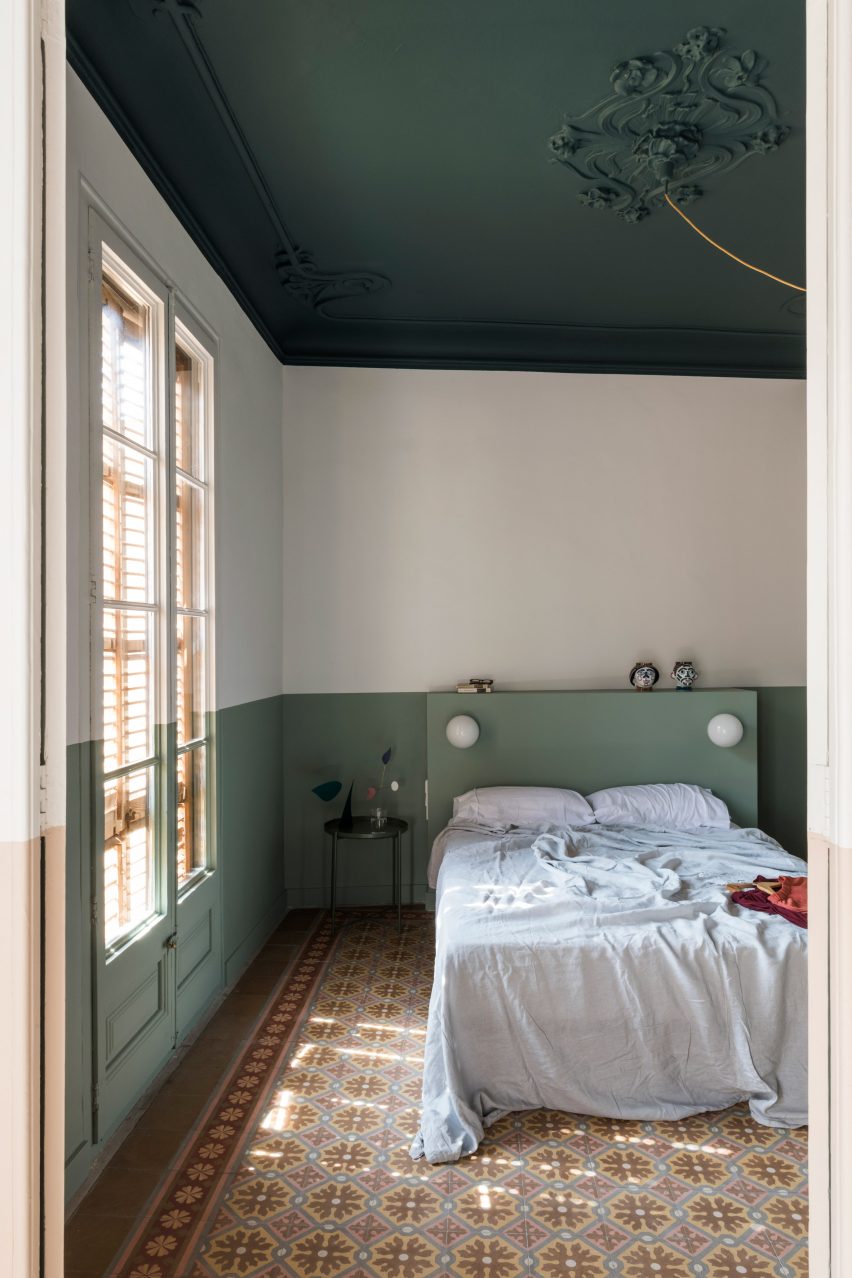
A peaceful bedroom
Top: an image from our cosy living rooms lookbook. Above: a project from the peaceful bedrooms lookbook

Lookbooks published so far feature living rooms, dining rooms, bedrooms, kitchens and bathrooms.

Dezeen Lookbooks is a response to the surge of interest in home design since the start of the coronavirus pandemic, which has seen people spending much more time at home.

As a result, web traffic to Dezeen posts about home interiors has soared.

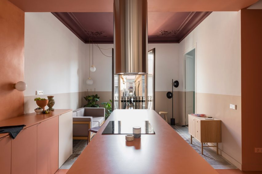
Klinker apartment
This Barcelona apartment features in our colourful kitchens lookbook

Popular Lookbook stories we’ve published over the last few months include our showcases of living rooms with calm interiors, bold bathroom designs and thirty kitchens designed by architects.

We’ll be adding more image-led roundups over the coming weeks and plan to expand the section to include other types of interiors plus trend reports in future.

Interior design fans can also check out our sections on residential interiors, apartments and houses.

Reference