Interior image of the Khaite store
CategoriesInterior Design

Khaite flagship store designed as a “tribute to the cultural legacy of SoHo”

Interior image of the Khaite store

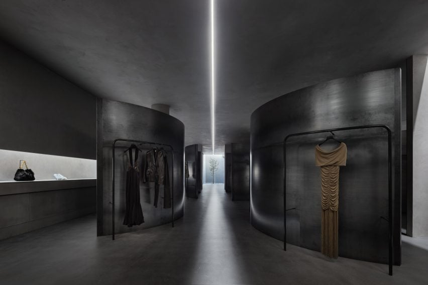
American fashion brand Khaite has opened its flagship store in SoHo, New York City – a cement-trowelled and steel-lined interior with an evergreen tree planted into its shop floor.

The store was designed by Khaite‘s founder and creative director, Catherine Holstein and her husband New York-based architect, Griffin Frazen.

Interior image of the Khaite store
The Khaite flagship store is located in SoHo, New York City

It occupies a Corinthian column-fronted building in SoHo, capped with Italianate cast-iron modillion cornices, designed by German architect Henry Fernbach in 1871.

Holstein and Frazen wanted to encapsulate the cultural legacy of the SoHo location with the area’s connection to the founding of the brand.

Interior of the Khaite store
It was designed by Khaite’s founder and her husband

“Every element of KHAITE is shaped by New York, and we set out to make this space a tribute to the cultural legacy of SoHo,” said Holstein.

“When I moved to New York twenty years ago, this block of Mercer was my entry point to the city, and SoHo is where KHAITE was born. Our first design studio was just down the street.”

Interior image of the Khaite store in SoHo
The couple looked to encapsulate the legacy of its location

The entire 371 square metre ground floor of the store was dedicated to retail space while the building’s basement was reserved for back-of-house workings as well as a private meeting area.

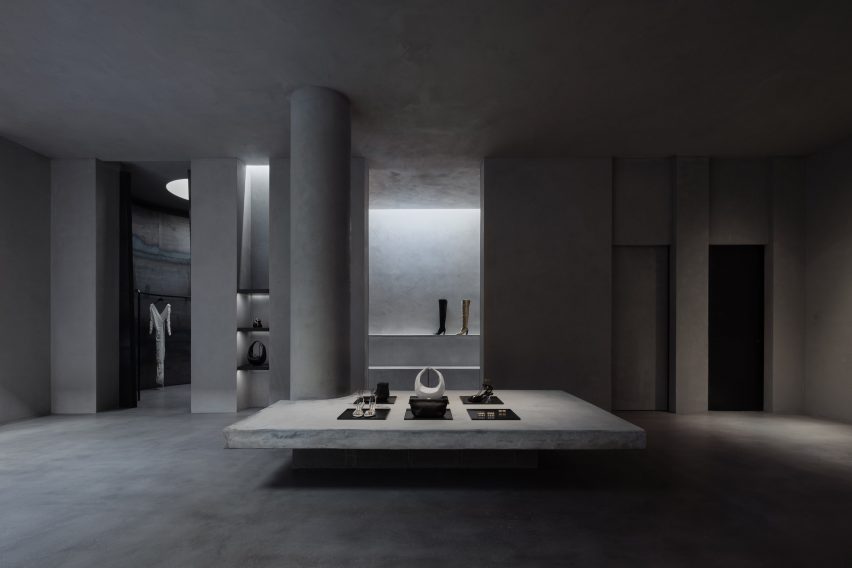
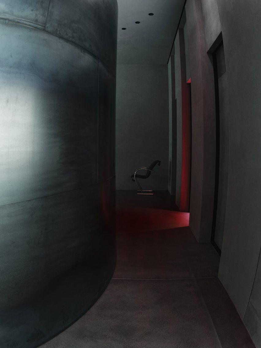
Holstein and Frazen’s approach saw the store clad in city-characterising materials such as steel, glass, poured concrete, troweled cement and plaster, which bring an industrial and monolithic look to the space.

Photo of the Khaite store
Cement, concrete and steel were used throughout the store

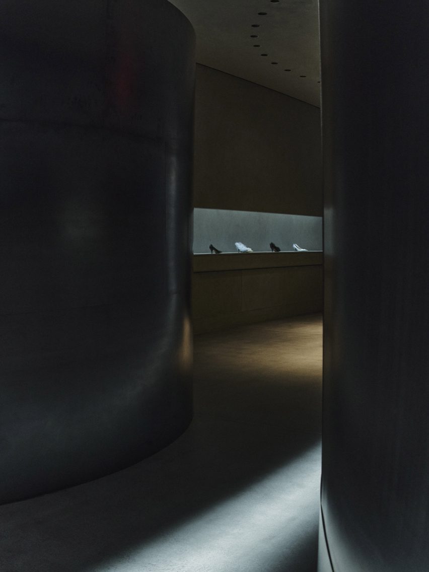
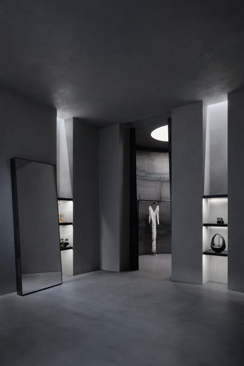
Four curving steel partition walls meander through the length of the retail space and are used to conceal and frame Khaite’s ready-to-wear collections that are displayed on curved display rails.

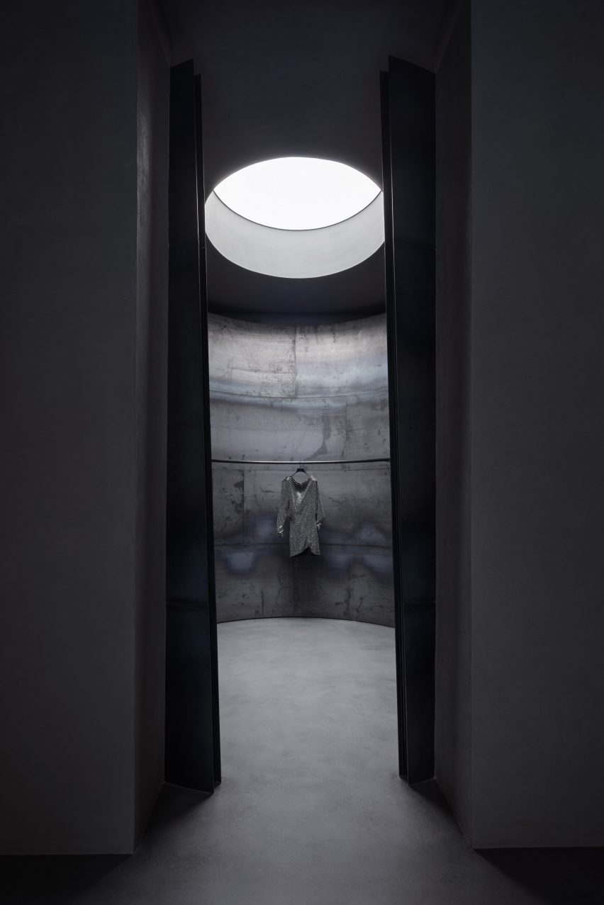
The four steel walls are visually separated by a channel of light from one of two skylights at the rear of the store that was exposed during its renovation.

A focal feature of the store is an evergreen Bucida Buceras tree, which was named the Shady Lady and planted into the floor beneath the rear skylight.

As light enters and flows into the space from the skylights the rough and textural quality of the cement-trowelled walls is revealed.

Photo of the interior of the Khaite store
Skylights were uncovered during its renovation

“The design was conceived in terms of material – choosing the right materials and working with them in the right way to satisfy the programmatic requirements,” said Frazen.

“We leaned into elemental qualities like natural light, preserving the scale and openness while creating intimate spaces.”

Photo of a tree in the store
A tree was planted into the floor of the store

“We embrace the change of materials like steel and concrete just as you would leather and cashmere, honoring them by allowing them to wear in gracefully,” said Frazen.

“Each piece has unique textures, and rather than polishing away or painting over them, we preserved imperfection.”

Photo of the concrete store
It has an industrial look

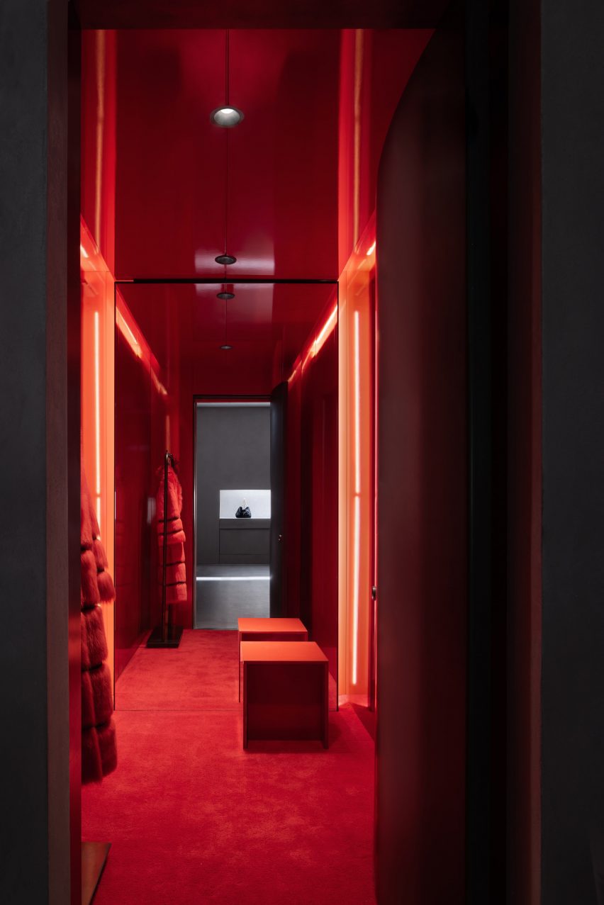
Three fitting rooms were designed to contrast the brutalist details of the store and were blanketed in a deep red, fitted with plush red carpeting and warm lighting.

Minimal furniture was placed throughout, such as a Sing Sing chair by Japanese designer Shiro Kuramata that sits beside a twisted, low-lying shelf used to display the brand’s accessories.

Interior image of a red fitting room
The basement contains back-of-house operations

Before opening to the public, the store was used as the setting for Khaite’s Autumn Winter 2023 show which was presented in February.

Nearby in SoHo, design agency Aruliden completed a store interior for fashion brand Jonathan Simkhai that incorporated cut-out shapes from Simkhai’s clothing into partitions and furniture.

Design firm Crosby Studios teamed up with AR technology company Zero10 to create a pop-up store also in SoHo that allows people to try on virtual clothes.

Reference

paul clemence le corbusier
CategoriesArchitecture

unite d’habitation shot by paul clemence in tribute to le corbusier

paul clemence le corbusier

unite d’habitation through the lens of paul clemence


Photographer Paul Clemence journeys to Marseille to discover Le Corbusier‘s Unite d’Habitation, one of the most recognizable works of modernism. Following his stay at the Hôtel le Corbusier, which occupies the third floor of the iconic building, the Brooklyn-based photographer offers new a glimpse inside the vertical city. The 1952-built project was first erected in response to the baby boom and subsequent housing crisis of post-war France, and takes shape as a monumental, seventeen-story block raised atop an array of heroic pilotis.

paul clemence le corbusier

images © Paul Clemence / ARCHI-PHOTO@photobyclemence


discover the concrete city in the sky


Unite d’Habitation exemplifies Le Corbusier’s call for a new modern architecture, and is brought to life with modernist innovations a range of scales. An early example of the brise-soleil shows thoughtful, environmentally-responsive detailing, which integrates a system of sun shading directly into the facade. Meanwhile, a modular logic ensures that each narrow unit spans two levels and receives sunlight and ventilation from either end — this concept of a simple component to be aggregated is typical of Le Corbusier’s new school of thought.


On the whole, the project is designed to function as a city, a ‘machine for living in,’ and integrates all necessary amenities for its occupants to live. When first conceived, Unite d’Habitation was tightly fit with 330 units for 1,600 people, a post office, a two-level shopping center, library, restaurant, hotel for visitors, clinic, and a rooftop gymnasium and track. Even a school was located on the eleven-acre grounds.

paul clemence le corbusier


le corbusier’s mediterranean masterpiece


The design of Le Corbusier’s Unite d’Habitation takes vernacular cues from the Mediterranean context — the French architect was largely influenced by his early travels throughout Greece and Rome, and drew from its built landscape of ubiquitous white walls and roof gardens. More than historical styles, he applied the spatial ideas of the urban armature to his work. Thus, the project harmonizes the individual dwelling with the ‘urban plan.’ 

paul clemence le corbusier
the monumental block rises seventeen stories, its modular logic expressed along its patterned facade

paul clemence le corbusier
the building is elevated atop an array of heroic pilotis

paul clemence le corbusierOra Ito’s MAMO (Marseille Modulor) art space occupies the rooftop (see designboom’s coverage here)


Reference

Interior of Cafe Bao with wood-panelled mezzanine
CategoriesInterior Design

BAO King’s Cross pays tribute to Asia’s Western-style cafes

Interior of Cafe Bao with wood-panelled mezzanine

The King’s Cross outpost of London restaurant BAO features a wood-panelled interior designed by Macaulay Sinclair based on the Western-style cafes of Taiwan and Japan.


Set within a mixed-use building in Pancras Square, the 188-square-metre space includes a restaurant and bar, a baked goods counter and a workshop as well as a management head office.

Interior of Cafe Bao with wood-panelled mezzanine
The double-height restaurant features a wood-panelled mezzanine

Its menu and interior was informed by Taiwan’s oldest Western-style cafe, Bolero, as well as Japanese kissatens, a type of tearooms that were popular in the middle of the 20th century.

Kissatens serve Yōshoku cuisine, an interpretation of western food seen through an Asian lens. Typical dishes include katsu sandwiches, omurice omelettes – made with fried rice and fried scrambled eggs – and hamburger steak.

Wood serving counter and glossy red floor in London restaurant by Macaulay Sinclair
A pastry counter next to the entrance extends into a bar

“It’s the type of place that is disappearing fast, similar to the pie and mash shops in London,” BAO founder and creative director Erchen Chang told Dezeen.

“But it’s a heritage that is growing a new wave of nostalgia. The restaurant, Bolero, was the first and now oldest Western-style cafe in Taiwan and it’s got such a history to it. It feels as though time has been frozen – in a good way. I love the decor, the old waiters and mostly the old menu.”

Wood counter with coffee machine in Cafe Bao
Bespoke timber and glazed screens provide views into the kitchen

Chang and the team at BAO worked with Nottingham-based Macaulay Sinclair to create an interior that evokes the “nostalgic domesticity” of traditional Taiwanese kitchens, houses and eateries.

“All our restaurants are interpretations of culture in Taiwan,” said Chang, who founded the restaurant chain alongside Shing Tat Chung and Wai Ting Chung.

“We like to use this as a starting point and point of reference for our restaurants and whilst our aim is to create that experience that transports you, it’s not to create a direct copy of the references we take.”

Wood serving counter with display cases in London restaurant by Macaulay Sinclair
Baked goods are displayed near the front of the space

When customers enter the restaurant, they are greeted by a baked goods counter showcasing a range of handmade pastries that they can take away or enjoy in the restaurant.

The counter extends into a bar and overlooks the dining area, which is set with simple square tables and dining chairs by Finnish brand Artek.

Light streams in through large floor-to-ceiling windows and a white-accented staircase takes diners upstairs to a mezzanine level overlooking the double-height restaurant.

On the upper level, guests can learn how to make the steamed buns that give the restaurant its name in classes led by BAO bakers.

Pastry chefs working at Cafe Bao
Diners can watch the chefs at work

The double-height space is wrapped in wood panelling, polished plaster surfaces and bespoke timber screens with glazed panelling.

On the ground floor behind the bar, the screens separate the kitchen from the restaurant, while on the mezzanine level they allow diners to peek into the workshop space.

Solid and veneered iroko wood is used throughout the restaurant, finished with a mix of timber stains and lacquer sheens, while the floor is finished with red epoxy paint in a gloss finish that BAO refers to as “Bauhaus red”.

Dining area with white staircase and paper lanterns at London restaurant by Macaulay Sinclair
Paper lanterns by Isamu Noguchi hang in the dining area

“The bespoke timber and glazed screens are intended to be a playful yet functional barrier between kitchen and restaurant trading space,” said Mike Sinclair, who founded Macaulay Sinclair alongside John Macaulay in 2003.

“Glazing provides considered sightlines into the theatre kitchen whilst flexible, openable apertures assist operational communication.”

Dining chairs against wood-panelled walls in Cafe Bao
The floor is finished in red epoxy paint

All joinery featured throughout the restaurant and workshop space is bespoke and the paper lanterns that hang above the dining area are by Japanese designer Isamu Noguchi.

A museum-style glass display area under the staircase showcases some of the restaurant’s bao buns and restaurant merchandise.

White staircase and wood-panelled walls in London restaurant by Macaulay Sinclair
A white-lacquered staircase leads up to the mezzanine

Macaulay Sinclair also worked on the nearby Dishoom restaurant in King’s Cross, which is located in a former railway transit shed and channels mid-20th-century Bombay.

Photography is by John Carey.

Reference