9 Tutorials To Improve Your Section Renderings
The winners of Architizer’s 3rd Annual One Rendering Challenge have been revealed! Interested in next year’s program? Subscribe to our newsletter for updates.
Sections are integral to understanding any architectural scheme. Whether 2D or 3D, they can give an insight into the varying heights within a model, site conditions, function, material use, light mapping and more. Students and professionals have been experimenting with a variety of styles and techniques to create conceptual and realistic sections to best showcase their proposals. Softwares like Illustrator and Photoshop have also made the task easier, especially when paired with 3D modeling applications and rendering assets.
People creating or inspecting design portfolios now expect drawings that are not only accurate but also have a strong visual appeal. Whether it is a blueprint effect, pop-art palette, x-ray layering or a watercolor effect, every technique contributes something different to the composition. Below is a list of videos that show some different types of sections and how to create them digitally.
Using Photoshop, the above video walks viewers through the different steps of converting a simple line drawing of a section into a rich visual that shows material, depth, light, green cover and more. In addition to the main drawing, there are several smaller steps that can not only apply to sections but can also help enrich other 2D drawings. The tutorial also takes care of less important details that might otherwise be overlooked such as staggering shadows on sloped surfaces and recesses.
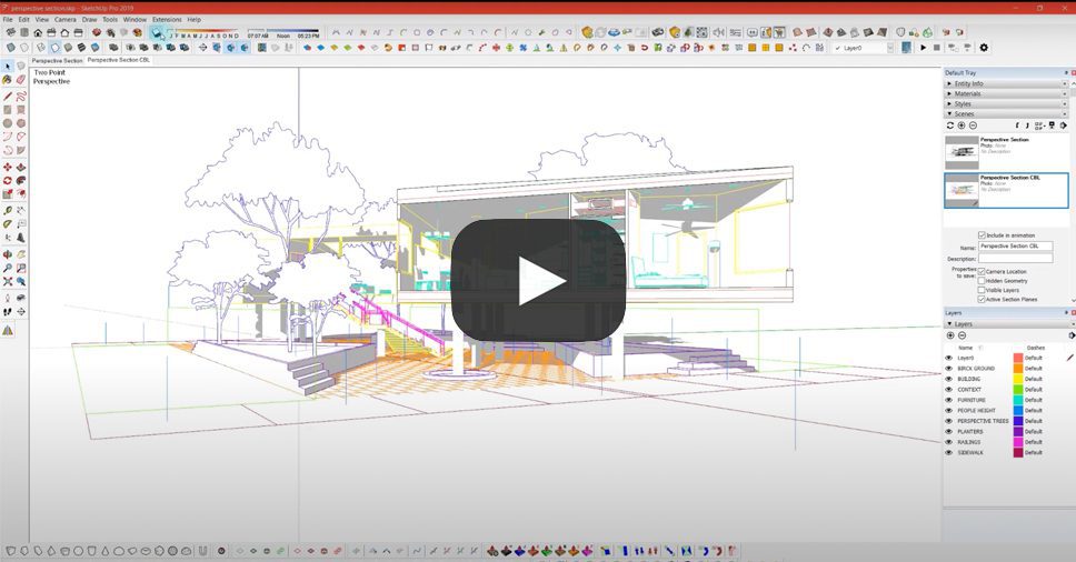
The creator has explained how to take a perspective section from SketchUp into a vector drawing on Illustrator to create a minimal black and white render. This is especially helpful to understand how angled sections can be created for structures with irregular forms. Naudet starts with detailed instructions on how to cut a section in a 3D model and add a reference height for human figures as well as faces for shadows on transparent surfaces. The tutorial then moves to Illustrator where we learn how to layer the base image and the shadows and then add humans, manipulate the site and play with line weights.
Street sections are helpful when it comes to showing road widths, tree heights and compound boundaries. The video above shows how to simply and effectively render a cross-section of a road for larger architecture projects, public space designs or urban planning. It starts with a line drawing and builds on it with silhouettes and vector additions of cars and trees along with labels and dimensions.
This video combines the regular view and the hidden line mode and normal mode views in SketchUp to create a conceptual render in Photoshop. There are also tips on how to vary opacity to enhance depth and manipulate line weights, add subtle textures, and correctly use colored lines instead of black for drawings. The technique is an effective way of moving away from traditional sections to more stylistic drawings without compromising on details or accuracy.
More focused on the Photoshop rendering than the original SketchUp model, this lengthy video is a must watch for all looking to create detailed and dramatic section renders. It starts with the basics of masking, introducing textures in perspective and adding noise, before moving into light modifications, building contrast and artistic flourishes. The voiceover is also extremely helpful in understanding the importance of each step and how the different tools and commands work.
This two-part series shows how to build out a landscape section entirely on photoshop. The first video focuses on a basic 2D section with a water body, vegetation and human activity. This is a method that focuses less on accurate site contours and more on the visual impact of the site. However, it is easy to start with a contour diagram from an AutoCAD drawing or SketchUp model and then follow along with the steps as described in the video. The second video shows how to convert the previously created 2D section into a perspective view, again entirely on Photoshop.
There is something very charming about hand-rendered drawings and sketches. However, creating multiple drawings by hand is not only more time-consuming but also can leave less room for modifications. The tutorial above shows a simple way of converting a line drawing imported from any 3D modeling software into a section that appears to be rendered by hand. It uses a variety of brush settings such as size, opacity, spacing and jitter to create realistic shading. While the brushes linked in the description are not available anymore, it might be possible to find similar ones on other websites online.
Paired with a great music selection, this video uses an angled section plane in an axonometric SketchUp view to create a colorful section. The initial part of the video focuses on cleaning up the imported drawing, adding fill to the cut portions and tweaking certain line weights. It shows how adding blocks of color can help differentiate programs and also assist in labeling. The drawing is finished off with painted shadows, tree silhouettes and tags for functions.
A less traditional way of depicting a 3D section is by using a puzzle piece form to cut a section line as opposed to a standard section plane. The video shows how to cut a puzzle piece out of a 3D model in ArchiCAD and clean the model for rendering in Illustrator. The second half focuses on using transparency, adding dotted lines for better understanding, introducing color and more.
The winners of Architizer’s 3rd Annual One Rendering Challenge have been revealed! Interested in next year’s program? Subscribe to our newsletter for updates.

