Keir is an AEC Domain Expert operating at the intersection of architecture practice, sustainable development and software design. With over 15 years in practice, he has crafted high-quality projects across various sectors, including education, health, housing, and workplaces. He helps Architects, Clients and Startups thrive in an ever-changing industry. Connect on LinkedIn.
A new week, a new way for Generative AI to blow our minds.
Images generated from text prompts have now filled my news feed; they have swiftly ascended the viral ladder, caused heated debates and gained ‘meme status.’ When these arresting visuals started appearing, it felt like each novel experimentation demanded our close attention: “What has this inexplicable new tool done now?!”
Yet modern attention spans are increasingly short, and bold imagery can quickly become ubiquitous. Our sense of wonder is easily replaced by boredom and ambivalence.
Incredibly, the development of Generative AI actually appears to be evolving faster than our agitated modern attention spans. Just as I was beginning to become nonplussed by the latest hybridization of Batman X The Simpsons, I discovered sketch-to-render.
Most people are familiar with models that use simple text prompting, where you describe everything about a composition using words only. Much can be achieved with these tools, but when it comes to exact composition and configuration, you are working at the model’s behest. However, fewer architects are aware that you can now combine an image with a text prompt to further your creative control.
While these are enormously promising developments, it has been hard to understand exactly how an architect might be able to use these tools. How can we use them to augment the design and visualization processes we are already doing? In architecture, we work in the gritty reality, not the synthetic imagination of AI. Planning and construction is a messy business that requires precision solutions.
Yet, sketch-to-render is a different kind of approach and takes user control to the next level again, utilizing an additional step in the generation feature called Control Nets, which allow for far greater control over how an image is constructed and where the trained model will go to work on a composition. Think of Control Nets as a framework or bounding box within which the AI will go to work — it puts you in the driving seat of the model’s explorations.

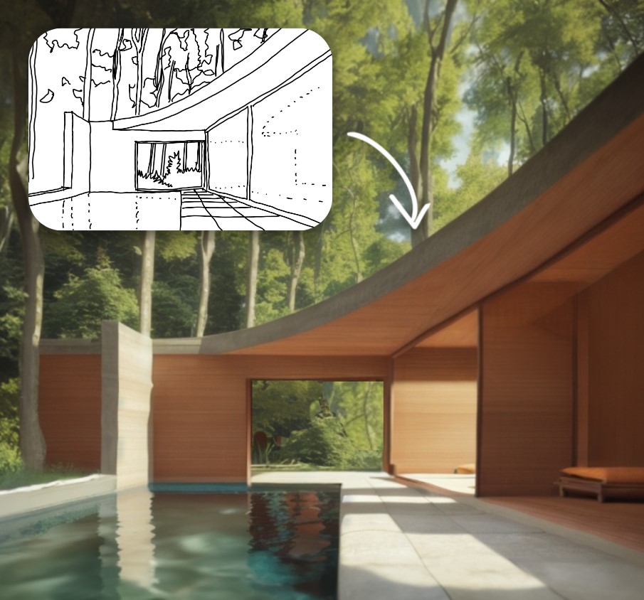
Sketch by author (of NWLND’s “Refuge” project), render produced in Prome AI
Sketch-to-Render
This is a 20-minute process and the idea here is to go straight from primitive line work to vivid render.
Midjourney can produce incredibly high quality and vivid imagery, but offers limited control over the exacting composition of the subject matter. For fields like architecture, the ability to fix the areas within an image around which the model will iterate is absolutely essential for actual tool adoption and use.
There are now various methods to combine generative image tools with ‘fixed’ image subjects and composition to give more exacting control over a single viewpoint and to then iterate ideas on top.
Here are some good emerging methods that are worth experimentation:
- Control Net: A Stable Diffusion model that creates an abstract segmentation using a preprocessor and then combines this with a text prompt. The install is complicated for regular users and the software needs a powerful computer. If you can’t run this locally due to hardware, you can now do it on the cloud, where the Stable Diffusion with ControlNet is now being hosted by various providers.
- PromeAI: The easiest interface that I’ve tried for sketches, complete with preset filters and styles. Its mostly free baseline features are powerful and worth a play. The workflow is simple just login, upload a sketch or hidden line view, add text description prompts and off you go.
- Veras: This works directly within the viewport of everyday software interfaces (SketchUp/Rhino/Revit). It is simple and easy to use and is frictionless because it’s a 3D CAD plugin. The more detail and surface materials you can add, the better it will do at recognizing components.

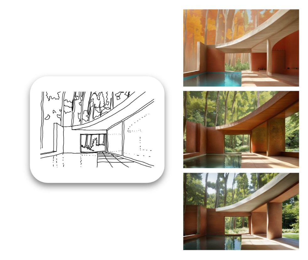
Example of varied rendered outputs produced from the original sketch
Sketch-to-Render-in-Context
This is a more complex process and takes about 30 minutes once you understand how to do it.
The direct sketch-to-render tools are great to use, but having experimented with them in detail, I felt they were best suited to interior design work only. When it comes to external envelope and massing, we always need to place our ideas in context and render with appropriate scale, visualizing the buildings and landscapes within which they sit.
Then, I discovered the idea of using two control nets together: one for a process called “in-painting” and the second for the sketch proposal. There is quite a bit of trial and error to get the workflow right, but it’s made possible by running Stable Diffusion with ControlNet model on your local machine and is repeatable for any photo and sketch combo (provided you can draw).

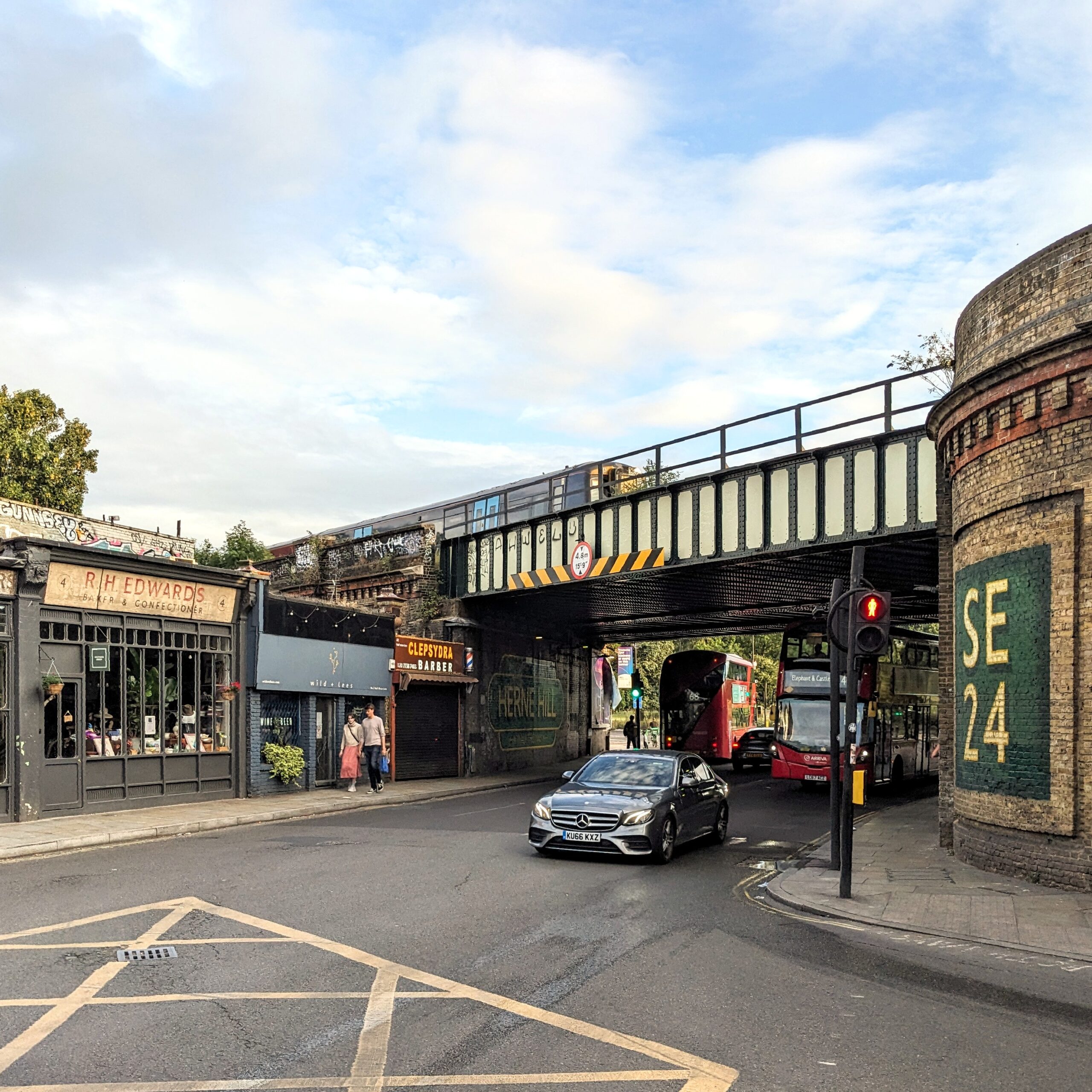
Photograph taken by author of an imaginary development site while on a cycle ride home
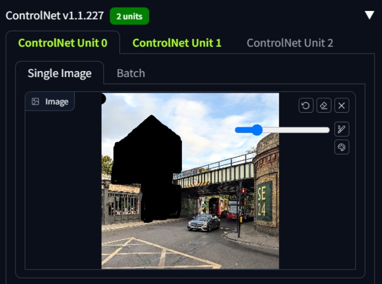
The aforementioned simple “sketch-to-render” process works with one ControlNet active. However you can now use Stable Diffusion with a second ControlNet at the same time which can be used for a process called “in-painting” and this allows you to tell the model exactly which parts of a source image you want to experiment with and which you want to leave exactly as they are.
What I love about this application of Generative AI is that it relies solely on your direction and discretion as a designer and what you do with the pen. It takes out the “middle-man” of painstaking digital modeling of an idea and goes straight to vivid imagery. This is rendering without the hours of boring 3D modeling.
In a world where you can get straight to a high-quality render with just a site photo, a sketch and an ability to describe your idea in the form of an effective prompt, you immediately bypass the need to build detailed 3D models of initial concept ideas.

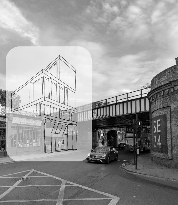
Design sketch by author, drawn quickly directly on top of original photograph.
Arguably, most major practices working with developers have to run projects with a high degree of waste. Options are tested, digitally modeled in 3D, rendered, photoshopped and perhaps mocked up quickly in foam or card model for a client to review. Then we respond to comments, requests for changes, new constraints, new information and a continuous process of change occurs.
Throughout this design process, each rendition must be exhaustively conceived, drawn and modeled before it can be vividly represented in context; this means much of the previous work is discarded or inevitably thrown away almost immediately. Quick iteration tooling could massively reduce the waste and grunt work associated with the process we call “optioneering.” This term is not used affectionately in practice because it can feel so non-linear, but unfortunately some form of option testing is always required to discover a design and each option requires lots of time and energy.

Screenshot produced by author showing process of in-painting using Stable Diffusion with 2no ControlNets – the black area tells the model which part of the image to experiment upon
In a race to produce powerful concept imagery for a new feasibility study or competition, someone who can draw their ideas well is going to beat 3D modeling in turnaround time and speed of iterations using a tool like this .
Soon, clients will be getting rendered ideas in a matter of days from a commission, not weeks. Their expectations about what is possible in a given time frame are going to change — and quickly.
There remains loads of space for improvement, but the foundation is there for a very different approach to design and visualization that could be really empowering for architects (and clients too).

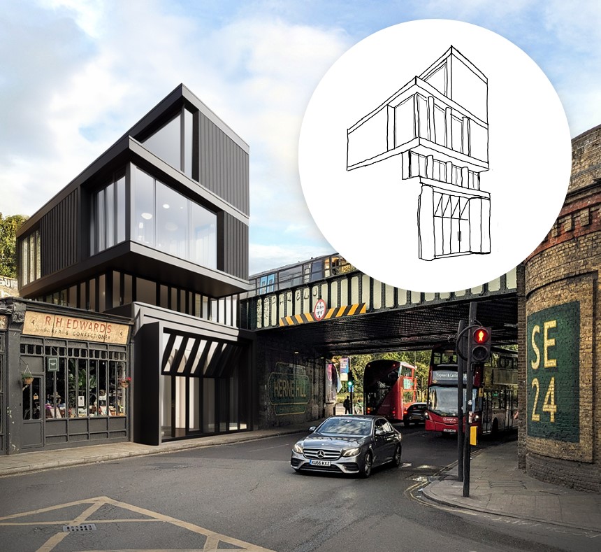
Final Image produced by author using Stable Diffusion with two ControlNets for an imaginary project in Herne Hill, London. The image was produced in less than an hour including sketching time.
My first attempt is a bit rough but demonstrates the enormous potential here; imagine how powerful this will be for early stage feasibility work. I definitely don’t love the outcome, but it’s some version of what I was thinking in the sketch. I would still be happy to present this image to a client as an early study at feasibility stage to give them a more vivid sense of a project’s massing and scale alongside a set of 2D drawings before developing the preferred option in fine detail myself.
In the example shown, I would estimate the model achieved about 50% of my line intentions and about 20% of my material intent on the façades. However, the perspective, massing, lighting, context placement, reflections and sense of scale are all bang on — and all this is done with a general purpose, open-source model.
As this technology continues to improve, specialized architecture models will be trained on data sets that focus specifically on façade and architectural composition. Different architectural styles and materiality options will be made possible and they will be far better at understanding façade componentry such as floor zones, balustrades, windows, curtain walling and columns. The models will need to learn “archispeak” which will now be expressed using text prompt inputs and require architects to say what they actually mean in simple language.
As these models improve we will be able to discern discrete elements within the design concept, identify them as an architectural building component and then refine them directly with prompts as we work. We will be able to apply different prompts to different parts of the image, add people, change the lighting and mood — designing over and over in a live render environment — without modeling anything, all potentially driven from a sketch idea.
There will be many more experiments to come… and when Midjourney can do ControlNets too, it will probably feel like “game over” for much of the traditional 3D model and rendering that we do currently.
Keir is an AEC Domain Expert operating at the intersection of architecture practice, sustainable development and software design. Connect on LinkedIn.
With thanks to:
Ismail Seleit who was the first person I saw demonstrate this idea.
@design.input who put out a great video that helped to describe each step of the process.
Hamza Shaikh for pointing me at ControlNet in the first place when I got frustrated with Midjourney.
Architizer’s new image-heavy daily newsletter, The Plug, is easy on the eyes, giving readers a quick jolt of inspiration to supercharge their days. Plug in to the latest design discussions by subscribing.


