Transcending Typology: 6 Ways Architects Are Transforming New Spiritual Spaces
The latest edition of “Architizer: The World’s Best Architecture” — a stunning, hardbound book celebrating the most inspiring contemporary architecture from around the globe — is now available. Order your copy today.
Religion is steeped in symbolism, and places of worship are, by extension, physical manifestations of these belief systems. Architecture is a powerful vehicle for spirituality. It allows the ethereal, the conceptual, to be made tangible and concrete. Spatial design can give form to the cornerstones of faith, orchestrating vast volumes of veneration and shaping intimate nooks for introspection.
Yet, we’ve moved far beyond traditional, time-honored typologies of religious space. Architects continue to experiment with light, scale and form to create subversive and surprising sacred structures. From awe-inspiring parametric projects to a meditative woodland retreat, discover the ways these wonderous places of worship, recognized at the 11th A+Awards, are forging new pathways to architectural enlightenment.
1. Calling on Curvilinear Forms
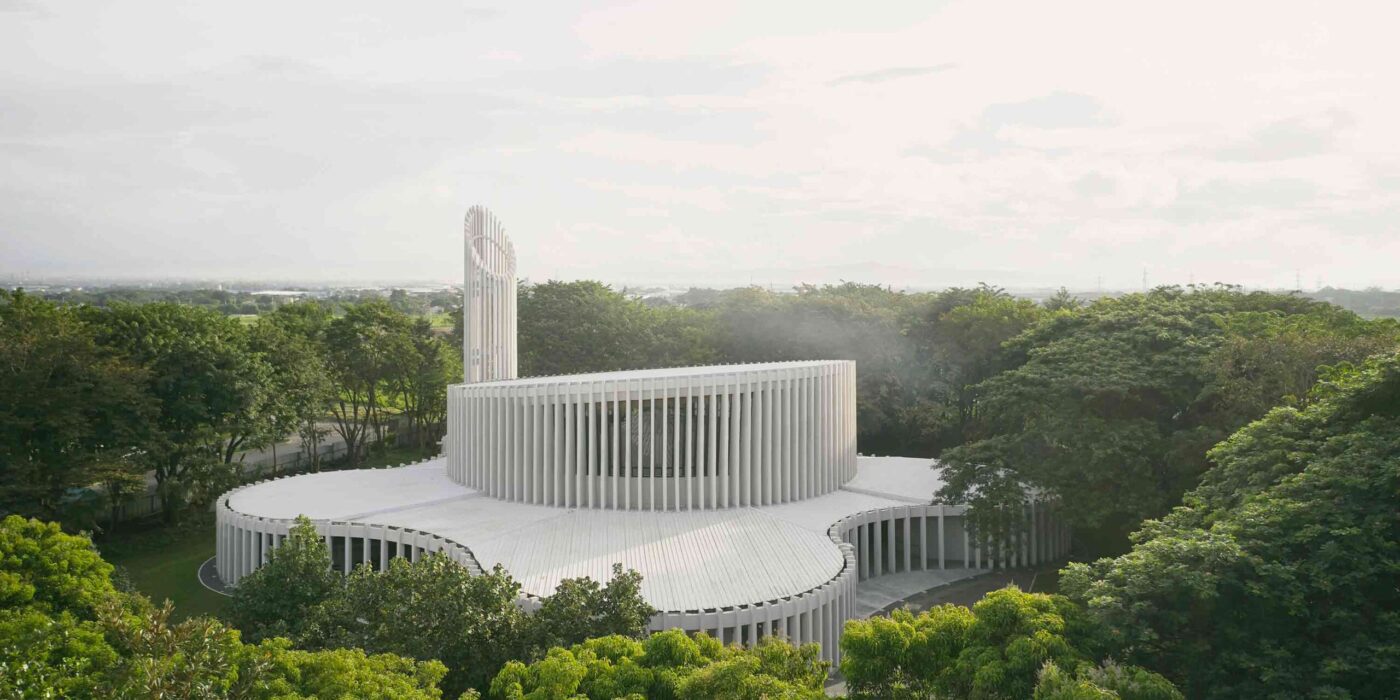
Sanctuario De La Salle by CAZA, Biñan, Philippines
Jury Winner, 11th Annual A+Awards, Religious Buildings & Memorials
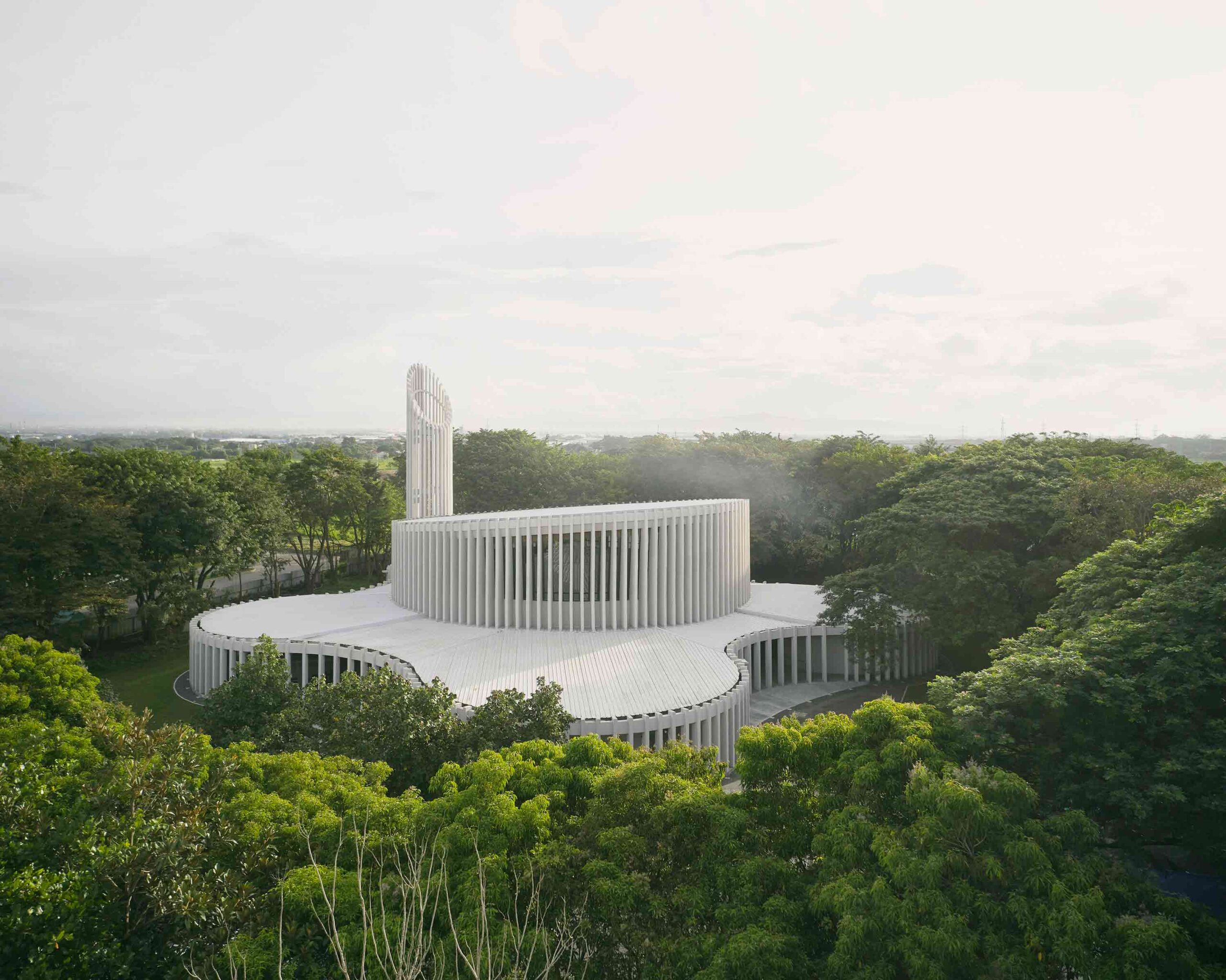
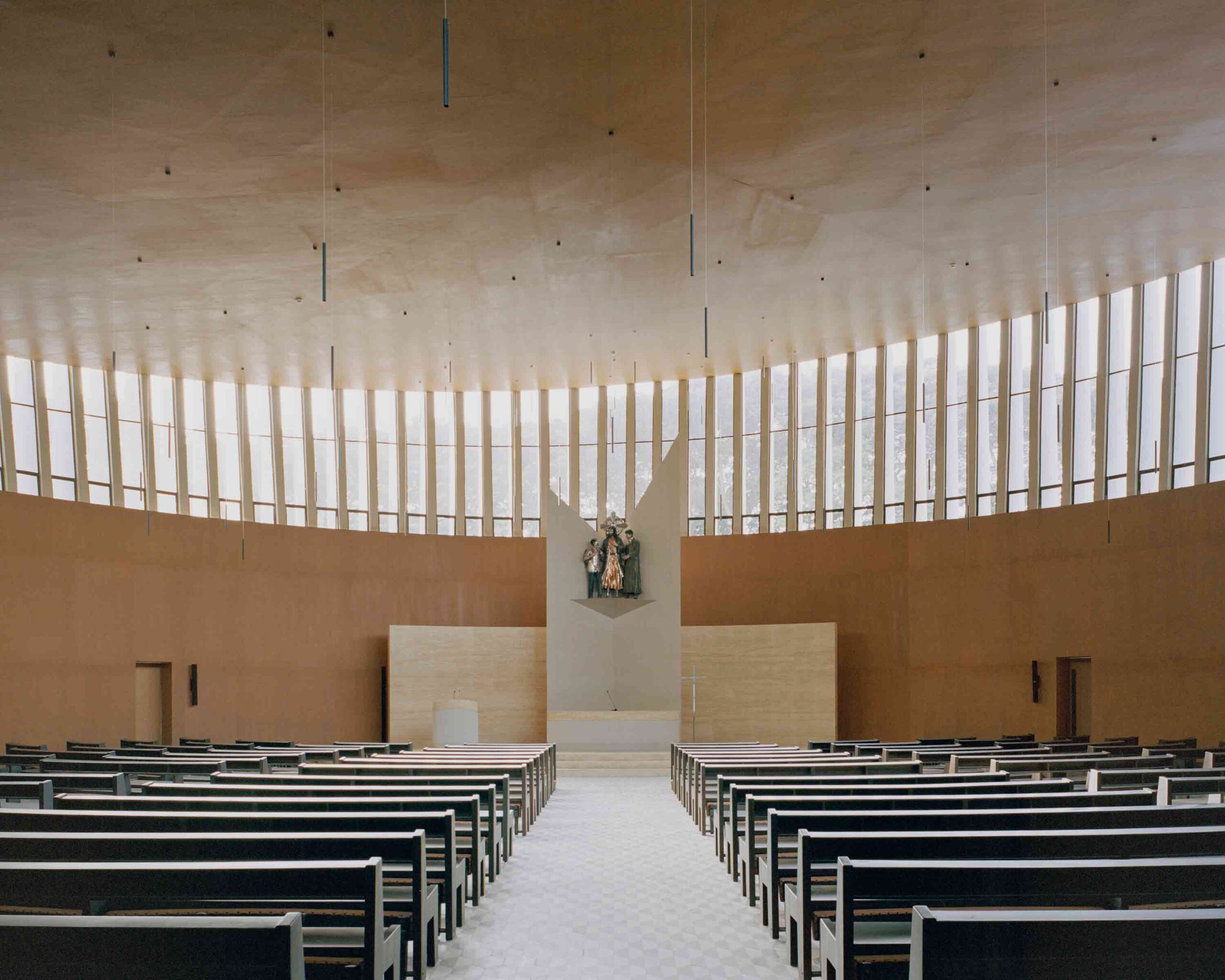 In a dramatic departure from the historic cruciform plan, this remarkable church in the Philippines is defined by its striking, amorphous form. Shrouded by woodland, the mysterious edifice is veiled by a rhythmic curtain of white slats, eschewing precise angles for flowing, curvilinear lines. The building embraces organic shapes, while its permeable façade establishes a dialogue between the inner world of worship and the external landscape.
At the heart of the church is the drum-shaped congregation hall, framed by a sweeping clerestory window. Above, the tilted ceiling evokes the orbital arc of the planets, reinforcing the connection between the congregation and the wider universe. A series of spherical rooms flank the hall, situated within a larger circulatory area, the small pockets forming a communal space greater than the sum of its parts.
2. Experimenting With Glazing
Church of the Holy Family by ARQBR Arquitectura e Urbanismo, Brasília, Brazil
Popular Choice Winner, 11th Annual A+Awards, Religious Buildings & Memorials
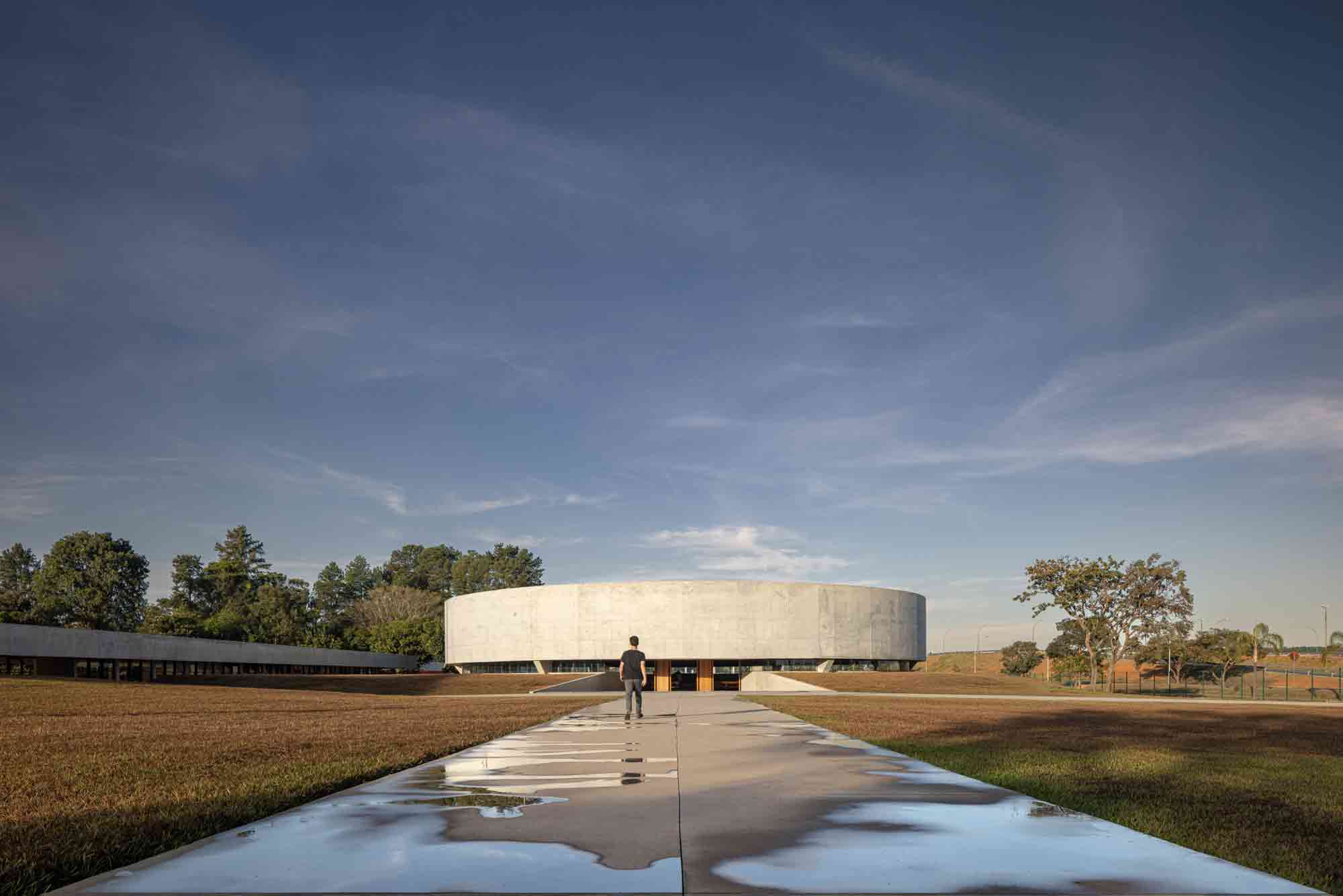
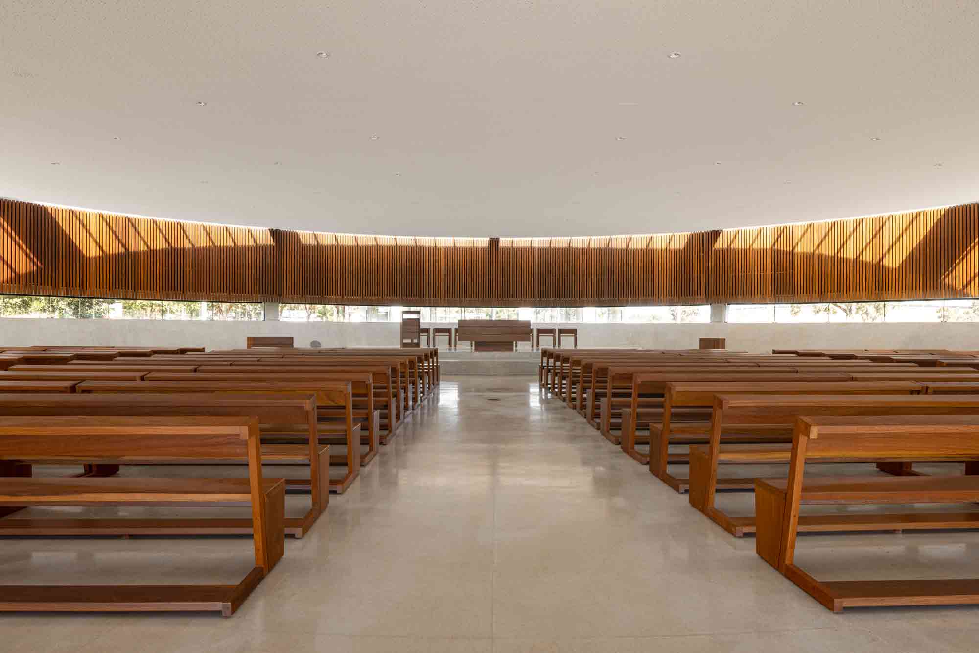 A casualty of urbanization, the trees that once surrounded this site in Brasília were all but removed to make way for an adjacent expressway. The acreage’s new Catholic church seeks to reawaken the bucolic soul of the land and illuminate the relationship between the spiritual and environmental realms.
The circular nave, peaceful in its monolithic presence, is partially embedded underground, beneath the natural height of the plot. Inside, parallel ribbons of glazing encase the perimeter. Inset into the roof, a ring of skylights illuminates the ripple of wood panels below. A sweeping glass band rises behind the lectern, balancing on the horizon, drawing the external terrain in. This remarkable project recenters and internalizes the landscape, infusing it with religious significance.
3. Memorializing the Past
Saint Sarkis Church by David Hotson_Architect, Carrollton, Texas
Finalist, 11th Annual A+Awards, Religious Buildings & Memorials
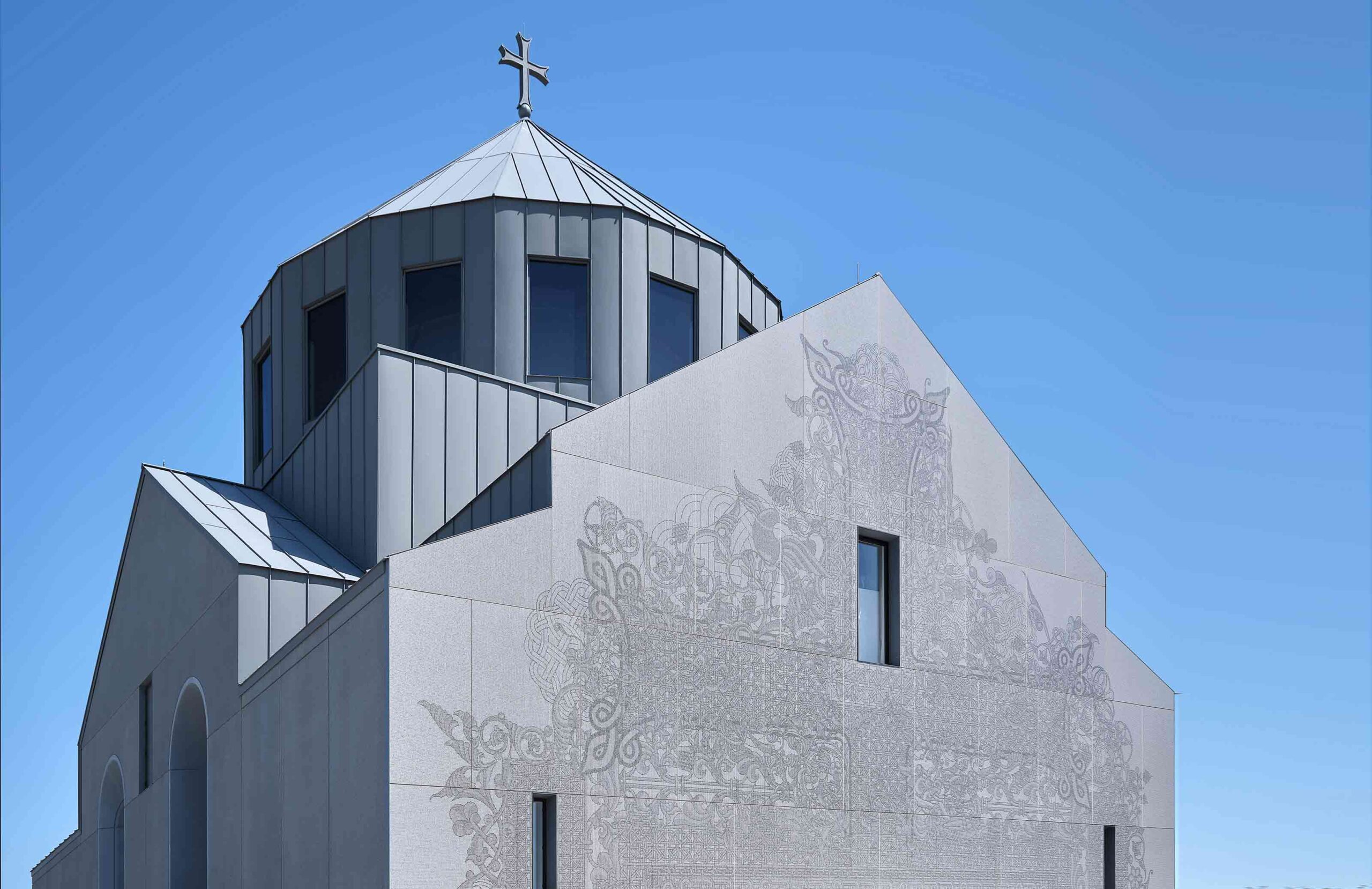
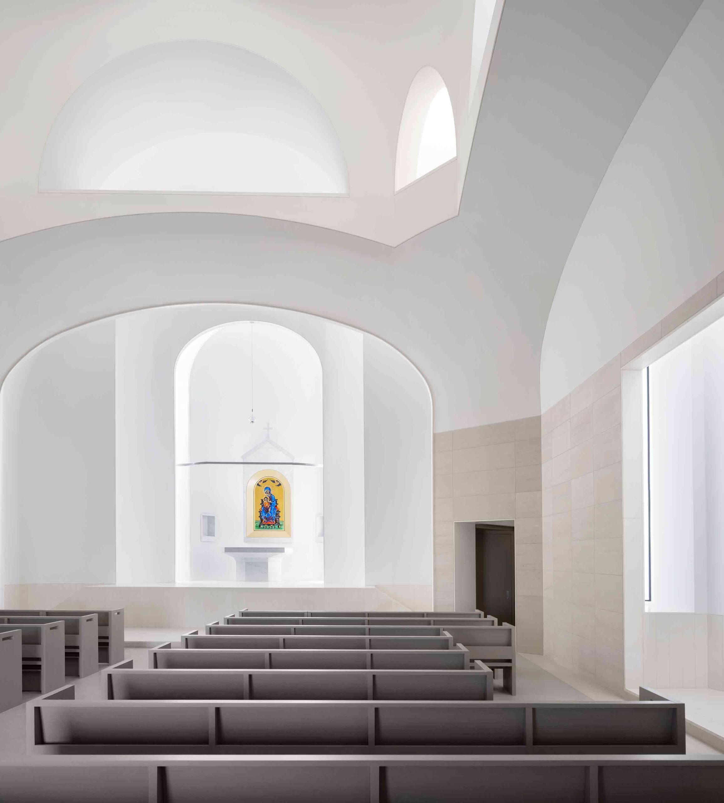 While this astonishing church stands in East Texas, it draws on an ecclesiastical tradition some 8,000 miles away. A homage to the historic Armenian church of Saint Hripsime, it features the same domed form, built some 1,400 years on from its counterpart. The structure’s sculptural interior, carved from glass-fiber reinforced concrete, follows the lead of its ancient inspiration. Lighting fixtures, air-conditioning ducts and other modern interventions have been skilfully concealed, creating an ethereal finish that transcends time.
The very fabric of this grand edifice was conceived as a moving memorial too. The west façade is clad in digitally printed porcelain rainscreen, depicting the traditional Armenian cross and motifs drawn from the country’s vernacular art. Yet, upon closer examination, a secondary layer of meaning unfurls — the design dissolves into 1.5 million infinitesimal pixels, representative of the victims of the Armenian genocide.
4. Honoring the Organic World
Meristem Chapel by MOTIV Architects, Surrey, Canada
Finalist, 11th Annual A+Awards, Pavilions
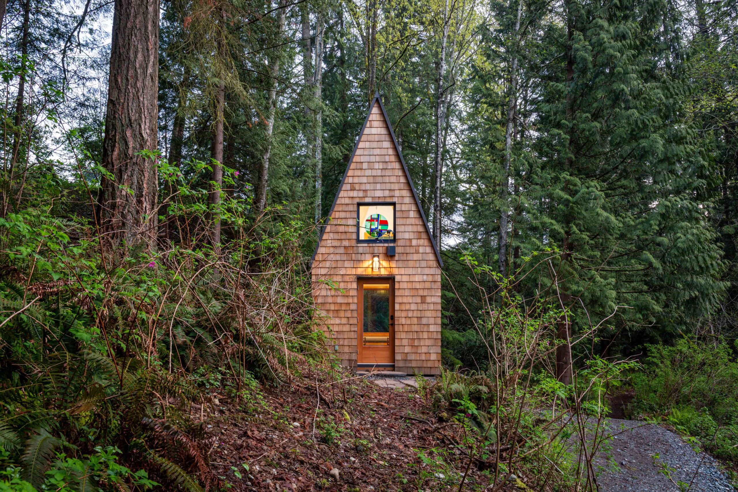
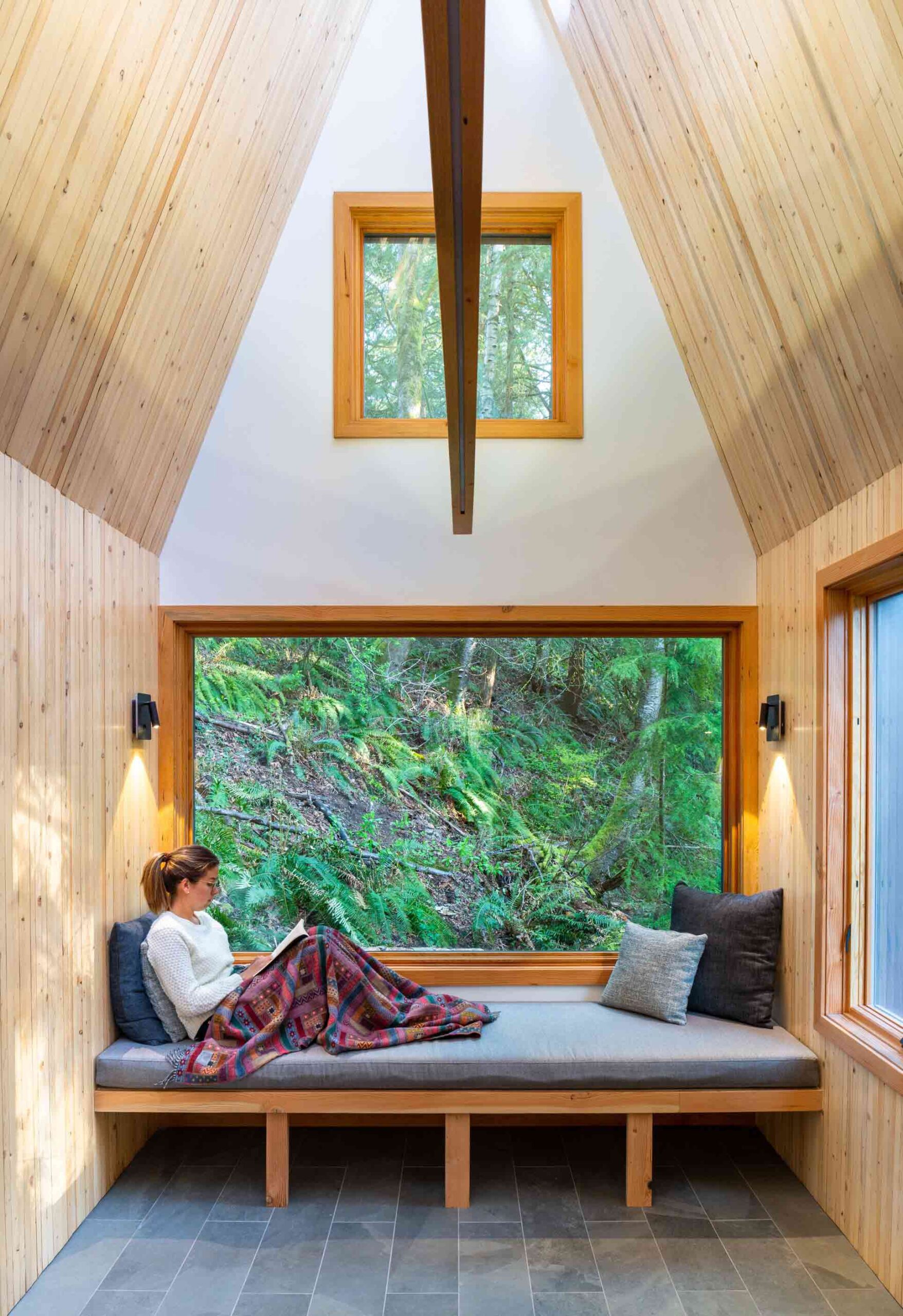 This enchanting chapel in British Columbia was conceived as a peaceful place of reflection and reconnection with the organic landscape, at a distance from the frenetic hubbub of modern life. Its name, Meristem, references a plant tissue found in the roots and shoots of foliage, which instigates the growth of new cells. In the same way, this unassuming space seeks to instill spiritual growth in those who find refuge within its walls.
Nestled in woodland, the structure’s steeply pitched form mirrors the silhouette of the surrounding conifers. The materials used in its construction are deeply rooted in the chapel’s locale — plywood and nail-laminated timber panels were salvaged from deconstructed buildings less than 200 meters from the site. Exposed wood envelops the interior, forming a calming space for contemplation. Twelve skylights are embedded in the ridge of the roof, casting mesmerizing sunbeams across the woodwork.
5. Playing with Perforated Skins
Kol Emeth Center by Field Architecture, Palo Alto, California
Finalist, 11th Annual A+Awards, Religious Buildings & Memorials
Finalist, 11th Annual A+Awards, Sustainable Cultural/Institutional Building
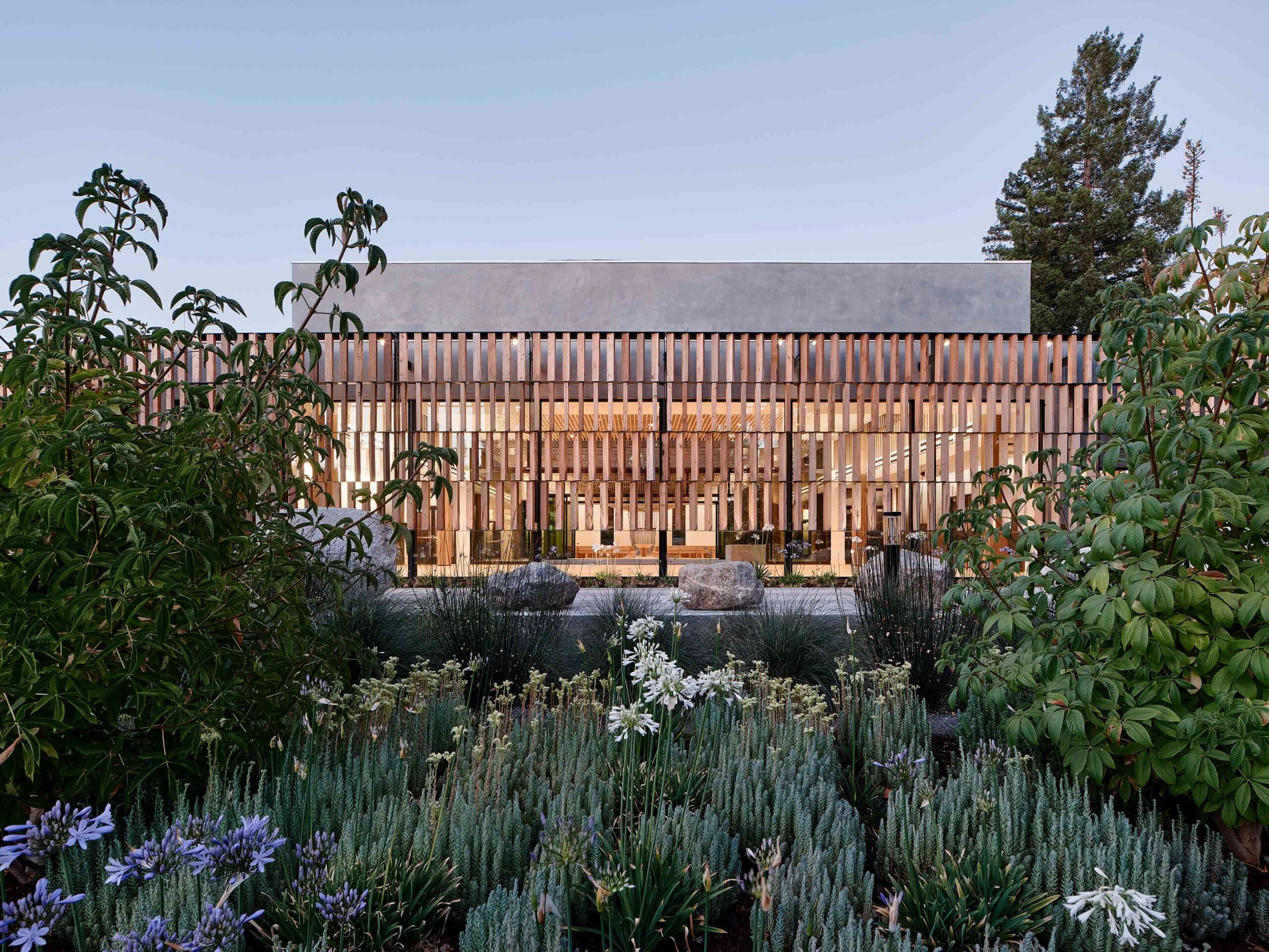
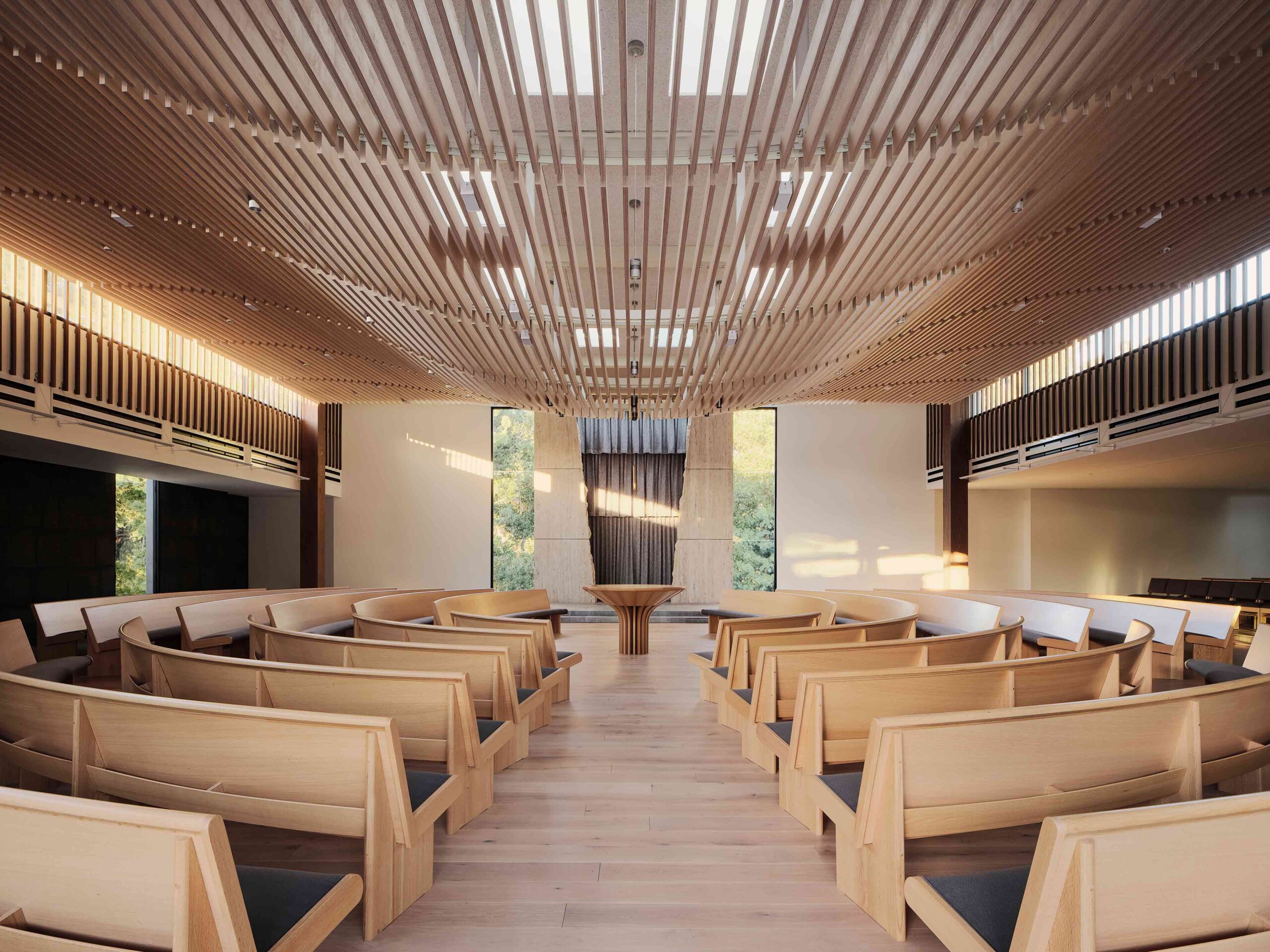 Envisaged as a progressive beacon, this extraordinary synagogue in California combines centuries-old tradition with modern values, articulated through cutting-edge construction methods. The project negotiated a number of restrictions, including an awkward, triangular plot, a single-story height limit and a tight budget. The result is a versatile place of worship that utilizes humble materials and honors the structure’s environmental context.
The building’s sleek, glazed frame is encircled by a striking perforated skin. A stunning example of parametric design, four tiers of rotating timber slats have been carefully calibrated to maximize the site’s light levels. In the prayer hall, a slatted dropped ceiling falls in organic undulations, allowing light from the glazing above to filter through. Thanks to the synagogue’s porous shroud, its spiritual spaces are punctuated with glimpses of the verdant woodlands and wildflowers.
6. Merging Unexpected Typologies
Madaline Terrace by Dake Wells Architecture, Springfield, Missouri
Special Mention, 11th Annual A+Awards, Religious Buildings & Memorials
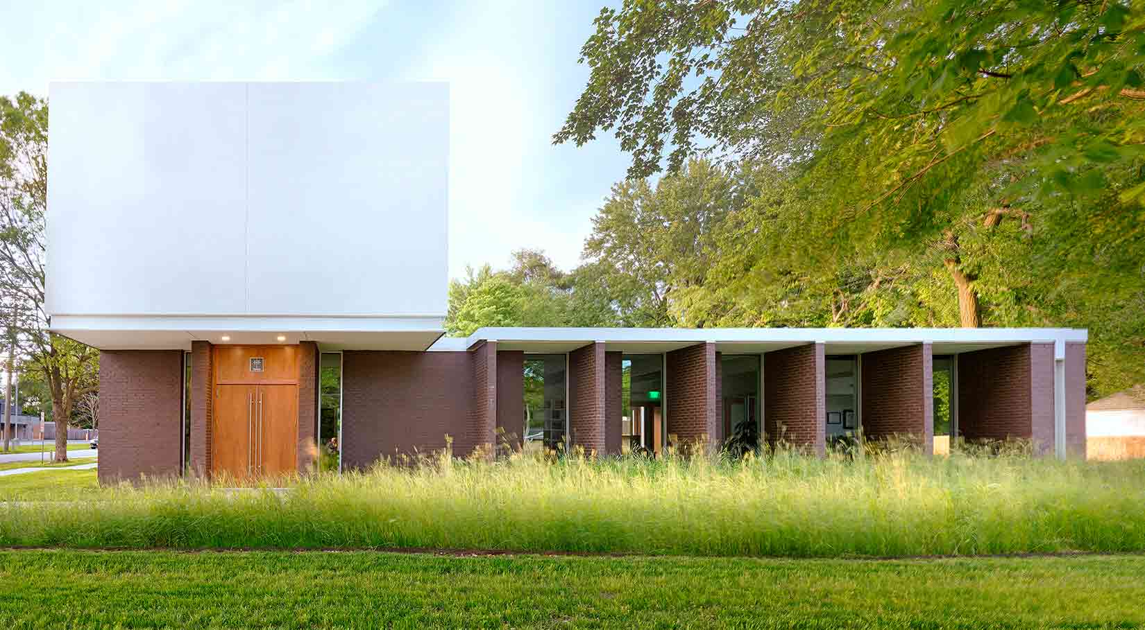
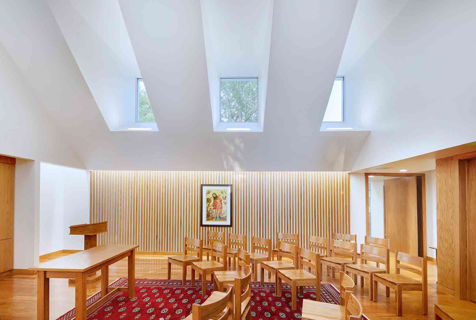 This innovative project sits at a juncture between contrasting worlds. Bridging Springfield’s energetic commercial district and a quiet neighborhood, the building fuses two surprising typologies: a private law practice and a chapel. Visually compelling, the modernist-inspired structure masterfully balances the needs of its client, a minister and attorney with a proclivity for Le Corbusier and Louis Kahn.
The building reads as a tale of two functions, belied by a unifying architectural thread. A low pavilion houses the law office, accentuated by protruding fins that offer shade from the Missouri sun. Meanwhile, the chapel is expressed as a white cubic volume floating above the brickwork. Inside, the mass has been carved into a majestic, vaulted space. The sequestered glazing in the roof becomes a series of picture frames, capturing snapshots of the tree canopy while obscuring the hustle and bustle of the thoroughfare below.
The latest edition of “Architizer: The World’s Best Architecture” — a stunning, hardbound book celebrating the most inspiring contemporary architecture from around the globe — is now available. Order your copy today.


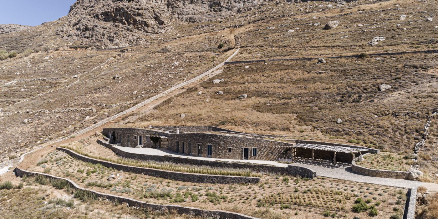
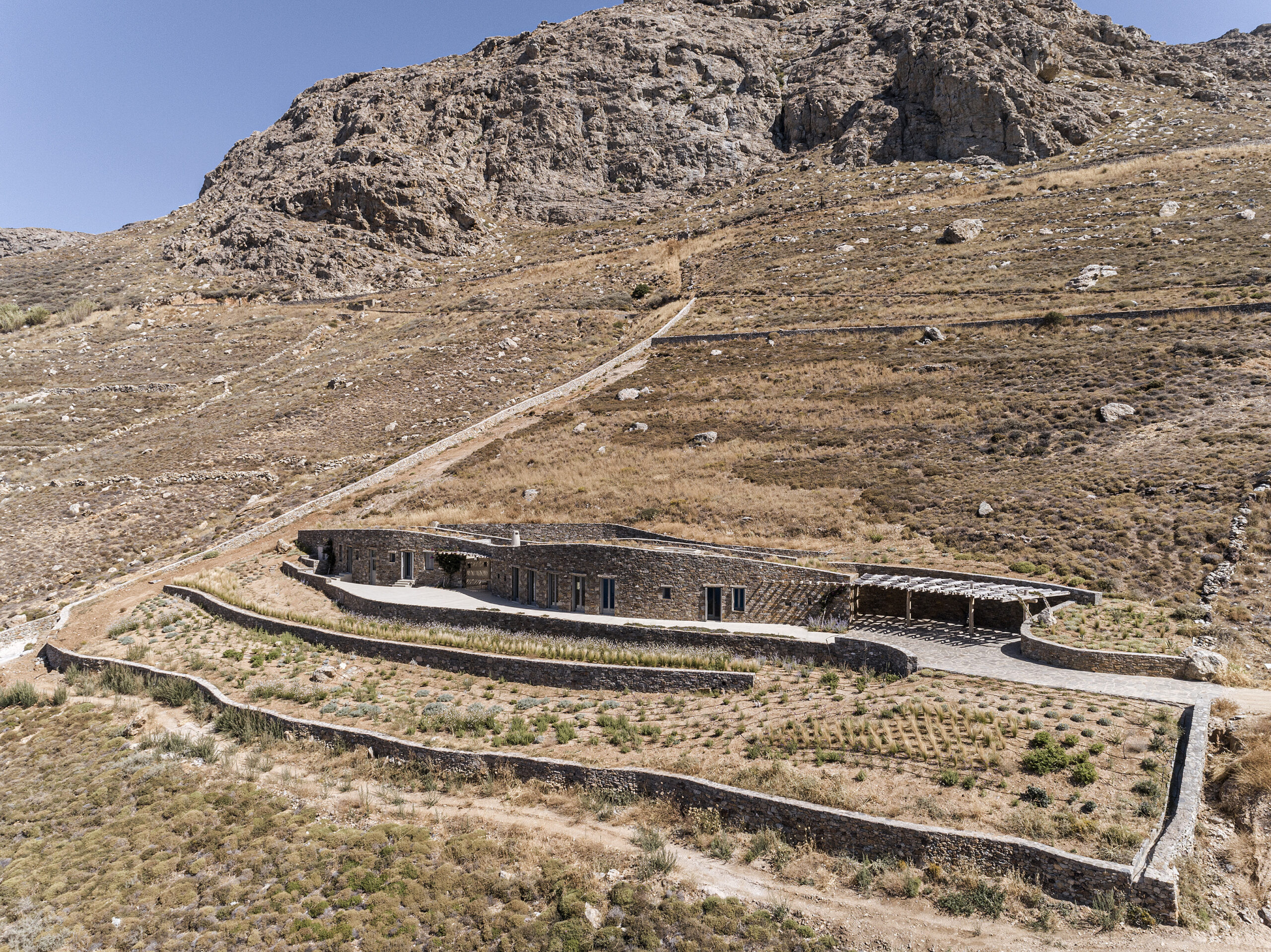
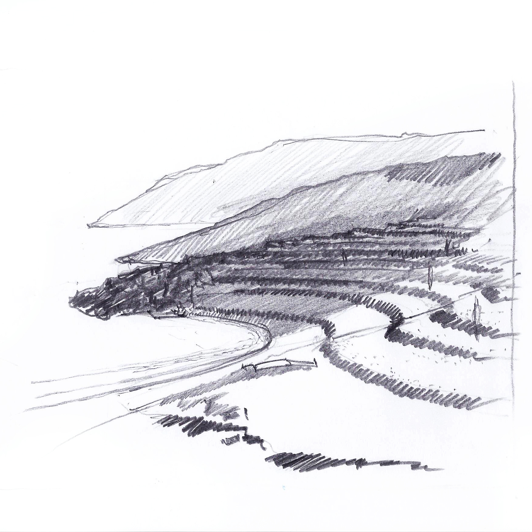
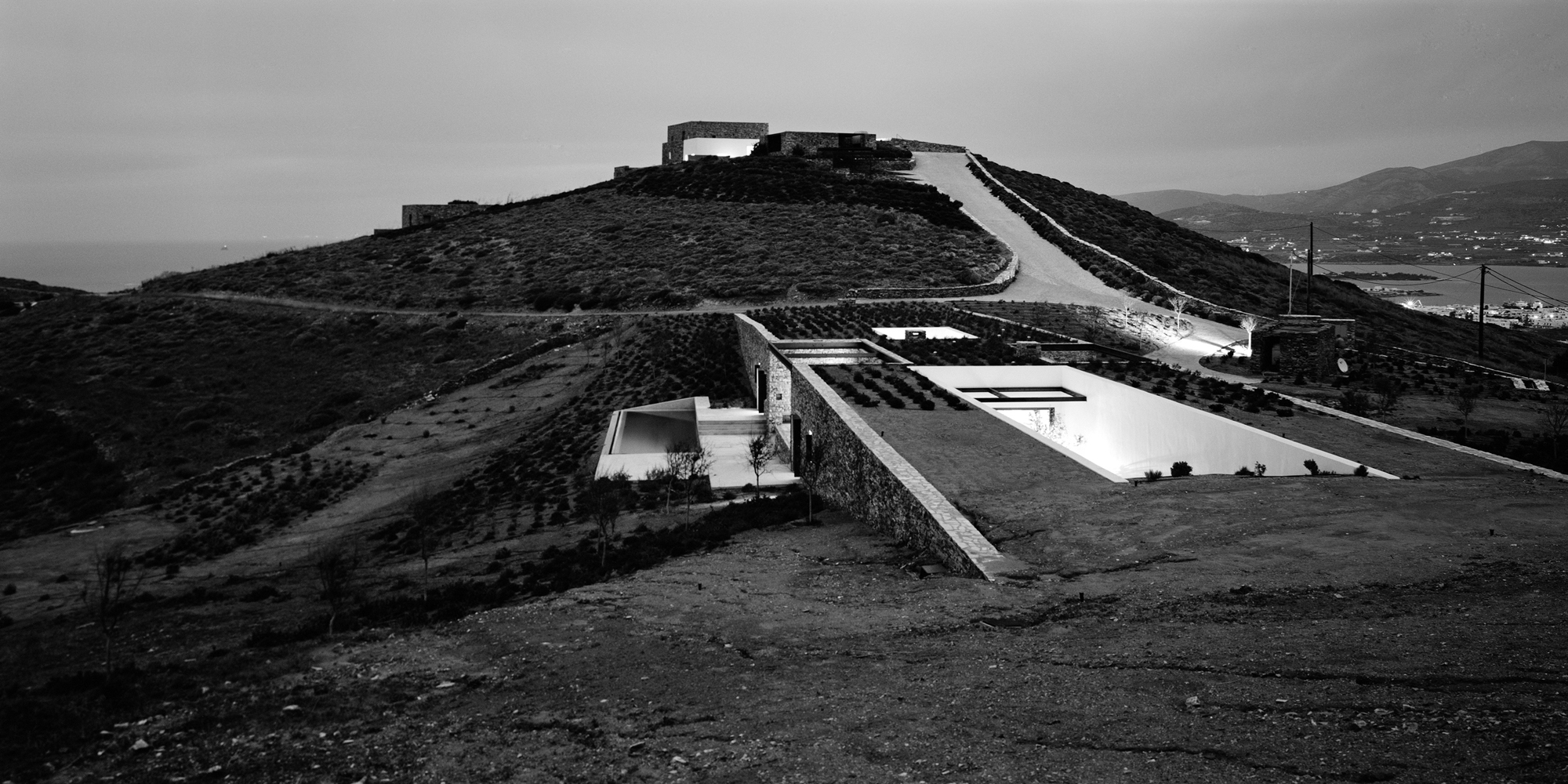
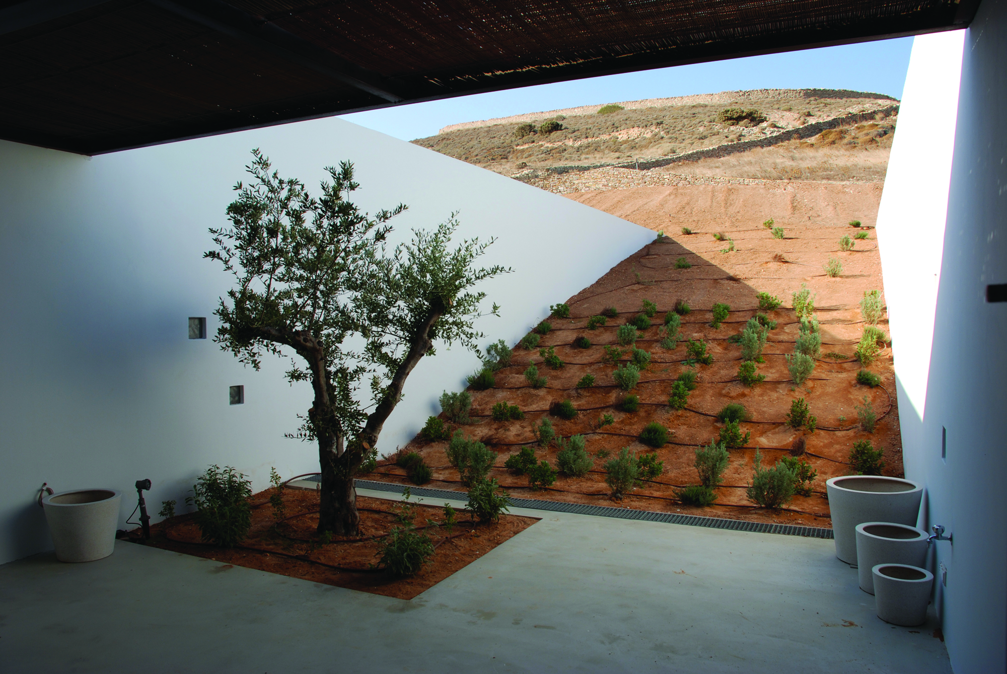
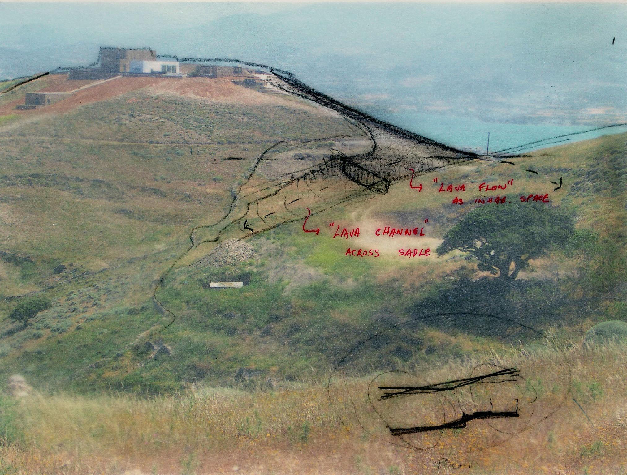 Aloni is also a house that trails the landscape. Still, in this case, the land is not raw or uninhabited, but rather a product of rural conversion practices. Following the agricultural motifs of the past, Deca Architecture employs a series of techniques such as carving, sinking and the use of existing retaining walls. They create a semi-artificial landscape that blurrs the edges between the natural and artificial ground morphology.
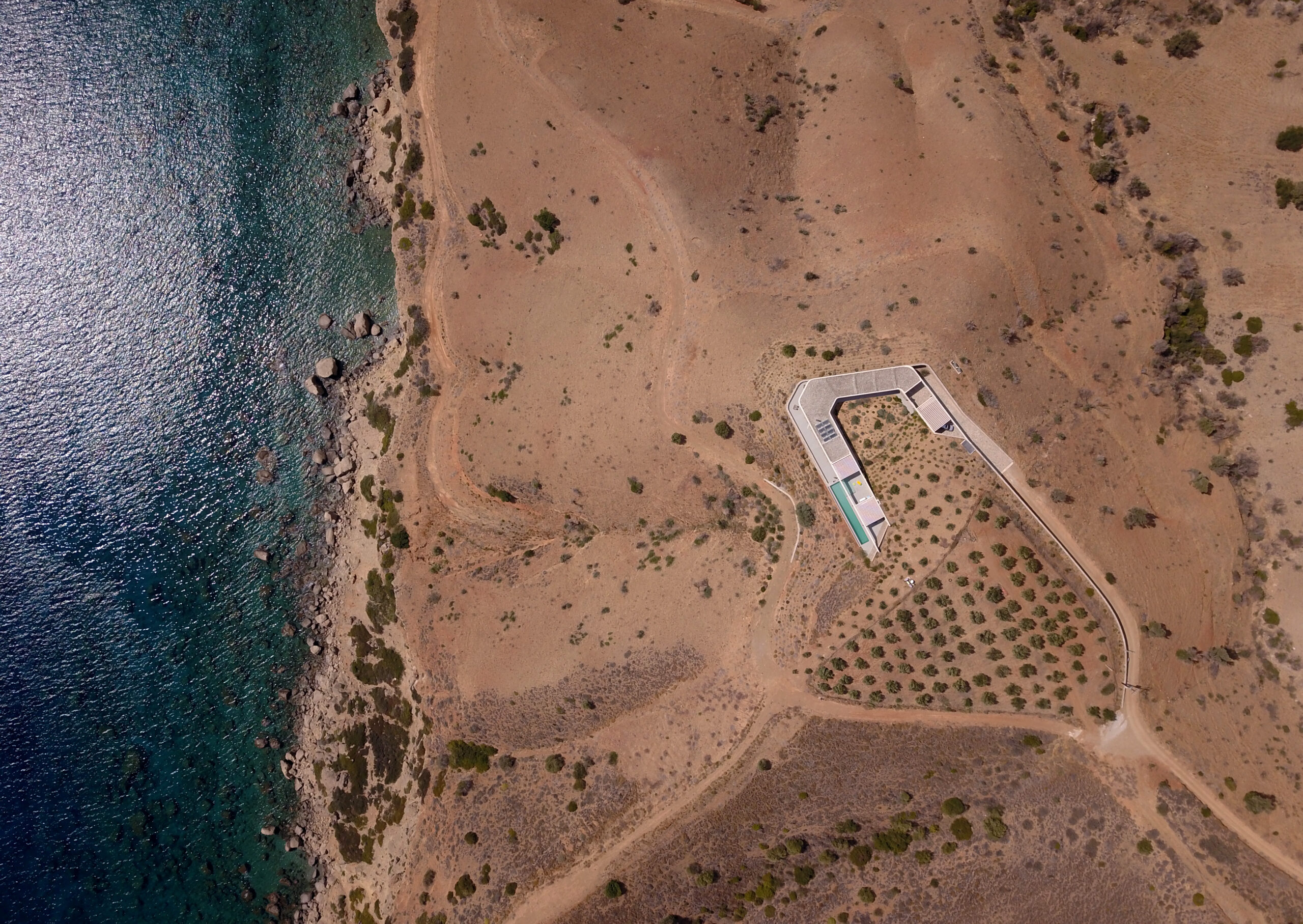
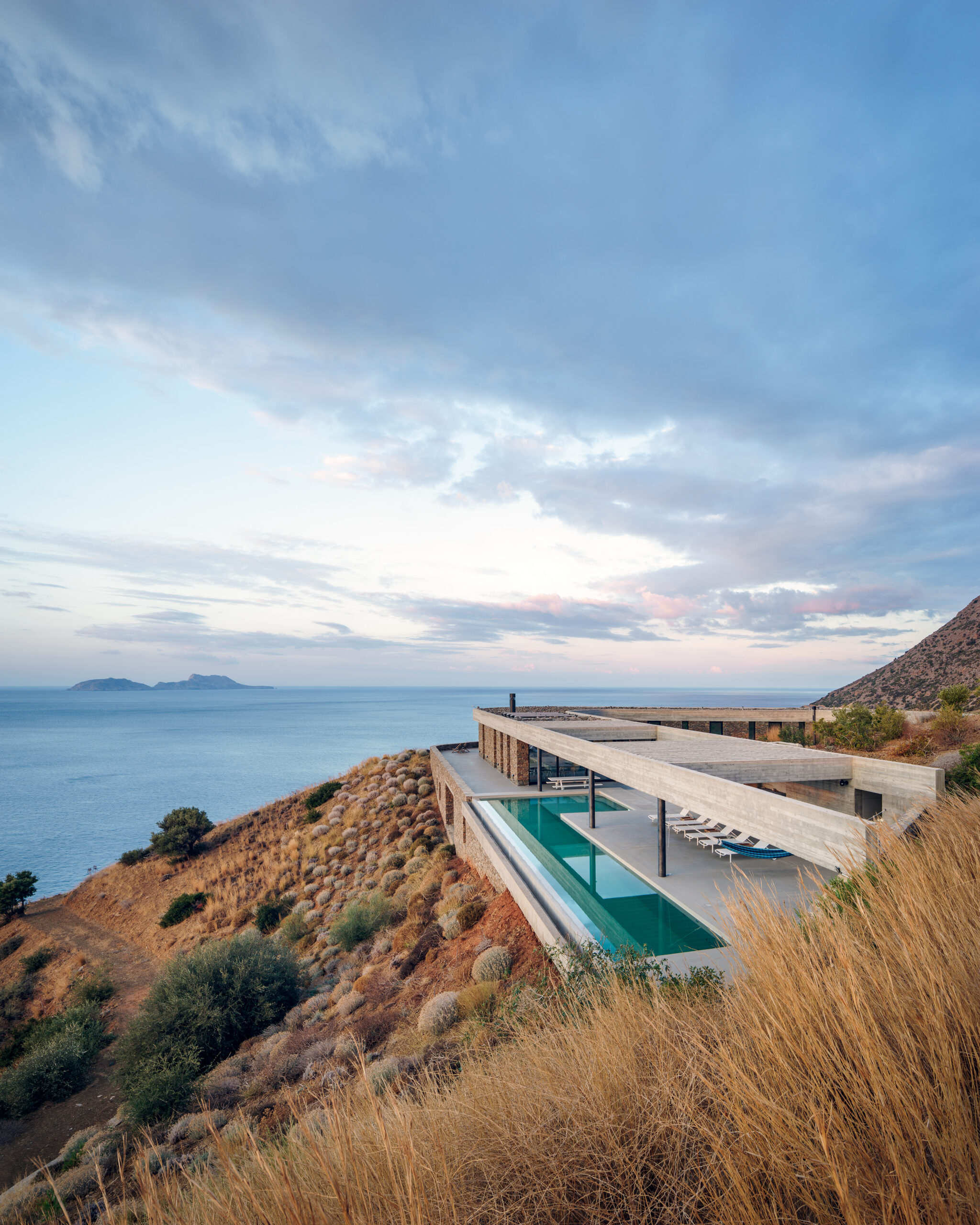
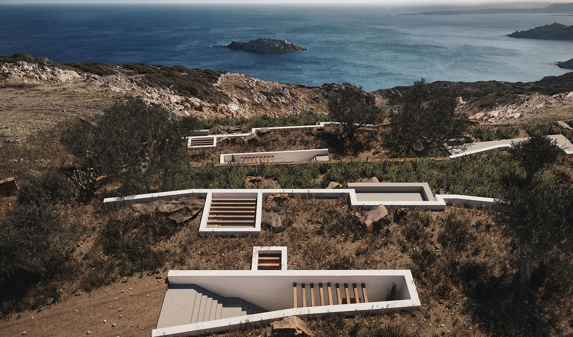
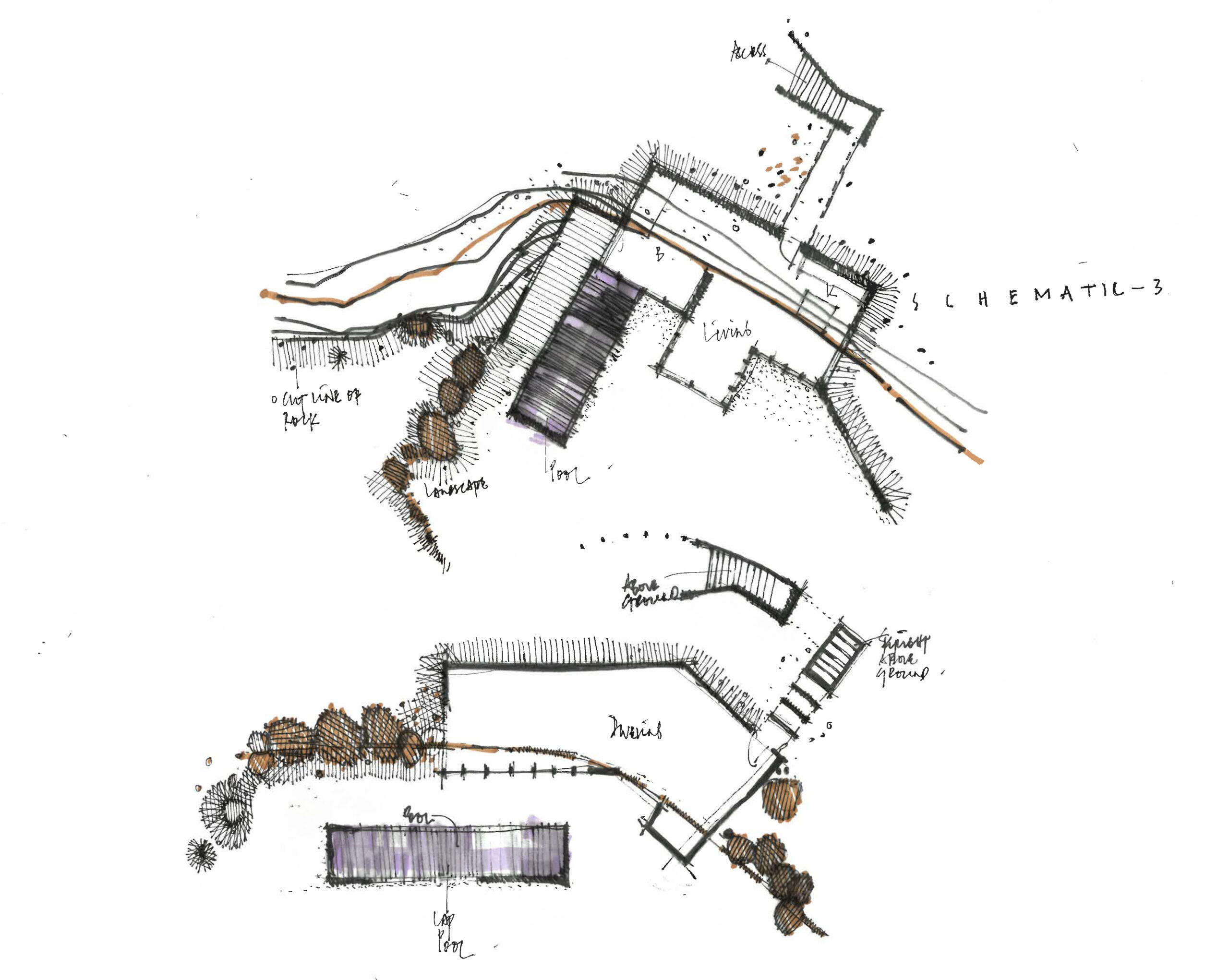
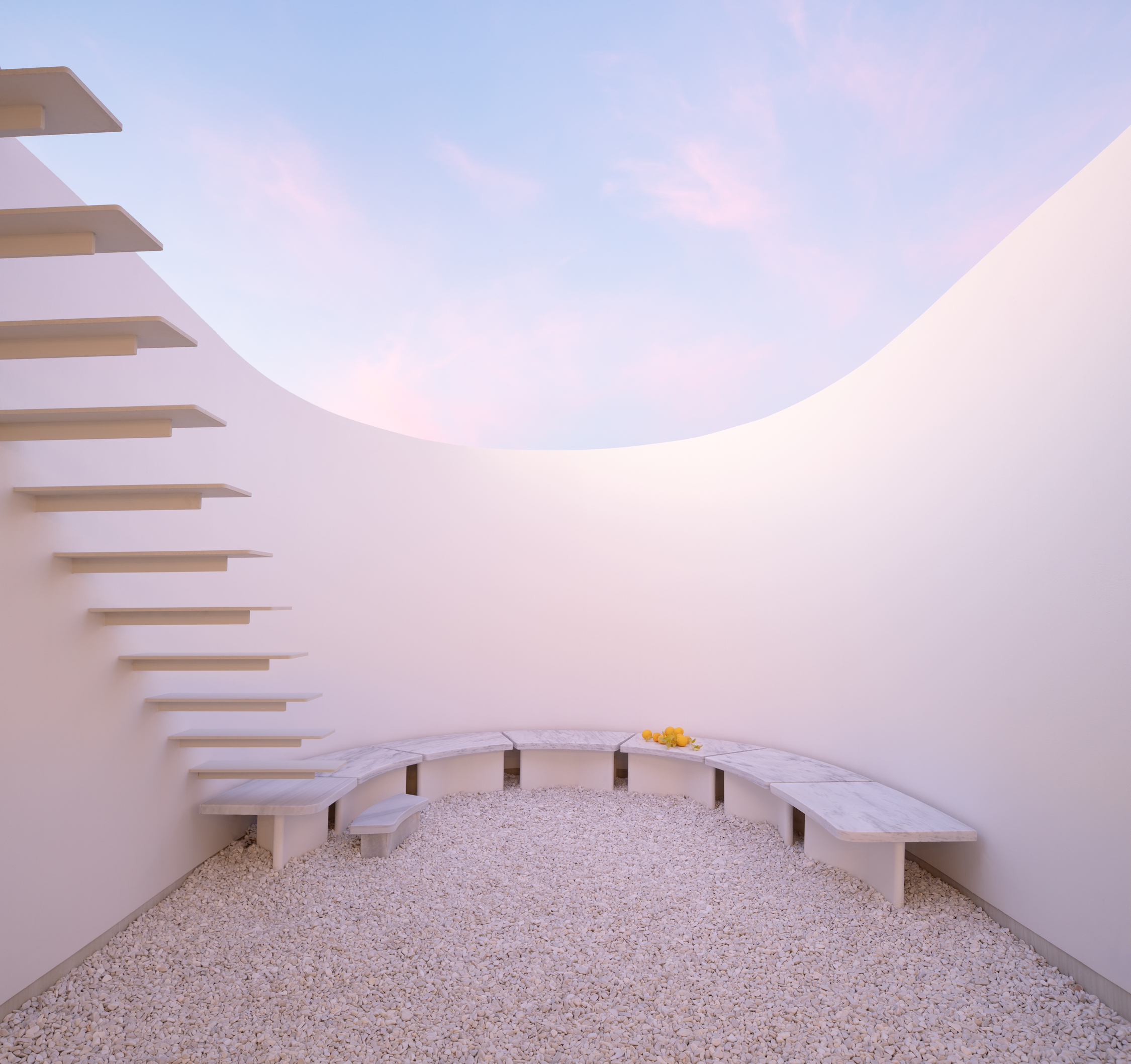
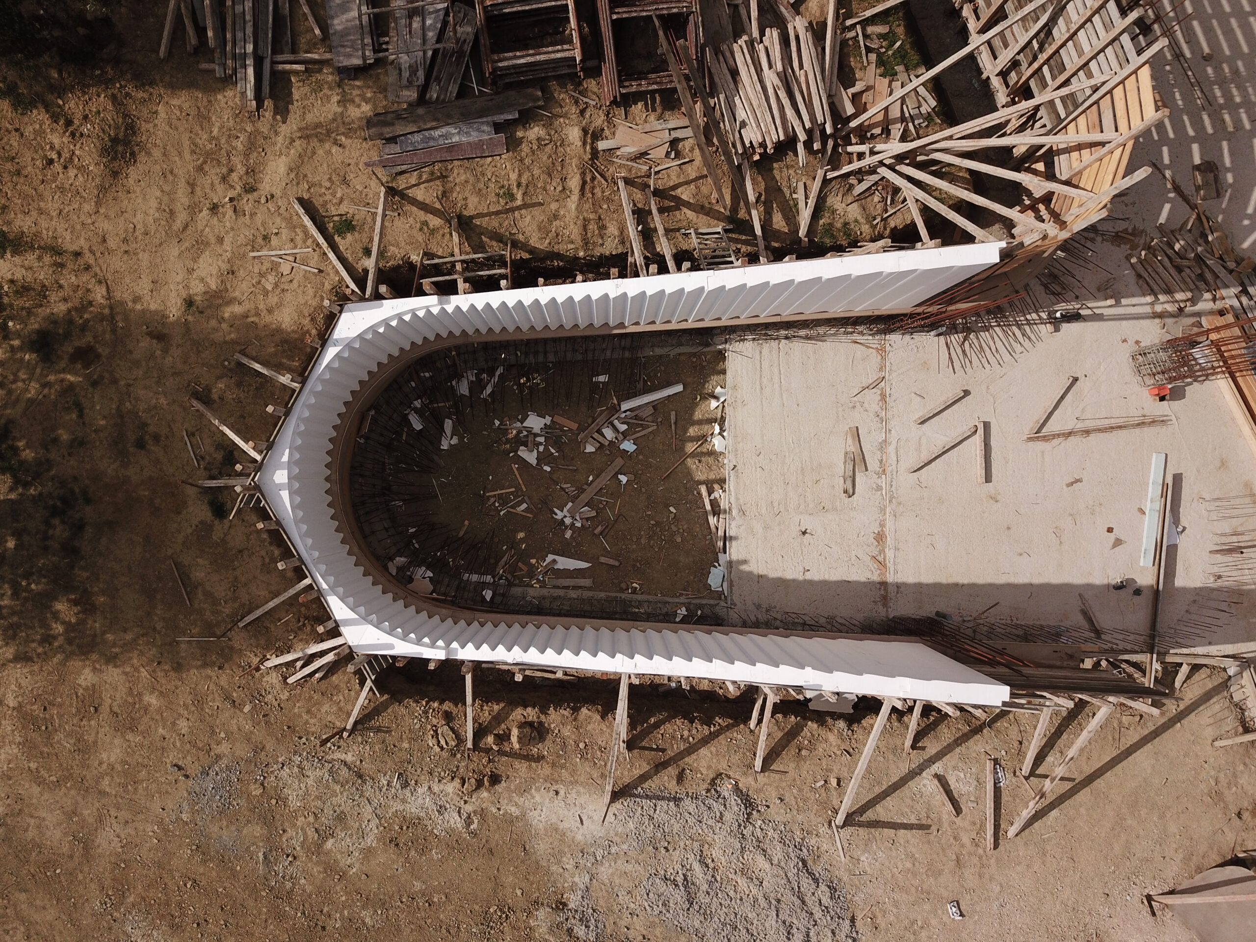 Located in a shallow Peloponnesian slope, KHI is a house full of contradictions. Playing with height as well as enclosure, LASSA Architects have merged courtyards, unrestricted roofs, underground gallery spaces, and sunbathed rooms all within a single rippling wall. The wall gradually sinks into the ground, continuously reframing the two functions of the house: the residence and the art space. It becomes an animating apparatus that shifts the landscape conditions around KHI House, gently integrating it with the immediate terrain.
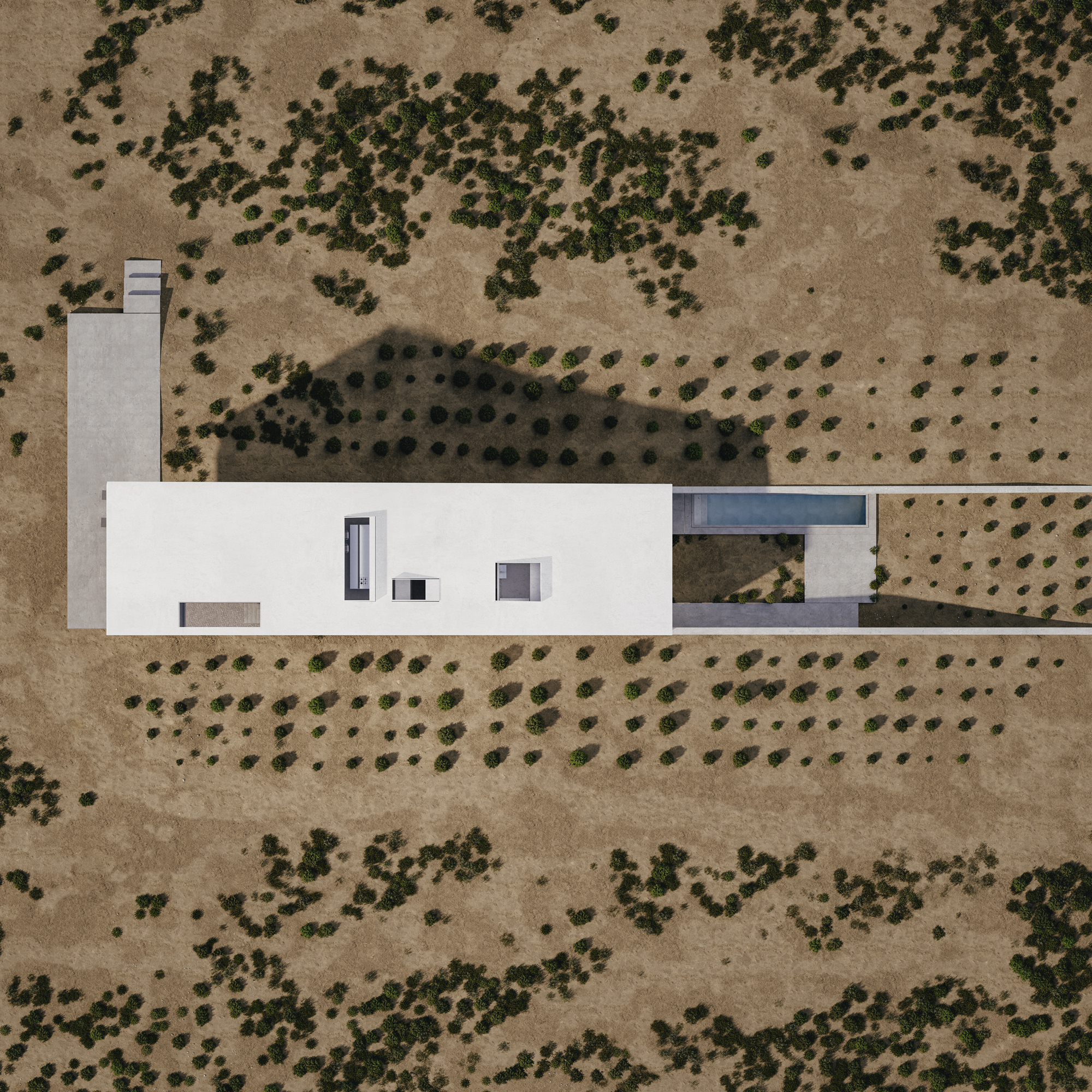
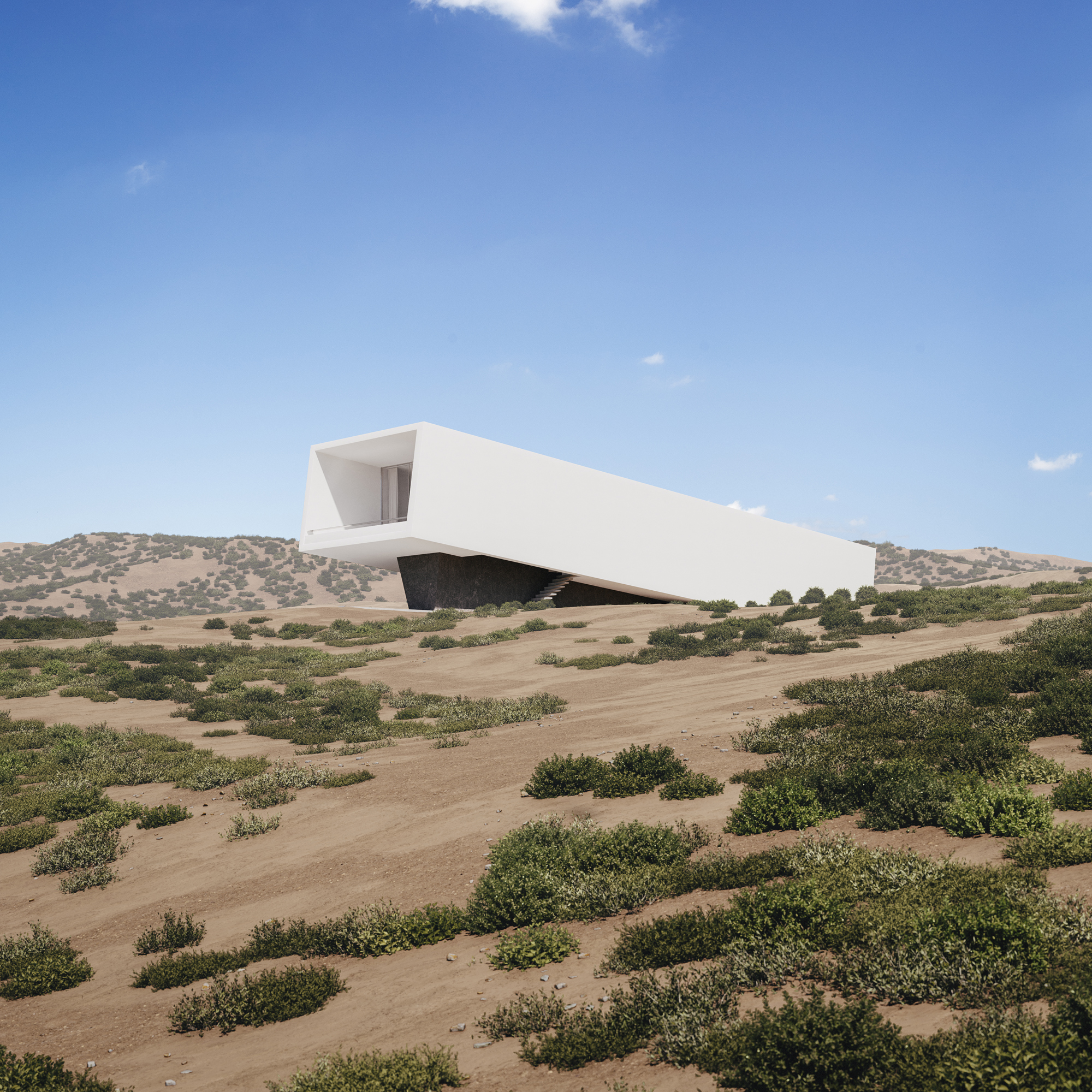 Built only a couple of miles away from Athens’s dense urban setting, House 6 ° celebrates the unspoiled nature of its setting. Emerging from the ground, the white solid structure compliments the incline of the adjacent hill. House 6 °separates its functional spaces into underground private areas, illuminated by a series of skylights, and common areas above the ground, strategically positioned towards the surrounding countryside views.
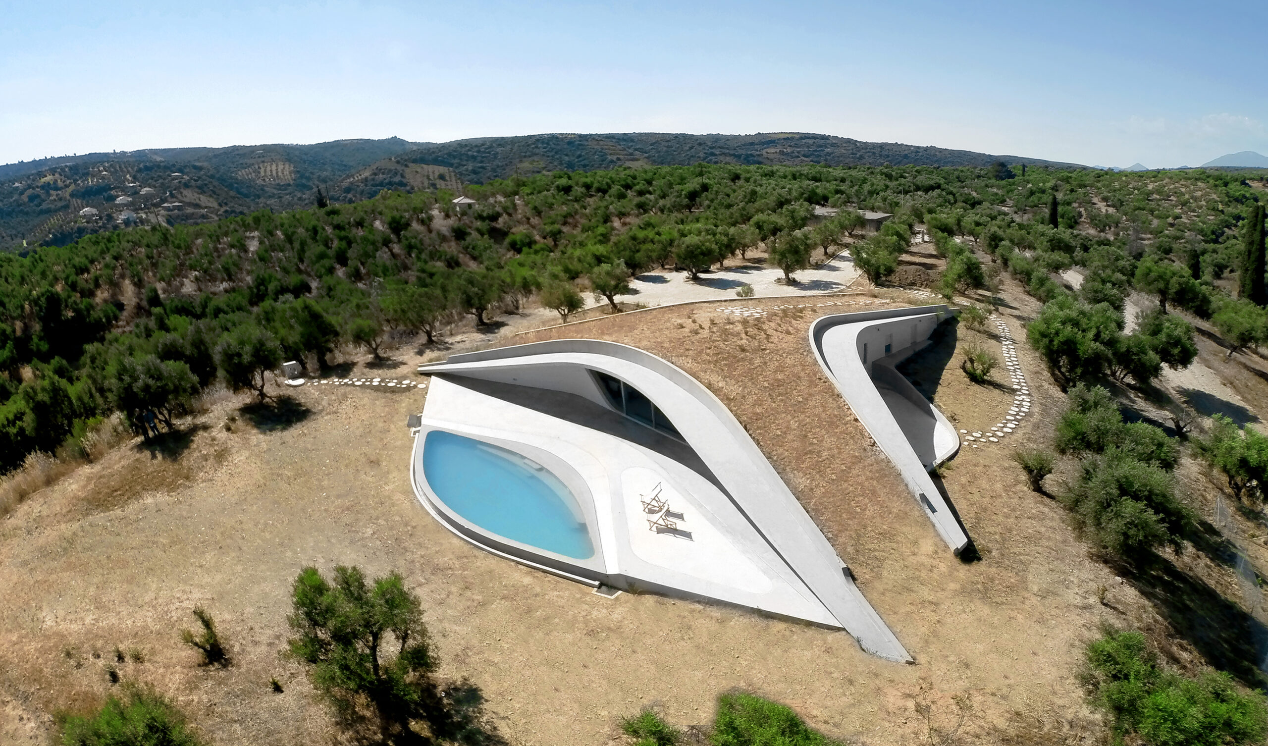
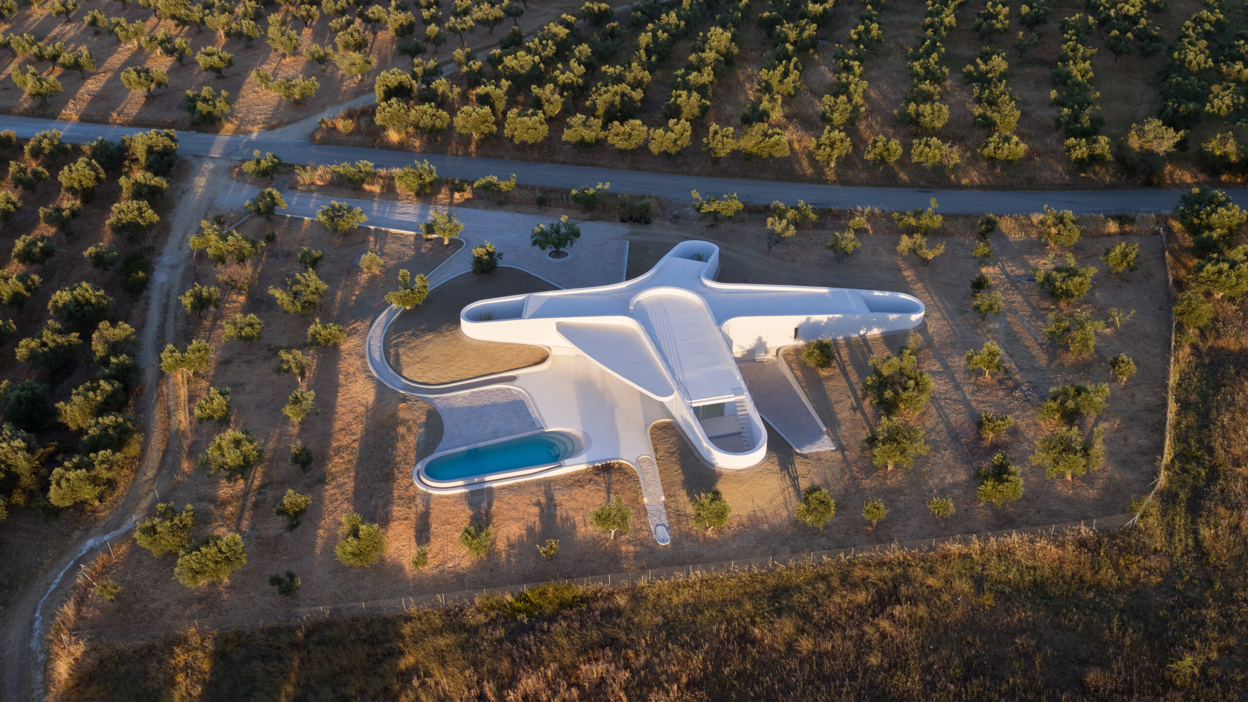
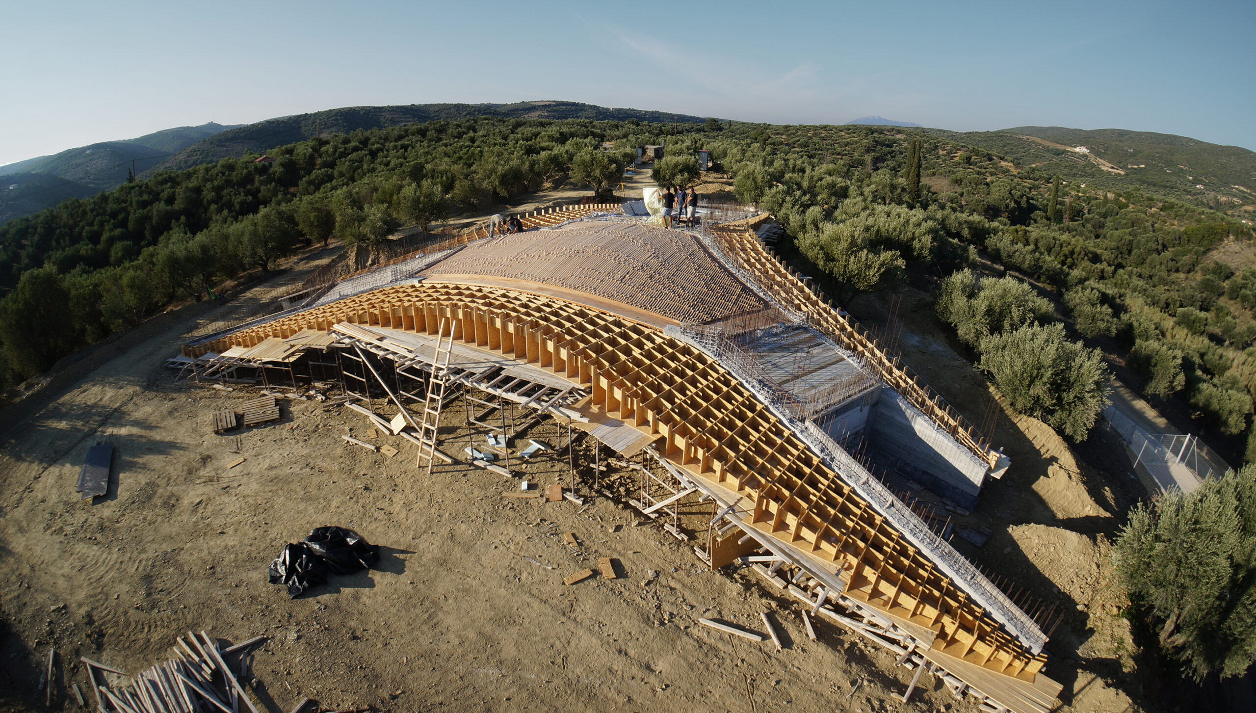 Villa Ypsilon is one of the most radical “yposkafo” residences, found inside a Peloponnesian olive grove. Instead of digging into the landscape, its design manipulates the ground’s surface, shifting it to a higher level. The roof of the villa becomes an integral part of the hill as well as a natural cooling mechanism for the entire space.