“Yposkafo”: Have You Heard of Greece’s Underrated and Undercut Residential Typology?
Architects: Want to have your project featured? Showcase your work through Architizer and sign up for our inspirational newsletter.
For the past decade, Greek architects have had to tap into the tourist industry, Greece’s most prosperous sector, in order to deal with the country’s financial crisis. Suddenly, the bare landscapes in rural Greece went “under construction,” and a new typology of residential architecture emerged.
The term “yposkafo” stands for a building that exists partially into the ground and is also known as undercut architecture. These seven residential projects explore the different techniques, processes and morphologies of houses that blend in with a site’s topography. Spanning through multiple levels, these residences include both extraordinary underground spaces as well as limitless country and seaside views.
Xerolithi
By Sinas Architects, Serifos, Greece
Jury Winner 2021, A+Awards, Architecture + Stone
-
Photos by Yiorgos Kordakis
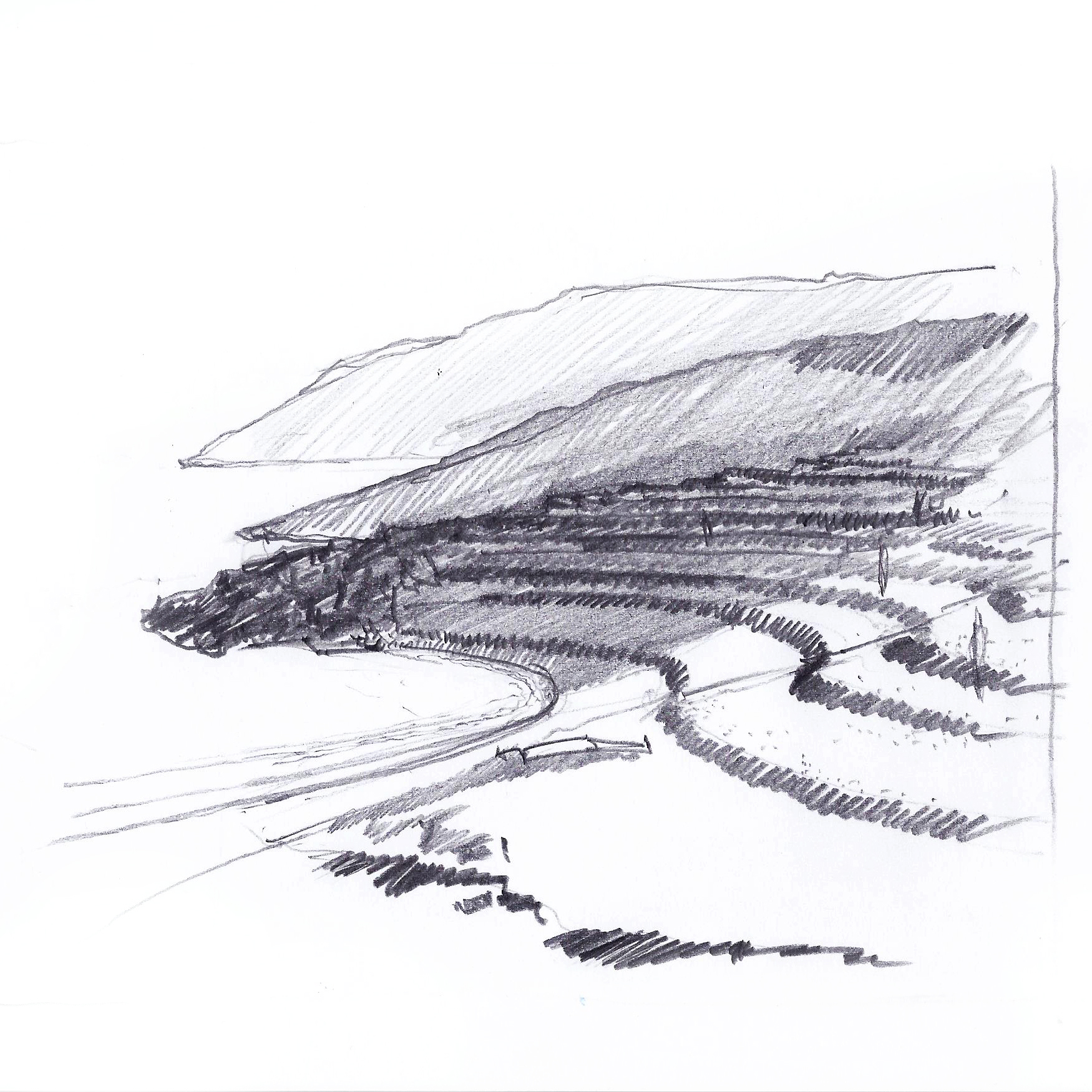
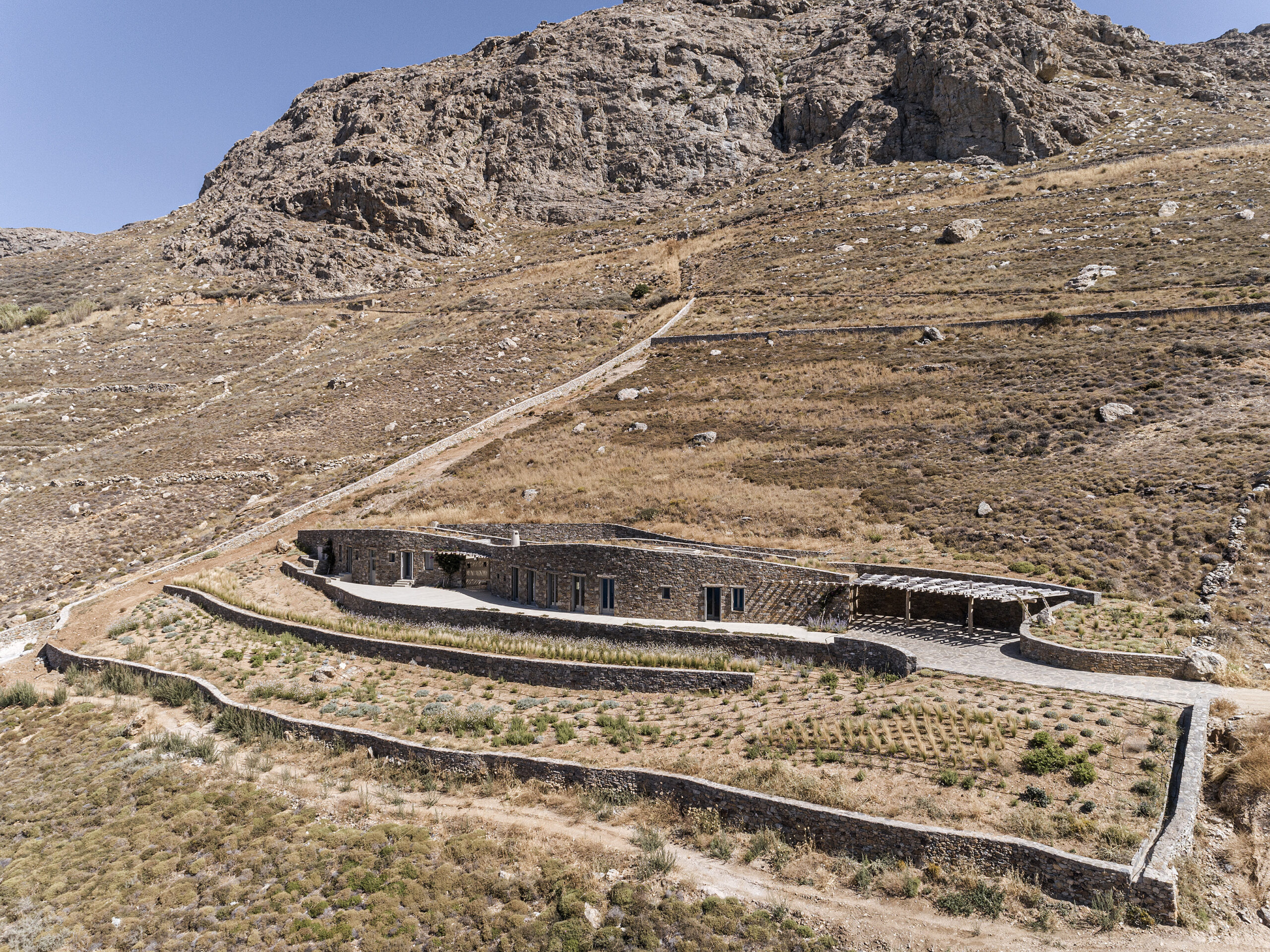
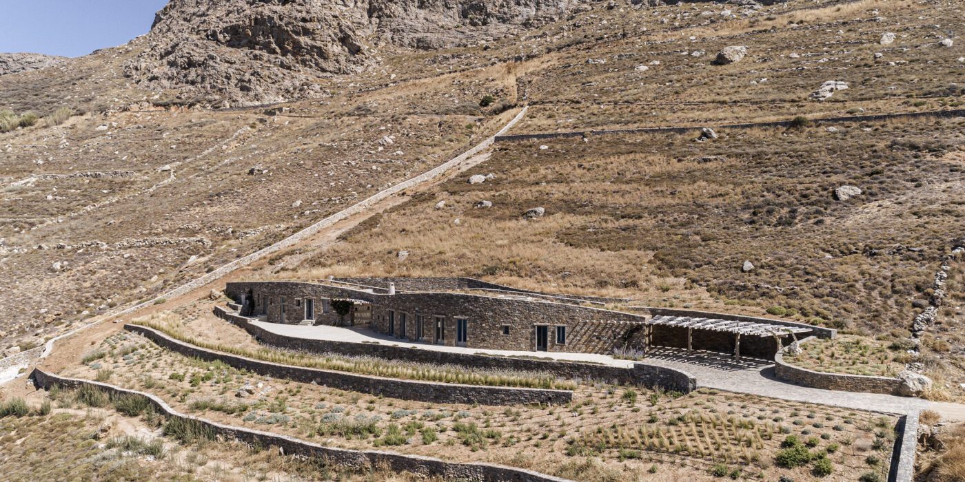
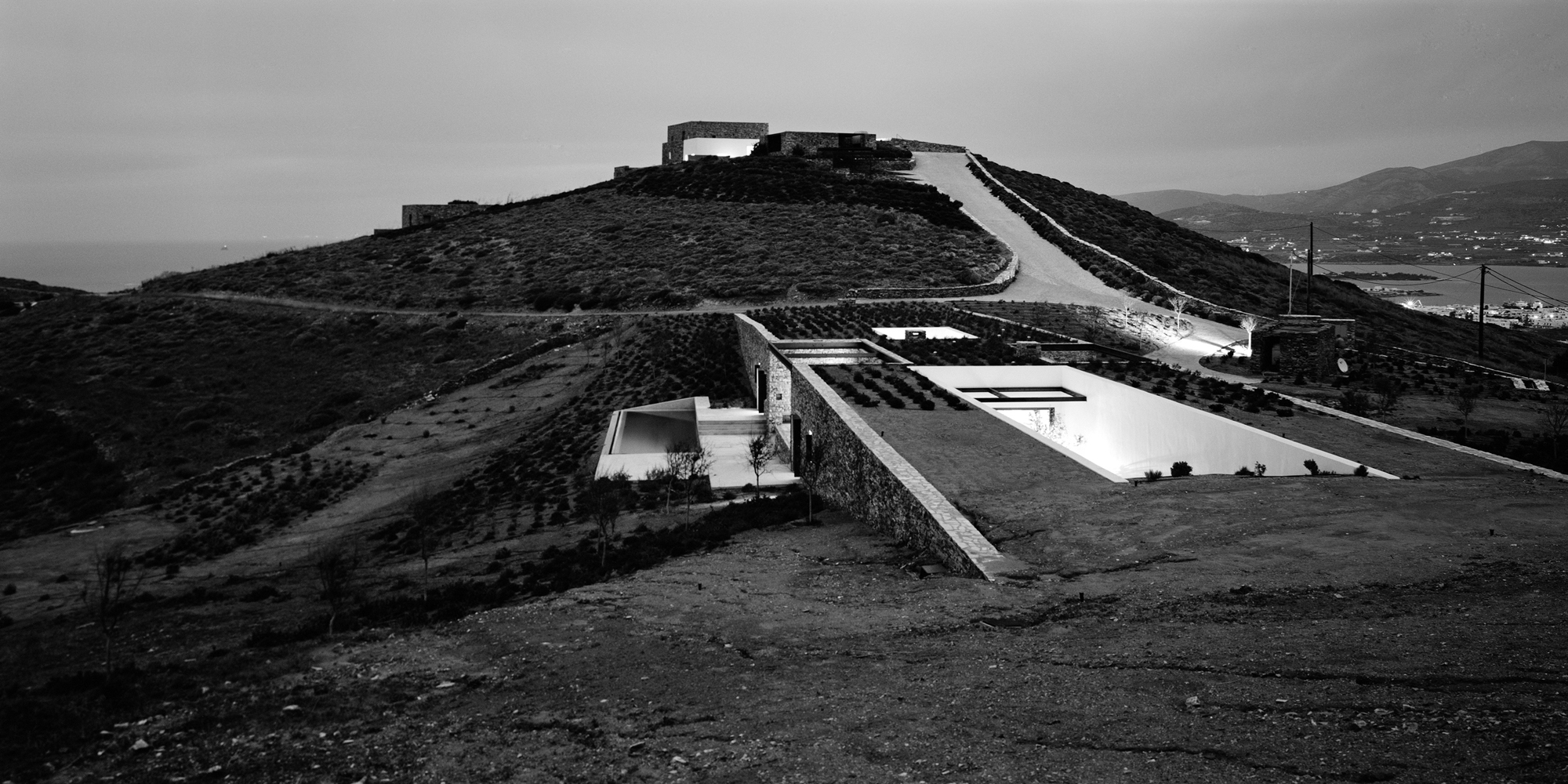
Topography and landscape are the two essential ingredients of Xerolithi. Breaking the preconceptions of a typical Cycladic house, Sinas Architects have exaggerated the island’s topographical contours, designing a house that seamlessly integrates with its surroundings. With walls built from the island’s stone and a roof that is covered with local plants and vegetation, the house is gradually emerging from the Mediterranean hill. Finally, a long, singular façade arranges the house’s functions in a linear order, successfully orienting it towards the sea.
Aloni
By Deca Architecture, Antiparos, Greece
-
Photos by Erieta Attali
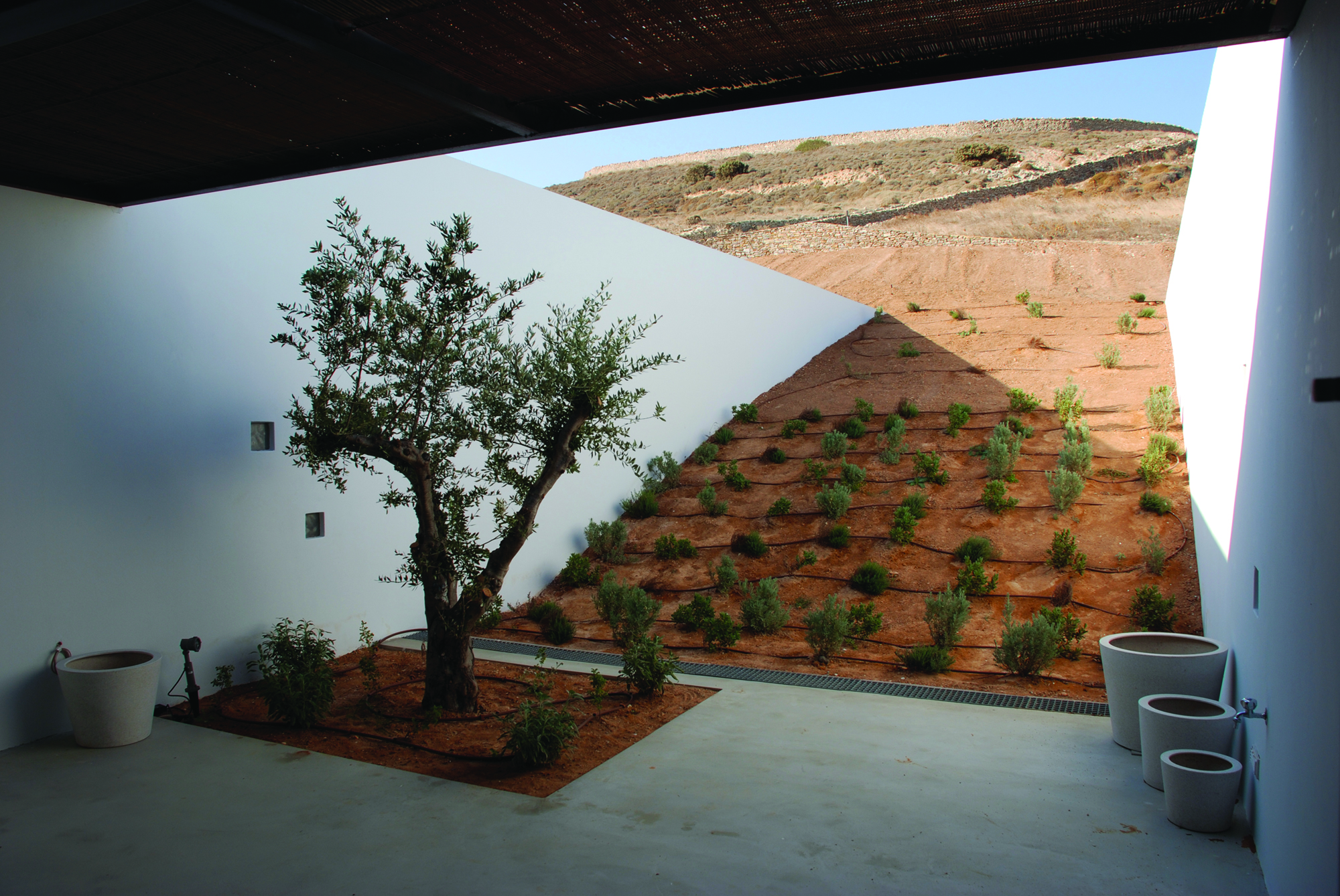
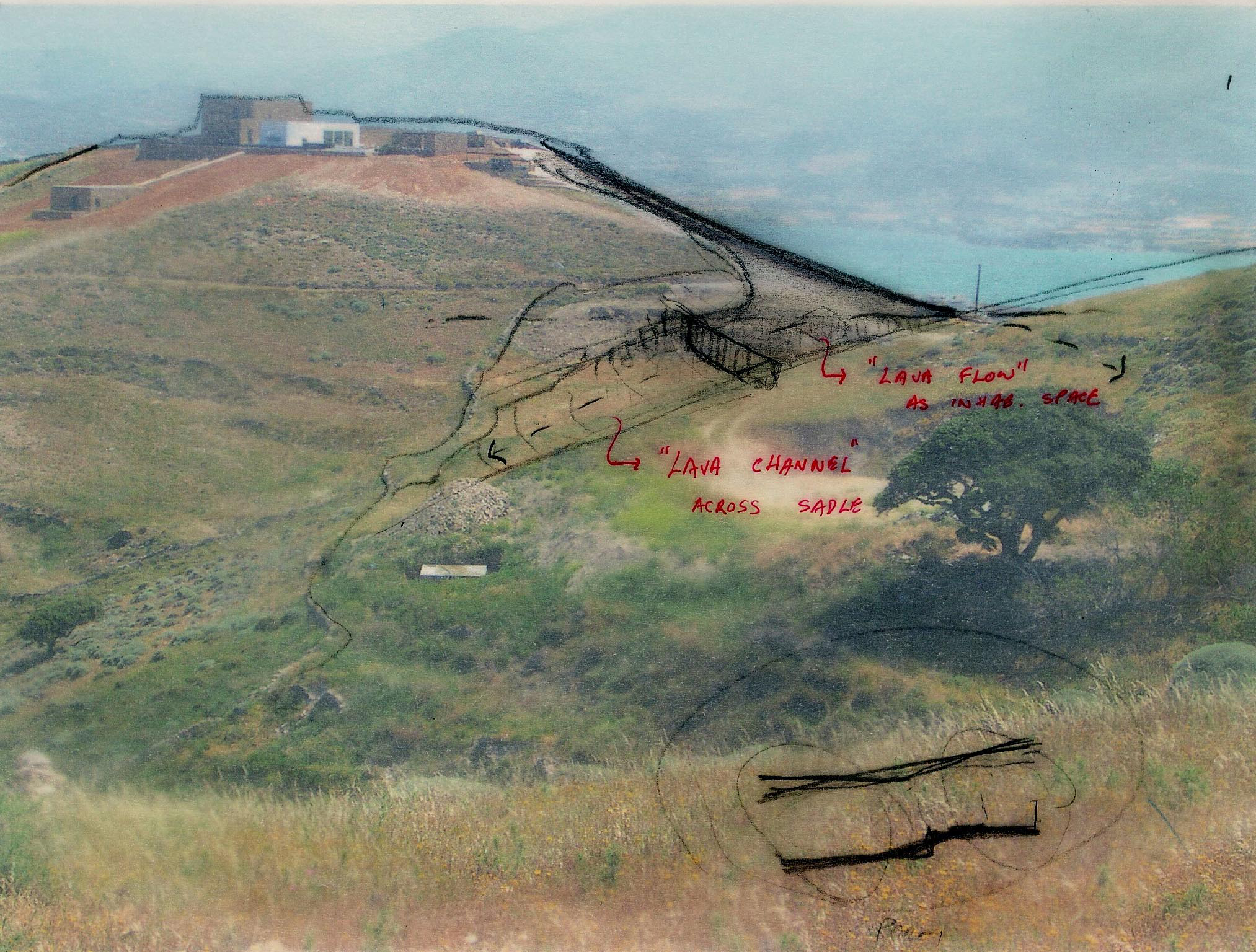 Aloni is also a house that trails the landscape. Still, in this case, the land is not raw or uninhabited, but rather a product of rural conversion practices. Following the agricultural motifs of the past, Deca Architecture employs a series of techniques such as carving, sinking and the use of existing retaining walls. They create a semi-artificial landscape that blurrs the edges between the natural and artificial ground morphology.
Ring House
By Deca Architecture, Crete, Greece
Jury Winner 2018, A+Awards, Private House (L 3000-5000 sq ft)
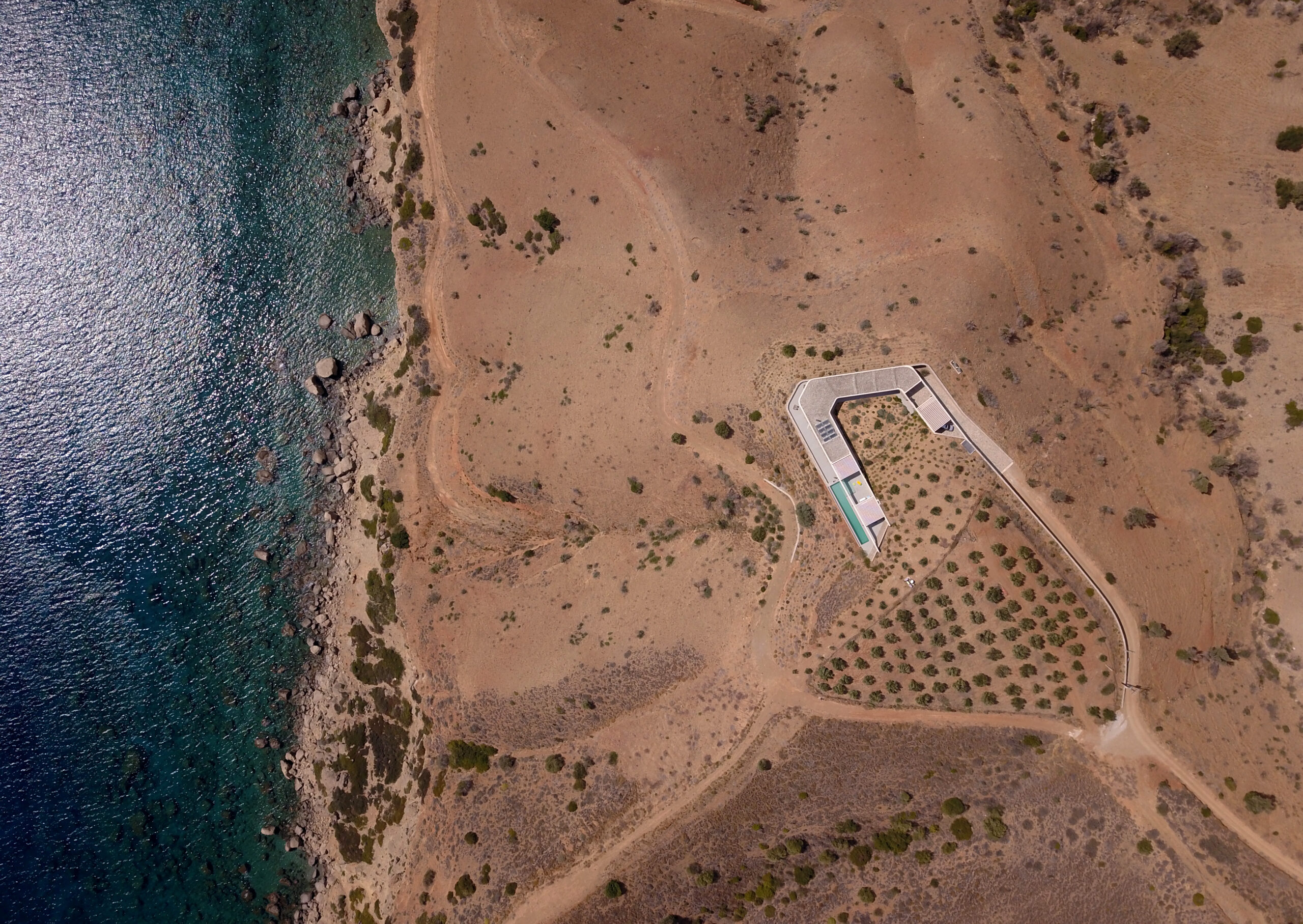
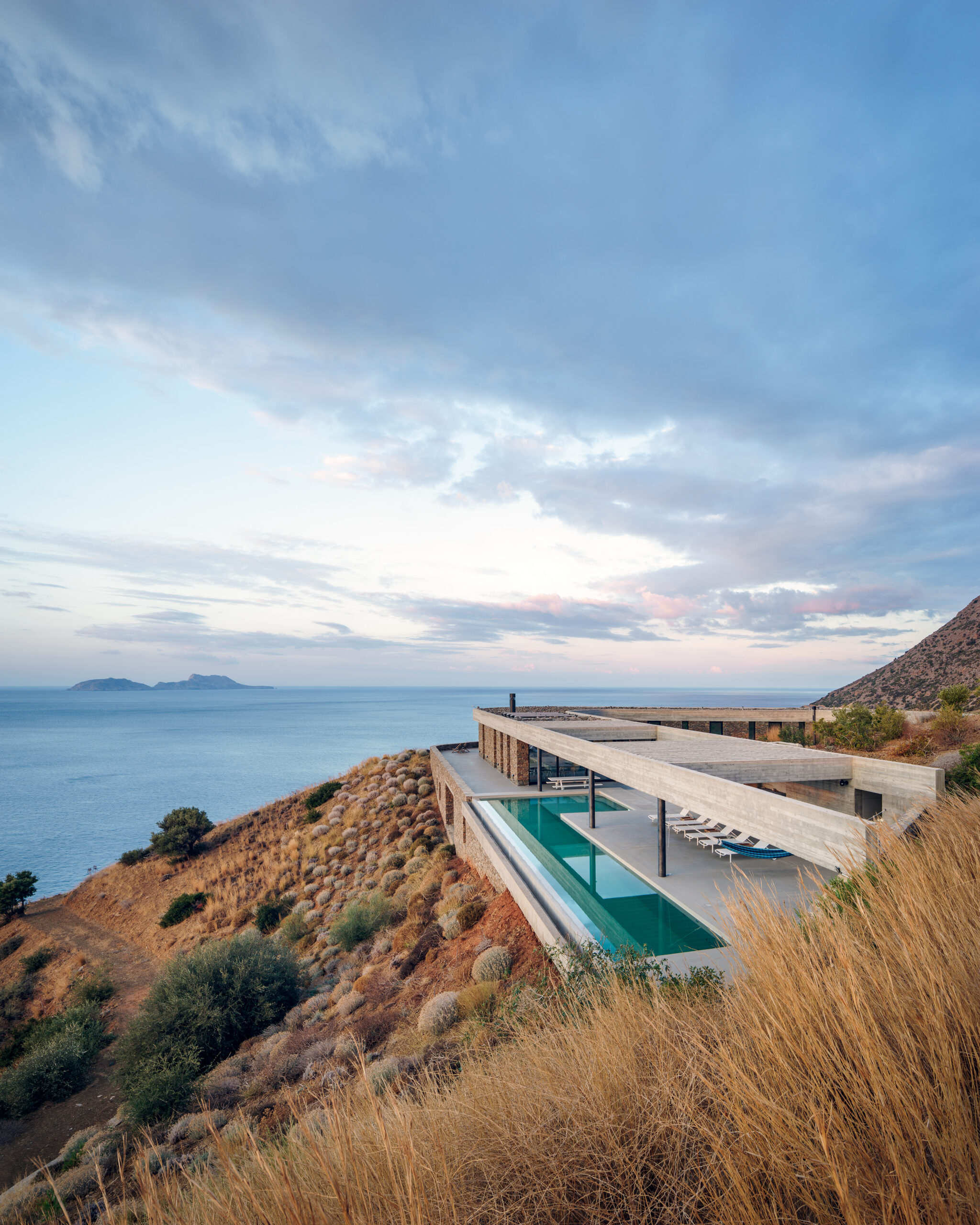
Photos by George Messaritakis
In addition to being a refined addition to Crete’s natural setting, the Ring House fulfills a wider agenda. After countless random interventions to the hill’s topography, Deca Architecture approached the house’s design as an opportunity to regenerate the surrounding landscape. Pursuing a reduce-waste approach, they used the excavated material to reconstruct the hill’s original morphology. At the same time, the Ring House itself acts as an exemplar for sustainable design. Its careful insertion into the landscape, results in the formation of a temperate microclimate fit for Crete’s desert-like environment.
Sheltered Villas
By A&M Architects, Karpathos, Greece
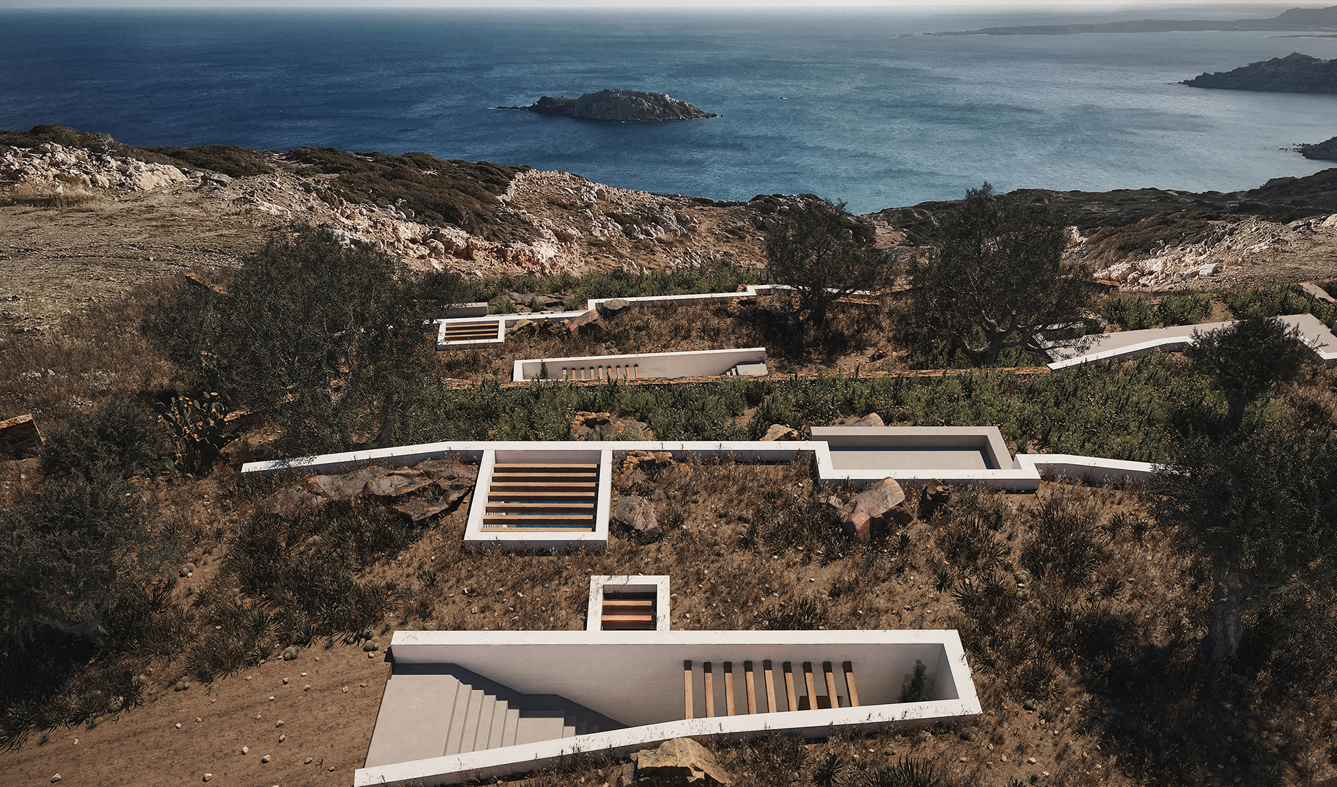
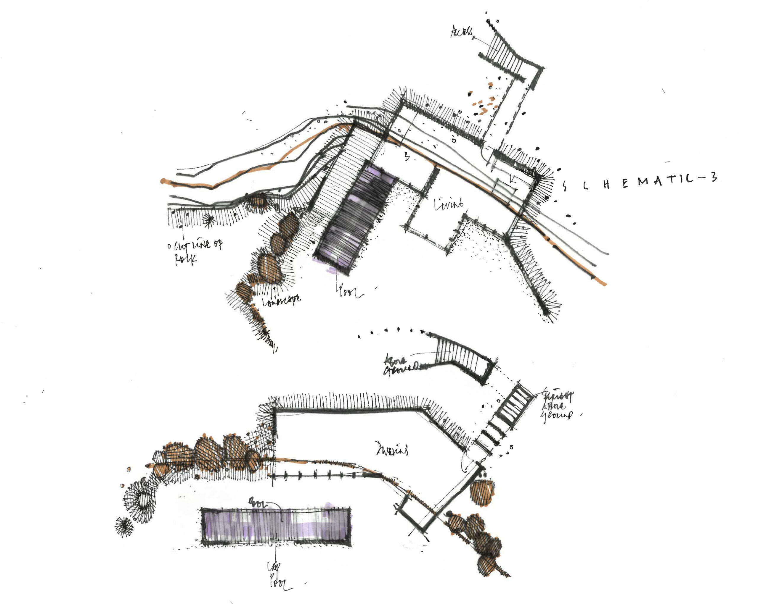
Sheltered but not concealed, A&M Architects designed three distinct villas in the island of Karpathos. However, instead of employing the classic “yposkafo” typology, they added a bit of a twist, treating the opposing facades of each house in the most contradictory way. On the one hand, a series of white retaining walls cut through the ground, clearly marking the back wall of each villa. On the front end of the house however, a single transparent façade creates a threshold between the inside spaces and the outside scenery.
KHI House & Art Space
By LASSA Architects, Methoni, Greece
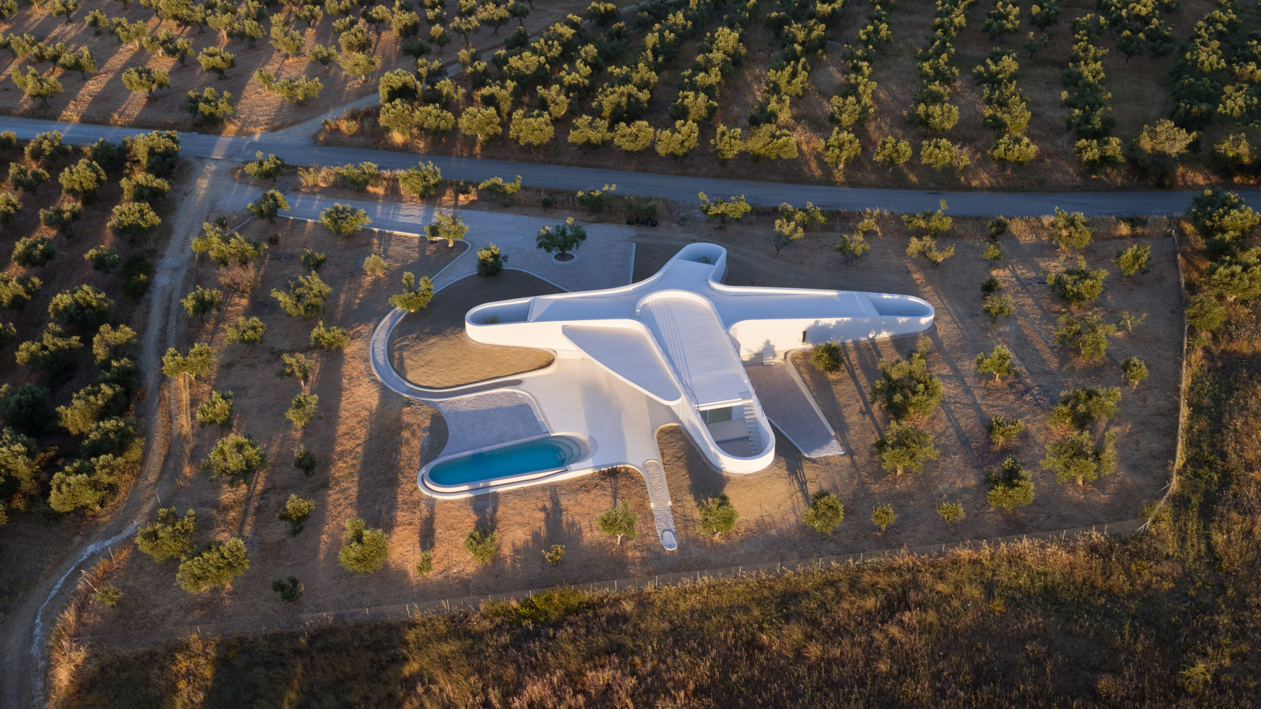
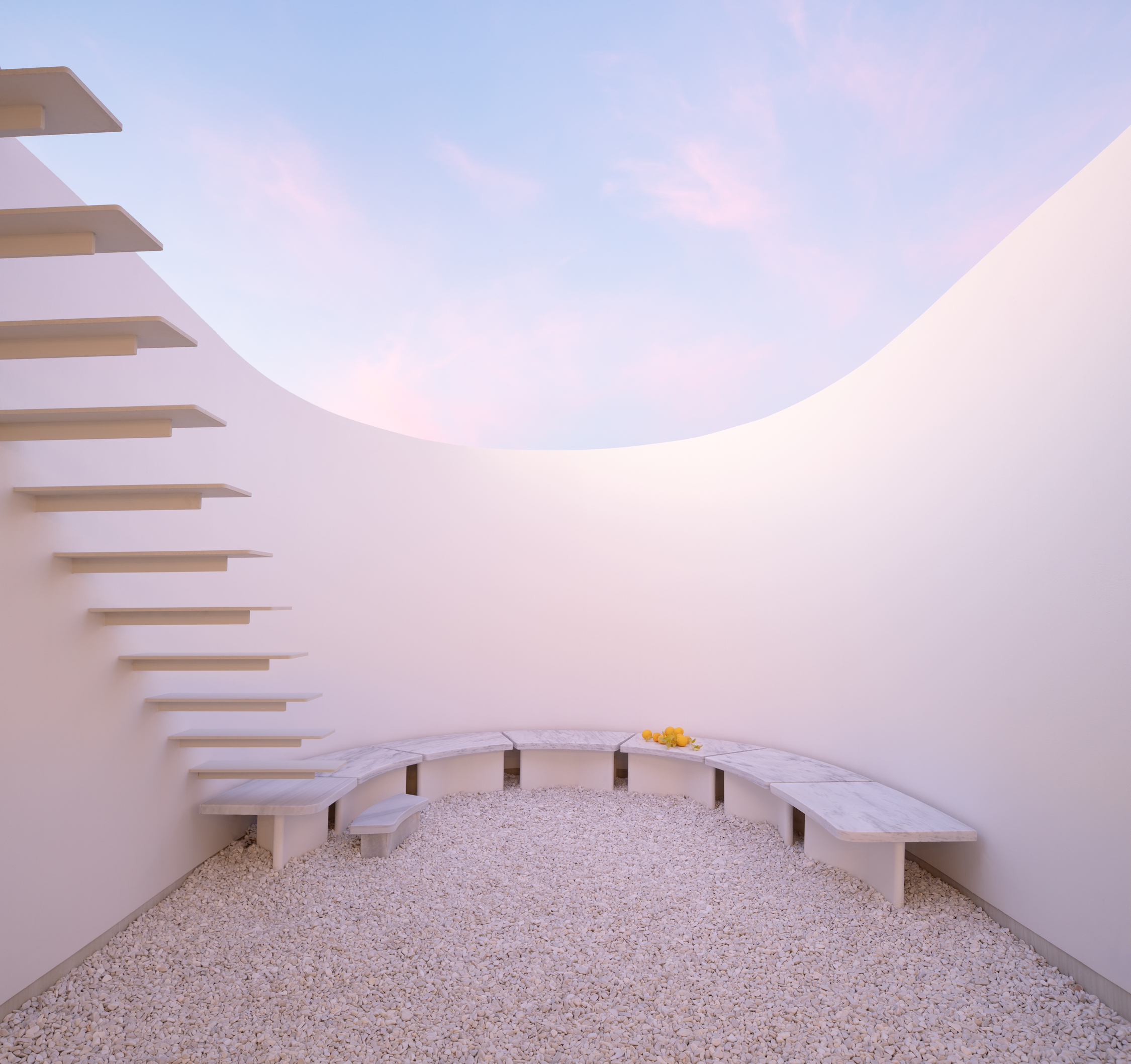
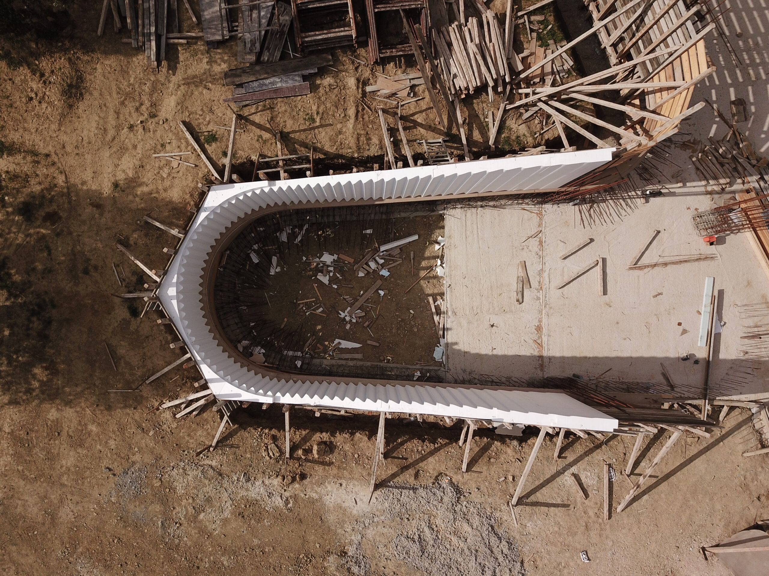 Located in a shallow Peloponnesian slope, KHI is a house full of contradictions. Playing with height as well as enclosure, LASSA Architects have merged courtyards, unrestricted roofs, underground gallery spaces, and sunbathed rooms all within a single rippling wall. The wall gradually sinks into the ground, continuously reframing the two functions of the house: the residence and the art space. It becomes an animating apparatus that shifts the landscape conditions around KHI House, gently integrating it with the immediate terrain.
House 6 °
By Mado Samiou Architecture, Lagonisi, Greece
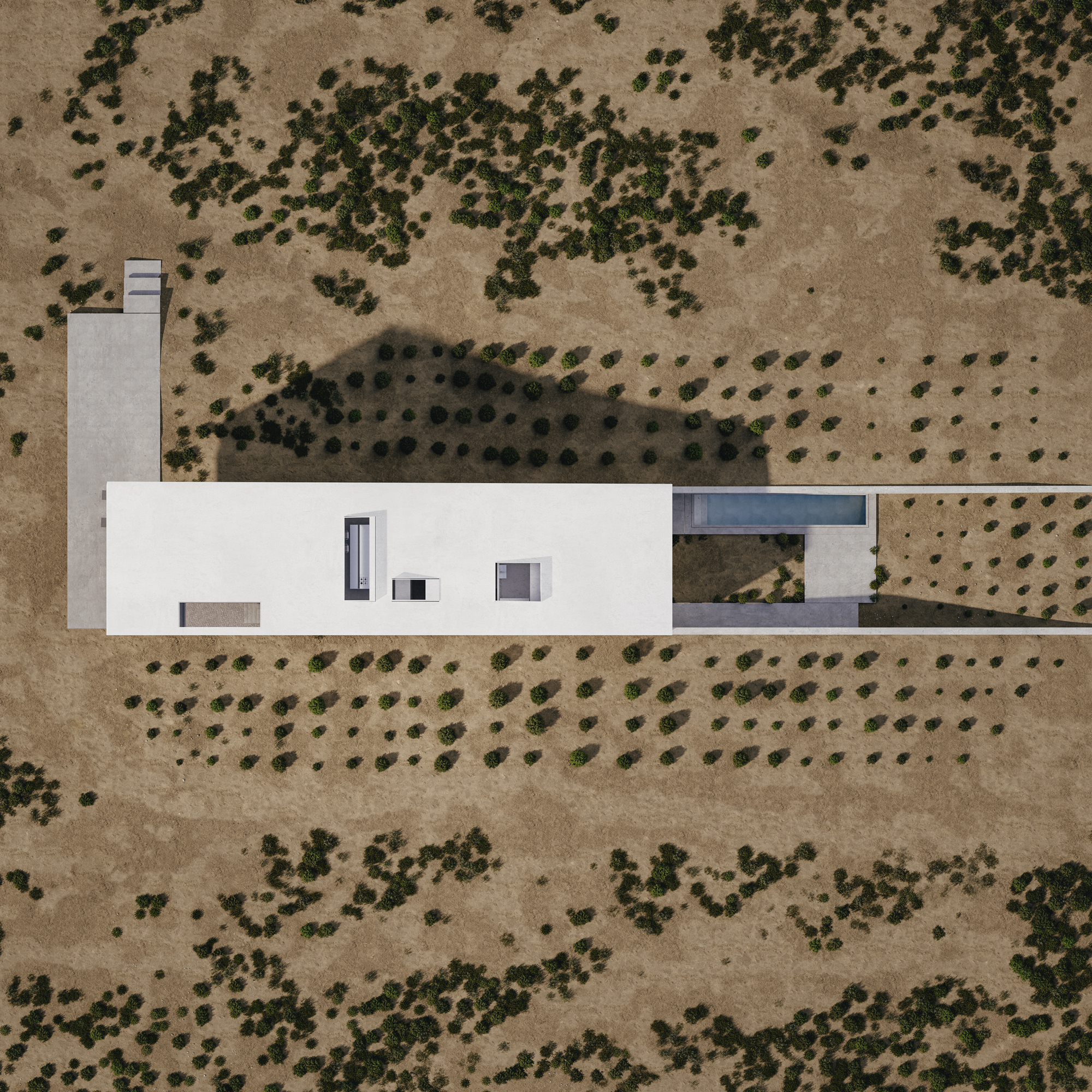
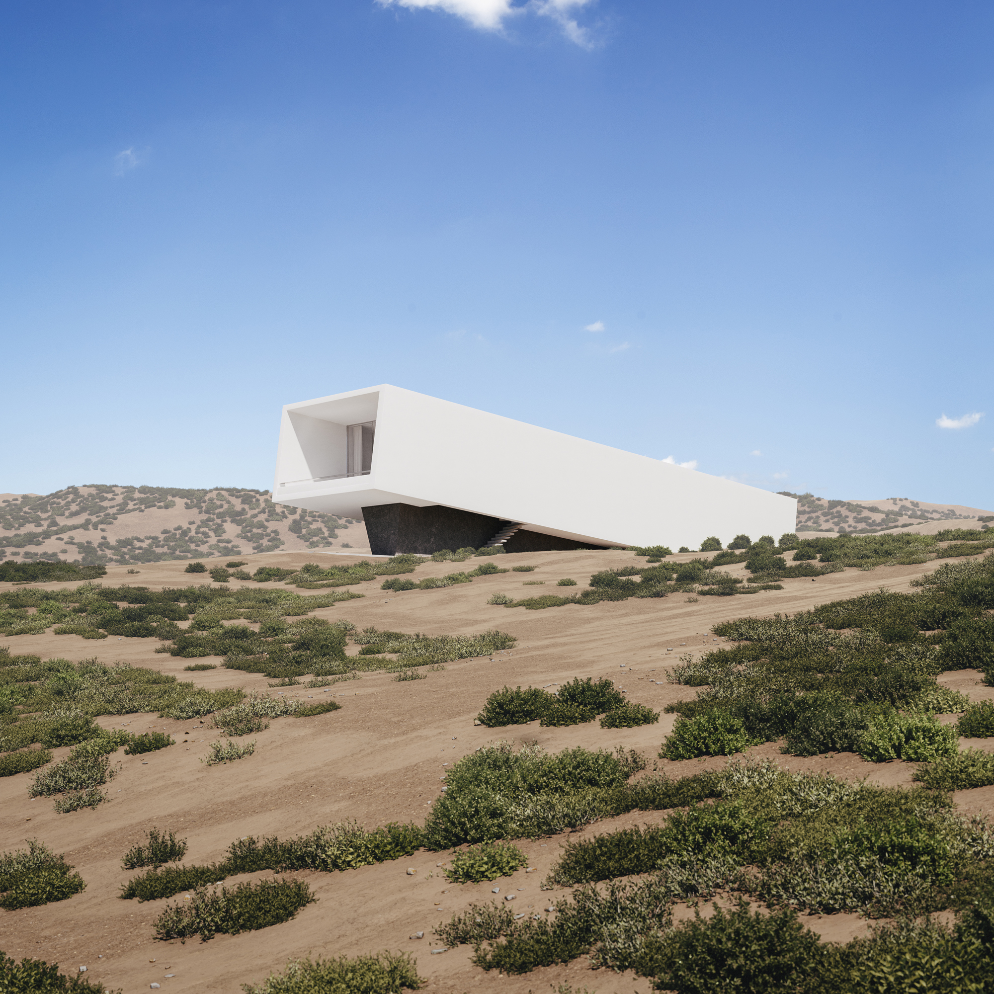 Built only a couple of miles away from Athens’s dense urban setting, House 6 ° celebrates the unspoiled nature of its setting. Emerging from the ground, the white solid structure compliments the incline of the adjacent hill. House 6 °separates its functional spaces into underground private areas, illuminated by a series of skylights, and common areas above the ground, strategically positioned towards the surrounding countryside views.
Villa Ypsilon
By LASSA Architects, Foinikounta, Greece
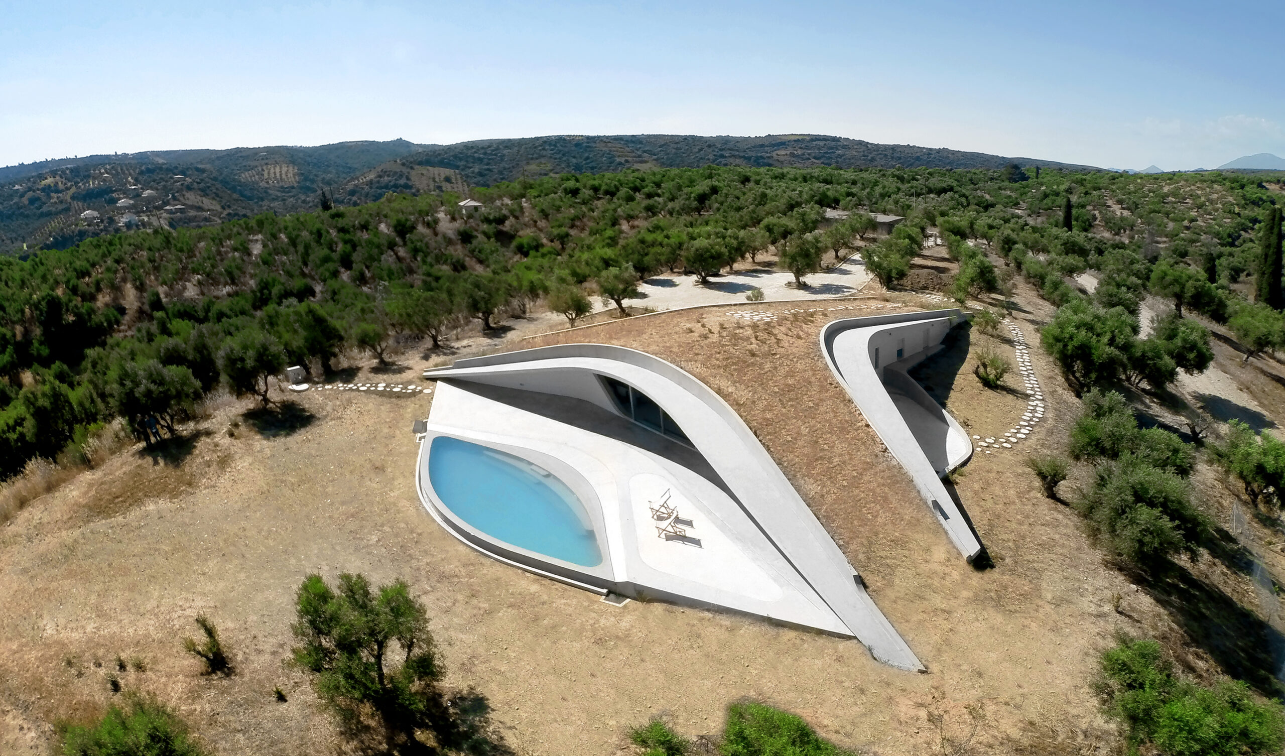
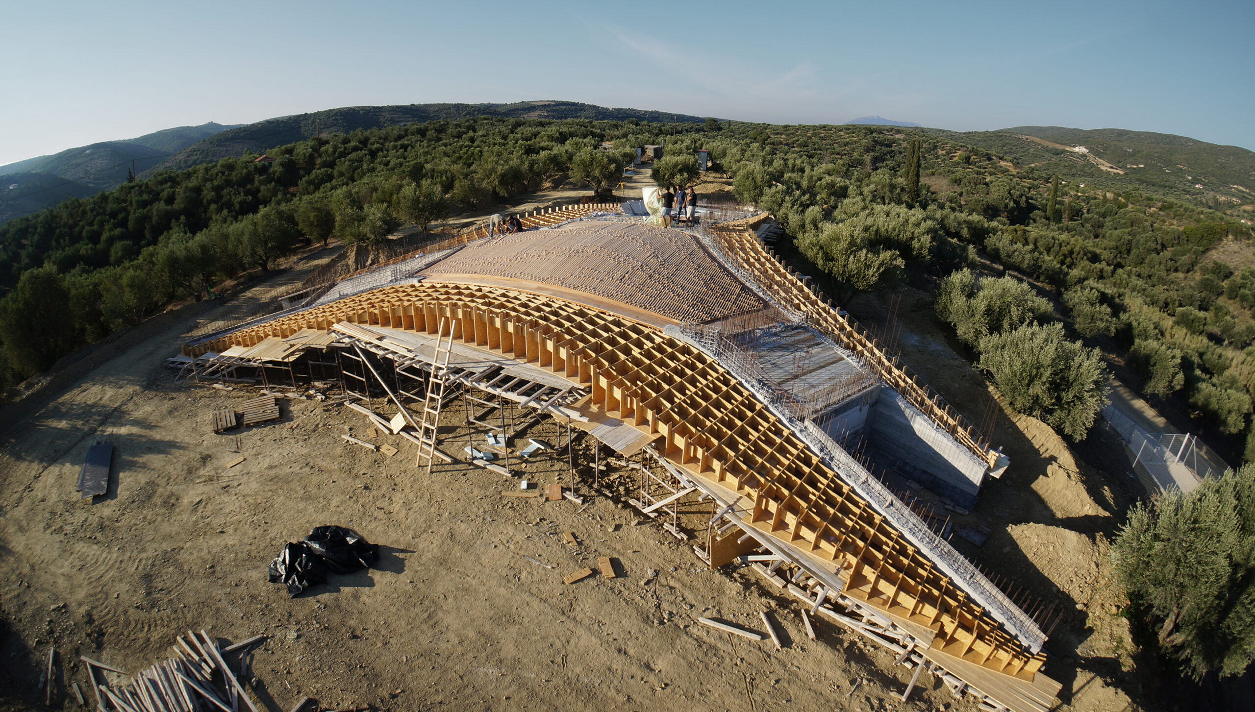 Villa Ypsilon is one of the most radical “yposkafo” residences, found inside a Peloponnesian olive grove. Instead of digging into the landscape, its design manipulates the ground’s surface, shifting it to a higher level. The roof of the villa becomes an integral part of the hill as well as a natural cooling mechanism for the entire space.
“Yposkafo” typology is predominantly established in rural areas in order to sustain Greece’s natural landscape. Greatly encouraged by Greek building regulations, it has become an intermediary solution for promoting international tourism without sacrificing its physical beauty.
Architects: Want to have your project featured? Showcase your work through Architizer and sign up for our inspirational newsletter.

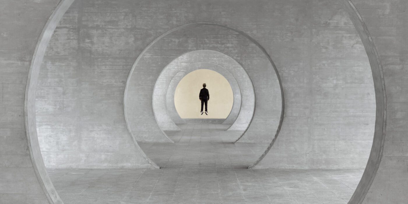
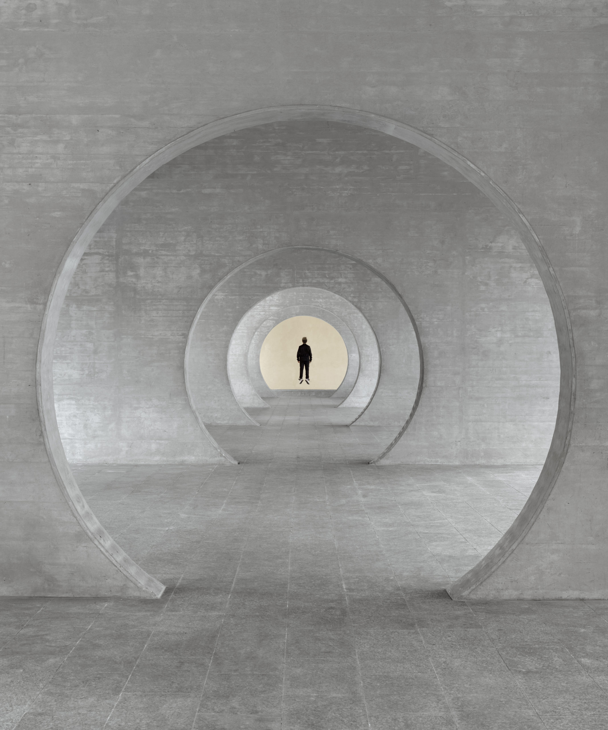 Taken in Novazzano Residential Complex in Switzerland, this work imagines the site as the residence of a superhero. The view looks through a series of circular openings and lands on the end of the space. There, a figure is floating as only a superhero can. The figure occupies the center of the composition and is backed by a warm, bright background.
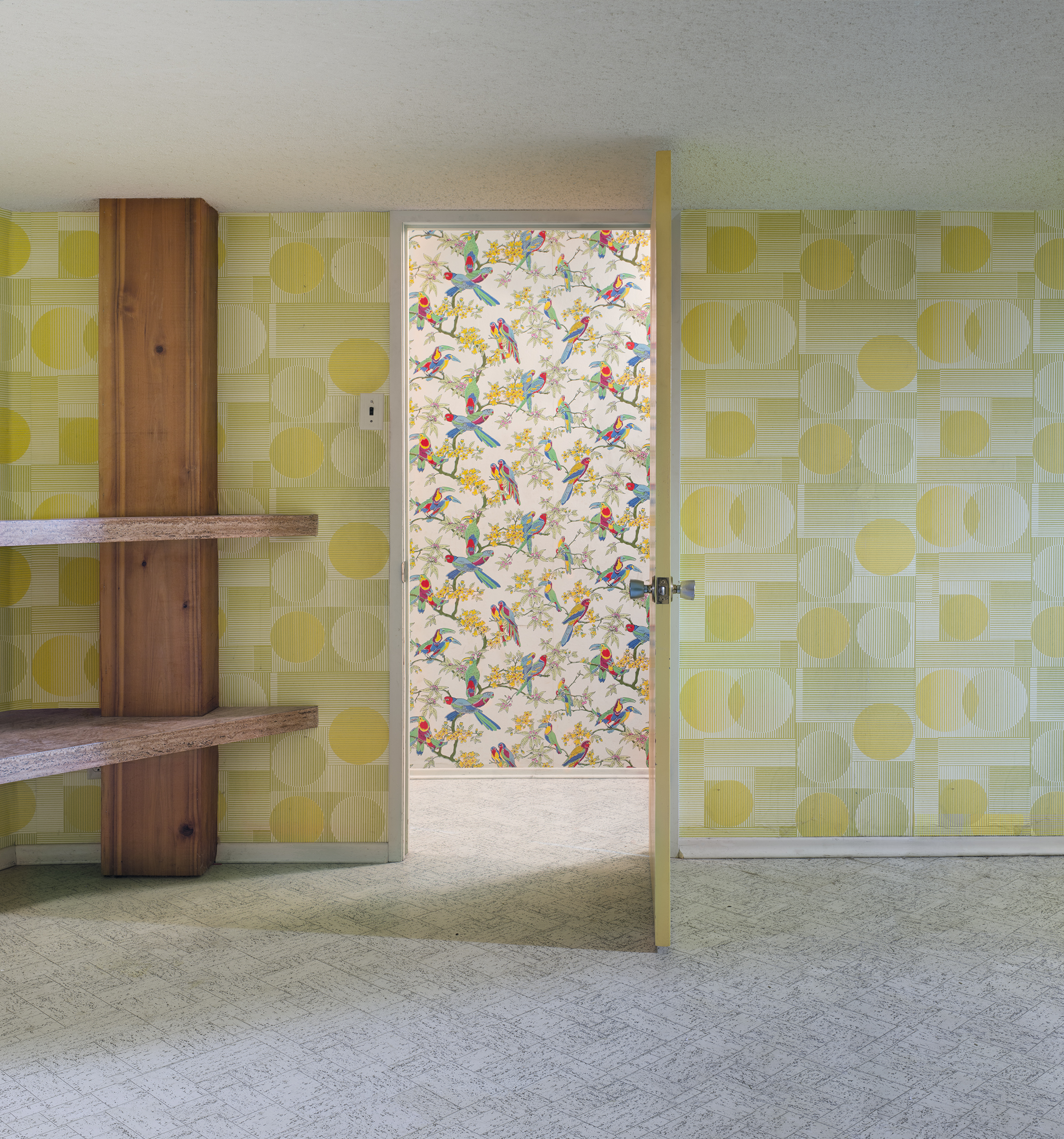 Framed by the doorway in this image is a wall covered in wallpapers depicting birds and plants. In the foreground is a darker room with abstract geometric shapes on its walls. The rather modernist patterns in the foreground contrast the nostalgic patterns behind them in terms of brightness, color schemes and the complexity of shapes.
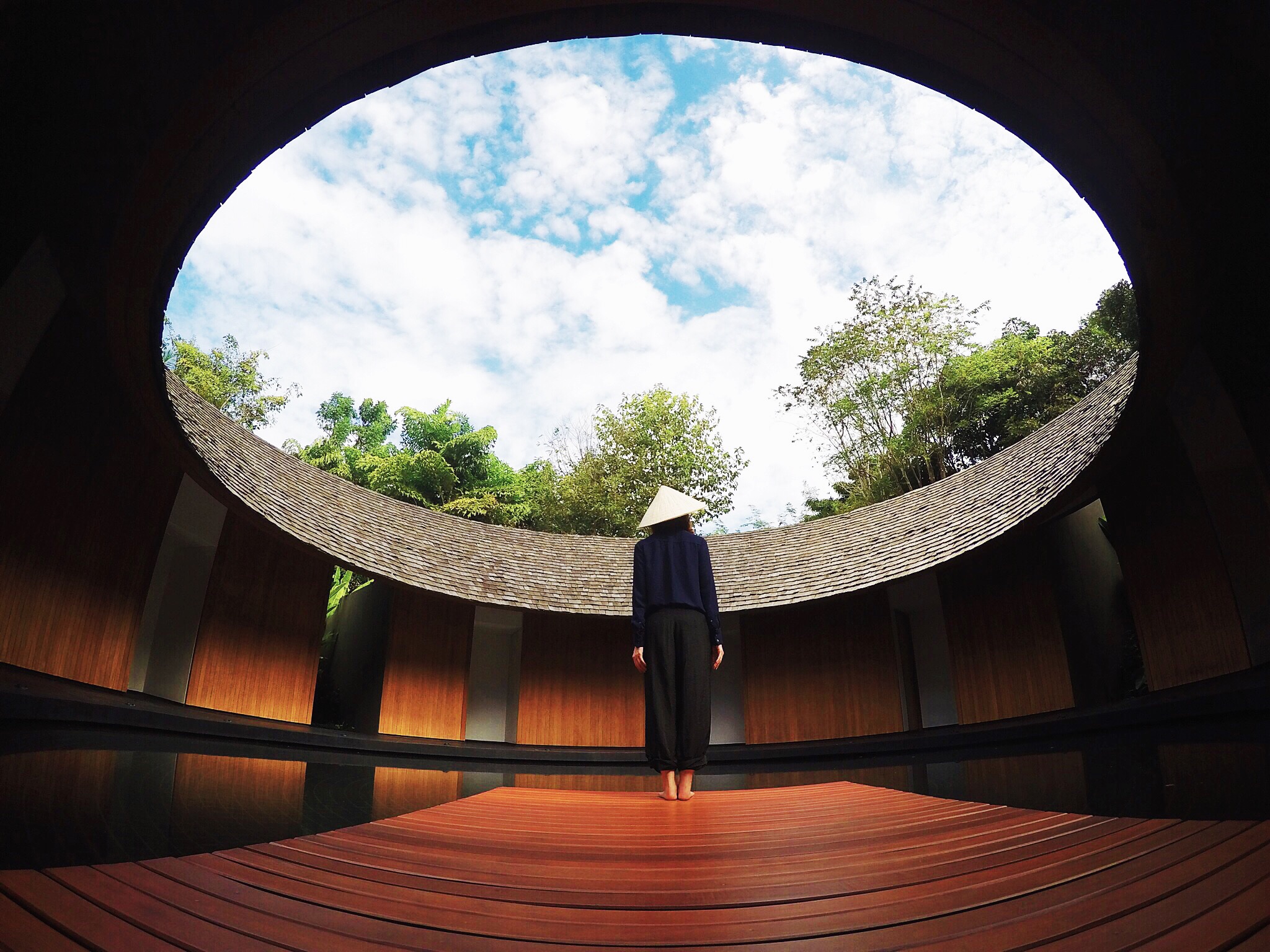 In this photo, the first thing that grabs the viewer’s attention might be the sky framed by the building’s roof. Inside and outside the frames are respectively the bright natural environment and the built environment in the roof’s shadow.
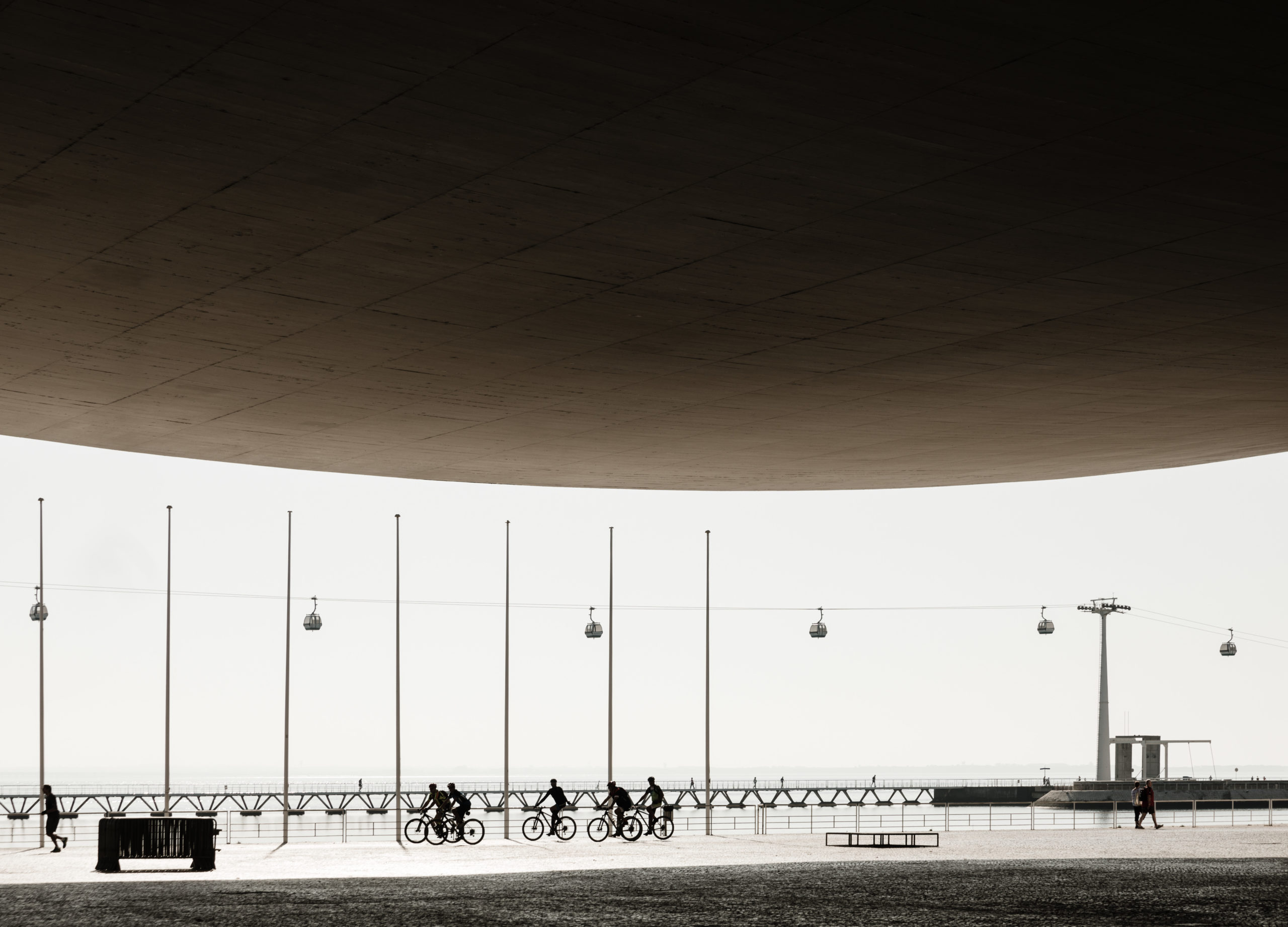 Nearly half of the image is occupied by the canopy of Álvaro Siza’s Expo’98 Portuguese National Pavilion, which reframes the image. All contents, the street, the pedestrians, the cyclists, etc, are concentrated in the lower half of the composition. The brightness of the late morning sunlight becomes a white canvas, while the shaded inner side of the canopy seems so dark that forces your view down.
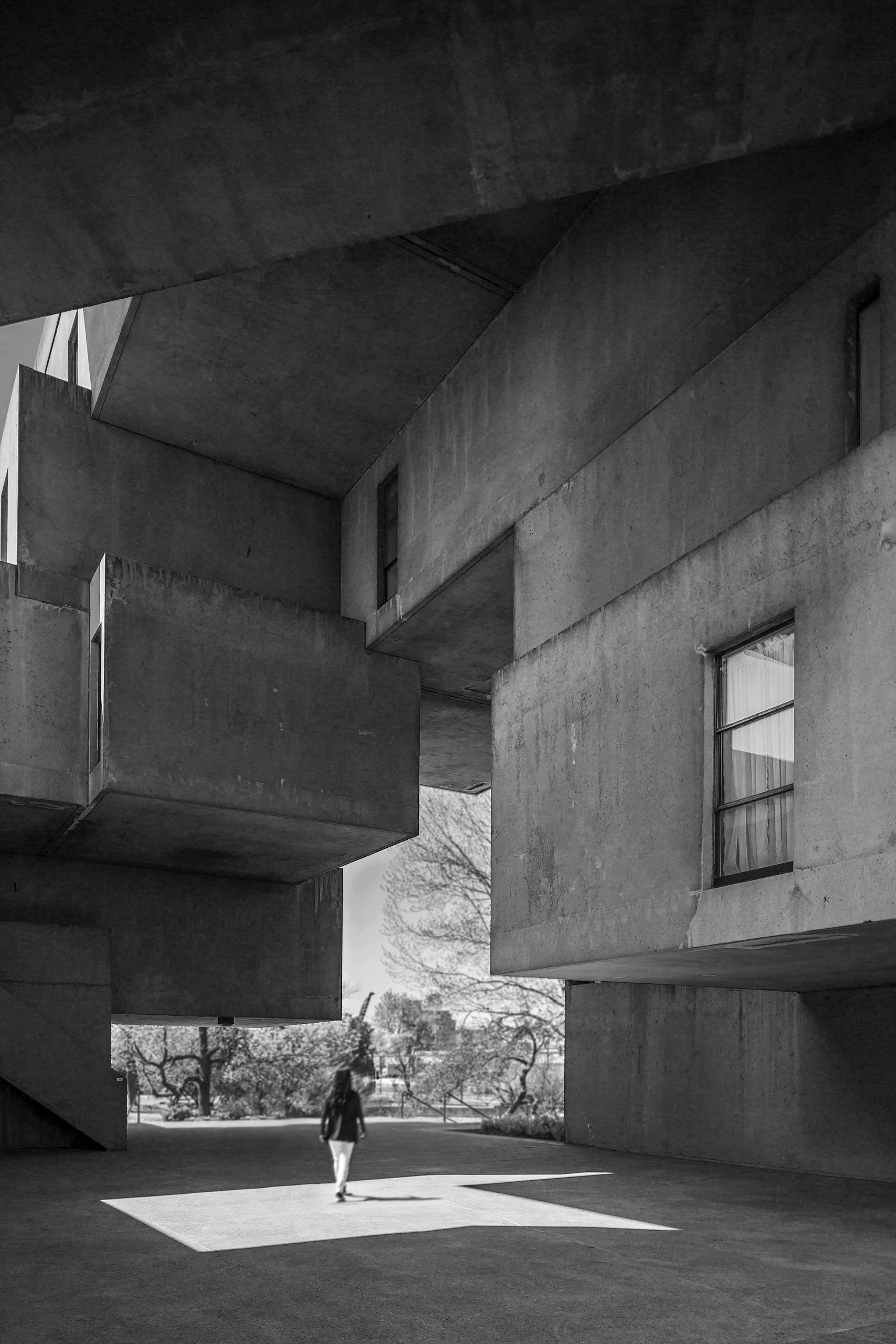 The author creates an irregular second frame with the building Habitat 67 by Moshe Safdie. Heavy concrete volumes are layered one over another, while each rectangular volume is different in length and thickness. Together, they frame the green space in the background with straight lines and clear angles, highlighting the contrast between natural and built, organic and industrial.
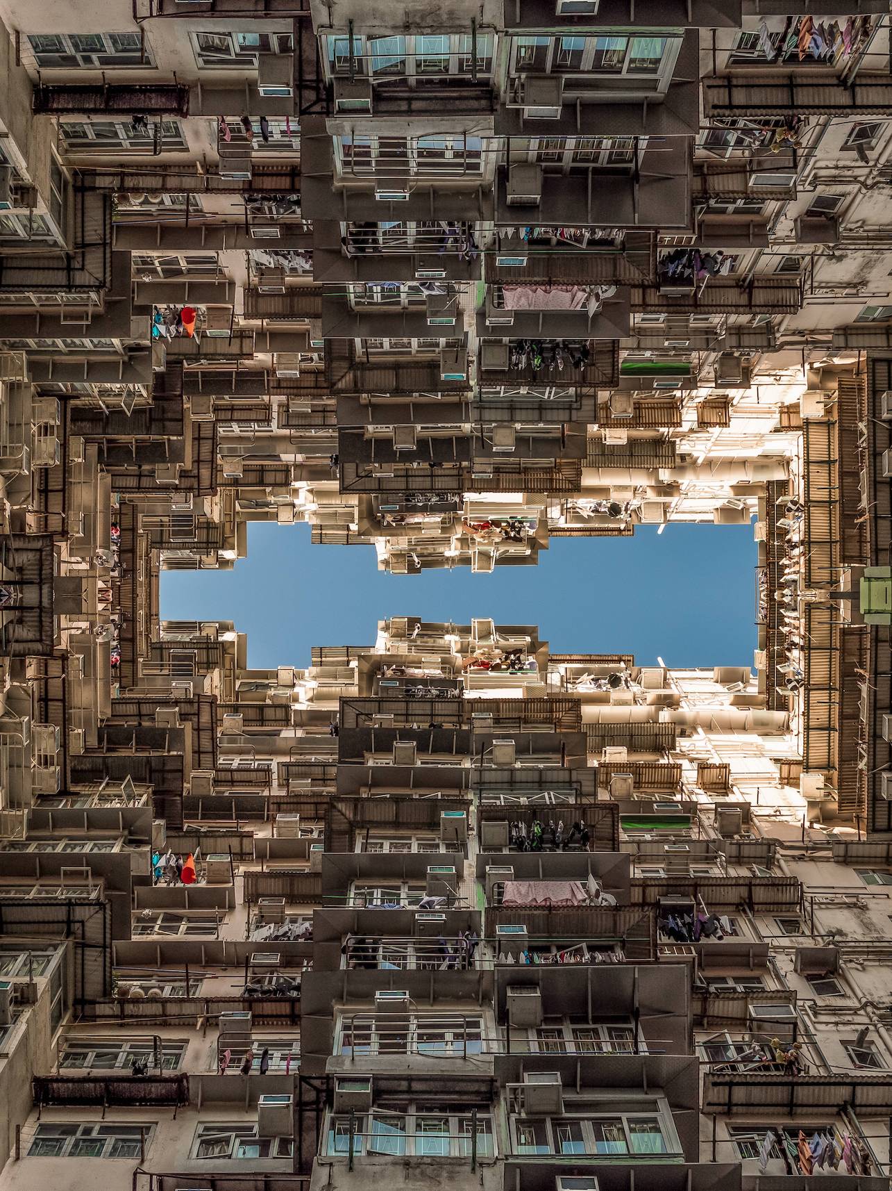 The image depicted here might be striking to those who never lived in areas of dense population. However, it is the type of view that the author grew up with. The building here is one of the government-subsidized residences for low incomes. In this photo, the sky is clear like a plain color block while buildings are rich in forms and textures. The windows are rhythmic as your view goes upwards from the bottom of the photo. The rhythm comes to a sudden end as it reaches the top of the building, where the sky frees you from the intense building surface. The photo is mirrored to form the symmetrical frame in the middle. This creates a feeling of being surrounded by buildings and multiplies the intensity of the textures.