Eight bedrooms with understated yet productive desk spaces
For our latest lookbook, we’ve rounded up eight bedrooms with desks that provide much-needed workspace while maintaining a peaceful environment.
Not every house has the space for a designated office room, so adding a desk to the bedroom is a popular choice for those requiring a place to work or study at home.
The examples in this lookbook show how a workspace for productivity can be added to a bedroom without detracting from the calm and serenity needed for sleep.
It includes understated fold-out desks, desks built into wall storage, a cosy reading nook and a study area that can be closed off with sliding screens.
This is the latest in our lookbooks series, which provides visual inspiration from Dezeen’s archive. For more inspiration see previous lookbooks featuring interiors informed by Mediterranean living, interiors that adopt wabi-sabi principles and interiors covered in Barbiecore pink.
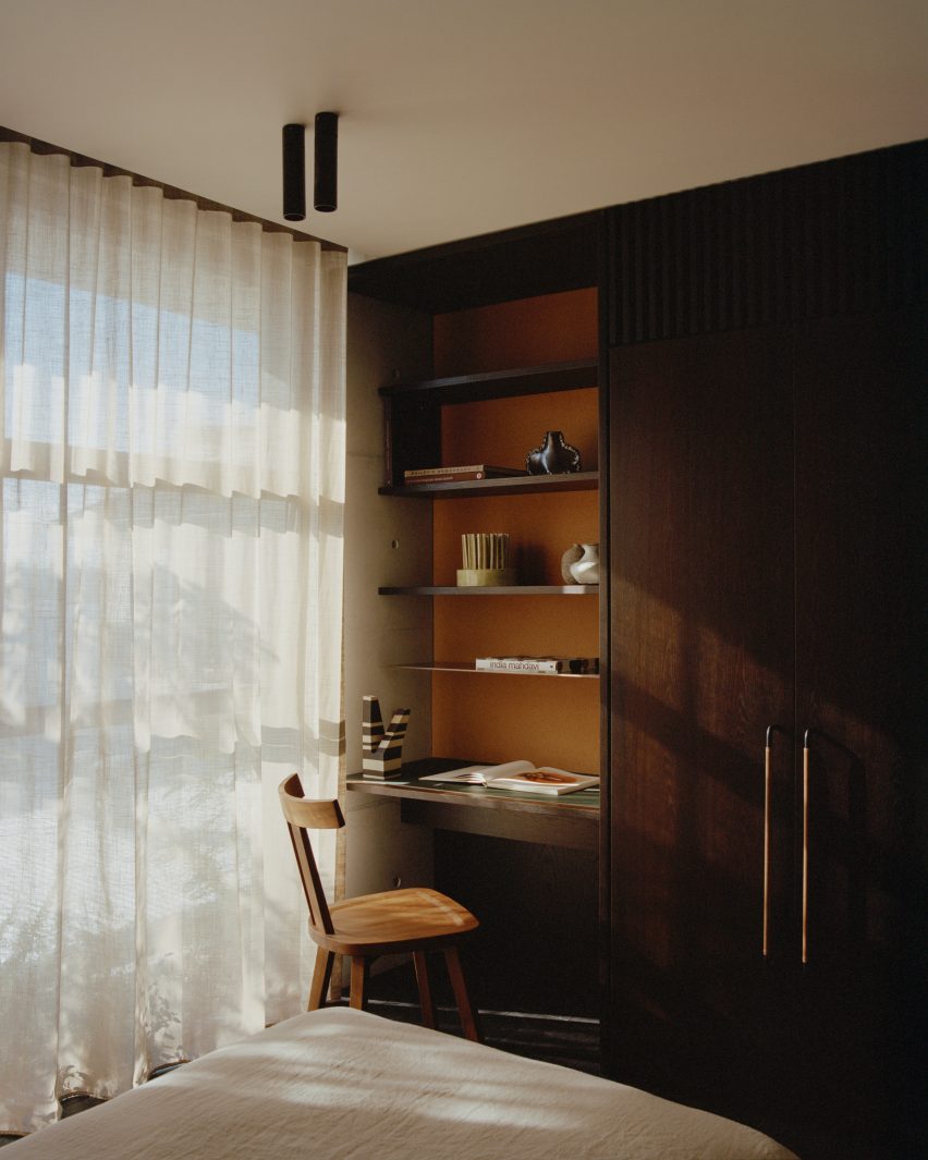
Fisherman’s Cottage, Australia, by Studio Prineas
Architecture studio Studio Prineas designed a concrete tower extension containing four bedrooms for a fisherman’s cottage in Sydney, separating the private rooms from the rest of the house.
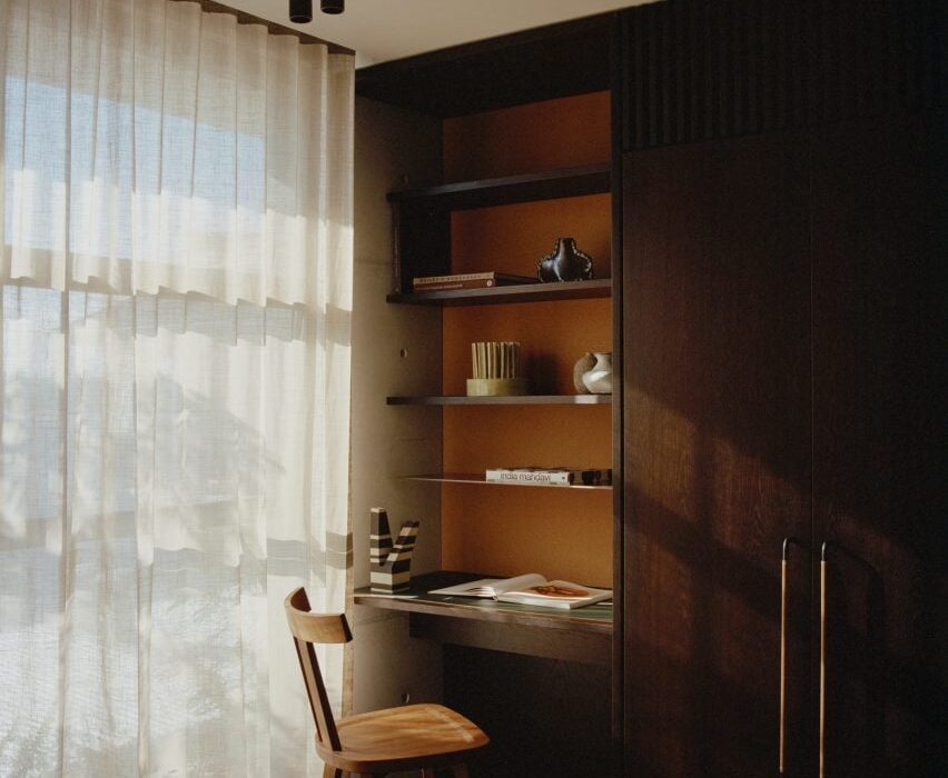
The studio added dark timber built-in wardrobes, shelving and a small desk along a wall in one of the bedrooms, adjacent to a large window that overlooks the nearby bay and lets natural light onto the study space.
Find out more about Fisherman’s Cottage ›

House in Red Concrete, Norway, by Sanden+Hodnekvam Arkitekter
The pine-panelled interior of this bedroom contrasts with the home’s red-pigmented concrete exterior, designed by Oslo architecture studio Sanden+Hodnekvam Arkitekter.
Pine plywood furniture that decorates the space was built on site, including the wall-mounted desk at the end of the bed.
Find out more about House in Red Concrete ›
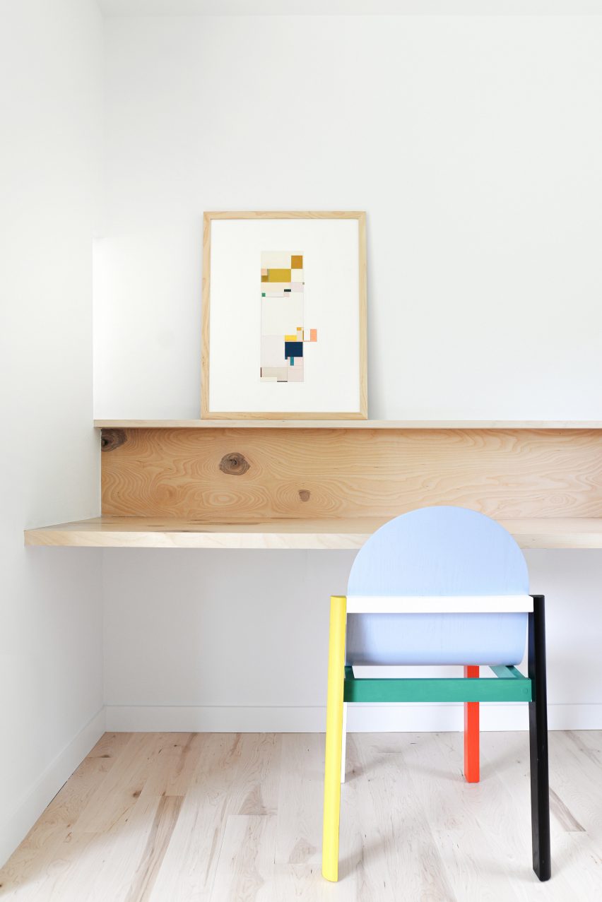
Pine Lane House, USA, by Ballman Khapalova
Two bedrooms were combined into one main bedroom suite with a study space, as part of the renovation of this 1980s ranch house in Saugerties, New York, by architecture studio Ballman Khapalova.
The studio designed custom wood furniture for the home, including a minimalist fold-out desk that stretches the length of the bedroom’s designated office nook.
Find out more about Pine Lane House ›
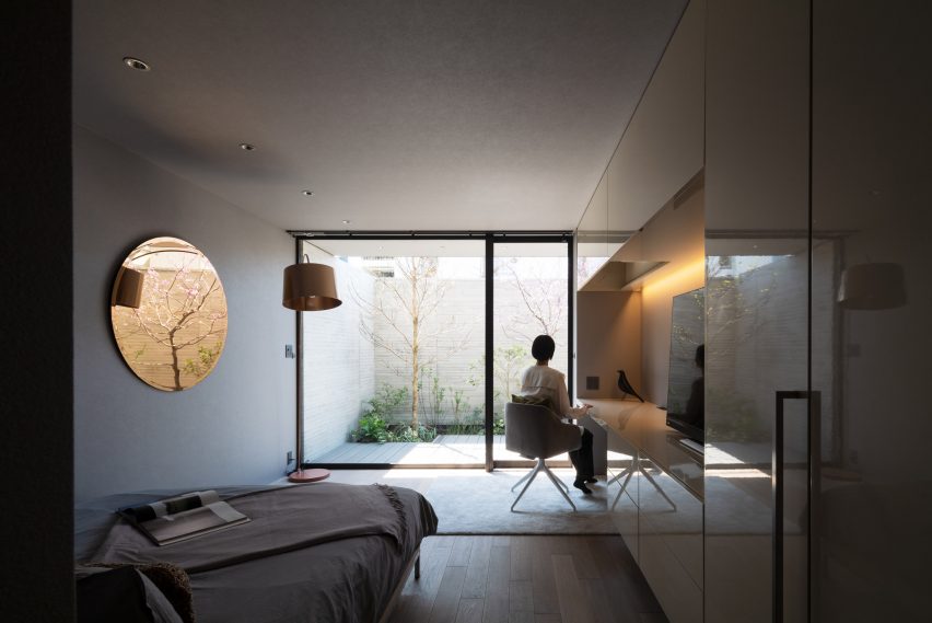
Laxus, Japan, by Apollo Architects & Associates
A desk space sits in line with glossy wall storage in the bedroom of this Tokyo home, which is lit by strip lighting recessed in the overhead cupboards.
Designed by Japanese studio Apollo Architects & Associates, the bedroom overlooks a courtyard with trees and shrubs, adding a serene and calming quality to the space.
Find out more about Laxus ›
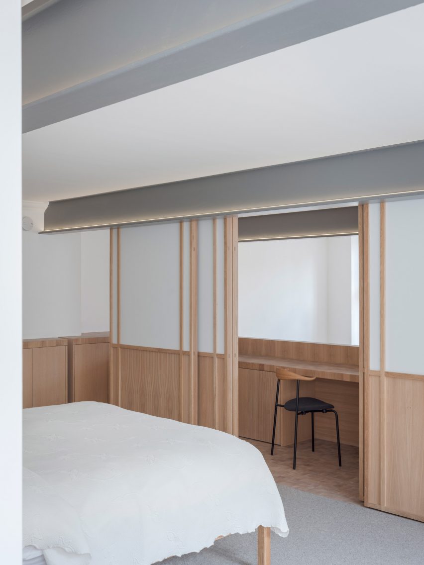
Apartment Block, UK, by Coffey Architects
Local studio Coffey Architects overhauled the interior of this two-storey London flat and decorated it with surfaces made from wooden blocks, including a mezzanine study area with a long desk and storage.
Behind the study area is a main bedroom. Here, Coffey Architects separated the two zones by changing the flooring from wooden blocks to a grey carpet and adding Japanese-style timber screens inlaid with translucent panels.
Find out more about Apartment Block ›
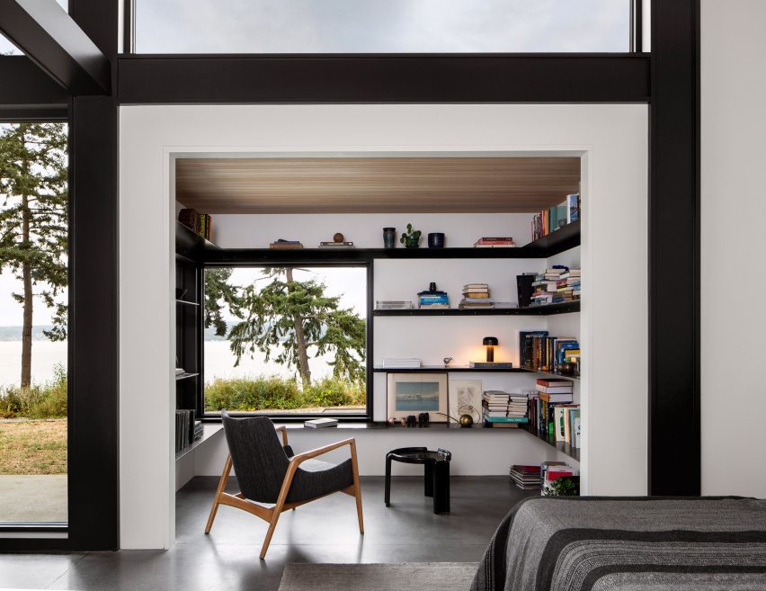
Whidbey Dogtrot, USA, by SHED
American firm SHED added a reading nook with views of the surrounding landscape to the bedroom suite in Whidbey Dogtrot, a cedar-clad home in the Pacific Northwest.
Slim black shelving covers the three walls in the nook and provides a worktop space for reading and studying.
Find out more about Whidbey Dogtrot ›
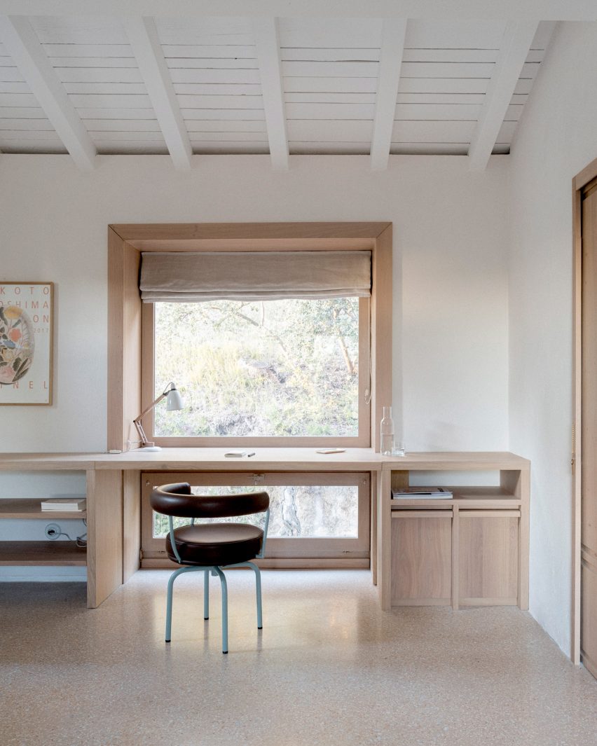
MA House, France, by Timothee Mercier
An oak desk paired with an aubergine-coloured Cassina chair sits behind a large picture window in the bedroom of this farm building in southeast France.
Architect Timothee Mercier converted the rural building into a home for his parents, creating a purposefully pared-back interior “clear of fuss and clutter” and adding splashes of colour in the choices of furniture.
Find out more about MA House ›
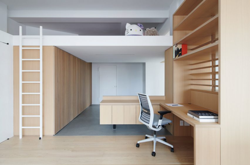
Financial District apartment, USA, by Light and Air
Brooklyn studio Light and Air removed partition walls in this 1,200-square-foot New York City apartment to create an open space with increased storage.
Custom-built furniture creates separation between the rooms, including an L-shaped desk with open shelves that helps divide the bedroom area from the living room.
Find out more about the Financial District apartment ›
This is the latest in our lookbooks series, which provides visual inspiration from Dezeen’s archive. For more inspiration see previous lookbooks featuring interiors informed by Mediterranean living, interiors that adopt wabi-sabi principles and interiors covered in Barbiecore pink.

