Gensler redesigns its own LA office to have “warmth and comfort” of home
CategoriesInterior Design

Gensler redesigns its own LA office to have “warmth and comfort” of home

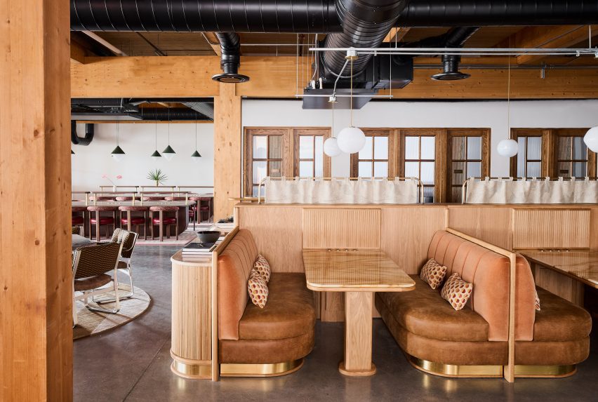
The team at global architecture firm Gensler’s Los Angeles office has redesigned a floor of its workspace with a hospitality approach, as a pilot for the remaining spaces.

The Gensler LA team’s renovated its space to give it more of the “warmth and comfort” that its staff became used to during its time working from home.
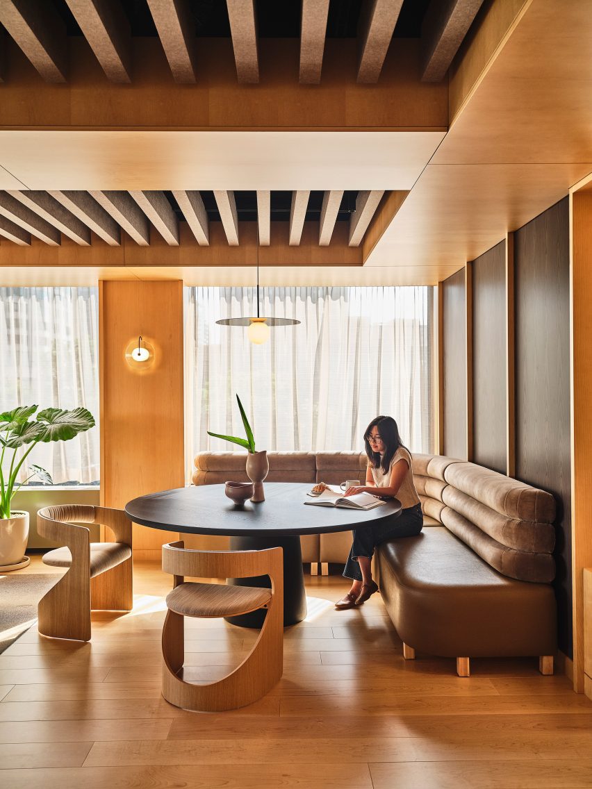
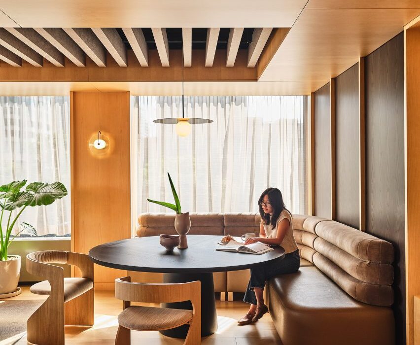
Workspace in the Gensler LA office with a banquette around a black circular tableWorkspace in the Gensler LA office with a banquette around a black circular table
The team at Gensler LA redesigned the third floor of their offices to better suit their current workplace needs

The studio’s return to the office post-pandemic came seven years into a 15-year lease of its spaces in Downtown Los Angeles, the firm had converted from an empty bank building in 2011 then expanded to two floors in an adjacent, connected structure.

With a growing workforce and a desire to rethink the layout, functionality and appearance of the office, a group of the studio’s “next generation” of designers and strategists led an effort to redesign the interiors of the third floor.
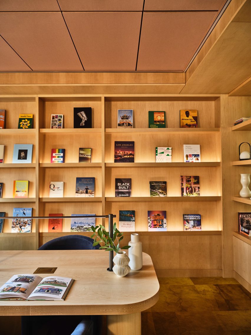
Open shelving with colourful books displayed Open shelving with colourful books displayed
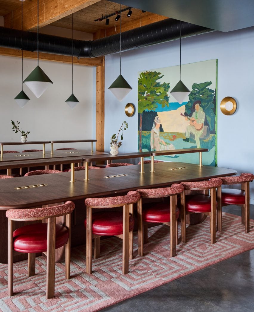
The pilot project incorporates several products from Gensler collaborations, including open shelving and communal tables

“The look and feel of our space, though contemporary, lacked the warmth and comfort of the hospitality touches we integrate for our clients’ workspaces and that we had become accustomed to while working from home,” Gensler senior strategist Sarah Koos told Dezeen.

“Coupled with the changing nature of hybrid work, the space necessitated a transformation that would support a renewed sense of a work-lifestyle.”
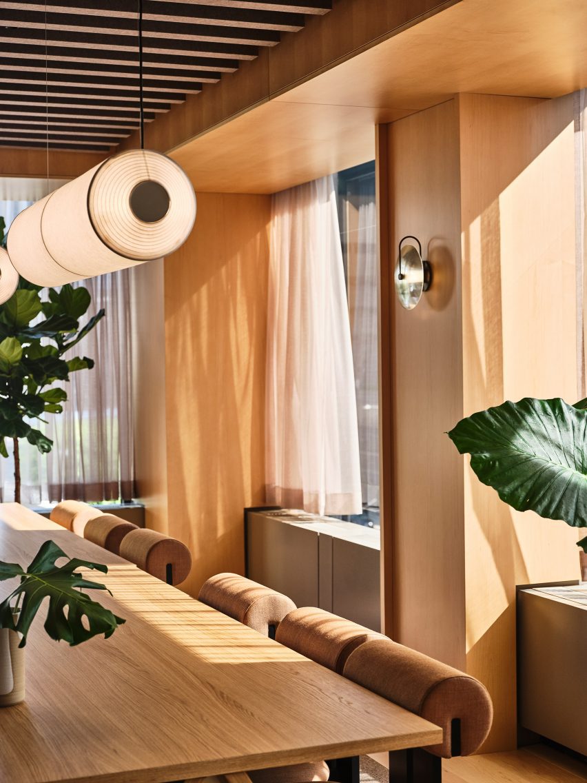
Communal table in wood-lined roomCommunal table in wood-lined room
A warm aesthetic that captures the essence of Los Angeles was chosen for the interiors

The group spent a year listening and learning from surveys, workshops and feedback sessions in which each of the 500-plus employees was able to have a say about their future work environment.

Many team members had been highly mobile even before hybrid working became popular, so the previous dedicated desk system seemed redundant.

“Working from home for two years effectively rewired peoples’ expectations of their work environments, a sterile, single-use corporate office no longer spoke to the warmth, variety, and comfort they were afforded in their own homes,” said Koos.
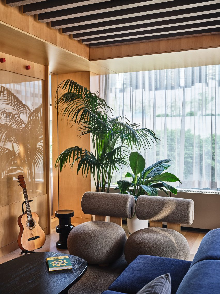
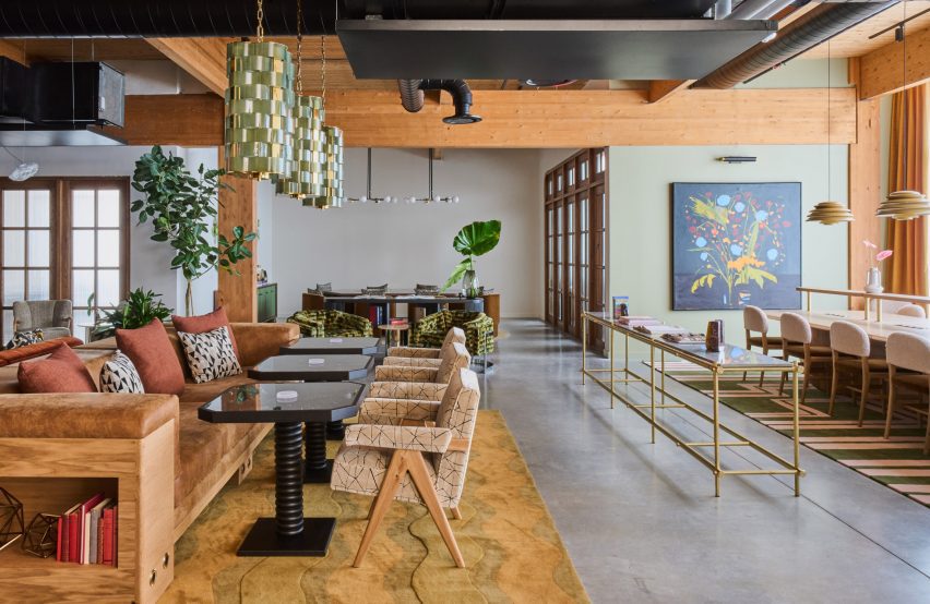
Lounge area with comfy seating, plants and a guitarLounge area with comfy seating, plants and a guitar
Plenty of lounge areas with comfy seating were created for employees to use

They therefore set about redesigning the offices with a focus on flexibility, communal work areas and presentation spaces.

“Rather than confine our designers to a desk or a conference room, we developed a kit-of-parts inclusive of typical sit-stand workstations, communal tables, focus pods, booths, material layout islands, and more,” said Gensler senior designer Kirk Bairian.

“Gensler is built on a studio system which is critical to our design culture, and each studio was able to use this kit-of-parts to customise their space to reflect the specific ways in which they work.”
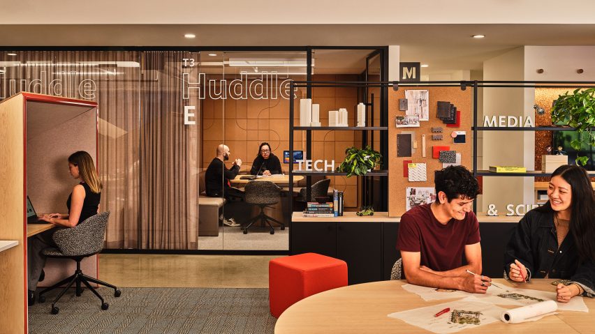
Workspace with glass meeting room, privacy booth and shelving for pin-upsWorkspace with glass meeting room, privacy booth and shelving for pin-ups
The team devised a “kit of parts” for the different studios to customise their own workspaces

A warm, hospitality-forward aesthetic that mirrors the “informal but elevated, casual but curated” essence of Los Angeles was chosen.

Materials including maple plywood, blackened metal and subtle textiles provide a backdrop for more colourful additions in the form of ever-changing pin-up display boards, styled shelving, artwork by local students and books from local creative businesses.

Lounge-style furniture and jewel-toned textiles are placed in the co-working areas to evoke a hotel lobby or coffee shop vibe.

Several of Gensler’s furniture and fixture collaborations were also introduced, among them the communal tables and open shelcves from a product line created with Fantoni and custom focus pods from a partnership with Tangram’s Studio Other.
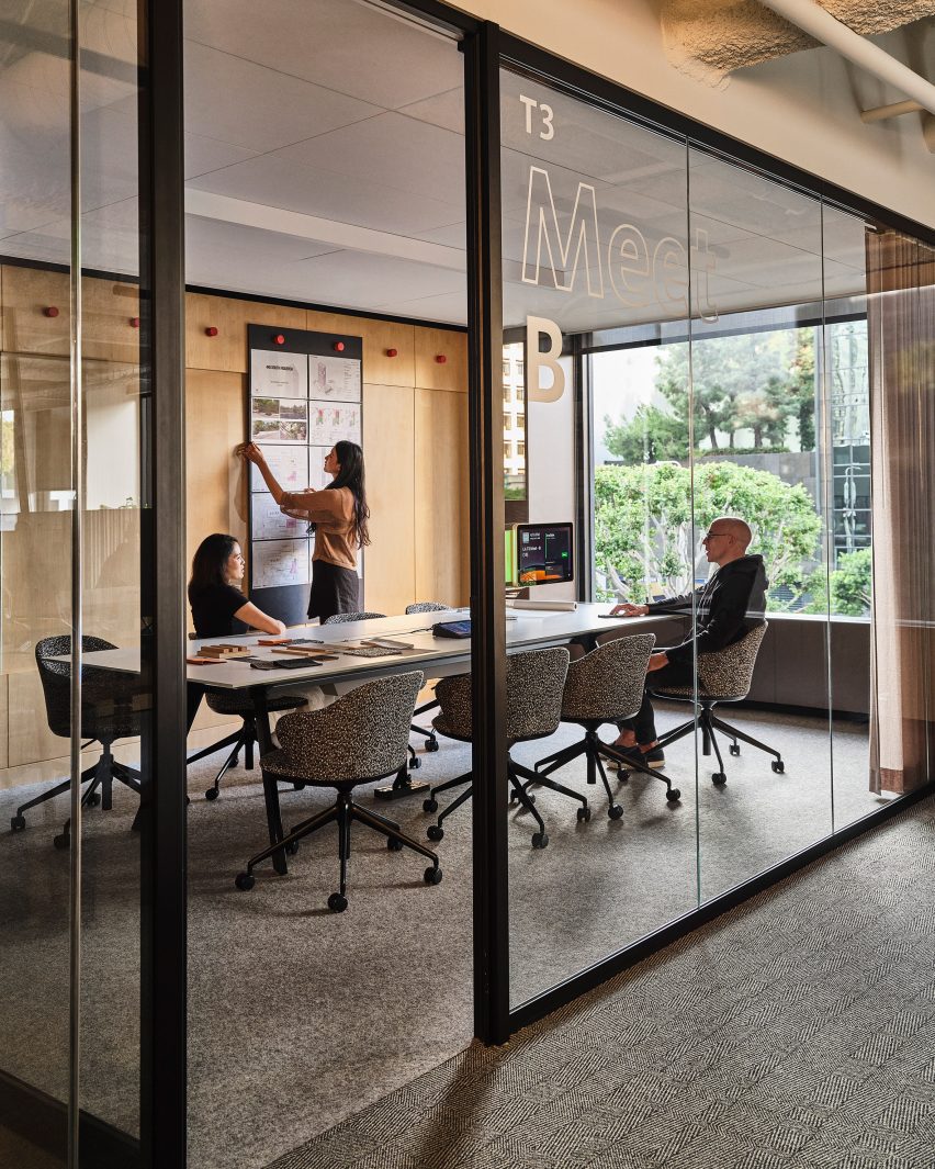
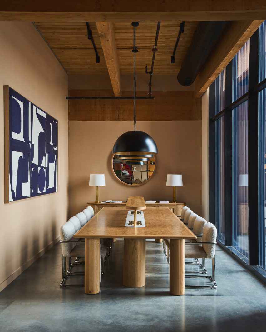
Conference room behind glass wallConference room behind glass wall
Traditional conference rooms are available alongside more flexible spaces for group work

Since the project completed in 2023, the data from badges suggest that employee office attendance has increased by 35 per cent for the studios located in the renovated pilot space, according to the firm.

“Studios in the new space shared that they felt that working in the renovated space made them more productive, enabled more effective collaboration, and overall, greatly improved their in-office experience,” the team added.
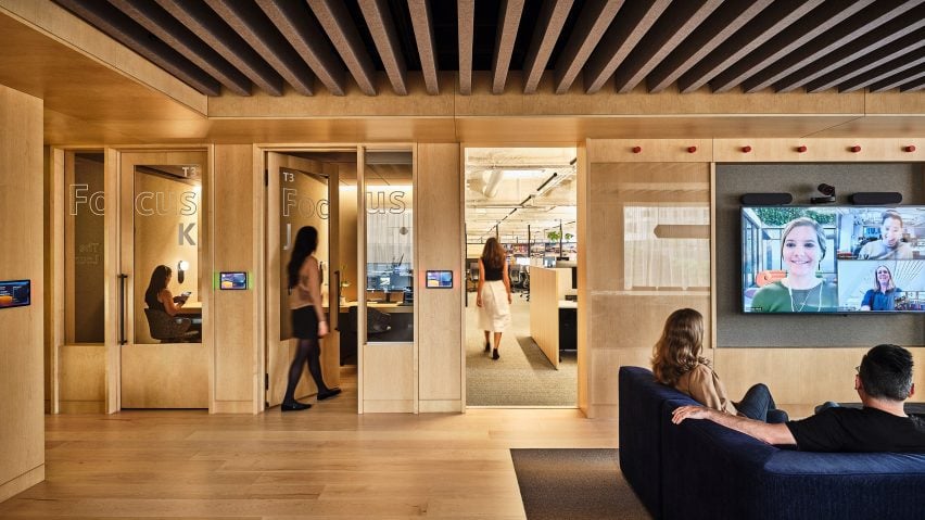
Wood-lined workspace with private booths and open Zoom areasWood-lined workspace with private booths and open Zoom areas
Maple plywood and blackened metal were among the materials chosen to give the space more of a hospitality feel

Gensler is the world’s largest architecture firm and has locations 53 locations globally. Its European head offices in Wapping, London, was longlisted in the business building category of Dezeen Awards 2020.

In 2022, co-CEO Andy Cohen told Dezeen in an exclusive interview that architecture should abandon “top-down” management to improve working conditions.

Reference

Post Company imbues Mollie Aspen hotel interiors with earthy hues
CategoriesInterior Design

Post Company imbues Mollie Aspen hotel interiors with earthy hues

New York studio Post Company has designed warm, wood-filled interiors for a boutique hotel in Aspen, Colorado, which offers a pared-back take on the Arts and Crafts style.

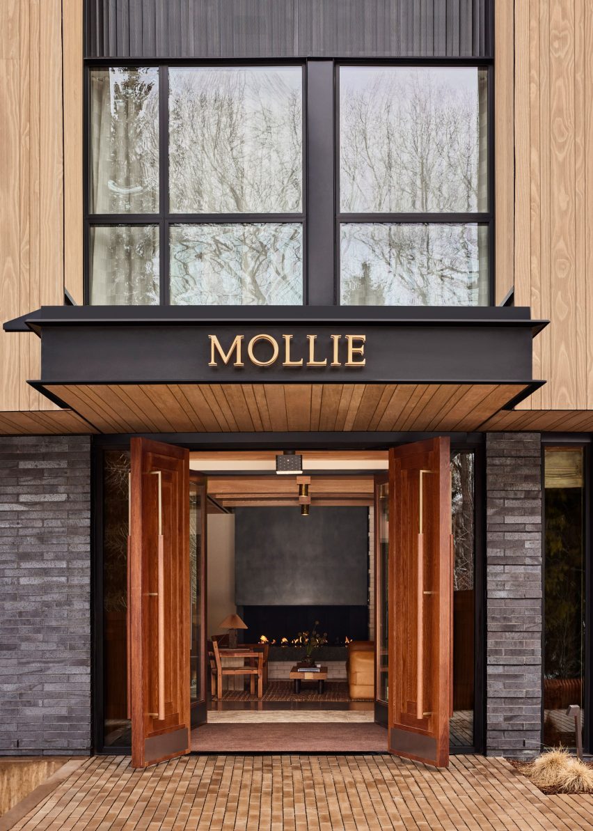
Mollie Aspen occupies a new timber-clad building designed by CCY Architects and developed and operated by HayMax in the mountain city’s downtown area.

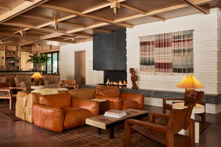
Lobby lounge at Mollie Aspen with earth-toned furniture and a gridded wood ceilingLobby lounge at Mollie Aspen with earth-toned furniture and a gridded wood ceiling
With an open fireplace as a backdrop, the lobby lounge at Mollie Aspen features earth-toned furniture and a gridded wood ceiling

Post Company was tasked with creating the interiors for the 68-room hotel, combining contemporary Scandinavian and Japanese design elements for a serene take on Rocky Mountain luxury.

“Mollie is designed for those with a natural curiosity and appreciation for connection and offers visitors a unique, welcoming respite in the bustling mountain town,” said the hotel’s team.

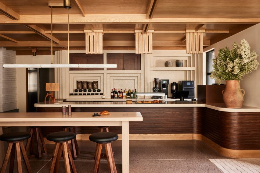
All-day cafe in the Mollie Aspen lobby All-day cafe in the Mollie Aspen lobby
An all-day cafe in the lobby serves pastries and beverages from a walnut-wrapped counter

An abundance of wood can be found throughout the different spaces, with numerous varieties creating a layered effect of different colours and grain patterns.

The timber is crafted into elements like gridded wall and ceiling panels with built-in lighting, which evoke an Arts and Crafts aesthetic, as well as fluted counterfronts and a range of furniture pieces.

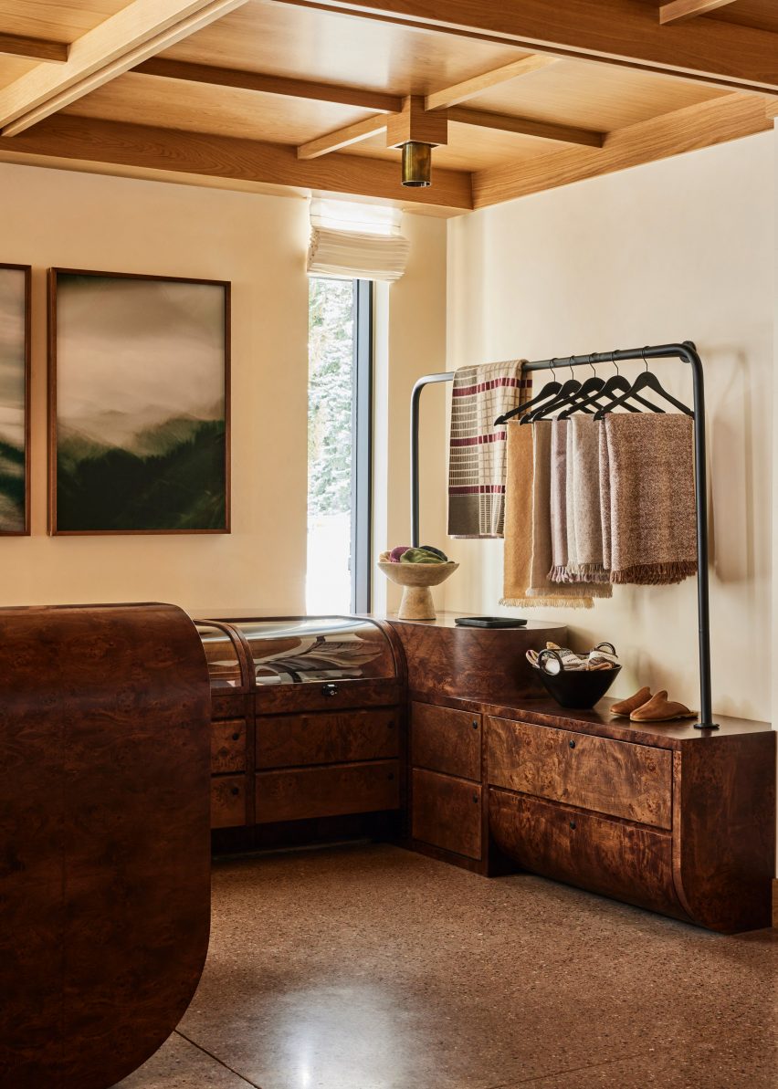
Burl wood counters and displays in a retail spaceBurl wood counters and displays in a retail space
Burl wood counters and displays present goods in the hotel’s retail space

The majority of the materials used in Mollie’s construction were sourced from the Western United States to reduce waste, according to the team.

Meanwhile, other accents like earthen ceramics, hand-dyed textiles and sand-casted brass add to the cosy atmosphere.

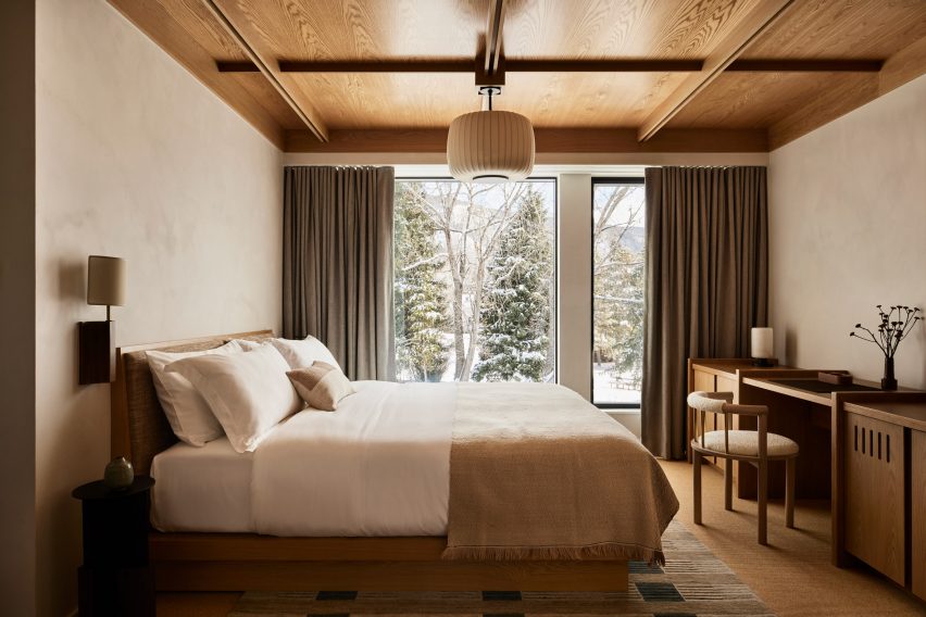
Guest room with neutral decorGuest room with neutral decor
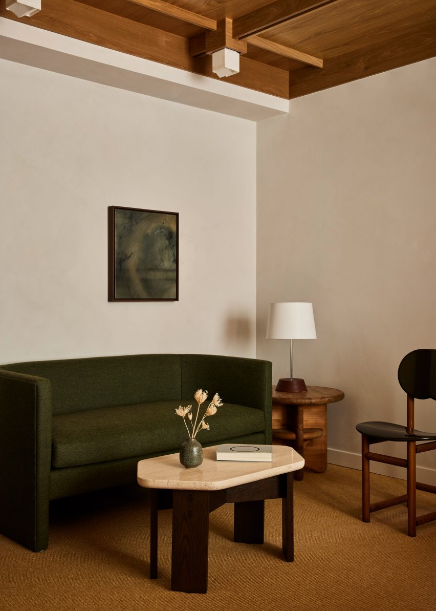
Guest rooms offer an even more pared-back take on the neutral decor palette

“These materials are incorporated throughout the hotel to mimic the area’s rough-hewn mountains while large windows frame views of the surrounding landscape and bring an abundance of light into the hotel,” said the team.

The lobby lounge is designed as a cosy gathering space for guests and the public, with a large open fireplace providing a backdrop.

Beige plaster walls and textured carpet in a guest roomBeige plaster walls and textured carpet in a guest room
Beige plaster walls and textured carpets complement the wood ceilings in the guest rooms

Chunky leather, velvet and boucle sofas and armchairs in a range of earthy hues form comfy conversation nooks.

At one end of the room, the black-topped bar spans the full width and is illuminated by a row of globe-shaped pendant lights suspended from thin brass bars.

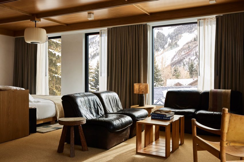
Guest suite with black leather furniture and snowy mountain viewsGuest suite with black leather furniture and snowy mountain views
Black leather furniture in the larger suites offers a contrast to the other furniture pieces and snowy mountain views

A repeated geometric pattern across the pale counter front is also found on door panels leading to other hotel areas.

An all-day cafe at the opposite end of the lobby serves pastries and an assortment of beverages from a walnut-wrapped counter, and the restaurant

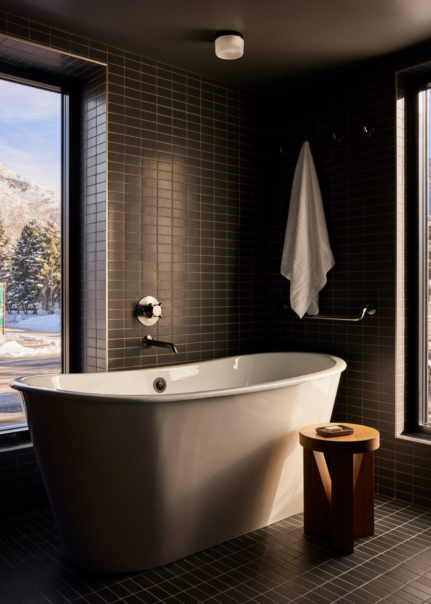
Bathroom with dark green tiles and freestanding white bathtubBathroom with dark green tiles and freestanding white bathtub
Dark green tiles in the bathrooms match the spruce trees outside

In the adjacent retail space, burl wood counters and displays with curved edges, some of which are topped with glass vitrines.

On the third floor is a roof terrace with a bar and a spa pool set to open in Spring 2024, while a fitness facility and flexible meeting space are located at ground level.

The guest rooms continue the soft, neutral palette in a more pared-back style.

Beige plaster walls, textured carpets and green-grey curtains complement the wood ceilings and built-in furniture, while black leather chairs add contrast.

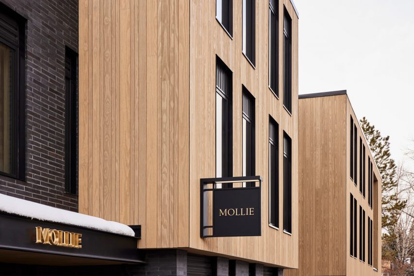
Mollie Apsen entrance with logo on the entrance canopyMollie Apsen entrance with logo on the entrance canopy
Mollie Aspen is located within a newly constructed building by CCY Architects

Dark green stacked tiles that line the bathrooms match the spruce trees outside and freestanding tubs beside the windows allow guests to enjoy the view while soaking.

“Guests are left with a sense of Aspen’s cultural and recreational history, providing a lens to appreciate its contemporary personality and influence,” the team said.

Mollie Aspen's wood-clad exteriorMollie Aspen's wood-clad exterior
The building was constructed largely from materials sourced from the Western US

Aspen is a renowned destination for winter sports and affluent vacationers, and CCY Architects has designed several private residences in and around the town – among them an extension to a Victorian house, a residence nestled in a grassy valley and a retreat that overlooks the dramatic mountainous scenery.

Formerly known as Studio Tack, Post Company’s previous hotel projects include the Anvil Hotel in Wyoming, The Sandman in California, and Scribner’s Catskill Lodge in New York.

The photography is by Nicole Franzen.

Reference

Inaba Williams creates mirrored stucco-clad residences in California
CategoriesSustainable News

Inaba Williams creates mirrored stucco-clad residences in California

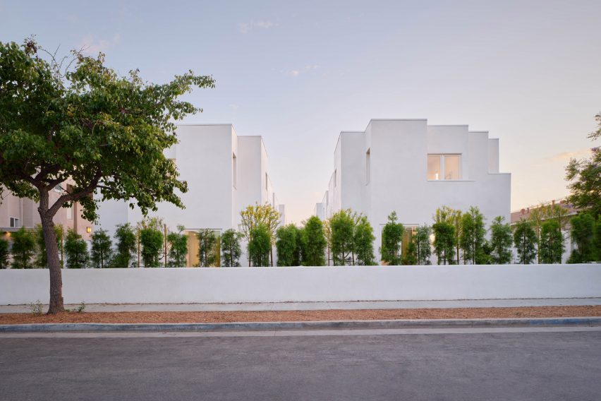
US studio Inaba Williams Architects has created two mirrored houses with courtyards in Santa Monica, California that are clad in white stucco and have net-zero energy use, according to the studio.

Completed in 2023, the twin five-bedroom houses measure 3,900 square feet (362 square metres) each and are divided by a privacy wall and rectangular lap pools.

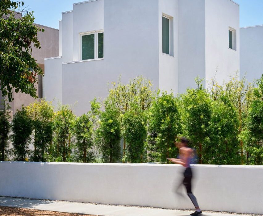
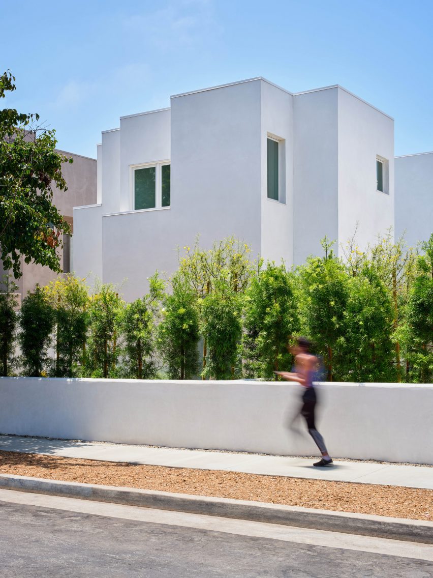
Woman running in front of white stucco house rising out of hedgesWoman running in front of white stucco house rising out of hedges
Inaba Williams Architects has completed two white-stucco-clad houses in Santa Monica

Brooklyn-based practice Inaba Williams Architects followed strategies laid out in Title 24 – California’s Building Energy Efficiency Standards – to create net-zero emissions houses “better suited to our future climate conditions”.

“Having far fewer windows, the buildings reduce heat gain and energy use, while allowing residents to enjoy indoor outdoor living,” the studio told Dezeen. “With less need for air conditioning and generous access to landscaped areas, they offer a more natural, less tempered experience with the environment.”

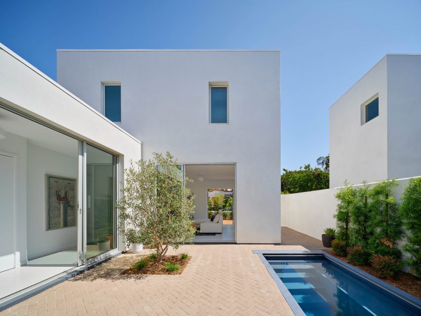
White stucco home with small tree and soaking pool in courtyardWhite stucco home with small tree and soaking pool in courtyard
The two structures are mirrors of each other and are divided by a courtyard with a privacy wall in the middle

Set on 40-foot (12-metre) wide lots, the linear homes measure only 20 feet (6 metres) at their widest, leaving plenty of space for outdoor areas on either side of the house for residents to enjoy.

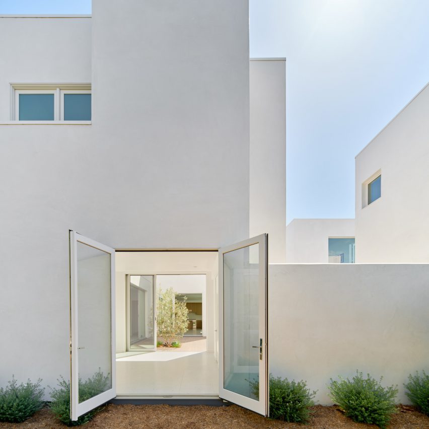
Residents enter from a small courtyard on the outside street-edge corner of the lot into a rounded entryway that passes directly into the main exterior courtyard.

White stucco home with open doorWhite stucco home with open door
The studio said the home has achieved net-zero emissions

At the northern end of the site lies a small two-storey volume that holds a media room and a private suite.

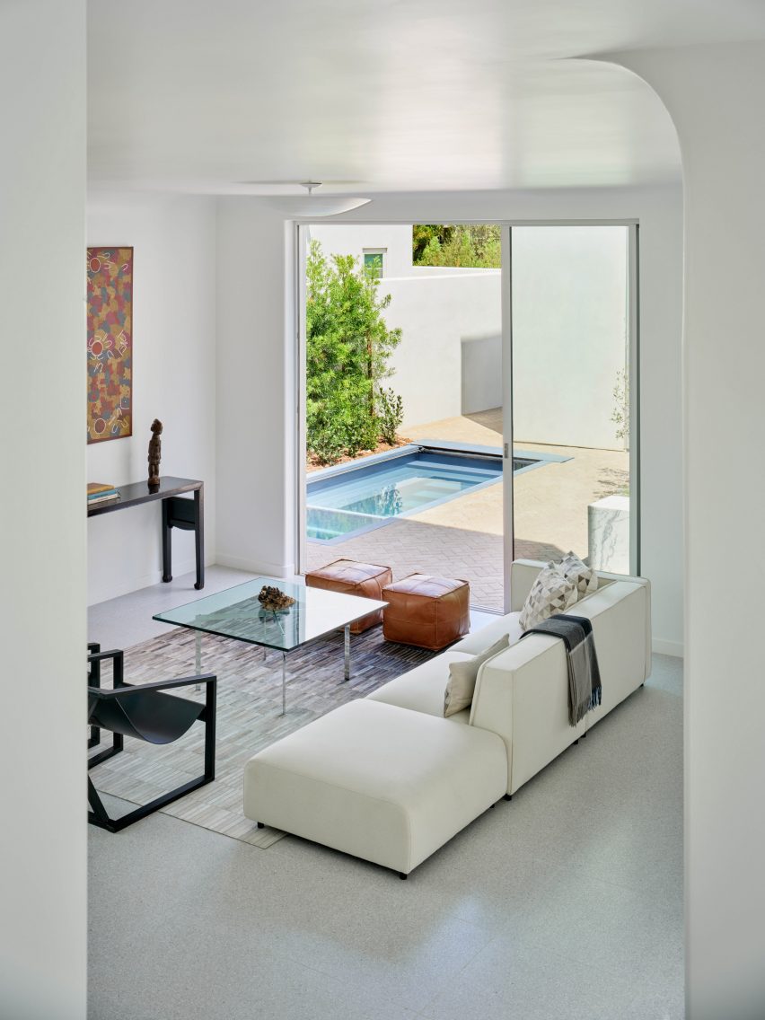
Moving deeper into the house, the living, dining and kitchen areas are collected into an open-plan space with windows and sliding doors that look onto the outdoor areas – including a dining patio – which bring daylight in from three sides.

Living room with pool seen through courtyard doorsLiving room with pool seen through courtyard doors
The white of the exterior continues inside

A bedroom suite, garage, and a secluded zen garden hold the southern edge of the site.

Above, a family room and terrace sit at the top of the staircase in the centre of the plan. Two suites are located on the rear of the site, while the primary suite takes up the rest of the level with a private embedded balcony.

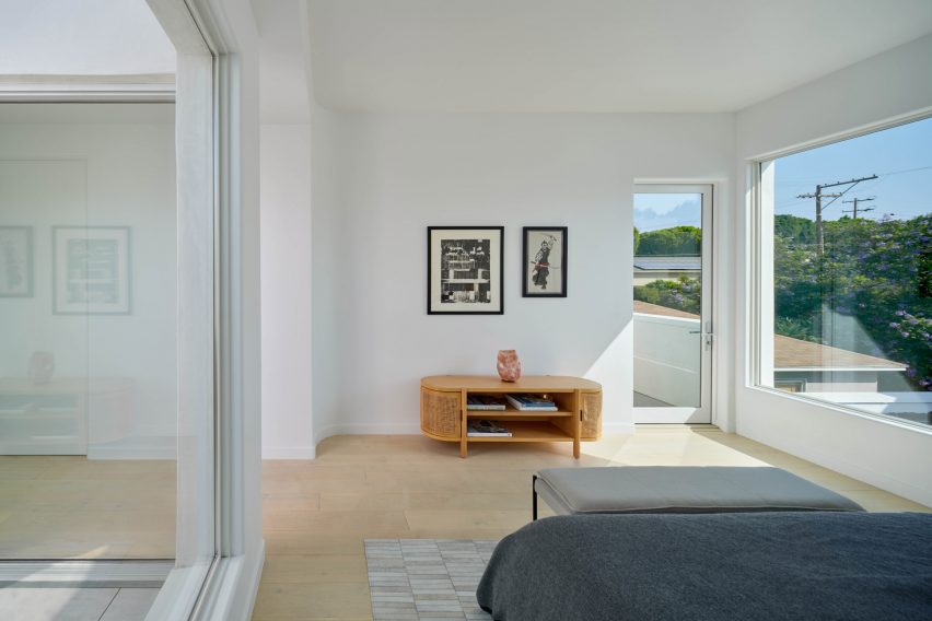
Bedroom with white walls and minimalist furnitureBedroom with white walls and minimalist furniture
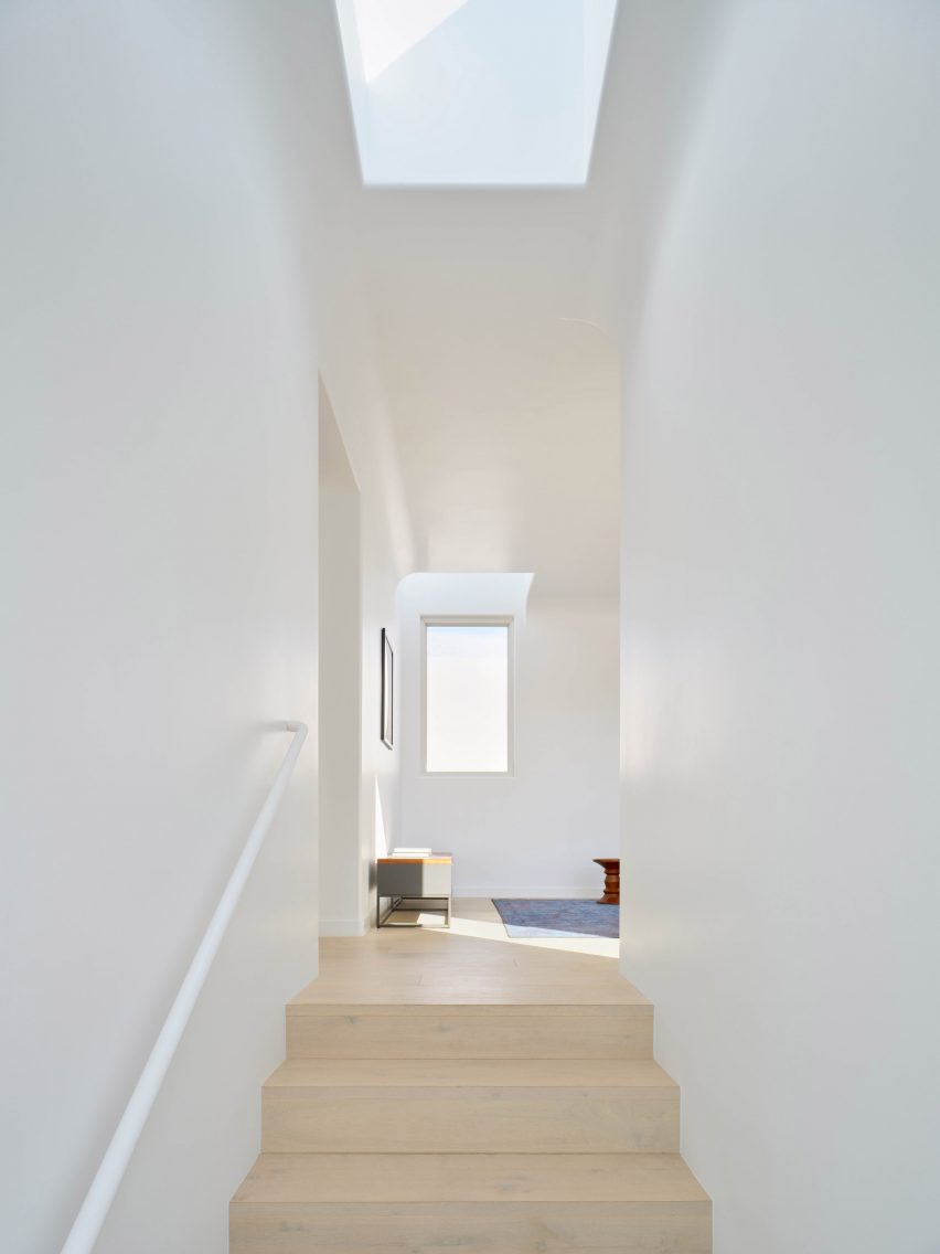
Wood flooring was used for the top floor

“The courtyards are the focal point of the side-by-side homes,” the team said. “Following the Energy Standards’ option to use glass on just 20 per cent of the exterior surface area, the limited amount of glazing is concentrated around these central outdoor areas. “

Positioned to maximize daylight, the courtyards and auxiliary areas capitalise on the coastal location’s mild climate and can be used every day.

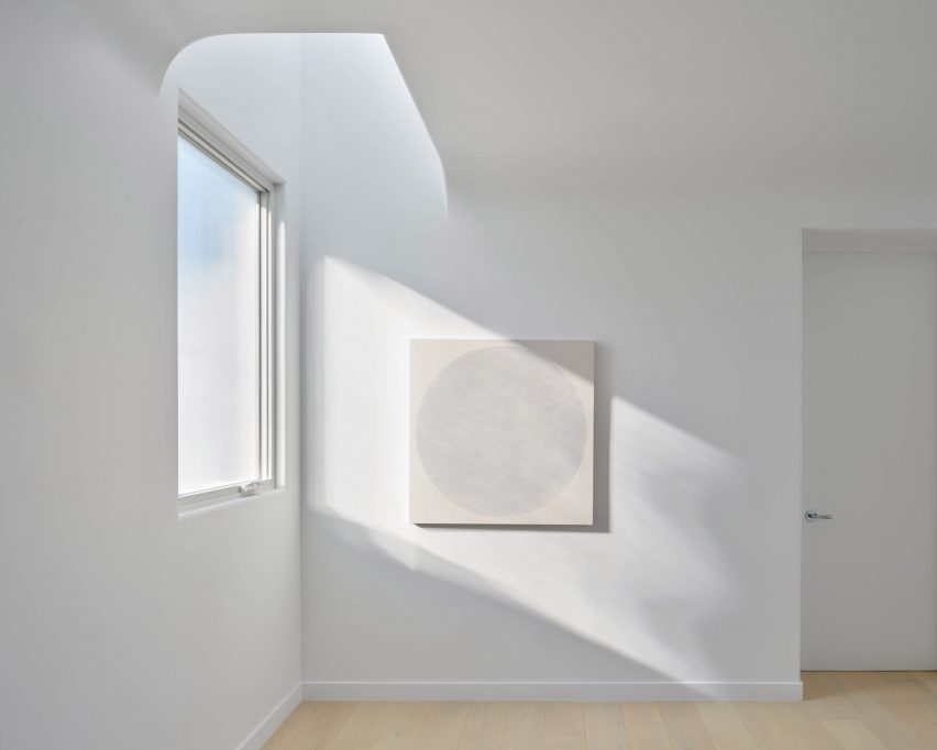
Curved white windowsCurved white windows
Windows were strategically placed to maximise light and limit heat gains and losses

“Similarly, taking into account the solar path, the building massings let ample sunshine into the courtyards over the day and year,” the team said.

The all-white houses have simple materials to accentuate their forms, with stucco on the exterior. White walls and terrazzo and hardwood floors feature on the interiors. The coving along the ceiling is made of glass fibre-reinforced concrete from a local vendor.

Skylight over oak staircase in white Santa Monica homeSkylight over oak staircase in white Santa Monica home
The houses were constructed under California’s Title 24 guidlines

Outside, brick pavers are set in a herringbone pattern that provides a soft geometrical detail to the smooth forms and green planted beds add color and texture.

Combined with the low glass-to-surface area building envelope, root-mounted solar panels help the homes meet California’s Zero Net Energy criteria, however hitting performance metrics wasn’t the team’s driving force.

“We think the more approaches there are to creating a sustainable future the better, and the Standards could have a cumulative climate benefit,” the studio said. “Just as the New York 1916 Zoning Resolution shaped the highrise tower type, California’s Energy Code can help shape the house type by being a framework for experimenting with its form and layout.”

“Its requirements can be guidelines to think inventively about climate-oriented design – to evolve our collective thinking about the type in a positive way.”

White walls along street of Santa Monica houseWhite walls along street of Santa Monica house
Exterior walls provide privacy for extensive outdoor space

Other recently built courtyard houses in Santa Monica include a brick house centred around a decades-old olive tree by Woods + Dangaran and a cedar- and zinc-clad L-shaped home by Walker Warner Architects.

The photography is by Brandon Shigeta.


Project credits:

Design architect: Jeffrey Inaba, Darien Williams, Sharon Leung, Nabila Morales Perez, Yasamin Mayyas, James Brillon, Andre Macias-Yanez
Executive architect and general contractor: Modative
Civil engineer: Obando and Associates
Structural engineer: Gouvis
Title 24 consultant: Title 24 Guys
Landscape architect: Studio H2O

Reference

Co-working members’ club The Malin opens wood-filled Nashville location
CategoriesInterior Design

Co-working members’ club The Malin opens wood-filled Nashville location

The Malin has designed its work-oriented member’s club in Nashville, its first outside of New York City, with an earthy colour palette and a mix of vintage and contemporary furniture to give it a hotel-like feel.

Located in the Wedgewood Houston neighbourhood, The Malin is one of a number of creative businesses within the Nashville Warehouse Co, which claims to be the city’s “first large-scale mass-timber building”.

Lounge-like space inside mass-timber building in NashvilleLounge-like space inside mass-timber building in Nashville
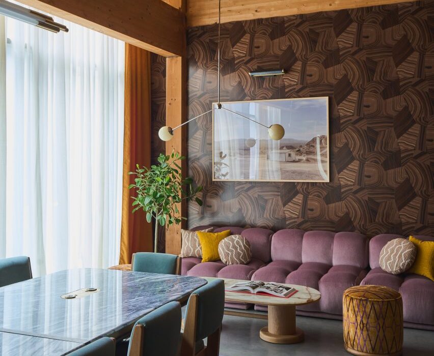
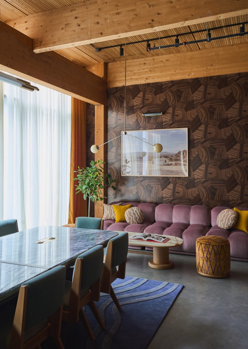
The mass-timber structure of the Nashville Warehouse Co building is visible throughout The Malin’s interiors

The building’s timber structure is highly visible throughout the interiors, and the pine ceilings and deep beams add to the warm, earthy palette of the various work areas.

Designed by The Malin‘s in-house team, the club encompasses 16,000 square feet of space that encompasses 48 dedicated desks, seven private offices, five meeting rooms and two libraries.

Oak banquettes with velvet upholstery within industrial-style spaceOak banquettes with velvet upholstery within industrial-style space
Wood varieties including light oak and dark walnut are used throughout the member’s club

All of these rooms feature rich colours and an eclectic mix of vintage and contemporary furniture, intended to feel more like a hotel than a co-working space.

“We’re in the hospitality business, so we carefully tailor each location of The Malin to fit the needs of the neighbourhood and professional community,” said The Malin founder and CEO Ciaran McGuigan. “Not only are we providing the highest level of hospitality, but we’re doing it in a refined and beautiful space that contributes to a productive workflow.”

Rows of walnut worktables with red upholstered seatingRows of walnut worktables with red upholstered seating
The club offers both dedicated workspaces and casual areas for members to meet and relax

The design team decorated The Malin Wedgewood Houston with deep-toned Benjamin Moore paints, Schumacher wallpapers and glazed zellige tiles, while bespoke millwork is executed in dark walnut and white oak.

A variety of formal and casual seating areas are available for members to utilise as desired, either for individual or group work, or entertaining guests.

Open-plan space with sofas, armchairs and communal tablesOpen-plan space with sofas, armchairs and communal tables
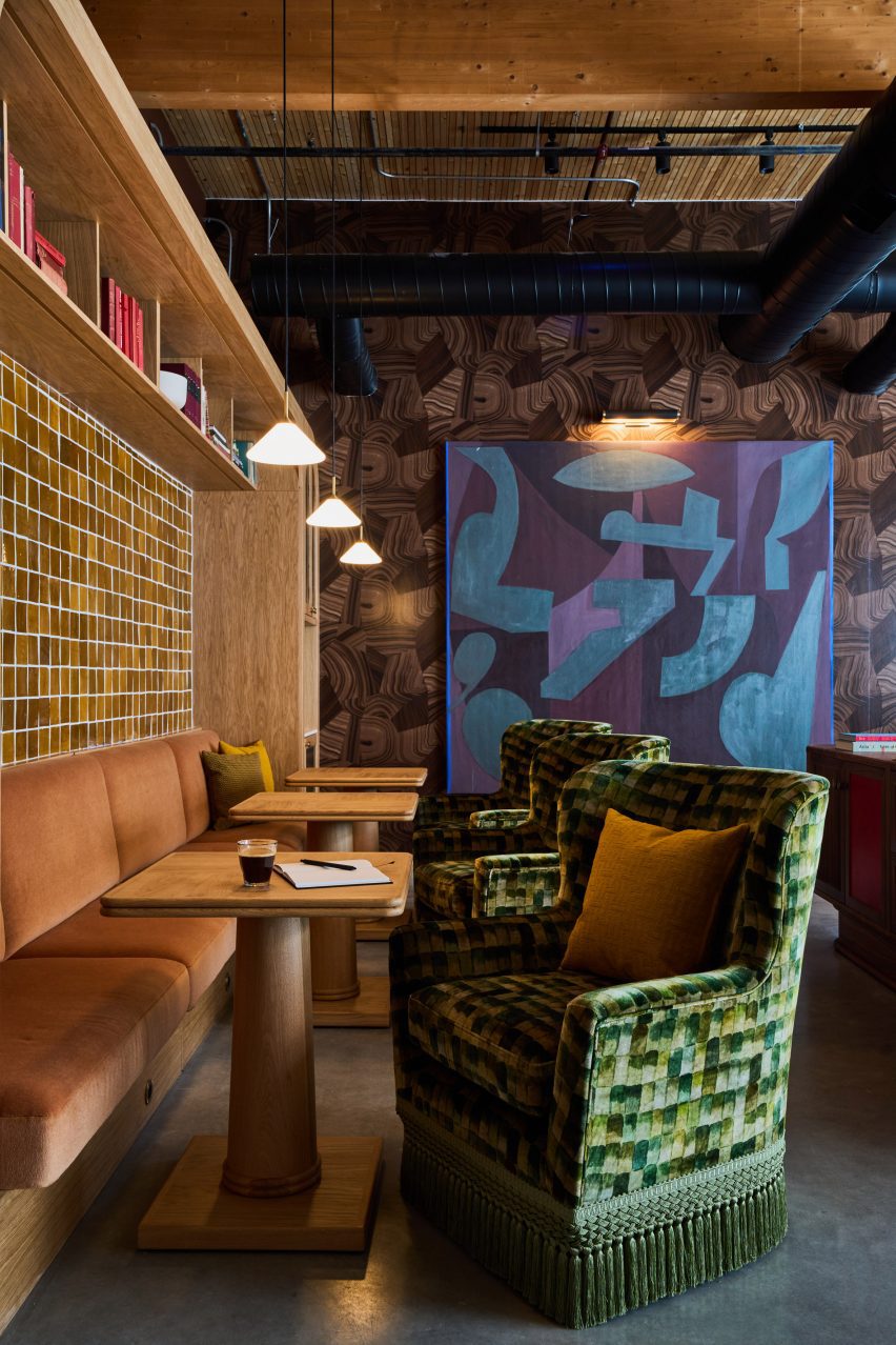
Sofas, communal tables and banquettes are all available for use as desired

Large communal tables accompanied by cushioned tubular metal chairs, sofas and armchairs with brightly coloured velvet upholstery, and cafe tables beside leather banquettes are among the options available.

Surfaces of limestone, travertine and multiple varieties of marble – including Giallo Siena, Irish Green, Onice Brecia and Aresbecator Oribico – complement the wood tones and colourful furniture.

Meeting room with tan walls, large wooden table and tubular metal chairsMeeting room with tan walls, large wooden table and tubular metal chairs
Private meeting rooms are similarly designed to look more like a hotel than an office

Members also have access to an acre of outdoor community park space for hosting events, and receive discounts and perks at several neighbourhood hotspots.

“The Malin is committed to providing an environment equipped with personalised services and high-touch amenities,” said the team. “In catering to a tight knit community with a finite number of members, The Malin is able to provide tailored lifestyle management services while offering both the comforts of a home and the resources of an office.”

The Malin’s first location in Manhattan’s Soho, which opened in 2022, was longlisted in the small workspace interiors category of Dezeen Awards 2022.

The company has since added spots in Williamsburg and the West Village to its portfolio, making The Malin Wedgewood Houston its fourth.

Interior of The Malin in NashvilleInterior of The Malin in Nashville
The colour scheme throughout the club is warm and earthy, aided by richly toned upholstery and deep paint hues

Long-known for its thriving music scene, Nashville is now quickly growing as a destination for other creative industries.

Recent openings in the city include an outpost of members’ club Soho House – just down the street from The Malin – and a multi-venue dining and drinking destination designed by AvroKO and owned by Sam Fox and Justin Timberlake.

The photography is by Sean Robertson.

Reference

Kith Women Flagship in Soho combines walnut and pink marble
CategoriesInterior Design

Kith Women Flagship in Soho combines walnut and pink marble

American fashion brand Kith has returned to the location of its first Manhattan flagship to open a women-dedicated store, in which olive trees grow up through display podiums.

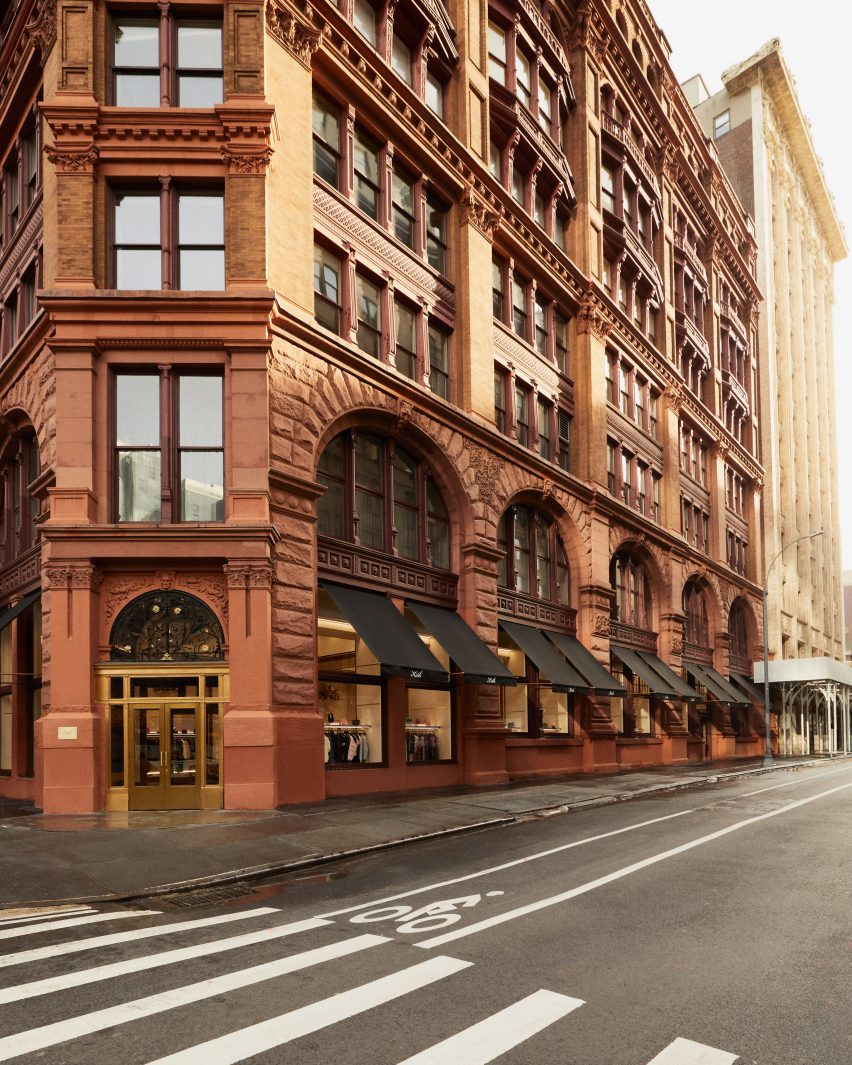
The inaugural Kith Women Flagship in Soho opened last December at 644 Broadway, the same historic landmark building where the brand debuted its Manhattan retail offering in 2011.

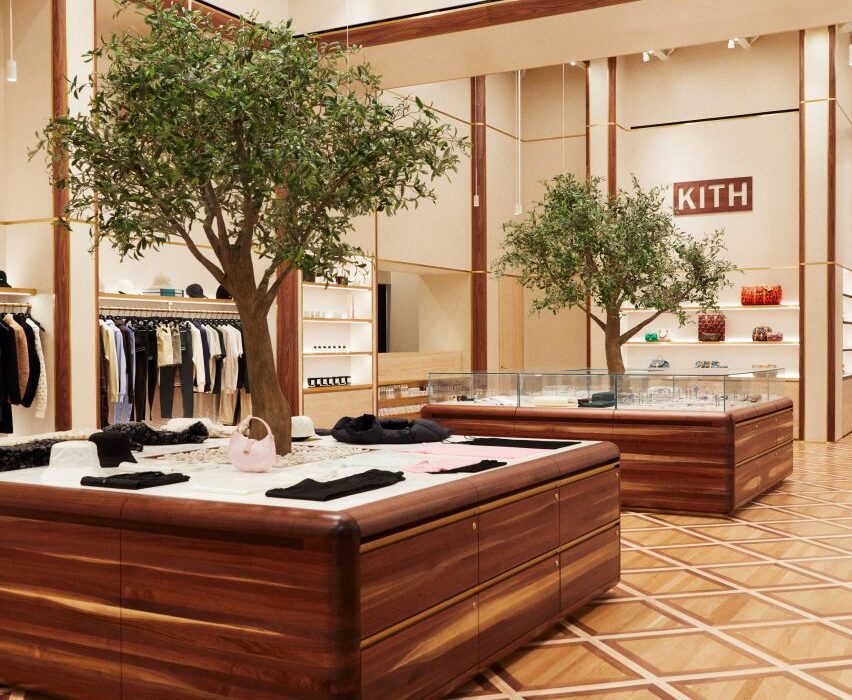
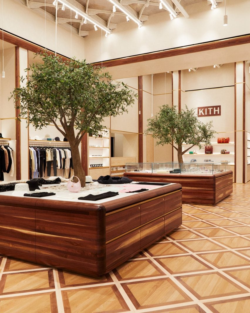
Custom-built walnut podiums with olive trees growing through the centreCustom-built walnut podiums with olive trees growing through the centre
Custom-built podiums run through the middle of the Kith Women flagship store in Soho

Previously the Manhattan Savings Institute Bank, the red sandstone and brick structure’s exterior features wrought iron gates at the entrance and set the tone for the materials palette inside.

Kith founder and creative director Ronnie Fieg designed the interiors to include signature elements of the brand’s retail concepts, but with adjustments to acknowledge its context.

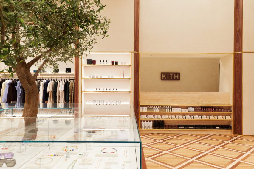
Kith Women store with apparel and accessories displayed in walnut and brass-trimmed nichesKith Women store with apparel and accessories displayed in walnut and brass-trimmed niches
The main room displays apparel and accessories in walnut and brass-trimmed niches

“The ambiance exudes modern elegance with its warm and calming aura, constructed with materials like Venetian plaster, travertine, and rosa aurora [marble],” said the Kith team.

The spacious main room benefits from tall ceilings and an open floor plan, and presents Kith Women in-house and multi-brand ready-to-wear apparel against Venetian plaster and Kith monogrammed suede wallpaper.

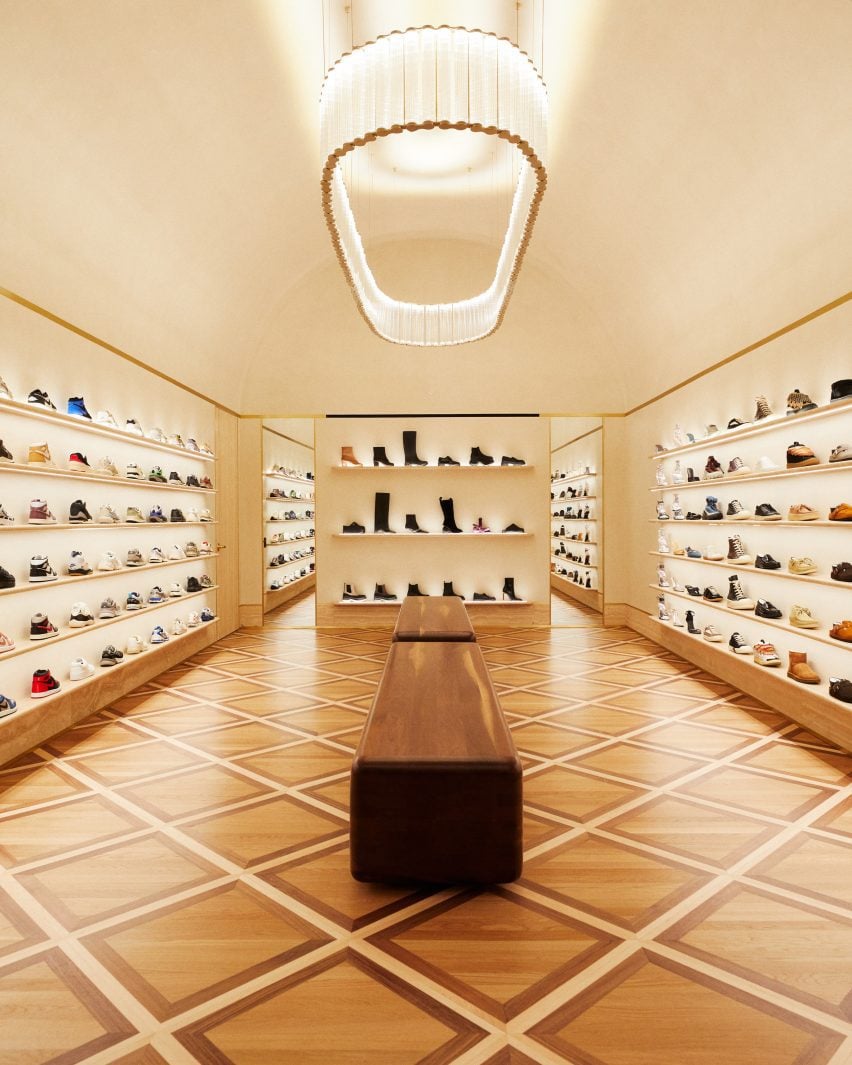
Footwear room with shoes presented on travertine shelvesFootwear room with shoes presented on travertine shelves
In a room dedicated to footwear, shoes are presented on travertine shelves

Clothing is displayed on rails installed in walnut and brass-trimmed niches around the perimeter, with accessories like hats and bags placed on shelves above.

A row of square walnut podiums runs through the middle of the room, each with an olive tree growing up through the centre of its pink marble surface.

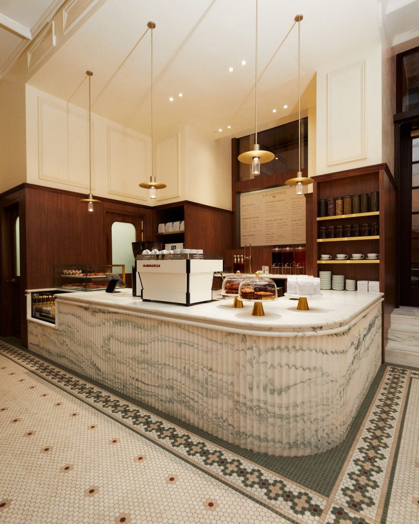
A cafe and flower shop featuring mosaic floors and a fluted marble service counterA cafe and flower shop featuring mosaic floors and a fluted marble service counter
A cafe and flower shop is run in partnership with PlantShed, and features mosaic floors and a fluted marble service counter

Custom-built by Brooklyn-based woodworker Mark Jupiter, these units contain drawers for product storage, and alternating ones are topped with glass vitrines for showcasing jewellery and other small accessories.

Oak flooring is laid in a grid pattern transversed by walnut strips, and the darker wood also lines the fitting rooms.

Footwear has a dedicated room, in which shoes are displayed on shelves with integrated lighting that run from one end to the other.

“Entering the footwear space, you will find a grand arched plaster ceiling, travertine shelves, and a custom chandelier from Italy by Viabizzuno,” the team said.

Cafe in a courtyard behind historic wrought iron gatesCafe in a courtyard behind historic wrought iron gates
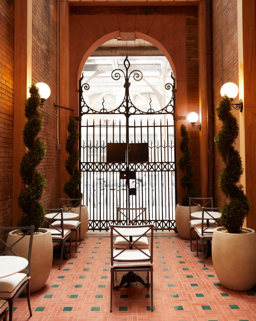
The cafe leads out to a courtyard behind the historic building’s wrought iron gates

In the final room is a cafe run in partnership with New York-based flower and plant shop PlantShed, which serves light bites and drinks and offers custom floral arrangements.

The space features a mosaic tiled floor, walnut wall panelling, a service counter with a fluted pink marble front and floral displays on stepped stone plinths.

The cafe leads out to a courtyard area behind the building’s impressive iron gates, which furnished with cafe tables and chairs in between topiary plants shaped into spirals.

Exterior view of red sandstone building at 644 BroadwayExterior view of red sandstone building at 644 Broadway
Kith Women is located at 644 Broadway, the same building where the brand opened its original flagship retail space in 2011

Feig also designed Kith’s recently opened Williamsburg store, located in the 25 Kent Plaza office building where the brand also has its corporate offices.

The company had previously worked with design studio Snarkitecture on its retail spaces around the world, including outposts in Miami, Los Angeles and Paris.

The photography is courtesy of Kith.

Reference

Gharib Studio outfits Austin jewellery store with pink walls and arches
CategoriesInterior Design

Gharib Studio outfits Austin jewellery store with pink walls and arches

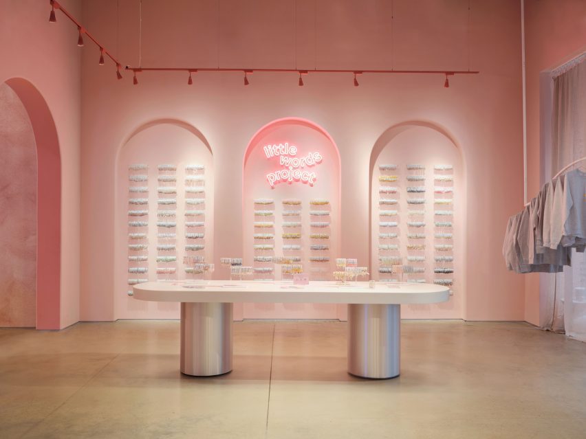
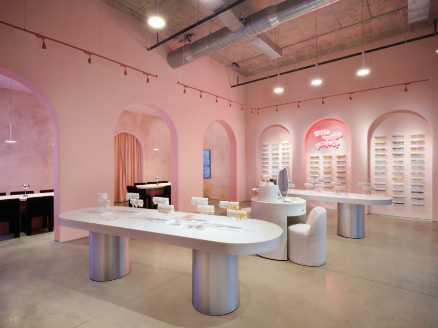
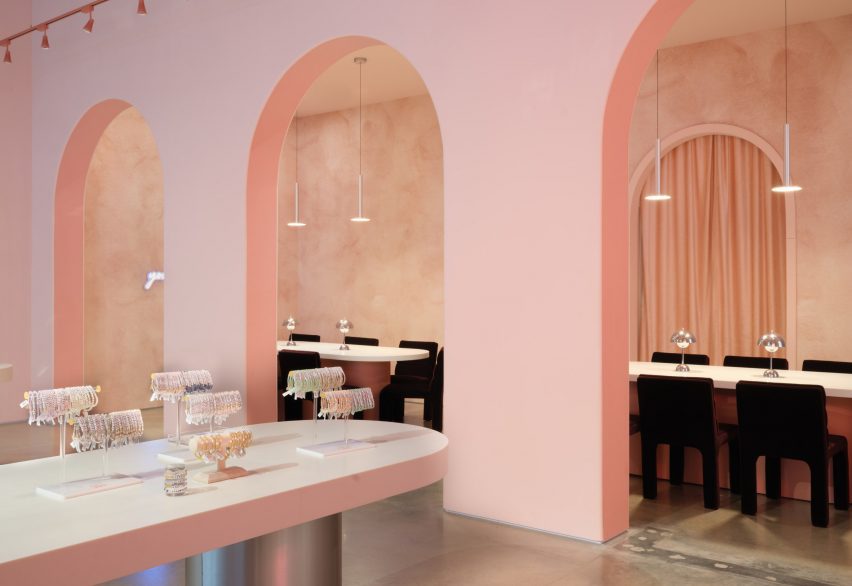
Los Angeles design studio Gharib Studio has contrasted concrete floors and exposed ceilings with soft-pink walls and clean lines for a jewellery store in Austin.

Created for the friendship jewellery brand Little Words Project (LWP), Gharib Studio used elements of the merchandise to inform the store’s pink material palette and incorporated arches throughout the space to contrast the industrial elements of the building, which were left exposed.

Table with silver baseTable with silver base
Gharib Studio has outfitted a jewellery store in Austin with dusty pink

According to Gharib Studio founder Nora Gharib, the team followed the common phrase “everything is bigger in Texas” when designing the concept store.

“I wanted to amplify the brand in a grand way by taking the LWP brand aesthetic and localizing it to Texas by pushing the standard design elements, such as the brand’s bracelet arches and beading table experience, then accentuating it,” said Gharib.

A retail store with silver with long white tablesA retail store with silver with long white tables
Arches and soft tones contrast with the space’s industrial elements

Visitors enter the store into a large, primary space, where built-in display cases were integrated into the walls.

On one side, the display resembles small bookcases and on the other, the bracelets are displayed throughout a series of arches.

Archways with tables and chairsArchways with tables and chairs
Long tables lead to the seating area at the back of the space

At the centre of the primary space are two long tables with metallic-coated bases, also used for display. A circular display table in the middle was created to resemble a vanity, with merchandise incorporated throughout.

Gharib inserted three arches along the back of the space, in part to accentuate the height of the space, and to draw visitors to the space beyond them, which serves as a beading area.

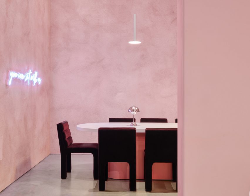
Velvet chairs underneath aluminum light fixtureVelvet chairs underneath aluminum light fixture
Metallic details were informed by the charms found on the bracelets

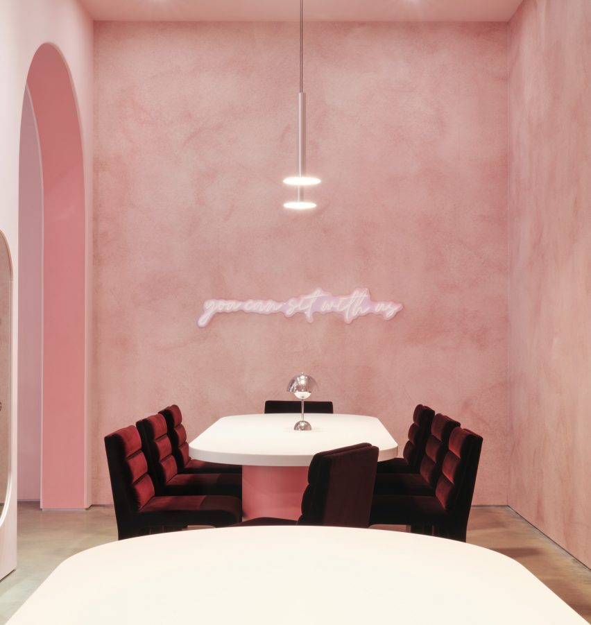
This space was outfitted with CB2 Castell Chairs in burgundy, with similar tables as the main space, except with pink bases instead of silver.

A neon sign that reads, “You can sit with us” hangs above the tables.

Textured dusty-pink wallpaper by Belarte Studio was used to line the space, while the remaining interior was covered in a rose pink hue.

Metallic accents throughout the store, including aluminium light pendants, a metal trimmed mirror and the display table’s metallic bases, were informed by the metal charms found in LWP bracelets.

Space with velvet chairs and textured wallpaperSpace with velvet chairs and textured wallpaper
It is the brand’s first store in Austin

The space’s utility elements were left exposed on the ceiling, with red track lighting running the perimeter of the space.

Other retail projects recently completed in Austin include a mid-century post office turned grocery by Side Angle Side.

Gharib Studio is a Los Angeles-based studio founded by Nora Gharib in 2023, focused on retail and brand design.

The photography is by Casey Woods Photography 


Project credits:

Architectural designer: Gharib Studio

General contractor: Paco Santander Construction

Reference

Home Studios uses local materials to renovate Northern California hotel
CategoriesInterior Design

Home Studios uses local materials to renovate Northern California hotel

Brooklyn-based Home Studios has turned a conference centre in Northern California back into a luxury hotel, as originally intended by the property’s founder: the inventor of the radio.

The Lodge at Marconi sits on a 62-acre site next to Tomales Bay, within the picturesque Marconi State Historic Park – a 1.5-hour drive up Highway Route 1 from San Francisco.

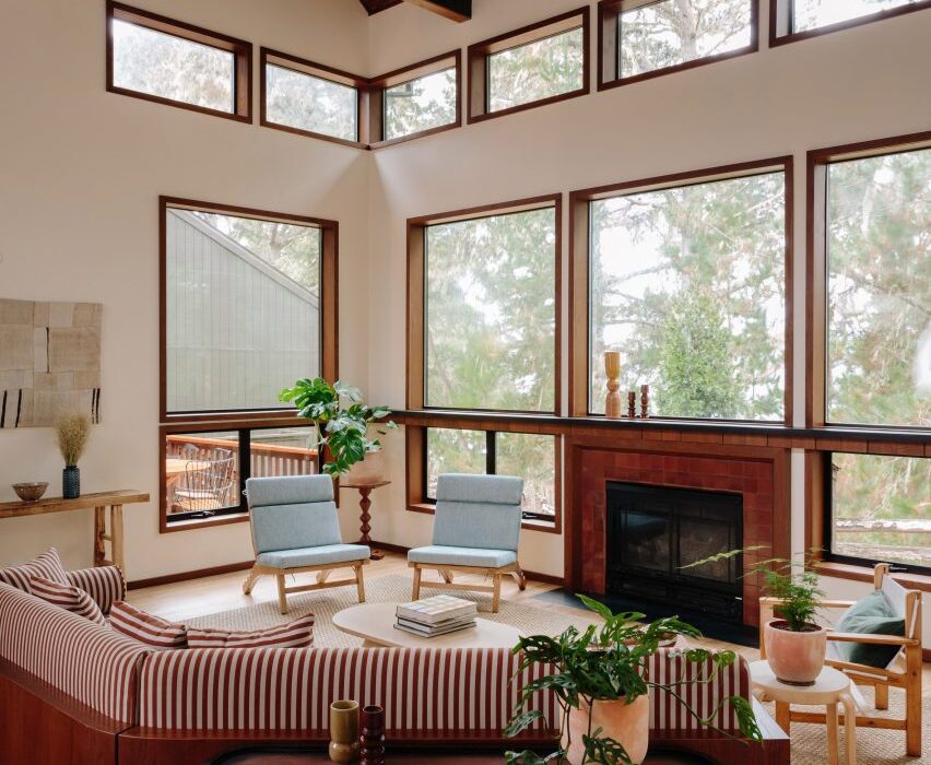
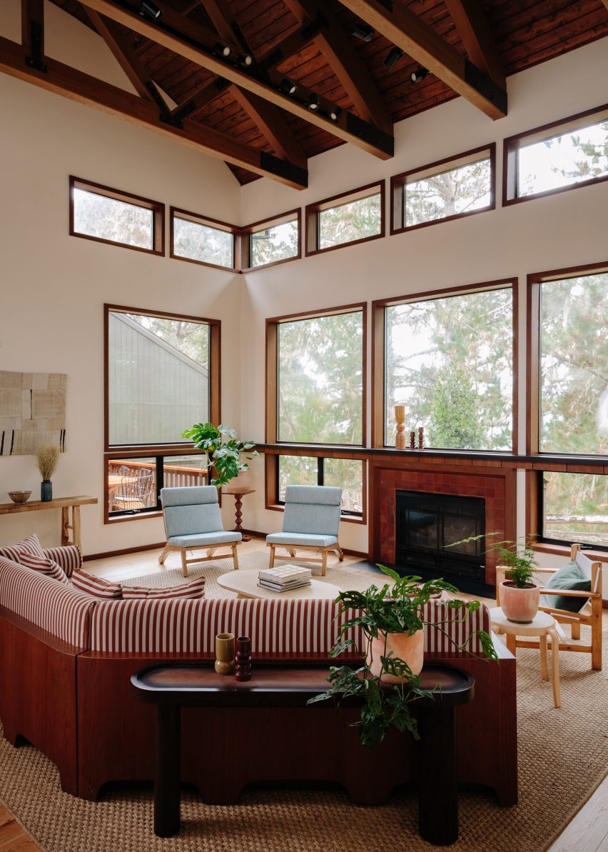
Double-height lounge space with large windows and a red striped sofaDouble-height lounge space with large windows and a red striped sofa
Home Studios created a variety of lounge areas across Lodge at Marconi to provide an informal atmosphere

Designed for Nashville-based company Oliver Hospitality, the hotel occupies a historic property that was first built by Guglielmo Marconi, an Italian physicist who invented the radio in 1896.

“Home Studios found inspiration in the property’s storied history – particularly in the pioneering spirit of Guglielmo Marconi, who worked with a New York-based engineering company to build the property’s initial building, a luxury hotel, in 1914,” said the design team, led by Oliver Haslegrave.

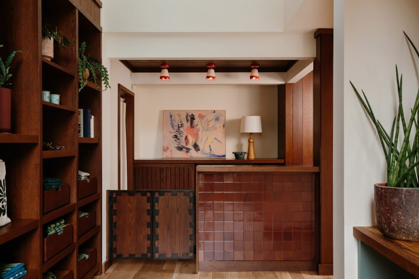
Hotel reception counter clad in oxblood-coloured tilesHotel reception counter clad in oxblood-coloured tiles
The reception counter is clad in oxblood-coloured tiles from Heath Ceramics

It took 17 months to overhaul the complex of blackened-wood buildings, which are topped with mono-pitched roofs of different heights and opposing directions.
The architecture is similar to that of The Sea Ranch Lodge further up the coast, which reopened in 2022 after its own extensive renovation.

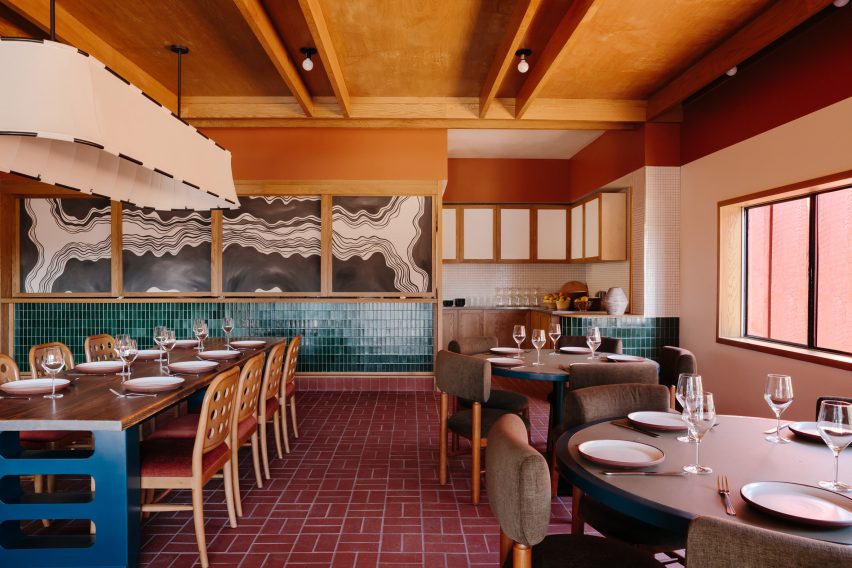
Dining room featuring brick flooring, blue-green tilework and eclectic contemporary furnitureDining room featuring brick flooring, blue-green tilework and eclectic contemporary furniture
The Redwood Dining Hall features brick flooring, blue-green tilework and eclectic contemporary furniture

Home Studios looked to the iconic site – famed for its modernist style and sensitive land planning – for cues when developing the Lodge at Marconi’s 45 guest rooms and suites, which occupy freestanding buildings across the wooded site.

“Borrowing design language from Sea Ranch’s ‘living lightly on the land’ credo, the rooms blend into the environment and boast a tranquil and peaceful atmosphere,” the team said.

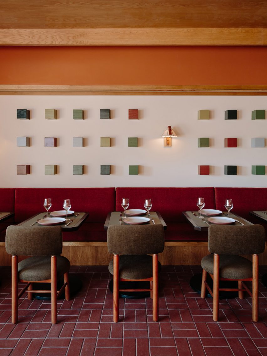
A series of coloured wooden cubes mounted on a wall above banquette seating and dining tablesA series of coloured wooden cubes mounted on a wall above banquette seating and dining tables
Artworks in the restaurant, including a series of coloured wooden cubes, were created in collaboration with Lukas Geronimas Giniotis

The hotel complex is made up of eight indoor and outdoor spaces, laid out “like a summer camp” to accommodate different activities in each area.

In the reception block, guests arrive to a series of lounges and other communal spaces that create a more informal setting than a traditional hotel lobby.

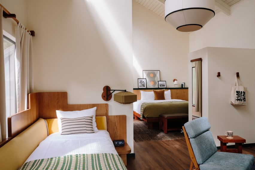
Bright guest suite with a double bed, day bed and blue lounge chairBright guest suite with a double bed, day bed and blue lounge chair
The bedrooms are bright and airy, with materials and colours that subtly reflect the hotel’s natural surroundings

A check-in counter is fronted with oxblood-coloured tiles by Heath Ceramics, which was founded in nearby Sausalito.

More of the company’s tiles, this time in blue-green hues, line the lower walls of the restaurant known as the Redwood Dining Hall.

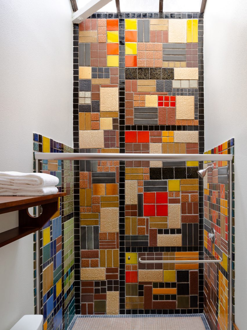
Shower with colourful patchwork of tiles from the 1960sShower with colourful patchwork of tiles from the 1960s
Three of the guest room bathrooms feature original tiles that date back to the 1960s

Red bricks are laid in a basketweave pattern across the floor, contrasting with the bright blue bases of the custom dining tables, while warm cedar panels and beams cover the ceiling.

A mural comprising four-panel linen screens and a series of wood cubes mounted on a wall was made in collaboration with California-based artist Lukas Geronimas Giniotis.

The guest rooms are bright and airy, with the colours of the natural surroundings subtly reflected in the furnishings.

Some have cosy loft spaces, while larger suites feature a dedicated workspace and sitting area.

Buildings clad in blackened wood and topped with monopitched roofsBuildings clad in blackened wood and topped with monopitched roofs
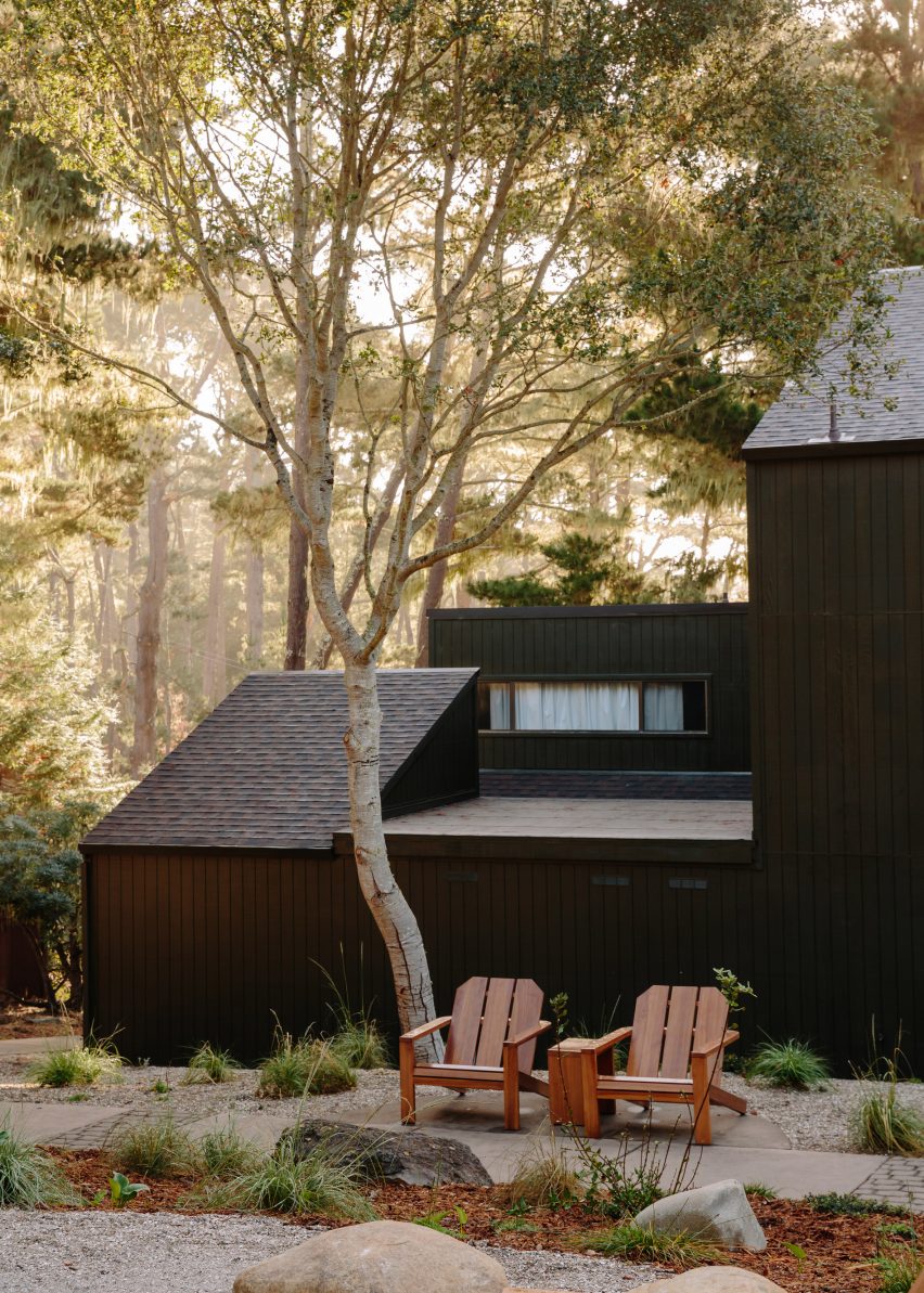
The accommodations are split across several buildings clad in blackened wood and topped with monopitched roofs

“Northern California’s rugged environment served as a design influence, and is reflected in the natural woods and earth-tone textiles that adorn each room and weave together a cohesive connection throughout the property,” Home Studios said.

“Three guest room bathrooms feature original tile dated to the 1960s when the hotel served as a rehabilitation facility known as Synanon.”

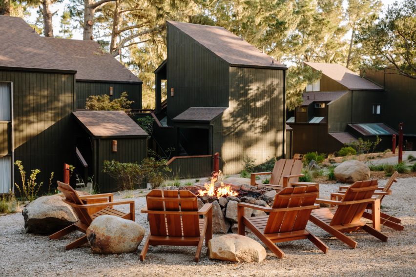
Wooden chairs surrounding a fire pit with blackened wood buildings in the backgroundWooden chairs surrounding a fire pit with blackened wood buildings in the background
The property includes multiple outdoor areas for gatherings and events

Across the property, the indoor spaces are afforded scenic views of the forest and the water through large windows.

A variety of gathering and event spaces are available to guests both inside and out, including wooden chairs positioned around fire pits among the landscape designed by Bay Area firm Dune Hai.

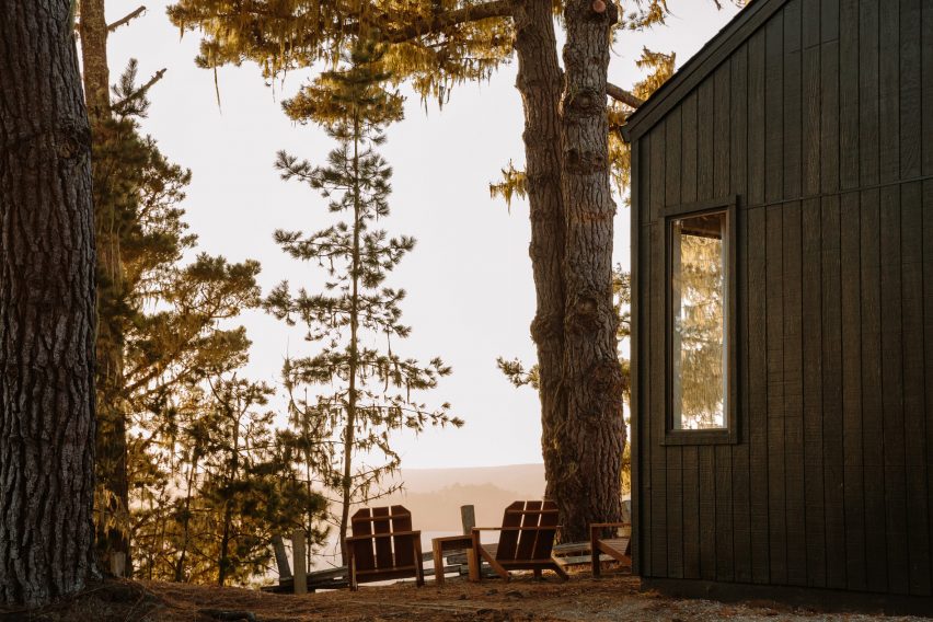
View through the trees to Tomales Bay at sunsetView through the trees to Tomales Bay at sunset
Lodge at Marconi sits atop a hill overlooking Tomales Bay in Northern California

This is Home Studios’ third hotel project, following the Mediterranean-influenced Alsace hotel in Los Angeles and the boutique Daunt’s Albatross motel in Montauk.

The firm’s other recent projects include a revamped bar and restaurant on Nantucket, an Italian eatery close to Harvard University and a townhouse renovation in Fort Greene, Brooklyn.

The photography is by Brian W Ferry.

Reference

ALA draws on West Village history for Talea taproom interiors
CategoriesInterior Design

ALA draws on West Village history for Talea taproom interiors

New York studio Alda Ly Architecture has designed a taproom for female- and veteran-owned brewery Talea in the city’s West Village neighbourhood, which includes a place for groups to “scheme”.

Talea West Village is the beer company’s third outpost and its first Manhattan location, following two established in Brooklyn.

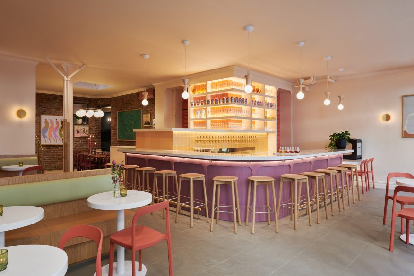
Bar area with stools surrounding a purple-fronted counterBar area with stools surrounding a purple-fronted counter
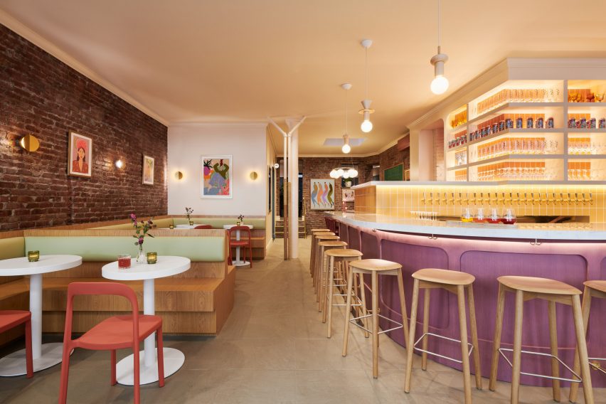
The main dining and drinking area at the Talea West Village taproom is anchored by a colourful bar

The space is located in a 1920s building on Christopher Street, an iconic thoroughfare that’s home to several landmarks, businesses and historic spaces associated with the LGBTQ+ rights movement.

“This new taproom on Christopher Street reclaims the masculine identity of a West Village saloon to celebrate voices of women and LGBTQ+ communities in the Village, all while serving Talea’s popular sour brews in an elevated, vibrant space,” said Alda Ly Architecture (ALA).

Bar with built-in seating on the left and counter on the rightBar with built-in seating on the left and counter on the right
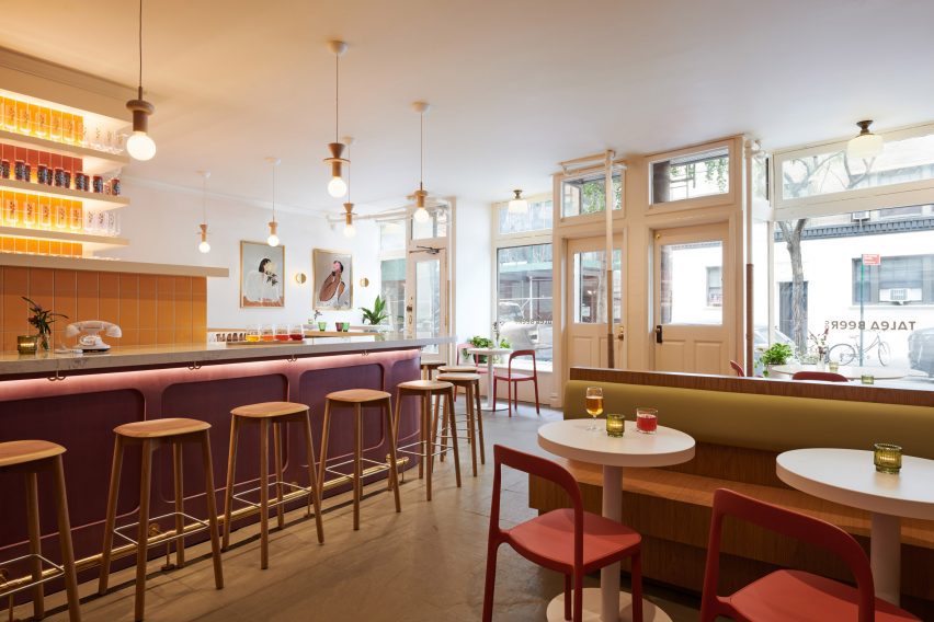
Bright hues chosen by ALA for the space include yellow for tiles, green seat backs and red dining chairs

Flooded with natural light thanks to large windows along the street facade, the main space is anchored by a purple-fronted bar with a curved white quartz countertop in one corner.

Behind, numerous beer taps are mounted onto a yellow-tiled partition, while glassware and cans are displayed on shelves above.

View towards an exposed brick wall with seating in frontView towards an exposed brick wall with seating in front
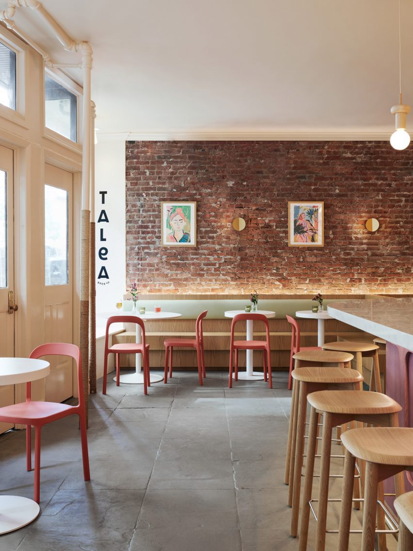
Exposed brick and stone floors allude to a saloon-style aesthetic

The bar is lit by Junit oak pendants from Schneid Studio and brass Dottie sconces by Visual Comfort are mounted around the perimeter.

“We opened up the space to provide as much open area for the front dining room, and brought the bar front and centre to highlight the taps with their extensive selection of beers,” said ALA founder Alda Ly.

Dining area and bar counter with street windows behindDining area and bar counter with street windows behind
The taproom was designed to celebrate its location in the West Village, which has played an important role in LGBTQ+ history

“We wanted the bar to be a welcoming beacon for all people in the neighborhood,” she added.

The other side features built-in, stained-oak seating and small circular tables against an exposed brick wall.

Brick-wrapped room with a skylight over a large tableBrick-wrapped room with a skylight over a large table
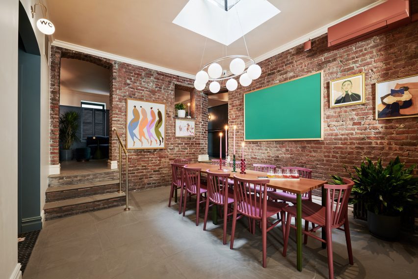
Behind the bar is The Revolution Room, intended for larger groups to gather

Pale green backrests and muted red Scroll dining chairs from Industry West continue the interior’s bright colour palette, which is also echoed in the works by local artists displayed on the walls.

“It was important to us to capture the spirit of Talea in a space that felt elevated but also very warm and welcoming,” said ALA project director Marissa Feddema.

Past the bar is a more intimate space called The Revolution Room, designed for groups of eight to 10 people to “scheme, hang and gather” according to the team.

A large table sits below a Nuura Miira 8 Oval chandelier that’s suspended from a skylight, and more brickwork is exposed to add to the saloon-like vibe.

Dimly lit room with dark walls and colourful furnitureDimly lit room with dark walls and colourful furniture
At the back is the Snug, a cosy space furnished with jewel-tone pieces

Further back still, patrons will find the Snug – a much darker and cosier room decorated with jewel-toned furniture, navy limewash painted walls and a vintage fireplace mantle.

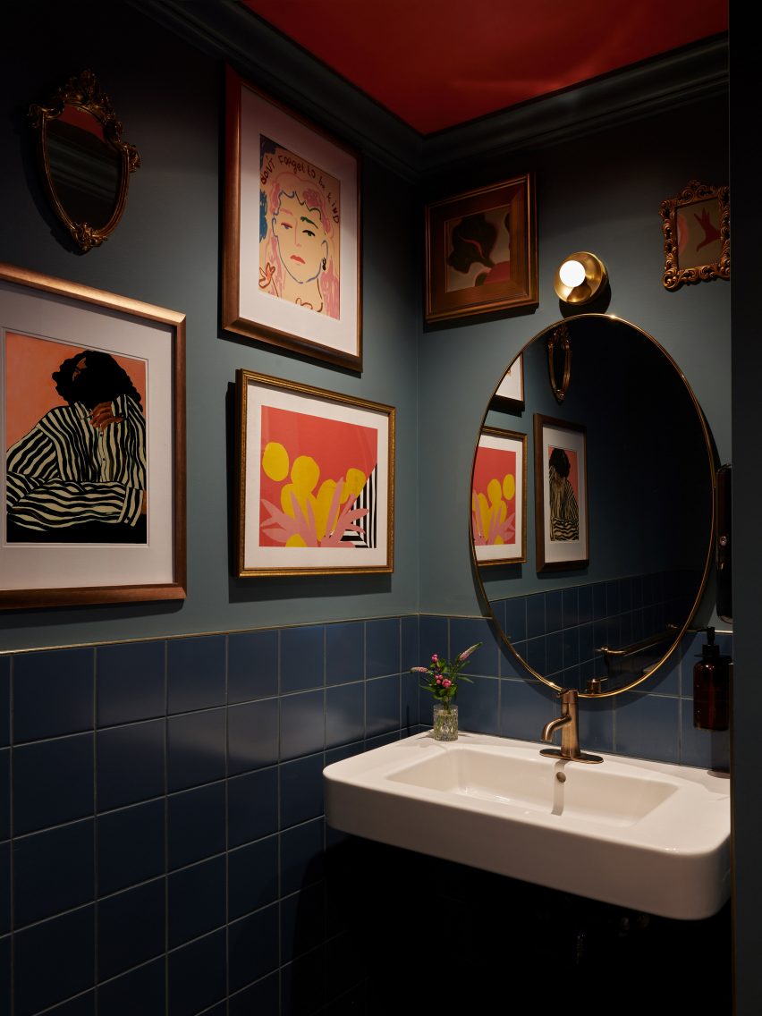
The moody bathrooms are adorned with images of prominent local residents and gender activists through the years, further emphasising the neighbourhood’s importance to the LGBTQ+ community.

Bathroom with dark blue tiles, paintings on the walls and an oval mirror above a sinkBathroom with dark blue tiles, paintings on the walls and an oval mirror above a sink
Images of prominent local residents and gender activists are displayed in the moody bathrooms

The West Village is packed with bars and restaurants, from upscale dining spots like Cecchi’s to casual cocktail places like Donna.

Close by, in the Union Square area, ALA has previously designed the interior for a doctor’s office and clinic with earthy and homey details.

The photography is by Brooke Holm.


Project credits:

Architect and interior designer: ALA (Alda Ly, Marissa Feddema, Sheridan Treadwell, Marlee Anderson)
MEP engineer: Tan Engineering
General contractor: Aerial Design & Build

Reference

Standard Architecture refreshes interior of pink Paul Smith store in LA
CategoriesInterior Design

Standard Architecture refreshes interior of pink Paul Smith store in LA

British fashion label Paul Smith’s iconic pink store in Los Angeles has received an interior makeover from Standard Architecture.

Standard Architecture collaborated with the Paul Smith design team to reimagine the 4,740-square-foot (440 square metres) store on Melrose Avenue, West Hollywood.

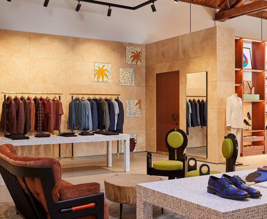
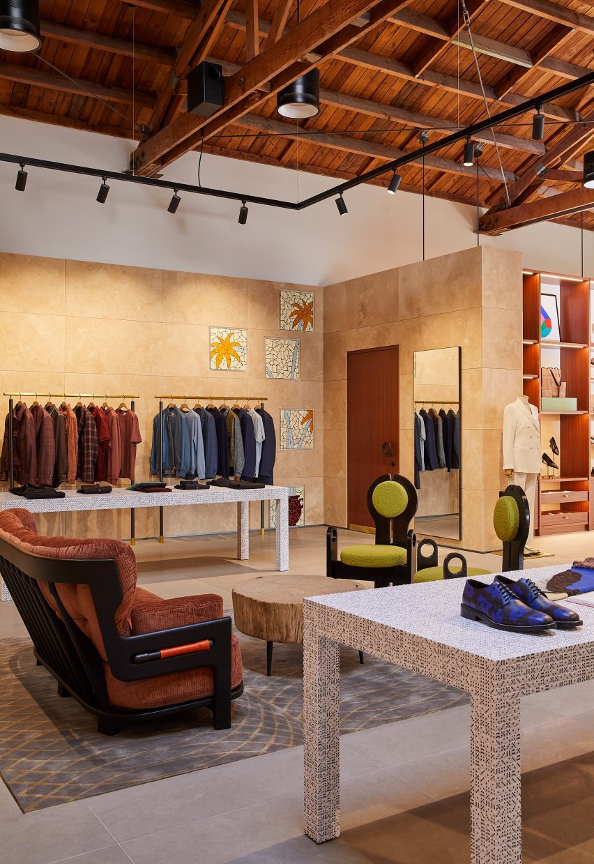
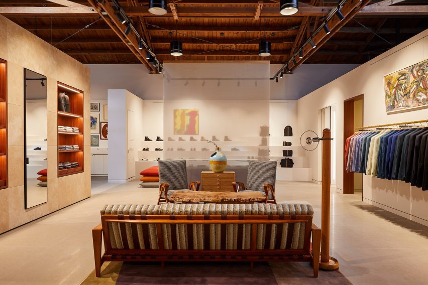
Paul Smith LA store interior is stone-clad partitions and exposed raftersPaul Smith LA store interior is stone-clad partitions and exposed rafters
Standard Architecture and the Paul Smith team reorganised the LA store to better define the brand’s different collections

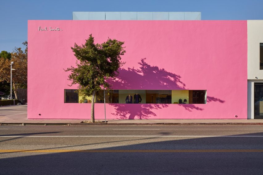
The studios also created a new VIP entrance patio for the building, which is notorious for its bright pink exterior that has become a pilgrimage spot for amateur photoshoots.

“The primary goal was to enhance the overall customer experience within the store, which was achieved by creating a more cohesive and immersive shopping environment across the different brand departments,” said Standard Architecture.

Seating area with clothing displays on either sideSeating area with clothing displays on either side
Stone-clad partitions help to define areas, but don’t reach the exposed timber ceiling

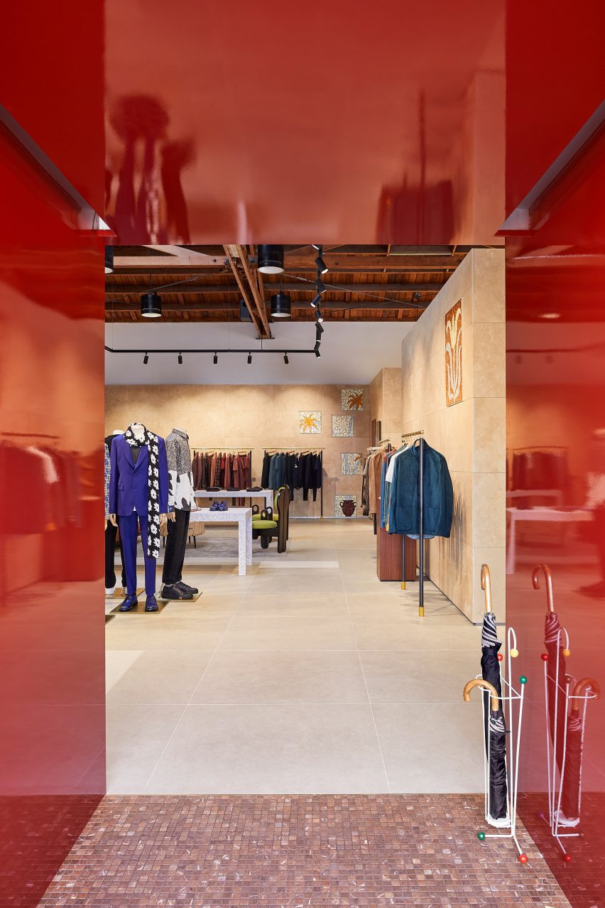
The entrance to the store – the only opening in the giant pink wall that faces the parking lot – leads shoppers through a glossy red metal vestibule into the main retail space.

Clearly defined yet interconnected areas for the menswear, womenswear and homeware collections help with navigation around the store.

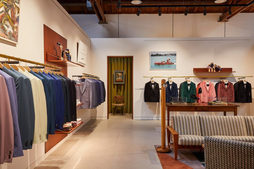
Suits displayed in colour order on long brass railsSuits displayed in colour order on long brass rails
Long brass rails are used to present tailoring

Partitions clad in dappled beige stone frame these zones, but don’t reach the exposed timber ceiling, to retain the sense of openness.

In places, the stone walls are inlaid with mosaic-style artworks depicting abstract flora, which add splashes of colour to the warm-toned surfaces.

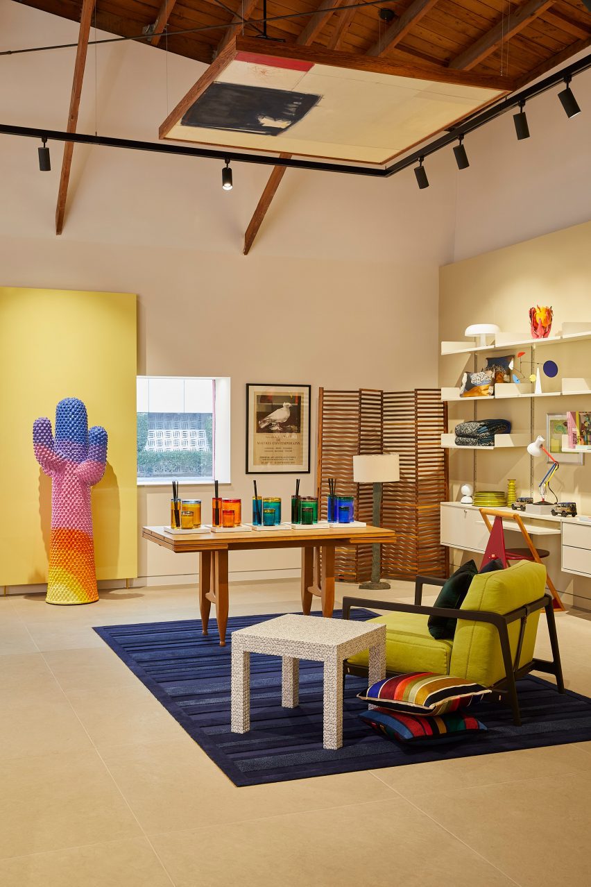
Paul Smith homeware collaborations displayed in a corner of the storePaul Smith homeware collaborations displayed in a corner of the store
Paul Smith’s collaborations with Gufram and Anglepoise are among the pieces on show

Black track lighting is suspended from the rafters, spotlighting the various clothing displays and lounge areas furnished with midcentury-style sofas and armchairs that are dotted around the store.

Long brass rails that appear to be suspended in midair are used to display suit jackets, which are carefully arranged by colour.

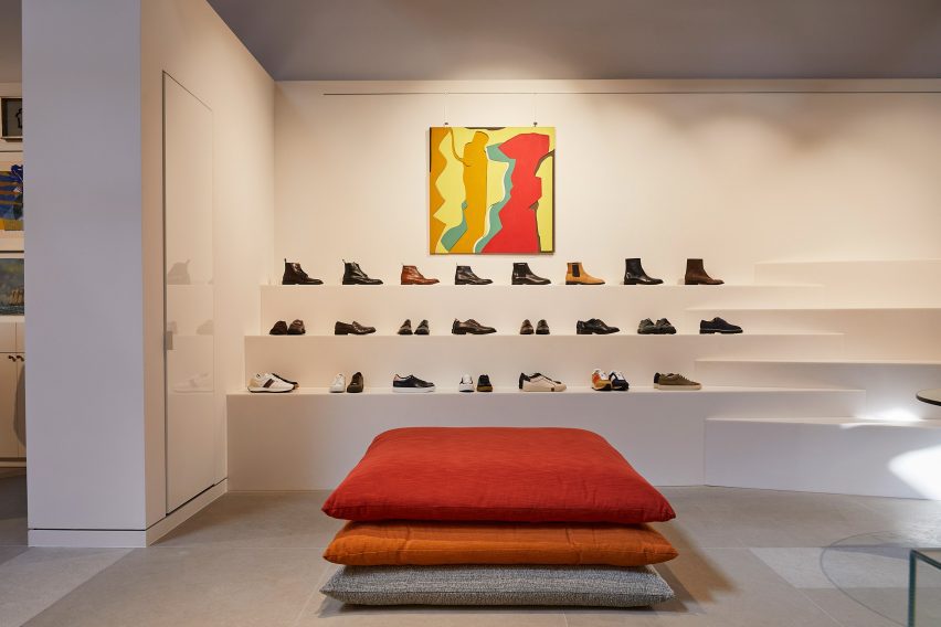
Shoes presented on stepped white ledges that resemble bleacher seatingShoes presented on stepped white ledges that resemble bleacher seating
Shoes are presented on stepped white ledges that resemble bleacher seating

In an area dedicated to accessories, the shoes and bags are lined up on stepped white ledges that resemble bleacher seating.

Walnut is used for accents including shelving, door frames, and podiums, as well as for a large open storage system with compartments for presenting individual products and a row of sculptures by Alexander Calder.

Founded by fashion designer Paul Smith in 1970, his eponymous brand is synonymous with the brightly coloured stripes applied to many of its apparel products and other collaborations.
Many of these appear throughout the store, including a colour-tinted Anglepoise desk lamp and a striped version of Gufram’s cactus-shaped coat stand.

Glossy red metal vestibule with store interior beyondGlossy red metal vestibule with store interior beyond
Entry to the store is via a vestibule wrapped in glossy red metal

“Overall, the design reflects a deep understanding of the brand’s identity, which places a strong emphasis on the use of colour and attention to detail,” Standard Architecture said.

Paul Smith retail spaces around the world are equally playful. On London’s Albemarle Street, its boutique has a patterned cast-iron facade by 6a Architects, while the shop in Seoul is encased in a curving concrete shell by System Lab.

Bright pink exterior of Paul Smith store on Melrose AvenueBright pink exterior of Paul Smith store on Melrose Avenue
The store on Melrose Avenue is an icon in Los Angeles thanks to its bright pink facades

Standard Architecture was founded by Silvia Kuhle and Jeffrey Allsbrook, who discussed their work with Dezeen during our Virtual Design Festival in 2020.

Past projects by the firm include a Hollywood Hills residence with a cantilevered swimming pool and a minimal showroom for fashion brand Helmut Lang – which was located just a few blocks from the Paul Smith store before it shuttered.

The photography is by Genevieve Garruppo.


Reference

Lovers Unite revives interiors of mid-century Silver Lake home
CategoriesInterior Design

Lovers Unite revives interiors of mid-century Silver Lake home

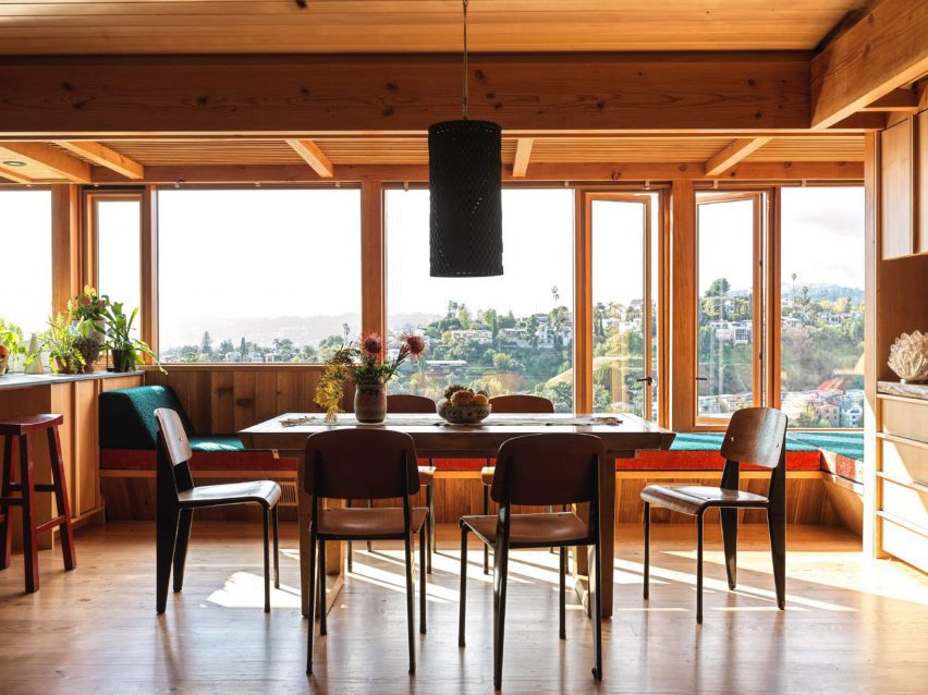
California design studio Lovers Unite has reinvigorated a 1950s home with sweeping views of the Los Angeles hills, turning an unused balcony into an extension of the indoor social space.

The wooden dwelling in LA’s Silver Lake neighbourhood belongs to production designer James Chinlund and artist Clare Crespo.

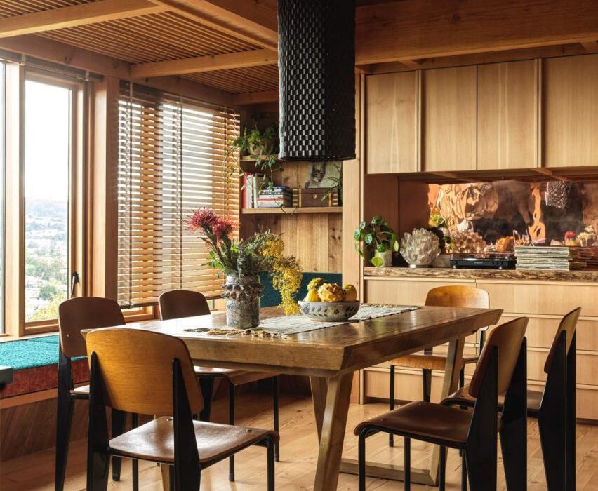
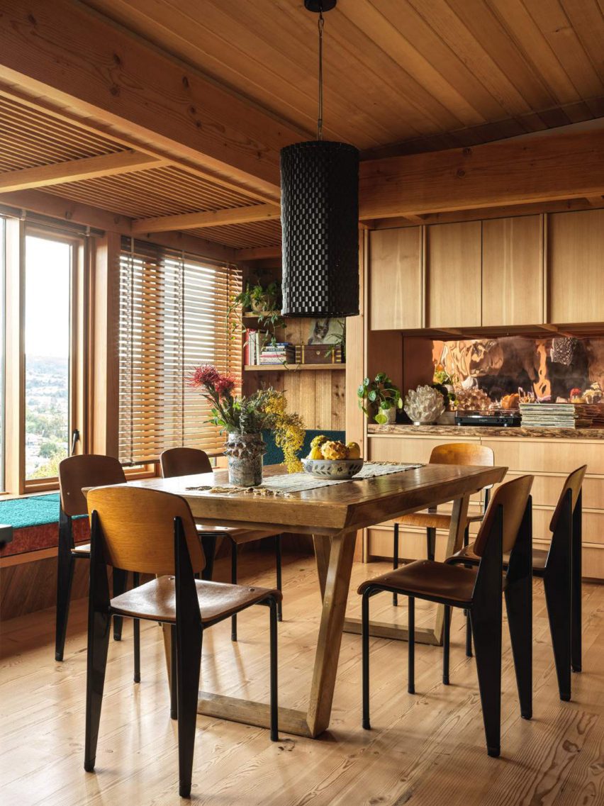
Wood-lined room with dining table and six chairsWood-lined room with dining table and six chairs
Lovers Unite renovated the home for a creative couple in Los Angeles

A “previously a boring, nondescript mid-century house”, according to Lovers Unite, the property required some imagination to bring its interiors up to par with its setting.

Therefore, the studio “introduced a few carefully plotted architectural interventions and material shifts to completely reimagine the interior of the home and take full advantage of its prime site”.

Dining room with large windows that have a view of hills in the distanceDining room with large windows that have a view of hills in the distance
The house has expansive views over the city’s hills

The most impactful of these interventions was to bring an underutilised balcony at the back of the house into the envelope, extending the open-plan living and dining area by several feet.

Beneath the large windows that were installed to fill the gap, Lovers Unite placed built-in seating with teal-upholstered cushions for relaxing and enjoying the panoramic vista.

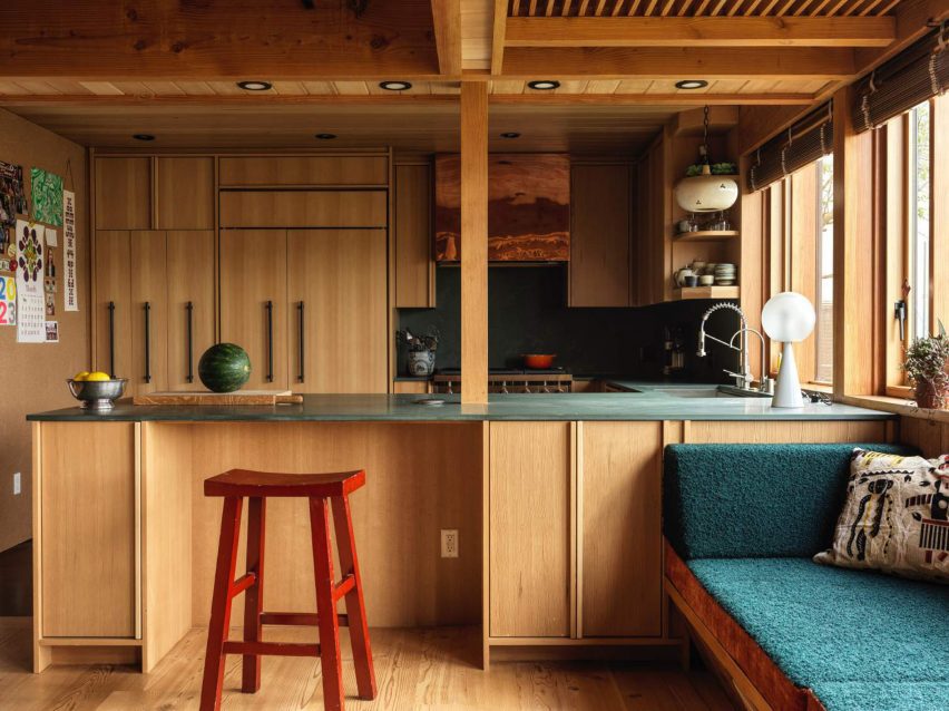
View of wood-lined kitchen with a peninsula in the foregroundView of wood-lined kitchen with a peninsula in the foreground
Plenty of wood was used throughout the home, particularly in the kitchen

“With a large window wall and generous built-in banquette, the room finally celebrates the expansive views that had always been there,” the studio said.

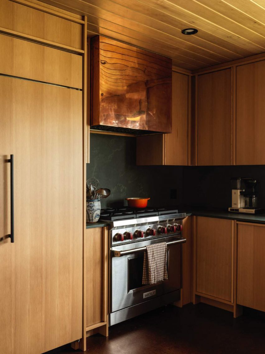
In the kitchen, dark green soapstone used for counters and the backsplash contrasts with the honey-toned cabinetry, and a shiny copper range hood matches a panel installed at the back of a bar area on the opposite side of the room.

Honey-toned wood kitchen with soapstone surfaces and a copper range hoodHoney-toned wood kitchen with soapstone surfaces and a copper range hood
The honey-toned wood contrasts with soapstone surfaces and a copper range hood

Elsewhere, colourful furnishings, collectible design pieces and bold artworks stand out against the predominantly wood interiors.
A timber-lined lounge area features the classic modular Togo sofa system by Michael Ducaroy, which is wrapped in yellow corduroy fabric.
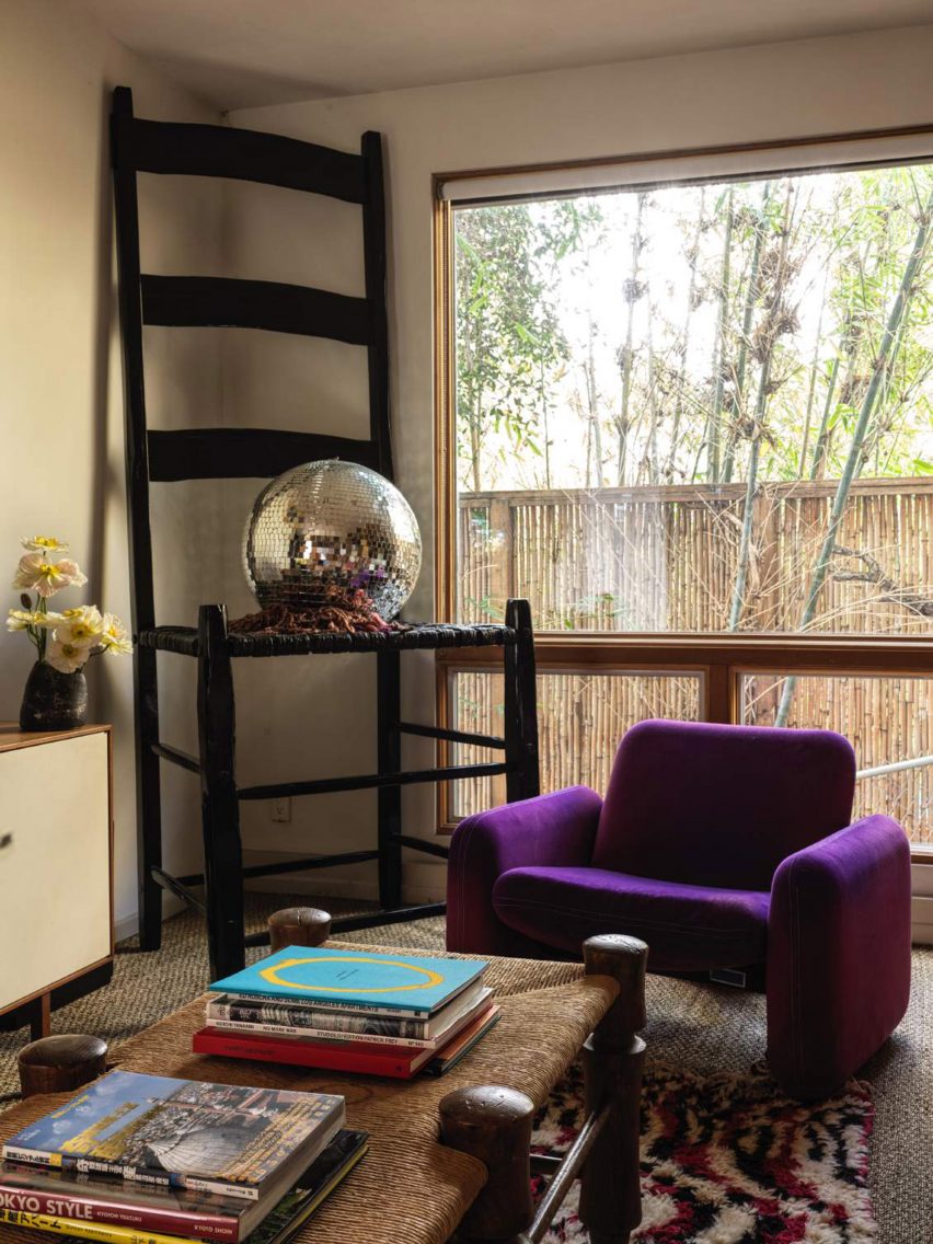
Meanwhile, in the den, a purple armchair is positioned beside a giant chair that Chinlund used as a prop for a shoot by Italian fashion outfit Roberto Cavalli.

Wood slats were employed to partially screen the staircase opening on the upper level, next to a central fireplace with a raised hearth.

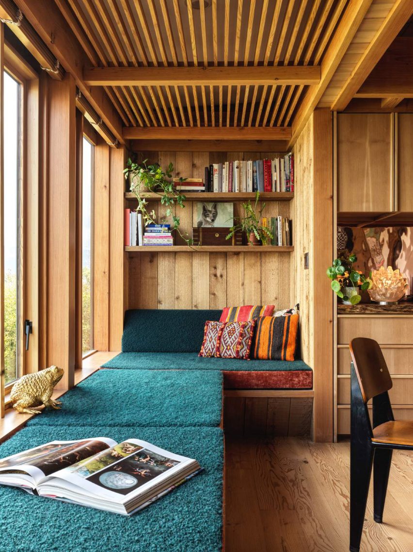
Teal-upholstered window seat with a reading nook at the endTeal-upholstered window seat with a reading nook at the end
As part of the renovation, an unused balcony was incorporated into the social space and a long window seat was installed in its place

Other decor items like vintage rugs, embroidered cushions and plenty of art and design books add even more character to the spaces.

“Ultimately, the mood of the home reflects the spirit and talents of the estimable homeowner,” said Lovers Unite, noting that Chinlund has worked as a production designer for the Avengers movie franchise.

Den with a purple armchair and an oversized chair with a disco ball on its seatDen with a purple armchair and an oversized chair with a disco ball on its seat
Colourful furniture and set props are scattered through the different rooms

Silver Lake is home to a variety of architectural gems, many built on dramatically sloping sites, including residences designed by notable mid-century architects like Richard Neutra and Rudolph Schindler.

Led by Karen Spector and Alan Koch, Lovers Unite is based close to the neighbourhood, and has previously wrapped a bar and restaurant in Pasadena with expressive drapery.

The photography is by Chris Mottalini.

Reference