migliore+servetto completes human safety net bookstore in venice
CategoriesArchitecture

migliore+servetto completes human safety net bookstore in venice

migliore+servetto completes multimedia bookstore


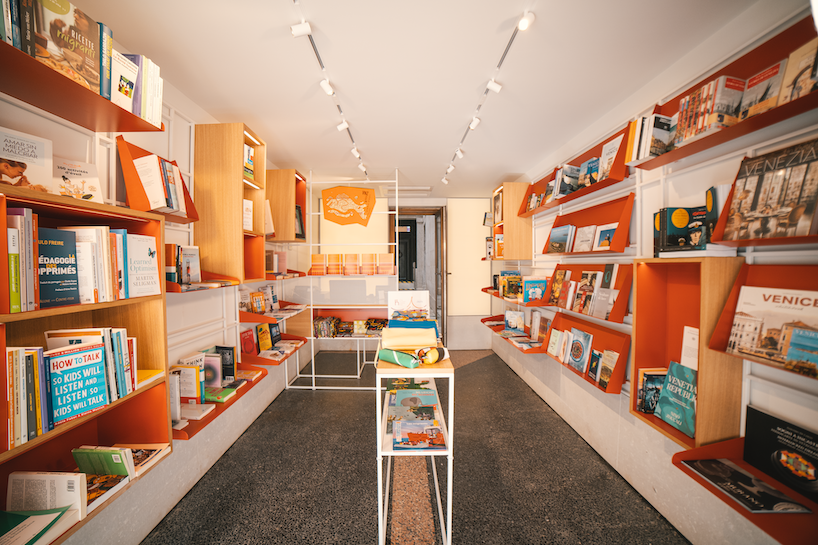
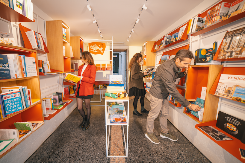
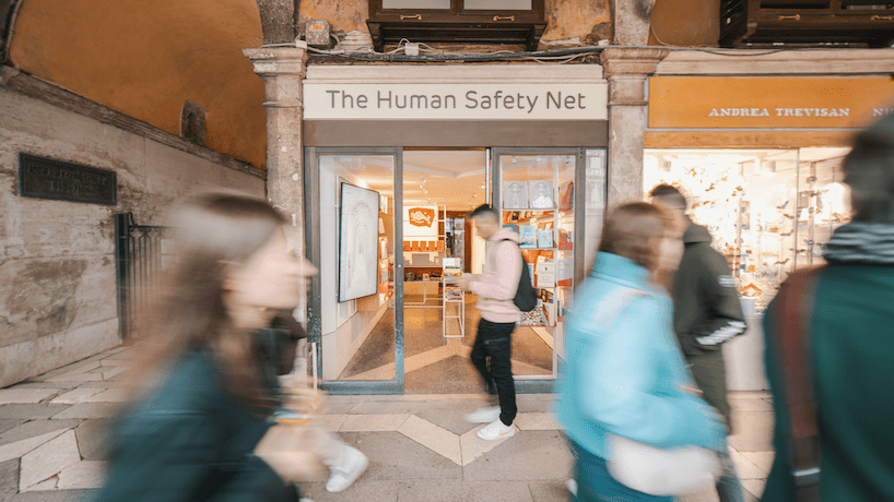
Tucked away in Venice’s Saint Mark’s Square, the Bookstore of The Human Safety Net Foundation by Migliore+Servetto sits at the intervention of work, dialogue, discovery, and community experience. Housed within the historical building of Procuratie Vecchie, the compact 14 square meter space reveals a warm interior, an exhibition titled A World of Potential, a multimedia experience, and welcoming areas throughout. The intervention preserves and refreshes historic spatial features including windows and flooring while new furniture and subtle design elements were introduced to inject modernity and reinforce The Human Net’s brand identity. Inclusivity and accessibility were additionally key pillars for the design team, influencing even the design of the open-shelved bookcase serving as the storefront display visible to all passersby.

migliore+servetto restores historic venetian structure for human safety net bookstore
all images courtesy of Milgiore+Servetto


a multimedia community experience in saint mark’s square


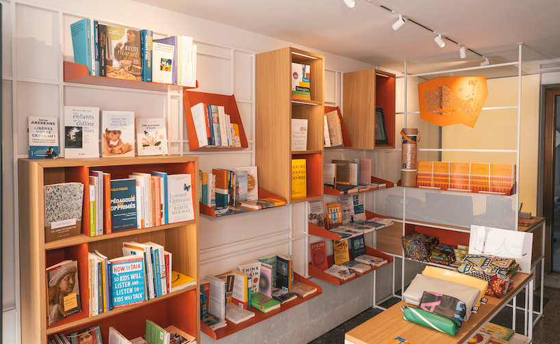
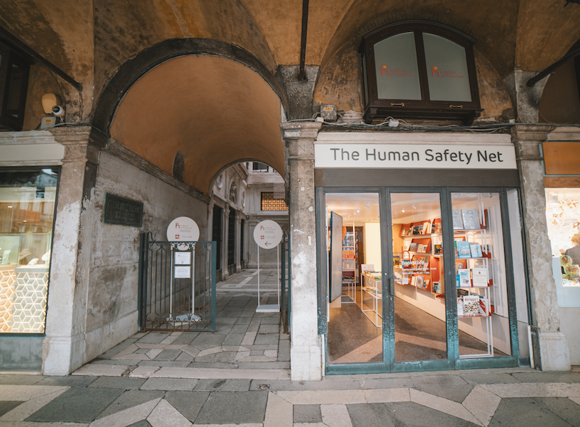
Externally, the foundation’s name and logo are marked in new signage and graphics on the entry door and mezzanine window, subtly connecting this intimate space to The Human Safety Net’s broader presence on the third floor. Within, embracing the space along the walls, a series of red, steel bookshelves form a modular display system with integrated light featuring different dimensions and angulations. Each insert is mobile and interchangeable to ensure maximum flexibility, with the shelves converging to form a 90° angle and host the sales counter. The central aisle and window display case complete the furniture ensemble, their lightness and flexibility echoing the foundation’s identity to provide an unambiguous homogeneity to the space.


Migliore+Servetto’s intervention involved the replacement of existing furniture, false walls, and suspended ceilings, while historic elements such as the original Venetian flooring, windows, and shutters were preserved and renovated. Light grey plasterboard now forms the suspended ceilings and false walls, complemented by a natural stone band countering potential high-water impacts as it spans the whole perimeter. For the lighting design, the Italian designers opted for Targetti spotlights which offer flexible planes of light to create different accents for different display by running along ceiling-recessed tracks. A restored door opens onto Corte Maruzzi, flanked by and a luminous wall and a vertical monitor that adds digital dimensions to the space, facilitating broader communication and narratives.

migliore+servetto restores historic venetian structure for human safety net bookstore

migliore+servetto restores historic venetian structure for human safety net bookstore

migliore+servetto restores historic venetian structure for human safety net bookstore

 the human safety net foundation bookstore

 the human safety net foundation bookstore


project info:


name: Bookstore of The Human Safety Net Foundation
designer: Migliore+Servetto Architects

location: Procuratie Vecchie, Saint Mark’s Square, Venice


designboom has received this project from our DIY submissions feature, where we welcome our readers to submit their own work for publication. see more project submissions from our readers here.


edited by: ravail khan | designboom

Reference

Marcante-Testa unveils Ca’ Select bar and distillery in Venice
CategoriesInterior Design

Marcante-Testa unveils Ca’ Select bar and distillery in Venice

Italian studio Marcante-Testa has turned an industrial building in Venice into the canal-side Ca’ Select bar, visitor centre and production facility.

Set alongside a small canal in the Cannareggio district of Venice, the bar and distillery belong to the company behind Select Aperitivo – the main ingredient of a Venetian Spritz.

Marcante-Testa Architects has turned an industrial building in Venice into the canal-side Ca' Select bar, visitor centre and production facility.
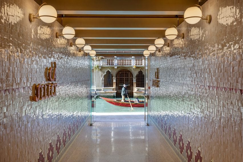
Ca’ Select bar is located on a canal in Venice

“The history of Select is closely tied to that of Venice, where the brand was founded in 1920,” said Marcante-Testa.

“Starting from this awareness, the mother company Gruppo Montenegro commissioned the architects Andrea Marcante and Adelaide Testa to formulate a reinterpretation of the unique characteristics of Venetian identity, reviving one aspect of the city’s past.”

Select Aperitivo bar in Venice
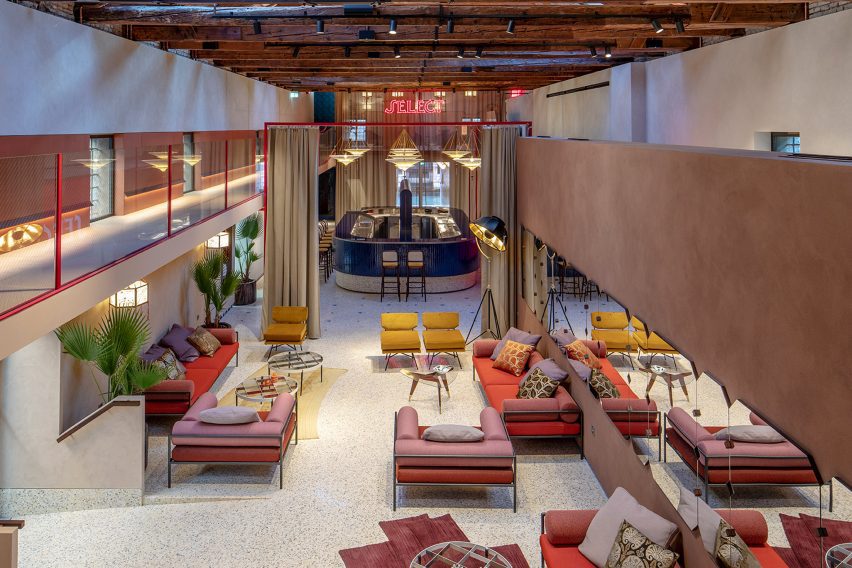
The space includes a Select Aperitivo bar

Marcante-Testa led the conversion of the former metal workshop into a bar and events space, spanning 690 square metres. Throughout the bar and production spaces, glass and ceramic details were chosen to highlight traditional Venetian crafts.

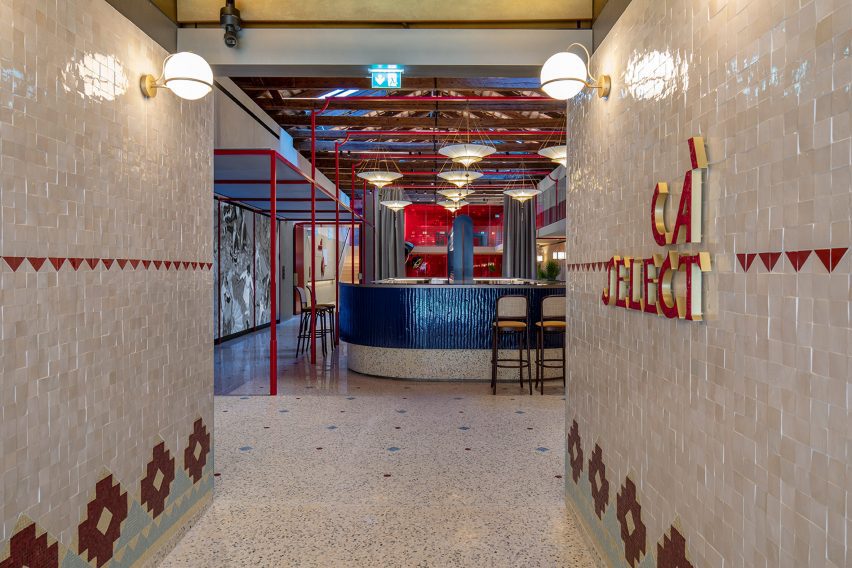
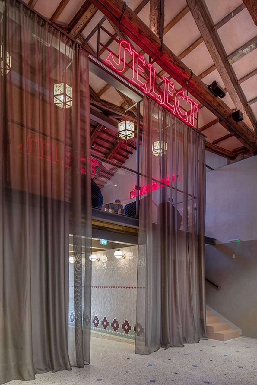
The elongated space was split linearly into three zones, with the bar placed at the front of the building so it can be accessed from the canal by a corridor clad in white and red Zellige tiles made by Mosaic Factory.

Bar in Venice by Marcante-Testa
The bar is wrapped in blue wavy glass

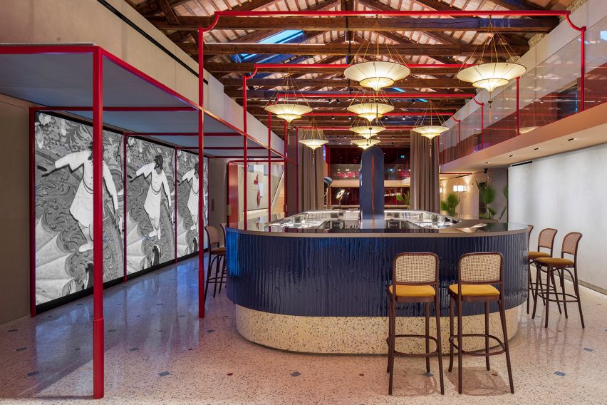
At the centre of the space is a freestanding bar wrapped in blue wavy glass “in the Murano tradition”, created by the Wonderglass company to recall the waves of the nearby lagoon.

The space features three handmade mosaics made from tiles fired in the historic Fornace Orsoni and informed by the sketches of Spanish designer Mariano Fortuny, who was a long-term resident of Venice.

Venetian seminato terrazzo flooring with red glass and blue sodalite marble inlays was used to unify the spaces, running from the entrance through the bar to the production area.

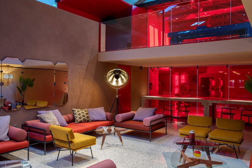
Separated from the bar by a large curtain is a seating area furnished with steel-framed sofas alongside armchairs upholstered in reds and pinks as a nod to the aperitivo’s colour. This area will also be used as an events space.

Events space at Ca' Select bar in Venice
An events space is located next to the bar

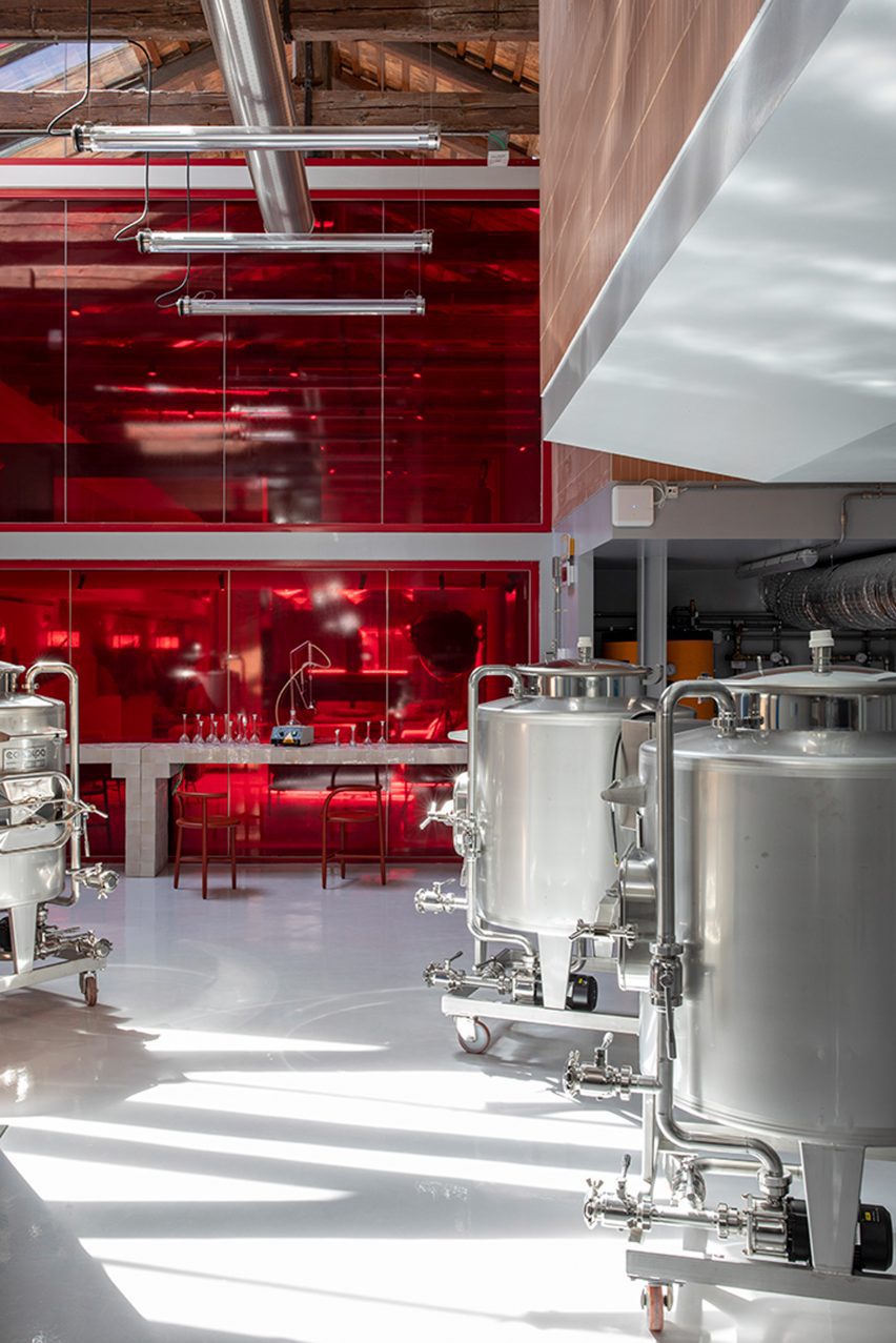
The event space has views through a red-tinted glass wall to the production facility at the rear of the building.

Here, the maceration of the herbs and spices used to make the distinctive aperitivo takes place.

Distillery in Venice
The distillery is separated from the public areas by a glass wall

The final space in Select Aperitivo’s building is nestled above the entrance corridor. Accessed by steps to the side of the entrance is a small visitor centre with exhibits curated by Turin-based Studio Fludd.

It contains seating and exhibits that aim to tell the story of the aperitivo brand, which was established in 1920.

Visitor centre for Select Aperitivo
An exhibition space is located above the entrance

Select Aperitivo hopes that the bar and visitor centre will continue to reinforce the brand’s historic links to the city.

“Ca’ Select represents a fundamental step in our multi-year plan to consolidate the brand and aims to strengthen the link with the city of origin,” said Marco Ferrari, CEO of Gruppo Montenegro, which owns the brand.

“It is no coincidence that we have decided to bring the heart of Select’s production here, to enhance the local culture starting with the valuable architectural elements that enrich the space.”

Production facility for Select Aperitivo
The building also houses a Select Aperitivo production facility

Other recently completed bars that have been featured on Dezeen include a brewery in a former Copenhagen slaughterhouse and a bar in Calgary topped with plywood barrel vaults.


Project credits:

Architectural project: Marcante-Testa
Interior design project: Marcante-Testa
Project and content management: Mindthegap Studio
Plants and facilities design: Pgs Ingegneria – Studio Associato
Content of the exhibition design: Studio Fludd
Production coordination and executive production: Epica film
Visual identity project: Studio Fludd
Building works director: Valter Camagna, Andrea marcante
Local architect: Stefano Romagna
Project manager: Roberta Minici
Safety manager and coordinator: Sebastiano Cibien
Building construction: Steelwood Engineering
Plant engineering work: Gruppo Frassati, Vem Sistemi
Set-up arrangements: Steelwood Rngineering, Gruppo Frassati, Amap, Wonderglass
Light design: Marcante-Testa with Flos
Decorative lighting supplier: Fortuny
Technical lighting supplier: Flos
System integrator: Acuson, Red Group

Reference

Mitsubishi Jisho Design creates food-waste teahouse in Venice
CategoriesSustainable News

Mitsubishi Jisho Design creates food-waste teahouse in Venice

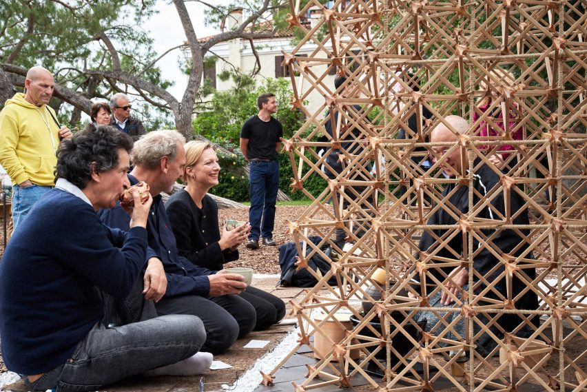
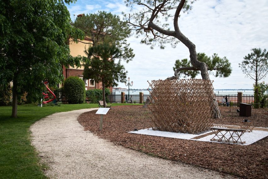
Tokyo-based Mitsubishi Jisho Design has made a teahouse from food-waste-based materials at the Venice Architecture Biennale.

Architects Takaaki Fuji, Hiroya Inage and De Yuan Kang from Mitsubishi Jisho Design designed the teahouse for the Time Space Existence exhibition held by the European Cultural Center during this year’s Venice Architecture Biennale.

Food-waste tea house
Mitsubishi Jisho Design created a tea house for the Venice Architecture Biennale

The teahouse was named Veneti-An – a combination of the words Venetian and An, which means a small hut in Japanese and is often used in names of  teahouses.

It was designed to offers visitors a place to experience a Japanese tea ceremony and reflect on how people connect following the Covid pandemic.

“The point of this exhibition is to explore, to use it as a lab, to make people think,” said De Yuan Kong said.

“It’s all about creating conversations.”

Pavilion made from cardboard and food waste for Time Space Existence exhibition
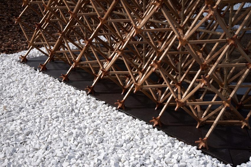
It was constructed with food-waste joints

The tea house was built from varied of materials made from food waste including coffee grounds and pasta, who are common foods in Venice.

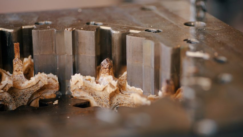
Along with 7,165 paper tubes and 128 cork floor panels, it includes 74 coffee-ground-made panels and 2,324 joint components made from discarded pasta. According to the architects, the pasta-based joint components produced by Fabula are as durable as concrete.

“I feel that the exterior material in architecture is limited,” said Fuji.

“Our intent is to explore new technologies in construction, which could result in stronger regional identities and expression.”

Pasta being moulded into architectural components
Pasta was moulded to form the joint components

The angle of the struts that make up the pavilion was set at 45 degrees. This was determined by the city’s latitude to further connect it to the city.

“By adapting the joint shape to the latitude of the place where it is placed, a distinctive identity is created in the form, as well as a teahouse that optimally lets in or shields it from sunlight in response to the local environment,” said the architects.

Cardboard and food waste chairs
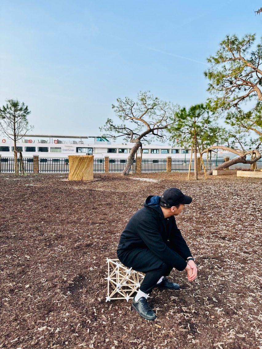
The pavilion will be disassembled into pieces of furniture after the exhibition

Veneti-An is waterproof as its components were treated with a silicon-based liquid by Japanese silica coating producer SilicaGen.

The team will measure and record changes to the materials used during the six month exhibition as part of its research on sustainable materials, responding to the overall biennale’s theme – Laboratory of the Future.

To build the pavilion, the architects packed the components, a total weight of 255.5 kilograms, into seven 87-litre suitcases and took them from Japan to Italy.

Following the biennale, the teahouse will be dismantled and rebuilt into pieces of furniture.

“Neither 100 per cent manufactured nor 100 per cent self-built, it is a piece of furniture that allows for modification and addition of a personal touch,” said the designers.

“The dimensions of the parts were determined on the premise of turning into furniture, or perhaps it would have been better to describe it as furniture transformed into a teahouse for the exhibition’s duration only.”

Time Space Existence exhibition at Venice Architecture Biennale
It forms part of the Time Space Existence exhibition

The tea house is located in Marinaressa Gardens alongside a concrete emergency housing prototype developed by the Norman Foster Foundation and Holcim as part of the Time Space Existence exhibition.

The group show presents work by architects, designers and artists from 52 different countries in venues across the city. Also as part of the show SOM and Princeton University used AR to construct a self-balancing arch.

The photography is by Yuta Sawamura.

Time Space Existence takes place from 20 May to 26 November 2023 at various locations across Venice, Italy. See Dezeen Events Guide for an up-to-date list of architecture and design events taking place around the world.

Reference

saudi arabia pavilion at the 2023 venice architecture biennale
CategoriesArchitecture

saudi arabia pavilion at the 2023 venice architecture biennale

a walk through ‘IRTH إرث’  at the 2023 saudi arabia pavilion 


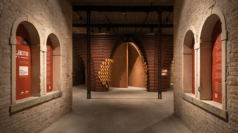
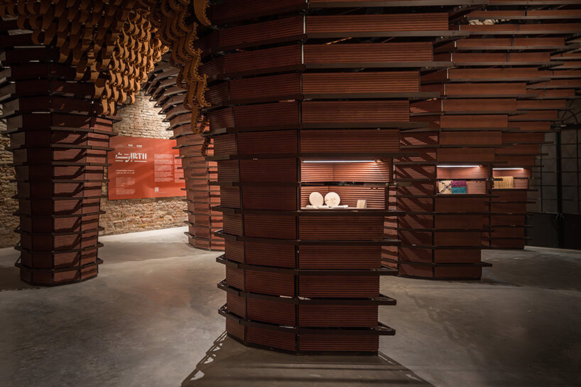
2023 Venice Architecture Biennale: For its third participation at the international fairthe National Pavilion of Saudi Arabia presents ‘IRTH إرث’ (meaning ‘legacy’ in Arabic), a spellbinding and multi-layered sensory exhibition under the curation of Basma and Noura Bouzo. Designed by architect AlBara Saimaldahar, the show examines the symbiotic relationship between material and immaterial properties and links past to future using one of the most historically significant and primary materials used in Saudi architecture: earth. 

dramatic wood and clay sculptures engulf the saudi pavilion at venice architecture biennale
all images © Venice Documentation Project, courtesy Ministry of Culture (unless stated otherwise)


exploring material vs. immaterial, and linking past to future 


Materials used to shape built environments can be thought of as quiet storytellers. Their unique properties, both tangible and intangible, tell us plenty about the inhabitants of a country or region. They are, in other words, embedded with narratives and hold valuable lessons that bridge traditional knowledge with new practices, creating a constantly evolving line of continuity. At this year’s Venice Biennale, ‘IRTH إرث’ physically explores this line linking past and future by celebrating Saudi Arabia’s most characteristic building material. Used as both a structural and cladding element, earth is spotlighted here through its textures and colors — spanning the entire spectrum of the country’s natural tones, from its desert dunes to the red sea coast.

dramatic wood and clay sculptures engulf the saudi pavilion at venice architecture biennale
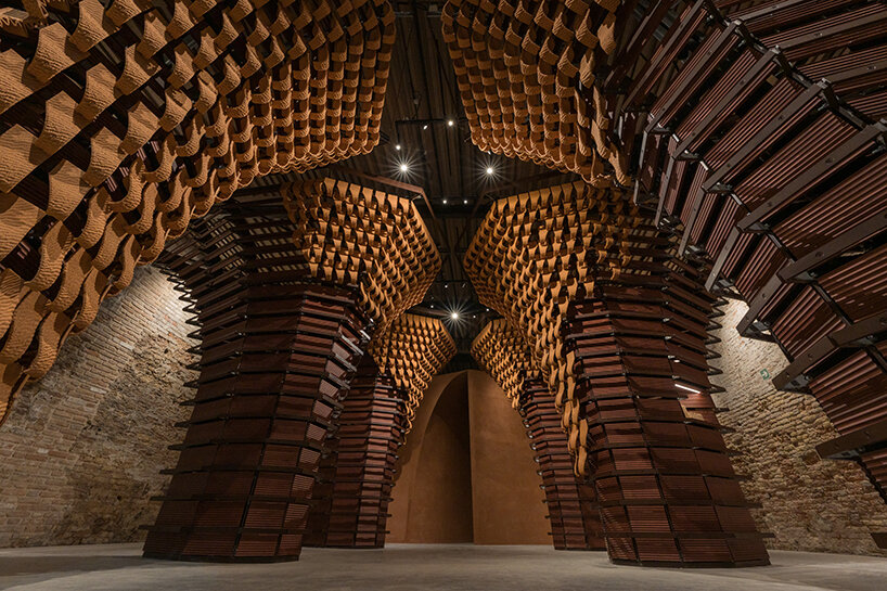
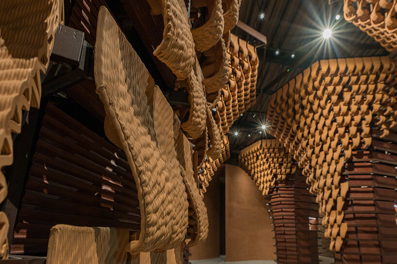
six arches clad internally with wood panels and externally with 3D-printed clay tiles


a multi-layered, sensorial journey into Saudi Architecture 


Illustrating this concept, the 2023 Saudi Arabia Pavilion design takes on a multi-layered approach, allowing visitors to experience the exhibition from different perspectives. The first layer is the structure itself, divided into several sections and reflecting on the method and use of vernacular components jointly with innovative technologies. The second layer, defined as the exhibition content, provides an overview of earth’s present and future in Saudi architecture.


The distinctive layout envisioned by AlBara Saimaldahar (see more here) combines nostalgia, legacy, and ongoing adaptation. It looks to the future through the lens of the past; it enhances the intrinsic essence of Saudi craftsmanship through elaborate artifacts, takes traditional patterns and motifs from Al-Balad, the Historical Jeddah, and transforms them into fluid forms. The evolution of the very concept of legacy is challenged in a crescendo that reaches its climax at the end. At the heart of the project is an experiential component: a simple, immersive room that stimulates the visitors’ senses, triggering individual reactions in an independent and uninfluenced manner.

dramatic wood and clay sculptures engulf the saudi pavilion at venice architecture biennale
celebrating the primary material in Saudi architecture: earth


The destination itself is not the end but rather a call for reflection and eventual examination of how one’s senses not only take but generates imprints within space and time. It is here that architecture brings to the surface the value of the unseen, allowing its occupants to build their own cognitive reconnaissance and placemaking,’ comments Saimaldhar.


The journey through the Pavilion’s three main structures begins by passing beneath six arches as authentic gateways. With their imposing eight-sided metal structures clad internally with wooden panels and externally with 3D-printed clay tiles – featuring an undulating pattern reminiscent of desert dunes – the portals convey both grandeur and lightness. On the one hand, they evoke monumental works of architecture carved in stone and in caves — mighty, seemingly indestructible, and enduring across time — and, on the other hand, the transience of materials, unstable like the sand of the Rub’ al-Khali desert or the Empty Quarter, as the outer covering gradually fades until it disappears.

dramatic wood and clay sculptures engulf the saudi pavilion at venice architecture biennale
the exhibition provides an overview of the material’s present and future


Meanwhile, an olfactory experimentation emerges in the middle of the Pavilion. A large and empty rectangular room is imbued with a fragrance created especially for the exhibition: notes of lavender, frankincense, and myrrh rise in the air, resonating with Arab culture in its most homely form. An immersive sensory hub, this dematerialized environment offers a glimpse of the future through the lens of tradition — an existential experience allowing visitors to experience something exceptional, sensing a ‘moment’ in time and triggering a memory of the Pavilion that will be different for each person.


The only material element inside the hall is a 3D-printed clay column illuminated by interior lights that project mystical patterns onto the Pavilion’s floor, walls, and ceiling. When the Biennale concludes, the sculpture will be transported to the bottom of the Red Sea, acting as an artificial stone to stimulate the growth of a marine ecosystem.


Underwater structures play a key role in the formation of habitats. Gradually, as more columns are printed, this ‘first stone’ will be joined by new elements: a gradual and continuous pattern of growth that will transform a single object artificially placed in a natural setting into an expanse of vertical lines, a labyrinth from which corals and other life forms will come forth. The contrast between the pure geometric form of the columns and the irregular expansion of life within them will visualize the relationship between nature and artifice: a human artifact is reclaimed and incorporated by nature in a dynamic balance that is both fragile and enduring,’ writes the curatorial team.

dramatic wood and clay sculptures engulf the saudi pavilion at venice architecture biennale
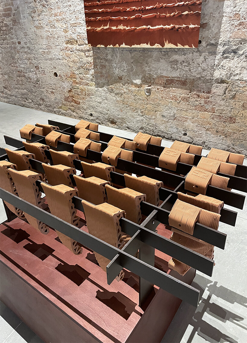
rows of clay tiles | image © designboom


The layout concludes by passing through two more portals: here, the visitor is invited to get involved in their transformation, adding new tiles (from the legacy of earth/clay tiles) to an octahedral structure through an interplay of progressive change, day after day.


According to Basma and Noura Bouzo, the experiments and explorations on display at the Saudi Arabia Pavilion combine the interdisciplinary perspectives of architects and designers, inviting the public to take part in a journey that will help define a legacy for future generations. ‘The pavilion brings to the forefront the notion of collaborative practice as a foundation of the laboratory of the future. It invites visitors to breach their role as spectators and actively engage in the process. The experience itself mirrors the future of architecture and materiality as a work in progress, determined not only by the practitioners but by its occupants.’


Reference

david adjaye’s triangular all-timber pavilion pierces the sky at venice architecture biennale
CategoriesArchitecture

david adjaye’s triangular all-timber pavilion pierces the sky at venice architecture biennale

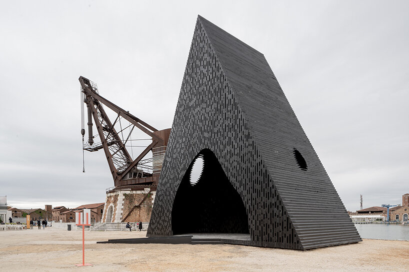
David Adjaye presents ‘The Kwaeε’ at Venice Architecture Biennale


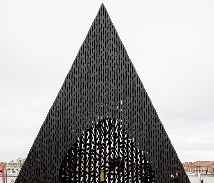
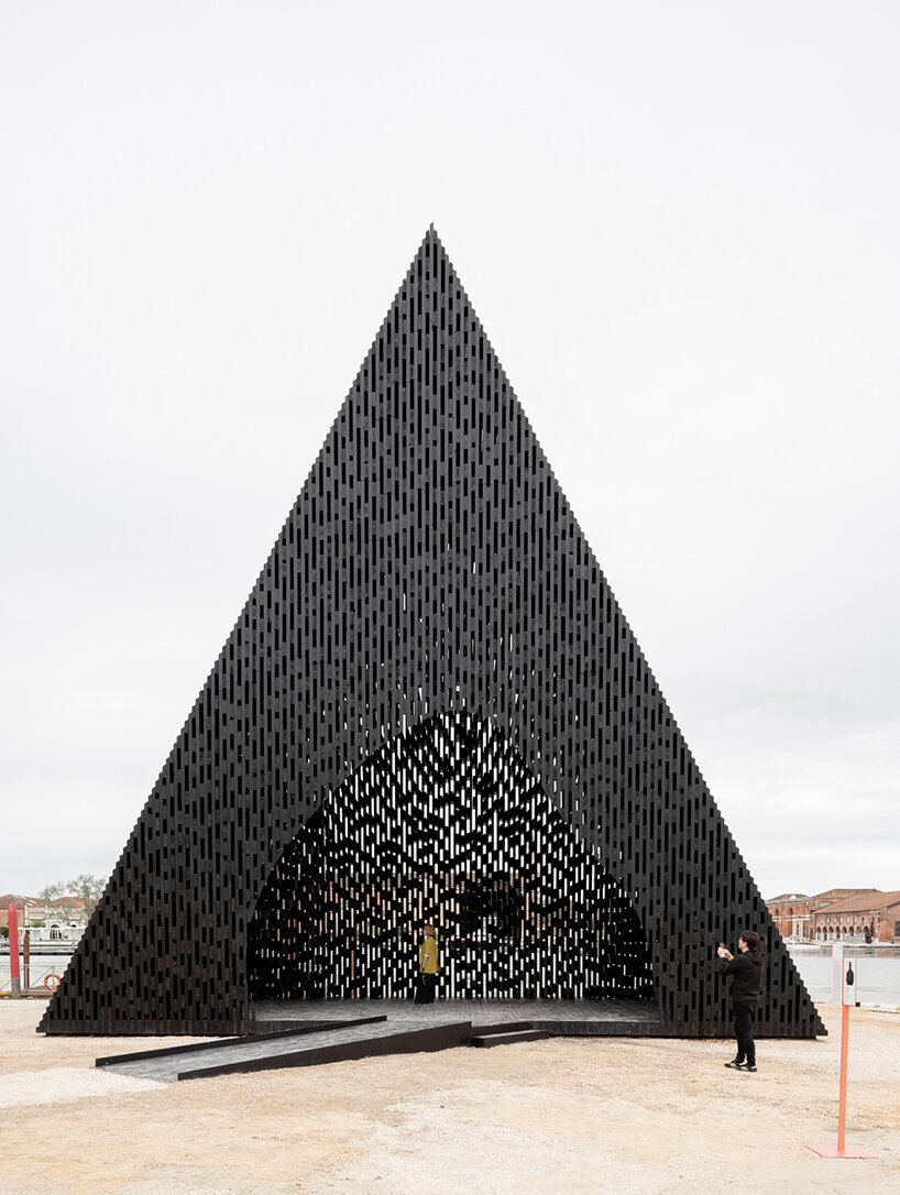
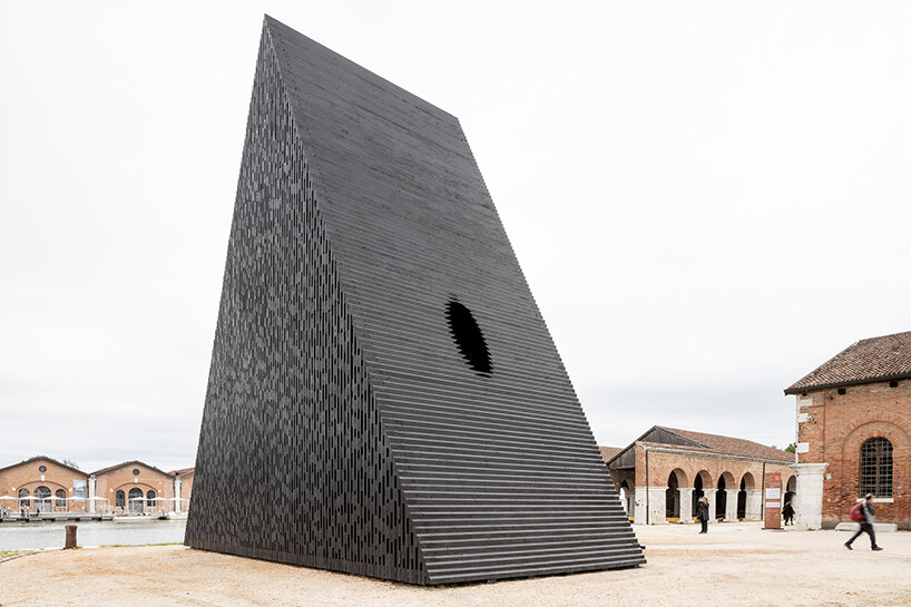
At the Venice Architecture Biennale 2023, acclaimed British architect David Adjaye has unveiled a striking triangular pavilion crafted exclusively from timber. Positioned just outside of the Arsenale Central Pavilion, the eye-catching structure is aptly titled ‘The Kwaeε,’ taking its name after the word ‘forest’ in Twi, a dialect of the Akan language spoken by millions of people in southern and central Ghana.

david adjaye's triangular all-timber pavilion pierces the sky at venice architecture biennale
David Adjaye’s triangular pavilion stands just outside the Arsenale | image by Andrea Avezzù, courtesy of La Biennale di Venezia (also head image)


all-wood pavilion evokes serene forest-like atmosphere


‘The Kwaeε’ installation by David Adjaye (find more here) embodies the essence of its namesake through its form and materiality. Crafted entirely from wood, this triangular prism structure incorporates two oculi, creating an interesting visual composition. By seamlessly merging elements of doorways, platforms, assemblies, and windows, the installation forms a harmonious and unified entity. The deliberate distortion of the shape, thoughtfully angled and integrated with its surroundings, generates passages and openings that facilitate a continuous flow of movement and interaction. Moreover, the structure’s vertical black timber slabs produce a captivating interplay of light and shadow, enveloping the space with a serene forest-like atmosphere.


Located right outside of the historic Arsenale grounds at the Venice Biennale (find more here), the pavilion stands out as a captivating addition, showcasing the rich diversity of African and African diaspora practitioners. Its external triangular prism structure contrasts with an internally sculpted ovoid chamber reminiscent of a cave. This design allows visitors to gaze at the sky through the oculi while enjoying glimpses of the surrounding canal through the intricately crafted timber interstices. Not only does the installation provide a tranquil space for reflection and respite, but it also serves as a versatile venue for multiple events and gatherings, accommodating diverse needs and purposes.

david adjaye's triangular all-timber pavilion pierces the sky at venice architecture biennale
the external triangular prism structure contrasts with an internally sculpted ovoid chamber | image by Andrea Avezzù, courtesy of La Biennale di Venezia

david adjaye's triangular all-timber pavilion pierces the sky at venice architecture biennale
crafted entirely from wood, the triangular prism structure incorporates two oculi | image by Andrea Avezzù, courtesy of La Biennale di Venezia


Reference

Venice floodwaters inform two-tone interior of Va Bene Cicchetti bar
CategoriesInterior Design

Venice floodwaters inform two-tone interior of Va Bene Cicchetti bar

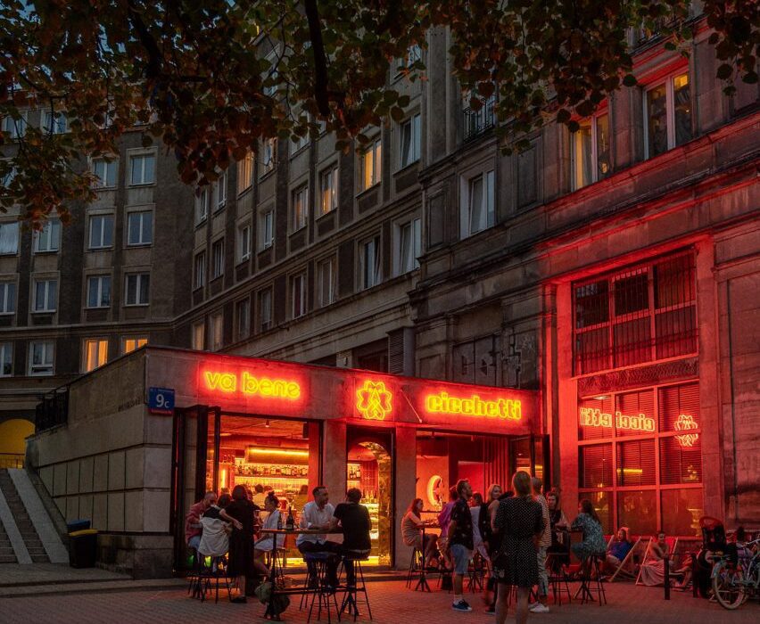
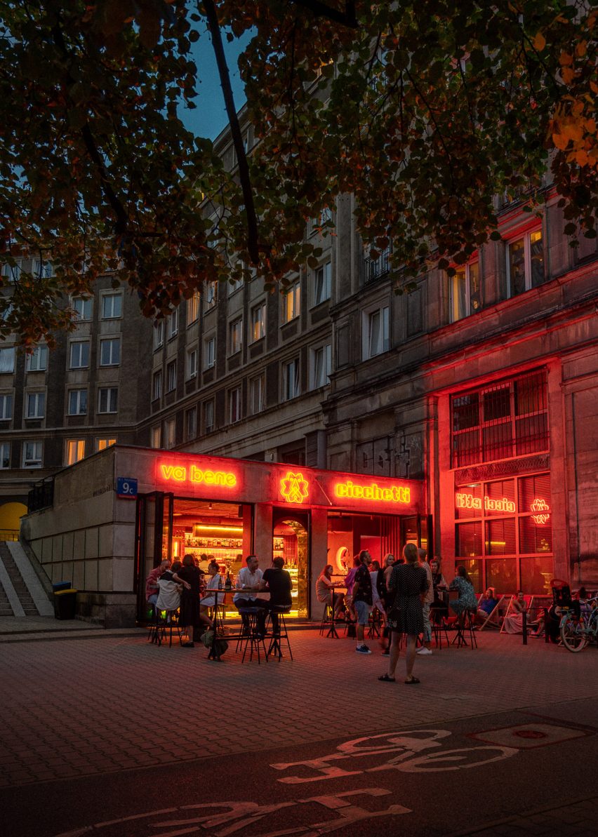
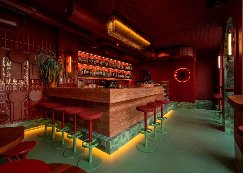
Sea green floors and skirting tiles are contrasted against the all-red interior of this bar in Warsaw, Poland, which local studio Noke Architects has designed to recall the high waters of Venice.

Billed as Poland’s first cicchetti bar – an Italian bar selling drinks alongside small plates of food – Va Bene Cicchetti is located in a huge Socialist Realist housing estate from the 1950s called the Marszałkowska Housing District.

Exterior of Va Bene Cicchetti bar by Noke Architects
Va Bene Cicchetti is a bar in Warsaw

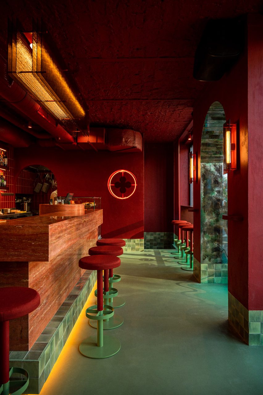
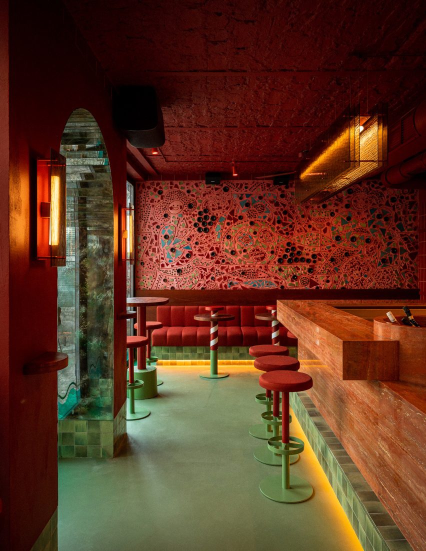
Customers enter the bar via an arched doorway lined with antique mirrors. Inside, they are met by a huge red travertine counter with a large drinks cooler, which is hollowed out of the stone and filled with ice and bottles of prosecco.

Most of the interior is rendered in warm hues of red and gold in a nod to the colours of the Venetian flag.

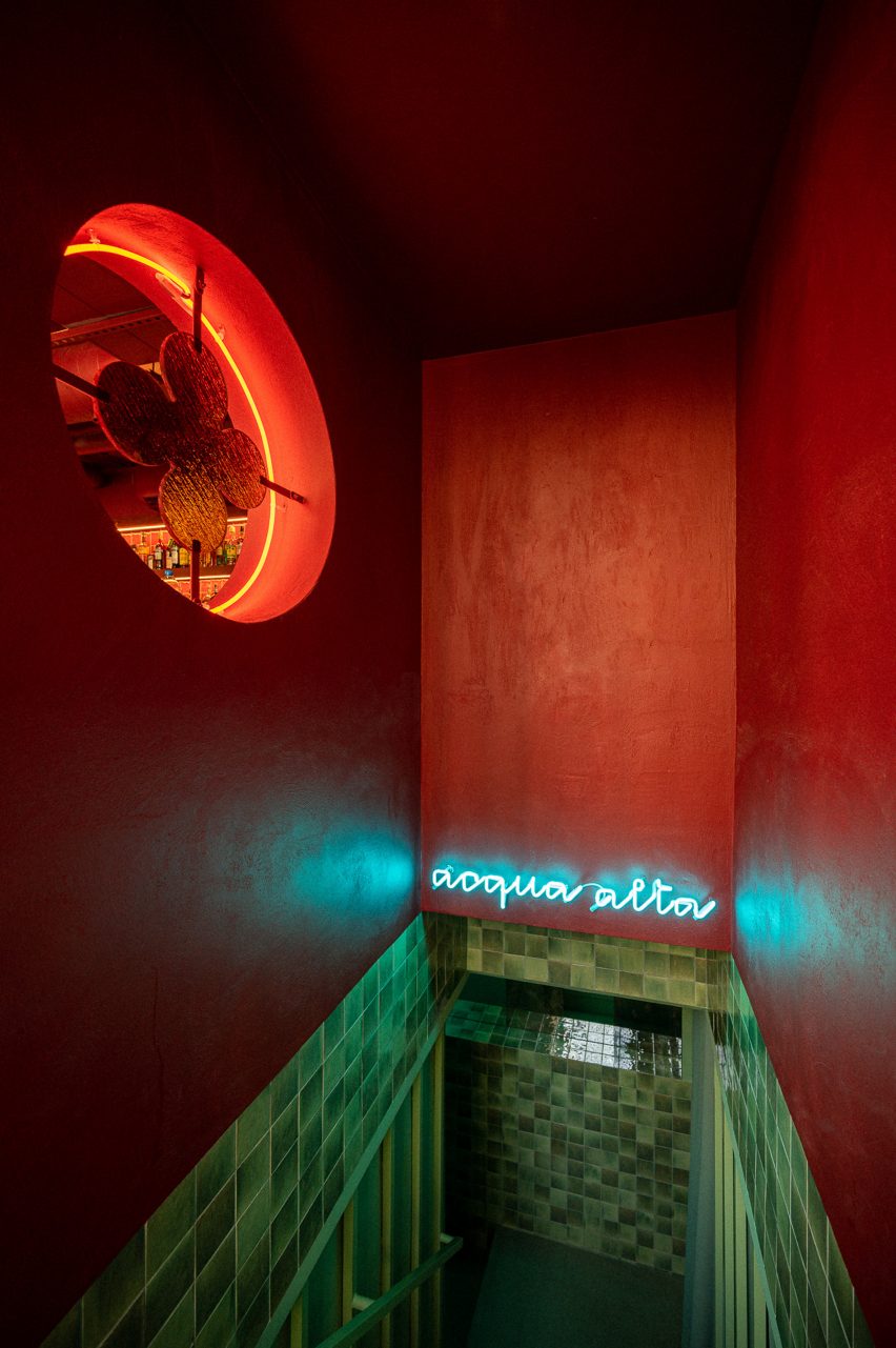
But the floor, and everything up to about 20 centimetres in height, is finished in sea green to suggest the high waters of the Veneto region, locally known as acqua alta.

Red travertine bar by Noke Architects
Its interior was informed by Venice’s floodwaters

Several times a year, when the tide in the Adriatic Sea rises, these floodwaters will cover streets and piazzas in Venice in a layer of water.

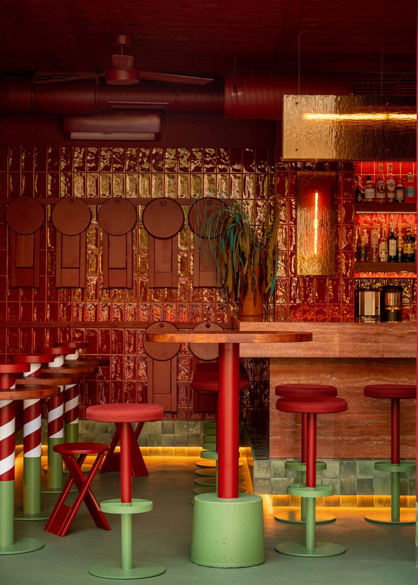
To recreate this “flood effect” inside the interior of Va Bene Cicchetti, Noke Architects coloured the floors and skirting tiles, as well as the base of table legs, chairs and plinths in a watery shade of turquoise.

Red and turquoise interior of Warsaw bar Va Bene Cicchetti
Tables resemble Venice’s red-and-white striped mooring poles

“We wanted the place to be unambiguously associated with Venice but we also wanted for this reference to be fresh and unique,” said Piotr Maciaszek, who co-founded Noke Architects alongside Aleksandra Hyz and Karol Pasternak.

“We took inspiration from the colours of the Venetian flag, which dominate all finishings, and incorporated the acqua alta motif in the interior as an element of surprise.”

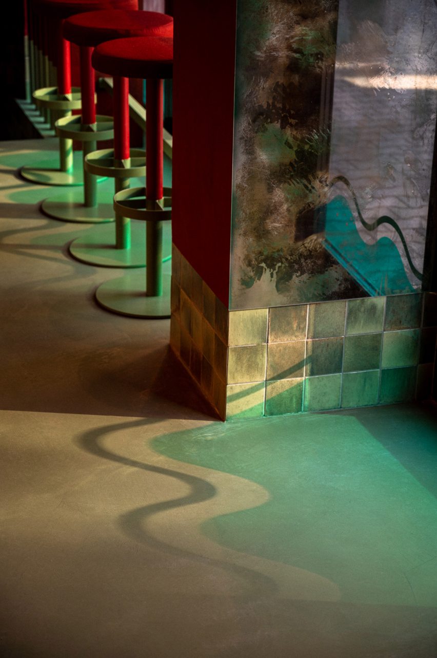
Shadow of wave decal on floor of Warsaw bar
Turquoise skirting tiles run along the perimeter of the room

The scheme is completed with glass lamps that resemble rippling water and bespoke furniture pieces including tables that pay homage to the red-and-white striped mooring posts found in Venice’s canals.

Taking over an entire wall of the bar is an intricate mosaic made from reclaimed materials including glass panes from the Murano glass factory in Venice and fragments of wine bottles from Va Bene Cicchetti’s sister restaurant Va Bene.

The mural depicts the bar’s owners and their dog Koko enjoying wine and food at a table in Venice.

“Veneto is where the famous Murano glass and antique mirrors are manufactured,” Maciaszek explained.

“The region is famous for its ceramics and wine. We came up with the idea to use mini pieces of Venice as the building blocks of our artwork. Mosaic was the perfect solution for this.”

Va Bene Cicchetti bar in Warsaw by Noke Architects with all-red interior and turquoise floors
The bar is centred on a red travertine counter

The bar’s basement level is completely saturated in the same greeny-blue hue as the floors upstairs to create the impression of being underwater.

Bathrooms, meanwhile, are finished in black and white stripes and topped with a red ceiling in a reference to the uniforms worn by Venetian gondoliers.

Wall mosaic in Warsaw bar
An intricate mosaic covers an entire wall of the bar

Polish illustrator and graphic designer Ola Niepsuj was responsible for creating the bar’s visual identity, which depicts the Lion of Saint Mark – a winged lion that represents the patron saint of Venice and is found on buildings across the city.

At Va Bene Cicchetti, this motif can be found in the form of door handles and the neon light above the entrance.

Stairwell with colour-block red and green walls
The bar’s basement level is covered in sea green tiles

Elsewhere in Poland, local practice Paradowski Studio recently channelled the glamour of Kraków’s interwar cafes and the clean functionalism of its mid-century modern cinemas for a hotel renovation.

The Puro Stare Miasto hotel is located next to Kraków’s historic old town and spans 138 rooms alongside an extensive open-plan reception, lobby space and restaurant.

The photography is by Piotr Maciaszek.


Reference

Drinking fountain map of Venice encourages sustainable tourism
CategoriesSustainable News

Drinking fountain map of Venice encourages sustainable tourism

Spotted: There is a now a new way to stay hydrated when visiting Venice’s historic streets and waterways. Visitors to the island can use a map and an app to find a fountain of fresh water near their location. Each fountain is unique and provides a glorious mix of design and location. The map encourages people to carry their own personal water bottles and forego the disposable plastic versions whenever possible.

The Venice Tap Water website lists all currently available fountains within the city and on the surrounding islands. There are nearly 200 listed, making it often only a matter of a few steps to find safe drinking water. Water distribution company Veritas provides detailed water quality information for the area, alongside a map of public restrooms in the city.

As one of the world’s most popular tourist destinations, Venice, like many other top sites, is struggling to find the right balance between preservation of the city and showcasing the beauty that makes it famous. From January 2023, the city will impose a tourist tax that requires visitors to book entry to the island and pay a fee ranging from €3 to €10.

Other innovations spotted by Springwise that are helping to improve the sustainability of global tourism include a satellite-powered platform that lists local ecosystem information and an eco-luxury hotel focused on minimising its carbon footprint.  

Written by: Keely Khoury

Email: info@venicetapwater.com

Website: venicetapwater.com

Reference

Breathing New Life into The Procuratie Vecchie in Venice
CategoriesArchitecture

Breathing New Life into The Procuratie Vecchie in Venice

Browse the Architizer Jobs Board and apply for architecture and design positions at some of the world’s best firms. Click here to sign up for our Jobs Newsletter. 

Few cities in the world have been for so many centuries a melting pot of different languages, religions and lifestyles as Venice: here, the salty air of the lagoon not only gave rise to the city’s trade relationships, but also continues to create an intoxicating atmosphere that lays fertile ground for cultural exchange and dialogue.

Procuratie Vecchie is an iconic building that occupies the north side of St. Mark’s Square: completed in the first half of the 16th century, the complex — once the seat of the Procurators of St. Mark’s, high officials with offices inferior only to those of the Doge and responsible for assisting the poor — since the 19th century has housed Generali, one of the largest global insurance and asset management providers.
Introduction tunnel. Photo by Andrea Martiradonna
“The Human Safety Net”. Photo by Andrea Martiradonna

After the completion of the restoration, commissioned by Generali and designed by David Chipperfield Architects Milan, a large portion of the complex has finally opened to the public. The restoration, which involved the renovation of the first and second floors, the reorganization of the accessibility of the building through the insertion of new stairs, and a renewed central entrance on the third floor, has not only brought back to its original splendor one of the most fascinating places in Venice but it is also re-established the building’s link to the original social dimensions of the larger Renaissance complex.

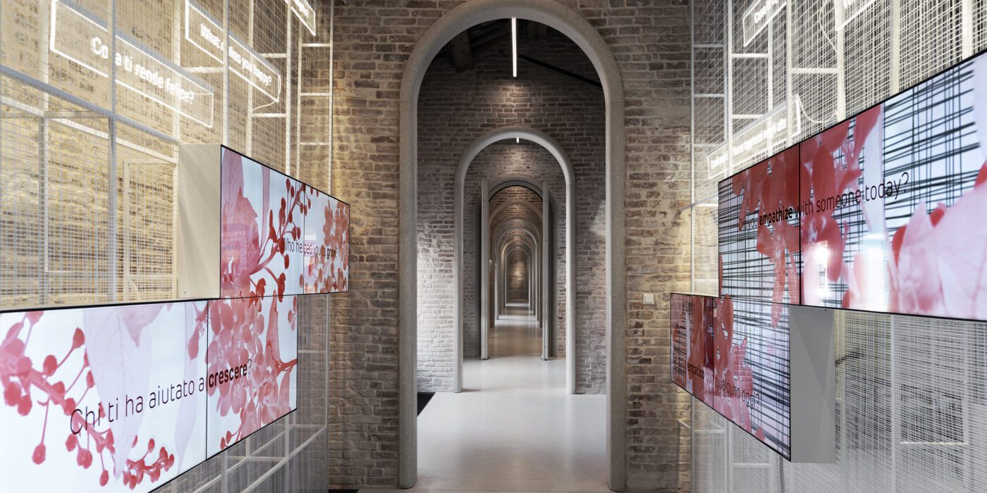
In addition to being a place of work, the building’s third floor houses the 32 291 square foot (3000 sq m) home of the Generali Group Foundation, “The Human Safety Net,” which works to improve the living conditions of people in vulnerable situations around the world. To convey the spirit of the Foundation, the third floor hosts the interactive exhibition “A World of Potential” curated by Orna Cohen and Andreas Heinecke, founders of Dialogue Social Enterprise and designed for the interior, exhibition, graphics & multimedia design by the Milan-based studio Migliore+Servetto under the artistic direction of Davide Rampello.
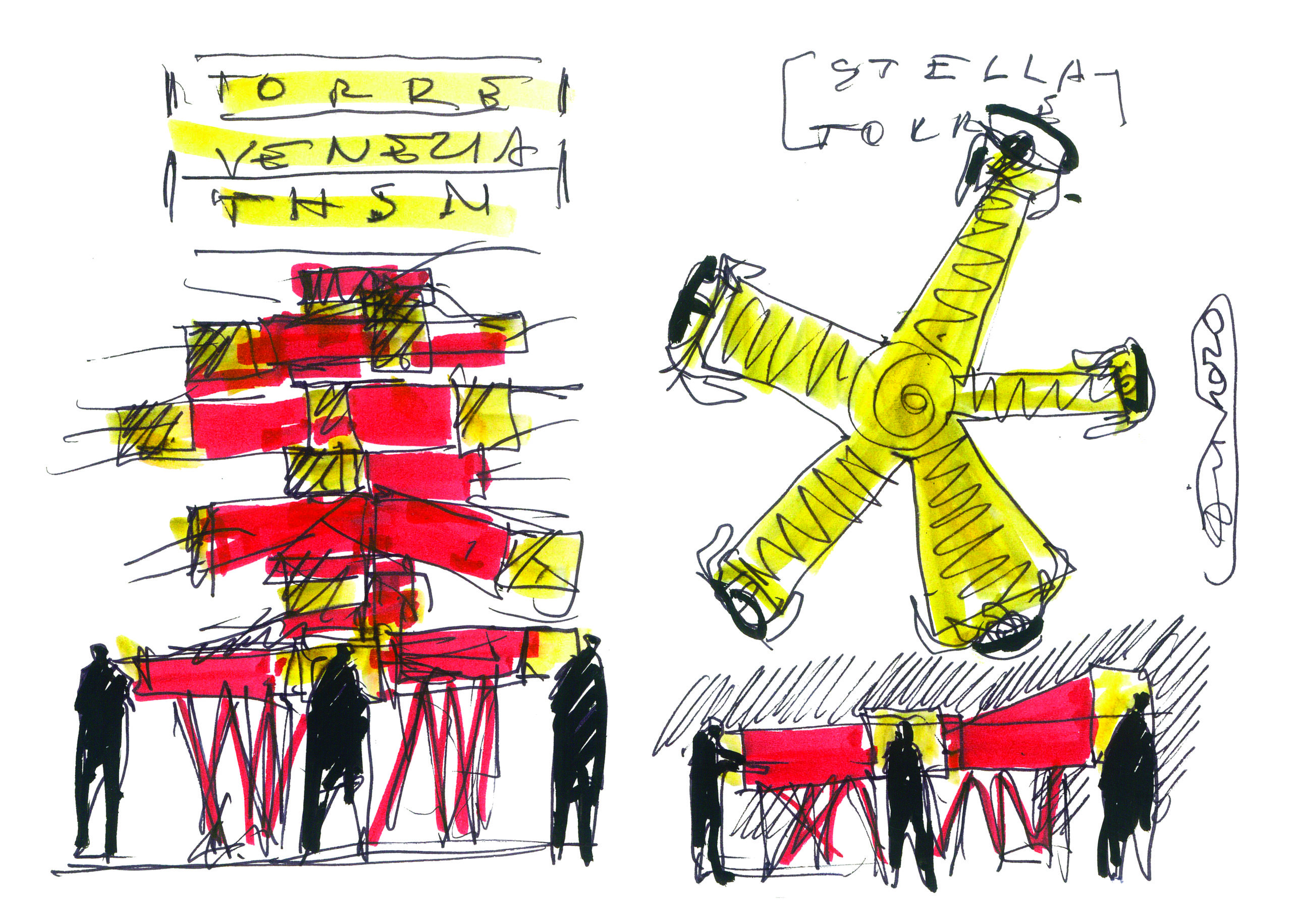
Sketch by Ico Migliore
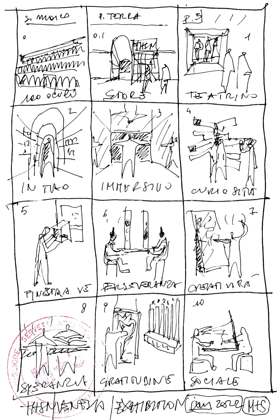
Exhibition itinerary. Sketch by Ico Migliore

In addition to the exhibition, the Migliore+Servetto studio developed the design of the reception and commercial areas on the ground floor and the spaces for interaction on the third floor: a café, a coworking area, event rooms and an auditorium.

Achille Castiglioni used to say that “we don’t design objects or spaces but behaviors”: and this statement can only be more apt in relation to this exhibition. In fact, the exhibition offers visitors a cognitive experience to recognize the potential in themselves and in others, according to the “learning by doing” method by John Dewey and on the basis of the ” values in action” outlined by the positive psychology of Martin Seligman and Christopher Peterson, and selected by the curators (creativity, kindness, perseverance, gratitude, curiosity, hope, social intelligence, teamwork): the result is a project halfway between a science and technology museum and an anthropological experience.
The café. Photo by Andrea Martiradonna
The coworking. Photo by Andrea Martiradonna

The entire itinerary is characterized by three recurring symbols: the table, the nest and the mirror. The table is an emblem of meeting and dialogue, and is present throughout the interactive installations and in the convivial spaces. Meanwhile, the nest symbolizes welcome and bonds, and recalled in the structures of the bookshops. Finally, the mirror, which in Venice boasts a centuries-old tradition, recurs in the furnishings of the café and in various installations as an allegory of reflection and of the comparison with oneself.
The café with optical chamber. Photo by Andrea Martiradonna
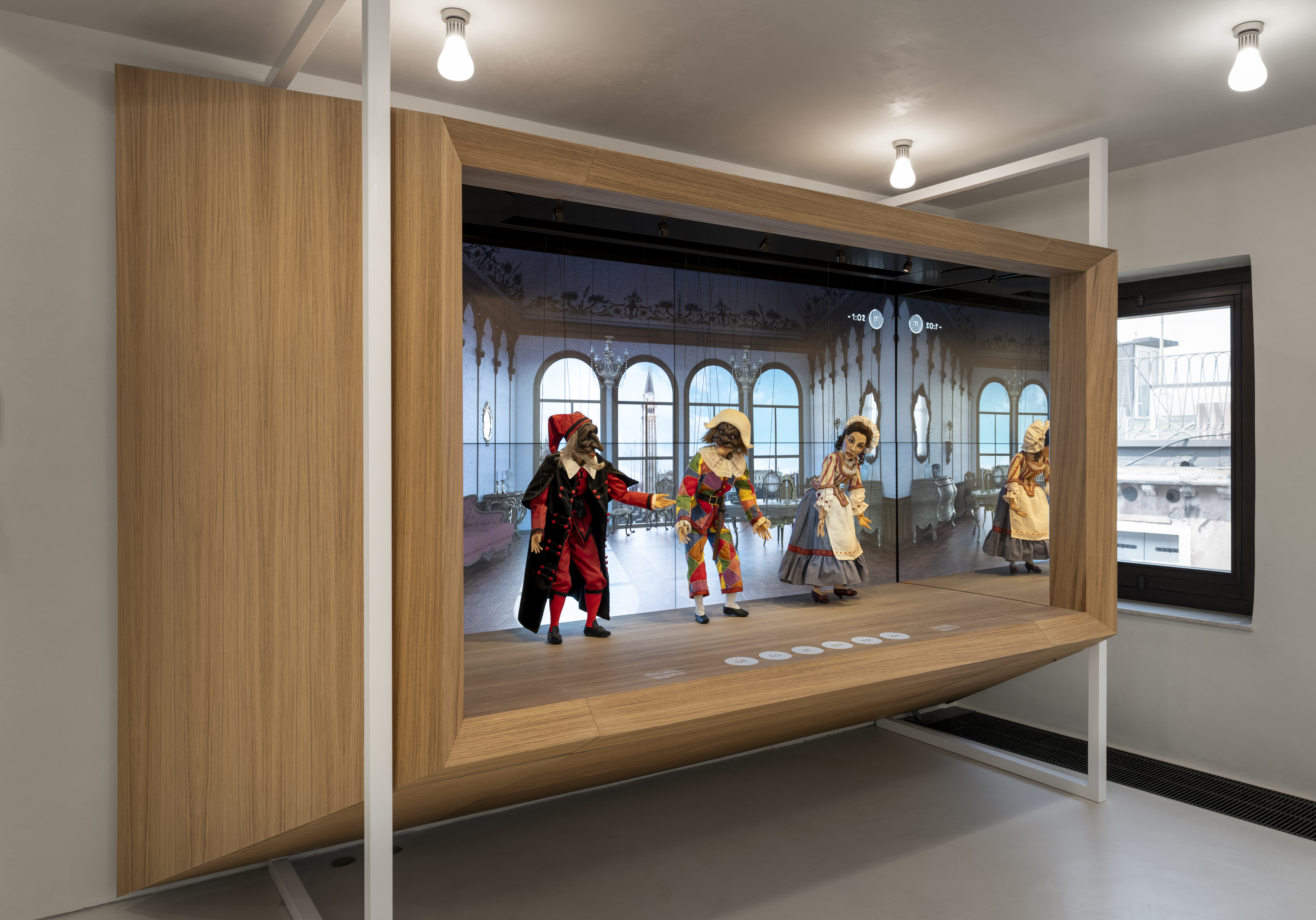
The Venetian theatre. Photo by Andrea Martiradonna

The entire narrative space, suspended between craftsmanship and refined technologies, tells of a strong bond with the city. Venice’s pulsating life is filtered uninterrupted through the “oculi” — the openings on the façade of the third floor. Some of these openings create a system of visual enlargement that recalls the optical machines of Canaletto.

At the beginning of the exhibition, the wooden puppets of Harlequin, Pantalone and Columbine — masks of Venetian theater — animated by sophisticated technology interact with visitors by answering questions about the history of the city in several languages. The installation “Window on Venice” allows visitors to take a leap back in time, exploring in 3D what some places in the city looked like in the 16th century.
Team work. Photo by Andrea Martiradonna
Team work. Photo by Andrea Martiradonna

The partitions of the spaces and the furnishings, all designed by Migliore+Servetto, enter into conversation with the existing structures. This dialogue enhances the presence of local materials such as glass, copper, wood, mirrors. The characteristic Venetian “bricole” constitute the supporting structure of the installation of the exhibition route dedicated to team working; the benches of the café, in natural wood, recall those of the historical Venetian cafés; the patterns of the carpets rework traditional motifs, such as the ornate arches of the Doge’s Palace or the “millefiori murine”; the chandeliers made by local master glassmakers create an evocative dialogue between natural and artificial light.

The studio also contributed to the selection of the contents of the Art Studio, the space dedicated to temporary exhibitions that hosts “CHUTZPAH. A tent that is not a tent, animals that are not animals”, curated by Gabi Scardi, is a project created by the collective “Atelier dell’Errore BIG” that gives voice through art to a community of young people marked by neurodiversity.
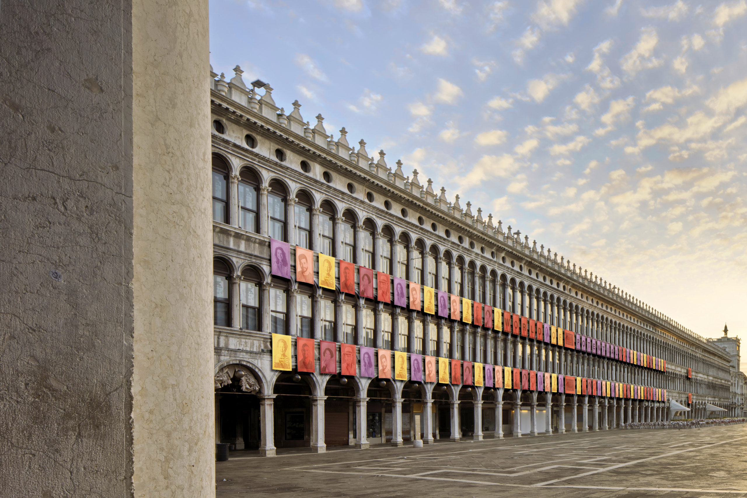
Image by Migliore + Servetto architects
Social intelligence. Photo by Andrea Martiradonna

The temporary installation, also by the studio, of 100 external tapestries on the façade of the Procuratie Vecchie facing St. Mark’s Square and 22 tapestries on the internal façade of Corte Maruzzi tells about the actions and the identity of the Foundation.

An intervention under the banner of a holistic approach that, through the culture of inclusion, social innovation and sustainability, and through an effective design language, opens new possibilities for self-awareness and awareness of others, in the perspective of transforming more and more the concept of “me” into that of “us”.

Browse the Architizer Jobs Board and apply for architecture and design positions at some of the world’s best firms. Click here to sign up for our Jobs Newsletter. 

Reference