Eight serene bedrooms with striking natural views
Far-flung homes from New Zealand to Patagonia feature in this lookbook that showcases bedrooms with calm interiors where glazing has been maximised and clutter minimised to keep the focus on the views.
Installing huge floor-to-ceiling windows is a no-brainer when a house is set in a prime location, whether overlooking Lake Tahoe or Chile’s craggy coastline.
But the real key is to create pared-back interiors that don’t detract from the natural vistas, using minimal furnishings and a natural material palette that brings the outside in.
Read on for eight minimalist bedroom interiors that make the view their protagonist.
This is the latest in our lookbooks series, which provides visual inspiration from Dezeen’s archive. For more inspiration see previous lookbooks featuring bedrooms with bathtubs, statement headboards and wood-panelled dining rooms.
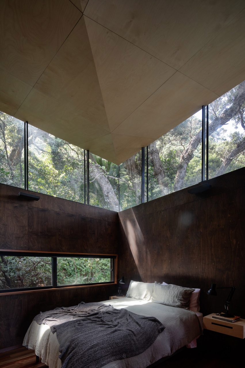
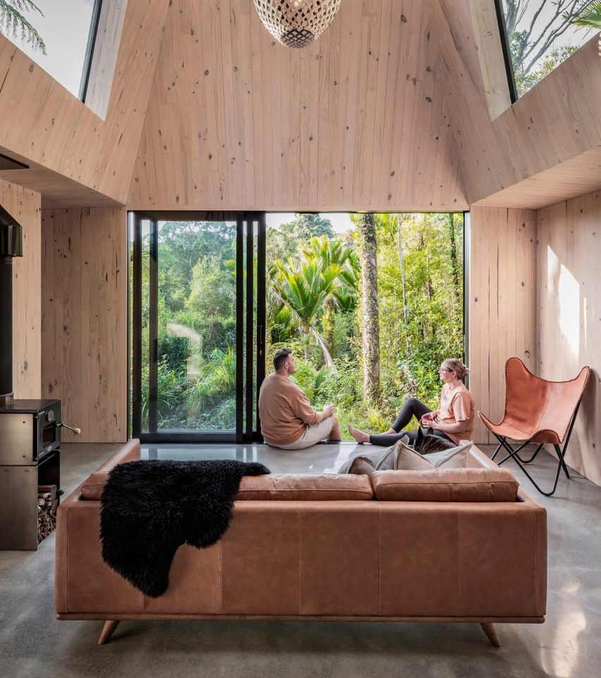
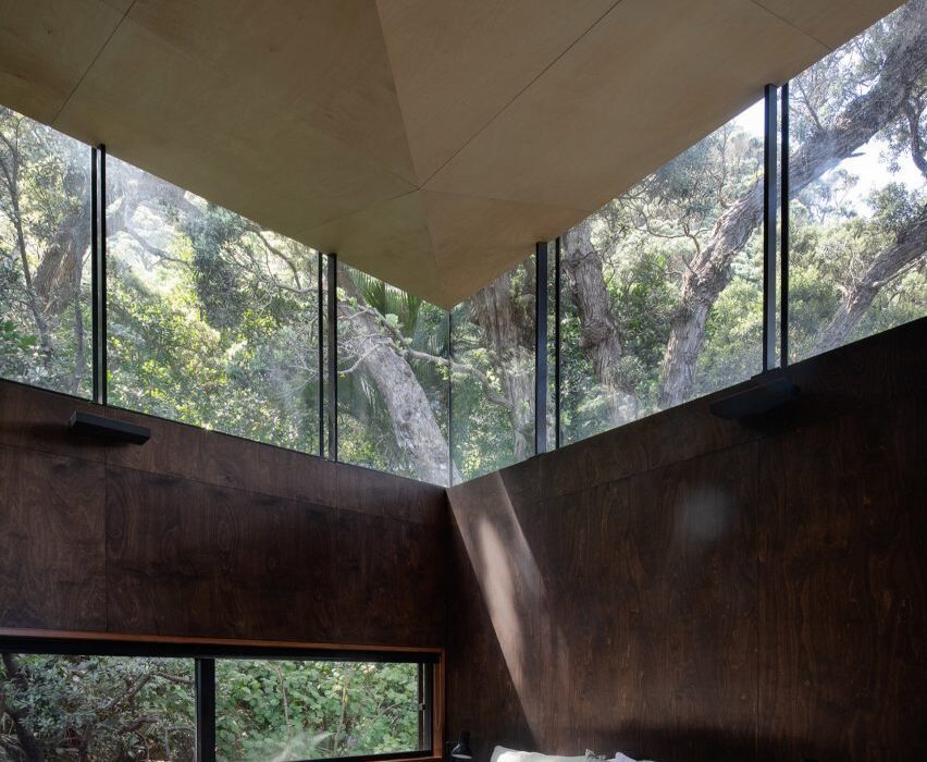
Kawakawa House, New Zealand, by Herbst Architects
A clerestory window wraps all the way around this home in the surf town of Piha, New Zealand, allowing light to filter through a canopy of pōhutukawa trees and into the bedroom.
This dappled effect is mirrored in the interior through the use of dark birch on the walls and light plywood on the ceilings, which help to draw sun into the living spaces.
Find out more about Kawakawa House ›
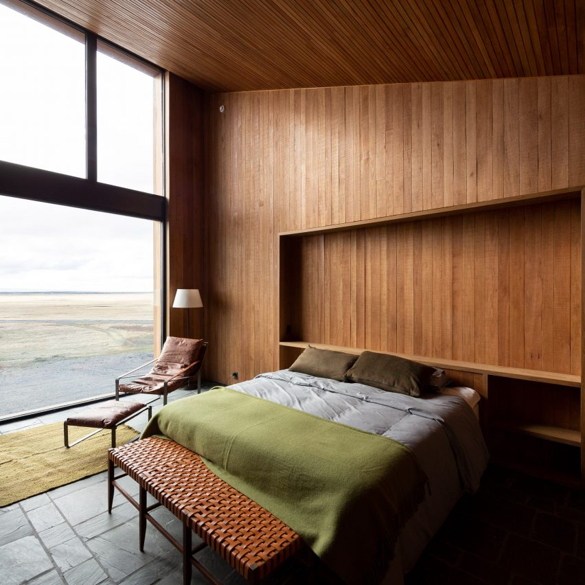
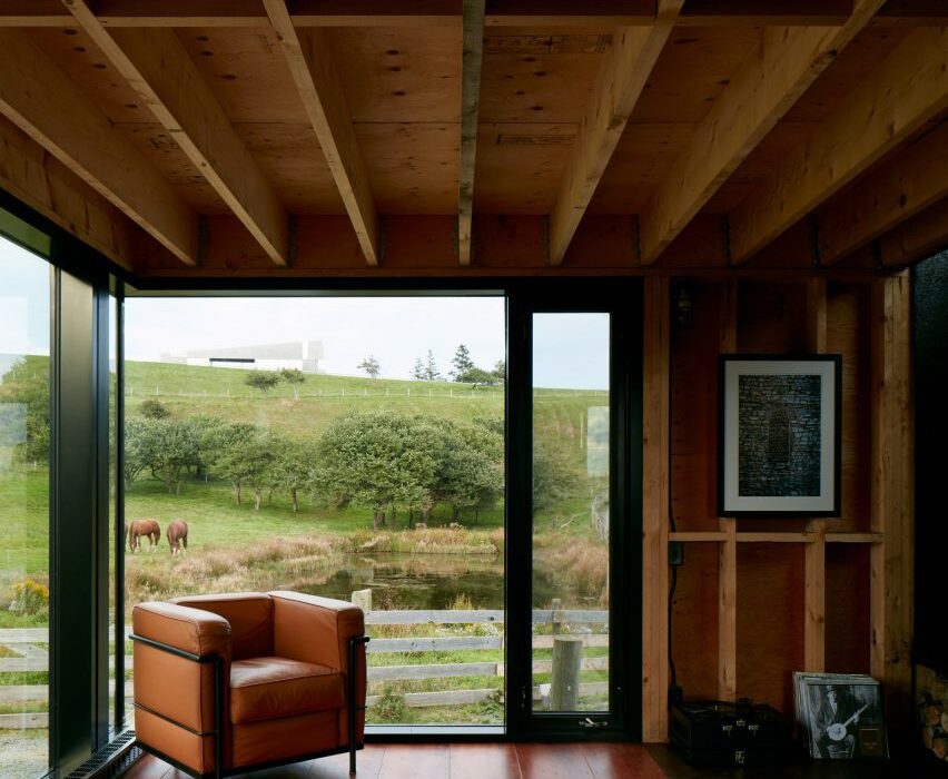
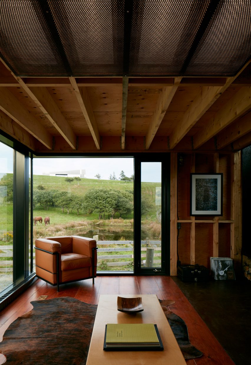
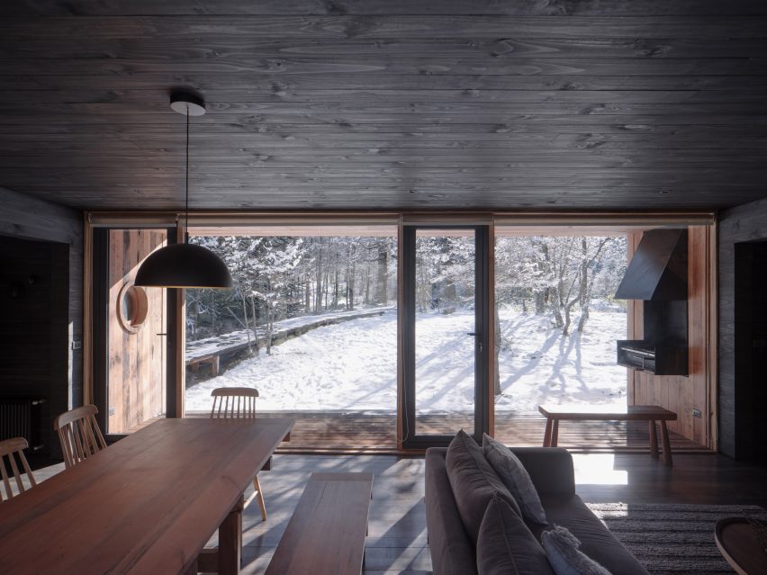
Estancia Morro Chico, Argentinia, by RDR Architectes
Wood, leather and wool help to add warmth to this otherwise spartan bedroom, which belongs to a family of sheep farmers in remote Patagonia.
A floor-to-ceiling window makes the most of the region’s vacillating sunlight while providing views across the surrounding 27,000-hectare ranch and the wild steppe beyond.
“The general aesthetics of the project were inspired by the traditional architecture of the region, which demonstrated extreme austerity and an almost primitive simplicity,” said RDR Architectes.
Find out more about Estancia Morro Chico ›
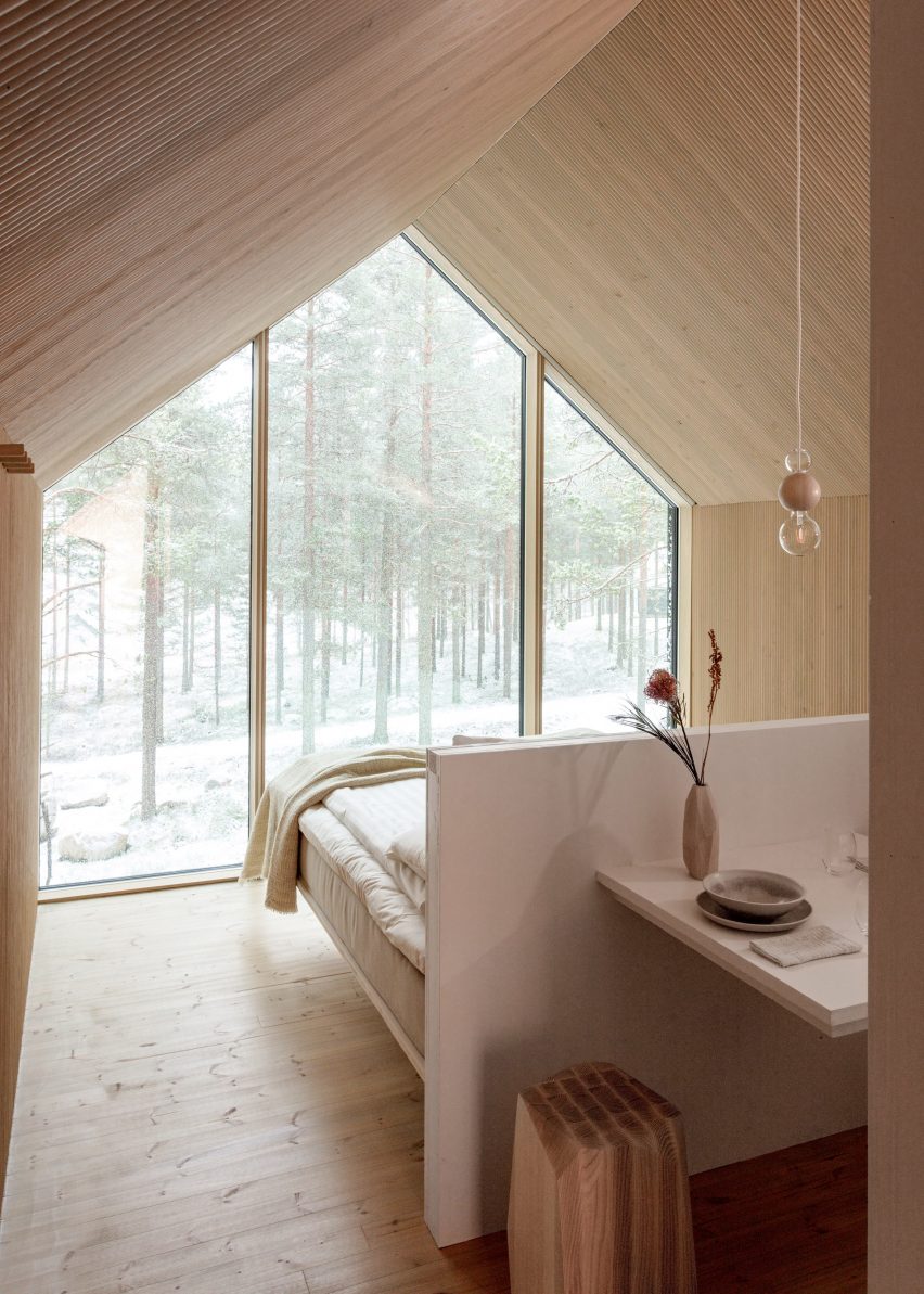
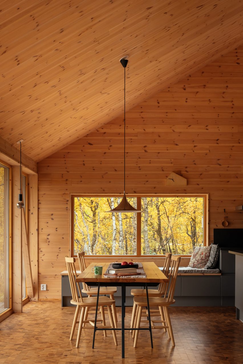
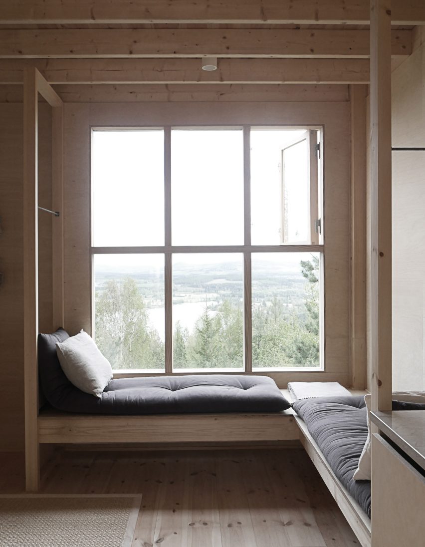
Niliaitta, Finland, by Studio Puisto
In the absence of bedside tables, most of the space inside this cabin near Finland’s Salamajärvi National Park is occupied by a custom-made bed, placed directly in front of a glazed wall.
Local practice Studio Puisto kept furnishings to a minimum and covered nearly all of the surfaces in the same pale wood, so as not to compete with the natural spectacle.
“The interior is done purposefully so that it would only serve as a neutral blank canvas, second to the nature outside,” Studio Puisto said.
Find out more about Niliaitta ›
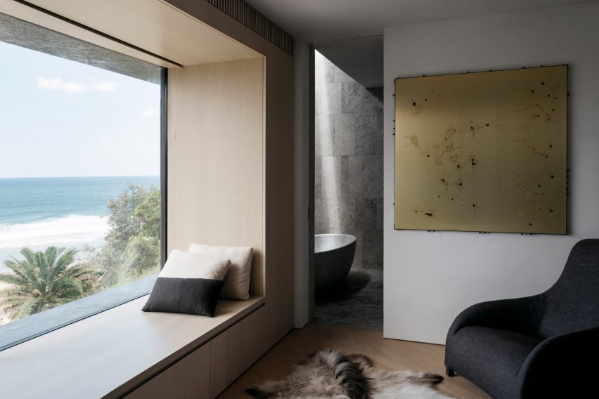
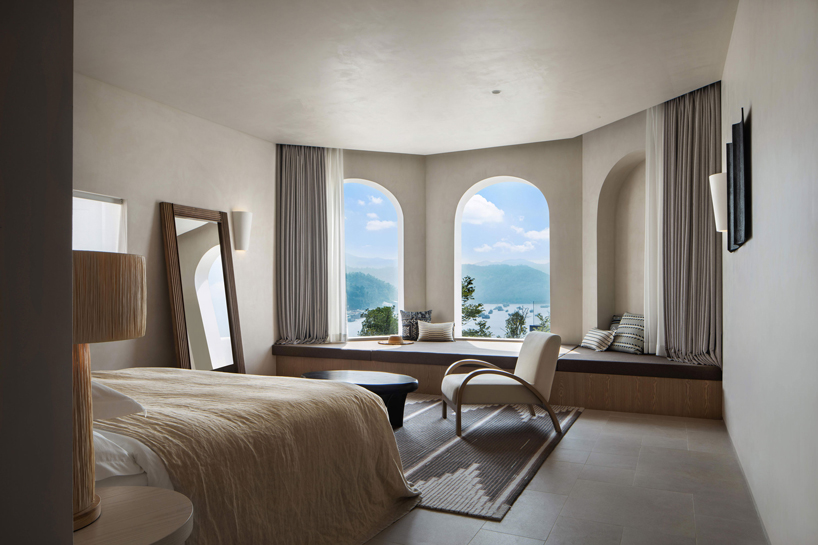
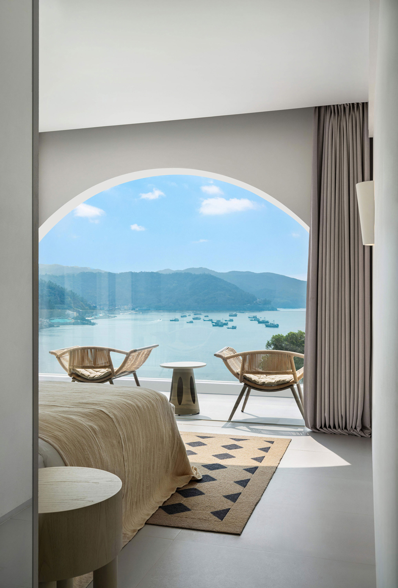
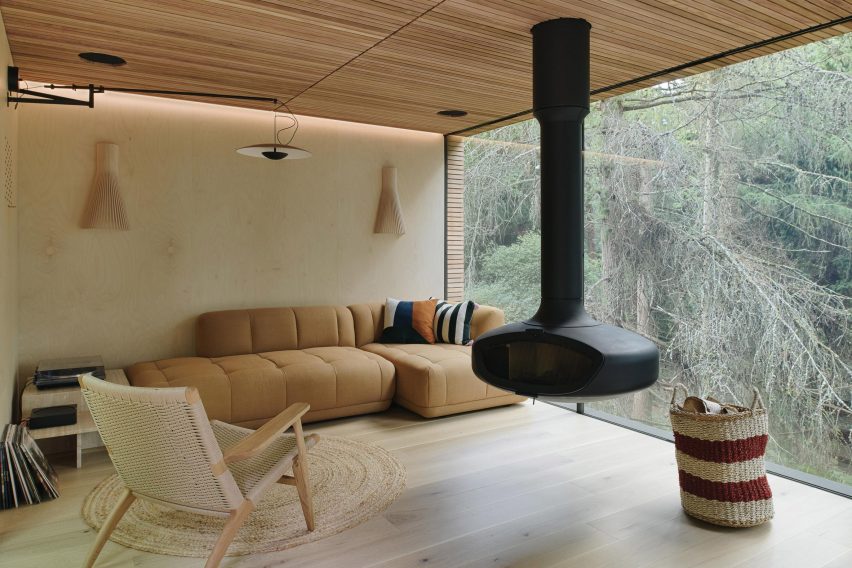
Matopos, Australia, by Atelier Andy Carson
When Atelier Andy Carson renovated the home of gallerist Judith Neilson, the Sydney studio set out to provide a minimalist backdrop for her personal collection of art and furniture.
Meanwhile, finishes and window placements throughout the house were chosen to honour nearby Freshwater Beach, with the best views provided by the window seat in the primary bedroom.
“Thoughtfully placed windows frame vistas of the sea, while polished plaster interior walls reflect views of the blue and yellow hues of ocean and sand back into the home,” the studio said.
Find out more about Matopos ›
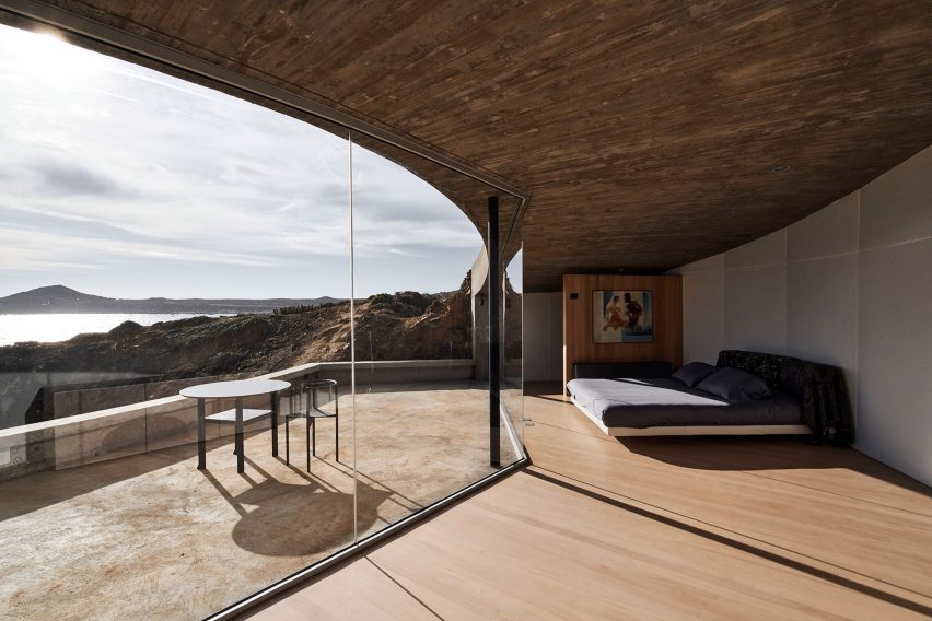
House in Los Vilos, Chile, by Ryue Nishizawa
This bedroom was carved out of a cliffside on Chile’s Pacific coast, with a glass front and private terrace opening it up to views of crashing waves and craggy rocks.
The building’s board-marked concrete slab roof is left exposed throughout the interior, paired with pared-back wooden furnishings and floors.
Find out more about House in Los Vilos ›
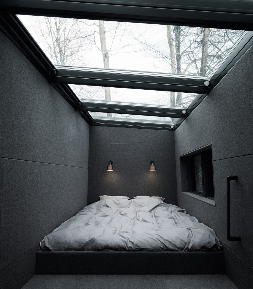
Shelter, Sweden, by Vipp
A huge skylight stretches across the ceiling of this compact loft bedroom, set in a prefabricated cabin on the banks of Lake Immeln in Sweden, to create the impression of sleeping under the open sky.
To keep attention on the stars, the monochrome interior features moody lighting and slate grey felt panels that cover both the walls and the floors.
Find out more about Shelter ›
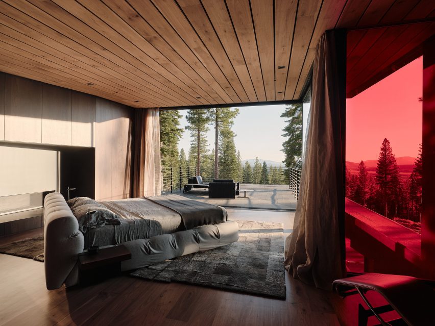
Lookout House, USA, by Faulkner Architects
A huge bed is placed diagonally at the centre of this room, effectively displacing all other furniture but taking full advantage of the home’s sweeping Lake Tahoe panorama.
For the interior, Californian studio Faulkner Architects brought together local materials including volcanic basalt, concrete made using local sand and walnut wood sourced from orchards in the nearby Sierra foothills.
“Consistent through the house, the quiet built environment is muted in colour and tonality, which allows the landscape outside to be the focus,” said the studio.
Find out more about Lookout House ›
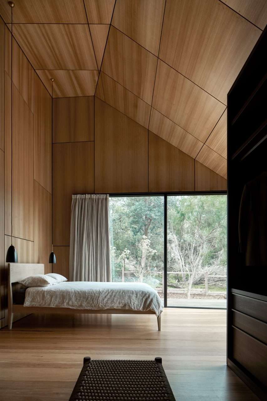
Casa X, Australia, by Branch Studio Architects
Dramatic sloped ceilings finished in pale wood panelling envelop the bedrooms of this house on Phillip Island near Melbourne, with bedside pendant lights suspended from their highest point.
Glazing covers the better part of one wall, looking out over the trees that encircle the property to provide privacy despite the home’s beachfront location.
Find out more about Casa X ›
This is the latest in our lookbooks series, which provides visual inspiration from Dezeen’s archive. For more inspiration see previous lookbooks featuring bedrooms with bathtubs, statement headboards and wood-panelled dining rooms.

 As the centerpiece of the Des Moines Western Gateway Park urban renewal project, this public library was sited between the center of the city and a newly designed public park. As well as library facilities, the building contains a flexible activity space, education facilities, children’s play areas, a conference wing and a cafeteria. In plan, it responds to the orthogonal nature of the city blocks to the east while stretching out into the park to the west. This plan is extruded vertically with a glass-metal skin, which gives the building its distinctive appearance.
 Harkening back to the beginning of insulated glazing itself, the Halley VI Antarctic Research Station was designed for polar research. As the world’s first re-locatable research facility, it was constructed by Galliford Try for the British Antarctic Survey (BAS). The project aimed to demonstrate ground-breaking architecture characterized by a compelling concept, but also a structure that’s executed with careful attention to detail and coordination.
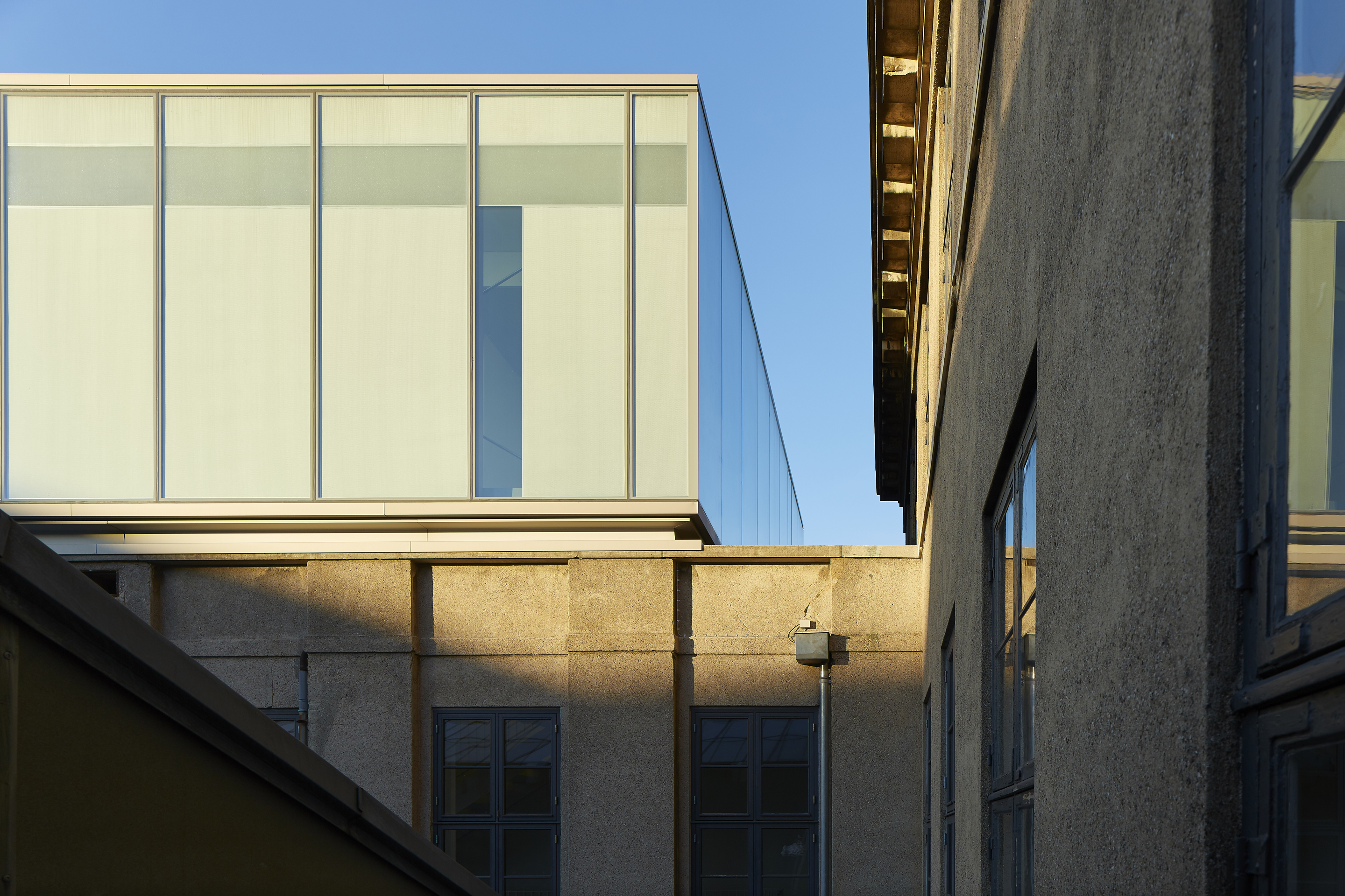
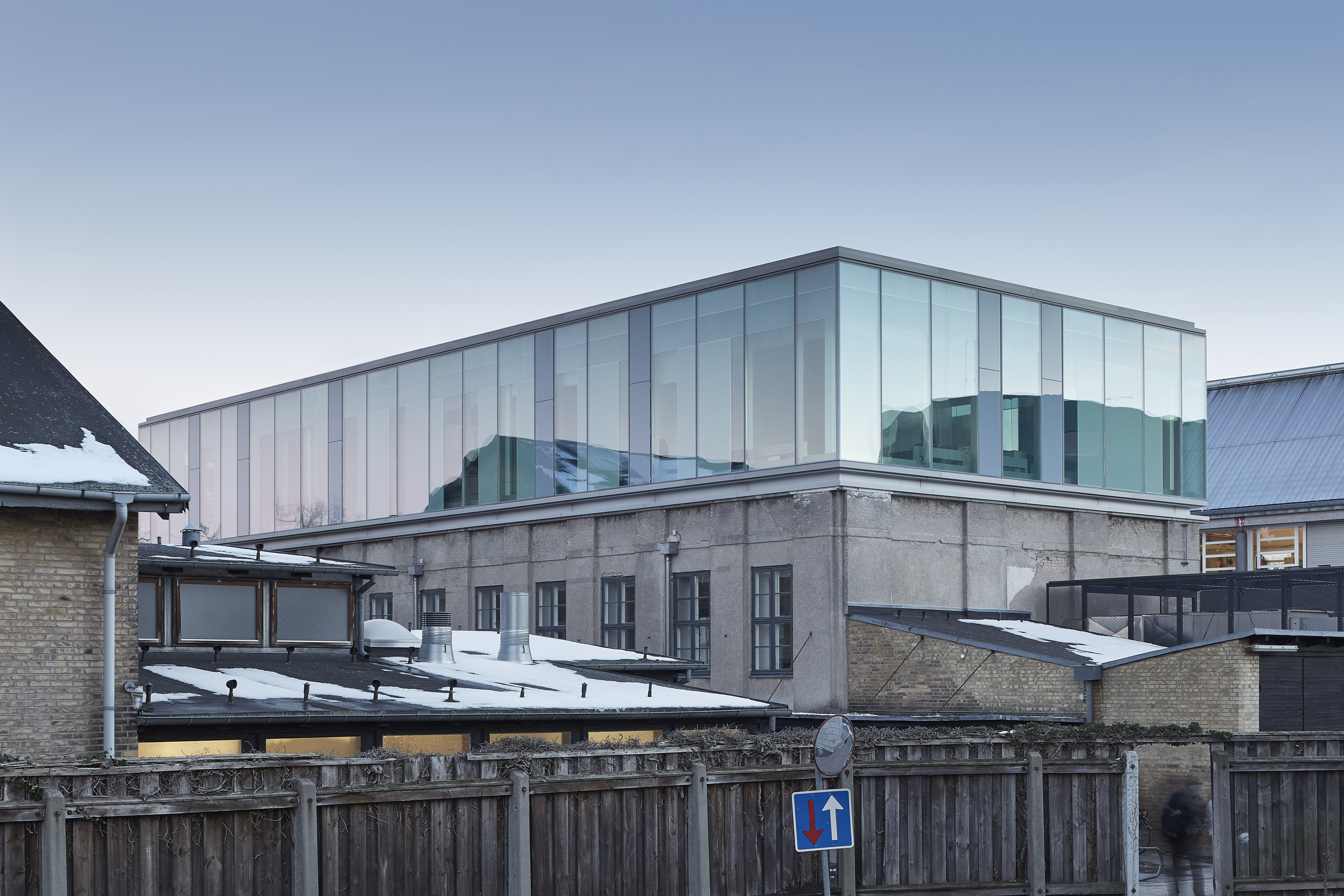 Extending an existing university gymnastic hall with a testing laboratory, the Damesal project was designed with a new building on top. The project offered an opportunity to explore an architectural concept where the geometry of the additional floor is designed with a simple box shape in glass. The architectural and functional variation happens as the glass façade responds to the program and functions within the building. The building’s envelope embodies design and performance as a collaboration between the architect and the supplier of the customized glass solution.
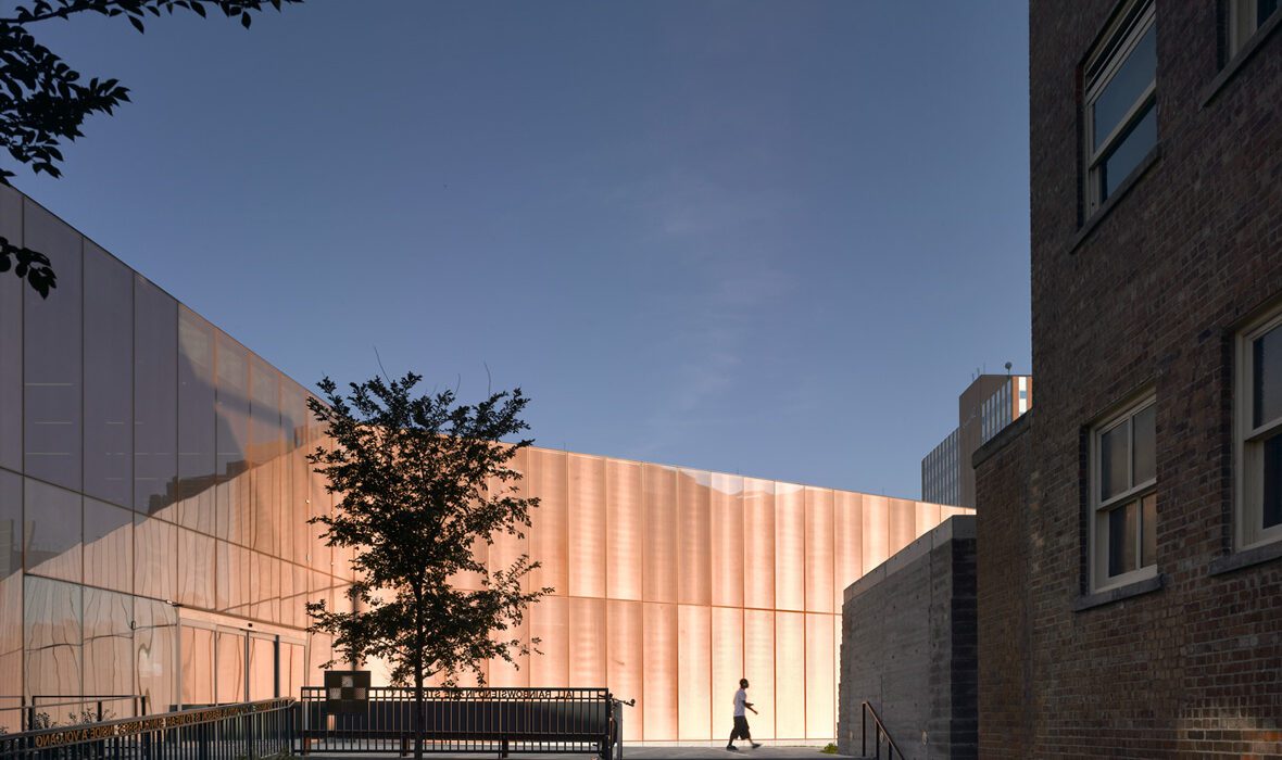
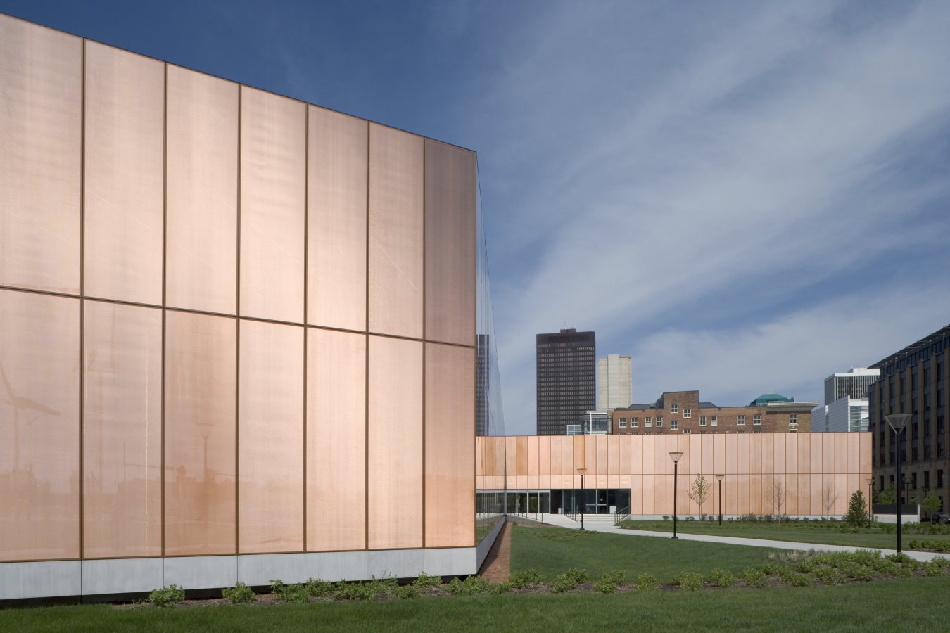
 The Greenpoint Emergency Medical Service (EMS) Station was designed as a two-story facility that supports FDNY ambulance crews and vehicles. The project was made with a strong, distinctive form occupying a prominent site in the rapidly developing neighborhood. The station’s requirements led to a four-part division of the facility. Because the space for housing vehicles called for a higher ceiling height than the rest of station, one side is taller than the other. This change organizes the building’s functions.
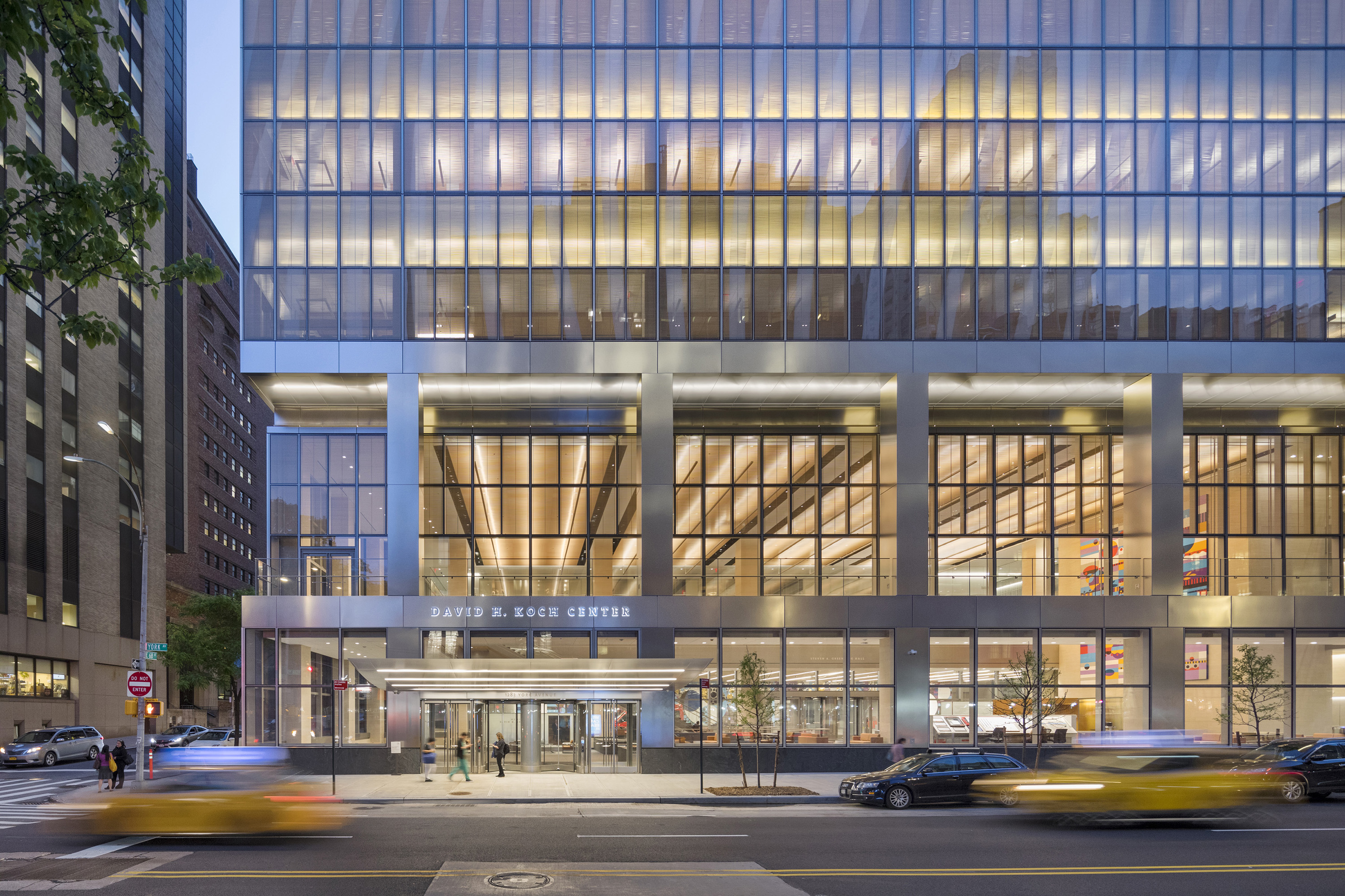
 The Koch Center was designed to provide advanced integrative healthcare and complex outpatient services. Patient-centered and family-centered care is at the forefront of the building’s medical program, announced by a triple-height lobby that offers respite from the surrounding streets. Infusion and radiation oncology areas, as well as diagnostic imaging, typically found in basement areas, are located on upper floors. This gives patients and staff the benefit of natural light.
 SHA designed the Cité de l’Océan et du Surf museum to raise awareness of oceanic issues and explore educational and scientific aspects of the surf and sea. Centered around leisure, science, and ecology, the project was made in collaboration with Solange Fabião. The design includes the museum, exhibition areas, and a plaza, within a larger master plan. The building form derives from the spatial concept “under the sky”/“under the sea”.