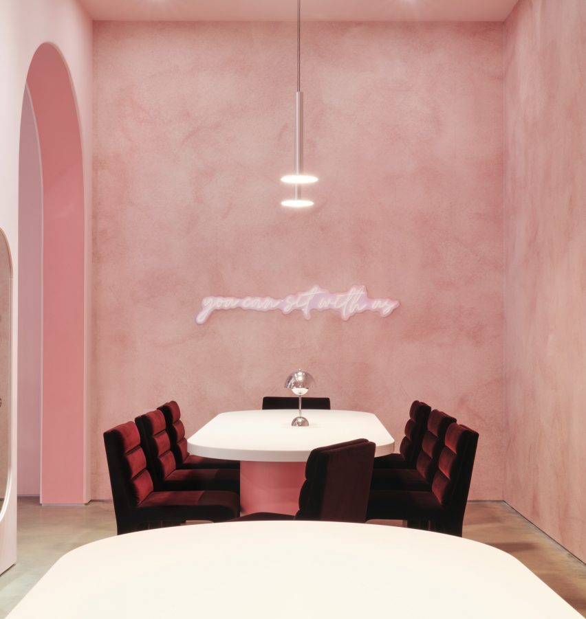
Los Angeles design studio Gharib Studio has contrasted concrete floors and exposed ceilings with soft-pink walls and clean lines for a jewellery store in Austin.
Created for the friendship jewellery brand Little Words Project (LWP), Gharib Studio used elements of the merchandise to inform the store’s pink material palette and incorporated arches throughout the space to contrast the industrial elements of the building, which were left exposed.
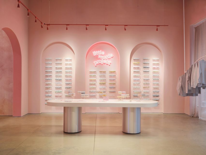
Gharib Studio has outfitted a jewellery store in Austin with dusty pink
According to Gharib Studio founder Nora Gharib, the team followed the common phrase “everything is bigger in Texas” when designing the concept store.
“I wanted to amplify the brand in a grand way by taking the LWP brand aesthetic and localizing it to Texas by pushing the standard design elements, such as the brand’s bracelet arches and beading table experience, then accentuating it,” said Gharib.
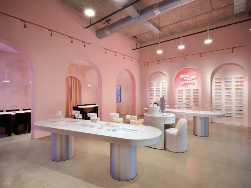
Arches and soft tones contrast with the space’s industrial elements
Visitors enter the store into a large, primary space, where built-in display cases were integrated into the walls.
On one side, the display resembles small bookcases and on the other, the bracelets are displayed throughout a series of arches.
Long tables lead to the seating area at the back of the space
At the centre of the primary space are two long tables with metallic-coated bases, also used for display. A circular display table in the middle was created to resemble a vanity, with merchandise incorporated throughout.
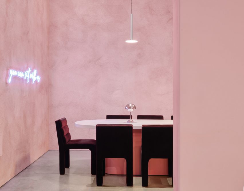
Gharib inserted three arches along the back of the space, in part to accentuate the height of the space, and to draw visitors to the space beyond them, which serves as a beading area.
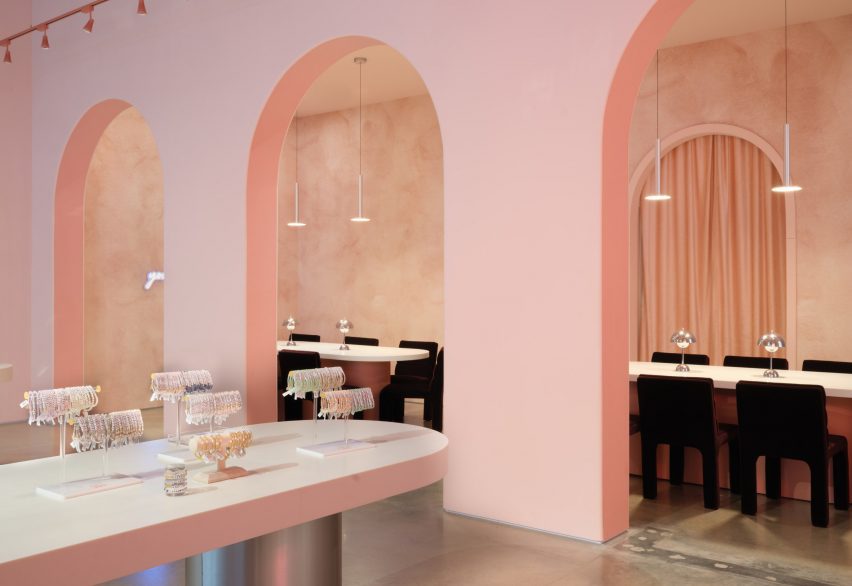
Metallic details were informed by the charms found on the bracelets
This space was outfitted with CB2 Castell Chairs in burgundy, with similar tables as the main space, except with pink bases instead of silver.
A neon sign that reads, “You can sit with us” hangs above the tables.
Textured dusty-pink wallpaper by Belarte Studio was used to line the space, while the remaining interior was covered in a rose pink hue.
Metallic accents throughout the store, including aluminium light pendants, a metal trimmed mirror and the display table’s metallic bases, were informed by the metal charms found in LWP bracelets.
It is the brand’s first store in Austin
The space’s utility elements were left exposed on the ceiling, with red track lighting running the perimeter of the space.
Other retail projects recently completed in Austin include a mid-century post office turned grocery by Side Angle Side.
Gharib Studio is a Los Angeles-based studio founded by Nora Gharib in 2023, focused on retail and brand design.
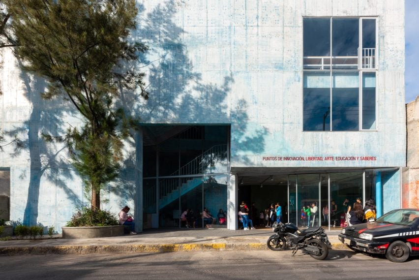
Design firms WORKac and Ignacio Urquiza Architects have created a multi-level, concrete community centre in an underserved neighbourhood that is meant to “promote the regeneration of social life”.
The building by New York’s WORKac and local studio Ignacio Urquiza Arquitectos – officially called PILARES Lomas de Becerra — is located in a hilly area and rises up from a dense intersection surrounded by active streets.
The community centre is located in Mexico City
Located in Mexico City’s Lomas de Becerra neighbourhood, the building was created as part of a government initiative called PILARES, which stands for Points of Innovation, Freedom, Art, Education and Knowledge.
For a slender, irregularly shaped site, the team devised a multi-storey facility that encompasses 5,059 square feet (470 square metres).
WORKac and Ignacio Urquiza Architects designed the multi-level structure
“In appearance, the volume is simple and compact, with a strong character that confirms its presence as a public building,” the team said.
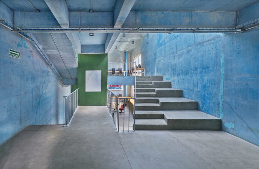
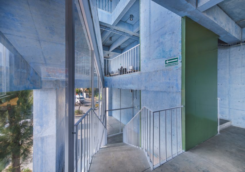
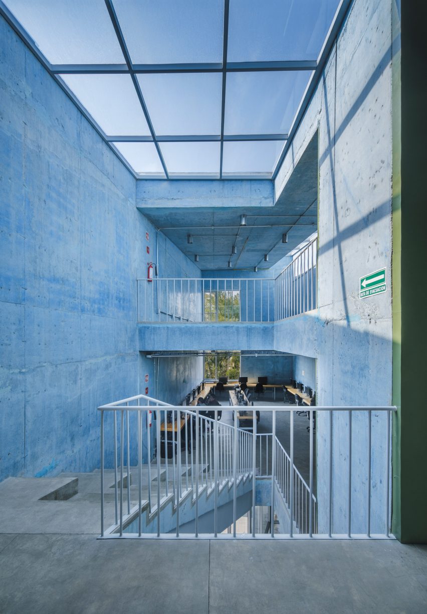
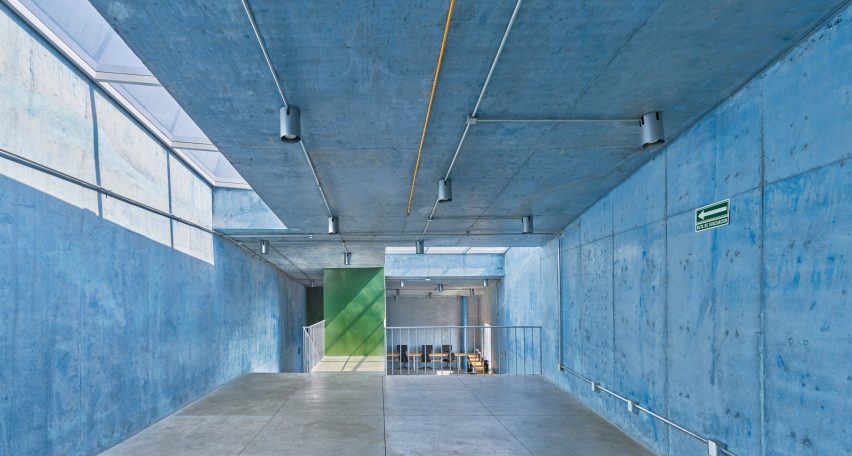
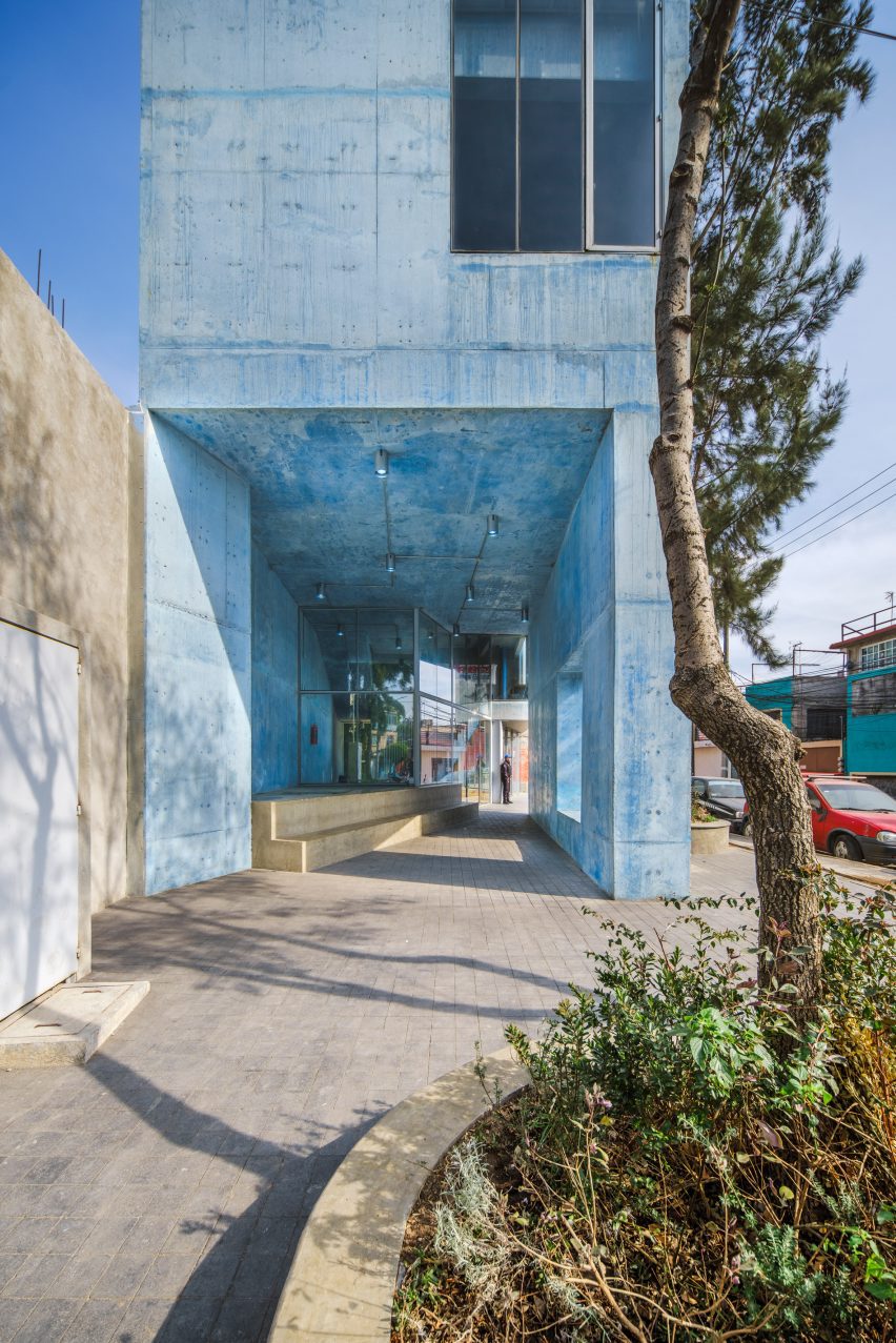
Walls are made of concrete – a material chosen for its construction and structural efficiencies, as well as its thermal and aesthetic qualities, the team said. The concrete was dyed blue, a decision informed by the vibrant colours found in the surrounding area.
The team devised the building for a slender, irregularly shaped site
Launched in 2018, the PILARES programme aims to create opportunities for residents in underserved areas.
“Each PILARES building is designed to support various kinds of classes and workshops in support of skill building, as well as bringing cultural programming, learning opportunities, and safe spaces for leisure and cross-generational gathering to each neighbourhood,” said New York’s WORKac.
“The sites selected for their construction create new landmarks in the urban fabric, enabling the population to identify them as community meeting centres that promote the regeneration of social life.”
Walls are made of blue concrete
Mexico City’s government enlisted local and international design studios to create 26 facilities under the programme.
Buildings are meant to respond to the local context and follow programming guidelines developed through extensive community engagement.
The building is meant to respond to its local context
The team tried to reflect the community and its values in the architecture.
“The use of colour in Mexican architecture is an element that has been transformed and reinterpreted in the hands of many artists and architects across generations,” the team said.
The building is fronted by a plaza that is shaded by pre-existing trees.
The building is fronted by a plaza with trees
Part of the ground floor is sliced away to form an angled, glazed entry wall, which helps “the transition between exterior and interior spaces”, the team said.
“The diagonal opening on the ground floor provides clear and free-flowing pedestrian routes in every direction, inviting users to walk around the plaza and enter the building,” the team said.
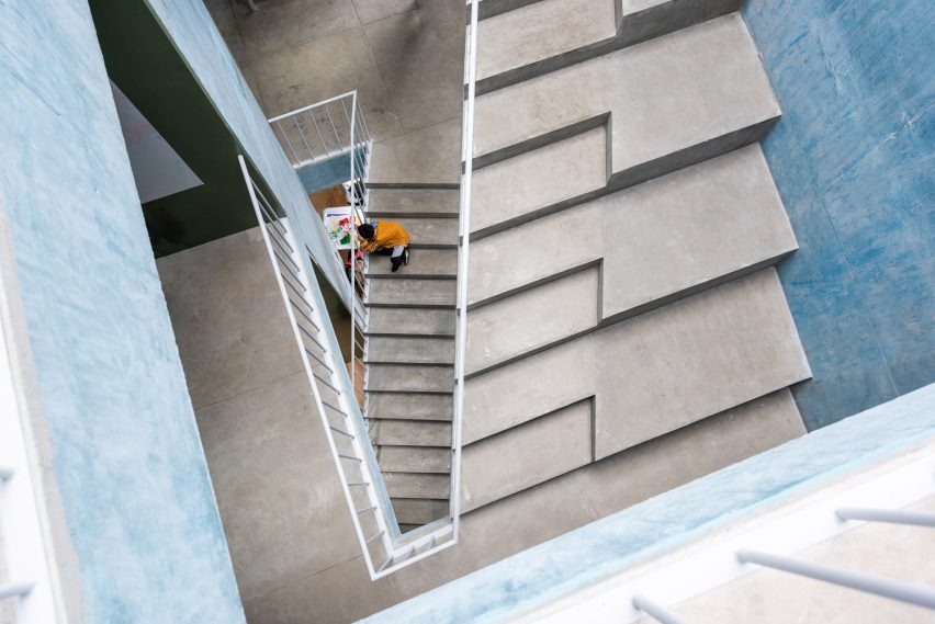
Inside, the building contains three split levels, all of which are connected by a central staircase. Rooms are designed to be fluid and adaptable.
“This flexible approach leaves open the possibility for changes to the programme over the lifetime of the building and allows it to freely evolve and adapt,” the team said.
Three split levels are connected by a central staircase
WORKac and Ignacio Urquiza Architects have designed a second PILARES building, in the borough of Azcapotzalco, that follows a similar design vocabulary.
Other PILARES buildings include a community centre in Iztapalapa by Rozana Montiel Estudio de Arquitectura that features a series of bridges, walkways and exterior staircases.
Architect: WORKac and Ignacio Urquiza Architects (IUA) Team: Amale Andraos, Dan Wood, Ignacio Urquiza Seoane, Michela Lostia di Santa Sofía, Eder Hernández, María del Mar Carballo, Ana Laura Ochoa, Anet Carmona, Noé García, León Chávez, Fernando Tueme, Sacha Bourgarel Interior design and lighting: WORKac, IUA and APDA Structure and engineering: BVG (César Barquera, Eduardo Barquera); Ecomadi Landscape: Genfor Landscaping (Tanya Eguiluz) Development: Mexico City government and ZV Studio (Carlos Zedillo) Digital visualizations: Israel Levy Client: Mexico City government
Czech architecture studio Neuhäusl Hunal has renovated a prefabricated apartment in Prague, turning it into an open-plan home and workspace for sculptor and glassworker Vladimír Bachorík.
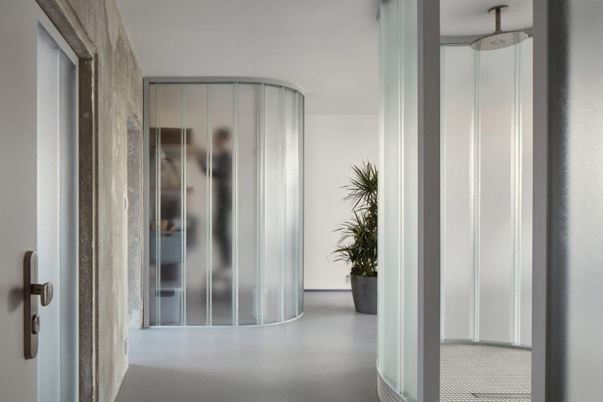
Neuhäusl Hunal opted for curved translucent glass partitions in place of doors to divide the interior spaces and create a sense of openness and fluidity.
U-profiled glass partitions divide the interior spaces
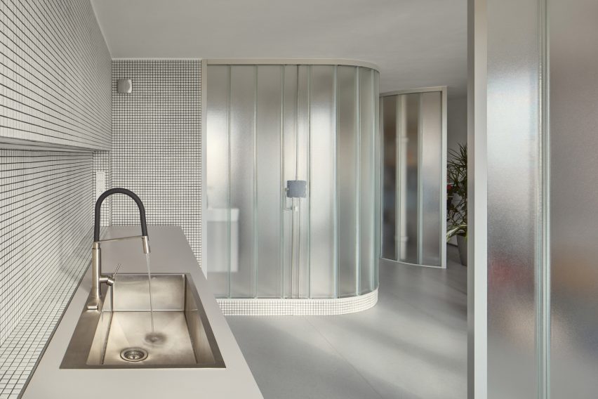
In order to maximise floor space, the studio removed all non-load-bearing elements, leaving just a single load-bearing concrete wall that cuts through the living and workspaces.
Three U-profiled glass partitions were then used to enclose a cloakroom, storage space and kitchen, while the remaining floor space can be used flexibly.
An existing load-bearing concrete wall separates the living and work spaces
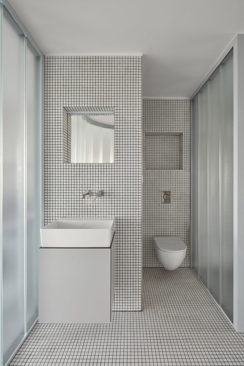
A centralised, curved bathroom, raised by a small platform for waste management, is similarly enclosed by translucent glass panels and protrudes into the main space.
The bathroom interior was lined extensively with white ceramic tiles and features a walk-in shower.
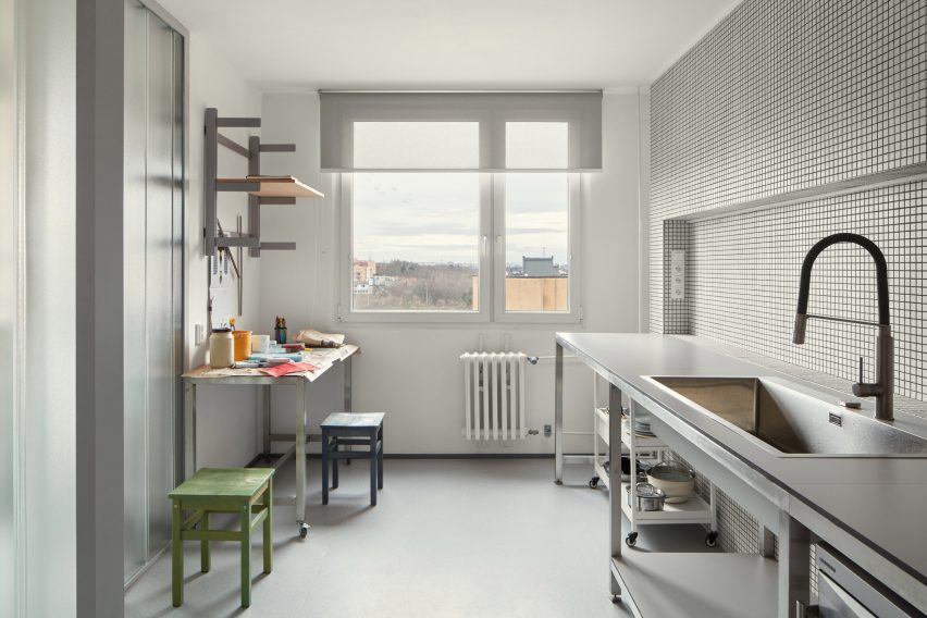
Meanwhile, matching ceramic tiles were also used in the kitchen, which doubles as a work area for the artist.
White mosaic tiles line the kitchen and bathroom
“To design the maximally open and flowing space without doors, infrastructure, besides statics, was a key constraint, which defines the location of the single-almost-enclosed space: the bathroom,” studio architect and founder David Neuhäusl told Dezeen.
“Therefore we emphasized [the bathroom] as the most prominent element in the apartment to create a strong spatial experience,” Neuhäusl continued.
The interior material palette was defined by the stripped concrete wall as well as the translucent panels and ceramic tiles, set on a background of white plaster walls and grey-toned rubber flooring.
Metal furniture and shelving was used throughout the minimalist interior, with cubic plinths used to display Bachorík’s glasswork around the space.
Existing windows draw daylight into the interior spaces
Daylight shines through the existing windows at either end of the apartment and penetrates the glass partitions to create a brightly lit interior, while carefully positioned strip lights and spotlights provide artificial lighting.
“These translucent glass blocks of high order ensure the penetration of light and create identity of the apartment,” Neuhäusl explained.
“Their materiality and character naturally refer to the client’s lifelong work. They can be naturally composed in curves to formulate the softly shaped partitions.”
Metal furniture is used throughout the space
Neuhäusl Hunal is an architecture studio founded by David Neuhäusl and Matěj Hunal in the Czech Republic.
Other projects recently completed in the Czech Republic include a winery topped with a sweeping concrete roof and an angular black extension to a neo-gothic church.
Dezeen’s latest lookbook explores eight interiors – from bright, airy residential spaces to cool, open-plan offices – illuminated by perforated brick walls.
Perforated brick walls are often used as a cooling strategy in warmer climates. This lookbook highlights their effect on the lighting and shading of interior spaces and how they can be used to create a playful, light atmosphere.
This is the latest in our lookbooks series, which provides visual inspiration from Dezeen’s archive. For more inspiration see previous lookbooks featuring homes with light-filled kitchens, sculptural wooden staircases and airy, pared-back loft conversions.
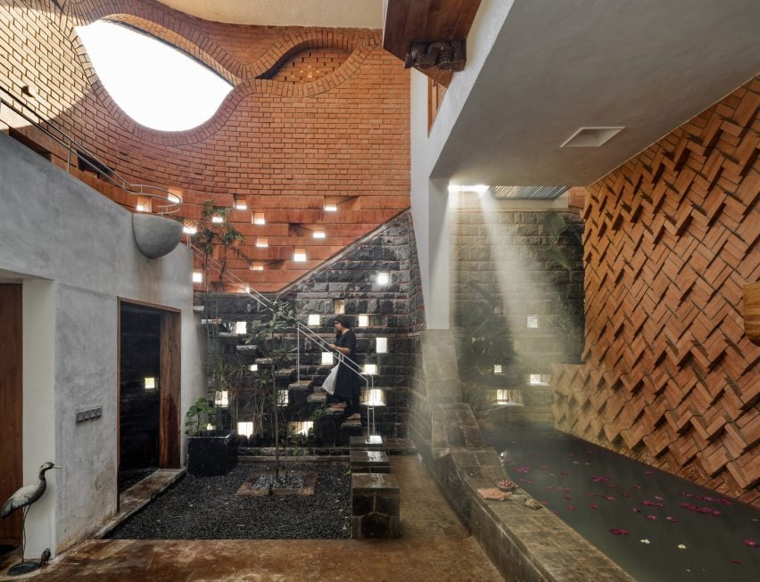
Photo by Hemant Patil
Studio by the Hill, India, by Mind Manifestation
This converted apartment in Pune, India – designed by architecture studio Mind Manifestation to house the studio’s office – uses perforated bricks to create a well-lit and ventilated workspace.
Bricks was used extensively across the flooring and complemented by green lime plaster walls.
“The material palette has been tastefully chosen so as to match with the different shades of the hill throughout the year,” Mind Manifestation explained.
Find out more about Studio by the Hill ›
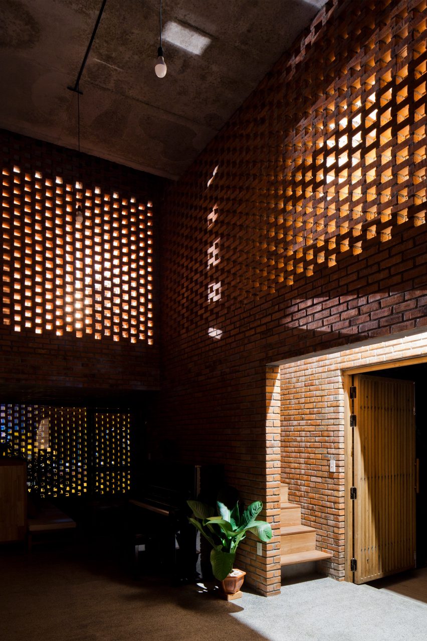
Photo by Oki Hiroyuki
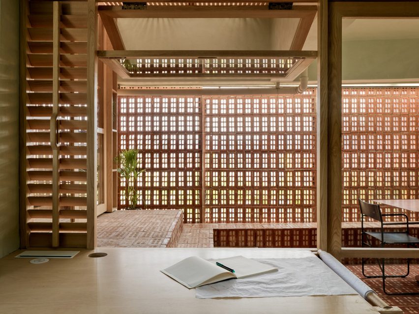
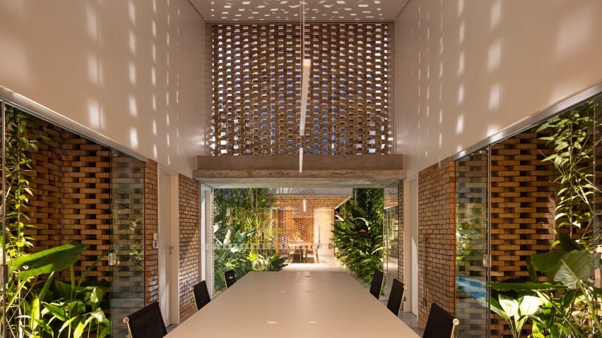
Cuckoo House, Vietnam, by Tropical Space
Cuckoo House, designed by Tropical Space, is a two-storey home situated atop a cafe in Da Nang, Vietnam, encased by a shell made from local clay bricks.
Living spaces on the upper floor feature perforated brick for privacy and ventilation, with the design resulting in a playful chequered lighting pattern across the wooden and concrete interior.
Find out more about Cuckoo House ›
Photo by Oki Hiroyuki
Wall House, Vietnam, by CTA
Square perforated bricks salvaged from nearby buildings sites are used on the exterior of CTA’s Wall House in Bien Hoa, Vietnam.
Stacked in an irregular formation, the punctured bricks filter sunlight and air into the space, creating dotted shadows across the plant-filled double-height living room.
Find out more about Wall House ›
Photo by Hemant Patil
Gadi House, India, by PMA Madhushala
Gadi House in Maval, India, by PMA Madhushala is a compact arrangement of volumes and courtyards.
Dimly-lit courtyards and living spaces are illuminated by pockets of sunlight accessed through perforations in the brick and stone walls.
Find out more about Gadi House ›
Photo by Federico Cairoli
Intermediate House, Paraguay, by Equipo de Arquitectura
The Intermediate House by Paraguay-based studio Equipo de Arquitectura is a narrow residence in Asunción organised around an open-air courtyard.
Manually pressed, unfired bricks form the perforated street-facing facade – drawing sunlight and air through the vaulted brick-roofed dining room and into adjacent spaces.
Find out more about Intermediate House ›
Photo by Oki Hiroyuki
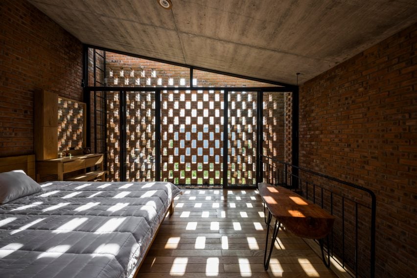
The Termitary House, Vietnam, by Tropical Space
Patterned shadows decorate the dimly-lit brick and wood interior of The Termitary House in Da Nang, Vietnam, designed by Tropical Space.
Inspired by earthen termite nests, the studio used perforated brick on the facade and internal walls to bring natural light into the interiors during the day and draw in artificial light at night.
Find out more about The Termitary House ›
Photo by Timothy Kaye
Cloud House, Australia, by Dean Dyson Architects
Australian studio Dean Dyson Architects designed the Cloud House – a two-storey home in Malvern – using an exterior layer of grey, perforated brickwork.
Intended to create a “private oasis” for the clients, the perforated brick pours light into the interior living spaces, with passive ventilation enabled by operable windows.
Find out more about Cloud House ›
Photo by Joana França
Tropical Shed, Brazil, by Laurent Troost Architectures
Located on a long, narrow plot in Manaus, Tropical Shed is a plant-filled office with a centralised courtyard designed by Brazilian studio Laurent Troost Architectures.
Interlocking bricks – repeated throughout the design – form a perforated wall in the double-height office to create a cool work environment decorated with playful shadows.
Find out more about Tropical Shed ›
This is the latest in our lookbooks series, which provides visual inspiration from Dezeen’s archive. For more inspiration see previous lookbooks featuring homes with light-filled kitchens, sculptural wooden staircases and airy, pared-back loft conversions.
Faux fur is liberated from the realm of fashion and used to cover entire walls in this lookbook, which rounds up five interior projects including an igloo-shaped children’s room and a surreal Prada set by AMO.
Rendered in grabby colours, furry textiles are increasingly being used by interior designers to make retail environments feel more enticing, as seen below in the all-pink makeover of Balenciaga’s London store and the monochrome grey fit-out of Chinese womenswear boutique SND.
But in colder climes – like the ski town of Aspen – fake fur can also serve a practical purpose by providing some much-needed cosiness.
Read on for five examples of interiors that are using this unconventional material on an architectural scale.
This is the latest in our lookbooks series, which provides visual inspiration from Dezeen’s archive. For more inspiration see previous lookbooks featuring subway-tiled bathrooms, chequerboard floors and rustic Italian interiors.
Photo by Billal Baruk Taright
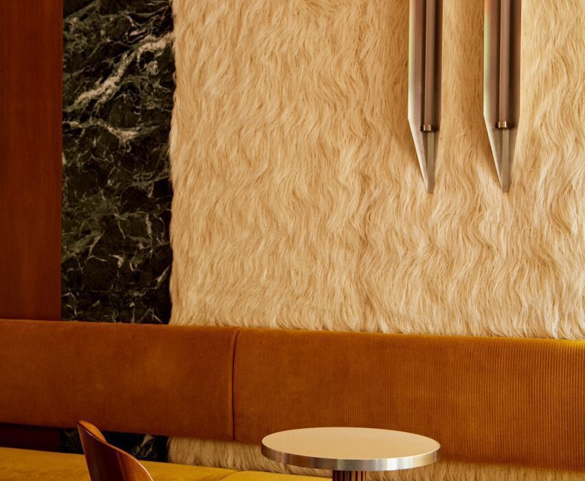
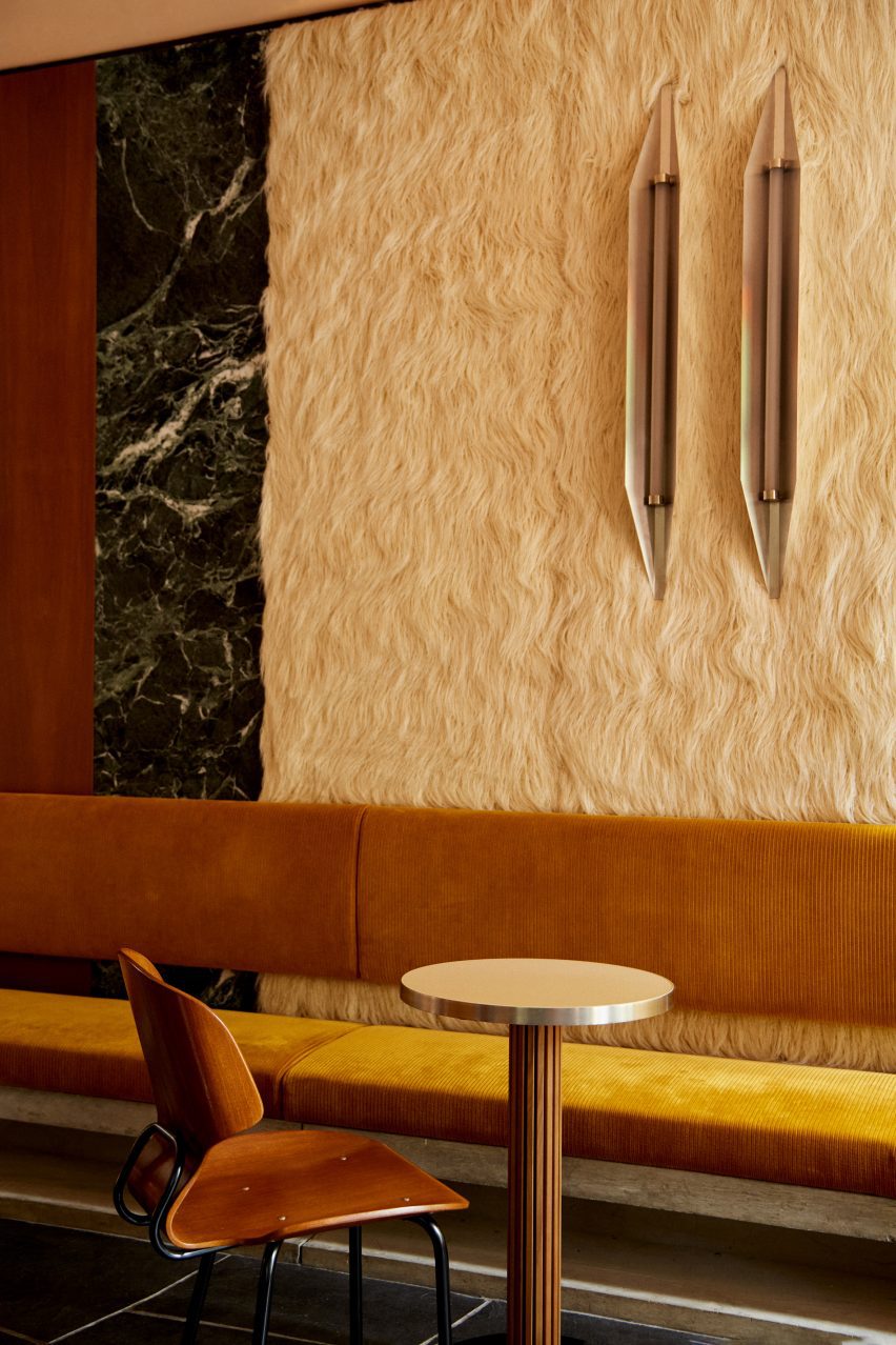
Sant Ambroeus Coffee Bar Aspen, US, by Giampiero Tagliaferri Studio
Cosy Alpine touches meet midcentury Italian glamour inside this coffee bar that designer Giampiero Tagliaferri has completed in the ski town of Aspen.
Here, the walls are clad in alternating panels of walnut wood, deep green Verde Alpi marble and faux fur that was designed to resemble shaggy Mongolian lamb wool.
Find out more about the Sant Ambroeus Coffee Bar Aspen ›
Mount Street store, UK, by Balenciaga
Every surface inside Balenciaga’s London store – from the walls and floors to the columns and shelves – was wrapped in furry bright pink textile as part of a temporary installation last April.
The intervention was designed to celebrate the brand’s popular Le Cagole bag and its maximalist spirit, with the materials used now set to be reused for future projects.
“We are currently researching the best way in which we can donate the faux fur, so that it can be reused in manufacturing toys for example,” Balenciaga told Dezeen.
Find out more about the Mount Street store ›
Photo by José Hevia
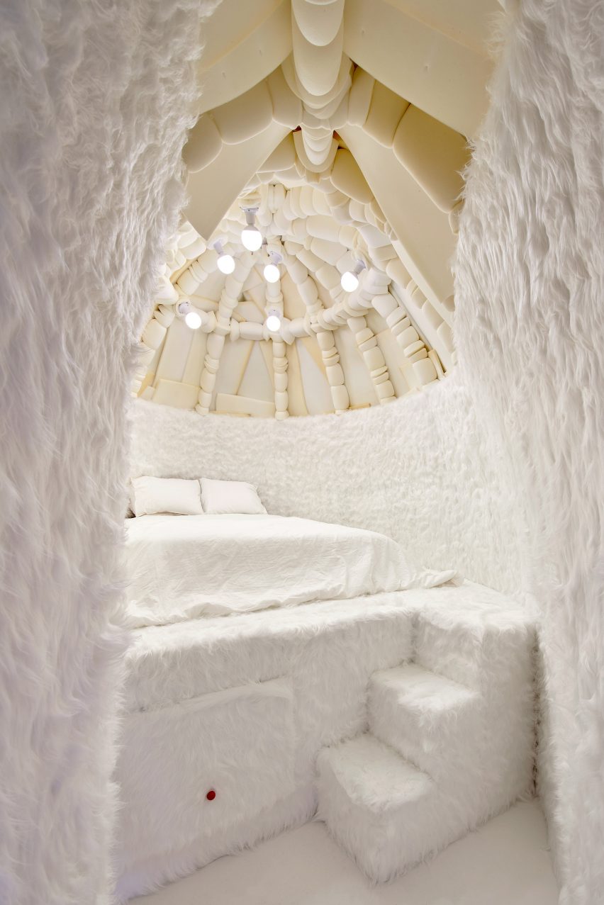
Winter Bedroom (for a Big Grrl), Spain, by Takk
This winter-themed bedroom belongs to the young daughter of Spanish designers Mireia Luzárraga and Alejandro Muiño and is topped with a 3.5-metre-high dome designed to resemble an igloo.
Fuzzy white carpet clads almost every inch of the space to create the impression that the all-white interior is covered in a blanket of snow.
Find out more about Winter Bedroom (for a Big Grrl) ›
Photo by Agostino Osio
Prada AW21 2021 menswear show, Italy, by Rem Koolhaas and AMO
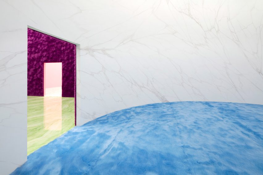
For Prada’s Autumn Winter 2021 menswear presentation, research studio AMO created a sequence of four geometric rooms designed to create “the illusion of a never-ending route”.
Each room inverts the material arrangements of the one that came before, with white marble walls and fluffy sky-blue carpet making way for glossy stone flooring and furry walls in a moody magenta colour.
Find out more about the Prada AW21 menswear show ›
Photo by Shao Feng
SND boutique, China, by Various Associates
In the absence of colour, Chinese studio Various Associates relied on contrasting textures and dramatically slanted walls to provide aesthetic interest inside this womenswear store in Chongqing, China.
The interior combines furry changing-room pods will full-height mirrors to make the store feel more “visually magical and spacious”.
Find out more about SND boutique ›
This is the latest in our lookbooks series, which provides visual inspiration from Dezeen’s archive. For more inspiration see previous lookbooks featuring subway-tiled bathrooms, chequerboard floors and rustic Italian interiors.
For our latest lookbook, we have selected eight interiors that use lattice screens to conceal and divide spaces without blocking sightlines.
Lattice screens can come in a variety of materials and provide a versatile alternative to solid walls and room dividers, offering a way to create privacy between two spaces while still maintaining a connection between them.
From concealing bathrooms to establishing connections between interior and exterior spaces, this lookbook presents eight different ways in which lattice screens have been used in residential, hotel and restaurant interiors.
This is the latest in our lookbooks series, which provides visual inspiration from Dezeen’s archive. For more inspiration see previous lookbooks featuring period home renovations, open-plan interiors characterised by bold dining tables and interiors with reclaimed materials.
Photo by Denilson Machado
Dendê Duratex House, Brazil, by NJ+
Brazilian architecture studio NJ+ took cues from Bahia, the Brazilian state that studio founder Nildo José grew up in, to create the interior of Dendê Duratex House. Here, it integrated a white latticework structure that separates the living space from the bedroom.
The volume encompasses the one-bedroom apartment’s bathroom and kitchen amenities while introducing texture to the monochrome minimalist home.
Find out more about Dendê Duratex House ›
Photo by Amit Geron
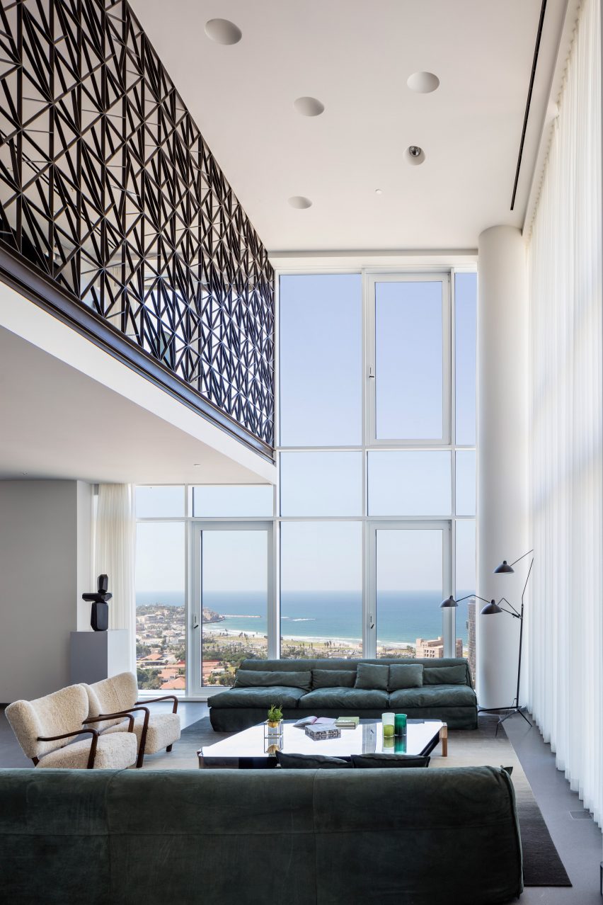
P Duplex apartment, Israel, by Pitsou Kedem Architects
The second floor of this apartment in Tel Aviv was transformed into a mezzanine that overlooks a double-height living and dining room by local practice Pitsou Kedem.
A black metal guardrail wraps the upper level, tracing the route from the staircase to the upper floor and offering security while allowing views of the floor below. The see-through lattice design features triangular shapes compiled into rectangular modules.
Find out more about P Duplex apartment ›
Photo by Pedro Pegenaute
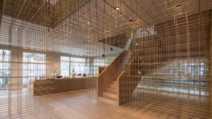
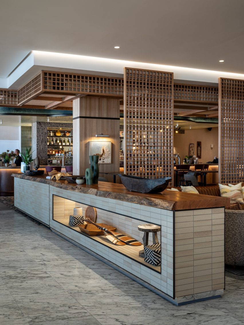
Sulwhasoo Flagship Store, South Korea, by Neri&Hu
This five-storey flagship store, designed for Korean skincare brand Sulwhasoo, is characterised by large expanses of brass rods that form a lattice network. Used throughout the store, the latticed walls form see-through room dividers as well as shelving.
The framework continues from the exterior into the interior of the store, guiding visitors through the five floors. Architecture studio Neri&Hu’s concept was informed by lanterns and their role in illuminating journeys in Asian culture.
Find out more about Sulwhasoo Flagship Store ›
Photo by Andrii Shurpenkov
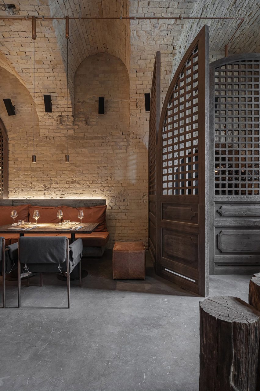
Virgin Izakaya Bar, Ukraine, by YODEZEEN
Timber screens and red metal webbed structures conceal and divide spaces within this Japanese restaurant in Kyiv, designed by Ukrainian architecture and design studio YODEZEEN.
The wooden lattice screens were introduced to soften the restaurant’s cold material palette, consisting of raw concrete and brick surfaces.
Find out more about Virgin Izakaya Bar ›
Photo by Luis Garvan, Luis Young and Maureen Evans
Casa Octavia, Mexico, by PPAA
Thin latticed timber screens shield this hotel’s interiors from harsh sunlight and cast intricate shadows throughout the day.
The screens aim to serve as a mediator between hotel guests and passerbys, fostering interaction between residents of the La Condesa neighbourhood in which its is located and the hotel itself, while maintaining a level of privacy.
Find out more about Casa Octavia ›
Photo by Tom Ferguson
Manly Pacific, Australia, by Luchetti Krelle
Sliding lattice screensseparate the reception from the bar in this hotel in Sydney, which was renovated by Australian studio Luchetti Krelle.
The partitions allow the two distinct spaces to blend together without losing their individual character, which is defined by contrasting material and colour palettes.
Find out more about Manly Pacific ›
Photo by Maha Nasra Eddé
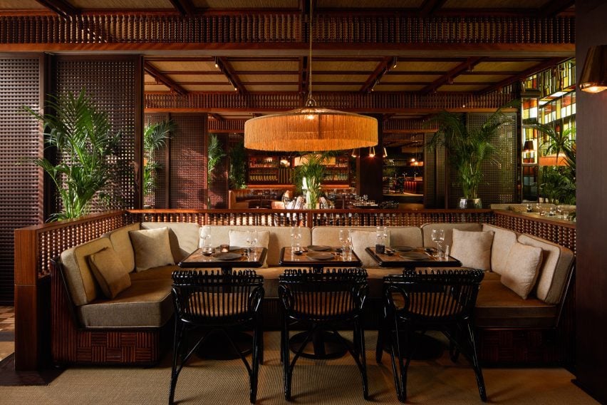
Mimi Kakushi, Dubai, by Pirajean Lees
London studio Pirajean Lees was informed by Japan’s jazz age, combining a variety of materials and textures such as beaded curtains, stained-glass windows and sliding gridded screens in this restaurant in Dubai.
The flexibility of the moveable lattice screens allows the restaurant to host events of varying crowd sizes, partitioning the open-plan layout into a variety of smaller spaces.
Find out more about Mimi Kakushi ›
Photo by Amit Geron
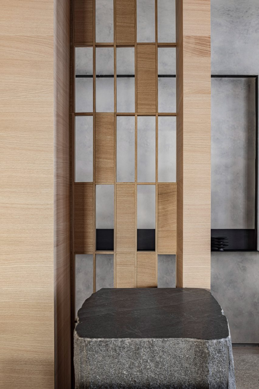
Hiba, Israel, by Pitsou Kedem Architects
A combination of solid and hollow oakwood components forms a gridded screen that allows visitors to glimpse between the dining area and the entrance of this restaurant in Tel Aviv.
Alongside oakwood, the restaurant’s interior features granite slabs and concrete. Designers Pitsou Kedem Architects aimed for the raw material palette to reflect the restaurant’s use of fresh ingredients.
Find out more about Hiba ›
This is the latest in our lookbooks series, which provides visual inspiration from Dezeen’s archive. For more inspiration see previous lookbooks featuring period home renovations, open-plan interiors characterised by bold dining tables and interiors with reclaimed materials.
For our latest lookbook, we have gathered eight examples of homes where tactile and practical lime plaster walls give the interiors a natural, calming feel.
Lime plaster is a traditional wall coating typically made from sand, water and lime. It is often used in heritage buildings, since it is a breathable material that can be a good choice for damp spaces.
It also has a natural look and feel that can help to create a more rustic and peaceful atmosphere in modern homes.
This is the latest in our lookbooks series, which provides visual inspiration from Dezeen’s archive. For more inspiration see previous lookbooks featuring clever wine storage solutions, space-efficient bedrooms and Mediterranean-style interiors.
Photo by Simone Bossi
MA House, France, by Timothee Mercier
Architect Timothee Mercier turned a rural farmhouse building in southeast France into a home for his parents that aimed to respect both the site and the region’s architectural history.
Inside, he went for a pared-back, spartan interior, where some of the house’s stone exterior was left exposed. Walls were white-washed with chaux – a local lime plaster – to create a clean backdrop for the living room’s wooden furniture.
Find out more about MA House ›
Photo by Lorenzo Zandri
Cork House, UK, by Polysmiths
Cork-clad living spaces feature in this east London home, which architecture studio Polysmiths’ director Charles Wu designed for himself and his partner.
Wu used locally sourced timber and lime plaster for the house. A lime-plastered wall divides the main bedroom from its en-suite bathroom, which is lit by a corner lightwell.
Find out more about Cork House ›
Photo by Lorenzo Zandri
Herne Hill House, UK, by TYPE
The Herne Hill House extension replaced an existing conservatory at a south London terrace house, creating a bigger kitchen and dining room.
A peaceful window nook gives views out of the garden from the open-plan kitchen, which features walls covered in lime plaster. Their pale beige hue contrasts the warm terracotta-coloured quarry-tile floor.
Find out more about Herne Hill House ›
Photo by David Dworkind
Québec home, Canada, by Ménard Dworkind
This home in Montréal centres around a lime-plastered, curved central block that sweeps around a staircase and forms a mezzanine level that overlooks the living room.
Here, the rounded wall holds a terracotta fireplace. A geometric steel table adds a more modernist and industrial feel to the organic interior.
Find out more about the Québec home ›
Photo by Mikaela Burstow
Iceberg apartment, Israel, by Laila Architecture
Natural lime plaster covers the walls in this Israeli apartment, which gets its name from a large birch plywood storage volume resembling an iceberg.
In the kitchen, the plaster walls were complemented with birch plywood cabinetry and sunny pastel-hued chairs.
Find out more about the Iceberg apartment ›
Photo by Lorenzo Zandri and Christian Brailey
Low Energy House, UK, by Architecture for London
The minimalist interior of this energy-saving home in north London was designed using wood, stone and lime plaster by studio Architecture for London.
Designed as a home for its founder, Ben Ridley, it had some problems with dampness. To help solve this, walls were coated with lime plaster to form an airtight layer, mitigating any heat loss.
Find out more about Low Energy House ›
Photo by Salva López
Casa Soleto, Italy, by Studio Andrew Trotter and Marcelo Martínez
Studio Andrew Trotter and Marcelo Martínez renovated this 17th-century Puglia house, using natural materials and colours wherever possible.
Earth-coloured lime plaster decorates the walls, adding to the rustic feel of the space and matching the tactile and rough-hewn materials and furniture used for the interior.
Find out more about Casa Soleto ›
Photo by Jim Stephenson
North London home, UK, by Whittaker Parsons
A home in London’s Stoke Newington was given an additional storey made from copper, larch and structural insulated panels, which houses a bedroom suite.
Architecture studio Whittaker Parsons chose lime plaster for the walls of the space, which was designed to have a serene feel.
“Lime render is a calming tactile material, characterful and soft,” said Whittaker Parsons. “It is a low-carbon alternative to gypsum plaster. It’s also a hygroscopic material, so it naturally moderates the moisture level in the bedroom.”
Find out more about this North London home ›
This is the latest in our lookbooks series, which provides visual inspiration from Dezeen’s archive. For more inspiration see previous lookbooks featuring clever wine storage solutions, space-efficient bedrooms and Mediterranean-style interiors.
gosize melds external and internal spaces at ashiya s house
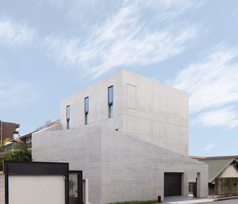
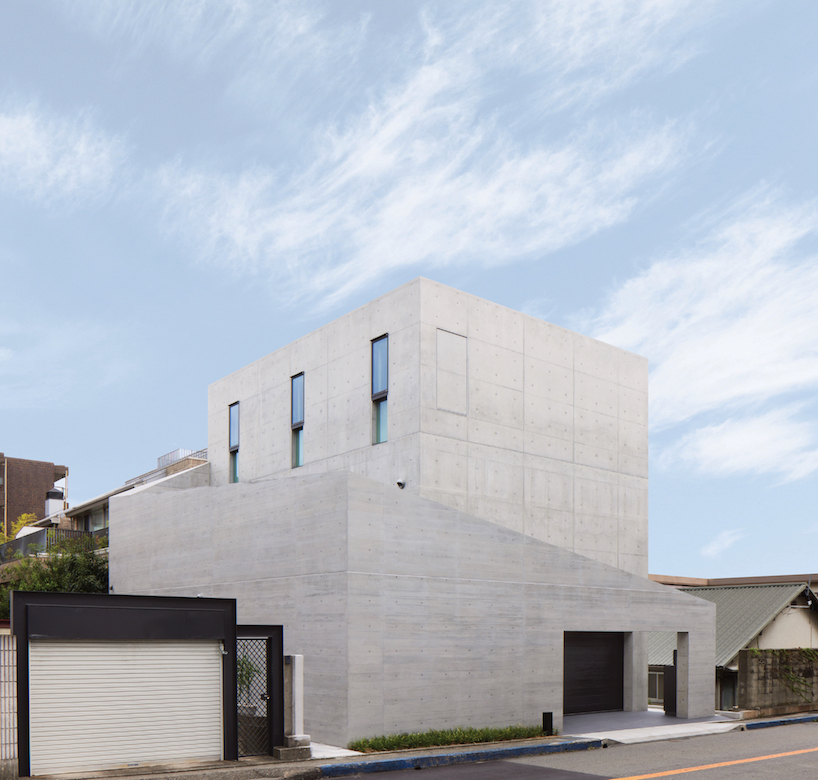
Amid an upscale residential neighborhood in Hyogo Prefecture, Japan, the Ashiya S House stands as a three-story block of concrete infused with a dynamic sequence of spaces. The home, conceived by Go Fujita of studio GOSIZE, fuses traditional Japanese perspectives with modern aesthetics, resulting in a space that blurs the boundaries between interior and exterior, motion and stillness, and yin and yang.
Situated in close proximity to neighboring apartment buildings and a busy road, the architects placed emphasis on blocking sightlines and noise, prioritizing privacy and tranquility for residents. The spatial solution devised a series of outer walls surrounding the building, each varying in height and strategically positioned to create an open space that fosters intimacy while inviting natural light and views inside.
height-changing walls envelop the building | all images courtesy of Go Fujita / GOSIZE
fusion of traditional japanese design with modern aesthetics
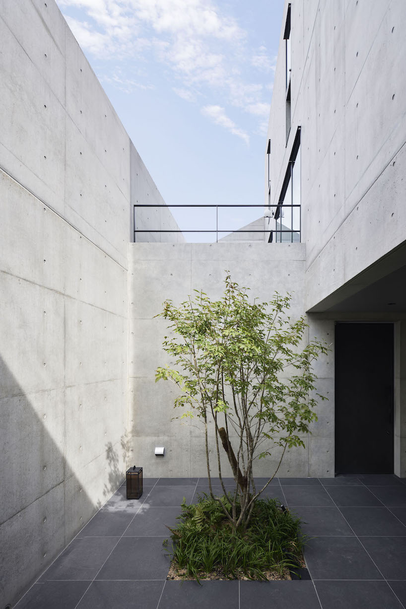
Approaching the entrance, residents are guided along a semi-external path formed by gaps between overlapping exterior walls, marking a transition from public to private. Stepping inside, rough yet delicate tatami-finished walls adorned with contemporary art fuse traditional and modern elements, creating a serene ambiance that sets the tone for the rest of the Ashiya S House.
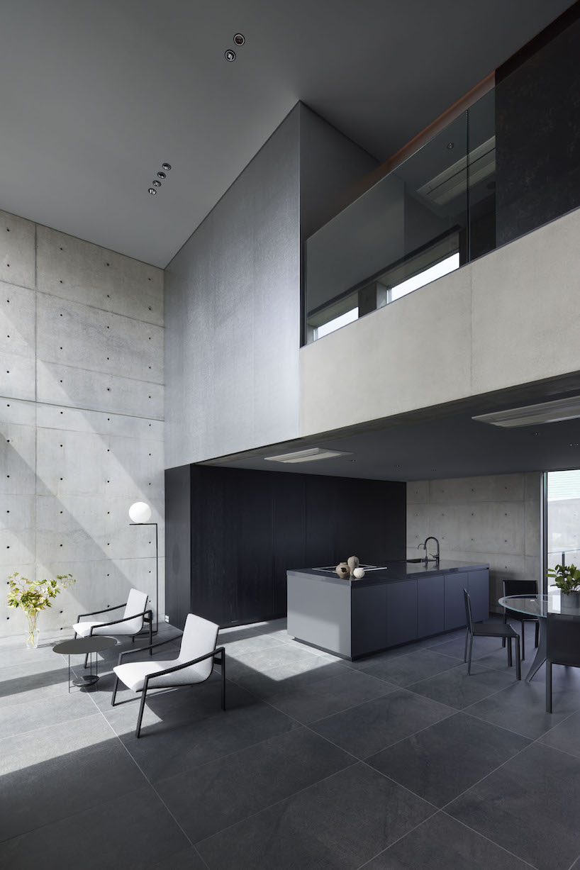
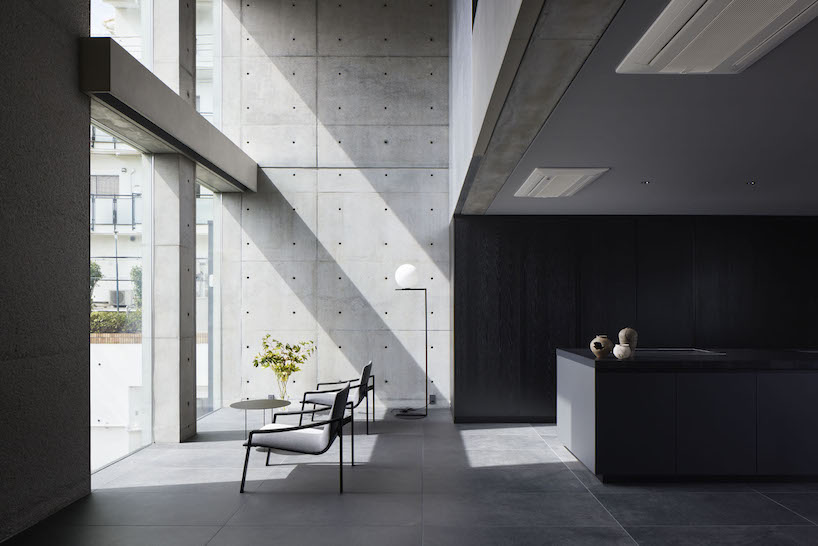
Ascending the stairs, guided by subtle indirect lighting, unveils a living area that exudes a sense of openness. The double-height windows allow sunlight to stream in, softly reflecting off the tin wallpaper and diffusing into every corner of the living space. The team at GOSIZE has carved these expansive openings into the thick walls to also serve as screens, framing the ever-changing views of the outside world, effectively merging the indoor and outdoor experiences.
a walled courtyard and porch marking a transition from exterior to exterior
GOSIZE’s design concept fuses traditional Japanese perspectives with modern aesthetics
the living space is infused with light and openness despite the home’s location in a bustling area
For this lookbook sponsored by Vitrocsa we’ve selected 10 buildings with glazed walls created using the Swiss window brand’s products, from a Foster + Partners-designed villa to a restaurant in a former police station.
Floor-to-ceiling windows maximise views and flood rooms with natural light, while enabling a seamless transition between interior and exterior spaces.
Founded in 1992, Vitrocsa specialises in minimalist windows with ultra-narrow aluminium-alloy frames, rails and thresholds designed at its facility in Saint-Aubin-Sauges, Switzerland.
Here are 10 projects where the brand’s sliding, pivoting, guillotine and turntable corner products have been used to form glass walls.
This is the latest in our lookbooks series, which provides visual inspiration from Dezeen’s archive. For more inspiration see previous lookbooks featuring homes with pocket doors, interiors informed by biophilic design and garden swimming pools.
Photo by Michael Nicholson
Headland House, Australia, by Atelier Andy Carson
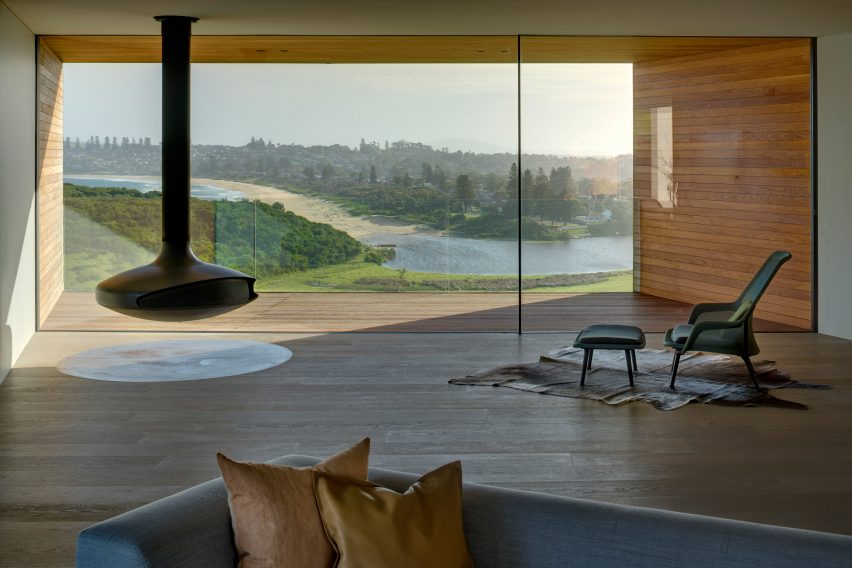
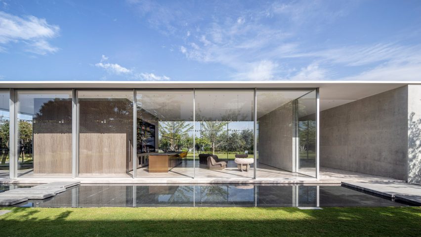
One end of Headland House in New South Wales features a rectangular glazed wall overlooking the surrounding coastline and farmland.
Sydney-based studio Atelier Andy Carson used Vitrocsa sliding doors to open up the living space onto a funnel-like, timber-clad balcony with a glass balustrade, leaving the vista uninterrupted.
Find out more about Headland House ›
Photo by Matthew Millman
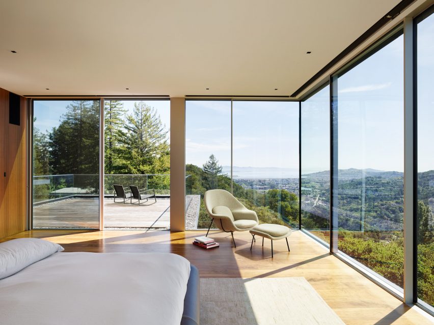
Spring Road, USA, by EYRC Architects
Stacked glass boxes define Spring Road, a house near San Francisco designed as a tranquil hilltop retreat by EYRC Architects.
In the large master suite, the dramatic views of Mount Tamalpais and the San Francisco Bay are exploited via a corner of Vitrocsa glazed walls that can be opened up onto an adjacent terrace.
Find out more about Spring Road ›
Photo by David Agnello
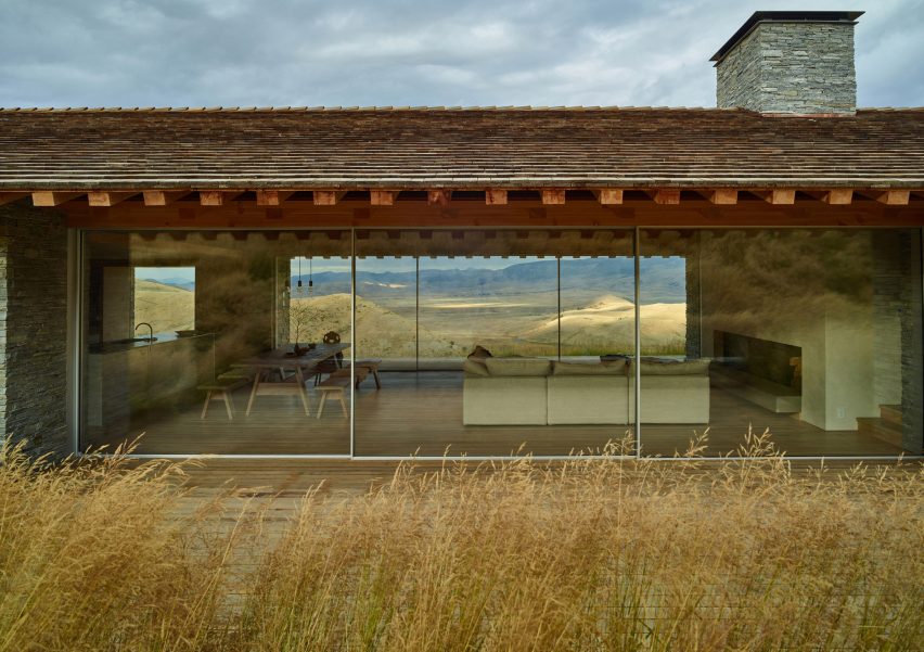
Jackson Hole, USA, by McLean Quinlan
British architecture firm McLean Quinlan was appointed to deliver a house in Wyoming modelled on a nearby settlers’ cabin dating from 1888.
Rustic materials are balanced with contemporary elements such as floor-to-ceiling windows spanning the open-plan kitchen, dining and living room, and an all-wood alcove overlooking the mountainous landscape through a large glass wall.
Find out more about Jackson Hole ›
Photo by Nigel Young
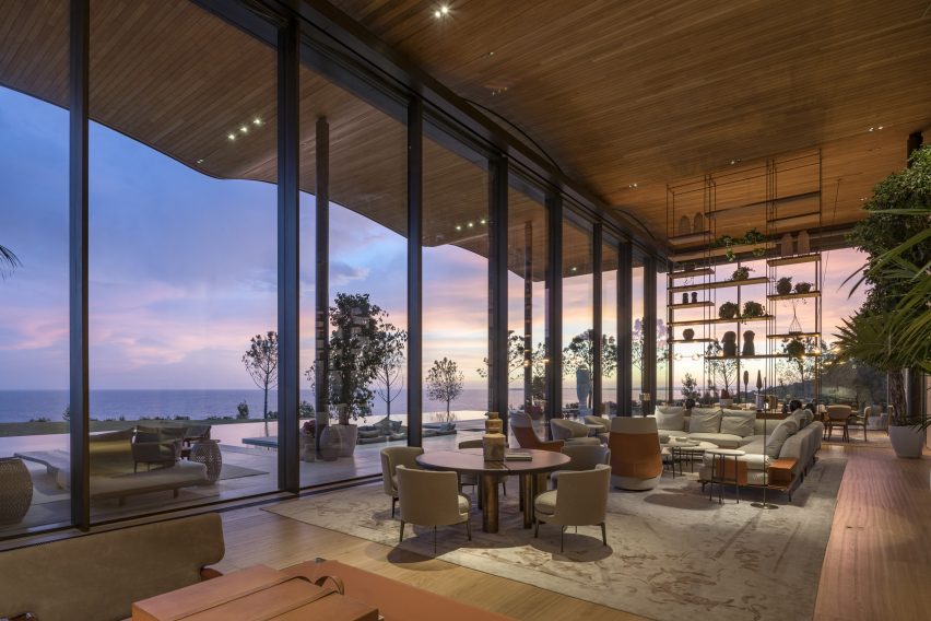
Dolunay Villa, Turkey, by Foster + Partners
A rare private residence designed by British studio Foster + Partners, Dolunay Villa has huge areas of glazing on its coast-facing southern side.
The glass wall slides open onto a terrace sheltered by a rippling timber roof that cantilevers outwards and was designed to look like an extension of the rocky, beachside setting.
Find out more about Dolunay Villa ›
Photo by Amit Geron
Private Spa, Israel, by Pitsou Kedem Architects
This glass-house pavilion in Herzliya was designed by Tel Aviv studio Pitsou Kedem Architects to have the feel of a hotel spa.
The main wing is enveloped with glazed walls on three sides set on a bespoke system of aluminium rails produced by Vitrocsa that allow them to slide wide open.
Find out more about Private Spa ›
Photo by Amit Geron
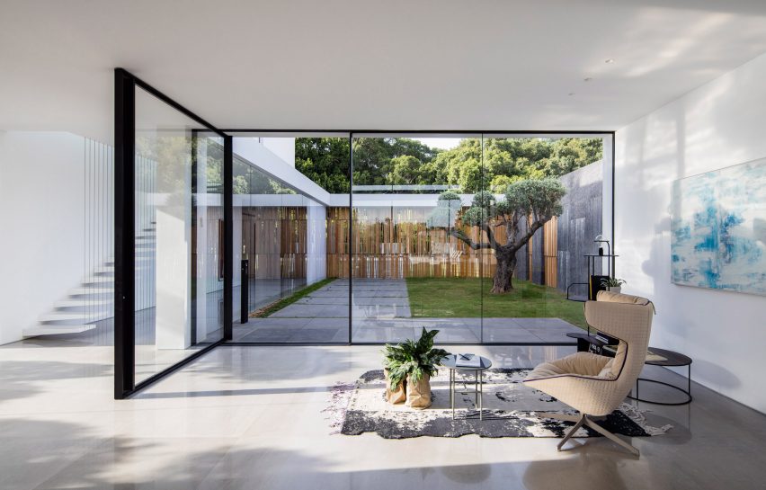
House F, Israel, by Pitsou Kedem Architects
F House, also in Israel and by Pitsou Kedem Architects, features a glass curtain wall with a large pivoting door from Vitrocsa that swings inward from a private courtyard.
Glazing is used liberally throughout the project to produce multiple seamless transitions, including an all-glass corner section looking onto another courtyard and clerestory windows that frame views of a separate lounge space on the upper level.
Find out more about House F ›
Photo by Katherine Lu
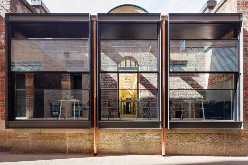
Former Rocks Police Station, Australia, by Welsh + Major
A trio of full-height, sash-style Vitrocsa guillotine windows face the street at this restaurant in Sydney that occupies a converted 19th-century brick building.
They were fitted to the building by Australian studio Welsh + Major as part of a renovation of the former police station.
Find out more about Former Rocks Police Station ›
Photo by Felix Forest
Cleveland Rooftop, Australia, by SJB
Vitrocsa sliding windows divide the living spaces from a private garden at this rooftop apartment in the Sydney suburbs designed by architecture studio SJB.
The architects aimed to create a space that seemingly flows from inside to outside and used large glazed Vitrocsa Swimms sliding windows to divide the interior and exterior.
Find out more about Cleveland Rooftop ›
Photo by Amit Geron
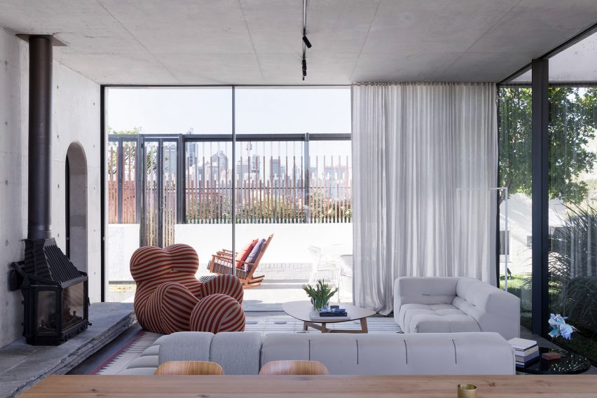
A House by the Sea, Israel, by Pitsou Kedem Architects
The third home designed by Pitsou Kedem Architects on this list is a beachfront house where the studio aimed to maximise the connection with the Mediterranean Sea.
Giant windows flood the home with views and natural light, including in the double-height living area and in the cantilevered upper storey’s master bedroom where thin protruding lintels help to provide shade.
Find out more about A House by the Sea ›
Photo courtesy of Kengo Kuma Associates
The Portland Japanese Garden Cultural Village, USA, by Kengo Kuma
Kengo Kuma created pavilions for a new complex at a Japanese-style urban garden in Portland, Oregon.
To maximise the connection between the interiors and their serene surroundings, the Japanese architect used Vitrocsa sliding windows throughout the scheme.
Find out more about The Portland Japanese Garden Cultural Village ›
This is the latest in our lookbooks series, which provides visual inspiration from Dezeen’s archive. For more inspiration see previous lookbooks featuring homes with pocket doors, interiors informed by biophilic design and garden swimming pools.
This lookbook was produced by Dezeen for Vitrocsa as part of a partnership. Find out more about Dezeen partnership content here.
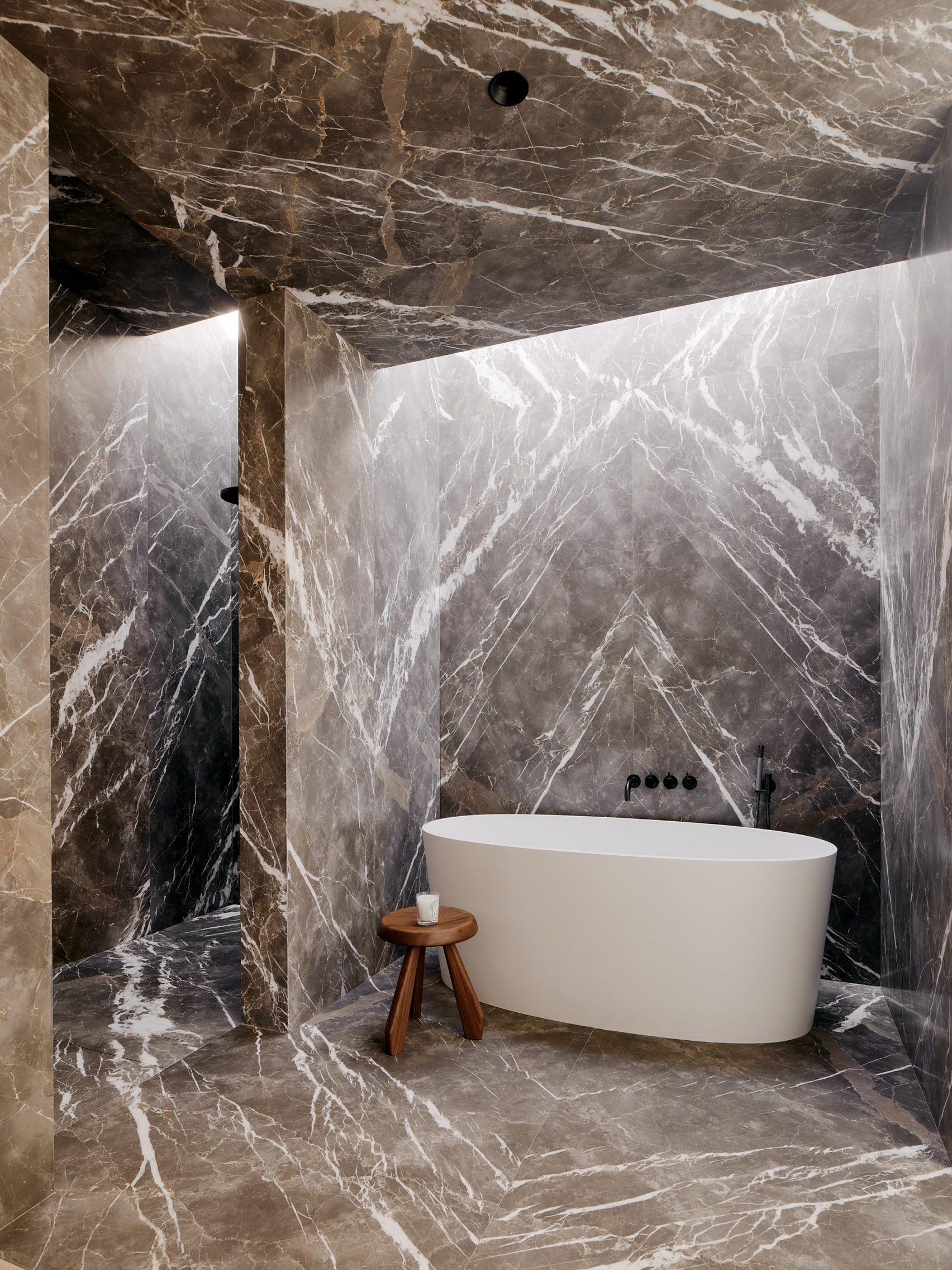
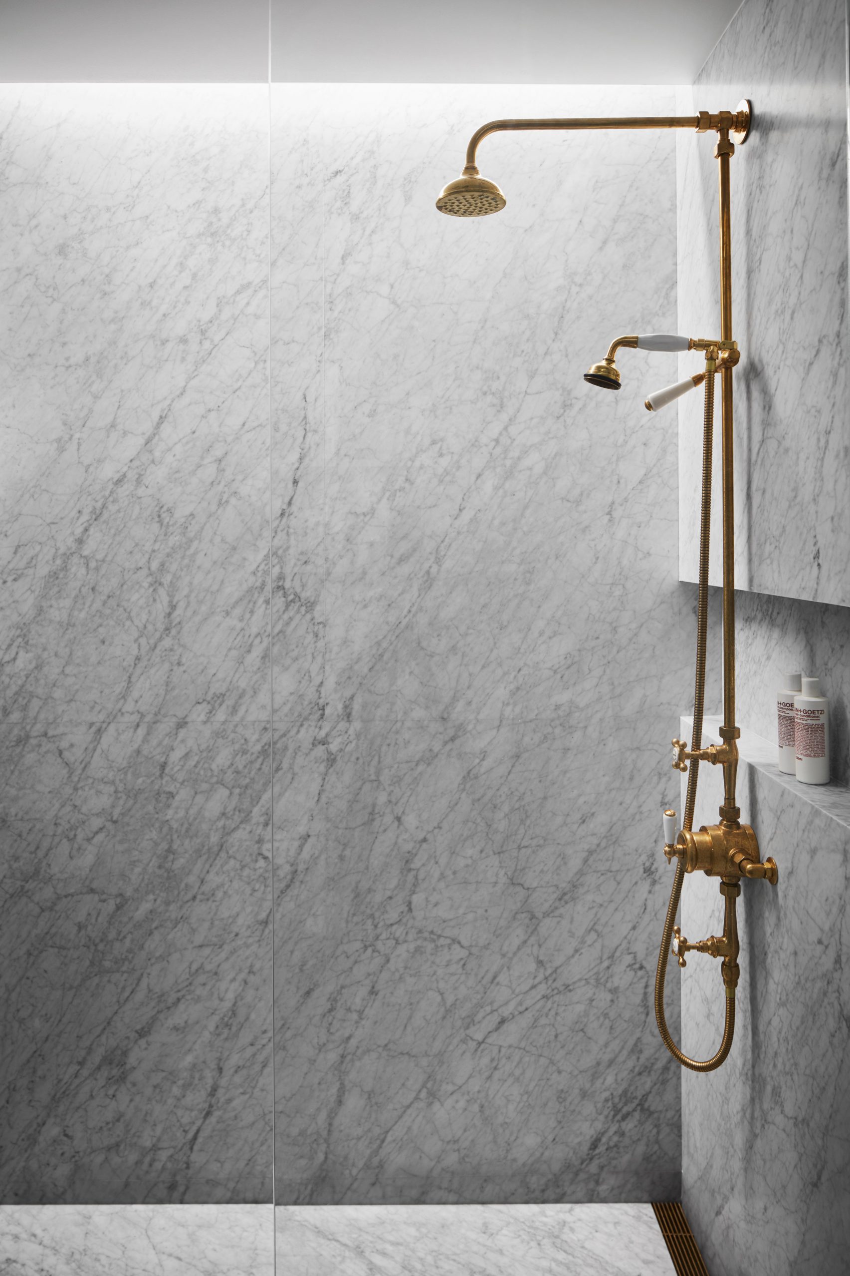
Our latest lookbook shines a light on homes where marble and similar natural stones have been used as the primary material in the bathrooms.
Marble can be a great solution for bathrooms, as it is durable enough to withstand a wet environment better than alternative materials such as wood or concrete.
Many homeowners opt to use the same material across all surfaces, creating a uniform aesthetic that extends from the sink and shower areas across the walls.
Read on to see 10 different examples, featuring a range of marbles that include Carrera and Verde Aver, as well as similar natural stones such as travertine and quartzite.
This is the latest in our lookbooks series, which provides visual inspiration from Dezeen’s archive. Other recent editions showcase Scandinavian kitchens, outdoor showers and eclectic interiors.
Habitat 100, Sweden, by Note Design Studio
Note Design Studio used two types of marble in its renovation of this 1920s Stockholm apartment, echoing the tones of an Italian marble floor in the hallway.
For the main bathroom, the designers opted for a pale Swedish marble known as Ekeberg. Some slabs were polished, while others were milled in different directions to create a subtle chequered pattern.
Elsewhere in the home, green-toned Brännlyckan marble offers a striking counterpoint.
Find out more about Habitat 100 ›
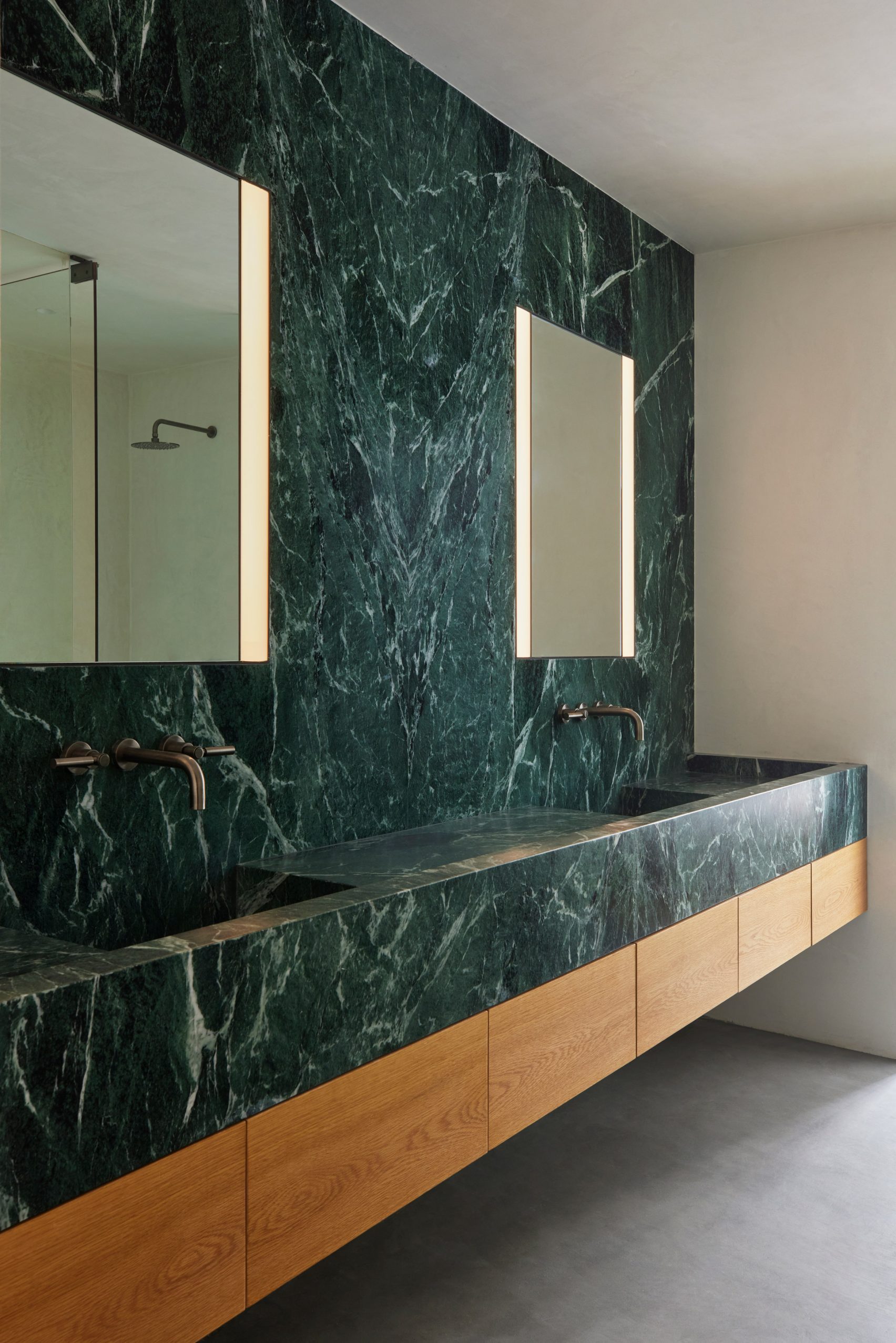
Eastern Columbia Loft, USA, by Sheft Farrace
Tasked with redesigning an apartment in Los Angeles’ Eastern Columbia building, a block with an iconic turquoise art-deco facade, architecture studio Sheft Farrace decided to work with the same palette in the main bathroom.
The architects did this with a statement wall of Verde Aver marble, an Italian stone with a similar green hue.
The marble forms a counter that spans the width of the room, integrating two basins, and also forms a splashback that extends all the way up to the ceiling.
Find out more about Eastern Columbia Loft ›
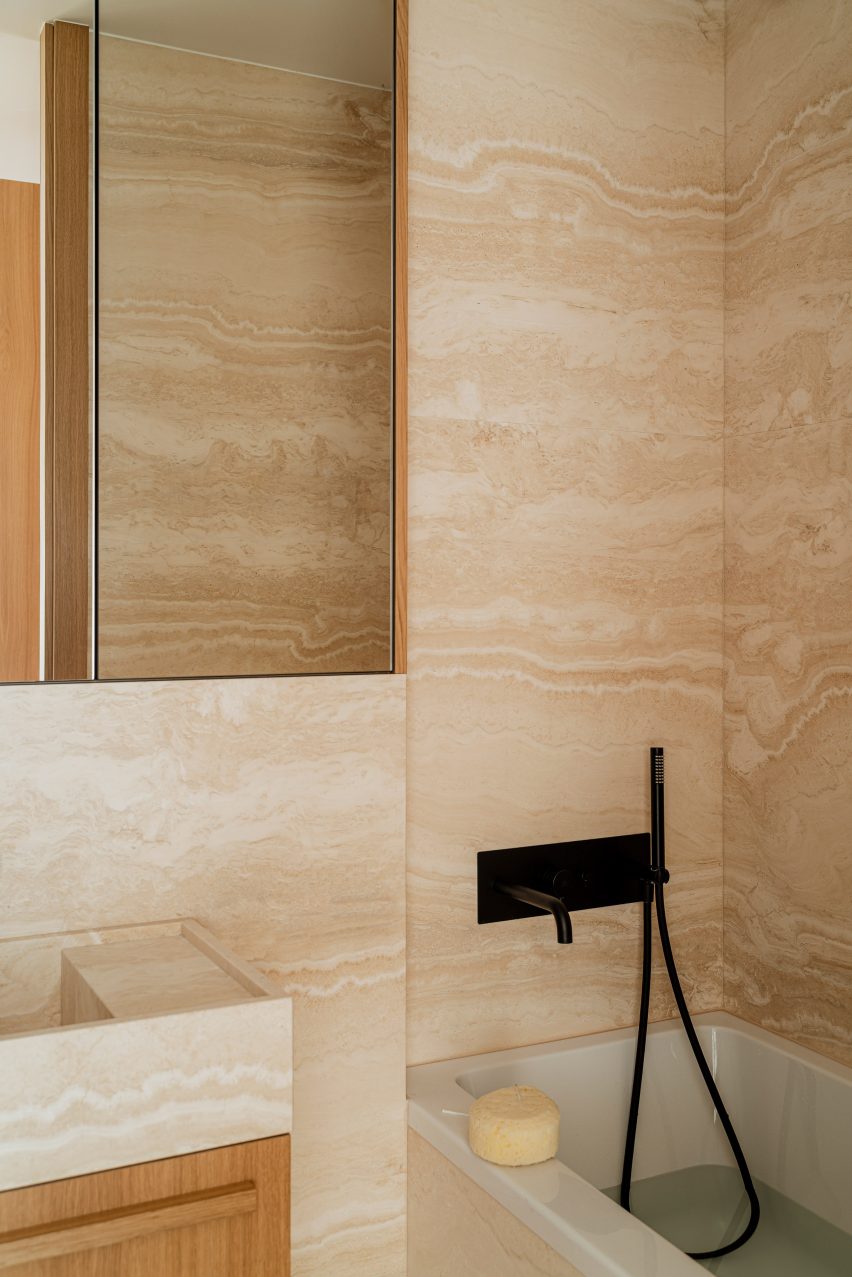
Botaniczna Apartment, Poland, by Agnieszka Owsiany Studio
A warm-toned travertine features in the bathroom of this apartment in Poznań, which was renovated by Agnieszka Owsiany Studio for a professional couple.
While travertine is a limestone, so not technically a marble, it has a similarly patterned finish.
The stone wraps the walls and the bath, and also forms a cuboidal washbasin. The same stone also features in the home’s kitchen, where it was used to create an island counter.
Find out more about Botaniczna Apartment ›
The Village, Germany, by Gisbert Pöppler
Wood and marble are combined throughout this apartment renovation by Berlin designer Gisbert Pöppler, in the city’s Mitte district, but the juxtaposition is particularly striking in the bathroom.
The room features a bathtub set within a niche that is lined with highly variegated South American marble.
The warm tones of the stone are echoed by the wooden flooring, as well as by a basin unit that combines dark oak with white-glazed lava stone.
Find out more about The Village ›
Flat #6, Brazil, by Studio MK27
Studio MK27 chose highly textured materials for this renovation of a four-bedroom flat in São Paulo, home to a couple and their three teenage sons.
For the washrooms, the designers selected grey Armani, a Mediterranean marble that combines dark tones with white accents.
The stone has been carefully arranged to ensure the white streaks run through niches set into the walls, which provide space for storing soap and shampoo.
Find out more about Flat #6 ›
D2 Townhouse, UK, by Jake Moulson
Multi-coloured stone offered a good fit for the eclectic interiors of this renovated townhouse in Dublin, designed by architect Jake Moulson.
The most striking example can be found in an under-stairs toilet, where a Brazilian quartzite called Azul Imperial combines shades of purple, blue and gold.
Find out more about D2 Townhouse ›
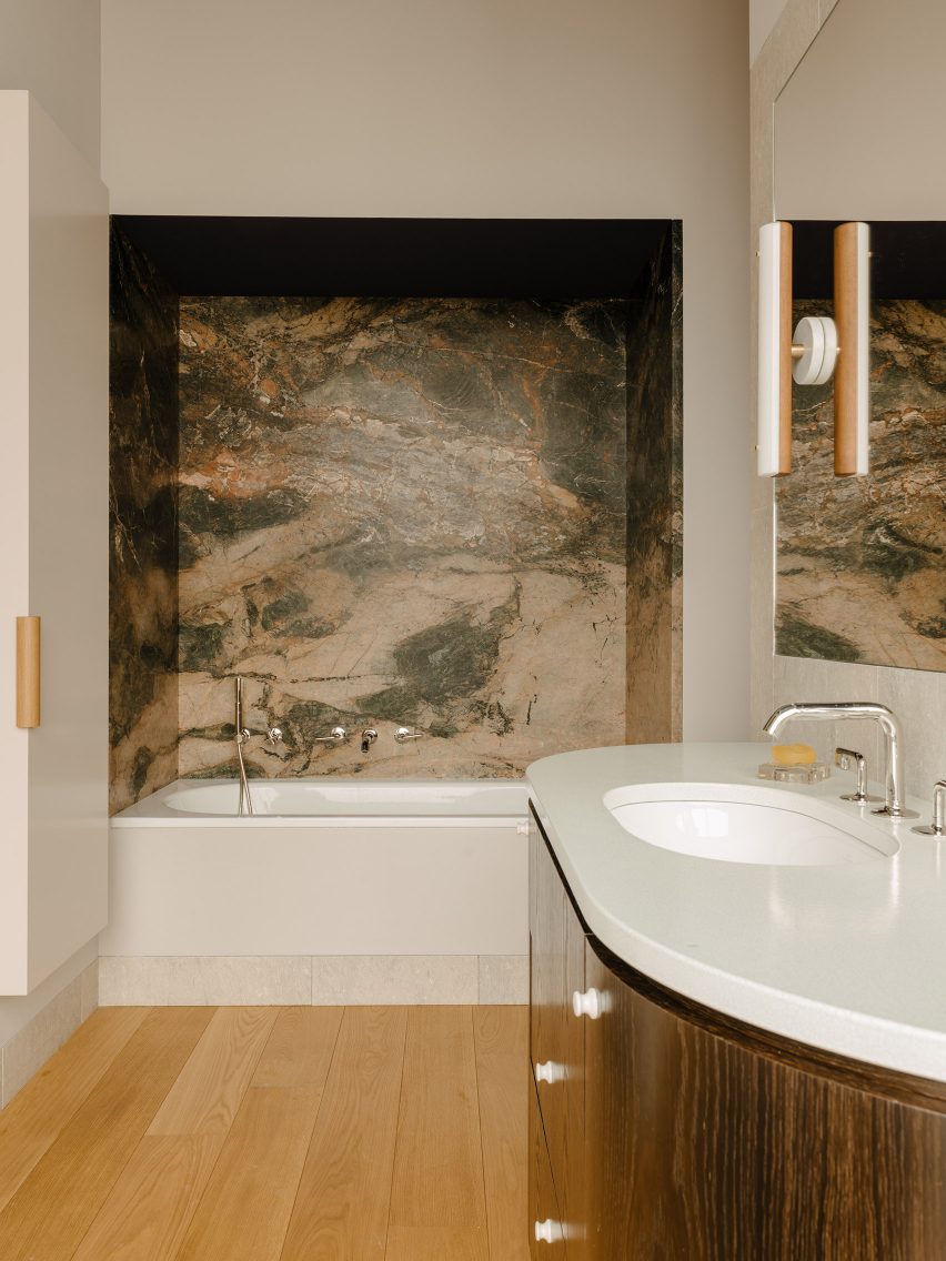
ER Apartment, Brazil, by Pascali Semerdjian Arquitetos
This family home in São Paulo, designed by Pascali Semerdjian Arquitetos, features different types of Brazilian stone.
In the bathroom, white Parana marble forms the walls and floor, and also provides surfaces within a trough-shaped bronze sink that was custom-made to echo the curves of a mirror above.
Elsewhere in the home, panels of jade-coloured onyx serve as surfaces and also conceal an in-wall light fixture.
Find out more about ER Apartment ›
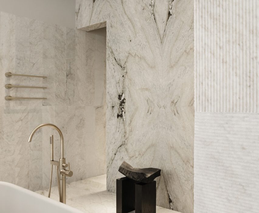
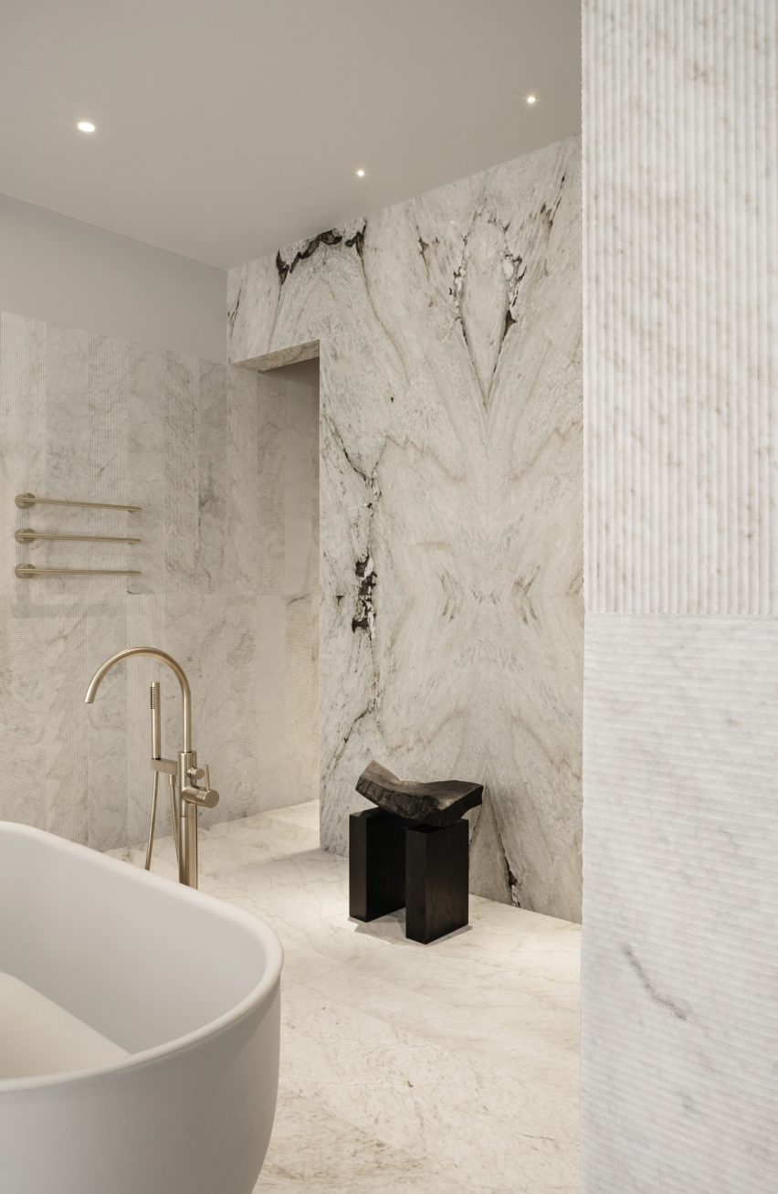
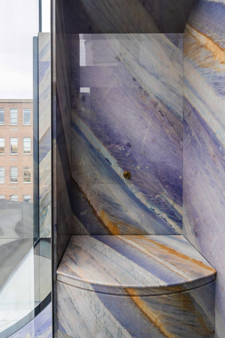
Twentieth, USA, by Woods + Dangaran
A marble known as Bronze Vena, or “bronze vein”, is the focal point of the en-suite in the main bedroom of this Santa Monica home by Los Angeles-based Woods +Dangaran.
Large-format slabs of this stone cover the walls, floor and ceiling of the bath area, toilet and walk-in shower.
The slabs were cleverly book-matched at the centre of the room for a symmetrical effect. Slabs effectively mirror each other, creating zigzags within the vein patterns.
Find out more about Twentieth ›
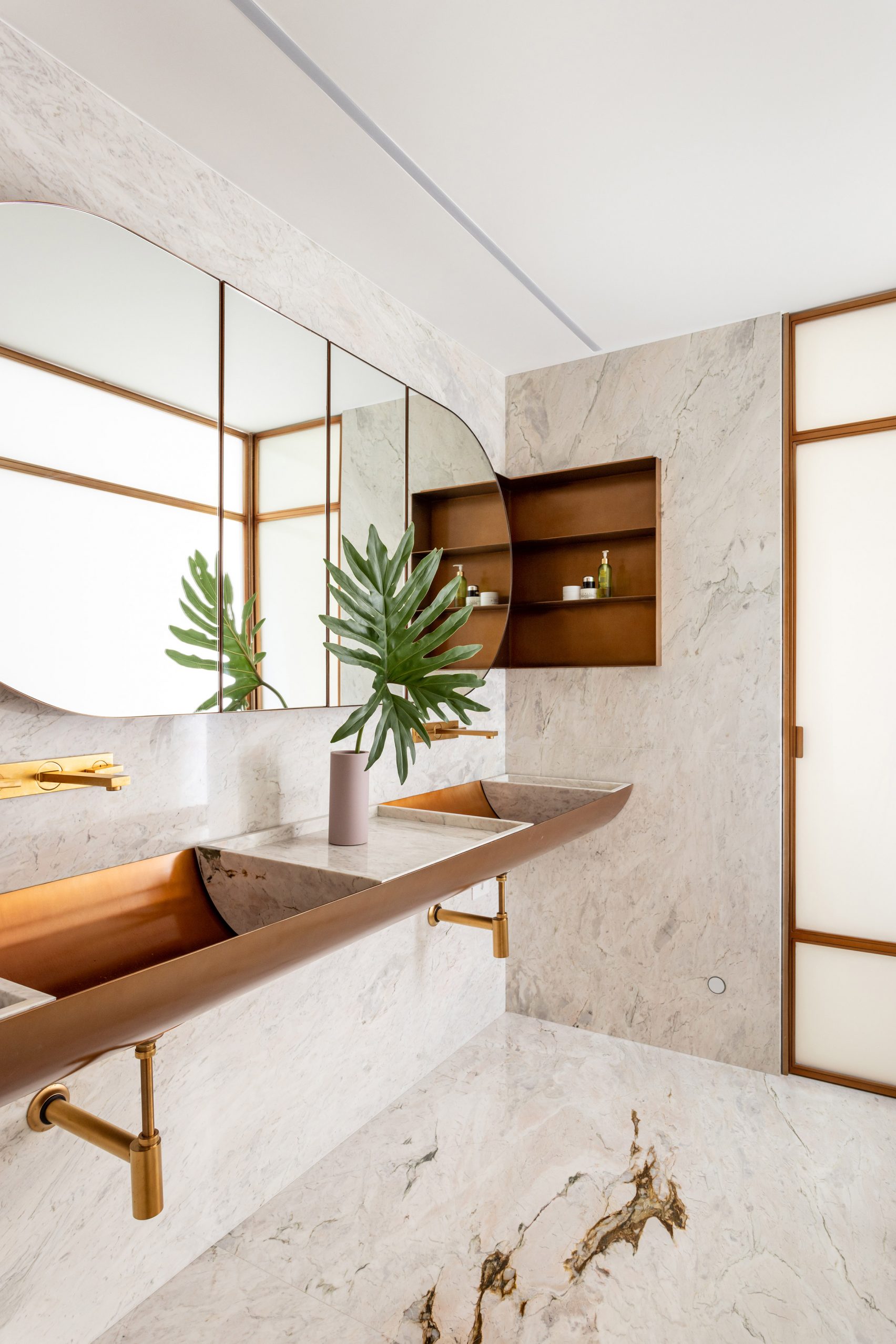
West 76th Street, USA, by Messana O’Rorke
This apartment on Manhattan’s Upper West Side is home to the founders of the skincare brand Malin + Goetz, so special attention was naturally paid to the bathrooms.
New York-based studio Messana O’Rorke combined brass fittings with Carrera marble – the hugely popular Italian stone – with the ambition of creating a “spa-like” feeling.
One bathroom features a marble recess with an integrated sink and mirror, while the other boasts a shower that is illuminated by a hidden pocket in the ceiling.
Find out more about West 76th Street ›
Villa Waalre, Netherlands, by Russell Jones
To match the minimal aesthetic of this woodland home in Waalre, near Eindhoven, bathrooms are finished in Statuario, a white marble quarried in Italy.
The effect works particularly well in the main bedroom, where a free-standing partition wall divides off part of the space for an en-suite. This volume incorporates a marble basin, as well as timber-fronted drawers.
Find out more about Villa Waalre ›
This is the latest in our lookbooks series, which provides visual inspiration from Dezeen’s archive. Other recent editions showcase Scandinavian kitchens, outdoor showers and eclectic interiors.