Eight eclectic interiors enhanced by striking accent walls
Blotchy slate tiles, playfully patterned murals and a single oversized circle form these eye-catching interior accent walls that we have collected for our latest lookbook.
An accent or feature wall is one that differs in colour, material or texture from the other walls that surround it. Accent walls can feature in both interior and exterior locations.
Architects and designers often use these statement walls to delineate different spaces in a room, or simply to create striking and joyful interior details.
From a New York apartment to a Helsinki teahouse, here are eight eclectic interiors defined by eye-catching accent walls.
This is the latest in our lookbooks series, which provides visual inspiration from Dezeen’s archive. For more inspiration see previous lookbooks featuring offbeat bakeries, inviting entrance halls and homes with split-level living areas.

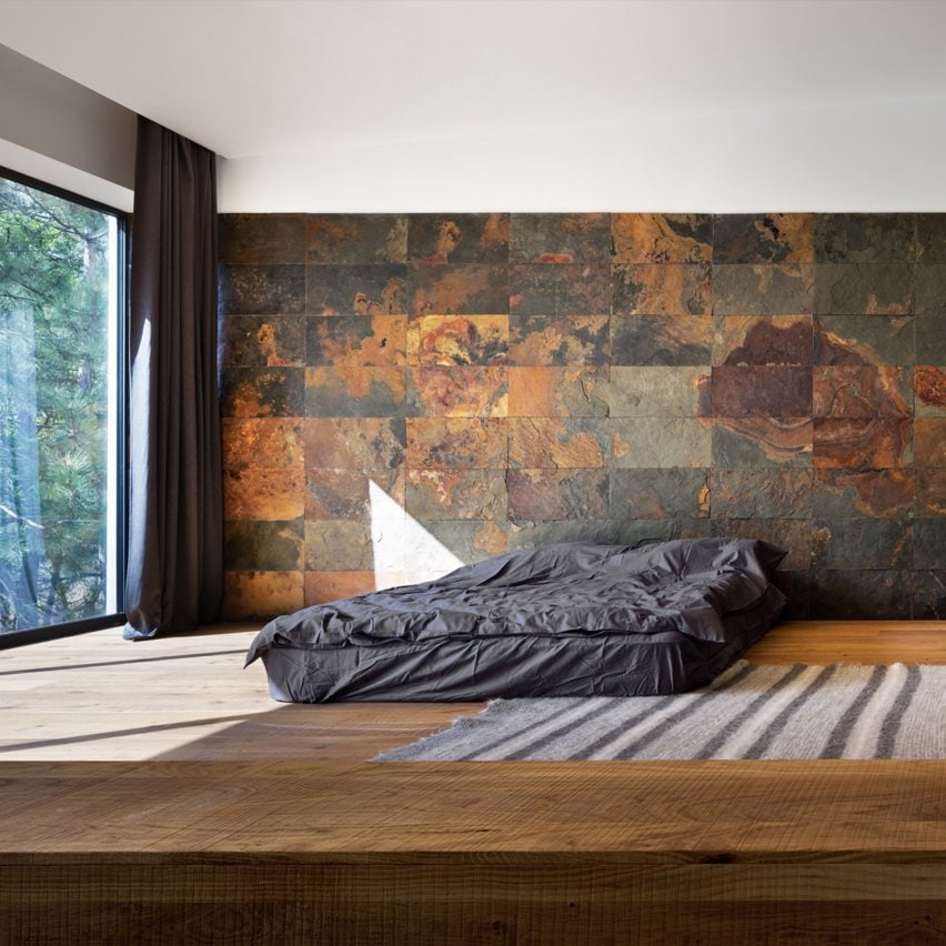
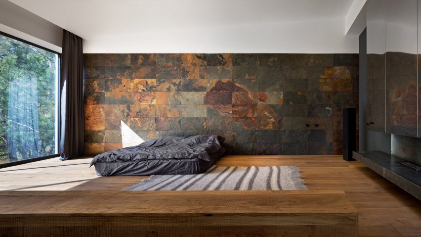
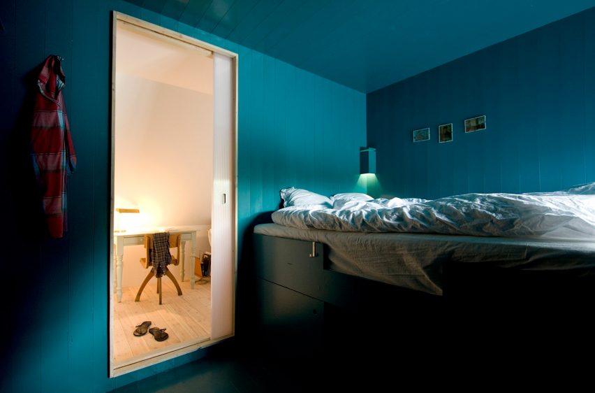
Heat 360, Ukraine, by Azovskiy & Pahomova Architects
This house in the Dnepropetrovsk region of Ukraine features a bedroom with a dark slate-tile wall defined by dramatic rust blotches.
Azovskiy & Pahomova Architects made the adjacent wall from floor-to-ceiling glazing that illuminates the room’s earthy-hued interiors.
Find out more about Heat 360 ›
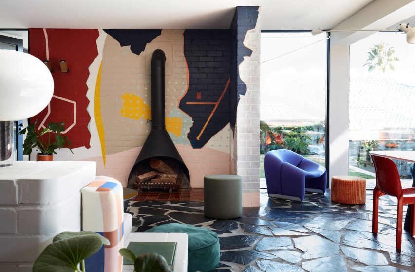
Polychrome House, Australia, by Amber Road and Lymesmith
An abstract mural packed with colourful geometric shapes covers one of the walls in the living space at Polychrome House in Sydney.
The bold interiors are enhanced by graphic paved floors and a mismatch of bright furniture in hues ranging from burnt orange to sea green.
Find out more about Polychrome House ›
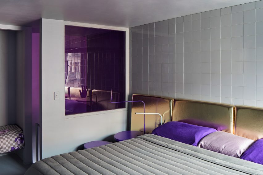
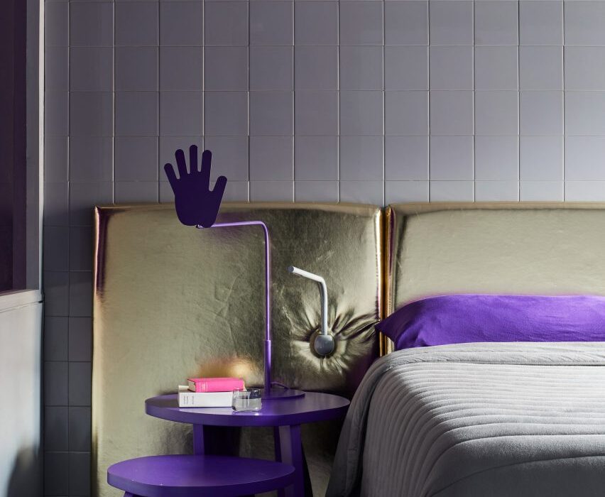
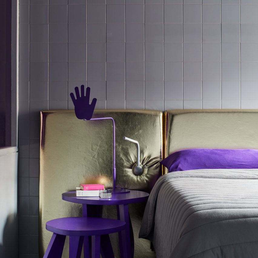
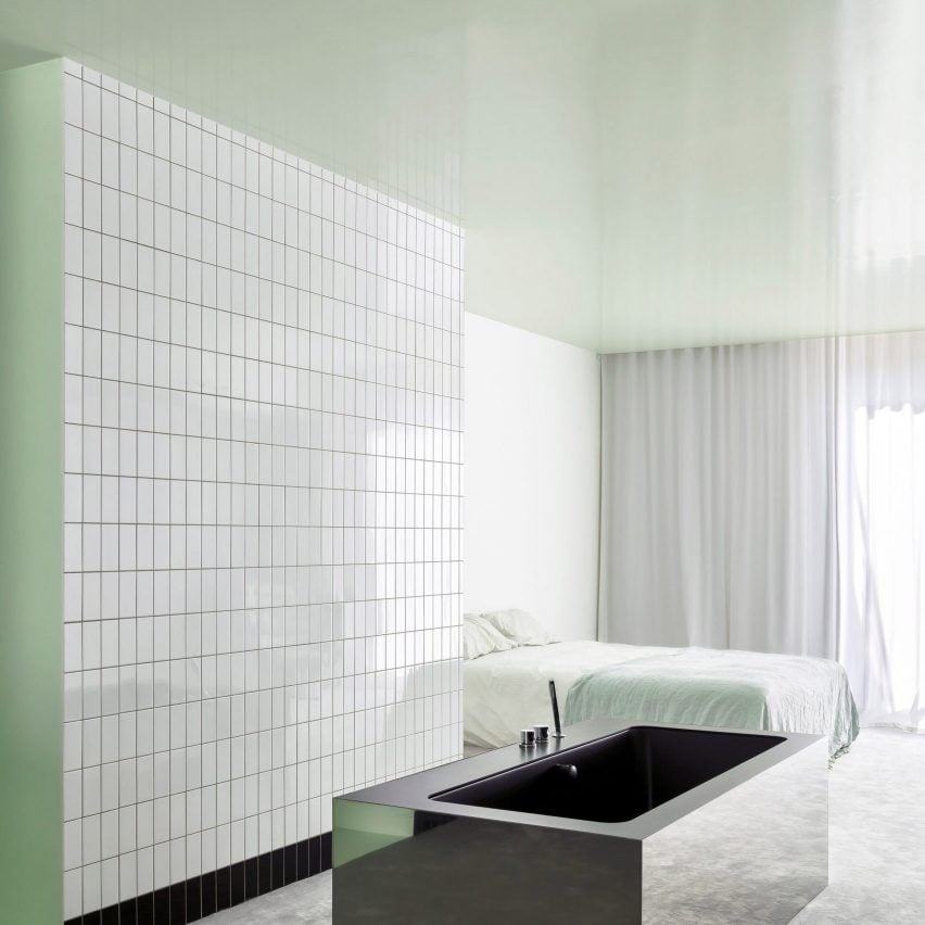
New York apartment, USA, by Harry Nuriev and Tyler Billinger
Designer Harry Nuriev and partner Tyler Billinger – both of Crosby Studios – renovated their New York home with Nuriev’s “signature boldness”.
A white-tiled accent wall features in the otherwise colourful bedroom, which features a plush gold-lame headboard and ultraviolet elements including a hand-shaped bedside lamp.
Find out more about this New York apartment ›
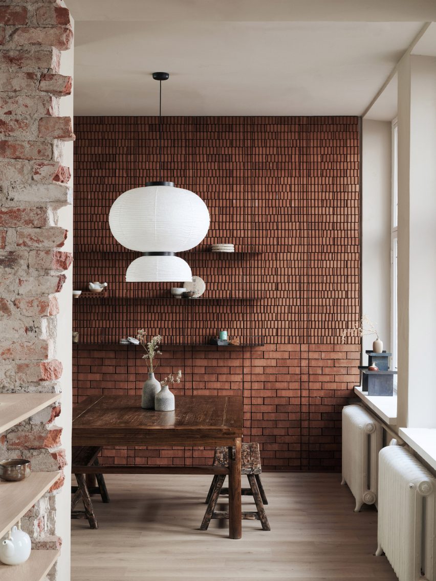
Teemaa, Finland, by Yatofu
A combination of traditional flat bricks and grooved bricks comes together in the tasting room of Helsinki’s Teemaa teahouse to create an eclectic accent wall.
Design studio Yatofu aimed to reference the raw tactility of tea leaves when creating the interiors, which are also characterised by elements of oak and oxidised steel.
Find out more about Teemaa ›
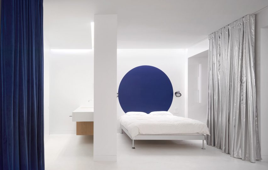
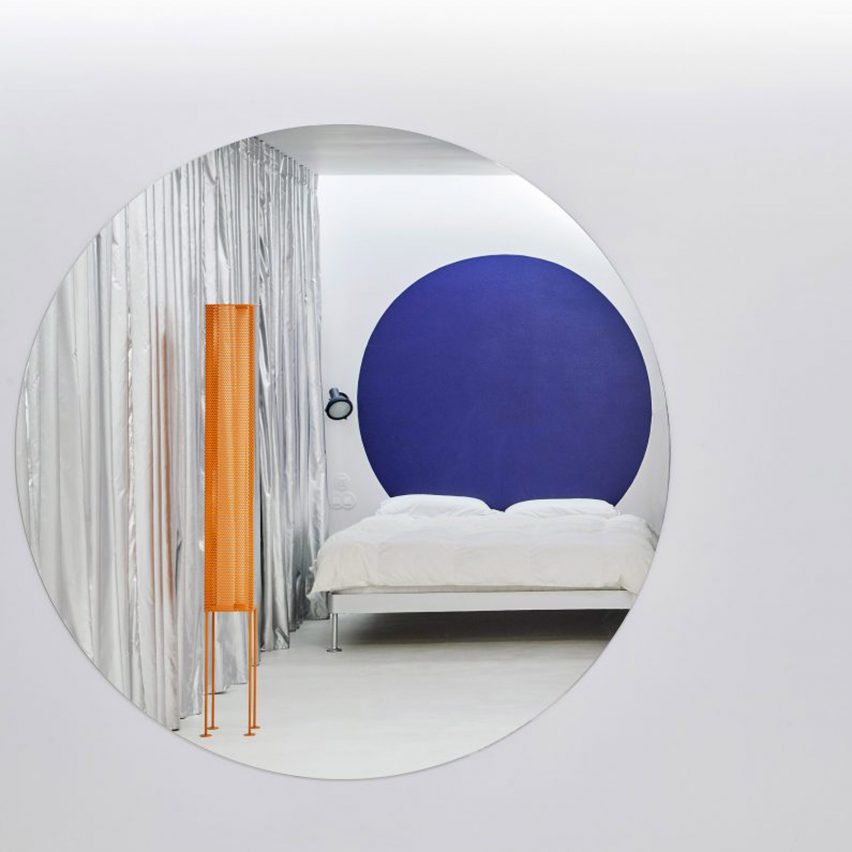
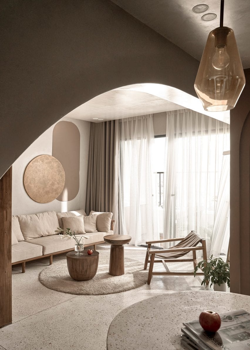
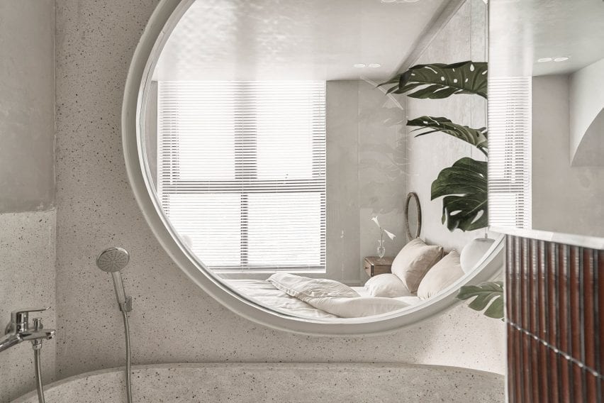
Casa A12, Spain, by Lucas y Hernández-Gil
The white floors and sheets in the bedroom suite at Casa A12 form a neutral backdrop for a large cobalt blue dot circle that creates a playful feature wall.
Local studio Lucas y Hernández-Gil added various other space-delineating accents to the Madrid apartment, including swathes of silvery curtains and corrugated metal partitions.
Find out more about Casa A12 ›
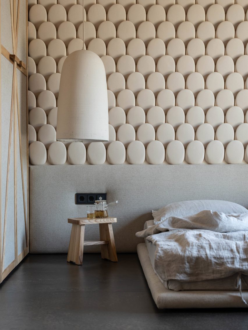
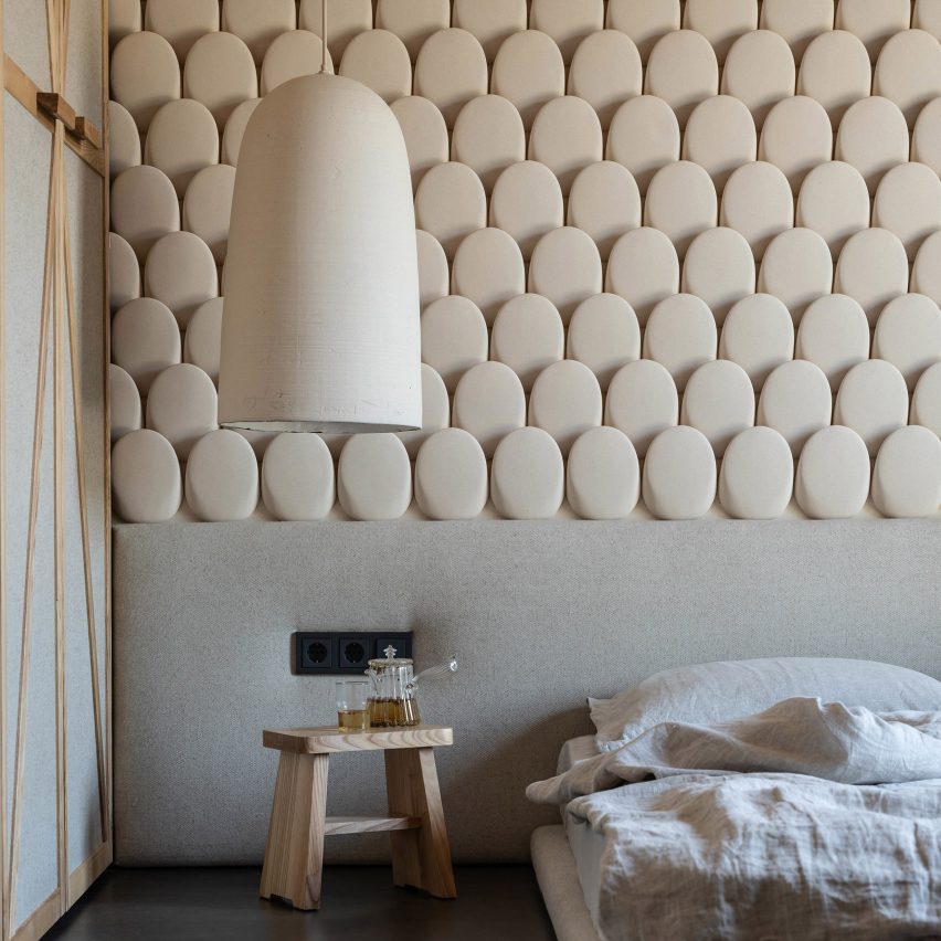
Shkrub, Ukraine, by Sergey Makhno
Built by architect Sergey Makhno for him and his family, the Shkrub house includes a feature wall made up of rows of rounded ceramic tiles that resemble jumbo fish scales.
These were made from several types of clay finish that were usually mixed with flax seeds, rye and wheat in accordance with Ukrainian traditions.
Find out more about Shkrub ›
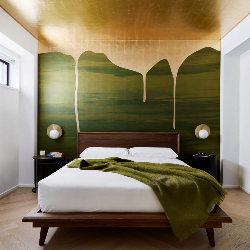
Chelsea Pied-à-Terre, USA, by Stadt Architecture
Decadence takes centre stage at this renovated New York apartment in the form of a green bedroom mural that is “dripping” with globules of gold paint.
Covering an entire wall and moving up into the ceiling, the design was created by Brooklyn-based Calico Wallpaper and references the lush nature of Vancouver’s Stanley Park – a location that is meaningful to the dwelling’s Canadian occupants.
Find out more about Chelsea Pied-à-Terre ›
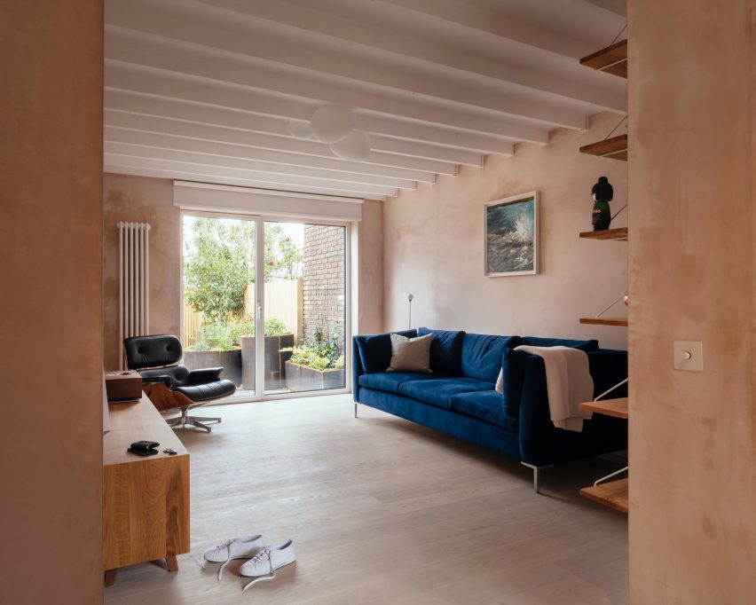
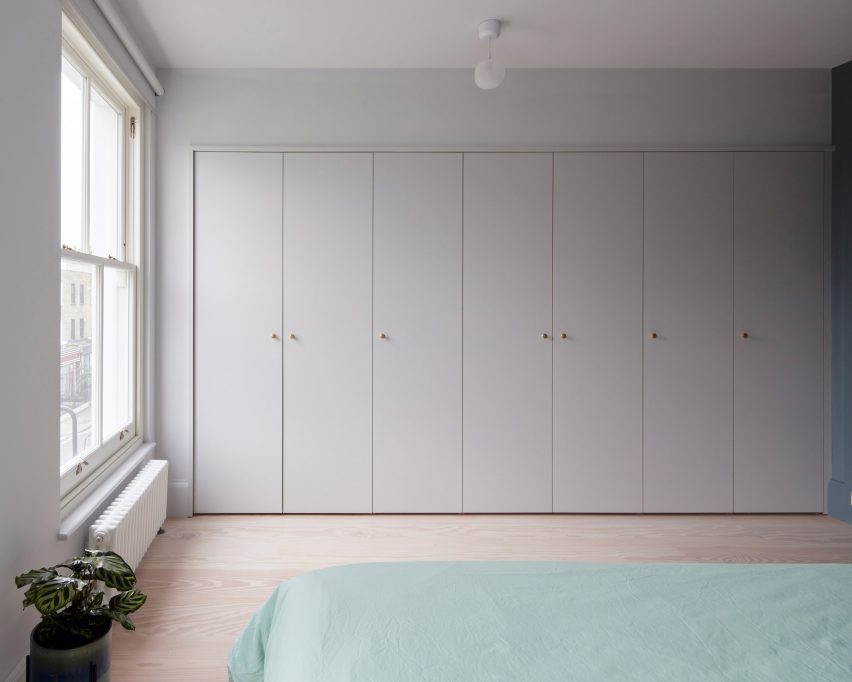
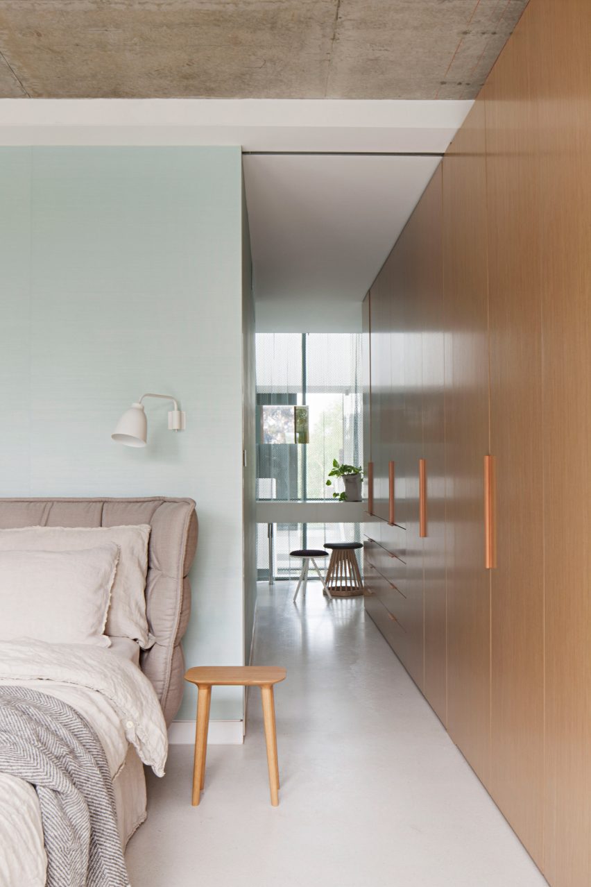
582 Rydon Street, London, by Moxon Architects
British studio Moxon Architects renovated a Victorian townhouse in north London’s Islington area by adding a sunken garden and minimalist interiors.
Throughout the home, subtle reminders of its early 19th-century history were inserted into the design. These include a floral gridded feature wall in the primary bedroom.
Find out more about 582 Rydon Street ›
This is the latest in our lookbooks series, which provides visual inspiration from Dezeen’s archive. For more inspiration see previous lookbooks featuring offbeat bakeries, inviting entrance halls and homes with split-level living areas.


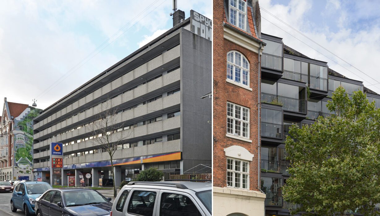
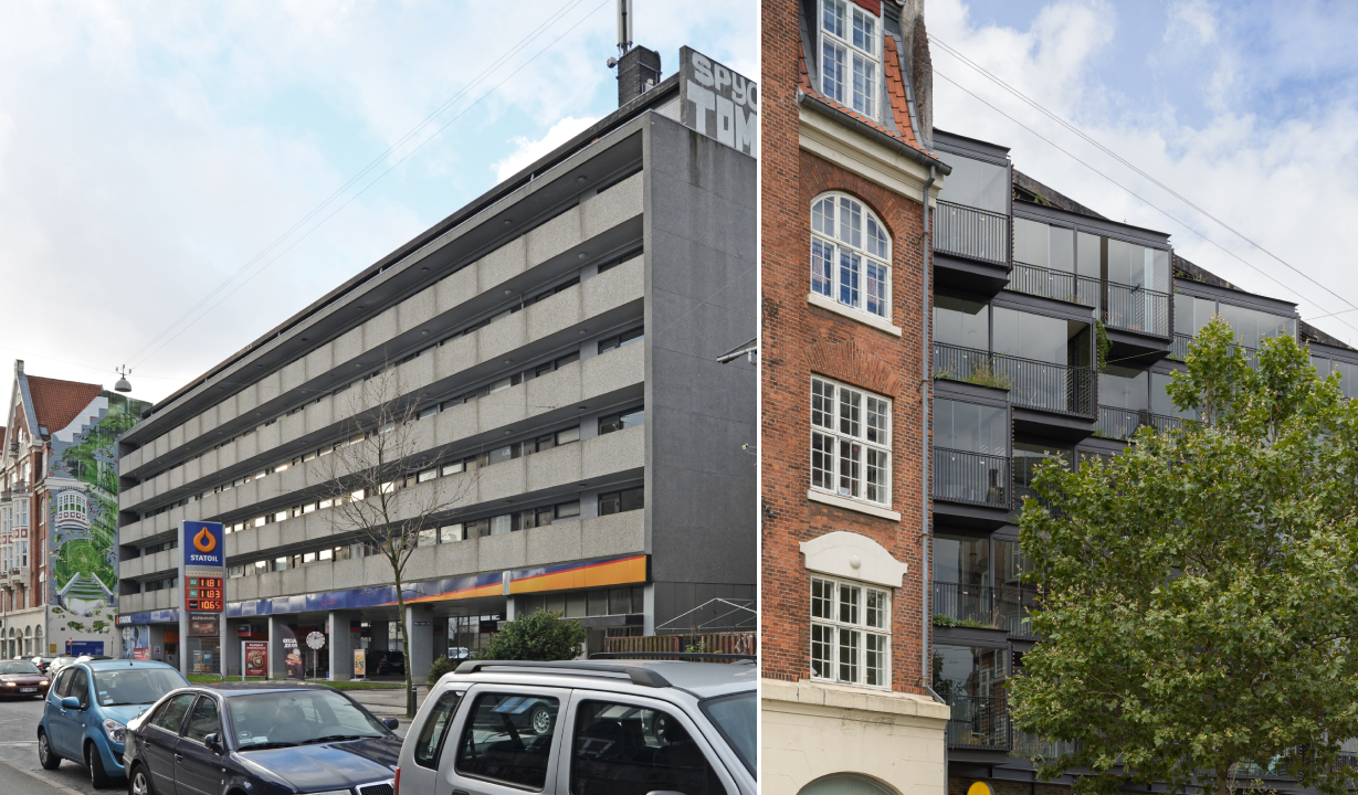
 Instead of just addressing the water damage, Tegnestuen LOKAL came in with a vision to turn the existing façade of Ørsted Gardens into an interactive green space. “The main idea with the Ørsteds Haver project is to create a holistic environmental, social and architectural counterpoint to the pragmatic renovations that are carried out all over the country, and which often have a one-sided focus on energy,” they explain. This approach is one of the reasons that the building swept the Architecture +Renovation category in the
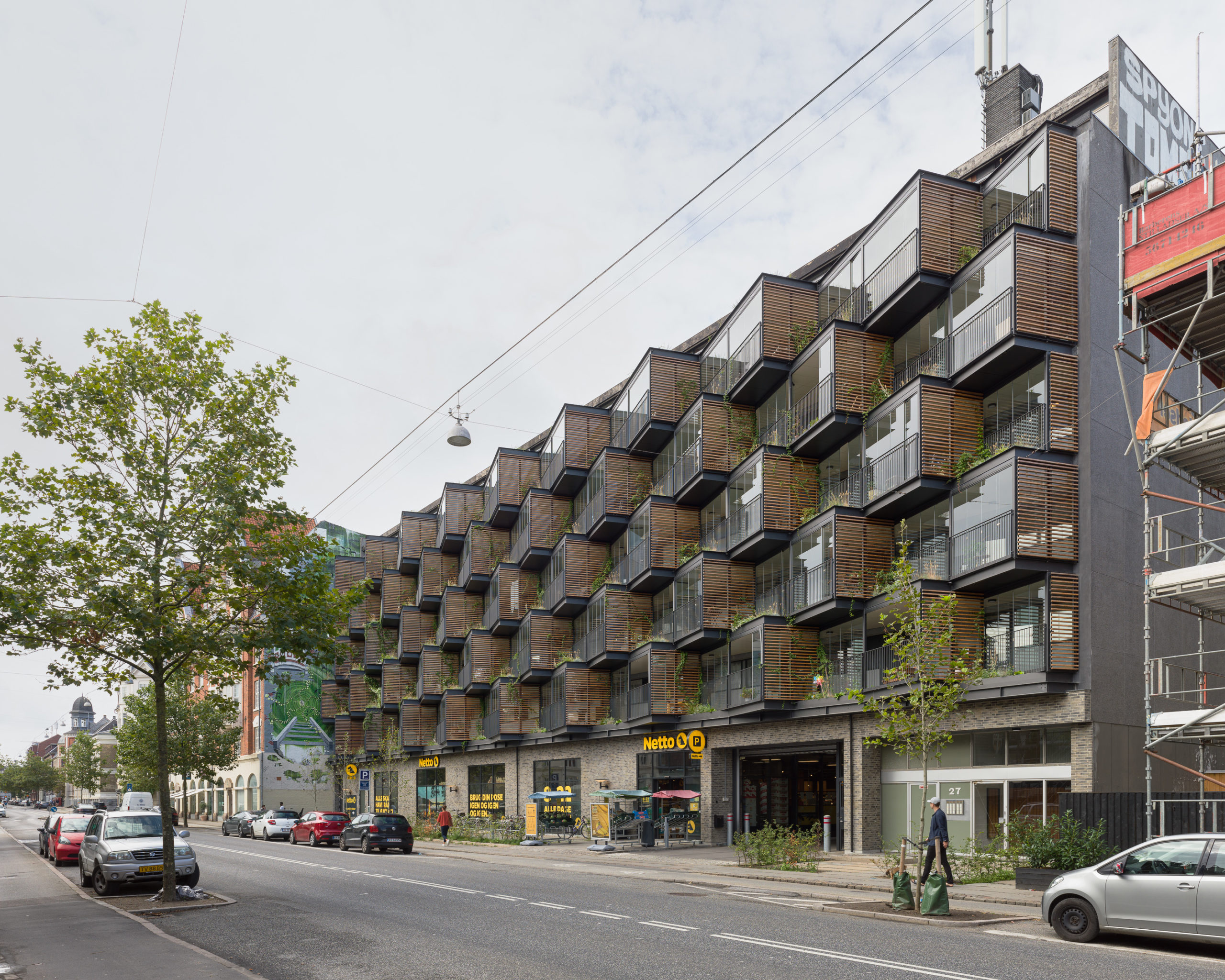
 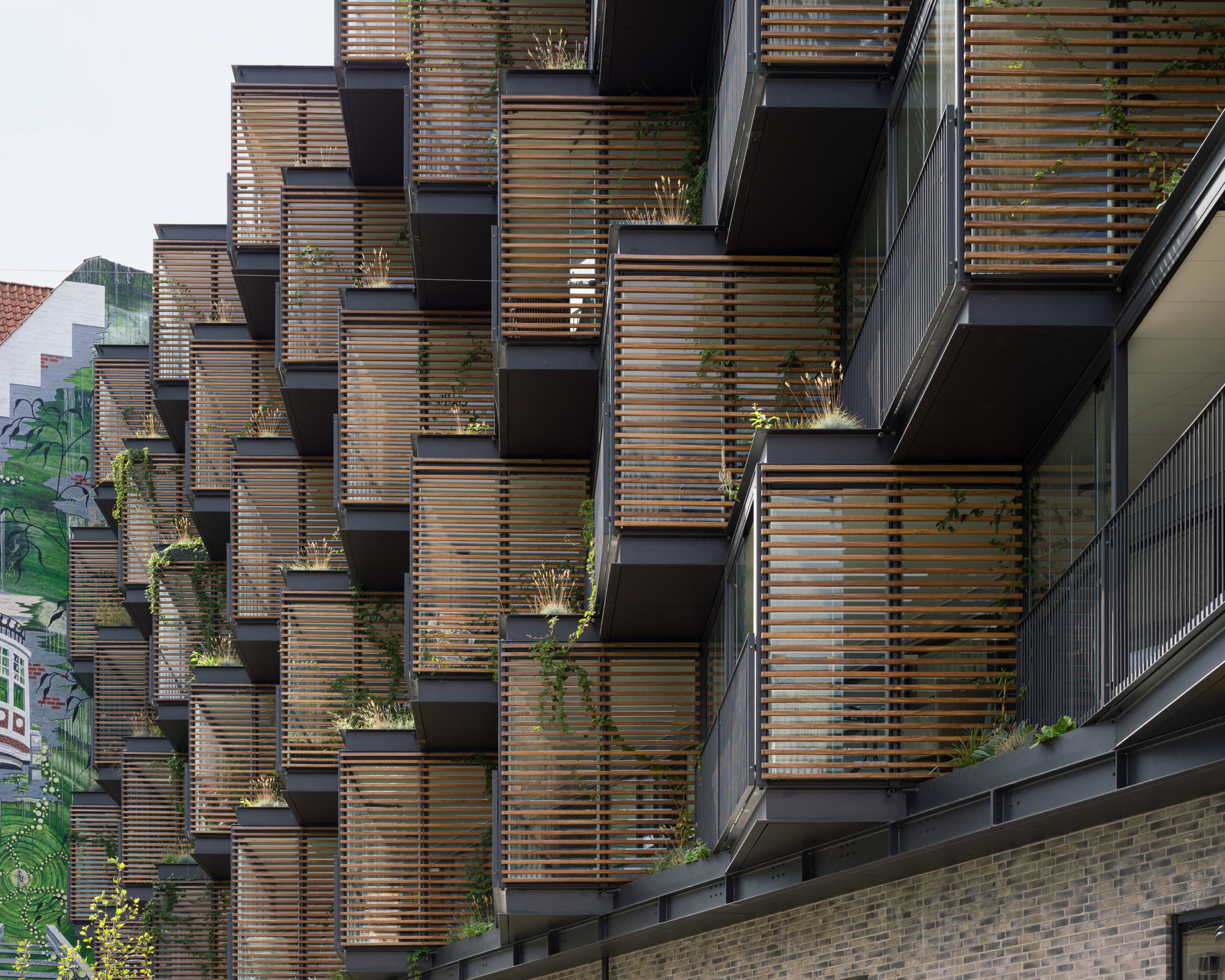 The small gardens set between these balconies are made of welded steel boxes that come from the manufacturer and are placed directly into these gaps. They have an automatic irrigation system as well as spouts to ensure that the excess water from the garden falls directly into the garden below, indirectly enabling them to water themselves.
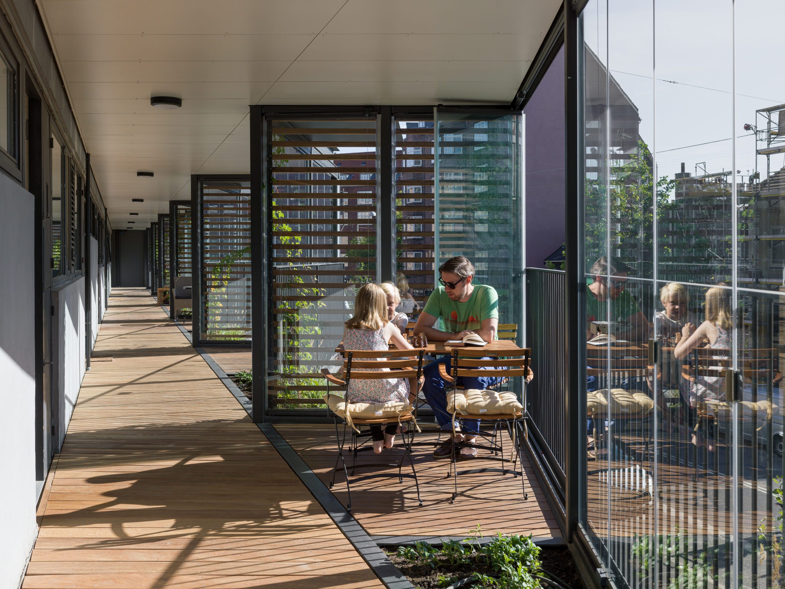 Finding innovative ways to radically transform current buildings is something many architects will have to look into in addition to planning new net zero energy homes and offices. In instances where building-level renovations might be impossible, there are still many opportunities to retrofit water collection, solar generation, green systems or spaces that boost connectivity into the outer envelope of the building that can dramatically change how the building functions and also contribute to the wellbeing of those using it. One single project might not change the world but it sure can make a difference one community at a time.