wood and plaster cover the solid form of villa k340 in the netherlands
CategoriesArchitecture

wood and plaster cover the solid form of villa k340 in the netherlands

Villa K340’s Split-Level Design traces the undulating terrain


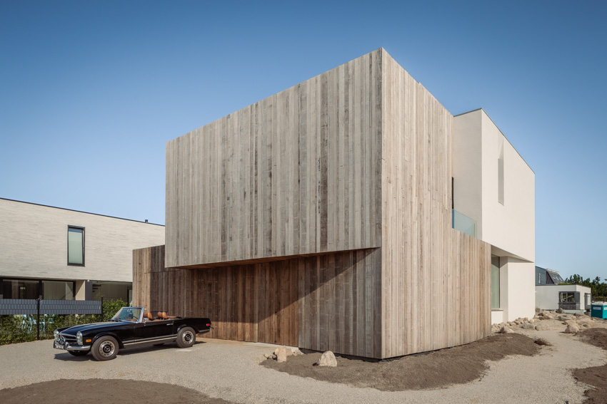
Architect Francois Verhoeven constructs Villa K340 in Vroondaal, a natural and recreational area near the Hague, aiming to blend modernity with nature. The region encompasses several designated residential complexes, such as ‘De Hoogte’ where the house stands. The area allows modern villas to be built in a landscape of artificially constructed hills.


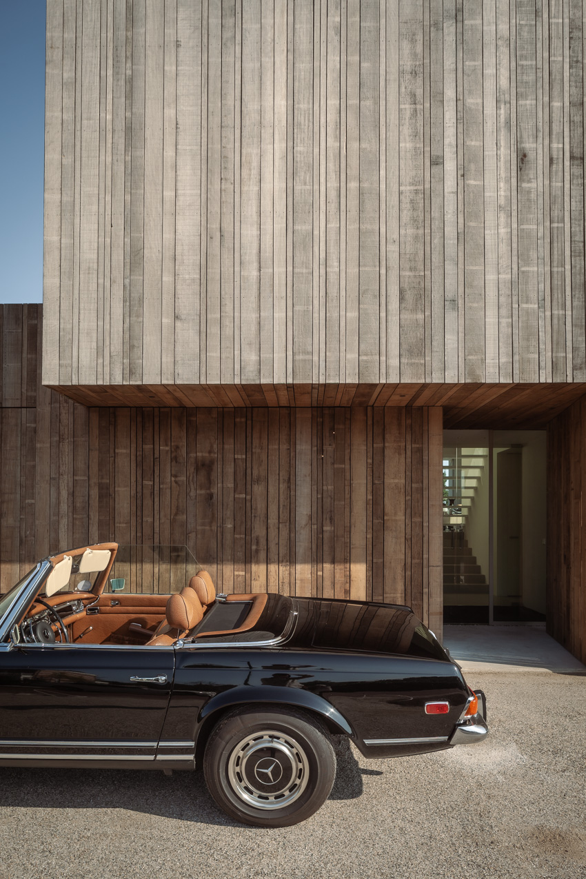
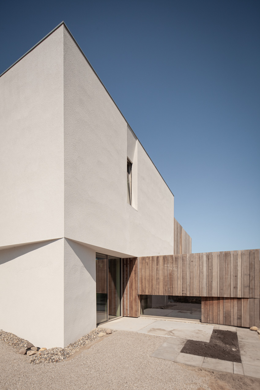
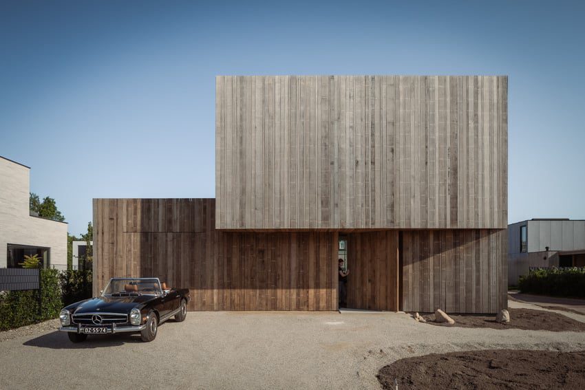
K340’s design aligns with the concept of a split-level layout that runs along the contours of the undulating terrain. The entrance rests at a lower elevation while the living areas perch atop the hill, forging a dynamic interplay between architecture and landscape. The project features a juxtaposition of raw, natural materials against sleek design elements. Wooden components and lime plaster, contrast the facade’s clean divisions and slender aluminum window frames. Wooden cladding extends in front of windows and along the front facade, creating a robust silhouette. In the evening, light shines through the gaps of the cladding elements from within the villa.

wooden cladding and lime plaster cover the solid form of villa k340 in the netherlands
all images courtesy of Francois Verhoeven Architect


wooden cladding coats the house creating a robust exterior


A large pivot door merges into the facade when closed, offering a sense of privacy and structural delineation at the entrance area. A central staircase and adjoining outdoor spaces provide views of the villa’s various levels. The design team attends to meticulous detailing to ensure fluid transitions between interior and exterior spaces, concealing the window frames behind cladding and plasterwork. The wooden facades cover up the roof edges and blend gracefully with set-back windows, extending the main shape from the top to ground level. Floor-to-ceiling windows free of mullions and thresholds are incorporated into the interior, integrating into the walls.

wooden cladding and lime plaster cover the solid form of villa k340 in the netherlands
the design of Villa K340 aims to blend modernity with nature


Francois Verhoeven inserts eco-Friendly Features in Villa K340


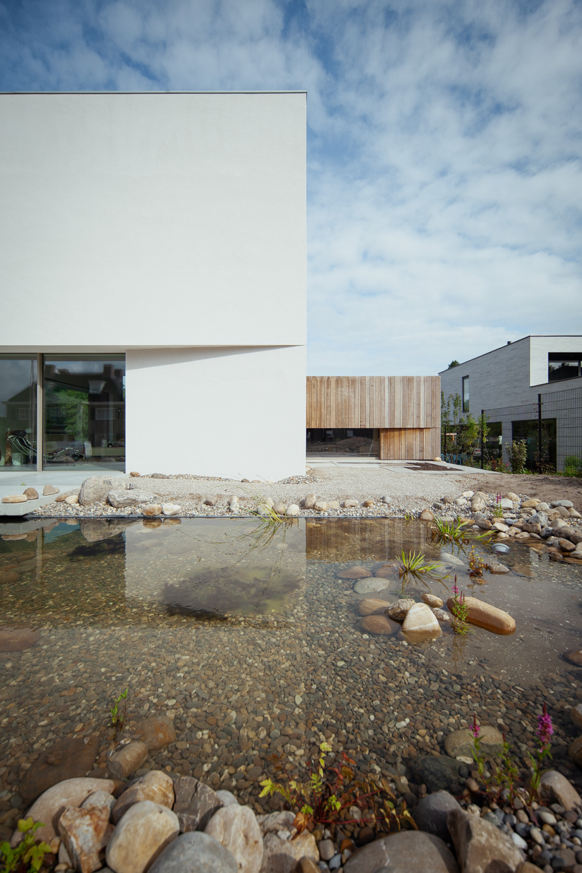
Aiming for a sustainable design, the project features triple glazing, a geothermal heat pump, CO2-controlled ventilation, and strategically designed overhangs that provide shade in the summer and allow plentiful sunlight in during the winter. Solar panels, discreetly set behind the elevated roof edge, keep the villa’s energy consumption to a minimum. The villa’s garage, thoughtfully integrated into the architectural design, features a green roof. The roof, the surrounding organic garden and pond are designed and landscaped by Biotooptuinen and complement the modern design, enhancing the house’s overall aesthetic appeal.

wooden cladding and lime plaster cover the solid form of villa k340 in the netherlands
the project features a split-level layout

wooden cladding and lime plaster cover the solid form of villa k340 in the netherlands
the entrance rests at a lower elevation while the living areas perch atop the hill

wooden cladding and lime plaster cover the solid form of villa k340 in the netherlands
the surrounding organic garden and pond complement the modern design

Reference

Electric Bowery arranges steel and wood cabins for Hudson Valley hotel
CategoriesArchitecture

Electric Bowery arranges steel and wood cabins for Hudson Valley hotel

California studio Electric Bowery has arrayed a series of wood or Corten steel-clad cabins in Upstate New York that are nestled among meadows and woodland.

Electric Bowery was responsible for the architectural design of Wildflower Farms, a rural retreat in the Hudson Valley operated by the Auberge Resorts group, while interiors were completed by New York studio Ward + Gray.

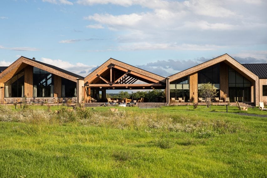
Row of wooden buildings with off-set gabled roofs
The buildings at Wildflower Farms are based on vernacular farmhouses and barns, but with modern European influences

Intended as an escape for reconnecting with nature, the site of the former Rosedale tree farm was transformed into a luxury getaway with hiking trails and a working farm with produce and animals.

The masterplan for the 140-acre site revolves around a central meadow, through which the winding paths connect various clusters of guest cabins with the communal buildings.

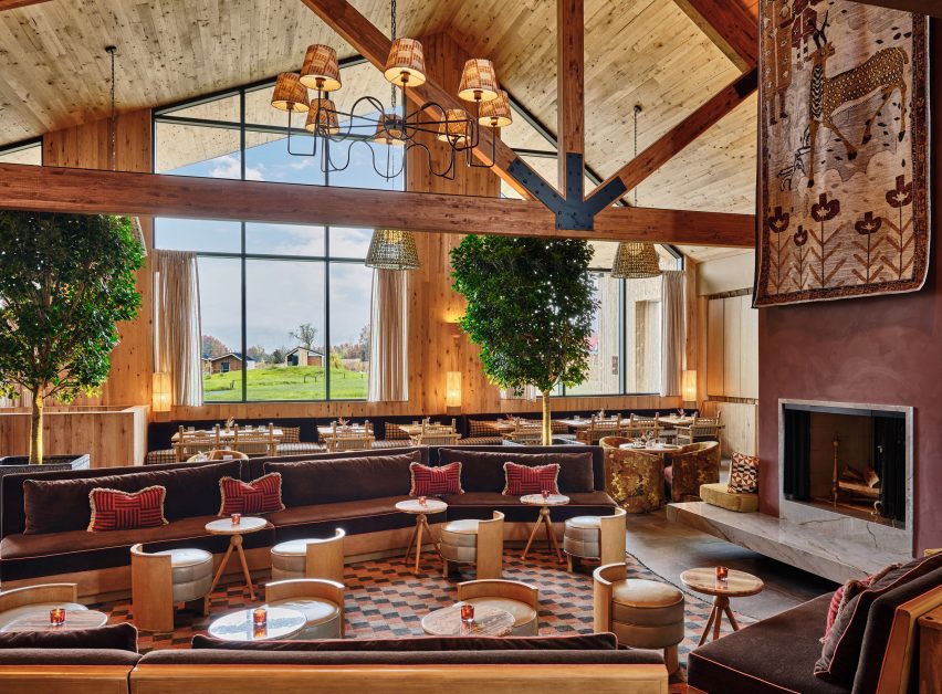
Restaurant dining room with high ceiling, exposed beams and warm colour palette
Interiors for the resort were completed by Ward + Gray, which chose a warm and textured palette for spaces including the restaurant

Views of the Shawangunk Ridge are framed through the Great Porch, a covered open-air lounge organised around a central fire pit.

To one side is the resort’s restaurant, Clay which uses many ingredients grown or produced on-site.

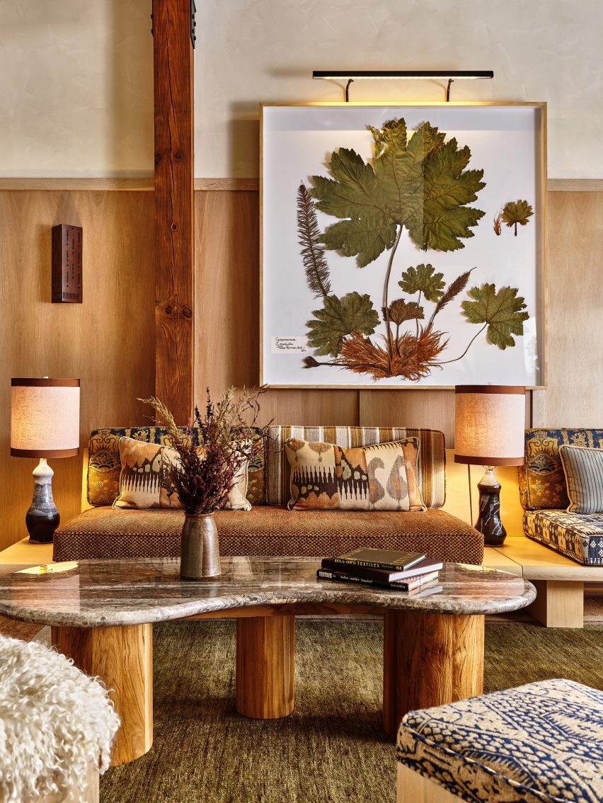
Framed pressed botanicals hang on a wall above earth-toned furniture
In the shop, curated by Gardenheir, pressed botanicals are framed on a wall above earth-toned furniture

The dining room interior features warm, textural earth tones, wood-framed furniture and large indoor trees, while outdoor tables overlook the meadow and mountains beyond.

The other side of the Great Porch houses the reception area and a store curated by Gardenheir that sells a variety of garden-themed products.

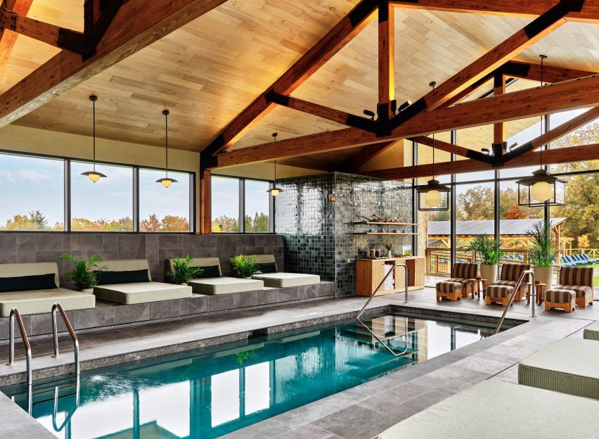
Indoor swimming pool with exposed timber trusses and slate floors
The indoor swimming pool sits below exposed timber trusses and features slate floors

The Thistle spa and an indoor pool are accessed beyond, decorated in a palette of buffed biscuit, mottled green and slate grey that complement the exposed beams.

Together, this row of large, timber-clad gabled structures anchors the resort, while the various guest accommodations are spread out around it.

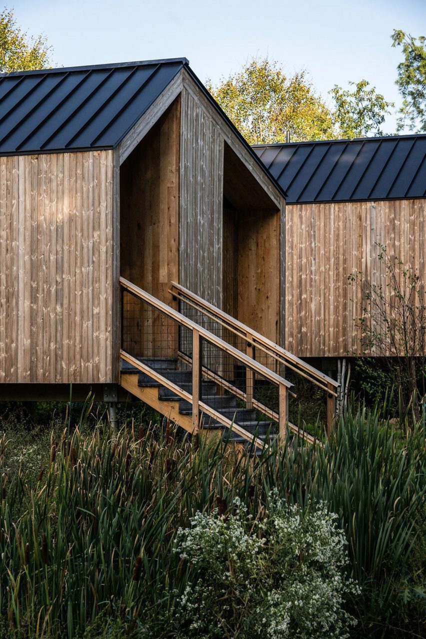
Cottages with reclaimed oak cladding and offset gabled roofs
Guest cottages also feature offset gabled roofs, and are clad in reclaimed oak

“With a more modern take on the vernacular building typologies of farmhouse and barn, inspired by modern European architects such as Peter Zumthor, the buildings were designed to frame the surrounding mountains, nestled harmoniously into the site,” said the studio.

Other amenities across the resort include an outdoor swimming pool and lounge area and a building dedicated to fitness that houses a gym and a yoga studio facing a pond.

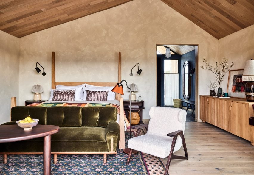
Guest bedroom with earthy colour palette
The guest bedrooms are cosy yet modern, with a colour palette borrowed from the natural surroundings

For the design of the 65 cabins and cottages, Electric Bowery co-founders Cayley Lambur and Lucia Bartholomew looked to several references including the lifestyle of their native state, and architects like Mickey Muennig.

“It was particularly important to convey the indoor-outdoor living experience that was borrowed from and inspired by west coast Californian architecture, using tall storefront glass in several locations with naturally weathered and repurposed wood-clad ceilings and fin walls visually extending from the interior to exterior,” said the architecture studio.

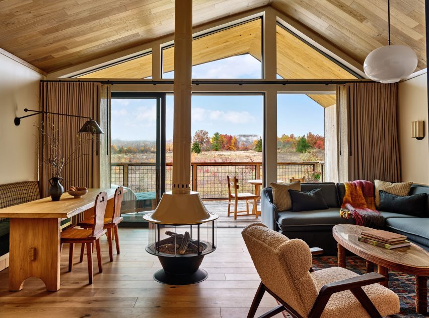
Guest room lounge with sliding glass doors that open onto porch
Sliding glass doors open the guest rooms to private porches

The oak-clad Ridge and Meadow cottages all have an offset gabled form, while the double-gable structures house the two-bedroom suites.

Sliding glass doors open onto private porches, which are each angled to block views from their neighbours.

Cabin clad in Corten steel surrounded by trees
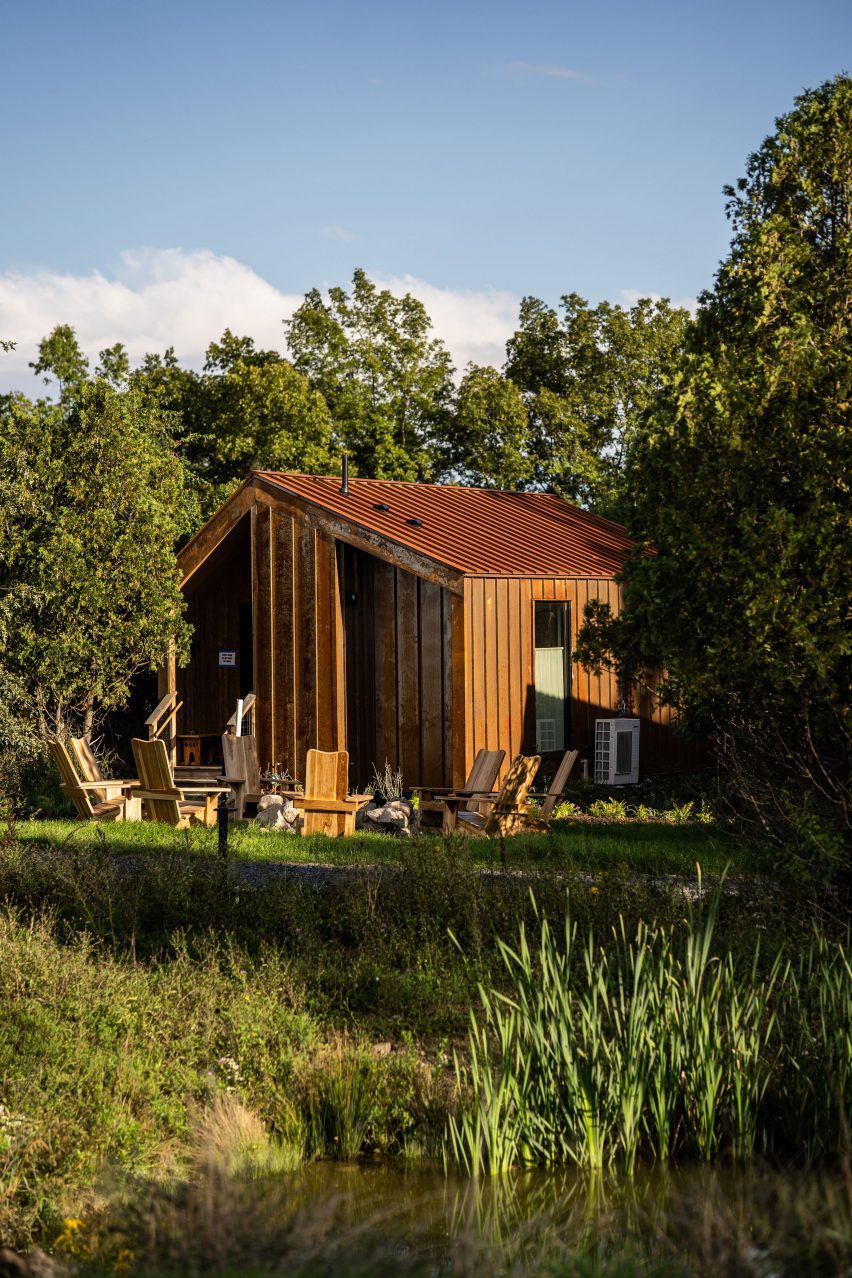
Nestled into the trees, the Bower Cabins are clad in weathering steel

Interiors are bright and modern, with bold colours borrowed from the natural surroundings and custom furniture paired with locally sourced antiques.

Tucked beneath the tree canopy, the Bower Cabins are a similar shape to the cottages, but clad in weathering steel.

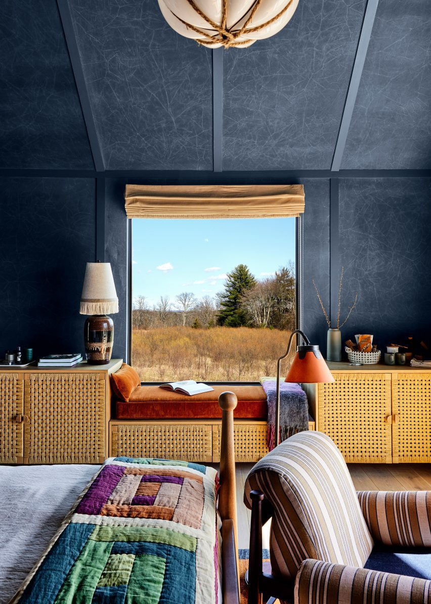
These smaller rooms feature a darker, more intimate palette of dark blue walls and patterned textiles, and details including woven cabinet doors.

“The overall palette of the project is composed of an abundance of natural materials – stacked stone, slate, weathered wood finishes, naturally oxidized Corten steel, to name a few – that blend seamlessly with the landscape and provide warmth through texture and lack of uniformity, but also conform to the modern architectural lines of the buildings,” said the studio.

Bedroom interior with dark blue walls, woven cabinet fronts and patterned textiles
The smaller cabin interiors feature dark blue walls, woven cabinet fronts and patterned textiles

Lambur and Bartholomew founded Electric Bowery in 2013 after working together at Frank Gehry’s office, and now has offices in Los Angeles, Big Sur and New York City.

Their earlier projects include a house in Venice Beach with an off-centre pitched roof, which bears a resemblance to the cabins at Wildflower Farms.

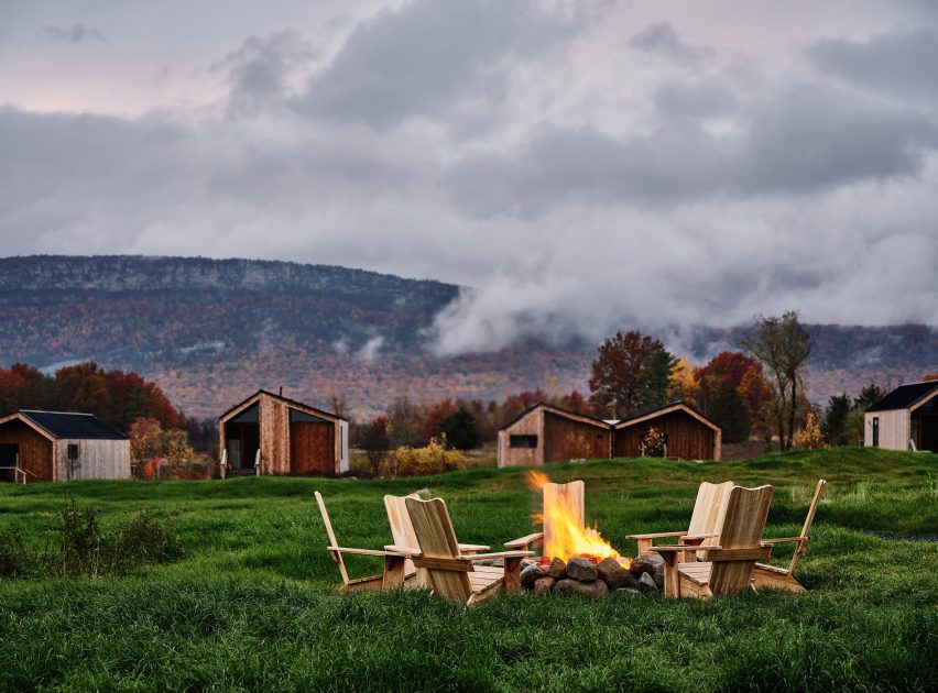
Chairs surrounding a fire pit with cabins and mountain ridge in the distance
Wildflower Farms occupies a 140-acre site and offers a rural escape 90 minutes from New York City

The Hudson Valley is a popular getaway destination for city dwellers craving a dose of nature, and its popularity increased further during the pandemic, when many New York City relocated there temporarily or permanently.

Among the myriad places to stay in the area are the boutique Hotel Kinsley in Kingston, and Troutbeck, a renovated English-style country house.

The photography is courtesy of Wildflower Farms.

Reference

Eight textural kitchens that combine stone and wood surfaces
CategoriesInterior Design

Eight textural kitchens that combine stone and wood surfaces

For this lookbook, we’ve collected eight kitchen interiors that marry the natural textures of wood and stone to create visual interest while remaining practical.

Stone is a hardwearing and durable material, making it a popular choice for kitchen worktops, while wood adds a sense of warmth to interior spaces when applied to walls, floors or kitchen cabinets.

In these kitchens, the natural grain of wood is complemented by striking stone surfaces, including cool-toned limestone, travertine, and a range of dramatically veined marble.

This is the latest in our lookbooks series, which provides visual inspiration from Dezeen’s archive. For more inspiration see previous lookbooks featuring mid-century home renovations, interiors centred around dining tables and spaces finished in reclaimed materials.


Kitchen inside Low Energy House designed by Architecture for London
Photo by Lorenzo Zandri and Christian Brailey

Muswell Hill house, UK, by Architecture for London

English studio Architecture for London renovated and extended this Edwardian home in London using natural materials in a bid to keep embodied emissions to a minimum.

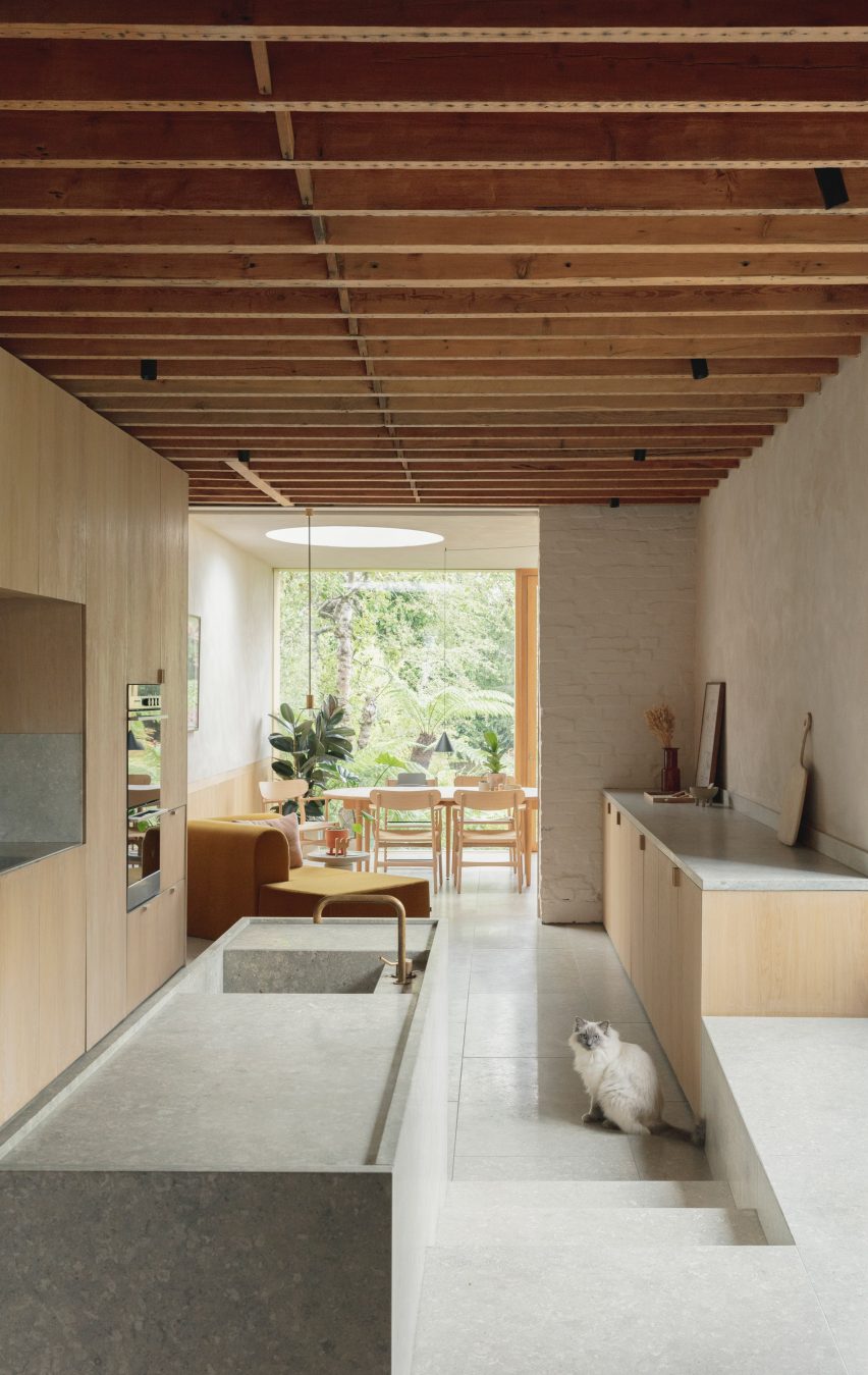
In the kitchen, cabinets were lined with oak wood while pale grey limestone was used for the floors, worktops, prep counter and a chunky window seat.

The studio also exposed the original timber roof beams and complemented the minimal material palette with lime plaster on the walls, forming an airtight layer to mitigate heat loss.

Find out more about the Muswell Hill house ›


Wood-lined kitchen interior with a marble island by DAB Studio
Photo by Daniëlle Siobhán

Zwaag family home, Netherlands, by DAB Studio

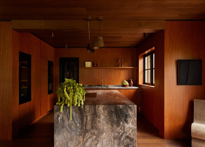
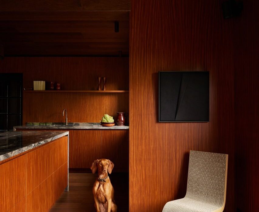
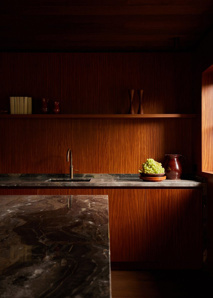
For the kitchen renovation of this home in Zwaag, the Netherlands, Dutch interiors practice DAB Studio covered the walls and cabinets in Afromosia wood, and the floors and ceilings in smoked black-oiled oak.

The Afromosia wood was quarter-sawn to reveal a decorative grain pattern and add a sense of playfulness to the space, while an Arebescato Orobico marble kitchen island acts as the room’s centrepiece.

Find out more about Zwaag family home ›


Travertine stone kitchen island and backsplash with oak cabinets
Photo by David Dworkind

1980s Quebec home, Canada, by Ménard Dworkind

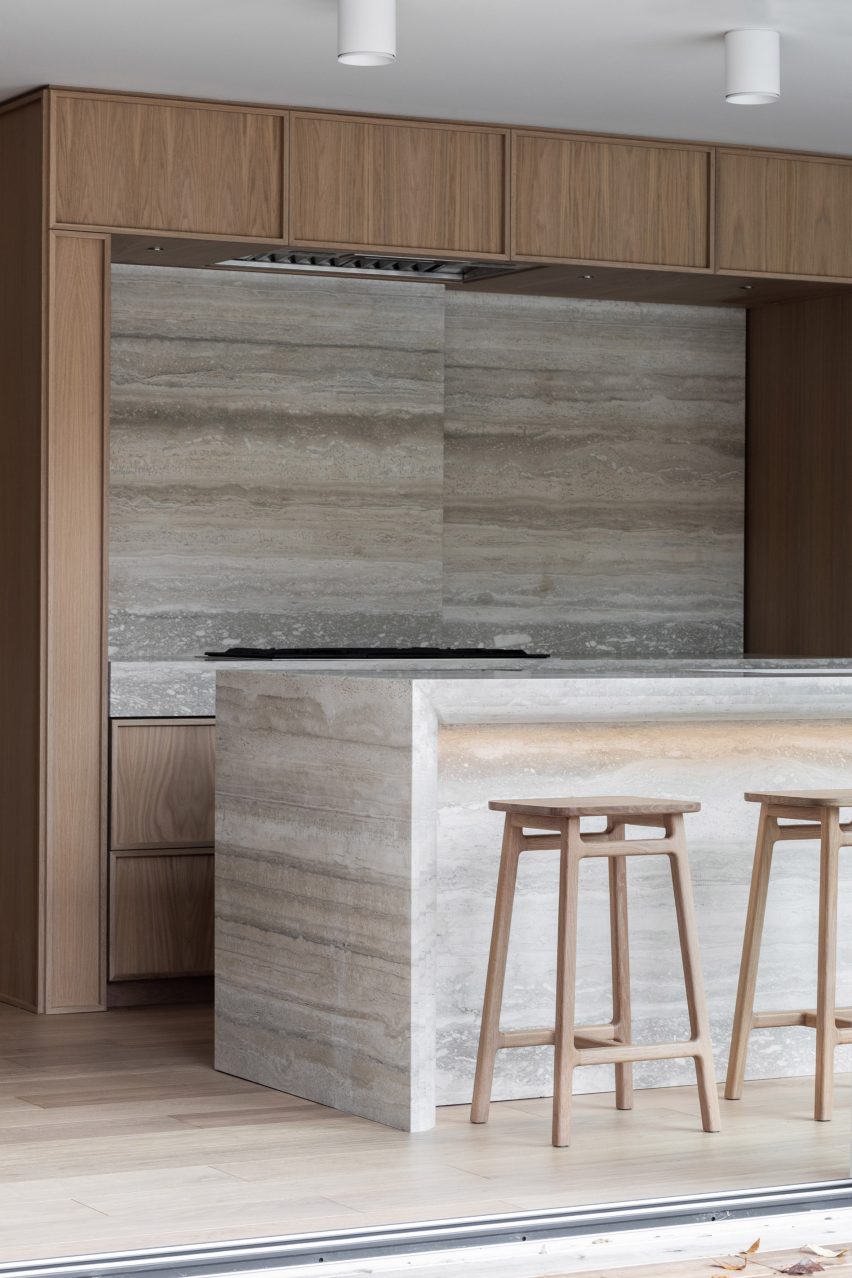
A sculptural travertine island sits at the centre of the kitchen in this 1980s home in Quebec, which was renovated by Canadian architecture studio Ménard Dworkind.

The studio also used a travertine slab to create a sliding backsplash, inserted into the warm oak cabinetry to conceal additional storage space.

Find out more about the 1980s Quebec home ›


Kitchen in Twentieth house by Woods and Dangaran
Photo by Joe Fletcher

Twentieth, USA, by Woods + Dangaran

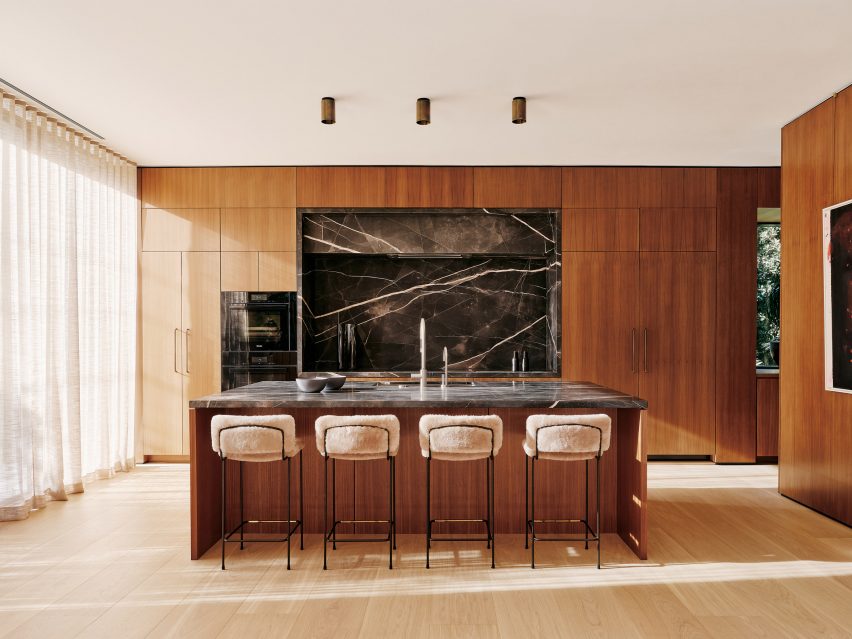
For this kitchen in a Santa Monica home, Los Angeles studio Woods +Dangaran used a dark grey marble with bold white veining to form the island worktop and the surrounds of a recessed space in the wall units.

White oak lines the floors, while a darker shade of walnut was used for wall panelling, cupboards and the sides of the island.

Find out more about Twentieth ›


Palm Beach house in Sydney by YSG with stone kitchen island

Sydney Palm Beach house, Australia, by YSG

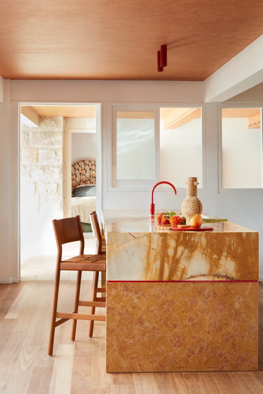
Informed by the rustic beach clubs of Ibiza and Cancun, Australian interiors studio YSG overhauled a holiday home in Palm Beach, Sydney, with a mix of sunny colours and textures.

In the kitchen, the studio sanded down the wooden floorboards to achieve a warmer tone and added an island made from two types of stone – Giallo Siena marble and travertine – to recall “the ombre shades of a freshly poured tequila sunrise”.

Find out more about the Sydney Palm Beach house ›


Minimal interiors of forest retreat designed by Norm Architects
Photo by Jonas Bjerre-Poulsen of Norm Architects

Forest cabin, Sweden, by Norm Architects

Danish studio Norm Architects kept the material palette minimal and rustic for this holiday cabin in a Swedish forest.

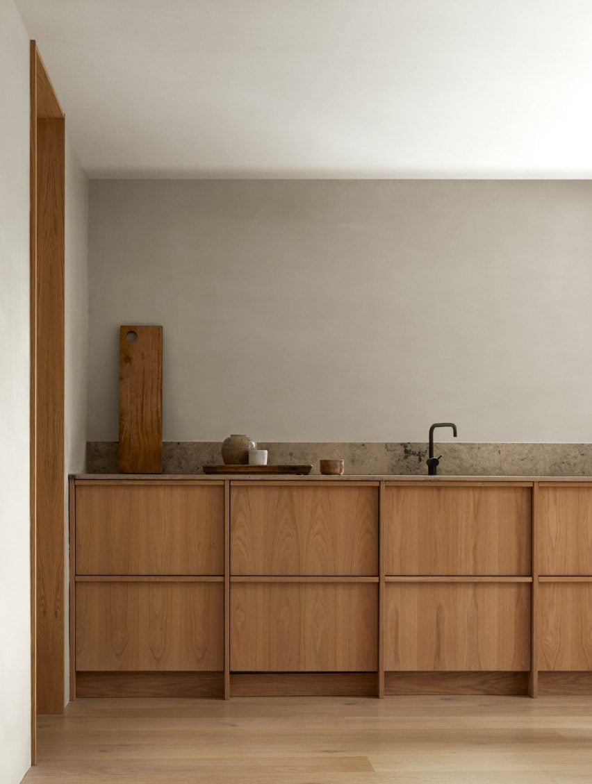
Handleless kitchen cupboards are finished in oak to match the floors, complemented by a stone worktop that extends up into a short backsplash.

Find out more about the forest cabin ›


Brooklyn Loft by Dean Works
Photo by Daniel Salemi

Brooklyn Loft, USA, by Dean Works

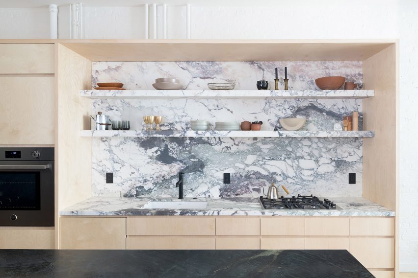
White marble with grey-and-blue veining provides an eye-catching worktop, backsplash and shelving in the kitchen of Brooklyn Loft, an apartment designed by local studio Dean Works.

Surrounding the marble is a large Baltic birch plywood storage unit that doubles as a room divider to separate the kitchen from the bedroom. A dark stone kitchen island was added to contrast the otherwise light-toned interior.

Find out more about Brooklyn Loft ›


Sunderland Road house in London by 2LG
Photo by Megan Taylor

Forest Hill house, UK, by 2LG Studio

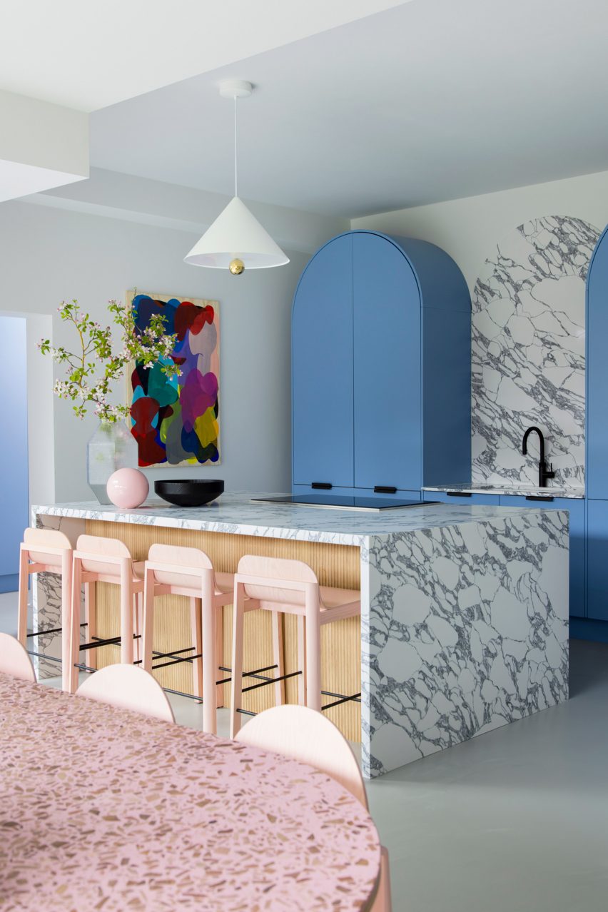
Playful pastel colours characterise the interior of this Edwardian home in London, which was renovated by 2LG Studio.

The local firm aimed to balance Italian influences – in the form of the marble backsplash and kitchen island – with Scandinavian design elements such as the arched cabinets and grooved wood siding.

Find out more about the Forest Hill house ›

This is the latest in our lookbooks series, which provides visual inspiration from Dezeen’s archive. For more inspiration see previous lookbooks featuring mid-century home renovations, interiors centred around dining tables and spaces featuring reclaimed materials.

Reference

DAB Studio lines kitchen of Dutch home with oak and Afromosia wood
CategoriesInterior Design

DAB Studio lines kitchen of Dutch home with oak and Afromosia wood

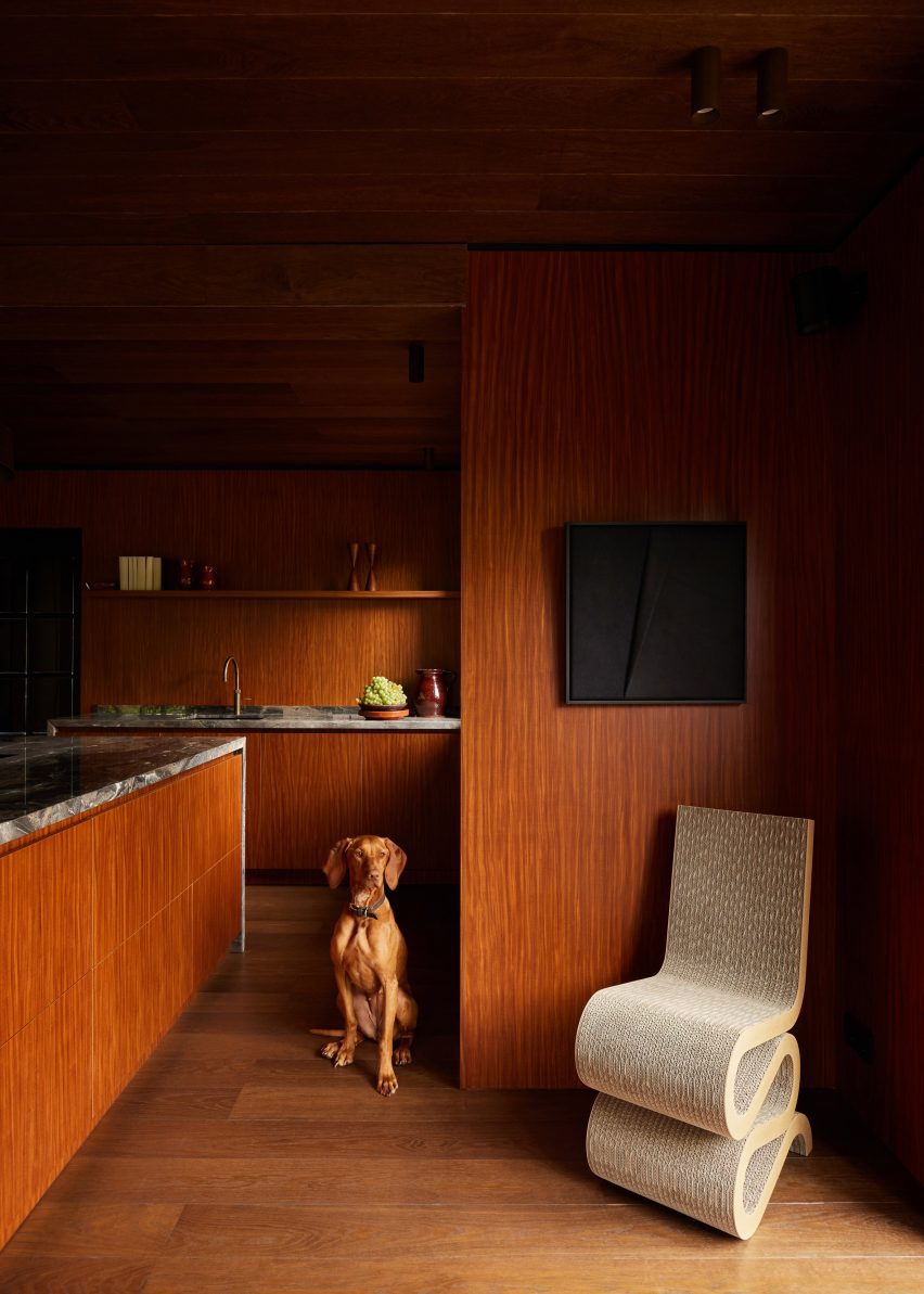
Dutch interior design practice DAB Studio has transformed the kitchen of a family home in Zwaag, the Netherlands, by covering the floors and ceiling in one type of wood and the walls and cabinets in another.

DAB Studio aimed to create a “calm yet soulful” interior with an earthy colour palette made up of tan and neutral shades.

Kitchen interior by DAB Studio with wood-lined walls, floors and cabinets
Quarter-sawn Afromosia wood lines the walls and kitchen units

The floors and ceiling were covered in hand-scraped oak with a smoked and black-oiled finish, laid in a pattern of side-by-side plank pairs.

Afromosia wood, a tropical hardwood native to west Africa, was applied to the walls and cabinets. The wood was quarter sawn to create a decorative grain pattern and add a sense of playfulness to the interior.

Wood-lined dining room with a built-in seating nook
Oak planks were laid in side-by-side pairs on the floors and ceiling

DAB Studio co-founders, Lotte and Dennis Bruns, designed the interior to be a space that would balance “feminine and masculine elements” and reflect both of the owners’ design tastes.

According to the duo, the repeating wood choices for the different surfaces give the space a sense of completeness.

Wood-lined kitchen with a black door and marble worktops
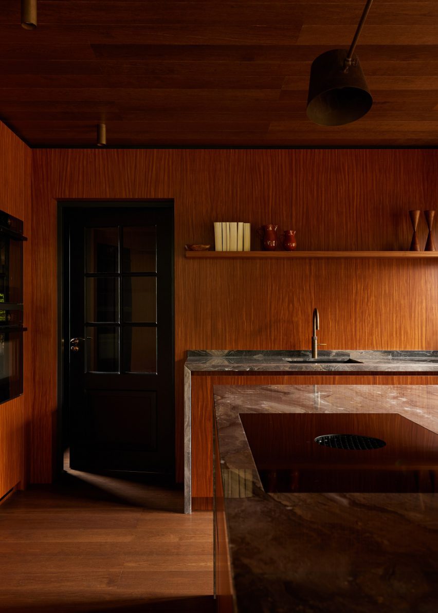
Marble worktops extend down the sides of the kitchen units

“Per the client’s request, we wanted to merge the feminine and masculine vision of their new home, balancing each other out in one curated space,” the co-founders told Dezeen.

“This allowed us to create unique areas in line with our client’s habits and interests while imbuing the space with a sense of spaciousness and lightness.”

“In order to merge all elements of the design, it felt important to prioritise the theme of consistency,” the duo added.

“For that particular reason, the wood of the floor is repeated on the ceiling, and the wood used for cabinetry is continued into the walls of the room.”

The centrepiece of the kitchen is the island, which features Afromosia wood cabinet doors and a waterfall countertop made from Arebescato Orobico marble.

Wood cabinets along one kitchen wall were also topped with a marble worktop, which extends down one side to frame the unit.

Wood-clad seating nook with upholstered seating and a marble table by DAB Studio
The studio balanced “masculine and feminine” elements in the interior

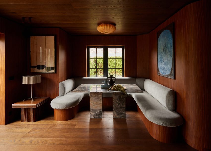
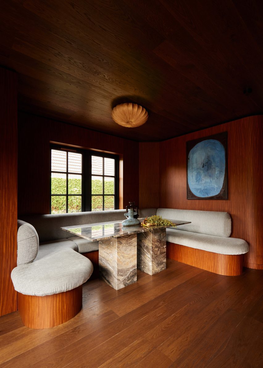
DAB Studio added a dining nook below a window, designed to be a space flooded with natural light where the family can gather.

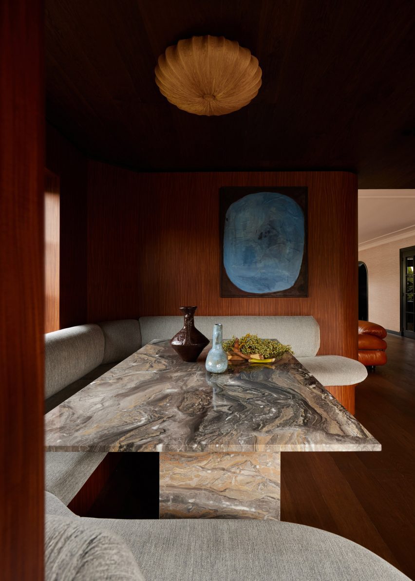
Seating with rounded corners wraps the three walls of the nook. The seating base was covered in the same wood as the interior walls, while the seat and backrest are covered in plush upholstery.

Wood-lined kitchen by DAB Studio with marble worktops
The quarter-sawn Afromosia wood creates a decorative grain

At the centre of the nook, a rectangular table with two blocky legs made from Arebescato Orobico marble contrasts the rounded seating.

“The dining nook is where the family can spend time together, welcome new conversations, and create core memories,” said Lotte and Dennis Bruns.

“The asymmetrical built-in banquette seating feels inviting with its round edges, and adds a dynamic feel to the space.”

Banquette seating in a dining room nook with wood flooring, ceiling and walls by DAB Studio
The dining nook sits below a window

Decorative items and free-standing furniture were introduced to the interior to add more rounded elements, including a Wiggle Chair by Frank Gehry.

Elsewhere in the Netherlands, Francois Verhoeven Architects has created a bungalow clad in vertical timber slats and Julia van Beuningen added a plywood staircase to a barn conversion.

The photography is by Daniëlle Siobhán.

Reference

Wood and asphalt wrap Phoenix apartment building by SinHei Kwok
CategoriesArchitecture

Wood and asphalt wrap Phoenix apartment building by SinHei Kwok

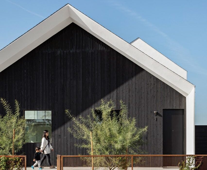
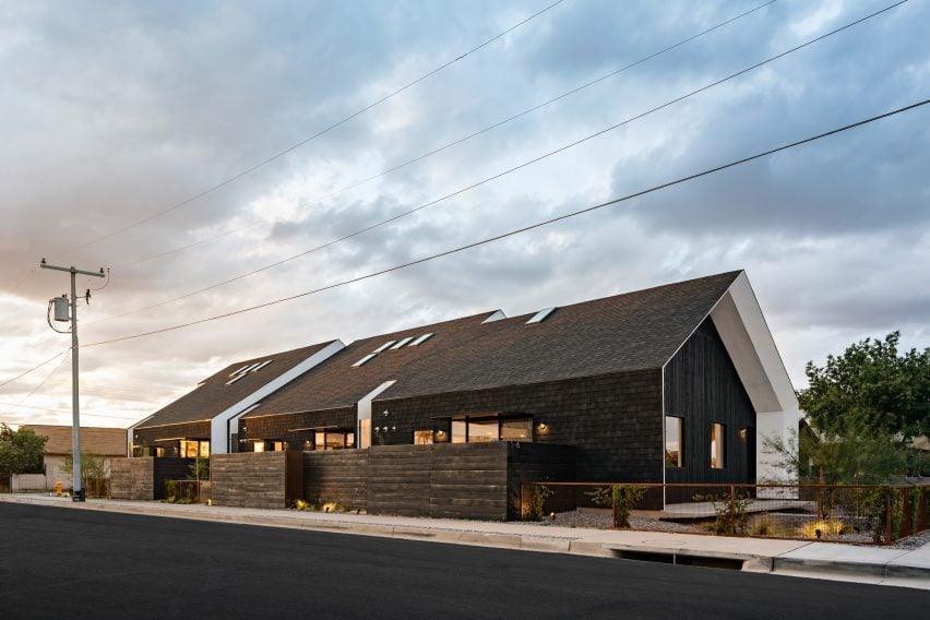
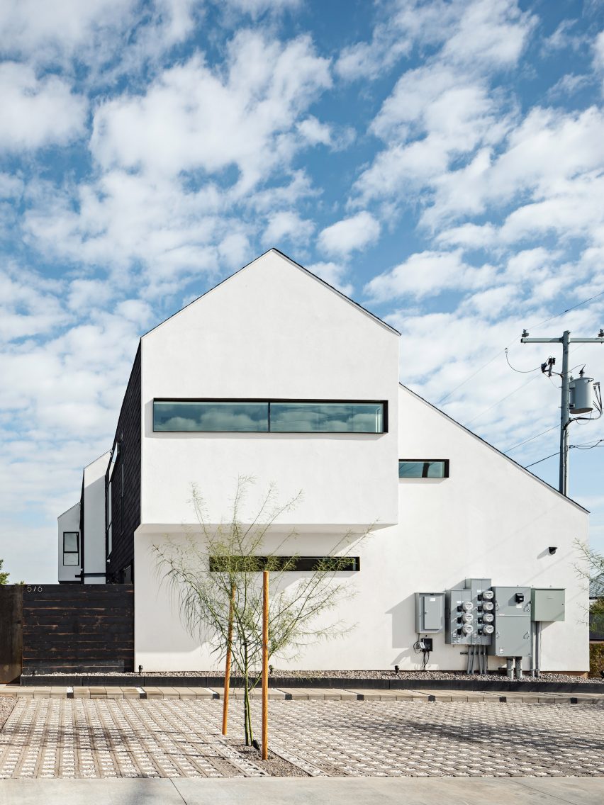
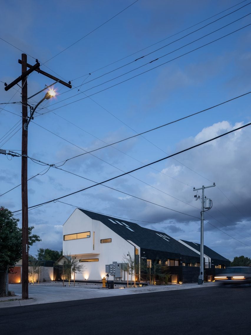
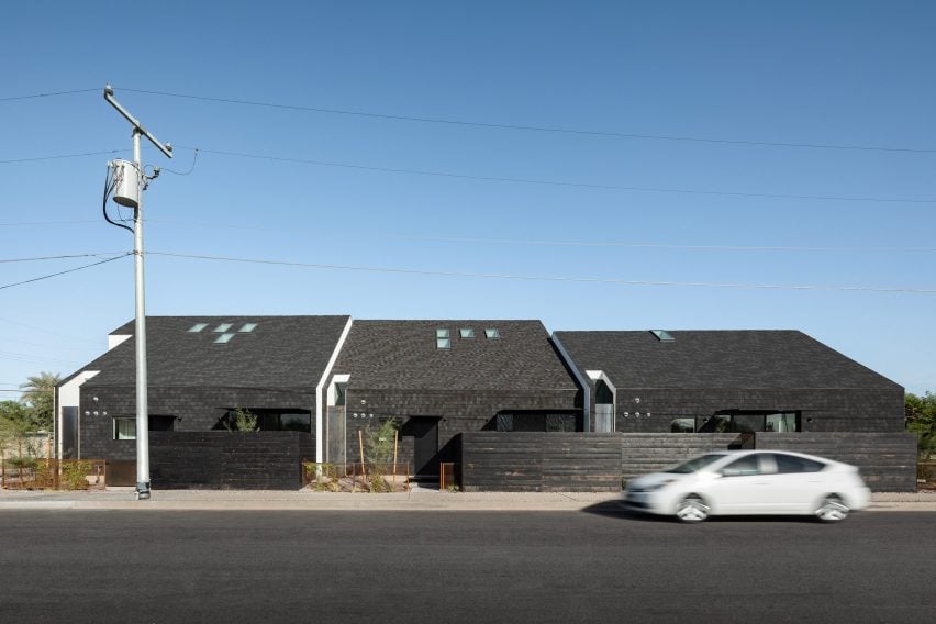
Black wood and asphalt shingles clad the exterior of the Polker housing block by architect and developer SinHei Kwok, who took cues from historic “pyramid cottages” while conceiving the project.

The historic Garfield neighbourhood – which has been undergoing revitalisation – is located near downtown Phoenix and is known for its modest, 20th-century homes designed in various styles. Of particular note are the district’s “pyramid cottages”, so named for their distinctive hipped roofs.

Gable end of a Phoenix house clad in black timber by SinHei Kwok
The Polker home aims to provide an alternative to urban sprawl

SinHei Kwok – whose multidisciplinary studio is based in Phoenix and Hong Kong – purchased a standard lot in the Garfield district and embarked on creating a multi-family development that respects its milieu.

“Inspired by the 100-year-old pyramid cottages within the historic neighbourhood, the building’s massing takes cues from the surrounding context,” said Kwok, who served as the architect and developer.

Pitched roof house clad in black wood and asphalt shingles
Asphalt shingles cover the exterior

One of the project’s main goals was to offer an alternative to the sprawl that characterises the Phoenix metropolitan area, which the architect described as an “unsustainable phenomenon”

“Phoenix has been infamous for urban sprawl with single-family housing developments since the 1950s,” the architect said.

“This project served as a prototype of urban infill development to help build a sustainable, walkable city.”

Pitched roof house with extruded upper level and white gable end
It contains six housing units

For the rectangular property – which measures 140 feet by 50 feet (43 by 15 metres) – the architect conceived a long, two-storey building that contains six rental units. The building’s pitched roof is meant to reference the historic pyramid cottages.

Slightly different facade treatments were used around the building.

Pitched roof house clad in asphalt shingles with extruded upper level and white gable end
Stucco covers one elevation

On the north- and south-facing elevations, the roof and exterior walls are wrapped in variegated asphalt shingles. The east wall is clad in black wood, while the western facade is covered in vanilla stucco and features a horizontal window.

“Inspired by Chinese landscape paintings, the horizontal shape of the window facing west captures the constantly changing skyline of downtown while limiting heat gain from the summer sun,” said Kwok.

The entire building totals 4,250 square feet (395 square metres). Within the units, one finds fluid layouts and a restrained material palette.

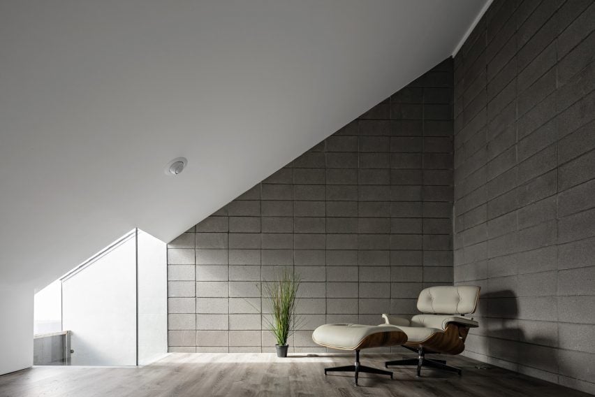
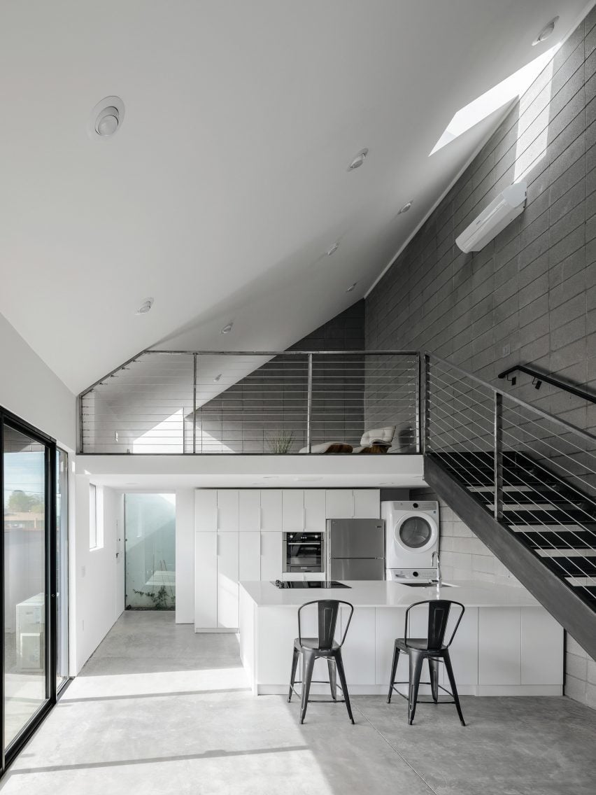
Interior elements include concrete flooring, concrete-block walls and a steel staircase. For the bathroom shower, Kwok used exterior-grade, aluminium-composite panels to eliminate grout joints and “provide a clean, modern look”.

House with a pitched roof clad in asphalt shingles by SinHei Kwok
Different materials were applied to different facades

All of the apartments have two levels, with the public area located on the ground floor. The upper level – traditionally used as an attic in the historic cottages – holds either a single loft-style room or two bedrooms and a bathroom.

In addition to a small parking lot with permeable paving, the site offers pockets of private and shared outdoor space.

Room with a sloped roof and lounge chair
The home has concrete block interior walls

All units have covered patios accessed by sliding glass doors, enabling a connection between inside and out.

Along the eastern elevation, which faces a street, Kwok carved out an outdoor space that serves as a reinterpretation of the iconic front porches found in the historic neighbourhood. The flooring is a 30-foot-wide (nine-metre) concrete slab that cantilevers over the ground.

Double-height space with a sloping roof and steel staircase
The studio added a steel staircase

“Our approach kept the same front-porch concept, encouraging dwellers to meet and interact with their neighbors,” said Kwok.

“During nighttime, it becomes a floating porch, with LED lights that light up below the slab.”

This is the second project by SinHei Kwok in Phoenix’s historic Garfield neighbourhood. For a compact site there, the architect and developer created a pair of apartment buildings that have M-shaped roofs and asphalt-shingle cladding.

The photography is by Roehner + Ryan.


Project credits:

Design architect, developer and owner: Sin Hei Kwok
Associate architect: Yin Pang
Structural engineer: Struktur Studio
MEP/FP engineer: Otterbein Engineering
Contractor: Beckett Construction

Reference

Christian + Jade explores the Weight of Wood at 3 Days of Design
CategoriesInterior Design

Christian + Jade explores the Weight of Wood at 3 Days of Design

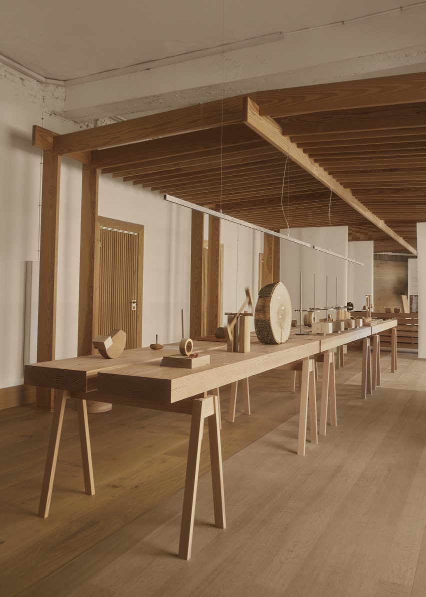
Danish design studio Christian + Jade has created an exhibition in collaboration with wood flooring manufacturer Dinesen that explores the density of wood and its significance and history as a commodity.

The Weight of Wood exhibition, which takes place at the Dinesen showroom as part of Copenhagen festival 3 Days of Design, was the result of a year-long research project commissioned by the brand’s recently founded Dinesen Lab.

Photo of Weight of Wood exhibition
Weight of Wood is an exhibition by Christian + Jade

Dinesen Lab invited Christian Hammer Juhl and Jade Chan, founders of Christian + Jade, to take part in a residency in which local artists were asked to work with wood harvested by the company to produce a research project and explore the weight of wood.

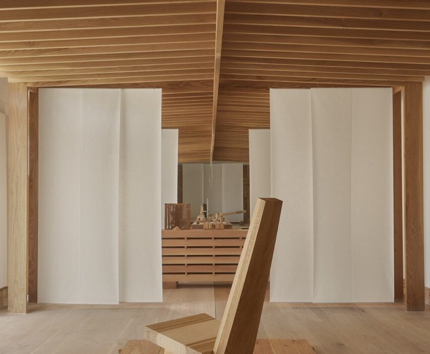
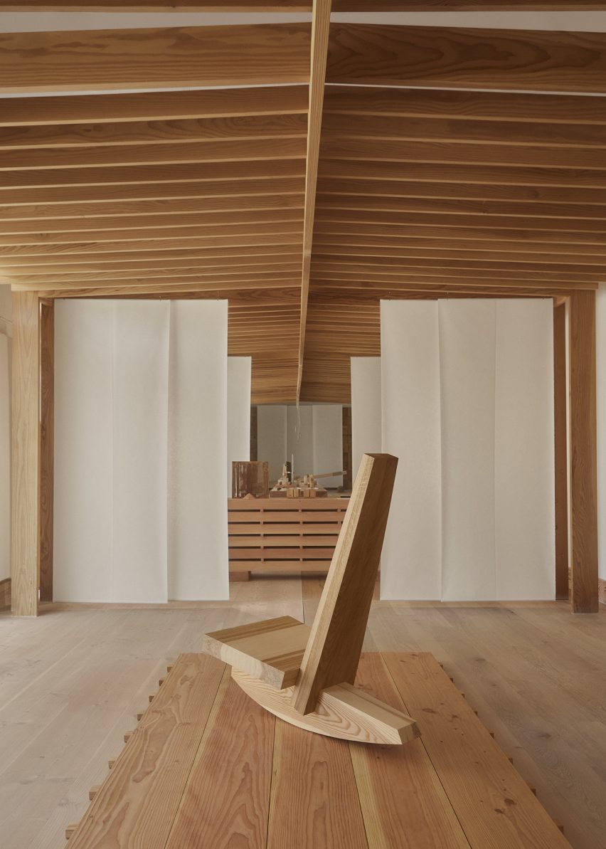
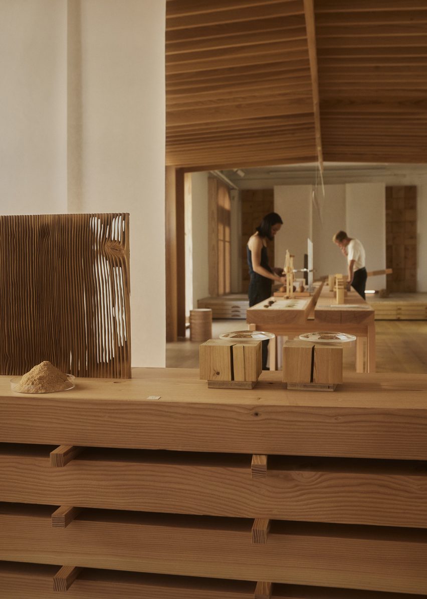
The Weight of Wood installation is located within a large exhibition space at the brand’s showroom in Copenhagen. This was divided into a series of smaller rooms via sheets of textured paper hung vertically from a wooden pavilion.

Photo of an installation at the Weight of Wood exhibition
It takes place at the Dinesen showroom

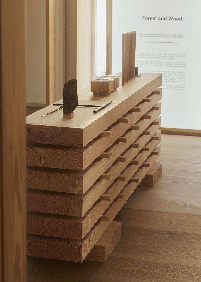
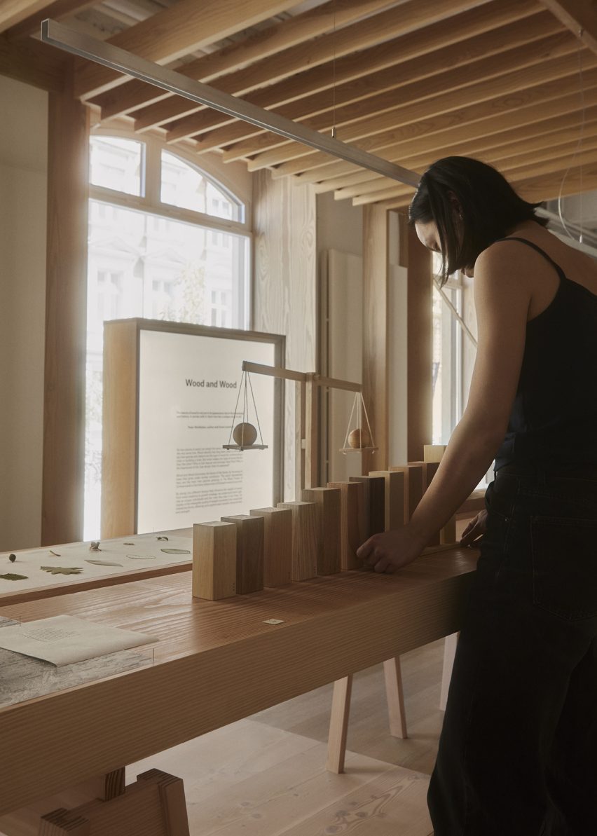
Each of the smaller rooms separates the exhibition into three different parts titled Forest and Wood, Wood and Wood, and Human and Wood.

Throughout the exhibition space, wooden tables hold a number of experiments and interventions completed by Christian + Jade using different types of wood that were harvested by Dinesen.

“We were fascinated by the idea that no two pieces of wood weigh the same, not even if it comes from the same tree trunk,” the studio explained at a preview of the exhibition. “This was really what sparked our interest in this project.”

Photo of Weight of Wood
The exhibition explores the ways in which wood has been commodified

“Through this exhibition, we have tried to work with this idea in various scales,” the studio founders added. “It sort of presents a design methodology, combining different pieces of wood with different densities.”

“What we have created is not only a series of furniture but also a rocking horse, a rocking chair and lots of small experiments that visualise this intangible quality of wood, which is the weight of wood.”

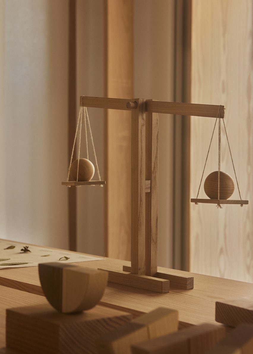
A collection of different-sized cubic wooden volumes were presented in the exhibition, made from 11 different species of wood including beech, cherry, Douglas fir and elm. Each of the pieces of wood weighs 250 grams and conveys the different densities of wood through volume and size.

A seesaw placed at the rear of the exhibition space featured a base made from Douglas fir and topped by a seat constructed from equal parts Douglas fir and oak. As a result of oak having a higher density than Douglas fir, the seesaw will always lean towards its oak-constructed side.

Photo of a wooden scale at Weight of Wood exhibition
The designers used Dinesen’s wood for their experiments

“We chose three different furniture archetypes that require weight and balance in their function – the seesaw, the rocking chair and the rocking horse,” Chan said.

“So in designing or reimagining the furniture, we’ve worked with four of Dinesen’s main wood species; that is Douglas fir, oak, pine and ash.”

Photo of the exhibition
The exhibition was divided into three parts

“The seesaw is an example of one of the simple principles that we apply – the pivot point is made using Douglas and the seat is made using oak and Douglas,” Chan added.

The rocking horse was constructed from 87 per cent Douglas fir and 13 per cent ash. Because of its Douglas fir-heavy construction, the horse always tilts towards one side, which provides it with a unique movement.

Photo of the exhibition
The exhibition included a rocking horse, seesaw and rocking chair

Chan concluded the preview of the Weight of Wood exhibition with a poem by H P Dinesen, a relative of the company founders:

“To those who love the tree, those who may be fighting the tree, the one who plants the tree, the one who fells the tree, the poet who praises the tree, and the one who simply settles with enjoying the tree.”

Also at this year’s 3 Days of Design, Nemo Lighting unveiled a light designed by architect Le Corbusier and a lamp by architect Charlotte Perriand and Takt launched a fully disassemblable sofa that can be replaced and recycled.

The photography is by Claus Troelsgaard.

Weight of Wood is on show as part of 3 Days of Design 2023, from 7 June to 9 June 2023. See Dezeen Events Guide for information about the event, plus a list of other architecture and design events taking place around the world.

Reference

Yuma Kano creates ForestBank material out of unusable wood
CategoriesSustainable News

Yuma Kano creates ForestBank material out of unusable wood

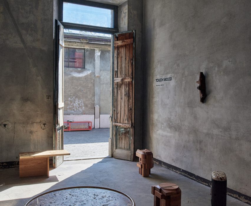
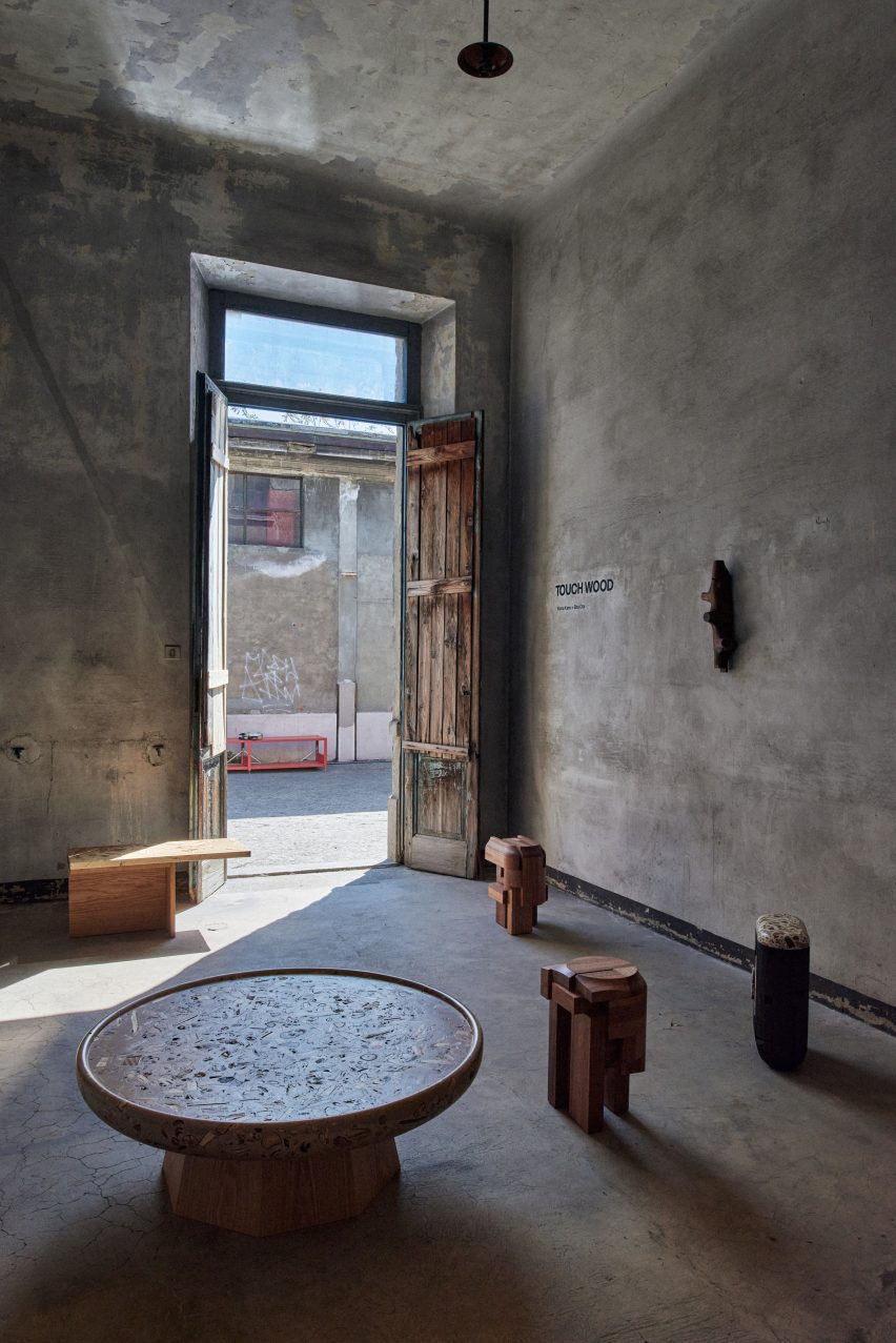
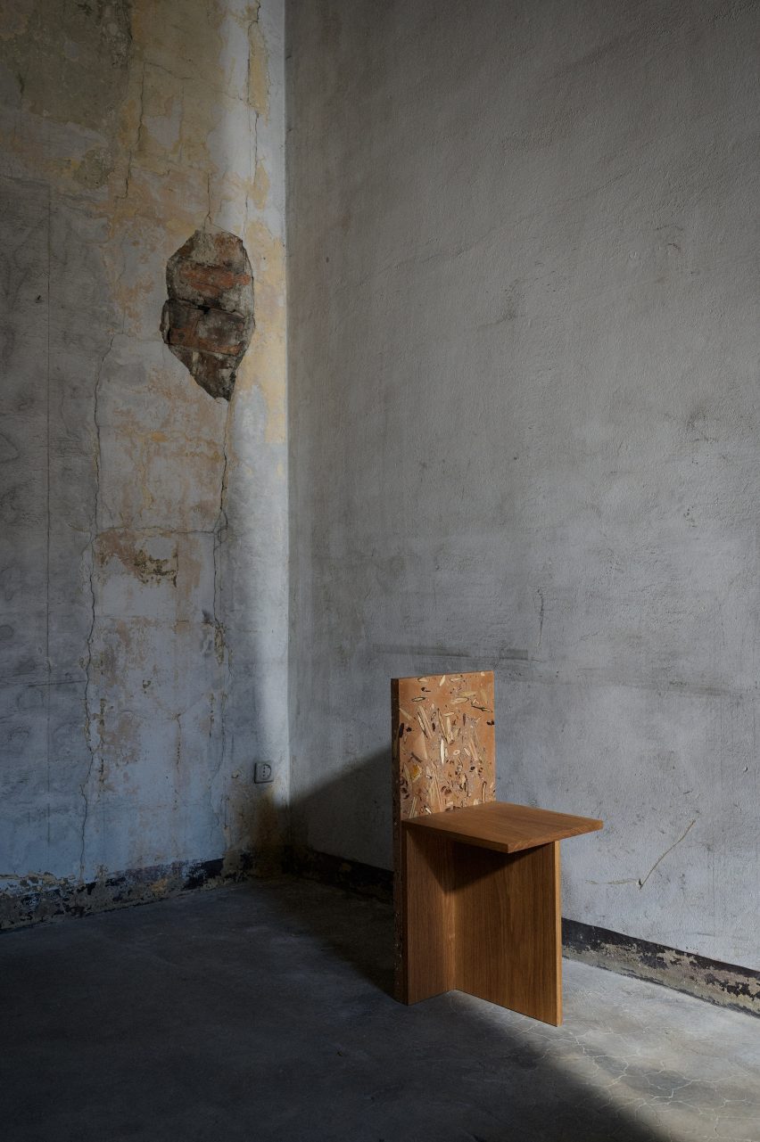
Japanese designer Yuma Kano has created a decorative material that resembles terrazzo from wood, foliage, bark, soil and seeds that was shown at Milan design week.

Kano, who showed his work together with fellow designer Sho Ota as part of the Touch Wood exhibition at the Alcova venue, says the idea behind the project was to find value in not just lumber, but all of the forest.

Interior of Touch Wood exhibition
ForestBank was shown at Alcova in Milan

After gathering unusable wood and other forest materials, he mixes them with a water-based acrylic resin that does not use any reactive mineral bases or volatile organic solvents.

“In the Japanese forest industry, these small pieces of wood are a waste material,” Kano told Dezeen. “I wanted to reuse the waste.”

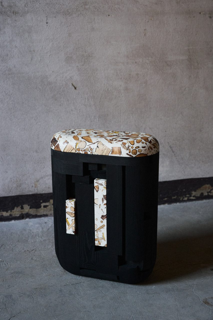
Seat by Yuma Kano
The material is made from waste wood

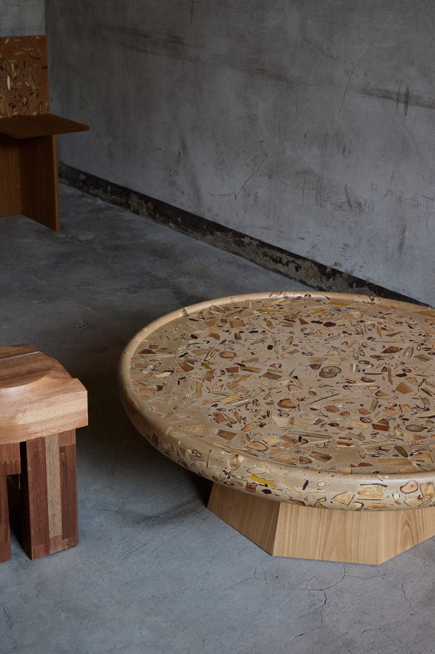
The technique invented by Kano creates a material with patterns that vary depending on the angle and depth of the cut into it, as well as on what ingredients – such as foliage, wood, bark, soil and seeds – were combined.

It means that the furniture made from the trademarked ForestBank material might also change how it looks as it grows older.

“The green leaves mixed in change to orange and brown as the seasons change,” Kano said.

“In addition, earth from the forest floor can be mixed in, adding browns and blacks, you can see the complex patterns of the cross sections of roots and seeds ordinarily hidden in the earth, and take notice of the different coloring that different species of trees have.”

ForestBank table by Yuma Kano
The finished material resembles terrazzo

Kano has made a collection of furniture from the material that includes a table, seats and a clothes hanger, and said the pieces can eventually be recycled to create more ForestBank material.

“I’m actually reusing the dust from the original pieces for future pieces,” he explained.

Hanger at Touch Wood exhibition
A sculptural hanger was on show at Touch Wood

The focus of the Touch Wood exhibition in Milan was to showcase ways of using wood that would have otherwise gone to waste.

Here, Kano’s furniture pieces were juxtaposed with Ota’s furniture collection, called Surfaced, which is made using wood that was scheduled to be discarded from workshops and factories.

The designers hoped that the exhibition would showcase designs that mass-production cannot achieve.

“The material can show the uniqueness of each little piece of wood,” Kano said.

ForestBank seat
A chair has a back made from ForestBank

This year’s Milan design week featured a number of projects by emerging designers. We looked at five emerging designers showing in Salone del Mobile’s Salone Satellite section and rounded up ten standout installations in Milan as part of our coverage.

Touch Wood was on show from 17 to 23 April 2023 as part of Milan design week. See Dezeen Events Guide for more architecture and design events around the world.

Reference

Ten mass-timber buildings that changed the way we think about wood
CategoriesSustainable News

Ten mass-timber buildings that changed the way we think about wood

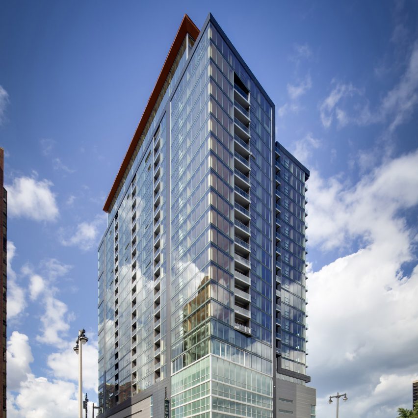
As our Timber Revolution series comes to an end, we round up the 10 significant buildings that have pushed the use of mass-timber.

Starting with a small housing scheme built in rural Austria in the late 1990s and ending with an 87-metre tower completed in the USA last year, the buildings profiled in the series chart the rise of engineered wood over the past 25 years.

Here are 10 mass-timber buildings that helped to change the way we think about wood:


The Ölzbündt building in Austria by HK Architekten
Photo by Ignacio Martinez

Ölzbündt, Austria, by HK Architekten (1997)

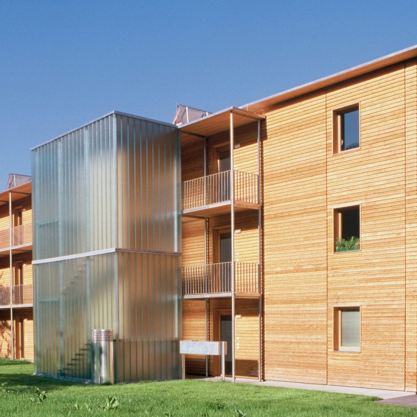
Our first case study profiled this early example of mass-timber multi-storey housing outside Dornbirn by Herman Kauffman’s studio, HK Architekten.

The three-floor block, which holds 13 homes and references traditional local houses in its design, was a prototype for a construction system that would enable multi-storey residential buildings to be made out of wood.

Find out more about Ölzbündt ›


BTZ building at TU Graz
Photo by Paul Ott (also top)

BTZ at TU Graz, Austria, by Nussmüller Architekten (2001)

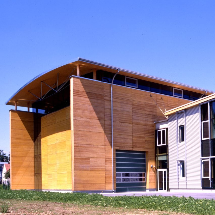
Much of the early research into mass timber took place in Austria, and the Bau Technik Zentrum (BTZ) at Graz University of Technology was the very epicentre of that work.

Designed by Nussmüller Architekten, the BTZ was an important mass-timber testing centre but also a significant piece of wooden architecture in itself, as one of the first examples of panel-system mass-timber construction and the first timber building with a curved roof.

Find out more about BTZ at TU Graz ›


Exterior of Murray Grove by Waugh Thistleton
Photo by Will Pryce

Murray Grove, UK, by Waugh Thistleton Architects (2009)

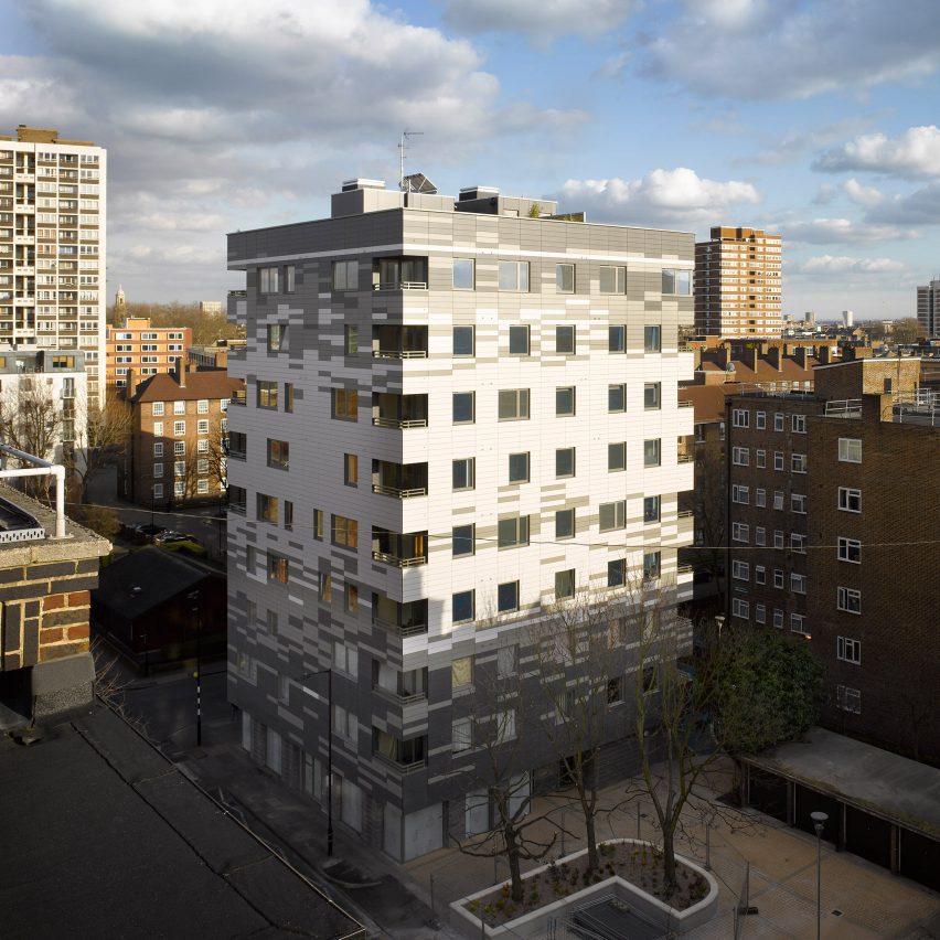
Murray Grove, also known as Stadthaus, attracted international attention upon its completion for demonstrating that timber could be used for tall buildings.

The nine-storey residential tower in east London, designed by local studio Waugh Thistleton, has a superstructure made almost entirely from pre-fabricated cross-laminated timber (CLT).

Find out more about Murray Grove ›


Photo of Forté
Photo courtesy of Lendlease

Forté, Australia, by Lendlease (2012)

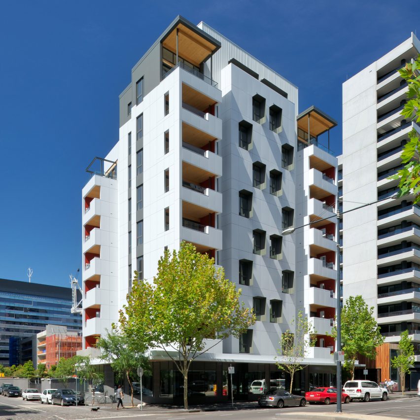
More than 750 CLT panels were shipped all the way from Austria to Australia to construct the first mass-timber high rise down under, designed and built by developer Lendlease.

Even despite the extensive freightage, university researchers said that the 10-storey building’s environmental impact was still smaller than if it had been constructed using concrete.

Find out more about Forté ›


Tamedia Office Building by Shigeru Ban
Photo by Didier Boy de la Tour

Tamedia Office Building, Switzerland, by Shigeru Ban (2013)

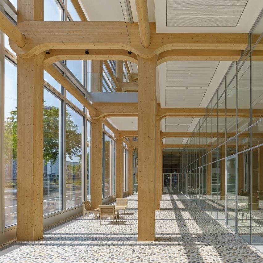
Japanese architect Shigeru Ban worked with Swiss engineer Hermann Blumer to devise a novel structural system for this extension to an office building in Zurich.

The pre-fabricated glued-laminated timber skeleton is held together entirely without screws or nails, instead consisting of large columns and cross-beams intersected by ovular spacer beams that lock the whole structure together.

Find out more about the Tamedia Office Building ›


T3 by Michael Green Architecture
Photo by Ema Peter Photography

T3, USA, by Michael Green Architecture (2016)

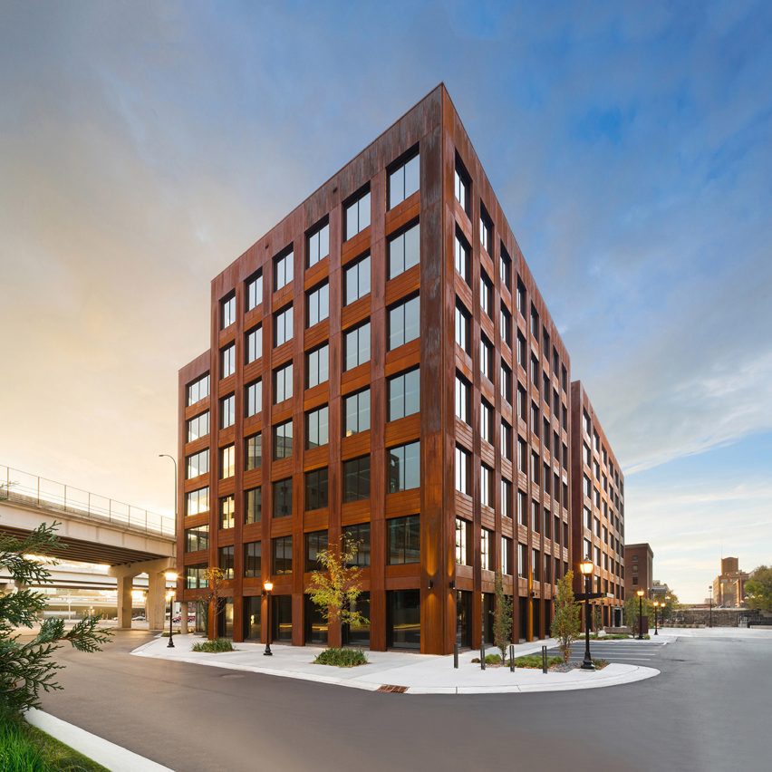
T3 in Minneapolis, designed by Canadian office Michael Green Architecture, became the first tall wooden structure in the USA upon its completion.

Constructed using wood from trees killed by mountain pine beetles, it was intended to demonstrate to the US real-estate industry that large mass-timber projects were viable – and it worked, with 1,677 mass-timber buildings now either finished or in progress across the country.

Find out more about T3 ›


Dalston Works building by Waugh Thistleton Architects
Photo courtesy of Waugh Thistleton Architects

Dalston Works, UK, by Waugh Thistleton Architects (2017)

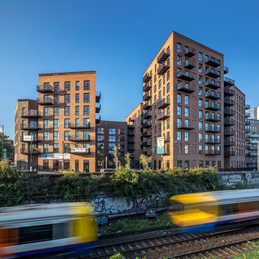
Using 3,852 cubic metres of CLT, the Dalston Works apartment complex in east London used more mass timber by volume than any other building.

Also designed by Waugh Thistleton, its external, party and core walls, as well as flooring and stairs, were made entirely from pieces of CLT – but at the request of the developer it was clad in traditional bricks to reference nearby Edwardian and Victorian buildings.

Find out more about Dalston Works ›


The exterior of Mjøstårnet
Photo by Ricardo Foto

Mjøstårnet, Norway, by Voll Arkitekter (2019)

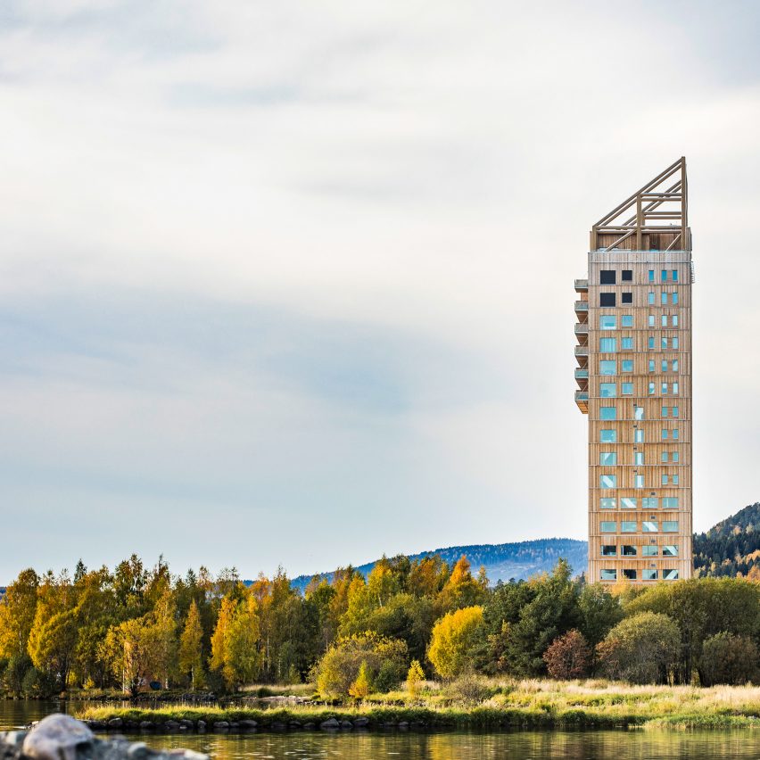
Mjøstårnet is an 85.4-metre-high tower on the edge of Norway’s biggest lake constructed using wood from local spruce and pine forests.

Architecture studio Voll Arkitekter designed the project, which was the world’s tallest timber building when completed, to show that building large, complex structures out of wood is possible.

Find out more about Mjøstårnet ›


Exterior of Sara Kulturhus Centre
Photo by Patrick Degerman

Sara Kulturhus Centre, Sweden, by White Arkitekter (2021)

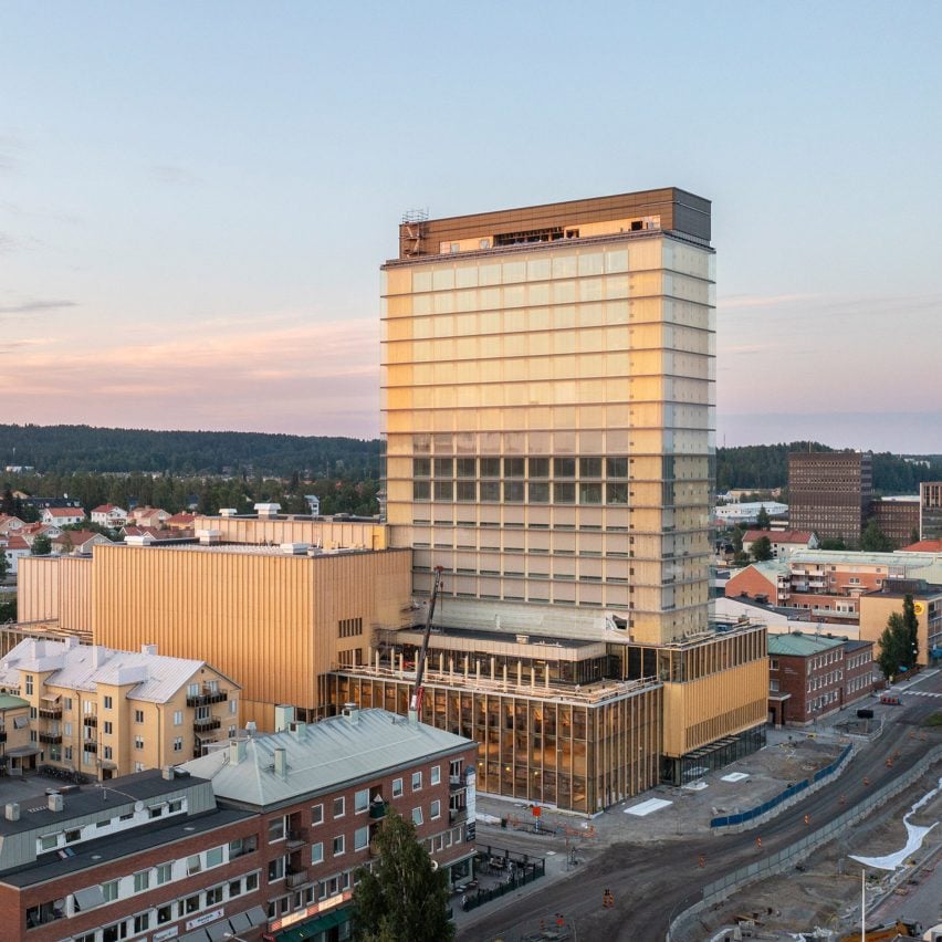
White Arkitekter’s Sara Kulturhus Centre is a 20-storey mass-timber building just below the Arctic Circle in the Swedish city of Skellefteå.

The vast quantities of wood used in its structure are estimated to store 9,000 tonnes of carbon dioxide – double the amount thought to have been emitted during construction, meaning the studio claims the building will be carbon negative over its lifetime.

Find out more about the Sara Kulturhus Centre ›


World's tallest timber tower Ascent
Photo courtesy of Korb + Associates Architects

Ascent, USA, by Korb + Associates Architects (2022)

The final case study featured in the Timber Revolution series is Ascent in Milwaukee, Wisconsin, currently the world’s tallest mass-timber building at 86.6 metres – though likely not for much longer.

Rather than its height, Korb + Associates Architects believes the residential project’s true significance is the collaborative model devised for working with city officials to achieve regulatory sign-off.

Find out more about Ascent ›


Timber Revolution logo
Illustration by Yo Hosoyamada

Timber Revolution

This article is part of Dezeen’s Timber Revolution series, which explores the potential of mass timber and asks whether going back to wood as our primary construction material can lead the world to a more sustainable future.

Reference

“We need to start using our wood more efficiently”
CategoriesSustainable News

“We need to start using our wood more efficiently”

A Timber Revolution requires us to focus on reducing mass-timber structures’ raw-material use instead of trying to design the tallest possible wooden building, writes Maximilian Pramreiter.


The renaissance of wood as a building material continues and has major potential to support climate-friendly construction – but it must be used efficiently.

From the second half of the 19th century, almost every product in our lives changed from being made out of a bio-based material to a highly engineered fossil-based alternative. The materials used to construct our buildings changed from natural materials like wood, stone and clay – which were considered antiquated and inferior – to man-made materials like steel, cement and glass.

The renaissance of one of the oldest building materials – wood – has already begun

The combination of steel frames, formwork concrete and glass facades led to the emergence of skyscrapers and marks the beginning of the age of steel at the end of the 19th century. The ensuing race for the design of the world’s highest building reached its temporary climax in 2010 with the completion of the Burj Khalifa at a record height of 828 metres. Today, every well-known city has at least one famous skyscraper in its skyline and concrete, as well as steel, dominates the architectural landscape regardless of the size of the project or its structural necessity.

The debate about how to combat climate change is now putting increasing pressure on the built environment, which currently generates roughly 40 per cent of the world’s annual greenhouse gas emissions. According to the International Energy Agency, around a third of these building-related emissions are emitted during construction, also known as embodied carbon.

Much of the current discussion on climate protection therefore focuses on how to replace modern construction materials with climate-friendly alternatives. Against this background, the renaissance of one of the oldest building materials – wood – has already begun.

Wood has the ability not only to substitute carbon-intensive materials, but also store carbon in the built environment. This makes it the perfect climate-friendly building material and it is without question that wood will play a key role in transforming the global building sector into a carbon sink.

Quite naturally, a similar race to construct the highest timber building has started. Architecture publications are full of the newest, loftiest wooden skyscrapers, such as Ascent Tower in the USA, which is currently the tallest timber structure in the world at 87 metres, followed by the Mjøstårnet Building in Norway at 85 metres, the HoHo Tower in Austria at 84 metres and the Sara Kulturhus Centre in Sweden at 75 metres.

These innovative heights are achieved using a combination of concrete and engineered wood products, primarily cross laminated timber (CLT) and glued laminated timber (GLT). CLT especially has experienced rapid market growth, with production capacities doubling within a couple of years.

Both CLT and GLT have a distinct disadvantage: their raw-material footprint

Among other things, this success story is mainly driven by two factors. Firstly, engineered timber offers a high degree of homogenisation of the natural material wood, which simplifies structural design. Secondly, it provides the possibility to pre-fabricate complete wall and floor elements before delivery to the construction site, shortening overall construction times.

Nevertheless, both CLT and GLT have a distinct disadvantage: their raw-material footprint. It is estimated that roughly 2.5 metres-cubed of roundwood is needed in order to produce 1 metre-cubed of GLT or CLT, not counting cut-outs for windows and doors. The 1.5 metres-cubed of by-products generated are mainly used for low-value products like particle boards or burned. In comparison, timber-frame construction – which is only suitable for low-rise buildings – uses around 2 metres-cubed of roundwood per metre-cubed of timber-frame boards.

To use a real-world example, the aforementioned HoHo Tower is constructed using 365 metres-cubed of GLT and 1,600 metres-cubed of CLT. Based on our research, we estimate that around 4,100 metres-cubed of roundwood was needed to produce these materials.

So, should we stop using GLT and CLT? Quite clearly no. But we need to start thinking about how we can improve the material efficiency of GLT and CLT and whether we can use more resource-efficient wood products like laminated veneer lumber (LVL), laminated strand lumber (LSL) or oriented strand board (OSB) for some constructions.

The race to build the tallest mass-timber skyscraper is therefore missing the point over the longer term. The real race should be to build the mass-timber building with the smallest raw-material footprint.

Relying on a universal solution that can be applied to all projects, regardless of size, will not work and if the current path is followed thoughtlessly then history is going to repeat itself and society will not only have to deal with climate change, but also with severe resource shortages.

If the current path is followed thoughtlessly then history is going to repeat itself

To prevent that from coming to pass, we need to start using our wood more efficiently and to increase the proportion of material used in long-term products and constructions. As well as the raw-material footprint, the energy demand during production and the ability to reuse, repurpose or recycle the whole component or its constituents also needs to be considered.

At the same time, these challenges offer unprecedented architectural and designing possibilities. If we think about all the potential material combinations, as well as currently under-utilised wood species, the timber revolution offers a potential design versatility that is only surpassed by nature itself. It is not going to be a walk in the park, but pioneering never was.

Maximilian Pramreiter is a researcher in the Institute of Wood Technology and Renewable Materials at the University of Natural Resources and Life Sciences, Vienna.

The photo is by Cristina Gottardi via Unsplash.


Timber Revolution logo
Illustration by Yo Hosoyamada

Timber Revolution

This article is part of Dezeen’s Timber Revolution series, which explores the potential of mass timber and asks whether going back to wood as our primary construction material can lead the world to a more sustainable future.

Reference

Wonder Wood: Black Label Sets a New Standard for Sustainable Materials
CategoriesArchitecture

Wonder Wood: Black Label Sets a New Standard for Sustainable Materials

For architects specifying materials for their projects, it’s hard to look past the building envelope as the most important element to consider. Not only is it one of the most visually significant aspects of a building, but it can also make or break a project’s sustainability credentials, given the potential environmental impact of sourcing, transporting, constructing and maintaining materials used for exterior surfaces.

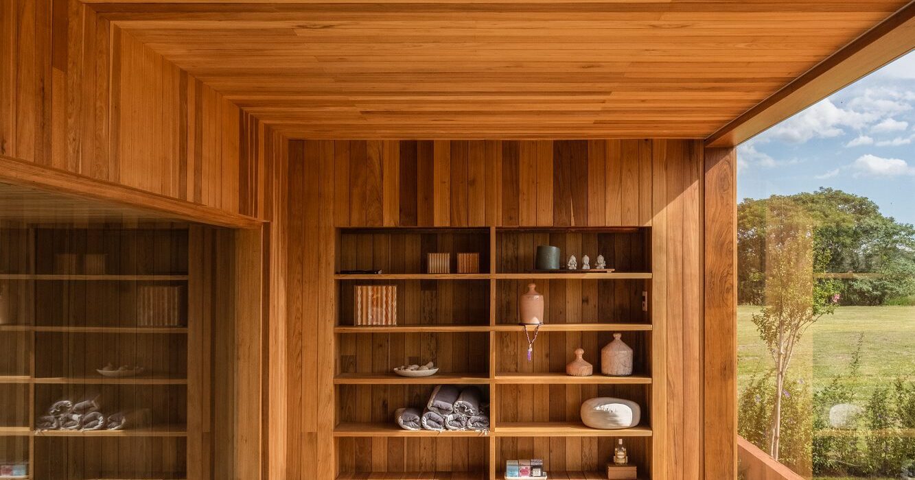
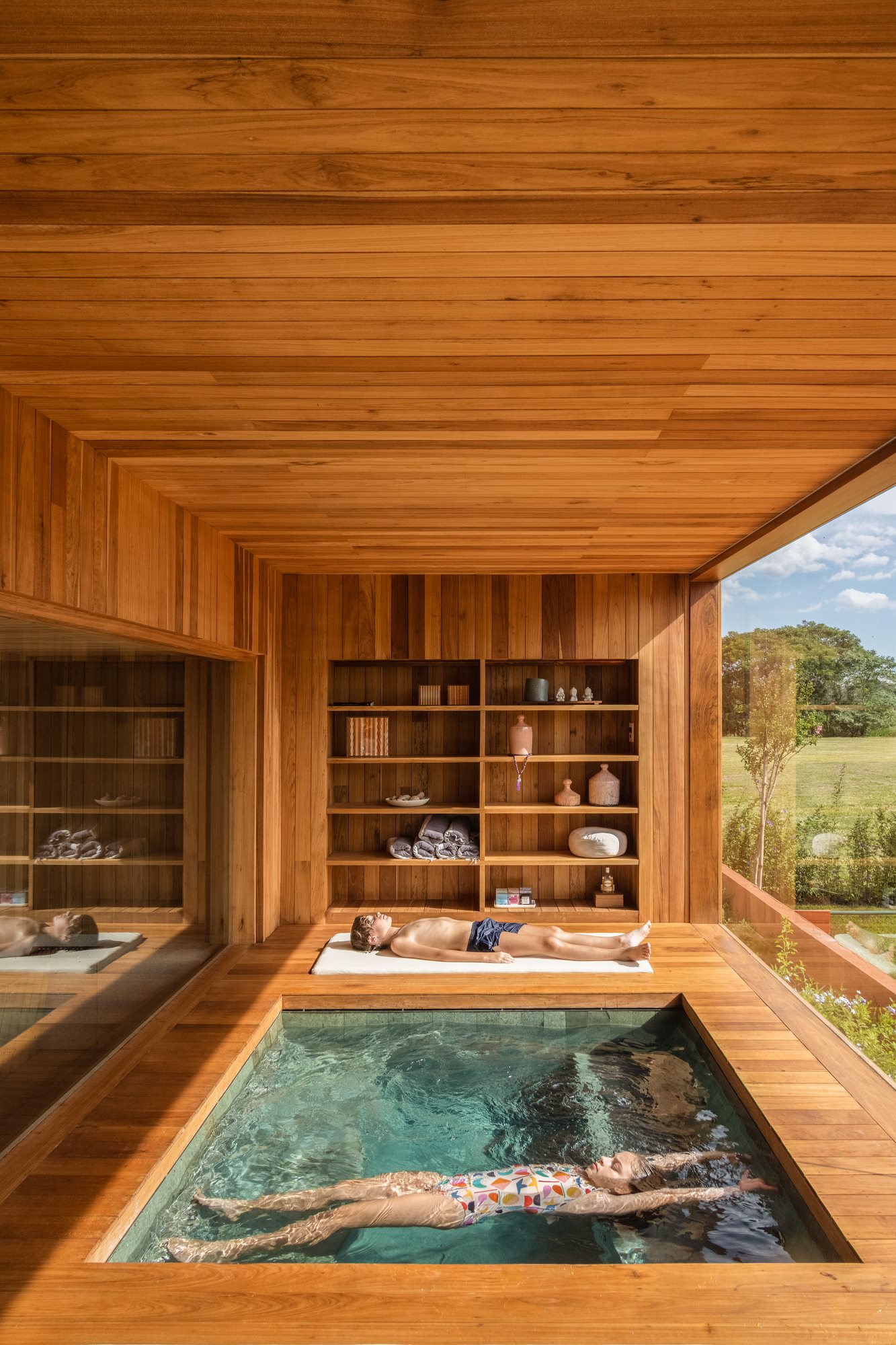
Enter Black Label by Tropical Forest Products, one of the world’s most sustainable building products for decking, cladding and more. This forward-thinking manufacturer has refined its process to minimize the environmental impact of its products without compromising on the durability and incredible aesthetic qualities of its collection. The results are stunning: the warm, rich tones and resilient nature of tropical hardwood makes it a fit for a wide range of contemporary architecture projects, including hospitality, commercial, residential and landscape design typologies. Black Label Sustainable Lumber topped the popular choice vote in the Landscape Design category for the 2022 A+Product Awards.
Architizer spoke with Tropical Forest Products about their products, their processes, and how they see their work evolving in the future.

Congratulations on winning a 2022 A+Award! What does winning this accolade mean to you and your brand?

We are thrilled to have Black Label sustainable lumber named a winner in the world-renowned Architizer A+Awards. This prestigious recognition proves that the architectural community appreciates our efforts to bring high quality and organic tropical hardwoods to market.

The fact that we were awarded by People’s Choice makes it even more special. We would be equally thrilled if this was a jury award, but the fact that this came from architects, designers, contractors and homeowners who have been using Black Label wood confirms the great acceptance that the industry has given to our sustainable, architectural grade products.

What inspired the design of your product?

We are inspired by nature. We believe that natural hardwoods are not only the most sustainable and renewable building product in the world, but they’re also the most exquisite. So we keep our interference as minimal as possible. That means that Black Label hardwoods have no chemicals, additives or toxins – nothing is added. Our products are already what the engineered industry has tried to mimic for years, with no success.

From natural one-of-a-kind designs to unmatched structural strength, our hardwoods are born nearly impeccable. Our role is selecting the optimal boards – Premium Architectural Grade on all sides and edges, with no knots – and kiln-drying them in state-of-the-art Italian chambers.
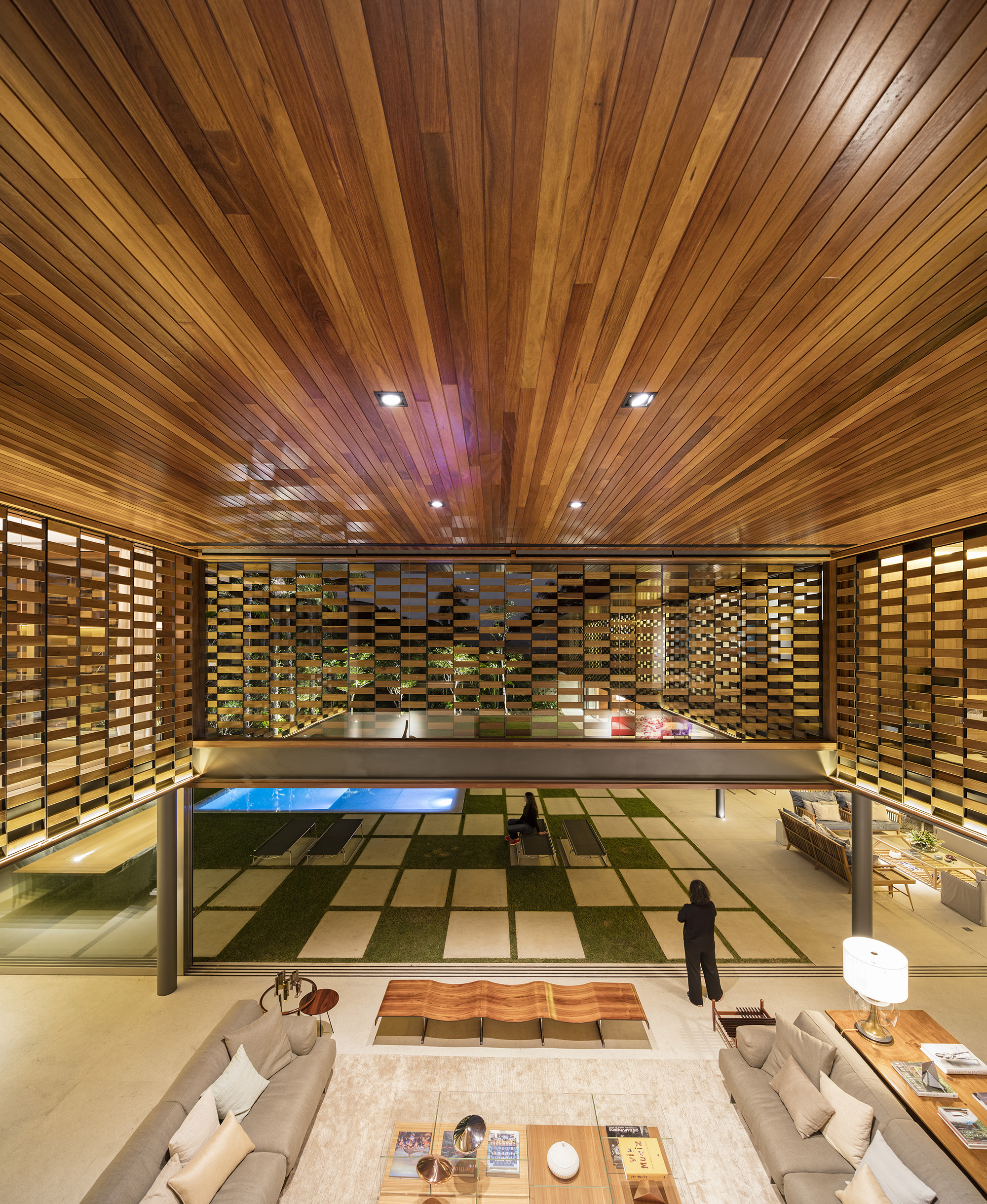
Using advanced sustainable forest management techniques certified by the Forest Stewardship Council or Unfloresta, we go deep inside the forest and hand pick a limited number of trees with potential to become a piece of art in the hands of architects. Our mission is to give professionals the ability to create stunning, meaningful work that not only delights people, but that also reconnects them to nature.

Add to that the design of specific product profiles, along with the product testing and engineering into a system-based approach consisting of CAD details and CSI based specification language, and you have the essence of the Black Label brand.

Tell us about the manufacturing process — What are the key stages involved, and how do these help ensure a high quality end product?

Manufacturing sustainable wood products goes way beyond what meets the eye. Kiln-drying every board in Italian-made chambers until they meet precise humidity levels is a challenge, as is the world-class millwork we do with our state-of-the-art German-built planers. But it’s when we go into the forest to source our wood that we really set ourselves apart.

To craft every piece of Black Label hardwood, we use the most stringent forest management protocols, guaranteeing forests forever for all future generations. We remove less productive trees (that no longer store carbon) and make room for new trees to flourish.

Think of it as a garden, but on a bigger scale. We prune aging trees the same way you prune old branches in your backyard, allowing new life to grow. And not just any aging tree. From an area as big as a football field, only four to six trees are carefully selected, leaving the remainder intact. And for every one we harvest, up to 25 new trees benefit from the opening in the canopy of leaves and have a chance to flourish.

We go out of our way to keep our products not only sustainable and organic, but to make sure they bring a positive impact on both nature and people. Our multiple certifications with world-class organizations like FSC and Unfloresta only prove how seriously we take sustainability at Black Label.

What detail of your product was the biggest challenge to design, and why? How did you resolve it?

Solving design challenges are at the core of Black Label. Wood, by its very nature, is an incredibly flexible building product, and we take that to the next level by bringing unlimited profile options with state-of-the-art molders and CNC platforms. There’s nothing a commercial or residential project would need, no matter how big or small, that we could not provide.

We also have a dedicated department to serve designers and architects in their specification development process with all of the tools and data they require available on our website. Additionally, we always love to hear from designers directly so we can match their needs, from product sampling to our mill shop.
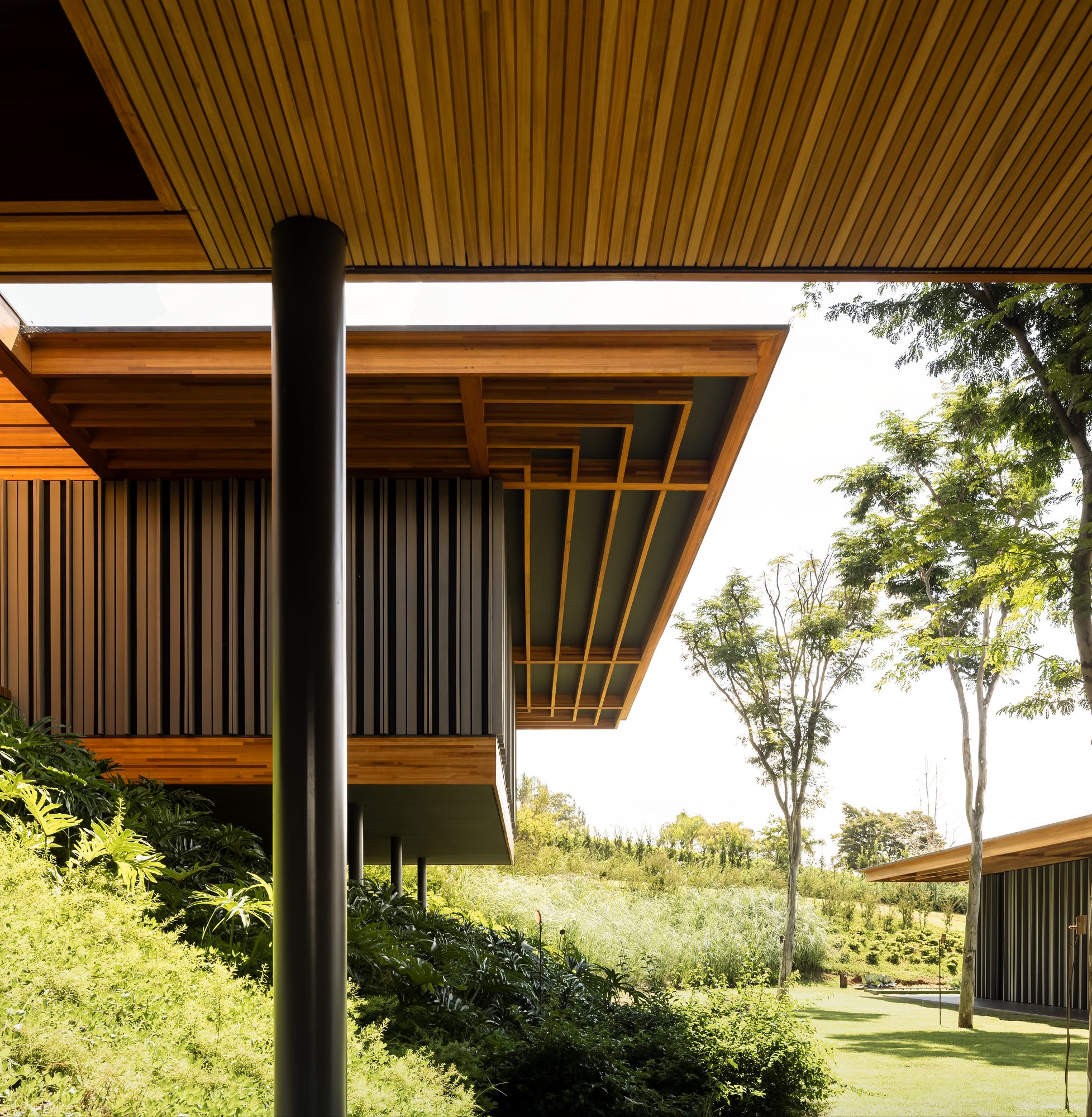
What makes your product unique and of great value to specifying architects?

Tropical hardwoods are the best in the world for a wide range of residential and commercial applications, and Black Label heightens this aspect. Black Label wood products such as Ipe, Garapa, Tigerwood, Jatoba, Cumaru and Bulletwood — the world’s most appealing species — are sustainably sourced and perfect for all climates. Besides, all of them have unmatched durability and require low maintenance, without the use of chemical treatments. They represent the perfect mix of beauty and unrivaled performance.

Black Label hardwoods have almost twice the strength of Generic FAS grade lumber, and because of the establishment of definitive grading rules, Black Label offers lifestyle products with Premium Appearance on all four sides and edges of each board. Our hardwoods are 100% organic — with absolutely no additives — harvested from sustainably managed forests, and some species have an impressive lifespan of up to 75 years. Hardwood last longer than other materials, and therefore does not have to be replaced nearly as often, making it even more sustainable. Plus, every piece of wood has enhanced stability, made possible by an optimal temperature control system that increases the structural performance by hardening the cell walls. It’s what the industry has been trying to match for years by using chemicals and toxic additives, with no success.

Combine this with FSC, Unifloresta, and even our own Legal Lumber certification program, and designers have a validated and comprehensive approach to biophilic design within the wood product category.

What has the reception to your product been like from architects/clients/consumers?

It has been amazing to watch the incredible reception for such a young brand that has been on the market for less than two years. Dealers all over North America are working with Black Label products every day, and we were awarded by People’s Choice at the Architizer A+Awards. On top of that, we received additional prestigious recognition, which made us the most awarded hardwood brand in our industry in 2022.

Technically, the architects and designers are astounded by the breadth of resources that are available to them to assist in specifying naturally durable hardwood products from our resource library and our availability to work through design challenges with them.

Both designers and consumers are reassured by our comprehensive environmental compliance certification programs, including FSC certification. But the real challenge remains in the continuing education about the Life Cycle Benefits of renewable wood products over non-renewable building products. We are extremely grateful to have received the Architizer A+Award and for any attention it brings to this most important environmental initiative.
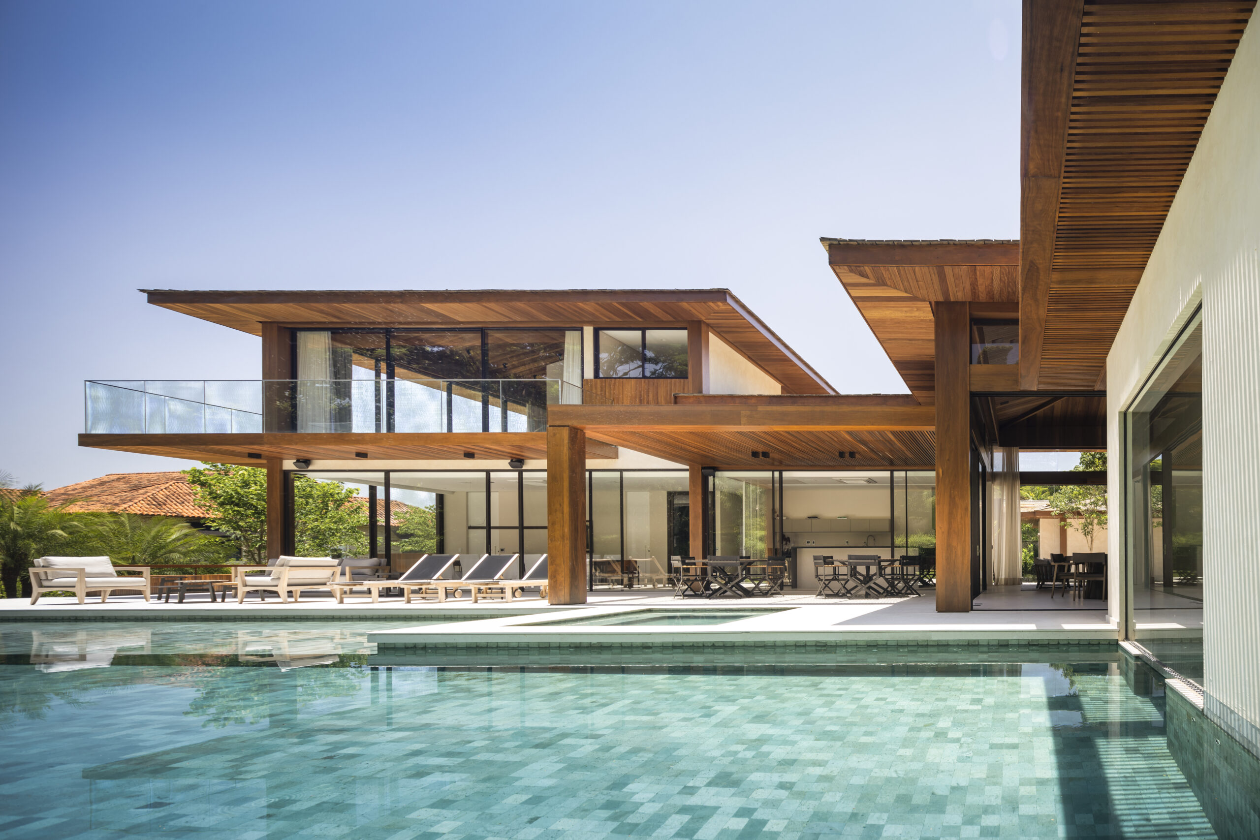
How do you see the product evolving in the future?

We have just recently introduced prefabricated deck tiles into our Black Label roof deck system. And for the first time ever in our industry, they are kiln-dried, providing a resistance only similar to that of steel.

But only offering wood sometimes isn’t enough for a brand that aims to support architects and builders with everything they need to deliver world-class projects. So, we’re excited to announce the evolution of the Black Label brand into a wide range of accessories from deck and clad clips to tool kits to stains and beyond.

This evolution is how we guarantee our builders will always find the same quality standards we stand for, from the wood all the way down to the smallest screw.


To find out more about Black Label Sustainable Lumber, visit their website, and reach out to one of their experts to learn how to implement the product in your next project.

All images courtesy of Tropical Forest Products
Reference